TYPE DESIGN INFORMATION PAGE last updated on Wed May 6 16:17:18 EDT 2026
FONT RECOGNITION VIA FONT MOOSE
|
|
|
|
Fabio Haag Type (was: ByType, and: Foco Design)
[Fabio Luiz Haag]
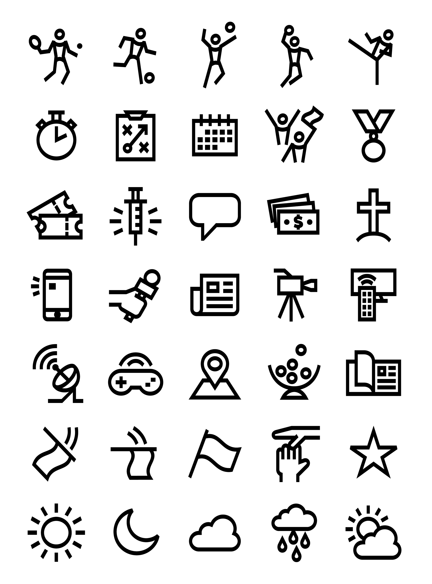
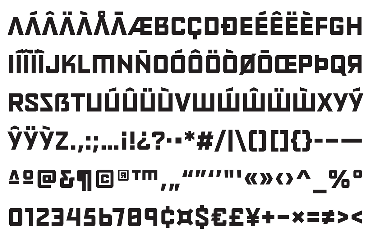
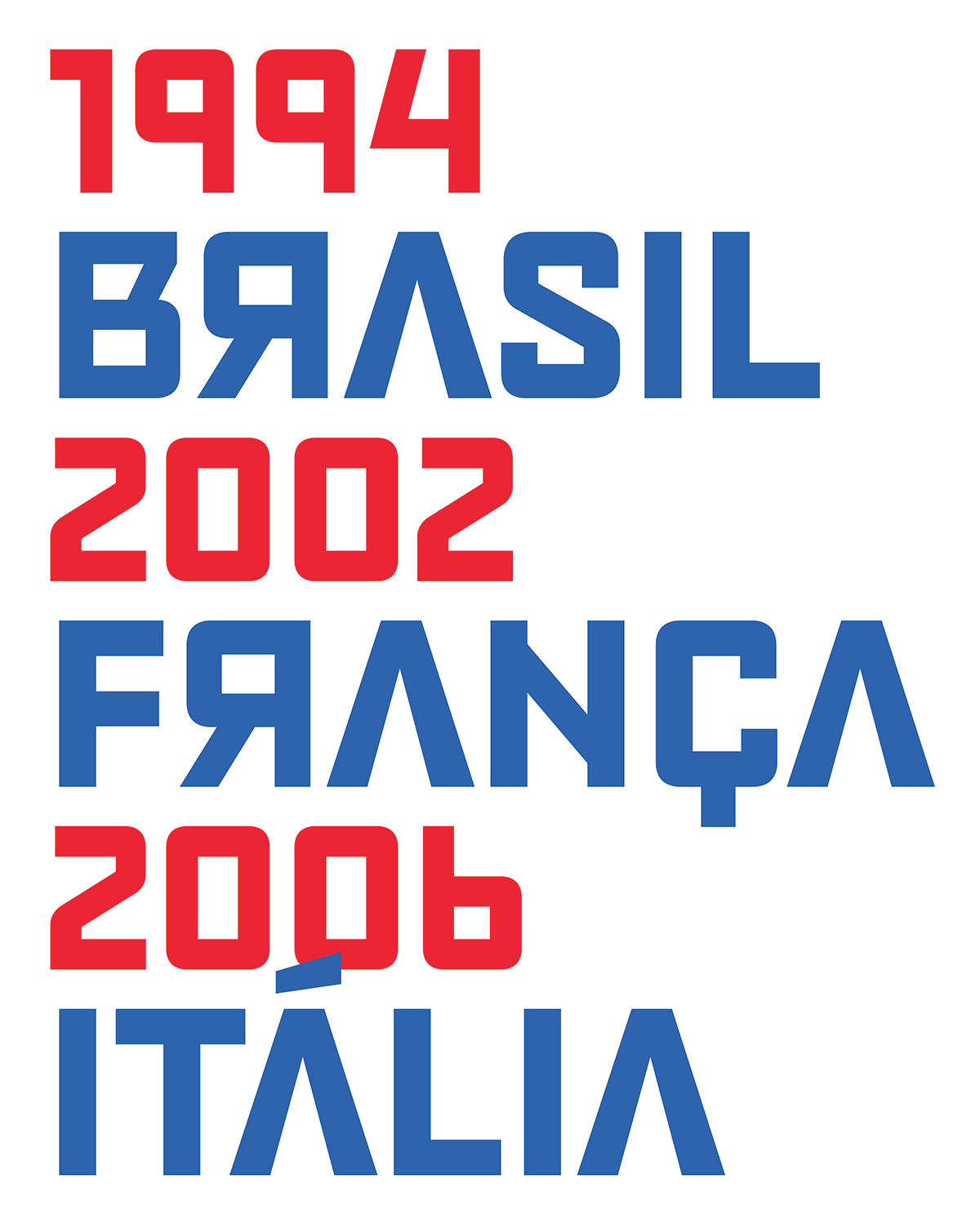
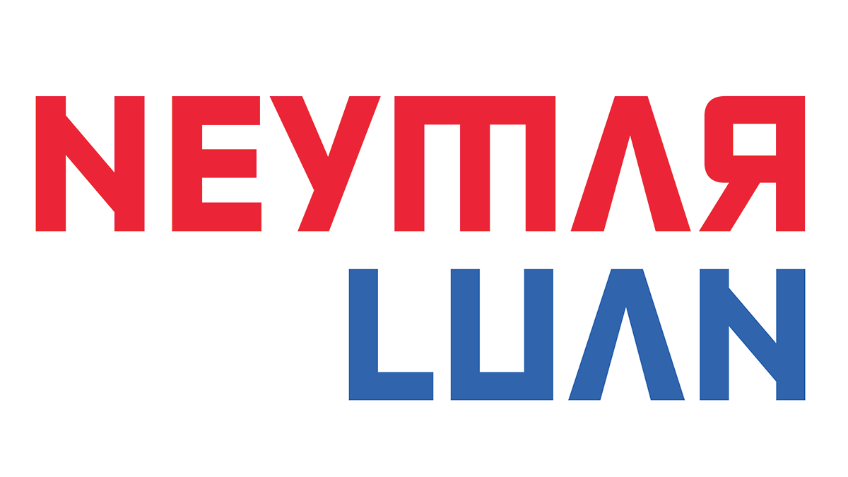
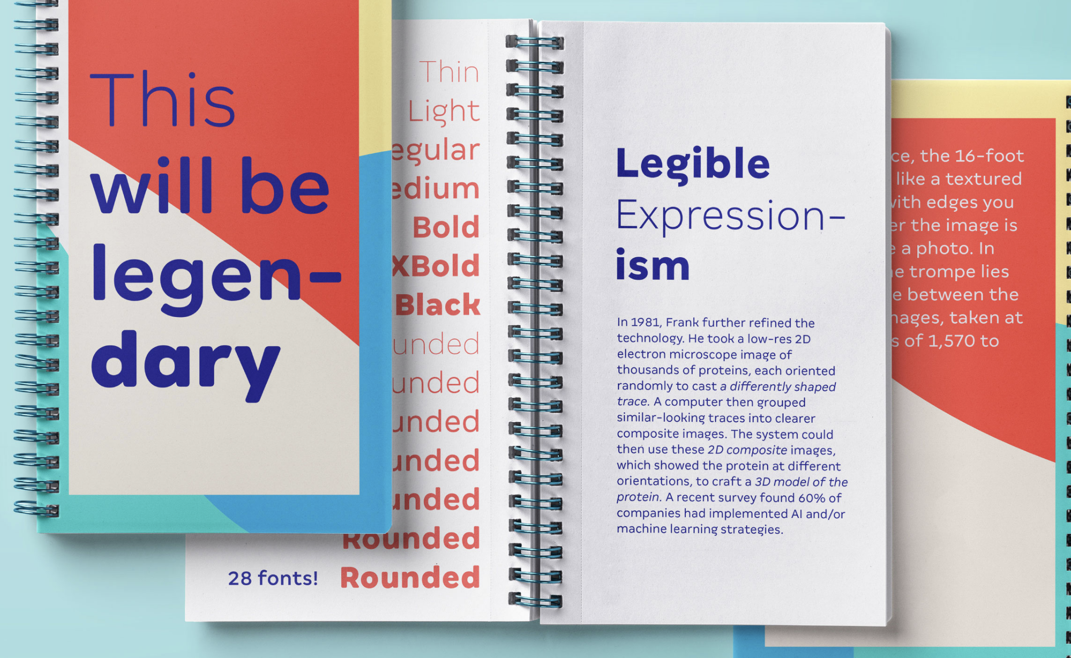
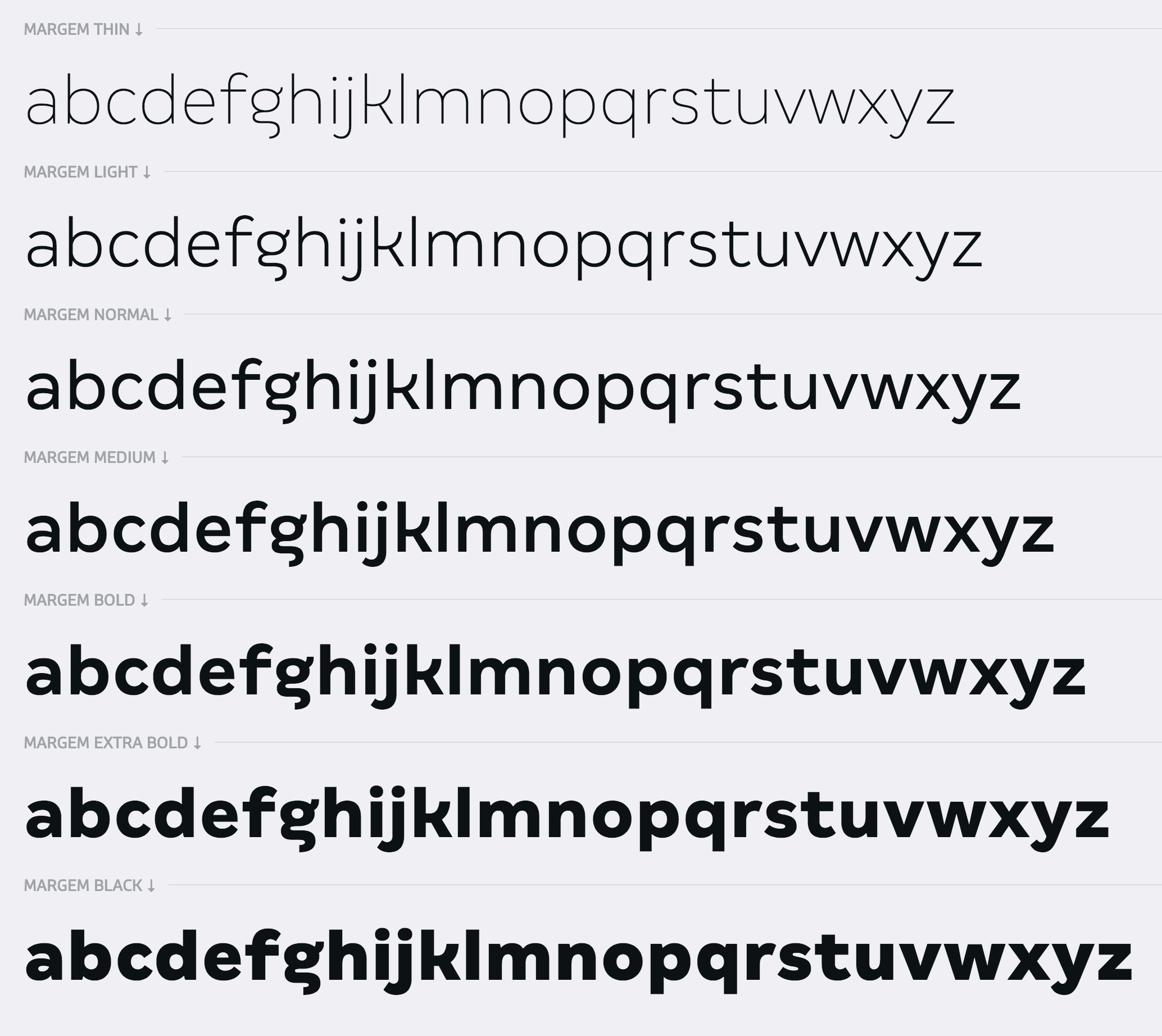
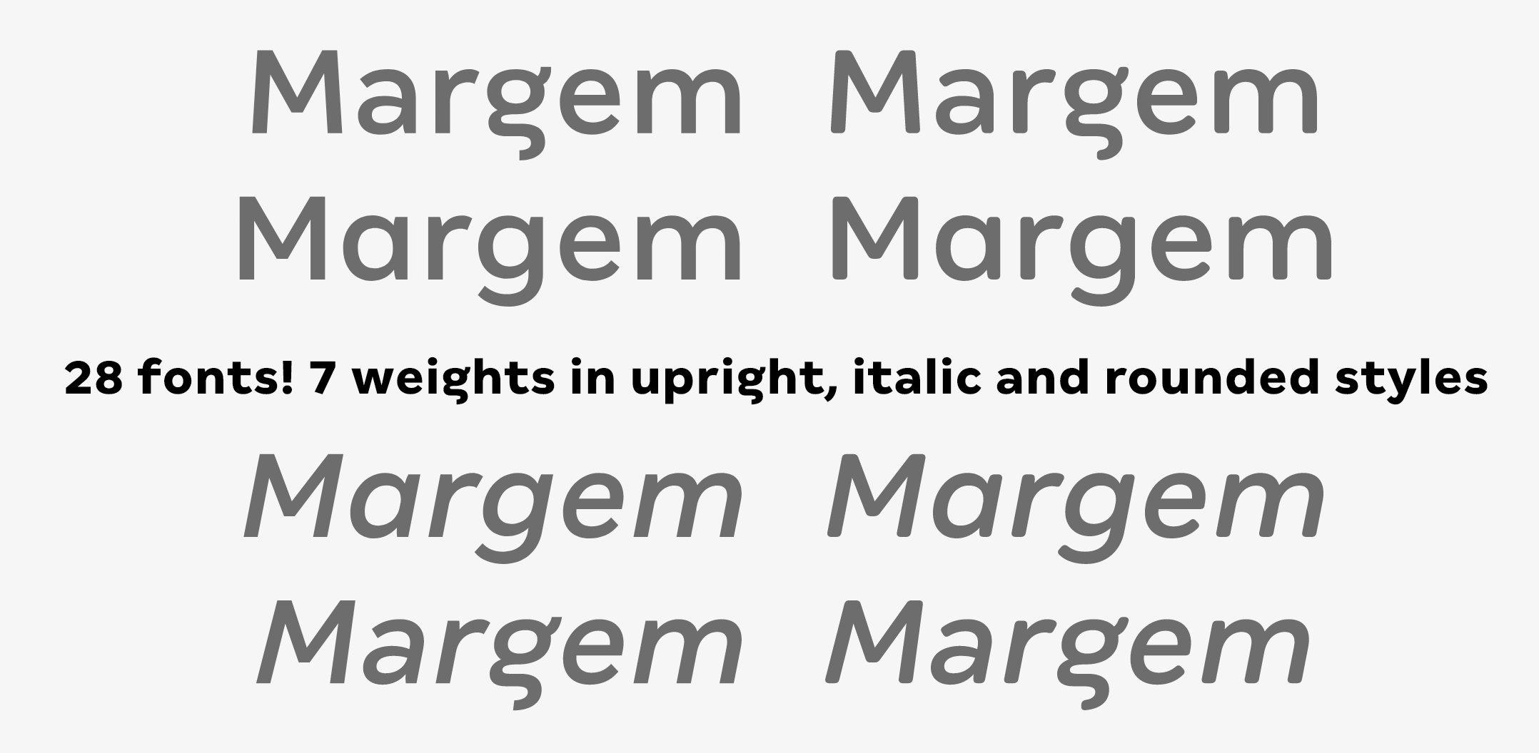
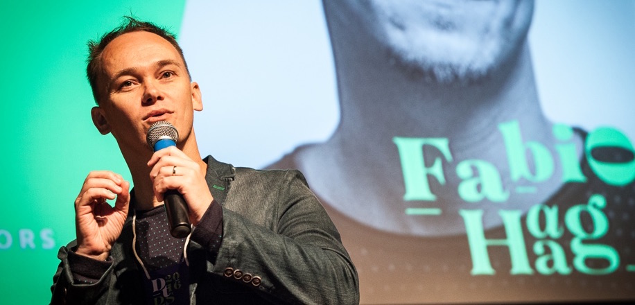
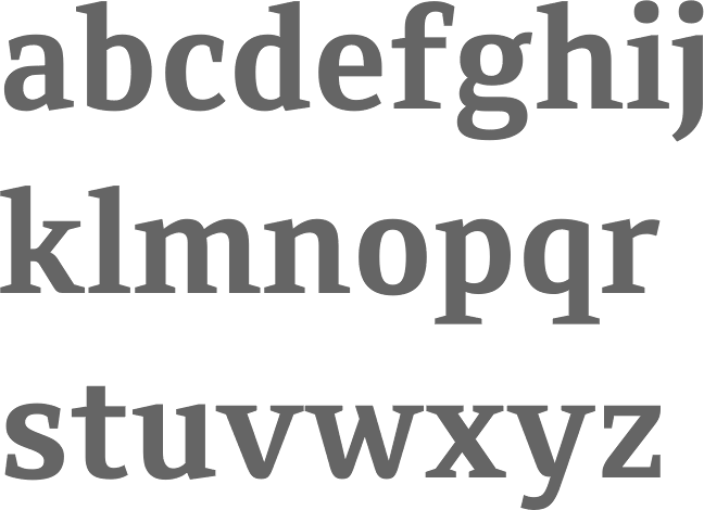
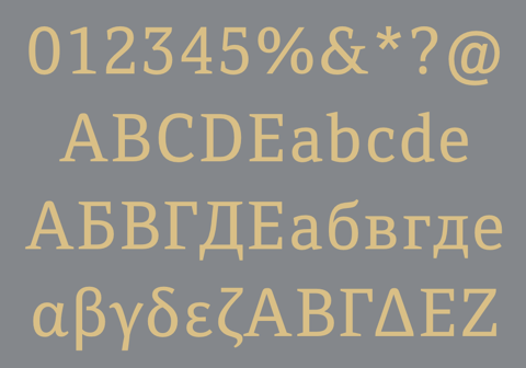
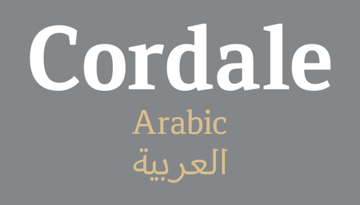
Fabio Haag Type is Fabio Haag's type foundry in Brazil. Earlier, he ran ByType, the type subdivision of Foco Design, and worke for Dalton Maag's Brazilian division. Fabio Luiz Haag (b. 1981, Taquara, Rio Grande do Sul) is located in Sapiranga, Rio Grande do Sul. Fabio Haag designed FH After (2006, futuristic display typeface to which After Text and After Headline were added in 2007), FH Foco (2003) (a large x-height sans), this futuristic typeface (2003), and Minas Headline, a custom family made for the government of Minas Gerais. He was working on this display font (2005). In 2006, Foco became a Dalton Maag Ltd font family, and Fabio Haag became the new Creative Director of the Brazilian wing of Dalton Maag in 2008. MyFonts sells Foco and Foco Corp (2007). Designer (with Jonas Schudel) of a grotesque sans at Dalton Maag, 2007-2009, called Effra, which was inspired by a 1816 design from the Caslon font foundry. Discussion at Typophile. Followed in 2013 by Effra Corp (Dalton Maag) which also supports Greek and Cyrillic. In 2007, he created the organic sans typeface IronThree. Cordale (2008) is a workhorse serif typeface jointly done with Lukas Paltram at Dalton Maag. Cordale Corp, the corporate edition, includes Latin Extended A, Greek and Cyrillic characters sets. Cordale Arabic was published in 2013. In 2009, Foco Italics was published. At ATypI 2009 in Mexico City, he spoke about Dalton Maag and about the elements necessary to make it in the type business today. In 2012, the Dalton Maag Brazil team designed the font for the Rio 2016 Olympic Games The 5448-character connected script font Rio2016 was developed by Dalton Maag Brazil, and involved a team that includes Fabio Haag, Fernando Caro and Gustavo Soares. Beth Lula is the Branding Director of the Rio 2016 Olympic and Paralympic Games Organising Committee. Passages of the press release: Each letter expresses a characteristic of Rio 2016 Games, its people and city. The letters are written with a single continuous linework, with a fast and fluid movement, suggesting the movements of the athletes in action. The variety of curves in the letters has a unique informality, inspired by the joyfulness of the Brazilian people. Fabio Haag: As a Brazilian typophile, designing the Rio 2016 font was a dream job. This is a milestone for the design scene in Brazil---it's a great example of how type designers can collaborate with graphic designers, sharing their expertise to strengthen an identity. In 2013, Fabio designed Almaq, a pair of sans display typefaces in cuts called Refined and Rough. Codesigner with Bruno Mello, Fernando Caro, Rafael Saraiva and Ron Carpenter of Soleto (2014, Dalton Maag), a sans typeface that won an award at Tipos Latinos 2014. Setimo (2015) was co-designed by Fernando Caro, Ken Gitschier, Fabio Haag and Lukas Paltram at Dalton Maag, and won an award at Tipos Latinos 2016. In 2016, Fabio Haag published Lembra (a sans that was created specifically for branding, characterized by tapered terminals) at his new type foundry, Fabio Haag Type, set up after he left Dalton Maag after eight years. Fabio Haag Type grew in 2020 to a team of four, now also including Ana Laydner, Henrique Beier and Eduilson Coan. In 2019, a variable font option was added top Lembra. In 2017, he designed the 28-unit legible humanist sans variable font family Margem (Fabio Haag Type), which includes a yummy Rounded subfamily. Still in 2017, he developed the sans typeface Sua, which as a variable option. In 2018, he published pictograms for SporTV, a forceful constructivist font for the World Cup 2018 also for SporTV and Furacão (for Atletico Paranaense). Typefaces from 2019: Suzano Sans (a commissioned rounded branding typeface done for Suzano). Typefaces from 2020: Margem (a fine 7-style rounded sans family by Henrique Beier, Ana Laydner and Eduilson Coan). Typefaces from 2021: Seiva (by Henrique Beier, Eduilson Coan and Fabio Haag: a distant relative of Didot, this exotic sans family is partitioned into Text, Display and Poster subfamilies, and welcomes variable font technology), Salva (2021, Fabio Haag Type). A versatile workhorse sans family: Eduilson Coan was the lead designer. He was assisted by the Fabio Haag Type team of Henrique Beier, Ana Laydner and Fabio Haag himself. |
EXTERNAL LINKS |
| | |

file name: Fabio Haag Type Seiva 2021

file name: Fabio Haag Type Seiva 2021

file name: Fabio Haag Type Seiva 2021
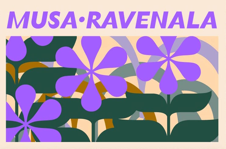
file name: Fabio Haag Type Seiva 2021

file name: Fabio Haag Type Seiva 2021

file name: Fabio Haag Type Seiva 2021
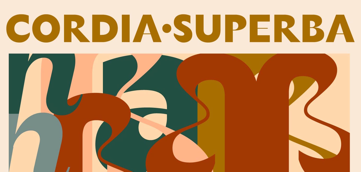
file name: Fabio Haag Type Seiva 2021
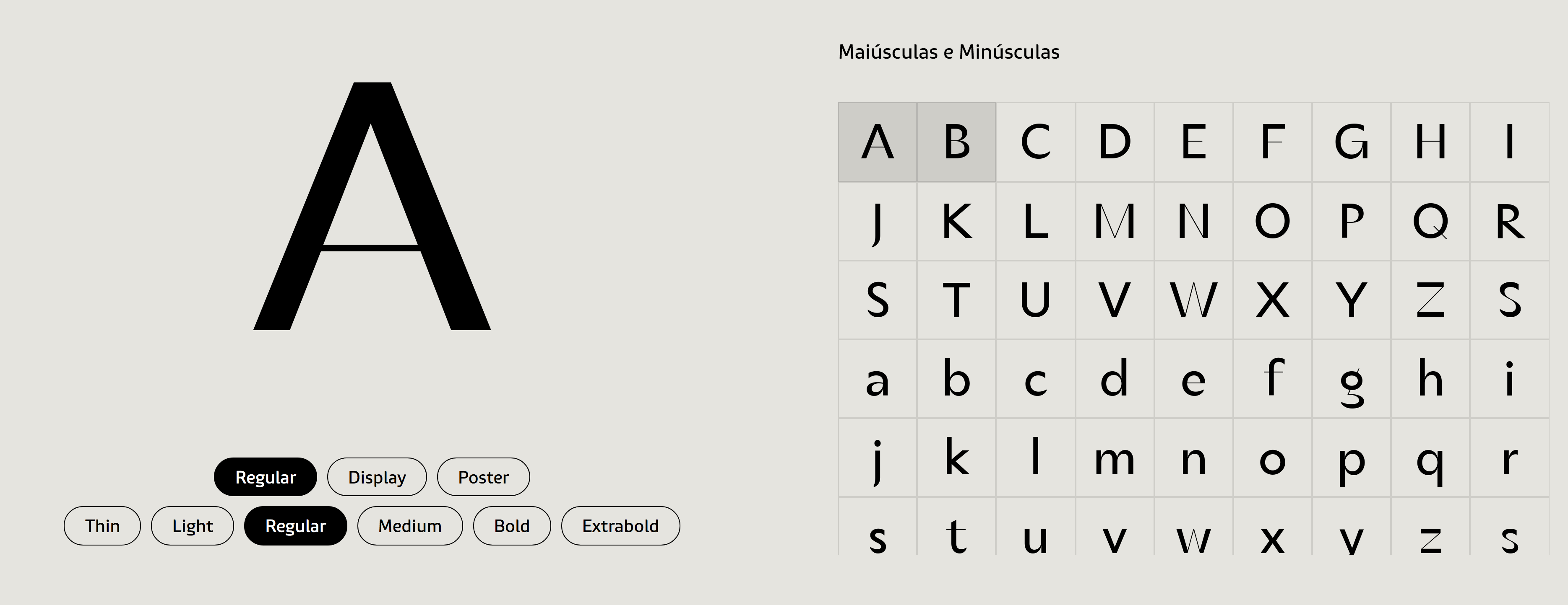
file name: Fabio Haag Type Seiva 2021

file name: Fabio Haag Type Seiva 2021

file name: Fabio Haag Type Seiva 2021

file name: Fabio Haag Type Seiva 2021
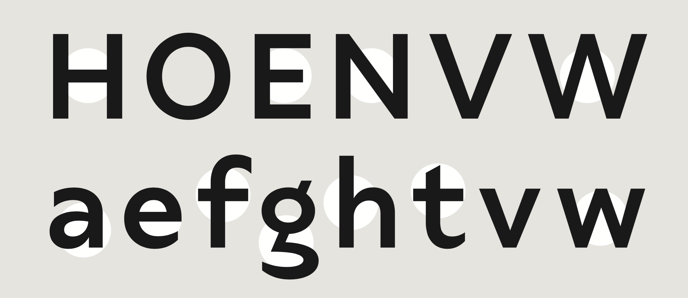
file name: Fabio Haag Type Seiva 2021
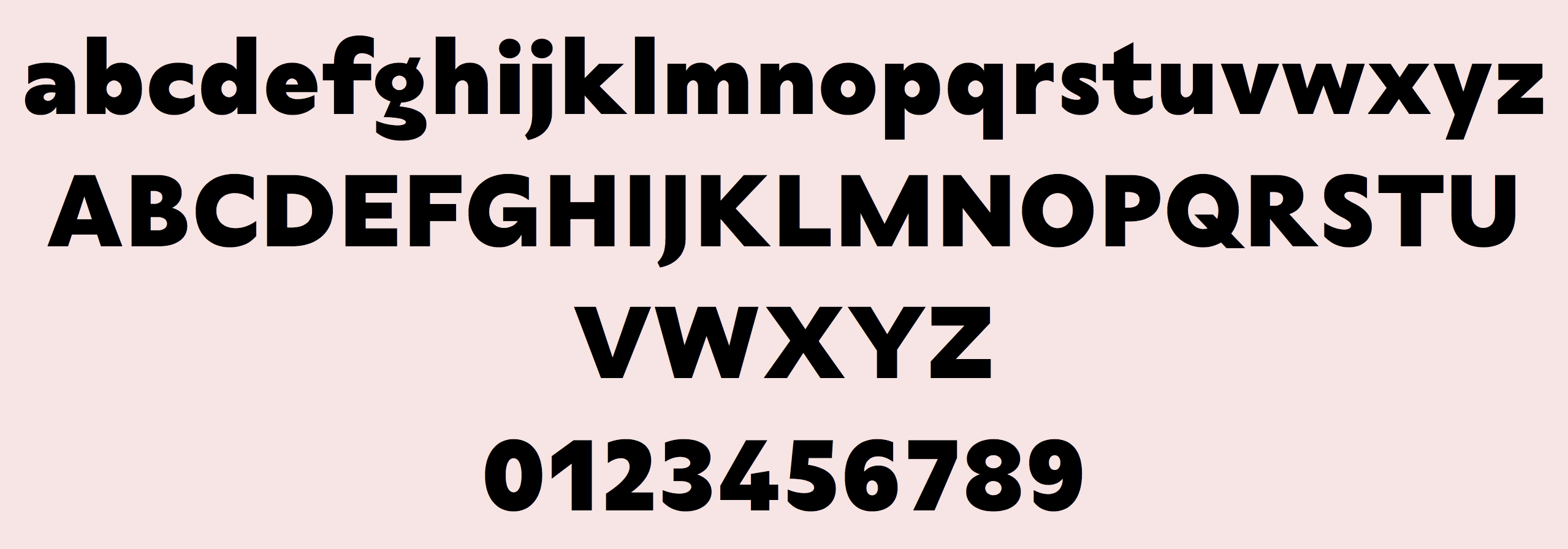
file name: Fabio Haag Type Seiva 2021
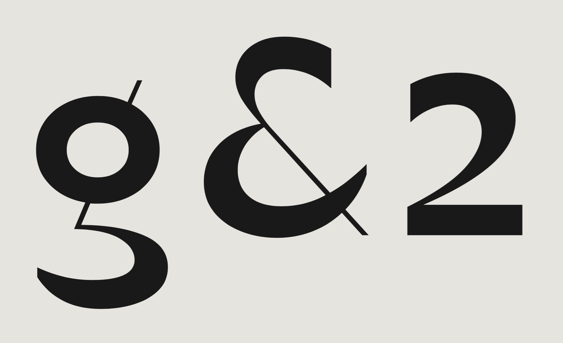
file name: Fabio Haag Type Seiva 2021
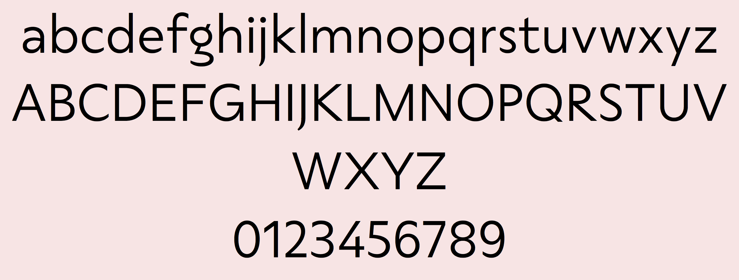
file name: Fabio Haag Type Seiva 2021
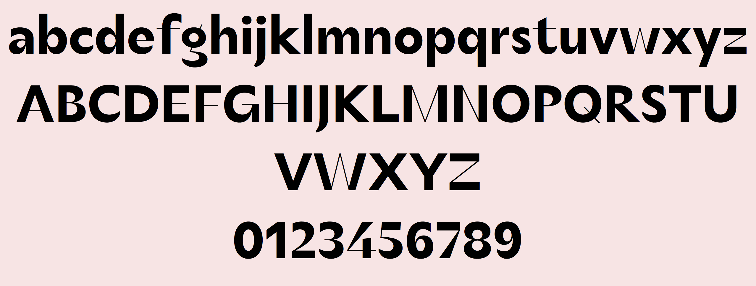
file name: Fabio Haag Type Seiva 2021
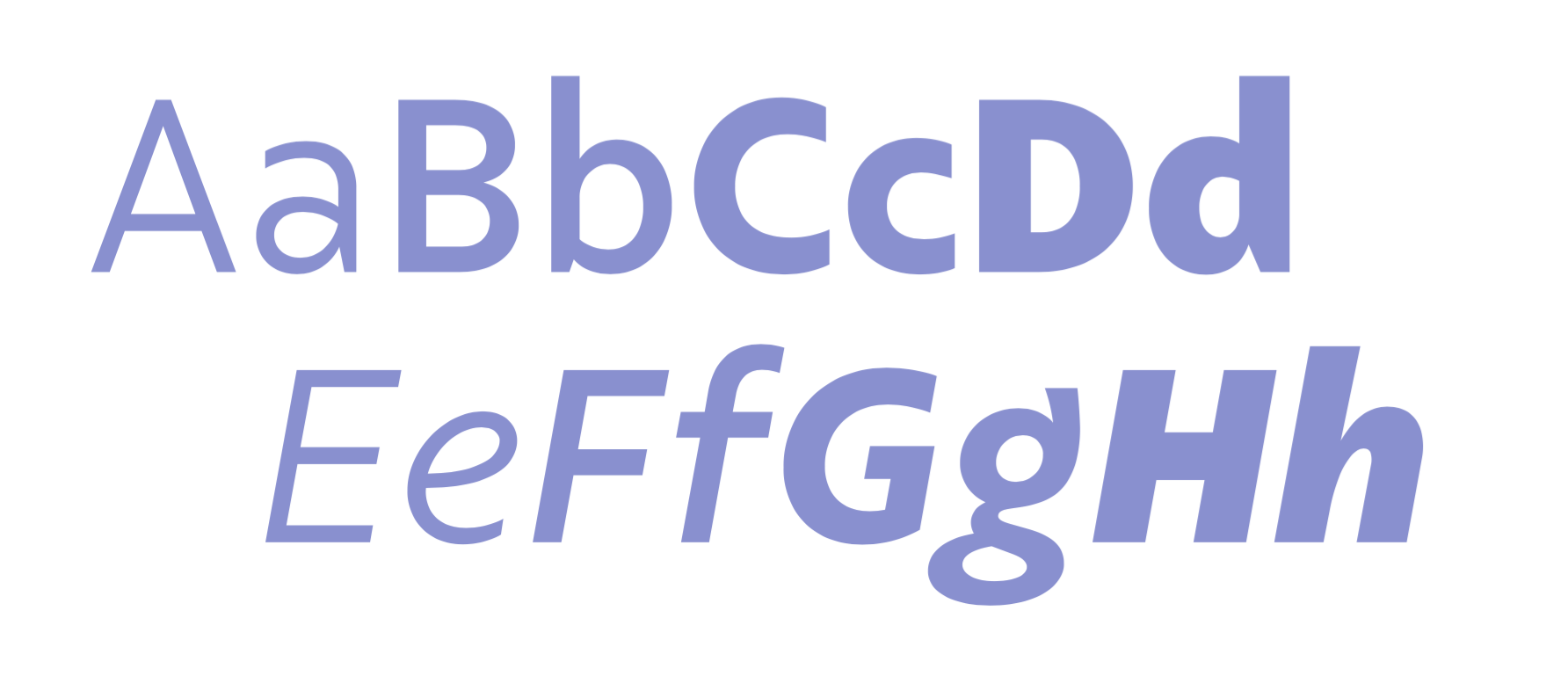
file name: Eduilson Coan Fabio Haag Type Salva 2021
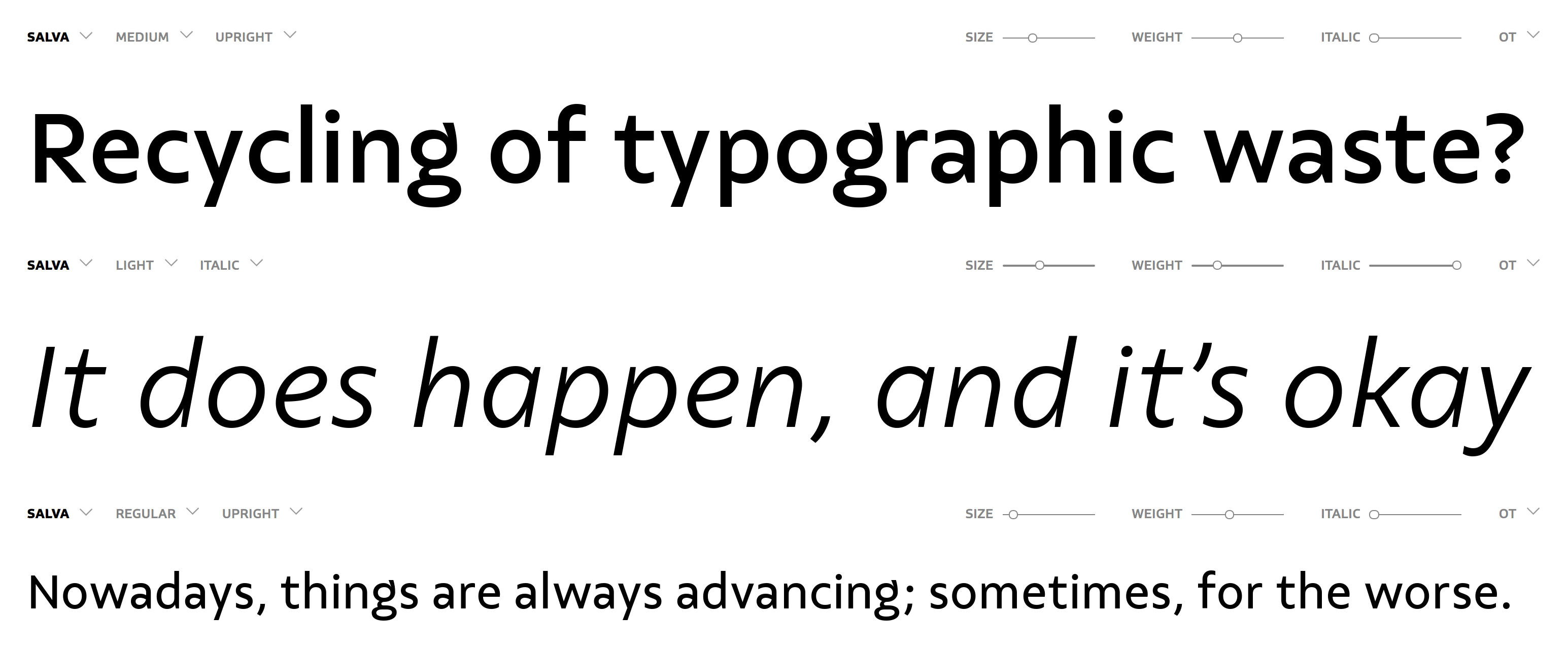
file name: Eduilson Coan Fabio Haag Type Salva 2021

file name: Eduilson Coan Fabio Haag Type Salva 2021
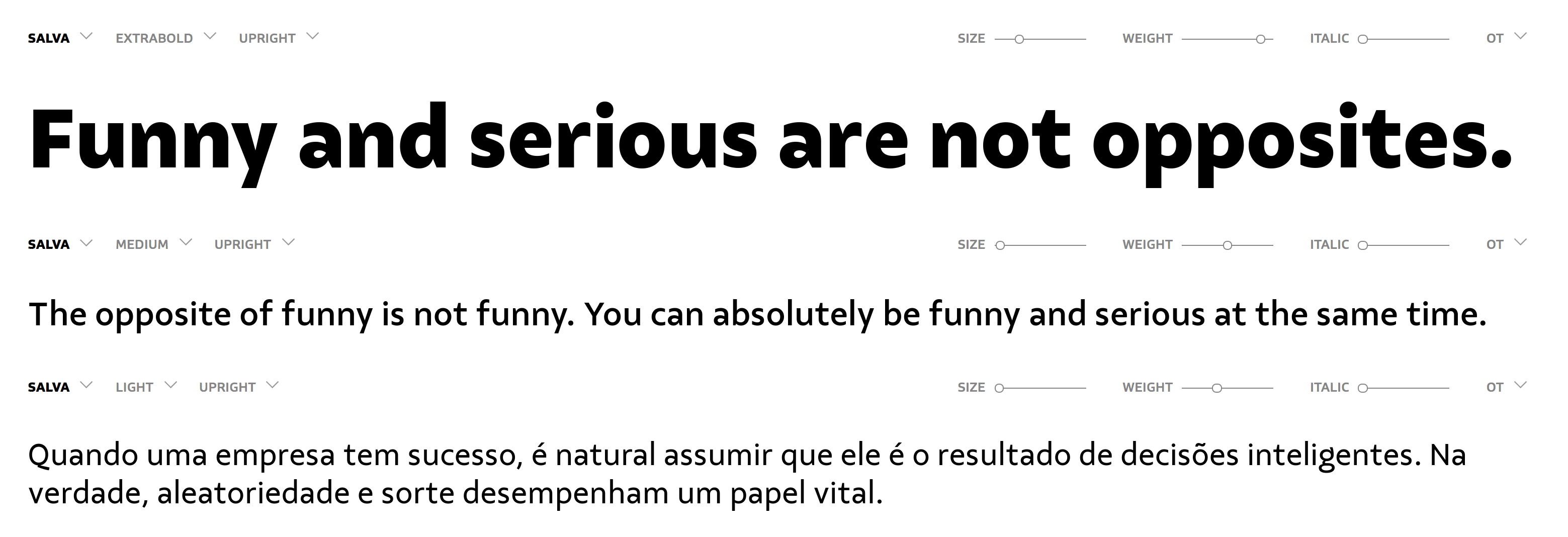
file name: Eduilson Coan Fabio Haag Type Salva 2021
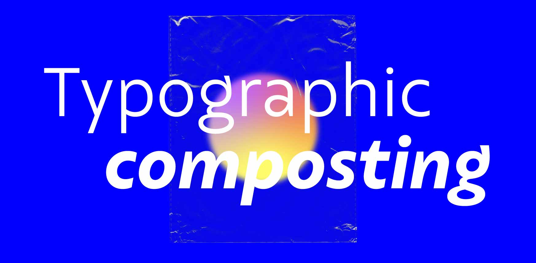
file name: Eduilson Coan Fabio Haag Type Salva 2021
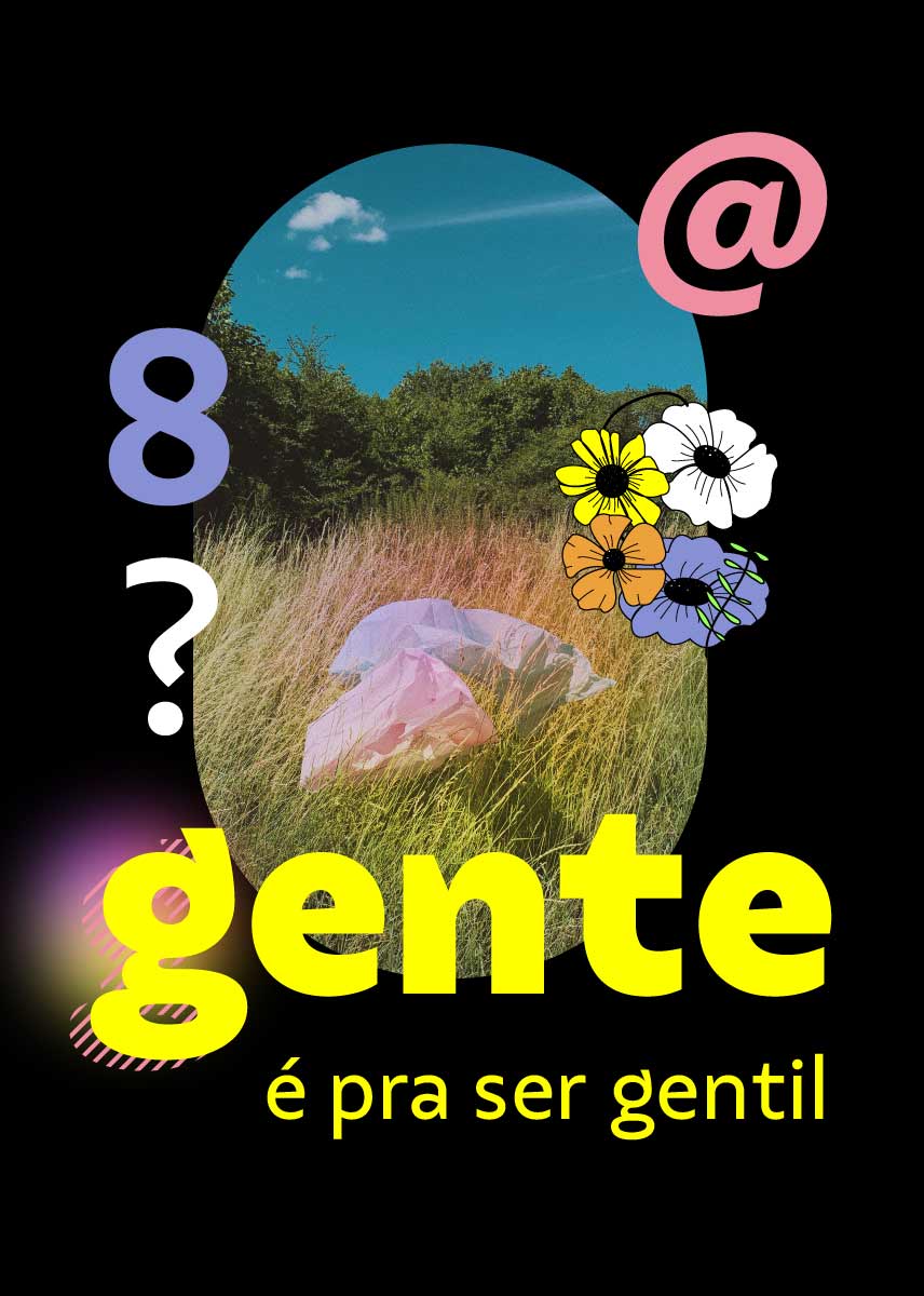
file name: Eduilson Coan Fabio Haag Type Salva 2021

file name: Eduilson Coan Fabio Haag Type Salva 2021
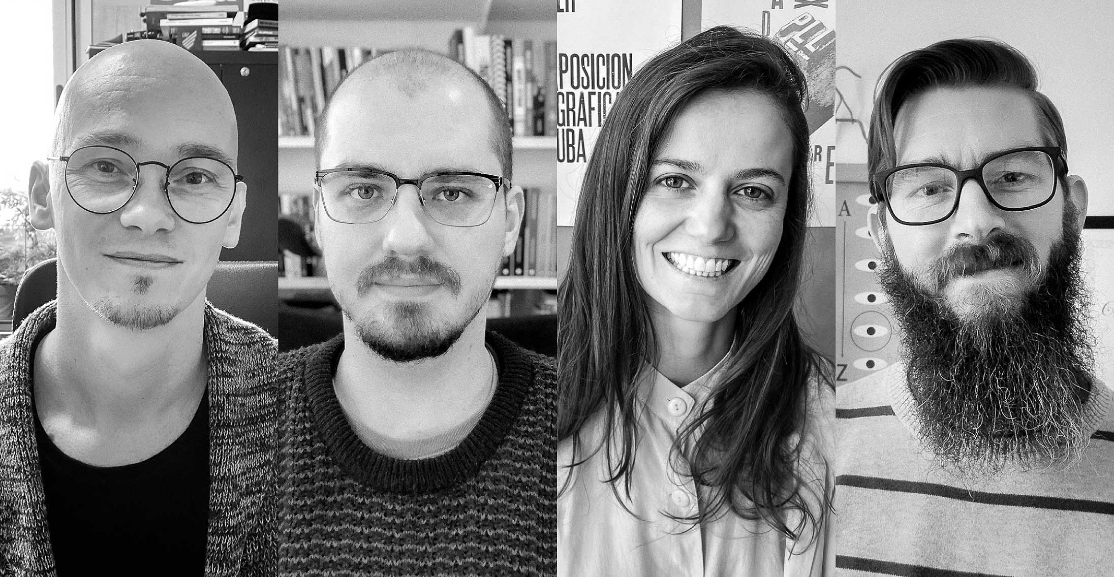
file name: Fabio Haag Type 2020
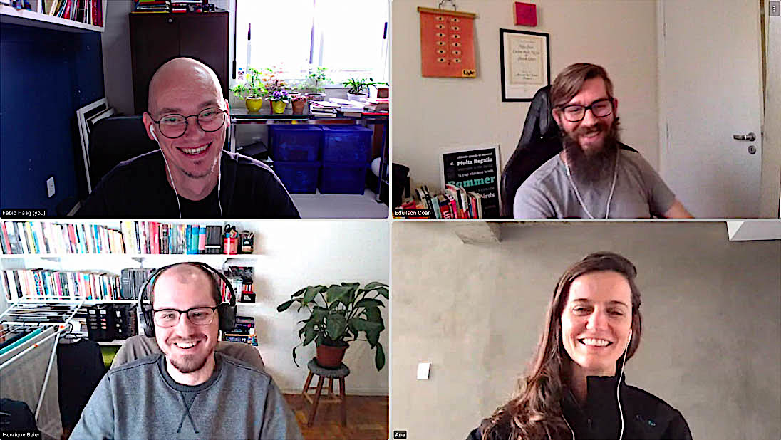
file name: Fabio Haag Type Fabio Haag Henrique Beier Ana Laydner Eduilson Coan 2020

file name: Fabio Haag Type Fabio Haag Henrique Beier Ana Laydner Eduilson Coan 2020

file name: Fabio Haag Furacao 2018
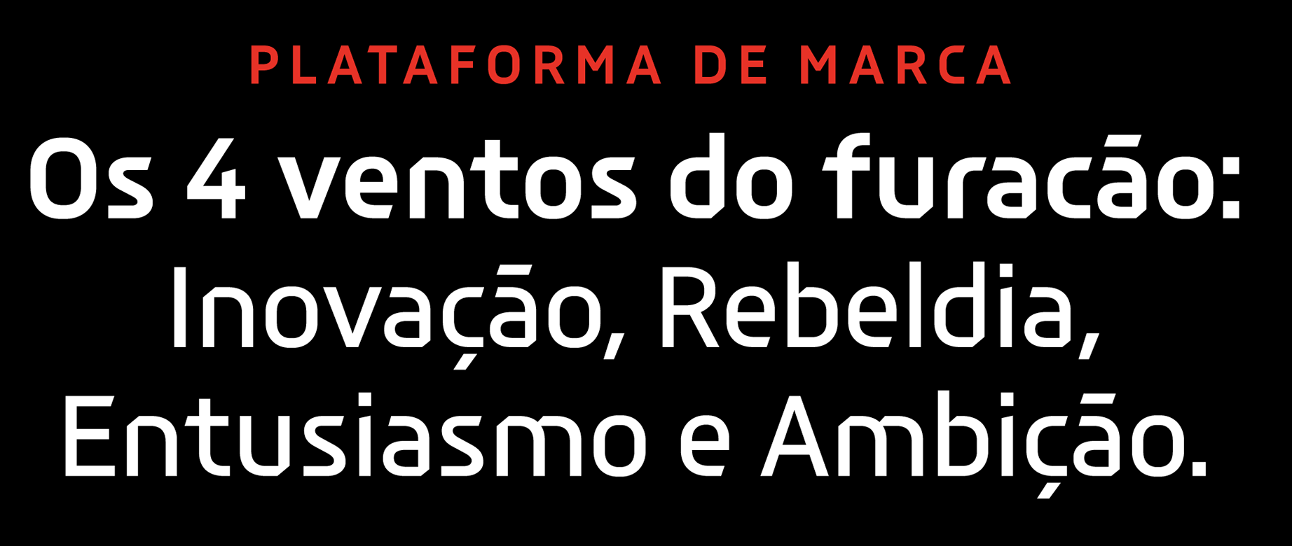
file name: Fabio Haag Furacao 2018
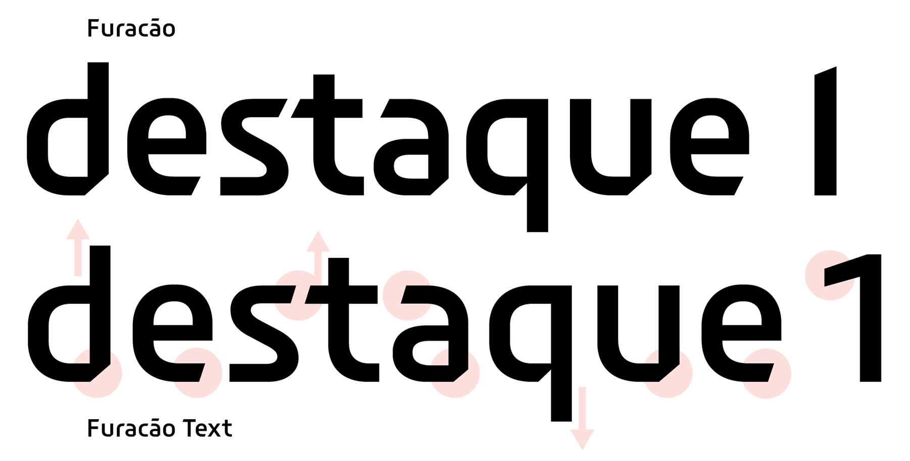
file name: Fabio Haag Furacao 2018

file name: Fabio Haag Furacao 2018
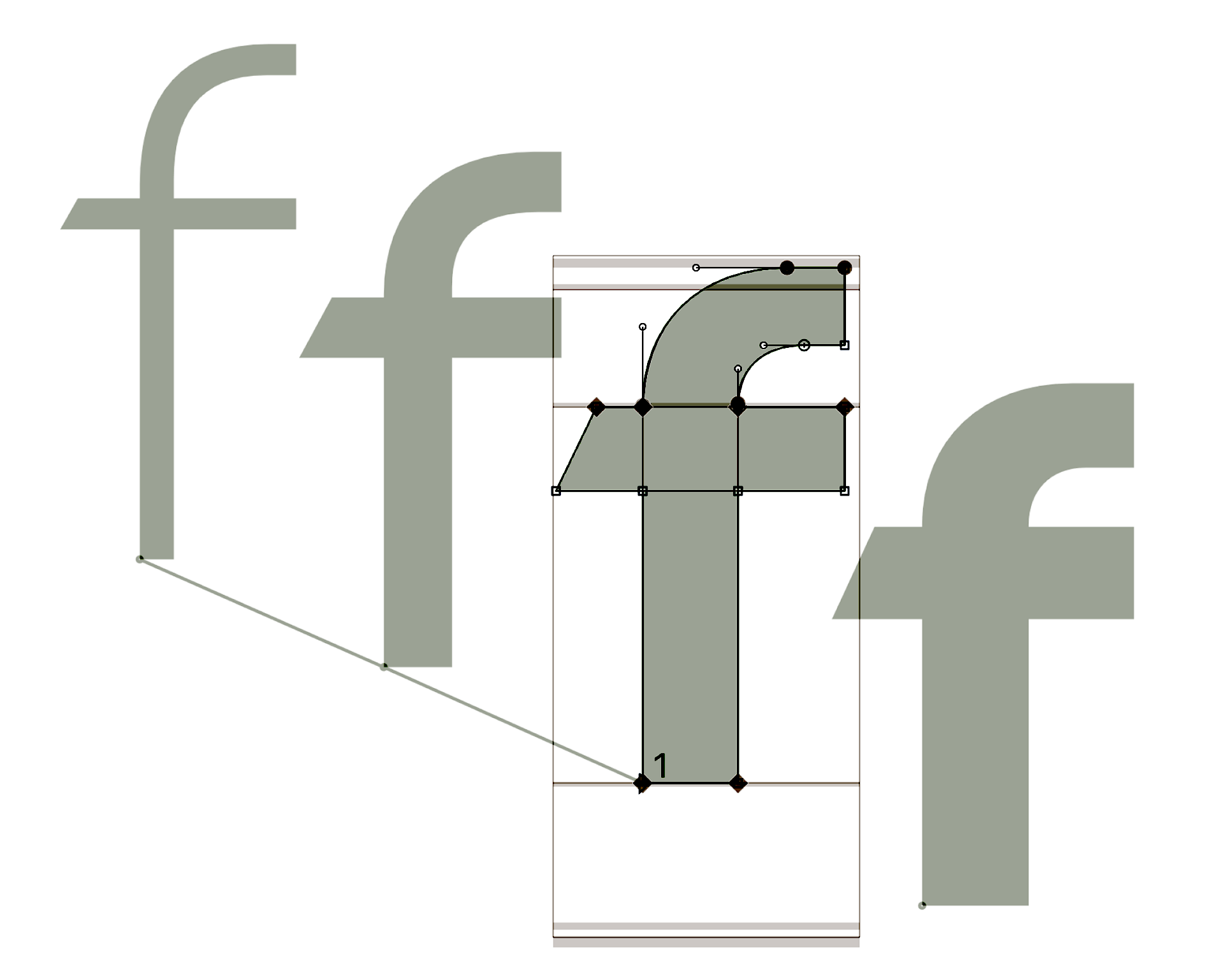
file name: Fabio Haag Furacao 2018
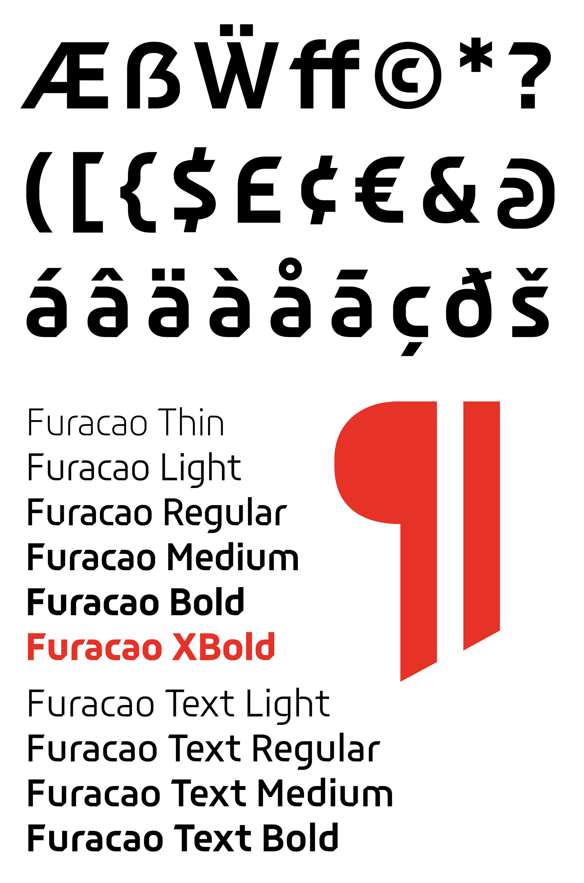
file name: Fabio Haag Furacao 2018

file name: Fabio Haag Furacao 2018

file name: Fabio Haag Suzano Sans 2019

file name: Fabio Haag Suzano Sans 2019

file name: Fabio Haag Suzano Sans 2019
file name: Fabio Haag Suzano Sans 2019

file name: Fabio Haag Suzano Sans 2019
file name: Fabio Haag Pictogramas Spor T V 2018
file name: Fabio Haag Spor T V 2018
file name: Fabio Haag Spor T V 2018b
file name: Fabio Haag Spor T V 2018c

file name: Fabio Haag Spor T V 2018d
file name: Fabio Haag Margem 2017
file name: Fabio Haag Margem 2017a

file name: Fabio Haag Margem 2017b

file name: Fabio Haag Margem 2017c
file name: Fabio Haag Margem 2017d
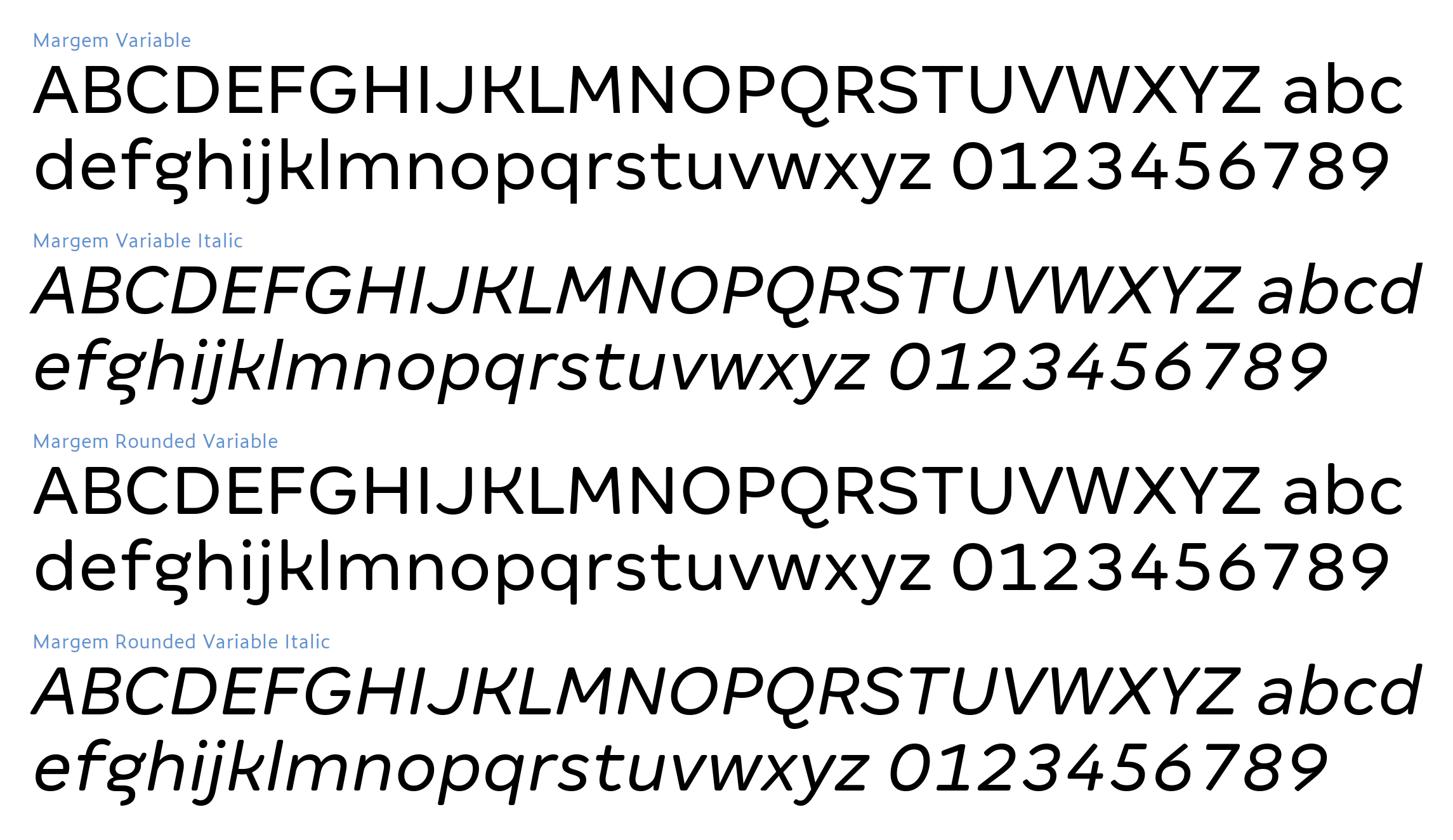
file name: Fabio Haag Margem Variable 2019
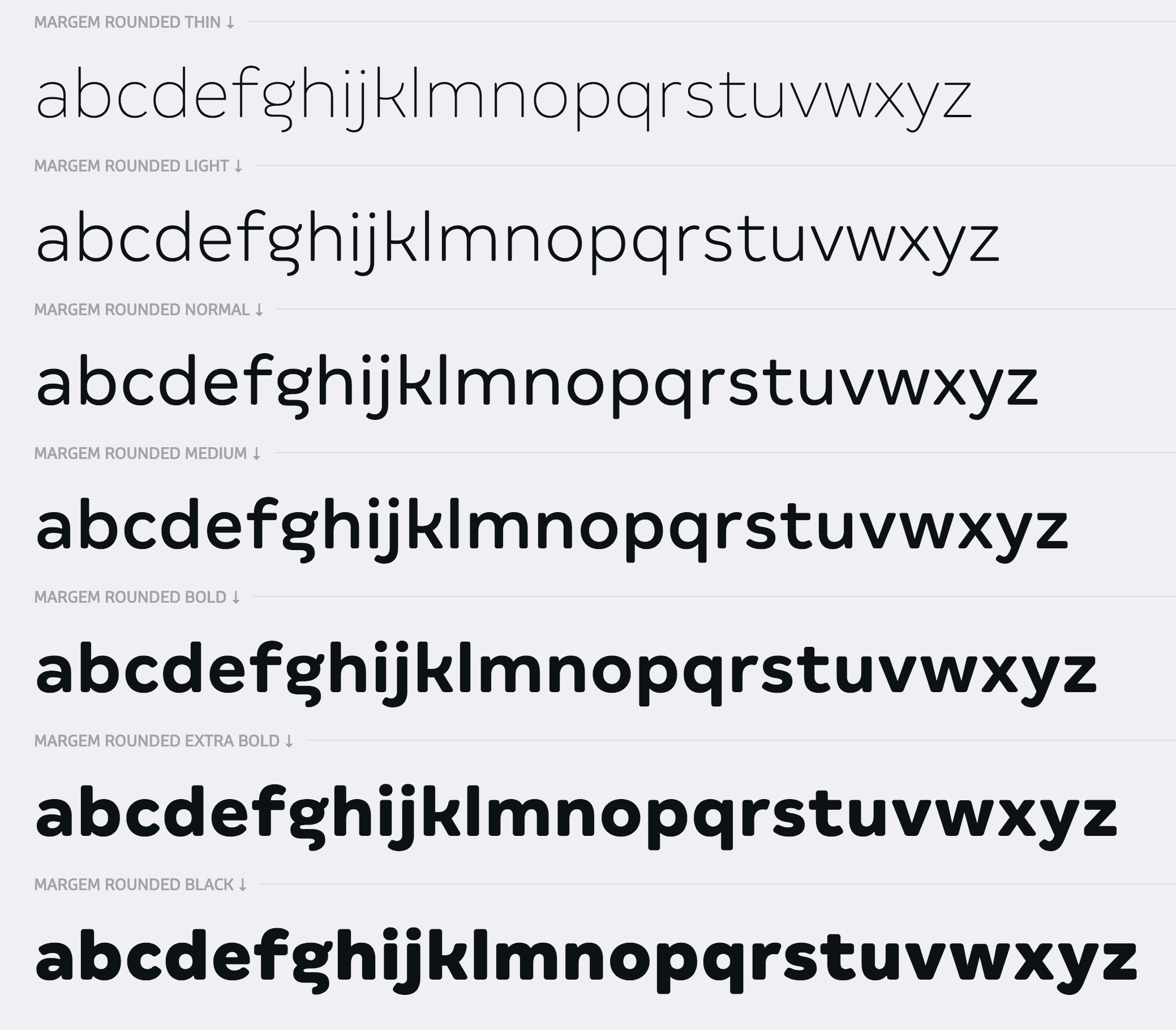
file name: Fabio Haag Margem Rounded 2017

file name: Fabio Haag Sua 2017

file name: Fabio Haag Sua Variable 2019

file name: Fabio Haag Sua 2017b
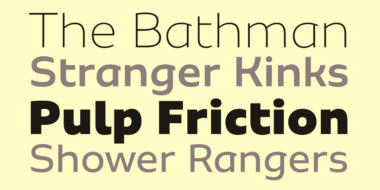
file name: Fabio Haag Type Sua 2017 227068
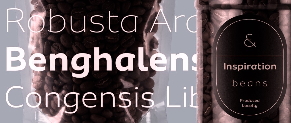
file name: Fabio Haag Type Sua 2017 227074

file name: Fabio Haag Type Sua 2017
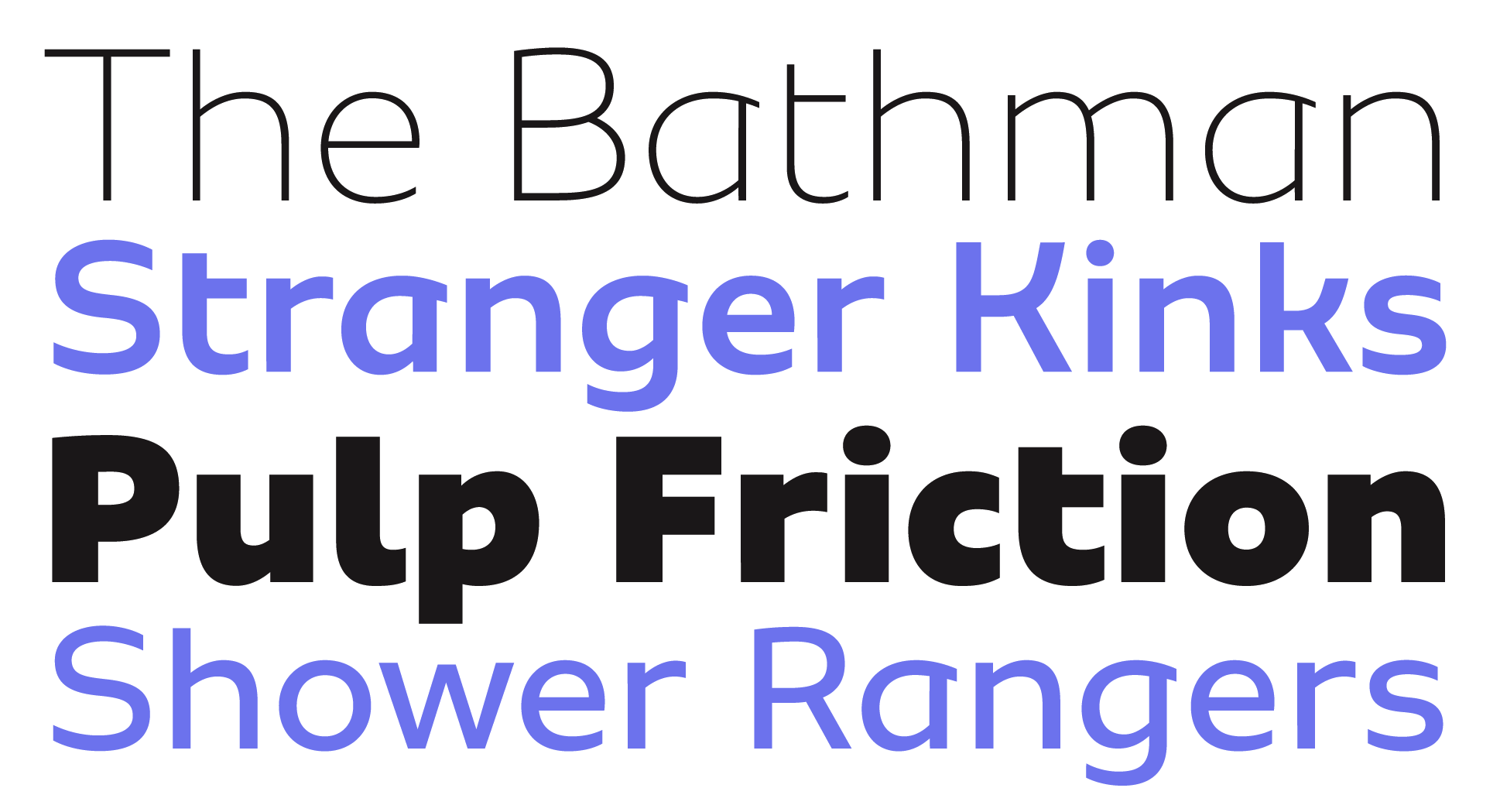
file name: Fabio Haag Sua 2017c
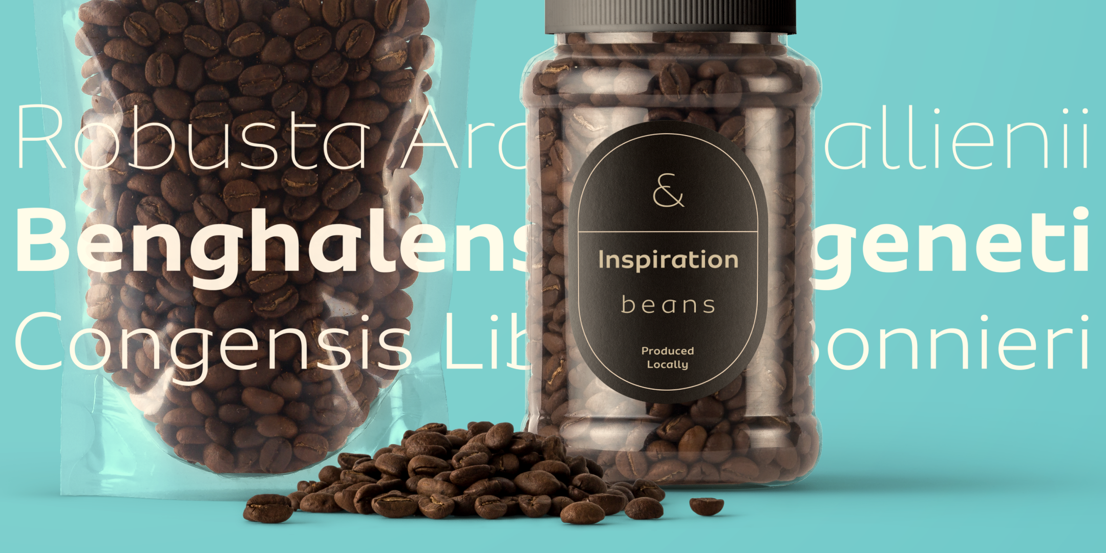
file name: Fabio Haag Sua 2017f

file name: Fabio Haag Sua 2017g

file name: Fabio Haag Lembra Variable 2019
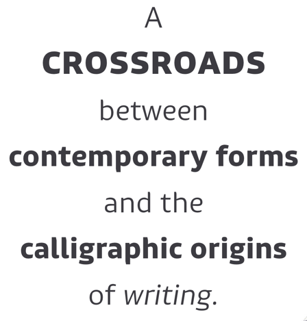
file name: Fabio Haag Type Lembra 2016 220199

file name: Fabio Haag Type Lembra 2016

file name: Fabio Haag Lembra 2017

file name: Fabio Haag Lembra 2017b

file name: Fabio Haag Lembra 2016
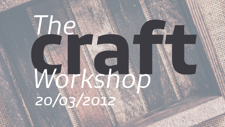
file name: Fabio Haag Lembra 2016b
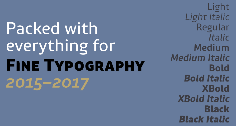
file name: Fabio Haag Lembra 2016c
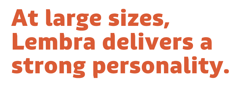
file name: Fabio Haag Lembra 2016d
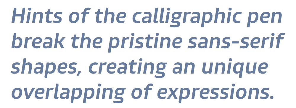
file name: Fabio Haag Lembra 2016e

file name: Fabio Haag Lembra 2016f
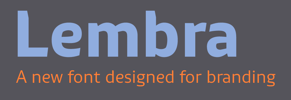
file name: Fabio Haag Lembra 2016g
file name: Fabio Haag Pic

file name: Fabio Luiz Haag Lukas Paltram Cordale 2008b
file name: Fabio Luiz Haag Lukas Paltram Cordale Bold 2008
file name: Fabio Luiz Haag Lukas Paltram Cordale Corp 2008

file name: Fabio Luiz Haag Dalton Maag Cordale Arabic 2013

file name: Fabio Luiz Haag Dalton Maag Cordale Arabic 2013b
file name: Fabio Luiz Haag Dalton Maag Cordale Arabic 2013c

file name: Fabio Luiz Haag After 2006
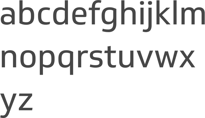
file name: Dalton Maag Soleto 2014
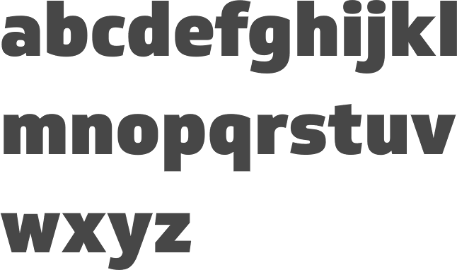
file name: Dalton Maag Soleto Black 2014
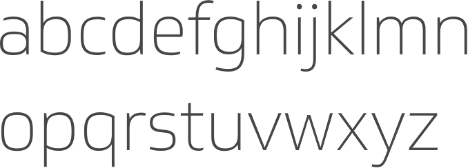
file name: Dalton Maag Soleto Thin 2014
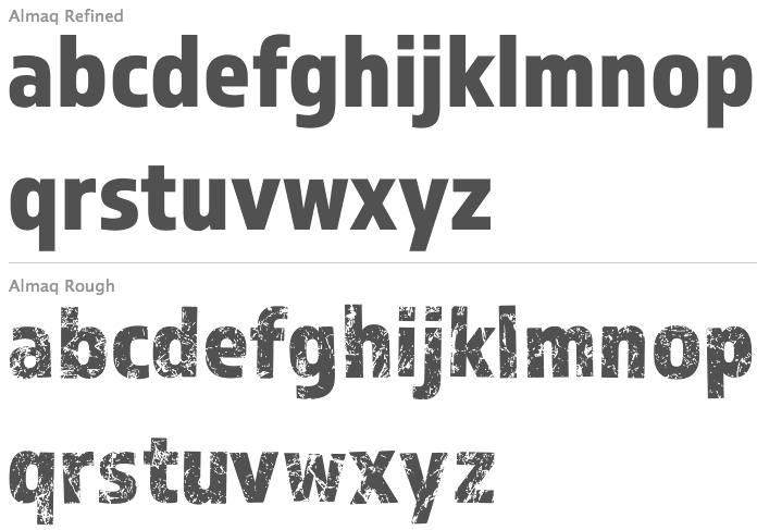
file name: Fabio Luiz Haag Almaq 2013
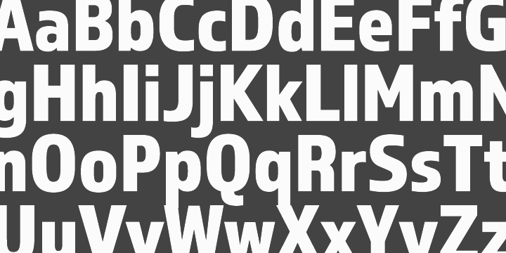
file name: Fabio Luiz Haag Almaq 2013b
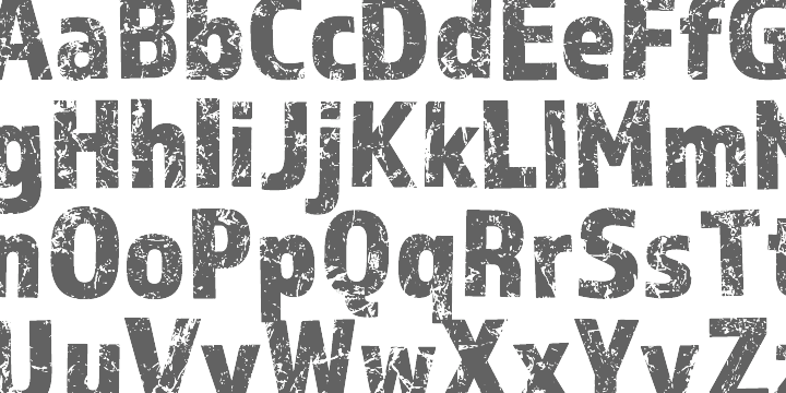
file name: Fabio Luiz Haag Almaq 2013c
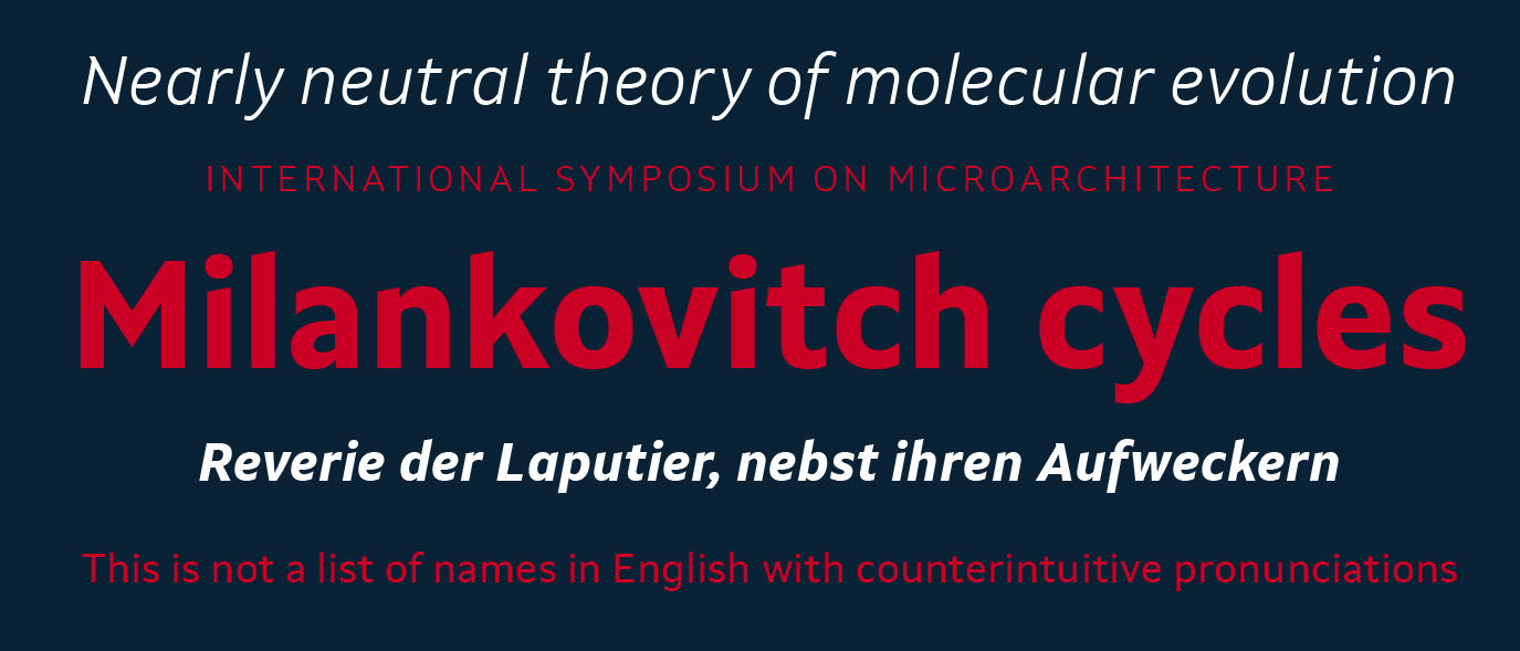
file name: Dalton Maag Setimo 2015 186503
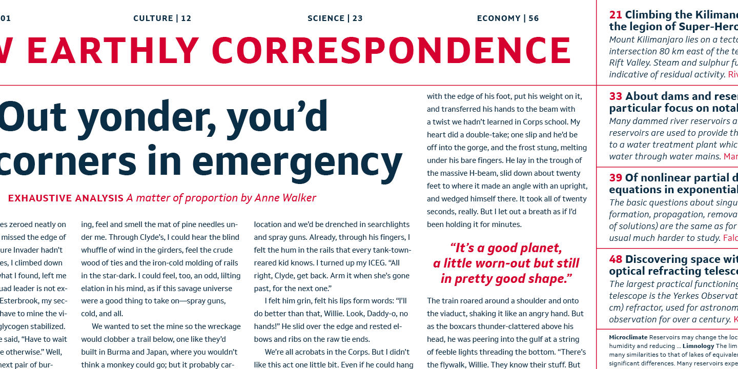
file name: Dalton Maag Setimo 2015 186504
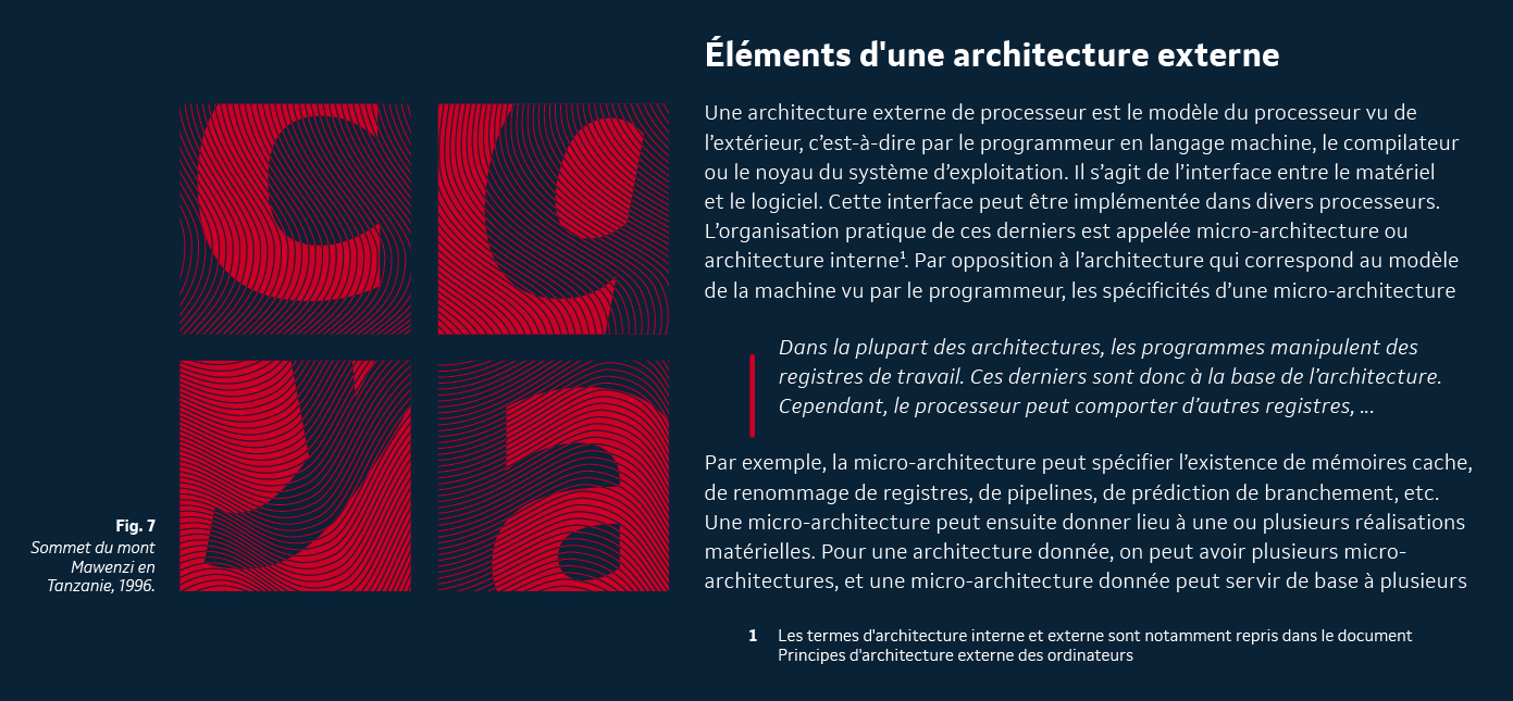
file name: Dalton Maag Setimo 2015 186505

file name: Dalton Maag Setimo 2015 186506
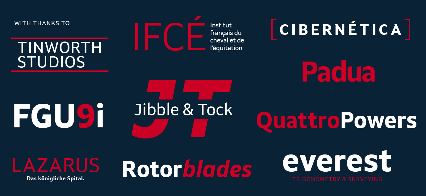
file name: Dalton Maag Setimo 2015 186507

file name: Dalton Maag Setimo 2015
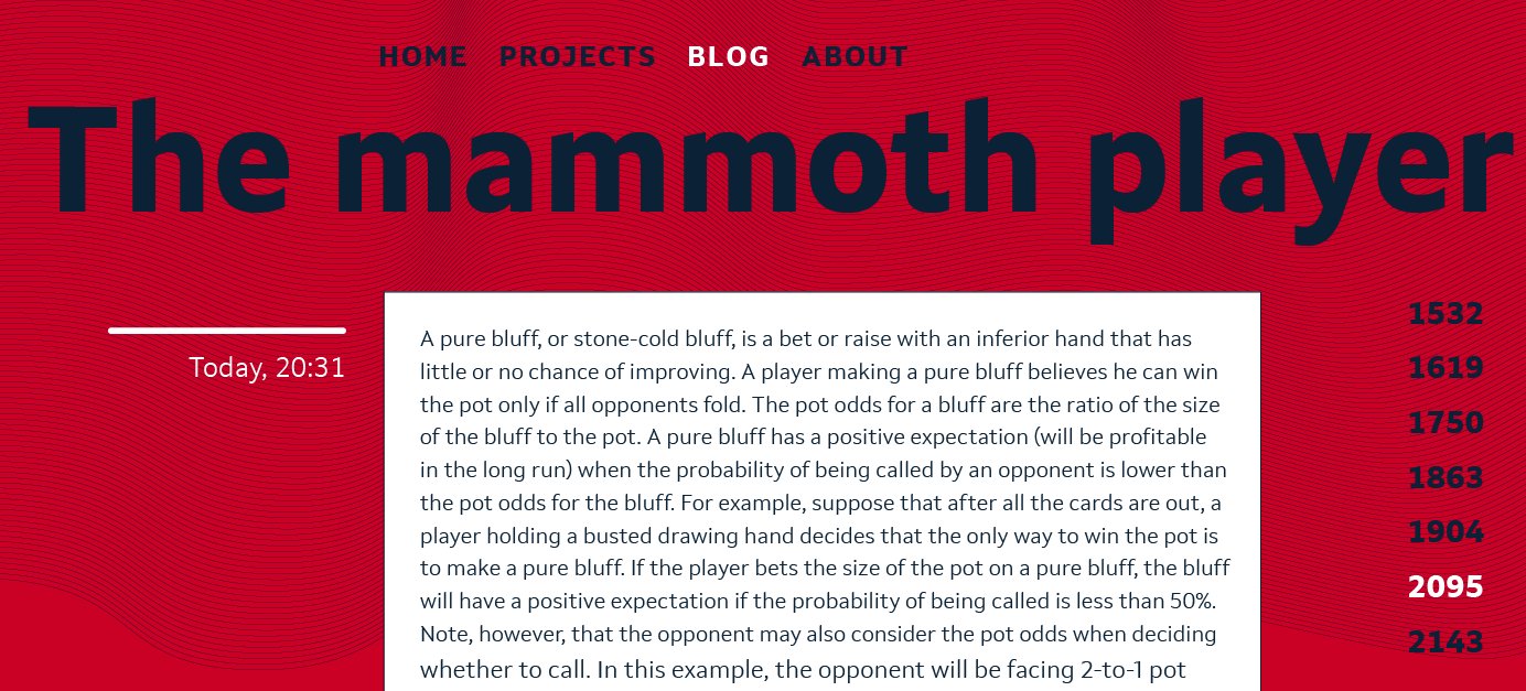
file name: Fernando Caro Setimo 2015 186508
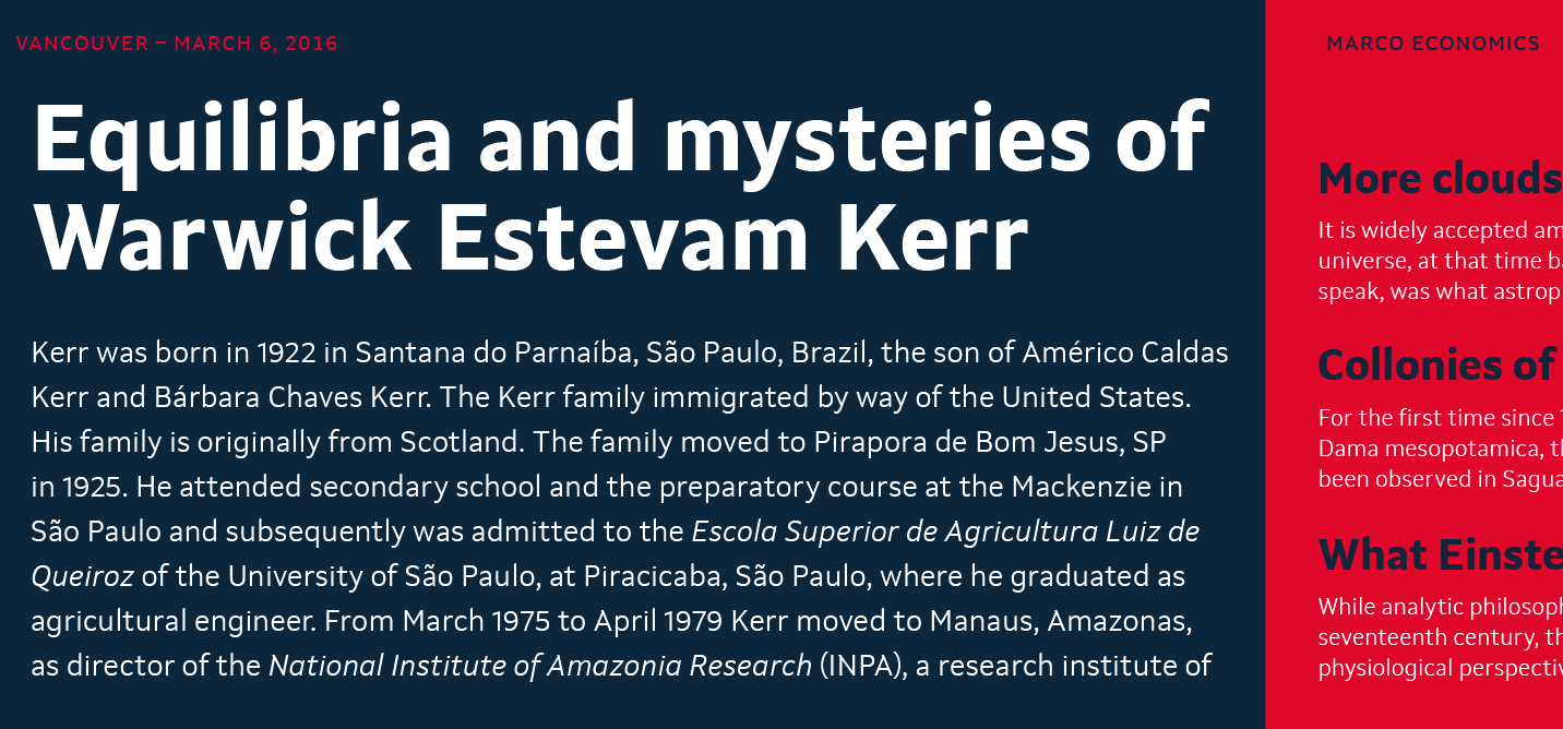
file name: Fernando Caro Setimo 2015 186509
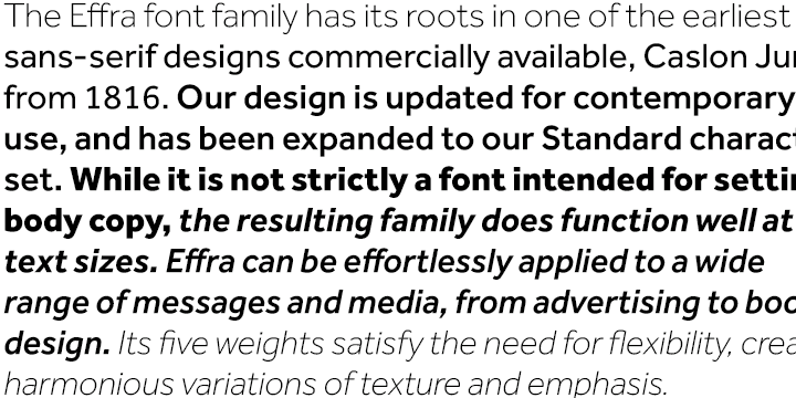
file name: Jonas Schudel Fabio Luiz Haag Effra 2007 2009
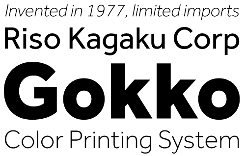
file name: Effra 2009

file name: Effra 2009b
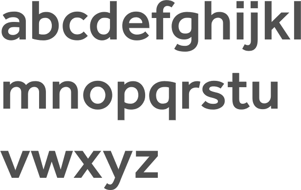
file name: Jonas Schudel Fabio Luiz Haag Effra Medium 2007 2009

file name: Jonas Schudel Fabio Luiz Haag Effra Corp 2013
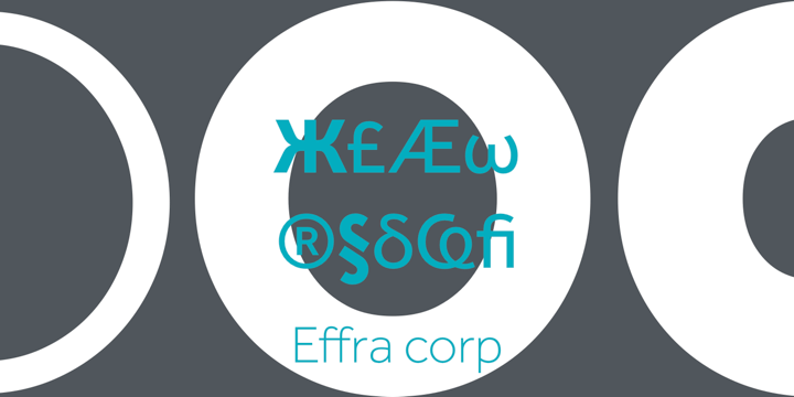
file name: Jonas Schudel Fabio Luiz Haag Effra Corp 2013b

file name: Jonas Schudel Fabio Luiz Haag Effra Corp Bold 2013

file name: Jonas Schudel Fabio Luiz Haag Effra 2007 2009 Poster by Bill Dawson 2015

file name: Fabio Luiz Haag Foco Corp Black 2007
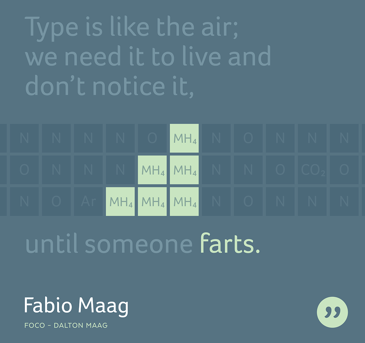
file name: Fabio Luiz Haag Foco 2007 Poster by Bill Dawson 2015
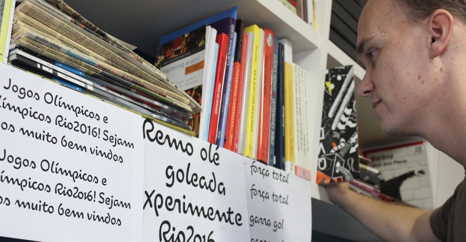
file name: Dalton Maag Fabio Haag Rio2016 2012

file name: Dalton Maag Fernando Caro Rio2016 2012
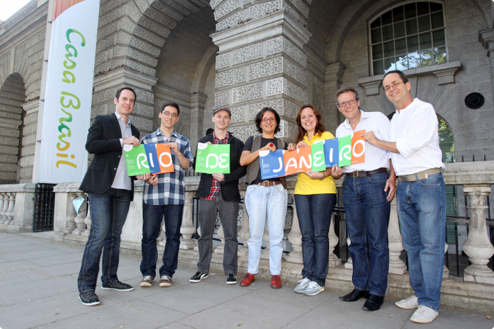
file name: Dalton Maag Team Beth Lula Rio2016 2012
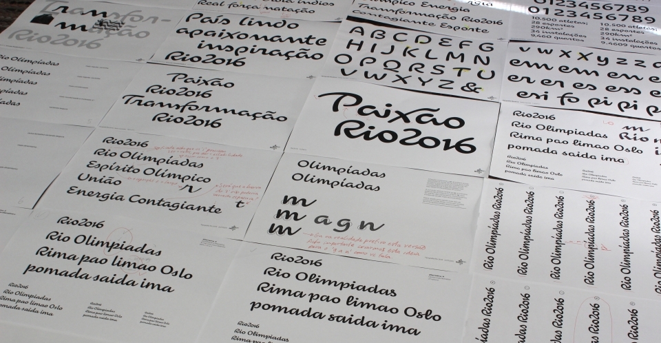
file name: Dalton Maag Rio2016 2012

file name: Dalton Maag Rio2016 2012b
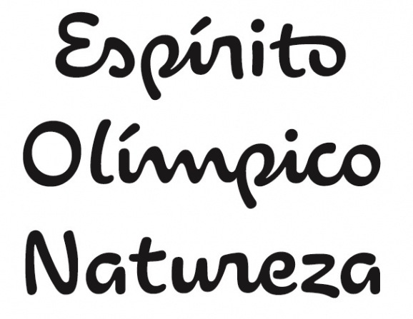
file name: Dalton Maag Rio2016 2012c
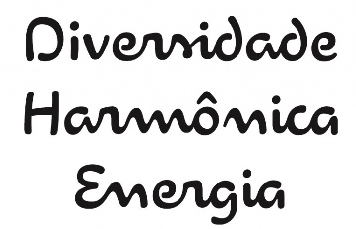
file name: Dalton Maag Rio2016 2012d
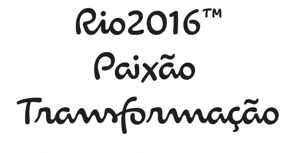
file name: Dalton Maag Rio2016 2012e
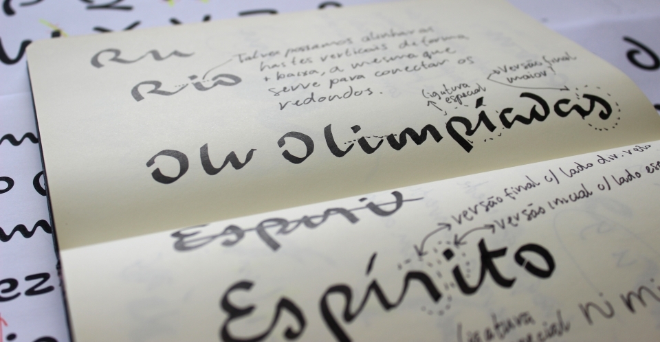
file name: Dalton Maag Rio2016 2012f
file name: Rio2016 Logo

file name: Fabio Haag Pic

file name: Fabio Luiz Haag Pic
| | |
|
Luc Devroye ⦿ School of Computer Science ⦿ McGill University Montreal, Canada H3A 2K6 ⦿ lucdevroye@gmail.com ⦿ https://luc.devroye.org ⦿ https://luc.devroye.org/fonts.html |

