TYPE DESIGN INFORMATION PAGE last updated on Wed May 6 16:19:20 EDT 2026
FONT RECOGNITION VIA FONT MOOSE
|
|
|
|
Or Octavio Pardo Virto. Born in Pamplona, Spain, Octavio got his first degree in Fine Arts at the University of Barcelona. After several years working for various design studios and advertising agencies, he moved to UK where he graduated from the MA in Type Design at the University of Reading in 2010. After collaborating with the Typofonderie in Paris for several months, Octavio went back to Pamplona. His typefaces:
|
EXTERNAL LINKS |
| | |

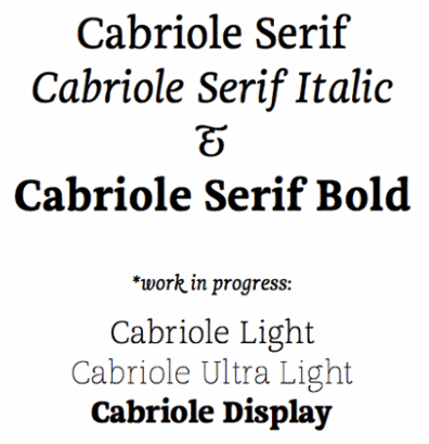
file name: Octavio Pardo Cabriole 2010

file name: Octavio Pardo Cabriole 2010b

file name: Octavio Pardo Cabriole 2010c

file name: Octavio Pardo Cabriole 2010d

file name: Octavio Pardo Cabriole Serif Roman 2010

file name: Octavio Pardo Cabriole 2011

file name: Octavio Pardo Cabriole 2011b

file name: Jose Maria Ribagorda Ibarra Real

file name: Jose Maria Ribagorda Ibarra Real 2007

file name: Jose Maria Ribagorda Octavio Pardo Ibarra Real 2007

file name: Jose Maria Ribagorda Octavio Pardo Ibarra Real Italic 2007

file name: Jose Maria Ribagorda Octavio Pardo Ibarra Real Semi Bold 2007

file name: Jose Maria Ribagorda Octavio Pardo Ibarra Real Nova 2019

file name: Jose Maria Ribagorda Octavio Pardo Ibarra Real Nova 2007

file name: Georg Duffner Octavio Pardo E B Garamond Semi Bold 2017

file name: Octavio Pardo Elena Ramirez Cubit 2016

file name: Octavio Pardo Elena Ramirez Cubit 2016b

file name: Octavio Pardo Modular Infotech Gupter 2000 2018

file name: Octavio Pardo Modular Infotech Gupter 2000 2018

file name: Octavio Pardo Modular Infotech Gupter 2000 2018

file name: Octavio Pardo Myth 2016

file name: Octavio Pardo N R K Ethica Slab 2016

file name: Octavio Pardo N R K Ethica Slab 2016b

file name: Octavio Pardo Typeface 2016

file name: Octavio Pardo Sutturah 2011b

file name: Octavio Pardo Sutturah 2011c

file name: Octavio Pardo Sutturah 2011

file name: Octavio Pardo Sutturah 2011d

file name: Octavio Pardo Sutturah 2011d

file name: Octavio Pardo Sutturah 2011e

file name: Octavio Pardo Sutturah 2011f

file name: Octavio Pardo Blackwood 2011

file name: Octavio Pardo Terabyte 2011

file name: Octavio Pardo Adelle Cyrillic 2013

file name: Octavio Pardo Pic

file name: Octavio Pardo Pic

file name: Octavio Pardo Pic
| | |
|
Luc Devroye ⦿ School of Computer Science ⦿ McGill University Montreal, Canada H3A 2K6 ⦿ lucdevroye@gmail.com ⦿ https://luc.devroye.org ⦿ https://luc.devroye.org/fonts.html |


