TYPE DESIGN INFORMATION PAGE last updated on Wed May 6 16:20:01 EDT 2026
FONT RECOGNITION VIA FONT MOOSE
|
|
|
|
The Garamond mess
The choice of Garamonds is confusing, and so is the name Garamond when associated with typefaces. In fact, the most faithful of all garamonds is not even called Garamond. So, here is a brief overview.
|
EXTERNAL LINKS |
| | |

file name: Monotype Garamond Italic

file name: Monotype Garamond Roman

file name: Monotype Garamond Std Italic

file name: Monotype Garamond

file name: Monotype Garamond Poster by Luciana Job 2015

file name: I T C Garamond Poster by Evgenia Skalyha 2015

file name: Tony Stan I T C Garamond 1976

file name: Tony Stan I T C Garamond Book 1977

file name: Tony Stan I T C Garamond 1976

file name: Tony Stan I T C Garamond Light 1977

file name: Tony Stan I T C Garamond Narrow Ultra 1977
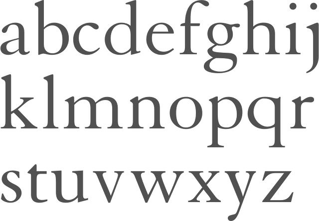
file name: George William Jones Chauncey H. Griffith Linotype Granjon 1928 1930

file name: Jan Tschichold Sabon M T 1966

file name: Jan Tschichold Sabon 1964 1967 Poster by Pamela Cruz 2017

file name: Jan Tschichold Sabon 1964 1967 Poster by Madeleine Teh 2017

file name: Linotype Stempel Garamond after Stempel Stempel Garamond 1925

file name: Linotype Stempel Garamond after Stempel Stempel Garamond 1925 3
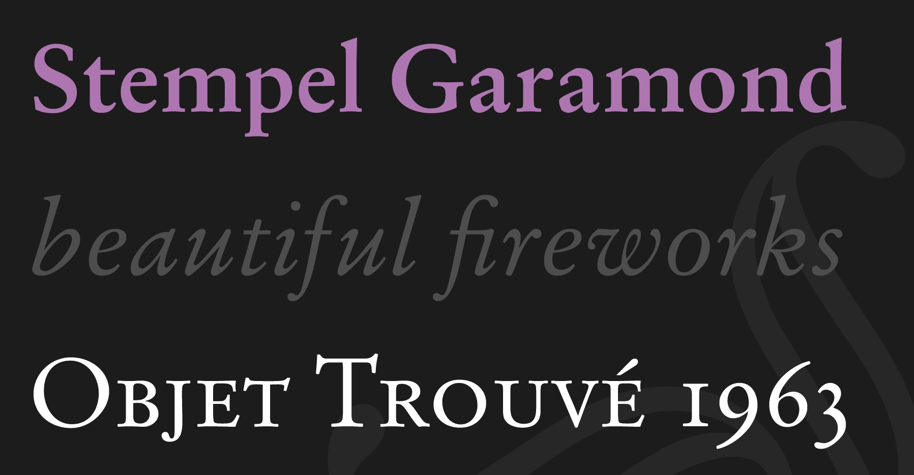
file name: Linotype Stempel Garamond after Stempel Stempel Garamond 1925

file name: Stempel Stempel Garamond 1925 Poster by Karin Thompson 2016

file name: Stempel Garamond 1925 1936
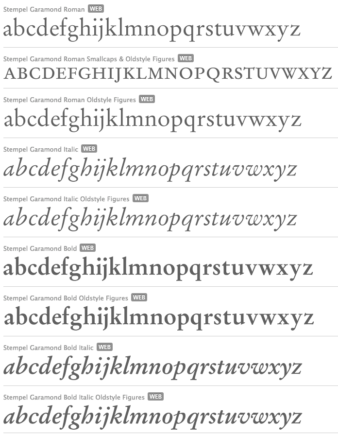
file name: Stempel Garamond 1925 1936 Stempel Garamond 1925 1936
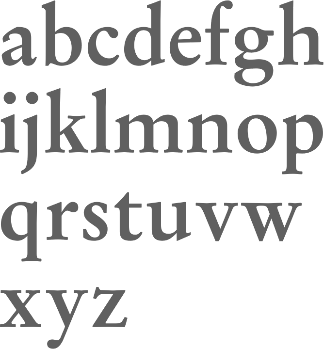
file name: Stempel Garamond 1925 1936 Stempel Garamond Bold 1925 1936
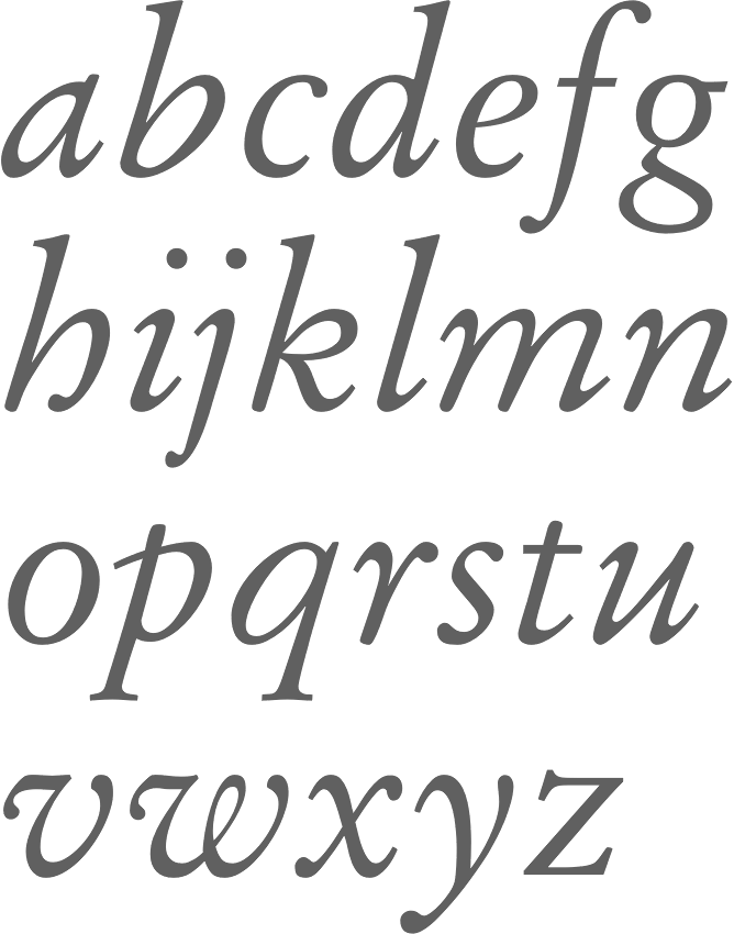
file name: Stempel Garamond 1925 1936 Stempel Garamond Italic O S F 1925 1936
| | |
|
Luc Devroye ⦿ School of Computer Science ⦿ McGill University Montreal, Canada H3A 2K6 ⦿ lucdevroye@gmail.com ⦿ https://luc.devroye.org ⦿ https://luc.devroye.org/fonts.html |

