| | |
Achaz Reuss

|
 In house type designer at Elsner&Flake. He designed an elegant high-contrast art deco display typeface Miami EF in 1994, the broken black lettering typeface EF Splitter, the horizon lettering typeface EF Eastside in 1995, and Nivea in 2000 (for Beiersdorf).
 Designer of the Bank Gothic style gaspipe sans family FF QType (2004, FontFont) in Condensed, Compressed, Extended, SemiExtended and Square versions. In 2007, he created Bodoni Stencil (URW++). Other URW creations include Latin, Nimbus Roman Modern Compress, URW Compress and URW Oklahoma (art deco). In 2022, FontFont released FF DIN Stencil (by Albert-Jan Pool, Achaz Reuss and Antonia Cornelius) and its variable sidekick, FF DIN Stencil Variable. FontShop link. Klingspor link. Linotype link. Catalog of his typefaces. [Google]
[MyFonts]
[More] ⦿
|
Adem Tas
|
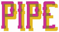 Konya, Turkey-based designer of the pixelish typefaces Admtas (2017) and Incomplete (2017), and the water or gas pipe typeface Pipe (2017). [Google]
[More] ⦿
|
Aldo Novarese

|
 Italian designer, 1920-1995, who designed most of his typefaces at Nebiolo in Turin. Until 1975, he made about 30 families at Nebiolo, and after 1975, he produced about 70 further families of fonts. With weights included, he created about 300 fonts. Biography by Sergio Polano. He was very influential, and wrote two important books, Alfa Beta: Lo Studio e il Disegno del Carattere, a study on font design and history (1964), and Il Segno Alfabetico (1971). Essay by Sergio Polano on Novarese. The list of fonts done at Nebiolo:
 - Landi Linear (1942). This was revived in digital form in 2011 by Toto as K22 Landi Linear.
- Etruria (1940-42)
- Express (1940-43)
- Normandia (1946-49, with Butti, and 1952)
- Athenaeum Initials (with A. Butti, 1945-1947)
- Fluidum (+Bold) (1951, script). Revived by Ralph Unger as Butti (2011).
- Fontanesi (1951-54, an all caps rococo font). Digital revivals include Fontanesi RMU (2018, Ralph M. Unger) and Fontanesi (2003, a free font by Frogii).
- Microgramma (1952, with A. Butti; available at URW++). This was done as an alternative to Bank Gothic, and is identical to Eurostile Bold Extended.
- Nova Augustea (1951, ITC Augustea Open)
- Egizio (1953-57), a slab serif [see E710 Roman on the SoftMaker MegaFont XXL CD, 2002, or Egizio URW (2009, quite complete family with 5 styles) or Egizio EF (2001), or Thierry Gouttenègre's Aldogizio (2013)]. For a specimen, see here.
- Cigno (1954). This script typeface was revived an extended as P22 Cigno (2008, Colin Kahn, P22).
- Swan (1954), aka Cigogna (with A. Butti).
- Juliet (1954-55). For a superb revival and extension of this copperplate script, see Canada Type's Ambassador Script (2007).
- Ritmo (1955)
- Rhythm (1955)
- Garaldus (1956-ff). A garalde digitally revived in 2012 as Garaldus by Flanker.
- Slogan (1957). Digital revival by Terry Wudenbachs in 2010 called P22 Slogan.
- Recta (1958-1961). This is a large sans family. Canada Type published an 18-font revival in 2011, also called Recta.
- Estro (1961). A western font now found in the Mecanorma collection.
- Fancy (1961)
- Exempla (1961). Published by VGC in 1966. Third Prize in the 1966 VGC National Type Face Design Competition.
- The Eurostile family (1952: caps, with Alessandro Butti; 1962: lower case). This is carried by many foundries such as Adobe, Linotype, and URW++. Eurostile lookalikes include Aldostile (Autologic), ES (Itek), Eurasia (SoftMaker), Eurogothic, Eurostar (MGI Software), Eurostile, Eurostile Next (Akira Kobayashi), Gamma, Jura (Daniel Johnson), Microgramma, MicroSquare (SoftMaker), Microstyle (Compugraphic), NuevoSolStile (Cayo Navarro), SD Eurostile Elite (Justin Rotkowitz), Square 721 (Bitstream), Waltham. Noteworthy is Eurostile Round (2014), a rounded version of Eurostile by URW++.
- Patrizia
- Magister (1966)
- Forma (1966). Alessandro Colizzi explains: From 1965, following a marketing-oriented approach focused on the user, the management set a research group of graphic designers to work on a new typeface design. Headed by Novarese, who provided the basic alphabet, the team included Franco Grignani, Giancarlo Iliprandi, Till Neuburg, Ilio Negri, Pino Tovaglia, Luigi Oriani, and Bruno Munari. The collective design process was based on an analysis of contemporary sanserif typefaces and legibility tests, to develop a more mature, humane interpretation of the Swiss sanserif trend. The process was quite laborious with monthly meetings spanning across over two years. In 1968, Forma was eventually released as lead type. As its name implies, Forma aimed at representing the ideal letterform of its time, equally appealing to designers, printers and the general public. The typeface was favourably received by the design community (it won a special mention at Compasso d'oro in 1970), but although initial sales were encouraging, it could not really compete in a market already saturated by Univers, Helvetica and the like. . A grand revival of Forma, described by Indra Kupferschmdt, was organized by Roger Black for Hong Kong Tatler (as fashion mag). The revival was executed by Font Bureau's David Jonathan Ross in 2013. See David Jonathan Ross's site.
- Oscar (1966)
- Lambert (Compacta lookalike)
- Metropol (1967). This gaspipe typeface was digitized by Patrick Griffin at Canada Type in 2007 as Press Gothic. Originally, it was meant as an alternative to Geoffrey Lee's Impact at Stephenson Blake.
- Elite (1968, a boring linear script, digitized in 2005 by Canada Type as Fontella)
- Fenice
- Stop (1971; available at Mecanorma, Linotype, URW++, Elsner&Flake)
- Dattilo (1974, an Egyptian face) (1974): his last creature for Nebiolo, a typewriter type. It was considered as a slab serif companion of Forma. This typeface was revived as a variable font in 2020 by David Jonathan Ross.
His post-Nebiolo fonts: - Primate (1972), for AG Berthold. For a digital revival of this wedge serif, see Luca Terzo's Noctis (2020).
- Sintex 1 (VGC, 1973). A revival and expansion of this funky nightclub typeface was done in 2008 by Patrick Griffin at Canada Type as Stretto (2008).
- Sprint (1974). A script typeface. Digital versons: Sprint (Linotype), Sprint (2019, SoftMaker).
- Bloc (1974, VGC)
- Mixage (1977 Haas, a lineal font, now ITC Mixage) 1985?
- Novarese Book (1978, now ITC Novarese Book)
- Lapidar (1977)
- Andromeda (1978, VGC)
- Global (1978, VGC)
- Fenice (1977-80; now ITC Fenice)
- Expert or Expert Haas (1982-1983). At Haas'sche Typefoundry.
- Floreal Haas (1983). A decorative and slightly wavy serif published by Haas'sche Schriftgiesserei.
- Colossal (1984); see Colossalis at Berthold, a slab serif sports lettering family)
- Stadio (1974). A reverse contrast sans that was published only as a rub-on transfer typeface. Revived in 2020 by the Zetafonts team as Stadio Now.
- Symbol (1982-1984, now ITC Symbol)
- Arbiter (1989, Berthold)
View Aldo Novarese's typefaces. [Google]
[MyFonts]
[More] ⦿
|
Alexey Popov
[Popskraft Lab]

|
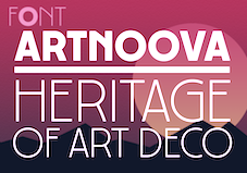 [MyFonts]
[More] ⦿
|
Alif Ryan Zulfikar
[Sakha Design]

|
[MyFonts]
[More] ⦿
|
Alison Argento
[Dear Alison]

|
 [MyFonts]
[More] ⦿
|
Andrew McCluskey
|
 Independent game developer Andrew McCluskey (NAL Games, Dundee, Scotland, b. 1991) published hundreds of free typefaces before 2015 under the NAL label. In 2015, Andrew McCluskey, after becoming Allison James, joined forces with Daniel Johnston and set up Chequered Ink in bath, UK. They live in Newport, Wales. Andrew's pre-merger fonts are listed here.
 Andrew McCluyskey designed the free LED-inspired Kinglify (2011), Digital Display (2012), and Princelify (2011). Manly Man (2011), Metal Arhyrthmetic (2011) and Ace Futurism (2011) are semi-octagonal. Consider Me Vexed (2011) and Pixel Flag (2011) are pixel typefaces. In 2012, he made She Curls in the Mist, Xero's Karma, Pastcorps (army stencil), Gnome Splinters, Fought Knight, Vermin Vibes (futuristic), Vermin Vibes 1989 (pixel face), Vermin Vibes 2, Vermin Vibes 3 (2014), Vermin Vibes Diet, Vermin Vibes Redux, Dubbing Star (futuristic), Sorrier Statements, Particulator (an octagonal paper fold typeface), Coder's Crux (a pixel typeface created for programmers, FontStruct), Triggering Fanfares (octagonal), Alt West, Notalot25 (pixel face), Notalot35 (pixel face), Lord Juusai (inspired by the logo for Lord Tensai from WWE), Zephyr Jubilee (an alien language simulation typeface), Bevel Fifteen, Xero's Theorem (sci-fi), Sawchain (2012, FontStruct), Dubbing Step and Here Be Dubstep (FontStruct), Italic Bricks, Gang Wolfik (angular, +Blade), Ruaturecu, Quous Inno, Electramaniacal, Xodohtro-Nu (a black octagonal typeface), Distortion of the Brain, Berate the elementary (techno face), Not sure if weird or just regular, Opulent Fiend, Rawhide Raw 2012 (techno, inspired by the WWE Raw logo of 2012), Particulator II (octagonal), The Missing Link (trekkie), Thunderstrukk, Understrukk, Ganf Wolfik Blade (a pointy Blade style font). Typefaces made in 2013: Call of Ops Duty, Spinebiting, Laceration, Casual Hardcore, Zany Races, Vermin Vibes 2 Nightclub, Exoskeleton, Perspire, Piston Pressure (sans), Particulator III, Liberty City Ransom (grunge), Zdyk Leo, Variety Killer (grunge), Savantism, Vermin Vision, Zdyk Sagittarius (a circle-based experimental font), Milestone One (a gaspipe sans), Comfortably Fucked, Noasarck (+Sporadico, +Quattro), Future Time Splitters, Heart Breaking Bad, Jan Hand, Erhank, Exoskeleton, The Rave Is In Your Pants, Minecraft Evenings (inspired by the Minecraft logo), FoughtKnight Victory (a video game font), Piescese, Comic Spans, Cauterise, Dead Font Walking (rough-edged poster font), Cutthroat Clawmarks, Eride (grunge), Effervescent Superbeings, Front Page News, Kill The Noise (brush script), Distort You A Lesson (grungy), Vermin Vibes 2 Black, Vermin Vibes 2 White, Vermin Vibes 2 Soft, Dubstep Cadence, Relapse Into Madness, Kings of Kings Lynn (dadaist), Smorgasbord, Scream When You'Re Ready, I Phone You Phone, Respire, Perspire, Vermin Vibes Slant, Sharp, Cursivertex, Rick Lobster (stencil face), Cursivertex, Vermin Vibes Dystopia (cyberpunk), Wabbit Sans, Calligraphy Aquiver, Agra Axera (knife-edged sci-fi face), The Keepsake Days, See You At The Movies, Xero's Proof, Vermin Vibes Out Of Ink (textured), Melancholic Roadeo, Wickermanor (a stiletto typeface), Lord Juusai Rises, Vermin Vibes Ex, Vermin Vibes Roundhouse, Just in the Firestorm, Stuntcroft (modular), Ghetto Magnetic (grunge), QA Reports (fat finger typeface), Y-Andermo (stiletto style), Dragon Slapper. Typefaces from 2014: Man Flu (FontStruct), Zany Races, Big Quicksand, Modern Caveman, Alpha Sapphire (a Pokemon typeface), Omega Ruby (a Pokemon typeface), Schweiz, Beta (FontStruct), Jawbreaker (FontStruct), Tomorrow Wind, Embezzler, Royal, Final Gambit (grungy athletic lettering), NAL Hand, Fingbanger, Dont Waste That Napkin (squarish font), Bold Testament, Cisgender, NonchalantLove, Grelsey Kammar (sic), Valiant (stencil), Anger Management, Italipixel, Ultramarine, Nero (sci-fi font), Bamboozler, Seriffic, High Jinks, Iregula (sic), LNR Phonetic Alphabet, Primary School, Playtime (3d face), Electromagnetic Lungs, Node to Nowhere, Alienated (trekkie font), Questrian, Scars, Da Se Nei (art deco), Dance Floor (dot matrix face), Edge Cutting, Lord Juusai reigns, Superpower Synonym (fat brush), Fought Knight Die (techno), The Thrill of the Kill, Lay of the Land, Deavantgar (art deco), Confidel, Fight Night, Comeback of the Damned, Vermin Vibes Corrupto, Chandstate, Scars, Bustin Jieber (pixel typeface), A Dash of Salt, Come Rain or Fall, Xsotik, Sanseriffic (avant-garde sans), Cassius Garrod, Effortless Tattoo, Coder's Crux 2, Radaro, Overdrive Sunset (brush face), Dead CRT, Fatality's Edge, Tolerant, Coder's Crux 2 (dot matrix), Consider Me Vexed (pixel face), Diamante, Pixel Flag, Aardvark CWM Type, Enter The Grid, Vermin Vibes 2 EDM XTC, Byron, See You at the Movies 2, And Then It Ends, God Hates Westboro, Writing Without Ink, Zdyk Aquarius, Curvert, Superdie, Rocky Road, Animal Silence (constructivist), Gnaw Hard, 19th Century Renegade, Trip Trap, Freudian Slit, Digital Dismay (LED face), Zdyk Pisces (circle-based typeface), Zdyk Scorpio, Guilty Treasure (techno), Wolfganger (inspired by Wolfgang Gartner), Xero's Retreat, Sitdown (octagonal), Stencylette, No More Justice (blackletter), Masterblast (sci-fi), Kesha (sci-fi), Primal Dream, Grandma's Television, Keyboard Warrior, Foughtknight, Blissful Thinking, Positive Reinforcement, The End of Days. Typefaces from 2015: This Sucks (pixel font), Front Page Neue, Vermin Vibes Mert, Rock Elegance, Stripes. Typefaces from 2016: Enter The Grid, Fill In The Gaps, FoughtKnight, Grunge Tank, Alt West. Dafont link. Most of his typefaces were made using FontStruct, where he is known as NAL or Notalot. Fontspace link. [Google]
[More] ⦿
|
Anthony Bowe
[Geronimo Fonts (or: Paradox Fontworks, or: Typewire Studios)]
|
 [More] ⦿
|
Associated Typographics (or: Public Type)
[Michael Cina]

|
 Head of Cina Associates, Michael Cina (Minneapolis, MN), has started many a typographic and graphic design enterprise in his long career. Associated Typographics was founded in 2012.
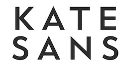
 Typefaces from 2012 include the gas pipe modular typeface family Ramsey, which was followed in 2015 by Ramsey Condensed and in 2021 by an updated version of Ramsey to a 54-style rounded squarish typeface. In 2013, he published the eight-style bold geometric stencil family Skol, and created the custom sans typeface family Matterhorn with Matthew Desmond for Disney. In total, Cina made nine custom typefaces for Disney in 2013. In 2014, he published the squarish sans family Ramsey. In 2015, he published Atelier (octagonal), Reileta and Stadt. Also in 2015, he designed the custom sans typeface Kate Sans for Kate Spade in New York. Typefaces from 2016: YWFT Roamer. Typefaces from 2018: Query (2018). A sans family that is insired by civil rights posters from 1968. Typefaces from 2020: Ghostly Gothic. Klingspor link. Additional URL. Behance link. [Google]
[MyFonts]
[More] ⦿
|
Bagerich Type Foundry (was: Zealab Fonts Division, Zea Fonts, Zea Lab, Zeaspace)
[Reza Rasenda]

|
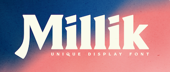 Founded in Bandung, Indonesia in the middle of 2019 by graphic designers Reza Rasenda (b. 1993) and Riska Chandra Dewi, Zealab Fonts Division specializes in and is inspired by urban culture, luxurious brands and street posters. Reza Rasenda designed these typefaces in 2020: Crenzo (a free sci-fi typeface), Pherome (a fashion-conscious display serif), Arguman (an aerodynamic or speed font), Oldblue (an interlocking retro font), Digitany (pixelized), Ethique, Brightfate (with Riska Candra Dewi; a sharp-edged typeface that conjures up images of a guillotine), Bagerich (an art nouveau genre display typeface by Reza Rasenda and Riska Candra Dewi), Digitany (pixelish), Rigeko (a refreshing display typeface), Chillion (in the heavy rounded serif genre), Anglestein (a sans inspired by retro car and amplifier lettering), Millik (a sturdy angular poster typeface), Bellinzo, Shirens, Roundlane, Oldblend (a 4-style circle-based sans family, possibly renamed Oldblue), Richson (a sans inspired by pop punk, rock, hardcore music and skateboarding), Airbolt (a futuristic racing font), Roseford (a display typeface), Qultiva (a display typeface), Ethique, Hochland (tall, condensed, urban), Rodenberg (a beer bottle font), Aveline (a display serif), Quilla, Monschone (a fashion mag sans in one style).
 Typefaces from 2021: Neima (a decorative serif), Nagoda, Chuten (a display typeface), Ephidona (a decorative serif), Claycozoa (an intestinal typeface), Elgista (incised and hipsterish, with mostly trapezoidal stems), Amovand (a decorative serif), Willton, Olieva, Waffold, Bogam (a great free black display font), Voca (brutalist, in their view), Gover (a gaspipe sans, +stencil), Agne (a decorative serif). Typefaces from 2022: Vifellia (an experimental condensed display serif, in which the left side serif is curved and the right side serif is straight). Type Department link for Zealab. Type Department link for Bagerich Type Foundry. Typefaces from 2022: Guffonia (a hyper-decorative hipster typeface), Baunk (futuristic). [Google]
[MyFonts]
[More] ⦿
|
Bo Berndal
[T4 Typography AB]

|
[MyFonts]
[More] ⦿
|
Bomparte's Fonts
[John Bomparte]

|
 Bomparte's Fonts is John Bomparte's (b. Port of Spain, Trinidad, 1959) foundry in Wake Forest, NC. A graphic and type designer, John Bomparte was the assistant to, and a protege of renowned type designer Ed Benguiat, at the legendary Photo-Lettering Inc. It was there that John was surrounded by other great type designers such as Tony Stan, Vic Caruso, Vincent Pacella and Bob Alonso.
 John designed the art deco sans typeface Hamptons BF, and another art deco headline face, Take Two BF. In 2006, he published the 12-style family Blackletter Sans and the exquisite poster semi-Greek simulation art deco typeface Abstrak BF (modeled after a 1931 ATF font by Robert Foster called Abstract). In 2007, he surprises with the 1920s poster font Michelle BF, the hand-printed Brandy BF, its follow-up Johnny Script BF (2008), the quirky Freaky Frog BF, the dot matrix halftone effect font Subliminal BF, the frizzy Glow Gothic BF (2007), and the gorgeous swashy 3-style blackletter family Black Swan BF (2007). His 2008 typefaces: Jacky Sue BF (based on the hand of Jackie Geerlings), SoHo Nights BF, Hamburger Font BF (a rounded fat face), and the art deco sans serif typefaces Sidewalk Cafe BF (2008) and Hamptons BF (2 weights). Emerge BF (2009) is a flare serif inspired by Admiral, c.1900, from the Keystone Type Foundry. Freedom Writer BF (2009) is a connected handwriting script face. Danielle BF (2010) is hand-printed, based on the hand of Danielle Paradis. Factor BF (2010) is an electronic / futuristic / techno face. FingerSpeller BF (1994) is an American sign language typeface. Retroscript BF (2010) and Capistrano BF (2010) are beautiful connected scripts. In 2011, he added the fat felt tip pen typeface Sherbet BF and the funky rounded display typeface Dragonfly BF. In that same year, he published the stunted black wood type typeface Squat (BA Graphics, based on earlier work of or with Bob Alonso). Typefaces from 2012: Rockport BF (a gaspipe font inspired by 19th century wood types), Wilmington Script BF (an upright loopy connected script). In 2014, Seagrass BF, a connected script, and My Write Hand BF were published. Footloose (2015, BA Graphics) is a dynamic script typeface that was unfinished when Bob Alonso died. John Bomparte finished it. Typefaces from 2016: Shandy BF (a playful connected script). Typefaces from 2018: Petals BF. A flourished curvaceous ornamental didone. Typefaces from 2021: Between The Lines BF (a display typeface with some Super Veloz vibe). Klingspor link. Catalog of some of his commercial fonts. [Google]
[MyFonts]
[More] ⦿
|
Breauhare Fonts
[Harry Warren]

|
 Foundry created in 2006 by Virginia Beach, VA-based Harry Warren (b. 1961, Cape Charles). Digitization of the typefaces was initially done by Bob Alonso (of BA Graphics).
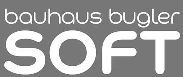
 MyFonts sells Cooper Goodtime (2007, inspired by the lettering used on the CBS-TV variety series The Glen Campbell Goodtime Hour (1969-1972)), Happy Trails (2007, based on the lettering (all upper case) that was used on most Trailways buses from 1936 through the very early 1960s), Jesus Saves (2008), Jesus Heals (2010), Neon Bugler (2008, a neon-light or paperclip font; digital help by John Bomparte; +Neon Bugler Squared), Future Bugler (2008), Future Bugler Upright (2010), Future Bugler Soft (2015, digitized by John Bomparte), Handmade Bugler (2009, digitized by John Bomparte), Southern Nights (2009, disconnected script), Scan (2010, a barcode-themed font), My Left Hand (2011), Minnesota Plaid (2011, a gaspipe family digitized by John Bomparte), Bauhaus Bugler (2013, digitized by John Bomparte: monoline Bauhaus style sans; compare with Qero Nite), Bauhaus Bugler Soft (2015), Fast Food (2014), Daddys Hand (based on Harry Warren's father's hand; digitized by John Bomparte), Chili Beans (2021: a Bauhaus-inspired wide grotesque with oval shoulders), and Dime Store (2007). Klingspor link. Showcase of Harry Warren's typefaces at MyFonts. [Google]
[MyFonts]
[More] ⦿
|
Daniel Feldt
[Great Scott]

|
 [MyFonts]
[More] ⦿
|
Darius Samek
[Elster Fonts]

|
[MyFonts]
[More] ⦿
|
David Suid

|
 Type designer from Santiago, Chile, who created the neo-humanist sans typeface family Hartwell (2017, W Foundry). Hartwell comes in 18 weights from thin to heavy and features matching italics.
 In 2018, he designed Armin Grotesk (W Foundry: it pays homage to Armin Hoffmann, one of the prominent designers in the Swiss genre). In 2019, he released Friends at W Foundry, a 14-style modern sans characterized by a gaspipe lower case f. Typefaces from 2020: Moncler (+Variable; a 22-style all caps modernist font family), Armin Soft. Typefaces from 2021: Cassius (a 10 style garalde family with two additional variable fonts; it is characterized by the lower case a and s which appear to be vomiting). Typefaces from 2022: Neue Magnus (an 11-style neo-grotesk at Without Foundry). [Google]
[MyFonts]
[More] ⦿
|
Dear Alison
[Alison Argento]

|
 Travel writer based in Cherry Hill, NJ. Designer (b. Augusta, ME, 1977) of the children's scribble font Urly Lurnin (2008), and of Smiley (2008, comic book face), and of the informal handwriting fonts Pickled Sans (2008), Slim Pickens (2008), Smokehouse (2008) and Gladly Mailed (2008).
 Bender Script (2008) is a brush script developed from an incomplete script drawn by Charles Chas Bluemlein. Barnstormer Script (2010) is a sign painter typeface. Gonte (2013) is a sketchbook script typeface. Saskya (2015) is a rough chancery script. Glade (2015) is a formal calligraphic copperplate script in five widths. In 2016, she designed the architectural lettering typeface Robard, the brush script typeface Beckford Script and the ballpoint pen script Generous Hospitality. Typefaces from 2020: Postale (a monoline gas pipe sans). [Google]
[MyFonts]
[More] ⦿
|
Dominik Krotscheck
[zum Egon]

|
 [MyFonts]
[More] ⦿
|
Elster Fonts
[Darius Samek]

|
German designer of: - Kontext Dot (2021). A halftone printing font. Still in 2021, this was followed by Kontext H and Kontext V (an experimental font family that plays with optical effects).
- Billund (2021). A textured marquee font emulating letters made with Lego pieces. Billund covers Latin, Greek and Cyrillic.
- The six-style gaspipe font Magpie (2021), which comes with additional stencil styles.
[Google]
[MyFonts]
[More] ⦿
|
Eric Pelletier
|
Designer of the gaspipe typeface Prototype (2021). [Google]
[More] ⦿
|
Frederick W. Lambert

|
British type and graphic designer who taught at the London College of Printing and headed Letraset. His typefaces: - LetterForm No. 2 (1953). See Letter Forms: 110 Complete Alphabets (by Fred Lambert, Dover, 1972; edited by Theodore Menten; 19 editions of that book were published between 1964 and 1990).
- Sans Stencil (1959).
- Compacta (1963, Letraset) is a super-condensed heavy industrial sans-serif family that can be used in phone directories, ads for airplanes, and masculine newspapers. It is in the gaspipe genre that descended from Schmalfette Grotesk, led to Haettenschweiler and Impact, and to Matthew Carter's masthead type for Private Eye. Compacta ended up in the digital as ITC Compacta and found its way to the Linotype collection, and by osmosis, to the Bitstream collection since 1990 (where the font took on a life as Swiss 930 and as Compacta Bold BT), and at Scangraphic in 2004 (as Compacta SH). Compacta's style was popular in the early 1960s: Rolling Stones albums such as Aftermath and 12x5 and The Who's I Can See For Miles either use Compacta or are in a similar style. It was in use on the cover of The Sexual Fetish (1965). It was also used as the titles and credits font for shows such as Emergency and The Six Million Dollar Man, as well as on-screen by NBC Sports from 1991 to 1995, and in the TV series Baywatch. It has been used by the Seattle Mariners Major League Baseball team since 1993. Compacta appeared as the logo typeface for World Wrestling Federation's television program SmackDown from 1999 to 2001.
- Annlie (1966, Letraset). A strong black didone typeface with beautiful numerals that later became an ITC font, ITC Annlie.
- Linear (1969, Letraset).
Linotype link. FontShop link. [Google]
[MyFonts]
[More] ⦿
|
GalloFonts (was: Graphics by Gallo)
[Gerald Gallo]

|
 GalloFonts is part of Graphics by Gallo, founded in 1974 by Gerald Gallo (b. Lucernemines, PA, 1941), and based in Bethesda, MD. The fonts: Bullish (squarish), Display Brutal Rough (2015), Display Black Serif Rough (2015), Pristine Light (2014: caps only squarish sans family), Display Pump (2014), Display University (2005, athletic lettering), Angulatte Light, Angulatte Medium, Angulatte Bold, Anniversary Seals (2003), Basic Bullets, Blooming Ornaments (2008), Brashee Regular, Brashee Bold, Calendar Font One, Calendar Font Two, Calendar Font Three, Carved Initials, Chiseled Initials, Cleancut, Dexterous (2010, art nouveau), Diamond Monogram - 2 Characters, Diamond Monogram - 3 Characters, Display Black Serif (2010, angular), Display Dots Five (2010), Display Dots Six (2010), Display Grungy (2010), Display Robust (2010), Dooddle, Embossed Shallow, Embossed Medium, Embossed Deep, GG Casual Light (2002, was Gallo Casula: hand printing family), GG Casual Medium, GG Casual Bold, GG Dingbats (was Gallo Dingbats, like Zapf Dingbats), GG Serif (1993, was Gallo Serif), Geometric Arrows, Geometric Ornaments, Gnarlee, Greetings, Home Sweet Home, Isometric Initial Caps - Bird's Eye View (1994), Isometric Initial Caps - Worm's Eye View, Isometric Ornaments, Jackolantern Assortment (2002) Just Bugs, Kruede Light, Kruede Regular (handwriting), Kruede Bold, Leaf Assortment (1994), Leaves Falling, Logotype, Magnificent Ornaments (2006, Victorian era decorations), Make Tracks (2002, animal footprints), Number Ornaments, Numbers 0-99 Style One - Circle Negative, Numbers 0-99 Style One - Circle Positive, Numbers 0-99 Style One - Diamond Negative, Numbers 0-99 Style One - Diamond Positive, Numbers 0-99 Style One - Square Negative, Numbers 0-99 Style One - Square Positive, Numbers 0-99 Style Two - Circle Negative, Numbers 0-99 Style Two - Circle Positive, Numbers 0-99 Style Two - Diamond Negative, Numbers 0-99 Style Two - Diamond Positive, Numbers 0-99 Style Two - Square Negative, Numbers 0-99 Style Two - Square Positive, Numbers 0-99 Style Three - Circle Negative, Numbers 0-99 Style Three - Circle Positive, Numbers 0-99 Style Three - Diamond Negative, Numbers 0-99 Style Three - Diamond Positive, Numbers 0-99 Style Three - Square Negative, Numbers 0-99 Style Three - Square Positive, Ornate Initials - Style One (2002), Ornate Initials - Style Two, Ornate Initials - Style Three, Pleasant Hand Light (2002) Pleasant Hand Medium, Pleasant Hand Bold, Precision, Rolling Ball Cursive, Serene (1993), Slender, Smiling Faces, Snowflake Assortment (1994), Snowflakes Falling (2001), Sport Numbers, Star Assortment (2002), Stature (2010, compressed sans), Swiss Folk Ornaments - Critters&Things, Swiss Folk Ornaments - Floral, Swiss Folk Ornaments - Geometric, Time Clocks, Woozee, Display Prominent (2005), Ultimate Ornaments (2005), Cross Ornaments (2005), Heraldic Creatures (2006), Victorian Leaf Ornaments (2006: great!), Quilt Patterns One (2007), Holy Ornaments (2007), Oriental Ornaments (2007), Gothic Initials One through Six (2007-2008), Interlaced Ornaments (2007), Modest Ornaments (2008), Art Nouveau Flowers (2008), Art Nouveau Ornaments (2008), Quilt Patterns Two (2008), Display Gothic (2008, blackletter), Plant Assortment (2008), Birds Flying (2009), Happy Go Lucky (2009, Victorian), Fish Fresh (2009), Display Dots One (2009, dot matrix face), Display Art Two and Three (2009, art nouveau alphabets), Display Dots Two Serif and Sans (2009, dot matrix typefaces), Display Dots Three Serif and Sans (2009), Display Dots Four Serif and Sans (2009), Display Robust (2010), Quilt Patterns Three and Four (both 2009), Gothic Initials (Seven, Eight, Nine: 2009), Carefreed (2009, a Halloween script?), Glorita (2009, casual condensed sans), Fancy Flowers (2010), Rectilinear Ornaments (2010), Display Brutal (2010, grunge), Cross Stitch Graceful (2010), Cross Stitch Regal (2011), Cross Stitch Formal (2010), Cross Stitch Discreet (2010), Cross Stitch Classic (2010), Display Dots Seven (2011), Cross Stitch Majestic (2011), Cross Stitch Elaborate (2011), Cross Stitch Medieval (2011), Cross Stitch Ornaments (2013), Display Squares One and Two (2011, gridded or dot matrix typefaces), Display Digits One through Seven (2011), Display Crisp (2012, octagonal), Blue on Blue (2012, shadow face), Green on Green (2012, 3d shadow face), White on White (2012), Orange on Orange (2012, a 3d shadow face), Victorian Ornaments (2012), Printers Plant Ornaments (2012, a floral typeface), Simple Ornaments, Numbers Style Three Diamond Positiv Regular (2012), Charisma (2013, inspired by the hand lettering used by draftsmen and architects), Display Explicit (2013), Display Uncanny (2013, unicase), Display Carlos (2013, a piano key typeface), Mighty Oaks (2013, stylized oak leaves), Sweet Hand (2014), Fast Hand (2014), Medallion Ornaments (2016), Vigorous (2016, octagonal), Heavy Duty (2016, a bold condensed sans), Tight Hand (2016), Hasty Hand (2016), Neat Hand (2016), Bullish (2017), Impossible Ornaments (2018: based on Escher's ideas), Flair Hand (2018), Severe (2018: squarish).
 Typefaces from 2022: Flashie (technio caps), Illustrious (chamfered caps), Sturdie (condensed, squarish), Jubilant (squarish), Noteworthy, Sensuous (art deco), Loftie (chamfered caps), Pudgie, Brilliante (squarish), Fervent (an all caps condensed slab serif), Bevelle (a beveled chamfered slab serif), Lankie (a gas pipe font), Rotunde (a blocky sans), Rigide (a 6-style squarish sans). View Gerald Gallo's typefaces. [Google]
[MyFonts]
[More] ⦿
|
Gerald Gallo
[GalloFonts (was: Graphics by Gallo)]

|
 [MyFonts]
[More] ⦿
|
Geronimo Fonts (or: Paradox Fontworks, or: Typewire Studios)
[Anthony Bowe]
|
 First called Geronimo Fonts, then Paradox Fontworks, and then Typewire Studios, this American studio created these free fonts in 2015: For Sara, Funkytown, Necktie (blackboard bold), Northpoint (strong octagonal varsity font), Kevin Eleven (handcrafted 3d font), Back to School (handcrafted), Musicnet (dot matrix font), Anxiety, Starship One, Astronaut City (comic book style), Internet Friends, Solitude (rounded sans), Kinetic Extreme (+Solid), Crank, Disco Flow, Psychedelic, Lemons, Bokai, Royalty Code, Operation (military octagonal stencil face), Northwest (squarish), Hijack, Establishment, Jamstone, Skinz, The Antenna, Distortion, Los Mesitos, Rock Salmon, Hand Stencil, Crossroads, Upton Funk, Zero Theory, The Million Mile Man (3d outline font), Blueberry Pie, Boraodway Musical, Block Cartoon, Cinematic Language, Kayak, Aerospace, Russian (constructivist), Lines (white on black), Ohio Collegiate, Alkaline.
 In 2014, Anthony designed these typefaces: The Ambrosia Society, The American (stencil), Clockwork (rounded and octagonal), Basico 1983, Crash Test, Christmas Sweater (textured, knitted), Dysfunctinal, Winter Sans, Tazorblade, Origami, Kingsbury, Mike, Secret Stencil, Braillefont, Encrypted, Spacecraft, Retro Serif, Something Blue, Lakeside, Amelia Pond, Kindergarten, Superpowers, Homeboys, Dispensations, Neutron (sans), Chrome, Mandarin, Battlecry (stencil), Spacebar, Starlight, Square Deal, Timeline, Simpetico, Guardians (octagonal), Pixel Rocks, Snakeway, The Spaceman, Paint Brush, Series Slab, Simple Life, Warehouse, Flappy Birdy, Brushmark, Hammers and Strings, I Do Not Trust You, My Dad Drives Me Crazy, Scriptfont, Widehand, Bastille, Destruction, Remember, Handlebars, Marksman, Animated, Chubby Gothic, Highlight, Lighthead, Random Type, Readable, Archibald, Stenciles, Andersans, Gondola (monoline geometric sans), Sundance Neue, Jangotype, Limousine, Crayon Kids, Packing Tape, Cartoon Adventures, Telescope, Little Shrimp, Destiny (FontStruct), Al Dente, Copper Four (piano key font), Digit LCD, Dimension (horizontally striped), Highway Block Sans, Integration, Overload (LED font), Scoreboard LED, The Distance LCD, Ace Gaffigan, Grean, The Distance (FontStruct), Reason to Believe, Quincy Egbert, Oklahoma, Anonymous, Amaretto, Espionage (horizontally striped), Waffleboy, Angular, Equalizer, Spangled, Freewind, Ancient Grease, Black Pine Trees, Etra Preview, Fun Fragment, Multilingual hand, Red Velvet, The Fragile Wind, Lightweight Serif, Instant Access, Black Pixel, Rapid Mental Thursday, Blue Chucks, Hand Power, Royalty Waffles, Anger Management, Pocket, Effective, Florida, Pencil Sharp, Silence Will Fall (a prison say counter font), Chuck, Caged, Diamond, Uncle Salsa, Zebru, Sun, Stafona, Questions, Fancy, Sunwave, Doodle Digit, Einstein Grand, Lollipop, Lemon Rose, Gentleman, Jukebox, Fuzzy, Monster Taxi, Popsicle, Ripleys, Fragment, Crashy, Ravioli, Little Picnic, Strobelight, Cool, Cheddar (hand-printed) and Comic Fade (a dot matrix font done at FontStruct), Schnoodle, Ice Cubed (pixel face), GF Albert, Garfield, Black Friday, National Industry, Warlox, Moneto, Troublemaers, Sundrop, Magnitude, Break The Chain, Black Fire, Ralph, Hexoto, Flubber, Crazy Smile, Angel, Cheapskate, Flatboard, Stitcher, Black Shadow (20143, a dripping blood font), Probably Yes, True Love, Charlie, George, Alpine Script, Aztec Kingdom, Megafont, LCD Expanded, Generation, Arcadia, Cosmo, Jokerface, Deco Future (a blackboard bold typeface, +Inline). Many of the typefaces were made with FontStruct. Typefaces from 2016: Inklings (textured), Scorpion (squarish), Vincentio (text typeface), University (varsity font), Gameplay, Barbershop (squarish blackboard bold style), Elevation (sans), Revolution Script, New Chinese (oriental simulation), Underground, The Neverlanders. Typefaces from 2017: Snowball, War of 1930, Superguns, High School, Destructive (octagonal stencil font), American Grunge, French Fries (shaded). Typefaces from 2018: Oldies Cartoon, Showtunes, Topline (squarish sans), Grunge Band, The Friendly Indians. Typefaces from 2019: Land+Mine (spurred), Jersey Slim. Typefaces from 2020: Meatloaf (pixelish), Space Galaxy, Ouitfield Pro (heavy sans caps), Alkine (circled letters), Flower Girl (alphadings), Lightzone (a dot matrix font), Gameplay 1987 (a pixel font). [Google]
[More] ⦿
|
Graviton
[Pablo Balcells]

|
 Graviton is a small type foundry based in Buenos Aires, Argentina. It was founded by Argentinian type designer Pablo Balcells in 2013.
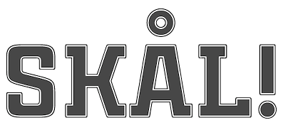
 Balcells created these typefaces in 2012, most of which cover both Latin and Cyrillic: Engranajes (bike gears), Eslava Inline, Eslava Double Line, Eslava Stencil, Eslava Solid, Eslava Outline, Solida (10-style sci-fi blocky sci-fi typeface), Pixelar, Armadura (a monoline octagonal typeface with a stencil style), Oboe (an ultra-fat blocky typeface), Cuantica (sci-fi) and Led. In 2013, he published Gubia (a condensed elliptical techno sans), Mensura (a gaspipe sans), Mensura Slab, Mensura Titling (all caps titling typeface family that includes outlined and stencil styles), Mensura Slab Titling, Herradura (an 8-style wide wood type slab serif), and LED. Typefaces from 2014: Necia (modular), Necia Stencil, Tecnica Stencil, Tecnica Slab Stencil, Aguda (modular geometric sans), Aguda Stencil, Cintra (gaspipe sans, +Stencil, +Inline, +Outline), Cintra Slab, Tecnica, Tecnica Slab. Typefaces from 2015: Violenta Slab (+Stencil, +Unicase, +Inline), Violenta (+Inline, +Unicase, +Stencil). Typefaces from 2016: Citadina (techno sans family). Still in 2016, Jeroen Krielaars and Pablo Balcells co-designed the animated pixel typeface Pixelar. Typefaces from 2017: Estricta (a slightly elliptical techno typeface), Ruda (+Ruda Unicase, +Ruda Stencil), Ruda Slab. Typefaces from 2018: Binaria (an octagonal family), Ordax (an industrial sans typeface by Pablo Balcells, Mariya Vasiljevna Pigoulevskaya and Donna Wearmouth). Typefaces from 2019: Electronica, Intensa, Masiva (a geometric sans). Typefaces from 2020: Holgada, Densa (an 8-style condensed sans), Nebulosa (a sci-fi typeface), Naftera (a squarish typeface). Typefaces from 2021: Tuerca (an 8-style octagonal typeface), Oxima (an 8-style technical sans). Fontsquirrel link. [Google]
[MyFonts]
[More] ⦿
|
Great Scott
[Daniel Feldt]

|
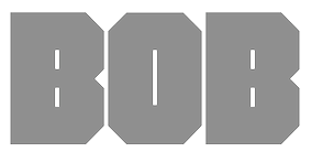 Daniel Feldt is a graphic designer and illustrator from Stockholm, Sweden. His early typefaces include Furiosa (2015, a fat brush script), Bob (2015, a heavy octagonal mechanical typeface) and Gunnar Bold (2015, a rounded sans).
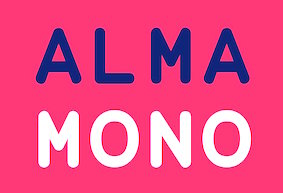
 Typefaces from 2016: Applejack (thick brush script), Knuckle Sandwich (dry brush), Midnight Rider (dry brush script), Wilder (a condensed handcrafted typeface), GS Frank (a sans family influenced by DIN and Eurostile), Gunnar (handcrafted rounded sans), Cherie Bomb (brush font), Margot (brush script). Typefaces from 2017: Etheline (sans), Handwritten Halloween, Fright Night, Narrabeen Brush, Luchador (a great vintage layered font family), Alma Mono (a rounded monospaced sans in five weights)). Typefaces from 2018: Stray Bullets, Knicknack (rounded sans), Rockaway Beach. Typefaces from 2019: Nostromo (octagonal), Deckhouse, Brickton (a vintage layered font), Emmylou (sans+signature styles), Manufaktur (techno or gaspipe sans), Post Box (a ballpoint pen font). Typefaces from 2020: Alma Sans (a low contrast sans), Stonehill (a bold handpainted sans serif typeface for display or packaging use), Morro (a counterless geometric poster typeface), Redig (a bold condensed chamfered / octagonal sans appropriate for athletics or news print). Home page. [Google]
[MyFonts]
[More] ⦿
|
Gustavo Paz
|
 Creator of the free airforce / techno font Airborne (2012, OFL) and the free techno typeface Nasdaqer (2013, OFL), which was inspired by the NASDAQ logo.
 In 2014, Gustavo published Robotech, New Academy (gas pipe caps face), Anita SemiSquare Normal (OFL). Devian Tart link. Aka Terran 21 and Panta Rei. Dafont link. Devian Tart link. [Google]
[More] ⦿
|
Harry Warren
[Breauhare Fonts]

|
[MyFonts]
[More] ⦿
|
horsecow
|
Student at DMACC in Des Moines, IA, in 2013, who designed the thin gas pipe typeface Pipeline (2013, FontStruct). His second typeface was Walking Stick (2013). [Google]
[More] ⦿
|
Jason Ng
|
Hong Kong-based designer of the elegant thin monoline sans typeface Linlegrey (2017), the handcrafted Charmie (2017) and School Rules (2018), and Slendergrey (2017). Typefaces from 2019: Camaly. Typefaces from 2020: Bolula (a gaspipe sans), Carnival (a draftsman's font), Santario. [Google]
[More] ⦿
|
Jeff Levine
[Jeff Levine: Additional typefaces]

|
 [MyFonts]
[More] ⦿
|
Jeff Levine: Additional typefaces
[Jeff Levine]

|
 This is a list of fonts by Jeff Levine not categorized anywhere else on my pages.
 - A: Adelanto JNL (2009), Adhesive Letters JNL (2011), Adhesive Serif Letters JNL (2015), Adventure Film JNL (2021: a casual sans based on the titles and credits for Texas Across the River, 1966), Afternoon Edition JNL (2015), Air Circus JNL, Aisle Seats JNL (2006, based on letters cut by the Redikut Letter Company of Hawthorne, CA), Album Cover JNL (2008), Alleway JNL (2012, a condensed sans), Allograph JNL (2007), Alphacal JNL (2008, outlined, and like Juneway JNL, based on water-applied decals once made by the Duro Decal Company (now Duro Art Industries) of Chicago), Alton JNL (2010: a bold display sans), Amateur Printer JNL (2007, grunge), Ampersorts JNL (2011: ampersands), And So Forth JNL (2011), Anecdote JNL (2009), Announcement Board JNL (2018: white-on-black), Antique Packaging JNL (2019: Victorian), Antique Price Tags JNL (2019), Arcaro JNL (2013, a calligraphic typeface based on the movie credits of the ABC TV series Naked City, 1958-1963, starring detective Frank Arcaro), Antique Show Card JNL (2018: based on an alphabet from the first Speedball Lettering Book in 1915), Arch Creek JNL (2010, an all caps revival of Beton), Ardball (2006), Arrevederci JNL (2018), Arrow Callouts JNL (2021: an arrow-themed alphading font), Art Deco Monograms JNL (2015), Arte Critique JNL (2009), Artist Colony JNL (2009), Arts District JNL (2014), Art Student JNL (2010), Art Techno JNL (2017), Astrospy JNL (2008: techno), Awkward Gothic JNL (2008), Axelby JNL (2013).
- B: Backpage Article JNL (2010), Bal Harbour JNL (2008), Balcony Seats JNL (2007, narrow retro sans), Ball Game JNL (2018), Bandmaster JNL (2021: based on the opening movie titles from the 1940 musical comedy Strike up the Band starring Judy Garland and Mickey Rooney), Barricade (2011, a great shadowed caps face), Bayview JNL (2008, based on Inland Type Foundry's Studley), Best Bet JNL (2014, a slab serif redesign of Beton), Bike Decals JNL (2008), Billing and Shipping JNL (2010), Bingo Player JNL (2010), Birch Beer JNL (2008), Bitmap Typewriter JNL (2017), Bit Part JNL (2017: extra condensed), Bit Player JNL (extra-condensed tall poster font) (2015), Bloktor Mosaik JNL (2007), Blue Parrot (2006), Bluesman JNL (2014: based on the lettering of the blues album "I'm Jimmy Reed" released on the legendary Vee-Jay label out of Chicago), Bold Display Sans JNL (2016: based on an imge in a Speedball book), Bonehead JNL (2013, bones), Bookkeeper JNL (2019: based on R. Hunter Middleton's slab serif, Karnak), Bookkeeping JNL (2019, like an extra bold version of R. Hunter Middleton's slab serif Karnak (1936)), Boss Jock JNL (2021: an informal font based on the title and credits from the 1965 film Strange Bedfellows), Box Lunch JNL, Brass Rail JNL (2015), Brazil Nut JNL (2015), British Cinema JNL (2021, based on the hand lettered titles and credits from the 1945 British film The Way to the Stars), British Vehicle JNL (2020; based on the UK license plate font created by Charles Wright in 1935; with Ahmed Eraqi), Broadcast JNL (2015), Broadletter JNL (2009), Brochure Sans JNL (2022: based on Sans Serif No.7 from the 1921 Miller & Richard type specimen book), Brogado (2006), Brookside JNL (2016), Brushmark JNL (2011), Brush Off JNL (2017), Bulk Weight JNL (2017), Bum Steer JNL (2015), Burger Joint (2006), Burger Royale JNL (2007), Burlesk Queen JNL (2020: blocked letters), Business Helpers JNL (2014), Business Letter JNL (2021: based on the squarish typeface Geometric in the 1894 catalog of the John Ryan Foundry in Baltimore, MD).
- C: Calendar Blocks JNL (2009), Calling Card JNL (2010), Callouts JNL (2011, in Circle and Square styles; white letters on black background), Canby (2006, a squarish caps face), Candle Wax JNL (2014, based on the movie poster for Bell, Book and Candle starring James Stewart), Cast And Crew JNL (2015, condensed monoline), Cast Shadow JNL (2010), Casual Lunch JNL (2009), Casual Friday JNL (2008, roman lettering), Casual Tune JNL (2015), Catalog Serif JNL (2015), Catalog Sheet JNL (2022: based on an extra condensed serif typeface from the 1892 MacKellar, Smiths & Jordan type foundry specimen book), Catch Words JNL (2009), Channel Tuning JNL (1999), Channel Surfing JNL (2010), Charlies Bar BQ JNL (2008, heavy slab serif), Charmer JNL (2014), Chive Turkey JNL (2007), Chunky Nouveau JNL (2020), Circuletter JNL (2016), Ciribiribin JNL (2014), Classification JNL (2015), Classroom JNL (2009), Cling Vinyl JNL (2009), Coal Train (2004), Cocktail Hour JNL (2016, a beatnik typeface based on the opening title for the 1962 Blake Edwards film Days of Wine and Roses starring Jack Lemmon and Lee Remick), Coffee Bar JNL (2021: a squarish typeface), Coldfield JNL (2008), College Nouveau JNL (2018), Colmar JNL (2018), Columnist JNL (2020, after Morris Fuller Benton's News Gothic, 1908, ATF), Commentary JNL (2010, almost typewriter type---easy on the eye), Composer JNL (2017), Concierge JNL (2014), Conscription JNL (2017), Corkboard JNL (2010: a rounded all caps family), Cornfield JNL (2008), Crepe Paper JNL (2018), Criminal Intent JNL (2018: based on the trailer of the 1942 movie Mr. and Mrs. North), Crown Heights JNL (2007, slab serif caps), Cruise Director JNL (2021: an inline typeface based on a hand-lettered title on the poster for the 1933 musical comedy film Melody Cruise), Courtship JNL (2018), Cover Letter JNL (2019), Curtain Up JNL (2018), Cyberglass (2010, techno), Cybrox JNL (2012, grunge).
- D: Dance Hall JNL (2011), Dance Lesson JNL (2015, a wedge serif in the style of Latin Wide), Rotisserie Menu JNL (2021: based on a 1928 menu for the restaurant Rotisserie Du Cardinal), Dangits JNL (2009), Danish Script Initials JNL (2019, based on letters designed by Copenhagen-born industrial artist and letterer Gustav Boerge Jensen (1898-1954), Date Book JNL (2021; based on the credits of the movie The Awful Truth, 1937), Decal (2006), Decalcomania JNL (2017), Deco Of Tomorrow JNL (2014), Deconstructed JNL (2012), Decorative Panels JNL (2009), Deco Template JNL (2018: squarish), Deerfield JNL (2006, Bank Gothic style), Department Store JNL (2019), Desk Jockey JNL (2008), Deskplate JNL (2011: an all caps copperplate font), Desk Job JNL (2018), Detective Client JNL (2021: based on the cast credits of the 1941 film, The Maltese Falcon), Detention JNL (2007, hand-printed), Diamond Callouts JNL (2019, letters in triangles), Diamond Jim (2010), Diamondwood JNL (2015, rhombic), Dip Pen JNL (2017, rounded, handcrafted), Disclaimer JNL (2010, condensed thin headline face), Display Board JNL (2020: based on Paul Renner's Futura Display from 1932), Display Inline JNL (2009), Displayced (2006, LED font), Display Roman JNL (2014), Doggone It JNL (2019: based on the movie posters for the 1962 film, Mono Cane), Do It Yourself JNL (2008), Doo Wop Initials JNL (2007), Doowop (2006), Dormitory Decals JNL (2009), Double Take JNL (2008), Drafting Class JNL (2021: based on an all caps alphabet in The Essentials of Lettering by Thomas E. French and Robert Meiklejohn (circa 1912)), Dreamy JNL (2017), Dual Line Roman JNL (2021: an inline titling typeface), Duonor JNL (2010), Durable JNL (2016, based on a 1940s cover of a catalog for the Duro Decal Company of Chicago).
- E: Eastport JNL (2019: an interpretation of Morris Fuller Benton's 1931 classic, Stymie Extra Bold), Eat More Fruit JNL (2016), Eccentric Sans JNL (2018), Edessa JNL (2009: chiseled stone look, faux Greek), Editorial Comment JNL (2009, grotesk caps-only headline face), Edits and Credits JNL (2008), Egg Farm JNL (2021: based on the opening titles and credits of the 1947 film comedy The Egg and I), Electric Newspaper JNL (2021: a dot matrix font based on the moving message board electric newspaper from 1931 installed by the Los Angeles Times---in partnership with the Richfield Oil Company---on its building), Electrostatic JNL (2017, textured), Elite Resort JNL (2017, slab serif), Elsinor (2006), Endless Journey JNL (2009), Ensemble Inline JNL (2014), Entitled JNL (2007, squarish as in Bank Gothic), Evening Edition JNL (2009), Evening Event JNL (2021; based on hand lettering from the title credits for the 1950 film All about Eve), Evening Paper JNL (2015), Evening Walk JNL (2018), Expressions (smilies).
- F: Factual JNL (2010,headline face), Fairgrounds (2006), Fancy Free JNL (2016: decorative caps), Fancy Show Card JNL (2021), Farragut JNL (2008, hairline geometric), Fastenating JNL (2012, paper clip font), Federal Agent JNL (2021: a condensed typeface based on the opening title of the 1959 premiere season of The Untouchables), Feltboard JNL (2008), Fence Post JNL (2012), Festival Nights (fancy letters), File Clerk JNL (2020, Jeff Levine: based on Cushing (1897)), File Folder JNL (2010, Bank Gothic style family), Film Crew JNL (2009), Fincastle JNL (2011, all caps sans titling face), First Responder JNL (2017: a left-slanted version of Catalog JNL), Flagstaff JNL (2010), Flatbush Beanery (2006), Flipboard JNL (2011), Flivver (2006, a slab-serif display font), Floor Tiles JNL (2009), Florida (2006, retro), Food Vendor JNL (2011), Fordham JNL (2011, all caps slab serif), Formal Invite JNL (2021: thin, condensed serif lettering found in a 1937 magazine ad for Chris Craft boats), Formal Notice JNL (2020: a revival of an alphabet by Samuel Welo in Studio Handbook for Artists and Advertisers), Frankly Plain JNL and Franky Ornate JNL (2010, all caps typefaces after Franklin Gothic), Frantic Pace JNL (2016, a bouncy retro party font), Free Form Retro JNL (2021: an all caps sans based on the titles and credits from the 1960 French film Le Passage Du Rhin), French Calligraphic JNL (2019), French Cinema JNL, French Serif Moderne JNL (2009), French Slab Serif JNL (2018: based on the 1934 French lettering instruction book L'Art du Tracé Rationnel de la Lettre), French Song JNL (2021: a whimsical typeface based on the titles and credits of the 1952 British comedy Song of Paris), Freunlaven JNL (2006, psychedelic), Front Row JNL (2017: a tall condensed typeface that reinterprets Morris Fuller Benton's Empire from 1937), Fruit Juice JNL (2020), Fun and Games (2011, a casual retro typeface redrawn from the lettering found on the cover of a 1935 Speedball Lettering Pen book).
- G: Gene Condensed JNL (2014), Generic Sans JNL (2022: modeled after Condensed Blair from the 1907 specimen book of the Inland Type Foundry), Generic Gothic JNL (2013: an interpretation of Franklin Gothic Condensed), Genesee JNL (2010), Gift List JNL (2016), Gift Wrap JNL (2014), Gilbert JNL (2011, after Eric Gill's sans), Go Home JNL (2017), Good Sport JNL (2019), Goose Creek JNL (2021: based on hand lettered credits from the 1942 British film comedy The Goose Steps Out), Go To Town JNL (casual inline type style) (2015), Gothic Grotesk JNL (2020; a revival of Royal Gothic (1930s, Stevens, Shanks & Sons), which in turn was based on Charter Oak (1899, Keystone Foundry)), Greenwich Village JNL (2014), Groovy 3D Caps JNL, Groovy Happening JNL (2005, psychedelic, in the style of Action Is), Groovy Summer (2006, a casual sans), Guadalajara JNL (2014, a Mexican party font), GummedAlphabet JNL (2011), Gummed Letters JNL (2010).
- H: Halavah Twist JNL (2007; see also its extension Zydeco JNL in 2009), Hallandale (2006), Halliday JNL (2013: an outlined typeface based on Beton Open Condensed), Handbills And Posters JNL (2015), Handmade Caslon JNL (2015), Handmade Dropshadow JNL (2010), Handmade Gothic JNL (2011, inspired by lettering samples in a 1941 Speedball Lettering Pen instructional booklet), Handmade Headline JNL (2018: a 1940s style typeface), Handmade Roman JNL (2011), Hand Stamped JNL (2006, rubber stamp look), Hanford (2010, a sans headline family), Hash and Beans JNL (2007), Headstone Roman JNL (2015), Hectonoid JL (2008), Heller Sans JNL (2019: after an experimental alphabet by Steven Heller), Highbrow Cafetorium JNL (2009), Hippie Comics JNL (2021: based on poster lettering in the 1920 edition of How to Paint Signs and Sho Cards by E. C. Matthews), Home Address JNL (2019), Home Economics JNL (2018), Home Room JNL (2009), Horse Puckey JNL (2008), Hotel Suite JNL (2017), Hoxie JNL (2008).
- I-J: Impecunious JNL (2017), Impressionable JNL (2012, based on a rubber stamp set), Incarceration JNL (2020), Industriality JNL (2015), Informational Gothic (2013: The Wood-Regan Instruments Company (Wrico) of New Jersey manufactured for decades a line of lettering kits called the Wrico Sign Maker. With only special ink pens, plastic templates and a template guide anyone could letter clean, clear signs, posters and notices. This typeface is based on one of those kits), Informational Sans JNL (2021: squarish, caps only), Initial Seals JNL (2012), Inkpad Letters JNL (2011), Inline Lettering JNL (2011, inspired by the opening title of a classic 1940s horror film, The Invisible Man's Revenge), Inlet JNL (2017), Inline Square JNL (2017), Innerspring JNL (2015), Intermediate JNL (2019: based on a home movie titling kit from circa the 1950s or 1960s called the Magna Tech Titler Number 312, modeled after Futura Bold), Interoffice Memo (2011), Intrigue JNL (2014, based on the hand-lettered movie titles from one of the William Powell / Myrna Loy Thin Man series of films), Island Time JNL (2015), Jalopy (2014), Jive Jump (2006), Jobseeker JNL (2011: hand-printed), Juneway (2006, modeled after a set of water-applied decals made by the Duro Decal Company of Chicago), Jungle Drums JNL (2017, African theme), Junior Printer JNL (2015), Just Great JNL (2016: angular display typeface).
- K-L: Katydid JNL (2015, a connect-the-dots typeface), Katz Pajamas JNL (2017), Keyden Drop Caps JNL (2021: a set of slab serif framed capitals based on John Alden Initials, shown in the 1906 edition of the Keystone Type Foundry specimen book), Key Largo JNL (2011, all caps slab serif), Lakeland JNL (2013), Kiddie Blokz JNL (2010), Kids Activities JNL (2017, handcrafted), Lamp Post JNL (2012, an interpretation of Post Old Style, ca. 1901), Last Date JNL (2018), Lasting Impression JNL (2008), Late Breaking News JNL (2016, headline sans), Late Hours JNL (2021: inspired by the hand lettered titles for the 1961 film The Children's Hour), Lecture Hall JNL (2012), Lefferts (2006, squarish display face), Legal Brief JNL (2021), Legal Eagle JNL (2017, with engraved lines), Les Folies JNL (2009, Victorian), Lettering Lesson JNL (2021: a bold serif typeface based on the 1922 instructional booklet from the St. Louis Show Card School), Lettering Pen JNL (2015, handcrafted), Library Book Initials JNL (2018: Library Book Initials JNL was modeled from examples of Sidney Gaunt's Publicity Initials; originally sold in metal type by Barnhart Brothers and Spindler as a companion to the Publicity Gothic typeface), Liebestraum JNL (2014, a decorative caps font), Limited Appeal JNL (2016), Linem Up (2010), Lobby Card JNL (2010), Local News JNL (2021: a condensed sans based on the hand lettered title for the 1954 film Power of the Press), Location JNL (2017), Longbranch Initials (2006, for decorative monograms), Longacre JNL (2013, fat rounded sans), Long And Thin Initials JNL (2015), Loose Leaf JNL (2010), Love Notes JNL (2011: alphadings), Luminum JNL (2007).
- M: Made in Japan (2014), Mailbox Letters JNL (2008), Main Feature JNL (2017, a marquee sans), Mainline JNL (2014), Manual Typewriter JNL (2017: allegedly after a 1933 example by Morris Fuller Benton), Manufactory JNL (2019, a wedge serif not unlike the ones used in advertizing in the late 19th century), Manufacturer JNL (2020: a reinterpretation of the Extra Bold Extended weight of Bauersche's Venus Grotesk (ca. 1907)), Marble Cutter JNL (2015, based on dies used for stamping text into marble headstones or other monuments manufactured by The Vermont Marble Company (Vermarco), which operated from the 1880s until 1976), Marching Band JNL (2019), Margate JNL (2013, based on water-applied decals manufactured in 1962 by the American Decalcomania Company for Goodyear), Marketing Strategy JNL (2017), Marking Device JNL (2014), Maryland JNL (2014), Matchbook JNL (2014: based on lettering on a matchbook from the Carrousel Restaurant in Miami Beach), Mayville JNL (2009), McCadden JNL (2013, inspired by the hand-lettered credits for the George Burns and Gracie Allen Show [1950-1958]), Meal Ticket JNL (2008, squarish), Merchandiser JNL (2010), Merchandising JNL (2014, brush signage script), Merchant Trade JNL (2020, after the Matthews Series by Inland Type Foundry, 1901), Merrymakers JNL (2020), Midnite Movie JNL (2017, inspired by the hand lettered title credits from the 1961 Hammer Pictures film Curse of the Werewolf), Millport (2006, squarish display face), Mimeograph Template JNL (2019: based on a plastic lettering guide manufactured by the Albert Blake Dick Company of Chicago), Misdirection JNL (2009), Mixed Messages JNL (2007, ransom note), Mocombo JNL (2010, an African look typeface that is a slightly modified version of one of the numerous alphabets created by the late Alf R. Becker for Signs of the Times Magazine during the period of the 1930s through the 1950s), Model Railroad JNL (2015), Moderator JNL (2013), Modern Appliances JNL (2014), Monoline Rounded JNL (2014), Monster Movies JNL (2018: a Halloween font), Monthly Meeting JNL (2013), Monthly Newsletter JNL (2011), Monthly Statement JNL (2018: based on the 1934 French lettering instruction book L'Art du Tracé Rationnel de la Lettre), Morning Edition JNL (2021), Morning Paper JNL (2015), Morningside Heights JNL (2015), Morningstar JNL (2012, named after Jeff's friend, Estella Dawn Roberts of Stella Roberts Fonts), Movieland JNL (2008), Movie Night JNL (2011), Movie Set JNL (2021: an all caps wedge serif based on a 1911 movie poster for the film How Bella Was Won), Movie Show JNL (2021: an all caps wedge serif based on a 1911 movie poster for the film How Bella Was Won), Moving Message JNL (2015, dot matrix typeface), Musical Arrangements JNL (2014), Musical Comedy JNL (2021: hand-printed), Musical Score JNL (2015), Music Course (2019), Mystery Show JNL (2018: modeled after the hand lettered titles found on various early episodes of the 1950s TV suspense program Alfred Hitchcock Presents).
- N: Naroid Initials JNL (2010, one of the most ultra-compressed sets of initials available in digital type), Narrow Minded JNL (2014), National Spirit JNL (2009), Newark JNL (2014: a strong slab serif), New Car Tag JNL (2020: based on the new license plates in Florida, which were introduced in 2018), Newsbreak JNL (2008), Newsbreaker JNL (2016; a vintage newspaper titling typeface), News Crew JNL (2017), Newshawk JNL (2007, a condensed sans), Newspaper Publisher JNL (2021: based on a headline in the 1917 edition of Logansport, Indiana Pharos-Observer), Newsprint JNL (2011), Newsreel Caps JNL (2014), Newsreel Text JNL (2021), News Ticker JNL (2021: based on the New York Times Square ticker operational in the 1930s), Newsworthy JNL (2011: a condensed headline sans), New Thin Roman JNL (2019, based on an alphabet called Compressed Roman in Essentials of Lettering, 1912), Nightcap JNL (2011), Nighthawk JNL (2009, a retro headline sans), No Entry JNL (2021: a bold blocky slab serif based on the hand lettered titles and credits from the 1958 war film The Young Lions), Nondescript JNL (2012), Nouveau Date JNL (2021: arts and crafts style), Nouveau Fashion JNL (2018), Nouveau Spur JNL (2019: neither art nouveau nor spurred), Nouveau Standard JNL (2018), Nouveau Handlettered JNL (2017), Nouveau Lettering JNL (2019, based on a 1916 slab serif alphabet by Thomas Wood Stevens), Nouveau Romance JNL (2017), Nouveau Roundcorner JNL (2015), Nouveau Square JNL (2017, squarish), Nouveau Standard JNL (2018), Nouveau Work JNL (2018), Nouveau Years JNL (2019), Nouveau Yorke JNL (2015), Novelty Nouveau JNL (2021), Now Playing JNL (2010).
- O: Oblogram JNL (2008, techno), Occidental Tourist JNL (2009), Odditype JNL (2006, computer simulation), Off Duty JNL (2021: based on the hand lettering from the titles and credits of the 1964 French film comedy Le Gendarme de Saint-Tropez), Office Staff JNL (2021: a version [with serifs added] of Popularity JNL---a condensed art deco design based on a popular typeface known as Radiant), Office Space JNL (2021: based on Condensed Edina from the 1921 Miller & Richard type specimen book), Office Work JNL (2021: a squarish typeface based on the title and credits of the 1965 film Mirage), Off The Wall JNL (2008). Old Bodoni Wide JNL (2016), Old Songs JNL (2018), Old Tijuana JNL (2018: in the serape style of pseudo-Mexican lettering found on ad designs of the 1930s and 1940s), Order Form JNL (2021: after MacKellar, Smiths & Jordan's Lining Gothic Extended from their 1892 catalog), Ordinary Gothic JNL (2017: gaspipe style), Outline Sans JNL (2018), Overnight JNL (2017), Oversimplified JNL (2019), Overton JNL (2017, based on early letter designs of Rudolf Wolf).
- P-Q: Pacific Atoll JNL (2021: a stylized slab serif type design based on the movie title lettering for the 1942 wartime film Pacific Rendezvous), Pacific Island JNL (2017: a tiki font based on the sheet music cover for the title song from the 1957 Marlon Brando movie Sayonara), Packaged Cookies JNL (2021; based on the first Oreo Sandwich package from 1923), Packaged Goods JNL (2016), Park Slope JNL (2014), Parfum de Paris JNL (2014), Paint Store JNL (2006), Parking Lot Sale JNL (2021: a flag font), Parkitechture (2006), Part and Parcel JNL (2009), Partial Eclipse JNL (2012), Patriotica JNL (2011, American flag face), Pavement JNL (2010, based on the extra-condensed lettering used on roadway information signs as revised by the U.S. Government in 2000), Pendraw Roman (2006), Pen Elegant JNL (2018, after an alphabet from a 1918 lettering instruction book by William Hugh Gordon), Pen Gothic JNL (2017: a rounded sans), Penmanshift JNL (2006, ronde style), Pen Nib Square JNL (2019), Penny Wise JNL (2017), Pen Sans Rounded (2019: based on a Speedball book from 1940), People Talk JNL (2021; a squarish all caps typeface based on a title card with cast credits for the 1935 movie The Whole Town Talking starring Edward G. Robinson and Jean Arthur), Performer JNL (2014, re-drawn from condensed hand lettering found on a piece of vintage sheet music), Personal Invitation JNL, Personalization (2019: a squarish typeface), Personal Note JNL (2011), Photo Developer JNL (2021), Picz JNL (2009), Pillow Puff JNL (2008, fluffy and cloud-like lettering), Pistol Twelve JNL (2008), Pitkin JNL (2006, a hand-lettered sans), Plastic Display JNL (2010, sketched from photo examples in an old sales promotion sheet for the Movitex Do-It-Yourself Plastic Sign Kit by Pryor Marking Products of Chicago), Plastic Template JNL (2011), Pleasantville JNL (2012, a condensed slab serif), Pocket Initials JNL (2008), Podunk JNL (2007), Political Poster JNL (2021: a condensed casual sans inspired by the hand lettering on a 1940 campaign poster for Franklin Delano Roosevelt), Pool Deck JNL (2015), Popstix JNL (2013), Pop Tune JNL (2014), Popularity JNL (2014, after Radiant), Port Of Call JNL (2015), Postal JNL (2009, white on black, as on stamps), Poster Contoured JNL (2018), Poster Pen JNL (2017), Poster Inline JNL (2014), Poster Plain JNL (2012), Poster Project JNL (2020), Post Production JNL (2021: a slab serif modeled after title card of the 1950 Humphrey Bogart and Gloria Grahame drama In a Lonely Place), Prehysteric JNL (2010), Presentation JNL (2011, a slabby family), Press Run JNL (2015, a reinterpretation of the classic typeface Cheltenham Condensed), Pricing Labels JNL (2010), Printed Letters (2006, made from stamped impressions made by a 1940s childrens sign making set), Printing Set JNL (2006, based on a rubber stamp alphabet), Printing Sorts JNL (2009), Prismatiq JNL (2009, shadow face), Privilege Sign JNL (2021: based on above-the-store signage for many newspaper stands, soda shops, candy stores, luncheonettes and pharmacies of the 1950s and early 1960s), Privilege Sign Two JNL (2021: based on decorative signage for many drive-ins, motels, food stores and other businesses of the 1940s), Promotional Copy JNL (2012), Proofreader JNL (2011, a rounded slab serif face), Prospect Heights JNL (2015), Public Notice JNL (2009), Public Transportation JNL (2008), Public Utility JNL (2012), Public Works JNL (2007: emulates the hand-cut lettering silk screened onto metal), Publication JNL (2010, a revival of DeVinne, 1890), Punch Tape JNL (2016, dot matrix font), Quick Meal (2019: a hand lettered interpretation of Morris Fuller Benton's 1905 design Miehle Extra Condensed Title), Quick Poster JNL (2019), Quick Response JNL (2015, based on QR codes), Quick Titling JNL (2019), Quorfid JNL (2010).
- R: Raccoon Coat JNL (2014), Radio Interference (2019: grungy), Radio Show JNL (2019: based on a logo from the TV show Car 54 Where Are You?), Rail Bum JNL (2016, basically Morris Fuller Benton's Hobo with slab serifs added), Railway Station (2019: a spurred wedge serif), Recording Artist JNL (2019), Record Jacket JNL, Recreation JNL (2013, outlined shadow face), Red Border Labels JNL (2015), Rendering (2011, architectural draftman's lettering), Reprint JNL (2013), Restaurant And Lounge JNL (2015, handcrafted), Retail Merchant (2006), Retail Monoline JNL (2021: a stylish thin headline typeface), Retail Packaging JNL (2019), Recruitment JNL, Retail Price JNL (2021, +Inline; for catchy price cards), Retail Shop JNL (2018: based on vintage New York City neon signage), Retirement JNL (2021: a flared headline typeface based on the hand lettered film credits for the 1937 movie Make Way for Tomorrow), Retro Packaging JNL (2018), Retro Resort JNL (2011), Reveler JNL (2019), Reverberation JNL (2011, horizontally striped face), Reverse Calendar Blocks JNL (2011), Rhineland Roman JNL (2017), Ritz Slab Serif JNL (2018), Road Picture JNL (2021: modeled after the hand lettered title and credits for the 1940 Bob Hope-Bing Crosby semi-musical comedy Road to Singapore), Roadside Diner JNL (2021: a signpainting font in the style of pre-war Miami), Rockaway JNL (2006, titling sans), Rock Concert JNL (2021; an all caps curly Victorian typeface inspired by the opening title and credits for the 1964 motion picture comedy Send Me No Flowers starring Rock Hudson, Doris Day, and Tony Randall), Roma Initial Caps JNL (2009), Rotisserie Menu JNL (2021: based on a 1928 menu for the restaurant Rotisserie Du Cardinal), Rough Print JNL (2012, rubber stamp lettering), Roundpoint Pen JNL (2011, based on instructional lettering found in an old Speedball Pen textbook), Roughshod (2006), Running Board JNL (2017, monoline, pen-lettered), Rural Route JNL (2010), Rustic Inn JNL (2014).
- S: Salad Bar JNL (2013), Sales Convention JNL (2021: a squarish typeface based on a menu printed in 1937 for the Starlight Room of the Waldorf-Astoria in New York City), Sales Pitch JNL (2014), Sales Slip JNL (2013), Sandcastle JNL (2011), Sans Poster Bold + 3D, Savings And Loan JNL (2014), Scandals JNL (2017), School Project JNL (2015, based on self-adhesive poster board letters once made by the E-Z Letter Stencil Company and sold under the name Quik Stik), Schoolroom JNL (2020: a school font based on the type style used for the Superior Sign and Chart Printer No. 929), School Age (2019: based on Trixy Toy Educator, a 1930s-era set of letters and numbers for teaching children, manufactured by the Durrel Company of Gardner, MA), Schoolyard Blues JNL (2018), Sea Cruise JNL (2015), Scoreboard JNL (2014: dot matrix typeface), Screentext JNL (2010, pixel), Screenwriter JNL (2021; based on the all caps hand lettered credits from the 1950 Humphrey Bogart film In a Lonely Place), Second Guess JNL (2017), Second Impression JNL (2008), Sennetarium JNL (2008, after lettering in a Charlie Chaplin movie), Semi Calligraphic JNL (2018), Sentzoff Coupon (2006, stitched), Series A Signage JNL (2018: this is based on Highway Gothic, also known as FHWA, by the United States Federal Highway Administration; the widths varied from A (condensed) to F (wide), but A was discontinued, hence the motivation to create Series A Signage), Serif Callouts JNL (2017), Sew What JNL (2010, stitching face), Shareholder JNL (2015), Shelf Numbers JNL (2008), Shelf Tags JNL (2017), Shicken Zoop JNL (2008, Hebrew), Shipping Carton JNL (2012), Sign and Poster JNL (2009, die-cut letters), Sign and Display JNL (2019: a companion of Sign and Poster), Shopkeeper JNL (2010, after a a vintage rubber stamp sign and chart printing set), Shopping Guide (2019), Short Subject JNL (2016, based on some hand-lettered title cards from various vintage Columbia Pictures two-reel comedies), Show Card Freehand JNL 2021; based on the title and credits for the 1951 Dick Powell and Rhonda Fleming film Cry Danger), Show Card Pen JNL (2021: based on an alphabet in the 1920 edition of How to Paint Signs and Sho Cards by E. C. Matthews), Show Card Sans JNL (2021: based on an alphabet in the 1922 book Modern Show Card Writing), Showmanship JNL (2017), Show Poster JNL (2021: A vernacular typeface based on a design from the 1960 edition of Samuel Welo's Studio Handbook for Artists and Advertisers), Shutterbug JNL (2021: a blocky typeface based on the signage of Jerry Lewis's Camera Exchange on Vine Street in Hollywood in 1950), Sightseeing Boat JNL (2021: based on the titles and credits for the 1966 romantic comedy The Glass Bottom Boat), Sign Expert JNL (2021: based on an alphabet in The Expert Sign Painter, 1922), Sign Studio JNL (2019: a multiline typeface modeled after an alphabet found in Martin Meijer's Album de Lettres Arti (1949)), Sign Template JNL (2015, based on one of the many plastic lettering guides manufactured by the now-defunct Wright-Regan Instrument Company also known as Wrico), Silent Film JNL (2021: a display slab serif used by the Uptown Theater in Wichita, Kansas, in 1928), Silent Movies JNL (2021; a rounded monolinear sans of the interbellum period), Silly Behavior (2019: a shaded bouncy letter font that revives a 1930 alphabet from 100 Alphabets Publicitaires dessinés par M. Moullet), Simplicity JNL (2014), Simply Grotesk JNL (2012, Peignotian), Simply Nouveau JNL (2017), Slab Compact JNL (2019), Sleuth JNL (2013, after the trailer for the 1936 movie After The Thin Man), Slim Chance JNL (2015, an ultra-narrow font based on an image of vintage packaging for Aquapruf Ear Drum Protectors), Slim Nouveau JNL (2017), Snack Shop JNL (2007, the retro diner look in a bold outline face), Snorkel JNL (2014), Snow Job JNL (2017, inspired by the hand-lettered titles for the 1964 Rankin-Bass animated holiday classic Rudolph the Red Nosed Reindeer), Socialite JNL (2009), Soda Fountain JNL (2015, bilined), Solid Serif JNL (2014), Songbook JNL (2014), Song Composer JNL (2017), Song Merchant JNL (2017), Song Plugger JNL (2014), Song Publisher JNL (2015), Song Stylist JNL (2016), Song Vendor JNL (2017), So Unusual JNL (2021: based on the hand lettered credits for the 1942 film comedy I Married a Witch), Southwest Serenade JNL (2015), Special Edition JNL (2021: based on a newspaper headline font used in 1924), Specimen Book JNL (2020: based on Lining Antique (1889. Illinois Type Foundry) and Central Lining Antique (1892, Central Type Foundry)), SplintersJL (2004), Sporting Event JNL (2021: a slab serif based on the title and credits of a British boxing film from 1953 called The Square Ring), Sportsboard JNL (2020: a flipboard font), Sport Shaded JNL (2009), Spring Fashion JNL (2010), Spring Season JNL (2020: textured caps), Spur Handlettered JNL (2008), Squarity JNL (2008), Stage Production JNL (2020), Stage Show JNL (2021: based on the movie credits for 9 Garcons...Un Coeur starring Edith Piaf), Stamp of Approval JNL (2007), Stamped Metal JNL (2012, beveled), Starlight Sans, Stationer JNL (2018), Stellator JNL (2006, a high-tech modular font), Stenographer JNL (2021: close to Bank Gothic Condensed), Stickball JNL (2017), Stonecut JNL (2014), Store Clerk JNL (2020: outlined), Store Tags JNL (2011), Streetcar JNL (2019: a vintage railroad wagon lettering font), Streeter JNL (2013, based on Beton Bold Condensed), Stylish Title JNL (2021: based on the cover title of the July 1935 issue of Harper's Bazaar), Subscription JNL (2018), Summer Holiday JNL (2021; based on the hand lettered production credits for the 1930 film Holiday), Summertime Breeze JNL (2021: based on the opening title sequence for the 1958 film The Long, Hot Summer), Sunlight JNL, Sunny South JNL (2015), Sunshine Susie JNL (2018), Supporting Cast JNL (2011), Surf Bum (2019), Swing Band JNL (2013: inspired by the title lettering from "Hi-De-Ho", a 1930s all-black cast film starring legendary bandleader Cab Calloway), Swing Vote JNL (2020: a beatnik font).
- T: Tabloid Edition JNL (2021: based on a headline newspaper font from UK's Daily Mail in 1918), Tabloid News (2019: an all caps condensed slab serif), Tabloid Press JNL (2015), Take Charge JNL (2016, based on the opening title card for the 1936 film The Charge of the Light Brigade starring Errol Flynn, Olivia de Havilland, Donald Crisp and David Niven), Tallahassee Chassis JNL (2007, modeled from a toy rubber stamp set imported from Japan), Tall And Narrow JNL (2015), Tamiami JNL (2009, Victorian, known as "Cuba"), Tea Bag JNL (2013), Tea Time JNL (2014), Technerd JNL (2011, a thin technical/mechanical face), Technopen JNL (2013: a rounded techno sans from a 1929 instructional booklet for the Esterbrook Drawlet Pens), Teenagers JNL (2021: a beatnik font that was inspired by the hand lettered opening credits for The Many Loves of Dobie Gillis, a teen-oriented television comedy that ran from 1959 to 1963 on CBS), Teen Years JNL (2021: a blocky sans inspired by the hand lettered name for the Joyce Records label (circa 1956)), Template Basic JNL (2021: a simple sans), Template Sans (2019: based on a lettering template by the Wright-Regan Instrument Company (Wrico)), Template Shadow (2019), Tenement JNL (2020: based on a Cooper Black style alphabet by Harry Lawrence Gage that was shown in Thomas Woods Stevens's book Lettering (1916)), Terrace JNL (2015), Terror JNL, That Stuff JNL (2009), Theater Lights JNL (2014), Theater Tickets JNL (2021: Based on the marquee signage for Detroit's Majestic Theater built in 1934), Theatrics JNL (2009, 3d face), Thin Mint JNL (2011), Thinly Disguised JNL (2016), Three Day Pass JNL (2009), Tiler JNL (2012, a gridded face), Title Block Sans JNL (2011, an avant-garde titling face), Too Much Information JNL (2007), Top Billing JNL (2008, dot matrix), Top Forty (2019: handcrafted), Topographic Sans JNL (2018: a mapmaking sans featured in a U.S. Army Corps of Engineers topographic drafting manual), Toucan Tango JNL (2007, multiline face), Tough Guy (2006, shaded titling face), Tough Stuff JNL (2008), Toy Decals JNL (2018), Toy Letters JNL (2018: based on die-cut letters and number by Village Toys (circa 1930s or 1940s)), Toyprint JNL (2009, grunge), Trade Journal JNL (2010), Trade Printer JNL (2007, Victorian-era sans emulation), Train Car JNL (2021: based on the hand-lettered opening credits of Alfred Hitchcock's Strangers on a Train (1951)), Transactive JNL (2007, dot matrix), Transcendental JNL (2017), Tribal Council JNL (2011, jungle lettering with a linocut look), Trilium JNL (2010, triline face), Tropicano JNL (2013, a wavy typeface), Tunesmith JNL (2014, Victorian), Twelve Oaks (2006), Two Cents Plain JNL (2012), Two Reeler JNL (2006; see also its follow-up typeface Positive Vibe JNL, 2007, both modeled after title cards of an early Charlie Chaplin movie), Two Step Nouveau JNL (2018), Type Catalog (2011, bilined all caps face), Typemonger JNL (2022: based on Two Line Sans Serif from the British type specimen book of Vincent Figgins (circa 1860)), Typesetter JNL (2011), Type Vendor JNL (2012), Typewriter Sans JNL (2015), Type Wronger JNL (2013, old typewriter typeface).
- U-V: Unpretentious JNL (2014), Urmeba JNL (2012, named after amoebas and co-designed with Ray Larabie; a barf font), Used Cars (2012), Utica JNL (2010, squarish all caps face), Vacation Resort JNL (2021: based on the hand lettered cast and production credits for the 1942 musicl comedy Holiday Inn starring Bing Crosby and Fred Astaire), Vaudevillian JNL (2017), Utility Signage JNL (2017), Vehicle JNL (2010, a condensed block font as for car plates), Vendor JNL (2010, Victorian era ribbon face), Vertical Roundpoint JNL (2011, found in a 1941 edition of the Speedball Lettering Pen instruction book and re-drawn digitally by Jeff Levine), Victorian Typewriter JNL (2020), Vintage Designs JNL (2009, dingbat which has some fists), Vintage Price Tags JNL (2015), Vododeo JNL (2014).
- W: Washington Heights JNL (2016), Wavely (2010), Weekend Date JNL (2020), Weeneez JNL (2011, wiener-shaped glyhs), Welcome Home JNL (2009), Werble JNL (2010), What A Night JNL (2018), Whoosh JNL (2007), Wild About Myself JNL (2015), Willoughby JNL (2006, based on 1950s toothpaste lettering), Window Sign JNL (2013), Wine Cellar JNL (2014), Winery JNL (2012: a soft-serifed caps face), Winkle Picker JNL (2021: a cut paper font based on the 1963 movie poster for an Italian documentary called Sexy Nudo), Winter Garden JNL (2017), Wireline JNL (2021: a paperclip font), Wire Mesh JNL (2009), Work Force JNL (2011), Wynwood JNL (2009).
- X-Y: Yankee Doodle Boy JNL (2017), Yard Sale JNL (2013), Yargo JNL (2009, hand-printed), Yayazout JNL (2008, fun titling face), Yorso Square JNL (2007).
- Z: Zera JNL (2007, intersecting rings), Zodor JNL (2010), Zoning Department JNL (2012), Zydeco JNL (2009).
[Google]
[MyFonts]
[More] ⦿
|
John Bomparte
[Bomparte's Fonts]

|
 [MyFonts]
[More] ⦿
|
Julius Steponavicius
|
Graphic designer in Vilnius who graduated from the Vilnius Academy of Arts in 2012. In that year, he created the corporate gaspipe typeface Machine. [Google]
[More] ⦿
|
Justin Kostelansky

|
 Pittston, PA-based creator of Grecian Gunslinger (2012, octagonal and slabby), Kostel Infinity Sans (2012, gaspipe typeface), Defiance (2012, a didone headline typeface designed for photographer Ronald N. Tan's upcoming book "Defiance"), Hedron (2012, octagonal and slabby), and Kostel Slab Serif (2012).
 Behance link. [Google]
[MyFonts]
[More] ⦿
|
kookoogurl123
|
FontStructor who made the fat gaspipe typeface Zoombaz (2012). [Google]
[More] ⦿
|
Levi Bunyan
|
Designer from Aberdeen, Scotland, whose studio is called Aekido. He created Relic (2011, an abstract geometric caps face), UniStenc (2011, stencil face), Wonderland (a simplistic sans headline face), Body (2011, monoline geometric typeface with some stenciled letters), and Diamond Sans (2011, caps only). In 2012, he designed Blackjack Gothic, and Body Shop (a thin stencil typeface for The Body Shop). In 2013, he published Oznacheniya (inspired by Bulgarian signage), Pipeline (a gaspipe caps only typeface), Modular, and Black Grape (a monospaced sans typeface). Behance link. Cargo Collective link. [Google]
[More] ⦿
|
Luis Lobo
|
Portuguese designer of the oily gas pipe typeface Getti Sans (2019). [Google]
[More] ⦿
|
Marit Angenita Otto

|
 Dutch type designer who published the experimental typeface Jazmo in 2012 at URW: Jazmo is an offspring of an assignment I did for a Dutch architect. A classic building and coincidently the place of my studio in my hometown Zwolle, Netherlands, needed to be renovated. My job was to design the house numbers and signs for this building. This building I refer to was built in 1932 and designed according to the New objectivity architecture. Now it accommodates several artist and craftsmen and also houses students. In my design I used elements of the Art Nouveau.
 In 2013, she published Smooth Buggaloo (URW++), a typeface that was inspired by the music of the sixties. Le Rock (2013, URW++) is a bouncy freeform display typeface. Labyrindo (2013, URW++) is inspired by Greek labyrinths. In 2014, Marit published Pipeline (URW++), a gaspipe or paperclip typeface, Filistique (URW++, a flowing informal unconnected script typeface), and Nipon (URW++), a display typeface. In 2015, still at URW++, she created the stylish display typeface Democrazia, the hybrid oriental/Arabic emulation typeface Eurabia, the display typeface family Kosmique, the meccano typeface C-Nation, the squarish stencil typeface Constructa, the squarish revolutionary typeface Picastro (the name is a contraction of Picasso and Castro; not to be confused with Leon Hulst's signage typeface Picastro, made a year earlier), and the display typeface New Daily. Typefaces from 2016: Roundabout (an elliptical sans, URW++), Beyond Babylon (an Arabic simulation typeface, URW++) [Google]
[MyFonts]
[More] ⦿
|
Max Phillips
[Signal Type Foundry]

|
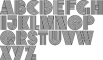 [MyFonts]
[More] ⦿
|
Michael Cina
[Associated Typographics (or: Public Type)]

|
[MyFonts]
[More] ⦿
|
MyFonts: Gas pipe typefaces
|
MyFonts selection of gas pipe typefaces. View a more complete list of gas pipe typefaces. [Google]
[More] ⦿
|
Nathan Dawdy
|
 Lincoln, NE-based designer of the serif display typeface Volere Bene (2017), the tweetware squarish typeface Diotima (2017) and the free sans display typefaces Lysis (2017) and Milk (2017).
 In 2018, he designed Chocolate Milk, the gaspipe typeface Nebraska, Eames, Maybach, Warehouse, the bilined typeface Symposium, JS Sans (free), the squarish Love, the roman caps typeface Asthenia, and the free typeface Trolly Dodgers Condensed. [Google]
[More] ⦿
|
Nuno Dias

|
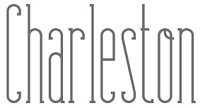 Portuguese media artist (b. 1982) who lives in Braga and Covilhã. He graduated in 2007 in Multimedia Design from the University of Beira Interior, Covilhã. Designer of the paper-fold typeface Origram (2008) and the free gaspipe typeface Makhina (2012).
 In 2014, he started selling fonts. Commercial typefaces include the condensed poster typeface Bohemian Slab (2014) and the tall condensed charmer Fabuleuse Slab. In 2017, he designed the rounded sans semi-stencil typeface Meteoric. MyFonts link. Behance link. Creative Market link. Devian Tart page. Dribble link. [Google]
[MyFonts]
[More] ⦿
|
Open City Design
[Phil MacIsaac]
|
 Charlottetown, Prince Edward Island-based designer of the free rounded retro typeface Narwhal (2018), the expressionist blackletter typeface Krautrock (2018), the free blackletter typeface Scotland (2018) and the free handcrafted typeface Soviet League (2018).
 Free typefaces from 2019: Norilsk, Chernobyl (Cyrillic simulation), Kaiser (a rounded blackletter), Campaign, Revolucion (constructivist), Oligarchy, Contraband (a free monoline script), Viking, Myrkvior (rune emulation), Vintage74, Art Nuvo (psychedelic, art nouveau). Typefaces from 2020: Vanity (a free German expressionist typeface), Nordic Club (a national park typeface), Shogun (a gaspipe font), Contraband (a monolinear font duo), Pariah (a rounded heavy blackletter). Dribble link. Open City Design link. [Google]
[More] ⦿
|
Pablo Balcells
[Graviton]

|
 [MyFonts]
[More] ⦿
|
Phil MacIsaac
[Open City Design]
|
 [More] ⦿
|
Popskraft Lab
[Alexey Popov]

|
 Alexey Popov, or Alex Pop for short (Popskraft Lab, Buchardo, Argentina, and now New York City) designed the children's book / cartoon font family Beebzz and the comic book typeface Beaverist in 2016. In 2013, he created the techno typeface Technozis. In 2017, he published the layered font 3D Bulb Lamp, the beveled typeface Legend, the (great!) neon font Nightlife, the Warm Lamp alphabet, the colorful children's book font Happy Kids, and the art deco sans typeface Artnoova.
 In 2018, he designed the spurless sans Alterhard and the plump script font AlPuzato. In 2019, he published the wide display sans typeface AlterGlam and Beebzz Rounded. Typefaces from 2020: Cattyfox, Alterglam (a wide and fashionbable geometric sans family, started in 2019), Neonlife (a multiline neon font). Typefaes from 2021: Arbus (a 9-style informal supermarket sans), Revolancer (letters turned ninety degrees; followed in 2022 by the 9-style display sans Revolancer ProBeaverist (a 9-style monolinear vernacular marker pen font), Exelancer (a 10-style futuristic typeface), Alterhard (a 9-style gaspipe sans) (a 9-style condensed spurless sans with large x-height, started in 2018). [Google]
[MyFonts]
[More] ⦿
|
Raihan Nizar
|
 Raihan Nizar (b. 1977) is the Indonesian FontStructor who made Cubos (2011, squarish and geometric), Pixelized Handwriting (2011), Lost in Future (2011, sci-fi face), Valdero (2011), Simplicity (2011, kitchen tile face), Bold Type (2011, octagonal), Fat Cribbo (2011, gridded), Block Out (2011, in the style of the commercial typeface Pincoya), Smooth (kitchen tile face), Quadro, Minimal (geometric, gridded, almost a kitchen tile face), Zkratchy (scratchy face), Retro Mania (almost a Western face), Techno Light, Blockz, Box Building (3d outline face), Metropol (outline techno face), Space Adventure, Electric City, Cubix, Revolution, Pixel, High Volume, and Letters In The Blocks in 2011. Many of these typefaces are pixelish.
 Typefaces from 2012: Dequatrion (fat stencil face), Konnekto (electrical circuit font), Devoltas, Forsid (cubist painting font), Etnis (squarish), Electro (counterless and octagonal), Mr. Ken (very fat face), Squadlest (squarish), Neonize (dot matrix face), Simplicity (kitchen tile face), Sound System (squarish), High Volume, Bajaj Sans (gaspipe sans), Bulat (fat counterless typeface), Elektro (blocky, counterless), Elektro Forest, The Slabbers (Egyptian), Kotakisme (counterless and geometric), Bhekhathe (thin geometric typeface), Insomnia, Siliko (metal band logo font), Motakku (labyrinthine, op-art). Typefaces from 2013: Yamko Rambe Yamko (alchemic typeface), Farmhand Script (poster script), Luikeza, The Ugly Script, Gerobak (fat, counterless). Aka cablecomputer. Fontspace link. FontStruct link. [Google]
[More] ⦿
|
Rasul Hasanov
|
 Designer and illustrator in Baku, Azerbaijan.
 He created the elegant Retro Baku (2018; for Latin and Cyrillic), the free experimental font Delogy (2018), a Cryptocurrency Icon set (2018), the free modular typeface Protos (2017), free stone age script Gobustan (2016: named after the 40,000 year old rock art found in Gobustan), the free gaspipe font Big Font AZ (2012), Gazal (2012) and Sharq (2012, Arab simulation face). Home page. Behance link. [Google]
[More] ⦿
|
Reza Rasenda
[Bagerich Type Foundry (was: Zealab Fonts Division, Zea Fonts, Zea Lab, Zeaspace)]

|
 [MyFonts]
[More] ⦿
|
Sakha Design
[Alif Ryan Zulfikar]

|
Yogyakarta, Indonesia-based designer (b. 1991) of these script typefaces in 2020: Amillea (a rabbit ear script), Hayatti (a rabbit ear script), Koalla, Vyodra. Typefaces from 2021: Dartie (script), Thanks Valentine (a confident script), Thanks Valentine (a scrapbook Valentine's Day script), Algeko (an organic monolinear sans), Mousony (a bold slab serif), Halena (a bold rounded sans), Timeless Series (a squarish mechanical sans), Pumpkin Smile, Dead Bear, Hallo Witch, Christmas Leaf (script), Spooky Ghost, Christmas Queen (script), Alveru (an all caps sans), Miver (a gaspipe font with tiny terminals), Miver, Voklea (a thick monolinear informal typeface), Fun Zone (a polygonal cartoonish display font), Lightmoon (a sign-painting script), Lovely Summer (script), Andyou (an upright script), Summer Peach (a scrapbook script), Tropical Leaves (a calligraphic script), Aneliya (script), Green Leaves (a heavy calligraphic script), The Spring (script), Youth Line (a monolinear script), Youth Line (a monolinear script), Chill Rabit (a scrapbook font), Spring Sweet (a scrapbook script), Easter Gift (a fat finger font), Christmas Bear, Rastica, Love Lea (a Valentine's Day script), Beatlove (a wild upright script), Cheerful Yellow( Christmas Bright (a scrapbook script), Easter Nice, Bright Love (a Valentine's Day script), Christmas Night (a script typeface), Valentine Soul (an upright calligraphic script), Christmas History (a rabbit ear script), Christmas Bell (script), Withrose (calligraphic script), Ageitha (an upright rabbit ear calligraphic script), Thanklove (script). Typefaces from 2022: Love Rabbit (a scrapbook script), Highlove (a fat finger font). [Google]
[MyFonts]
[More] ⦿
|
Sam Potts

|
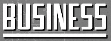 Designer of Addressograph. Sam Potts and Sam Potts Inc are located in Brooklyn, NY. His sketches of Addressograph are based on lettering from a vintage ad for the Addressograph-Multigraph Corporation, manufacturers of the Addressograph addressing machine that stamped out dog-tag-like plates that were used to print mailing labels at high volume. The glyphs of Addressograph follow the gaspipe lettering style popular in the United States in the 1930s and 1940s. In 2014, Jesse R. Ewing (Midwest Type), created the retail typeface Addressotype that is based on Addressograph. [Google]
[MyFonts]
[More] ⦿
|
Saul Bass

|
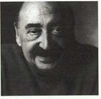 American graphic designer and Oscar-winning filmmaker, best known for his design of motion-picture title sequences, film posters, and corporate logos. Born in the Bronx, NY, in 1920, he died in Los Angeles in 1996. Bass worked for some of Hollywood's most prominent filmmakers, including Alfred Hitchcock, Otto Preminger, Billy Wilder, Stanley Kubrick and Martin Scorsese. Among his best known title sequences are the animated paper cut-out of a heroin addict's arm for Preminger's The Man with the Golden Arm, the credits racing up and down what eventually becomes a high-angle shot of a skyscraper in Hitchcock's North by Northwest, and the disjointed text that races together and apart in Psycho. Bass designed some of the most iconic corporate logos in North America, including the Bell System logo in 1969, as well as AT&T's globe logo in 1983 after the breakup of the Bell System. He also designed Continental Airlines' 1968 jet stream logo and United Airlines' 1974 tulip logo, which became some of the most recognized airline industry logos of the era.
 Type design came as a by-product of his famous logos or movie posters. He designed the artsy Rainbow Bass (1982), as well as a gaspipe-style logo typeface for Alcoa (1963) to accompany his logo for Alcoa. Revivals and descendants of Bass's work: - Alumi (Michael Hernan). Based on the Alcoa typeface.
- Hitchcock (Matt Terich). A free font. This is strictly speaking not a Bass revival, because Dave Nagata did most of the drawings. The style, however, is one hundred percent vintage Bass. According to Keith Morris, the lettering artist who did the lettering for the Saul Bass titles was Art Goodman. Not soi according to Jill Bell: Art Goodman did not do the lettering for Saul Bass. Rather Saul utilized a number of different lettering artists through out his career. Harold Adler did most of the Hitchcock/Preminger titles, Maury Nemoy did some (St. Joan).
- Chank Diesel's Hitchcock (1997).
- Rainbow Bass, a vertically striped disco style design, was remade by Nick Curtis as Backstage Pass (2008), Kymmera Deco NF (2011), and High Five and High Five Jive.
- Harold Lohner's Alumino (2008) was inspired by Saul Bass's design for the aluminum company Alcoa.
- Saul (Laura French, 2011) is based on the cut-out letter movie titling style used by Bass in some movies.
- In 2015, Robin Lassalle created Saul Bass Font to honor Saul's genre.
- Zetafonts pays tribute to Bass in their Double Bass (2018, by Cosimo Lorenzo Pancini).
Jennifer Bass (his daughter) and Pat Kirkham published Saul Bass: A Life in Film&Design (2011). The book's blurb: This is the first book to be published on one of the greatest American designers of the 20th Century, who was as famous for his work in film as for his corporate identity and graphic work. With more than 1,400 illustrations, many of them never published before and written by the leading design historian Pat Kirkham, this is the definitive study that design and film enthusiasts have been eagerly anticipating. Saul Bass (1920-1996) created some of the most compelling images of American post-war visual culture. Having extended the remit of graphic design to include film titles, he went on to transform the genre. His best known works include a series of unforgettable posters and title sequences for films such as Alfred Hitchcock's Vertigo and Otto Preminger's The Man With The Golden Arm and Anatomy of a Murder. He also created some of the most famous logos and corporate identity campaigns of the century, including those for major companies such as AT&T, Quaker Oats, United Airlines and Minolta. His wife and collaborator, Elaine, joined the Bass office in the late 1950s. Together they created an impressive series of award-winning short films, including the Oscar-winning Why Man Creates, as well as an equally impressive series of film titles, ranging from Stanley Kubrick s Spartacus in the early 1960s to Martin Scorsese s Cape Fear and Casino in the 1990s. Designed by Jennifer Bass, Saul Bass's daughter and written by distinguished design historian Pat Kirkham who knew Saul Bass personally, this book is full of images from the Bass archive, providing an in depth account of one of the leading graphic artists of the 20th century. Wikipedia page. [Google]
[MyFonts]
[More] ⦿
|
Signal Type Foundry
[Max Phillips]

|
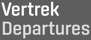 Signal Type Foundry & Drawing Office is a type foundry in New York City, est. 2012 by Max Phillips (b. 1957, New York City), a typographer, graphic designer, toy designer, creative director and novelist who moved to Dublin, Ireland, in 2013 with his Irish spouse. His typefaces:
 - FF Spinoza Pro (2011). His first type design, developed over a period of eleven years. FontShop: With the goal of readability in mind, Phillips named the typeface after 17th century rationalist and lens-grinder Baruch Spinoza, a man whose job it was to help people see clearly. The type family is meant as an elegant workhorse, a classic text family with just enough individual character to hold its own in display sizes. It was inspired by mid-century German book typefaces like Trump Mediaeval and Aldus, and by the types of Nicolas Kis. The forms are narrow and economical, with open counters. The line is firm and distinct. Strong, thick strokes and serifs help it grip the page.
- Center (2013). A technical monoline sans typeface with soft lines. It is based on a round rectangle. Followed by Center Slab in 2016 and Center 2 in 2019.
- The prismatic / hypnotic multilined typeface Vibro (2011), an op-art font that received the Type Directors Club Certificate of Excellence in 2012.
- Pressio (2016). A condensed to wide wood-inspired sans typeface family. See also Pressio Stencil (2018).
- Baasic (2016). A standard sans typeface: Baasic was designed for Dublin-based design office aad. baasic, and was intended as a plain, hardworking grotesque---a simple tool for clear communication.
- Ballinger Mono and Ballinger (2018). Published by Signature Type Foundry, Max explains: Ballinger began life as a single-weight proprietary typeface called baasic [...] We have developed it into a fully-featured eight-weight family with matching italics. Sources include early 20th century jobbing sanses like Morris Benton's News Gothic, and Candia, a 70s-era typewriter face Josef Müller-Brockmann designed for Olivetti, which had unusually deep junctures that added energy to letters like m and n. The family takes its name from Raymond A. Ballinger, the great mid-century American designer, author of "Lettering Art in Modern Use," and champion of elegance and readability. Ballinger has large counters and a generous x-height. Followed in 2019 by Ballinger Condensed.
- Mortise (2019). A welcome addition to the slab serif genre by Sean Mongey and Max Phillips. Max writes that the long, slightly curved vertical serifs give it a raffish, mustache-twirling air.
- Sinter (2019). A gaspipe sans.
- Tenon (2019). A great sans based on Mortise. By Sean Mongey and Max Phillips.
- Dashiell (2020, Text, Bright, Fine). He writes that it is an attempt to combine the warmth and frankness of Caslon with the lucid elegance of Garamond.
[Google]
[MyFonts]
[More] ⦿
|
T4 Typography AB
[Bo Berndal]

|
Swedish commercial foundry in Stockholm. Bo Berndal and Torbjörn Olsson are two of T4's main type designers. The sister company A4 designs newspapers. Typefaces at Myfonts include: - T4-Batory (2006). A futuristic elliptical monoline geometric family by Berndal.
- T4-Batoswash (2006).
- T4-Botobe.
- T4-CaballeroScript.
- T4-Cartesius (2006). A roman typeface by Berndal.
- T4-Eknaton.
- T4-Geometra.
- T4-Gertrud.
- T4-Hagalind.
- T4-Havel.
- T4-InterruptDisplayPro (2007, Olsson). A sturdy monoline packaging and/or gaspipe typeface.
- T4-Kantor.
- T4-Mixtra (2006: Roman, Sansserif, Slabserif). A masculine family by Berndal.
- T4-MotorMouth.
- T4-Museum (Borders, Fournier, Ornaments, Tertia Cursive).
- T4-OneNightStand.
- T4-Pelegotic.
- T4-Picadyll (2006). An art deco typeface by Berndal.
- T4-Sergel (2007). A multiline chiseled sculptural typeface.
- T4-TYMAGaramont (2007). Its designer, Bo Berndal, writes: The TYMA Garamont Roman was inspired by the Berner-Egenolff type sample from the 1560s. The Italic was inspired by a sample from Robert Granjon, also from the 1560s. The name TYMA is short for AB Typmatriser, a Swedish company founded 1948, because the Second World War stopped all import of matrices for Linotype and Intertype typesetting machines. It took until 1951-52 before the import was up to speed again. Until then, Sweden had to fend for itself. TYMA produced all technical equipment needed for type production, including the pantograph to cut the matrices, a complete set for each size and version. The templates for Garamont Roman were initiated by Henry Alm 1948. Bo Berndal was hired the following year, and continued the work by drawing and cutting templates for the rest of Garamont Roman, as well as for the remaining Garamont family. Bo Berndal stayed at TYMA until it went bankrupt in 1952. At that time Bo Berndal had already kick-started his career as type designer by drawing the typeface Reporter for one of the big daily newspapers, Aftonbladet, a version of Cheltenham for another daily, Dagens Nyheter, and copied several old typefaces for other customers. Librarian Sten G. Lindberg at The Royal Library of Stockholm, Kungliga Biblioteket, procured copies of original type samples. Henry Alm started the work in 1948, and Bo Berndal completed it - finally in this OpenType version.
Catalog at MyFonts. View Bo Berndal's typefaces. FontShop link. Klingspor link. [Google]
[MyFonts]
[More] ⦿
|
Tipokujna
|
 Tipokujna (Typo Kitchen) is a workshop organized in 2013 by Macedonian type designer Lasko Dzurovski and Creative Exchange. The typefaces made during this workshop can be freely downloaded:
 - Cover (Nebojsa Geleski, Goce Veleski, Anke Klein, Vlatko Ristov). A strong-willed sans typeface.
- Topola (Milan Stojanov, Anastasia Manasievska Georgi night, Elena Gjorgjievska). A thin sans display typeface.
- Banana (Vanja Stork). A Cyrillic-only hand-drawn typeface.
- Tube (Sanja Spasovska). A gaspipe sans.
- Constellation (Martin Kovachki). A connect-the-dots typeface.
- Kenzo Tange Light & Slab (Mary Veterovska, Irma Velkoska, Igor Delov, Iko Ilievski). A great geometric slab and sans pair.
- Skorid (Lasko Dzurovski). A heavy octagonal / mechanical typeface that can stop a Russian tank.
- Mountain (Isaac Vishnjikj). A sans typeface.
- Bipolar (Mickey Stefanovski). A thin geometric avant-garde sans in which condensed and wide letters can be mixed for dramatic effects.
- Karmakasha (Alexander Peshevski). A rounded sans.
- Apron (Alexandra Noveska). A hand-printed typeface.
- Hoi (Costa Lazarevski).
Behance link. [Google]
[More] ⦿
|
Wade Winebrenner
|
Graphic designer in Savannah, GA. Creator of the gaspipe typeface Arbitor (2012). Behance link. [Google]
[More] ⦿
|
Youporn
|
FontStructor who made the gas pipe display typeface Pornstar (2013). [Google]
[More] ⦿
|
Zac Freeland
|
During his studies at Grand Valley State University, Grand Rapids, MI-based Zac Freeland designed the gas pipe typeface Effecto (2013) and the free squarish modular typeface Cornerstone (2015). Behance link. [Google]
[More] ⦿
|
zum Egon
[Dominik Krotscheck]

|
 Graphic designer in Brunn am Gebirge, Austria, b. 1989, who graduated in 2012 from the New Design University in St. Pölten. His thesis work was the sans typeface family Fahrplan (2012). He is located in Judenburg, Austria, and operates as zum Egon (and before that, as Dwiedoml). Domink Krotschek's partner at zum Egon is "Julia".
 In 2012, he created the layered font family Fudge. He also created the rounded sans typeface Dega (2012), as well as Pixelstuff (2012). In 2013, he created the layered sans family Furunkel. This arts-and-crafts typeface is characterized by the possibility of having different top, middle and bottom thirds of the capital letters. Later in 2013, he set up the commercial type foundry Dominik Krotscheck in Judenburg, Austria. His commercial typefaces include the layered system Furunkel (2013) and Floz (2014, a gaspipe sans). Free typefaces include Keel (2013) and Firty (2013). Typefaces from 2014: Schnipsl (a stackable paper cut-out typeface family), Clarke (at The Designers Foundry), Flounder (a condensed all-caps sans serif font), Flounder Pro. Typefaces from 2015: Rhea (condensed all caps sans serif fonts), Unfug Tight, Unfug Wiggly, Unfug Box (a nice fat handcrafted poster typeface). Typefaces from 2017: Agnes By Hand. Typefaces from 2019: Darlene (a Peignotian sans with rounded corners). Typefaces from 2020: Edith (a handmade serif type), Corso (an ultra condensed sans). [Google]
[MyFonts]
[More] ⦿
|

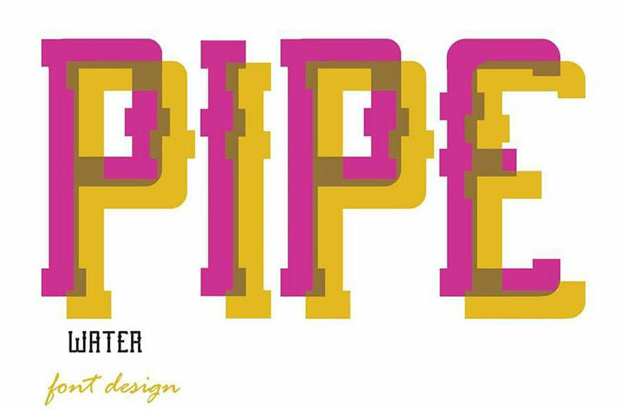

 In house type designer at Elsner&Flake. He designed an elegant high-contrast art deco display typeface
  Konya, Turkey-based designer of the pixelish typefaces Admtas (2017) and Incomplete (2017), and the water or gas pipe typeface Pipe (2017). [
 Italian designer, 1920-1995, who designed most of his typefaces at Nebiolo in Turin. Until 1975, he made about 30 families at Nebiolo, and after 1975, he produced about 70 further families of fonts. With weights included, he created about 300 fonts.
  [
[ [
[ Independent game developer Andrew McCluskey (NAL Games, Dundee, Scotland, b. 1991) published hundreds of free typefaces before 2015 under the NAL label. In 2015, Andrew McCluskey, after becoming Allison James, joined forces with Daniel Johnston and set up
  [
[ Head of Cina Associates, Michael Cina (Minneapolis, MN), has started many a typographic and graphic design enterprise in his long career. Associated Typographics was founded in 2012.
  Founded in Bandung, Indonesia in the middle of 2019 by graphic designers Reza Rasenda (b. 1993) and Riska Chandra Dewi, Zealab Fonts Division specializes in and is inspired by urban culture, luxurious brands and street posters. Reza Rasenda designed these typefaces in 2020: Crenzo (a
  Bomparte's Fonts is
  Foundry created in 2006 by Virginia Beach, VA-based
  [
[ Type designer from Santiago, Chile, who created the neo-humanist sans typeface family
  Travel writer based in Cherry Hill, NJ.
  [
[ GalloFonts is part of Graphics by Gallo, founded in 1974 by
  [
[ First called Geronimo Fonts, then Paradox Fontworks, and then Typewire Studios, this American studio created these free fonts in 2015: For Sara, Funkytown, Necktie (blackboard bold), Northpoint (strong octagonal varsity font), Kevin Eleven (handcrafted 3d font), Back to School (handcrafted), Musicnet (dot matrix font), Anxiety, Starship One, Astronaut City (comic book style), Internet Friends, Solitude (rounded sans), Kinetic Extreme (+Solid), Crank, Disco Flow, Psychedelic, Lemons, Bokai, Royalty Code, Operation (military octagonal stencil face), Northwest (squarish), Hijack, Establishment, Jamstone, Skinz, The Antenna, Distortion, Los Mesitos, Rock Salmon, Hand Stencil, Crossroads, Upton Funk, Zero Theory, The Million Mile Man (3d outline font), Blueberry Pie, Boraodway Musical, Block Cartoon, Cinematic Language, Kayak, Aerospace, Russian (constructivist), Lines (white on black), Ohio Collegiate, Alkaline.
  Graviton is a small type foundry based in Buenos Aires, Argentina. It was founded by Argentinian type designer Pablo Balcells in 2013.
  Daniel Feldt is a graphic designer and illustrator from Stockholm, Sweden. His early typefaces include Furiosa (2015, a fat brush script), Bob (2015, a heavy octagonal mechanical typeface) and Gunnar Bold (2015, a rounded sans).
  Creator of the free airforce / techno font
  [
[ This is a
  [
[ Pittston, PA-based creator of
  Dutch type designer who published the experimental typeface
  [
[ Lincoln, NE-based designer of the serif display typeface Volere Bene (2017), the tweetware squarish typeface Diotima (2017) and the
  Portuguese media artist (b. 1982) who lives in Braga and Covilhã. He graduated in 2007 in Multimedia Design from the University of Beira Interior, Covilhã. Designer of the paper-fold typeface
  Charlottetown, Prince Edward Island-based designer of the
  [
[ [
[ Alexey Popov, or Alex Pop for short (Popskraft Lab, Buchardo, Argentina, and now New York City) designed the children's book / cartoon font family
  Raihan Nizar (b. 1977) is the Indonesian
  Designer and illustrator in Baku, Azerbaijan.
  [
[ Designer of Addressograph. Sam Potts and Sam Potts Inc are located in Brooklyn, NY. His sketches of Addressograph are based on lettering from a vintage ad for the Addressograph-Multigraph Corporation, manufacturers of the Addressograph addressing machine that stamped out dog-tag-like plates that were used to print mailing labels at high volume. The glyphs of Addressograph follow the gaspipe lettering style popular in the United States in the 1930s and 1940s. In 2014, Jesse R. Ewing (Midwest Type), created the retail typeface
  American graphic designer and Oscar-winning filmmaker, best known for his design of motion-picture title sequences, film posters, and corporate logos. Born in the Bronx, NY, in 1920, he died in Los Angeles in 1996. Bass worked for some of Hollywood's most prominent filmmakers, including Alfred Hitchcock, Otto Preminger, Billy Wilder, Stanley Kubrick and Martin Scorsese. Among his best known title sequences are the animated paper cut-out of a heroin addict's arm for Preminger's The Man with the Golden Arm, the credits racing up and down what eventually becomes a high-angle shot of a skyscraper in Hitchcock's North by Northwest, and the disjointed text that races together and apart in Psycho. Bass designed some of the most iconic corporate logos in North America, including the Bell System logo in 1969, as well as AT&T's globe logo in 1983 after the breakup of the Bell System. He also designed Continental Airlines' 1968 jet stream logo and United Airlines' 1974 tulip logo, which became some of the most recognized airline industry logos of the era.
  Signal Type Foundry & Drawing Office is a type foundry in New York City, est. 2012 by Max Phillips (b. 1957, New York City), a typographer, graphic designer, toy designer, creative director and novelist who moved to Dublin, Ireland, in 2013 with his Irish spouse. His typefaces:
  Tipokujna (Typo Kitchen) is a workshop organized in 2013 by Macedonian type designer Lasko Dzurovski and Creative Exchange. The typefaces made during this workshop can be freely downloaded:
  Graphic designer in Brunn am Gebirge, Austria, b. 1989, who graduated in 2012 from the New Design University in St. Pölten. His thesis work was the sans typeface family