TYPE DESIGN INFORMATION PAGE last updated on Thu Apr 16 21:35:43 EDT 2026
FONT RECOGNITION VIA FONT MOOSE

|
|
|
|
|
Bicycle-themed typefaces | ||
|
|
|
|
SWITCH TO INDEX FILE
| |
Adam Turman is a Minneapolis-poster poster artist and bicycle enthusiast. At Chank's place, he designed the bicycle dingbat typeface B Complex (2012: The best things in life begin with a B. Bikes, Burgers, Beers, Babes.) and the fat finger typeface Turman Grotesk (2012). [Google] [MyFonts] [More] ⦿ | |
A wonderful vintage Italian ad mounted on the wheels of a bicycle. [Google] [More] ⦿ | |
During his studies at the National Institute of Fashion Technology in Hyderabad, India, Alok Bhoi drew a nice typographic bike (2015). [Google] [More] ⦿ | |
Puyong, Malaysia-based designer of the messenger bike-inspired typeface Coury (2018). [Google] [More] ⦿ | |
Coimbatore, India-based student-designer of the bike-inspired typeface Psyclopath (2014). [Google] [More] ⦿ | |
Amondo Szegi
| |
Manila, The Philippines-based designer of the textured decorative caps typeface Intricate (2017). [Google] [More] ⦿ | |
| |
In 2015, she hooked up with Olson for a new typeface for Porsche. Anne writes: Porsche has always had a very clean and structured, well-known visual brand. Their custom headline font, Porsche Franklin Gothic, happens to be the exact same as Franklin Gothic. In order to create a refresh of the Porsche brand, while still maintaining the established look, there was opportunity for a new typeface. The core of the new typeface is based on the Porsche logo, as well as typeface Deutsches Institut für Normung 145---a precise, technical typeface; also the standard for German road signs. With a strong racing history, additional visual cues were also used in creating a truly unique, custom Porsche typeface. Dribble link. Twitter link. [Google] [MyFonts] [More] ⦿ | |
In 2012, he and Yassin Baggar set up Fatype, a type foundry in Berlin and Neuchatel, Switzerland. His most well known typeface design is Adam BP (2007, B&P Foundry), a 4-weight sans family. He also designed Aleksei (2010, unreleased serif face), GQ Slab, GQ Baton (b Anton Koovit and Yassin Baggar), U8 (2010: a grotesk family based on lettering in the Berlin underground), Arvo (2010: a free slab serif family at Google Font Directory, co-designed with Yassin Baggar). Anton Koovit and Yassin Baggar offer a new take on U8 in their UCity typeface family (2019). Experimental typefaces by him include Kork Sausage, Boudo (collage alphabet), Planton, Velo (geometric). Allan (2010) and Arvo are free at the Google Directory. Fontsquirrel link. Behance link for Fatype. [Google] [MyFonts] [More] ⦿ | |
Typographic poster examples: A, B, C, D, E, F, G | H | I | J | K | L | M | N | O | P | Q. Examples of typographically great bike posters: A | B | C. Behance link. Facebook link. Flickr link. Die Gestalten link. [Google] [More] ⦿ | |
Typefaces made in in 2008 as thalamic: Hello (connected upright script), Epilogie (blocks), WimSoft (+U/C), Chunk Chip, Konstruct (Russian constructivism face), Sensei Says, FS Tributary, Twotype Font, Urge (fat octagonal), Subliminal, FS United One, The Game of Type, Anaximander Zooom!, Corrupt and Corrupt Ed (piano key stencil fonts), Blueprint, Monomum, Synergy, Insert Coin Italic, Write I Careful, Write I Casual, Write I Dump, Loop UC, Loop LC, Emergic, Prick!, Insert Coins Pixels, Retro Electro, Bubble Lab IJ, Bubble Lab Bang, A Needle Pulling Thread, Send, Scan (IBM logo look), Intermittent and Intermittent Sans (stencil typefaces), Melt x DR and Melt x tDR (dot matrix), Oval x DR and Oval x tDR (original design by theDesignersRepublic for Issey Miyake), On Grid, Indigo (almost blackletter), orange_2 (dot matrix), Scan (horizontal stripes), Bass, Grape (simple pixel face), Nachahmung and Nachahmung Block (fat and extra condensed, Wim Crouwel simulation typefaces), Nachahmung Block Serif, Conjunction, Interjection, Is It, Sangular (nice experiment), Anonon (nails in square letters), Purple and Purple Very (slab serif headline typefaces, pixelized), Arc Echo (biline and strutted), The Question (a fantastic 3d paper fold imitation face), FS Minimal (a fantastic ultra fat decorative face), FS FontStructor, Vibrant (multiline labyrinthine or op-art face), Writ (upright pixel script), Castor, Ooki (octagonal), Industrial, The I Flat, The I, Indiscrete, Analog (connected script), Dent (mechanical), Digital (connected script), Hello Hello, and Sensei Says. In 2009, he made Clone It, Entwined, C64, Helix, Fontsration, Bent, Stripe Zoo, Dull, Indent (stencil), Quartertined (kitchen tile), Firox, Orfix, A Priori, Ignore, Confused, S-Ookii, Ookii (octagonal), Very Becoming, Crisis Averted, Crisis (neat bold octagonal face), Penmanship, Up All Night, Sleep All Dayi, Chunk Chip, Grayletter (upright script), Soso, Mostly Harmless (textured face), Etched, La Cross, Twotype, Etched Bare, Aught (One, Two, Three), as: Inflate (Pop, Pfft, Puff, Poof), Istic, Very Becoming, Ignore, Ought, Balance, Broken, Dry Flat (dot matrix), La Cross, Etched (+Bare), Fontsration (+Refined: multilined beauties), FS Institutional (fat multiline face), FS Industrial, FS Pixelayers. Additions in 2010 as thalamic: fs Section, fs Reboot, fs Easy DNA Auto Stencil, fs Institutional (+Ho, +Elements), fs Quartertined, fs Stencil 2.0, fs Rivet, fs Intaglish, fs Dumb Italic, fs Loop Gap, fs GoTeam (stencil), fs ITilic, fs Kerplunk (Startrek face), fs Dumb Italic, fs Ribbon, fs Beringer, fs Ooki Woodcut, fs Croissant (stencil), fs 45 (octagonal stencil), fsXO, fs Pipe, fs Confused Less. Fonts from 2011 as thalamic: fs Xenon (a paperclip face), fs Instant, fs Twist, fs WIP (blackletter), fs Sparc, fs Reboot (texture face), fs Pod, fs Flute Tune, fs Special, fs Watch Out (stencil), fs Etched Nyle (labyrinthine face), fs No Kerning Required (2011, connected upright script). Creations in 2012 as thalamic: fs Flip, fs Mom, fs Noise, fs Noise II, fs Junk, fs You Are Here, fs Flash (outlined), FS Easy Too (paperclip face), FS Strict, FS Fix, fs in three (octagonal stencil face), fs Single, fs Wakarimasen, fs r-failed (white on black), fs Permutation X, fs Pan Am, fs Institutional, fs Institutional 2, fs Chunky (counterless), fs Grayletter (textured face), fsXply (op-art). Creations in 2013 as thalamic: fs So Not Right, fs Grid Urdu (pixel face), fs Not So Right, fs Six Sticks, fs Half (octagonal family), fs Bored, fs Make it Happen, fs Salvage, fs To Be Discarded, fs Connect (stencil), fs Whomp, fs Praxis, fs Fez (3d face), fs Input, fsTramp, fs Five Alive, fs Hote-Zyd (labyrinthine), fs Patterns (Layers, Quarters), fs Five Alive (origami font), fs Go To Sleep (retro speed font), fs Vaerktoj (inspired by the brand identity of Hoejmark Cycles), fs Permutation B, fs Jester, fs Permutation XII (op-art), fs Insatiable, fs Electronic, fs Carbon (a nice chequered face), fs When We Were Young (multiline typeface), fs Shogun Tiny (a lined kitchen tile typeface), fs Optical, fs When We Were Young (multilined), fs Slate, fs Shogun (gridded), fs Iie (+Filled), fs Blocky (dot matrix), fs Thalamic. Creations in 2014 as thalamic: fs Perhaps, fs Perhaps Perhaps, fs Stability (Turmoil, Flux), fs Industrial (an artsy fat dot matrix face), fs Rehash, fs Ah, fs Curly, fs So, fs Flint, fs ICK (blackboard bold style), fs Wiggle, fs Grid, fs Ah. Creations from 2015 as thalamic: fs B-Chain (bike chain font), fs Risque (art deco), fs Squangular (Impair, Square, Flair, Pair), fs Oval, fs MIP, fs Flower (kitchen tile face). Creations as minimum: fs Chips (2014), fs Oh (2014, piano key style), fs Stack (2014, +Overflow), fs llljjj (2014), fs Turn Off The Sun (2014, beveled), fs Zag (2013 textured), fs Zig (2013, textured), fs Mullions (2013), fs The Italic (2013), Gridlock (2009), Mingle Minx (2009), Mingle Co (2009), Mingle (2009, gridded letters), Bevel (2009, 3d beveled family), illiij (2009, multiline family), m.ove.r (2009, multiline family), Grayscale (2009, multiline family), fs Cubed (2010, 3d-face), Bas Relief (2009, 3d face), Silver (2009, 3d face), Tin (2009), Lead (2009), Bevel (2009), Bevel Just (2009), Bevel Just Shadowed (2009), Ceci n'est pas une vague (2009), A Fault in Reality (2009, optical effect font), Blit Slash (2009, experimental), Blit Hack (2009), Dot Dot Hex (2009), Super Black (2009), fs Overlap (2010), fs Fabric (2010, texture font), fs Original (2010), fs Ink Blot (2010), fs Dots and Dashes (2010), fs I Square (2010), fs Squared Up (2010), fs Super Black (2010), fs Unoriginal (2010), fs Minimum (2010, geometric stencil face), fs Pin and Thread (2010, stitching face), fs Shade (2012, 3d face). FontStructions from 2011: fs Perpetual (dotted line face), fs Slither, fs No Escape, fs Prompt (a DNA-inspired biochemical lab face), fs Plus H (horizontally striped face), fs Arc Test 2:2 (a modular blackboard bold face), fs V Simple (2010, textured face), fs Instant, fs Permutation V, fs Rehash Monoic (labyrinthine), fs Meta (texture face), fs Scroll, fs Scroll Not (stencil). FontStructions from 2012: fs Translucent (a texture face), fs Bank, fs Shade, fs Confined (white on black), fs Institutional (+Vo, +HeVe, +Ho, +He, +Ve: texture typefaces), fs Bang, fs Random (textured face), fs Random Pattern, fs Lead, fs Tin, fs Silver, fs Tungsten. Klingspor link. Abstract Fonts link. Behance link. [Google] [More] ⦿ | |
Bart Co Design
|
His vintage liqour collection (2017) includes
Typefaces from 2018: the Print Press collection (Blutzen, Fratley, Garnet, Harold, Stilzkin Sans, Stilzkin Slab), Nimitz (a free retro all caps sans), Bosmark (a vintage sketched typeface), Monkstead (a block display family with several textures), Signist, Hartwood, and the Newsstand collection (which includes Presson, Stammark, Brookset, and Darmond). Typefaces from 2019: Pelagia (text typeface), Moorland (a fat face didone), Keller (an all caps sans), Mosley (a weathered letterpress emulation font), Madchen Sans (a free retro sans), Maurine (a retro script). Typefaces from 2020: Braden Sans, Paschal (serif), Dumont (sans). Typefaces from 2021: Frisco (a retro display serif), Landman (a retro font inspired by Murillo/Aldo Manutio typefaces designed by Schelter & Giesecke in 1897), Devon (art nouveau caps), Omnibus (a free art nouveau font), Urban Serif (a condensed slab serif), Irish Poem, Mesnage Slab Serif, The Moonshine Collection (Bastien (art nouveau), Dalton (squarish), Fribois (a monolinear school script), Guilmot, Liboury (a frilly decorative blackletter)). Typefaces from 2022: Vespucio (a classic serif), Blokhaus (a bold sans). [Google] [More] ⦿ |
German designer at Team 505 who is based in Berlin. During his studies, he created the bike-themed font Felge (2012, with David Benski). Behance link. Cargo collective link. [Google] [More] ⦿ | |
Bartosz Wesolek
| |
Bicycle
| An orphaned circle-based sans typeface made in 2017. It is possibly made by Kelly Smith. [Google] [More] ⦿ |
Brian created the outlined art deco typeface Silver Spectacular (2014) for the New York Lottery. He explains: This outdoor campaign for the New York Lottery conveys the notion of spectacular wealth with custom art deco typography and illustration. Each execution features a different art deco style, inspired by the monuments of New York City art deco architecture; Rockefeller Center, the Empire State Building, and the Chrysler Building. Behance link. [Google] [More] ⦿ | |
In 2015, at Zetafonts, Cosimo Lorenzo Pancini designed CocoBikeR (2015) to celebrate the hipster and bike cultures. Bruno La Versa did the illustrations for that project. CocoBikeR (for Latin, Greek and Cyrillic) is part of the successful Coco Gothic typeface family. [Google] [More] ⦿ | |
Based in Bogota, Colombia, Camila Spindola created the decorative bike-themed all caps typeface Bicidelia in 2014. [Google] [More] ⦿ | |
Carsten Raffel
| |
As a student at Federation University in Ballarat Central, Australia, Chenae Smith designed the display typeface Giro Giro (2015). While the glyphs appear like bike chains, the creator admits to being influenced by indigneous Australians cave paintings. [Google] [More] ⦿ | |
| |
Chris Watson is an award-winning, London-based illustrator with an incorrigible knack for steely, hand-drawn illustrations. Besides being commissioned from around the world by the likes of Levi Strauss and the Guardian, Watson frequently indulges in his penchant for cycling, providing illustrations for periodicals like Cycling Active, Cycling Weekly, and Performance Bikes. At Voltage, he published Watson Steel Pen No. 1 (a hand-drawn nostalgic poster face), DingBikes (bicycle dingbats) and Watson Grotesk (Tuscan face). [Google] [MyFonts] [More] ⦿ | |
| |
Clean and Modern
|
In 2013, he designed Lindot by combining lines and dots. Behance link. [Google] [More] ⦿ |
During his studies in Madrid, CuCu designed the cycle-based display typeface Ciclo (2013). [Google] [More] ⦿ | |
| |
Aka DV82. Dafont link. Behance link. [Google] [More] ⦿ | |
The bike rack-inspired typeface Bike Rack (2013) was created by Danver-based David Laskowski II. [Google] [More] ⦿ | |
David M. Foster
| |
In 2012, he made Munir (scanbat font with images of Munir Said Thalib, 1965-2004, one of Indonesia's most famous human rights and anti-corruption activists who was poisoned by an Indonesian government airline agent with arsenic on a flight to Amsterdam), Papan Kita (dingbats of Asian buildings), Sepeda (bicycle dingbats), Volkswagen (dingbats), Perangko Wayang, (shadow puppets) and Senyum (facial dingbats). Typefaces from 2013: Paralis (multiline, prismatic). Typefaces from 2014: Cermin Pahlawan (scanbats related to Hari Pahlawan), Toer (scanbats of Pramudya Ananta Toer, an Indonesian author and human rights activist who went to jail for his opinions). Typefaces from 2015: Sekar Arum (textured caps). Typefaces from 2016: Torajamatra (patterns), Ikatan (Indonesian symbols; inside the font, the designer is identifed as Rumah Joana). Typefaces from 2017: Tegel (dingbats with tile patterns). Dafont link. Fontspace link. [Google] [More] ⦿ | |
Diego Berakha is a Buenos Aires-based graphic designer. Born in Zaragoza, Spain, he lives in Buenos Aires since 1966 and works on editorial pieces, movie posters, type design and illustration. He also works as an advertising film director and is co-founder and designer of the art & culture magazine Labor. His Diego Berakha Studio in Buenos Aires. His lettering style is flashy and colorful and nicely interwoven with the graphic elements. In 2016, he designed the monoline connected script typeface Melodi. [Google] [MyFonts] [More] ⦿ | |
Lima, Peru-based designer of Cycling (2019, with Selene Torres Urquizo, at PUCP). [Google] [More] ⦿ | |
Belleville, IL-based designer of Unchained (2014), a display typeface with glyphs that are related to bike chains. [Google] [More] ⦿ | |
| |
| |
Behance link. [Google] [More] ⦿ | |
Bournemouth, UK-based designer of a bike-themed font in 2014. She also made Speed (2014). [Google] [More] ⦿ | |
In 2012, she published the Picassonian geometric experimental typeface MeM, done together with Jakob Runge, at 26plus. Behance link. [Google] [MyFonts] [More] ⦿ | |
| |
Graphic designer in Alicante, Spain, b. 1988, Elda. Graduate of Escuela de Arte y Superior de Diseño de Alicante. His typefaces include Almacen Display (2016), Varry (2012, a multiline art deco typeface), Frank (2011-2012, a textured typeface), the hairline art deco typeface Alambre (2012), Typohobia (2012, alchemic typeface), Alicante (2013, a blackboard bold typeface inspired by Alicante City and designed by Erre Gálvez and Almodovar---but not the Almodovar, but Fernando, the one running Demokratica---for the ALC III exhibition). Behance link. [Google] [More] ⦿ | |
Free font academic project organized by Prodessor Chico Neto at the Federal University of Ceara, Brazil for his course Fundamentals of Visual Communication. Several display typefaces by students can be downloaded for free. The typefaces from 2014: 3D Font (Mateus Lotif), Ultra Pixcel (Leonardo Barbosa), A Casa (Jorge Vidal), Lady Letter (Laura Angeli), A culpa e das estrelas (Brenna de Alencar), Pin Up (Lucineide Fonseca), Classuda (Thalis Gonçalves), Squarcle (Diego Moura), Clock Carf (Carlos Almi da Rocha), AP McChild (Antonio Placido), Colegial (Jessyca Alcantara: hand-printed), Geo Modern (Mariana Marques), Grenade Rock Star (Fernando Santos), Comics Scaroman (Alan Castro), Jolie (Joana Pereira), Clown (Samara Rocha), Juno (Iury Sales), Cicledown (Pedro Lucas Bezerra: a bicycle font), Naive Wall (Smaley Cavalcante), Wall Bricks (Thais Evangelista, or Thais Franco), Skate off the streets (Bruno Nascimento), Allan o Santo (Rafaela Caminha), Starwave (Alynne Albuquerque), Rupestrus Peace (Rosana Batista), Zebra Print (Gabriel de Oliveira), Fake Impact (Ravi Yuji Couto). [Google] [More] ⦿ | |
FONTana Typestudio
|
Free typefaces: Zodiac (2000), Cards (Gyula Zsigri, 2001), Maldoror, Domino (Gabor Kóthay), Count, Csenge (a Hungarian rune font by Csaba Dávid), Qwerty (Gabor Kóthay, 2000), Y2K (Gabor Kóthay, 2000). Early commercial fonts: Woodini (caps), Sleeping Beauty (caps), Zimbalo (1999, Amondó Szegi), Pacalsone (1999, Amondó Szegi), Paradox (1999, Amondó Szegi), Construct (2001, Amondó Szegi), Binario (2000, Amondó Szegi), Bikewrench (2001, Amondó Szegi), Cabin (2001, Gábor Kóthay). At T-26, in 2001, Amondó Szegi published the commercial typefaces MuseFace (art nouveau), Glosso (2003), Xodus (2001, Regular, Italic, Forgotten), Kozma-Ornaments, all showing old Slavonic and/or Armenian influences in Latin letters. In 2000, he made Alian Ornaments (floral ornaments) for T-26. At T-26, Gábor Kóthay published Adagietto (2000), Minerva (2000), Archetype (2000). At PsyOps, Gábor Kóthay published the formal script Anglia (2001), Berill (2001), and Plexo (2001). Amondó Szegi's typefaces at T-26: Nexodus (2008, medieval style), Zenthes (2008), Alien Ornaments, Glosso, Iskola (2002, a Victorian typeface done with Silas Dilworth), Kozma (great ornaments), Melico, Melico Ornaments (2004, another great set), Xodus. At P22, Szegi designed the curly typeface Mantra (2005). Amondó Szegi's Telegdi family is since 2001 available from P22. At The Type Trust, he created the playful Gepetto (2006). Typefaces from 2013: Ma (avant-garde, constructivist, done as an hommage to Lajos Kassak), Overdose, Sorry (kitchen tile typeface), Atett (hommage to Lajos Kassak), Street Soul, Samizdat, Velorex (brush script), Zsir (fat octagonal face), Kedves (hipster font). Typefaces from 2014: Iseum, Pix Gotisch. Among their custom corporate identity jobs, the Losonczi Hair Salon work (2012) is quite outstanding. Dubstep (2012) is an experimental triangulated grid-based typeface. In 2013, Glosso Novum (2013, Fontana Type Foundry), a remastering of Glosso (2003), was published. Nexodus (2013) is a reworking of his 2001 typeface Xodus, with new ornaments and zodiac signs, and more weights. Xodus (2001, Regular, Italic, Forgotten) revives work by Miklós Kis Misztótfalusi (Nicholas Kis), who was one of the first designers of Armenian type: He prepared his first set of exotic types before September 1685 for the Armenian printing house in Amsterdam. It was the knowledgeable mayor of Amsterdam who requested that those types be founded. These types were used to print the mayor's (Nicolaes Witsen) work entitled Noord en Oost Tartarye. Misztótfalusi's name appears in the colophon of the book. Later, in 1687, he found Georgian types, which were, in many respects, similar to the Armenian set. Since there was no printing house in Georgia, he designed the types on the basis of some manuscripts. Unfortunately, as legend has it, the types never reached the Georgian court, which had commissioned Misztótfalusi to design them. They were either lost or stolen somewhere in Sweden. However, a sample sheet survived and was found in 1980 in Amsterdam. It may seem to make no sense to re-Latinise the types of Misztótfalus, who himself was a great master in founding Latin types, and for whom Armenian types meant the first step in a new direction. Typefaces from 2016: Crave Sans. Klingspor link. Fontspace link. Behance link. Dafont link. Creative Market link. [Google] [MyFonts] [More] ⦿ |
Foster Type
|
In 2012, he won two awards at the Moriswawa Type Design Competition for Blanco, the Gold Prize in the Latin category, and the Second Prize in the People's Choice category for Latin. Blanco also won at TDC 2013. In 2014, Dave Foster and Paul Barnes (Commercial Type) designed Marr Sans. They write: The influence of Scotland in typefounding belies the nation's small size. Marr Sans, a characterful grotesque design, was inspired by a typeface from the 1870s found in the work of James Marr & Co. in Edinburgh, successors to Alexander Wilson & Sons. From a few lines in three sizes, and only one weight, Paul Barnes and Dave Foster have expanded the family from Thin to Bold, plus an Ultra Black weight, a wider companion to the six lighter weights. While Graphik and Atlas represent the greater homogenity of twentieth century sans serifs, Marr, like Druk, revels in the individuality of the nineteenth century, and is like an eccentric British uncle to Morris Fuller Benton's Franklin and News Gothics. Domaine Sans (2014, with Kris Sowersby) won an award in the TDC 2015 Type Design competition. In 2015, Dave Foster developed a handcrafted typeface for National Australia Bank. Cooper Nouveau is Dave Foster's digitization at House Industries of Dave West's 1966 italic version of Cooper Black. Co-designer of Epicene Text & Display (2021, by Dave Foster and Noe Blanco). Award winner at 25 TDC in 2022. These are baroque typeface families inspired by the work of 18th century masters J-F. Rosart and J.M. Fleischmann. AIGA describes the result as a baroque typeface celebrating ornamental idiosyncracy. Co-designer of Manuka (2019-2021, by Dave Foster and Noe Blanco). Award winner at 25 TDC in 2022. Compressed typefaces for large sizes. Described by Klim Type: With deviant details pilfered from Teutonic timber type, Manuka grafts a contemporary antipodean aesthetic onto 19th century German root-stock. Tight spacing, closed apertures and sharp joins make a compelling texture, like sunlight sparkling through a forest canopy. Behance link. Old URL. Another Behance link. [Google] [More] ⦿ |
Florence, Italy-based illustrator. Designer of Ovo (2014), a font designed to be used for the cultural institutions of the town of Montevarchi, Italy. Its shapes are influenced by the architecture of the medieval town, and is based on arcs and a grid. Behance link. [Google] [More] ⦿ | |
GautFonts
|
Interview. Fontspace link. Dafont link. Klingspor link. [Google] [More] ⦿ |
Milan-based designer of the bamboo stick typeface Tipo Canneto (2014). [Google] [More] ⦿ | |
Gijs's first typeface, as a student at the Academy of Fine Arts and Design in Maastricht, The Netherlands (class of 2014), was Alleycat (2013), a typeface influenced by and dedicated to bike messengers. Twisted and Strangled Type (2013) starts from Avenir and makes it into a twisted Escher-like typeface. | |
At PUC in Rio de Janeiro, Giuliana Fantauzzi designed the text typeface Eczar (2017). [Google] [More] ⦿ | |
| |
Graviton
|
Balcells created these typefaces in 2012, most of which cover both Latin and Cyrillic: Engranajes (bike gears), Eslava Inline, Eslava Double Line, Eslava Stencil, Eslava Solid, Eslava Outline, Solida (10-style sci-fi blocky sci-fi typeface), Pixelar, Armadura (a monoline octagonal typeface with a stencil style), Oboe (an ultra-fat blocky typeface), Cuantica (sci-fi) and Led. In 2013, he published Gubia (a condensed elliptical techno sans), Mensura (a gaspipe sans), Mensura Slab, Mensura Titling (all caps titling typeface family that includes outlined and stencil styles), Mensura Slab Titling, Herradura (an 8-style wide wood type slab serif), and LED. Typefaces from 2014: Necia (modular), Necia Stencil, Tecnica Stencil, Tecnica Slab Stencil, Aguda (modular geometric sans), Aguda Stencil, Cintra (gaspipe sans, +Stencil, +Inline, +Outline), Cintra Slab, Tecnica, Tecnica Slab. Typefaces from 2015: Violenta Slab (+Stencil, +Unicase, +Inline), Violenta (+Inline, +Unicase, +Stencil). Typefaces from 2016: Citadina (techno sans family). Still in 2016, Jeroen Krielaars and Pablo Balcells co-designed the animated pixel typeface Pixelar. Typefaces from 2017: Estricta (a slightly elliptical techno typeface), Ruda (+Ruda Unicase, +Ruda Stencil), Ruda Slab. Typefaces from 2018: Binaria (an octagonal family), Ordax (an industrial sans typeface by Pablo Balcells, Mariya Vasiljevna Pigoulevskaya and Donna Wearmouth). Typefaces from 2019: Electronica, Intensa, Masiva (a geometric sans). Typefaces from 2020: Holgada, Densa (an 8-style condensed sans), Nebulosa (a sci-fi typeface), Naftera (a squarish typeface). Typefaces from 2021: Tuerca (an 8-style octagonal typeface), Oxima (an 8-style technical sans). Fontsquirrel link. [Google] [MyFonts] [More] ⦿ |
| |
Abel (2012, Latinotype) is a dingbat typeface that reinterprets the artistic expression of the Mapuche people in Chile, rescuing the handmade stroke they embodied to textiles and pottery, this time in a fresh way to use contemporary patterns. It has contemporary "mapuche" patterns. Ride My Bike (2012, Latinotype) is a hand-printed headline typeface family that comes with a fun Dingbat style. The font was designed by her in bed while she was recovering from a bicycle accident. The hand-printed Bon Appetit family (2012, +Dingbats) would be perfect to illustrate a breakfast with Agatha Christie in a remote British village. Other typefaces from 2012 include the dingbat fonts Dans Le Jardin and Dans Le Noël. Typefaces from 2013: In a Jar (hand-lettering, Latinotype), Four Seasons (handwritten, with Luciano Vergara), Dans Le Toilette (sic), Love Story (with Luciano Vergara, Latinotype: a hairline upright Valentine's Day script), Love Story Dingbats. Typefaces from 2014: Macarons, DIY Time (hand-printed, with Luciano Vergara at Latinotype), Ride My Bike Serif. In 2015, she made the 26-font typeface family Boho (Latinotype; in Script, Sans, Serif and Dingbats styles) and Go Gipsy (Latinotype: a wild calligraphic script). Typefaces from 2016: Touch Me (by Coto Mendoza and Luciano Vergara: in Script and Sans versions; the script is based on Coto's unique experimental calligraphy; she calls this one "tribal chic"), Bikini Season (Script and Sans, by Coto Mendoza and Luciano Vergara), Indigena (Latinotype: indigenous Chilean "mapuche" style dingbats). In 2017, Latinotype published her swashy Namaste Script and accompanying all caps typeface Namaste Sans. Its motivation: Namaste is the perfect choice for wellness, healing and therapy oriented products. Its smooth shape and soft curves allow the user to create beautiful designs for essential oils, bath salts, quartz crystals, mindfoodness, candles, incense and aromatherapy products packaging. Typefaces from 2018: Coiffeur (a fashion script by Guisela Mendoza and Luciano Vergara at Los Andes). [Google] [MyFonts] [More] ⦿ | |
Art director in Sao Paulo, Brazil. Creator at Unique Types of the free typeface Ubiratan (2009, Gustavo Terra: bike dingbats). [Google] [More] ⦿ | |
Hafizh Naufal
| |
As a student in Wakefield, UK, Hamza Khan designed the display typeface Derailleur in 2016. [Google] [More] ⦿ | |
Hans Renzler
| |
Typefaces from 2017: Azureon, Aadhunik (monoline organic sans). Dafont link. Fontspace link. [Google] [More] ⦿ | |
During her studies at Vilnius Academy of Arts in Vilnius, Lithuania, Ieva Masaityté designed the bike-themed typeface Cycl (2016). [Google] [More] ⦿ | |
Ignacio Meza
| |
French designer of these typefaces in 2019: Bike Typ0, L'Ondulé. [Google] [More] ⦿ | |
Ipsum Planet
|
|
Graphic designer from Oradea, Romania, who made Spoke (2009, letters imitating bicycle spokes). Behance link. [Google] [More] ⦿ | |
| |
UK-based FontStructor who made the chain and bike gear-themed typeface Dirt Cycles (2010). [Google] [More] ⦿ | |
J.L. Romero (JL Romero Design, Madrid) created the ornamental caps typeface Bike Type (2012). He works as a graphic designer and illustrator. Behance link. [Google] [More] ⦿ | |
Jaduger Design Studio (and: Twodollarshop)
|
Typefaces from 2017: Ashial Chalky, Mibrush (dry brush script), Malo Script, Egyp (hieroglyphs), Cycle Font (bike scanbats), Tamaki Pro (grungy letterpress emulation typeface), Stone Age, Kabadi (a geometric headline sans), King's Initials, Handwriter (grungy). Typefaces from 2018: Gothink (an ultra-condensed sans family with solid and aged versions of all styles), Kula, Reformer (a tall condensed gothic sans). Typefaces from 2020: Kula (+Shadow: a 4-style poster serif), Typrighter V1. A substore of Jadugar Design Studio is Twodollarshop. MyFonts link. [Google] [MyFonts] [More] ⦿ |
British creator of Bespoke No. 4 (2012), a paperclip typeface based on bicycle spokes. [Google] [More] ⦿ | |
Creative designer in Rochester, UK, who created the experimental Cycle Typeface (2012), in which all glyphs are made up of parts of a bicycle. [Google] [More] ⦿ | |
Janick Neundorf (Aprgate Design, Stuttgart, Germany) created the mechanical octagonal sans typeface Fixed Font (2013). Behance link. [Google] [More] ⦿ | |
Designer in Cape Town, South Africa. In 2012, he created an art deco typeface that was inspired by a bicycle. [Google] [More] ⦿ | |
| |
Jesse Snyder
| |
| |
J.F.Y. Daniel Gauthier
| |
Designer in the UK, who created a Bicycle alphabet (2010). She graduated from The University of Lincoln, England, with a BA Hons in Graphic Design&Illustration in 2007. [Google] [More] ⦿ | |
Jonathan Hill
| |
London-based graphic designer who created the bike-themed ornamental font Velobet (2012). Behance link. [Google] [More] ⦿ | |
Jordi Manero Pascual
| |
Joseph Carmelo Barba (b. 1994, The Philippines) created the fixed gear bike-themed font Barbalicious in 2013. Dafont link. [Google] [More] ⦿ | |
During her studies at ESAG Penninghen, Julie Noel (Paris) created the decorative caps alphabet Cieslewicz, which is named after Polish graphic artist Roman Cieslewicz (1930-1996). [Google] [More] ⦿ | |
In 2012, he made Stickerman Bad Times, Rock X Start TFB, Aespiro TFB, Perspectivo TFB (3d face), Desgarvuda (textured face), Estancofida TFB (textured face), LEDisplay TFB, Restroom Signs TFB, Chinese Cally TFB, Discontinuo, Suast Ornad TFB (a textured face), Scoolar TFB (3d face), Katakana TFB, Hiragana TFB, Dragons TFB, Arrows TFB, Old Retro Keys TFB, Pycuaf, Pycuafodi, Dragon Ball TFB, Escaned (texture face), Chess TFB, Seagram TFB, Army Weapons TFB, Stamp Seal TFB, Logos TFB, Scripto TFB, Another Ornaments TFB, Vintage Auto Cars TFB, Simple (a monoline sans), Travesia TFB (information design dings), Music TFB (dingbats), Xmas Cartoon, Wings of Wind TFB, Mickey M TFB, Pincel Handwrite, Jigsaw Pieces TFB, Valentines Day TFB (heart dingbats), Proportional TFB (squarish sans), Stars TFB, Working Signs TFB, Signs Language TFB, Ornaments Labels and Frames, Snowflakes TFB, Christmas Nativity TFB, Chinese Zodiac TFB, Zodiac TFB, Only Skulls, Calendar Note TFB, Sports TFB (sports silhouettes), Old Retro Labels TFB, 11 Vator TFB, Xmas TFB (Christmas dings), Trees TFB, Clothing Logos TFB, Dirty Sweb, Can Dog TFB, Ornaments, Finger Print, Kitty Kats TFB, Batman Logo Evolution TFB, Light TFB (avant garde sans), Digital Display TFB (LED face), Skullx (dingbats), Tribal Tattoo (dingbats), Klingon, The Meme Font (dingbats), Rongorongo (a system of glyphs discovered in the 19th century on Easter Island), Strangferfixcs, Hotel Transilvania and Frankenwine. Typefaces made in 2013: Pudahuel Sans, Variada TFB (simple circle-and-arc-based sans), Estorea TFB, New LED Board TFB, Rayada TFB (textured face), New Barcode Font TFB, Estrellas TFB (stars), Estrellass (sic) TFB, Spirits Dots Drinks, Mero Ornad TFB (fishnet textured), Toolz TFB, New Stencil TFB, Logocarsbats TFB, Caritons TFB (smilies), Illustrations TFB (scanbats), Edgebat TFB (knives), Crossbats TFB (crosses), Abstrec TFB (organic sans), Frames TFB, BitxMap Font TFB, Austera Simple TFB, Traffic Signs TFB, Extranger Sol TFB, Rifle Bats TFB, New X Digital TFB (LED typeface family), Dasgastada TFB, El Alambre TFB, Punk Not Dead TFB, Triangled TFB, Noxtrey Auf TFB, Cross LED TFB (+Bold), Cursi Extra TFB, Hearts Shapes TFB, Ornamentsss TFB, Eggfaces TFB, Orniste TFB, Shadded TFB (sic) (shadow face), Spoghetti Western (sic) (Italian Far West face), Groovy Font (shaded), Fireguns TFB (dingbats), Only Revolver TFB (dingbats), Aeg Flyon Now (condensed sans), Espinuda TFB, T1 Logoso TFB, Social Logos TFB, Hearts and Flowers for valentines, Astrology Astrological TFB, Ornametss TFB, Astrology TFB, Old Ornaments, Old Foundry Prints TFB, Old seals TFB, English Two Line TFB (pearly alphabet from 1796), Amame TFB (dot matrix face), Fontesda TFB (sketched face), Flowers Dots Bats TFB, Queen Destroy TFB, Bicycle TFB (dingbats), Stone Army, Ancient Weapons TFB, Numismatic Bats TFB, Elizabethan Initials TFB, Anome Ibul, Big Daddy LED, Mavole Sinpo TFB (spurred), Dowted Remix TFB (dot matrix face), QR Font TFB, Another Barcode, Display Free TFB (LED face), Cadabra Debilex, Initials TFB, Music Logos TFB, Toxic Waste TFB, Ornad Dentro TFB, Logos and Logos TFB, Amore Mio, Hearts Shapes TFB, Another X Display TFB (dot matrix), Pro Display TFB (dot matrix), Juino Net, Quiwo Luse TFB, Aliencons Two, Cargante TFB, News Board TFB, Aliencons TFB, Barcode TFB, Birthday Balon TFB, Birds TFB (silhouettes), Le Fish (fish silhouettes), Motos TFB, Love You Too TFB (Valentine's day font), LED LCD 123, Noteame (fat sans), Badopus TFB (monoline script), Estrellado TFB, Love You TFB (Valentine's Day font), Cubs LED TFB (LED / dot matrix typeface), Text Inside TFB (textured face), Kuwa Ronmcie Q (circle-based face), Zebra TFB, Distrogrunge TFB, Carillas TFB (smilies). Another URL. [Google] [More] ⦿ | |
Kuala Lumpur, Malaysia-based designer of Annulus (2016), a bike-themed typeface. This experimental typeface was done for a school project. [Google] [More] ⦿ | |
Santa Barbara d'Oeste, Brazil-based designer of the fun bike-inspired display typeface Pedala Familia (2015). Behance link. [Google] [More] ⦿ | |
Lebanese designer of the Latin display typeface Bicycle (2015). [Google] [More] ⦿ | |
Kees Derksen, The Human Cannonball, is the Rotterdam-based designer of Vanmoof (2012): all glyphs are based on the shapes of the Vanmoof bicycle frame. [Google] [More] ⦿ | |
Kelly Smith
| |
Bloomingdale, IL-based designer of the high tech modular typeface Aareo Blob (2013) and the grunge typeface Faded Glory (2013). Behance link. [Google] [More] ⦿ | |
Klaus Johansen
| |
Designer in Guatemala City. He created the 3d outline font Isometric (2012) and Peluda (2012, a sans typeface based on hair). In 2013, he added the experimental typeface Dioin. [Google] [More] ⦿ | |
Brighton, MA-based creator of the monoline display sans typeface Mona Surf (2014). Behance link. [Google] [More] ⦿ | |
Quito, Ecuador-based designer of the thin avant garde typeface Muyu (2018). [Google] [More] ⦿ | |
During her studies in Barcelona, Laura Cabezudo Figueredo designed the modular bike chain-themed typeface Tipocleta (2016) and the free display sans typeface Kabe (2018). [Google] [More] ⦿ | |
Lauren Ashpole
| |
Communication designer based in Norwich, UK with an interest in science, sustainability and society. Creator of the Café Vélotypeface (2012), which was designed as part of a rebranding of the Cambridge-based French café, Café Vélo. [Google] [More] ⦿ | |
Lille, France-based designer of the rounded sans typeface La Cycle Rounded Bold (2017). [Google] [More] ⦿ | |
Listemageren Fontarkiv
|
Dafont link. [Google] [More] ⦿ |
At Universidade Federal De Goias in Goiania, Brazil, Luane Dourado designed a typographic bicycle in 2015. [Google] [More] ⦿ | |
Santa Barbara d'Oeste, Brazil-based designer of Pedalar (2014), a typeface that was inpired by bicycle pedals. [Google] [More] ⦿ | |
During her studies, photographer Lynn Smith (Lochgelly, Scotland) drew a great typographic bike (2014). Behance link. [Google] [More] ⦿ | |
| |
Sydney, Australia-based designer of the bike parts font Cyclography (2014). [Google] [More] ⦿ | |
London-based designer of the bicycle parts alphabet Type Cycle (2016). Behance link. [Google] [More] ⦿ | |
Talented illustrator and graphic designer in Milan, Italy, who works for the Italian version of Wired Magazine. Behance link. Examples: a bike poster called Hand Made With Love (2011), and an illustration called Firenze (2011). Creator of the fun free font GRN Burgy (2011), which was created for massive headlines, posters and fast food logos. It takes inspiration from the earliest American graffiti and from fast food culture. [Google] [More] ⦿ | |
Mark McCormick
| |
Swiss graphic designer. In 2010, his graduation work led to the bicycle-inspired typeface La Guidonne. Behance link. [Google] [More] ⦿ | |
Bulgarian designer. During his studies at University of Huddersfield in the UK, he created a set of numerals that were inspired by bicycle chains (2017). Earlier, in 2014, he designed a 3d Bulgarian Cyrillic typeface. [Google] [More] ⦿ | |
Designer in Ladera Ranch, CA. He studied Art and Design at California Polytechnic University San Luis Obispo before taking work at Surfer Magazine. Creator of a nice Happy Newyear 2013 poster, as well as a great typographic cycling poster called Jedidiah (2012). Behance link. [Google] [More] ⦿ | |
Designer who made Link (1997), with letters made up of pieces of a bicycle chain. Q-bic is a 3-d cube font (2000). [Google] [More] ⦿ | |
Michael Nÿkamp
| |
MKN Design
|
|
Mobaric Minhas
| |
During his studies at Middlesex University, Mohamad Elaasar (London, UK) designed the deco typeface Velo (2018). [Google] [More] ⦿ | |
In 2013, she designed Kryptonian Script for Warner Bros' Man of Steel. In 2015, she created a typeface based on strings, Two Pencil Typeface, as well as the experimental typeface Motorix (released by the Psy/Ops type foundry in San Francisco). In 2016, Monica Maccaux and Greg Lindy joined forces for the creation of the cursive school script font ABC Mouse Cursive. Behance link. Blue Taco Design. [Google] [More] ⦿ | |
During her studies in Moscow, Nadya Davydowa designed the Latin / Cyrillic poster typeface Kissel (2013). [Google] [More] ⦿ | |
Naked Fowl
| Naked Fowl is Brooklyn, NY-based Mark McCormick. He created a revival typeface called Latin Antique (2012), the quaint typeface Alfonso (2012), and produced several interesting pieces of lettering. Student at The Cooper Union. [Google] [More] ⦿ |
Nate Williams
| |
Nate Williams Illustration and Design (or: Letter Playground)
|
|
| |
Third year graphic design student at Salford University, who lives in Manchester, UK. Behance link. She used Fibonacci patterns in her creation of the Turing alphabet (2012), named in celebration of Alan Turing's 100th birthday. Dutch city bikes inspired her in the design of the spoke and wheel font Amsterdam (2012). | |
Owen Johnston
| |
Graphic designer in Newcastle, UK, who created a (partial?) typeface called Giro in 2013 to celebrate the bike race. Behance link. [Google] [More] ⦿ | |
Pablo Balcells
| |
San Francisco-based foundry (at 409 Washington Street), also called Hawks&Shattuck, and A.E.&W.F. Shattuck. Its work can be seen in Type Foundry Specimen Book and Price List of Printing Types Rules Borders Ornaments Machinery Tools and Supplies (1893: san Francisco) and Handy Book of Specimens (1899). In 1895, Gustave Schroeder joined the company to produce original typefaces. Typefaces and ornaments include Pacific Bikes (1895), Pacific Cubs (1895), Aldus Italic (1895, by Gustave Schroeder), Sierra (by Gustave Schroeder), Pacific Victoria Italic (1898, a version with lowercase of Nicholas Joseph Werner's Victoria Italic of 1891 at Central Type Foundry). [Google] [More] ⦿ | |
In 2012, he created Muse, Gotham Streets (a prismatic typeface), Slinky, Stencil, Tulipe (counterless), Bad Billy (multilined, art deco), The Great Carnival (beveled caps), Web Font (prismatic), Jump Jump Font (octagonal), Fashion (a horizontally striped typeface), OK (prismatic), The Aviator (horizontally striped poster face), La Bonne Aventure (prismatic and slightly art deco), the rope-themed typeface Noeud Marin, the shaded boat name typeface Bleu Marine, the multiline caps typeface Origami, the moustache-inspired caps typeface Mous Type (ornamental moustache-shaped capitals), the multilined display typeface Empire, the hand-drawn Une Typo Faite A La Main, and the prismatic typeface Anabelypster. After a bout of salmonella, he created Intestino, still in 2012. In Motion (2012) is an awesome prismatic art deco typeface. Images of his stunning work from 2011: i, ii, ii, iv, v, vi, vii, viii, ix, x. His Cathédrale project (2011) starts from a squarish face and transforms it gradually into one that contains the features of a cathedral. Creations in 2013: Shapes (geometric font), Gold Deco, Dentelle, Twist, Sleek (a thin slab serif), Say Say Say (multiline, prismatic, hypnotic), Metrick (a gridded typeface), Film Noir (an overlay type system), Tam Tam, Diner (a striped all caps typeface), Spot Light Font (prismatic), Flora, Bright Diamond, Incandescent, XVII (multilined display face), Konga (a multiline script), Shiny Diamond, Splash (paint font), Chicago (prismatic neon tube face), Taxi (a wonderful multiline typeface), Papale (religious symbology alphabet made to mock the papal system), Empreinte (pure op-art), Broken Arrow Font (multiline caps face), Liquid Paper Font, Sunset (prismatic), Boogie (Broadway-style art deco family), New Art Deco (prismatic art deco face), Poule de Luxe, Burnout (a prismatic typeface), Marble Maze Font, M Gagnon (ornamental caps influenced by the design work of Denis Gagnon). FontStruct fonts: Test3 (2012), Jump Jump 2 (2012). Typefaces made in 2014: Moiré, Decora, Magnetic, Noise (TV noise emulation), Yes (multilined font), Broderie (braided letters), SAS (multilined), Full House, Heart Font (prismatic), 1976 (inspired by the 1976 Olympic Games in Montreal), Gold (prismatic art deco typeface), Lace, Bike. Typefaces from 2015: Detour, Allie X, Grad Font, Duct Tape, Mint Julep (bilined art deco beauty), Hourglass, Stuntman (prismatic), La Dame de Coeur (playing card font), Fog. Typefaces from 2016: Road Free (a free prismatic font), Solitaire (card font), Joliette, Denis (named after Montreal's mayor, Denis Coderre), Montreal (a prismatic typeface based on the logo of the city of Montreal), Cherry Cola Font, Bro & Co (multilined art deco beauty), Macramee (multilined). Typefaces from 2017: The Simple Font (sans), Le Cabinet (multilined neo deco). Typefaces from 2018: Atrium (a sublime multiline art deco beauty), Pride (a color font to support the LGBT community). Typefaces from 2019: Columbarium (a beveled typeface), The Invisible Font, The Usual Font, Recettes d'Ici (handcrafted style for menu design), Vinyl (multiline), Gasoline (a gasoline spill textured font), Reflet, Mint Soda (a fashion mag extravaganza), Glamarrr (a sailor or pirate font). Typefaces from 2020: Siren (a wonderful mermaid-themed initial caps font, half Engravers MT and half mermaid), Homa (decorative caps), Luna (blocky caps), Chicken Bone, Happier (an all caps 3d color font), Dollara (a polygonal typeface), Stay Home, Mundo Disko (prismatic). Typefaces from 2021: Deliria, The National Bank Open font (created for a tennis tournament). Behance link. Hellofont link (for buying his fonts). Typefaces from 2022: Trumpets (deco caps). [Google] [More] ⦿ | |
| |
Prague, Czechia-based designer of a poster called Hipster Typo Bike (2016). [Google] [More] ⦿ | |
Graphic designer and illustrator in London, who created an all caps Bicycle Alphabet in 2017. Behance link. [Google] [More] ⦿ | |
Maracanaú, Brazil-based creator of the free circle- and bicycle-inspired typeface Cycledown (2014), a typeface he finished during his studies. [Google] [More] ⦿ | |
Pedro Pan
| |
Graduate of the Vorkurs program at the Basel School of Design and of Academy of Art and Design Basel, class of 2014. Basel, Switzerland-based designer of the modified and mollified didone typeface Pedal (2014). Behance link. [Google] [More] ⦿ | |
Behance link. [Google] [More] ⦿ | |
Artist and designer in Sao Paulo, Brazil. Creator of the emotional hand-drawn lettering alphabet Leite de Onça (2009). Pinterest link. Facebook link. Cargo Collective link. Behance link. [Google] [More] ⦿ | |
Hyderabad, India-based student-designer of a nice typographic bicycle illustration (2017). [Google] [More] ⦿ | |
Renzler Design
|
In 2014, Hans Renzler, Dmitrij Ritter and Igor Labudovic co-designed the sans serif and slab serif pair of typefaces Donau Neue and Donau Alte. [Google] [MyFonts] [More] ⦿ |
During his studies in Caldas da Reinha, Portugal, Ricardo Ribeiro designed the triangulated bike-inspired typeface Bicla (2014). Behance link. [Google] [More] ⦿ | |
Rodrigo Araya Salas
| |
Rodrigo Typo (was: RAS Design)
|
Rodrigo Typo link. RAS Design link. Dafont link. Dafont linkNewer Dafont link. Behance link. Fontspace link. Fontsy link. Abstract Fonts link. Old URL. Creator of many hand-drawn free fonts. His typefaces from 2008 and 2009: Super (2009, for signage), Snow (2009), Mari (2009), El Cubano (2009, dingbats of typefaces), Mental Freak (2009, outline), Freak Animals (2009), Brigada Ramona Parra (2009, dingbats), Happie (2009, dingbats), Santiago Icono (2009), Icono Skate Dingbat (2009), 78 Skate (2009), The Sorden (2009), Estilo Urbano (2009, stencil), Tetris (2009), Techno (2009), Kona (2009, childish hand), Parody Logoskate (2009, dingbats), Fat Love (2009), La Rata Bizarra (2008), Tabla (2008), A Mano Alza (2009), Maribel (2009, handwriting), Stencil (2009), Rayando (2008, chalky writing), Klam, Loco TV, Monos Frekis (2008, funny dingbats), Tabla (2008), Happie (2009, more funny dingbats), Funny Icons (2009), Kiltro (2008, dog dingbats), Pokemona (dingbats), Maniatico (scratchy outlined hand), Bizarro 1 (outline hand), Chile (dingbats), Freaky (2008, dingbats), Esquiso (outlined handwriting), Crazy Ras (outlined and hand-printed), Skatelove (2008, dingbats), Los de Abajo (2008, dingbats), Logoskate (2008), David (2008, flowing ultra fat face), Destruccion (2008, grungy), Skateboarding (2008, ransom note face), Mike Valley (2008, skateboard dingbats), Rodney Mullen King (2009, skateboard dingbats), El Chavo del 8 (2008, scanbats), Grande Maradona (2008, scanbats), Saintfont (2009, hand-printed), New Tetris (2009), September 11 Icon (2009, a powerful set of dingbats), Icono BMX (2009, bike dingbats). Typefaces from 2010: Commando X (2010, a pixel dingbat typeface for computer games), Raya Irregular, Mari+David, Depressive Icon, Esquiso, Ego (2010), El Cubano (dingbats with typefaces), Barras Bravas (almost graffiti face), Globe Face (award winner at Tipos Latinos 2010). Fonts done in 2011: Logo Font, Buen Dia (ransom note face), Drugstore (blackletter), Condorita (dingbats), KingKöng (a nice fat letter comic book face), Rolo (fat letter face), Logo, Comando X (a pixelized dingbat typeface based on video games), Catbox (2011, fat and rounded), Joia (a thin octagonal face), Plop (a "hip hop font"). Typefaces from 2012: Designio (rounded sans family), Nollie, Rocka (triangulated), Mosku (paint or blood drip face), Gigio Italia Bizarre (dingbats), Conny Rocket, Retro Hand Type (stitched), Wood (wood type simulation), Tritona, Nollie, Zdravo Maria (children's hand), Bordados (stitched typeface). Typefaces from 2013: Mexe, Polly, Pintanina (+Pro) (comic book caps face; the Pro version appeared in 2015), Giger Free (inspired by the paintings of H.R. Giger), Rango (fat hand-printed face), Smile (fat signage face), Pequena (a fat finger typeface for children's books; in Latin, Greek and Cyrillic), Children One, Lollapalooza, BRP (dingbats), Koni Black, Cusco, Rorschach, Children One (poster font), Varial Hellflip, Marty (hand-drawn poster font for Latin and Cyrillic), Barricada [not to be confused with the Barricada font by Sudtipos]. Typefaces from 2014: Marty Spring, Munky Negra (a creamy signage typeface by Rodrigo Araya Salas and Raphael Rodriguez), Tobogan (ultra-black poster face), Lilirun, Peral, Zurita (brush face), Ruba, Street Animals (dingbats), NegritaPro (funky), Ruda (brush face), Muro (thick brush type), Cucho (signage typeface), BRC (hand-printed), Konga (a chocolaty creamy signage script originally from 2012), Pony, Guakala, Alboroto, Loyola (a cartoon script started in 2013, which won an award at Tipos Latinos 2018), Froh (an informal fat stencil), Paihuen Pro (Mapuche-inspired letters), Helenita (perhaps useful for children's books; see also Helenita Dos in 2017), Macabro (a great hand-lettered and weathered typeface family), Box10, Ria, Bototo. Typefaces from 2015: Mari+David, Good Friend (a primitive script), Galpon (a great vernacular signage and/or comic book typeface for Latin, Greek and Cyrillic; extended in 2020, with Bruno Jara Ahumada, to Galpon Pro), Smile Pro (a fat multi-style handcrafted poster family of exceptional beauty; together with Andrey Kudryavtsev), Ardilla Small (a rounded organic sans by Rodrigo Araya and Andrey Kudryavtsev), Konga Pro (based on his own creamy script, Konga, from 2012), Mari & David (poster typeface), Forest Puyehue, Skatista (handcrafted script and skateboard dingbats), Ruba Style, Janmeid, Forma (experimental, robotic), Australia Skate (vernacular type), Tobi Black (for comic books and children's books, +Greek, +Cyrillic), Tobi Dirt, Basural (experimental). Typefaces from 2016: Bowl, Aliengo (a fun Martian font family done with Andrey Kudryavtsev), Marty Two (a lovely handcrafted typeface, ideal for children's books), Minnie Play (a children's book typeface by Rodrigo Araya and Andrey Kudryavtsev), Camo (a layered typeface family by Rodrigo Araya and Andrey Kudryavtsev), Camo Dirt, Clarence World (with Andrey Kudryavtsev: a rounded cartoon font inspired by the logo of the Cartoon Network series Clarence; followed in 2017 by Clarence Two), Pequena Pro (+Cyrillic) (with Andrey Kudryavtsev), La Mona Kids, Konga Rock, Movskate (a skateboarding culture font by Rodrigo Araya, Juan Sepulveda and Patricio Gonzalez), La Mona Pro (72 styles: A feast of textures!). Typefaces from 2017: Hatter Display (a Halloween font), Hatter Display Pro (+extensive dingbats), Hatter Cyrillic Display, Macabro Danger (wall paint style), Checkin Script (with four sets of travel dingbats), Caleuche (a bold weathered typeface, with Andrey Kudryavtsev; but that coauthorship was altered in 2021 to Franco Jonas Hernandez), Pequena Neo, Bike Park, Bike Park Two, Kawaii RT, Clarence Two, Portena, Mi Cocina (restaurant icons and dingbats), Big Foot Forest, Clarence Cyrillic (by Rodrigo Araya and Andrey Kudryavtsev), Galpon Spring, Spike Bot (by Rodrigo Araya and Andrey Kudryavtsev), Forest Two. In 2018, Rodrigo Typo published these typefaces: Ding (a great fattish cartoon font, co-designed with Andrey Kudryavtsev and Franco Jonas; see also its extensions, Ding Pro (2019) and Ding Extra (2019)), Squick (a comic book / children's font family by Franco Jonas, Andrey Kudryavtsev and Rodrigo Araya), La Pica Pro (by Rodrigo Araya and Andrey Kudryavtsev), Catshape (dingbats by Rodrigo Araya), Tobi Pro (by Franco Jonas, Rodrigo Araya Salas, and Andrey Kudryavtsev), Spiro (a retro almost psychedelic lettering font based on the series The Boatniks; by Rodrigo Araya Salas and Andrey Kudryavtsev), La KonyBlack (by Rodrigo Araya and Andrey Kudryavtsev), Ruda Two, Nuby (Franco Jonas, Rodrigo Araya Salas and Andrey Kudryavtsev), Garita, Alquitran (based on pixacao), Alquitran Stencil and Alquitran Rust (by Francisco Paez, Rodrigo Araya Salas and Andrey Kudryavtsev), Rague Pro (a stone-cut font by Rodrigo Araya Salas and Andrey Kudryavtsev, which won an award at Tipos Latinos 2018). Typefaces from 2019: Hatter Halloween, Clarence Alt (a an almost bubblegum children's book sans by Franco Jonas, Rodrigo Araya Salas and Andrey Kudryavtsev), Nacho Rough, Naguel, Lolapeluza Two, Nacho (a Mexican party font by Rodrigo Araya and Franco Jonas). Typefaces from 2020: Minado Rough, Toretto, Diablito One (a two-font and four dingbat-font package by Rodrigo Araya Salas and Bruno Jara Ahumada), Clarence Inline (a plump informal typeface family by Rodrigo Araya Salas and Franco Jonas Hernandez), La Pica Bonus (a vernacular or supermarket style font and dingbat family by Andrey Kudryavtsev and Rodrigo Araya Salas), Ancoa Slanted (an angular display family in 15 styles; by Andrey Kudryavtsev, Rodrigo Araya Salas and Franco Jonas Hernandez), Ruina One (rough, distressed), fj Trance (a reverse contrast Egyptian by Rodrigo Araya Salas, Franco Jonas, Valentina Faundes and Jorge Morales Salas), Tunning (an all caps speed font), Skippie (a comic book family by Andrey Kudryavtsev, Rodrigo Araya Salas, Bruno Jara Ahumada and Franco Jonas, and four sets of dingbats including Skippie Monster Lucha Libre and Skippie Monster Halloween), Ancoa (an angular 19-style layerable typeface by Andrey Kudryavtsev, Rodrigo Araya Salas and Franco Jonas Hernandez). Typefaces from 2021: Rinno (a rounded geometric display family by Rodrigo Araya Salas and Franco Jonas Hernandez), Ripster, Elah (a children's book or supermarket font; with Andrey Kudryavtsev), Loyola Next (a 14-style sans by Rodrigo Araya Salas and Bruno Jara Ahumada), Clarence Pro (a vernacular supermarket font by Rodrigo Araya Salas and Franco Jonas Hernandez), Meche Pro (a 12-style ligature-rich poster typeface), Rambi, Willner (a 5-style display sans by Rodrigo Araya and Franco Jonas), Picaflor (a titling or children's book typeface by Rodrigo Araya Salas and Bruno Jara Ahumada), Picaflor Hand (by Rodrigo Araya), Picaflor Soft (a fine national park or children's book family of organic sans fonts by Rodrigo Araya Salas and Bruno Jara Ahumada). Vectorlove won an award at Tipos Latinos 2012. Mona won an award at Tipos Latinos 2014. View Rodrigo Typo's typefaces. [Google] [MyFonts] [More] ⦿ |
Visual Communication student at Loughborough University, UK, who lives in Oxford. In 2011, she made Cycling in London, a typeface inspired by bicycle parts. She also created London Olympic (2011, silhouettes of athletes in the forms of letters). [Google] [More] ⦿ | |
Design student in Johannesburg, South Africa, in 2012. In 2012, Shavaughn created a bicycle calendar using only typographic building blocks. [Google] [More] ⦿ | |
British designer who made the cog-themed initial caps typeface Cogs (2012). He is schedlued to get a Bachelor's degree in Arts in 2015 from Kingston. [Google] [More] ⦿ | |
Antwerpen, Belgium-based designer of the bike lock-inspired typeface Lock Type (2015) and the fat octagonal typeface Popkantoor (2016). Behance link. [Google] [More] ⦿ | |
Tanit Boronat (Valencia, Spain), together with Albert Gómez and Ana Civera, created Versa (2013, a beveled typeface). [Google] [More] ⦿ | |
Portland, OR-based creator of the ornamental caps typeface Break Display (2012), which was inspired by bicycle parts. [Google] [More] ⦿ | |
Tatevik Aghababyan
| |
Tatssachen
| Tatevik Aghababyan is an Armenian designer who lives and works in Frankfurt, where she is the main person at the studio Tatssachen. She designed these typefaces: Fedra Sans Armenian (with Peter Bilak; Third Prize at Granshan 2010 for Armenian text types), Elien (an experiental modular family), Glueziffer (2010; a Treefrog-style scratchy hand family), Arpi (2007; sans Armenian unicode face). Elien (2009, 26plus) is a monospace typeface inspired by bike chains and dot matrix ideas. [Google] [More] ⦿ |
Team 505 and David Benski co-designed Felge (2012), a font whose glyphs are inspired by bike wheels. [Google] [More] ⦿ | |
The Living End
|
In 2011, she went commercial at MyFonts as Lauren Ashpole Foundry, located in Brooklyn, NY. Her fonts there include Starry Night (1998), Sewing Patterns (2010, silhouettes of women), Sewing Patterns 2 (2012), Origami Bats (2010), Horseshoes And Lemonade (1998), Forgotten Playbill (2011), Bikes (2011, dingbats), Paper Hearts (2012, a Valentine's Day font), and Candy Randy (1998). Typefaces from 2014: Hellmuth (2014, based on the Tuscan writing on the Hellmuth Building) . Typefaces from 2015: Herbaceous Border (2015, floral caps). Typefaces from 2016: Bar Book (dingbats), Parallel Lines. Typefaces from 2017: Sewing Patterns 3. Typefaces from 2018: Roundabout (a display type with circus font textures), Mistletoe (a color SVG font). Typefaces from 2019: Thornback (sketched). Typefaces from 2020: Sacremende (a chunky, slightly messy display font inspired by the retro California aesthetic and, in particular, old surf rock posters). Typefaces from 2021: Space Time (a starry stackable shadow font). Abstract Fonts link. [Google] [MyFonts] [More] ⦿ |
The Northern Block (TNB)
|
Another Dafont link. MyFonts link. Hellofont link. Behance link. Klingspor link. Abstract Fonts link. Alternate URL. In 2010, he started FontStructing typefaces. His first was the grungy wooden plank typeface Timber Remnants. Also in this category is Laser Disco (2008, futuristic). Typefaces from 2006 until 2008: Sylar (2008, a techno family in 16 styles), Geta Robo (2008, a mechanical typeface influenced by Japanese animation), Arctic Patrol (angular family), Dokter Bryce (2008, octagonal and severe), Orange Royale (2008, 8 styles of fat techno and stencil fonts), CorTen (2008, octagonal ultra-fat stencil), QueueBrick (2008, LED simulation), Center Forward (2008, futuristic), Platform One (2008, a futuristic family), Line Wire (2008, octagonal, influenced by the work of Dutch designer #Wim Crouwel), StealWerks (2006, LED-inspired stencil face; published at T-26) and Blockout (2007, 5 weights of a futuristic blocky type family). In 2008, these were followed by more computer-related typefaces such as VideoTech (futuristic), JoyRider and AstroNaut (octagonal+futuristic, now at T-26). WerkHaus (2008) is a 5-style family inspired by the minimal sans typefaces of Herbert Bayer and the Bauhaus movement. Typefaces from 2009: Scriber (2009, octagonal techno family), Get A Robo (2009, a 10-weight mechanical family influenced by Japanese animation (Anime)), Ten Gu (2009, paperclip font remastered from the 1970's Letragraphica font Tangui), Orange Royal (2009, rounded stencil), VideoTech (2009, inspired by computer games for the Commodore 64), SkyWing (2009, rounded typeface inspired by Japanese computer console games, such as Captain Tsubasa created by Yoichi Takahashi), VanBerger (2009, an octagonal family influenced by the De Stijl movement), Logan Five (2009, techno family inspired by the 1976 sci-fi film Logan's Run), Zaius (2009, a bold sans family that includes a stencil style, all based on Ed Benguiat's work for the 1968 movie poster for Planet of the Apes), Oric Neo (2009, a free octagonal techno family; +Stencil), VanBerger Stencil (2009, a free geometric sans influenced by Theo Van Doesburg and the De Stijl movement), Aldo (2009, +Open: a bold stylized type typeface re-worked from the original 1970s movie poster The Battle For The Planet Of The Apes), Sylar Stencil. Typefaces from 2010: Intropol (2010; image), Arcle (a monoline organic sans), Hoxton (humanist sans family), Lintel (monoline sans family with a large x-height), Knul (monoline sans), Dohrma (a machismo geometric face; +Inline), Planer (a technical writing family), Otomo (a Japanese techno family that includes a stencil), Yodo (a geometric experimental family in 3 weights), Nu Order (a sans family that includes a very thin weight), PyeMan (2009, a piano key font named after the PacMan game), ProtoFet, DraftWerk (a minimal rounded typeface inspired by architecture and furniture detail drawings), DyeLine (a geometric face with a great hairline weight), Cobol (2010, great octagonal monowidth face), Draftwerk (architectural lettering), Olympik (a gorgeous multiline family based on Letraset's Optex, 1970), Kaine (a slab family inspired by 1960s spaghetti westerns: +Stencil, +Outline, +Italic +Block; Hill says that The grid template is based on Welt Extra Bold from Letraset with detailed changes, additional characters and new style variations.), Brion (a modernization and extension of A. Mailay's rounded sans font Arpad (1971, VGC); Kaine Block, the counterless version, is free at Dafont). Mekon (2010) is a fat sans display typeface with a free horizontally striped style. It revives and extends Peter Steiner's phototype Black Body (1973). MarkusLow (2010) is a revival and extension of Basilea (1965, Markus Low, VGC). Teletex (2010; +Ultra Light, +Light, +Medium) is a typewriter style slab serif whose design was influenced by Rockwell.
Jonathan Hill's most popular typefaces. Type designs done in 2012: Hackman (elliptical sans), Borda (octagonal), Savile (humanist sans), Metrik (a nice geometric---borderline organic---sans family), Metral (rounded octagonal typeface), Uniman, Kobern (a strong sans), Reznik (techno sans). Type designs from 2013 by Jonathan Hill: Nauman (a humanist sans family with attention paid to the triple (1, i, j)), Gunar, Nuber (followed in 2018 by Nuber Next), Eund (a modulated sans), Corbert (Bauhaus-inspired sans), Corbert Condensed. Typefaces from 2014: Byker (geometric sans), Schar (humanist sans), Loew (geometric information design sans; extended in 2018 by him and Donna Wearmouth to Loew Next (for Latin and Cyrillic) and Loew Next Arabic), Bitner (spurless organic sans named after bitcoins), Modum, Modum. Typefaces from 2015: Facto (a simple sans family with large x-height), Halcom (influenced by Futura), Scharf, Itoya. Typefaces from 2016: Syke Mono (a stylish monospaced typeface family), Oyko (an octagonal industrial typeface family), Kylo Sans, Syke (a sans typeface family), Hoxton North (a condensed humanist, very British, sans), Celdum (geometric sans). Typefaces from 2017: Tomarik, Typold. Typefaces from 2018: Paradroid, Sprout (a low-contrast 6-weight sans). Typefaces from 2019: Roag (an industrial geometric sans paying homage to mechanical designs of the 1930s), Syke (14-style sans), Scharf (a sturdy sans family), Mynor (a modern squarish sans inspired by machine-readable typefaces of the 1950s including OCR-A and B). Typefaces from 2020: Corbert Wide, Blom (a humanist sans family). Typefaces from 2021: Waldo (a 4-style bold, stencil-focused display typeface loosely based on a 1973 science fiction movie poster for The Battle For The Planet of The Apes), Nauman Neue (a 60-style humanist sans), Kopik (a comic book typeface with rounded forms; it was inspired by the 1960's architectural handwriting style practised by draftsmen), Duran (a 14-style geometric sans with built-in strength). Creative Fabrica link. View Jonathan Hill's typefaces. Another list of Jonathan Hill's fonts. Interview in 2014. [Google] [MyFonts] [More] ⦿ |
During his studsies at the Danish School of Media and Journalism in 2013, Thomas Amby Johansen created a few ornamental drop caps. He also has a few spectacular posters under his belt, such as Time Trial, Bucheron (a tribute to A.M. Casssandre) and Cirque du Romani, all done in 2013. Behance link. [Google] [More] ⦿ | |
| |
Creator of a typographic poster called Ride Your Bicycle (2012). This work was done during his graphic design studies in Duluth, MN. [Google] [More] ⦿ | |
| |
During his graphic design studies at Les Gobelins in Paris, Tom Smile created the mechanical bicycle-inspired font Velodroom Meka (2015). This typeface was made for a short film about bicycles in French and Dutch movies. [Google] [More] ⦿ | |
In 2015, he created a number of typefaces that were inspired by metal band genres: Death Metal, Viking Metal, Industrial Metal, Doom Metal, Heavy Metal, Trash Metal, Power Metal, Black Metal, Gothic Metal. Behance link. [Google] [More] ⦿ | |
Boulder, CO-based creator of a typographic poster for the cyclo-cross world championships in Louisville, KY, in 2013. | |
Twintype
| Twintype is the company of graphic designer Owen Johnston, who was born in 1979 in New Zealand, and works in the UK. He created several pixel or techno typefaces (no sales, no downloads): Minus (pixel family), Midgit, Frown Box (2010, multilined), Typhoon, Twice (bilined). Double Up is a bilined stencil-like typeface reminiscent of neon lights. Species is a two-line square techno face. [Google] [More] ⦿ |
USOTA (United States of the Art)
|
Creator of the free bike chain-inspired font FK Chain 08 (2008). Carsten Raffel created Affront (2002, a futuristic family). In 2001, he made the dot matrix typeface Demotype. In 2014, he created the fat display typeface Biki Round Stencil Black (buy it here). Behance link. Dafont link [Google] [MyFonts] [More] ⦿ |
Amsterdam-based creator of the display typeface Bike (2013) and of the slab serif typeface Banana circus, which were created during her studies at KABK in Den Haag. Behance link. Personal web site. [Google] [More] ⦿ | |
Volkovysk, Belarus-based designer of the Cyrillic circle, cycle and bicycle-based typeface Grand Bi (2014). [Google] [More] ⦿ | |
London-based designer of the bike-themed typeface Penny Farthing (2017). [Google] [More] ⦿ | |
Visual Avortic (or: Official Avortic, or: Avortype)
| Depok, Indonesia-based designer of these typefaces in 2021: Droid (techno), Docisa, Sigma (techno), Rage (techno), Revoke (techno), Avortype, Azure (sci-fi), Cortex, Arnaiz (a free bicycle chain emulation display typeface), Avorball (funky dings), Tribal (circular dings). [Google] [More] ⦿ |
Warehouse Design
| The Warehouse is a collaborative effort between Brittany Deighton (Kent, Ohio) and Jesse Snyder, who is located in Ohio. We also find a mention of Wilmington, NC, more recently. Typefaces by them include some icon font sets, Stilts (2013, a thin headline typeface), Narwhal (2013, a clean all-caps sans typeface), Miniglyph, Parks and Rec (icons), and Snack Time (icons). Together, they designed the slabby wood type (and letterpress emulation) typeface Ohio, Medical Icons, Survival Icons, Bike Icons and Transit Icons in 2013. In 2015, they published the squarish sans typeface Carolina. Creative Market link. [Google] [More] ⦿ |
Formation (2012) is an ornamental techno all caps typeface. | |
Fonts made as Will I in 2010 include Slab, Asgard Annarr, Slubscript, Jettletter, Zingaling LC, MiniMallow, LitBit, WPA Go Thin (nice mechanical typeface cloned from Stephen Coles' WPA Gothic), Spark Bit, Fat Bit, Frosty Bit, Esau, iChip (pixel face), Allegorica 2.0b, Spark Bit, Stampede (Western face). Creations from 2011: Sketch Bit (grunge), fs Kronos (angular), Geodoni Extra Black Condensed (in the piano key genre), Archly Gothic, Zingaling LC (art deco kitchen tile typeface cloned from Intaglio's Zingaling), W Stripes The Font (texture face), Polygonal ii (octagonal and counterless), Ohm Run Slab, fs Cogni (bike chain font), fs Cognate (similar), fs Pythagoras, fs Rondeau. In 2012, he revised RM Uncialic (by Ray Meadows) to RMUncialic+, and added fs Light (white on black), fs Galactica and fs Isthmus (piano key stencil family in several styles). In 2013, he published fs Floresta, fs UnStruct, fs Fermat (roman lettering), fs Alhambra, fs Radiata and 1/8ish center square (gridded). [Google] [More] ⦿ | |
Woodcutter Manero
|
In 2013, he created Gothic Winter (snow-capped blackletter), Woodcutter Anonymous (ransom note font; +part2, 2014), The Shining (movie scanbats), Woodcutter Optical Army (op-art), Viking Runes Shields, Fresh Blood, Pig Rules, Pole Dance, Music+Party, Asian Food, Deers (sic), Woodcutter Amor de Madre (curly tattoo font), Tattoo Vieja Escuela 1, 2 and 3, Origami (animal dingbats), Vintage Motorcycle Club (scanbats), Vintage Christmas (dingbats), Terry Richardson World (scanbats), Woodcutter Wire Fence, Woodcutter Points (textured face), Made in Spain 4, I Love 80s (dings), Drugs (drug paraphernalia dings), Barber Shop (dingbats), Woodcutter del Reves, Adventure Time, New York New York (1 and 2), Woodcutter Dripping Classic, Woodcutter Tinta China (ink splatter font), Woodcutter Cross, Nightmare on Social Media, Breaking Bad (scanbats), Fight Club (boxing scanbats), Boligrafo (sketched font), Robots, Luxury Brands, Woodcutter Buena Lettra, Barcelona (scanbats), Devoto (religious dingbats), Joker (dingbats), Woodcutter Typewritter (sic), Banksy (scanbats), Made in Spain 1, 2 and 3 (company logos), Animal City (funny dingbats), LSD Junior (a scary alphading font), Woodcutter Army (army stencil), Woodcutter El Día De Todos Los Santos (Mexican dingbats), Woodcutter Summer Shadows, and the monster dingbat typeface Woodcutter El Dia del Juicio. Still in 2013, he designed Woodcutter Black Square, DaPunk, Woodcutter Pollita Alegre (a penis font), Woodcutter Hungry Pig, and Woodcutter Hand Light. Typefaces from 2014: Hospital Icons, Woodcutter Rare Drawings, Headache, Irresistible (rounded sans), Doctor Garcia (textured), Violence, Hipster Icons, Saint Valentine's Day, Mister Manson, Casino (dingbats), Christian Icons, Christmas Icons, Hermes Manero, Beauty (dingbats), Art Icons & Tools, Clouds Mix, Malamadre (grunge), Offset Punk, Manos de Cerdo, Hotel Oriental, Basic Trip, Popeye (scanbats), Viva la Fiesta (flag alphadings), Street Stencil, Supermarket, Ebola Font, Vintage Halloween, Motel Imperial, Clothes, The Second World War (army stencil), Tahs On A Rope, Penis (dingbats), Regular Show (dingbats), Parkinsonism, The 70 Greatest Directors of All Time (scanbats), Smartphone (alphadings), Dripping, Chaos in Wisconsin, Saturno, Gym (dingbats), Angie, Antique Book, Black Rodeo, Gutierrez+, Matias-Font, Viejo-Oeste, Woodcutter-Prison-Tattoo, old+sailor, Italian Revolution, Kid Nightmare, Anderson (rough stencil), Manero (scratchy script), Tecno-Chaos (dot matrix font), Neverland, Martian Font, Radical Block, Woodcutter Delicada, Bon Appetit, Termica, Kandinsky, Hotel Paradiso, Seven Arts, Street Icons, Militaria (dingbats), Undergramo (poster font), Woodcutter Avispa, Fuego Fatuo, Other Space, Electrica Sals, Woodcutter Dramatica, Cocinitas (cooking dingbats), Bad Mother Fucker, Quentin Tarantino (scanbats), El Extraño, Fine Disorder, Woodcutter BCN Style (dripping blood font), Woodcutter Virus, Efectiva, Mogambo (fat brush), Duck Tape, Warriors, Cutre Glam, Woodcutter Sutill Shadow, Woodcutter Future, Rage, Woodcutter Negative, Manolo, Vegetables, Woodcutter Storm (lightning texture), Woodcutter Rare Drawings, Rustic Heavy Metal, Grass, Virgin Mary (scanbats), Laurus Nobilis (wreaths), Mister Bambu, Woodcutter Barcode, Conquest, Multimedia Icons, Preschool, Cursors, Woodcutter Kaos, Woodcutter Lines, Ukraine (constructivist), Meccano, Woodcutter Simple Font, Crux (crucifixes), Dolores (3d), Eyes, MoneyMoneyMoney, Made in Spain 5, Barcelona Mon Amour, New Society (a 3d shadow face), Federico (a hand-printed shadow typeface), Aranea (spider dings), Fifth Avenue (art deco), Beware of Pitbull, Dictators (scanbats), Woodcutter Vintage Cartoon, The American (textured face), Woodcutter Mixed Icons, Apple Japanese Keyboard, Vintage Classics Disney, Carnage College (blood splatter font), Vintage Porn (scanbats), Woodcutter Fontana (textured caps), Woodcutter Mixed Icons, Woodcutter Jet Set, Woodcutter Gothic Drama (blackletter), Woodcutter Relieve, Mixed Icons Vol. 1, Woodcutter Electric, Woodcutter Cloth, Street Style (graffiti font), Gothic Punk, Human Body Parts, Dirty Harry, Woodcutter Fine Sketch, Woodcutter Invisible, Miley Cyrus (scanbats), Old Guard, Circus and Fair, Comic Cover, Woodcutter Gigantismo, Clockwork Orange (scanbats), Dosmilcatorce, The Walking Dead (scanbats). Typefaces from 2015: Rude High School, Imprenta Gonzales (white on black), Estrategia (textured style), Monkey Business, Venganza (dripping blood font), Woodcutter Executive, Left Hand Comic (textured), Dirty News, Gorilla BCN (a great handcrafted athletic lettering typeface), Neo Protein (bio-grunge), Barrio-Santo (graffiti style), Periodic-Table-of-Elements, TerrorToons, Vanilla-Candy, Baseball-Icons, Boots, Fine-Homage, Jesus-Christ (religious icons), Lock, Meredith (texturted typeface), Neo-Victorian, Old-Europe (soft blackletter), White-Army (military stencil), HeadWear, Oil-Icons, Pollito-Peligroso (white-on-black letters), Taxi, The-Dentist, Planeta Zero (white-on-black letters), Cronenberg, Hell Bar, Horror Poster, Big Gipsy Bro, Peccatum (bloo drip font), Tempus Fugit (grunge), Indiana State (a great shaded titling face), DJ Icons, Gentleman Icons, Dope Crisis (textured), Bad Quality, Love and Hate, Smoking (dingbats), Phantom of the Opera (dripping blood font), Video Games (dingbats), Beauty Initials, Knife, Ciudad Capital, System Error (dot matrix font), Rejilla (gridded font), Punk Survival, Watches, Barrio Chino (grungy typeface), Delayed (dot matrix font), Impertinencia, Ecology, Anchor, Comic Sandchez, Beard, Globe Icons, Jalisco Company (handcrafted 3d typeface), Summer Icons, New Art Deco (textured art nouveau typeface), Gordita Alegre, Banned World, Pixel Chaos, Dirty Grunge, Metal Curvy, Jazz Club, One Percent, Profile, Scoreboard, Sentencia, The Octopus (silhouettes of octopi), New Sailor (tattoo script), Cleaner, Bear Icons, Woodcutter Trama, Manolete (wavy font), Skully (alphadings), Big Designer, Vintage Punk (white on black), Streets of Fire (textured), Nordica, Belle Epoque (art deco), Bakery, The Worlds Best Logos, Special Unit (textured typeface), Manifesto, Shooter, Woodcutter Carnage, Black Rain (sketched), Soft Addiction, Digital Camera Symbols, Surf, Tailoring, Palo Santo, Morbida (rounded athletic letters), Fine Shadows, The Woodcutter (dings), Experimento (textured typeface), Seven Sisters, Senior Citizen (dingbats), Hotel California, Woodcutter Hand 2015, Fire Department (scanbats), Dolor de Muelas [toothache], Hamburger, Vintage Mixed Vol 1 and 2, Torremolinos, Ol Torero (bullfight scanbats), Formula 1 (scanbats), Presidents of the United States of America, Furure Blood (dripping blood typeface), Wild West Icons, Maravillosos, Territorio (textured display face), Forced Flowers, Black Hole, The Death, Extra Fat (comic book font), Cristobal, Cirilico, Fuck Off (a very useful raised middle finger font), Mexican Skull (the best Mexican skull font anywhere), Old Nuremberg, Maria Dolores, China, Street College, Rodriguez, Tourism, Community, Oklahoma (varsity font), Smartphone Icons, Science Icons, Horse, Greek Mythology, Persiana (a Venetian blind font), Alcohol, Whatsap Emoticons, Library (possibly the best library icon font today), Candelita, Remember Me, Flamenco, Universidad 2015 (athletic lettering), Sneakers, Fire, Industrial Worker, Europe, Abstemious, Police, School, Paris, Savage Empire, Nautical (dingbats), Crusader (dingbats), Woodcutter MMXV, Rats, Monster Mash, 5th Avenue Stencil, Baby Icons, New Space, City Icons, Diamonds, Punkland, Temblores, Puttana Antique, Human Anatomy (dingbats), Guerra Santa, Winter Icons, Farm, NeoWriter, Russia. Typefaces from 2016: Woodcutter People Faces, Ear, Codociosa (grungy), Viking Hell, Simple Myopia (textured, halftone style), Bulbs, Emblem, Vegan Icons, Fleur de Lis, Pregnancy, Harley Davidson, Window, Owl, Native American Indians, The Toy Castle, Aristogramos Chernow, Mediogramo (monogram font), Yes Darling, Dilema Emocional (white on black), Original 301 (draftsman style), Emperador Oscuro (scribbly), Vespa (scanbats), Fine-Sheriff, Hard-Western, Olivia-Garcia (brush script), Woodcutter-Rude-Press (a great handcrafted poster typeface), Printing, Disabled Icons, Golf Icons, Electric Guitar Icons, Airport-Icons, Prudencia (pixel style), Rude-Basic, Stencil-Guerrilla, Tramita-club, Drone, Garden Icons, Feminine Hygiene, Psycho Dad, Intransigencia (textured), Fat Food Icons, Torrebruno, Home Appliances, La Pecosa (textured), Gyn Toons, Insect Icons, Bomb, Special Forces, Business, Irish, Female Underwear, Zombie Salad, Isometric Love, Dinastia (textured), Fireworks, Happy Birthday, Snake Mix, US Election, Spectrum, Extreme Simple, Drunk Sailor (tattoo font), Mountain (dingbats), Cafe Madrid (white on black), Celebration, Rabbit, Rude College, Words, Wingding Review, Transilvania (blood drip font), Tattoo Museum, El Arropeiro (dry brush font), TV (scanbats), Western Dead, Star Wuarras, File Types, Industrial Poison (grunge), Future War, Masacre Digital, Senor Domingo (grungy), Workout Routine (dingbats), Gipsy Bar, Finegrams (ornamental caps, monogram font), Diving (dingbats), Extupida, Dictadura, Euro Estilazo, Cul de Sac, Lions, Woodcutter Olla Barrejada, Cocaine, Monogramos, Gobierno (rounded sans), Maldita Comebolsas, Macho (spurred style), Eagle (great eagle-themed dingbats for East European coup d'etats ca. 1880), Fuck Love, Woodcutter Rocks (white on black), England (dingbats), Mechanic (garage mechanic dingbats), Rodaja (script), Le Petit Chaos, Old Deutschland (blackletter), Mister George, Cloud Candy, Ceporro, Old School Toons, Big Drama (fat poster style), Serial Font, Hotel Madriz, Lady Fiesta, Punk Army, Enfermo Rules, The Laguna, Casa Camaron, Mister Muerte (dripping blood font). Typefaces from 2017: Sea Life, Sushi Sushi, Destruccion, The Barrio Caps (blackletter for gangs), Prehistoric Paintings, Sumo, Hot Air Balloons, Woodcutter Self-Portraits, Manero Universe (grune), Digital Dark Sister (LED font), New Watch (LED style), Free Biker (spurred tattoo font), The King, Canada, Super Hero, Target Shooting, Smokeland, Rabia Absoluta, Infringement, Gifts Icons, Sprinkled (textured), Miopia Internacional, Chupapollas, Orientalismus (oriental emulation), Technopollas, Doctor Punk (ransom note font), Global Terror, Bananas Social Club, Wedding, Coffee Icons, Archeology, Graffiti Tags, Maquina de Escribir (old typewriter font), Little Candy Shop, Madre Superiora (script), Territorial, Diogenes, Cyber Tittle, Pain Explosion, Panchito Style, Lightning Bolt, Pixeland, Club Seven Espadas, Chandelier, Computer Mouse, Restroom, Wash Care, Hell Circus, Extraterrestre, Pix Punk, Lamp, Pizza, Pirate Style, Vacaciones, Hecatombe, Fuente Manerismo, La Cucaracha (white on black), Plastic Surgery, Mafia Mix, Dirty Classic Machine (old typewriter), Woodcutter Noise, Cokelines, Simple Cream, Vintage Poison, Lighter Icons, Pacific Break, Maldito Gringo, Bazar Costa, Doctor Satan (dripping blood font), Caja Fuerte (textured stencil typeface), Saint Peter (brush script), Bela-Lisboa, Ear, Future-Socialism (constructivist), Poop, Retro-Toons, Tattoo-Pro-Icons, Victorian-Gang, Woodcutter-Justice, Writing, Amusement-Park, Linoleum, Funny Barber (shaded), Decadence, Victorian Gang, Depalma (spurred sans), Bela Lisboa. Typefaces from 2018: La Gilda, Portugal Vintage, Call to Huesi, Wood Xmas, Black Empire (a fancy blackletter), Benedicto (a textured all caps typeface), Pixel Icons, Hysterical, Cadalso 74 (grunge), Gramitos, Negroni Chaos, Carajillo de Anis, Hail Disney, Pen Icons, Neo Spain (a glitch font), Adolfito, Anesthesia, Don Pasquale, The Imperial, Juanita Banana, Sovereignty, Bloody Winter (dripping blood font), Drunk College, Sunset Boulevard (shadow font), Miss Order (3d effect font), Burning Manero, Dirty War (a grungy military stencil), Press Division (a shadow font), Fight Team 18, Time To Dead (grunge), Woodcutter Clasica, La Nueva Vieja Escuela (a paint drip font), Woodcutter Animal Faces, Crochet (a softly spurred typeface), Marshal Manero, Nou Barris Bcn, Bad Things (a dripping blood font), Biker Vamp, Insuperable, Pain Shop, El Monstruo del Raval, Arabesque Ornaments, Fans, Tarraco City, Woodcutter Basic Viking (rune simulation), The Hurraca Company, Broken Press, Carnage 1974 (a dripping blood font), Manicomio Woodcutter (a very funny comic book style dingbat font), Amor (spurred), Rompetechos, Electric Punk, Happy Square, Bad Signal (a glitch font), Funny Death, Fresh Nieve (paint drip font), Rota en mil Pedazos (a glitch font), Perra Gorda, Goma de Mascar (a bubblegum font), Mister Love, La Deco Klan, Glitchland, Hackerchaos, Vicious Stencil, Hippie (dings), Skate (dingbats), Dinosaur Icons, Mastodontus, Alphaletras, Torito Style (a woven font), Problems in Wisconsin, Alarma Social, Rue Mademoiselle, Tree Icons, Go Go Sports, Rage Against Mom, Hell Kitchen, Black Order, Black Trident, Sale, War Times (dingbats), Ice Cream Icons, Bastardo, Titi Yayo Rules, Jailbreak, Britannia (blackletter), Venenosa (grungy letterpress), The Gallery (3d, sketched), El Puto Amo, Finolis, Lovegramos (monogram font), Smartwatch, Interferencias (glitch font), Hostage (ransom note font), Miss Antonia (grungy caps), Bocadilla de Mortelada, Bitcoin, Car Parts, Celtic Knots, Cock (rooster dingbats), Dubious Reputation, Funny Chaos, Garage Imperio (shaded, vintage), Geometriarquia (archeological stone font), Good Morning, Graphic Design (dings), Hard Core, HoldFast (spurred), MacizoCompany, Milk, New Gang (garage dingbats), Ninja and Samurai, PhayaThai (Thai emulation), Robotic Arm, Rotunda, Social Media Circled, Stone Block, Unicorn, Victorious (Victorian), Gypsyland, Modernist Chaos, Rata Negra, MMA Champ, Love Initials, Doctor Glitch, Mad College, E-Commerce (dingbats), Sheriff (dingbats), Outline Mix, Stencil Icons, Fairy Tales (dingbats), Alfabetizacion, Night Fever Again, Jodido & Noble, Woodcutter Oligarquia, Screwdriver, Baroque Explosion, Seville Kid, Huesitos, Hanging Party, Brave Grams, Tower of London (outlined, Tuscan), Quintanar de la Orden, Punk West, El Forastero, The Enemigo (ink splash font), El Camino, Finisterre (thin sans). Typefaces from 2019: Ho Chi Minh City, Retro Team, Brushland, Stamp Empire, The Drama Army (an irregular military stencil), Space Grunge, Disturbed (a glitch font), Dead Corporation, El Tito Adolfo (textured), Dirty Deco, Mister Black, Grunge Manifesto, Dark College, Indian casino (a striped Far West font), Heil West (Tuscan), Bonesitos (a bone font), Bad Santa Company, Felipe Segundo, Vanity Garden, Rough Blacky, Rough City (textured, weathered caps), California, Canarias, Chernobyl (weathered), Beauty Bee (an inky script), Chain Style (a bike chain font), Spaniard Soldier, The Matadero (a slimey font), Lapicero, The Minima, House Icons, La Distinguida, Fuente Jalisco, Cordoba, Extreme Glitch, Simulacro, Dies Irae Saloon, El Hispano (decorative Tuscan capitals), Senorita Esmeralda (Tuscan; white on black), Easy Listening, Cool Chaos, Guarrilla, Big Dealer (a grungy poster typeface), Lord British (decorative caps), Cantina Jalisco (Tuscan), Disco Paradiso (brush font), Dark Metal Institute, Asteroide, Bloody Office (dripping blood font), Los Chapters, Home Entertainment, Witch, Cemetery King (dripping blood font), Steel Soldier (a military stencil), Estreno (a dot matrix font), Cat Faces, Gears Icons, Flower Icons, Hardcore Poster, Northern Army (a military stencil), Casimiro, Pantano Gipsy (sic), Zodiac Mix, Insane Empire, Break Summer, Wood Hell Company, Merluza Company (a grungy typeface), Metalurgia Sexual, Aztec Icons, Cemetery Picnic, Pantano Thing, Falange Punk, Jupiter Team, Breakdance, Origaminator, Gothic Gotera, Friday 14, Wifi Icons, Parque del Buen Retiro, Bato Todo El Rato (a graffiti font), Neo Nacional (a shadow font), Capitan Morgan (a Tuscan pirate font), Habitacion 37, Santa Monica (a shadow font), Casino Bar (shaded font), El Boxeador, Attack the Block, Sister Ant, Hard Tree, Another Round, Charcuteria, Thor Gonzalez, Crappy Town (grungy), European War (eroded military stencil), Rock of Times (3d), Crazy Saigon (shaded), Diamondgrams (monograms), Humanoide 2014 (a dripping blood font), Cheddar Cheese (weathered type), Alberto ha Vuelto, Sweet Cake, Cortocircuito (a glitch font), Potorro Angular, Hijo Puta Peligroso (a 3d shadow font), Constitution, Mastodonte, Street Reich, Hispania Manero, Pureta, Pandora, Spray Letters, Roca de Escama, Fat Mom Rules, Thespian, Stencil Time, Isometria Club (3d), Meteoritox, Cinema Capitol, Barna Break, Scratch Night Team, The Estampada, Afterhours, B-Team, Caballito, Ampersand, Gothic Manus, Espana (spurred, Western), Circus Manerus (Tuscan circus font), Hood Army Stencil, Negative System, Positive System, Pagan Symbols, Andy Capp, American Sign Language, Tiki Idols, Greek Column, Maze, Euro Western, Speed Grams, Tiki Tako, Burgos City (waethered caps), The Company (inline caps), Waste Money (a striped money font), Speedy Retro (a circus font), La Rapidita (a speed emulation font), Chill-out Gang, Resistance (grunge), Normandy Squad (condensed military stencil), Last Round, Tecno Extrema, Madrid Grunge, Escabetxina, Face To Sun, Sailor Gonzalez (a tattoo font), Times Now (a codex font), Sergi Tete, Orgasm Co. Typefaces from 2020: Pocket Change, Basura Humana, Korean Icons, Construction Icons, Cowboy Manero (handcrafted, Western), National College, Big Junkie Joe, New World Order, Le Club Parisien, Hardcore Attitude (grungy), Orchestra Icons, Soccer Icons, Tennis, Billiard, Startup Icons, The Fortune, Imperator, La Ramera de Barcelona, The North Hell, Soccer Team, Traditional Punk (a ransom note font), Seismo Club (a glitch font), Ugly, Pistolas, Thailand Icons, Renderland (beveled), Traditional Tattoo Parlour, Retro Computer (halftone font), Vintage Glitch, Torquemada in da house, Louisiana Biker Shop, Le Casino Royale (vintage caps, almost Tuscan), Property of Thor, Los Angeles MMXX (a dripping blood blackletter), American Dreamer (a circus font), American Signs, Back To The Fantasy, Badass Draws, Ballooning, Barcelona Streets (a dripping paint font), Battle of Gettysburg, Bisturi Night Club (a marquee font), Born To be Strong (grungy), Bourbon Whiskey, Century Manero (blackletter), Crunch Motel, Decorative Stencil, Drunk Company, Fat Enterprise, Fellini Club, Gameboard, Gorilla Team, Grandma Rules (a stitching font), Grindcore Records (a scratchy font), Hygiene Icons, La Cebadita, Laia the Great Blondie, Latino Heart, Mass Hysteria, Neo Metropolis, Old Celtiberian (blackletter), Oscuro Club (a heavy grungy brush font), Pandemic&co, Poster Queen, Retro Killer (splattered blood font), Saint-Tropez, Sangre y Arena, Se Esta Lianado, Skate Brand (grungy), Spanish Nightmare (a glitch font), The Happy Bear, The Poster King (grungy), Trabello, Trapeze Artist, Western Samurai, City of Brussels, Daddy Ink (a dripping blood font), Conflictive, Albacete Team, Ornaments Salad, Strong Brain, Hand Shadows Icons, Hello Kitty, Bunker Lowercase (a blackletter), LSD Glitch, Rounder Dirty Team, Ole Torrero, Doctor Terror, Hello Chilly (a glitch font), Donuts Icons, Candy Icons, Holy Bible, Old Japanese, Gothic Notausgang, Adventure Magazine, Nordic Thunder, Black Metal, Franco Bros, Saigon Hotel, Piratas, English Bulldog, Mount Olympus (stone cut Greek emulation), Recreativos, Coronavirus, Dirty And Elegant (grungy), 18 Army (an army stencil), Dirty Streets (grungy), Dark Citizen (grungy), Wild Spain, Marbella, Woodcutter People Faces Vol2, Hawaiian Icons, Vietnam, Maps of USA, Comandante Glitch, Planets, Documenta (a shadow font), Ghetto Bros, Charnego (a wooden plank font), Westfalia (a blackletter), Oi!oi!oi! Party (a ransom note font), Bad Gringo (Tuscan), La Formalita, Sabandija Asquerosa, Woman Faces, Dark Tales, Model Woman Silhouettes, Super Impacto, Adolfo's Punk Restuarant, Virginia, Henry McCarty (a grungy western font), Neo Euskal Herria (a Basque font), Heartbreaking, Battery Icons, Space Rangers, Terremoto, La Distorsionada (a glitch font), New York Press (textured ultra fat caps). Typefaces from 2021: Retro Grunge West, The Bandido (spurred), Casino Madrid, Rosita's Dinner, Mom's Gang (a grungy slab serif), Las Brigadas (a military stencil), Typewriter Grunge, Fire Safety Icons, Zodiac Killer Code, Hearts Salad, American Offset (a halftone texture font) Schizoid Personality, Happy Ending (a dripping semen font), María Magdalen, Nuevo Orden Nacional, Future Shit, Carnage Movie Poster (brush), Big Holidays (counterless), San Judas Tadeo, The King Of Wall (a ransom note font), Graffiti City, Spanish College (a sports font), Campo De La Bota, History Icons, Gothic War, Rocking Bunny, White Storm, Police Department, Rebel Hero, Graphic Lady, La Casa Del Cementerio, Picapiedra (a 3d stone font), Barcelona Scared (a dripping blood font), Nightmare On Raval Streets, High Moon, The Lord of War, La Isla Tortuga (a pirate font), Carmen Polo Superstar (script), Napolitana, New Dimension (3d), Heavy Steel, Barna Hardcore, Fine Books (Initial caps), Descompensada (a ransom note font), Rifle Casual, Espana Imperial, Big Titles, La Costa Dorada is Spain, Brasil Icons, Indonesian Icons, Los Guripas (a grungy blackletter). [Google] [More] ⦿ |
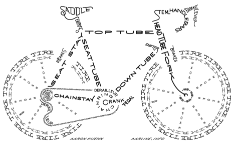 Designer of a nice typographic bike called
 Designer of Monster Bike (2019; an alphading typeface made from bike tools) and Him Her It (2019: an alphading typeface that pokes fun at the gender chaos). [
 Anne Ulku is an established designer based in Minneapolis, MN. She graduated from Minneapolis College of Art&Design in 2007. Her typefaces include
  Anton Koovit was born in Tallinn, Estonia, in 1981, and studied graphic design at the Estonian Academy of Arts, ESAG Paris and at the Gerrit Rietveld Academy in Amsterdam. In 2006, he obtained a masters in type design at
  Extraordinary Hungarian design talent based in Budapest, 1986-2015. I can't find enough superlatives to describe his work or find appropriate words to express my sadness when I learned of his death due to a
  Ata Syed (Karachi, Pakistan) has a dual identity at FontStruct, where he is one of the most prolific contributors. He is known there as
  Or Bart Wesolek, b. 1986. Nowa Sol / Poznan, Poland-based graphic designer, who published the vintage typeface Rheiborn, the display typeface Onufry (based on lettering on vintage cycling posters), the poster typeface Molheim, the letterpress typeface Darmond, the squarish Garthram, the vintage typeface Martslock, the
 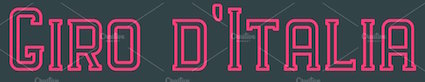 [
[ Graphic designer from Virginia who graduated at Virginia Commonwealth University in 2011. He works at DDB in New York. Creator of
  Graphic designer from Catania, Italy. He created the ultra-geometric typeface
  [
[ Bicycle racer in Houghton, MI, who also works as graphic designer. His bike race event posters are great, both visually and typographically. [
 Disciple of Philipp Luidl, b. 1967, Munich, Germany. During his studies in Vienna, Christoph Reichelt designed the modular retro typeface Grande Coppi (2016). In 2021, he released
  Ignacio Meza (Clean and Modern, and before that,
 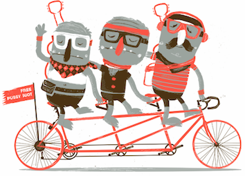 Dana Krusche (Berlin, Germany) created the (typographic) gig poster Free Pussy Riot in 2014.
  Madrid-based designer (b. 1982) of the free art deco typeface Lame (2014) and the experimental typeface Two Moons (2015).
  [
[ Yogyakarta, Indonesia-based creator (b. 1987) of the counterless architectural lettering typeface
  During her studies in Mexico City, Dulce Salazar designed the
  Illustrator in Berlin, whose brush and pen lettering on fashion posters is distinctive and powerful. Of particular beauty are her
  Visual communications designer in Germany. At
  London-based designer who created
  FONTana is a font design studio in Szeged, Hungary, started in 1999.
  Australian graphic and type designer who lives in Sidney. Born in 1986, Dave graduated with a Bachelor in Visual Communication from Swinburne University, and went on to work for 6 years as graphic designer in Sydney before a government scholarship enabled him to attend the Type and Media Masters held at KABK in 2011-12. His early
  J.F.Y. Daniel Gauthier (GautFonts) was born in Montreal in 1964, and lives in Hamilton, Ontario. His fonts from 2005 and before include BarrelOfMonkeys, ChainFontOpen, ChangChang, ChangChangWoodcut, DirtyDarren, FireStarter, GriffinDucks, Jenna Myles, LollipopLettering, Lymphnodes, PooCorny, PooSmooth, Quake3ArenaBats (scanbats),
  Graphic designer in Krakow (was: Warsaw), Poland, who specializes in vintage design elements. Their typefaces include the tweetware weathered / rustic font Black Willow (2016) and the free rough rounded sans Quickens (2018). In 2019, they released the great free vintage engraved money (or old map) font Vaderlands which is based on an original in a Dutch book dated 1781. [
 Graviton is a small type foundry based in Buenos Aires, Argentina. It was founded by Argentinian type designer Pablo Balcells in 2013.
  Bordeaux, France-based designer of the rounded stencil typeface Libournavelo (2015, +icons). This font is used to promote bicycling in the city of Libourne. He also made a flowing hand-printed typeface for La Table de Josephine, a restaurant in the Hotel Kyriad in Bègles, France.
  Chilean type designer, aka Coto Mendoza, located in Concepcion, Chile. She created the cooking dingbat typeface
  Hyderabad and/or Visakhapatnam-based creator (b. 1992) of the free outlined typeface
  Design group associated with
  Jakarta-based creator of a beautiful set of posters in 2012 for an event called
  Mobaric Minhas is the Auckland, New Zealand-based designer of the old typewriter typeface families AMTW (2016), Typerighter (2016), Silk Remington Typewriter (2016),
  Graphic designer and ilustrator who designed the icon sets Running, Swimming and Cycling in 2020. [
 London-based creator of
  [
[ [
[ Kaiser Zhar Khan (b. 1980, Chile), aka Zanatilja, used to run a new defunct archive called True Type Fonts. He also designed many typefaces himself. The most famous among these is his free African-themed typeface South Afirkas 2100 (2009), which is downloadable from
  [
[ In the late 1990s, Klaus Johansen from Odense made gorgeous (free) dingbat typefaces such as Fabeldyr, Ancient Heads, Art Nouveau Headers, Art Nouveau Women, Atleter,
  Student at Rocky Mountain College of Art and Design majoring in Communications Design. Mara lives in Colorado. Mara's font
 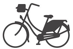 Michael Nÿkamp (MKN Design, Grand Rapids, MI) is a designer and illustrator born and raised in Ontario Canada. He won an award in 2014 at the
  [
[ Graphic designer, who has an MFA in Graphic Design at Otis College of Art & Design (Los Angeles) in 2012. She currently teaches graphic design at the University of Nevada, Las Vegas and is Creative Director at Blue Taco Design in Las Vegas. Monica created a few experimental typefaces in 2012, such as
  [
[ Nate Williams is a designer and illustrator in Washington. Creator of the free font
 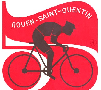 London-based illustrator and graphic designer who made a great set of (typographic) posters of bike races in 2012.
  [
[ Super-talented Montreal-based illustrator and digital artist.
 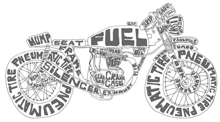 Austin, TX-based illustrator who runs Paulville Studio. Creator of a great typographic poster called Cafe Racer (2013).
  Based in Shanghai, Pop Chang is an original and creative designer, illustrator and photographer. His typographic work includes
  Renzler Designer is Hans Renzler's design studio in Vienna. For a bike store, the created Lovelo (2012, an animated typeface) and the inline typeface
  [
[
 The Northern Block (TNB) is Jonathan Hill's foundry based in Leeds and/or Sheffield and/or Newcastle, UK, est. 2006. The designer and funder is
  Typefaces from 2011:
 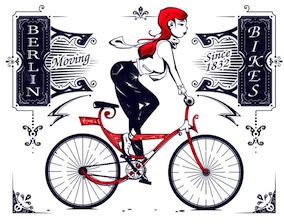 Illustrator in Berlin, whose work involves fresh creative lettering. His businessman poster series is exceptional.
  Bristol, UK-based illustrator and graphic designer who created several Tour de France posters for Le Coq Sportif between 2012 and 2014.
  Born in Finland, Tomi Lahdesmaki graduated from Academy of Art University in San Francisco. Now based in London, where he runs a studio called Harvest, Tomi created several typefaces in 2014, including the all caps decorative series Mastodon, the fat typeface / light sister combination called Aune, and the heavy titling sans typeface Scandal. He also created several interesting sets of icons.
  Carsten Raffel (b. 1973) is a graphic designer and illustrator who studied communication-design in Hildesheim, Germany. Since 1999 he has been working for the Hamburg-based design studio MUTABOR as a graphic designer and illustrator, and published parts of his work in Mutabor magazines 9 and 10 and in lingua grafica.
 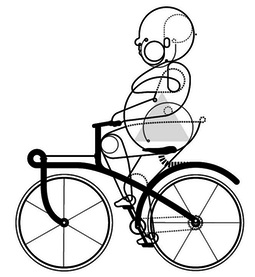 Über-talented and original illustrator based in Brighton, UK. Creator of
 Prolific Barcelona-based type designer. He started out by creating the counterless hand-printed typefaces Woodcutter Dripping Nightmare (2012) and
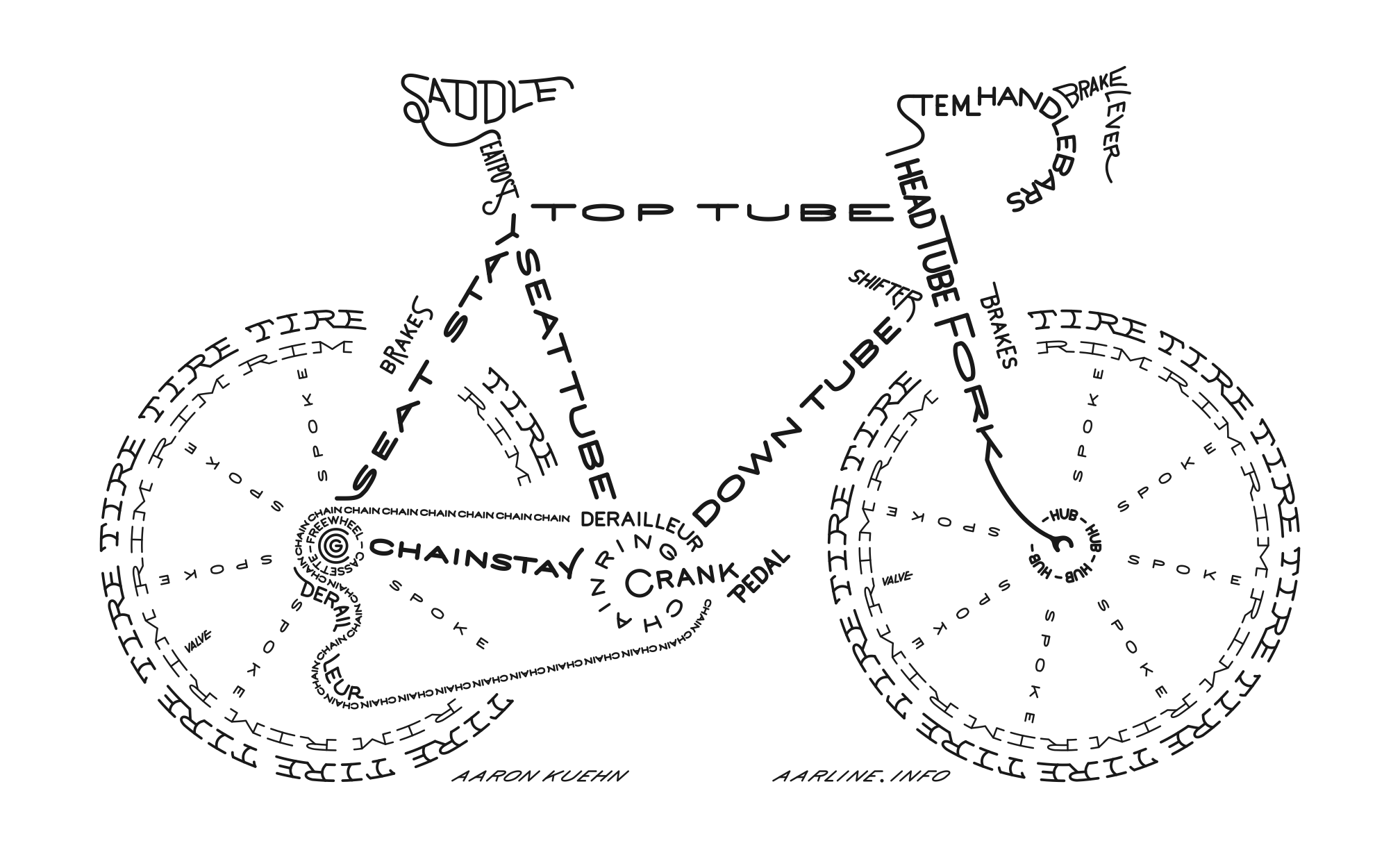
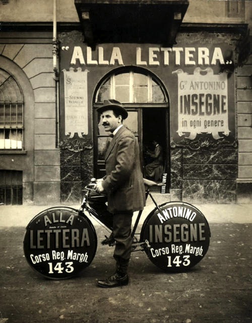
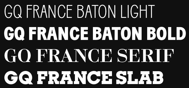
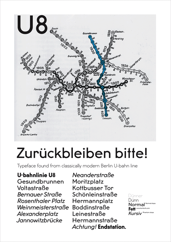
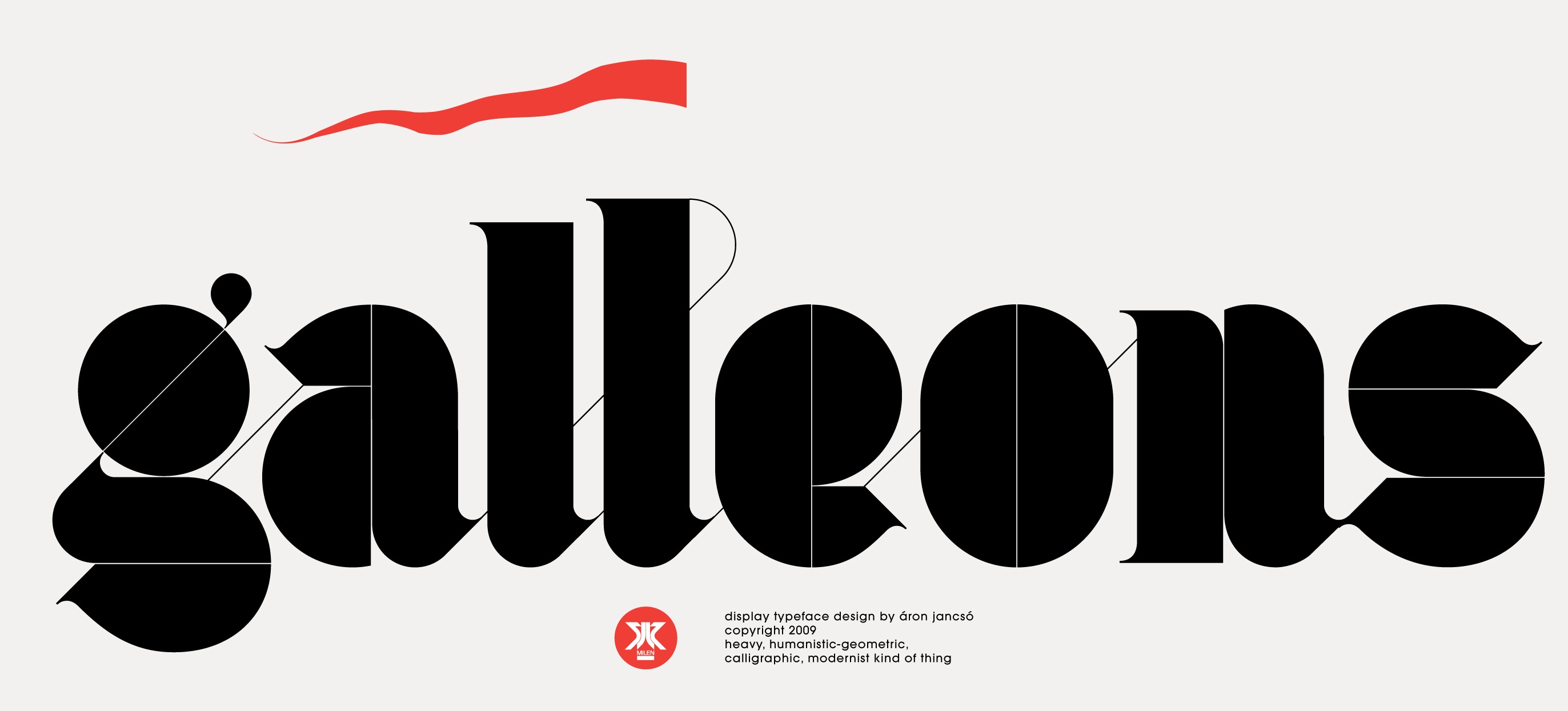
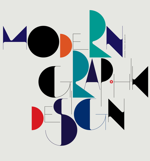
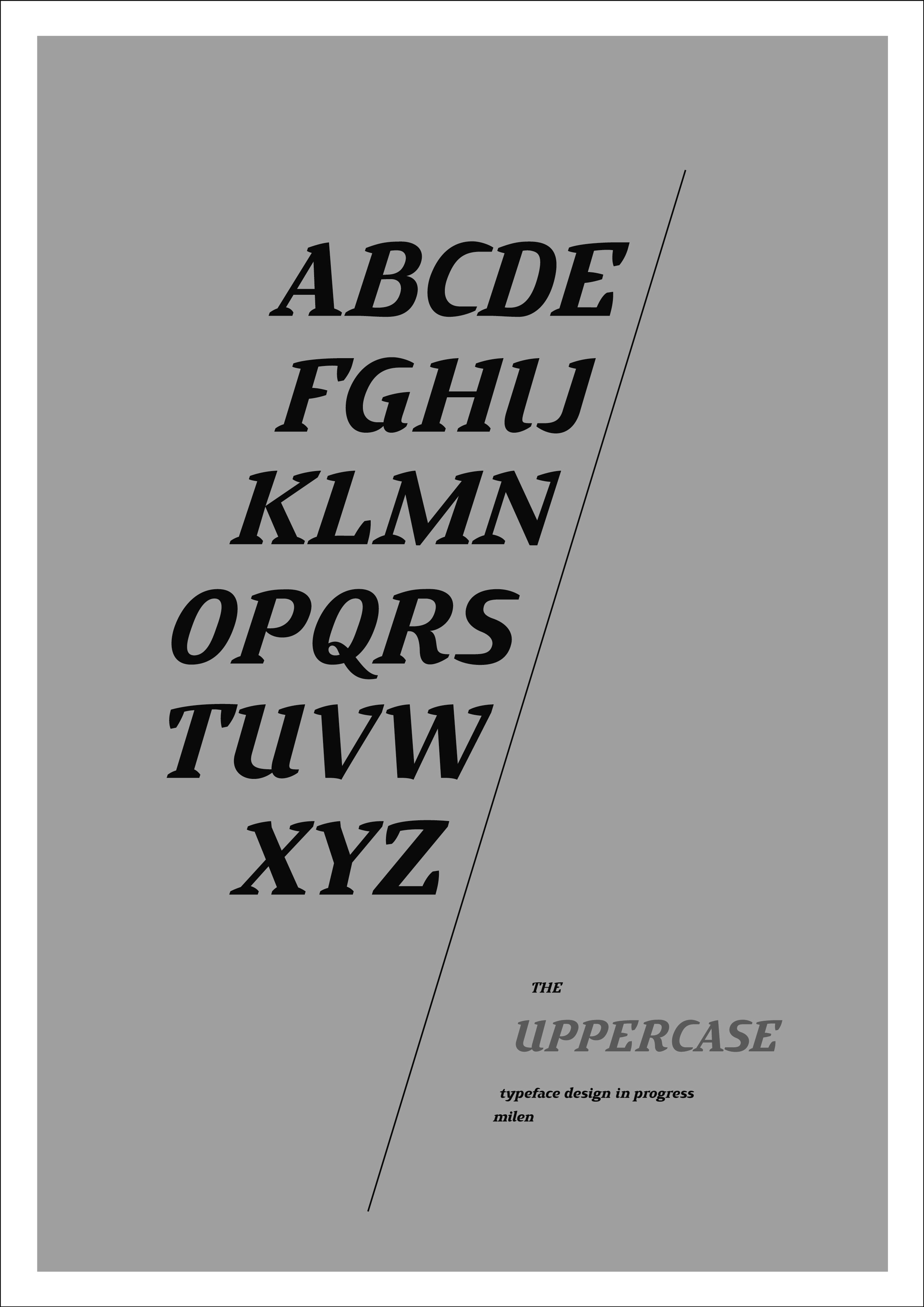
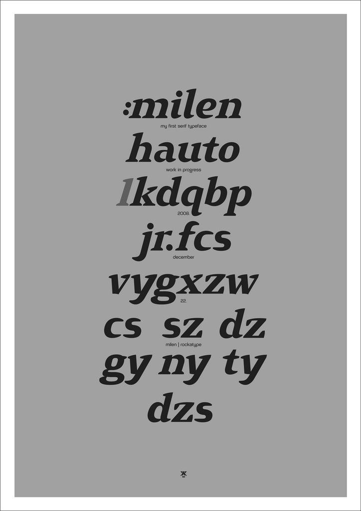
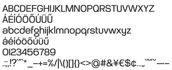
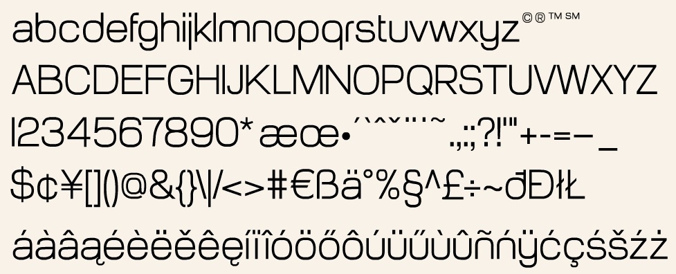
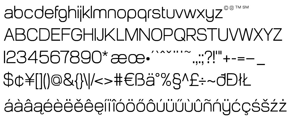
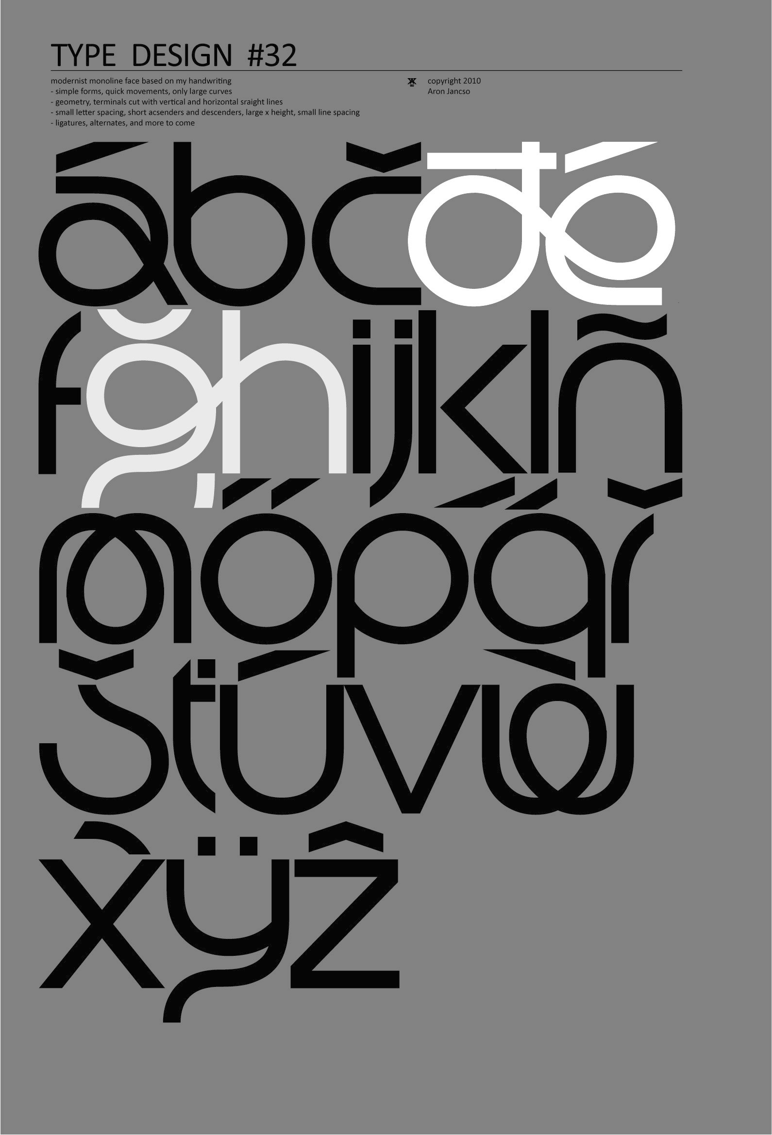
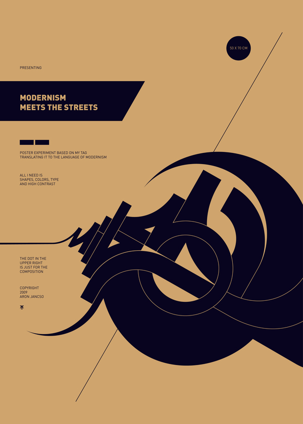
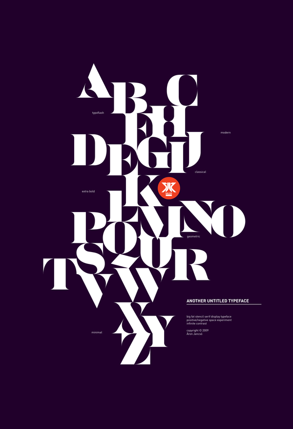
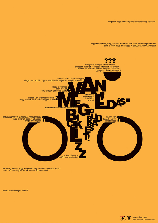
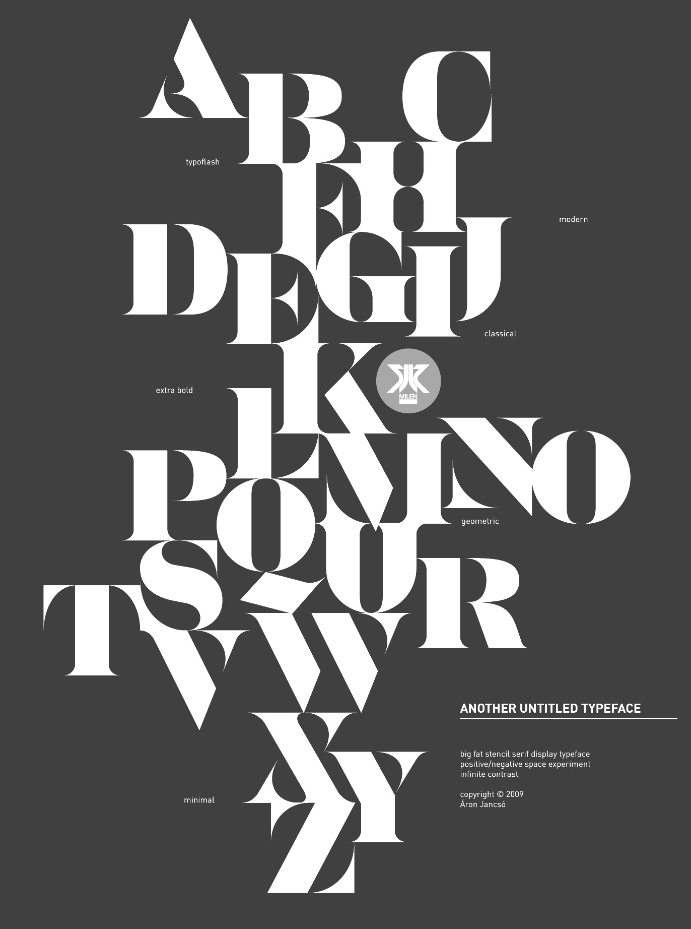
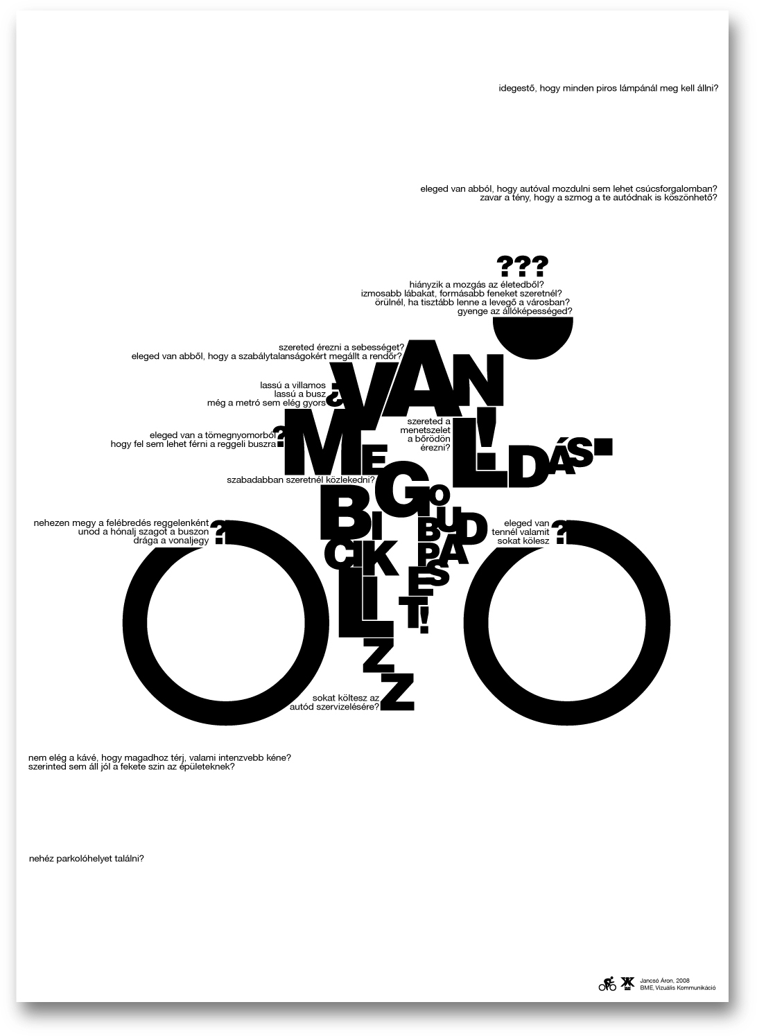
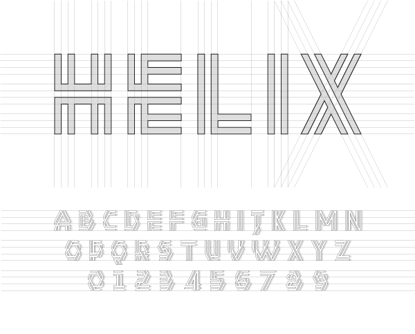
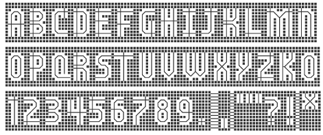
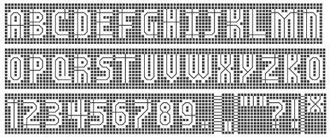
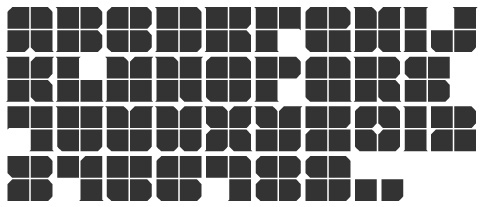
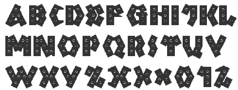
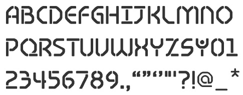
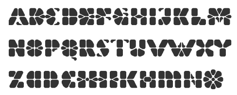
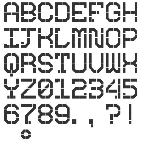
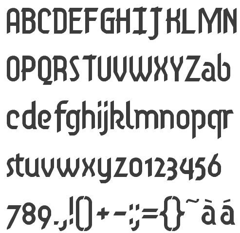
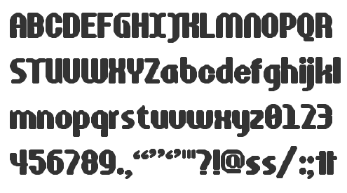
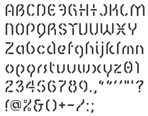
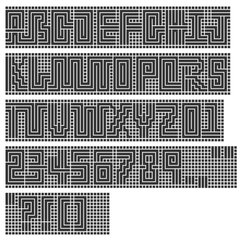
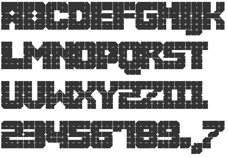
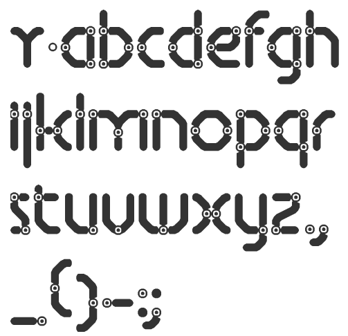
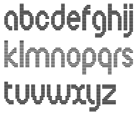
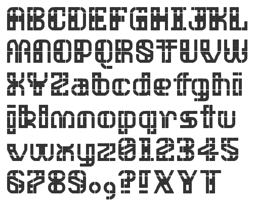
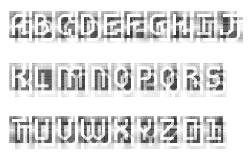
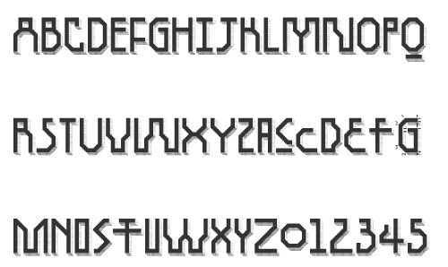
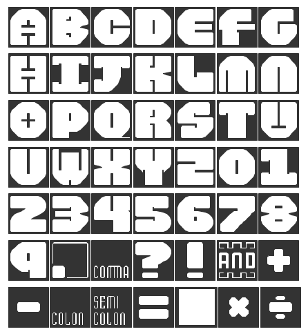
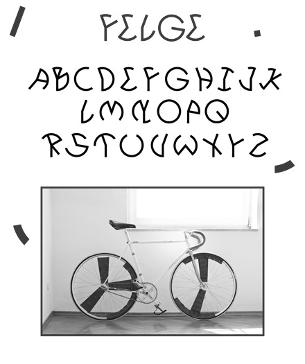
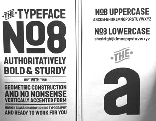
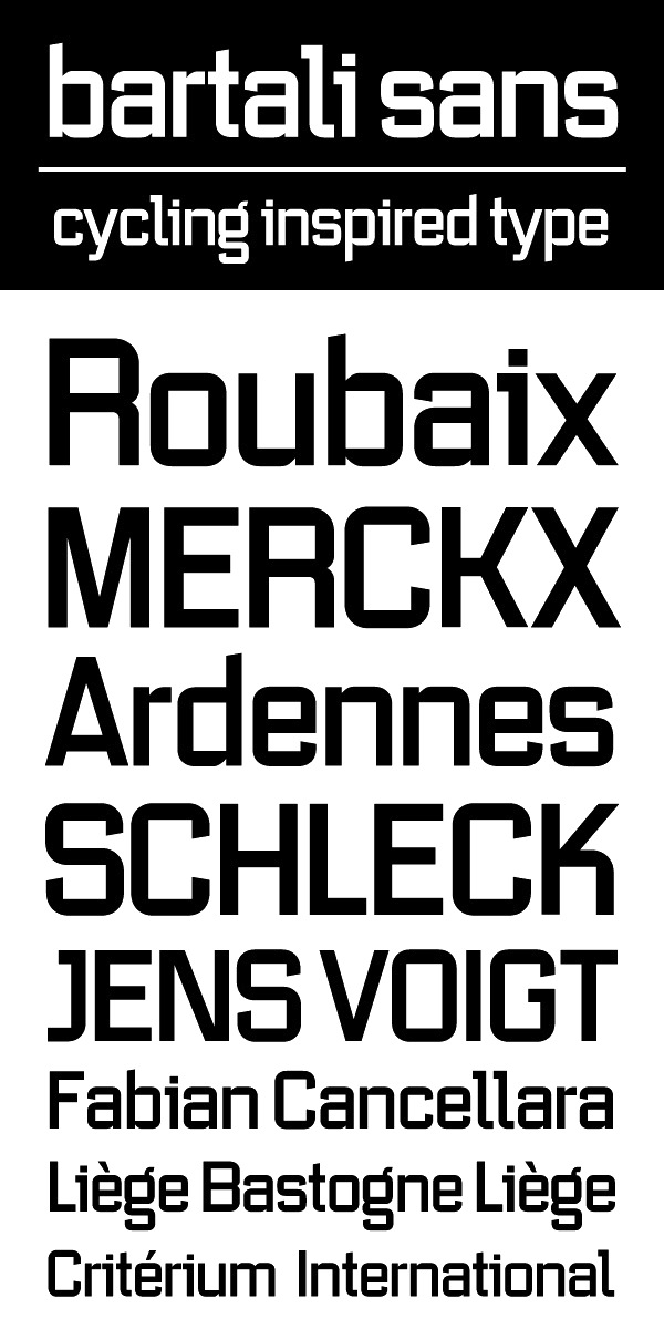
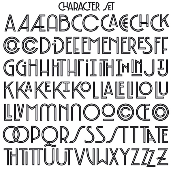
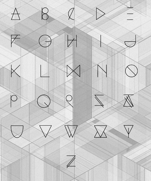
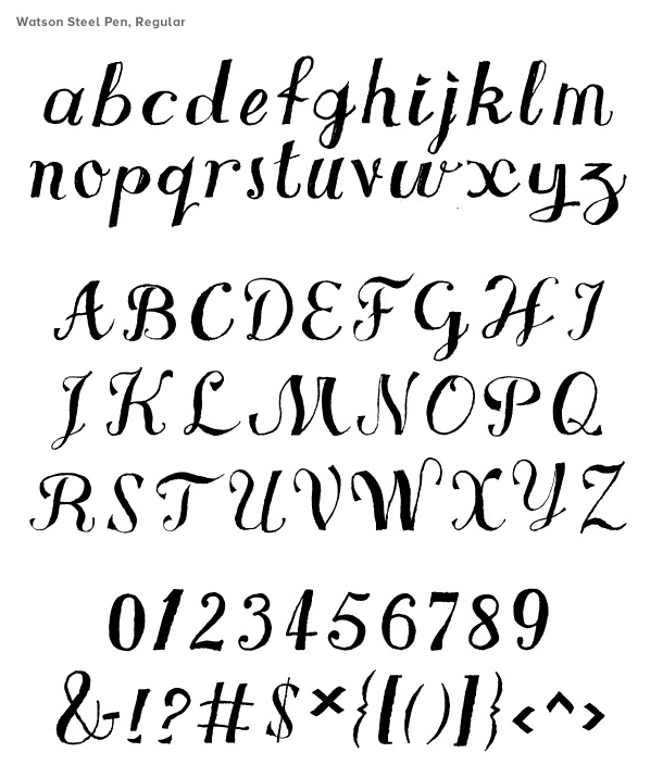
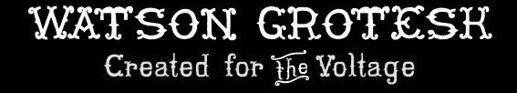
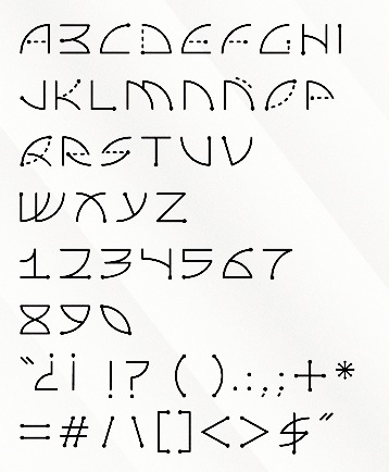
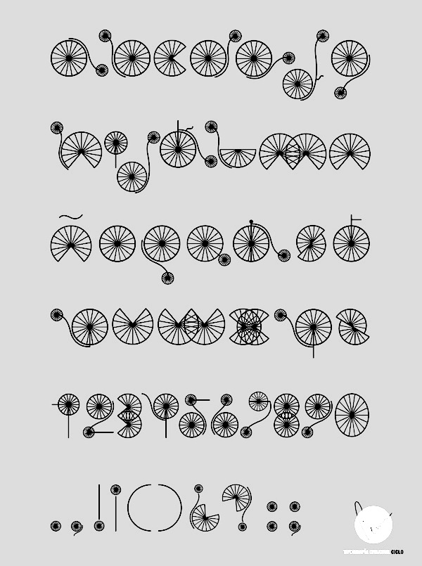
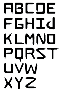
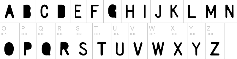
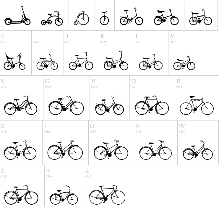
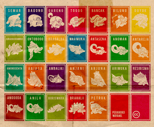
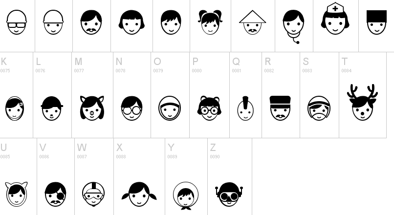
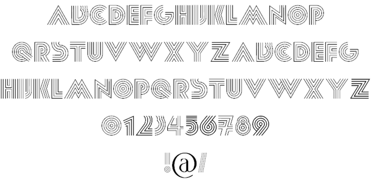
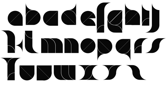
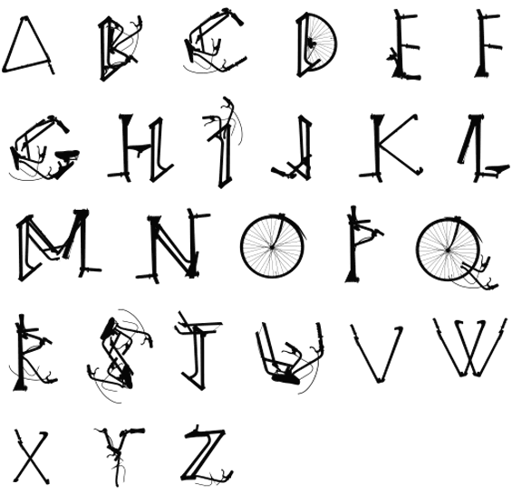
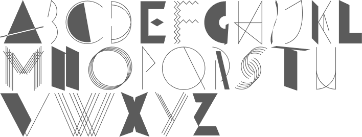
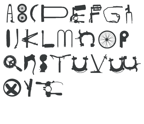
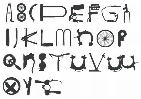
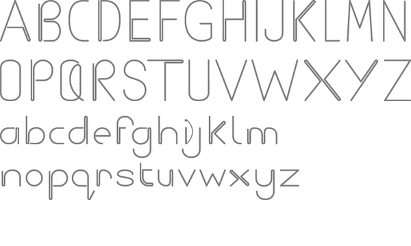
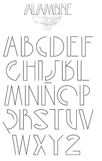
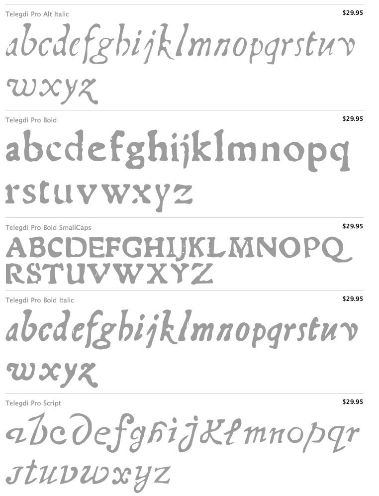
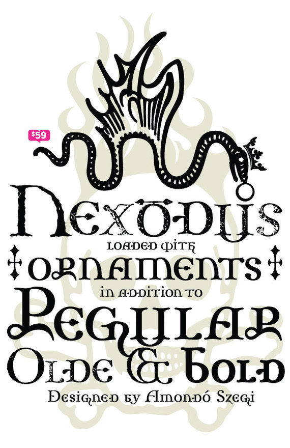
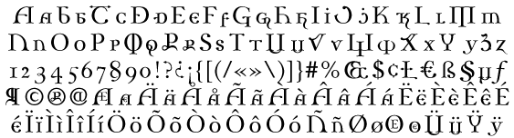
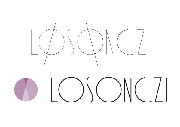
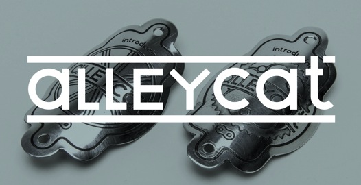
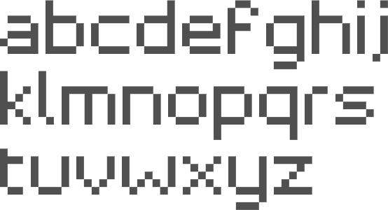
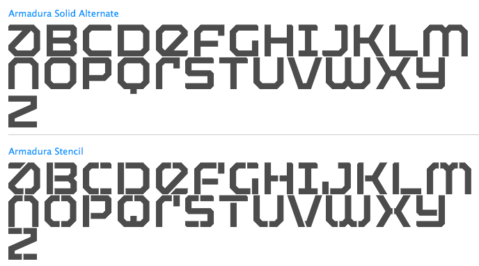
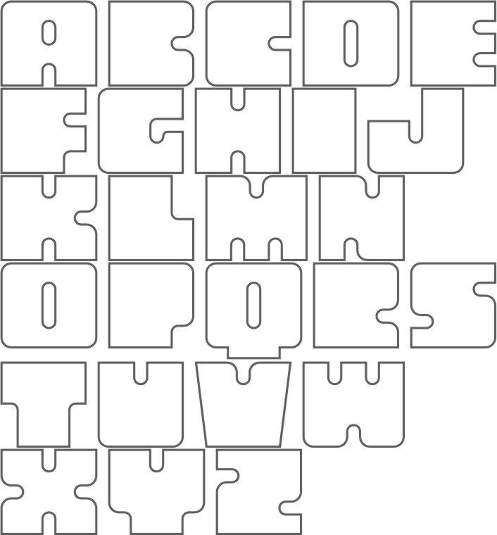
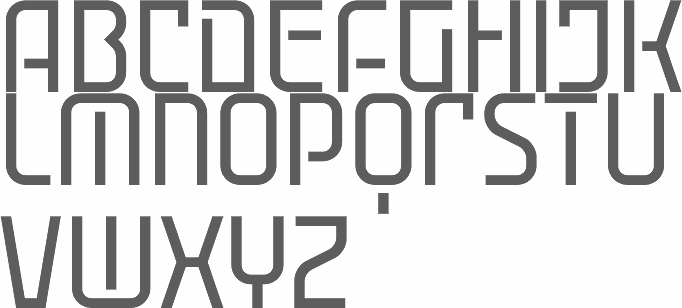
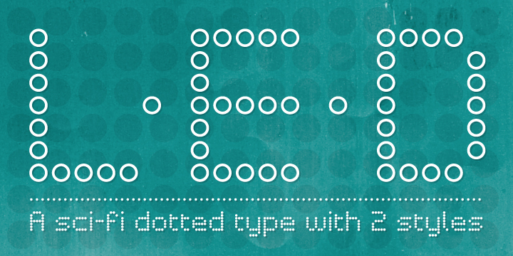
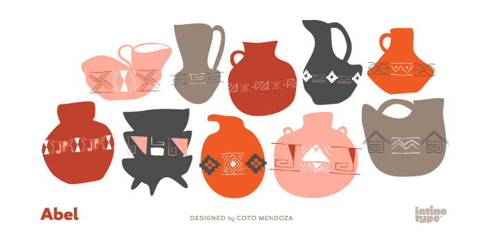
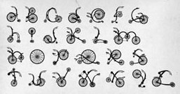
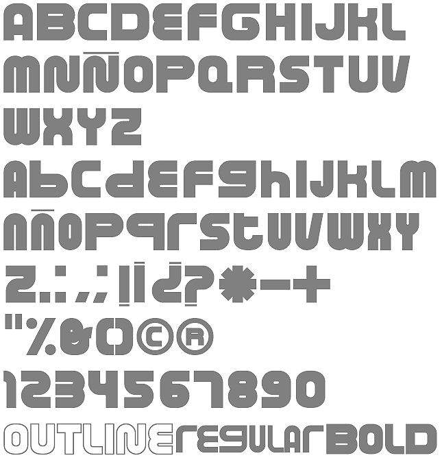
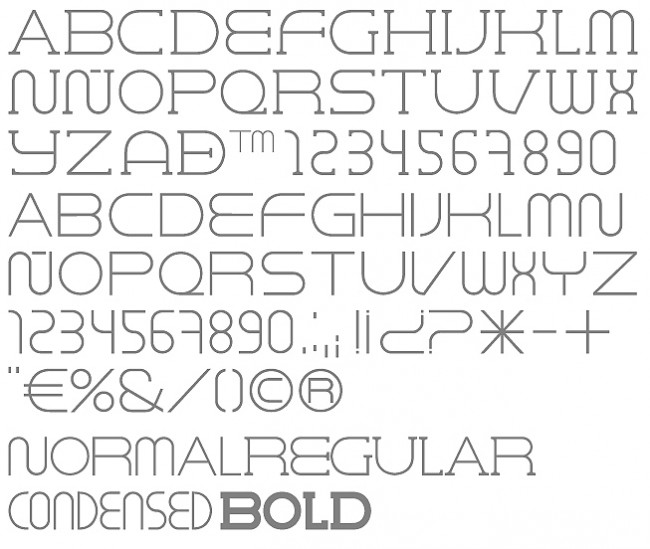
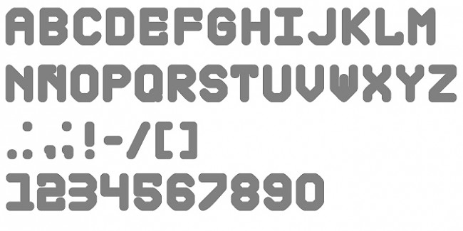
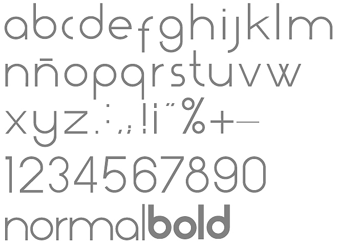
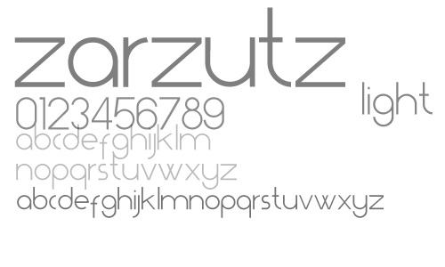
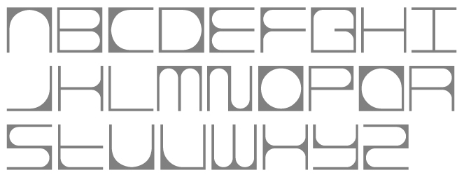
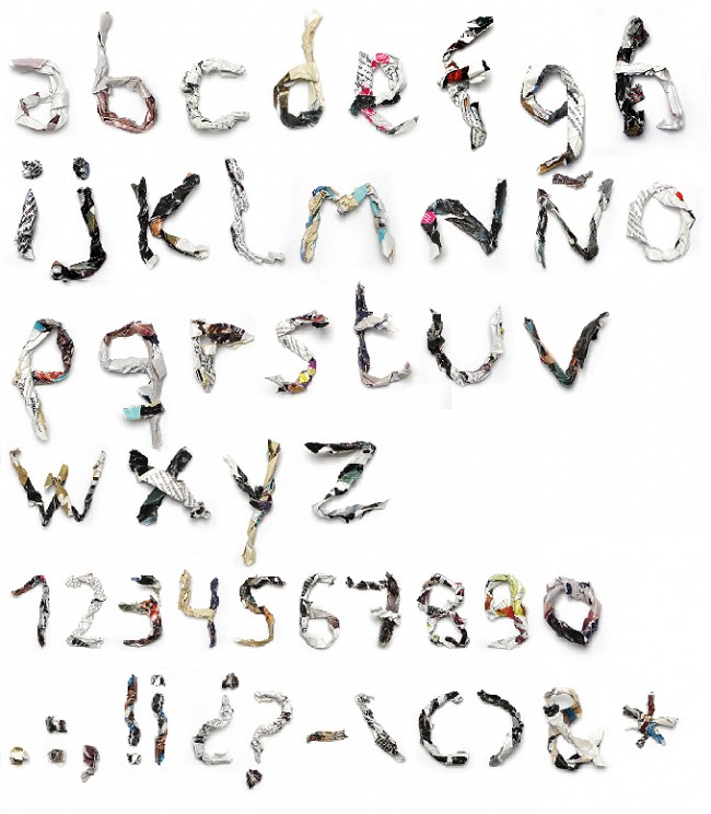
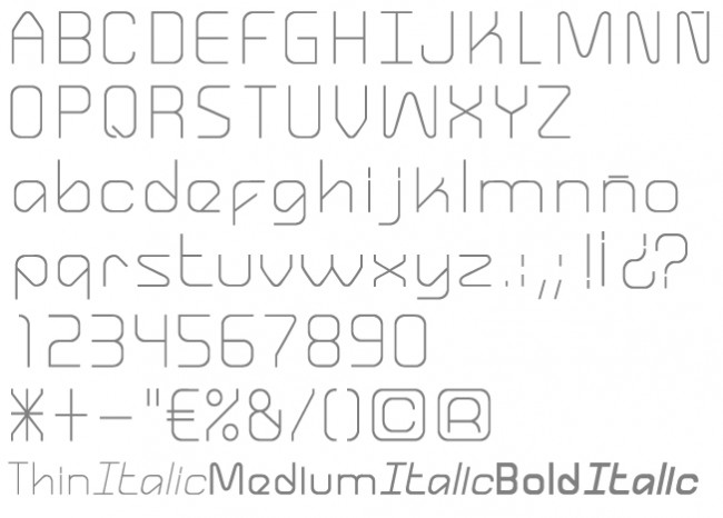
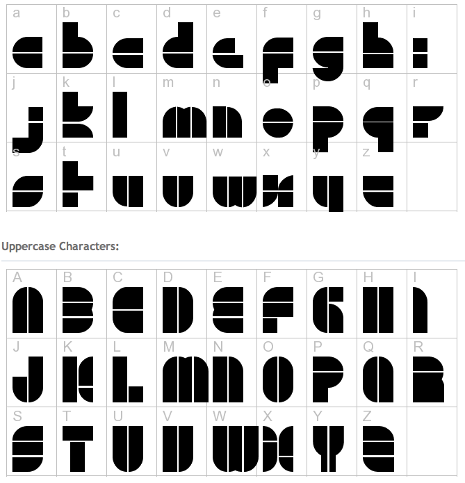
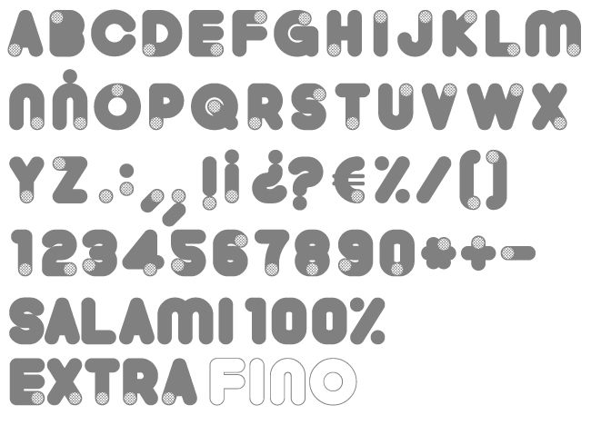
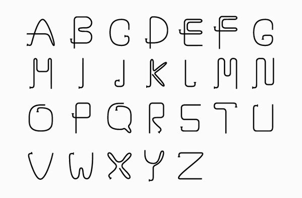
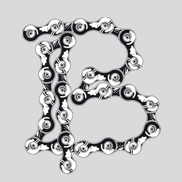
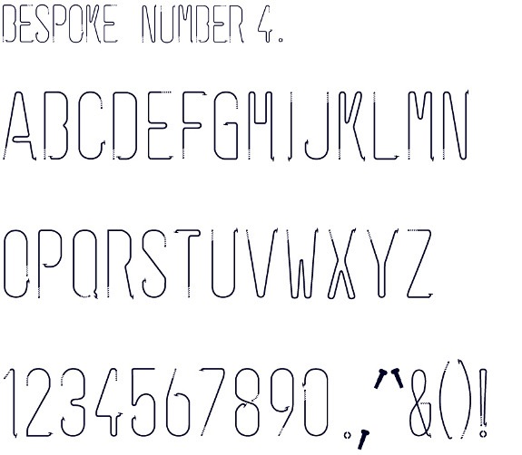
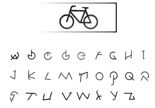
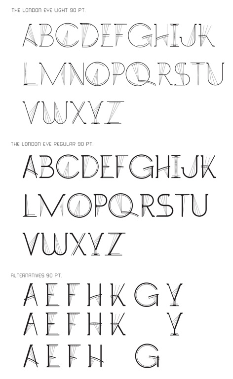
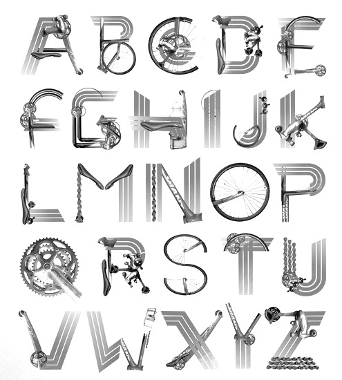
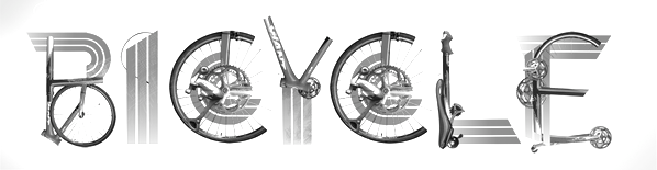
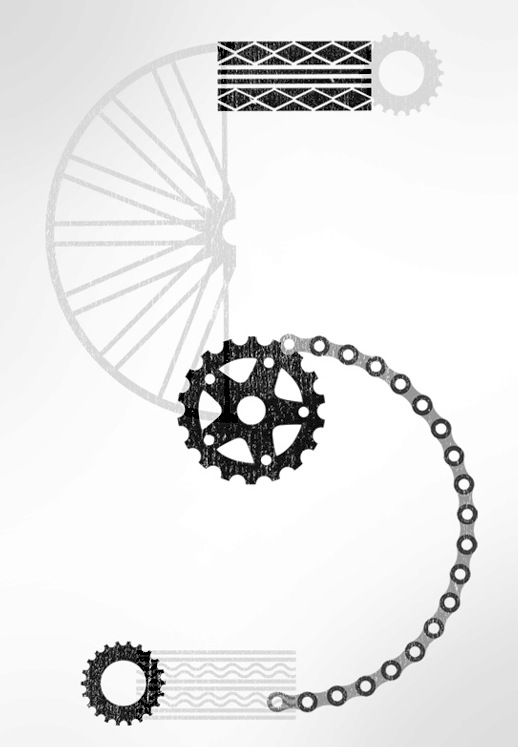
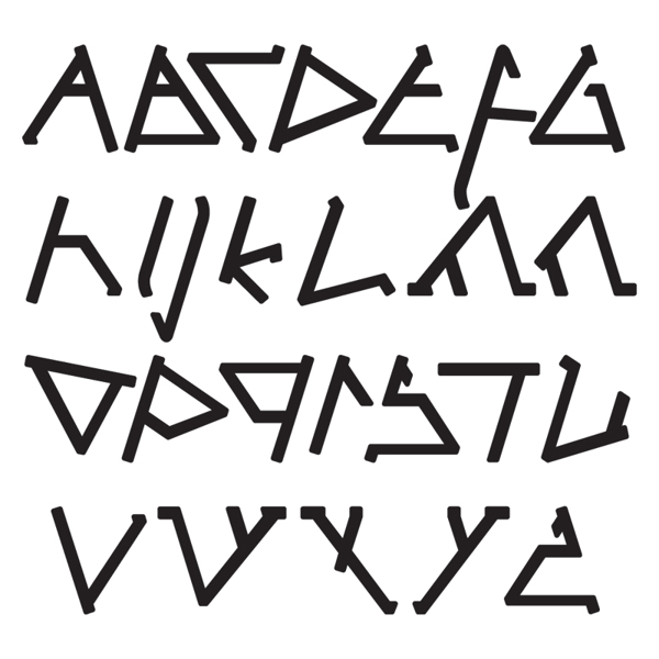
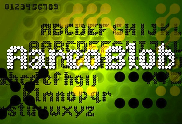
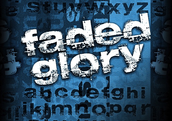
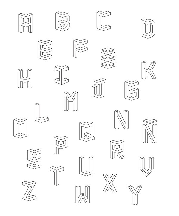
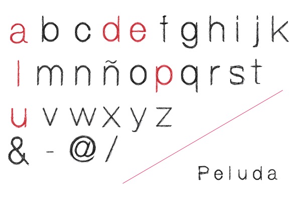
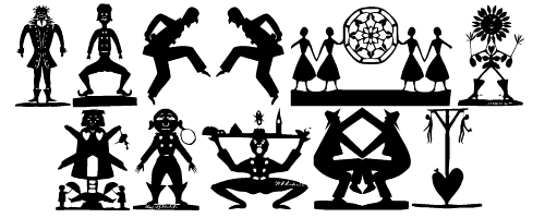
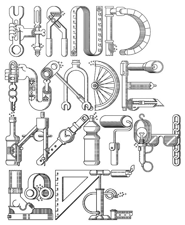
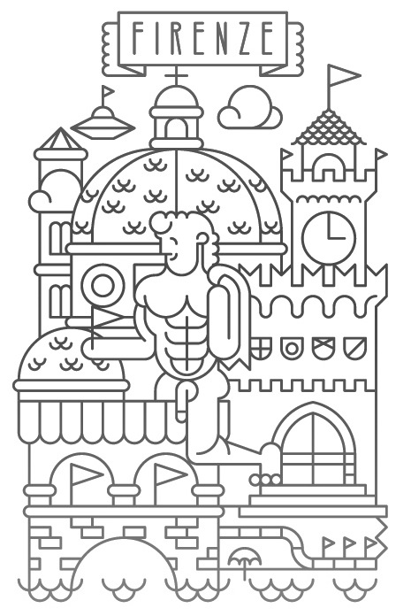
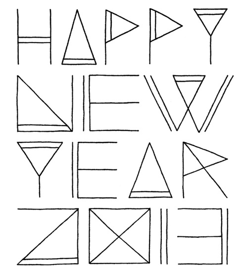
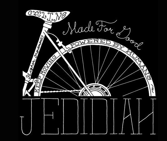
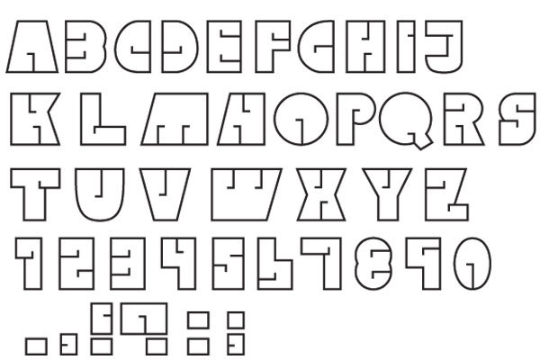
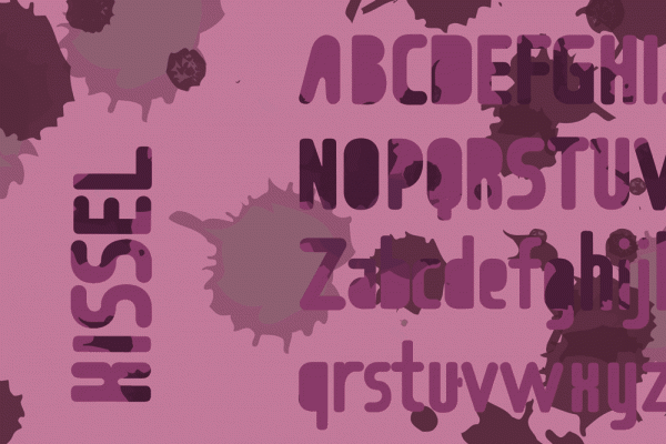
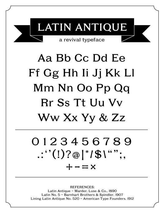
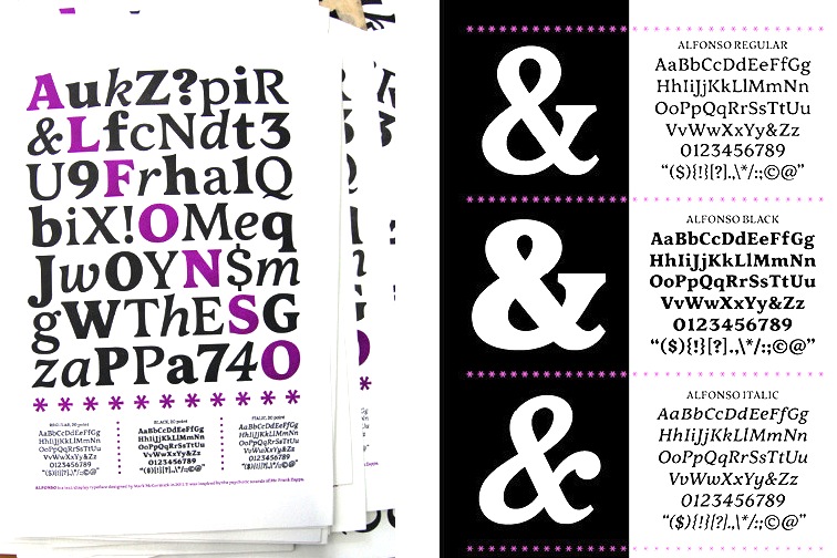
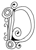
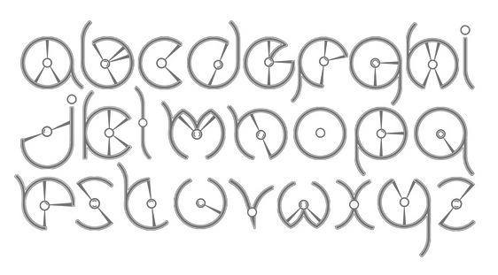
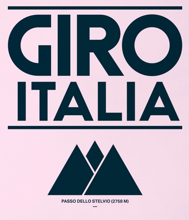
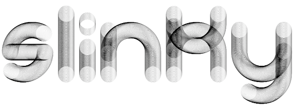
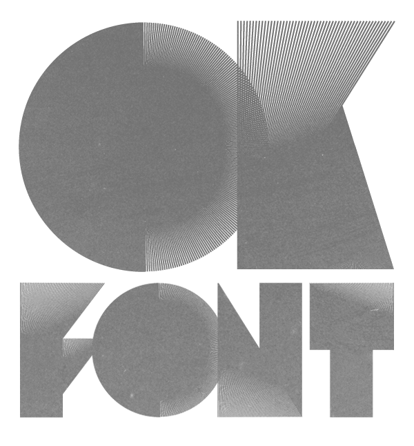
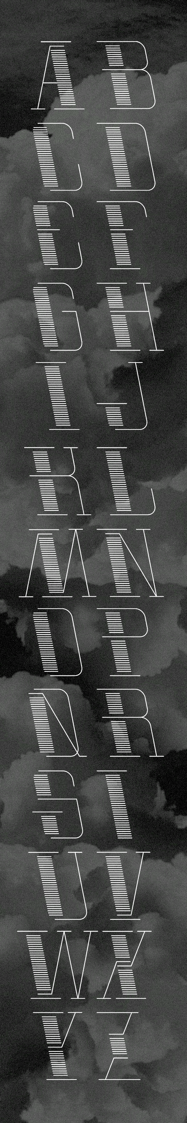
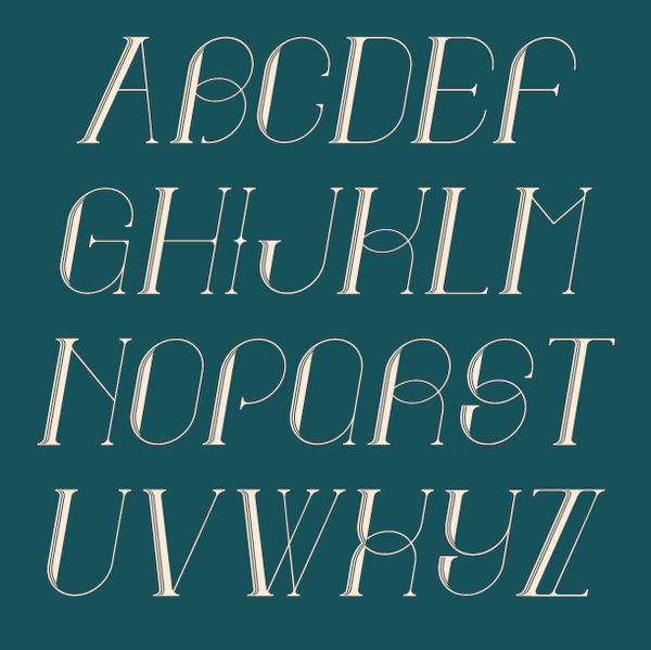
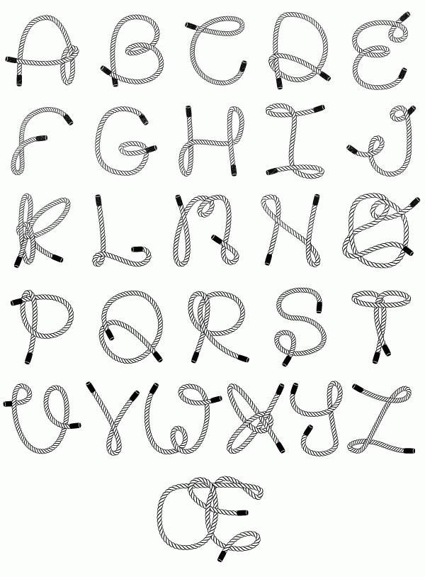
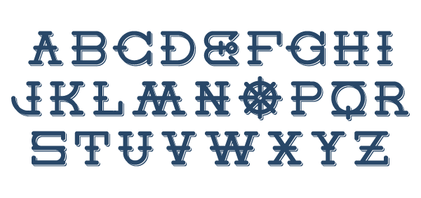
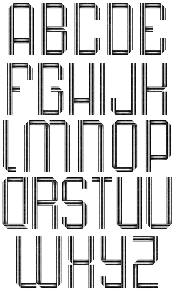
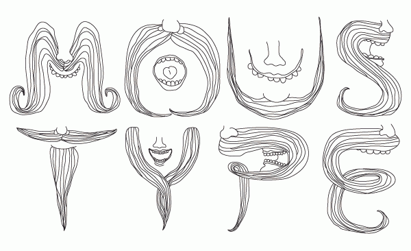
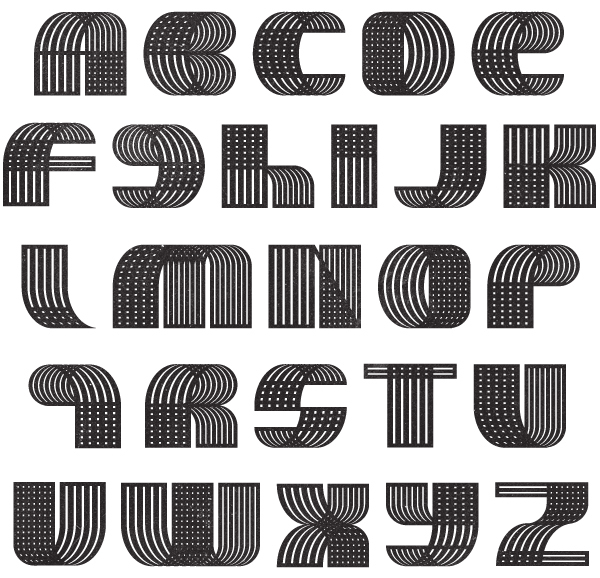
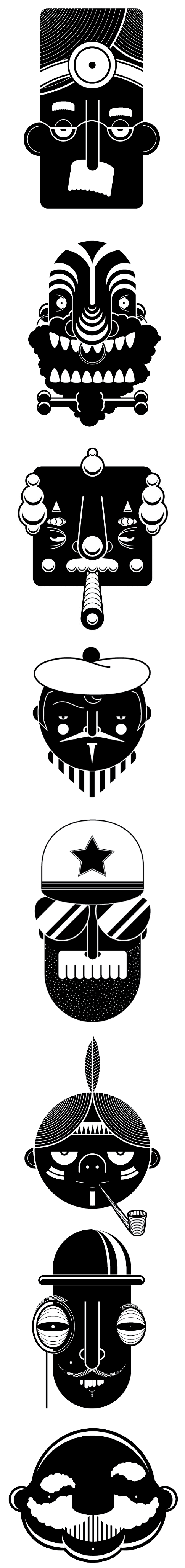
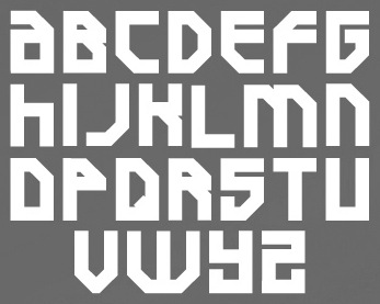
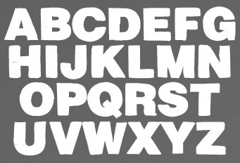
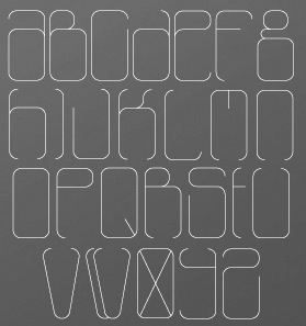
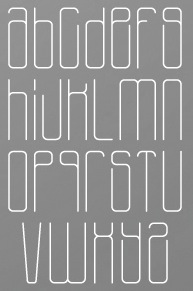
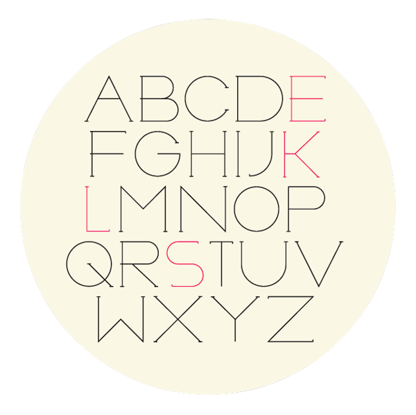
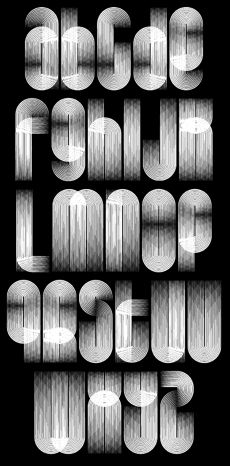
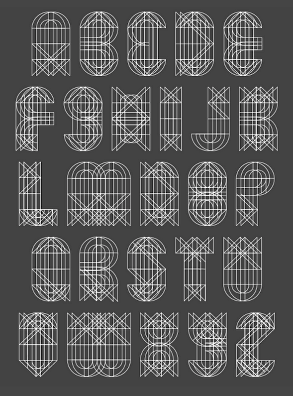
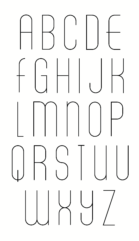
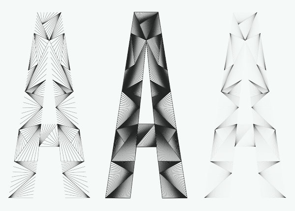
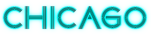
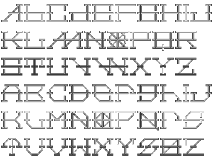
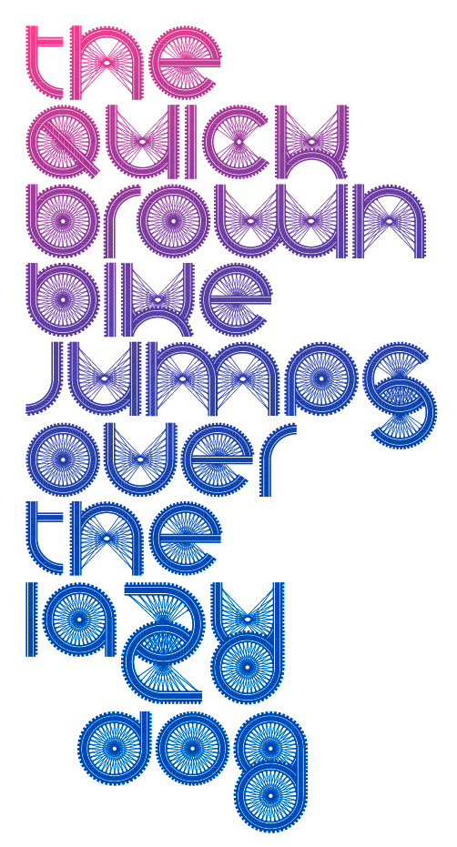
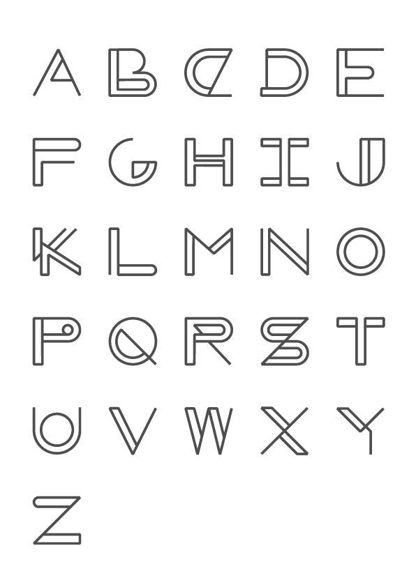
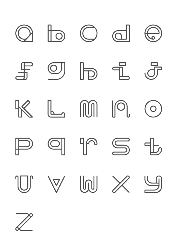
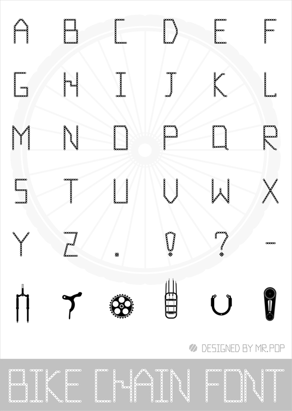
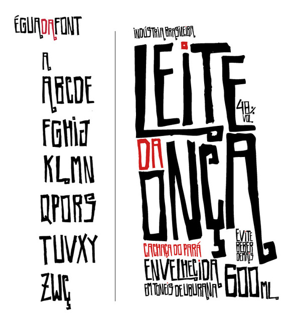
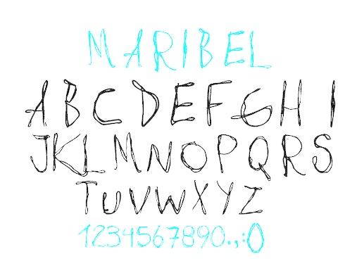
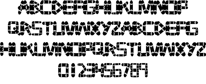
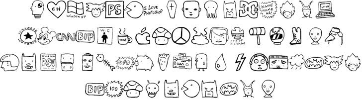
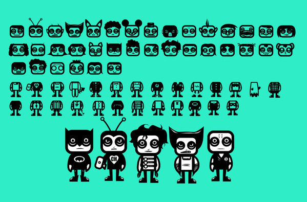
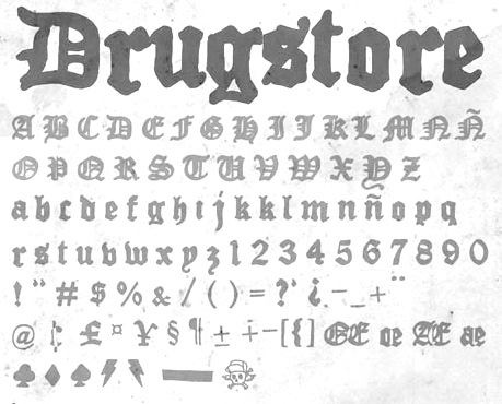
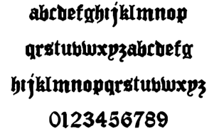
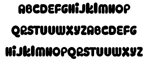
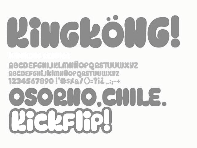
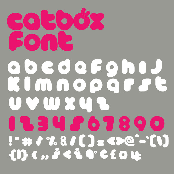
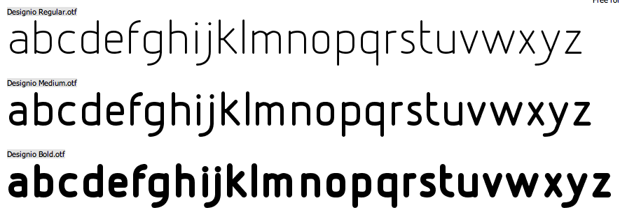
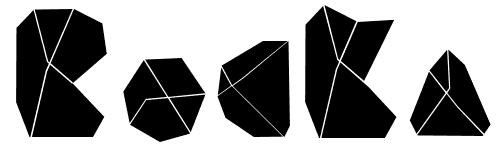
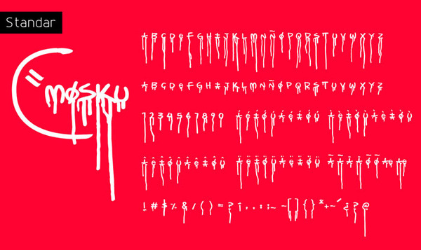
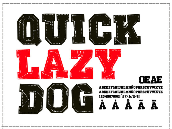
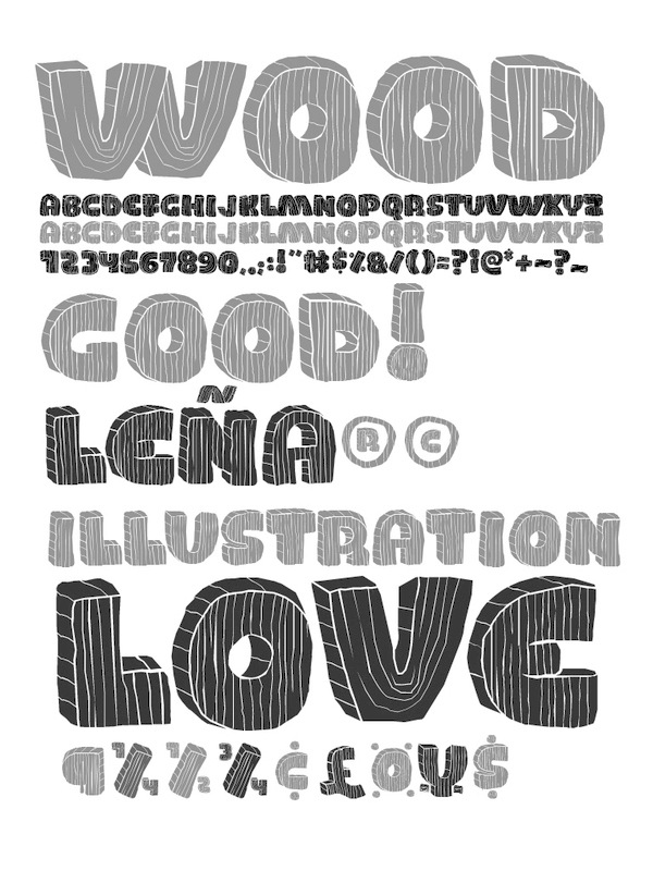
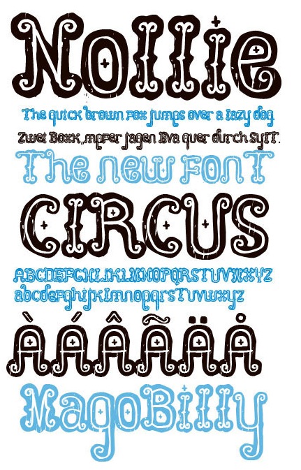
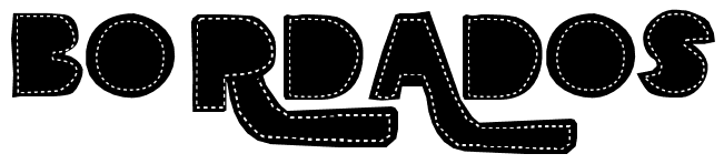
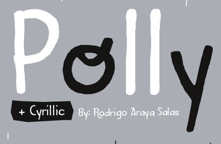
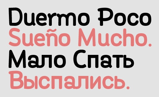
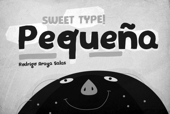
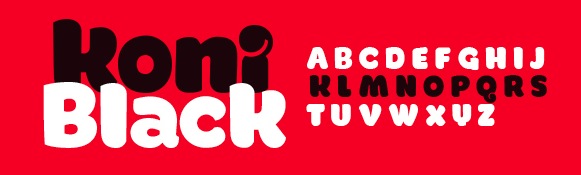
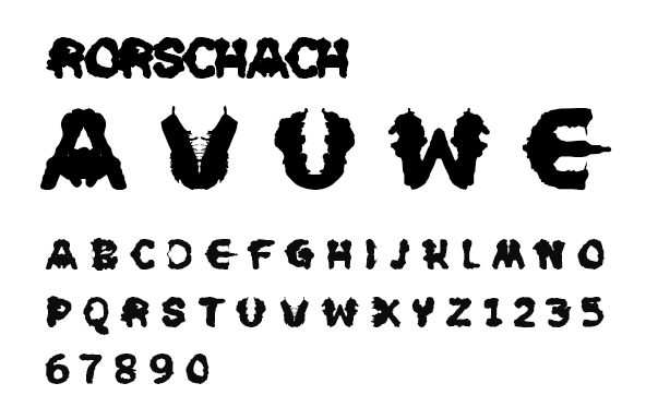
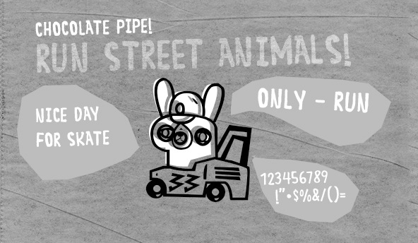
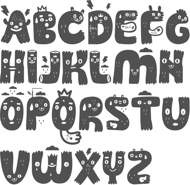
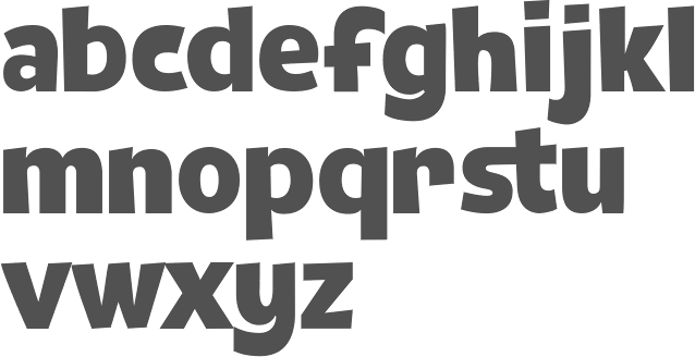
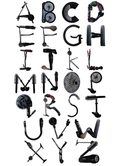
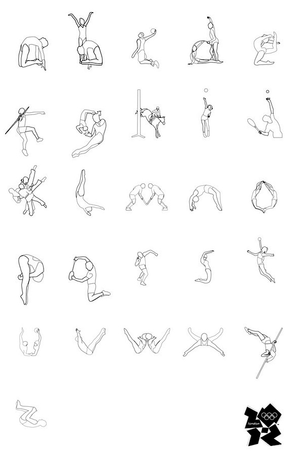
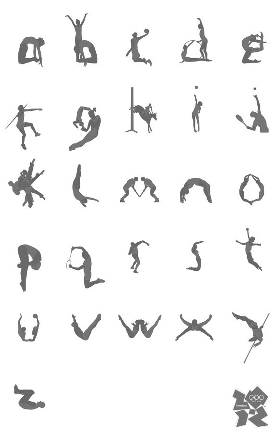
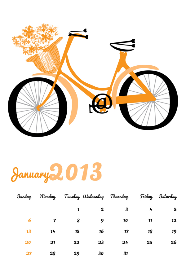
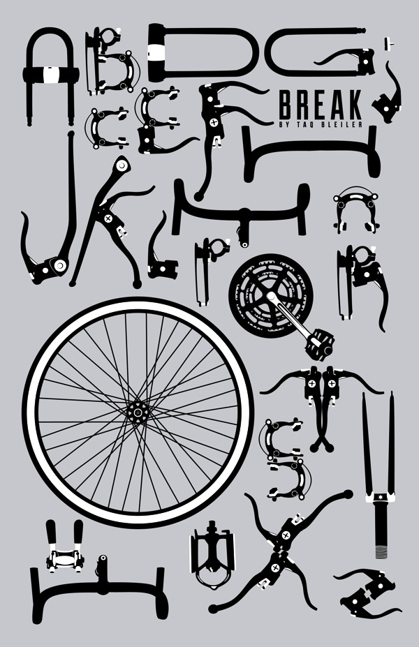
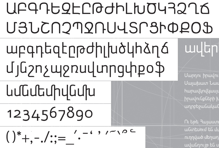
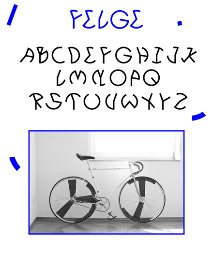
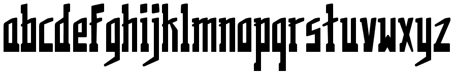
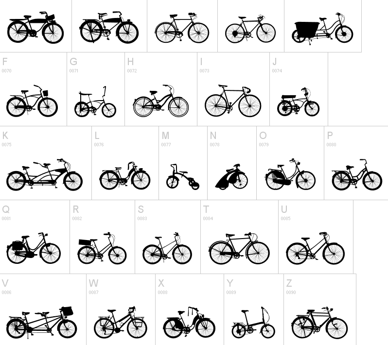
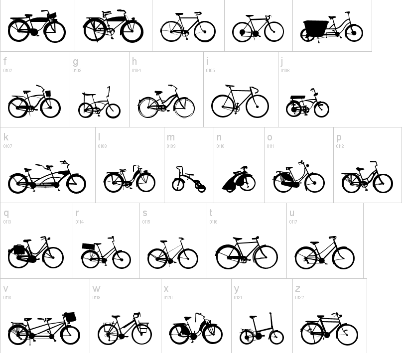
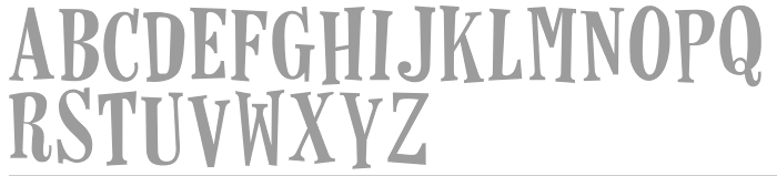
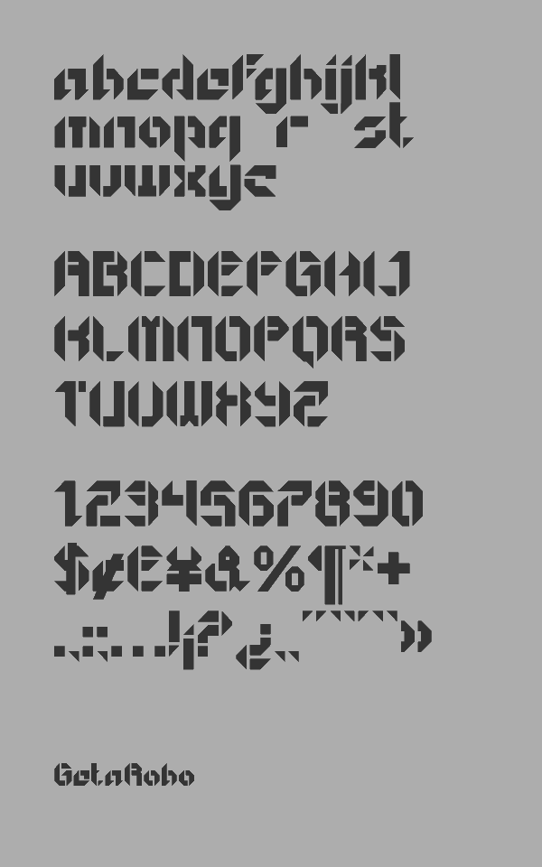
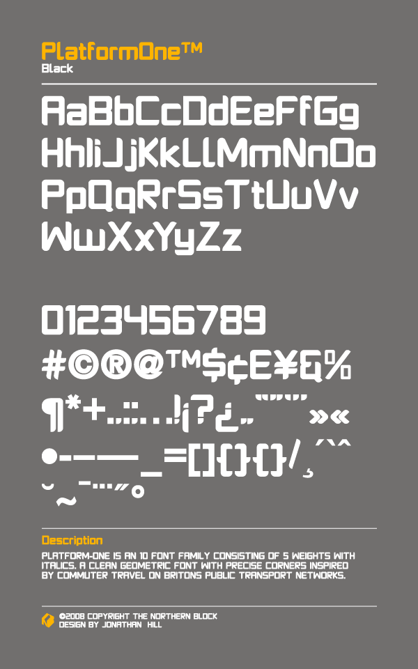
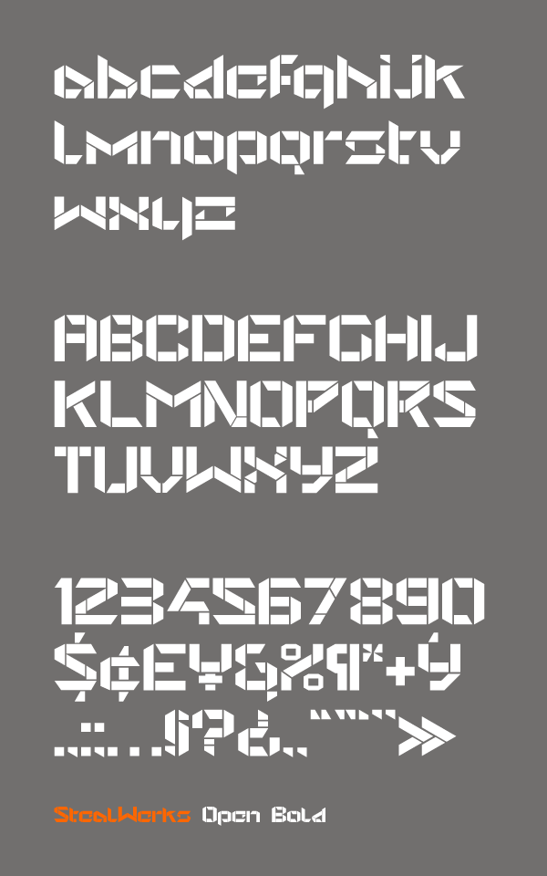
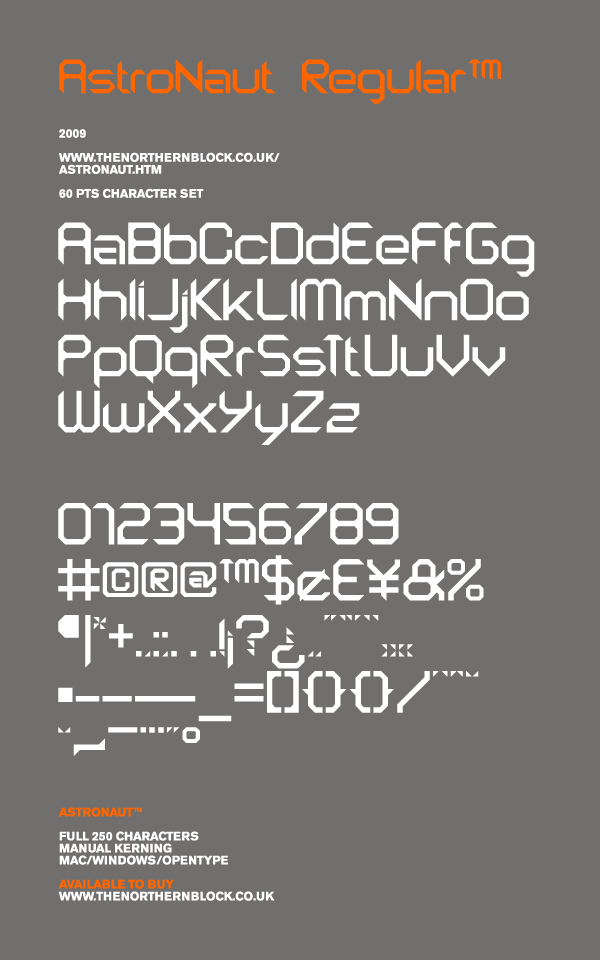
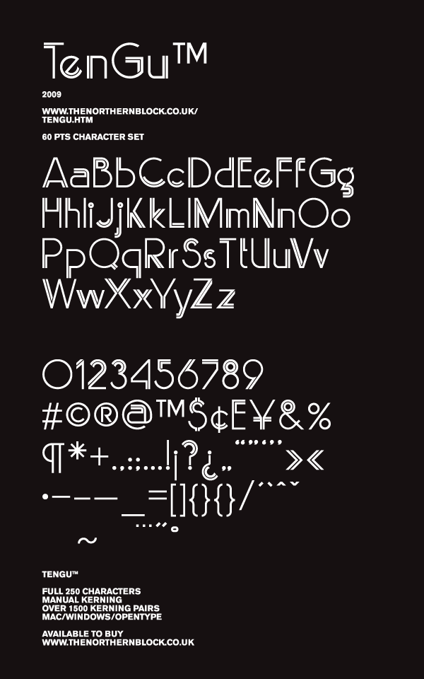
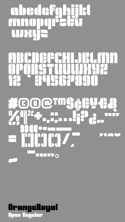
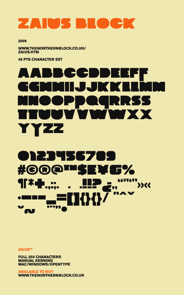
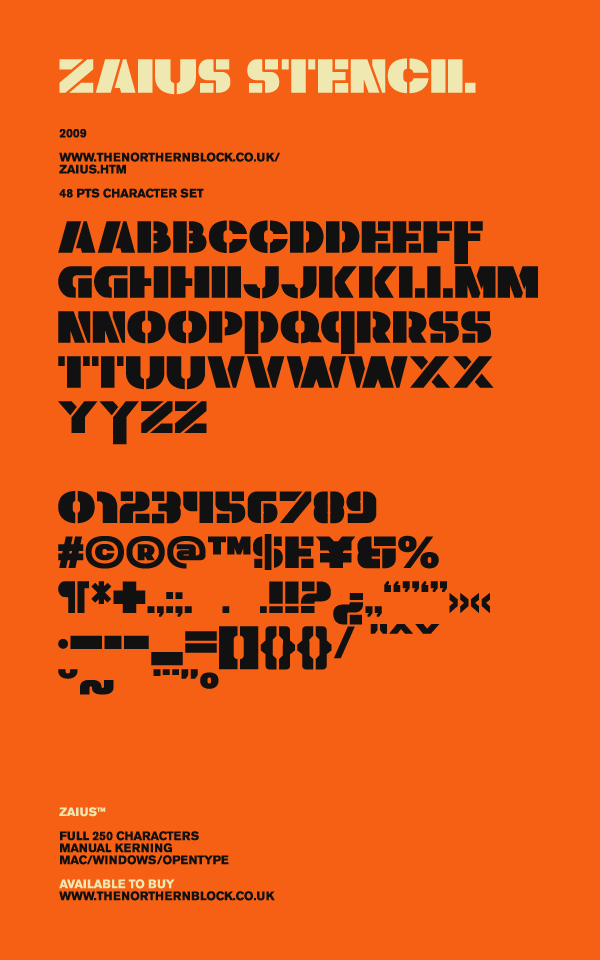
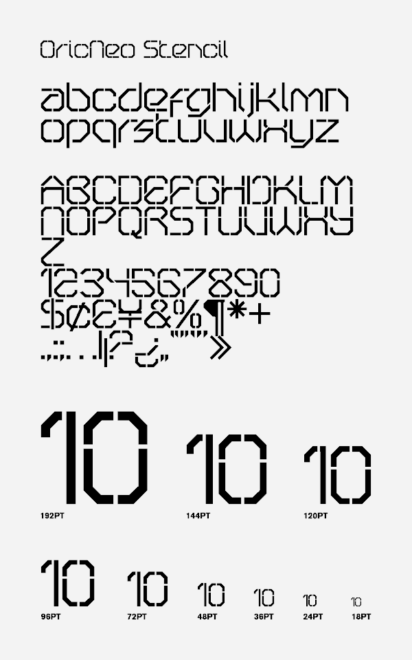
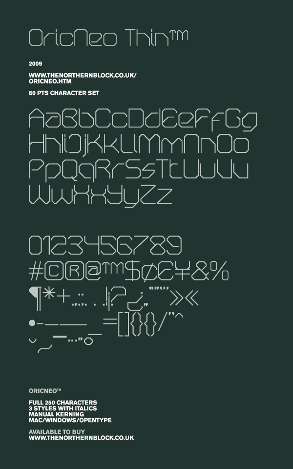
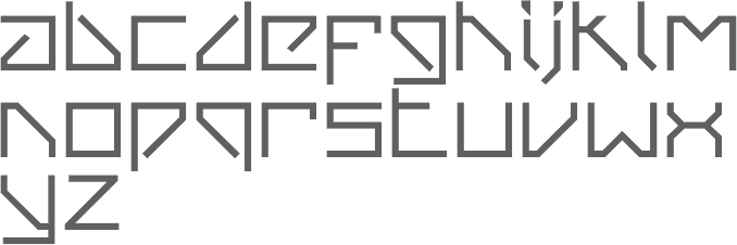
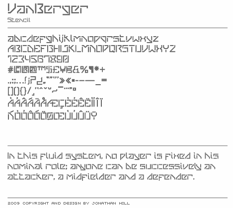
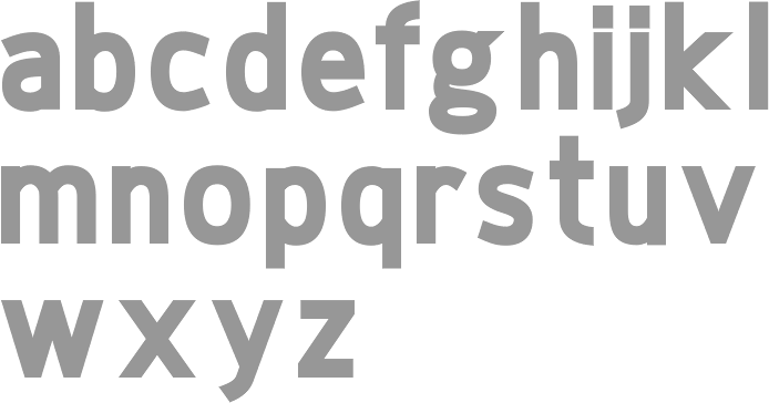
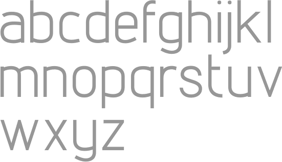
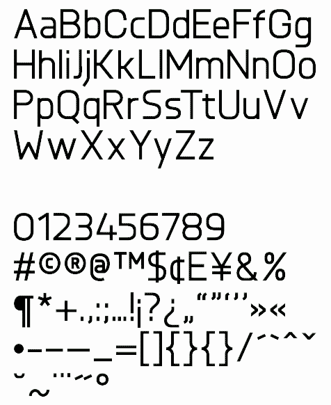
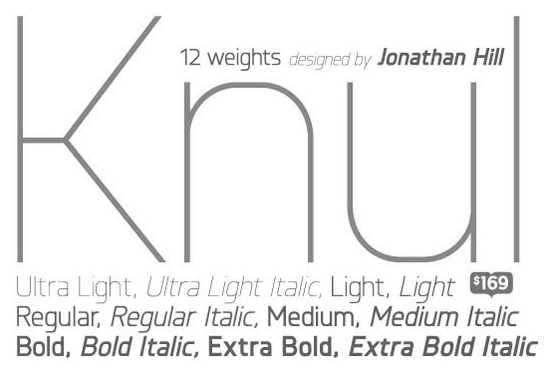
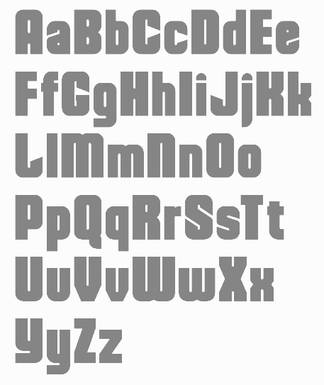
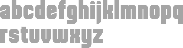
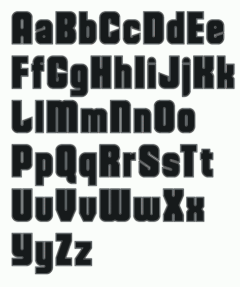
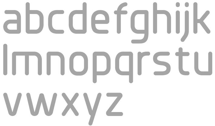
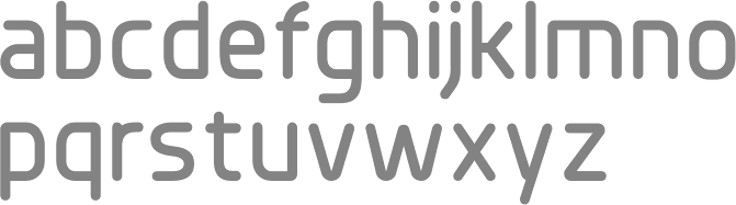
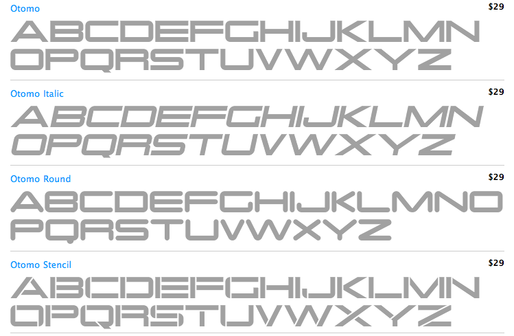
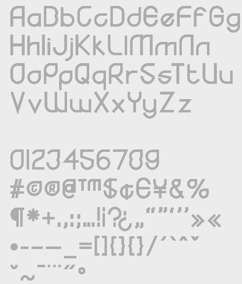
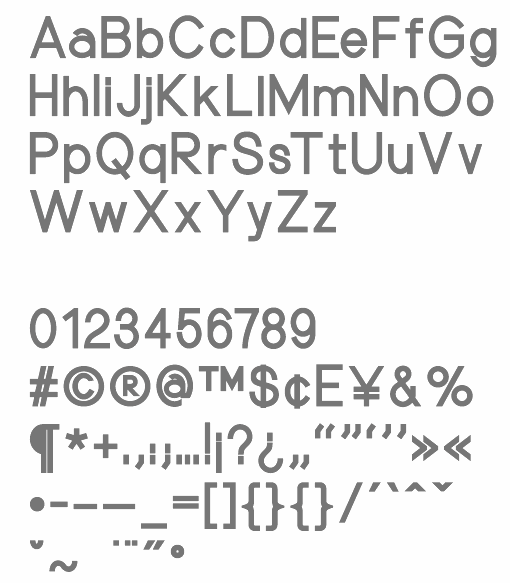
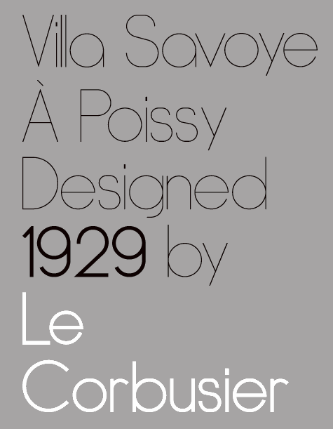
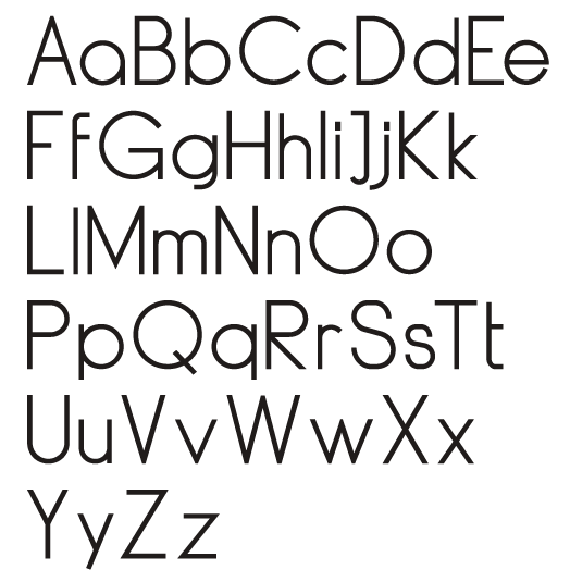
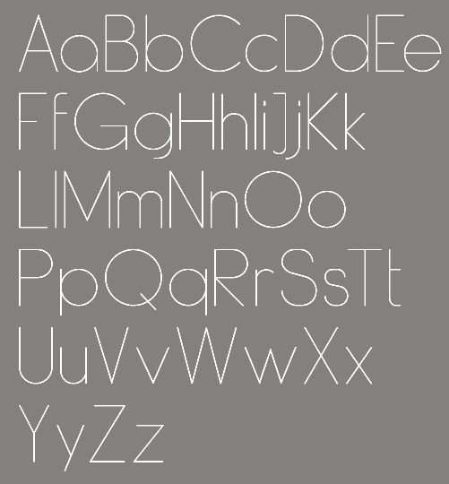
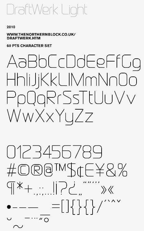
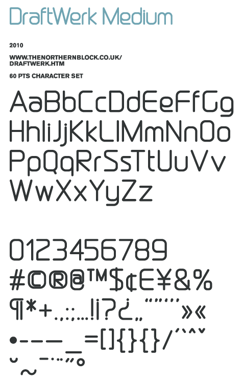
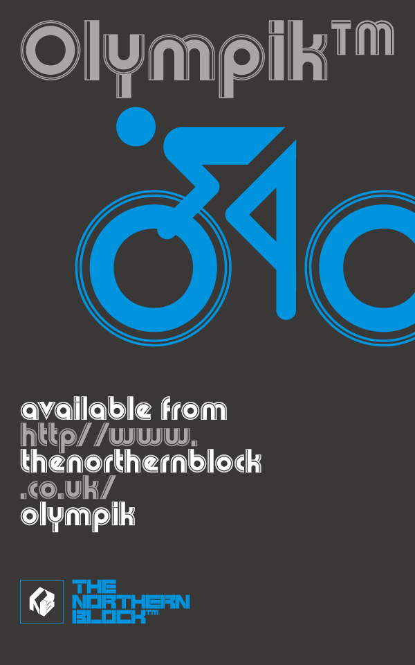
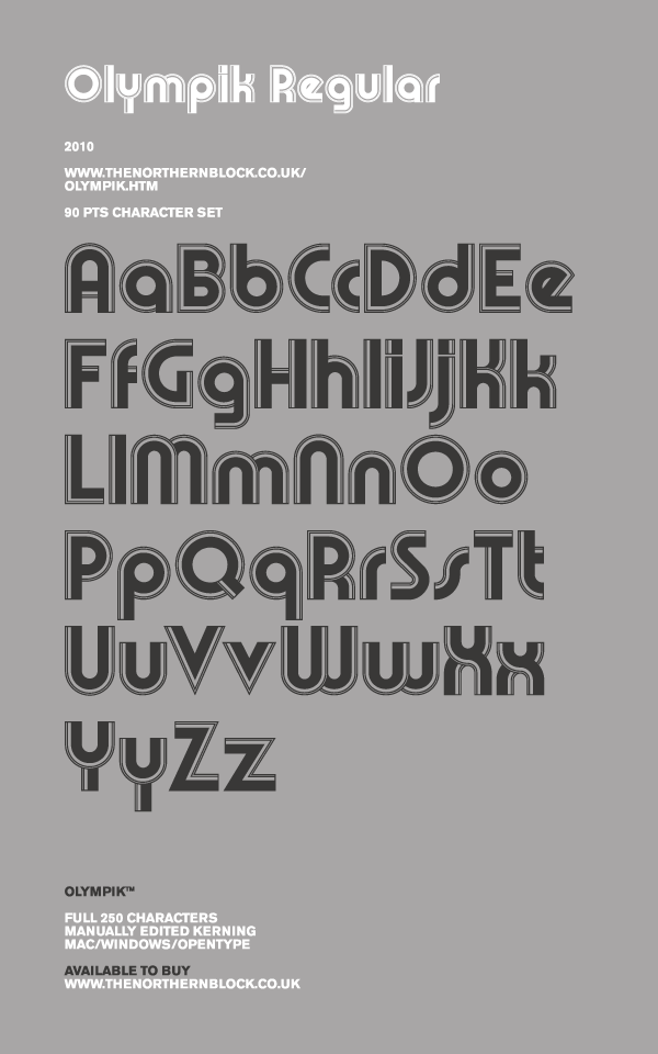
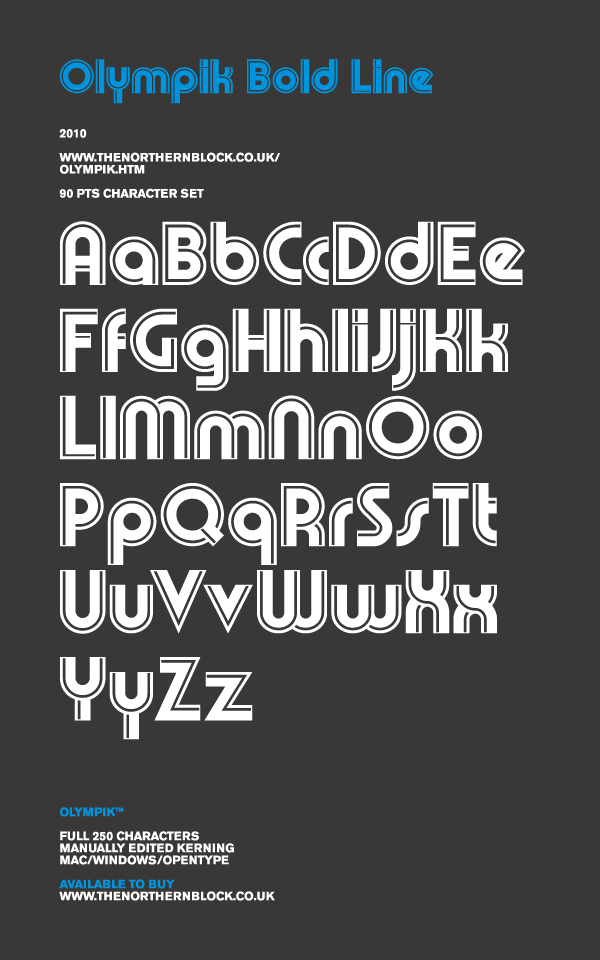
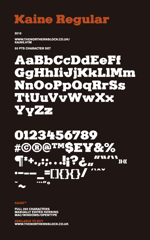
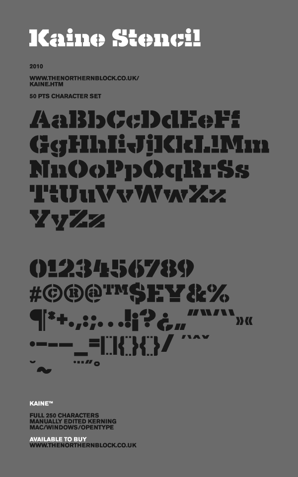
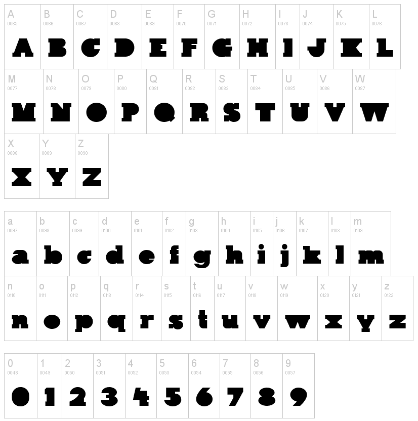
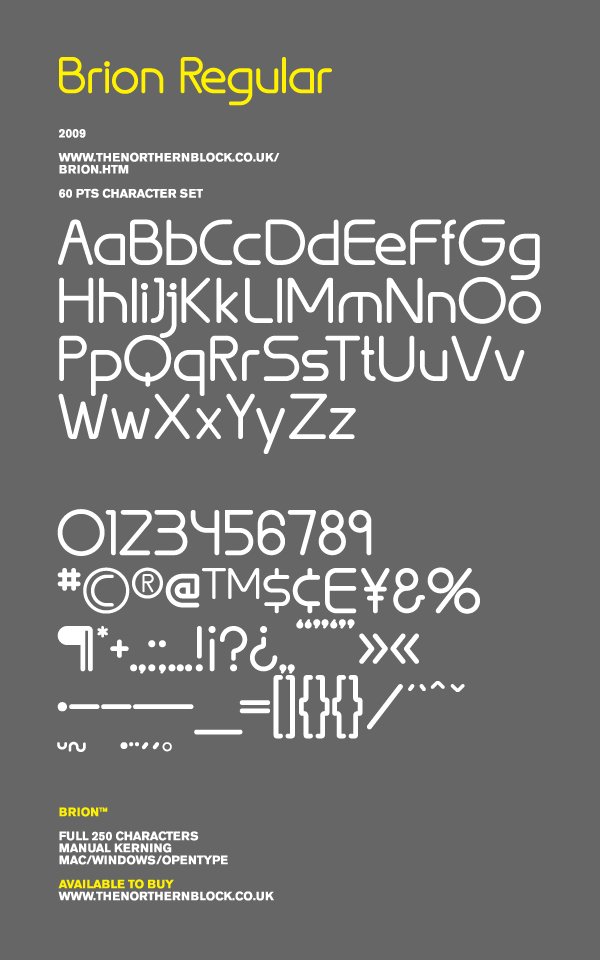
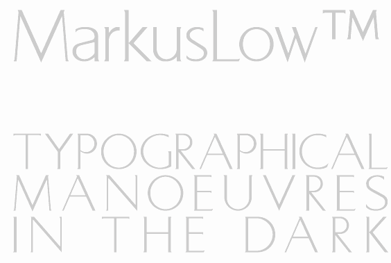
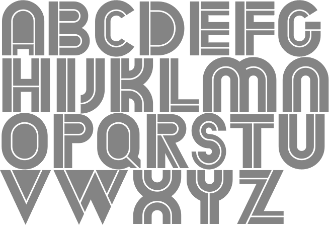
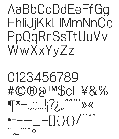
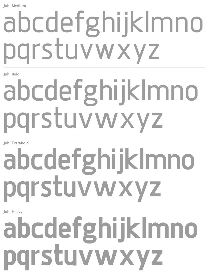
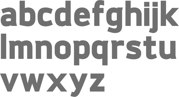
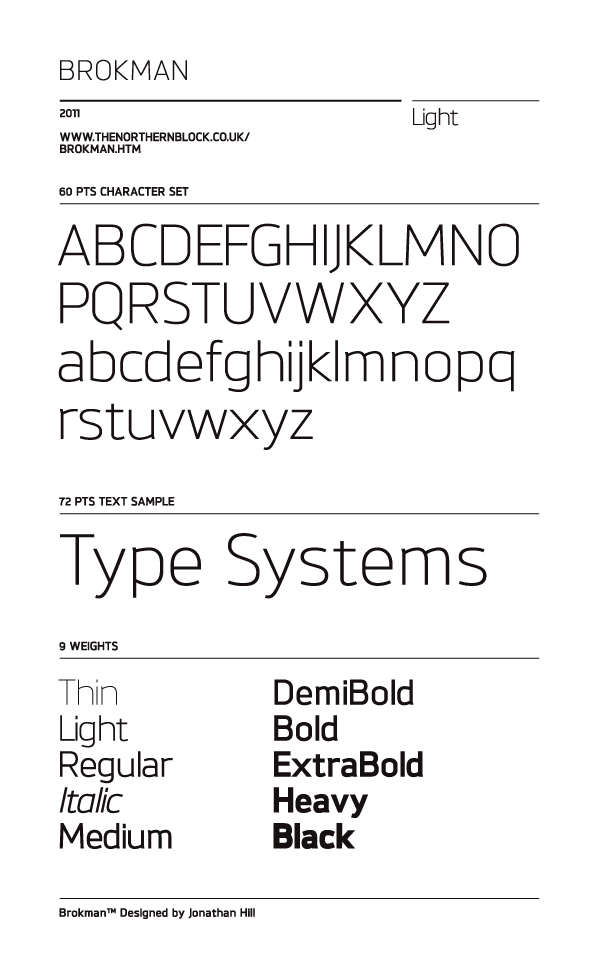
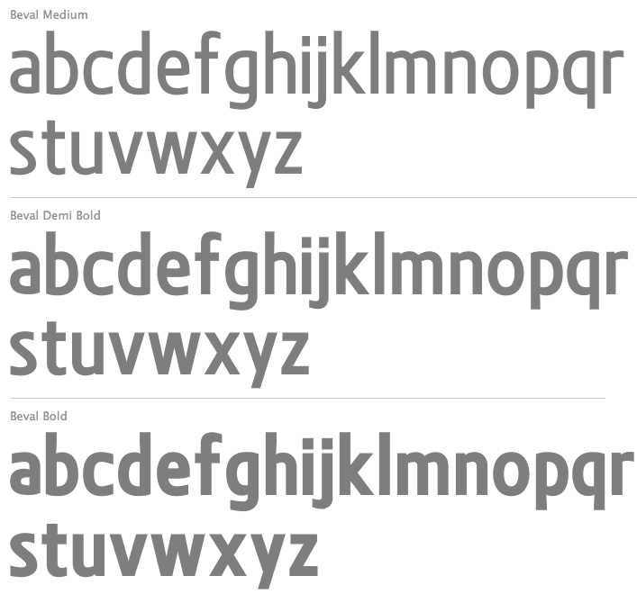
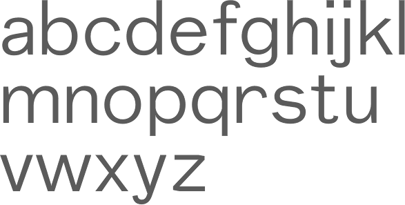
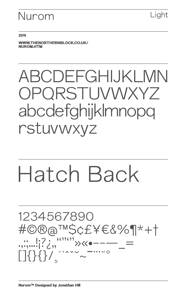
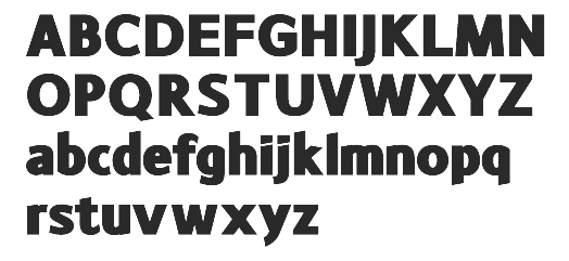
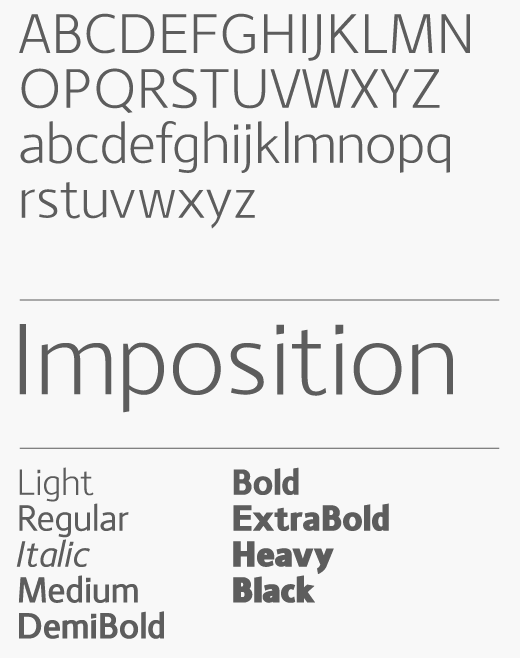
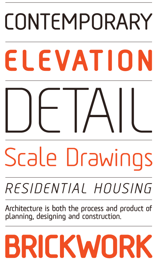
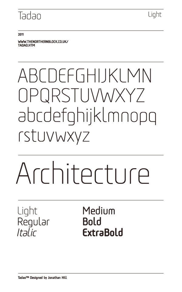
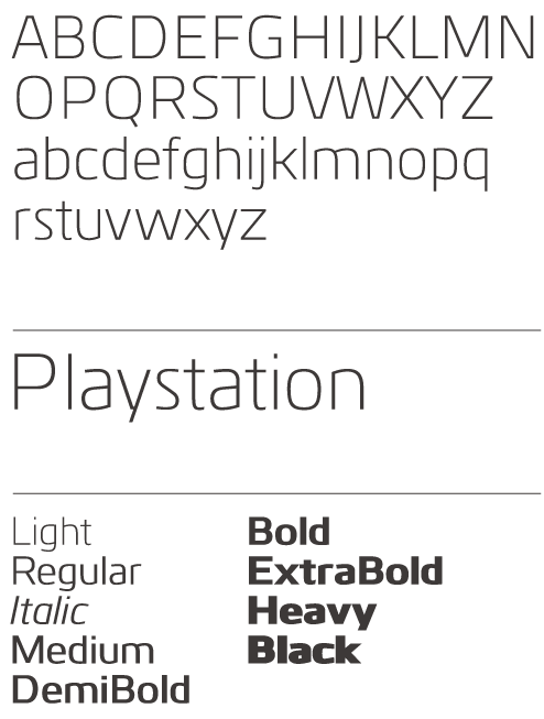
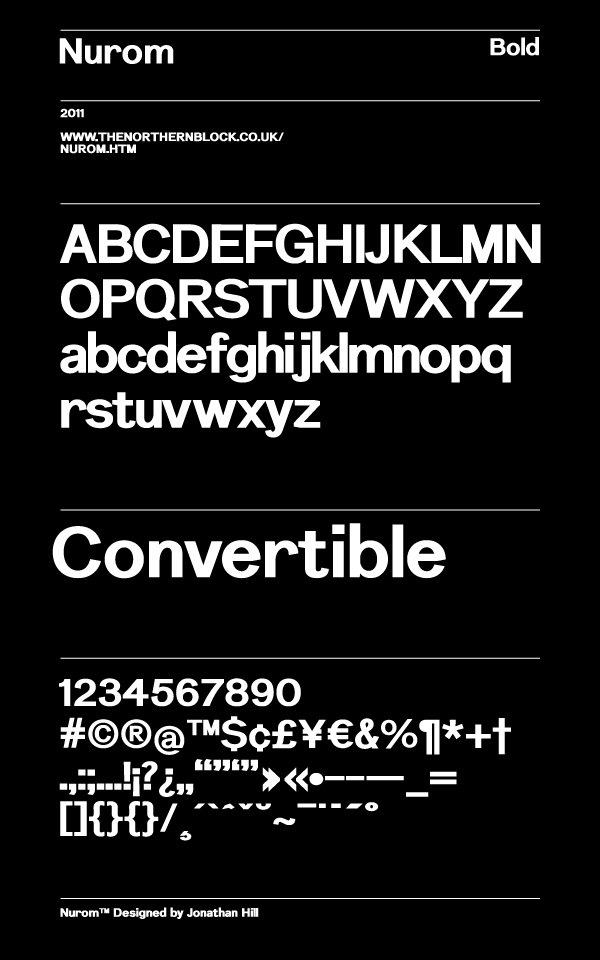
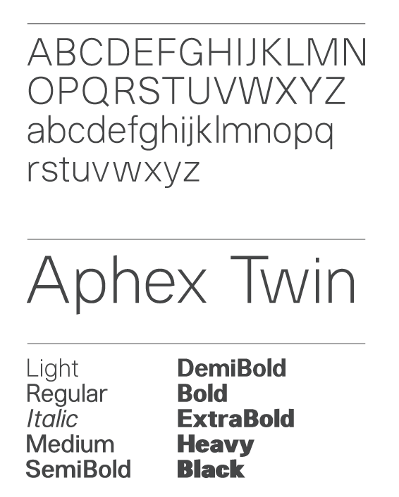
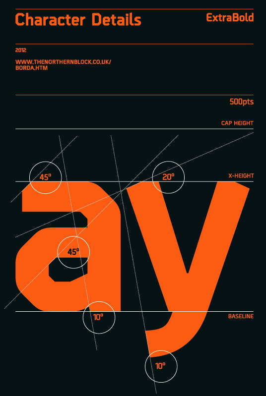
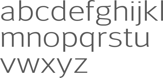
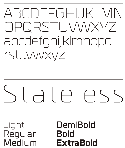
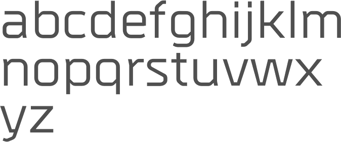
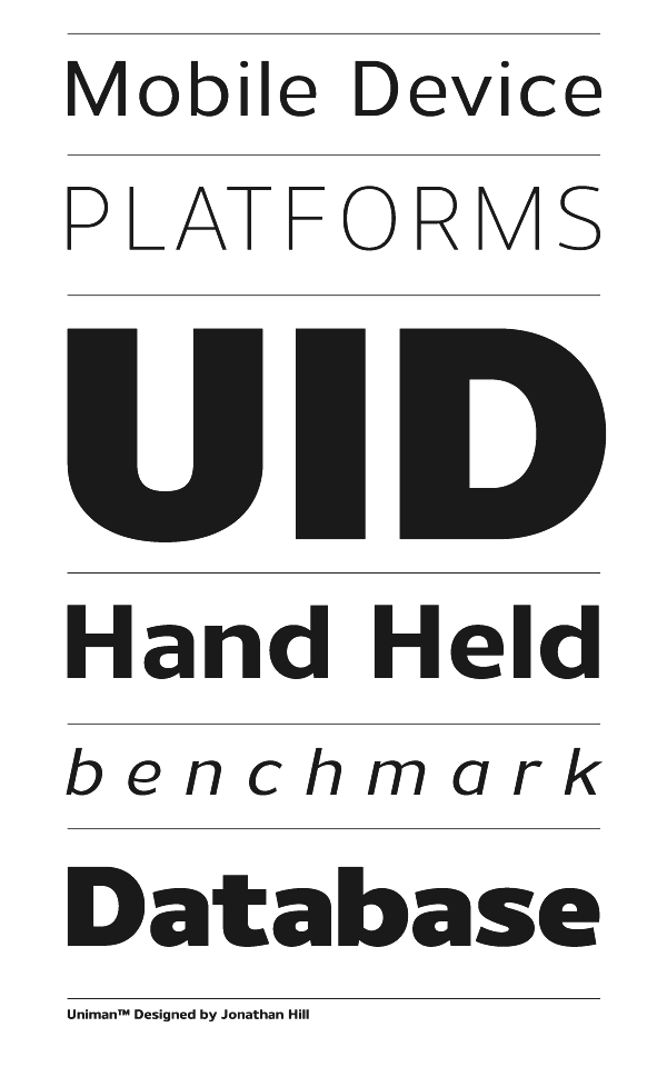
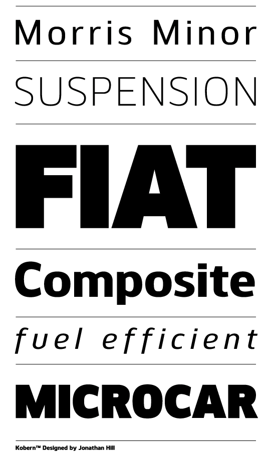
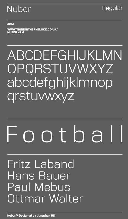
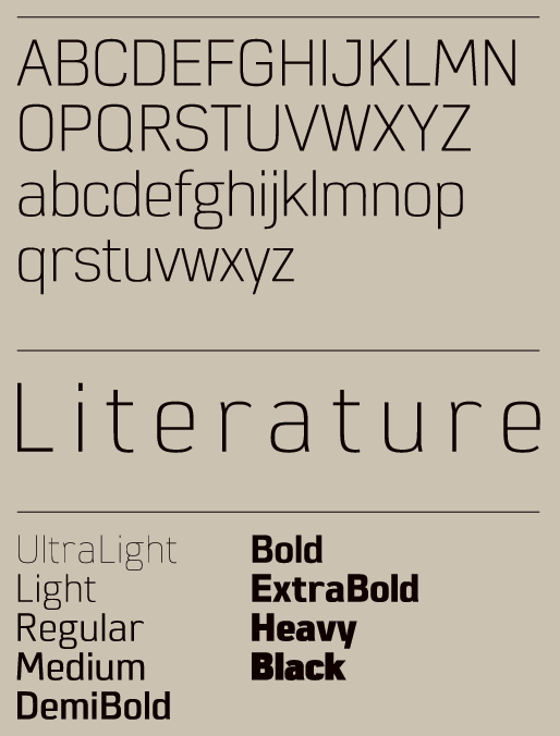
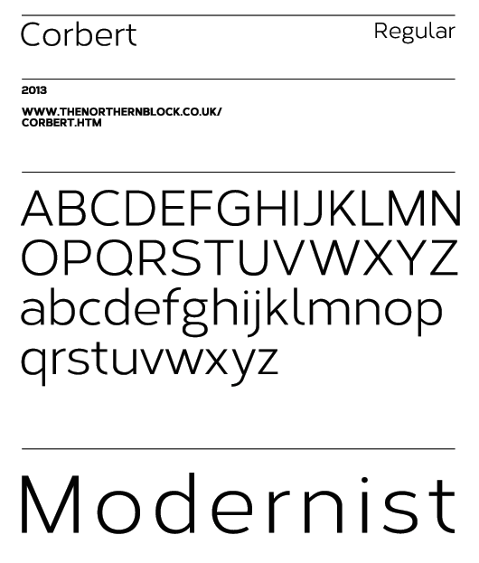
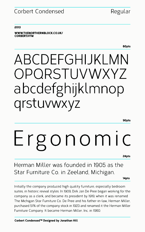
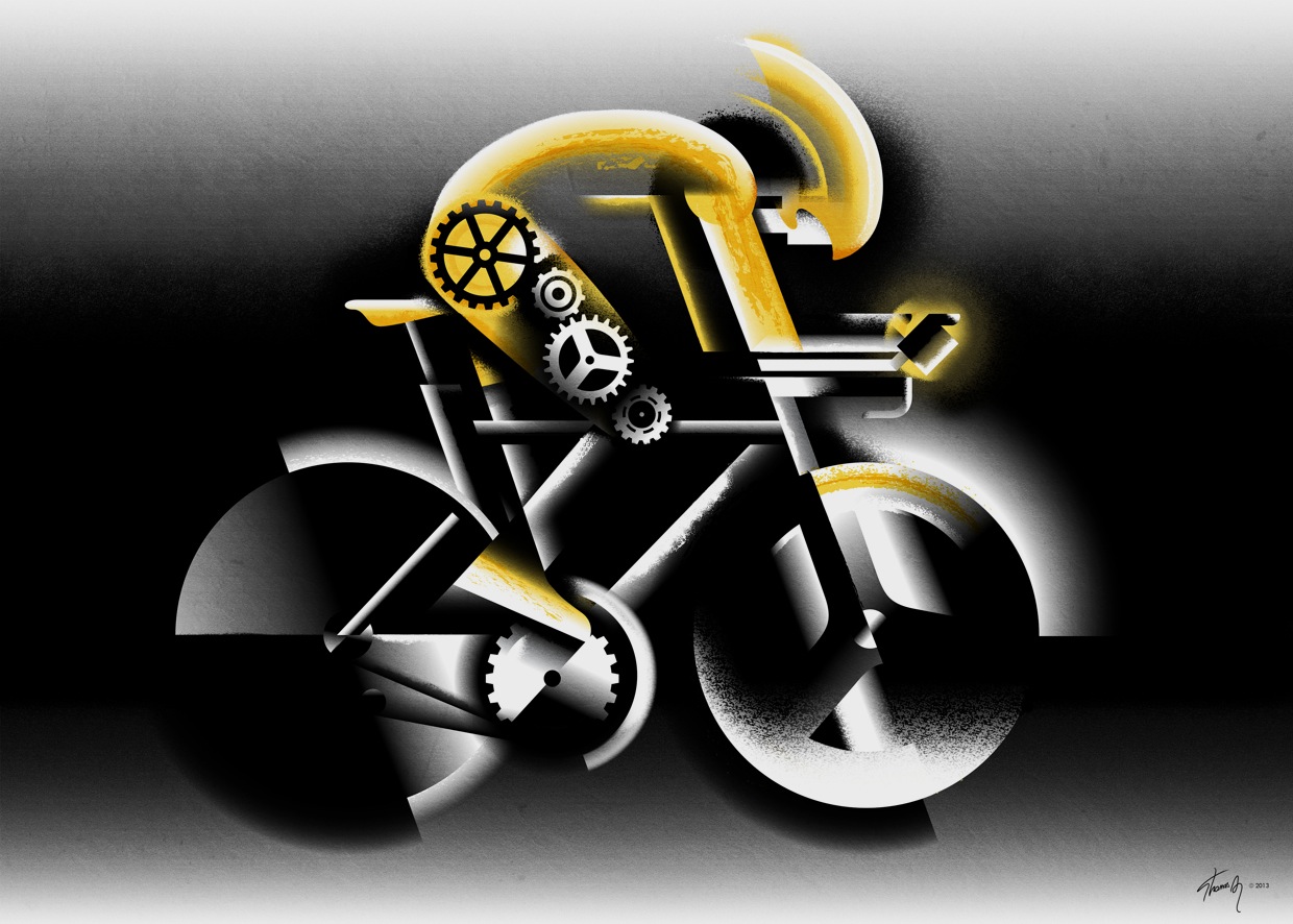
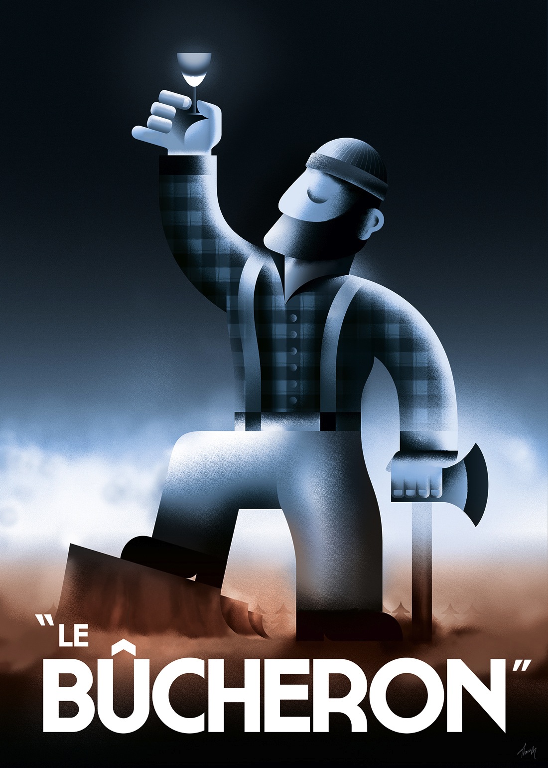
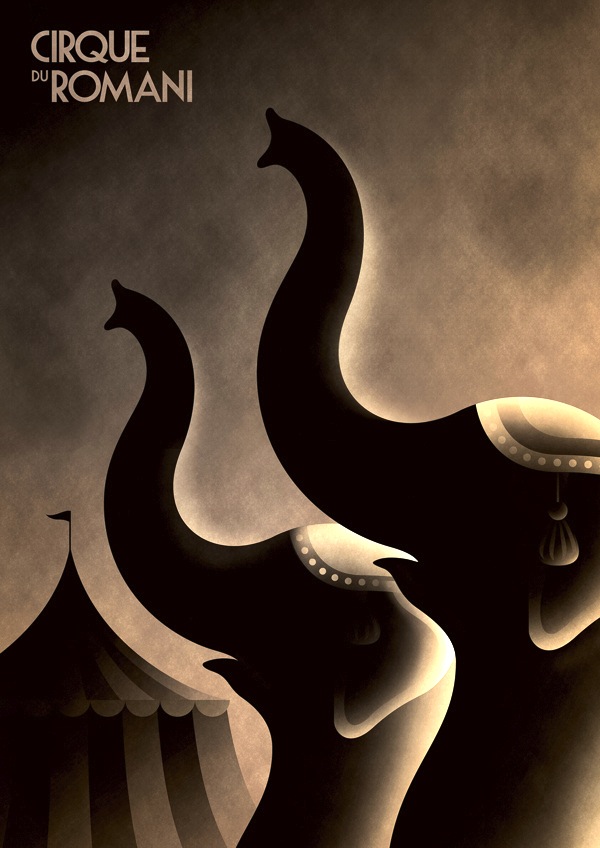
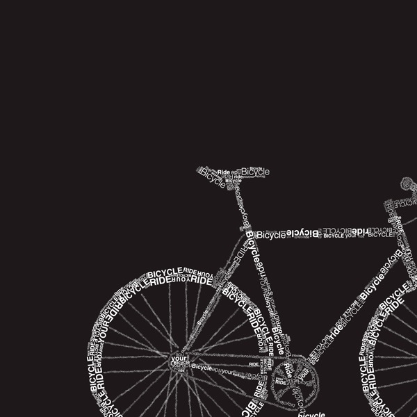
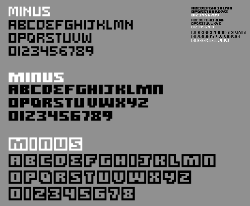
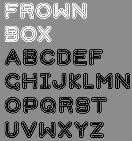
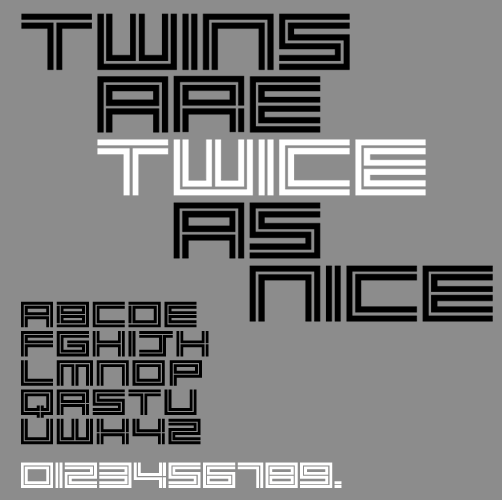
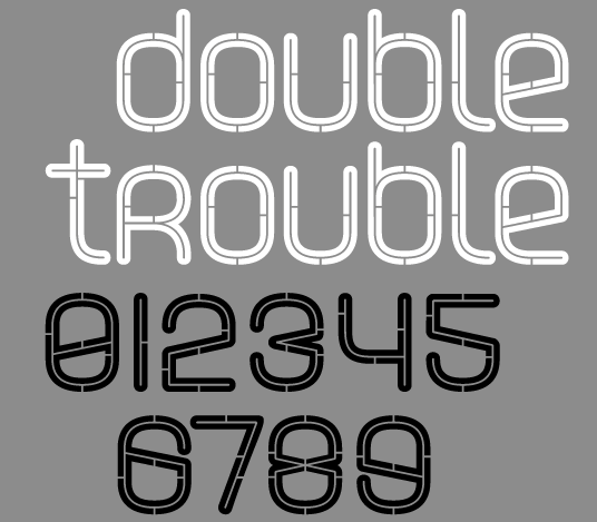
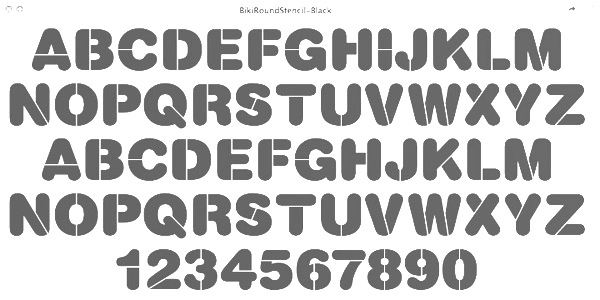
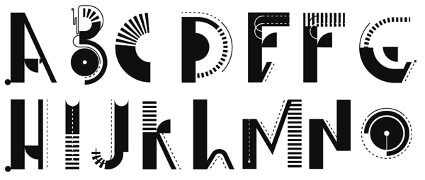
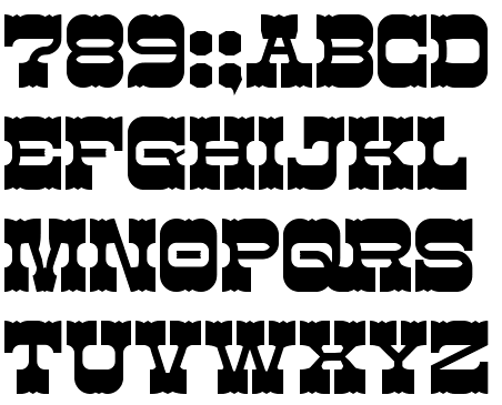
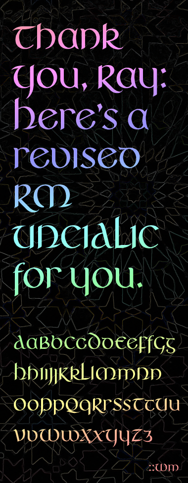
|
|
|
|