TYPE DESIGN INFORMATION PAGE last updated on Sat May 16 08:22:13 EDT 2026
FONT RECOGNITION VIA FONT MOOSE

|
|
|
|
|
Commercial foundries | ||
|
|
|
|
SWITCH TO INDEX FILE
Berthold Direct Corp
|
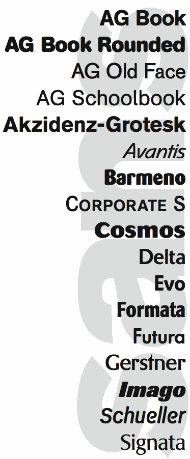
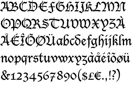
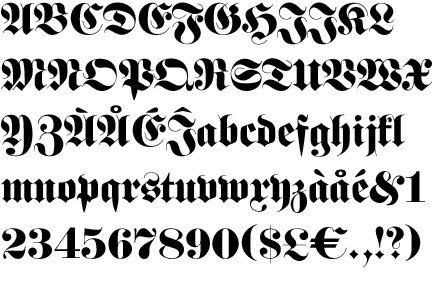
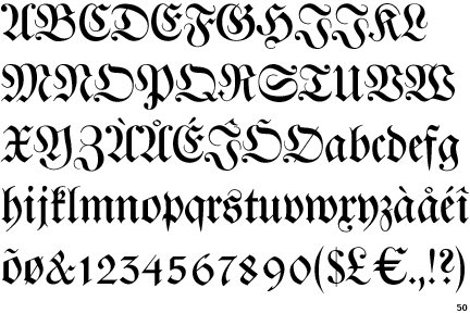
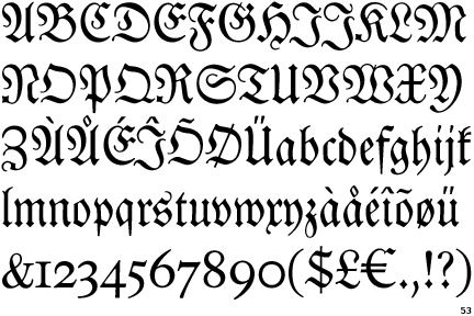
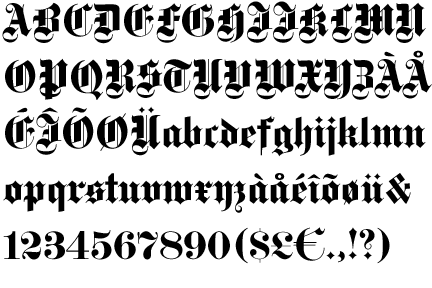
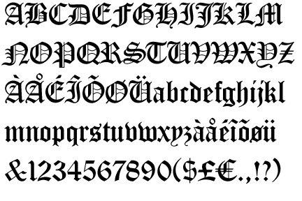
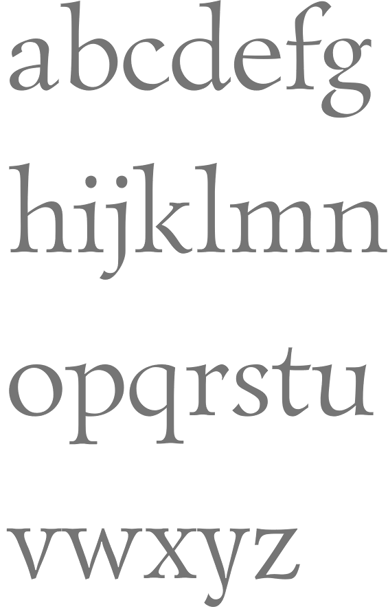
A few months after Hunt's death, Monotype acquired the Berthold collection. For many years, on and off between about 1970 and his death in 2009, Günter Gerhard Lange was the typographic director [of Berthold Direct Corp, and its German "predecessor" Berthold]. Lange, along with Bernd Möllenstadt and Dieter Hofrichter, formed the core of Berthold's Type Atelier located in München to continue the development of the Berthold Exklusiv typefaces. The classics in the collection include Akzidenz-Grotesk, Block, City, AG Book, Delta, Formata, Imago and Laudatio. Frequent contributors in the 1970s and 1980s were Friedrich Poppl and Gustav Jaeger. There are also many less frequently used older typefaces like Normande (1860), Augustea (1905-1926), and Michelangelo (1950, by Hermann Zapf). Cover of their sans catalog. Cover of their modern typeface catalog. [Image: Karim Ahmed uses Normande BT in a beautiful poster] The main Berthold typefaces at MyFonts. Large catalog of Berthold's typefaces, given in alphabetical order. See also here. [Google] [MyFonts] [More] ⦿ |
Bitstream wrote on the origins of the collection: The Bitstream Typeface Library was developed under the supervision of Matthew Carter, the creator of such esteemed typefaces as ITC Galliard; Snell, Bitstream Charter and Swiss Compressed. Carter, who also serves as Bitstream's Senior Vice President of Design, set uncommonly high standards for the company's highly-skilled design staff. Working from the earliest-generation artwork available, each character of every typeface is hand-digitized on advanced workstations specially programmed by Bitstream's engineers. In building the library, Carter has overseen the licensing of typefaces from such respected international sources as the International Typeface Corporation (ITC), Kingsley-ATF Type Corporation, and Fundicion Tipografica Neufville SA, among others. Bitstream also develops new and original designs. Many countries provide for the legal protection of typeface names only, not the designs themselves. This means that the original names of many typefaces can only be used with a license from the owner. The majority of Bitstream typefaces in this catalog have licensed names (on which royalties are paid), or have historical names that reside in the public domain, or have names to which Bitstream owns the rights. In these cases, the name is used. When the original name is not available for use by Bitstream, an alternative name appears. For example, Swiss 721 is the name that Bitstream uses for its version of the typeface popularly known as Helvetica? Because the original name of that typeface is not widely licensed, there are many offerings of the design with completely different names. It is important to note that the use of an alternative name has no bearing on the inherent quality or authenticity of the typeface design. Bitstream sold a nice 500-font CD for 39 USD around 1996, with all the great text families. This was a fantastic buy, as proved by this quote from John Hudson: I have said it before and I will say it again: I think the development of the original Bitstream library was one of the worst instances of piracy in the history of type, and it has set the tone for the disrespect for type shown today. (A bit of background: Bitstream asked Linotype if they could digitize Linotype's library of fonts. Linotype refused, but Bitstream went ahead anyway.) On this issue, read these pages by Ulrich Stiehl and Typophile. Bitstream was offering a 250-font CD. Type Odyssey Font CD (2001). Bitstream has added Greek, Cyrillic, OldStyle versions to many of its families. New releases in July 2001: Artane Elongated, Cavalero, Drescher Grotesk BT, FM Falling Leaves Moon, FM Rustling Branches Moon, Picayune Intelligence (by Nick Curtis), Raven, Richfont, Rina, Sissy Boy, Stingwire, Tannarin. In November 2001, Serious Magic entered into a long-term agreement to license 25 Bitstream outline fonts for its new visual communication products. Bitstream has been an exemplary corporate citizen, occasionally producing license-free fonts for the masses, such as their Vera collection. Bitstream's own overstated blurb about itself: Bitstream Inc. (NASDAQ: BITS) is a software development company that makes communications compelling. Bitstream enables customers worldwide to render high-quality text, browse the Web on wireless devices, select from the largest collection of fonts online, and customize documents over the Internet. Its core competencies include fonts and font technology, browsing technology, and publishing technology. Finally, together with its spin-off, MyFonts, Bitstream was sold to Monotype Imaging in 2011. Catalog of typefaces [large web page warning]. [Google] [MyFonts] [More] ⦿ | |
Carlos Segura
| |
David Berlow
| |
Additions in 2005 include the dingbat typefaces Beautilities EF Alpha, Ornamental Rules EF, Diavolo Rules EF, Squares EF (Alpha, Beta and Gamma), Topographicals EF Alpha, Typoflorals EF Alpha, Typographicals EF Alpha, Typomix EF Alpha, Typosigns EF Alpha, Typospecs EF Alpha and Beta (which have several fists), Typostuff EF Alpha, Diavolo EF, Schablone EF, Gigant EF, Maloni EF, OCRA EF, EF Unovis (a 16-weight family inspired by Quadrat). In the hand-printed category, let us mention Filzerhand. Their blackletter collection includes some bastardas (Alte Schwabacher, Lucida Blackletter), some frakturs (Fraktur, Fette Fraktur EF, Justus Fraktur, NeueLutherscheFraktur, Walbaum-Fraktur), some rotundas (Weiss-Rundgotisch), and some texturas (Gotisch, Old English). Commissioned fonts include Castrol Sans (2007). Selected additional typefaces: Garamond Rough Pro (2018), Bluset Now Mono (2018), Newspoint (2017, based on Morris Fuller Benton's News Gothic), Meier Kapitalis (2013, a lapidary typeface based on a 1994 sketch by Hans Eduard Meier in his book Die Schriftentwicklung), Gillies Gothic EF (after William S. Gillies's 1935 original), EF Medieva, Bank Sans Caps EF, Metropolitain (1985) (after a 1905 art nouveau typeface by Fonderie Berthier). Fonts4ever link (2008). Listing at Fontworks. Future events schedule. New fonts. Catalog of their typefaces [large web page warning]. See also here. [Google] [MyFonts] [More] ⦿ | |
Font Bureau
|
Catalog of Font Bureau's typefaces. [Google] [MyFonts] [More] ⦿ |
Berlin-based FontShop International, started by Erik Spiekermann, Joan Spiekermann, and Neville Brody in 1989/1990, offers its own line of digital fonts under the FontFont label. The FontFont library contains around 2,000 original fonts. Its designers included Just van Rossum, Erik van Blokland, David Berlow, Max Kisman, Tobias Frere-Jones, Fred Smeijers, Martin Majoor, and many others. FontShop has offices in San Francisco as well. In July 2015, FontShop and FontFont were bought by Monotype. They are focusing on web fonts today. Their initial web font package included DingbestWeb, DroidsWeb, InfoWeb-Bold, InfoWeb-Italic, InfoWeb-Normal, KosmikWeb, MarketWeb, PixelsDream (by Zuzanna Licko), SheriffWeb-Bold, SheriffWeb-Italian, SheriffWeb-Roman, TrademarkerWeb, TypestarWeb-Black, TypestarWeb-Normal. The free fonts page has InterOffice (two dingbat fonts made in 2001 by Andreas Jung, Markus Hanzer, David Berlow, Fedor Hüneke, Erik van Blokland, Robert Snider, chester, Hans Reichel, Nicole Kapitza, Christoph Kalscheuer, Joachim Müller-Lancé, Paul Neville, Barbara Klunder, György Szönyei, Matthias Thiesen, Norbert Reiners, Joancarles Casasín, Gert Wiescher, Fabrizio Schiavi, Mindaugas Strockis, Theo Nonnen, Alan Greene, Donald Beekman, Martin Wunderlich, Critzler, Stefan Kisters, Dung van Meerbeeck, Ole Søndergaard, Nick Shinn, and Mårten Thavenius), FF Dingbest (by Johannes Erler and Olaf Stein), FF Xcreen, and many Euro symbols to go with their standard fonts. Catalog of FontFont's typefaces [large web page warning]. [Google] [MyFonts] [More] ⦿ | |
Fonts.com is the web presence of Monotype, the largest foundry on the planet in the first part of the 21st century. Subpages: New releases, foundries, designers, new best sellers, all best sellers. [Google] [More] ⦿ | |
Established in 1989 in Berlin by Erik Spiekermann, Joan Spiekermann and Neville Brody. Also offices in San Francisco, Australia, Austria and Norway. It has a formidable collection of fonts, better known as the FontFont collection. It is a major source of new type, and organizes a Conference in Berlin each year, called TYPO Berlin. In 2015, FontShop was sold to Monotype. Fontshop team. Designers. Subpages: FontFeed (font news), FontStruct (free modular fontre), FontBook, Font education. Catalog of FontFont's typefaces [large web page warning]. [Google] [MyFonts] [More] ⦿ | |
Harvey Hunt
| |
Large type German foundry Linotype controlling over 4000 fonts. The company was located in Bad Homburg since 1998. It was acquired by Monotype Imaging in 2006, after more than a decade under the helm of Bruno Steinert. On January 29, 2024, Monotype sent this message: As part of a consolidation of its online offerings, the Monotype Group has decided to discontinue the operation of Monotype GmbH's online store LinoType, effective 28.03.2024, and to transfer/novate this business unit in its entirety to MyFonts Inc. of 600 Unicorn Park Drive, Woburn, MA 01801---also a company of the Monotype Group. And that is the end of Linotype. Linotype wrote about itself in 2008: Linotype GmbH, based in Bad Homburg, Germany and a wholly owned subsidiary of Monotype Imaging Inc., looks back onto a history of more than 120 years. Building on its strong heritage, Linotype develops state-of-the-art font technology and offers more than 9,000 original typefaces, covering the whole typographic spectrum from antique to modern, from east to west, and from classical to experimental. All typefaces (in PostScript(tm) and TrueType(tm) format as well as more than 7,000 fonts in OpenType(tm)) are now also available for instant download at www.linotype.com. In addition to supplying digital fonts, Linotype also offers comprehensive and individual consultation and support services for font applications in worldwide (corporate) communication. It publishes frivolous/experimental font collections under the name Taketype (1 through 4 now), and regularly publishes reworked classic and original text type families such as Compatil, Vialog, Satero, Linotype Sabon, Linotype Frutiger, Linotype Optima, and Linotype Univers. Its designers. A time line:
MyFonts link for Linotype Design Studio. Catalog of the typefaces in Linotype's library [large web page]. View Linotype's library of typefaces in alphabetical order. [Google] [MyFonts] [More] ⦿ | |
Seattle-based company involved to some extent in typography. Until 2002, the fonts developed by them were free. That is no longer the case. They are major players in multilingual typeface development, type for on-screen use, and type formats such as OpenType. A listing of their typefaces:
The information below was written by Microsoft itself. The Typography Group at Microsoft is responsible for both fonts and the font rendering systems in Windows. Since version 3.1 the primary font system built into Windows has been the TrueType system, licensed from Apple in a deal (with hindsight) remarkably beneficial to Microsoft. Working with Monotype, the Microsoft Typography Group produced fine TrueType versions of Arial, Times New Roman and Courier New, tuned to be extremely legible on the screen; these were all ready for the launch of Windows 3.1. Since then these core fonts have been developed to cover more and more of the world's languages. In the mid-1990s under Robert Norton a program of truly new type designs was begun, using TrueType technology to render faithfully the bitmaps and outlines designed by Matthew Carter (Verdana, Georgia, Tahoma) and by in-house designer Vincent Connare (Trebuchet, Comic Sans). Until August 2002 these core fonts were offered freely over the Web, where they made an undoubtedly positive contribution in terms of legibility and font choice. In 1996 the OpenType initiative with Adobe was announced; this is touted as "the end of the font wars", whereby advanced multilingual text layout becomes available, native rendering of PostScript fonts becomes part of Windows 2000, and unwieldy font formats are rationalized. In 1998 the group announced ClearType. This is a very ingenious method to increase legibility on color LCD screens, individually targeting the 3 subpixels (red, green and blue) that make up each pixel. Such a leap forward in readability on these screens is a crucial element to the success of nascent eBook technology. Simon Daniels at the Group's website keeps font fans and font developers up to date with most aspects of the digital typography scene, and communicates the technicalities of how fonts work in Windows. Updating us about the current (October 2000) activity of the Group, Simon notes: 1999 saw several members of the group leave to join Microsoft's eBooks group. These included technical lead Greg Hitchcock, developers Beat Stamm and Paul Linerud as well as former Monotype hinters Michael Duggan and Geraldine Wade. On August 12, 2002 Microsoft discontinued the free availability of the core fonts, noting that the downloads were being abused in terms of their end-user license agreements. Most commentators took this to mean the company objected to the fact that the fonts were being installed with Linux distributions. View Microsoft's typefaces. [Google] [MyFonts] [More] ⦿ | |
In 2006, Monotype Imaging acquires Linotype, one of the last truly dedicated and honest large type companies. In 2007, Doug Shaw succeeds Robert M. Givens as president and chief executive officer. In 2010, Monotype acquires Ascender. In 2011, Monotype buys Berthold Types, Bitstream and MyFonts. Images of their best-selling typefaces in 2011: i, ii, iii. Full catalog of Monotype's typefaces [large web page warning]. View the Monotype typeface library. [Google] [MyFonts] [More] ⦿ | |
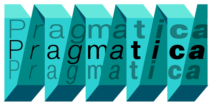
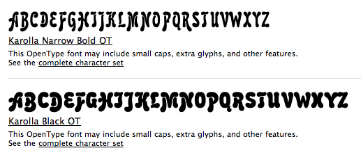
Products include FastFont, a simple TrueType builder, ParaNoise, a builder for PostScript fonts with random contours, FontLab, a universal font editor and ScanFont, a font editor with scanning module. Random, customized fonts. Multilingual fonts including, Latin, Cyrillic, Arabic, Greek, Georgian and Hebrew fonts for Macintosh and Windows. Catalog. Designers. Alternate URL. Famous typefaces by Paratype include Academy, Pragmatica, Newton, Courier, Futura, Petersburg, Jakob, Kuenstler 480, ITC Studio Script, ITC Zapf Chancery, Amore CTT (2004, Fridman), Karolla, Inform, Hafiz (Arabic), Kolheti (Georgian), Benzion (Hebrew). The PT Sans (Open Font Library link), PT Serif and PT Mono families (2009-2012) are free. PT stands for Public Type. Another download site. PT Sans, for example, consists of PTSans-Bold, PTSans-BoldItalic, PTSans-Caption, PTSans-CaptionBold, PTSans-Italic, PTSans-Narrow, PTSans-NarrowBold, PTSans-Regular. Other free ParaType fonts include Courier Cyrillic, Pushkin (2005, handwriting font), and a complete font set for Cyrillic. Type designers include Vladimir Yefimov, Tagir Safayev, Lyubov Kuznetsova, Manvel Schmavonyan and Alexander Tarbeev. They give this description of the 370+ library: The Russian constructivist and avant garde movements of the early 20th century inspired many ParaType typefaces, including Rodchenko, Quadrat Grotesk, Ariergard, Unovis, Tauern, Dublon and Stroganov. The ParaType library also includes many excellent book and newspaper typefaces such as Octava, Lazurski, Bannikova, Neva or Petersburg. On the other hand, if you need a pretty typeface to knock your clients dead, meet the ParaType girls: Tatiana, Betina, Hortensia, Irina, Liana, Nataliscript, Nina, Olga and Vesna (also check Zhikharev who is not a girl but still very pretty). ParaType also excels in adding Cyrillic characters to existing Latin typefaces -- if your company is ever going to do business with Eastern Europe, you should make them part of your corporate identity! ParaType created CE and Cyrillic versions of popular typefaces licensed from other foundries, including Bell Gothic, Caslon, English 157, Futura, Original Garamond, Gothic 725, Humanist 531, Kis, Raleigh, and Zapf Elliptical 711. Finally, ParaType offers a handwriting font service out of its office in Saratoga, CA: 120 dollars a shot. View the ParaType typeface library. Another view of the ParaType typeface collection. [Google] [MyFonts] [More] ⦿ | |
Rafael Sánchez Sánchez
| |
RaFont
| Cali, Colombia-based designer of Simetrika (2015, a hipster typeface) and Awesome (2015, a signage script). Fontspring link. [Google] [More] ⦿ |
Sam Berlow
| |
T-26
| T-26 was founded in 1994 by the Cuban designer Carlos Segura, and is located in Chicago. It was one of the world's most prolific font producers, with over 1900 fonts made by about 200 designers, but ran out of steam in the 21st century. List of font names and package numbers. Segura himself made a few fonts, including Chopsticks (2002), Square45 (2000, a 5-weight font family with LCD-like lettering, with Tnop Wangsillapakun), Square 40 (1995, based on lettering found a 1940s propaganda sign). View T-26's typefaces. Another listing of the T-26 fonts. [Google] [MyFonts] [More] ⦿ |
The Type Founders
| The Type Founders is home to some of the most renowned type foundries from around the world. Run by Sam Berlow, its staff includes type designer Richard Lipton, font engineer Stephen Nixon, and type experts Jill Pichotta, Joana Correia and Tiffany Wardle. The Type Founders was set up in 2021, is based in New York City, and is incorporated in Delaware. The list of type foundries as of March 2025:
|
In 2016, Font Bureau launched Type Network in partnership with Carter & Cone, Typetr (Petr van Blokland), DJR (David Jonathan Ross), Occupant Fonts (Cyrus Highsmith), Richard Lipton, Cabarga Type, Victoria Rushton, and Greg Thompson. TN Custom: a sub-site for custom type design. As of 2020, Type network had 30 partners: Bold Monday, Brody Fonts, CabargaType, Carter & Cone, CJ Type, CSTM Fonts, DJR, Font Bureau, Frere-Jones Type, Garage Fonts, Greg Thompson, The Ivy Foundry, Kerns & Cairns, Kontour, Lipton Letter Design, LudwigType, Mark Simonson, Monokrom, Newlyn, Occupant Fonts, Plau, Retype, Revolver Type Foundry, Roger Black, Supertype, Type-o-Tones, Typetr, Underware, Victoria Rushton, XYZ Type. In 2024, Matthew Rechs became its CEO, while Roger Black remains one of its key leaders. [Google] [More] ⦿ | |
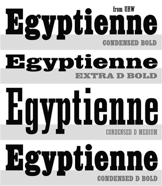
Selected releases: URW Egyptienne, URW Grotesk (1985, Hermann Zapf), Anzeigen Grotesk (2009), Clarendon No 1 URW, Saa Series (an industrial sans: the official typeface for Australian road signage), Nimbus Sans (1987, a Helvetica clone), Nimbus Sans Novus, Nimbus Sans Europa (covering Latin, Greek, Baltic, Cyrillic, Central European, Turkish, Romanian, and so forth), Nimbus Roman No 9 (2001), Nimbus Sans Global and Nimbus Roman Global, each at about 2000 Euros, and each containing 35,000 glyphs, from kanji/Chinese/Korean to all European languages. House typefaces done for corporations: DaimlerChrysler Corporate ASE (after the Corporate ASE series for Daimler-Benz by Kurt Weidemann), Gardena Sans (2015, for Gardena), Siemens Schriftfamilie, Deutsche Telekom Schriftfamilie, ZF Friedrichshafen, Körber Argo, URW++ SelecType Raldo (2001, for Igepa). MyFonts lists their bestsellers. Catalog of their typefaces [large web page warning]. Another catalog of URW's typefaces. Eight-minute corporate movie produced in the summer of 2014. Adobe link. [Google] [MyFonts] [More] ⦿ |

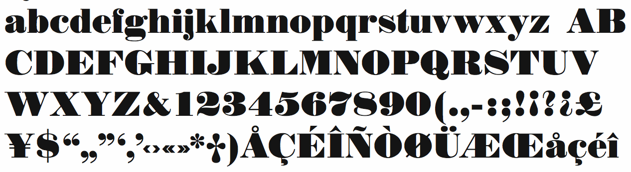
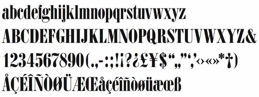
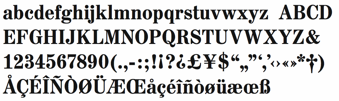
 Once called Berthold Types and now Berthold Direct Inc, this companay is located in Chicago, IL, and was/is run by Harvey Hunt (1949-2022) and his wife Melissa Hunt, an attorney. The font collection is aristocratic, unpolluted by grunge and cheap thrills, featuring many well-known text type families. On the other hand, typophiles all over the world are aghast at the marketing strategies of Berthold. The fonts, all having "BE" or "BQ" in the font names, originated from Berthold AG in Germany, a company that went bankrupt. Some people argue that the Chicago-based Berthold has no rights to the old Berthold AG collection---a fact documented by Uli Stiehl. But most importantly, the Hunts became famous because of the numerous lawsuits typically related to the selection of font names too close to names in their collection.
  Founded in 1981 by Mike Parker, Matthew Carter, Cheri Cone, and Rob Freedman, Bitstream is the first digital font foundry. Not without controversy, though, as many claim that the original digital collection was an illegal copy of Linotype fonts [Note: I disagree with that statement--take out "illegal"]. In 1999, Bitstream created
  German type foundry in Hamburg established in 1986 by Veronika Elsner and Günther Flake. They offer original fonts as well as improved versions of classical fonts. There are many non-Latin fonts as well. In-house designers include Jessica Hoppe (Carpediem), Verena Gerlach (
 [
[ In 2004, Monotype Imaging Inc was created when TA Associates bought Agfa-Monotype from Agfa. Its headquarters are in Woburn, MA. Agfa had bought the previous incarnation of Monotype in 1998. Before that, Agfa, a well-known photographic film, chemicals and paper manufacturer and Bayer subsidiary, entered the typography scene in 1982 by acquiring an interest in Compugraphic Corporation, the American phototypesetter company. From the press release: Based in Wilmington, MA, with regional offices in the U.K., Chicago, Redwood City, Calif., Japan and China, Monotype Imaging provides fonts and font technologies to graphic professionals, software developers and manufacturers of printers and display devices. Formerly Agfa Monotype Corp., the company also provides print drivers and color imaging technologies to OEMs (original equipment manufacturers). Monotype Imaging is home to the Monotype typeface library, a collection that includes widely used designs such as the Arial, Times New Roman and
 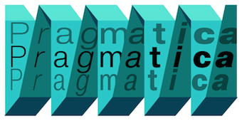 The main digital type foundry in Russia. ParaType was established as a font department of ParaGraph International in 1989 in Moscow, Russia. At that time in the Soviet Union, all typeface development was concentrated in a state research institute, Polygraphmash. It had the most complete collection of Cyrillic typefaces, which included revivals of Cyrillic typefaces developed by the Berthold and Lehmann type foundries established at the end of 19th century in St. Petersburg, and artwork from Vadim Lazurski, Galina Bannikova, Nikolay Kudryashov and other masters of type and graphic design of Soviet time. ParaType became the first privately-owned type foundry in many years. A license agreement with Polygraphmash allows ParaType to manufacture and distribute their typefaces. Most of Polygraphmash staff designers soon moved to ParaType. In the beginning of 1998, ParaType was separated from the parent company and inherited typefaces and font software from ParaGraph. The company was directed by Emil Yakupov until February 2014. After Yakupov's death, Irina Petrova took over the reins.
  URW++ Design&Development GmbH is a Hamburg-based foundry established in 1995 by Svend Bang, Hans-Jochen Lau, Peter Rosenfeld, and Jürgen Willrodt. URW stands for Unternehmensberatung Rubow Weber, named after Gerhard Rubow and Rudolf Weber, cofounders of the original URW company from which urw++ evolved. It offers a whole range of font services and has an extensive (7000+) font library. At the basis of the early development of many classy PostScript fonts. For example, in 1999, URW++ donated the 35 core PostScript fonts (renamed) under the GNU GPL license to the Ghostscript project. The great 3000-font CD costs about 2000DM. Other CDs are more expensive: on the ITF CD, each font is about 100DM! URW sells fonts and font families with complete rights (you can change, resell, embed, anything, except use the original name), with examples ranging from 2k for a complete family of 12 to 5k for a collection of 250 fonts. This practice continues until today: URW++ thus provides a great service to software developers who want to include high-quality typefaces in their software applications. URW has offices in many countries. In the first decade of the 21st century, freelance type designer Ralph M. Unger contributed most frequently to the URW library.
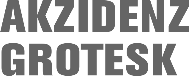
|
|
|
|