| | |
Anna Haidash
|
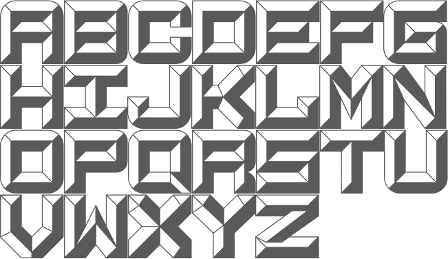
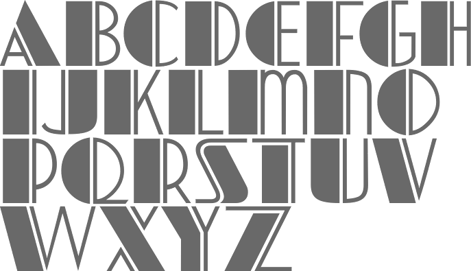
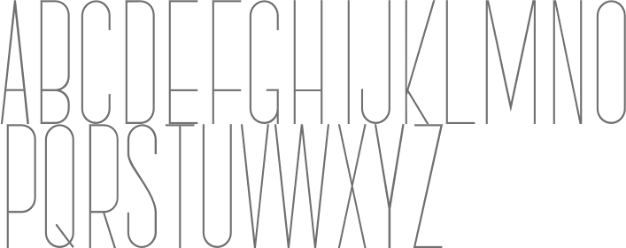
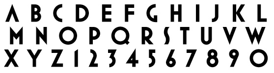
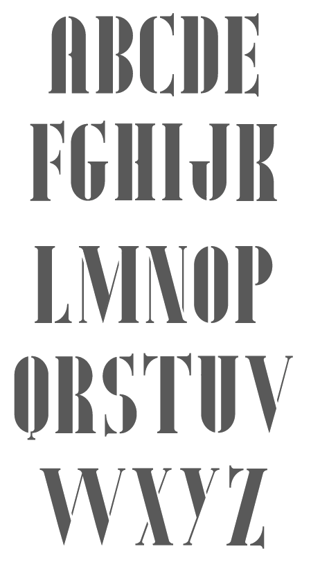
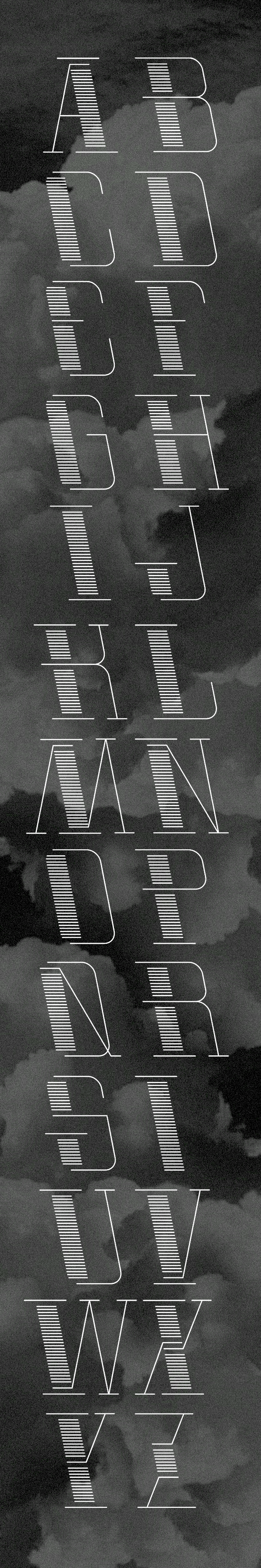
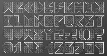
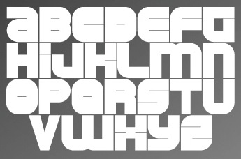
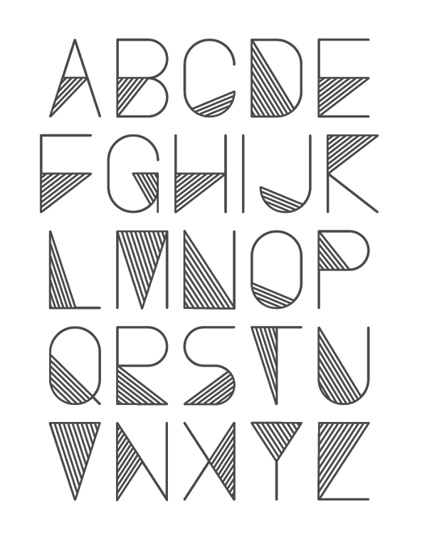
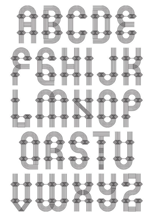
During her studies at LNAA, Lviv, Ukraine-based Anna Haidash designed the straight edged film noir Cyrillic typeface Bukashky (2020). [Google]
[More] ⦿
|
burodestruct (or: Typedifferent.com)
[Lorenz Lopetz Gianfreda]

|
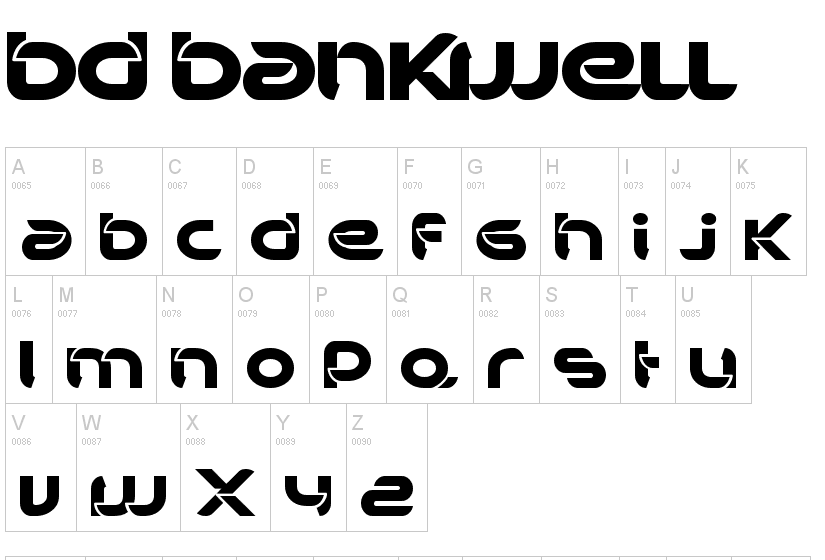
 Lorenz Lopetz Gianfreda's foundry in Bern, Switzerland, est. 1994, called Burodestruct and Typedifferent.com.
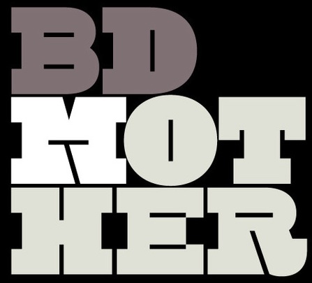
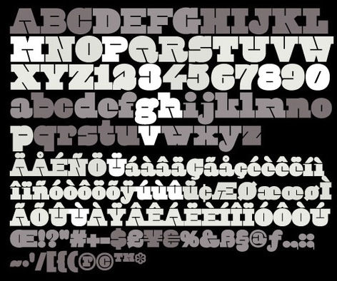
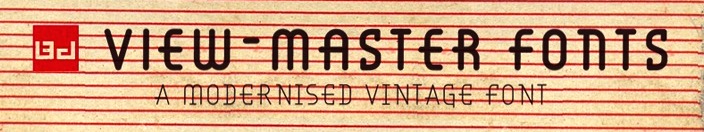
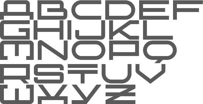
 Free fonts include(d) the gorgeous GalaQuadra (by Angela Pestalozzi, 1999), Eject Katakana (1998), Dippex (1995, grunge font), Ticket (1995), Rocket 70 (1996), Ratterbit (1995, pixel font), Plakatbau (1995), Lodel Fizler (1996), Flossy (1995), Faxer (1995), Console Remix (1998), Cravt (1998, by "Katrin"), Stereotype (1998, by M. Brunner), Brockelmann (1995, free), Kristallo (1997, very original display face) and Billiet (1996). Other fonts: Acidboyz (1998), Alustar (1999), BD Asciimax (1999, ascii art font), BD Billding, Bdr_mono (1999), Brick (1996, like Kalendar), Cluster (1996), Console (1997), Doomed (1998), Eject (1998), Electrobazar (1995), Elside (1995), Globus (1996), Fazer (1996), Lofi (1997), Medled (1995), Paccer (1995), Solaris (1998), Spicyfruits_brush_rmx (1998, a nice high-contrast face), Spicyfruits_rmx, Wurst (free, by Heiwid, 2000), Relaunch (2000), Relaunch Katakana (2000, free), Rainbow (2000), DeLaFrance (2000, free, by Heiwid), Electronic Plastic (2000), Colonius (2001), Cash (2001), Cashbox (2001), Bilding (2001), Meter (2001), Mustang (2001), Bankwell (2001), BD Alm (2001), Balduin (2001), Tatami (2001, oriental look font), Hexades (2001, free), Nippori (2002, techno), Jura (2002), Bonbon (2002, free), Band (2002, free), Navyseals (2002, kitchen tile font), Ritmic (2002), BDR Mono (1999, OCR-like font), Mann (2003, ultra fat stencil), Aroma (2003), Zenith (2003), Nebraska (2003), BD Equipment (2004), BD El Autobus (2004), BD Unexpected (2004), BD Wakarimasu (2004, free kana face), BD Bernebeats (2004, futuristic), BD Deckard (2004), BD Spinner (2004), BD Victoria (2004), BD Designer (2004), BD Kalinka (2005, a curly ultra-fat display face), BD Equipment (2004), BD El Autobus (2004), BD Unexpected (2004), BD Varicolor (2005, stencil), BD Chantilly (2005), BD Memory (2005), BD Emerald (2005, beveled), BD Kalinka (2005, Cyrillic simulation), BD Extrwurst (2005), BD Aquatico (2005), BD Mandarin (2005), BD Polo (2005), BD Beans (2005), BD Tiny (2005, pixel face), BD Times New Digital (2006), BD Panzer (2006), BD Jupiter, BD Jupiter Stencil (2006), BD Pipe (2006), BDR Mono 2006 (2006), BD Fimo Outline (2007, free, by Nathalie Birkle), BD Bermuda (2007, experimental and geometric), BD Smoker (2007, psychedelic), BD Radiogram (2007), BD Mother (2007, exaggerated black Egyptian), BD Fimo Regular (2007, free), BD Demon (2007), BD Reithalle (2007, free), BD Halfpipe (2007, free), BD Broadband (2008, free; not to be confused with the much older fonts BroadbandICG or FLOP Design's Broadband), BD Viewmaster and BD Viewmaster Neon (2008), BD Electrobazaar (2008), BD Motra (2008, stencil), BD Virtual (2008), BD Spacy 125 (2008), BD AsciiMax, BD ElAutobus (2004), BD Equipment (2004), BD Ramen (2003), BD Retrocentric (2009), BDR A3MIK (2009, virile Latin and Cyrillic slab), BD HitBit (2009), BD Unicorse (2010, unicase and techno), BD Telegraph (2011), BD Schablone (2012, stencil face), BD Pankow (2013, stencil), BD Algebra (2014), BD Hiragana Kuro (2014), BD Qualle (2014, a fat poster typeface), BD Tribler (2015, a tribal font). Alphabetical listing of their pre-2015 free typefaces: Algebra, Alm, Apotheke, AsciiMax, Baldrian, Band, Bankwell, Bardust, Beans, Billding, Billiet, Bonbon, Brockelmann, Burner, Cash, Cashbox, Chantilly, Circo, Console, Console Remix, Cravt, Delafrance, Designer, Destination, Dippex, Eject Katakana, ElAutobus, Elmax, Elside, Equipment, Faxer, Fazer, Fimo, Flossy, Fluke, Galaquadra, Geminis, Halfpipe, Hexades, Hiragana Kuro, Jayn Fonta, Kristallo, Lodelfizler, Lofi, Medled, Meter, Mustang, Outline, Paccer, Pipe, Plakatbau, Plankton, Polo, Ragout, Ramen, Ratterbit, Reithalle, Relaunch, Relaunch Ktna, Rocket70, Sirca, Sirca Rmx, Solaris, Spacy125, Spicyfruits, Spinner, Stella, Stencler, Stereotype, Ticket, Times New Digital, TinyFont, Tribler, Unfold, Wakarimasu. Alphabetical listing of their pre-2015 commercial typefaces: A3mik, Acidboyz, Alustar, Aquatico, Aroma, Balduin, BDR Mono 2006, Bermuda, Bernebeats, Breakbeat, Brick, Broadband, Calamares, Central, Cluster (Corporate), Colonius, Deckard, Demon, Discount, Doomed, Edding850, Eject, Electrobazar 2008, Electronicplastic, Elk, Emerald, Endless, Extrawurst, Fontabello, Globus, Good Wood, Hell, Hitbit, Jupiter, Jura, Kalinka, Kameron, Kinski, Las Palmas, Mandarin, Mann, Memory, Mother, Motra, Naranino (2012: a children;s script), Navyseals, Nebraska, Nippori, Nokio, Orlando, Pankow, Panzer, Qualle, Radiogram, Rainbow, Retrocentric, Ritmic, Robotron, Schablone, Showlong, Smoker, St.Moritz, Stalker, Stonehenge, Sweethome, Tatami, Telegraph, Unexpected, Unicorse, Varicolor, Victoria, Viewmaster, Virtual, Wotka, Wurst, Wurst Directors Cut, Zenith. In 2015, Gianfreda designed BD Barbeaux (a condensed typeface with the fashionable chic of the French art nouveau or film noir). Typefaces from 2016: BD Kickrom Mono (LED emulation type). Typefaces from 2018: BD Westwork. Typefaces from 2020: BD Aubergin (an experimental poster font with Bauhaus elements), BD Microna (a pixelish variable font), BD Micron Robots (dingbats). Typefaces from 2021: BD Supper (a food packaging sans), BD Roylac (a stylish poster font that evokes modern furniture), BDRmono 2021 (hipster style techno). Alternate URL. Dafont link. Behance link. View the Typedifferent typeface library. [Google]
[MyFonts]
[More] ⦿
|
Eric Ochaya
[Ochaya Designs]
|
[More] ⦿
|
Font & Graphic Land
|
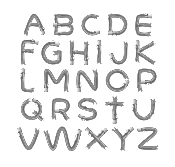
 Banda Aceh, Indonesia-based designers of the script typefaces Luxurious Line (2015), Ramsteinz (2015: calligraphic), Gracias (2015, thick brush), Hello Listie (2015), Glytten (2015), Adelle Script (2015) and Loft Yian (2015), the display typeface Vardy (2015, film noir style), and the wonderful rough brush font The Mistie (2015).
 Typefaces from 2016: De Black, Fortescue, Heart Signal, Hey Dory, Toretto, Honey Land (brushed calligraphic font family), Ravenclaw (Halloween font), Jaguar (dry brush), Champagne (an inky brush typeface), Sharktooth, Lovely Kenzie, Labyrinth (bilined), Cashy Allen (brush script), Joker (handcrafted), Coralie (curly script), La Viola (free thick brush typeface), Captain America (octagonal and interlocking), Brightscales (curly script), Chicksar, Typefloss (a nice dry brush font), Lovelight, Alexandria (Greek simulation font), Brushello, Cherry Blossom (a children's font), Woodpecker (wood plank typeface), Cataleya (free). Typefaces from 2017: Luxurious Line, Camelone, Glamorous Silhouette, Russell, Vardy, Forester (vintage slab serif), Soeltin, Almera, Relevant, Mellany (script), Tomodachi Hiragana. Behance link. Another Behance link. Aka Voryu. [Google]
[More] ⦿
|
Francesco Mistico Canovaro
[Zetafonts (or: Studio Kmzero, or: ZeroFont)]
|
 [MyFonts]
[More] ⦿
[MyFonts]
[More] ⦿
|
Gregory Wood
|
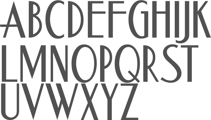
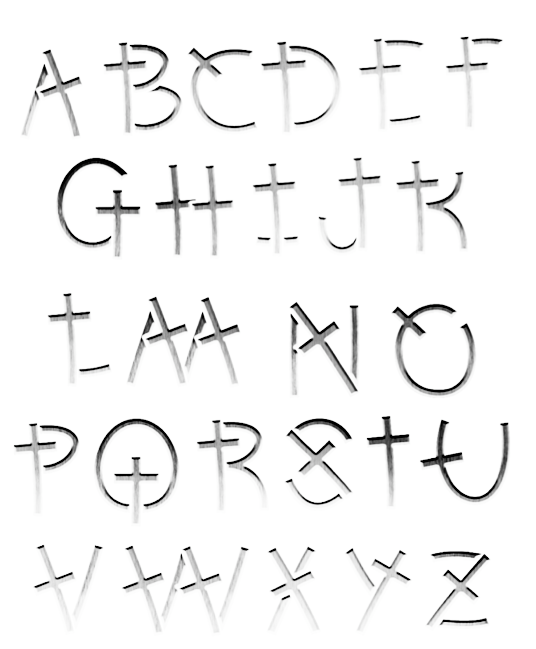
Philadelphia, PA-based designer of the film noir script font Boulevard (2018). [Google]
[More] ⦿
|
Henri Avecunk
|
 Sollentuna, Sweden-based creator (b. 1973) of Parsley Path (2016), Ignoreland A (eroded style), Ombudsman Stencil (2016), Chateau de Garage (2016, a heavy slab serif), King of Rome (2016, heavy wedge serif), Backboard Outline (2016, athletic lettering), Jollysight Sans (2016), Horseback Slab (2016), Playoff (2016), Bellet (2016, Peignotian, caps only), Strejka (2016, grungy and handcrafted), Promenade de la Croisette (2016, a condensed all caps movie credit font), Fogle Hunter (2016, a tall-ascender antiqued treasure map typeface), Ground Control (2016, a techno typeface), Hello Euroboy (2016), I Am A Rock (2016), the condensed handcrafted typeface Tamales (2015), Discoteca Rounded (2016), Entschuldigung (2016, squarish sans), Discoteca (2016, rounded sans), Mouthpiece (2016), Jumping The Couch (extremely condensed film noir font), the Peignotian typeface Nizza (2016), the athletic lettering font Be True To Your School, and the narrow handcrafted Stem Panini (2016).
 Typefaces from 2017: Wermland Gothic, Fields of Cathay, Chrobot, Grenade Stencil (military stencil), Camargue Serif, Krechanstaud Gothic (grungy), Spettekaka Serif, Boulodrome (heavy rounded sans script). Typefaces from 2018: Les Champs, Backcountry, Manhandle Slab, Out of My League (sans). Typefaces from 2019: Budokan Rounded, Edsbacka Flare Serif, Bonard, Generalissimo, Airside Sans, Haute Corniche (art deco caps), Danderyd Gothic. Typefaces from 2020: Big Star (octagonal). [Google]
[More] ⦿
|
Ilyas Yunusov
[Kulturrrno]
|
[MyFonts]
[More] ⦿
|
Jack Thompson
|
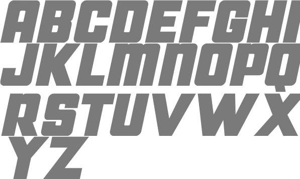
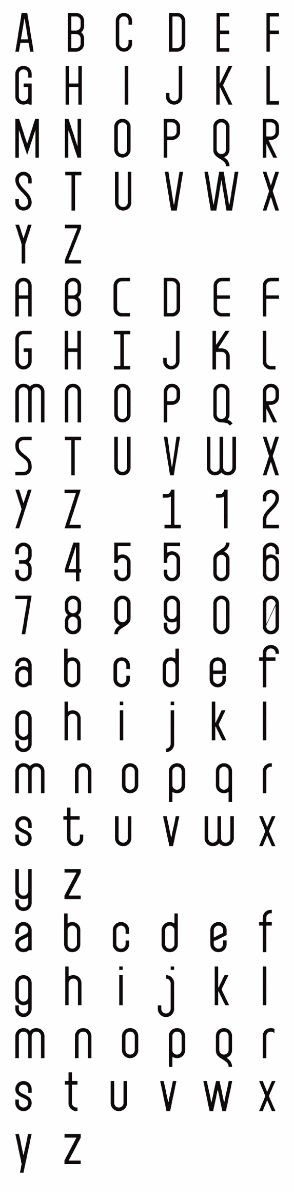
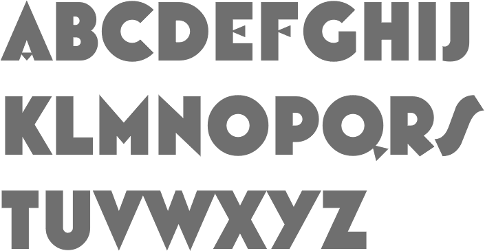
 Graduate of Glasgow College and Glasgow Caledonian University. Glasgow, Scotland-based designer of the titling sans typeface Alterner (2019). The typeface and presentation were influenced by the typographic work of Jean-Luc Godard.
 In 2015, he published the art deco typefaces Plaza (art gallery style) and Xthlx (dystopian). In 2016, he designed the hand-printed typefaces Spagwetti and Dragonfly. In 2019, he released his second dystopian (this time, origami-inspired) typeface, Origama, and the high-contrast film noir font Jean-Luc. [Google]
[More] ⦿
|
Jaikishan Patel
[Magic Type]
|
[More] ⦿
|
Jeff Levine
[Jeff Levine: Art Deco Typefaces]
|
 [MyFonts]
[More] ⦿
[MyFonts]
[More] ⦿
|
Jeff Levine
[Jeff Levine: Alf R. Becker fonts]
|
[MyFonts]
[More] ⦿
|
Jeff Levine: Alf R. Becker fonts
[Jeff Levine]
|
Jeff Levine created a number of typefaces that were based on alphabets created by the late Alf R. Becker for Signs of the Times Magazine during the period of the 1930s through the 1950s. These incude Casual Signage JNL (2018), Film Noir JNL (2010, counterless geometric art deco style), Hexide JNL (2011, a fat hexagonal design), Kanona JNL (2010), Karaoke JNL (2010), Mocombo JNL (2010, African look), Modern English JNL (2018), Nightspot JNL (2011, an art deco headline face), Patriotica JNL (2011, a stars and stripes face), Police JNL (2010, caps only 3d shadow typeface after a design by Alf R. Becker), Roadblock JNL (2011), Show Card Casual JNL (2018: based on a single stroke brush alphabet by Alf Becker), Tradewinds JNL (2010, African look), Udsed Cars (2010, comic book style caps). [Google]
[MyFonts]
[More] ⦿
|
Jeff Levine: Art Deco Typefaces
[Jeff Levine]
|
 Art deco is another style that appeals to Jeff Levine. He has created some beauties:
 - Acceptable JNL (2014).
- Afterword JNL (2021). An art deco typeface based on a card shown in the 1931 gangster film The Public Enemy.
- Aircheck (2006, retro CBS font).
- Airliner JNL (2008, all caps, based on a promotional postcard for Kitty Davis' Airliner - a popular Miami Beach night spot of the 1940s).
- Allerton (2019).
- Aparcero JNL (2015).
- Apparel JNL (2020). An art deco stencil.
- Artistry JNL (2017).
- Art Class JNL (2014). Art Class JNL was re-created from the titling of a lettering booklet called Drawlet Portfolio, published by the Esterbrook Pen Company in the 1930s. Drawlet pens were Esterbrook's answer to the popular Speedball lettering pens, and the booklet was an instructional manual on hand lettering with the pen nibs.
- Art Event JNL (2021). Based on a 1930s WPA (Works Progress Administration) poster advertising an exhibit of New Jersey area posters. It had its main lettering rendered in a very condensed hand lettered interpretation of Futura Black.
- Art Lover JNL (2007, based on an art deco typeface from a Dan Solo book).
- Art Materials JNL (2021). Based on the cover of the 1930s-era Catalog of Artists' Materials from Ernst H. Friedrichs, Inc. in New York.
- Art Museum JNL (2016).
- Artwork Stencil JNL (2018, based on an art deco stencil alphabet by Georges Léculier, 1939).
- Autumn Song JNL (2019).
- Bandleader JNL (2014).
- Bandshell JNL (2020).
- Bargain Shopping (2019). Based on an old storefront sign of F.W. Woolworth.
- Barn Dance JNL (2018).
- Bay Ridge JNL (2015).
- Beachfront Hotel JNL (2018).
- Bed And Bath JNL (2016, from the hand-lettered name on a 1930s-era tin for Cadet condoms).
- Belmont JNL.
- Bensonhurst JNL (2016).
- Big Band JNL (2011) is a brash typeface that is based on a lettering example found in a 1941 Speedball Lettering Pen instruction book.
- Bill of Fare JNL (2021). A stylish art deco serif based on a 1942 menu cover for the restaurant at the Biltmore Hotel in Los Angeles.
- Blue Orchid JNL (2015).
- Borough Park JNL (2014).
- Brand X JNL (2013),
- Brookhurst (2006, compressed art deco font).
- Cabana Club (2006, Miami Deco inspired font with a razor-thin double outline).
- Cafe Society JNL and Cafe Society Monoline JNL (2014).
- California Bound JNL (2015). Based on the hand lettering found on the side of the old California Zephyr passenger trains.
- Canarsie JNL (2006, a hand-lettered art deco face), Canarsie Slab JNL (2001).
- Casting Call JNL (2015).
- Casual Deco JNL (2019).
- Catalog JNL (2012). A blocky headline typeface.
- Central Park JNL (2014).
- Changing Times JNL (2017).
- Chanson De Paris JNL (2018).
- Chinese Song JNL (2019).
- Chocolate Bar JNL (2016).
- Clean Deco JNL (2020).
- Cleveland Neon JNL (2016, based on the art deco neon sign for the iconic Clevelander Hotel located in the Art Deco district of Miami Beach).
- Club Lunch JNL (2016).
- Common Area JNL (2015).
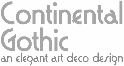
- Contintental Gothic (2006).
- Cortland JNL (2009): modeled [in part] from lettering spotted in the opening credits of Columbia Pictures 1945 Batman serial.
- Counter Servive JNL (2021).
- Courtroom JNL (2021). Based on the hand lettered opening title for the 1935 Perry Mason movie, The Case of the Lucky Legs.
- Cover Art JNL (2016). Based on a cover of an art deco era Portuguese magazine called Illustracao.
- Cover Charge JNL.
- Crestview Six JNL (2010). And its outline and shadow versions called Gramercy Eight JNL (2010).
- Cut Stencil JNL (2011).
- Dance and Sing JNL (2021). An art deco stencil based on a 1932 fan magazine from Spain entitled Films Selectos.
- Dance Band JNL (2017).
- Dance Moderne JNL (2020). An art deco typeface based on an alphabet in Portfolio of Alphabet Designs for Artists, Architects, Designers & Craftsmen (1938, Irene K. Ames).
- Dance Number JNL (2015).
- Dance Partner JNL (2015). Based a movie poster for the 1935 RKO picture "Roberta" starring Fred Astaire and Ginger Rogers, which in turn was based on the hit 1933 stage play that introduced the song Smoke Gets in Your Eyes. The play itself was based on the Alice Duer Miller novel Gowns by Roberta.
- Dance Routine (2019).
- Dance Time JNL (2021). Based on an appearance poster from 1936 for the Benny Goodman orchestra.
- Dancing Girl JNL (2021). An art deco font based on a poster for the 1930 film Show Girl in Hollywood.
- Dancing Marathon JNL (2021). An art deco font based on the cover of the 1932 sheet music for Dancing Marathon.
- Date Night JNL (2016, based on the opening title card for the 1931s pre-code movie drama Other Men's Women starring Mary Astor, Regis Toomey, James Cagney and Joan Blondell.
- Deco Days JNL (2018).
- Deco Design JNL (2020).
- Deco Diva JNL (2020).
- Deco Drop Caps JNL (2018). Based on an alphabet shown in Modèles de lettres modernes par Georges Léculier (1925).
- Deco Eccentrique JNL (2018) and Deco Multiline JNL (2018).
- Deco Banner JNL (2016), Deco Edition JNL (2017), Deco Moderne JNL (2017), Deco Nights JNL (2017), Deco Pen JNL (2017), Deco Redux JNL (2020: an all caps counterless art deco typeface), Deco Revisited JNL (2020).
- Deco Romance JNL (2020).
- Deco Roundpoint JNL (2018), Deco Semi Serif JNL (2017).
- Deco Signage JNL (2021).
- Deco Sketch JNL (2020).
- Deco Spot Initials JNL (2020). A set of rounded art deco initials set inside circular borders, after Georges Léculier's Modèles de Lettres Modernes.
- Deco Hotel JNL (2015). A hairline deco typeface.
- Deco Geometric Stencil JNL (2015).
- Deco Style JNL (2018).
- Deco Paragraph Initials JNL (2015).
- Deco Pennant Initials JNL (2013).
- Deco Elongated JNL (2013).
- Deco Triline JNL (2017).
- Deco Wide JNL (2020). Based on an alphabet in Georges Léculier's Models of Modern Letters.
- Delancey JNL (2014). Inline and squarish.
- Design District (2006, art deco inspired design elements).
- Desk Clerk JNL (2010).
- Dine and Dance JNL (2015). Supper club deco, multilined.
- Dining Out JNL (2021). An art deco sans based on a 1940s ad flier for the Los Angeles restaurant Lucca Paris Inn.
- Direkta JNL (2012).
- Dip Pen Deco JNL (2019). Made with a round nib pen.
- Discotheque JNL (2018).
- Double Bill JNL (2013). Inspired by the promotional movie trailer for 1938 gangster comedy A Slight Case of Murder starring Edward G. Robinson.
- Double Line Deco JNL (2015).
- Drawing Tablet JNL (2011).
- Dress Shirt JNL (2018).
- Drexel JNL (2018).
- Dual Line Deco JNL (2017).
- Dutch Deco JNL (2020). Based on Anton Kurvers's hand lettering on the front cover of the 1927 magazine Het Vlaamsche Volstooneel.
- East Village JNL (2016).
- East To West JNL (2014).
- Easy Living JNL (2015).
- Easy Money JNL (2014).
- Erratic JNL (2014).
- Estella JNL (2008, starry art deco version of Farragut JNL). Jeff writes: Her father named her Estella Dawn, or morning star. She truly shines bright, for as the owner of Stella Roberts Fonts, she has dedicated part of her net profits to helping her siblings pay for their medication; they both suffer from Cystic Fibrosis and diabetes. Calm in spirit, loyal to friends and family, nurturing and caring, Stella has been a friend of Jeff Levine's for years. His Estella JNL font was dedicated to her, as is this other namesake font, Morningstar JNL.
- Eckhardt Showcard JNL (2008).
- Evening Gown JNL (2015). Based on an ad for the 1935 musical "Roberta" starring Fred Astaire and Ginger Rogers.
- Evening Initials JNL (2015).
- Evening Out JNL (2018).
- Evening Wear JNL (2014).
- Family Deco JNL (2021). Inspired by the bold art deco hand lettering of the movie credits for the 1936 Laurel and Hardy comedy Our Relations.
- Fancy Dancing JNL (2015). Based on sheet music titling for the 1938 movie musical "Carefree" starring Fred Astaire and Ginger Rogers.
- Fancy Deco JNL (2018: based on the 1934 French lettering book L'Art du Tracé Rationnel de la Lettre by D. Duvillé).
- Fancy Roman JNL (2018).
- Fashionable JNL (2016, art deco: based on print ads for the Hickok Jewelry Company).
- Fashion Statement JNL (2018).
- Faux Decaux (2007, fat art deco).
- Favorite Hangout JNL (2009).
- Film Noir (2010). A counterless art deco typeface based on Alf R. Becker's examples.
- Fine And Dandy JNL (2018, curly art deco).
- Fine Dining JNL (2016: inspired by the opening titles for the 1940 Barbara Stanwyck-Fred MacMurray film Remember the Night).
- Fine Food (2019).
- Finery JNL (2014).
- Flirtation Walk JNL (2018).
- Floorwalker JNL (2013). Based on stencils made in 1926 by Display Material Company of St. Paul, MN.
- Flower Shop JNL (2021).
- Foreign Film JNL (2021). An art deco typeface based on opening credits for the 1936 French drama La Belle Equipe.
- Formal Dance JNL (2018, Dutch deco).
- Formal Event JNL (2021). Based on hand lettered actors' credits on a title card from the 1937 film Shall We Dance.
- Free Form Deco (2019).
- French Bistro JNL (2018, based on the 1934 French lettering instruction book L'Art du Tracé Rationnel de la Lettre).
- French Deco JNL (2018).
- French Geometric JNL (2018, based on an art deco alphabet by Georges Léculier, 1939).
- French Pastry JNL (2015).
- French Wine JNL (2018).
- Frisco Bay JNL (2007, a nice art deco).
- Funny Business JNL (2018).
- Funny Papers JNL (2017).
- Gambling Resort JNL (2014).
- Gidley (2007).
- Golden Beach JNL (2015).
- Golden Moment JNL (2021). An art deco font based on the hand lettered cast credits for the 1939 film Golden Boy starring Barbara Stanwyck, Adolphe Menjou, William Holden and Lee J. Cobb.
- Golden Opportunity JNL (2015).
- Golden Years JNL (2021).
- Graduating Class JNL (2017).
- Grand Central JNL (2010): multi-line Art Deco font is reminiscent of all of the glitz and glamour associated with Manhattan in the 1930s and 1940s.
- Hatchery JNL (2016).
- Hollenbeck JNL (2008).
- Hollywood Revue JNL (2015). Inspired by a movie poster for The Hollywood Revue of 1929.
- Home Movies JNL (2012). Based on 1950s cling vinyl letters made by the Clingtite Letters Company of Chicago.
- Horse Drawn Carriage JNL (2016. Based on the title card for a 1935 Bette Davis feature entitled The Girl from 10th Avenue.
- Hotel District JNL (2016).
- Huntington (2006, an art deco typeface inspired by the opening titles of the film Casablanca).
- Hybrid Deco JNL (2020).
- Industrial Arts JNL (2017). An interpretation of Morris Fuller Benton's Phenix American, 1935.
- Informational Sign JNL (2016).
- Inline Retro JNL (2019).
- Jams And Jellies JNL (2016).
- Jazz Guitar JNL (2020).
- Jazz Trumpeter JNL (2021; an art deco typeface modeled after the title card for the 1945 movie comedy The Horn Blows at Midnight starring Jack Benny).
- Juke Joint JNL (2014).
- Junior Clerk JNL (2017).
- Kiddie Show JNL (2017).
- Last Tango JNL (2021).
- Lauderdale JNL (2013).
- Light Line Deco JNL (2018).
- Limousine JNL (2010, counterless, caps only).
- Lobby Poster JNL (2021). Based on hand lettered cast credits for the 1932 George Arliss film The Man Who Played God.
- Local Jeweler JNL (2021). Thin art deco caps.
- Love Song JNL (2014).
- Malagueña Stencil JNL (2015).
- Mantequilla JNL (2021). Pure art deco lettering modeled after the cover of the 1924 edition of Joaquin Belda's novel, La Hora del Abandono.
- Maplehurst JNL (2010): a beautiful rounded ultra-fat face.
- Market JNL (2009).
- Metalworker JNL (2009), and its star-spangled derived face, NationalSpiritJNL (2009).
- Metalet Modern JNL (2008, based on the letters found within the Metalet Movie Titling Set manufactured by the Modern Display Advertising Company of Hollywood, California circa the 1940s. Each stamped metal letter would be affixed to the background surface via the use of miniature magnets. Once in place, titles for home movies or slides could be photographed, the letters then returned to their storage area in their box.).
- Midtown JNL (2010) and its serifed version, Crosstown JNL (2010).
- Millbrae JNL (2015). Named after the old Millbrae Theater in Millbrae City, CA.
- Modular Deco JNL (2018). Based on an alphabet shown in Modèles de lettres modernes par Georges Léculier (1925).
- Monoline Deco JNL (2014).
- Monthly Adventures JNL (2012).
- Moonlit Night JNL (2017).
- Moonlit Walk JNL (2017).
- More Deco Lettering JNL (2015).
- Movie Classic JNL (2021). Based on hand lettered title card from the 1935 melodrama Magnificent Obsession.
- Movie House JNL (2013). A trilined typeface.
- Movie Matinee JNL (2021). A marquee font based on a 1926 trade ad for the silent comedy The Nut-Cracker starring Edward Everett Horton.
- Movie Musical JNL (2021).
- Movie Screen JNL (2020). An art deco typeface based on the hand-lettered opening titles from the 1944 Laurel and Hardy comedy The Big Noise.
- Movie Set JNL (2021). Based on the hand lettered title on the poster for the 1929 film comedy Why Leave Home?.
- Mulholland JNL (2015).
- Musical Number JNL (2015) and Musical Prelude JNL (2017), Music Lesson JNL (2020).
- Nameplate JNL (2016).
- Narrow Deco JNL (2019).
- Nice and Easy JNL (2021). Based on art deco hand lettered title and credits for the 1937 film Easy Living starring Jean Arthur and Edward Arnold.
- Night Life JNL (2012).
- Nightspot JNL (2011). A bilined headline typeface based on lettering by Alf R. Becker.
- Nightowl JNL (2011): a headline font encased in rectangles inspired by an Art Deco hand-lettered alphabet found in a 1941 edition of the Speedball Lettering Pen instruction book.
- Nouveau Poster JNL (2011). based on an alphabet found in Modern Pen Lettering (1915, C. Howard Hunt pen company).
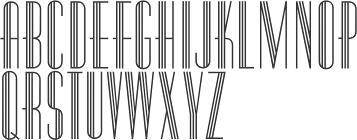
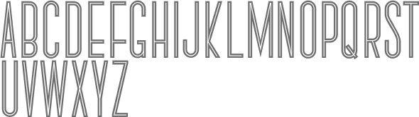
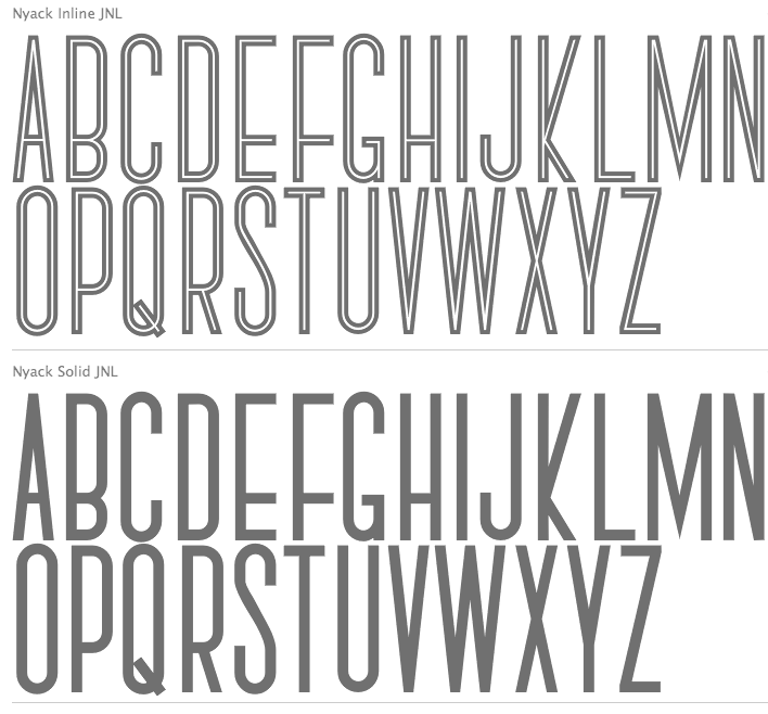
- Nyack (2010, Inline, Solid, Monoline): tall, caps only.
- Paducah JNL (2021). Based on hand lettered screen credits for the 1940 film The Proud Valley.
- Parisian Playboy JNL (2017).
- Parkitecture JNL (2006): counterless and fat.
- Park West JNL (2020). An art deco slab serif.
- Party Invite JNL (2016).
- Passenger Train JNL (2021). Based on a 1940s travel poster for the Florida East Coast Railway.
- Pencil Pusher JNL (2014).
- Pen Lettering Sans JNL (2017, handcrafted art deco).
- Pen Work JNL (2017).
- Penwrite JNL (2017).
- Performing Arts JNL (2018).
- Perfume Counter JNL (2017).
- Periodical JNL (2016). Based on a cover of a 1920s Spanish magazine called Nuevo Mundo.
- Period Piece JNL (2015).
- Piano Lesson JNL (2015).
- Piano Solo JNL (2015).
- Pin Spotter JNL (2021: art deco).
- Oceanfront Property JNL (2017).
- Office Visit JNL (2021).
- Playwright JNL (2010): Levine's version of Broadway.
- Old Miami Beach JNL (2012). Based on signs of the Roney Plaza hotel in South Miami Beach.
- On The Town JNL (2016).
- Opening Night JNL (2013).
- Ormond JNL (2011) and Ormond Inline JNL (2011). The latter is a blackboard bold style face.
- Pocatello JNL (2016. Based on the cast and crew credits for Presenting Lily Mars (1943), (starring Judy Garland and Van Heflin.
- Pocomoke JNL (2015).
- Ornate Deco (2019). Based on an alphabet by Martin Meijer in Album de Lettres Arti (1949).
- Postmodern Moderne (2019). Based on an alphabet by Paul Carlyle and Guy Oring in their 1935 book, Letters and Lettering.
- Poultry And Fish JNL (2016).
- Presswork JNL (2020).
- Private Eye JNL (2019). Based on signage seen in 77 Sunset Strip, an ABC series that ran from 1958 until 1964.
- Prospect Park JNL (2015).
- Quite Animated JNL (2016).
- Radio Singer JNL (2017).
- Rail Service JNL (2021). Based on extra bold, squared art deco sans hand lettering found on a 1940s travel poster for the Pennsylvania Railroad.
- Rail Travel JNL (2021). Based on a hand lettered 1930s travel poster from the Pennsylvania Railroad.
- Railway Depot JNL (2018: based on the 1934 French lettering instruction book L'Art du Tracé Rationnel de la Lettre).
- Regal Suite (2006, display art deco).
- Retail Establishment JNL (2021). Based on the 1935 catalog for Vitrolite. LI>Revelry Deco JNL (2021). Based on the dust jacket for the 1926 book Revelry.
- Rhythmic Revue JNL (2018).
- Ridgewood JNL (2012).
- Ritz Stencil JNL (2011).
- Riverside JNL (2017).
- Romance Song JNL (2021). An art deco sans serif lettering used for the opening titles of the 1941 melodrama Penny Serenade starring Cary Grant.
- Roney JNL (2008, a stylized version of his own art deco typeface Metalet Modern).
- Screen Star JNL (2020). A rounded monolinear art deco typeface.
- Seahawk JNL (2019).
- Screenplay JNL (2010): modeled after the signage seen in an old photo of the RKO movie studios building circa the 1930s.
- Service Deluxe JNL (2015).
- Sheet Music JNL (2011).
- Shopping Spree JNL (2016). Inspired by the hand lettering on the title card for the 1938 film Fast Company starring Melvyn Douglas and Florence Rice.
- Show Biz JNL (2013).
- Show Card Deco JNL (2017).
- Showgirl JNL (2011). Based on the neon letters of a 1940s marquee.
- Showpiece JNL (2014).
- Signage JNL (2013). A stencil in the style of Futura Stencil.
- Silver Screen Deco JNL (2020).
- Sleuth JNL (2013, after the trailer for the 1936 movie After The Thin Man).
- Social Gathering JNL (2016).
- Society Column JNL (2016. Based on the title card for the 1938 screwball comedy Four's a Crowd starring Errol Flynn, Olivia de Havilland and Rosalind Russell.
- Solid Deco JNL (2016).
- Song Album JNL (2016).
- Song And Dance JNL (2014).
- Song Sheet JNL (2014).
- Deco Drop Caps JNL (2018). Based on an alphabet shown in Modèles de lettres modernes par Georges Léculier (1925).
- Space Deco JNL.
- Stage Play JNL (2015).
- Summerhaven JNL (2009).
- Social Club JNL (2021). Based on a movie poster for the 1934 comedy/crime drama Jimmy the Gent starring James Cagney.
- Society Dame JNL (2008).
- Solitude JNL (2015).
- Song Folio JNL.
- Stationery Department JNL (2015).
- Streamlined Stencil JNL (2015).
- Striptease JNL (2012). A 1930s burlesque show marquee typeface.
- Stagehand JNL (2014).
- Stocks and Bonds JNL (2021). Based on the hand lettered opening title for the 1935 movie Thanks a Million.
- Structural Glass JNL (2020). An art deco typeface based on a 6-letter example from a 1931 Vitrolite catalog.
- Student Council JNL (2021). Based on a lithographed cardboard sign (circa 1930s) for Spizz Sparkling Water, a bottled seltzer from the Dr. Pepper Bottling Company of Lexington, Kentucky.
- Stuffed Shirt JNL (2013).
- Stylette JNL (2007, an art deco typeface after Stylor JNL).
- Stylor JNL (2006, hairline art deco).
- Suggestion Box JNL (2015).
- Supper Club JNL (2007).
- Swing Era JNL (2015).
- Table Fortu JNL (2007, art deco stencil).
- Tall Order JNL (2015, a revival of Raleigh).
- Tanawonda JNL (2010).
- Tarpon Springs JNL (2021).
- Theater Bar JNL (2021).
- Thoroughfare JNL (2014).
- Ticket Booth JNL (2016). Based on the opening title card for 1940's Two Girls on Broadway.
- Tin Pan Alley JNL (2014).
- Top Hat JNL (after Art Lover JNL).
- Totally Deco JNL (2017).
- Town And Country JNL (2014).
- Transit Station JNL (2021). Based on a neon sign above the Greyhound bus terminal entrance in a 1930s New York City photo.
- Travel Brochure JNL (2016, based on a vintage booklet from the Japan Tourist Bureau entitled How to See Matsushima and Environs).
- Travel Plans JNL (2021). An art deco typeface based on a 1930s travel poster from American Airlines.
- Triborough JNL (2008).
- Tropical Tourist (2011). A 1934 advertisement for the Roney Plaza Hotel at 23rd Street and Collins Avenue on Miami Beach yielded the inspiration for Tropical Tourist JNL.
- Type Uncommon JNL (2015).
- Upscale JNL (2014, based on a 1939 alphabet by Sanford Ink Company).
- Uptown JNL (2013). Based on the book Sixty Alphabets (1944).
- Tap Water JNL (2016).
- Thin Line Deco JNL (2016).
- Throughway JNL (2020). A revival of an art deco alphabet from A Portfolio of Alphabet Designs for Artists, Architects, Designers & Craftsmen (Irene K. Ames, 1938).
- Top Tune JNL (2018).
- Torrid Tango JNL (2018).
- Uptown Line JNL (2015), Uptown Residence JNL (2015), and Uptown Review JNL (2017).
- Van Wyck JNL (2008).
- Variety Store JNL (2015).
- Vaudeville JNL (2012).
- Vocalist JNL (2014).
- Weekend Plans JNL (2020).
- Westbrook JNL (2012, a monoline all-caps typeface).
- Western Suburbs JNL (2021). An art deco typeface based on the cover of a 1932 edition of Sunset Magazine.
- Window Dressing JNL (2012).
- Window Treatment JNL (2013). A Broadway style marquee face.
- Wingate JNL (2006, a narrow monolinear art deco type).
- Wonderful JNL (2014).
- Words And Music JNL (2014). Based on the 1934 sheet music for I'll String Along with You from the Dick Powell-Ginger Rogers musical 20 Million Sweethearts.
- World Travel JNL (2021: inspired by the hand lettering found on a 1930s travel poster promoting visits to India).
[Google]
[MyFonts]
[More] ⦿
|
John S.C. Simpson
|
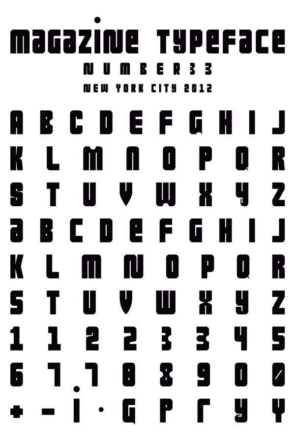
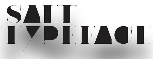
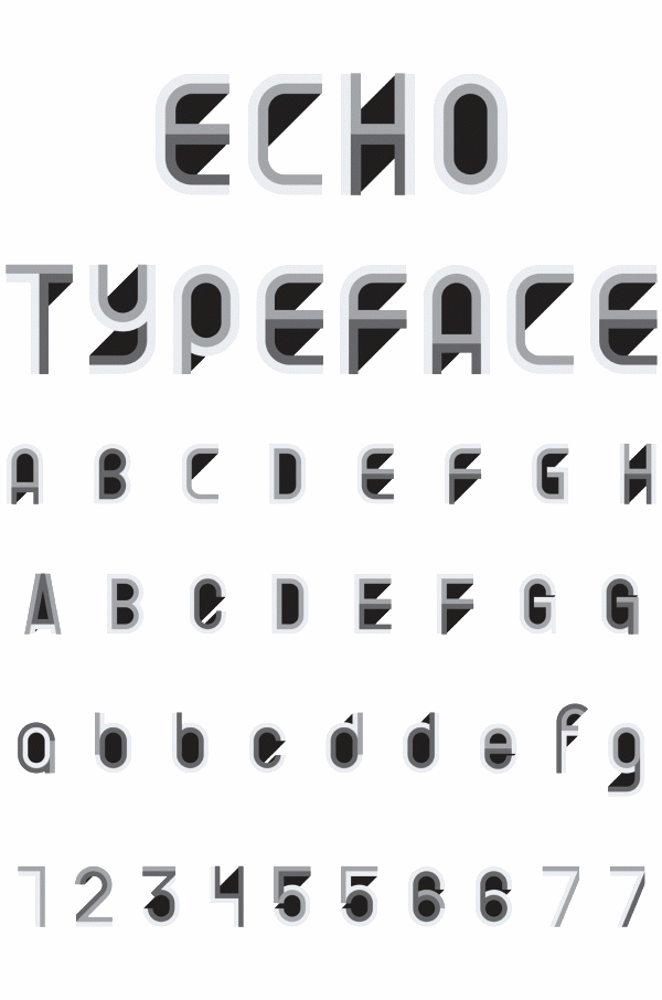
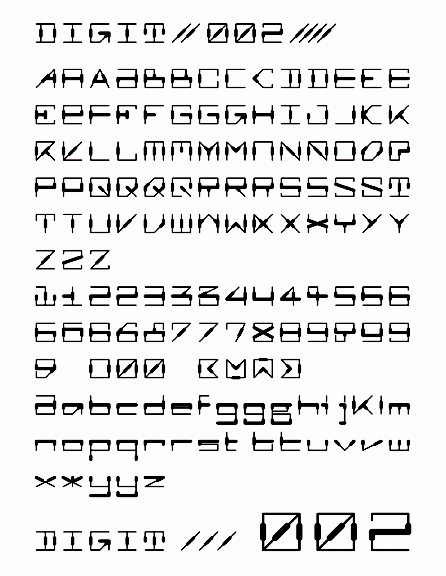
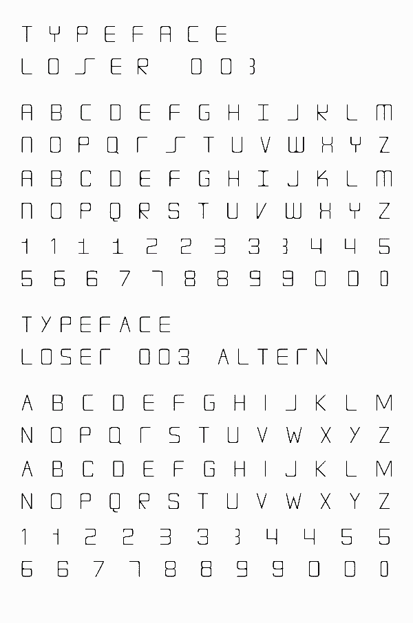
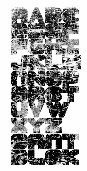
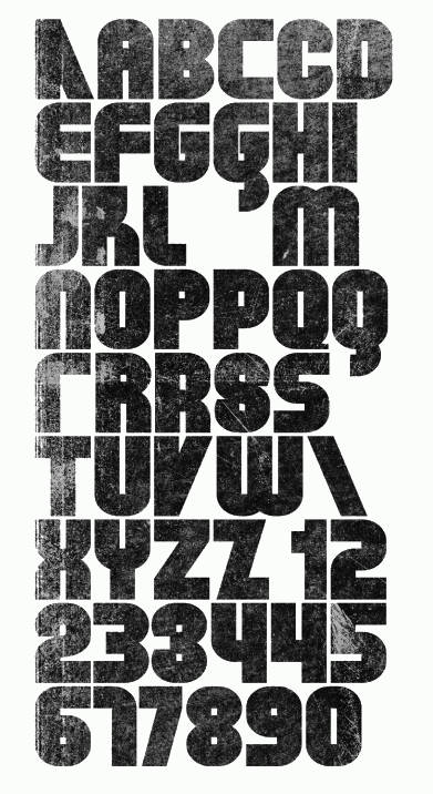
 Art director in New York City. Born in Britain, he is a typographer, illustrator, painter, branding specialist and graphic artist. His largely experimental type design work includes the retro techno typeface Magazine No. 33 (2013), Salt (2013), Echo 08 (2013, a multilined logotype family), Digit 002 (2013), Can Pull Regular (2013), Loser 003 (2013), Wurm Digitail (2013, pixelish), Cant Blok (2013), Fac 003 (2013), Fac (2013), Pramb (2013), 12 Blocks New York (2013), Intro (2013), and Fast Forward (2013).
 Typefaces from 2014: Leonardo (grunge and geometry experiment). In 2015, he made the squarish typeface Cronin, the circle-based Can Pull, Flic Flim, the counterless typeface Winston, and the film noir typeface Cinema. Typefaces from 2016: Aeon (a custom pixel typeface family for Nike New York), Radford (a squarish modular typeface family), Pig, Loser (squarish). Behance link. Another Behance link. Old URL. [Google]
[More] ⦿
|
Joseph Dawson
|
Santiponce, Sevilla, Spain-based designer, b. 1976, of Kids Club House (2019), Super Marker (2019), Angel Eyes (2019), Robotron (2019), Love Craft (2019), Comfy Chrisymas (2019), Cartoon Comic (2019), Love Nature (2019), Critical Role Play (2019), Holiday Chocolate (2019: outlined), Merry Christmas (2019), Mr. Machine (2019: an elliptical display sans), Happy Markers (2019), Playtime (2019), the balloon font Balloons (2019), the zombie font Scarify (2019), the stone age typeface Stompy (2019) and the handcrafted typefaces Certainly (2019), Stripes & Ribbons (2019), and Rum and Bones (2019). Typefaces from 2020: Mummy Halloween, Robot Go, Cute Notes, Remembers, Magic Hat, Hand Crafted, Cute Notes, Film Noir, Battle Star, Sound Wave, Day Display, Eye Spy, Cute 'n' Cuddly, Donut Quest, Sticks and Stones, Love Cats, Cabaret Display, Cartoon Comic, Balloon Craft, Sunshine Smile, Kids Play, Digital Squiggle, Space Adventure. Typefaces from 2021: Balloons, Happy Marker. Creative Fabrica link. [Google]
[More] ⦿
|
Justin Buto
|
Graphic designer in Danbury and/or Stambury, CT, who graduated from Western Connecticut State University. Creator of Sci Noir (2012): "Sci-Noir" is a genre of both film and literature that combines the dark and mysterious elements of Film Noir and classic Science Fiction. In 2019, he published the sci-fi typeface Xibalba, the Mayan-themed caps typeface Muyal, and the glitch typeface Paramorfosi. Fontspace link. [Google]
[More] ⦿
|
Kulturrrno
[Ilyas Yunusov]
|
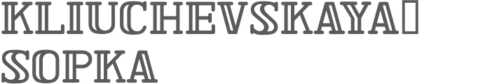
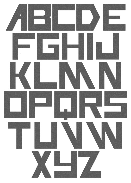
 Taganrog, Russia-based designer of Mash-up (2017), the copperplate emulation typeface Highbridge (2017), the elegant caps only sans typeface Leaner (2017: an all caps monolinear geometric sans, followed in 2018 by Leaner Extended) and the art deco typeface Noirside (2017).
 In 2018, he designed the condensed sans typeface Chromota, and Parallone. Typefaces from 2019: Cultrz (a geometric sans), Sayin On (a grungy caps typeface). Typefaces from 2020: Nullomis (29 styles; an all caps Soviet era font), Domek (a condensed layered sans). Typefaces from 2021: Parallone (a 12-style sans, updating his earlier typeface from 2018). [Google]
[MyFonts]
[More] ⦿
|
Lorenz Lopetz Gianfreda
[burodestruct (or: Typedifferent.com)]
|
 [MyFonts]
[More] ⦿
[MyFonts]
[More] ⦿
|
Magic Type
[Jaikishan Patel]
|
 Mumbai, India-based designer of these Latin typefaces:
 - The display typeface Gold (2018). See also the free squarish Google font Goldman (2018). Github link.
- The free Google font Red Rose (2018), which was designed for love, romance, drama, thriller, noir and passion. Github link.
- The free sans typeface family Rowdy (2018).
- The fashion mag sans typeface Poison (2019).
- The wide bold sans typeface Dashboard (2019).
[Google]
[More] ⦿
|
Mark Gordon
|
Orem, UT-based designer of the art deco film noir typeface Classeco (2016). [Google]
[More] ⦿
|
Mark Simonson
[Mark Simonson Studio]
|
 [MyFonts]
[More] ⦿
[MyFonts]
[More] ⦿
|
Mark Simonson Studio
[Mark Simonson]
|
 Mark Simonson Studio is located in StPaul, MN. Mark founded Mark Simonson Studio around 2000, and describes himself as a freelance graphic designer and type designer. From his CV: Early in my career I worked mainly as an art director on a number of magazines and other publications including Metropolis (a Minneapolis weekly, 1977), TWA Ambassador (an inflight magazine, 1979-81), Machete (a Minneapolis broadsheet, 1978-80), Minnesota Monthly (Minnesota Public Radio's regional magazine, 1979-85), and the Utne Reader (1984-88). I was head designer and art director for Minnesota Public Radio (1981-85) and an art director for its sister company, Rivertown Trading Company (1992-2000). During that time, I designed over 200 audio packages, including most of Garrison Keillor's, along with several hundred products (t-shirts, mugs, rugs, watches, etc.) for the Wireless, Signals, and other mail order catalogs. I have frequently done lettering as part of design projects I'm working on. This has always been my favorite part, so in 2000 I opened my own shop specializing in lettering, typography and identity design. I've also been interested in type design since my college days. I started licensing fonts to FontHaus in 1992, and since starting my new business, stepped up my efforts in developing original typefaces. I now have more than 70 fonts on the market with many more to come. This is increasingly becoming the focus of my activities. In 2021, he joined The Type Founders.
 His fonts: - Coquette (2001). He says: Coquette could be the result of a happy marriage of Kabel and French Script.
- Anonymice Powerline (2009-2010). This is probably a hack by some people based on Anonymous. It is available in some Github directories.
- Kandal: a 1994 wedge serif, now also at MyFonts).
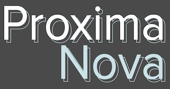
- Proxima Sans (1994, a geometric sans, rereleased in 2004), followed in 2005 by his massively successful Proxima Nova in 42 styles/weights. Followed by Proxima Nova Soft (2011). The rounded version of Proxima Nova is Proxima Soft (2017). For a variable font that captures all styles, see Proxima Vara (2021). In 2022, he added Proxima Sera (an 18-style workhorse serif that combines old style forms with contemporary and modern typefaces).
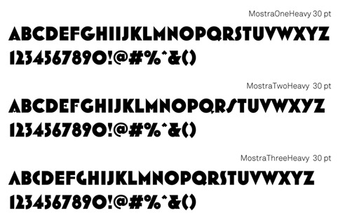
- Mostra (2001): based on a style of lettering often seen on Italian Art Deco posters and advertising of the 1930s. Look at the Light and Black versions, and drool...... The 2009 update is called Mostra Nuova. Selected styles: Mostra Nuovo Bold, Mostra One Light, Mostra Three Bold, Mostra Two Heavy.
- In 2001, he made the Mac font Anonymous. Its updated version is Anonymous Pro (2009-2010), a TrueType version of Anonymous 9, which was a freeware bitmap font developed in the mid-90s by Susan Lesch and David Lamkins. It was designed as a more legible alternative to Monaco, the mono-spaced Macintosh system font.
- In 1998 and 2001, he produced the (free) 3-style Atari Classic family.
- In 2003, he released Blakely Bold and Heavy (an art deco font first done for the Signals mail order catalog). The original Blakely is from 2000.
- Goldenbook Light, Regular, and Heavy, based on the logotype of the 1920s literary mag called "The Golden Book Magazine".
- Metallophile Sp 8 Light and Light Italic (2008): a "faithful facsimile of an 8-point sans as set on a 1940s-vintage hot metal typesetting machine".
- Refrigerator Light and Heavy, Refrigerator and its extension Refrigerator Deluxe (2009) (geometric sans).
- Changeling Light, Regular, Bold, Stencil, and Inline (2003): a redesign and expansion of China, a VGC photo-typositor typeface from 1975 by M. Mitchell, which includes unicase typefaces; see also Changeling Neo, 2009.
- Sanctuary Regular and Bold: a computerish typeface based on lettering in the 1976 movie Logan's run--later withdrawn from the market.
- Sharktooth (+Bold, +Heavy).
- Felt Tip Roman, Woman and Senior (based on his own handwriting). Felt Tip Senior (2000) is based on the hand of Mark's father. Felt Tip Woman Regular and Bold are based on the handwriting of designer Patricia Thompson.
- Filmotype Gay (2011).
- Filmotype Honey (2010): fifties brush lettering face. For a free alternative, see Honey Script (2000) by Dieter Steffmann.
- Raster Gothic Condensed Regular and Bold (12 fonts total), and Raster Bank (a pixelized version of Bank Gothic).
- Other free bitmap fonts for the Mac [the PC version was made by CybaPee]. MyFonts page.
- He digitized Phil Martin's family, Grad (2004, inspired by Century Schoolbook, and originally done by Martin in 1990).
- His 2006 production includes three script typefaces: Kinescope is a connected script based on title lettering in Fleischer Studios' animated Superman films from the 1940s. Snicker is a cartoony block letter type. Both were published at Font Bros. And Launderette is a connected very slanted script based closely on lettering used in the titles of the 1944 Otto Preminger film, Laura.
- In 2007, he revived and extended Filmotype Glenlake (2007, sold at Font Bros).
- Lakeside (2008) is a flowing 1940s-style brush script. It was inspired by hand-lettered titles in the classic 1944 film noir movie Laura.
- In 2008, he revived Filmotype Zanzibar, about which he writes: That Zanzibar is nearly an anagram of bizarre seems fitting. The surviving people from Filmotype (later Alphatype) have not been able to tell us who designed this gem, so we have no record of the designers intentions. Released in the early 1950s, it seems somewhat inspired by the work of Lucian Bernhard (Bernhard Tango, 1934) and Imre Reiner (Stradivarius, 1945). At first, it appears to be a formal script, but there are no connecting strokes. It would be better described as a stylized italic, similar to Bodoni Condensed Italic or Onyx Italic, with swash capitals.
- Filmotype Vanity (2008) is an outline typeface based on a 1955 design by Filmotype. It was derived from Filmotype Ginger.
- Filmotype Alice (2008) is casual handwriting. However, MyFonts now credits Patrick Griffin with the digitization.
- Filmotype MacBeth (2008) is a freestyle face.
- Filmotype Ginger (2008) is a heavy display typeface with an aftertaste of Futura.
- Boxy2 (2008) and Boxy1 (2008) are severely octagonal typefaces made to test out FontStruct. See also bubblewrap.
- In 2008, Mark Solsburg and Mark Simonson cooperated on the digital revival of the calligraphic Diane Script, originally designed in 1956 by Roger Excoffon.
- In 2009, Mark worked on SketchFlow Print, a font for Microsoft. It will be bundled with the next version of Christian Schormann's Expression Blend, part of Microsoft's Expression Studio suite. The fonts, based upon the handwriting of architect Michaela Mahady of SALA Architects, Inc., give that well-known architectural printing look (like Tekton).
- Filmotype Gem (2011). A sans headline typeface that was first drawn by Filmotype in the 1950s.
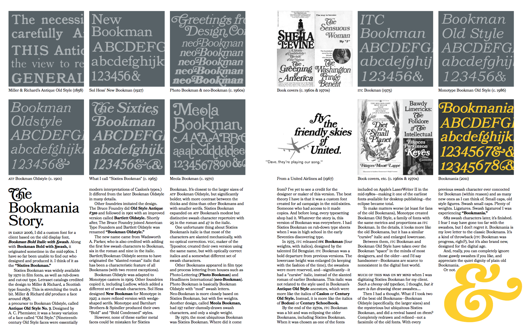
- Bookmania (2011) is a revival of Bookman Oldstyle (1901) and the Bookmans of the 1960s, but with all the features you would expect in a modern digital font family. Especially, Simonson's Bookmania story is worth reading.
- In 2018, he published the 25-style Acme Gothic at Fontspring. He explains: Acme Gothic (2018) is based on the thick and thin gothic lettering style popular in the U.S. in the first half of the twentieth century. There have been typefaces in this genre before, but they were either too quirky (Globe Gothic), too English (Britannic), too Art Deco (Koloss), too modern (Radiant), or too Art Nouveau (Panache). None captures the plain, workman-like style of Acme Gothic.
- Parkside (2018) is a script typeface inspired by typefaces and lettering of the 1930s and 1940s. Parkside uses OpenType magic to automatically select letter variations that seamlessly connect to the letters coming before and after.
- In 2018, he emulated wood type in his HWT Konop at P22. Named for Don Konop, a retired Hamilton Manufacturing employee, who worked from 1959 to 2003, this typeface is monospaced in both x and y directions so that letters can be stacked vertically and horizontally. All proceeds go to the Hamilton Wood Type and Printing Museum.
- Etna (2020). A 30-style text and display family that started out from William H. Page's Victorian wood type Aetna (1874), and was remolded by Simonson into a useful typeface family though still distinctly linked to its ancestor. Etna includes three different condensed widths in all six weights (intended for display use), four different figure styles, alternate characters, true small caps, and a selection of dingbats, including arrows, stars, asterisks, and manicules.
Links to his typefaces, in decreasing order of popularity: Proxima Nova, Bookmania, Mostra Nuova, Proxima Nova Soft, Coquette, Refrigerator Deluxe, Felt Tip Roman, Grad, Changeling Neo, Goldenbook, Lakeside, Kinescope, Metallophile Sp8, Blakely, Felt Tip Woman, Snicker, Felt Tip Senior, Kandal, Sharktooth, Anonymous, Raster Bank, Raster Gothic. FontShop link. Fontspace link. MyFonts interview. View all typefaces designed by Mark Simonson. Fontspring link. Google Plus link. Klingspor link. Abstract Fonts link. Kernest link. I Love Typography link. Font Squirrel link. Old link to hos site. [Google]
[MyFonts]
[More] ⦿
|
Mertcan Sikar
|
Istanbul-based student-designer of the cinema noir sans typeface Golan (2017). [Google]
[More] ⦿
|
Miranda Hopper
|
 Type designer. The casual film noir Firefly (2010, Canada Type) was designed by Miranda Hopper for Patrick Griffin's type design class of 2010 at Humber College in Toronto. Klingspor link. [Google]
[MyFonts]
[More] ⦿
Type designer. The casual film noir Firefly (2010, Canada Type) was designed by Miranda Hopper for Patrick Griffin's type design class of 2010 at Humber College in Toronto. Klingspor link. [Google]
[MyFonts]
[More] ⦿
|
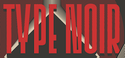
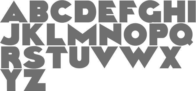
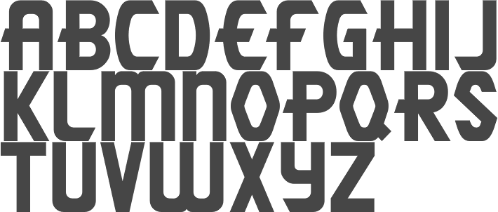
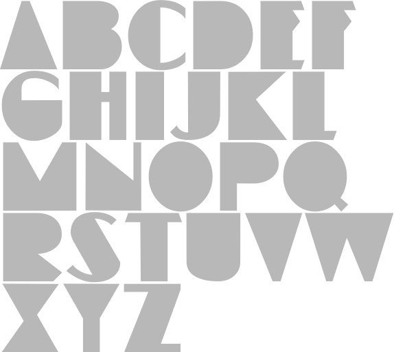
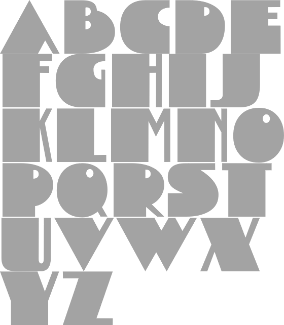
MyFonts: Film noir typefaces
|
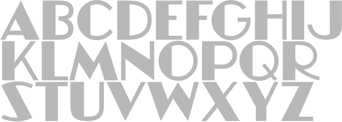
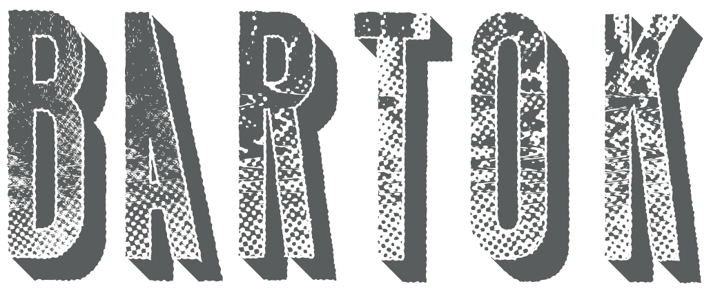
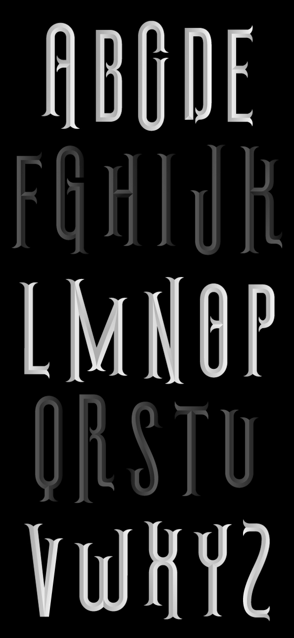
Film noir, the middle of the 20th century, mystery movies, expressionism, depression, thrillers, Hitchcock, Goddard. [Google]
[More] ⦿
|
Nathan Gale
|
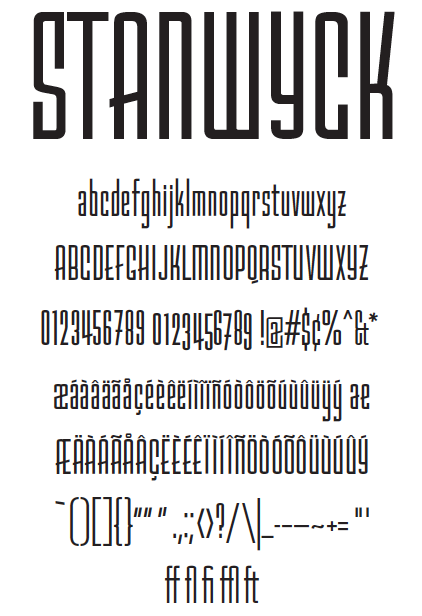
Portland, OR-based designer of Stanwyck (2013), a successfully executed display typeface that is based on film noir movie titles of the '40s and '50s. Behance link. [Google]
[More] ⦿
|
Nick Oeffling
|
Nick Oeffling (b. Santa Monica, CA) designed the zebra-textured fingerprint-inspired typeface Touch in 2016 during his studies at Chapman University in Los Angeles. It was created to celebrate the fifteen year anniversary of the film noir thriller Memeno. [Google]
[More] ⦿
|
Ochaya Designs
[Eric Ochaya]
|
 Fredericton, New Brunswick, Canada (was: Ottawa, Canada)-based designer of the free textured typeface Khepri (2017), which was inspired by Egyptian hieroglyphics. He also designed Voyager (2017), the textured typeface Embers (2017), the 22-style art deco sans Dianna (2017), and the letterpress emulation typeface family Barry (2017).
 Typefaces from 2018: Barlet (a free display sans), Portia (film noir caps). [Google]
[More] ⦿
|
Patrick Saville
|
Patrick Saville is a London based-illustrator and graphic designer. He created the grungy textured all-caps sans typeface Shadow (2012), which is based on the film noir. [Google]
[More] ⦿
|
Patrick Seymour
|
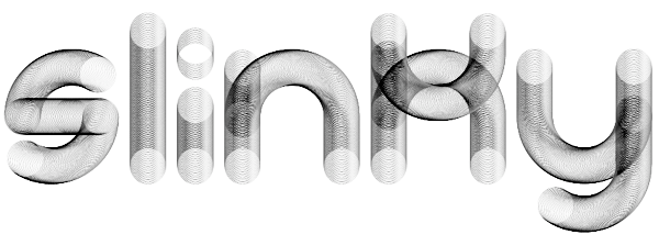
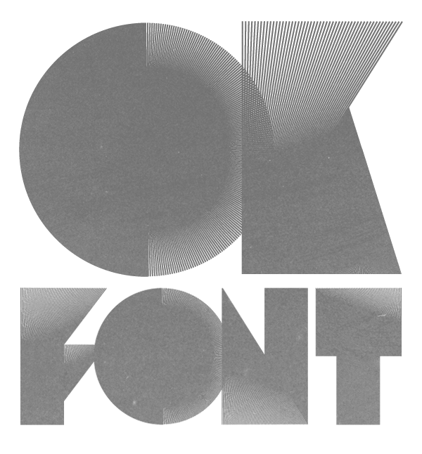
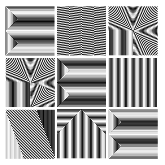
 Super-talented Montreal-based illustrator and digital artist. Home page. He created several modular typefaces in 2011.
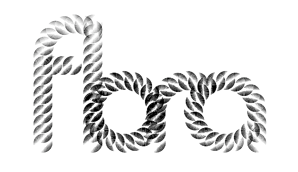
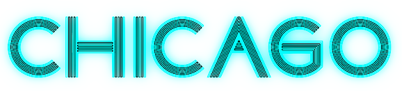
 In 2012, he created Muse, Gotham Streets (a prismatic typeface), Slinky, Stencil, Tulipe (counterless), Bad Billy (multilined, art deco), The Great Carnival (beveled caps), Web Font (prismatic), Jump Jump Font (octagonal), Fashion (a horizontally striped typeface), OK (prismatic), The Aviator (horizontally striped poster face), La Bonne Aventure (prismatic and slightly art deco), the rope-themed typeface Noeud Marin, the shaded boat name typeface Bleu Marine, the multiline caps typeface Origami, the moustache-inspired caps typeface Mous Type (ornamental moustache-shaped capitals), the multilined display typeface Empire, the hand-drawn Une Typo Faite A La Main, and the prismatic typeface Anabelypster. After a bout of salmonella, he created Intestino, still in 2012. In Motion (2012) is an awesome prismatic art deco typeface. Images of his stunning work from 2011: i, ii, ii, iv, v, vi, vii, viii, ix, x. His Cathédrale project (2011) starts from a squarish face and transforms it gradually into one that contains the features of a cathedral. Creations in 2013: Shapes (geometric font), Gold Deco, Dentelle, Twist, Sleek (a thin slab serif), Say Say Say (multiline, prismatic, hypnotic), Metrick (a gridded typeface), Film Noir (an overlay type system), Tam Tam, Diner (a striped all caps typeface), Spot Light Font (prismatic), Flora, Bright Diamond, Incandescent, XVII (multilined display face), Konga (a multiline script), Shiny Diamond, Splash (paint font), Chicago (prismatic neon tube face), Taxi (a wonderful multiline typeface), Papale (religious symbology alphabet made to mock the papal system), Empreinte (pure op-art), Broken Arrow Font (multiline caps face), Liquid Paper Font, Sunset (prismatic), Boogie (Broadway-style art deco family), New Art Deco (prismatic art deco face), Poule de Luxe, Burnout (a prismatic typeface), Marble Maze Font, M Gagnon (ornamental caps influenced by the design work of Denis Gagnon). FontStruct fonts: Test3 (2012), Jump Jump 2 (2012). Typefaces made in 2014: Moiré, Decora, Magnetic, Noise (TV noise emulation), Yes (multilined font), Broderie (braided letters), SAS (multilined), Full House, Heart Font (prismatic), 1976 (inspired by the 1976 Olympic Games in Montreal), Gold (prismatic art deco typeface), Lace, Bike. Typefaces from 2015: Detour, Allie X, Grad Font, Duct Tape, Mint Julep (bilined art deco beauty), Hourglass, Stuntman (prismatic), La Dame de Coeur (playing card font), Fog. Typefaces from 2016: Road Free (a free prismatic font), Solitaire (card font), Joliette, Denis (named after Montreal's mayor, Denis Coderre), Montreal (a prismatic typeface based on the logo of the city of Montreal), Cherry Cola Font, Bro & Co (multilined art deco beauty), Macramee (multilined). Typefaces from 2017: The Simple Font (sans), Le Cabinet (multilined neo deco). Typefaces from 2018: Atrium (a sublime multiline art deco beauty), Pride (a color font to support the LGBT community). Typefaces from 2019: Columbarium (a beveled typeface), The Invisible Font, The Usual Font, Recettes d'Ici (handcrafted style for menu design), Vinyl (multiline), Gasoline (a gasoline spill textured font), Reflet, Mint Soda (a fashion mag extravaganza), Glamarrr (a sailor or pirate font). Typefaces from 2020: Siren (a wonderful mermaid-themed initial caps font, half Engravers MT and half mermaid), Homa (decorative caps), Luna (blocky caps), Chicken Bone, Happier (an all caps 3d color font), Dollara (a polygonal typeface), Stay Home, Mundo Disko (prismatic). Typefaces from 2021: Deliria, The National Bank Open font (created for a tennis tournament). Behance link. Hellofont link (for buying his fonts). Typefaces from 2022: Trumpets (deco caps). [Google]
[More] ⦿
|
Stefan Huebsch
[Typocalypse Types]
|
 [MyFonts]
[More] ⦿
[MyFonts]
[More] ⦿
|
Typocalypse Types
[Stefan Huebsch]
|
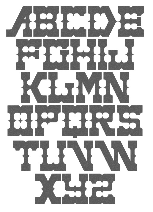
 Typocalypse Types was founded in 2009 by two students of communication design from the University of Applied Science in Trier: Kai Merker and Stefan Huebsch (b. 1981, Saarbrucken; Stefan Huebsch lives in Heusweiler / Saarbrücken in Saarland, Germany). Sven Fuchs joined some time later.
 Huebsch's first font, made in 2009, is Black No. 7---it was inspired by the Jack Daniel's Black Label Whiskey logo from 1866. Black No. 7 Vintage (2009) is a grungy version. In 2011, he created Lith, a hand-drawn headline typeface inspired by Alice In Wonderland and the Brothers Grimm fairy tales. In 2014, he published a spectacular 11-style font family, Lichtspiele, that takes inspiration from early 20th century movies, and more specifically, the film noir genre. In this series, Lichtspiele Neon 3D is of particular interest. Lichtspielhaus (2014) is an ultra-condensed version. Lichtspielhaus Handmade (2014) is the handwritten version---it was influenced by the hand-painted signs on cinema facades of the early cinema days. In 2015, we were treated to Lichtspielhaus Slab (ultra-condensed), and in 2016 to Lichtspiele Reklame (the ultra-condensed version). In 2017, Stefan Huebsch and Daniela Spinelli co-designed Konkret (a sharp-edged all-caps secret service sans with some left-leaning Kontra italics). Behance link. Creative Market link. [Google]
[MyFonts]
[More] ⦿
|
Zetafonts (or: Studio Kmzero, or: ZeroFont)
[Francesco Mistico Canovaro]
|
 Italian design firm in Firenze consisting of three graphic designers, Francesco Canovaro, Debora Manetti, and Cosimo Lorenzo Pancini. It has evolved into Italy's premier and most prolific type foundry. Canovaro's Behance link. Also called ZeroFont and Zetafonts, this type foundry exhales joy---in every design and presentation, the passion of the designers bubbles to the surface. Blending a delicious sense of humour and a great aesthetic taste, Zetafonts is a typographic delight. Their typefaces:
 - Adlibitum (2018). A textura blackletter typeface family.
- Anaphora (2018). Anaphora is a contemporary serif typeface designed by Francesco Canovaro (roman), Cosimo Lorenzo Pancini (italic) and Andrea Tartarelli. It features a wedge serif design with nine weights from thin to heavy. Its wide counters and low x-height make it pleasant and readable at text sizes while the uncommon shapes make it strong and recognizable when used in display size. Anaphora covers Latin, Greek and Cyrillic.
- Aliens and Cows (2016). An ultra-condensed all aps sans family by Canovaro.
- Arturo (2018), by Francesco Canovaro.
- Atlantica (2017). A signage script family.
- Lightstrike (2016). A thin (and free) brush font by Canovaro.
- Byom (2016). A tweetware organic sans typeface family by Francesco Canovaro.
- Adlery (2016, +Cyrillic). A brush script by Cosimo Lorenzo Pancini.
- Adlibitum (2016). A blackletter typeface by Cosimo Lorenzo Pancini and Francesco Canovaro.
- Morbodoni (2016). A display didone by Cosimo Lorenzo Pancini and Francesco Canovaro.
- Altair (2016). A display sans by by Francesco Canovaro based on Digitalino.
- Aquawax (2015). A sans family by Canovaro and the Zetafonts team. Extended in 2019 to Aquawax Pro by Francesco Canovaro, Cosimo Lorenzo Pancini and Andrea Tartarelli.
- Armonioso (2014). A creamy connected signage script.
- A Day Without Sun (2014, by Cosimo Lorenzo Pancini).
- Another Shabby (2014, a primitive script by Francesco Canovaro).
- Antipasto (2007, by Matteo Di Iorio). A clean elegant sans by Canovaro.
- Arista (2007) and Arista 2.0 (2010). A simple rounded bold sans typeface designed by Francesco Canovaro and Adolfo Monti. In 2017, Francesco Canovaro updated these to Arista Pro.
- Arsenale White and Arsenale Blue (2009). Children's hands, done by Cosimo Lorenzo Pancini, Francesco Canovaro, Andrea Mi, Debora Manetti, Katiuscia Mari, and Jonathan Calugi.
- Beatrix Antiqua (2016, by Francesco Canovaro, Cosimo Lorenzo Pancini and Andrea Tartarelli). This humanist sans-serif typeface is part of the Beatrix family (Beatrix Nova, etc.) that takes its inspiration from the classic Roman monumental capital model. Its capitals are directly derived from the stone carvings in Florence's Santa Croce Cathedral. Beatrix keeps a subtle lapidary swelling at the terminals suggesting a glyphic serif, similar to Hermann Zapf's treatment in Optima. Some weights are free.
- Bimbo >(2018). A child emulation handwriting font developed as an extension and redesign of the original Arsenale White typeface created with italian illustrator Jonathan Calugi.
- Bistecca (2005). A bellissima extra-condensed serif font created for ego[n] 5 and for the cover of ego[n] 4.
- Braciola (2006). Monospaced and octagonal, with stencil styles added.
- Brushstrike (2015). By Canovaro.
- Byron (2006). Handwriting.
- In 2010, Canovaro designed the plumpish bubblegum typefaces Bubblebody Fat and Bubbleboddy Extra Light. These fonts were discontinued in 2016 and replaced by Bubbleboddy Neue.
- Bulletto (2015). A retro baseball script.
- Cibreo. A basic sans typeface by Canovaro and Monti.
- Cinematografica (2017). An ultra condensed small caps movie typeface used in the advertising campaign for Lucca Comics 2017 Festival. This film noir family features eight weights from thin to heavy with open type alternate glyphs and some full word ligatures.
- The rounded geometric sans family Cocomat (2015, Zetafonts, by Cosimo Lorenzo Pancini, Debora Manetti and Francesco Canovaro) was inspired by the style of the twenties and the visions of Italian futurists like Fortunato Depero, Giacomo Balla and Antonio Sant'Elia. Updated in 2019 as Cocomat Pro.
- Cocosignum (2017). Cocosignum Corsivo Italico and Cocosignum Maiuscoletto are both based on Italian art deco styles.
- Codec (2018) by Cosimo Lorenzo Pancini, Francesco Canovaro and Andrea Tartarelli is a geometric sans typeface family in which all terminal cuts are horiontal or vertical. See also Codec Pro (2019).
- Delizioso (2008). Art deco.
- Digitalino (2013).
- Docporn (comic book style).
- Duepuntozero Pro (2006-2008). A condensed rounded sans famly by Adolfo Monti and Francesco Canovaro. The Pro version was released in 2019.
- Filetto (2009). A sans modeled after DIN 1451 done by Canovaro, Debora Manetti and Katiuscia Mari.
- Florentia (2017). An 18-style lapidary typeface family influenced by the renaissance and luxury.
- In 2018, Debora Manetti and Francesco Canovaro designed the brush handwriting font Freehand Brush.
- Handvetica (2005). Arched.
- Happy Frush Zero (2014). A random note font.
- Happy Funghetto (2015). Fifties style lettering.
- Heading Pro (2017). A condensed sans typeface by Francesco Canovaro. Followed in 2018 by Heading Pro Ultra Compressed, Heading Pro Extended, and Heading Pro Text.
- Hello Script (2015). Curly and calligraphic.
- Modulo3 (2008). An artsy beauty.
- New Romantic (curly grunge).
- Panforte (2013) and Panforte Serif (2013): hand-drawn typefaces. Panforte Pro followed in 2017.
- Prozak. Consists of zProzak-Bold, zProzak and zProzakLight (2006). A basic sans typeface by Canovaro and Monti.
- Sala de Fiestas (2005-2006). Free download at OFL.
- Square80 (2009).
- Studio Gothic (2017, by Francesco Canovaro, Cosimo Lorenzo Pancini and Andrea Tartarelli) is an 8-style geometric sans family based on Alessandro Butti's geometric sans classic, Semplicita.
- Sugo (2007). By Canovaro and Monti.
- Taller (2009, ultra-condensed), Taller Evolution (2009), Tallest (2009, ultra-condensed).
- Targa Monospace. Inspired by license plate lettering.
- Targa (2002), TargaMS (2002), TargaMSHand (2002). Cosimo Lorenzo Pancini, who developed Targa in 2002, based his design on the peculiar sans serif monospace typeface with slightly rounded corners and a geometric, condensed skeleton that Italy had been using for its license plates. In 2022, Francesco Canovaro redesigned this font into a versatile multi-weight typeface, Targa Pro, which includes Targa Pro Mono (which keeps the original monospace widths), Targa Pro Roman (with proportional widths), both in five weights plus italics, the handmade version Targa Hand, and Targa Pro Stencil.
- Tutor (2006). Rectangular, pixelish---what I call a piano key font.
- Zerocalcare is a typeface family created for the branding of Lucca Comics & Games Festival 2016. It is based on the digitised handwriting of italian comic artist Zerocalcare, and it uses open type substitutions to mimick the flow of real handwriting. Free at Dafont.
- Double Bass (2018): A jazzy 4-style typeface family that pays tribute to Saul Bass's iconic hand lettering for Otto Preminger's The Man with the Golden Arm film title sequence and other movies, Bass's vibrating, almost brutal cut-out aestethics, and the cartoonish lettering and jazzy graphics of the fifties.
- Another Shabby (2018) is a brush script typeface family designed by Francesco Canovaro for Zetafonts with Cyrillic letters designed by Alina Golovan.
- Sugo Pro (2018, Francesco Canovaro, Andrea Tartarelli). It was designed in 2006 by Francesco Canovaro in two weights (regular and extralight) and later used by Cosimo Lorenzo Pancini as base inspiration for the design of the successful Zetafonts' Cocogoose Pro typeface. In 2018 the family was completely redesigned by Andrea Tartarelli, expanding the original glyph set to include Cyrillic and Greek and adding three extra weights and italics. The restored and revamped version is named Sugo Pro Classic. In 2020, Cosimo Pancini, Andrea Tartarelli and Mario De Libero drew the 60-style Cocogoose Pro Narrows family, which features many compressed typefaces as well as grungy letterpress versions.
- Extenda (2018) is a thin-to-wide grotesque advertising or movie credit family with some of the DNA of Impact or Compacta. By Francesco Canovaro and Andrea Tartarelli.
- In 2019, Blacker Sans (Francesco Canovaro, Andrea Tartarelli) and Blacker Pro (Cosimo Lorenzo Pancini and Andrea Tartarelli) were released. The 63-strong fashion mag powerhouse Blacker Sans Pro (Francesco Canovaro, Andrea Tartarelli) followed in 2020. Zetafonts writes: Blacker Pro is the revised and extended version of the original wedge serif type family designed by Cosimo Lorenzo Pancini and Andrea Tartarelli in 2017. Blacker was developed as a take on the style that Jeremiah Shoaf has defined as the "evil serif" genre: typefaces with high contrast, oldstyle or modern serif proportions and sharp, blade-like triangular serifs.
- The extreme wedge serif and reverse stress typeface family Blackest (2018, Andrea Tartarelli and Francesco Canovaro).
- In 2019, Cosimo Lorenzo Pancini, Francesco Canovaro and Andrea Tartarelli published the monolinear geometric rounded corner amputated "e" sans typeface family Cocogoose Classic and the condensed rounded monoline techno sans typeface family Iconic.
- Klein (2019) is (in their words) Zetafonts' love letter to the grandmother of all geometric sans typefaces, Futura. Starting from a dialogue with Paul Renner's iconic letterforms and proportions, Francesco Canovaro and Andrea Tartarelli decided to depart from its distinctive modernist shapes with slight humanist touches and grotesque solutions---with some design choices evoking the softness of humanist sans serifs like Gill Sans. The end result is a workhorse superfamily of 54 fonts with full coverage of Latin, Cyrillic and Greek. The original display-oriented family, developed in nine weights with matching italics (from the hairline thin to the sturdy black), has been paired with a text version (with slightly higher x-height, better readability and maximum legibility at small point size) and with a condensed version, to be used for space-saving display solutions in editorial and advertising formats. With a name that is both a nod to its humble functionality and an homage to French nouveau realiste artist Yves Klein, this typeface aims to become your next trusted companion in all your adventures in print, digital and motion design.
- Kitsch (2019, Francesco Canovaro, Andrea Tartarelli and Maria Chiara Fantini) mixes angular medieval elements and old style letterforms. Thicker (2020, by Francesco Canovaro and Andrea Tartarelli). They write: A geometric sans typeface on steroids, it was first designed in the muscular extrablack weight with the aesthetics of high-power dynamic typefaces used in sports communication, and then developed in the lighter weights where the shapes show some vintage-inspired proportions and the slightly squared look that nods to Novarese famous Eurostile, eponymous with retro-futurism..
- Stinger (2020, a 42-style reverse contrast family by Francesco Canovaro, Cosimo Pancini, Andrea Tartarelli and Maria Chiara Fantini).
- As part of the free font set Quarantype (2020), Francesco Canovaro designed Quarantype Chillout and Quarantype Sunshine. Sunshine Pro (2020, Zetafonts) was designed by Cosimo Lorenzo Pancini and Solenn Bordeau expanding the original Quarantype Sunshine design by Francesco Canovaro, which in turn was designed as a typeface for good vibes against Covid-19. Sunshine Pro is an experimental Clarendon-style font with variable contrast along the weight axis---contrast is reversed in light weight, minimized in the regular weight and peaks in the bold and heavy weights.
- Eastman (2020, by Francesco Canovaro and Andrea Tartarelli with help from Solenn Bordeau) is a 178-font geometric sans workhorse family with Bauhaus genes developed for maximum versatility both in display and text use, with a wide weight range and a solid monolinear design featuring a tall x-height. It comes with a two axis variable font (weight, italic angle). It was followed by the 46-style font Eastman Grotesque (2020, by Francesco Canovaro, Cosimo Pancini and Andrea Tartarelli), which comprises an interesting Eastman Grotesque Alternate subfamily with daring and in-your-face glyphs, and the 88-style Eastman Condensed (2021, by Francesco Canovaro, Cosimo Pancini and Andrea Tartarelli).
- Garbata (2020). A round typeface loosely based on Windsor and Cooper Black, having a variable type option that offers many weights. Between sans and serif.
- Bogart (2020, Francesco Canovaro and Andrea Tartarelli). An homage to the low-contrast oldstyle fat faces, like Cooper Black (Oswald Bruce Cooper, 1922), Windsor and Goudy Heavy Face (Frederic W. Goudy and Sol Hess, 1925-1932), and more recently, Bookman.
- Stadio Now (2020). A revival by the Zetafonts team of Aldo Novarese's Stadio (1974), a reverse contrast sans that was published only as a rub-on transfer typeface. It comes with a multi-axis variable font that greatly enlarges the design space.
- Amazing Slab (2021). A 20-style typeface family designed by Francesco Canovaro, Mario de Libero (who did the inline versions), Sofia Bandini and Andrea Tartarelli, developed from the Amazing Grotesk family designed by Cosimo Lorenzo Pancini. Characterized by outward-pointing top serifs, this typeface is designed for use in athletic lettering, logos and titling. Zetafonts writes: Mixing an Egyptian serif, low contrast approach with the curved endings and open shapes of humanist sans grotesques, it was developed to embody the energetic and friendly nature of the startup scene---a feeling of innovation, information and energy, with a desire for simplicity and straightforward communication. The basic design shapes for the font come from the strong personality of the extrabold letterforms drawn by Francesco Canovaro for his StartupItalia logo, that informed the display design of the four darkest weights (from medium to black).
- Coco Sharp (2021). A 62-style sans feast, and two variable fonts with variable x-height, by Francesco Canovaro, Cosimo Pancini and Andrea Tartarelli.
- Arsenica (2021). A 43-style decorative serif by Francesco Canovaro for Zetafonts, and developed by a design team that included Mario De Libero, Andrea Tartarelli and Cosimo Lorenzo Pancini. It comprises two variable fonts and subfamilies Display, Text, Alternate and Antiqua.
- Asgard (2021). A 72-strong experimental display sans superfamily with a 3-axis (weight, width, slant) variable font, designed by Francesco Canovaro, Andrea Tartarelli ans Mario De Libero.
- Heading Now (2021). A 160-strong titling font (+2 variable fonts) by Francesco Canovaro, Cosimo Pancini, Andrea Tartarelli and Mario De Libero that provides an enormous range of widths.
- Salad and Salad Interlock (2021-2022). These typefacea are based on vernacular signpainting, extending Debora Manetti's Sala de Fiestas.
- Bakemono (2021). Canovaro writes: the design space of fixed vs. proportional width, mixing the lessons of mechanical typewriter technology with the intuitions of eastern brush calligraphy. The name of the typeface comes from the Japanese shape-shifter monsters that could change their form freely between human and animal, and aptly describes the metamorphic nature of this wide superfamily coming in proportional, monospace and intermediate subfamilies. bakemono supports Latin, Cyrillic, Aarabic and kana, and comes with a variable font option.
Corporate typefaces were designed for Lucca Comics and Games, Digitalic Magazine, Kair, Unicoop, and Istituto Europeo di Design. Behance link. Zetafonts home page. View the Zetafonts library. Abstract Fonts link. I Love Typography link. MyFonts link. Type Department link. [Google]
[MyFonts]
[More] ⦿
|

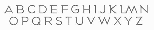
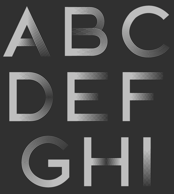
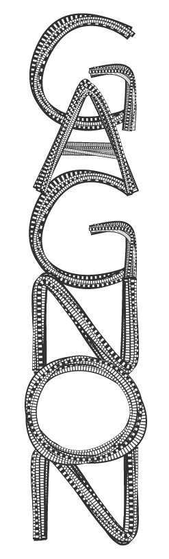
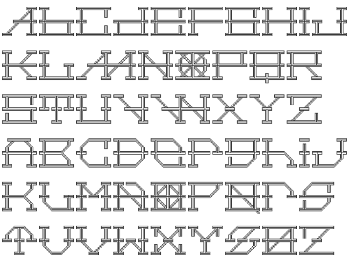
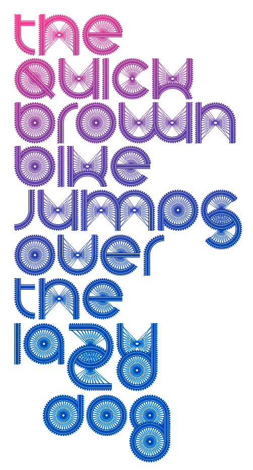