| | |
<...>
|
" <...> is the title of a new graphic design magazine (now based in Den Haag, The Netherlands) intended to fill a gap in current arts publishing. It is not interested in re-promoting established material or creating another 'portfolio' magazine. Instead, it offers inventive critical journalism on a variety of topics related both directly and indirectly to graphic design culture. " Editors: Jurgen Albrecht, Stuart Bailey, Peter Bilak. [Google]
[More] ⦿
|
5Pts
|
Type design mag started in September 2003 by Underware in The Netherlands. [Google]
[More] ⦿
|
8 Faces
[Elliot Jay Stocks]
|
8 Faces is published in England by Elliot Jay Stocks Design Ltd. Volume 1 (2010) features interviews with Erik Spiekermann, Jessica Hische, Ian Coyle, Jason Santa Maria, Jos Buivenga, Jon Tan, Bruce Willen, and Nolen Strals. Volume 2 (2011) has interviews with eight designers: Martin Majoor, Ale Paul, Stephen Coles, Tim Brown, Nick Sherman, Rich Rutter, Veronika Burian, and José Scaglione. Written and edtited by Elliot Jay Stocks. [Google]
[More] ⦿
|
A3
[Bram Vermeyen]
|
Bram Vermeyen's blog and electrtonic mag about design and typography. [Google]
[More] ⦿
|
A4
|
Pelle Anderson's Swedish language design and type magazine. It is very up to date on type used in newspapers. [Google]
[More] ⦿
|
Alessandro Tartaglia
[FF3300]
|
[More] ⦿
|
Alphabet Farm Journal
[Sumner Stone]
|
Type design and typography mag at Stone Type Foundry. [Google]
[More] ⦿
|
Apply
|
Defunct type magazine published by the German foundry, Apply Design. [Google]
[More] ⦿
|
Artistica
|
Graphic arts magazine. Features type designers in its Fontworks page. [Google]
[More] ⦿
|
Atomik
|
French on-line mag by Benoit Godde, who has designed about ten beautiful typefaces. [Google]
[More] ⦿
|
Bakoma fonts
[Basil K. Malyshev]
|
The Bakoma fonts were made by Basil Malyshev, author of Bakoma TeX. BaKoMa TeX uses fonts in ATM compatible PostScript Type 1 format These fonts was produced by automatical conversion from Knuth's Computer Modern MetaFont codes. The conversion technology was designed by Basil K. Malyshev in 1994-1995. Later, the technology was improved to handle hint replacement, and the collection was extended by additional fonts. Some of Bakoma TeX is commercial now, but the fonts are still free. They are originally in type 1, but subsequent truetype and opentype versions have been developed too. Here is a grouped listing: - Roman (+italic, +bold, +slanted): cmb10, cmbx10, cmbx12, cmbx5, cmbx6, cmbx7, cmbx8, cmbx9, cmbxsl10, cmbxti10, cmcsc10, cmcsc8, cmcsc9, cmr10, cmr12, cmr17, cmr5, cmr6, cmr7, cmr8, cmr9, cmsl10, cmsl12, cmsl8, cmsl9, cmti10, cmti12, cmti7, cmti8, cmti9.
- Typewriter: cmcitt10, cmtt10, cmtt12, cmtt8, cmtt9, cmvtt10, cmsltt10, cmitt10, cmtcsc10.
- Sans: cmss10, cmss12, cmss17, cmss8, cmss9, cmssbx10, cmssdc10, cmssi10, cmssi12, cmssi17, cmssi8, cmssi9, cmssq8, cmssqi8.
- Computer Modern Exotic: cmdunh10, cmff10, cmfi10, cmfib8, cminch, cmu10, cmtcsc10, cmtex10, cmtex8, cmtex9.
- Math fonts: cmbsy10, cmbsy5, cmbsy6, cmbsy7, cmbsy8, cmbsy9, cmex10, cmex7, cmex8, cmex9, cmmi10, cmmi12, cmmi5, cmmi6, cmmi7, cmmi8, cmmi9, cmmib10, cmmib5, cmmib6, cmmib7, cmmib8, cmmib9, cmsy10, cmsy5, cmsy6, cmsy7, cmsy8, cmsy9.
- LaTex fonts: circle10, circlew10, lasy10, lasy5, lasy6, lasy7, lasy8, lasy9, lasyb10, line10, linew10, LCMSS8, LCMSSB8, LCMSSI8.
- Metafont logo fonts: logo10, logo8, logo9, logobf10, logosl10.
- AMS fonts 2.1, Euler font family: euex10, euex7, euex8, euex9, eufb10, eufb5, eufb6, eufb7, eufb8, eufb9, eufm10, eufm5, eufm6, eufm7, eufm8, eufm9, eurb10, eurb5, eurb6, eurb7, eurb8, eurb9, eurm10, eurm5, eurm6, eurm7, eurm8, eurm9, eusb10, eusb5, eusb6, eusb7, eusb8, eusb9, eusm10, eusm5, eusm6, eusm7, eusm8, eusm9.
- AMS fonts 2.2: msam10, msam5, msam6, msam7, msam8, msam9, msbm10, msbm5, msbm6, msbm7, msbm8, msbm9.
- LamsTeX Commutative Diagram Drawing Fonts, dated 1997: lams1, lams2, lams3, lams4, lams5.
- Xy-Pic Drawing Fonts, dated 1997: XYATIP10, XYBSQL10, XYBTIP10, XYCIRC10, XYCMAT10, XYCMAT11, XYCMAT12, XYCMBT10, XYCMBT11, XYCMBT12, XYDASH10, XYEUAT10, XYEUAT11, XYEUAT12, XYEUBT10, XYEUBT11, XYEUBT12, XYLINE10, XYMISC10, XYQC10.
- Computer Modern Cyrillic Fonts, with the Cyrillic extension due to N. Glonty and A. Samarin in Institute for High Energy Physics (IHEP) in 1990: cmcb10, cmcbx10, cmcbx12, cmcbx5, cmcbx6, cmcbx7, cmcbx8, cmcbx9, cmcbxsl10, cmcbxti10, cmccsc10, cmccsc8, cmccsc9, cmcinch72, cmcitt10, cmcsc10, cmcsc8, cmcsc9, cmcsl10, cmcsl12, cmcsl8, cmcsl9, cmcsltt10, cmcss10, cmcss12, cmcss17, cmcss8, cmcss9, cmcssbx10, cmcssdc10, cmcssi10, cmcssi12, cmcssi17, cmcssi8, cmcssi9, cmcssq8, cmcssqi8, cmcti10, cmcti12, cmcti7, cmcti8, cmcti9, cmctt10, cmctt12, cmctt8, cmctt9, cmcu10, cmcyr10, cmcyr12, cmcyr17, cmcyr5, cmcyr6, cmcyr7, cmcyr8, cmcyr9.
Related links: message by Sebastian Rahtz). Mirror. Polish mirror. TTF versions. Alternate URL. Another URL. Yet another URL. Yet another URL. 1500 non-free fonts have been developed as well. [Google]
[More] ⦿
|
baseline
|
Magazine about type design. [Google]
[More] ⦿
|
Basil K. Malyshev
[Bakoma fonts]
|
[More] ⦿
|
Bethany Heck
[The Font Review Journal]
|
[More] ⦿
|
Bibliologia
|
Bibliologia: An International Journal of Bibliography, Library Science, History of Typography and the Book is published by Istituti Editoriali e Poligrafici Internazionali in Pisa under the editorship of Fabrizio Serra. The first volume appeared in 2006. About 64 Euros per year subscription. [Google]
[More] ⦿
|
Bram Vermeyen
[A3]
|
[More] ⦿
|
Bright Ideas Magazine
[Gail Conwell]
|
50USD/month, edited by "Bright Ideas". Bright Ideas is produced under the direction of Creative Director Gail Conwell. [Google]
[More] ⦿
|
BrouteMag
|
A Basque design magazine, with a subpage on Basque fonts. [Google]
[More] ⦿
|
Bund für Deutsche Schrift und Sprache
|
 Magazine dealing with Fraktur (history, font-designers) and German language, est. 1927. Written in German and typed in blackletter. Currently edited by Harald Rösler. Gerda Delbanco of Delbanco Frakturschriften is the wife of Helmut Delbanco, who is the chairman of the Bund. Alternate URL. [Google]
[More] ⦿
Magazine dealing with Fraktur (history, font-designers) and German language, est. 1927. Written in German and typed in blackletter. Currently edited by Harald Rösler. Gerda Delbanco of Delbanco Frakturschriften is the wife of Helmut Delbanco, who is the chairman of the Bund. Alternate URL. [Google]
[More] ⦿
|
Cadernos de Tipografia
|
Portuguese on-line typography magazine distributed in PDF format. [Google]
[More] ⦿
|
CAP Design
[Per Torberger]
|
Swedish design mag that has occasionally some features on fonts and font technology. Run by Per Torberger. Run by Per Torberger. It used to have Andreas Lindkvist's Capofont and Capheads. [Google]
[More] ⦿
|
CAP On-Line
|
Media publication by Jack Yan and Associates. [Google]
[More] ⦿
|
Claudia Rocha Franco
[Tupigrafia]
|
[More] ⦿
|
Codex
[John Boardley]
|
A quarterly printed type and typography magazine started in 2012. John Boardley is not only the founder of Codex, but also of I Love Typography and WLT. Born in the UK, he lives in Japan and Saigon. Paul Shaw is the Editor in Chief. [Google]
[More] ⦿
|
CODEX
|
Quarterly print magazine devoted to typography and lettering, started in 2011 by I Love Typography. [Google]
[More] ⦿
|
Comedia: Revue suisse de l'imprimerie
|
Comedia is a Swiss type magazine established in 2002. It has many interesting articles on typography and type design (in French and German). [Google]
[More] ⦿
|
Création Numérique
|
French internet and multimedia magazine. [Google]
[More] ⦿
|
Creative Pro
|
Font news on-line. Edited by John Berry. [Google]
[More] ⦿
|
Czechoslovak TeX Users Group
|
This TeX users group has an active Bulletin, which has several interesting issues with articles each month. Free access to the issues. (In Czech) [Google]
[More] ⦿
|
David Fleming Nalle
[Scriptorium (Ragnarok Press, Fontcraft)]

|
 [MyFonts]
[More] ⦿
[MyFonts]
[More] ⦿
|
De Stijl
|
Influential Dutch magazine founded in 1917 by Theo van Doesburg in cooperation with Piet Mondrian, Bart van der Leck, Anthony Kok, Vilmos Huszar and J.J.P. Oud. It became the catalyst for the De Stijl movement. Ninety numbers were published in 8 volumes, the last one in 1932. All have been scanned in. The De Stijl movement lived and died with the magazine. [Google]
[More] ⦿
|
De(-)fis
|
Ezine by ParaType in Russia. [Google]
[More] ⦿
|
Deleatur
|
Czech design mag. Has occasionally some articles on typography. [Google]
[More] ⦿
|
Department Typography
[Fred Showker]
|
Department Typography (was: &Type) is Fred Whowker's on-line mag. [Google]
[More] ⦿
|
Design, Typography and Graphics On-line Magazine
|
The official publication of The Design&Publishing Center. Subscription required. Showker Graphic Arts, 15 SouthGate, Harrisonburg, VA 22801, USA. [Google]
[More] ⦿
|
Design&Publishing Center
|
First established in 1994 to provide an online web site for DT&G Zine. DT&G was originally published each month on AOL and Compuserve for attendees of Fred Showker's design and publishing seminar and conference appearances. The Design&Publishing Center is owned by Showker Graphic Arts&Design, Harrisonburg, Virginia, USA, established in 1972. Hot type news, type discussions, and links. [Google]
[More] ⦿
|
Desktop Publishers Journal
|
[More] ⦿
|
Desktop-Dialog
|
[More] ⦿
|
El Tipo
|
Spanish typographic experiment mag run by José Gil-Nogués Villén (b. 1971, Valencia) out of Oviedo, Asturias. [Google]
[More] ⦿
|
Electronic Publishing
[Nelson Beebe]
|
Bibliography by Nelson Beebe of EPODD, the Electronic Publishing Journal. [Google]
[More] ⦿
|
Elliot Jay Stocks
[8 Faces]
|
[More] ⦿
|
Emerge Extra
|
The Acrobat PDF newsweekly. Subscribe to the email version. [Google]
[More] ⦿
|
Emigre
|
Tim Starback asked me to remove the link ("Hi Luc, Would you please remove the link and email address for Emigre on: http://cg.scs.carleton.ca/~luc/fontmags.html Thanks, Tim Starback "). The address is http://www.emigre.com/, but you can't link from here. Their email address is info@emigre.com (email link removed). They have a magazine called Emigre. [Google]
[More] ⦿
|
Eye Magazine
|
Graphic design and visual arts magazine. [Google]
[More] ⦿
|
FF3300
[Alessandro Tartaglia]
|
 Italian design studio run by Alessandro Tartaglia, graphic designer, strategist for FF3300, and professor at Politecnico of Bari.
 Mariarosaria Digregorio and Enzo Ruta are the creators in 2007 of the techno typeface FF3300 Type. FF3300 is also an independent and freely downloadable pdf magazine about graphic design, typography, architecture and design, illustration, photography, street art and writing. Tartaglia's typefaces include minimalist experimental types such as Valdrada (2007), Ipazia (2007) and Zoe (2007), as well as ISIA (custom-made for ISIA in Urbino; slabbed and slabless simple glyphs) and Handwriting (a commissioned grunge typeface for the Pollofriabile magazine in Rome). FF3300 created the Divenire typeface for the Italian Democratic Party. The weights are Divenire Roman, Divenire Italic and Divenire Mono (2012-2013). Subpage. Another subpage. Blog. Story of FF3300. Facebook link. [Google]
[More] ⦿
|
Flourishes
|
Flourishes is the magazine of the very active San Antonio Calligraphers Guild. [Google]
[More] ⦿
|
font magazine
|
FontFont font magazine, which also serves for showing specimen. Founded by Erik Spiekermann. Web page structure broken though. [Google]
[More] ⦿
|
Font Magazine
|
On-line font magazine managed by Erik Spiekermann. [Google]
[More] ⦿
|
Font Magazine
|
FontFont's on-line type magazine. [Google]
[More] ⦿
|
FontSite
[Sean Cavanaugh]
|
Online font site run by Sean Cavanaugh (b. Cape May, NJ, 1962) out of Camano Island, WA. This used to be called Title Wave Studios. Since 1996, Sean Cavanaugh is the head of FontSite. In the archives, one can/could find essays on writing style, rules of typography, and a comparison by Thomas Phinney (program manager of Latin Fonts at Adobe) of T1 and TTF. The Fontsite 500 CD (30 USD) offers 500 classical fonts with the original names, plus a few names I have not seen before, such as Bergamo (=Bembo by Francesco Griffo), Chantilly (=Gill Sans), Gareth (=Galliard), Noveo sans (=Neuzeit Grotesk), Palladio (=Palatino), Savoy (=Sabon), URWLatino, Unitus, Toxica, Publicity, Plakette, Pericles, Opus (=Optima), Melville, Function, Flanders, Cori Sans, Binner. Uli Stiehl provides proof that many of the fonts at FontSite are rip-offs (identical to) of fonts in Martin Kotulla's (SoftMaker) collection. This is perhaps best explained that Sean Cavanaugh's last real job was director of typography for SoftMaker, Inc., where he oversaw the development and release of SoftMaker's definiType typeface library and associated products [blurb taken from Digital Type Design Guide: The Page Designer's Guide to Working With Type, published in 1995 by Hayden Books]. Free fonts: Bergamo, CartoGothic (1996-2009), CombiNumerals. At MyFonts, the CombiNumerals Pro and CombiSymbols dingbat families are available since 2010. The site has a number of fonts with the acronym FS in the name, so I guess these are relatively original (but I won't swear on it): Allegro FS, Beton FS, Bodoni Display FS (+ Bold, Demibold), Bodoni No 2 FS (+ Ultra, Bodoni Recut FS (+Bold, Demibold), and so forth. His 500 Font CD has these fonts: - Garalde, Venetian: Bergamo, Bergamo Expert, Bergamo SC&OsF, Caslon, Caslon Expert, Gareth, Garamond, Garamond Expert, Garamond SC&OsF, Garamond Condensed, Garamond Modern, URW Palladio, URW Palladio Expert, Savoy, Savoy Expert, Savoy Small Caps&OsF, Vendôme.
- Slab Serif: Clarendon, Glytus, Typewriter, Typewriter Condensed.
- Script: Commercial Script, Deanna Script, Deanna Swash Caps, Hudson, Legend, Mistral, Park Avenue, Phyllis, Phyllis Swash Caps, Vivaldi.
- Uncial: American Uncial, Rosslaire.
- Blackletter: Fette Fraktur, Fette Gotisch, Olde English.
- Borders and symbols: Celtic Borders, Deanna Borders, Deanna Flowers, Picto, Sean's Symbols.
- Transitional: URW Antiqua, Baskerville, Baskerville Expert, New Baskerville.
- Didone, modern: Bodoni, Bodoni Expert, Bodoni Small Caps&OsF, Modern 216, Walbaum.
- Sans serif: Chantilly, Franklin Gothic, Franklin Gothic Condensed, Franklin Gothic Cnd. SC&OsF, Function, Function Small Caps&OsF, Function Condensed, Goudy Sans, Opus, Opus Small Caps&OsF, Syntax, Letter Gothic.
- Decorative: Ad Lib, Algerian, Arnold Boecklin, Binner, Caslon Antique, Chromatic, Copperplate Gothic, Davida, Delphian Open Titling, Function Display, Glaser Stencil, Goudy Handtooled, Handel Gothic, Hobo, Honeymoon, Horndon, Mercedes, Mona Lisa, OCR-A&OCR-B, Plakette, Reflex, Salut, Stop, Toxica, VAG Rounded.
Some more fonts: Alperton, Anaconda, Arizona, Bamboo, Bellhop, Bellows Book, Bernhard Modern FS (2011), Boehland (a revival of Johannes Boehland's Balzac, 1951), Le Havre. MyFonts link. Fontspace link. His art deco fonts, as always without "source" and confusing Victorian, art nouveau, and psychedelica with art deco, include Rimini, Arnold Boecklin, Eldamar, Erbar Deco, Rangpur, Pinocchio, Azucar Gothic, Boyle, Busorama FS, Winona, Abbott Old Style, Almeria (after Richard Isbell's Americana) and Adria Deco, Bernhard Modern FS (2011). FontSpring link. [Google]
[MyFonts]
[More] ⦿
|
Fred Showker
[Department Typography]
|
[More] ⦿
|
FUSE
|
Fuse: Interactive Magazine, experimental fonts. Also available online, the Wired 2.07 article FUSE. List of fonts. List of FUSE fonts. [Google]
[More] ⦿
|
F-Wort.net
|
Dirk Uhlenbrock's type pages, an on-line magazine with essays in German. [Google]
[More] ⦿
|
Gail Conwell
[Bright Ideas Magazine]
|
[More] ⦿
|
Garth Walker
[Orange Juice Design]
|
[More] ⦿
|
Grafema
|
Book and calligraphic arts mag with some type design articles published by CEAAD, Centro de Estudos Albicastrenses Aplicados ao Design in Castelo Branco, Portugal. In Spanish and Portuguese. [Google]
[More] ⦿
|
Graphic Exchange Magazine
|
Canadian graphic communications and graphic arts magazine founded in 1991. Its publisher is Dan Brill. The magazine's type designer is Nick Shinn. [Google]
[More] ⦿
|
Greek Font Society
|
 The Greek Font Society was founded in 1992 by the late Michael S. Macrakis (1924-2001) as a Non-Profit Organization with the expressed aim of contributing to the research of Greek typography. The Society was founded initially by the Kostopoulos Foundation, with further support provided by the Greek Ministry of Culture, the Leventis Foundation, Regis College-USA, the Maliotis Foundation and the Girondelis Foundation. From 2004 until 2006, the Board of Directors consists of M.V. Sakellariou (President). L. Macrakis (Vice-President), D.G. Portolos (Secretary), L.G. Savidis (Treasurer), G.E. Agouridis, A.G. Drimiotis, and A. Giakoumakis. GFSs type design programme began through the collaboration of painter-engraver Takis Katsoulidis with type designer George D. Matthiopoulos. Since then, GFS has designed a growing list of Greek polytonic (fully-accented) fonts which include various historical revivals and new designs with respect to typographic tradition. In addition, GFS was commissioned to design fonts for the Athens Academy, The Athens Archeological Society, the Institute of Speech amongst others. Furthermore, GFS organised an International Conference, Greek Letters: from Tablets to Pixels at the Institute Français dAthènes in 1995, and has been active in the publication of works on Typography. For this aim GFS edited and designed the proceedings of the Conference: Michael S. Macrakis (edit), Greek Letters: from Tablets to Pixels, Oak Knoll Press, Newcastle-Delaware, 1996. The artistic collaborators include George D. Matthiopoulos, Michail Semoglou and Natasha Raissaki. Finally, they are making some high quality free fonts, such as:
 - GFS Didot (1994, a didone designed by Takis Katsoulidis and digitized by George Matthiopoulos; a matching Latin alphabet is based on Hermann Zapf's Palatino). Open Font Library link.
- GFS Bodoni (1992-1993): a didone designed by Takis Katsoulidis and digitized by George Matthiopoulos. See also GFS Bodoni Classic (Greek only).
- GFS Olga (1995, a serif designed and digitized by George Matthiopoulos, based on the historical Porson Greek type (1803)).
- GFS Callierges Greek, based on the types of Zacharias Callierges (15th century), digitized by George Matthiopoulos.
- GFS Porson Greek, digitized by George Matthiopoulos in 1995. This is based on the types of Richard Porson of the 18th century.
- GFS Artemisia (2001), by painter-engraver Takis Katsoulidis and digitized by George D. Matthiopoulos. Open Font Library link.
- GFS Complutensian Greek, digitized by George Matthiopoulos and Antonis Tsolomitis. This was based on the types of Arnaldo Guillen de Brocar (16th century). Now called GFS Complutum (2007).
- GFS Neohellenic (1993-2000, Takis Katsoulidis and George D. Matthiopoulos). They explain: In 1927, Victor Scholderer (British Museum Library curator), on behalf of the Society for the Promotion of Greek Studies, got involved in choosing and consulting the design and production of a Greek type called New Hellenic cut by the Lanston Monotype Corporation. He chose the revival of a round, and almost monoline type which had first appeared in 1492 in the edition of Macrobius, ascribable to the printing shop of Giovanni Rosso (Joannes Rubeus) in Venice. New Hellenic was the only successful typeface in Great Britain after the introduction of Porson Greek well over a century before. The type, since to 1930s, was also well received in Greece, albeit with a different design for Ksi and Omega. GFS digitized the typeface (1993-1994) funded by the Athens Archeological Society with the addition of a new set of epigraphical symbols. Later (2000) more weights were added (italic, bold and bold italic) as well as a Latin version. A further extension, GFSNeohellenicMath, was published in 2018: The font GFSNeohellenicMath was commissioned to the Greek Font Society (GFS) by the Graduate Studies program "Studies in Mathematics" of the Department of Mathematics of the University of the Aegean, located on the Samos island, Greece. The design copyright belongs to the main designer of GFS, George Matthiopoulos. The OpenType Math Table embedded in the font was developed by the Mathematics Professor Antonis Tsolomitis. The font is released under the latest OFL license, and it is available from the GFS site at http://www.greekfontsociety-gfs.gr. The font is an almost Sans Serif font and one of its main uses is for presentations, an area where (we believe) a commercial grade sans math font was not available up to now.
- GFS Elpis (2006, Natasha Raissaki), an original design which tries very hard to match the Greek and Latin parts of its alphabet.
- GFSSolomos (2006) by George D. Matthiopoulos.
- GFS Theokritos, a redesign by George D. Matthiopoulos of a font created by Yannis Kefallinos (1894-1958) in the 1950s. Free at Open Font Library.
- GFS Baskerville (2007) by Antonis Tsolomitis.
- GFS Gazis (2007, George Matthiopoulos), about which they write: During the whole of the 18th century the old tradition of using Greek types designed to conform to the Byzantine cursive hand with many ligatures and abbreviations - as it was originated by Aldus Manutius in Venice and consolidated by Claude Garamont (Grecs du Roy) - was still much in practice, although clearly on the wane. GFS Gazis is a typical German example of this practice as it appeared at the end of that era in the 1790s. Its name pays tribute to Anthimos Gazis (1758-1828), one of the most prolific Greek thinkers of the period, who was responsible for writing, translating and editing numerous books, including the editorship of the important Greek periodical (Litterary Hermes) in Wien.
- These majuscule typefaces were made by George Matthiopoulos in 2006 and 2007: GFS Ambrosia, GFS Eustace, GFS Fleischman-Regular, GFS Garaldus, GFS Jackson-Regular, GFS Nicefore. He writes: GFS Ambrosia has the main characteristics of the majuscule forms of the early Christian tradition while GFS Nicefore is a typical byzantine sample of the 5th-7th century period. GFS Jackson is an edition of the font cut, in 1788, by Joseph Jackson on commission by the Cambridge University in preparation of the edition of the Beza codex containing the New Testament from the 5th-6th century. Theodore Beza was the erudite scholar from Geneva who had given the codex as a gift to the University in 1581. GFS Eustace is a typical example of byzantine woodcut initials used in many similar forms in Italy for Greek editions of the Bible, Prayers and other theological literature from the 15th to 19th centuries. GFS Fleischman, on the contrary, is based on a typeface cut by Johann Michael Fleishman, typecutter of the Dutch Enschedé foundry in the baroque style that prevailed in the mid-18th century.
[Google]
[More] ⦿
|
Grrr
|
Spanish graphic design mag which publishes many articles on typography and type design. [Google]
[More] ⦿
|
Heike Häser
[typemotion]
|
[More] ⦿
|
Holominds
|
German design mag. [Google]
[More] ⦿
|
How
|
On-line magazine for graphic designers. The February 2001 issue of HOW magazine is devoted to type. Seems to have died. [Google]
[More] ⦿
|
Hyphen A Typographic Forum
|
This type and design mag in English and Greek is edited by Altervision (Klimis Mastoridis, Tasos Efremidis, Dimitris Mitsiopoulos, Apostolos Rizos) in Thessaloniki. It is published by Typophilia, Thessaloniki. Mastoridis is chairman of AterVision. [Google]
[More] ⦿
|
Icograda
|
International Council of Graphic Design Associations, based in Brussels. Publishes once in a while a feature article on typography. Alternate URL. [Google]
[More] ⦿
|
Idea mag
|
Great Japanese design magazine, possibly the best design mag out there today, often featuring articles on typography. It published Typography Today, a book edited by Helmut Schmid that introduces selections from 88 designers. It traces the course of modern typography from Lissitzky, Tschichold, Zwart, Emil Ruder, Karl Gerstner, Herb Lubalin, to Wolfgang Weingart, Wim Crouwel and Kohei Sugiura. The new edition includes art by Neville Brody, April Greiman and Ahn Sang-Soo. See also IDEA NO. 305: Type Design Today (2004), which has articles by - Robin Kinross: "Some features of the font explosion"
- Jean-François Porchez: "Type design that changed the outlook of Paris"
- Fred Smeijers: "From punchcutting to digital type design"
- Akira Kobayashi: "Originality and Redesign of Typeface"
- André Baldinger: "Succeeding experimental typefaces"
- LettError: "Twin Cities - Typeface represent a city"
- François Rappo: "Didot Elder - Radical revival of Historical Typefaces"
- Matthew Carter: "Yale University Typeface Project"
[Google]
[More] ⦿
|
i-jusi
|
South African magazine. Has a sub-page on African fonts, which is just a link to the SacredNipple foundry. [Google]
[More] ⦿
|
IMPRINT TeSRE Archive
|
"IMPRINT (The Newsletter of Digital Typography) is a free newsletter devoted to digital typography and typesetting." Edited by Robert A. Kiesling. [Google]
[More] ⦿
|
Index.ru
|
Major Russian design and links page. [Google]
[More] ⦿
|
Ink Magazine
[Pierre Delmas Bouly]
|
Design magazine. Graphical concept by Patrick Lallemand and Pierre Delmas Bouly. They designed the random modular font Minimal Bloc (2007, Superscript): here modularly decomposed letters can switch between various geometric forms. This was followed in 2008 by Basics, another modular design. Superscript is located in Lyon. [Google]
[More] ⦿
|
Insite, the ezine at Phil's Fonts
|
Ezine at Phil's Fonts. [Google]
[More] ⦿
|
International Journal of Digital Typography
|
Started in 2006, and edited by Yannis Haralambous (ENST Bretagne, Brest, France), John Plaice (University of New South Wales, Sydney, Australia) and Apostolos Syropoulos. [Google]
[More] ⦿
|
Invers
|
German design and typography magazine. Edited by Freiburg's Jürgen Funcke, Günter Honkomp and Karsten Risseeuw. [Google]
[More] ⦿
|
ISLAS CIES magazine
|
Galician (Galego) ezine about typography and web page design. [Google]
[More] ⦿
|
Japan Typography Association
|
JTA (Japan Typography Association) page. They have a Japanese type mag called Typographics T. Old URL. [Google]
[More] ⦿
|
Joe Clark, Toronto Writer
|
Joe Clark's essays on typography. Typoblog: his old blog on type. Newest URL for his type blog. Author of the must-read book Building Accessible Websites (2002). At ATypI 2003 in Vancouver, he spoke about typography for online captioning. ATypI writes: Toronto journalist, author (Building accessible websites, New Riders, 2003), and accessibility consultant Joe Clark has followed typography as long as he.s followed accessibility for people with disabilities: over 20 years. He is director of the Open&Closed Project, a public-private-academic partnership in research and standardisation in captioning, audio description, subtitling, dubbing, and related fields in audiovisual accessibility. At ATypI 2007 in Brighton, he spoke about Type in the Toronto Subway. [Google]
[More] ⦿
|
Johannes König
[Melville Brand Design]
|
[MyFonts]
[More] ⦿
|
John Boardley
[Codex]
|
[More] ⦿
|
Joshua King
|
Designer of the HPGCalc (or: HP Graphing Calculator Display) font in all formats, based on the original design of Hewlett-Packard as used in their graphing calculators HP38G, HP39G and HP40G. [Google]
[More] ⦿
|
Kafka Design
|
Czech design studio in Prague, and publisher of "Font" (in Czech): Od roku 1991 vydáváme odborný èasopis Font, toho èasu jediný specializovaný èasopis v ÈR zamìøený na grafiku, písmo, typografii, pre-press, reklamní praxi atd. Mezi odbìratele patøí vìtina tuzemských grafických studií, výtvarníkù a reklamních agentur. [Google]
[More] ⦿
|
Kak
[Katerina Kozhukhova]
|
 Kak is a Russian type and design magazine run by Peter Bankov and Katerina Kozhukhova. Alexander Tarbeev designed the typefaces KakC and DenHaag for the mag. This sub-page explains how to tell Bembo, Garamond, Janson, Caslon and Baskerville apart. Katerina Kozhukhova also designed a bouncy hand-printed typeface, Ka (Letterhead). [Google]
[More] ⦿
Kak is a Russian type and design magazine run by Peter Bankov and Katerina Kozhukhova. Alexander Tarbeev designed the typefaces KakC and DenHaag for the mag. This sub-page explains how to tell Bembo, Garamond, Janson, Caslon and Baskerville apart. Katerina Kozhukhova also designed a bouncy hand-printed typeface, Ka (Letterhead). [Google]
[More] ⦿
|
Katachi
[Ken Olling]
|
Oslo-based studio and design mag. In 2011, Katachi Media collaborated with Andrés Torresi to create a typeface superfamily, targeted mainly for the iPad, but also for web and print. Andrés in Argentina, and Katachi in Norway, jointly developed a serif and sans-serif type family called Katachi. Video about Katachi. On Behance, we read that Ken Olling (Oslo) is one of Katachi's men. [Google]
[More] ⦿
|
Katerina Kozhukhova
[Kak]
|
[More] ⦿
|
Ken Olling
[Katachi]
|
[More] ⦿
|
kopelow.com
|
Ezine about fonts and design. [Google]
[More] ⦿
|
La Police
|
Swiss type design mag, started in 2016. Issua A (2016) has these articles: - Pastis & Cigarettes. Josef Tyfa first published Academia as metal type. (Frantisek Storm)
- Subalpine. One-off One: Josef. Josef Müller-Brockmann fitting the typewriter's grid. (Atelier Carvalho Bernau)
- Typewriter type faces. Recollecting aesthetics of spacing constraints. (Alan Bartram)
- The Race for Unica. One-off Two: Unica Intermediate Portemanteau design back in fashion. (Louise Paradis)
- The Haas Type foundry Ltd. in an International Environment. Changes and Developments in its Organisation and Operation part 1. Looking back, down the rabbit hole. (Brigitte Schuster)
Issue B (2017) has these articles: - The Haas Type foundry Ltd. in an International Environment Changes and Developments in its Organisation and Operation part 2. Looking back, closer, down the rabbit hole. (Brigitte Schuster)
- Sans plomb. Early digitals. (Optimo).
- The 2002 Typographic Agenda. Learning by drawing. (François Rappo)
- Typeface Redesign. Think before your draw. (Christian Mengelt)
- A Note on the AA Files Display Initials. One-off Three: all styles Various styles for different issues. (Adrien Vasquez)
- Cogitating Vectors: The Hershey Fonts. Recoordinating the past. (Frank Grießhammer)
- Everyday types. Researching Ladislas Mandel's typefaces for telephone directories part 1: Galfra. There is interference on the lines. (Alice Savoie, Dorine Sauzet & Sébastien Morlighem)
[Google]
[More] ⦿
|
Letter Arts Review
|
"Internationally recognized as the preeminent magazine for lettering artists and calligraphers, the award-winning quarterly journal will acquaint you with today's fresh and innovative lettering artists as well as yesterday's legends." See also here. [Google]
[More] ⦿
|
LetterArts
|
Calligraphy magazine from Oklahoma. [Google]
[More] ⦿
|
Letterspace
[Paul Shaw]
|
Biannual newsletter of the Type Directors Club in New York. Very informative, with a nice book review section by Paul Shaw. His brief bio: he is a calligrapher and typographer working in New York City. In his 18 professional years as a lettering designer he has created custom lettering and logos for many leading companies, including Avon, Lord&Taylor, Rolex, Clairol and Esté Lauder. Paul has taught calligraphy&typography at New York's Parsons School of Design for over ten years and conducted workshops in New York and Italy. His work has been exhibited throughout the United States and Europe. His publishing credits include "Blackletter Primer" and "Letterforms", as well as articles for Print, Fine Print, Design Issues and Letter Arts Review. He is the recipient of awards from the Type Directors Club, AIGA, the New York Art Directors Club, Print and How magazines. He won a National Endowment for the Humanities fellowship to study the type designs of Morris Fuller Benton, and a Newberry Library fellowship to study the work of George Salter. Paul's experience in using research libraries to study historical manuscripts will be shared with tour participants wishing to visit the Vatican Library. He has been a partner in LetterPerfect since 1995. Paul Shaw's home page. [Google]
[More] ⦿
|
Linda Kudrnovská
[TYPO]
|
[More] ⦿
|
Linotype Matrix
|
A quarterly news sheet produced by Linotype and Machinery Ltd. from the 1930s through the 1960s. The Linotype Matrix will be republished starting the Fall of 2005. [Google]
[More] ⦿
|
Livetype
[Pedro Reis Amado]
|
Started and maintained by Portugal-born Pedro Amado, who taught in the Faculty of Fine Arts at the University Porto, and is now professor at the University of Aveiro, the LiveType Project focuses on the development of complete Fonts using Fontforge. This project aims that everyone involved can and will learn more about typography and type developing in a collaborative method. It will provide the fonts and the font files regularly to users, developers and anyone with an interest in type. They are working on their first font. On Typophile, the question came up regarding the use of the (free) FontForge software rather than the commercial FontLab editor. Amado's reply and additional points: - 1. No third party. One of the main directives of this project is to ALWAYS keep it on an Open [Source] Basis so we don't depend on third party, commercial solutions.
- 2. Open Source. I really believe in the future of Open Source Software. Bear with me for a moment - I work as a Design Tecnhician in a Fine-Arts Faculty in Portugal. As you might know, our public education system doesn't have that much money. The ones who do are usefull courses/faculties like engineering So this situation leaves us with obsolete growing, underdeveloped, non-market responsive solutions. All this because people who are running the system are spending money in vaious stupid ways. If you are familiar with Manuel Castells' opinions, you might agree that one way to promote a better future is through the use of Open Source solutions. In a very practical way, save some money to invest on more important things - enter Linux & Open Source Software, hence the use of Fontforge. Take the case of our neighbours, the spanish region of Estremadura. The public education system developed their own personalized, scaled to needs Linux Distro - Linex - that they implemented on the whole school system. It worked and the savings were huge! Brasil and some regions in Africa and India are also taking on similar initiatives I know these are difficult to implement solutions, and calculating the costs arent this simple. But this takes to me next point.
- 3. Training. Imlementing this cost saving solutions means taking on a higher maitenance cost and further system administration - hey! I work on an University arent Universities supposed to promote knowlegde? How about using these systems, develop them, teach students howto, and then coming full circle when students start to use them in their professional lives and saving money to companies etc Nevertheless students should be also trained on the tools that the market needs - so teaching commercial tools and practices is also necessary. So the perfect solution would be to train students how to do it independently of the tools. So as a member of a Faculty I feel its my obligation to start using this systems, and start promoting them (along with commercial and established solutions). The LiveType Project is exactly this - I want to show people that is possible to use the free, open source solutions to learn how to do it with professional quality. And talking about learning
- 4. Collaboration. The fact that they learn how to do it on a Linux platform, or on a Mac platform or on a Win platform doesn't affect what they learn. This is really it. I don't consider myself a type designer Im just an amateur typographer and type designer whanabe, so I also want to learn how to type design better, who knows if I grow to be good at it? I also want to learn no matter the platform. I also want to learn and knowlege should be acquired in a Free, Open Source Collaborative way! Things work out better if we collaborate with each other.
In 2005, this project morphed into Typeforge. Speaker at ATypI 2010 in Dublin. Speaker at ATypI 2016 in Warsaw on The evolution of the type specimen book. [Google]
[More] ⦿
|
Magwerk
|
Encore magazine. In issues 13 through 18, we find articles by Albert-Jan Pool on the history of DIN typefaces and in particular, FF DIN. Annoying background noise when this site is open. [Google]
[More] ⦿
|
Melville Brand Design
[Johannes König]
|
Led by Michael Schmidt, with participation of Florian Brugger, Lars Hamsen and Johannes König (art director, b. 1979). This German design studio made the free font Melville Too Bold (2009). After Johannes König graduated from the University in Salzburg as a "Magister for Multimedia-Arts", he worked for Fantomas and Starshot Munich as a free-lance art director and illustrator. In 2010, Johannes published the art deco all caps typeface Abracadabra and the variable stroke size typeface Trick Pony at Volcano. In 2012, he created the alchemic typeface Mestizo, which was published by Volcano. Accius, Alerio and Amias are three substyles that deal with the basic geometric shapes, while the Balbo, Belus and Borba styles are for playful icons. Some of the guys are involved in Karlsruhe-based MAGMA Brand Design (Behance link). The successful Slanted magazine is published by MAGMA Brand Design. Home page. Klingspor link. Volcano Type link. [Google]
[MyFonts]
[More] ⦿
|
MetaCulture
|
Meta Desin's magazine. [Google]
[More] ⦿
|
MetaType
|
[More] ⦿
|
MUSE
|
Mag by Hoefler Type Foundry in New York. [Google]
[More] ⦿
|
Nadia Samadi
[Pica Magazine]
|
[More] ⦿
|
Nelson Beebe
[Electronic Publishing]
|
[More] ⦿
|
Nicholas Fabian
[Type Designs by Nicholas Fabian]
|
[MyFonts]
[More] ⦿
|
Orange Juice Design
[Garth Walker]
|
Orange Juice Design is located in Durban, South Africa. It was founded in 1995 by Garth Walker, South Africa's leading exponent of post-apartheid design. Sheila Dorje (from Cape Town, South Africa) designed the Arabic simulation font Halaal (2000). Fontshop link to Dorje. I-jusi (Zulu for juice) is a magazine published by Orange Juice Design. As part of this, he has published discussions of African typography in National Typographika 1 (i-jusi volume 11) and 2 (i-jusi volume 17) (commented here). Walker was commissioned to design a typeface for South Africa's new constitutional court in 2004. He also created Red Mercury, inspired by Jonathan Barnbrook's work, and alluding to South Africa's covert nuclear defence programme. Garth Walker co-designed the African dingbats font AfroDisiac (1997, [T-26]) with Brode Vosloo (Sacred Nipple Type Foundry in South Africa), William Rea and Lisa King. [Google]
[More] ⦿
|
ParaType News
|
ParaType news, in Russian. De-Fis is ParaType's e-zine. Russian type glossary. [Google]
[More] ⦿
|
Paul Shaw
[Letterspace]
|
[More] ⦿
|
Paulo Heitlinger
|
 Portuguese author of Tipografia: origens, formas e uso das letras (2006, Paulo Heitlinger, Lisbon) and Alfabetos, Caligrafia e Tipografia (2010, Lisbon). Born in Lisbon, he studied nuclear physics in Germany. He lectured on communication design at the Universidade do Algarve. His pages (in Portuguese) are quite complete, with a great glossary, a beautiful section on the history of type, a mag called Cadernos de Tipografia, links to type design in the world in general, and in Brazil, Spain and Portugal in particular, and more general information on type. Font-making how to. Useful timeline of 16th century writing manuals. An absolute must. He has also created or revived a number of typefaces, which can be bought on-line.
 An incomplete list of his typefaces: - Sinalética: A sober serif typeface for excellent legibility.
- CantoneirosRegular (2008), Cantoneiros-Thin (2008): art deco / avant-garde.
- Transito (2008): the famous 1930s stencil face of Jan Tschichold at Lettergieterij Amsterdam, with reinvented forms for f, g and y. [Note: the pic on the right-hand-side is Transito, as grabbed from Heitlinger's page---the grammatical error is not mine.]
- Sturmblond-Medium (2008): Revival of simple lettering of Herbert Bayer.
- Bayer Condensed: Revival of simple lettering of Herbert Bayer.
- Imperatorum (2008)
- Ratdoldt (2008): a blackletter typeface made from scans, and attributed to Erhard Ratdolt.
- Valentim (2008): a blackletter typeface made from scans of the book Vita Christi. Named after Valentim Fernandes, a printer active in Lisbon, ca. 1480-1519.
- Incunabulo Normalizado (2008): a blackletter typeface made from scans of the book Vita Christi.
- Uhertype-Medium (2007): Revival of another Bauhaus era typeface, by Joost Schmidt.
- Arkitekto: A Bauhaus style piano key font based on an image found in a book of Kurt Weidemann.
- His Spanish collection includes Bastarda de Francisco Lucas, a versão espanhola da Cancelleresca italiana do século XVI. Um ponto alto da Caligrafia del Siglo de Oro.
- Redondilla de Francisco Lucas, a penmanship font based on Arte de Escribir (1577).
- Gótica Rotunda Gans.
- Juan Bravo, based on azulejos (tiles).
- Segovia, a titling font.
- Centauro, a decorative font.
- Kurrsiva, inspired by scripts from the 1960s.
- Deco de Avila, an avant-garde face.Bertrand (2008): an art deco typeface patterened after the shop sign of Livraria Bertrand in Chiado, Lisbon.
- Rotunda:
- Visigotica: based on the calligraphic writings of the 10th and 11th centuries. This font has many alternates. Based on scans of a text of the 10th century called Actas de Concilio de Caledonia de 451. Styles: Imperatorum, Isidoro.
- Typefaces based on the calligraphic work of Francisco Lucas, 1570: Bastarda de Lucas Italic (2009), Bastarda de Lucas (2009), Redondilla de Lucas (2009).
- Uncialis (2009): a Lombardian type based on a 16th century model of Giralde de Prado.
- Escolar Portugal (Fino, Forte) and Escolar Brasil are school fonts of the "upright connected script" style that were made in 2008. For more on didactic fonts, read the booklet Caderno de Tipografia e Design Nr. 14 (March 2009).
[Google]
[More] ⦿
|
Pedro Reis Amado
[Livetype]
|
[More] ⦿
|
Per Torberger
[CAP Design]
|
[More] ⦿
|
Peter Reichard
[Spatium Newsletter]
|
[More] ⦿
|
Pica Magazine
[Nadia Samadi]
|
Annual type and design publication, started in 2009 by three graphic design students at UQAM in Montreal: Ariane Perpignani, Gabrielle Lamontagne and Nadia Samadi. [Google]
[More] ⦿
|
Pierre Delmas Bouly
[Ink Magazine]
|
[More] ⦿
|
Ping Mag
|
Japanese design magazine (with English translations) that has regular features on typography and type design. [Google]
[More] ⦿
|
Pixelfreak
|
Multimedia magazine. Stale link. [Google]
[More] ⦿
|
Planète Typographie
|
Jean-Christophe Loubet del Bayle's web site on typography. In French. Besides articles, there are also useful type links. Old pages. Temps typographiques. [Google]
[More] ⦿
|
Printing History
|
This is the The Journal of the American Printing History Association (APHA). [Google]
[More] ⦿
|
Proektor
|
Russian design (and occasionally type) mag in which Olga Ru (St. Petersburg) is involved. [Google]
[More] ⦿
|
PTF Gazette
|
Jean-François Porchez's great on-line newspaper about type. Great web page. Full of information. A must! Lots of links to books. [Google]
[More] ⦿
|
Publications GUTenberg
|
The Cahiers GUTenberg and La Lettre GUTenberg are French publications dealing with all typographical matters. They are situated on the threshold between good typographical practice and the development of related software. Archives GUTenberg. Run from IRISA in Rennes. [Google]
[More] ⦿
|
Publish Magazine
|
By Publish RGB. [Google]
[More] ⦿
|
Punchcut
|
In 2002, Jared Benson and Joseph Pemberton formed PUNCHCUT in Emeryville, CA, where they "design, operate and produce Typophile, a collaborative, online typographic community." In 2012, they published the free sans typeface Amble at Fontsquirrel. Pemberton writes: In 2010 Sun licensed it for inclusion in the JavaFX SDK for mobile handsets. Any similarity to Droid stems from a similar creative brief over at Ascender Corp. [Google]
[More] ⦿
|
Raquel Pelta
[Visual.gi]
|
[More] ⦿
|
Règles:Zéro
|
New type magazine founded in 2002 and edited by Frenchman Stephane Giner. The font Xero Wide SC was made by Apostrophe for them. Fonts by Giner include Panzani Soup V3 (handprinting), Push Tab (based on Heineken beer bottle lettering), Neolt (based on drawings with Rotring pens) and Dinan (to be finished). [Google]
[More] ⦿
|
Revista Tiypo
|
Mexican type magazine started in 2003. It also showcases typefaces by most Mexican typec designers. Director: Héctor Montes de Oca. Editor: Francisco Calles. Coeditor: Nacho Peón. Design: Héctor Montes de Oca and Nacho Peón. Editorial Board: Luis Almeida, Francisco Calles, Eduardo Danilo, Gonzalo García, Uziel Karp, David Kimura, Domingo Martínez, Gabriel Martínez, Héctor Montes de Oca, Ángeles Moreno, Eric Olivares, Enrique Ollervides, Ignacio Peón. Alternate URL. [Google]
[More] ⦿
|
Robert Fauver
[Typeology]
|
[MyFonts]
[More] ⦿
|
SangBleu
|
Swiss image and type magazine published with the help of B&P Foundry in Lausanne. [Google]
[More] ⦿
|
Sans Serif: On-line typography magazine
|
Edited by Don Hosek. [Google]
[More] ⦿
|
Scriptorium (Ragnarok Press, Fontcraft)
[David Fleming Nalle]
|
 Dave Nalle was born in Beirut on March 19, 1959, and died on February 13, 2021 from COVID in his home town of Manor, Texas. From his wiki page: Dave Nalle is a political writer, game author and font designer who was active in the early history of the development of the internet. Nalle was at one time Chairman of the Republican Liberty Caucus, a group that promotes libertarianism within the Republican Party, Senior Politics Editor at Blogcritics online magazine, and was the CEO of Scriptorium Fonts. Obituary [PDF] by Steve Jackson at the Daily Illuminator. Obituary by Shannon Appelcline at RGG Net. Obituary [PDF] at Dungeon Master Magazine.
 A creative and prolific designer, he has made hundreds of beautiful (often historic) fonts. His outfit, Scriptorium (based near Austin, TX, est. 1989), also does custom font and logo design. At some points, Scriptorium was also known as Ragnarok Press and Fontcraft. It specializes in artsy and ancient typefaces. Some subset of the fonts is made by Michael Scarpitti. Free font demos. Images of his best selling fonts. Special subpages: - Three free fonts: Onuava (a mini-serifed hybrid fixed-width font), Divona (sans), Sirona (based on Lombardic calligraphy).
- Lombardic: Aneirin, Benevento (8th century Lombardic), Cymbeline, Fabliaux, Formidable, Locksley.
- Decorative initials such as the 20th century sign lettering initials set Pencraft Initials (2009), New Saxon Initials (2016, based on work by F.G. Delamotte), Delamotte Initials One (2016), Delamotte Initials Two (2016), Holly Initials (2010, based on Real PenWork (1880s, Knowles and Maxim), Vyones (2010), Vergennes (2001), Cascade (2009), Bergling (2010; based on initials by John M. Bergling).
- Steampunk typefaces: Clockwork, Gearhead, Gears, Verne, Draughtwork, Belgravia, Boetia, Blackthorn, Linthicum, Good-fellow, Necromantic, Mephisto.
- Wild West fonts: Academy, Alcalde, Atkinson Boomtown (2009, after the lettering of Frank Atkinson), Atkinson Eccentric (2009), BigIron, Cibola, Del Norte, Lachesis, Perdido, Plowright, Primer, Riudoso, Niederwald, San Lorenzo (2011, with a Mexican and Tuscan look), Stonehouse, Manquo, Rochambeau, Purcell, Vaquero.
- Arabic simulation fonts: Samaritan is based on the poster lettering of Alphons Mucha from his poster for the play La Samaritan. Serendib and Waziri are based on the hand lettering of René Bull from his edition of the Arabian Nights. Caliph (1993) is derived from Ernst Schneidler's classic Legende font, with variant characters based on his original lettering. Also: Satampra, Jerash, Samarkand, Isfahan.
- Celtic fonts: the fonts include Constance, Durrow (1993, traditional rendering of Insular Minuscule calligraphy), Malvern, Glendower (based on the most common lettering in the Book of Kells), Knotwork (caps based on Celtic knots), Alba Text (modernized text font based on Celtic uncial lettering), Lindisfarne (based on a square uncial style), Stonecross (1997, derived from Celtic cross and gravestone inscriptions), Celtic Spirals (dingbats), Celtic Borders font (lets you combine key strokes to form decorative borders; many frames and borders are original Celtic designs by Arts&Crafts period artists like Evelyn Paul and Louis Rhead), Spiral Initials, Brigida (based on Rudolph Koch's interpretation of a squared uncial), Macteris Uncial, Coverack (heavy non-traditional uncial), Dahaut (modernized uncial), Dunsany, Glendower, Morgow (1999, spiral uncial), Teyrnon (elaborate spurred uncial), Padstow (heavy uncial), Vafthrudnir (2011, uncial), Sualtim and Columba (decorative initials based on characters found in the Book of Kells), Albemarle (2001).
- Oriental simulation fonts: Yoshitoshi (2003, based on the 1900-style writing by Yoshi Toshi.
- Gothic fonts, including Alt Gothic, Koch Gothic, Barnabas (2011), Sternhagen (2014), Montgisard (2010, roman capitals with blackletter lower case), Serenissima, Gelderland, Alcuin, Monumental, Goldwork, Waldeck, Roncesvalles, Montressor (2010, ornamental blackletter capitals), T4C Beaulieux (1998, a free copy here), Bastarda (2011), Burgundian, Cadeaulx, Collins Old English, Courtrai, Descant, Ereshkigal, Faustus, Franconian (1993, a Schwabacher), Froissart (2000), Ghost Gothic, Katisha, Koch Gothic, Ligeia, Magdeburg, Magdelena, Melusine, Pyle Gothic, Rheingold, Sanctum, Stuttgart Gothic (2010), Textura, Theodoric, Yngling (2002).
- German expressionist: Dromon.
- Renaissance fonts: Monumental Gothic, Caswallon (a Caslon family), humanist cursive (Palmieri, Castiglione and Hanes Italic), quirky Italian cursives (Fiorenza and Alleghieri), a Roman style hand-lettered font (Rudolfo and Rudolfo Swash), a Trajan-style Roman lettering (Hadrianus), a classic flourished cursive (Trinculo) and a set of floral intials from the Quattrocento (Fraticelli).
- Modern poster fonts: Ascelon, Bilitis, Cosmic Dude, Dromon, Ducatus Rough, Eglantine (after Central Type Foundry's Quaint Roman), Ekberg (2002, based on Samuel Welo's posters), Fortinbras, Hamilton, Jambon, Oblivion, Posada (2008, based on the poster lettering of Mexican artist José Guadalupe Posada), Squiffy, Suspicion, Magnin (2003).
- Mapmaker fonts: building elements are available in Basilica; Ortelius is a map dingbat font; Queensland (based on lettering by artist and calligrapher Eric Sloane), is bold, hand-drawn and reminiscent of medieval writing on maps. There are also Brandywine, Daresiel, Hesperides, Longhorne, Windlass (1996), and Cityscape. Orford (2008) is based on samples of hand lettering from a 1693 manuscript collected by Lewis Day in his classic book on historical paleography, Alphabets Old and New.
- Calligraphic fonts: Albemarle (2001), Azariel, Moncrief (2011, based on the calligraphy of J.M. Bergling), Pavane, Rasael (2009), Abdiel (2005), Roncesvalles, Gazardiel (2003, connected script), Spoonbill (2003, arts and crafts), Macteris (Roman uncial font), Antioch Uncial (Roman uncial font), Burgundian (Classic black letter font), Franconian (993, a classic black letter font), Castiglione (Attractive Renaissance lettering), Cicero (Roman Rustica font), Formidable (1993, very bold late medieval / Lombardic style), Collins Old English (Classic Old English style gothic), Corbei Uncial (Roman uncial font), Cymbeline (late medieval lettering), Durrow (Standard insular minuscule uncial font), Theodoric (Classic black letter font), Gazardiel, Ghost Gothic (Unusual gothic font), Glendower (Uncial font based on Book of Kells), Gloriana (Interesting hand lettering style), Folkard (from the hand-lettering of Charles Folkard), Offenbach Chancery, Ranegund Merovingian Courthand, Benevento (8th century Lombardic), Hesperides.
- Art deco typefaces: Imperatore (2018: based on a hand lettered design from California art deco master designer Pedro de Lemos in the 1920s), Speakeasy (2018), Gates of the West (2018), Lyceum (2014), Borealis (2009), Criterion (2011), Illuminata, Madding (2009, a bold poster font that grew out of Aventine), Alexandrine (2009), art Deco Stencil (2009, based on samples of Art Deco stencil lettering by Pedro Lemos), Falmouth.
- Art nouveau typefaces: Acadian, Agravain (2009), Amphitryon (2009), Ariosto, Asphodel, Averoigne, Beaumains (2011, based on J.M. Bergling's lettering), Beauvoir, Belgravia (based on J.M. Bergling), Bernhardt (based upon the lettering of the Czech art-nouveau artist Alphonse Mucha), Bentham, Berenicia, Boetia (2003, based on J.M. Bergling's lettering), Bruges, Bucephalus (1993), Burd Ellen (2009), Butterfield (1993; in Alfred Roller's style), Cafe Society (2018), Curetana, Damariscotta, Elsene (2011, based on lettering by early 20th century illustrator Clara Elsene Peck), Elysian, Exotique, Flaubert, Gaheris, Ganelon, Gehenna, Goodfellow, Grammophon (2019: a bold Jugendstil poster font), Harbinger, Huyot (2016, after Georges Auriol's types), Jugendstil Kunsthand (2003), Lysander, Maginot (1993; after Peter Schnorr, 1898), Munich (after the Munchner Jugend magazine), Norumbega, Odeon, Ormandine (2010), Pantagruel, Phaeton, Reggio, Rochmbeau, Rockne (2009), Rudolfo, Setebos, Sprite, Summerisle, Sylphide (2005), Undine, Valentin (2008), Vambrace (2010), Walhal, Wendingen (2016), Wormwood (2018), Zeitschrift (2016, based on the Ver Sacrum magazine).
- Modern poster fonts: Field Day (2003), Ascelon, Bilitis, Cosmic Dude, Dromon, Ducatus Rough, Eglantine (after Central Type Foundry's Quaint Roman), Ekberg (2002, based on Samuel Welo's posters), Fortinbras, Hamilton, Jambon, Oblivion, Squiffy.
- Constructivist fonts: Krasny Mir (2009), Vrubel, Structura (1997).
- Futuristic fonts: Alecto, Angelus, Circuit, Culdrose, Gearhead, Ironclaw, Parika, Sanhedrin, Semiramis (1997), Slither, Structuro, Yazata, Adastra (dings).
- Borders and ornaments. These include New Arets and Crafts Borders (20912, based on The Calendar of Golden Thoughts (Barse and Hopkins Publ, 1911).
- Boneyard fonts: Undertaker (2014), Antrobus (2010), Sepultura (2002), Halloweenies, Dementia, Boneyard, Skull and Bones, Malagua (1999-2013), Paleos (2002, from titling of B movies in the cave girl genre), Carmilla, Abaddon, Black Cow (1998), Valdemar, Cuede, Ligeia, Mayhem, Mephisto, Golgotha, Sanguinary, Ironworks, Moravia, Gehenna, Nosegrind (2005, graffiti), Corpus, Ghostly.
- School fonts: Schoolhand (2010).
- Arts and Crafts movement (late Victorian period, 19th century), based on work and lettering by Walter Crane, William Morris, Charles Rennie Mackintosh and Elbert Hubbard. The Arts&Crafts movement was enormously influential on the works of designers, artists and architects of the 20th century, and inspired the Art Nouveau and Art Deco movements. Fonts include William Morris' Kelmscott (based on Morris' Troy type), and True Golden, fonts from the Glasgow branch of the movement like Chelsea Studio (1997), which is based on Charles Rennie Mackintosh's lettering, fonts from the Roycrofters of New York like Semiramis and Ganelon, fonts based on Walter Crane's work such as Crane Gothic, Pencraft Initials (2009) and Walter Crane, and even fonts from the California Arts&Crafts period of the early 1900s like Coloma. Other typefaces: Jesse M. King (refreshed in 2015, and based on hand lettering from a frontispiece design by Glasgow-based Jessie King who was known for her lavish book covers), Aylward, Palmyra (based on work by the Roycrofters, a design community founded by Elbert Hubbard), Aylward (2010, Victorian), Hyacinth Initials, Spoonbill, Adresack (1996: inspired by the arts and crafts lettering styles of designers like Charles Rennie MacKintosh and Jessie M. King), Brandywine, Changeling (2009, based on lettering by fairy artist Fanny Railton), Goddard, and Advertising Gothic (2003), Valentin, Gaheris, Agravain (2009). Delaguerra (2001-2009) is based on a lettering style originating in the California Arts&Crafts period commonly associated with Mission Style. It is still in common usage in signage at historical sites in California.
- Victorian: Beaumarchais, Berenicia, Bilibin, Brandywine, Brigidis, Curetana, Durendal, Elphinstone, Flaubert, Folkard, Gjallarhorn, Gloriana, Hermia, Ironclaw, Magnus.
- Typewriter: Fontcraft Courier.
- Anthroposophic: Ekberg (2002, based on a sample of poster lettering by Samuel Welo).
- Medieval fonts of Scriptorium, critiqued by Marc Smith, page 65: Batwynge is based on lettre gffe by Geofroy Tory (1529), and not on an illuminated manuscript of the tenth century as claimed by Scriptorium. Perigord (1993) is based on a Carolingian alphabet drawn by Ernst Bentele in 1952. Allencon is a calligraphic font based on an interpretation of 6th century Ostrogothic Italian calligraphy.
Some selected fonts: Finchley (psychedelic), Captain Kidd (2012, an original font design based on the title lettering from the classic pirate movie starring Charles Laughton), Aerobrush (2011), Fondry Ornament (2009), Atkinson Egyptian (2008, after the lettering of Frank Atkinson), Verne (2008: remade in 2020 into Covid19), Goldwork (almost blackletter), BigBlok (2010), LetterpressGothic (2010), Plymouth (2010, in the style of Cooper Bold), Broadley (2008, an architecturally inspired script based on lettering by British architect and designer C.F.A. Voysey), Locksley (2004, medieval lettering), Tuscarora (curly lettering), Fiorenza (Renaissance calligraphy), Hesperides (old colonial calligraphic script), Angelus (beautifully printed monospaced script), Esperanza (1996, connected medieval handwriting), Ithuriel (2002), Alleghieri (2002), Hamilton (2002), Spiral Initials, Zothique (great font, based on hand lettering from a map of Clark Ashton Smith's fantasy world of Zothique), Reynard (semi-Celtic), Daresiel (elegant script), Caliph (1992, Arabic simulation), Bassackwards, Rosalinde (1999, handwriting), Arakne (2000, connected handwriting), Falconis (by Michael Scarpitti), Asrafel (semi-Celtic), Swithin (2004), Tyrfing (Art Nouveau/Fraktur, 1999), Waldeck (2008, blackletter), Woburn Initials, Stampwork, Draughtwork, Roughwork (a codex font derived from Nalle's own True Golden which is based on a=n earlier typeface by arts and crafts master William Morris), Melusine (gothic calligraphy), Corbei (uncial), Niederwald (hand lettering), Gjallarhorn (great uncial), Gaiseric (early medieval uncial), Taranis (1987, an uncial first drawn as a font for the cover of the old Ysgarth roleplaying system), De Bellis (roman era, by Michael Scarpitti), Engravers Gothic, Monimental Initials, Sanhedrin (Enemy of the State font), Vespasiano (roman capitals, by Michael Scarpitti), Bilitis, Hendrix (2002), Collins OE (old English), Samedi, Praitor, Evadare (1993, based on a character set which was hand calligraphed by Rudolf Koch), Koch Fantasie (1993), Black Cow (1998). Zothique, Ruritania, Mariner (2004, based on hand lettering originally done by Willy Pogany), Trinculo (a swinging cursive font), Texas Star (2002), Octavian (antique demi-serif font), Ruffian (antique type font), Ascelon (thin sans serif font), Munich (title lettering from Munchner Jugend magazine), Necromantic (bizarre bold titling font), Titania (romantic decorative lettering font), Oberon (bold romantic font), Knotwork, Guede (1993), Pullman, Purcell (Victorian circus poster style font), Allegheny, Carmilla, Malagua (1999-2013), Ardenwood, Platthand, Buccaneer, Cochin Archaic (2010), Boswell (1994), Guilford (based on lettering by artist and calligrapher Eric Sloane), Death Ray (2012, constructivist), Alecto (futuristic), Candlemas (2003), Bridgeport (2003, based on lettering by artist and calligrapher Eric Sloane), Medieval Tiles (2003), Linthicum (2003), Draughtwork (2003), Yngling (Fraktur, 2003), Rheingold (elaborate Fraktur: Music Hall Text elsewhere; see also Teuton Text, Cincinnati Type Foundry, 1877), Kidd (2003), Belgravia (2004), Peck Shields (2004), Scrawlies (2000, handcrafted), Albrecht Durer Gothic (2004), Orpheus (2004), InduXtrial (2004, a grunge face), Yoshitoshi (2003), Veronique (2004), Veneto (2006), Vidilex (1993, monospaced), Abelarde (2006), John Speed (1993: a mapmaker font), Furbelow (2006), Estoril (2006), Tangle, Aventine (sans), Texas Star (2002), Groningen (Bauhaus design), Nevins Hand, Scrapple (2011, Victorian, ornamental), Leodegar (2011, based on samples of 7th century Frankish hand lettering), Candlemass (2012). Fonts from 2013: Doge (a Venetian font based on a J.M. Bergling revival), Original Django (after the titling font in Quentin Tarantino's movie Django Unchained). Fonts from 2014: Highball, Carillon (based on a typeface by Samuel Welo), Edifice (based on lettering by J.M. Bergling). Fonts from 2015: Gods of Mars (an inline sci-fi typeface), Rykov (based on a 1930s Ukrainian constructivist style; Latin and Cyrillic), Vie Moderne (French art deco), Dahlgren, Grand Concours (art deco), Tantalus, Power Tie (art deco), Marquis Greeking. Fonts from 2016: Ekberg Modern (based on lettering samples by Samuel Welo from poster designs of the 1920s), Knuckleduster, Tzaphkiel, Sarandiel, Primrose Initials, Elizabethan Script (chancery style), Zeitschrift (an art nouveau font based on the Ver Sacrum magazine), Wendingen (Dutch deco), Memento Mori (Tuscan), Rounders (art deco). Fonts from 2017: Buzzmill (wooden plank font), Pumpkin Patch Initials, Talinn, Reliquary, Nopalito, Scattershot (script). Typefaces from 2018: Marionettas (a Mexican horror movie poster font), Fascination, Architextura, Santa Sangre, Glyphos. Typefaces from 2019: Cafe Corso (art nouveau), Comic Classix. Fnts released in 2020: Epigramatic (based on lettering by Dard Hunter for the Roycroft Press in the early 1900s), Cryptos (graffiti). Klingspor link. Abstract Fonts link. Dafont link. View David Nalle's typefaces. Scriptorium's library. [Google]
[MyFonts]
[More] ⦿
|
Sean Cavanaugh
[FontSite]
|
[MyFonts]
[More] ⦿
|
Seong Ah Choi
[Yoon Design Institute]
|
[More] ⦿
|
Serif: The Magazine of Type & Typography
|
Edited by Don Hosek. Type links. Complete table of contents. This publication seems to be in limbo as this Feb 24, 2003 posting by Hrant Papazian shows: "Dear Mr Hosek, Normal channels of communication have failed. The last time this happened, a post to Typo-L succeeded in getting through to you, so here I am again, trying to get a refund on Serif, which has not shipped an issue in about three years. This past September you wrote on Typo-L: "I'll give refunds to the impatient"*. I declared myself as impatient and asked for a refund. I was advised on September 26 that the refund has been issued but it would take upto two billing cycles. It's now been about four cycles, and still nothing. Could you please let me know what to expect? Is there perhaps some information I could throw at my bank?" [Google]
[More] ⦿
|
Shift Magazin
|
German printing magazine. [Google]
[More] ⦿
|
Short Cuts
|
ATypI Fringe newspaper from October 1997. [Google]
[More] ⦿
|
Signa
|
A German language magazine devoted to signs and symbols. Edited by Andreas Stötzner in Leipzig. [Google]
[More] ⦿
|
Skylla Magazin
|
Alexander Svensson's German ezine about languages. Has regular contributions on fonts (with downloads). Three free IPA fonts, Sophia, Doulos and Manuscript. Includes the Euro Collection v1.03. [Google]
[More] ⦿
|
Smashing Magazine: Fonts
|
Type design and type examples at Smashing Magazine. [Google]
[More] ⦿
|
Smashing Type - Letterform Appreciation Online
|
Interactive typography, letterform appreciation art magazine. Free subscription. Has feature articles, tips, a gallery and reviews. Run by Rod McDonald from Toronto. [Google]
[More] ⦿
|
Soap
|
Czech design and typography magazine. [Google]
[More] ⦿
|
Spatium Newsletter
[Peter Reichard]
|
German site concerned with typography, type news, interviews, links, and discussions, and masterfully managed by Peter Reichard (Offenbach) and Christopher Lindlohr (Frankfurt). It was active from 2002 until 2012. Peter designed the cute dingbat font PixelheadHandmadeBeta (2001). Pixel font links. Typosition is an on-line type-in-design mag (free, PDF format). Now also in print. [Google]
[More] ⦿
|
Sumner Stone
[Alphabet Farm Journal]
|
[More] ⦿
|
superlow.com
|
Norwegian design and type magazine edited by Norwegian designer Halvor Bodin. On-line, handy PDF files. Discussion papers include an essay on blackletter type. [Google]
[More] ⦿
|
Tachy
|
Designer of the numerals font BLUETICK_Font (2006). [Google]
[More] ⦿
|
The Dezine Cafe
|
The Dezine Cafe (Semiotx Inc) is an on-line magazine and place for feedback and a rendez-vous. [Google]
[More] ⦿
|
The Font Review Journal
[Bethany Heck]
|
The Font Review Journal was created by Bethany Heck, a design director and typographic enthusiast who specializes in multi-typeface systems. The Font Review Journal is home to reviews and analysis of typeface designs both new and old. The site is aimed at designers who want to discover new typefaces to add to their arsenal, or those who want to learn to appreciate old favorites on a deeper level. [Google]
[More] ⦿
|
The PracTeX Journal
|
Journal launched in 2005 and initially edited by Lance Carnes. [Google]
[More] ⦿
|
The Terminal
|
P22's in-house type magazine. [Google]
[More] ⦿
|
The Terminal
|
P22's type magazine. [Google]
[More] ⦿
|
Tipo E
|
Tipo e stands for Tipo Editorial. Their first publication is Tipo Elige Tipo. It is run by Manuel Sesma (professor at Universidad Complutense de Madrid), Gustavo Gili, and Elena Veguillas. [Google]
[More] ⦿
|
tipoGráfica
|
Argentinian magazine on type and graphic design edited by Rubén Fontana. [Google]
[More] ⦿
|
Tipoitalia
|
Bilingual (Italian/English) type magazine launched in 2009 by Claudio Rocha (editor-in-chief) and Simone Wolf (managing editor). The editorial board consists of Sandro Berra, James Clough, Giada Coppi, Giangiorgio Fuga, Piero de Macchi and James Mosley. As a teaser, issue 1 (2009) has articles on lettering on letter boxes, the Dante typeface, Nebiolo specimens, covers of the Campo Grafico magazine, Piero de Macchi, and "The Italian monstrosity" (by James Clough). [Google]
[More] ⦿
|
TipoItalia
|
Italo/English type mag. First issue will appear in October 2008. [Google]
[More] ⦿
|
tpG -- tipoGráfica
|
tpG (or tipoGráfica) is a design and typography magazine published in Buenos Aires, Argentina. It is published in Spanish with an English translation addendum for international subscribers. The current editor is Zalma Jalluf. [Google]
[More] ⦿
|
Tribe
|
Artistic web site organized by FontShop, with Max Kisman as editor. An on-line mag, really. [Google]
[More] ⦿
|
Tribe
|
Bi-monthly mag from FontShop San Francisco launched in January 2001. Edited by Max Kisman. [Google]
[More] ⦿
|
Tupigrafia
[Claudia Rocha Franco]
|
Brazilian type and calligraphy magazine edited by Claudia Rocha Franco and Tony de Marco. Great list of links to Brazilian typographers. Based in Sao Paulo. There is an English addendum. Order here. [Google]
[More] ⦿
|
TYP Observatoire Typographique
|
French typography magazine headed by Nicolas Taffin. The editorial board consists of Serge Cortesi, Pierre Di Sciullo, Julien Gineste, Jean-Paul Martin, Frédérique Mathieu, and François Richaudeau. Head office at C&F editions, Caen, France. [Google]
[More] ⦿
|
TYP (Typografisch Papier)
|
Typography magazine from the Netherlands, edited by Assi Koostra, Max Kisman and Peter Mertens. [Google]
[More] ⦿
|
Type
|
"The bi-annual Journal of ATypI is Type, the first issue of which was published in Spring 1997. Edited by Sumner Stone, Type is distributed to all members and is also available to non-members at a subscription of 16.50 British pounds." [Google]
[More] ⦿
|
Type Designs by Nicholas Fabian
[Nicholas Fabian]
|
The informative home page of Nicholas Fabian, who died in April 2006. Check out his gorgeous fonts, like Fabius Art Deco and Fabius Durer. Also nice discussions of typographical issues such as TrueType versus PostScript. And pages on the history of type. He also sold Ugarit fonts. Early masters of type design. Alternate URL. [Google]
[MyFonts]
[More] ⦿
|
Type Eye
|
On line type mag at Garagefonts. [Google]
[More] ⦿
|
typemotion
[Heike Häser]
|
German on-line type and web design mag run by Heike Häser (in German). Nice subpage on high quality free fonts. [Google]
[More] ⦿
|
TypeNotes
|
Typography magazine started in 2017 by London-based type foundry Fontsmith (Jason Smith). [Google]
[More] ⦿
|
Typeology
[Robert Fauver]
|
 Typeology is the commercial foundry of Robert Fauver (b. 1978), who lives in Moorestown, NJ. His site has an on-line PDF-format type magazine that showcases new fonts, and was started in 2006. In Typeology #1 (2006), we find, e.g., 14 fonts from Dino Dos Santos René Verkaart, Damien Gosset, Marcio Hirosse, Andre Nossek, Keith Bates, Amy Conger, Jason Ramirez, Hannes Siengalewicz, Sean Kelly and Clément Nicolle.
 His early fonts were free, like the grunge ornate caps typeface Dirty Ames (2006, based on an intials typeface created by D.T. Ames in 1884), and the Broadway style typeface Quaker Shade (2009). His commercial typefaces include Holmes (2009, graffiti style) but a version of that is also at Dafont. Dafont link. Klingspor link. [Google]
[MyFonts]
[More] ⦿
|
TYPO
[Linda Kudrnovská]
|
Bi-monthly Czech type and graphic design magazine set up in 2003 by Pavel Zelenka, Filip Blazek, Pavel Kocicka and Jakub Krc. Some issues are free. Linda Kudrnovská is its present editor-in-chief. Issue 13 (2005) deals with readability and legibility, for example. Some of the articles: The Science of World Recognition (Kevin Larson), The Bouma Supremacy (Hrant Papazian), Lateral Interference, Response Bias, Computation Cost and Cue Value (Peter Enneson), and Producting legible text on screen: Where do we look for guidance? (Mary C. Dyson). Issue 14 (2005) has an article by Iva Knobloch on Vojtech Preissig and by Adam Twardoch on FontLab 5. Table of contents. [Google]
[More] ⦿
|
Typofile
|
On-line type magazine of Will-Harris House, run by Daniel Will-Harris. [Google]
[More] ⦿
|
Typografische Monatsblätter
|
TM is a Swiss magazine involved in typography. Frequent contributors include Helmut Schmid. It is run by Comedia in Bern. The editor is Jean Pierre Graber from Zürich. [Google]
[More] ⦿
|
typographer.com
|
Archive of some free fonts (including Ethan Dunham's Scarecrow and RedFive--watch out, RedFive has a faulty number 2), and articles and discussions about type. Plus a book review section. And an on-line magazine run by David John Earls. [Google]
[More] ⦿
|
Typography Papers
|
High-end typography magazine edited by the faculty at the University of Reading. [Google]
[More] ⦿
|
typograpunx
|
"typograpunx is a zine about typography/design/punk and what not" (from the web page). [Google]
[More] ⦿
|
Typozines
|
Microsoft's list of type magazines. [Google]
[More] ⦿
|
U&lc Online
|
"U&lc Online is the companion publication to ITC award-winning quarterly magazine, U&lc (Upper and Lower Case: The International Journal of Graphic Design and Digital Media)." Edited by John Berry, it offers great articles on type in the world on on the newest ITC typefaces. The paper magazine is now discontinued. Alternate URL. [Google]
[More] ⦿
|
U&lc (Upper and Lower Case)
|
The International Journal of Graphic Design and Digital Media, published by International Typeface Corporation. [Google]
[More] ⦿
|
Vaya Tipo
|
Spanish type magazine. [Google]
[More] ⦿
|
Vignette
|
Japanese typography journal. [Google]
[More] ⦿
|
Vilvi
|
Spanish e-zine with a subsection / blog on type. [Google]
[More] ⦿
|
Visible Language
|
Started in 1967 as The Journal of Typographical Research. Now called Visual Language, it rarely publishes relevant typographical articles. The best issues are the ones from 1967-1970. [Google]
[More] ⦿
|
Visual.gi
[Raquel Pelta]
|
Raquel Pelta's Spanish web site (Visual Magazine). Has lots of type information, but many links do not work for me. Raquel Pelta is a graphic design historian who holds a PhD in Arts from Facultad de Bellas Artes de la Universidad de Barcelona. She was professor of history of design at Elisava School of Design (University Pompeu Fabra, Barcelona), and editor of Visual magazine (2001-2004). She is curator of exhibitions related to the first and second Spanish Typographical Conferences, held in Valencia in 2004 and 2006. At ATypi 2006 in Lisbon she spoke about the post-war resurgence of Spanish type design. Since 2006, she teaches at the Facultad de Bellas Artes de la Universidad de Barcelona. Biography. [Google]
[More] ⦿
|
Web Design Clinic
|
Electronic mag for enhancing your web sites. On occasion, there are some items that deal with type. [Google]
[More] ⦿
|
WebSchrift
|
German/Austrian on-line mag related to typography on the web. Edited by Wolfgang Schimmel, it has some nice discussions. [Google]
[More] ⦿
|
Wysiwyg Software Design GMbH
|
German mag. [Google]
[More] ⦿
|
x-height magazine
|
On-line magazine edited by Sarah Manheim and published by Mark Solsburg. Copyright DsgnHaus (was FontHaus). [Google]
[More] ⦿
|
Yoon Design Institute
[Seong Ah Choi]
|
Maker of (almost 300) Korean typefaces, est. 1989. Seoul's Seong Ah Choi is the Senior Developer. Check also the on-line Korean typeface magazine of the Yoon Design Institute. For a taste of their fonts, see YDICuckB-KSCpc-EUC-H, YDICuckM-KSCpc-EUC-H and YDIYheadL-KSCpc-EUC-H here. Other fonts include YDIWebDotum (2001), found here. Fonts include CheersB10, CheersB20, CheersB30, CheersM10, CheersM20, CheersM30, FreeB10, FreeB20, FreeB30, FreeL10, FreeL20, FreeL30, FreeM10, FreeM20, FreeM30, GroundB10, GroundB20, GroundB30, GroundL10, GroundL20, GroundL30, GroundM10, GroundM20, GroundM30, TaebekB10, TaebekB20, TaebekB30, TaebekCB10, TaebekCB20, TaebekCB30, TeensB10, TeensB20, TeensB30, TeensM10, TeensM20, TeensM30. In 2017, Yoon Designpublished the free text typeface family Binggraell. In 2018, Yoon Design published the Latin / Hangul typeface East Sea Dokdo at Google Fonts. Typefaces from 2021, all done by Suk-Hoon Pyun: YD Winter (a rough-edged script), YD Yoonche (a geometric sans), YD Sunbeams (a geometric sans), DS Novel 165 Page, DS Refined Letter, DS Romantic Guy, DS Sweet Kiss, YD Spring, Cre Happiness (an organic sans), Cre Hearttree, Cre Myungjo, YD Pine Needle (a solid serif font). [Google]
[More] ⦿
|


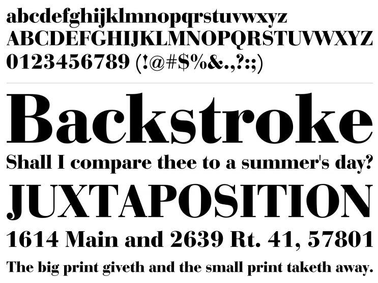
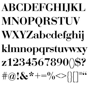
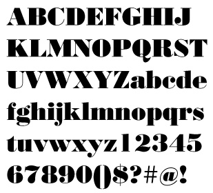
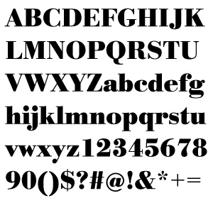
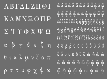
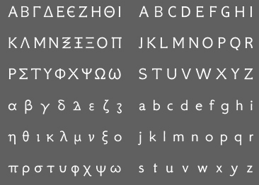
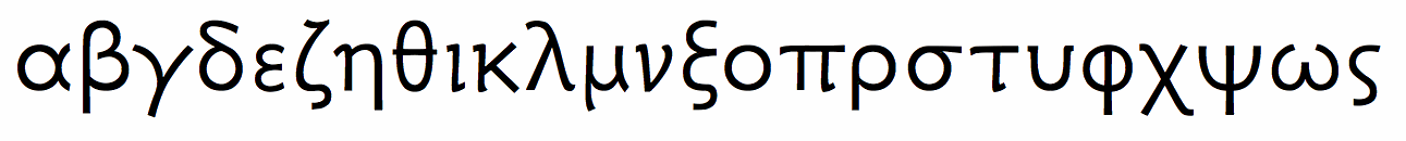
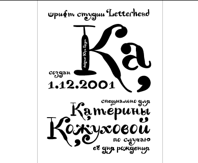
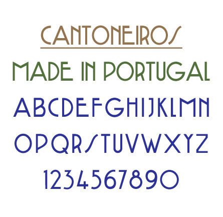
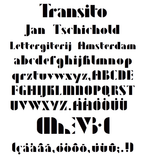
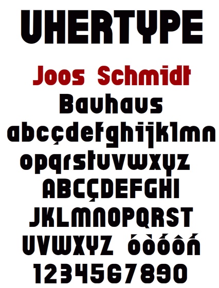
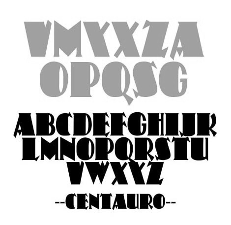
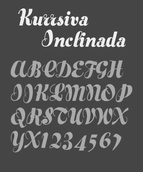
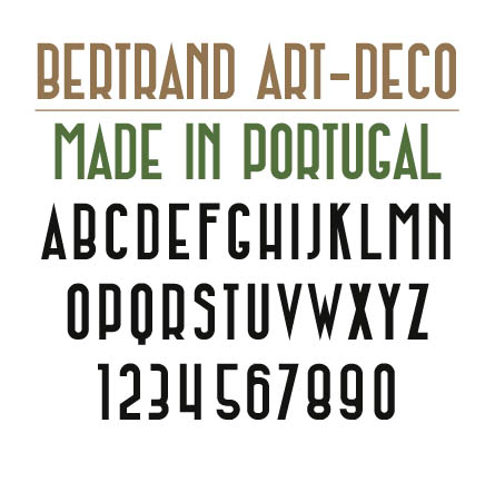
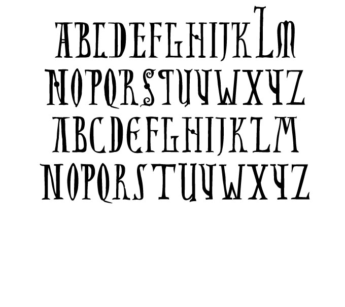
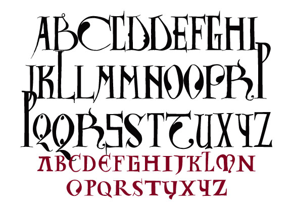
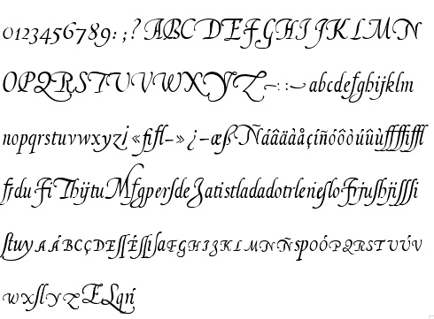
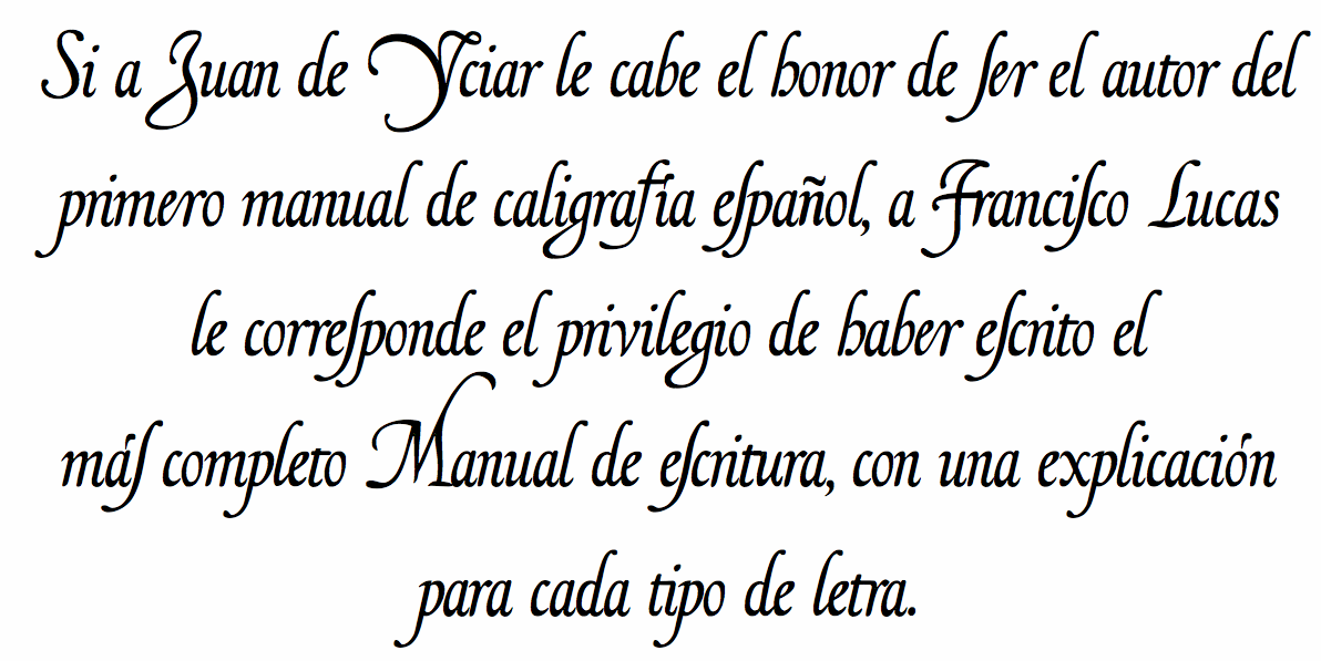
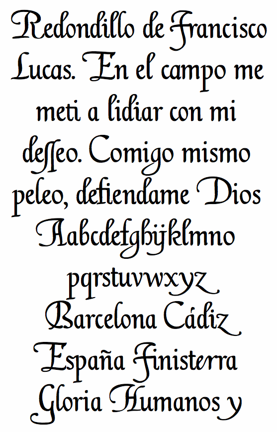
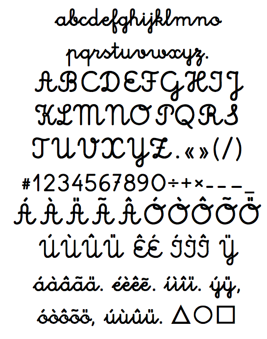
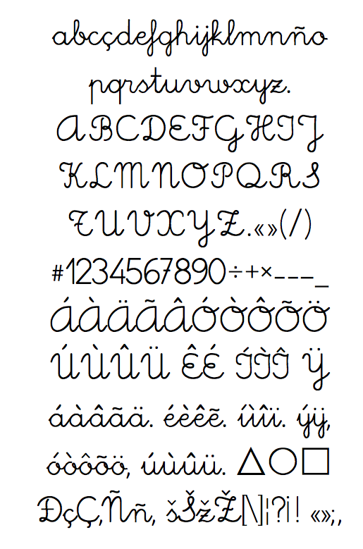