TYPE DESIGN INFORMATION PAGE last updated on Thu Jul 16 06:50:25 EDT 2026
FONT RECOGNITION VIA FONT MOOSE

|
|
|
|
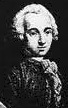
Pierre-Simon Fournier
French typefounder (b. Paris, 1712, d. Paris, 1768) also called Fournier le jeune.
Pauline Nuñez graduated in 2007 from Ecole Estienne with a thesis entitled Pierre-Simon Fournier, typographe absolu, typographe accompli?. Publications by Pierre-Simon Fournier dit le jeune:
|
EXTERNAL LINKS |
| | |


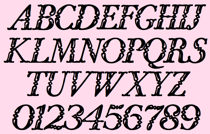
file name: Jim Spiece Narcissus S G based on Pierre Simon Fournier

file name: Jim Spiece Narcissus S G

file name: Brian Lucid Font Bureau Narcissus 1995 after Walter Tiemann Narcissus 1921
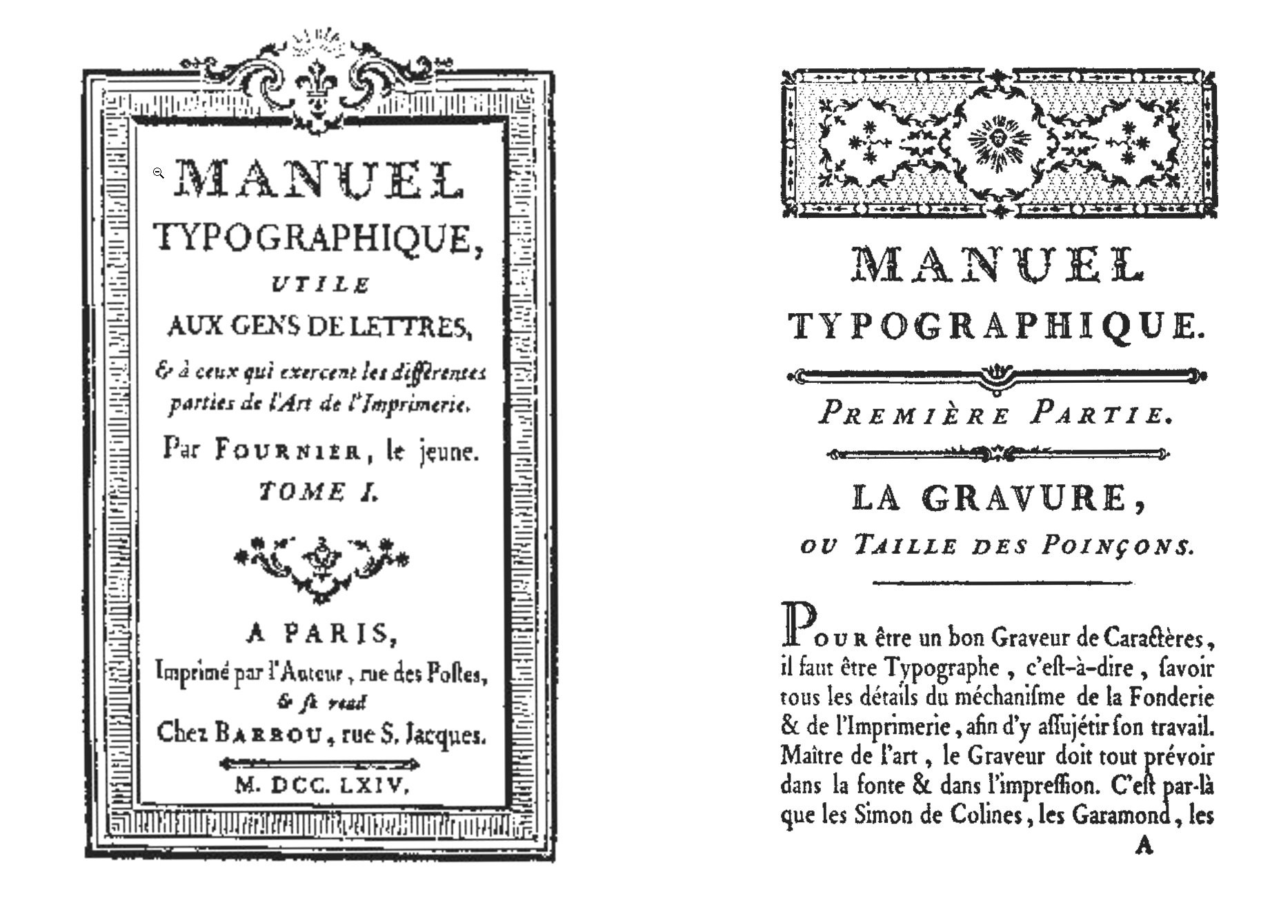
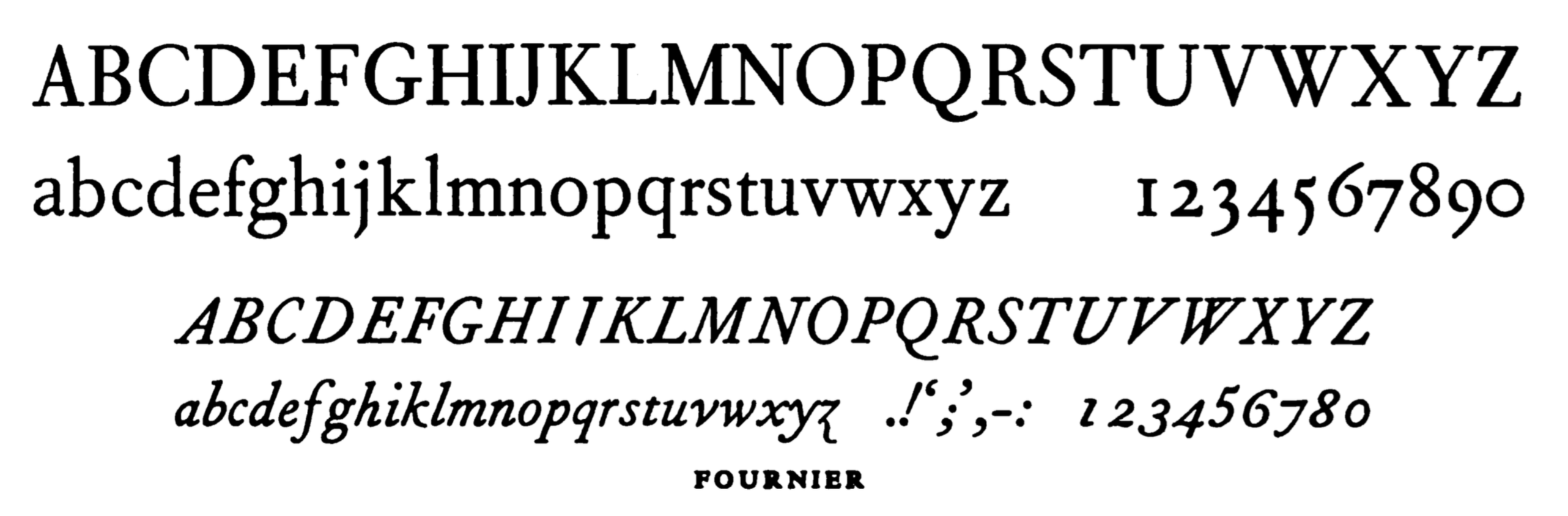
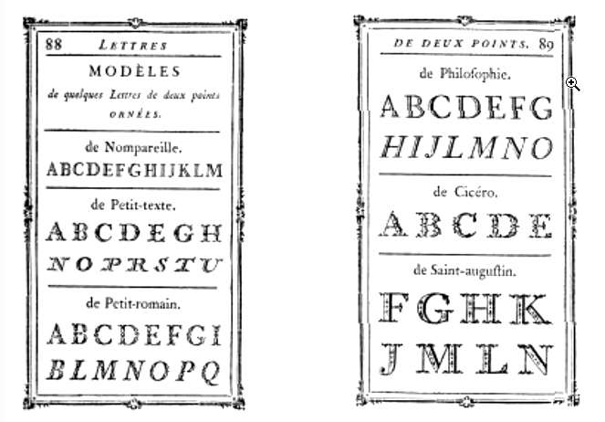
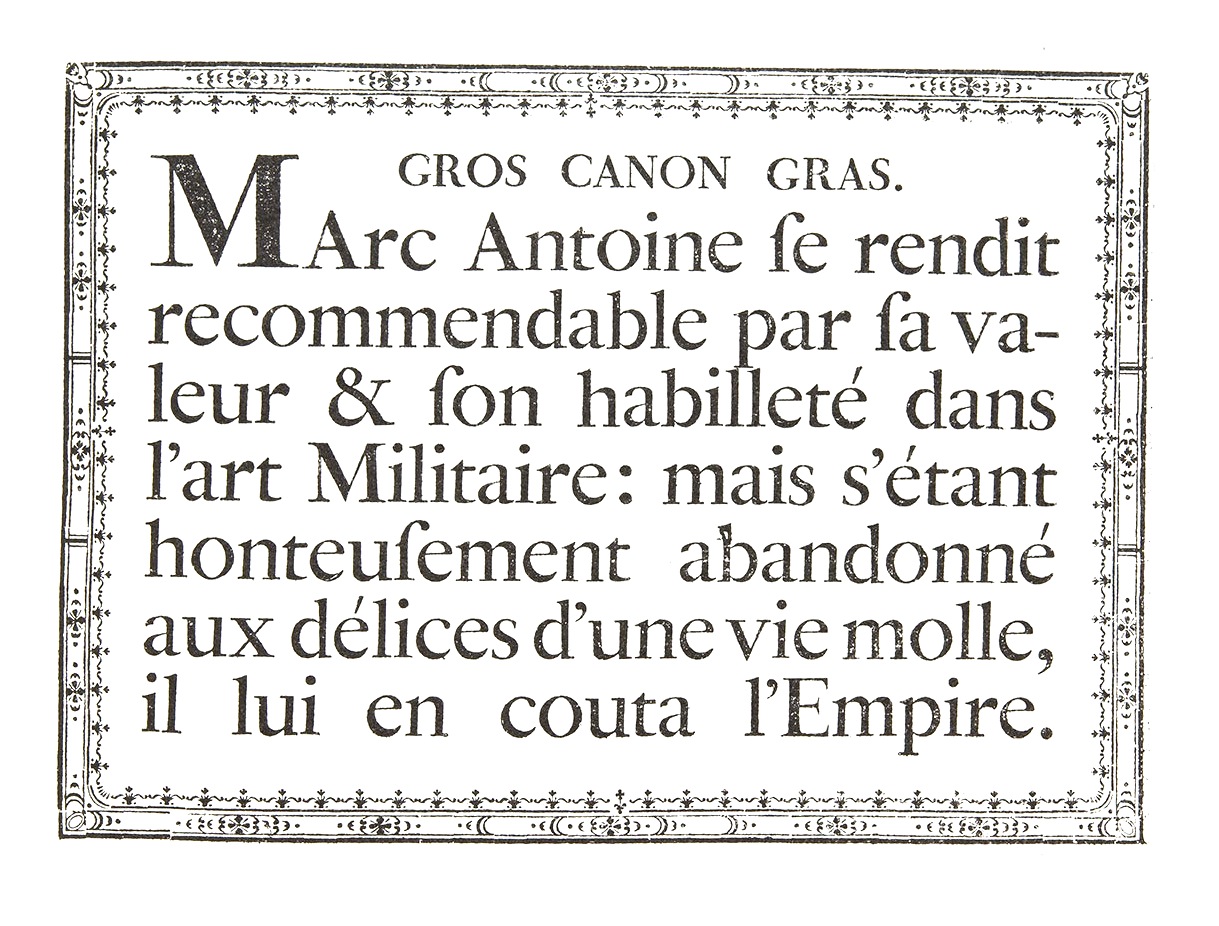
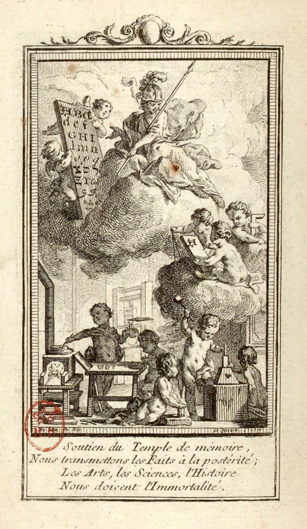
file name: Fournier Le Jeune Manuel Typographique 1764
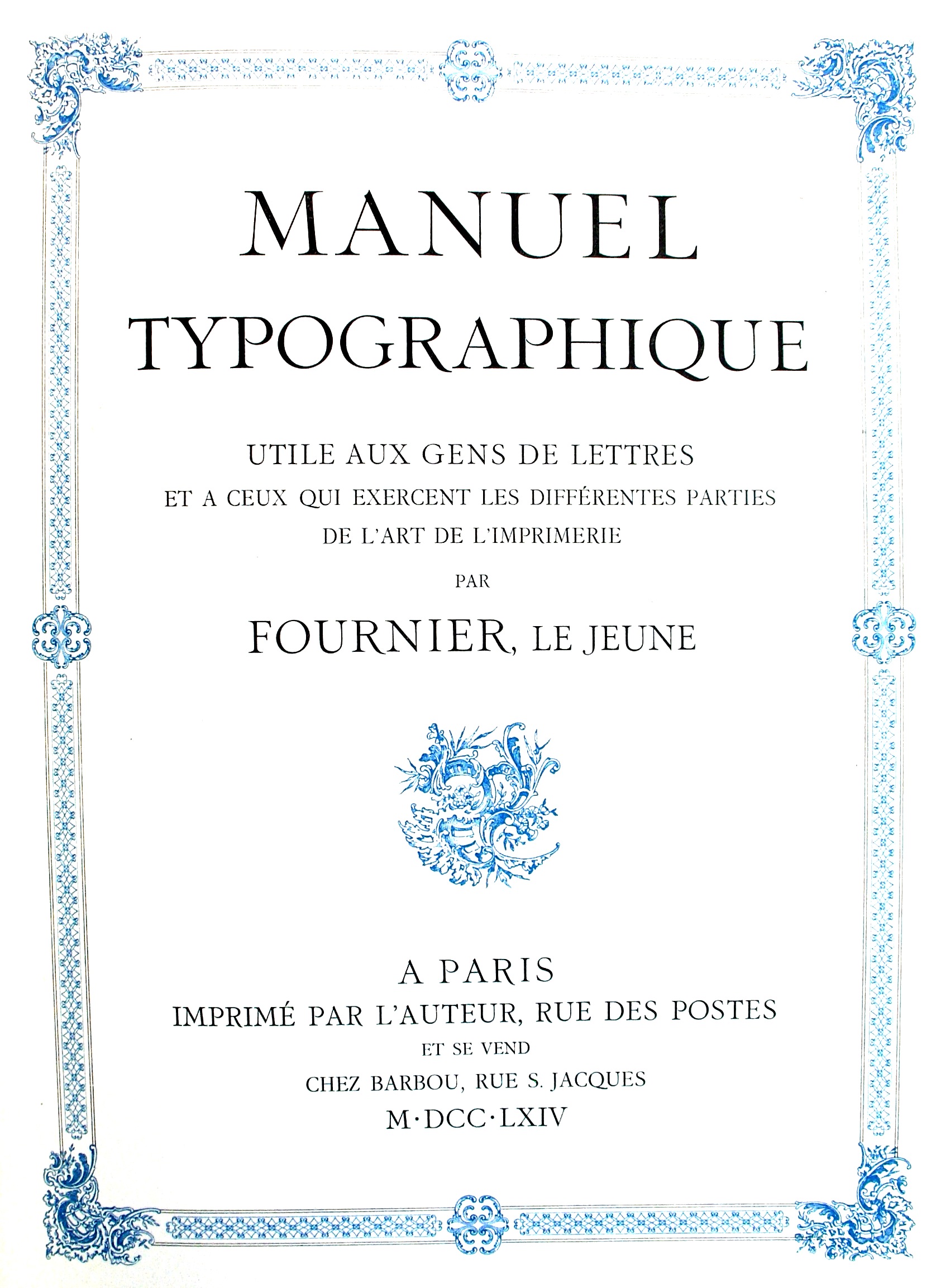
file name: Fournier Le Jeune Manuel Typographique Cover 1764
file name: Torbjorn Olsson Museum Fournier 2007c
file name: Joshua Darden Corundum Text 2006
file name: Joshua Darden Corundum Text 2006b
file name: Joshua Darden Corundum Text 2006c
file name: Joshua Darden Corundum Text 2006e

file name: Joshua Darden Corundum Text 2006f
file name: Joshua Darden Corundum Text 2006g
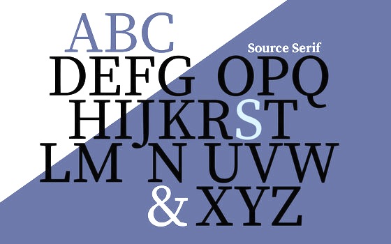
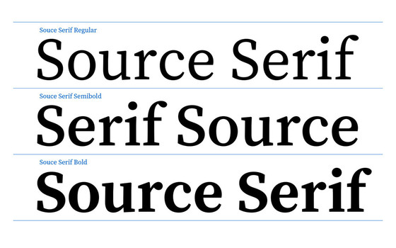
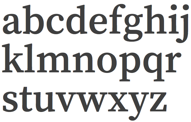
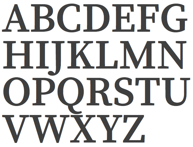
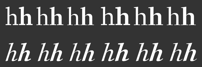
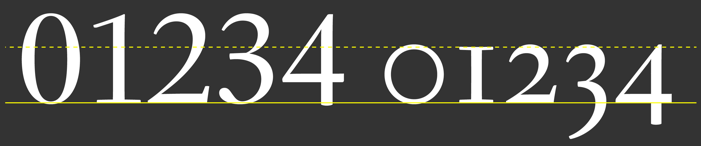
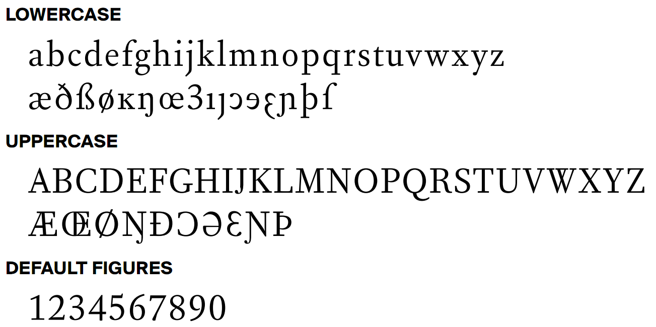
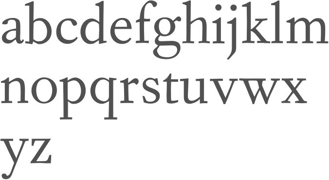
file name: Frank Griesshammer Source Serif Pro 2014a
file name: Frank Griesshammer Source Serif Pro 2014d
file name: Frank Griesshammer Source Serif Pro Semibold 2014
file name: Frank Griesshammer Source Serif Pro Semibold 2014b

file name: Frank Griesshammer Source Serif Pro Semibold 2014c
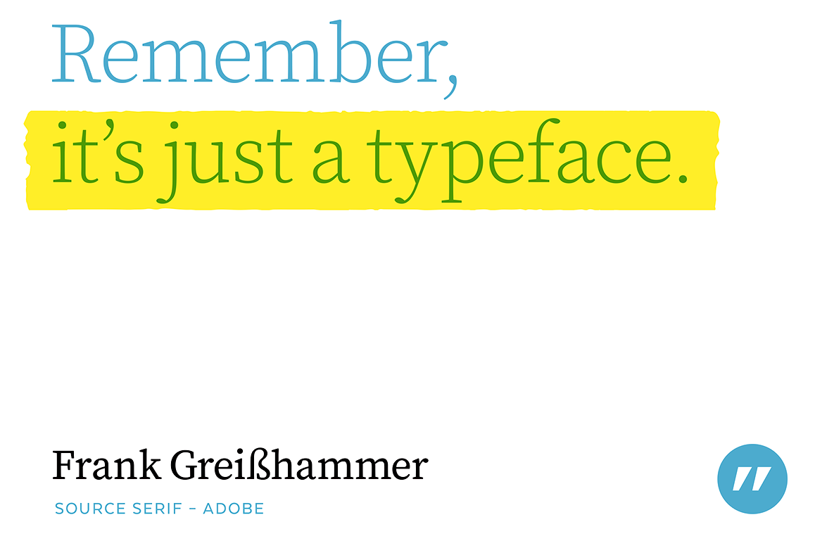
file name: Frank Griesshammer Source Serif 2014 Poster by Bill Dawson 2015
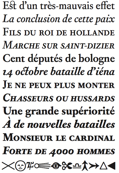
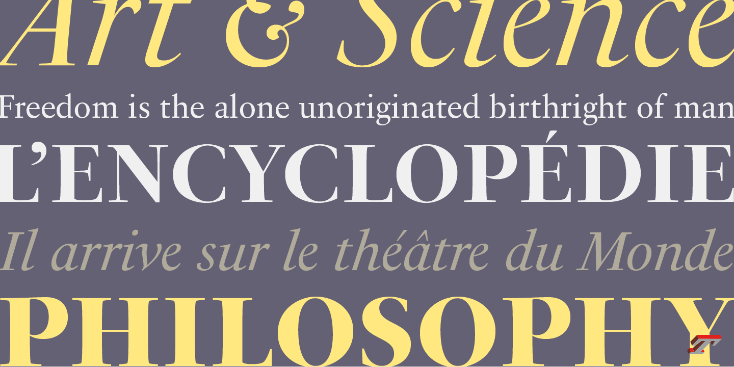
file name: Francois Rappo New Fournier 2011
file name: Francois Rappo New Fournier 2011b

file name: Francois Rappo New Fournier 2011c
file name: Francois Rappo New Fournier 2011d
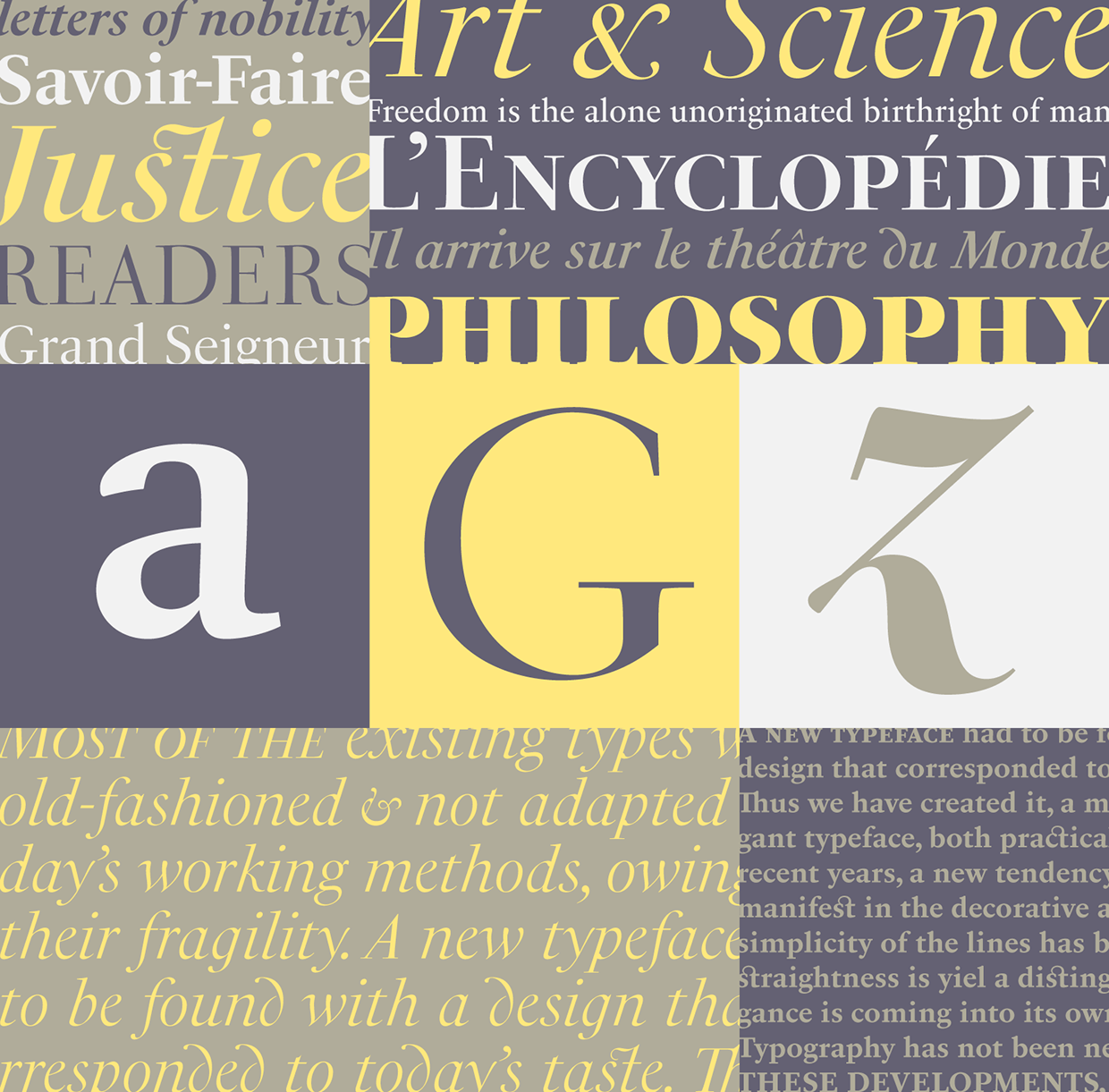
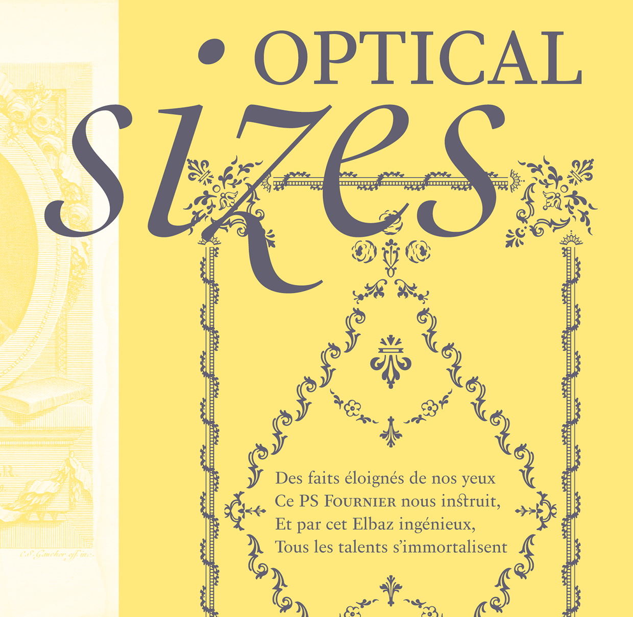
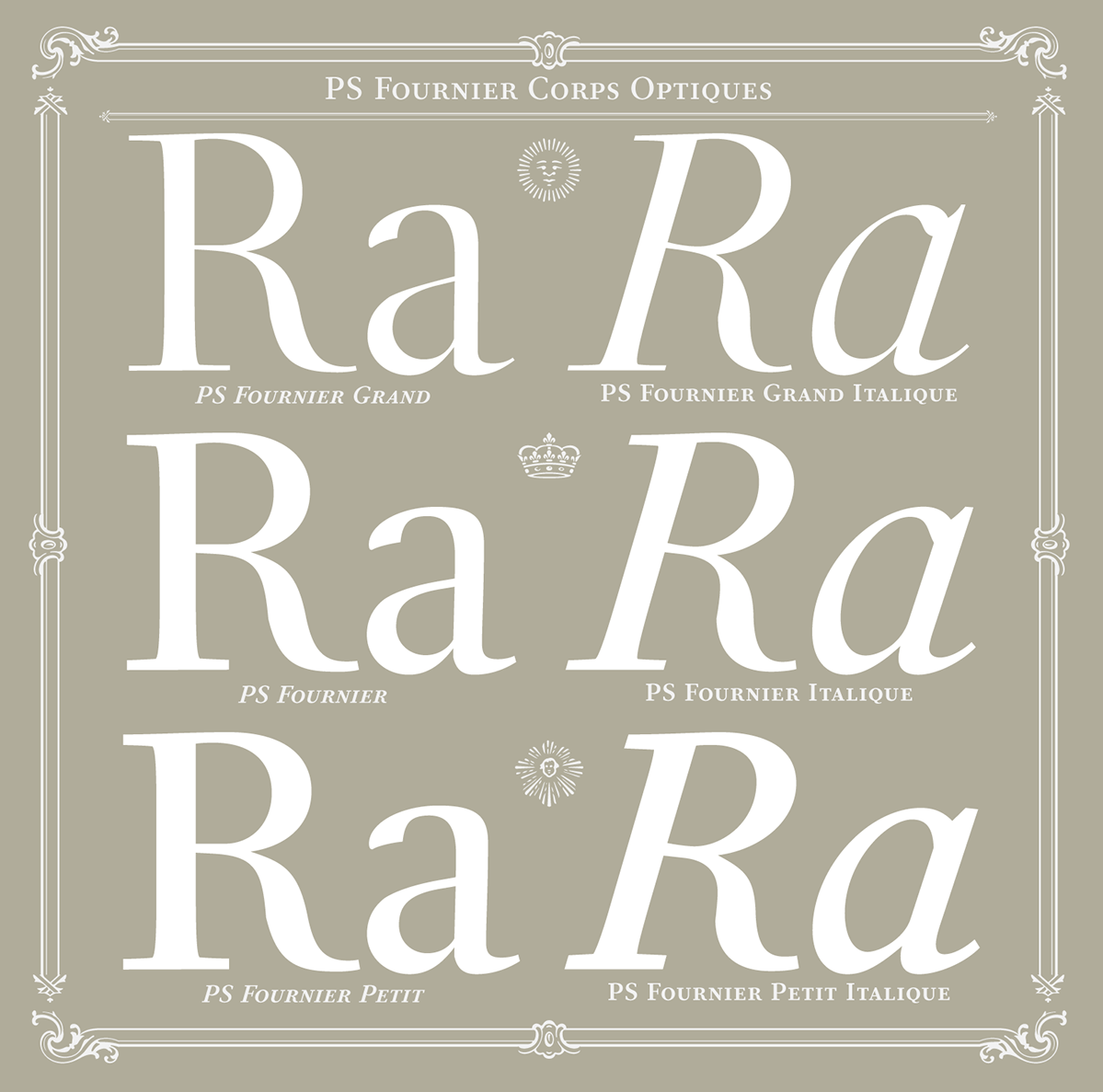
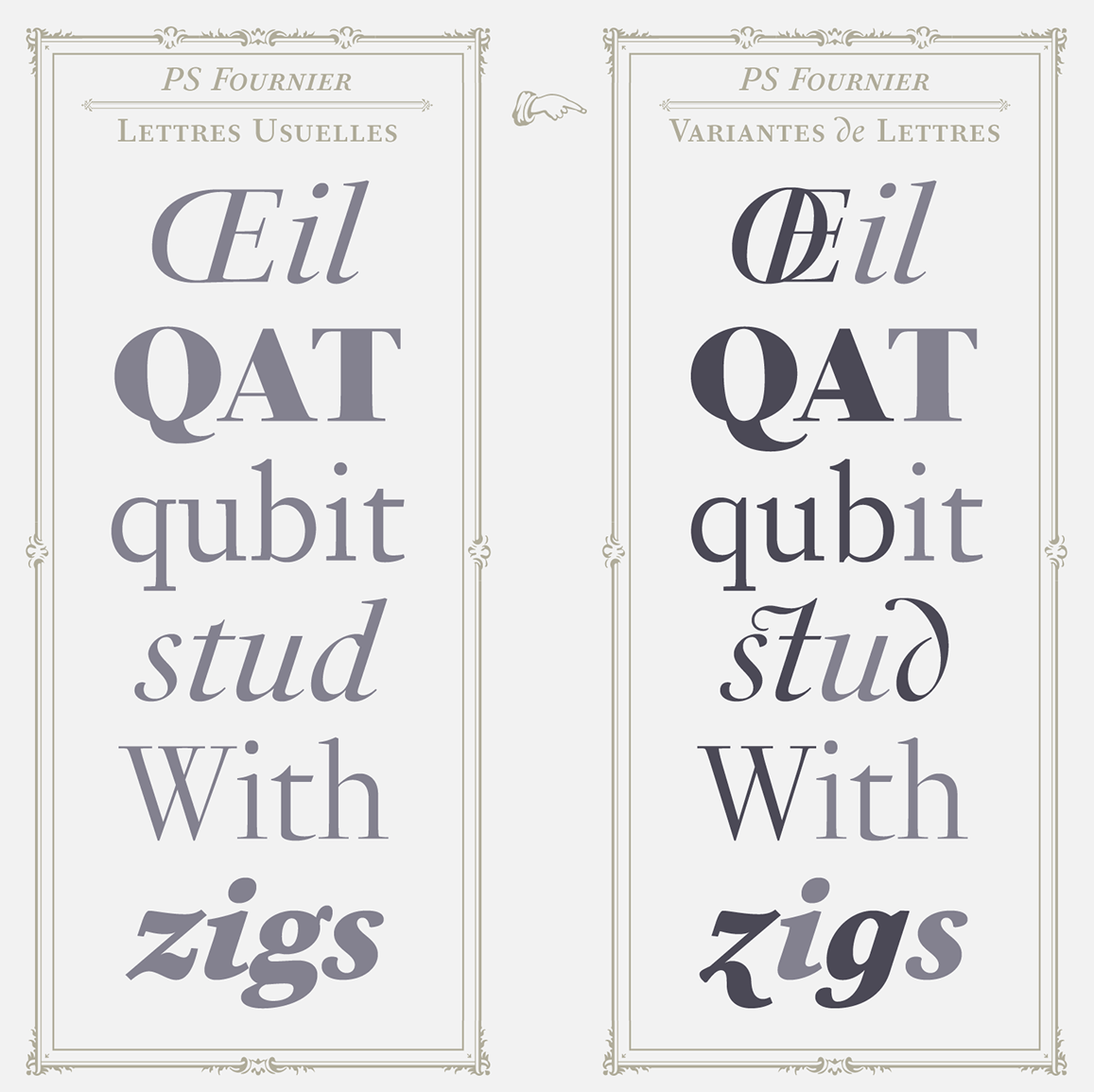
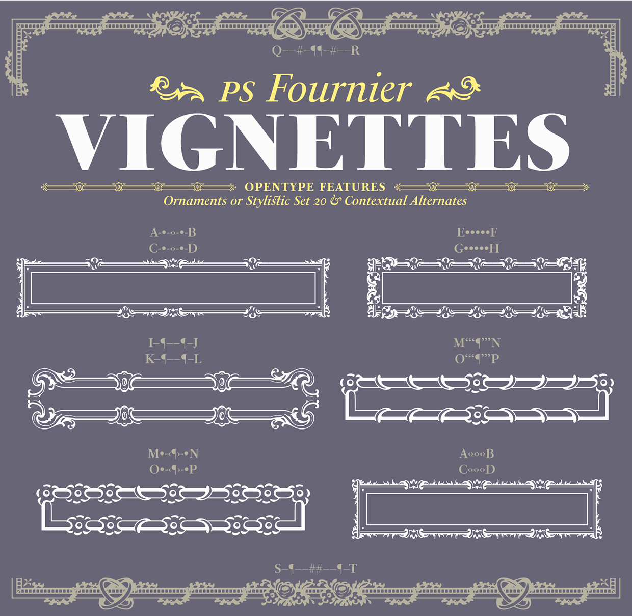
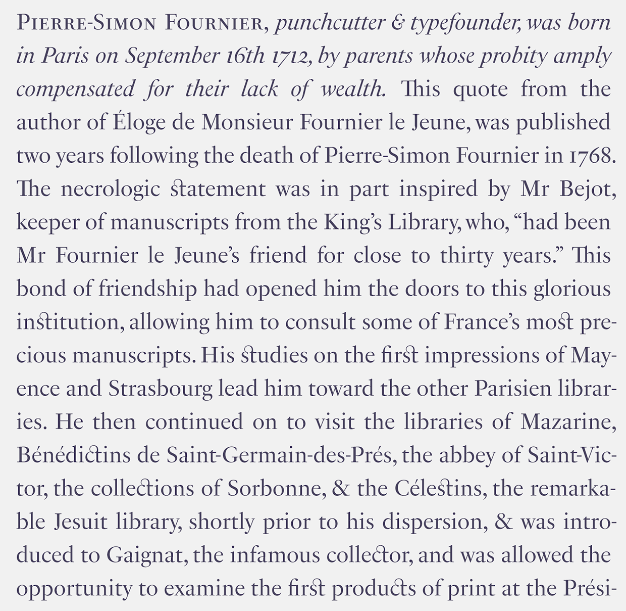
file name: Stephane Elbaz P S Fournier 2016
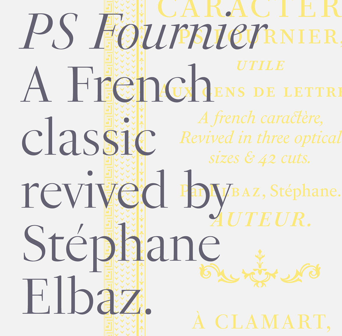
file name: Stephane Elbaz P S Fournier 2016b

file name: Stephane Elbaz P S Fournier 2016c
file name: Stephane Elbaz P S Fournier 2016d
file name: Stephane Elbaz P S Fournier 2016e
file name: Stephane Elbaz P S Fournier 2016f
file name: Stephane Elbaz P S Fournier 2016g
file name: Stephane Elbaz P S Fournier 2016h

file name: Stephane Elbaz P S Fournier 2016j
file name: Stephane Elbaz P S Fournier 2016k
file name: Stephane Elbaz P S Fournier 2016l

file name: Stephane Elbaz P S Fournier 2016m
file name: Stephane Elbaz P S Fournier 2016

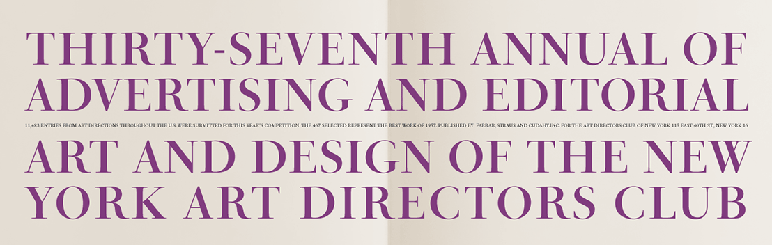
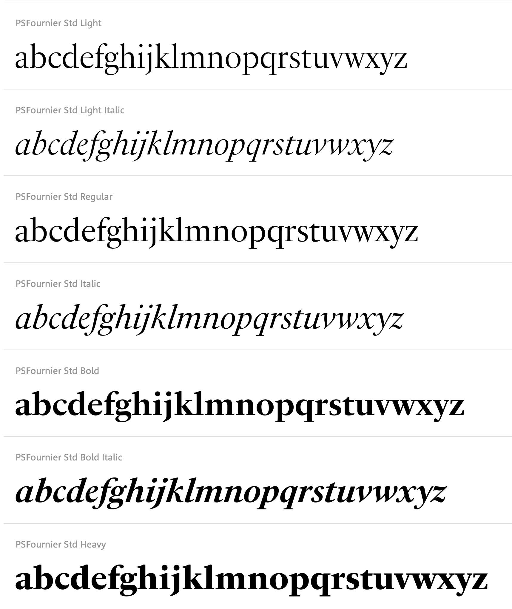
file name: Typofonderie P S Fournier Std 2016 1
file name: Typofonderie P S Fournier Std 2016 2

file name: Typofonderie P S Fournier Std 2016 3

file name: Typofonderie P S Fournier Std 2016 4

file name: Typofonderie P S Fournier Std 2016 5

file name: Typofonderie P S Fournier Std 2016
file name: Lanston L T C Fournier Le Jeune
file name: Alan Prescott A P T New June 1996
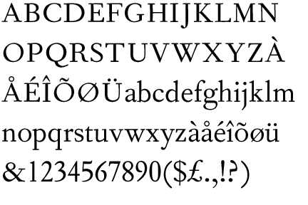
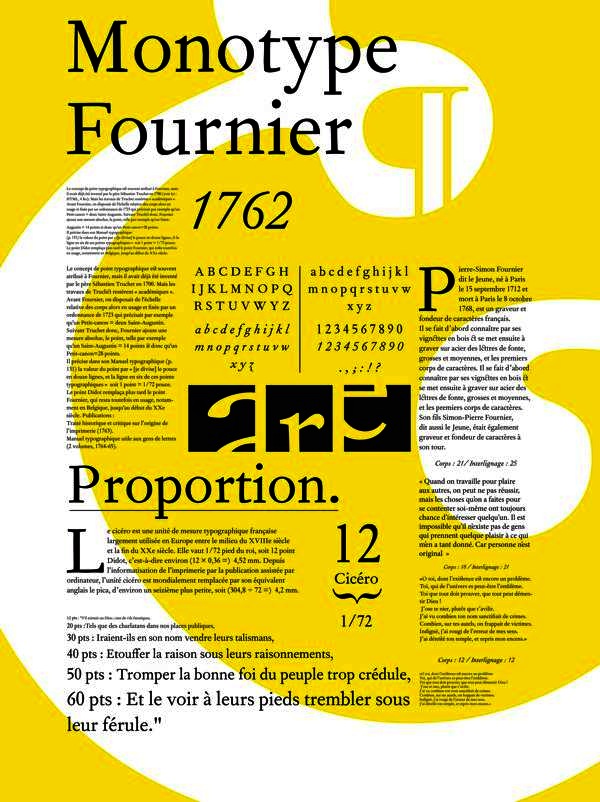
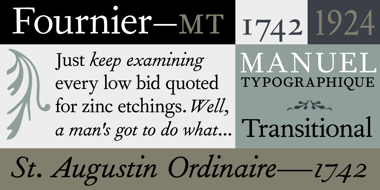
file name: Monotype Fournier 1925
file name: Monotype Fournier 1924
file name: Monotype Fournier 1924b
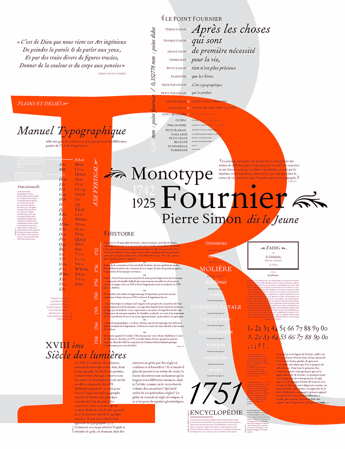
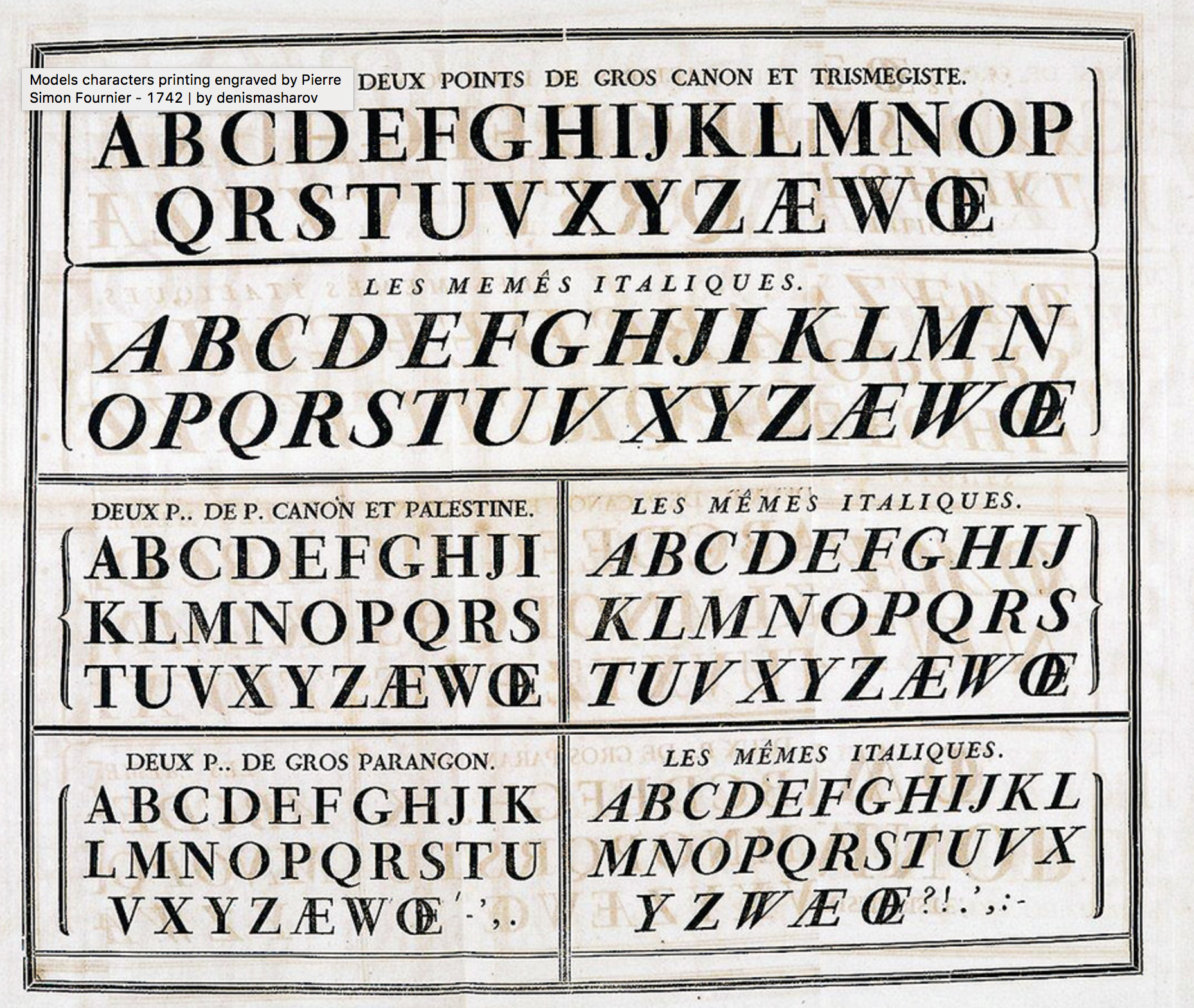
file name: Pierre Simon Fournier Fournier 1742 Monotype1924 Poster by Aleksandra Miletic 2016
file name: Pierre Simon Fournier Fournier 1742 Monotype1924
file name: Pierre Simon Fournier Fournier 1742 Monotype1924 Poster by Nino Israel 2014
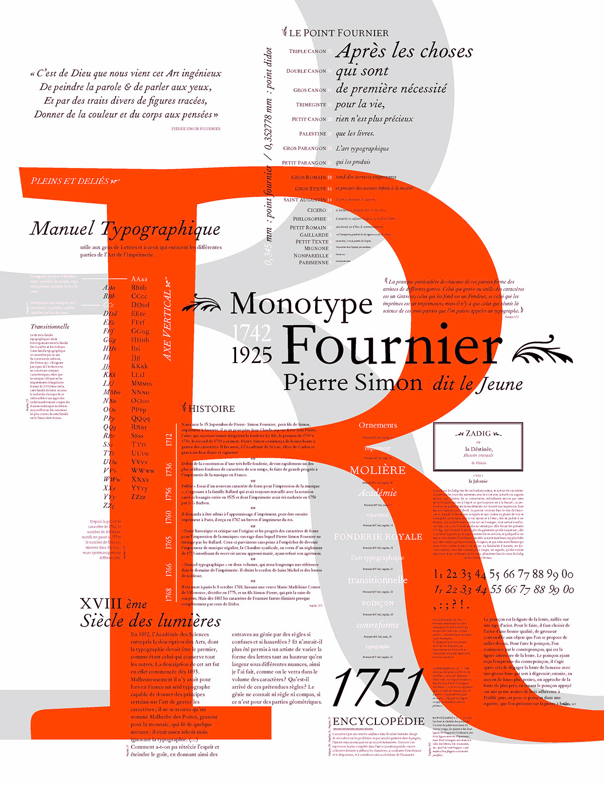
file name: Pierre Simon Fournier Fournier 1742 Monotype 1924 Poster by Aleksandra Miletic 2016
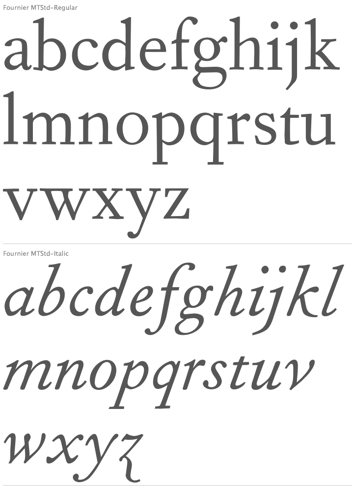
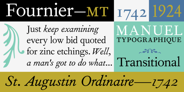
file name: Pierre Simon Fournier Le Jeune Fournier M T
file name: Monotype Fournier M T after Pierre Simon Fournier Le Jeune
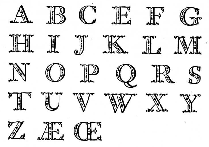
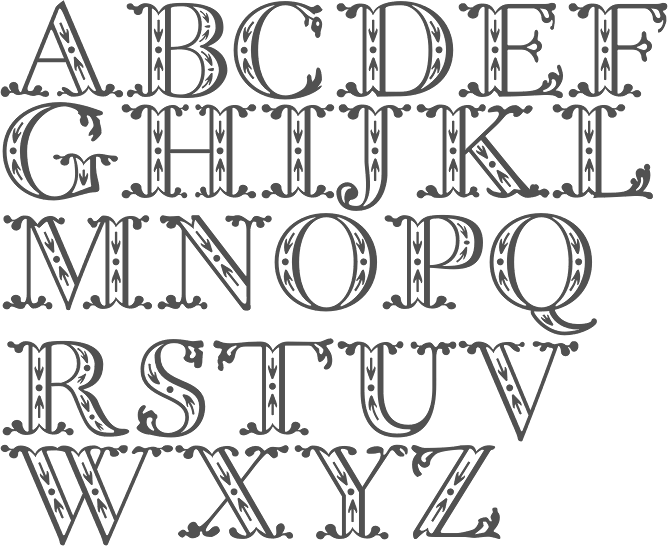
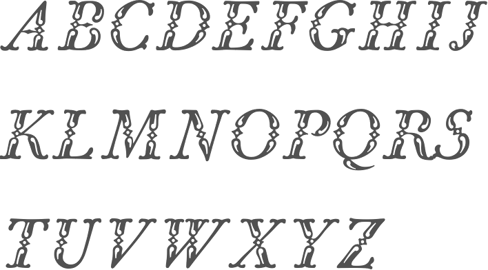
file name: Pierre Simon Fournier Rococo Capitals ca1760
file name: Pierre Simon Fournier Le Jeune Rococo Capitals 1760
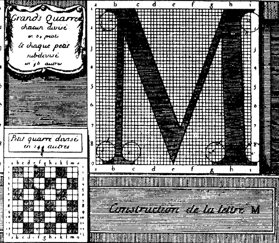
file name: Pierre Simon Fournier Lettre M
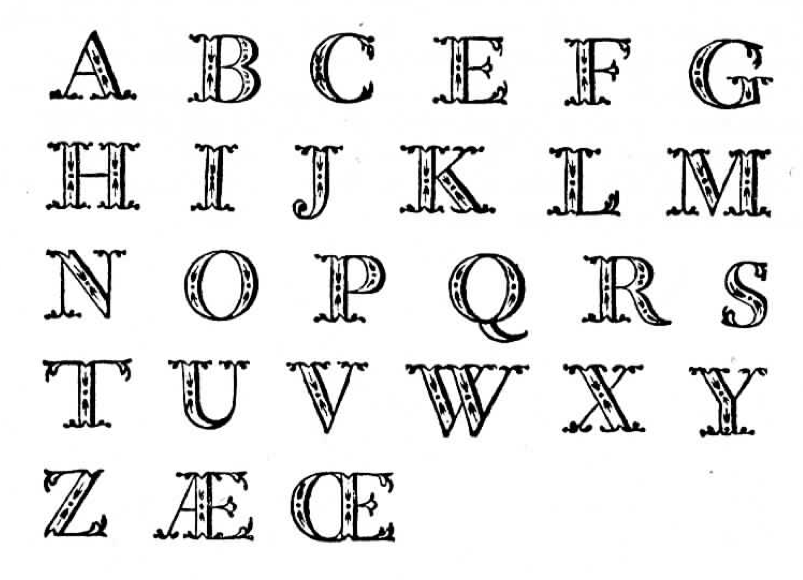
file name: Fournier Capitales Ornees
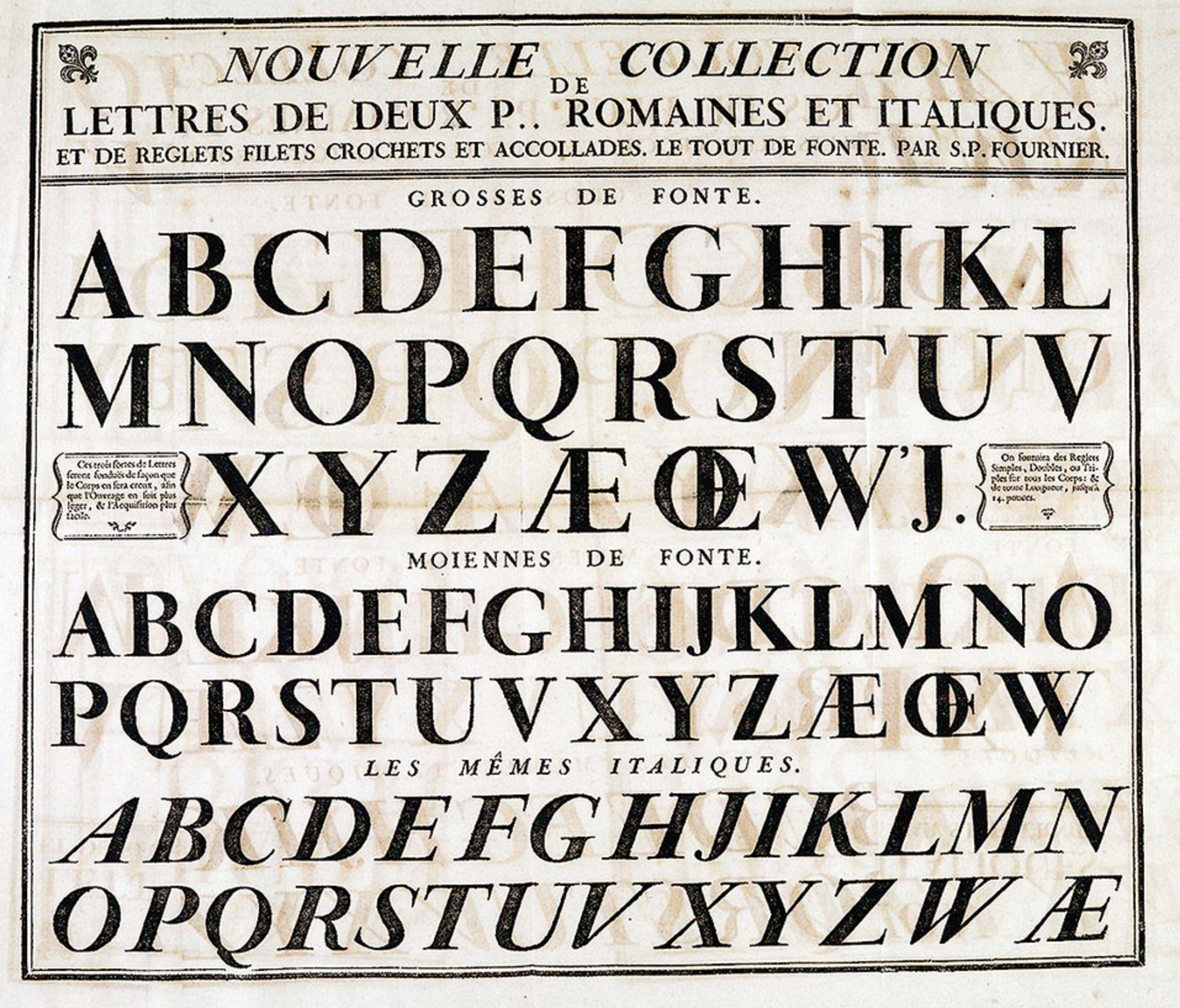
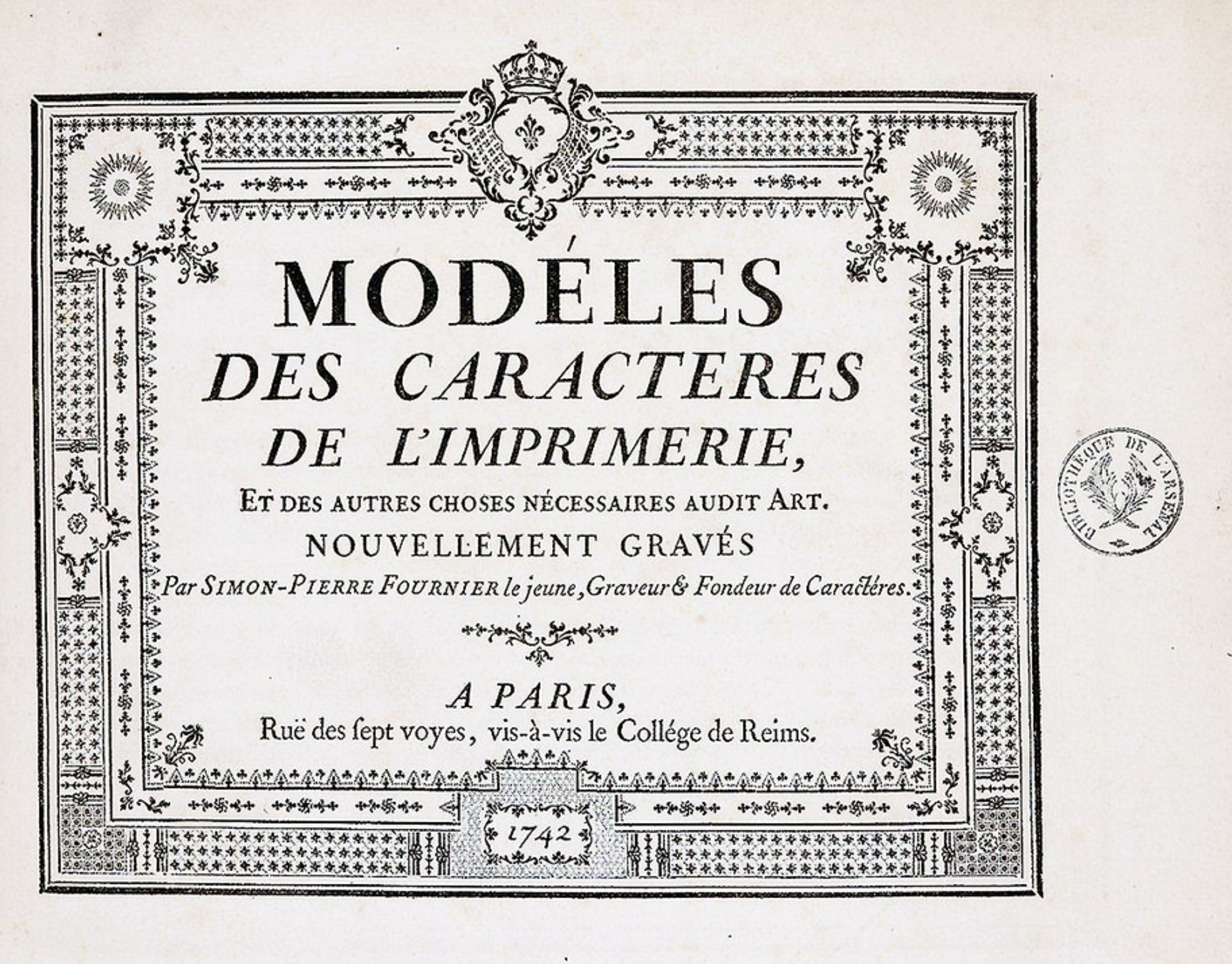
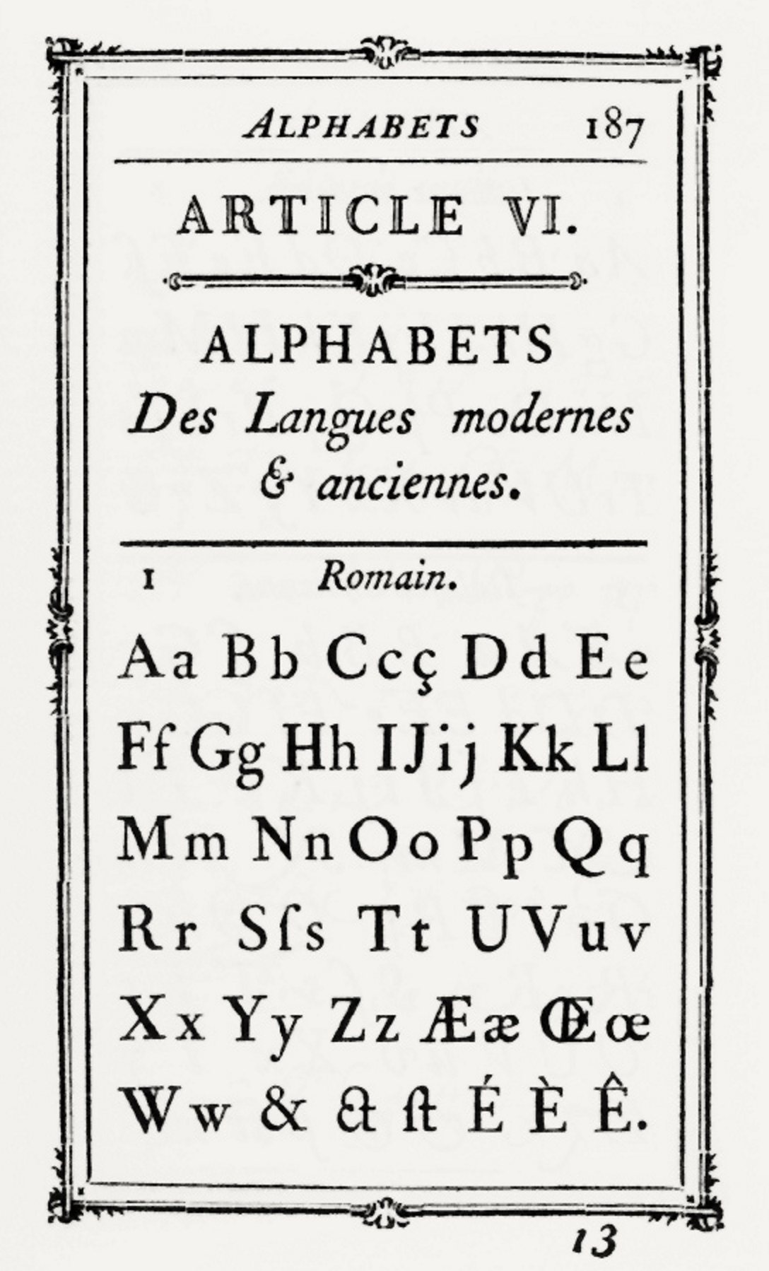
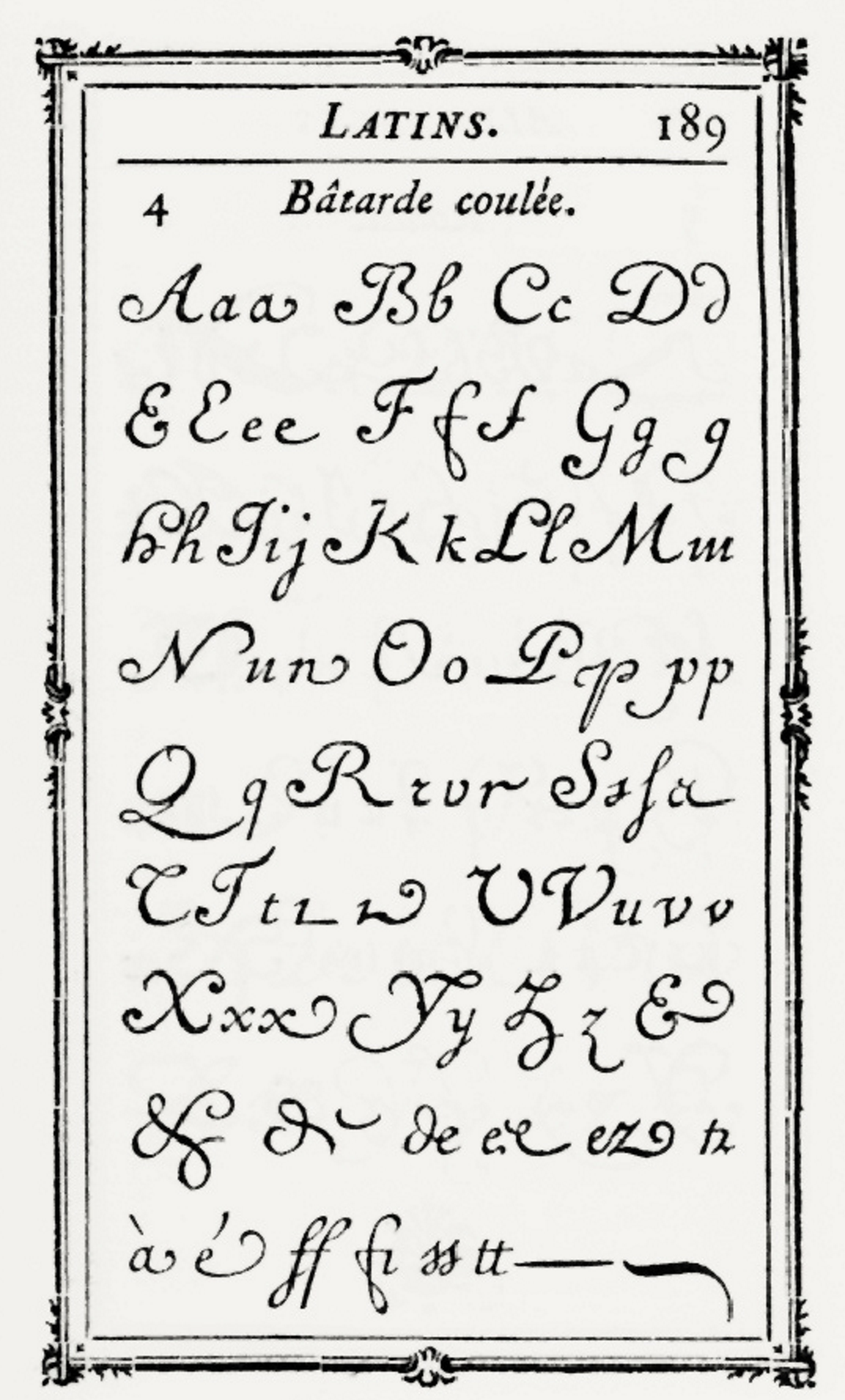
file name: Pierre Simon Fournier Modeles Des Caracteres De L Imprimerie Paris 1742
file name: Pierre Simon Fournier
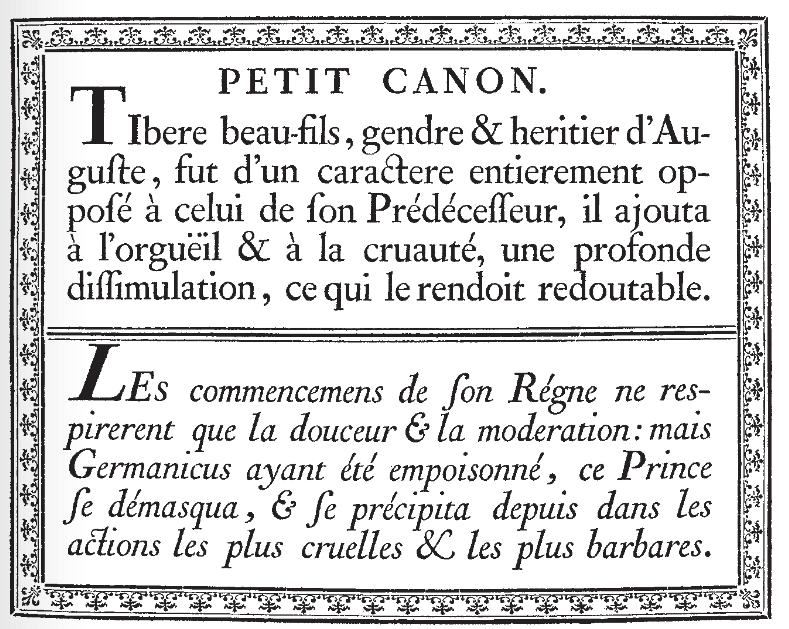
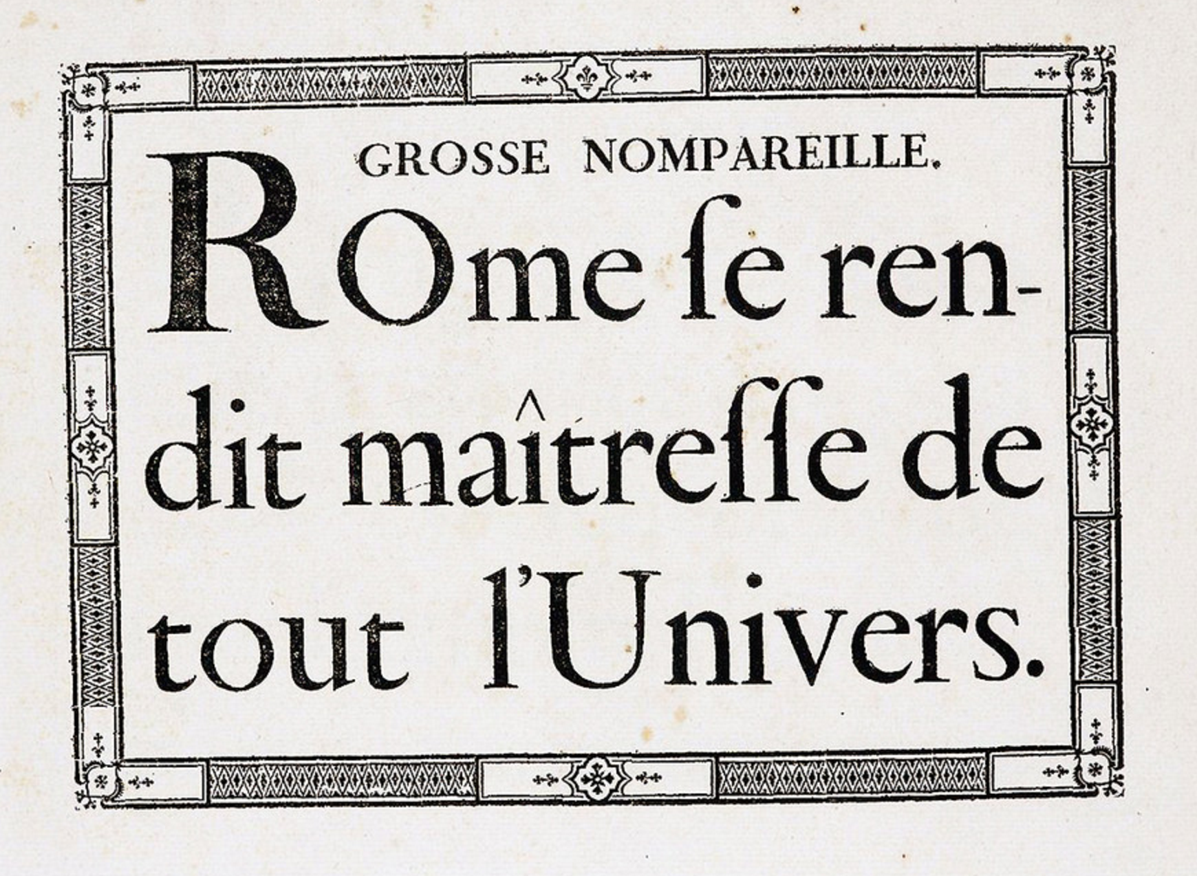
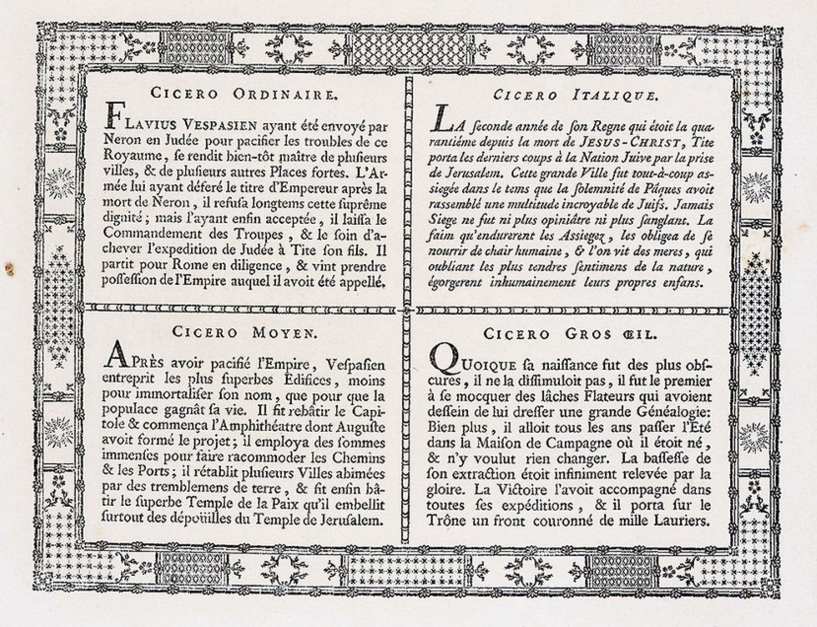
file name: Pierre Simon Fournier Petit Canon 1742
file name: Pierre Simon Fournier Specimen 1742
file name: Pierre Simon Fournier Specimen 1742b
file name: Pierre Simon Fournier Specimen 1742c
file name: Pierre Simon Fournier Specimen 1742d
file name: Pierre Simon Fournier Specimen 1742e
file name: Pierre Simon Fournier Specimen 1742f
file name: Pierre Simon Fournier Specimen 1742g
file name: Pierre Simon Fournier Specimen 1742h
file name: Pierre Simon Fournier Specimen 1742i
file name: Pierre Simon Fournier Specimen 1742j
file name: Pierre Simon Fournier Specimen 1742k
file name: Pierre Simon Fournier Specimen 1742l
file name: Pierre Simon Fournier Specimen 1742m
file name: Pierre Simon Fournier Specimen 1742n
file name: Pierre Simon Fournier Specimen 1742o
file name: Pierre Simon Fournier Specimen 1742p
file name: Pierre Simon Fournier Specimen 1742q
file name: Pierre Simon Fournier Specimen 1766
file name: Pierre Simon Fournier Specimen 1766b
file name: Pierre Simon Fournier Specimen 1766c
file name: Pierre Simon Fournier Specimen 1766d
file name: Pierre Simon Fournier Specimen 1766e
file name: Pierre Simon Fournier Specimen 1766f
file name: Pierre Simon Fournier Specimen 1766g
file name: Pierre Simon Fournier Specimen 1766h
file name: Pierre Simon Fournier Specimen 1766i
file name: Pierre Simon Fournier Specimen 1766j
file name: Pierre Simon Fournier Specimen 1766k
file name: Pierre Simon Fournier Specimen 1766l
file name: Pierre Simon Fournier Specimen 1766m
file name: Pierre Simon Fournier Specimen 1766n
file name: Pierre Simon Fournier Specimen 1766o
file name: Pierre Simon Fournier Specimen 1766p
file name: Pierre Simon Fournier Specimen 1766q
file name: Pierre Simon Fournier Specimen 1766r
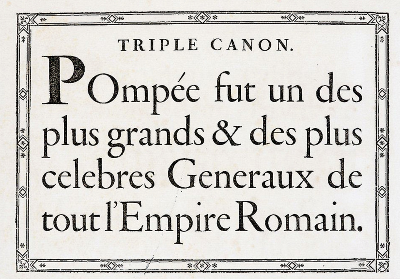
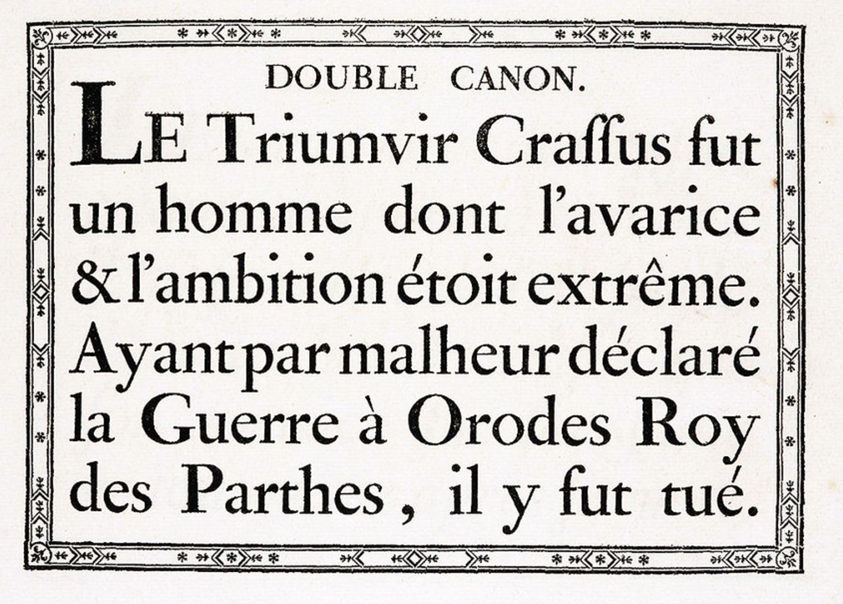
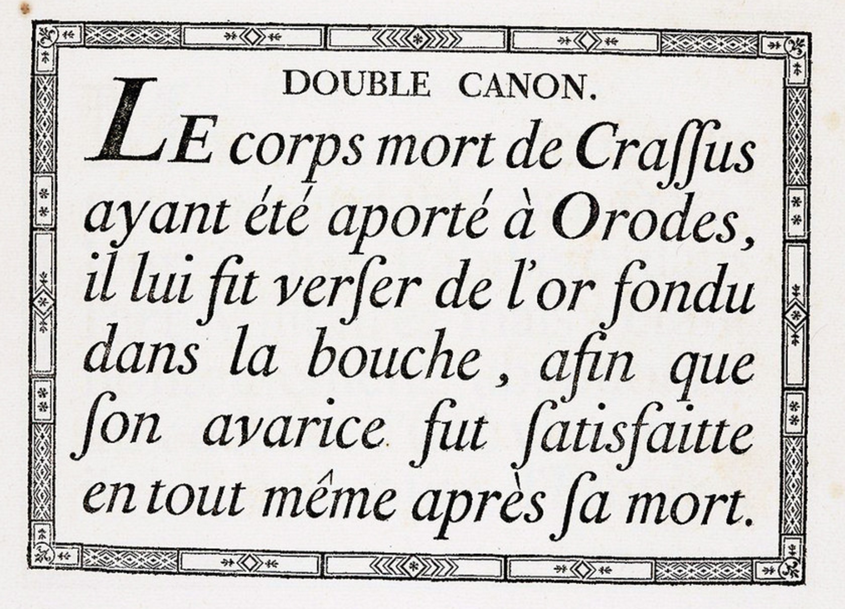
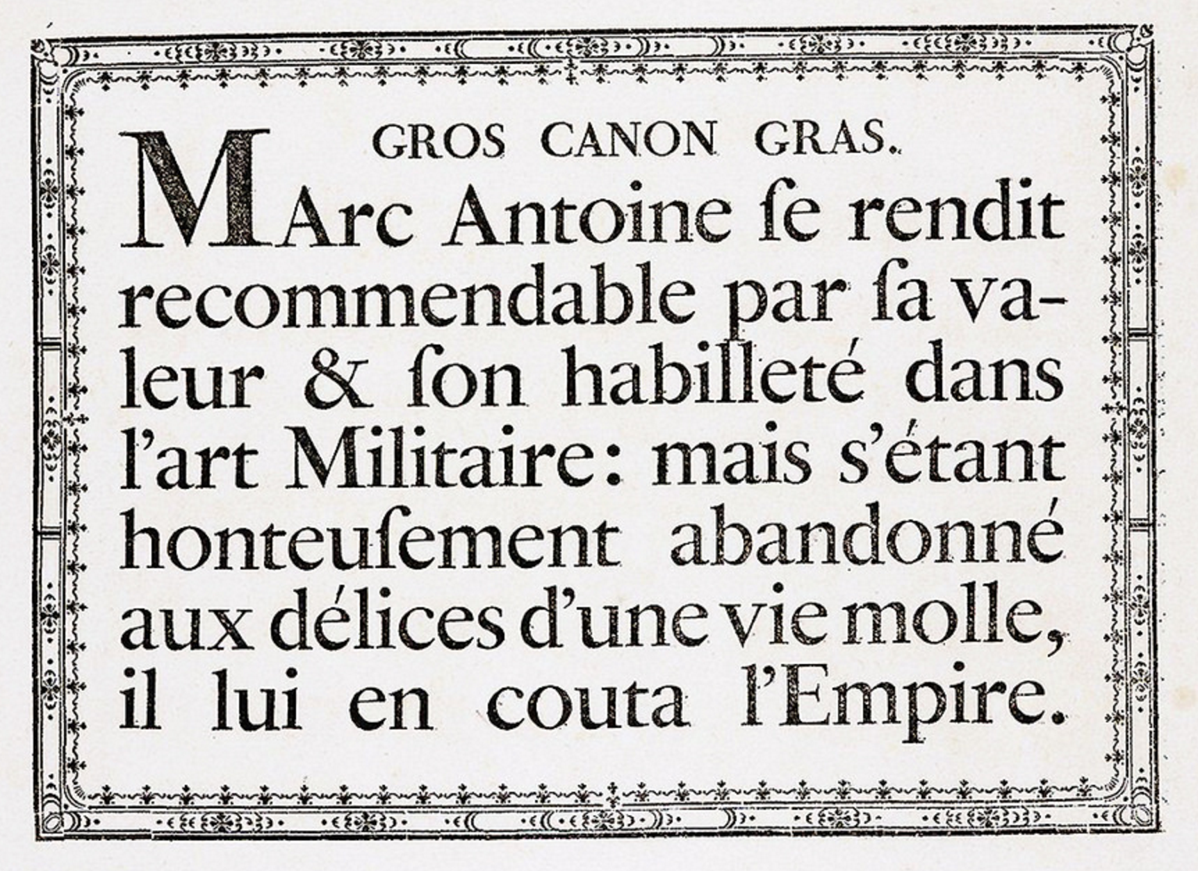
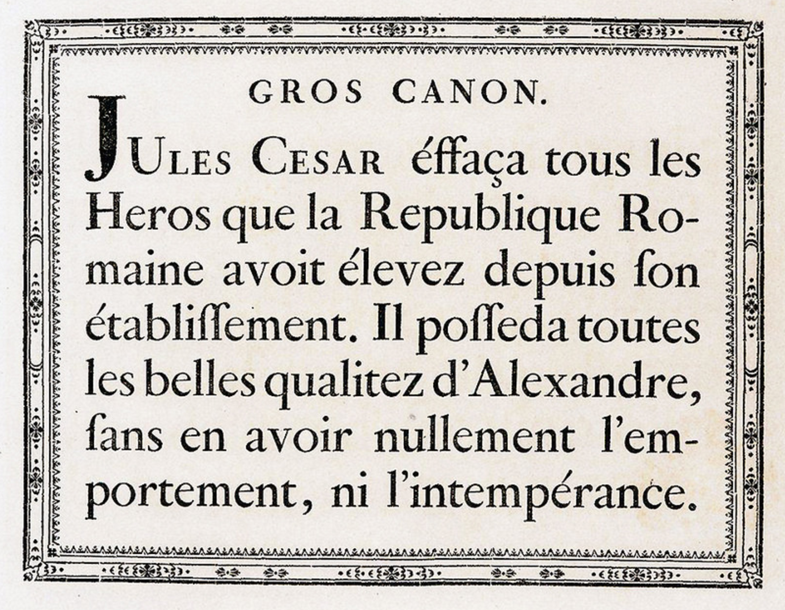
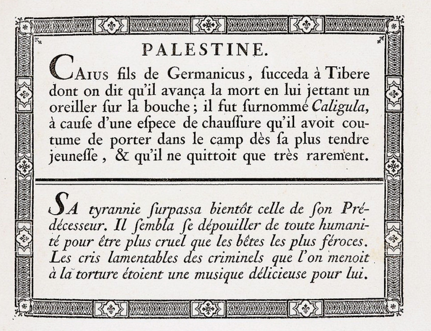
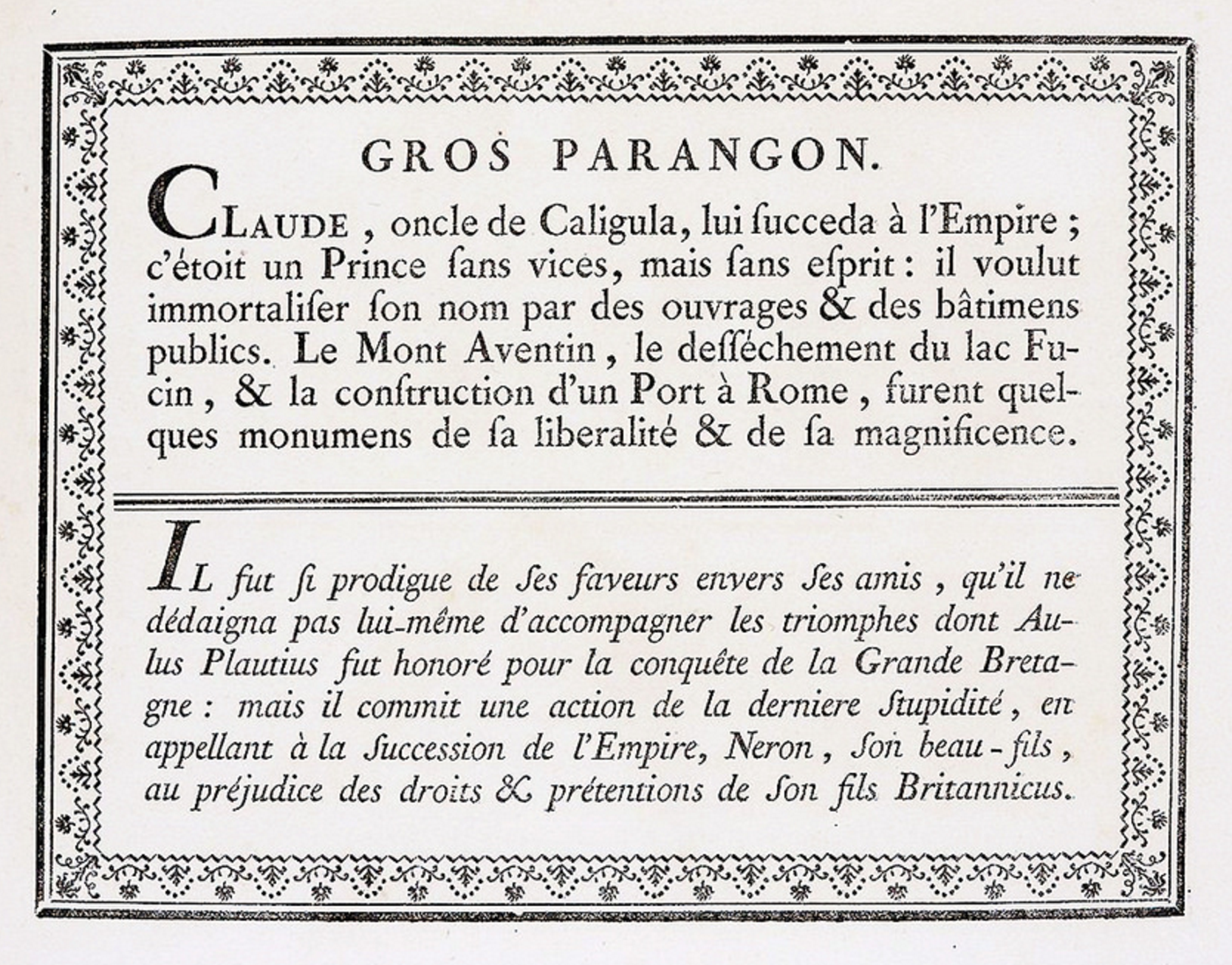
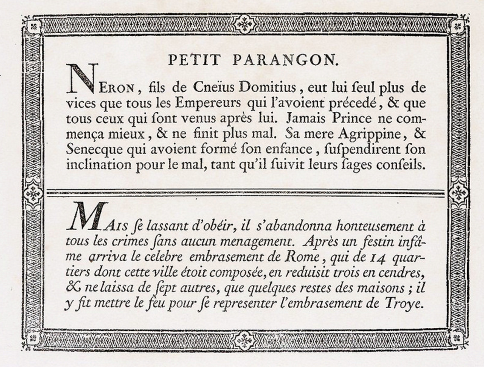
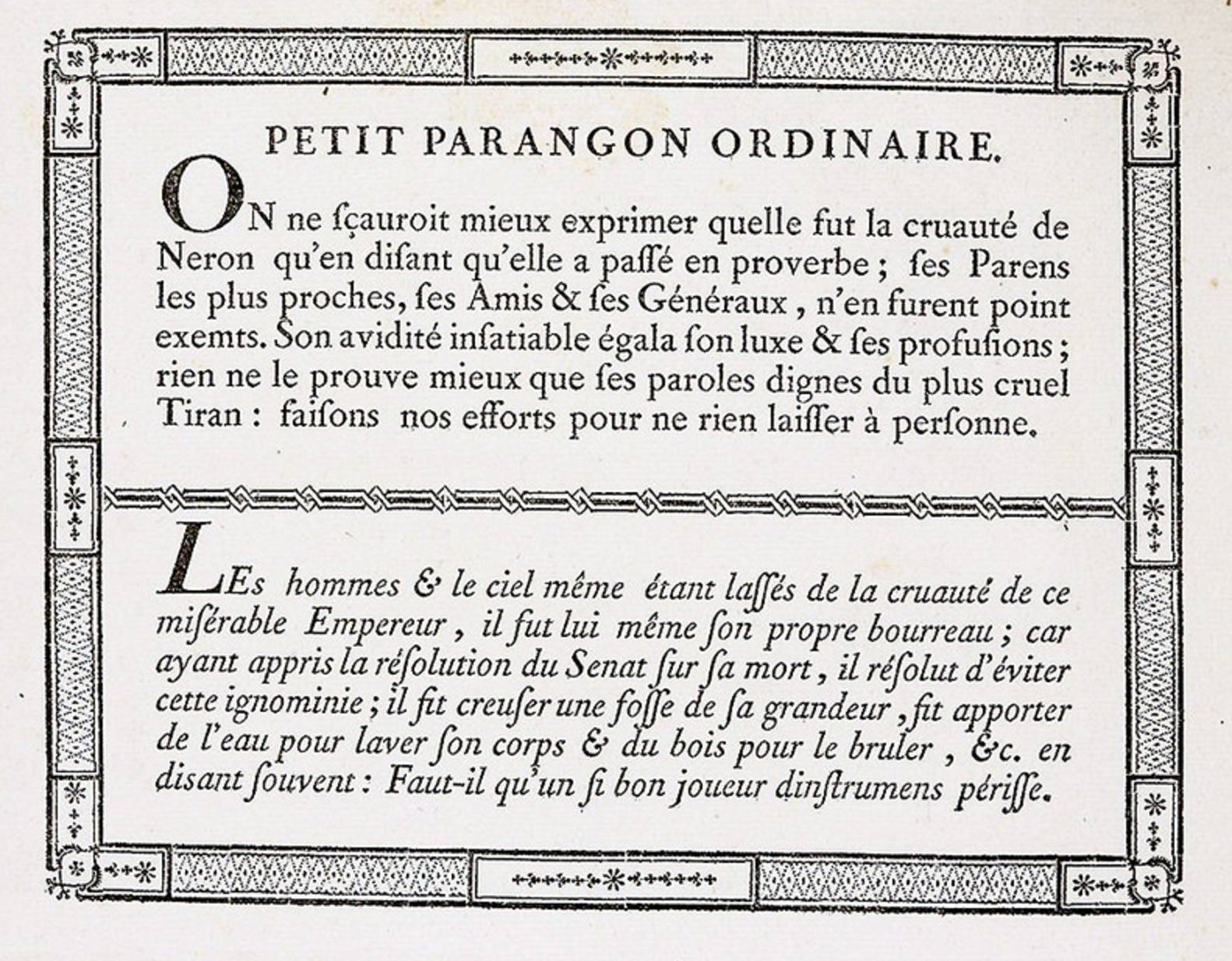
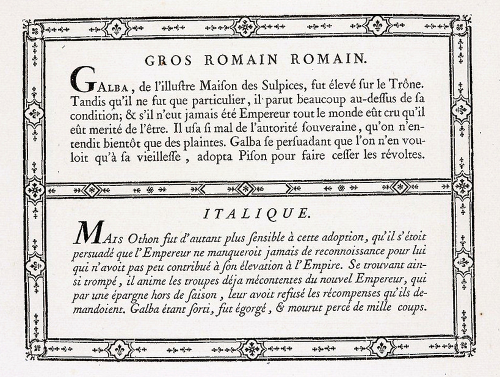
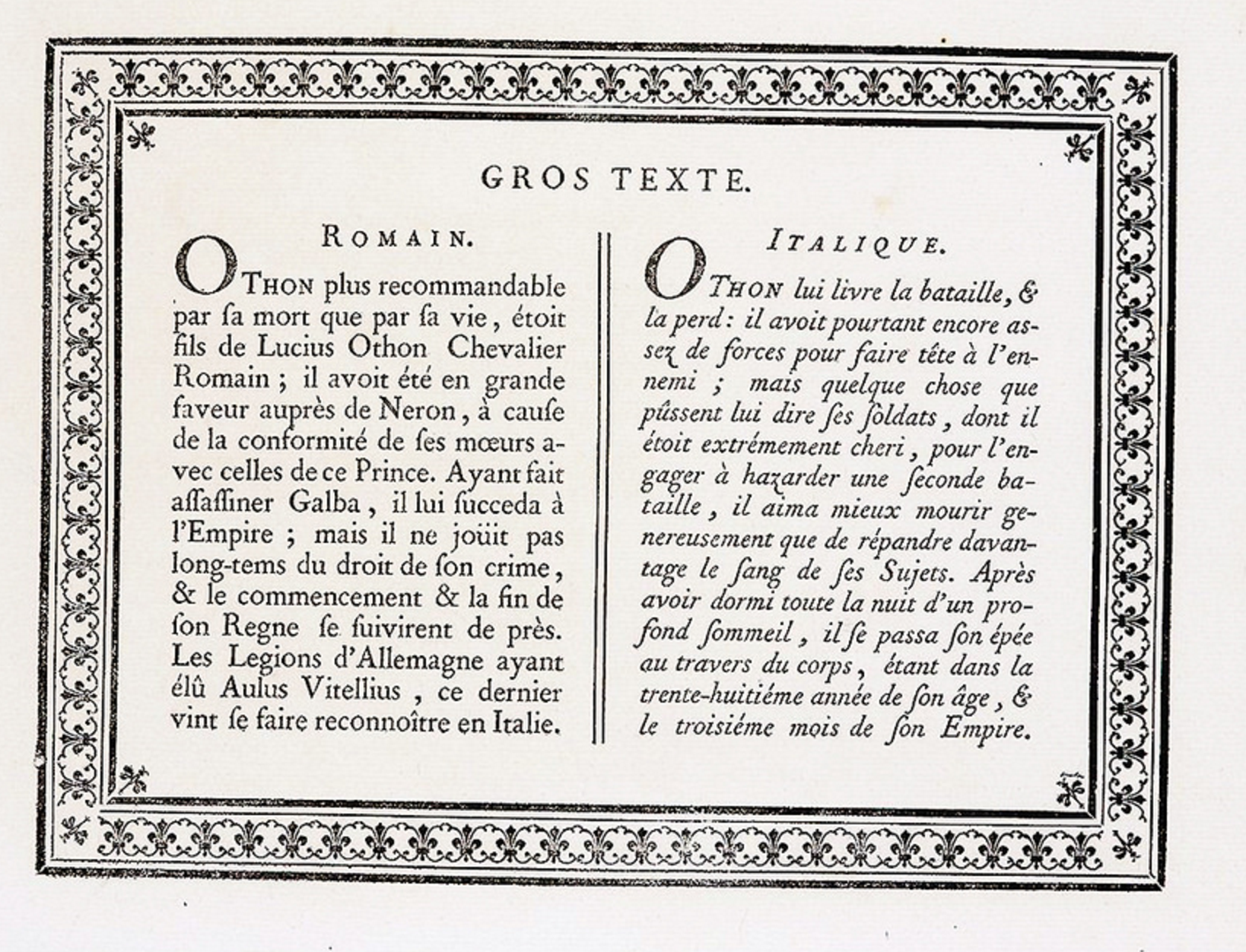
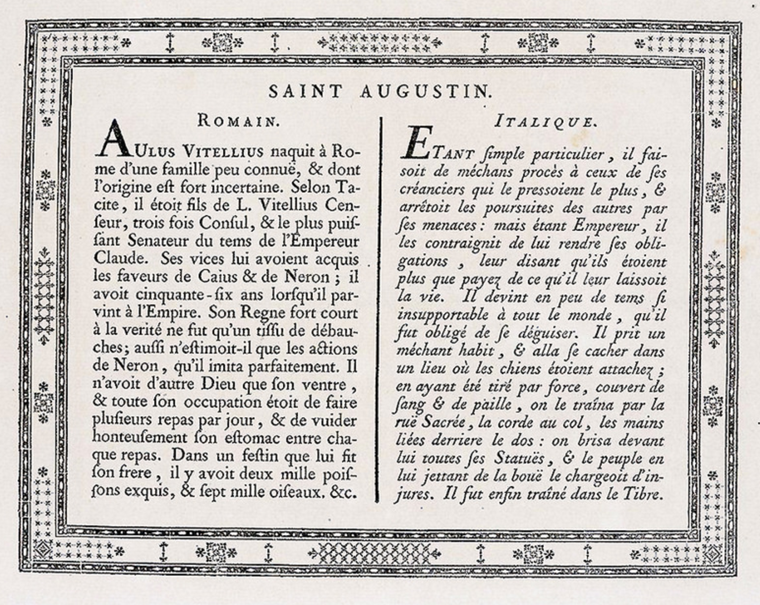
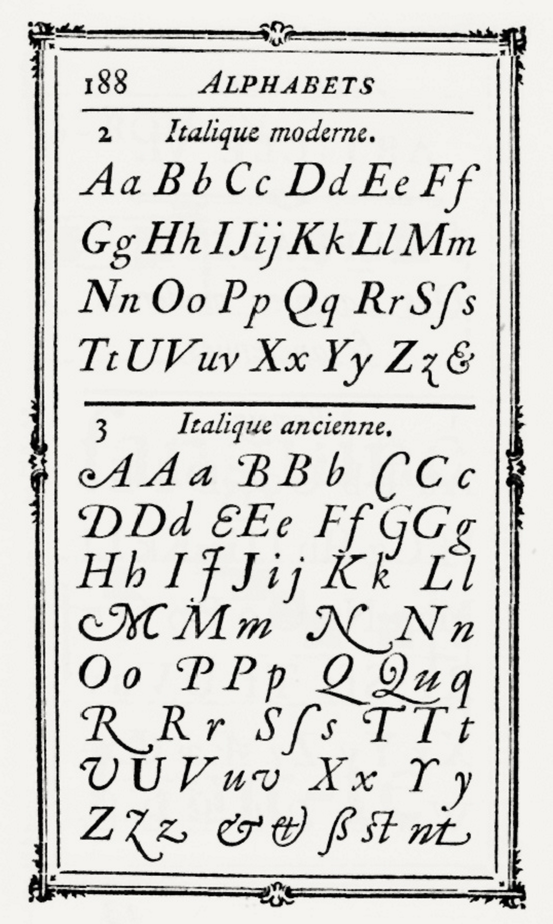
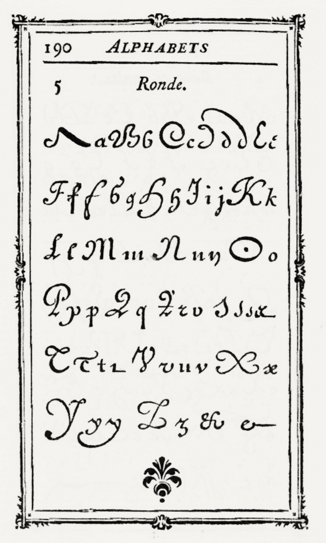
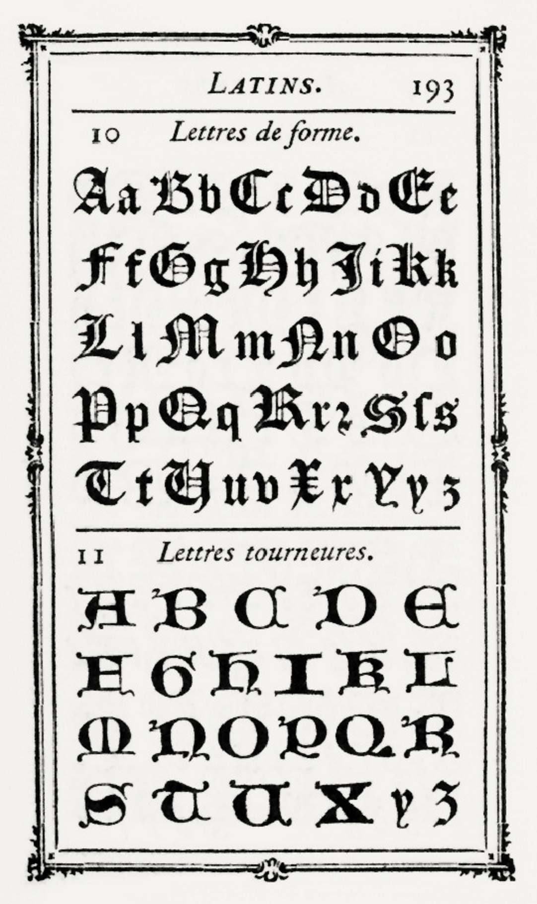
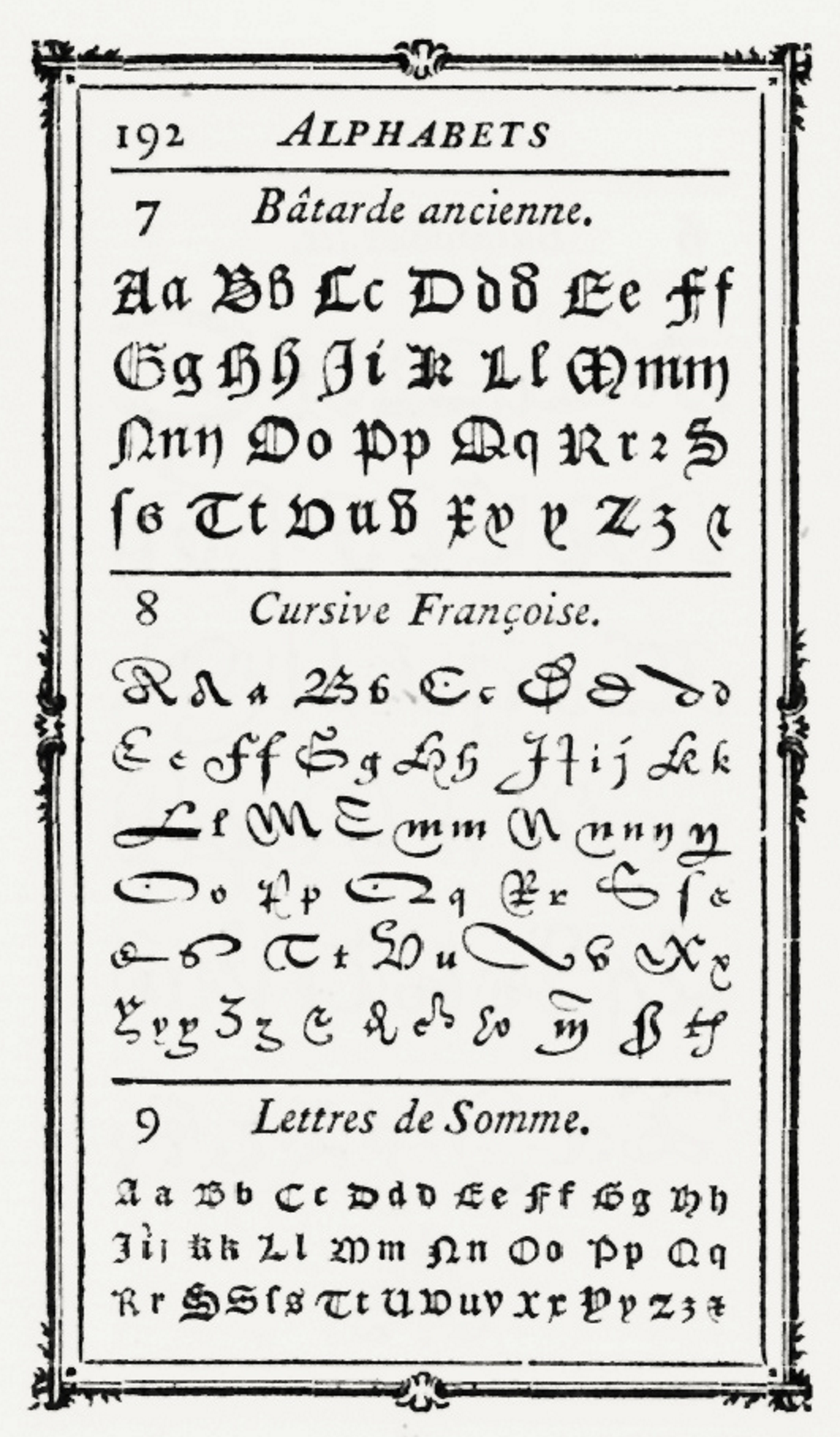
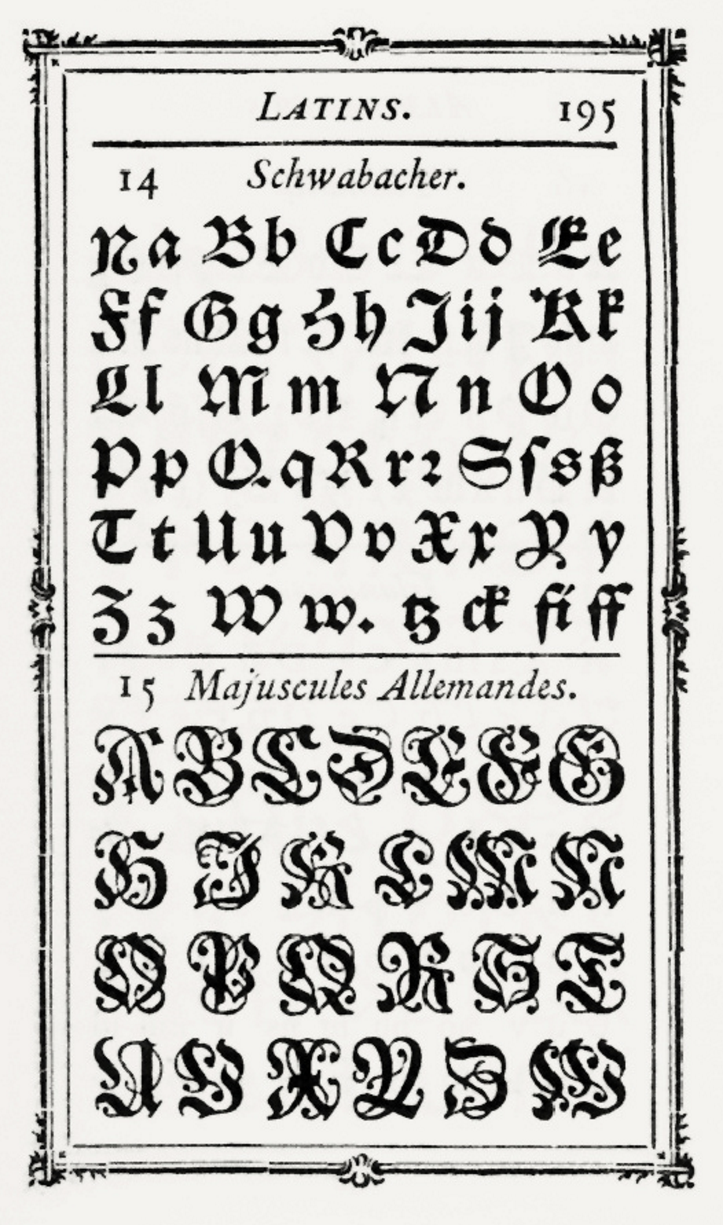
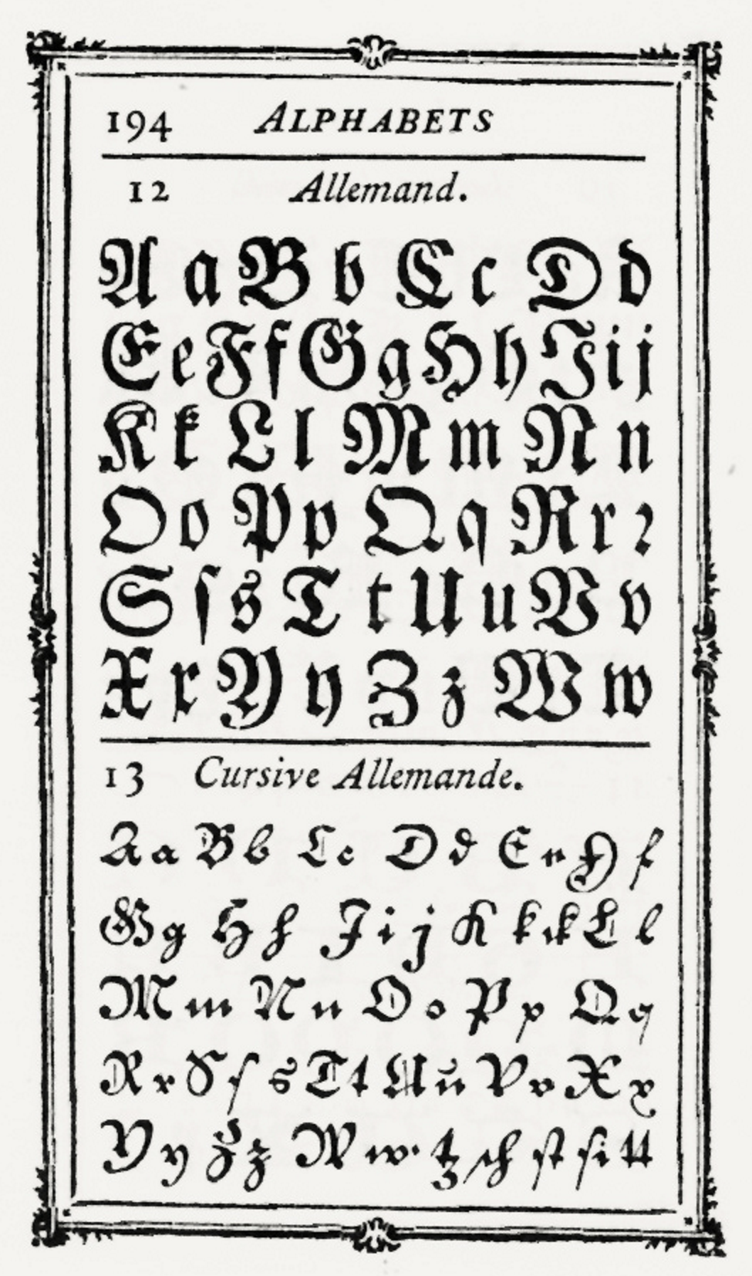
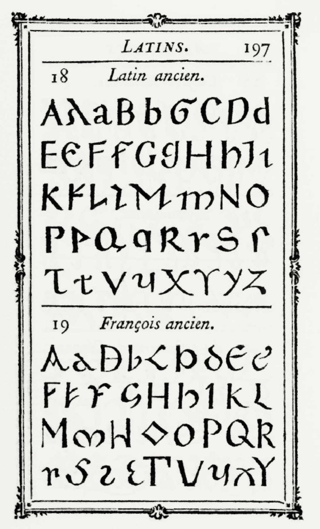
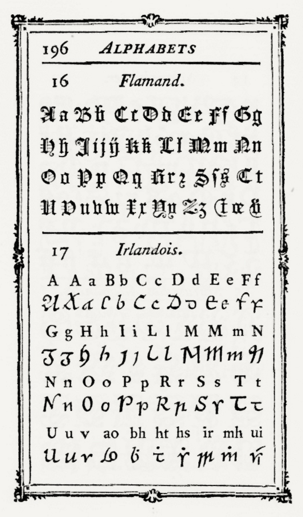
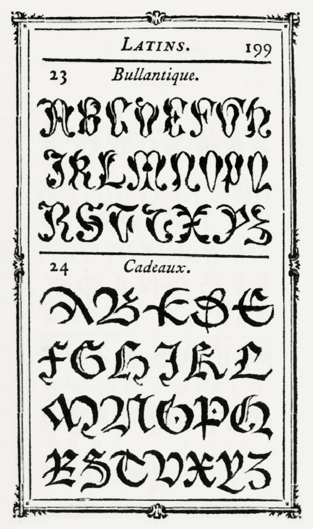
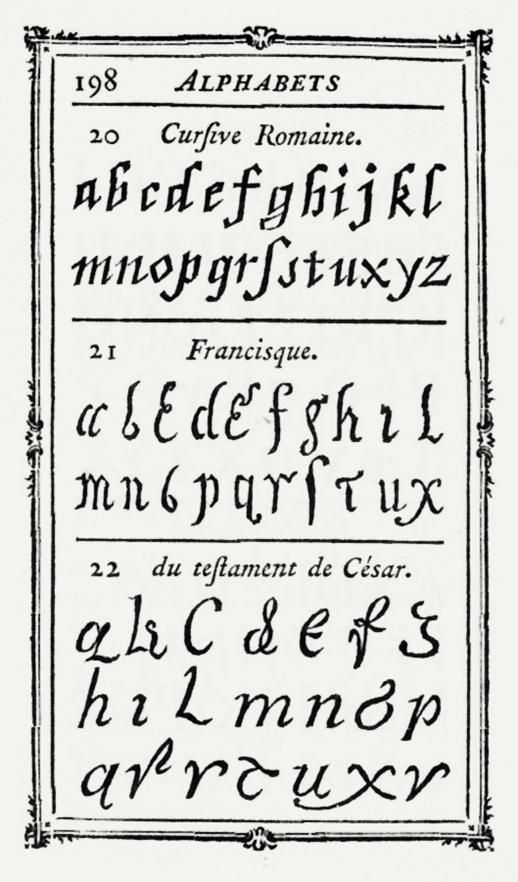
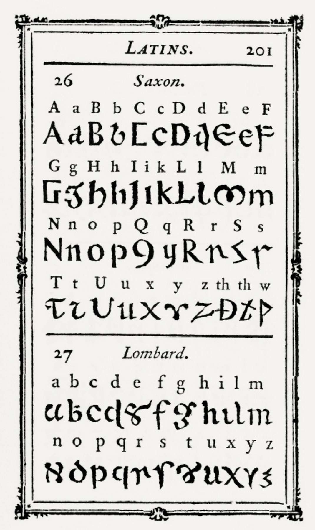
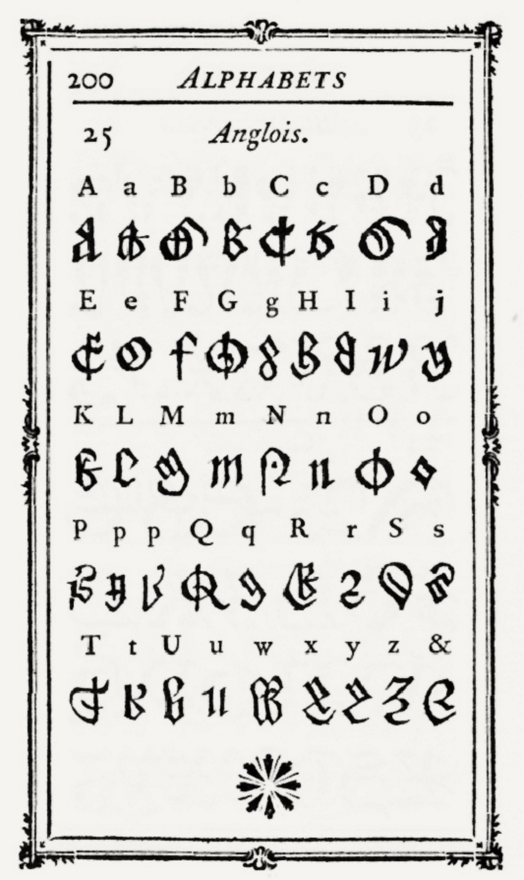
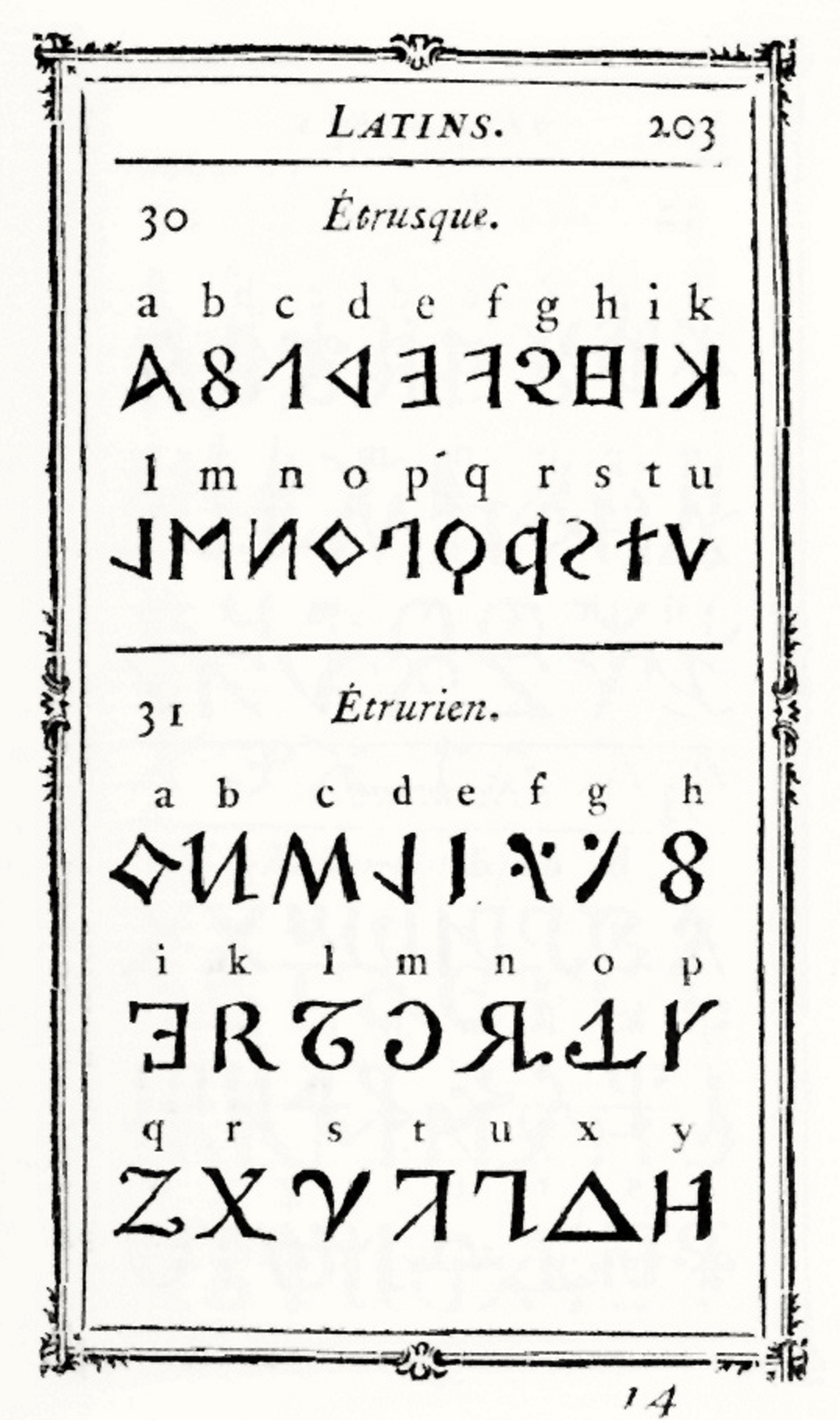
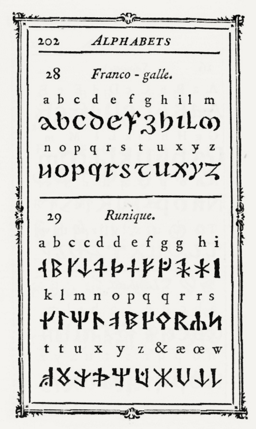
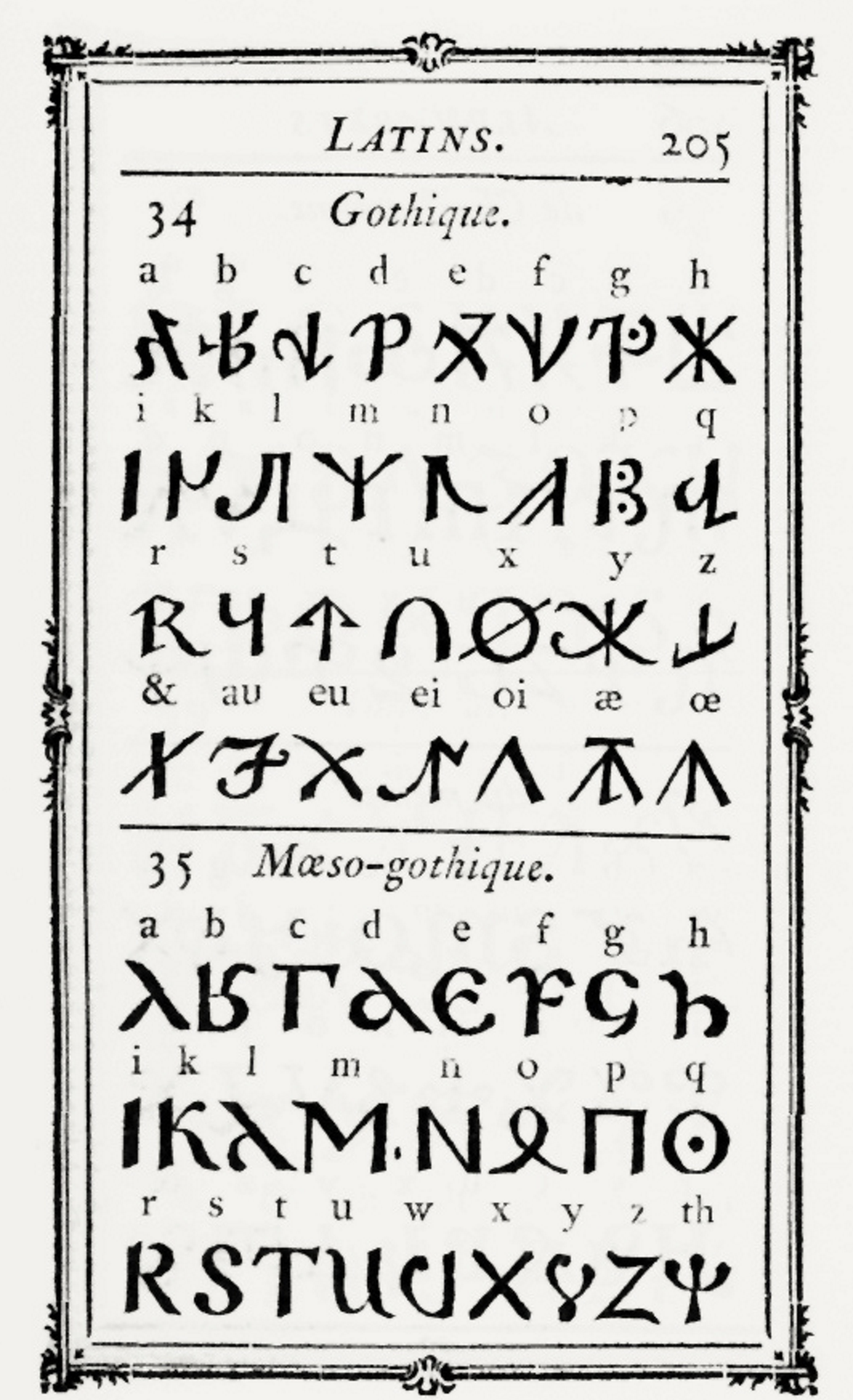
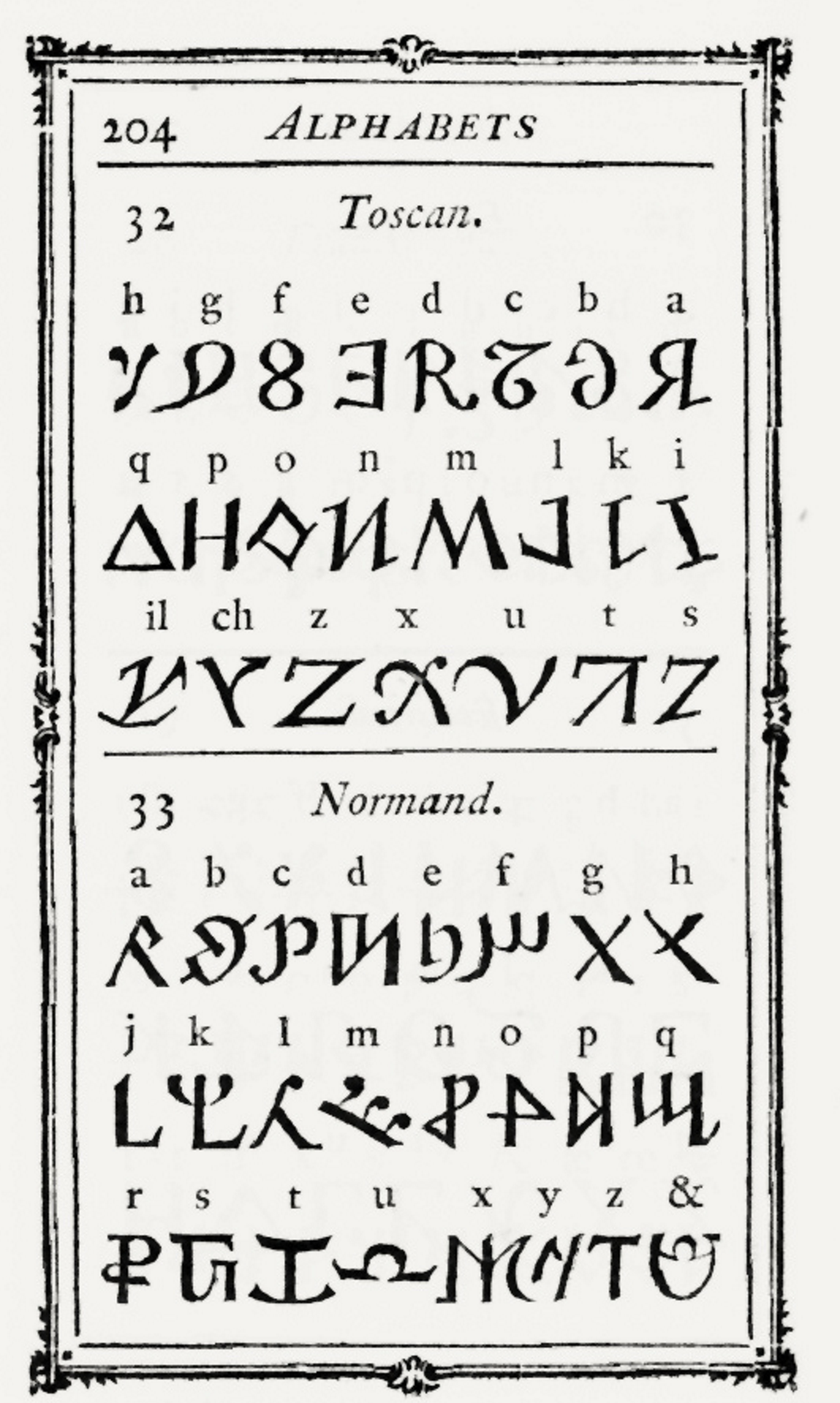
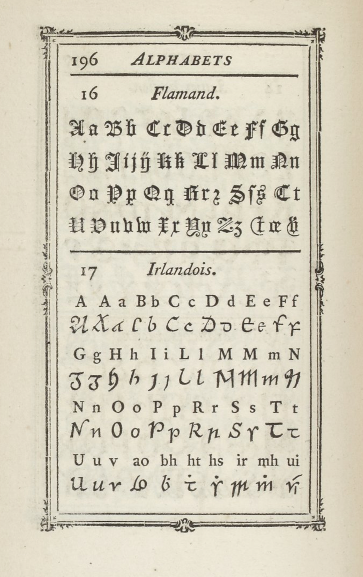
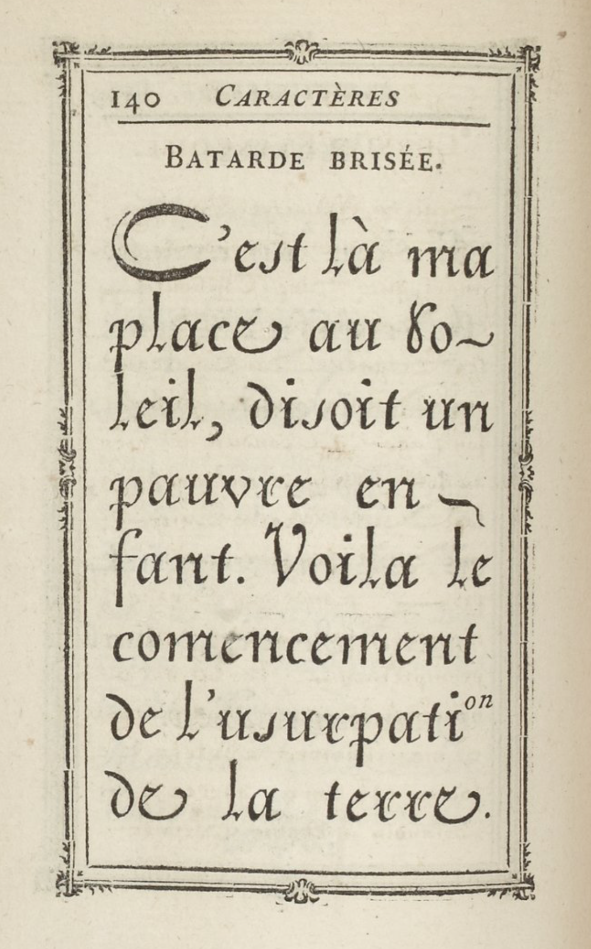
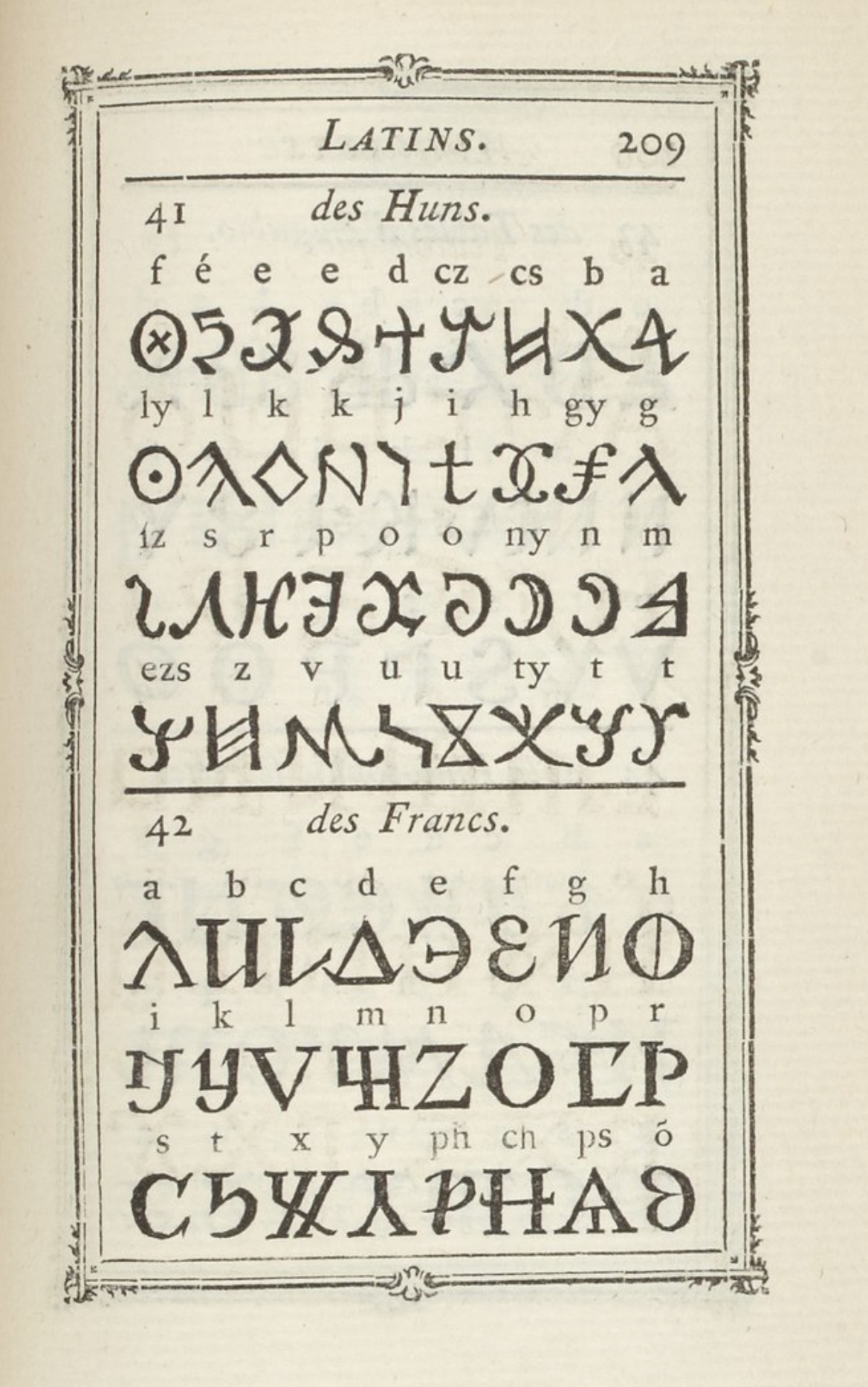
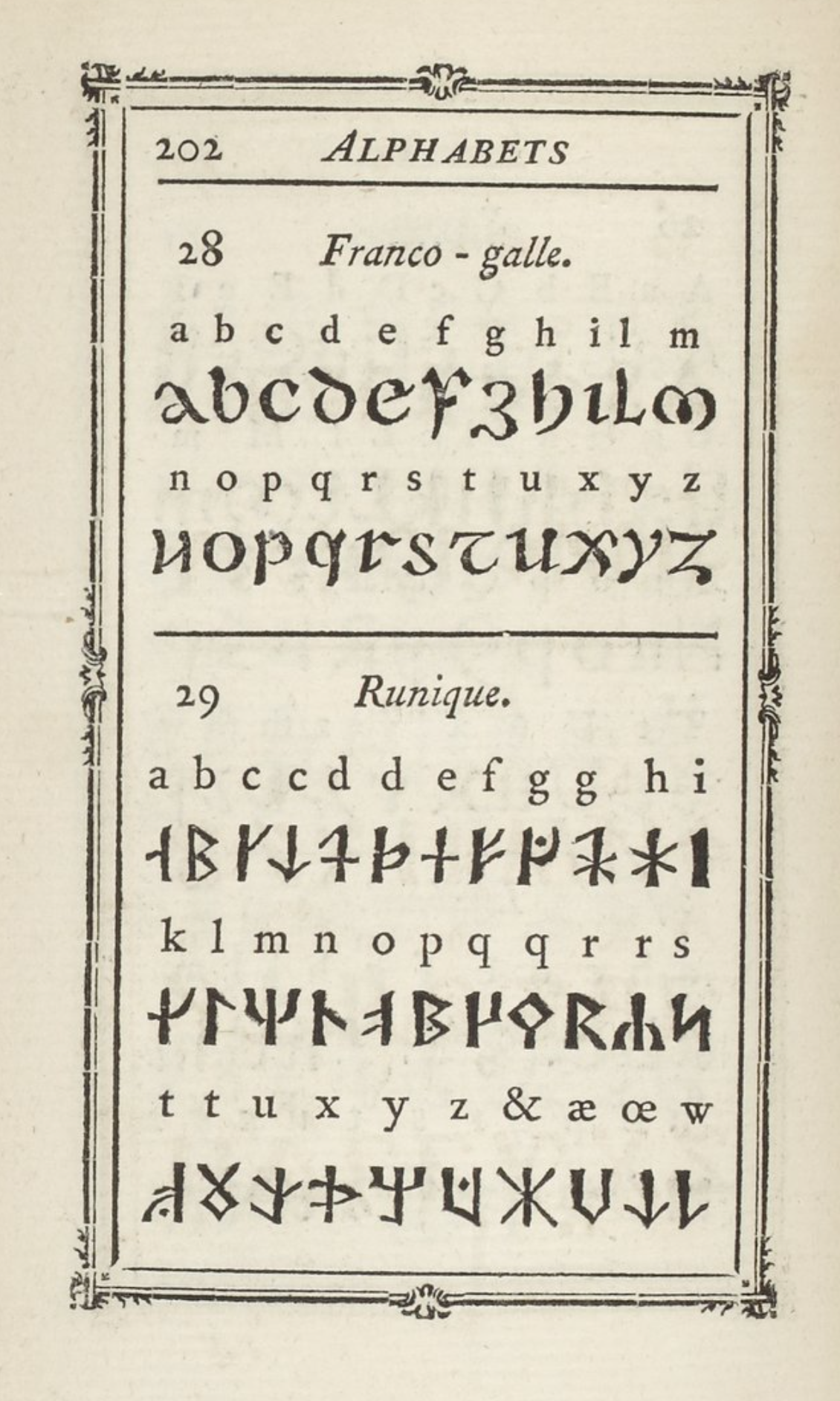
file name: Pierre Simon Fournier Manuel Typographiqiue 1764 Tome I I
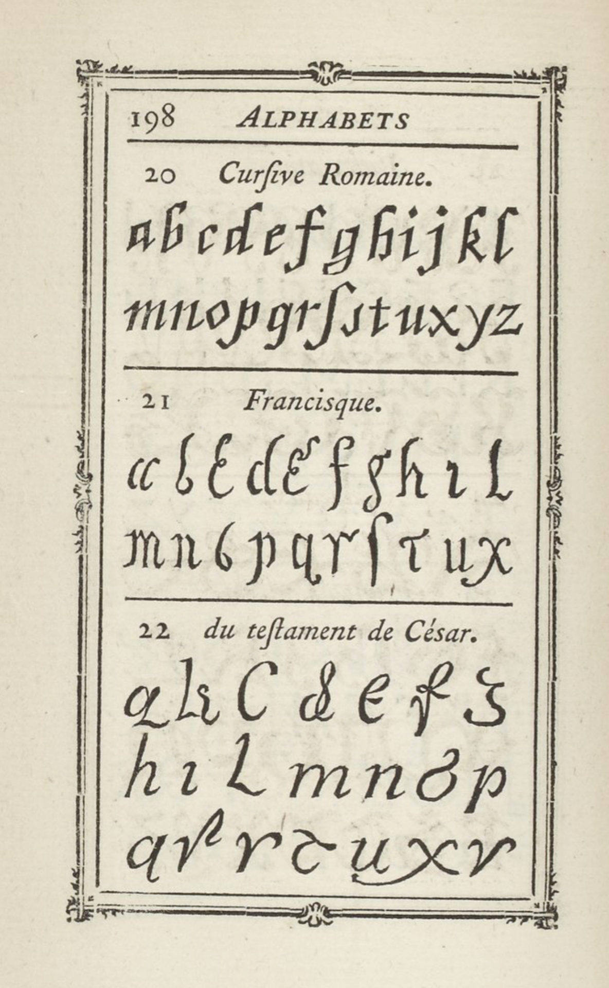
file name: Pierre Simon Fournier Manuel Typographiqiue 1764 Tome I I
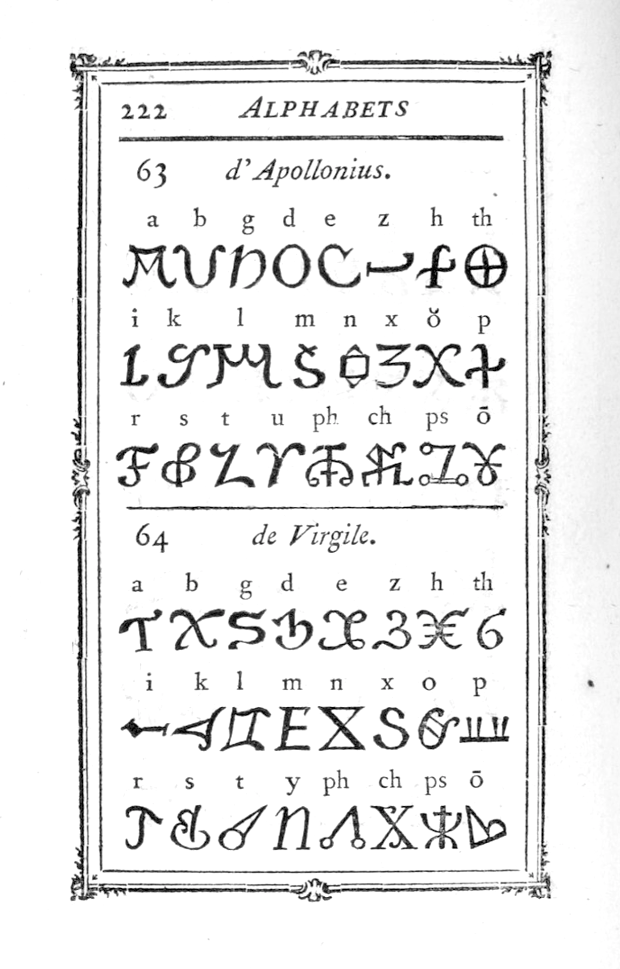
file name: Pierre Simon Fournier Manuel Typographiqiue 1764 Tome I I
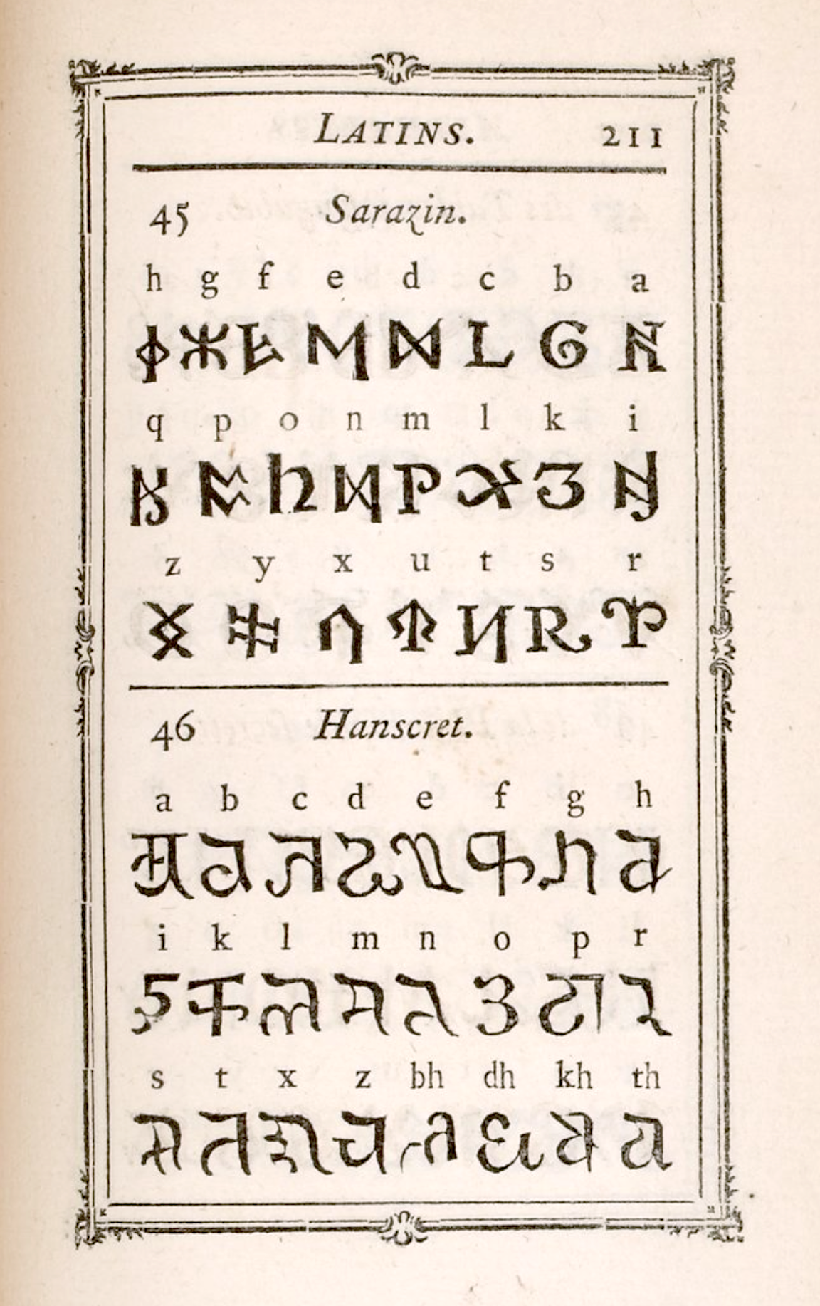
file name: Pierre Simon Fournier Manuel Typographiqiue 1764 Tome I I
file name: Pierre Simon Fournier Manuel Typographiqiue 1764 Tome I I
file name: Pierre Simon Fournier Manuel Typographiqiue 1764 Tome I I
file name: Pierre Simon Fournier Manuel Typographiqiue 1764 Tome I I
file name: Pierre Simon Fournier Manuel Typographiqiue 1764 Tome I I
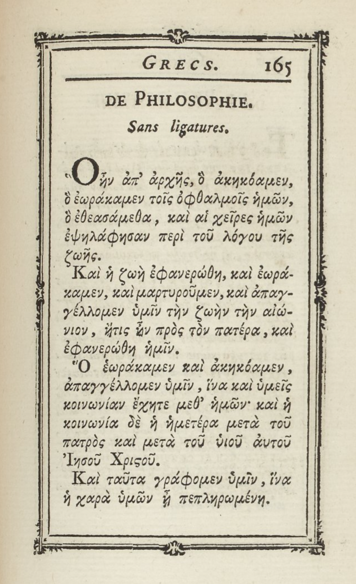
file name: Pierre Simon Fournier Manuel Typographiqiue 1764 Tome I I
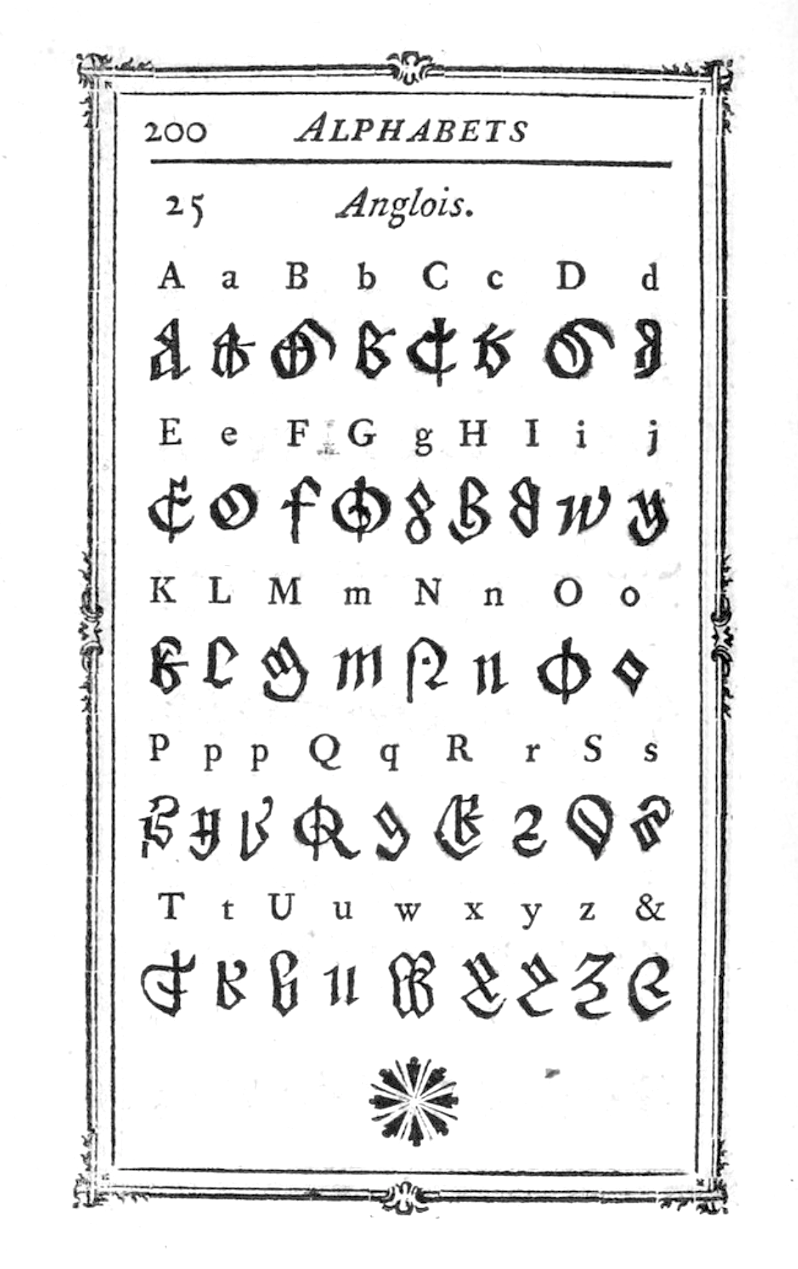
file name: Pierre Simon Fournier Manuel Typographiqiue 1764 Tome I I
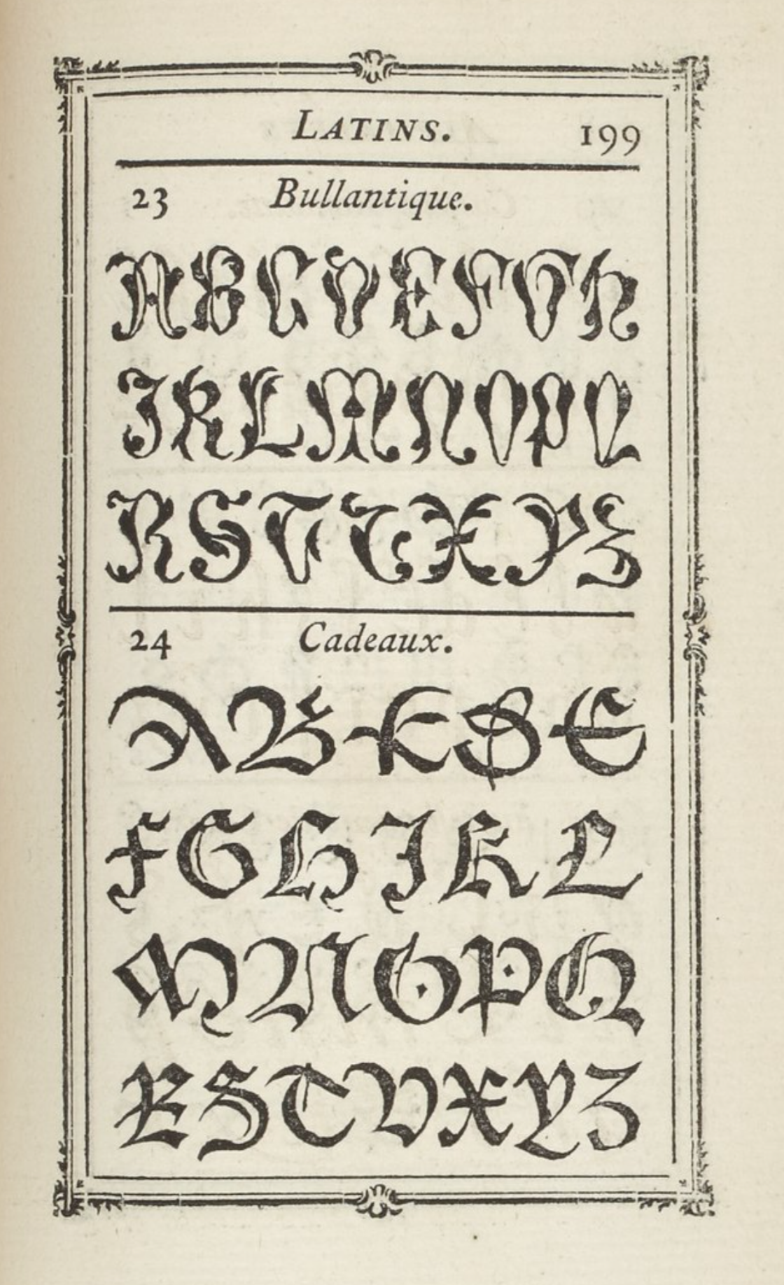
file name: Pierre Simon Fournier Manuel Typographiqiue 1764 Tome I I
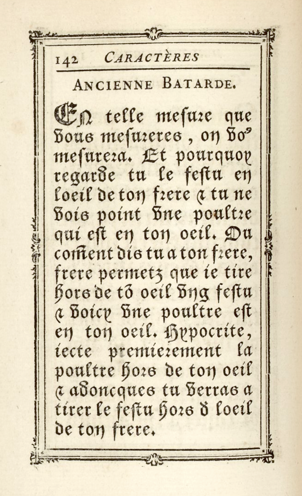
file name: Pierre Simon Fournier Manuel Typographiqiue 1764 Tome I I
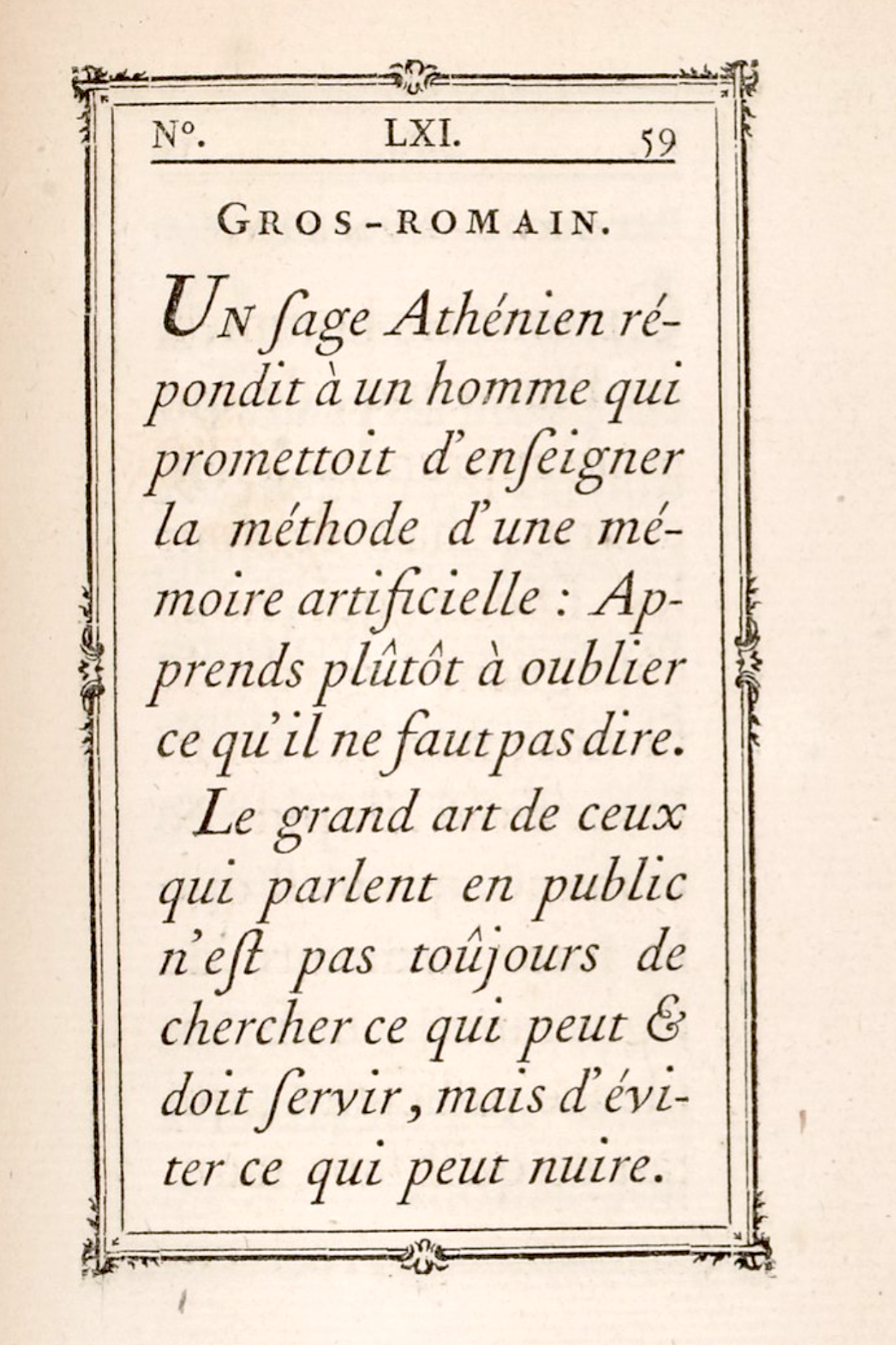
file name: Pierre Simon Fournier Manuel Typographiqiue 1764 Tome I I
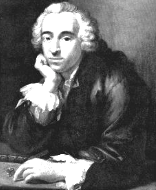
file name: Pierre Simon Fournier Portrait
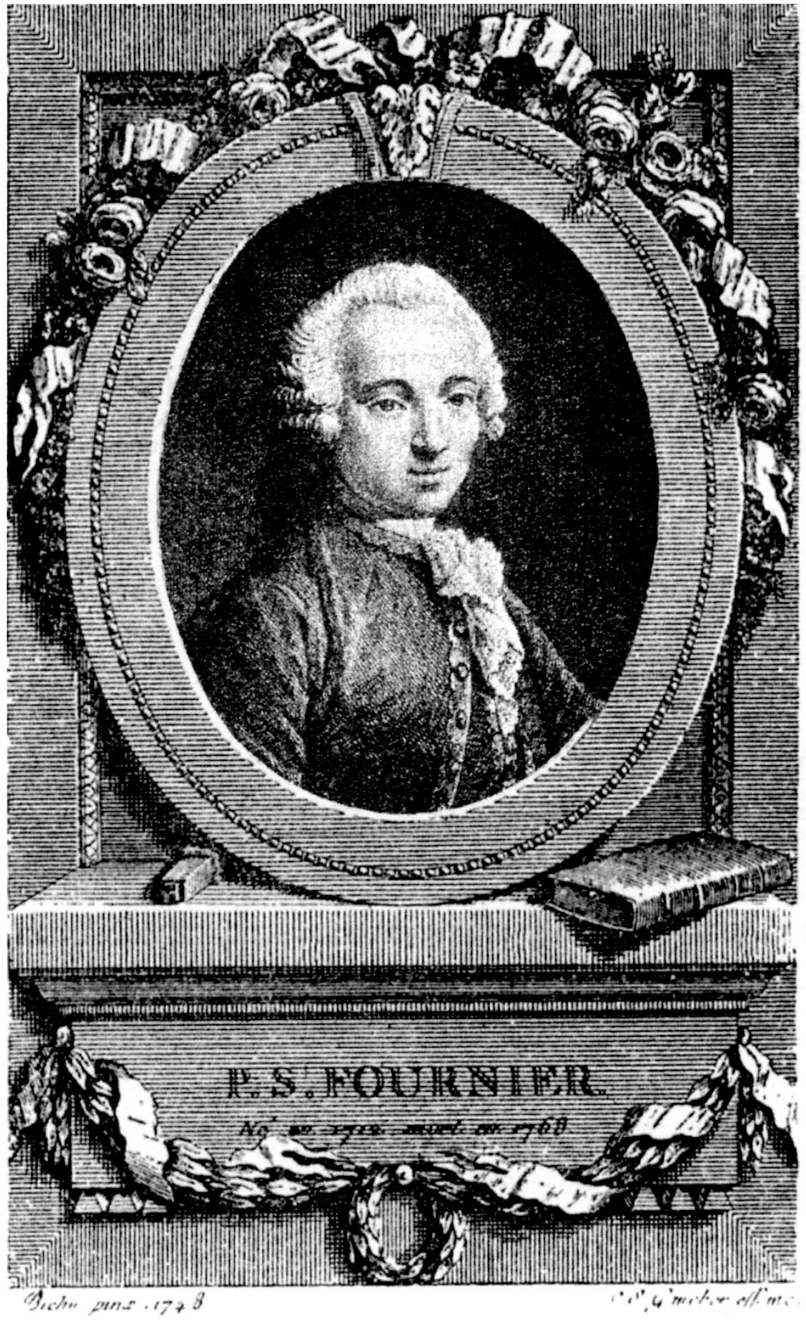
file name: Pierre Simon Fournier Portrait 1748
| | |
|
Luc Devroye ⦿ School of Computer Science ⦿ McGill University Montreal, Canada H3A 2K6 ⦿ lucdevroye@gmail.com ⦿ https://luc.devroye.org ⦿ https://luc.devroye.org/fonts.html |