TYPE DESIGN INFORMATION PAGE last updated on Sun Jul 12 12:10:46 EDT 2026
FONT RECOGNITION VIA FONT MOOSE

|
|
|
|
|
Font samples | ||
|
|
|
|

SWITCH TO INDEX FILE
| |
A brush-stroked type 1 font
| Glabbeek (1994) was brushed on paper, scanned in, and transformed into a type 1 font by a program written by Sandro Mazzucato for his M.Sc. thesis in 1995. Goetsenhoven was brushed on paper, scanned in, and transformed into a type 1 font by a program written by Sandro Mazzucato for his M.Sc. thesis in 1995. The highlighted points are control points for the Bezier curves. Random search in automatic font generation (1994) is an article by Luc Devroye and Sandro Mazzucato that describes the entire process. [Google] [More] ⦿ |
Printing is used for labels, menus, orders, blackboards and so forth. The font Overlaar-Bold was obtained from a sample created using a magnetic pen on a Summasketch pad. [Google] [More] ⦿ | |
| |
Yes, automated hinting is not ideal, but time restrictions force us sometimes to make shortcuts. I wrote an automatic hinter in PostScript which first identifies horizontal and vertical tangents on the outlines, and then matches close tangents of the same polarity to define possible locations for hints. It gives satisfactory hints for 92% of the characters. Shown here is the capital S of the URW font URWPalladioL-Roma. [Google] [More] ⦿ | |
Bernard Desruisseaux
| |
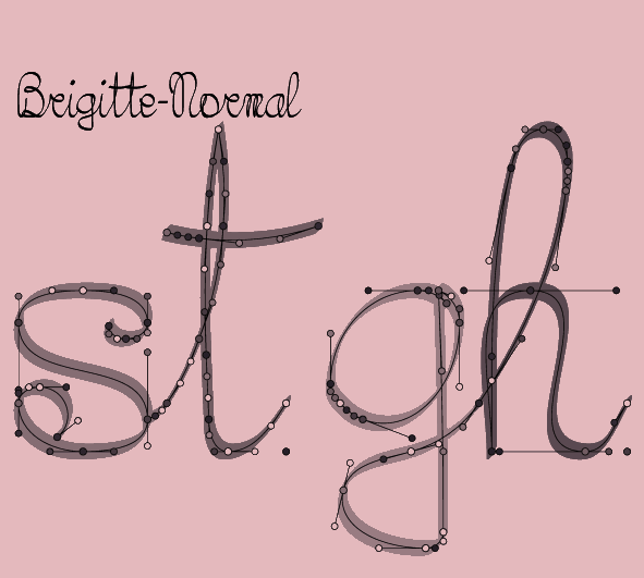
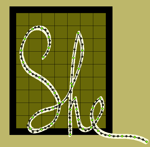
We have a battery of 12 fonts containing over 1400 characters, pairs and triples that can be fit together in interesting ways to simulate real handwriting. Shown is the "st" pair in the font Herpes. All were obtained with a magnetic pen and converted by a type 3 PostScript generator in which Bezier splines were calculated using Hobby's algorithm. Here is the triple "She" from the font PhthiriusPubis. [Google] [More] ⦿ | |
Fungus is a font family consisting of about 15 fonts with over 1600 glyphs representing single characters, pairs, triples, end-characters, end-pairs, end-triples, start-characters, start-pairs and start-triples. Words are broken up into collections of glyphs, and optimization of the break-up is done by a mechanism of rewards and penalties. Glyphs are strip-kerned on the fly and put together. The sample shows the constituent glyphs in various shades. The software was developed by Luc Devroye and Mike McDougall. [Google] [More] ⦿ | |
Oplinter is created from a sample of handwriting in which each glyph was stroked twice. The Bezier outlines were again produced by Sandro's program. The Bezier control points on the contour show how well Sandro's tracing program works on characters with many intersecting strokes. The character #. [Google] [More] ⦿ | |
Ken Sarowiwa was the Nigerian environmental activist who was muredered by the Nigerian government which was abetted by Shell in its crime. I drew this font a little while after his death. The font was drawn on a magnetic pad, and the stroke was captured and converted by an in-house program. Sarowiwa-Plume is the same font as in the previous example, but I put a different nib on the (virtual) pen. PostScript type 3. [Google] [More] ⦿ | |
| |
| |
The font shown here is called Wommersom made by Luc Devroye. It too was obtained from a scanned sample. The sample shown here was done directly in PostScript to show that fonts may be used in computer art. "Out creepy devil" is a permutation of "Luc Piet Devroye" suggested by Tom Shermer. [Google] [More] ⦿ | |
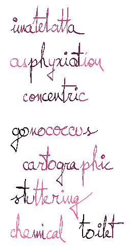
Janos Pach is one of the finest minds on this earth. A disciple of Paul Erdos, Janos makes the hardest things seem easy. And he explains his insights in a thick fountain pen. He left a sample at McGill, which we converted with Sandro's software in an admittedly imperfect font. Boris Aronov was going to send me suggestions for corrections, but he has not done so thus far. We obtained a sample written with a thick fountain pen when he gave a talk here at McGill, scanned it, and created a type 1 font by Sandro Mazzucato's software. The letter H shown here may not be the prettiest glyph, but one gets a good feeling for the smooth outlines that Sandro's oultline-optimization software leaves behind. [Google] [More] ⦿ | |
MetamorFont
|
|
Mike McDougall
| |
HeverleeOSF (1996) is my own handwriting when I am calm and serene (which is almost never). The type 3 font was obtained via the magnetic pen program of François Belair. Many characters were redrawn until I was pleased with the results. The letters OSF refer to the fact that this is an old style figures font. As with all the type 3 fonts I made, each typeface consists of Regular, Bold, Thin, and Black weights, a Small Caps collection, an Italic collection, and often an OSF collection. The sample was obtained by a special effect written directly in PostScript. [Google] [More] ⦿ | |
Gete (1994) is an old typewriter font based upon a typewriter I used when I was a boy. My mother had kept in the attic, and it still had a 20-year old dried out ribbon in it. Remington was the name of the machine. Here we approximated the contours by a minimal polygon that would correctly color each of the pixels in the original bitmap. Naive, but it works. Check also for OV29 in our download page. [Google] [More] ⦿ | |
Random fonts
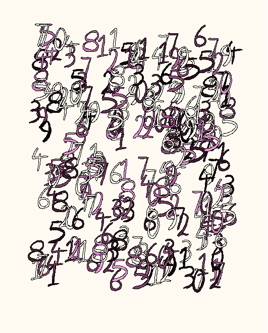
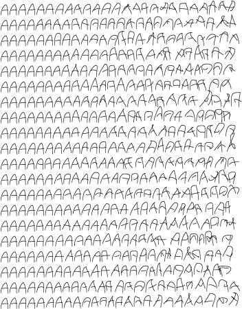
| Mike McDougall (ex-University of Pennsylvania Ph.D. student) created a random type 3 font called Tekla (1994) as an undergraduate student at McGill University, under the supervision of Luc Devroye. Tekla uses several handwritten samples as parents to create random offspring. Tekla's letters vary every time a character is needed. A type 3 font of unique versatility, Tekla may be used to simulate drunkenness, and, as the sample shows, varying degrees of instability on one page. His font has a "craziness" parameter, by which we could actually extrapolate beyond the convex polyhedron determined by the master fonts. It should prove useful in testing character recognition software. A companion article entitled Random Fonts for the Simulation of Handwriting has appeared in "Electronic Publishing" in 1995. See also here. Additional URL. [Google] [More] ⦿ |
I use Bost-Bold for envelopes. It was drawn on paper, scanned, and converted by the program of Sandro Mazzucato in a type 1 PostScript font. Quite legible. Here is how I made the previous figure of Bost-Bold by using various clipping paths in PostScript. [Google] [More] ⦿ | |
Sandro Mazzucato
| |
| |
I created a font with 256 spirals from various mathematical families: logarithmic, polynomial, exponential, and indeed many other spirals. These may be used to test the accuracy of printers. The font is Type 3 PostScript of course. The figure shows just a small subsample of the glyphs. [Google] [More] ⦿ | |
| |
Syed Hyder was one of the founders of the School of Computer Science at McGill University. At McGill, Syed, together with Olivier Maquelin and Amar Goudjil developed high-quality nonlinear context-sensitive Arabic fonts. One of the greatest hackers anywhere, Olivier wrote an in-house TrueType to PostScript converter in C in two afternoons. Paola Maleh and Laleh Tajrobekhar helped out with the programming for context-sensitive Arabic glyph placement. Laleh's brother in Iran, one of the leading calligraphers there, provided the team with wonderful Nastalique glyphs. A few years before his death, Syed tried to convince Microsoft to use his solution for automated Arabic glyph placement in their software, but no deal was struck. The project was then abandoned. Syed Hyder died in Pakistan on Easter Sunday, 2006. [Google] [More] ⦿ | |
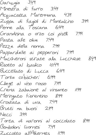
The menu shown here was done in Birke-New, a font I designed mathematically, without looking at any screen or using any font software. All Bezier control points were typed in individually. There was a moderate amount of PostScript hacking to make the characters connect in a neat way. The font was done in type 3 format. [Google] [More] ⦿ |
 With
With  With
With  An example of strip kerning: two characters are moved towards each other until strips covering the character end up at a given distance from each other. This is not ideal for kerning in general, but it is handy when setting large pieces of handwritten text. The kerning pairs are automatically generated during the generation of type 1 or 3 PostScript fonts. [
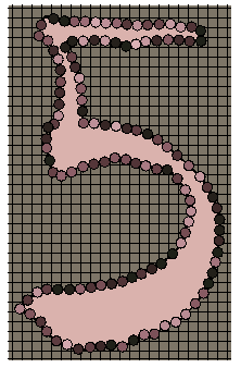
|
|
|
|