| | |
Alejandro Paul

|
 Designer who lives in Buenos Aires and who teaches graphic design and typography at the Universidad de Buenos Aires. He has worked as an art director in prestigious Argentina-based studios, handling high-profile corporate brands such as Arcor, Marta Harff, Morph, SC Johnson, Danone, and Movicom. He runs Estudio Paul. Professor at Facultad de Arquitectura, Universidad de Buenos Aires. Co-creator, with Apostrophe at Apostrophic Laboratory, of Usenet (2000), FontCop I through IV (2000) and the pixel font family Cayetano. Published the dot matrix font Stardust with T-26 in 2000. Designed the gorgeous font Elektora in 2000. He developed with Michael Lynch a 17-font Tennis set of grid-based pixel fonts. At Typeworx, he published Reflex (2002), a commercial 6-style unicase font family. Another web site by Alejandro. Cofounder of DAS, a design studio in Buenos Aires.
 Cofounder of Sudtipos (2003), where he does custom work and creates new typefaces. His work there includes Tierra (a titling face), Latinaires (2003-2018: originally called Latina Sans), Reflex, Downtempo (2003), Stardust and Mosaico (1999, pixel face). Still at Sudtipos, he digitized the beautiful handwriting/calligraphic typefaces by Angel Koziupa called Alma (2005), Murga, Habano and Tiza, which together with his script typeface Argenta (2004), Oxida (2005), the medieval script typeface Mama Script (2004, designed with Alfredo Graziani), Divina (2004, with Alfredo Graziani), and the sans family Kautiva (2004) can be bought via Umbrella Type. For children's orthography, he developed Estrada Hand, on commission for Editorial Estrada. He was working on the serif family Libertina (2004). Herencia (2004, a handwriting typeface done with Diego Giaccone), Grover (2004, slab serif), Milk Script (2004, with Alfredo Graziani), Mama Script (2004, with Alfredo Graziani), Politica (2004, a techno typeface with a very thin Thin weight) are at Sudtipos. The Bluemlein Scripts (2004-2005, Umbrella and Veer) are based on the calligraphic renderings of Charles Bluemlein, shown in a 1943 ink catalog: Miss Le Gatees, Mr Rafkin, Mr Keningbeck, Mr Lackboughs, Lady Dawn, Mrs Von Eckley, Mr Sheppards, Mr Dafoe, Mr Canfields, Mr Stalwart, Mr Sandsfort, Mr Leopolde, Mr DeHaviland, Mr Blaketon, Miss Stanfort, Miss Packgope, Miss Fajardose, Mrs Saint-Delafield, Mrs Blackfort, Mr Sopkin, Mr Sheffield, Miss Lankfort, Herr Von Muellerhoff, Dr Sugiyama, Dr Carbfred. (Note: Soft Horizon's Lainie Day (1993) is an earlier free font in the style of Lady Dawn and Mr Lackboughs). In 2011, that series was made available at Google Web Fonts. Sudestada (2005, Sudtipos) is a handwriting script developed with Diego Giaccone. Cuisine (2005, Umbrella Type) is an informal bold script. Mousse Script (2005, Sudtipos) is based on Glenmoy, a 1932 Stephenson Blake typeface. Suave Script (2005) is a 4am jazz bar script. Ministry (2005) is related in style but less funky, Chocolate (2005) is for sales ads, and Cenizas (2005, with Angel Koziupa) is straight from an old manuscript. Whomp (2006, Umbrella) was based on a partial sign-painting font by Alf Becker (1930s), and so was Buffet Script (2006, Sudtipos). Affair (2006, Umbrella) is swashy and calligraphic, while Candy Script (2007) and its italic version Sugar Pie (2011) are based on Argentina's market lettering. Galgo Script (2007) is a brush calligraphic font based on a design of Angel Koziupa. Burgues Script (2007) is an ornate calligraphic script based on the lettering of calligraphy teacher Louis Madarasz (1859-1910) (award at TDC2 2008). Burgues Script, Adios Script (2008: it won an award at TDC2 2009), Feel Script and Sugar Pie all won awards at Tipos Latinos 2008. Sinfonieta (2006) and Buffet Script are fifties style connected scripts. Feel Script (2007) is based on lettering that calligrapher and logo designer Rand Holub created in 1950 and that was subsequently captured in Intertype's typeface Monterey (1958). Some letterforms were redrawn from vintage American magazine ads (some by Holub himself), Cuisine (2008, food advertising script), Pronto (2008, comic book style, by Alejandro Paul and Angel Koziupa), Grover (2004, rounded sans family), Grover Slab (2004). Burgues Script, Adios Script, Feel Script and Sugar Pie all won awards at Tipos Latinos 2008. Calgary Script (2008, Umbrella) is a pure signpainting job. Accolades from all typophiles for his calligraphic wunderkind, Compendium (2008). The 2009 haul: Sugar Pie (signage font), Bravissima Script, Theorem (upright semi-script). Speaker at ATypI 2009 in Mexico City. The year 2010 starts off with a bang, five awards at Tipos Latinos 2010: a grand prize for Brownstone Sans, and four standard awards, for Semilla, Kewl Script (for food packaging and store windows), Calgary Script, and for Business Penmanship. Typefaces from 2010 include the baseball lettering typeface Fan Script and the tattoo script face Piel Script (piel=skin), which was influenced by Burgues Script and more remotely by showcard lettering by B. Boley (1930s, Sign of the Times Magazine). Piel Script won an award at Tipos Latinos 2012. In 2011, he and Koziupa made the fat signage typeface Aventura and Viento (a grunge version of their earlier 2004 face, Brisa). He added one retro connected signage font to the Filmotype collection in 2012, called Filmotype Kitten (original from 1955). Filmotype Zephyr (2012) is an italic roman formal script. Filmotype Yukon (2012) is inspired by the classic Palmer style of penmanship. Storefront (2012) is a swashy signage typeface based on an incomplete alphabet by Alf Becker. His signage script typeface Hipster Script won an award in the TDC 2012 competition and at Tipos Latinos 2012. Typefaces from 2013: Rolling Pen (a connected script that recalls the business penmanship genre), Bellissima Script (based on a copperplate calligraphic alphabet from Bellezas de la Caligrafía by Ramón Stirling, 1844). In 2014, he helped Panco Sassano, a lettering artist and illustrator from Mar del Plata, who designed the wide connected semi-calligraphic handwriting typeface Horizontes Script (Horizontes subsequently won an award at Tipos Latinos 2016). Still in 2014, he published the fat packaging or signage script Bowling Script, which is based on Freely Drawn Italic, a non-font alphabet by Ernst Bentele (1953). In 2015, Alejandro Paul, Yani Arabena and Guille Vizzari combined forces in the signage script typeface Quotes (Script+Caps) (2015, Sudtipos). Merengue Script (2015, with Panco Sassone) is a fun creamy script, ideal for pastry shops, tea rooms or supermarkets. Steak (2016) is a connected vintage signage script based on an Alf Becker design. Envelove (2017) is a script typeface family consisting of Script, Icons, and Caps, designed at Sudtipos by Yani Arabena, Guille Vizzari, and Alejandro Paul. Winner at Tipos Latinos 2018 of a type design award for Envelove. Still in 2017, Guille Vizzari and Alejandro Paul co-designed the great Moleskine notebook-inspired typeface family Proprietor. Proprietor comes in Script, Icon, Deco, Wide, Open and Roman styles. It won an award at Tipos Latinos 2018. Rigatoni (2017): A skyline didone based on mid-20th century example by Eugen Nerdinger. Bibliophile Script (2017). A pair of copperplate calligraphic typefaces. Fixture (2018: a 72-font grotesk family published by Sudtipos). Newbery Sans Pro (2018). A simple workhorse sans typeface family that is inspired by German industrial design and the lettering of Eugen Nerdinger. Winner at Tipos Latinos 2018 of a type design award for Tennis Set, Bibliophile Script, French Bulldog, Envelove, La Taqueria, and Speakeasy Set (a collection of (copperplate) script, sans, modern, flare and gothic substyles). From 2019: Hot Salsa (a retro brush script; with Ximena Jimenez), Old Letterhand, Clockmaker (arts and crafts style), Steak Script (inspired by an old alphabet by Alf Becker), Address Sans Pro (a sans family inspired by Butti and Novarese). In 2019, Alejandro Freitez and Claire Menager, under the art directoship of Alejandro Paul, designed the multistyle wood type look / Western / Victorian / reverse stress / hyper-decorative Presley Slab. Typefaces from 2020: Apothicaire (a wonderful quaint serif family in the frivolous didone genre; three variable fonts, 16 styles in all), Inglesa (a penmanship script), Dilemma, Dilemma Serif (Dilemma is a sans/serif type system with 42 styles; it is inspired by the anonymous Polyphème, Cyclopéen and Extra Condensé designs from the early 1900s at the Peignot Fonderie; two variable fonts are included), Sporty Pro (a large sports / athletics font family). Typefaces from 2021: Plethora (an 18-style family and two variable fonts that build on Julius Herriet's Old Style Ornamented for Bruce Type Foundry; Alejandro added various frills, ligatures, weights, exaggerating in true Victorian spirit), Magari (a fat face or Normande; Alejandro likens it to Italian classics of the 19th century though), Regional (27 styles, plus variable styles). Typefaces from 2022: Wienerin (a revival and expansion of Olympia (1929) by Carl Otto Czeschka, one of the members of The Wiener Werkstätte). [Google]
[MyFonts]
[More] ⦿
|
Alena Morgunova
|
 Aka Malena. Kharkiv, Ukraine-based designer of these typefaces:
 - In 2017: Grid and the dog-themed typeface Lovely Rustica.
- In 2018: Bright Gouache, Summertime (bitmap color font), Junior (bitmap color font), Stork, Malarstvo (artistic; inspired by the lettering of Ukrainian artist Vasyl Krychevsky (1873-1952)), the Latin / Cyrillic bitmap color font Happy Pencil, the color font Mosaic, Mosaik Black, and the brush font Plan Pen.
- In 2019: Little Monster (a bitmap color font).
[Google]
[More] ⦿
|
Amin Ebrahim Kamal
[Sughayer Foundry]
|
[More] ⦿
|
Andrew Pixel (was: Timm Design)
[Andrew Timothy]
|
 Estonian graphic designer who created these (mostly display sans or decorative serif style) typefaces:
 - In 2017: Heraldry (decorative caps), Spacious (sci-fi).
- In 2019: Orlande, Mjölnir (a runic or Nordic script emulation), Ravenstar, Cyber (a mosaic font), Carmina Burana, Great Glory (brush), Galileo (serif), Galilei (script), Living Dream (font duo), Marie (sans), Curie (script), Pomino (a tall stylish serif), Chara (Sans+Serif), Moccha (Sans+Serif), Turin (Sans+Serif), Torres, Rustic Jack, Alchemy, Bushel (a spurred Tuscan typeface), Misty Meadow, Fiver (prismatic), Heleen Script, Xavier, Saint James, Vernazza (a condensed sans/serif pair), Torres (a free sans and Slab pair).
- In 2020: Tiny Twig, Claro, Grove, Black Echo, Porto, Reval, Decora (geometric, art deco), Laura, Crasus, Cecilia Octavia, Rosalia, Boutique Serif, Flora, Magic Spell, Flare, Starglow, Sunday Sunshine.
- In 2021: Alfa (sci-fi, stencil), Beauté.
- In 2022: Polygon (triangulated), Verdant (a foliated font), Freco (a wedge serif), Wild Dreams.
Envato link. [Google]
[More] ⦿
|
Andrew Timothy
[Andrew Pixel (was: Timm Design)]
|
[More] ⦿
|
Arkadzi Laurukevich
|
Designer in Vilnius, Lithuania, who graduated from the European Humanities University. Creator of the elegant tiled typeface Mosaic (2012). [Google]
[More] ⦿
|
Arrow Type (or: Typefloundry, or: Recursive Design)
[Stephen Nixon]
|
 Stephen Nixon (b. South Dakota) was an undergraduate student at the University of Minnesota in the Twin Cities. After that, he moved to New York City to work as a product designer at IBM. There, he focused on visual design & UX for software products, then moved into brand experience design within IBM Watson. Stephen lives in Brooklyn, NY, where he operates Arrow Type, taking on freelance type design & development work. In 2018, he graduated from the TypeMedia program at KABK in Den Haag. He runs Arrow Type. Since 2021, Stephen Nixon is font engineer at The Type Founders in New York. His typefaces:
 - The free angular text typeface Killam (2012).
- His KABK graduation typeface, Recursive (Mono, Sans), released in 2018. He explains its multiple uses: Recursive Mono & Sans is a variable type family inspired by casual script signpainting and designed for better code & UI. In programming, recursion is when a function calls itself, using its own output as an input. Recursive Mono was used as a tool to help build itself: it was used to write Python scripts to automate work and generate specimen images, and it was used in the HTML, CSS, and JS to create web-based proofs & prototypes. Through this active usage, Recursive Mono was refined to be not just warm, but also deeply useful for all-day work. Recursive Sans borrows characters from its parent mono but adjusts many key glyphs for comfortable readability in text. Its metrics are superplexed---glyphs take up the same horizontal space across all styles. As a 3-axis variable font, this allows for fluid transitions between weight, slant, and expression (casual to strict letterforms), all without text or layout reflow. In turn, this enables new interactive possibilities in UI and makes for a uniquely fun typesetting experience. This typeface was followed by Recurso Sans (2019; free at OFL). Github page where we learn that contributors besides Stephen Nixon include Katja Schimmel, Lisa Huang and Rafal Buchner. In 2019, these authors published Recursive as a variable font with five axes---mono, casual, weight, slant and italics. Dedicated page. Google Fonts link.
- He contributed a variable font version to Nikita Prolopov's Fira Code.
- Name Sans V2 was published by Future Fonts in 2020. Name Sans is a modern interpretation of the tile mosaic name tablets of the New York City subway.
- Lang Syne (2021). A semi-slab family derived from grave carvings in the Green-Wood Cemetery of Brooklyn, NY.
Fontsquirrel link. [Google]
[More] ⦿
|
Ashley Breunich
|
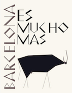 Graphic designer in New York City, who created a font based on the mosaics of Gaudi called Barcelona (2012). It was used in an imaginary rebranding of that city. [Google]
[More] ⦿
Graphic designer in New York City, who created a font based on the mosaics of Gaudi called Barcelona (2012). It was used in an imaginary rebranding of that city. [Google]
[More] ⦿
|
Barmoor Foundry
[Tracy Sabin]
|
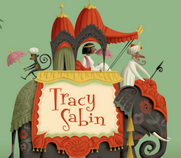 Barmoor Foundry showcases handcrafted and script fonts created by Californian illustrator Tracy Sabin. Typefaces from 2016: Lechlade (inspired by the handwriting of the great British pen and ink artists Edward Lear, John Tenniel, E. H. Shepard and Edward Ardizzone), Antibes.
 Typefaces from 2017: Barmoor (inspired by Garamond), Nobbin (a quirky children's book font used in the book Nothing To Do). Typefaces from 2018: P22 Muschamp Pro (P22: midway between a beatnik type and a curly vampire script). Typefaces from 2019: P22 Schneeberger (a curly and playful handcrafted typeface family). Sabingrafik link. Typefaces from 2021: P22 Torrone (an art deco script). P22 link. [Google]
[MyFonts]
[More] ⦿
|
Ben Schumitz
|
During his studies at Kendall College of Art and Design, Grand Rapids, MI-based Ben Shumitz created the display typeface Mosaic (2015). [Google]
[More] ⦿
|
Blake Haber
|
Santa Barbara, CA-based designer of the freeware fonts Printer's Ornaments, Matador, Isla Bella, Taco Salad (1994), ItalianMosaicOrnaments, and Muddy's Water. Blake Haber is married to Michelle Dixon, who runs the foundry Dixie's Delights. Fontspace link. Dafont link. [Google]
[More] ⦿
|
Brandice Baggarley
|
 Graphic designer in Yakima, WA, who created Mosaics in 2015. [Google]
[More] ⦿
Graphic designer in Yakima, WA, who created Mosaics in 2015. [Google]
[More] ⦿
|
Bruna Mix
|
Illustrator and art director in Recife, Brazil, who created a typeface out of moving light called Typo Photografic (2013), and an untitled mosaic font in 2013. [Google]
[More] ⦿
|
Camilia Busarello
|
Graphic designer Camilia Busarello (Florianopolis, Brazil) was inspired by the mosaics of Rodrigo de Haro when she created the broken piece font Alexandria (2011). [Google]
[More] ⦿
|
Carolina Monaco
|
Rome, Italy-based designer of Giotto (2016), a school project typeface based on the Angela di Giotto mosaic. [Google]
[More] ⦿
|
Darelle Teau
|
During her studies at the Yoobee School of Design (Auckland, New Zealand), Darelle Teau created Bohemian (2013), a mosaic-inspired ornamental caps typeface. [Google]
[More] ⦿
|
Derek Vogelpohl
[ShyFoundry (was: ShyFonts)]
|
[MyFonts]
[More] ⦿
|
Design Culture (was: Cubanica Fonts)
[Pablo A. Medina]
|
Pablo A. Medina designs all fonts at Cubanica Fonts in New York. He is a Communication Design professor at Parsons the New School for Design and lives in the East Village of New York City. He has also taught at Maryland Institute College of Art. MyFonts page. Cubanica became Design Culture in 2016. Cubanica fonts: - 24hrs.
- Calaveras (2011). Based on a signage style in Buenos Aires called Fileteado.
- Cuba (1996). A 3d signage typeface based on a sign for the restaurant La Flor de Cuba on Bergenline Avenue in Union City, New Jersey. It evokes of hand-painted signs on glass.
- Dekalb (2017).
- Diablitos (2011).
- First Avenue (2000). Based on an old metal neon sign, it was first published at Plazm.
- Imbalance (2002). An experimental sans.
- Marquee.
- Medina Gothic (2005). A clean sans family.
- North Bergen (1996). A vernacular sans.
- Sailor Gothic (2003).
- Sombra.
- Vitrina (1996). A connected signage typeface first published at Plazm.
- Union Square. A bold stitching font, and at the same time a nice homage to the mosaic typography in the New York subway system.
Klingspor link. View Cubanica's library of typefaces. View Pablo Medina's typefaces. [Google]
[MyFonts]
[More] ⦿
|
Digital Typeface Studio (was: Evas Unique Fonts)
[Eva Barabasne Olasz]
|
 Aka Eva Barabas, and as Digital Studio. Ireland-based designer of Zenfyrkalt (2015, decorative textured caps), Papyrus EBO (2015), and Cirkus (2015, curly font).
 In 2016, she designed Kristaly (connected script), Rubican (connected script), FlypFlop (thin connected script), Dingfleur (floral dingbats), Dingsprinkle (ornaments), Lacy (textured), Coalpen, Digi Stamps One (flowery ornaments), the textured typefaces Leaffy (decorative caps) and Hyppolit, the ornamental typeface Zending, Karykas, the curly script Pyktor, Symca, Dood Leafs, Pypats, the textured typeface Zensyrom, Doodlowers, Doodletters, Woodys, the stylish display typeface Lynzer, the curvy Roucorns, the sans typeface Dyane, the pendant typeface Proxanys, the display typeface Chowes, the bubble-themed Amydor, the textured typefaces Sanzen and Bubbles, the sketched typeface Stone Story, the handcrafted Clarissa, Cally Script and Sanlabello, the mask dingbat font MaskbyEBO, the curly decorative all caps typefaces Zsylett and Zsynor, Rythmus and Popcorn. Typefaces from 2017: Maudlyn (script), Hakyt (script), Atyla (script), Welga, Bynda (script), Kylets (script), Martyn (script), Balton (handcrafted), Zengo (ornamental caps), Chyga (Victorian, curly), Geryta, Leafyction, Edyra (textured caps), Simpla (textured caps), Digidon (textured caps), Trefay (calligraphic script), Fonix (textured caps), Haloven (Halloween font), Sylabus, Icing Cookies, Clarissa, Floryan (floriated caps), Flory Anna, Nebulo, Storyteller (floriated didone), Mandings, Zenyth, Beadwork, Eszty (calligraphic), Divat, Kahir (exquisite decorative caps), Zen3, Moaren (sketched), Moare (fingerprint texture), Stone Story (textured), Stampy, Wyllam, Dyane (sans), Manuell (a heavy display didone), Labrint (textured), Zenone (textured decorative initial caps), Zensyrom (textured caps), Marmelad, Filigran (a textured didone), Chamylle (leafy font), Balloony (comic book style), Bemydor (textured caps), Eggshell Mosaic (textured caps), Portabell (textured caps), Stampy Light (outlined shadow typeface), Tendrils (textured caps), Retrograph (textured caps), Digizen (textured all caps typeface). Typefaces from 2018: Lamor (heart-themed textured caps), Zentyp (decorative textured initials), Square Frames, Seamless Patterns, Tiptak, Adetar, Seryfan, Blysher, Katalyn, Agrifan, Bokretan, Hebydia (calligraphic), Westyler (script), Pepitas, Sthencyl (script), Bykars (curly), Hegran (Victorian, with curls), Monogram Framer, Grafyk, Orhydea (upright script), Denka (textured caps), Dathyn, Agrish, Olyber, Sayes Script, Layers (with snowy TV screen texture), Dafodyl, Rubynt, Ofaly, Gudlak, Natyl, Vytorla Mix (curly script), Gaby, Kiraly, Meybi (heart script), Sofye, Emryt, Vytorla, Sybelia, Alyfe, Bigdey, Amagh. Typefaces from 2019: Gitar, Feba, Arthegos (script), Quilty (script), Trinyta, Lyra (textured caps), Astoria, Judyth, Artopyl, Stokyt, Janzen (tribal texture caps). Typefaces from 2020: Storyk (script), Pegro Stencil, Framed Monograms, Beprity Stencil (a script), Direkt Stencil, Dings, Sati, Hapyster, Stager, Lathyn, Welga, Agrifan, Atyla, Hegran (curly Victorian), Orhydea (a rabbit ear script), Dyobar (a stencil font), Cytar, Valtin (decorative caps for Valentine's day). Creative Market link. Creative Fabrica link. [Google]
[More] ⦿
|
Ding Bang
|
 Designer of the free sports logo or children's scanbat typefaces LFP (2014), NCAA The Americans (2014), NHL East (2014), MLS East (2014), NHL West (2014), MLS West (2014), MLB NL (2014), NFC (2014), Disney Family 1 (2014), NBA West (2014), NFL AFC (2014), MLB AL (2014), NBA East (2014), NCAA Big 10 (2014), Mosaic Sone (2014) and Black Hoops (2014). In 2014, he also made the dingbat fonts Shrek, Thanksgiving Day, Thanksgiving Turkey, MAC, C-USA, Christmas, New-year, Santa, Winter, Xmas-Gift, xmas-tree, Premier League, Calcio, SEC, Pac 12, NCAA ACC, Ligue 1, Disney Halloween, Halloween Logo, Autumn, Monster High, Bundes Liga, Big 12, Halloween Happy, Halloween, Finest, Pixar2, Pixar1, Shades of Grey [scanbats related to the movie 50 Shades of Grey], Princes and Summertime, and the dot matrix typefaces LED Bus and Black Ball.
 Typefaces from 2015: Famous Car 1, Brasileirao, World Cup Logos, Ancient Weapons, Guns 2, Helmets, Cowboy, Horses 1, Fast Food Logos, Guns, Olimpic Icons 1, Winter Sport, Peppa Pig, Mickey Vintage, Proton Style, Sun Belt, MWC, King Lion, Social Manual. Typefaces from 2016: Tender Puppies, Flags of Europe (1 and 2), Lucas Characters (scanbats). Typefaces from 2017: Men's Clothing, Computer Icons, Wifi, Cats. Typefaces from 2018: Christmas Ornaments. Typefaces from 2020: Justice League, Summer Pool, Sonico, Farm, Sapce, Pupies (sic). [Google]
[More] ⦿
|
Dixie's Delights
[Michelle Dixon]
|
 This used to be a wonderful page, but Michelle Dixon seems to have retired from the font making business. There used to be five shareware dingbats fonts: African Ornaments One, Cave Painting Dingbats One, Mayan Dingbats, Pre-Columbian Ornaments One, and Printers' Ornaments One (Mac PS), plus about 45 other original fonts (not shareware). In her wonderful collection, the following of Michelle Dixon's creations stand out: Arrighi Copybook, ItalianMosaicOrnaments, Beautiful, LondonHouse, Love Letter Typewriter, Gaudy Medium, Rusty Nail-Medium (the last four are all old typewriter fonts), and the display fonts Isla Bella (art nouveau), La Negrita, Arty Nouveau, Victorian, Art Nouveau Fonts, Bad Dog-Black, Berlin, Caslon Frenzy, Dixon's Vixens Caps, AntiqueMonoTW, DangerousTypoWriter, Elegant Nouveau Initial Caps, Fruitbasket, Matador, Manhattan, Modern Scribe, Ovid, Spillage, Tacos, Tolstoy, Typewriter, Love Letter, Basketcase, ChiliPepperDingbats, Postage Stamps, Garish Monde, Taco Modern, and Beautiful Ink. All fonts are between 5 and 30 dollars a piece, but often there are four fonts per face. In August 98, the absolutely gorgeous calligraphic font Beautiful Ink became available as a 10USD shareware font in Windows TrueType. Many designs are by Blake Haber, who is Michelle Dixon's husband. Located in Santa Barbara, CA.
 Dafont link. Alternate URL. [Google]
[More] ⦿
|
Emanuele Hueller
|
London, UK-based designer of the square-shaped typeface Mosaic (2019). [Google]
[More] ⦿
|
Empty Page Studio
[Lukasz Kulakowski]
|
Lukasz Kulakowski, a Polish graphic designer in Dublin and Baile Atha Cliath, Ireland, created the free typeface Mosaic Leaf (2011), which was inspired by Akzidenz Grotesk typeface. In 2012, he published Orbits (a prismatic multiline face, done with Zbyszek Czapnik). Typefaces from 2013 include the free display typeface Rhubarb Display Font (a condensed art deco sans caps family for Latin and Cyrillic done with Zbyszek Czapnik). In 2014, he created the tweetware font Christmas Time. Emptypage Studio is presently located in New York City. [Google]
[More] ⦿
|
Eva Barabasne Olasz
[Digital Typeface Studio (was: Evas Unique Fonts)]
|
 [More] ⦿
|
Everythinks
|
 Design and corporate identity studio in Lisbon. Creators of the elegant sans headline typeface Caixa Alta (2013), the stencil typeface Caffein (2011), Beedrones (2011, hexagonal), Ink (2012, a heavy brush face), Ecotour Portugal (2012, brush face), Lusofonia (2012, a decomposable typeface), Arte No Feminino (2012, a mosaic typeface), Ponte Romana (2012, a thin avant-garde wine label typeface).
 Behance link. [Google]
[More] ⦿
|
Fanni Horvath
|
Illustrator from Sopron, Hungary. Her hand-drawn lettering on some moleskine posters is attractive. In 2010, she created the mosaic typeface Diafore. [Google]
[More] ⦿
|
Fonderie Typographique Française
|
 Type foundry in Paris, founded in 1921 by the merger of the firms of Chaix, Marcou, Durey, Huart and Saling. There were several catalogs of their typefaces such as Fonderie Typographique Française Catalogue Général (ca 1925, 798 pages). This site shows many samples from this foundry. The typefaces shown include Amadis (blackletter), Apollo, Ascot, Atlas (1933, an art deco typeface by K.H. Schaefer), Bizerte (art deco), Blanches Saint Germain (pearly caps), Caravelle (1957, the French name of Folio, a Helvetica-like typeface by Konrad Bauer and Walter Baum), Clipper (1951, by Louis Ferrand), Deauville (a charmer that conjures up Les Vacences de Monsieur Hulot), Décor (pixelized and with mosaic effects), Ecriture parisienne (ronde), Editor (1937, Henri Chaix), Estienne, Excelsior FTF (art nouveau), Flash (1953, Enric Crous-Vidal), Garamond FTF, Hélios (a shaded titling face), Ile de France (by Enric Crous-Vidal), Marocaines FTF (revived in 2019 by mario Feliciano as Mazagan), Moscovites, Muriel (1950, a script typeface by Joan Trochut-Blanchard), Normandy, Paris (1953, Enric Crous-Vidal), Pittoresques FTF (1924, Japanese style art nouveau: revival of Pittoresques penchées by Yanick Blancho in 2015 as Koëlh), Psitt (1954, by René Ponot), Ramsès (a tall-legged Egyptian), Stylo (1935, connected script), Swing (art deco), Vulcain (art deco). Apollo is FTF's reply to Renner's Futura. [Google]
[MyFonts]
[More] ⦿
Type foundry in Paris, founded in 1921 by the merger of the firms of Chaix, Marcou, Durey, Huart and Saling. There were several catalogs of their typefaces such as Fonderie Typographique Française Catalogue Général (ca 1925, 798 pages). This site shows many samples from this foundry. The typefaces shown include Amadis (blackletter), Apollo, Ascot, Atlas (1933, an art deco typeface by K.H. Schaefer), Bizerte (art deco), Blanches Saint Germain (pearly caps), Caravelle (1957, the French name of Folio, a Helvetica-like typeface by Konrad Bauer and Walter Baum), Clipper (1951, by Louis Ferrand), Deauville (a charmer that conjures up Les Vacences de Monsieur Hulot), Décor (pixelized and with mosaic effects), Ecriture parisienne (ronde), Editor (1937, Henri Chaix), Estienne, Excelsior FTF (art nouveau), Flash (1953, Enric Crous-Vidal), Garamond FTF, Hélios (a shaded titling face), Ile de France (by Enric Crous-Vidal), Marocaines FTF (revived in 2019 by mario Feliciano as Mazagan), Moscovites, Muriel (1950, a script typeface by Joan Trochut-Blanchard), Normandy, Paris (1953, Enric Crous-Vidal), Pittoresques FTF (1924, Japanese style art nouveau: revival of Pittoresques penchées by Yanick Blancho in 2015 as Koëlh), Psitt (1954, by René Ponot), Ramsès (a tall-legged Egyptian), Stylo (1935, connected script), Swing (art deco), Vulcain (art deco). Apollo is FTF's reply to Renner's Futura. [Google]
[MyFonts]
[More] ⦿
|
Fontherapy
|
 Type foundry specializing in display type, with a weakness for textured fonts. Publisher of these typefaces as of 2019: Ampera, Analyst, Antic, Akasia (textured), Alasans, Aloha (rounded sans), Alusans, Amblas, Ambyar, Apache, Arsiran, Asolola, Black Forest, Bound, Bisix, Bitink, Black Boxes, Britania, Brocolli, Bubble, Canthink, Clorofiil, Coblosans, Cooland, Calista, Checker, Comixs, Coobra, Coretz, Cotton Candy, Cumils, Darling, Darling Lovable, Diestya, Direction, Drops, Drought, Dymbrud, Exclude, FastaR, Fillet, Flowrish, Focus, Force, Fragile, Gedung, Gigs (layered, octagonal), Gopoh, GresiX, Gubeng v.1, Gubeng v.2, Gazebo, Gelish, Greysia (floral), Hiking (spurred), Ion Plus, Ink Scribble, Intens, Kaleng, Laron, Lotus, Lucky Line (multiline), Mandalika, Moca, Madrosah, Morse (copperplate style), Mosaic (textured), Nona, Oldiest, Pleaster, Pashion, Pentol, Pieces, Pinky (rounded sans), Plank, Playon, Prabu, Pring, Queens, Quicker, Robeck, Roman, Rubber, Racheto, Reactive, Red Blood, Risole, Rooti, Salmoon, Sealand, Squad, Squash, Squash EffecT, Super FanS, Safira, Serifah, Silo, Starled, Susans, Susteria, Threemore (sketched), Tooth, Trailer, Tuman, Tevos, Tornado, Trobost, Velove, Villa, Wave, WinteR, Wood (textured), Wooden, Xania, Zebra. [Google]
[More] ⦿
Type foundry specializing in display type, with a weakness for textured fonts. Publisher of these typefaces as of 2019: Ampera, Analyst, Antic, Akasia (textured), Alasans, Aloha (rounded sans), Alusans, Amblas, Ambyar, Apache, Arsiran, Asolola, Black Forest, Bound, Bisix, Bitink, Black Boxes, Britania, Brocolli, Bubble, Canthink, Clorofiil, Coblosans, Cooland, Calista, Checker, Comixs, Coobra, Coretz, Cotton Candy, Cumils, Darling, Darling Lovable, Diestya, Direction, Drops, Drought, Dymbrud, Exclude, FastaR, Fillet, Flowrish, Focus, Force, Fragile, Gedung, Gigs (layered, octagonal), Gopoh, GresiX, Gubeng v.1, Gubeng v.2, Gazebo, Gelish, Greysia (floral), Hiking (spurred), Ion Plus, Ink Scribble, Intens, Kaleng, Laron, Lotus, Lucky Line (multiline), Mandalika, Moca, Madrosah, Morse (copperplate style), Mosaic (textured), Nona, Oldiest, Pleaster, Pashion, Pentol, Pieces, Pinky (rounded sans), Plank, Playon, Prabu, Pring, Queens, Quicker, Robeck, Roman, Rubber, Racheto, Reactive, Red Blood, Risole, Rooti, Salmoon, Sealand, Squad, Squash, Squash EffecT, Super FanS, Safira, Serifah, Silo, Starled, Susans, Susteria, Threemore (sketched), Tooth, Trailer, Tuman, Tevos, Tornado, Trobost, Velove, Villa, Wave, WinteR, Wood (textured), Wooden, Xania, Zebra. [Google]
[More] ⦿
|
fuzzyjay
|
Designer at FontStruct in 2008 of Speckle and Mosaic4Way (a mosaic knitting font). [Google]
[More] ⦿
|
Geri Osgyan
|
Aka Gergo Osgyan. During his studies, Geri Osgyan (Szolnok, Hungary) created Mosaic Type (2014) and the monospaced unicase Bauhaus-inspired Student 26 (2016). Behance link. [Google]
[More] ⦿
|
Gleb Guralnyk
|
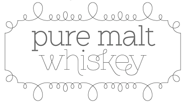
 Dnipropetrovsk, Ukraine-based designer of these typefaces in 2015: Odd Times (a vintage blackletter typeface), Brandy Label (a layered Victorian signage font), Smoking (a great Western layered poster font), Traveller, Letterhead (steampunk, vintage, Victorian), Age, Nataly Temper, Vintage Auto (a retro chrome automobile font), Golden Dust (a lava lamp font), Rusty Phoenix, Phoenix, the Victorian signage typeface Whiskey, Spirals, Biker (spurred inline font), the oily signage font Pin Up.
 In 2016, he designed Far Kingdoms (Victorian), Brass Heart (steampunk / Victorian), Big City Light (a vintage movie theater typeface), Lostamp (a weathered vintage rough stencil script), Kexman (calligraphic script), Loftype (creamy brush script), Shoelaces (monoline script), Tobacco Box (Victorian), Humblest, Whiskey Label (a great vintage Victorian headline font), Insane Fear (spurred), Falchion Edge (Victorian display typeface), Inside The Box (techno), Amber Taste (a layered Victorian beer label font; see also Amber Taste Pro (2020)), One Thin Line (a paperclip font), Bald Eagle (Victorian), Autumn Feel (brush script), Dirty Cartoon, Magic Curls, Winery, Bite Hard (beveled caps), Lovebus (psychedelic style), Column (layered Victorian), Golden Brush, Marine Fairytale (Victorian), and Old Story (handcrafted). Typefaces from 2017: Goodwine, Daub (EPS format brush alphabet), Rusted Bevel, Dirty Cartoon (a layerable cartoon font), Bald Eagle (vintage), La Belman (Victorian; see also La Belman Pro in 2020), Bright (creamy calligraphic), Winery, Magic Curls, Black Queen (Victorian style), Little Mess (dry brush), Lovebus (psychedelic), Bite Hard, Fiver (prismatic style), Sweet Rum (vintage), The Freaky Circus (Western circus font), Biker New (spurred), Flex Wire, Agress (graffiti style), Old Story, Rusted Brushpen (dry brush), Mosaic Pool, Ranch (vintage style with layered textures), Golden Dust, Letter Head, Limber (dry brush script), Patina, Craft Beer (a layered beer label font), Droptune (Victorian), Chimera Tail, Hardwatt (dry brush), Megawatt (signage script), Jamish (a handcrafted blackboard bold typeface), Oak Lumber, Odd Times (blackletter), Gunshot (an art nouveau display typeface), Bootleggers (a vintage label typeface), Brandy Label (vintage layered font), Smoking Typeface (vintage Western style, with layering). Typefaces from 2018: Shining Night (a marquee font), Scratches, Candy Shop (a multiline titling typeface), Nataly Temper (a crayon font), Anise Seeds, Lostamp (a great stamp font), Hicksons (retro signage script), Loftype (creamy script), Far Kingdoms (spurred vintage typeface), Predators Cuspid, Sweet & Fresh, Frantic (a vintage car typeface), Affair (Victorian), Falchion Edge (spurred vintage style), Lost in Space, Traveler (an interlocking vintage Tuscan display typeface), True Black, Late Frost, Inside The Box (an interesting double-width font), Magic Garden (curly style), Skater Girl (retro script). Typefaces from 2019: True Black (Tuscan), Nature Force, Sweettooth (script: 2018-2019), Rusted Bevel, Rusted Bevel, Fishermans Knot (a vintage label font started in 2018), Skater Girl (a heavy upright script), Cidrella, Western Shooter, Little Mess (a dry brush calligraphic script), Spirit Board (pure Victoriana), Ranch Vintage (shadowed, textured, vintage), Forged Fence (an ironwork font), Long Ride (an octagonal license plate font), Chimera Tail Rough, Patina. Typefaces from 2020: Sweet Ponch, Natural Heap (letters in laurels), Street Rush, Cally (a decorative Tuscan typeface), Sunny Bay, Harietta (a retro monoline script), Cheer Inside (a vintage font), Frizzy (a vintage label font), Asia Impact (simulating an oriental brush calligraphy), Exa Metline (an inline font), Hallie (a curly display typeface), No Rules, Parallax, Golden Treasure (a vintage ironwork font), Squidink, Bushman (an organic sans), Florry (a display sans), Propeller, Spirit Board (a layered circus font family), Lord Grayson (Victorian), Grayson (a tall gloomy monoline sans), Grayson Rough, Kaipara (a patterned all caps font), Classic Heritage (a Victorian or steampunk signage typeface), Anise Seeds (vintage softly spurred Tuscan caps), Candy Shop (vintage trilined caps), Plop, Practish (an experimental slab serif family), Everleigh (a stylish thin typeface), Everleigh Duo, Love Affair (vintage, perhaps art nouveau), Lost in Space (sci-fi), Sweet and Fresh. Typefaces from 2021: Dusky Rough (a Western or saloon font), Dusky Pub (a Western typeface with Tuscan features), Dusky Slab (a reverse stress Western font), Humblest Pro (an all caps display sans), Giftbox (a vintage label font). Typefaces from 2022: Simply Royal (layerable vintage caps with an engraved money look), Go Pop (pop art). [Google]
[MyFonts]
[More] ⦿
|
Golder Jagat
|
Dhaka, Bangladesh-based designer (b. 1990) of the alphading typeface Letter Hanger JG and these handcrafted typefaces, all from 2020: Jellyfish 3D (textured), Mosaic Serif, Home Craft, Hair Thinned, Trunk Shaped, Made of Clay, Cursive Elaborate, Molded Bold. [Google]
[More] ⦿
|
Haoz Xiong
|
 FontStructor who made Creme (2012), Gsuga (2010, octagonal), Gsuga Mosaic (2011, texture face), Trixonn (2011), Inotia (2011, octagonal), Aubrey (2011, tall condensed), RezRox (2011), HZP001 (2010), HAOZ (2010), Nilt (2011), Adlex (2011, paper fold face), Stonair (2010), Stonair II (2012). Aka Bear Gogh.
 Catalog. [Google]
[More] ⦿
|
Harold Lohner
[Harold's Fonts]
|
 [More] ⦿
|
Harold's Fonts
[Harold Lohner]
|
 Harold Lohner was born in upstate New York in 1958. He received an MFA in printmaking from the University at Albany and is Professor of Visual Arts at Sage College of Albany. He began making fonts in 1997 and starting distributing them the next year through Harold's Fonts. He lives in Albany, NY, with his partner, Al Martino. Originally, most of his typefaces were freeware or shareware, but gradually, he started selling most on his site or via FontBros. His typefaces:
 Link at Dafont. . Abstract Fonts link. [Google]
[More] ⦿
|
House of Lime
[Merethe Liljedahl]
|
 Defunct type foundry that had free original dingbats, alphadings and fonts, mostly from scanned art by Merethe Liljedahl (House of Lime) in Landskrona, Sweden.
 The font list: Abstract, Africa, African Design, African Eggs, AfricanPattern, AlphaRemember, AlphaSausage, AlphaThin, AmishQuilts, AngelsFairies, Angelsaroundtheworld, AngloText, Animal, AnimalDesign, AntiqueStuff, AntiqueStuffII, AroundSports, Aroundthehouse, ArtDecoMotif, ArtNouveauBild, ArtNouveauBlume, ArtNouveauFlowers, ArtNouveauFramesandBorders, ArtNouveauInitials (2001), ArtNouveauInitialsA, ArtNouveauInitialsB, ArtNouveauInitialsC, AsianArt, AsianArtII, BOO, BabyTime, BackToSchool (2000, pencil-themed face), Bagsandstuff, BagsandstuffII, Balloons, Baseball, Big Lou (2003, art deco), BirdStencilDesign, BirdStencilDesignII, Birdies, Bzzy (2004, alphadings), Books, Butterflies, Buttons (2006), Calender, CamelotCaps (2000), CarstensOwls, Cats, CelticElements, CelticElementsII, CelticMotif, Celtics, Cherub, CheshireInitials (2001), Chiseled (2006), ChristmasTime, ChristmasWreath, ChubbyDotty, ChubbyTrail, Cornerflair (2002), CrayolaKiddyFont, Curly Fleur Caps, DBLCeltic, DBLCorners, DBLFacesfromthepast, DBLFlowerDelight, DBLMedievalDesign, DancerInTheDark, DancerInTheDarkII, DancerInTheDarkIII, DecorativeOrnamental, Decorette, Decorina (2001), DesignMotif, DesignerCorners, DesignerCorners, DesignerDing, DesignerDividers, DesignerFrames, DesignerFramesTwo, DesignerMix, DesignerMixII, DesignerMixed, DesignerMotifs, DesignerMotifsThree, DesignerMotifsTwo, DesignerPlus, DesignerStuff, Dividers, DividersTwo, DoggyBag, DogsandCats, Dolphins, Dot Trail (2002), DoverChineseMotifDesign, DoverFloral, DoverFloralandDesignII, DoverJapaneseDesign, Dragons, Durbin Initials (2009), EasterBunny, EasterHoppy, EasterTime, EatingOut, Egypt, ElectionTime (2000), Elegance, EvelynsHeart, EvsDragons, ExtraOrnamentalNo2, FaceofaLady, Faces2Faces, FacesOfTheCentury, Faith, Fans, Fashion, FashionLadies, FleurCornerCaps (2000), FloralDesign, FloralStencilDesign, FloridVictorianOrnament, FlowerandFairyAlphabet, Folklore, FolkloreII, Fontanesi, Framed, Frames, FramesAndBorders, FramesAndBordersII, FramesAndBordersIII, FramesandBackgrounds, FramesandHeaders, Fromthegarden, Fruityandveggie, Furballs, GailsUnicorn, GardenTime, Geisha, Genzsch Initials, GermanCaps, GothicCornerCaps, GothicFlourish, GrafikText, GuinevereCaps, HalloweenKiddyFont, Hats, HatsII, HatsIII, HatsIV, HatsV, HeartsofLime, Heraldics, Horses, Houses, HousesII, Howling, Iconettes, Inmygarden, Inyourgarden, Itsserved, Jars, JustFrames, KarensKitties, KeyasTurtles, KiddyDing, KiddyFlakey (2002), KiddyFrames, KiddyHalloween, KiddyToys, KidsAlphabet, KittytheCat, Ladiesofthe20s, Leaves, LimeBlossomCaps (1999), LimeGloryCaps (2000), LisasDragons, LittleHeroes, LizsGibsonGirls, LovePoision, Maskes, MedievalAlphabet (2000), MedievalMotif, MedievalMotifTwo, MexicanMotif, MirrorImage, MosaicCaps (2000), Motif, Mousie (2000, alphadings), MoyrasParrots, Music For Your Ears (2006), MutansII, Mutants, Mythical, NavyBlues (2000, white on black buttons), OldFashionedIllus, OldFloralIllustration, OldFolksShuffle (2000), Onthefarm, OrientalDesign, OrientalIcons, OrientalIconsII, OrientalIconsIII, OrientalIconsIV, OrientalView, OrnamentalCorners, OrnamentalDecoration, OrnamentalDecorationII, OrnamentalElements, OrnamentalElementsII, OrnamentalFramesI, OrnamentalInitialsA, OrnamentalInitialsB, OrnamentalInitialsC, OrnamentalInitialsD, OrnamentalInitialsE, OrnamentalInitialsF, OrnamentalInitialsG, OrnamentalInitialsH, OrnamentalInitialsI, OrnamentalInitialsJ, OrnamentalInitialsK, OrnamentalInitialsL, OrnamentalInitialsM, OrnamentalInitialsN, OrnamentalInitialsO, OrnamentalInitialsP, OrnamentalInitialsQ, OrnamentalInitialsR, OrnamentalInitialsS, OrnamentalInitialsT, OrnamentalInitialsU, OrnamentalInitialsV, OrnamentalInitialsW, OrnamentalInitialsX, OrnamentalInitialsY, OrnamentalInitialsZ, OutOfAfrica (2000), Paisley, Paisley Caps, PaisleyII, Party (2004, Mexican simulation face), Pentagon (2003, Western face), PhilliBoo, PokemonKiddyDing, Retro Elite (2003, art deco), RibbonCaps, Rose, Rosegarden, Scary, Scary House, Scrapper's Arrows, ScrappersCorner, ScrappersElements, ScrappersElementsII, ScrappersElementsIII, ScrappersElementsIV, ScrappersElementsV, ScrappersKeys, ScrappersStencil, ScrappingDoodles, Scream, Sealife, September11, Shaking Salsa, Ships, SimplyFriends, Skeleton, Smelly, SomeoneSpecial, Spiders (2001), SplatterCaps, Spooky, Sporty (2004), Spring (2003, Victorian ornamental typeface), Square Frame (2006), Stamped Flowers, Starlite, Stars, Stencil, StripesCaps (2000), SugarFootStrut, Sun and Moon, Sunflowers, Sunny Days (2004), SunshineKiddyFont, Tattoo, TheGoddess, ThePerfectMan, ThemeCorners, TiffanyCorners, TiffanyCornersII, TiffanyCornersIII, Tiles, Tools, TraditionalFloralDesign, TraditionalFloralDesignII, TraditionalFloralDesignIII, Trapeze (2004), TreasuryofDesign, Treesandleaves, Tulips, TylersPokemon (2000), UncasWomen, Valentine, VictorianWindow, Wedding, Wildflower, WildflowerII, WildflowerIII, WildflowerIV, YesterdaysBeauty, YourSign, Yummi, Zodiac. Designer Menues (commercial dings, 2001). In 2006, these commercial dings: Scrapping Corners, Scrappers Fills. Direct access to the dingbats. Direct access to fonts. Fontspace link. Dafont link. Abstract Fonts link. [Google]
[More] ⦿
|
Jackie Bennett
|
Australian designer of the curly mosaic art typeface Gaudia (2018), which is inspired by Gaudi's work. [Google]
[More] ⦿
|
Jennifer Chocolate
|
Designer of tyhe mosaic / tiled typeface Knight Tiles Display (2022). [Google]
[More] ⦿
|
Josep Pascó
|
Catalan lettering artist: check Mosaicos E.F. Escofet y Cia. (1908). [Google]
[More] ⦿
|
Joshua Galindo
|
During his studies at Ringling College of Art and Design in Sarasota, FL, Joshua Galindo designed the heavy display / poster typeface Europa (2017). It is modular, very much like the tribal mosaic Europe is reverting back to after Brexit. Behance link. [Google]
[More] ⦿
|
Juha Korhonen
|
 Juha Korhonen (b. 1966, aka Junkohanhero) is a Finnish artist and type designer, who created these free fonts, mostly in the grunge genre:
 - In 2006: Tasapainoaisti (grunge), Type-Ra (old typewriter), 60 Sekuntia (grunge), Waving My Arms in the Air (dingbats), Cold Night for Alligators (grunge), Shangri-La (handwriting), Horros, How Can I Organize My Garage?, They're coming to take me away, Hullunkruunu (grunge), Liitu (grunge), Snakepit (dings), In My Head (grunge), FCockroach (grunge), 3-2-1 Jungbats (which includes a Deux Chevaux!), Aamunkoi (handwriting), Not now, I have a headache!, Kulminoituva, Kallot (skeleton dingbats), Ummagumma (handwriting), finitimusiungo, jungodingbats, Junkos Typewriter (almost a ransom note font), notakangaroo (handwriting), Minenookenguru, ympyroity.
- In 2007: 215000E, 6000km, Gubben-I-L, Hevonen, Horros, IKHIOOGLA2, IKHIOOGLA3, IKHIOOGLAcow, IKHIOOGLAone, IKHIOOGLAwithout, Postinkantaja-Job (ransom note face), They're-coming-to-take-me-away, Jungobungo (ransom note), Nollapistet (grunge), VieraskirjanPeto (skull dingbats), Maksukehoitus (white on black), Avain (dingbats of keys), Pink Bazooka, Phorssa (ransom note), Bones (pirate font), 215000EURO (ransom note), DINGDONG (dingbats including a 2CV), CKAS (tape dingbats), JoskusEi (grunge), Puoli-ihminen, Zupagargonizer, ZupagargonizerT, Puoli Ihminen (hand-printed), Polla (a great scratchy ink stain lettering font in the style of Treefrog), Wahroonga, Tienpaalla (traffic signs), Typenoksidi (old typewriter), Pozo, Pozotwo, Pozothree, Pozofour (Kafkaesque). He also made the dingbats Avain, Tajunnan-tuolla-puolen (movie dingbats), Vieraskirjan-Peto, Payday (white on black).
- In 2008: Melkein Aito Kopio (tool dingbats), Znort3000 (white on black grungy typewriter), Oravanpyörä (white on black outline face), Ellet Niin (ransom note face), Kuusinollakahdeksan (ransom note font), Jadefedga08, Jadefedgah80, Jadefedgah8002 (all ransom note fonts), Jormadorka (more ransom notes), Maaliskuu (handwriting), PajaRaja, Aikasiirtyma, Bugghet.
- In 2009: Tarkistatiedot, Bugebol, Harmaa Perkele (grungy outline face), Huomenna (grunge outline), Betelgeuse (hand-printed), Merkurius (more grungy outlines), GhundZiliag, Laboratoriokoira (grunge), PolviHumppilasanoo.
- In 2010: Tammikuunkolmas, Kosminentaustasateily (old typewriter), SinisenharmaaPerkele, Osasto329suljettu.
- In 2011: 19000paarmaa, Tunnepinta, Vuosivuodelta (grunge).
- In 2014: Adieresis, Air-Atlas, Appendix (ransom note font), Bactosaurus, Bad-Pizza-wth-Pepperoni, Bad-Pizza, Bakesaurus, Balochisaurus, Bambiraptor, Beast-Of-Burden, Bilbao (a fat rough brush face), Birds-Requiem-Svart, Birds-Requiem, Bug-Report, Burgerbuzz, Buzz-Aloha, BwheroGreeZero, Cactus-Tequila, Charlie Dont Surf, Chryse-Planitia, Culdesac, Cyberpnuk2, DSIODRER, DSIODRER2, Damsterdam, Downleft (3d typeface), Drop!, Existence, Firebug, GogolSimone&Monroe (textured), GROmagnon, Gromagroo, Handful of Nothing (grunge), Hangen-henki, Hangover, Haudankorva, Helleplus 32, Hetkea Myohemmin, Hiekkalasi, huhtikuu, Human Error, Hyeenan-haukotus, Inertia-Creeps, I Wanna Be Your Dog, Jamaica Aroma (grunge), Jazz Zebra, Jockey Full of Bourbon (white on black letters), Jupiter (children's script), Kaktuspiste, Kalmari (blackletter), Keskiyon-Lumisade, Kothika (grungy blackletter), Krakle!, Kulkeuma, Kuumotus, Lasihiekka, Lean on me, Liima,-paperi,-sakset-2 (ransom note font), Llama-Grazy, Llama-Mad, Louis Cypher, Lumenharmaa, Lumihyeena (ransom note font), Lyhyt-Lauantai (children's script), Me-and-your-mother, Mechanical-Machine (old typewriter), Metalbox, Mustasurma, Muurahaiskarhu (weathered calligraphic script), Nasty MSG, Neptunus, Nirhauma, Nopee Torstai, Noppalukemat, Onion-soup, Paltamo 88300, Persona Non Grata (grungy ransom note font), Pintaväre, Plastika-Elektronika, Pyromaani, Quark Zone, Quiet Evening (old typewriter typeface), Quiet Zoo, Red Rabbit, Rho Cassiopeiae, RGMB 6044 Str, Rottapuisto, Ruoste, Rush-Minute, Rust Never Sleeps, Sadannes, Sensory Cortex, Sensuroitu, Siamese-Twins, Singalonga, Singapore, Sitruunahyeena, Skinny Zebra (shaded face), Snapz!, Soul-Sister, Stranger-In-You, Takapiru, Takapiru2, Tempo-Minimo-Bass, Terra, Terraario, Terrieri, Territorio, Terrorisoija, Tomorrow-Comes-Today, Torstai-perjantai, Tricky-Christine (all caps Treefrog style inky script), Trolli, Tulihuuma, Tulikuume, Typetype, Typetys, Typistys, Typpea (old typewriter), Union-soap, Wallowxenon, Whisper in the Dark, White Elk, Wripetyter (old typewriter), Wrong-place-right-time, Wrong-time-right-place, Wrong-time-wrong-place, Xmas Year Zero, Yericho-Punx, ZIGZAGZOEL, Zombie Queen (grungy old typewriter).
- In 2015: 49 Birthdays, A Box For, All Rights Reserved, Almost-like-the-blues, Androidi Pisa, Aurinko, Avojaloin (old typewriter), Boring, Blacklist, Blah-blah-bang, Blank Eye, Burn Out Fade Away, Beyond-These-Things, Can-you-ever-see-a-whole-circle, Children-of-the-revolution, Close-your-eyes, Cut The Crap, Dancing-in-the-dark, Dark-Dream, Dark-was-the-night, Deafening Silence, Destroy-X, Dharma Bum, Dharma Punk, Digi Ziggy, Divisible-Invisible-High, Divisible-Invisible-Low, Drenazmozgow, Dystopia, Eight Days A Week, Endrophenomeua, Ensimmäinen-kevät, Every Little Thing That You Did, Everything is possible, Feeling Babylon (shaded typeface), Fifteen Feet of Pure White Snow, Forty Six, FourFiveSixSevenEight, GalvanizeBurn, Garbage Guerilla, Glingzerminator, Good-And-Evil-Day, Good-And-Evil-Night, Green-Dream, Have-nothing-to-do-with, Hidden Zebra, Holy Cow, Humectez-La-Mouture, Hyvä voittaa pahan, Hugo Z, Ice-cream-for-crow, Ihana-Perkele-Alaston, Ihana-Perkele, I Love You, Instant Karma, Instant-Nirvana, Is That Clear, Is-there-anybody-out-there?, January Threed, Justaword, Kasuaari-kirjastossa, Keveat Sandaalit, Killing Me Softly, Kasuaari-kirjastossa, Kirjainkone (old typewriter), Kirkuvanpunainen kirsikk, Kiss Me My Darling Kiss Me (grunge), Last-living-souls-Dark, Last-living-souls-Dirty, Last-living-souls-Shadow, Last-living-souls, Lauantaiaamu-7:25, Lazy Opossum, Life is so wonderful, Lilith X, Lost in Moments, Lovely Weekend, Lower Atmosphere, Lumi-nauroit, Manamansalo (shaded handcrafted font), Mandelio di Paedre (textured), Metamorphose Requiem (blackletter), Moa, Molienda de Paedra (textured), Moons of Jupiter, Nicotine Love, Nie Zabawne Komik, Nirepnirun-atsum, Nirepnirun-oivuk, Nirepnirun-oknalb, Nollanaama, Onnenmyyra (halftone emulation), Open-your-eyes, Oranssi Hohde (textured), Paljain Jaloin (grunge), Pikku-Julmuri, Pink-T-shirt, Puolelta Toiselle, QWERTYpe (old typewriter), Quicksand-x, Radar Echoes Unclear Atmosphere, Raparperitaivas, Read between the lines, Redhair, Refuse-to-bow-down, Regurgance, Requiem-for-A (blackletter), Rhinoceros (a pretty Treefrog script), Rip-off, Road-to-nowhere, Ronttifontti, Rye Field, Safe-from-harm, Screaming Red, Sekunda, Seven Deadly Sins, Shadow Catcher, Six Feet Under, Slave-only-dreams-to-be-king, Some-Distant-Memory-Dark, Some-Distant-Memory, Something-in-the-air, Something in the Way, Sonic Barrier, Sound of Silence, Syntax Error, Syyskuu-repaleinen, TakeYourClothesOffWhenYouDance, Tango Psychedelia (old typewriter), Tell Us Pangaia, The-Beginning-Of-Memory, Thirteenth Floor 2, This-side-up, Time Goes So Slowly, Toinen Tammikuu, Too-drunk-to-fuck, Uglygoodbad, Uglygoodbaddark, Under the Influence (grungy texture), Unfinished-Sympathy, Universal Mind, Universedge, Universum Invenire, Velvet Queen, Viimeinen-syksy, Villasukat, Walk-with-me-now (letterpress emulation), Waste-of-time, Waveternity, White Elephant, White-funky-rabbit, White-light,-black-line, White Submarine, Windy Indigo, World Without End, Xsdeterminatoer (sic).
- Typefaces from 2015 published in 2016: Dark Monday (ransom note font), Jinzingoer, No More Lies, Cubebroken, Cult-of-the-toucan, Doublpeopl, InvisiblerrorEdge, InvisiblerrorFast, Invisiblerror, Jugglingoose, On-the-horizon, Raccoon, Strawolverine, Wantedo, Edge, Black is not a color, Apocalypse, Disturbo, Black Owl, Spirit Ritual, Woodcut, Animals are like people, Tox Typewriter, I Believe In Life Before Death, Crab, Dieproud, In the deep dark woods, Chic Chak Zubra (Treefrog style), Non Watercolor, April-Fools'-Day-Crazy-vrs, April-Fools'-Day-Silly-vrs, April-Fools'-Day, As-long-as-I-can-hold-my-breath, Floating-tin-can, Head-like-a-hole, Here-Just-Now-Black, Here-Just-Now-Out, Here-Just-Now, Scratch-X-Black, Scratch-X, Shoemaker, Skriik!-Electro-mechanical-mach, Thin-king, Blinded-by-desire, Brake-a-leg, Deja Vu Dive, Greater-than-the-sum-of-its-par, Hell-is-round-the-corner, I-love-the-smell-of-rain, Kopio-639, March-of-the-pigs, Methods-of-escape, Overdose, People-per-square-kilometer, Right-where-it-belongs, The-universe-in-a-nutshell, This-is-nu-jazz, Torture, Trashbox (white on black), Walk-this-way, What-is-this--some-kind-of-joke (white on black), Why-do-we-blink-so-frequently (old typewriter), 2016-Bugs, 3-Times-Recycled-Old-Newspaper, 3TimesRecycledOldNewspaper, Always-Been-Right, Amateur-Dirty, Amateur-Naked, Amateur-Slash, Another-name-for, Brief-Moment-Between, Bubu-Ghost, By-the-way, Contrite-in-spirit, Crash-test-dummy, Dead-end, Dimension-Zero, Dirty-Old-Town, Dreamer-Eternal, Dreamer, Endless-heartache, Feel-the-universe, Found-my-way-out, Grapevine, Grasshopper-Z, GrasshopperZ, Hehku, Here-we-are-now,-entertain-us, Hidden-meanings-Italic, I've-seen-that-face-before, I-Did-It-My-Way, I-tell-you-all-my-secrets, IDidItMyWay, Is-there-time-in-outer-space?, Jokioinen, Kube-Vertiko, KubeVertiko, Lazarus-Oz-Kolsvart, Lazarus-Oz-Moerkt, Lazarus-Oz-Syndfri, Lazarus-Oz, Libertango, More-news-from-nowhere (white-on-black), Now-your-conscience-is-clear, Paradox-Mosaic, Paranoid Orange, Pelkistettya todellisuutta (old typewriter), Piparivahtiperhonen-Itio, Piparivahtiperhonen, Planet-Garbage, Secretly-wishing-for-rain, Send-me-a-postcard, Sun-zoom-spark, Through-the-night (old typewriter), Trash!-More-trash!, Trash-Zydego, Tremolo-Flaw, with-righteous-indignation,-aga, with-righteous-indignation, Dark-Underground, Feelings-On-Off, From-here-to-eternity-too, From-here-to-eternity, Fuga-de-cerebros, Gsubadaslowly, Hell-Finland, Hello-Finland, It-started-here,-again, It-started-here, Lost-in-the-supermarket, Muspi-Merol-Krad, Muspi-Merol-Mirg, Muspi-Merol-Thgil, Razterhunch-Burn (textured typeface), Razterhunch-Shadow, Razterhunch, Sister-Morphine, Syntinen-ihminen-on-kaunis-ihmi, Tropic-of-Cancer, Velvet-Dream, Viiden-pennin-operetti, Auribus-tenere-lupum, Big-Bubu, Completely-Nonsense, Corner-Dark-Distance, Corner-Dark-Just-X, Corner-Dark (white on black font), How-do-you-sleep?, How-low-is-low?, Karmakooma, Long-distance-call, On-aika-soittaa-sinfonia, Pink-Bunny-2, Pink-Bunny, Pink-Chaos, Right-to-remain-silent, Rough-Simple.
Typefaces from 2017: Pink Kangaroo, Punktype, Dog Foz Zebra, Mondmonkey, Quiet Horror Story, Strawobbly, Better Get Ready, Flea Market Finds, Background Noise, Rhythm Vino, Echoes, Music For Empty Apartments, Synonym Blank. Typefaces from 2018: Blockheads (white on black), Blue Sky Blue Grass, Lievidence (a ransom note font), Quick Pangolin, Brillianthre. - Typefaces from 2020: Mugwort Maximum (grunge), Heart Jungle (textured).
- Typefaces from 2021: Nothing Clean, Central European Time, Examples Of Erosion, Overconsumption, Ransom Blanco Zero, Bullfrog, Damage Red, A Good Day To Die, Everything Experience, Ring Singularity, Grey+Red, Memento Griseo Ruber, Think Harder.
Dafont link. Old URL. Additional URL. Font Squirrel link. Fontsy link. Abstract Fonts link. [Google]
[More] ⦿
|
Julia Bondar
|
Cracow, Poland-based designer of the mosaic typeface Organic (2019), which was inspired by the leaves of the Physalis. [Google]
[More] ⦿
|
Khrys Bosland
|
Aka Khrys Kreations. Kindergarten teacher (b. 1988) in Florida, who made many hand-printed typefaces that appeal to children. Her typeface list as of 2012: KBBlockParty, KBChubby, KBDabble, KBDinoMite, KBDottyDot, KBFancyMe, KBKinderWrite, KBNeat, KBPeppy, KBRoundUp, KBSketch, KBSpacingOut, KBStripedPajamas, KBSubtle, KBSunshine. Many of these fonts were made with FontMaker and/or MyScriptFont. Typefaces from 2013: KB Up In Smoke, KB True Believer, KB Sneaky Walrus, KB Radio Wizard, KB Jumping Jellybeans, KB Fun House, KB Brght and Merry, KB Tiny Red Whale, KB The End Is Broken, KB Pancake Party, KB Googley Eyes, KB Funky Glasses, KB Brainy Skeleton, KBanAvoxlost, KB Zipa Dee Doo Dah, KB Seriously Into Her, KB Miso Soup, KB Hear Me Play, KB Earthquake, KB Camera Shy, KB And It Slips My Mind, KB Witching Hour, KB Pay The Lady, KB Reindeer Games, KB Gobble Day, KB Stick, KB Lucky Clover, KB Dunk Tank, KB Dark Hour, KB Planet Earth, KB Lace Nightgown, KB The Silent Night, KB Nosy Neighbor, KB Bubblegum, KB Freezer Burn, KB Hold the Phone, KB Jellybean, KB Jukebox, KB Starlight, KB Broken Apart, KB Push Over, KB Sandy Shorts, KB Love It Down, KB Pink Lipgloss, KB When Pigs Fly, KB Crazy Town, KB Her Highness, KB Lola Loves Me, KB Scared Straight, KB Write It On A Post It, KB Wiggle Worm, KB Saucey Lady, KB RiceaRoni, KB Pasta For Two, KB Ninja Power, KB Moonlight Falls, KB Maker Factory, KB Hot Tamale, KB Fancy Footwork, KB Cheetah Rita, KB Stylographic, KB Snowballin, KB Shot In The Dark, KB All Aboard, KB Troubled Soul, KB Delicate Soul, KB ABC Doodles, KB Grandeur, KB Turning Gears, KB Queeny Me, KB A Stitchin Time, KB Pop The Bubbly, KB Quipster, KB Cloudy Day, KB Noodle Monster, KB Out Of Towner, KB Ribbons and Bows, KB Skittled, KB You've Been Spotted, KB You're Just My Type, KB Bonjour Sweetheart, KB Curious Soul, KB Framework, KB Push, KB Washi, KB Camp Out, KB Chatter Box, KB Lime Light, KB Kinder Write Bold, KB Ruffled Feathers, KB So Thinteresting (+Bold), KB Sunshine Bold, KB Swirl N Twirl. Typefaces from 2014: KBCallMe, KBNeiledIt, KBNowWalkItOut, KBRacecars, KBReallyDnealie, KBTheFlowerFarm, KBTwoLovers, KBHabitsCanBeBroken, KBInterestingZebra, KBLikePinkStars, KBOneBigScrape, KBQuietStories, KBRadioWatcher, KBSecretPassage, KBSourdoughBread, KBSquishyBlanket, KBStickToThePlan, KBTropicalVACATION, KBWalkingontheTable, KBWanderAround, KGSummerSunshineBlackout, KGSummerSunshineShadow, KGSummerSunshine. Typefaces from 2016: KB Balloon Animal, KB Bus Stop, KB Caterpillar, KB Darling MG, KB Expansive, KB Mommy Dearest, KB Mosaic, KB Play Date, KB Swifty, KB The Little Fella, KB Warm Her Up. Dafont link. [Google]
[More] ⦿
|
Laura Mays
|
During her studies in London, Laura Mays designed the mosaic typeface Whimsy Wall (2018), which has a color font style. [Google]
[More] ⦿
|
Linnea Motts
|
Creator of the frilly display typeface Mosaic (2012). [Google]
[More] ⦿
|
Louis Semmler
|
Freelance graphic designer and illustrator in Adelaide, Australia. Creator of Mosaic (2014). [Google]
[More] ⦿
|
Lukasz Kulakowski
[Empty Page Studio]
|
[More] ⦿
|
Malou Osendarp
|
Dutch designer of Correspond (graduation typeface at KABK, 2005-2006) and Saranna (after Stefan Schlesinger's unfinished typeface from just before WWII). In 2005, Malou did a revival of Jan van Krimpen's Spectrum (1952). Favela Exposed is a hand-drawn poster typeface inspired by the mosaic stairway in Santa Theresa, Rio de Janeiro. Typecache link. [Google]
[More] ⦿
|
Marcin Leskow
[Martin Leśków]
|
 [More] ⦿
|
Martin Leśków
[Marcin Leskow]
|
 Polish graphic designer. Dafont link. He also uses the name Marcin Leśków. Fonts made in 2009 and 2010: ABitEmpty, Atlantis, Atticghost, Bigboots, Brokentypewriter, Crazyman, Doodleman (sketch font), Eternaldream, ExcellentWriter (curly script), Fightingdogs, FirstRound, Florentine Amber (2010), Forgottennight (grunge), FutureIsBack (curly script), HungryAlligator, Jigsawpuzzle, Lastbreath, Lighthouse, Likeonmydisplay (LED simulation), LittleAlien, LostShoe, MisterFlourish, Mosaiconthefloor (tiling face), NaughtyGirl, NewYorkCity, NiceWritten, Northernprairies, Olddungeon, Outside, PlanetOfDots (dot matrix), Pressedinframe, Privateautopsy (grunge), Quadratic, QuickFingers, Rottedboard, Skyscraper, Spacewarrior, Steelmagnolias, Stonewall, SunStreet, TellMeYourSecret, Tempusfugit, ThereWasACircle, Thirstyhorse (nice Western Italian style face), Timeless, Waterfall, WildScript, Windyday (grunge).
 Klingspor link. [Google]
[More] ⦿
|
Merethe Liljedahl
[House of Lime]
|
 [More] ⦿
|
Michelle Dixon
[Dixie's Delights]
|
[More] ⦿
|
Mike Norrington
|
 Leeds, UK-based designer of the mosaic typeface Hepper (2014). Behance link. [Google]
[More] ⦿
Leeds, UK-based designer of the mosaic typeface Hepper (2014). Behance link. [Google]
[More] ⦿
|
Nicholas Misani
|
 New York City-based designer of several great mosaic-based lettering pieces in 2017. In 2017, Louise Fili, Nicholas Misani and Rachel Michaud co-designed the art nouveau typeface Montecatini, which is inspired by Italian travel posters from that era. In 2019, Louise Fili, Nicholas Misani and Andy Anzollitto expanded this typeface to the 24-style Montecatini Pro.
 Marseille (2017) is co-designed with Louise Fili. It is an art deco-inspired letterform that is based on Louise Fili's cover design for the Marguerite Duras novel The Lover. Behance link. [Google]
[MyFonts]
[More] ⦿
|
Nick Curtis
|
Nick Curtis (b. Chicago, 1948) lived in Texas from 1952-1997, and lives since 1997 in Gaithersburg, MD and Alexandria, MD. From ca. 1990 onwards, he has been designing fonts, first for free, and then commercially. He had a great reputation as a "revivalist" type designer, with a particular interest in retro fonts and art deco types. In 2003, his site had become too popular and too expensive to maintain, and thus he went commercial as Nick's Fonts. In 2013, he stopped making fonts, and donated his collection of rare books and type material to the University of Virginia. Interview. Complete list of names and other info, maintained by Sander de Voogt. Interview in which we learn about his fondness for Corel Draw as a type design tool. Near the end of 2012, he posted this comment on his web site: Fifteen years ago, I embarked on a wonderful voyage of discovery, when I created my very first font with Fontographer 3.15. My maiden voyages were, frankly, rather clunky and amateurish, but I have been told that they showed promise. Well, sure enough, thanks to the diligent (and patient) efforts of Ilene Strizver, I polished up my craft enough to sell my humble efforts---first as a sideline business and, since 2006, as my full-time job. In total, I have produced over eleven hundred fonts---almost five hundred of them freeware fonts, which I conservatively estimate have been downloaded and enjoyed by over three million people worldwide. Unfortunately, this past year has brought a series of unanticipated setbacks, culminating in the loss of my wife's beautiful mind and soul to the scourge of alcoholism. In an effort to generate extra income to cover the expenses for her long-term care, I have proposed a number of, I believe, innovative ways to revamp the online font business; unfortunately, those efforts have fallen flat, primarily due to the professional font community's abject fear of crossing the $165 million Elephant in the Room. I even offered a special discount rate of 75% off retail price for full-time students of Typohile Forum. To date, there have been zero takers. Hell: even the webfont kit of one of my own fonts which I purchased from myfonts.com turned out to be an empty folder. Talk about a run of bad luck. Which leaves my with you, dear readers. If you or someone you know has had fun or made a buck from my humble efforts throughout the years, please donate whatever you can---even a lousy dollar would help---to help me out. I would greatly appreciate it. Home page. Dafont link. FontShop link. Klingspor link. Abstract Fonts link. View the typefaces designed by Nick Curtis. [Google]
[MyFonts]
[More] ⦿
|
Nick Curtis
[Nick Curtis: Typefaces from 2006]
|
 [MyFonts]
[More] ⦿
[MyFonts]
[More] ⦿
|
Nick Curtis: Typefaces from 2006
[Nick Curtis]
|
 Typefaces made by Nick Curtis from 2006, not listed elsewhere on these pages: Magic Lantern NF, Duly Noted NF (after an ATF typeface from 1912 called Freeahand), Got That Bling NF (a connected script based on the work of Al Mack, from his Lettering: Brush&Pen in the Single Stroke), Haarlem Nights NF (based on a 1920 Dutch poster for Public Placement Services by Johan Dijsktra), Architectuur NF (based on De Stijl type lettering by H. Th. Wijdeveld, 1925), Gandy Dancer NF (a revival of Tabard, ca. 1912, ATF), Pomfrit Dandy NF (based on Frys Ornamented No. 2 by Stephenson Blake), Smith Premier (Clean and Schmutzy) NF (a typewriter pair after the letters of the Smith Premier No. 3), ed Hot Mama NF (2006), Jumbo Mumbo NF (a revival of Independant done in 1930 by Collette and Dufour), Union Telegraph NF (2006), Major Production NF (which was followed in 2009 by Major Pro Extras NF), Teeny Boppin NF (gleaned from Schrifti Alphabeti, a book of Cyrillic alphabets published in Kiev in 1979), Rutin Tutin NF (based on Wild West lettering found in Schrifti Alphabeti, 1979), Jampact NF (2006, an ultra fat headline face), Beagle Boyz NF (a bouncy typeface based on a Cyrillic alphabet presented in the book Schrifti Alphabeti, 1979), Midtown Tessie NF and Downtown Tessie NF (mosaic tile typefaces), Scary Scrimshaw (based on a 1968 poster for a Doors concert), Speedball No1, Speedball No2 SW (2001), Speedball No3 (2001), Bellagio NF (an interpretation of Robert Wiebking's 1917 font Advertisers Gothic, designed for BB&S), High Society NF (2006, a fashion mag typeface based on an alphabet found in Lettering for the Commercial Artist by Blandford Press, 1946), Osiyo Dohitsu NF (based on letterforms in the Cherokee Syllabary, reputedly devised by Sequoyah in the early nineteenth century; it has petroglyphs as well), Micro Manager NF (pixel face), Paper Caper NF (2006), Shady Grove (a condensed version of Thorne Shaded), American Pi NF (2006: ATF ornaments from the catalogs between 1913-1934, including some designed by Will Bradley, Frederic Goudy and George Trenholm), The Donald NF (a hyper-curly decorative face), Boo Meringue NF (a Halloween font based on Lithotint (1897, ATF)), Lesser Arcana (a mystical type), Zyklop NF (2006), Deux Chasses NF (based on ATF's Thermotype), Bon Mot NF (based on Barnhart Brothers&Spindler's Engravers Upright Script), Munchkin Land NF (based on a work called Thor, issued by Frederic Wesselhoeft Ltd of London in the 1930s), Didgeree Doodle NF (2006, a curly cursive originally released as Bernhard Heavy Antique Cursive by the Bauersche Giesserei by Lucien Bernhard), Kudo Kaps One, Two, Three and Four NF (a total of eight classical initial caps typefaces), Crane Titling NF (medieval-inspired uppercase letters drawn by famed book illustrator Walter Crane with charming, if somewhat quirky, lowercase letters by J. W. Weekes), DecimoSexto NF (+italic) (includes Spanish Roman letters and Griffo style italics, both hand-drawn by Francisco Lucas in Madrid, 1577), Visillo Adornado (a caps typeface based on the typeface Vesta, originally designed by Albert Auspurg for H. Berthold AG, Berlin in 1926), Edsel Font, Deco Dingbats. [Google]
[MyFonts]
[More] ⦿
Typefaces made by Nick Curtis from 2006, not listed elsewhere on these pages: Magic Lantern NF, Duly Noted NF (after an ATF typeface from 1912 called Freeahand), Got That Bling NF (a connected script based on the work of Al Mack, from his Lettering: Brush&Pen in the Single Stroke), Haarlem Nights NF (based on a 1920 Dutch poster for Public Placement Services by Johan Dijsktra), Architectuur NF (based on De Stijl type lettering by H. Th. Wijdeveld, 1925), Gandy Dancer NF (a revival of Tabard, ca. 1912, ATF), Pomfrit Dandy NF (based on Frys Ornamented No. 2 by Stephenson Blake), Smith Premier (Clean and Schmutzy) NF (a typewriter pair after the letters of the Smith Premier No. 3), ed Hot Mama NF (2006), Jumbo Mumbo NF (a revival of Independant done in 1930 by Collette and Dufour), Union Telegraph NF (2006), Major Production NF (which was followed in 2009 by Major Pro Extras NF), Teeny Boppin NF (gleaned from Schrifti Alphabeti, a book of Cyrillic alphabets published in Kiev in 1979), Rutin Tutin NF (based on Wild West lettering found in Schrifti Alphabeti, 1979), Jampact NF (2006, an ultra fat headline face), Beagle Boyz NF (a bouncy typeface based on a Cyrillic alphabet presented in the book Schrifti Alphabeti, 1979), Midtown Tessie NF and Downtown Tessie NF (mosaic tile typefaces), Scary Scrimshaw (based on a 1968 poster for a Doors concert), Speedball No1, Speedball No2 SW (2001), Speedball No3 (2001), Bellagio NF (an interpretation of Robert Wiebking's 1917 font Advertisers Gothic, designed for BB&S), High Society NF (2006, a fashion mag typeface based on an alphabet found in Lettering for the Commercial Artist by Blandford Press, 1946), Osiyo Dohitsu NF (based on letterforms in the Cherokee Syllabary, reputedly devised by Sequoyah in the early nineteenth century; it has petroglyphs as well), Micro Manager NF (pixel face), Paper Caper NF (2006), Shady Grove (a condensed version of Thorne Shaded), American Pi NF (2006: ATF ornaments from the catalogs between 1913-1934, including some designed by Will Bradley, Frederic Goudy and George Trenholm), The Donald NF (a hyper-curly decorative face), Boo Meringue NF (a Halloween font based on Lithotint (1897, ATF)), Lesser Arcana (a mystical type), Zyklop NF (2006), Deux Chasses NF (based on ATF's Thermotype), Bon Mot NF (based on Barnhart Brothers&Spindler's Engravers Upright Script), Munchkin Land NF (based on a work called Thor, issued by Frederic Wesselhoeft Ltd of London in the 1930s), Didgeree Doodle NF (2006, a curly cursive originally released as Bernhard Heavy Antique Cursive by the Bauersche Giesserei by Lucien Bernhard), Kudo Kaps One, Two, Three and Four NF (a total of eight classical initial caps typefaces), Crane Titling NF (medieval-inspired uppercase letters drawn by famed book illustrator Walter Crane with charming, if somewhat quirky, lowercase letters by J. W. Weekes), DecimoSexto NF (+italic) (includes Spanish Roman letters and Griffo style italics, both hand-drawn by Francisco Lucas in Madrid, 1577), Visillo Adornado (a caps typeface based on the typeface Vesta, originally designed by Albert Auspurg for H. Berthold AG, Berlin in 1926), Edsel Font, Deco Dingbats. [Google]
[MyFonts]
[More] ⦿
|
Oleg Khalimov
|
Oleg Khalimov (or Halimov) is the designer of the Latin/Cyrillic black italic font Stilla (1996-2002; original Latin typeface by Boltana, 1973), Marusya (1998, Cyrillic) and Skye8 or Die (2002: he designed the Cyrillic version of an original by Jakob Fischer, aka Pizzadude). He created the free dot matrix typeface Classic Mosaic in 2013. Dafont link. [Google]
[More] ⦿
|
Pablo A. Medina
[Design Culture (was: Cubanica Fonts)]
|
[MyFonts]
[More] ⦿
|
Paul James Lloyd
|
 About 100 free TrueType fonts by University of Western Australia lecturer Paul Lloyd (b. UK), many of them elaborate caps fonts: Larkin Capitals (2004), QuaNauticale Initials (2004, with Manfred Klein), Blavicke Capitals (2002), FoliarInitials (2002, Caps), Halftone (2003, blackletter), UltraBlack (2003, blackletter), Saraband (2002, an ornamental ribbon font after Karl Klimsch, 1869), Infula (2002, Caps), Strelsau (2002, Fraktur), Dampfplatz-DemiBold (2002, Fraktur), DampfplatzShadow-Black (2002, Fraktur), DampfplatzSolid-Black (2002, Fraktur), GenzschEtHeyse (2002, Fraktur), GenzschEtHeyseAlternate (2002, Fraktur), Moderna (2002, Fraktur), Lightfoot (2002), Nuffield Initials (2002), Cantebriggia (2002, Fraktur), Charterwell (2002, Fraktur), Portcullion (2002, blackletter), Portculliard Initials (2003, blackletter), Proclamate (2002, blackletter), Zenda (2002, blackletter), Teutonic (2002, blackletter), Medieval Victoriana (2002, caps), Portland Roman (2002), Wolnough (2002, caps), Landsdowne (2002, + Shadow: Victorian typefaces), Grimeswade (2002, caps), Orotund-Heavy, OrotundCapitals-Heavy (2002), Minster (2002, a 6-font Fraktur family), Killigrew (2002, Fraktur), Minim (2002, Fraktur), Coltaine (2002), Emporium Capitals (2002), Penshurst (2002), Cherubim Initials (2002), Pompadour Initials (2002), Casua (2002), Wadsworth's Industria (2002), Radaern Script (2002), Queen Empress (2002), Lisburne Initials (2002), Dundalk (2002), Claritty (2002, handprinting), Mysterious Voyage (2002), Arborial (2002), Deepwoods (2002), Florana (2002), Springtime (2002), Topiary (2002), Woodland (2002), Bertham, Camelot Initials, Chocolate Box (2002), Altea, Mosaic (2002, caps), Burgoyne (2002, caps), Hentzau Initials (2002), Engravier (2002, caps), Rustick Capitals (2002), Louvaine (2002), Chipperfield&Bailey (2002), Boister Black (2002, blackletter; the commercial Boister Black Pro was done in 2009 at CheapProFonts), Quill (2002), Erasmus (2002), Birmingham, Bolton, Brassett (2001), Chancera, Glastonbury, Grantham, E-Caps, CleaversJuvena, CoronationScot, Chronos, Brodgnorth, Draughtsman (2002), Duvall, Helena, Hominis (1997), Imperator, Lewisham, Newstyle, Noir-et-Blanc, Peake, Priory, Ruritania, Shrewsbury, Simplicity, Sylph, Ubiqita_Europa, Woodcut Capitals, Watson, Wrenn, Imperator, Trefoil Capitals (2002), TinplateTitling, Freame, Graphis, Dutch I, Festival, Festival Flourish, d'Spenser, Sylvan-Capitals, Helena, Bridgnorth and Paladin Caps. In his Black Jewels series (as in "blackletter"), he published Black (2002), Germanica (2002), and is working on Minim and Killigrew. Most typefaces come in many weights, and are carefully manicured products. Other Lloyd creations may be found here, here, here, here, or here in Russia. In 2008, he started a commercial foundry, Greater Albion Typefounders. Font Squirrel link. Behance link. [Google]
[MyFonts]
[More] ⦿
About 100 free TrueType fonts by University of Western Australia lecturer Paul Lloyd (b. UK), many of them elaborate caps fonts: Larkin Capitals (2004), QuaNauticale Initials (2004, with Manfred Klein), Blavicke Capitals (2002), FoliarInitials (2002, Caps), Halftone (2003, blackletter), UltraBlack (2003, blackletter), Saraband (2002, an ornamental ribbon font after Karl Klimsch, 1869), Infula (2002, Caps), Strelsau (2002, Fraktur), Dampfplatz-DemiBold (2002, Fraktur), DampfplatzShadow-Black (2002, Fraktur), DampfplatzSolid-Black (2002, Fraktur), GenzschEtHeyse (2002, Fraktur), GenzschEtHeyseAlternate (2002, Fraktur), Moderna (2002, Fraktur), Lightfoot (2002), Nuffield Initials (2002), Cantebriggia (2002, Fraktur), Charterwell (2002, Fraktur), Portcullion (2002, blackletter), Portculliard Initials (2003, blackletter), Proclamate (2002, blackletter), Zenda (2002, blackletter), Teutonic (2002, blackletter), Medieval Victoriana (2002, caps), Portland Roman (2002), Wolnough (2002, caps), Landsdowne (2002, + Shadow: Victorian typefaces), Grimeswade (2002, caps), Orotund-Heavy, OrotundCapitals-Heavy (2002), Minster (2002, a 6-font Fraktur family), Killigrew (2002, Fraktur), Minim (2002, Fraktur), Coltaine (2002), Emporium Capitals (2002), Penshurst (2002), Cherubim Initials (2002), Pompadour Initials (2002), Casua (2002), Wadsworth's Industria (2002), Radaern Script (2002), Queen Empress (2002), Lisburne Initials (2002), Dundalk (2002), Claritty (2002, handprinting), Mysterious Voyage (2002), Arborial (2002), Deepwoods (2002), Florana (2002), Springtime (2002), Topiary (2002), Woodland (2002), Bertham, Camelot Initials, Chocolate Box (2002), Altea, Mosaic (2002, caps), Burgoyne (2002, caps), Hentzau Initials (2002), Engravier (2002, caps), Rustick Capitals (2002), Louvaine (2002), Chipperfield&Bailey (2002), Boister Black (2002, blackletter; the commercial Boister Black Pro was done in 2009 at CheapProFonts), Quill (2002), Erasmus (2002), Birmingham, Bolton, Brassett (2001), Chancera, Glastonbury, Grantham, E-Caps, CleaversJuvena, CoronationScot, Chronos, Brodgnorth, Draughtsman (2002), Duvall, Helena, Hominis (1997), Imperator, Lewisham, Newstyle, Noir-et-Blanc, Peake, Priory, Ruritania, Shrewsbury, Simplicity, Sylph, Ubiqita_Europa, Woodcut Capitals, Watson, Wrenn, Imperator, Trefoil Capitals (2002), TinplateTitling, Freame, Graphis, Dutch I, Festival, Festival Flourish, d'Spenser, Sylvan-Capitals, Helena, Bridgnorth and Paladin Caps. In his Black Jewels series (as in "blackletter"), he published Black (2002), Germanica (2002), and is working on Minim and Killigrew. Most typefaces come in many weights, and are carefully manicured products. Other Lloyd creations may be found here, here, here, here, or here in Russia. In 2008, he started a commercial foundry, Greater Albion Typefounders. Font Squirrel link. Behance link. [Google]
[MyFonts]
[More] ⦿
|
Paul O'Connell
|
Type designer from the UK, b. 1966. He created the humanist sans typeface Silkstone Sans (2011), the script typeface Frazzle (2011), Swash (2011, a signage script face), Jester Script (2011), and the angular typeface Hotspur (2011). Mosaic (2011) and Bloated (2011) are hand-printed. MyFonts link for Paul O'Connell Typographics. In an interesting twist, Erik Spiekermann showed that Silkstone is a rip-off of his own ITC Officina, obtained by an automatic procedure. Silkstone was subsequently removed from MyFonts. [Google]
[MyFonts]
[More] ⦿
|
Ralf Kloeden
[Ralf Kloeden Grafische Gestaltung]
|
[More] ⦿
|
Ralf Kloeden Grafische Gestaltung
[Ralf Kloeden]
|
Ralf Kloeden's fonts include Term-RegAaa (2000, minimalist), the Status pixel font family with fonts Alpha, Beta, Gamma, Delta and Theta (Mac only), Mono, Allo, Kr-Nr, Bar, and Mosaic Quadra (Mac only). Ralf Kloeden Grafische Gestaltung is based in Berlin. Dafont link. [Google]
[More] ⦿
|
Ranim Al Assad
|
Abu Dhabi-based student-designer of the squarish textured typeface Mosaic (2017). [Google]
[More] ⦿
|
Ravi Hampole
|
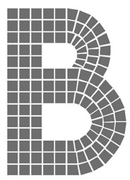 Creative director for Starwood Hotels. New York City-based designer of the mosaic tile font Straphanger (2015). [Google]
[More] ⦿
Creative director for Starwood Hotels. New York City-based designer of the mosaic tile font Straphanger (2015). [Google]
[More] ⦿
|
Richard Diaz Granados
[Stereo Type Haus]
|
[MyFonts]
[More] ⦿
|
Ron Ruedisueli
[Sed4 Type Foundry (or: Sed4tives)]
|
 [More] ⦿
|
Ryan Deremer
|
Aussie designer in Brooklyn, NY. His beveled typeface Mosaic (2012) was inspired by the mosaic typefaces of the New York Subway. [Google]
[More] ⦿
|
Saji Johnny Kundukulam
|
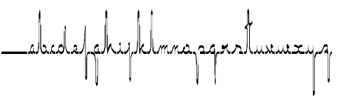 Creator of the scratchy hand Saji Johnny Kundukulam (2010), Wall Painting (2012, mosaic tile face), New York (2012, neon look face), Soak (2011-2012, a textured face), Revolution (2012, a grotesk headline typeface), Revolution II (2012), Builder (2011, pixel face), Cheese Pizza (2011, a caps typeface with runny joints), Bark (2011, texture face), Radar (2011, roundish face), Richmond (2011, dadaist), Ginger 2971 (2011, grungy), Saint (2011), Who Am I (2011, grungy), Dam (2012, an organic caps face), Mercury (2012, liquid look face), Muddy Tyres (2012), Dodge (2011), Moulded Saji (2011), Nibiru (2011, grunge), ECG Saji (2010), DRAGONFLY Saji (2011, Treefrog-style face), Trash (2011, grunhge), New York (2011, grunge), FACE Saji (2011, scanbats), Save Our Souls Saji (2011), Truck Driver (2011), Dragon (2011, grunge), and Wired Saji (2010).
 Fontspace link. Another link. [Google]
[More] ⦿
|
Sed4 Type Foundry (or: Sed4tives)
[Ron Ruedisueli]
|
 Dutch professional music producer and audio engineer who founded his own record label. He also makes (mostly free) fonts. His work:
 - A FontStruct series called STF Letters op Maat, which attempts to recreate all alphabets designed by Dutch Bauhaus designer Jurriaan Schrofer (1926-1990). That list: STF Cutout 1985 (+Solid), STF JS Bevel (+Fill), STF Grafisch, STF Etage Aanduiding (17x17-Inline 1, 17x17-Inline 2, 17x17-Medium Fill, 17x17-Multiline, 17x17-Full Fill, 5x5 Matrix, Hi-res) [op-art, prismatic], STF Gemeentereiniging, STF Berlage (after the letters Schrofer originally designed for The "Beurs Van Berlage", a commodity market building located in the centre of Amsterdam. Later it was also digitalized and used to for the Dutch passport), STF Elevated (3d shadow typeface), STF Semiotica (Incised Outline, Incised, Book, Regular, Title), STF Sater, STF Sans Severe (Light, Heavy, Outlined, Multilines), STF Sans Rounded, STF Avant-Garde i10, STF Schrofer Modular Blocks, STF Social Human Trends (Outlined, Solid, Fill Isolated, Outined Isolated), STF Girokantoor, STF Marx (Solid, Striped), STF Squared Sans, STF Onleesbaar Alfabet (Stroke, Solid, Outlined), STF Bols Jaarverslag, STF Bredero (for the Bredero Bouwbedrijf), STF A.S.C. Communications, STF Connaissance et Langage, STF Paspoort, STF Last Warning (v1), STF Connected Squares (+Fill, +v2 Headline, +v2 Fill, +v2 Outline).
- Other FontStruct typefaces, now over 180 in all, made in 2017-2018. Included are STF Down Vote, STF Slab Inn (a Western font), STF Polygon Window (hexagonal), STF Kalender (based on a 1976 calendar with octagonal letters by Wim Crouwel), STF See You in 2019 (a tiled font), STF Uni (a varsity font), STF Geo Gothique, STF Tegel (a kitchen tile font), STF Don't Count on Me, STF Hyster (a modernist stencil), STF Der Zyklus, STF Scriptorium (blackletter), STF Paradox, STF Sutoraipu Origami Multiline, STF Sutoraipu Origami Filled Stencil, STF Futureline, STF Frescher (Escher-inspired), STF Whiskey-A-Go Go, STF Labrat (op-art, prismatic), STF Tranziztor, STF Otto Font Schirach (mosaic lettering), STF BFG (condensed piano key style), STF Ace of Maze, STF Amsterdam School, STF Neon Flux, STF Wendingen 1922 (based on a old brochure by Wendingen for the Internationale Theater Tentoonstelling Amsterdam 1922; letters designed by Hendricus Theodorus Wijdeveld (1885-1987)), STF Van Nelle (based on an early 1900's poster ad for Van Nelle coffee), STF Purple Maze, STF Militia Stencil, STF Idiocracy (stencil), STF Rode Draad, STF Praesens (based on the lettering found in the second issue of Polish avant garde architectural magazine Praesens), STF Fabricon (a De Stijl stencil; +Outline, +CrossSection), STF Defrag, STF Trilineae, STF Bolsjewie (constructivist), STF Kraftwerk (a tiled typeface; after a 2015 poster by Chuck Sperry for Kraftwerk), STF De Stijl, STF Portfolio Peeters (a tribute to Belgian modernist artist Jozef Peeters (Antwerp, 1895-1960), based on the folder art for his 1921 linocut portofolio), STF Sector 7 (military stencil).
- Pax Romana. Based on the capitalis monumentalis seen at the base of Trajan's Column.
- STF Espionaje. Inspired by the lettering found on a vintage sheet music cover art for "La Java bousculée" (1924).
- STF Oudvreugde's Ontwaken. Based on the Dutch deco lettering of Dutch graphic designer Frederika Sophia (Fré) Cohen (1903-1943). The letters were taken from a book cover design for the "Arbeiders-jeugdcentrale Amsterdam" which was published in 1924.
- Typefaces from 2019: STF Blauhaus (Bauhaus-inspired), STF Type O Negative, STF Bodidone, STF Textualis Batavicum (blackletter), STF Alhambra Blvd, STF Type O Negative, STF Ein Berliner, STF Geo Grotesque (in the style of TT Norms and LL Circular), STF Innercity (art deco), STF Photonia (futuristic), STF Square Grylls, STF Mizollen (labyrinthine), STF Mr Bob Doubalina, STF Plateau Disco (groovy), STF Uncialis Modularis (uncial).
- Typefaces from 2020: STF Schlanke Schöne, STF Care Sensitive.
FontStruct link. [Google]
[More] ⦿
|
ShyFoundry (was: ShyFonts)
[Derek Vogelpohl]
|
ShyFoundry (formerly ShyFonts Type Foundry), located in Elkhorn, NE, was founded in 1995 by Derek Vogelpohl (b. Phoenix, AZ, 1971), whose (often techno) fonts used to be free. His original free font site closed down in February 2001. The fonts were thereafter available at CybaPee's site. Fontspace link. Derek briefly joined ApostrophicLabs in March 2001. His first font there is Phosphorus. In 2001, he created the beautiful Plasmatica family, PhosphorusII, Avondale (a great display family), and the large Covington text family, which is also available now for the Tex community. Dafont link. In 2008, he took his operation to MyFonts. Each type family comes in 8 to 12 styles. - His old free font list: AlienEncounters, ArcheryBlack, AftershockDebris, AlienEncounters, AmericanaDreams, SF DigitalReadout [1999; in 2009, a commercial version, SF Digital Readout Pro appeared], DistantGalaxy, GrooveMachine, HollywoodHills (octagonal, like wood type), MoviePoster, OuterLimits, PlanetaryOrbiter, SFAtarianSystem, SFBigWhiskey, SFCosmicAge, SFFortuneWheel, SFGothican, SF Junk Culture, SFJuggernaut, SFNewRepublic, SFOldRepublic, SFSportsNight, SFSquareHead, SFTattleTales, SFTechnodelight, SF Viper Squadron (1999), SFZeroGravity, SFCollegiate, SFMoviePoster, SolarSailer, StarDust, Telegraphic, ViperSquadron, SF IronSides, SF GrooveMachine, SF TransRobotics, SF Balloons, SF Intellivised, SF Obliquities, SF Willamette, ActionMan, Arborcrest, Automaton, Buttercup, ChromeFenders, SF Espionage, SF Square Head Pro (2009, with Roger S. Nelsson at CheapProFonts), SF Square Root, EccentricOpus, GrungeSans, Intermosaic (pixel family), Intoxicated, IronGothic, Laundromatic, Quartzite, SlapstickComic (comic book font family), SynthonicPop, SF Wasabi (oriental simulation), TheraminGothic, Ferretopia, Toontime, Retroesque, Chaerilidae, Gushing Meadow (dripping blood family), Shai Fontai, Retro Splice.
- Free fonts made in 2008: SF Fourche, SF Florencesans (a huge family), SF Plasmatica, SF Slapstick Comic, SF Speedywaystar.
- Commercial fonts: SF Groove Machine Pro, SF Quartzite Pro, SF Animatron (2008, a redesign of the techno family SF TransRobotics), SF Tekamah (2008, futuristic), SF Portabello (2008, bold and edgy headline family), SF Hallucination, SF Hypocrisy (2009, simple sans), SF Pale Bottom (2009), SF Outer Limits (2009), SF Orson Casua (2009), SF Old Republic (2009), SF Obliquities (2009), SF New Republic (2009), SF Movie Poster (2009), SF Minced Meat (2009), SF Chrome Fenders (2009), SF Eccentric Opus (2009), SF Buttacup (2009), SF Chaerilidae (2009), SF Covington (2009), SF Espionage (2009), SF Deco Techno (2009), SF Baroquesque (2009), SF Ferretopia (2009), SF Chromium 24 (2009), SF Avondale (2009), SF Electrotome (2009), SF Cosmic Age (2009), SF Hallucination (2009), SF Florencesans (2009), SF Zimmerman (2009, hand-printed).
[Google]
[MyFonts]
[More] ⦿
|
Simon Thordal
|
Simon Thordal (College of Visual Communication, Haderslev, Denmark) designed the free experimental geometric typeface Cryptex (2015), the experimental geometric typeface Encoded Mosaic (2016), and the wedge serif Latin / Cyrillic typeface Rust Modern (2016). Behance link. [Google]
[More] ⦿
|
Stephen Nixon
[Arrow Type (or: Typefloundry, or: Recursive Design)]
|
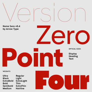 [More] ⦿
|
Stereo Type Haus
[Richard Diaz Granados]
|
 Stereo Type Haus (or STH) is a commercial foundry in Brooklyn, NY, est. 2000, offering fonts by Rick D. Granados ((b. Miami, FL, 1970): Bucks (graffiti font), Bushwick (handwriting), Ballbuster, Bedford (2010, an award-quality dot matrix family inspired by mosaic lettering by Heins&LaFarge, architects of the IRT (Interborough Rapid Transit) in New York City: Bedford hints at the station names on platform walls which date back to 1904 but modernize it through a rigid grid system and rounded corners), Bockhold (2010, a humanist take on DIN), Broadcast (neat stencil face), Konstrukt (stencil), Construkt (2009, a unicase stencil), Falcon, Gran Torino, Roller Girl, Opera (2005, with Ros Knopov), Prisma 2012 (2010, an octagonal multiline face), Radiac (2010, a monoline squarish unicase face), Rukbat, Stylus, Schmearox, Tech Stencil (2000), Noise&Hum, STH Sirena (2006, inspired by hand-painted signage found in "Little Haiti" Miami, Florida), Boris Dworschak (Partisan East, Partisan West, Basic, Gaijin. Other designers include Nikola Djurek (Cornerset (pixel), Aiseman), Luis Valle&R.D. Granados (Lillian, a script face), Arnold Steiner (Statica, Organic Mechanic), Michael Clarke (Paris), Carlos Alfonso (Locut, 2Bit), Denise Wilton (Stereobitz, a stereo dingbat face), Nikola Djurek (Tribeca, Magasine, Soho, Novella) and unnamed author fonts such as Palleta, Rook, STH Kit 1, Stereobytes (audio dingbats), Stereobytes Vintage (hi-fi dings), Nomad (a deconstructivist stencil face).
 At FontStruct in 2009, he made the Victorian family Cartelle (+Inline), the pixel family Microdot, and Chico. Granados spends his time between New York City and Austin, Texas. Klingspor link. View Richard Granados's typefaces. [Google]
[MyFonts]
[More] ⦿
|
Sughayer Foundry
[Amin Ebrahim Kamal]
|
Or Soug Hayar. Or Amin Sughayer. Or Amin Ibraheem. Egyptian creator of the free font series Felicitation Arabic Ramadan (2015), Felicitation Arabic Feasts (2015), Old Mosaic (2015), Amin Sina (2015), Aayat Quraan (2014), My-Font-Quraan1 (2014), Vintage Decorative Signs (2014), Vintage Panels (2014), Vintage Frames (2014), Vintage Elements (2014), Sughayer Separates (2014), Vintage Borders (2014), Vintage Decorative Corners (2014). Fontspace link. Home page. [Google]
[More] ⦿
|
Sydney Goldstein
|
 During her design studies at the University of Kansas (Lawrence, KS), Sydney Goldstein created the (excellent!) free ornamental mosaic font South Rose (2013) for a fictional travel service. In 2015, she added the interesting 10-style typeface family Hooptie, which is based on a 1972 Land Yacht. [Google]
[More] ⦿
During her design studies at the University of Kansas (Lawrence, KS), Sydney Goldstein created the (excellent!) free ornamental mosaic font South Rose (2013) for a fictional travel service. In 2015, she added the interesting 10-style typeface family Hooptie, which is based on a 1972 Land Yacht. [Google]
[More] ⦿
|
Tayce Henderson
|
During her studies in Brisbane, Australia, Tayce Henderson designed the mosaic-styled typeface Macaroons (2012). [Google]
[More] ⦿
|
Tracy Sabin
[Barmoor Foundry]
|
 [MyFonts]
[More] ⦿
[MyFonts]
[More] ⦿
|
William Overington
|
 Located in Worcestershire, England. Designer in 2005-2006 of the free fonts 10000, 10000Outline, ArtisticText, HouseBricks, HouseBricksOutline, BUILD3D, CHESS3D, Chronicle, ChronicleTextDocument, ChronicleTextLozenge, ChronicleTextOutline, ChronicleTextSublozenge, ChronicleText, FontofSpaces, ForSupermarketWallSigns, GalileoLetteringEnamelled, GalileoLetteringGilding, GalileoLettering, GalileoLetteringMosaic, GalileoLetteringSubmosaic, GothicSplendour, Invention103, PaperSimulation, PixelPolka, PixelPolkaOutline, Poetical, QuestChess, Questtext, SculptureGarden, SpanglewareBlues, Stones, Style, StyleArtFont, TomatoesOrangesandLimes. Those are mostly pixel-inspired and techno fonts.
 Fonts made in 2006: AlternateGlyphSelectorsV, CropMarks, EutopianArchitecture (architectural writing face). From 2007: the futuristic but also art deco KernDeco-Italic, KernDeco, KernDecoOutline-Italic, KernDecoOutline, KernDecoShadowLayer, KernDecoShadowLayer2. And PicturesLandscape, PicturesPortrait, Sonnet to a Renaissance Lady, Sonnet Large Initials. From 2008: TRAIAN Experiment. From 2009: FOODQUALITYCOLOURSHAPES. From 2011: Disc and Annuli, Art Test, Sonnet Calligraphic. [Google]
[More] ⦿
|
Wilson Thomas
|
 Designer (aka Funk King, b. Fort Knox, KY) who lives in Orlando, FL, and/or Apopka, FL. He used FontStruct in 2008-2009 to make over 550 decorative fonts, and became one of the world's top experts on FontStruct, FontShop's on-line font editor. Most of his fonts were withdrawn in 2012. He did a few commercial typefaces at his commercial foundry, Funk King. His creations include
 - A Bit Eccentric.
- Alphabots
- Alphadings: Picnic Basket (2014), Rat Race (2014), Pod Invasion (2014), On Hangers (2012, a commercial series that includes Pants on Hangers, etc), Dog Tag, Black Bird, Easter Egg Dots, Ser Egghead T. handlebar, Ovoidotta (now called Sniff), Play Book, BuddhaBuddha, Swizzle Sticks, Computer Backplate, Milky Way, Sprout, Football, Clapboard (for movie makers), Teed Off, Book Stack, Speaker Box, Ant Farm, Sound and Vision, Speaker Grill, Tom Tom, Caged Type, Conga Lounge, Spinal, Add Van, Frostruct, Picket Fence, Regatta, Cranestruct, Impossible Alphabet, Igloo Village, Mortar Board, Jack, Marionette, Golden Gate (+Short, +Solid), Crossed, Eff U ("the finger"!), Tall Big Top, Jackpot, Skulls&Cross Bones Redux, Crosshairs, Drama Club, Good Day Sunshine, Butterfly, Steps and Windows, Heartbroken, O Christmas Tree, Christmas Lights, Candle, Supper Time (alphadings of plates), Sands of Time (alphadings of hour glasses), Fishbones (commercial since 2012), Handy (alphading with hands), Hang Ten (feet alphadings) and High Five (hand alphadings), Armade and Ghost Ship Armada (ship alphadings), Cut Here (stitching alphadings), Schematic (electric circuit alphading), Masquerade, Mortar Board, Gear Bits, Gearswork, Hi-Lo Gears, Gears, Resistor, Gear Shift, Castle, Castle with Flags, Antique Keys, Rounded Keys, Pods, Piano Keys (+Alt, +Correct), Framework, Dixieland Jazz, Spats, and City of New Orleans (the last three are alphdings based on the same Victorian alphabet), Saturn, Piggy Bank, Voodoo Doll, Dice, Fist Bump.
- Antennas, Antennas Outline
- Antiquity
- Arcostellati, Arcostellato, Arcangolo, Arcontorno (2011): a blackletter family.
- Architect, Ruled, Gridworks, Blueprint (Solid, Dashed), Quadular (+Serif), Isometric Modified (+Light, +Bold Outline), Isometric (a 3d gridded family: +Basic Latin, +Basic Latin Lite, +More Latin, +Bold, +Black).
- Art deco: Arc Neuvo (rounded letters), Arc Nuevo (2012, commercial), Toneelschuur (based on the letterhead created for the Theatre Toneelschuur Haarlem), Shift (bold), Eye Spy (this says Peter Sellers), Mod Squad.
- Atomic.
- Avenue, Avenue Alphabet (white on black).
- Badge
- Ball And Chain (neat), Ball Bearings.
- Balls and Bats
- Banjo (2012).
- Barber Shop
- Barcoded
- Basket
- Beachwear (horizontally striped)
- Beat Block, Beat Box.
- Beatnik.
- Beltway.
- Birdseye
- Birdsteps
- Bitten
- Blackletter: Abbey
- Blanket Serif Caps, Blanket Sans Serif
- Block Inline Block
- Block Mosaic (great gridded letters)
- Blockheads
- Blood Sweat&Tears
- Bolla Fratturato (2011): outlined blackletter face.
- Bolt, Bolted
- Bon Mots.
- Break, Balance Beam, After Party (2010).
- Bubble Zwrap (2010).
- Build A Bridge
- Buzz Kill
- Cafe Fumante.
- Carp Black, Carp Blanc
- Caterpillar, Tall Caterpillar.
- Cattails
- Chain Gang, Krazy King
- Channel
- Check Mate (checkered flag font).
- Cherry Bomb.
- Chubby
- Cinder Block (2010): a 3d typeface with texture thrown in.
- Circuit Board Solid, Circuit Board Outline, Circuit Board Outline Numbers, Circuit Board Simple, Micro Clean, Microcircuitz, Circuit Board Simple, Schematode (2013).
- Circus Maximus Outline
- Cirquela (2012). a non-FontStruct font, this is his first hand-printed typeface.
- Clean
- Cobblestones
- Code Hijack (2014).
- Compass (+Plain)
- Connected scripts: Cruise, Jet Cruise (2009), Notched Script (upright, connected), Rough Script (italic, connected), square Script (pixelish, connected).
- Computer Backplate, Milky Way.
- Contempole
- Crimped Pincushion (2010).
- Crispy Inline (classy)
- Crooked Marker, Marker
- Crop Circles
- Crownbar.
- Curls And Twirls
- Cut Here
- Daisies (nice rounded square letters with painted daisies)
- Decoscriptic, Decoish.
- Diamonds Are Forever, Liberty (dot amtrix fonts)
- Didactic fonts: Back to School.
- Digital, Digital Whimsy (gorgeous fonts in which the meat of the glyphs is made up of 0's and 1's), Digital Italics, Digital Non-italics.
- Dingbats: Digital Biz Bitz (2012), Capitalist Pictograms (2012), Kapitalist Kit (2011), Weather System (2011), Twelve Days of Christmas (2010), Learning For Business (2010), Calder Symbols (2010), Mad Aliens (2010), FSEmoticons, Maven Pictograms, Temp (weather dings), Sports Wave, Bullet Arrows
- Dinner at 8
- Diode
- Directional
- Ditier Cycles (2010): a grunge version of J. Hughes's Dirt Cycles.
- Disco Ball, Disco Salvation.
- Doggie Tracks (2010).
- Dollars and Cents.
- Domestic Bliss (+Solid), Blissful Hearts (Valentine's Day alphadings).
- Domino, Dominodot
- Dot matrix fonts: Belly Button (2013), Fandangle (2013), Trace Remains (2013), Billiards (2013), Pome (2013), Cow Poke (2013), Rouletto (2014), Crawler (2014), Zephyrelli (2012), Yoyo (2012), Carousel (2011), Corsivo Punti (2011), Wisp (2011), Amusement (2011), Menagerie (2011), Junk (2011), Iphont (white on black dot matrix face), Lyrical (dot matrix script), Petits Pois, Elli, Industrial Magic, Wind Chime, Domestic Bliss (2010, +Serif, +Sans Serif), Ying Yang (2009)
- Double Decker
- Eau de Kerning.
- Efficiency (2010).
- Eiffel family: mechanical.
- Electrifunkified (2013).
- Emergency
- eq Regular, eq Radio Waves, eq Tight.
- Erector Set (2010).
- Extension Cord
- Fairy Tale (curly)
- Fantastic
- Fast Cars, Fast Lane, Fast Forward
- Fifty Famous Fairy Tales (bi-lined and bejeweled)
- Flair Ornate, Flaired Script, Flair, Flaired
- Floor Plan
- Flash (gridded face)
- Folk Art (wooden plank simulation)
- Font Troll
- Fractal, Wireframe, Hemisphere, Origami (now Mummification): experiments in glyph partitioning.
- Funk, Funky palms
- Gancio (2014). Hand-drawn.
- Gemstone (letters in a mosaic)
- Glyphs made from broken objects: Broken Combs, Broken Glasses
- GI Joe
- Grain
- Graphont
- Grid1, Grid2, Pas De Grille Pli Isométrique (+Plombé), Grille Noir Pli Isométrique (+Plombé), Grille Intrépide Pli Isométrique (+Plombé), Grille Facile Pli Isométrique (+Plombé).
- Grunge typefaces: Feather (2010).
- Gummy (2010).
- Happily Ever After (2010).
- Heath Robinson (gorgeous mechanical font).
- Hexcavated (2010).
- High Anxiety.
- High Wire (dotted).
- Honeycomb Black (hexagonal).
- Horizontally Phased (like IBM logo from afar), Vertically Phased, Field Goal.
- Hot Diggity Dog (2010): a monoline rounded sans.
- Void.
- Inline: Hi-Fi Deco, Track (+Filled), Crispy Inline
- Imperfect Optical Experiment.
- Ironside, Ironworks.
- Isomixed (+Inline, +Inverted, +Light, +Inline Light), Isomixerd Moire (nine textured styles).
- Jacks (2010): a stitching font.
- Jeannie
- Jelly Bean series: I's, Wide, O's, Split
- Jetsons (futuristic).
- Jolly Swash 9+Tall, +Tall Wide Tail).
- Kaleidoscope, Kaleidoscope Solid
- Kitchen tile typefaces: MadisonAveAvenue (2010), Edgar Fernhout (2012).
- Lace
- Ladder
- Last Days Of Summer, Endless Summer, Beach.
- Lattice, Lattice Black
- Lean
- Leaves
- l-e-display
- Little Miss Muffet.
- Loom.
- Love, Love Letters
- Martini
- Metroliner and Metroliner Deluxe.
- MICR fonts: Wedge Solid.
- Mike
- Mitered, Zietgeist: striped 3d typefaces.
- Modal.
- Modern Ancient (chiseled font imitation)
- Molecular (+Complex, +Complex 1), Dense Molecular Complex (1 through 5), Molecular Architecture, Tessellation 1 (+Continuous), Tessellation 2.
- Monkey Bars.
- Montreal (+Italics)
- Monumental, Less Monumental,
- Mortar Booted (+Thick, Separated, Mission, Booted Mission).
- Mouthy
- Music fonts: Fret Full (2010), Fret Station (2010).
- MyBlock
- Mystere (2012, grunge).
- Necklace
- Ninja.
- Oblique
- Octovision Remix
- Open&Shuttered Day, Open&Shuttered Night
- Oriental simulation/look: Shoji Pixel, Shoji Stage&Screen Soapbox, Chinese Democracy, Asian Influence.
- Origami City (2010): formerly Simply Elevated Black. Simple Elevation (2012) is in the same family.
- Outline Habitat
- Ozmosis (2014), Ozian (2014), Cardinal (2014), Emblem (2014), Oblio (2014), Hollow Branch (2014)
- Pallina (2010, + Stampino, +Diluente).
- Palm, Tall Palm
- Paperclip typefaces: Neue Werner Paperclip (2012).
- Patterns
- Pavers
- Piccadilly (2010).
- Pipes
- Pisa.
- Pixel Dust, Pixels Dusted, Zogg Domination (video game font)
- Plaid
- Pop Arc (2010). In the same style: Conveyor Belt, Milk Bottle, Cookie Cutter, Erector Set (2010).
- Popsicle Sticks (nice vertically striped glyphs).
- Playbook (2010).
- Power Grid, Power Gridlocked
- Process This (2010) and Flowcahrt (2010): based on graphs of computer programs.
- Pump Boys (2010).
- Puzzle
- Quagmire (2010)
- Radio Waves
- Razorback Block
- Receipt (2012): a dot matrix face.
- Regular Habitat
- Relativity
- Remixintag (2011, a clone of Wallachia by Intaglio).
- Repeat
- Ribbodini (2010, ribbon font).
- Riveted
- Road Trip
- Sausalito Nautica (2011).
- Say What? (Exaggerated ink trap face)
- Scaffoldini (2010): a 3d gridded face. Followed by Scaffo (2012), Scaffoldini Senza Griglia (2010), Scaffoldini Ascendente Contrario SG, Scaffoldini Ascendente Senza Griglia, Scaffoldini Contrario Senza Griglia, Scaffoldini Ascendente, Scaffoldini Contrario, and Scaffoldini Ascendente Contrario, Scaffoldini Prospettico (+Contrario, +SG).
- Scichosis.
- Scripts: Diode (+Dioded, Diodoubled, Diodocked, Diodedocked, Diodiced), Scherzando, Fontstitution, Rough Script, Scriptilicious, Whipped Cream, 45 Degrees, Script Town (2013), Aloha (2013), Sinal Strength (2013), Ink Well (2013).
- Skulls, Skully
- Slice N dice
- Skyscraper.
- Small Wonder, Small World
- Snowflake (2010).
- Soap.
- Sole
- Soma (2009): 3d letters mades from cubes.
- Spooky Eyeballs (2009).
- Squiggles
- Stained Glass, Stained with Cross
- Starburst
- Stencil fonts: GI Joe (2012, military), Kid's Stencil (white on black), Black Tie, Matchstick, Stensei, Stencillated, Tri-Fold, Tri-Fold Cut, Tri-Fold Rounded, Stencil, Stencil Plate, Stencil Face, Semi Stencil, Psuedo Stencil, Psychedelic Stencil.
- Stitching fonts: Cross Worded (2013), Cut Here (2014), Sampler
- T-Shirts on a Clothesline
- Swamp Frog and Tadpole: artsy fat letters
- Swamp Funk, Mojo (curly letters)
- Swatches.
- Tabular
- Tall Habitat
- Techno look: Technified, Slick, Tangential (2010).
- Tanqueray (2010): octagonal face.
- Teepee (wood look)
- Tennis themed: Racket, Net Ball, World Cup.
- Tetrominoes Black (2010): a 3d typeface cloned from TP2 Marriott's Tetrominoes.
- Textile
- Texture fonts: Global (2011, globes), SS Half Tone (One, Two, Three), SS Watermark, SS Silk Screen (2010). These brush texture typefaces were cloned from Swifted Strokes by Mike Lee. Tramarada (2011) has a stunning woven look.
- Thalistic.
- The Adventure of the Dancing Men (2011, dingbats).
- The Big Top
- The Real McCoy
- Tiki.
- Time
- Timpani, Timpaniless, Timpaniblok, Alien Crop Circles (outer space face).
- Toothpaste (2011): imitating oozing toothpaste.
- Trapezoidot, Zoidot, Dotz (dotted typefaces).
- Upright connected scripts: Madie (2009)
- Valentine's fonts: Hearts and Flowers, Hearts and Arrows, Keys to your Heart, Bed of Hearts
- Vapors and Mirage: evaporating glyphs.
- Vibration (2010). This multiline typeface was followed by Echo (2010).
- Victorian fonts: Alouette, Swamp Funk
- Void.
- Waveform
- WPA Household Arts Stripes, WPA Household Arts Chex, WPA Household Arts (poster stencil face)
- Wee The People, Small World.
- Werner Paperclip (2009), Paperclip (2010): paperclip typefaces after a 1974 original by Ad Werner.
- Western fonts: Bolo (2010), Bow Tie (2010), Bowl (2010), Western Doodle, Sparky, Buckaroo, Diamond Buckaroo, Saloon and Desert Rose. Western style alphadings: Cart Before The Horse, Wagon Train
- Weird
- White on black typefaces: Tabs, Dot Keys, Rounded Keys, Block Keys, Keys.
- Wiggles
- Wim Crouwel-related fonts: Unknown Crouwel #1, Edgar Fernhout (2012: a Wim Crouwel tribute font in kitchen tile style taken from a 1963 poster), Kalender 1976 Letters (octagonal based on a Wim Crouwel calendar from 1976), Kalender 1976, Brusselmans (based on a Wim Crouwel poster), Rabobank (based on a Wim Crouwel poster), Brabant (based on a Wim Crouwel poster)
- Woodcut, Woodcut Recut, Woodcut Banjo.
- Woven.
- Wrenched
- Yay Team
- Zebeast (Zebra-striped letters)
- Zodiac Block
In 2012, he added these fonts at MyFonts: Architect, Black Tie, Carousel, Check Mate, Cobblestones, Cruise, Dog Tag, Edgar Fernhout (2012), Fifty Famous Fairy Tales, Fratturato Digitale (pixelish blackletter face), Ghost Town, Jackpot, Jelly Bean, Keyboard, Kingdom (a castle font), Lagniappe (Victorian), Lyrical, Madie, Matchstick, Menagerie, Q Typ, Scaffo, Sprinkle, Stained Glass, Stencillated, Stensei (stencil), Sweet Valley, Toothpaste, Vibration MF, Yoyo, Zephyrelli. Typefaces from 2013 (no longer freely downloadable!): Pome (dot matrix), Cow Poke (dot matrix), Sausalito Nautica, Cut Here (stitching typeface), Belly Button (dot matrix face), Rouletto (bejeweled typeface), Picnic Basket (alphadings), Fandangle (dot matrix), Trace Remains (dot matrix), Billiards (dot matrix), Cross Worded, Script Town, Schematode (connect-the-dots), Electrifunkified, Aloha, Signal Strength, Ink Well, Satellite, Supper Time (alphadings), Mike (alphadings), Licorice, Conga Lounge OF, Monkey Bars, Daisies, Fractal OF (textured face), Saloon OF, Ball and Chain, Say What. Typefaces from 2014: the multilined or inline typefaces Ozmosis, Ozian, Cardinal, Hollow Branch, Emblem, and Oblio. The alphading typefaces Rat Race and Picnic Basket. The pearly dot matrix typeface Rouletto and Crawler. The video game typefaces Pod Invasion and Zogg Domination. The stitching typeface Cut Here. The pixelized typeface Code Hijack. Klingspor link. Dafont link. Fontspace link. Additional URL. Myfonts link. MyFonts foundry link. View Wilson Thomas's commercial typefaces. [Google]
[MyFonts]
[More] ⦿
|
Yoobee School of Design
|
 Yoobee School of Design (Auckland, New Zealand) showcases some original typefaces due their graduates in 2013: Julie Zhu (who made a great art deco caps typeface), Alex Tau, Anish Vijayan (who made Flormetal), Ben Andersen (who made the ship mast-inspired Silo Park), Darelle Teau (who made the mosaically-tiled Bohemian), Chongqing Fan, Natchanok Ruangsillapasart (who made the hexagonal typeface Fistura de Silo), Jiayu Ni, Rangi Christie, Sandeep Patel (who made Ponsonby, inspired by metal joints), Tri Nguyen, Thanadul Lertpisitkul, Russell Wilmshurst (Britomap), Linda Munt (Gallery, inspired by jewelry), Leung Onki, Charles Scott, and Matthew Fell (who made Dockside). [Google]
[More] ⦿
Yoobee School of Design (Auckland, New Zealand) showcases some original typefaces due their graduates in 2013: Julie Zhu (who made a great art deco caps typeface), Alex Tau, Anish Vijayan (who made Flormetal), Ben Andersen (who made the ship mast-inspired Silo Park), Darelle Teau (who made the mosaically-tiled Bohemian), Chongqing Fan, Natchanok Ruangsillapasart (who made the hexagonal typeface Fistura de Silo), Jiayu Ni, Rangi Christie, Sandeep Patel (who made Ponsonby, inspired by metal joints), Tri Nguyen, Thanadul Lertpisitkul, Russell Wilmshurst (Britomap), Linda Munt (Gallery, inspired by jewelry), Leung Onki, Charles Scott, and Matthew Fell (who made Dockside). [Google]
[More] ⦿
|
Yuuki Yamaguchi
|
Graphic designer in Tokyo who created various display typefaces in 2015 such as Partition (kitchen tile), Mosaic, Line and Contrast. Behance link. [Google]
[More] ⦿
|
Zupagrafika
|
Design studio in Poznan that created Prefab Font in 2014. Prefab is a dot matrix typeface based on mosaic tiling. Behance link. [Google]
[More] ⦿
|

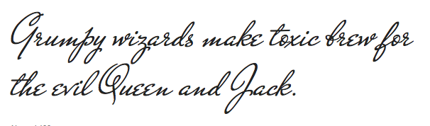
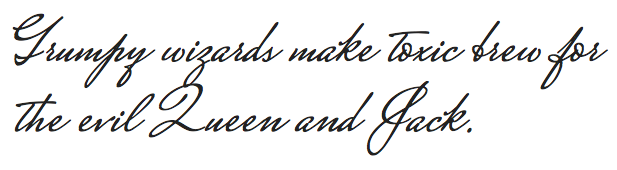
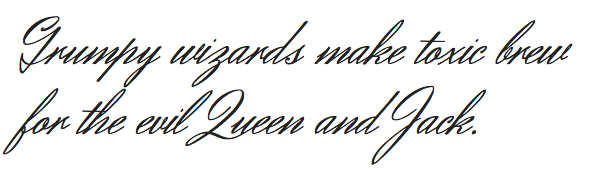
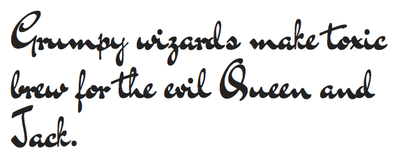
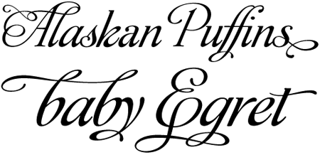
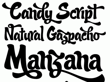
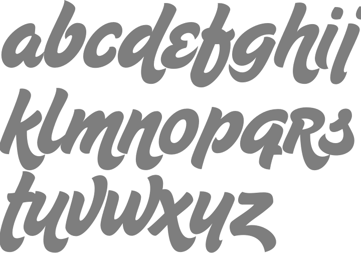
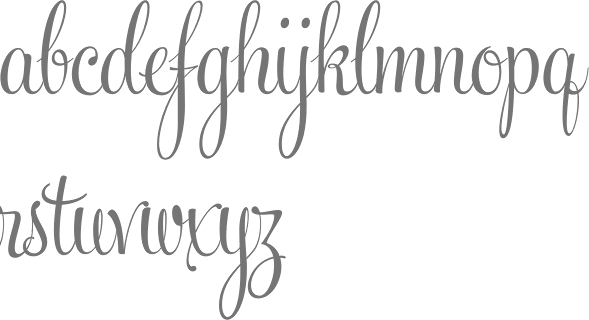
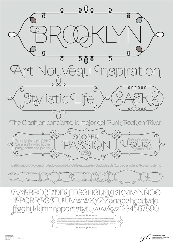
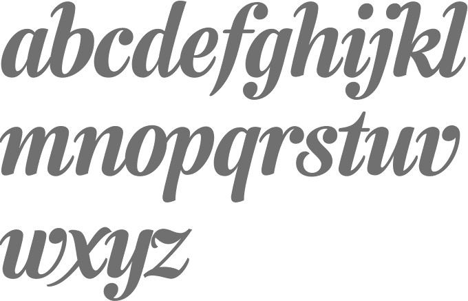
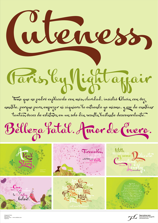
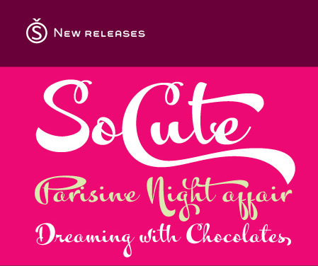
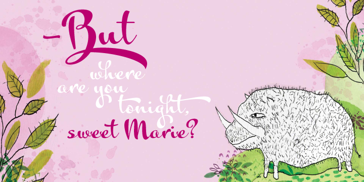
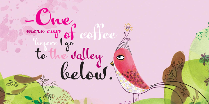
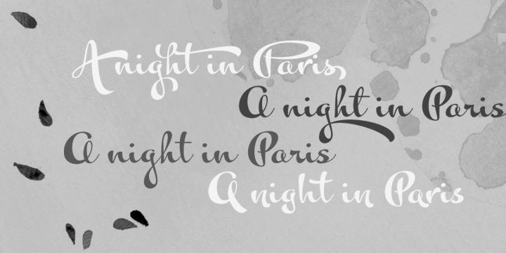
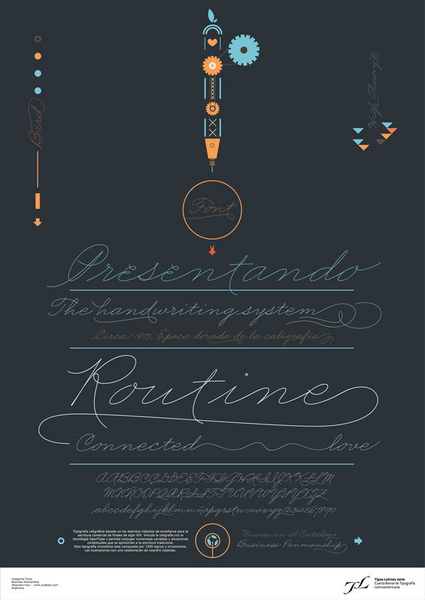
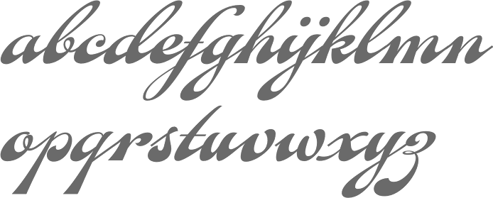
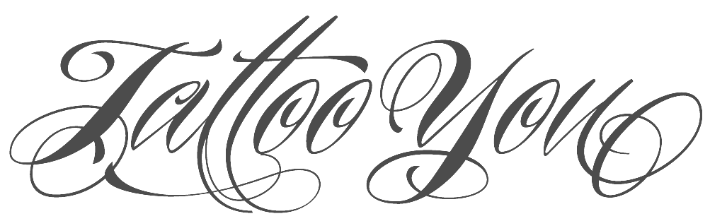
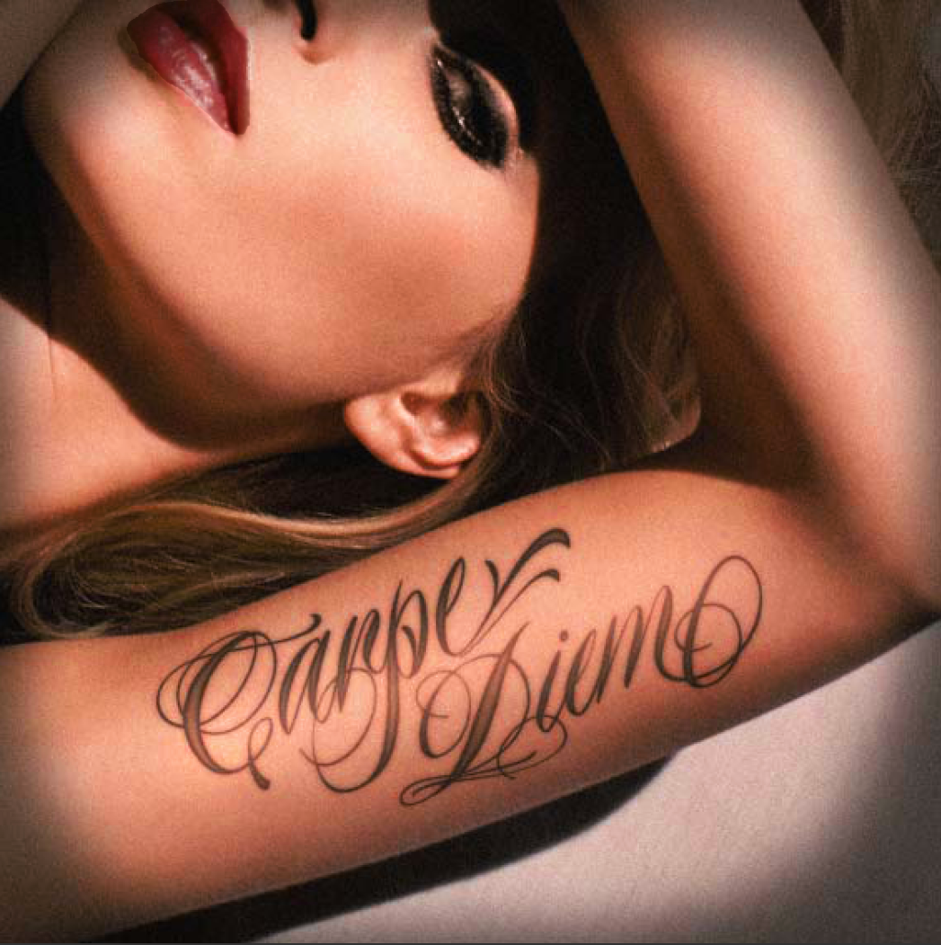
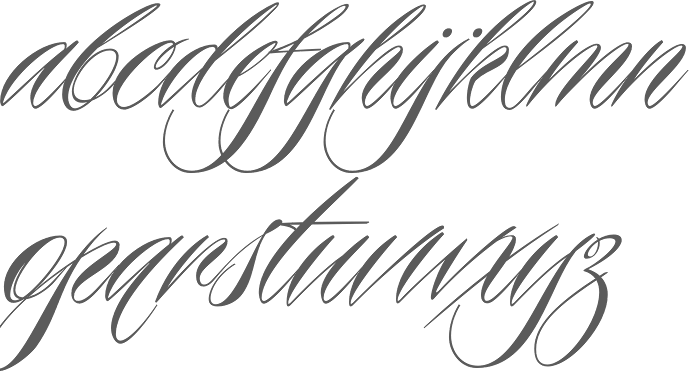
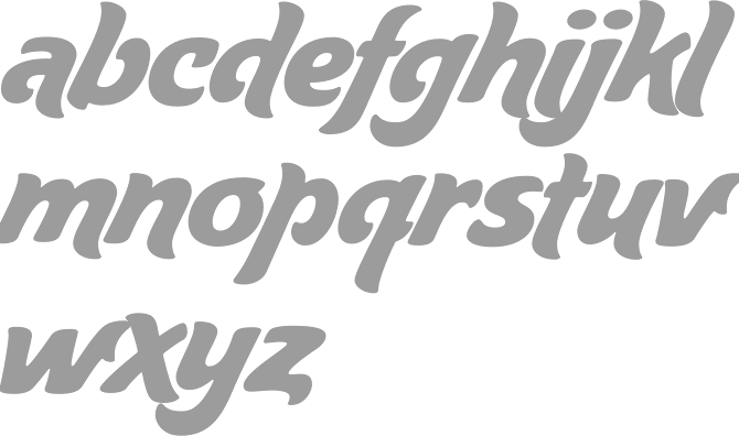
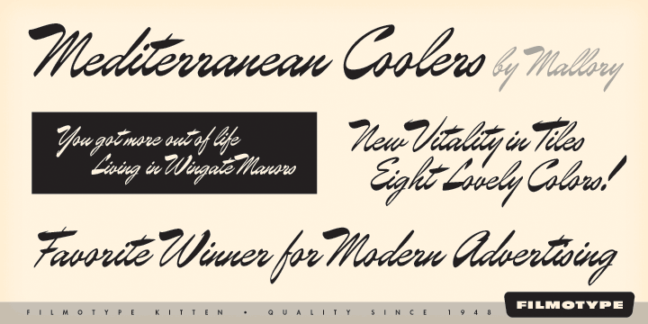
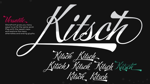
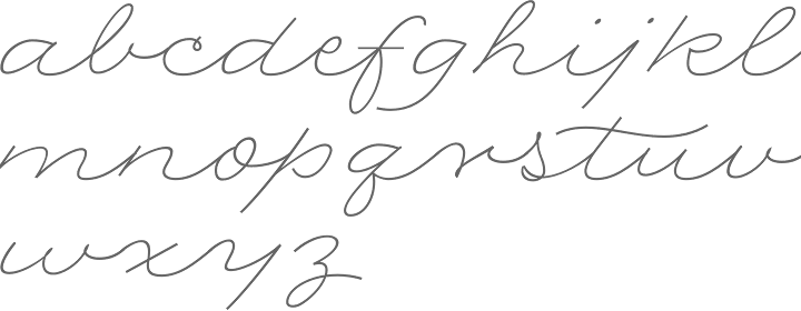
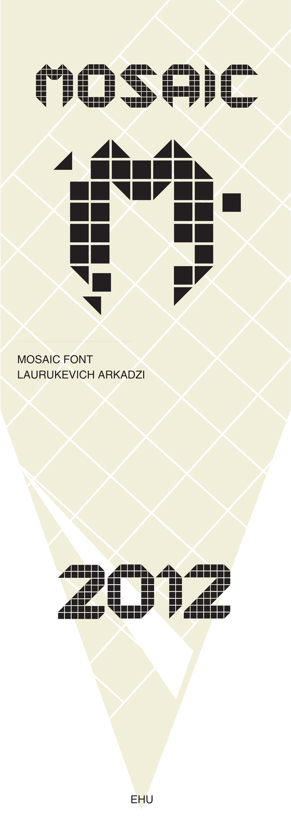
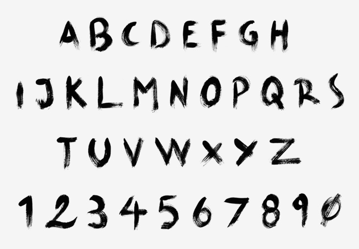
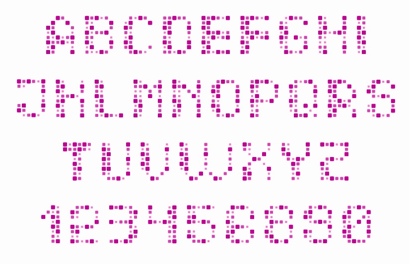
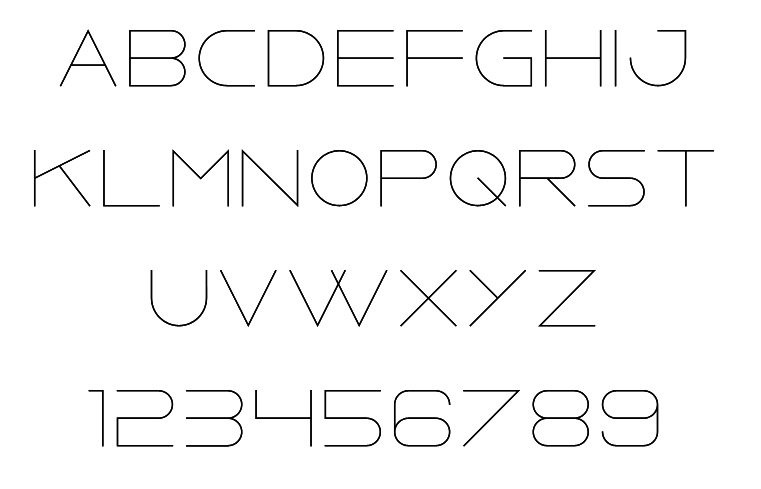
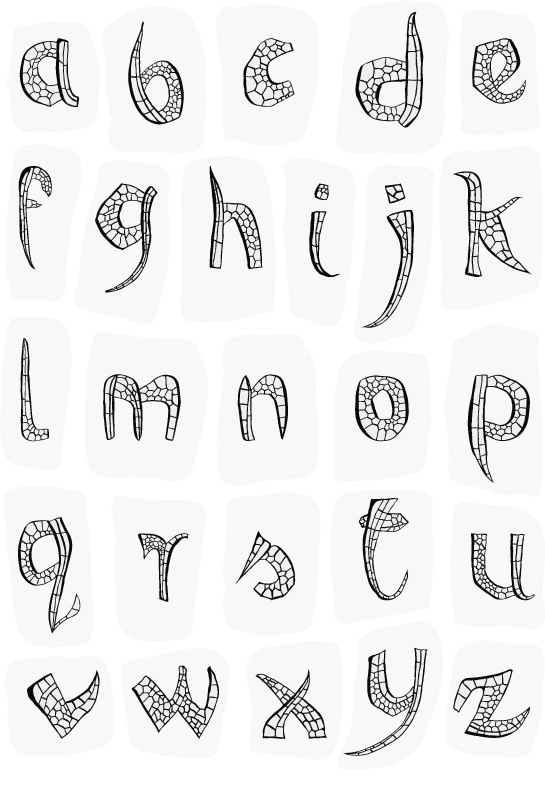
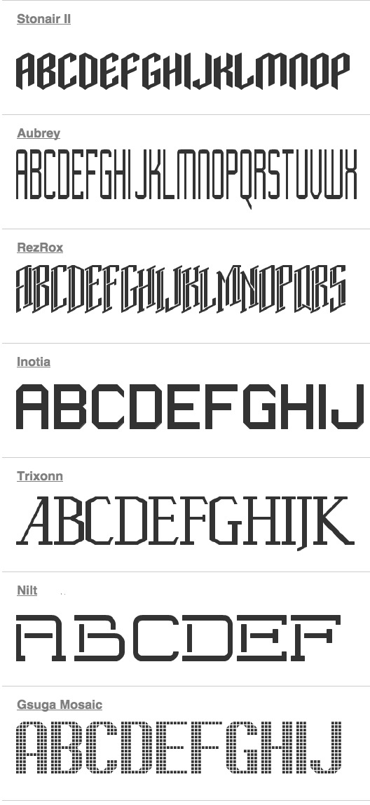
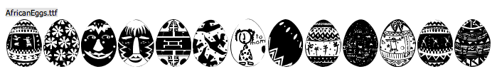
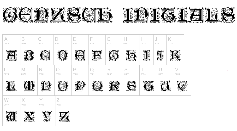
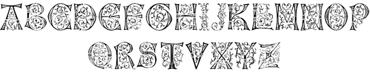
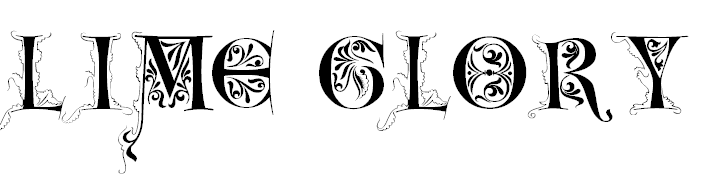
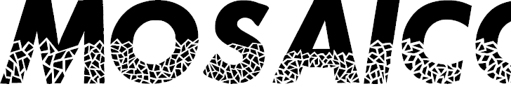
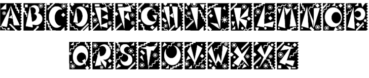
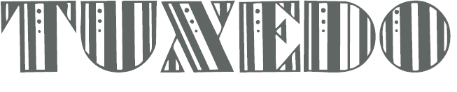
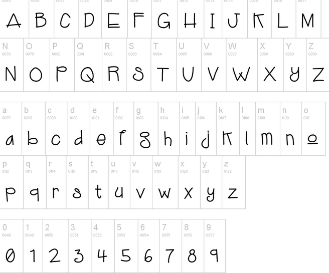
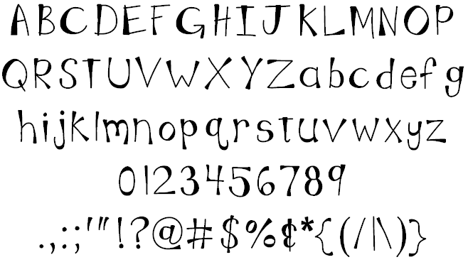
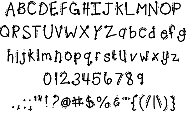
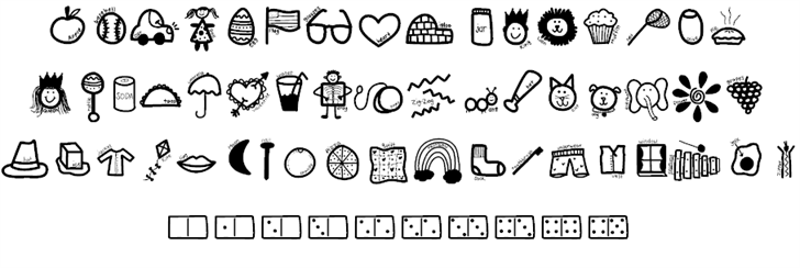
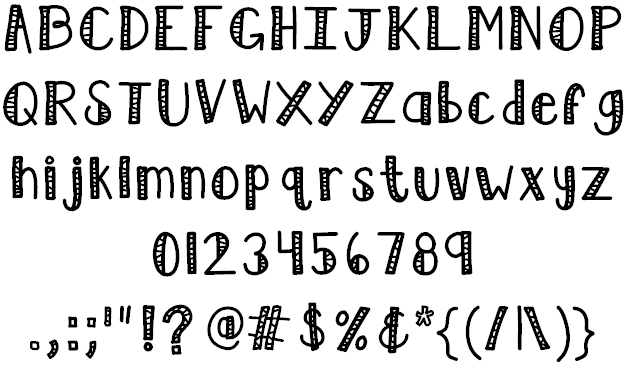
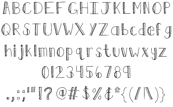
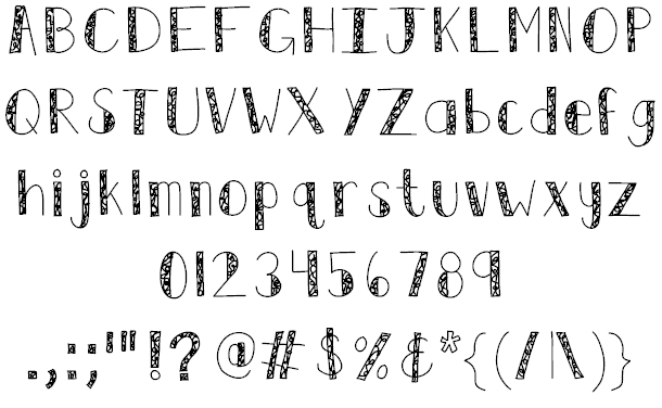
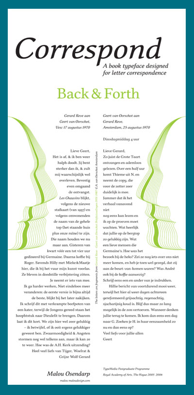
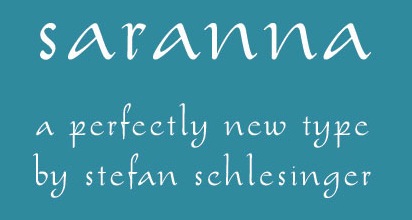
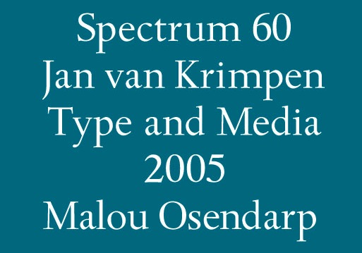
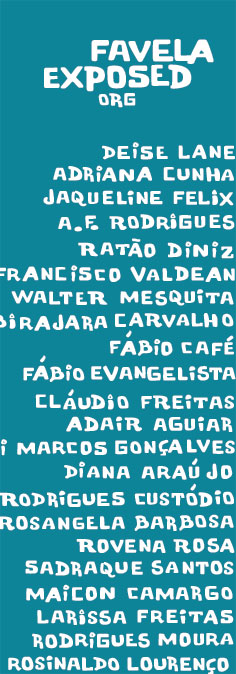
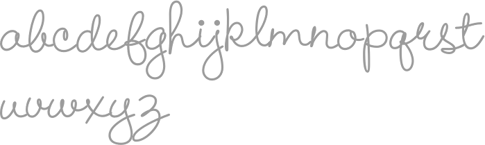
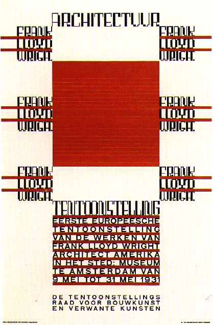
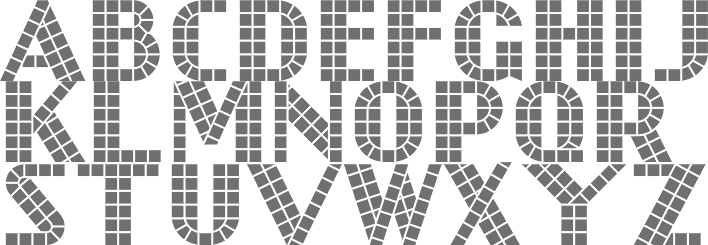
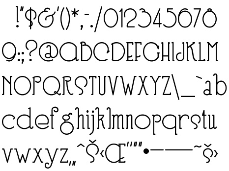
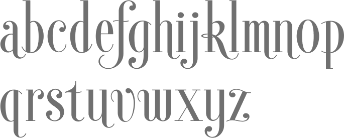
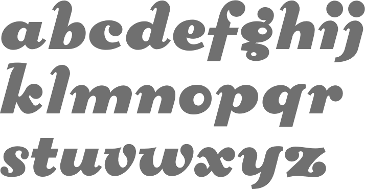
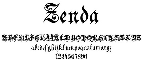
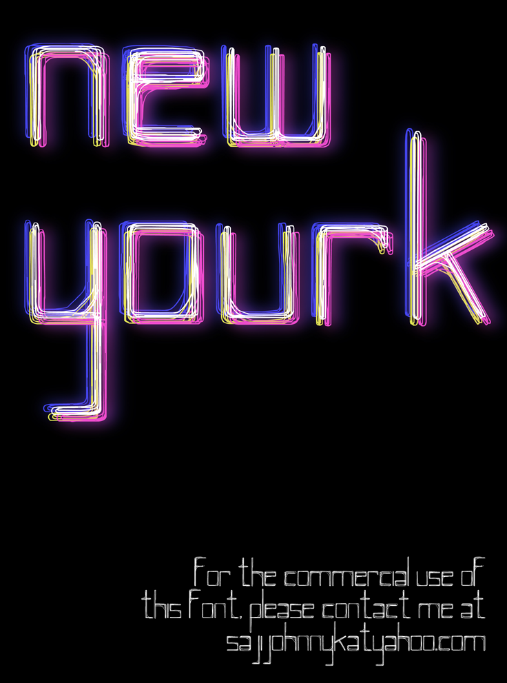
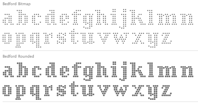
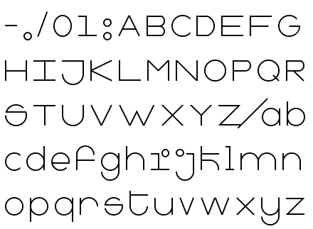
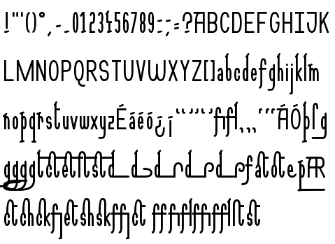