| | |
Alexandra Pavlenko
|
During her studies at the British Higher School of Design in Moscow, Alexandra Pavlenko created the dry brush font Archeology (2017), an onion print typeface (2017), the very fat poster font Play (2017) and the prismatic typeface Strips (2017). [Google]
[More] ⦿
|
Amy VanTorre
|
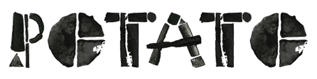
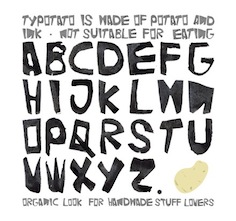
Designer of the grunge typefaces Kira Lynn (2005) and Potato Press (2005, potato printing). She also make the gorgeous scratchy handwriting font Brankovic (2007). [Google]
[More] ⦿
|
Andrew Foster

|
British designer (b. 1976, Bedford) of Mister Loopy (2009). He went commercial in 2009: via MyFonts, one can now buy Spud AF (2009, a potato cut font), Peepz AF (2011, a collection of typefaces of boys), and the hand-printed Scribbles AF family (2011, +Biro, +Felt Tip, +Marker). MyFonts link. Klingspor link. Dafont link. [Google]
[MyFonts]
[More] ⦿
|
Andrew P. Smith
|
London-based and Australia-born designer of Doodlebug (Letraset, a nice scratchy handwriting face), Jokerman (1995, Esselte), Retro Bold (1992, a slab serif done with Colin Brignall), Scratch (1995), Smudger (1994), Chiller (1995, Esselte), the frivolous curly font Laughin (FontHaus, since 2006 also at Group Type: sample, another sample, and another one), Doubler Script (FontHaus), Chipper (1995), and Faxsimile (at 2Rebels, 1998). Creator of Barbed Wire AS (1998). Goo Goo Gjoob (Letraset Fontek) was inspired by the hand-writing and drawings of John Lennon (see also John Lennon (2008, a free font by Analia Wainer). Potato Cut (Fontek) is a comic book face. Klingspor link. FontShop link. View Andrew P. Smith's typefaces. [Google]
[MyFonts]
[More] ⦿
|
Barbara Klingenberg
|
Flensburg, Germany-based designer of the potato print typeface Rue Morgue (2017). [Google]
[More] ⦿
|
Carey-Anne Jayanandham
|
At the University of Johannesburg in 2016, Carey-Anne Jayanandham designed the icons for the Zoo Lake wayfinding system, and published a potato stamp tribute to Adrian Frutiger (2016). Behance link. [Google]
[More] ⦿
|
Christine Auf der Mauer
|
Chicago-based designer of Potato Print Font (2013) and of a geometric typeface done for KISD (Köln International School of Design) Gala 2012. Behance link. [Google]
[More] ⦿
|
Denis Mas
|
Moscow-based designer (with Anton Shelko) of the decorative Cyrillic caps typeface Entertaining Mechanics (2014). He also made the potato print Cyrillic font Zhola (2014). [Google]
[More] ⦿
|
Denis Parfyonov
|
Moscow-based designer of the Cyrillic display typeface Circus (2017), which combines Bodoni and PF Agora Slab. He also created the Cyrillic potato print typeface Soil (2017). [Google]
[More] ⦿
|
Device Fonts
[Rian Hughes]
|
 Rian Hughes studied at the LCP in London before working for an advertising agency, i-D magazine, and a series of record sleeve design companies. Under the name Device he now provides design and illustration for the advertising, entertainment, publishing, and media industries. He works from Richmond, UK, as a comic book artist, letterer and typefounder---his foundry is called Device. He creates mostly display type. List of fonts. Interview. Review by Yves Peters. Monotype Imaging page. Interview by Die Gestalten. Various (overlapping) font listings, still unorganized.
 - Dingbats: Pic_Format, Mastertext Symbols, MacDings, RiansDingbats, Autofont.
- FontFont fonts: Identification (1993), Revolver, Rian's Dingbats, LustaOneSixtySans, Knobcheese, CrashBangWallop, and Outlander.
- [T-26] fonts: English Grotesque (1998), Data90 (2003; a free FontStruct typeface that is virtually identical to Data90 is Bitrate by Kummaeno (2010)), Flak Heavy (2003, stencil), Flak (2003, stencil), Freeman (2003), Klaxon (2003, kitchen tile font), Cordite, Substation (2003), September (2003), West Way (2003), Egret (2003), Paralucent Complete (2003), Paralucent Condensed, Paralucent Stencil (2003), Mercano Empire (2003), Iconics (2003), Cantaloupe (2003), Gravel (2003), Acton (blocky screen font, 2002), Ainsdale, Amorpheus, Anytime Now (alarm dingbats), Bingo, Blackcurrant (Blackcurrant Cameo (1997) is free), Bordello, Elektron, Haulage (U-Haul lettering, 2002), WexfordOakley, Telecast, Terrazzo, Transit, Untitled, Scrotnig, Skylab (2002), Silesia (1993), SlackCasual, Ritafurey, Reasonist-Medium, Regulator, GameOver, Novak, Quagmire, PicFormat, Jakita Wide (2000, techno font), Metropol-Noir, Motorcity, Mastertext, Mystique (2002), MacDings, Lusta, Laydeez, Sinclair, Paralucent (sans serif), Judgement, Bullroller, Zinger (a fifties font), Citrus (2002), Popgod (2003), Range (2000, a futuristic font), Hounslow, Jemima, Griffin, GranTurismo, Gargoyle, Foonky, DoomPlatoon, Darkside ("remixed" by FontStructor Kummaeno in his Ubangi (2011)), Kallisto (2010), Kallisto Lined (2010), Cyberdelic, Contour, and the very original Stadia Outline family (Stadia is a kitchen tile font).
- List of all fonts by Rian Hughes, as of 2004: Acton, Ainsdale, Amorpheus, Anytime Now, Bingo, Blackcurrant, Bordello, Bull Roller, Chascarillo, Contour, Cottingley (1992), FF CrashBangWallop, Cyberdelic, Darkside, Data90, Doom Platoon (1996), Elektron, English Grotesque, Flak, Foonky, Freeman, Game Over, Gargoyle, Gran Turismo, Griffin, Haulage, Hounslow, Iconics, FF Identification, Jakita, Jemima, Judgement, FF Knobcheese, Laydeez Nite, Lusta (big family), Mac Dings, Mastertext, Men Swear, Metropol Noir, Motorcity, Mystique, Novak, FF Outlander, Paralucent, Pic Format, Platinum, Quagmire, Range, Reasonist, Register (A and B), Regulator, FF Revolver, FF Rian's Dingbats, Ritafurey, Scrotnig, September, Silesia, Sinclair, Skylab, Slack Casual, Space Cadet, Stadia, Substation, Telecast, Terrazzo, Transmat, Untitled One, Vertex, Westway, Wexford Oakley, Why Two Kay, Zinger.
- At Veer, in 2005, these Device fonts were published: Gentry, Gridlocker, Valise Montreal, Custard, Box Office (moviemaking letters), Sparrowhawk, Monitor, Moonstone, Miserichordia, Yolanda (a great playful medieval text typeface in three styles: Duchess, Princess, Countess), Gusto, Dauphine, Rogue, Ritafurey, Dynasty, Radiogram, Xenotype, Roadkill (grunge), Payload (stencil family comprising Regular, Outline, Spraycan, Narrow, Narrow Outline, Wide, Wide Outline), Catseye, Electrasonic, Absinthe (psychedelic style), Straker, and Chantal (brush).
- In 2006, Veer added these: Profumo, Ironbridge, Cheapside, Battery Park (grunge), Forge, Shenzhen Industrial, Hawksmoor (grunge), Coldharbour Gothic, Wormwood Gothic (grunge), Chase (grunge), Diecast, Roadkill Heavy, Tinderbox (fuzzy blackletter), Dazzle (multiline face), Nightclubber (art deco), Klickclack (2005, comic book or cartoon caper typeface), Vanilla (art deco), Wear it's at (grunge), Diecast, Drexler, Box Office (movie icon font).
- Fonts from 2007: DF Conselheiro (2007, grunge), DF Glitterati (2007), Indy Italic (script), DF Apocrypha (2006, rough outline), DF Quartertone (2007), DF Lagos (2007, rough stencil), DF Pulp Action, DF Reliquary #17 (2006, grunge didone), DF Dukane (2007, octagonal grunge), DF Strand (2007, striped stencil), DF Rocketship from Infinity (2006, futuristic), DF Appointment with Danger (2006), DF Las Perdidas (2006, grunge stencil), DF Kelly Twenty (2007, grunge stencil), DF Heretic, DF Roadkill, DF Ironbridge, DF Forge, DF Shenzhen Industrial, DF Hawksmoor, DF Cheapside, DF Battery Park, DF Saintbride, DF Profumo, DF Coldharbour Gothic, DF Wormwood Gothic, DF Tinderbox, DF Flickclack, DF Vanilla (multiline art deco face), DF Chase, DF Nighclubber (art deco jazz club face), DF Diecast, DF Dazzla, DF Zond Diktat (grunge), DF Yellow Perforated, DF Mulgrave (grunge), DF Ministry B, DF Ministry A (with a hairline weight), DF Gridlocker, DF Gentry, DF Valise Montréal (grunge), DF Custard, DF Box Office, DF Roadkill, DF Payload Wide, DF Payload Narrow, DF Catseye Narrow, DF Catseye, DF Yolanda, DF Xenotype, DF Telstar, DF Straker, DF Sparrowhawk, DF Rogue Serif, DF Rogue Sans Extended, DF Rogue Sans Condensed, DF Rogue Sans, DF Ritafurey B, DF Ritafurey A, DF Radiogram, DF Pitshanger, DF Payload (stencil), DF Outlander Nova, DF Moonstone, DF Monitor, DF Miserichordia, DF Interceptor, DF Gusto, DF Glitterati, DF Galicia (2004), DF Galaxie, DF Electrasonic, DF Dynasty B, DF Dynasty A, DF Drexler, DF Dauphine, DF Chantal, DF Absinthe, DF Register Wide B, DF Register Wide A, DF Register B, DF Register A, DF Quagmire B, DF Cordoba (2007, grunge), Mellotron (2004, stencil), Seabright Monument (2007), Charger (2007, grunge).
- T-26 releases in 2007: Klickclack, Hawksmoor (grunge), Heretic, Ironbridge (old letter simulation), Battery Park (grunge), Chase (grunge), Cheapside (grunge), Dazzle (multiline art deco), Diecast (grunge), and Forge (grunge).
- T-26 releases in 2008: Automoto (fat multiline deco face), Straker (organic). Also from 2008: Mission Sinister (grunge), Gonzalez (grunge).
- FontBros release in 2009: Filmotype Modern. Other Filmotype series fonts include Filmotype Miner (2012), Filmotype Manchester (2012), Filmotype Meredith (2012), Filmotype Marlette (2012), Filmotype Mansfield (2012), Filmotype Power (2012) and Filmotype Major (2012: this is based on a typeface used as the titling font for the popular children's book by Dr. Seuss entitled One Fish Two Fish Red Fish Blue Fish, 1960). Other 2009 fonts: Degradation (grunge).
- Creations in 2010: Pod (2010, fat round stencil), Korolev (2010, a 20-style monoline sans family based on communist propaganda from 1937), DF Agent of the Uncanny (2010, brush face), DF Destination Unknown (2010, Kafkaesque brush), DF Maraschino Black (a sleek, sophisticated high-contrast swash capital font).
- Creations in 2011: DF Capitol Skyline, DF Capitol Skyline Underline and DF Capitol Skyline Capitals (a multi-weight all-caps pair that epitomizes Streamline Moderne), DF Korolev (a 20-weight sans serif family based on lettering by an anonymous Soviet graphic designer who did the propaganda displays at the Communist Red Square parade in 1937. Named in honor of Sergey Pavlovich Korolyov, or Korolev, considered to be the father of practical astronomics). In 2018, Korolev was expanded to Korolev Rounded and Korolev Rough.
- Typefaces from 2012: Ember (informal script), Kane (based on the Batman logo), Glimmer Glossy, Glimmer Mate, Galleria (avant-garde caps), Clique (flared sans).
- Typefaces from 2013: Wulf Utility (grungy), Charterhouse (an aggressive black sans), Filmotype Melon (after a 1959 original, this is an offbeat Googie era doo-wop typeface), Filmotype Melody (similar to Melon), Filmotype Mellow (also similar to Melon), Raw (worn wood type), Cadogan (a rhythmic connected script), Whiphand (brush face), Steed (heavy codensed masculine sans inspired by the titles of the Avengers TV show), State Stencil (Clean and Rough: in the style of Futura Black), Korolev Military Stencil (named after Sergei Korolev, father of Soviet astronautics, and based on signs from the Red Army parade of 1932), Armstrong (a 1950s automobile font).
- Typefaces from 2015: 112 Hours (numerals font).
- Typefaces from 2016: Typex (an angular yet rounded monospaced typewriter or OCR-style typeface based on the lettering used on Alan Turing's and Tutte's famous code-breaking machine at Bletchley Park, the Bombe, and the subsequent British answer to the German Enigma machine, the Typex), Serenity (a legible sans family).
- Typefaces from 2017: Pitch (a heavy block sans in chrome and solid variants), Shard (originally commissioned for Nickelodeon's 3D reboot of the Teenage Mutant Ninja Turtles franchise), Championship Inline, Mood (a great liquid deco font), Grange, Grange Rough, Dazzle Unicase, Urbane (sans), Urbane Rounded, Albiona (a modern take on Clarendon; includes Albiona Heavy Stencil), Albiona Soft (a rounded version of Albiona), Pact (a modular geometric font).
- Typefaces from 2018: Rutherford, Salvation (a potato cut font), Kano (inspired by the work of Dutch furniture designer and architect Gerrit Rietveld, one of the principal members of the Dutch artistic movement De Stijl), Rogue Sans Nova, Fairtrade (rough-edged font), Goddess (Victoriana), Neuropa (a five-weight semi-extended sans that projects a muscular corporate authority), Worthington Arcade (a caps-only lapidary typeface), Zeno (a piano key stencil typeface), Vektra (an experimental crosshatch-textured typeface), Recon (a quartz display font), Kinesis (Kinesis is inspired by the work of Dutch furniture designer and architect Gerrit Rietveld, one of the principal members of the Dutch artistic movement De Stijl. It is a modular headline font, constructed from white, black and grey overlapping rectangles), Freehouse (Freehouse is a reinterpretation of the well-remembered Watney's logo, a brewery and pub chain infamous for its poor quality beer and brutalist decor.), Zipline (a great multiline typeface), Argent Sans, Craska (a multiline font), Panther Black, Carilliantine (art nouveau with many interlocking letter pairs), Regulator Nova, Broadside, Bubblegum Pop, Heft (a heavy slab serif), Faction (stencil style), Metaluna (techno, engineering), Magnetron (futuristic), Urbane Rough, Urbane Adscript (a monoline semi-linking sans), Revolver (original from 1992), Albiona Inked (a Clarendon).
- Typefaces from 2019: Gerson Rand, Gravesend Sans (an all caps sans family based on the unique typeface used for the iconic grass-green signage for the now-defunct Southern Railway in England).
- Other: Customised Foonky Starred, Altoona, DfAncestorITC, DfAttitudesPlain, HotRod (2002).
- Typefaces from 2020: Breach (a display typeface with partitioned capital letters), Epiphany (stencil), Aurore Grotesque (an elegant geometric art deco sans family with small x-height), Faculty (a geometric sans with large x-height), Fathom (a flared serif typeface), Atomette (a stylized comic book typeface family), Conquera (a stylish extended caps-only font in five weights plus an inline), Dare (a tape font, that borrows a pinch of the hand-drawn swagger of Bauer's Cartoon (designed in 1936 by H. A. Trafton), used as Dan Dare's signature logo in the British boy's comic Eagle, and also the upward-pointing serifs of machine-moderne typefaces such as Dynamo (designed by K. Sommer for Ludwig & Mayer in 1930), Urbane Condensed.
- Typefaces from 2021: Maximum (a blocky techno or sports font), Paralucent Slab (a monolinear slab serif), Guildhall (a 10-style strong-willed mechanical font family), Broadside Text (14 styles), Cynosure (a 14-style elliptical sans), Valvolina (a geometric display typeface inspired by Italian Futurismo), Chassis (a sci-fi or computer game font), Fomalhaut (a space exploration font), Disclosure (a grungy font), Sheffield Fiesta (a squarish font based on the brutalist concrete landmark nightclub in Sheffield, now the Odeon Cinema), Grange Text (a 14-style sans), Wilko (a fat rounded poster typeface), Farthing (a 5-style wedge serif).
- Typefaces from 2022: Bradbury Five (a vernacular / bubblegum / supermarket / cartoon typeface in 18 styles), Tracker (an inline space-age disco font from the 1960s or 1970s, reminiscent of the Mexico City olympics font), Salient (a 12-style didone).
FontShop link. Klingspor link. [Google]
[MyFonts]
[More] ⦿
|
Diala El-Zein
|
Graphic designer in Beirut, who created the poatao print font Batata in 2014. [Google]
[More] ⦿
|
Diana Khozheva
|
 Moscow-based creator of some striking painted Cyrillic alphabets in 2014. She also created Fishtail Font (2014) and Potato Script (2014, for Cyrillic). [Google]
[More] ⦿
Moscow-based creator of some striking painted Cyrillic alphabets in 2014. She also created Fishtail Font (2014) and Potato Script (2014, for Cyrillic). [Google]
[More] ⦿
|
Donald Roos
[Otherways.nl]
|
[MyFonts]
[More] ⦿
|
Dutchfonts.com
[Ko Sliggers]
|
 Ko Sliggers, b. 1952, Bloemendaal, The Netherlands, was a young designer at Studio Dumbar. After that, he became a professional cook in Rotterdam, Italy and France, switched back from food to design, producing challenging visuals at Studio Anthon Beeke and, in 2002, set up a one-man studio in Lalleweer, in the province of Groningen, called Dutchfonts. He was trained by Chris Brand at the St. Joost Academy in Breda. Ko created these commercial typefaces: DF Tapa (2007, irregular hand), Camino (2006, an austere sans), Ko (1997, six stencil styles), Etalage (2000), Arienne (2000), Staple Mono (monowidth typewriter family), Staple Txt (2005), Pommes (based on type cut out of potatoes; 8 styles), Daantje (dog dingbats) and Ko (1997, rough stencil). His own web site. MyFonts page, where you can buy DF-Arienne, DF-Etalage, DF-Ko, DF-Pommes (2005, potato cut typeface family), DF-Staple Mono, DF-Tapa (2007, grunge), DF-Mercat (2007, dingbats inspired by Barcelona's Ramblas), DF-Pigtail (2008, seventies-style script family), DF-Zzzz (2009), DF Camino (2009, a sans that is modeled on traffic sign sans typefaces), DF Stromboli (2010: It was written with a coffee spoon, acting like a broad pen, in the ashes of the Stromboli volcano right on top of a scanner. ), DF DejaVuPro (2010, an amalgam of sans typefaces), DF Game Over (2011, sketched face), DF Scheurze (2012, a great fat rough stencil face).
 Typefaces from 2013: DF Riga (grungy pixel face), DF Abit (another grungy pixel face), DF Dudok (a grungy pixel face). Typefaces from 2015: DF Charlie Go (free typeface designed immediately after the Charlie Hebdo attack in Paris), DF Park (experimental font started in 2013, originally made to dress up the facades of a food exhibition). Dafont link. Klingspor link. View Ko Sliggers's typefaces. [Google]
[MyFonts]
[More] ⦿
|
Enserio Studio
|
 Girona, Catalunya-based designer of Patata (2014), a potato print font custom-made for Set Café. Edding (2014) is a marker font. Behance link. [Google]
[More] ⦿
Girona, Catalunya-based designer of Patata (2014), a potato print font custom-made for Set Café. Edding (2014) is a marker font. Behance link. [Google]
[More] ⦿
|
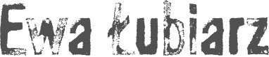
Ewa Lubiarz
[Lubudu]
|
[MyFonts]
[More] ⦿
|
Eyal & Myrthe
[Eyal Holtzman]
|
 Eyal Holtzman (Den Haag, The Netherlands) is a graphic and type designer who was born in Haifa, Israel in 1969. He studied at the Royal Academy of Art in The Hague, and teaches typography and graphical arts in various places. He set up Studio Eyal and Myrthe together with Myrthe Stel.
 Eyal Holtzman has designed many corporate and some retail typefaces. typefaces for clients such as The Enschedé Font Foundry and Nationale Nederlanden. His work has been exhibited in many places, including in Museum of the Book---Meermanno in Den Haag. MyFonts writes: In the book Ha, daar gaat er een van mij! (Hey, there goes one of mine!, a chronicle of graphic design in The Hague from 1945 to 2000, 010 Publishers, Rotterdam 2002) he is called "one of the most idiosyncratic letter talents from The Hague" and in Dutch Type (010 Publishers, Rotterdam 2004) expert Jan Middendorp describes his letters as being "among the most original alphabets produced in the Netherlands", (...) "tapping into an idiom that no other type designer working in the Netherlands has ever used". His typefaces: - Normandia. Done during his studies at KABK.
- Joel (Book, Display). Done during his studies at KABK.
- Jerusalem (1996). A Latin / Hebrew font that attempts to harmonize the two scripts. This design was part of Eyal's post-graduate type design project at the KABK in 1996 and was later exhibited in Meermanno.
- Rain Birds. Done during his studies at KABK.
- Dille & Kamille. A handwriting font commissioned by a retail chain.
- Soya. A potato cut font done for a book about artist Allie van Altena.
- Rosart. A collaboration with The Enschedé Font Foundry. A revival of the Two Line English Body Rosart, designed in the 18th century by the Belgian type cutter Jacques François Rosart (1714-1777). This revival, based on original type specimens from the J. Enschedé collection, aimed to interpret the spirit of the original design as faithfully as possible. Irregularities in the design had to be kept.
- Staring. A revival of the unknown font used in the poetry book Gedichten van A. C. W. Staring (published by Nicolaas Beets in Zutphen, undated).
- OD 1 2 3. A typeface commissioned by design and advertising agency OD in Rotterdam. The three fonts have identical spacing and can thus be superimposed. Text set this way emulates adhesive tape.
- Sympatico (2016). A special design for the supermarket chain Jumbo, to replace Jumbo The Sans. That work was commissioned by Niels Alkema. The font is in use by the professional bicycle racing team Lotto NL Jumbo.
- Douche (2006). A rounded monolinear sans done originally for the visual identity of theater festival <>Mooi Weer Spelen in Delft. This font mixes upper and lower case, all basically of the same height.
- Kristal (2015, at Bold Monday). This 8-style book typeface with calligraphic roots was published in 2021. It is accompanied by kaleidoscopic ornaments and open caps that are ideal for monumental lettering.
[Google]
[MyFonts]
[More] ⦿
|
Eyal Holtzman
[Eyal & Myrthe]
|
[MyFonts]
[More] ⦿
|
Fontek (Letraset Fontek)
|
 Collection of typefaces at Letraset. Newest typefaces include Donaldson Hand (Tim Donaldson), La Gioconda (based on letters from Giovanni Francesco Cresci, done by Richard Dawson and Dave Farey), Spidercave (Michael Gills), Locomotiv (Phill Grimshaw), Bobbysox (Alan Dempsey), Bouchon (Roselyne and Michel Besnard), Eplica (Yvonne Diedrich), Uffington (Tim Donaldson). The fonts: Aachen Bold, Aachen Medium, Academy Engraved, Agincourt, Algerian Condensed, Ambrose, Aquinas, Aquitaine Initials, Aristocrat, Arriba, Arriba-Arriba, Artiste, Augustea Open, Avalanche Script, Avenida, Axis Bold, Balmoral, Bang, Banner, Becka Script, Belwe Mono, Belwe Mono Italic, Bendigo, Bergell, Bertie, Bertram, Bible Script, Bickley Script, Bitmax, Blackmoor, Bluntz, Bobbysox, Boink, Bordeaux Display, Bordeaux Family, Bordeaux Italic, Bordeaux Roman, Bordeaux Roman Bold, Bordeaux Script, Bouchon Bold, Bouchon Light, Brighton Bold, Brighton Light, Brighton Medium, Bronx, Burlington, Buzzer 3, Cabaret, Cabarga Cursiva, Campaign, Cancellaresca Script, Carlton, Carumba, Caslon 540 Ital/Swash, Caxton Light Italic, Caxton Roman Bold, Caxton Roman Book, Caxton Roman Light, Chalkline Bold, Challenge Bold, Challenge Extra Bold, Champers, Charlotte Bold, Charlotte Book, Charlotte Book Italic, Charlotte Family, Charlotte Medium, Charlotte Sans Bold, Charlotte Sans Book, Charlotte Sans Book Italic, Charlotte Sans Family, Charlotte Sans Medium, Charlotte Sans Small Caps, Charlotte Small Caps, Chiller, Chipper, Choc, Chromium One, Citation, Claude Sans, Claude Sans Bold Italic, Claude Sans Italic, Collins, Comedy, Commercial Script, Compacta, Compacta Bold, Compacta Italic, Coptek, Corinthian Bold, Corinthian Bold Condensed, Corinthian Light, Corinthian Medium, Crillee Bold Italic, Crillee Extra Bold Italic, Crillee Italic, Crillee Italic Inline Shadow, Cult, Dancin', Data 70, Dave Farey Display Fonts, David Quay Display Fonts, David Quay Scripts, Demian, Demian Bold, Design Font Attitudes, Design Font Calligraphic Ornaments, Design Font Celebrations, Design Font Commercials, Design Font Delectables, Design Font Diversions, Design Font Diversities, Design Font Eclectics, Design Font Energetics, Design Font Expressions, Design Font Incidentals, Design Font Industrials, Design Font Inspirations, Design Font Journeys, Design Font Mo' Funky Fresh Symbols, Design Font Moderns, Design Font Naturals, Design Font Organics, Design Font Organics II, Design Font Primitives, Design Font Radicals, Design Font Urbans, Design Font Well Beings, Design Font Wildlife, Digitek, Dolmen, Donaldson Hand, Doodlebug, Dynamo Shadow, Edwardian Medium, Elysium Bold, Elysium Book, Elysium Book Italic, Elysium Family, Elysium Medium, Elysium Small Caps, Emphasis, Enviro, Eplica Bold, Eplica Bold Italic, Eplica Book, Eplica Book Italic, Eplica Family, Eplica Medium, Eplica Medium Italic, Epokha, Equinox, Etruscan, Faithful Fly, Fashion Compressed No. 3, Fashion Engraved, Figural Bold, Figural Book, Figural Book Italic, Figural Family, Figural Medium, Figural Small Caps, Fine Hand, Flamenco Inline, Flamme, Flight, Fling, Follies, Forest Shaded, Frances Uncial, Frankfurter, Frankfurter Highlight, Frankfurter Inline, Frankfurter Medium, Freestyle Script, Freestyle Script Bold, Gigi, Gilgamesh Bold, Gilgamesh Book, Gilgamesh Book Italic, Gilgamesh Family, Gilgamesh Medium, Gilgamesh Small Caps, Gilgamesh Titling, Gill Display Compressed, Gill Kayo Condensed, Gillies Gothic Extra Bold Shaded, Glastonbury, Globale, Globale Bold, Globale Bold Italic, Globale Family, Globale Italic, Goo Goo Gjoob, Gravura, Green, Greyton Script, Hadfield, Hand Drawn, Harlow, Harlow Solid, Harvey, Hazel, Heliotype, Helvetica Bold Condensed, Helvetica Medium Condensed, Highlight, Hollyweird, Ignatius, Impakt, Indy Italic, Informal Roman, Inscription, Iris, Isis, Jazz, John Handy, Jokerman, Kanban, Katfish, Katytude, Klee, La Bamba, La Gioconda, La Gioconda Bold, Lambada, Laser, Laser Chrome, Latino Elongated, Laura, LCD, Le Griffe, Lexikos, Lightnin', Limehouse Script, Lino Cut, Locarno Italic, Locarno Light, Locomotiv, Magatama, Malibu, Marguerita, Martin Wait Display Fonts, Martin Wait Scripts, Mastercard, Mekanik, Mekanik Italic, Milano, Mistral, Mo' Funky Fresh, Montage, Neo Neo, Oberon, Odessa, Old English, One Stroke Script, One Stroke Script Bold, One Stroke Script Shaded, Orange, Orlando, Pablo, Papyrus, Party, Pendry Script, Phill Grimshaw Display Fonts, Phoenikia, Pink, Plaza, Pleasure Bold Shaded, Pneuma, Potato Cut, Prague, Premier Lightline, Premier Shaded, Princetown, Pristina, Pritchard, Pritchard Line Out, Pump, Pump Demi Bold, Quadrus, Quixley, Rage Italic, Ragtime, Rapier, Refracta, Regatta Condensed, Retail Script, Retro Bold, Retro Bold Condensed, Riva, Robotik, Robotik Italic, Romic Light, Romic Light Italic, Roquette, Ru'ach, Rubber Stamp, Rundfunk, Santa Fe, Savoye, Scratch, Scriba, Scriptease, Scriptek, Scriptek Italic, Scruff, Shaman, Shatter (op-art), Sinaloa, Skid Row, Slipstream, Smack, Smudger, Spidercave Bold, Spidercave Book, Spidercave Book Italic, Spidercave Family, Spidercave Ornamented, Spooky, Spotlight, Squire, Squire Extra Bold, Strobos, Superstar, Synchro, Tag, Tannhauser, Teknik, Telegram, Tiger Rag, Tim Donaldson Display Fonts, Tim Donaldson Scripts, Tiranti Solid, Trackpad, Tropica Script, Twang, Uffington, Ulysses, University Roman, University Roman Bold, University Roman Italic, Van Dijk, Van Dijk Bold, Varga, Vegas, Vermont, Victorian, Victorian Inline Shaded, Vienna Extended, Vivaldi, Wade Sans Light, Wanted, Waterloo Bold, Westwood, Wild Thing, Willow, Xylo, Young Baroque, Zaragoza, Zennor, Zinjaro. [Google]
[More] ⦿
Collection of typefaces at Letraset. Newest typefaces include Donaldson Hand (Tim Donaldson), La Gioconda (based on letters from Giovanni Francesco Cresci, done by Richard Dawson and Dave Farey), Spidercave (Michael Gills), Locomotiv (Phill Grimshaw), Bobbysox (Alan Dempsey), Bouchon (Roselyne and Michel Besnard), Eplica (Yvonne Diedrich), Uffington (Tim Donaldson). The fonts: Aachen Bold, Aachen Medium, Academy Engraved, Agincourt, Algerian Condensed, Ambrose, Aquinas, Aquitaine Initials, Aristocrat, Arriba, Arriba-Arriba, Artiste, Augustea Open, Avalanche Script, Avenida, Axis Bold, Balmoral, Bang, Banner, Becka Script, Belwe Mono, Belwe Mono Italic, Bendigo, Bergell, Bertie, Bertram, Bible Script, Bickley Script, Bitmax, Blackmoor, Bluntz, Bobbysox, Boink, Bordeaux Display, Bordeaux Family, Bordeaux Italic, Bordeaux Roman, Bordeaux Roman Bold, Bordeaux Script, Bouchon Bold, Bouchon Light, Brighton Bold, Brighton Light, Brighton Medium, Bronx, Burlington, Buzzer 3, Cabaret, Cabarga Cursiva, Campaign, Cancellaresca Script, Carlton, Carumba, Caslon 540 Ital/Swash, Caxton Light Italic, Caxton Roman Bold, Caxton Roman Book, Caxton Roman Light, Chalkline Bold, Challenge Bold, Challenge Extra Bold, Champers, Charlotte Bold, Charlotte Book, Charlotte Book Italic, Charlotte Family, Charlotte Medium, Charlotte Sans Bold, Charlotte Sans Book, Charlotte Sans Book Italic, Charlotte Sans Family, Charlotte Sans Medium, Charlotte Sans Small Caps, Charlotte Small Caps, Chiller, Chipper, Choc, Chromium One, Citation, Claude Sans, Claude Sans Bold Italic, Claude Sans Italic, Collins, Comedy, Commercial Script, Compacta, Compacta Bold, Compacta Italic, Coptek, Corinthian Bold, Corinthian Bold Condensed, Corinthian Light, Corinthian Medium, Crillee Bold Italic, Crillee Extra Bold Italic, Crillee Italic, Crillee Italic Inline Shadow, Cult, Dancin', Data 70, Dave Farey Display Fonts, David Quay Display Fonts, David Quay Scripts, Demian, Demian Bold, Design Font Attitudes, Design Font Calligraphic Ornaments, Design Font Celebrations, Design Font Commercials, Design Font Delectables, Design Font Diversions, Design Font Diversities, Design Font Eclectics, Design Font Energetics, Design Font Expressions, Design Font Incidentals, Design Font Industrials, Design Font Inspirations, Design Font Journeys, Design Font Mo' Funky Fresh Symbols, Design Font Moderns, Design Font Naturals, Design Font Organics, Design Font Organics II, Design Font Primitives, Design Font Radicals, Design Font Urbans, Design Font Well Beings, Design Font Wildlife, Digitek, Dolmen, Donaldson Hand, Doodlebug, Dynamo Shadow, Edwardian Medium, Elysium Bold, Elysium Book, Elysium Book Italic, Elysium Family, Elysium Medium, Elysium Small Caps, Emphasis, Enviro, Eplica Bold, Eplica Bold Italic, Eplica Book, Eplica Book Italic, Eplica Family, Eplica Medium, Eplica Medium Italic, Epokha, Equinox, Etruscan, Faithful Fly, Fashion Compressed No. 3, Fashion Engraved, Figural Bold, Figural Book, Figural Book Italic, Figural Family, Figural Medium, Figural Small Caps, Fine Hand, Flamenco Inline, Flamme, Flight, Fling, Follies, Forest Shaded, Frances Uncial, Frankfurter, Frankfurter Highlight, Frankfurter Inline, Frankfurter Medium, Freestyle Script, Freestyle Script Bold, Gigi, Gilgamesh Bold, Gilgamesh Book, Gilgamesh Book Italic, Gilgamesh Family, Gilgamesh Medium, Gilgamesh Small Caps, Gilgamesh Titling, Gill Display Compressed, Gill Kayo Condensed, Gillies Gothic Extra Bold Shaded, Glastonbury, Globale, Globale Bold, Globale Bold Italic, Globale Family, Globale Italic, Goo Goo Gjoob, Gravura, Green, Greyton Script, Hadfield, Hand Drawn, Harlow, Harlow Solid, Harvey, Hazel, Heliotype, Helvetica Bold Condensed, Helvetica Medium Condensed, Highlight, Hollyweird, Ignatius, Impakt, Indy Italic, Informal Roman, Inscription, Iris, Isis, Jazz, John Handy, Jokerman, Kanban, Katfish, Katytude, Klee, La Bamba, La Gioconda, La Gioconda Bold, Lambada, Laser, Laser Chrome, Latino Elongated, Laura, LCD, Le Griffe, Lexikos, Lightnin', Limehouse Script, Lino Cut, Locarno Italic, Locarno Light, Locomotiv, Magatama, Malibu, Marguerita, Martin Wait Display Fonts, Martin Wait Scripts, Mastercard, Mekanik, Mekanik Italic, Milano, Mistral, Mo' Funky Fresh, Montage, Neo Neo, Oberon, Odessa, Old English, One Stroke Script, One Stroke Script Bold, One Stroke Script Shaded, Orange, Orlando, Pablo, Papyrus, Party, Pendry Script, Phill Grimshaw Display Fonts, Phoenikia, Pink, Plaza, Pleasure Bold Shaded, Pneuma, Potato Cut, Prague, Premier Lightline, Premier Shaded, Princetown, Pristina, Pritchard, Pritchard Line Out, Pump, Pump Demi Bold, Quadrus, Quixley, Rage Italic, Ragtime, Rapier, Refracta, Regatta Condensed, Retail Script, Retro Bold, Retro Bold Condensed, Riva, Robotik, Robotik Italic, Romic Light, Romic Light Italic, Roquette, Ru'ach, Rubber Stamp, Rundfunk, Santa Fe, Savoye, Scratch, Scriba, Scriptease, Scriptek, Scriptek Italic, Scruff, Shaman, Shatter (op-art), Sinaloa, Skid Row, Slipstream, Smack, Smudger, Spidercave Bold, Spidercave Book, Spidercave Book Italic, Spidercave Family, Spidercave Ornamented, Spooky, Spotlight, Squire, Squire Extra Bold, Strobos, Superstar, Synchro, Tag, Tannhauser, Teknik, Telegram, Tiger Rag, Tim Donaldson Display Fonts, Tim Donaldson Scripts, Tiranti Solid, Trackpad, Tropica Script, Twang, Uffington, Ulysses, University Roman, University Roman Bold, University Roman Italic, Van Dijk, Van Dijk Bold, Varga, Vegas, Vermont, Victorian, Victorian Inline Shaded, Vienna Extended, Vivaldi, Wade Sans Light, Wanted, Waterloo Bold, Westwood, Wild Thing, Willow, Xylo, Young Baroque, Zaragoza, Zennor, Zinjaro. [Google]
[More] ⦿
|
Graham Bowes
|
 University of Salford (Manchester, UK) graduate who created Illuminati (2012, octagonal), and Potato (2012, potato printing). [Google]
[More] ⦿
University of Salford (Manchester, UK) graduate who created Illuminati (2012, octagonal), and Potato (2012, potato printing). [Google]
[More] ⦿
|
Hannes von Döhren
[HVD Fonts]
|
 [MyFonts]
[More] ⦿
[MyFonts]
[More] ⦿
|
H.P. Becker
|
 German codesigner, with Lars Cellini at New Cat Orange, of NCO Potatoe, a prototypical potato carving font. [Google]
[MyFonts]
[More] ⦿
German codesigner, with Lars Cellini at New Cat Orange, of NCO Potatoe, a prototypical potato carving font. [Google]
[MyFonts]
[More] ⦿
|
HVD Fonts
[Hannes von Döhren]
|
 Hannes von Döhren (b. 1979, Berlin) is a Berlin-based designer (b. 1979). His foundry is HVD Fonts. He started out with free handwriting and grunge fonts such as HVD Comic Serif Pro (2009, an alternative to Comic Sans, according to HVD), The Subway Types (2009, a graffiti family: Shik (New York), Deon (Paris) and Etan (Berlin) came together to show the typical tag styles of their respective metropolitan areas. The fonts were digitized, spaced, kerned and programmed by Hannes von Döhren).
 Later he went commercial, first at T-26, and then under his own label, HVD Fonts. His typefaces: Shelton (2008, T-26), HVD Peace (2008, an army stencil font), HVD Comic Serif (2007, a serifed spoof on Comic Sans), HVD Rowdy (2007), HVDSpencils-Block (2007, stencil), HVDSpencils (2007, stencil), HVD Steinzeit (2005), HVD Edding 780, HVD Rawcut (2005), HVD Age 11 (2006), HVD Shelton (2008, T-26: wood type grunge), HVD Bodedo (2009, potato-Bodoni lettering), Quench Pro (2008, Linotype), HVD Peace (2008), and HVD Poster (2006, grunge). Typefaces made in 2009: Grandma (great hand-printed style---move over, Comic Sans), Christmas Dingbats, ITC Chino (a soft-edged signage and sans family, done with Livius Dietzel), Klint (sans family, +Rounded), Brevia (a soft sans in seven styles), Cowboyslang (a Western slab serif family), Embryo (superblack), Embryo Open, and Opal, a classy old style text family with tall ascenders. Bumper (2009) is an ultra-black sans family in a style related to Impact. Typefaces from 2010: FF Basic Gothic (a grotesk family done with Livius Dietzel), Reklame Script, Shelton (grunge), Blow Up is a fat balloon font. His masterpiece of 2010 and perhaps of his career thus far is the Brandon Grotesque family that relives the 20s and 30s. [A year after I wrote the previous sentence, Brandon Grotesque won an award at TDC2 2011, and all during 2011, it was the most sold typeface at MyFonts. It was followed in 2018 by Brandon Grotesque Condensed.] Livory (2010, with Livius Dietzel) is a rounded serif type family of four fonts influenced by the French Renaissance Antiquas from the 16th century. Production in 2011: Brix Slab (2011, with Livius Dietzel), Brix Slab Condensed (2011, with Livius Dietzel:(24 styles in all), Pluto (16-style semi-scriptish sans family, +Italics), Cheap Pine (a wood type caps family), Supria Sans (free web font family; +Black). Together with Supria Sans Condensed, this 36-style family is a basic sans workhorse. It won an award at TDC2 2011. Typefaces from 2012: Shelton Slab (eroded wood type or dirty letterpress look), Diamonds (geometric caps only family), Pluto Sans, Love Potion No. 10. Typefaces from 2013: Embryo Tiny, Niveau Serif (an engravers / copperplate style typeface), Niveau Grotesk, Mikado (signage family for games, food and advertising with a lot of genetic material from Brandon Grotesque: Mikado Bold Demo is free), Brandon Text (similar to, but with a higher x-height and more rounded corners than Brandon Grotesque, it is more appropriate for long texts and small print), FF Mark (together with Christoph Koeberlin and the FontFont team: this font is marketed as Ze new Germanetric sans; one weight is free). Typefaces from 2014: Brix Sans (2014, created using precisely engineered glyphs for corporate or information design; with Livius Dietzel), Brandon Printed (a caps-only letterpress version of Brandon Grotesque). Typefaces from 2015: Brandon Grotesque Office (screen-optimized; specially designed for Microsoft Office applications, it has 4 styles), Brandon Text Office (also made for Microsoft Office applications), Goodlife (a hand-lettered collection, consisting of Brush, Sans, Script, and Serif styles), Americane Condensed and Americane (based on American wood types). In 2016, Christian Koeberlin designed Fabrikat, which had creative input of Hannes von Döhren. This simple geometric sans serif family is based on the DIN style used in the 20th century by German engineers. It has a plain and precise appearance, and is a textbook example of a compass-and-ruler typeface. The monospaced almost-typewriter version Fabrikat Mono followed in 2017. Typefaces from 2018: Giulia (a creamy cutesy baby shampoo font family). Typefaces from 2020: Brandon Text Condensed (in 12 styles), Bouba Round (a round sans family for small devices and wayfinding), Fabrikat Normal. Typefaces from 2021: Palast (Text, Display, Poster; with Bernd Volmer). Abstract Fonts link. Another URL. Font Squirrel link. I Love Typography link. Fontsy link. View Hannes von Döhren's typefaces. [Google]
[MyFonts]
[More] ⦿
|
imagex
|
 Frenchman (b. 1957) who started making fonts in 2010, after a career in illustration, comics, and video games. In 2010, he created the free fonts BabyJo (pixel face), Bayday, Chrom (beveled face), LaPresse (grunge), Muffaroo, Poppy, Poppydot, Spacecard, Strokewith, Strokeless, ToonLand (comic book lettering), ToonLandBlack, ToonLandShad, TrashToys (grunge), WorldColors (3d face).
 In 2011, he published Francobelge (comic book face), Freepress (grunge), Gamix (Western titling face), Inmyroom (dingbats), Majestrick (calligraphic), Onomatopaf (comic book dings), Outerzone, OuterzoneB, Starz (dingbats), Stenstreet (grunge), Tram, Tramix (texture face), TrashToys02, War-Lettersn, Mixagex, Massive Dynamite (grunge), Not Well (grunge), Actu, Blck, Gling (texture face), HeRioz (silhouettes), Brightoon (cartoonish brush face), Muzo (ink spill face), Sharpy, Space Shop (dingbats), Pulp Dance (hand-printed), Essef (art deco), Retro Sign (grunge), Labo (grunge), Exhausted, Komikoz, Puzzled, Toonimals (dings), Penstriped (sketch face), Cashier (grungy), Dan Hand, Hardwell (grungy caps), Colleged (athletic lettering), Goodjean (jeans texture face), Seaside Things (dingbats), Real Tek (techno), Zou (3d hand-printed caps), Painter, Border Line (grunge), Handout (grunge), Tract (grunge), Pulpatone (grunge), Logos I Love, Pal Antic (chancery hand), Twent (fat rounded display face), DoodFlow (dingbats), Afro Add (texture face), Crump (grunge), Big White, Dark Room (grunge), Manifesto (grunge), Tacketil (a FontStruct font), Otto Land (sketch face), Over (outline face), Under (brush dings), Baskertown (grunge), Nursery Tale, Panic (texture face), BlackNDot (ink spill face), Beyond (striped display face), Advert, Car Crash (grunge), Heartz, Starsteel, Smart Faces, Blackflag (a brushed blackletter), Dock 51 (grungy stencil), Lead (3d face). In November 2011, he created a number of texture typefaces: Hotöcop, Pal Mod, Speedy (sketch face), Thirties Gold, Sunset GP. Further 2011 typefaces: Poptivi, Shadow Mole, Super Modern Black. Faces from 2012: Remanence, Winter Days (dingbats), Nowharehouse (grunge), Snuff (grunge), Cup of Tea (3d shadow face), Talk of the wall. Typefaces from 2012: Egirlz (dingbats), Art Post (white on black poster lettering), Volutes (copperplate calligraphic script), From me 2 you (curly script), PS I Love You, Kolossal (caps only), Kraash, Alexandre (3d engraved headline face), Monstres de poche (dingbats), Alternate (grunge), Warning, Dreams (brush face), Headline Crack, Bump Pad (textured typeface), Carton (grungy white-on-black stencil face), Maybe maybe Not, Frames n Riboons (sic), Blackboard (sketched face), Logotronik (a 3d techno face), Big Bad Dogs (dingbats), Libre Expression (engraved copperplate typeface), Mecagothix (textured blackletter face), Destroy, Destroy Helpers, Buy More, Things we said (curly face), Lost Saloon (Tuscan), Salon de Coiffure (beveled), Brighton Pier (grunge), Motel Vacancy (grunge), Bates Shower (dripping blood typeface), Venus Furs (texture typeface), Showmen, True Men Tattoos (dingbats), Quicker (sketch font), Romanum Est (grungy Trajan face), Also (scratchy letters), Lazy Day (3d font), Pusher, Hard Dumb, The Idiot, Overflowing (grunge), Fast Foont (sketched), Melange (grunge), Jumbo Parade (circus font), Happy Monsters, Zozox (experimental), Magic Sound (packaging typeface), Arena Mascaras (dingbats), Top View (3d face), Flagadoum, Last King Quest, Rhythm n Blacks (textured face), Troll Sketched, Superpoz (a 3d painted typeface of exceptional beauty), HalloCuties (Halloween font), Gothik Steel (circus font), Silvestre Relief (3d titling face), Just Like That (comic book face), Numero 10 (athletic lettering), Tet de Mor (skulls), Facelook, Xmas Dad, Instant Marker, Ragtimer, Punk Dots (textured face), Onomato Vlam (comic book balloons), 8th Cargo (textured mechanical octagonal face), Zu Kabarett (creepy curly German expressionist face), Unusual Day One, Happy New One (party font), Xmas Doods, Xmas Doods 2, Higher, Usual Day One, Team 401 (athletic lettering), Doonga (comic strip letters), Killer's Move. Typefaces from 2013: Them (fat brush), Ghost Code, Tiny Heroes (figurines), Over There (sci-fi), Higher than High, Abandon (sketched face), Broken Hearts, True Stories, A wolf at the door (wood style poster face), Elo Hand, Bots n Droids (dingbats), Toonimals 2 (dingbats), Halftoned Backup (textured face), Novlang (textured poster face), Come With Us, Ptits Pirates (pirate figurines), Board Dudes (skateboard dingbats), Big Bro's Watch (grungy), Doonga Slash (comic book face), Round About, Signz, Lethal League (grungy athletic lettering), Dark Times, Dandy Hat Trick, tardots (textured typeface), Dinoz (dinosaur dingbats), Big Surprise (fat script), Comix Loud, Arlequin, Fanzine Title, Scotch Taped, Phoenix (dingbats), Rock's Death (grunge), Tuamotu (textured), Trees Friends (dingbats), King Arthur Legend (blackletter), Fairy Strange, Flame On, Mystery, Money Go Round (ransom note font), Seven of One, Captain's Talk, Peaches en Regalia (sketch font), Wrong Board (textured or crayon typeface), Subito (comic book face), Extra Sales (signage face), Gimme Danger (grunge stencil), Alphabet City (graffiti font), Raleigh Rock, Rysky Lines, Splash, Good Vibers (comic book figurines), Tequilla Sunrise (3d shadow face), Graphers Blog, Star Waves, Splash, Action Comics, Wild Trails (wood plank typeface), Tiki Club (dingbats), Bad Striped (sketched face), Come With Me (paint drip face), Famous Oldies (textured face), Girly Toons (dingbats), Eshop Advert, Full Pack 2025, Dickson's Tale (a great grungy caps face), Hand Typewriter, Campus Relief (athletic lettering), ZalienZ (dingbats), Manga Style (oriental brush), Journal du Soir (letterpress emulation), Royal Delight (3d sketched face), Gothix Fate, Lettrisme (a letterpress ransom note font), NYC Zone 123 (graffiti face), Tedz (teddy bear dingbats), Merry Xmas, Last Day On Earth (textured typeface). Typefaces from 2014: Dite Alla Giovine (flared cursive script), Heavy Gothik (textured blackletter), Comix Bubbles, King of Scotland (textured), Lazy Sketch, Arabica Export (coffee bag texture), Scream Again, Season of the Witch, Soul Festival, Back Ride 342, Cheap-Potatoes, Nine-Feet-Under (grunge), Remingtoned-Type, Search'n-Destroy, Starz-2, Vanished, On The Roof (or: On The Tops), Mad Groove Blast, Another Brick (textured face), Destination Future, Perversionist, Dex's Jobs (Treefrog-style typeface), Ptit Coeur d'Amour, Mickey's School (athletic lettering), One Way or Another (a hand-drawn poster typeface), Californian Cars (license plates), Building State Empire, Back on Lime (shadow face), Next Ups (graffiti face), PatchFun (textured face), Railway to Hells, Shut'em Down, Misunderstanding, Another Brick (textureface), Perversionist (grunge), Destination Future, Linographer, Polish Posterisation, For Girls Only, Half Price 4 You (sketched typeface), Secret Agency (bad ink grunge), Player One (a grungy baseball Script), Raw Notice, Home Mad Popsters, No Silly Walk There, Bad Coma (lovely grunge), Dark Net Warrior (grunge), Cowboy Movie (Western font), Palm Beach (textured typeface), Search n Destroy (textured), Carnaval de mai, Variations (textured), Black Jeans (weathered font), City of Light, Santa's Air Mail (snow-capped letters), Cheap-Potatoes, Nine-Feet-Under, Remingtoned-Type, Search'n-Destroy, Starz-2, Vanished. Typefaces from 2015: Snake Jacket, Big Campus (athletic lettering), Penball Wizard, When The Eagles Dare, Urban Brush Zone (graffiti font), Wild West Pixel, World Black Shadow, Next Custom, Irresponsible Direction (grunge), Doodle Gum (textured), Posthuman (textured), Red Zone (glaz krak face), Smasher 312 (graffiti font), Columbine (dripping blood font), Tarentula's Web, Just Like This (retro funk), Eastern Brush (oriental brush typeface), Pulp Headlines (grungy typeface), War is Over (letterpress emulation), Thirties Relief, Flowers Power (sic) (floral caps), Direct du Gauche (inky brush), Jackpot (3d, sketched), Numero 10 Clean (athletic lettering), Lace Dreams (textured), Right Chalk (chalky crayon font), Lazy Sketch Black, Golden Age (shaded pixel font), Swamp Death (textured), Astounding News, Heavy Metal Rocking, Fifties Movies, Grunge Strokes 01, Cosmik Orchestra, Paysley Sports (sandy athletic lettering), No Safety Zone (grungy stencil), Quicksands (textured), Break It Down (glaz krak font), Naughty Cartoons, Mad Groove Clean (athletic lettering), Outlaw Stars (grungy Western face), Space Comics, Dirty Bowl 86 (athletic lettering), Cheap Potatoes Black (imitating pototo printing?), ExtraBlur (textured), Backside Air, Megalopolis, Curse of the Zombie, After the Goldrush, Avantgardiste 1934, Easy Fashion (textured), Free Thinking's Murder (textured), Phantom Zone (zombie texture), Snake In The Boot, Checkpoint Charlie (grungy stencil), For Girls Only Bold, Playing In The Mood (piano key face), Intergalactik Airlines, Les Mystères de Paris, Season of the Witch Black (blackletter), Resistance Is Futile (a great textured mechanical typeface), On The Tops Lights (matinee signage), Strawberry Fields, Serif of Nottingham, OnomatoBom (cartoon smaks). Typefaces from 2016: Dynamix (a shaded comic book typeface), Black Santa (snowy letters), Astral Delight, Mr. Headlines (titling sans), Sister Spray, Shaka Pow (cartoon font), Jack in the Box, Glitter Campus (athletic lettering), Ghost Crazy (heavy brush), Prezident, Flowers Kingdom (psychedelic), Galaxy Corps (octagonal stencil), Stitchn School, Brown Shoes, Armagedon (dry brush), Smasher 312 (graffiti style), Bad Stories, Master Droid, Heavy Metal Box (grungy letterpress), Outerspace Shoping (sic), Extros Backstage (squarish), Jelly Crazies (jellybean font), Black and White Banners, Ballad of Dwight Frye (grungy), Crazy Sixties, SciFi Movies, Maximum Strength (athletic lettering), Evanescente (sketched typeface), Urban Ghost, Vif Argent (watercolor brush script), Demolition Crack (textured), How to Disappear, Public Market, Pyjama Party, Magician Rings (modular sans), Pale Blue Eyes (brush script), All The Mad men (sketched), Dixociative (white-on-black), White Flame (octagonal typeface), Asian Delight (oriental brush emulation), Candy Shop, Barb Wire Club, Super Weird, My Socks Line. Typefaces from 2017: Scoubidou Rap, Good Morning (cartoon font), Graphik Arts (textured), Danger Zone Warning, Love The One You're With, Are You Hung Up (textured), Keys of Paradise, Mr Headlines Fancy, Game of Brush, Powerful, Ghost Shadow, Quick Menu Boards, Urban Fresh Air, Cheer Lace Leader (textured), Cracked Code (grunge), Very Simple Chalk, Fluo Gums, Very Popular, Personal Service, Blind Signature (crayon font), Blood n Guts, Quarterback Fight (octagonal athletic lettering), Supersonic Rocketship, Reboot Crush, Strange Path (dry brush font), Heroes Legend, Cache-Tampon, Championship (a great horizontally striped typeface), Silver Age Queens, Strange Tales. Typefaces from 2018: Play With Fire, Scrunched, Megalomaniac Headliners, Craps of Paper (white on black), All Things Must Pass (textured), Presque Normal, Interfearence, Pop of the Tops, Universal Knowledge, Digital College, Cold Turkey (a handcrafted horror font), Strange Magic, Grandissimo, Best Prices (sketched), Magician's Daughter, Children's Theater (textured), Magnifico, Lethal Slime, Pop of the Pops, Slow Death, Folk Festival, Strange Marvel, Strong Impact (octagonal), Heavy Metal Blight, Mango Slice, Are You Jimmy Carl Black, Strange Clowns, Mechanical Animals, Fast Forward, Spanish Castles, Vintage Warehouse, Swamp Black, Pixelmania, Enigma key, Vlump (wooden plank font), Guns n Flash Comix, Black Streamer, East Border (military stencil), Bot Craftshop, Super Quick, Don't You Know?, Return of the Flash, Only The Strong (weathered athletics font), Hands Up, Strange Shadow, White on Black, Ed Wood Movies. Typefaces from 2019: Inner Mounting Flame, Playtimes, Game Commands (white on black), Magic Spots (with a spotted texture), Vanishing (with a halftone effect), State Secret (squarish), All My Stitches (a hospital font), Lightyear Design, Ancient Ad, African Style (textured with African patterns), Secret Planet (sci-fi), Universal Ignorance, Give Peace a Chance, Hard Punk Gothic, Vraoum (speed emulation font), Galaxy Travels, Megapoliscape, Red Signal, Perfect Mystery (dry brush), Many Years Ago (mechanical, octagonal), Vintage Display (textured caps), Space Sport (textured, octagonal), Dancing Days, Steam Punk, Splatch (comic book font), Rear Defender (octagonal, stencil), Ghost Factory, Kids Magazine. Typefaces from 2020: Bright Star (sci-fi), Fiesta Rumba (a matinee font), Sergeant Rock (a stencil typeface), Tricky Hearts (a vampire font), Organic Brand, Campus Riot (grungy), Crazy Love Song, Shiny Signature, Evil Highway, Slightly Eroded, Lightyear Shadow, City Player (graffiti), Night of the Deads (a horror font), Ka Blam (an all caps cartoon font), Unforgettable, Corrupted File (grungy, pixelish), Urban Heroes (a dripping paint font), Victorian Art Magic Remains, Kid Games, Restricted Area (a dripping paint stencil), Dark Poestry, Platinum Sign, Tacos de Tijuana (a Mexican party font), Retro Shine, Lower East Side (a graffiti font), Holidays Homework (a chalk font), Deep Shadow, Finger Printed, Crushed (a glaz krak typeface), Bing Bam Boum, Stars Fighters (a Star Trek font). Typefaces from 2021: Baby Party, Shadow Of The Deads, Big Bad Bugs, Boldfinger (bold caps), Paperback Writer (sketched), Comics Tricks, Charming Sixties, Squarely, Mad King Games, Back to School (a varsity font), Youtube Star (an oily typeface), Silver Medal (beveled), Cosmic Blaster. [Google]
[More] ⦿
|
Ivan Alves
|
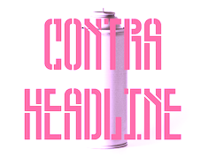 Born in Porto, Portugal, Ivan Alves studied graphic design at ESEIG, Erasmus at Camberwell School of Arts in London and went to Barcelona to do an internship at Stanton Studio. Since 2011 he works at a studio in Porto called Nor267. In 2016, he designed the potato cut font Wild Potato. Its letterforms are based on the Jean-Luc font by Atelier Carvalho Bernau.
 Typefaces from 2017: Contra Headline (a stencil typeface for the revolution). Behance link. [Google]
[More] ⦿
|
Javier Gasso Forteza
|
Art director in Cabrils, Spain, who created Patata (2014), a typeface based on potato cuts. Behance link. [Google]
[More] ⦿
|
Jeroen Overweel
|
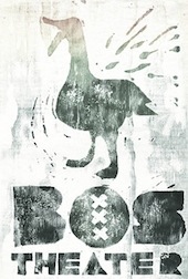 Designer in Utrecht, The Netherlands. In 2014, he published the excellent Bos Theater Type, a typeface that is reminiscent of rough wood prints and even potato printing. [Google]
[More] ⦿
Designer in Utrecht, The Netherlands. In 2014, he published the excellent Bos Theater Type, a typeface that is reminiscent of rough wood prints and even potato printing. [Google]
[More] ⦿
|
Juan A. Odriozola
|
 Uruguayan designer in Montevideo (b. San José del Mayo, 1978) of Flopi (2007, an organic sans), Haas and Haas New (2011, sans family created by altering Helvetica according to personal taste), Yo Soy Lucia (2010, a humanist sans), Urbana (2010, stencil face), Sansme (2011, monoline sans), and Potato Type (2011).
 In 2013, he made the decomposable typeface Op. Behance link. Another Behance link. [Google]
[More] ⦿
|
Ko Sliggers
[Dutchfonts.com]
|
[MyFonts]
[More] ⦿
|
Lars Cellini
[New Cat Orange (or: NCO)]
|
[MyFonts]
[More] ⦿
|
Lein Design
|
 Dutch designer, b. 1991, aka Marjolein. A self-proclaimed vector artist, she created the elegant art deco typeface Lein Bold (2008) as well as Lein Rounded (2008) and Lein Future (2008). Potato (2009) is more art deco candy. Dafont link. [Google]
[More] ⦿
Dutch designer, b. 1991, aka Marjolein. A self-proclaimed vector artist, she created the elegant art deco typeface Lein Bold (2008) as well as Lein Rounded (2008) and Lein Future (2008). Potato (2009) is more art deco candy. Dafont link. [Google]
[More] ⦿
|
Lubudu
[Ewa Lubiarz]
|
 Type foundry set up in Sieradz, Poland in 2013 by Ewa Lubiarz. Creator of a potato stamp typeface family simply called Potato (2013). [Google]
[MyFonts]
[More] ⦿
Type foundry set up in Sieradz, Poland in 2013 by Ewa Lubiarz. Creator of a potato stamp typeface family simply called Potato (2013). [Google]
[MyFonts]
[More] ⦿
|
Marina Apevalina
|
Moscow-based designer of the Cyrillic potato font Potato Font Sunset (2015). [Google]
[More] ⦿
|
Marusya Strange
|
Moscow-based designer of the Cyrillic potato print font Pogreb (2019) and the finger-painted Plemya (2019). [Google]
[More] ⦿
|
Miles DeCoster
[Potato Fonts]
|
[More] ⦿
|
Miryam Travisani
|
Canosa di Puglia, Italy-based designer of the potato print typeface Cruda (2015). Behance link. [Google]
[More] ⦿
|
Monica Vigo
|
 Graduate of Miami Ad School. Madrid-based designer of Spree Park (2012, a fat counterless typeface), Batllo (2012, a wavy ornamental typeface to honor Gaudi), Diamante (2012, octagonal) and Typotato (2012, potato printing).
 Varea (2013) was created for the identity of Irene Varea. Behance link. [Google]
[More] ⦿
|
MyFonts: Potato cut typefaces
|
Typefaces that simulate potato cut stamp printing. [Google]
[More] ⦿
|
NBGNGS (or: New Beginings (sic))
|
Swedish design site. The owners made some interesting free fonts: New Begindings, Fubbick (based on fraudulent signatures), Bintje Bold (potato print face), and New Handwriting (2007, based on a unsuccessful handwriting reform that the Swedish head council of education attempted to implement during the mid 70s). [Google]
[More] ⦿
|
New Cat Orange (or: NCO)
[Lars Cellini]
|
German type foundry, est. 2016 in Wiesbaden. Their first typeface is NCO Potatoe (2016, Lars Cellini and H.P. Becker), a prototypical potato carving font. [Google]
[MyFonts]
[More] ⦿
|
Otherways.nl
[Donald Roos]
|
 Type foundry in Amsterdam, run by Donald Roos (b. Haarlem, 1978). Also involved are Jantoon Roos (Haarlem, b. 1953) and Benz Roos. Donald Roos studied type design at KABK in Den Haag. In 2008, he started up his own studio Bureau.Donald, based in Amsterdam. He created the online typographic library Typebase and is co-founder of tech-startup Triqle. Donald has been a teacher at several academies; the Willem de Kooning Academy, Rotterdam College and Fontys College. He currently teaches type design at KABK in Den haag.
 Typefaces (all by Donald Roos) include LD Spaghetti (2004), LL Bint (2004, potato stamp face), LL Gaufre (2004, an "OpenPixelType"), MagGothic (in progress). They are also involved in the digitization of wood type. In 2009, he got involved in Vette Letters, and there he published VLNL Bint, VLNL Gaufre, VLNL Knoffel, VLNL Brak, and VLNL Spaghetti Bolognese, VLNL Woodburger, VLNL Wasabi, VLNL Irish Stew, VLNL Hollandsche Nieuwe. Typefaces by Donald Roos from 2013: VLNL Wood Burger (based on American wood type), VLN Wasabi Turbo. In 2015, he published VLNL Boulangerie. In 2021, Donald Roos digitized Plinc Buffalo for House Industries. Plinc Buffalo is a bold western wood type font based on an original PhotoLetteringInc font by Ed Benguiat called Buffalo. Klingspor link. Creative Market link. Behance link. Bureau Donald. [Google]
[MyFonts]
[More] ⦿
|
Paige Tagliaferre
|
As a student at Lindenwood University, St. Louis, MO-based Paige Tagliaferre designed the potato font Half Spud (2017). Behance link. [Google]
[More] ⦿
|
Potato Fonts
[Miles DeCoster]
|
Kutztown University's Miles DeCoster offers these free fonts, all potato cut: Spud (1997), Spud Slab (1997), Taters (1998), Potato Head (1999), Home Fries (2002), Yukon (2010). DeCoster is a professor in the Communication Design Department. All fonts are made by the techique of potato printing. [Google]
[More] ⦿
|
Ray Larabie
[Typodermic]
|
 [MyFonts]
[More] ⦿
[MyFonts]
[More] ⦿
|
Rian Hughes
[Device Fonts]
|
 [MyFonts]
[More] ⦿
[MyFonts]
[More] ⦿
|
Rii Che
|
Moscow-based designer of a Cyrillic potato font simply called Potato Font (or Kartofel'nyj in Russian) (2016). [Google]
[More] ⦿
|
Sasha B. Perelman
|
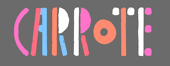 Graphic designer in Moscow who made the free vector font Carrote (2015, Latin and Cyrillic), which is based on carrot prints. He also made the free hexagonal typeface Vibrey (2015). [Google]
[More] ⦿
Graphic designer in Moscow who made the free vector font Carrote (2015, Latin and Cyrillic), which is based on carrot prints. He also made the free hexagonal typeface Vibrey (2015). [Google]
[More] ⦿
|
Shuhei Toyoda
[Tydtyp]
|
[MyFonts]
[More] ⦿
|
Thomas Biwer
|
Creator of the grunge typefaces Schwabstrasse (2008) and We are Potatoes (2007, potato printing). Dafont link. [Google]
[More] ⦿
|
Tommi Sharp
|
Tommi Sharp Gill is a freelance designer from East Tennessee based in San Francisco. She is a graduate of the Type@Cooper West program. At Future Fonts, she published the potato font Taters. At Type du Nord, she released the free vintage label font Cortinas (2022). [Google]
[More] ⦿
|
Tydtyp
[Shuhei Toyoda]
|
 UK-based type foundry, est. 2014 by Shuhei Toyoda (b. 1983, Japan). Typefaces include Boxdon Titling (2014, an ultra-heavy typeface designed for vertical layout) and PTT (2014, a potato print emulation typeface). [Google]
[MyFonts]
[More] ⦿
UK-based type foundry, est. 2014 by Shuhei Toyoda (b. 1983, Japan). Typefaces include Boxdon Titling (2014, an ultra-heavy typeface designed for vertical layout) and PTT (2014, a potato print emulation typeface). [Google]
[MyFonts]
[More] ⦿
|
Typodermic
[Ray Larabie]
|
 Ray Larabie (b. 1970, Ottawa, Canada) ran Typodermic in Mississauga, ON, which opened in the Fall of 2001. In 2006, it moved to Vancouver, BC, and in 2009 it moved on to Nagoya, Japan. Dafont page. Ray Larabie has been making fonts since 1996, but those early fonts were freeware. His pre 2001 fonts are grouped under the label Larabie Fonts. In 2001, he set up Typodermic. Latest additions.
 The Typodermic fonts: - 2022: Biphoton (a monospaced sans with the same proporions as Letter Gothic 12), Valve (an industrial muffler shop font), Deception (a sub-pixel typeface with ten captivating effects---Deception Array (wide blocks), Deception Bars (text viewed through lenticular glass), Deception Blocks (as in heavy JPEG degradation), Deception Diamonds, Deception Lines (for a grayscale effect), Deception Particles, Deception Plusses, Deception Process (simulates grayscale LCD text or a thermal printer on the fritz), Deception Scanline (television picture tube text rendering), Deception System (1-bit dithering gone haywire)), Monofonto (a monospaced sans), Encercle Draft (permitting users to create numbers in borders), Encercle Sans, Heavy Heap (a groovy psychedelic typeface with a scorching look, reminiscent of 1960s hot-rod culture and die-cast toy vehicles), Ggx89 (a 48-style tightly spaced Swiss style sans family).
- 2021: Quadrillion (a 12-style rounded monoline sci-fi family), Mochon (a wall writing or chalk font based on the lettering of Donald Mochon, dean of the RPI School of Architecture until 1966; the Mochon samples were provided by an ex-student of Mochon, Karl A. Petersen), Steelfish Hammer (a subtly rustic version of Larabie's most popular typeface, Steelfish), Wavetable (sci-fi), Xyzai (an LED emulation font, described by Ray Larabie as a hardcore, Y2K-style techno typeface), Geoparody (a 12-style squarish typeface inspired by a late 1960s font called Anonymous), Typewriter Spool (122 fonts, modeled after the Underwood No. 5 typewriter font).
- 2020: Gravtrac (a 56-style condensed to crushed slab serif family inspired by mid-twentieth century classics like Univers 59 Ultra-Condensed, Helvetica Inserat and Compacta; +Greek, +Cyrillic), Vinque Antique (a rustic handcrafted blackletter in eight styles).
- 2019: Dealerplate (17 license plate styles for various states and provinces in the USA and Canada, current as of 2019; included are California, New York, New Jersey, Ohio, Illinois, Pennsylvania, Florida, Maryland, Michigan, Wisconsin, Massachusetts, Missouri, Washington, North Carolina, Virginia, Quebec, and Ontario), Kenyan Coffee Stencil, Good Timing, Steelfish Rounded, Bitcrusher (a consumer electronics / techno font), Galderglynn 1884 (a nineteenth-century style sans-serif typeface that exp[ands his Galderglynn Esquire).
- 2018: Cybermontage, Crack Man (a pac man font), Propaniac (a 1980s-style postmodern typeface inspired by a Pointer Sisters record sleeve which was designed by Shoot That Tiger Creative Services), Zelega Zenega, Spectrashell.
- 2017: Minicomputer (MICR style), Squirty, PCTL9600, PCTL4800 (retro techno), Ultraproxi (semi-monospaced and influenced by the high speed computer printers from the 1950s to 1970s), Toxigenesis (techno sans), Venus Rising, Vanchrome (a compact sans-serif headliner with chromatic layers), Krait (a layered geometric typeface designed for architectural display), Xylito (a layered font for chromatic or 3d effects).
- 2016: Refuel (octagonal, based on military aircraft markings), Expressway Soft (a sans-serif font family inspired by the U.S. Department of Transportation's FHWA Series of Standard Alphabets, also known as Highway Gothic), Conthrax (squarish, techno), Cornpile (cartoonish), Electric, Evensong (art deco), Fledgling (a very tall typeface), Gymkhana (sans), Remissis (sans), Sunday Evening (a reverse contrast typeface), Meloche (Meloche is a unique grotesque sans-serif typeface influenced by hand-painted French signs of the late nineteenth century. It's available in 7 weights and obliques).
- 2015: Canada 150 (a custom font for the Canadian government; see here, here, this coverage regarding the Inuktitut part of the font, and this reaction by the curmudgeons in Toronto who complain that Ray did this work for free), Autoradiographic (sans family), Built Titling (for compact headlines), Chickweed Titling (cartoon titling font), Cardigan Titling (flared headline face), Bench Grinder Titling, Kleptocracy Titling, Palamecia Titling (rounded black comic book typeface), Quasix Titling, Galderglynn Titling (all caps sans family from hairline to black), Mixolydian Titling, Stormfaze (a sci-fi font started in 1996 and finished in 2015), NK57 Monospace (a 60-style programmer typeface), Gargle, Athabasca (a sans family designed for the rugged Canadian oil patch).
- 2014: Mesmerize (a large free sans family), Kingsbridge (a large slab serif family with sharp points on the A, M, N, V and W), Manbow (a layered geometric art deco display font which includes solid, clear, stripe, polka-dot and screen patterns), Breamcatcher (an all caps art deco font inspired by the piano sheet music for With Every Breath I Take which was featured in the Bing Crosby/Kitty Carlisle musical comedy film, Here is my Heart), Kilsonburg (Dutch deco based on an old Vogue magazine cover), Uchiyama (poster typeface), Goldsaber (art deco design), Vexler Slip (unicase), Rakesly, Dacquoise, Pretender, Rimouski (a rounded geometric font family), Nulshock (techno), Recharge (techno/industrial font), Interrogator Stencil, Strange Alphabets (arts and cratfs font), Angerpoise Lampshade (free).
- 2013: Numbers With Rings, Shookup (funky cartoon font), Pastrami on Rye (cutout comic book style), Chickweed, Built (a condensed headline sans), Fluctuation (a softly rounded elliptical sans family), Astrochemistry (sci-fi, techno with rounded edges), Snasm (sci-fi).
- 2012: Engebrechtre (2000-2012), Die Nasty (1999-2012: free), Strasua (1999-2012), Planet Benson (1997-2012), Husky Stash (1998-2012), Barbatrick (1999-2012: a speed emulation font), Zero Hour (1997-2012), Urkelian (1998-2012: very condensed), Zolasixx (inspired by the video game Zaxxon), Ampacity (neon font), Chromakey (a space deco headline font inspired by box art classic video games including Matrix Marauders and Magical Chase), Disassembler (1980s style bitmap font), Zerbydoo (a dot matrix family), Superego (a geometric-techno font inspired by the cabinet graphics for the 1981 Stargate arcade game), Rukyltronic (a set of dot matrix typefaces), Nerdropol (pixel family), Gulkave (rounded pixel font), Cyclopentane, Palamecia (a fat finger poster face), Gameness (a 1990 retro industrial deco font), Camulogen (headline face), Color Basic (a pixel typeface inspired the by TRS-80 Color Computer), Triac Seventy One (a funky face), Acroyear (retro all-caps headline font), Troll Bait, Strenuous (unicase), Permanence (a retro=futuristic font based on Alvin Toffler's cover of Future Shok, 1970), Clockpunk (octagonal and quaint), Battlemaze (trekkie face), Mixolydian (industrial sans).
- 2011: Ugocranis (a brutalist typeface), Clipwave, Wheaton (MICR-inspired), Mango Scribble, TRS Million (dot matrix face), Ugogranis (constructivist), Gomoku (paper cut face), From The Internet.
- 2010: Cranberry Gin (2010, octagonal), Restore (all caps, geometric sans), From The Stars (an elliptical techno family done with Chikako Larabie), Thrusters (space age face), Dream Orphanage, Dream Orphans (2000-2012), Kengwin (rounded slab serif), Gleaming The Cube (Greek simulation face), Vectipede (a slab serif family), Great Escape (an elliptical sans family), Subrocs (connected script), Hackensack (with Chikako Larabie), Polarband (bilined stackable headline face), Naked Power, Special Forces (a great macho slab serif headline face---watch for awards to roll in), Warugaki (handpainted), Warmer, Honfleur (art deco; with Chikako Larabi), Voivode (a headline typeface done with Chikako Larabie), Hachimitsu (Asian look face, done with Chikako Larabie), Kadeworth (rounded retro look sans, done with Chikako Larabie), Gnuolane Jump (2010, with Chikako Larabie), Markerfield (brush), Board of Directors (Bank Gothic style family, done with Chikako Larabie), GGX88 (a Swiss sans family), Body Goat, Reversal, Gord (techno), Computechnodigitronic (LED, LCD geek-look font), Bench Grinder, Inklea (a bubbly face), Skygirls (retro brush script), Gloss (a paint brush typeface based on Champion, 1957, G.G. Lange), Galderglynn Esquire.
- 2009: Maqui (an industrial headline sans family), Zingende (art deco family: caps only), Misadventures, Gaz (large retro sans family), Acrylic Brush, Enamel Brush (a digitization of Catalina, 1955, Emil J. Klumpp), DDT (neutral sans), Thump (fat, casual), Desperate Glamour, Pricedown (an update of his free 1990s font, patterned after the lettering on The Price Is Right show), Mitigate (monoline and slabbed; has some typewriter styles), Catwing, Walken (slab serif stencil), Silicone (soft rounded sans family), Movatif (sans), Gunplay (a stencil family inspired by the poster for the 1972 Steve McQueen/Ali MacGraw film The Getaway), Fragile Bombers (octagonal), Forgotten Futurist (techno sans, 19 styles), Bullpen (slab serif), Coolvetica (35 styles), Duality, Good Times, Strenuous, Shlop (paint-drip style), Dirty Baker's Dozen (stencil), Junequil (VAG Rounded style), Owned (graffiti), Domyouji, Threefourtysixbvarrel (stencil), Enacti, Uniwars (futuristic, 16 styles).
- 2008: Madawaska (a rugged slab serif), Ebenezer (grunge), Gnuolane Stencil, Raincoat, Report School (avant garde sans), Jesaya, Carouselambra (art nouveau), Debusen (rounded), Barge (military font), Renju (2008, potato or rubber stamp print face), Otoboke (handlettered), Hit (informal hand), R6 D8 (futuristic sans family), Rexlia (an octagonal machinistic family), Hybrea (a display sans with TV screen rounding), Sweater School, Tussilago (2008, a neutral sans family), Presicav (extended sans), Hover Unit, Addlethorpe (grunge), Scheme (rounded sans), Usurp (bouncy poster lettering), Negotiate (technical sans family), Divulge, Sewn, Gnoulane (condensed sans), Moja, Teeshirt (old typewriter face), Pound (art deco marries grunge), Graveblade (heavy metal font), Synthemesc (psychedelic anti-Starbucks font), Chysotile (white on black grunge), Cardigan (sans), Gurkner (balloon style), Reagan (grunge).
- 2007: Tight (a copy of Dean Morris's 1976 Letraset chrome font Quicksilver), Headlight, Meloche (a 3-style grotesk), Octin Spraypaint (grunge stencil), Octin Vintage (grunge), Bouffant (script), Octin Prison (stencil), Octin Sports (octagonal), Octin College (octagonal, for sports jerseys), Octin Stencil (free octagonal font family), Burnaby Stencil (stencil), Superclarendon, Conceal, Ohitashi, Stud (grunge), Bristles (grunge), Skirt, Cotton (grunge), Kelvingrove (a bit of copperplate gothic, rounded and shaved), Augustine, Containment, Snowa, Veriox, Scrubby, Transmute, Sheaff, Injekuta (techno), Rinse (grunge), Polyflec, Domyouji (square sans), Winthorpe (old style), Cutiful (script), Flyswim (grunge), Dirtstorm (spray-painted stencil), Shnixgun (grunge), Neuzon (grunge), Oxeran (old typewriter), PRINTF (grunge all caps monospaced), Akazan (sans), Nyxali (a metal tag face), Nesobrite (25 styles of Bank Gothic lookalikes), Meloriac (a heavy headline sans inspired by Futura), Walnut (graffiti face), Gnuolane (a narrow superelliptical sans), Edifact (a damaged computer font), Darkheart, Stampoo (squarish), Raymond (rough script), Hayate (oriental look), Telephoto. The entire Octin series is free at DaFont.
- 2006: Octynaz (grunge), Paltime (ornamented), Jolie Ecriture Desard (children's hand), Mango (comic book face), Desard (child's hand), Bulltoad, Lerku (eroded serif), Charbroiled (also eroded), Ceroxa (eroded stencil), Nagomi (a chiseled-look Asian font based on calligraphy of Chikako Suzuki from Nagoya), Whiterock, Yellande, Chilopod (a futuristic typeface inspired by the logo from the 1980s videogame, Atari Centipede), Order, Goldburg (based on a typeface by George Bowditch, 1957), Laserjerks (2006, brutalist), Milibus (futuristic), Bonobo (serifed), Ohitashi, Sarasori (TV-tube shaped typeface in the style of Oban), Structia (an octagonal family), Betaphid (octagonal), Gendouki (futuristic stencil), Slugger (athletic lettering), Marianas (a gorgeous art deco face), Lineavec (octagonal), Corzinair (serif family), Buxotic (a great caps face), Cinecav X (for closed caption TV and DVD), Salsbury (comic book face), Lonsdale (loosely based on a font called Parkway Script, which was designed by Emil Hirt in 1964), Alepholon (futuristic), Kwokwi, Mikadan (a tribute to Stephenson Blake's Verona from 1948, which was in turn based on William Dana Orcutt's Humanistic from 1904), Marion (2012: a beautiful transitional family adopted as a standard Mac OS X font), Quasix (hookish), Skraype (grunge stencil), Bleeker (casual lettering), Linefeed (monospaced line printer font), Draculon (a casual typeface inspired by the letterforms of William Orcutt's humanist font from 1904 which was in turn based on an Italian manuscript from 1485), Mahavishnu (a mix between 1970s psychedelics and art nouveau), Doradani (a corporate identity sans family), Korotaki (futuristic).
- 2005: Beat My Guest, Kadonk (a Halloween face), Report (a VAG-Rounded style face), Croteau (a poster face), Heroid (ook face), Barrista (informal script), Wyvern (sans serif), Wubble (like puddles of water), Caryn (casual script), Folder (a rigid sans family), Venacti (a futuristic family), Xenara (a keyboard lettering family), Emory (a destructionist sans family), Ligurino (neat sans&serif family), Biondi (update of Copperplate Gothic; followed in 2010 by Biondi Sans; these copperplate style typefaces are in the style of AT Sackers), Byington (Trajan column lettering), Sayso Chic, Expressway (28 weights, a highway signage family), Algol (pixel type), Meposa (fat display face), Tandelle (condensed), Vigo, Maychurch, Mecheria, Vactic (dot matrix), Zosma, Topstitch, Windpower, Llandru, Soap (a creative extension of Cooper Black, with dingbats), Kleptocracy (1999-2005), Owned, Rimouski (sans), Burnstown Dam (2005, a wooden plank font), Sinzano (sans with opentype ligatures galore; compare, e.g., House Ed Interlock), Zamora.
- 2004: Affluent, Threefortysixbarrel (stencil face), Tank, Telidon (dot matrix face), Funboy, Neuropol X, Neuropol Nova, Mufferaw (comic book face), Larabiefont, Zekton (techno), Strenuous 3D, Silentina (advertised as "a silent movie font"), Amienne (brush script), Fenwick Outline (free), Betsy Flanagan (1998, a keyboard face), Boopee (children's handwriting), Pirulen (in the general Bank Gothic style), Zalderdash.
- 2003: Zupiter, Blue Highway.
- Before 2002: the dot matrix family Telidon, Telidon Ink, Butter Belly, Almonte (1999), the architectural font Jillican (octagonal), Snowgoose, Bomr, Pakenham, Neuropol, Nasalization, Fenwick, Kleptocracy DLX, Sui Generis, Dirty Bakers Dozen (faded stencil), Minya Nouvelle, Asterisp, Chinese Rocks, Jillsville (great artsy Courier), Ulian, Wevli (including Wevli Dingbats), Sappy Mugs (funny mugshots), Sofachrome (1999, inspired by Pontiac car emblems), Eden Mills (1999).
MyFonts interview. Fontspace link. Fontspring link. Catalog of the typefaces in the Larabie Fonts collection. Klingspor link. Catalog of the Typodermic library in decreasing order of popularity. Extensive (large page warning) Typodermic catalog. Font Squirrel link. Creative Fabrica link. Fontsquirrel link. Fontdaily link. [Google]
[MyFonts]
[More] ⦿
|
Ulf Constantin Stein
|
German designer at PROTO.Type of POTATO.cut, PUNCH.tape, DYS.opia (1996), CHRISCHI.writes, PYRO.mania, SCREAMhot, LOOKAlike, PLAcard. He co-designed ScreamHot at ApplyDesign with Martin Kitz. At Elsner&Flake, he designed (or licensed) EF DYS.opia (1996), EF LOOKA.like, EF PLA.card (1998), EF POTATO.cut (1996), EF PYRO.mania, EF SCREAM.hot. Some of his fonts are distributed by the Apply Design Group. FontShop link. View Ulf Constantin Stein's typefaces. [Google]
[MyFonts]
[More] ⦿
|
Under The Knife Studios
|
Durban, South Africa-based designer of a potato cut font in 2018. [Google]
[More] ⦿
|
Xavi Palouzié
|
Graphic designer from Barcelona who made the potato stamp typeface Geo Basic Fifteen (2013), in which all letters are crafted from fifteen basic geometric shapes. Behance link. [Google]
[More] ⦿
|

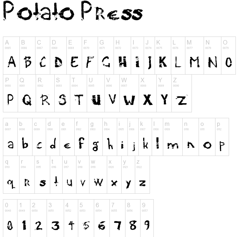
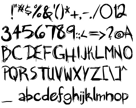
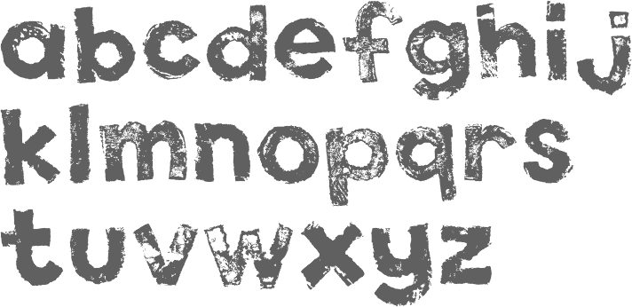
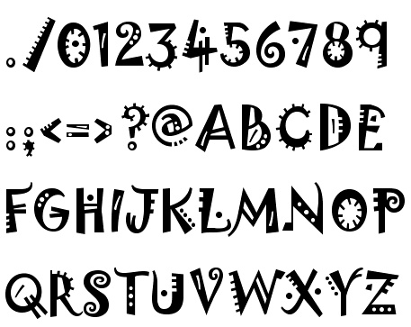
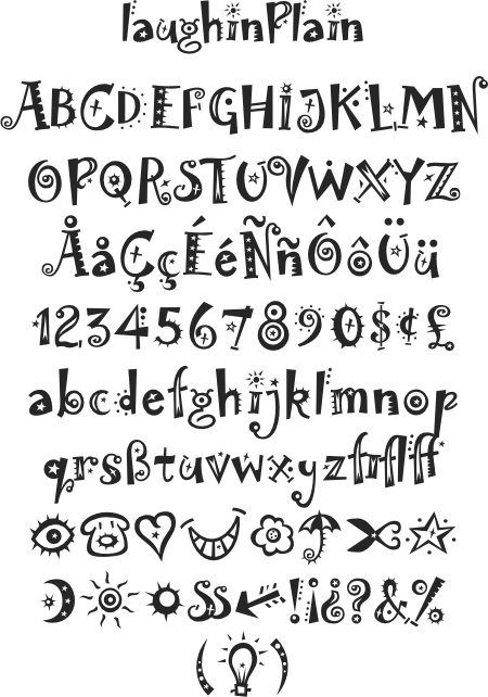
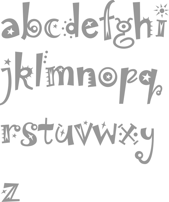
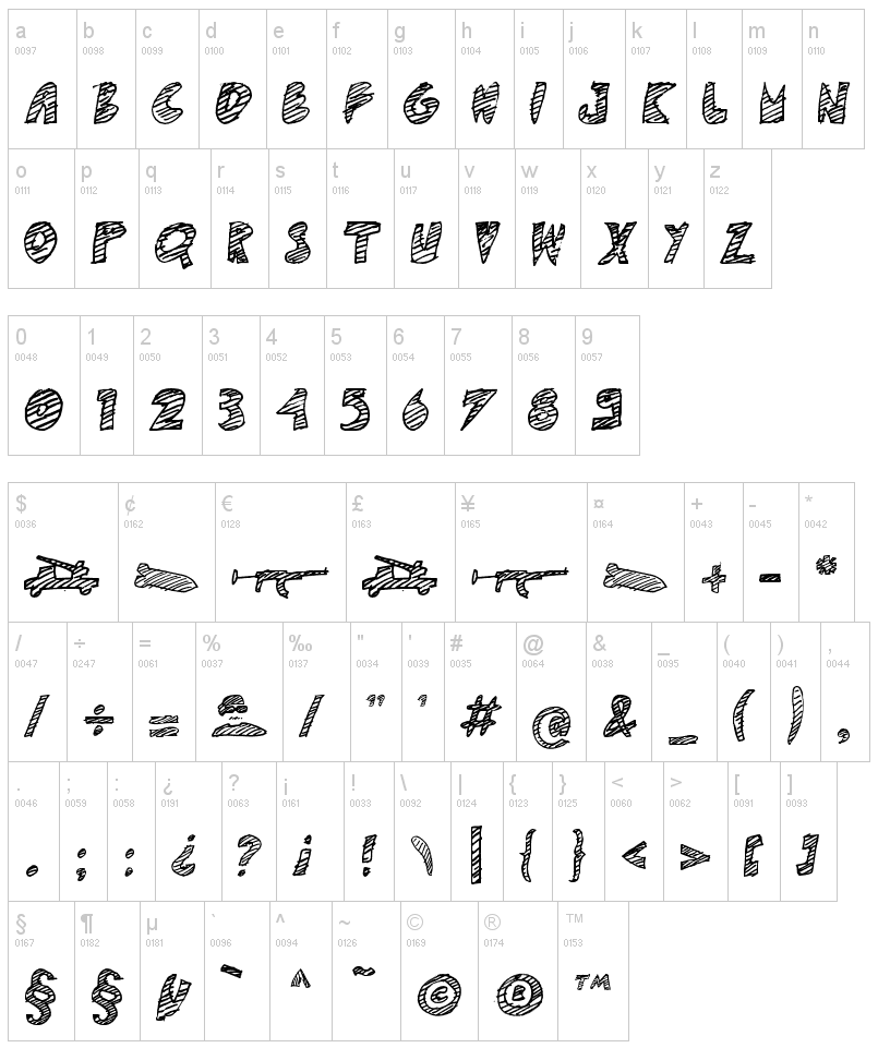
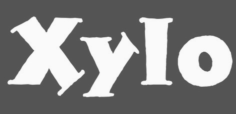
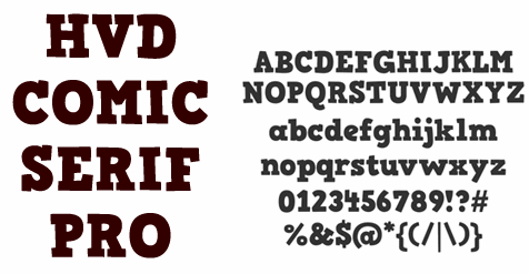
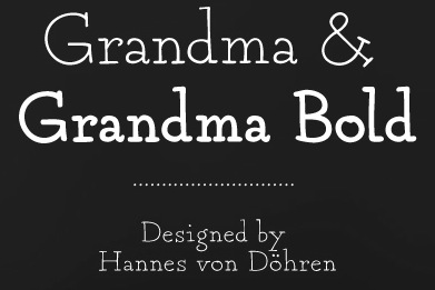
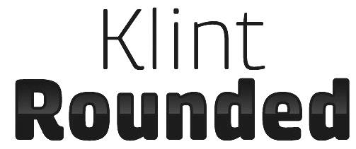
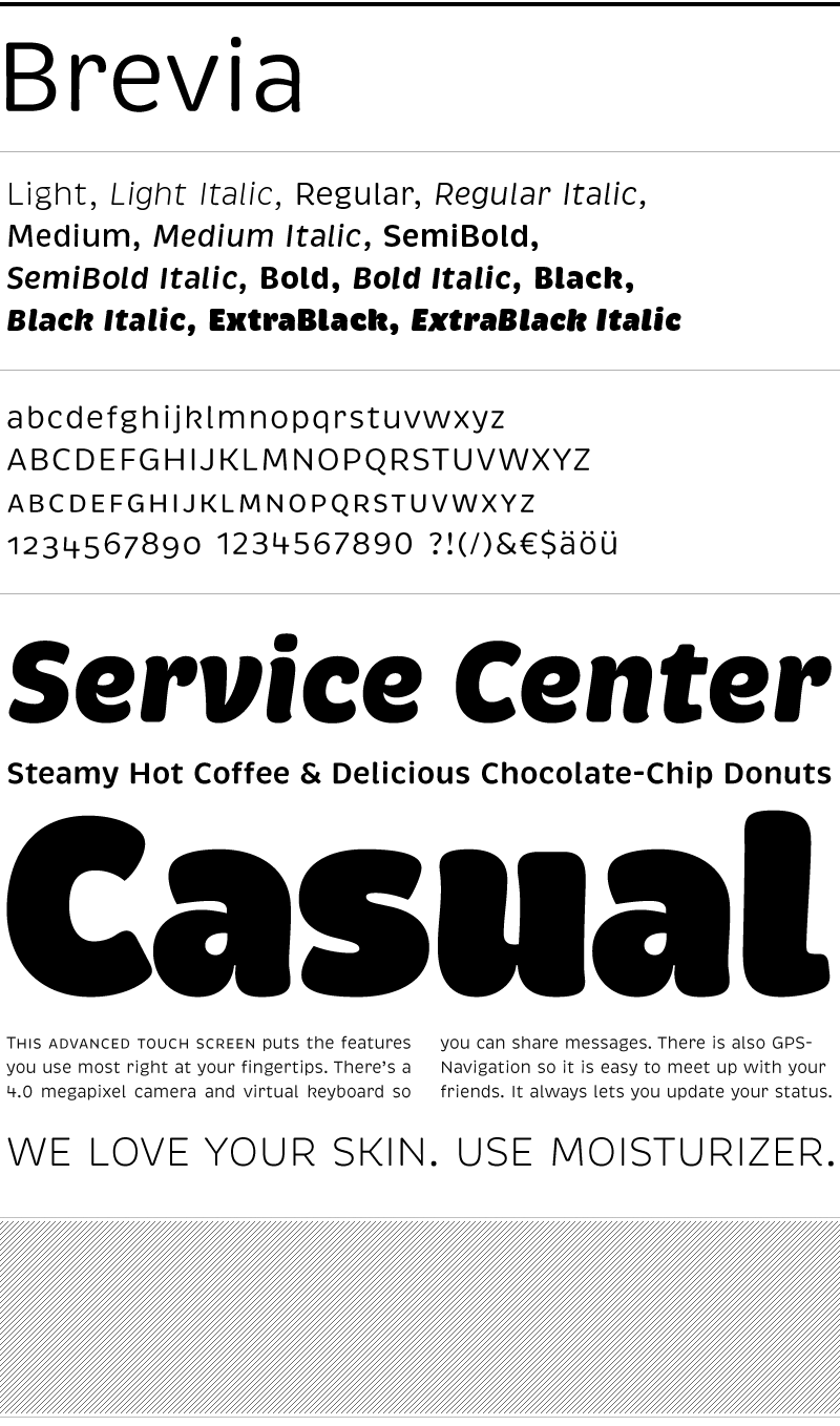
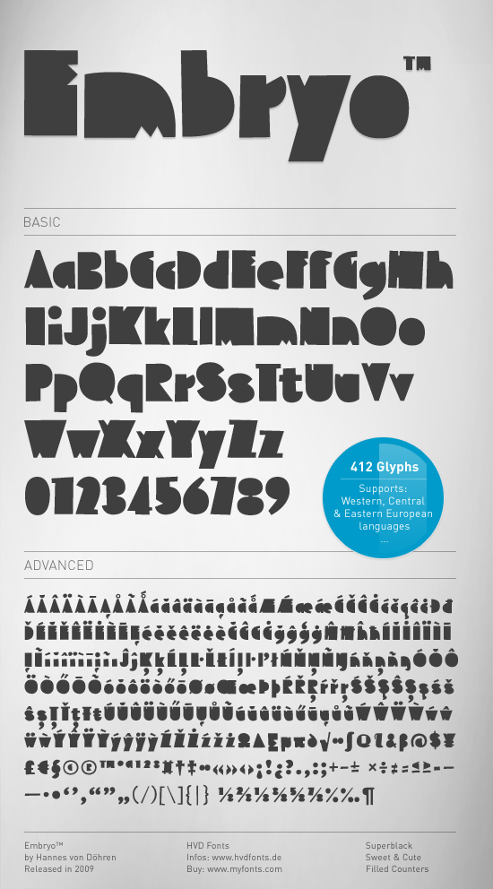
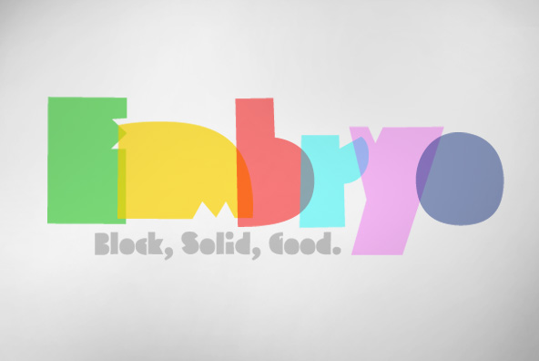
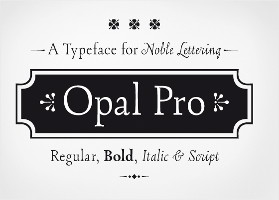
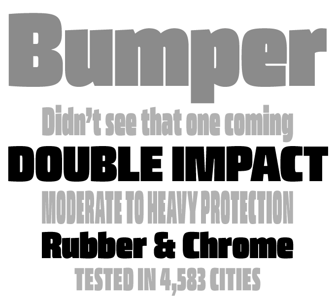
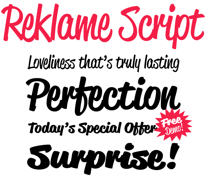
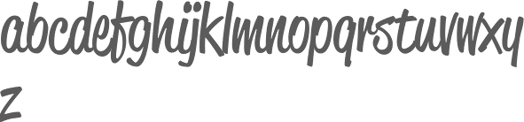
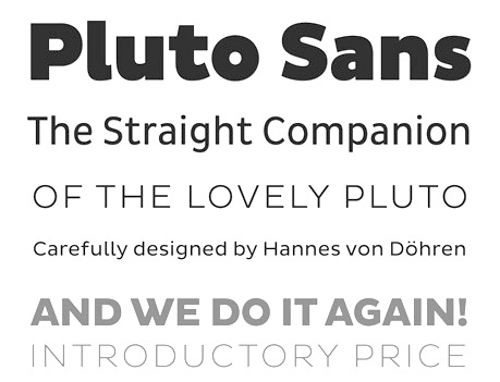
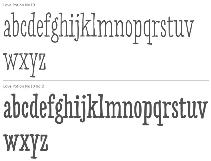
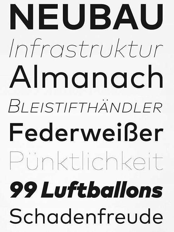
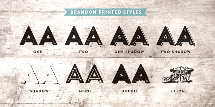
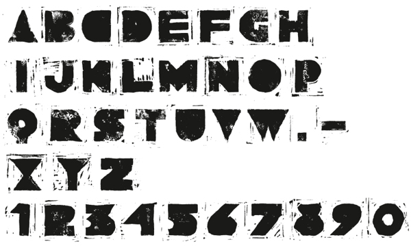
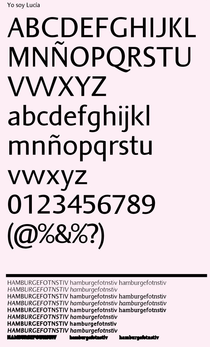
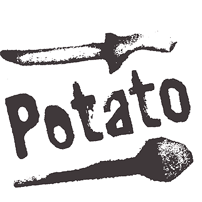
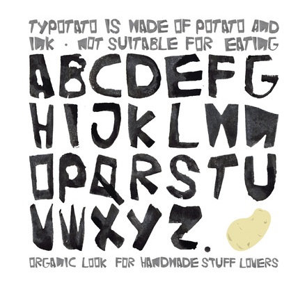
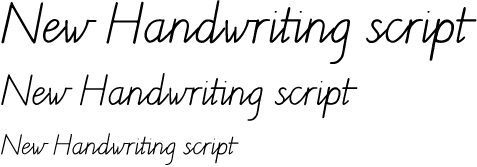
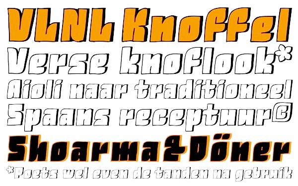
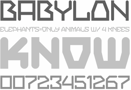
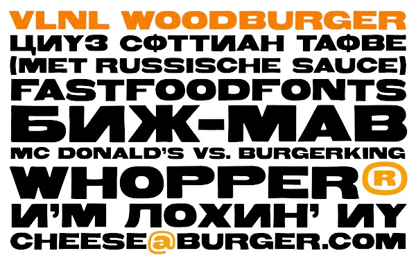
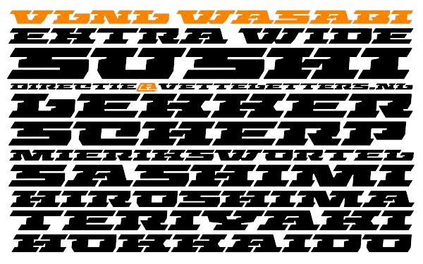
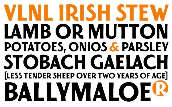
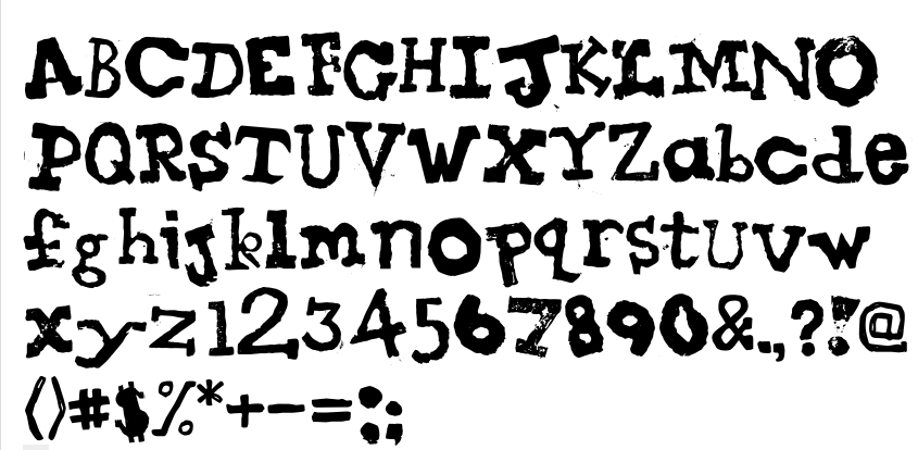
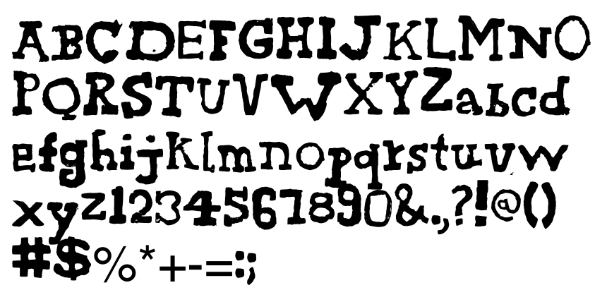
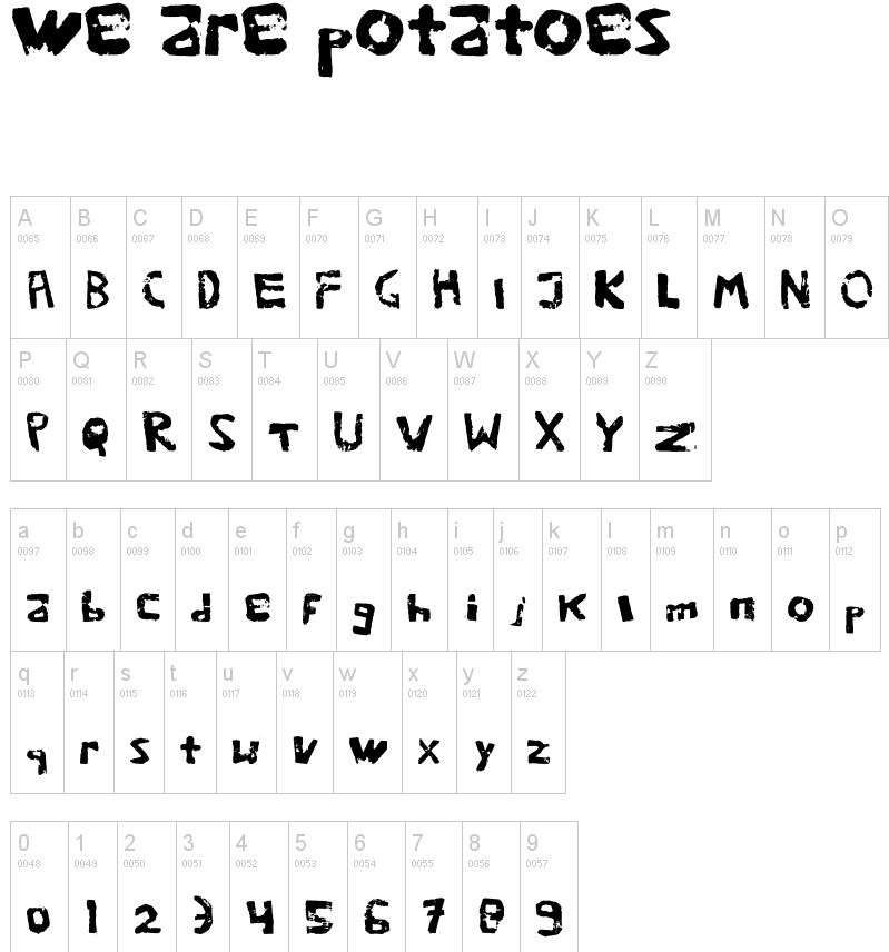