| | |
55cards
[Brett Gilbert]
|
Brett Gilbert ("55 cards") is the designer at FontStruct in 2008 of minima55, minima55_grid. His Lattice is a gorgeous rhomboid-patterned caps face. Others include Double Six (domino pieces), Square Jaw, Halftone. [Google]
[More] ⦿
|
Abygail Bradley
|
During her studies in Manchester, UK, Abygail Bradley created the rhombic typeface Diamond Heist (2014). [Google]
[More] ⦿
|
Alberto del Real
|
Graphic designer in Ciudad Real, who created the decorative typeface Muelle and the rhombic typeface Robodo in 2018. [Google]
[More] ⦿
|
Alessia Sistori
|
During her communication design studies, Alessia Sistori (Berlin, Germany) created Clarity Font (2013, thin and geometric) and Pommesensalade (2013, a rhombic font). [Google]
[More] ⦿
|
Alexandra Savelkaeva
|
 Moscow, Russia-based designer of a rhombic Latin typeface in 2016. She also made the handcrafted Cyrillic typeface Native Type (2016), and a set of Olympic Icons (2016). [Google]
[More] ⦿
Moscow, Russia-based designer of a rhombic Latin typeface in 2016. She also made the handcrafted Cyrillic typeface Native Type (2016), and a set of Olympic Icons (2016). [Google]
[More] ⦿
|
Alexandros Poursanidis
|
Thessaloniki, Greece-based designer of a rhobic typeface called Art Deco (2016). [Google]
[More] ⦿
|
Alexey Atapin
|
 Web designer in Saint Petersburg, Russia. His typefaces are often experimental and include:
 [Google]
[More] ⦿
|
Alissa Nowak
|
Brisbane, Australia-based student-designer (at Griffith University) of the rounded rhombic typeface Klono (2019). [Google]
[More] ⦿
|
Amel 12070
|
FontStructor who made the rhombic typeface abcd in 2013. [Google]
[More] ⦿
|
Anthony Bowe
[Geronimo Fonts (or: Paradox Fontworks, or: Typewire Studios)]
|
 [More] ⦿
|
Beth Morrison
|
During her studies, Winchester, UK-based Beth Morrison created the rhombic typeface Edge (2015). [Google]
[More] ⦿
|
Bezz Javan
|
Los Angeles-based multimedia designer. In 2018, he published these display typefaces: Cubart (3d), Esquare, Slinky, Dumber, Dumberer, Blockage (3d), Chizzeld, Lotty Dotty, Dimetia, Nockt, Domals, Hangerz, Sirkly, Geomiez, Diamonz (rhombic), Cirquetta (labyrinthine), Whetted, Solark, Eggo. [Google]
[More] ⦿
|
Brett Gilbert
[55cards]
|
[More] ⦿
|
Brian J. Bonislawsky
[Monogram Fonts Co]

|
 [MyFonts]
[More] ⦿
[MyFonts]
[More] ⦿
|
Brooke Bauer
|
During her studies at Flagler College in Saint Augustine, FL, Brooke Bauer designed the free diamond-themed display typeface Diams (2015). Dafont link. [Google]
[More] ⦿
|
Cahya Sabunge
|
Bandung, Indonesia-based designer, b. 1994, of the rhombic typeface Cabella (2019). [Google]
[More] ⦿
|
Chebo Besa
|
As a student in Salford, UK, Chebo Besa created Diamond Typeface (2015). [Google]
[More] ⦿
|
Chris Turpen
|
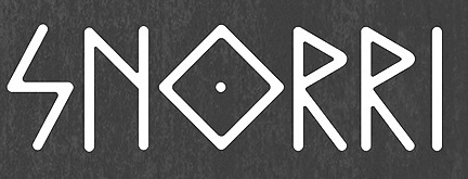 During his studies at SCAD in Savannah, GA, Chrius Turpen designed the elegant rhombic rune simulation typeface Snorri (2014). It is based on Icelandic and Nordic manuscripts and carvings. [Google]
[More] ⦿
During his studies at SCAD in Savannah, GA, Chrius Turpen designed the elegant rhombic rune simulation typeface Snorri (2014). It is based on Icelandic and Nordic manuscripts and carvings. [Google]
[More] ⦿
|
Christopher Mihaly
|
During his studies, Christopher Mihaly (Danbury, CT) designed the rhombic typeface Boxed Out (2015). [Google]
[More] ⦿
|
Coleman Collins
|
Designer in New York City. Creator of Alpha Mail (2012, a rhombic typeface). [Google]
[More] ⦿
|
Deeait Creates
[Mathias Doblhammer]
|
Mathias Doblhammer (DeeAit) is a graphic designer and illustrator from Vienna, His typefaces include Benchmark (2007), Fashion Victim (2009, hairline avant-garde face), Bowler (2008, rounded and ultra-fat), the octagonal / rhombic typeface Symbolis (2012), and Lazy Fox (2009, connected octagonal experiment). [Google]
[More] ⦿
|
Diamond Bodoni
|
 A rhombic Monotype font with Bodoni letters in rhombic (diamond-shaped) windows. Unknown designer. [Google]
[More] ⦿
A rhombic Monotype font with Bodoni letters in rhombic (diamond-shaped) windows. Unknown designer. [Google]
[More] ⦿
|
Diego Aravena Silo
[Without Foundry (or W Foundry; was: Diego Aravena)]
|
 [MyFonts]
[More] ⦿
[MyFonts]
[More] ⦿
|
Edgar Cornejo
|
Arequipa, Peru-based designer of the rhombic grid pixel typeface Futurax (2019). [Google]
[More] ⦿
|
Elly Gehrig
|
During her graphic design studies in Newcastle, Austrlia, Elly Gehrig designed the rhombic typeface Quilter (2012). [Google]
[More] ⦿
|
Elodie Poulin
|
Brussels-based designer of the octagonal typeface Beck (2013), which is named after Harry Beck, the architect who drew the first plan for the London Subway. She also designed the experimental rhombic typeface Rhombicuboctaèdre (2013) and the wedge serif caps typeface La Roseraie (2013). Behance link. [Google]
[More] ⦿
|
Enes Besinci
|
Istanbul, Turkey-based designer of the rhombic and hexagonal typeface Prayer (2019). [Google]
[More] ⦿
|
Erika Buttigieg
|
Hamrun, Malta-based designer of the straight-edged typeface Diamandis (2014). Behance link. [Google]
[More] ⦿
|
Ezra La Vin
|
During his graphic design studies in Brisbane, Australia, Ezra La Vin created Highroller (2013, a rhombic all caps typeface). Behance link. [Google]
[More] ⦿
|
Fanette Mellier
|
French designer of a very creative rhombic multicolor layered font system called Circus. The picture below is taken from the thesis of Thomas L'Excellent. [Google]
[More] ⦿
|
Gabrielius Mackevicius
|
Graphic designer in Vilnius, Lithuania, who designed the display typeface Pewpew (2016), the very original free sans typeface Pupa (2016), the rhombic geometric typeface Rombomb (2016), the diagonal pixel typeface Krikstas (2008), the free monoline experimental typeface Schlangen Schriftas (2010), and the pixelish blurred vision typeface Janinos Juosta (2009), which has a woven texture. The free typeface Krikstas (2008) is based on folk themes. Behance link. Klingspor link. Dafont link. [Google]
[More] ⦿
|
Geronimo Fonts (or: Paradox Fontworks, or: Typewire Studios)
[Anthony Bowe]
|
 First called Geronimo Fonts, then Paradox Fontworks, and then Typewire Studios, this American studio created these free fonts in 2015: For Sara, Funkytown, Necktie (blackboard bold), Northpoint (strong octagonal varsity font), Kevin Eleven (handcrafted 3d font), Back to School (handcrafted), Musicnet (dot matrix font), Anxiety, Starship One, Astronaut City (comic book style), Internet Friends, Solitude (rounded sans), Kinetic Extreme (+Solid), Crank, Disco Flow, Psychedelic, Lemons, Bokai, Royalty Code, Operation (military octagonal stencil face), Northwest (squarish), Hijack, Establishment, Jamstone, Skinz, The Antenna, Distortion, Los Mesitos, Rock Salmon, Hand Stencil, Crossroads, Upton Funk, Zero Theory, The Million Mile Man (3d outline font), Blueberry Pie, Boraodway Musical, Block Cartoon, Cinematic Language, Kayak, Aerospace, Russian (constructivist), Lines (white on black), Ohio Collegiate, Alkaline.
 In 2014, Anthony designed these typefaces: The Ambrosia Society, The American (stencil), Clockwork (rounded and octagonal), Basico 1983, Crash Test, Christmas Sweater (textured, knitted), Dysfunctinal, Winter Sans, Tazorblade, Origami, Kingsbury, Mike, Secret Stencil, Braillefont, Encrypted, Spacecraft, Retro Serif, Something Blue, Lakeside, Amelia Pond, Kindergarten, Superpowers, Homeboys, Dispensations, Neutron (sans), Chrome, Mandarin, Battlecry (stencil), Spacebar, Starlight, Square Deal, Timeline, Simpetico, Guardians (octagonal), Pixel Rocks, Snakeway, The Spaceman, Paint Brush, Series Slab, Simple Life, Warehouse, Flappy Birdy, Brushmark, Hammers and Strings, I Do Not Trust You, My Dad Drives Me Crazy, Scriptfont, Widehand, Bastille, Destruction, Remember, Handlebars, Marksman, Animated, Chubby Gothic, Highlight, Lighthead, Random Type, Readable, Archibald, Stenciles, Andersans, Gondola (monoline geometric sans), Sundance Neue, Jangotype, Limousine, Crayon Kids, Packing Tape, Cartoon Adventures, Telescope, Little Shrimp, Destiny (FontStruct), Al Dente, Copper Four (piano key font), Digit LCD, Dimension (horizontally striped), Highway Block Sans, Integration, Overload (LED font), Scoreboard LED, The Distance LCD, Ace Gaffigan, Grean, The Distance (FontStruct), Reason to Believe, Quincy Egbert, Oklahoma, Anonymous, Amaretto, Espionage (horizontally striped), Waffleboy, Angular, Equalizer, Spangled, Freewind, Ancient Grease, Black Pine Trees, Etra Preview, Fun Fragment, Multilingual hand, Red Velvet, The Fragile Wind, Lightweight Serif, Instant Access, Black Pixel, Rapid Mental Thursday, Blue Chucks, Hand Power, Royalty Waffles, Anger Management, Pocket, Effective, Florida, Pencil Sharp, Silence Will Fall (a prison say counter font), Chuck, Caged, Diamond, Uncle Salsa, Zebru, Sun, Stafona, Questions, Fancy, Sunwave, Doodle Digit, Einstein Grand, Lollipop, Lemon Rose, Gentleman, Jukebox, Fuzzy, Monster Taxi, Popsicle, Ripleys, Fragment, Crashy, Ravioli, Little Picnic, Strobelight, Cool, Cheddar (hand-printed) and Comic Fade (a dot matrix font done at FontStruct), Schnoodle, Ice Cubed (pixel face), GF Albert, Garfield, Black Friday, National Industry, Warlox, Moneto, Troublemaers, Sundrop, Magnitude, Break The Chain, Black Fire, Ralph, Hexoto, Flubber, Crazy Smile, Angel, Cheapskate, Flatboard, Stitcher, Black Shadow (20143, a dripping blood font), Probably Yes, True Love, Charlie, George, Alpine Script, Aztec Kingdom, Megafont, LCD Expanded, Generation, Arcadia, Cosmo, Jokerface, Deco Future (a blackboard bold typeface, +Inline). Many of the typefaces were made with FontStruct. Typefaces from 2016: Inklings (textured), Scorpion (squarish), Vincentio (text typeface), University (varsity font), Gameplay, Barbershop (squarish blackboard bold style), Elevation (sans), Revolution Script, New Chinese (oriental simulation), Underground, The Neverlanders. Typefaces from 2017: Snowball, War of 1930, Superguns, High School, Destructive (octagonal stencil font), American Grunge, French Fries (shaded). Typefaces from 2018: Oldies Cartoon, Showtunes, Topline (squarish sans), Grunge Band, The Friendly Indians. Typefaces from 2019: Land+Mine (spurred), Jersey Slim. Typefaces from 2020: Meatloaf (pixelish), Space Galaxy, Ouitfield Pro (heavy sans caps), Alkine (circled letters), Flower Girl (alphadings), Lightzone (a dot matrix font), Gameplay 1987 (a pixel font). [Google]
[More] ⦿
|
Gisela Guastella
|
During her graphic design studies at UBA in Buenos Aires, Gisela Guastella created the modular rhombic typeface Romboid (2013). [Google]
[More] ⦿
|
Hubert and Fischer
[Sebastian Fischer]
|
 Founded by Philipp Hubert (based in New York) and Sebastian Fischer (based in Stuttgart), Hubert & Fischer is a design studio with offices in New York and Stuttgart, Germany with a global client base. The studio specializes in creating editorial design, type design, visual identity, print, application, websites and e-commerce design from concept to production.
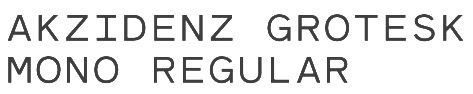
 Google Creative Lab approached them to design a typeface for the branding of the Rubik's Cube Exhibition "Beyond Rubik's Cube" the Liberty Science Center, Jersey City. They designed a slightly rounded heavyweight font (Rubik, 2015, Rubik One, 2014, and Rubik One Mono, 2014) in which the letters fit perfectly in a single cubelet of the Rubik's Cube. The font was expanded to include Cyrillic and Hebrew characters for the exhibition. Free downloads at Google Web Fonts (see also here), Github and Open Font Library. Rubik One was created by Elvire Volk Leonovitch under the art direction of Hubert and Fischer. Bickerton (2014) is a rhombic typeface. Other commissioned typefaces: Dumpling Grotesk (based on a hand-painted sign of a Chinese restaurant in New York and characterized by a two-legged m), Bickerton (based on the work of artist Ashley Bickerton), Akzidenz Grotesk Mono, Unterwirt Regular, Cold Comfort (2010, a sharp-edged typeface for the exhibition catalogue Cold Comfort of artist Rudolf Reiber), Stripe (by Sebastian Fischer: A signage system typeface developed for the high school Quinta das Flores in Coimbra, Portugal), EDP (by Sebastian Fischer: a thick geometric sans for Latin, Chinese, Hindi and Cyrillic), Oberkofler (a pixel script for the publication Blut im Schuh for artist Gabriela Oberkofler), Tiptop (a sans designed as headline for the publication Jugend Forscht), Morus (a hipster typeface family), Swollen. Behance link. Fontspace link. [Google]
[More] ⦿
|
Ivan Villag&ocute;mez Ramos
|
Ivan Villagomez Ramos (a student of Graphic Design at the UVM Querétaro, Mexico) and Led Factory (also in Querétaro) co-designed the rhombic typeface Lorentz (2012). [Google]
[More] ⦿
|
Jake Sharpe
|
During his studies at the Winchester School of Art, UK, Jake Sharpe created the rhombic grid typeface Waste Water (2013). Behance link. [Google]
[More] ⦿
|
Jang Hyunsue
|
Cardiff, Wales-based designer and illustrator who created the rhombic typeface Diamonds (2014). Behance link. [Google]
[More] ⦿
|
Jean-Baptiste Franceschetti
|
During his studies at ESDAC, Marseille, France-based Jean-Baptiste Franceschetti created the rhombic typeface Opream Sans (2014). [Google]
[More] ⦿
|
Jeff Levine
[Jeff Levine: Additional typefaces]
|
 [MyFonts]
[More] ⦿
[MyFonts]
[More] ⦿
|
Jeff Levine: Additional typefaces
[Jeff Levine]
|
 This is a list of fonts by Jeff Levine not categorized anywhere else on my pages.
 - A: Adelanto JNL (2009), Adhesive Letters JNL (2011), Adhesive Serif Letters JNL (2015), Adventure Film JNL (2021: a casual sans based on the titles and credits for Texas Across the River, 1966), Afternoon Edition JNL (2015), Air Circus JNL, Aisle Seats JNL (2006, based on letters cut by the Redikut Letter Company of Hawthorne, CA), Album Cover JNL (2008), Alleway JNL (2012, a condensed sans), Allograph JNL (2007), Alphacal JNL (2008, outlined, and like Juneway JNL, based on water-applied decals once made by the Duro Decal Company (now Duro Art Industries) of Chicago), Alton JNL (2010: a bold display sans), Amateur Printer JNL (2007, grunge), Ampersorts JNL (2011: ampersands), And So Forth JNL (2011), Anecdote JNL (2009), Announcement Board JNL (2018: white-on-black), Antique Packaging JNL (2019: Victorian), Antique Price Tags JNL (2019), Arcaro JNL (2013, a calligraphic typeface based on the movie credits of the ABC TV series Naked City, 1958-1963, starring detective Frank Arcaro), Antique Show Card JNL (2018: based on an alphabet from the first Speedball Lettering Book in 1915), Arch Creek JNL (2010, an all caps revival of Beton), Ardball (2006), Arrevederci JNL (2018), Arrow Callouts JNL (2021: an arrow-themed alphading font), Art Deco Monograms JNL (2015), Arte Critique JNL (2009), Artist Colony JNL (2009), Arts District JNL (2014), Art Student JNL (2010), Art Techno JNL (2017), Astrospy JNL (2008: techno), Awkward Gothic JNL (2008), Axelby JNL (2013).
- B: Backpage Article JNL (2010), Bal Harbour JNL (2008), Balcony Seats JNL (2007, narrow retro sans), Ball Game JNL (2018), Bandmaster JNL (2021: based on the opening movie titles from the 1940 musical comedy Strike up the Band starring Judy Garland and Mickey Rooney), Barricade (2011, a great shadowed caps face), Bayview JNL (2008, based on Inland Type Foundry's Studley), Best Bet JNL (2014, a slab serif redesign of Beton), Bike Decals JNL (2008), Billing and Shipping JNL (2010), Bingo Player JNL (2010), Birch Beer JNL (2008), Bitmap Typewriter JNL (2017), Bit Part JNL (2017: extra condensed), Bit Player JNL (extra-condensed tall poster font) (2015), Bloktor Mosaik JNL (2007), Blue Parrot (2006), Bluesman JNL (2014: based on the lettering of the blues album "I'm Jimmy Reed" released on the legendary Vee-Jay label out of Chicago), Bold Display Sans JNL (2016: based on an imge in a Speedball book), Bonehead JNL (2013, bones), Bookkeeper JNL (2019: based on R. Hunter Middleton's slab serif, Karnak), Bookkeeping JNL (2019, like an extra bold version of R. Hunter Middleton's slab serif Karnak (1936)), Boss Jock JNL (2021: an informal font based on the title and credits from the 1965 film Strange Bedfellows), Box Lunch JNL, Brass Rail JNL (2015), Brazil Nut JNL (2015), British Cinema JNL (2021, based on the hand lettered titles and credits from the 1945 British film The Way to the Stars), British Vehicle JNL (2020; based on the UK license plate font created by Charles Wright in 1935; with Ahmed Eraqi), Broadcast JNL (2015), Broadletter JNL (2009), Brochure Sans JNL (2022: based on Sans Serif No.7 from the 1921 Miller & Richard type specimen book), Brogado (2006), Brookside JNL (2016), Brushmark JNL (2011), Brush Off JNL (2017), Bulk Weight JNL (2017), Bum Steer JNL (2015), Burger Joint (2006), Burger Royale JNL (2007), Burlesk Queen JNL (2020: blocked letters), Business Helpers JNL (2014), Business Letter JNL (2021: based on the squarish typeface Geometric in the 1894 catalog of the John Ryan Foundry in Baltimore, MD).
- C: Calendar Blocks JNL (2009), Calling Card JNL (2010), Callouts JNL (2011, in Circle and Square styles; white letters on black background), Canby (2006, a squarish caps face), Candle Wax JNL (2014, based on the movie poster for Bell, Book and Candle starring James Stewart), Cast And Crew JNL (2015, condensed monoline), Cast Shadow JNL (2010), Casual Lunch JNL (2009), Casual Friday JNL (2008, roman lettering), Casual Tune JNL (2015), Catalog Serif JNL (2015), Catalog Sheet JNL (2022: based on an extra condensed serif typeface from the 1892 MacKellar, Smiths & Jordan type foundry specimen book), Catch Words JNL (2009), Channel Tuning JNL (1999), Channel Surfing JNL (2010), Charlies Bar BQ JNL (2008, heavy slab serif), Charmer JNL (2014), Chive Turkey JNL (2007), Chunky Nouveau JNL (2020), Circuletter JNL (2016), Ciribiribin JNL (2014), Classification JNL (2015), Classroom JNL (2009), Cling Vinyl JNL (2009), Coal Train (2004), Cocktail Hour JNL (2016, a beatnik typeface based on the opening title for the 1962 Blake Edwards film Days of Wine and Roses starring Jack Lemmon and Lee Remick), Coffee Bar JNL (2021: a squarish typeface), Coldfield JNL (2008), College Nouveau JNL (2018), Colmar JNL (2018), Columnist JNL (2020, after Morris Fuller Benton's News Gothic, 1908, ATF), Commentary JNL (2010, almost typewriter type---easy on the eye), Composer JNL (2017), Concierge JNL (2014), Conscription JNL (2017), Corkboard JNL (2010: a rounded all caps family), Cornfield JNL (2008), Crepe Paper JNL (2018), Criminal Intent JNL (2018: based on the trailer of the 1942 movie Mr. and Mrs. North), Crown Heights JNL (2007, slab serif caps), Cruise Director JNL (2021: an inline typeface based on a hand-lettered title on the poster for the 1933 musical comedy film Melody Cruise), Courtship JNL (2018), Cover Letter JNL (2019), Curtain Up JNL (2018), Cyberglass (2010, techno), Cybrox JNL (2012, grunge).
- D: Dance Hall JNL (2011), Dance Lesson JNL (2015, a wedge serif in the style of Latin Wide), Rotisserie Menu JNL (2021: based on a 1928 menu for the restaurant Rotisserie Du Cardinal), Dangits JNL (2009), Danish Script Initials JNL (2019, based on letters designed by Copenhagen-born industrial artist and letterer Gustav Boerge Jensen (1898-1954), Date Book JNL (2021; based on the credits of the movie The Awful Truth, 1937), Decal (2006), Decalcomania JNL (2017), Deco Of Tomorrow JNL (2014), Deconstructed JNL (2012), Decorative Panels JNL (2009), Deco Template JNL (2018: squarish), Deerfield JNL (2006, Bank Gothic style), Department Store JNL (2019), Desk Jockey JNL (2008), Deskplate JNL (2011: an all caps copperplate font), Desk Job JNL (2018), Detective Client JNL (2021: based on the cast credits of the 1941 film, The Maltese Falcon), Detention JNL (2007, hand-printed), Diamond Callouts JNL (2019, letters in triangles), Diamond Jim (2010), Diamondwood JNL (2015, rhombic), Dip Pen JNL (2017, rounded, handcrafted), Disclaimer JNL (2010, condensed thin headline face), Display Board JNL (2020: based on Paul Renner's Futura Display from 1932), Display Inline JNL (2009), Displayced (2006, LED font), Display Roman JNL (2014), Doggone It JNL (2019: based on the movie posters for the 1962 film, Mono Cane), Do It Yourself JNL (2008), Doo Wop Initials JNL (2007), Doowop (2006), Dormitory Decals JNL (2009), Double Take JNL (2008), Drafting Class JNL (2021: based on an all caps alphabet in The Essentials of Lettering by Thomas E. French and Robert Meiklejohn (circa 1912)), Dreamy JNL (2017), Dual Line Roman JNL (2021: an inline titling typeface), Duonor JNL (2010), Durable JNL (2016, based on a 1940s cover of a catalog for the Duro Decal Company of Chicago).
- E: Eastport JNL (2019: an interpretation of Morris Fuller Benton's 1931 classic, Stymie Extra Bold), Eat More Fruit JNL (2016), Eccentric Sans JNL (2018), Edessa JNL (2009: chiseled stone look, faux Greek), Editorial Comment JNL (2009, grotesk caps-only headline face), Edits and Credits JNL (2008), Egg Farm JNL (2021: based on the opening titles and credits of the 1947 film comedy The Egg and I), Electric Newspaper JNL (2021: a dot matrix font based on the moving message board electric newspaper from 1931 installed by the Los Angeles Times---in partnership with the Richfield Oil Company---on its building), Electrostatic JNL (2017, textured), Elite Resort JNL (2017, slab serif), Elsinor (2006), Endless Journey JNL (2009), Ensemble Inline JNL (2014), Entitled JNL (2007, squarish as in Bank Gothic), Evening Edition JNL (2009), Evening Event JNL (2021; based on hand lettering from the title credits for the 1950 film All about Eve), Evening Paper JNL (2015), Evening Walk JNL (2018), Expressions (smilies).
- F: Factual JNL (2010,headline face), Fairgrounds (2006), Fancy Free JNL (2016: decorative caps), Fancy Show Card JNL (2021), Farragut JNL (2008, hairline geometric), Fastenating JNL (2012, paper clip font), Federal Agent JNL (2021: a condensed typeface based on the opening title of the 1959 premiere season of The Untouchables), Feltboard JNL (2008), Fence Post JNL (2012), Festival Nights (fancy letters), File Clerk JNL (2020, Jeff Levine: based on Cushing (1897)), File Folder JNL (2010, Bank Gothic style family), Film Crew JNL (2009), Fincastle JNL (2011, all caps sans titling face), First Responder JNL (2017: a left-slanted version of Catalog JNL), Flagstaff JNL (2010), Flatbush Beanery (2006), Flipboard JNL (2011), Flivver (2006, a slab-serif display font), Floor Tiles JNL (2009), Florida (2006, retro), Food Vendor JNL (2011), Fordham JNL (2011, all caps slab serif), Formal Invite JNL (2021: thin, condensed serif lettering found in a 1937 magazine ad for Chris Craft boats), Formal Notice JNL (2020: a revival of an alphabet by Samuel Welo in Studio Handbook for Artists and Advertisers), Frankly Plain JNL and Franky Ornate JNL (2010, all caps typefaces after Franklin Gothic), Frantic Pace JNL (2016, a bouncy retro party font), Free Form Retro JNL (2021: an all caps sans based on the titles and credits from the 1960 French film Le Passage Du Rhin), French Calligraphic JNL (2019), French Cinema JNL, French Serif Moderne JNL (2009), French Slab Serif JNL (2018: based on the 1934 French lettering instruction book L'Art du Tracé Rationnel de la Lettre), French Song JNL (2021: a whimsical typeface based on the titles and credits of the 1952 British comedy Song of Paris), Freunlaven JNL (2006, psychedelic), Front Row JNL (2017: a tall condensed typeface that reinterprets Morris Fuller Benton's Empire from 1937), Fruit Juice JNL (2020), Fun and Games (2011, a casual retro typeface redrawn from the lettering found on the cover of a 1935 Speedball Lettering Pen book).
- G: Gene Condensed JNL (2014), Generic Sans JNL (2022: modeled after Condensed Blair from the 1907 specimen book of the Inland Type Foundry), Generic Gothic JNL (2013: an interpretation of Franklin Gothic Condensed), Genesee JNL (2010), Gift List JNL (2016), Gift Wrap JNL (2014), Gilbert JNL (2011, after Eric Gill's sans), Go Home JNL (2017), Good Sport JNL (2019), Goose Creek JNL (2021: based on hand lettered credits from the 1942 British film comedy The Goose Steps Out), Go To Town JNL (casual inline type style) (2015), Gothic Grotesk JNL (2020; a revival of Royal Gothic (1930s, Stevens, Shanks & Sons), which in turn was based on Charter Oak (1899, Keystone Foundry)), Greenwich Village JNL (2014), Groovy 3D Caps JNL, Groovy Happening JNL (2005, psychedelic, in the style of Action Is), Groovy Summer (2006, a casual sans), Guadalajara JNL (2014, a Mexican party font), GummedAlphabet JNL (2011), Gummed Letters JNL (2010).
- H: Halavah Twist JNL (2007; see also its extension Zydeco JNL in 2009), Hallandale (2006), Halliday JNL (2013: an outlined typeface based on Beton Open Condensed), Handbills And Posters JNL (2015), Handmade Caslon JNL (2015), Handmade Dropshadow JNL (2010), Handmade Gothic JNL (2011, inspired by lettering samples in a 1941 Speedball Lettering Pen instructional booklet), Handmade Headline JNL (2018: a 1940s style typeface), Handmade Roman JNL (2011), Hand Stamped JNL (2006, rubber stamp look), Hanford (2010, a sans headline family), Hash and Beans JNL (2007), Headstone Roman JNL (2015), Hectonoid JL (2008), Heller Sans JNL (2019: after an experimental alphabet by Steven Heller), Highbrow Cafetorium JNL (2009), Hippie Comics JNL (2021: based on poster lettering in the 1920 edition of How to Paint Signs and Sho Cards by E. C. Matthews), Home Address JNL (2019), Home Economics JNL (2018), Home Room JNL (2009), Horse Puckey JNL (2008), Hotel Suite JNL (2017), Hoxie JNL (2008).
- I-J: Impecunious JNL (2017), Impressionable JNL (2012, based on a rubber stamp set), Incarceration JNL (2020), Industriality JNL (2015), Informational Gothic (2013: The Wood-Regan Instruments Company (Wrico) of New Jersey manufactured for decades a line of lettering kits called the Wrico Sign Maker. With only special ink pens, plastic templates and a template guide anyone could letter clean, clear signs, posters and notices. This typeface is based on one of those kits), Informational Sans JNL (2021: squarish, caps only), Initial Seals JNL (2012), Inkpad Letters JNL (2011), Inline Lettering JNL (2011, inspired by the opening title of a classic 1940s horror film, The Invisible Man's Revenge), Inlet JNL (2017), Inline Square JNL (2017), Innerspring JNL (2015), Intermediate JNL (2019: based on a home movie titling kit from circa the 1950s or 1960s called the Magna Tech Titler Number 312, modeled after Futura Bold), Interoffice Memo (2011), Intrigue JNL (2014, based on the hand-lettered movie titles from one of the William Powell / Myrna Loy Thin Man series of films), Island Time JNL (2015), Jalopy (2014), Jive Jump (2006), Jobseeker JNL (2011: hand-printed), Juneway (2006, modeled after a set of water-applied decals made by the Duro Decal Company of Chicago), Jungle Drums JNL (2017, African theme), Junior Printer JNL (2015), Just Great JNL (2016: angular display typeface).
- K-L: Katydid JNL (2015, a connect-the-dots typeface), Katz Pajamas JNL (2017), Keyden Drop Caps JNL (2021: a set of slab serif framed capitals based on John Alden Initials, shown in the 1906 edition of the Keystone Type Foundry specimen book), Key Largo JNL (2011, all caps slab serif), Lakeland JNL (2013), Kiddie Blokz JNL (2010), Kids Activities JNL (2017, handcrafted), Lamp Post JNL (2012, an interpretation of Post Old Style, ca. 1901), Last Date JNL (2018), Lasting Impression JNL (2008), Late Breaking News JNL (2016, headline sans), Late Hours JNL (2021: inspired by the hand lettered titles for the 1961 film The Children's Hour), Lecture Hall JNL (2012), Lefferts (2006, squarish display face), Legal Brief JNL (2021), Legal Eagle JNL (2017, with engraved lines), Les Folies JNL (2009, Victorian), Lettering Lesson JNL (2021: a bold serif typeface based on the 1922 instructional booklet from the St. Louis Show Card School), Lettering Pen JNL (2015, handcrafted), Library Book Initials JNL (2018: Library Book Initials JNL was modeled from examples of Sidney Gaunt's Publicity Initials; originally sold in metal type by Barnhart Brothers and Spindler as a companion to the Publicity Gothic typeface), Liebestraum JNL (2014, a decorative caps font), Limited Appeal JNL (2016), Linem Up (2010), Lobby Card JNL (2010), Local News JNL (2021: a condensed sans based on the hand lettered title for the 1954 film Power of the Press), Location JNL (2017), Longbranch Initials (2006, for decorative monograms), Longacre JNL (2013, fat rounded sans), Long And Thin Initials JNL (2015), Loose Leaf JNL (2010), Love Notes JNL (2011: alphadings), Luminum JNL (2007).
- M: Made in Japan (2014), Mailbox Letters JNL (2008), Main Feature JNL (2017, a marquee sans), Mainline JNL (2014), Manual Typewriter JNL (2017: allegedly after a 1933 example by Morris Fuller Benton), Manufactory JNL (2019, a wedge serif not unlike the ones used in advertizing in the late 19th century), Manufacturer JNL (2020: a reinterpretation of the Extra Bold Extended weight of Bauersche's Venus Grotesk (ca. 1907)), Marble Cutter JNL (2015, based on dies used for stamping text into marble headstones or other monuments manufactured by The Vermont Marble Company (Vermarco), which operated from the 1880s until 1976), Marching Band JNL (2019), Margate JNL (2013, based on water-applied decals manufactured in 1962 by the American Decalcomania Company for Goodyear), Marketing Strategy JNL (2017), Marking Device JNL (2014), Maryland JNL (2014), Matchbook JNL (2014: based on lettering on a matchbook from the Carrousel Restaurant in Miami Beach), Mayville JNL (2009), McCadden JNL (2013, inspired by the hand-lettered credits for the George Burns and Gracie Allen Show [1950-1958]), Meal Ticket JNL (2008, squarish), Merchandiser JNL (2010), Merchandising JNL (2014, brush signage script), Merchant Trade JNL (2020, after the Matthews Series by Inland Type Foundry, 1901), Merrymakers JNL (2020), Midnite Movie JNL (2017, inspired by the hand lettered title credits from the 1961 Hammer Pictures film Curse of the Werewolf), Millport (2006, squarish display face), Mimeograph Template JNL (2019: based on a plastic lettering guide manufactured by the Albert Blake Dick Company of Chicago), Misdirection JNL (2009), Mixed Messages JNL (2007, ransom note), Mocombo JNL (2010, an African look typeface that is a slightly modified version of one of the numerous alphabets created by the late Alf R. Becker for Signs of the Times Magazine during the period of the 1930s through the 1950s), Model Railroad JNL (2015), Moderator JNL (2013), Modern Appliances JNL (2014), Monoline Rounded JNL (2014), Monster Movies JNL (2018: a Halloween font), Monthly Meeting JNL (2013), Monthly Newsletter JNL (2011), Monthly Statement JNL (2018: based on the 1934 French lettering instruction book L'Art du Tracé Rationnel de la Lettre), Morning Edition JNL (2021), Morning Paper JNL (2015), Morningside Heights JNL (2015), Morningstar JNL (2012, named after Jeff's friend, Estella Dawn Roberts of Stella Roberts Fonts), Movieland JNL (2008), Movie Night JNL (2011), Movie Set JNL (2021: an all caps wedge serif based on a 1911 movie poster for the film How Bella Was Won), Movie Show JNL (2021: an all caps wedge serif based on a 1911 movie poster for the film How Bella Was Won), Moving Message JNL (2015, dot matrix typeface), Musical Arrangements JNL (2014), Musical Comedy JNL (2021: hand-printed), Musical Score JNL (2015), Music Course (2019), Mystery Show JNL (2018: modeled after the hand lettered titles found on various early episodes of the 1950s TV suspense program Alfred Hitchcock Presents).
- N: Naroid Initials JNL (2010, one of the most ultra-compressed sets of initials available in digital type), Narrow Minded JNL (2014), National Spirit JNL (2009), Newark JNL (2014: a strong slab serif), New Car Tag JNL (2020: based on the new license plates in Florida, which were introduced in 2018), Newsbreak JNL (2008), Newsbreaker JNL (2016; a vintage newspaper titling typeface), News Crew JNL (2017), Newshawk JNL (2007, a condensed sans), Newspaper Publisher JNL (2021: based on a headline in the 1917 edition of Logansport, Indiana Pharos-Observer), Newsprint JNL (2011), Newsreel Caps JNL (2014), Newsreel Text JNL (2021), News Ticker JNL (2021: based on the New York Times Square ticker operational in the 1930s), Newsworthy JNL (2011: a condensed headline sans), New Thin Roman JNL (2019, based on an alphabet called Compressed Roman in Essentials of Lettering, 1912), Nightcap JNL (2011), Nighthawk JNL (2009, a retro headline sans), No Entry JNL (2021: a bold blocky slab serif based on the hand lettered titles and credits from the 1958 war film The Young Lions), Nondescript JNL (2012), Nouveau Date JNL (2021: arts and crafts style), Nouveau Fashion JNL (2018), Nouveau Spur JNL (2019: neither art nouveau nor spurred), Nouveau Standard JNL (2018), Nouveau Handlettered JNL (2017), Nouveau Lettering JNL (2019, based on a 1916 slab serif alphabet by Thomas Wood Stevens), Nouveau Romance JNL (2017), Nouveau Roundcorner JNL (2015), Nouveau Square JNL (2017, squarish), Nouveau Standard JNL (2018), Nouveau Work JNL (2018), Nouveau Years JNL (2019), Nouveau Yorke JNL (2015), Novelty Nouveau JNL (2021), Now Playing JNL (2010).
- O: Oblogram JNL (2008, techno), Occidental Tourist JNL (2009), Odditype JNL (2006, computer simulation), Off Duty JNL (2021: based on the hand lettering from the titles and credits of the 1964 French film comedy Le Gendarme de Saint-Tropez), Office Staff JNL (2021: a version [with serifs added] of Popularity JNL---a condensed art deco design based on a popular typeface known as Radiant), Office Space JNL (2021: based on Condensed Edina from the 1921 Miller & Richard type specimen book), Office Work JNL (2021: a squarish typeface based on the title and credits of the 1965 film Mirage), Off The Wall JNL (2008). Old Bodoni Wide JNL (2016), Old Songs JNL (2018), Old Tijuana JNL (2018: in the serape style of pseudo-Mexican lettering found on ad designs of the 1930s and 1940s), Order Form JNL (2021: after MacKellar, Smiths & Jordan's Lining Gothic Extended from their 1892 catalog), Ordinary Gothic JNL (2017: gaspipe style), Outline Sans JNL (2018), Overnight JNL (2017), Oversimplified JNL (2019), Overton JNL (2017, based on early letter designs of Rudolf Wolf).
- P-Q: Pacific Atoll JNL (2021: a stylized slab serif type design based on the movie title lettering for the 1942 wartime film Pacific Rendezvous), Pacific Island JNL (2017: a tiki font based on the sheet music cover for the title song from the 1957 Marlon Brando movie Sayonara), Packaged Cookies JNL (2021; based on the first Oreo Sandwich package from 1923), Packaged Goods JNL (2016), Park Slope JNL (2014), Parfum de Paris JNL (2014), Paint Store JNL (2006), Parking Lot Sale JNL (2021: a flag font), Parkitechture (2006), Part and Parcel JNL (2009), Partial Eclipse JNL (2012), Patriotica JNL (2011, American flag face), Pavement JNL (2010, based on the extra-condensed lettering used on roadway information signs as revised by the U.S. Government in 2000), Pendraw Roman (2006), Pen Elegant JNL (2018, after an alphabet from a 1918 lettering instruction book by William Hugh Gordon), Pen Gothic JNL (2017: a rounded sans), Penmanshift JNL (2006, ronde style), Pen Nib Square JNL (2019), Penny Wise JNL (2017), Pen Sans Rounded (2019: based on a Speedball book from 1940), People Talk JNL (2021; a squarish all caps typeface based on a title card with cast credits for the 1935 movie The Whole Town Talking starring Edward G. Robinson and Jean Arthur), Performer JNL (2014, re-drawn from condensed hand lettering found on a piece of vintage sheet music), Personal Invitation JNL, Personalization (2019: a squarish typeface), Personal Note JNL (2011), Photo Developer JNL (2021), Picz JNL (2009), Pillow Puff JNL (2008, fluffy and cloud-like lettering), Pistol Twelve JNL (2008), Pitkin JNL (2006, a hand-lettered sans), Plastic Display JNL (2010, sketched from photo examples in an old sales promotion sheet for the Movitex Do-It-Yourself Plastic Sign Kit by Pryor Marking Products of Chicago), Plastic Template JNL (2011), Pleasantville JNL (2012, a condensed slab serif), Pocket Initials JNL (2008), Podunk JNL (2007), Political Poster JNL (2021: a condensed casual sans inspired by the hand lettering on a 1940 campaign poster for Franklin Delano Roosevelt), Pool Deck JNL (2015), Popstix JNL (2013), Pop Tune JNL (2014), Popularity JNL (2014, after Radiant), Port Of Call JNL (2015), Postal JNL (2009, white on black, as on stamps), Poster Contoured JNL (2018), Poster Pen JNL (2017), Poster Inline JNL (2014), Poster Plain JNL (2012), Poster Project JNL (2020), Post Production JNL (2021: a slab serif modeled after title card of the 1950 Humphrey Bogart and Gloria Grahame drama In a Lonely Place), Prehysteric JNL (2010), Presentation JNL (2011, a slabby family), Press Run JNL (2015, a reinterpretation of the classic typeface Cheltenham Condensed), Pricing Labels JNL (2010), Printed Letters (2006, made from stamped impressions made by a 1940s childrens sign making set), Printing Set JNL (2006, based on a rubber stamp alphabet), Printing Sorts JNL (2009), Prismatiq JNL (2009, shadow face), Privilege Sign JNL (2021: based on above-the-store signage for many newspaper stands, soda shops, candy stores, luncheonettes and pharmacies of the 1950s and early 1960s), Privilege Sign Two JNL (2021: based on decorative signage for many drive-ins, motels, food stores and other businesses of the 1940s), Promotional Copy JNL (2012), Proofreader JNL (2011, a rounded slab serif face), Prospect Heights JNL (2015), Public Notice JNL (2009), Public Transportation JNL (2008), Public Utility JNL (2012), Public Works JNL (2007: emulates the hand-cut lettering silk screened onto metal), Publication JNL (2010, a revival of DeVinne, 1890), Punch Tape JNL (2016, dot matrix font), Quick Meal (2019: a hand lettered interpretation of Morris Fuller Benton's 1905 design Miehle Extra Condensed Title), Quick Poster JNL (2019), Quick Response JNL (2015, based on QR codes), Quick Titling JNL (2019), Quorfid JNL (2010).
- R: Raccoon Coat JNL (2014), Radio Interference (2019: grungy), Radio Show JNL (2019: based on a logo from the TV show Car 54 Where Are You?), Rail Bum JNL (2016, basically Morris Fuller Benton's Hobo with slab serifs added), Railway Station (2019: a spurred wedge serif), Recording Artist JNL (2019), Record Jacket JNL, Recreation JNL (2013, outlined shadow face), Red Border Labels JNL (2015), Rendering (2011, architectural draftman's lettering), Reprint JNL (2013), Restaurant And Lounge JNL (2015, handcrafted), Retail Merchant (2006), Retail Monoline JNL (2021: a stylish thin headline typeface), Retail Packaging JNL (2019), Recruitment JNL, Retail Price JNL (2021, +Inline; for catchy price cards), Retail Shop JNL (2018: based on vintage New York City neon signage), Retirement JNL (2021: a flared headline typeface based on the hand lettered film credits for the 1937 movie Make Way for Tomorrow), Retro Packaging JNL (2018), Retro Resort JNL (2011), Reveler JNL (2019), Reverberation JNL (2011, horizontally striped face), Reverse Calendar Blocks JNL (2011), Rhineland Roman JNL (2017), Ritz Slab Serif JNL (2018), Road Picture JNL (2021: modeled after the hand lettered title and credits for the 1940 Bob Hope-Bing Crosby semi-musical comedy Road to Singapore), Roadside Diner JNL (2021: a signpainting font in the style of pre-war Miami), Rockaway JNL (2006, titling sans), Rock Concert JNL (2021; an all caps curly Victorian typeface inspired by the opening title and credits for the 1964 motion picture comedy Send Me No Flowers starring Rock Hudson, Doris Day, and Tony Randall), Roma Initial Caps JNL (2009), Rotisserie Menu JNL (2021: based on a 1928 menu for the restaurant Rotisserie Du Cardinal), Rough Print JNL (2012, rubber stamp lettering), Roundpoint Pen JNL (2011, based on instructional lettering found in an old Speedball Pen textbook), Roughshod (2006), Running Board JNL (2017, monoline, pen-lettered), Rural Route JNL (2010), Rustic Inn JNL (2014).
- S: Salad Bar JNL (2013), Sales Convention JNL (2021: a squarish typeface based on a menu printed in 1937 for the Starlight Room of the Waldorf-Astoria in New York City), Sales Pitch JNL (2014), Sales Slip JNL (2013), Sandcastle JNL (2011), Sans Poster Bold + 3D, Savings And Loan JNL (2014), Scandals JNL (2017), School Project JNL (2015, based on self-adhesive poster board letters once made by the E-Z Letter Stencil Company and sold under the name Quik Stik), Schoolroom JNL (2020: a school font based on the type style used for the Superior Sign and Chart Printer No. 929), School Age (2019: based on Trixy Toy Educator, a 1930s-era set of letters and numbers for teaching children, manufactured by the Durrel Company of Gardner, MA), Schoolyard Blues JNL (2018), Sea Cruise JNL (2015), Scoreboard JNL (2014: dot matrix typeface), Screentext JNL (2010, pixel), Screenwriter JNL (2021; based on the all caps hand lettered credits from the 1950 Humphrey Bogart film In a Lonely Place), Second Guess JNL (2017), Second Impression JNL (2008), Sennetarium JNL (2008, after lettering in a Charlie Chaplin movie), Semi Calligraphic JNL (2018), Sentzoff Coupon (2006, stitched), Series A Signage JNL (2018: this is based on Highway Gothic, also known as FHWA, by the United States Federal Highway Administration; the widths varied from A (condensed) to F (wide), but A was discontinued, hence the motivation to create Series A Signage), Serif Callouts JNL (2017), Sew What JNL (2010, stitching face), Shareholder JNL (2015), Shelf Numbers JNL (2008), Shelf Tags JNL (2017), Shicken Zoop JNL (2008, Hebrew), Shipping Carton JNL (2012), Sign and Poster JNL (2009, die-cut letters), Sign and Display JNL (2019: a companion of Sign and Poster), Shopkeeper JNL (2010, after a a vintage rubber stamp sign and chart printing set), Shopping Guide (2019), Short Subject JNL (2016, based on some hand-lettered title cards from various vintage Columbia Pictures two-reel comedies), Show Card Freehand JNL 2021; based on the title and credits for the 1951 Dick Powell and Rhonda Fleming film Cry Danger), Show Card Pen JNL (2021: based on an alphabet in the 1920 edition of How to Paint Signs and Sho Cards by E. C. Matthews), Show Card Sans JNL (2021: based on an alphabet in the 1922 book Modern Show Card Writing), Showmanship JNL (2017), Show Poster JNL (2021: A vernacular typeface based on a design from the 1960 edition of Samuel Welo's Studio Handbook for Artists and Advertisers), Shutterbug JNL (2021: a blocky typeface based on the signage of Jerry Lewis's Camera Exchange on Vine Street in Hollywood in 1950), Sightseeing Boat JNL (2021: based on the titles and credits for the 1966 romantic comedy The Glass Bottom Boat), Sign Expert JNL (2021: based on an alphabet in The Expert Sign Painter, 1922), Sign Studio JNL (2019: a multiline typeface modeled after an alphabet found in Martin Meijer's Album de Lettres Arti (1949)), Sign Template JNL (2015, based on one of the many plastic lettering guides manufactured by the now-defunct Wright-Regan Instrument Company also known as Wrico), Silent Film JNL (2021: a display slab serif used by the Uptown Theater in Wichita, Kansas, in 1928), Silent Movies JNL (2021; a rounded monolinear sans of the interbellum period), Silly Behavior (2019: a shaded bouncy letter font that revives a 1930 alphabet from 100 Alphabets Publicitaires dessinés par M. Moullet), Simplicity JNL (2014), Simply Grotesk JNL (2012, Peignotian), Simply Nouveau JNL (2017), Slab Compact JNL (2019), Sleuth JNL (2013, after the trailer for the 1936 movie After The Thin Man), Slim Chance JNL (2015, an ultra-narrow font based on an image of vintage packaging for Aquapruf Ear Drum Protectors), Slim Nouveau JNL (2017), Snack Shop JNL (2007, the retro diner look in a bold outline face), Snorkel JNL (2014), Snow Job JNL (2017, inspired by the hand-lettered titles for the 1964 Rankin-Bass animated holiday classic Rudolph the Red Nosed Reindeer), Socialite JNL (2009), Soda Fountain JNL (2015, bilined), Solid Serif JNL (2014), Songbook JNL (2014), Song Composer JNL (2017), Song Merchant JNL (2017), Song Plugger JNL (2014), Song Publisher JNL (2015), Song Stylist JNL (2016), Song Vendor JNL (2017), So Unusual JNL (2021: based on the hand lettered credits for the 1942 film comedy I Married a Witch), Southwest Serenade JNL (2015), Special Edition JNL (2021: based on a newspaper headline font used in 1924), Specimen Book JNL (2020: based on Lining Antique (1889. Illinois Type Foundry) and Central Lining Antique (1892, Central Type Foundry)), SplintersJL (2004), Sporting Event JNL (2021: a slab serif based on the title and credits of a British boxing film from 1953 called The Square Ring), Sportsboard JNL (2020: a flipboard font), Sport Shaded JNL (2009), Spring Fashion JNL (2010), Spring Season JNL (2020: textured caps), Spur Handlettered JNL (2008), Squarity JNL (2008), Stage Production JNL (2020), Stage Show JNL (2021: based on the movie credits for 9 Garcons...Un Coeur starring Edith Piaf), Stamp of Approval JNL (2007), Stamped Metal JNL (2012, beveled), Starlight Sans, Stationer JNL (2018), Stellator JNL (2006, a high-tech modular font), Stenographer JNL (2021: close to Bank Gothic Condensed), Stickball JNL (2017), Stonecut JNL (2014), Store Clerk JNL (2020: outlined), Store Tags JNL (2011), Streetcar JNL (2019: a vintage railroad wagon lettering font), Streeter JNL (2013, based on Beton Bold Condensed), Stylish Title JNL (2021: based on the cover title of the July 1935 issue of Harper's Bazaar), Subscription JNL (2018), Summer Holiday JNL (2021; based on the hand lettered production credits for the 1930 film Holiday), Summertime Breeze JNL (2021: based on the opening title sequence for the 1958 film The Long, Hot Summer), Sunlight JNL, Sunny South JNL (2015), Sunshine Susie JNL (2018), Supporting Cast JNL (2011), Surf Bum (2019), Swing Band JNL (2013: inspired by the title lettering from "Hi-De-Ho", a 1930s all-black cast film starring legendary bandleader Cab Calloway), Swing Vote JNL (2020: a beatnik font).
- T: Tabloid Edition JNL (2021: based on a headline newspaper font from UK's Daily Mail in 1918), Tabloid News (2019: an all caps condensed slab serif), Tabloid Press JNL (2015), Take Charge JNL (2016, based on the opening title card for the 1936 film The Charge of the Light Brigade starring Errol Flynn, Olivia de Havilland, Donald Crisp and David Niven), Tallahassee Chassis JNL (2007, modeled from a toy rubber stamp set imported from Japan), Tall And Narrow JNL (2015), Tamiami JNL (2009, Victorian, known as "Cuba"), Tea Bag JNL (2013), Tea Time JNL (2014), Technerd JNL (2011, a thin technical/mechanical face), Technopen JNL (2013: a rounded techno sans from a 1929 instructional booklet for the Esterbrook Drawlet Pens), Teenagers JNL (2021: a beatnik font that was inspired by the hand lettered opening credits for The Many Loves of Dobie Gillis, a teen-oriented television comedy that ran from 1959 to 1963 on CBS), Teen Years JNL (2021: a blocky sans inspired by the hand lettered name for the Joyce Records label (circa 1956)), Template Basic JNL (2021: a simple sans), Template Sans (2019: based on a lettering template by the Wright-Regan Instrument Company (Wrico)), Template Shadow (2019), Tenement JNL (2020: based on a Cooper Black style alphabet by Harry Lawrence Gage that was shown in Thomas Woods Stevens's book Lettering (1916)), Terrace JNL (2015), Terror JNL, That Stuff JNL (2009), Theater Lights JNL (2014), Theater Tickets JNL (2021: Based on the marquee signage for Detroit's Majestic Theater built in 1934), Theatrics JNL (2009, 3d face), Thin Mint JNL (2011), Thinly Disguised JNL (2016), Three Day Pass JNL (2009), Tiler JNL (2012, a gridded face), Title Block Sans JNL (2011, an avant-garde titling face), Too Much Information JNL (2007), Top Billing JNL (2008, dot matrix), Top Forty (2019: handcrafted), Topographic Sans JNL (2018: a mapmaking sans featured in a U.S. Army Corps of Engineers topographic drafting manual), Toucan Tango JNL (2007, multiline face), Tough Guy (2006, shaded titling face), Tough Stuff JNL (2008), Toy Decals JNL (2018), Toy Letters JNL (2018: based on die-cut letters and number by Village Toys (circa 1930s or 1940s)), Toyprint JNL (2009, grunge), Trade Journal JNL (2010), Trade Printer JNL (2007, Victorian-era sans emulation), Train Car JNL (2021: based on the hand-lettered opening credits of Alfred Hitchcock's Strangers on a Train (1951)), Transactive JNL (2007, dot matrix), Transcendental JNL (2017), Tribal Council JNL (2011, jungle lettering with a linocut look), Trilium JNL (2010, triline face), Tropicano JNL (2013, a wavy typeface), Tunesmith JNL (2014, Victorian), Twelve Oaks (2006), Two Cents Plain JNL (2012), Two Reeler JNL (2006; see also its follow-up typeface Positive Vibe JNL, 2007, both modeled after title cards of an early Charlie Chaplin movie), Two Step Nouveau JNL (2018), Type Catalog (2011, bilined all caps face), Typemonger JNL (2022: based on Two Line Sans Serif from the British type specimen book of Vincent Figgins (circa 1860)), Typesetter JNL (2011), Type Vendor JNL (2012), Typewriter Sans JNL (2015), Type Wronger JNL (2013, old typewriter typeface).
- U-V: Unpretentious JNL (2014), Urmeba JNL (2012, named after amoebas and co-designed with Ray Larabie; a barf font), Used Cars (2012), Utica JNL (2010, squarish all caps face), Vacation Resort JNL (2021: based on the hand lettered cast and production credits for the 1942 musicl comedy Holiday Inn starring Bing Crosby and Fred Astaire), Vaudevillian JNL (2017), Utility Signage JNL (2017), Vehicle JNL (2010, a condensed block font as for car plates), Vendor JNL (2010, Victorian era ribbon face), Vertical Roundpoint JNL (2011, found in a 1941 edition of the Speedball Lettering Pen instruction book and re-drawn digitally by Jeff Levine), Victorian Typewriter JNL (2020), Vintage Designs JNL (2009, dingbat which has some fists), Vintage Price Tags JNL (2015), Vododeo JNL (2014).
- W: Washington Heights JNL (2016), Wavely (2010), Weekend Date JNL (2020), Weeneez JNL (2011, wiener-shaped glyhs), Welcome Home JNL (2009), Werble JNL (2010), What A Night JNL (2018), Whoosh JNL (2007), Wild About Myself JNL (2015), Willoughby JNL (2006, based on 1950s toothpaste lettering), Window Sign JNL (2013), Wine Cellar JNL (2014), Winery JNL (2012: a soft-serifed caps face), Winkle Picker JNL (2021: a cut paper font based on the 1963 movie poster for an Italian documentary called Sexy Nudo), Winter Garden JNL (2017), Wireline JNL (2021: a paperclip font), Wire Mesh JNL (2009), Work Force JNL (2011), Wynwood JNL (2009).
- X-Y: Yankee Doodle Boy JNL (2017), Yard Sale JNL (2013), Yargo JNL (2009, hand-printed), Yayazout JNL (2008, fun titling face), Yorso Square JNL (2007).
- Z: Zera JNL (2007, intersecting rings), Zodor JNL (2010), Zoning Department JNL (2012), Zydeco JNL (2009).
[Google]
[MyFonts]
[More] ⦿
|
Ji-young Jeon
|
During her studies at Ewha Womens University in Seoul, Korea, Ji-young Jeon created a number of Latin fonts around the theme of Chang-sai, or Korean (octagonal, rhombic) door patterns. [Google]
[More] ⦿
|
Joana Geraldo
|
During her communication design studies in Coimbra, Portugal, Joana Geraldo created Diamond Font (2013) and Metropolis (2013, organic typeface). [Google]
[More] ⦿
|
Joanna Mirowska
|
Chicago-based art director who designed the rhombic experimental typeface Queen of Diamonds in 2013. [Google]
[More] ⦿
|
Joe Green
|
Redcar, UK-based designer of Serviette Sans (2013), a rhombic typeface. [Google]
[More] ⦿
|
Joe Warburton
|
Graduate of the Leeds College of Art. Leeds, UK-based designer of the rhombic typeface Mountain (2012, Ten Dollar Fonts). With Formula Studio, he designed the sans typeface Sasquatch (2013). Behance link. [Google]
[More] ⦿
|
Juan Garcia del Pino Martin
[Reves Studio]
|
[More] ⦿
|
Kaligra.co (was: Newflix, Icarus Bro, and Artlantis)
[Kurt Harahap]
|
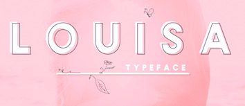 Aka Icarus Bro and as Newflix, est. 2017. Medan, Indonesia-based designer of the geometric sans typefaces Gerald (2017), Gerald Round (2017), Amora Sans (2017), Gaston (2017) and Louisa (2017), and the decorative floriated caps typeface Winter Color (2017).
 Typefaces from 2018: Floresto (an interlocking sans), The Florest (another vintage interlockig sans), Western Lake, Uicon (icon sets), Farmer, Snowy, The Northwest, George, George Round, Enriq (a fashion mag sans, +Round), Victoria (sans), The Nomads, Brewski (vintage type), Oregon Vintage, Lighthouse (Sailor Rounded), The Sailor, Jenny, Maxim Sans. Typefaces from 2019: Marisa, Wanderlust, The Riverfall, Karin, Larosa Sans, Carose (sans), Las Valles, Carino (sans). Typefaces from 2020: Mikela (decorative serif), Lamore, Rosie Sans, Kelly (decorative serif), Hipster Script, Taylor, Snowy Floral (a color font). Harahap also made many icon sets, such as Gamers, Galaxy, Fruits, E-Commerce, Christmas, Agriculture, Adventure. Typefaces from 2021: Valky Wolgen (a decorative serif) or simply Valky. Typefaces from 2022: Kelly (a display typeface with large rhombic tittles), Larosa (a stylish all caps sans). [Google]
[MyFonts]
[More] ⦿
|
Kat Gilbert
|
During her Graphic Design studies at Central Saint Martins in London, American / Austrian Kat Gilbert created a modular stencil typeface (2013) and a triangular experimental typeface called Sparkle Tune or Sparkling Tunes (2013), which was custom-made for a music band. She also made a stencil typeface in Phil Baines's course in 2013. In 2018, she designed the triangulated typeface Gridlocked. [Google]
[More] ⦿
|
Kavya Tolia
|
Mumbai, India-based designer of the decorative rhombic Latin / Devanagari typeface Amrapali (2015), which was inspired by the Taj Mahal palace. [Google]
[More] ⦿
|
Kurt Harahap
[Kaligra.co (was: Newflix, Icarus Bro, and Artlantis)]
|
 [MyFonts]
[More] ⦿
[MyFonts]
[More] ⦿
|
LED Factory
|
A cooperative (est. 2011) of four designers in Queretaro, Mexico. Behance link. Creators of the display typeface Vandatt (2012). Ivan Villagomez Ramos (a student of Graphic Design at the UVM Querétaro, Mexico) and Led Factory co-designed the rhombic typeface Lorentz (2012). [Google]
[More] ⦿
|
Linh T. Thuy
|
Auckland, New ealand-based creator of a straight-edged typeface in 2014 that was inspired by the diamond shape of the roof top of Vector Arena, Auckland Harbour. [Google]
[More] ⦿
|
Logan Dufrn
|
 Parisian designer of Geotype (2012, letters constructed from basic geometric shapes), and Quadritype (2012, an experimental rhombic typeface). [Google]
[More] ⦿
Parisian designer of Geotype (2012, letters constructed from basic geometric shapes), and Quadritype (2012, an experimental rhombic typeface). [Google]
[More] ⦿
|
Lucie Baratte
|
Lille, France-based designer of the pixel blackletter font Methazoa (2013). Crapotine (2013) is an experimental diamond- or rhomboid-inspired ornamental caps typeface. Behance link. [Google]
[More] ⦿
|
Luis Vicente Hernandez
|
 Luis Vicente Hernandez (Dos Decadatres, or DDCT) is a Spanish designer in Madrid who created the free pixelish typeface Houndstooth in 2007 for Neo2, a Spanish magazine. His typefaces include Anchor Deco (2009), Caponata (2009, elegant display face), Maxima (2009), Aguadulce (2009), Super League Font (2010), Minima, Absurda, Houndstooth, Unga Unga (primitive counterless comic book face), Perruna, DDCT Abstrusa (2009), Black Diamonz (2009, rhombic), Bouncing Wisdom (2010, a face in the style of Rennie Mackintosh), Boaz (2010, a display headline face for Go Skateboarding Mag), Farewell (2011), Averis (2011, an art deco display face).
 In 2012, he created the tall piano key typeface Buho. Typefaces from 2013 include OOG. Typefaces done between 2013 and 2017 include Hoot (used in the Tao Te Ching book). Bespoke typefaces: Suanzesburg (for TheCube), Sphere (for Henry Blake). HypeForType link. Behance link. [Google]
[More] ⦿
|
Marc Bacani
|
Carson, CA-based designer who studied at the Art Institute of Los Angeles. In 2016, he designed a modular rhombic typeface. [Google]
[More] ⦿
|
Marhandam Palindung
[Up Font Studio]
|
[More] ⦿
|
Martino Bombonato
|
Italian designer (b. 1994) of the free hexagonal / rhombic typeface Romb (2014). [Google]
[More] ⦿
|
Mathias Doblhammer
[Deeait Creates]
|
[More] ⦿
|
Meriem Mghazli
|
Marrakech-based designer of Helvegut (2012), a series of playful extensions of Helvetica. She also did a signage project for her school, L'Ecole Supérieure des Arts Visuels, in 2012. Creator of Archi-Alphabet (2014), an experimental rhombic typeface. She also designed an ornamental card game set for Rummy (2014). [Google]
[More] ⦿
|
Monogram Fonts Co
[Brian J. Bonislawsky]
|
 Commercial foundry, est. 2009 by Brian J. Bonislawsky (Las Vegas, NV), known for his participation in the Astigmatic One Eye Typographic Institute, the Breaking the Norm Font Library, VersusTwin Type Foundry, and Foundry-X. Most of the fonts done after 2013 were in cooperation with Jim Lyles. Fonts made in 2009 include MFC Franklin Corners (based on Metal Corners from the 1889 "Convenient Book of Specimens" from Franklin Type Foundry in Cincinnati), MFC Manoir Monogram (2009, Victorian initials), MFC Bijou Monogram, MFC Escutcheon Monogram, MFC Pantomime Monogram, MFC Peony Monogram (2009), MFC Vice Monogram (an Art Deco letterset (capitals only) from a 1915 publication by Cartier-Bresson of Paris), MFC Viper Monogram (based on Hollywood Combination Initials, found in a 1934 ATF book), MFC Carson Monogram (from Art Monogram and Lettering by J.M. Bergling, Vol. 1, Fifth Edition, 1912), MFC Semicirculus Monogram, MFC Royaume Monogram (after lettering from the 1884 Ames' Guide to Self Instruction in Practical and Artistic Penmanship by Daniel T. Ames), MFC Bindi Monogram (after a 1915 publication by Cartier-Bresson of Paris), Carson Monogram (a letter set from the book Art Monogram and Lettering by J.M. Bergling, Vol. 1, Fifth Edition published in 1912, where it was simply labeled New Antique 53), Noir Monogram (after the "Pearl" letterset from the 1854 Becker's Ornamental Penmanship and Draughtsman's Letter Book by George J. Becker), Distinto Borders (after the Black&White and Running Borders from the 1906 Abridged Keystone Type Foundry Specimen Book), Tagliato Monogram (after a decorative letterset (capitals only) from the 1899-1900 Treatise on Embroidery, Crochet and Knitting booklet by M. Hemingway&Sons Silk Co), Mouchoir Monogram, Memoriam Initials (based on University Initials in the 1934 Book of American Types by ATF), Moissanite Monogram (based on Diamond Combination Monograms from the same book), MFC Monarchy Initials (based on Diamond Combination Monograms from the same book), Morningside Monogram and Neuport Monogram (both based on letters found in the 1934 Book of American Types by American Type Founders), Diamant Monogram, Distinto Borders (based on borders found in the 1906 Abridged Keystone Type Foundry Specimen Book), Ruse Monogram (an all caps typeface based on DeRoos Inline), MFC Tagliato Monogram (from the 1899-1900 Treatise on Embroidery, Crochet and Knitting booklet by M. Hemingway&Sons Silk Co), and Tryst Monogram. MFC Franklin Corners (2009) is a series of three border dingbat fonts.
 MFC Hills Medieval (2010) was developed from an overly ornamental blackletter type specimen found in the 1882 Hills Manual of Social and Business Forms. The interesting Victorian outline family Sappho Monogram (2010) was inspired by an alphabet set from the book, Monograms and Alphabets for Combination by Dollfus Mieg&Cie, first published in the 1890s. Typefaces from 2012: MFC Bruce Corners. Typefaces from 2013, all done with Jim Lyles: MFC Baelon Monogram (an 800-character monster font with outlined spurred letters from Dollfus Mieg's book, ca. 1890), MFC Bontebok Monogram, MFC Carnivale Monogram (known as Romantiques No. 3 and Ornate No. 2), MFC Thornwright Monogram (from the Manuel de Broderies No. 179 by N. Alexandre & Cie. from the late 1800s), MFC Zulu Monogram (an African-themed font inspired by Bibliothèque D.M.C: Alphabets et Monogrammes 2nd Series), MFC Jewelers Monogram (based on a decorative alphabet designed in 1901 by Marcus Goldsmith, an inventor of elegant accessories), MFC Verre Monogram, MFC Triangulus Monogram (based on a vintage publication called "Bibliotheque D.M.C: Alphabets et Monogrammes 2nd Series"), MFC Chaoxiang Monogram, MFC Fantasie Monogram, MFC Mastaba Monogram, MFC Voyeur Monogram (based on Broadway Monogram Initials in Book of American Types (1893, ATF)), MFC Haute Monde Monogram, based on Elite Monogram Initials in Book of American Types (1893, ATF)), MFC Budding Monogram, MFC Hardwood Monogram, MFC Almond Monogram, MFC Brass Rules Petit (based on filets from the Franklin Type Foundry), MFC Damask and MFC Damask Flourish (by Brian J. Bonislawsky and Jim Lyles, a Victorian capitals and floriated caps pair of typefaces based on Oxford No. 2 from the 1893 catalog of the Cleveland Type Foundry). Typefaces from 2014: MFC Medieval Monogram (a Lombradic caps typeface based on Book of American Types (1934, American Type Founders)), MFC Chaplet Monogram (from Dessins de Broderies---Album No. 486 (Sajou, late 1800s)), MFC Capulet Monogram (based on Monograms and Alphabets for Combination (Dollfus Mieg & Cie, 1890s)), MFC Klaver Monogram, MFC Billow Monogram (from Manuel de Broderies No. 179 by N. Alexandre & Cie. from the late 1800's), MFC Aldercott Monogram (by Brian J. Bonislawsky and Jim Lyles, after a 1901 alphabet by Marcus Goldsmith, an inventor of elegant accessories of personal nature). Typefaces from 2015: MFC Tattersaw Monogram, MFC Livermore Monogram (based on Victorian alphabets shown in Charles J. Strong's The Art of Show Card Writing, 1907), MFC Ringold Monogram (based on Strong's Book of Designs, 1917), MFC Petworth Monogram, MFC Piege Monogram, MFC Gilchrist Initials, MFC Gilchrist Monogram, MFC Arteaga Borders One, MFC Arteaga Borders Two, MFC Arteaga Borders Three, MFC Brass Rules Grand (based on Franklin Type Foundry's brass rules in Convenient Book of Specimens, 1889). Typefaces from 2016: MFC Diresworth Monogram (based on an alphabet set from the book, Monograms and Alphabets for Combination by Dollfus Mieg & Cie, first published in the 1890's), MFC Spindler Borders, MFC Imperator Monogram (based on Monograms and Alphabets for Combination by Dollfus Mieg & Cie, 1890s), MFC Mercer (an initials set from the book Monograms and Alphabets for Combination by Dollfus, Mieg & Cie, first published in the 1880s), MFC Botanical Borders (based on a collection of border treatments from the 1886 Spécimens de caractères d'imprimerie by E. Houpied a Paris), MFC Diamondside Monogram, MFC Redding Monogram (a highly ornate lettering style from Letters and Lettering by Carlyle & Oring), MFC Rodizio (a layered chromatic typeface family inspired by wood types by William H. Page), MFC Falconer Monogram, MFC Glencullen Monogram, MFC Bruce's Corners Two (based on Metal Corners found in Specimens of Printed Types (1882, Bruce Type Foundry)), MFC Westport Monogram, MFC Arkena Monogram (art nouveau font based on Strong's Book of Designs (1917)). Typefaces from 2017: MFC Enschede Borders (based on floral borders in the 1904 Ornamenten Hoofdlijsten en Sluitstukken book by Joh. Enschedé & Zonen, Haarlem), MFC Keating Monogram (based on Monograms and Alphabets for Combination (1890s, Dollfus, Mieg & Cie)). Typefaces from 2018: MFC Stencil Borders Six, MFC Elmstead Monogram and MFC Endeavor Monogram (both based on Dollfus, Mieg & Cie, 1890s), MFC Blossom Monogram (a chromatic layering font), MFC Buttergin Monogram (based on Tuscan typeface shown in Letters and Lettering by Carlyle & Oring), MFC Stencil Borders Five, MFC Stencil Borders Four, MFC Stencil Borders Three, MFC Stencil Borders Two, MFC Stencil Borders One (all by Brian Bonislawsky), MFC Diamondstack Monogram, MFC Sansome Monogram (an art nouveau typeface based on John F. Irwin's Rustic Roman from 1906). Typefaces from 2019: MFC Joliet Monogram (2019: based on a vintage McCalls Kaumagraph Transfer), MFC French Roman (an all caps typeface based on French Roman Light in an 1899 lettering publication by International Correspondence Schools), MFC Diamerrick Monogram (diamond-shaped monograms), MFC Ambeau Monogram (2019, based on the decorative art nouveau alphabet called American Beauty in J.M. Bergling's Art Alphabets and Lettering, 1914), MFC Diamas Monogram (diamond-shaped monograms), MFC Nadall Medieval (an uncial/blackletter font based on Bernd Nadall's Faust from 1898). Typefaces from 2020: MFC Patisserie Monogram (from Letters and Lettering by Carlyle & Oring), MFC Decatur Monogram (after an alphabet seen in J.M. Bergling's book Monograms and Engraving Alphabets). Typefaces from 2021: MFC Deco Diamond Monogram. View the typefaces made by Brian Bonislawsky. Typefaces from 2022: MFC Heathcliff Monogram (2022: rhombic monograms). Creative Market link. [Google]
[MyFonts]
[More] ⦿
|
MyFonts: Diamond typefaces
|
A list of diamond typefaces. The first definition of a diamond typeface is one that has rhombus or diamond-shaped dots on the i and j. [Google]
[More] ⦿
|
Neville Lam
|
 Neville Lam (Kowloon) created the ornamental caps typeface 3BAL (2013). [Google]
[More] ⦿
Neville Lam (Kowloon) created the ornamental caps typeface 3BAL (2013). [Google]
[More] ⦿
|
Paola Ros
|
Spanish designer of Rhomboid (2016). [Google]
[More] ⦿
|
Peter Mazoch
|
 Polish design student who made the rhombic typeface Pixador (2011). [Google]
[More] ⦿
Polish design student who made the rhombic typeface Pixador (2011). [Google]
[More] ⦿
|
Raissa Andreas
|
Jakarta, Indonesia-based designer of the rhombic / hexagonal typeface Navajo (2014). This was developed while she was studying at Limkokwing University of Creative Technology in Malaysia. [Google]
[More] ⦿
|
Reves Studio
[Juan Garcia del Pino Martin]
|
Juan Garcia del Pino Martin (Reves Studio, Toledo, Spain) designed the free rhombic typeface Rhombus (2015). [Google]
[More] ⦿
|
Robbie de Villiers
[Wilton Foundry]
|
 [MyFonts]
[More] ⦿
[MyFonts]
[More] ⦿
|
Ryan Manterola
|
Graphic designer in Lake Worth, FL. Creator of Pretentious Hipster (2012, a rhomboid typeface). [Google]
[More] ⦿
|
Santiago Amaya
|
Designer and illustrator in Barcelona and/or Bogota, Colombia, aka Xato. Creator of the spiky hexagonal typeface Uglymann (2012). The octagonal typeface Crwell (2014) was designed on a rhombic grid. Dafont link. Behance link. Cargo collective link. [Google]
[More] ⦿
|
Sebastian Fischer
[Hubert and Fischer]
|
 [More] ⦿
|
Sophia Nikolaeva
|
Graduate of the British Higher School of Art&Design. Moscow-based designer of a diamond-themed typeface in 2016. [Google]
[More] ⦿
|
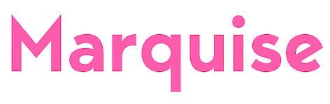
Suet Vinie
|
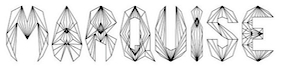 Bristol, UK-based creator of a number of modular experimental typefaces in 2012. These include Cross (straight-edged, based on triangulations), Marquise, American Brilliant (textured and geometric), Diacubic (simulating a graph), Diatomic and Briolette (rhombic). [Google]
[More] ⦿
Bristol, UK-based creator of a number of modular experimental typefaces in 2012. These include Cross (straight-edged, based on triangulations), Marquise, American Brilliant (textured and geometric), Diacubic (simulating a graph), Diatomic and Briolette (rhombic). [Google]
[More] ⦿
|
Tari Puteri
|
Jakarta, Indonesia-based designer of Diamond Font (2015). [Google]
[More] ⦿
|
Thomas Boucherie
|
 Based in Montpellier, France, Thomas Boucherie designed the dingbat typefaces Ghost Smileys (2009), Punk Smileys (2009), thomasboucherie (2007), thomasboucherie3 (2008), Pictoserie 5 (2009, Pingbats), pictoserie 6 (2011, dingbats), Poulpi (2011, octopi), Piou (2011, ducklings), Pucca (2004, Japanese dolls), Thomas1 (2007) and Thomas (2007).
 In 2012, he created Toy Cloud, Pictoserie 7, Kawai Medical (medical dingbats), Square Face, the rhombic typeface Iddi Head, and the dingbat typefaces Animal Kai, Kawaii Eyes, Kokeshi Kawaii, Mustache, Polynesian Etua (dingbats), Kawaii Food II, Pirats (sic) (pirate dingbats), LaLinea Sea (sea dingbats), Toy Kars, Galaxia, and Bow. Typefaces from 2013: Toy Stum, Dead Head, Nox One, Mix One. Catalog. He also has icon sets. In 2013, Thomas set up a second identity, that of the Swiss woman Maelle Keita. Dafont link. Another Dafont link. And another link. Abstract Fonts link. Old URL. [Google]
[More] ⦿
|
Tofutype
[Tzu-yuan "Erik" Yin]
|
 Erik Yin (b. 1988) lives in Kaohsiung City, Taiwan. Creator of the gridded rhombic typeface Prism (2013) and the sans headline typeface ERKN (2013). ERKN covers Latin, Greek, Cyrillic, Hebrew, Armenian and Georgian. In 2014, he created the Latin typeface Coward. In 2015, he created the free thin sans typeface Jonah.
 In 2018, he addded the calligraphic oriental emulation font Goalthink and the modular typeface CubeFarm Latin (to accompany his Chinese font CubeFarm). Typefaces from 2019: Typori (a rounded sans). Dafont link. Behance link. Home page. [Google]
[More] ⦿
|
Tzu-yuan "Erik" Yin
[Tofutype]
|
[More] ⦿
|
Up Font Studio
[Marhandam Palindung]
|
Sungguminasa, Indonesia-based designer of the script typefaces Attasey (2019) and Khillua Zoldyck (2019), the straight-edged typeface Demiurge (2019), the rhombic typeface Shalltear (2019: inspired by the tradiational Bugis-Makassar script) and the molecular typeface Megumin (2019). [Google]
[More] ⦿
|
Weknow
[Wino Sutarmin Kadir]
|
 Weknow is the foundry of Indonesian type designer Wino Sutarmin Kadir (b. 1979), who is based in Bogor, Jakarta. Weknow produced a large collection of free fonts from 2009 until 2012. He started making commercial fonts in 2012.
 Creator of the unicase sans typeface Weknow (2009) and the roundish MisstyPoland (2009). From 2010: Helenfont (2010), Dennis Vallera (2010), Kasumichan, Karitza, Mozzie, Wings, Sharon, Noakatz, dearladysandra, arachnidlove, Alexandra, Monica (2010), Natalie, Wayner 8088, Anime Queen (2010, pixelized), Nano (2010, pixel face), Glover (2010, circular face), Frozen Pandaman (geometric), Joenine (circular), Fun Record (geometric), Gembira (circular), Gabrielle, Solgas (circular), lifeforfun (2010), znowwhite (2010), Snowmask (2010), Nine (2010), Znowwhite (2010), Cecile (2010, experiment with triangles), Coreldraw (2010, geometric, monoline), DennisVallera (2010, inspired by the vector art of Canadian Dennis Vallera), Helenfont (2010). Designs from 2011: Michelle (circle-based), Emmilia (circle-based), Raynaliz, Polysoup, Seba, Selfregion (concentric glyphs), Wings of the dragons (octagonal), Spider, The Training Artist, Chewed Kandi, Sandra, Saintfighteraqua (geometric), Alexey (circle-based), Kristina (circle-based), Graphic Dream, Crystalcore (techno), Dominique (fat rounded), Formalart, Henderson (circle-based), Intanputripratiwi (circle-based), Kioshima (geometric), Gitchgitch (geometric), Justta, Dismecha, Self Region (labyrinthine), Alberto (monoline geometric), Abstrasctik (rounded and experimental), Nicole, Robotoc, Laggastic, Masterpanda, Mohr, Maruciel, Gabrielle, Carlos (a circle-based face), Life For Fun (geometric monoline sans), Lois Cesarano (hexagonal), Heather Thomas (circles and lines), Picaee (modular and leafy), Owaikeo (a circle and arc face), Celeste, The World, Future, Lanitta, Earthearth, Basic, Beautiful, Internationalist (monoline rounded sans caps face), Midnight Show, Plastic, Victory, Perfect, Superpower, Katarzyna, Invasion, Block, Wonderfull, Sweetest, Direction, Funrecord, Eternal Flame, Coreldarw, James Glover (circle-based), Superstar, Inside, Parallel, Million, Ocean, Never Ending Maze, Silverbend, Dragon Fly, Whatever You Want, Swinging Swan, Funatic, Soulmate, Superhero, Zetland, Letting The Cable Sleep, Weknow World, Universalisme, Ocean, Smiley Turtle, Family&Friend, Flower in the window, You&Me&Everyone Else, Astonishing, Grass Hopper, Merpati Putih, Extra Hot, Trees of Happiness, Blowing Bubble, Brain Storm, Good Morning, Flower Lover, Honestly, Jaguar, Modern Aristocrat, Pure and Simple Everytime, Ride the lightning, Proffesional (sic), Flight Stewardess, Antique Retro, Natural Technologies, Ethereal Sky, Conversation, Earth Heart. Free typefaces from 2012: Serta Kayu (multiline script), Emerald, Sweater (texture face), Fish Bone, Delicious Ketchup. The Dark Knight, String and Wire, Little Ant, Xtrapower, Standard International, Nice dream come true, Bavaria, Queen of the modern age, Science Fiction, Greatest View, Queen of the Modern Age, Made in earth, Arabian Knight, Emperor of Japan, Bill Gates Windows, Maximum Kilometer, Mineral Oil Resources, Motorcycle (curly caps), Eskimo and Polar Bear, Gladiator Sport, Aero Dynamic, Optical Fiber, High Logic, Generation (a nice all-caps shadow face), My Heart, Play Ground (multiline face), Cartoon Character, Windows in Japan, Quantum Leap (dymo label face), Computer Love, Electric City, and Copper, Valentine In Love, Weknow Windows, Punk, Graphic Design, Billy Jean Style, LMAO (rounded bold sans face), Take and Give, Indonesia Tanah Air, Swimmer Browser, Diamonds are forever (hexagonal and rounded), Tortoise, My Dear, Get Ready, Export Import, Miracle, Digital Ninja, Funtastic Million Moment, Funny and Cute, Samurai in UK, Bookmark, Once Upon A Time, Bird Feather, Respect, Aruna Aira Jasmine, Extra Cheese, Beauty and the beast, Kung Fu Master (oriental simulation typeface), Game Player (art deco), Modern Building, Trade and Mark, Grovy (sic) Kind of Life, King of Font and Typography, ABC (comic book face), Metro City (extended monoline typeface), The Art, Sprout and the bean, Scooter experiment, Sundown Sunrise (a rounded monoline sans), Art Heart, WindowsObject, Authentic Love, Dolphin Ocean Wave, British Pop Music, Master (sci-fi), Sneak Peeks, Like This, Crumble, Zebra Cross, Star Constellation, Water and Gasoline, Autumn, Aviator, So Cute, Crow Chief (bow and arrow font), Beard Rider, Skateboard, Panel, Swallow Sky Night, Hotel Motel (fat finger face), Techno Various, Zooming Track, Robo Cop, Dance Fever, West Java, Ivory Culture, Push The Button (art deco), Highway Patrol (blocked black typeface), Sausage, Little Atom, Mick Jagged, Life Is Final (copperplate), Total Hammer, Cybertooth, Modern Craft, Riding The World, Boarder (counterless), Essential Arrangement, Sensation, Helmet, Smile, Little Think Big Impact, Airplane, Young and Free, The Futurist, Creative Mind, House Builder, Falling in love, My Font (a rounded monoline oblique sans), Proffesional (sic) Edition, Young Forever, Brown Fox, We Know, Prehistoric, Frankenstein Monster, Great Adventure, You Makes Me Happy, The One and Only Me, Wireframe (3d face), Ceramic (3d face), Winner, The Amazing Me, Cycle, Asia Pacific, Written on the hand, Love is blind, Luxurious Sexy, Robotic, Nano (dot matrix face), King Of The World, Roller Blade, Antelope Run, Elemental, Champion Coffee Cup, Bandit, Arcade, Zetland, The Training Artist, Technique, Neon Glow, Fruit Vegetable, Archieve, Experiment Butterfly, French Fries, Remember Memory, Rocksteady, Electro Static Rain, Science Channel (stencil face), Surfing and Play, Umbrella, The Wizard, Great Leader, Bare Knuckle Fight, The Wizard of One Click, Extra Large, Stabilo Spidol, Onion Rings, Strawberry, Lets Do It Again, Modern Script, Amazing Symphony, Psychedelic, Jump Street, The Earth (modular), Brigade Army, Extraordinary, Cobra on Coconut Tree, Natural Beauty, Anything Mean Everything, Smoke on the water, Write A Letter, Everybody, Together, Planting And Seeding, Savior Light Our Way, All Around The World, Think More For Solution, Yesterday, Techno Tech, Prudent, Metamorphosys, Keep quite and simple (sic), India Hair Style, Catalyst, Bamboo Shoot, Global Capitalism, Water Drop, Thunder Jagger, The Science Archaeologist, The Happy Face Smile, Pyramid Inverted, Jailbreak, Game of Life, Fun Raiser, Athletic, Android Robot (sci-fi), Croissant Sandwich, Ocean Free, Thursday, Crochet Pattern, Firework, Futuristic, Pocket (rounded bold sans), Entertainment, Technology (bubblegum face), So This Is It (inline caps face), Everything (circle-based font), Auto Mobile, Futurism, Rhinoceros Break, Enormous (angulat headline face), The Quick (octagonal), Over The Mountain (wavy face), Frame Work, Interplanetary, Antariksa (rounded sans), Airwaves, Strong in the Heart, Pure And Simple Everytime (rounded organic sans), Gitchgitch (rounded organic sans), Monica, The Lazy Dog (grunge), True Self Reliant, Think Techno, Street, Symbol (constructivist), Post Rock, Moon Light (plump and round), Jumping Running, Green Avocado, Bunga Melati Putih, Bizzare, World Word, Little Rainy Day (dot matrix), Animaline (animal dingbats), Smart Watch, At Most Sphere, Sweet Lollipop (curly), Painting The Light, Flattered, Earth Aircraft Universe, Daydreamer, Earth Aircraft Universe, Flattered, Welcome to Planet Earth, People Quark, Friendly Robot, Biological, Splashing, Freezer, Ragatnia Clara (a nice script), The Happy Face Return. Typefaces from 2013: Cat Eyes, Stay True, Where Wolf, The Sound, Royal Jelly, Grumpy Cat, Aku Cinta Kamu, Yellow, Innovation, Invisible Man, Archieve, Electro Magnet, Bamboo Chopsticks, Valentine's Day, True Love, Club Golf, Your Smile, Guitar On Stage, Karate (oriental simulation), Recognition, Sleeping Beauty (plump lettering), Gelombang Radio, Frozen Ice, Sport Center, Reflection, Enjoy The Time, Fillet O Fish (brushed caps), Artistic, Flower Generation (psychedelia), Heart Shaped, Adore You, Jelang (textured typeface), Stargazer, Army Of Me, Xtreme Bike, Atomic, Fancy Curly, Mastermind, Scientist, Brother, Bahasa Indonesia (sans), Cyber, Photography, Super Creative, Black Stallion (script), Cartoon, Exposure (shadow face), The Ticket, Mercury (retro-futuristic), Agriculture (lava lamp typeface), Electronic, Transformation, The Night (gothic typeface), King Cobra, Bionic Heart, Goddess of Fortune, Guitar Acoustic, Magenta Flower, Java Island (lava lamp typeface), Ready Steady Go, Cute Monster, High Speed, Machine Gun, Random Face 1 (dingbats), Dear Diary, Shinobi Ninja, Stranger (octagonal), Discovery, Translation, Japan (oriental simulation), Digital Gothic, Techno, Butterfly (lava lamp typeface), Candlelight (eax drip face), Maverick, Movie Script Ending, Monochrome, Japan, Chunky Bar, The Greatest High (blackboard bold), Featured, Random Thing 1 (cartoon dingbats), Straw Hat, Where Are You, Plant On Lawn, The Innocent Face, Beat of Drum, ASDFA, Creamy Butter, Monster Rock, Plumbing, Mexicano Chili Sauce, Air Show (bubblegum face), This Is True, Fresh Mint, Laser Gun, My Game, Black Mamba, Drako Heart, Children Stories, Play The Game (with a McDonald's M), Let it be, Everlasting Song, Logotype, Blessing Son, Wino Sutarmin Kadir, Bad Boy, Bold and Blue, Quantum (sci-fi face), Oceanography, Elementary, Sailorman, Heart And Love, High Thin Light, Vintage Postcard (spurred), The Bartender (spurred), Inside The Boxes (rhombic type), Herbalism, Happy Home (lava lamp typeface), Wave Zone, Market Leader, The Monkey, Engine Power, Gamer, Story Telling (lava lamp typeface), High Flagship, Back to Nature, The Quick Motorcross (bilined, caps only, with a McDonalds M), Fisherman (lava lamp typeface), Step Forward, King of Pirate (art nouveau caps), Heritage, High in Love, Thin Decorative (spurred typeface), Little Cowboy, What The Fun, Aha Experience, Glitch (pixel face), Portable. Typefaces from 2014: Enjoy The Show (bubblegum font), Right Power, Xerxes, Selamat Hari Raya, Sincere Heart, Thermometer, My Angle (fat script), Restaurant, Life is font, Material Science, Wave Zone, Everything is a test, The kind of feeling, The President, Blue Ocean, Heavy Metal Gaze, Air-Planet, FOREST-THING (a black poster font), Here-Comes-The-Sun, VICE-VERSA, Wajah-mu-Malaikat, The Miracle, Over The Sky, Eternal Love, Under Stand, Lets Get It On, Salute, Please Forgive Me, Forest Jump. Dayak Shield, Golden Bar (piano key stencil face), Life To Find, Make Peace, Rocket Brothers, Space Truckin, Silver Knight, Zeppelin, Banana Split, Funny Sport, Material Science, Cinta Adalah Perhatian, Love is Attention, Philosophy, Swampthing, Something, Great Job, I Love You, Baby Metal, Millenium 3, White Sock, Liberate, Life Is Font, Chasing Tail, Listening, Sghining Pearl, Hall of Fame, The Good Life, Funky Claw, Pretty Clever, Breath, Continue, Eyes Believer, Samurai Sword, About, God is Watching us, Smile at face, Guitar Rumble, Si Cantik, She is Beautiful, Joker Shoes, Welcome to the jungle (brush face), Maximum High Tension, First Love, Great Heart, Computer Robot, Question of Science, Book Shelves, Billy The Kid (Western font), Times New Romance, Techno Capture, Chemistry, City Shine, Samurai and Blade, Hexagonal. Typefaces from 2015: Brigade of Love, Creative Culture, Axe For Warrior (dingbats), Bogor, Teleport Machine, Construction, Architecture, Underground (octagonal), King will be king, Knight of Light (medieval), Barbarian, Every Day, Thumbs Up, Defragmented (pixel face), Garden of Rose, House Music, Giant Universe, Element (a connect-the-dots typeface), Kingdom of Heart, Smart Talk, Take On Me, Symbolism, The Happiness, Dark Empire, Space of Time, Game Robot, Made in Indonesia, Morning Sunshine (art deco), Gravity Relationships, All About Love, City of Rock, Dear Baby, My Pleasure, Dear Lovely, Drea Reality, Charming Prince, Warehouse Project (geometric solids), Stone Rock, Script Machine, Pray Boy, Copy Paste, Baby Cuttie, Treasure Island, Impulse of Heart (fat rounded stencil), Extraordinary Craft, Brand New Colony (connected script), Digital Handmade, Learning, Aero Glass, Rainbow In Love, Catatan Harian, Sky Liner, A Lot of Love, Take Me Home, Shake It Off, Everything More, Qualified Good, We are the Word, Tshirt, Valuable, Weknow, Metal Kingdom, Phytoplankton, Kissing The Rain, Sunset Beach, Jazz Music, Dear Lovely, Dream Reality, My Pleasure, Boarder, Entertaintment-Show, Guardian, Indonesia, This-is-internet, Picture-of-you. Typefaces from 2016: Big Burger, Blues Melody, Kangaroo Punch, Dark, Amazing Day Everyday, Delicious Choice (lava lamp script), Panda Robot, Wijaya Fresh, Megapolitan Jakarta, Chalk Board, Mother Father, Knowledge Power, Singing Bird, Extra Machine (stencil), Airwave (rounded sans), Human Alter Ego (octagonal), Grand Prix, Serat Kayu, Daniel, Greatest Map, Jazz Sound, Amazing Sound, Algorithm (techno), Brother Army (upright connected script), Cannon Ball, Senorita Spain, Billionaire, Most Famous, The Innocent Army, Guitar Electric, Bracelet, Batman, Phenomenon, Arabian Prince, Taring Serigala, Happy Everydays Day, Coffee Time, Revolver (Western style), Space Object, Black Arrow, Candle-Light, Evergreen, Green Tea (foliate typeface), Harley Queen, Masquerade. Typefaces from 2017: Red Light Special, The Brain, Entrance, Auto Bots, Alive in Science Fiction, Harmonic Vibration, Hydraulics System, Mountain Dew, Flying Bird, Next Century (outlined), Read Book (trilined), Just Do Good, Purpose, Kasih Dan Sayang, Tobacco (scratchy typeface), Baby Superhero, Life in Digital Age, Black Star, Start Revolution, Artistic, Army of Me, Anything Mean Everything, Antariksa, Animaline Dingbats, Android Robot, Amazing Symphony, A Lot of Love, All Around The World, All About Love, The Ugly Font, Switch System, Across The Night, I Am A Robot, Polygon Star, The Creation, Amazing Day Everyday, A Lot of Love, Western Eastern (Far West font), Gangsters, Armored, All Around The World, Great Britain, Chintya Awuy, King and Queen, City of Rain, Sub Urban City, Spicy Paprika, King of Everything, Pondok Ratu Intan, Celestial Love, After Party, Underground 2. Typefaces from 2018: Age of Science and Technology, Autopilot, Age of Awakening. Typefaces from 2019: Primitive Heart. Typefaces from 2020: Thefotosintesis. Alternate URL. Behance link. Dafont link. Fontspace link. Klingspor link. Fontm link. Creative Market link. [Google]
[MyFonts]
[More] ⦿
|
Wilton Foundry
[Robbie de Villiers]
|
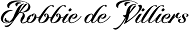 The Wilton Foundry, which started out in Wilton, CT, but is now in Chattanooga, TN), was founded in 2003 by Robbie de Villiers. It published the semi-stencil typeface EM (2018), Brew (2018), Context Regular (2017: a condensed inline typeface), Målestok (an octagonal logo font family), Yotta (2017, a thin monoline sans specially designed for the fashion retail industry), Werk Serif (2017), Clareza (2016, a clean geometric sans), Leuk (2016, a playful sans), Maker (2015, a fresh rectangle-studded techno-display typeface), Saluzzo (2015, a contemporary calligraphic stencil interpretation of Bodoni), Twine (2014, a warm rounded stencil type inspired by the Plantin typeface which in turn is based on Robert Granjon's Gros Cicero of the 16th century), Cielo (2012, a sans family with some contrast), Marcus (2012, a roman type family in the Trajan style), Typetonic (2011, techno), Skript (2011, a stencilish script), Vallassina (2011, like a child's hand), Bellezza (2010), Pagina (2010, humanist sans), Rijk (2010, calligraphic), Saycheez (2009), Chamber (2009, serif face), Ciseaux (2009), Terzo (2009, calligraphic), Werk (2009, 12-style sans family), Velouté (2008, script), Diario (2009, blackboard script), Carnegie Classic (2009, calligraphic), Ziro (2008, almost a comic book font), Suzie Q (2007, hand-printed), Brasserie (2007, connected script), Chateau (2007, calligraphic script), Pointe (2007, a blackboard script), Atto Sans (2007), Santa Cruz (2007, a serifed headline face), Marzipan (2007, a whimsical script), Spark (2007), Fete (2006, formal script), Flax (2006), Portfolio (2005), Cyan (2006, a compact serif typeface reminiscent of Trajan; updated in 2016 as Cyan Neue), Ceres (2009, related to Cyan), Cyan Sans (2006), Petronella (2006, medieval script), Pezzo (2006, calligraphic script), Canette (2006, calligraphic script), Vecta Serif (2005), Vecta (2005, sans family; also published in 2006 as Vecta DT (DTP Types)), Cinnamon (2005, children's handwriting), Cilantro (2005, fun handwriting, and its niece Hanna (2008)), Misspink (2005, stone-age simplicity), Brown Fox (2005, script), Celsius (2005, felt tip face), Plumage (2007, formal high contrast calligraphy), Plato (2005, faded roman caps), Diplomat (2006, calligraphic), Duet (2004, calligraphic; also published in 2006 as Duet DT (DTP Types)), Spark (2005), Anno Rex (2005), Hampton, SCelsius, Gluestick, Duet Bold (2005, calligraphic), Duet-Flourishes (2004), Duet2Deux, Duet-Regular (2005), Nobodi Bodoni (2005), About Face (2004, script), Benjamin (2003, a geometric sans), Paella (2005), Boondoggle (2005, curly face), Monotonose (2004), Password (2004), LoosieGoosie (2004), Pippin (2005, transitional serif), Carnegie (2004, calligraphic), LatextBold (2003), ModusBoldItalic (2003), Nantucket (2004), Nicolas (2005), Oslo (2005, a legible sans family), Sepia (faded look), Belair.
 Chatype is a geometric slab serif typeface family designed in 2012 for the city of Chattanooga, TN, by Robbie de Villiers and Jeremy Dooley. Unio (2012) is a rounded slab family designed to be sturdy and legible. In 2017, Wilton Foundry published Yotta, Marcus, Chateau, Pagina, Plato, Beurre, Vecta Serif, Cyan Neue, Buckle, Suzie, Unio, Attic Sans, Blau (hand-chiseled, angular text typeface) and Taglio, a contemporary calligraphic interpretation of incised or inline engraving or carving. Typefaces from 2018: Chartre, EM, Mijne, Brew, De La Croix (a stencil sans inspired by the works of Eugène Delacroix, leader of the Romantic School) , Halla (a light monoline sans). Typefaces from 2019: Kular (monospaced), Zentral (an awesome 2-style sculptural font with the angularity of old Czech masters such as Preissig and Menhart). Typefaces from 2020: Obo Regular (a diamond-studded display typeface), Rito (monospaced). Home page. View Robbie de Villiers' typefaces. Home page. [Google]
[MyFonts]
[More] ⦿
|
Wino Sutarmin Kadir
[Weknow]
|
 [MyFonts]
[More] ⦿
[MyFonts]
[More] ⦿
|
Without Foundry (or W Foundry; was: Diego Aravena)
[Diego Aravena Silo]
|
 Diego Aravena Silo set up Without Foundry with Felipe Sanzana 2012. In 2016, Diego Aravena joined forces with fellow type designers Patricio Truenos and Bana Arasanz. In 2022, he embarked on studies at the University of Reading. Diego's typefaces:
 - The funky flared typeface family Pirata (2013). Pirata has some interlocking characters.
- D Sari (2014, Latinotype). This typeface won an award at Tipos Latinos 2014. Diego calls this 22-style rounded sans family neohumanist.
- Zennat Pro (2014, Latinotype).
- D Hanna (2014) is a 22-font neohumanist sans typeface family. Followed in 2015 by D Hanna soft. D Hanna is instantly recognizable by its amputated e.
- Huboost (2014): a tall titling face.
- Dsert (2014, Latinotype): a 39-weight display sans family that is inspired by the 1970s politically colored design movement, afichismo. Many glyphs are slightly flared.
- Barranco (2015). Barranco is a 3d layered font family with shadows and inline effect layers.
- Without Sans (2015, by Felipe Sanzana and Diego Aravena). This large sans family is characterized by a large x-height and rhombic dots.
- D Blues (2015). A neo-humanist typeface family in 20 styles.
- Bronto (2015). A rounded sans family with reversed contrast.
- Biblioteca (2015) by Roberto Osses, Cesar Araya, Patricio Gonzalez and Diego Aravena won an award at Tipos Latinos 2016.
- Gardenia (2016): a rounded sans typeface family by Salvador Rodriguez Lagos.
- In 2016, Salvador Rodriguez and Diego Aravena Silo co-designed the geometric sans typeface family Fuse and Fuse V.2, which are characterized by a large x-height and some humanist elements. Salvador Rodriguez and Julia Martines Diana added Fuse V.2 Printed in 2018.
- Eren and Eren Condensed (2016) is a 32-style slab serif family with a humanistic touch and rounded corners---it was designed by Salvador Rodriguez and programmed by Diego Aravena.
- Ulises (2017). Designed with Salvador Rodriguez: an eclectic slab serif with some grotesque features.
- Kappa (2017): A modern sans serif with humanistic and geometric features, co-designed by Salvador Rodriguez and Diego Aravena. Followed in 2017 by the slab version Kappa Vol2 (designed by Salvador Rodriguez).
- Salvatore (2018). A neogrotesque.
- Notorious (2018). A brush script.
- Hermann (2018). By Salvador Rodriguez and Diego Aravena. This wonderful readable garalde will be great for novels.
- Ryman Gothic (2019, by Diego Aravena Silo and Franco Jonas at W Foundry) is inspired by Edwin Allen's wood types and Morris Fuller Benton's gothics.
- Gallos (2020, by Diego Aravena Silo and Salvador Rodriguez). A 20-style mix of architype, geometric, gaelic, unicase and uncial. It contains variable styles as well.
- Supera Gothic (2020). An 18-style geometric sans by Diego Aravena Silo and Salvador Rodriguez. Plus variable fonts.
- Saes Grotesk (2021). An 18-style grotesk sans by Diego Aravena that comes with two variable fonts. It is based on early 19th century gothics.
Creative Market link. Behance link. Another Creative Market link. Old foundry link at MyFonts. Behance link for Without Foundry. Yet another Creative Market link. [Google]
[MyFonts]
[More] ⦿
|

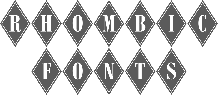
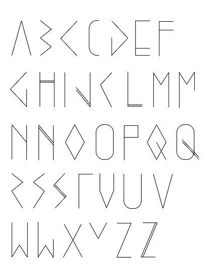
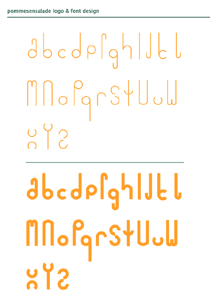
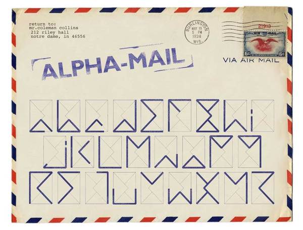
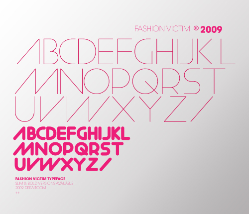
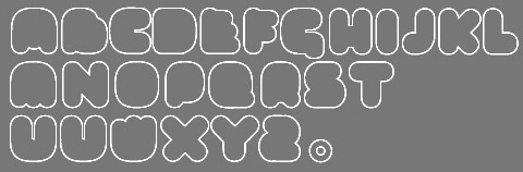
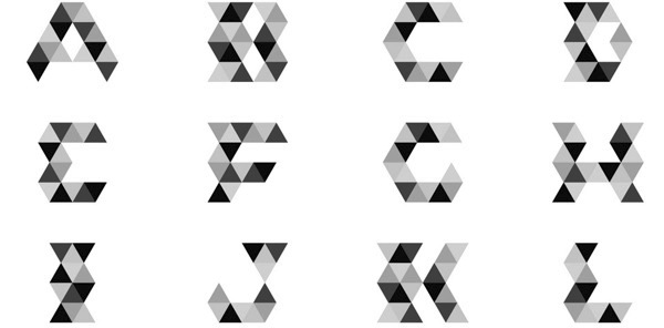
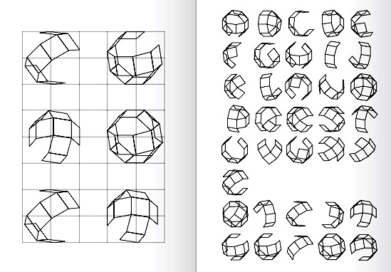
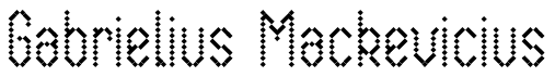
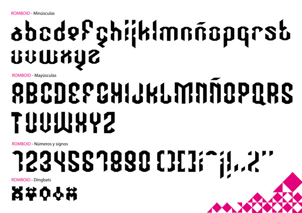
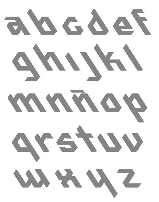
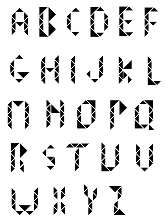
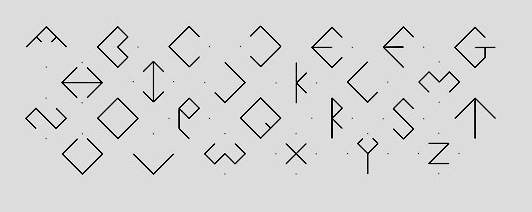
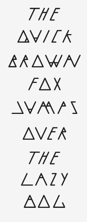
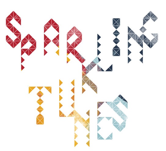
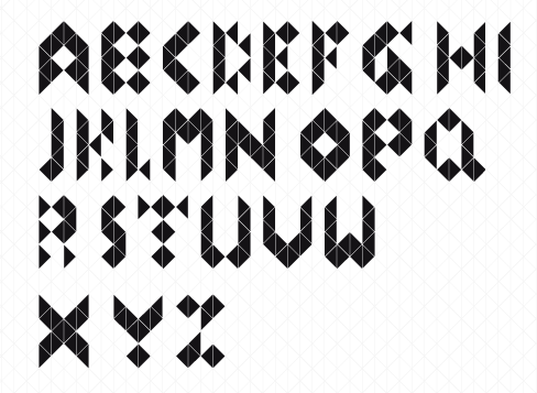
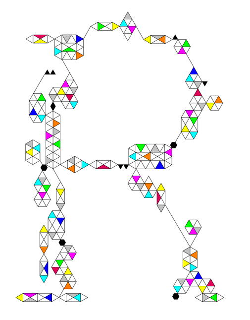
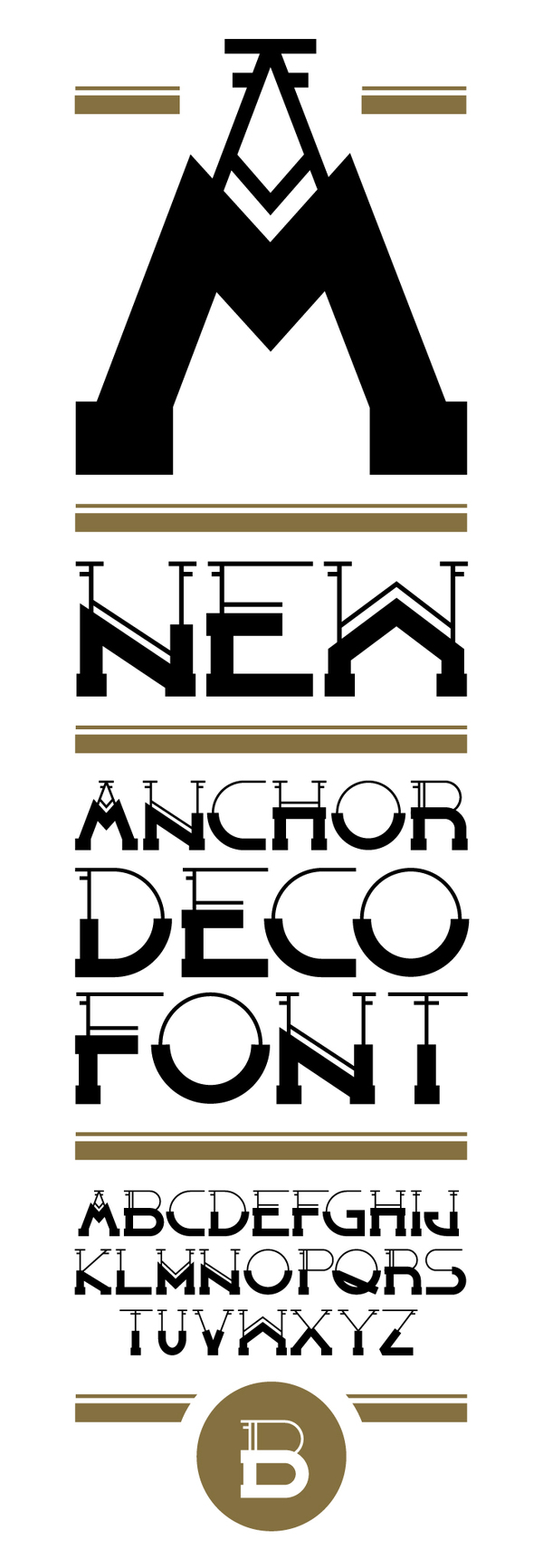
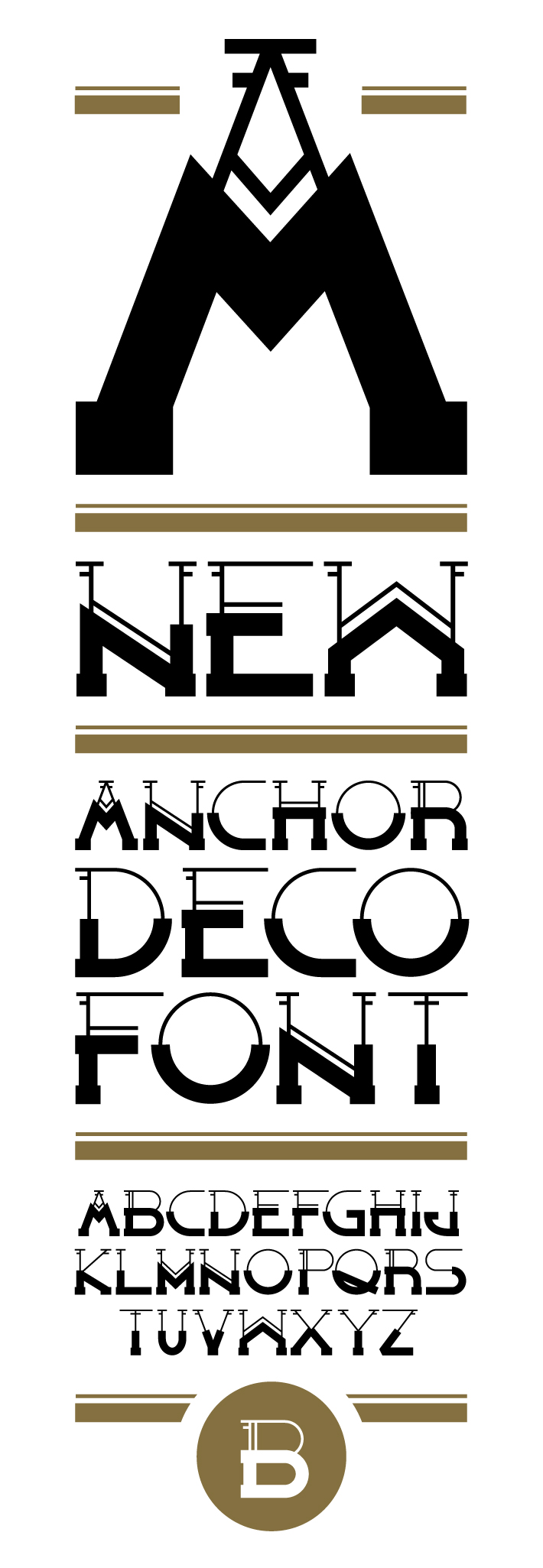
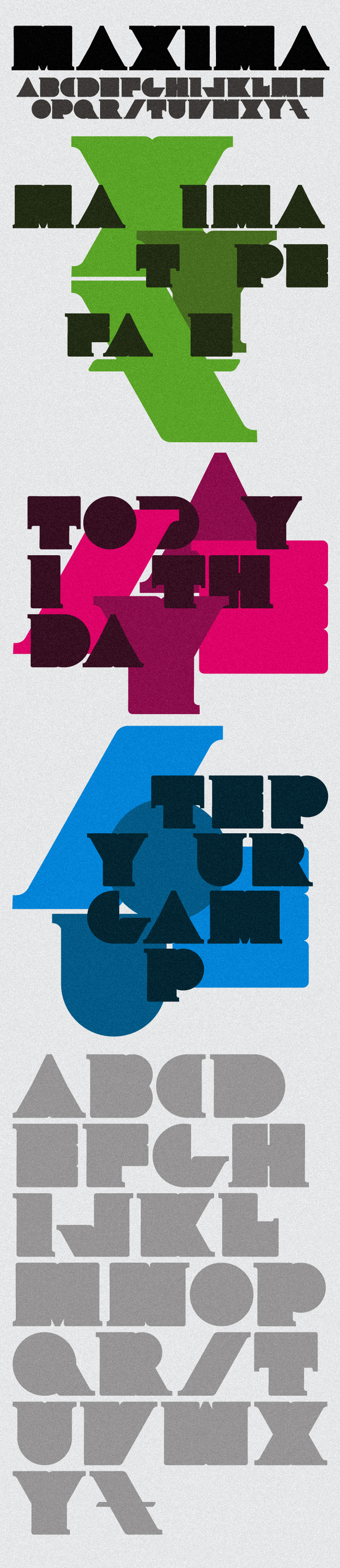
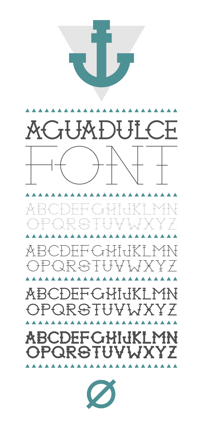
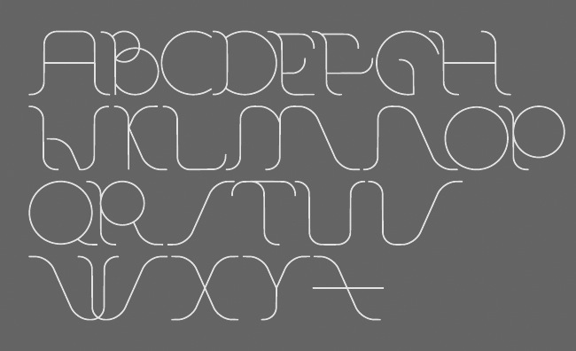
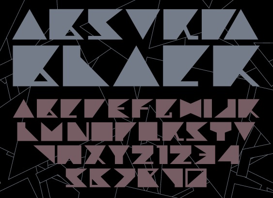
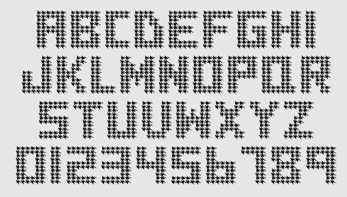
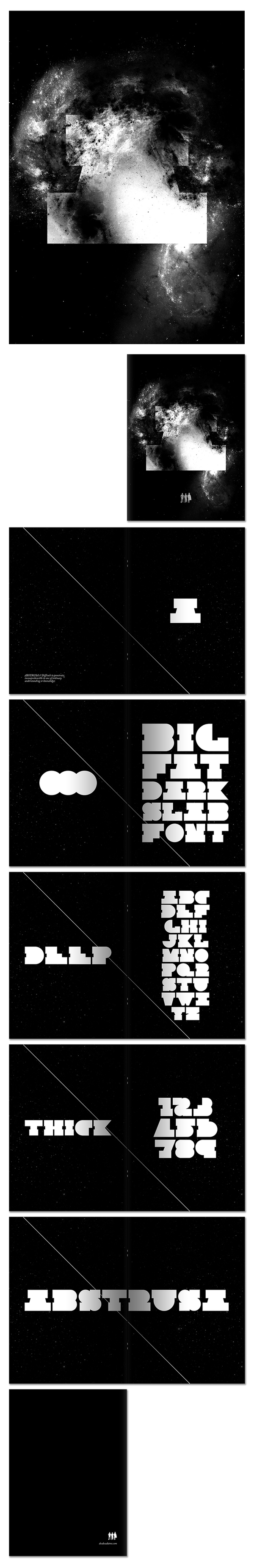
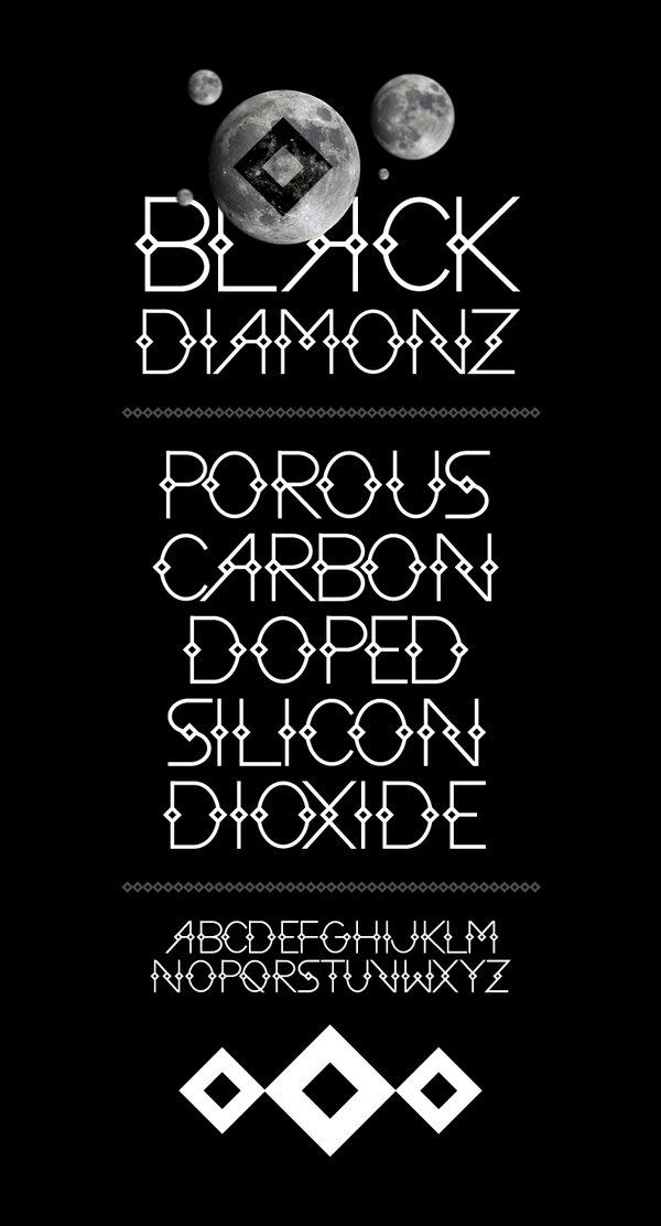
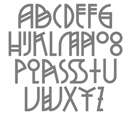
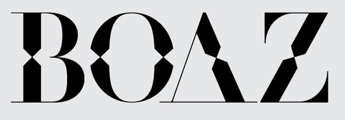
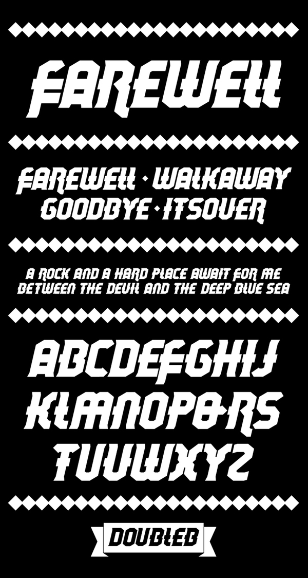
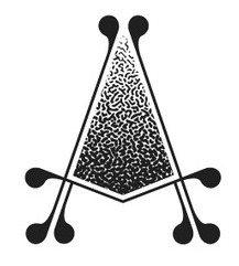
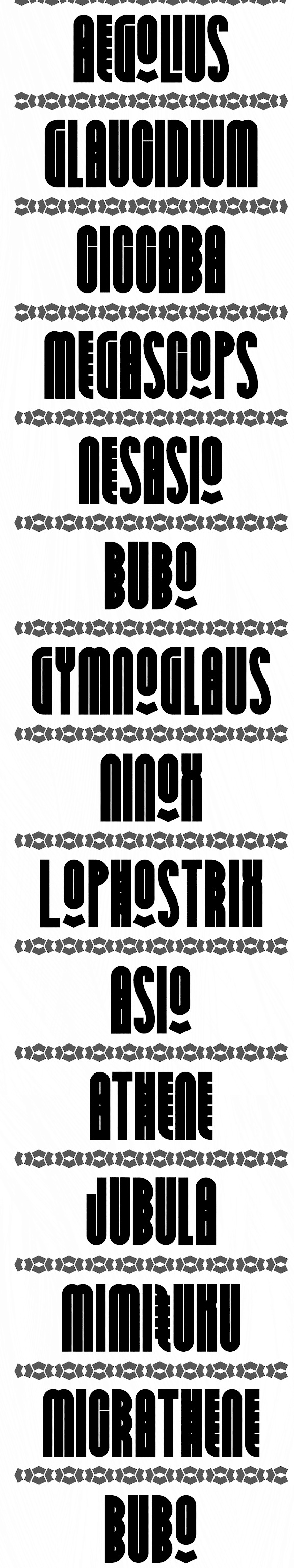
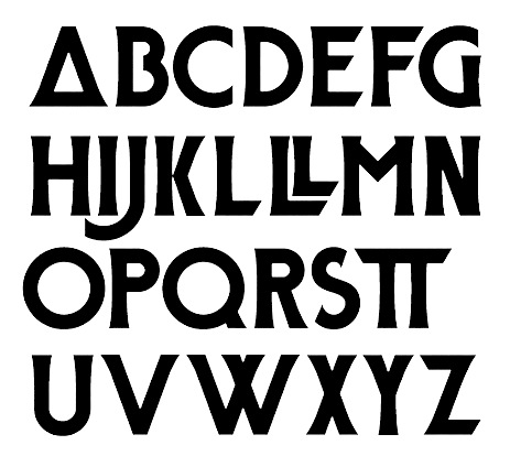
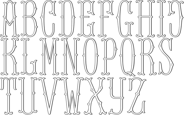
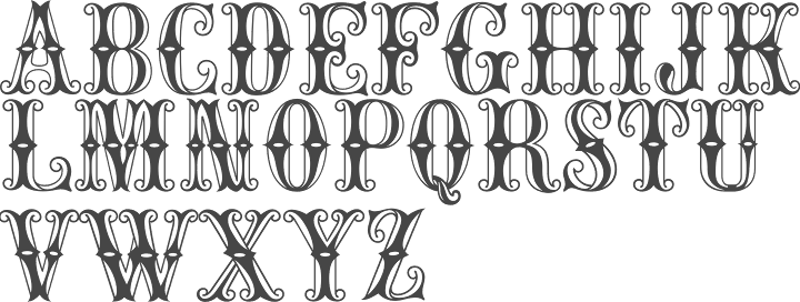
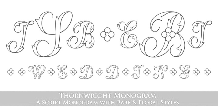
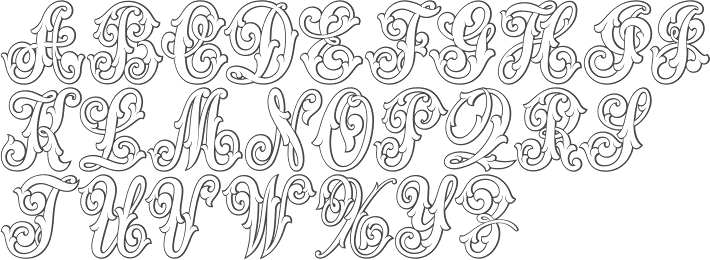
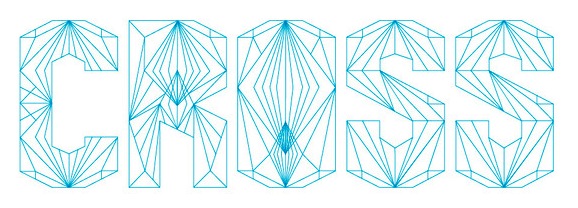
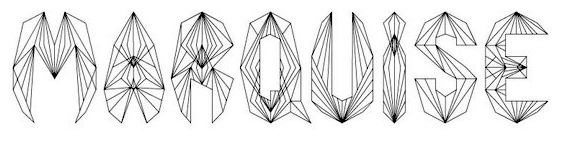
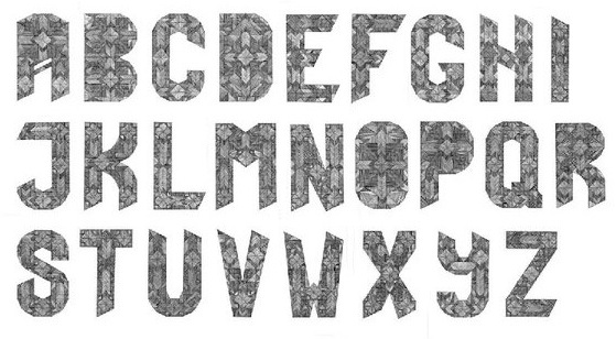
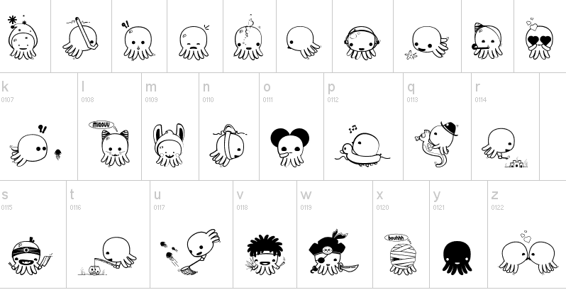
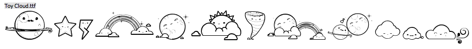
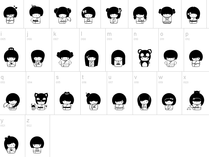
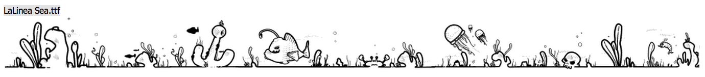
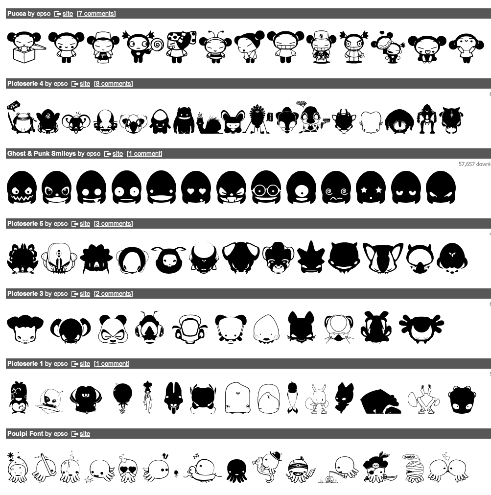
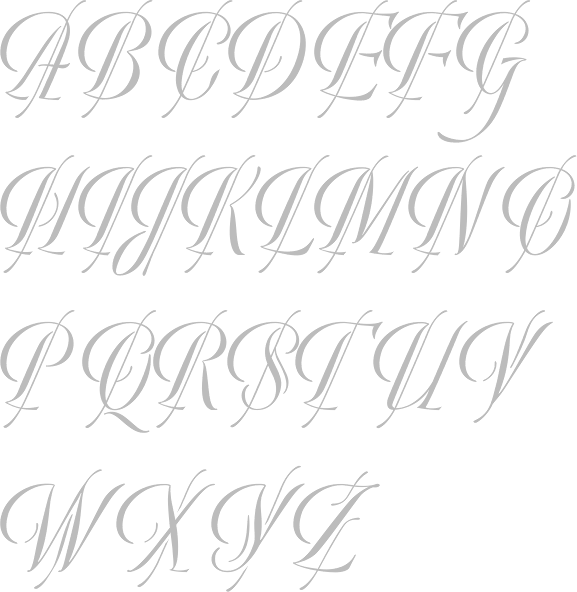
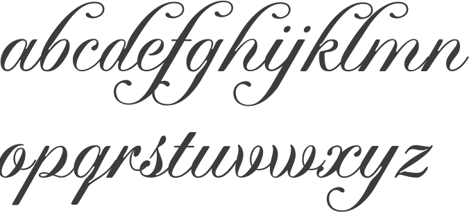
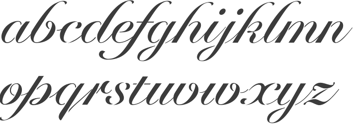
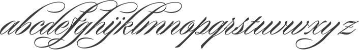