TYPE DESIGN INFORMATION PAGE last updated on Sat May 16 07:56:44 EDT 2026
FONT RECOGNITION VIA FONT MOOSE

|
|
|
|
|
Typefaces related to Egon Schiele | ||
|
|
|
|
SWITCH TO INDEX FILE
Caracas, Venezuela-based designer of the display typeface Orchestra (2015) and the Saul Bass-inspired typeface Angular (2015). [Google] [More] ⦿ | |
Schiele died from the Spanish flu three days after his wife. [Google] [More] ⦿ | |
| |
In 1937 the Nazi Party declared Heckel's work degenerate. It forbade him to show his work in public, and more than 700 items of his art were confiscated from German museums. By 1944 all of his woodcut blocks and print plates had been destroyed. After World War II, Heckel lived at Gaienhofen near Lake Constanz, and taught at the Karlsruhe Academy until 1955. He continued painting until his death at Radolfzell in 1970. Heckel's woodcuts and lettering inspired a few typefaces, most notably:
| |
Naples, Italy-based designer of the handwriting typeface Egon (2016), which is inspired by the signature of the Viennese expressionist painter Egon Schiele. [Google] [More] ⦿ | |
Gregory La Vardera made fonts for Handcraftedfonts, including HfSecede (1994, inspired by the architectural drawings of Otto Wagner), HfModularStencil (1994, interpreted from LeCorbusier Stencils), HfLaVardera (1994, own handwriting). His fonts are no longer part of Handcrafted fonts, which has now turned into Adcrobatics. Presently, Gregory is an architect and principal of Lami Design. [Google] [More] ⦿ | |
Behance link. [Google] [More] ⦿ | |
Jonathan Macagba
| |
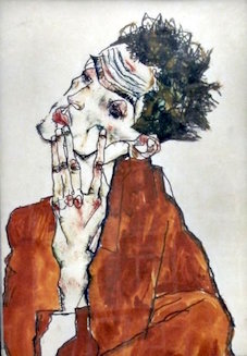
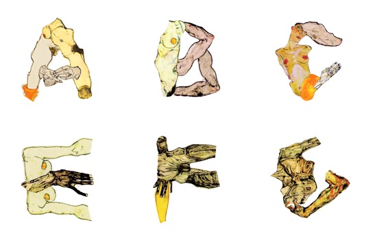
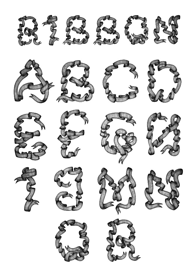
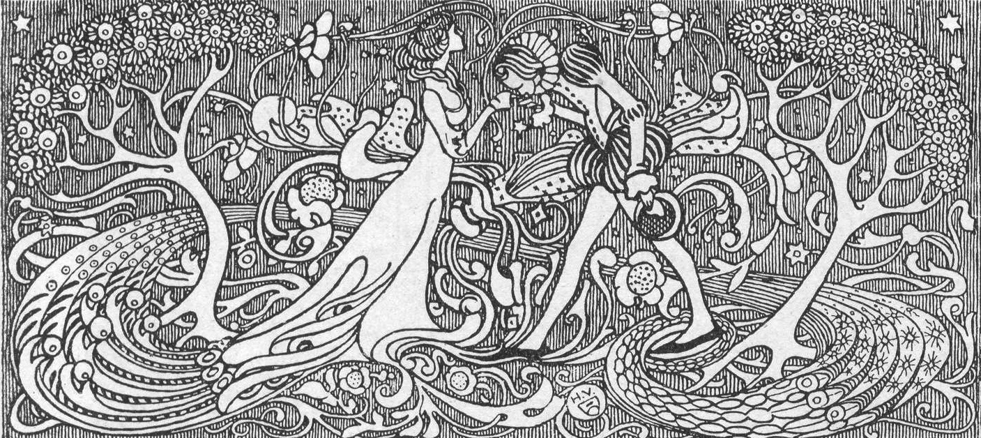
Illustrator Nathalie Hallman (Stockholm, Sweden) explains the motivation behind her decorative caps typeface Egon Schiele (2013): Typeface built out of image cut-outs from works by Austrian expressionist painter Egon Schiele (1890-1918). A protégé of Gustav Klimt, Schiele was a major figurative painter of the early 20th century. The twisted body shapes and the expressive line that characterize Schiele's paintings and drawings mark the artist as an early exponent of Expressionism. From 2012 until 2015, she studied at Beckmans College of Design in Stockholm. She drew an ornamental caps alphabet called Ribbon (2012). Behance link. [Google] [More] ⦿ | |
Prototype-NY (was: Handcraftedfonts)
|
Jonathan also made commercial fonts available via Phil's Fonts, such as the interesting Murder Mystery Font, EdoFont (great Japanese decoratives), Frankenfont, Frankenfont Careers, FunToUseFonts, HF American Diner (a 3d shadow typeface), Broadstreet, Exposition, Antique Row, Doodle, Libris (great!!!), Edofont (Japanese crests), Newgarden (more!!), and Poster. At Umbrella Type, he published Exposition and Exposition Rounded (2004, a type revival influenced by an Italian poster designed by Leopoldo Metlicovitz in 1906 for the opening of the Simplon Tunnel), Libris (2004, a great and very clean revival of a 12th century Spanish script), and Poster (2004, partially influenced by Egon Schiele's hand-lettered poster for the 1918 Vienna Secession. He also makes custom fonts, logos and signatures. Dafont link. Klingspor link. FontShop link. [Google] [MyFonts] [More] ⦿ |
Marketed by Veer, this collection, started in 2004, brings us fonts by Alejandro Paul (Kautiva, 2004), Alejandro Paul and Angel Koziupa (Argenta (2003, a playful script), and Brisa (2004, another casual script)), HabanoST, Malbeck, Mobley, Murga, and Tiza), Corey Holms (Mince, Brea), Wayne Thompson (Bosin), Miles Newlyn (the blackletter typeface Ferox), Neil Summerour (Donatora (2004, a Bodoniesque revival), Headcold (2004), Ayumi (2004), the casual handwriting family Luce, and the athletic lettering family Sneakers), Randy Jones (Olduvai, 2004), Mike Cina (Trisect (2004)), Jonathan Macagba (Exposition and Exposition Rounded (2004, a type revival influenced by an Italian poster designed by Leopoldo Metlicovitz in 1906 for the opening of the Simplon Tunnel), Libris (2004, a great and very clean revival of a 12th century Spanish script), Poster (2004, partially influenced by Egon Schiele's hand-lettered poster for the 1918 Vienna Secession)), Alfredo Graziani and Alejandro Paul (Mama Script (2004, a medieval script)), Stefan Hattenbach (New Global), Christian Robertson (Pill Gothic), Michael Doret (Orion) and Diego Giaccone (Plumero). [Google] [More] ⦿ | |
The secession building displayed art from several other influential (art nouveau) artists such as Max Klinger, Eugene Grasset, Charles Rennie Mackintosh, and Arnold Bocklin. Secessionists not mentioned above include Josef Maria Auchentaller, Rudolph Bacher, Peter Behrens, Marcus Behmer, Adolf Böhm, Paul Bürck, Hans Christiansen, Johannes Cissarz, Carl Otto Czeschka, Josef Diveky, Max Fabiani, Remigius Geyling, Willi Geiger, Richard Gerstl, Albert Paris von Gütersloh, Josef Hoffmann, Ludwig Hohlwein, Moriz Jung, Gottlieb Theodor von Kempf, Julius Klinger, Leo Kainradl, Oskar Kokoschka, Max Kurzweil, Oskar Laske, Bertold Löffler, Heinrich Lefler, Mila Von Luttich, Burkhard Mangold, Carl Moll, Alphonse Mucha, Joseph Maria Olbrich, Bruno Paul, Joze Plecnik, Emil Preetorius, Erwin Puchinger, Alfred Roller, Malva Schalek, Egon Schiele, Othmar Schimkowitz, Jan Toorop, Heinrich Vogeler. Dedicated link. [Google] [More] ⦿ |
 Talented illustrator in Izmir, Turkey. Some of his posters have great lettering. [
 Erich Heckel (b. 1883, Döbeln, d. 1970, Radolfzell) was a German painter and printmaker, and a founding member of the Die Brücke group which as active from 1905 until 1913. Heckel and the three other founding members of Die Brücke (i.e., Ernst Ludwig Kirchner, Karl Schmidt-Rotluff and Fritz Bley) admired the work of Edvard Munch, and aimed to make a "bridge" (Brücke) between traditional neo-romantic German painting and modern expressionist painting. Primitive, esp. African, art was also an inspiration to the members of the Die Brücke.
 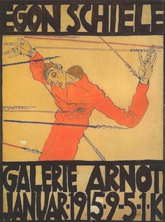 Jon Cox is a graphic designer in Santa Ana, CA. His work includes a beautifully lettered poster in the style of Egon Schiele (2013).
 Original fonts, clip art, signature fonts by New Yorker (and ex-Philadelphian) Jonathan Macagba, and Gregory La Vardera. Macagba used to run Handcraftedfonts, then Adcrobatics, and finally
  The Vienna Secession---also known as the Union of Austrian Artists, or Vereiningung Bildender Künstler Österreichs---was formed in 1897 by a group of Austrian painters, sculptors, and architects who had resigned from the Association of Austrian Artists: Gustav Klimt, Koloman Moser, Josef Hoffmann, Joseph Maria Olbrich, Max Kurzweil,
|
|
|
|