TYPE DESIGN INFORMATION PAGE last updated on Sun Jan 25 02:38:07 EST 2026
FONT RECOGNITION VIA FONT MOOSE
|
|
|
|
|
Tape fonts | ||
|
|
|
|
SWITCH TO INDEX FILE
Designer of grungy or hand-printed typefaces in 2014: Pepperoni Pizza, French Fries Apocalypse, Motherland (a grungy Cyrillic simulation typeface), Silent Broadcast (grunge), Undertaker, Soldier of the Dark, Oh My Oh La La yeah, One Two Mustard, Destroy the Enemy. In 2015, he made Against Modern Football, Walter Goes to America, The Day is My Enemy (tape font), Bring Me The Gummy Bears (ransom note font). In 2017, he/she designed Naughty Scratch. Home page. Dafont link. [Google] [More] ⦿ | |
Acces Design
|
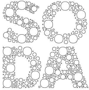
Typefaces made in 2009: DB72, DBColon, DBPoints Sans, DBCube, and DB13, mostly dot matrix or octagonal fonts. In 2010, these were followed by db Outline, db Stickers, db Stick, DB Cube New, db MOKI (stencil), db Ciao, db Ticket Light, db 72, DBpoints (dot matrix), DBPoin2, and db Kopix (blackletter), db New Points Italic (dot matrix face). In 2011, we find dB Stick, dB Sticker, dB Sticker Mono (a monospaced typewriter face), db Prague (fat sans), db Backjumps (an extraordinary fat poster stencil), db Perl, db Perl 1.2 (texture face), db Quarz (2011, +Mix), and db Nox and db Nox II. Fonts made in 2012: db Como (a simple monospace sans), db Sticker (hairline sans), db Rocko v2 (stencil face), db Today v1 (a beautiful black slab face), db Today v2, db Etroite (2012, in several weights: constructivist), db N3, db Drops (fat counterless face), db Quarz Mix, db Soda, db Klacks, db NQ, db Boxer, db Como (monospaced), db Smoothie (fat stencil face), db Quick Cut (stencil), db Karton (stencil), db Frieda. Typefaces from 2013: db Etroite, db Concierge (hairline serif), db Lineo, db Lucky, db Boxer III, db SIL. Typefaces from 2014: db Darling. db Oh Darling, db Melitta (a fantastic brush emulation typeface), db Sticker T, db Points Sans Oblique (dot matrix font), db Como Splitt, db Quirlo (fat rounded poster typeface), db Quirlo Mix, db Limo (angular angry anthroposophic sans), db Limo N, db Slow (a German expressionist typeface), db Bargo Condensed, db TwoLines (an inline font). Typefaces from 2015: DB Caryptis, DB Oleumi, DB Caroli Plain, DB Caroli, DB Seimeins Serif, DB Seimains, DB Sago, DB Sago II, DB Sthlm (+Light), DB Gertrude, DB Track, DB Track Too. Typefaces from 2016: DB Maquette, DB Largo, DB For You (winner in the 2016 Fontstruct Love competition), DB Bargo Slanted. Typefaces from 2017: DB Jojo, DB Scrape, DB Tape Noir, DB Tape Slab, DB Tape, DB Pins, DB Monoto Sans, DB Mrs Back n Black, DB Dr. Bob, DB Tilda, DB Rondo Mix, DB Rondo, DB Shop. Beate set up Acces Design ca. 2017. The typefaces available there are ad Backjumps (stencil), ad Bargo, ad Como, ad Concierge, ad Darling, ad Oh Darling, ad Frieda, ad Klacks, ad Limo, ad Lucky, ad Magritte, ad Melitta, ad Mill, ad Points, ad Quirlo, ad Slow, ad Soda and ad Soda Plex. Typefaces from 2018: ad Falter (blackletter). Typefaces from 2019: ad Dorma (sans), ad Flieger, ad Louise, ad Hobby, ad Journal, ad Juli (sans), ad Tape, ad Violetts (handcrafted), ad Tape (sans). Typefaces from 2020: ad Ander, ad Sticker Mono, ad Juli (sans), ad Magritte (sans and serif; for posters). Behance link. FontStruct link. [Google] [More] ⦿ |
Adam Ladd Design
|
Free typefaces from 2015: Poster Cut, Poster Line. Poster Cut Neue followed in 2021. Typefaces from 2016: Oilvare (an 18-style layered font family), Cheddar Gothic (handcrafted letterpress emulation family; followed in 2018 by Cheddar Gothic Rough). Typefaces from 2017: Neato Serif (followed in 2018 by Neato Serif Rough), Highest Praise (brush script), Citrus Gothic, Bakerie (42 hand-drawn typefaces), Trailmade, Farmhand (Farmhand is a textured, hand drawn, condensed font family featuring serif, sans, inline, italic, and extras styles suited for display titling), Garlic Salt, Likely (brush script), Likely Sans, Active (an upright brush script). Typefaces from 2018: Config (a condensed geometric sans; see also Config Condensed and Config Ultra in 2019), Config Rounded, Quiche (in Text, Display, Fine and Stencil substyles, for a total of 52 ball terminal-themed fonts), Quiche Sans (Peignotian), Cheddar Gothic Sans Two, Botany, Braisetto (connected signature font). Typefaces from 2019: Skie (a big gothic sans family with low contrast, small x-height and tall ascenders), Quiche Flare, Magdelin (a 40-style gothic sans), Fractul (a geometric sans characterized by its dramatic squarish "a"), Gopher (a reverse contrast family), Konnect (a geometric sans family). Typefaces from 2020: Lufga (an 18-style low-contrast sans with large x-height and short ascenders and descenders), Gopher Mono (a 16-style reverse stress monospaced sans), Quiche Display, Neulis (a sans typeface with a script lower case "l" and "s"), Zuume (a high impact condensed all-caps sans family), Zuume Rough, Zuume Soft. Typefaces from 2021: Serca (a 40-style sans with some tension), Otterco (a condensed geometric sans in 32 styles). Typefaces from 2022: Zuume Edge (a 32-style high-impact all-caps condensed octagonal typeface), Fromage (a stylish 14-style Peignotian sans). Fontsquirrel link. [Google] [MyFonts] [More] ⦿ |
Adam McIntyre
| |
Graphic design student at the University of Salford in Manchester, who created Masking Tape (2012), Decipher (2012, a minimalist typeface dedicated to Alan Turing), Shedge (2013, a stiletto typeface for a local band called Shedge), and Sporidium (2013). [Google] [More] ⦿ | |
Istanbul, Turkey-based designer of the monolinear sans typeface Minight (2020), the tape font Birik (2020), the all caps sans typeface Bosno (2020) and the display typeface Seconding (2020). [Google] [More] ⦿ | |
Andrew Bellamy
| |
Andy Lethbridge
| |
Angel Garcia Rubio
| |
| |
Cambridge, UK-based designer of the experimental stick figure typeface Line Eyes (2016) and a colorful geometric all caps tape font (2016). Behance link. [Google] [More] ⦿ | |
Las Vegas, NV-based designer of Duct Tape (2017), an alphabet entirely made with duct tape. Behance link. [Google] [More] ⦿ | |
Arktype (was: Atelier René Knip)
|
Recently, Knip and his brother Edgar formed a new company, Gebroeders Knip, which produces furniture and accessories in which letterforms are integral parts of the objects design. One of his experiments, a unicase typeface with an Arabic feel, was digitized by Nick Curtis as Turban Hey NF (2008). In October 2012, Knip and another Dutch designer cofounded Arktype, but by 2020, the other Dutch designer left that company. Typefaces at Knip's site as of 2020:
|
Atelier de Design Holistique
|
In 2017, he designed Sharpness Grotesk. Typefaces from 2018: Joplin (a free experimental pair of typefaces that play on positive and negative spaces), 518 (a free color font), Meta (a courageously named emoji-enriched free monoline rounded sans; I am sure that under pressure from FontShop, it was renamed 518 after a few weeks), Spectacle (free), Fracture (a free blackletter font). Typefaces from 2019: Abac (free). Typefaces from 2020: Spectacle (free). Behance link. Another URL. Yet another URL. [Google] [More] ⦿ |
Balevgraph Studio
| Known as Iqbal Paj and Iqbal Pauji. Winong, Indonesia-based designer of predominantly script typefaces. His catalog as of 2021: Astara, Astevy, Avotte (sans), Befano (a thin condensed organic sans), Bellanda (a fat finger script), Bellanov, Bellina (a monolinear script), Beristan (script), Betrand (script), Bettasand, Beyllan, Bodine, Brittney Westone (a monolinear script), Brittwey (script), Bulgatty Signature, Bullaina (a monolinear script), Dejuno, Dellimun (a brush script), Fanteo (a futuristic stencil typeface), Farwell (a script font), Frichilla, Ganbate Script, Geminy, Gerillas, Hargetus (a stencil font), Helina (a flowing signature script), Helliya Signature (a monolinear signature font), Hevana, Heyosan (a round hand-crafted slab serif), Jellahy (script), Kanttelaz, Lenolove (bilined), Maron Rose (a luxury serif), Martend (a calligraphic sans), Montey, Nesthy, Pelytta, Prebuga Signature (a monoline signature script), Rachetty (script), Rahella (a signature script), Rallynda (script), Renytta, Rethobie, Rolland, Rookey, Samdwoz (a tape font), Satreva (a thin all caps sans), Satreva Neue (a monolinear titling sans), Serona (a 5-style caps typeface for logos or displays), Serona Signature, Southampton (a tall brush script), Southwell (a monoline script), Suttiq, Swelly, Swesty, The Ground (a monolinear geometric sans), The Ruttmey (an art deco sans), Tuned Rompies (a retro display typeface), Wyllona. Typefaces from 2022: Pareson (a distinguished single-weight all caps sans). [Google] [MyFonts] [More] ⦿ |
Austrian designer of the sticky tape typeface Indu (2016). [Google] [More] ⦿ | |
Beate Limbach
| |
Chicago, IL-based designer of the tape font Bei (2017) and a set of family icons (2017). [Google] [More] ⦿ | |
Ben Kothe (Kontur Networx, Germany) created the tape font XuitsFont (2013). This is a commercial hook. Fontspace link. [Google] [More] ⦿ | |
Benjamin Melville
| |
Indonesian designer (b. 1990) of the handcrafted tape font Bestee Houwer, and these other typefaces, all from 2020: Copperfire, Goodright, Hindi Laso, Karra, Manymons, Marilyn, Mexmustache, Russiani, Salya, SilentBob, SoftStar, Syareal, Versailles Flow Whiter, Wildwildling, Yegrith Script. [Google] [More] ⦿ | |
New York-based designer of the free sans serif typeface Standard (2017-2019), Counter (2017), Evening (2017: a flared, incised typeface), Section (2017), Half (2016: a rectangular monospaced typeface), TCA (2015: a modular tape font), FontlabFont (2013: a pixel font). Github link. Library Stack link. [Google] [More] ⦿ | |
Type designer associated with Heumm Design in North Korea. Creator of the monolinear hand-drawn typeface HU Cookie (2020, with Haerin Lee and Rumi Kim), HU Wind Sans (2020: a 15-style sans for Latin, Greek and Cyrillic by Haerin Lee, SangHyeon Park and ByoungHeon Park), HU Hand Serif (2020: with Yehyeong Lee and Haerin Lee), and HU The Game (2020, with Haerin Lee), a typeface with mini-spurs and odd terminals that is designed for display. Typefaces from 2021: HU Sangsang (a fat finger font by ByoungHeon Park and Jueun Kim), HU Masking Tape Latin (a masking tape font for Latin, Greek and Cyrillic by Rumi Kim and ByoungHeon Park), HU Big Round (a techno typeface by Rumi Kim, ByoungHeon Park and Gahee Kim), HU Rosette (a cursive display serif by Haerin Lee, Rumi Kim, ByoungHeon Park and Gahee Kim). Typefaces from 2022: HU Makingfilm (a stencil typeface by ByoungHeon Park and Jihoon Park). [Google] [MyFonts] [More] ⦿ | |
Louisville, KY-based designer (b. 115) of the duct tape font Riley's Tape (2017). [Google] [More] ⦿ | |
Born in Stuttgart (1971), Daniel Fritz designed the paper tape typeface FF Ticket in 2000. FontShop link. FontShop link. [Google] [MyFonts] [More] ⦿ | |
Portuguese-Brazilian multidisciplinary graphic designer in Santos / Sao Paulo, who created the expressionist typeface Dora (2015) and the sticky tape typeface Marker (2015). In 2016, he designed the pen emulation typeface Dora, the octagonal typeface tick tack, which was inspired by alarm clocks from the 1990s. It wa originally created for the visual identity of the video channel Tick Tack. Behance link. Link to Congaa. Behance link for Congaa. Newer Behance link. [Google] [More] ⦿ | |
Former ballet dancer. Montreal designer and owner and founder (with Fabrizio Gilardino) of 2Rebels in Montreal (since 1995). He teaches type design at UQAM (University of Quebec in Montreal). Two Rebels was sold to FontHaus in 2007. Some typefaces were published with T26. Dulude's fonts:
FontShop link. MyFonts link. Klingspor link. Home page. [Google] [MyFonts] [More] ⦿ | |
| |
Lisbon, Portugal-based designer of the tape typeface Samurai (2016). [Google] [More] ⦿ | |
During his studies in New York City, Ege Dalaman created an art tape typeface (2015). [Google] [More] ⦿ | |
Erman Yilmaz
| |
Designer of the EPS format children's font Pastel (2015), Masking Tape Alphabet (2015), and Donut Vector Font (2015). [Google] [More] ⦿ | |
Mons, Belgium-based creator (b. 1985) of the free hand-drawn didone typeface BodoFlo (2013), ABlockyFont (2014, iFontMaker font), and of Hipsterish Pro (2015; buy it here; despite the name, the typeface is closest to the arts-and-crafts style of 1895), Marker Pen (2015), Feltipen Pro (2015), Thin Font (2014), Tape Type (2015, iFontMaker), and Large Font (2014). Aka Hello I'm Flo. Jellycube link. Dafont link. Behance link. [Google] [More] ⦿ | |
FontHaus (or: DsgnHaus)
| Mark A. Solsburg's company, FontHaus (or DsgnHaus), was located in East Fairfield, CT, then in Westport, CT and Norwalk, CT, and now in Chelsea, MI. Established in 1990, it offers a 1200-font collection of original fonts. It briefly became DsgnHaus, then ForDesigners.Com, and then went back to FontHaus. It used to sell typefaces for 2 Rebels, FontHaus, Intellecta, Adobe, FontShop, Alphabets, ITC/Fonttek, Berthold-Adobe, Linotype, Berthold, Lunchbox, Bitstream, Scangraphic, Carter&Cone, T-26, Dennis Ortiz-Lopez, Font Bureau, Elsner&Flake, and so forth. At the end of 2010, it was offering over 75,000 fonts. On their DsgnHaus Exclusives CD, we find fonts by the following individuals or foundries: Al Brantner, Frank Heine (UORG), Munich Type, Altemus, Franta Storm, Patricking, Ampersand, Galapagos Design, Pepper Tharp, Andrew Smith, Gary Munch, Robert Knopf, Andy Stock, Graphics by Gallo, Robert Petrick, Ann Pomeroy, Haig Bedrosian, Rodrigo Cavazos, Apply Design, Holly Goldsmith, Self Build, Bill Fletcher, Jack Tom, Spiece Graphics, Blue Sky Graphics, Jason Sutton, Swordfish Design, Casey Cheeseman, Jens Gelhlaar, Terminal Design, Christian Scwartz, Joe VanDerBos, Tintin Timen, Circus Design, John Alfonso, Wolfer Type, DsgnHaus, Kayde Fonts, Wolfgang Wagner, Kurt Roscoe, Woodrow Phoenix, Emma Smith, Mark Jamra, Faruk Ulay, Mondrey (Castcraft). Since 2001, the fonts are available through MyFonts. Their 155 exclusive fonts, as of 2017: 2 Rebels Un, AlaCarte One, AlaCarte Two, Alert Code, Allan Gothic, Always Twelve, Angry, Aries, Babbio, BadDeni, Bereta, Billes, Boggle, Bonray, Boulbar, Boules, Bristol FH, Bubba Bold, Bubble Bath, Caaarc, Cafe Noir, Carbon, Caslon Antique, Cattawampus, Chew Toy, Chicane, Chuckle Head, Clean Cut, Coeval, Cooper Poster FH, Cro Aloha, Curly Luly, Cuty, DH Sans, DV9, Day Job, Db8 digital, Design, Dieselis, Dieselis Economic, Dinky Dinks, Doublecross, Doubler Script, Doufff, Dynamic, Eternity, Faxsimile, Fleche, Flembo, Flywheel, Frank Gorshin, Fred, Freysk, Gagarin, Garaline, Graphic, Groundlings, Haberdasher, Hanbuhrs, Handex, Hector, Huoncry, Inbetween, Infobahn, Jandoni, Junk, KO, Keynote, Kidy, Knitmap, Krome Domes, LaPlaya, Laser Beam, Laughin, LeScript, LearnedBehavior, LeftBrain, Leticea Bumstead, Lines, Lolo, Luna Martino, Magma, Manesca, Manipulator, Manipule, Manomessa, Manosk, Marcel Duchamp, Mariasfont, Market Place, Marsh Mallow, Menace, Message, Midlaw, MilkShake, Minimex, Modern, Mutation, Nacht, Nameless, Napoleon, Non Linear, Novella, Nuclear Reactor, Nunavik, Outfitters, Ovidius, Pastor, Pep Rally, Perceval, Peripheral, Perles, Phoenix Chunky, Pilgrim, Plastik, Poster Gothic FH, Punch, Quattr occhi, Razzia, RightBrain, Rigolotte, SP Elder, SP Stoned Oldstyle, SP Thais, Saturn, Scratch n Sniff, Scritto Politto Freako, Semi Sans, Shindig, Sinister, Sitcom, Snowslider, Sofa, Solo Sport, South, Sportif, Stadion, Stencil Full, Superman U, Table Manners, Tape, Tata One, Tex Loose, Thin Man, Toxin, Toy Box, Traveler, Troiminut, Tutu One, Vague, Vintage Gothic, Voyou, Wooders, Yisana, Zkumavka. Showcase of FontHaus's typefaces at MyFonts. [Google] [MyFonts] [More] ⦿ |
German designer at Linotype of Linotype Cutter Schere Com (1997, white on black informal lettering; with Georg Kugler in 2007), Linotype Tagesstempel (1999, with Georg Kugler) and Johnstemp Pro (2008, grunge). In 2014, he made John LED7 (2014), a dot matrix typeface for Latin, Greek and Cyrillic. In 2016, he designed the mechanical / octagonal typeface John Tape and the scribbly script font Johnend. In 2017, he published John Tapextra (tape or duct tape font). Are Georg John and Georg Kugler one and the same? FontShop link. Klingspor link. [Google] [MyFonts] [More] ⦿ | |
Indian graphic designer. Creator of Tape Font (2013, folded paper typeface) and Sahgam (2013, a circle-based display typeface). Behance link. [Google] [More] ⦿ | |
Indian designer of the paper-fold font Tape (2011). Behance link. [Google] [More] ⦿ | |
Graphics Bam
| Dorset, UK-based designer (b. 1981) of the scratchy typeface Bams Anger (2016) and BM Hand (2016). In 2018, he designed Wet Brush and Block Letters. In 2019, he released the dot matrix font Sweet Home, the glitch fonts Electro Fried, Fuzzy Monster and Bad TV, the grunge fonts Sloppy Comic, Dirty Boy, Cut It and Projector, the emoji font Type Face, the fat finger fonts Rok-A-Zine and Dope Bam, and the grungy Print Room. Typefaces from 2020: Harley Q, Germ, Drowned World, Busted Pen, Little Blob, Bad Speed Way, Stitch, Play Sign, Wax, Ignore Me, Excuse Me, Stew, Magic Tape (a tape font). [Google] [More] ⦿ |
| |
Hand Foundry
|
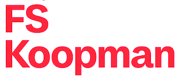
Typefaces from 2016: Rogan (a modular sans), Adinah (layered brush script), Bronkoh (a subtly softened sans workhorse typeface family). Typefaces from 2018: FS Koopman. A sans family designed by Andy Lethbridge and Stuart De Rozario. A hybrid sans workhorse that takes inspiration from Swiss grotesks, American gothics and early British grotesques. In 2020, he released these script or handcrafted typefaces at Monotype: Adagio, Douglas, Gambino (a chalk font), Herman (a marker pen font), Hylandia, Kendrick (a thick brush font), Morning, Rockland (a counterless poster font), Wrong (a tape font). [Google] [MyFonts] [More] ⦿ |
Bandung, Indonesia-based designer (b. 1987) of Jagged (2011), Whatever (2011, hand-printed), Statix (2011, squarish pixelish face), Tape The Font (2010) and Brush That Font (2011). Devian Tart link. Fontspace link. Another Devian Tart link. [Google] [More] ⦿ | |
Burton, UK-based designer of the sticky tape typeface Keep It Together (2015). [Google] [More] ⦿ | |
Sumatera Selatan, Indonesia-based designer (b. 1998) of the free tape font Titik Tape TTF (2013). [Google] [More] ⦿ | |
Hindro Cholis
| |
Hiroko Sakai (Tokyo) created Tape Font (based on masking tapes) in 2013. Behance link. [Google] [More] ⦿ | |
Ideas and Apps
| Spanish creator of the fat finger font Ideas and Apps (2015), the scissor cut (or tape) font Hammer & Nails (2015), the hand-printed Caballar (2015), and the connected script font Little Lara (2015, free at Open Font Library). Typefaces from 2016: Ideas and Apps Faces (dingbats, with Elena Esteban), Elena Shine (sans). [Google] [More] ⦿ |
Informal Type
|
In 2019, Erman published the self-centered hipster typeface Oddee. Erman explains: Oddee typeface is based on the dissimilarities in personal fashions and the contradictions sparked between two schoolmates, Adolf Loos and Josef Hoffmann, the first of whom is known for his belief in finding no place for the concept of ornamentation in architecture and functional design, while the latter proposes the ornamentation could find a place within design through not being a direct force but being a contributing part to a collective aesthetical value in everyday objects. [Google] [MyFonts] [More] ⦿ |
Ingrid Garcia (Kontur Networx, Germany) created the tape font Typo3InspiredV2 (2013). This is a commercial hook. Fontspace link. [Google] [More] ⦿ | |
Ingrimayne Type (was: The Bovine Rebellion)
|
Dingbat fonts: XPhyngern (1990, pointing fingers), XPointedDesert and XSimpleHands (1994, more fists), Schneeflaken (two snow fonts, now available as XSchneeFlaken), ComputerBugz (nice butterflies, now available as XCompuTerBuggz), Galaxies (around the theme of the sun and stars), GlitzyFlash (1990), Grandecort (1994), LeakOrLeach (1995), Baumfuss (1990), LeafMeAlone (leaves), StarsAndStripes, StarPieces, Fingers, SimpleHands, PointedDesert, IngyDing (1996, 3 dingbat fonts in the style of Zapf Dingbats; in 2010 overhauled into one 1400-ornament monster face, Ingy Ding MCD, containing smilies, arrows, Zapfian ornaments, dice, chess pieces, fists, weather dingbats, and so forth), IngyDingLeftovers. A list of fonts:
Klingspor link. Dafont link. Abstract Fonts link. View Robert Schenk's typefaces. View Ingrimayne's typeface library. [Google] [MyFonts] [More] ⦿ |
Iqbal Paj
| |
Itsmaku
| Kiev, Ukraine-based designer of the free tape font Tapeflow (2019), and the winter tour icon set Just Ride (2019). [Google] [More] ⦿ |
Leeds-based illustrator and designer, who made Bionique, StickyTape and Transistor at Fontmonster (now obsolete). [Google] [More] ⦿ | |
During her graphic design studies, Janne van Hooff (Den Haag, The Netherlands) created Tape Font (2013, FontStruct). [Google] [More] ⦿ | |
Jason Fagone
| |
During her studies in Hamburg Germany, Jennifer Lietz designed Tape Font (2015). [Google] [More] ⦿ | |
Joel Maillot
| |
Katowice, Poland-based designer of the tape font Pluszek (2018). [Google] [More] ⦿ | |
Keith Tricker
| |
Lars Harmsen
| |
Art director in Montreal who designed the free duck tape typeface Ducktype (2016). [Google] [More] ⦿ | |
Greenville, SC-based designer of the blackboard bold typeface Nirosta (2016) and the all caps rounded monolinear wide sans typeface Paris Mountain (2016) intended for use on state park signs. She also designed the free tape typeface Cassius (2016) and ten went on to study at Type@Cooper. Typefaces from 2017: Caprino Stencil, the Trattoria series (Mascarpone, Pecorino, Caprino). Dribble link. Behance link. You Work For Them link. [Google] [More] ⦿ | |
Sao Paulo, Brazil-based designer, at Centro Universitario Belas Artes, of the duct tape font Lukoi (2018). [Google] [More] ⦿ | |
Mark A. Solsburg
| |
| |
Max Tarkhov
| |
MIA
| Berlin-based graphic designer, who has a degree in information science and media design from the Faculty of Graphic Design, University of Applied Sciences Augsburg, Germany. Creator of Mia Logotype (2008), Script01 (2005), NHM Regular (2008, octagonal), Tape Type (2005, rectangular). No downloads. Behance link. [Google] [More] ⦿ |
A selection of commercial sticky or duct tape typefaces. [Google] [More] ⦿ | |
| |
Otherwhere Collective (or: Ilott Type, Bellamy Studio)
|
Andrew Bellamy designed 64-SRC (2017), a rare condensed monospace font inspired by IBM's Selectric type from the 1960s. His 57 Nao (2016) is a revival of a Japanese typewriter font from the 1950s called Messenjaa. They explain: Designed in 1950s Japan by Okanao & Kushiro, the perfect partnership until artistic temperaments drove them apart. The duo spent years crafting the font with the working title Messenjaa, Okanao bringing technical expertise to craft letterforms, while Kushiro made it his life, obsessively working late into the night to check pages for errors. For him the project was never about making money, it was an artistic endeavor to reprint the great Western works of literature. When he found out Okanao had secretly sold the rights of the font for use as a logo for a major Japanese manufacturer, Kushiro burned all evidence of the designs in a fit of passionate fury. The two reportedly never spoke again. Messenjaa was thought lost forever until a type specimen was discovered in a vintage typewriter box bought on eBay. Now redrawn and available as 57-nao, a faithful and beautifully crafted monospace characterized by what is considered Okanao's defining moment, the angular loop on the lowercase a. 52-Kfx (2017) is an extra tall sans typeface. 35-FTR (2017) was custom drawn specifically for the book Analogue Photography which required the timeless elegance of Futura and the compact utilitarian typesetting of Helvetica. In 2018, he designed the fashion mag typefaces 19Pra and Coutura Sans. In 2019, Bellamy published OC Bartok (a wedge serif), OC Pajaro (a sans family between Futura and Akzidenz Grotesk), OC Format Sans (a geometric grotesk sans serif that fuses the style of Futura with the rhythm and proportions of Akzidenz), OC Rey. Typefaces from 2020: OC Format Stencil (a variable font design inspired by the work of Bruno Munari, Paul Rand, and Max Huber), OC Format Collage, OC Format Shards. A special mention for the masking tape font OC Revolt, a variable display font made for the protest graphics of the NYC-based Trump Brexit era Non-Complicit project who initially made guerrilla type with masking tape applied directly in situ or to silk screens. Typefaces frm 2021: OC Highway Var (a free variable font based on Highway Gothic). It builds on Ash Pikachu's free Highway Gothic font. [Google] [MyFonts] [More] ⦿ |
PBinns Design (est. 2012) is located in Toronto, Canada. Creator of Electrical Tape (2012). [Google] [MyFonts] [More] ⦿ | |
Pidco Art
|
|
Melbourbne, Australia-based student-designer of a folding tape font in 2018. [Google] [More] ⦿ | |
Founder of Edhv in Eindhoven, The Netherlands, in 2009. Creator of the sticky tape font Eindhovem for the city of Eindhoven. [Google] [More] ⦿ | |
René Knip
| |
In 2013, he published Pacaembu, an extraordinary multilined typeface family inspired by graphic patterns of Brazilian indians. Carona (2013) is a vernacular typeface based on wall writing. Lock Type (2013) is a heavy rounded techno sans typeface family. In 2014, he published the dadaist paper-cut typeface Pulso, the octagonal typeface Louco, and the plump bubblegum typeface Burle Marx, which shares the roundness of the official Olympics 2016 typeface. The vernacular typeface Copa (2014) was designed to honor the world cup in 2014 in Brazil. It is based on street painting. This project was supported by illustrations made by Henrique Mamede. Hincha (2015) is a paper tape font used for soccer posters. Block (2015) and United Squad (2015) are soccer lettering fonts. Behance link. Another Behance link. Dafont link. [Google] [More] ⦿ | |
Robert Schenk
| |
Jerusalem-based typographer and graphic designer who created the experimental minimal FontTape (2010). [Google] [More] ⦿ | |
Ross Turnbull is based in Edinburgh, Scotland. He created the fat (vernacular, dadaist) poster typeface RT DIY-Tape (2014). Dafont link. [Google] [More] ⦿ | |
Royhan Nashuh Salsabiyl
| |
Type designer associated with Heumm Design in North Korea. Creator of the monolinear hand-drawn typeface HU Cookie (2020, with Haerin Lee and ByoungHeon Park). HU Cookie covers Latin, Cyrillic and Greek. Typefaces from 2021: HU Dear Molly (an informal monolinear typeface), HU Big Round (a techno typeface by Rumi Kim, ByoungHeon Park and Gahee Kim), HU Rosette (a cursive display serif by Haerin Lee, Rumi Kim, ByoungHeon Park and Gahee Kim). Typefaces from 2021: HU Flat White (a tuxedoed sans by Rumi Kim and Jihye Lee), HU Mymyoh (a 6-style techno sans), HU Masking Tape Latin (a masking tape font for Latin, Greek and Cyrillic by Rumi Kim and ByoungHeon Park), HU Life Style (a six-style display sans by Rumi Kim, Yehyeong Lee and Jihye Lee), HU Basic Round (a simple sans by Rumi Kim and Yehyeong Lee). [Google] [MyFonts] [More] ⦿ | |
Salford Type Foundry
|
|
Salsabiyl Studios
| Bogor, Indonesia-based designer of Somnium Amor (a tall display serif vaguely related to Koch Antiqua), Maghfirea (2021: an angular serif), Last Hope (2021: a tape font), Andromeda (2021: a monolinear script) and Cassiopeia (2020: a Peignotian mini-serif typeface). [Google] [MyFonts] [More] ⦿ |
Designer of the irregular tape font Scattersmiles (2021). [Google] [More] ⦿ | |
South Korean designer (b. 2003) of the squarish typeface Same World (2021) and the tape typeface Ptype (2021). [Google] [More] ⦿ | |
Shriftovik Foundry
|
Typefaces from 2019: SK Irrationalist (originally, a free constructivist typeface), SK Primo, SK Eliz (a free pixel font. Typefaces from 2020: SK Concretica (a caps only monumentalist or hipster typeface for Latin, Greek, Cyrilllic, Hebrew, katakana and hiragana), SK Brushwood (co-designed with Alexandra Valuikina), SK Cuber, SK Moralist (a fat finger font), SK Cynic (a pixel emulation font). Typefaces from 2021: SK Shriftovik (constructivist; Latin and Cyrillic), SK Phlegmatica (a square-shaped letter font), SK Glypher (almost a tape font). Behance link for Shriftovik Foundry. [Google] [MyFonts] [More] ⦿ |
Soup.Type
| Now defunct foundry. It had free fonts by Jason Fagone of Penn State University. They include Monko (handwriting), Monko Blocky, Pianissimo, Blade, Young Zaphod, Velour, Velodrome, Electric Circus, Trapped Family, Font4TheDumped, Torpedo, BachelorPad, 4Decibels and Falling (handwriting of Andy Wagner). [Google] [More] ⦿ |
Designer (Brooklyn, NY) who is getting a second degree in Ecological Engineering. He made the comic book typeface Rhsxyn Kqrtwn in 2010 at You Work For Them. He also made the paper fold typeface Packing Tape (2011), Melting Beads (2011), and the feathered typeface Featherhead (2011). Home page. Behance link. [Google] [More] ⦿ | |
Studio K
|
His foundry is Studio K: The foundry specialises in display fonts designed primarily for advertising, publishing, product packaging and signage. He created the wavy typeface Calypso (2011), the techno typeface Charta (2011), the sturdy black typeface Anvil (2011), Jazz Age (2011, art deco), and the brush typeface Pagoda (2011). In 2012, he published Hollywood Hills, Pier Arcade, Graffix, Skeleton Slab, the art deco typeface Tea Dance, the art nouveau typeface Paris Metro, Oscar Bravo (a heavy octagonal typeface), Café de Paris (a stylish retro--futuristic fifties style typeface), Barrowboy, and the stylish Contessa family. Typefaces from 2013: Communiqué (rugged stencil face), Regency (influenced by Americana and Optima, it is a flared very humanist sans), Alma Mater (athletic lettering), Showbiz (inline typeface), Dynatron (retro sci-fi font), Mechanoid (elliptical techno sans), Canterbury (inspired by the shapes of the cathedral), Export Drive (a bold condensed cargo stencil), Soft Rock (bold condensed sans), Red Top, Colossus (an elliptical typeface that is a bit squarer than Microgramma), 4Square (elliptical), Aspidistra (art nouveau), Home Grown. Typefaces from 2014: Belvedere, Joe Cool (a bold masculine headline typeface in the genre of Impact), Gravitas (a Bauhaus / futurismo typeface), Rock Face (sticky tape typeface). Typefaces from 2015: Chenko (2015, a constructivist / brutalist typeface named after Rodchenko), Marazion (a rounded display sans), Castaway, Variety (ransom note font), Nightlife (an amoebic rounded stencil typeface that conjures up neon signs, DNA molecules and jelly beans), Rough Stuff (textured faded stencil typeface), Signpost (a drop shadow version of Red Top). Typefaces from 2016: Cambourne (a luxury goods font advertized as cutting edge retro), Capstan (slab serif), Alonquin (art deco: a typographical tribute to Dorothy Parker and the New Yorker crowd who haunted the Alonquin hotel in its 1920s heyday), Cadenza, Exotica (described by Keith as Old World elegance meets Levantine luxury), Oxbridge (vintage compact titling typeface). Typefaces from 2017: Vagabond (a weathered vintage railroad font), Brando (slab serif). Typefaces from 2018: Stamina (a sports font), Cybernaut. [Google] [MyFonts] [More] ⦿ |
iGraphic designer from South Korea. She studied graphic design in HfG Karlsruhe in Germany, and is based in Stuttgart, Germany. Her typefaces as of 2021: Flefixx (typewriter type), Kiko, Erwin (a plump script), Anthony (a free stick font released at Velvetyne that pays homage to British sculptor Anthony Caro). Sun Young Oh at Velvetyne [Google] [More] ⦿ | |
Israeli designer of the Hebrew tape font Akum (2019). [Google] [More] ⦿ | |
Tikhon Reztcov
| |
Timothy Isherwood
| |
Foundry in Ljubljana, Slovenia, est. 2011. Vladimir & Vladimir soes art direction at Modna, the main Slovenian fashion magazine. Based in Lubljana, Vladimir & Vladimir designed the fat finger font Krink in 2013. Earlier, he (they?) created the free Tape Font (2011, dadaist). [Google] [MyFonts] [More] ⦿ | |
Volcano Type (MAGMA)
| Magma Brand Design in Karlsruhe, Germany evolved in 2004 into Volcano Type. Magma is headed by Lars Harmsen (b. Hannover, 1964) and Ulrich Weiss. Lars Harmsen spent the first four years of his life in Chicago. He then moved to Geneva with his parents for eight years, and then moved to Karlsruhe. He completed his schooling at the French section at the European School. He first studied history and Germanics in Freiburg before beginning to study design at Basel, Boston, Saarbrücken and Pforzheim. He got his degree in graphic design, and in 1996 he founded MAGMA [Büro für Gestaltung] together with Ulrich Weiß. He is the co-founder of STARSHOT GmbH, a design company for sports products, now based in Munich. MAGMA created Type Foundry Volcano-Type.de and the internet forum Slanted.de. In the meantime, Slanted.de has become the most active German typography forum. Volcano Type offers commercial and some free typefaces: DigiBo (Boris Kahl), Objects (free ransom typeface by the house), MonoPoint and DoublePoint (monospace dot matrix families by the house), Amiga Normal and Rounded (pixel typefaces by Boris Kahl), Screeny, Pixel and C64 Style (pixel typefaces by Boris Kahl), Fette Pixel (pixel typeface by Florian Gärtner), Teckbo (digital typeface by Boris Kahl, who writes: Retro-Avant-Garde for Club-Flyer-Honks and Plastic-Pussy-Chicks), Psycho (grunge by Boris Kahl), Wald Ast (tree branch look by Sandra Augstein), Wald Blatt (tree leaf look by Tanja Rastätter), Rollerblind (a pair of dot matrix typefaces by Boris Kahl), Chaucer (uncial by Boris Kahl), Glossy (dot matrix typeface by Sandra Hofacker), Brüll (a funny frog dingbat typeface by Andre Rösler), Pax (a free peace symbol typeface by Heidrun Weißschädel and Alexander Kassel), Mud (free typeface by Boris Kahl). And these display typefaces by Florian Gärtner: Republic, Tacora. And finally the Fone 1 through 3 grunge typefaces by Florian Gärtner. The typefaces of Lars Harmsen (or co-designed by him) at Volcano:
Behance link. Klingspor link. Volcano Type link. MAGMA Brand Design link. Their bestsellers at MyFonts. View Volcano's complete typeface library. See also here and here. [Google] [MyFonts] [More] ⦿ |
Design studio in Berlin and London run by Ani Weinbaum and Nina Stahl. Their typefaces include these:
| |
During her studies at Grafisch Lyceum Rotterdam, Wendy Varela designed the tape typeface Tecticz (2018). [Google] [More] ⦿ | |
Hong Kong-based designer of the Latin typefaces Paperclip (2019) and Tape (2019). [Google] [More] ⦿ | |
Bordeaux, France-based designer of Tape Type (2014). Behance link. [Google] [More] ⦿ | |
|
|
|
|
|


 Gifted designer from Epalinges, Lausanne, Switzerland. One of the most talented creators of typefaces with FontStruct.
 Graphic designer in Cincinnati, OH. He gradually moved to type design and joined
  [
[ [
[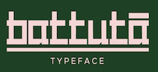 Yogjakarta, Indonesia-based designer of the
  Dutch type designer located in Bloemendaal. Jan Middendorp wrote about him in
  Designer in Camboulazet (was: Albi and Toulouse), France, who created the didone display typeface Black Italic in 2014, and the blackletter Gothique, the wavy Dancing Font, Tape Font, Mosaique, the splendid Mono Gorille, Curiosité, the
  [
[ Graphic designerr in Moscow who made a colorful Cyrillic stencil alphabet dedicated to Neville Brody (2015). Other typefaces for Latin and Cyrillic include Hollow Pixels (2015), Adhesive Tape (2015), and Multicolore (2015, a rounded sans done for his graduation). He also designed the pictograms Olympic Gods (2015) and Sportsmen (2015).
  FontStructor who made the heavy octagonal slab serif caps typeface
  During his studies, Andrew Lethbridge (Portsmouth, UK) created an op-art typeface called Modular Alphabet (2014). In 2015, he published the calligraphic brush script typeface family
 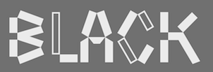 Istanbul, Turkey-based designer (b. Mersin, 1985) of the sticky tape typeface
 [
[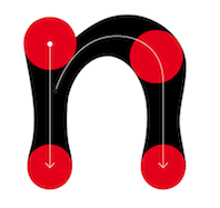 French designer of these typefaces Turone (2015), Dramatique (2015), Onda (2005-2013, dot matrix type), Materiology (2008), DuBuisson (2004, modular and counterless), TypoTape (2010), Elsewhere Filaire (2004), Treza (2010, with Benjamin Gomez at Dépli). [
 Creator of the collage typeface
  British born designer Andrew Bellamy worked for agencies in London, Oslo, and Miami, and is currently developing various global brands as Design Director at JKR in New York City. He started Ilott Type and then
 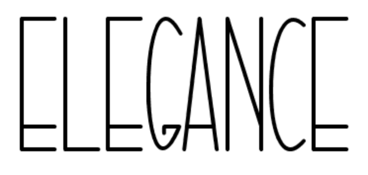 Pare Kediri, Indonesia-based designer of Donation (2020: a funky display sans), Moonlight Rotter (2020: script), Go Retro (2020: a dry brush script), Riujin Palluy (2020: a monoline script), Buffalor (2020: a tall all caps font), Ekuador City (script), Buffky 359 (constructivist), The Laron (2020), Chozy Mermaid (2020), Restu (2020), Liquid Bloss (2020), Baby Powder (2020), Buffalor (2020), Pql (2020), Vukuviland (2020), Black Spidol (2020), Buffky359 (2020), Esseintona (2020), Orang Gila (2020), Better Time (2020), Nanci Pinio (2020), Rapunzel Governmen (2020), Amrika Seriket (2020), Baby Dollar (2020: a rounded black sans), Salah Halusinasi (2020: script), Yellow Ganana (2020: script), Kasih Bunda (2020: a monoline script), Tadeliji (2020: a tape font), and Child Emperor (2020: a fat finger font). [
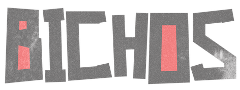 Brazilian graphic and type designer in Sao Paulo, b. 1990. He made the hand-printed brushy typeface
  [
[ Salford Type Foundry was established in 2012 by Manchester's University of Salford lecturer Timothy Isherwood. It is a repository for typefaces designed by the students. One of their most famous type design graduates is Darren Scott.
  At ATFI (Moscow) and later Shriftovik Foundry (also in Moscow), Tikhon Reztcov designed the
  Keith Tricker (b. 1949) is the Creative Director of a UK advertising agency, and during his career has worked as both a copywriter and art director.
  [
[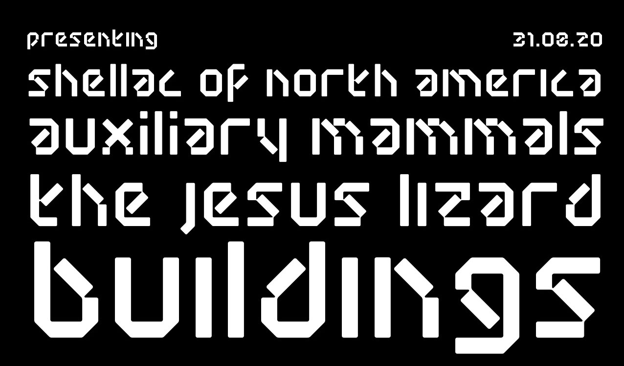 Deerlijk, Belgium-based designer of the triangulated sci-fi typeface Random DM (2016, FontStruct), the modular Random Mass (2020), the octagonal typeface Random Abe (2020), and Random Nods (2020: a tape font based on the work of wim Crouwel).