TYPE DESIGN INFORMATION PAGE last updated on Mon Jul 20 20:36:25 EDT 2026
FONT RECOGNITION VIA FONT MOOSE

|
|
|
|
|
Type scene in Georgia (the state, not the country) | ||
|
|
|
|
SWITCH TO INDEX FILE
414 General Store
|
|
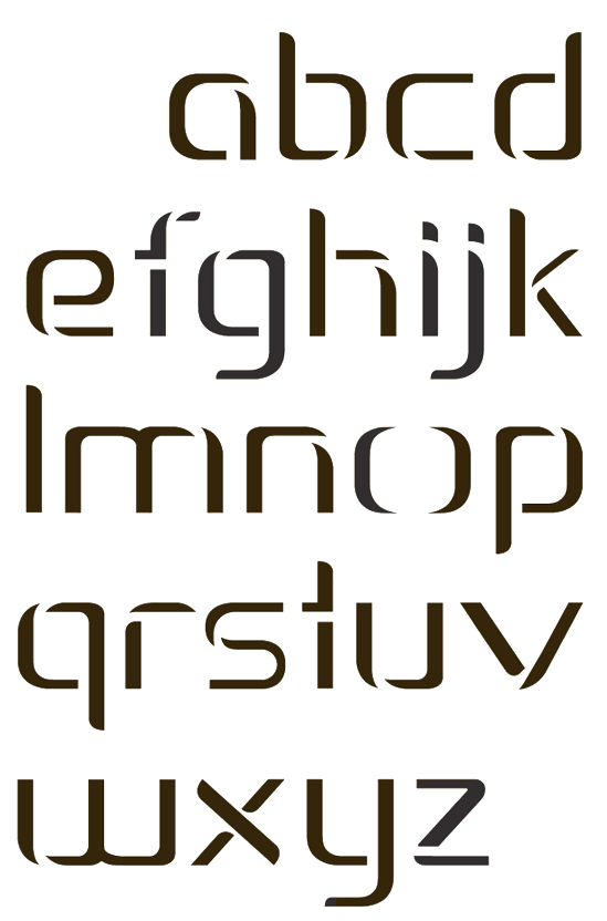
Creator of Treeline (2013, an alchemic typeface), which was designed during her studies at the University of Georgia in 2013. In 2017, at FontStruct, she published the free techno typeface Pooling duting her studies at Southern Illinois Unversity in Carbondale, IL. FontStruct link. Behance link. [Google] [More] ⦿ | |
Designer in Atlanta, GA, who created the sans display typeface Buffalo Rock (2010). [Google] [More] ⦿ | |
During her studies in Savannah, GA, Adriana Ozawa Rodrigues designed the hipster typeface Ladybug (2015). [Google] [More] ⦿ | |
AKOFAType
| Located in Powder Springs, GA, AKOFAType has published the following dingbats with symbology from Ghana: Adinkra Calabash, Adinkra FineFine, Adinkra WantaWanta (2007). The designer is Kwesi A. Amuti (b. East Lansing, MI, 1974). He is working on Steady Rockin (a display face) and Fat Head. In 2013, he published Ehmbeecee, a typeface with frames. In 2014, he made the elliptical sans typeface Cabeza Grossa and the snowflake typeface Flurry. Creative Market link. Typedia link. Klingspor link. [Google] [MyFonts] [More] ⦿ |
During her studies in Atlanta, GA, Alanna Revear created the modular typeface Scoreboard (2014). [Google] [More] ⦿ | |
| |
Alcir Heidemann designed the free outlined and bilined typeface Athena during his studies in Savannah, GA, in 2015. [Google] [More] ⦿ | |
During her studies in Atlanta, GA, Alessandra Rabellino designed the inline typeface Degraves (2017). [Google] [More] ⦿ | |
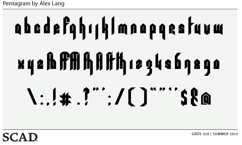
For a course at SCAD (Savannah College of Art and Design, GA), Alex Lang designed the modular typeface Pentagram (2013). Dafont link. [Google] [More] ⦿ | |
Alex Liebold
| |
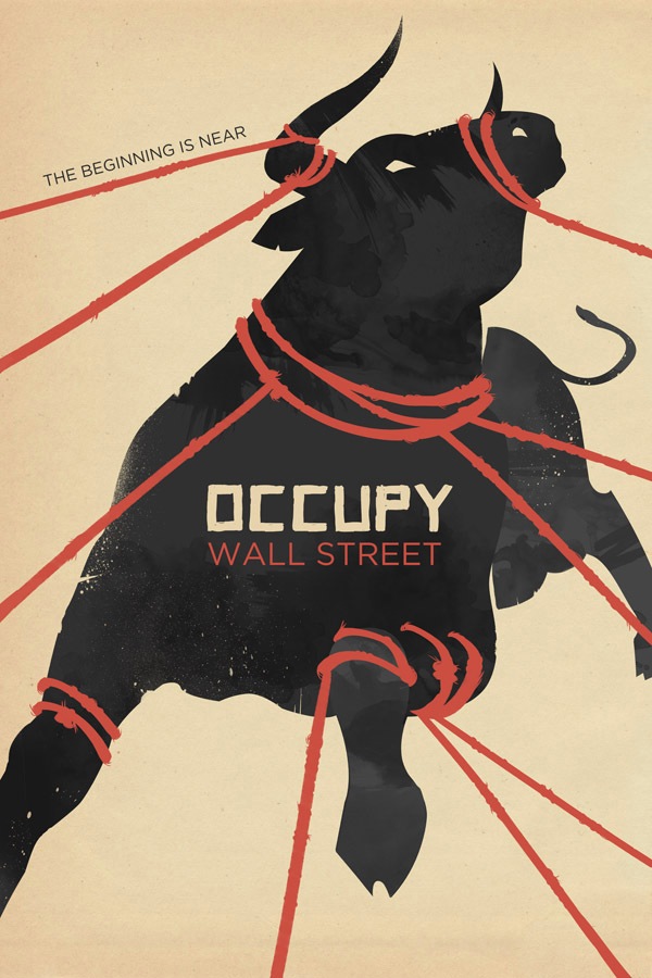
Alexandra Clotfelter is currently attending Savannah College of Art&Design in Savannah, Georgia. She created the typographic poster Occupy Wall Street (2011). Home page. [Google] [More] ⦿ | |
As a student at Georgia State University in Atlanta, GA, Alexandre Funaro drew the decorative Magical Girl Alphabet (2016). [Google] [More] ⦿ | |
Graphic designer in Atlanta, GA, whose typeface Vixens (2013) is presented as a fashion typeface. It has the modularity of a FontStruct font. [Google] [More] ⦿ | |
Together with Remy Chard, Alice Glenane (Gold Coast, Australia) created the experimental typeface Shadow Line (2013) which was inspired by the architecture of The Queensland Museum. [Google] [More] ⦿ | |
Behance link. [Google] [More] ⦿ | |
Senior designer at Dalla Mente Design in Atlanta, GA, who created Big Breakfast Font in 2013 (free at iFontMaker). Facebook link. [Google] [More] ⦿ | |
During her studies at the Savannah College of Art and Design in Savannah, GA, Amy Wallace created the hipster typeface Frank (2015). [Google] [More] ⦿ | |
Ana Luisa Rumbos Guerra is from Caracas, Venezuela. During her architecture studies at SCAD in Savannah, GA (class of 2018), she created the vernacular typeface Parsons13 (2013). Behance link. [Google] [More] ⦿ | |
Savannah, GA-based student who proposed this caps typeface (2006) for a school project. [Google] [More] ⦿ | |
Student at Savannah College of Art and Design, majoring in Graphic Design. Creator of a nice typographic art deco poster in 2010. [Google] [More] ⦿ | |
Interface designer from Lawrenceville, GA, who graduated from Georgia Tech in Atlanta, and who created the experimental typefaces AMBubbla, HalfTonBleenUpper. [Google] [More] ⦿ | |
At SCAD in Savannah, GA, Andrew Wagenhals created the prismatic typeface Wagenhalia in 2015. Behance link. [Google] [More] ⦿ | |
During his studies in Atlanta, Anthony Crisa designed the handcrafted typeface Shut Up (2017). [Google] [More] ⦿ | |
Marietta, GA-based designer of Loko Type (2013), a distressed steampunk caps typeface. [Google] [More] ⦿ | |
Savannah, GA-based designer of the prismatic typeface Saxofon (2015). Behance link. [Google] [More] ⦿ | |
Born and raised in Mexico City, Armin Vit is a graphic designer and writer now living in Austin, Texas. He is co-founder of UnderConsideration and its myriad sites. His last employment position was at Pentagram. He now runs UnderConsideration's Department of Design. With his partner, Bryony, he has co-authored the books Women of Design and Graphic Design Referenced. Designer of the futuristic fonts Modular (2001) and Tirkovet, and of Stress (letters obtained without lifting the pen). He attended the School of Graphic Design at Anahuac University in Mexico City and taught typeface design at the Portfolio Center, marchFIRST, Atlanta, GA. Home page. After Atlanta, he moved on to Chicago, and later to Austin. At TypeCon 2003, he told this dream about Hrant Papazian, I quote: I dreamt that Hrant came to my house, the weird thing is that it was his typophile picture only (since that is as far as I know what Hrant looks like). So he came in, and went "Number Two" in my bathroom without flushing, after that, he headed out to the kitchen to hang out and stuff. So I go into my bathroom and see these unflushed turds in my toilet. I go up to Hrant and say "Excuse me, Hrant, you left your turds in my toilet." His response involved handing me a plunger and adding "This should fix it." And that was it. [Google] [More] ⦿ | |
Savannah, GA-based designer of the tall display typeface Grace (2015). [Google] [More] ⦿ | |
For a school project at Savannah College of Art and Design in 2013, Ashlyn Hicks created the experimental typeface Wedge. [Google] [More] ⦿ | |
Athenian Font
| "TrueType "Athenian" is part of GreekKeys, the Macintosh/Windows font + keyboard package designed by George B. Walsh and Jeffrey Rusten, and owned by the American Philological Association. The font contains all common ancient Greek (polytonic) accents and symbols; it is to be used on Macintosh and Windows (3.1 or 95) for READING Classical Greek with Perseus (on the Web page or the CD version) and in other publicly available ancient Greek texts." This font is free. Walsh died, but Jeffrey Rusten was at Emory University, Atlanta, and is now at Cornell University. See also here. Alternate site. Mac and PC. Mac version. Another Mac version. IMPORTANT NOTE: The font was withdrawn by Jeffrey Rusten, so PLEASE do not bother him. The present link still has the font, but Rusten asked me to ask you not to use the font. [Google] [More] ⦿ |
The Atlanta Friends of the Alphabet is a collection of calligraphers, typographers and people who love the alphabet. [Google] [More] ⦿ | |
Home page. Dafont link. [Google] [More] ⦿ | |
Barry Roseman is a graduate of Occidental College and Art Center College of Design. He earned a Masters Degree in Graphic Design from Yale University and studied at the School of Design in Basel, Switzerland. He is currently an Assistant Professor at Atlanta College of Art. He spoke at ATypI 2005 in Helsinki on The design innovations and typographic beauty of transportation timetables. [Google] [More] ⦿ | |
Bill Kenney
| |
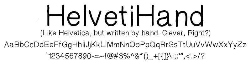
Atlanta, GA-based creator (b. 1992) of Futura Handwritten (2013), designed for use in web comics. Other fonts from 2013 include the hand-drawn typefaces Libby Hand and HelvetiHand. In 2015, he made Drunken Serif. Dafont link. [Google] [More] ⦿ | |
Black Dog Studios
| Donnie Lee (Dalton, GA) made Nirvana Roman in 1994, a font in the style of Exocet. See also here and here. [Google] [More] ⦿ |
Born in Georgia in 1995, Brandon Sweeney created Woah That's Bold (2013) and Brandon's Handwriting (2013). Tumblr link. [Google] [More] ⦿ | |
Atlanta, GA-based desigfner of Deliq (2014), a fat typeface inspired by Stilla (1973, François Boltana). [Google] [More] ⦿ | |
During his studies in Savannah, GA, Brett Sherman designed the sturdy web serif typeface Industrial Type (2016). Behance link. [Google] [More] ⦿ | |
In 2018, Brian LaRossa and Erica Carras co-designed the Bauhaus typeface Staatliches. The alphabet revives and extends Herbert Bayer's title lettering on the cover of the first Bauhaus exhibition catalogue from 1923. It features full sets of capitals, numbers, punctuation, and symbols, in addition to alternate widths, discretionary ligatures, and common Latin accents. Staatliches is free at Google Fonts. [Google] [More] ⦿ | |
Britton Walters
| |
During her studies at SCAD in Savannah, GA, Bruna Michelon designed the polytopal typeface Gems (2016). [Google] [More] ⦿ | |
During her studies at Savannah College of Art and Design in Savannah, GA, Carmen Rodriguez Lo created the squarish typeface Celsus (2016). [Google] [More] ⦿ | |
During her studies at the University of Georgia, Athens, GA-based Caroline Iverson designed the pixelish typeface Pleasantries (2017). Behance link. [Google] [More] ⦿ | |
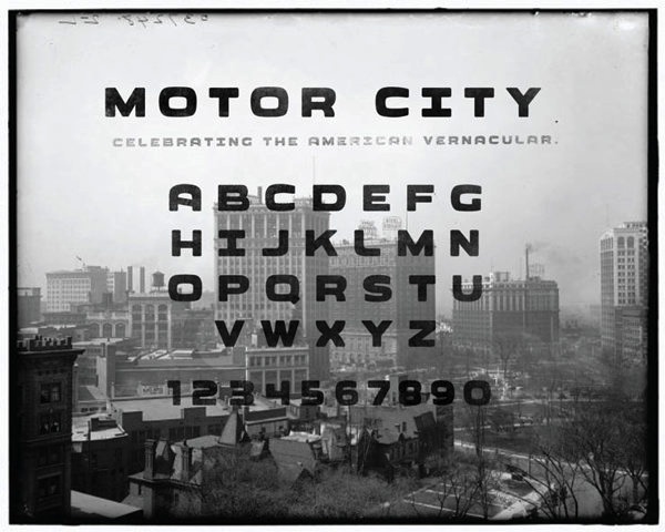
Savannah, GA-based designer of Motor City (2012), a rounded automotive signage typeface that recalls the era of the car manufacturers in Detroit. This typeface was created during his graphic design studies. [Google] [More] ⦿ | |
Catscape
| Medium-sized archive. It is run by Greg Wolkins, who designed the handwriting font Damali. Based in Carrollton, GA. [Google] [More] ⦿ |
Charles Scott
| |
Charles Scott Creative
| Thomasville, GA-based designer of the free Hebrew Emulation font Jawbone (2021). [Google] [More] ⦿ |
Charles Woolbright (aka Razorwing) is the designer from South Georgia of Espruar Third Edition (2003), which was used in "Wizards of the Coast's Forgotten Realms". [Google] [More] ⦿ | |
Savannah, GA-based designer of the Alobar typeface (2014). [Google] [More] ⦿ | |
Student at Savannah College of Art and Design, 2008-2012. Creator of the signage typeface One Shot Script (2012). [Google] [More] ⦿ | |
During her studies in Savannah, GA, Chloe Ayoub created the dot matrix typeface Toutou (2015). Behance link. [Google] [More] ⦿ | |
During her studies at Savannah College of Art and Design, Chloe Konnor created the geometric display typeface Baffled (2015). [Google] [More] ⦿ | |
At Georgia State University, Swuwanee, GA-based Chong Myung Jeong designed the FontStruct font Hencoop in 2017. [Google] [More] ⦿ | |
Chris Bilheimer
| |
Chris Risdon
| |
| |
During his studies at Anderson University, Christian Crocker (Cartersville, GA) designed the custom typeface Macassar (2015) for Taylor Guitars. [Google] [More] ⦿ | |
| |
Graphic designer in Savannah, GA. Creator of the modular typeface Hybrid (2012) and the cursive typeface Marilou (2013, a school project at SCAD). Behance link. [Google] [More] ⦿ | |
Atlanta, GA-based designer of Stitches (2017) and Tailored (2017). Creative Market link. [Google] [More] ⦿ | |
Christine Fleming
| |
Illustrator and writer working out of Atlanta, where she runs Might Could Studios. Her typefaces include Might Could Marker (2017), Might Could Pen (2016), Might Could Pencil (2016), Might Could Sans (2016, handcrafted) and Might Could Script (2016, a monoline script, perhaps for children's books). Creative Market link. [Google] [More] ⦿ | |
Atlanta, GA-based designer of the pixel typeface Soak Mono (2015) and the related font Soak Outline (2015). Behance link. [Google] [More] ⦿ | |
Savannah, GA-based designer of this brush face (2005). [Google] [More] ⦿ | |
Savannah, GA-based student who proposed the Amelia-style rounded typeface Orb Sans (2006) for a school project. [Google] [More] ⦿ | |
During her studies at SCAD, Atlanta, GA-based Clarke Davis created the circle-based display typeface Roly Poly (2015). Behance link. [Google] [More] ⦿ | |
Cody Boisclair
| |
Atlanta, GA-based designer of the hipster typeface Fathom (2016). Behance link. [Google] [More] ⦿ | |
Context Foundry
|
He also runs 414 General Store with Courtney Burroughs. [Google] [MyFonts] [More] ⦿ |
Graphic design graduate from Savannah College of Art and Design. He is currently located in Portland, OR. Corey created the thin geometric sans typeface Cosmic Designer Pro (2012). [Google] [More] ⦿ | |
Courtney Burroughs
| |
Graphic designer and illustrator in Marietta, GA. In 2014, House Industries and Courtnie Dani Fore introduced the gory blood splatter typeface Killer Blood Type, which was inspired by the Dexter Morgan persona and his psychopathic alter ego. House Industries link. [Google] [More] ⦿ | |
Savannah, GA-based student who proposed Classic Soul (2006) for a school project. [Google] [More] ⦿ | |
During her studies at Savannah College of Art and Design, Dawn Sutton (b. Damascus, MD) created the plumpish typeface Blobfish (2014). [Google] [More] ⦿ | |
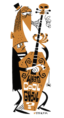
Derek Yaniger
| |
From Atlanta, GA, a design blog by Andrew Egenes. It has a subpage on typography. [Google] [More] ⦿ | |
At the Savannah College of Art & Design in Savannah, GA, Dipali Bajaj created the thin symmetry-themed sans typeface Twins (2016). [Google] [More] ⦿ | |
Don Synstelien
| |
Donnie Lee
| |
Atlanta-based graphic designer. Creator of Primitive Scratch (2003, a graffiti font) and Twenties (2003). She calls herself Ann Northcutt Gray on Typophile. Download Primitive Scratch here (strangely, its font name inside is NewWGL4Font). [Google] [More] ⦿ | |
Dyslexica Font Foundry
| Type foundry in Covington, GA, est. 2013. The goals of the foundry are to provide quality fonts and to develop dyslexic friendly font families and variations. Fonts from 2013 include Perkly (a rounded geometric stackable sans family). In 2016, Robert published Prolexia. [Google] [MyFonts] [More] ⦿ |
Eccentrifuge
| The Eccentrifuge Blackletter Directory aims to be an exhaustive online reference for all commercially available blackletter fonts (but he only deals with commercial type). Run by John Butler of North Carolina (he was in Atlanta, GA). John Butler designed the Butler Antiqua family (2002) in the style of Ruzicka and Dwiggins. Eccentrifuge assists type designers in navigating and managing the complexity of OpenType feature programming, Euro conversion, character encoding and Unicode, Python scripting, bitmap embedding, and to a certain extent, internationalization. It also specializes in developing connected OpenType font designs at a level of fluidity previously unavailable, allowing your designs to achieve a true handwritten look. Jobs include Emigre's Mrs. Eaves OpenType, an OpenType version of Erik Van Blokland's Kosmik, and Barchowsky Fluent Hand OpenType. [Google] [More] ⦿ |
Savannah, GA-based student who proposed this lemonade stand typeface (2006) for a school project. [Google] [More] ⦿ | |
During his studies, Atlanta, GA-based Elliot Cohen designed the squarish typeface Manhattan (2016). [Google] [More] ⦿ | |
Emely Rodriguez (Savannah, GA) created the hand-printed poster typeface Simple Font (2014, free). She studied at SCAD. Behance link. [Google] [More] ⦿ | |
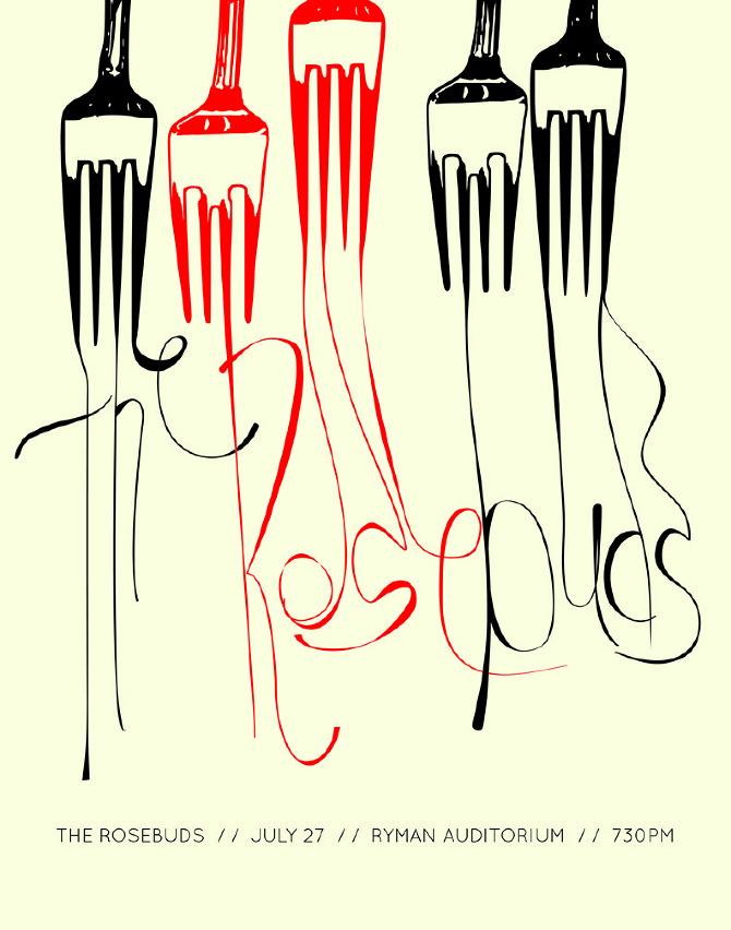
Designer in Atlanta, GA, whose company is called Curly Maple Creative. Creator of an eye-pleasing typographic poster called Rosebud Forks (2012). [Google] [More] ⦿ | |
Emily Conners
| |
BFA student in Graphic Design at Savannah College of Art and Design. Creator of the free typeface Anderson (2012), a semi-hexagonal creature. [Google] [More] ⦿ | |
Emily Kurek is an art director and lettering artist based in Atlanta, Georgia. Her lettering work has been featured in publications such as Adweek and The One Club. At Type Cooper 2020, she designed Balsa, which is inspired by old-fashioned wood type. [Google] [More] ⦿ | |
Emily Lime Design
|
Old home page. Some fonts or subsets of fonts can be had for free at Fontspace and Dafont. MyFonts interview in June 2012, with this introductory paragraph: We've seen a few meteoric careers on MyFonts before, but the dazzling feats accomplished by the one-woman foundry called Emily Lime has left us seriously in awe. Based in Greenville, SC, this brand new font company managed to score one best-seller after another these past six months. The energetic Southern Belle in charge of the operation has made fonts in a range of styles, but capricious scripts are what she does best. Her peacefully named Bombshell Pro is at the top of our Hot New Fonts list as we speak. And while her alphabets are nonchalant and untamed, the underlying font technology is smart and nifty. Meet Emily Conners, a newcomer with a punch. [Google] [MyFonts] [More] ⦿ |
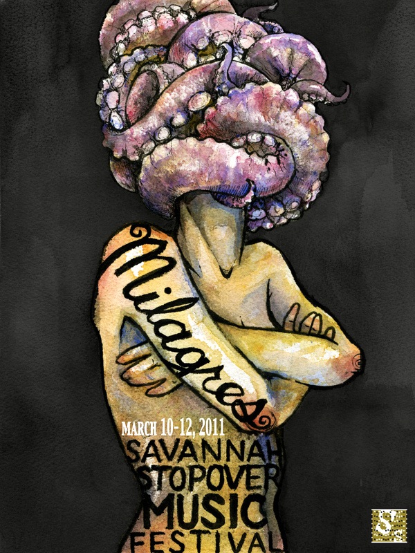
Freelance illustrator in Savannah, GA. She created the award-winning typographic poster Milagres in 2011. Behance link. [Google] [More] ⦿ | |
| |
Erin Armstrong (Atlanta, GA) created the Sci-fi Fantasy Alphabet (2011, all caps). [Google] [More] ⦿ | |
During her studies at Savannah College of Art and Design in Savannah, GA, eri Song created the appropriately named thin brush script typeface Fairy Tale (2015). [Google] [More] ⦿ | |
| |
During her studies in Savannah, GA, Folami Jolicoeur designed the thin sans stencil typeface Blank Space (2015). Behance link. [Google] [More] ⦿ | |
| |
Graphic designer in Macon, GA. Creator of the handcrafted typeface Querido papai Noel (2015). [Google] [More] ⦿ | |
Designer in Atlanta, GA, who created the techno typeface DAF Left (2014). [Google] [More] ⦿ | |
At SignDNA, he published the script typeface Monika. At Carmel Type Co in 2015, he published the decorative Victorian typefaces Calliope [not to be confused with the 2005 font MVB Calliope], Bronwyn, and Vintage Design Elements in 2015. Letterhead had this bio: Gary Godby's career as a sign artist has spanned nearly 28 years. He has worked in commercial sign shops in Virginia and Florida. While in Florida he spent thirteen years at Disney's in-house sign shop. In 1995 he returned to his native Virginia to work for Graphic Services, Inc., a large commercial shop in Manassas. Graphic Services is a full service sign and display company that primarily works for builders and developers. The shop employs 42 people with Gary's primary role as designer. "When you're designing," Gary says, "you see a project go from concept to reality, and I get alot of gratification out of that." Klingspor link. Behance link. [Google] [More] ⦿ | |
Genetic ICG
| Genetic ICG is an Athens, GA-based interactive, design, and advertising agency, which was started by Neil Summerour in 2002. [Google] [MyFonts] [More] ⦿ |
| |
Brazilian designer. During his studies in Savannah, GA, Gleisson Cipriano created Disguise sans (2014). Behance link. Dafont link. [Google] [More] ⦿ | |
During his studies in Savannah, GA, Gonzalo Gelso created the art deco typeface Gallante (2015). Behance link. [Google] [More] ⦿ | |
Hiawassee, GA-based designer of the script typeface package Botanical Bliss (2017) which consists of Chasing The Sun, Chasing Skies and Chasing Rays. Creative Market link. [Google] [More] ⦿ | |
Greg drew Ghoulies (2008, Context Foundry, Savannah, GA), a ghost-themed all-caps alphabet. He also made Fresh Produce (2008), a hand-painted signage face. [Google] [More] ⦿ | |
Greg Wolkins
| |
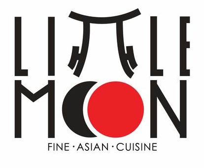
Atlanta, GA-based creator of an oriental simulation logotype for a fictional upscale Japanese restaurant, Little Moon (2012). Alternate URL. [Google] [More] ⦿ | |
Guy Haynie
| |
Located in Atlanta, GA, Hannah Barganier created the ornamental typeface Crop in 2013. Behance link. [Google] [More] ⦿ | |
Haynie Design Co
| Atlanta, GA-based designer of Service Station (2017, a free auto repair shop font), the dry brush all caps display typeface Wildwood (2017) and the architectural typeface Grifter (2017). Typefaces from 2018: Rust & Nails (weathered vintage style). [Google] [More] ⦿ |
During her studies, Atlanta, GA-based Iliana Taylor designed the rounded display typeface Son of Irwin (2017). [Google] [More] ⦿ | |
Insigne Type Design Studio (was: Dooley Type)
|
Catalog of their typefaces. View Jeremy Dooley's font library. View Jeremy Dooley's typefaces. Adobe link. [Google] [MyFonts] [More] ⦿ |
Graduate of the Design Department of the National University of Art in Bucharest, Romania. Illustration designer in Savannah, GA. Creator of the hand-drawn Bella Hand type family (2011): Bella Hand Decorative, Bella Hand Outline and Bella Hand Simple were created for Bella Italia, through McCann Erickson London. [Google] [More] ⦿ | |
Atlanta, GA-based graphic designer who created two sets of art deco numerals in 2015. Behance link. [Google] [More] ⦿ | |
Savannah, GA-based student who proposed Scintilla Slant (2006) for a school project. See also here. [Google] [More] ⦿ | |
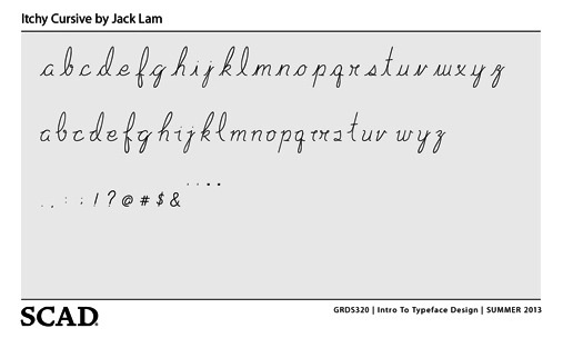
Jack Lam is from Quarry Bay, Hong Kong. He created the Itchy Curvy typeface in 2013 while studying at SCAD in Savannah, GA. [Google] [More] ⦿ | |
Atlanta, GA-based designer of the connect-the-dots typeface Space (2018). [Google] [More] ⦿ | |
During her studies at SCAD in Savannah, GA, Jalina Falvey designed the display typeface MIA (2014). [Google] [More] ⦿ | |
Atlanta, GA-based designer of the handcrafted typeface Tall American (2015). Creative Market link. [Google] [More] ⦿ | |
Savannah, GA-based student who proposed the fat 1870's style display typeface Little Hills (2006) for a school project. [Google] [More] ⦿ | |
James Martin is from Cincinnati but works as a designer in Atlanta. The computer mouse served as the catalyst for the funky Mousetrap alphabet (2006-2007). Not a font. In 2012, he created the free octagonal font Aluap Sans. [Google] [More] ⦿ | |
Designer from Savannah, GA. He created the sans typeface Grizsly (2011). [Google] [More] ⦿ | |
Jason Jaring (Savannah, GA, b. 1987) created the Korean simulation font Gangnam (2012) named after the hilarious music video of 2012 by South Korean rapper Psy [On September 20, 2012, "Gangnam Style" was recognized by Guinness World Records as the most "liked" video in YouTube history"]. [Google] [More] ⦿ | |
Jeffrey Rusten
| |
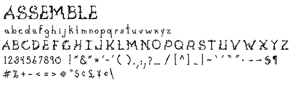
Graphic designer from Lawrenceville, GA, who made the experimental custom typeface Assemble (2009). [Google] [More] ⦿ | |
During her studies at Flagler College in St. Augustine, FL, Jenna Davenport (Newman, GA) designed Funky Music (2018). [Google] [More] ⦿ | |
Jenna drew Montreal (2008, Context Foundry, Savannah, GA), a fat counterless face. [Google] [More] ⦿ | |
Behance link. [Google] [More] ⦿ | |
Lincoln, RI-based student (at SCAD, Savannah, GA) who is interested in legibility issues for her school project. [Google] [More] ⦿ | |
Jeremy Dooley
| |
Graphic designer in Atlanta, GA. She made the caps typeface Guts (2011). [Google] [More] ⦿ | |
Jessica Bronson graduated from Parsons School of Design in 2009 with a BBA in Design+Management. She lives in Savannah, GA, where she pursues an MFA in graphic design at Savannah College of Art and Design. Creator of the slab serif typeface Embargo (2012). [Google] [More] ⦿ | |
Graphic designer in Savannah, GA, who created the script typeface Norma Jeane (2012). [Google] [More] ⦿ | |
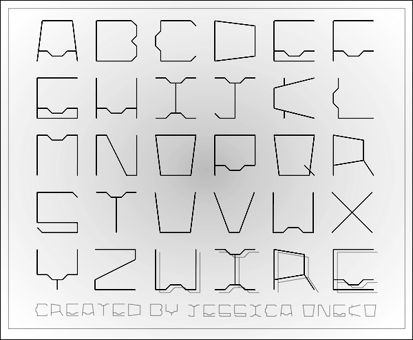
Jessica Ongko (Atlanta, GA) is a Creative Circus student. She created A Type of Wire (2012), which was inspired by the wire legs of a breakfast in bed table from IKEA. [Google] [More] ⦿ | |
Graphic designer from Atlanta, GA. Creator of New World Order Font (2009), a hand-drawn sans-serif font inspired by Modernism. [Google] [More] ⦿ | |
Savannah, GA-based designer of this squarish face (2005), which was inspired by Chinese architecture. See also OOps39 (2005). [Google] [More] ⦿ | |
MFA candidate at Savannah College of Art and Design in Savannah, GA. She is working on the handwriting typeface Scarlet (2006) for a school project. [Google] [More] ⦿ | |
Atlanta, GA-based designer of an art deco poster typeface in 2016. [Google] [More] ⦿ | |
John Butler
| |
During his studies in Savannah, GA, John Incampo designed the counterless poster typeface Jabba (2014). [Google] [More] ⦿ | |
Savannah, GA-based creator of Modern Gothic (2012): I designed this typeface out of three basic shapes broken apart angularly. The massaged result is Modern Gothic. The typeface aesthetic was inspired by sharp medieval architecture and modern curvilinear forms echoing the spirit of the Bauhaus. Behance link. [Google] [More] ⦿ | |
Illustrator from Caracas, Venezuela who is attending SCAD in Savannah, GA in 2015. At SCAD, he drew the all caps Ancient Mythology Alphabet. [Google] [More] ⦿ | |
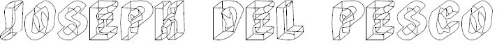
Fonts by Jo del Pesco include Deering (free). Go here for fonts created by nine of Jo del Pesco's students in 1998 at Savannah College of Art and Design. Other fonts include Manerism, Cornercopia, Thrilmatic, Eargasim, Paper Running. I believe that at www.spinacle.com (now obsolete), Jo had a few free fonts: Analog, Overt, Bag Lady, Derrida (1997, 3d outline face). Dafont link. Fontspace link. [Google] [More] ⦿ | |
Visual designer in Atlanta, GA, who works under the name of Jad. Creator of 606 (2013), a conceptual font inspired by Dieter Rams's 606 Universal Shelving System. Behance link. [Google] [More] ⦿ | |
Savannah, GA-based designer of the notched Latin / Cyrillic typeface Wyssheé (2018). [Google] [More] ⦿ | |
Student at Savannah College of Art and Design (2009-2013). In 2012, she created the grotesk typeface Maro. [Google] [More] ⦿ | |
Dafont link. [Google] [More] ⦿ | |
During her graphic design studies in Savannah, GA, Kaitlyn Richards designed the loopy script typeface Milieu (2012) and the experimental layered art deco typeface Deco (2012). [Google] [More] ⦿ | |
During her studies at Savannah College of Arts and Design in Savannah, GA, Kamilla Ferreira designed the hipster typeface Folk Fox (2016). [Google] [More] ⦿ | |
Karen Smith
| |
| |
Savannah, GA-based student who designed this handwriting face (2005). [Google] [More] ⦿ | |
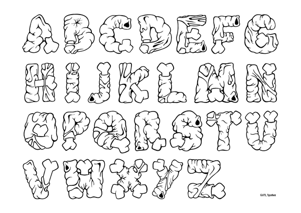
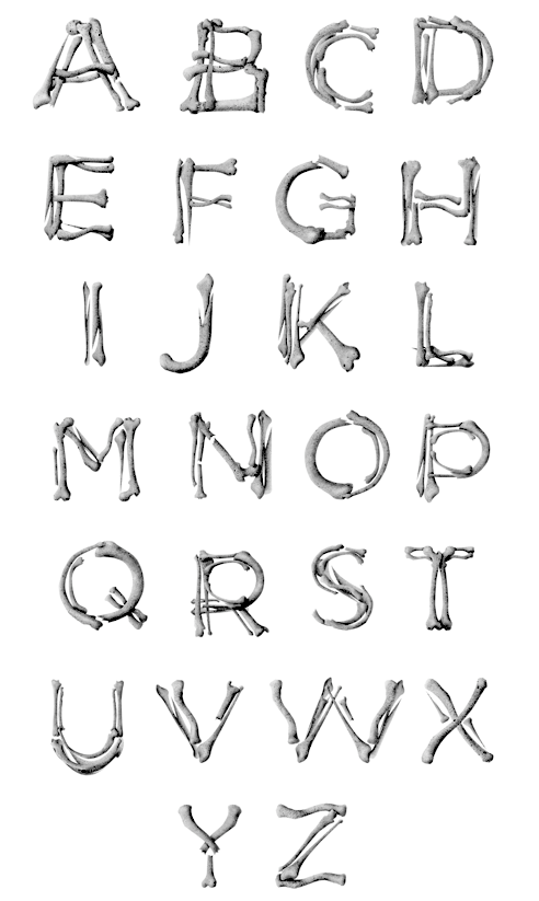
During her studies at Georgia State University in Atlanta, GA, Katherine Konzal designed an illustrative all caps alphabet based on skeletal bones (2012). [Google] [More] ⦿ | |
Link to Pluck Design. [Google] [More] ⦿ | |
Graphic designer and photographer in Cleveland, OH, who obtained an MFA in graphic design at SCAD (Savannah, GA) in 2013. She runs Kelsey Cronkhite Design. Creator of the octagonal typeface Powerpants (2011), the flowing curly script typeface Blue Spruce (2013), and the calligraphic Swanville Road (2016). In 2017, she designed Cleverly Brush. Behance link. Creative Market link. Home page. [Google] [More] ⦿ | |
Behance link. [Google] [MyFonts] [More] ⦿ | |
| |
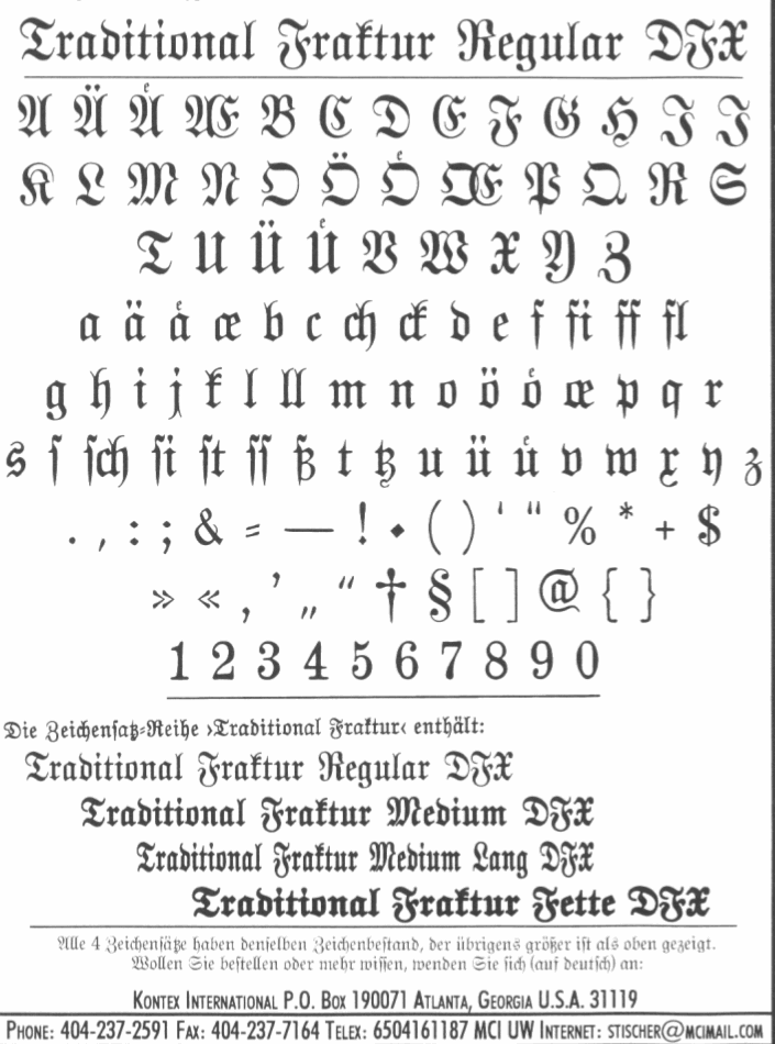
Company in Atlanta, GA, that advertised some blackletter fonts in die deutsche Schrift in 1993, such as Traditional Fraktur (4 styles). [Google] [More] ⦿ | |
Graphic designer in Atlanta, who created a personal logotype in 2012, called Bozeman. [Google] [More] ⦿ | |
Savannah, GA-based student who designed the art deco typeface Resonance (2005). [Google] [More] ⦿ | |
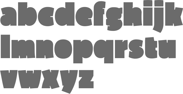
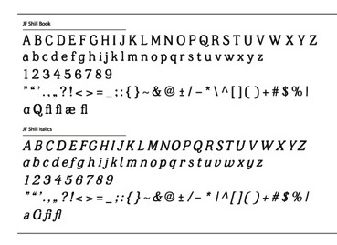
Savannah, GA-based designer (b. 1992) of the 4-style wood-inspired typeface family JF Shill (2013), which was finished during her graphic design studies. In 2014, she designed Dollop. Elsewhere, like on Dafont, she is known as K. Bishop Martinez. [Google] [More] ⦿ | |
Kwesi A. Amuti
| |
A design duo in Atlanta, GA. Together, they designed the stylish display typeface Vincenza in 2019. [Google] [More] ⦿ | |
Graphic designer from Hartwell, GA. Creator of the hand-printed typeface ytchknstrut (2007) and of Emanate (2007, a simple sans). [Google] [More] ⦿ | |
Kylee studied at Savannah College of Arts and Design (SCAD), class of 2016. Savannah, GA-based designer of the free monoline sans display typeface Tessalate (2015, renamed Tessellate). [Google] [More] ⦿ | |
During her studies at the Savannah College of Art and Design in savannah, GA, Kylee Narvell created the hand-drawn typefaces Bip (2015) and Slash (2015). Behance link. [Google] [More] ⦿ | |
During her studies at Savannah College of Art & Design in Savannah, GA, Kyra Troy designed a stylish alphabet poster (2013). [Google] [More] ⦿ | |
At SCAD in Savannah, GA, Laura Kwon designed the bitmap typeface Solidslice (2016). [Google] [More] ⦿ | |
During her studies at SCAD in Savannah, GA, Lauren Anderson designed the vintage typeface Lanister (2013). [Google] [More] ⦿ | |
Lauren Bernstein (Atlanta, GA) designed the script typeface Goldenwood in 2016 and writes: Goldenwood is a typeface inspired by a whimsical woodland wedding. [Google] [More] ⦿ | |
Lauren Childs (Atlanta, GA) created the retro baseball script font Leon's (2013) for Leon's Full Service, a restaurant in Decatur, GA. [Google] [More] ⦿ | |
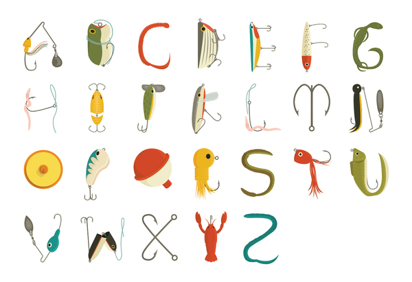
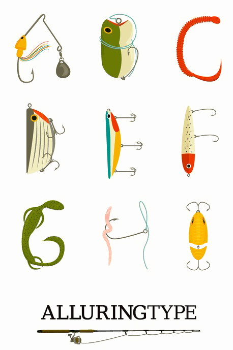
Lauren Harvill (Atlanta, GA) used fishing lures in her illustrative alphabet called Alluring Type (2012). [Google] [More] ⦿ | |
| |
During her studies at Savannah College of Art and Design in Savannah, GA, Liz smith created Edgar, a Victorian typeface about which she writes: Edgar is a type typeface inspired by the man of mystery and macabre himself, Edgar Allan Poe. Based upon type samples from the 19th century and the Sanborn Map Company, it is a geometric typeface that lends itself well as a display face. [Google] [More] ⦿ | |
Atlanta, GA-based designer of Charles Grodin (2012). [Google] [More] ⦿ | |
During his studies at the Hochschule für Gestaltung in Offenbach am Main, Germany, Lukas Kaross designed the multiline typeface Hylda (2016). Behance link. [Google] [More] ⦿ | |
Industrial designer who studied at Georgia Tech in Atlanta. He designed Proteus (2013), a modernized Greek typeface that utilizes robust monospaced letter forms. [Google] [More] ⦿ | |
Madie Homan (Cumming, GA) designed the sp[eed font Competitive Eimaq (2019) during her studies at SCAD. [Google] [More] ⦿ | |
Marc Marius Mueller is a German design student in Savannah, GA. In 2011, he used FF Meta as a model for creating ESM3. [Google] [More] ⦿ | |
Athens, GA-based designer of an untitled ornamental rope font (2014). [Google] [More] ⦿ | |
During her studies at Savannah College of Art and Design in Savannah, Georgia, Mariana Dominguez Cosson designed a beautiful typographic anatomy poster (2013). [Google] [More] ⦿ | |
During her studies in Savannah, GA, Mariana Midori created the Tuscan typeface Mustache (2016). [Google] [More] ⦿ | |
Savannah, GA-based designer of the ironwork font Gradis (2015). [Google] [More] ⦿ | |
Graphic designer in Savannah. GA, who created the geometric sans typeface Simplex in 2013. [Google] [More] ⦿ | |
American designer of the interesting font NotCaslon (1995) at Emigre. [Google] [MyFonts] [More] ⦿ | |
During his studies at Savannah College of Art and Design, Mark Napolitano (Savannah, GA) created the blackboard bold typeface Skinny Love (2014). [Google] [More] ⦿ | |
Savannah, GA-based student who designed this display face (2005). [Google] [More] ⦿ | |
Another URL. Behance link. [Google] [More] ⦿ | |
Matthew Aaron Desmond
|
Free types as of 2010: Marble Roman, Environ regular, Dorkbutt, Europa, Exsect, Inthacity, Liquidy Bulbous, Lustria (2012, Google Web Fonts), Stomper. Commissioned types: 77kids (2007, for the children's brand; the sketched typefaces were done with Justin Thomas Kay), AE Aerie (2005-206, American Eagle Outfitters), AE Newburgh (2005-206, American Eagle Outfitters), AE Summer Fonts (2007, all for American Eagle Outfitters), EEL Futura (2006, for Enjoying Everyday Life), Nike World Cup (2006), Virgin America (2006). Typefaces from 2019: Starfire (2019, a retro geometric sans). Orphaned types that disappeared or were planned but never executed: BrotherMan, Caprice, Convolve, HipstersDelight, Lugubrious, ModestaSmallCaps, Serifity, Skitzoid, Sliver, ThrowupSolid, Auresh (1998, futuristic; Test Pilot Collective), Kcap6 (1998, with Cina; Test Pilot Collective), Epiphany (1997; Test Pilot Collective), Testacon (with Kral and Cina; Test Pilot Collective), Civicstylecom (1999; Test Pilot Collective), Lutix (1998; Test Pilot Collective), Xerian (1997; Test Pilot Collective), Swoon, Furtive (2004, a sans), the display typeface Flathead (2004), the blackletter typeface Bahn (2004), Mesotone BT (2006, Bitstream, a monoline sans), Practical (a monoline connec script, planned in 2007 but not published), Poliphili (planned in 2007, as a revival of an Aldus/Griffo font), Wutupdo (1996, Garage Fonts), GFDesmond (Garage Fonts), Drone, Golden Times (2014, a corporate small caps typeface for the University of Minnesota), Vapiano (2014: hand-printed typeface for Vapiano International). Behance link. View Matt Desmond's typefaces. Fontspring link. Fontsquirrel link. [Google] [MyFonts] [More] ⦿ |
Matthew Desmond
| |
Graduate of Portfolio Center in Atlanta, GA. He created the mixture typeface Amalgam (2010). [Google] [More] ⦿ | |
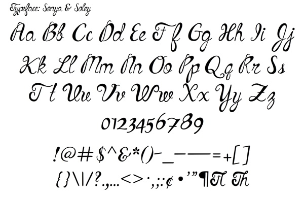
Atlanta, GA-based creator of the script typeface Sonya & Soley (2013). This typeface was inspired by a dance choreographed by Sonya Tayeh to the song Pretty Face by Soley, hence the name. [Google] [More] ⦿ | |
During her studies at SCAD in Savannah, GA, Meredith Denny designed the neo deco typeface Blocked (2017). [Google] [More] ⦿ | |
During her studies at SCAD in Savannah, GA, Meredith Denny created the geometric typeface Block D (2015) and the display typeface Lindot (2015). [Google] [More] ⦿ | |
Michael H. Lee
| |
Atlanta, GA-based designer of Crunchtime (2013, a paint splatter typeface). [Google] [More] ⦿ | |
Mickey Rossi
| |
Might Could Studios
| Christine Fleming, aka Christie Nishiyama runs Might Could Studios in Atlanta, GA. She designed the handcrafted comic book typeface Might Could Sans in 2016. Creative Market link. [Google] [More] ⦿ |
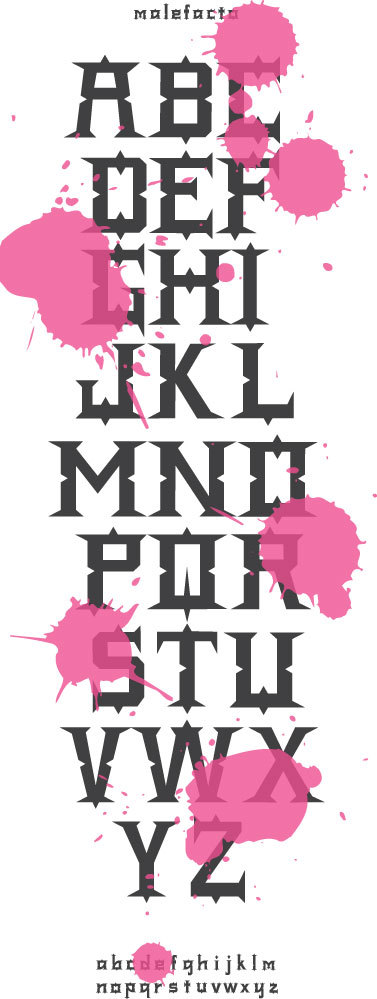
Graphic designer in Atlanta, GA. About her spurred typeface Malefacto (2012), Millisa Jackson writes: If the Devil has his own font what would it look like? I think it would be razor sharp and terrifying yet still beautiful. That describes it well. [Google] [More] ⦿ | |
| |
Mister Retro
|
At Sideshow, together with Stuart sandler in 2008, he published Creaky Tiki, Creaky Frank, Creaky Solid, and Derekbats. Derek Yaniger and Stuart Sandler published Wildsville: The Art of Derek Yaniger. Klingspor link. [Google] [MyFonts] [More] ⦿ |
Monument Art (was: M-Art)
| Monument Art or "Monumental Art Fonts for cemetery monuments" is run by Reg Owens out of Elberton, GA. Commercial truetype Windows fonts for monuments: Mod Roman, Vermarco, Government Marker, Double Outline, Polished Outline, Double V-Line, Monument Gothic, Monument Block, Monument Shadow, Hebrew, Old English. Dead link. [Google] [More] ⦿ |
During her studies in Savannah, GA, Morgan Hayes designed the straight-edged experimental typeface Tessera (2016). [Google] [More] ⦿ | |
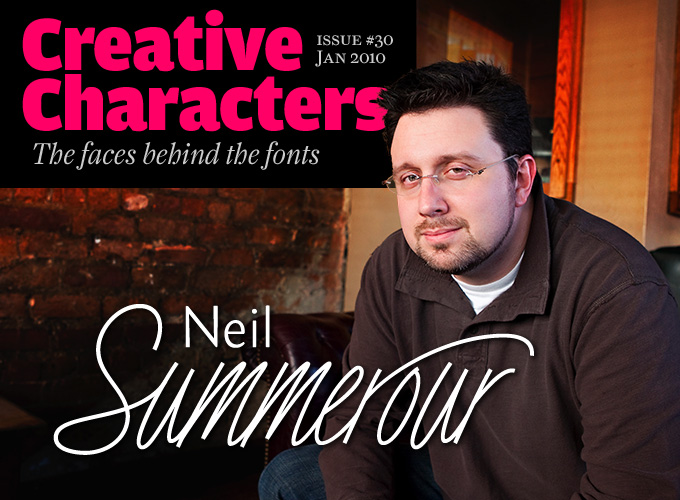
Neil Summerour
| |
Neil Summerour
| |
Nerfect Type Laboratories
|
MyFonts.com sells some of their fonts: Stinky School Book, Creeps (2002, funny typefaces!), Ailene, Smuggler (2001), Crunk, Kurtzberg, Nerfect&Cola, Go-rilla, Outlaw, Class of 1964 (dingbats), Dingbatio, Mr. Walters-Casual (comic book face), Tricky-Treat (scratchy handwriting), Fiend (2004) and MonsterKit. View Britton Walters's typefaces. Klingspor link. [Google] [MyFonts] [More] ⦿ |
Savannah, GA-based designer of the vintage shadow typeface Lowrider (2016). Behance link. [Google] [More] ⦿ | |
Art director based in Savannah, GA. During his studies at SCAD there, he created the multiline caps only typeface Copenhagen (2016). [Google] [More] ⦿ | |
Graphic designer in Savannah, GA, who created the Italian western typeface Hayduke (2015). [Google] [More] ⦿ | |
During his studies at Savannah College of Art and Design in Savannah, GA, Nicholas Sedlazek created a roman caps typeface (2011). [Google] [More] ⦿ | |
Savannah, GA-based designer of Little Love (2017). [Google] [More] ⦿ | |
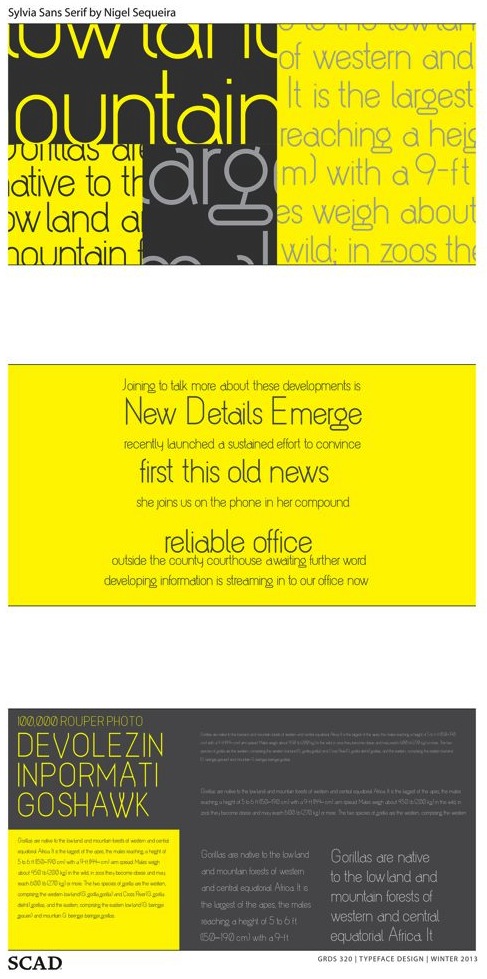
Nigel Sequeira or Nigel Fitzgerald created Sylvia Sans for a school project at SCAD in Savannah, GA, in 2013. [Google] [More] ⦿ | |
Savannah, GA-based student-designer of the modular negative circle font Thelema (2017). [Google] [More] ⦿ | |
At the Savannah College of Art & Design in Savannah, GA, Noey Tantanatipchai (originally from Bangkok, Thailand) designed the elegant display typeface Contra (2016). [Google] [More] ⦿ | |
Omega Design
| Mike H. Lee is Atlanta-based designer of the futuristic font Terminator, which won an award at the TDC2 2001 competition (Type Directors Club). He has designed a number of techno/Startrek fonts with Josh Dixon, and these are on his site at Omega Design.
|
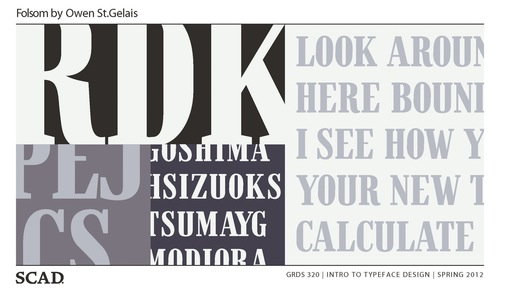
Creator of the compressed typeface Folsom (2012). Owen is based in Savannah, GA. [Google] [More] ⦿ | |
Pam Shuler
| |
Paper Moon Type & Graphic Supply
|
|
Born in Starkville, Mississippi, Parvaneh is currently studying towards a BFA in Graphic Design at Savannah College of Art and Design (SCAD) in Savannah, GA. During her studies, she created the beveled typeface Radikal (2012). [Google] [More] ⦿ | |
Savannah, GA-based student who proposed Holocaust (2006), an experimental face. [Google] [More] ⦿ | |
During his studies in Atlanta, GA, Phillip Wood designed a decorative typeface (2017). [Google] [More] ⦿ | |
Positype
|
Swash & Kern is the bespoke lettering and typeface design alter ego of Neil Summerour. In 2001, Neil published his first two type designs with [T-26] Digital Type Foundry in Chicago, IL. Since then, he has released tens of font families including hiragana and katakana fonts. Positype fonts are sold by Myfonts.com and [T-26]. Klingspor link. Facebook link. Blog. Behance link. Union Fonts link.
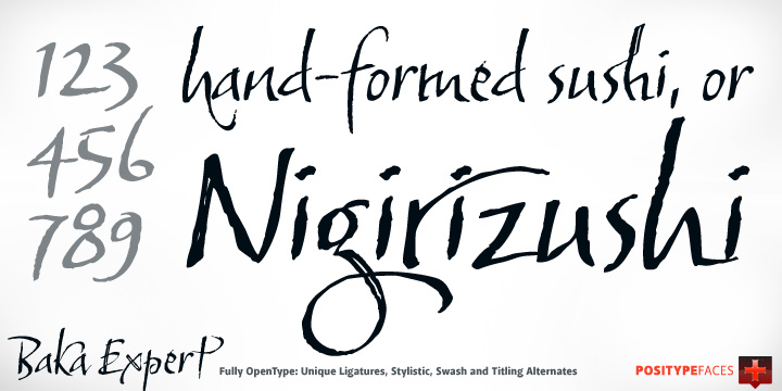
His life in hiw own words: Neil Summerour is a type designer, lettering artist, calligrapher and designer based in Georgia, USA with one foot in Takamatsu, Japan. After graduating from The University of Georgia Lamar Dodd School of Art with a BFA in Graphic Design, he soon found himself opening his own studio to deal with the flow of freelance work. [...] Neil opened his personal type foundry, Positype, in 2000 to feed his ever-growing desire for type design. He later co-founded TypeTrust (2002) with Silas Dilworth as his addiction to type and lettering grew. [...] He was an adjunct art professor at The University of Georgia in graphic design and taught graphic design at the Governor's School for the Arts. [...] As a typeface designer, he has published over 60 typeface families and produced numerous custom typefaces for clients worldwide. [...] He has won the Type Directors Club Certificate of Excellence in Type Design in 2010 and 2011 for Fugu and Nori, respectively. Showcase of Neil Summerour's fonts. [Google] [MyFonts] [More] ⦿ |
Positype Flourish is an offshoot of Neil Summerour's Positype in Jefferson, GA. It showcases designs of new and upcoming talents in type design. At its launch in 2020, the following artists were part of the group: Acra Koh, Aline Kaori, Jovana Jocic, Llio Peng, Leon Hugues, Marie Boulanger, Potch Auacherdkul and Scott Fuller. [Google] [More] ⦿ | |
Atlanta, GA-based designer of a Bengali typeface (2014). This typeface was developed during her studies at the Savannah College of Art & Design. [Google] [More] ⦿ | |
Pucker(type)
| Chris Risdon (b. 1972, New York, NY) founded Pucker(type) in 2004. Rison holds an MFA in type design. Pucker(type) is located in Savannah, GA. He designed Cheek (techno family), SAV Display (2005, T-26), and Satellite (3-weight octagonal family). MyFonts sells Cheek PT, Satellite PT (octagonal) and SAV PT (2005, medieval). These fonts can also be found at T-26 and Monotype Imaging. Klingspor link. [Google] [MyFonts] [More] ⦿ |
QJS Graphics is a design company, est. 2007 in Atlanta, GA. Founder and Art Director Quintavious Shephard, hails from Atlanta, Georgia, and currently attends Florida A&M University in pursuit of a Bachelors Degree in Graphic Design. Creator of the techno typeface Quin (2011). [Google] [More] ⦿ | |
Rachel Adams (Savannah College Of Art & Design, Savannah, GA) created the stick typeface Touch (2013). [Google] [More] ⦿ | |
Atlanta, GA-based designer of an innovative typographic poster for Martin Luther King Jr day in 2016. Behance link. [Google] [More] ⦿ | |
Savannah, GA-based student who proposed Betwixt and Between (2006), a display typeface with swashes. [Google] [More] ⦿ | |
Reg Owens
| |
R.E.M. Athens
| Chris Bilheimer (R.E.M. Athens) attended the fine arts program at the University of Georgia and began working as art director for the band R.E.M. in 1994. While still working for R.E.M., he continues with other work in the music industry, art directing bands including Green Day, Beck, and Weezer. Bilheimer has garnered three Grammy nominations for art direction, and, with Michael Stipe, co-designed several fonts for use on the band's artwork: REM Accelerate, REM Orange, REM Tourfont. With the help of type foundry TypeTrust, these fonts have recently been released commercially by Neil Summerour at Positype. Speaker at TypeCon 2009 in Atlanta. [Google] [MyFonts] [More] ⦿ |
Originally from Bombay, Rhea Duckworth first studied in Bombay (2013) and then at the Savannah College of Art and Design, class of 2017. She created the display typeface DeeDee (2015), which is inspired by the 1990s cartoon Dexter's Laboratory. [Google] [More] ⦿ | |
Savannah, GA-based designer of the angular almost hexagonal typeface Quartz (2015), which was finished during her studies at Savannah College of Art and Design (SCAD). [Google] [More] ⦿ | |
Inspired by a typeface designed by Matt Willey, Riley Mann (Savannah, GA) designed the typeface Deeper (2014) with very condensed, rigid forms and extremely narrow counters. This typeface was created during his studies. [Google] [More] ⦿ | |
Graphic design student in Savannah, GA, who created Circles (2013) and Paperclip Font (2013). [Google] [More] ⦿ | |
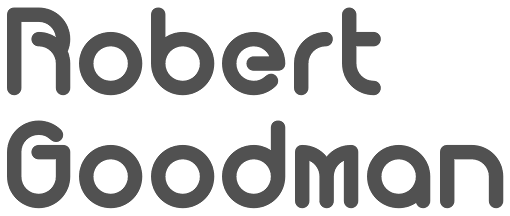
Robert Goodman
| |
His early fonts were released at VGC, the Visual Graphics Corporation: VGC Aquarius (2, 4, 5, 6, 7, 8, Outline) (1967) (this was digitized in 2007 by Steve Jackaman as Aquarius), VGCArnholm Sans Bold (1965), VGC Fovea (1977). Arnholm also designed WTC Veritas for the World Typeface Center, New York, 1981-85. He created these headline typefaces for the Los Angeles Times, 1980: L.A. Times Regular, L.A. Times regular italic, L.A. Times Bold and L.A. Times Bold Italic. MyFonts page. Linotype bio. FontShop link. Klingspor link. View Ronald Arnholm's typefaces. [Google] [MyFonts] [More] ⦿ | |
Savannah, GA-based student who proposed this skinny typeface (2006) for a school project. [Google] [More] ⦿ | |
Creator of the thin geometric sans typeface Olivia (2015). This typeface was done for a project at the Savannah College of Art and Design in Savannah, GA. Later in 2015, she finished the experimental display typeface Perikito Sans. [Google] [More] ⦿ | |
Collectively, a group of 40 from SCAD designed Pooler (2003, Chank), a free funky comic book style face. [Google] [More] ⦿ | |
Atlanta-based designer (b. 1984) of Angelique Cosmos Font (2004, stencil). Home page. [Google] [More] ⦿ | |
Scott Banks
| |
| |
Dribble link. [Google] [MyFonts] [More] ⦿ | |
Graphic designer in Savannah, GA, where he is studying at SCAD. In 2011, he created a modular typeface that is entirely based upon triangles, Tri Face. Home page. [Google] [More] ⦿ | |
Graduate of the Master of Fine Arts program in Graphic Design at Savannah College of Art and Design (SCAD) in Savannah, GA, class of 2013. Now working as a designer in San Francisco. Creator of the floral ornamental caps typeface Botanical (2012). Stillis (2013) is a fluid roman face: "Stillis" is directly translated to the word "drip" in Latin, which plays off the fluidity of water and the arches on Roman aqueducts, such as Pont du Gard. In 2014, he created a decorative set of numerals called Math Is Beautiful. Behance link. [Google] [More] ⦿ | |
Seven Seas Design Co
|
Typefaces from 2016: Alouette. Creative Market link. Dafont link. [Google] [More] ⦿ |
At Savannah College of Art & Design in Savannah, GA, Shamar Joseph designed the prismatic titling typeface Photon (2016). [Google] [More] ⦿ | |
Duluth, GA-based designer of the experimental typeface Type Dye (2012). [Google] [More] ⦿ | |
Shuler Studio
| Pam Shuler (Shuler Studio, Columbus, GA) designed many exquisite monograms. In 2017, she published Monogram Chic. Other monogram fonts include Monogram Block, Single Antique Chic and Vintage Vine. [Google] [MyFonts] [More] ⦿ |
Sidecar
| Savannah, GA-based designer of the sans typeface Proletar (2016). He also designed many sets of vector format icons in 2016, such as Animals, Academic Icons, Clothing, Commerce, Foodie, Furniture, Health, Music, Nature, nautical Icons, Office, Space, Sports and Transportation. Home page of Bill Kenney. Behance link. [Google] [More] ⦿ |
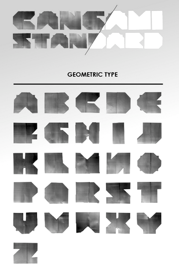
Designer in Atlanta, GA, who created Cangami (2013), an illustrative alphabet created from metal cans and manipulated using the traditional Japanese art of paper folding known as origami. [Google] [More] ⦿ | |
Savannah, GA-based designer of Dripink Ingrabol (2017). [Google] [More] ⦿ | |
Savannah, GA-based designer of this display face (2005). [Google] [More] ⦿ | |
Savannah, GA-based designer of the curly display typeface Bash (2013). [Google] [More] ⦿ | |
His typefaces:
YWFT link. MyFonts link. FontShop link. [Google] [MyFonts] [More] ⦿ | |
Designer in New York City who grew up in Atlanta. She created the ornamental caps typeface Montecastello (2012). [Google] [More] ⦿ | |
Atlanta, GA-based designer of the prismatic caps typeface Rhizome Alphabet Song (2014). [Google] [More] ⦿ | |
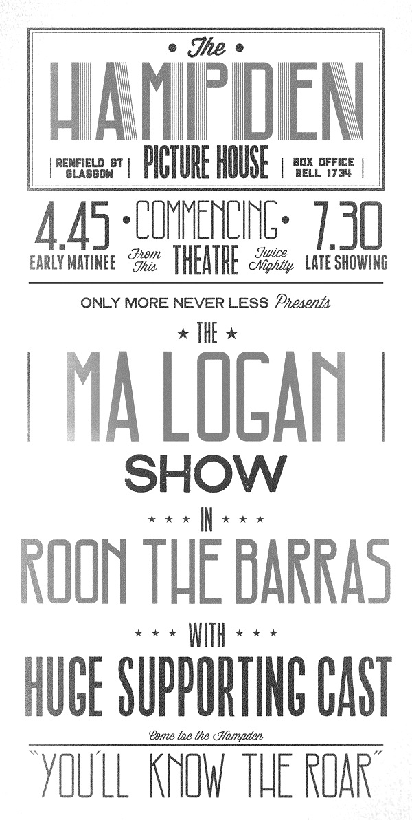
Atlanta, GA-based graphic designer and illustrator. His typefaces include Hampden (2011, an art deco caps face), Geometra (2011, octagonal) and Skyler (2011, a great high-contrast fashion mag face). [Google] [More] ⦿ | |
SUBFLUX experiment
|
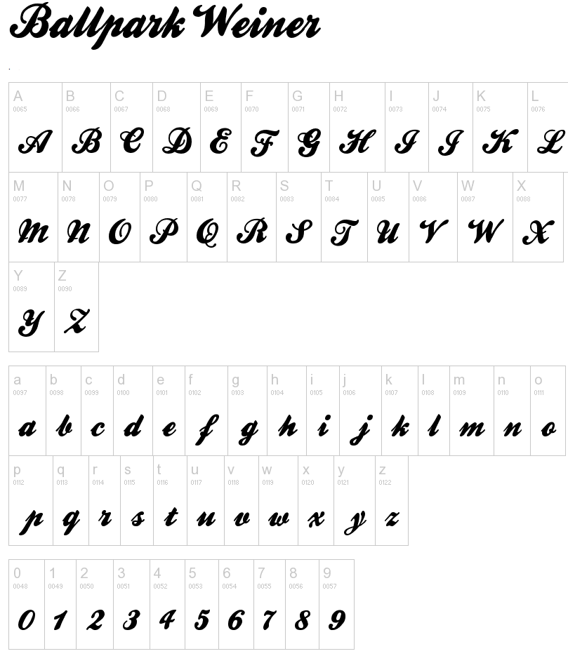
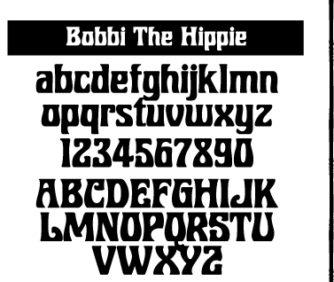
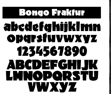
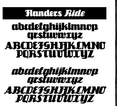
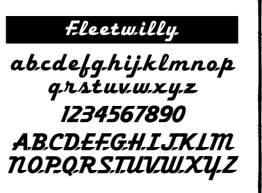
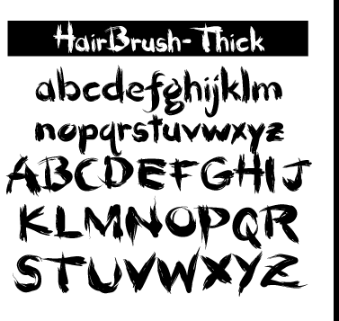
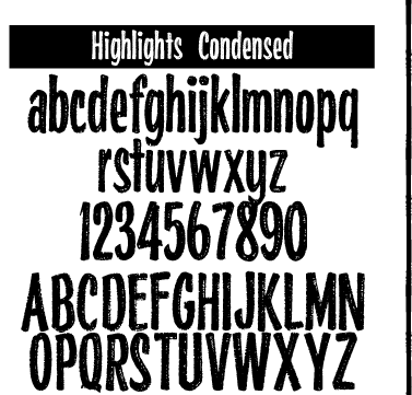
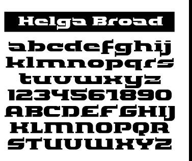
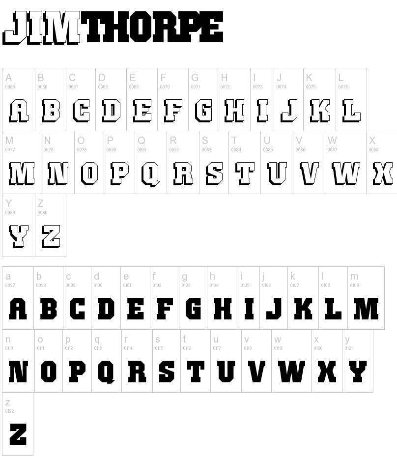
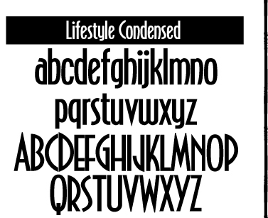
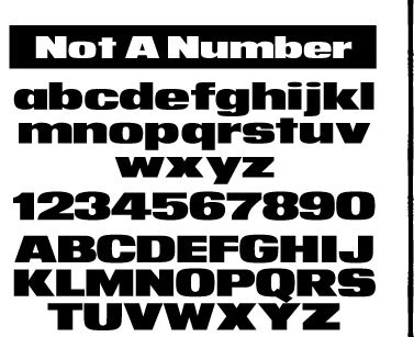
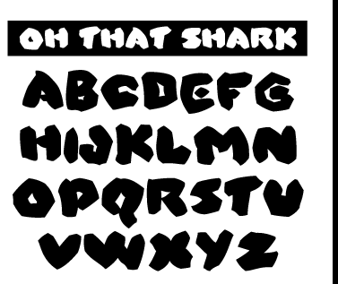
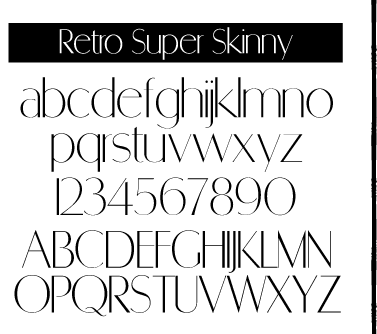
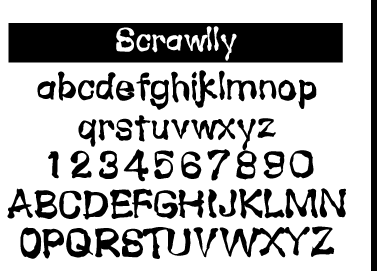
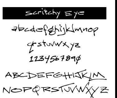
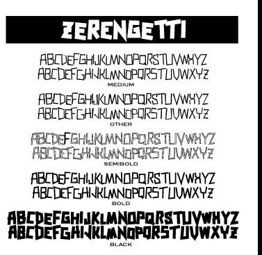
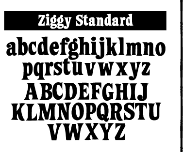
He offers these free typefaces under the Subflux label: Alpha Male Modern (1997), AthleticSupporter, BallparkWeiner (connected fifties script), BarBenderBold, BobbiTheHippie, BongoFraktur (in Koch's Neuland style), CargoCrate (stencil), CollegeBoy (athletic lettering), FlandersRideItalic, FlandersRide, Fleetwilly, FlyTrapExtended, Hair Brush, HighlightsCondensed, Helga Broad, Hilda Broad, JimThorpeHigh (octagonal / mechanical), LevelFourteenDruid (medieval), LifestyleCondensed (avant garde), NotANumber, On That Shark (angular), RetroSuperSkinny (Peignotian), SatansMinions, Scrawlly, Scritchy Eye, Zerengetti (African look), ZiggyStandard. Rossi calls himself also "Loveless". Dafont link. Klingspor link. Abstract Fonts link. [Google] [More] ⦿ |
SynFonts
|
At Plazm, he published Derision (1995), NudE (1995), SlickDog (1995). SynFonts seems to be located in Marietta, GA, now. Abstract Fonts link. View all fonts at SynFonts. [Google] [MyFonts] [More] ⦿ |
The Palladam Tamil font was designed in 1989-1990 by T. Govindaraj who works or worked at Georgia Tech in Atlanta. Alternate URL. [Google] [More] ⦿ | |
As a student at Savannah College of Art and Design in Savannah, GA, Tarcisio Rodrigues designed the curly tattoo typeface Nostalgia (2016). [Google] [More] ⦿ | |
| |
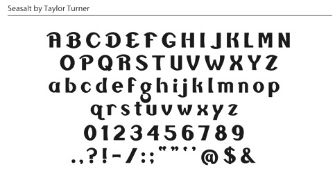
Graphic designer in Savannah, GA. During her studies, she designed Seasalt (2013). Dafont link. [Google] [More] ⦿ | |
Atlanta, GA-based designer of Espresso Roast (2016: brush script), Tuesday Script (2016) and Hawthorne Script (2016). Typefaces from 2017: Miss Magnolia (script). Creative Market link. [Google] [More] ⦿ | |
Web site by paper manufacturer Neenah Paper (Atlanta, GA), dedicated to letterpress. [Google] [More] ⦿ | |
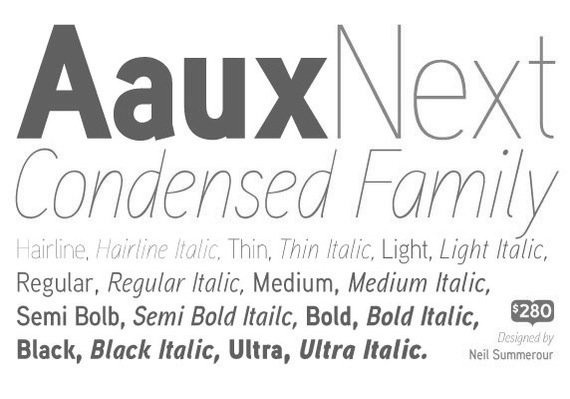
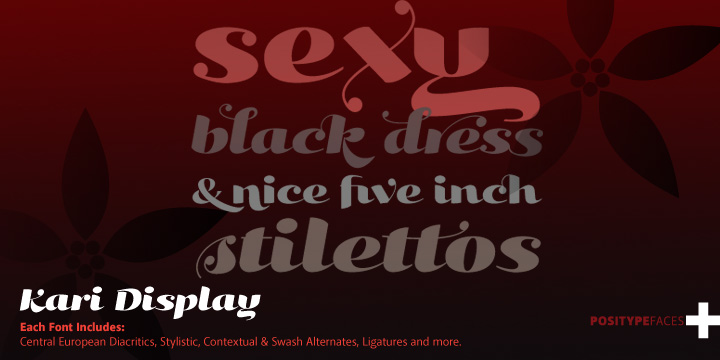
Releases include Ventura (dos Santos), Leitura Display, Leitura News, Leitura Sans and Leitura (dos Santos), Esta Pro (dos Santos), Sansarah (Silas Dilworth and Sarah Faust), Organic (Neil Summerour), Malbeck (Alejandro Paul and Angel Koziupa), Argenta (Alejandro Paul and Angel Koziupa), Aaux Pro and Aaux Next (Neil Summerour), Headroom (Lee Fasciani), Ezzo (dos Santos), Jaguarundi (Ryoichi Tsunekawa), Priva Pro (dos Santos), Sneakers Script (Summerour), Do Gothic (Wongsunkakon), Volupia (dos Santos), Reservation Wide (Dilworth), Estilo (dos Santos), Everafter (Dilworth), Musee (dos Santos), Breuer Headline and Breuer Text (Silas Dilworth), Rickety (Dilworth and Chris May), Baka Too (Summerour), Baka (Summerour), Cen Pro (Summerour), Lump (Dilworth), Cynapse Pro (Summerour), Gepetto (Szegi), Fatty (Dilworth and Chris May), Headcold (Summerour), Plastek (Summerour), Kari Pro (Summerour), Sneakers (Summerour), Donatora (summerour), Novacane (Fasciani), System02 (Fasciani), Dispose (Fasciani), NeoGothic (Fasciani), Diego (Dilworth), Vandermark (Dilworth), Cooter (Dilworth), Titan Pro and Titan Text Pro (Dino Dos Santos), Large Pro (dos Santos), Plexes Pro (Dino Dos Santos), Andrade Pro (Dino Dos Santos), Boycott (Ryoichi Tsunekawa), Tokyotrail (Ryoichi Tsunekawa), Ayumi Pro (Neil Summerour), Yumi (Neil Summerour), Altar (Neil Summerour), Estilo Script (Dino Dos Santos), Depot (Chris Dickinson), Penn Station (Anuthin Wongsunkakon&Neil Summerour), Alber (Chris Dickinson), Zimbalo (Amondó Szegi), Eon (Neil Summerour), Angel Script (2009, Neil Summerour), Facebuster (Silas Dilworth, a heavy slab serif). [Google] [MyFonts] [More] ⦿ | |
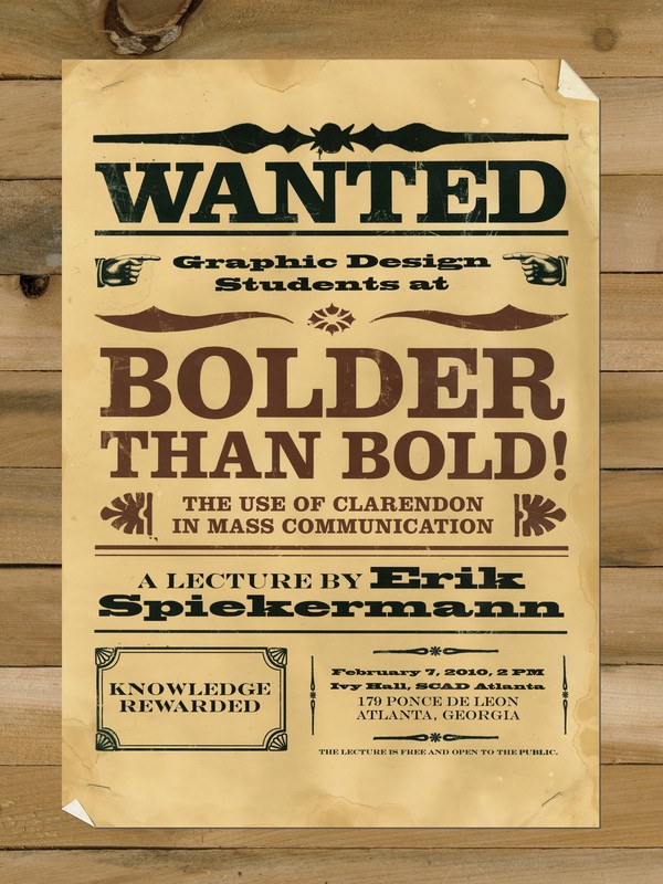
The Typographic Desk Reference (Oak Knoll Press, New Castle, DE, 2009) is Theodore Rosendorf's useful reference guide of typographic terms and type classification. There is a foreword by Ellen Lupton. The much larger Second Edition (2015) is coauthored wit Erik Spiekermann. Theo Rosendorf is based in Decatur, GA. [Google] [More] ⦿ | |
At the Savannah College of Art and Design in savannah, GA, Jack Fleming designed an octagonal shadow typeface called Lowkey (2016). Behance link. [Google] [More] ⦿ | |
Atlanta, GA-based designer of the display typeface demetri (2014). [Google] [More] ⦿ | |
During her studies in Atlanta, GA, Tina Marshall created Nuptials (2015), a wedding-themed illustrative alphabet. [Google] [More] ⦿ | |
Atlanta, GA-based designer (b. 1982) of the pixel font SysFrag (2002). Web site. [Google] [More] ⦿ | |
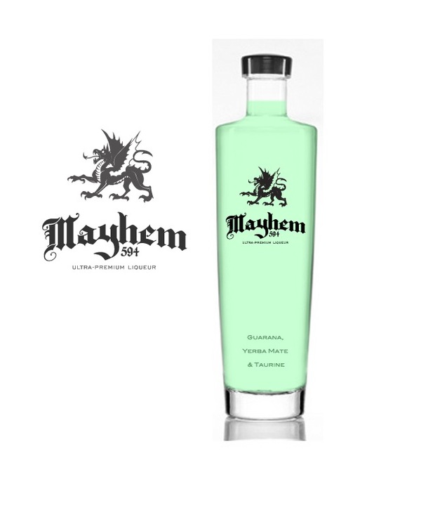
Graphic designer in Atlanta, GA. Home page. Mayhem 594 (2009) is a nice example of blackletter type in use. [Google] [More] ⦿ | |
During his studies in Atlanta, GA, Tucker Lebsack created a typeface that was inspired by the plumbing department of Home Depot. [Google] [More] ⦿ | |
Ty Wilkins
| |
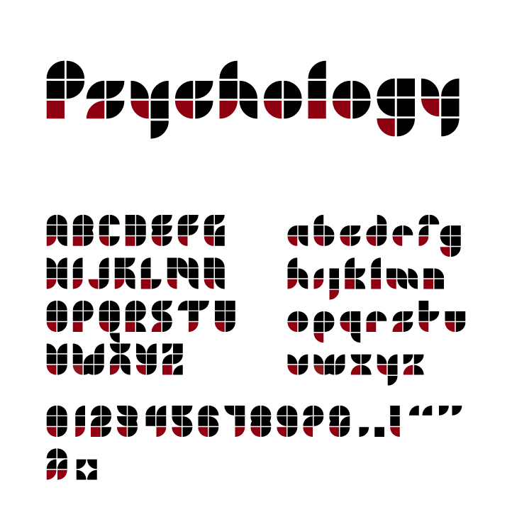
Macon, GA-based graphic designer who made the kitchen tile typeface TY Psychology (2006), and the modular trapezoidal typeface TY Krypton (2006). [Google] [More] ⦿ | |
Designer in Atlanta (b. 1976) who made the finger brush font Inkdup (2001), Ruffdup, Satellite, Screen VST, Sinestra, Singapore and Stereotype. In 2005, he added Moderna (a lightweight sans text face). He does custom type design. [Google] [More] ⦿ | |
Type Theory
| Type Theory is a journal of contemporary typography featuring news, views, reviews and interviews. Ty Wilkins founded Type Theory in January of 2009, but the last post was made in 2010. He graduated from Auburn University with a Bachelor of Arts in Graphic Design and currently works as a graphic designer for Gardner Design where he specializes in brand development. Ty Wilkins is the Macon, GA-based graphic designer who made the kitchen tile face TY Psychology (2006), and the modular trapezoidal typeface TY Krypton (2006). [Google] [More] ⦿ |
TypeCon 2009 was held in Atlanta, Georgia, July 14-19, 2009, at the Center for Design Study. The Atlanta Site Committee Chairs were Hank Richardson, Nancy Rorabaugh, Albert Whitley, and Joey Hannaford. Speakers include Matthew Carter, John Downer, Craig Eliason, Peter Enneson, Shelley Gruendler, Stefán Kjartansson, Akira Kobayashi, Kevin Larson, Gerry Leonidas, Mathieu Lommen, Brian Lucid, Bruno Maag, Vítor Quelhas, Hank Richardson, Stuart Sandler, Paul Shaw, Jim Sherraden, and Ilene Strizver. Pictures (mostly by Eben Sorkin). [Google] [More] ⦿ | |
Savannah, GA-based designer of Metric Display (2015), a modular geometric typeface. Behance link. [Google] [More] ⦿ | |
Graphic designer in Savannah, GA. Creator of the gaspipe typeface Arbitor (2012). Behance link. [Google] [More] ⦿ | |
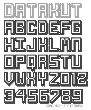
East Point, GA-based designer of Datakut (2012, an outline face), Razor (2012, a texture face) and Taco (2012, a wavy face). All typefaces were made with FontStruct. [Google] [More] ⦿ | |
April 6-7, 1999, Hyatt Regency, Atlanta. Keynote speaker Roger Black. [Google] [More] ⦿ | |
| |
Savannah, GA-based designer of this display face (2005). [Google] [More] ⦿ | |
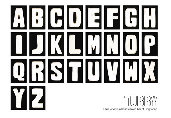
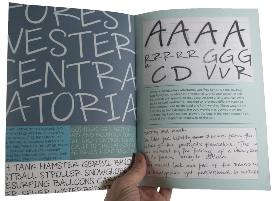
Savannah, GA-based designer of Tubby (2012), a typeface in which each letter was inspired by a carved bar of ivory soap. She also designed Geoffrey Script (2012). [Google] [More] ⦿ | |
Savannah, GA-based student who designed these typefaces (2005). [Google] [More] ⦿ | |
Gainesville, GA-based designers of these handcrafted typefaces: Bookshelf (2013), Secret Society (2015). Creative Market link. [Google] [More] ⦿ | |
Zach Scott (Zach Scott Design, Canton, GA) created the logotype Unbound (2013). [Google] [More] ⦿ | |
Zane Townsend is from Georgia (b. 1977) but lives (lived?) in Tokyo. He gave away his fonts under foundry names such as Unrender.com, "The StyleMachine", "13th Degree Fonts" and "Ghost Font Foundry". Alternate URL at eksten.com. List of typefaces: 13DokusanNormal, 13Fletcher [hacker font], 13Ghosts [letters in circles], 13GhostsBlack, 13GhostsFull, 13Inka [dingbats], 13Misa, 13Roshi [sci-fi], Astro, Ghost. [Google] [More] ⦿ | |
Zone38 (or: Codeman38)
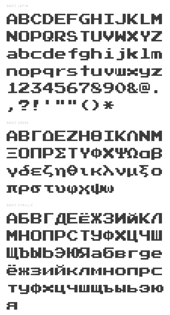
| From Georgia, Cody Boisclair's pixel fonts based on fonts found in Nintendo or Super Nintendo games, made in 2001: PCSeniorReg, PressStartReg, ReturnOfGanonReg, LunchtimeDoublySoReg, ManaspaceReg, PressStartK, DeluxeFont (pixel font), SenorSaturno. In 2003, these were added: Press Start 2P (free at Google Web Fonts and OFL: a bitmap font based on the font design from 1980s Namco arcade games), Yoster Island, Kong Text and DP Comic. Alternate URL. Devian Tart link. Dafont link. Open Font Library link. Fontspace link. [Google] [More] ⦿ |
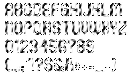
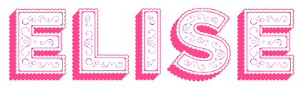 Courtney Burroughs and Alex Liebold (Savannah, GA) run 414 General Store. Their typefaces include Elise (2014, layered decorative caps) and Monster Party (2015, decorative caps). [
 During his studies in Savannah, GA, Alberto Santana created the display typeface Mima Grotesk (2014). [
 Architect and graphic designer in Atlanta, GA. Amberlee created Josephine (2011, headline caps). She also created some fashionable calligraphic headline posters against child labor in 2011, based on
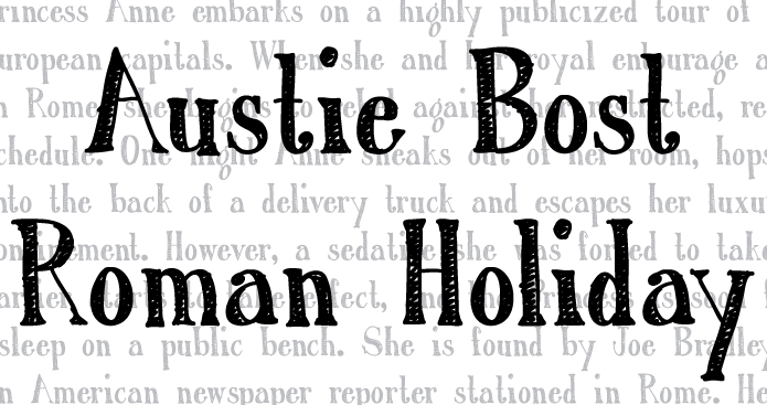
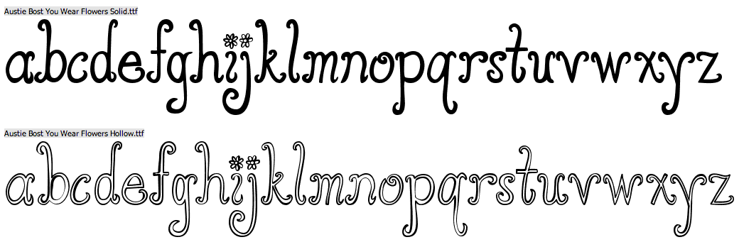
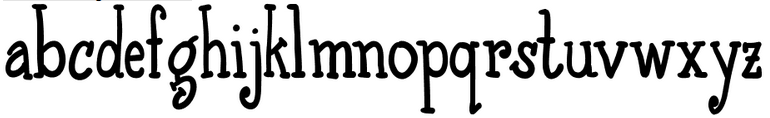
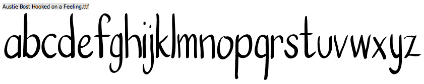
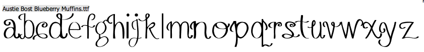
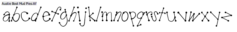
  Snellville, Atlanta, GA-based designer (b. 1977) of the playful fonts Austie Bost Dreamboat (2015), Austie Bost There For You (2015), Austie Bost Envelopes Print (2014), Austie Bost Take A Chance (2014), Austie Bost Lifted Up (2014), Austie Bost Arrow Mania (2014, arrows), Austie Bost Envelopes (2014), Austie Bost Versailles (2014: thin curly script), Austie Bost Chunky Description (2014), Austie Bost Descriptions (2014), Austie Bost Wibbly (2014: a great curly poster typeface), Austie Bost Somersaults (2014), Austie Bost Cartwheels,
  Raised in Atlanta, Brian earned his Bachelor's and Master's degrees from MICA in Baltimore, MD. He currently lives in Brooklyn, NY. He is an alumnus of Milton Glaser's Summer Program and a founding member of The Children's Publishing Design Forum. A designer, artist and illustrator recognized by many awards, Brian designed these art-historical typefaces in 2014:
 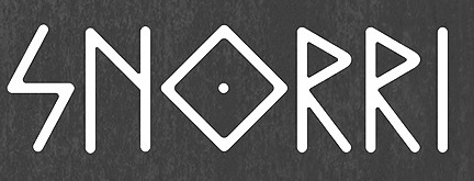 During his studies at SCAD in Savannah, GA, Chrius Turpen designed the elegant rhombic rune simulation typeface Snorri (2014). It is based on Icelandic and Nordic manuscripts and carvings. [
 Student from Atlanta, GA, who made a great
  [
[
 Eric drew Chiropractor (2008,
  Savannah, GA-based designer of the artistic keyhole font Quorra (2015) during her studies at Savannah College of Art and Design. [
 Designer of the rounded poster typeface
  Sign painter and gilder now located in Blue Ridge, GA. He made the Victorian signage font families Tyler (2003, inspired by a typeface by E.L. Brown from the late 1800's),
  Ginny has a degree in history from Yale (1998). During her studies at Savannah College of Art and Design (SCAD) in Savannah, GA, Ginny Nicholson created the connected cursive typeface Emma (2014). [
 Insigne Type Design Studio (est. 2006) is run by
  During her graphic design studies in Savannah, GA, Jennifer Giesler created the slab serif typeface
  [
[ Born in Virginia in 1980 and based in Georgia, Julius Woodard designed the rounded squarish Cyrillic simulation typeface
  [
[ During her studies in Savannah, GA, Karla Zavala designed the experimental bilined typeface Crossover (2016). [
 During her Master of Fine Arts studies at Savannah College of Art and Design (SCAD) in Savannah, GA, Kelly Farmer created the decorative display typeface
  Type designer in Peachtree City, GA. His typefaces from 2012 include a six-style unicase sans family entitled
  Kirby Matherne is a multi-disciplinary designer / art director who resides in Atlanta, GA. Via
  Lily Feinberg grew up in Georgia and studied at the University of Georgia, class of 2011. She presently works as a graphic designer in New York City. With Mary Catherine Pflug, she is one half of

 [
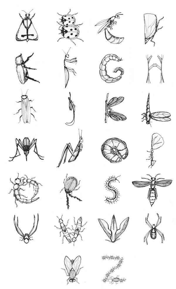
[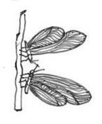 Mirely Cabral (Atlanta, GA) created the insect alphabet
  Derek Yaniger (b. Arkansas, lives in Atlanta, GA) is an
  [
[ Nerfect Type Labs in Berwyn, IL, is the foundry of Britton Walters (b. Atlanta, GA, 1973). Free fonts: Desmond (2003), Ausfahrt (dingbats), Bad Weekend (comic book font), Clint (2003), CursedMustache (2003), Clunky, Coffin Nails, Conspiracy (old typewriter font), Crap Magnet family (free at
  Scott Banks (Atlanta, GA) specializes in digital fonts with a printed letterpress or hand-lettered look and feel. In 2022, he released
  Positype was founded in 2002 by Athens and/or Jefferson, GA-based designer and type designer
  Professor of Art Graphic Design at Lamar Dodd School of Art, part of the University of Georgia, Athens. Born in 1939 in Barre, VT, Arnholm designed the lapidary typeface
  [
[ Using iFontMaker, Scott Banks (
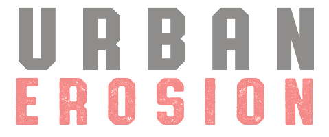 Scott Fuller (b. Newnan, GA) is a designer, illustrator, treasure hunter and founder of The Studio Temporary in Acworth, GA. Based in Atlanta, GA, he joined
 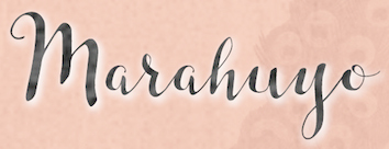 Dahlonega, GA-based designer of the connected script typefaces Caleigh (2015), Marahuyo (2015) and Ola Moon (2015).
  Designer (b. Siglufjordur, Iceland), who got a BA in graphic design from Iceland Arts in 1993, and lived in Reykjavik. He took a job in Atlanta, GA, designing for CNN.com. In the next five years, Stefan worked his way from interactive designer to creative director. He co-founded the interactive agency Armchair, and has directed projects such as Coca-Cola's M5.
  Born in 1968 in Belleview. From Omaha, NE, Don Synstelien's own fonts sold through SynFonts (which he created in 1994) or
  During her studies in Atlanta, GA, Tayler Mulhall created the decorative (feminine, mysterious, artsy) typeface Frida (2014), which is named after Frida Kahlo. [
 Small high quality type design group, est. 2005 by Silas Dilworth and Neil Summerour, and located in Athens, GA and Chicago, IL, It consists of Silas Dilworth (Dilworth Typographics, Inc.), Dino dos Santos (DSType), Lee Fasciani (Lee Fasciani Typographics), Neil Summerour (Positype), Amondó Szegi (Fontana), and Anuthin Wongsunkakon (Behaviour Group).
  During his studies in Savannah, GA, Wesley Sharp created the thin avant-garde Aphrodite Sans typeface (2015).
|
|
|
|