TYPE DESIGN INFORMATION PAGE last updated on Mon Jul 13 20:57:52 EDT 2026
FONT RECOGNITION VIA FONT MOOSE

|
|
|
|
|
Type scene in North Carolina | ||
|
|
|
|

SWITCH TO INDEX FILE
A New Machine
|
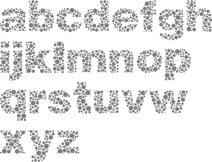
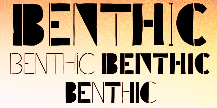
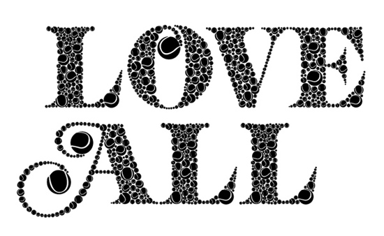
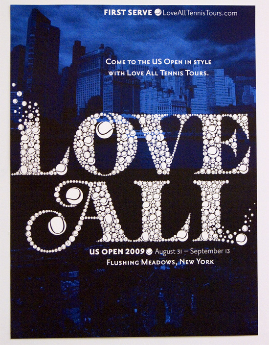
In 2012, he made Quarry (an outlined hand-drawn shadow font), Holt Sans (a Peignotian family), Unstable Slab, Mitosis (using bubbly dots), Radial (prismatic), and Airwave (techno). Typefaces from 2013: Benthic (decorative geometric caps), Tubbs (a beefy poster face), Dot To Dot (a dotted and lined pair of school fonts), Emjay (sketched blackboard bold typeface). Typefaces from 2014: Art Party (a festive hand-drawn typeface co-designed with with Erin Solomon), Carawan (a rounded sans family), Back and Forth, Fat Nib (splatter brush face), Smoot (whimsical typeface). Typefaces from 2015: El Guapo (a handcrafted typeface co-designed with Erin Solomon), Nervy, Current (thin connected script). Typefaces from 2016: Etymon (Skyline style), Big Trees (Victorian, Western), Igor (a beatnik style font). Typefaces from 2017: Down With The King (a great techno headline typeface). Typefaces from 2018: Thickness (hand-drawn), Chisel Brush, Dot to Dot, Dot To Dot Cursive (dotted line font, perhaps for teaching children in school). Typefaces from 2019: Artie Deco, Marie Jeanne. Klingspor link. [Google] [MyFonts] [More] ⦿ |
Durham, NC-based designer of the vernacular typeface Taco Cat (2016). [Google] [More] ⦿ | |
Adam Roe
| |
Adam Roe
| |
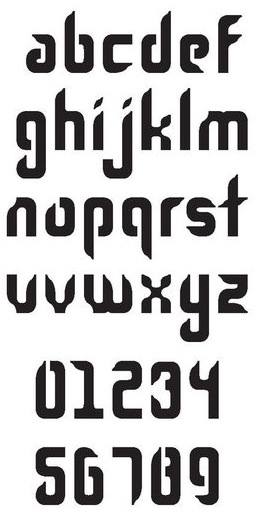
Designer from North Carolina who made the angular techno typeface Litha (2010). [Google] [More] ⦿ | |
Alberto Larizza
| |
Born in Scotland, Alex Hunter grew up in the USA and is now based in Charlotte, NC. She created great lettering for her poster Ask Me To Stay (2013). [Google] [More] ⦿ | |
| |
Graphic designer in Ralegh, NC, who created an experimental typeface in 2010 called Georna. [Google] [More] ⦿ | |
Charlotte, NC-based designer of the modular typeface Bitmap Bamboo (2019). [Google] [More] ⦿ | |
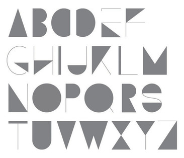
Alycia Kozlowski (Raleigh, North Carolina) created the octagonal typeface Stream Geometrica Lite in 2014. [Google] [More] ⦿ | |
Winston Salem, NC-based designer of Handwritten Benjamin (2020). [Google] [More] ⦿ | |
| |
Raleigh, NC-based designer of Isabel (2017, a brush font) and Stately (2016: a Victorian style typeface). Creative Market link. [Google] [More] ⦿ | |
Greensboro, NC-based designer of the decorative caps typeface Damask (2016). [Google] [More] ⦿ | |
Greensboro, NC-based designer of the retro display typeface Triumph (2020). [Google] [More] ⦿ | |
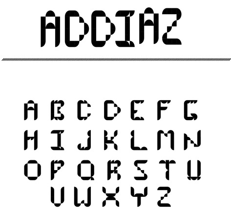
During her studies at Peace College in Raleigh, NC, Angela Diaz designed the modular typeface Addiaz (2012). [Google] [More] ⦿ | |
During her studies in Concord, NC, Angela Sullivan designed the decorative typeface Molten Kandy (2017). [Google] [More] ⦿ | |
During her studies at Appalachian State University, Boone, NC-based Anna Barlow designed the old typewriter font Bark (2018). [Google] [More] ⦿ | |
During her studies at Anderson University in South Carolina, Matthews, NC-based Anna Tabor designed the Azalea typeface (2016) for The Glen, a wedding venue located on a historic plant nursery in Florida. [Google] [More] ⦿ | |
Davidson, NC-based designer of the squarish typeface family ASD Bravery (2017). Creative Market link. [Google] [More] ⦿ | |
Designer at North Carolina Agricultural and Technical State University of the experimental typeface The Alphabet (2021). [Google] [More] ⦿ | |
Charlotte, NC-based designer of Willy Wonka (2015). Behance link. [Google] [More] ⦿ | |
Greensboro, NC-based designer (b. 1987) who runs Dirty Little Cards. Creator of Dirty Little Secrets (2011), Poisoned Apples (2011), and Little Sparrow (2011, thin handwriting). [Google] [More] ⦿ | |
During her studies, Ashley Gibson (Charlotte, NC) designed the squarish typeface Genesis (2019) and Daily Rotine Icons (2019). [Google] [More] ⦿ | |
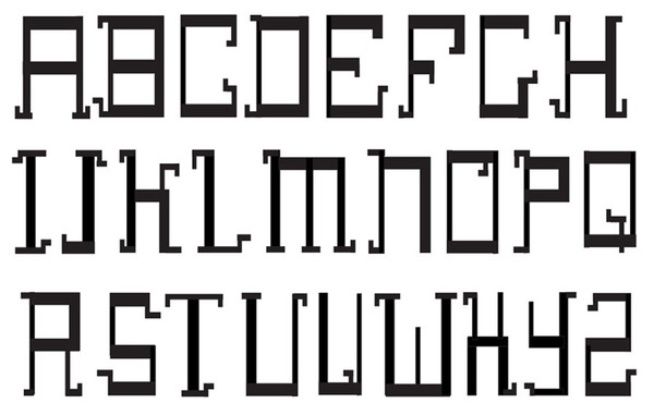
During his studies at Art Institute of Charlotte in Charlotte, NC, Austin Head designed Terminal Bitmap Font (2015). [Google] [More] ⦿ | |
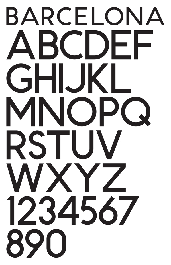
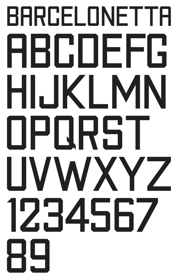
During his graphic design studies at RISD in Providence, RI, Barron Webster, who is originally from North Carolina, created a pair of display sans typefaces called Barcelona and Barcelonetta (2012). In 2013, he created the modern blackletter family Baum Display (dedicated site: free typeface for personal use). Behance link. [Google] [More] ⦿ | |
As a student in Charlotte, NC, Bay Routh designed the display typeface Muscadine (2016). [Google] [More] ⦿ | |
Banner Elk, NC-based designer of the sharp-edged typeface Sproy (2015). [Google] [More] ⦿ | |
Fayetteville, NC-based designer (b. 1986) of the pixel typeface River_City_Ransom_Ingame_Font, based on the in-game font from River City Ransom. FON format only. [Google] [More] ⦿ | |
Brooklyn-based graphic designer with an interest in lettering and typeface design. He studied graphic design in Raleigh, North Carolina and received a certificate in typeface design from the Cooper Union in 2019. Benjamin Tuttle is a volunteer at the collectively-run microcinema Spectacle Theater since 2017, contributing film programming, poster design, trailer editing, and more. He is Design Director at Ultravirgo. His typefaces:
| |
Bomparte's Fonts
|
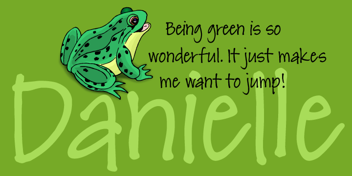
John designed the art deco sans typeface Hamptons BF, and another art deco headline face, Take Two BF. In 2006, he published the 12-style family Blackletter Sans and the exquisite poster semi-Greek simulation art deco typeface Abstrak BF (modeled after a 1931 ATF font by Robert Foster called Abstract). In 2007, he surprises with the 1920s poster font Michelle BF, the hand-printed Brandy BF, its follow-up Johnny Script BF (2008), the quirky Freaky Frog BF, the dot matrix halftone effect font Subliminal BF, the frizzy Glow Gothic BF (2007), and the gorgeous swashy 3-style blackletter family Black Swan BF (2007). His 2008 typefaces: Jacky Sue BF (based on the hand of Jackie Geerlings), SoHo Nights BF, Hamburger Font BF (a rounded fat face), and the art deco sans serif typefaces Sidewalk Cafe BF (2008) and Hamptons BF (2 weights). Emerge BF (2009) is a flare serif inspired by Admiral, c.1900, from the Keystone Type Foundry. Freedom Writer BF (2009) is a connected handwriting script face. Danielle BF (2010) is hand-printed, based on the hand of Danielle Paradis. Factor BF (2010) is an electronic / futuristic / techno face. FingerSpeller BF (1994) is an American sign language typeface. Retroscript BF (2010) and Capistrano BF (2010) are beautiful connected scripts. In 2011, he added the fat felt tip pen typeface Sherbet BF and the funky rounded display typeface Dragonfly BF. In that same year, he published the stunted black wood type typeface Squat (BA Graphics, based on earlier work of or with Bob Alonso). Typefaces from 2012: Rockport BF (a gaspipe font inspired by 19th century wood types), Wilmington Script BF (an upright loopy connected script). In 2014, Seagrass BF, a connected script, and My Write Hand BF were published. Footloose (2015, BA Graphics) is a dynamic script typeface that was unfinished when Bob Alonso died. John Bomparte finished it. Typefaces from 2016: Shandy BF (a playful connected script). Typefaces from 2018: Petals BF. A flourished curvaceous ornamental didone. Typefaces from 2021: Between The Lines BF (a display typeface with some Super Veloz vibe). Klingspor link. Catalog of some of his commercial fonts. [Google] [MyFonts] [More] ⦿ |
This North-Carolinian made Screwwy Jubilee Font (2010) and ChunkyMunky (2010), two hand-printed typefaces. [Google] [More] ⦿ | |
High Point, NC-based designer of the all caps hipster typeface Nomadic (2014). [Google] [More] ⦿ | |
Jamestown, NC-based designer of Antique (2017). [Google] [More] ⦿ | |
Charlotte, NC-based designer of the handcrafted typeface A Quik Lesson (2017). Behance link. [Google] [More] ⦿ | |
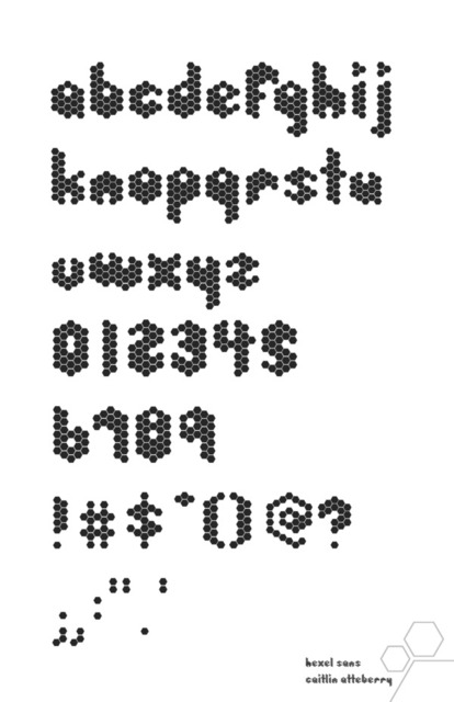
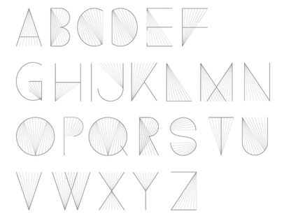
Raleigh, NC-based designer of Hexel Sans (2011), which was inspired by the hexagonal patterns seen in beehives. [Google] [More] ⦿ | |
Callout
| Callout is the Greensboro, NC-based foundry of Kyle Lambert. Designer of Pipe Dream (2011, a typeface inspired by video games from the 1990s), Hookshot (2011), Reacher Sans (2011, a monoline stencilish warm sans). [Google] [MyFonts] [More] ⦿ |
Graphic designer in Charlotte, NC, who during her internship with Arzberger Stationers, created some caps typefaces in 2011; Flora (floriated), Suzy (oriental simulation), Caroline (calligraphic), Sassie (Victorian), and a blackletter face. [Google] [More] ⦿ | |
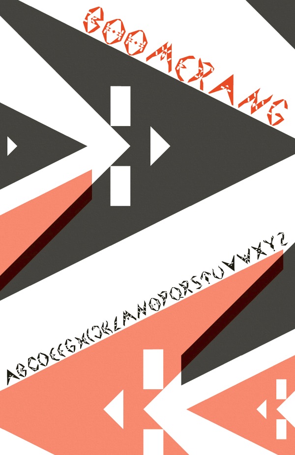
During her studies in Charlotte, NC, Chelsea Brown designed the display typeface Boomerang (2013). [Google] [More] ⦿ | |
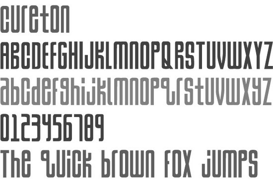
Print and graphic designer in Charlotte, NC. Creator of Cureton (2010), a display typeface in which all letters have the same height and are above the baseline. In 2017, he designed the vintage typeface Ironworth and the modular all caps typeface Bronzet. Home page. [Google] [More] ⦿ | |
Concord, NC-based creator of a steampunk caps typeface in 2012. [Google] [More] ⦿ | |
Greensboro, NC-based designer of the custom typeface Star Trail (2017). [Google] [More] ⦿ | |
Charlotte, NC-based designer of the custom skateboard font Grind (2014). Behance link. [Google] [More] ⦿ | |
Connie Myers
| |
Raleigh, NC-based designer of Ephemeral (2012), a modular typeface. Behance link. [Google] [More] ⦿ | |
Crawler
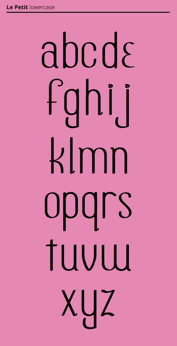
| Walker Corl (or just Crawler) is the Charlotte, NC-based designer of the Le Petit typeface in 2013. Behance link. [Google] [More] ⦿ |
Graphic designer and typographer from North Carolina, who studied graphic design at Savannah College of Art&Design. He created the geometric counterless typeface King Pong (2010). [Google] [MyFonts] [More] ⦿ | |
Wilmington, NC-based designer of the shareware font ScrewedUpTypewriter, showcased at (but not downloadable from) Fred Showker's page. [Google] [More] ⦿ | |
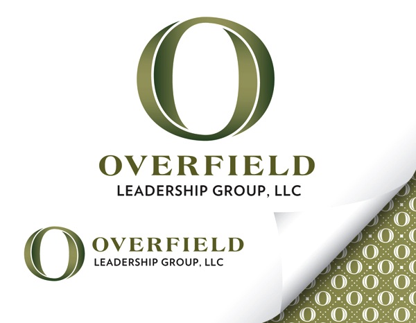
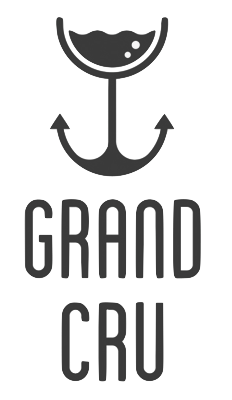
Greenboro, NC-based creator of an Escheresque logo for Overfield (2012) and of a savvy logo for a charter yacht in the British Virgin Islands called Grand Cru (2012). | |
He used FontStruct in 2008 to make the dotted typeface Pullchain, which could be used for teaching children how to write. Codesigner at American Type Founders Collection of ATF Alternate Gothic (2015, Mark van Bronkhorst, Alan Dague-Greene, David Sudweeks, Igino Marini, & Ben Kiel). ATF Alternate Gothic is a new, significant digital expansion to 40 fonts of Morris Fuller Benton's classic 1903 design. In 2019, Sudweeks designed the serif typeface family MVB Dovetail at MVB Fonts. Abstract Fonts link. [Google] [MyFonts] [More] ⦿ | |
North Carolina-based designer of the brush script typeface View (2016). Creative Market link. [Google] [More] ⦿ | |
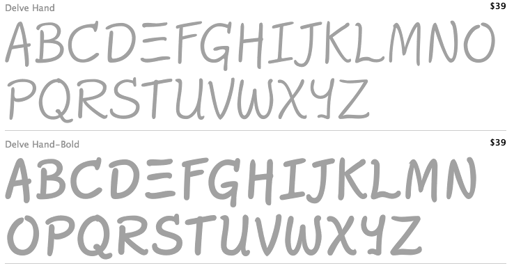
Delve Fonts (was: Delve Media Arts)
|
Adobe link. [Google] [MyFonts] [More] ⦿ |
Delve Withrington
| |
Dennis Ludlow
| |
District (was: CV Type)
|
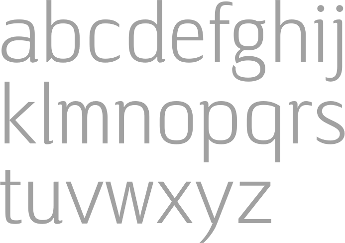
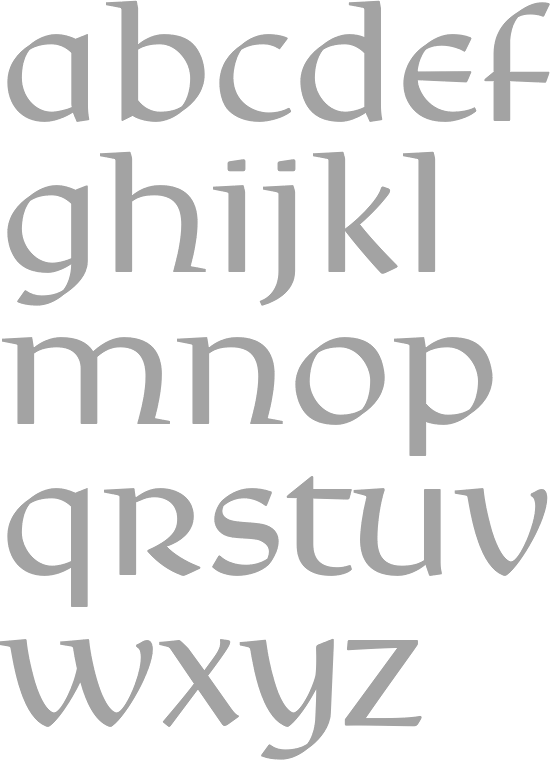
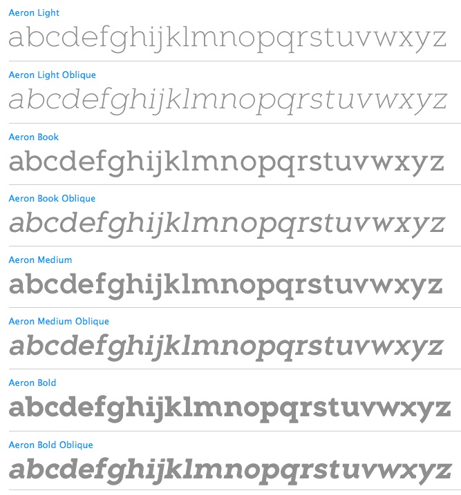
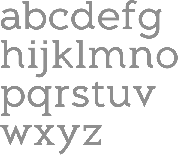
His creations from 2010 until 2012: Aeron (2010, semi-serifed family, with a crippled lower case h), Hijinx (2009, a headline face), Verlico (2009, a take on Optima), and Frusta (2010, a 5-style slab serif family), Level (2010, an elliptical sans family), Reverie (2011, a curly sans), Encoder (2011, a slabby stencil family), Blancmange (2012: a tall informal semi-brush family), Reverie OT (2012). Typefaces from 2013: Hoban (Light and Bold, a pair of high-contrast fashion mag typefaces), Fair Sans (unicase), Fair Sans Text. Typefaces from 2014: Coupler (Coupler is a sturdy text face with low contrast, airy counters, and a strong baseline for smaller sizes and extended reading), Fair Sans Text. Typefaces from 2015: Steady Sans (a sans with curvy dynamics), Emeritus (a lapidary typeface influenced by carved letters found on buildings and monuments in Washington, DC). View Galen Lawson's typefaces as CV Type. View Galen Lawson's typefaces as District. [Google] [MyFonts] [More] ⦿ |
Doghead Studio
|
|
DS Design
| North-Carolinian distributor of the Kidbag type collection. Kid Type Paint was designed by Jane Scarano and Jake Scott. Designer at Creative Alliance of the kid's handwriting typefaces KidType 1 and 2, as well as DingBrats (1993, dingbats). Dead FontShop link. Jake and Scott Scarano (now defunct link!) are credited at FontShop with the 1993 creative Alliance ruled kid's lettering typeface Kid Type Ruled, and the brushy 1993 typefaces Kid Type Crayon, Kid Type Marker and Kid Type Paint. Dafont link. [Google] [More] ⦿ |
Eccentrifuge
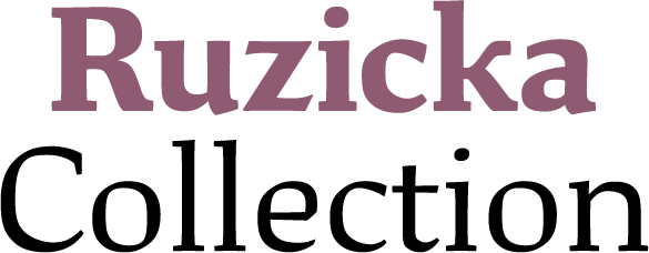
| The Eccentrifuge Blackletter Directory aims to be an exhaustive online reference for all commercially available blackletter fonts (but he only deals with commercial type). Run by John Butler of North Carolina (he was in Atlanta, GA). John Butler designed the Butler Antiqua family (2002) in the style of Ruzicka and Dwiggins. Eccentrifuge assists type designers in navigating and managing the complexity of OpenType feature programming, Euro conversion, character encoding and Unicode, Python scripting, bitmap embedding, and to a certain extent, internationalization. It also specializes in developing connected OpenType font designs at a level of fluidity previously unavailable, allowing your designs to achieve a true handwritten look. Jobs include Emigre's Mrs. Eaves OpenType, an OpenType version of Erik Van Blokland's Kosmik, and Barchowsky Fluent Hand OpenType. [Google] [More] ⦿ |
Graphic designer in Snow Camp, North Carolina, who designed the display typeface Samara in 2016. Behance link. [Google] [More] ⦿ | |
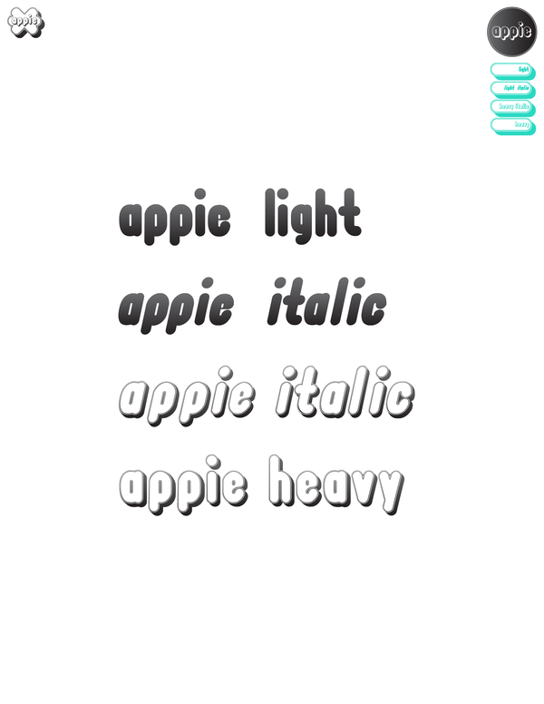
Raleigh, NC-based designer who created the round organic Appietype family in 2011. [Google] [More] ⦿ | |
Brooklyn-based creator of Monel 400 (2011), a multiline art deco poster typeface commissioned by Duke University. [Google] [More] ⦿ | |
Flash Design
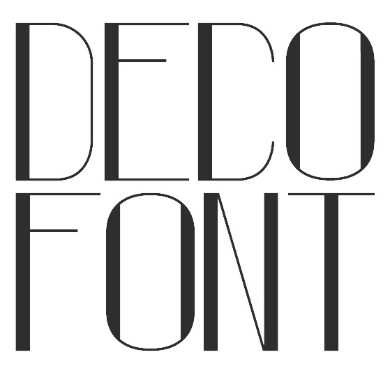
| Alberto Larizza (Flash Design, and now Era Ora Studio, Winston-Salem, North Carolina) created Deco Font (2011). In 2010, he created the poster font Era Ora. Alberto was born in Tuscany, Italy, in 1985. Behance link. Linkedin link. Home page. [Google] [More] ⦿ |
Mac and Windows commercial software for font problem diagnosis, repair, and organization. It can be used to convert between type 1, OpenType and truetype. Morrison SoftDesign is located in Charlotte, NC. [Google] [More] ⦿ | |
FontVista is a 30USD font viewing, cataloguing and printing Mac utility by Morrison SoftDesign, Charlotte, NC. Free demo. FontVista supports TrueType, MultipleMaster, Postscript Type 1, and Bitmap fonts. [Google] [More] ⦿ | |
Commercial Mac and PC software by Morrison SoftDesign (Charlotte, NC) for converting fonts between type 1, OpenType and truetype. Not cheap. [Google] [More] ⦿ | |
Commercial Mac utility by Morrison SoftDesign, located in Charlotte, NC. [Google] [More] ⦿ | |
Raleigh, NC-based designer, while at Parsons School of Design, of the experimental op-art typeface Wax (2017). [Google] [More] ⦿ | |
Galen Lawson
| |
Salisbury, NC-based designer of the free serifed typeface family Animagus (2014). [Google] [More] ⦿ | |
Apex, NC-based designer of Byron Handwriting (2019) and the marquee font Hollywood Lights (2019). [Google] [More] ⦿ | |
American experimental photographer from Clayton, NC. Designer of Lined Lines (2009, hand-printed) and Handwritten Heather (2009). [Google] [More] ⦿ | |
Heather Gibson (Calluna Design, Mooresville, NC) created the bitmap typeface Elevated (2010, FontStruct). [Google] [More] ⦿ | |
Designer in Advance, NC, who created the display typeface Light as a Heather (2014). [Google] [More] ⦿ | |
A graduate of NC State's College of Design, Heidi created a slabby monoline typeface there in 2009. Born in Columbus, OH, she lives in Raleigh, NC. Behance link. [Google] [More] ⦿ | |
Jaime Van Wart
| |
At the University of North Carolina in Wilmington, NC, Jane Molinary designed the handcrafted typeface Fruity Pebbles (2016). Behance link. [Google] [More] ⦿ | |
Jane Scarano
| |
Durham, NC-based designer of the thin sans typeface Light Rails (2018). [Google] [More] ⦿ | |
Graphic design student at University of North Carolina at Charlotte. Behance link. Creator of On The Vine (2012), a pixelish typeface. [Google] [More] ⦿ | |
Jason Tselentis
| |
Jean hails from South Carolina and studied art history at Queens College in Charlotte, NC. Designer of Dizzy (1995), Elli (1993) and Rats (1997, with the help of Jill Pichotta) at Font Bureau. These are grunge handwriting fonts, except for the great calligraphic font Elli, originally commissioned in 1989 by the Houghton Library of Harvard University, in honor of Eleanor Garvey, curator emerita of the library's Department of Printing and Graphic Arts. Rats was based on the handwriting of children's book illustrator Scott Nash: Its small body height and tall ascenders support an oldstyle spirit drawn from early second-century Roman cursive scripts. Dizzy was made for an artist's book about Dizzy Gillespie. Creative Alliance's font Hatmaker (1996) consists of two all caps typefaces, one of which was inspired by Ben Shahn's hand-constructed alphabet. FontShop link. Klingspor link. [Google] [MyFonts] [More] ⦿ | |
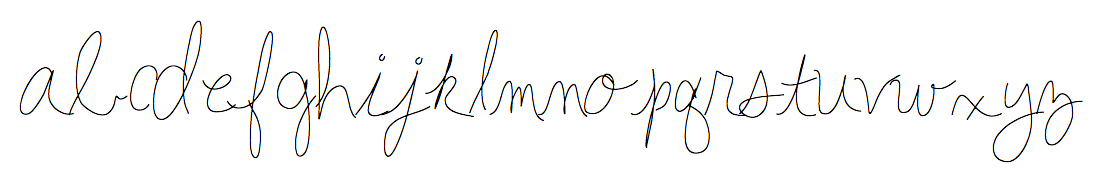
North Carolina-based creator of Folkster (2015, connected cursive typeface), Scout (2013, brush typeface) and Metrix (2013, modular and octagonal). Creative Market link. [Google] [More] ⦿ | |
Jen Jones
| |
Jen Jones Fonts
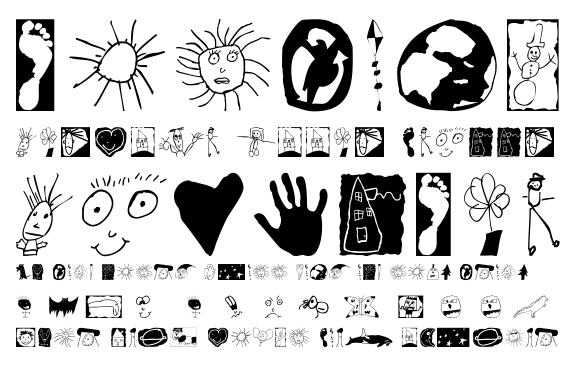
| Raleigh, NC-based designer of the free hand-ccrafted Hello Fonts bundle of 262 fonts. Many, if not all, of these fonts were designed using iFontmaker. There is also a commercial collection of fonts. The free font list: Hello Big Deal, Hello Casual, Hello Esli Script, Hello Hustle, Hello Morgan, Hello Raleigh, Hello Ramona, Hello Texas, HelloAbracadabra, HelloAcaBelieveIt, HelloAlakazam, HelloAli, HelloAloha, HelloAmazing, HelloAmazingReally, HelloAnnie, HelloAnnieWide, HelloAntsClose, HelloAntsOnFire, HelloArchitect, HelloAsparagus, HelloBabes, HelloBabyGirl, HelloBarndoor, HelloBarnyard, HelloBasic, HelloBeMyPenPal, HelloBeYou, HelloBeYou2, HelloBeYouFill, HelloBelle, HelloBestDay, HelloBigBen, HelloBigDeal, HelloBigSky, HelloBillionaire, HelloBirdie, HelloBlossom, HelloBlowPops, HelloBlueprint, HelloBoomerang, HelloBoxStitch, HelloBoxer, HelloBoxerABC, HelloBoxerWide, HelloBoyfriend, HelloBoyfriendSquisht, HelloBragTags, HelloBrownieBadge, HelloBubbleButt, HelloBubbles, HelloBubbly, HelloBuckaroo, HelloButtons, HelloCake, HelloCarmel, HelloCartoon, HelloCasual, HelloCasualSlim, HelloCeratops, HelloChaChing, HelloChalkTalk, HelloChitChat, HelloChitChatX, HelloChunky, HelloClaus, HelloCurly, HelloCurlyQ, HelloCutie, HelloDNangelo, HelloDaisy, HelloDataHead, HelloDeanna, HelloDigitheads, HelloDippyPippi, HelloDoodlePrint, HelloDoodlePrintToo, HelloDoodleType, HelloDoodles, HelloDotBot, HelloDotStick, HelloDotty, HelloEllie, HelloEllieBold, HelloEngineer, HelloEsliScript, HelloEsther, HelloEtchASketch, HelloFabulous, HelloFairytale, HelloFickle, HelloFickleJuice, HelloFineMotor, HelloFireworks, HelloFirstie, HelloFirstieBig, HelloFirstieBigGulp, HelloFirstieSquisht, HelloFirstieThin, HelloFontStew, HelloFrozen, HelloFun, HelloFunkyFresh, HelloGeorgeI, HelloGeorgeII, HelloGeorgeIII, HelloGeorgeIV, HelloGirlie, HelloGreekGoddess, HelloHandMeDown, HelloHappy, HelloHappyDays, HelloHarley, HelloHaywire, HelloHelicopter, HelloHeyGirl, HelloHoneybun, HelloHoneycrisp, HelloHotDiggity, HelloHotMess, HelloHotStuff, HelloHotcakes, HelloHottie, HelloIHeartYou, HelloIWillNotChewGum, HelloImagination, HelloIsh, HelloIshBig, HelloIshThin, HelloJannie, HelloJocelyn, HelloJourney, HelloJrHigh, HelloJumpingJacks, HelloJunieB, HelloJustSayin, HelloKami, HelloKandinsky, HelloKayMay, HelloKayMaySquisht, HelloKelly, HelloKennedy, HelloKeyLimelight, HelloKidMarker, HelloKindergarten, HelloKookie, HelloLetItGo, HelloLightbox, HelloLikeABoss, HelloLiza, HelloLori, HelloLoruna, HelloLovebug, HelloLucy, HelloMacaroni, HelloMaddox, HelloMaddoxThick, HelloMakerspace, HelloMalibu, HelloMango, HelloMath, HelloMeatballs, HelloMilkMoney, HelloMillionaire, HelloMissThang, HelloMister, HelloMovesLikeJaggar, HelloMrsSketch, HelloMummy, HelloNatellie, HelloNeatFreak, HelloNerdAlert, HelloNoTeardrops, HelloNorthwestye, HelloOlive, HelloOliver, HelloPalazzo, HelloParis, HelloPhonicDoodles, HelloPicasso, HelloPinata, HelloPippi, HelloPirate, HelloPlainJane, HelloPlayground, HelloPoolNoodle, HelloPopcorn, HelloPoppinTags, HelloPractice, HelloProzac, HelloPumpkin, HelloQueenie, HelloRaleigh, HelloRaspberry, HelloRecess, HelloRockyRoad, HelloRoundHole, HelloRuhdonkulous, HelloSansaNorth, HelloSansaSouth, HelloSanta, HelloSantaBarbara, HelloSassy, HelloScarecrow, HelloScrapbook, HelloScratch, HelloScript, HelloShabbyBlob, HelloShelby, HelloSimple, HelloSip, HelloSixBoys, HelloSketchie, HelloSkinny, HelloSkinnyMinnie, HelloSkippy, HelloSmartie, HelloSmores, HelloSnowball, HelloSperry, HelloSpot, HelloSquarePeg, HelloSquiggles, HelloSquirrel, HelloStacy, HelloStarbucks, HelloSticky, HelloStitches, HelloSugar, HelloSuhKurity, HelloSunshine, HelloSuperhero, HelloSweetCheeks, HelloSweetCheeks_0, HelloSweetiePie, HelloSweetiePie_0, HelloSwimmy, HelloSydney, HelloTGIF, HelloTeacher, HelloTeacher2, HelloTexas, HelloTheHue, HelloTiffany, HelloTimber, HelloTiptoes, HelloTracer, HelloTracerSolid, HelloTreat, HelloTrick, HelloTupelo, HelloTypeHype, HelloTypewriter, HelloTypewriterSquisht, HelloTypewriterThin, HelloWhackAMole, HelloWhimsy, HelloWhoaNelly, HelloWobblie, HelloWoohoo, HelloWordsmith, HelloYolo, HelloZaxby, HelloZipper, HelloZombie, HelloiFont. iFontmaker link. At iFontMaker, there are hndreds of additional fonts, including Hello Adelaide, Hello Hustle, for example. [Google] [More] ⦿ |
Typefaces from 2017: Hello I Heart, Hello Ish. Typefaces from 2018: HelloCarmel, HelloMilkMoney, HelloSuhKurity, /HelloTypeHype. Dafont link. Home page. iFontMaker link. [Google] [More] ⦿ | |
His typefaces:
Interview. Behance link. Interview by Lovers Magazine. [Google] [MyFonts] [More] ⦿ | |
Jesse Snyder
| |
| |
John Bomparte
| |
John Butler
| |
John Lynch (Troutman, NC) designed an untitled bitmap typeface in 2014. [Google] [More] ⦿ | |
This bookseller from Greensboro, NC, specializes in calligraphy. "We supply calligraphers, lettering artists, illuminators, bookbinders and papercraft enthusiasts with books, tools and supplies including fine papers. Our selection of calligraphy books and supplies is unequaled in the world." [Google] [More] ⦿ | |
In 2011, John Stevens and Ryuichi Tateno combined forces to publish the four-font calligraphic brush series Stevens Titling at Linotype. It comprises Stevens Titling Boar Brush, Wolf Brush, Sable Brush and Badger Brush styles, all based on the Trajan style. Cargo collective link. Behance link. [Google] [MyFonts] [More] ⦿ | |
Jon Jennings
| |
During his graphic design studies at North Carolina State, Jonathan Boffa (Raleigh, NC) created the sharp-edged compressed typeface Georotica (2014). [Google] [More] ⦿ | |
Graphic artist in Carrboro, NC. For a school project, he designed Circuit Type (2015). [Google] [More] ⦿ | |
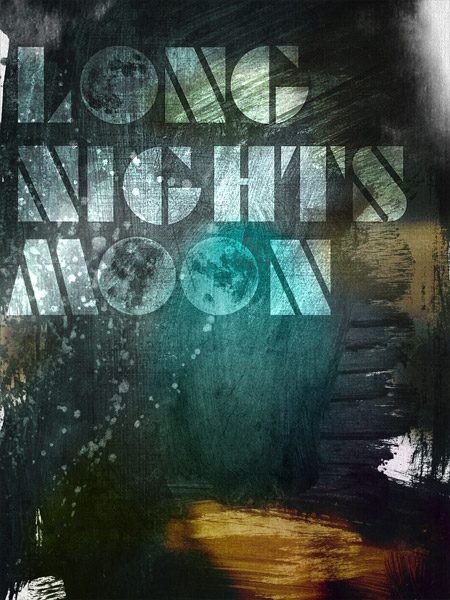
Art director who was in North Hollywood, CA, and is now based in Charlotte, NC. Developer of custom typefaces for the 2009 film Long Nights Moon. Promotional poster. In 2016, he designed the delightfully irregular Uptown Sans. Home page. Creative Market link. Behance link. [Google] [More] ⦿ | |
| |
Cullowhee, NC-based designer of the modular typeface just called Personal Font (2015). [Google] [More] ⦿ | |
Charlotte, NC-based designer of the display typeface Empire (2017). Behance link. [Google] [More] ⦿ | |
Graphic designer in Rock Hill, SC. In 2017, she designed the Sailo Jerry-inspired tattoo typeface Collins. [Google] [More] ⦿ | |
| |
Graphic designer in Raleigh, NC, who created Cloud Nine (2011), a balloon font. [Google] [More] ⦿ | |
Salisbury, NC-based designer of a great hand-drawn but untitled art deco typeface in 2014. Behance link. [Google] [More] ⦿ | |
Charlotte, NC-based designer of the brutalist semi-blackletter typeface Gurl Code (2017). Behance link. [Google] [More] ⦿ | |
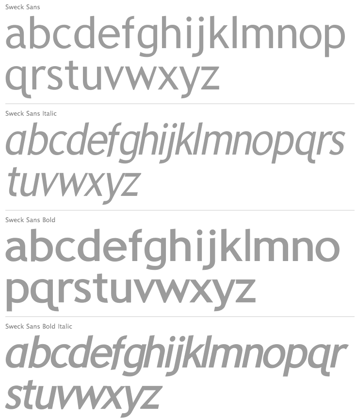
Kent Swecker
| |
Ketchup n Mustard
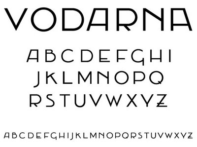
| Art director in Los Angeles, who studied at NC State University (class of 2008). Jaime Van Wart was a full-time product and visual designer for IBM's Lotus software group, and designed original typefaces and custom lettering. She created the Victorian typefaces Restoration and Vodarna in 2009. In 2018, she designed the display sans typeface Gipsy, the modulated sans Pacific, the blackletter typeface Eastwatch, and the geometric sans typeface Admiral. [Google] [More] ⦿ |
Asheboro, NC-based designer (b. 1989) who created the handwriting font For Shem:D (2005). Home page. [Google] [More] ⦿ | |
Boone, NC-based Kimi Kaste created the hipster avant-garde typeface Just My Type in 2015, taking inspiration from ITC Willow. [Google] [More] ⦿ | |
Fuquay-Varina, NC-based graphic designer. Creator of the circular typeface Satellite (2014). [Google] [More] ⦿ | |
Kris Bazen
| |
Wake Forest, NC-based designer of the hipster typeface Min Mal (2015). [Google] [More] ⦿ | |
Kyle Lambert
| |
At Elon University in Elon, NC, Lauren Brame designed the minimalist all caps typeface Ster (2016). [Google] [More] ⦿ | |
As a student at Appalachian State University, Boone, NC-based Lauren Crowe designed the multilined typeface Carraway (2016). [Google] [More] ⦿ | |
Boone, NC-based designer who created a handcrafted condensed typeface during her studies in 2014. [Google] [More] ⦿ | |
During her studies at Appalachian State University in Boone, NC, lauryn Jackson created the circle-based typeface Circular (2015). [Google] [More] ⦿ | |
Greensboro, NC-based designer of the all caps typeface Kinetic (2014). [Google] [More] ⦿ | |
| |
Lunchbox Design
| Adam Roe (Lunchbox Design, Charlotte, NC) is the American designer of Percolator (T-26), Adolescence (Monotype), Blind Date (T-26), Epicure (T-26), Intention (T-26), Girlfriend (T-26), BMetaphorA, Epicure, Dumpster (stencil), Epitaph, Intention, Lunchbox, Metaphor, Technique, Ashtray, Boogieman (1999), Gas Station, Malaise, Airmail, Alexander, Angobie, Article10, Category, Charisma, EightTrack, MulletHead, NotQuite, NowWhat, Outahere, PillowTalk, PromDate, Replicant, Sabotage, Sandbox, Secretary, Soapbox, Solace, Substance, Surrogate, Technique, Undertow. FontShop link. Klingspor link. View Adam Roe's typefaces. [Google] [MyFonts] [More] ⦿ |
He once said Each letter should have a flirtation with the one next to it. The story told by his son Clyde (Chromatype, Charlotte, NC) in 2010: It was a quote developed during the time of using the typositor for phototypesetting headlines. Herb Lubalin, Aaron Burns and ITC were clients of ours who often required the careful and considered placement of one letter next to the other. We had to take into account the positive and negative space between letters. This was being done in a red light safe darkroom, exposing each letter one at a time and watching it develop under a "glass" which held liquid photo developer. Being a flirtatious man, my father came up with that quote during that period which was around 1985-1986. A couple of years later he became a consultant for a few companies including Adobe in their earliest years. That quote can be found in one of Adobe's first specimen books "Adobe Type Guide, Volume 1". [Google] [More] ⦿ | |
Mad Irishman
|
The fonts were originally available from Agfa/Monotype. [Google] [MyFonts] [More] ⦿ |
Marianfonts (or: MarianFudge Design, or MFD)
| Marianfudge Design 99. Free fonts by 1-year old Tommy Cary (Hight Point, NC). The fonts: 15teen, Apocalypse, ArmyofGawd, Astra, Averen, AvoidLongLines1, BackupGeneration1, BayouCowboy, BeirutSugar3, BigLog, Binary, Bodenhand (neat handwriting), Brian Cary, CaptainLethargic, CheapPizza, Chi, ConNinguna, ConspiracyMeadows, CorneliusMaurits, DarkEmpire, Discussion, DjCourageous, Eli50b1, Fargas, FatCyan, Fayettenam, FifteenStories, Grasko, Gunther, Heliosphere, HugYourIntern1, Hydrophonic, IamMonomer, IamMonotonous1, Idiot, InnieOuttie, Invalid, JanglyBounce, LosDelQueso, Marianfudge, Mondo, Morelife, Mr. Doodely Doo, NyakSquared1, OrphanageRiot1, Oscilloscope4, Primagrosa, Rascal, Relieftechnik1, RoboticMonkey1, Routine, Royal, SalinasMotionClerk1, SkippyGreeny, Stereophonic1, TapeLoop, TawattypeBloch, TawattypeII1, TelemarketingSuperstar, TelemarketingSuperstarItalic, TexasLED, TheWorldsFieryDemise, ThebGL, TributetoNova, Victor, Warren1, Backadelica, MethaneDwarf, StereoSaturn. Direct access. |
| |
Waxhaw, NC-based graphic designer who created the beveled typeface Love in 2016. Behance link. [Google] [More] ⦿ | |
North Carolina-based designer (b. 1970) of the photo dingbat typeface Beatbox (2007) and the scanbat typeface Instant Graffitication (2010). Fontsy link. [Google] [More] ⦿ | |
Charlotte, NC-based designer of the pixel font Cyberpunk (2015). Behance link. [Google] [More] ⦿ | |
Boone, NC-based designer of the dot matrix typeface Redox (2015) and the experimental typeface Morph (2014). [Google] [More] ⦿ | |
During his studies, Matt Frizzell (Boone, NC) designed the wide octagonal poster typeface Stout (2016, FontStruct). [Google] [More] ⦿ | |
Matt Perkins
| |
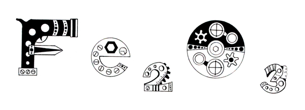
Matt Stevens (Charlotte, NC) created a great series of mechanically deconstructed caps called The Exploded Alphabet (2013). In a similar style, he designed illustrations for an article on European Supercars for Wired UK, also in 2013 Behance link. [Google] [More] ⦿ | |
Another URL. Behance link. [Google] [More] ⦿ | |
Maurice Meilleur is a recovering political theorist turned graphic designer and design researcher and writer (in his own words). He completed a PhD in political theory from Indiana University Bloomington in 2004, and earned an MFA in graphic design from the University of Illinois at Urbana-Champaign in 2015. He is an assistant professor of graphic design at Iowa State University in Ames, Iowa, where he teaches and studies typography and design semiotics and methods. Earlier, he was assistant professor of graphic design in the Department of Art at Appalachian State University in Boone, North Carolina. Maurice is writing a book on the principles and history of modular scripts. His experimental modular typeface Kast was a jury finalist in the Society of Typographic Aficionados' 2016 ProtoType competition. He has developed Kast into paper, photographic, print, and digital artifacts, and begun to explore digital animation using Python and Drawbot as part of a larger investigation into typographic representation and parametric/algorithmic/generative formal systems. At ATypI 2018 in Antwerp, he spoke on modular scripts and generative design. [Google] [More] ⦿ | |
During her studies at Appalachian State University, Meg Becker (Boone, NC) designed the very original multiline typeface Paradox (2014). [Google] [More] ⦿ | |
Raleigh, NC-based designer oof the mini-slabbed typeface Vue (2016). [Google] [More] ⦿ | |
Michael Hassler (b. 1972, Denton, NC) designed the free spurred biker style typeface Hassified (2017), Comic Ink (2017), Architects Draft (2017) and Architects Pen (2017). Dafont link. [Google] [More] ⦿ | |
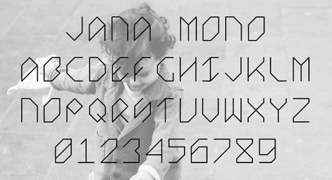
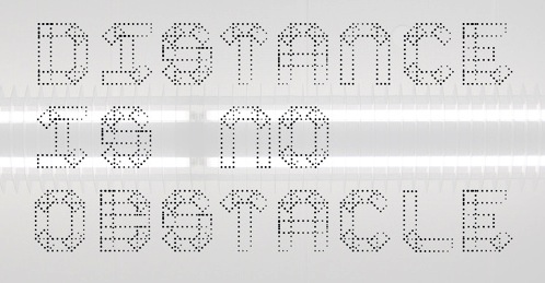
Durham, NC-based art director who created the thin octagonal monospaced typefaced Jana Mono (2013), the dot matrix typeface Spec (2013), and the pixelish typeface Textuell (2013). Behance link. [Google] [More] ⦿ | |
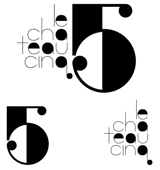
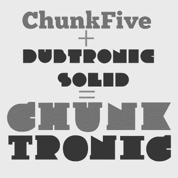
Raleigh, NC-based designer. He did the logotype and identity for Le Chateau Cinq (2013), a high end French cuisine and jazz fusion restaurant. A merge of Chunk Five and Dubtronic Solid yielded the Chunktronic typeface (2012). His foundry is called the Frankenstein Type Foundry. [Google] [More] ⦿ | |
Monotype on The History and Future of Variable Fonts
| An article written in 2017 by Jason Tselentis, a designer, writer, and educator based in North Carolina. As Associate Professor at Winthrop University, he teaches visual communication design, brand strategy and development, web design, and typography. [Google] [More] ⦿ |
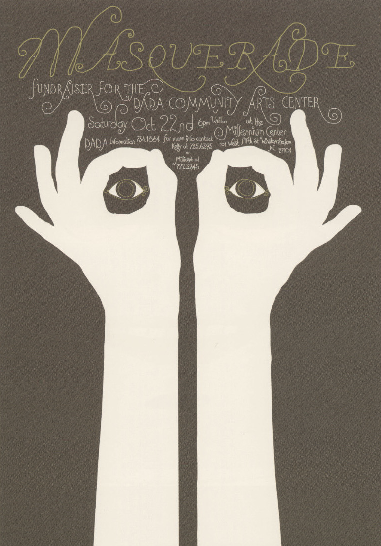
Winner at TDC 27 in 2006 in the poster category with a great piece called Masquerade. [Google] [More] ⦿ | |
Barcode software company located in Raleigh, NC. Two free "3 of 9" barcode fonts by Bear Rock Technologies: C39HrP24DmTt, C39P24DmTt. [Google] [More] ⦿ | |
Graphic designer in Cherry Hill, NC, who created the sans headline typeface Arch Grotesk (2012). [Google] [More] ⦿ | |
Nevin Mizelle (Kitty Hawk, NC) studied at the Savannah College of Art and Design in Hong Kong in 2014, where she created the modular typeface Sympl (2014). [Google] [More] ⦿ | |
Bad link. Graduate of North Carolina State University, who created the free display typeface Muziek in 2011. Klingspor link. [Google] [More] ⦿ | |
Freelance graphic designer in Charlotte, NC, who created the pixel typeface Pixel It in 2016. [Google] [More] ⦿ | |
Hickory, NC-based designer of an untitled modular typeface in 2014. Behance link. [Google] [More] ⦿ | |
Patrick Michael Murphy
| |
Greensboro, NC-based designer of the dripping paint font Drekstain (2016). [Google] [More] ⦿ | |
Phoenician Alphabet
| At NC-based Salim George Khalaf's page on ancient Phoenicia, find free truetype fonts (Mac, PC): Nakht Hieroglyphics, Eshmoon (1996; Phoenician runes by Salim himself) and Ugaritic1 (by David Myriad Rosenbaum, El Sobrante, CA). Alternate URL. It has a great tree of language genealogies, placing Phoenician around 1600BC, with as child languages Proto-Arabic (1500BC), Old Hebrew (900BC), Archaic Greek (1000BC), Etruscan/Latin (900BC) and Aramaic (800BC). Alternate URL. [Google] [More] ⦿ |
Pixel Zombies
| Huntsville, AL-based designer who studied at The Art Institute of Raleigh-Durham. Creator of the stencil typefaces Brigade (2016) and Raleigh (2016), and the modular typeface Poggers (2019). Creative Market link. Dribble link. Home page. [Google] [More] ⦿ |
Waxham, NC-based vendor of barcode fonts and software. These cover Code 128, Code 3 of 9 (Code 39), EAN, UPC, Postnet, Interleaved 2 of 5, PDF417, ASP Barcodes, PDF417, OCR-A, OCR-B, MICR, and Data Matrix barcodes, and cost between 75 and 129 dollars per barcode style. [Google] [More] ⦿ | |
Rah Dick
| German designer of the spiky grungy black metal band typeface Unreal Tournament. This typeface was used for the titling of one of the computer games by Epic Games in Raleigh, NC. Old link. [Google] [More] ⦿ |
RAH Creative used to be ROBYNA.COM, and before that, Robyn's Fonts. The owner is Robyn Harton (b. 1964, North Carolina). She has a Bachelor of Fine Arts from Virginia Commonwealth University. Based in Richmond, VA, Robyn Harton's commercial dingbat creations and borders include RA Lotus (for Mandalas), RA Holiday (Xmas font), RA Lotus2, RA Seichim Hand, RA Seichim Regular, RA Protection, RA Mandalas, RA Eye Frames (free sampler font), RA Hand, RA Crystals, RA Ganesh, RA Egypt Web Sites, RA Eye Menus, RA Geo Borders, RA Geo Menus, RA Geo Buttons, RA Sea Life, RA Reiki-Seichim Plus Hand, Butterflips (great butterflies!!), Capsulated, EShopper, LuvNKisses, Paisley, Quilter's Delight, RunningNcircles, Seperates, SunNMoon, ToAndFrom, Bauble (I through IV), Interfacer, Kitchen Tile, Scrollworks, Whirlygigs, RA AllSmiles, RA Aten, RA Cats, RA Happy Things, RA Unknown Symbols, RA WebFrExtras, RA Fatima, RA India Borders, RA Masks, Flakey, Geared Up, Petey Rone, RA Web Frames, Amenti RA (2001). The fonts can also be purchased at MyFonts.com. Catalog of some typefaces. [Google] [MyFonts] [More] ⦿ | |
Cullowhee, NC-bsed designer of the jumpy letter font Grungy (2015). [Google] [More] ⦿ | |
Reelhouse
| Adam Roe, the founder of Lunchbox Design, now runs Reelhouse, where he sells his 65 fonts for 600USD. FontShop link. Klingspor link. [Google] [MyFonts] [More] ⦿ |
| |
Charlotte, NC-based vector artist, b. 1981. Home page. Designer of Rickman Script (2002), a child script face. [Google] [More] ⦿ | |
Mebane, NC-based designer of the playful modular experimental typeface Birdie (2016). Home page. [Google] [More] ⦿ | |
Robert Ethel
| |
Using iFontMaker, Robin Parrish (North Carolina) created Robin's Hand (2011, fat finger face). [Google] [More] ⦿ | |
| |
Russ Rowlett (University of North Carolina) made the Pointers font (arrows). Urban Fonts carries his upright script New Venice (2007). Dafont link. [Google] [More] ⦿ | |
Raleigh, NC-based designer of Cornered Typeface (2014). Behance link. [Google] [More] ⦿ | |
Salim George Khalaf
| |
| |
| |
Student at Meredith College in 2015 who lives in Raleigh, NC. She created the oriental simulation typeface Chopstick (2015). [Google] [More] ⦿ | |
Winston-Salem, NC-based designer of Moonshot (2016, handcrafted) and Sundae Funday (2016, handcrafted). [Google] [More] ⦿ | |
Sean Grady
| |
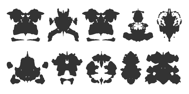
Designer in North Carolina. Home page. Using Rorschach inkblot tests, he created the non-alphabetic experimental font Tool Malfunction (2010). [Google] [More] ⦿ | |
Sharkshock
|
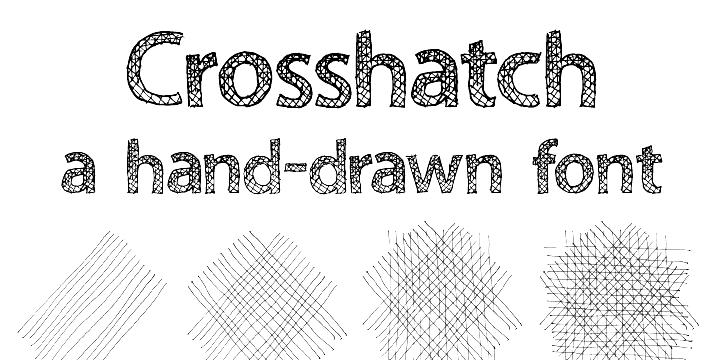
His early typefaces include Hot Pizza (2001), Hawaiian Punk, Royal Acidbath, Little Caesar, Subway, Holiday India, Mobsters, Dallas Cowboys (Western look, 2004), Dark Crystal, Queen of Camelot (2015), Green Eggs and Spam (2015), Ludlow Strong Ale (2015, German beer label font), Space Angel (2014), Electrox, Cowboys, Dolphins, Viking Stencil, Lexust (2002), Padaloma (2002), Fujita Ray (2002), Willy Wonka, Hursheys, Grinched (a Halloween or beatnik font), Honda, Busch Gardenz, Holiday India (2000), Simpsons, Blockbusted, IHOP, Chicken Fool A, Playtoy (2000: like the masthead of Playboy), Cowboys (2001), Dreamscar (2001, has a Cyrillic version), Mr. Goodbaur, Dr. Peppers, Oreos, Air Millhouse, Fruitopia, Raiders, TGI Friday, Jolly-Raunchy, Mouser, Pirate-Keg, Fujita Ray (2015), Modeccio (2015, art deco), Wendyville (2015, Western), Vonique 64 (2015, avant-garde style), Your Royal Majesty (2015, a unique blackletter-inspired vampire script), Hackney Block (2015), Thunder Lord (2015, an outlined variant of Raiderfont), Republica Minor (2015), News of the World (2015: a news headline font), TH3 Machine (2015), Funkrocker (2015, inky, grungy), Tiki Tropic (2015: a tiki font), TypoGraphica (2015, a strong geometric sans), Vonique 92 (2015, circle-based fashion sans), Reisenberg (2015, a black titling sans; v2.0 dates from 2018). There is also a medium-sized categorized archive, with subsections such as cartoon fonts and movie fonts. Typefaces from 2016: Twiddlestix, Konigsberg (rounded sans), Wicked Mouse (looney tunes typeface), Heathergreen (a tall condensed sans), Wonderbar (psychedelic), College Block (athletic lettering), Death Star, Ring of Kerry (uncial style), Blockletter (octagonal), Café Françoise, Cronus (round monoline sans), Suissnord (a wide sans display typeface), Grinched 2.0 (an update of Grinched), Red Seven (futuristic), Enchanted Land (derived from the blackletter genre), Freakshow (ornamental ransom note font), Deutschlander (a condensed sans for movie credits and similar applications). Typefaces from 2017: Lemonade Stand, Dark & Black, Hennigar (a heavy compact sans in the spirit of Impact), Durango Western, Banbury (a heavy display didone), United Kingdom (techno), Goldoni, Kingsmen. Typefaces from 2018: Bloomsburg (a 6-style organic sans; +Cyrillic), Stupid Meeting (an all caps display typeface), Medusa Gothic, Carson (tall grotesque), Collegeblock 2 (an octagonal varsity font), Medusa Gothic, Royal Crescent (sans), Praetoria, Papaya Sunrise, Helmswald Post (blackletter). Typefaces from 2019: Deutschlander 2.0 (an organic monoline sans, with coverage of Cyrillic and Greek), Zanzabar (a genie lamp or Arabic emulation typeface), Vonique 43 (an organic fashion mag sans), Delacorso Outlines (tall decorative caps), Kwixter Sketch (for Latin and Cyrillic). Typefaces from 2020: Stupid Meeting (an all caps sans with a comic book feel, appropriately named to describe most COVID era Zoom work sessions), Toyster (a plumpish typeface), Wonderbar 2 (psychedelic, all caps), Boldstrom (a tightly spaced heavy industrial sans), Reisenberg, Snicker Snack, Crosshatcher (a sketched font), Czesko (a skyline font), Storybook Ending (a mix of uncial and Tuscan), Toyster (a bubblegum font). Typefaces from 2021: Kamryn (a display serif), Mouser (an organic geometric sans in six styles), Dottingham (a Victorian typeface), Tempestua (a sharp bold display sans), Lemonade Stand, Brontoburger (a vernacular typeface). Typefaces from 2022: Jumbalo (a bubblegum font). Abstract Fonts link. Creative Fabrica link. [Google] [MyFonts] [More] ⦿ |
During her graphic design studies, Sharon Hartsell Boone, NC) created a lava lamp typeface (2014) that was inspired by Nick Shinn's Fontesque. [Google] [More] ⦿ | |
Spectrum Designs (was: Connie Starsongs)
| Web page design and scanning services. Free Truetype (PC, Mac) fonts designed by Connie Myers from Charlotte, NC such as the nice handwriting font Connie's Print. [Google] [More] ⦿ |
| |
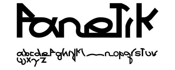
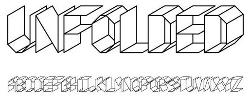
Graphic designer in Blowing Rock, North Carolina. He created the experimental typefaces Fanetik (2011) and Unfolded (2011, 3d, origami style). Old URL. Behance link. [Google] [More] ⦿ | |
Sportsfonts
| Sportsfonts was founded in 2014 or 2015 by Kristopher Bazen (b. Canton, OH) who studied at the Art Institute of Pittsburgh. He worked in the world of sports marketing, lived in Columbus, OH, and is now in Charlotte, NC. He writes that Sportsfonts was built with the sports designer in mind. We are a rare breed that is enamored with the aesthetic of athletics, so it was only appropriate to create a site focused on such a crucial element of sport: typography. From jerseys to end zones, it is impossible to downplay the effect of type in our industry/passion of choice, so instead, we choose to embrace it wholeheartedly. Please join me in creating the one and only mecca of all sports font foundries! Typefaces: Forge, Robison, Playoff, Nameplate, Champions, Recon, Edge, Junction, Special Forces / Ops, Capone, Rush, Union, Full Speed Ahead, Armor, Sports Machine, Flint, Okie, Razor, Roundtree. Creative Market link. [Google] [More] ⦿ |
At Appalachian State University in Boone, NC, Sydney Carey and Melanie sasser co-designed the squarish typeface Juicebox (2015). [Google] [More] ⦿ | |
Asheville, NC-based designer of the pixel-based typeface Little Monsturz (2015). [Google] [More] ⦿ | |
During his MFA graphic design graduate studies at University of Illinois at Urbana-Champaign, Taekyeom Lee created the Hangul simulation typeface Hangul (2010), the modular typeface Wire (2012), the pure op-art typeface Dizzy (2011), and the 3d Latin typeface Land (2013). His latest research explores unconventional methods of creating three-dimensional type with materials and techniques unique to type design, such as ceramics and 3D printing. He is currently an Assistant Professor of Graphic Design at Iowa State University in Ames, Iowa. Before that, he was an Assistant professor of Graphic Design at Appalachian State University in Boone, NC. Home page. Speaker at ATypI 2018 in Antwerp. [Google] [More] ⦿ | |
Thomas Radeke
| |
Charlotte, NC-based designer of the decorative caps typeface Wonder Woman (2015). [Google] [More] ⦿ | |
Cullowhee, NC-based designer of the tetris / tangram typeface Play (2015). [Google] [More] ⦿ | |
Titivillus Foundry
|
|
Tommy Cary
| |
Travis Howell
| |
Tricia Treacy has been running her own letterpress design studio, Pointed Press, creating custom book and print work for commercial clients, international artists, designers and writers since 2000. Using a combination of digital and analog methods, she collaborates on conceptual projects with a range of artists and designers. She has taught graphic design, letterpress and book arts at the University of Pennsylvania, the University of Delaware and the Mason Gross School of the Arts. Tricia is currently an Assistant Professor of Design at Appalachian State University in North Carolina. Speaker at ATypI 2012 Hong Kong: Vista Sans wood type project. [Google] [More] ⦿ | |
Raleigh, NC-based designer in 2015 of the free custom typeface Seventy-Eight (2015) and the handcrafted typeface Tristanica (2015). [Google] [More] ⦿ | |
High Point, NC-based designer of the set of colored numerals FunType (2016). This typeface was done for a typography class at High Point University. [Google] [More] ⦿ | |
Pfafftown, NC-based designer of Fresca Secca (2014), an alphabet on the base of pasta. [Google] [More] ⦿ | |
Manfred Albracht's font creation program that allows type 1 to truetype conversions. DS Design, 1157 Executive Circle, Suite D., Cary, NC 27511, USA. Alternate link. You can also buy ScanFont, FontExpert, SigMaker, TypeTool, FontLab. Also, custom font design. [Google] [More] ⦿ | |
Typography in Decay (TiD)
|
Fontsy link. Fontspace link. Old URL. Dafont link. Abstract Fonts link. [Google] [More] ⦿ |
Valency Graphics
| Montreat, NC-based designer of the square-edged typeface Marvino (2019). [Google] [More] ⦿ |
Boone, NC-based Victor Moore designed a few typefaces in 2014 during his graphic design studies. [Google] [More] ⦿ | |
Graphic designer in Raleigh, NC. Creator of these typefaces in 2012: Ezra (she says: Ezra is a Modern typeface designed to break the stereotype of Moderns only being used in the fashion industry. I was heavily inspired by Bodoni's regularity with measurable and repeatable forms and sought to create a typeface that utilized the interchangeable parts concept and pushed Modern typefaces past design stigmas), Beehive. [Google] [More] ⦿ | |
Walker Corl
| |
Warehouse Design
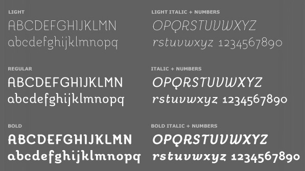
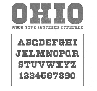
| The Warehouse is a collaborative effort between Brittany Deighton (Kent, Ohio) and Jesse Snyder, who is located in Ohio. We also find a mention of Wilmington, NC, more recently. Typefaces by them include some icon font sets, Stilts (2013, a thin headline typeface), Narwhal (2013, a clean all-caps sans typeface), Miniglyph, Parks and Rec (icons), and Snack Time (icons). Together, they designed the slabby wood type (and letterpress emulation) typeface Ohio, Medical Icons, Survival Icons, Bike Icons and Transit Icons in 2013. In 2015, they published the squarish sans typeface Carolina. Creative Market link. [Google] [More] ⦿ |
As a student in Holly Springs, NC, Will Burkart created the squarish all caps sans typeface Parallels (2016). [Google] [More] ⦿ | |
Cullowhee, NC-based designer of the dotted typeface Boom (2014). Behance link. [Google] [More] ⦿ | |
Yusuf McCoy (Raleigh, NC), a graphic designed who graduated from North Carolina State University, created the bullet hole typeface Anti Grav (2013). Behance link. [Google] [More] ⦿ | |
Zach and Beth Wilkinson
| |
Zach Wilkinson Design
| Zach Wilkinson is motion designer in North Carolina. In 2020, he released the handcrafted typefaces Secret Society and Bookshelf. [Google] [More] ⦿ |

 Foundry, est. 2011, in Raleigh, NC, by
  Charlotte, NC-based designer of Forrader (2014), a rounded vintage poster sans. [
 Amanda Weiss, who lived in Kernersville, NC, and is now based in Princeton, NJ, where she works for Princeton University Press, designed American Model Printer Typeface (2014) based upon an angled crossbar sans typeface seen in a 1880s publication called American Model Printer.
  Bomparte's Fonts is
  David Sudweeks pursued graphic design at Brigham Young University where he focused his studies on lettering and type. After completing a brief apprenticeship with type designer Mark van Bronkhorst in California, David took up the position of Type Director at FontShop San Francisco. He now works primarily from his home studio outside Raleigh, North Carolina writing and curating type as a member of
 [
[
 Doghead Studio is the personal foundry of designer Jon Jennings. Jennings created the free handwriting font Lucidity (2008).
  [
[ North Carolina-based creator of the hand-printed typeface Hello Firstie (2012). In 2015, she designed HelloEtchASketch (iFontMaker) and
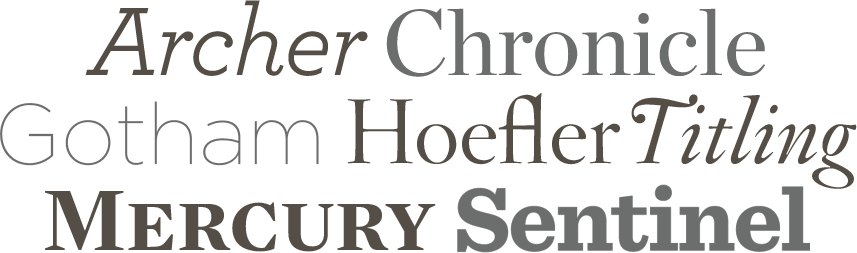
  Originally from North Carolina (b. 1979), Jesse Ragan studied type design at Rhode Island School of Design. After college, Jesse designed typefaces at Hoefler&Frere-Jones, where he had a hand in Gotham, Archer, and several other families. Since 2005, he has worked independently in Brooklyn, developing typefaces and lettering for a variety of clients. His work can be found at Font Bureau, House Industries, and Darden Studio. He also teaches typeface design at Pratt Institute and Cooper Union. He won an award at
  Graphic designer in Charlotte, NC, who created the modular techno typefaces Crackle (20154), Juise (2015) and Tokyo 15 (2015, intended for athletic use).
  [
[ Calligrapher and letterer in Winston-Salem, North Carolina, who occasionally designs
  Ex-North Carolinian designer who has a BFA in graphic design from Columbia college Chicago, and lives in Chicago.
  Graphic designer from Raleigh, NC. Recent graduate from the College of Design at NCSU. Creator of a
  [
[ Bogota, Colombia-based designer of the plumpish typeface Bambalina (2014). [
 Mad Irishman has original fonts by
  During her studies in Raleigh, NC, Marie Laurence Daigle designed the fine deco typeface Think Thin Graff (2016). [
 At North Carolina's Wake Tech Community College, Renee Clayton designed the sketched blackboard bold typeface February (2020). [
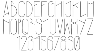 Graphic design student in Greensboro, NC. She created a
  During her studies Charlotte, NC-based Sara Sodano designed the number font Whimsical (2016). [
 Wake Forest, NC-based designer. Creator of
  Dennis Ludlow (Sharkshock Productions, Raleigh, NC) started making mostly free fonts in 1999. On August 28, 2001, Dennis announced that he would stop producing fonts, forever. To prove himself wrong, he became more prolific trhan ever, and ultimately started designing retail fonts as well.
 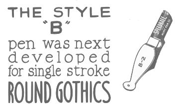 Speedball pens were invented by Hunt Corporation (or Hunt Company) which was located in Camden, NJ and later (since 1958) in Statesville, NC. The highlights of that company:
 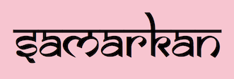 Robert Ethel (Ethel Enterprises, Murphy, NC) designed the shareware Indic simulation font Samarkan in 1993.
  Charlotte, NC-based Matt Perkins' fonts Das Reicht Gut and A Scratch are interesting display fonts. He made about 20 fonts in all, many of them at the peak of the grunge font deacde: A Scratch,
|
|
|
|