| | |
AArrgghh! Typefaces
[Jonathan Smith]
|
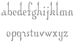
AArrgghh! Typefaces used to offer shareware fonts by Jonathan Smith (Cleveland, OH) of Rhode Island Soft Systems: New Land Contour, All-Hearts, Bunny-Lips, Confetti, El-RioLobo (1993, Mexican simulation face), Elbjorg-Script, Essential-Times, Firey, Glifik, Gyptienne (hieroglyphics), Hero-Outline, Hirosh (oriental simulation face; an exact copy of Sukiyaki, made in 1968 by Gene Eidy for Lettergraphics International), Ice-CreamSandwich, Ice-Snow, Made-InTheUSA, New-LandContour, New-LandInline, New-LandOutline, New-LandSport, Ol'54, Planetz, Porter-Lil'Kaps (gorgeous late night show display font), Religious, RockArt, Spider-WebBlock, The-Score, Wet-Paint. Fontspace link. [Google]
[More] ⦿
|
Adolph Katz
|
Designer of an unnamed ornamental typeface in 1963 that could have been based on work by Herman Ihlenburg. He owned Coro Inc in Providence, RI. [Google]
[More] ⦿
|
AJ Paglia
|
Talented graphic designer from Providence, RI, who made these free fonts: Sarabelle (2012, irregular hand), Iron Sans (2011), Wicked Grit (2011, grungy), Anchor Jack (2011, art deco display face), Beagle Brigade (2010), Providence (2010, slab face), Amperzand (2010), Ackbar (2010, a great heavy sans display face), Alley Oop (2010, mechanical style), Wicked Scary Movie (2010, comic book style), Excelsior Sans (2009, ink trap exercise), Amity Jack (2009, black headline sans), Aldo The Apache (2009, black octagonal), Arm Wrestler (2009, slightly flared display sans; for 95% based on OliJo by Manfred Klein, 2002), Wicked Woman (2009, based on or a copy of Rutaban by Jason Pagura, 2001), Mighty Mighty Friars (2009, based on or a copy of Plumber's Gothic by Harold Lohner, 2007), Vive La Revoluzione (2009, based on or a copy of Headline One HPLHS by Andrew Leman, 2002). Dafont link. Font Squirrel link. Kernest link. [Google]
[More] ⦿
|
Alan Segama
|
Providence, RI-based BFA graduate from Emmanuel College. Behance link. His first typeface is the deco font Buzz Chillington (2011). [Google]
[More] ⦿
|
Alexa Terfloth
|
During her studies under Cyrys Highsmith at Rhode Island School of Design, Alexa Terfloth (Providence, RI) created the text typeface Marigold (2015). Behance link. [Google]
[More] ⦿
|
Alexis Kraus
|
Graphic designer from Rhode Island. He created the slightly gross alphabet Nose Job (2011), but this is not a font. [Google]
[More] ⦿
|
Allie Surdovel
|
Graphic designer in Providence, RI, who created the cat alphabet Daddy Cat (2014). Behance link. [Google]
[More] ⦿
|
American Mathematical Society
[Tom Kacvinsky]
|
The AMS in Providence, RI, offered the Computer Modern and AMS fonts in type 1 and metafont formats. Free, and for mathematical symbols, the best anywhere. The contact until 2004 was Tom Kacvinsky. Tom hasn't worked at the AMS since 2004. The AMS and CM fonts are copyrighted by the AMS now and are part of the TeX Live distribution. AMS Fonts. [Google]
[More] ⦿
|
Amy Cohas
[Amy Ina Studio]
|
[More] ⦿
|
Amy Ina Studio
[Amy Cohas]
|
Graduate of the Rhode Island School of Design, who created the display sans typeface Halvah in 2017. Creative Market link. [Google]
[More] ⦿
|
Anisa Holmes
|
During her studies at the Rhode Island School of Design and Brown University in Providence, RI, Anisa Holmes designed Bobby Pin Alphabet (2013). Behance link. [Google]
[More] ⦿
|
Arley-Rose Torsone
|
 Graduate of RISD, Central Saint Martins College of Art and Design, London, and Parsons School of Design, New York. She created experimental alphabets such as Poop Font (2010). More seriously, she created Grandma's Crooked Finger (2010, a neatly hand-printed typeface with tall ascenders) and Bodoni Dust (2011, an artsy-fartsy didone). Klingspor link. [Google]
[More] ⦿
Graduate of RISD, Central Saint Martins College of Art and Design, London, and Parsons School of Design, New York. She created experimental alphabets such as Poop Font (2010). More seriously, she created Grandma's Crooked Finger (2010, a neatly hand-printed typeface with tall ascenders) and Bodoni Dust (2011, an artsy-fartsy didone). Klingspor link. [Google]
[More] ⦿
|
ASDDF
[Corinne Ang]
|
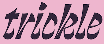 Asddf is a typographic practice founded in 2021 by Corinne Ang, a Filipino graphic and type designer based in Brooklyn, NY and Providence, RI, where she studied at the Rhode Island School of Design. In 2020, she released Mononbloc Sans and Fluoral. During a workshop at Type Cooper 2021, she developed Trickle, which she explains as follows: Trickle is a bastardisation of the italic form. The simple aim of it was to create a vivacious, lively rhythmic display typeface that utilised the calligraphic italic ductus as a jumping point. [Google]
[More] ⦿
Asddf is a typographic practice founded in 2021 by Corinne Ang, a Filipino graphic and type designer based in Brooklyn, NY and Providence, RI, where she studied at the Rhode Island School of Design. In 2020, she released Mononbloc Sans and Fluoral. During a workshop at Type Cooper 2021, she developed Trickle, which she explains as follows: Trickle is a bastardisation of the italic form. The simple aim of it was to create a vivacious, lively rhythmic display typeface that utilised the calligraphic italic ductus as a jumping point. [Google]
[More] ⦿
|
Ashley Rego
|
With a group of fellow students, Ashley Rego (Tiverton, RI) designed the letterpress emulation typeface Astraea (2016). Behance link. [Google]
[More] ⦿
|
Asta Thrastardottir
|
Asta Thrastardottir is a graduate student at RISD. Originally from Iceland, she is based in Providence. At Type Cooper 2020, she designed Eyja, a slender display serif. [Google]
[More] ⦿
|
Barron Webster
|
During his graphic design studies at RISD in Providence, RI, Barron Webster, who is originally from North Carolina, created a pair of display sans typefaces called Barcelona and Barcelonetta (2012). In 2013, he created the modern blackletter family Baum Display (dedicated site: free typeface for personal use). Behance link. [Google]
[More] ⦿
|
Blambot!
[Nate Piekos]

|
 Blambot Comics Fonts was founded in 1999 by graphic designer and illustrator, Nate Piekos, and is located in East Providence, RI. Blambot has a huge number of original free comics fonts and balloons by Nate Piekos (East Providence, RI, b. RI, 1975). Comic Lettering is an alternate URL, where you can also order logo designs, custom fonts, and custom lettering. Fontspace link. The fonts:
 - 2021: Collect Em Now BB (a comic strip font), Spinner Rack Pro BB.
- 2020: Out of Line Pro BB, Ready for More BB, Nightmark BB, Tight Spot BB, Budrick BB, Flannel Shirt BB (a sans family).
- 2019: Tire Swing BB, Ready For Anything BB.
- 2018: Invulnerable BB.
- 2017: Collect Em All BB, Spinner Rack BB.
- 2016: Friend Or Foe Tall BB, Friend Or Foe BB, Astrogator BB, Out Of Line BB.
- 2015: Susurrus BB (sans family), Inkcantation BB (slightly creep jhand-drawn serif font), Blambastic BB, Brushzerker BB.
- 2014: Hundredwatt BB, Piekos Toons BB, Beelzebnrush BB, Astounded Round BB, Astounder Squared BB, Sleuth Serif BB, Crypto Creep BB, Wretched Remains BB (brushy Halloween font), Mech Effects 1 BB, We Come in Peace BB, Manga Master BB.
- 2013: Unearthed BB (Celtic), Always Angry BB, Sequentialist BB, Might Makes Right BB, Fight To The Finish BB, Palooka BB, ManlyMen BB, Trash Cinema BB, Bulletproof BB, Ticking Timebomb BB (LED font), Potty Mouth BB (dingbats), Vengeful Gods BB (Greek simulation face), Blowhole BB (fat finger font family), Shrunken Head BB, Perihelion (+Condensed: elliptical sans).
- 2012: Dungeon Dweller BB, Mark of the Beast BB (Halloween font), Monsterific BB, Tough as nails BB, Longbow BB (a rough-edged blackletter), Gamma Rays BB, Inkslinger BB (a true comic book style family), Saucer BB (sketch font), Smells Like Tacos BB, Mutant Academy BB, Destroy Earth BB, Mandroid BB, Fundead BB, Stupid Head BB, Spellbreaker BB, Elevations BB (2012, a blueprint typeface), Revenger BB (angular family).
- 2011: Silver Bullet BB (a fat hand-drawn blackletter face), Shallow Grave BB, Imaginary Friend BB, Highjinks BB, ShallowGrave BB, Quahog BB (angular, calligraphic), Mumble Grumble BB, Action Figure BB, Piekos FX Rough BB, ChainsawzBB, Heavy Mettle, Billy The Flying Robot BB, Longbox BB.
- 2010: Ninjutsu BB, Protest Paint BB, Rock Steady BB, Ladylike BB, Protest Paint BB (grunge), Tone Deaf BB, Clown Teeth BB, Irish Stout BB (beer label face), Sans Sanity BB, Straight To Hell, Unmasked, Piekos FX BB, Hometown Hero BB, Piekos Professional; BB, Big Bad Bold BB, Crash Landing, HoneyMead BB, Secret Origins (2010).
- 2009: Dragonbones BB, MeanStreets BB, Two Fisted BB, RedStateBlueState BB, Scream Queen, Fresh Meat BB, Gone Fission BB, Black Hole, Life Form, Crimewave BB, Firepower BB, Artists Alley BB, Stronghold BB, Village Idiot, Raging Red Lotus (2009, oriental simulation), Dwarven Axe BB, Silver Age BB, Flyboy BB (2009, techno), Giant Sized Spectacular BB (2009).
- 2008: Snake Oil Salesman (old typewriter face), Earthman and Earthman Extended (a nice 12-style retro sans family), Clairvoyant BB, KrakHead BB [one of my favorites], Blambot FXPro BB, Sangre BB, Dearly Departed BB, Boogers, Bada Boom BB, Old Crone BB (2008, bewitched style).
- 2007: Fire Fight BB, After Dark BB, Post Mortem BB, Fold and Staple BB (with Brandon J. Carr), Dunce Cap BB, DeathRattle BB, Potty Mouth BB, Dominatrix BB (grunge), Shore Leave BB (based on sailor tattoos), Cloudsplitter BB, Drawing Board (inspired by Tekton), Warhorse BB, Warmonger BB.
- 2006: Duty Calls BB, Hellfire BB, AveAveBB, Indie Star, Blamblam BB, Braaains BB (dingbats), Musashi BB, Atland Sketches, Double Life BB, SkinDeep BB, SkinDeep Swashes BB, Newsflash.
- 2005: KeelhauledBBBold, KeelhauledBB, MainframeBBBold, MainframeBB, Alter Ego BB, Entrails, Mastermind BB, Zooom BB, Whitechapel BB (handwriting), Sucker Punch, Crimefighter, 10c Soviet, CyranoBB, Praetorium, Spectre Verde, Hired Goons, Afterlife BB (2005, tall ascendered face), Seven Monkey Fury (oriental simulation face), Spectre Verde, FeedbackBB.
- 2004: Atland, Creative Block, Midnightsnack BB, Bloody Murder BB, Seven Swordsmen, Webletterer, Rackum Frackum, Oh Crud, CatholicSchoolGirlsBB, Antihero, Dark Arts, Bearded Lady BB, BottleRocket, Streetcred, Lowrider, Extra pickles (2004).
- 2003: Square Jaw BB, Shinobi, Bar Brawl, Holy Mackerel (2003, Craterface BB, Zombie Guts, Knuckle Sandwich, Workingman, Fat Stack BB, Santa's Big Secret, ArrMatey, Tokyo Robot, JackLanternBB, Perils of Piekos, Turntablz, Wicked Queen (2003, free), Golden Oldie, Badaboom, OhCrap, Whoop Ass, Damn Noisy Kids, Paperboy, Armor Piercing, Radioactive Granny, Sidekick International, Digital Strip, Mighty Zeo, Arcanum, Zud Juice, Ale&Wenches, Bar Brrawl, Bar Brawl BB, Armored Science BB, Blamdude, Shinobi, Man of Science, Sidekick BB (2003).
- 2002 and earlier: AndroidNation, Blambot-Custom, Blambot-Standard, Captain-Spandex, Casket-Breath, Concetta, Dupuy-Bold, Edible-Pet-II, Edible-Pet, Edible-PetInternational, Enchilada, Evil-Genius, Flat-Earth-Scribe, Gunhead-Chick, Lovecraft's-Diary, Mouth Breather, Mighty-Tomato, MonkeyChunks, Monkeyboy, Mummy-Loves-You, Mutant-Supermodel, Nate's-Choice, PiranhaSexual, Red-Right-Hand, Roboshemp, Space-Pontiff, Squeezy-Cheez, Urinetoast, Voodoo-Doll, YellaBelly, Zartz!, TwelveTonFishstick, TwelveTonSushi, A.C.M.E.-Explosive!-Bold, A.C.M.E.-Explosive!, GrungeUpdate, Mothership, Twelve-Ton-Goldfish, Whoop-Ass, WickedQueen BB, Winter-in-Gotham, 13 O Clock, ACMEInternational, ChroniclesofaHero, ChroniclesofaHeroBold, FanboyHardcore, KidKosmic, LetterOMatic, MangaTemple, GorillaMilkshake, Caeldera, Belizarius, Bottix, ChatteryTeeth, OrangeFizz, OrangeFizzItalic, Pythia, SpiritMedium. Direct access.
- Commercial fonts: Knuckle Sandwich, Utility Belt, Tentacle Jones, Rocketboy, Seargent Six-Pack, Secret Identity, Edible Pet 3, Piekostype, LintMcCree Mysteries, Doc Seismic, Mike Allred's AAA, AAARGH, Allred's Aliens Invade, Asteroids for Lunch, Action Away, Allred's Amazing Stupendous, ArmorPiercing, Mars Police, Irezumi, Holy Macxkerel, Hudson VC, CreepingEvil, BlambotPro (great), Creeping Evil, Rooftop Run, AAA Redmeat, Eurocomic, Comic Geek, Jack Armstrong (nice), Rivenshield (useful), Howard Bros (nice), Mighty Zeo, Cajun Boogie, Betty Noir, Sand Diego '02, Wrecking Ball, Miskatonic, Roswell Wreckage, WizardSpeak, Glass Jam, BucketOBlood, Three Arrows, Damn Noisy Kids, Humbucker, Oh Crap, Caveman, Blambot Casual, 10CentComics, BettyNoir, BigBlokeBB, BlamDudeBB, BlamDudeBBItalic, CajunBoogie, DetectivesInc, Irezumi, IrezumiItalic, SpiritMedium, VanHelsing.
Over 1000 free fonts here: 10CentSoviet, 10CentSovietBold, ACMEExplosive, ACMEExplosiveBold, ACMESecretAgent, ACMESecretAgentBold, ACMESecretAgentItalic, AleandWenchesBB, AleandWenchesBBBold, AndroidNation, AndroidNationBold, AndroidNationItalic, AnimeAce, AnimeAceBold, AnimeAceItalic, Arcanum, ArcanumBold, ArcanumItalic, ArmorPiercing, ArmorPiercing20BB, ArmorPiercing20BBItalic, ArmorPiercingItalic, ArrrMateyBB, BadaBoomBB, BattleLines, BettyNoir, BigBlokeBB, BlamDudeBB, BlamDudeBBItalic, BlambotCustom, Bottix, BottleRocketBB, BottleRocketBBBold, Caeldera, CajunBoogie, CatholicSchoolGirlsBB, ChroniclesofaHero, ChroniclesofaHeroBold, CreativeBlockBB, CreativeBlockBBBold, CrimeFighterBB, CrimeFighterBBBold, DamnNoisyKids, DarkArtsBB, DetectivesInc, DigitalStrip, DigitalStripBold, DigitalStripItalic, DwarfSpiritsBB, EvilGeniusBB-Bold, EvilGeniusBB, FanboyHardcore, FanboyHardcoreBold, FanboyHardcoreItalic, FatStackBB, FeastofFleshBB, FeastofFleshBBItalic, FeedbackBB, FeedbackBBItalic, FlyboyBB, GorillaMilkshake, GorillaMilkshakeItalic, Irezumi, IrezumiItalic, JackLanternBB, KeelhauledBB, KeelhauledBBBold, KidKosmic, KidKosmicBold, KidKosmicItalic, LetterOMatic, LetterOMaticBold, LetterOMaticItalic, MainframeBB, MainframeBBBold, MangaTemple, MangaTempleBold, MangaTempleItalic, MarsPolice, MarsPoliceItalic, MightyZeo20, MightyZeo20Bold, MightyZeo20Italic, MightyZeoCaps20, MightyZeoCaps20Bold, MightyZeoCaps20Italic, Miskatonic, MouthBreatherBB, MouthBreatherBBBold, NewsflashBB, OhCrap, OhCrudBB, OrangeFizz, OrangeFizzItalic, PraetoriumBB, PsiphoonBB, Pythia, RagingRedLotusBB-Italic, RagingRedLotusBB, RoswellWreckage, SanitariumBB, SantasBigSecretBB, SergeantSixPack, SevenMonkeyFuryBB, SevenSwordsmenBB, ShockTherapyBB-Italic, ShockTherapyBB, SpectreVerdeBB, SpectreVerdeBBBold, SpiritMedium, SwingSetBB, TurntablzBB, TurntablzBBBold, TwelveTonFishstick, TwelveTonSushi, Umberto, Vampiress, VillageIdiotBB, WarmongerBB, WebLettererBB, WebLettererBBBold, WhoopAss, WickedQueenBB, WizardSpeak, WizardSpeakWorn, Yoshitoshi, YoshitoshiBold, YoshitoshiItalic, ZudJuice, ZudJuiceBold, ZudJuiceItalic. Dafont link. Klingspor link. Fontspace link. View the Blambot typeface liubrary. [Google]
[MyFonts]
[More] ⦿
|
Brett Maurer
|
A graduate from the Rhode Island School of Design in 2004, Brett Maurer now runs his own identity and design studio. He lives in Brooklyn, NY. Creator of Brutale (2007), a futuristic japo-techno type family. [Google]
[More] ⦿
|
Buttfaces Digital Type Foundry
[Tobias Tylus]
|
Buttfaces Digital Type Foundry offers some original fonts, both free and commercial, designed by Tobias Tylus. First he was located in Dallas, TX, but more recently, he moved to Providence, RI. The semi-grunge fonts all made at the zenith of the grunge movement in the 1990s and designed under the motto Don't take any crap include Buttweasel, Enema Light, Buttzilla, Skuttlebutt (grunge, 1997), Buttoni, Grumpybutt, Doopah, Buttskratch, Tookus, Buttinsky, Butt-Naked, Hindsight, Poopchute, Butthead, Buttkowski, Buttwriter, Headbutt, Buttskerville, Curliebutt, Chunkybutt, Punkass, Ciggiebutt, and Alien Butt. Since 2003, the fonts can be bought at MyFonts: Butt Bongo, Butt Scratcher, Butt Smuggler, Butt Writer, Butta Bing, Buttheads, Buttkowski, Buttmap, Buttskerville, Buttweasel, Buttzilla, Chunkybutt, Ciggiebutt, Creakybutt, Curliebutt, Dingbutts, Enema, Headbutt, Poopchute, Punk Ass, Sillybutt, Skuttlebutt, Stinkybutt. Old URL. View the typeface library. [Google]
[MyFonts]
[More] ⦿
|
Calder Hansen
|
During his studies at Brown University (Providence, RI) and at Type West, Calder Hansen designed the experimental display typeface Rinca (2019). Calder explains: The contrast axis of a typeface is a line describing how weight is distributed in the letters. Strokes parallel to the axis are thick; strokes perpendicular to it are thin. Rinca is an exploration of what happens when the contrast axis is curved rather than straight. It is based on the shapes created by a broad-nib pen that changes angle as it draws based on its position relative to the arc of the axis. This creates a texture that is strange but self-consistent. [Google]
[More] ⦿
|
Cara Buzzell
|
Cara Buzzell (Malcolm Grear Designers, Providence, RI) created the warm text typeface Blount in 2015. Behance link. [Google]
[More] ⦿
|
Carol Twombly
|
 Born in 1959 in Concord, Carol Twombly studied at the Rhode Island School of Design and under Charles Bigelow at Stanford, and joined the Bigelow&Holmes studio for four years. In 1988, she joined Adobe and started designing typefaces. She was featured in 5 American Type Designers by Spurius Press. In 1994, she won the Prix Charles Peignot. In 1999, she retired from type design.
 Linotype link. FontShop link. Typophile link. A book about Twombly by Nancy Stock-Allen (Oak Knoll Press, Newcastle, 2016): Carol Twombly: Her Brief But Brilliant Career in Type Design. Her typefaces: - FB Californian (1987-1994, with David Berlow and Jane Patterson).
- Adobe Caslon (1990). Poster by Rachel McKay.
- Chaparral (1997).
- Charlemagne (1989).
- Lithos (1989, the famous stone-cut look face).
- Mirarae (1984). This typeface with its characteristic mid-eighties oversized x-height won her the Morisawa Gold Prize.
- Myriad (1992, with Robert Slimbach), Myriad Wild, Myriad Sketch, and Myriad Tilt.
- Nueva (1994, +Extended).
- Trajan (1989, Adobe).
- Viva (1993).
- The Western typefaces Pepperwood (1994), Rosewood (1994), Ponderosa (1990) and Zebrawood, all co-designed with Kim Buker Chansler and Carl Crossgrove. Pepperwood was patterned after a 1877 wood type by Vanderburgh, Wells and Company. [Caution: Some say that she did *not* co-design these typefaces, contradicting MyFonts and other sources.]
View the typefaces made by Carol Twombly. [Google]
[MyFonts]
[More] ⦿
|
Carson Evans
|
 Carson Evans has a BA from Yale University and will have an MFA from Rhode Island School of Design in Providence, RI, in 2018. She designed the Venetian typeface Jarndyce (2016) under the supervision of Cyrus Highsmith. [Google]
[More] ⦿
Carson Evans has a BA from Yale University and will have an MFA from Rhode Island School of Design in Providence, RI, in 2018. She designed the Venetian typeface Jarndyce (2016) under the supervision of Cyrus Highsmith. [Google]
[More] ⦿
|
Cem Eskinazi
|
Cem is a Turkish graphic and type designer and educator. He holds a BS in Marketing Communications from Emerson College and an MFA in Graphic Design from RISD. He teaches at both undergraduate and graduate levels at RISD. For some time, he was affiliated with Occupant Fonts in Providence, RI. Creator of the blackletter font Dürer Blades (ca. 2021). [Google]
[More] ⦿
|
Charles Gibbons
[Oddsorts]
|
 [MyFonts]
[More] ⦿
[MyFonts]
[More] ⦿
|
Corinne Ang
[ASDDF]
|
[More] ⦿
|
Cynthia Wang
|
Chinese American creator of MoguFont (2012), a fat finger hand-printed typeface. Aka Kittenmogu, she will attend RISD starting in the Fall of 2012. Dafont link. [Google]
[More] ⦿
|
Cyrus Highsmith
[Occupant Fonts]
|
 [MyFonts]
[More] ⦿
[MyFonts]
[More] ⦿
|
Cyrus Highsmith
[Morisawa Providence Drawing Office]
|
[More] ⦿
|
Dan Carr
[Golgonooza Letter Foundry]
|
[MyFonts]
[More] ⦿
|
Dan Reynolds
[TypeOff]
|
 [MyFonts]
[More] ⦿
[MyFonts]
[More] ⦿
|
Daniel Berkeley Updike
|
Born in Providence, 1860, he died in Boston in 1941. Typographer, printer, historian and author, best known for his classic book Printing Types: their History, Forms and Use" (1922, Harvard University Press; second edition at Harvard University Press in 1951) which is based on a lecture series he gave at Harvard University from 1910 to 1916. The second edition is from 1937. In 1893 (some say 1894), he founded the Merrymount Press in Providence, Rhode Island. He designed the Montallegro typeface. In 1896, Daniel Berkeley Updike and Bertram G. Goodhue co-designed a bold text typeface. Britannica entry. Abebooks link. Volume 1 and Volume 2 of his book have been scanned in. Patent office link. [Google]
[More] ⦿
|
Dresser Johnson
[Kevin Dresser]
|
Corporate identity and print design company in New Paltz, NY, est. 2003 in New York City by Kevin Dresser and Kate Johnson. Kevin Dresser (b. 1971, Rochester, NY), its head, was a type designer at Hoefler Type Foundry from 1997 until 2000, when he started Dresser & Sons. His work there included art deco typefaces and iconography for the signage program at Radio City Music Hall, a redesign of the classic Cheltenham typeface for The New York Times Magazine, a custom typeface in Hebrew for the Rodeph Sholom Synagogue, a grunge typeface for Florent Restaurant, custom typefaces for Architectural Design Magazine, iconography for The Museum of Modern Art, lettering for TypeCon 2005, and a few retail typefaces. In 2003, he published the 15-weight sans family General at Thirstype, which is now also available for licensing from Dresser Johnson. Kate Johnson is a graphic designer who graduated from the Rhode Island School of Design. Typefaces from 2012: Terminus (dot matrix face). [Google]
[MyFonts]
[More] ⦿
|
Dyana Weissman
[Kerns&Cairns]
|
 [MyFonts]
[More] ⦿
[MyFonts]
[More] ⦿
|
E3Type
[James R. Pardee Jr.]
|
Providence, RI-based designer. Creator of Antecedent (2005), a sans family done as a project at the Surrey Institute of Art and Design. Alternate URL. [Google]
[More] ⦿
|
Eli Block
|
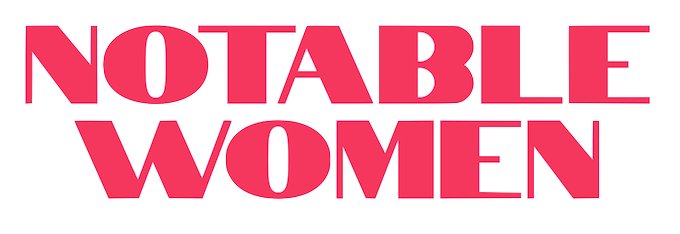 Graduate of the Brown University and Rhode Island School of Design Dual Degree Program, where he studied biology and industrial design. Eli has worked at Google Creative Lab and as a Kleiner Perkins Caufield & Byers Design Fellow. His typefaces:
 - Notable (2018, Google Fonts). Co-designed by Eli Block, Hana Tanimura and Noemie Le Coz, the art deco typeface Notable is an uppercase sans serif display font; its letterforms are based on those found on U.S. currency. Notable was designed for Notable Women, an initiative by former Treasurer of the United States Rosie Rios. Notable Women is an augmented reality experiment that lets anyone see 100 historic American women where they have historically been left out: U.S. currency.
- Gene (2018). A small, round text typeface for print and web.
- In 2019, Niki Polyocan and Eli Block co-designed the free Google web font Lacquer. Github link. Lacquer is an expressive display font featuring heavy drips and dozens of alternate glyphs. Lacquer was hand drawn using a paint pen by Niki Polyocan and was extrapolated and finished by Eli Block at Google Creative Lab.
[Google]
[More] ⦿
|
Eric Heater
|
Providence, RI-based designer of the shadow typeface Negatif (2016) and the sharp-edged modular typeface Belvedere (2016). Behance link. [Google]
[More] ⦿
|
EunJee Kim
|
EunJee Kim, also known as Joy, graduated from the Rhode Island School of Design with a BFA in graphic design, in 2012. She is actively working on her personal projects, and as a freelance graphic designer in New York. She did an experimental shaky version of Futura in 2013. [Google]
[More] ⦿
|
Franziska Stetter
|
Stuttgart-based designer. Student at the Rhode Island School of Design (2011-2013) in the MFA program. Her extensive portfolio includes the typeface Alfred (2012, a headline typeface inspired by the magazine Bomb), Insect Font (2007, experimental) and Never Sleep (2009, an angular font). [Google]
[More] ⦿
|
Frere Jones Type
[Tobias Frere-Jones]
|
 Celebrated type designer, born in 1970 in New York City. Frere-Jones received a BFA in Graphic Design from the Rhode Island School of Design in 1992. He moved to Boston, where he worked at the Font Bureau until 1999. He joined the faculty of the Yale University School of Art in 1996 and has lectured throughout the United States, Europe and Australia. From 1999 until 2014, he worked for and with Jonathan Hoefler in New York. In 2015, he set up his own type foundry, Frere Jones Type. His old Font Bureau typefaces can be bought since 2020 at Frere Jones / Type Network. His work is in the permanent collections of the Victoria & Albert Museum in London and the Museum of Modern Art in New York. In 2006, The Royal Academy of Visual Arts in The Hague (KABK) awarded him the Gerrit Noordzij Prijs, for his contributions to typographic design, writing and education. In 2013 he received the AIGA Medal, in recognition of exceptional achievements in the field of design.
 His Font Bureau typefaces: - Armada (1987-1994). A rigid elliptical sans in many styles. This is a surprisingly beautiful family despite its self-imposed design restrictions. The Compressed Black is a piano key typeface in the style of Wim Crouwel. Font Bureau: An experiment in algorithmic design, Armada follows the verticals and flat arches so often to be found in the architectural geometry of cast iron and brickwork in 19th century American cityscapes.
- Asphalt (1995). Font Bureau: Who hasn't admired the energy of Antique Olive Nord? All other ultrabolds seem sluggish in comparison. Nord exudes Excoffon's animation and Gallic impatience with the rules. Tobias Frere-Jones cross-bred the weight, proportion, and rhythms of Nord with the casual grace of his own Cafeteria, gaining informality and a dancing vitality on the page.
- Benton Sans (1995-2003). Created by Tobias frere-Jones and Cyrus Highsmith, it is a revival of Benton's 1903 family, News Gothic, and one of Font Bureau's bestsellers. It is a very complete family, ranging from regular widths to Condensed, Compressed and ExtraCompressed subfamilies. The Small Caps set is complete as well.
- Benton Modern (1997-2001). Benton Modern was originally undertaken by Tobias Frere-Jones to improve text at The Boston Globe. Widening the text face for the Detroit Free Press, he returned Century's proportions to Morris Fuller Benton's turn-of-the-century ATF Century Expanded, successfully reviving the great news text type. The italic, based on Century Schoolbook Italic, was designed by Richard Lipton and Christian Schwartz, who also added the Bold.
- Cafeteria (1993). Font Bureau about this cartoonish font: The irregularities normally found in script can enliven sans-serif letterforms. In Cafeteria, Tobias Frere-Jones took special care to balance activity with legibility on the paper napkin that served as his sketchpad, drawing a freeform sans-serif that is condensed but in no way stiff.
- Citadel (1995).
- CochinOldstyle (1992), CochinBlack (1991).
- Eldorado (1993-1994).
- Epitaph (1993). Drawn around 1880 at the Boston Type Foundry (the Boston branch of American Type Founders), Epitaph was modeled on a graceful Art Nouveau letterform that was bringing a new vitality to gravestone inscriptions at the time. The energy and life of the Vienna Secession alphabet drew the attention of Tobias Frere-Jones, who digitized the original set of titling capitals and added alternate characters for its Font Bureau release.
- Garage Gothic (1992). In three weights, it is based on parking garage ticket lettering but very reminiscent of license plate characters.
- Grand Central (1998). Grand Central was designed for 212 Associates from late-twenties capitals hand-painted on the walls of Grand Central Station. Font Bureau writes: The design is a distinguished Beaux Arts descendant of the great French Oldstyle originated by Louis Perrin in Lyons in 1846, known across Europe as Elzevir and in the U.S. as De Vinne.
- Griffith Gothic (1997-2000). A revival of Chauncey Griffith's telephone book directory typeface, Bell Gothic (1937-1938).
- Hightower (1994-1996). A Venetian typeface originally done for the Journal of the American Institute of Graphic Arts. Font Bureau: Dissatisfied with others' attempts to bring Nicholas Jenson's 1470 roman up to date, Frere-Jones prepared his version of this calligraphic roman, with his own personal italic.
- Interstate (1993, Font Bureau). Done for the United States Federal Highway Administration, but later released as a type family by Font Bureau. Interstate Mono (done with Christian Schwartz) followed in 2000, also at Font Bureau. The family is a reinterpretation of Highway Gothic, which has been the official typeface for American highway signage for decades. Its design is ultimately based on signage alphabets developed in the late 1940s by Dr. Theodore Forbes, assisted by J.E. Penton and E.E. Radek.
- Miller. A Scotch Roman finished in 1997 together with Matthew Carter and Cyrus Highsmith at Font Bureau.
- Niagara (1994). Almost a skyline typeface. Contains Niagara engraved.
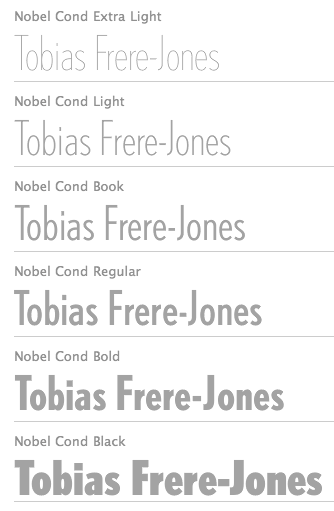
- FB Nobel (1993). An exquisite geometric sans family based on old ideas of De Roos at Amsterdam who explored alternative character sets to enliven basic Futura forms. Frere-Jones views Nobel as Futura cooked in dirty pots and pans. FB Nobel showcased. The Extra Lights were added by Cyrus Highsmith and Dyana Weissman.
- Pilsner (1995). A beer bottle typeface. Font Bureau: Sitting in a Paris cafe with a bottle of beer, Tobias Frere-Jones gave his attention to the label. It was set in a roman design wearing blackletter-like clothes, probably to suggest an origin in Alsace or points to the East. Unable to forget the design, with its blocky, straight line emphasis, Tobias designed Pilsner, an exercise in straight lines in an angle-centered scheme.
- Poynter Old Style (1997, Font Bureau).
- FB Reactor (1996). This was first a FUSE7 font in 1993). Reactor destroys itself as it is put to use.
- Reiner Script (1993). Based on a 1951 brush script by Imre Reiner (ATF).
- Stereo (1993). After a typeface by Karlgeorg Hoefer, 1963 (Font Bureau says 1968).
At FontFont, he designed the children's fonts FF Dolores (1991) and FF Dolores Cyrillic. At FUSE 15, he designed Microphone (1996). At FUSE 10, he published Fibonacci, a font consisting just of lines. His custom work includes WorthGothic (1996), WorthLogo1996 (1995), WorthText (1995), GQGothic (1995), Halifax, Commonwealth (1995), Belizio-TwentySix (Font Bureau), HermanMillerLogo (1999, Font Bureau). Cassandra, Vitriol (1993), Quandry (1992-1994) and Chainletter (1993). Retina Agate (2001, specially made for small-print stock listings at the Wall Street Journal) netted him a Bukvaraz 2001 award and an AIGA 2003 Design Award. From 1999 until 2014, he designed for the Hoefler Type Foundry, which he joined as an equal partner (and the new company became Hoefler & Frere-Jones (in 2004), or H&FJ). He claims that he brought with him to H&FJ a lot of typefaces including Whitney, Whitney Titling, Elzevir, Welo Script, Archipelago (Shell Sans), Type 0, Saugerties, Greasemonkey, Vive, Apiana, and Esprit Clockface. It is not expicitly stated at the H&FJ site which typefaces he had a hand in, but one can safely assume that it must have been nearly every typeface made since he entered into the partnership. In 2014, Tobias sued Jonathan for half of the company in a 20-to-80 million dollar lawsuit since he claims that Hoefler reneged on his promise to give him his half. The typefaces at H&FJ he had a hand in include: Archer (2001, by Jonathan Hoefler and Tobias Frere Jones). A humanist slab serif originally designed for Martha Stewart Living. It has a great range of features, including a classy hairline style. Some say that Archer is just Stymie with some ball terminals. Nevertheless, it became a grand hit, and has been used by Wes Anderson in The Budapest Hotel, and by Wells Fargo for its branding. David Earls on Archer: with its judicious yet brave use of ball terminals, and blending geometry with sexy cursive forms, all brought together with the kind of historical and intellectual rigour you fully expect from this particular foundry, Archer succeeds where others falter. - HTF Retina (2002). For use in the Wall Street Journal.
- Gotham (2001). A sans serif done with the help of Jesse M. Ragan. In fact, the orignal design in 2000 was for GQ magazine. Read about it here. In 2007, he published the rounded version Gotham Round. Gotham was used in 2008 by Obama in his presidential campaign. Joshua Brustein (Business Week): Gotham is one hell of a typeface. Its Os are round, its capital letters sturdy and square, and it has the simplicity of a geometric sans without feeling clinical. The inspiration for Gotham is the lettering on signs at the Port Authority, manly works using "the type of letter that an engineer would make," according to Tobias Frere-Jones, who is widely credited with designing the font for GQ magazine in 2000. Critics have praised Gotham as blue collar, nostalgic yet exquisitely contemporary, and simply self evident. It's also ubiquitous. Gotham has appeared on Netflix (NFLX) envelopes, Coca-Cola (KO) cans, and in the Saturday Night Live logo. It was on display at the Museum of Modern Art from 2011 to 2012 and continues to be part of the museum's permanent collection. It also helped elect a president: In 2008, Barack Obama's team chose Gotham as the official typeface of the campaign and used it to spell out the word HOPE on its iconic posters. Hoefler produced versions in 2016 such as Gotham Office and Gotham Narrow Office.
- Cyclone (2003).
- In 2010, he and Jonathan Hoefler designed the sans family Forza.
- Giant (2003).
- Knoz (2003).
- Topaz (2003).
- Verlag (2006). Developed together with Jonathan Hoefler.
- Whitney (2004). This is an amazing 58-style sans family designed for the Whitney Museum, but now generally avalaible from Hoefler, and touted as a great family for infographics. A derivative, Whitney-K, is the house font of Kodak. Whitney's sales blurb: While American gothics such as News Gothic (1908) have long been a mainstay of editorial settings, and European humanists such as Frutiger (1975) have excelled in signage applications, Whitney bridges this divide in a single design. Its compact forms and broad x-height use space efficiently, and its ample counters and open shapes make it clear under any circumstances.
- With Hoefler, he collaborated on projects for The Wall Street Journal, Martha Stewart Living, Nike, Pentagram, GQ, Esquire, The New Times, Business 2.0, and The New York Times Magazine. In all, he has designed over five hundred typefaces for retail publication, custom clients, and experimental purposes. His clients have included The Boston Globe, The New York Times, The Cooper-Hewitt Museum, The Whitney Museum, The American Institute of Graphic Arts Journal, and Neville Brody. He has lectured at Rhode Island School of Design (from which he graduated with a BFA in 1992), Yale School of Art, Pratt Institute, Royal College of Art, and Universidad de las Americas. His work has been featured in How, ID, Page, and Print, and is included in the permanent collection of the Victoria&Albert Museum, London.
Interview. Interviewed by Dmitri Siegel. He created Estupido Espezial for fun, but it actually made it into an issue of Rollingstone. Catalog of his typefaces at Font Bureau. Keynote speaker at Typecon 2014. View typefaces designed by Tobias frere-Jones. Another page with typefaces created by Tobias Frere-Jones. [Google]
[MyFonts]
[More] ⦿
|
Friday fresh New Fonts #96
|
Small free font showcase by Provience, RI-based Brazilian-born Paulo Canabarro. [Google]
[More] ⦿
|
Gerard Unger
|
 Dutch type designer, born in Arnhem, The Netherlands, in 1942, d. 2018. He studied at the Gerrit Rietveld Academy in Amsterdam, and taught at the Rhode Island School of Design, the University of Reading, and at the Gerrit Rietveld Academy in Amsterdam. From 1974 on, he designed type, starting his career at Hell in Kiel in 1986. Until the end of his career, he taught at Reading and Rietveld. Unger designed stamps, coins, magazines, newspapers, books, logo's, corporate identities, annual reports and many other objects. But he was best known for his typefaces:
 - Markeur (1972), not available as digital type. Unger's first typeface, designed for Enschedé's Pantotype system.
- M.O.L. (1974), not available as digital type. M.O.L. is the type used in the Amsterdam subway.
- Demos (1975-1976, Linotype). Unger said once that this was his first face, and that he made it at Hell in Kiel in 1974 (but I am confused then as to the date of Markeur then).
- Demos (new version 2001), available from Visualogik. In 2015, Gerard published Demos Next (done together with Monotype's Linda Hintz and dan Reynolds) at Linotype.
- Praxis (1976, Linotype). Revived in 2017 as Praxis Next, also at Linotype. Linotype writes that the design is by Gerard Unger, Linda Hintz and the Monotype Design Studio.
- Hollander (1983, Linotype).
- Flora (1984). There is also ITC Flora (1980-1984). Named after Unger's daughter, this is an upright sans italic.
- Swift (1985). This sturdy transitional typeface is his most popular design. It is used by many Dutch and Scandinavian newspapers, and got Unger the Gravisie-prijs in 1988. In 2009, Linotype published Neue Swift (a 1995 design by Unger), i.e., Swift with old style figures thrown in. See also Swift 2.0 (1995).
- Amerigo (1986), available from Bitstream. This was originally designed for 300dpi laserprinters. It is a tapered almost lapidary typeface family. In the Bitstream collection, Amerigo is called Flareserif 831.
- Oranda (1987), available from Bitstream. This is a slab serif originally drawn for the European hardware manufacturer Océ in 1968.
- Cyrano (1989).
- Argo (1991), available from Dutch Type Library.
- Delftse Poort (1991), a stencil typeface not available as digital type.
- Decoder (1992), available from Font Shop. This was a font from the FUSE 2 collection.
- Gulliver (1993). This typeface was used by USA Today and the Stuttgarter Zeitung. Can be bought from URW++ from 2009 onwards.
- OCW Swift (1995-1997, for Ministerie van OC en W, Zoetermeer - NL, by Visualogik Technology&Design).
- ANWB fonts (1997), available from Visualogik.
- Capitolium (1998). Capitolium was designed in 1998 at the request of the Agenzia romana per la preparatione del Giubileo for the Jubilee of the Roman Catholic Church in 2000. It was not used though for the millennium celebrations. In 2002, Capitolium was picked as the serif font for the material of ATypI in Rome. It was accompanied in that advertising by Unger's sans serif font Vesta (2001), loosely based on the lettering at the Vesta temple in Tivoli. He developed Capitolium futher to make Capitolium News and Capitolium News 2 (2011, Type Together), so that the adapted glyphs would be more legible (large x-height) and fit better on a page (more glyphs per line). The modern typeface Capitolium News 2 was published by Type Together in 2011.
- Paradox (1999), available from Dutch Type Library. This is a Didone font done in 1999, for which he won a Bukvaraz award in 2002.
- Coranto (2000). In 2011, Coranto2 was published at TypeTogether: Coranto 2 is originally based on Unger's typeface Paradox, and arose from a desire to transfer the elegance and refinement of that type to newsprint.
- Vesta (2001). The sans serif Vesta (designed as a possible candidate sans serif for the Rome 2000 project) won an award at Bukvaraz 2001. It is available now as Big Vesta (2003).
- Linotype Library is the licenser of the German government's new corporate design typefaces Neue Demos (Antiqua, 2004) and Neue Praxis (sans-serif, 2004) by Unger. The typefaces are to be used for all official correspondence, brochures and advertisements.
- Allianz (2005) is a corporate type system with sans and serif typefaces developed with the firm of Claus Koch of Düsseldorf. The typefaces were designed in collaboration with Veronika Burian, London, and were produced as fonts by Visualogik, 's-Hertogenbosch.
- Alverata (2013). A lapidary flared typeface with a huge x-height influenced by roman ("romanesque") lettering from the XIth and XIIth centuries. Alverata consists of three different fonts: Alverata, Alverata Irregular and Alverata Informal. For the development of the Greek letterforms, Unger collaborated with Gerry Leonidas (University of Reading) and Irene Vlachou (Athens). He cooperated with Tom Grace for the Cyrillic letterforms. Alverata was published by Type Together in 2014 and 2015. It appears to have Vesta's skeleton and dimensions. Alverata won the type design prize at Tokyo Type Directors Club 2016. PDF file.
- Sanserata (2016, Type Together). The blurb: Sanserata is an articulated sans that mirrors Alverata's creativity and concept. Its bright and unflappable nature make it perfect for positive and casual brands, and its accentuated terminals improve legibility in text, especially on screens where light emission tends to round off the endings of glyphs.
Gerard Unger lived in Chicago and Bussum, The Netherlands. Besides the awards mentioned in the list above, he received global prizes for his typography, such as the H.N. Werkman Prize (1984), the Maurits Enschedé-Prize (1991), the 2009 SOTA Typography Award and the TDC Medal (2017). Author of Terwijl Je Leest (Amsterdam, 1997) and Theory of Type Design (2018). Books about Gerard Unger include Gerard Unger Life in Letters (2021, by Christopher Burke, De Buitenkant). Interview by John L. Walters. At ATypI 2004 in Prague, he spoke about type for dailies, and also on Neue Demos and Neue Praxis. At ATypI 2008 in St. Petersburg, he spoke about letterforms in inscriptions from the 10th, 11th and 12th centuries. FontShop link. Klingspor link. View Gerard Unger's typefaces. [Google]
[MyFonts]
[More] ⦿
|
Golgonooza Letter Foundry
[Dan Carr]
|
Dan Carr (b. Cranston, RI, 1951-2012) was an American poet, type designer, typographer, printer, teacher, punchcutter, environmentalist, human rights activist and New Hampshire State Representative (2008-2010). Carr received his BA at Clark University in Worcester, Massachusetts. In Boston, in 1979 he and his partner Julia Ferrari, started the Golgonooza Letter Foundry & Press, a hot metal Monotype graphic design and composition house, which they moved to Ashuelot, NH, in 1982. Together they created Trois Fontaines Press in 1997, a limited edition fine press. Carr taught typography, and the history of typography at Keene State University in Keene, NH. He died after a struggle with cancer. At Golgonooza they produced high-quality letterpress books for a wide variety of clients. Dan Carr is the designer of the great-looking text fonts Lyons and Cheneau, 1990-1994, as well as Regulus (a metal font created in 1998 that earned him the title of Master Typographic Punchcutter of France in 1999), Philosophie, Genesis Numerals, and Beckett Bodoni, at the Golgonooza Letter Foundry. He won a Bukvaraz 2001 award for Parmenides (a metal type for archaic Greek). His digital typeface "Cheneau" was chosen for a judges' choice award by the Type Directors Club in 2000. Both Dan Carr's Parmenides Greek and Christopher Stinehour's Diogenes Greek were commissioned by the printer Peter Koch for The Fragments of Parmenides. Alternate URL. Klingspor link. Caxton Club link. [Google]
[MyFonts]
[More] ⦿
|
Hans-Rudolf Lutz
|
Swiss typographer (b. Zürich, 1939, d. 1998). He had his own studio, Lutz Verlag, in Zürich. He published books such as "Typoundso" and "Ausbildung in typografischer Gestaltung". He taught at the schools of design in Zürich and Luzern for over thirty years, and founded the typography department in Luzern in 1968. [Google]
[More] ⦿
|
Highchair
[Jason Hogue]
|
Highchair is Jason Hogue's type foundry in Providence, RI. Jason Hogue is Director of Design & UX at Oomph, Inc. Early in his career, at T26, he created Infinity (1999), Interrobang (1999), Solidarity, and Displacement (2000, pixel face). He also published these fonts at Garagefonts. HC Din Engschrift Rounded is exclusive at Highchair. In 2018, he finished PE Analog Clock Icon Font. FontShop link. Github link. [Google]
[MyFonts]
[More] ⦿
|
Huda Smitshuijzen AbiFarès
|
 Huda Smitshuijzen AbiFarès, was born in Beirut in 1965. Author of Arabic Typography A Comprehensive Sourcebook (Saqi Books, London, 2001), Experimental Arabic Type (Saatchi&Saatchi, Dubai, 2002), Typographic Matchmaking (BIS Publishers, Amsterdam 2007), Arabic Type Specimen Book (2008), Typographic Matchmaking in the City (2010) and Arabic Type Design for Beginners (2013), and a number of articles on multilingual communication in the Middle East such as Arabic Type: a challenge for the 2nd millennium (1998). She holds degrees in graphic design from Yale University School of Art and Rhode Island School of Design, and specializes in bilingual typographic research and design. She has worked as a designer for a number of years, in the USA, Amsterdam, France and Beirut. She has taught typography and graphic design at the American University of Beirut. She was the Chair of the Visual Communication Department for three years at the American University in Dubai and founded the Khatt Foundation, Center for Arabic Typography in Amsterdam. She curates exhibitions, organizes collaborative design research projects between Europe and the Middle East, and is editor of the Khatt Foundation online network of Arab/Middle Eastern designers (www.khtt.net). She is currently pursuing a PhD at Leiden University while working between Europe and the Middle East as a typography and design consultant on projects of cultural relevance. She has art directed and collaborated on the design of several contemporary Arabic fonts for magazines like Aleph (London) and companies in the Gulf. Typefaces include Alef Caps (2008), done with Pascal Zoghbi. KHTT link. [Google]
[More] ⦿
Huda Smitshuijzen AbiFarès, was born in Beirut in 1965. Author of Arabic Typography A Comprehensive Sourcebook (Saqi Books, London, 2001), Experimental Arabic Type (Saatchi&Saatchi, Dubai, 2002), Typographic Matchmaking (BIS Publishers, Amsterdam 2007), Arabic Type Specimen Book (2008), Typographic Matchmaking in the City (2010) and Arabic Type Design for Beginners (2013), and a number of articles on multilingual communication in the Middle East such as Arabic Type: a challenge for the 2nd millennium (1998). She holds degrees in graphic design from Yale University School of Art and Rhode Island School of Design, and specializes in bilingual typographic research and design. She has worked as a designer for a number of years, in the USA, Amsterdam, France and Beirut. She has taught typography and graphic design at the American University of Beirut. She was the Chair of the Visual Communication Department for three years at the American University in Dubai and founded the Khatt Foundation, Center for Arabic Typography in Amsterdam. She curates exhibitions, organizes collaborative design research projects between Europe and the Middle East, and is editor of the Khatt Foundation online network of Arab/Middle Eastern designers (www.khtt.net). She is currently pursuing a PhD at Leiden University while working between Europe and the Middle East as a typography and design consultant on projects of cultural relevance. She has art directed and collaborated on the design of several contemporary Arabic fonts for magazines like Aleph (London) and companies in the Gulf. Typefaces include Alef Caps (2008), done with Pascal Zoghbi. KHTT link. [Google]
[More] ⦿
|
Isaac Tobin
|
 Tobin is based in Chicago, and studied graphic design at the Rhode Island School of Design (2002). He is a senior designer at the University of Chicago Press.
 Designer of Ferdinand (Egyptian, a cross between Futura and Clarendon according to Tobin), Verne Jules (copperplate font), Ostia (a sans all caps typeface with Trajan proportions), Faina, Attleboro (sans), Strata (text typeface), Field (octagonal) and Rivadavia (octagonal and mechanical). Klingspor link. Typecache link. [Google]
[More] ⦿
|
J. Hogue
|
J. Hogue (Highchair Designahus and Oomph Inc, Providence, RI) created Analog-Clock-icon-font (2012). Github link. [Google]
[More] ⦿
|
Jack Halten Fahnestock
|
American designer currently (i.e., 2019) studying at the Rhode Island School of Design. Creator of the free variable font Tiny (2019, Velvetyne), a monospaced dot-matrix typeface based on the smallest type size of five dots on the HandJet EBS-250 hand-held printer. The sizes of the dots make up the variable axis. He writes: The TINY font family was originally created at over the summer of 2018 as the visual identity for an experimental retail pop-up shop in Chinatown, New York City called Today in New York, or TINY for short. The shop was the result of an intern project at Verdes, a creative agency, between Jack Halten Fahnestock and Theia Flynn. There they sold T-shirts and tote bags customized on the spot with a fancy (and stupid expensive) handheld inkjet printer called a HandJet EBS-250. Personal web site. [Google]
[More] ⦿
|
Jacob Poindexter
|
Digital artist in Linthicum, MD, and Providence, RI, who created the sci-fi typeface Cosmos (2013). In Robert Lipton's type design class in 2017, g=he developed the angular and tension-laden typeface Cilia, which was inspired by Brazilian novelist Clarice Lispector's The Passion According to G.H. [Google]
[More] ⦿
|
Jade Kim
|
Providence, RI-based designer of the serif typeface Hodoo (2014). [Google]
[More] ⦿
|
James Goggin
[Practise]
|
 [More] ⦿
|
James R. Pardee Jr.
[E3Type]
|
[More] ⦿
|
Jason Hogue
[Highchair]
|
[MyFonts]
[More] ⦿
|
Jason Pamental
|
Jason Pamental (Rumford, RI) is Senior Director of Design and Technical Strategy at Isovera, where he heads the design and development team, leads workshops, and works with clients establishing their digital strategy. Jason specializes in typography for the web. Author of Responsive Typography (O'Reilly). [Google]
[More] ⦿
|
Jennifer Pereira
|
Lincoln, RI-based student (at SCAD, Savannah, GA) who is interested in legibility issues for her school project. [Google]
[More] ⦿
|
Jeremy Mickel
[MCKL (was: Mickel Design)]
|
 [More] ⦿
|
John Caserta
[The Design Office]
|
 [More] ⦿
|
John Everett Benson
|
 Lettering artist, stonecutter, calligrapher and sculptor, b. 1939, Newport, RI. Son of John Howard Benson (1902-1956), stonecutter and calligrapher, who was also born in Newport. He has created inscriptions for monuments including the John F. Kennedy memorial at Arlington National Cemetery, the National Gallery of Art, and the Vietnam Memorial in Washington, DC. Trained in sculpture at the Rhode Island School of Design, John was owner and operator of the historic John Stevens stonecarving shop for more than thirty years. He trained his son Nicholas, who now runs the John Stevens Shop (since 1993), and has lately returned to the full-time practice of making sculptures at his studio in Newport.
 His typefaces include the understated calligraphic scripts Alexa (1995-2002, Adobe), Balzano (1994, Adobe) and Caliban (1995, Adobe), the titling typeface Aardvark for Font Bureau (1991, with Jill Pichotta), and several phototypefaces for architectural applications. Sample of his work from 1973 now at the MoMA in New York. Wikipedia link. Font Bureau link. . Fontshop link. Linotype link. View the typefaces that were made by Benson. [Google]
[MyFonts]
[More] ⦿
|
John Howard Benson
|
Born in Newport, RI, in 1901, John Howard Benson became a famous stonecutter and calligrapher. An author and educator at the Rhode Island School of Design, he wrote The Elements of Lettering with Arthur Graham Carey. He died in 1956. Philip Hofer (Harvard College Library) published Inscriptions in the Graphic Arts Department at Harvard in PAGA, volume 1, no. 1, pages 10-12, 1953. In that article, he describes the collection at the Houghton Library in Harvard, and focuses a lot on the lettering and inscriptions of John Howard Benson. Hofer claims Benson is the best letter cutter of his generation, just as Eric Gill was the best in his generation. His son is type designer, stonecutter and calligrapher John Everett Benson (b. 1939). [Google]
[More] ⦿
|
Jonathan Smith
[Rhode Island Soft Systems]
|
[More] ⦿
|
Jonathan Smith
[AArrgghh! Typefaces]
|
[More] ⦿
|
Joseph Allegro
|
As a student at the Rhode Island School of Design, Joseph Allegro (Providence, RI) designed the 9x9 pixel grid typeface Linus (2016). Behance link. [Google]
[More] ⦿
|
Julian Kelly
|
Originally from Vermont, Julian Kelly is the Providence, RI-based designer an experimental SVG format typeface in 2016 called Eightynine. The source is available at Github. He writes: Eightynine is a typeface composed entirely of stroked SVG paths. The face was created as an experiment to see web type could freely shift weight as it was scaled. Unfortunately it isn't that practical to use, a JS script has to go through and replace all of the text on the page with inline SVGs every time the page reflows. [Google]
[More] ⦿
|
Kasey Labelle
|
Pawtucket, RI-based graphic designer who created the squarish sans family B Jup Sans in 2009. [Google]
[More] ⦿
|
Kate Wilson
|
Graphic designer in Providence, RI, who created the display typeface Sprite (2014). [Google]
[More] ⦿
|
Katie Kerrigan
|
Newport, RI and Stamford, CT-based student, letterer and graphic designer. Creator of an ornamental caps face (2011) and a nice psychedelic typography poster in 2009. Behance link. [Google]
[More] ⦿
|
Kerns&Cairns
[Dyana Weissman]
|
 American type designer, b. 1980, who graduated from the RISD, and worked at Font Bureau (as Senior Custom Designer) and Type Network (as Custom Type Director) in Boston. She set up Kerns & Cairns, also in Boston. Interview at Daidala. Interview by Christian Palino. Her typefaces:
 - Materot: calligraphic.
- She expanded the Benton Sans family into an ultra for Toyota, commissioned by Saatchi&Saatchi.
- Baskerville was modified by her for Northeastern University (via Korn Design).
- She made a font for learning handwriting for TouchMath.
- Apotek (2020): a squared counter typeface family based on lettering on old medicine bottles seen in Oslo.
- Benton Modern Display (2008), co-designed with Richard Lipton at Font Bureau: Benton Modern Text was first prepared by Font Bureau for the Boston Globe and the Detroit Free Press. Design and proportions were taken from Morris Fuller Benton's turn-of-the-century Century Expanded, drawn for ATF, faithfully reviving this epoch-making magazine and news text roman. The italic was based on Century Schoolbook.
- A redesign of Matthew Carter's Postoni (1997), called Stilson (2009, with Richard Lipton and Jill Pichotta): Since 1997, The Washington Post's iconic headlines have been distinguished by their own sturdy, concise variation on Bodoni, designed by Matthew Carter. For the 2009 redesign, Richard Lipton, Jill Pichotta, and Dyana Weissman expanded the family with more refined Display & Condensed styles for use in larger sizes. Originally called Postoni, the fonts were renamed in honor of The Post's founder, Stilson Hutchins.
- Escrow Reading Edge (2016, Font Bureau). An extension of Cyrus Highsmith's Scotch Roman, Escrow (2006).
- Syfy Hero and Syfy Sidekick.
- Waldorf Astorai. An art deco typeface inspired by the lettering on the facade of Waldorf Astoria Hotel at 301 Park Avenue in New York City.
- Comedy Sans. A 12-style typeface commissioned by Comedy Central.
- Firdevs (2022). A digitization of a Victorian typeface drawn in Silivri Prison by political prisoner and journalist Fevzi Yazici, and named after Fevzi's wife.
- CTV Sans. For the Canadian TV network.
- ESPN College Football. A custom varsity font family developed together with Victoria Rushton and loyalkaspar.
- Peacock Sans (2020, with Victoria Rushton). A custom typeface for Peacock, NBC Universal's video streaming platform.
- GRab=vity Grotesk (2021, with Victoria Rushton and CSTM Fonts).
FontShop link. Type Network link. [Google]
[MyFonts]
[More] ⦿
|
Kevin Dresser
[Dresser Johnson]
|
[MyFonts]
[More] ⦿
|
Kristine Austria Sanchez
|
Graphic designer in Newport, RI. She made the clean hand-printed typefaces Jinian (2011) and Jinian Annoyed (2011). [Google]
[More] ⦿
|
Kyle Green
|
Providence, RI-based designer of the experimental typefaces Circuit (2014) and Mas Context (2014). Behance link. [Google]
[More] ⦿
|
Leander Remington White
|
Barrington, RI-based designer of the mechanical octagonal typeface Heavy Black (2015), the angular typeface Jagged (2015), and the display sans typeface Grotesque (2015). [Google]
[More] ⦿
|
Lehu Zhang
|
Lehu Zhang has an MFA from Rhode Island School of Design, Providence, RI. He created the Latin text typeface Impression in 2013. Behance link. [Google]
[More] ⦿
|
List of design schools
|
List of schools offering type and typography course work, as compiled by the Type Directors Club: [Google]
[More] ⦿
|
Llewellyn Hensley
|
During her studies at the Rhode Island School of Design in 2015, in the class taught by Cyrus Highsmith, Llewellyn Hensley (Providence, RI) created the text typeface Tralfamadore. Behance link. [Google]
[More] ⦿
|
Marianne Harrison
|
 Graduate of RISD. Providence, RI-based designer of the flared typeface Pardalote (2016). [Google]
[More] ⦿
Graduate of RISD. Providence, RI-based designer of the flared typeface Pardalote (2016). [Google]
[More] ⦿
|
Marie Otsuka
|
 Marie is a type and graphic designer, and programmer. In addition to designing type, she works on tool engineering at Occupant Fonts in Providence, RI. She also collaborates with a range of organizations as a designer and developer. Marie holds an MFA in Graphic Design from RISD and a BA in Interdisciplinary Studies from the University of Chicago.
 In 2021, at Occupant Fonts / Type Network, she released the 42-style Pentameter. Type Network writes: In Pentameter, Marie Otsuka explores the polyrhythmic potential that usually stays dormant inside the limitations of monospaced typefaces. As an upright italic, the letterforms create a lively pattern while their uniform metrics remain steady. The result is an inventive design on a syncopated beat that resonates with the poetics beyond code. Pentameter's lower case i looks like a breaststroke swimmer coming up for air. [Google]
[More] ⦿
|
MCKL (was: Mickel Design)
[Jeremy Mickel]
|
 Jeremy Mickel runs a design studio in Los Ange;les, where he moved to from Minneapolis in 2015. Before that, he was located in Brooklyn, New York and Providence, RI. Originally called Mickel Design, the studio and foundry was renamed MCKL in 2012. Mickel has taught at RISD and the Minneapolis College of Art and Design.
 He is working on this VAR-Rounded sans serif style face (2007) that was based on plastic cut letters seen in New York's subway. See also here and here. Mickel's typefaces: - Router (2008, Jeremy Mickel): a rounded sans family.
- Baro (2010, Chester Jenkins and Jeremy Mickel): Baro is inspired by memories of Antique Olive Nord, Roger Excoffon's landmark design originally commissioned for Air France in 1956. Nord, the heaviest weight of Antique Olive, was the starting point, but Baro shares DNA with other Village designs, including Apex New and Mavis.
- Eventide (2009, Jeremy Mickel): octagonal and 3d family based on ideas by Paul Carlyle in the early 1940s. That Carlyle typeface had also made it into the PhotoLettering collection in 1971. Eventide was developed into a family at House Industries under the art direction of Ken Barber and Christian Schwartz, and won an award at TDC2 2011.
- Superior (2010, Jeremy Mickel): a high-contrast transitional "nearly didone" face. Superior Title (2013) is described as a high-contrast missing link between Times and Bodoni. It was designed for fashion publications.
- Shift (2010, Jeremy Mickel): a slab serif family that won an award at TDC2 2011.
- Gonesh (2009, Jeremy Mickel): a great new sans family.
- Aero (2010, Village Type) was developed in cooperation with Chester Jenkins. This poster family, inspired by Excoffon's Antique Olive, was awarded at TDC2 2011.
- Letterboxes (2008). A stencil typeface that was part of a collaborative project with John Caserta at the Design Office.
- Plinc Flourish (a 2011 digitization by Jeremy Mickel for House Industries). Based on William Millstein's Millstein Flourish, an upright script first designed for PhotoLettering Inc in the early 1940s.
- Union (2011). A basic sans family, ideal for corporate design.
- Jeremy Mickel created a digital version L.Harl Copeland's (prismatic, beveled, roman caps) Trillium typeface [originally done at Photolettering] in 2011 at the new digital Photolettering / House Industries.
- Fort is a sans family published in 2012 by Village.
- Playoff Sans and Playoff Serif (2015).
- Adidas has partnered with MCKL to create an innovative suite of variable fonts. These fonts are being used across a wide spectrum of applications, including Creative Direction, Product Design, Graphics, Communications, Digital Experiences, and the brand campaign for the upcoming World Cup. In 2015, Mickel expansed the Adineue Pro family. In 2017 they started the first Adidas Variable Font, Adineue CHOP Variable, an octagonal athletic sans in a wide range of weights from hairline to black, and widths from extra-condensed to extra-wide. In 2018, Mickel embarked on Adineue Pro Variable.
- Rosa Sans (2019: by Jeremy Mickel and Pentagram). A free geometric grotesk (in their own words) sans family.
- Trust (2020). A flared typeface first used for the identity of the Commission on Presidential Debates (Trump versus Biden).
- Logic Monospace and Logic Monoscript (2020). Mickel writes: Logic Monospace takes inspiration from midcentury typewriter fonts, including IBM Selectric's Advocate and the ubiquitous Courier, with additional references in slab serifs like Stephenson Blake's Scarab. While there are many great script typewriter fonts, including Olympia and Aristocrat, Logic Monoscript is a novel creation, with few examples of true connecting monospace scripts in existence.
- Uber (2020). A custom job for Uber.
- Owners (2021). iJeremy explains: Owners is an expressive family of fonts that takes inspiration from the dynamic energy of handmade signage as seen around Los Angeles.
- RedHat Display, Text and Mono subfamilies. The open source fonts were originally commissioned by Paula Scher / Pentagram and designed by Jeremy Mickel / MCKL for the new Red Hat identity. Mickel writes: Red Hat is a fresh take on the geometric sans genre, taking inspiration from a range of American sans serifs including Tempo and Highway Gothic. The Display styles, made for headlines and big statements, are low contrast and spaced tightly, with a large x-height and open counters. The Text styles have a slightly smaller x-height and narrower width for better legibility, are spaced more generously, and have thinned joins for better performance at small sizes. In 2021 we added Light and Light Italic styles, and a Monospace family. Variable fonts with a weight axis are available. RedHat's official site.
Klingspor link. Village link. Speaker at ATypI 2018 in Antwerp. [Google]
[More] ⦿
|
Michael Guhl
|
For a school project at Rhode Island School of Design in Providence, RI, Michael Guhl designed the fun decorative caps typeface Body Talk (2017). [Google]
[More] ⦿
|
Michelle Mruk
|
Illustrator Michelle Mruk (Providence, RI) used the figure 8 to create the Loopback typeface in 2013. In 2015, now loacted in Brooklyn, NY, she designed the experimental typeface Summer Type. Behance link. [Google]
[More] ⦿
|
Milan Nedved
|
Typefounder in Providence, RI. He created the display caps typeface Babel (2011). [Google]
[MyFonts]
[More] ⦿
|
Morisawa Providence Drawing Office
[Cyrus Highsmith]
|
In September 2017, Morisawa announced the establishment of "Morisawa Providence Drawing Office" in Providence, RI, as its new base for developing Latin fonts. Cyrus Highsmith, who had served as a designer for Font Bureau for many years, and who started Occupant Fonts in 2015, has been appointed as its creative director. By this move, Morisawa acquired Occupant Fonts. [Google]
[More] ⦿
|
Mostyn Griffith
|
During his studies at the Rhode Island School of Design (class of 2018), Mostyn Griffith (Palo Alto, CA) created the display typefaces Solum Serif (2015) and Lenor Black (2016). [Google]
[More] ⦿
|
Nate Piekos
[Providence Type]
|
[MyFonts]
[More] ⦿
|
Nate Piekos
[Blambot!]
|
 [MyFonts]
[More] ⦿
[MyFonts]
[More] ⦿
|
Nicole Cochary
|
During her studies at the Maryland Institute College of Art (MICA), Nicole Cochary (Providence, RI) designed the slabby Western typeface Eastwood (2014) and Heavy Reggie (2018). [Google]
[More] ⦿
|
Occupant Fonts
[Cyrus Highsmith]
|
 Senior designer at Font Bureau since 1997, after graduating that year from the Rhode Island School of Design. Born in Milwaukee, WI, he now is a faculty member at RISD, where he teaches typography in the department of Graphic Design. He regularly offers a summer course on Digital Type Design, Summer Institute of Graphic Design, Rhode Island School of Design. His sketchbooks are now on line. In 2016, he set up Occupant Fonts as part of the Type Network.
 In September 2017, Morisawa announced the establishment of "Morisawa Providence Drawing Office" in Providence, RI, as its new base for developing Latin fonts. Cyrus Highsmith, who had served as a designer for Font Bureau for many years, and who started Occupant Fonts in 2015, has been appointed as its creative director. By this move, Morisawa acquired Occupant Fonts. Author of Inside Paragraphs, written for a foundational typography course. Matthew Carter writes: Cyrus Highsmith takes the lid off a paragraph of type and shows its inner workings. There is nothing you need to understand about using type that's not in this book. Cyrus explains the correct terms for the typographic components of form and space that make a letter, a word, a line, a paragraph, and he does it with clear drawings, simple language, and a legible typeface for the text. Interview at MyFonts. Cyrus created wonderful typefaces such as Loupot (1997, with Laurie Rosenwald, based on the lettering on Charles Loupot's St. Raphael poster from 1948), Eggwhite (2000-2018, for comics), Relay (2002, a somewhat art deco sans serif family that will be in vogue for years to come!), Benton Sans (1995-2003, with Tobias Frere-Jones, a revival of Benton's 1903 family, News Gothic; see also Benton Sans Wide, 2013), Occupant Gothic (2000-2018, angular), Prensa (2003, a simple 24-style serif family), Prensa Display (2012), Dispatch (1999-2000), Halo (2003), the 12-weight Stainless family (2001), and Daleys Gothic (1998). The Wall Street Journal uses his D4ScotchD4Scotch family (2001). He made a modified Palatino for the newspaper El Mercurio, and designed Zocalo or El Universal for the newspaper El Universal. He won Bukvaraz 2001 awards for Prensa and Relay. His Amira (Font Bureau) and (Spanish-feeling) Zocalo (Font Bureau) won awards at TDC2 2004. At ATypI 2004 in Prague, he spoke about the wealth of typefaces. In 2006, Escrow (Font Bureau) was published, an out-of-this-world 44-style subdued Scotch family that is used by The Wall Street Journal. In 2007, still at Font Bureau, he created Antenna, a 56-style sans family, as well as Biscotti, a delicate connected (wedding) script commissioned in 2004 by Gretchen Smelter and Donna Agajanian for Brides magazine. His calligraphic copperplate script Novia (2007, Font Bureau) was commissioned to grace the pages of Martha Stewart Weddings. Still in 2007, he won an award for his newspaper type family Quiosco (Font Bureau). Font Bureau writes: With Quiosco, Cyrus Highsmith continues an examination of themes and possibilities which he first explored in Prensa, inspired by the work of W. A. Dwiggins---specifically a dynamic tension between inner and outer contours. However, the crackling, electrical energy of Prensa here gives way to a more fluid, mercurial muscularity in Quiosco. See also Quiosco Display. In 2006, he designed Scout for Geraldine Hessler's redesign of Entertainment Weekly, under the influence of DIN, Venus and Cairoli. Scout is a utilitarian sans serif series that was followed in 2013 with Scout RE---four styles optimized for screen text and small sizes in print. In 2016, he added Scout Text. In 2010, at Font Bureau, he published the extensive families Ibis Text and Ibis Display, which he says were influenced by Walbaum (1919) and Melior (1952). The Webtype version IbisRE is poorly kerned / displayed in my browser though. From 2007 until 2010, he developed Salvo Sans and Salvo Serif (Font Bureau), which were originally called Boomer Sans and Serif. They were released in 2011. In 2012, he published Serge (an angular script family in three styles: a frisky, acrobatic typeface that dashes off decorative blurbs, signs, and headlines with a lively, angular zest), Heron Sans and Heron Serif at Font Bureau, which writes: Heron Serif and Sans are born of hard iron and steel, but galvanized with Cyrus Highsmith's warmth and energy. In 2013, he published Icebox at Font Bureau---a font that is based on a set of magnetic letters found at a variety store. Typefaces from 2014: Tick and Tock, two stencil styles. Typefaces from 2015: Antenna Serif. Typefaces from 2016: Gasket, Gasket Unicase, Gasket Uncial. Typefaces from 2017: Allium. Typefaces from 2018: Allium Text. Speaker at ATypI 2013 in Amsterdam: Don't design web fonts Its theme is: The successful type series of the future will be the ones that can move between media. He says that new typefaces should be smarter than the devices that use them. In 2015, he received the coveted Gerrit Noordzij Prijs. His illustrations were the subject of an exhibition and a book, both called Products Of A Thinking Hand (Typotheque / KABK, 2018). View Cyrus Highsmith's typefaces. Klingspor link. FontShop link. MyFonts interview. Old Font Bureau link. [Google]
[MyFonts]
[More] ⦿
|
Oddsorts
[Charles Gibbons]
|
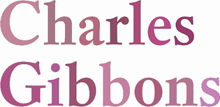 Charles Gibbons (b. 1967, Lynn, MA) received an MFA in graphic design from the Rhode Island School of Design. Gibbons spent much of the nineties as a designer for the University of Minnesota in Minneapolis and later as assistant professor of Graphic Design at the University of Wisconsin / Stout where he taught typography and publication design. In 2001, he joined the Library of Congress as the chief designer for the United States Copyright Office. Chuck has partnered with various typefoundries such as Bitstream, Filmotype, Sideshow, Tart Workshop, Device, and Cultivated Mind. The Ciao Bella ornaments he designed with Cultivated Mind's Cindy Kinash represent the first commercially available auto-chromatic fonts: each font can be set in two colors. Working with Stuart Sandler and Crystal Kluge at Tart Workshop, he developed the method by which their Aya Script delivers its characteristic curlicue ribbons. His types grace book covers, greeting cards, film titles, museum façades, and the seal of the United States Copyright Office. At present, he teaches typography and type design at Tufts University in Boston. In 2015, he set up Oddsorts. His typefaces, in more or less chronological order:
 - Aphasia BT (2000, Bitstream). He writes: A meeting of Byzantine and Art Deco forms, Aphasia began as a series of handwritten captions to accompany drawings in the early 1990s.
- At Oddsorts, he published Bradley Wayside and Bradley Chicopee in 2015: Begun in 2000 as a wedding gift for the designer's wife and used privately for years, they're finally available to the public. The fonts were inspired by the masterful art nouveau lettering of Will H. Bradley, whose posters for Ault & Wiborg printing inks and Victor Bicycles continue to draw collectors after more than a century. Wayside and Chicopee expand the twenty-odd characters Bradley drew into a comprehensive multiscript system that includes modern Greek and extended Cyrillic alphabets, ordinals, automatic fractions, and ornaments.
- In 2014, Charles Gibbons and Cindy Kinash co-designed Ciao Bella (first published at Cultivated Mind, and in 2016 at Oddsorts). It features a handcrafted copperplate script style, and several flower ornaments about which they write: The Ciao Bella ornaments he designed with Cultivated Mind's Cindy Kinash represent the first commercially available auto-chromatic fonts: each font can be set in two colors. What's truly innovative about Ciao Bella's ornaments is that most of the characters come in pairs that can be set in multiple colors without any stacking, layering, or aligning. They work in any application that supports kerning---even most word processors.
- Full Moon Suite (2001, Bitstream). Co-designed with Mary Trafton. Includes FM Black Cherry Moon, Alternate, Ligature, and Doubles. FullMoon BT won an award at the TDC2 2003 competition.
- Fleischmann BT Pro (2002). A family heralded by the typophiles as outperforming the DTL Fleischmann.
- Various Filmotype fonts for Stuart Sandler's Filmotype project. In 201, he designed the identical lively freestyle typefaces Filmotype Nemo (original from 1953), Filmotype Niro, and Filmotype Nero. The renaming was done under various scenarios of pressure. In 2011, he also made the signage typeface Filmotype Atlas. In 2012, he created the art deco fat didone typeface Filmotype Rose, and the fine brush letter signage typeface Filmotype Havana. Filmotype Adonis (2012) is a clean hand-drawn typeface. Filmotype Royal (2012) is a transitional typeface family. Typefaces from 2013: Filmotype Orlando (cartoonish), Filmotype Parade (cartoonish), Filmotype Zeal (a formal almost-copperplate script). In 2014, he added Filmotype Western (an italian, or reversed stress, typeface based on a Filmotype design from 1955), and in 2015 Filmotype Wand. Filmotype Maxwell (2019) is a revival of an interlocking Filmotype font from the 1960s.
- Greenleaf (2019).
- Local Market (2014). With Cindy Kinash. A hand-drawn collection of typefaces.
- True North (+Extras, +Textures: a vintage letterpress emulation set of fonts designed for posters and banners), 2014-2015. Done together with Cindy Kinash.
- Winooski (2015) is a fun cartoon typeface.
FontShop link. Oddsorts link. [Google]
[MyFonts]
[More] ⦿
|
Paul Soulellis
|
 Paul Soulellis (b. 1968) is a Providence, RI (was: New York)-based artist and creative director, maintaining his studio in Long Island City, NY. Paul was trained as an architect and is a graduate of Cornell University's College of Architecture, Art and Planning. He is the founder/director of Queer.Archive.Work, a non-profit community reading room, publishing studio, and community space, and Associate Professor of Graphic Design at the Rhode Island School of Design.
 He created Library of the Printed Web, a curatorial project organized around artists who use screen capture, image grab, site scrape and search query to develop printed matter from content found on the web. He founded the design firm Soulellis Studio in 2001 and produces work for clients like Cornell University, TED, Waterworks, Esri, the Rockefeller Foundation and the Municipal Art Society of New York. Creator of two free typefaces: - Stetson (2012) is an experiment in geo-historical typography: The single-weight typeface is drawn from a very small sample of 19th century hand-drawn letterforms, found within an old photograph in a shed in Weymouth, Massachusetts. The sample, E. H. Stetson and Co, is surrounded by a display of shoes. Not far from where the photograph was found is the actual Stetson Shoe Co. factory building, which operated in Weymouth from 1885 until 1973. Stetson was created for Weymouths, a 12-volume book project commissioned by the 2012 b-side Arts Festival in Weymouth, England (part of the Maritime Mix / London2012 Cultural Olympiad by the Sea). Production by Thomas Jockin.
- Sélavy (2013), co-designed with Nina Stössinger, who writes: Sélavy is the result of a serendipitous collaboration with Paul Soulellis. For his project Library of the Printed Web, Paul was looking for a dotted typeface reminiscent of the punched-out caps on Marcel Duchamp's 1934 Green Box. As he could not find a typeface close enough, I [Nina] was spontaneously tempted to make one. This is it. Sélavy (named after Duchamp's pseudonym Rrose Sélavy) is a dotted typeface that does not follow a non-dotted model.
[Google]
[More] ⦿
|
Paulo Canabarro
[Typography Mania]
|
[More] ⦿
|
Pica Pusher
|
Designer and compositor from Providence, RI, who is working on Scripty (2006), a bouncy sans face. Also called Dan G. [Google]
[More] ⦿
|
Practise
[James Goggin]
|
 Graduate of London's Royal College of Art in 1999, James Goggin (b. 1975) founded graphic design studio Practise in 1999 in London with his partner Shan James. James was art director of The Wire (2005-2008). In August 2010, Goggin moved to Chicago where he was Design Director at the Museum of Contemporary Art Chicago (2010-2013). Previously he was based in Arnhem, the Netherlands, working as course director and teacher at Werkplaats Typografie (2009-2010) and visiting lecturer at ECAL (Ecole cantonale d'art de Lausanne) (2009-2010). The studio Practise has been based in Providence, RI, since 2016 where James also teaches BFA and MFA Graphic Design at Rhode Island School of Design (RISD). Aka Jacques Gauguin and "Practise", he has worked in London, Auckland and Sri Lanka.
 His typefaces: - In 2001, he made the three-weight LL Courier Sans (+Mono) at Lineto.
- Between 2003 and 2014, James Goggin, Rafael Koch, Mauro Paolozzi, and Arve B%aring;tevik developed LL Prismaset A at Lineto, a redesign and extension of Rudolf Koch's Prisma (1930).
[Google]
[More] ⦿
|
Providence Type
[Nate Piekos]
|
From East Providence, RI, Nate Piekos' foundry started near the end of 2002. Nate Piekos (b. 1975, RI) also runs the comic font foundry Blambot. His fonts are being sold at MyFonts.com. These include East Side NDP, Clam Cakes NDP (2003), KennedyPlazaNDP (2003), Number42BusNDP (2003), ThayerStreetNDP (2003), WestminsterNDPItalic (2003), WestminsterNDP (2003), Coffee Milk NDP (2003) and Prov Draftsman NDP. [Google]
[MyFonts]
[More] ⦿
|
Raphael Boguslav
|
Great handletterer (b. 1929 in Far Rockaway, Long Island of Russian parents) who grew up in New York City. He studied lettering with Paul Standard, Georg Salter and Leo Manso at The Cooper Union and graduated from The Cooper Union in 1951. He worked at the same studio as Milton Glaser for the next three years. Rahael become a designer and worked for some time for Lippincott and Margulies in New York. Raphael lived in Colorado for a long time, but is now based in Bellingham, WA. In 1969 he patented a squarish typeface for Tyco Laboratories in Waltham, MA. In 1972, he moved to Newport, RI and resumed his career in lettering, calligraphy and graphic design. His typeface Avia (VGC) was an expansion of a logofont he did for Abex Corporation, almost like a stencil. It is now at Font Bureau, where Jill Pichotta has added the Light and Bold in 2000. His typeface Visa (1966, VGC) won the Second Prize in the 1966 VGC National Type Face Design Competition. Others (thanks, Alexander Tochilovsky) confirm what I thought---that Visa and Avia are the same thing. Finally, Sloop Script Pro (1994, Richard Lipton, Font Bureau) is based on Boguslav's designs. FontShop link. MyFonts link. [Google]
[MyFonts]
[More] ⦿
|
Rhea Jain
|
During her studies at RISD in Providence, RI, Rhea Jain designed the text typeface Elatior (2018). [Google]
[More] ⦿
|
Rhode Island School of Design
|
Reputed design school that graduated quite a few well-known type designers. [Google]
[More] ⦿
|
Rhode Island Soft Systems
[Jonathan Smith]
|
Your TrueType signature font for 70USD. Forms are on the web. Plus three 10-font packs at 20USD a pack. These font packs have limited character set shareware versions as well. Fonts on them include MagChar, TreeCarving, Handprinting, DingDong-Signso'theTimes, Chell-Crome, and a number of fonts by Jonathan Smith made in 1993: All-Hearts, Bunny-Lips, Confetti, El-RioLobo, Elbjorg-Script, Essential-Times, Firey, Glifik, Hero-Outline, Hirosh (an exact copy of the phototype font Sukiyaki by Gene Eidy, 1968), Ice-CreamSandwich, Ice-Snow, Made-InTheUSA, New-LandContour, New-LandInline, New-LandOutline, New-LandSport, Ol'54, Planetz, Porter-Lil'Kaps, Religious, RockArt, Spider-WebBlock, The-Score, Wet-Paint. [Google]
[More] ⦿
|
Ryan Bugden
|
 Ryan Bugden is an independent graphic and type designer based in Brooklyn. Before graduating from Type Media at the KABK in Den Haag, The Netherlands (class of 2019), he received his BFA in Graphic Design from RISD (Rhode Island School of Design), completed the Type@Cooper Extended Program, and worked as a senior designer at Pentagram and Red Antler. He currently runs R&M with Michelle Ando and releases typefaces independently and through Future Fonts. He is an adjunct professor of typography at School of Visual Arts in New York City.
 His typefaces: - The angular serif typeface Fez (2014). Designed under the supervision of Cyrus Highsmith of Font Bureau while Ryan was studying at the Rhode Island School of Design, it was meant for the menu of The Red Fez, a restaurant in Providence.
- Memoire (2016). A typeface that degrades with each use. It was designed for the fifth issue of Sub Rosa's biannual publication La Petite Mort.
- Meek Display (2018-2019).
- His graduation typeface at KABK was the experimental Spec (2019). Spec won an award at 23TDC.
- Arcane. A custom typeface for the original Netflix series Arcane, based on the world of League of Legends.
- Strawberry Western. A custom type for Kisa Shiga's independent anti-waste fashion label Strawberry Western. The identity is bilingual, drawn for both English and Japanese readers.
- Getaway. A custom variable font for an alcohol-free bar in Greenpoint, Brooklyn.
- Kato Sake Works. iA custom typeface family for Kato Sake Works, a local sake brewery in Bushwick, Brooklyn run by Shinobu Kato. It includes Kato Mono.
[Google]
[More] ⦿
|
Samantha Edson
|
 Samantha Edson graduated from Roger Williams University and works as a graphic designer in North Providence, RI. She created the vintage display typeface serendipitous in 2015. Behance link. [Google]
[More] ⦿
Samantha Edson graduated from Roger Williams University and works as a graphic designer in North Providence, RI. She created the vintage display typeface serendipitous in 2015. Behance link. [Google]
[More] ⦿
|
Sarah Dahsohl Im
|
During her studies at the Rhode Island School of Design in Providence, RI, Sarah Dahsohl Im created the text typeface Demitasse (2017). [Google]
[More] ⦿
|
Shiman Shan
|
Shiman Shan is a designer and 2012 graduate of the Rhode Island School of Design with a BFA in Graphic Design. Creator of the connected script typeface Sometimes Regular (2012). [Google]
[More] ⦿
|
SIGDS: Rhode Island School of Design
|
Intensive Summer school, including courses on typography and typeface design, taught by Franz Werner and Cyrus Highsmith. [Google]
[More] ⦿
|
Soohee Cho
|
Graphic designer in Providence,RI, who created the wedge serif Black Cat typeface (2016), which was influenced by Edgar Allan Poe's The Black Cat. She also published some fine Korean lettering posters (2016). Behance link. [Google]
[More] ⦿
|
Stephanie Low
|
 Student at the Rhode Island School of Design in Providence, RI, class of 2015. Supervised by Cyrus Highsmith, she designed Pluto (2015), a contemporary serif text face with lumpy, thumb-like serifs which reference the whimsy of Tintin comic books and the newsy formality of National Geographic magazine. Behance link. [Google]
[More] ⦿
Student at the Rhode Island School of Design in Providence, RI, class of 2015. Supervised by Cyrus Highsmith, she designed Pluto (2015), a contemporary serif text face with lumpy, thumb-like serifs which reference the whimsy of Tintin comic books and the newsy formality of National Geographic magazine. Behance link. [Google]
[More] ⦿
|
Stephen G. Moye
|
 Designer from Cranston, Providence, RI, b. 1947, who made these free typefaces:
 - Architext (1991). An octagonal typeface. Artlookin (1991) and Trooklern (1991) are identical.
- CiviRegular (a free version of Civilite by Moye and Beatty).
- Fleurons A (1991-1993). Based on A Suite of Fleurons by John Ryder.
- Goudy Hundred (1999). A rendering of Goudy's Bertham font, which in turn was named after Goudy's wife Bertha. The drawings and matrices were lost in a fire in 1939.
- Hook Read (1991).
- Kellnear (1991).
- Koch (1991). A rendering of Rudolf Koch's Antiqua.
- Lichtner (1991). Livia (1991) is identical. A Trajan pair of typefaces.
- Paddington (1997, a simulation of Edward Johnston's writing for the London Transport in 1918).
Author of Fontographer: Type by Design (MIS Press, 1995), a book set in Livingston, a font Moye designed himself. Moye was saddened by the demise of Fontographer at the hands of Macromedia, and elated by its resurrection at FontLab in 2005. He also wrote Tex TypeSpec [free PDF at CTAN]. Dafont link. Abstract Fonts link. [Google]
[More] ⦿
|
Suri Huang
|
Providence, RI-based co-designer, with Yifan Du, of Nihil (2019), a stencil font based on Baskerville. [Google]
[More] ⦿
|
Susan Merriam
|
Apparel and graphic designer Susan Merriam (Merriam Design, Providence, RI) created an attractive painter font called Bobby Pin (2012) during her studies at the Rhode Island School of Design. Behance link. [Google]
[More] ⦿
|
The Design Office
[John Caserta]
|
 A place for independent designers in downtown Providence, RI. One of the designers in this group is John Caserta, the founder of The Design Office, who conceived its magnificent web page. John created Modern Pictograms (2011, a free icon font).
 Fontsquirrel link. John's CV: John Caserta is a Providence-based designer, artist and educator. He received an MFA from Yale University in 2004 and a BA in Journalism from The University of North Carolina in 1995. Upon completion of his graduate thesis, Take Your Time, he was awarded the J. William Fulbright Fellowship in Art to create a time capsule for a small village in southern Italy. Upon return to the United States in January of 2006, he was appointed critic in the department of graphic design at The Rhode Island School of Design. In addition to course instruction, he is a graduate thesis adviser and leads various workshops. In November of 2007, he founded The Design Office. He continues to run a solo information design practice, taking commissions primarily from media companies and universities. He lives in Pawtucket, R.I. with his wife Sarah, daughter Lucia and dog Ray. Fontsquirrel link. Fontspace link. [Google]
[More] ⦿
|
Tobias Frere-Jones
[Frere Jones Type]
|
 [MyFonts]
[More] ⦿
[MyFonts]
[More] ⦿
|
Tobias Tylus
[Buttfaces Digital Type Foundry]
|
[MyFonts]
[More] ⦿
|
Tom Grace
|
 Born in Boston in 1976. Graduated with an MA in Typeface Design from-the University of Reading and studied at the Rhode Island School of Design. After graduation, he worked briefly for Jeremy Tankard and Font Bureau. In 2005, he worked briefly for Porchez Typofonderie. He currently lives in Heidelberg, Germany.
 He designed these typefaces: - Strela (2003). This typeface covers Latin, Cyrillic, Albanian, Belorussian, Bosnian, Catalan, Croatian, Czech, Estonian, Greenlandic, Hungarian, Latvian, Lithuanian, Macedonian, Maltese, Polish, Romanian, Sami, Serbian, Slovak, Slovenian, Turkish, Ukrainian, and Welsh.
- Deréon (2005, Porchez Typofonderie). This is a 6-font family done together with J.F. Porchez for House of Deréon, the clothing label of Beyoncé and Tina Knowles.
- Other typefaces done for Porchez: Henderson Serif (2006, black weight and production help), Verspieren (2007, for an insurance company), Le Monde Journal PTF (2007, help with the expansion of the 1994 original by J.F. Porchez), Le Monde Livre PTF (2008, help with the expansion of the 1997 original), Parisine PTF (2006, production assistance), Parisine Office (2006, production assistance), Sabon Next (2002, assistance), Mencken (2005, help with this font for The Baltimore Sun).
- In June 2007, he won the best Greek display typeface catgory at the Hellenic Alphabet competition.
- In 2008, he made a bastarda typeface Givry (Type-Together) created in the spirit of the bâtarde flamande as shown in the styles of the prominent scribes Jean Fouquet, Loyset Liédet, and Jean Bourdichon. It has Civilité influences.
- Trade Gothic Next (2008), with Akira Kobayashi at Linotype.
- In 2009, he created Alizé (Type-Together), a 3-weight italic beauty based on the chancery italic of the 16th century, with a Garamondesque "h".
- In 2012, Type Together published his typeface Iskra, a rounded family that covers Latin and Cyrillic. Iskra won an award at TDC 2013.
- Aeris (2010, Linotype). A flared sans family.
- Neue Helvetica Compressed (2014, Linotype).
- In 2014, Akira Kobayashi, Sandra Winter and Tom Grace joined forces to publish DIN Next Slab at Linotype.
- In 2018, Tom Grace and Steve Matteson published VAG Rounded Next at Monotype. It is an extension of the Volkswagen font VAG Rounded from the 1970s.
Speaker at ATypI 2017 Montreal. Behance link. Old URL. Klingspor link. View Tom Grace's typefaces. [Google]
[MyFonts]
[More] ⦿
|
Tom Kacvinsky
[American Mathematical Society]
|
[More] ⦿
|
Tori Hinn
|
Providence, RI-based type and graphic designer, b. Florida. Under the supervision of Cyrus Highsmith at RISD, she designed Clarence in 2013: Clarence is a calligraphic typeface derived from the hand-lettering forms found in Christmas cards of the 1920s. It is inspired by the film, "It's a Wonderful Life". Behance link. Cargo Collective link. [Google]
[More] ⦿
|
TypeOff
[Dan Reynolds]
|
 Typeoff was an Offenbach-based German type collective, est. 2004 by Daniel John Andrew Reynolds (b. 1979, Baltimore, MD), who blogs happily and frequently. Dan grew up in various cities in the USA, received a BFA in graphic design from the Rhode Island School of Design (RISD) in 2002, and moved to Germany in 2003 to study typography with Professor Fritz Friedl at Hochschule für Gestaltung in Offenbach. Dan was an intern at Linotype, and is still affiliated with Linotype. In 2004, he founded Typeoff.de. In 2007 he moved to the University of Reading for an MA in typeface design. Afterwards, he returned to Germany where he is based in Berlin and, for some time. In 2017, he helped Jan Middendorp set up the new foundry Fust & Friends. In 2018, he submitted his type history PhD dissertation at the University of Braunschweig, Germany, and joined LucasFonts in Berlin.
 Typefaces created by the collective include Argos, AT Stencil, Disco 3000, Ignaz Text, Ignaz Titling, India Gothic, Janus, Jeans, Pater Noster, Proportia, Sweet Pea, Teppic, Used to Love Her. The designers include the founder Dan Reynolds, and his collaborators David Borchers, Lara Glück, Till Hopstock, and Lukas Schneider. Dan's own typefaces at TypeOff include Ignaz Text (2004, originally called Ignaz Textura, and based on letters he found on a sepulchral memorial outside of St. Ignaz church in Mainz (Germany)), Ignaz Lombard Caps (2004), Ignaz Titling (2004), Janus (2004, a pixel face), Pater Noster (2004-2009, an uncial), Proportia (2004, a geometric sans), Sweet Pea (2004, an octagonal face), and Used to Love Her (2004, experimental). He is working on a Lombard Capitals face (2004), Teutonia Serif (2005, based on Teutonia, a geometric display typeface that was cut in Offenbach by the Roos & Junge type foundry in 1902; this squarish family is released under the name Mountain at Volcano Type in 2006) and Farewell Street (2004, sans family). Working on this condensed didone (2007). In 2007, he worked with Kobayashi at Linotype to produce a revival and extension of a 1930 sans family of Morris Fuller Benton, and named it Morris Sans (+Small Caps), which could be viewed as an organic version of Bank Gothic. Morris Sans was published in 2008 by Linotype. In 2008, he designed the serif family Martel in partial fulfilment of the requirements for the MA in typeface design at the University of Reading---it covers Latin and Devanagari. Martel Sans was published in the (free) Google Fonts collection in 2015. It was finished in 2014 in cooperation with mathieu Réguer. Github link. He is working on a Condensed Serif. Malabar (2008) won an award at TDC2 2009. Malabar also won the German Design Prize in Gold 2010. See the Linotype version Malabar Etext (2013). In 2013, Dan did a digital revival of Harold Horman's Western reverse stress typeface Carnival at House Industries. The original dates back to the 1940s when Horman co-founded PhotoLettering Inc. Codesigner with Matthew Carter in 2010 of Carter Sans (ITC), a flared lapidary typeface family. With Mathieu Réguer, he created the libre a monolinear, geometric sans typeface family Biryani (2015, Google Web Fonts) for Latin and Devanagari. In 2017, he published Rustic. In 2020, Eben Sorkin, Pria Ravichandran, Inga Ploennigs and Dan Reynolds co-designed the sans family Karow at URW. Type events of 2008 reviewed by Dan. Volcano Type link. Speaker at ATypI 2010 in Dublin and at ATypI 2011 in Reykjavik. Klingspor link. Speaker at ATypI 2013 in Amsterdam and at ATypI 2014 in Barcelona. Speaker at ATypI 2016 in Warsaw on Did photography kill punchcutting?. Speaker at ATypI 2018 in Antwerp on the topic of Jean Midolle's typeface Midolline. Volcano Type link. [Google]
[MyFonts]
[More] ⦿
|
Typography Mania
[Paulo Canabarro]
|
Typography Mania is a weekly post series that comes around every Wednesday with the best of Typography design works on the web, from type videos to images everything is full of great design and typography inspiration. Users can submit their typography designs. It is managed by Paulo Canabarro, a web designer from Brazil currently living in Providence RI, USA. Last post dates from 2011. [Google]
[More] ⦿
|
Viviane Jalil
|
Viviane Jalil was born and raised in Geneva, Switzerland. She studied at the University of Geneva and then the Rhode Island School of Design in Providence, RI. While at RISD, she created the propaganda poster typeface Dystopia (2014). Behance link. [Google]
[More] ⦿
|
Yifan Du
|
Providence, RI-based co-designer, with Suri Huang at the Thode Island school of Design, of Nihil (2019), a stencil font based on Baskerville. [Google]
[More] ⦿
|

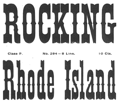
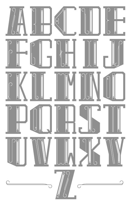
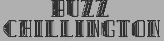
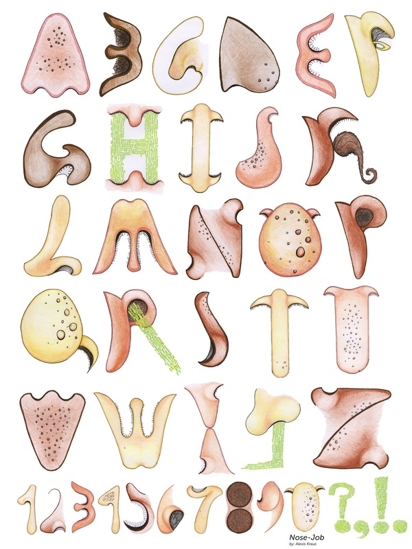
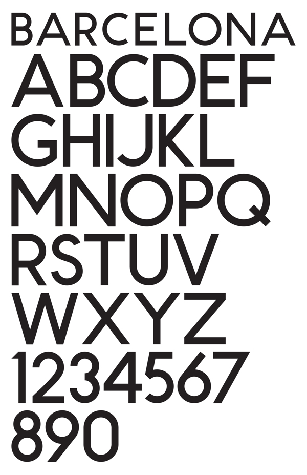
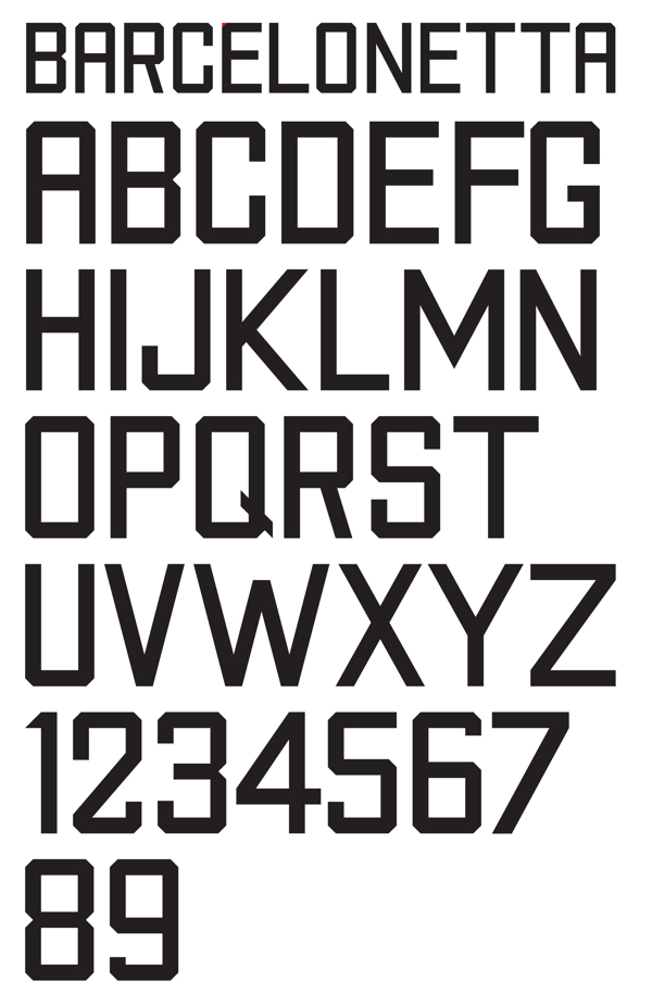
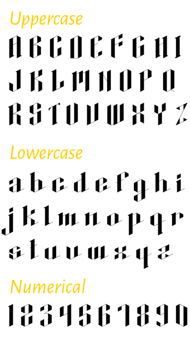
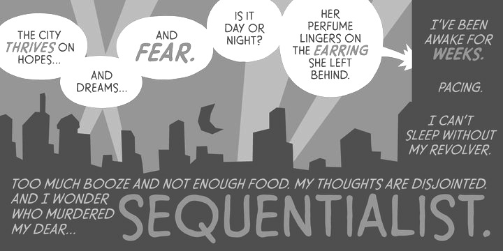
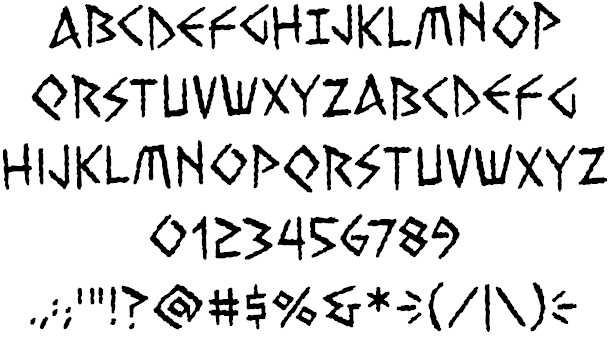
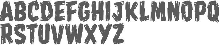
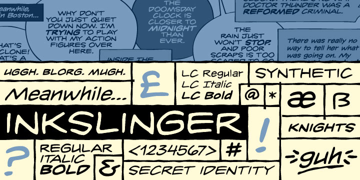
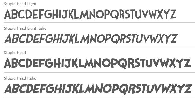
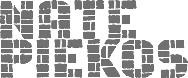
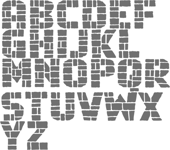
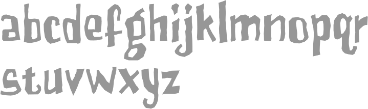
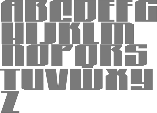
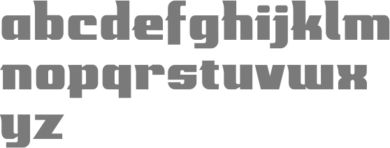
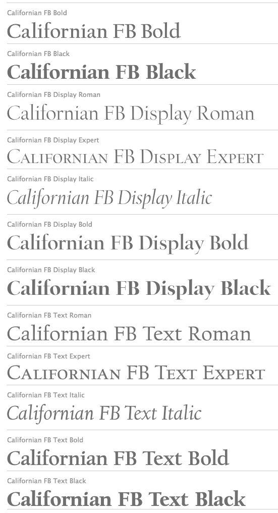
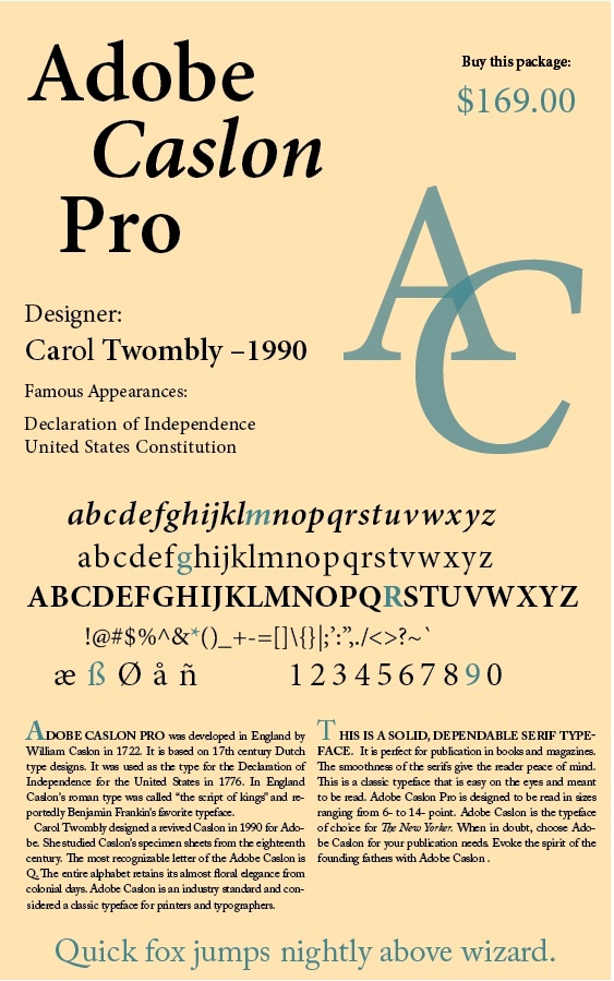
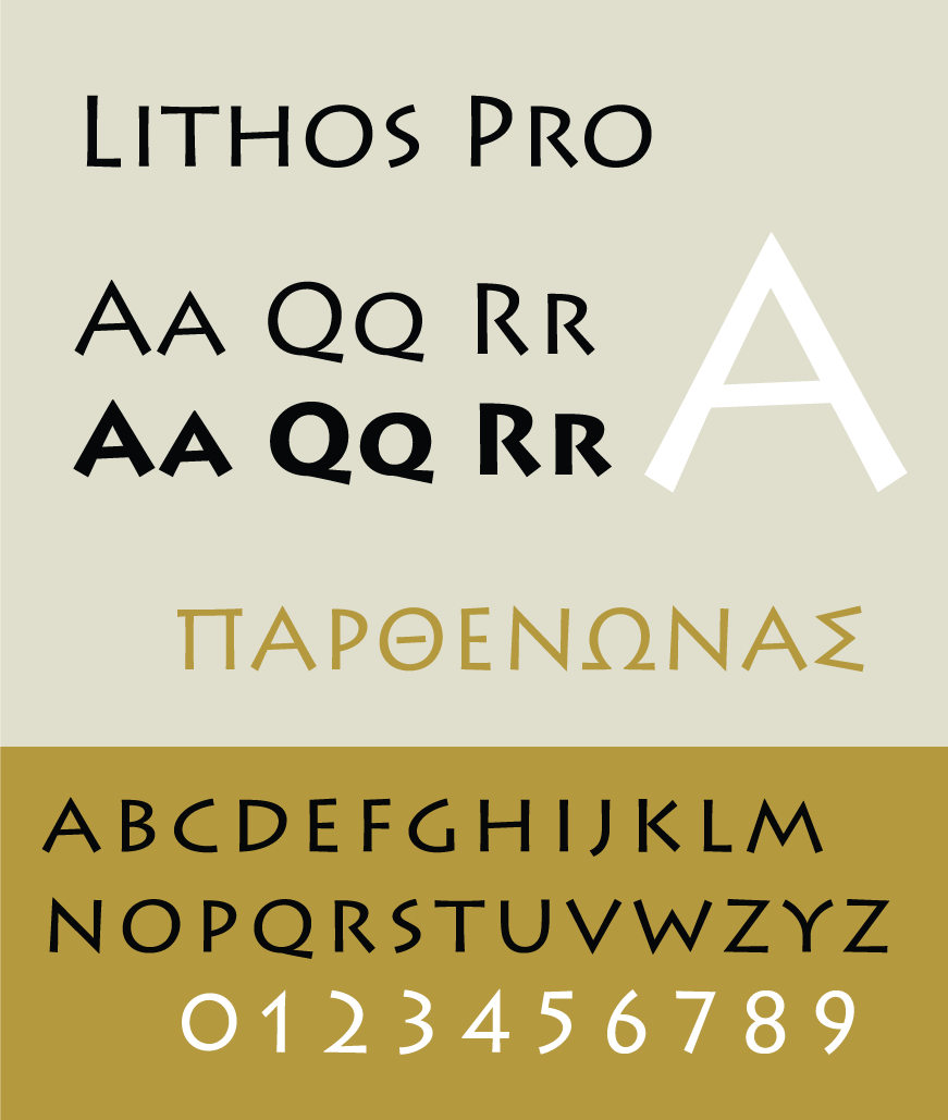
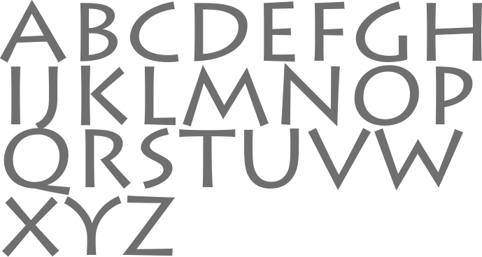
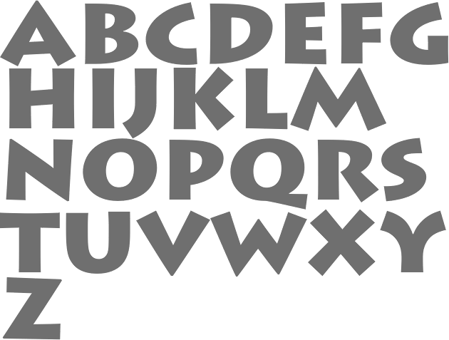
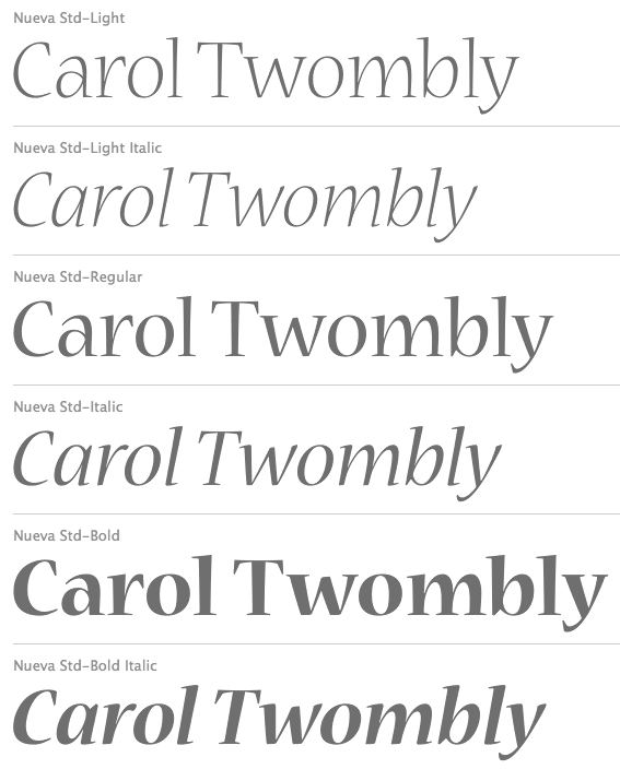
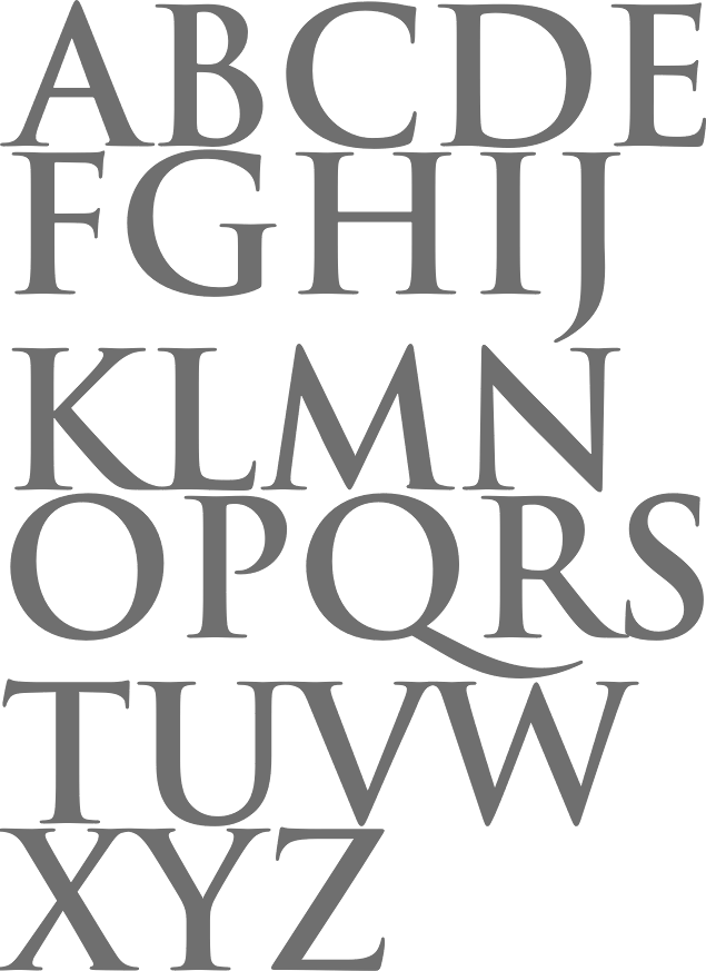
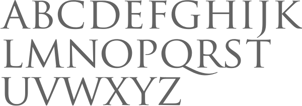
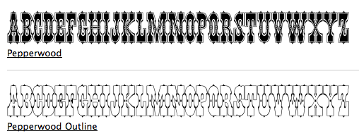
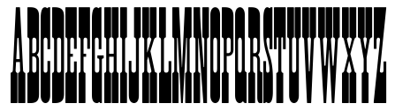
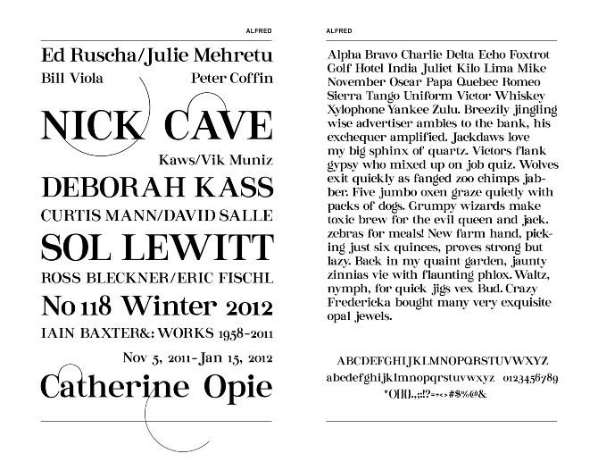
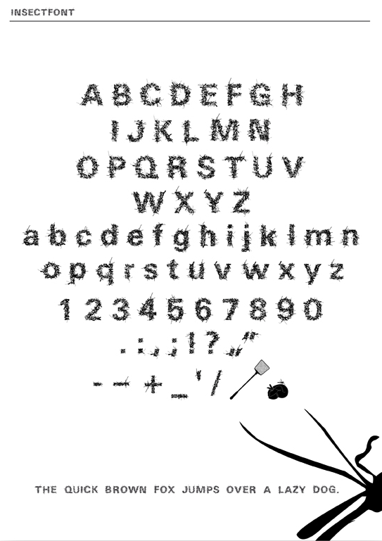
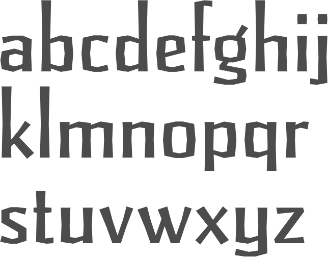
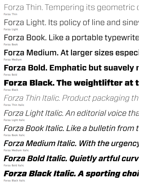
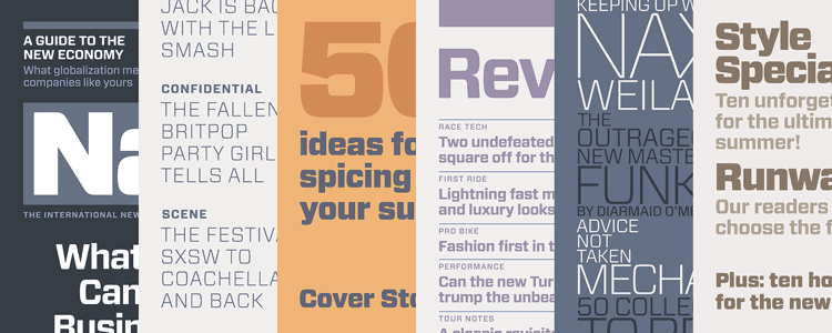
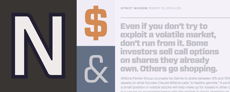
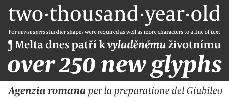
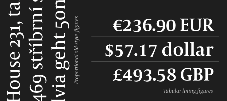
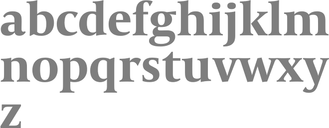
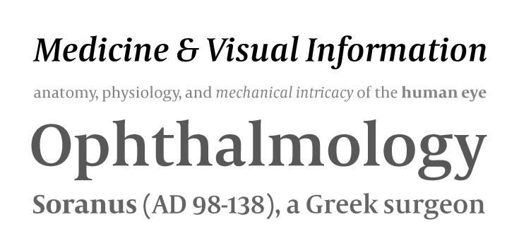
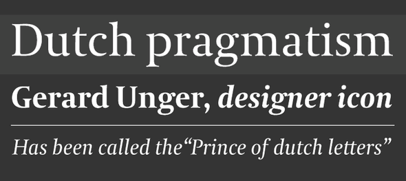
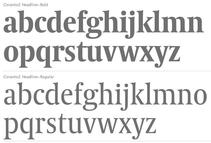
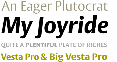
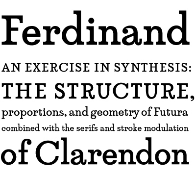
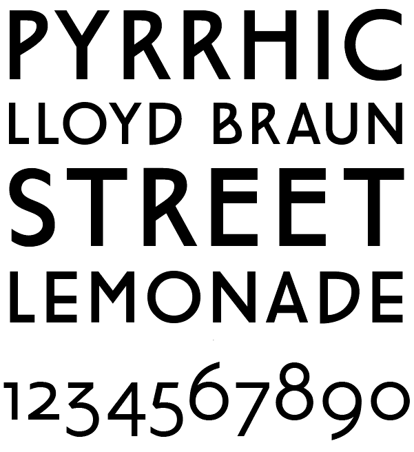
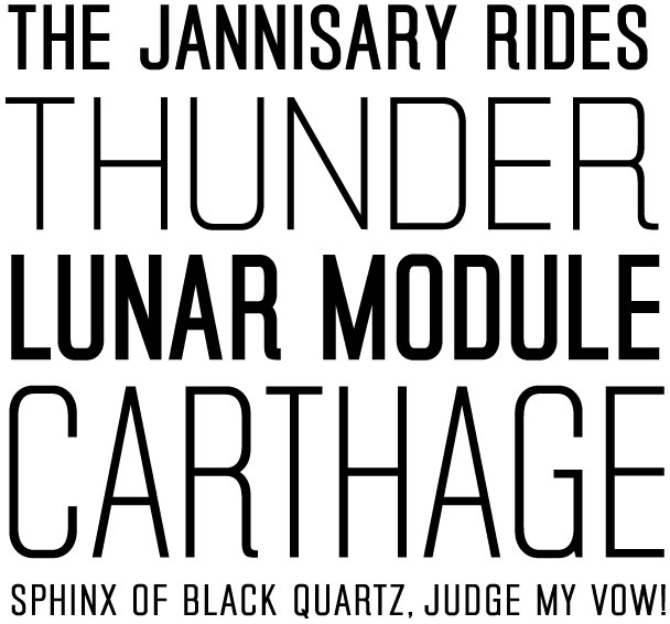
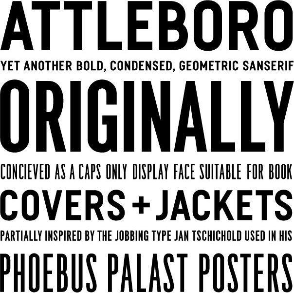
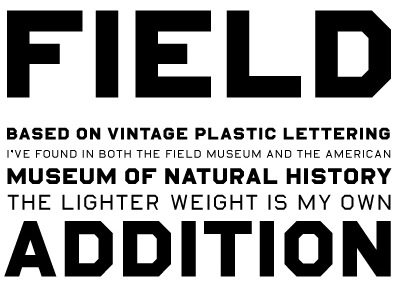
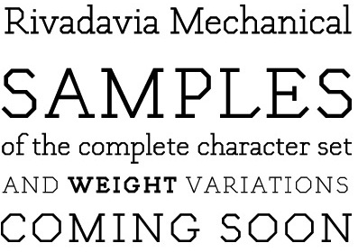
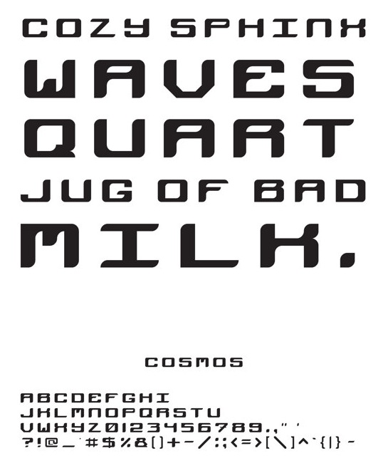
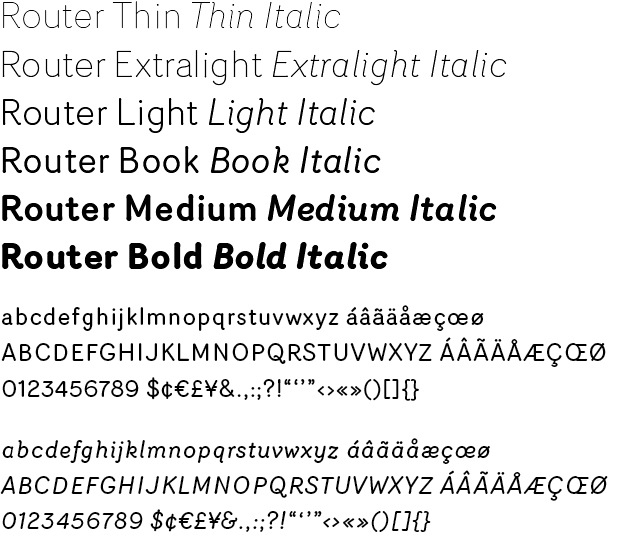
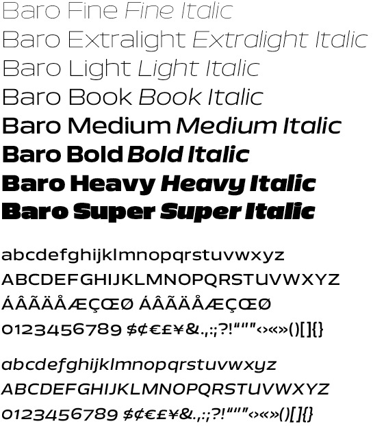
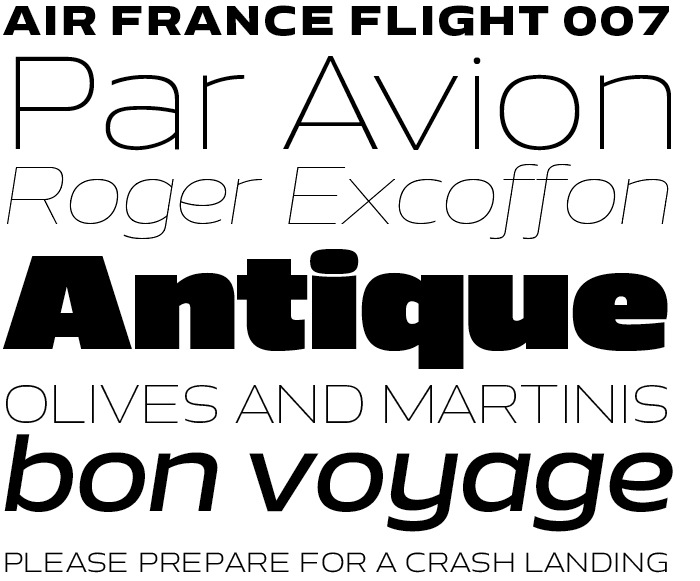
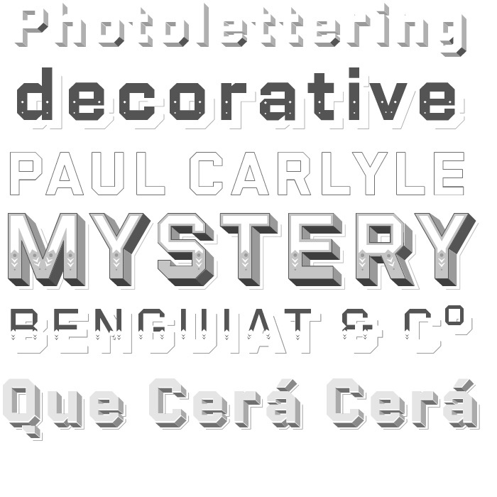
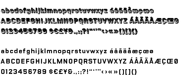
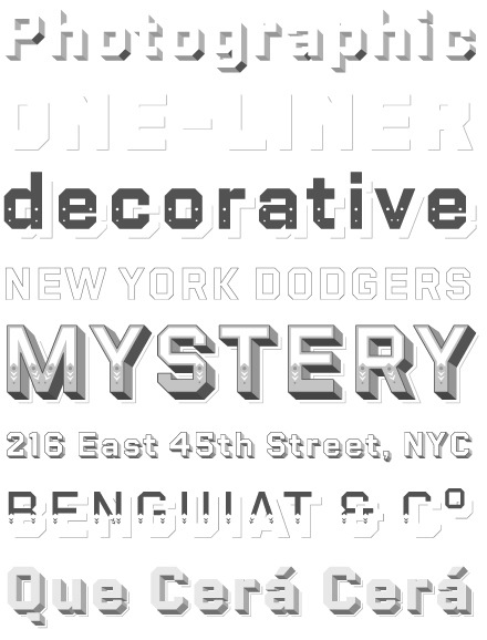
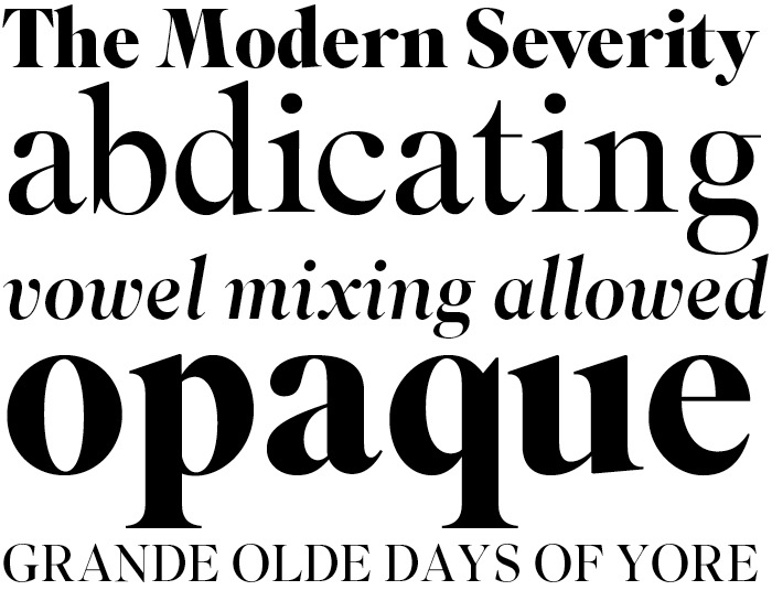
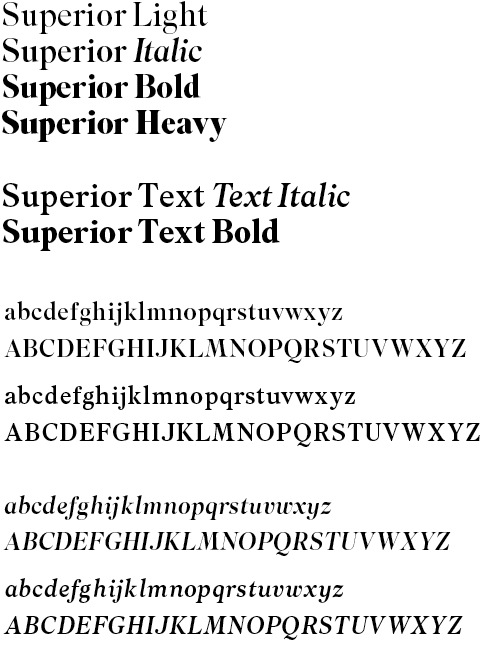
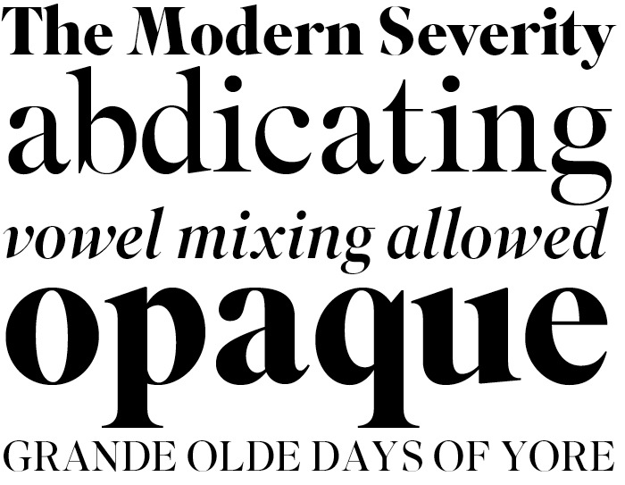
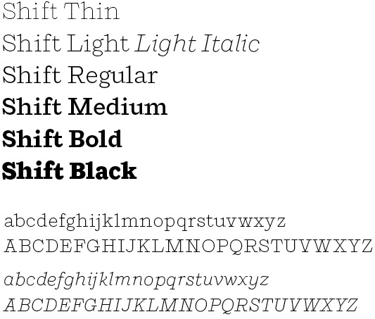
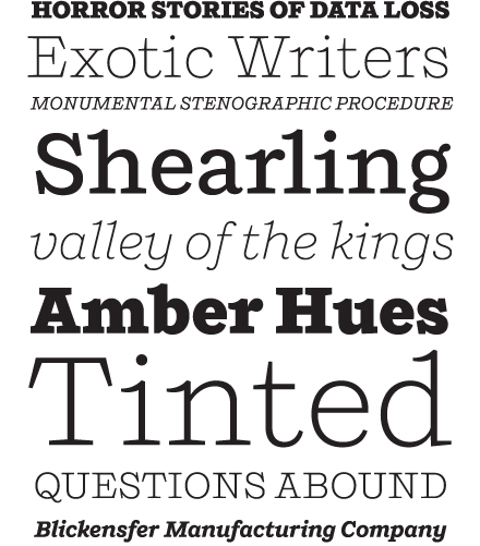
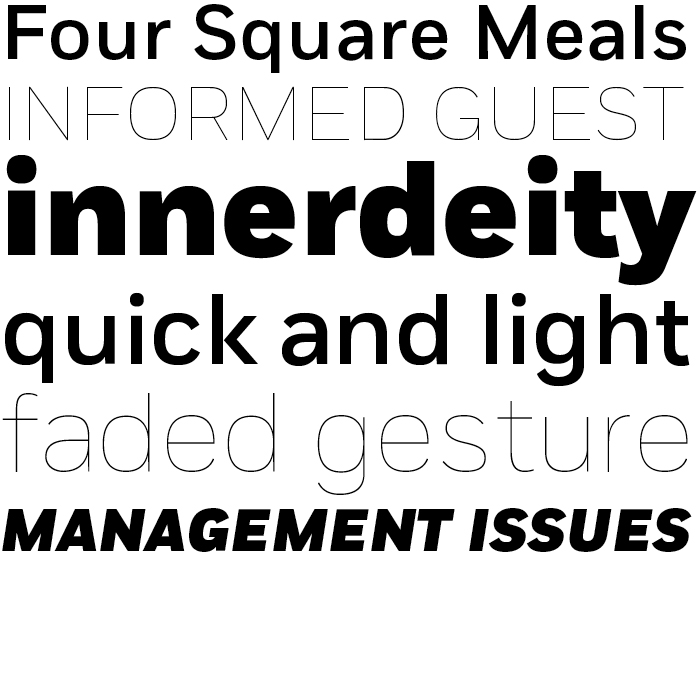
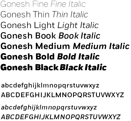
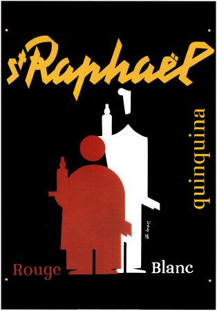
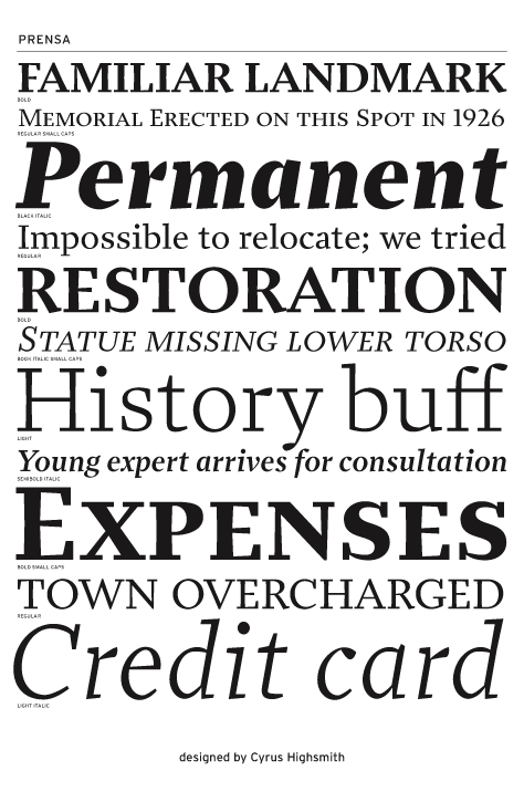
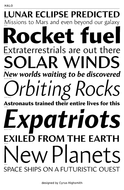
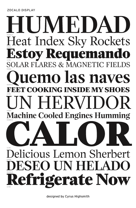
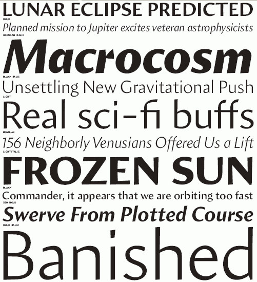
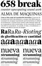
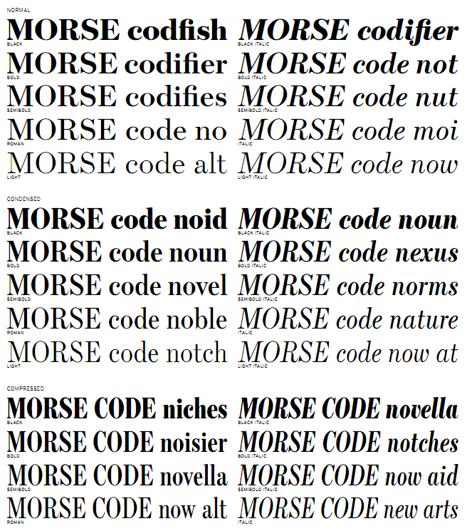
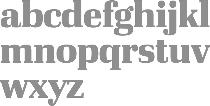
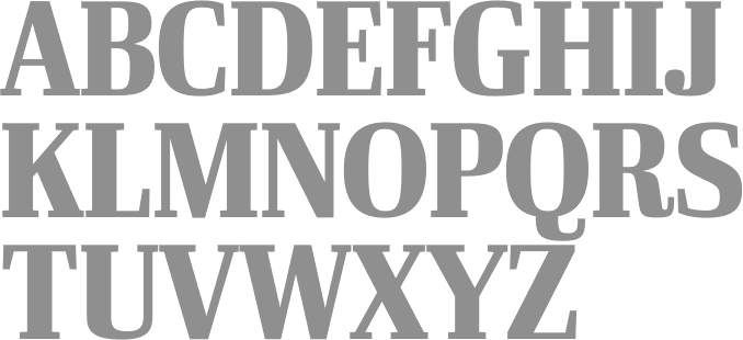
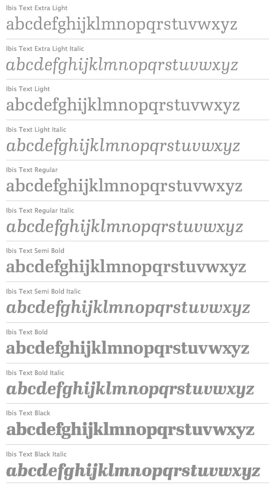
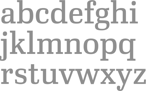
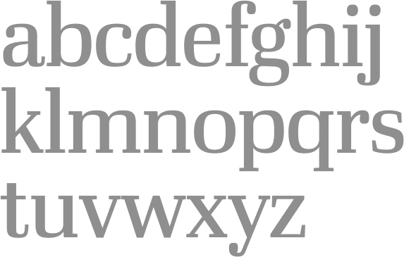
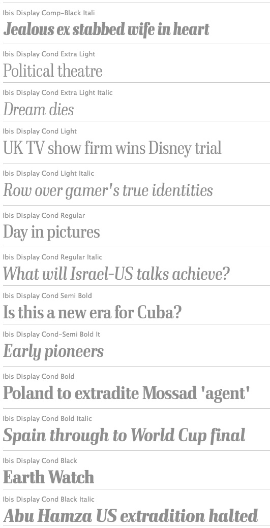
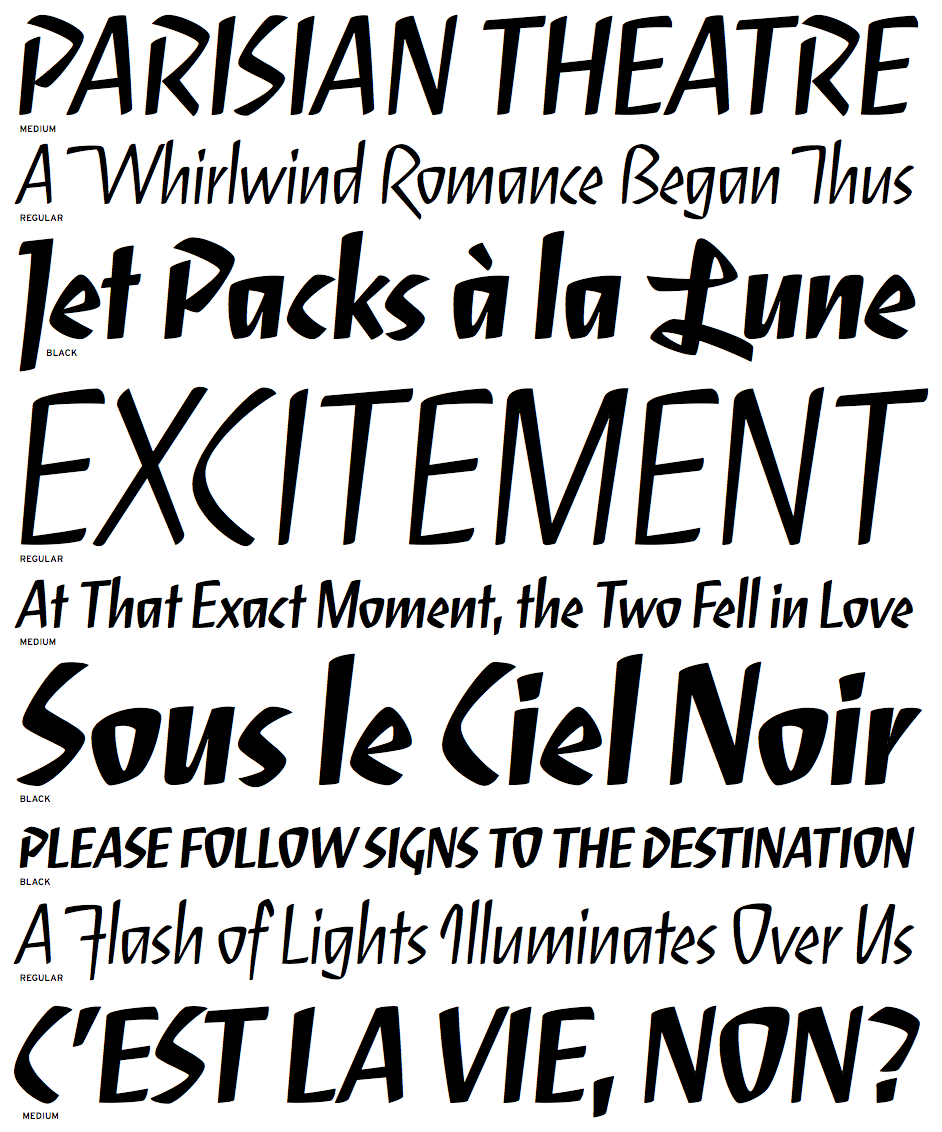
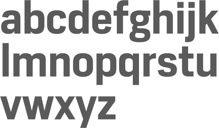
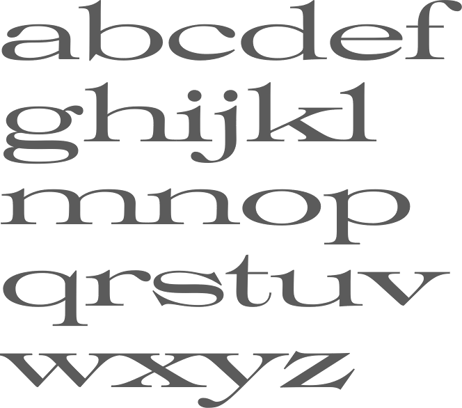
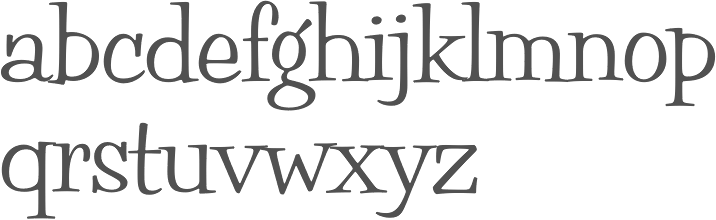
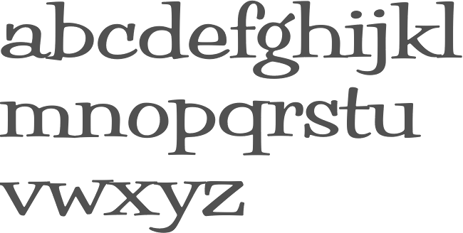
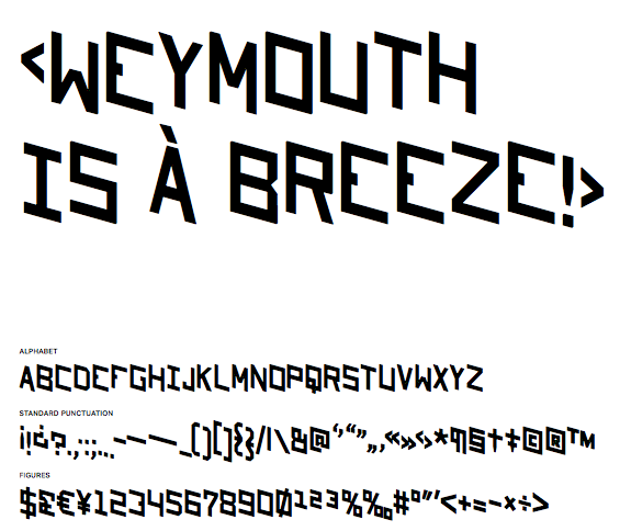
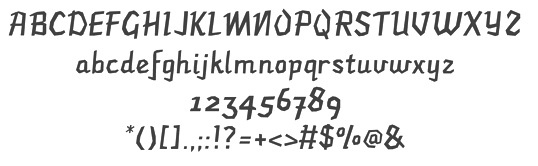
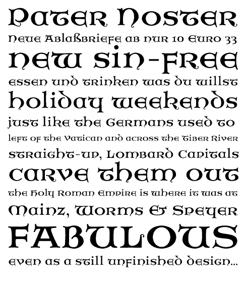
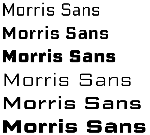
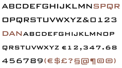
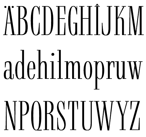
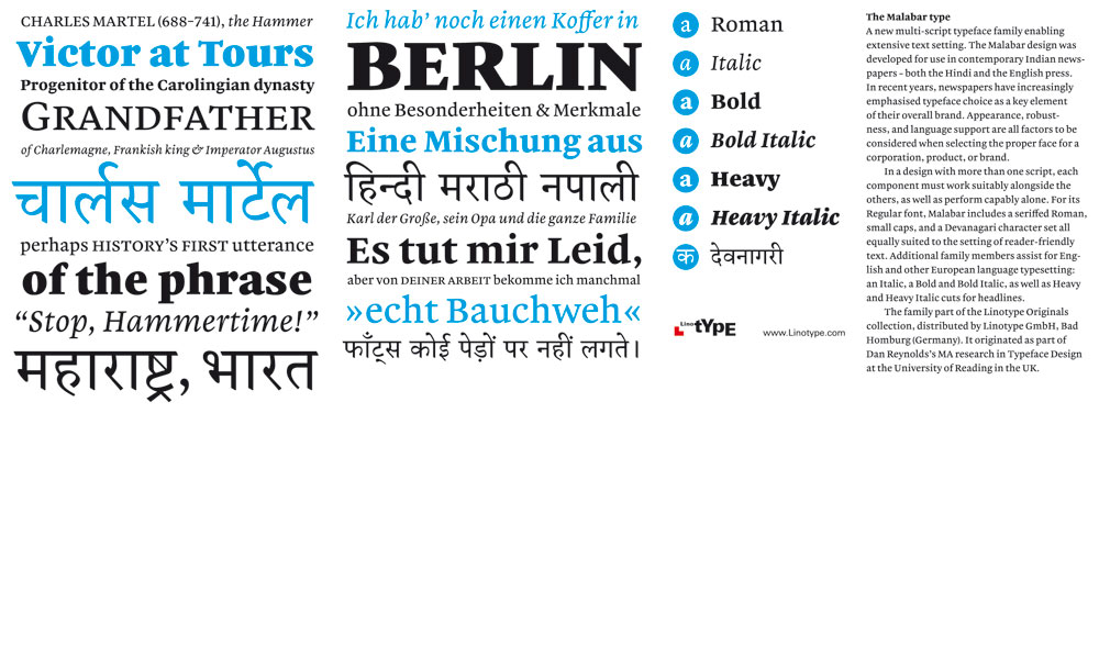
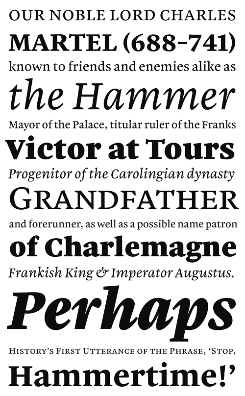
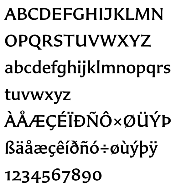