TYPE DESIGN INFORMATION PAGE last updated on Sun Jan 25 02:44:12 EST 2026
FONT RECOGNITION VIA FONT MOOSE
|
|
|
|
|
The Finnish type scene | ||
|
|
|
|
SWITCH TO INDEX FILE
Aarno Hohti
| |
abstra.type.design
| Finnish design consortium. About 3 dollars per font. Among the mostly display typefaces, I like penetrati (by Vesa Kautto), Electra-Normal (by Anna-Elina Aartola), and abstra (by Vesa Kautto). [Google] [More] ⦿ |
Kouvola, Finland-based designer of the rune-inspired typeface Ilmatar (2017). [Google] [More] ⦿ | |
Illustrator and graphic designer based in Helsinki, Finland. In 2017, she created the funky (children's book?) poster typeface Friend. [Google] [More] ⦿ | |
Graphic designer in Helsinki, Finland, who created the sans typeface aarne in 2012. [Google] [More] ⦿ | |
Graphic designer in Helsinki. She created the hairline hipster typeface Fox in a Box (2015). [Google] [More] ⦿ | |
Helsinki, Finland-based designer of the spurred typeface Riivio (2017). [Google] [More] ⦿ | |
Industrial designer. Amy's typeface Aalto (2012) is inspired by the well-known Finnish architect and designer Alvar Aalto. She also made the custom font Articule (2012) for a gallery in Montreal. [Google] [More] ⦿ | |
During her studies, Anastasia Ev (Mikkeli, Finland) created a Finnish rune simulation font (2013). [Google] [More] ⦿ | |
Vaasa, Finland-based designer of the free hipsterish sans typeface Vernal Sans (2016). Behance link. [Google] [More] ⦿ | |
Helsinki, Finland-based designer of the free heavy handcrafted font Icecany Fontantara (or Tropical Ice) (2016, during her studies at Srishti Institute of Art, Design and Technology). Behance link. [Google] [More] ⦿ | |
Lahti, Finland-based designer. Creator of the free fat counterless typeface Much Bolder (2009). [Google] [More] ⦿ | |
APL
| Aarno Hohti's free metafont for APL. Plus many files for TEX users who want to set APL code nicely. [Google] [More] ⦿ |
Based in San Francisco, AppDynamics is an enterprise software company specialising in application performance monitoring software that ensures the smooth running of business-critical applications In 2019, a rebranding of AppDynamics led to the corporate typeface AppD Sans, which was jointly developed by Göran Söderstrom (Sweden), Paul Russell (New Zealand), Kallan & Co (Finland), Brett King (Finland) and Hannu Koho (Finland). [Google] [More] ⦿ | |
Ari Koivunen
| |
Finnish designer of the octagonal techno font Nouveau IBM (2009). [Google] [More] ⦿ | |
Finnish type designer and artist. One of his creations was the first Finnish initial and ornamental character set called Jorma, which was first shown in the Kirjapainotaito-magazine in 1914. [Google] [More] ⦿ | |
Nice free utility and barcode (BarfCode.ttf) created by Hannu Helminen, 1999. [Google] [More] ⦿ | |
Besarion Paata Gugushvili
| |
Bitmap fonts at the University of Vaasa, Finland. Archive. [Google] [More] ⦿ | |
BPG Fonts
|
Besarion Paata Gugushvili Gugushvili designed the Georgian glyphs for the DejaVu typeface. He was also involved in the design of the Georgian script for the Nokia Pure typeface. Finally, he made a series of Georgian fonts with the acronym BPG in the font names and ran BPG-InfoTech. These fonts include
They are now part of the Dejavu open source font distribution (see also here). Some downloads and discussions here. Google group presence. BPG Classic Medium. BPG Dede Ena Block. BPG Glaho (2005) is here. Other families less easy to locate include BPG Afxazeti (2005). BPG Dede Ena. Direct access to these BPG fonts: BPGAcademiuriUAm, BPGChveulebriviUm, BPGClassic99U, BPGDumbadzeU, BPGLortkipanidzeU, BPGMikheilStefaneUm, BPGNinoKhutsuriU, BPGPaataKhutsuriMtavruli, BPGPaataKhutsuriU, BPGParisianU, BPGSanSerDina, BPGSansSerifUE, BPGSanSerUE2, BPGSanSerUE!, BPGSanSerUEm, BPGSerifUE, BPGSysVarEU, BPGUcnobiU. Nice 19th century fonts, with characters in unicode positions. Alternate URL. Download link. [Google] [More] ⦿ |
Brian Kaszonyi
| |
Foundry in Helsingfors, Finland, who were earlier in Jena. They acted as the foundry of the university there. The foundry stayed in Helsingfors under the leadership of one of the sons until 1924, when it was sold to Genzsch & Heyse. [Google] [More] ⦿ | |
Circus Design
| Finnish art director Brian Kaszonyi is the designer of CircusRootbeer, Circus Robot and Circus Mouse (1992). Co-designer with Tomi Haaparanta of the FUSE95 experimental font FutuRoman. Codesigner with Peter Kaszonyi of CircusRex (1993). All these fonts are still available from FontHaus. Codesigner with Tomi Haaparanta and Klaus Haapaniemi of the 15-font War family in 1999-2000. In 2013, in cooperation with Tomi Haapranta, he created a decomposed monoline layered text face, Tee Franklin. His corporate typefaces include designs done for Finnish pulp and packaging giant Stora Enso. Cargo Collective link. [Google] [More] ⦿ |
Cloud9 Type Dept and Paavola Type Studio
|
In 2015, Jani published the painter's brush typeface Truffaux Pro. In 2016, he added the geometric sans family Agis and Harpers Grotesque. In 2017, Paavola designed the German expressionist typeface Aunque. In 2018, he published Albeit Grotesk Caps, Albeit Grotesk Stencil Caps, and Albeit Grotesk Rounded Caps. In 2020, at Paavola Type Studio, he released Seigneur Serif Display, a high-contrast serif in the Dutch tradition (his own words). Typefaces from 2021: Winkell (an origami-style display typeface). [Google] [MyFonts] [More] ⦿ |
Cosmonaut Fonts
|
The foundry is under reconstruction but its fonts survive at TypOasis. Fontspace link. Dafont link. [Google] [More] ⦿ |
Cufon
| Free software published in 2009 to render text in a font of one's choice. Developed by Simo Kinnunen. From the announcement: Cufon aims to become a worthy alternative to sIFR, which despite its merits still remains painfully tricky to set up and use. To achieve this ambitious goal the following requirements were set:
Cufon consists of a font generator, which converts fonts to a proprietary format and a rendering engine written in JavaScript. In reality the generator is little more than a web-based interface to FontForge. First, the generator builds a custom FontForge script based on user input and then runs it, saving the result as an SVG font. The SVG font is then parsed and SVG paths are converted to VML paths. This is a crucial step in achieving stellar performance in Internet Explorer, as it supports VML natively. The resulting document is then converted into JSON with a mix of functional JavaScript. This has numerous advantages:
|
Curvy Fonts
| Turku, Finland-based designer, b. 1962, who founded Curvy Fonts. His typeface include the semi-psychedelic typeface Whimple Whomple (2018) and the hippie fonts Ari Cube Spiro (2019) and Ari Cube (2019). [Google] [MyFonts] [More] ⦿ |
Juha Rautiainen (Freak)'s Finnish archive with well over 700 truetype fonts. [Google] [More] ⦿ | |
Darkmind (Darkbase) is the Finnish designer of the handwriting typeface Freeform0001 (2003). Alternate URL. [Google] [More] ⦿ | |
Finnish company selling Cyrillic typefaces and barcode fonts and software. Webmaster Joni-Pekka Kurronen. [Google] [More] ⦿ | |
Behance link. [Google] [More] ⦿ | |
Creator of esint10, a font with integrals of various sizes and kinds. This font was converted into type 1 by Martti Nikunen in 2005: see here. Nikunen used mftrace on the metafont output. [Google] [More] ⦿ | |
Finnish American architect who drew the squarish lettering for Eero, a type family created in 2003 by Christian Schwartz. Eero is used in the Dulles International Airport, and was commissioned by House Industries. In 2014, Miranda Roth (P22) created a set of eight fonts in Saarinen's architectural style, simply called P22 Saarinen. [Google] [More] ⦿ | |
Helsinki-based graduate of the TypeMedia program at the KABK in The Hague in 2017. His graduation typeface at KABK was Chariots of Fire (2017): Theatrical, grandiose and historically inaccurate. Chariots of Fire is a costume drama in a typeface. My mission was to mix various expressive styles within the same family, and see how far I could take it. This journey brought about 4 weights called Style, Class, Flair & Panache: a roman for display, a roman for text, the italic companion and one extended joker-face. Also, there is a set of small caps with suddenly no serifs. I wanted to dedicate this piece of work to Vangelis, but accidentally purchased a picture of Demis Roussos instead. Chariots of Fire is currently unreleased and will probably stay that way. [Google] [More] ⦿ | |
Finnish designer of the handwriting fonts Pwnisher1, Pwnisher2 and Pwnisher3 (2010). [Google] [More] ⦿ | |
During her studies in Helsinki, Elina Nikkinen designed the angular typeface Kota (2017). Behance link. [Google] [More] ⦿ | |
Emil Karl Bertell
| |
Emma Laiho studied at the Aalto University School of Art and Design in Helsinki. In 2011, she obtained a Masters in the type and media program of KABK. Her graphic design involves mainly editorial and book design. Her graduation typeface at KABK was Taiga (2011), a text family for books. [Google] [More] ⦿ | |
Erik Bertell
|
Erik's fonts EB Base Mono (2009, monospaced), EB Futuretro (2002, bilined art deco techno face), EB Neon (2002), EB Boogie Monster (2002, multiline prismatic op art family), EB Vintage Future and EB Humboldt (2002, ultra fat). EB Martin (2010) is, in his own words, a post modern take on several traditional blackletter types. EB Bellissimo Display (2010) is a rounded monoline geometric sans typeface family. EB Jessica (2011) is part typewriter, part cemetery. Typefaces from 2013: Steamer (which he calls a grimy grotesque), EB Vintage Future, EB Martin (blackletter), EB Jessica Condensed Book. Moomin (2015) is a custom typeface designed for the Moomin brand. It is based the type used in the early comic strips by Tove Jansson, the author and creator of the Moomins. Cavalier (2016) is an avant-garde sans in the style of the 1970s. Typefaces from 2018: Capital (a sans and serif family by Teo Tuominen, Erik Jarl Bertell and Emil Karl Bertell). Typeface from 2019: Portland (a reverse contrast typeface by Emil Bertell, Erik Bertell and Teo Tuominen), Taurus (an all caps logotype family by Emil Bertell, Erik Bertell and Teo Tuominen), Zeit (a transitional text typeface by Emil Bertell, Erik Bertell and Teo Tuominen), Avion (a sans family by Emil Bertell, Erik Bertell and Teo Tuominen), Fabrica (a decorative frilly didone by Emil Bertell, Erik Bertell and Teo Tuominen), Tapas (by Emil Bertell, Erik Bertell and Teo Tuominen: a Serif, Sans, Deco and Script collection), Galatea (a 48-style sans family by Erik and Emil Bertell), Well (Erik Bertell and Toni Hurme: a wavy custom display typeface for Well Coffee), Morison (a great 32-style wedge serif typeface by Erik and Emil Bertell and Teo Tuominen), Frank Sans (grungy). Typefaces from 2020: Laurel (by Teo Tuominen, Emil Bertell and Erik Bertell: a 4 style sans with amnay wedge elements), Resolve Sans (by Teo Tuominen, Emil Bertell and Erik Bertell: an extensive grotesk super family of 124 fonts: from compressed to extended, thin to black), Rockford Sans (2020: an 8-style geometric sans with large x-height and slightly rounded corners; Emil Bertell, Erik Bertell and Teo Tuominen), Walden (a heavy rustic serif typeface by Emil Bertell, Erik Bertell and Teo Tuominen), Klik (a geometric sans family with Bauhaus influences, by the dynamic trio of Emil Bertell, Erik Bertell and Teo Tuominen). Typefaces from 2021: Imagist (a 12-style sharp-edged serif by Emil Bertell, Erik Bertell and Teo Tuominen), Alonzo (a 24-style Peignotian sans by Emil Bertell, Erik Bertell and Teo Tuominen), Maine (a 12-style modernized book antiqua by Emil Bertell, Erik Bertell and Teo Tuominen), Lagom (a 16-style slab serif with some Clarendon charm; by Emil Bertell, Erik Bertell and Teo Tuominen), Wonder (a 12-style rounded serif in the style of Windsor; by Emil Bertell, Erik Bertell and Teo Tuominen), Grand Cru (a refined serif family with 36 styles; by Emil Bertell, Erik Bertell and Teo Tuominen). Link to Bond Creative Agency. Behance link. [Google] [MyFonts] [More] ⦿ |
Erik Jarl Bertell
| |
Esa Anttikoski
| |
Eskimo Creative
|
Typefaces from 2017: Happy Trendy (brush script), South Mind. Behance link. Graphicriver link. [Google] [More] ⦿ |
Euroset Oy--Xxpress Oy (or: Vektorointi Lauri Alku)
| Finnish outfit owning the rights to the font Nokia by Lauri Alku, 1990. [Google] [More] ⦿ |
Illustrator, graphic designer and artist in Helsinki, Finland, b. 1988. During her studies at Aalto University of Art and Design, she started work on the text typeface Sukiyaki (2012-2014). Devian Tart link. Behance link. [Google] [More] ⦿ | |
Fenotype
|
Typefaces made in 2002: Disco (prismatic), Lakmus, Valimo, FUTU, Test1, Foton Torpedo, Cheaptype, Personal Computer, Copycut, Unicode 0024, HKI Metro, HKI NightLife, Digital Kauno, Fenotravels (dingbats), Tivoli, Kosmonaut, 10124, JouluFonttiFenotype, Testi, 1laitos, 1120, 0629 (2002, a kitchen tile font), 0927, 0210, FTdingsprevi, Fenotypedings#lego3, Genotype, NeoPangaia, NeoPangaia 2, Nipponblocks, Pectopah, Personalcomputer, Pouttu, Samarin (2002, athletic lettering), Unicode0024, URALphat, URALthin, URAL, URAL3d (all Latin/Cyrillic fonts with incomplete punctuation though), Automania (multiline), Copycut, Halo, 222_2003, Tantor, Letters, Rikos, Lastu, ThreeTheHardWay, Bukkake, Halo. Emil's brother Erik designed Neon (paperclip face), Mama and Mama Round (paperclip typefaces). In private email, he calls himself Carl. The foundry evolved from 2theleft. Fonts made in 2003: Military Dingbats, 08 02 03 Fenotype, Projectsfenotype, Rock-it. Fonts made in 2004: Scandinavian Titan white, Scandinavian Titan, Acid Test 2, Acid Test (texture typefaces), 080203, Letters11, Linja, Projects, Rock it, Simpletype. Commercial typefaces: Sapluuna, Shortcut, Transeuro-Express, Omega-Uros, Fenotype Dings, Military Dingbats, Nippon Noodle. Typefaces made in 2004: Kolari, Kolari Light, FTfaces, Twisted Ontogenesis. Alternate URL. In 2005: RoundAbout, Nihilist Philosophy, Boogie Monster, Chunky Hunk (Western), Diy Typeface (kitchen tile style), Futuretro (stencil-like), 3TheHardWayOverrun, Pedant Dilettante, FT Rosecube, FT Blockbuster, 3TheHardWayRMX, Adios Gringo (Western face), Helsingfurt (3d oil glow face), Cream Soda (liquid), Thashed Paper Bag, Big Medium. In 2006: Rock It Deluxe (grunge), Cassette (dingbats), Kings Garden (Japanese trees as dingbats). MyFonts link, opened in 2009, where one can buy 080203, 3 The Hard Way Overrun, 3 The Hard Way RMX, Adios Gringo, Depth Charge, FT Helsingfurt, FT Roundabout, FT Scandinavian Titan, FT Twisted Ontogenesis, Ice Cream Soda, Kings Garden, Kolari, Nihilist Philosophy, Old Note, Rock It, November Script, and Majestic Mishmash (ransom note caps), Digital Kauno (2002, upright script), 10.12, EB Vintage Future, Fenotype Dingbats, FT Forest, FT Funghis, FT Military Dingbats, FT Weapon of Choice, Motel Xenia, URAL, Valima. Additions in 2010: Linguine (connected script), FT Telegraph (slab serif), FT Brush, FT Industry Machine, FT Giorgio, Killer Elephant (signage), FT Supervisor (ultra-condensed), FT Dead Mans Diary (scribbly), FT Grandpa Script (grunge calligraphy), FT Stamper (angular lettering), FT Tantor (fat, rounded), FT Bronson (fat display typeface with mustache dings thrown in), FT Master of Poster (bi-level display typeface with many ligatures and interlocking letters), FT Hidden Forest (tree dingbats), FT Mammoth (grotesque headline face), Rikos (futuristic), Squarendon Extra Bold (2010, a Clarendon), FT Moonshine Script (a Treefrog style face), Billboard (a hand-printed rounded caps family), EB Bellissimo Display (rounded monoline sans), Malamondo (an all caps display typeface with a large number of interlocking ligatures), Linja (2002 and 2010, a rounded ultra condensed family), Punavuori (2002 and 2010: a monoline sans family), Signor (2010, a rounded all caps family), Mrs. Lolita (connected script), Funghi Mania (mushroom dingbats), Funghi Mania Script, Darlington (very open upright connected script family), Archipelago (+Caps: an upright connected script), Tower (pieces that enable one to modularly construct towers when stacked; created as a school assignment at the University of Industrial Art&Design Helsinki in 2006), Monster (just as Tower but for monsters), Verna (informal face with ball terminals), Verner (2010, a connected script version of Verna), Verner (2010, a connected script version of Verna). Typefaces from 2011: Pepita Script (an upright connected script with small lachrymal terminals), Pepito (its nonconnected version), Barber (upright script family), Banzai Bros (a fat caps-only signage face), Mishka (an upright connected script with tear drop terminals). In 2012, he created Salamander Script, Taiga (connected upright script), Mercury Script (a set of upright connected script typefaces), Slim Tony (a bubblegum retro signage face) and Mercury Ornaments. Typefaces from 2013: No. Seven (a successful brushy signage or baseball script), Alek and Alek Ornaments (an upright signage script), Voyage (a vintage script), Barracuda Script (brushy signage face), Bonbon (signage script), Bonbon Ornaments, Scaramouche (a playful connected script). Typefaces from 2014: Larry (sturdy connected script), Silver (upright connected script), Powder Script, Peaches And Cream (creamy signage or baseball script), In and Out (a connected retro signage script), The Carpenter (a script family in the style of Mercury Script). Typefaces from 2015: HMS Gilbert (a collection of 14 hand-crfated vintage types), Lager (a signage script family with adaptable swashes and other opentype goodies), Vanilla Shot, Journey (a smooth and elegant vintage script family of four weights and a matching ornament set, packed with alternate characters, and, in Bertell's style, perfect connections between glyphs), Tea Biscuit (signage script), Skipper, Skipper (connected script), Frost (a signage typeface that is just right, a sure award winner), Monday (sign apinting typeface). Typefaces from 2016: Jazz Script, Fragola (sign painting font), Syrup (sign painting font), Cosmopolitan (monoline connected script), Bluebell (copperplate calligraphic script), Inkston (vernacular brush script together with the standard handcrafted sans and text styles), Beaujolais (brush script), Black Script (a heavy signage script), Beaujolais (an organic brush script), Cold Brew (signage script), Inkheart (tattoo style). Typefaces from 2017: Camper (monoline script, accompanied by Camper Print), Aether Rain (thin script), Thang, Big Fish, Bolton (Bolton Script and Bolton Script, and the degraded Bolton Print pack), Vodka (Slab, Sans, Pen and Brush), Poster Brush, Fresh Press (signage style), Praktika (grotesk), Praktika Rounded, Blossoms, Kitchen (sign painting brush), Letterpress Studio, Takeaway, Aether Rain, Pitcher (baseball script), Karu (a workhorse sans), Bluebell (calligraphic), Roster (signage script), Dog Days, Catsy, Alfons (in Script, Display, Sans, Serif, Tiki, Extras and Ornaments subfamilies), Cosmopolitan (monoline script and sans pair), Snooker (retro signage script), Salty (a creamy brushed signage typeface). Typefaces from 2018: Aster Script, Audrey (a monoline script and sans duo), Galatea (a 48-style sans family by Erik and Emil Bertell), Double Porter (an 18-style font collection with scripts, sans, and grunge faces thrown in the mix), Matchstick, Fruitos, Corner Deli (a layerable set of fonts in script and sans styles), Bayamo (a brush script done for Monotype), Sidecar (a connected monoline neon sign script, and a matching sans), Ginger John, Brush Marker, Shirataki (monoline soft pen script), Ash (a crayon font), Breakfast Script, Dallas Print Shop (a display family by Teo Tuominen and Emil Karl Bertell), Capital (a sans and serif family by Teo Tuominen, Erik Jarl Bertell and Emil Karl Bertell). Elixir, Maestri (a classical connected scrupt by Teo Tuominen and Emil Karl Bertell), Popcorn (brush script), Cherry (signage script), Goodwater, Signature Script, Kingfisher (a beer botle signage script), Sonder (brush script). Typefaces from 2019: Taurus (an all caps logotype family by Emil Bertell, Erik Bertell and Teo Tuominen), Ex Libris (a high contrast flared serif titling font), Riley (a retro sign painting script), Allison Script, Milky (a sign-painting brush script), Portland (a reverse contrast typeface by Emil Bertell, Erik Bertell and Teo Tuominen), Zeit (a transitional text typeface by Emil Bertell, Erik Bertell and Teo Tuominen), Boardwalk Avenue Rough (a monoline script and a weathered all caps sans), Avion (a sans family by Emil Bertell, Erik Bertell and Teo Tuominen), Yes Script, Gainsborough (script), Florian (a roman typeface with crisp edges and some contrast), Vogue Sans (a haute couture all caps contrast sans), Fabrica (a decorative frilly didone by Emil Bertell, Erik Bertell and Teo Tuominen), Chai (an expressive sans / serif hybrid), Rainmaker Script (monoline), Aequitas (a stylish sharp-edged roman typeface family), Tapas (by Emil Bertell, Erik Bertell and Teo Tuominen: a Serif, Sans, Deco and Script collection), Lawrence (a stylish roman typeface), Kallio Brush (a signage brush script), Morison (a great 32-style wedge serif typeface by Erik and Emil Bertell and Teo Tuominen), Felicity Serif (a juicy bold high-contrast serif), Las Palmas (Brush, Pen, Slab, Condensed), Honey Drops, Explorer, Boardwalk Avenue (a sans/script font duo), Skye (a heavy decorative didone), Leftfield (a retro baseball script), Steak And Cheese, Agile Sans (a humanist sans by Emil Karl Bertell, Erik Jarl Bertell, and Teo Tuominen), Punk Rocker, Silverline, Perfume (Pen, Brush and Sans), Hops And Barley, Allison. Typefaces from 2020: Laurel (by Teo Tuominen, Emil Bertell and Erik Bertell: a 4 style sans with amnay wedge elements), Omnipop (Sans, Brush, Script), Paper Tiger (a Victorian Script accompanied by a condensed flared serif in two weights and a chunky sans serif), Resolve Sans (by Teo Tuominen, Emil Bertell and Erik Bertell: an extensive grotesk super family of 124 fonts: from compressed to extended, thin to black), Gambler (a 14-style display type collection), Rockford Sans (2020: an 8-style geometric sans with large x-height and slightly rounded corners; Emil Bertell, Erik Bertell and Teo Tuominen), Slacker (a brush script), Grand Atlantic (a vintage display package), Magnolia (Brush, Serif), Walden (a heavy rustic serif typeface by Emil Bertell, Erik Bertell and Teo Tuominen), Klik (a geometric sans family with Bauhaus influences, by the dynamic trio of Emil Bertell, Erik Bertell and Teo Tuominen), Rose Garden Deluxe (a font duo), Felicity (a heavyweight display sans). Typefaces from 2021: Alonzo (a 24-style Peignotian sans by Emil Bertell, Erik Bertell and Teo Tuominen), Imagist (a 12-style sharp-edged serif by Emil Bertell, Erik Bertell and Teo Tuominen), Maine (a 12-style modernized book antiqua by Emil Bertell, Erik Bertell and Teo Tuominen), Briston (a bold creamy serif in the Windsor genre), Lagom (a 16-style slab serif with some Clarendon charm; by Emil Bertell, Erik Bertell and Teo Tuominen), Skillet (a chubby Cooper Black-genre typeface full of hedonism and joie de vivre), Kings Valley (a decorative serif), Shaker Script (monolinear), Wonder (a 12-style rounded serif in the style of Windsor; by Emil Bertell, Erik Bertell and Teo Tuominen), Ellie Script (a signature script), Dirty Sundae (a casual font), Grand Cru (a refined serif family with 36 styles; by Emil Bertell, Erik Bertell and Teo Tuominen), Kiosk (a 4-style vintage headline typeface family in Script and Sans versions). Typefaces from 2022: Blood Orange (in the Cooper Black / Windsor / Souvenir genre), Tomato Ketchup (supermarket kitsch in the fat rounded Windsor genre). Dafont link. Behance link. Creative Market link. MyFonts interview. |
Fonticon
| John Joe Mittler (b. Tampere, Finland, 1974) runs Fonticon in Lapua, Finland. He specilaizes in dingbats, and made the Mannequin font series (2006), which has "anatomically correct high-resolution illustrations of women with diverse body weights and shapes, in diverse levels of clothing." Subfonts include Stout, Slim, Cup C, and Pregnant. MyFonts page. [Google] [MyFonts] [More] ⦿ |
Corporate type vendor in Espoo, Finland, acting for Linotype, FontShop, and others. [Google] [More] ⦿ | |
Finnish upstart foundry, which possibly ceased to exist. About five free Mac truetype fonts: Pisara (outlined handwriting--nice!), Digitaali, Japestyle, Treedee, Nohata. [Google] [More] ⦿ | |
Galina Eskimo
| |
Gerald Giampa
| |
Tatiana Evreinova writes in 2005: Grigori Evreinov had created a pseudo-graphic typeface called Styled. The goal was to simplify visual perception of the typeface and to strengthen legibility. The Styled typeface includes 26 pseudo-graphic tokens that are very similar to standard typeface and could be perceived relying on previous user experience. Tatiana got a PhD in Computer Science from the University of Tampere, Finland, in 2005. The Styled typeface minimized the number of eye movements in a research experiment. [Google] [More] ⦿ | |
Hanna Hakala is a type and graphic designer from Helsinki, Finland. She has studied graphic design at University of Art and Design Helsinki and type design at the Type and Media masters program at the Royal Academy of Arts in The Hague, The Netherlands. She has an MA in developmental genetics and has worked in Minneapolis and Helsinki as a research scientist. She has been involved with the design of several visual identities, magazines and books. In 2008, she started working for the design agency Hahmo. She is particularly interested in information design, multilingual projects and the design of Latin-Cyrillic typefaces. Hanna designed and released the text typeface family DTL Valiance (2007-2017) at Dutch Type Library. Speaker at ATypI 2011 in Reykjavik. [Google] [More] ⦿ | |
Harri Perälä from Finland created this gorgeous connected handwriting font, Tengwar Cursive TrueType Font v0.95. Free. Tengwar font tutorial. See also here. See also here. [Google] [More] ⦿ | |
Heikki Morgan Hämäläinen
| |
Heikki is a Sydney University Master of Multimedia (hons.) graduate and has also studied a Master of Arts degree in filmmaking at the University of Art and Design Helsinki, Finland. Currently, Heikki is employed at SeaLink Travel Group in Adelaide as Design Lead. He is the creator of the scratchy hand-printed typeface Else Type (2011, iFontMaker) and of the hand-printed typeface Hessutxt (2011, iFontMaker). [Google] [More] ⦿ | |
Helsinki Type Studio
|
|
While studying at the University of Lapland, Finland, class of 2015, Heta Kasurinen designed the nature-inspired art nouveau typeface Meadow (2015-2016). [Google] [More] ⦿ | |
Hiekka Graphics
|
Fonts made in 2010: Sketchetica (sketched Helvetica), Sketchetik (renamed Sketchetica?). Followed in 2013 by Sketchetik Fill. In 2013, he published Tushi (an attractive brush face), Savu (hand-lettered) and Sini Bold and Sini Ornaments (poster typefaces). Typefaces from 2014 include Golos. Behance link. Klingspor link. [Google] [MyFonts] [More] ⦿ |
Cargo collective link. Link at Underware. Alternate URL: This is playtime. His typefaces:
| |
Hurme Design
|
In 2016, he updated Hurme Geometric Sans 1 + 2, Hurme Geometric Sans 4, and Hurme Geometric Sans 3. In 2019, Erik Bertell and Toni Hurme co-designed the wavy custom display typeface Well for Well Coffee. Also, Hurme releases Hurme FIN 1a and 1b, and Hurme FIN Mono in 2019, all more or less monolinear with a wide choice of widths from Compressed to Extended. In 2021, he published Hurme tek (a squarish techno family). [Google] [MyFonts] [More] ⦿ |
Brighton, UK-based graphic designer and illustrator who grew up in Finland. During her studies at the University of Brighton, she created the display typeface Consideration (2016). Behance link. [Google] [More] ⦿ | |
Inselfonts is Andreas Saari (or Andreas Finn) in Finland. They published the free grunge typeface Andreus (2010). [Google] [More] ⦿ | |
Free code 128 barcode TrueType font. Check also here. [Google] [More] ⦿ | |
Rovaniemi, Finland-based designer of the heavy sans typeface Bulls (2017), which was created for a school project. [Google] [More] ⦿ | |
Coding that supports the following languages: Afrikaans, Catalan, Danish, Dutch, English, Faeroese, Finnish, French, German, Galician, Irish, Icelandic, Italian, Norwegian, Portuguese, Spanish and Swedish. See also here, here, here, here, here, here, here, and here. More specifically, other ISO-8859 groups are as follows:
| |
Type designer at Helsinki Type Studio. In 2011, he co-designed the sans typeface Relevant Regular with Niklas Ekholm. Corporate typefaces include Ylioppilaslehti (2014), Raudus sans and HTS Sans (2014, for Art Fair Tokyo), HTS One and HTS Mono (2016, with Niklas Ekholm), Botanic (2014, for Robin Albrecht), Yksi Sans (2015, for Yksi magazine). In 2015, Juho Hiilivirta, Niklas Ekholm and Jaakko Suomalainen co-designed the custom typeface Finlandica. Finlandica was commissioned by the Prime Minister's Office as part of a visual identity for Finland. They write: Ink traps like cuts from a blunt ax, makes the typeface reliable in small sizes and gives it character in large headlines. Like the Finnhorse it's a breed suitable both as riding horse and workhorse. Free download. In 2016, he finished Shoni Sans. Typefaces from 2017: Streamer, Tenerife. Behance link. [Google] [More] ⦿ | |
Designer (Pietarsaari, Finland) of the sans typeface Lagom Sans (2004), River (2006, a serif with lively slightly random edges), and Huckleberry (2005, Western face). [Google] [More] ⦿ | |
Jani Paavola
| |
Finnish creator of the fat finger typeface James Jeans (2012) and the textured typeface Dotted Newspaper (2012). In 2013, she made Mia's Greetings. [Google] [More] ⦿ | |
| |
Jarno Lukkarila
| |
Finnish student who graduated in 2007 from the University of Reading, where she designed Ilona, an informal rounded-serif face designed for children's books. [Google] [More] ⦿ | |
Helsinki-based designer who made a cute paper type out of crinkled sheets (2009). [Google] [More] ⦿ | |
Finnish FontStructor who made Coffee (2012), jere347 (2012, squarish) and jere123 (2012). [Google] [More] ⦿ | |
Finnish graphic design student in the UK. Creator of various experimental typefaces in 2012. [Google] [More] ⦿ | |
Jesse Juup
| |
JL-types Ky
| Juhani Lehtiranta holds a Ph.D. in linguistics, and lives and works in his place of birth, Nurmijärvi, near Helsinki. He has been busy with special fonts since 1985. In 1990 he established font design company, JL-types Ky. Lehtiranta's special interests are typefaces for European minority languages (e.g., Greek, Baltic, Sami, Cyrillic, Central European) and custom made fonts (e.g., barcode fonts (JLCode128, JLEAN, JLCode39, JLInterleaved2/5)). He created the first fonts for the Uralic Phonetic Alphabet in 1985 and published an OpenType phonetic font in 2005. He spoke at ATypI 2005 in Helsinki on A wild play with diacriticts, in which he discusses the Finnish language, Sami, and other special aerial languages. [Google] [More] ⦿ |
Finnish designer (b. 2002) of the children's script typeface Pahan Puuskahdus (2014) and Páákallojen hyókkáys (skulls). [Google] [More] ⦿ | |
Johannes Neumeier
| |
John Joe Mittler
| |
Typefaces from 2021: Dolph (a faux monospaced monolinear rounded sans). Future Fonts link. [Google] [More] ⦿ | |
Dafont link. Old URL. Additional URL. Font Squirrel link. Fontsy link. Abstract Fonts link. [Google] [More] ⦿ | |
Juhani Lehtiranta
| |
In 2012, he created the sans family Mogul and the monospaced Tutankhamono. In 2014, he published Turi (a slab serif inspired by Sami author Johan Turi's simultaneous perspective illustrations). In 2015, he made Tyrant. In 2015, Juho Hiilivirta, Niklas Ekholm and Jaakko Suomalainen co-designed the custom typeface Finlandica. Finlandica was commissioned by the Prime Minister's Office as part of a visual identity for Finland. They write: Ink traps like cuts from a blunt ax, makes the typeface reliable in small sizes and gives it character in large headlines. Like the Finnhorse it's a breed suitable both as riding horse and workhorse. Free download. In 2016, he created the sans typeface Rodham, and in 2017 the widely monospaced typeface Railo Thin. [Google] [More] ⦿ | |
Jukka Aalto, aka "Armadillo" comments from the font design trenches. Here are bits and pieces.
| |
Jukka Korpela
| |
Finland-born and Londrina, Brazil-based designer of Oliveira's Neon (2013), a FontStruct typeface that was inspired by neon signs from the 1920s. [Google] [More] ⦿ | |
Julia Sysmäläinen
| |
Juliasys
|
Julia created these typefaces:
Klingspor link. FontShop link. Behance link. Another Behance link. Art Lebedev link. [Google] [MyFonts] [More] ⦿ |
Jung-Lee Type Foundry
|
Lee and Martens co-designed Jungka (2013-2016), a sans typeface motivated as follows: We wanted to make a grotesk font positioned somewhere between Akzidenz grotesk, Helvetica and Univers---not as dry and distant as Univers, but devoid of the quirky uniformity of Helvetica. Jungka is more reminiscent of Akzidenz Grotesk than the other two typefaces. Other typefaces include Impact Nieuw (2012-2016), Vlees Sans (2016), Red Dawn (2016), Suomi 100 (2015: Suomi 100-Groteski and Suomi 100-Antiikva were designed for Finland's 100th birthday). In 2018, Karel Martens and Jungmyung Lee released Pirelli. They write: Pirelli is a revival of an anonymous grotesk typeface that Karel Martens once came across. Its mostly horizontal and vertical features with a mono-line structure and an absence of flourishes give it a concise expression. Yet, it has the distinctive motif of unusually high-waisted capitals, visible in all letters with bars, such as E, F, and P. This feature gives Pirelli the atmosphere of earlier Art Nouveau and Secessionist lettering. [Google] [More] ⦿ |
Jungmyung Lee
| |
Juraj Sukop
| |
During his studies at Kookmin University in South Korea, Tampere, Finland-based Jussi Ahola created the full hangul typeface Jangul (2013). [Google] [More] ⦿ | |
Visual information designer, consultant and teacher who lives and works at Tampere, Finland. He has an MA in media from Tampere University and Tampere University of Applied Sciences. He specializes in designing complex visual systems, like newspapers, magazines and web sites. He made the avant garde geometric sans typeface Alvar (2010). [Google] [More] ⦿ | |
Designer of the free comic book typeface Nibby (2010, Open Font Library). Abstract Fonts link. [Google] [More] ⦿ | |
From the University of Tampere, Finland, Jürgen F. Schopp's list of books on typography. He also has a nice page on type classification. For "broken" typefaces (gebrochene Schriften), Schopp proposes this:
| |
Juuso Salakka
| |
Finnish designer of the futuristic typeface Utopy (T-26, 2004). [Google] [More] ⦿ | |
Finnish designer of the free constructivist typeface Sovjet Box Bold (2015) and the squarish techno / sci-fi typeface Cubellan (2015). [Google] [More] ⦿ | |
Born in Turku, Finland, in 1955. Lecturer at the University of Art and Design in Helsinki since 1996. He has mainly focused on teaching lettering and basics of typography at both the BA and MA levels. He also arranged the first digital font design courses in UIAH in 1994-1995. He has a small studio on Harakka Island just off the Helsinki coastline. He was the main organizer of ATypI 2005 in Helsinki. [Google] [More] ⦿ | |
Graphic designer in Helsinki who created the wvy sans typeface Kiusa in 2015. Behance link. [Google] [More] ⦿ | |
| |
Graphic designer in Helsinki, who created the display typeface Airon (2013). [Google] [More] ⦿ | |
From the University of Tampere, Finland, Jürgen F. Schopp's list of type classifiactions. In German. [Google] [More] ⦿ | |
Finnish designer with Tomi Haaparanta and Brian Kaszonyi of the 15-font War family in 1999-2000. [Google] [More] ⦿ | |
Kokoro & Moi, established in 2001 in Helsinki, is a full-service creative agency specializing in brand strategies and identity design. In 2013, togethe with Underware, they designed the custom typeface family Stockmann Sans: Stockmann department stores were going through a major uplift in their brand and communications in 2012, when they decided to move away from the wide selection of font styles to a unified look-and-feel and smoother processes. The era of Helvetica and Garamond was coming to an end with a unique, handcrafted Stockmann Sans about to step in. Behance link. [Google] [More] ⦿ | |
Finnish Flash font site. Has the "Koneisto" typeface. [Google] [More] ⦿ | |
Finnish designer of the handcrafted typefaces Amazing Bro (2015), I Need Help (2015), I Love Pugs (2015) and Three Dots (2015). [Google] [More] ⦿ | |
Kristoffer Lindqvist
| |
Kunihiko Okano
| |
Lanston Type Co
|
The fonts: Albertan No. 977, Albertan Bold No. 978, Albertan Title No. 980,&Inline No. 979, Bodoni No. 175, Bodoni Bold No. 2175, Bodoni 26 (a Lanston unicase based on an interpretation by Sol Hess), No. 175, Caslon Old Style No. 337, Caslon Bold No's 637,&537, Deepdene No. 315, Figures Square No. 132, Flash No. 373, Fleurons C, Fleurons Granjon Folio, Fleurons Folio One, Forum No. 274, Francis No. 982, Garamont No. 248, Globe Gothic No's 240,&239,&230, Goudy Initials No. 296, Goudy Old Style No. 394, Goudy Thirty No. 392, Goudy Village (#2) No. 410, Hadriano Stone-Cut No. 409, Hadriano Title No. 309, Jacobean Initials, Jefferson Gothic No. 227, Jenson Old Style No. 508, Kaatskill No. 976, Kaufmann (Lanston Swing Bold) No. 217, Kennerley Old Style No. 268, Metropolitan No. 369, Obelisk No. 2577, Pabst Old Style No. 45, Pabst Old Style Open, Spire No. 377, 20th Century No. 605, Vine Leaves C, Vine Leaves Folio One, Vine Leaves Folio Two, Water Garden Ornaments. P22 writes this about Lanston: In the late 1800s, Tolbert Lanston licensed his technology to an English sister company and became a major international force. Lanston grew rapidly with America's pre-eminent type designer, Frederic Goudy, holding the position of art director from 1920-1947. The Philadelphia-based Lanston Monotype eventually parted ways with its English counterpart. English Monotype became simply known as Monotype from that time forth. Lanston was acquired by American Type Founders in 1969. After a series of other owners, the company found its way to master printer Gerald Giampa, who moved it to Prince Edward Island in 1988. During its time of transition, Lanston continued supplying the American market for monotype casters until January 21, 2000, when the hot-metal component of Lanston was tragically destroyed by a tidal wave. Giampa was one of the earliest developers of PostScript fonts. After the loss, he focused on digitization to an even greater extent. Under his stewardship, Lanston's classic typefaces were digitized in a style that was true to the sources, which are the brass and lead patterns from which the metal type was made. The past few years have seen Giampa and Lanston travel from Canada to Finland, and back again. Now, Lanston has completed another journey back to the United States to come under the care of a new steward: P22. Giampa is answering the call of the sea. He has traded his type founder's hat for that of a ship's captain to sail the northern Pacific coast. During his shore leaves, Giampa will act as typographic consultant to Lanston-P22. The P22 Lanston collection (2005-2006) was designed wih the help of people such as Paul Hunt and Colin Kahn. It includes these typefaces:
Fonts can be purchased from MyFonts where all fonts have the prefix LTC. Obituary of Giampa and links to obituaries. Catalog of the Lanston typeface library. View the typefaces designed by Lanston. A more extensive page of Lanston Monotype typefaces. [Google] [MyFonts] [More] ⦿ |
At Lahti Institute of Design in 2018, Finnish illustrator Lara Ala-Olla (b. 1995) designed the rigid geometric sans typeface Nocturne. [Google] [More] ⦿ | |
Finnish hieroglyphologist who lives in Helsinki. Creator of A Stressed Sans (2006), a sans display typeface not unlike Peignot. [Google] [More] ⦿ | |
Helsinki-based designer of Koivu Sans (2015), a typeface that was inspired by Finnish road signage. His Ithaca (2015) is a grotesque sans serif. [Google] [More] ⦿ | |
Lauri Alku
| |
Lauri Paatero
| |
Finnish graphic and identity designer. Creator of the (free) handwriting font My Hand Fights (2005). Dafont link. Another URL. [Google] [More] ⦿ | |
After TypeMedia, Lauri Toikka and Florian Schick set up the design studio and type foundry Schick Toikka in Berlin. Typefaces:
| |
LetterMaker
|
From 2010 until 2012, Paul D. Hunt (Adobe) and Teo Tuominen developed the monospaced programmimg font family Hasklig. Creator of the round signage / cartoon typeface Winnie the Hoop (2012, inspired by Winnie the Pooh). In 2013, he graduated from the Type & Media program in Den Haag, with a typeface family called Binky that was inspired by wood type. Before that, he graduated from the Pekka Halonen Academy in 2009 and the Lahti Institute of Design in 2012. He also designed Tartufe (2013), and drew the italics of Source Code Pro for Adobe in 2014. In 2015, Emil Karl Bertell and Teo Tuominen joined forces at Fenotype when they designed the retro connected signage script typeface Tea Biscuit. Typefaces from 2016: HK 1917 (originally drawn as custom lettering for the label of a gin called Helsingin. HK 1917 is based on the headline font used in the set of statutes from 1917 that started the prohibition in Finland), Paradise Sans (a custom typeface family designed for Paradise City Beverage Company; it includes a stunning stencil style), Warrior Sans (a custom typeface for specialty coffee company Warrior Coffee). Typefaces from 2017: Wolby (brush-lettered), Trevor (a kind slab serif), Floki (condensed sans), Wolt Display (for the food delivery service Wolt), Walter (Type Together; Teo writes that Walter originally began as a revival of an unidentified typeface used in a Dutch version of the play Tartuffe by Molière), Kaarna, Winnie The Hoop (signage script), Airo (a monospaced slab serif with reversed contrast). Typefaces from 2018: Geria (a hand-drawn sans), Papillon Script (a monoline script; with Emil Karl Bertell, at Fenotype), Calton and Calton Stencil (a utilitarian workhorse sans serif family), Quida (a flared display duo with sans and script, +Quida Rough), Vieno, Banto (wedge serif), Dallas Print Shop (a display family by Teo Tuominen and Emil Karl Bertell), Capital (a sans and serif family by Teo Tuominen, Erik Jarl Bertell and Emil Karl Bertell), Maestri (a classical connected scrupt by Teo Tuominen and Emil Karl Bertell). At Future Fonts, he published the wedge serif typeface Banto (2018) and the experimental typeface Chippo (2018). Typefaces from 2019: Portland (a reverse contrast typeface by Emil Bertell, Erik Bertell and Teo Tuominen), Taurus (an all caps logotype family by Emil Bertell, Erik Bertell and Teo Tuominen), Zeit (a transitional text typeface by Emil Bertell, Erik Bertell and Teo Tuominen), Avion (a sans family by Emil Bertell, Erik Bertell and Teo Tuominen), Fabrica (a decorative frilly didone by Emil Bertell, Erik Bertell and Teo Tuominen), Tapas (2019, by Emil Bertell, Erik Bertell and Teo Tuominen: a Serif, Sans, Deco and Script collection), Morison (a great 32-style wedge serif typeface by Erik and Emil Bertell and Teo Tuominen), Saiga (Future Fonts). In 2019, he released Luna at Future Fonts. Luna features high contrast and dashing details. Typefaces from 2020: Laurel (by Teo Tuominen, Emil Bertell and Erik Bertell: a 4 style sans with amnay wedge elements), Resolve Sans (by Teo Tuominen, Emil Bertell and Erik Bertell: an extensive grotesk super family of 124 fonts: from compressed to extended, thin to black), Rockford Sans (2020: an 8-style geometric sans with large x-height and slightly rounded corners; Emil Bertell, Erik Bertell and Teo Tuominen), Ompu (Future Fonts: a heavy condensed sans serif), Walden (a heavy rustic serif typeface by Emil Bertell, Erik Bertell and Teo Tuominen), Klik (a geometric sans family with Bauhaus influences, by the dynamic trio of Emil Bertell, Erik Bertell and Teo Tuominen). Typefaces from 2021: Imagist (a 12-style sharp-edged serif by Emil Bertell, Erik Bertell and Teo Tuominen), Alonzo (a 24-style Peignotian sans by Emil Bertell, Erik Bertell and Teo Tuominen), Maine (a 12-style modernized book antiqua by Emil Bertell, Erik Bertell and Teo Tuominen), Lagom (a 16-style slab serif with some Clarendon charm; by Emil Bertell, Erik Bertell and Teo Tuominen), Wonder (a 12-style rounded serif in the style of Windsor; by Emil Bertell, Erik Bertell and Teo Tuominen), Grand Cru (a refined serif family with 36 styles; by Emil Bertell, Erik Bertell and Teo Tuominen). Future Fonts link. [Google] [MyFonts] [More] ⦿ |
Helsinki-based art director and graphic designer. He created a few typefaces, probably on commission. [Google] [More] ⦿ | |
During her studies at KYAMK, Helsinki, Finland-based Lisa Sierpinska designed Floral watercolor Font (2017). Behance link. [Google] [More] ⦿ | |
Ludwig Type
|
View Ludwig Übele's typefaces. A list of Ludwig Übele's typefaces. Klingspor link. [Google] [MyFonts] [More] ⦿ |
Ludwig Übele
| |
Helsinki-based designer of the pixelish typeface Alfabeth (2014). [Google] [More] ⦿ | |
Finnish designer of the handwriting font Luxorian Adv (2006). [Google] [More] ⦿ | |
Rovaniemi, Finland-based designer of the display typeface Carnivorous (2016), which is inspired by deadly, yet feminine, carnivorous plants. [Google] [More] ⦿ | |
Finnish graphic designer, b. 1965, who focuses on book design and typography. His one-man studio, started in 1987, is located near the sea in south-eastern Helsinki. Itkonen has an MA in art history and communications from the Helsinki University (1991). Before that, he had graduated from the school of the Finnish graphic designers association (Mainosgraafikkojen koulu) in 1986. Itkonen is the author of Typografian käsikirja, a Finnish handbook on typography (2003), and has written extensively on typography. Since the early 90s, his book designs have won several honourable mentions in the Finnish contest for the most beautiful books of the year. Itkonen also teaches part-time on typography. [Google] [More] ⦿ | |
| |
I am not sure that Mats-Peter Forss (Rauma, Finland) is a type designer. He started Creative Booster. The Dafont typeface he showed and that he is selling on Creative Market, Northern Lights Script, was made by someone else, Misti Hammers. In 2016, he also showed the connected script typefaces Festive Script, Trendsetter and Hello Stockholm, and the brush script typefaces Cayman Islands, Masterblush, Imperfectly, Awesome (dry brush, a renaming of Cayman Islands?), Silverberry, Southfield, Smaragdines, Little Bestseller and Amaranth. Typefaces from 2017: Steadfast, Paradise Thoughts, Sugarstyle Millennial, Summer Festival (script), Riverside Avenue (a free script), Wilderness, Beautiful Bloom, Rosefield, Perfect Sunset (dry brush font), Saturday (brush script). Typefaces from 2018: Wilderness (free). Typefaces from 2019: Hills of Marbella. | |
Ruka, Finland-based designer of the techno display sans typeface I Am Now (2017). [Google] [More] ⦿ | |
Helsinki-based creator of a constructivist typeface that is based on a font of Manfred Klein. [Google] [More] ⦿ | |
Melvas Type (was: Mahti)
|
Ringa (2011) is a fun extra bold slab serif face. Alina (2012) is a connected fifties-style signage typeface. Saline (2012) is an angular brush script typeface. Typefaces from 2013: Riona Sans. Typefaces from 2014: Ahkio (fat brush signage typeface accompanied by great manicules (fists)), Sanelma (a brush script inspired by Hot Rod lettering and sign painting), Roihu (a monoline sans typeface family with a large x-height and very open counters; its 16 styles and opentype features make it ideal for scientific publications). Typefaces from 2015: Paintlay (a layered sign painting font), Sivellin (a gracious connected brush script). Typefaces from 2016: Kaleidos Rough (dry brush script), Kaleidos (a brush script), Suti (signage type), Handelson (a 6-style handcrafted typeface family). Typefaces from 2017: Kuunari (simple squarish sans), Kuunari Rounded, Organika (handcrafted typeface family), Magneton (retro brush signage script), Buinton (signage script), Buinton Rough, Boomville (signage script), Ahkio (a retro brush script), Signalist, Authenia (brush script), Boutiera (a retro signage script). Typefaces from 2018: Bakeshop, Fineday (brush signage script), Hangbird. Typefaces from 2019: Monteria (a brush / signage script), Sideroad (a brush script), Baguet Script (a modern brush script), Bluestar (an upright roundhand script; perhaps a baseball or beer bottle script), Lemonado (a fine brush script). Typefaces from 2020: Vadelma (script), Chella (a 16-style creamy display face), Bogue (a 16-style soft serif family), Bogue Slab (an 18-style rounded slab serif), Gladiola (a retro brush script), Mainsail (a dry brush script). Typefaces from 2021: Nietos (a 19-style geometric sans), Steamtown (a 12 style family that mixes industrialism and letterpress), Belinda New (a retro brush script). |
Finnish creator of Scrrrabbble (2007). Alternate URL. [Google] [More] ⦿ | |
Espoo, Finland-based designer of the straight-edged, almost runic, typeface Protom (2016) and the pixel typeface Retro Robot (2017). [Google] [More] ⦿ | |
Lahti, Finland-based graphic designer who studied package&graphic design at Lahti University of Applied Sciences in 2010. Creator of the fat finger typeface MKHarakanvarpaat (2011). [Google] [More] ⦿ | |
| |
| |
Mika Melvas
| |
Helsinki-based graphic designer. Designer of this restaurant logo face (2005). [Google] [More] ⦿ | |
Behance link. [Google] [More] ⦿ | |
| |
Espoo, Finland-based designer of the handwriting typefaces Galerie La Mess (2020), Miss Confidential (2020) and Awesomespill (2020). [Google] [More] ⦿ | |
Minority languages of Russia on the Net
| Esa Anttikoski's page with minority Russian language links. Has fonts for Altai/Mari, Kazakh, Tatar, Chechen, Chuvash (TimesEC), Udmurt, Ossetian, Karelian, Yakut. His font Abur (2000). Subpage on Russian minority language fonts. In particular, free fonts offered include
|
Visual designer in Turku, Finland, who created the paperclip typeface Kati (2015), the experimental party typeface Late (2015), and the lava lamp typeface Sprout in 2015. Behance link. [Google] [More] ⦿ | |
Morganismi
|
In 2010, he founded Morganismi (in Finland's Sysmä), and created the children's hand Morganshand, the petroglyph font Rock Painting, the retro futuristic typeface 2010 Outta Space (2010), and the insult-inspired dingbat typeface 1HarshLanguage. Morganismi (2010) is a primitive human alphabet. Kauhaatos (2010) is a scary gothic face. Fraught (+Icons, which includes some fists) (2010) is a rough hand-printed stencil face. Curser (2010) is an old typewriter face. Morgothick (2011) is described as follows: Morgothick is an ugly not-so-decorative blackletter font, hand-drawn like straight from the dark Middle Ages of drunk monks and dim chambers. Riipale (2012) is a font family with two sets of hand-drawn characters. Typefaces from 2013: However (ransom note font), Alph Deco (art deco outline font), Seriffi Morgan (an antiqued roman typeface). Typefaces from 2014: Snow Now. In 2015, Morganismi published the handcrafted typeface Nippon. Typefaces from 2016: Circus Minimus Pulex (+Icons). Typefaces from 2017: Sulawesi (an adventurous font imitating old map styles), Sulawesi Kuwa (dingbats). Typefaces from 2018: Ruutu (a funny faces font). Typefaces from 2021: Pandemizing (a COVID-themed alphabet). Typefaces from 2022: Alternasci (emulating medieval manuscript text, +Alchemia, +Magia, +Picturae dingbats; the upper case of Magia is the so-called Theban or Witch's Alphabet). View the typefaces made by Morganismi. [Google] [MyFonts] [More] ⦿ |
| |
Niklas Ekholm
| |
Finnish designer of Makinen Was Here (2000, Lahti Institute of Design), a great font, but an even greater presentation. He is a multimedia designer who works in Helsinki for Evia Helsinki Oy. [Google] [More] ⦿ | |
No Bad Type
|
|
OCR-A: Tor Lillqvist
| OCR-A was coded in METAFONT84 by Tor Lillqvist, VTT/ATK (Technical Research Centre of Finland, Computing Services). [Google] [More] ⦿ |
Graduate of St.Petersburg State Academy of Arts and Industry. Helsinki, Finland-based designer of the decorative 3d Cyrillic typeface Izba (2016), which is inspired by Russian wooden architecture. This typeface was developed during his studies at Aalto University School of Arts, Design and Architecture in Helsinki. Behance link. [Google] [More] ⦿ | |
Oleg Martos (Finland) created the Cyrillic fonts 1979, Braeside, Crackman, Paul Boxes, as well as Cyrillic versions of YellowSubmarine, SirClive and Abduction. [Google] [More] ⦿ | |
Miettinen (from Vantaa, Finland, a graduate of the University of Helsinki) extended and completed the gorgeous ITC Mendoza Roman series in 2006. See also here. [Google] [More] ⦿ | |
| |
Linotype link. FontShop link. [Google] [MyFonts] [More] ⦿ | |
Ossi Gustafsson
| |
Paul van Oijen
| |
Pol Solsona (Sabadell, Catalunya, and Helsinki, Finland) created the experimental typeface Fuck Stereotypes (2011). Behance link. [Google] [More] ⦿ | |
Prakt is a Helsinki-based design agency founded in 2011. It created the custom sans typefaces Bermuda Helsinki (2011) and Sibelius (2014). Behance link. [Google] [More] ⦿ | |
Prashant Coakley's graduation project in Helsinki was Badomtilia (2013), a script font for an endangered Indian language. It has a Latin component as well. [Google] [More] ⦿ | |
Finnish designer of the comic book typeface Ames Pro (2018). [Google] [More] ⦿ | |
Quill Type Co
|
Typefaces from 2018: Meryll (serif), Hanko (sans), Brusco. Elsewhere, he writes that he is based in Maastricht, The Netherlands, and Helsinki, Finland. Creative Market link. Behance link. Newest Creative Market link. [Google] [More] ⦿ |
Professor Riitta Brusila is teaching and researching visual communication and graphic design at University of Lapland. She is a partner of a design company. Dr. Brusila has studied at the University of Art and Design, Helsinki (1987 M.A., visual communication) and at the University of Tampere (1997, Doctor of social sciences, communication research and visual journalism). She has published articles and books about typography. She has also translated some of Jan Tschichold's texts into Finnish. Brusila is chairman of the board of Grafia (Finnish Graphic Designer's Association) since 2003. [Google] [More] ⦿ | |
Ritva Leinonen is a Finnish artist and teacher. She works as a painter and graphic designer and has an interest in calligraphy. She is a member of The Association of painters in Finland, and has had exhibitions in Finland since 1964 and abroad since 1972. Ritva has been a lecturer in visual communication and typography at Lahti Institute of Design since 1971 and a teacher at UIAH, Helsinki from 1979-1982. She has organized typographic symposiums in Finland since 1995. [Google] [More] ⦿ | |
Ritzy Spacedweller
| |
Codesigner, with Markus Schröppel of LL Pikseli (2009), a dot matrix face. [Google] [More] ⦿ | |
Oulu, Finland-based designer of these typefaces in 2018: Nova (based on Gill Sans Ultra bold), a colorful dot-based typeface, and the bilined Lufont. [Google] [More] ⦿ | |
rzy-- SD Fonts
| From Espoo, Finland, Ritzy Spacedweller's free fonts: Digeria-Normal, DJ-Gross, Donnie, Speedlearn-Normal, 02760, 3X3, 80's-Cyberpunk-Revival, AlSabro, Almanacques, Aranea, Bored-Schoolboy, Brainless-Thoughts, Clauderosa, Confusion, Coptica, Crying-Star, Daville, Dempsey-Modern-Uncial, Denial (this Exocet-related family from 2000 is also here), Empiric, End-of-Path, Fasttracker-II, Finnish-Rock-Paintings, Fire-Of-Ysgard, Ghis-Ghis, Glue-Klinging-Klan, Gothic-Bozo, Handshake, Helena-Script, Hic-Habitat-Minotaurus, Izolation, L'Elf Noir du Mal, Loving-Babes, Ludovicos, Metropoliz, Paganspace, Painfull-Misery, Paolo, Paternoster-AH, Professor-Mad, Progressiva, Reubalach, Rumble-Dumble, Sailor-'87, Scrawl, Scrypticali (2001), Seabreed, Silent-Hill-of-Cheryl, Slouch..., Swelled-Computer, Tagster, Times-UnXpected, Xenith, XenoArial, Dwarven-Stonecraft. Most fonts have only caps. Many have an "ancient" flavor. Alternate URL. Could his real name be Kauko Mieli? Dafont link. [Google] [More] ⦿ |
MacCampus writes: The Saames are a small people living in Northern Norway, Sweden, Finland, and Russia. They have their own language called Saami (Samisk, Saamisch), sometimes also called Lappe (Lappisch). The language (or rather its three different dialects) uses some characters not present in any other European language. For Saami, MacCampus has created the SamoFont series of fonts. Currently available are Nimbus Roman SA (SamoFont 01) and Nimbus Sans SA (SamoFont 02). [Google] [More] ⦿ | |
Finnish graphic designer in Helsinki. Behance link. Creator of Cthulhentai (2010), an elaborate all-caps face with tattoo and jewelry influences. [Google] [More] ⦿ | |
Saku Heinänen
| |
Graphic designer and illustrator, b. Jordan, based in Finland. At TypeParis 2017, she designed the angular text typeface Ancor. Graduate of the postgraduate program in type design at ESAD Amiens (France), 2018-2020. Her graduation typeface at ESAD was Tirhal, an Arabic and Latin typeface. [Google] [More] ⦿ | |
Designer of FF Nelio (2001, a stitching family in 14 styles), who lives in Helsinki, where he works as a graphic and typographic designer. He co-designed all Underware fonts: Dolly, Bello, Sauna (1999-2002), Liza (2009), Auto (1, 2 and 3) (2004-2014), 2 and 3), Unibody 8 (free) and Fakir (a blackletter typeface). In 2015, Bas Jacobs, Akiem Helmling and Sami Kortemäki published the stencil family Tripper Pro. Brief CV. FontShop link. MyFonts link. FontShop link. [Google] [MyFonts] [More] ⦿ | |
Graphic designer in Helsinki, b. 1981. He created the experimental typeface KSM BDN (2011). [Google] [More] ⦿ | |
Zigan Trad Okudeska is a Klingon language font, copyright ZLI Sami Laitala (1996). Created by Sami Laitala from Finland. [Google] [More] ⦿ | |
Lahti, Finland-based designer of the art nouveau typeface Tabermann Schrift (2019). [Google] [More] ⦿ | |
Sampo holds a Masters Degree in Electrical Engineering from the Royal Institute of Technology in Stockholm. Originally from Finland, he was the lead engineer for the TrueType rasterizer---and inventor of truetype---while at Apple, from 1987 to 1989. He set up his own company, Type Solutions, to market font development software (TypeMan, StingRay, Incubator), a Java development system, software for the Apple Newton and, later, a new rasterizer, T2K. This relied much less on hints in the font, yet produced results comparable with good TrueType fonts. In 1995-1996, Type Solutions (and Tax and Accounting Software Corporation, whatever that is) made the Helvetica-lookalike fonts TxFntB10, TxFntB12, TxFntB14, TxFntB8, TxFntB6, TxFntN6, TxFntN8. In 1998, Bitstream acquired Type Solutions and T2K is now fully integrated into Bitstream's font rasterizer, now called Font Fusion. An interview. From August, 1989 to November 1998, he was a founder and President of Type Solutions, Inc., where he developed the font renderer T2K. Sampo Kaasila joined Bitstream in November 1998 upon the acquisition of his company, Type Solutions, Inc. As Vice President, Research and Development at Bitstream, he is the main developer of ThunderHawk, a web browser for wireless devices. That software has a font family developed by Bitstream called Kaasila (2001). He stayed with Bitstream until its demise in 2012. In 2012, he joined Monotype as its Research and Development Director. Linkedin link. [Google] [MyFonts] [More] ⦿ | |
BA student at University of Ljubljana: Academy of Fine arts and Design, Department of Visual Communication Design, 2010-2013. In 2012, she is an exchange student at Aalto University: School of Arts, Design and Architecture in Helsinki. Creator of the experimental typeface Hemifission (2012) and of Kutsu (2012). | |
| |
Finnish creator of the grungy Angsterdamn (2010). [Google] [More] ⦿ | |
Shotype
|
At KABK, he created Quintet (2011), which consists of a script, a serif and an italic. He writes: The Script typeface is based on the double-pencil technique and looks double-stroke but consists of a single stroke. The Script variations have completely same letter widths and kerning values to be used as a layer font. The Serif style works for a subhead or body text. Quintet is suitable for packaging design for wines, sweets and cosmetics. The typophiles are applauding Quintet. Hrant papazian says that it is the best typeface to ever come out of KABK. Discussion on Typographica: The layered approach of Quintet gives the designer a toolbox that allows exploration of different shades within the same underlying model. Different weights are implemented in an unconventional way: instead of varying the main strokes, Quintet varies the weight of the outline. And this contour itself is maybe the most remarkable feature of the font: it is in fact broadnib-based double stroke drawn as a single, connected line. This technique itself has been practised by calligraphers for centuries, albeit in ornaments and illustrations, not the letterforms themselves. This way, Quintet gives us the pleasure to enjoy it not only once at first sight but again as we discover its clever loops and connections.. The typeface was published in 2012 by Photo-Lettering. Later he established Shotype. Besides Quintet Script and Quintet Serif, he created AXIS Latin Condensed, AXIS Latin Compressed, Hiragino UD Mincho, Hiragino UD KakuGo, Hiragino UD MaruGo, Shotype Serif, Shotype Slab, AXIS Mincho. In 2012, he won the Gold Prize in the Kanji category of the Morisawa Type Design Competition for Waran. Alcedo (2013) won an award in the Latin category at the Morisawa Type Design Competition 2014. In 2019, Matthew Carter, Shotaro Nakano, and Kunihiko Okano released Role Serif at Morisawa. Speaker at ATypI 2019 in Tokyo on the topic of Expressing Vocal Tones through Typography. [Google] [More] ⦿ |
In 2020, he designed the free rounded monolinear industrialist sans typeface Kalmansk. [Google] [More] ⦿ | |
Simo Kinnunen
| |
Finnish designer of the free fat finger font Operation Kapow (2021), which is based on scribbled handwriting found in the Calvin and Hobbes comic. [Google] [More] ⦿ | |
Tampere, Finland-based designer, b. 1978. Home page. Creator of the irregular handwriting typefaces Stane Round, Stane Fast and Stane One (2005). [Google] [More] ⦿ | |
Stephen Bird
| |
Suomen Kalligrafia Yhdistys is the Finnish calligraphic society. [Google] [More] ⦿ | |
Massive, two-volume atlas of Finnish typography edited by Anna Perälä, published at Helsinki: Helsingin yliopiston kirjasto, 2000. [Google] [More] ⦿ | |
Suomi Type Foundry
|
View Tomi Haaparanta's typefaces. [Google] [MyFonts] [More] ⦿ |
Finnish student-artist, b. 1989. She created the ABC typeface in 2012. [Google] [More] ⦿ | |
Kokkola, Finland-based designer of the stitching font Autorsky (2015). [Google] [More] ⦿ | |
Finnish designer of the dingbat font yt-hunter (2016). Free download. [Google] [More] ⦿ | |
Researcher in the Department of Computer and Information Sciences at the University of Tampere (Finland) with a Computer Science background, who received her Ph.D. degree from the University of Tampere in December 2005. Creator of the experimental typeface Styled (2005). [Google] [More] ⦿ | |
Type designer at Typolar in Helsinki, together with Jarno Lukkarila and Saku Heinänen. Teemu is a graphic designer in Helsinki. [Google] [More] ⦿ | |
Teo Georgiev (b. 1992) is a Bulgarian illustrator and graphic designer based in Helsinki who was studying towards an MA at Aalto University in Helsinki in 2020. In 2013, he published the colored all caps typeface Helvetica Warped. [Google] [More] ⦿ | |
Teo Tuominen
| |
Finnish designer of the bitmap font Sshlinedraw (Tero Kivinen and SSH Communications Security Oy, linedrawing characters for VT100 terminal, 1997). He also discussed the Microsoft truetype collection, EstrangeloEdessa (by Paul Nelson and George Kiraz, 2000, Syriac Computing Institute), ITC Franklin Gothic, Gautami (Microsoft, 2001), Latha (Microsoft, 2001), LucidaSansUnicode, MV Boli (Agfa-Monotype, 2001), Mangal (Microsoft, 2001), PalatinoLinotype (1998, a Unicode font), Raavi (Microsoft, 2001), Shruti (Microsoft, 2001), Sylfaen (Microsoft, 1999). All of these fonts are basically Unicode for all European languages, Cyrillic, Armenian, Hebrew, Arabic, basic mathematics, and Greek. But the site disappeared. [Google] [More] ⦿ | |
Katinhanta, Finland-based designer, b. 1976, of the fat finger font OodiJackO (2019). [Google] [More] ⦿ | |
Jörg Knappen's page on the European Computer Modern fonts. "The following languages are supported by the Cork encoding: Afrikaans, Albanian, Breton, Croat, Czech, Danish, Dutch, English, Estonian, Faroese, Finnish, French, Frisian, Gaelic, Galician, German, Greenlandic, Hungarian, Icelandic, Irish (modern orthography), Italian, Letzeburgish, Lusatian (Sorbian), Norwegian, Polish, Portuguese, Rhaetian (Rumantsch), Romanian, Slovak, Slovene, Spanish, Swedish, Turkish." [Google] [More] ⦿ | |
Philadelphia-based Illustrator, originally from Finland. In 2017, she designed the colorful decorative caps alphabets Prototype and Shoe. [Google] [More] ⦿ | |
Helsinki-based designer of a half Western half-faux hebrew typeface that one can see here (2004). [Google] [More] ⦿ | |
Tomi Haaparanta
| |
In 2015, he created a number of typefaces that were inspired by metal band genres: Death Metal, Viking Metal, Industrial Metal, Doom Metal, Heavy Metal, Trash Metal, Power Metal, Black Metal, Gothic Metal. Behance link. [Google] [More] ⦿ | |
Helsinki, Finland-based designer of the stylish all caps typeface Ribbondale (2017) and the geometric solid typeface Radavak (2018). [Google] [More] ⦿ | |
Graphic designer in Helsinki, Finland, who created the free deco number set Numbers (2015). Behance link. [Google] [More] ⦿ | |
In 2021, he designed the free medieval revival typeface Aboensis, which contains over 500 glyphs, including Lombardic capitals in one and two colors. He writes: Aboensis is a free unicode OpenType font that is intended for emulating late-medieval documents. The font is an example of a 15th century book cursive hand that was used in the Scandinavian countries. The main source for the glyphs is Codex Aboensis, a richly-illustrated law book written in the 1430s. The font also includes a number of glyphs taken from other roughly contemporary manuscripts. The largest group of them are cursive initials taken from The Black Book of Abo Cathedral that was compiled around the end of the 15th century. As medieval cursive is very difficult to read for modern readers, this font is not really suitable for any normal practical purposes. Instead, it is aimed for users who want to recreate medieval-looking documents with a computer. The font has two sets of initials. The rst ones are in the Lombardic style and are taken from Codex Aboensis. [Google] [More] ⦿ | |
Graphic designer in Helsinki, who designed the display typeface Aalto (2012). [Google] [More] ⦿ | |
Toni Hurme
| |
Tor Lillqvist
| |
Tsampa.org
| Tibetan software and fonts by Kristoffer Lindqvist. He created the free Tsampa Keyboard Font (2003) and is working on the Tsampa Classic typeface. [Google] [More] ⦿ |
Graphic designer in Finland since 1988, who obtained a Masters in Philosophy in 2001 from the Art History department at the University of Helsinki. Since 1997 she is a graphic designer at the book publisher Tammi. At the ATypI 2005 meeting in Helsinki she spoke on the history of Finnish type, focusing on the art nouveau era and the early 20th century. [Google] [More] ⦿ | |
During his studies in Helsinki, Tuomas Nurmi designed the notched sans typeface Cutting Edge (2018). [Google] [MyFonts] [More] ⦿ | |
Tutorial on character codes
| Jukka Korpela's great tutorial on character codes. Latin1 subpage. Jukka Korpela wrote Unicode Explained (O'Reilly). [Google] [More] ⦿ |
Finnish designer at FontStruct in 2008 of Solly. [Google] [More] ⦿ | |
Type1OS2
| Free utility to extract font information from type 1 fonts, written by Lauri Paatero. [Google] [More] ⦿ |
Typism
| Typism is Juraj Sukop's web-based font editor published in 2009: It is a public site where anyone can create a font for others to use and to study, to modify and to copy. You write the description of a typeface, design the outlines of a glyph, track the development history and publish any revision in human-readable format to store locally. All it takes to run it is a browser supporting a few open standards. [...] I believe it is of uttermost importance that everyone has the unrestricted access to the tools one needs to create freely. Therefore everyone can come here and may do good and that is why typism uses SVG. All the code and fonts are released under MIT License and Open Font License, respectively. [...] In other words, typism borrows heavily from Blender, Firefox, Wikipedia and The Pirate Bay. Juraj was an exchange student at UIAH in Helsinki, and got support for this project from the Slovak government. [Google] [More] ⦿ |
Typografi
|
FontShop link. Klingspor link. [Google] [MyFonts] [More] ⦿ |
Typolar (was: Jarno Lukkarila Type Foundry, or: Format Design)
|
His type families, most of which start with an extreme hairline weight.
Klingspor link. Behance link. [Google] [MyFonts] [More] ⦿ |
Underscore
|
|
Bas Jacobs and Akiem Helmling designed Dolly (2001), a 4-font book typeface with flourishes, brushy, sturdy, Dutch. They created Sofa, a precursor of Sauna (2002; +Sauna Mono Pro), which won an award at the TDC2 2003 competition. In 2002, they made Stool for a Finnish printing house, Salpausselän Kirjapaino Ltd. Ulrika is a custom display typeface designed for Proidea Oy (a Finnish film and video production company). Unibody 8 and 10 (2003) is a free OpenType pixel font optimized for FlashMX. In 2004, they created Auto, about which they write: Auto is a sans serif typeface which has three different models of italics, each with its own flavour. The font family consists of 3 x 24 fonts. With its three italics, Auto creates a new typographic palette, allowing the user to drive through unknown typographic and linguistic possibilities. Auto is fully loaded with both full Western and Eastern European character sets. Auto won an award at the TDC2 2005 type competition. Additional material on the web page: a wonderful intro to type basics, and an intro to OpenType. In 2004, they published the comic book / signage family Bello, which won an award at the TDC2 2005 type competition. In 2005, Underware joined the type coop Village. In 2006, they published Fakir, a blackletter family with Hindi inspirations. Fakir won an award at TDC2 2007. Interview in 2008. In 2009, they published the connected script brush typeface Liza (+Text, Display, Caps, Ornaments), which has several versions for each letter. In 2015, Bas Jacobs, Akiem Helmling and Sami Kortemäki published the stencil family Tripper Pro. Zeitung Pro (2016) is a substantial sans family, designed for micro and macro use, with optical sizes, and a Zeitung Flex variable Opentype font to boot. Custom types: Stockmann Sans (2012, with Kokoro & Moi: for the Scandinavian department store), Kone (2012: for the elevator company), Mr. Porter (script with a dozen alternatives for each glyph to better simulate real handwriting; it was awarded at TDC 2012 and at Tokyo TDC 2012), Stool (Headline, Thin, Grand), Sauna Mono (for the Danish Jyske Bank), Fated (fat), Ulrika (rounded and informal, slightly plump: for Proidea Ltd, a Finnish video production company), Suunto (2012; for sports watches, i.e., Suunto's Cobra2, Vyper2 and Elementum). Underware received a prize in the TDC Tokyo Type Directorts Club 2020 awards for Grammato, a contribution in the area of animated and automated typography. Their typeface Y (2020) is an OpenType Variable Display typeface, based on higher order interpolation. It won an award at 23TDC. In 2021, Underware released Plakato Pro, a stencil family that expanded into the neon, outline, inline, video game, grunge, kitchen tile and prismatic versions. MyFonts interview. Type Network link. View Underware's typeface library. Speaker(s) at ATypI 2019 in Tokyo, where they introduce the notion of grammatography: writing with letters that are not prefabricated, but that react to the user and reader---grammatos. [Google] [MyFonts] [More] ⦿ | |
Description of character sets.
| |
Uusimaa Type Foundry Incorporated
|
|
V. Sarela
| |
Designer of the comic book typeface Tovari Sans (2019). [Google] [More] ⦿ | |
Vesa Kautto
| |
The Finnish Law Institute logo (2011) is cleverly designed by Vesa Rantanen. [Google] [More] ⦿ | |
| |
Finnish graphic designer and illustrator, who is finishing a BA in Graphic and Media Design, at London College of Communication in 2013. Creator of a collaborative typeface (with Sam Brogan) in 2013. [Google] [More] ⦿ | |
Designer born in Kotka, Finland in 1979. He made a Bauhaus-style font in 2002. [Google] [More] ⦿ | |
Helsinki, Finland-based designer of the Latin / Cyrillic / Greek text typeface family Hedvig (2016) as part of her MA Thesis. [Google] [More] ⦿ | |
Behance link. [Google] [More] ⦿ | |
Free fonts Helvetica-EX, Times-EX (1992), with character extensions for Finnish (the Muunnettu Times). [Google] [More] ⦿ | |
Yautja
|
Typefaces from 2011: Teotihuacan (inspired by a Mexican poster), Micra (a monospaced OCR-A font), Fast Driving, Rendez-Vous (a condensed serif font inspired by the cover of "The Essential Jean Michel Jarre"), Carat Condensed, Carat, Wolfen (a copperplate style condensed face), Futuroid (sci-fi), Instrumenta (after Neville Brody's Industria), Modern Vision (based on the opening credits from The Terminator and The Running Man), Future Earth (futuristic: based on a typeface used in The Terminator logo which is also the base for the font "Earth"), Phatprogy (+Extra Phat). Typefaces from 2012: Modus Operandi, Ikonomi (squarish sans), Genera, Hexathrone, Liquid Crystal Serif, Wulthraesk (constructivist), Electionale, Major (a high contrast didone), Commandant (2012, like Futura Stencil), Comfutur (a beautiful stencil typeface with a bit of Futura Black), Qode (a retro-futuristic LED style typeface), Graphyto (a heavy slab face), Heavy Royale, Thiage (Thai simuation face), Bravis, Cirquetry, Solidis, Velocifero (bilined), Heavy Royale, Jet Set Groove, Reactor A1 (futuristic stencil), Polymoda (an abstract font), Lino II, Sequencer (+Condensed), Hertzace (square retro-futurist), Cifira (art deco), Saturation (monoline sans), Katana (+Bold, +Condensed), Countura (abstract and minimalist), Stripelane (horizontally striped), Vortexa (in the style of Data 70), In Nomine Matrix, Afterburner, Afterburner Phase II, High Rise (Western typeface), Sulaco, Polaroid, Tech Noir (a dot matrix typeface based on the nightclub sign from The Terminator), Slabbers II, Windician (art deco), Cryptocube, DMC 12, Ken Jp (oriental simulation typeface), PxlSQ, Scorpione, Monotronic, Advancer (dot matrix face), Avico, Discolyde, Film Sequence, Modern Vision (based on an unknown typeface which was used in the opening credits of The Terminator, The Running Man, Class of 1999, and also used on Robert A. Heinlein's book covers (there's a font called Heinlein which is similar)), Cromagnon, Gace, Midora Sans, Squarium (constructivist), Cheque Matte (octagonal; athletic lettering), Plusminus, Advancer Lite, Magnetofunk (retro-futuristic), Integrafia (piano key stencil face), Network9, Cechida, Rendez-Vous (condensed square slab face), Rendez-Vous II, Equantum, Karelian Stencil, Cryptocube, Neolexia, Ambiente, Stencilae (stencil), Linearis (horizontally striped), Contrafacia A and B (horizontally striped typefaces), Stereovision, Hypetron (based on the TRON logo), Degré (hexagonal), Typorabilis, Wunderkind (kitchen tile face), Kiova Captura, Biomehanika. Typefaces from 2013: Starast Maxi, Starast Next, Lugar, Siquid (dot matrix face), Devico (constructivist), Meco (based on Meco's logo), Confiant A, Confiant B, Zerusta, Carat, Combonaut, Jet Set Groove, Cifira, Gace, Condensbit, Synditon, Abciria, Vulthraesk, Rendez-Vous (+II), Instrumenta (based on Neville Brody's Industria), Saturation, RndEX, Rewinder, Power Electronics (an octagonal typeface based on the Captain Power logo), Obsidian Deco (a gorgeous fat piano key typeface), Electrone, Plusminus, Connector Module, Scorpione, Perficio, XOX Design, Da Capo (bold slab serif), Gradiator, Phatprogy, Genexus, Finica Sharp Script, Power Electronics (based on the Captain power logo), Aftertouch (a wide sans), Telecharger, Vicenti, Modicea, Submachine (based on Stanley Davis's Amelia), Genera Deux (a computer font), Genexe, Network 9 (connect-the-dots), Square Earth, Future Earth (trekkie font based on an old Terminator logo), Cechida, Supernature, Siberiada (a great Russian simulation typeface with a medieval touch), Defigma (bilined), Carat, Back to the future (based on the movie logo; called Rewinder on FontStruct), Vibrion (techno face), Connector Module, Wunderkind (a tiled typeface), Yaguar, Pacific Serif (slab serif), Aerogenes (wide techno font), Windician, Commandant (a wide art deco stencil face). Typefaces from 2014: Brigadier, Freelight (rounded stencil), Stencilae, Protocol Sans, Vicenti, Submachine, Dalecarian, Equantum, Twiphex, Waremann, Wolfen, Waltraud, Carat, Teotihuacan, Rendez-Vous (+II), Major (didone), Ambiente, Kiova Captura (based on the font used in Kiev camera manuals), Glissando, Vibrixean (sci-fi), Licoricette, Protagon (Greek simulation), Rewinder, Ardeus (futuristic, LED simulation), Techsyna (sci-fi), Rezonans (piano key style), Modern Vision, Trideko Display (multilined typeface), Xeometro (octagonal), Verbica, Megalith (a great black slab), Calibro. Typefaces from 2015: Coffee,-Juice,-Food-2, Electric-Blue, Karakteristika (blackletter tattoo font), Memogo (horizontally-lined font), Proximitro, Stratus, Super-Eurobeat, Verdisquo, HI-NRG, Modern Vision (based on a font used in the opening credits of The Terminator, The Running Man, Class of 1999), Workflow (stencil), Blackwing. Abstract Fonts link. Behance link. Dafont link. [Google] [More] ⦿ |
Finnish designer of the handcrafted typeface Egg (2015). [Google] [More] ⦿ | |
Helsinki-based creator of the 3d blocky typeface Isometric Grid (2012) and the 3d typeface Block Type (2014). [Google] [More] ⦿ |
|
|
|
|


 Cloud9 Type Dept and
  Type designs by Jesse Juup (Cosmonaut Fonts) from Turku, Finland, include
  Designer from Brooklyn, NY [now living in Helsinki], who graduated from The School of Visual Arts in 2007. Creator of Numbers (2013), a beautiful circuit-inspired octagonal set of numbers. She also made the Peignotian fashion mag typeface
  [
[ Helsinki, Finland-based Erik Bertell graduated from Lahti Institute of Design. His fonts include Neon, Mama and Mama Round. Born in Helsinki in 1980, Erik was at first a type designer for
  [
[ Helsinki-based creator of the connected brush script typefaces Sparkles (2016) and Secret Words (2016), the handcrafted My Dear Santa (2016), and the dry brush font Rocket Surfing (2016).
 [
[ [
[ Finnish commercial type foundry, est. 2013 by Niklas Ekholm, Juho Hiilivirta, Jungmyung Lee and Jaakko Suomalainen. The typefaces:
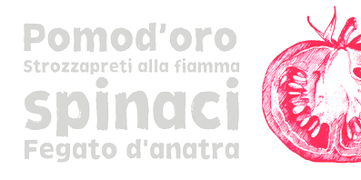
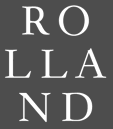 Born in Porto, Portugal, in 1975. From 1994 until 1999 he studied graphic design at the Escola Superior de Artes e Design. In 2000 he became a postgraduate student at the KABK where he wrote a Masters thesis entitled "Type&Media". He joined Underware in the same year. At ATypI 2005 in Helsinki, he spoke on On the edge of legibility, which in fact is a talk about blackletter. Affiliated since 2002 with Underware. He lives in Finland. Also doing business at
  Toni Hurme (Hurme Design, Helsinki) started publishing fonts in 2013. His first series, numbered 1 through 4, is
  [
[ Helsinki and Jyväskylä, Finland-based designer of the heavy grotesque typeface Mauna Kea (2015) and the thin Tuscan typeface Vilges (2015, designed for Sami languages in Finland and Scandinavia).
  [
[ [
[ [
[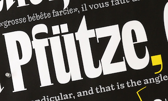 Joona Louhi is a freelance type designer currently based in Helsinki. Graduate of the
  Juha Korhonen (b. 1966, aka Junkohanhero) is a Finnish artist and type designer, who created these
 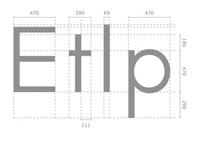 Rovaniemi, Finland-based type designer at
  Julia Sysmäläinen Carelian (Juliasys) is a Finnish type designer, who studied at Pekka Halosen Akatemia in Tuusula. She runs her own type foundry, Juliasys. Julia presently lives in Berlin, where she works for Edenspiekermann Berlin.
  The Jung-Lee Type Foundry was set up by Jungmyung Lee and Karel Martens in Amsterdam, ca. 2016. Karel Martens is an award-winning typography and type design teacher in Arnhem, and Jung-Lee has been designing type at
  [
[ Kea Bertell studied Spatial and Furniture Design at University of Art&Industrial design Helsinki. After being injured she started working as an illustrator with her husband Emil Bertell at Fenotype in Turku, Finland. Her first typeface, done in 2010, is the brushy Biscuits and Gravy. [
 [
[ The Lanston Type Co was based in PEI, Canada, moved in 2002 to Vancouver, and moved later that year to Espoo, Finland. In 2004,
  Graphic designer and illustrator who completed a Masters in type design at
  Teo Tuominen is a fearless Finnish type designer and letterer based in Helsinki. Teo has a background in graphic design and has a masters degree in type design from the TypeMedia program in Den Haag, The Netherlands, class of 2013. Designer of
  Ludwig Übele is a Berlin-based
  [
[ German designer, b. 1965. Currently, he teaches typography at the University of Lapland in Rovaniemi, Finland, but maintains a home in Wuppertal, Germany. His typefaces:
  Type foundry, est. 2011 by Vantaa, Finland-based Mika Melvas. It was originally called Mahti Type Studio, but was later changed to Mika Melvas. Melvas created the signage typefaces
  During his studies, Oulu, Finland-based Mika Hautamäki designed the mini-serifed Latin / Cyrillic / Icelandic headline typeface Pyramiden (2016) and thin architectural sans typeface Arkkari Light (2016). [
 Designer of the 5-style text typeface Botnia during a workshop at
  [
[ Finnish designer and illustrator who made the display typeface
  Type and graphic designer in Tampere and/or Lappeenranta, Finland. He created the
  During her studies in Helsinki, Nelli Långstedt designed the rounded sans typeface Girlgang (2018). [
 No Bad Type was founded in 2018 by Juuso Salakka in Helsinki, Finland. His typefaces:
  Graduate of Academy of Art University in San Francisco, class of 2007. After jobs in Helsinki, San Francisco, Atlanta, and Miami, since 2011, Olli Tervo is art director at RTC in Washington, DC. His portfolio includes the text typeface
  Aha, what a wonderful chiseled angular semi-handwriting font,
  [
[ Berlin-based product designer who created these typefaces in 2017: Luzia (text typeface), Cache (letterpress emulation), Stash, the display sans typeface Gerst, Konstanz (industrial age font), the slab serif Wrangell, the great all caps sans typeface Hossa (+Soft) (2017), and the dashing serif typeface Elaris (2017).
  [
[ Finnish designer in Helsinki (b. Kerava, 1975) who cofounded Underware with Akiem Helmling and Bas Jacobs in The Hague and has recently worked with DTL (Dutch Type Library). He studied at the Lahti Polytechnic/Institute of Design (1995-2001).
  German/Finnish design studio and type foundry in Berlin, est. 2012 by Florian Schick and Lauri Toikka, two KABK graduates. Their typefaces:
  Kunihiko Okano graduated from Kyoto City University of Arts in 1995. After working as a packaging designer for about a decade, he started his design office Shotype Design in 2008 and has been providing Latin parts to Japanese type foundries. In 2011, he graduated from
  Taipai, Taiwan (was: Beijing, China, and Tokyo, Japan)-based designer (b. Finland) of the
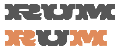 [
[ [
[ Born in Finland, Tomi Lahdesmaki graduated from Academy of Art University in San Francisco. Now based in London, where he runs a studio called Harvest, Tomi created several typefaces in 2014, including the all caps decorative series Mastodon, the fat typeface / light sister combination called Aune, and the heavy titling sans typeface Scandal. He also created several interesting sets of icons.
 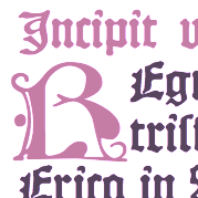 Finnish designer of the free typeface Missaali (2016). Missaali (
 [
[ Typografi is the type design company of Saku Heinänen, who is also the principal of Alku Design Ltd in Helsinki. Saku has been teaching at the Graphic Design Faculty of Aalto University in Helsinki, on topics such as typography, type design and publication design. His typefaces:
 Underscore is based in Espoo, Finland. Designer of
  Underware is a (typo)graphic design-studio which is specialized in designing and producing typefaces. These are published for retail sale or are specially tailor-made. The company was founded in 1999 by Akiem Helmling, Bas Jacobs and Sami Kortemäki. Since 2002 Hugo Cavalheiro d'Alte is also part of the studio. They are based in Den Haag, Helsinki and Amsterdam. In 2017, they joined
  Experimental fonts developed by
  [
[ Design student in Helsinki. He created some logo typefaces in 2011:
  Helsinki-based design studio. Creators of the display sans typeface Altai (2014). This is a bespoke typeface for the Altai glass series, designed by Finnish designer Mari Isopahkala. For the Kyrö Distllery Company in Isokyrö, they made the custom typeface Napue Sans (2014), which is based on memorial monument engravings.
  This is one of the most talented FontStructors, but also an active musician. On