TYPE DESIGN INFORMATION PAGE last updated on Thu Apr 16 21:59:09 EDT 2026
FONT RECOGNITION VIA FONT MOOSE
|
|
|
|
Matthew Carter (born in London in 1937, and son of Harry Carter) is one of today's most influential type designers. He trained as a punchcutter at Enschedé in 1956. In 1963 he was hired by Crosfield, a firm that pioneered the new technology of photo-typesetting, to lead their typographic program. He worked for Mergenthaler Linotype (1965-1981), and co-founded Bitstream Inc. with Mike Parker in 1981, adapting many fonts to digital technology. In January 1992, he founded Carter&Cone with Cherie Cone, and often collaborated with Font Bureau. In 1995, he won the Gold Prize at the annual Tokyo Type Directors Club competition for Sophia. In 1997, he received the TDC Medal for significant contributions to the life, art, and craft of typography. In 2010, he received a MacArthur grant. He lives in Cambridge, MA. John Berry on Carter's art (2002). Apostrophe comments on Berry's article. Interview. His fonts:
Speaker at ATypI 2013 in Amsterdam. Speaker at ATypI 2019 in Tokyo on the topic of Expressing Vocal Tones through Typography. Linotype link. FontShop link. Favorite quote: Watching me work is like watching a refrigerator make ice. Another quote: A typeface is a beautiful collection of letters, not a collection of beautiful letters. View Matthew Carter's typefaces. Matthew Carter's fonts. The typefaces made by Matthew Carter. See also here. Wikipedia page. Klingspor link. |
EXTERNAL LINKS |
| | |

file name: Matthew Carter Carter Sans

file name: Matthew Carter Carter Sans 2010

file name: Matthew Carter Shotaro Nakano Kunihiko Okano Role Serif Text Medium 2019

file name: Matthew Carter Shotaro Nakano Kunihiko Okano Role Slab 2019

file name: Matthew Carter Role 2019

file name: Matthew Carter Dan Reynolds Carter Sans Pro 2010

file name: Matthew Carter Dan Reynolds Carter Sans Pro Semibold 2010

file name: Matthew Carters Scotch Moderns Compared Georgia Miller Monticello

file name: Matthew Carter Georgia 1996 Poster by Meredith Denny 2015

file name: Matthew Carter Tom Rickner Georgia 1993 Poster by Josh Gorki 2018

file name: Matthew Carter Tobias Frere Jones Cyrus Highsmith Miller Display Bold 1997

file name: Matthew Carter Tobias Frere Jones Cyrus Highsmith Miller Display Italic 1997

file name: Matthew Carter Tobias Frere Jones Cyrus Highsmith Miller Text Roman 1997

file name: Matthew Carter Miller Text

file name: Matthew Carter Miller 1997 poster by Soumya Jain 2018
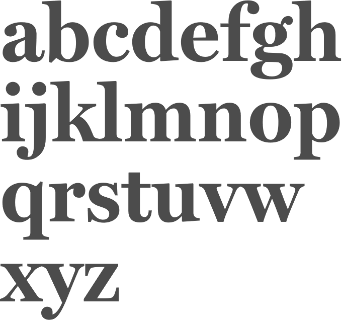
file name: Matthew Carter Cyrus Highsmith Tobias Frere Jones Font Bureau Miller 1997
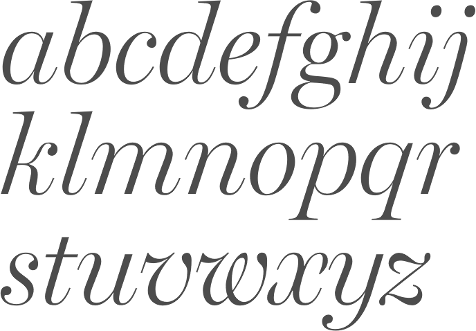
file name: Matthew Carter Cyrus Highsmith Tobias Frere Jones Font Bureau Miller 1997b
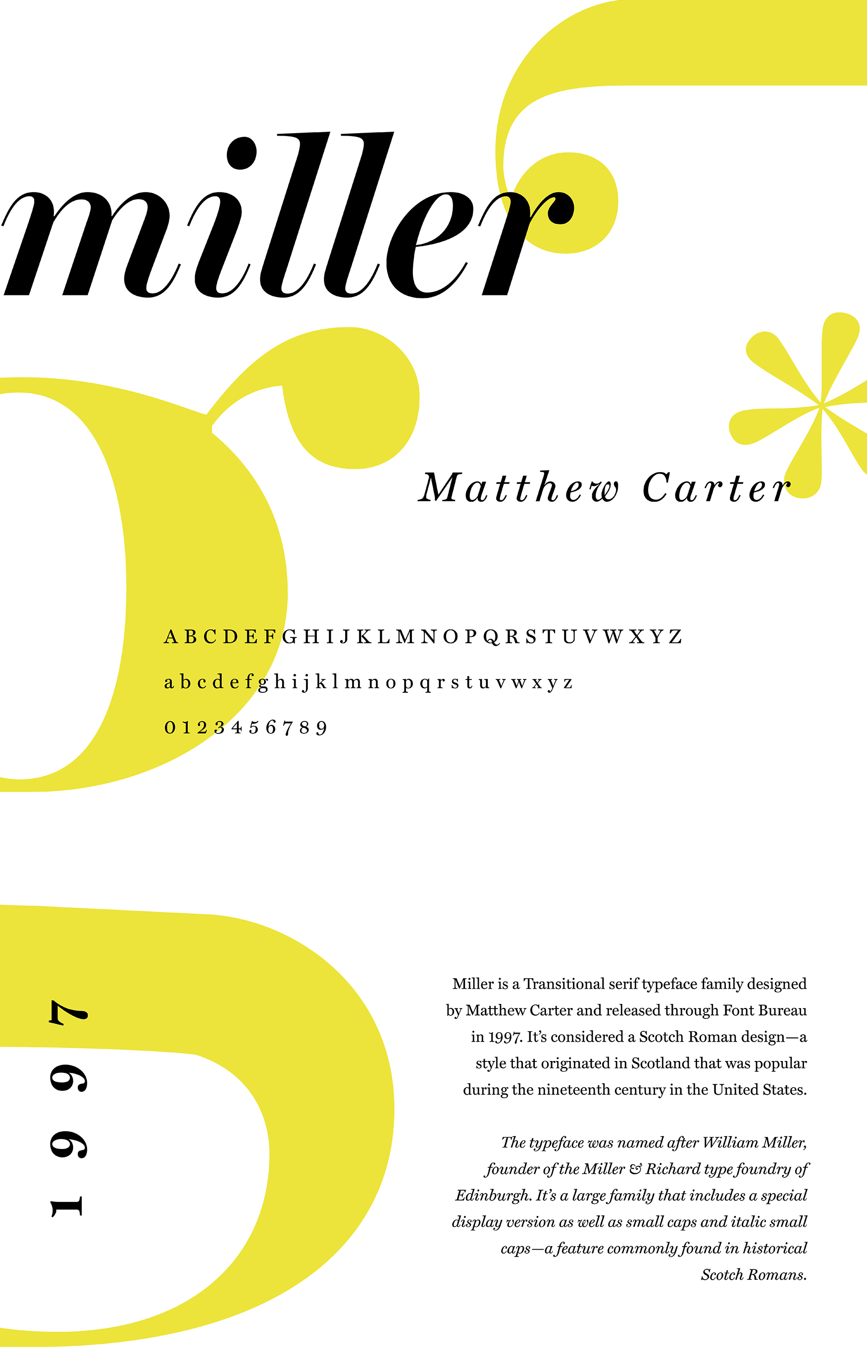
file name: Matthew Carter Cyrus Highsmith Tobias Frere Jones Font Bureau Miller 1997 poster by Soumya Jain 2018

file name: Matthew Carter D T L Flamande 2018

file name: Matthew Carter D T L Flamande 2018

file name: Matthew Carter Alisal 1995

file name: Matthew Carter Alisal Bold 1995

file name: Matthew Carter Alisal 1995

file name: Matthew Carter Alisal 1995b
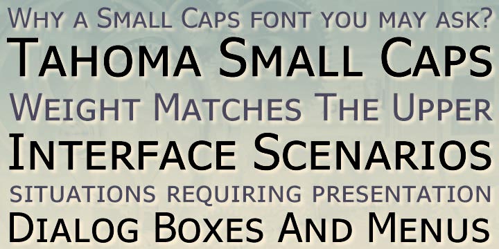
file name: Matthew Carter Tahoma 1994 23177

file name: Matthew Carter Tahoma 1994 Poster by Roaa Attuwaim 2017

file name: Matthew Carter Tahoma 1994 44933

file name: Matthew Carter Tahoma 1994

file name: Matthew Carter Tahoma 1994a

file name: Matthew Carter Jesse Ragan Roster 2015

file name: Matthew Carter Jesse Ragan Roster 2015b

file name: Matthew Carter Jesse Ragan Roster 2015c

file name: Matthew Carter Jesse Ragan Roster 2015d

file name: Matthew Carter Snell Roundhand

file name: Matthew Carter Roundhand B T 1965 after Charles Snell

file name: Matthew Carter Roundhand B T 1965 after Charles Snell

file name: Matthew Carter Roundhand B T 1965 after Charles Snell

file name: Matthew Carter Roundhand B T 1965 after Charles Snell

file name: Matthew Carter Roundhand B T 1965 after Charles Snell

file name: Matthew Carter Roundhand B T 1965 after Charles Snell

file name: Matthew Carter Roundhand B T after Charles Snell

file name: Matthew Carter Roundhand B T 1965 after Charles Snell

file name: Matthew Carter Roundhand B T 1965 after Charles Snell

file name: Matthew Carter Roundhand Black B T 1965 after Charles Snell

file name: Matthew Carter Snell Roundhand 1966 Poster by Meredith Denny 2015
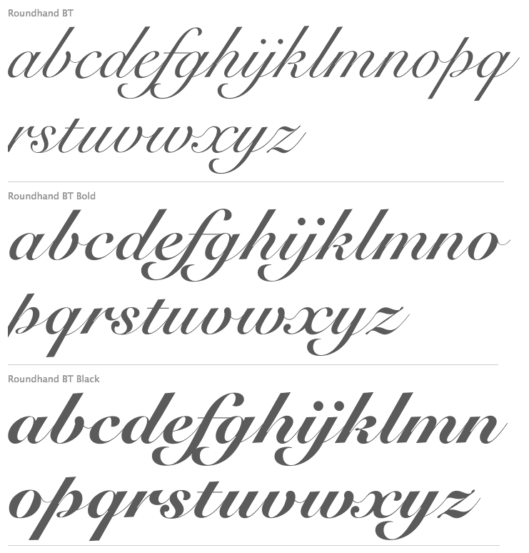
file name: Isabella Chaeva Vladimir Yefimov Roundhand B T Cyrillic 2013 after Matthew Carter Roundhand 1966

file name: Isabella Chaeva Vladimir Yefimov Roundhand B T Cyrillic 2013 after Matthew Carter Roundhand B T Black 1966

file name: Matthew Carter Shelley Script

file name: Matthew Carter Shelley Volante Script

file name: Matthew Carter Freehand471 Bitstream

file name: Matthew Carter Freehand471 Bitstream

file name: Matthew Carter Big Caslon Medium 1994

file name: Matthew Carter Big Moore 2014f

file name: Matthew Carter Big Moore 2014

file name: Matthew Carter Big Moore 2014b

file name: Matthew Carter Big Moore 2014c

file name: Matthew Carter Big Figgins 1992

file name: Matthew Carter Elephant 1992 Poster by Maria Jose Galo 2019

file name: Matthew Carter Elephant 1992 Poster by Eylul Camdere 2016

file name: Matthew Carter Elephant 1992 Poster by Isamar Noguera 2016

file name: Matthew Carter Elephant 1992 Poster by Lais Zanocco 2019

file name: Matthew Carter Mantinia 1993

file name: Matthew Carter Mantinia 1993

file name: Matthew Carter Mantinia 1993b

file name: Matthew Carter Mantinia

file name: Matthew Carter Sophia 1993

file name: Matthew Carter Van Lanen Wood Type 2002 2013

file name: Matthew Carter Van Lanen Wood Type 2002 2013b

file name: Matthew Carter Van Lanen Wood Type 2002 2013c

file name: Matthew Carter Van Lanen Wood Type 2002 2013d

file name: Matthew Carter Cochin Pro 1977

file name: Matthew Carter Cochin Pro 1977b
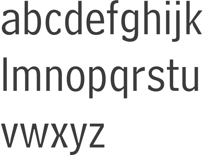
file name: Chauncey Griffith Bell Centennial Address 1937 Bitstream Version 1978
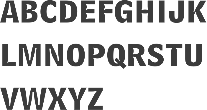
file name: Chauncey Griffith Bell Centennial Bold Listing 1937 Bitstream Version 1978

file name: Matthew Carter Bell Centennial Sub Caption 1978

file name: Matthew Carter Bell Centennial 1975 1978 poster by Sana Hassan 2015

file name: Bitstream Century725 B T Black 1990 2003

file name: Matthew Carter David Berlow David Jonathan Ross Verdana Pro 2010

file name: Matthew Carter Verdana 1996 Poster by Will Hughes 2015

file name: Matthew Carter David Berlow David Jonathan Ross Verdana Pro Condensed 2010

file name: Matthew Carter Verdana 1996 poster by Offeibea Adu Darko 2013
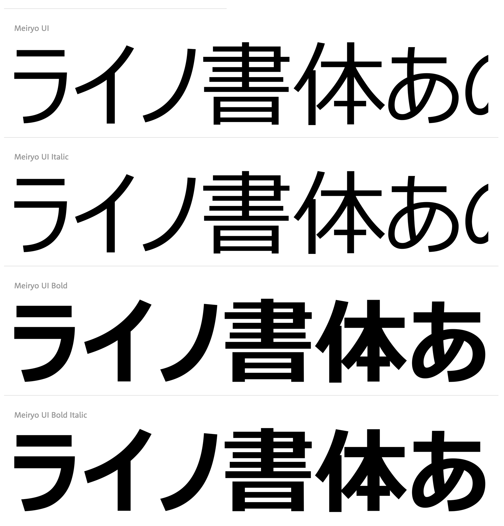
file name: Microsoft Meiryo U I 2020

file name: Microsoft Meiryo U I 2020
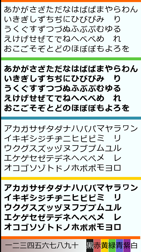
file name: Eiichi Kono Matthew Carter Meiryo 2005 poster by Yohance Hernando 2017
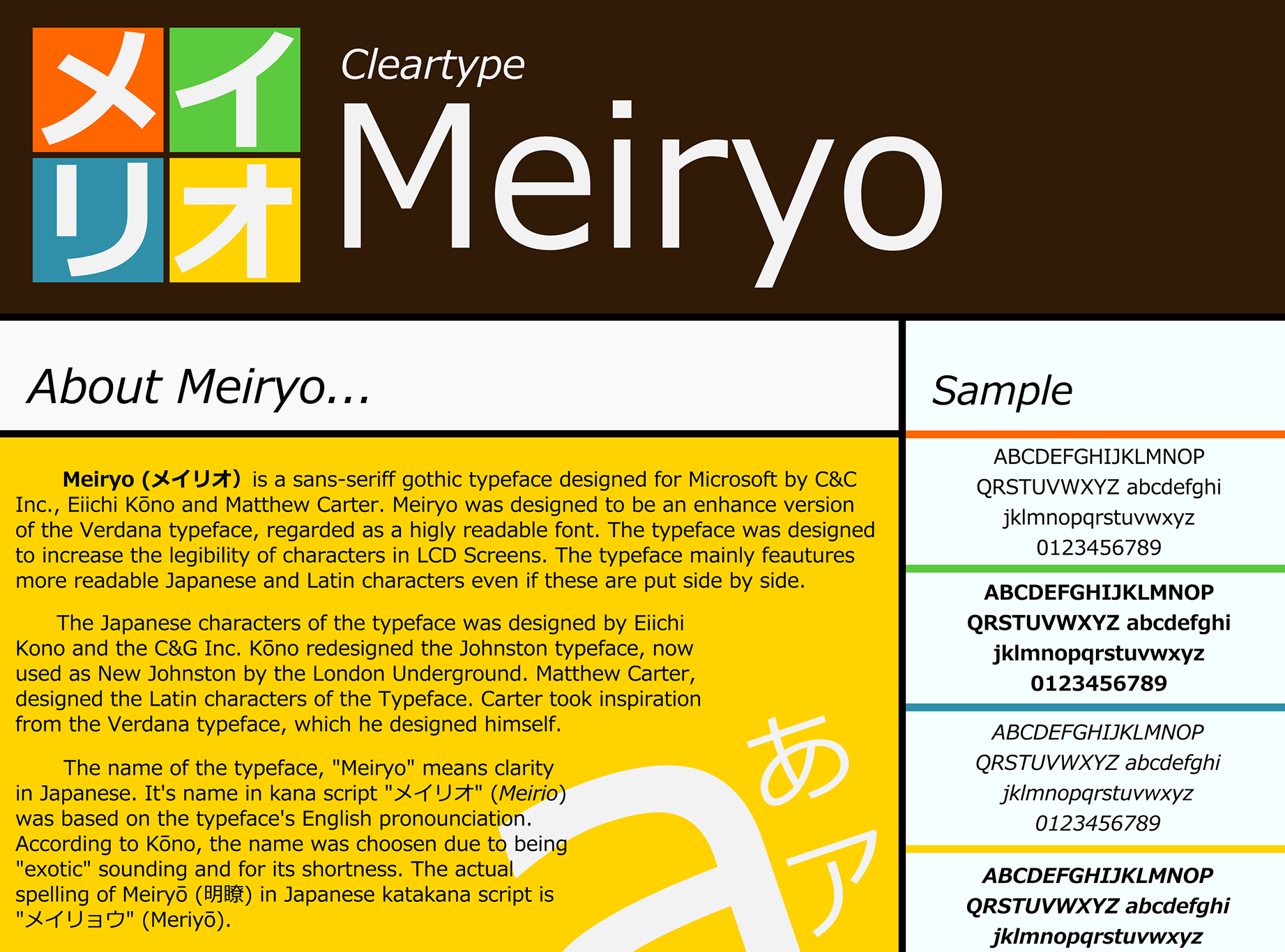
file name: Eiichi Kono Matthew Carter Meiryo 2005 poster by Yohance Hernando 2017b

file name: Matthew Carter Steve Matteson Georgia Pro 2010

file name: Matthew Carter Steve Matteson Georgia Pro Condensed 2010

file name: Matthew Carter Steve Matteson Georgia Pro Condensed 2010b

file name: Matthew Carter Tom Rickner Georgia 1993 Poster by Israa Hamad 2018

file name: Matthew Carter Tom Rickner Georgia 1993

file name: Matthew Carter Tom Rickner Georgia 1993 Poster by Kelsey Johnston 2016

file name: Matthew Carter Tom Rickner Georgia 1993 Poster by Rebecca Griffith 2018

file name: Matthew Carter Tom Rickner Georgia 1993 Poster by Rebecca Griffith 2018b

file name: Matthew Carter Tom Rickner Georgia 1993 Poster by Rebecca Griffith 2018c

file name: Matthew Carter Tom Rickner Georgia 1993 Poster by Nadia Gutierrez 2017

file name: Matthew Carter Tom Rickner Georgia 1993 Poster by Nadia Gutierrez 2017

file name: Matthew Carter Tom Rickner Georgia 1993 Poster by Steve Tell 2015

file name: Matthew Carter Tom Rickner Georgia 1993 Poster by Steve Tell 2015b

file name: Matthew Carter Tom Rickner Georgia 1993h
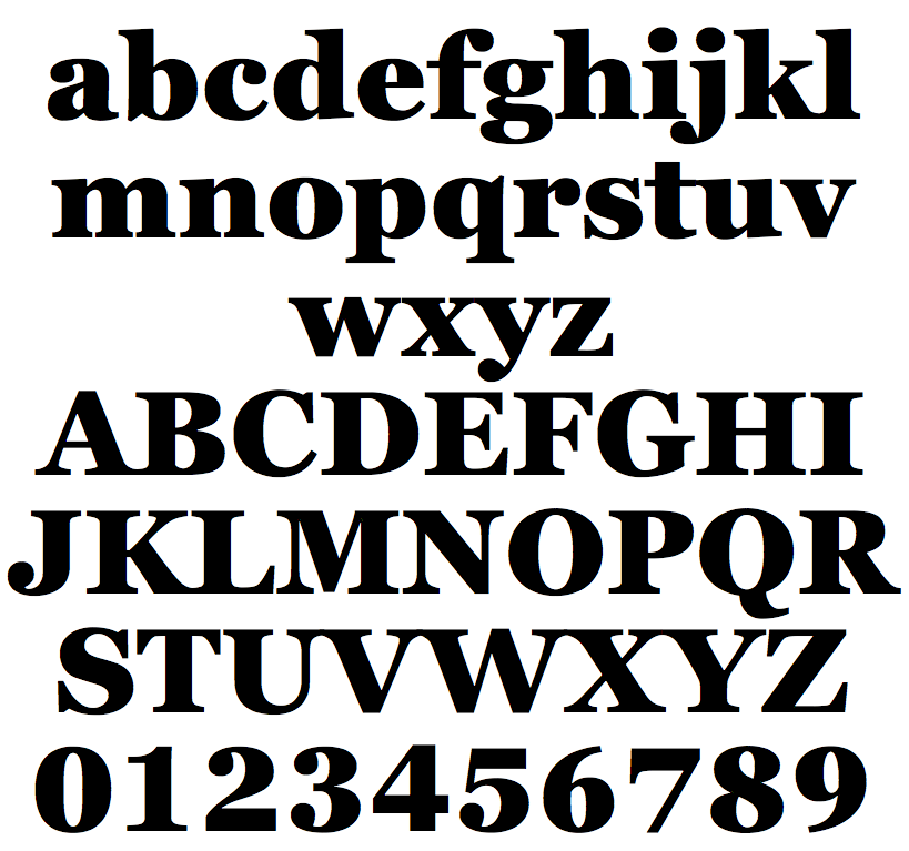
file name: Matthew Carter Font Bureau Georgia Heavy 2011

file name: Matthew Carter Font Bureau Georgia Heavy 2011b

file name: Matthew Carter Font Bureau Georgia Heavy 2011c

file name: Matthew Carter Tom Rickner Georgia 1993 Poster by Bill Dawson 2015

file name: Matthew Carter Tom Rickner Georgia 1993 Poster by Tabatha A Bird 2016

file name: Matthew Carter Georgia

file name: Matthew Carter Pic

file name: Matthew Carter Pic 2016 photo by James Duncan Davidson

file name: 2000px Skiaspecimen3

file name: Matthew Carter David Berlow Skia 1993

file name: Matthew Carter Skia

file name: 1000px Bitstream Charter sample

file name: Matthew Carter Bitstream Charter B T Pro

file name: Matthew Carter Yale Display

file name: Matthew Carter Yale New Bold

file name: Matthew Carter Yale New Bold Italic

file name: Matthew Carter Yale New Italic

file name: Matthew Carter Yale New Roman

file name: Matthew Carter Yale design italic

file name: Matthew Carter Yale 2004
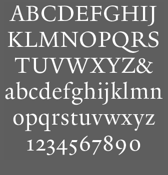
file name: Matthew Carter Yale Typeface 2004

file name: Matthew Carter Dan Reynolds Pic

file name: Matthew Carter I T C Galliard 1978 Poster by Laura Declercq 2014

file name: Matthew Carter I T C Galliard 1978

file name: Matthew Carter I T C Galliard Italic 1978

file name: Matthew Carter Galliard 1981 Poster by Marta Cillero 2013

file name: Carl Crossgrove I T C Galliard Etext 2013
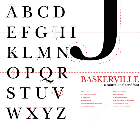
file name: John Quaranta Matthew Carter I T C New Baskerville 1978 Poster by Anna Theresa Fowler 2014

file name: John Quaranta Matthew Carter I T C New Baskerville 1978 Poster by Anna Theresa Fowler 2014b
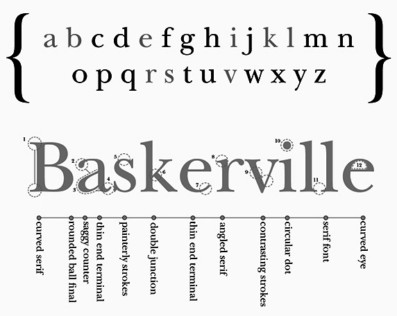
file name: John Quaranta Matthew Carter I T C New Baskerville 1978 Poster by Anna Theresa Fowler 2014c
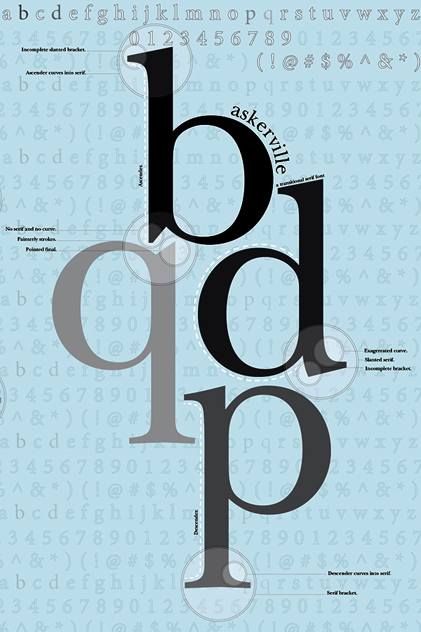
file name: John Quaranta Matthew Carter I T C New Baskerville 1978 Poster by Anna Theresa Fowler 2014d
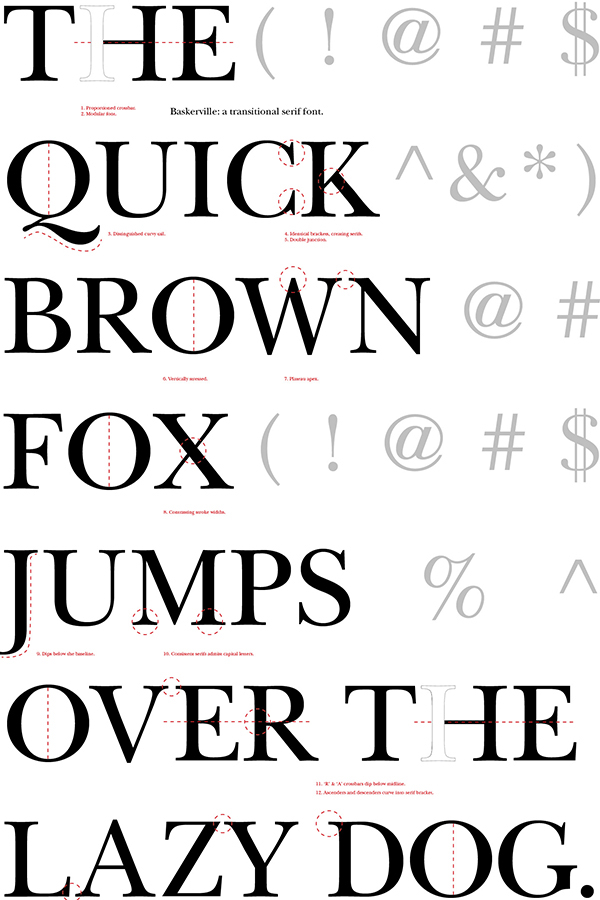
file name: John Quaranta Matthew Carter I T C New Baskerville 1978 Poster by Anna Theresa Fowler 2014e
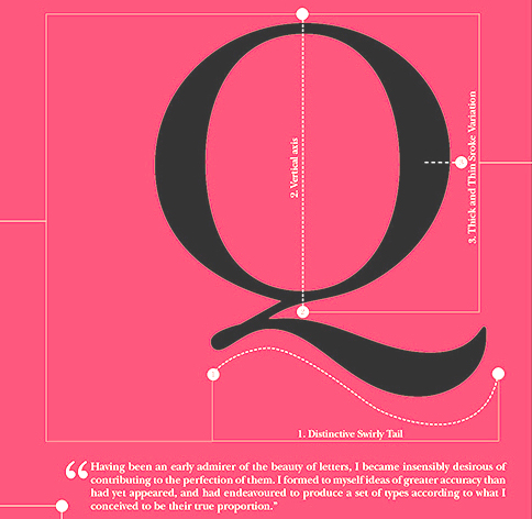
file name: John Quaranta Matthew Carter I T C New Baskerville 1978 Poster by Anna Theresa Fowler 2014f

file name: John Quaranta Matthew Carter I T C New Baskerville 1978 Poster by Anna Theresa Fowler 2014g

file name: John Quaranta Matthew Carter I T C New Baskerville 1978 Poster by Anna Theresa Fowler 2014h

file name: John Quaranta Matthew Carter I T C New Baskerville 1978 Poster by Anna Theresa Fowler 2014i

file name: Matthew Carter New Century Schoolbook Pro 1980 after Morris Fuller Benton 1915 1923

file name: Matthew Carter New Century Schoolbook Pro 1980 after Morris Fuller Benton 1915 1923 Poster by Joyce Choe 2016

file name: Matthew Carter New Century Schoolbook Pro 1980 after Morris Fuller Benton 1915 1923 Poster by Joyce Choe 2016b

file name: Matthew Carter Sitka Banner 2013

file name: Matthew Carter Sitka Text Bold 2013

file name: Matthew Carter John Hudson Kevin Larson M S Sitka 2013 poster by Fatih Kaya 2019

file name: Matthew Carter John Hudson Kevin Larson M S Sitka 2013

file name: Matthew Carter John Hudson Kevin Larson M S Sitka 2013b

file name: Matthew Carter John Hudson Kevin Larson M S Sitka 2013c

file name: Matthew Carter John Hudson Kevin Larson M S Sitka 2013d

file name: Matthew Carter John Hudson Kevin Larson M S Sitka 2013e

file name: Matthew Carter John Hudson Kevin Larson M S Sitka 2013f

file name: Matthew Carter John Hudson Kevin Larson M S Sitka 2013g

file name: Matthew Carter John Hudson Kevin Larson M S Sitka 2013h

file name: Matthew Carter John Hudson Kevin Larson M S Sitka 2013i

file name: Matthew Carter John Hudson Kevin Larson M S Sitka 2013j

file name: Matthew Carter Fuse F Deface

file name: Matthew Carter Pic in U L C 1977

file name: Matthew Carter A Typ I2018 photo by Norman Posselt

file name: Matthew Carter A Typ I2018 photo by Norman Posselt

file name: Matthew Carter A Typ I2018 photo by Norman Posselt

file name: Matthew Carter A Typ I2018 photo by Norman Posselt

file name: Matthew Carter A Typ I2018 photo by Norman Posselt

file name: Matthew Carter A Typ I2018 photo by Norman Posselt

file name: Matthew Carter A Typ I2018 photo by Michael Bundscherer

file name: Matthew Carter A Typ I2018 photo by Michael Bundscherer
| | |
|
Luc Devroye ⦿ School of Computer Science ⦿ McGill University Montreal, Canada H3A 2K6 ⦿ lucdevroye@gmail.com ⦿ https://luc.devroye.org ⦿ https://luc.devroye.org/fonts.html |


