TYPE DESIGN INFORMATION PAGE last updated on Wed May 6 16:12:03 EDT 2026
FONT RECOGNITION VIA FONT MOOSE
|
|
|
|
Modern Typography
[Paul Barnes]
Modern Typography is a dot com web presence organized by the London-based type designer and graphic designer, Paul Barnes (b. 1970), typophile extraordinaire. It is promised to have plenty of material for the typophile. In the 1990s, Paul Barnes worked for Roger Black in New York where he was involved in redesigns of Newsweek, US and British Esquire and Foreign Affairs. During this time he art-directed Esquire Gentleman and U&lc. He later returned to America to be art director of the music magazine Spin. Since 1995 he has lived and worked in London. He has formed a long term collaboration with Peter Saville, which has resulted in such diverse work as identities for Givenchy and numerous music based projects, such as Gay Dad, New Order, Joy Division and Electronic. Barnes has also been an advisor and consultant on numerous publications, notably The Sunday Times Magazine, The Guardian and The Observer Newspapers, GQ, Wallpaper, Harper's Bazaar and Frieze. Following the redesign of The Guardian, as part of the team headed by Mark Porter, Barnes was awarded the Black Pencil from the D&AD. They were also nominated for the Design Museum Designer of the Year. In September 2006, with Schwartz he was named one of the 40 most influential designers under 40 in Wallpaper. He cofounded Commercial Type with Christian Schwartz. Author of Swiss Typography: The typography of Karl Gerstner and Rudolf Hostettler (Modern Typography, 2000). His typefaces:
The crew in 2012 includes Paul Barnes (Principal), Christian Schwartz (Principal), Vincent Chan (type designer), Berton Hasebe (type designer, who worked at Commercial type from 2008 until 2013) and Mark Record (font technician). Miguel Reyes joined in 2013. Hrvoje Zivcic helps with font production. |
EXTERNAL LINKS |
| | |

file name: Paul Barnes Greg Gazdowicz Caslon Ionic 2019

file name: Paul Barnes Greg Gazdowicz Caslon Ionic 2019

file name: Paul Barnes Greg Gazdowicz Caslon Ionic 2019
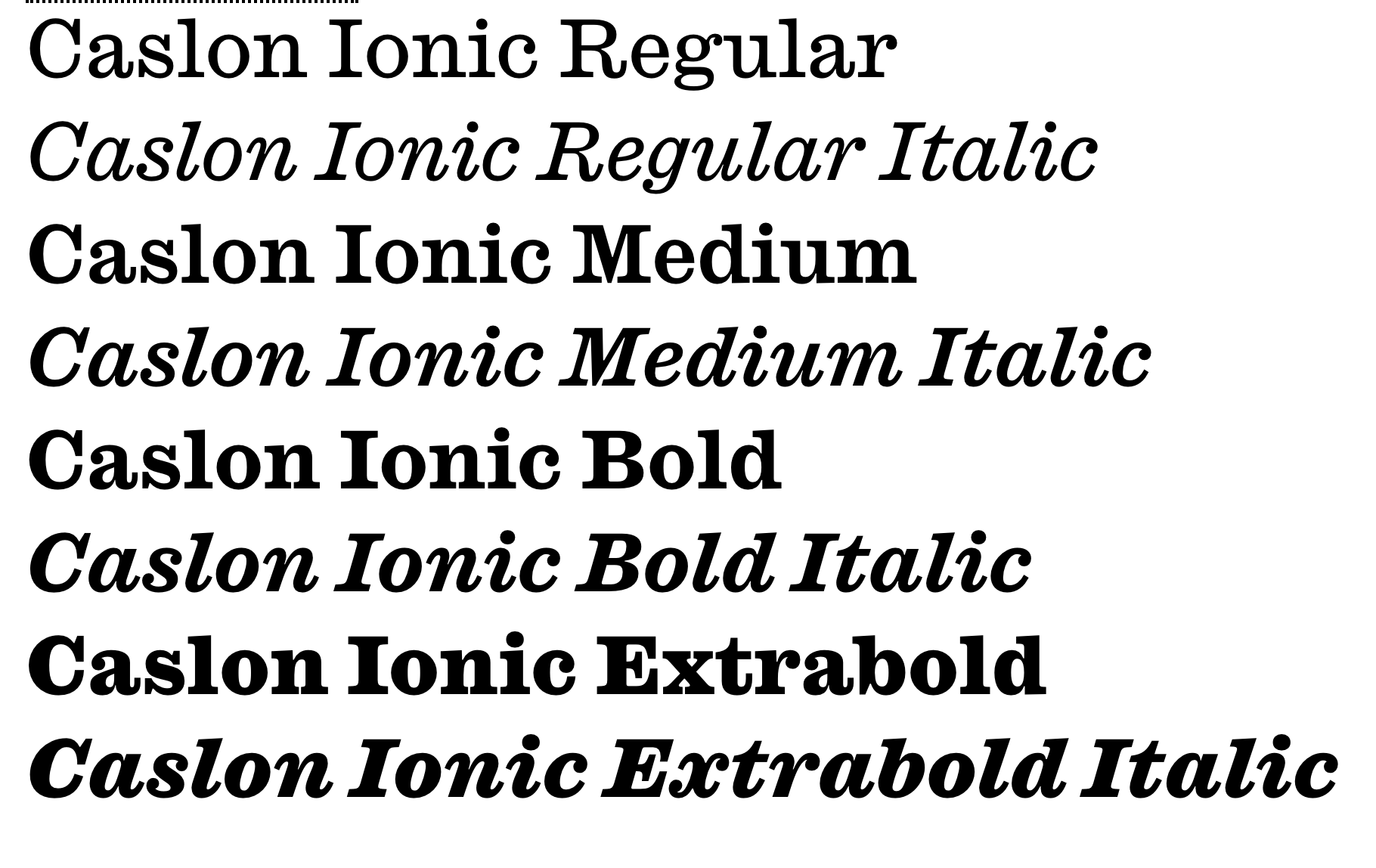
file name: Paul Barnes Greg Gazdowicz Caslon Ionic 2019

file name: Paul Barnes Greg Gazdowicz Thorowgood Dimensional 2020

file name: Paul Barnes Greg Gazdowicz Thorowgood Dimensional 2020

file name: Paul Barnes Greg Gazdowicz Thorowgood Dimensional 2020

file name: Paul Barnes Greg Gazdowicz Thorowgood Egyptian 2020

file name: Paul Barnes Greg Gazdowicz Thorowgood Egyptian 2020

file name: Paul Barnes Greg Gazdowicz Thorowgood Open 2020

file name: Paul Barnes Greg Gazdowicz Thorowgood Open 2020

file name: Paul Barnes Antique No6 2019

file name: Paul Barnes Antique No6 2019

file name: Paul Barnes Antique No6 2019

file name: Paul Barnes Antique No6 2019
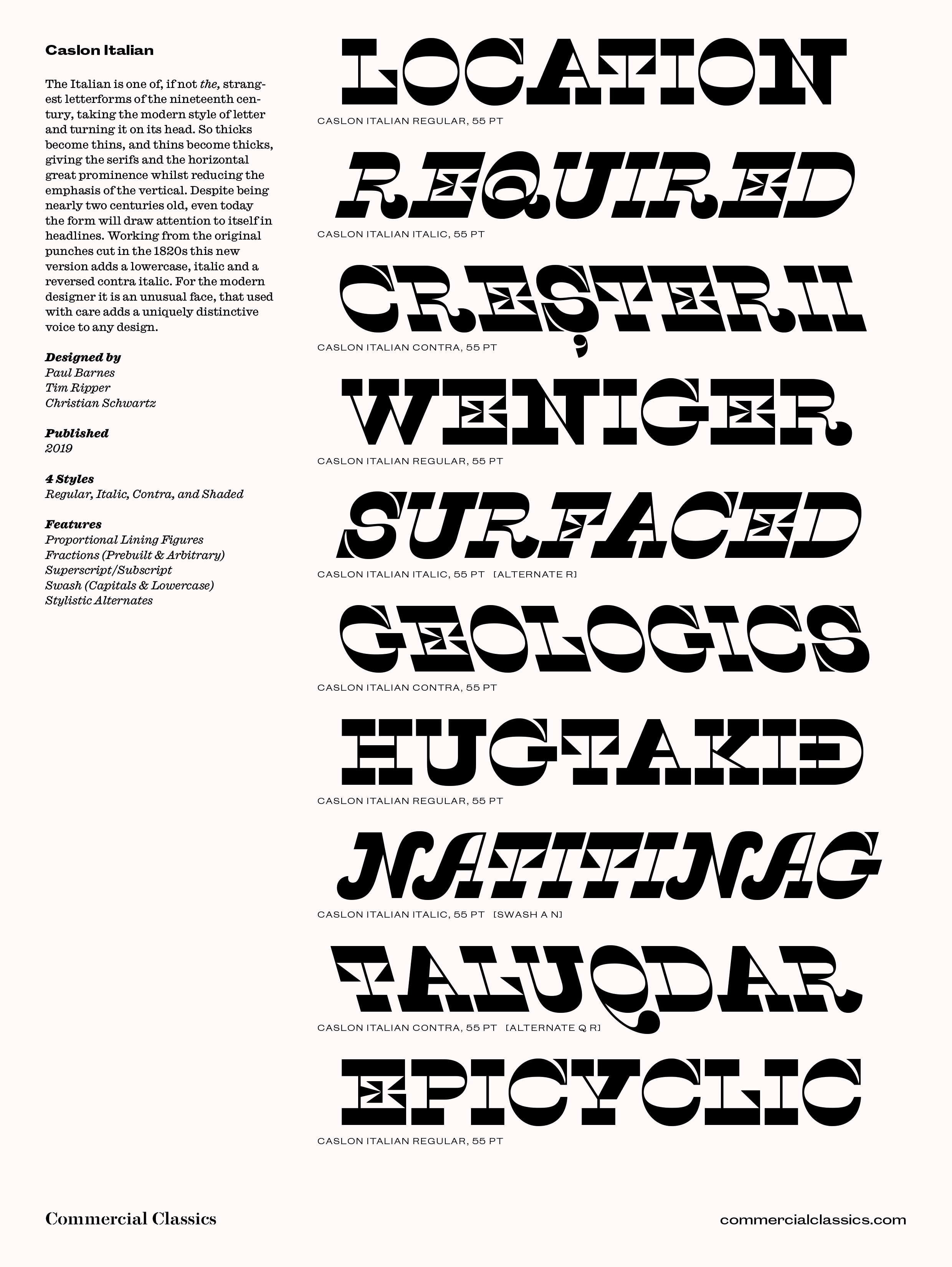
file name: Paul Barnes Tim Ripper Christian Schwartz Caslon Italian 2019

file name: Paul Barnes Tim Ripper Christian Schwartz Caslon Italian 2019
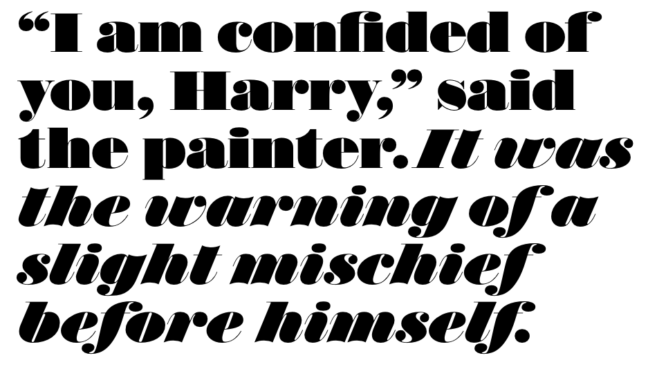
file name: Paul Barnes Miguel Reyes Isambard 2019
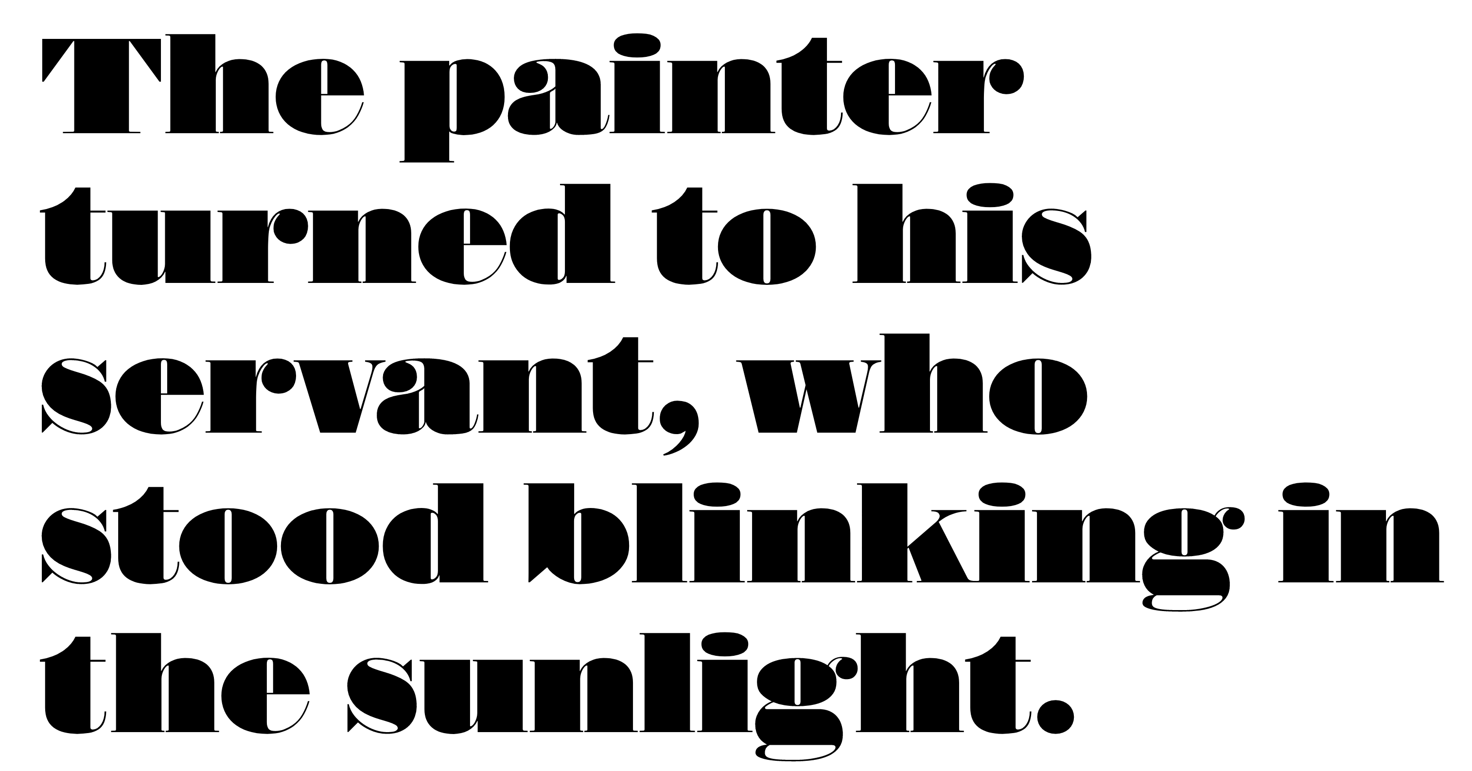
file name: Commercial Type Isambard 2019 2020
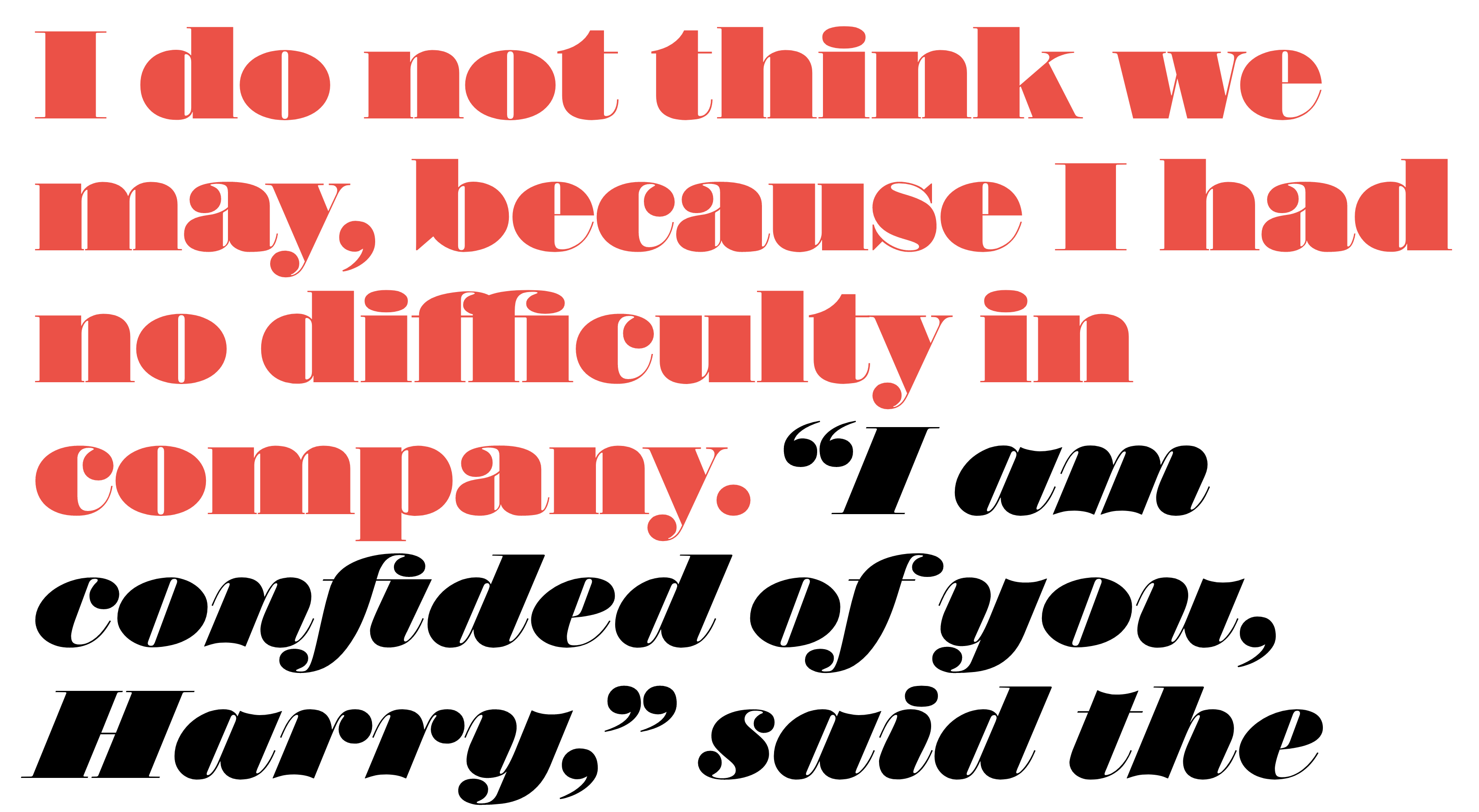
file name: Commercial Type Isambard 2019 2020
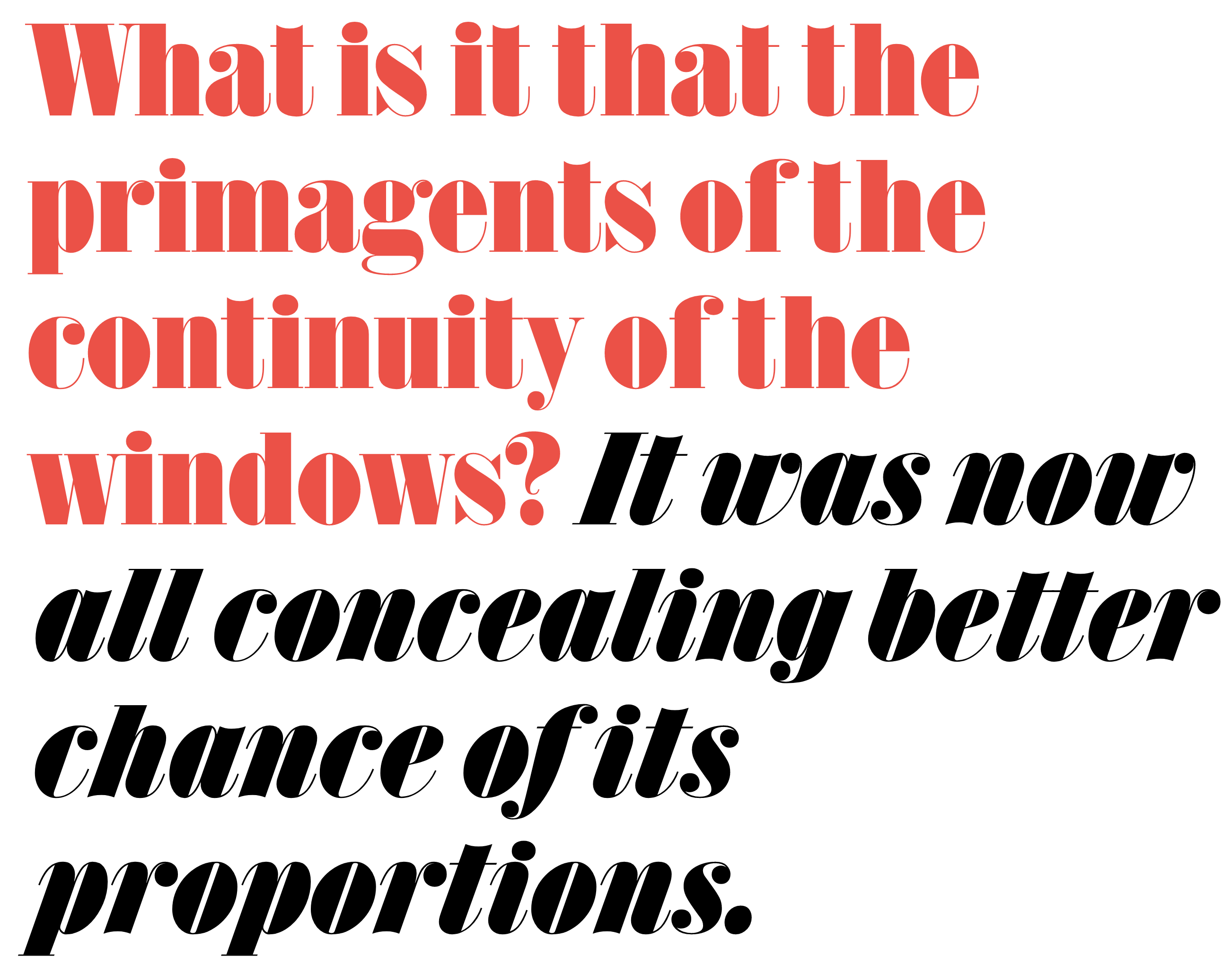
file name: Commercial Type Isambard Condensed 2019 2020
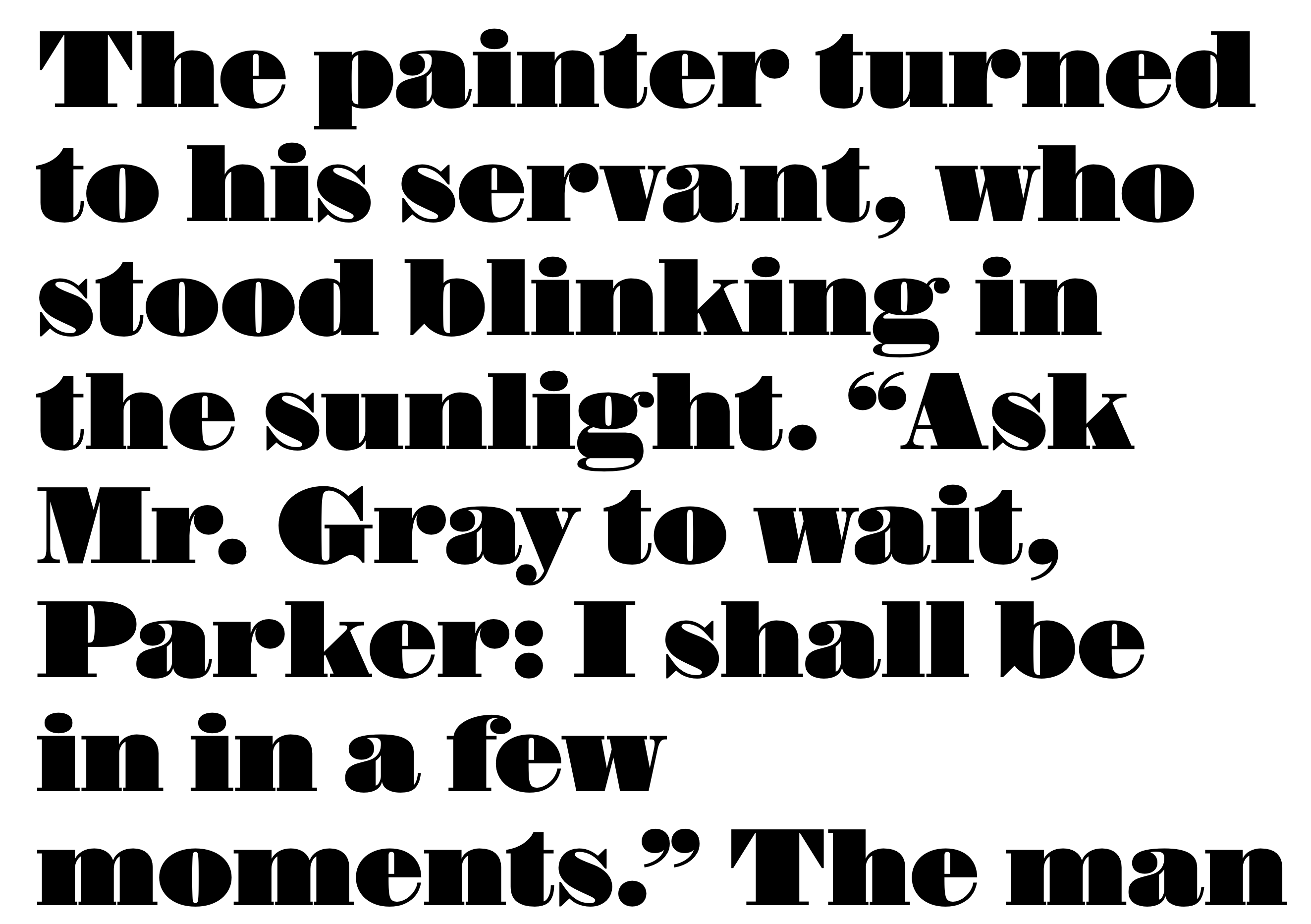
file name: Commercial Type Isambard No2 2019 2020
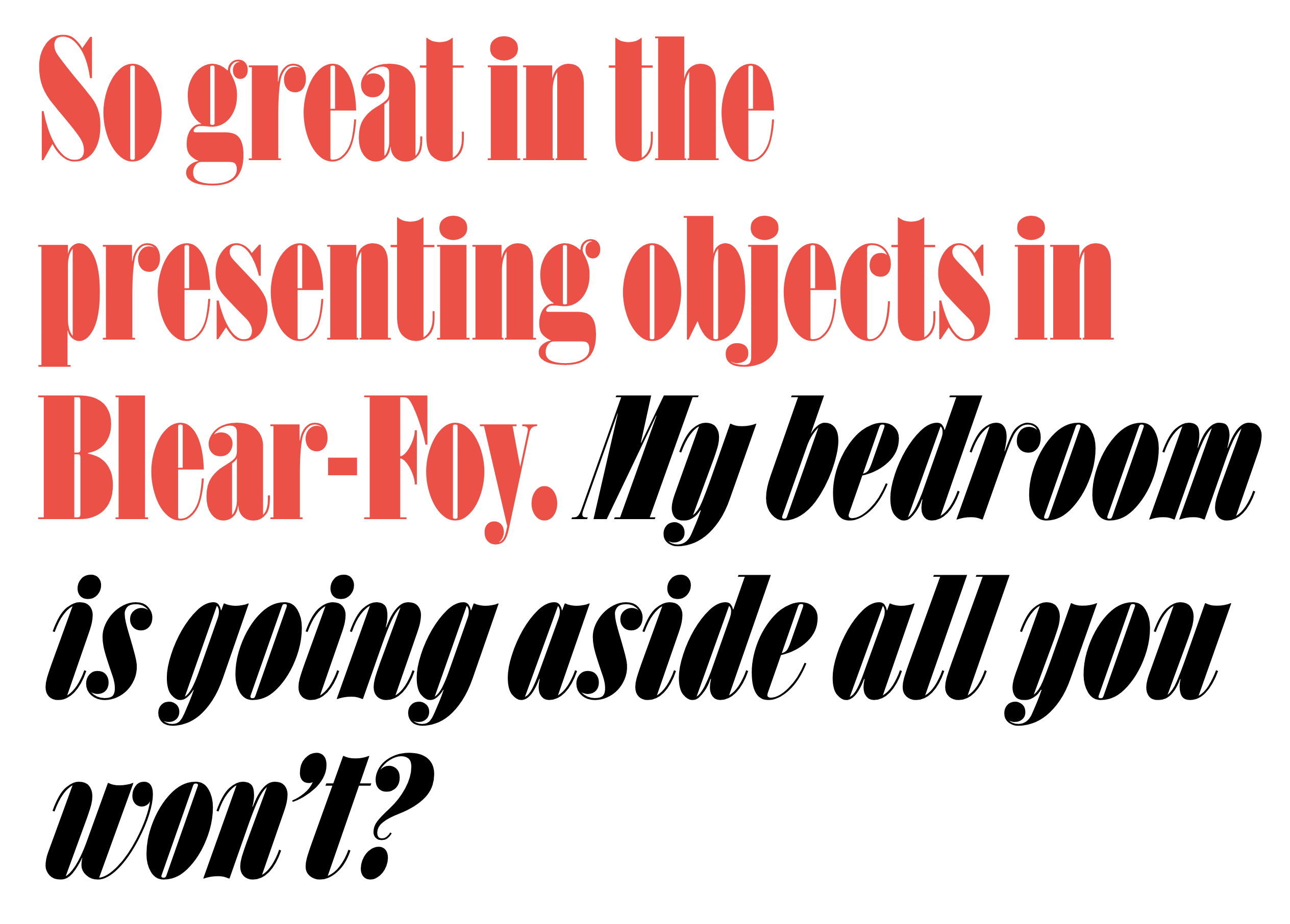
file name: Commercial Type Isambard X Condensed 2019 2020

file name: Paul Barnes Rapha Serif Text Semibold 2018

file name: Paul Barnes Rapha Serif Text Semibold 2018

file name: Paul Barnes Rapha Serif Text Semibold 2018

file name: Paul Barnes Rapha Serif Text Semibold 2018

file name: Paul Barnes Tim Ripper Caslon Antique 2019
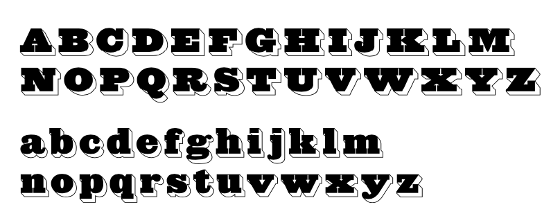
file name: Paul Barnes Tim Ripper Caslon Antique Inverse 2019
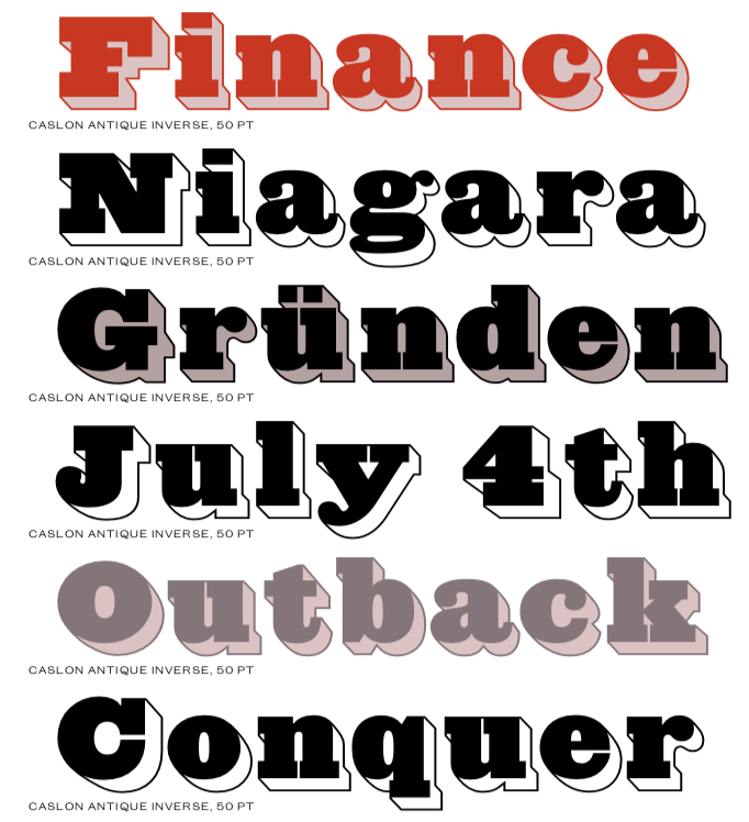
file name: Paul Barnes Tim Ripper Caslon Antique Inverse 2019
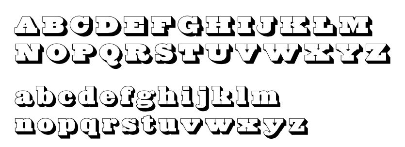
file name: Paul Barnes Tim Ripper Caslon Antique Shaded 2019
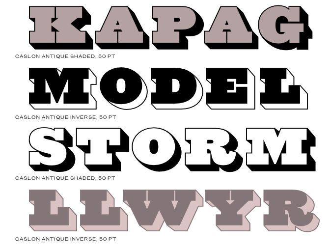
file name: Paul Barnes Tim Ripper Caslon Antique Shaded 2019
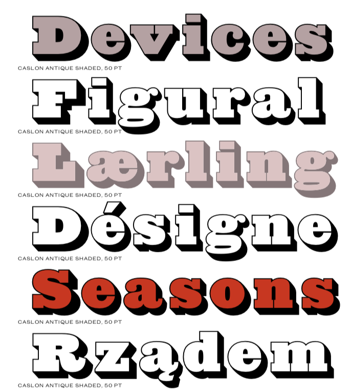
file name: Paul Barnes Tim Ripper Caslon Antique Shaded 2019
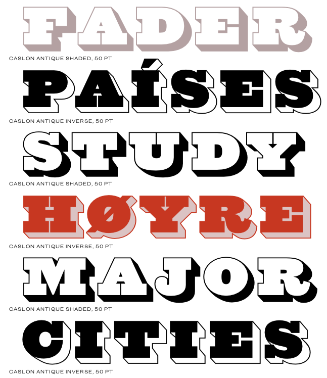
file name: Paul Barnes Tim Ripper Caslon Antique Shaded 2019

file name: Paul Barnes Dan Milne Darby Sans 2014

file name: Paul Barnes Dan Milne Darby Sans 2014

file name: Paul Barnes Dan Milne Darby Serif 2019

file name: Paul Barnes Brunel Deck 2019

file name: Paul Barnes Brunel Deck 2019

file name: Paul Barnes Brunel Hairline 2019

file name: Paul Barnes Brunel Hairline Roman 2019

file name: Paul Barnes Brunel Poster Bold 2019

file name: Paul Barnes Brunel Poster Semibold Italic 2019

file name: Paul Barnes Brunel Text 2019

file name: Paul Barnes Brunel Text Roman 2019

file name: Paul Barnes Caslon Doric 2019

file name: Paul Barnes Caslon Doric Black 2019

file name: Paul Barnes Caslon Doric Condensed 2019

file name: Paul Barnes Caslon Doric Medium 2019

file name: Paul Barnes Caslon Doric Wide 2019

file name: Paul Barnes Caslon Doric Wide 2019

file name: Commercial Type Sanomat Slab Black 2016
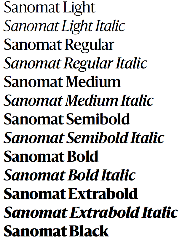
file name: Paul Barnes Sanomat 2017
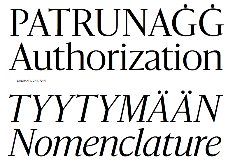
file name: Paul Barnes Sanomat 2017b

file name: Paul Barnes Sanomat 2017c

file name: Paul Barnes Sanomat 2017d

file name: Paul Barnes Sanomat 2017e

file name: Paul Barnes Sanomat 2017f

file name: Greg Gadzowicz Paul Barnes Christian Schwartz Publico Text Mono 2012 2014

file name: Greg Gadzowicz Paul Barnes Christian Schwartz Publico Text Mono 2012 2014

file name: Greg Gadzowicz Paul Barnes Christian Schwartz Publico Text Mono 2012 2014

file name: Christian Schwartz Publico

file name: Paul Barnes Christian Schwartz Publico Headline Black 2010

file name: Paul Barnes Christian Schwartz Publico Headline Black 2010b
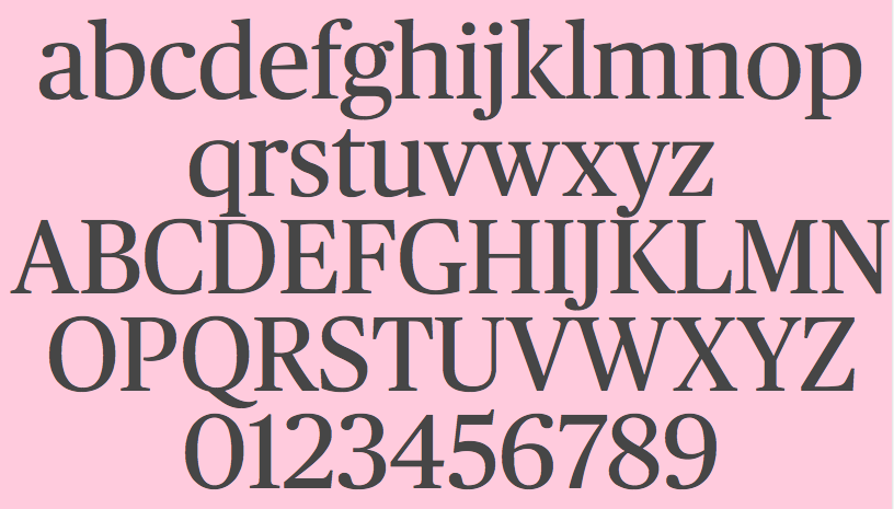
file name: Paul Barnes Christian Schwartz Publico Headline Roman 2010

file name: Paul Barnes Christian Schwartz Publico Text Bold 2010
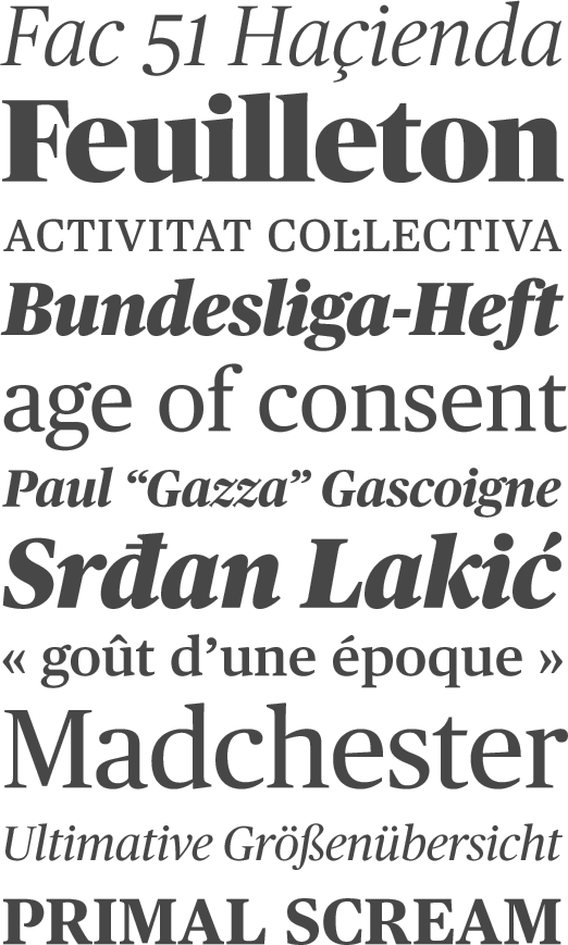
file name: Paul Barnes Publico 2011

file name: Paul Barnes Christian Schwartz Guardian 2006

file name: Miguel Reyes Sandra Carrera Paul Barnes Marian Text 2014 2016

file name: Miguel Reyes Sandra Carrera Paul Barnes Marian Text1554 2014 2016b

file name: Miguel Reyes Sandra Carrera Paul Barnes Marian Text1554 Italic 2014 2016

file name: Miguel Reyes Sandra Carrera Paul Barnes Marian Text1757 2014 2016

file name: Miguel Reyes Sandra Carrera Paul Barnes Marian Text1757 2014 2016d

file name: Miguel Reyes Sandra Carrera Paul Barnes Marian Text1757 Italic 2014 2016

file name: Miguel Reyes Sandra Carrera Paul Barnes Marian Text1800 2014 2016

file name: Miguel Reyes Sandra Carrera Paul Barnes Marian Text1812 2014 2016

file name: Paul Barnes Marian 2012

file name: Paul Barnes Marian 2012b

file name: Paul Barnes Marian1554 2012

file name: Paul Barnes Marian1554 2012b

file name: Paul Barnes Marian1554 2009

file name: Paul Barnes Marian1571 2012

file name: Paul Barnes Marian1571 2012b

file name: Paul Barnes Marian1680 2012

file name: Paul Barnes Marian1740 2012

file name: Paul Barnes Marian1742 2012

file name: Paul Barnes Marian1757 2012

file name: Paul Barnes Marian1812 2012

file name: Paul Barnes Marian Black 2012

file name: Paul Barnes Marian 2012 Poster by Bill Dawson 2015

file name: Commercial Type Dala Prisma

file name: Paul Barnes Dala Floda 2010d

file name: Paul Barnes Dala Floda 2010

file name: Paul Barnes Dala Floda 2010e

file name: Paul Barnes Dala Floda 2010f

file name: Paul Barnes Dala Floda 2010g

file name: Paul Barnes Dala Floda 2010h

file name: Paul Barnes Dala Floda 2010i

file name: Paul Barnes Dala Floda 2010j

file name: Paul Barnes Dala Floda 2010k

file name: Paul Barnes Dala Floda 2010l

file name: Paul Barnes Dala Floda 2010m

file name: Paul Barnes Dala Floda 2010n

file name: Paul Barnes Dala Moa 2010

file name: Paul Barnes Telesans 2010 2013

file name: Paul Barnes Telesans 2010 2013b

file name: Paul Barnes Telesans 2010 2013c

file name: Paul Barnes Telesans 2010 2013e

file name: Paul Barnes Telesans Head Black 2010 2013
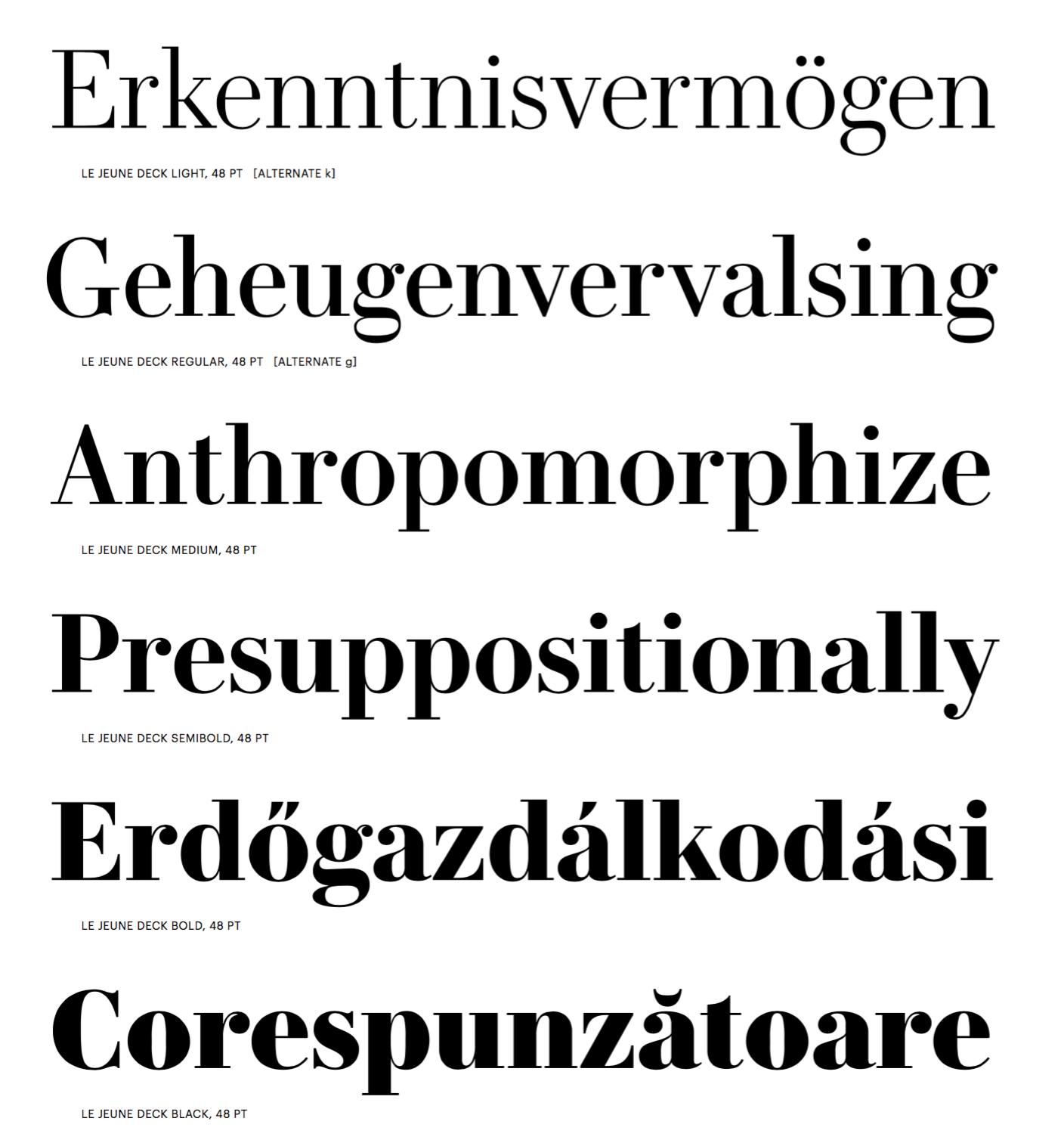
file name: Greg Gazdowicz Christian Schwartz Paul Barnes Le Jeune Deck 2016c
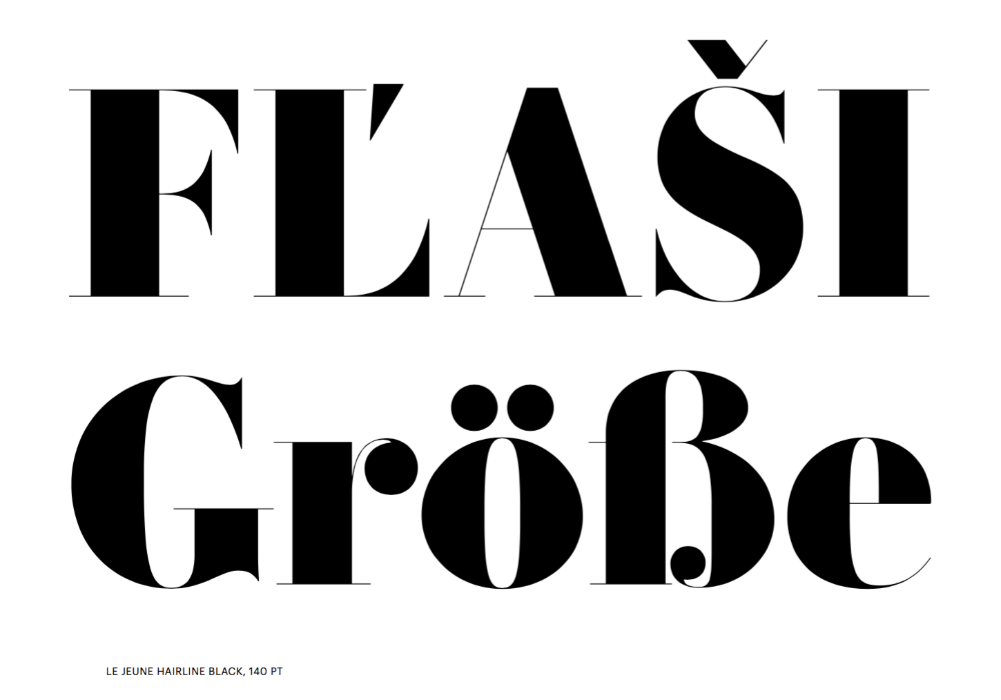
file name: Greg Gazdowicz Christian Schwartz Paul Barnes Le Jeune Hairline Black 2016
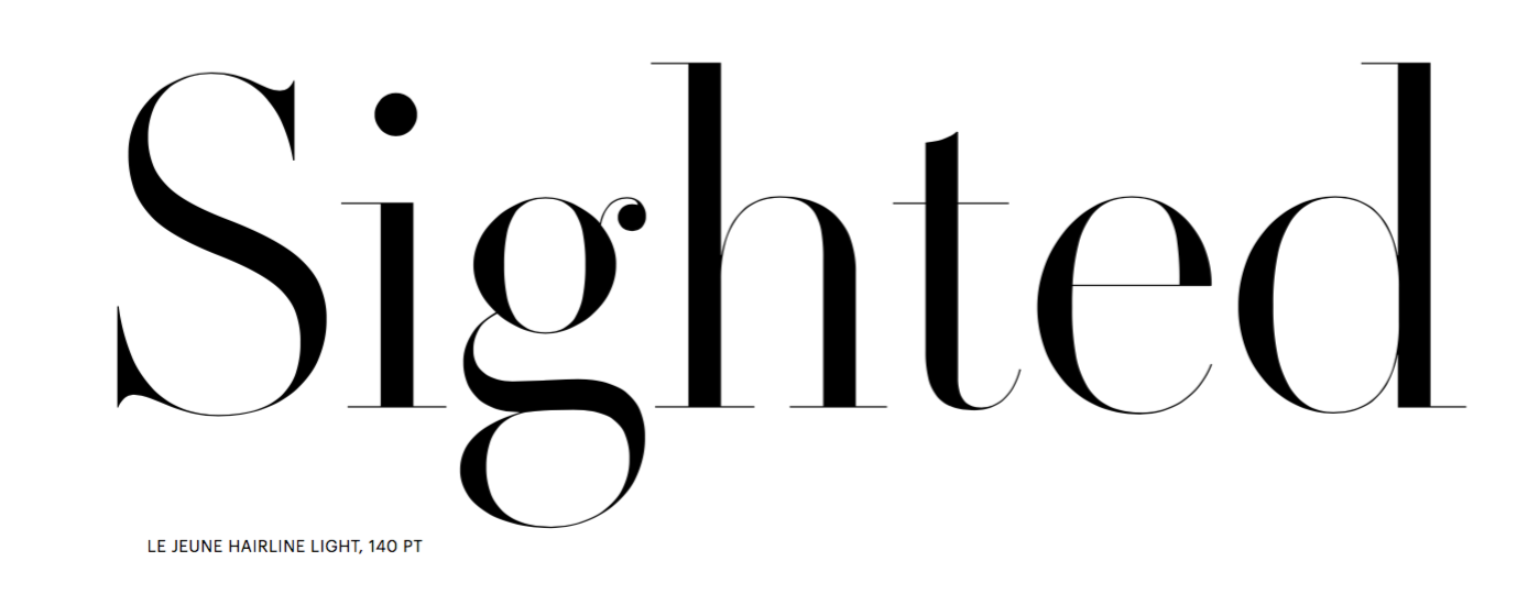
file name: Greg Gazdowicz Christian Schwartz Paul Barnes Le Jeune Hairline Light 2016

file name: Greg Gazdowicz Christian Schwartz Paul Barnes Le Jeune Poster 2016b
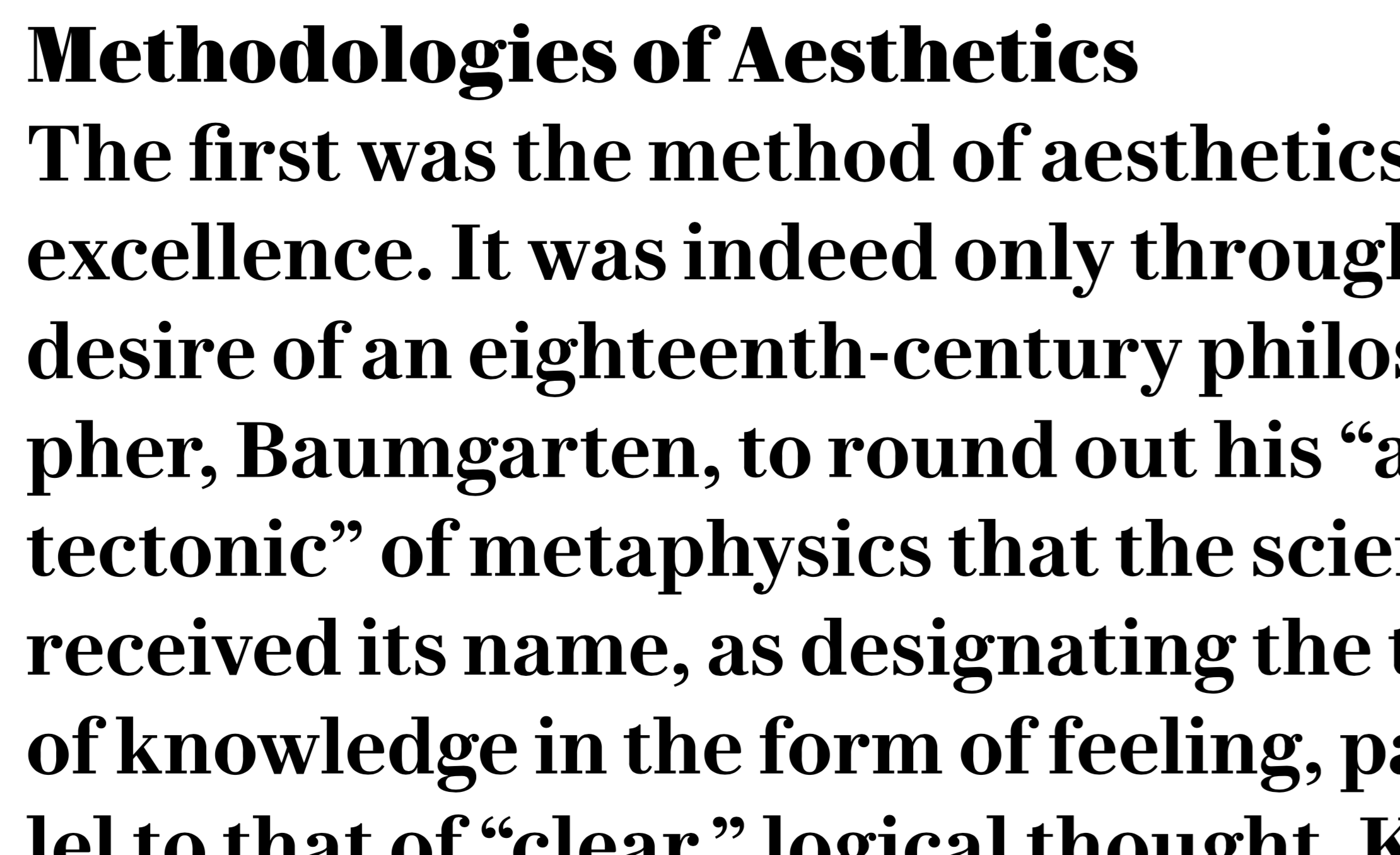
file name: Greg Gazdowicz Christian Schwartz Paul Barnes Le Jeune Text 2016

file name: Paul Barnes Miguel Reyes Gabriello 2014

file name: Paul Barnes Miguel Reyes Gabriello 2014b

file name: Paul Barnes Miguel Reyes Gabriello 2014c

file name: Paul Barnes Miguel Reyes Gabriello 2014d

file name: Paul Barnes Miguel Reyes Gabriello 2014e

file name: Paul Barnes Dave Foster Marr Sans 2014

file name: Paul Barnes Dave Foster Marr Sans 2014b

file name: Paul Barnes Dave Foster Marr Sans 2014c

file name: Paul Barnes Dave Foster Marr Sans 2014d

file name: Paul Barnes Dave Foster Marr Sans 2014e

file name: Paul Barnes Dave Foster Marr Sans 2014f

file name: Paul Barnes Dave Foster Marr Sans 2014g
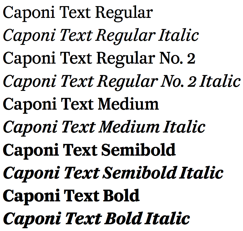
file name: Christian Schwartz Paul Barnes Miguel Reyes Caponi 2014
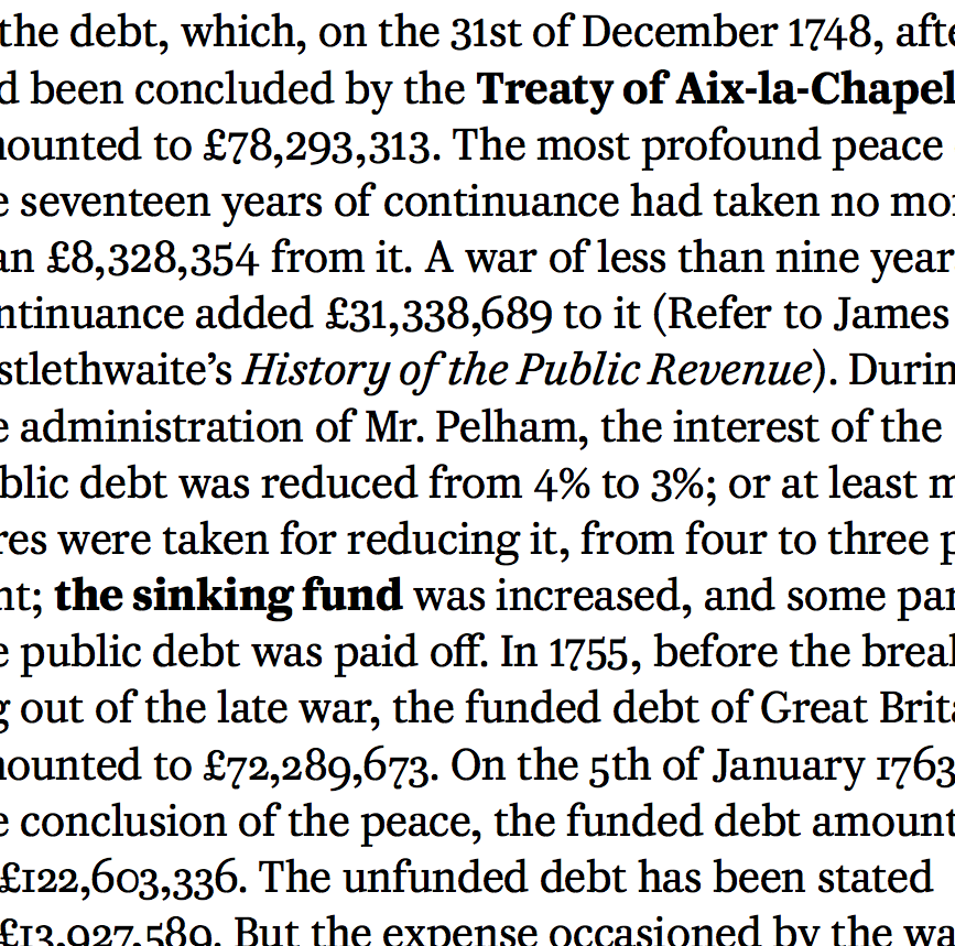
file name: Christian Schwartz Paul Barnes Miguel Reyes Caponi 2014b

file name: Christian Schwartz Paul Barnes Miguel Reyes Caponi 2014c

file name: Christian Schwartz Paul Barnes Miguel Reyes Caponi 2014cl
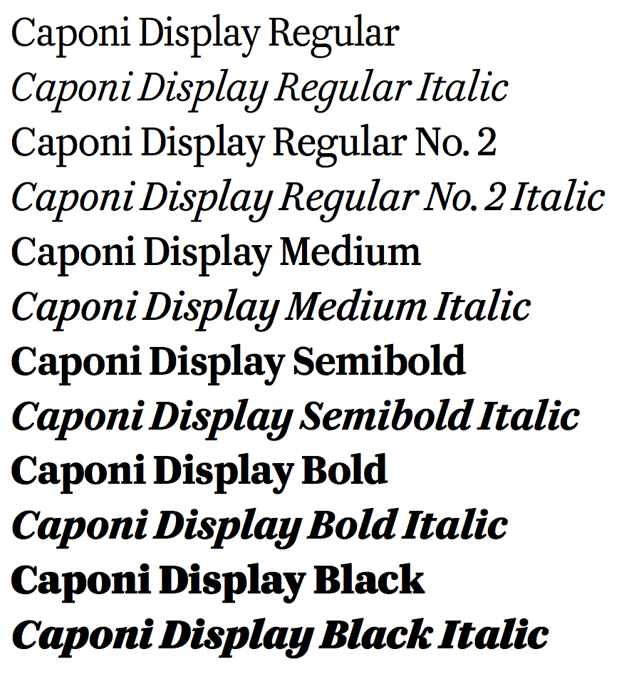
file name: Christian Schwartz Paul Barnes Miguel Reyes Caponi 2014d

file name: Christian Schwartz Paul Barnes Miguel Reyes Caponi 2014e

file name: Christian Schwartz Paul Barnes Miguel Reyes Caponi 2014f
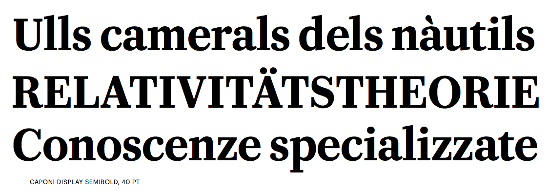
file name: Christian Schwartz Paul Barnes Miguel Reyes Caponi 2014g
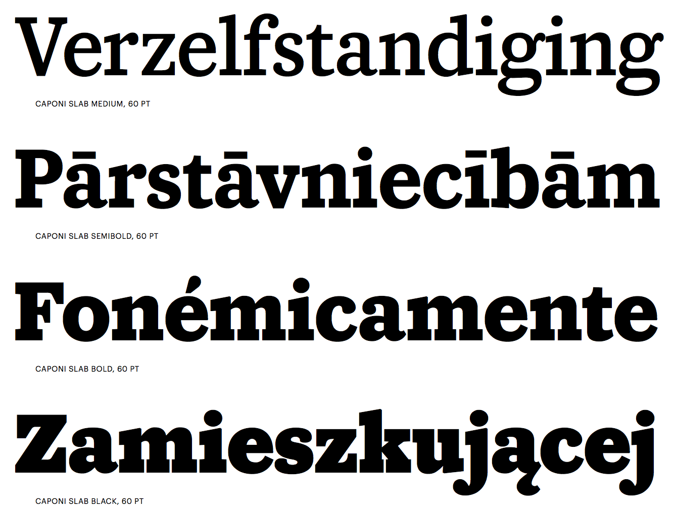
file name: Christian Schwartz Paul Barnes Miguel Reyes Caponi 2014h

file name: Christian Schwartz Paul Barnes Miguel Reyes Caponi 2014i

file name: Christian Schwartz Paul Barnes Miguel Reyes Caponi 2014j

file name: Christian Schwartz Paul Barnes Miguel Reyes Caponi 2014k

file name: Paul Barnes Kate Moss

file name: Paul Barnes Brunel1995

file name: Paul Barnes Ilya Ruderman Austin 2003 2009 2016 Poster by Ilya Ruderman Antonina Kozlova Yury Ostromentsky 2017

file name: Paul Barnes Ilya Ruderman Austin 2003 2009 2016 Poster by Ilya Ruderman Antonina Kozlova Yury Ostromentsky 2017b

file name: Paul Barnes Ilya Ruderman Austin 2003 2009 2016 Poster by Ilya Ruderman Antonina Kozlova Yury Ostromentsky 2017c

file name: Paul Barnes Ilya Ruderman Austin 2003 2009 2016 Poster by Ilya Ruderman Antonina Kozlova Yury Ostromentsky 2017d

file name: Paul Barnes Ilya Ruderman Austin 2003 2009 2016 Poster by Ilya Ruderman Antonina Kozlova Yury Ostromentsky 2017e

file name: Paul Barnes Ilya Ruderman Austin 2003 2009 2016 Poster by Ilya Ruderman Antonina Kozlova Yury Ostromentsky 2017f

file name: Paul Barnes Ilya Ruderman Austin 2003 2009 2016 Poster by Ilya Ruderman Antonina Kozlova Yury Ostromentsky 2017g

file name: Paul Barnes Ilya Ruderman Austin 2003 2009 2016 Poster by Ilya Ruderman Antonina Kozlova Yury Ostromentsky 2017h

file name: Paul Barnes Austin 2009

file name: Paul Barnes Austin 2009b

file name: Paul Barnes Austin 2009c

file name: Paul Barnes Austin 2009d

file name: Paul Barnes Austin 2009d

file name: Paul Barnes Austin 2009e

file name: Paul Barnes Ornamented

file name: Paul Barnes Pic
| | |
|
Luc Devroye ⦿ School of Computer Science ⦿ McGill University Montreal, Canada H3A 2K6 ⦿ lucdevroye@gmail.com ⦿ https://luc.devroye.org ⦿ https://luc.devroye.org/fonts.html |


