TYPE DESIGN INFORMATION PAGE last updated on Mon Jun 8 17:41:07 EDT 2026
FONT RECOGNITION VIA FONT MOOSE

|
|
|
|
|
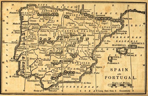
The Spanish type scene | ||
|
|
|
|
SWITCH TO INDEX FILE
29 Letters
|
At ATypI 2008 in St. Petersburg, he ran a workshop on the Arabic Kufi script. Speaker at ATypI 2010 in Dublin on the topic of political resistance and expression through graffiti in Lebanon and Palestine. His contributions to type design:
| ||||||||||||||||||||||||||||||||||||||||||||||||||||||||||||||||||||||||||||
Spanish designer of the dot matrix typeface Teleindicadores (2013, OFL). [Google] [More] ⦿ | |||||||||||||||||||||||||||||||||||||||||||||||||||||||||||||||||||||||||||||
45 Coated
| 45 coated is a studio of Shadday d.S.C, a Spanish freelance graphic designer based in Las Palmas on the Canary Islands. Creator of Lybkana (2012), a typeface that is based on a petroglyph found in the Canary Islands. The paintings and engravings belonged to a pre-Hispanic period (known as Guanche). The signs are in a defunct language called Libyan-Berber, which was spoken from the Canary Islands to Egypt. [Google] [More] ⦿ | ||||||||||||||||||||||||||||||||||||||||||||||||||||||||||||||||||||||||||||
Spanish designer of the hipsterish display typeface Belle de Mai (2020), a variable display typeface inspired in the cultural shock between high cost zones and the lowest suburbs near big metropolitans cities like Paris, and in the French culture, especially in the hood of La Belle de Mai, where it takes the name from. Typefaces from 2021: Galipo or Galipos (a Latin / Cyrillic display typeface inspired by Andalusian society and culture). [Google] [More] ⦿ | |||||||||||||||||||||||||||||||||||||||||||||||||||||||||||||||||||||||||||||
Valencia, Spain-based designer of a hipster typeface in 2016. [Google] [More] ⦿ | |||||||||||||||||||||||||||||||||||||||||||||||||||||||||||||||||||||||||||||
Cordoba, Spain-based designer of the handwriting typeface Curro Rumbao (2016). [Google] [More] ⦿ | |||||||||||||||||||||||||||||||||||||||||||||||||||||||||||||||||||||||||||||
New Hampshire or Spain-based dyslexic creator of Open Dyslexic (2011), a free font specially designed for dyslexia, developed on the basis of Bitstream Vera Sans. Leo Kelion writes for the BBC: The OpenDyslexic font is designed to give "gravity" to letters to prevent the characters rotating in readers' minds. Other type designs by Gonzalez include Eulexia and Alpha Symbolic (a "dyslexic notation" typeface that uses symmetric symbols to reduce confusion in the alphabet). Dafont link. Open Font Library link. Github link. Open Dyslexic link. Free download of Open Dyslexic. [Google] [More] ⦿ | |||||||||||||||||||||||||||||||||||||||||||||||||||||||||||||||||||||||||||||
Spanish foundry. In 2011, they published the Victorian family Abietar (+Negra). [Google] [MyFonts] [More] ⦿ | |||||||||||||||||||||||||||||||||||||||||||||||||||||||||||||||||||||||||||||
Designer (b. Spain, 1994) of the sans typefaces Lugos (2017), Mousse (2017), Vintage Avalanche (2016), Sufficit (2016) and Calculative (2016). [Google] [More] ⦿ | |||||||||||||||||||||||||||||||||||||||||||||||||||||||||||||||||||||||||||||
Cadiz, Spain-based designer of the book typeface Axelino (2017). [Google] [More] ⦿ | |||||||||||||||||||||||||||||||||||||||||||||||||||||||||||||||||||||||||||||
Art director in Madrid, Spain, who created the free TIF format display typeface Cardboard (2016). Behance link. [Google] [More] ⦿ | |||||||||||||||||||||||||||||||||||||||||||||||||||||||||||||||||||||||||||||
Madrid-based designer of the spiky typeface Pank (2016). [Google] [More] ⦿ | |||||||||||||||||||||||||||||||||||||||||||||||||||||||||||||||||||||||||||||
Aday Falcón
| |||||||||||||||||||||||||||||||||||||||||||||||||||||||||||||||||||||||||||||
Jaen, Spain-based designer of the angular text typeface Tuccitana (2018). [Google] [More] ⦿ | |||||||||||||||||||||||||||||||||||||||||||||||||||||||||||||||||||||||||||||
Spanish creator of the hand-printed Agafont (2008). [Google] [More] ⦿ | |||||||||||||||||||||||||||||||||||||||||||||||||||||||||||||||||||||||||||||
Spanish designer. Creator of the fat finger typeface Modular Sans (2011), which was based on the popular sans-serif Comic Sans. Behance link. [Google] [More] ⦿ | |||||||||||||||||||||||||||||||||||||||||||||||||||||||||||||||||||||||||||||
Spanish graphic designer who made DIN Stencil (2011). [Google] [More] ⦿ | |||||||||||||||||||||||||||||||||||||||||||||||||||||||||||||||||||||||||||||
Newsense (2013) is an art deco typeface that extends Milton Glaser's Film Sense (1968). Romaji Mincho (2013) is a free Asian simulation font based on the style of the Mincho typeface. Rhyder (2013) is a great (free) geometric 1930s style sans typeface. Martell (2013) is a free general purpose slab serif family. AC Big Serif (2013) is a free rounded wedge serif typeface. AC Thermes (2013) is a sans display typeface. Typefaces from 2014: AC Wanita (hand-drawn). Typefaces from 2019: AC Guanche (a font based on the ancient scripts used by the Guanches, the aboriginal inhabitants of the Canary Islands). [Google] [More] ⦿ | |||||||||||||||||||||||||||||||||||||||||||||||||||||||||||||||||||||||||||||
Adrian Martin Gomez
| |||||||||||||||||||||||||||||||||||||||||||||||||||||||||||||||||||||||||||||
Cuban designer, b. 1985, who lives in Jerez, Spain. Creator of the 3-style sans typeface family Colonial Havana (2016) and the text and poster typeface family Walina (2016). [Google] [More] ⦿ | |||||||||||||||||||||||||||||||||||||||||||||||||||||||||||||||||||||||||||||
Spanish designer of the paper cutout typeface Malenka (2020). [Google] [More] ⦿ | |||||||||||||||||||||||||||||||||||||||||||||||||||||||||||||||||||||||||||||
| |||||||||||||||||||||||||||||||||||||||||||||||||||||||||||||||||||||||||||||
Marbella, Spain-based design student. During his studies at Marbella Design Academy in 2012, he created the triangular-shaped high-contrast font Drisign. [Google] [More] ⦿ | |||||||||||||||||||||||||||||||||||||||||||||||||||||||||||||||||||||||||||||
Spanish creator of the graffiti font Vandalo (2009). Possibly called Arturo Garcia. [Google] [More] ⦿ | |||||||||||||||||||||||||||||||||||||||||||||||||||||||||||||||||||||||||||||
Spanish designer of Agustina (2005, scratched handwriting). [Google] [More] ⦿ | |||||||||||||||||||||||||||||||||||||||||||||||||||||||||||||||||||||||||||||
| |||||||||||||||||||||||||||||||||||||||||||||||||||||||||||||||||||||||||||||
Madrid-based designer of the hand-printed typefaces as Aida Garmo (2013), AS Melanie Handwriting (2011), Aida Scrap Rounded (2011) and Aida Scrap Small Size (2011). Dafont link. [Google] [More] ⦿ | |||||||||||||||||||||||||||||||||||||||||||||||||||||||||||||||||||||||||||||
Great graphic designer from Valencia, Spain. At Behance, she showed a trendy blingy smoky New York typographic poster (2009). In 2010, she made an equally fine poster for Berlin. [Google] [More] ⦿ | |||||||||||||||||||||||||||||||||||||||||||||||||||||||||||||||||||||||||||||
Spanish designer of the display typeface Refraccion (2016). [Google] [More] ⦿ | |||||||||||||||||||||||||||||||||||||||||||||||||||||||||||||||||||||||||||||
Based in Valencia, Spain, Aina Requena created the striped poster typeface Zebra (2012) together with Vicent Badia, Dasha Kratenko and Miguel R. Diaz. [Google] [More] ⦿ | |||||||||||||||||||||||||||||||||||||||||||||||||||||||||||||||||||||||||||||
Pamplona, Spain-based designer of the bilined typeface Ladoble (2018). [Google] [More] ⦿ | |||||||||||||||||||||||||||||||||||||||||||||||||||||||||||||||||||||||||||||
Designer in Sevilla, Spain, who created a couple of modular typefaces in 2017. [Google] [More] ⦿ | |||||||||||||||||||||||||||||||||||||||||||||||||||||||||||||||||||||||||||||
Spanish type designer from Navarra who lives in Los Realejos, Tenerife. [Google] [More] ⦿ | |||||||||||||||||||||||||||||||||||||||||||||||||||||||||||||||||||||||||||||
Madrid-based designer of the display typeface Quirou (2013). [Google] [More] ⦿ | |||||||||||||||||||||||||||||||||||||||||||||||||||||||||||||||||||||||||||||
Madrid, Spain-based designer of the modular techno typeface KR20-7 (2015). [Google] [More] ⦿ | |||||||||||||||||||||||||||||||||||||||||||||||||||||||||||||||||||||||||||||
Spanish graphic designer in Alicante, b. 1986. His free fonts include Alber (2009, grungy stencil), Globus (2009, almost counterless atrsy face), Industrial (2009, virile face) and Wind and Bubbles (2009). [Google] [More] ⦿ | |||||||||||||||||||||||||||||||||||||||||||||||||||||||||||||||||||||||||||||
Type historian at Reial Academia de Bones Lletres in Barcelona, who has a PhD in art history from Universitat Autonoma de Barcelona (UAB). Born in Barcelona in 1971, Corbeto is responsible for all the publishing activities of the Real Academia de Buenas Letras de Barcelona and the Asociación de Bibliófilos de Barcelona. His field of investigation is the history of printing types and, in particular, the work of Spanish punchcutters throughout the second half of the eighteenth century. At ATypI 2006 in Lisbon, he spoke about the efforts around 1750-1770 to set up the Royal Library type foundry by Juan de Santander and Gerónimo A. Gil. Speaker at ATypI 2009 in Mexico City, where he talked about the punches from the Spanish Royal Printing House. Soon he will publish a specimen and text book on all this. His books: Muses de la impremta. La dona i les arts del llibre (segles XVI-XIX) (ed., with M. Garone) (Associació de Bibliòfils de Barcelona, 2009); Especímenes tipográficos españoles. Catalogación y estudio de las muestras de letras impresas hasta el año 1833 (Calambur, Madrid, 2010); Daniel B. Updike, impresor e historiador de la tipografía (Campgrafic, Valencia, 2011); Tipos de imprenta en España (Campgrafic, Valencia, 2011), Las letras de la Ilustración. Edición, imprenta y fundición de tipos en la Real Biblioteca (Catálogo de la exposición en la Biblioteca Nacional, Madrid, 2012) e Història de la tipografia. L'evolució de la lletra des de Gutenberg fins a les foneries digitals (coauthor with M. Garone, Pagès Editors, Lérida, 2012). [Google] [More] ⦿ | |||||||||||||||||||||||||||||||||||||||||||||||||||||||||||||||||||||||||||||
Creator of a facsimile font called Real Madrid 1213 (2012), after the lettering Real Madrid is using in the 2012-2013 season. Download site. Check also the small improvement by Character. [Google] [More] ⦿ | |||||||||||||||||||||||||||||||||||||||||||||||||||||||||||||||||||||||||||||
Granada, Spain-based designer of the free techno typeface Arcade Fractured (2018), during his studies at Escuela Arte Granada. [Google] [More] ⦿ | |||||||||||||||||||||||||||||||||||||||||||||||||||||||||||||||||||||||||||||
Madrid-based designer of Fusion (2014, a 3d font), Black (2014, an alchemic typeface) and Magma (2014, an experimental geometric typeface). [Google] [More] ⦿ | |||||||||||||||||||||||||||||||||||||||||||||||||||||||||||||||||||||||||||||
Liebe Lorraine (2012) is an alchemic typeface. Espina (2012) is a spurred caps-only typeface. Mum Italic (2012) is in the planning stages. | |||||||||||||||||||||||||||||||||||||||||||||||||||||||||||||||||||||||||||||
Behance link. [Google] [More] ⦿ | |||||||||||||||||||||||||||||||||||||||||||||||||||||||||||||||||||||||||||||
Painter, sculptor and graphic designer, b. Madrid, 1942. He was commissioned in 2000 by the city of Bilbao to design a font with a Basque look. The result was Alfabeto Bilbao. Alternate URL with some of his paintings. Alfabeto Bilbao is free at Yo de Bilbao. [Google] [More] ⦿ | |||||||||||||||||||||||||||||||||||||||||||||||||||||||||||||||||||||||||||||
Graphic designer in Ciudad Real, who created the decorative typeface Muelle and the rhombic typeface Robodo in 2018. [Google] [More] ⦿ | |||||||||||||||||||||||||||||||||||||||||||||||||||||||||||||||||||||||||||||
Alberto Deltio
| |||||||||||||||||||||||||||||||||||||||||||||||||||||||||||||||||||||||||||||
Graphic designer in Alicante, Spain, who make Octagon (2010). Aka Prosaiper or Alber. [Google] [More] ⦿ | |||||||||||||||||||||||||||||||||||||||||||||||||||||||||||||||||||||||||||||
Graphic and industrial designer, post-producer and writer born in Alicante, Spain. He created a number of free typefaces in 2011 that are available via Devian Tart and Open Font Library: Berly, Octagon, Bubbles, EcoLive, Industrial, Filler. Devian tart link. Behance link. Open Font Library link. [Google] [More] ⦿ | |||||||||||||||||||||||||||||||||||||||||||||||||||||||||||||||||||||||||||||
Lugo, Spain-based creator of the counerless cut-out typeface Straight Font (2013). [Google] [More] ⦿ | |||||||||||||||||||||||||||||||||||||||||||||||||||||||||||||||||||||||||||||
Madrid, Spain-based designer of the rounded handcrafted typeface Natural (2017), the sans typeface Acatisia (2018), and the free icon set Summer Bold. [Google] [More] ⦿ | |||||||||||||||||||||||||||||||||||||||||||||||||||||||||||||||||||||||||||||
Alberto Martinez
| |||||||||||||||||||||||||||||||||||||||||||||||||||||||||||||||||||||||||||||
| |||||||||||||||||||||||||||||||||||||||||||||||||||||||||||||||||||||||||||||
Student of Art Direction at the Miami Ad School Madrid. He created the counterless Rounded Font (2011). Behance link. [Google] [More] ⦿ | |||||||||||||||||||||||||||||||||||||||||||||||||||||||||||||||||||||||||||||
Alberto Rodríguez Diaz
| |||||||||||||||||||||||||||||||||||||||||||||||||||||||||||||||||||||||||||||
Alberto Romanos
| |||||||||||||||||||||||||||||||||||||||||||||||||||||||||||||||||||||||||||||
Alberto Varela Ferreiro
| |||||||||||||||||||||||||||||||||||||||||||||||||||||||||||||||||||||||||||||
Madrid, Spain-based designer of the handcrafted and script typefaces Cremme (2018), Zuma (2018) and Hobla Script (2018). [Google] [More] ⦿ | |||||||||||||||||||||||||||||||||||||||||||||||||||||||||||||||||||||||||||||
Graduate of the Miami Ad School in Madrid who lives in Murcia, near where many spaghetti westerns were filmed. No surprise then that she created the Western look typeface Bandido and the counterless display typeface Cactus in 2012. Architecture font is a wide techno face. For something completely different, she turned to alchemism with the nutty Nick Minaj font (2012). | |||||||||||||||||||||||||||||||||||||||||||||||||||||||||||||||||||||||||||||
Graphic director in Zaragoza, Spain, who created an animated geometric Bauhaus typeface in 2016. [Google] [More] ⦿ | |||||||||||||||||||||||||||||||||||||||||||||||||||||||||||||||||||||||||||||
Designer in La Laguna, Canary Islands, Spain. He created Ciclo (2011), a monoline arc-and-straight-edge typeface. Seoul (2011) is a geometric avant-garde family. [Google] [More] ⦿ | |||||||||||||||||||||||||||||||||||||||||||||||||||||||||||||||||||||||||||||
Madrid-based designer of the display typeface Karma (2016). [Google] [More] ⦿ | |||||||||||||||||||||||||||||||||||||||||||||||||||||||||||||||||||||||||||||
Spanish designer from La Coruna, b. 1976. He created Matricula Espanola (2007, an all caps sans face) and N-Gage (2007, a futuristic experiment). Dafont link. [Google] [More] ⦿ | |||||||||||||||||||||||||||||||||||||||||||||||||||||||||||||||||||||||||||||
Graphic designer in Alicante, Spain, who created the unicase typeface Vertica in 2013. [Google] [More] ⦿ | |||||||||||||||||||||||||||||||||||||||||||||||||||||||||||||||||||||||||||||
Spanish graphic designer who lives in Murcia. Creator of Gne Script (2011, an angry angular handrinted face). Behance link. [Google] [More] ⦿ | |||||||||||||||||||||||||||||||||||||||||||||||||||||||||||||||||||||||||||||
| |||||||||||||||||||||||||||||||||||||||||||||||||||||||||||||||||||||||||||||
Spanish designer of the bold all caps sans typeface Aran (2019). [Google] [More] ⦿ | |||||||||||||||||||||||||||||||||||||||||||||||||||||||||||||||||||||||||||||
Alex Baisan (Valencia, Spain) designed Soul Trumpet (2013), a display typeface. Behance link. [Google] [More] ⦿ | |||||||||||||||||||||||||||||||||||||||||||||||||||||||||||||||||||||||||||||
Spanish designer of the serifed text typeface Archefont (2015). [Google] [More] ⦿ | |||||||||||||||||||||||||||||||||||||||||||||||||||||||||||||||||||||||||||||
Alex de la Fuente
| |||||||||||||||||||||||||||||||||||||||||||||||||||||||||||||||||||||||||||||
Behance link. Behance link for Feten Studio. Behance link for Sara Bautista. [Google] [More] ⦿ | |||||||||||||||||||||||||||||||||||||||||||||||||||||||||||||||||||||||||||||
Granada, Spain-based designer of the typeface Caelum (2013). [Google] [More] ⦿ | |||||||||||||||||||||||||||||||||||||||||||||||||||||||||||||||||||||||||||||
Spanish designer of Fine Line (2008) and Grungy Style (2008). [Google] [More] ⦿ | |||||||||||||||||||||||||||||||||||||||||||||||||||||||||||||||||||||||||||||
Designer in Santa Coloma de Gramanet. Creator of Santa Coloma (2013), a geometric sans typeface. [Google] [More] ⦿ | |||||||||||||||||||||||||||||||||||||||||||||||||||||||||||||||||||||||||||||
Cordoba, Spain-based designer of the text typeface Juanola (2018). [Google] [More] ⦿ | |||||||||||||||||||||||||||||||||||||||||||||||||||||||||||||||||||||||||||||
During his studies, Madrid, Spain-based Alfonso Armenteros Parras designed the free pixel font family Notorobo (2017) for Memex's UI. He also created the experimental geometric typeface Stijla (2017). [Google] [More] ⦿ | |||||||||||||||||||||||||||||||||||||||||||||||||||||||||||||||||||||||||||||
Alfonso Chulvi
| |||||||||||||||||||||||||||||||||||||||||||||||||||||||||||||||||||||||||||||
Spanish type founder and printer, who worked in Valencia around 1477-1478, where he published the Valancian Bible. He left for Murcia, where in 1484, he printed the Breviarium Cathaginense. [Google] [More] ⦿ | |||||||||||||||||||||||||||||||||||||||||||||||||||||||||||||||||||||||||||||
Cadiz, Spain-based designer of the decorative blackletter typeface Nirvana (2015) and the angular text typeface Wild Roman (2015). [Google] [More] ⦿ | |||||||||||||||||||||||||||||||||||||||||||||||||||||||||||||||||||||||||||||
Madrid-based designer of the futuristic typeface Cyborg (2015). [Google] [More] ⦿ | |||||||||||||||||||||||||||||||||||||||||||||||||||||||||||||||||||||||||||||
Madrid-based designer of the deco typeface City (2015). [Google] [More] ⦿ | |||||||||||||||||||||||||||||||||||||||||||||||||||||||||||||||||||||||||||||
Zaragoza, Spain-based designer of the titling typeface Deep Blues (2018). [Google] [More] ⦿ | |||||||||||||||||||||||||||||||||||||||||||||||||||||||||||||||||||||||||||||
Dailos Perez Gonzalez (Valencia, Spain), Alicia Raya (Valencia, Spain), Haizea Najera and Cristina Bonora co-designed the artsy thin caps typeface Fair in 2013. Behance link. [Google] [More] ⦿ | |||||||||||||||||||||||||||||||||||||||||||||||||||||||||||||||||||||||||||||
Graphic designer and illustrator in Valencia, who created the sketch typeface Tipotype (2012) for use on couches, cushions, and bedspreads. Behance link. [Google] [More] ⦿ | |||||||||||||||||||||||||||||||||||||||||||||||||||||||||||||||||||||||||||||
Alphabetum
| Juan-José Marcos García (b. Salamanca, Spain, 1963) is a professor of classics at the University of Plasencia in Spain. He has developed one of the most complete Unicode fonts named ALPHABETUM Unicode for linguistics and classical languages (classical&medieval Latin, ancient Greek, Etruscan, Oscan, Umbrian, Faliscan, Messapic, Picene, Iberic, Celtiberic, Gothic, Runic, Modern Greek, Cyrillic, Devanagari-based languages, Old&Middle English, Hebrew, Sanskrit, IPA, Ogham, Ugaritic, Old Persian, Old Church Slavonic, Brahmi, Glagolitic, Ogham, ancient Greek Avestan, Kharoshti, Old Norse, Old Icelandic, Old Danish and Old Nordic in general, Bengali, Hindi, Marathi, Phoenician, Cypriot, Linear B with plans for Glagolitic). This font has over 5000 glyphs, and contains most characters that concern classicists (rare symbols, signs for metrics, epigraphical symbols, "Saxon" typeface for Old English, etcetera). A demo font can be downloaded [see also Lucius Hartmann's place]. His Greek font Grammata (2002) is now called Ellenike. He also created a package of fonts for Latin paleography (medieval handwriting on parchments): Capitalis Elegans, Capitalis Rustica, Capitalis Monumentalis, Antiqua Cursiva Romana, Nova Cursiva Romana (2014), Uncialis, Semiuncialis, Beneventana Minuscula, Visigothica Minuscula, Luxoviensis Minuscula, Insularis Minuscula, Insularis Majuscula, Carolingia Minuscula, Gothica Textura Quadrata, Gothica Textura Prescissa, Gothica Rotunda, Gothica Bastarda, Gothica Cursiva, Bastarda Anglicana (2014) and Humanistica Antiqua. PDF entitled Fonts For Latin Palaeography (2008-2014), in which Marcos gives an enjoyable historic overview. Alphabetum is not Marcos's only excursion into type design. In 2011, he created two simulation fonts called Sefarad and Al Andalus which imitate Hebrew and Arabic calligraphy, respectively. Cyrillic OCS (2012) is a pair of Latin fonts that emulate Old Church Slavonic (old Cyrillic). In 2013, he created Cuneus, a cuneiform simulation typeface. Paleographic fonts for Greek (2014) has ten fonts designed by Marcos: Angular Uncial, Biblical Uncial, Coptic Uncial, Papyrus Uncial, Round Uncial, Slavonic Uncial, Sloping Uncial, Minuscule IX, Minuscule XI and Minuscule XV. These fonts are representative of the main styles of Greek handwriting used during the Classical World and Middle Ages on papyrus and parchments. There is also a short manual of Greek Paleography (71 pages) which explains the development of Greek handwriting from the fourth century B.C. to the invention of printing with movable type in the middle of the fifteenth A.D. He wrote a text book entitled History of Greek Typography: From the Invention of Printing to the Digital Age (in Spanish; second edition, 2018). See also here and here. [Google] [More] ⦿ | ||||||||||||||||||||||||||||||||||||||||||||||||||||||||||||||||||||||||||||
Alter Ebro
| Jorge Moreno (Alter Ebro illustration and design, Zaragoza, Spain) made Alter Ebro Pixel Font (2009, FontStruct). Dafont link. [Google] [More] ⦿ | ||||||||||||||||||||||||||||||||||||||||||||||||||||||||||||||||||||||||||||
Alter Littera
|
Alter Littera produces and markets opentype fonts reviving some of the most beautiful bookhands from medieval Western manuscripts, as well as some of the finest European and North-American typefaces from the mid-fifteenth through the early-twentieth centuries. The "Bookhand", "Oldtype" and "Initials" font collections cover gothic and/or blackletter letter forms. The typefaces:
| ||||||||||||||||||||||||||||||||||||||||||||||||||||||||||||||||||||||||||||
Alva Aur (Valencia, Spain) designed the Witch Lab typeface (2012, alchemic). [Google] [More] ⦿ | |||||||||||||||||||||||||||||||||||||||||||||||||||||||||||||||||||||||||||||
During his studies in Madrid, Alvaro De Ramón Murillo designed the sans typeface family Lotus (2015). Behance link. [Google] [More] ⦿ | |||||||||||||||||||||||||||||||||||||||||||||||||||||||||||||||||||||||||||||
Furniture and industrial designer in Madrid, whose rationality shines through in his architectural ADH typeface (2012). [Google] [More] ⦿ | |||||||||||||||||||||||||||||||||||||||||||||||||||||||||||||||||||||||||||||
Madrid-based designer of the alchemic / hipster typeface TCCM (2013). Behance link. [Google] [More] ⦿ | |||||||||||||||||||||||||||||||||||||||||||||||||||||||||||||||||||||||||||||
Madrid-based designer. He created the runic simulation typeface Runica (2012). Behance link. [Google] [More] ⦿ | |||||||||||||||||||||||||||||||||||||||||||||||||||||||||||||||||||||||||||||
Montreal, Quebec (was: Madrid, Spain)-based designer of a prismatic set of initials in 2016. [Google] [More] ⦿ | |||||||||||||||||||||||||||||||||||||||||||||||||||||||||||||||||||||||||||||
Madrid, Spain-based designer of the hipster typeface AMM (2017). [Google] [More] ⦿ | |||||||||||||||||||||||||||||||||||||||||||||||||||||||||||||||||||||||||||||
Madrid-based creator of the Planet Mambo Club art deco logotype (2013), and of the multiline art deco typeface Jambo Brothers (2013). [Google] [More] ⦿ | |||||||||||||||||||||||||||||||||||||||||||||||||||||||||||||||||||||||||||||
| |||||||||||||||||||||||||||||||||||||||||||||||||||||||||||||||||||||||||||||
| |||||||||||||||||||||||||||||||||||||||||||||||||||||||||||||||||||||||||||||
Creator of the informal hand-printed No Bullies Allowed (2012, iFontMaker) while working as Second Grade teacher at the American School of Madrid. Alyssha is originally from Portland, OR. Fontspace link. [Google] [More] ⦿ | |||||||||||||||||||||||||||||||||||||||||||||||||||||||||||||||||||||||||||||
Daughter of Richard Gans, the founder of Fundicion Tipografica Richard Gans, which was located in Madrid. She took over the company in 1936, together with her brothers Manuel and Ricardo, who were assassinated in the Spanish Civil war. She ran the business and was typographic director in the difficult years after the war, and built the foundry back up from scratch. The Fundicion Tipografica Richard Gans finally folded in 1975. [Google] [More] ⦿ | |||||||||||||||||||||||||||||||||||||||||||||||||||||||||||||||||||||||||||||
Madrid, Spain-based designer of the modular display typeface Woz (2018). [Google] [More] ⦿ | |||||||||||||||||||||||||||||||||||||||||||||||||||||||||||||||||||||||||||||
Graphic designer in Valencia, Spain, who created Sibila in 2015. [Google] [More] ⦿ | |||||||||||||||||||||||||||||||||||||||||||||||||||||||||||||||||||||||||||||
During her studies in Madrid, Ana Beltran designed a Mondrian-inspired typeface in 2015. Behance link. [Google] [More] ⦿ | |||||||||||||||||||||||||||||||||||||||||||||||||||||||||||||||||||||||||||||
Ana Dorado
| |||||||||||||||||||||||||||||||||||||||||||||||||||||||||||||||||||||||||||||
In 2012, she created the thin geometric display sans typeface Wassily. [Google] [More] ⦿ | |||||||||||||||||||||||||||||||||||||||||||||||||||||||||||||||||||||||||||||
| |||||||||||||||||||||||||||||||||||||||||||||||||||||||||||||||||||||||||||||
Alicante, Spain-based designer of a piano key typeface in 2017. [Google] [More] ⦿ | |||||||||||||||||||||||||||||||||||||||||||||||||||||||||||||||||||||||||||||
Spanish designer of the handcrafted typeface Deep (2015). [Google] [More] ⦿ | |||||||||||||||||||||||||||||||||||||||||||||||||||||||||||||||||||||||||||||
Graphic designer in Madrid. She created the curly Ananas (2011) and the squarish Pixel Diamond (2011). [Google] [More] ⦿ | |||||||||||||||||||||||||||||||||||||||||||||||||||||||||||||||||||||||||||||
Ana Marin (t-grafica) is the Ciudad Real, Spain-based designer of Hand Slab (2013), Gala Script (2013), Black Brush (2013, a brush blackletter), Grafica Sans (2013), a sans typeface that is partly grotesk. Dafont link. Behance link. [Google] [More] ⦿ | |||||||||||||||||||||||||||||||||||||||||||||||||||||||||||||||||||||||||||||
Logroño, Spain-based designer of Tim Siskup (2016), a tiki type font based on the work of Tim Biskup. [Google] [More] ⦿ | |||||||||||||||||||||||||||||||||||||||||||||||||||||||||||||||||||||||||||||
During her studies, Jaen, Spain-based Ana Palomino designed the condensed display typeface Julia (2017). [Google] [More] ⦿ | |||||||||||||||||||||||||||||||||||||||||||||||||||||||||||||||||||||||||||||
Salamanca, Spain-based designer of a wavy shaky Latin typeface in 2018. [Google] [More] ⦿ | |||||||||||||||||||||||||||||||||||||||||||||||||||||||||||||||||||||||||||||
| |||||||||||||||||||||||||||||||||||||||||||||||||||||||||||||||||||||||||||||
Madrid-based designer of Cosmic Coyote (2014, free) and Hipon (2014, a free hisper typeface). Behance link. [Google] [More] ⦿ | |||||||||||||||||||||||||||||||||||||||||||||||||||||||||||||||||||||||||||||
Ana V. Francès (or A-GRPHCS in Valencia, Spain) created a bichromatic typeface in 2012. Behance link. [Google] [More] ⦿ | |||||||||||||||||||||||||||||||||||||||||||||||||||||||||||||||||||||||||||||
Based in Villena, Spain, Analisa Moltó Vigon designed a proposal signage and pictogram typeface family for the aquarium in Valencia, Oceanogràfic. This was a graduation project. It is called Océano. [Google] [More] ⦿ | |||||||||||||||||||||||||||||||||||||||||||||||||||||||||||||||||||||||||||||
Photographer and graphic designer in Sevilla, Spain, who created the italic didone stencil typeface Doñ in 2017. [Google] [More] ⦿ | |||||||||||||||||||||||||||||||||||||||||||||||||||||||||||||||||||||||||||||
During her studoes at ESDA (Design School of Aragon), zaragoza, Spain-based Andrea Albiac designed the uppercase didone typeface Artemisa (2018). [Google] [More] ⦿ | |||||||||||||||||||||||||||||||||||||||||||||||||||||||||||||||||||||||||||||
Amposta, Spain-based designer of the experimental modular typeface Sempitern (2018) and the reverse stress typeface Bood (2018). [Google] [More] ⦿ | |||||||||||||||||||||||||||||||||||||||||||||||||||||||||||||||||||||||||||||
Valladolid, Spain-based designer of the circle-based typeface Delicia (2018). [Google] [More] ⦿ | |||||||||||||||||||||||||||||||||||||||||||||||||||||||||||||||||||||||||||||
During her studies at Escuela de Diseño Vitoria-Gasteiz, Andrea Rodriguez (Burgos, Spain) created the monoline sans typeface Bonhomia (2017). [Google] [More] ⦿ | |||||||||||||||||||||||||||||||||||||||||||||||||||||||||||||||||||||||||||||
Spanish designer of the deco typeface Contrast (2019). [Google] [More] ⦿ | |||||||||||||||||||||||||||||||||||||||||||||||||||||||||||||||||||||||||||||
He hooked up with Pose Radu in 2017 and set up The Jumping Foxes. Through The Jumping Foxes, they commercialized Radu's Matisse design as JF Matisse (2017). [Google] [MyFonts] [More] ⦿ | |||||||||||||||||||||||||||||||||||||||||||||||||||||||||||||||||||||||||||||
Colombian graphic and type designer, b. Cali, 1976. He has an undergraduate degree from Instituto Departamental de Bellas Artes in Cali (1996-2001), and Masters degrees in corporate identity (from ELISAVA in Barcelona, 2006-2007) and in type design (from IED in Madrid, 2012). In 2012, he created the sans typeface Nerea (Comando Cran). This typeface was a school project at IED in Madrid. [Google] [More] ⦿ | |||||||||||||||||||||||||||||||||||||||||||||||||||||||||||||||||||||||||||||
Spanish designer of the hand-printed typefaces Charanga (2013) and Inocua (2013). [Google] [More] ⦿ | |||||||||||||||||||||||||||||||||||||||||||||||||||||||||||||||||||||||||||||
| |||||||||||||||||||||||||||||||||||||||||||||||||||||||||||||||||||||||||||||
Valencia, Spain-based designer of the handcrafted typeface Lux (2015). [Google] [More] ⦿ | |||||||||||||||||||||||||||||||||||||||||||||||||||||||||||||||||||||||||||||
Cordoba, Spain-based creator (b. 1991) of the ornamental caps typeface Popcorn (2013). [Google] [More] ⦿ | |||||||||||||||||||||||||||||||||||||||||||||||||||||||||||||||||||||||||||||
Angel Alvarez
| |||||||||||||||||||||||||||||||||||||||||||||||||||||||||||||||||||||||||||||
| |||||||||||||||||||||||||||||||||||||||||||||||||||||||||||||||||||||||||||||
Madrid-based designer of the 3d outline typeface Acetato (2017). [Google] [More] ⦿ | |||||||||||||||||||||||||||||||||||||||||||||||||||||||||||||||||||||||||||||
Graphic designer in Las Palmas de Gran Canaria who created Rising Typeface in 2013, for which he took inspiration from samurai warriors. Artyca (2013) is Gill Sans, adapted to various symbologies. In 2015, he designed the minimalist hipster typeface Nara, which is inspired by the architecture of Japan's second historical period known as Nara. [Google] [More] ⦿ | |||||||||||||||||||||||||||||||||||||||||||||||||||||||||||||||||||||||||||||
Angel Garcia Rubio
| |||||||||||||||||||||||||||||||||||||||||||||||||||||||||||||||||||||||||||||
Angel Justo
| |||||||||||||||||||||||||||||||||||||||||||||||||||||||||||||||||||||||||||||
Spanish graphic designer who made Suipacha (2011), a gridded texture typeface modularly constructed from triangles. It comes with beautiful logotype work for the Suipacha Gallery in Buenos Aires. [Google] [More] ⦿ | |||||||||||||||||||||||||||||||||||||||||||||||||||||||||||||||||||||||||||||
Angel Perez (Cordoba, Spain) created a tattoo-inspired ornamental caps typeface called Sybarithe (2013). Behance link. [Google] [More] ⦿ | |||||||||||||||||||||||||||||||||||||||||||||||||||||||||||||||||||||||||||||
Ángel Sánchez is a Spanish designer. In 2011, he created Museum (a roman caps face), Curriculum (a monoline typewriter face) and Stadium (a geometric circle-based display typeface for architectural signs). Stadium and Museum are free. [Google] [More] ⦿ | |||||||||||||||||||||||||||||||||||||||||||||||||||||||||||||||||||||||||||||
Angel Suazon Acar
| |||||||||||||||||||||||||||||||||||||||||||||||||||||||||||||||||||||||||||||
During her studies in Sevilla, Spain, Angela Gutierrez Garcia designed the steampunk typeface Steampang (2016), the art nouveau typeface Natural Type (2017), and the stitching font Old Granny Cross (2017). [Google] [More] ⦿ | |||||||||||||||||||||||||||||||||||||||||||||||||||||||||||||||||||||||||||||
Angloletra
|
| ||||||||||||||||||||||||||||||||||||||||||||||||||||||||||||||||||||||||||||
Angrois Design
| César Gómez Blanco (Angrois Design) is a Spanish graphic designer in La Coruña, b. 1982. Creator of the techno typeface Bule (2010). [Google] [More] ⦿ | ||||||||||||||||||||||||||||||||||||||||||||||||||||||||||||||||||||||||||||
Spanish creator of the free font REZ Spain (2013). Fontspace link. [Google] [More] ⦿ | |||||||||||||||||||||||||||||||||||||||||||||||||||||||||||||||||||||||||||||
Spanish type designer who created Escorial (ca. 1960, Richard Gans Foundry), a display typeface with Koch Antiqua influences. [Google] [More] ⦿ | |||||||||||||||||||||||||||||||||||||||||||||||||||||||||||||||||||||||||||||
Spanish typefounder based in Sevilla, who emigrated to Mexico and is thought to be the first Spanish typographer in North America. He created a large number of Gothic, roman and cursive typefaces. He printed mainly religious oeuvres, from about 1560 until about 1571. Cristóbal Henestrosa, who wrote Espinosa. Rescate de una tipografía novohispana (México, Designio, 2005), writes: He worked with Juan Pablos (first printer on the American continent) since 1551 and he began his independent job in 1559, with Maturino Gilberti's Grammatica Maturini and finalized with the second edition of Graduale Dominicale in 1576, the year he died. It is not completely clear that he cut [types], although there is a contract (1550) in which he promises to cut type for Juan Pablos, but he is the second printer in all of America and the first one who preferred roman and cursive type over the gothic. [Google] [More] ⦿ | |||||||||||||||||||||||||||||||||||||||||||||||||||||||||||||||||||||||||||||
Espinosa, the printer, had his own foundries---one in Madrid, another in Sevilla and one in Segovia. In Segovia, in 1777, he founded a drawing school. In his writing and font specimen books he explained his desire to imitate the Spanish calligraphic forms and to engrave directly each punch (without using counterpunches). It is Espinosa's italic that was used in the book La conjuracion de Catalina y la guerra de Jugurta (1772, Ibarra, Madrid). He taught at la Real Academia de Bellas Artes de San Fernando, worked at la Casa de la Moneda de Sevilla (since 1772) and la Casa de la Moneda de Segovia (since 1774), and is famous for creating the Ibarra typeface. Sandra Carrera created an entire typeface system based on the types of Antonio Espinosa de Monteros. Called Pícara (2014) it is a bookish typeface with a knife-cut feel and a sturdy serif. In 1993, Juan Ignacio Pulido Trullén, Sandra Silvia Baldassarri Santa Lucía, and Francisco José Serón Arbeloa (Universidad de Zaragoza, Spain) co-designed the free typeface family Ibarra, which is based on the type used in La conjuracion de Catalina y la guerra de Jugurta (1772, Ibarra, Madrid). Author of Muestras de los Caracteres que sejiinden por direccion de D. Antonio Espinosa de los Monteros y Abadia (1771, Academico de la Real de San Fernando, Madrid). [Google] [More] ⦿ | |||||||||||||||||||||||||||||||||||||||||||||||||||||||||||||||||||||||||||||
Spanish cartoonist de Santiago (who is based in Cartagena) used to run Dir Dam Foundry, where he sold his comic book fonts Comic Pro (1998), Comic Ignatz, and Comic Camelot. Comic Pro is also at Jack Yan (1999) and at Type Quarry. [Google] [MyFonts] [More] ⦿ | |||||||||||||||||||||||||||||||||||||||||||||||||||||||||||||||||||||||||||||
Antonio Hernández Marín
| |||||||||||||||||||||||||||||||||||||||||||||||||||||||||||||||||||||||||||||
Spanish designer of the school fonts Escolar1, Escolar2Negra, Escolar4Puntos, and Escolar5Calada in 1992. Download here. [Google] [More] ⦿ | |||||||||||||||||||||||||||||||||||||||||||||||||||||||||||||||||||||||||||||
Dafont link. [Google] [MyFonts] [More] ⦿ | |||||||||||||||||||||||||||||||||||||||||||||||||||||||||||||||||||||||||||||
| |||||||||||||||||||||||||||||||||||||||||||||||||||||||||||||||||||||||||||||
Antonio Molin Martin
| |||||||||||||||||||||||||||||||||||||||||||||||||||||||||||||||||||||||||||||
Madrid-based designer of Casa Bermejo (2016), a Tuscan revival typeface. [Google] [More] ⦿ | |||||||||||||||||||||||||||||||||||||||||||||||||||||||||||||||||||||||||||||
Oviedo, Spain-based designer of Xozza (2015) and of an untitled squarish typeface in 2015. Behance link. [Google] [More] ⦿ | |||||||||||||||||||||||||||||||||||||||||||||||||||||||||||||||||||||||||||||
Lugo, Spain-based designer of the propaganda poster typeface Hüte Dich (2017), which is based of German war time letterpress with some avant garde elements mixed in. Behance link. [Google] [More] ⦿ | |||||||||||||||||||||||||||||||||||||||||||||||||||||||||||||||||||||||||||||
Spanish place in Madrid with commercial fonts for teaching children: Escolar (+Flecha, +Pro, +Cuadricula), Preescolar, Preescolar pro, Infantil, Preainfantil, Junior (+Venezuela), Trazos (tracing fonts), Precalimex, Calimex (used in Mexico), Calimex Pluma, Andina (used in Chile), Caliprico (used in Puerto Rico), Basica, Caliper (used in Peru), Calipro, Calirredo (used in the Domican Republic). Also: Ibarra Antiqua, Pautas, Elzevir, Mates (math symbol fonts), Gregoriano (blackletter). Anyetipo also has a type making service. [Google] [More] ⦿ | |||||||||||||||||||||||||||||||||||||||||||||||||||||||||||||||||||||||||||||
Applied Meta Projects (was: Tunera Type Foundry, Ariel Graphisme)
|
In 2018, he designed the display typeface CMT and the free typeface Ouroboros (at Velvetyne), a font for alchemists, witches, heretics and outsiders that has art nouveau elements. In 2021, he improved some curves and added some symbols suggested by artist Hélène Mourrier. Typefaces at Tunera:
Behance link. Open Font Library link. Old link to Ariel Graphisme. Ariel Martin Pérez at Velvetyne. [Google] [More] ⦿ | ||||||||||||||||||||||||||||||||||||||||||||||||||||||||||||||||||||||||||||
Aqueno Design (Burgos, Spain) created the hipster / alchemic typeface Euforia in 2013. Behance link. [Google] [More] ⦿ | |||||||||||||||||||||||||||||||||||||||||||||||||||||||||||||||||||||||||||||
During his studies in Burgos, Spain, Aqueño Design created the hipster typeface Hipo Euforia (2013). Behance link. [Google] [More] ⦿ | |||||||||||||||||||||||||||||||||||||||||||||||||||||||||||||||||||||||||||||
Granada, Spain-based creator of Handabit (2010, hand-printed), which can be bought here. [Google] [More] ⦿ | |||||||||||||||||||||||||||||||||||||||||||||||||||||||||||||||||||||||||||||
Argenis Dinael Urdaneta Oropeza
| |||||||||||||||||||||||||||||||||||||||||||||||||||||||||||||||||||||||||||||
Graduate of Escuela Superior De Diseño De La Rioja in Logrono, Spain, class of 2016. Madrid-based creator of the vector format font Theo (2014). This 3d experimental font was influenced by De Stijl. [Google] [More] ⦿ | |||||||||||||||||||||||||||||||||||||||||||||||||||||||||||||||||||||||||||||
Ariana Vidal (Vigo, Spain) created the thin sans display typeface Eleuve (2013). [Google] [More] ⦿ | |||||||||||||||||||||||||||||||||||||||||||||||||||||||||||||||||||||||||||||
Ariel Martin Perez
| |||||||||||||||||||||||||||||||||||||||||||||||||||||||||||||||||||||||||||||
Spanish type designer who lived in the 16th century. GFS Complutensian Greek is a digitization of some of his types by George Matthiopoulos. [Google] [More] ⦿ | |||||||||||||||||||||||||||||||||||||||||||||||||||||||||||||||||||||||||||||
Graphic designer in Balneario de Camboriu, Brazil. He reduced the serifs in Courier New and created Courrier Digital (2012). Spacender (2012) is another experimental typeface. Behance link. [Google] [More] ⦿ | |||||||||||||||||||||||||||||||||||||||||||||||||||||||||||||||||||||||||||||
Art Platanao
| Aday Falcón (Art Plataneo, Las Palmas de Gran Canaria) is the Spanish designer who created the free alchemic typeface Boyuna (2012) at FontStruct. He also made the wavy Alisios (2012) and the art deco typeface Frank Wayne (2012). Dafont link. Art Plataneo link. Behance link. [Google] [More] ⦿ | ||||||||||||||||||||||||||||||||||||||||||||||||||||||||||||||||||||||||||||
Illustrator and graphic designer in Sevilla, Spain, who created the lapidary roman caps typeface Cartuja in 2015. Inspiration came from a tomb in the Monasterio de la Cartuja de Sevilla. [Google] [More] ⦿ | |||||||||||||||||||||||||||||||||||||||||||||||||||||||||||||||||||||||||||||
Futuristic fashion accessory and costume designer in Madrid. Behance link. Creator of Asho (2011). [Google] [More] ⦿ | |||||||||||||||||||||||||||||||||||||||||||||||||||||||||||||||||||||||||||||
Atelier Laia
|
In 2013 Atelier Iaia published the calligraphic Iturzaeta-inspired typeface Lamia, a joint effort of Santos Bregaña, Julen Cano Linazasor and Maore Sagarzazu: The Lamia font is inspired by the work of the most famous calligrapher of the Basque Country, Jose Francisco de Iturzaeta Eizaguirre (Getaria, 1788-Madrid, 1853). His writing method was compulsory in Spanish schools since 1835. His "unpolished Spanish font" tried to be more effective than the more commercial English version by avoiding embellishments and excessive rear tearing. More akin with the liberal values imported by the French, his offerings sought uniformity, speed and efficiency to ensure that those in the less-favored echelons of society had an effective communication tool. From his "General collection of characters of European Letters" published in Madrid in 1833, we have chosen the "lower case pancilla reformed" represented in one of the prints. We have tried to reinterpret it by keeping its essence but also ensuring that it is viable for potential contemporary uses which, thanks to its good readability and effectiveness in longer texts, basically means as a decorative or display font. The upper case was generated using the lower case as a reference. Waskonia (2013, Santos Bregaña) is inspired by Basq gravestones from the 8th century. Earlier work of Santos Bregaña includes the Kai (Basque) typeface family (199701999, with Mikel Enparantza) at Garagefonts. FontShop link. Klingspor link. [Google] [MyFonts] [More] ⦿ | ||||||||||||||||||||||||||||||||||||||||||||||||||||||||||||||||||||||||||||
Madrid, Spain-based designer of the sans display typefaces Culonite (2018: rounded and circular; lowercase only), Natural (2018: handcrafted), and Acatisia (2018). [Google] [More] ⦿ | |||||||||||||||||||||||||||||||||||||||||||||||||||||||||||||||||||||||||||||
In 2012, they published the free twitterware round sans family Bariol, which has its own dedicated web page. This was followed by the wonderful set of icons called Bariol Icons. In 2015, they published the tweetware / donationware rounded typeface family Bariol Serif. Typefaces from 2013: Salomé (a fat didone, +Stencil, +Italic, +Deco). Dedicated web page. The text typeface Calendas (2011, Paula Gutierrez). Additional weights were custom-made for the magazine Town & Country. They created a bespoke wayfinding font / icon set for London Luton Airport in 2014. Typefaces from 2015: Geomanist---I guess the name comed from geometric and humanist. In general, I can't imagine a worse marriage but this one actually works. Typefaces from 2016: Seville (a custom font for Fitbit Blaze, based on Bariol), Semcon (for the Swedish engineering firm Forsman & Bodenfors). Typefaces from 2017: Archia (a technical / architectural sans family), Noway (Noway was originally designed as a corporate and signage typeface for London Luton Airport. It has 159 icons and five weights, and is an ideal wayfinding font family), Noway Round. Typefaces from 2018: Solano & Catalan (a corporate typeface), Aceña (a corporate typeface), Silka (a geometric descendant of Futura), Musetta (a fashion mag thin sans), Basier (a Helvetica-style neutral sans family with horizontal and vertical terminals, with a choice of round or square tittles). Typefaces from 2019: Parking (an all caps art deco by Marc Valli), Basier Mono, Bould, Chaney (caps only, for display). Typefaces from 2020: Sawton (a 15-style monolinear condensed geometric sans family consisting of Circular, Industrial and Bauhaus subfamilies), Silka Mono, Wotfard (a malleable geometric sans: time for soulful functionality), Argesta (a fashion mag typeface). Typefaces from 2021: Novela ( a rational serif for use in texts), Izoard and Izoard Soft (a monolinear sans inspired by the text on the monument atop the mythical Col d'Izoard in France which is frequently featured in the Tour de France), Strawford (a 14-style monolinear neo-geometric sans), Scilla Display ( an elegant high-contrast serif typeface inspired by the shapes of the flowers with sharp edges and organic curves). Typefaces from 2022: N27 (an over-the-top hipster sans classified as avant-garde by Atipo), Stampa (an all caps sans serif typeface inspired by La Stampa's nameplate used by the weekly's sports supplement in Turin in 1902). Behance link. Bariol site. Interview in 2012 by Unostiposduros. [Google] [More] ⦿ | |||||||||||||||||||||||||||||||||||||||||||||||||||||||||||||||||||||||||||||
Senuior designer in Madrid, who created the runic typeface Heaven Can Wait (2013) and the brick-based typeface WFT Typo (2014). Behance link. [Google] [More] ⦿ | |||||||||||||||||||||||||||||||||||||||||||||||||||||||||||||||||||||||||||||
Aviv Studio
|
| ||||||||||||||||||||||||||||||||||||||||||||||||||||||||||||||||||||||||||||
Josep Renau's movie poster Herz Hitler led this Spanish designer to evelop a poster typeface in 2011. [Google] [More] ⦿ | |||||||||||||||||||||||||||||||||||||||||||||||||||||||||||||||||||||||||||||
Cordoba, Spain-based designer of Mezquita (2015) and Station K Icons. [Google] [More] ⦿ | |||||||||||||||||||||||||||||||||||||||||||||||||||||||||||||||||||||||||||||
Illustrator and designer in Valencia, Spain, who studied at the University of Salamanca, class of 2014. She designed some icons (2016) and published the remarkable knife cut typeface Mudanzas (2016). [Google] [More] ⦿ | |||||||||||||||||||||||||||||||||||||||||||||||||||||||||||||||||||||||||||||
Bea Canut
| |||||||||||||||||||||||||||||||||||||||||||||||||||||||||||||||||||||||||||||
During her studies at the School of Arts of Granada, Spain, Bea Gonzalez designed the constellation typeface Auriga (2019). [Google] [More] ⦿ | |||||||||||||||||||||||||||||||||||||||||||||||||||||||||||||||||||||||||||||
Based in Burgos, Spain, Beatriz Izquierdo designed Euforia (2013, an alchemic typeface) and Balum (2014, a curly all caps typeface). Behance link. [Google] [More] ⦿ | |||||||||||||||||||||||||||||||||||||||||||||||||||||||||||||||||||||||||||||
Spanish designer of a great Memphis Group style typeface in 2019. [Google] [More] ⦿ | |||||||||||||||||||||||||||||||||||||||||||||||||||||||||||||||||||||||||||||
Madrid-based designer of the music notation font Capitan (2018). [Google] [More] ⦿ | |||||||||||||||||||||||||||||||||||||||||||||||||||||||||||||||||||||||||||||
Graphic designer in Ciudad Real, Spain, who created several display typefaces in 2016. [Google] [More] ⦿ | |||||||||||||||||||||||||||||||||||||||||||||||||||||||||||||||||||||||||||||
Based in Murcia, Spain, Bego Carrillo designed the free grid-based typeface Redrum (2013). [Google] [More] ⦿ | |||||||||||||||||||||||||||||||||||||||||||||||||||||||||||||||||||||||||||||
Graphic designer in Zaragoza, Spain. In 2017, she created these typefaces: Volantis (a connect-the-dots font), Divex (hairline sans), Orion (slab serif). [Google] [More] ⦿ | |||||||||||||||||||||||||||||||||||||||||||||||||||||||||||||||||||||||||||||
Student in Madrid who created the pixelish typeface Tetrixia (2014). [Google] [More] ⦿ | |||||||||||||||||||||||||||||||||||||||||||||||||||||||||||||||||||||||||||||
Almeria, Spain-based designer of the fashion mag typeface Miscela (2019). [Google] [More] ⦿ | |||||||||||||||||||||||||||||||||||||||||||||||||||||||||||||||||||||||||||||
| |||||||||||||||||||||||||||||||||||||||||||||||||||||||||||||||||||||||||||||
Belen Temprado (Madrid, Spain) created the blackboard bold typeface Harlem in 2013. [Google] [More] ⦿ | |||||||||||||||||||||||||||||||||||||||||||||||||||||||||||||||||||||||||||||
| |||||||||||||||||||||||||||||||||||||||||||||||||||||||||||||||||||||||||||||
Graduate of Escuela de Arte Diez in Madrid, who is based in Madrid. Benito created the hip free typeface Totem (2014, FontStruct) and the free modular typeface Rise (2014, FontStruct). In 2015, he made the free typeface Poniente. [Google] [More] ⦿ | |||||||||||||||||||||||||||||||||||||||||||||||||||||||||||||||||||||||||||||
Madrid, Spain-based designer of the Latin fashion mag typeface Estilosa (2018). [Google] [More] ⦿ | |||||||||||||||||||||||||||||||||||||||||||||||||||||||||||||||||||||||||||||
Graphic designer in Spain who runs Siloseno Estudio DG. In 2012, he created the fun sea-themed display typeface A Novena for which he was inspired by images from his Galician home town of Santa Eugenia de Ribeira. Siloseno is a school script font created for the Siloseno graphic design studio. Finally, Colonialistas (2011) is inspired by flags. Behance link. Dafont link. [Google] [More] ⦿ | |||||||||||||||||||||||||||||||||||||||||||||||||||||||||||||||||||||||||||||
Bernat Gramage/Toni Benlliure
| |||||||||||||||||||||||||||||||||||||||||||||||||||||||||||||||||||||||||||||
List of the typography and type specimen books at the National Library of Spain in Madrid. [Google] [More] ⦿ | |||||||||||||||||||||||||||||||||||||||||||||||||||||||||||||||||||||||||||||
Biblioteca Real de Madrid
| Libray attached to the Palacio Real de Madrid, Spain. In 1761, thanks to the initiative of Juan de Santander, a foundry is annexed to the Biblioteca Real in Madrid, which he headed at the time. Santander's goal was to create a collection of fonts necessary for the proper functioning of the press in the Biblioteca Real, imitating the model of the Imprimerie Royale in Paris. He decided to manage the whole process in Spain, from the creation of the punches to the final print of the font because of the high cost of importation. Santander requests Geronimo Gil to perform this task and asks the calligrapher and paleographer Palomares to supervise his work. This foundry ended up owning the fonts engraved by Gil as per the request, some types collected by Santander, some ordered from Pradell, and some obtained from the school of engraving of the Universidad de Salamanca. [Google] [More] ⦿ | ||||||||||||||||||||||||||||||||||||||||||||||||||||||||||||||||||||||||||||
| |||||||||||||||||||||||||||||||||||||||||||||||||||||||||||||||||||||||||||||
Blancoletters
|
For his graduation work in the Masters of Type Design program of the University of Reading, Juan Luis Blanco (Spain) created the Latin, Greek, Cyrillic, Tifinagh, Arabic typeface family Amaikha (2014). Amaikha is characterized by Latin warmth and roundness. A list of his typefaces:
Speaker at ATypI 2016 in Warsaw on A Typographic Maghribi Trialogue. In this talk, he explains, together with Laura Meseguer and Krystian Sarkis, the Typographic Matchmaking in the Maghrib project of the Khatt Foundation, which tries to facilitate a cultural trialogue as well as shed a typographic spotlight on the largely ignored region of the Maghreb in terms of writing and design traditions. The specific goal of the collaboration is the research and development of tri-script font families (for Latin, Arabic and Tifinagh) that can communicate harmoniously. [Google] [MyFonts] [More] ⦿ | ||||||||||||||||||||||||||||||||||||||||||||||||||||||||||||||||||||||||||||
Blastto
| Spanish graphic design group Blastto (Madrid) is actually Carlos Llorente, b. Guadalajara, Spain, currently based in London. He created a nice art deco type booklet in 2010, covering Broadway (1929), Bifur (1919), Parisian (1928) and others. Designer of the free experimental typeface Teardrop (2010) and the gridded typeface Try Type (2011). In 2012, he made Pigopago (a free double stroke font). The tweetware experimental typeface Del Gherp Al Tipo followed in 2013 after a TypoMad workshop in Madrid. Behance link. Dafont link. [Google] [More] ⦿ | ||||||||||||||||||||||||||||||||||||||||||||||||||||||||||||||||||||||||||||
Font news in English and Spanish. Not updated since 2011. [Google] [More] ⦿ | |||||||||||||||||||||||||||||||||||||||||||||||||||||||||||||||||||||||||||||
Bnomio
| Bnomio is Jose Luis Perez Ramos, b. 1977, Madrid, Spain. He designed the rounded blackletter tattoo typeface Tattoo Flaman (2016). Behance link. Ultratypes link. [Google] [More] ⦿ | ||||||||||||||||||||||||||||||||||||||||||||||||||||||||||||||||||||||||||||
| |||||||||||||||||||||||||||||||||||||||||||||||||||||||||||||||||||||||||||||
Graduate of Escuela Superior de Diseño de la Rioja. Graphic designer in Logroño, Spain. Creator of the hand-drawn typeface Amanuense (2013) and of the pixelized typeface Pixelada (2013). [Google] [More] ⦿ | |||||||||||||||||||||||||||||||||||||||||||||||||||||||||||||||||||||||||||||
Gijon, Spain-based designer of the free monoline sans typeface OI Sans (2019). [Google] [More] ⦿ | |||||||||||||||||||||||||||||||||||||||||||||||||||||||||||||||||||||||||||||
In 2016, she designed the display typeface Bluet. Home page. Another home page. [Google] [More] ⦿ | |||||||||||||||||||||||||||||||||||||||||||||||||||||||||||||||||||||||||||||
Borja Holke
| |||||||||||||||||||||||||||||||||||||||||||||||||||||||||||||||||||||||||||||
Borja Holke
| |||||||||||||||||||||||||||||||||||||||||||||||||||||||||||||||||||||||||||||
Malaga, Spain-based designer of the Japanese cheery tree-inspired typeface Kikuzakura (2017). [Google] [More] ⦿ | |||||||||||||||||||||||||||||||||||||||||||||||||||||||||||||||||||||||||||||
Madrid, Spain-based designer of the monoline display sans typeface Axbor (2015). [Google] [More] ⦿ | |||||||||||||||||||||||||||||||||||||||||||||||||||||||||||||||||||||||||||||
Brackets
| During his studies at the San Telmo Art School in Malaga, Malaga, Spain-based Jose Antonio Jimenez Macias created the magazine and newspaper typeface families Noemi (2015) and Noemi Slab (2018), as well as Noemi Typewriter and Noemi Rounded. Fontown link. [Google] [MyFonts] [More] ⦿ | ||||||||||||||||||||||||||||||||||||||||||||||||||||||||||||||||||||||||||||
Brand Design
|
| ||||||||||||||||||||||||||||||||||||||||||||||||||||||||||||||||||||||||||||
Branding with Type
|
Alberto designed a font for an imaginary language. For his MA degree, he worked on variations of Frutiger (2009). His first commercial typeface is Bw Quinta Pro (2015, a sans family). In 2015, he created the variable width condensed grotesque and poster typeface Bw Stretch, and the bespoke retro-futuristic elliptical sans typeface Flat Sans for the Spanish digital agency Flat101. During Typeclinic 11th International Type Design Workshop, he created the typeface Stretch Caps (2015). In 2016, he designed Bw Darius (a sharp-edged high-contrast 4-style typeface family), Bw Surco (humanist sans for Latin and Cyrillic), Bw Modelica (a minimal, robust, reliable and pragmatic geometric sans in 64 styles), Bw Modelica Ultra Condensed, Bw Modelica Condensed, Bw Modelica Expanded, and Bw Mitga (a sans with strong personality and a 16 degree angle that dominates the design). Typefaces from 2017: Bw Nista (Grotesk, International and Geometric), the Cyrillic / Greek expansion of Modelica, called Modelica LGC, Bw Helder (an 18-style sans typeface developed with Thom Niessink), Bw Gradual (an eccentric ink-trapped hipster sans), Bw Glenn Sans and its Egyptian companion, Bw Glenn Slab. Typefaces from 2018: Bw Seido Round (a rounded almost-but-not-quite monoline sans in 12 styles that takes elements from DIN 1451; fiollowed in 2019 by Bw Seido Raw), Bw Vivant (a Peignotian typeface co-designed wih Moritz Kleinsorge). Typefaces from 2019: Bw Beto (a text family in two optical sizes, the larger one being called Bw Beto Grande), Bw Aleta (geometric sans). Typefaces from 2021: Bw Pose (Bw Pose No 3 and Bw Pose No 5, two times twelve fonts: didone typefaces with additional features such as uninterrupted slabs in the No3 family, and occasional wedges in the uppercase). Behance link. Creative Market link. Home page of Alberto Romanos. Typefaces from 2022: Bw Fusiona (a workhorse sans family). [Google] [MyFonts] [More] ⦿ | ||||||||||||||||||||||||||||||||||||||||||||||||||||||||||||||||||||||||||||
| |||||||||||||||||||||||||||||||||||||||||||||||||||||||||||||||||||||||||||||
Spanish firm offering two free company sans fonts: Brokerland Bold and Light (2004). [Google] [More] ⦿ | |||||||||||||||||||||||||||||||||||||||||||||||||||||||||||||||||||||||||||||
Bruno Costa
| |||||||||||||||||||||||||||||||||||||||||||||||||||||||||||||||||||||||||||||
| |||||||||||||||||||||||||||||||||||||||||||||||||||||||||||||||||||||||||||||
Buenos Dias
| Buenos Dias is located in Sevilla, Spain. One of its two founders, Javier R. Calvo, used concentric circles as jewel beads to make up ornamental letters in his Monica Lettering. Behance link. [Google] [More] ⦿ | ||||||||||||||||||||||||||||||||||||||||||||||||||||||||||||||||||||||||||||
Bull's Eye Soft
| Bull's Eye Soft is the Valencia-based foundry of software engineer Carlos Colomina (b. 1977, Valencia). Colomina created Carl Sans (2012, a hand-printed which he calls a good alternative to Comic Sans) and Wayfont Sans (2012). [Google] [MyFonts] [More] ⦿ | ||||||||||||||||||||||||||||||||||||||||||||||||||||||||||||||||||||||||||||
Graphic design studio in Huelva and Sevilla, Spain. Creators of the Musket typeface (2012, a condensed slab serif in four styles; free demo), and the donationware condensed family Facunda (2012). Behance link. [Google] [More] ⦿ | |||||||||||||||||||||||||||||||||||||||||||||||||||||||||||||||||||||||||||||
by New Roman
|
| ||||||||||||||||||||||||||||||||||||||||||||||||||||||||||||||||||||||||||||
Cabeza Dura
| Granada, Spain-based designer of the modular 70s vibe display typeface Disco Display (2020). [Google] [MyFonts] [More] ⦿ | ||||||||||||||||||||||||||||||||||||||||||||||||||||||||||||||||||||||||||||
Mataro, Spain-based creator of the modular typeface Ox (2013). [Google] [More] ⦿ | |||||||||||||||||||||||||||||||||||||||||||||||||||||||||||||||||||||||||||||
Campanu
| Spanish designer of the casual display typeface Secem (2019). [Google] [MyFonts] [More] ⦿ | ||||||||||||||||||||||||||||||||||||||||||||||||||||||||||||||||||||||||||||
Madrid-based designer of the decorative inline typeface Jukebox (2017). [Google] [More] ⦿ | |||||||||||||||||||||||||||||||||||||||||||||||||||||||||||||||||||||||||||||
Kycka (2011) is a hand-printed slab serif family designed for children's books. Karty (2011, Eurotypo) is a blackboard bold pair of typefaces inspired by Baskerville. Marilyn (2011, Eurotypo) is an informal bouncy heavy sans face. Natalie (2011) is a condensed slab serif face. In 2012, she published the connected script family Gilda, the informal cursive typefaces Zanya, Miss Seshat (Eurotypo) and Belha, the script typeface Lirio (Eurotypo), the hand-printed Pimpin, and the fat finger family Souffle. Typefaces from 2013: Aleka (a vampire script in the style of Bombshell Pro), Mots (a light feminine script), Vernaccia, Eydis (connected script), Bonna (a successful calligraphic family), Rocha (funky cartoon style), Mussa (a curly children's book font), Onna (multiline script), Blondy (curly signage script), Gemma (connected script), Gemmadonati (another connected script), Lavinia (signage script), Ameglia (seductive upright flourished vernacular script). Typefaces from 2014: Juliette, Urbis (curly script), Tansy (a charming connected script), Flamenca (connected script), Mde Sade (flowing wedding script), Nubila, Gardeny (script), Eroli (connected calligraphic script), Andria (script), Kumma (script), Tout, Tout Web Icons, Tout Restaurant Icons. Typefaces from 2015: Parisi (calligraphic script), Scintillae Script, Santa Rita (signage script), Kira (brushy font), Amorino, Aprilis (signage script), Redbird (brush script), Muscari (connected script), Ambar (connected script with a roman caps set called Ambar Serif). Typefaces from 2016: Lyllo, Redmoon Basic, Sond (brush script), Nuit (an informal typeface based on hand-printing), Wildly (brush type), Bloem (Script and Sans), Brun (brush typeface), Joias, Scriptum (brush script). Typefaces from 2017: Halley, Brighten (brush script), Decize (an ornamental didone), Tapa (a sharp-serifed text family), Serenus, Pasteque, Galia, Mikha, Mikha Sans, Junius. Typefaces from 2018: Anemos (a powerful retro signage script), Bernyck (retro script), Mathylda Script (a calligraphic signature font), Cinefile, Stanffords (a brush script paired with Stanffords Sans), Clauques Script and Sans (a signature script), Jacine (Sans+Script), Pial, Mont Rose (based on examples published in Script Lettering (1957, M. Meijer)), Barcares, MyBella (a casual calligraphic script), Skyr Pro (handcrafted), Gageac (a decorative didone), Atmosfera (a glamour sans based on didone contrast), Waylom (script). Typefaces from 2019: Novata, Violant (a medieval script), Manises (inspired by a text written on a 16th century tile), Mostaza (a signage script), Trauville (calligraphic), Magie, Magie Slim, Beauville Script (a retro script), Bovary (a calligraphic script). Typefaces from 2020: Turer (all caps, in the Tekton or Koch Antiqua genre), Indalo (a casual script), Rhodes (a calligraphic typeface), Calinda, Aulas (a decorative serif), Raspail (copperplate calligraphy), Calagio (a casual script), Clichy (a casual sans), Colomby (copperplate round English handwriting), Rembord (an inclined script), Montigny (emulating an 18th century roundhand script). Typefaces from 2021: Verbum (a casual bold script), Grao (a casual script), Tarnese (a calligraphic script), Real Blues (script), Brabon (a heavy signage script), Escaut (a wide inky script). Typefaces from 2022: Cockcrow (a connected sans), Castagna (a calligraphic script). [Google] [MyFonts] [More] ⦿ | |||||||||||||||||||||||||||||||||||||||||||||||||||||||||||||||||||||||||||||
Madrid, Spain-based designer of the blackboard bold typeface Thypography (2015). [Google] [More] ⦿ | |||||||||||||||||||||||||||||||||||||||||||||||||||||||||||||||||||||||||||||
Behance link. [Google] [More] ⦿ | |||||||||||||||||||||||||||||||||||||||||||||||||||||||||||||||||||||||||||||
Valencia, Spain-based designer of the paper-fold typeface Concordia (2013), named to support the fight against AIDS. His studio is called Yonoh Estudio Creativo. In 2014, he designed the circle-based typeface Sophie. Behance link. [Google] [More] ⦿ | |||||||||||||||||||||||||||||||||||||||||||||||||||||||||||||||||||||||||||||
Spanish designer of Codex Gigas (2011), a free grungy semi-vampire font that can be found at Dafont. He also created Evil Bible (2014). [Google] [More] ⦿ | |||||||||||||||||||||||||||||||||||||||||||||||||||||||||||||||||||||||||||||
| |||||||||||||||||||||||||||||||||||||||||||||||||||||||||||||||||||||||||||||
Carlos Campos
| |||||||||||||||||||||||||||||||||||||||||||||||||||||||||||||||||||||||||||||
Carlos Colomina
| |||||||||||||||||||||||||||||||||||||||||||||||||||||||||||||||||||||||||||||
Madrid-based creator of the modular typeface Hedstar (2012). Behance link. [Google] [More] ⦿ | |||||||||||||||||||||||||||||||||||||||||||||||||||||||||||||||||||||||||||||
In 2013, he designed the humanist mediterranean sans typeface Born (tweetware). In 2014, he created Neon (2014), a set of capital numerals, for the September issue of Yorokobu Magazine. Neon is inspired by American road movies from the 80's and 90's. In 2015, he created Yorokobu numbers for the magazine. Still in 2015, he designed Recia (Indian Type Foundry): an angular ten-style wedge serif typeface family. Free at Fontshare. Typefaces from 2016: 3D Experimental. In 2018, he graduated from the TypeMedia program at KABK in Den Haag. His graduation typeface, Azor, was designed for editorial use. He explains: Azor is a typeface for display and text that requires comfortable legibility, personality and a human touch. Azor's italics are quite angular for added contrast with the romanstyles. [Google] [MyFonts] [More] ⦿ | |||||||||||||||||||||||||||||||||||||||||||||||||||||||||||||||||||||||||||||
CarlosBull is the alias of Carlos de Toro Hernando (b. 1990), a graphic design student at ESDIR in La Rioja, Spain. He lived in Logrono. In 2013, during his Masters studies in Barcelona, he created a beautiful text typeface called Born. Behance link. [Google] [More] ⦿ | |||||||||||||||||||||||||||||||||||||||||||||||||||||||||||||||||||||||||||||
Spanish graphic designer. He created the ball terminal typeface Farlow (2010). Behance link. [Google] [More] ⦿ | |||||||||||||||||||||||||||||||||||||||||||||||||||||||||||||||||||||||||||||
| |||||||||||||||||||||||||||||||||||||||||||||||||||||||||||||||||||||||||||||
Spanish creator of the organic monoline typeface Wec (2011). [Google] [More] ⦿ | |||||||||||||||||||||||||||||||||||||||||||||||||||||||||||||||||||||||||||||
Barcelona-based graphic designer, b. Zaragoza, 1986. After studies in Zaragoza and Barcelona, Carlos Irazabal created the Misterio text typeface (2014, transitional). [Google] [More] ⦿ | |||||||||||||||||||||||||||||||||||||||||||||||||||||||||||||||||||||||||||||
| |||||||||||||||||||||||||||||||||||||||||||||||||||||||||||||||||||||||||||||
Carlos Llorente
| |||||||||||||||||||||||||||||||||||||||||||||||||||||||||||||||||||||||||||||
Valencia, Spain-based designer of Vallada (2013). [Google] [More] ⦿ | |||||||||||||||||||||||||||||||||||||||||||||||||||||||||||||||||||||||||||||
Carlos Maeso Gonzalez has a degree in mathematics from UAM (Autonomous University of Madrid). He has worked in different capacities at Telefonica, the main telecommunications company in Spain, for 35 years. iHe currently works at the INE (Spanish National Institute of Statistics). In 2022, he designed the 6-style casual sans typeface family Lamaesa. [Google] [MyFonts] [More] ⦿ | |||||||||||||||||||||||||||||||||||||||||||||||||||||||||||||||||||||||||||||
Graphic designer and illustrator in Badajoz, Spain, who created a bilined display typeface in 2015. [Google] [More] ⦿ | |||||||||||||||||||||||||||||||||||||||||||||||||||||||||||||||||||||||||||||
Carlos Nombela
| |||||||||||||||||||||||||||||||||||||||||||||||||||||||||||||||||||||||||||||
Carlos Primo, a graphic designer from Madrid, created the super-techno typeface Sector 85 (2011), and the subdued blackletter family Der Neue Gutenberg (2012). Carlos was educated in Venezuela. In 2014, he designed Archetype and Eye Candy (a bubblegum typeface based on Helvetica Neue 95). [Google] [More] ⦿ | |||||||||||||||||||||||||||||||||||||||||||||||||||||||||||||||||||||||||||||
Designer in Madrid who was born there. Home page. He created the upright lined script typeface Angelita (2010). [Google] [More] ⦿ | |||||||||||||||||||||||||||||||||||||||||||||||||||||||||||||||||||||||||||||
Graphic designer at Insignia MK in Murcia, Spain. In 2015, Cesar Ordoño and Carlos Serrano co-designed the blackletter / metal band typeface Fucking Noise. [Google] [More] ⦿ | |||||||||||||||||||||||||||||||||||||||||||||||||||||||||||||||||||||||||||||
During his studies, Albacete, Spain-based Carlos Tofo designed the free font Togo (2018) and the display typeface Cihe (2018). [Google] [More] ⦿ | |||||||||||||||||||||||||||||||||||||||||||||||||||||||||||||||||||||||||||||
Linotype page. Klingspor link. FontShop link. View some digital versions of Winkow's typefaces. [Google] [MyFonts] [More] ⦿ | |||||||||||||||||||||||||||||||||||||||||||||||||||||||||||||||||||||||||||||
During her studies in Vigo, Spain, Carlota Novo Gonzalvo (now based in London) created Twiggy (2013). [Google] [More] ⦿ | |||||||||||||||||||||||||||||||||||||||||||||||||||||||||||||||||||||||||||||
| |||||||||||||||||||||||||||||||||||||||||||||||||||||||||||||||||||||||||||||
Carmen Garriga Rios
| |||||||||||||||||||||||||||||||||||||||||||||||||||||||||||||||||||||||||||||
Malaga, Spain-based designer. In 2017, she made a folded movie film typeface . [Google] [More] ⦿ | |||||||||||||||||||||||||||||||||||||||||||||||||||||||||||||||||||||||||||||
Designer in Madrid, who created the lively free geometric poster typeface Geo Font (2015). Behance link. [Google] [More] ⦿ | |||||||||||||||||||||||||||||||||||||||||||||||||||||||||||||||||||||||||||||
Madrid-based designer (b. 1989) of the handcrafted typefaces Delgadito (2016), Think (2016), Boqueron (2016), Carolina Valtuille (2016), Krema (2016), Lunes (2016), Akra (2016), Karbon (2016), LoBe (2016), Kap (2016) and Kharu (2016). Dafont link. Creative Market link. [Google] [More] ⦿ | |||||||||||||||||||||||||||||||||||||||||||||||||||||||||||||||||||||||||||||
| |||||||||||||||||||||||||||||||||||||||||||||||||||||||||||||||||||||||||||||
Torredonjimeno, Spain-based designer of the hipster typegace Mephisto (2017). Beghance link. [Google] [More] ⦿ | |||||||||||||||||||||||||||||||||||||||||||||||||||||||||||||||||||||||||||||
César Gómez Blanco
| |||||||||||||||||||||||||||||||||||||||||||||||||||||||||||||||||||||||||||||
Designer in Pontevedra, Spain, who created the wide organic sans Swift (2012). [Google] [More] ⦿ | |||||||||||||||||||||||||||||||||||||||||||||||||||||||||||||||||||||||||||||
| |||||||||||||||||||||||||||||||||||||||||||||||||||||||||||||||||||||||||||||
Celia Martinez Bravo
| |||||||||||||||||||||||||||||||||||||||||||||||||||||||||||||||||||||||||||||
In 2012, they made Manuscrita XVI. [Google] [MyFonts] [More] ⦿ | |||||||||||||||||||||||||||||||||||||||||||||||||||||||||||||||||||||||||||||
Celtiber (1996) is a hand-drawn Celtic-Iberian font in truetype format. [Google] [More] ⦿ | |||||||||||||||||||||||||||||||||||||||||||||||||||||||||||||||||||||||||||||
"The Celtiberian script developed from the Iberian scripts. Only a small number of Celtiberian inscriptions dating from between the 6th and 1st centuries BC have been found. With the Roman take over of the Iberian peninsula, the Celtiberian script was gradually replaced by the Roman/Latin alphabet and eventually disappeared. The Celtiberian script was used mainly by druids for religious purposes. It s partly syllabic and partly alphabetic." See also here. [Google] [More] ⦿ | |||||||||||||||||||||||||||||||||||||||||||||||||||||||||||||||||||||||||||||
Graphic designer in Arande de Duero, Spain. Creator of the brush font Hüeso (2013). [Google] [More] ⦿ | |||||||||||||||||||||||||||||||||||||||||||||||||||||||||||||||||||||||||||||
Graphic designer at F33 in Murcia, Spain. In 2015, Cesar Ordoño and Carlos Serrano co-designed the blackletter / metal band typeface Fucking Noise. [Google] [More] ⦿ | |||||||||||||||||||||||||||||||||||||||||||||||||||||||||||||||||||||||||||||
Madrid-based business. Creator(s) of the grid typeface CubesType (2009). [Google] [More] ⦿ | |||||||||||||||||||||||||||||||||||||||||||||||||||||||||||||||||||||||||||||
During her studies, Chantal Duran (Calella, Spain) designed a good-looking tall slab serif typeface (2016). [Google] [More] ⦿ | |||||||||||||||||||||||||||||||||||||||||||||||||||||||||||||||||||||||||||||
Madrid-based designer of the gridded square typeface Enlajeta (2012). [Google] [More] ⦿ | |||||||||||||||||||||||||||||||||||||||||||||||||||||||||||||||||||||||||||||
Illustrator and graphic designer based in Sevilla. Creator of the nice typographic poster called Francisco Nixon (2010). Behance link. [Google] [More] ⦿ | |||||||||||||||||||||||||||||||||||||||||||||||||||||||||||||||||||||||||||||
Designer in Valencia, Spain. Behance link. He created Modrounded (2010). [Google] [More] ⦿ | |||||||||||||||||||||||||||||||||||||||||||||||||||||||||||||||||||||||||||||
Madrid, Spain-based codesigner, with Luis Armesilla, of the free display typeface Plstk (2016). Behance link. [Google] [More] ⦿ | |||||||||||||||||||||||||||||||||||||||||||||||||||||||||||||||||||||||||||||
Madrid-based designer of the free font Plstk (2012). [Google] [More] ⦿ | |||||||||||||||||||||||||||||||||||||||||||||||||||||||||||||||||||||||||||||
Creator of Liposuction (2010, a kitchen tile face). Christian is an art director in Madrid. [Google] [More] ⦿ | |||||||||||||||||||||||||||||||||||||||||||||||||||||||||||||||||||||||||||||
Many links and downloads of Church Slavonic fonts. Included are
| |||||||||||||||||||||||||||||||||||||||||||||||||||||||||||||||||||||||||||||
Spanish graphic designer. Behance link. In 2011, she made a beautiful striped caps typeface entitled Type And Songs. [Google] [More] ⦿ | |||||||||||||||||||||||||||||||||||||||||||||||||||||||||||||||||||||||||||||
Cisco Gomez
| |||||||||||||||||||||||||||||||||||||||||||||||||||||||||||||||||||||||||||||
During her studies, Clara Battestini (Cabrils, Spain) designed the roundish text typeface Battestini (2019). [Google] [More] ⦿ | |||||||||||||||||||||||||||||||||||||||||||||||||||||||||||||||||||||||||||||
Madrid, Spain-based designer of the display typeface Sweet (2016). [Google] [More] ⦿ | |||||||||||||||||||||||||||||||||||||||||||||||||||||||||||||||||||||||||||||
Granada, Spain-based designer of the cutesy typefaces Alice, Smiles, Alhambra and Ohlala in 2015. [Google] [More] ⦿ | |||||||||||||||||||||||||||||||||||||||||||||||||||||||||||||||||||||||||||||
Graphic designer in Madrid. In 2017, she created the sans typeface Maga. [Google] [More] ⦿ | |||||||||||||||||||||||||||||||||||||||||||||||||||||||||||||||||||||||||||||
Graphic designer in Huelva, Spain, who created the fashionable typeface New Didonas Sans Serif (2013). [Google] [More] ⦿ | |||||||||||||||||||||||||||||||||||||||||||||||||||||||||||||||||||||||||||||
Illustrator in Valencia, Spain. In 2015, Elisabeth Cerdá, Claudia Torán, Paula Sangenaro and Lidia Peris co-designed the all caps typeface Flintstone at the Universidad Politécnica De Valencia. [Google] [More] ⦿ | |||||||||||||||||||||||||||||||||||||||||||||||||||||||||||||||||||||||||||||
Argentinian designer now living in Madrid, whose designs can apparently be bought at Nakedface (but none are shown there). At PsyOps, he published Franzen. Klingspor link. FontShop link. [Google] [More] ⦿ | |||||||||||||||||||||||||||||||||||||||||||||||||||||||||||||||||||||||||||||
Malaga, Spainbased designer of handcrafted typefaces. These include August (2019), Maxtip (2019), Red Lipstick (2019), Irene (2019), Unique (2019: graffiti style), Stressed Out (2019), Manuscrito (2019), and Fire (2019). [Google] [More] ⦿ | |||||||||||||||||||||||||||||||||||||||||||||||||||||||||||||||||||||||||||||
Spanish creator of the free lined dotted school font Cole Carreira (2013). Dafont link. [Google] [More] ⦿ | |||||||||||||||||||||||||||||||||||||||||||||||||||||||||||||||||||||||||||||
Comando Cran
|
| ||||||||||||||||||||||||||||||||||||||||||||||||||||||||||||||||||||||||||||
Comoon Laboratorios
| Madrid and/or Badajoz-based designer David Serrano (Comoon Laboratorios) published the counterless dadaist typeface Ardua (2012), Footter (2012, free), Mariana (2012, alchemic), the titling typeface Cuadrate (2012) and the display typefaces Robusta (2012) and Rea Time (2012). In 2013, he drew the Fubika alphabet. Behance link. [Google] [More] ⦿ | ||||||||||||||||||||||||||||||||||||||||||||||||||||||||||||||||||||||||||||
Madrid, Spain-based designer of Conegraphic Egyptian (2017). . [Google] [More] ⦿ | |||||||||||||||||||||||||||||||||||||||||||||||||||||||||||||||||||||||||||||
Costa Type
| CostaType is a personal typography project by Bruno Costa, a Brazilian designer and art director, based in Madrid, Spain. In 2020, he published the graffiti typeface Vandalismo 26. [Google] [MyFonts] [More] ⦿ | ||||||||||||||||||||||||||||||||||||||||||||||||||||||||||||||||||||||||||||
Crece Agency
| Cisco Gomez and Crece Agency proposed a gender neutral / inclusive typeface by introducing new glyphs. Cisco altered Buivenga's Museo to make his point. The project was inspired by an earlier Swiss project at HEAD by Tristan Bartolini, who introduced a similar idea for the French language. [Google] [More] ⦿ | ||||||||||||||||||||||||||||||||||||||||||||||||||||||||||||||||||||||||||||
Crestaco
| Crestaco is a design and software development studio founded by Javier Rodriguez Cos (aka Madonna Mark II, b. 1972, Tarragona, Spain) and located in El Morell, Spain. Javier Cos is a graphic, type, and video game designer. His first typeface is Anvylon (2012), which is monospaced for use in programming and tabular material. Its rounded monoline design is reminiscent of the type used in early video terminals and line printers. Seleniak (2012) is based on the logo of the eponymous MSX video game. [Google] [MyFonts] [More] ⦿ | ||||||||||||||||||||||||||||||||||||||||||||||||||||||||||||||||||||||||||||
Valencia, Spain-based creator of Miau Type (2013), a Peignotian sans caps typeface. The codesigners are Laura Marin (also from Valencia) and Xavi Barrachina. Behance link. [Google] [More] ⦿ | |||||||||||||||||||||||||||||||||||||||||||||||||||||||||||||||||||||||||||||
Art director in Madrid who created the hipster typeface Bend in 2015. [Google] [More] ⦿ | |||||||||||||||||||||||||||||||||||||||||||||||||||||||||||||||||||||||||||||
Valenci, Spain-based designer of the thin art deco caps typeface Fair Font (2013). This work was done in collaboration with Dailos Perez Gonzalez (Valencia, Spain), Alicia Raya (Valencia, Spain), and Haizea Najera. Behance link. [Google] [More] ⦿ | |||||||||||||||||||||||||||||||||||||||||||||||||||||||||||||||||||||||||||||
Cadiz, Spain-based art director, who designed the fashionable typeface Promise in 2019. [Google] [More] ⦿ | |||||||||||||||||||||||||||||||||||||||||||||||||||||||||||||||||||||||||||||
At URJC in Madrid, Cristina Dorda designed the decorative caps alphabet El Relojero (2018). [Google] [More] ⦿ | |||||||||||||||||||||||||||||||||||||||||||||||||||||||||||||||||||||||||||||
Madrid, Spain-based designer of an ornamental caps typeface in 2015. Behance link. [Google] [More] ⦿ | |||||||||||||||||||||||||||||||||||||||||||||||||||||||||||||||||||||||||||||
A conference subtitled La letra dibujada was eld from June 18-20, 2010, in the Escuela de Arte y Superior de Diseño de Valencia, Valencia, Spain. Speakers included Gerrit Noordzij, Ken Barber, Ale Paul, Ricardo Rousselot, Javier Mariscal, James Mosley, Claude Mediavilla, Keith Adams, Marian Bantjes, Pepe Gimeno, Jose Ramon Penela, Pilar Cano and Sergio Jimenez. [Google] [More] ⦿ | |||||||||||||||||||||||||||||||||||||||||||||||||||||||||||||||||||||||||||||
Design site and blog, in Spanish. It is much more concerned with mag design than typogrophy. Run by four guys from Valencia: Javier Perez Belmonte, Diego Obiol, Tomas Gorria, and Herminio Javier Fernandez. [Google] [More] ⦿ | |||||||||||||||||||||||||||||||||||||||||||||||||||||||||||||||||||||||||||||
Cuchi qué tipo
| Graphic and type designer based in Jaén, Andalusia. Carlos investigates street signs and traditional lettersigns in his city for a university project called Rótulos chuléricos de Jaén. His web site, Cuchi qué tipo, is both a blog on type design (in Spanish) and a showcase for his own typefaces. His type designs:
| ||||||||||||||||||||||||||||||||||||||||||||||||||||||||||||||||||||||||||||
During his studies in Madrid, CuCu designed the cycle-based display typeface Ciclo (2013). [Google] [More] ⦿ | |||||||||||||||||||||||||||||||||||||||||||||||||||||||||||||||||||||||||||||
Spanish designer of a lapidary typeface in 2017 that is based on the type used on the gravestone of Perafan de Ribera in the Monasterio de la Cartuja de Sevilla. [Google] [More] ⦿ | |||||||||||||||||||||||||||||||||||||||||||||||||||||||||||||||||||||||||||||
Spanish foundry from the 19th century. See their specimen book Caracteres, emblemas y adornos de que está surtida la imprenta de D. Ignacio Boix (Madrid, 1833). [Google] [More] ⦿ | |||||||||||||||||||||||||||||||||||||||||||||||||||||||||||||||||||||||||||||
Dailos Perez Gonzalez (Valencia, Spain), Alicia Raya (Valencia, Spain), Haizea Najera and Cristina Bonora co-designed the artsy (art deco) thin caps typeface Fair in 2013. Behance link. [Google] [More] ⦿ | |||||||||||||||||||||||||||||||||||||||||||||||||||||||||||||||||||||||||||||
Spanish graphic designer who works in London. Creator of the bubblegum typeface Moruna (2013). Behance link. [Google] [More] ⦿ | |||||||||||||||||||||||||||||||||||||||||||||||||||||||||||||||||||||||||||||
Damiano Vitali
| |||||||||||||||||||||||||||||||||||||||||||||||||||||||||||||||||||||||||||||
Freelance graphic designer from Spain who lives in Amsterdam. He created the interesting geometric display sans typeface Athan (2010, Thinkdust), and the futuristic deco (Dutch neo-plasticist) typeface Blozend (2010, Thinkdust). Cargo Collective link. [Google] [MyFonts] [More] ⦿ | |||||||||||||||||||||||||||||||||||||||||||||||||||||||||||||||||||||||||||||
Dani Romero (Madrid) created the beautiful geometric alchemic typeface Nibiru (2012), and the experimental typeface Asfalto (2012). [Google] [More] ⦿ | |||||||||||||||||||||||||||||||||||||||||||||||||||||||||||||||||||||||||||||
In 2020, he published Versina (10 styles) and Versina Ornaments at Latinotype. Versina was inspired by Spanish transitional typefaces from the 18th century. After he set iup his own foundry, he published the 12-font carved-look family Velma and the brush tip calligraphic font Jahnis. [Google] [MyFonts] [More] ⦿ | |||||||||||||||||||||||||||||||||||||||||||||||||||||||||||||||||||||||||||||
Spanish designer of Tallstreight (sic) (2011). [Google] [More] ⦿ | |||||||||||||||||||||||||||||||||||||||||||||||||||||||||||||||||||||||||||||
Daniel Dorado
| |||||||||||||||||||||||||||||||||||||||||||||||||||||||||||||||||||||||||||||
Daniel Hernando
| |||||||||||||||||||||||||||||||||||||||||||||||||||||||||||||||||||||||||||||
Artistic director in Madrid. Creator of the experimental skeletal bone font Palabras Muertas (2012). [Google] [More] ⦿ | |||||||||||||||||||||||||||||||||||||||||||||||||||||||||||||||||||||||||||||
During his studies, Santa Cruz de Tenerife, Spain-based daniel Herrera designed a beveled all caps typeface (2017). [Google] [More] ⦿ | |||||||||||||||||||||||||||||||||||||||||||||||||||||||||||||||||||||||||||||
Typefaces from 2018: Pardal (a slab serif). Typefaces from 2021: Triakis (octagonal). Fontown link. [Google] [More] ⦿ | |||||||||||||||||||||||||||||||||||||||||||||||||||||||||||||||||||||||||||||
Madrid, Spain-based designer of the junkyard typeface Tipokomon (2016), which was influenced by Takashi Murakami, Pokemon, and 1980s movies such as Godzilla and Jurassic Park. [Google] [More] ⦿ | |||||||||||||||||||||||||||||||||||||||||||||||||||||||||||||||||||||||||||||
Spanish creator (b. 1996) of the octagonal typeface Dear Insanity (2015). [Google] [More] ⦿ | |||||||||||||||||||||||||||||||||||||||||||||||||||||||||||||||||||||||||||||
Madrid-based illustrator. Designer of a decorative caps alphabet in 2016. Behance link. [Google] [More] ⦿ | |||||||||||||||||||||||||||||||||||||||||||||||||||||||||||||||||||||||||||||
Spanish designer (b. 1984) of the cloud-themed font Bigardo Fanzine (2016). Dafont link. [Google] [More] ⦿ | |||||||||||||||||||||||||||||||||||||||||||||||||||||||||||||||||||||||||||||
Daniel Rodríguez Valero received his PhD in Arts in 2006 from University of Barcelona, where he also got a Postgraduate in Digital Typography. He teaches Typographic Design and Digital Typography in the Arts Faculty (University of Barcelona) since 1999, and Graphic Design in Advertising studies (University of Alicante) since 2002. He teaches Digital Typography at the máster ibérico em design, Oporto (Portugal). He has created a new system for type design called Constructor in collaboration with Marc Antoni Malagarriga I Picas, a programmer. Constructor is a glyph editor based on calligraphic curves, which he presented at TypeTech, ATypI in Brighton in 2007. He writes: Constructor is a new tool for type design, open source and cross-platform, based on a calligraphic heritage that provides new possibilities. It can be combined with production tools like Fontographer or FontLab, because its finality is to construct outlines extrapolating some instructions or parameters given by the user. It works with only one master and produces different letterforms that can be copied/pasted to a font editor. It will help to design quickly a complete family, so the benefits of this new system for type designers are tremendous. He claims to be inspired in part by Gerrit Noordzij's theory of type design as explained in The stroke of the pen. [Google] [More] ⦿ | |||||||||||||||||||||||||||||||||||||||||||||||||||||||||||||||||||||||||||||
Graphic designer, illustrator and motion designer in Madrid. He created the fun hipster typeface Tenta in 2014. Behance link. [Google] [More] ⦿ | |||||||||||||||||||||||||||||||||||||||||||||||||||||||||||||||||||||||||||||
Aka DV82. Dafont link. Behance link. [Google] [More] ⦿ | |||||||||||||||||||||||||||||||||||||||||||||||||||||||||||||||||||||||||||||
Senior designer in Madrid, who created the experimental Simple Lines Font in 2014. [Google] [More] ⦿ | |||||||||||||||||||||||||||||||||||||||||||||||||||||||||||||||||||||||||||||
Madrid, Spain-based designer of Dry House (2014, a modular typeface). [Google] [More] ⦿ | |||||||||||||||||||||||||||||||||||||||||||||||||||||||||||||||||||||||||||||
Freelance motion designer and art director who grew up in Valencia, Spain, and was born in 1976. He now lives and works in Zurich. Creator of the free geometric font Cubop (2009). Behance link. Dafont link. [Google] [More] ⦿ | |||||||||||||||||||||||||||||||||||||||||||||||||||||||||||||||||||||||||||||
David Figueiras
| |||||||||||||||||||||||||||||||||||||||||||||||||||||||||||||||||||||||||||||
Graphic designer in Cordoba, Spain, who created the modular serifed typeface DJPM in 2018 for a school project. [Google] [More] ⦿ | |||||||||||||||||||||||||||||||||||||||||||||||||||||||||||||||||||||||||||||
Spanish creator of the hand-printed David Lozano Lucas (2009, Fontcapture). Home page. Another link. [Google] [More] ⦿ | |||||||||||||||||||||||||||||||||||||||||||||||||||||||||||||||||||||||||||||
David Luis
| |||||||||||||||||||||||||||||||||||||||||||||||||||||||||||||||||||||||||||||
Graphic designer in Palencia, Spain, who created the typeface AntiType in 2017. [Google] [More] ⦿ | |||||||||||||||||||||||||||||||||||||||||||||||||||||||||||||||||||||||||||||
During his graphic design studies, David Pastor (Murcia, Spain) created the striped shaded typeface Retro Red (2018). [Google] [More] ⦿ | |||||||||||||||||||||||||||||||||||||||||||||||||||||||||||||||||||||||||||||
During his studies at IED in Madrid, Spain, David Poveda created the experimental handcrafted typeface Madrid (2015). [Google] [More] ⦿ | |||||||||||||||||||||||||||||||||||||||||||||||||||||||||||||||||||||||||||||
Barcebalejo, Spain-based designer of the modular typeface Noma (2014). [Google] [More] ⦿ | |||||||||||||||||||||||||||||||||||||||||||||||||||||||||||||||||||||||||||||
Zamora, Spain-based creator of the Victorian display typeface New Antique (2013). Behance link. [Google] [More] ⦿ | |||||||||||||||||||||||||||||||||||||||||||||||||||||||||||||||||||||||||||||
Madrid-based designer of Arnold (2011, display sans). [Google] [More] ⦿ | |||||||||||||||||||||||||||||||||||||||||||||||||||||||||||||||||||||||||||||
David Serrano
| |||||||||||||||||||||||||||||||||||||||||||||||||||||||||||||||||||||||||||||
David Ucles (Alcoy, Spain) created the squarish typeface Datube (2012). [Google] [More] ⦿ | |||||||||||||||||||||||||||||||||||||||||||||||||||||||||||||||||||||||||||||
Valencia, Spain-based creator of the art nouveau cover for Jeffrey Euginides's The Virgin Suicides. [Google] [More] ⦿ | |||||||||||||||||||||||||||||||||||||||||||||||||||||||||||||||||||||||||||||
Spanish designer of the modular typeface Arcanis (2018). [Google] [More] ⦿ | |||||||||||||||||||||||||||||||||||||||||||||||||||||||||||||||||||||||||||||
De La Piedra A La Nave (or: Medialab Prado, or: Manufactura Independiente) |
Open Font Library link. Developed in 2012 during a workshop, we read from Ana Carvalho & Ricardo Lafuente (Manufactura Independente) in a piece entitled From Stone to Spaceship, Collaborative type design: The future home of Medialab-Prado, Serrería Belga (Belgian Saw Mill) has its facades decorated with beautiful typography. Taking on the challenge set by Medialab-Prado to liberate these letters from their stone prison and release them to the world, we hosted a three day workshop in Madrid. The premise was to collaboratively design a font, using a fully libre workflow and with no pre-requisites for participation---everyone was invited to join in. We were thrilled to receive this invitation from Medialab-Prado to come to Madrid and work together in a font revival inspired by a building with a rich historical background. The reception to the call was impressive and two days later we closed it having enlisted a total of thirty participants from different backgrounds and coming from different cities in Spain. At Open Font Library, one can find the free fonts Douar Outline (2011), Sisperdotsize (2014, pixel font), Deuperset (2014, pixel font) and Setperset (2014, pixel font). [Google] [More] ⦿ | ||||||||||||||||||||||||||||||||||||||||||||||||||||||||||||||||||||||||||||
Dene Studios
| Known as James Dene or James Partington. Malaga, Spain-based designer of the handcrafted typefaces Rune (2018), Calx (2018), Calligraphy Rough (2018), Back to School (2018). In 2019, he published Barleycorn, Atomic, Lost in Space, Centuria (a clean modern sans), Nadir, Geneva, Control, Cosmic, Myrkheim (a Norse or hipster font), Perehilion (a paperclip font), Aphilion (stencil), Equinox (a connect-the-dots typeface), Revolve (hipster style), Ascension, Orion (circle-based), Nova (sci-fi), Voyager (stencil), Black Velvet, Quamir (a hipster sans), Norse Elder Futhark, Interlace (a multiline typeface), Exoplanet, Orson (a serif typeface), Dr Jekyll & Mr Hyde, Sterling, Queen, Horace, Amos (a fashion mag sans), Allegra (serif), Archibald (slab serif), Cuneiform, the medieval typeface Reznor, the blackletter typefaces Griffin, Edgar and Deimos, Matrix, Egyptian Hieroglyph, Elder Futhark and Detective (a fingerprint texture font). Typefaces from 2020: Horizon, Barleycorn, Ancient Language Package, Perihelion (a paperclip typeface), Maze, Lost in Space, Quick, Assassin, Constantine, Drastica, Grace, Orson, Alistair, Antoinette, Bernard, Edgar, Lila, Anastasia, Angelica, Annabelle, Black Velvet, Centuria, Jinx (handcrafted). [Google] [MyFonts] [More] ⦿ | ||||||||||||||||||||||||||||||||||||||||||||||||||||||||||||||||||||||||||||
Deseo Grafico
| Deseo Grafico is Alberto Deltio's creative studio in Palencia, Spain, est. 2013. It offers a free rounded sans typeface, Deltia Semirounded (2013). Behance link. [Google] [More] ⦿ | ||||||||||||||||||||||||||||||||||||||||||||||||||||||||||||||||||||||||||||
| |||||||||||||||||||||||||||||||||||||||||||||||||||||||||||||||||||||||||||||
Spanish designer of Propria (2016, art deco) and Aquarium Terrarium (2016, a revived and reconstructed all caps art deco typeface based on building sigange). [Google] [More] ⦿ | |||||||||||||||||||||||||||||||||||||||||||||||||||||||||||||||||||||||||||||
Madrid-based designer of the bilined decorative typeface Ring (2016). [Google] [More] ⦿ | |||||||||||||||||||||||||||||||||||||||||||||||||||||||||||||||||||||||||||||
Madrid-based designer of a colorful geometric solid typeface (2016). [Google] [More] ⦿ | |||||||||||||||||||||||||||||||||||||||||||||||||||||||||||||||||||||||||||||
Diego Berakha is a Buenos Aires-based graphic designer. Born in Zaragoza, Spain, he lives in Buenos Aires since 1966 and works on editorial pieces, movie posters, type design and illustration. He also works as an advertising film director and is co-founder and designer of the art & culture magazine Labor. His Diego Berakha Studio in Buenos Aires. His lettering style is flashy and colorful and nicely interwoven with the graphic elements. In 2016, he designed the monoline connected script typeface Melodi. [Google] [MyFonts] [More] ⦿ | |||||||||||||||||||||||||||||||||||||||||||||||||||||||||||||||||||||||||||||
Diego Delgado is a graphic designer in Aranda de Dueo, Spain. In 2014, he created an experimental typeface. Behance link. [Google] [More] ⦿ | |||||||||||||||||||||||||||||||||||||||||||||||||||||||||||||||||||||||||||||
Vigo, Spain-based designer of the prismatic typeface Campus Simple (2018). This typeface is a decorative version of the University of Vigo's typeface Campus. His graduation typeface there was Gandara Roman (2018). [Google] [More] ⦿ | |||||||||||||||||||||||||||||||||||||||||||||||||||||||||||||||||||||||||||||
During his design studies in Madrid, Diego Lara designed the rounded and softly bracketed slab serif typeface Slapa (2013). Free download at Open Font Library. [Google] [More] ⦿ | |||||||||||||||||||||||||||||||||||||||||||||||||||||||||||||||||||||||||||||
Valencia, Spain-based designer of the bilined poster typeface Horta (2018). [Google] [More] ⦿ | |||||||||||||||||||||||||||||||||||||||||||||||||||||||||||||||||||||||||||||
Graphic designer in Ciudad Real, Spain, who created several display typefaces in 2017. [Google] [More] ⦿ | |||||||||||||||||||||||||||||||||||||||||||||||||||||||||||||||||||||||||||||
Diego works as a graphic designer in Rome. Behance link. [Google] [More] ⦿ | |||||||||||||||||||||||||||||||||||||||||||||||||||||||||||||||||||||||||||||
Difusor
| Lugo, Spain-based designer (b. 1997) of the pentagonal typeface Pyrite (2017). [Google] [More] ⦿ | ||||||||||||||||||||||||||||||||||||||||||||||||||||||||||||||||||||||||||||
Dinael Design
| Madrid-based graphic, web and type design studio. Creators of the free dot matrix typeface Game Power (2007). It is run by Argenis Dinael (b. 1978, Valencia, Edo. Carabobo. Venezuela). Dafont link. Klingspor link. [Google] [More] ⦿ | ||||||||||||||||||||||||||||||||||||||||||||||||||||||||||||||||||||||||||||
Madrid-based designer of the lachrymal typeface Prototype 024 (2019). [Google] [More] ⦿ | |||||||||||||||||||||||||||||||||||||||||||||||||||||||||||||||||||||||||||||
Art director in Tarifa, Spain, b. 1980, who studied at the University of Barcelona. Behance link. Creator of the experimental typeface Drops (2010), which can be bought at HypeForType. Klingspor link. [Google] [More] ⦿ | |||||||||||||||||||||||||||||||||||||||||||||||||||||||||||||||||||||||||||||
DownHill Publishing
|
The DownHill Publishing fonts are grouped into Print Writing, D'Nealian, Box Writing, Cursive Writing, Phonics, Sign Language, Seasonal, Decorative. [Google] [More] ⦿ | ||||||||||||||||||||||||||||||||||||||||||||||||||||||||||||||||||||||||||||
Madrid-based designer of the free spurred squarish typeface Rude Rude (2014). [Google] [More] ⦿ | |||||||||||||||||||||||||||||||||||||||||||||||||||||||||||||||||||||||||||||
Art director in Madrid. In 2018, together with Nadya Angelova (Madrid), she designed the inline typeface Heartbeat (2018). [Google] [More] ⦿ | |||||||||||||||||||||||||||||||||||||||||||||||||||||||||||||||||||||||||||||
Dyslexic Font
| The Dyslexic Font designed in 2022 by Lausanne, Switzerland-based artist Rocio Egio (b. Alicante, Spain) and Gurugram, India-based creative designer Pranav Bhardwaj uses colours, inversions and tilted positions. It is meant to emulate Egio's own experience with the alphabet. [Google] [More] ⦿ | ||||||||||||||||||||||||||||||||||||||||||||||||||||||||||||||||||||||||||||
| |||||||||||||||||||||||||||||||||||||||||||||||||||||||||||||||||||||||||||||
Venezuelan industrial designer since 2005, who worked at the Universidad de Los Andes from 2005-2016. Cofounder of Cacao C.A. in 2006, one of the first design studios in Merida, Venezuela. In 2016, he left for Spain where he obtained a Masters in Design and Illustration at UPV in Valencia. Designer of the Light alphabet (2017) and Furniture Alphabet (2017). Behance link. [Google] [More] ⦿ | |||||||||||||||||||||||||||||||||||||||||||||||||||||||||||||||||||||||||||||
Illustrator in Madrid, b. 1986, who hgraduated from UCM. In 2016, she designed the spy detective caps alphabet Policiaca. Behance link. [Google] [More] ⦿ | |||||||||||||||||||||||||||||||||||||||||||||||||||||||||||||||||||||||||||||
El Circulo de Oro de Uresh-Nefer
| Defunct hieroglyphics page by Antonio Hernández Marín. It had some downloadable fonts, including Trophos (Greek font by Carlos F. Gilardoni, 1994), Antonious (Greek, by Wisam Michael), Coptic, and TransliterationItalic (Egyptian transliteration font from Utrecht University). Old URL. [Google] [More] ⦿ | ||||||||||||||||||||||||||||||||||||||||||||||||||||||||||||||||||||||||||||
Spanish typographic experiment mag run by José Gil-Nogués Villén (b. 1971, Valencia) out of Oviedo, Asturias. [Google] [More] ⦿ | |||||||||||||||||||||||||||||||||||||||||||||||||||||||||||||||||||||||||||||
Elena Cameselle
| |||||||||||||||||||||||||||||||||||||||||||||||||||||||||||||||||||||||||||||
Malaga, Spain-based designer of the textured all caps typeface Hamabe (2017). [Google] [More] ⦿ | |||||||||||||||||||||||||||||||||||||||||||||||||||||||||||||||||||||||||||||
Spanish co-designer, with Angel Garcia Rubio of the dingbat typeface Ideas and Apps Faces (2016). [Google] [More] ⦿ | |||||||||||||||||||||||||||||||||||||||||||||||||||||||||||||||||||||||||||||
Spanish designer, who made Birthday (2012). It was derived from Fontin by stretching the counters, rounding the terminals, softening the serifs and grungifying a few outlines. [Google] [More] ⦿ | |||||||||||||||||||||||||||||||||||||||||||||||||||||||||||||||||||||||||||||
| |||||||||||||||||||||||||||||||||||||||||||||||||||||||||||||||||||||||||||||
Spanish graphic and web designer. In 2016, with Octavio Pardo, she designed Cubit, a custom monospaced typeface for a Chicago-based interior design Studio. [Google] [More] ⦿ | |||||||||||||||||||||||||||||||||||||||||||||||||||||||||||||||||||||||||||||
Malaga, Spain-based designer of the rounded sans typeface Techno (2019). [Google] [More] ⦿ | |||||||||||||||||||||||||||||||||||||||||||||||||||||||||||||||||||||||||||||
Elena Veguillas is a Spanish designer and journalist based in London. She completed her MA (Res) in Typography & Graphic Communication at the University of Reading and is presently pursuing a Ph.D. at Central Saint Martins College of Art & Design in London, exploring the relationship between architectural lettering and early corporate identity. In May 2013 Elena became part of the TypeTogether team, taking care of the foundry's communication and design projects from their offices in London. Ex-editor of Iconographic Magazine. She also is co-founder of the publishing house Tipo E (Tipo Editorial), which is dedicated to publishing original Spanish texts about (principally Spanish) typography. She also publishes a newsletter about type, lettering and graphic heritage, Circular de tipografía (in Spanish). [Google] [More] ⦿ | |||||||||||||||||||||||||||||||||||||||||||||||||||||||||||||||||||||||||||||
During her studies in Madrid, Elena VT designed the art deco typeface Flapper (2017). [Google] [More] ⦿ | |||||||||||||||||||||||||||||||||||||||||||||||||||||||||||||||||||||||||||||
Madrid-based designer of the avant-garde sans caps typeface En Serio (2012). Behance link. [Google] [More] ⦿ | |||||||||||||||||||||||||||||||||||||||||||||||||||||||||||||||||||||||||||||
Eliel
| Ceuta, Spain-based designer (b. 1997) of the octagonal typeface Oriema (2020). [Google] [More] ⦿ | ||||||||||||||||||||||||||||||||||||||||||||||||||||||||||||||||||||||||||||
Jewish trader who set up a press in 1485 in Hijar (Spain). His helper was Salomao Maimon Zalmati (also Jewish, from Sevilla), the old teacher of Alfonso Fernandez de Cordoba. His equipment at the time was the most sophisticated on the Iberian peninsula. They were able to print in Castellano, Portuguese and Hebrew. Some researchers maintain that Elieser Alantansi and the Lisbon-based printer Elieser Toledano are one and the same. [Google] [More] ⦿ | |||||||||||||||||||||||||||||||||||||||||||||||||||||||||||||||||||||||||||||
Granada, Spain-based designer of the modular sans typeface Sporty (2017). [Google] [More] ⦿ | |||||||||||||||||||||||||||||||||||||||||||||||||||||||||||||||||||||||||||||
Designer in Valencia, Spain. In 2015, Elisabeth Cerdá, Claudia Torán, Paula Sangenaro and Lidia Peris co-designed the all caps typeface Flintstone at the Universidad Politécnica De Valencia. [Google] [More] ⦿ | |||||||||||||||||||||||||||||||||||||||||||||||||||||||||||||||||||||||||||||
Emaiema
| Design and photography studio Emaiema in Valencia, Spain, is run by Ruben Moge (b. 1990, Puerto de Sagunto), who created the octagonal typeface Moge (2016, FontStruct). Moge was co-designed with Saray Palau at EASD Castellon. FontStruct link. [Google] [More] ⦿ | ||||||||||||||||||||||||||||||||||||||||||||||||||||||||||||||||||||||||||||
Emi Monserrate (Madrid, Spain) created the pixelish blackletter typeface Hamlet Regular (2014). [Google] [More] ⦿ | |||||||||||||||||||||||||||||||||||||||||||||||||||||||||||||||||||||||||||||
Spanish software developer. He created the handwriting font Asfhy_Font_1 (2008). [Google] [More] ⦿ | |||||||||||||||||||||||||||||||||||||||||||||||||||||||||||||||||||||||||||||
Senior designer in Madrid whose studio is called Yido. He created the alchemic circle-based typefaces Laatz Nuu (2013) and Ciclo in 2013. Behance link. [Google] [More] ⦿ | |||||||||||||||||||||||||||||||||||||||||||||||||||||||||||||||||||||||||||||
Graphic designer in Valencia, Spain. In 2014, he embarked on a large project that involved an old Underwood typewriter. He took it apart, and used the pieces to inspire him in the design of a series of (non-typewriter) typefaces. [Google] [More] ⦿ | |||||||||||||||||||||||||||||||||||||||||||||||||||||||||||||||||||||||||||||
| |||||||||||||||||||||||||||||||||||||||||||||||||||||||||||||||||||||||||||||
| |||||||||||||||||||||||||||||||||||||||||||||||||||||||||||||||||||||||||||||
Santander, Spain-based designer (b. 1986) of the hipster sans typeface Cero (2015). Dafont link. [Google] [More] ⦿ | |||||||||||||||||||||||||||||||||||||||||||||||||||||||||||||||||||||||||||||
Enrique Teruel
| |||||||||||||||||||||||||||||||||||||||||||||||||||||||||||||||||||||||||||||
Eric Be
| Alicante, Spain-based designer of the condensed Victorian typeface Regencia (2018) and the free sans typeface Kymera (2018). [Google] [More] ⦿ | ||||||||||||||||||||||||||||||||||||||||||||||||||||||||||||||||||||||||||||
Eric Berto
| |||||||||||||||||||||||||||||||||||||||||||||||||||||||||||||||||||||||||||||
Graduate of the Faculty of Fine Arts of the Polytechnic University of Valencia. Madrid, Spain-based designer of the fat didone display typeface 1994 (2017). Its design is based, according to Bonillo, on Pistilli Roman (John Pistilli) and Paris Pro (Moshik Nadav). [Google] [More] ⦿ | |||||||||||||||||||||||||||||||||||||||||||||||||||||||||||||||||||||||||||||
Spanish designer of the hipster typeface Helvetica Struggle (2014). [Google] [More] ⦿ | |||||||||||||||||||||||||||||||||||||||||||||||||||||||||||||||||||||||||||||
Erik Villarreal (Monterrey, Mexico) designed the logotype for the city of Salamanca in 2011. [Google] [More] ⦿ | |||||||||||||||||||||||||||||||||||||||||||||||||||||||||||||||||||||||||||||
| |||||||||||||||||||||||||||||||||||||||||||||||||||||||||||||||||||||||||||||
Madrid-based designer. Home page. Creator of La Cabeza (2009), which simulates letters cut out of paper with scissors. [Google] [More] ⦿ | |||||||||||||||||||||||||||||||||||||||||||||||||||||||||||||||||||||||||||||
Graphic designer in Alicante, Spain, b. 1988, Elda. Graduate of Escuela de Arte y Superior de Diseño de Alicante. His typefaces include Almacen Display (2016), Varry (2012, a multiline art deco typeface), Frank (2011-2012, a textured typeface), the hairline art deco typeface Alambre (2012), Typohobia (2012, alchemic typeface), Alicante (2013, a blackboard bold typeface inspired by Alicante City and designed by Erre Gálvez and Almodovar---but not the Almodovar, but Fernando, the one running Demokratica---for the ALC III exhibition). Behance link. [Google] [More] ⦿ | |||||||||||||||||||||||||||||||||||||||||||||||||||||||||||||||||||||||||||||
ESAT Foundry
| Valencia, Spain-based designer of the free sans typeface Diana Sans (2015), which is characterized by a teapot style s. Dafont link. Behance link. [Google] [More] ⦿ | ||||||||||||||||||||||||||||||||||||||||||||||||||||||||||||||||||||||||||||
Lanzarote, Spain-based designer of the decorative caps typeface Cesar Manrique (2019). [Google] [More] ⦿ | |||||||||||||||||||||||||||||||||||||||||||||||||||||||||||||||||||||||||||||
Spanish graphic designer who created the spurred typeface Belvis (2016). Dafont link. [Google] [More] ⦿ | |||||||||||||||||||||||||||||||||||||||||||||||||||||||||||||||||||||||||||||
Estefania Bravo Ortega is the Madrid-based designer of Eleonora (2012, Comando Cran), a sans serif that is influenced by handwriting. Behance link. [Google] [More] ⦿ | |||||||||||||||||||||||||||||||||||||||||||||||||||||||||||||||||||||||||||||
| |||||||||||||||||||||||||||||||||||||||||||||||||||||||||||||||||||||||||||||
Esther Martinez
| |||||||||||||||||||||||||||||||||||||||||||||||||||||||||||||||||||||||||||||
Estudi Xarop
| A Xàtiva, Valencia-based graphic design studio founded in 1993 by Toni Benlliure and Bernat Gramage. They designed Alquimia (1995, grunge) at Garcia Fonts. [Google] [More] ⦿ | ||||||||||||||||||||||||||||||||||||||||||||||||||||||||||||||||||||||||||||
Madrid-based designer of the sans display typeface Estela (2016), Troquelada (2016), and BY (2016). [Google] [More] ⦿ | |||||||||||||||||||||||||||||||||||||||||||||||||||||||||||||||||||||||||||||
Eurotypo
|
Eurotypo is also the foundry of Olcar Alcaide. Catalog of Olcar Alcaide's typefaces. In 2010, he published the text family Antium and the warm signage typefaces Mijas Ultra and Lila Pro Heavy. Typefaces from 2011 include Lila pro, Atenea (a humanist sans family), Agerola Script (a fat flowing signage face), Teja (signage face), Zalea (yet another signage face), and Nabu Pro (a connected signage script). Equalis (2011M, with Juan Lavalle) is a monoline slab typeface with a huge x-height and wide open counters. It was followed by Equalis Stencil (2011). Ravel (2011) is a fat signage script face. Atenea Egyptian (2011) is a solid slab serif family. Berta (2011) is a signage brush typeface with connected and unconnected versions. Optic Art (2011) is an ornamental typeface with building blocks that can be used for overlays. Creator of Eurotypo Bodoni Bold (2011). Typefaces from 2012: Cubus (dingbats), Saxo Deco (art deco), Moliere (2012, an elegant didone family with outspoken ball terminals), Melon Script (a fat curvy signage script family), Riky (comic book family), Chipa (a signage and package design script), Heket (an expressive curly script), Lenga (a slab serif typeface family), Mikal (brush script). Duktus is a 1940s style script in the style of Donatello (1935, Wagner & Schmidt), Troubadour (1927, Wagner & Schmidt), Liberty Script (1927, Willard T. Sniffin), Trafton Script (1933, Howard Allen Trafton), and Coronet (1937, R.H. Middleton). Typefaces from 2013: Dignus (influenced by Bank Gothic and Eurostile), Bague (old Dutch style with little contrast, in the style of Jan Van Krimpen), Lugo (a heavy signage or advertising script), Brittes (copperplate script), Talis (contrast-rich sans family), Fiesole (display family with an awkward back-curled lower case d), C Duflos (after a bâtarde coulée by Claude Duflos, a French engraver who was acitve around 1690). Typefaces from 2014: Talks (creamy signage script), Fiume (calligraphic script), Predy, Daevon (copperplate script), Beily (letterpress style), Ritts (a heavy script-like display family), Ritts Cursive (in the style of the brush signage scripts descending from Robert E. Smith's Brush Script for ATF in 1942). Typefaces from 2015: Valentia (a semi-copperplate calligraphic script followed by Valentia Condensed in 2016), Stabia, Digatte Quill (connected script), Digatte (connected monoline cursive script). Typefaces from 2016: Duero (signage script), Turia (calligraphic script), RRollie (a lapidary typeface based on the roman inscriptions), Valentia Nit (a copperplate typeface enriched with swashes and extensions). Typefaces from 2017: Citix (a great calligraphic / penmanship script), Citix Two Condensed, Alfabetica (humanist sans), Merick. Typefaces from 2018: Fortezza (a stiifened didone), Portoluce, Hotdogger (a cursive brush font family), Hotdogger Extras (dingbats), Favarotta, Vikive (a grotesque family), Aretino (a renaissance text typeface), Mirabella, Lectio. Typefaces from 2019: Palio (a condensed tall didone), Fractus (blackletter), Blackduck (blackletter), Sgraffio (copperplate script). Typefaces from 2020: Eolia A (a 12-style low contrast grotesque typeface), Breda (a 12-style geometric sans), Breda Two (six additional condensed styles), Marcus Traianus (in the Trajan style, with lowercase included as well), Eurotypo Sans, Eurotypo SII, Eurotypo BKL (a Baskerville-inspired family), Cannoli (a retro brush lettered signage script). Typefaces from 2021: Zornale (a 7-style text family inpsired by the Zornale, an original manuscript that contains a daily record of the books acquired by the Venetian bookseller Francesco de Madiis, between 1481 and 1488), Alacant (a 14-style slab serif with elliptical shoulders), Tre Giorni (a carefully designed script in solid and outline styles), Due Giorni (a rhythmic calligraphic script), Sagasti (a text typeface with straight serifs), Calcis (a 10-style sans), Rufolo (an 8-style lapidary typeface influenced by Robert Hunter Middleton's Stellar (1929), William A. Dwiggins' Albertus (1932) and Hermann Zapf's Optima (1952)). Typefaces from 2022: Zornale Title. Creative Market link. Klingspor link. [Google] [MyFonts] [More] ⦿ | ||||||||||||||||||||||||||||||||||||||||||||||||||||||||||||||||||||||||||||
Logroño, Spain-based designer of a colorful (untitled) alphabet in 2014. [Google] [More] ⦿ | |||||||||||||||||||||||||||||||||||||||||||||||||||||||||||||||||||||||||||||
Graphic designer in Madrid. She created Dali's Alphabet (2012), based on Salvador Dali's favorite elements in his paintings. Behance link. [Google] [More] ⦿ | |||||||||||||||||||||||||||||||||||||||||||||||||||||||||||||||||||||||||||||
London-based designer of the minimalist monoline sans typeface Plastic Crowds (2013, with Marta Yarza): Inspired by old cinema marquees and by the 60s advertisements of NASA, we created this unique upper case typeface for the art collective Plastic Crowds. In 2014, she added Orchid (2014), a ball terminal typeface influenced by didone fat typefaces. She was also involved in the design of a custom typeface for the Banh Mi 11 store in London, together with Sam Phong Nguyen and Sergio Tatoli. She also co-designed Japanica (2014, a free experimental Asian simulation typeface, with Marta Yarza). Home page at Universidad Complutense de Madrid. [Google] [More] ⦿ | |||||||||||||||||||||||||||||||||||||||||||||||||||||||||||||||||||||||||||||
Extratype (was: Textaxis)
|
Typefaces either made or extended in 2015 when the company was renamed Extratype: ASM (an industrial monospaced sans: ASM stands for the Santa Monica Arts cultural center located in Barcelona where ASM was the corporate typeface from 2008-2013), Blak (a chubby typeface originally designed for the now defunct magazine Suite), Poster (a fat face family, i.e., with ultra-black didone excesses and high contrasts). In 2020, he released the 56-style text family Chamberi (co-designed with Francisco Torres) and wrote: Chamberí is designed to be Vogue Spain's bespoke typeface. An ambitious typographic branding project made for one of the most iconic magazine headers of the world, it defines the Spanish edition's personality through a blending of the functionality of 19th century modern romans (also known as Scotch typefaces) and the gestural expressiveness of typographic Baroque. Chamberi is a peculiar combination of the rational and the delicate, the sturdy and the feminine. It is offered in Text, Headline, Display and (fashion mag) Super Display sub-families. Suite won an award at the TDC2 2003 competition. His Quixote text family (2005) won an award at TDC2 2006 and at Tipo-Q. FontShop link. Klingspor link. [Google] [MyFonts] [More] ⦿ | ||||||||||||||||||||||||||||||||||||||||||||||||||||||||||||||||||||||||||||
Ezra Mal
|
| ||||||||||||||||||||||||||||||||||||||||||||||||||||||||||||||||||||||||||||
Blanes, Spain-based designer of the modular typeface Nevermind (2018) and the minimalist hairline sans typeface Palomera (2018). [Google] [More] ⦿ | |||||||||||||||||||||||||||||||||||||||||||||||||||||||||||||||||||||||||||||
Fando Fonts
| Spanish graphic and type designer, and comic book artist. Fernando studied Audiovisual Communication in Valencia, Spain, and Typography at the IED and Unos Tipos Duros in Madrid. Since then, many cartoonists and comic writers have relied upon for personalized typefaces. Designer of a custom logotype called Inter Accesorios (2012), and a comic book font, Fumetto (2019). With Eysner award nominated Albert Monteys, he designed the comic book font Fonteys. He used to offer a free font, Billybong (2013). Creator of an unnamed typeface at Comando Cran. In 2020, he released Marcinelle, a comic book typeface family based on classic French-Belgian comics. In 2021, he released the comic book family Fonteys Pro. Fontown link. [Google] [MyFonts] [More] ⦿ | ||||||||||||||||||||||||||||||||||||||||||||||||||||||||||||||||||||||||||||
Spanish illustrator. Behance link. Creator of a retro cartoon illustrated alphabet (2011; not a font). [Google] [More] ⦿ | |||||||||||||||||||||||||||||||||||||||||||||||||||||||||||||||||||||||||||||
Valencia, Spain-based designer of the hand-printed Western typeface Street Cowboys (2011) and the free brush typeface Fvriosa (2016). Dafont link. Behance link. [Google] [More] ⦿ | |||||||||||||||||||||||||||||||||||||||||||||||||||||||||||||||||||||||||||||
FC Barcelona (2009), Premier League (2007), and Real Madrid 2009 (2009) are athletic lettering typefaces made by a designer who wishes to remain anonymous. Even though I know the designer, I am classifying these typefaces now as orphaned. [Google] [More] ⦿ | |||||||||||||||||||||||||||||||||||||||||||||||||||||||||||||||||||||||||||||
| |||||||||||||||||||||||||||||||||||||||||||||||||||||||||||||||||||||||||||||
| |||||||||||||||||||||||||||||||||||||||||||||||||||||||||||||||||||||||||||||
During his studies at URJC, Felix Avia (Madrid, Spain) designed the free modular typeface Kuban (2018). [Google] [More] ⦿ | |||||||||||||||||||||||||||||||||||||||||||||||||||||||||||||||||||||||||||||
Mutiloa, Spain-based designer of Breaking Van Font (2016). This anthroposophic typeface is influenced by the van in Breaking Bad. Behance link. [Google] [More] ⦿ | |||||||||||||||||||||||||||||||||||||||||||||||||||||||||||||||||||||||||||||
A Coruña, Spain-based designer of a decorative caps typeface in 2018. [Google] [More] ⦿ | |||||||||||||||||||||||||||||||||||||||||||||||||||||||||||||||||||||||||||||
Fernando Fuentes Mendez
| |||||||||||||||||||||||||||||||||||||||||||||||||||||||||||||||||||||||||||||
In 2011, he made the monoline organic sans typeface Lerótica (free at OFL). In 2012, he created Nabatea (stone chisel typeface), V de Vacia (a grungy outline face), Sabática (organic), the straight-edged data style typeface Gabardina, the grotesk typeface A Bebedera, the shadow typeface B de Bonita, D Puntillas, and the deconstructed Qebrada. In 2013, he designed Yacarena Ultra, H.H. Agallas, Nacimiento (a dymo label font), J Airplane Swash (a psychedelic typeface named after Jefferson Airplane), CA Garrutas (grunge), CA Gatintas (grunge), I Am Telefono (the largest phone dingbat and scanbat typeface on earth), Wach Op-Art (kaleidoscopic icons), K.O. Activista, I Am Hueca, X Template (stencil), H.H.Samuel (rounded sans), U2 Metalona (a beautiful white-on-black display face), M F Plexus Italic, J.M. Nexus Grotesque (an "thin inline" fat grotesque), Wachinanga, Tabaquera, Pabellona (grunge), El Pececito (video game font), the poster typeface Hobby of Night (OFL), H2O Shadow (outline version of Fabada), Zabatana Poster (a didone-inspired poster font), Oaxaquena Tall, Yacimiento (wood style wedge serif), and Rabanera. Typefaces from 2014: Babalusa Cut, A Cuchillada, Sabandija (a plump round display typeface), F2 Tecnocratica, F1 Secuencia Quad (pixel face), La Pejina FFP (bilined), Tabaiba Wild, Gabachita (ultra-condensed rounded sans). Typefaces from 2015: Tabarra Pro (Swiss style sans family for Latin, Cyrillic and Greek), A Sogra Ruth (ultra-condensed art deco), Gaban (an outline version of Tabardo), Tabardo (a heavy blocky font), Wacamoler Caps (a Tuscan typeface inspired opening credits of the Western movie Winchester '73 directed by Anthony Mann in 1950), Ubicada (condensed geometric sans), Rabiosa (neurotic font), Zacatecas (condensed shaded sans), F3 Secuencia Round, La Babaca (a powerful black condensed sans in the style of Impact), Obcecada Sans + Serif (condensed with almost disappearing descenders), Eacologica Round Slab (a nice commercial font with an incomplete set of numerals), Palim Script (curly), Vacaciones (signage face), de La Cruz. Typefaces from 2016: Yugoslavia (calligraphic), Love Box (stencil), Cienfuegos (connected retro script named after the Cuban her Camilo Cienfuegos), Gaitera Ball (round fat script), The Black Box (a retro banner font), Durum Kebab (shadow sans), Jolgoria In Town (script), Yerbaluisa (signage script), Escobeta One (brush script), Posteratus Rex, Bastardilla (a cursive font), Rotulona Hand, The Juke Box (retro juke box lettering), Angelique Rose (connected monoline script), Promenades, Bucanera (a swashbuckle font), Lucemita, Panama Road (a casual calligraphic font), Deslucida, Disoluta, Sucesion Slab, Tabarra Pro Round, Qebab Pro Shadow, Monserga (white on black), Indulta SemiSerif. Typefaces from 2017: Partizano Serif (a retro poster font; free demo), Jack Stanislav (a great condensed movie poster font), Fontanero (rounded fat sans), Yonky (fat slab serif), Zigzageo, Libertatus (manual serif fonts based on a Czech poster from 1935), Libertatus Duas (slab serif), Flamante Sans, Flamante Serif, Flamante (Round, SemiSlab, Stencil, Seca, Cairo, Roma), Seisdedos Dead (rough stencil fonts), Neo Latina (stencil), Carta Magna (blackletter), La Sonnambula (signature script), Bola Ocho (an eightball font), Clandestina (textured, layered), Acratica (signage script), Penitencia Inline, Autarquica (outlined vernacular style), Caminata One (shaded signage typeface), Sin Razon (wedge serif), Glotona Black and White (a layered tattoo style font duo), Glotona Dots (the textured versions of Glotona), 6th Aniversario, Tribal Box (squarish sans, with tattoo ornaments and a great environment for borders), Candy Pop (bubblegum font), Sargento Gorila (army stencil font), Libertinas + co (a curly calligraphic script; the free version has no numerals). Typefaces from 2018: Gudariak (a free color SVG font: Vicente Ballester Marco (Valencia 1887-1980) was a graphic designer and Valencian poster artist affiliated with the CNT (Confederacion Nacional del Trabajo) who created political propaganda posters of clear modernist and post-cubist influence during the Spanish Civil War. The Gudariak typeface is inspired mainly by one of the posters he made for the Government of Euskadi and also in others where the author continues to explore this particular typographic style. ), Farisea Fraktur, Octuple Max (techno), Ordeal Eroded, Panfleta Stencil, Secuela (free), Fragua Pro (condensed sans family), Getho (a geometric semi-sans), Cowboya Tuscan (a curly Tuscan circus font), Txuleta Deco (a striped art deco typeface), Coltan Gea (slab serif), Getho Semi Sans, Cowboys (a Tuscan typeface), Drystick Geo Grotesk, Diezma, Grifa Slab, Coltan Gea (slab serif family), Paloseco (geometric and grotesk), Stoica (a color SVG font), Letrera Caps (a rounded square style layered and color font that pays homage to the sans serif inline genre), Enagol Math (a condensed rounded slab serif based on carefully applied mathematical ratios), Heptal, Velocista, Octagen Condensed, Octagen Black, Sextan Serif, Sextan Cyrillic, Quickat (signage script), Octagen (condensed sand with short descenders), Wolframia Script (flowing handwriting), Pentay Slab, Pentay Sans, Pentay Book, Cuatra, Judera (Flat and Ring: monospaced, unicase and totally sqaurish), Quotus (slab serif), Tripleta Grotesk (a 16-style geometric sans family). Typefaces from 2019: Pervitina Dex (sci-fi), Megalito Slab, Obesum Caps, Jane Roe (sans), Icons Opentype, Felona (stencil: a variable font), Neo Fobia, Bocartes Fritos (food icons), Red Thinker (a squarish monoline sans), Pena Caldaria (blackletter). Typefaces from 2020: Anoxic (a squarish monoline sans). Typefaces from 2021: Humato (a sturdy font for weightlifters), Probeta (a squarish techno sans family in 42 styles), Speeday (a speed emulation sans). Creative Market link. OFL link. Behance link. Dafont link. Devian tart link. Abstract Fonts link. Fontspace link. [Google] [MyFonts] [More] ⦿ | |||||||||||||||||||||||||||||||||||||||||||||||||||||||||||||||||||||||||||||
| |||||||||||||||||||||||||||||||||||||||||||||||||||||||||||||||||||||||||||||
Designer in Madrid, who created the ultra-condensed display and logo typeface Zephyr in 2012. He also produced a special set of spurred blackletter numbers called Yorokobu (2012). In 2013, he created the modular techno typeface Lopsided. [Google] [More] ⦿ | |||||||||||||||||||||||||||||||||||||||||||||||||||||||||||||||||||||||||||||
Fernando Rivas
| |||||||||||||||||||||||||||||||||||||||||||||||||||||||||||||||||||||||||||||
Madrid-based designer of the experimental caps typeface Rat Type (2011). [Google] [More] ⦿ | |||||||||||||||||||||||||||||||||||||||||||||||||||||||||||||||||||||||||||||
Spanish designer of Markus Ink (2009), a hand-printed font. Dafont link. Another URL. Fontspace link. [Google] [More] ⦿ | |||||||||||||||||||||||||||||||||||||||||||||||||||||||||||||||||||||||||||||
Fetenstudio
| Spanish studio in Madrid, est. 2014. In 2015, it published the sans typeface Optotypo (design by Alex de la Fuente and art direction by Sara Bautista). Optotypo was inspired by eye chart typography. Graphicriver link. Behance link. Behance link for Sara Bautista. [Google] [More] ⦿ | ||||||||||||||||||||||||||||||||||||||||||||||||||||||||||||||||||||||||||||
Fidel Lopez
| |||||||||||||||||||||||||||||||||||||||||||||||||||||||||||||||||||||||||||||
The Fifth Congreso internacional de tipografía took place in Valencia from June 29-July 1, 2012. Organized by Association of Designers of the Region of Valencia (ADCV), its main speakers were Dave Crossland (of Open Font Library, and Google Web Fonts), Ale Paul, Paula Carbonell, Gustavo Ferreira, Gerard Unger, Dylan Kendle, Hilary Kenna, and Petr van Blokland (cofounder of Webtype). [Google] [More] ⦿ | |||||||||||||||||||||||||||||||||||||||||||||||||||||||||||||||||||||||||||||
During her studies in Madrid, Florencia Ryberg designed the wax-based typeface Escriben Cirius (2016). Behance link. [Google] [More] ⦿ | |||||||||||||||||||||||||||||||||||||||||||||||||||||||||||||||||||||||||||||
Dutch freelance graphic designer (b. Almelo, 1985) living in Granada, Spain, and/or Nijverdal, The Netherlands. Creator of the free rounded sans typeface FV Almelo (2012), which was designed using ruler and compass. FV Granada (2012) is a contemporary monoline sans typeface. FV Deventer (2012) is a wavy antique almost Victorian font. Floris also created Hipster Icons. Behance link. Dafont link. [Google] [More] ⦿ | |||||||||||||||||||||||||||||||||||||||||||||||||||||||||||||||||||||||||||||
Fontbilisi (was: Germán León)
|
His first typeface is the quaint Latin slab serif Miraflores (2012). In 2013, he published GL Tetuan (a slab serif that covers Latin, Cyrillic, Georgian and Greek) and GL Benicassim (a sans for Latin and Cyrillic). The foundry Germán León was renamed Fontbilisi that same year. In 2017, Leon published GL Parla (a decorative, even playful, typeface derived from didones). Linkedin link. [Google] [MyFonts] [More] ⦿ | ||||||||||||||||||||||||||||||||||||||||||||||||||||||||||||||||||||||||||||
Fontes galegas
| A free Galician truetype font, GALLAECIANormal (1997, by Alberto Varela Ferreiro), and a free Castellano font, Nova-Outubro (1998). See also here. Dafont link. [Google] [More] ⦿ | ||||||||||||||||||||||||||||||||||||||||||||||||||||||||||||||||||||||||||||
Spanish font vendor founded by Lole Roman and Francisco Aranda. [Google] [More] ⦿ | |||||||||||||||||||||||||||||||||||||||||||||||||||||||||||||||||||||||||||||
FontReactor
| Spanish archive with well over 1000 truetype fonts, categorized in all possible ways. The site is run by Guillem Catala. List of designers. Newest fonts. List of foundries. [Google] [More] ⦿ | ||||||||||||||||||||||||||||||||||||||||||||||||||||||||||||||||||||||||||||
Spanish language description of the history of typefounding in Valencia, Spain. [Google] [More] ⦿ | |||||||||||||||||||||||||||||||||||||||||||||||||||||||||||||||||||||||||||||
| |||||||||||||||||||||||||||||||||||||||||||||||||||||||||||||||||||||||||||||
Fran Mendez (London, UK) has a BA Honours degree in Fine Arts from the University of Salamanca, Spain, a PGCE from Polytechnic University of Valencia (2008) and a Masters in Graphic Design (Communication and Editorial Design) from Escuela Superior de Diseño Elisava in Barcelona (2010). She created the experimental typefaces Morse Code (2014) and LDF Type (2014). Behance link. [Google] [More] ⦿ | |||||||||||||||||||||||||||||||||||||||||||||||||||||||||||||||||||||||||||||
| |||||||||||||||||||||||||||||||||||||||||||||||||||||||||||||||||||||||||||||
Spanish designer who created the free experimental typeface Legotype in 2008 for Neo2, a Spanish magazine. [Google] [More] ⦿ | |||||||||||||||||||||||||||||||||||||||||||||||||||||||||||||||||||||||||||||
Jerez de la Frontera, Spain-based designer of the art deco typeface Largarian (2016). [Google] [More] ⦿ | |||||||||||||||||||||||||||||||||||||||||||||||||||||||||||||||||||||||||||||
Andaluz, Spain-based illustrator who made the typefaces Gothic Stencil (2012, blackletter) and Getto Style (2012). Behance link. [Google] [More] ⦿ | |||||||||||||||||||||||||||||||||||||||||||||||||||||||||||||||||||||||||||||
Sevilla, Spain-based designer of the geometric solid typeface Lichtenstein (2017). [Google] [More] ⦿ | |||||||||||||||||||||||||||||||||||||||||||||||||||||||||||||||||||||||||||||
Francisco José Serón Arbeloa
| |||||||||||||||||||||||||||||||||||||||||||||||||||||||||||||||||||||||||||||
Digitizations of his Griffo-style lettering in 1577 include:
Scans: Grifa italica and Batarda, Redondilla (1570), Letra. [Google] [More] ⦿ | |||||||||||||||||||||||||||||||||||||||||||||||||||||||||||||||||||||||||||||
Art director in Madrid. Creator of the thin large-counter sans typefaces Bolinga (2016) and Aurea (2014) Home page. Behance link. [Google] [More] ⦿ | |||||||||||||||||||||||||||||||||||||||||||||||||||||||||||||||||||||||||||||
Francisco Robles Maldonado
| |||||||||||||||||||||||||||||||||||||||||||||||||||||||||||||||||||||||||||||
Spanish penman who published Arte nueva de escribir, inventada por el insigne maestro Pedro Diaz Morante e illustrada con Muestras nuevas, y varios discursos conducentes al verdadero Magisterio de Primas Letras, por D. Francisco Xavier de Santiago Palomares etc in Madrid (Antonio de Sancha) in 1776. His Arte de Esrcibir was published by Benito Cano in Madrid in 1789. Local download. [Google] [More] ⦿ | |||||||||||||||||||||||||||||||||||||||||||||||||||||||||||||||||||||||||||||
During his studies at EESS, Frank Granados (Algeciras, Spain) designed the curvy typeface Arbolada (2018), which was inspired by Christian Schwartz's Amplitude. He also designed the Flintstone / tiki / font Rock Wave (2018). [Google] [More] ⦿ | |||||||||||||||||||||||||||||||||||||||||||||||||||||||||||||||||||||||||||||
| |||||||||||||||||||||||||||||||||||||||||||||||||||||||||||||||||||||||||||||
Spanish foundry. A specimen book with 322 pages was published. [Google] [More] ⦿ | |||||||||||||||||||||||||||||||||||||||||||||||||||||||||||||||||||||||||||||
Fundición Tipográfica José Iranzo
| Fundición Tipográfica José Iranzo is a Spanish foundry which published type typefaces in the 1940s such as the heavy script font Pulido, the commercial modern typeface Publicidad (1930) and Supertipo Veloz (1942, see Neufville). Located in Barcelona and Madrid. José Iranzo published Catálogos : Tipos (Madrid, 1968). Catalog in PDF format (thanks to J.R. Penela). [Google] [More] ⦿ | ||||||||||||||||||||||||||||||||||||||||||||||||||||||||||||||||||||||||||||
Spanish foundry active in the 20th century, with offices in Barcelona, Madrid and Valencia. It made typefaces such as Numantina, Numancia, Hispalis (digitally revived by Red Rooster as Schiller Antiqua), Grotesca Nacional, Nueva Grotesca, Vigorosa, Clasico Nacional, Electra, Imperio, Radar (brush script), Romana, Ingles 15, and Rusinol (C. Winkow). Catalogo de la Fundicion Tipografica Nacional. [Google] [MyFonts] [More] ⦿ | |||||||||||||||||||||||||||||||||||||||||||||||||||||||||||||||||||||||||||||
Late 19th century foundry in Madrid, which worked mostly with types imported from France and Germany. [Google] [More] ⦿ | |||||||||||||||||||||||||||||||||||||||||||||||||||||||||||||||||||||||||||||
Late 19th century foundry in Madrid, which worked mostly with types imported from France and Germany. [Google] [More] ⦿ | |||||||||||||||||||||||||||||||||||||||||||||||||||||||||||||||||||||||||||||
Fundicion Tipografica de don J. Artaloitia
|
| ||||||||||||||||||||||||||||||||||||||||||||||||||||||||||||||||||||||||||||
Fundicion Tipografica Richard Gans
|
Six specimen books were published with titles like Fundicion Richard Gans Muestrario Edicion V. The first and second editions, rare books indeed, were published between 1883 and 1903. Editions 3 through 6 appeared in the period 1903-1922. The 1922 edition is here in its entirety (thanks to J.R. Penela). See also here. In 1965, a small catalog was published under the name Tipos Gans. The National Library in Madrid has Muestrario de Richard Gans (Madrid, Richard Gans, 1903, 410 pages) and Catalogo provisional (Madrid, 1950). On the web, the most complete discussion of Richard Gans is in the PDF file Fundicion Tipografica Richard Gans Historia y Actividad 1888-1975 (2004) by Dimas García Moreno and José Ramón Penela. Fonts: Until 1925, there were basically no original types. Almost everything in the specimen books of that era is due to German foundries, principally those of Wilhelm Woellmer in Berlin and Edmund Koch in Magdeburg. Some of those typefaces in common with Koch include Grotesca Chupada Redonda, Ronda Universal. Early types in this category also include Escritura Selecta, Escritura Favorita, Escritura Luis XV (it is being digitally revived by Manuel Lage), Gótico Globo (blackletter), Gótico Uncial (blackletter), Nueva Titular Adornada, Tipos de Adorno, Latina Moderna, Grotesca Ancha, Grotesca and Grotesca Chupada. Many, if not most of these, saw the light at the end of the 19th century and survived until 1965. It is fashionable now to revive all the typefaces. Nick Curtis created a few (see below), and Paulo W (Intellecta Design, Brazil) did many more. Intellecta Designs revivals include Gans Tipo Adorno, Gans Lath Modern, Gans Titular Adornada, Gans Ibarra, Gans Antigua, Gans Antigua Manuscrito, Gans Fulgor, Gans Radio Lumina, Gans Carmem Adornada, Gans Animals, Gans Italiana, and Gans Titania. The original Gans types can be categorized as follows:
showcase-gans/">View the digital revivals of typefaces by Gans. [Google] [More] ⦿ | ||||||||||||||||||||||||||||||||||||||||||||||||||||||||||||||||||||||||||||
| |||||||||||||||||||||||||||||||||||||||||||||||||||||||||||||||||||||||||||||
Aka Flakkk Biel. During his studies, Peñaranda de Bracamonte, Spain-based designer of the tweetware handcrafted typeface Dellafont (2019). [Google] [More] ⦿ | |||||||||||||||||||||||||||||||||||||||||||||||||||||||||||||||||||||||||||||
| |||||||||||||||||||||||||||||||||||||||||||||||||||||||||||||||||||||||||||||
Graphic designer in Madrid, who created the text typeface Nuss in 2016. [Google] [More] ⦿ | |||||||||||||||||||||||||||||||||||||||||||||||||||||||||||||||||||||||||||||
A project about the urban type found on buildings and signs in Granada, Spain. The project involves JuanJo Rivas del Rio, Nano Torres, and Rafa Galeano. In 2014, they created the tweetware typeface family Garnata Display. [Google] [More] ⦿ | |||||||||||||||||||||||||||||||||||||||||||||||||||||||||||||||||||||||||||||
Germán León
| |||||||||||||||||||||||||||||||||||||||||||||||||||||||||||||||||||||||||||||
Spanish printer in Badajoz who published Muestras de los caractéres de la imprenta de D. Gerónimo Orduña in 1851. This book is rather ordinary, but offers some nice bookplates. [Google] [More] ⦿ | |||||||||||||||||||||||||||||||||||||||||||||||||||||||||||||||||||||||||||||
Giftype
| Spanish designer of Gyftype Bones (2019: a skeletal font). In 2020, she released Arabesco Basic, Makenn Palos, Cap, Scribble Knot, Comic Basic (a comic book font), Tilma, Makenn00, Makenn01, Makenn23 and Makenn264 (an old typewriter font). Typefaces from 2021: Comicbasic (intended for comic books for children). [Google] [MyFonts] [More] ⦿ | ||||||||||||||||||||||||||||||||||||||||||||||||||||||||||||||||||||||||||||
Gilberto Moya Perona
| |||||||||||||||||||||||||||||||||||||||||||||||||||||||||||||||||||||||||||||
Madrid, Spain-based designer of the rounded modular sans typefaces Opium (2016) and Renata (2016). [Google] [More] ⦿ | |||||||||||||||||||||||||||||||||||||||||||||||||||||||||||||||||||||||||||||
Giuseppe Salerno
| |||||||||||||||||||||||||||||||||||||||||||||||||||||||||||||||||||||||||||||
| |||||||||||||||||||||||||||||||||||||||||||||||||||||||||||||||||||||||||||||
Madrid-based Spanish designer (b. 1976) of the destructionist typeface Soot Break (2005), the hip font Font City (2005) and the grunge typeface extranvetica (2005). Alternate URL. He also made the liquid typeface Pota (2008). Additional URL. [Google] [More] ⦿ | |||||||||||||||||||||||||||||||||||||||||||||||||||||||||||||||||||||||||||||
Book and calligraphic arts mag with some type design articles published by CEAAD, Centro de Estudos Albicastrenses Aplicados ao Design in Castelo Branco, Portugal. In Spanish and Portuguese. [Google] [More] ⦿ | |||||||||||||||||||||||||||||||||||||||||||||||||||||||||||||||||||||||||||||
Nice gallery of Spanish type from the last century. [Google] [More] ⦿ | |||||||||||||||||||||||||||||||||||||||||||||||||||||||||||||||||||||||||||||
Granada Design
|
| ||||||||||||||||||||||||||||||||||||||||||||||||||||||||||||||||||||||||||||
Granada Tierra Soñada
|
| ||||||||||||||||||||||||||||||||||||||||||||||||||||||||||||||||||||||||||||
Madrid, Spain-based designer of the free typeface Comic Serif (2019), which is clearly modeled after Vincent Connare's Comic Sans. [Google] [More] ⦿ | |||||||||||||||||||||||||||||||||||||||||||||||||||||||||||||||||||||||||||||
Guillem Catala
| |||||||||||||||||||||||||||||||||||||||||||||||||||||||||||||||||||||||||||||
Valencia, Spain-based designer of Norsk (2016), a typeface inspired by Viking Futhark writing. He also designed Airport Icon Set (2016). Behance link. [Google] [More] ⦿ | |||||||||||||||||||||||||||||||||||||||||||||||||||||||||||||||||||||||||||||
During his studies at ESDA (Spain) and ESAD of Matosinhos (Portugal), Guillermo Mendoza co-designed Didona en do menor (2018) together with Maria Sancho Garcia. This typeface combines Didot with musical elements. [Google] [More] ⦿ | |||||||||||||||||||||||||||||||||||||||||||||||||||||||||||||||||||||||||||||
Graphic designer in Valencia. Creator of Fairfont, an avant garde style typeface co-designed with Alicia Raya, Cristina Bonora and Dailos Pérez. Behance link. [Google] [More] ⦿ | |||||||||||||||||||||||||||||||||||||||||||||||||||||||||||||||||||||||||||||
Graduate of the Universidade Federal de Pernambuco, Brazil, class of 2013. As an exchange student at Universidad del Pais Vasco in Leiao, Bilbao, Spain-based Hannah Sa designed the pixel typeface Alma Terix Down (2016, FontStruct). She also made the striking display typeface Gandaya (2016). Behance link. [Google] [More] ⦿ | |||||||||||||||||||||||||||||||||||||||||||||||||||||||||||||||||||||||||||||
Designer based in Torrelavega, Spain, b. 1974 or 1975. His fonts include Harukaze74 symbols (2005), Harukaze74 Handwritten (2005, also called "drit") and these pixel fonts (2006): BlackCrabDrunkenPoint, BlackCrabPoint, Blackcrab, Blackcrabdrunken, Blackcrabdrunkenline, Blackcrabouttheline. Alternate URL. Yet another URL. And one more URL. [Google] [More] ⦿ | |||||||||||||||||||||||||||||||||||||||||||||||||||||||||||||||||||||||||||||
During her studies in Madrid, Spain, Hazel Nguyen designed the colored wooden block / geometric solid color typeface Creario in 2017. She also designed the squarish typeface Glime (2017). [Google] [More] ⦿ | |||||||||||||||||||||||||||||||||||||||||||||||||||||||||||||||||||||||||||||
Designer in Gijon, Spain. He created the display sans typeface Scalpel (2011). [Google] [More] ⦿ | |||||||||||||||||||||||||||||||||||||||||||||||||||||||||||||||||||||||||||||
Spanish graphic designer who made the display sans typeface Maxibon OT (2011). Home page. Beautiful logo. [Google] [More] ⦿ | |||||||||||||||||||||||||||||||||||||||||||||||||||||||||||||||||||||||||||||
Gijon, Spain-based designer of the horror font Kafka (2019). [Google] [More] ⦿ | |||||||||||||||||||||||||||||||||||||||||||||||||||||||||||||||||||||||||||||
Valencia, Spain-based designer of the geometric sans display typeface Wide Type (2014), which has a hipster sub-style. [Google] [More] ⦿ | |||||||||||||||||||||||||||||||||||||||||||||||||||||||||||||||||||||||||||||
Spanish graphic designer who created the elliptic sans typeface Elephant Light (2011). Home page. [Google] [More] ⦿ | |||||||||||||||||||||||||||||||||||||||||||||||||||||||||||||||||||||||||||||
| |||||||||||||||||||||||||||||||||||||||||||||||||||||||||||||||||||||||||||||
As a student in Palma de Mallorca, Hella 9 designed the decorative (Tim Burton-inspired?) all caps typeface Alpha Burtonet (2016) and the colorful all caps typeface Youkaiphabet (2017). [Google] [More] ⦿ | |||||||||||||||||||||||||||||||||||||||||||||||||||||||||||||||||||||||||||||
During her studies at EASD, Valencia, Spain-based Henaris R designed the psychedelic typeface Slaughterhouse (2018). [Google] [More] ⦿ | |||||||||||||||||||||||||||||||||||||||||||||||||||||||||||||||||||||||||||||
Heriberto Noguera
| |||||||||||||||||||||||||||||||||||||||||||||||||||||||||||||||||||||||||||||
Spanish designer (b. 1993) of the squarish typeface Hieronimus (2013). [Google] [More] ⦿ | |||||||||||||||||||||||||||||||||||||||||||||||||||||||||||||||||||||||||||||
Holke 79
|
| ||||||||||||||||||||||||||||||||||||||||||||||||||||||||||||||||||||||||||||
Holke 79
| Madrid, Spain-based designer of Wadeye (2018), a font inspired by Keith Haring's work and Australian aboriginal art. [Google] [More] ⦿ | ||||||||||||||||||||||||||||||||||||||||||||||||||||||||||||||||||||||||||||
Huy Fonts
|
With Inés Atienza, Juanjo designed the multilayered and/or chromatic circus font family Show (2014). Influenced by chromatic letterpress types, it is based on a type family called Concave, a Victorian type launched in 1884 by the foundry Marder, Luse & Co. Inés Atienza and Juanjo López are members of the Familia Plomez association, a small printshop based in Madrid that devote their efforts to promote everything about letterpress printing, calligraphy, and lettering. Lopez made Choriza and Choriza Sans (2013: sausage-inspired type), Adoquin (2013), the informal sketchified family Bodoniez (2011), Chiripa (2011, hand-printed), Hands Up (2011, various hands, including "thumbs up", "a OK", "the finger", and fists), Paquita Pro (2011, informal lettering; this children's book font was remodeled in 2016 as Paquita Next), Ultramarina (2011, a quaint face based on wood type headline examples), and Pichi (2011). Designer of the Scotch modern typeface Schotis Text (2017), the cartoon font family Xunga (2017) and the angular text typeface family Pliego. Earlier, Lopez was a T-shirt designer, who also used the name Juanjo Lopez. Old page of Juanjez Nikis. At Dafont, one could download the headline handwriting font Paquita (2006), a predecessor of Paquita Pro. See alo Fontstore / Fontshare's Paquito (2017). In 2021, he released the 70-strong thick-and-thin poster sans typeface Rotulo, which was inspired by Jano's Spanish movie posters. Later in 2021, he designed Graveur (he writes: Graveur is a Renaissance style text face based in the work of the French punchcutter Robert Granjon (1513-1589). Working on original artifacts kept in Museum Plantin-Moretus in Antwerp, observation of his punches, matrices and printed materials resulted in a extense type family that tries to capture the overall style of Granjon rather than simply being a slavish copy of a particular source. Started as my project at Expert Class in Type Design in Antwerp, Graveur has grown to become a typeface with four optical sizes and seven weights, plus italics and an ornaments font. It also has variable font). Klingspor link. Home page. I Love Typography link. Behance link. | ||||||||||||||||||||||||||||||||||||||||||||||||||||||||||||||||||||||||||||
Ian McMurray (Madrid, Spain) created Fibre Script (2013), an ornamental rope-textured caps alphabet. [Google] [More] ⦿ | |||||||||||||||||||||||||||||||||||||||||||||||||||||||||||||||||||||||||||||
Ibarra
|
| ||||||||||||||||||||||||||||||||||||||||||||||||||||||||||||||||||||||||||||
Typefaces from 2014: Bronzino, Hagia, Decodrops, Kobe Slab, Enoe (blackletter), Adagio, Nemesis (thin avant garde sans), Shalott (geometric sans), Origami, Kobe Regular, Kobe Stencil, Giovanni (textura blackletter), Decan, Thoreau (blackboard bold), Blue Requiem, Funky Business, Red Requiem, Dreamcatcher, Drastic, Retropix, Vanity Strong, Dotchild, Reya (blackletter). Typefaces from 2015: Stanwyck (stencil), Tiberian (roman caps), Dresde Sans, Fraktur in the Forest, Dingbat Tribe, Action (in the style of Impact), Hibiscus (sans), Oranienbaum (a stylish serif), Amphora (sans), Lazzaro (squarish), Pineapple Juice, Sheldon. Typefaces from 2016: Watercolor (an art deco sans inspired by Carlos Winkow's Grotesca Radio), Hipster, Lakme Mondrianesque, Humanist Sans. Typefaces from 2017: Dublin, Dresde Serif. [Google] [More] ⦿ | |||||||||||||||||||||||||||||||||||||||||||||||||||||||||||||||||||||||||||||
Spanish designer of the hand-printed typeface Clensey (2012). [Google] [More] ⦿ | |||||||||||||||||||||||||||||||||||||||||||||||||||||||||||||||||||||||||||||
Las Palmas de Gran Canaria, Spain-based designer of the great school project art deco magazine cover Apocope (2012). [Google] [More] ⦿ | |||||||||||||||||||||||||||||||||||||||||||||||||||||||||||||||||||||||||||||
Ideas and Apps
| Spanish creator of the fat finger font Ideas and Apps (2015), the scissor cut (or tape) font Hammer & Nails (2015), the hand-printed Caballar (2015), and the connected script font Little Lara (2015, free at Open Font Library). Typefaces from 2016: Ideas and Apps Faces (dingbats, with Elena Esteban), Elena Shine (sans). [Google] [More] ⦿ | ||||||||||||||||||||||||||||||||||||||||||||||||||||||||||||||||||||||||||||
In 2021, she released Partitura1941, a calligraphic typeface inspired by the titles of the songs in a family notebook dating back to 1941. [Google] [MyFonts] [More] ⦿ | |||||||||||||||||||||||||||||||||||||||||||||||||||||||||||||||||||||||||||||
Design school in Madrid, where one obtain do a Masters in type design. Its professors include Oriol Miró, Diego Areso and Pep Patau. [Google] [More] ⦿ | |||||||||||||||||||||||||||||||||||||||||||||||||||||||||||||||||||||||||||||
Art director in Madrid, Spain. At Type@Paris 2016, Ignacio Casco Guijarro designed the calligraphic text typeface Poliveau. Behance link. [Google] [More] ⦿ | |||||||||||||||||||||||||||||||||||||||||||||||||||||||||||||||||||||||||||||
Spanish designer of the display typefaces Bubble and Liney in 2016. [Google] [More] ⦿ | |||||||||||||||||||||||||||||||||||||||||||||||||||||||||||||||||||||||||||||
Spanish author of the writing manual Arte de escrevir con cierta industria (1559). [Google] [More] ⦿ | |||||||||||||||||||||||||||||||||||||||||||||||||||||||||||||||||||||||||||||
Spanish type designer who lives in Madrid. Fonts (not downloadable) include Elipse, Simple (2001, Garcia Fonts), Törio (a flowing formal script), Renau, and Convocatoria. Ignacio is mainly interested in 18th century Spanish typography, the golden age of printing in Spain. [Google] [More] ⦿ | |||||||||||||||||||||||||||||||||||||||||||||||||||||||||||||||||||||||||||||
Spanish (?) creator of the modular school project typeface Guapo Type (2014). [Google] [More] ⦿ | |||||||||||||||||||||||||||||||||||||||||||||||||||||||||||||||||||||||||||||
Royal printing office in Madrid. It issued Caracteres de la Imprenta Real en 1793 (Madrid) and Muestras de los punzones y matrices de la letra que se funde en el obrador de la Imprenta Real (1799, Madrid). Local download of the 1793 text. Local download of the 1799 text. [Google] [More] ⦿ | |||||||||||||||||||||||||||||||||||||||||||||||||||||||||||||||||||||||||||||
Located in Madrid, and born in 1974, Inaki Saiz created the ransom note font Revista (2009). [Google] [More] ⦿ | |||||||||||||||||||||||||||||||||||||||||||||||||||||||||||||||||||||||||||||
Designer in Madrid (since 2008) who has worked with Alberto Corazon in Madrid (2004-2005) and Massimo Vignelli in New York (2006-2007). She studied at the Sorbonne (1999), Universidad San Pablo CEU in Madrid (2004), Parsons in New York (2007) and Cooper Union (2011). With Juanjo López, she designed the multilayered and/or chromatic circus font family Show (2014). Influenced by chromatic letterpress types, it is based on a type family called Concave, a Victorian type launched in 1884 by the foundry Marder, Luse & Co. Klingspor link. [Google] [MyFonts] [More] ⦿ | |||||||||||||||||||||||||||||||||||||||||||||||||||||||||||||||||||||||||||||
Jerez, Spain-based designer of the octagonal typeface Origami (2014). [Google] [More] ⦿ | |||||||||||||||||||||||||||||||||||||||||||||||||||||||||||||||||||||||||||||
A graduate of the Facultad de Bellas Artes of the Universidad Politecnica de Valencia in Spain, Inma Ferrer and co-students Raquel Cambralla, Ana Alonso and Nuria Albesa designed the display typeface Organic Type (2015). [Google] [More] ⦿ | |||||||||||||||||||||||||||||||||||||||||||||||||||||||||||||||||||||||||||||
Iñaki Marquínez
| |||||||||||||||||||||||||||||||||||||||||||||||||||||||||||||||||||||||||||||
| |||||||||||||||||||||||||||||||||||||||||||||||||||||||||||||||||||||||||||||
Iñigo Jerez Quintana
| |||||||||||||||||||||||||||||||||||||||||||||||||||||||||||||||||||||||||||||
io grafix tipografia
| Spanish site with about 15 downloadable fonts, including the old typewriter font dyslexia, cafeta, and others. All fonts were designed by Iñaki Marquínez. His free and commercial work includes psychological damage fonts such as Anaiak, Aplomo, Bifidus, Cafeta, Collageno, Dislexiae, ElMono, Gabo6, Gara, Gripe, Juegos, Prima, Rectas, Sintecho. Dafont link. Short bio and interview by Juan Carlos Pacheco. [Google] [More] ⦿ | ||||||||||||||||||||||||||||||||||||||||||||||||||||||||||||||||||||||||||||
Ion Lucin
| |||||||||||||||||||||||||||||||||||||||||||||||||||||||||||||||||||||||||||||
Ionyc type
|
| ||||||||||||||||||||||||||||||||||||||||||||||||||||||||||||||||||||||||||||
Ipanema Gráfica
|
Rubén Prol created the sans face Carme (2011), which is free at Google Font Directory. Ancient Galician stone inscriptions led Prol to design Uralita (2012, +Bold, 2013), which is also free. In 2016, he designed the soccer shirt lettering typeface Hibernia, and the multilined Starman. In 2014, he designed the custom soccer shirt typeface RCD Carme Condensed for the new (2014-2015) RC Deportivo kits. Typefaces from 2017: Chuca Mono, Lordela (an angular German expressionist typeface), Abisinia (a unicase poster font). Dafont link. Behance link. Old URL. Behance link for Ruben Prol. [Google] [MyFonts] [More] ⦿ | ||||||||||||||||||||||||||||||||||||||||||||||||||||||||||||||||||||||||||||
Ipsum Planet
|
| ||||||||||||||||||||||||||||||||||||||||||||||||||||||||||||||||||||||||||||
Graphic designer in Alicante, Spain, who created the futuristic ornamental caps typeface Cosmos in 2012. [Google] [More] ⦿ | |||||||||||||||||||||||||||||||||||||||||||||||||||||||||||||||||||||||||||||
| |||||||||||||||||||||||||||||||||||||||||||||||||||||||||||||||||||||||||||||
Spanish creator of Karlstad (2014: octagonal typeface), The Hummel Font (2013: squarish, rounded), Reactor Sans (2013, octagonal), Dysfunctional (2013, gridded face), Isaac Script 2 (2013, brush script), Yummy (2013), a (free) squarish outline shadow titling typeface. Odessa (2013) is an octagonal stencil typeface. Error Stencil (2013, known as Artificial Stencil at FontStruct) is a De Stijl typeface pushed to the extreme. It was the basis of Artificial Script (2013) and Artificial Serif (2013). Isaac Gonzalez works as 1saac at FontStruct. His FontStructions from 2011 include the black pixel typeface Minimalist (2011) and the labyrinthine typeface Thessalonica (2011). In 2012, still at FontStruct, he added Redondo (art deco), Pilot V Ball Pen, Dynamic 12, Buzz1, Talk, Eroded Pixel v1, Belica (Regular, Oversized), Odessa (stencil face), Belica Rude (octagonal typeface), Yummy (3d shadow face) and Friendly Rounded 1. [Google] [More] ⦿ | |||||||||||||||||||||||||||||||||||||||||||||||||||||||||||||||||||||||||||||
Madrid-based designer of the modular typeface Pipeline (2016). [Google] [More] ⦿ | |||||||||||||||||||||||||||||||||||||||||||||||||||||||||||||||||||||||||||||
Based in Castellon de la Plana, where she was born, Isabel Miralles practices graphic design. She created the bikini-themed typeface Tipokini in 2012. [Google] [More] ⦿ | |||||||||||||||||||||||||||||||||||||||||||||||||||||||||||||||||||||||||||||
Madrid-based designer of the building silhouette typeface Guada (2013). [Google] [More] ⦿ | |||||||||||||||||||||||||||||||||||||||||||||||||||||||||||||||||||||||||||||
| |||||||||||||||||||||||||||||||||||||||||||||||||||||||||||||||||||||||||||||
Isabelle Salem
| |||||||||||||||||||||||||||||||||||||||||||||||||||||||||||||||||||||||||||||
Spanish typecutter in the 18th century. Mário Feliciano's FTF Merlo (1997-2004, work still continuing in 2010) is an interpretation of his letters. [Google] [More] ⦿ | |||||||||||||||||||||||||||||||||||||||||||||||||||||||||||||||||||||||||||||
Designer in Fuenlabrada, Madrid, Spain, of the pixel typefaces Fractionss (2014), LCD Machine (2013, LED font), Pixel Unicode (2013), Minlozma (2013), Emoticones Tityly (2013) and Boldp (2013). All his typefaces were made with FontStruct. Facebook link. [Google] [More] ⦿ | |||||||||||||||||||||||||||||||||||||||||||||||||||||||||||||||||||||||||||||
Salamanca, Spain-based designer of an inline typeface in 2019. [Google] [More] ⦿ | |||||||||||||||||||||||||||||||||||||||||||||||||||||||||||||||||||||||||||||
Salamanca, Spain-based designer of an inline all caps typeface in 2019. [Google] [More] ⦿ | |||||||||||||||||||||||||||||||||||||||||||||||||||||||||||||||||||||||||||||
Spanish creator of Trian Alfarera (2010), a free Open Font Library typeface based on street tiling in Sevilla. [Google] [More] ⦿ | |||||||||||||||||||||||||||||||||||||||||||||||||||||||||||||||||||||||||||||
J. Artaloitia
| |||||||||||||||||||||||||||||||||||||||||||||||||||||||||||||||||||||||||||||
J.L. Romero (JL Romero Design, Madrid) created the ornamental caps typeface Bike Type (2012). He works as a graphic designer and illustrator. Behance link. [Google] [More] ⦿ | |||||||||||||||||||||||||||||||||||||||||||||||||||||||||||||||||||||||||||||
La Coruña, Spain-based designer of pixaçao ABC (2014), a typeface based on Brazilian graffiti. Behance link. [Google] [More] ⦿ | |||||||||||||||||||||||||||||||||||||||||||||||||||||||||||||||||||||||||||||
Madrid-based foundry. Their work can be found in Muestrario de caractéres de imprenta de la fundicion de los Hijos de J.A. Garcia (Madrid, Imprenta, fundicion y fábrica de tintas, calle de Campomanes, número 6 [ca.1880?]). [Google] [More] ⦿ | |||||||||||||||||||||||||||||||||||||||||||||||||||||||||||||||||||||||||||||
Born in Sevilla, Spain, in 1989, Jaime Bernaldez designed Futuro Sans Serif in 2012, a year after his graduation from the Escuela de Arte de Jerez. Behance link. [Google] [More] ⦿ | |||||||||||||||||||||||||||||||||||||||||||||||||||||||||||||||||||||||||||||
Alcoy, Spain-based designer of the free display typeface Holden Cauldfield (2018). [Google] [More] ⦿ | |||||||||||||||||||||||||||||||||||||||||||||||||||||||||||||||||||||||||||||
Zaragoza, Spain-based designer of Ayax (2018). [Google] [More] ⦿ | |||||||||||||||||||||||||||||||||||||||||||||||||||||||||||||||||||||||||||||
Jaime Fernandez
| |||||||||||||||||||||||||||||||||||||||||||||||||||||||||||||||||||||||||||||
| |||||||||||||||||||||||||||||||||||||||||||||||||||||||||||||||||||||||||||||
James Partington
| |||||||||||||||||||||||||||||||||||||||||||||||||||||||||||||||||||||||||||||
Cordoba, Spain-based designer of the oriental simulation font Kaba (2019) and the condensed sans typeface Hit (2019). [Google] [More] ⦿ | |||||||||||||||||||||||||||||||||||||||||||||||||||||||||||||||||||||||||||||
Camprodon, Spain-based designer of the display typeface Mossec (2015). [Google] [More] ⦿ | |||||||||||||||||||||||||||||||||||||||||||||||||||||||||||||||||||||||||||||
| |||||||||||||||||||||||||||||||||||||||||||||||||||||||||||||||||||||||||||||
| |||||||||||||||||||||||||||||||||||||||||||||||||||||||||||||||||||||||||||||
Javier Cos
| |||||||||||||||||||||||||||||||||||||||||||||||||||||||||||||||||||||||||||||
Madrid-based designer of Felipe Script (2014; based on the handwriting of Felipe VI in 1981). Dafont link. [Google] [More] ⦿ | |||||||||||||||||||||||||||||||||||||||||||||||||||||||||||||||||||||||||||||
Javier Fernandez del Rivero
| |||||||||||||||||||||||||||||||||||||||||||||||||||||||||||||||||||||||||||||
Graphic designer in Valencia, Spain, who created Airport Icons in 2016. [Google] [More] ⦿ | |||||||||||||||||||||||||||||||||||||||||||||||||||||||||||||||||||||||||||||
During his studies, Almeria, Spain-based Javier Frutos designed the modular experimental typeface Practica (2016). [Google] [More] ⦿ | |||||||||||||||||||||||||||||||||||||||||||||||||||||||||||||||||||||||||||||
Art director in Cabrils, Spain, who created Patata (2014), a typeface based on potato cuts. Behance link. [Google] [More] ⦿ | |||||||||||||||||||||||||||||||||||||||||||||||||||||||||||||||||||||||||||||
Graphic designer in Murcia, Spain, b. 1988. He created the sans typeface Nodin (2012). [Google] [More] ⦿ | |||||||||||||||||||||||||||||||||||||||||||||||||||||||||||||||||||||||||||||
Javier Montanes
| |||||||||||||||||||||||||||||||||||||||||||||||||||||||||||||||||||||||||||||
Spanish designer (b. 1984) of the pixação-inspired typeface Guacamayo (2014). Dafont link. [Google] [More] ⦿ | |||||||||||||||||||||||||||||||||||||||||||||||||||||||||||||||||||||||||||||
Alcoy, Spain-based creator of the arc-based geometric typeface Natur Tipe (2013). [Google] [More] ⦿ | |||||||||||||||||||||||||||||||||||||||||||||||||||||||||||||||||||||||||||||
Javier R. Calvo
| |||||||||||||||||||||||||||||||||||||||||||||||||||||||||||||||||||||||||||||
Graduate of the Universidad Complutense de Madrid, b. 1988, Madrid. Creator of the primitive hand-printed typefaces acadian runes (2014), Bed and Breakfast (2013) and Neocat (2012), and the fat finger typeface Comic Book Fun (2012). Dafont link. [Google] [More] ⦿ | |||||||||||||||||||||||||||||||||||||||||||||||||||||||||||||||||||||||||||||
Javier Zamora (Granada, Spain) designed the headline typeface Rock Line (2014). [Google] [More] ⦿ | |||||||||||||||||||||||||||||||||||||||||||||||||||||||||||||||||||||||||||||
His typefaces: Abécédaire à Renayures (1991, for Collector magazine), Beauté (1966, for Magazine Votre Beauté), Castillejo-Bauhaus (1980, Rapitype Madrid), Catich (1998), Digitale (1974, Hollenstein Phototypo), Gautier (1992, Agence J.-P. Gautier&Associés), Guapo (1973-75, Hollenstein Phototypo), Hollywood Script (1989), Honolulu (1974, Hollenstein Phototypo), Incise Volume (1981, for Cergy Magazine), Jamaica Experience (1978, for Rock Hebdo Magazine), Lancöme (1981, Rapitype, for Lancöme), Larcher (1974, Hollenstein Phototypo), Latina (1987, Mécanorma), Liberté Égalité Fraternité (1985, for the Ministère de l'Éducation Nationale), Logement (1980, Rapitype, for Cergy Magazine), Menhir (1973-75, Hollenstein Phototypo), New Crayon (1980, Rapitype, for Cergy Magazine), Optical (1974, Hollenstein Phototypo), Plouf (1970-74, Hollenstein Phototypo), Rasgueo (1979, for U&lc Magazine), Revival (1979, for 20 ans Magazine), Soleil (1973-75, Hollenstein Phototypo), Super Crayon (1976, Titrage CCT), Tornade (1974, Hollenstein Phototypo), Veloz (1987, Mécanorma), Vibrator (1976, Titrage CCT). 3D Alphabet (by Character) is inspired by an alphabet coloring book designed by Jean Larcher, 1978. | |||||||||||||||||||||||||||||||||||||||||||||||||||||||||||||||||||||||||||||
Jeanik Bischof (Valencia, Spain) created the unicase typeface Fathika in 2006. [Google] [More] ⦿ | |||||||||||||||||||||||||||||||||||||||||||||||||||||||||||||||||||||||||||||
Jeannette Ponce
| |||||||||||||||||||||||||||||||||||||||||||||||||||||||||||||||||||||||||||||
Orihuela, Spain-based designer of a decorative robotoc 3d typeface in 2016. Behance link. [Google] [More] ⦿ | |||||||||||||||||||||||||||||||||||||||||||||||||||||||||||||||||||||||||||||
Devian tart link. Tumblr link. Behance link. [Google] [More] ⦿ | |||||||||||||||||||||||||||||||||||||||||||||||||||||||||||||||||||||||||||||
Aka Lady Frambuesa, this Spanish designer is one of the co-founders of the type foundry Comando Cran. At Comnado Cran, she published Flaminga (2012, an offbeat beauty in the style of the Pink Panther movie credits). She is no longer an active member of Comando Cran. [Google] [More] ⦿ | |||||||||||||||||||||||||||||||||||||||||||||||||||||||||||||||||||||||||||||
Spanish designer (b. 1976) of the hand-printed Gorri Sans (2009). Dafont link. [Google] [More] ⦿ | |||||||||||||||||||||||||||||||||||||||||||||||||||||||||||||||||||||||||||||
Jesus Camarero
| |||||||||||||||||||||||||||||||||||||||||||||||||||||||||||||||||||||||||||||
Cadiz, Spain-based designer of the condensed morphed typeface Dos04 (2016). [Google] [More] ⦿ | |||||||||||||||||||||||||||||||||||||||||||||||||||||||||||||||||||||||||||||
Badajoz, Spain-based designer of the rounded sans typeface Febrero (2016). Dafont link. [Google] [More] ⦿ | |||||||||||||||||||||||||||||||||||||||||||||||||||||||||||||||||||||||||||||
Jesus's Diary
| Sevilla, Spain-based designer of Gothic Exotic Typeface (2014), a modified didone typeface in a slightly gothic mask. Behance link. Hellofont link (for buying his typefaces). [Google] [More] ⦿ | ||||||||||||||||||||||||||||||||||||||||||||||||||||||||||||||||||||||||||||
Santander, Spain-based designer of the script typeface Paris (2019). [Google] [More] ⦿ | |||||||||||||||||||||||||||||||||||||||||||||||||||||||||||||||||||||||||||||
Author of "Recherches historiques et critiques sur l'établissement de l'art typographique" (Merlin, Paris, 1830). This book is an account, city by city, of the introduction of the first presses in Spain and Portugal. For example, Valencia was the first to get a press in 1474. Madrid, in 1499, was one of the last big cities to do so. [Google] [More] ⦿ | |||||||||||||||||||||||||||||||||||||||||||||||||||||||||||||||||||||||||||||
Jhon Esneider
| John Sneider (Jhon Esneider) is a graphic designer in Jerez de la Frontera, Spain. In 2016, he designed the display typeface Ribbon. [Google] [More] ⦿ | ||||||||||||||||||||||||||||||||||||||||||||||||||||||||||||||||||||||||||||
During his studies at UDES in Santander, Spain, Jhon Martinez (Bucaramanga, Colombia) designed the foliate display typeface Johnma Abecedario (2016). [Google] [More] ⦿ | |||||||||||||||||||||||||||||||||||||||||||||||||||||||||||||||||||||||||||||
Student-designer of Tesoros del Prado (2019). [Google] [More] ⦿ | |||||||||||||||||||||||||||||||||||||||||||||||||||||||||||||||||||||||||||||
Bibliography: Marcos Rafael Blanco-Belmonte, R. de Cordoba and M. White: El maestro Ibarra: homenaje que la Casa Gans, al celebrar sus bodas de oro, dedica al gran impresor Joaquan Ibarra (1931, Madrid, Fundicion Richard Gans). [Google] [MyFonts] [More] ⦿ | |||||||||||||||||||||||||||||||||||||||||||||||||||||||||||||||||||||||||||||
At Escuela de Arte de Sevilla, Spain, Johann Robert G designed the typeface Gelida (2018). [Google] [More] ⦿ | |||||||||||||||||||||||||||||||||||||||||||||||||||||||||||||||||||||||||||||
John Sneider
| |||||||||||||||||||||||||||||||||||||||||||||||||||||||||||||||||||||||||||||
John Wollring
| |||||||||||||||||||||||||||||||||||||||||||||||||||||||||||||||||||||||||||||
Spanish designer of Accord Script (2016) and Cheese (2016). [Google] [More] ⦿ | |||||||||||||||||||||||||||||||||||||||||||||||||||||||||||||||||||||||||||||
Joluvian
|
Behance link. Second MyFonts link. [Google] [MyFonts] [More] ⦿ | ||||||||||||||||||||||||||||||||||||||||||||||||||||||||||||||||||||||||||||
Jon Young was born in Pittsburgh, PA and studied graphic design at American University in Washington, DC. He did design projects for Bally Design, Staples and Charles, Philadelphia Museum of Art, Detroit Institute of Art, Phil's Fonts, University of Pittsburgh, and the World Movement for Democracy, and specializes in front end development, visual design, and typography. He is presently based in Madrid, Spain. At TypeParis 2017, Jon developed the text typeface Fuqua and wrote: Fuqua is a text typeface dedicated to the city of Pittsburgh, Pennsylvania. It references the character and personality of its people, its industrial history, and the identity of its football team, the almighty Steelers. [Google] [More] ⦿ | |||||||||||||||||||||||||||||||||||||||||||||||||||||||||||||||||||||||||||||
Salamanca, Spain-based designer of the modular typeface Bare (2016). [Google] [More] ⦿ | |||||||||||||||||||||||||||||||||||||||||||||||||||||||||||||||||||||||||||||
Aka Jotace (Lugo, Spain, b. 1989, Ribadeo). Creator of an original typographic poster called Fruton (2012). [Google] [More] ⦿ | |||||||||||||||||||||||||||||||||||||||||||||||||||||||||||||||||||||||||||||
Designer of the free rounded counterless typeface Oh Mai Mai (2010), which was inspired by the Mai Mai Monster. Behance link. Dafont link. Jorge lives in Madrid. Klingspor link. [Google] [More] ⦿ | |||||||||||||||||||||||||||||||||||||||||||||||||||||||||||||||||||||||||||||
Graphic designer in Miño, Spain, who created the sans typeface Neo Galaica in 2016 for his graduation project at the Faculty of Fine Arts in Pontevedra. [Google] [More] ⦿ | |||||||||||||||||||||||||||||||||||||||||||||||||||||||||||||||||||||||||||||
Jorge Calvo Garcia (Sensational Fix, Madrid, Spain) created Papermade Pro (a plumpish rounded script) in 2014. In 2015, he added the hand-drawn uppercase typeface La Toledana (YWFT). Behance link. [Google] [More] ⦿ | |||||||||||||||||||||||||||||||||||||||||||||||||||||||||||||||||||||||||||||
Spanish writing master in the XVIth century. His lettering served as an example for the Columbus text family developed in 1992 by Patricia and David Saunders at Monotype. [Google] [More] ⦿ | |||||||||||||||||||||||||||||||||||||||||||||||||||||||||||||||||||||||||||||
In 2016, he designed a decorative architectural all caps alphabet. Behance link. [Google] [More] ⦿ | |||||||||||||||||||||||||||||||||||||||||||||||||||||||||||||||||||||||||||||
As a student at ESNE in Madrid, Spain, Jorge Gutierrez Marco designed the free monoline variable sans typeface Devanesa (2020), with a "1" that looks like a "J". [Google] [More] ⦿ | |||||||||||||||||||||||||||||||||||||||||||||||||||||||||||||||||||||||||||||
Born in 1987 in Las Palmas de Gran Canaria, this graphic designer worked in Bacelona for two years at Folch Studio and Clase BCN. Today, he lives in the Canary Islands. He created Foster (2010, a didone italic) and the display typefaces Joker Serif and Joker Slab Serif (2010). Tauromaquia (2012) was inspired by bull fights. Futura and medieval symbology influenced Jorge in the creation of the alchemic typeface Avariciya (2013). Tiempo (2013) is a Peignotian sans. Behance link. [Google] [More] ⦿ | |||||||||||||||||||||||||||||||||||||||||||||||||||||||||||||||||||||||||||||
| |||||||||||||||||||||||||||||||||||||||||||||||||||||||||||||||||||||||||||||
Jorge Moreno
| |||||||||||||||||||||||||||||||||||||||||||||||||||||||||||||||||||||||||||||
Spanish designer of these free fonts in 2017: JMH Alfabeto Petiso, JMH Moreneta Dingbats, JMH Cajita, JMH Elixir, JMH Mariana Blanca (fun children cartoon font), JMH Paz, JMH Strigoi II, JMH Carrera, Vortice, JMH Crypt, JMH Tales, JMH Linart Caps II, JMH Bamboo Caps (oriental simulation font), JMH Lee West, JMH Mejana, Tuscan Caps, JMH Katan (based on the titling in the Katan comics), JMH Noreneta (Lombardic), JMH Ado, JMH Eeerie Dingbat, JMH Eeerie Out, JMH Eeerie, JMH Horror, JMH Harry Dickson Subs, JMH Memorias Dingbats, JMH Memorias SH One, JMH Select Terror, JMH Harry Dickson One, JMH Harry Dickson Two, Monsters Among Us Dingbats. Typefaces from 2018: JMH PR (a cartoon font family), JMH Halloween 2017, JMH Pulp Paperback (comic book font), JMH Typewriter (+Mono, +Dry Bold, +Thin), JMH Jezail, JMH Wolfa (dry brush), JMH Beda, JMH Sindbad, JMH Euryale, Julidoodles 3yrs (doodles by his 3-year old daughter), JMH Holy Bible, JMH Celaeno, JMH Extra Wide, JMH Arkham, JMH Moreneta Divine (heavy blackletter), JMH Cthulumbus, JMH Mummy, JMH Belicosa, JMH Canasta, JMH Saloon, JMH Extra, JMH Super Science, JMH Shadow. Typefaces from 2019: JMH Poudre, JMH Rodeo Caps 3, JMH Rodeo Cies Caps II, JMH Comics, JMH Espinosa (+Ornaments), JMH Typewriter Sans, JMH Ava, JMH Sherlock Dingbats, JMH Espinosa Ornaments, JMH Espinosa Bold, JMH Pets Caps, JMH Robotus, JMH Alien Sound, JMH Elixir Shadow, JMH Abedesa, JMH Moreneta Caps II (Lombardic). Typefaces from 2020: JMH Korak (a stone age font). It appears that some fonts (now removed from my list) were rip-offs. These included JMH Psychedelic Caps, which is a blatant copy of Keith Bates's Wes Wilson. [Google] [More] ⦿ | |||||||||||||||||||||||||||||||||||||||||||||||||||||||||||||||||||||||||||||
| |||||||||||||||||||||||||||||||||||||||||||||||||||||||||||||||||||||||||||||
Spanish designer of the blackletter typeface Gothic Punk (2016). [Google] [More] ⦿ | |||||||||||||||||||||||||||||||||||||||||||||||||||||||||||||||||||||||||||||
Alicante, Spain-based designer of the display typeface Posquin (2016). Behance link. [Google] [More] ⦿ | |||||||||||||||||||||||||||||||||||||||||||||||||||||||||||||||||||||||||||||
Jorgito Abuin (b. 1967, Spain) designed the brush font Cabanyal Z (2013). Fontspace link. [Google] [More] ⦿ | |||||||||||||||||||||||||||||||||||||||||||||||||||||||||||||||||||||||||||||
Jose A. Puche
| |||||||||||||||||||||||||||||||||||||||||||||||||||||||||||||||||||||||||||||
| |||||||||||||||||||||||||||||||||||||||||||||||||||||||||||||||||||||||||||||
Alberto Gonzalez (b. 1977, Algeciras) runs Plus Design in Barcelona. He created FAT BROSS (2009). [Google] [More] ⦿ | |||||||||||||||||||||||||||||||||||||||||||||||||||||||||||||||||||||||||||||
Jose Antonio Jimenez
| |||||||||||||||||||||||||||||||||||||||||||||||||||||||||||||||||||||||||||||
Jose Ignacio Alvarez Carratala is an art director in London, UK. Originally from Murcia, Spain, he completed the MATD program at the University of Reading, class of 2020. His graduation typeface, Josephus, was designed for packaging and comes in Latin and Greek, and sans and serif versions. [Google] [More] ⦿ | |||||||||||||||||||||||||||||||||||||||||||||||||||||||||||||||||||||||||||||
Valencia, Spain-based designer of the multiline typeface Impossible 3D Letters (2019). [Google] [More] ⦿ | |||||||||||||||||||||||||||||||||||||||||||||||||||||||||||||||||||||||||||||
Madrid-based designer of a hairline compass-and-ruler avant garde caps typeface in 2016. Aka Double Monkey. [Google] [More] ⦿ | |||||||||||||||||||||||||||||||||||||||||||||||||||||||||||||||||||||||||||||
Jose Luis Perez Ramos
| |||||||||||||||||||||||||||||||||||||||||||||||||||||||||||||||||||||||||||||
Jose Luis Vivas
| |||||||||||||||||||||||||||||||||||||||||||||||||||||||||||||||||||||||||||||
Malaga, Spain-based designer of the free modular squarish typeface Atalanta (2018). [Google] [More] ⦿ | |||||||||||||||||||||||||||||||||||||||||||||||||||||||||||||||||||||||||||||
Graphic designer in Madrid, Spain. Creator of the constellation typeface Constelar (2019). [Google] [More] ⦿ | |||||||||||||||||||||||||||||||||||||||||||||||||||||||||||||||||||||||||||||
Sevilla, Spain-based designer of the semi-serif class project typeface Querida (2017). [Google] [More] ⦿ | |||||||||||||||||||||||||||||||||||||||||||||||||||||||||||||||||||||||||||||
Graphic designer in Segovia, Spain. In 2015, he created the typeface Laude, which is based on the characters of the seventeenth-century headstones of Cathedral of Santa María of Segovia. [Google] [More] ⦿ | |||||||||||||||||||||||||||||||||||||||||||||||||||||||||||||||||||||||||||||
Jose Tijerin (b. 1966) is based in Madrid. In 2015 he created the free fairytale typeface Dark Elf, Silver Leaves, Hojas de Plata (floriated typeface), and Aaerea Brick. Dafont link. [Google] [More] ⦿ | |||||||||||||||||||||||||||||||||||||||||||||||||||||||||||||||||||||||||||||
Spanish designer of the hairy typeface Shock Floyd (2014). [Google] [More] ⦿ | |||||||||||||||||||||||||||||||||||||||||||||||||||||||||||||||||||||||||||||
José Alberto Mauricio
| |||||||||||||||||||||||||||||||||||||||||||||||||||||||||||||||||||||||||||||
José Antonio Garrido Izquierdo
| |||||||||||||||||||||||||||||||||||||||||||||||||||||||||||||||||||||||||||||
Spanish type designer at the Richard Gans Foundry who died in 1998. [Google] [More] ⦿ | |||||||||||||||||||||||||||||||||||||||||||||||||||||||||||||||||||||||||||||
Spanish author of Muestraio de los caracteres de la imprenta / José Cruzado (Madrid, 1990, 147 pages). [Google] [More] ⦿ | |||||||||||||||||||||||||||||||||||||||||||||||||||||||||||||||||||||||||||||
José Iranzo
| |||||||||||||||||||||||||||||||||||||||||||||||||||||||||||||||||||||||||||||
Art director in Madrid. His logo for the Spanish band Gizmo (2012) is remarkable. Behance link. [Google] [More] ⦿ | |||||||||||||||||||||||||||||||||||||||||||||||||||||||||||||||||||||||||||||
Spanish type designer who runs the digital type foundry Cajabaja. He designed Bravo (1990-1997, an octagonal family published in 1996 at Neufville), Fractura ND (1997, Neufville: a semi-stencil), Neutra, Neometric and Menú (1990-1997). | |||||||||||||||||||||||||||||||||||||||||||||||||||||||||||||||||||||||||||||
At ATypI 2006 in Lisbon, he spoke about Gerónimo Gil, The Royal Print of Spain and Joaquin Ibarra. [Google] [More] ⦿ | |||||||||||||||||||||||||||||||||||||||||||||||||||||||||||||||||||||||||||||
José María Gosálbez Ruete
| |||||||||||||||||||||||||||||||||||||||||||||||||||||||||||||||||||||||||||||
Jose Miguel Méndez is a Spanish graphic designer and illustrator living and working in London. He created some poster typefaces in 2012. [Google] [More] ⦿ | |||||||||||||||||||||||||||||||||||||||||||||||||||||||||||||||||||||||||||||
José Ramón Penela
| |||||||||||||||||||||||||||||||||||||||||||||||||||||||||||||||||||||||||||||
Spanish designer in Alicante of the fat circle-based font S-Code (2012). Dafont link. Behance link. [Google] [More] ⦿ | |||||||||||||||||||||||||||||||||||||||||||||||||||||||||||||||||||||||||||||
José Román Gálvez
| |||||||||||||||||||||||||||||||||||||||||||||||||||||||||||||||||||||||||||||
José Román Gálvez
| |||||||||||||||||||||||||||||||||||||||||||||||||||||||||||||||||||||||||||||
Santiponce, Sevilla, Spain-based designer, b. 1976, of Kids Club House (2019), Super Marker (2019), Angel Eyes (2019), Robotron (2019), Love Craft (2019), Comfy Chrisymas (2019), Cartoon Comic (2019), Love Nature (2019), Critical Role Play (2019), Holiday Chocolate (2019: outlined), Merry Christmas (2019), Mr. Machine (2019: an elliptical display sans), Happy Markers (2019), Playtime (2019), the balloon font Balloons (2019), the zombie font Scarify (2019), the stone age typeface Stompy (2019) and the handcrafted typefaces Certainly (2019), Stripes & Ribbons (2019), and Rum and Bones (2019). Typefaces from 2020: Mummy Halloween, Robot Go, Cute Notes, Remembers, Magic Hat, Hand Crafted, Cute Notes, Film Noir, Battle Star, Sound Wave, Day Display, Eye Spy, Cute 'n' Cuddly, Donut Quest, Sticks and Stones, Love Cats, Cabaret Display, Cartoon Comic, Balloon Craft, Sunshine Smile, Kids Play, Digital Squiggle, Space Adventure. Typefaces from 2021: Balloons, Happy Marker. Creative Fabrica link. [Google] [More] ⦿ | |||||||||||||||||||||||||||||||||||||||||||||||||||||||||||||||||||||||||||||
Spanish penman and writing master, 1751-1822. Author of Arte de escribir por reglas y sin muestras, establecido de Orden Superior en los Reales Sitios de San Idlefonso y Valsain despues de haberse experimentado en ambos la utilidad de su ensenanza, y sus ventajas respecto del metodo usado hasta ahora en las escuelas de primeras letras (1781, Madrid, Imprenta Real). [Google] [More] ⦿ | |||||||||||||||||||||||||||||||||||||||||||||||||||||||||||||||||||||||||||||
Samples of his work. Curlicues from 1650. Signature ornament. [Google] [More] ⦿ | |||||||||||||||||||||||||||||||||||||||||||||||||||||||||||||||||||||||||||||
Santa Cruz de Tenerife, Spain-based student-designer of the oriental style typeface Hook (2017). [Google] [More] ⦿ | |||||||||||||||||||||||||||||||||||||||||||||||||||||||||||||||||||||||||||||
Aka Jous Lara. Logroño, Spain-based designer of the grid-based typeface Inception (2013) and of the organic typeface Kreen (2013). [Google] [More] ⦿ | |||||||||||||||||||||||||||||||||||||||||||||||||||||||||||||||||||||||||||||
Madrid, Spain-based designer of the tweetware sans typeface Manuela (2015). [Google] [More] ⦿ | |||||||||||||||||||||||||||||||||||||||||||||||||||||||||||||||||||||||||||||
Art director in Madrid who created the inline art deco typeface Triquiñela (2013). Behance link. [Google] [More] ⦿ | |||||||||||||||||||||||||||||||||||||||||||||||||||||||||||||||||||||||||||||
JR Design (was: Pixip Icons, or: Pixip Design)
| Juan Ignacio Alfonso Laso (Pixip Icons or JR Design, Badajoz, Spain) created Ramone Script (a wide connected retro script) and Handtypo in 2014. In 2015, he published the 24-font Phantôme family, a competitor for Comic Sans. The script typeface Valentina and the free handcrafted Primitiva Slab (by J.L. Muñoz) followed later in 2015. Aka Jose Luis and as Jose Luis Muñoz. Another URL. Behance link. Dafont link. Another Behance link. [Google] [More] ⦿ | ||||||||||||||||||||||||||||||||||||||||||||||||||||||||||||||||||||||||||||
Juan Antonio Lavalle (b. 1959, Buenos Aires) studied Architecture at the University of Buenos Aires. Later, he moved to Madrid were he worked on large design projects. He resides in Madrid, Spain and offers his fonts through the Eurotypo foundry. Ethnicity (2011) is inspired and based on many indigenous South American geometric shapes such as Mapuche and Diaguitas. Equalis (2011, with Olcar Alcaide) is a monoline slab typeface with a huge x-height and wide open counters. Quadratique (2011) and Trigonus (2011) are typefaces for making patterns. In 2012, he made the Skinwall and Centers dingbats typefaces, and the art deco typeface Saxo. [Google] [MyFonts] [More] ⦿ | |||||||||||||||||||||||||||||||||||||||||||||||||||||||||||||||||||||||||||||
Spanish penman, who lived around 1600. He published Pronvnciaciones generales de lenguas, ortografía, escuela de Leer, Escriuir y Contar, y Sinificación de letras en la mano (1623, Montilla). [Google] [More] ⦿ | |||||||||||||||||||||||||||||||||||||||||||||||||||||||||||||||||||||||||||||
Juan Carlos Gallego
| |||||||||||||||||||||||||||||||||||||||||||||||||||||||||||||||||||||||||||||
Juan Carlos Grafico
| Spanish design/typography site. Juan Carlos Pacheco made the experimental font Polilla (a cross between Flexure and Goudy) in 1997/1998. Spanish type scene. [Google] [More] ⦿ | ||||||||||||||||||||||||||||||||||||||||||||||||||||||||||||||||||||||||||||
Juan Carlos Pacheco
| |||||||||||||||||||||||||||||||||||||||||||||||||||||||||||||||||||||||||||||
Graphic designer in malaga, Spain. In 2015, he created the free pixacao-inspired typeface Beat. [Google] [More] ⦿ | |||||||||||||||||||||||||||||||||||||||||||||||||||||||||||||||||||||||||||||
Cordoba, Spain-based designer of Hexagonal (2018). [Google] [More] ⦿ | |||||||||||||||||||||||||||||||||||||||||||||||||||||||||||||||||||||||||||||
| |||||||||||||||||||||||||||||||||||||||||||||||||||||||||||||||||||||||||||||
Image of Spanish gothic capitals (1550). He published Recopilación subtillísima intitulada Orthographia Practica in 1547-1548 (Zaragoza), the first writing manual in Spain. He also published Arte Subtilissima por la cual se enseña a escribir perfectamente in 1548 (8 editions from 1548 to 1566). Recopilación subtillísima intitulada Orthographia Practica was republished in 2003 by Jakider. From that book, his beautiful Latina initial caps. Scan of his Spanish renaissance alphabet, other alphabets, Ave Maria (1548, from Arte Subtilissima), chancery hand, and Cancellaresca gruesca (1548). Biblioteca complutense de Madrid has images on-line. [Google] [More] ⦿ | |||||||||||||||||||||||||||||||||||||||||||||||||||||||||||||||||||||||||||||
Juan de Santander
| |||||||||||||||||||||||||||||||||||||||||||||||||||||||||||||||||||||||||||||
Spanish creator of the free white-on-black typeface Punks (2013). [Google] [More] ⦿ | |||||||||||||||||||||||||||||||||||||||||||||||||||||||||||||||||||||||||||||
Madrid, Spain-based graphic designer. Creator of the beveled number set Tioptica (2015). Behance link>. [Google] [More] ⦿ | |||||||||||||||||||||||||||||||||||||||||||||||||||||||||||||||||||||||||||||
Brazilian illustrator and designer of computer games. On Behance, he says that he lives in Spain. Designer of the fat counterless family Mantequilla (+Congelada) in 2010. [Google] [More] ⦿ | |||||||||||||||||||||||||||||||||||||||||||||||||||||||||||||||||||||||||||||
Juan Garcia del Pino Martin
| |||||||||||||||||||||||||||||||||||||||||||||||||||||||||||||||||||||||||||||
Art director in Palma de Mallorca, Spain, who studied in Granada. In 2017, he deconstructed Slimach's Adobe Garamond Pro in his La Garramond (sic): Type design based on Adobe Garamond Pro by Robert Slimbach after a process of characters being laser-printed, then wrapped in found stones as if they were planets, then photographed and vectorized to be useful again. [Google] [More] ⦿ | |||||||||||||||||||||||||||||||||||||||||||||||||||||||||||||||||||||||||||||
Juan Ignacio Alfonso Laso
| |||||||||||||||||||||||||||||||||||||||||||||||||||||||||||||||||||||||||||||
Juan José Lopez
| |||||||||||||||||||||||||||||||||||||||||||||||||||||||||||||||||||||||||||||
| |||||||||||||||||||||||||||||||||||||||||||||||||||||||||||||||||||||||||||||
Juan Luis Blanco
| |||||||||||||||||||||||||||||||||||||||||||||||||||||||||||||||||||||||||||||
Juan Miguel Medina Prieto
| |||||||||||||||||||||||||||||||||||||||||||||||||||||||||||||||||||||||||||||
At Escuela de Arte in Madrid, Spain, Juan Ortega designer several experimental modular typefaces in 2017. These include Cloven, Cloven Bold, Mambo, Landing, Building, Thorn, Nib and Iris. Home page. [Google] [More] ⦿ | |||||||||||||||||||||||||||||||||||||||||||||||||||||||||||||||||||||||||||||
Typographer in Valladolid, Spain in the late 19th century. He published the specimen book Muestrario de caracteres tipográficos del establecimiento de Juan R. Hernando (Valladolid, 1896, Imp. de Juan R. Hernando). [Google] [More] ⦿ | |||||||||||||||||||||||||||||||||||||||||||||||||||||||||||||||||||||||||||||
| |||||||||||||||||||||||||||||||||||||||||||||||||||||||||||||||||||||||||||||
Juan Sanchez (b. 1962) is from Alicante, Spain. He created the backslanted typeface Joincaz in 2014. [Google] [More] ⦿ | |||||||||||||||||||||||||||||||||||||||||||||||||||||||||||||||||||||||||||||
Valencia, Spain-based designer of the Greek simulation typeface Harto (2014). [Google] [More] ⦿ | |||||||||||||||||||||||||||||||||||||||||||||||||||||||||||||||||||||||||||||
Madrid-based designer of the curvy Latin display typeface Moimenta (2012). [Google] [More] ⦿ | |||||||||||||||||||||||||||||||||||||||||||||||||||||||||||||||||||||||||||||
In 2014, he published the free ultra-condensed typeface HR Giger Type, named after artist H.R. Giger. The typeface itself was started in 2007. In 2014, he co-designed Garnata Display with Nano Torres and Rafa Galeano at Garnatatype, a project about the urban vernacular type in the city of Granada. Hellofont link. Behance link. [Google] [More] ⦿ | |||||||||||||||||||||||||||||||||||||||||||||||||||||||||||||||||||||||||||||
Juan-José Marcos
| |||||||||||||||||||||||||||||||||||||||||||||||||||||||||||||||||||||||||||||
Juan-José Marcos García
| |||||||||||||||||||||||||||||||||||||||||||||||||||||||||||||||||||||||||||||
Spanish designer of the modular display typeface Candles (2019) and the squarish typeface Bjoern (2019). [Google] [More] ⦿ | |||||||||||||||||||||||||||||||||||||||||||||||||||||||||||||||||||||||||||||
Codesigner with Santos Bregaña and Maore Sagarzazu of the calligraphic typeface Lamia (2013, Atelier Laia, Basque country), which is based on Jose Francisco de Iturzaeta Eizaguirre's "lower case pancilla reformed" found in General collection of characters of European Letters (1833, Madrid). [Google] [MyFonts] [More] ⦿ | |||||||||||||||||||||||||||||||||||||||||||||||||||||||||||||||||||||||||||||
Spanish designer of the horizontally striped typeface Griffin (2017). [Google] [More] ⦿ | |||||||||||||||||||||||||||||||||||||||||||||||||||||||||||||||||||||||||||||
Valencia-based creator of the ultra-light condensed sans typeface Valtika (2014). [Google] [More] ⦿ | |||||||||||||||||||||||||||||||||||||||||||||||||||||||||||||||||||||||||||||
Aka Jules Pascin, 1885-1930, a painter born of an Italian Serbian mother and a Spanish Jewish father, in Bulgaria. Around 1910, he designed the rather primitive and light-hearted Pascin Alphabet. [Google] [More] ⦿ | |||||||||||||||||||||||||||||||||||||||||||||||||||||||||||||||||||||||||||||
Vigo, Spain-based designer of the very tall sans typeface Piano (2017). [Google] [More] ⦿ | |||||||||||||||||||||||||||||||||||||||||||||||||||||||||||||||||||||||||||||
Art director in Madrid. I am not sure that her geometric alphabet Hard Candy (2010) was actually made into a font. [Google] [More] ⦿ | |||||||||||||||||||||||||||||||||||||||||||||||||||||||||||||||||||||||||||||
Spanish designer of the connected monoline sans typeface Sequire (2011). [Google] [More] ⦿ | |||||||||||||||||||||||||||||||||||||||||||||||||||||||||||||||||||||||||||||
During her studies in Valencia, Karmen Alcaide created the display typeface Rotville (2015). [Google] [More] ⦿ | |||||||||||||||||||||||||||||||||||||||||||||||||||||||||||||||||||||||||||||
Spanish web and graphic designer in Tenerife, b. 1980. Dafont link. He used Fontcapture to make the ransom note fonts tengoatushijos. (2009) and tengoatushijosnegativo (2009). [Google] [More] ⦿ | |||||||||||||||||||||||||||||||||||||||||||||||||||||||||||||||||||||||||||||
Kid Letters
| Kid Letters is a set of eleven instructional style truetype fonts designed in 2005-2006 by Juan José Marcos, a professor of classical languages in Plasencia, Spain. 60 Euros for the set: KidLetters-Bold, KidLetters, KidLettersArrows, KidLettersDotted, KidLettersDottedGuided1, KidLettersDottedGuided2, KidLettersDottedSquared, KidLettersGuided1, KidLettersGuided2, KidLettersMajuscules, KidLettersSquared (2006). This font family is specifically designed for teaching kids how to write, using aids such as dotted glyphs, lined letters, directional arrows and a combination of these. Letters do link to each other in a natural fashion. These manuscript fonts contain all the common signs, as well as accented characters - acute accent, grave accent, circumflex, tilde, diaeresis or umlaut mark, ring, cedilla, ae and oe ligatures, o slash and German double s - for Western European languages (Spanish, French, Portuguese, Italian, German, Dutch, Danish, Norvegian, Swedish and Icelandic, among others) and current symbols. [Google] [More] ⦿ | ||||||||||||||||||||||||||||||||||||||||||||||||||||||||||||||||||||||||||||
Graphic designer and illustrator in Cuenca, Spain, who created the decorative caps typeface Brain Type in 2018. [Google] [More] ⦿ | |||||||||||||||||||||||||||||||||||||||||||||||||||||||||||||||||||||||||||||
Kimeki
| Kimeki also used the name Paul Gomez Givera. Malaga, Spain-based designer of the free font Lightshadow (2018). Open Font Library link. [Google] [More] ⦿ | ||||||||||||||||||||||||||||||||||||||||||||||||||||||||||||||||||||||||||||
Kinema Moon Graphics
| Kinema Moon Graphics has Yuichi Nakagawa's fonts. Some free fonts: Betulehem, Fude (2008, handwriting), Fushi, Fuu, GolgothaObliqueE, GolgothaObliqueJ, Golgotha, HOSHI, Hane, InKanji, In, Ishi, Ito, KADOkaku, KADOmaru, Kakato, KATACHI, Kodama, Koto, Looper, Mizu, Moleculemodel, Namida, OTOchouha, OTOtanpa, Sakura, Shiziku, Sinobi, Sora, Sputnik (1998), Take, TenRegularE, Tsuno (gothic), Tsuta, V2, Yoru. Commercial fonts: Toge (2007-2008, gothic), Yari (2008, a pointy blackletter), Some of its commercial fonts are sold through Font Pavilion. Check here for the very nice medieval Spanish-look font Ibara (Roman and Japanese versions). In Font Pavilion 12 (2000), we find SORA-RegularE and SORA-RegularJ. [Google] [More] ⦿ | ||||||||||||||||||||||||||||||||||||||||||||||||||||||||||||||||||||||||||||
Spanish designers of the fat signage typeface Sommerschule (2011). [Google] [More] ⦿ | |||||||||||||||||||||||||||||||||||||||||||||||||||||||||||||||||||||||||||||
Kingdom Pixels (or: Reding)
|
They developed the custom stencil typeface eGruyère (2011). Other typefaces include Sommerschule Type (2012, a signage face), and Foamy Type (2012, morbidly obese and rounded: free for the price of a Twitter). In 2016, Puche designed the semi-stencil typeface Anchor (2016) and the colorful decorative caps typeface Royal Bali (2016). Behance link. [Google] [More] ⦿ | ||||||||||||||||||||||||||||||||||||||||||||||||||||||||||||||||||||||||||||
KMSLL
| During her studies in Madrid, Spain, Elena Cameselle designed the condensed outlined art deco typeface Tostadero Nossibe (2016). [Google] [More] ⦿ | ||||||||||||||||||||||||||||||||||||||||||||||||||||||||||||||||||||||||||||
Koeiekat
|
John Wollring designed these typefaces:
Abstract Fonts link. [Google] [More] ⦿ | ||||||||||||||||||||||||||||||||||||||||||||||||||||||||||||||||||||||||||||
Sevilla, Spain-based designer of Gothik Pixel (2014). [Google] [More] ⦿ | |||||||||||||||||||||||||||||||||||||||||||||||||||||||||||||||||||||||||||||
Kreis is a young communication designer from Tenerife, and is into fonts, fashion and film. He lives in Braunschweig, Germany, and is present on Behance. In 2010, he made an experimental alphabet---perhaps not a font---, called Kafka. [Google] [More] ⦿ | |||||||||||||||||||||||||||||||||||||||||||||||||||||||||||||||||||||||||||||
Spanish designer of the piano key typeface Industrial Raw (2016). [Google] [More] ⦿ | |||||||||||||||||||||||||||||||||||||||||||||||||||||||||||||||||||||||||||||
Behance link. Dafont link. [Google] [More] ⦿ | |||||||||||||||||||||||||||||||||||||||||||||||||||||||||||||||||||||||||||||
Spanish music teacher. In 2017, she released the free music notefonts LaSolsi Figuras and LaSolsi Not. [Google] [More] ⦿ | |||||||||||||||||||||||||||||||||||||||||||||||||||||||||||||||||||||||||||||
LabMol Art&Design
| Madrid, Spain-based creator (b. 1981, Bonares, Huelva) of Roundmol (2020) and LabMol (2009, Fontcapture), a cleanly hand-printed typeface. Behance link. [Google] [More] ⦿ | ||||||||||||||||||||||||||||||||||||||||||||||||||||||||||||||||||||||||||||
Lagalga
| Heriberto Noguera (Mostoles, Spain) designed LG Janfri (2010, bilined), LG Taladra (2010, a geometric typeface with bullet holes), Monodespaced (2010, hand-printed), JICA (2009, poster font), Tocco (2009, heavy sans), Barjola (2009, blackletter), Garjola (2009, pixelish blackletter), Nada Ultralight (2009), Mika Medium (2009), Grapafont (2007), Mika (2005, techno), Pelos (2006), FuckSans Joder (2006, pornographic symbols), Graphia (2005, script), Floja Script (2005, nice and scratchy) and Nada (2005, a futuristic face). Home page of Heriberto. Dafont link. Behance link. [Google] [More] ⦿ | ||||||||||||||||||||||||||||||||||||||||||||||||||||||||||||||||||||||||||||
Valencia, Spain-based designer of a nice set of typographic posters entitled Chillwave (2015). [Google] [More] ⦿ | |||||||||||||||||||||||||||||||||||||||||||||||||||||||||||||||||||||||||||||
Madrid, Spain-based designer of the art deco revival typeface Cine Rex (2016). This typeface is based on the sign for the Cine Rex movie theater. [Google] [More] ⦿ | |||||||||||||||||||||||||||||||||||||||||||||||||||||||||||||||||||||||||||||
| |||||||||||||||||||||||||||||||||||||||||||||||||||||||||||||||||||||||||||||
Valencia, Spain-based designer of a display sans typeface in 2018. [Google] [More] ⦿ | |||||||||||||||||||||||||||||||||||||||||||||||||||||||||||||||||||||||||||||
Spanish (Catalan?) designer of some experimental typefaces, such as Rose (2010), a typeface in which the dots are rose petals. She also made a typeface called Buit (2010) but I can't find a sample anywhere. [Google] [More] ⦿ | |||||||||||||||||||||||||||||||||||||||||||||||||||||||||||||||||||||||||||||
Cadiz, Spain-based designer of the free pixelish typeface Hueca (2019). [Google] [More] ⦿ | |||||||||||||||||||||||||||||||||||||||||||||||||||||||||||||||||||||||||||||
Madrid-based designer of a blackletter typeface simply called Gothic (2016). [Google] [More] ⦿ | |||||||||||||||||||||||||||||||||||||||||||||||||||||||||||||||||||||||||||||
A Coruña, Spain-based designer of the organic corporate font Eledobleefe (2014). [Google] [More] ⦿ | |||||||||||||||||||||||||||||||||||||||||||||||||||||||||||||||||||||||||||||
Aka Laura GI. Zaragoza, Spain-based designer of a simple all caps sans typeface in 2018. [Google] [More] ⦿ | |||||||||||||||||||||||||||||||||||||||||||||||||||||||||||||||||||||||||||||
Graphic designer in Spain who created the watercolor alphabet Freshco (2014). [Google] [More] ⦿ | |||||||||||||||||||||||||||||||||||||||||||||||||||||||||||||||||||||||||||||
Valencia, Spain-based creator of Miau Type (2013), a Peignotian sans caps typeface. The codesigners are Cristian Dominguez (also from Valencia) and Xavi Barrachina. Stripes (2013) is a free sketched 3d typeface. Dafont link. [Google] [More] ⦿ | |||||||||||||||||||||||||||||||||||||||||||||||||||||||||||||||||||||||||||||
Illustrator, designer and comic artist in Logroño, Spain. In 2015, she created the free vector format multiline deco typeface family Metropolis. [Google] [More] ⦿ | |||||||||||||||||||||||||||||||||||||||||||||||||||||||||||||||||||||||||||||
Madrid-based designers of the counterless modular typeface Flan (2015). Behance link. [Google] [More] ⦿ | |||||||||||||||||||||||||||||||||||||||||||||||||||||||||||||||||||||||||||||
During her graphic arts studies in Toulouse, France, Laureline Pujo created a script typeface, Journey (2014). [Google] [More] ⦿ | |||||||||||||||||||||||||||||||||||||||||||||||||||||||||||||||||||||||||||||
Lavernia & Cienfuegos is a multidisciplinary design studio based in Valencia, Spain. They designed the bespoke typeface Habana in 1999 for BASA magazine. It was designed to be used mainly as a headline font and display font with sizes of more than 20 points, where its quirky features stand out. Their web site says that it is the typeface of the Canary Islands Official College of Architects. [Google] [More] ⦿ | |||||||||||||||||||||||||||||||||||||||||||||||||||||||||||||||||||||||||||||
Lavernia&Asociados
| Lavernia&Asociados is a design outfit in Valencia, Spain. Designers of some experimental type. An example: Lorem y Letras by Nacho Lavernia and Sebastian Alós (1996). [Google] [More] ⦿ | ||||||||||||||||||||||||||||||||||||||||||||||||||||||||||||||||||||||||||||
Le Moustache is based in Palma de Mallorca. They created the ultra-black experimental typeface Payopony (2008). [Google] [More] ⦿ | |||||||||||||||||||||||||||||||||||||||||||||||||||||||||||||||||||||||||||||
For a school project in Santander, Spain, Leila Bensghaiyar and Javier Amigo co-designed the geometric typeface Three Angles (2016). [Google] [More] ⦿ | |||||||||||||||||||||||||||||||||||||||||||||||||||||||||||||||||||||||||||||
Spanish designer of the free handcrafted typeface Organix (2017). [Google] [More] ⦿ | |||||||||||||||||||||||||||||||||||||||||||||||||||||||||||||||||||||||||||||
Spanish designer of the handcrafted ephemeral typeface Ignotus (2017). [Google] [More] ⦿ | |||||||||||||||||||||||||||||||||||||||||||||||||||||||||||||||||||||||||||||
Font news in English, Spanish and Galego. Lots of updates! Goodies on type classification, font search, a type glossary, font identification, type articles, and related information. [Google] [More] ⦿ | |||||||||||||||||||||||||||||||||||||||||||||||||||||||||||||||||||||||||||||
Pictures of lettering in Santiago de Compostela, taken by yours truly with a cheap digital camera in 2003. [7MB] [Google] [More] ⦿ | |||||||||||||||||||||||||||||||||||||||||||||||||||||||||||||||||||||||||||||
Lettering Shop
|
Behance link. [Google] [More] ⦿ | ||||||||||||||||||||||||||||||||||||||||||||||||||||||||||||||||||||||||||||
LGF Fonts (or LG Tipos)
|
Manuel specialized initially in sexy silhouette fonts: Sexy Spanish Erasmus Girls (2007), Chicas y Mujeres (2007), Sexy Spanish Woman (2007), Gimnasia (2009). He also made the distressed typefaces TNewPro (2009) and Carboncillo Palo (2007), Galería Coruña (2008, Victorian), the geometric display typeface WFF Lage Grafica (2007) and the elegant upright script Lage Goyesca (2008). In 2009, he published Sistemas Font BT, which seems to be a copy of or very close to the well-known stencil typeface Futura Black BT. Fuck This Copy (2011) is a counterless grunge face. In 2012, he published LGF Goyesca, LGF Disco Inferno, LGF Terra Demo and LGF Patuko (fat finger face). In 2013, he created Belter (a vinyl disk font), LGF Besitos Square, LGF Besitos Round, LGF Lovevelyn, LGF Lage Logo TresD (a 3d shadow face), and the inline typeface Elucidar Titulares. Fonts from 2015: LGF Centelleo, LGF Cup. Typefaces from 2016: Circus LGF (an art deco layered family, ideal for coloring), Primavera LGF (based on Richard Gans's Primavera, and extended with a bold weight), Alicia LGF (a Broadway style art deco typeface based on Fatima, a font designed by Karl Hermann Schaefer in 1933 at Schriftguss), Mario LGT, LGF Avadar (an inline display typeface), ImanRG (a great shadow headline typeface after Richard Gans's Iman), Lgf Besitos Round Light (an architectural font). Typefaces from 2017: Decorativa RG (after Richard Gans), Elucidar, Ornato, Escorial RG (after Richard Gans), Rias Altas Ribadeo, Escritura Luis XVI (after Richard Gans), Maruxa (a script typeface after Richard Gans), Ortegal, Gauntlet LGt (a great neon / metal / disco typeface), LGF A Lage Logo (origami), Alage Evo + Evo Century (octagonal). Typefaces from 2018: Ornamentos Orlas y Vinetas. Typefaces from 2020: Patri LG (a belle epoque display typeface). Typefaces from 2021: Volvoreta RG LG (or Bolboreta; a revival of Richard Gans's Decorativa). Dafont link. Klingspor link. Abstract Fonts link. [Google] [MyFonts] [More] ⦿ | ||||||||||||||||||||||||||||||||||||||||||||||||||||||||||||||||||||||||||||
Barcelona-based Spanish type design blog. It is run by these people: zorglub, rare, PHOTO&GRAPHIC, Carlos Cabanas, Ángel, Arnau, Álvaro, Ángel, Josep Patau Bellart, lletraferit, clau4ni, Raúl Campuzano, Dídac Ballester, Andreu Balius, Eduardo Manso, txo, Txusmarcano, Víctor Palau. | |||||||||||||||||||||||||||||||||||||||||||||||||||||||||||||||||||||||||||||
Designer at Cuchi qué tipo, a foundry based in Jaén, Spain, of the salmon-textured typeface Rosa Salmon (2016) partly inspired by psychedelia. In 2021, she released an icon set called Artesanias Jaen. [Google] [More] ⦿ | |||||||||||||||||||||||||||||||||||||||||||||||||||||||||||||||||||||||||||||
Madrid-based designer of the grungy hand-printed typeface Relampago (2012). [Google] [More] ⦿ | |||||||||||||||||||||||||||||||||||||||||||||||||||||||||||||||||||||||||||||
Spanish designer (b. 1990) of Foshia (2009), an Arabic alphabet. [Google] [More] ⦿ | |||||||||||||||||||||||||||||||||||||||||||||||||||||||||||||||||||||||||||||
Graphic designer in Madrid, who created the monoline circle-based unornamented sans typeface Tipo Metrico (2013). Behance link. [Google] [More] ⦿ | |||||||||||||||||||||||||||||||||||||||||||||||||||||||||||||||||||||||||||||
Lolailonline
| This Spanish site has an interesting free "Kiddy Pixel" font (2001) by Celia Martinez Bravo. [Google] [More] ⦿ | ||||||||||||||||||||||||||||||||||||||||||||||||||||||||||||||||||||||||||||
Lole Roman Galvez
| |||||||||||||||||||||||||||||||||||||||||||||||||||||||||||||||||||||||||||||
Leon, Spain-based creator of HolaHola (2012). Behance link. Dafont link. [Google] [More] ⦿ | |||||||||||||||||||||||||||||||||||||||||||||||||||||||||||||||||||||||||||||
Graphic designer in Vigo (Galicia) who made the avant-garde geometric face Lorilight (2011). [Google] [More] ⦿ | |||||||||||||||||||||||||||||||||||||||||||||||||||||||||||||||||||||||||||||
| |||||||||||||||||||||||||||||||||||||||||||||||||||||||||||||||||||||||||||||
Merida, Spain-based designer of the sans typeface Millennial (2018). [Google] [More] ⦿ | |||||||||||||||||||||||||||||||||||||||||||||||||||||||||||||||||||||||||||||
Madrid, Spain-based designer of a circular typeface (2018) and a set of icons (2018). [Google] [More] ⦿ | |||||||||||||||||||||||||||||||||||||||||||||||||||||||||||||||||||||||||||||
| |||||||||||||||||||||||||||||||||||||||||||||||||||||||||||||||||||||||||||||
Don Benito, Spain-based designer of Manifold (2018). [Google] [More] ⦿ | |||||||||||||||||||||||||||||||||||||||||||||||||||||||||||||||||||||||||||||
| |||||||||||||||||||||||||||||||||||||||||||||||||||||||||||||||||||||||||||||
Or Lucas Alcaide De Wandeleer. Spanish archiect who studied at the University of Alcala in Madrid. Designer of the hand-printed typeface Aylan (2013, Eurotypo), the script typeface Idea (2014), and the signage script typeface Globie (2016, Eurotypo). Behance link. [Google] [MyFonts] [More] ⦿ | |||||||||||||||||||||||||||||||||||||||||||||||||||||||||||||||||||||||||||||
Creative director in Madrid who created the squarish typeface Balistraria (2014) and the architectural typeface Moneo (2019), which was based on Rafael Moneo's work. Behance link. [Google] [More] ⦿ | |||||||||||||||||||||||||||||||||||||||||||||||||||||||||||||||||||||||||||||
| |||||||||||||||||||||||||||||||||||||||||||||||||||||||||||||||||||||||||||||
Oviedo, Spain-based designer of the bilined all caps typeface Creta (2016). Behane link. [Google] [More] ⦿ | |||||||||||||||||||||||||||||||||||||||||||||||||||||||||||||||||||||||||||||
Madrid and Berlin-based designer of the children's alphabet Garabato (2015). Behance link. [Google] [More] ⦿ | |||||||||||||||||||||||||||||||||||||||||||||||||||||||||||||||||||||||||||||
Gijon, Spain-based designer of the high-contrast typeface Odette (2017). [Google] [More] ⦿ | |||||||||||||||||||||||||||||||||||||||||||||||||||||||||||||||||||||||||||||
Malaga, Spain-based designer of a decorative set of letters simply called Floral Alphabet (2016). Behance link. [Google] [More] ⦿ | |||||||||||||||||||||||||||||||||||||||||||||||||||||||||||||||||||||||||||||
Graphic and editorial designer in Madrid. She constructed a bicephalous experimental typeface in 2010. Behance link. [Google] [More] ⦿ | |||||||||||||||||||||||||||||||||||||||||||||||||||||||||||||||||||||||||||||
Graphic designer in Sevilla, Spain. In 2017, she drew a chancery script alphabet. [Google] [More] ⦿ | |||||||||||||||||||||||||||||||||||||||||||||||||||||||||||||||||||||||||||||
Madrid and/or Dubai-based designer of the geometric solid typeface Cloudy (2014), which was created during a workshop led by Pablo Abad. She also created the beveled 3d typeface Arch (2014). [Google] [More] ⦿ | |||||||||||||||||||||||||||||||||||||||||||||||||||||||||||||||||||||||||||||
| |||||||||||||||||||||||||||||||||||||||||||||||||||||||||||||||||||||||||||||
Graphic design studio in Madrid. Creators of an elegant wood and rubber stamp set called Barquito (2012). Behance link. [Google] [More] ⦿ | |||||||||||||||||||||||||||||||||||||||||||||||||||||||||||||||||||||||||||||
Granada, Spain-based designer of the Bauer Bodoni-inspired typeface New Modern (2016). [Google] [More] ⦿ | |||||||||||||||||||||||||||||||||||||||||||||||||||||||||||||||||||||||||||||
Madrid-based creator of the free font Morning Glory (2011) and the free font Plstk (2012, designed with Christian Baumgartner). Behance link. Home page. [Google] [More] ⦿ | |||||||||||||||||||||||||||||||||||||||||||||||||||||||||||||||||||||||||||||
Sorella is based on the texts written and engraved by Angela Baroni for the book Beatae Mariae Virginis officium (Venice, 1740). He writes: In this rare volume, printed from engraved copper plates, Baroni opted for Fleischmann-like forms of serif in the capitals (such as E, F and T) some years before Fleischman himself. Luis Castellón's research on Baroni's hand and the initial designs of Sorella were honoured by Frank E. Blokland at the Experts Type Design Course in Antwerp in 2022. [Google] [More] ⦿ | |||||||||||||||||||||||||||||||||||||||||||||||||||||||||||||||||||||||||||||
Spanish multimedia designer who created the modular connect-the-dots style typeface Nodo in 2013. Another Behance link. [Google] [More] ⦿ | |||||||||||||||||||||||||||||||||||||||||||||||||||||||||||||||||||||||||||||
Madrid, Spain-based desiigner of the pixel font Disomag and the experimental typeface Chapopote (2003-2011). Behance link. [Google] [More] ⦿ | |||||||||||||||||||||||||||||||||||||||||||||||||||||||||||||||||||||||||||||
Luis Miguel Torres
| |||||||||||||||||||||||||||||||||||||||||||||||||||||||||||||||||||||||||||||
Spanish designer of the digital font family Ibarra (Regular, OldStyle) based on the writings of famous Spanish printer Joaquin Ibarra y Marin (1725-1789). These fonts were free, but the link died. [Google] [More] ⦿ | |||||||||||||||||||||||||||||||||||||||||||||||||||||||||||||||||||||||||||||
Pontevedra, Spain-based designer of the display typeface Shark Tooth (2016). [Google] [More] ⦿ | |||||||||||||||||||||||||||||||||||||||||||||||||||||||||||||||||||||||||||||
Luis Quesada Design
| Spanish creator of Alligator Hand Draw Font (2015). Creative Market link. [Google] [More] ⦿ | ||||||||||||||||||||||||||||||||||||||||||||||||||||||||||||||||||||||||||||
Luis Quesada Romero
| |||||||||||||||||||||||||||||||||||||||||||||||||||||||||||||||||||||||||||||
In 2012, he created the tall piano key typeface Buho. Typefaces from 2013 include OOG. Typefaces done between 2013 and 2017 include Hoot (used in the Tao Te Ching book). Bespoke typefaces: Suanzesburg (for TheCube), Sphere (for Henry Blake). HypeForType link. Behance link. [Google] [More] ⦿ | |||||||||||||||||||||||||||||||||||||||||||||||||||||||||||||||||||||||||||||
Graphic designer in Valencia, Spain, who made Tipografia Caligrafica (2011). [Google] [More] ⦿ | |||||||||||||||||||||||||||||||||||||||||||||||||||||||||||||||||||||||||||||
Spanish graphic and type designer who made the experimental typeface Vinagre (2008) and of the alchemic typeface Dolor Lacus (2011). He is based in Madrid. | |||||||||||||||||||||||||||||||||||||||||||||||||||||||||||||||||||||||||||||
Designer from Marbella, Spain, who created Twilight (2009). [Google] [More] ⦿ | |||||||||||||||||||||||||||||||||||||||||||||||||||||||||||||||||||||||||||||
Gijon, Spain-based designer of the display typeface Medina (2017). [Google] [More] ⦿ | |||||||||||||||||||||||||||||||||||||||||||||||||||||||||||||||||||||||||||||
Architect and graphic designer in Madrid, Spain, who created several modular typefaces in 2016, including a piano key style, a circle-themed style, and a geometric solid style. Behance link. [Google] [More] ⦿ | |||||||||||||||||||||||||||||||||||||||||||||||||||||||||||||||||||||||||||||
Maarziin (Marina) is from Donostia, near San Sebastian. She made the child handwriting font Maarziin (2008). [Google] [More] ⦿ | |||||||||||||||||||||||||||||||||||||||||||||||||||||||||||||||||||||||||||||
Cordoba, Spain-based designer of the text typeface Victoria (2019) and the handcrafted typeface Scribo (2019). [Google] [More] ⦿ | |||||||||||||||||||||||||||||||||||||||||||||||||||||||||||||||||||||||||||||
| |||||||||||||||||||||||||||||||||||||||||||||||||||||||||||||||||||||||||||||
Illustrator and graphic designer in Madrid. Creator of the origami typeface paper (2014). [Google] [More] ⦿ | |||||||||||||||||||||||||||||||||||||||||||||||||||||||||||||||||||||||||||||
Lutz Baar is a German type designer who created the free font Baar Sophia in 2002. He did not allow commercial use. The candidature of Madrid for the Olympic Games 2020 (through the design agency Tapsa) used Baar Sophia in its logo without permission. A settlement of 1,500 Euros was reached. [Google] [More] ⦿ | |||||||||||||||||||||||||||||||||||||||||||||||||||||||||||||||||||||||||||||
Iratxe de la Torre, Jon Anguloa and Maider Sorasu (Valencia, Spain) co-designed the Basque typeface Aintzina in 2013. Behance link. A URL for their photographer / collaborator, Juanjo Sagi. [Google] [More] ⦿ | |||||||||||||||||||||||||||||||||||||||||||||||||||||||||||||||||||||||||||||
| |||||||||||||||||||||||||||||||||||||||||||||||||||||||||||||||||||||||||||||
Typefaces from 2017: Ramsign (headline sans). Behance link. [Google] [More] ⦿ | |||||||||||||||||||||||||||||||||||||||||||||||||||||||||||||||||||||||||||||
There is now an icon to prohibit manspreading (manspreading is the practice of certain men sitting with their legs wide open on public transport, taking up other people’s space) in the city of Madrid. [Google] [More] ⦿ | |||||||||||||||||||||||||||||||||||||||||||||||||||||||||||||||||||||||||||||
| |||||||||||||||||||||||||||||||||||||||||||||||||||||||||||||||||||||||||||||
Palencia, Spain-based designer of the straight-edged modular typeface Dewana (2018). [Google] [More] ⦿ | |||||||||||||||||||||||||||||||||||||||||||||||||||||||||||||||||||||||||||||
Art director in Madrid, Spain, who created the free modular typeface La Pera in 2015. [Google] [More] ⦿ | |||||||||||||||||||||||||||||||||||||||||||||||||||||||||||||||||||||||||||||
Designer in Valladolid, Spain, who created the experimental typeface Darkie (2011). [Google] [More] ⦿ | |||||||||||||||||||||||||||||||||||||||||||||||||||||||||||||||||||||||||||||
Spanish designer of the erotic outline font Sexy Spanish Woman (2007). [Google] [More] ⦿ | |||||||||||||||||||||||||||||||||||||||||||||||||||||||||||||||||||||||||||||
Manuel Lage
| |||||||||||||||||||||||||||||||||||||||||||||||||||||||||||||||||||||||||||||
Born in 1986 and located in Ribera del Fresno (Spain), Manuel Ponce designed Ibiza in 2009. Abstract Fonts link. [Google] [More] ⦿ | |||||||||||||||||||||||||||||||||||||||||||||||||||||||||||||||||||||||||||||
Typefaces from 2013: Transient, Evaow, Stella, Oval, Koda, Amaral (a technical pencil font), Astralasia. Typefaces from 2014: Radiance (avant garde), Valerie, Akasic, Destiny, Ensure (a casual sans), Exacta, Oldskool. Typefaces from 2015: Arsone (graffiti style), Manuscripta (script), Valerie (high contrast cursive typeface), Bertica, Exacta, Manuscripta, Spirituality, Bertica, Pleiadian, Positive Thinking, Lovelica, Dawn (sketched), Picasa (sketched painter's font), Abstracta, Future, Akasic. Typefaces from 2016: Artesana, Graff, Astralia, Idilica (avant garde), Yass, Sharik. Typefaces from 2017: Magnetic, Soma (an elegant tall display font), Solar (avant garde), Reason (a geometric hairline sans). Typefaces from 2019: Zen Garden (oriental simulation), Sistematica, Inedita, Galaxy, Existence (art deco), Amaral (architectural lettering), Kasparosky, Destiny (graffiti letters), Yes (a hairline art deco sans). Dafont link. Fontspace link. Behance link. Old URL. View Manuel Ramos's commercial typefaces. Newer Behance link. [Google] [MyFonts] [More] ⦿ | |||||||||||||||||||||||||||||||||||||||||||||||||||||||||||||||||||||||||||||
In 1949, Manuel Rollan Rodriguez (d. 1996) set up the publishing house Editorial Rollan in Madrid. It became a very successful venture. For the Spanish educational publisher Edelvives SA, he designed the school font Edelfontmed. It was made public by Compolaser S.L. in 1998, and can be downloaded here. He also made a musical notation font. [Google] [More] ⦿ | |||||||||||||||||||||||||||||||||||||||||||||||||||||||||||||||||||||||||||||
Manuel Sesma ovbtained a PhD under Raquel Pelta. He is a teacher, researcher, translator and an editor who specializes in typography, and is currently teaching in the Department of Design and Image at the Complutense University of Madrid. He co-directs the publishing house Tipo e with Elena Veguillas. At ATypI 2014 in Barcelona, he spoke about Maximilien Vox and the French Graphie Latine movement against modernity. [Google] [More] ⦿ | |||||||||||||||||||||||||||||||||||||||||||||||||||||||||||||||||||||||||||||
Spanish designer (b. 1975) of the free font Ultima Campagnoli (1997), inspired, so he says, by old sci-fi movies. He runs a design firm in Oviedo, Spain. Click on "works", then "editorial", then "fonts". [Google] [More] ⦿ | |||||||||||||||||||||||||||||||||||||||||||||||||||||||||||||||||||||||||||||
Manya Disseny
| Spanish site with type and graphic design news from Spain. Edited by José María Gosálbez Ruete. [Google] [More] ⦿ | ||||||||||||||||||||||||||||||||||||||||||||||||||||||||||||||||||||||||||||
At Comando Cran, which he co-founded with nine others, he created the beautiful angular hexagonal typeface Vögel (2012). [Google] [MyFonts] [More] ⦿ | |||||||||||||||||||||||||||||||||||||||||||||||||||||||||||||||||||||||||||||
Graphic designer in Madrid who made the multilined geometric typeface Straight Type (2012). Behance link. [Google] [More] ⦿ | |||||||||||||||||||||||||||||||||||||||||||||||||||||||||||||||||||||||||||||
Spain-based designer (b. 1996) of Mareta Handwriting (2020). [Google] [More] ⦿ | |||||||||||||||||||||||||||||||||||||||||||||||||||||||||||||||||||||||||||||
Mar Perez (Extrabold Studio, Valladolid, Spain) created the art deco typeface Embelesado (2013). Behance link. [Google] [More] ⦿ | |||||||||||||||||||||||||||||||||||||||||||||||||||||||||||||||||||||||||||||
| |||||||||||||||||||||||||||||||||||||||||||||||||||||||||||||||||||||||||||||
San Sebastian, Spain-based designer of a colorful ornamental caps alphabet in 2016. [Google] [More] ⦿ | |||||||||||||||||||||||||||||||||||||||||||||||||||||||||||||||||||||||||||||
Designer at Atipo of Parking (2019), an all caps art deco typeface. [Google] [More] ⦿ | |||||||||||||||||||||||||||||||||||||||||||||||||||||||||||||||||||||||||||||
Marcelo Riera (Orihuela, Spain) created the paper fold typeface Galgos (2012). [Google] [More] ⦿ | |||||||||||||||||||||||||||||||||||||||||||||||||||||||||||||||||||||||||||||
Osaka, Spain-based designer of the techno typefaces Okinawa (2014) and Mikamatic (2013). Dafont link. [Google] [More] ⦿ | |||||||||||||||||||||||||||||||||||||||||||||||||||||||||||||||||||||||||||||
Spanish graphic designer located in La Coruña. He created the hand-printed font Americano Neno (2012) which is based on American Typewriter. Behance link. [Google] [More] ⦿ | |||||||||||||||||||||||||||||||||||||||||||||||||||||||||||||||||||||||||||||
Graphic designer in Tui, Spain, who created the avant garde typeface Markway in 2016. [Google] [More] ⦿ | |||||||||||||||||||||||||||||||||||||||||||||||||||||||||||||||||||||||||||||
Author of "El maestro Ibarra: Homenaje que la casa Gans al celebrar sus bodas de oro, dedica al gran impresor Joaquin Ibarra" (Madrid: Richard Gans, 1931). [Google] [More] ⦿ | |||||||||||||||||||||||||||||||||||||||||||||||||||||||||||||||||||||||||||||
Student-designer of Prado Patrimonial (2019). [Google] [More] ⦿ | |||||||||||||||||||||||||||||||||||||||||||||||||||||||||||||||||||||||||||||
Madrid, Spain-based designer of Geometric (2019). [Google] [More] ⦿ | |||||||||||||||||||||||||||||||||||||||||||||||||||||||||||||||||||||||||||||
Colombian designer (b. 1987, Medellin) who co-founded the Spanish type foundry Comando Cran with fellow graduates of the IED (Instituto Europeo di Design Madrid), class of 2012. Before that, she graduated in 2011 from the Universidad Pontificia Bolivariana. At Comando Cran, she published Jalea Real (or Royal Jelly) (2012). [Google] [More] ⦿ | |||||||||||||||||||||||||||||||||||||||||||||||||||||||||||||||||||||||||||||
Granada, Spain-based designer of the student project font Cantalde (2014), which is based on Jenson Old Style. [Google] [More] ⦿ | |||||||||||||||||||||||||||||||||||||||||||||||||||||||||||||||||||||||||||||
Las Palmas de Gran Canaria-based designer of a circle-based modular typeface in 2014. [Google] [More] ⦿ | |||||||||||||||||||||||||||||||||||||||||||||||||||||||||||||||||||||||||||||
Spanish designer of a tuxedoed art deco typeface in 2016. [Google] [More] ⦿ | |||||||||||||||||||||||||||||||||||||||||||||||||||||||||||||||||||||||||||||
| |||||||||||||||||||||||||||||||||||||||||||||||||||||||||||||||||||||||||||||
Spanish designer of the display typeface Fritas (2018). [Google] [More] ⦿ | |||||||||||||||||||||||||||||||||||||||||||||||||||||||||||||||||||||||||||||
| |||||||||||||||||||||||||||||||||||||||||||||||||||||||||||||||||||||||||||||
Designer in Sevilla, Spain, who created the circle-based typeface Lady Bug (2013). Dragon Puppet (2013) seems like an unfonted ornamental caps alphabet. Behance link. [Google] [More] ⦿ | |||||||||||||||||||||||||||||||||||||||||||||||||||||||||||||||||||||||||||||
During her studies at Escuela Superior de Diseño de Aragón, Maria Lacasa Murillo (Zaragoza, Spain) designed Alfabeto Ergonomico (2017). In 2018, she published Unigotic which combines Universe and Old London. [Google] [More] ⦿ | |||||||||||||||||||||||||||||||||||||||||||||||||||||||||||||||||||||||||||||
Maria Ramos Silva
| |||||||||||||||||||||||||||||||||||||||||||||||||||||||||||||||||||||||||||||
Illustrator in Granada, Spain, who designed the ornamental caps alphabet Flamenco in 2017. [Google] [More] ⦿ | |||||||||||||||||||||||||||||||||||||||||||||||||||||||||||||||||||||||||||||
Maria Rosado studied at ESD Madrid and ECV Bordeaux. During those studies, together with Claire Delteil, she designed the hipster typeface Quai Branly for the Musées du Quai Branly in Paris. [Google] [More] ⦿ | |||||||||||||||||||||||||||||||||||||||||||||||||||||||||||||||||||||||||||||
During her studies, Maria Sancho Garcia (Huesca, Spain) co-designed Didona en do menor (2018) together with Guillermo Mendoza. [Google] [More] ⦿ | |||||||||||||||||||||||||||||||||||||||||||||||||||||||||||||||||||||||||||||
Murcia, Spain-based designer of the shadow typeface MPM (2017). [Google] [More] ⦿ | |||||||||||||||||||||||||||||||||||||||||||||||||||||||||||||||||||||||||||||
During her studies, Cuenca, Spain-based Maria Serrano Guijarro created Cathedral Gothic Font (2015). [Google] [More] ⦿ | |||||||||||||||||||||||||||||||||||||||||||||||||||||||||||||||||||||||||||||
Graduate of Escuela de Artes de Sevilla, class of 2020. Graphic designer in Sevilla, Spain, who created the Lucian Bernhard-style typeface Frankenstein (2020). [Google] [More] ⦿ | |||||||||||||||||||||||||||||||||||||||||||||||||||||||||||||||||||||||||||||
Marianela Grande
| |||||||||||||||||||||||||||||||||||||||||||||||||||||||||||||||||||||||||||||
Mariano Rivera Corbalán (Rivera Diseño) is a designer in Valencia, Spain. He created the multiline typeface Line (2010). Behance link. [Google] [More] ⦿ | |||||||||||||||||||||||||||||||||||||||||||||||||||||||||||||||||||||||||||||
Marina Jurado (Cordoba, Spain) designed the wonderful notebook font Dreamy in 2014 and an untitled 3d typeface in 2013. [Google] [More] ⦿ | |||||||||||||||||||||||||||||||||||||||||||||||||||||||||||||||||||||||||||||
Malaga, Spain-based creator of the curly typeface Citric (2013). [Google] [More] ⦿ | |||||||||||||||||||||||||||||||||||||||||||||||||||||||||||||||||||||||||||||
| |||||||||||||||||||||||||||||||||||||||||||||||||||||||||||||||||||||||||||||
Marion
| Marianela Grande (aka Marion) is a graphic designer in Rosario, Argentina, and Valencia, Spain. She created the frail display typeface Farewell (2013) and the hipster typeface Neurona (2014) and Aqua (2014). She also published Flamingo (2014, tweetware) and La Maga (2014). In 2015, she published the free space travel font Farewell Pro, and the free decorative typeface Valencia (based on the architecture of the city). Her fonts can be bought at Creative Market. Behance link. [Google] [More] ⦿ | ||||||||||||||||||||||||||||||||||||||||||||||||||||||||||||||||||||||||||||
Las Palmas de Gran Canaria, Spain-based designer of the molecular bi-colored typeface Fila (2019). [Google] [More] ⦿ | |||||||||||||||||||||||||||||||||||||||||||||||||||||||||||||||||||||||||||||
Marsi Desino
|
Designer of Calada (2013), a workhorse sans serif typeface developed during Typeclinic 6 and Typeclinic 7 in 2013. In 2015, she graduated from the MATD program at the University of Reading. Her graduation typeface, Sastre, is curved, angular, stressed, ink-trapped, and angry. It covers Latin, Greek and Hebrew, and can be used for stitching patterns. In 2016, she finished the fantastic slab serif typeface Knile at Atipo. Two of the sixteen weights are free. In 2018, Noel Pretorius and Maria Ramos set up NM Type. Together, they designed the custom typeface Meister for Jägermeister. Still in 2018, Maria Ramos and Jordi Embodas co-designed Nomada Didone. In 2019, Noel Pretorius and Maria Ramos co-designed Movement, a free experimental variable font inspired by dance movements. In 2021, they created Trisco, a custom font for Centro Galego de Arte Contemporánea. Speaker at ATypI 2018 in Antwerp on the topic of typewriter type. [Google] [MyFonts] [More] ⦿ | ||||||||||||||||||||||||||||||||||||||||||||||||||||||||||||||||||||||||||||
Creator of the animated sans typeface Madrid (2017). [Google] [More] ⦿ | |||||||||||||||||||||||||||||||||||||||||||||||||||||||||||||||||||||||||||||
Graphic designer in Sevilla, Spain, who created the counterless typeface Tup Type in 2018. [Google] [More] ⦿ | |||||||||||||||||||||||||||||||||||||||||||||||||||||||||||||||||||||||||||||
Interior design student in Madrid who created a geometric typeface in 2014. [Google] [More] ⦿ | |||||||||||||||||||||||||||||||||||||||||||||||||||||||||||||||||||||||||||||
Sevilla, Spain-based designer of the shaded 3d typeface Sailor Stripe in 2016. In 2017, she created the stencil typeface Space and the slab serif Revolution Type. [Google] [More] ⦿ | |||||||||||||||||||||||||||||||||||||||||||||||||||||||||||||||||||||||||||||
During a workshop by Pablo Abad, Madrid-based designer Marta Quijano created several modular typefaces in 2016. Behance link. [Google] [More] ⦿ | |||||||||||||||||||||||||||||||||||||||||||||||||||||||||||||||||||||||||||||
Madrid, Spain-based creator of New Metro (2013), a train track font. [Google] [More] ⦿ | |||||||||||||||||||||||||||||||||||||||||||||||||||||||||||||||||||||||||||||
| |||||||||||||||||||||||||||||||||||||||||||||||||||||||||||||||||||||||||||||
Spanish designer of the hand-drawn heart-themed typefaces Loveisintheair (2014) and Shalakadulah (2014). Fontspace link. [Google] [More] ⦿ | |||||||||||||||||||||||||||||||||||||||||||||||||||||||||||||||||||||||||||||
Editorial and graphic designer in Spain who created an informal upright script face in 2012. [Google] [More] ⦿ | |||||||||||||||||||||||||||||||||||||||||||||||||||||||||||||||||||||||||||||
Marta Yarza
| |||||||||||||||||||||||||||||||||||||||||||||||||||||||||||||||||||||||||||||
| |||||||||||||||||||||||||||||||||||||||||||||||||||||||||||||||||||||||||||||
Graphic designer in Popayan, Colombia, who created the all caps sans typeface family Green Font in 2015. Earlier, he spent some time in Madrid, and created the modular typeface Raices (2012). Behance link. [Google] [More] ⦿ | |||||||||||||||||||||||||||||||||||||||||||||||||||||||||||||||||||||||||||||
Madrid, Spain-based designer of a multiline op-art set of numerals called Numeros Psicotecnicos (2015). Behance link. [Google] [More] ⦿ | |||||||||||||||||||||||||||||||||||||||||||||||||||||||||||||||||||||||||||||
Designer in Alicante, Spain, of the tree-themed typeface Gill Tree (2011). Behance link. [Google] [More] ⦿ | |||||||||||||||||||||||||||||||||||||||||||||||||||||||||||||||||||||||||||||
Matthew Beattie (Q3 Designs, Spain) created the handwriting typeface Matt Serif (2006) and the hand-drawn fat display typeface Beluga Script (2007). Alternate URL. [Google] [More] ⦿ | |||||||||||||||||||||||||||||||||||||||||||||||||||||||||||||||||||||||||||||
In 2015, he started work on Graciosa, a revival of a typeface by Carlos Winkow, subsidized by the Spanish Ministry of Education, Culture and Sport. Graciosa, which has a gorgeous engraved style as well as four other styles, was published in 2021 by P22 as P22 Graciosa. [Google] [More] ⦿ | |||||||||||||||||||||||||||||||||||||||||||||||||||||||||||||||||||||||||||||
Photo. Joaquin Contreras wrote a thesis at the Faculty of Architecture of the University in Chile in 2007 entitled Diseño de fuentes tipográficas, basadas en los libros integramente caligrafiados por Mauricio Amster en Chile. I quote from a talk given by Contreras in 2021: Mauricio Amster Cats is a leading Polish editorial designer who worked for 40 years in Chile as a publisher, potter, lettering artist and teacher. He published two books on graphic standards to support his classes at the school of journalism and design hundreds of books. Son of Jewish parents persecuted by the Nazi regime, as a young man he studied graphic arts in Germany. Together with his friend Mariano Rawicz he travelled to Spain to take part in the civil war. In Madrid he designed newspapers, pamphlets, posters and books, the best known being the Cartilla Escolar Antifascista, a study book for militiamen. As a refugee he travelled to Chile on the Winnipeg, a ship prepared by Pablo Neruda (Chilean poet, diplomat, winner of the Nobel Prize) where he arrived with his wife Adina, a Spanish bookbinder with whom he shared his life. In Chile he started out as an anarchist, but as time went by he became part of Chilean culture until he became probably the most important designer of the last century. [Google] [More] ⦿ | |||||||||||||||||||||||||||||||||||||||||||||||||||||||||||||||||||||||||||||
Design student in Alcoy, Spain, who created the display typeface Neonive (2012) and the Western style typeface Tabernas (2015). [Google] [More] ⦿ | |||||||||||||||||||||||||||||||||||||||||||||||||||||||||||||||||||||||||||||
Mavet Vergara (Valencia, Spain) co-designed Jach'a (2015), a textured typeface inspired by native Chilean patterns, together with Katherine S&aauml;nchez and Carla Vazquez during their studies at the University of Chile. Jach'a means tall and strog in Quechua. [Google] [More] ⦿ | |||||||||||||||||||||||||||||||||||||||||||||||||||||||||||||||||||||||||||||
Spanish designer of the experiental circular geometric typeface Sunrise (2010). Home page. Aka galundor and Maximo. [Google] [More] ⦿ | |||||||||||||||||||||||||||||||||||||||||||||||||||||||||||||||||||||||||||||
Almeria, Spain-based designer of the stencil typeface Buscher (2019). [Google] [More] ⦿ | |||||||||||||||||||||||||||||||||||||||||||||||||||||||||||||||||||||||||||||
Madrid, Spain-based designer of the deco typeface Laika (2016). [Google] [More] ⦿ | |||||||||||||||||||||||||||||||||||||||||||||||||||||||||||||||||||||||||||||
Madrid-based designer of a Tuscan typeface in 2016 that revives a signage type used by the El Marco de Oro shop in Barcelona. She also designed a modular typeface in 2016. [Google] [More] ⦿ | |||||||||||||||||||||||||||||||||||||||||||||||||||||||||||||||||||||||||||||
Professor at IDG Wien (Indogermanistik Wien) of the Instituts für Sprachwissenschaft der Universität Wien. She designed Aal, Aal-Bold, Aal-BoldKursiv, Aal-Kursiv, AalTimes, AalTimesNewRoman-Kursiv, Aatoch, AatochFett, Aatoch-BoldKursiv, AatochKursiv, Aaron, Aaron-Bold, Aaron-BoldKursiv, AaronKursiv, AaronPunkt, AaronPunkt-Kursiv, Agriech (based on a typeface of Peter J. Gentry&Andrew M. Fountain, 1993), Agriech-Kursiv, Amairgin, Amairgin-Bold, Amairgin-BoldKursiv, Amairgin-Kursiv, AmairginTimes, AmairginTimesNewRomanPS-ItalicMT, Aspgriech, Aspgriech-Kursiv, and Keltiberisch (2001, a runes font). No downloads. [Google] [More] ⦿ | |||||||||||||||||||||||||||||||||||||||||||||||||||||||||||||||||||||||||||||
During her studies at Escuela de Arte Algeciras, this Los Barrios, Spain-based designer created the typeface Huma (2017). Behance link. [Google] [More] ⦿ | |||||||||||||||||||||||||||||||||||||||||||||||||||||||||||||||||||||||||||||
Los Barrios, Spain-based designer of the medieval script typeface Ludovicus (2017), which is named after Italian scribe Ludovico Arrighi. Behance link. [Google] [More] ⦿ | |||||||||||||||||||||||||||||||||||||||||||||||||||||||||||||||||||||||||||||
Madrid, Spain-based designer of the organic typeface Alive Leaves (2016). [Google] [More] ⦿ | |||||||||||||||||||||||||||||||||||||||||||||||||||||||||||||||||||||||||||||
La Palma, Canarias, Spain-based designer of the free (but incomplete) inky typeface No Rules (2012). She is also known as Menchulica. [Google] [More] ⦿ | |||||||||||||||||||||||||||||||||||||||||||||||||||||||||||||||||||||||||||||
Madrid, Spain-based designer of the Mad Max-themed decorative caps typeface Apocalypse (2018) and the ghoulish Horror Sans (2018). [Google] [More] ⦿ | |||||||||||||||||||||||||||||||||||||||||||||||||||||||||||||||||||||||||||||
During her studies in Albacete, Spain, Mey Toledo designed the geometric solid typeface Kleur (2018). [Google] [More] ⦿ | |||||||||||||||||||||||||||||||||||||||||||||||||||||||||||||||||||||||||||||
| |||||||||||||||||||||||||||||||||||||||||||||||||||||||||||||||||||||||||||||
Argentinian/Spanish type designer who lives in Zaragoza. [Google] [More] ⦿ | |||||||||||||||||||||||||||||||||||||||||||||||||||||||||||||||||||||||||||||
Graphic designer in Granada, Spain, who created Bonota (2013) and the modular typeface Kira (2014). Behance link. [Google] [More] ⦿ | |||||||||||||||||||||||||||||||||||||||||||||||||||||||||||||||||||||||||||||
Designer of the old church Slavonic font Kirilttf (with Tanya Laleva, Filología Eslava, Universidad Complutense, Madrid, 1994). [Google] [More] ⦿ | |||||||||||||||||||||||||||||||||||||||||||||||||||||||||||||||||||||||||||||
| |||||||||||||||||||||||||||||||||||||||||||||||||||||||||||||||||||||||||||||
| |||||||||||||||||||||||||||||||||||||||||||||||||||||||||||||||||||||||||||||
Malaga, Spain-based designer. Creator of the art deco typeface Revinart (2020). Azulejos (tiles) in the street inspired his tall serif typeface Veracruz (2020). [Google] [More] ⦿ | |||||||||||||||||||||||||||||||||||||||||||||||||||||||||||||||||||||||||||||
Madrid-based creator of the sans typeface Cero (2001, Garcia Fonts) and the game-inspired pixelish typeface Game (2002, Garcia Fonts). [Google] [More] ⦿ | |||||||||||||||||||||||||||||||||||||||||||||||||||||||||||||||||||||||||||||
| |||||||||||||||||||||||||||||||||||||||||||||||||||||||||||||||||||||||||||||
Madrid, Spain-based designer of these free fonts in 2018: Rocker (spurred), Rude (spurred). | |||||||||||||||||||||||||||||||||||||||||||||||||||||||||||||||||||||||||||||
| |||||||||||||||||||||||||||||||||||||||||||||||||||||||||||||||||||||||||||||
Based in Valencia, Spain, Miguel R. Diaz created the striped poster typeface Zebra (2012) together with Vicent Badia, Dasha Kratenko and Aina Requena. Behance link. [Google] [More] ⦿ | |||||||||||||||||||||||||||||||||||||||||||||||||||||||||||||||||||||||||||||
Dolores, Spain-based designer of Alfabeto Simbolico (2014). [Google] [More] ⦿ | |||||||||||||||||||||||||||||||||||||||||||||||||||||||||||||||||||||||||||||
| |||||||||||||||||||||||||||||||||||||||||||||||||||||||||||||||||||||||||||||
Graphic designer in Pamplona, Spain, who designed Adabaki Display (2019). [Google] [More] ⦿ | |||||||||||||||||||||||||||||||||||||||||||||||||||||||||||||||||||||||||||||
Mimetica
|
In 2014, they created a set of roman numerals. Hellofont link. [Google] [More] ⦿ | ||||||||||||||||||||||||||||||||||||||||||||||||||||||||||||||||||||||||||||
Spanish creator of the free fat rounded heart-filled typeface sweet Love (2013) and of the fat finger font Daisy (2013). Princess Dings (2013) is a hand-drawn dingbats font. Aka Miranda. [Google] [More] ⦿ | |||||||||||||||||||||||||||||||||||||||||||||||||||||||||||||||||||||||||||||
Born in the Canary Island from South Korean parents. During her studies at Universidad Complutense Madrid, Minji Kwon (b. 1992) created Purple Font (2014). [Google] [More] ⦿ | |||||||||||||||||||||||||||||||||||||||||||||||||||||||||||||||||||||||||||||
Minzhe Chen, aka Yuan, is a designer and illustrator from Vigo (Galicia, Spain). He has lived in Hong Kong, Barcelona, and currently he is studying Graphic and Interactive Communications at Ringling College of Art and Design in Sarasota, Florida. Creator of the thin monoline sans typeface Hilo (2012), which was designed by merging Apex Sans and Museo. [Google] [More] ⦿ | |||||||||||||||||||||||||||||||||||||||||||||||||||||||||||||||||||||||||||||
Spanish designer of several typefaces at Folch Studio. These include Cordinate Bold, Times Screen (a pixelized version of Times), FS Futura (2007) and FS Ugly Italic (2008, with Reto Moser). [Google] [More] ⦿ | |||||||||||||||||||||||||||||||||||||||||||||||||||||||||||||||||||||||||||||
| |||||||||||||||||||||||||||||||||||||||||||||||||||||||||||||||||||||||||||||
Valencia, Spain-based designer of the decorative art nouveau typeface Scargot (2018). [Google] [More] ⦿ | |||||||||||||||||||||||||||||||||||||||||||||||||||||||||||||||||||||||||||||
Lugo, Spain-based designer of Drop Font (2019). [Google] [More] ⦿ | |||||||||||||||||||||||||||||||||||||||||||||||||||||||||||||||||||||||||||||
| |||||||||||||||||||||||||||||||||||||||||||||||||||||||||||||||||||||||||||||
Torrevieja, Spain-based designer of the fat finger font Miriam's Font (2014). [Google] [More] ⦿ | |||||||||||||||||||||||||||||||||||||||||||||||||||||||||||||||||||||||||||||
Spanish designer of the dingbat font Pradito Moli (2019). [Google] [More] ⦿ | |||||||||||||||||||||||||||||||||||||||||||||||||||||||||||||||||||||||||||||
Salamanca, Spain-based designer of Arquitecto (2015), a handcrafted typeface. Behance link. [Google] [More] ⦿ | |||||||||||||||||||||||||||||||||||||||||||||||||||||||||||||||||||||||||||||
Logroño, Spain-based designer of the modular typeface Beemo (2015). [Google] [More] ⦿ | |||||||||||||||||||||||||||||||||||||||||||||||||||||||||||||||||||||||||||||
Varea (2013) was created for the identity of Irene Varea. Behance link. [Google] [More] ⦿ | |||||||||||||||||||||||||||||||||||||||||||||||||||||||||||||||||||||||||||||
Spanish designer who lives in Donostia-San Sebastian. Her typefaces include Sydney Meller (2017), Alexis Jernigan (2017, circle-themed), 36 Days of Type (2016, a decorative caps alphabet), Manyar (2013), Lost in Time (2012, display face) and Edden (2013, oriental simulation). Behance link. [Google] [More] ⦿ | |||||||||||||||||||||||||||||||||||||||||||||||||||||||||||||||||||||||||||||
| |||||||||||||||||||||||||||||||||||||||||||||||||||||||||||||||||||||||||||||
Spanish designer of the free connected school script font Morasoft (2013). I have difficulties parsing the five-part name. I guess Rafael is the third first name, and González is the first family name. Now, Morales, the first first name is a standard family name. I presume that Socrates is there as an homage to his globe-trotting Greek uncle. No, that is wrong. In reality, we have two guys: suspect number one is Socrates Morales, and suspect number two is Rafael Gonzalez Rodiguez. [Google] [More] ⦿ | |||||||||||||||||||||||||||||||||||||||||||||||||||||||||||||||||||||||||||||
Spanish type designer affiliated with FontYou. Codesigner with Alisa Nowak of the alchemic hipster font Pyrenees FY (2013). [Google] [MyFonts] [More] ⦿ | |||||||||||||||||||||||||||||||||||||||||||||||||||||||||||||||||||||||||||||
Münster Studio (or: Munster Estudio)
|
Behance link. Dafont link. [Google] [More] ⦿ | ||||||||||||||||||||||||||||||||||||||||||||||||||||||||||||||||||||||||||||
Madrid-based designer of the straight-edged experimental typeface Angle (2013), which only uses directions determined by an isosceles triangle. [Google] [More] ⦿ | |||||||||||||||||||||||||||||||||||||||||||||||||||||||||||||||||||||||||||||
During his studies at IES Puerta Bonita in Madrid, Nacho Herraiz designed a great typographic music poster for the Salzburger Festspiele (2013). [Google] [More] ⦿ | |||||||||||||||||||||||||||||||||||||||||||||||||||||||||||||||||||||||||||||
Designer in Mallorca and Madrid. For a course project, he designed Caminito Regular (2011). Alternate URL. [Google] [More] ⦿ | |||||||||||||||||||||||||||||||||||||||||||||||||||||||||||||||||||||||||||||
Nacho Lavernia
| |||||||||||||||||||||||||||||||||||||||||||||||||||||||||||||||||||||||||||||
Ibiza-based Spanish graphic designer who made the square experimental typeface Arena (2009). [Google] [More] ⦿ | |||||||||||||||||||||||||||||||||||||||||||||||||||||||||||||||||||||||||||||
Palma de Mallorca-based designer of the all caps alphabet Dog Font (2017). [Google] [More] ⦿ | |||||||||||||||||||||||||||||||||||||||||||||||||||||||||||||||||||||||||||||
In 2014, he co-designed Garnata Display with JuanJo Rivas del Rio and Rafa Galeano at Garnatatype, a project about the urban vernacular type in the city of Granada. [Google] [More] ⦿ | |||||||||||||||||||||||||||||||||||||||||||||||||||||||||||||||||||||||||||||
Illustrator in Madrid, who created the kitchen tile typeface Surf70 (2011), the graffiti style Naone Retro Russian (2013, +3D) and NY Russian Gothic (2015), the grungy typeface Naone Neue Serif Bold (2013), the striped typeface Sportiva (2014), and Smonkers (2015). Behance link. [Google] [More] ⦿ | |||||||||||||||||||||||||||||||||||||||||||||||||||||||||||||||||||||||||||||
During her arts studies at la Universidad de Salamanca, Spain, Natalia G (Valladolid) designed Pencil (2014) and Tetris (2014). [Google] [More] ⦿ | |||||||||||||||||||||||||||||||||||||||||||||||||||||||||||||||||||||||||||||
During her fine arts studies in Valladolid, Spain, Natalia García M created the ornamental caps typeface Bestiario (2015). [Google] [More] ⦿ | |||||||||||||||||||||||||||||||||||||||||||||||||||||||||||||||||||||||||||||
Jerez de la Frontera, Spain-based designer of the display sans typeface Bul (2017). [Google] [More] ⦿ | |||||||||||||||||||||||||||||||||||||||||||||||||||||||||||||||||||||||||||||
Spanish designer who created the free experimental typeface Orquidea in 2004 for Neo2, a Spanish magazine. [Google] [More] ⦿ | |||||||||||||||||||||||||||||||||||||||||||||||||||||||||||||||||||||||||||||
| |||||||||||||||||||||||||||||||||||||||||||||||||||||||||||||||||||||||||||||
Madrid-based designer of an artsy experimental typeface in 2015. Behance link. [Google] [More] ⦿ | |||||||||||||||||||||||||||||||||||||||||||||||||||||||||||||||||||||||||||||
Spanish designer (b. 1983) who made NeNe_WeNo Width HandWrite (2009), NeNe_WeNoReliev (2009, 3d face) and NeNe_WeNoShadowHandWrite (2009, a 3d grunge face). Blog. [Google] [More] ⦿ | |||||||||||||||||||||||||||||||||||||||||||||||||||||||||||||||||||||||||||||
Free experimental typefaces usually associated with the Neo2 blog and magazine. In Spanish. Neo2 (the magazine) started in 1994. [Google] [More] ⦿ | |||||||||||||||||||||||||||||||||||||||||||||||||||||||||||||||||||||||||||||
Designer of several experimental typefaces (2014) who is based in Sevilla, Spain. [Google] [More] ⦿ | |||||||||||||||||||||||||||||||||||||||||||||||||||||||||||||||||||||||||||||
Sevilla, Spain-based designer of a gothic typeface in 2014. [Google] [More] ⦿ | |||||||||||||||||||||||||||||||||||||||||||||||||||||||||||||||||||||||||||||
Nextia Design is located in Valencia, Spain. Creators of the silhouette dingbat typefaces ND Urban (2009) and ND Urban II (2010). [Google] [More] ⦿ | |||||||||||||||||||||||||||||||||||||||||||||||||||||||||||||||||||||||||||||
Zaragoza, Spain-based designer of Finura (2016), a deco stencil typeface inspired by Gotham. [Google] [More] ⦿ | |||||||||||||||||||||||||||||||||||||||||||||||||||||||||||||||||||||||||||||
Design studio in Toledo, Spain, who created the hipster typefaces Anfora (2014, Greek simulation) and Prenzlauer (2013). In 2014, Nimio created a decorative set of numerals called Numerologia (2014) and the custom avant-garde sans typeface Geome. Behance link. [Google] [More] ⦿ | |||||||||||||||||||||||||||||||||||||||||||||||||||||||||||||||||||||||||||||
Designer in Vilafranca de Panades, Spain, who created the modular typeface Crash Type in 2013. [Google] [More] ⦿ | |||||||||||||||||||||||||||||||||||||||||||||||||||||||||||||||||||||||||||||
| |||||||||||||||||||||||||||||||||||||||||||||||||||||||||||||||||||||||||||||
Madrid-based graphic designer, who created Boumber (2011), a typeface of concentric circles designed for percussion instruments. [Google] [More] ⦿ | |||||||||||||||||||||||||||||||||||||||||||||||||||||||||||||||||||||||||||||
Cordoba, Spain-based designer of the decorative typeface Sunset (2016). [Google] [More] ⦿ | |||||||||||||||||||||||||||||||||||||||||||||||||||||||||||||||||||||||||||||
Salamanca, Spain-based designer of the colorful typeface Miro (2018). [Google] [More] ⦿ | |||||||||||||||||||||||||||||||||||||||||||||||||||||||||||||||||||||||||||||
Aka Shirocreate. Noelia Sevillano (Cadiz, Spain) designed the text typeface Vilona in 2017. [Google] [More] ⦿ | |||||||||||||||||||||||||||||||||||||||||||||||||||||||||||||||||||||||||||||
Noem9 Studio
|
He created Avanth (2012), a modular experimental typeface that is very useful for logos and titles. Typefaces from 2012 include Ballege (a partially free slab serif family that uses details often seen in college sports and that was inspired by the film MoneyBall by Bennet Miller). Typefaces from 2013: Chronic (a free alchemic / hipster font inspired by native American legends), Essay (a copperplate headline sans published by Avondale). In 2016, he made the custom prismatic typeface Happy Ending, and 36 days of Type (decorative caps). They also published the layered multiline retail typeface family eNeon (2016). Typefaces from 2017: Kick Off (based on sports graphics from the 1970s). Typefaces from 2029: Inndam (modular). Typefaces from 2020: Locker Numerals, Creattica link. Creative Market link. Behance link. Dafont link. Graphicriver link. [Google] [MyFonts] [More] ⦿ | ||||||||||||||||||||||||||||||||||||||||||||||||||||||||||||||||||||||||||||
Nurai Lopez (b. 1992) studied at Art School of Jerez (2016). Today, she is a member of the ADG-FAD at Barcelona and the Collegi Oficial de Disseny Gafic de Catalunya. Designer of Blind Type (2016), a typeface that combines Braille and Latin. [Google] [More] ⦿ | |||||||||||||||||||||||||||||||||||||||||||||||||||||||||||||||||||||||||||||
Madrid-based creator of the upright connected school script typeface Rainer Rilke (2013), named after the poet. [Google] [More] ⦿ | |||||||||||||||||||||||||||||||||||||||||||||||||||||||||||||||||||||||||||||
Or Obed Guerra. Las Palmas de Gran Canaria, Spain-based designer of the constructivist typeface Red Cyber Ruin (2015). [Google] [More] ⦿ | |||||||||||||||||||||||||||||||||||||||||||||||||||||||||||||||||||||||||||||
Github link. [Google] [MyFonts] [More] ⦿ | |||||||||||||||||||||||||||||||||||||||||||||||||||||||||||||||||||||||||||||
Olcar Alcaide
| |||||||||||||||||||||||||||||||||||||||||||||||||||||||||||||||||||||||||||||
Graphic designer in Madrid who created Totem Type (2013), a squarish alchemic hipster typeface. [Google] [More] ⦿ | |||||||||||||||||||||||||||||||||||||||||||||||||||||||||||||||||||||||||||||
Spanish designer of several typefaces at Folch Studio. These include the typewriter family A80241736 (2006), FS Schoolbook Mono Italic (2006), and FS Courier (2006). [Google] [More] ⦿ | |||||||||||||||||||||||||||||||||||||||||||||||||||||||||||||||||||||||||||||
During his studies in Perlata, Spain, Oscar Orduña designed the curvy typeface Kainak (2014). [Google] [More] ⦿ | |||||||||||||||||||||||||||||||||||||||||||||||||||||||||||||||||||||||||||||
PAAM (was: Supperstudio)
|
Pablo Abad's other typefaces: No Future (2009, sci-fi), Knife (2008, modular), Pinza (2008, clothespin-themed), Romantique (2008, ultra-fat modular art deco face), Modul01 (2008), and Mambo (2008, super-ultra-fat art deco), Slaba (2009, fat slab serif), Voyeur (2009), Nostalgia (2013, Hype For Type). Old URL. Behance link. [Google] [More] ⦿ | ||||||||||||||||||||||||||||||||||||||||||||||||||||||||||||||||||||||||||||
Pablo Abad
| |||||||||||||||||||||||||||||||||||||||||||||||||||||||||||||||||||||||||||||
After some work experience in Buenos Aires, he returned to Spain. Nowadays Pablo is living in Madrid, works as Creative Director at Picnic and teaches editorial design at the Istituto Europeo di Design. [Google] [MyFonts] [More] ⦿ | |||||||||||||||||||||||||||||||||||||||||||||||||||||||||||||||||||||||||||||
| |||||||||||||||||||||||||||||||||||||||||||||||||||||||||||||||||||||||||||||
Graphic designer in Gijon, Spain, who created the high contrast Peignotian typeface Thick Thin (2015). [Google] [More] ⦿ | |||||||||||||||||||||||||||||||||||||||||||||||||||||||||||||||||||||||||||||
| |||||||||||||||||||||||||||||||||||||||||||||||||||||||||||||||||||||||||||||
Spanish designer of the display typeface Ovetus (2016). [Google] [More] ⦿ | |||||||||||||||||||||||||||||||||||||||||||||||||||||||||||||||||||||||||||||
Toronto-based designer (b. Spain) of the animated geometric color typeface Utopian (2018). [Google] [More] ⦿ | |||||||||||||||||||||||||||||||||||||||||||||||||||||||||||||||||||||||||||||
Pablo Lozano
| |||||||||||||||||||||||||||||||||||||||||||||||||||||||||||||||||||||||||||||
Graphic designer in Madrid, b. Salamanca, who created Offair (2013), a pixelish typeface. Behance link. [Google] [More] ⦿ | |||||||||||||||||||||||||||||||||||||||||||||||||||||||||||||||||||||||||||||
| |||||||||||||||||||||||||||||||||||||||||||||||||||||||||||||||||||||||||||||
During his studies in Cadiz, Spain, Pablo Sanchez created the stencil typeface Handtypo (2014) and the text typeface Kudeta (2016). Behance link. [Google] [More] ⦿ | |||||||||||||||||||||||||||||||||||||||||||||||||||||||||||||||||||||||||||||
Madrid-based designer who created the modular multiline geometric typeface Modular (2012). [Google] [More] ⦿ | |||||||||||||||||||||||||||||||||||||||||||||||||||||||||||||||||||||||||||||
Brighton, UK-based (designer b. 1984, Madrid) of the experimental typeface Brighton (2012) and the bilined typeface Imperio (2013). Behance link. [Google] [More] ⦿ | |||||||||||||||||||||||||||||||||||||||||||||||||||||||||||||||||||||||||||||
PabType
|
| ||||||||||||||||||||||||||||||||||||||||||||||||||||||||||||||||||||||||||||
Spanish designer of the display typeface Girasoules (1998). [Google] [More] ⦿ | |||||||||||||||||||||||||||||||||||||||||||||||||||||||||||||||||||||||||||||
Paco Fernandez
| |||||||||||||||||||||||||||||||||||||||||||||||||||||||||||||||||||||||||||||
Paco Martín (Madrid) created the geometric typeface Filofont (2012), an art deco headline sans typeface based on signage in a Philosophy department dating back to 1930. [Google] [More] ⦿ | |||||||||||||||||||||||||||||||||||||||||||||||||||||||||||||||||||||||||||||
| |||||||||||||||||||||||||||||||||||||||||||||||||||||||||||||||||||||||||||||
Sevila, Spain-based designer of the modular display typeface Brite (2018). [Google] [More] ⦿ | |||||||||||||||||||||||||||||||||||||||||||||||||||||||||||||||||||||||||||||
| |||||||||||||||||||||||||||||||||||||||||||||||||||||||||||||||||||||||||||||
Pascal Naji Zoghbi
| |||||||||||||||||||||||||||||||||||||||||||||||||||||||||||||||||||||||||||||
Spanish designer of the decorative children's book critter typeface Tipografia Infantil (2015). [Google] [More] ⦿ | |||||||||||||||||||||||||||||||||||||||||||||||||||||||||||||||||||||||||||||
Madrid, Spain-based designer of the hipster typeface Triangle (2016) and the free sans family Luam (2018). [Google] [More] ⦿ | |||||||||||||||||||||||||||||||||||||||||||||||||||||||||||||||||||||||||||||
Madrid, Spain-based designer of the circle-based typeface Balloon (2015). Behance link. [Google] [More] ⦿ | |||||||||||||||||||||||||||||||||||||||||||||||||||||||||||||||||||||||||||||
Freelance designer in Madrid who created the colorful rectangle-based typeface Hola (2017). [Google] [More] ⦿ | |||||||||||||||||||||||||||||||||||||||||||||||||||||||||||||||||||||||||||||
Graphic designer in Madrid who published the scriptish typeface Armanba in 2019. [Google] [More] ⦿ | |||||||||||||||||||||||||||||||||||||||||||||||||||||||||||||||||||||||||||||
Patricia studied at Escuela de Arte de Granada. Behance link. [Google] [More] ⦿ | |||||||||||||||||||||||||||||||||||||||||||||||||||||||||||||||||||||||||||||
| |||||||||||||||||||||||||||||||||||||||||||||||||||||||||||||||||||||||||||||
Spanish creator of Galaxy Visitors (2013) and Mrs Chocolat (2013). Dafont link. [Google] [More] ⦿ | |||||||||||||||||||||||||||||||||||||||||||||||||||||||||||||||||||||||||||||
Graphic designer in Madrid who created the handcrafted typeface Mon Oncle (2015). [Google] [More] ⦿ | |||||||||||||||||||||||||||||||||||||||||||||||||||||||||||||||||||||||||||||
Pontevedra, Spain-based designer of the handcrafted typeface Elencanto Lasalsa (2018). [Google] [More] ⦿ | |||||||||||||||||||||||||||||||||||||||||||||||||||||||||||||||||||||||||||||
Spanish designer of the free hairlined caps typeface Rasty Lop (2013). [Google] [More] ⦿ | |||||||||||||||||||||||||||||||||||||||||||||||||||||||||||||||||||||||||||||
Digital photographer and graphic designer from Gijon, Spain, who made the 2 pi R typeface (2011, hand-printed). Behance link. [Google] [More] ⦿ | |||||||||||||||||||||||||||||||||||||||||||||||||||||||||||||||||||||||||||||
Granada, Spain-based designer of the octagonal typeface Crush (2016). [Google] [More] ⦿ | |||||||||||||||||||||||||||||||||||||||||||||||||||||||||||||||||||||||||||||
Illustrator in Valencia, Spain. In 2015, Elisabeth Cerdá, Claudia Torán, Paula Sangenaro and Lidia Peris co-designed the all caps typeface Flintstone at the Universidad Politécnica De Valencia. [Google] [More] ⦿ | |||||||||||||||||||||||||||||||||||||||||||||||||||||||||||||||||||||||||||||
Peachy Petal (was: Opia Designs)
| Type designer in the Canary Islands who created the sans / script font duo Canary Garden in 2017. Other typefaces from 2017 include Alquimia, Veritas, and Florence (humanistic sans). Creative Market link. [Google] [More] ⦿ | ||||||||||||||||||||||||||||||||||||||||||||||||||||||||||||||||||||||||||||
His typefaces include the free didone typeface Valentina (2012). In 2016, he published the humanist sans typeface family Mestre, which, in his own words, is a German & Dutch-inspired geometric sans-serif. In 2017, Pedro graduated from the University of Reading with the multi-script typeface pair Rock (for Latin, Greek and Cyrillic) and Roll (for Latin, Arabic and Japanese). In 2018, Fontsmith published the mammoth sans family FS Industrie. Still in 2018, Arilla released FS Neruda at Fontsmith. This transitional storytelling text family is named after Chilean poet Pablo Neruda. The Lost & Foundry family of fonts was designed in 2018 by Fontsmith's designers Stuart de Rozario and Pedro Arilla together with M&C Saatchi London: FS Berwick FS Cattle, FS Century, FS Charity, FS Marlborough, FS Portland, FS St James. The campaign was developed by Fontsmith, M&C Saatchi London and Line Form Colour. The crumbling typefaces of Soho were recovered to be sold online as a collection of display fonts, to fund the House of St Barnabas's work with London's homeless. In 2020, Monotype released Bunbury, FS Rosa (a soft serif family influenced by Cooper Black and Windsor), FS Renaissance, a stencil serif typeface by Pedro Arilla and Craig Black. Behance link. Home page for Pedro Arilla. [Google] [MyFonts] [More] ⦿ | |||||||||||||||||||||||||||||||||||||||||||||||||||||||||||||||||||||||||||||
Spanish Jesuit father and penman, who lived around 1600. He published Método del Arte de Escribir (1614, Madrid, Luys Sánchez), a book in which he teaches how to write and draw Bastarda. [Google] [More] ⦿ | |||||||||||||||||||||||||||||||||||||||||||||||||||||||||||||||||||||||||||||
Dafont link. Creator of the art deco display typeface Capriccio (2011) around the theme of a restaurant. Klingspor link. [Google] [More] ⦿ | |||||||||||||||||||||||||||||||||||||||||||||||||||||||||||||||||||||||||||||
Author in Valencia of Libro Subtilissimo intitulado Honra de escribanos (1565), a writing manual. [Google] [More] ⦿ | |||||||||||||||||||||||||||||||||||||||||||||||||||||||||||||||||||||||||||||
Spanish penman, calligrapher and engraver, 1565-1636. He lived in Toledo from 1591 on and moved to Madrid in 1612. He published Arte nueva de escribir in which he explains his system for teaching cursive writing, published in five volumes between 1615 and 1631. He was respected as a great penman, who, incidentally, was ambidexterous. Scans: a calligraphic drawing of Felipe IV in 1624, a Spanish Bastarda (1624), a chancery hand (1630). For digital typefaces based on Morante's work, check out Ramiro Espinoza's Dulcinea (2012). | |||||||||||||||||||||||||||||||||||||||||||||||||||||||||||||||||||||||||||||
Graphic designer in Murcia, Spain. Creator of the display typeface Fixel Rotu (2013). Behance link. [Google] [More] ⦿ | |||||||||||||||||||||||||||||||||||||||||||||||||||||||||||||||||||||||||||||
Art director in Madrid. Behance link. Designer of Adam Gold (2011). [Google] [More] ⦿ | |||||||||||||||||||||||||||||||||||||||||||||||||||||||||||||||||||||||||||||
Dafont link. Klingspor link. Abstract Fonts link. Open Font Library link. [Google] [More] ⦿ | |||||||||||||||||||||||||||||||||||||||||||||||||||||||||||||||||||||||||||||
Pedro Pan
| |||||||||||||||||||||||||||||||||||||||||||||||||||||||||||||||||||||||||||||
Designer in Spain who runs Pyo Studio. He created Mantequerí (2011), and Circon (2011, hairline sans based on circles). Behance link. [Google] [More] ⦿ | |||||||||||||||||||||||||||||||||||||||||||||||||||||||||||||||||||||||||||||
Graphic designer in Malaga, Spain, who created the great angular text typeface Norden (2017). Behance link. [Google] [More] ⦿ | |||||||||||||||||||||||||||||||||||||||||||||||||||||||||||||||||||||||||||||
Spanish designer (b. Valencia, 1951) of the handwriting font Warhol, with slight calligraphic influences (possibly based on the handwriting of Andy Warhol's mother, Julia Warhol). It won an award at the TDC2 2001 competition (Type Directors Club). He also designed the curly FF Pepe family (2002). Since 1987 he has worked on a free-lance basis specialising in graphic communication, corporate identity, signposting and publication design. He has taught graphic design at the C. E. U. San Pablo University, Valencia. Author of Cali Typography (2002, La Imprenta-Comunicación Gráfica). Behance link. Bio at FontFont. FontShop link. Klingspor link. [Google] [MyFonts] [More] ⦿ | |||||||||||||||||||||||||||||||||||||||||||||||||||||||||||||||||||||||||||||
Designer of the pixelish typeface Pepepue (2002, Type-o-Tones). [Google] [More] ⦿ | |||||||||||||||||||||||||||||||||||||||||||||||||||||||||||||||||||||||||||||
Illustrator and graphic designer in Palma de Mallorca. In 2019, he published Aviadora. [Google] [More] ⦿ | |||||||||||||||||||||||||||||||||||||||||||||||||||||||||||||||||||||||||||||
Design studio in Madrid. At Graphic River, one can buy Baricco, Tabucchi, Pavese, and Tamaro, all pixel fonts designed in 2010. [Google] [More] ⦿ | |||||||||||||||||||||||||||||||||||||||||||||||||||||||||||||||||||||||||||||
Valencia, Spain-based creator of the quaint typeface Yore (2011), and of Marisol (2012) and Amalasuntha (2011). [Google] [More] ⦿ | |||||||||||||||||||||||||||||||||||||||||||||||||||||||||||||||||||||||||||||
| |||||||||||||||||||||||||||||||||||||||||||||||||||||||||||||||||||||||||||||
Spanish creator of the free grunge font Petrra Fam (2012). Dafont link. [Google] [More] ⦿ | |||||||||||||||||||||||||||||||||||||||||||||||||||||||||||||||||||||||||||||
Pisto Casero
|
Typefaces from 2011: Paper Cube (3d, outlined), the ink spill typeface Sopa de Letras, the fat counterless typeface Minimal, the outline typeface I Am Online With U, the 3d hand-printed outline typeface Indietronica, the stencil pixel typeface Stencil 8Bit, Wet Arial (a beautifully executed type treatment face), and the 3d pixel typeface Chip Tunes. Typefaces from 2012: Awakened, Corrupted Democrazy (grungy), Czech Tales (a beautiful curly typeface inspired by traditional Czech fairytales), Neon Serif (multilined, prismatic), Democrazy (sans and serif with very tall ascenders). Typefaces from 2014: I Am Online With You (a connected outline font family). Typefaces from 2015: Santanelli (an all caps rounded hipster display typeface). Home page. Fontspace link. Dafont link. [Google] [MyFonts] [More] ⦿ | ||||||||||||||||||||||||||||||||||||||||||||||||||||||||||||||||||||||||||||
Asturianos, Spain-based designer of the decorative Plant Alphabet (2017). Behance link. [Google] [More] ⦿ | |||||||||||||||||||||||||||||||||||||||||||||||||||||||||||||||||||||||||||||
Plan B
|
| ||||||||||||||||||||||||||||||||||||||||||||||||||||||||||||||||||||||||||||
During his studies at EASD Castello in 2016, Pradicol Match (Villafranca del Cid, Spain) created a handcrafted typeface. [Google] [More] ⦿ | |||||||||||||||||||||||||||||||||||||||||||||||||||||||||||||||||||||||||||||
Graphic designer in Alicante, Spain, b. 1986. In 2009-2010, he created EcoLive (sans), Filler (experimental, geometric), Industrial (squarish), and Wind and Bubbles. [Google] [More] ⦿ | |||||||||||||||||||||||||||||||||||||||||||||||||||||||||||||||||||||||||||||
Sevilla, Spain-based designer of Feminist (2018), a monoline slab serif typeface dedicated to Simone de Beauvoir. [Google] [More] ⦿ | |||||||||||||||||||||||||||||||||||||||||||||||||||||||||||||||||||||||||||||
Spanish designer who created the poo-themed typeface Defecafont (2005) as well as Fat Ass (2007) and the wooden plank style typeface Helter Skater (2009). Dafont link. [Google] [More] ⦿ | |||||||||||||||||||||||||||||||||||||||||||||||||||||||||||||||||||||||||||||
Quka.net
| Alternate URL of Angel Justo's pages. Angel designed Xozza (2001) and Quka (2001, pixel font). Free beta versions. Angel Justo (b. 1973, Galicia, Spain) is a professional graphic designer from Galicia, Spain. [Google] [More] ⦿ | ||||||||||||||||||||||||||||||||||||||||||||||||||||||||||||||||||||||||||||
In 2014, he co-designed Garnata Display with JuanJo Rivas del Rio and Nano Torres at Garnatatype, a project about the urban vernacular type in the city of Granada. Behance link. [Google] [More] ⦿ | |||||||||||||||||||||||||||||||||||||||||||||||||||||||||||||||||||||||||||||
Medina Sidonia, Spain-based designer of the high-contrast deco titling typeface Rusty (2016). Behance link. [Google] [More] ⦿ | |||||||||||||||||||||||||||||||||||||||||||||||||||||||||||||||||||||||||||||
Madrid-based graphic designer and art director, who created the organic typeface Paulistania (2009) and the neo modern serif Sliq (2010). Behance link. [Google] [More] ⦿ | |||||||||||||||||||||||||||||||||||||||||||||||||||||||||||||||||||||||||||||
| |||||||||||||||||||||||||||||||||||||||||||||||||||||||||||||||||||||||||||||
Designer in Cordoba, Spain, b. 1985. Home page. He created the 3d texture typeface Cubefont (2011). Is this possibly eruen? [Google] [More] ⦿ | |||||||||||||||||||||||||||||||||||||||||||||||||||||||||||||||||||||||||||||
Ramón Abajo
| |||||||||||||||||||||||||||||||||||||||||||||||||||||||||||||||||||||||||||||
This book led to the development of various modern script typefaces, such as Alejandro Paul's Bellissima Script (2013). Ramon's influence can also be seen in Ramiro Espinoza's Medusa (2013). [Google] [More] ⦿ | |||||||||||||||||||||||||||||||||||||||||||||||||||||||||||||||||||||||||||||
Valencia, Spain-based designer a modular geometric solid typeface in 2017. [Google] [More] ⦿ | |||||||||||||||||||||||||||||||||||||||||||||||||||||||||||||||||||||||||||||
While not a real typeface, the photographic alphabet Toothpick (2013) by Raquel Diaz (Logrono, Spain) is nevertheless worthy of mention. Raquel made the AI-format layered textured poster font family Mix Made in 2014. [Google] [More] ⦿ | |||||||||||||||||||||||||||||||||||||||||||||||||||||||||||||||||||||||||||||
Valladolid, Spain-based designer of the squarish typeface Roy Shooka (2017). [Google] [More] ⦿ | |||||||||||||||||||||||||||||||||||||||||||||||||||||||||||||||||||||||||||||
Elx / Elche, Spain-based designer of the handcrafted typeface Pangrama (2016). [Google] [More] ⦿ | |||||||||||||||||||||||||||||||||||||||||||||||||||||||||||||||||||||||||||||
Raquel Pelta
| |||||||||||||||||||||||||||||||||||||||||||||||||||||||||||||||||||||||||||||
Madrid-based designer of the geometroic display typeface Lineal (2016). [Google] [More] ⦿ | |||||||||||||||||||||||||||||||||||||||||||||||||||||||||||||||||||||||||||||
Designer of the origami-style typeface Tangram (2010). Behance link. Raúl lives in Madrid. [Google] [More] ⦿ | |||||||||||||||||||||||||||||||||||||||||||||||||||||||||||||||||||||||||||||
Spanish type designer who lives in France. He won an award at Tipo-Q in 2006 for RRhidalgo. [Google] [More] ⦿ | |||||||||||||||||||||||||||||||||||||||||||||||||||||||||||||||||||||||||||||
Spanish designer (b. 1986) of Egido Val Marker Font (2016) and Egido Val Handstyle (2015). Dafont link. [Google] [More] ⦿ | |||||||||||||||||||||||||||||||||||||||||||||||||||||||||||||||||||||||||||||
Rbngraphic
| Designer in Madrid who runs Rbngraphic. He was commissioned to make La Dolores Tattoo Font (2011). He also created Agua (2012, wavy water font), Moustache Font (2012, multilined face), Hierro (2012, bilined), Boris Vian (2012, a beautiful blackboard bold art deco family), and True Font (2012). In 2013, he created the straight-edged Straight. Some of his fonts can be bought via Hellofont. Behance link. Hellofont link. [Google] [More] ⦿ | ||||||||||||||||||||||||||||||||||||||||||||||||||||||||||||||||||||||||||||
Art director in Madrid who designed Cool And Floor (2013, modular display typeface). [Google] [More] ⦿ | |||||||||||||||||||||||||||||||||||||||||||||||||||||||||||||||||||||||||||||
Resistenza
|
In 2010, he made the circular multiline face Afrobeat (+Light), the fat counterless typeface Vito Sans (2010), Wonderwall (2010, like a skeletal construction), the high-contrast art deco typeface Zaza (2010), and the pure Italian vintage art deco face Luxx (futurism). Other work: an art deco poster. Direct links to his fonts: Zaza, Afrobeat, Vito Sans, Luxx, Wonder Wall, Afrobeat Light. Creations from 2011: Ratatan, Bodoni At Home (a handpainted Bodoni), Arcanotype (2011, delicate caps, individually drawn using Chinese ink on Japanese calligraphy paper), Babushka (2011), Dolce Caffe (2011), Adelaida (hand-printed poster face), Monella (octagonal). Production in 2012: Ampersanders (a font with many ampersands), BLAQ (an ornamental blackletter caps typeface inspired by Henry W. Troy), The Bay (hand-printed all caps poster face), Bratislove (an artsy hand-drawn typeface), Modernissimo (decorative modern art-inspired caps), Clementina (hand-printed caps), Afrobeat Gothic (angular multiline face). Typefaces from 2013: Glob (bubblegum face), Archivio (slab serif family with very open counters), Mina (connected script), Monster Hand (brush script), Berliner Fraktur (a flat brush fraktur inspired by Rudolf Koch), The Luxx (a redesign of the 2010 art deco sans typeface Luxx---a comparable typeface is Mostra Nuova by Mark Simonson), Starburst (calligraphic gestural light script), Caramello Script, Copperlove (copperplate script), Yma Italic (retro script), Sonica Brush. Typefaces from 2014: Stencil Creek, Elastica (handcrafted typeface family), Elastica (hand-drawn poster family), Nautica (copperplate script, extended in 2018 to Nautica Sottile and the monoline version Nautica Line), Ingles (copperplate script), Peperoncino Sans (a decorative sans serif font system designed with a marker), Attica RSZ (inspired by Caslon Italian and Novarese's Estro), Montana (poster family, +Icona), Superb (a yummy creamy script, co-designed with Paco Gonzalez), Dolce Caffe 3D, Coming Home (a hairline curly script based on a childish handwriting), Rachele (a monoline connected script with a large x-height), The Crashed Fonts (a glaz krak family), Newland (inspired by Rudolf Koch's Neuland), Two Fingers (a funky hand-drawn family that includes, e.g., Two Fingers Bodoni, Two Fingers Courier, Two Fingers Poster [blackboard bold] and Two Fingers Script). Typefaces from 2015: Modern Love (brush script), Mela (a gorgeous pointed brush / walnut ink typeface), Turquoise (a calligraphic serif type influenced by capitalis romana; not to be confused with Ahmet Altun's Turquoise typeface from 2011; co-designed with Paco Gonzalez, it was extended in 2019 in Turquoise Inline, and a new version was added in 2021, Turquoise Tuscan), Mina Chic (a wide connected calligraphic fashion mag script), Natura (connected fountain pen script, with accompanying Notebook, Icons and Stamps (initial caps) styles), Stencil Creek (inspired by Akzidenz Grotesk and influenced by street signs of the North West Pacific), Quaderno (monoline upright signage script). Typefaces from 2016: Xmas Wishes, Gianduja (2016, a chocolate box script typeface family co-designed with Andrea Tardivo and Paco Gonzalez). Apero (a handcrafted emulation of sans and slab styles; the sans serif was inspired by vintage local liquor labels), Respect (a brush script sign painting typeface), Mentha (a calligraphic connected script typeface). Typefaces from 2017: Peperoncino Vintage, Shabby Chic (wide signature script), Merendina (rounded sans family), Adore You (dry brush script), Quaderno Slanted (monolinear connected script), Love Wins (a collection of signage type phrases), Beach Please (watercolor brush), Timberline (dry brush script), Orbita (stencil shadow), Modern Love Slanted (brush style), Gessetto (a chalk lettering family). Typefaces from 2018: Pesto Fresco (a wonderful 28-font layerable font family for use in hand-lettered posters), Instamood (a casual script), Auster (an unconventional flared and reverse contrast sans; followed in 2019 by Auster Rounded by Paco Gonzalez and Giuseppe Salerno, and in 2020 by Auster Variable), Smoothy (brush script), Voguing (a multiline typeface inspired by the movement and glamour of the 80�s and New York ballrooms scene), Beach Please Vintage, La Bodeguita (calligraphic), Contigo (with Paco Gonzalez; see also Contigo Vintage ), Story Tales (folklore style, with many choices of textures and possibility of layering), DreamTeam (multilined). Typefaces from 2019 co-designed by Paco Gonzalez and Giuseppe Salerno: the brush typefaces Pando Script and Parkour, the Tuscan family Royale, the chalk font Dolce Caffe Chalk, the brush script Batticuore, the bry brush script typeface Blue Jeans, the layered handcrafted sans typeface Dolcissimo, and the font duo Sunday Morning. Typefaces from 2019 by Giuseppe Salerno: SmoothyPro (with Paco Gonzalez), Auster Slab (a reverse stress slab). Typefaces from 2020: Vermouth (a layerable font based on Italian signs from the 1960s), Big Mamma (a hand-printed slab serif by Giuseppe Salerno and Paco Gonzalez), Suerte (a reverse contrast display type, inspired by Aldo Novarese's Estro; with Paco Gonzalez), Norman (a fashion mag typeface by Paco Gonzalez and Giuseppe Salerno), Royale Italic (Tuscan; with Paco Gonzalez), Groupie (a psychedelic delight), Hello Fresh (with Paco Gonzalez), Nostalgia and Nostalgia Flowers (with Paco Gonzalez), Tresor (a romantic flared sans; with Paco Gonzalez), Pesto Fresco Italic (with Paco Gonzalez). Typefaces from 2021: Industria Serif (54 styles; by Giuseppe Salerno and Paco Gonzalez), Guess What (hand-printed), Little Boxes (a fat finger font), Notes (a notebook script family), Annuario (an 48-style sans initially created for a calendar), Norman Stencil, Norman Variable, Videomusic (script), Norman Fat (a decorative high-contrast razor-sharp serif). Typefaces from 2022: Oddity (a stylish calligraphic script). His type blog is called It's Not My Type. Behance link. Creative Market link. Klingspor link. Creattica link. [Google] [MyFonts] [More] ⦿ | ||||||||||||||||||||||||||||||||||||||||||||||||||||||||||||||||||||||||||||
Reves Studio
| Juan Garcia del Pino Martin (Reves Studio, Toledo, Spain) designed the free rhombic typeface Rhombus (2015). [Google] [More] ⦿ | ||||||||||||||||||||||||||||||||||||||||||||||||||||||||||||||||||||||||||||
Son of Richard Gans, the founder of Fundicion Tipografica Richard Gans, which was located in Madrid. He took over the company in 1936, at the start of the Spanish Civil War, helped design a few types, but was a few months later assassinated in that war, together with his brother Manuel. [Google] [More] ⦿ | |||||||||||||||||||||||||||||||||||||||||||||||||||||||||||||||||||||||||||||
Google Plus link. [Google] [More] ⦿ | |||||||||||||||||||||||||||||||||||||||||||||||||||||||||||||||||||||||||||||
Richard Gans
| |||||||||||||||||||||||||||||||||||||||||||||||||||||||||||||||||||||||||||||
Robert Fuster
| |||||||||||||||||||||||||||||||||||||||||||||||||||||||||||||||||||||||||||||
Talented illustrator in Madrid who drew some ornamental caps in 2011. Check also his Ladytron poster (2011) and his fashion illustrations. Robert was born in Caracas, Venezuela, in 1977. Home page. [Google] [More] ⦿ | |||||||||||||||||||||||||||||||||||||||||||||||||||||||||||||||||||||||||||||
Art director in Madrid, Spain, who created the free connect-the-dots typeface family Anaglyphos in 2014. Behance link. [Google] [More] ⦿ | |||||||||||||||||||||||||||||||||||||||||||||||||||||||||||||||||||||||||||||
Bilbao-based designer of Inmaculatta (1997, grunge) at Garcia fonts. [Google] [More] ⦿ | |||||||||||||||||||||||||||||||||||||||||||||||||||||||||||||||||||||||||||||
Graphic designer from Granada, Spain, who lives and works in München, Germany. Creator of Geometric Abecedary (2015). [Google] [More] ⦿ | |||||||||||||||||||||||||||||||||||||||||||||||||||||||||||||||||||||||||||||
| |||||||||||||||||||||||||||||||||||||||||||||||||||||||||||||||||||||||||||||
Rocio Egio
| |||||||||||||||||||||||||||||||||||||||||||||||||||||||||||||||||||||||||||||
Rodolfo Fernández Alvarez (who is from Montevideo, Asunción and Málaga) developed EzquerraCursiva (2010), a brush and signage face, based on the work of anarchist painter and letterer Francisco Ezquerra, who was active in Uruguay from ca. 1950 until ca. 1970, after fleeing Spain before World war II. [Google] [More] ⦿ | |||||||||||||||||||||||||||||||||||||||||||||||||||||||||||||||||||||||||||||
During his studies in Valladolid, and on the day of the Ramblas attack in Barcelona, Rodri TM designed the soft octagonal typeface BCN (2017), which mimics the characteristic street intersections in that city. [Google] [More] ⦿ | |||||||||||||||||||||||||||||||||||||||||||||||||||||||||||||||||||||||||||||
Typophile link. [Google] [More] ⦿ | |||||||||||||||||||||||||||||||||||||||||||||||||||||||||||||||||||||||||||||
Art director in Salamanca, Spain, who designed the thin sans typeface Slim Neon in 2016. [Google] [More] ⦿ | |||||||||||||||||||||||||||||||||||||||||||||||||||||||||||||||||||||||||||||
Half Scottish, half Spanish, Rona Marin Miller studied graphic design at Universidad de Salamanca and at Aberdeen College. She created a light movement alphabet called Rona's Font (2011). Behance link. [Google] [More] ⦿ | |||||||||||||||||||||||||||||||||||||||||||||||||||||||||||||||||||||||||||||
| |||||||||||||||||||||||||||||||||||||||||||||||||||||||||||||||||||||||||||||
Spanish designer who created some typefaces that can be found in the Spanish catalogue Muestras de los Punzones y Matrices de Letra que se funde en el Obrador de la Imprenta Real, Madrid, Ano de 1799 and in Las Eroticas, y Traduccion de Boecio by Villegas and printed by António de Sancha in Madrid, 1774. Mário Feliciano published the 14-weight Rongel serif family (2001, updated in 2005 as FTF Rongel V2), and I consider this Feliciano's best work. Feliciano states: [FTF Rongel is] an interpretation of the types showed in eighteenth century's Spanish catalogue: "Muestras de los Punzones y Matrices de Letra que se funde en el Obrador de la Imprenta Real, Madrid, Ano de 1799", and titled with the name Rongel, whom I suppose, cut them. Another example of these types can be found in "Las Eroticas, y Traduccion de Boecio" by Villegas and printed by António de Sancha in Madrid, 1774. [Google] [More] ⦿ | |||||||||||||||||||||||||||||||||||||||||||||||||||||||||||||||||||||||||||||
Graphic designer in Madrid who made the dot matrix typeface Rock and Point (2009, FontStruct). [Google] [More] ⦿ | |||||||||||||||||||||||||||||||||||||||||||||||||||||||||||||||||||||||||||||
Ciudad Real, Spain-based designer of a nice typographic poster called Flowink (2012). [Google] [More] ⦿ | |||||||||||||||||||||||||||||||||||||||||||||||||||||||||||||||||||||||||||||
Rubén Prol
| |||||||||||||||||||||||||||||||||||||||||||||||||||||||||||||||||||||||||||||
| |||||||||||||||||||||||||||||||||||||||||||||||||||||||||||||||||||||||||||||
Madrid-based graphic designer who created Bulge (2013, an elliptical typeface). [Google] [More] ⦿ | |||||||||||||||||||||||||||||||||||||||||||||||||||||||||||||||||||||||||||||
During his studies, zaragoza, Spain-based Ruben Hervas designed the gory killer typeface Knife (2017), together with Alvaro Alonso. Behance link. [Google] [More] ⦿ | |||||||||||||||||||||||||||||||||||||||||||||||||||||||||||||||||||||||||||||
Ruben Martinez Gonzalez
| |||||||||||||||||||||||||||||||||||||||||||||||||||||||||||||||||||||||||||||
Ruben Moge
| |||||||||||||||||||||||||||||||||||||||||||||||||||||||||||||||||||||||||||||
| |||||||||||||||||||||||||||||||||||||||||||||||||||||||||||||||||||||||||||||
Spanish author of Arte de la escritura y de la caligraf�a: teor�a y práctica (1920, Madrid, Perlado, Páez y Compañía), a textbook into the art of calligraphy and writing. This book is available on-line. [Google] [More] ⦿ | |||||||||||||||||||||||||||||||||||||||||||||||||||||||||||||||||||||||||||||
Graphic design student in Valencia, Spain. Together with Samantha Di Prospero, she created the alchemic display typeface Pintadera (2013). Behance link. [Google] [More] ⦿ | |||||||||||||||||||||||||||||||||||||||||||||||||||||||||||||||||||||||||||||
Salsipuedes
| Madrid, Span-based designer of Salsipuedes (2017), Olympic Games Icons (2019), Albollon (2019) and Boleo (2019), a display typeface designed to work in short texts such as headlines, banners, logos, signs, packaging and posters. [Google] [MyFonts] [More] ⦿ | ||||||||||||||||||||||||||||||||||||||||||||||||||||||||||||||||||||||||||||
During their studies at EASD Vitoria-Gasteiz ADGE, Irati Sagasta (Elorrio,Spain), Salvia Perez San Jose (Vitoria-Gasteiz, Spain) and Iara Aguiriano Hidalgo (Vitoria-Gasteiz, Spain) designed the modular typefaces Filetto (2017) and Iwik (2017). In 2018, Salvia Perez, now based in Pamplona, added the slab serif Redit. [Google] [More] ⦿ | |||||||||||||||||||||||||||||||||||||||||||||||||||||||||||||||||||||||||||||
Jaen, Spain-based designer of the quarter circle typeface Tulipan (2017). [Google] [More] ⦿ | |||||||||||||||||||||||||||||||||||||||||||||||||||||||||||||||||||||||||||||
Designer in Sevilla, Spain, who created the roman titling typeface Cartuja in 2015. It is based on the lettering for the gravestone of the dukes of Ribera de la Isla de la Cartuja. [Google] [More] ⦿ | |||||||||||||||||||||||||||||||||||||||||||||||||||||||||||||||||||||||||||||
Madrid, Spain-based designer of the modular rounded sans typeface Yummy (2016). [Google] [More] ⦿ | |||||||||||||||||||||||||||||||||||||||||||||||||||||||||||||||||||||||||||||
Sandra interned at Commercial Type during the summer of 2013, where she worked on Marian Text 1554 and Marian Text 1880. Type designer at Production Type since 2014. In 2014, she made the elegant type system Picara with subfamilies for Text (serifed), Text Sans, Display (modern, fashion mag styles), Stripes and Dual (semi-striped). She writes: Pícara is a bookish typeface family, a tool for graphic designers, which takes its roots into the Spanish 18th type design century, while being a free interpretation of a specimen showing the letters of Antonio Espinosa de los Monteros. Its "cut with a knife" shapes and tight curves, give Pícara a digital and contemporary texture as well as a singular identity, while being readable and functional. At Production Type, she cooperated on Countach in 2014: Countach, the tough compact sans supercharged with brawn & brains. Developed for The Crew, a critically acclaimed auto racing video game, Countach evokes the muscular and mechanical dynamics of fast cars and urban adventure. . Countach was developed by Superscript2, J.-B. Levée, Sandra Carrera and Irina Smirnova. Marian Text (2014-2016) is a grand collection of ultra thin typefaces designed at Commercial Type by Miguel Reyes, Sandra Carrera, and Paul Barnes. Marian Text 1554 depicts the old style of Garamond & Granjon; John Baskerville's transitional form becomes Marian Text 1757; the modern of Bodoni, with swash capitals and all, becomes Marian Text 1800, and the early Moderns of the Scottish foundries of Alexander Wilson & Son of Glasgow, and William Miller of Edinburgh, become Marian Text 1812. And like the original, a black letter: Marian Text Black, referencing the forms of Hendrik van den Keere. [Google] [More] ⦿ | |||||||||||||||||||||||||||||||||||||||||||||||||||||||||||||||||||||||||||||
Zaragoza, Spain-based designer of the thin avant-garde typeface Fania (2016). [Google] [More] ⦿ | |||||||||||||||||||||||||||||||||||||||||||||||||||||||||||||||||||||||||||||
Sandra Romano Martin
| |||||||||||||||||||||||||||||||||||||||||||||||||||||||||||||||||||||||||||||
Santos Bregaña
| |||||||||||||||||||||||||||||||||||||||||||||||||||||||||||||||||||||||||||||
Salamanca, Spain-based designer of the basic sans display typeface Aerospace (2018). [Google] [More] ⦿ | |||||||||||||||||||||||||||||||||||||||||||||||||||||||||||||||||||||||||||||
During her studies at UCM in Madrid, Spain, Sara Martinez created the multiline display typeface Modus (2014). [Google] [More] ⦿ | |||||||||||||||||||||||||||||||||||||||||||||||||||||||||||||||||||||||||||||
Graduate of the Complutense University of Madrid. Rome-based designer of Spanish Alphabet (2018, decorative caps). Behance link. [Google] [More] ⦿ | |||||||||||||||||||||||||||||||||||||||||||||||||||||||||||||||||||||||||||||
Zaragaoza, Spain-based designer of the vintage typeface Rooffont (2016). [Google] [More] ⦿ | |||||||||||||||||||||||||||||||||||||||||||||||||||||||||||||||||||||||||||||
Spanish creator of the display typeface family Slim (2016). [Google] [More] ⦿ | |||||||||||||||||||||||||||||||||||||||||||||||||||||||||||||||||||||||||||||
Spanish illustrator who designed a modular display typeface in 2017. [Google] [More] ⦿ | |||||||||||||||||||||||||||||||||||||||||||||||||||||||||||||||||||||||||||||
Sarah Gulliver (Luquin, Spain) made a fun calligraphic poster in 2013 called Gorka. [Google] [More] ⦿ | |||||||||||||||||||||||||||||||||||||||||||||||||||||||||||||||||||||||||||||
Graphic designer and photographer who graduated from ESDA in Zaragoza, Spain. Creator of the circle-based Round Around Font (2014). [Google] [More] ⦿ | |||||||||||||||||||||||||||||||||||||||||||||||||||||||||||||||||||||||||||||
Palma de Mallorca, Spain-based designer of Modular (2017) and Hexafont Neue (2016). Behance link. [Google] [More] ⦿ | |||||||||||||||||||||||||||||||||||||||||||||||||||||||||||||||||||||||||||||
Spain-based designer of a pointy display typeface (2018). [Google] [More] ⦿ | |||||||||||||||||||||||||||||||||||||||||||||||||||||||||||||||||||||||||||||
| |||||||||||||||||||||||||||||||||||||||||||||||||||||||||||||||||||||||||||||
Type conference held at the Escuela Superior de Diseño in Valencia, Spain, from 23-25 June 2006. Speakers included Neville Brody, Eric Spiekermann, Pauline Paucker, Reza Abedini, Pierre di Sciullo, Saki Mafundikwa, Mario Feliciano, Andreu Balius, Josep Maria Pujol and Jose Martínez de Sousa. [Google] [More] ⦿ | |||||||||||||||||||||||||||||||||||||||||||||||||||||||||||||||||||||||||||||
Semata
|
Her web site and free fonts disappeared. Web archive link. At one point, one could download the fonts here. Semata no longer publishes fonts. Old link for Semata. [Google] [More] ⦿ | ||||||||||||||||||||||||||||||||||||||||||||||||||||||||||||||||||||||||||||
| |||||||||||||||||||||||||||||||||||||||||||||||||||||||||||||||||||||||||||||
During his studies in Granada, Spain, Sergio Abstracts designed the outlined sci-fi typeface Urano (2016). [Google] [More] ⦿ | |||||||||||||||||||||||||||||||||||||||||||||||||||||||||||||||||||||||||||||
Graphic designer in Badalona, Catalunya, b. 1987, Mostoles, Spain. He studied at Escola d'art i superior de disseny Pau Gargallo in Badalona. Designer of the school project font Tipografia Inedit (2014). Behance link. [Google] [More] ⦿ | |||||||||||||||||||||||||||||||||||||||||||||||||||||||||||||||||||||||||||||
Spanish designer in Sevilla. Creator of SRGMarker (2009), Srg189 (2009, paper cut face), Linea (2008, geometric experiment), Interline (2009), Point (2009, dot matrix) and SQZR (2008, dripping blood font). His place is called srgworks. Dafont link. Old URL. Behance link. [Google] [More] ⦿ | |||||||||||||||||||||||||||||||||||||||||||||||||||||||||||||||||||||||||||||
Sergio Jiménez
| |||||||||||||||||||||||||||||||||||||||||||||||||||||||||||||||||||||||||||||
Sergio Lanzas (Jaen, Spain) created an unnamed display typeface in 2013. [Google] [More] ⦿ | |||||||||||||||||||||||||||||||||||||||||||||||||||||||||||||||||||||||||||||
As a student in Granada, Spain, Sergio Lopez designed the circle-based poster typeface Urano (2015). [Google] [More] ⦿ | |||||||||||||||||||||||||||||||||||||||||||||||||||||||||||||||||||||||||||||
Designer in Madrid, Spain, who created the ancient movie theater marquee font Cinerama (2015). [Google] [More] ⦿ | |||||||||||||||||||||||||||||||||||||||||||||||||||||||||||||||||||||||||||||
During his studies at Escuela de Arte de Granada in Granada, Spain, Sergio Mora designed the sci-fi typeface Mu Arae (2018). [Google] [More] ⦿ | |||||||||||||||||||||||||||||||||||||||||||||||||||||||||||||||||||||||||||||
Elche, Spain-based designer of the nibbed pen (school project) typeface MarkMe (2014). [Google] [More] ⦿ | |||||||||||||||||||||||||||||||||||||||||||||||||||||||||||||||||||||||||||||
Madrid-based designer of the spurred typeface Sacramento (2016). [Google] [More] ⦿ | |||||||||||||||||||||||||||||||||||||||||||||||||||||||||||||||||||||||||||||
Shadday
| |||||||||||||||||||||||||||||||||||||||||||||||||||||||||||||||||||||||||||||
During her studies in Madrid, Spain, Sheida Pourian designed a squarish typeface (2016). [Google] [More] ⦿ | |||||||||||||||||||||||||||||||||||||||||||||||||||||||||||||||||||||||||||||
Madrid-based creator of the layered art deco typeface Maduo Etra (2010). Maduo is a design studio in Madrid. He designed the geometric typeface Etra in 2013. Behance link. [Google] [More] ⦿ | |||||||||||||||||||||||||||||||||||||||||||||||||||||||||||||||||||||||||||||
Spanish designer of Shey (2010), a fat finger hand font. [Google] [More] ⦿ | |||||||||||||||||||||||||||||||||||||||||||||||||||||||||||||||||||||||||||||
Zaragaoza, Spain-based designer of the thin all caps didone typeface Lopez (2016). [Google] [More] ⦿ | |||||||||||||||||||||||||||||||||||||||||||||||||||||||||||||||||||||||||||||
| |||||||||||||||||||||||||||||||||||||||||||||||||||||||||||||||||||||||||||||
Graphic designer in Madrid. In 2016, she published the free sans typeface Ferpal Sans as an average of the typefaces seen in the city of Madrid. Behance link. [Google] [More] ⦿ | |||||||||||||||||||||||||||||||||||||||||||||||||||||||||||||||||||||||||||||
Valencia and now Madrid, Spain-based designer of the avant garde hipster titling typeface Onukka (2014). Behance link. [Google] [More] ⦿ | |||||||||||||||||||||||||||||||||||||||||||||||||||||||||||||||||||||||||||||
Simon Saavedra (SimonchoDesign, Spain) created the scratchy hand-printed typeface Slender (2013). [Google] [More] ⦿ | |||||||||||||||||||||||||||||||||||||||||||||||||||||||||||||||||||||||||||||
Madrid-based designer of a pixel typeface (2014). [Google] [More] ⦿ | |||||||||||||||||||||||||||||||||||||||||||||||||||||||||||||||||||||||||||||
Designer in Salamanca, Spain, who created the strong calligraphic poster typeface Alpino (2016). [Google] [More] ⦿ | |||||||||||||||||||||||||||||||||||||||||||||||||||||||||||||||||||||||||||||
Designer in Madrid, who created the alchemic typeface Superimposed (2012). Behance link. [Google] [More] ⦿ | |||||||||||||||||||||||||||||||||||||||||||||||||||||||||||||||||||||||||||||
Madrid-based designer of an untitled decorative typeface in 2014. Behance link. [Google] [More] ⦿ | |||||||||||||||||||||||||||||||||||||||||||||||||||||||||||||||||||||||||||||
| |||||||||||||||||||||||||||||||||||||||||||||||||||||||||||||||||||||||||||||
Stam Kid
| Adrian Martin Gomez (aka Stam Kid) is an illustrator and graphic designer in Madrid, Spain. In 2015, he created the outlined display typeface Gajo. [Google] [More] ⦿ | ||||||||||||||||||||||||||||||||||||||||||||||||||||||||||||||||||||||||||||
Las Palmas-based art director who created Royal Navarro (2012, fashion mag high-contrast display face). Behance link. [Google] [More] ⦿ | |||||||||||||||||||||||||||||||||||||||||||||||||||||||||||||||||||||||||||||
Stereoplastika
|
In 2013, he designed the art deco sans typeface Finolis (Ultratypes) and the fun experimental set of numbers Yorokobu Numerografia No 43. In 2017, he designed Animal Alphabet. Behance link. Klingspor link. Abstract Fonts link. [Google] [More] ⦿ | ||||||||||||||||||||||||||||||||||||||||||||||||||||||||||||||||||||||||||||
Subcoolture
|
Together with Pablo Cosgaya in 2013, he designed the vernacular poster typeface Barrio (see also Open Font Library). Barrio was extended in 2019 by Sergio Jimenez and Pablo Cosgaya to Barriecito. Github link. Google Fonts link. [Google] [More] ⦿ | ||||||||||||||||||||||||||||||||||||||||||||||||||||||||||||||||||||||||||||
During her studies, Vigo, Spain-based Susana Bravo designed the calligraphic script typeface Micaela (2017). [Google] [More] ⦿ | |||||||||||||||||||||||||||||||||||||||||||||||||||||||||||||||||||||||||||||
Bilbao, Spain-based codesigner, with Yienia Bilbao, Boiz Saenz and Beatriz Ramos, of the geometric solid typeface Publica (2019). [Google] [More] ⦿ | |||||||||||||||||||||||||||||||||||||||||||||||||||||||||||||||||||||||||||||
Suture Art
| Sevilla, Spain-based designer of the decorative caps typeface Jack Kirby (2019), which fits entirely with his futristic and dystopian art illustrations. [Google] [More] ⦿ | ||||||||||||||||||||||||||||||||||||||||||||||||||||||||||||||||||||||||||||
Illustrator in Madrid, Spain, who created the modular sans typeface MAW (2014). Behance link. [Google] [More] ⦿ | |||||||||||||||||||||||||||||||||||||||||||||||||||||||||||||||||||||||||||||
During her studies at ESAD, Tania Franco (Porto, Portugal) created the pixelish typeface family Structure (2014), the scary poster font The Walking Dead (2015), and the stencil typeface Triceratops. [Google] [More] ⦿ | |||||||||||||||||||||||||||||||||||||||||||||||||||||||||||||||||||||||||||||
Designer of the old church Slavonic font Kirilttf (with Miguel Angel Durán Pascual, Filología Eslava, Universidad Complutense, Madrid, 1994). [Google] [More] ⦿ | |||||||||||||||||||||||||||||||||||||||||||||||||||||||||||||||||||||||||||||
American designer of Suburbs (2017: handcrafted sans), and Tokyo 2020 (2017: probably not the official Olympic Games font). [Google] [More] ⦿ | |||||||||||||||||||||||||||||||||||||||||||||||||||||||||||||||||||||||||||||
Student in Madrid who created the alchemic typeface Izzy (2012). [Google] [More] ⦿ | |||||||||||||||||||||||||||||||||||||||||||||||||||||||||||||||||||||||||||||
Tata&Friends Studio
|
| ||||||||||||||||||||||||||||||||||||||||||||||||||||||||||||||||||||||||||||
Graphic designer in Lugo, Spain. He created the multiline piano key typeface Typofunk (2011) and the experimental circular arc-themed typeface Chained (2011). Creator of the experimental typeface OVNY (2011), which has not a single curved section, and looks extraterrestrial to me. Behance link. [Google] [More] ⦿ | |||||||||||||||||||||||||||||||||||||||||||||||||||||||||||||||||||||||||||||
A conference subtitled "Glocal. Tipografía en la Era de la Globalización" was held from June 20-22, 2008, in the Escuela de Arte y Superior de Diseño de Valencia, Valencia, Spain. Flickr group. [Google] [More] ⦿ | |||||||||||||||||||||||||||||||||||||||||||||||||||||||||||||||||||||||||||||
Graphic designer in Vigo, Spain, who created the art deco typeface Van Chrysler in 2017. Behance link. [Google] [More] ⦿ | |||||||||||||||||||||||||||||||||||||||||||||||||||||||||||||||||||||||||||||
Teresa Arroyo is a graphic designer in Valencia, Spain. She created Puzzle Font in 2013. Free PDF source. Behance link. [Google] [More] ⦿ | |||||||||||||||||||||||||||||||||||||||||||||||||||||||||||||||||||||||||||||
Valencia, Spain-based designer of Testegraphy (2016), a shadow typeface influenced by Herbert Bayer. [Google] [More] ⦿ | |||||||||||||||||||||||||||||||||||||||||||||||||||||||||||||||||||||||||||||
| |||||||||||||||||||||||||||||||||||||||||||||||||||||||||||||||||||||||||||||
The Yarza Twins
|
In 2016, Eva and Marta Yarza designed the almost polygonal typeface Batavier. In 2017, they published the industrial sans typeface FIA Formula E and the wide sans typeface Hilario YT. The Yarza Twins shop (where one can buy some of their fonts). Behance link for Eva Yarza. Behance link for Marta Yarza. [Google] [More] ⦿ | ||||||||||||||||||||||||||||||||||||||||||||||||||||||||||||||||||||||||||||
Thinko
| Thinko is Alfonso Chulvi's design studio in Madrid. Creator of the octagonal typeface Geometric City (2015). Behance link. [Google] [More] ⦿ | ||||||||||||||||||||||||||||||||||||||||||||||||||||||||||||||||||||||||||||
Tipantone is a Spanish graphic design group. It created a modular experimental typeface in 2012 that is patterned after Supertipo Veloz. [Google] [More] ⦿ | |||||||||||||||||||||||||||||||||||||||||||||||||||||||||||||||||||||||||||||
Tipo e stands for Tipo Editorial. Their first publication is Tipo Elige Tipo. It is run by Manuel Sesma (professor at Universidad Complutense de Madrid), Gustavo Gili, and Elena Veguillas. [Google] [More] ⦿ | |||||||||||||||||||||||||||||||||||||||||||||||||||||||||||||||||||||||||||||
Tipode
| Graphic designer from Valencia, Spain. He has a site with Spanish and Catalan language type material, including an interview with Fred Smeijers and the history of typefounding in Valencia. He is working on the stone and garden inspired Lhorta (2007). [Google] [More] ⦿ | ||||||||||||||||||||||||||||||||||||||||||||||||||||||||||||||||||||||||||||
PDF by Unos Tipos Duros that contains a history of Spanish typography between 1900 and 1936. In Spanish. By José Ramón Penela and Dimas García Moreno. [Google] [More] ⦿ | |||||||||||||||||||||||||||||||||||||||||||||||||||||||||||||||||||||||||||||
Spanish foundry that published its catalog Catálogo de tipos : 1974 in Madrid in 1974. [Google] [More] ⦿ | |||||||||||||||||||||||||||||||||||||||||||||||||||||||||||||||||||||||||||||
Spanish archive with school fonts, both lined and unlined, dotted and solid: Boo, Edelfontmed-Regular, Escolar1, Escolar2Negra, Escolar4Puntos, Escolar5Calada, Massallera, MeMima, Mestra-4 (DoblePautaPuntejada), Mestra1 (MemimaPautada), Mestra2 (Memima-Puntejada), Mestra3 (Pauta-doble), PalMeMim. [Google] [More] ⦿ | |||||||||||||||||||||||||||||||||||||||||||||||||||||||||||||||||||||||||||||
Tipos en red
|
Behance link. [Google] [More] ⦿ | ||||||||||||||||||||||||||||||||||||||||||||||||||||||||||||||||||||||||||||
Spanish pages on type: the history, the type families, design with type, the works. [Google] [More] ⦿ | |||||||||||||||||||||||||||||||||||||||||||||||||||||||||||||||||||||||||||||
FontShop link. Klingspor link. [Google] [MyFonts] [More] ⦿ | |||||||||||||||||||||||||||||||||||||||||||||||||||||||||||||||||||||||||||||
Madrid, Spain-based designer of the multiline 3d typeface Neo Tontchesca (2017) and the experimental typeface Fulgor (2017). Behance link. [Google] [More] ⦿ | |||||||||||||||||||||||||||||||||||||||||||||||||||||||||||||||||||||||||||||
| |||||||||||||||||||||||||||||||||||||||||||||||||||||||||||||||||||||||||||||
Toon Planet Vector Assets
|
| ||||||||||||||||||||||||||||||||||||||||||||||||||||||||||||||||||||||||||||
Graphic designer in Madrid who created the deco typeface Modern Solid (2015). [Google] [More] ⦿ | |||||||||||||||||||||||||||||||||||||||||||||||||||||||||||||||||||||||||||||
Digital revivals of his chancery scripts include Torio (2014, Pedro Leal). [Google] [More] ⦿ | |||||||||||||||||||||||||||||||||||||||||||||||||||||||||||||||||||||||||||||
Arial-Astur, Courier-Astur, Times-Astur. All fonts copyright Vaqueira, 1998. These are standard fonts with the symbols moved around for Spanish keyboards. [Google] [More] ⦿ | |||||||||||||||||||||||||||||||||||||||||||||||||||||||||||||||||||||||||||||
unostiposduros.com
| Very didactic and insightful Spanish language web site devoted to typography and its history. Pages by freelance graphic designer José Ramón Penela from Madrid. Check Penela's comparison of truetype and postscript. [Google] [More] ⦿ | ||||||||||||||||||||||||||||||||||||||||||||||||||||||||||||||||||||||||||||
| |||||||||||||||||||||||||||||||||||||||||||||||||||||||||||||||||||||||||||||
| |||||||||||||||||||||||||||||||||||||||||||||||||||||||||||||||||||||||||||||
Variable Type Foundry
|
| ||||||||||||||||||||||||||||||||||||||||||||||||||||||||||||||||||||||||||||
Madrid-based Spanish graphic and type designer who made the experimental typefaces Pochismo (2012), Tanga-Tanga (2012), Maria Antonia (a free alchemic font made for Neo2 Mag #107), Viruta (2008, woozy letters), Papela (2009, an origami font), and Vinagre (2008). In 2012, he published the caps family Morcillona. Behance link. [Google] [More] ⦿ | |||||||||||||||||||||||||||||||||||||||||||||||||||||||||||||||||||||||||||||
Graduate of EASD in Valencia, Spain. Valencia-based based designer of the didone-serifed fashion mag typeface Vero (2018). [Google] [More] ⦿ | |||||||||||||||||||||||||||||||||||||||||||||||||||||||||||||||||||||||||||||
Santa Cruz de Tenerife, Spain-based designer of Familia Pictogramas (2018). [Google] [More] ⦿ | |||||||||||||||||||||||||||||||||||||||||||||||||||||||||||||||||||||||||||||
Spanish designer at MIT (b. 1981) of the pixel font family Dysfunction Circuit (2004). The fonts are here. [Google] [More] ⦿ | |||||||||||||||||||||||||||||||||||||||||||||||||||||||||||||||||||||||||||||
The Spanish composer and pianist Víctor Carbajo (b. Madrid, 1970) shows his type creations, which include VykDingbats, Fatty, Carbax (fluid handwriting), and Maritrini. All fonts made in 1995-1996. He also has a number of bitmap fonts in Mac-bitmap and BDF formats: Rought, Nostalgia, BitDingbats, AstraMono. Astronomic Mono was made in 2007. In 2015, he made the handcrafted Carbax typeface. All fonts are free. His drawings are spectacular, and should be digitized into one or more fonts. Dafont link. Klingspor link. [Google] [More] ⦿ | |||||||||||||||||||||||||||||||||||||||||||||||||||||||||||||||||||||||||||||
Vicente Ballester Marco (Valencia, 1887-1980) was a graphic designer, illustrator and poster artist affiliated with the CNT (Confederacion Nacional del Trabajo) who created political propaganda posters of modernist and post-cubist influence during the Spanish Civil War in the studio Artes Gráficas de la Alianza de Intelectuales Antifascistas de Valencia. In his honor, Fernando Haro made the free color SVG font Gudariak that was inspired by one of the posters he made for the Government of Euskadi. [Google] [More] ⦿ | |||||||||||||||||||||||||||||||||||||||||||||||||||||||||||||||||||||||||||||
Graphic designer in Granada, Spain He created Dock 11 Stencil (2013: based on Lukas Bischoff's Dock11 from 2011), Modumetrica (2013: a geometric modular typeface), Triangulacion Hexagonal (2013: a hexagonal font), [Google] [More] ⦿ | |||||||||||||||||||||||||||||||||||||||||||||||||||||||||||||||||||||||||||||
| |||||||||||||||||||||||||||||||||||||||||||||||||||||||||||||||||||||||||||||
| |||||||||||||||||||||||||||||||||||||||||||||||||||||||||||||||||||||||||||||
Graphic designer in Madrid. His typefaces include Alfonsa (2013, counterless) and Absoluta (2013, display face). [Google] [More] ⦿ | |||||||||||||||||||||||||||||||||||||||||||||||||||||||||||||||||||||||||||||
Marbella, Spain-based designer of a rounded sans typeface in 2017. [Google] [More] ⦿ | |||||||||||||||||||||||||||||||||||||||||||||||||||||||||||||||||||||||||||||
| |||||||||||||||||||||||||||||||||||||||||||||||||||||||||||||||||||||||||||||
During his graphic design studies, Victor Garcia Rosillo (Cartagena, Spain) designed the antiqua text typeface Romanista (2015). [Google] [More] ⦿ | |||||||||||||||||||||||||||||||||||||||||||||||||||||||||||||||||||||||||||||
Santa Coloma de Cervello, Spain-based designer of the stencil didone typeface Affina (2017) and Vermout (2017). [Google] [More] ⦿ | |||||||||||||||||||||||||||||||||||||||||||||||||||||||||||||||||||||||||||||
During his studies in Madrid, Victor Sánchez Monedero designed a couple of comic book typefaces (2017). [Google] [More] ⦿ | |||||||||||||||||||||||||||||||||||||||||||||||||||||||||||||||||||||||||||||
Visual.gi
| Raquel Pelta's Spanish web site (Visual Magazine). Has lots of type information, but many links do not work for me. Raquel Pelta is a graphic design historian who holds a PhD in Arts from Facultad de Bellas Artes de la Universidad de Barcelona. She was professor of history of design at Elisava School of Design (University Pompeu Fabra, Barcelona), and editor of Visual magazine (2001-2004). She is curator of exhibitions related to the first and second Spanish Typographical Conferences, held in Valencia in 2004 and 2006. At ATypi 2006 in Lisbon she spoke about the post-war resurgence of Spanish type design. Since 2006, she teaches at the Facultad de Bellas Artes de la Universidad de Barcelona. Biography. [Google] [More] ⦿ | ||||||||||||||||||||||||||||||||||||||||||||||||||||||||||||||||||||||||||||
Design studio in Valencia, Spain, and London, UK. Creators of the decorative caps alphabet Zombic Sans (2011). Behance link. [Google] [More] ⦿ | |||||||||||||||||||||||||||||||||||||||||||||||||||||||||||||||||||||||||||||
Wamm typeface Design
| Spanish designer of the slightly flared sans typeface family Wamm 01 SE (2019). Fontown link. [Google] [MyFonts] [More] ⦿ | ||||||||||||||||||||||||||||||||||||||||||||||||||||||||||||||||||||||||||||
Spanish poster artist, whose lettering on this poster entitled "Ricardo Llacer y Hijos" from 1948 inspired Nick Curtis to make Little Rickey NF. [Google] [More] ⦿ | |||||||||||||||||||||||||||||||||||||||||||||||||||||||||||||||||||||||||||||
Graphic designer and dreamer in Madrid. Behance link. Creator of the art deco typeface Barquillo (2011). [Google] [More] ⦿ | |||||||||||||||||||||||||||||||||||||||||||||||||||||||||||||||||||||||||||||
At Ten Dollar Fonts, he published Thingbats Mono in 2012. Still in 2012, he created two calligraphic alphabets, a brush set, and a blackletter set. | |||||||||||||||||||||||||||||||||||||||||||||||||||||||||||||||||||||||||||||
Spanish designer of the grunge typeface Gurunge (2011). [Google] [More] ⦿ | |||||||||||||||||||||||||||||||||||||||||||||||||||||||||||||||||||||||||||||
Madrid-based designer (b. 1981) of Widefont, Hiragana (2000) [incomplete] and Graffiti Hiragana (2003). Alternate URL. [Google] [More] ⦿ | |||||||||||||||||||||||||||||||||||||||||||||||||||||||||||||||||||||||||||||
Spanish pixel font site, also called Xpaider. Some techno (non-pixel) fonts as well. Free fonts here: PXLB-Bold, PXLSB-UltraBold, PXLXCT, Retro-Robot-Xpaider, XPDR-DLUX, XPDR-DLUX-Black, XPDR-DLUX-Thin, Xpaider_Gothic (blackletter pixel), xpaider-doble-close, xpaider-doble-open, xpaider-navy-Bold, xpaider-navy-Normal, xpaider-pixel-explosion-01, xpaider-pixel-explosion-02, xpaider-text, xpaider-text-Bold, xpdr01, xpdr02, xpdr03, xpdr04, xpdr05, xpdr06. All fonts made between 2001 and 2003. [Google] [More] ⦿ | |||||||||||||||||||||||||||||||||||||||||||||||||||||||||||||||||||||||||||||
Designer of the free icon font Pulsar JS (2012). [Google] [More] ⦿ | |||||||||||||||||||||||||||||||||||||||||||||||||||||||||||||||||||||||||||||
In 2014, Yai made the free decorative caps typeface Craft (for craftsmen), the Greek-inspired caps typeface Hera and Destroy (2014: futuristic ornamental initials. Free download). In 2014, Tano Veron and Yai Salinas co-designed the free vector format colored display typeface Carioca. In 2015, Yai Salinas created the hipster typeface Hera, the free blueprint font Craft Font, free vector font Helana (color, all caps) and the free decorative caps typeface Sea. Typefaces from 2016: The free experimental draftsman typeface Lieben, the free textured ink-saving Arial GTI and Times GTI, the high contrast didone-inspired free fashion mag typeface Ginebra (revitalized in 2022 as GinZwei), the free decorative blackletter typeface Ethelvina, and the free thin connect-the-dots typeface Fina (which was designed for Design Hooks). Typefaces from 2017: Gaia (floral caps), Aires (a free color font at Fontself), the free textured color typeface Electra, the free colorful all caps Ariel Black typeface. Typefaces from 2018: Mercurio SVG (+color), Iris SVG, Russia 2018 (color fonts), Portugal, Sppain, Germany, England, France, Argentina, Flux (a nicely textured all caps color slab serif), Agatha (a free tall condensed slab serif). Typefaces from 2019: Margo (floral initial caps), Renata (a text family), Flora (textured caps), Easter (textured caps), Antiça, Crack (decorative caps), Christmas, Itze (a colorful textured all caps typeface), Demeter, Regia (floriated caps), Venus (free). Typefaces from 2020: Kaliope (a delicate and daring fashion mag display typeface), Acelga (a warm text typeface), Mora, Cut & Paste (a ransom note font), Nagy (Memphis-style exuberant capital letters), Block (3d), Konga (a wonderful color font). Typefaces from 2021: Mood Font (colourful and festive), Cleo (decorative caps). Flickr page, where she goes under the name Dopamina. Behance link. Dafont link. Creative Market link. [Google] [More] ⦿ | |||||||||||||||||||||||||||||||||||||||||||||||||||||||||||||||||||||||||||||
He also made Neoglagolitic Alpha (2010), another faux-modern version of the Glagolitic alphabet. Magmawave (2012) is a modular headline typeface. [Google] [More] ⦿ | |||||||||||||||||||||||||||||||||||||||||||||||||||||||||||||||||||||||||||||
Yeeatrs
| Jeannette Ponce is the Spanish designer of Chuky Chuky Black (2019: a great suture font) and Lara dot Serif Soria (2019). [Google] [More] ⦿ | ||||||||||||||||||||||||||||||||||||||||||||||||||||||||||||||||||||||||||||
This Spanish graphic designer created the experimental SquaredTimes font (2011). [Google] [More] ⦿ | |||||||||||||||||||||||||||||||||||||||||||||||||||||||||||||||||||||||||||||
Murcia, Spain-based designer of Yesy (2014, a connect-the-dots typeface). [Google] [More] ⦿ | |||||||||||||||||||||||||||||||||||||||||||||||||||||||||||||||||||||||||||||
Graphic designer in Santiago de Compostela, Spain. In 2015, she created a smorgasbord / ransom note typeface, Old Town, based on letters seen in the old town of Santiago de Compostela. [Google] [More] ⦿ | |||||||||||||||||||||||||||||||||||||||||||||||||||||||||||||||||||||||||||||
Spanish youngster (b. 1992) who used Fontcapture in 2009 to create Yonseca's (handwriting). [Google] [More] ⦿ | |||||||||||||||||||||||||||||||||||||||||||||||||||||||||||||||||||||||||||||
| |||||||||||||||||||||||||||||||||||||||||||||||||||||||||||||||||||||||||||||
Dafont link. Behance link. [Google] [More] ⦿ | |||||||||||||||||||||||||||||||||||||||||||||||||||||||||||||||||||||||||||||
Yuichi Nakagawa
| |||||||||||||||||||||||||||||||||||||||||||||||||||||||||||||||||||||||||||||
Spanish designer who is working on a project that involves working animals into capital letters. An example: Mosquito Diotima Roman (2006), with a gorgeous mosquito on a capital M. [Google] [More] ⦿ | |||||||||||||||||||||||||||||||||||||||||||||||||||||||||||||||||||||||||||||
Las Palmas de Gran Canaria, Spain-based graphic designer who created the free tuxedoed art deco typeface Celestia in 2016. In 2018, she published the free hipster typeface Nature. [Google] [More] ⦿ | |||||||||||||||||||||||||||||||||||||||||||||||||||||||||||||||||||||||||||||
ZE fonts
| Virtual type 1 fonts presented by Robert Fuster (1997-2000, Departament de Matemàtica Aplicada, Universitat Politècnica de València, 46071 València, Spain). "The zd fonts by Constantin Kahn (kahn@math.uni-hannover.de) are virtual T1 encoded Computer Modern fonts based on (OT1) Computer Modern, Times, and Helvetica fonts, intended for simulate dc fonts. (Waine Sullivan's dm fonts are another approach to the substitution of dc fonts by virtual ones.) Because dc fonts are now obsolete, I've adapted the Kahn's package to ec fonts. The resulting virtual fonts are named according to the ec fonts names, changing ec by ze (zerm1000.vf simulates ecrm1000, and so on)." [Google] [More] ⦿ | ||||||||||||||||||||||||||||||||||||||||||||||||||||||||||||||||||||||||||||
Zebra Font Factory
| Juan Carlos Gallego (Madrid) has designed about 20 font families, selling from 23USD to 210USD. See also here: Zebra Advert Compacta, Martian, Carla, Noventaicuatro, Alameda, Torera, Exhibitio Titler. | ||||||||||||||||||||||||||||||||||||||||||||||||||||||||||||||||||||||||||||
Spanish design studio and type foundry. [Google] [MyFonts] [More] ⦿ | |||||||||||||||||||||||||||||||||||||||||||||||||||||||||||||||||||||||||||||
Zer
|
 Madrid (and before that, Lebanon)-based Arabic type designer who runs the Arab type news and blog site called Arabic Typography.
 Valencia, Spain-based creator of the Bauhaus-inspired monoline geometric rounded sans typeface
  Adriana Perez Conesa is a Spanish graphic and typeface designer, currently based in Barcelona. She studied art and graphic design at the University of the Basque Country. Graduate of
  Aida Diaz (Torrelavega, Spain) designed the
  Graphic and type designer, and calligrapher, in Madrid. In 2012, he published
 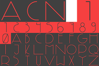 Architect, designer and photographer in San Fernando, Spain. In 2013, he designed the pair of avant garde typefaces
  Creator of these typefaces at the Spanish type foundry Eurotypo:
  [
[ Madrid, Spain-based designer of Neogothic (2014, a modular 21st century creamy blackletter) and AQRS Script (2019, with Juanjo Lopez). In 2022, he released the sharp-edged display serif
  Bilbao-based graduate of the EASD-ADGE School of Arts and Design in Vitoria-Gasteiz. He moved to Madrid to join Fetenstudio. Designer of the
  Spanish foundry, est. ca. 2009, and on the web since 2012. It is located in Madrid. Alter Littera's fonts and web site are designed and managed by José Alberto Mauricio, who holds a doctorate degree in Economics and Business Administration, and is Associate Professor of Econometrics at the Universidad Complutense de Madrid.
 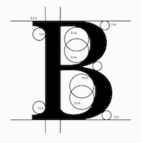 During his studies, Logroñ, Spain-based Alvaro Rubio designed the codex-inspired compass-and-ruler typeface Maths (2017). [
 Madrid-based graphic designer. FontStructor who made the counterless square typeface
  Designer in Valencia, Spain, who heads
  Ana Estrada Martos is a UX/UI developer in Madrid, Spain. In 2018, she designed the
  Graphic designer in Zaragoza, Spain, who created the ornamental didone typeface Nadine (2016). [
 Spanish penman who produced two writing books between 1583 and 1612. A facsimile of these was printed by Mardersteig (Officina Bodoni) for The Pegasus Press in Paris in 1928, in a 32-page book edited by Henry Thomas and Stanley Morison: Andres Brun, Calligrapher of saragossa, Sme account of his Life and Work, with a Facsimile in Collotype of the Surviving Text and Plates of his two Writing Books, 1583-1612. [
 Spanish type designer who created many typefaces at José Iranzobetween 1948 and 1965. These include: Gotico (1951, blackletter), Nueva Escritura Inglesa (1948), Junco (1962-1965: fino, seminegro, negro---condensed contrasted sans family), Pincel (1956, informal signage script), and Supremo (1956: fino, fino cursiva, seminegro, seminegro cursiva, negro, negro cursiva). [
 Madrid-based designer of Always Typeface (2015) and Camera Icons (2015). [
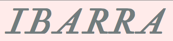 Spanish typefounder, engraver and printer from the 18th century, b. 1732, Murcia, d. 1812, Segovia. Unlike Pradell, the craftsman, Antonio Espinosa de los Monteros and Jeronimo Antonio Gil followed academic studies. They specialized in drawing and engraving under Tomas Francisco Prieto, engraver of the Real Casa de la Moneda, from whom they learned the techniques of engraving currencies. Their first task was to complete the matrices of Bernardo Ortiz. Gil and Espinosa began their careers simultaneously but Espinosa veers towards punchcutting. Gil began working for Juan de Santander at the Biblioteca Real until 1778, and was later transferred to the Real Casa de la Moneda de Mexico to become its first engraver, which made Santander lose his best punchcutter.
  Antonio J. Morata (Almeria, Spain, b. 1968) is a FontStructor (aka elmoyenique) who used FontStruct to make several modular typefaces starting in 2010. The typeface names start with z. We list them alphabetically:
 Jaen, Spain-based designer of the Cyrillic emulation and Stalinesque typeface Kremlin (2018) and the newspaper typeface Daily (2018). [
 Born in the Canary Islands, Ariel Martín Pérez is a freelance art director and illustrator based in Paris. He set up Ariel Graphisme. In 2020, he founded
  [
[ Spanish type foundry, est. 2013. One of its founders, Santos Bregaña, writes: Of Croatian origin, Santos Bregaña is born by chance in the city of Pamplona in 1965 on the very day that Le Corbusier drowns in Cap Martin. After studying architecture in San Sebastian and Barcelona he launches the Laia Atelier in 1996 where he focuses on interior design, and on graphic and industrial design projects associated with the culinary culture and business. In 2008 he receives, along with co-creator Anne Ibañez Guridi, the Art Director's Club of New York Sphere Award for their body of work for the restaurant Mugaritz. He leads Tabula, a publishing house dedicated to the spread of culture and gastronomy, and is a speaker on public forums and seminars related to high cuisine. His porcelain designs and his O! Luna, Tabula, and Linneo collections have received international praise and are in many of the best restaurants and hotels in the world.
  Design studio in Gijon, Spain, set up by Asturian designers Raul Garcia del Pomar and Ismael Gonzalez. One of them studied graphic design in Salamanca. Atipo produced the donationware typeface
  Aviv Studio in Monterrey and Mexico City consists of
  Madrid-based designer of the display typeface Canas (2014). [
 Alicante, Spain-based designer of the all caps titling typeface Changla (2019), which was inspired by Bauer Bodoni. [
 Zaragoza, Spain-based designer of the jazzy deco typeface Swingfont (2015)./ [
 Juan Luis Blanco is a graphic designer, type designer and calligrapher based in Zumaia in the heart of the Basque country. Since 1993, he works as a freelancer graphic designer. In 2013, he obtained an MA in Typeface Design from the University of Reading. Currently he combines calligraphy classes and graphic design with typographic projects that focus on Basque lettering as well as multi script typefaces involving the Latin, Arabic and Tifinagh alphabets.
  Granada, Spain-based designer of the display typefaces Yuan (2018) and Bolchevique (2018). [
 Granada, Spain-based designer of the
  Enrique Teruel was Orihuela, Spain-based designer of Line (2013, a prismatic typeface), and Helvetica Serif (2014). He joined or set up Brand Design in Madrid, where he now lives. [
 Alberto Romanos is a Zaragoza, Spain-based type designer who is co-located in London. First he founded the type foundry
  Brian Xiao (Brian Xiao Design, Hacienda Heights, CA) designed the text typefaces Keyserling (2014) and Galatea Bold Italic (2014). [
 Graphic designer in Madrid. Creator of the
  Design studio of José Román Gálvez who is also involved in the type foundry
  Carine de Wandeleer was born in Argentina to a French-Belgian immigrant family. She studied fine arts and graphic design at University of Buenos Aires, but lives and works in Spain.
  Freelance illustrator in Madrid. Creator of the blackboard bold extravaganza called
  Carles Rodrigo (Mucho) won a D&AD 2011 award in the typeface design competition for his
  Born in Logroño, Spain, Carlos studied graphic design at ESDIR (Escuela Superior de Diseño de La Rioja), and type design in the Advanced Typography Master class of the Universidad Autónoma de Barcelona (EINA). He was first based in Barcelona, but currently works out of London.
  FontStructor from Madrid, known as Ulrico, who made these typefaces in 2012: Planeto Rocko, Hermetica Modern Gothic,
  Graduate of Universidad de Salamanca. As a design student in Ponteviedra, Spain, Salamanca-based Carlos Liberal designed the display typeface Mordrake (2016) and the constructivist typeface Siberya (2016). [
 Industrial and graphic designer in Valencia, Spain, who created the marquee art deco typeface
  Madrid-based designer of the socially responsible decorative caps typeface Globalizacion (2016).
  During her studies in Jaen, Spain, in 2017, Celia Marchal Garcia (Granada, Spain) designed Kis, a revival of the typeface of Miklos Totfalusi Kis. She also created Central Perk, a fun revival of the beatnik cafe lettering for the TV show Friends (1994-2004), which was created and produced by Marta Kauffmann and David Crane. [
 Foundry in Madrid. Their first commercial typefaces are
  Type foundry in Spain, est. 2012, with which several type designers are associated. Linked by the
  Spanish type designer. In 2017, he published the text typeface
  As a student at EASD Soria in Palencia, Spain, Daniel Iglesias Arreal (aka Dani Bydani) designed the
  Madrid-based designer (b. 1982) of the free art deco typeface Lame (2014) and the experimental typeface Two Moons (2015).
  Open source font project. Their first fonts include
 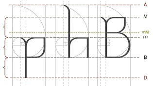 Salamanca, Spain-based creator of the compass and ruler typeface
  Born in 1987 in Santander, Spain, Diego Quijano Sanchez created Metatipografia Modular in 2012 for his graduation project. This is a modular type system in which keys on the keyboard are used to compose letters and icons. This fascinating project, and other ones called Metatipografia Monerd and Metatipografia Coordinate (pixel typeface) are conceptually related to Robert Meek's FontStruct.
 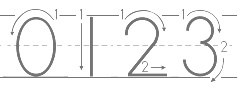 Free and commercial school fonts by Ramón Abajo, all made in 1999 or 2000: Ramon is a high school Spanish teacher in California. His fonts are floating around in
  Painter and illustrator of the art deco era, b. Valladolid, Spain, 1881, d. Valladolid, 1981. He became famous for his fashionable covers and illustrations for Vogue and Vanity Fair, and maintained offices in Paris and New York. During 1917-1920, he designed some typefaces for special use by Vogue. These were dug up by
  Elena Peralta Dimas is a graphic and type designer from Madrid, Spain, where she obtained her BA in Graphic Design. Before studying the Master in Type and Media in the KABK, she lived in Barcelona, where she got an MA in Typography and interned at Estudio Mariscal. She also worked as an in-house type and graphic designer at Seriesnemo Studio, developing projects related to branding, type and packaging. With a group of friends she brought TypeThursday, the monthly type event, to the city of Barcelona. Gaduate of the
  Graduate in graphic design from EASD Antonio Faílde of Ourense. Born in Ourense, he still lives there. He created the free lapidary sans typeface
  Valencia-based illustrator and graphic designer, who created the thin monoline unicase typeface
  Graphic designer in Granada, Spain, who created the sans typeface CIA Grenadina in 2016. [
 Spanish designer (b. 1985) from Malaga who now lives in Barcelona.
  Institute in Benalmadena, Spain (was: Santa Severa), where one can take 4-week courses at 1450 Euros a shot on the Etruscan alphabet, Trajan, Cuadrata and Rustic Roman Capital letters, and related subjects. They also organize lettering tours in Italy and guided tours in various musea. The teachers are Alberto Di Santo (Professor of the visual communication, Tor Vergata University, Rome; Professor of Graphic Design, Istituto Europeo di design, Rome; Professor of editorial design, La Sapienza University, Rome; Professor of Typography, C.F.P. Sinalunga, Siena) and
  Textaxis was Spanish/Catalan foundry run by Barcelona-based Iñigo Jerez Quintana since 1995. In 2015 it was renamed Extratype. Iñigo Jerez's beautiful typefaces
  Cordoba, Spain-based designer of the didone typeface Aedris Book (2019). [
 Freelance designer in Madrid. Creator of the funky poster or cartoon typeface Idolatra (2014).
  Madrid-based designer of a display typeface called Madrid (2014), which was inspired by the wiremesh architecture of Palacio de Cristal. [
 Las Palmas de Gran Canaria, Ampuero and Laredo, Spain-based designer (b. 1971) who set up deFharo. Creator of the monoline sans typeface
  Art director and designer in Madrid who runs
  Fontbilisi was established by German Leon (b. Madrid, Spain) in 2013. For a while, he was located in Tbilisi, Georgia. Since 2014, he is in Lima, Peru. In 2017, his MyFonts page places his origins in Ukraine. He explains: He was born in Madrid, but crisis and love brought him to Tbilisi, Georgia, from where he is currently designing.
  Photographer and graphic designer based in Jaén, Spain. Designer at
  Spanish designer of
  Full name: Francisco Lucas Vezino De Sevilla. Spanish lettering master in the 16th century who wrote
  Madrid-based outfit that offers free fonts, each with full Latin character sets, and 18 weights:
 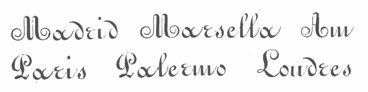 J. Artaloitia ran a foundry in Sevilla, Spain, called
 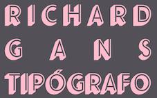 The Richard Gans Foundry is a defunct Spanish foundry which existed from 1888-1975.
  Bailen, Spain-based designer of the condensed display typeface Gabriela (2018). [
 During his studies at Escuela de Arte y Superior de Diseño in Pamplona, Spain, Gabriel Morala created the
  [
[ [
[ [
[ Summer course organized by Damia Rotger and Pedro Arilla in Sos del Rey Catolico near Zaragoza, Spain. the 2015 edition took place from 21-26 July.
  Paco Fernandez (Granada Design, Almeria, Spain) designed these Arabic display typefaces in 2015: Varela (based on the first Arabic book that was printed in Spain---it was produced in 1505 by Juan de Varela de Salamanca in his shop in Granada), Kitab (based on a leafed book), and Dairah (circle-based).
  A project started by Vanesa Aguilera and
  Graphic designer, illustrator and photographer in Valencia, Spain, who created a thin monoline typeface called
  Holke 79 (Borja Holke) is a graphic and motion designer in Madrid. His work includes the animated font
  Huy Fonts is a foundry in Madrid run by
  Spanish art student (in 2013). FontStructor who created these typefaces in 2013: Beauvoir, Lancaster, Figaro, Abel, Cawdor (octagonal), Dilior (a didone), Harmond (blackletter), Antelopes, Godiva (blackletter), Autumn, Sasanida, Help I Need Somebody (circle-based geometric sans), Goodbye Fontstruct, Fairy Tale Vanishing, Slanton, Kyrie, Eat Me, De Stijl, Chiara, Hecate, Stancyl (piano key), Ionica, Winty's Gothica, Vintage America, El Greco, Fairy Tale, Ozawa, Donibo Display, Decade (blackletter), Donibo, Weirdy Moves (+Party), Bliss (crayon font),
  Spanish designer of the fine free hand-printed poster typeface Kallaikos Revve (2018). She writes: Letra galaica, baseada na auténtica escritura empregada polas poboacións célticas de Galiza. Inspirada na epigrafía que aparece nos Guerreiros Galaicos de Santa Comba e San Paio de Meixedo (Portugal), adaptada, dibuxada e construída coma tipograía por Idoia de Luxán, partindo da documentación aportada por Paco Boluda.
  Located in Valladolid, Spain, Iñes Ortega designed the typeface Falcon (2014) based on the logo of the movie The Maltese Falcon (2014). He also created the elegant display typeface
  [
[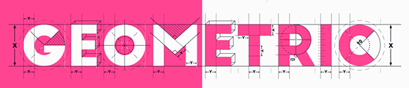 New York City (and before that, Madrid)-based illustrator who created the minimalist typeface Minim (2012), the scratchy typeface Displaced (2013), the
  Ruben Prol is based in A Coruña, Spain. He used to run
  Design group associated with
  Valencia, Spain-based designer of the hipster typeface Geomodern (2014). [
 During her studies in Granada, Spain, Isabel Tornay designed the warm rounded typeface Aisbel (2018). [
 Madrid-based art director, who graduated from the School of Arts and Crafts of Navarra in 2004. Designer of the crayon font Lipstick (2014). For Nevada Loft, she made the 3d custom font Loft (2009, silver award winer at Laus 2009).
  Jaén, Spain-based designer of the distinguished text and stencil pair of typefaces Botera (2017), which was released at
  Art director in Madrid, Spain, who created the fun cutout typeface Carnival (2016). [
 French type designer and calligrapher (b. 1947, Rennes, d. 2015) who worked mostly in Cergy-Pontoise. From 1962-1965, he studied typographic art in a school under the Paris Chamber of Commerce. From 1973 until 1985, Jean Larcher, who had studied calligraphy as well, worked as a freelance calligrapher in and around Paris. From 1985, he taught calligraphy both inside and outside France. He wrote several books, including Character Traits (2014). While calligraphy was his passion, Jean was also fascinated by op-art and geometric patterns. His fonts are all phototypes except for the metal font Latina.
  Cordoba, Spain-based designer of
  [
[ Joluvian is Jose Luis Vivas (b. 1979, Venezuela), who studied graphic design in Merida, Venezuela before traveling to the USA, Mexico, Spain and Italy. In Caracas, he worked at an ad agency. He is currently based in Madrid, where he continues his work on illustrations, signage and lettering. His typefaces:
  Toledo, Spain-based creator (b. 1984) of the heavy octagonal sci-fi typeface
  Designer in Llanera, Spain, who created
  Toledo, Spain-based graphic designer. He used the positions of the stars to create connect-the-points letters in his
  [
[ Art director in Madrid, Spain, who created the organic monoline sans typeface Spaceota in 2016. Spaceota is well-balanced and attractive. [
 [
[ [
[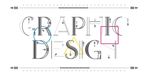 [
[ Madrid-based type designer and type professor, who teaches design at the Escuela de Arte diez de Madrid, and is an associate professor in the Facultad de BBAA of the Universidad Complutense de Madrid. Cofounder and organizer of the first two Congreso Nacional de Tipografía en Espana. Coordinator of the graphic design department of the School of Design of Madrid and member of the research group of the Carlos III University. In 2018, he joined the faculty in the Masters of Type Design program at
 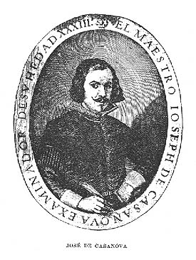 Also, José de Casanova. Noted Spanish calligrapher from the mid 17th century, who had the title examinador de los Maestros de Arte de la Caligrafía en la villa de Madrid. He was a highly regarded penman. Author of
  Spanish penman who published Arte Nueva de Escribir por preceptos geometricos, y reglas mathematicas at Imprenta de los Herederos de Manuel Ruiz de Murga in Madrid in 1719. Victoria and Albert write: Aznar de Polanco was not only a writing master and callig- rapher, but also a mathematician, architect and fencing master. Arte nuevo de escribir was his most important work on calligraphy. It is based on the firm belief that writing should depend on geometrical principles. [
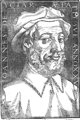 Also written as
  [
[ Spanish FontStructor who made the modular typeface dingbats
 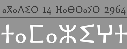 [
[ Zaragoza (and now, Barcelona), Spain-based creator (b. 1993) of the graffiti typeface Juanalzada (2013) and of the dripping blood caps typeface
  JuanJo Rivas del Rio (Malaga, Spain, b. 1983, San Pedro de Alcantara) created the teardrop-themed typeface
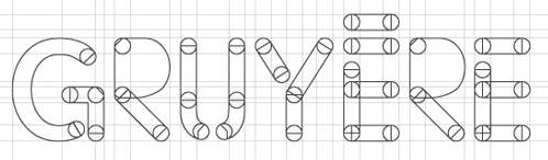
 Madrid-based designer of Caliquena (2005) and the decorative number typeface
  Madrid-based designer of the decorative caps typeface Madrid Type (2014). [
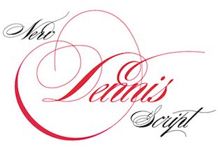 Lettering Shop is
  [
[ Award-winning graphic designer and illustrator in Barcelona, whose work and letter designs are characterized by flashy and colorful contructions. She studied at the University of Salamanca (2008) and ELISAVA (2013). Her type designs include 36 Days of Type (2016) and Ahoy (2013, a decorative rope font, which can be bought
  Spanish penman, 1632-1698. Author of
  Granada, Spain-based designer of the titling typeface Villagefont (2017), which is based on a magazine published in Madrid in 1934. She also designed Tangram (2017). [
 Valladolid, Spain-based designer of Risueña (2018: a friendly informal sans), Natura (2017: textured floral caps), and a children's book alphabet (2018). [
 Designer in Madrid, who created a nice
  Type designer from Madrid who published Sorella (2023-2024) at C-A-S-T. He participated in the Type@Cooper Extended program in 2023 and the EcTd at the Plantin Institute in 2022.
  [
[ Luis Vicente Hernandez (Dos Decadatres, or DDCT) is a Spanish designer in Madrid who created the free pixelish typeface
  Graduate of the Design Department of the National University of Art in Bucharest, Romania. Born in Bucharest, she lives and studies in Valencia, Spain. In collaboration with Angelica Acosta Otero and Jorge Morales, in 2013, she created a decorative caps typeface as a proposal for an illustration congress in Valencia. She also created a few floriated initials in 2013. She also creative a decorative techno typeface in 2013. [
 Graduate of the Escuela Superior de Diseño de Murcia, Spain. .During her studies at Politecnico di Milano, Maje Navarro created the curvy organic typeface Ardini (2014).
  Graphic design studio in La Laguna, Santa Cruz de Tenerife, Spain. In 2014, they created the free editorial design text typeface Brela, which is characterized by a large x-height and bump-proof vertical hanging serifs on the f, c, s and r. Later in 2014, they created the commercial typeface Nordiak Grotesk.
  Senior art director in Madrid. Designer of the free font Clothespin (2010), the experimental 3d font
  [
[ Based in Valencia, Spain, and born in Madrid in 1969, Manuel Ramos is the creator of these free and commercial typefaces in 2012: Astralia (oblique monoline sans),
  Codesigner with Santos Bregaña and Julen Cano Linazasoro of the calligraphic typeface
  Madrid-based graphic designer and art director. Creator of the bling typeface
  Spanish art director based in Madrid. She created an exquisite copperplate-style calligraphic script typeface called
  Illustrator and graphic designer in Malaga, Spain, who designed a modular decorative caps typeface in 2017. [
 [
[ During his design studies in Madrid, Mario Mimoso created the fun avant garde display sans typeface Mimoso (2015). For Tabacalera, he created a custom typeface and some signage icons. [
 Spanish designer Maria Ramos Silva (
 Spanish designer of
  Mase Design (Valencia, Spain) used the poster lettering for bull fights by Josep Renau in the creation of
  Matthias Beck is a German graphic and type designer based in Santa Cruz de Tenerife, Spain. He worked in advertizing agencies and design studios in Berlin, Barcelona, and the Canary Islands. He obtained a Bronze Award for the Letter Island typographic project (Graciosa) in the 2015 Canary Islands Design Awards, and several Gold Awards in the 2013 and 2019 editions of these awards.
 Graphic designer, illustrator and childrens book author in Spain. She created the handcrafted typefaces Alondra, Bohemian Lady and Jungle Cat in 2015. In 2016, she designed Artisania.
  This Miguel Hernández lives in Madrid and is associated with Avance Creativo. Not to be confused with his Chilean namesake at Latinotype. The Madrileno created the outlined hand-drawn poster typeface Marina (2011). In 2012, he made the interesting techno / gridded typeface family
  Graphic designer in Madrid, Spain, who created the avant garde sans typeface Rematle2015 in 2014 to celebrate the Champions Cup final in 2014 between Atletico and Real Madrid. It seems that Spaingraph is also run by Sanchez Serrano. In 2015, they offered a free set of dingbats called Spaingraph.
  Art director and graphic designer in Madrid, Spain. In 2013, he created a ball terminal typeface called
  Author, ca. 1945, of Rotulacion Decorativa no. 1 (Ediciones ARS, Barcelona) and
  Born in Pamplona in 1987 who obtained a Masters in typography and type design from EINA in Barcelona. He designed
  Studio in Madrid, est. 2002. Typefaces designed by them include
  During her studies in Vilafranca de Panades, Spain, Mireia Llosas created the experimental typeface Aurora (2014), which plays on the theme of the wireless symbol icon. [
 Art director in Madrid who created
 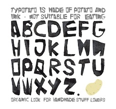 Graduate of Miami Ad School. Madrid-based designer of
 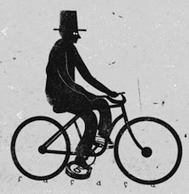 Graphic designer and art director in Barcelona, who used to be in Zaragoza, Spain. One can buy absolutely magnificent prints from them, as well as the vintage condensed sans poster typeface Americana (2015). Via dafont, one can download these free typefaces:
 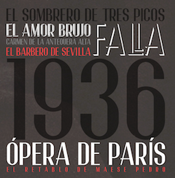 Nano Torres lives in Granada, Spain, where works as a designer.
  Graphic designer in Madrid who created the heavy blackletter-inspired typeface Babilonia (2014).
 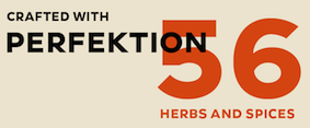 Type foundry set up by Noel Pretorius and Maria Ramos in 2017, jointly in Sweden and Spain. Their typefaces:
  Noem9 Studio is an online studio created by Jose A. Garrido, a graphic designer who was born in Alcañiz, Teruel, Spain, in 1987, and lived in Zaragoza. Noem9 is currently based in London.
  [
[ Studio with offices in Madrid and Bilbao, first called Supperstudio and then PAAM (run by
  [
[ Type designer in Madrid, Spain, b. Barcelona, 1982. In 2006, he moved to Buenos Aires. Pablo Alaejos's graduation typeface in 2012 at
  Pablo Bosch (Valencia, Spain) developed the legible typeface Atiza (2013) during an intensive study program at Type@Cooper in New York. He writes: Atiza is a text face for editorial purposes but with characteristics to also be used in newspapers. High X-hights, relatively low contrast and strong asymmetrical serifs make Atiza a very legible typeface in small sizes with a perfect behaviour in sizes between 8pt and 11pt, but with also with extraordinary legibility at 6pt.
  Graduate of the
  [
[ Badajoz, Spain-based designer of the slab serif typeface Mulatta (2019) and a fantastic set of hospital pictograms (2019). [
 Pab Type is either Pablo Lozano or Pablo Tellechea or both. Pablo Tellechea studied at Elisava in Barcelona, and settled in Madrid, where he taught typography at Calamo&Cran (2010-2012), and became editorial designer at the Biblioteca Nacional de Espana in 2015. His typefaces:
  Born in Lombardia in 1979, Paola Vecchi studied in Milan before moving to Spain, where she works as a graphic designer in Sevilla from 2010 onwards. In 2017, she designed the decorative caps alphabet Memento Mori.
  [
[ Patricia Rueda Saez (Granada, Spain) designed the art nouveau typeface Nerea (2014) which imports Victorian frilliness and didone ball terminals. In 2015, she created the triangulated typeface Triangle.
  During his studies in Valencia, Spain, Pau Hernandez designed the art deco typeface City Lights (2017). [
 Spanish type foundry, est. 2016 by Pedro Arilla (b. 1984, Ejea de los Caballeros), who runs
  Designer in Sevilla, Spain.
  Spanish creator (b. 1993) of the octagonal/pixel fonts Limh and Limh II (2009, FontStruct), GameOver (2009), GameOver2 (2009), Greek (2009, octagonal Greek simulation face, FontStruct) and 1896 (2009, constructivist). Aka Fodkito, he lives in Córdoba.
  During her studies at EASD Valencia, Pilar Estrada designed the hexagonal typeface Born in the URSS (2016). [
 Fine Arts graduate from UCLM (University of Castilla-La Mancha) in Spain, who works as a graphic designer in Cuenca, where he set up the Pisto Casero commercial type foundry in 2013, after a period of free font production. He worked at
  Design studio in Madrid founded by Andra Piscaer and Bea Canut. Over at
  Rafael Jordan Oliver, aka Barry Bianco, is a graphic designer and calligrapher in Valencia, Spain, b. 1983, Alzira. Graduate of EASD in Valencia, class of 2013. His typefaces:
  Spanish author of the calligraphy and penmanship book Bellezas de Caligrafia (1844, Joaquin Verdaguer, Barcelona). Stirling was active in Barcelona.
  Giuseppe Salerno (aka
  Italian graduate from the type design program at the
  [
[ Jaen, Spain-based designer of the energetic didone-on-cocaine typeface Lalola (2018) during her studies at Escuela de Arte Jose Nogue Jaen. [
 Madrid-based creator of the beveled and drop shadow typeface family
  Calligrapher and graphic designer in Madrid and Barcelona, who was born in Sao Paulo. Creator of the organic sans typeface
  [
[ Granada, Spain-based designer of the constructivist typeface Bolchevique (2015). [
 Vinaros, Spain-based student-designer of the
  Sandra Carrera (b. 1986), originally from Spain and Switzerland, has a Masters in art direction and type design from ECAL, Lausanne, Switzerland, and holds a BA in Visual Communication from HEAD, Geneva. Her degree project was a typeface called Gandarela typeface, a personal interpretation of of Baroque Spanish types.
  Madrid-based Portuguese designer of the custom typeface Fu (2014) for a mobile game by DoubleMind.
 Outfit in Cornella, Spain. Creator of Funkiee (2015), Helio Slab Serif (2015, a text typeface for science books), Helio Greek (2015), and Trueca (2015, a humanist typeface). [
 [
[ During her studies in Ankara, Turkey, Sila Özyildiz created the avant-garde typeface Moderna (2015). Now based in Alicante, Spain, she created the squarish typeface Brick, and a battery-themed all caps typeface in 2016.
  Spanish graphic design, poster design and illustration outfit of Alberto Rodríguez in Toledo and Madrid. Some free artsy fonts on this site include
  Toledo-based design firm run by Sergio Jiménez. Creators of the 3d typeface Pastas Black (2005) and the handwritten bold typeface Hostias (2005).
  Madrid, Spain-based designer of the futuristic octagonal stencil typeface Laforge Stencil (2018). [
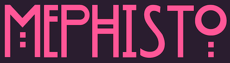 Illustrator in Jaen, Spain, who designed the poster typeface Mephisto in 2016. [
 The Yarza Twins, born in Vigo (Spain), are Eva and Marta Yarza. Marta graduated in 2012 with a degree in construction engineering. In 2014, she studied communication design (MA program) at Central Saint Martins (University of the Arts, London (UK)). During her studies in London, Marta Yarza created Square Print (2014, a
  Catalan/Spanish typography and type design blog and information site. At Behance, Ana is listed under Buenos Aires, Argentina. The motor behind Tipos en Red is
  Catalan type designer (aka Tomás Vellvé), who, at FT Neufville in 1971 created Vellvé, a simple rounded sans serif family, which was published at the
  Graphic designer in Jaen, Spain. In 2016, she designed the art deco all caps typeface Chaplin Type and the curvy serif typeface Arome (2016). [
 Oviedo, Spain-based designer of vector icon sets and accompanying fonts. These include Vecor Arrows, Restaurant App Icons, and Social Media App Icons.
  Or Torcuato Torio de la Riva. Spanish writing master (b. 1759, Villaturde, d. 1820) who studied Latin, theology and law at the University of Valladolid in 1773. He published these books:
  Valencia-based designer of
  Madrid-based graphic designer. Creator of the drop cap figurine typeface Atoiaf (2021), which was inspired by the characters and symbols of the epic saga A Song of Ice & Fire and the TV show Game of Thrones. [
 Variable Type Foundry is a digital type foundry based in Jerez de la Frontera, Cadiz, run by Lole Roman Galvez, a Madrid and Cadiz, Spain-based programmer and type designer, b. 1982, who also set up
  Spanish author of various books on calligraphy and penmanship. These
  Art director from Madrid. Creator of the experimental patterns
  Santander, Spain-based designer of an art deco typeface in 2019. Earlier, he designed the outlined display typeface Blocks (2018). [
 Tomata Taller Grafic is the Spanish outfit of calligrapher and graphic designer Xavier Cervelló Sanchez in Valencia. He created
  Graphic designer from Buenos Aires, Argentina, at some point located in Madrid, Spain, who made the
  Yanko Tsvetkov (b. Bulgaria) is a graphic designer in Valencia. He created the free Old Slavonic / Glagolitic style Cyrillic and Latin typeface
  Based in Dublin, Ireland, Sarhan is a student at The National College of Art&Design, Ireland. He created just one typeface, a sans typeface made up of line segments and arcs of circles, called
  Yssus Galiana (Madrid, Spain) created these free typefaces in 2012:
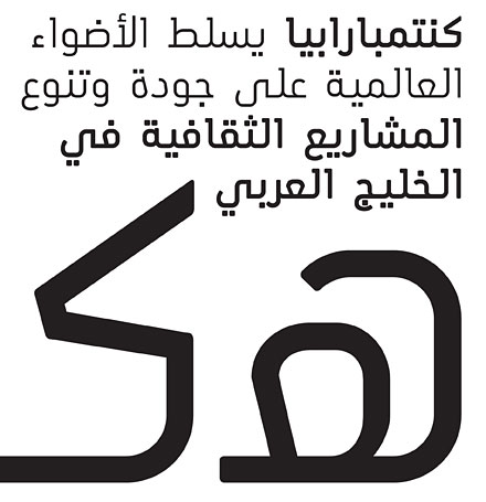
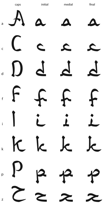
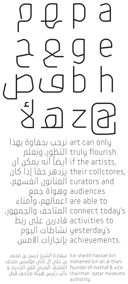
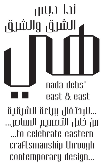
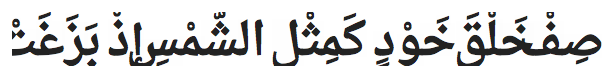
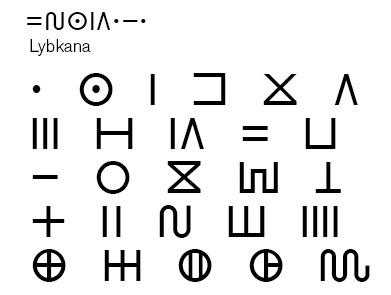
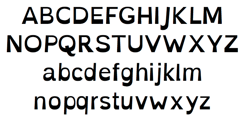
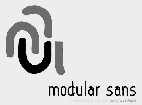
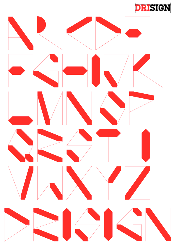
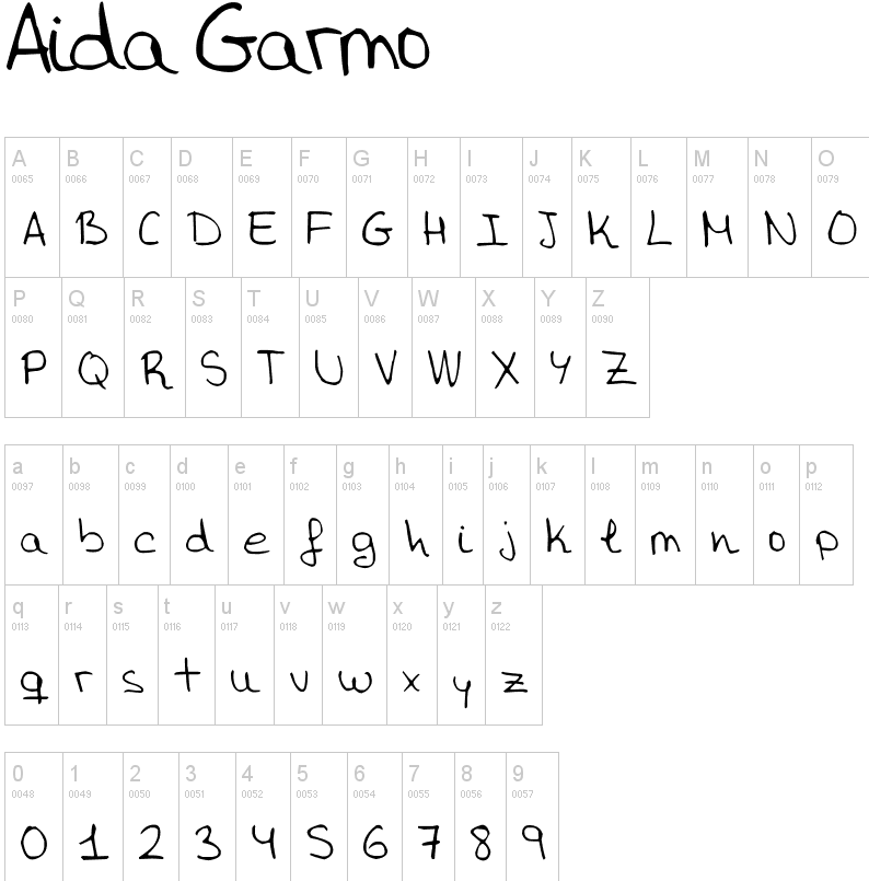
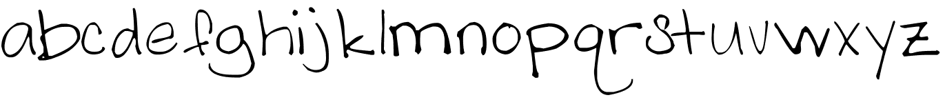
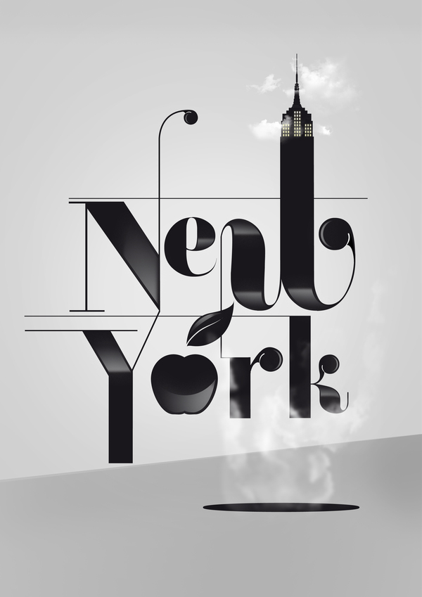
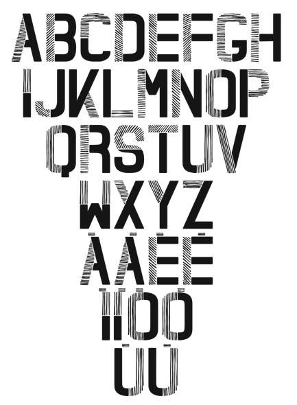
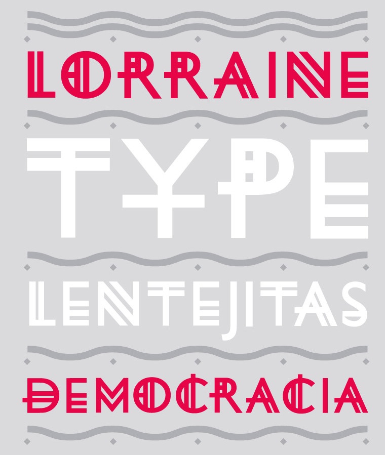
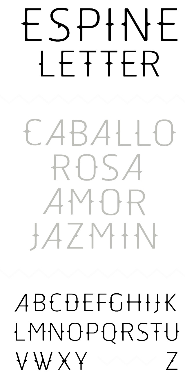
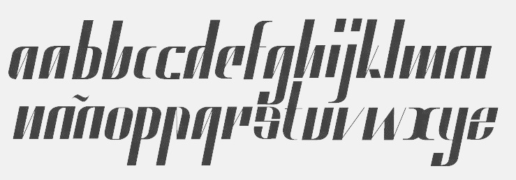
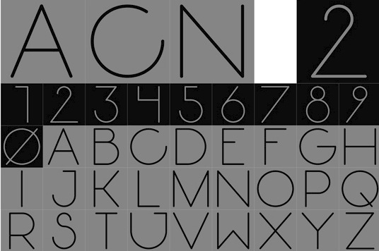
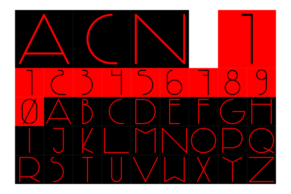
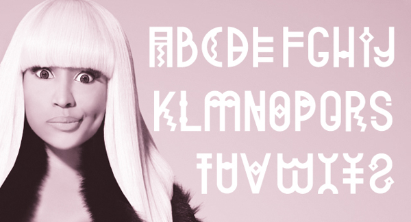
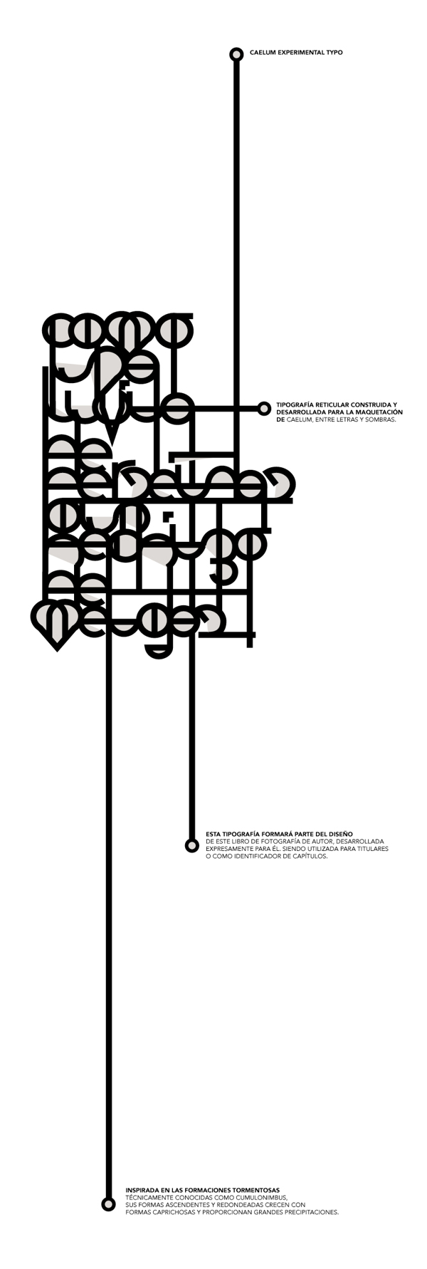
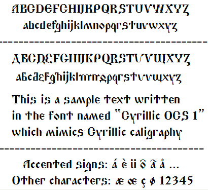
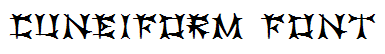
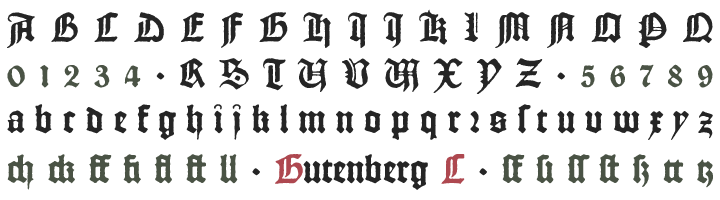
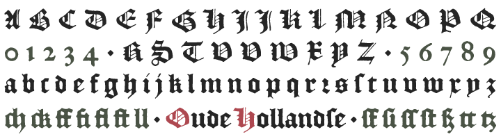
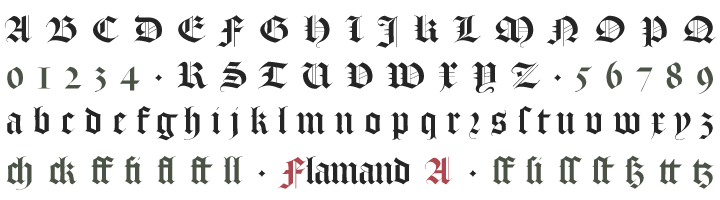
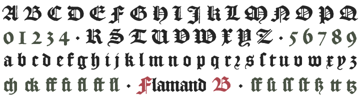
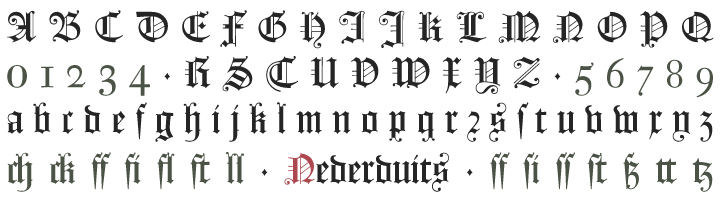
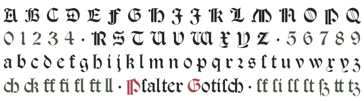
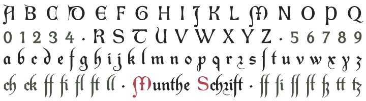
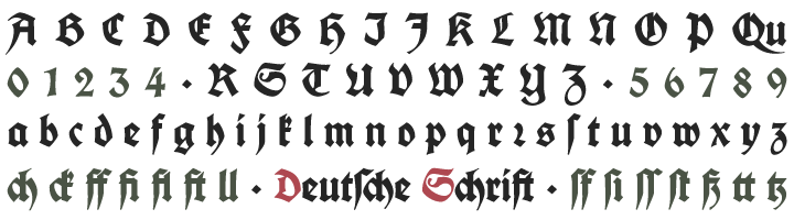
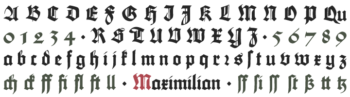
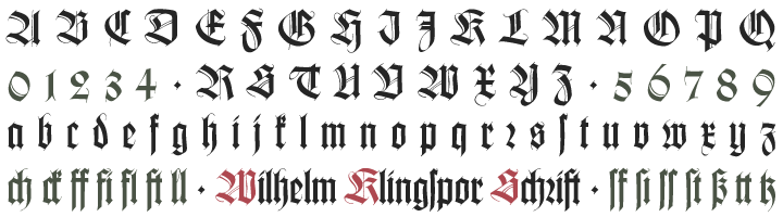
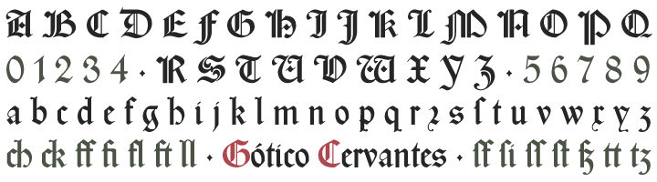
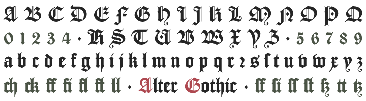
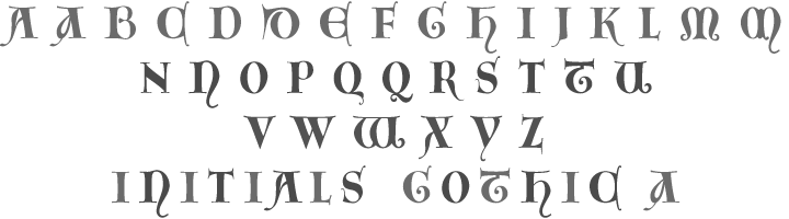
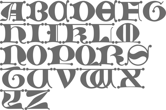
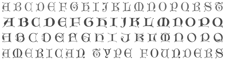
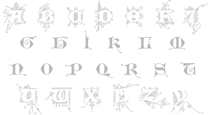
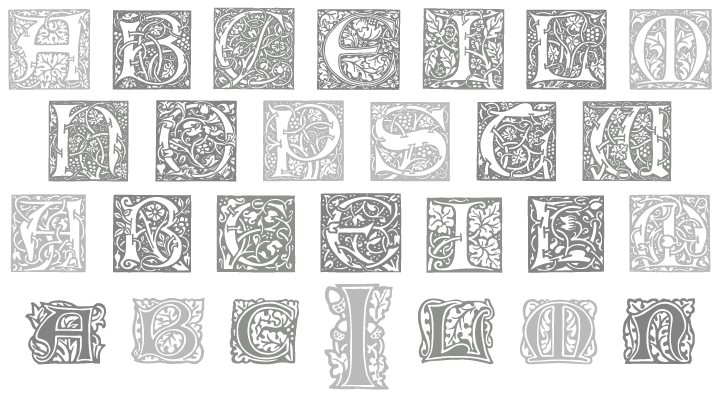
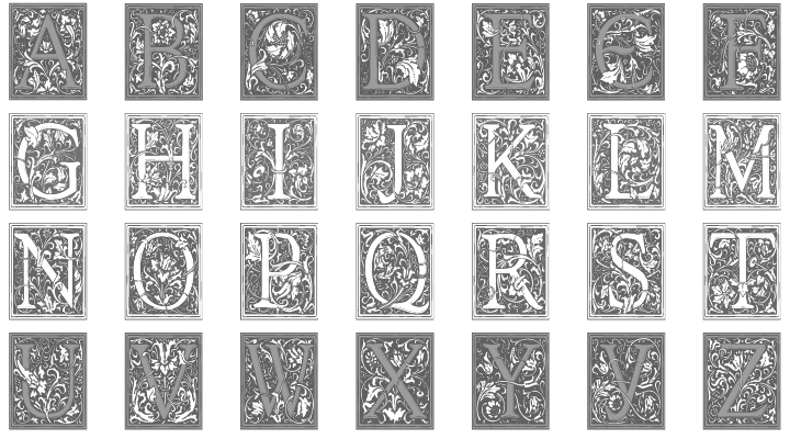
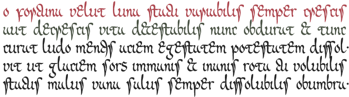
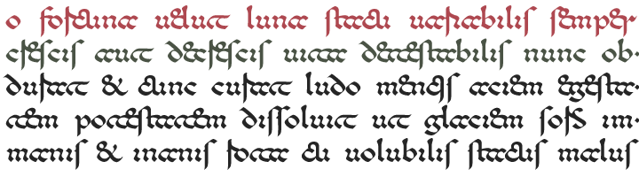
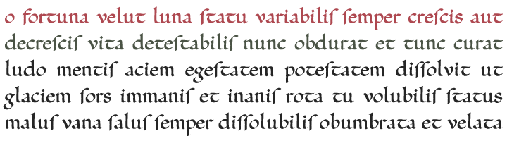
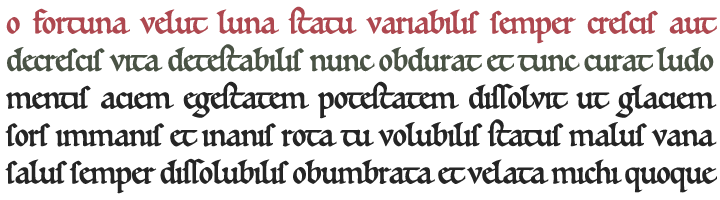
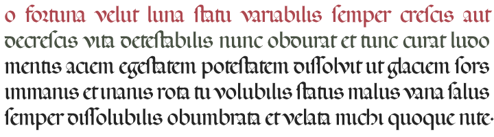
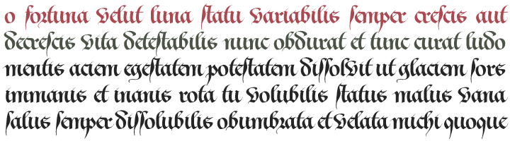
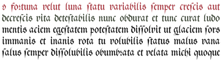
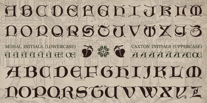
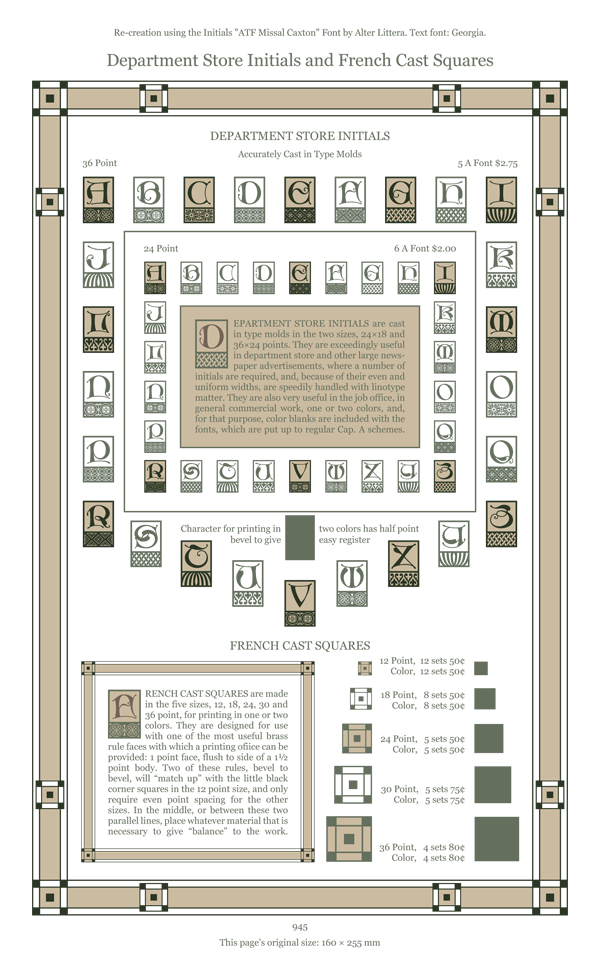
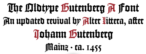
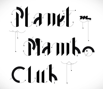
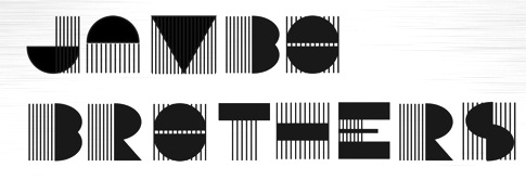
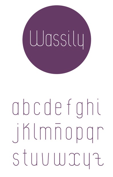
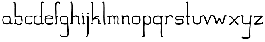
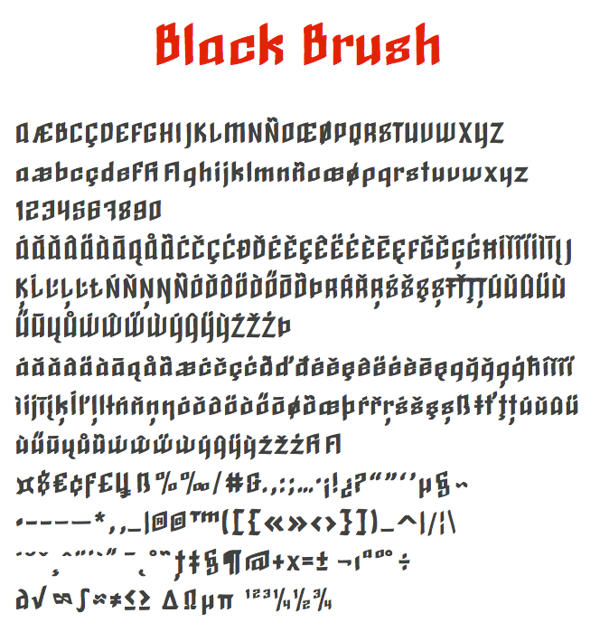
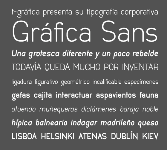
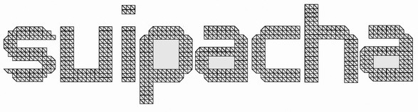
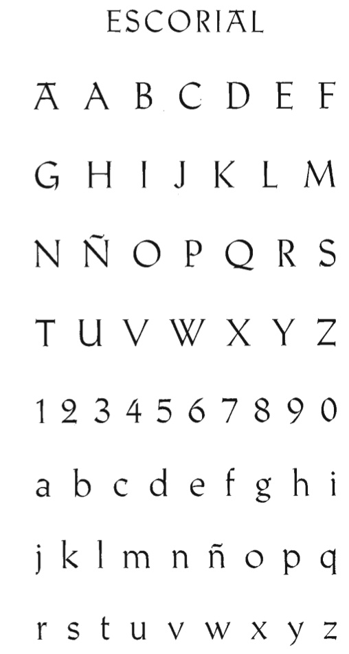
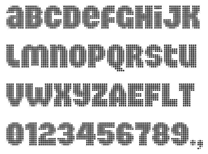
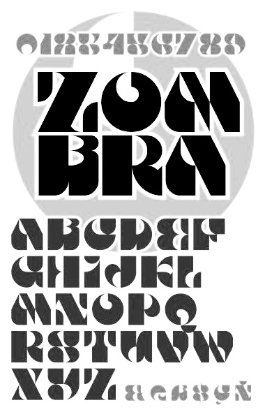
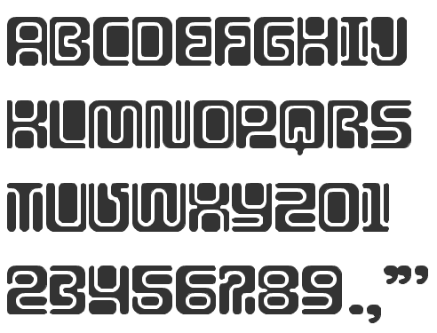
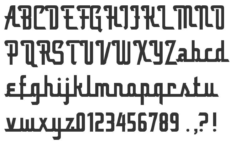
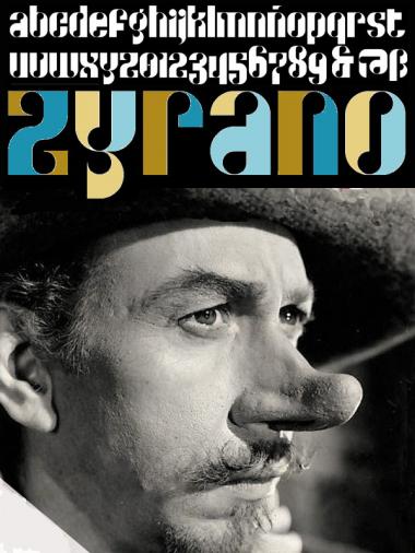
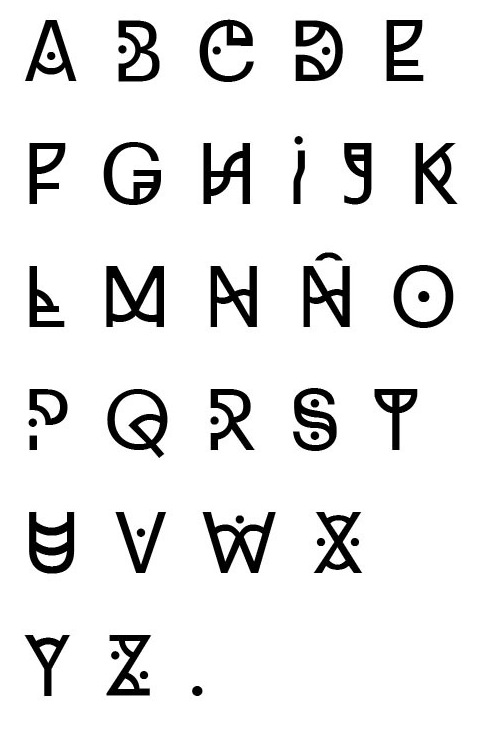
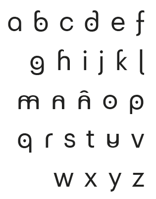
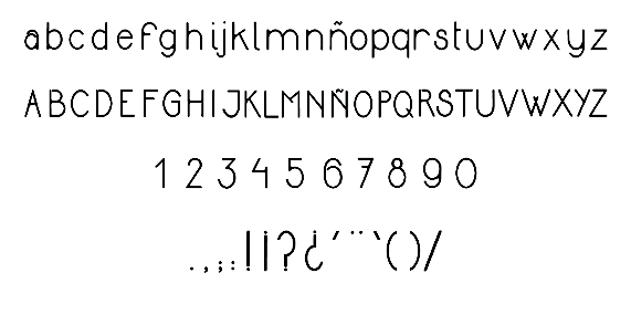
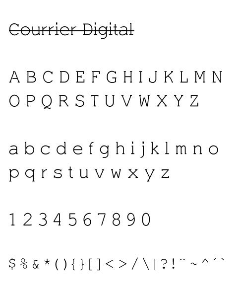
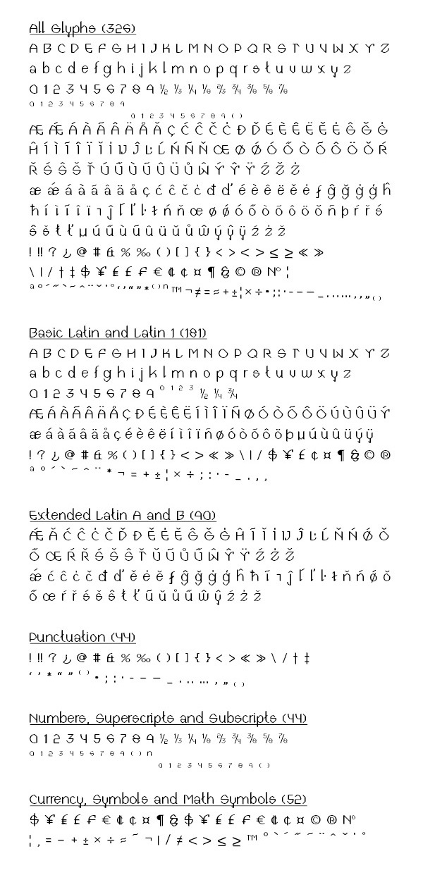
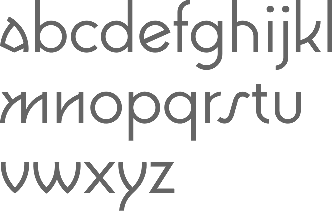
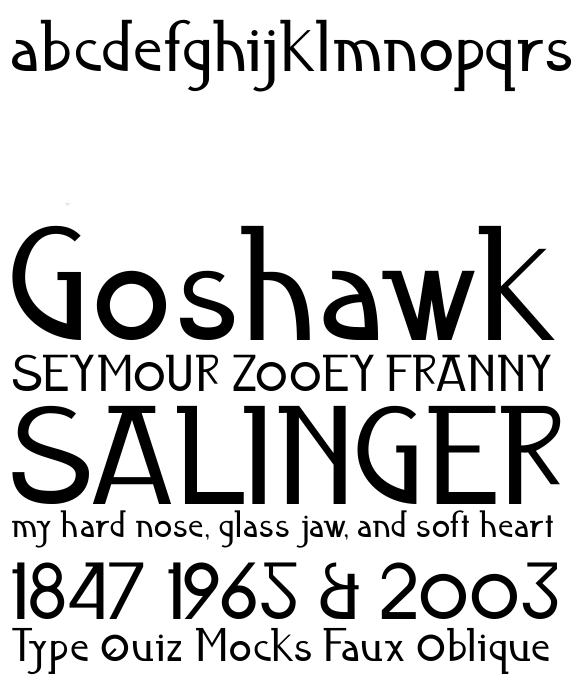
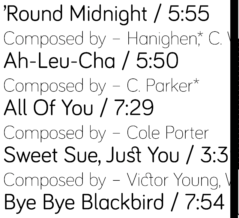
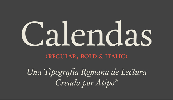
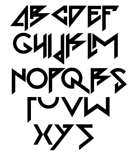
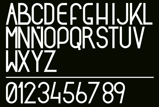
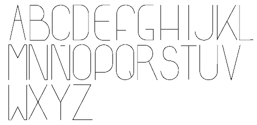
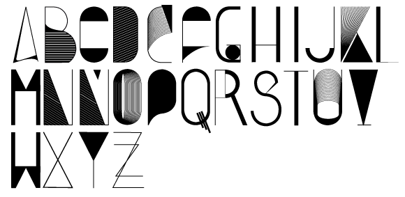
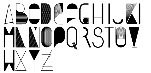
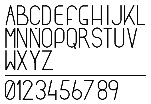
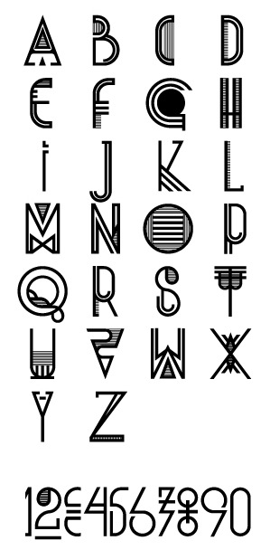
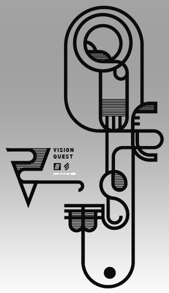
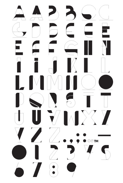
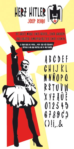
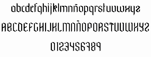
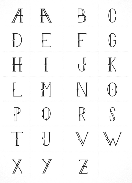
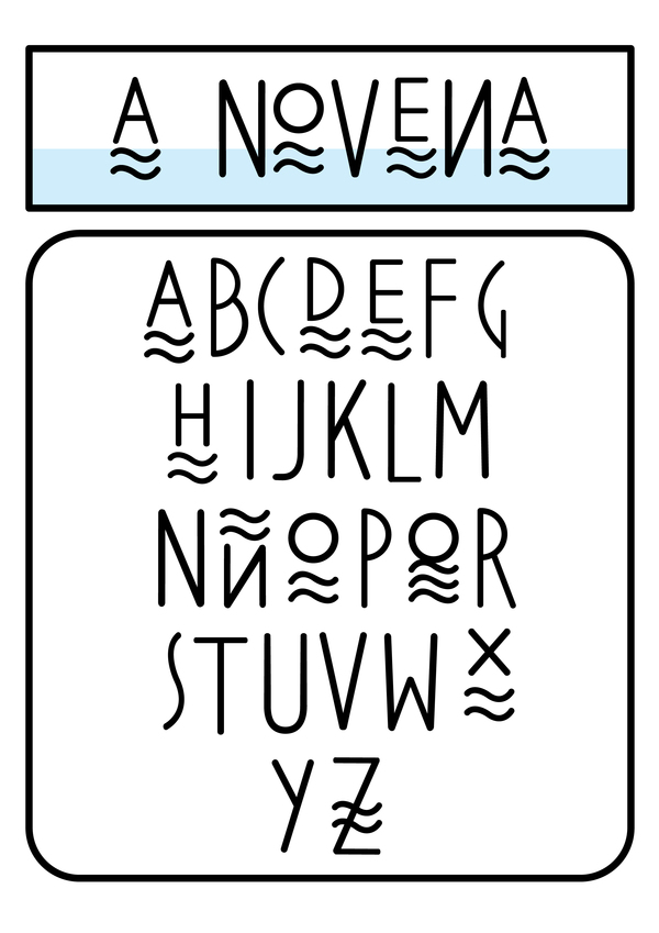
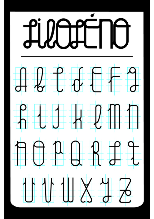
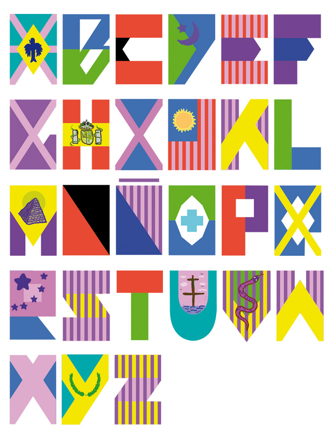
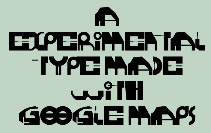
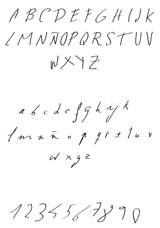
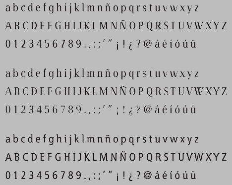
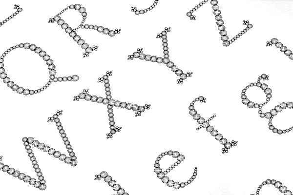
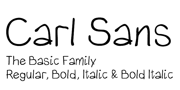
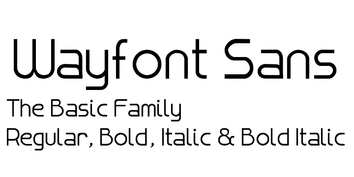
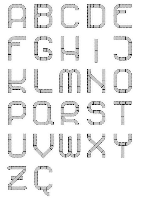
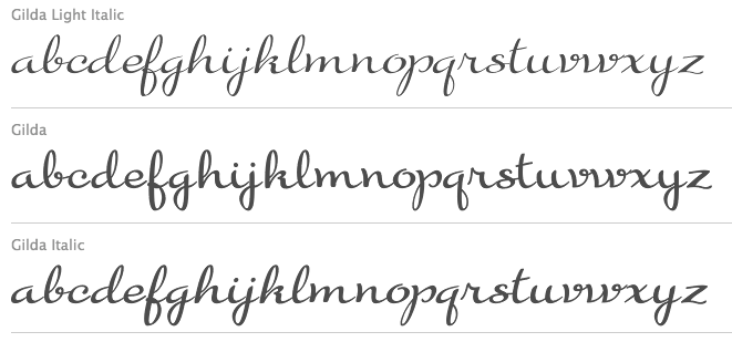
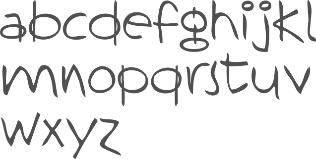
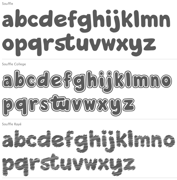
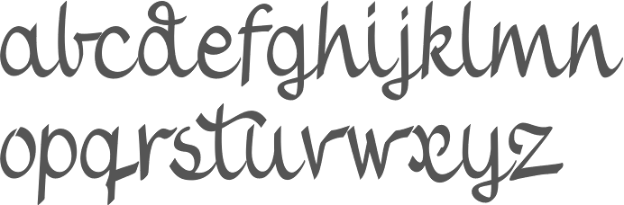
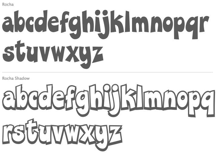
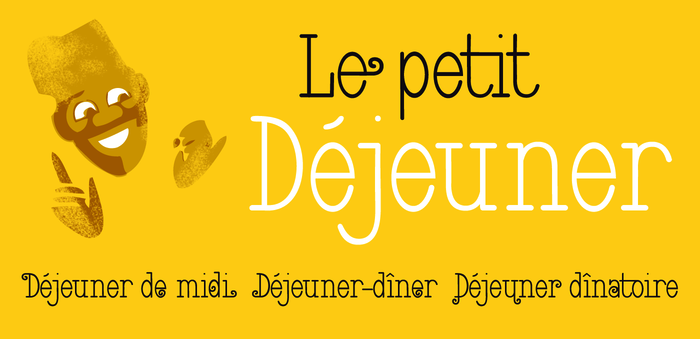
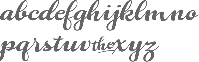
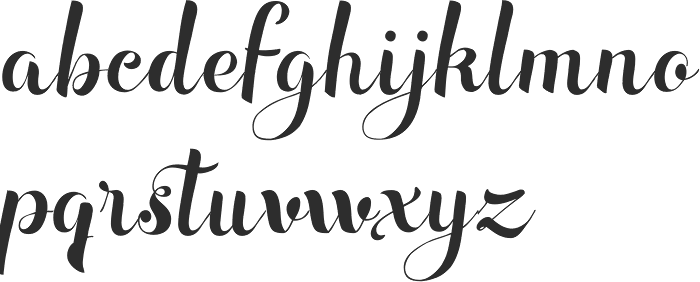
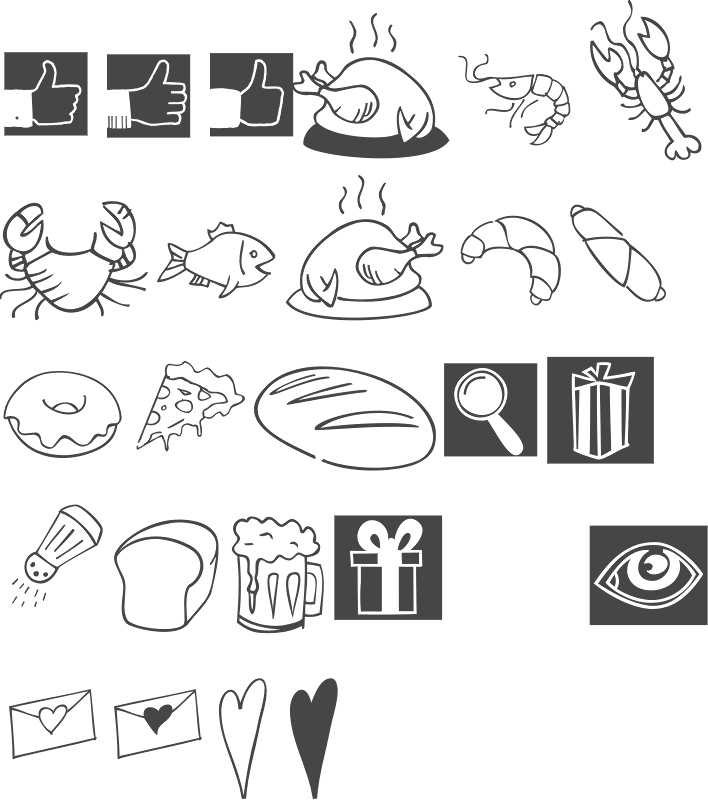
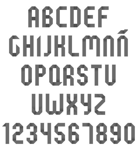
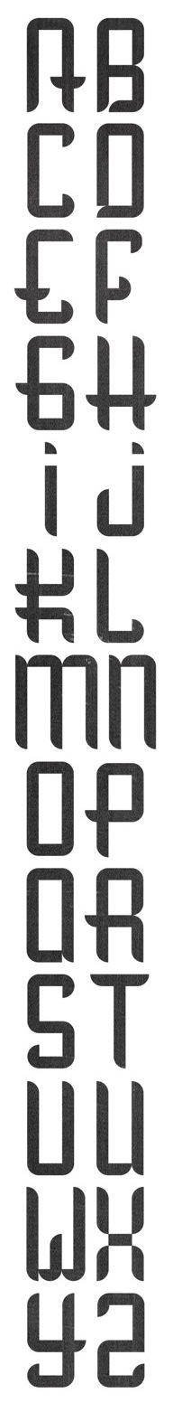
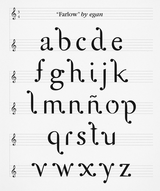
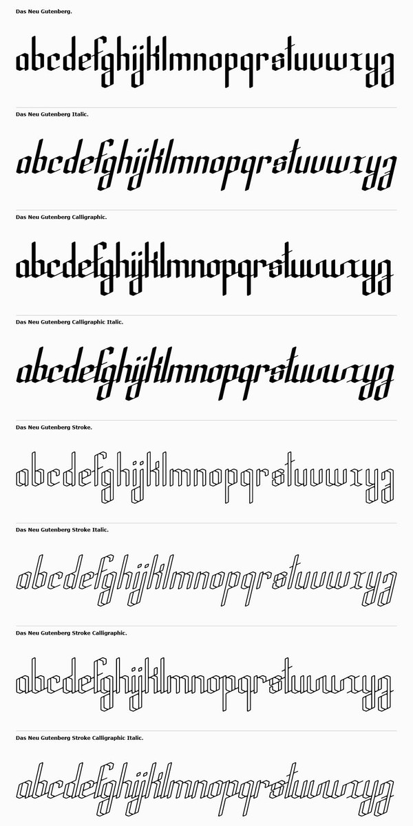
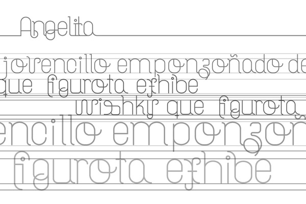
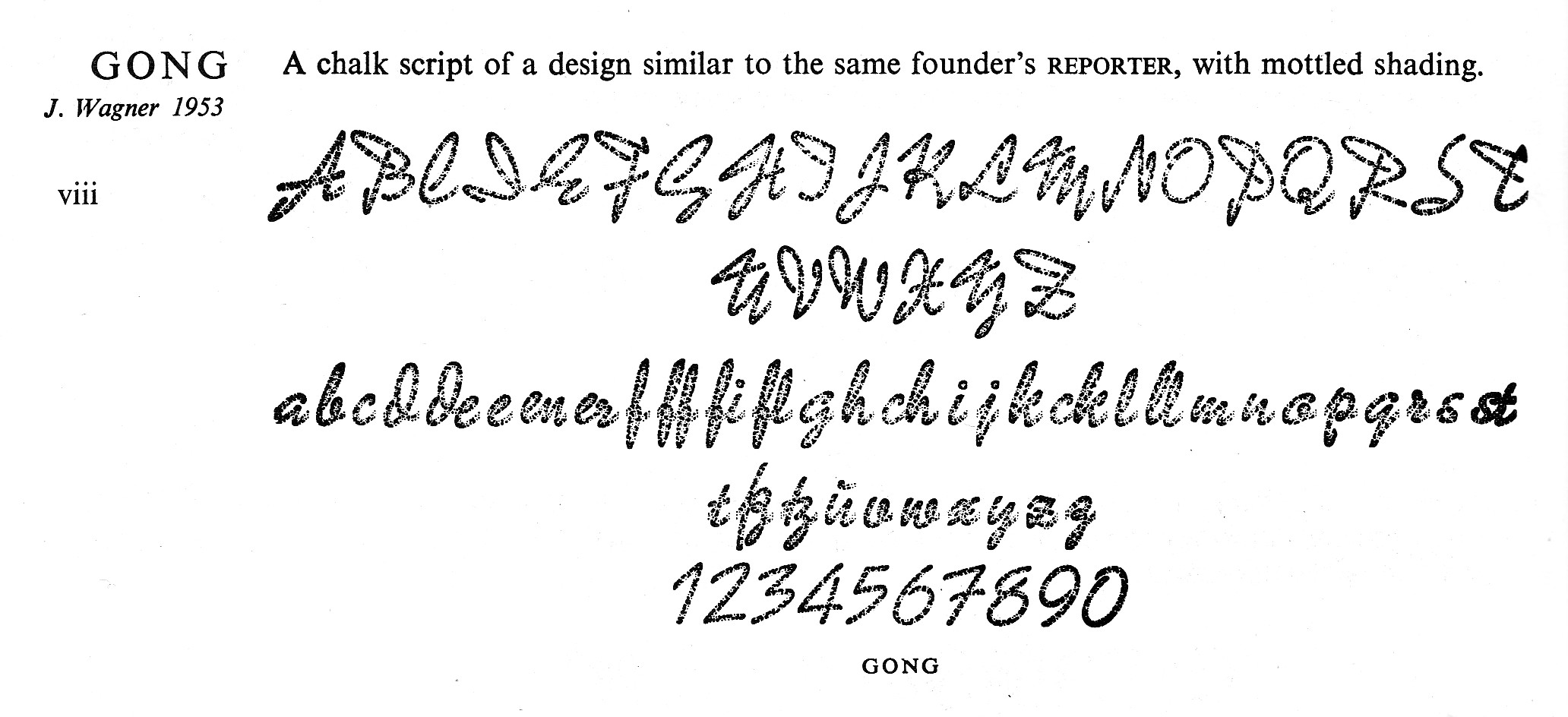
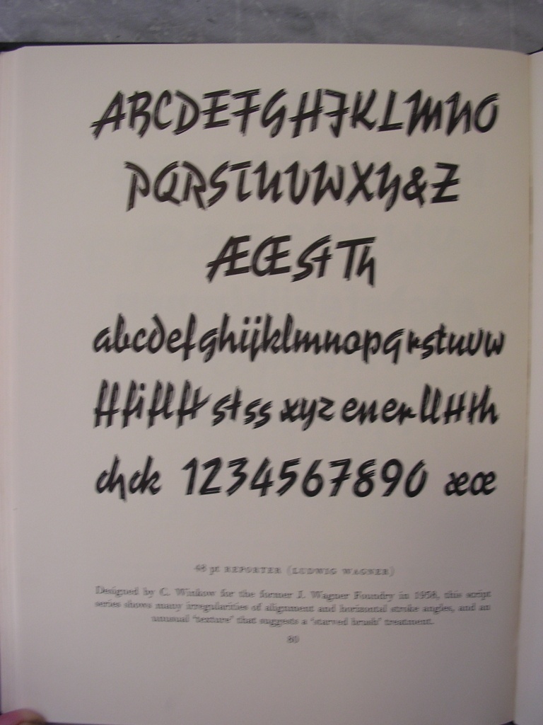
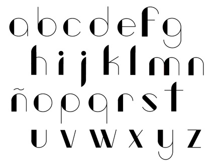
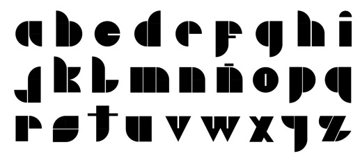
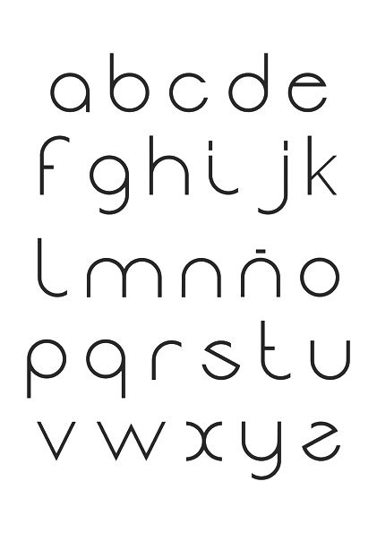
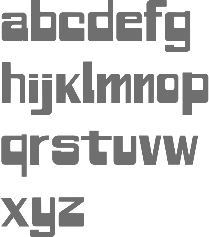
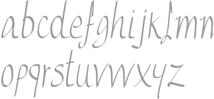
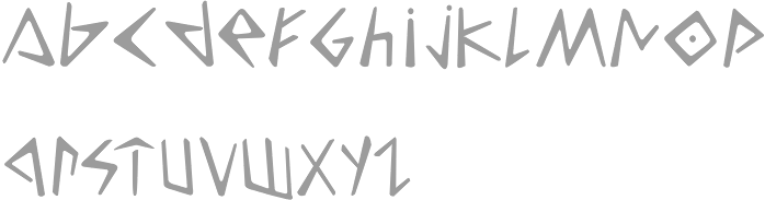
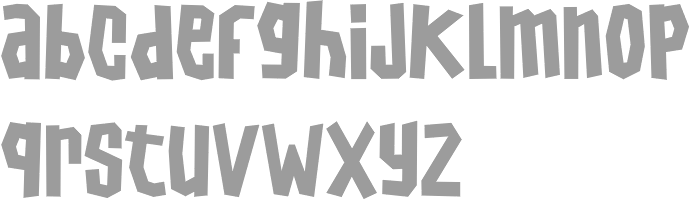
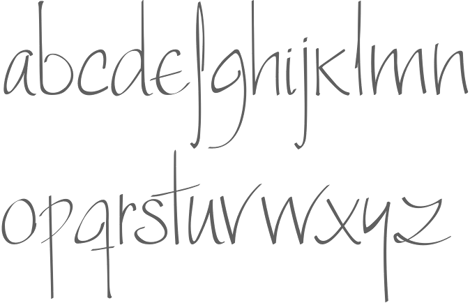
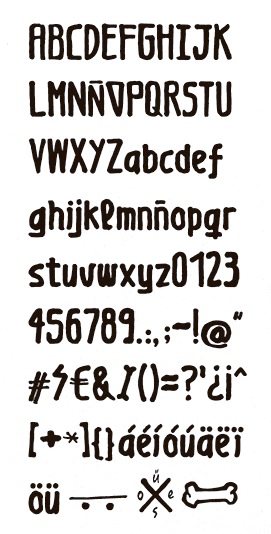
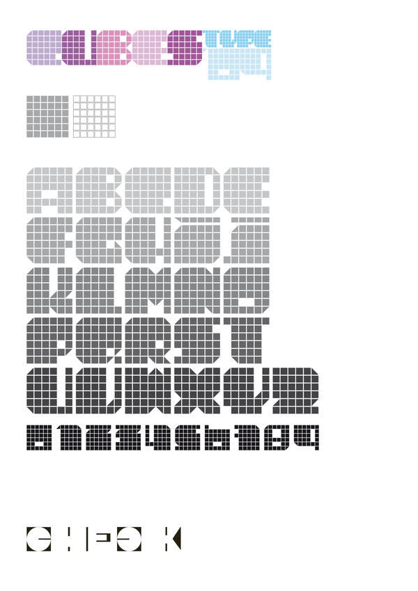
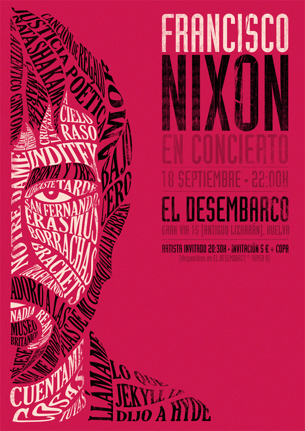
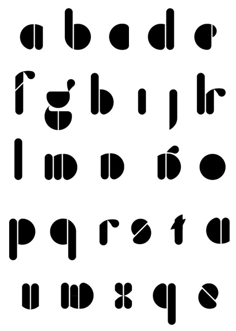
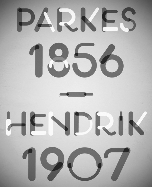
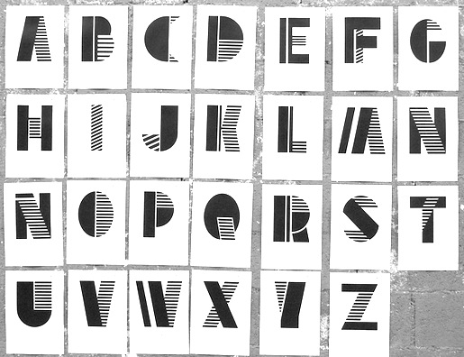
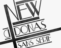
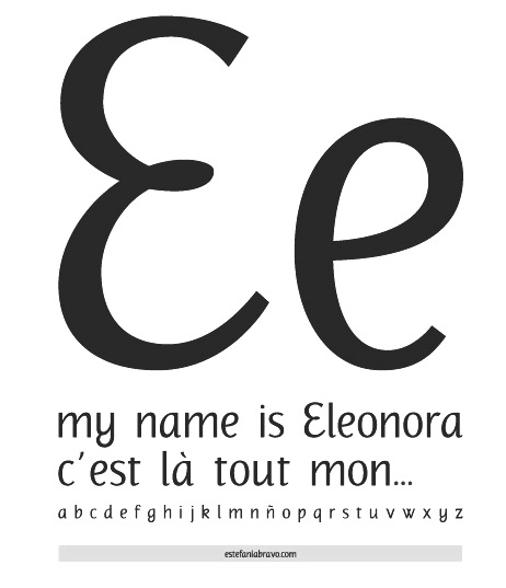
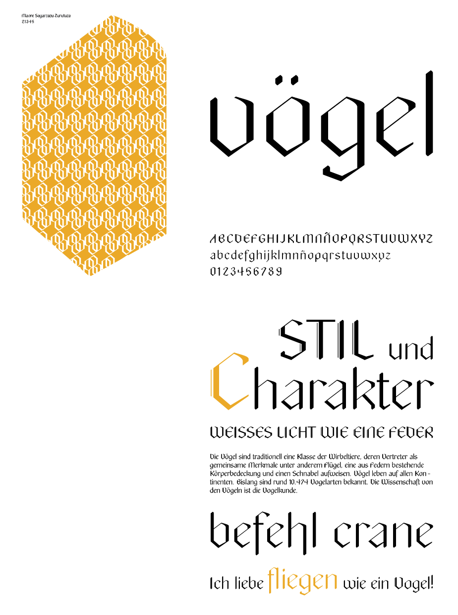
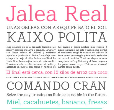
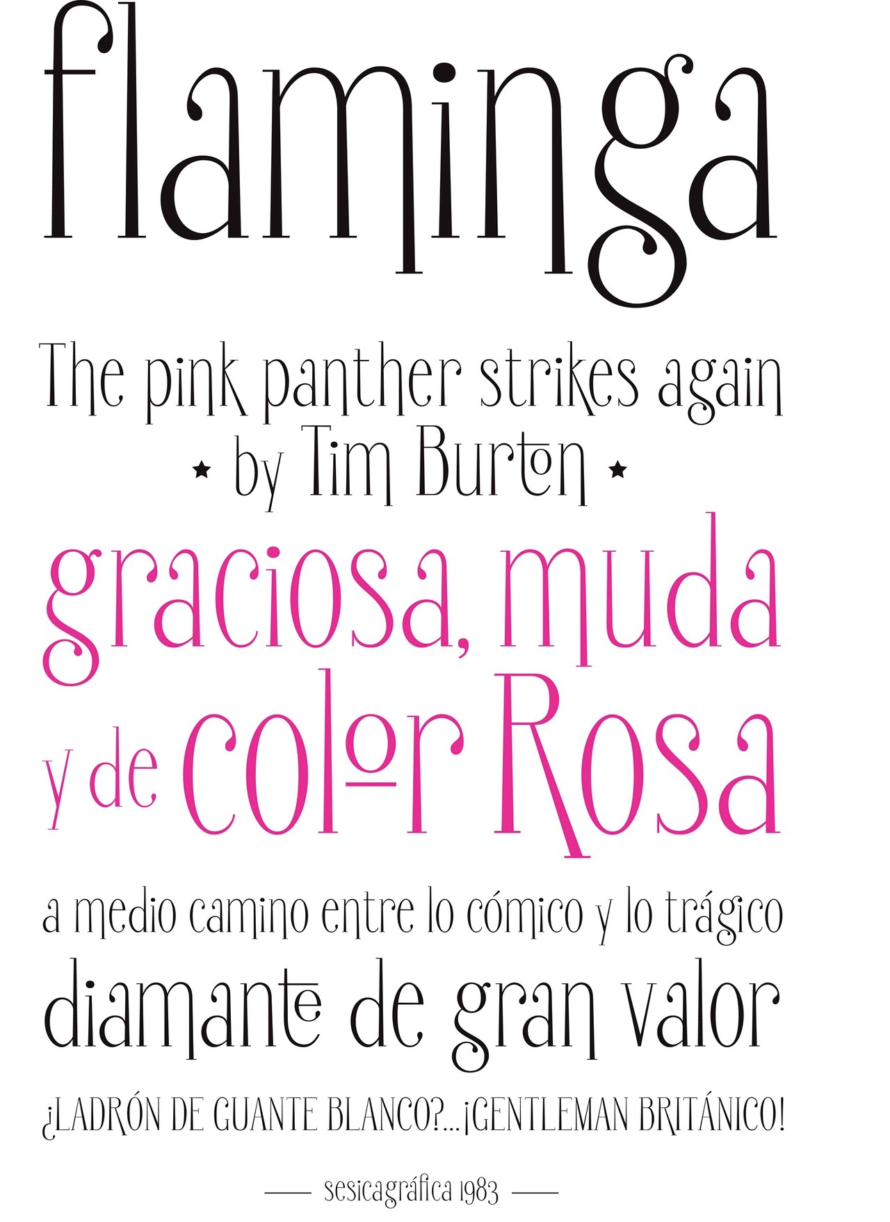
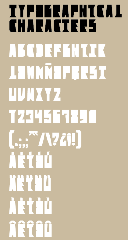
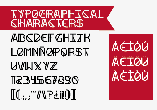
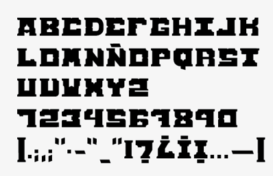
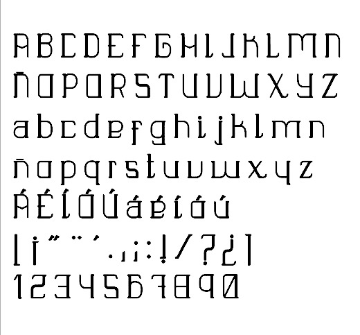
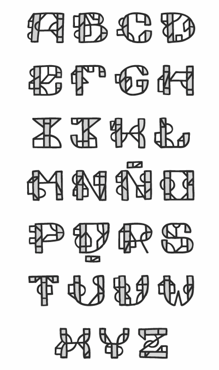
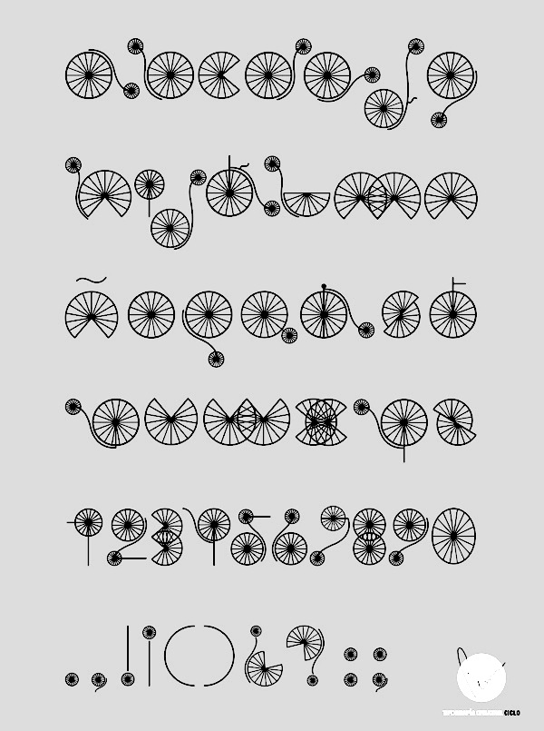
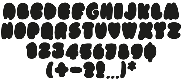
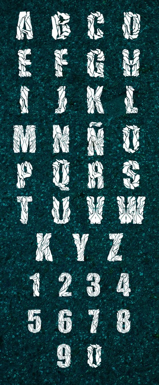
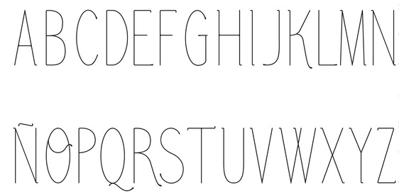
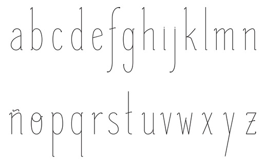
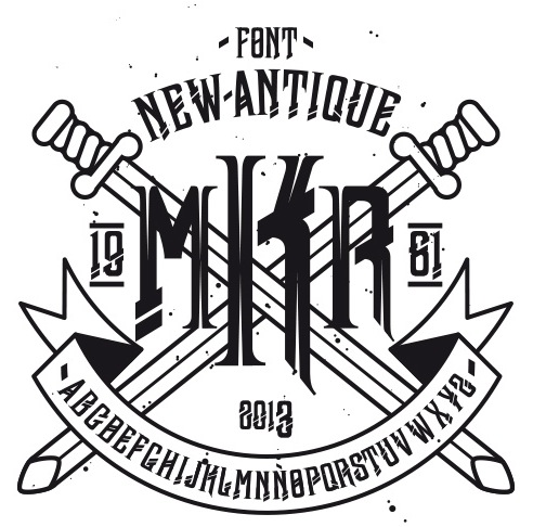
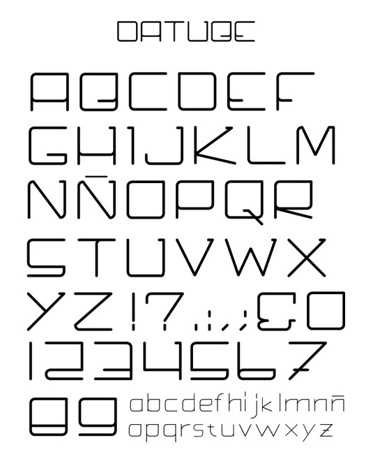
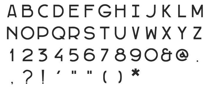
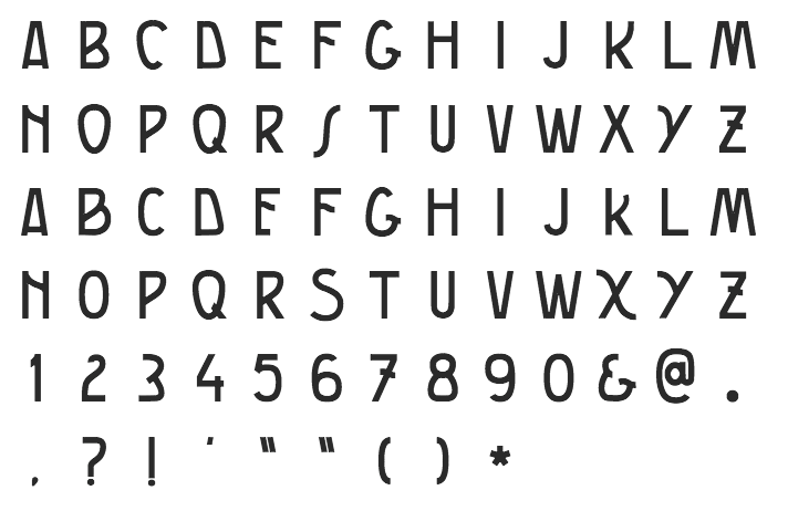
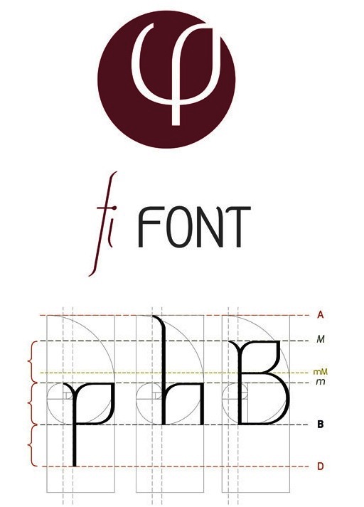
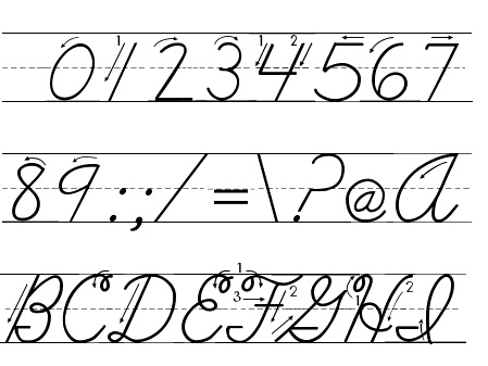
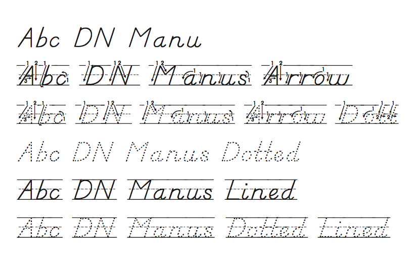
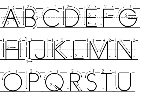
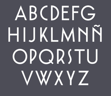
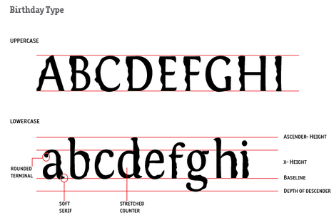
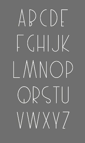
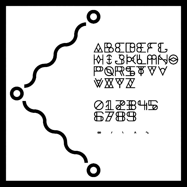
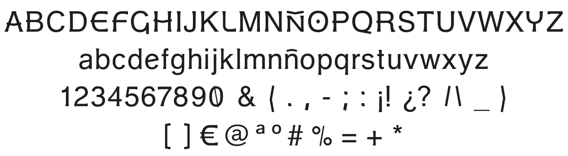
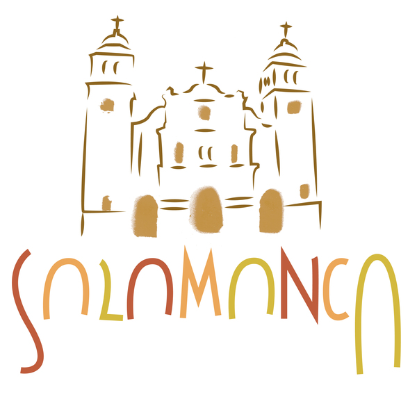
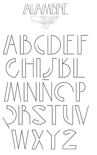
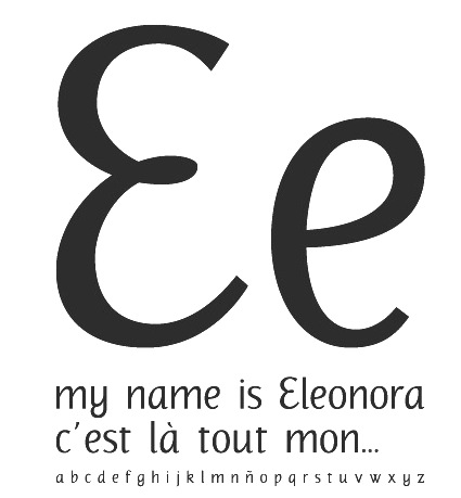
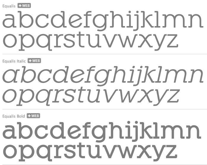
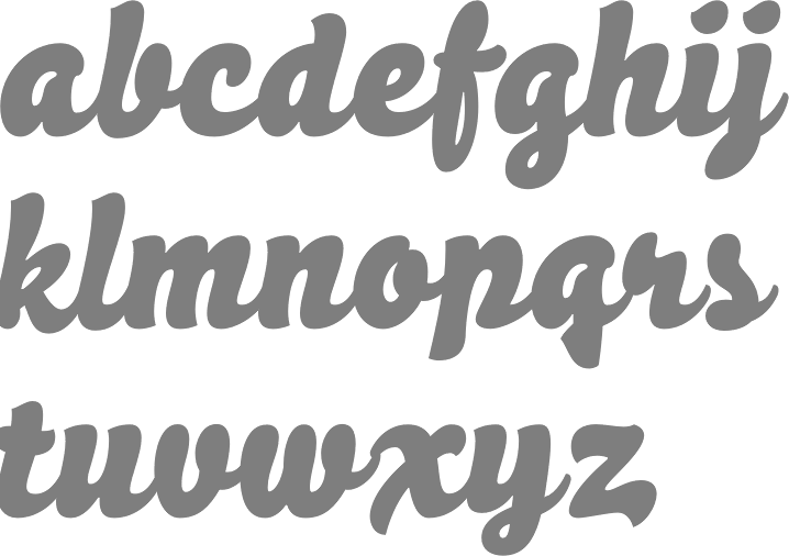
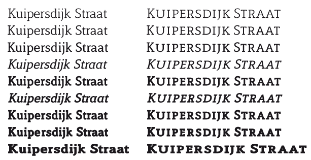
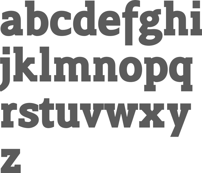
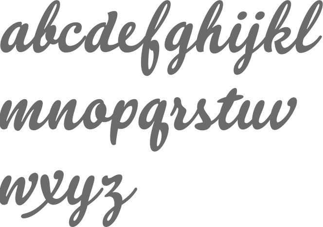
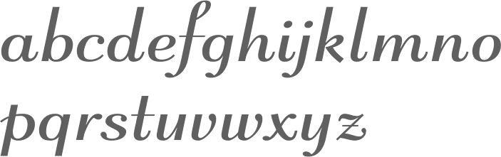
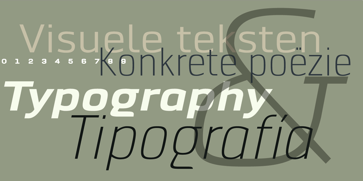
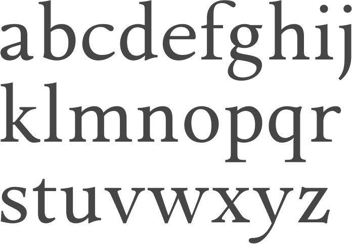
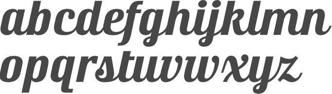
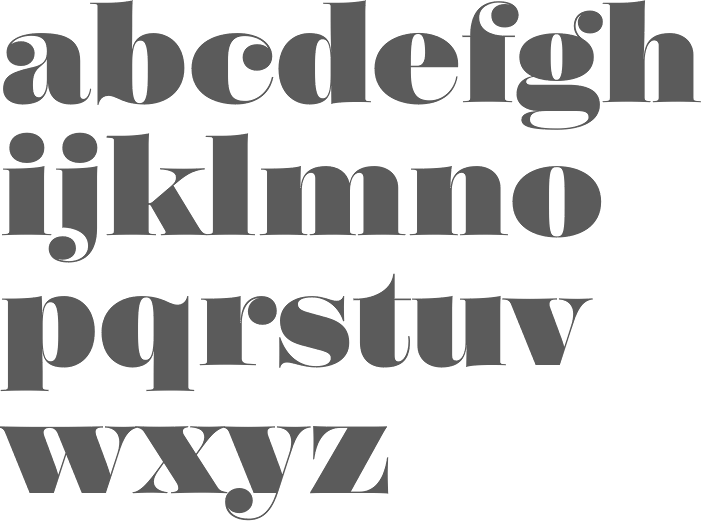
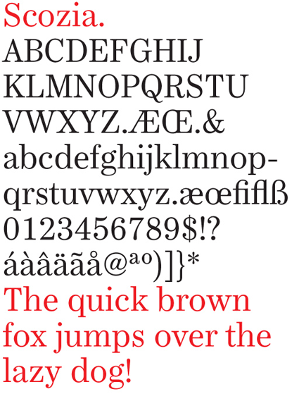
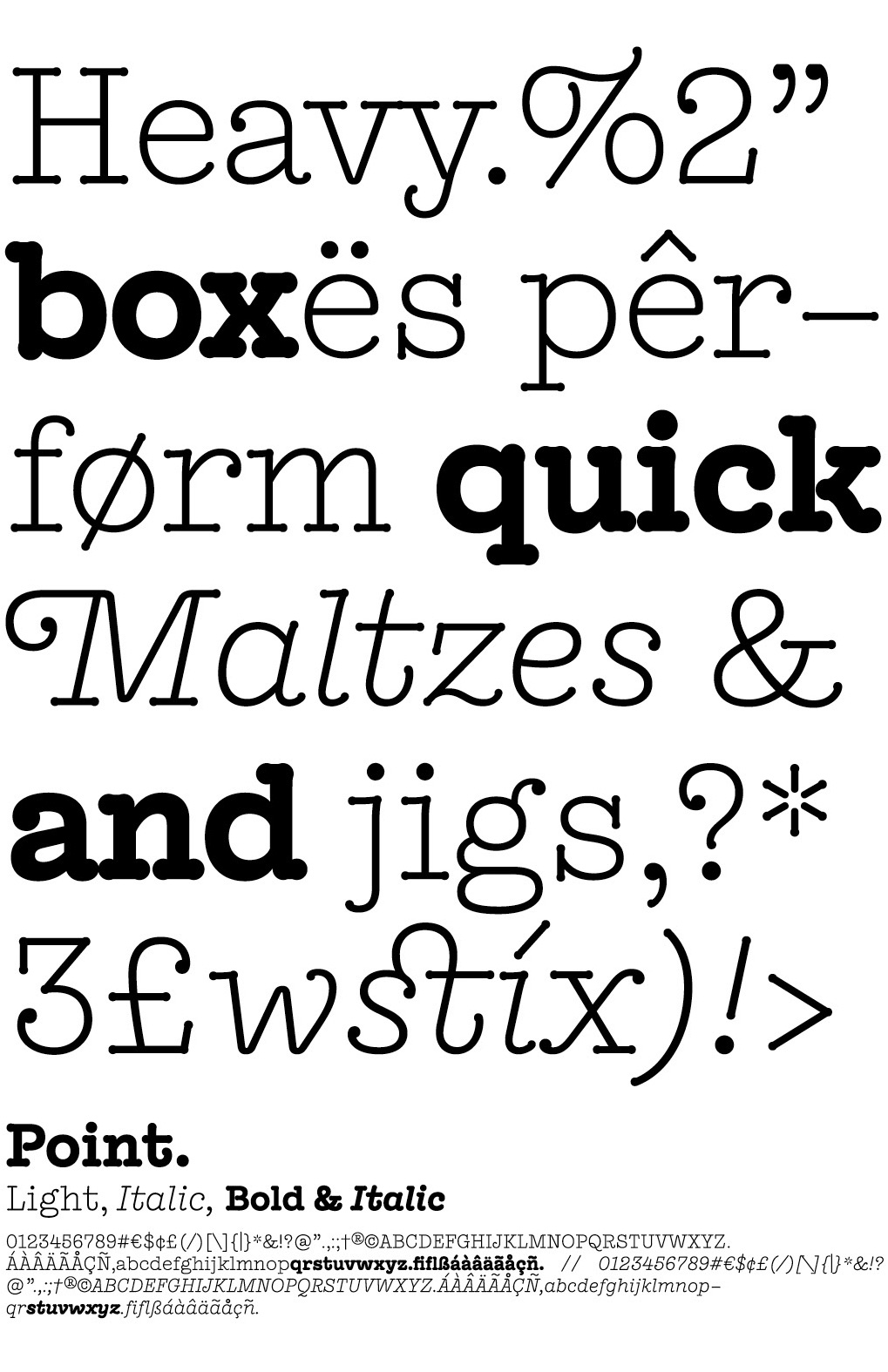
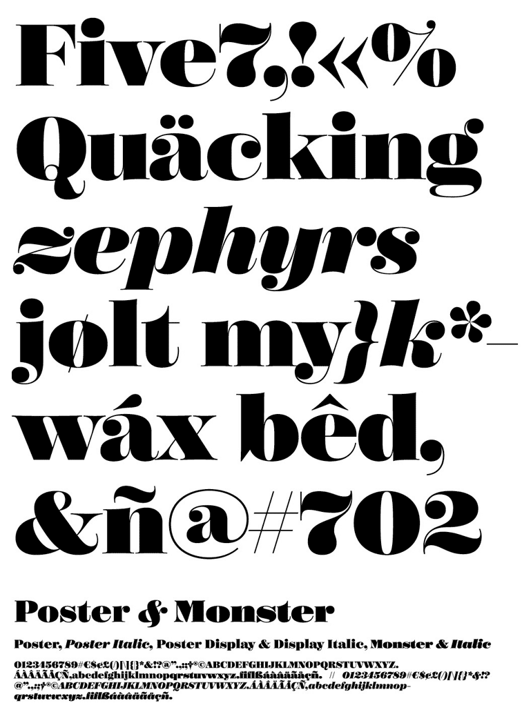
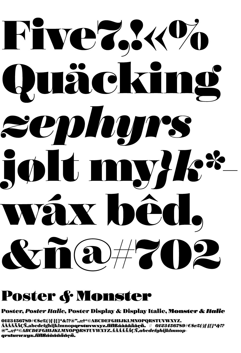
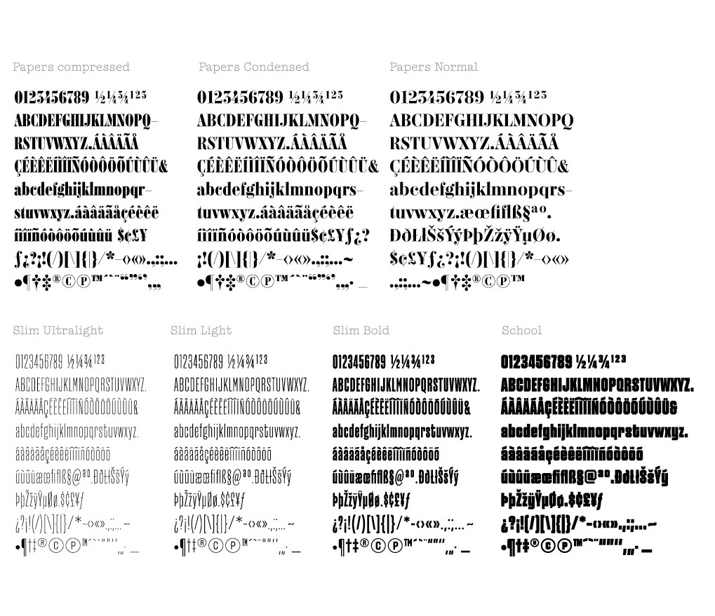
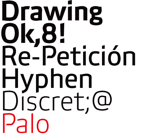
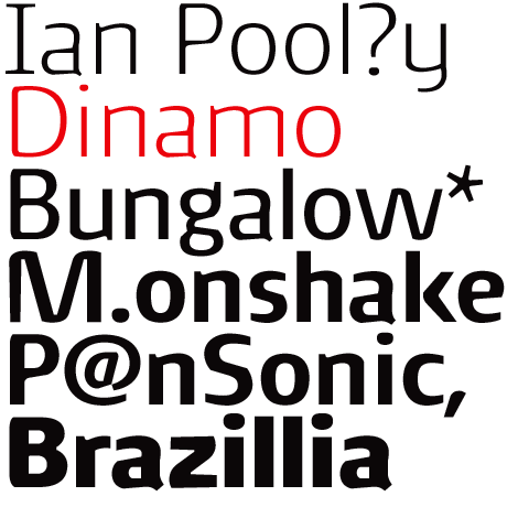
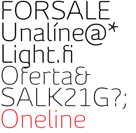
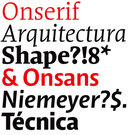
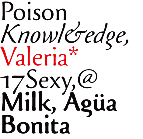
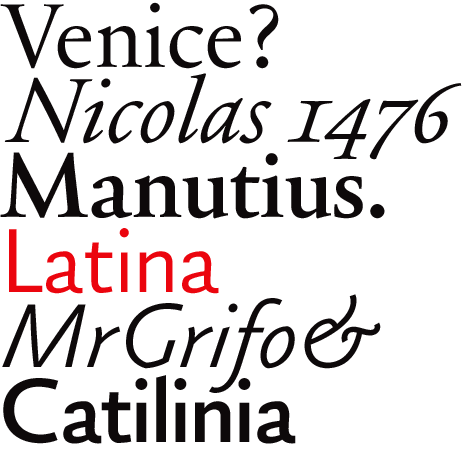
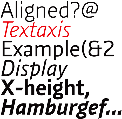
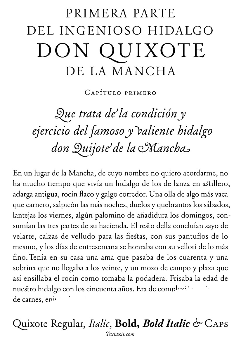
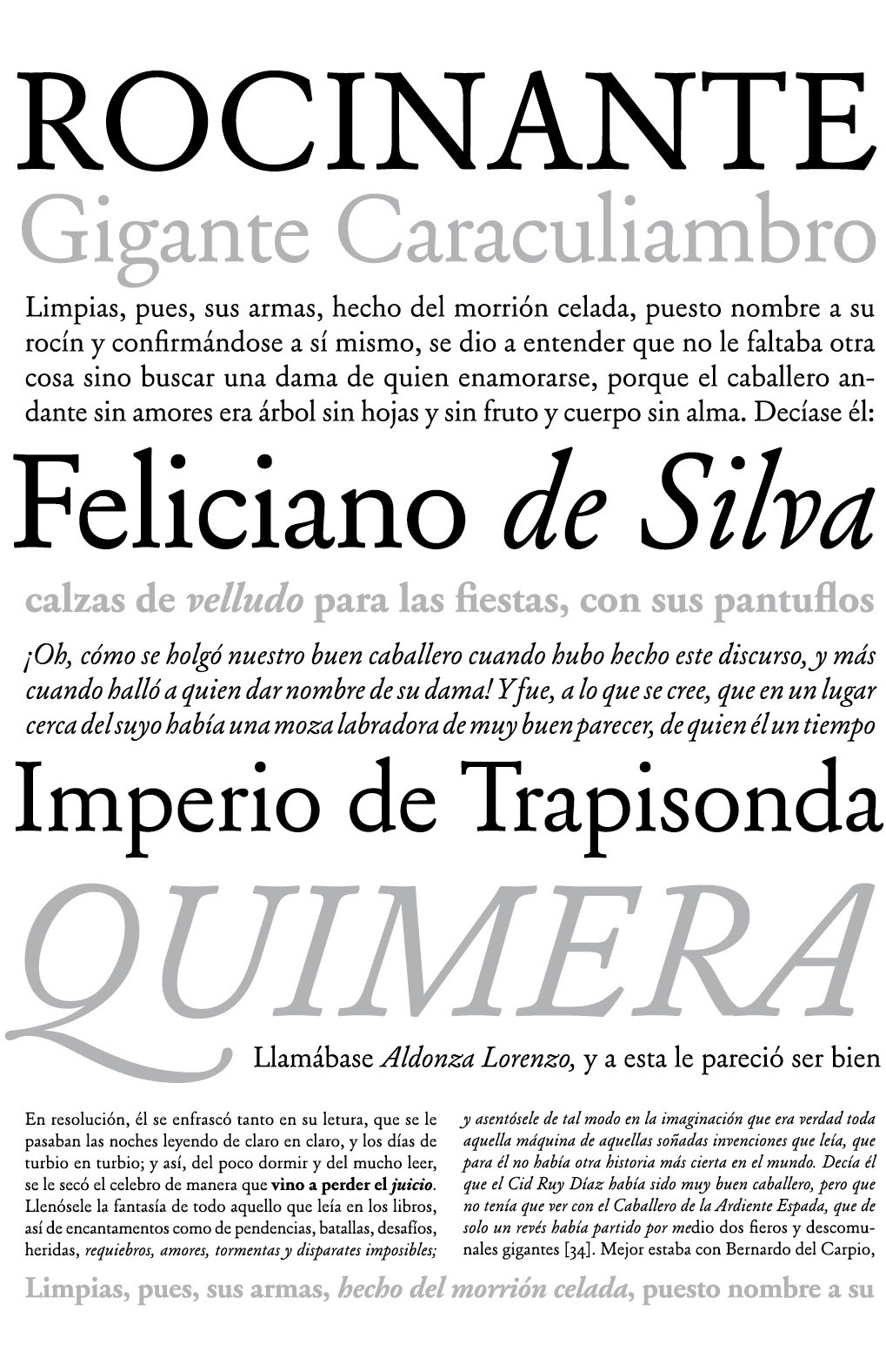
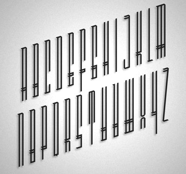
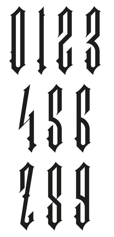
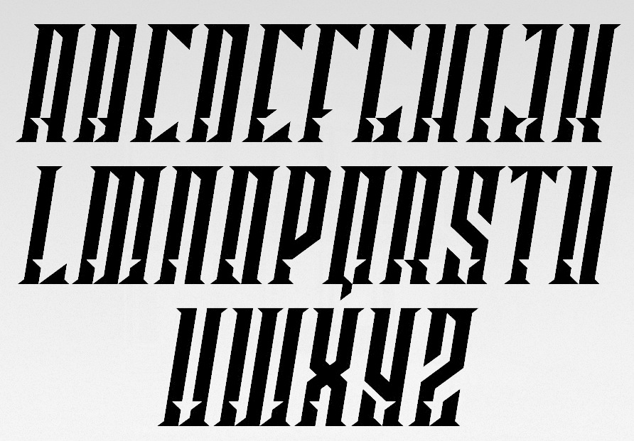
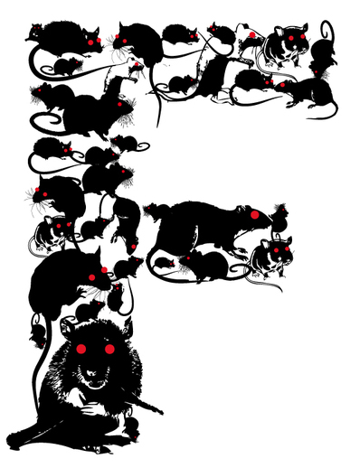
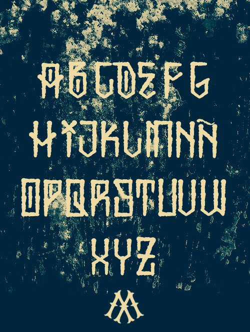
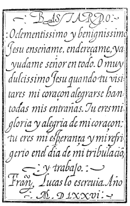
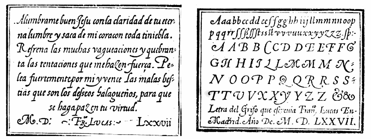
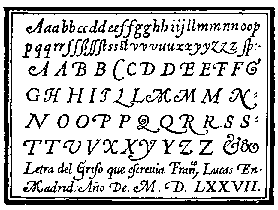
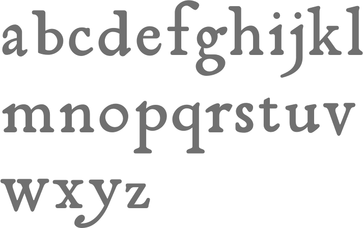
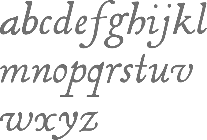
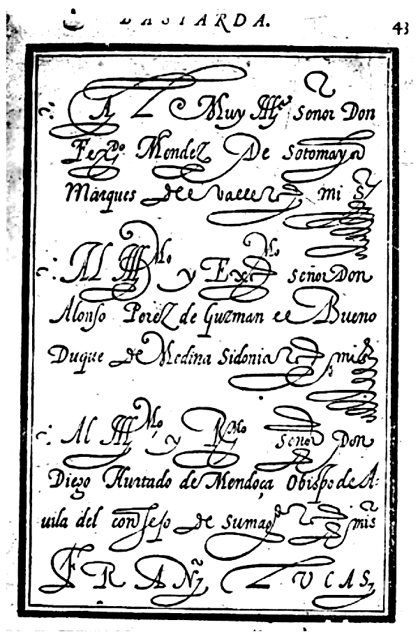
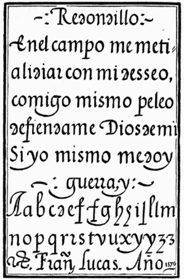
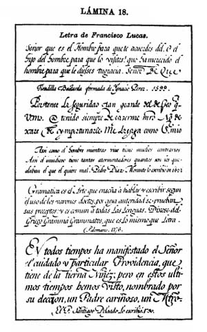
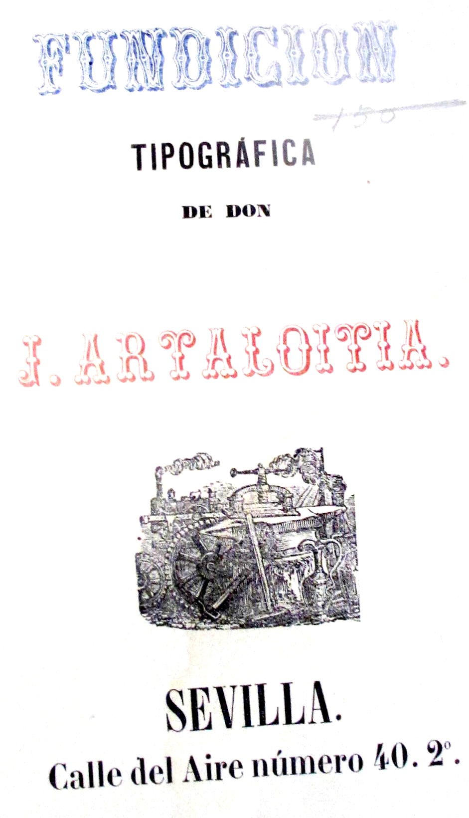
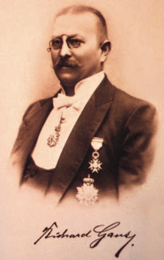
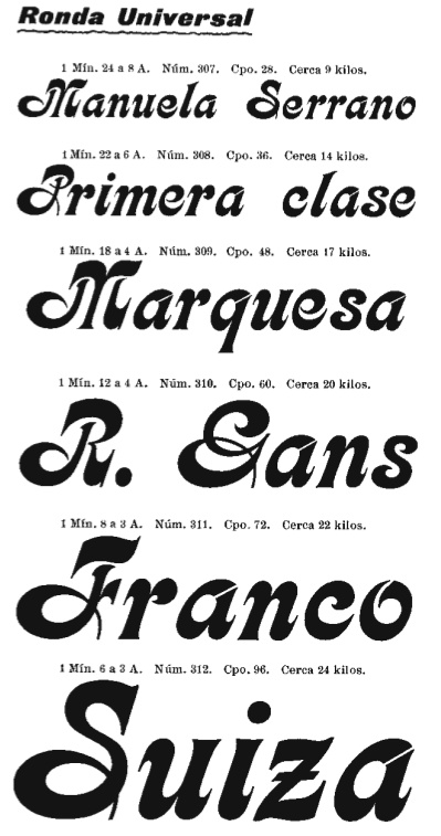
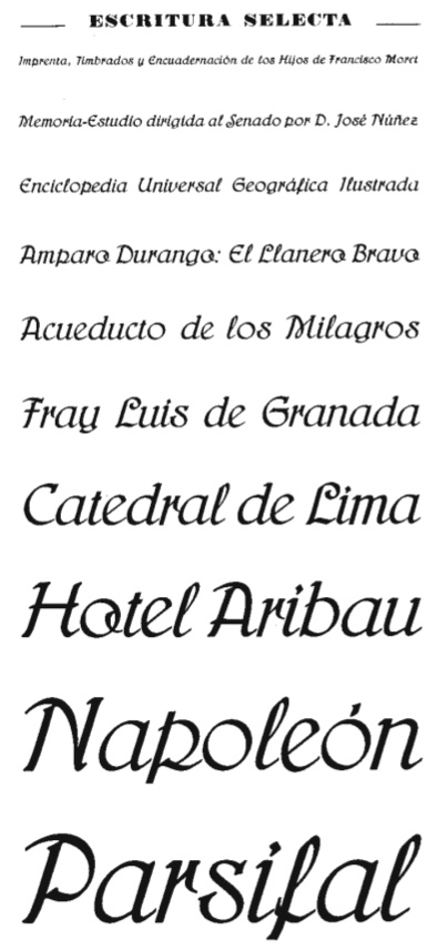
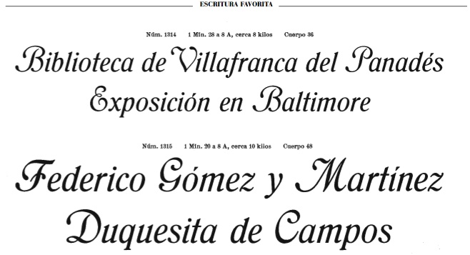
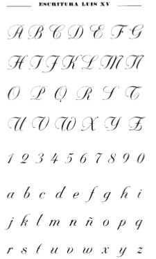
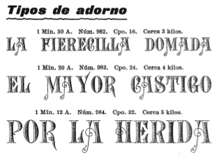
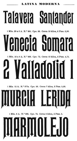
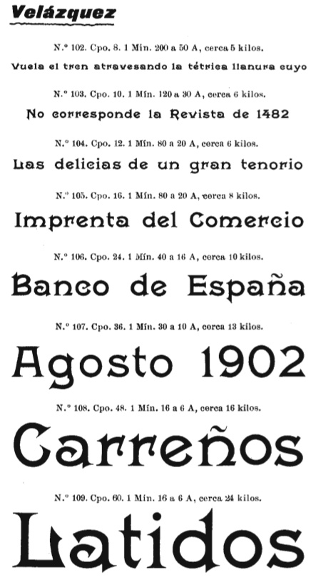
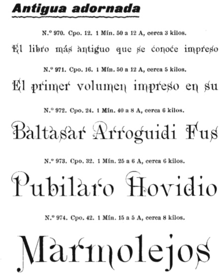
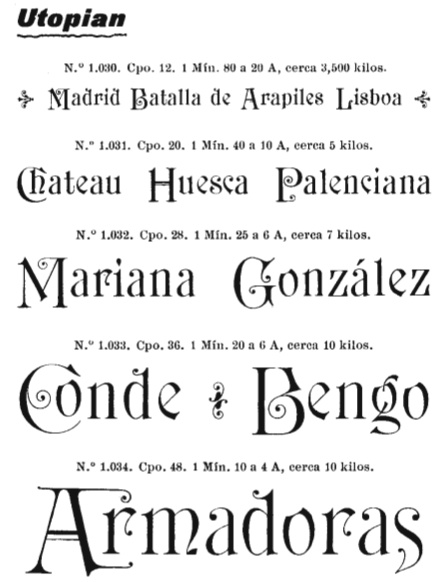
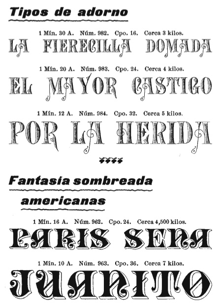
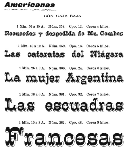
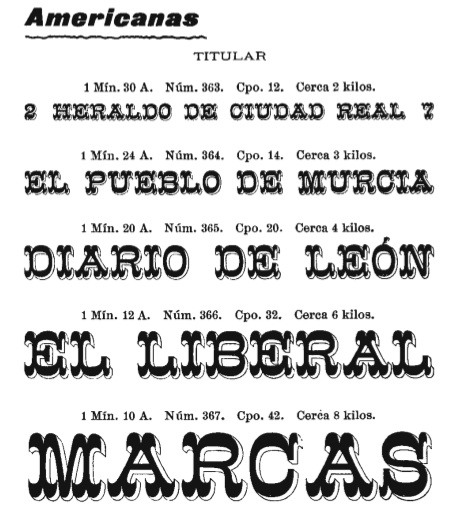
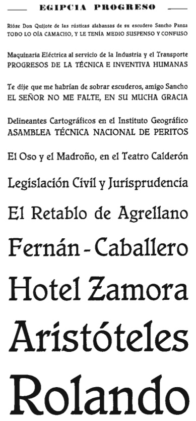
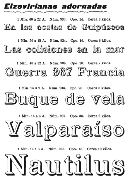
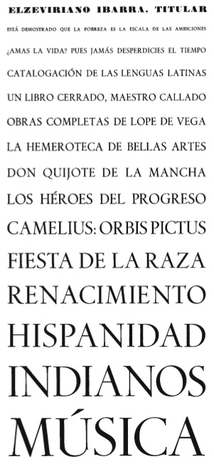
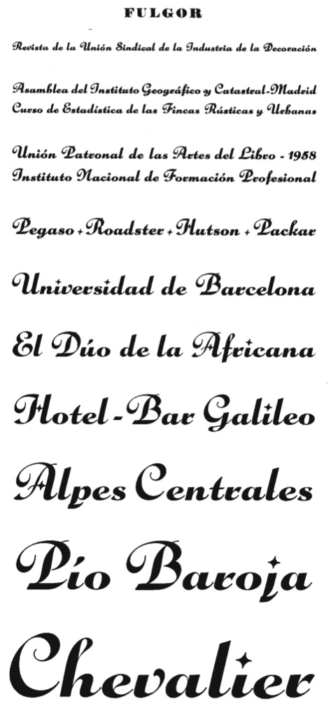
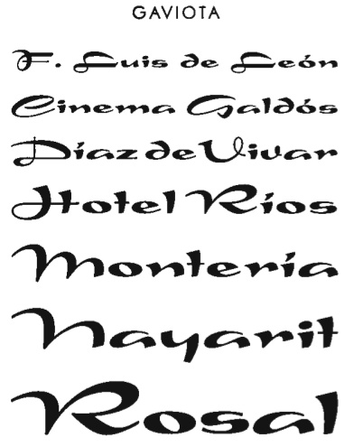
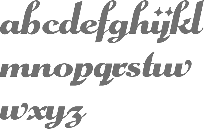
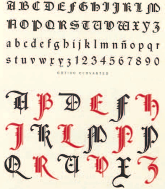
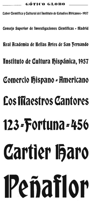
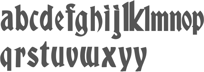
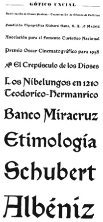
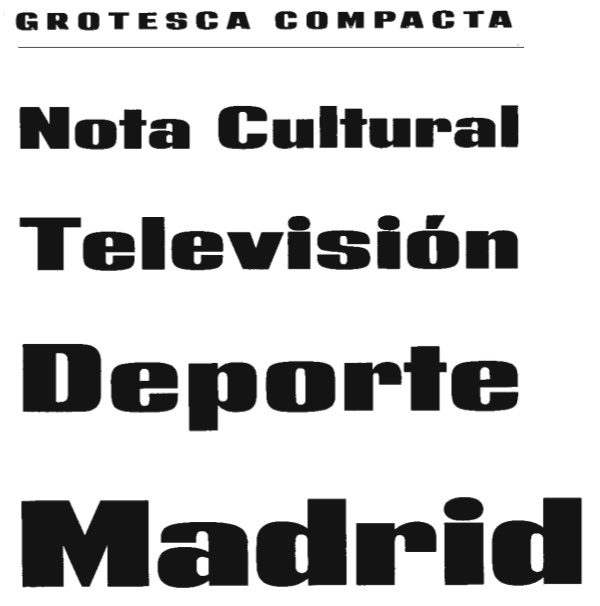
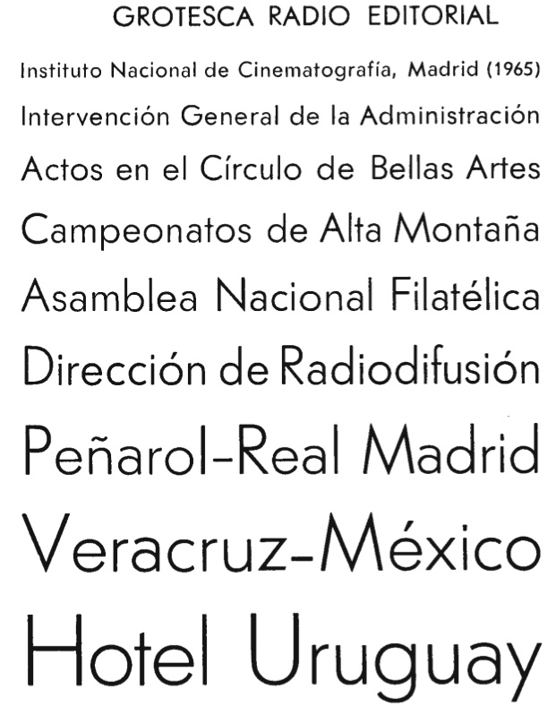
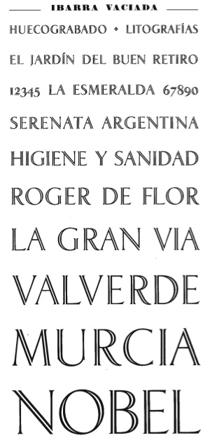
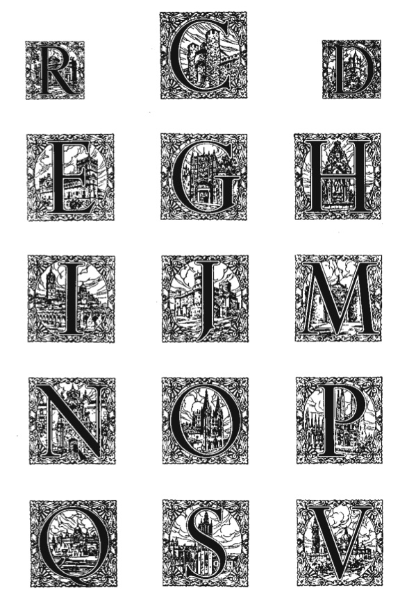
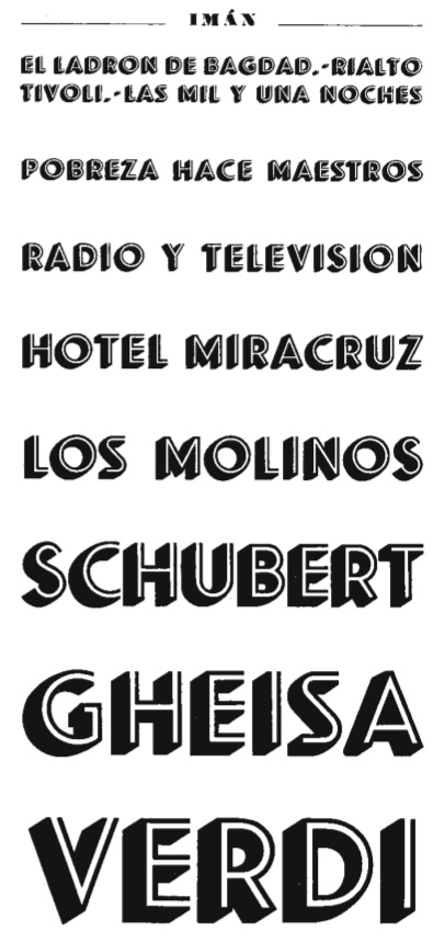
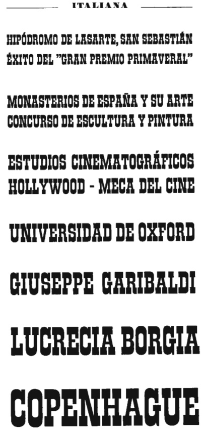
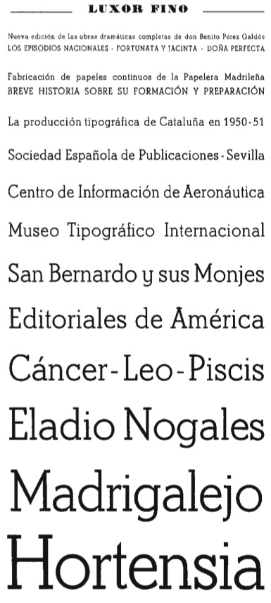
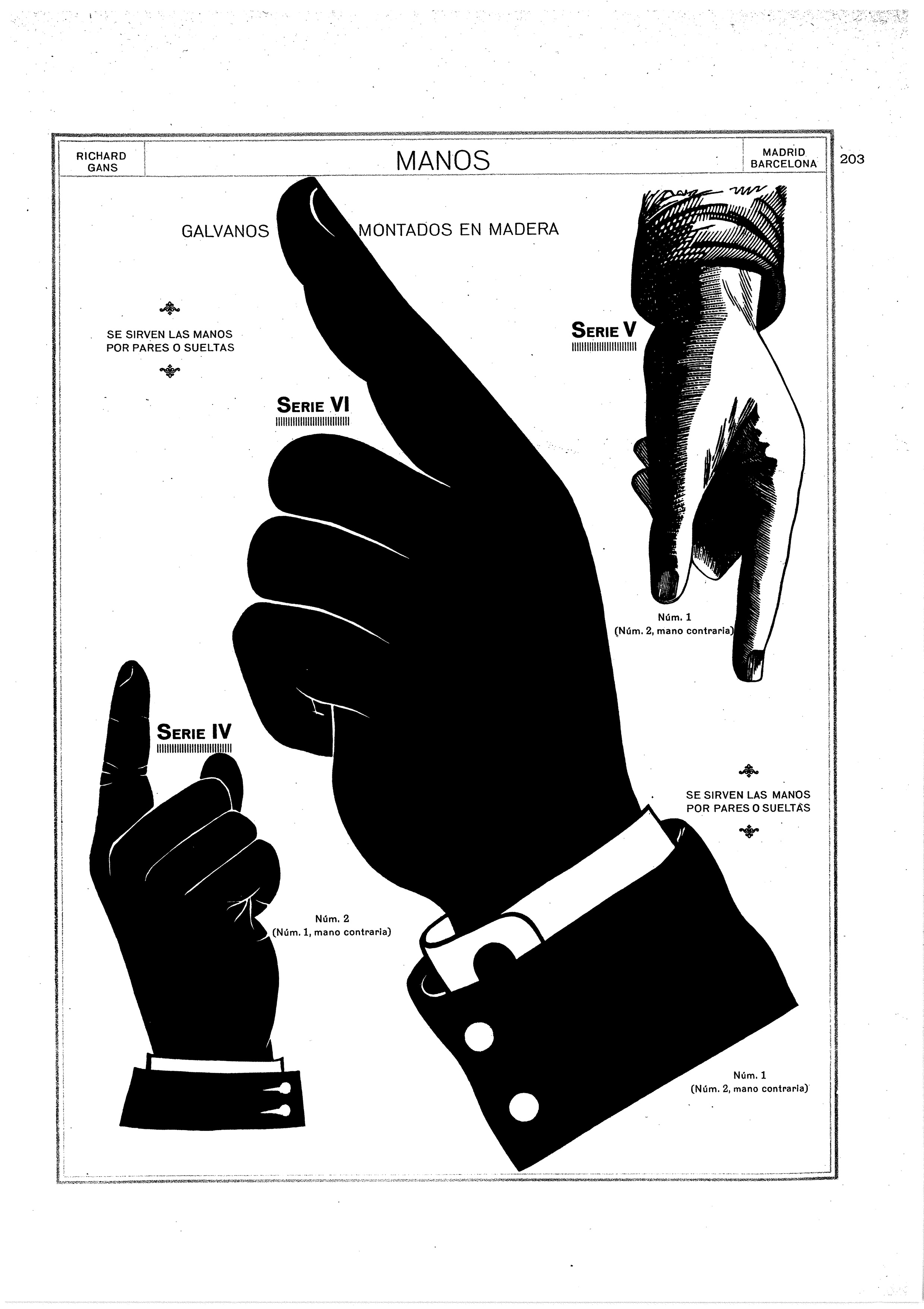
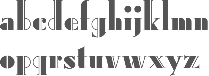
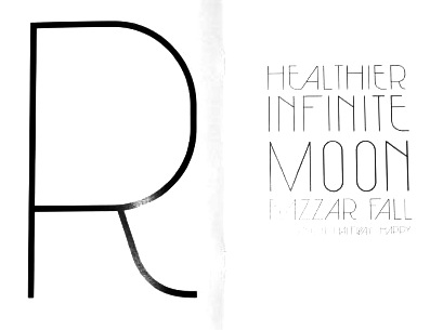
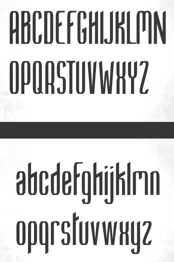
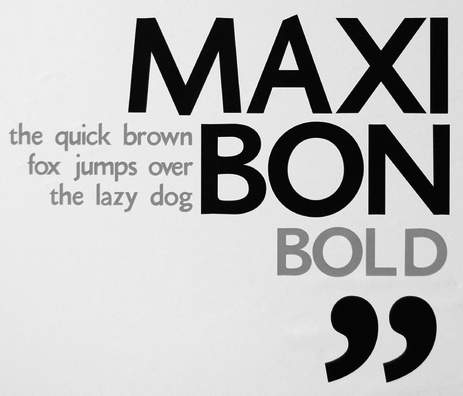
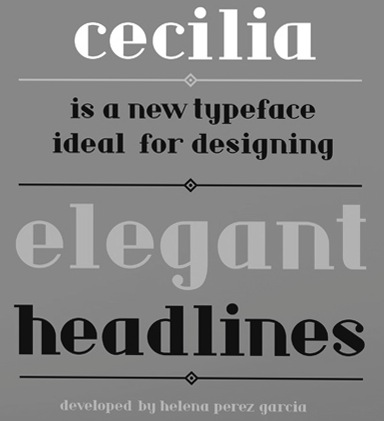
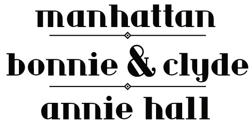
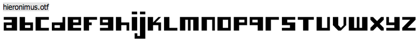
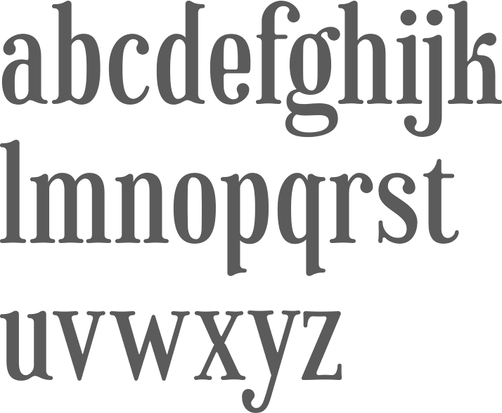
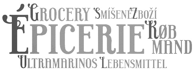
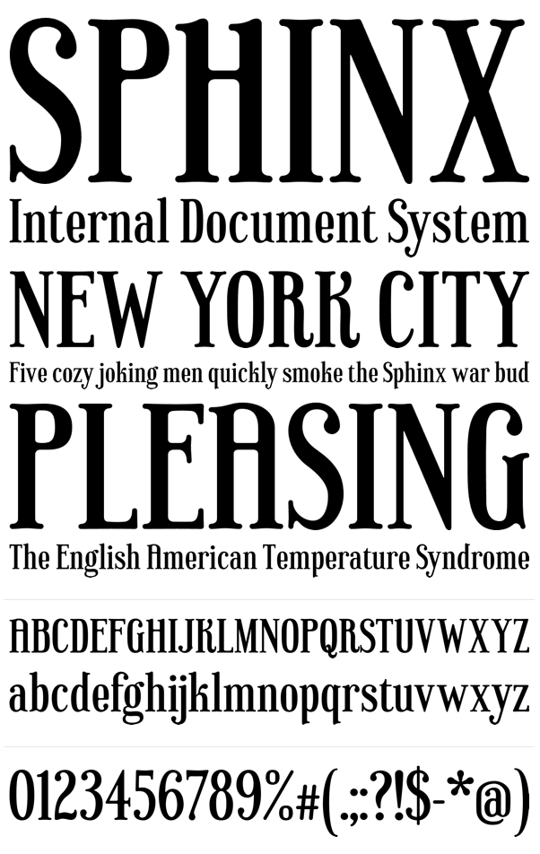
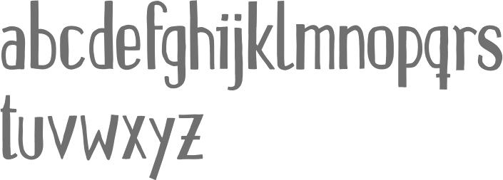
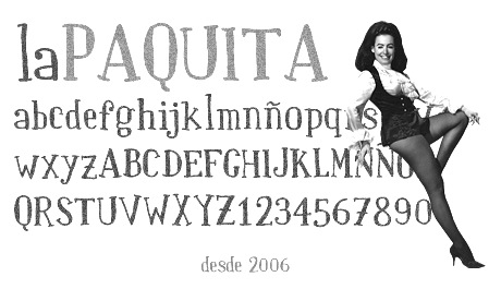
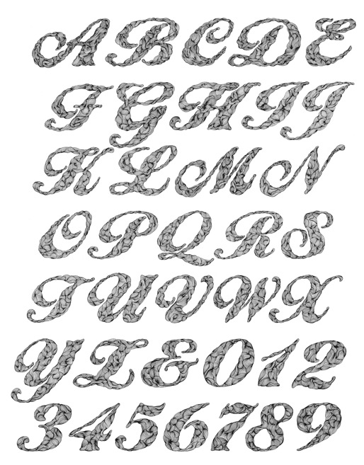
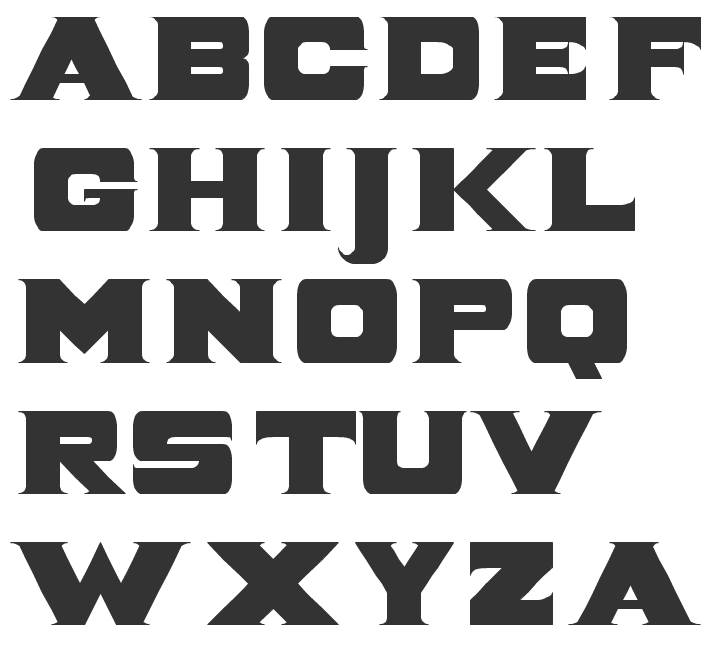
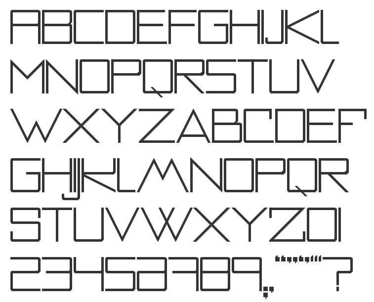
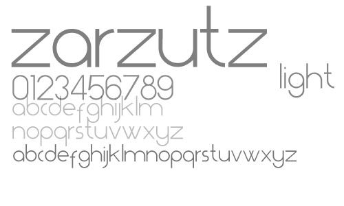
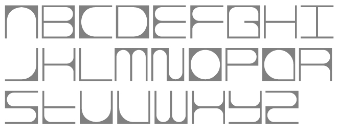
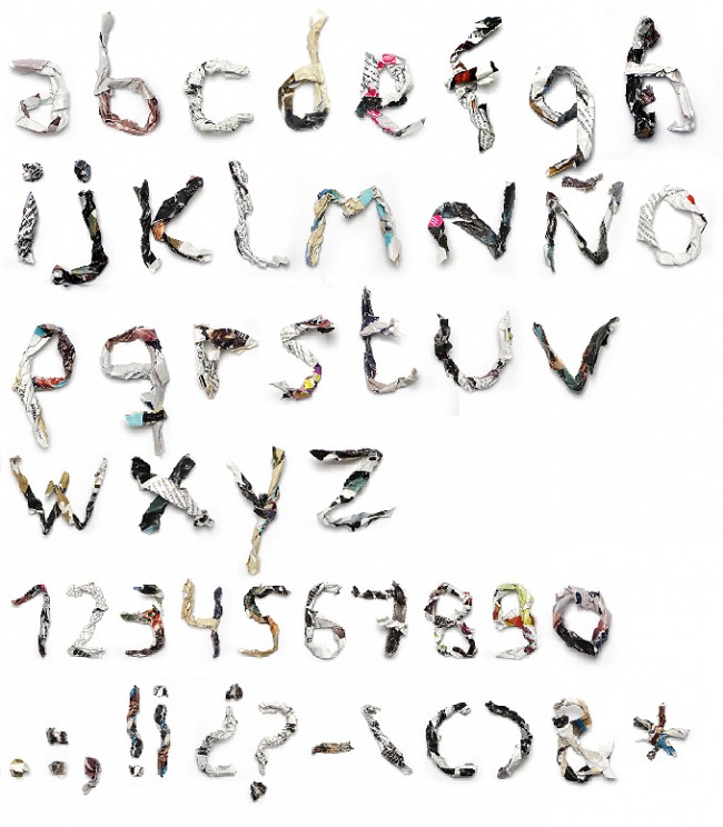
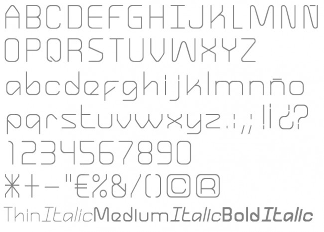
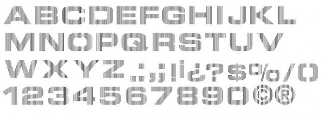
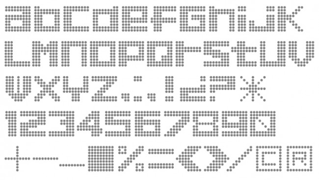
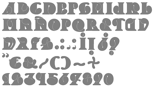
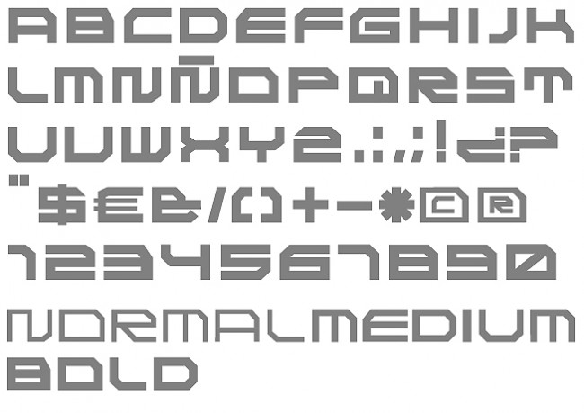
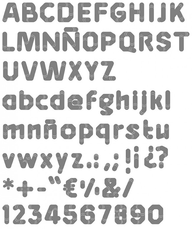
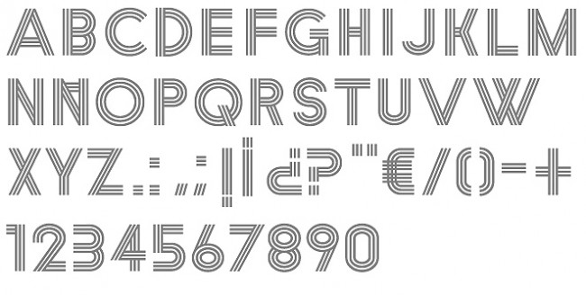
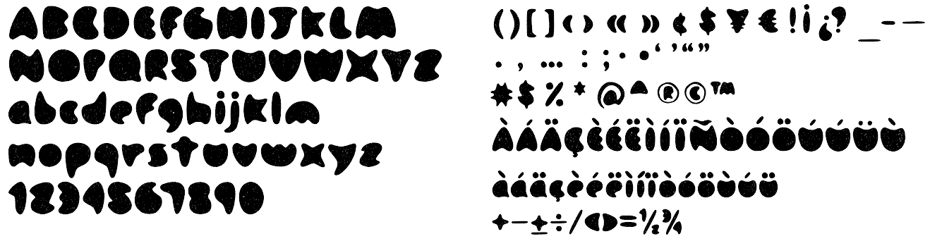
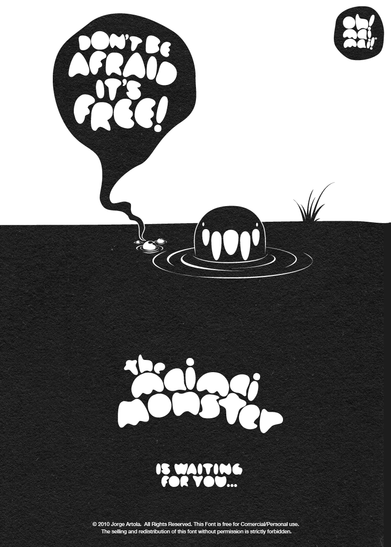
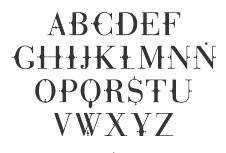
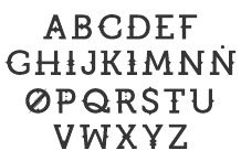
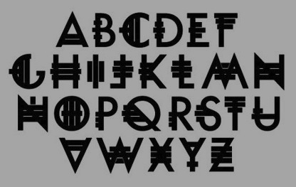
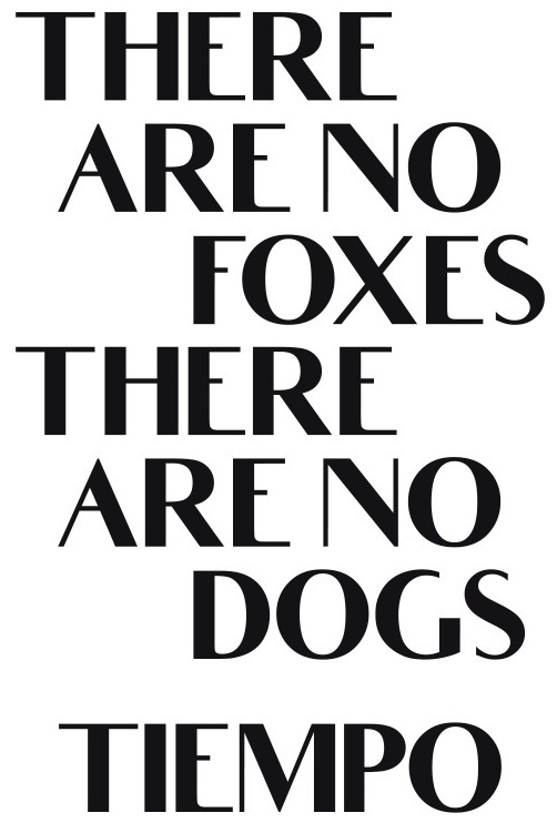
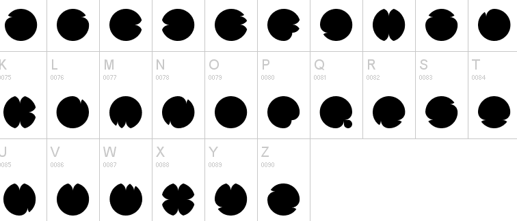
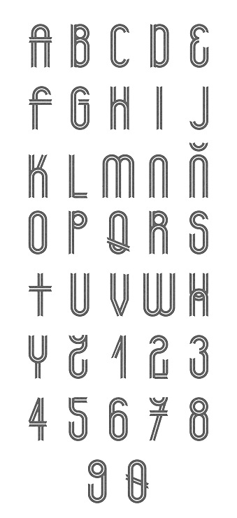
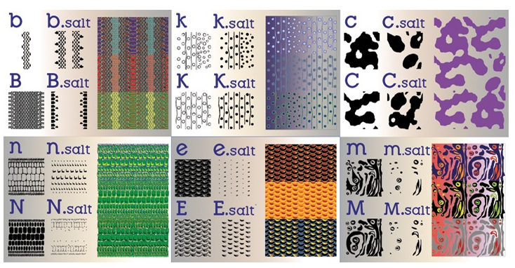
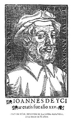
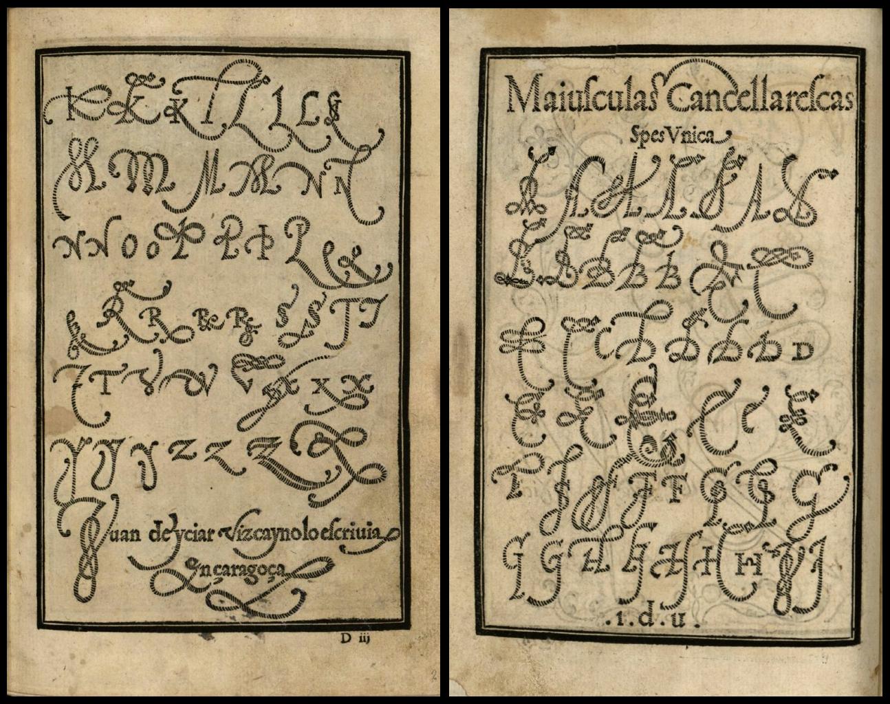
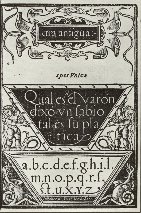
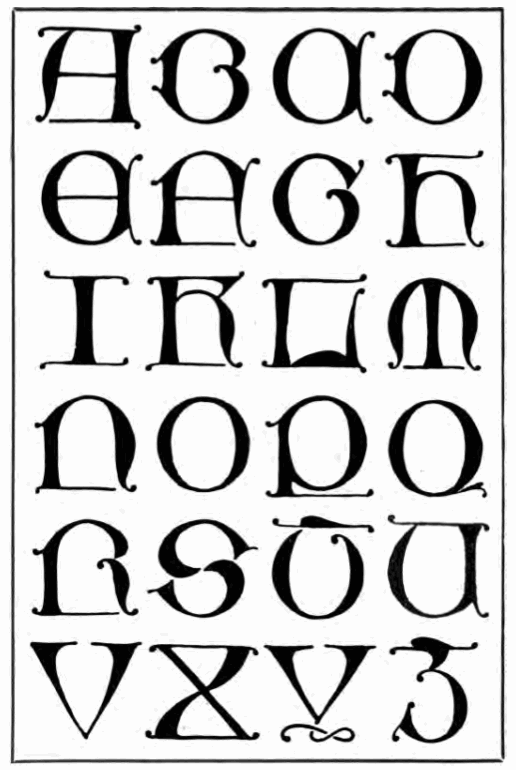
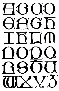
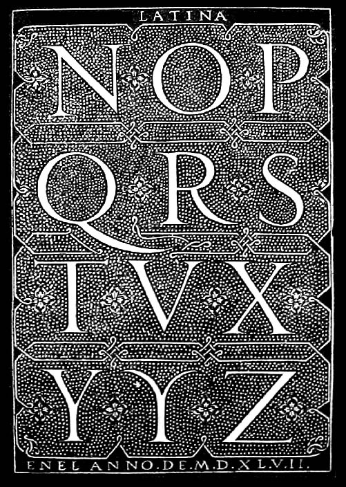
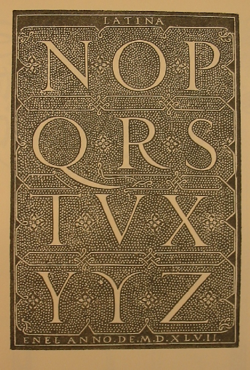
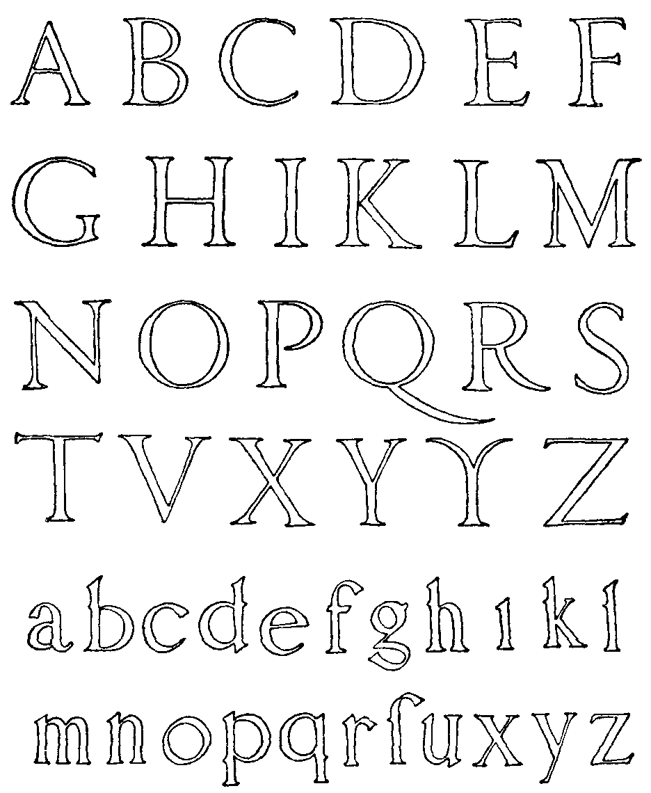
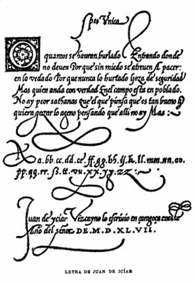
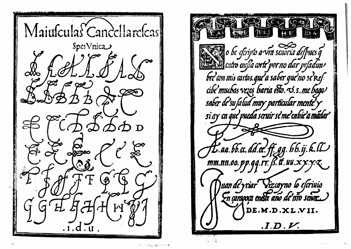
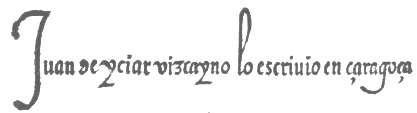
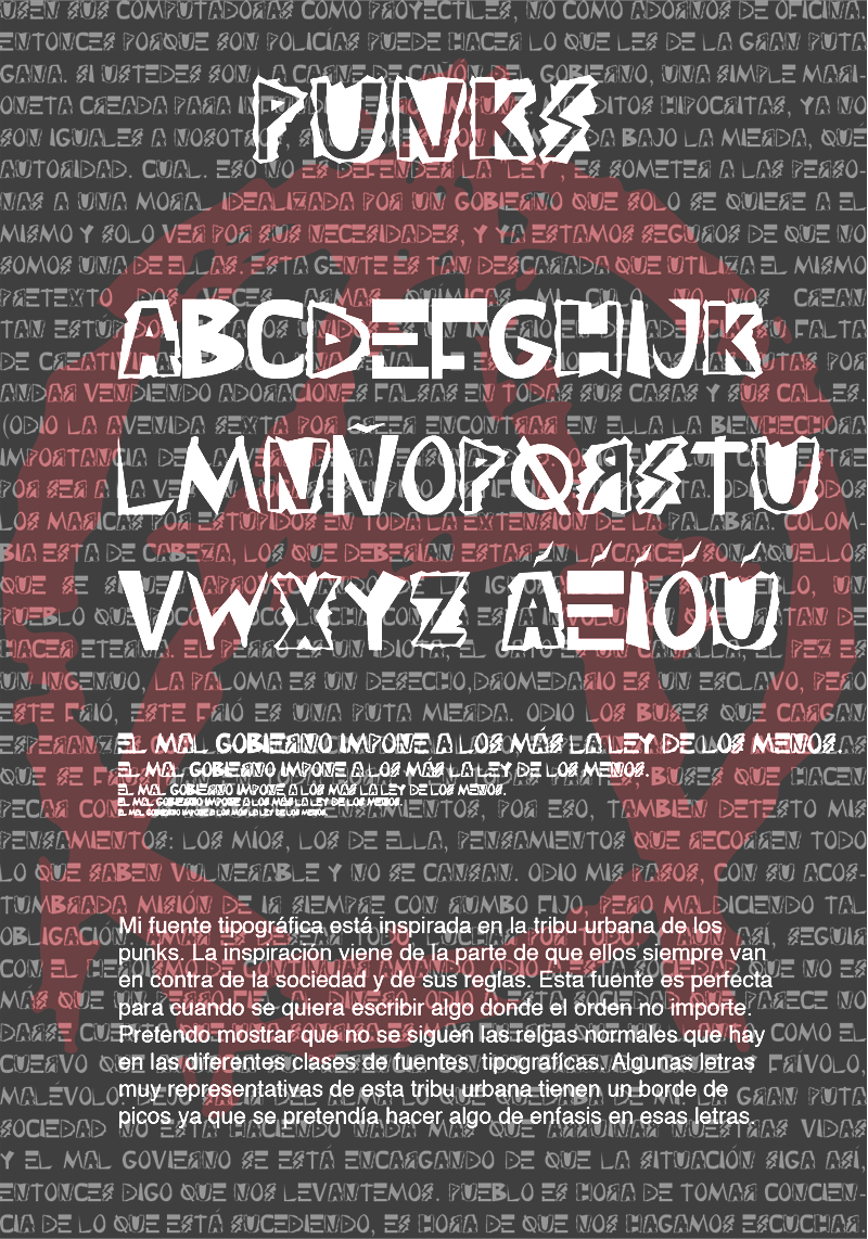
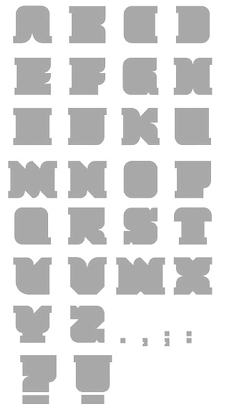
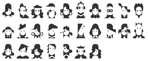
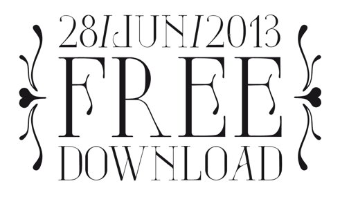
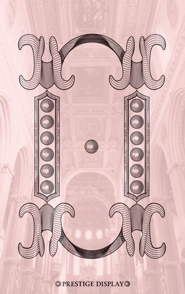
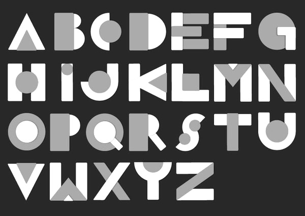
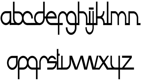
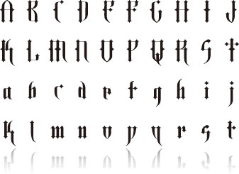
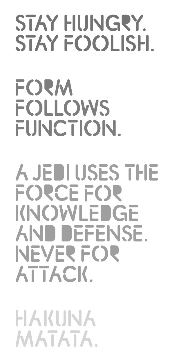
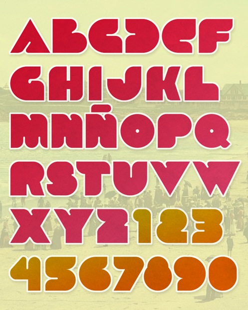
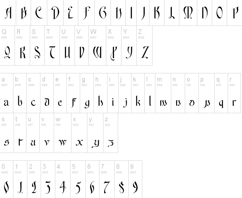
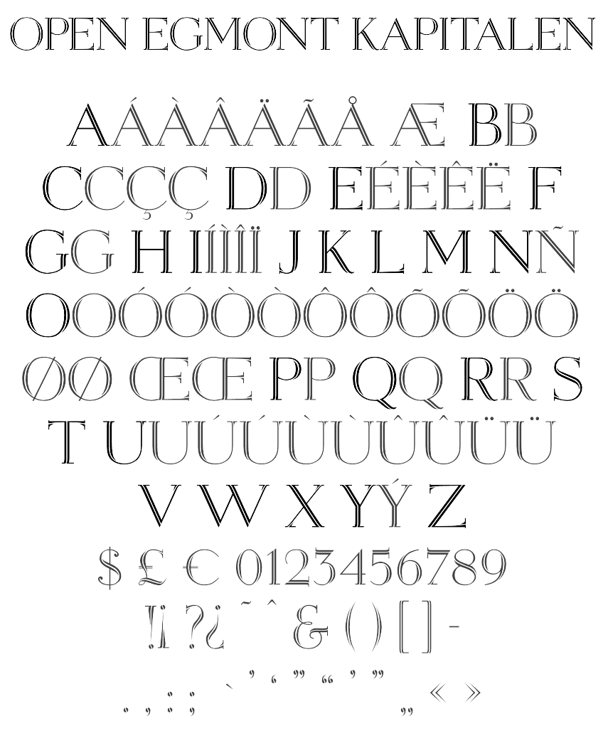
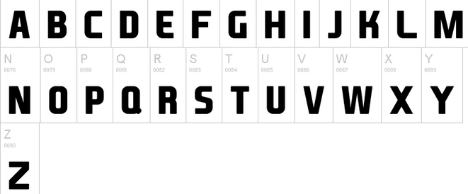
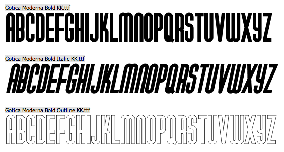
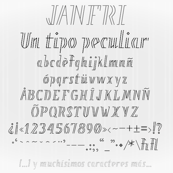
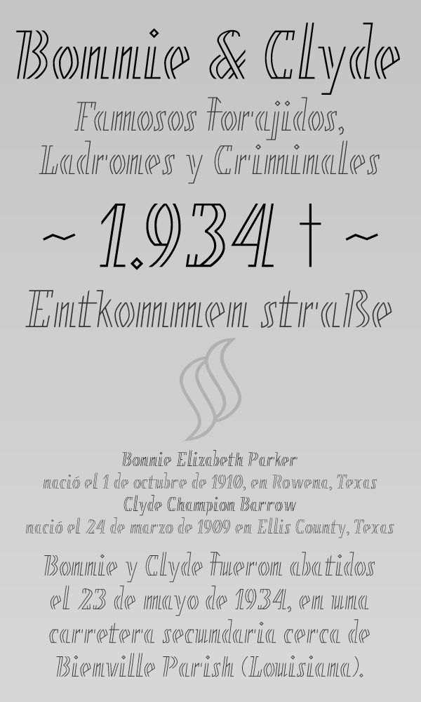
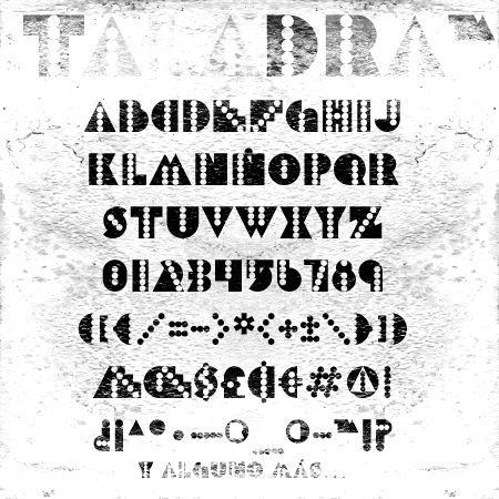
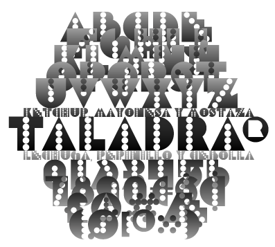
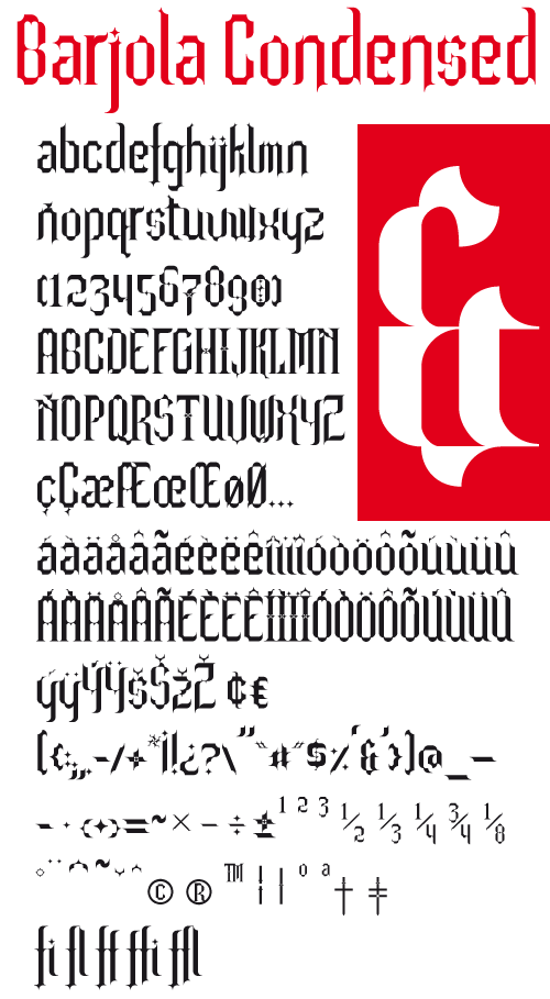
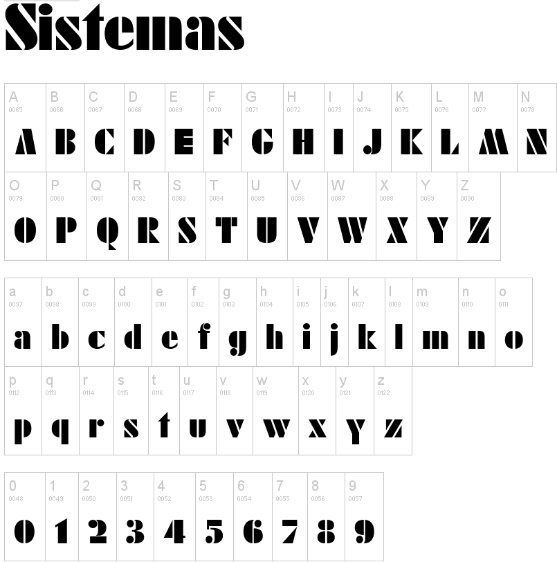
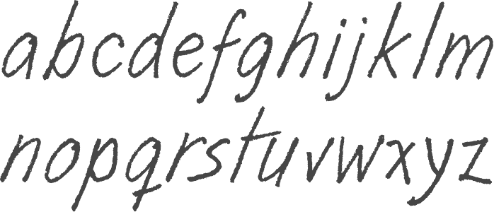
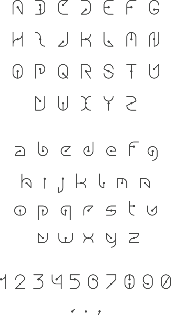
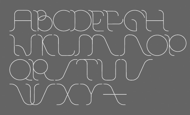
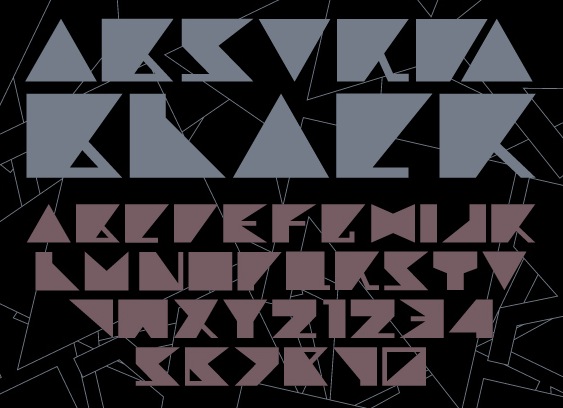
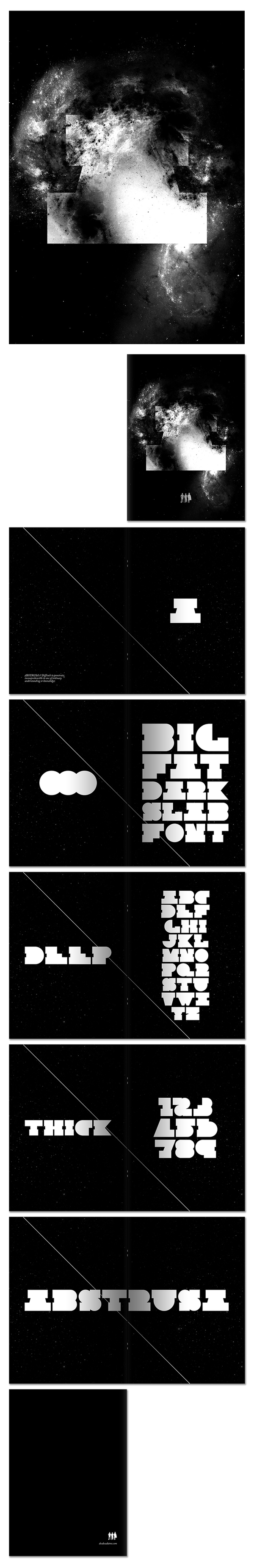
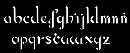
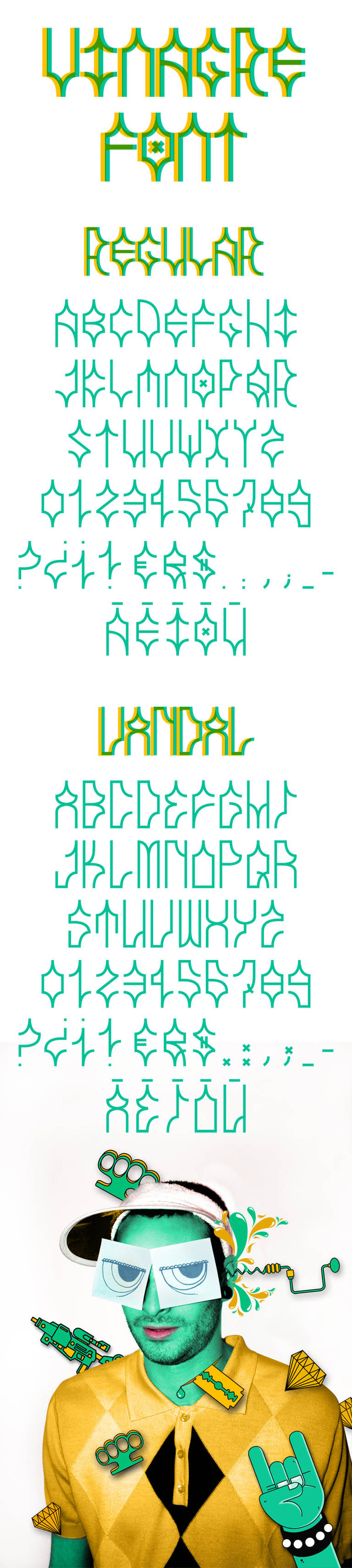
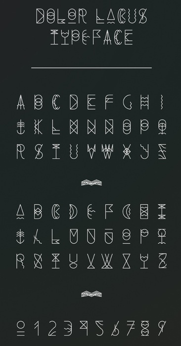
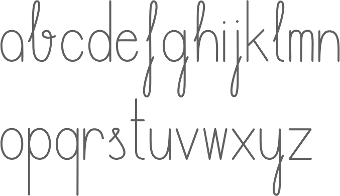
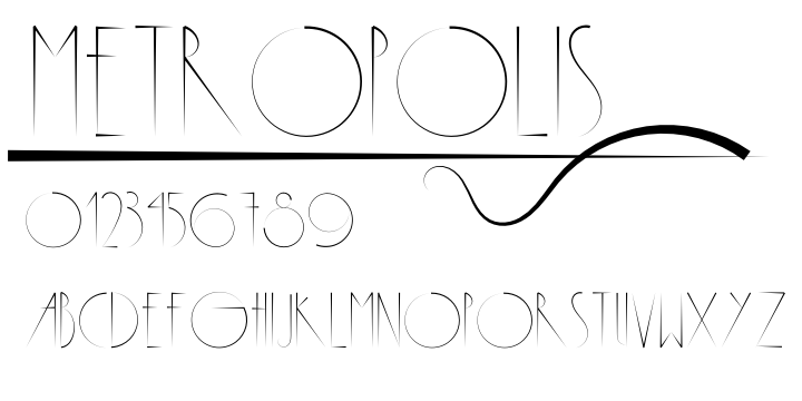
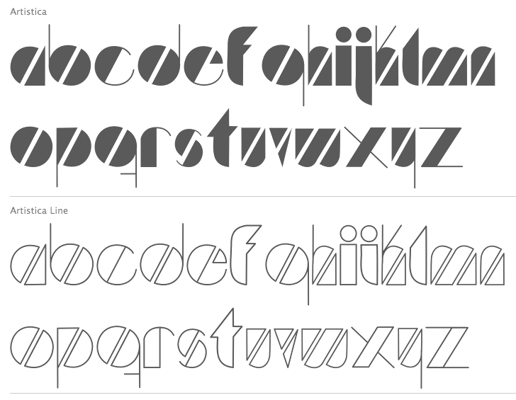
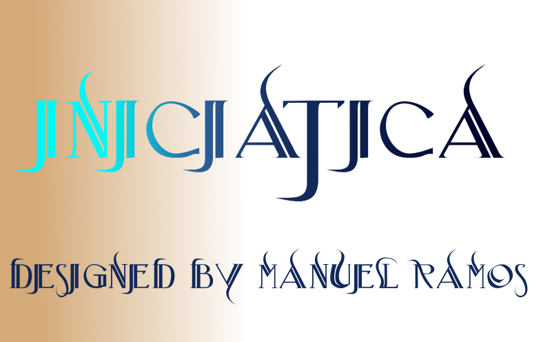
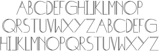
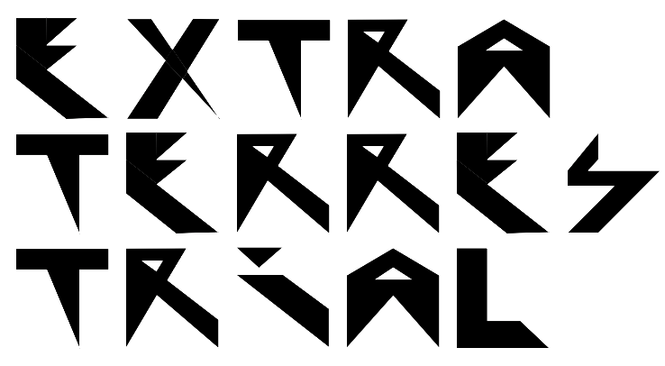
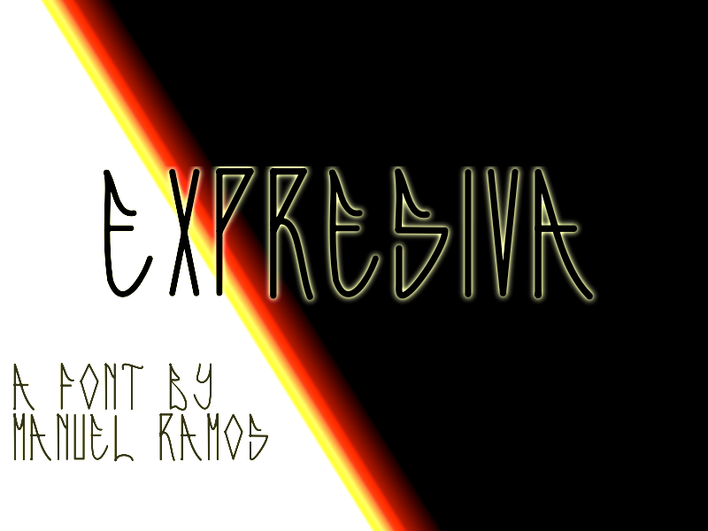
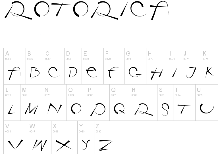
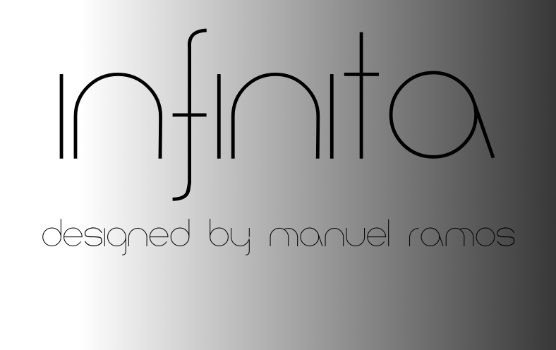
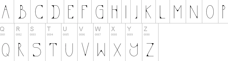
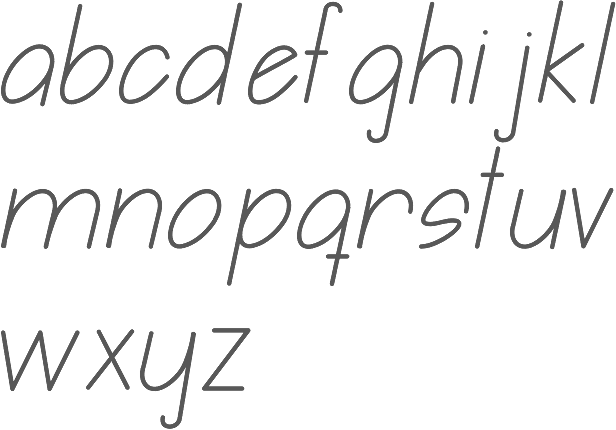
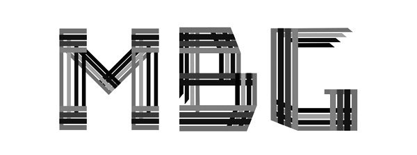
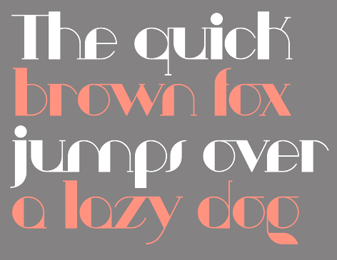
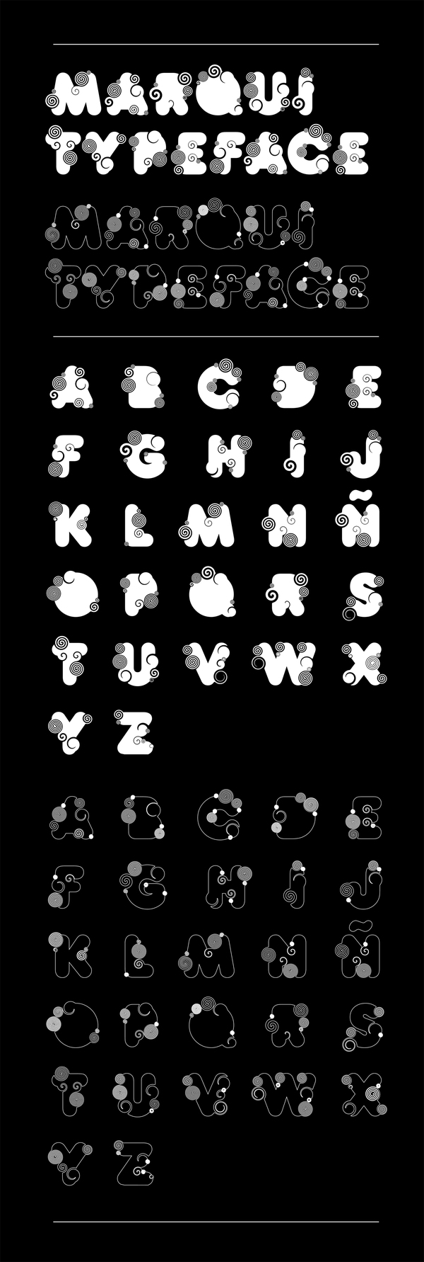
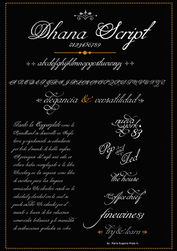
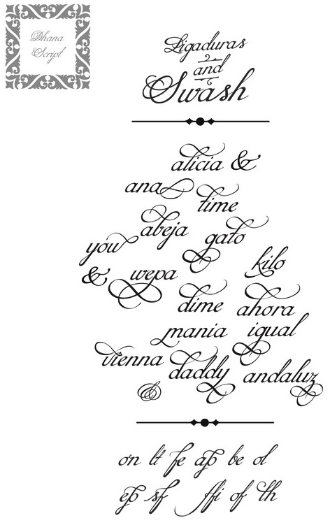
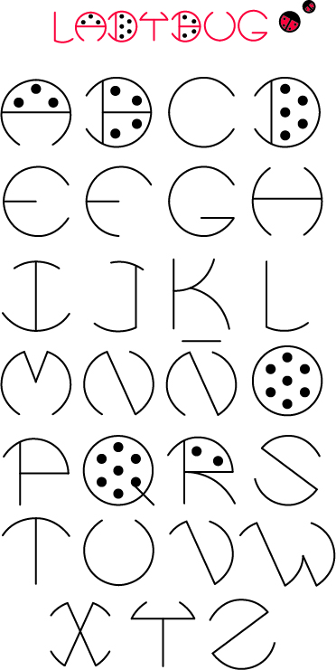
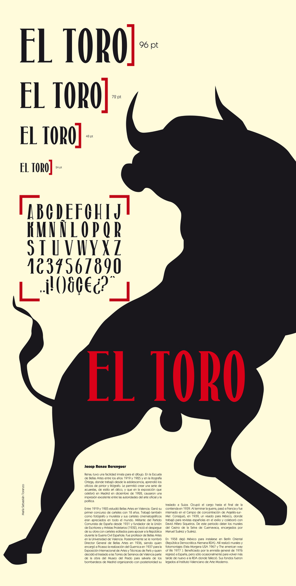
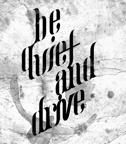
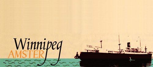
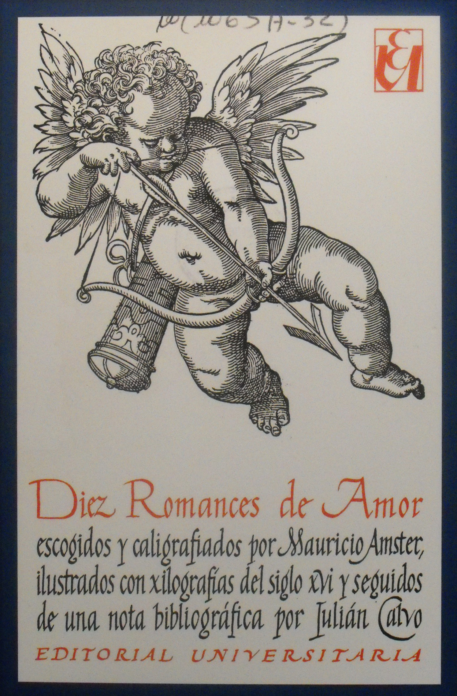
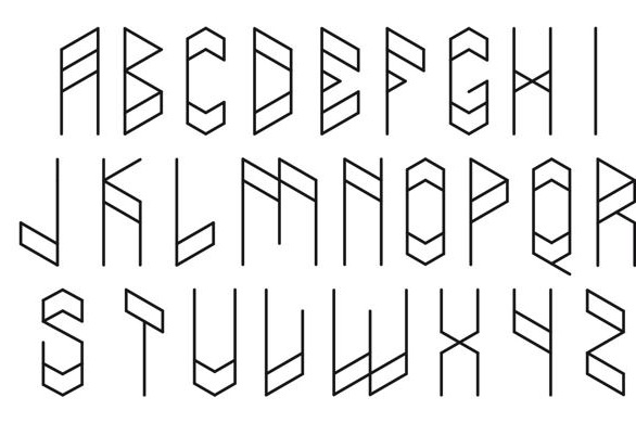
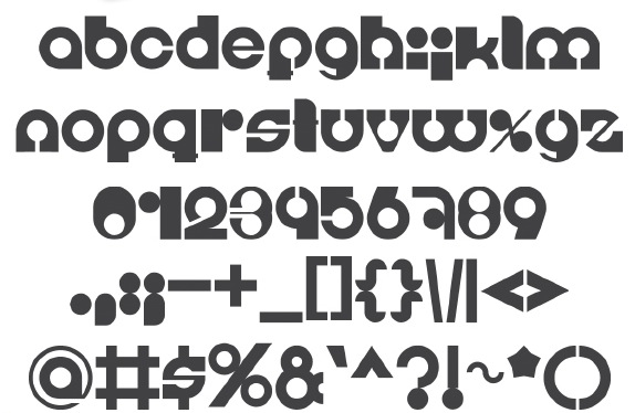
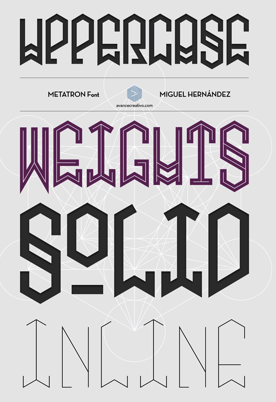
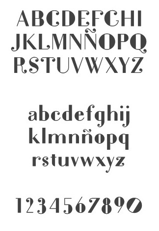
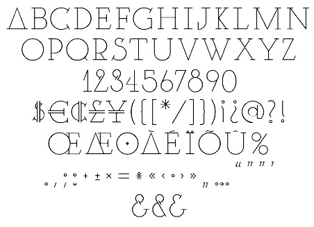
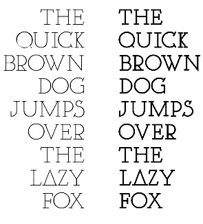
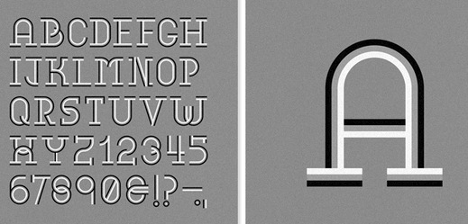
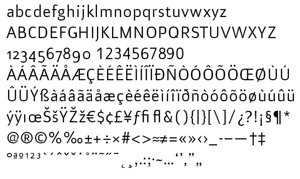
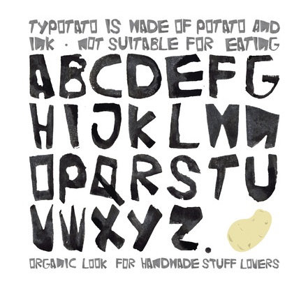
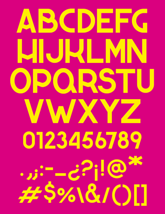
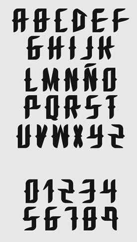
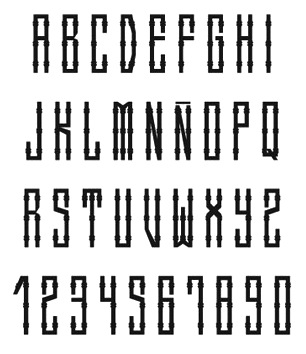
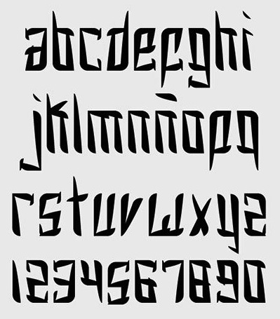
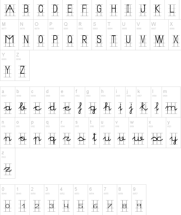
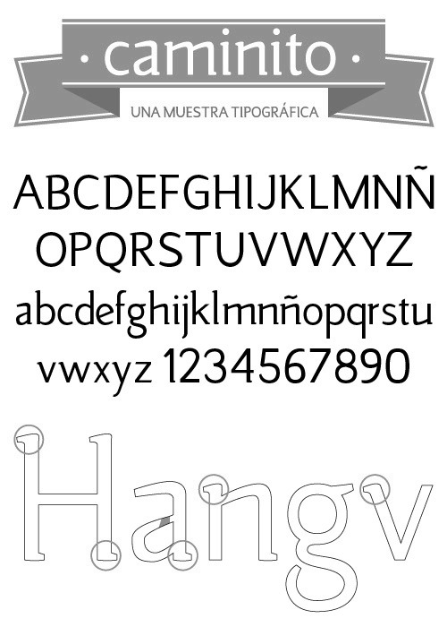
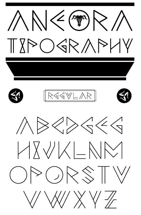
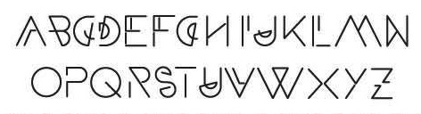
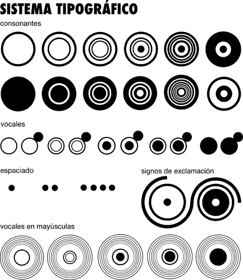
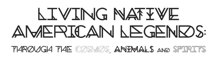
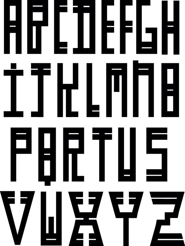
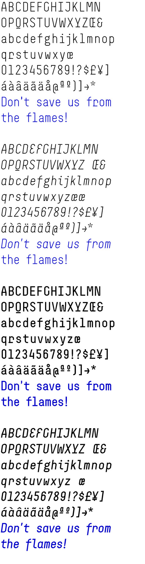
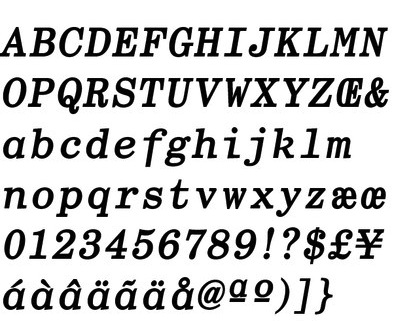
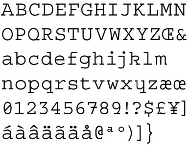
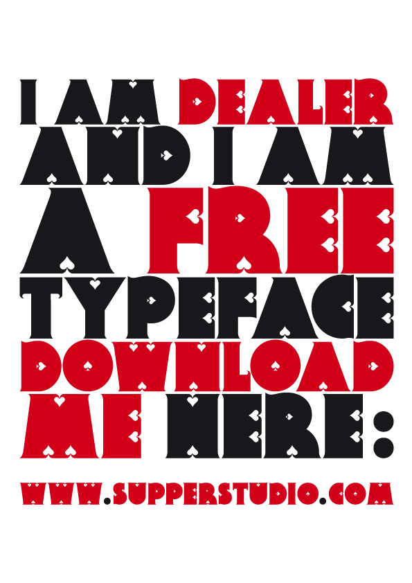
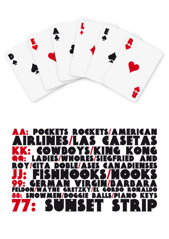
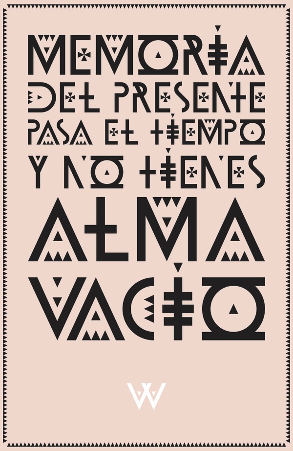
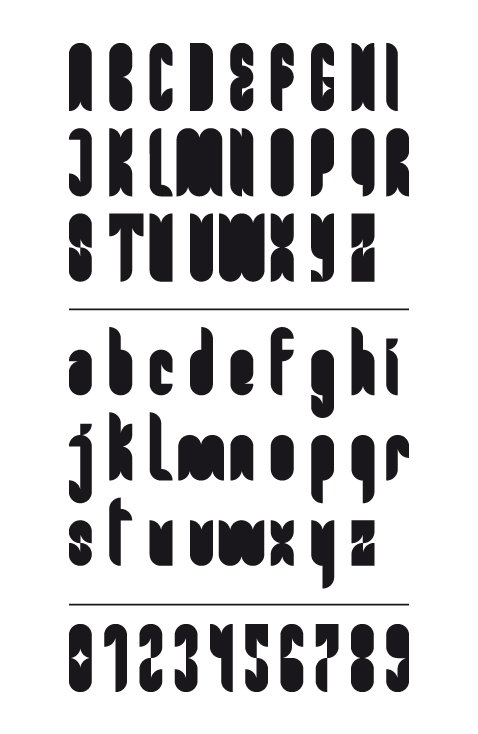
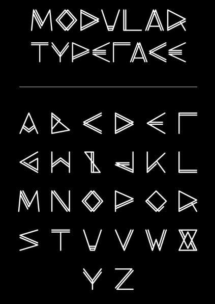
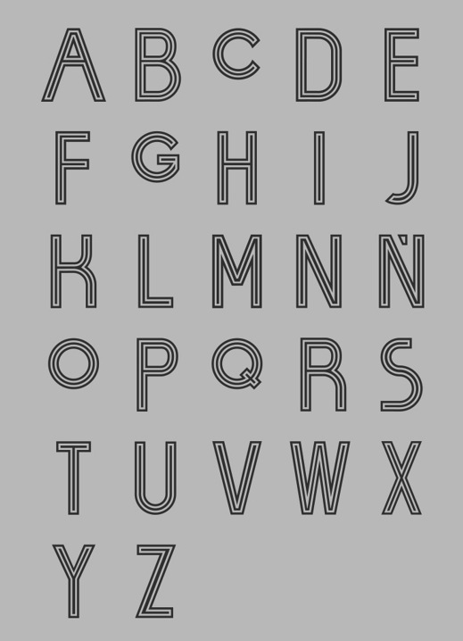
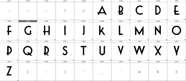
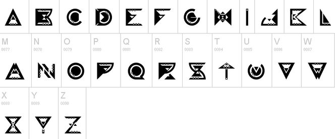
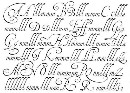
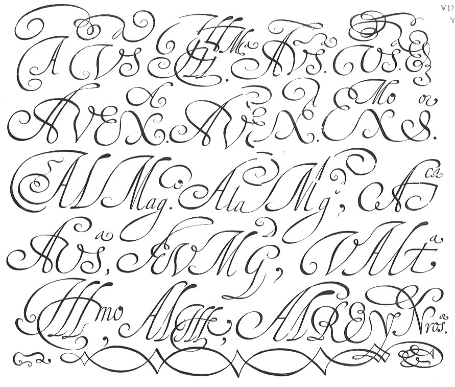
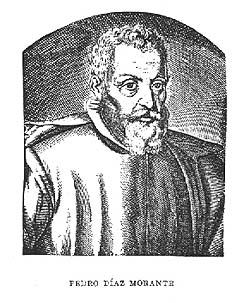
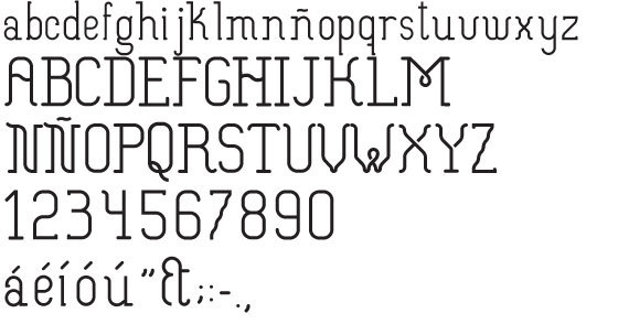
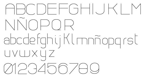
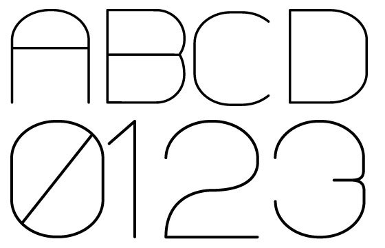
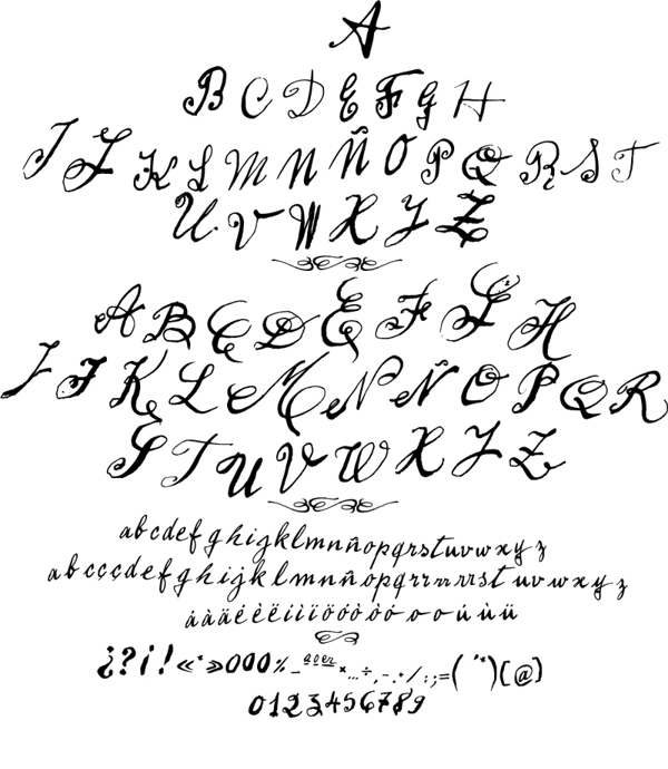
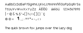
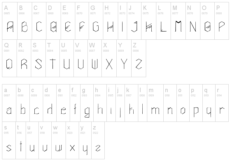
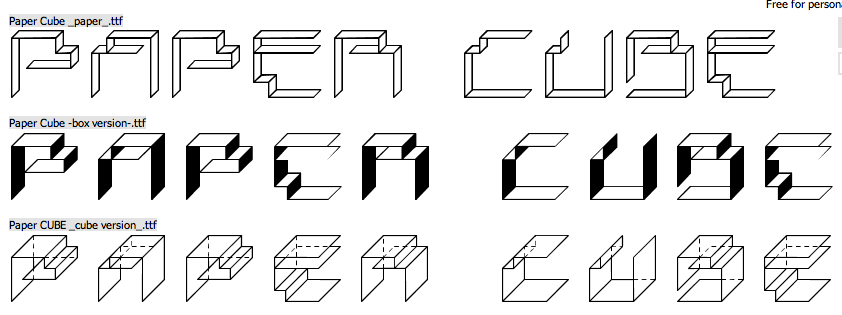
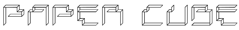
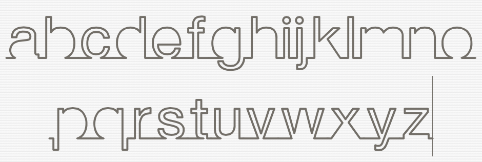
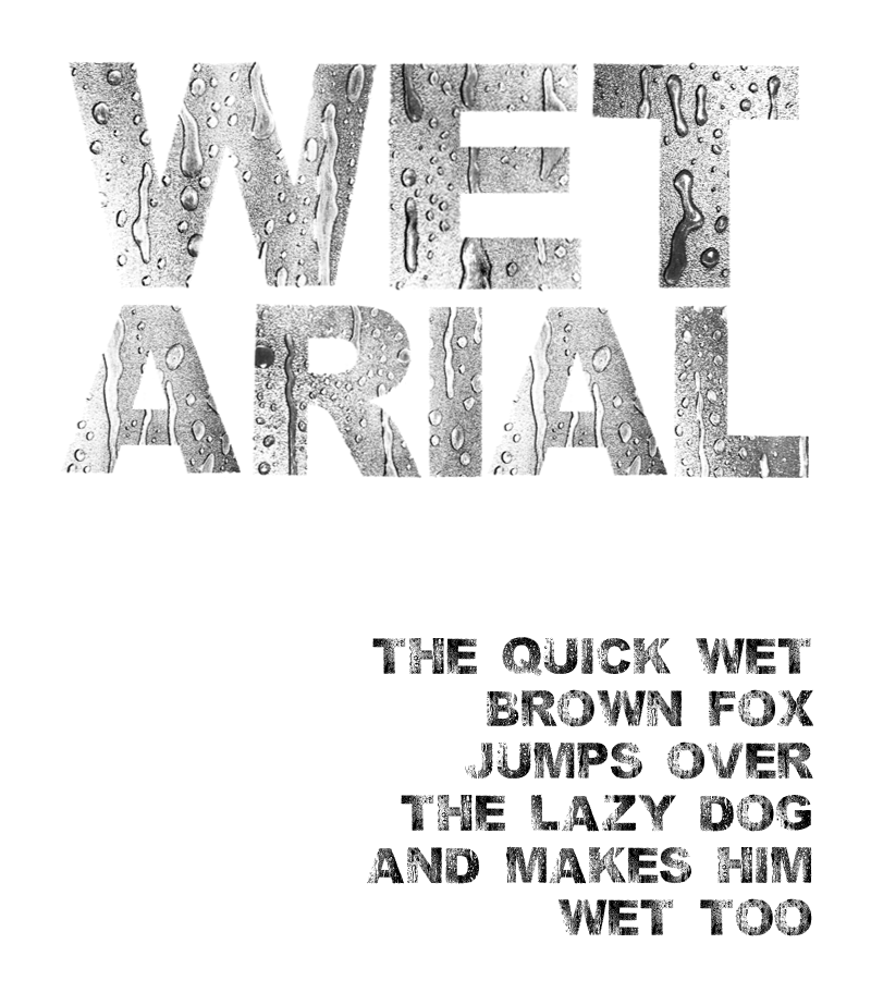
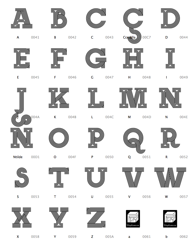
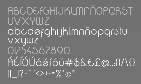
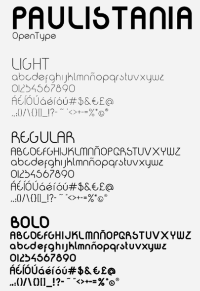
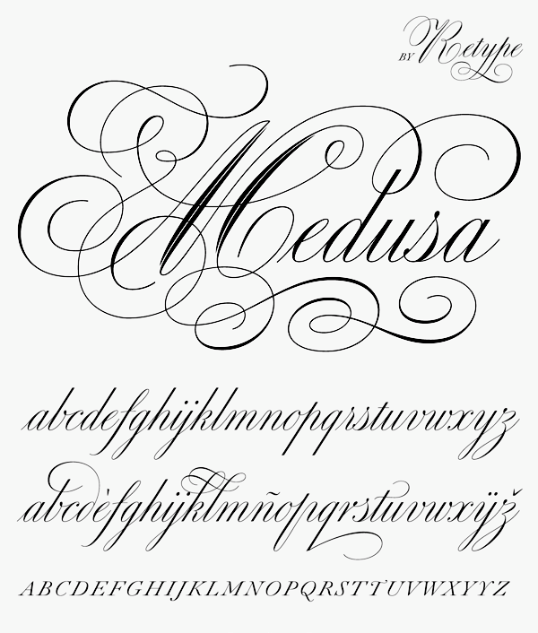
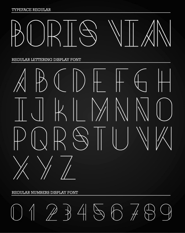
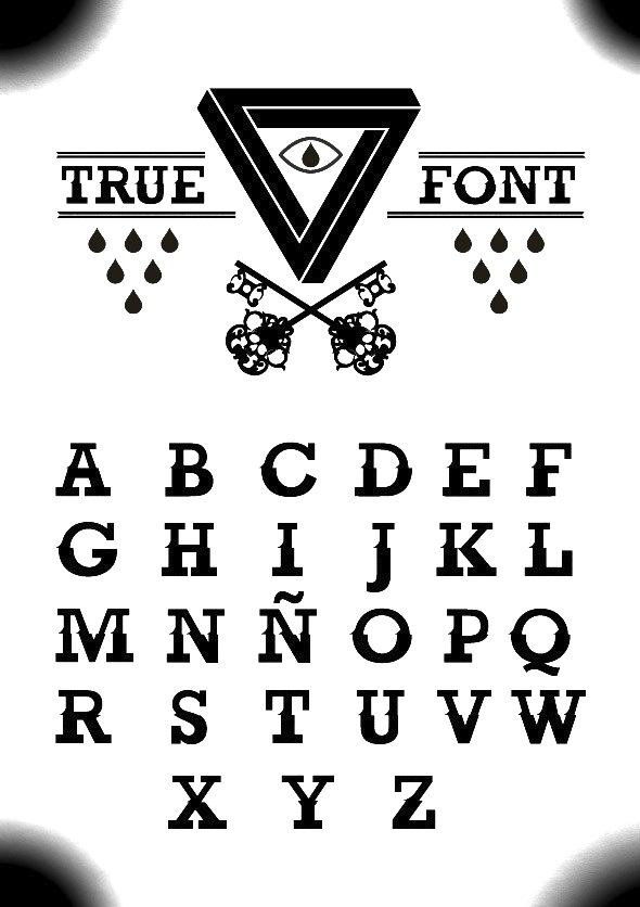
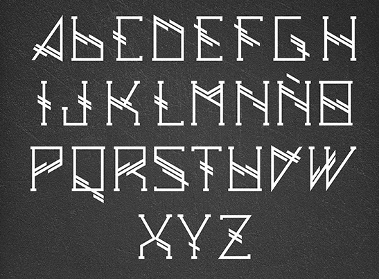
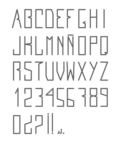
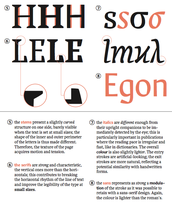
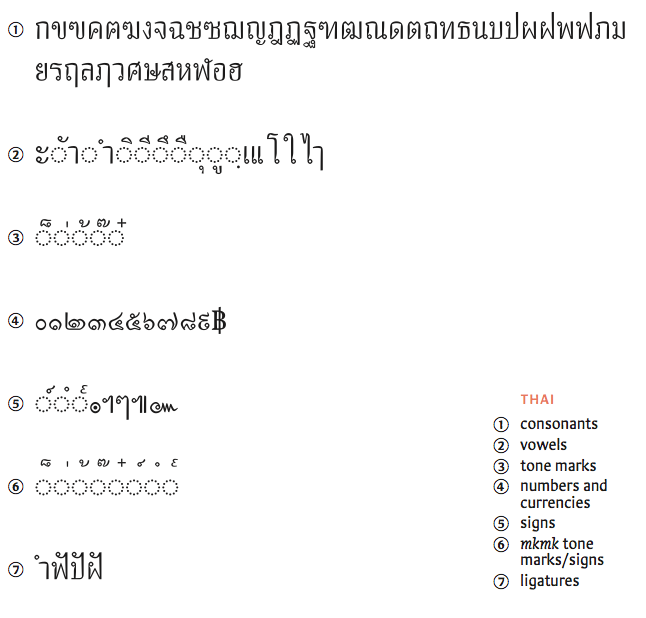
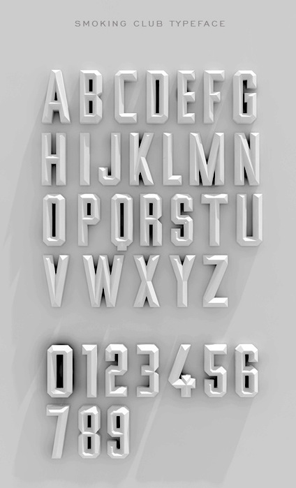
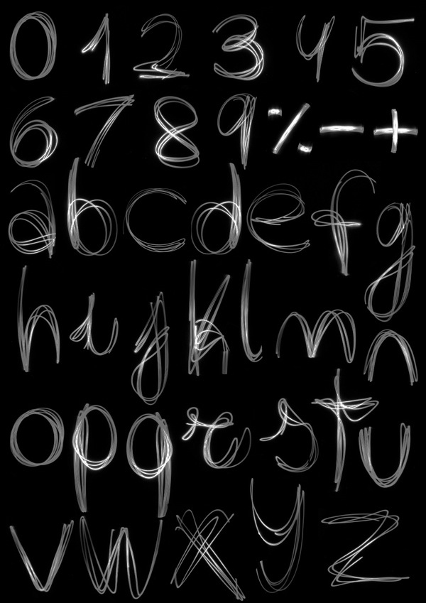
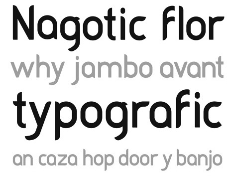
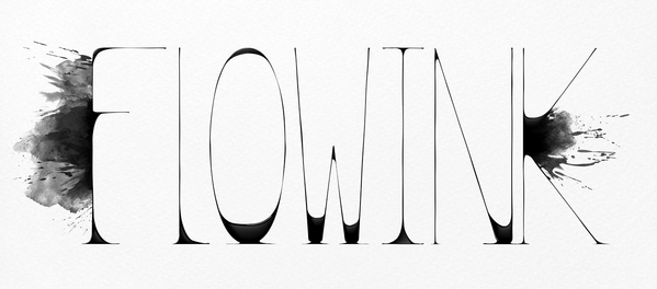
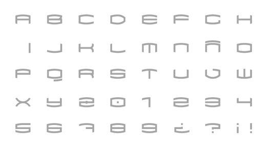
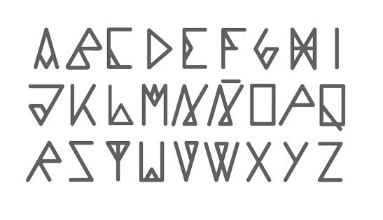
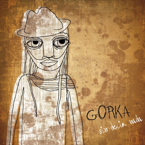
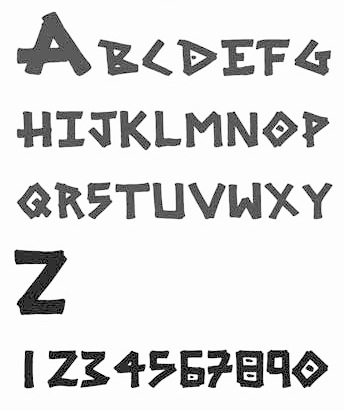
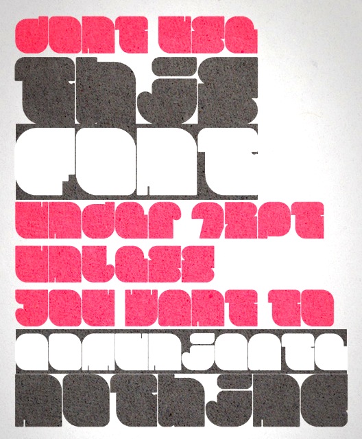
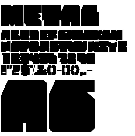
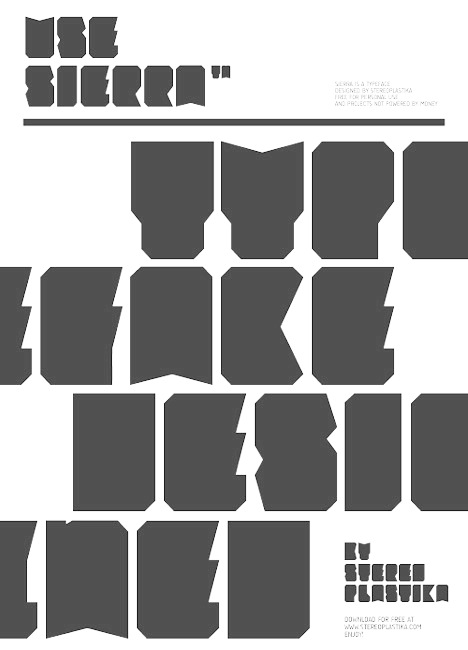
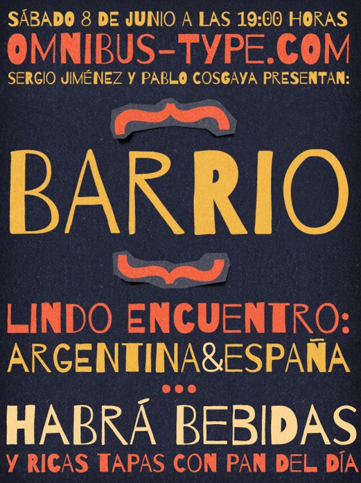
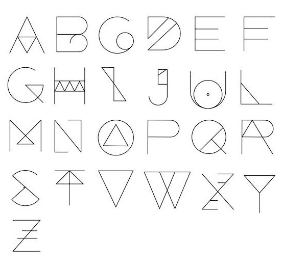
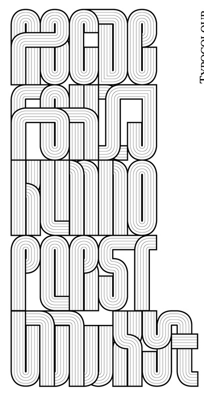
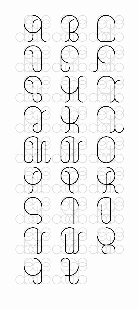
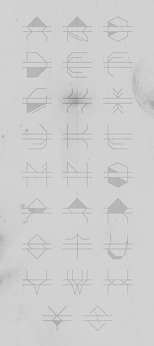
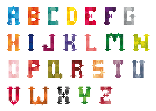
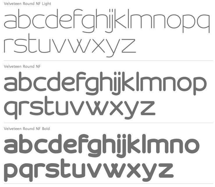
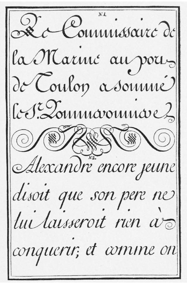
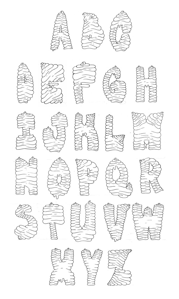
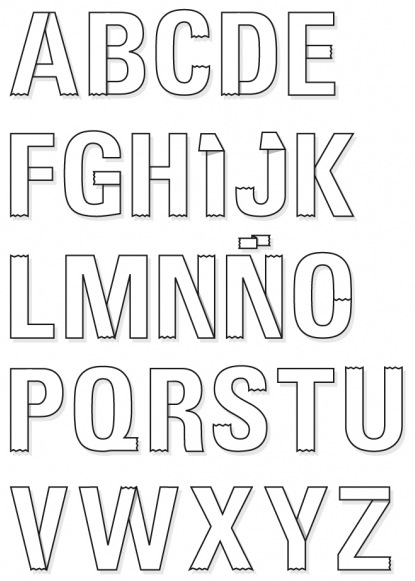
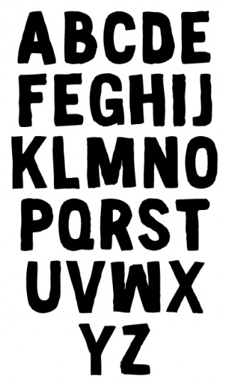
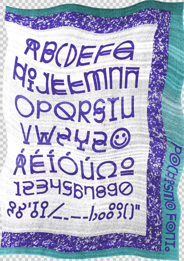
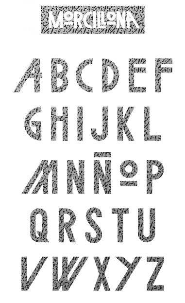
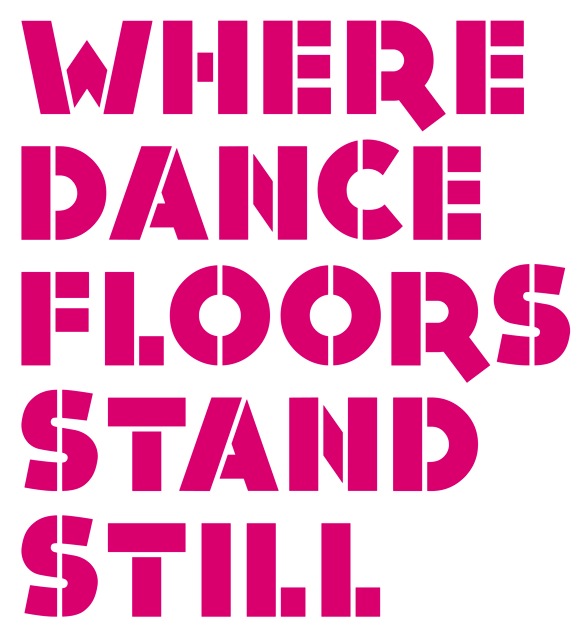
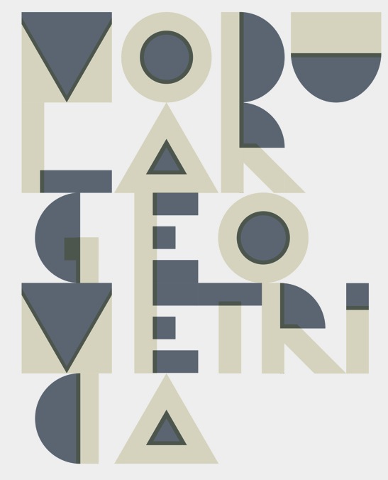
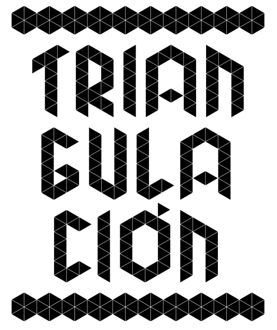
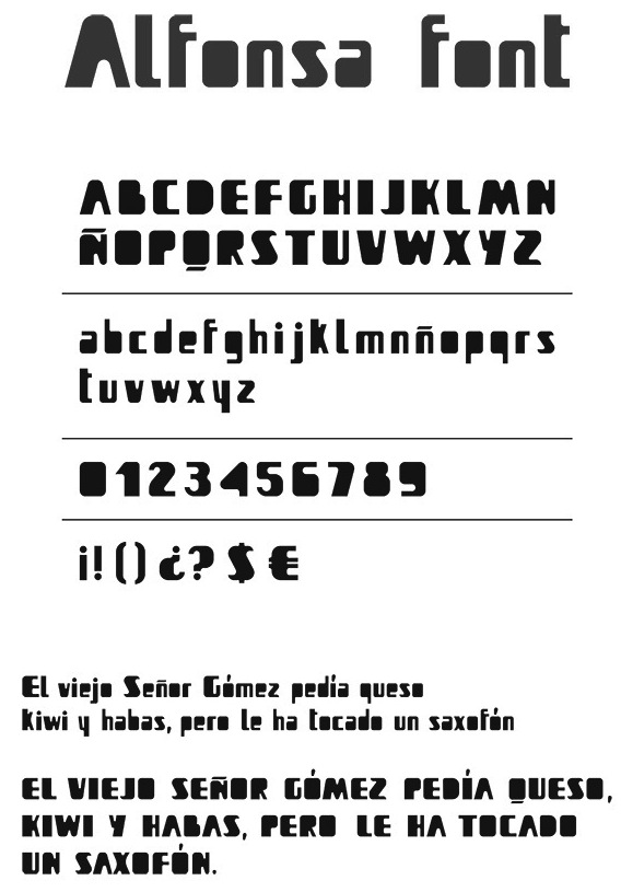
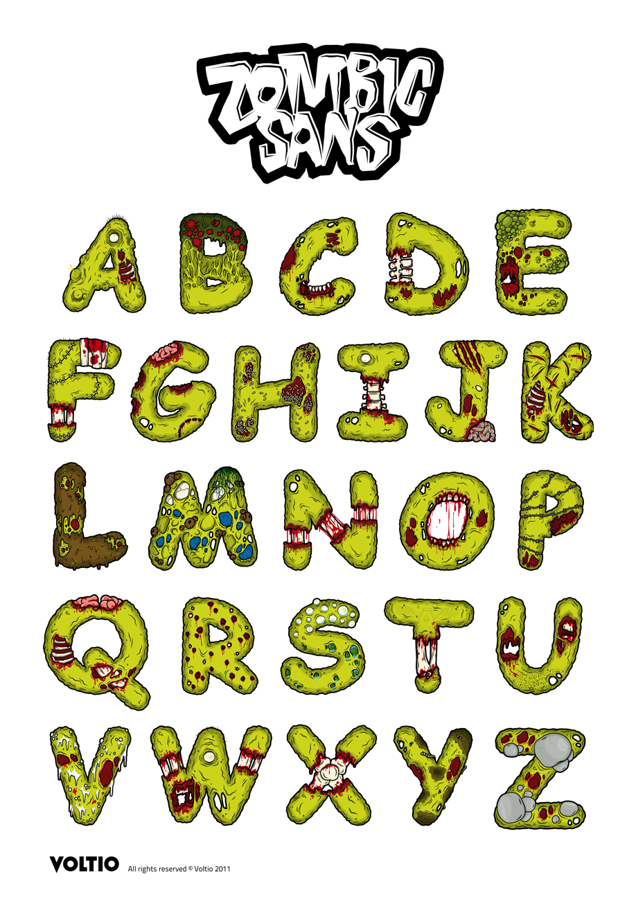
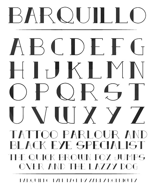
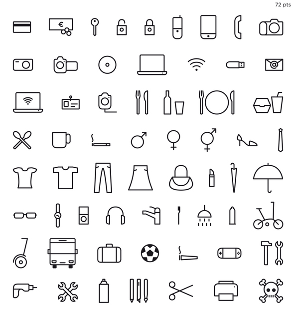
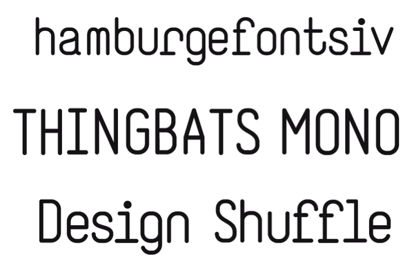
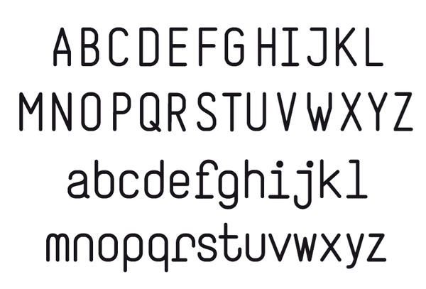
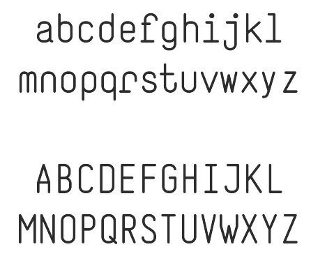
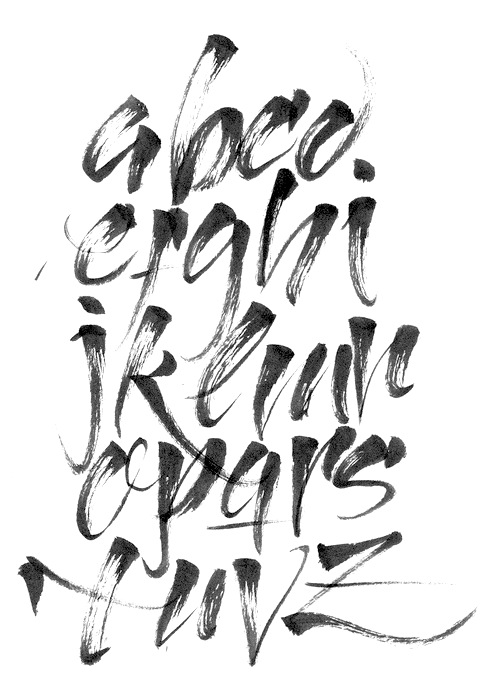
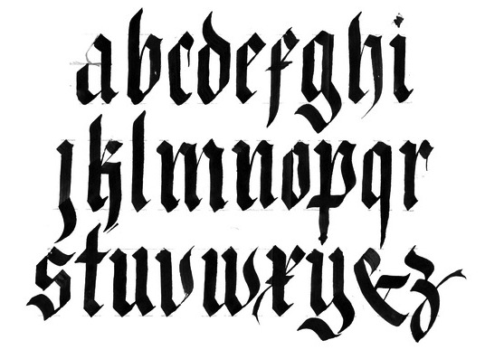
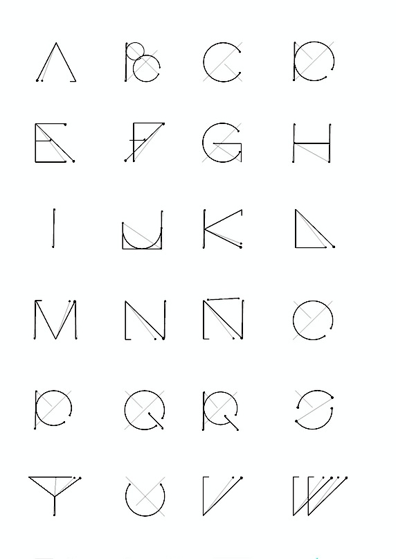
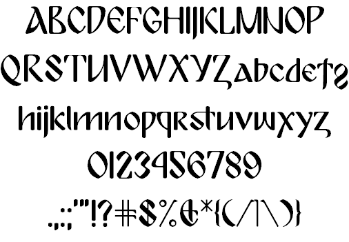
|
|
|
|