TYPE DESIGN INFORMATION PAGE last updated on Wed May 6 16:00:48 EDT 2026
FONT RECOGNITION VIA FONT MOOSE

|
|
|
|
|
Basque fonts | ||
|
|
|
|
SWITCH TO INDEX FILE
| |
A commercial Basque font at Agfa Monotype. [Google] [More] ⦿ | |
| |
Graphic designer in Bilbao, Spain. In 2017, Hamex Design (Bilbao, Spain), Teresa Bacelar, Laura Pajuelo, and Ainara Rodriguez co-designed a geometric solid typeface. [Google] [More] ⦿ | |
Graduate of the University of Irun, Spain. Auckland, New Zealand-based designer of the custom teardrop typeface Curia Tecnoparque (2017). Behance link. [Google] [More] ⦿ | |
Aka Alba GD, located in Vitoria-Gasteiz, Spain. During her studies at EASD Vitoria-Gasteiz in the heart of Basque country, Alba Gonzalez created the ball terminal typeface Isabella (2015). [Google] [More] ⦿ | |
Painter, sculptor and graphic designer, b. Madrid, 1942. He was commissioned in 2000 by the city of Bilbao to design a font with a Basque look. The result was Alfabeto Bilbao. Alternate URL with some of his paintings. Alfabeto Bilbao is free at Yo de Bilbao. [Google] [More] ⦿ | |
Behance link. Behance link for Feten Studio. Behance link for Sara Bautista. [Google] [More] ⦿ | |
Bilbao-based designer of the octagonal typeface Tangram (2015, with Kasper Rus). Aka Amaia con i. [Google] [More] ⦿ | |
| |
Basque type designer and lettering artist in Biarritz, France. Runs La Negresse there. [Google] [More] ⦿ | |
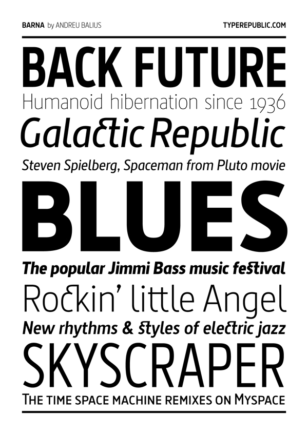
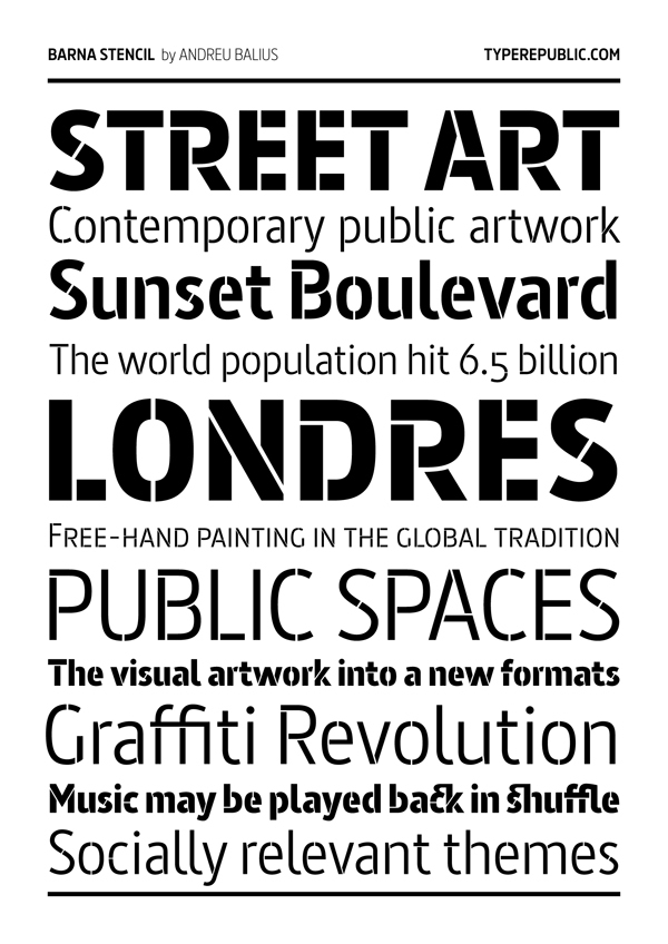
Andreu Balius Planelles
| |
Andy Benedek
| |
Graduate of ESDI in Barcelona. Now located in Vitoria-Gasteiz, Basque Country, Ane Irizar designed the pixelish typeface Siberian Gothic (2013) and the circle-based sans typeface Tita Round (2014). Behance link. [Google] [More] ⦿ | |
Ari Rafaeli
| |
| |
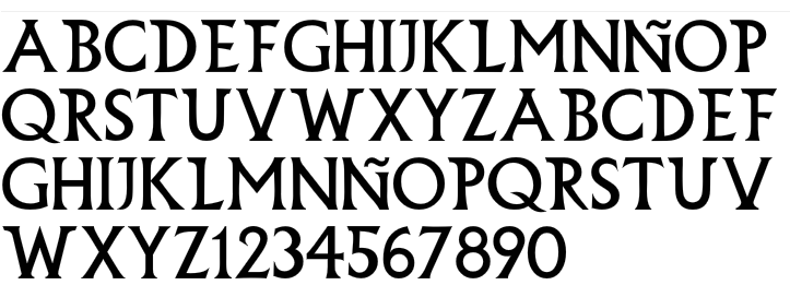
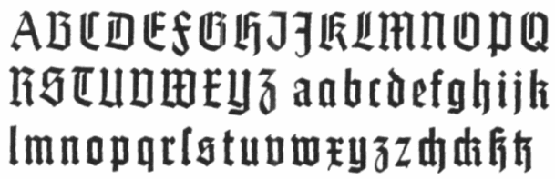
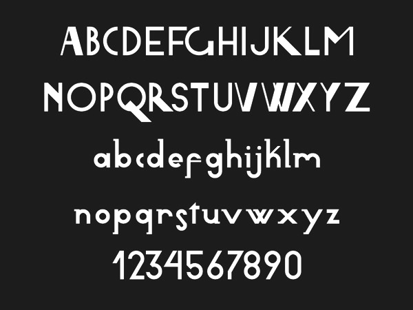
Illustration of the Basque alphabet, by P. and J. de Zabalo. [Google] [More] ⦿ | |
ARTypes
|
View the typefaces made by Ari Rafaeli / ARTypes. [Google] [MyFonts] [More] ⦿ |
Designer of Early Days (2003), a display font with Basque features, and Jenkins (2004, a sans). Ashton lives in Wanganui, New Zealand. [Google] [More] ⦿ | |
Vitoria-Gasteiz, Spain-based designer of the multiline typeface AG (2017). [Google] [More] ⦿ | |
Atelier Laia
|
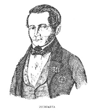
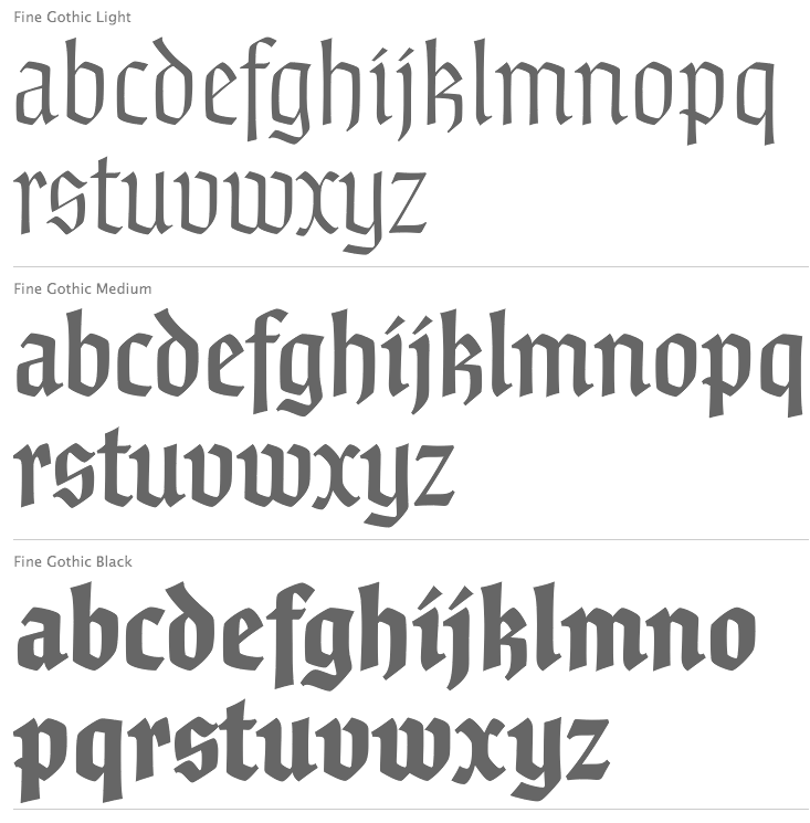
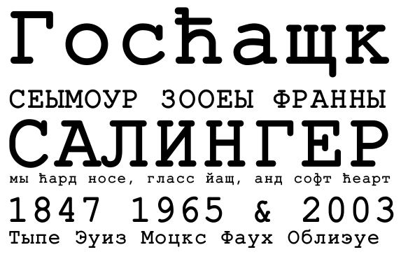
In 2013 Atelier Iaia published the calligraphic Iturzaeta-inspired typeface Lamia, a joint effort of Santos Bregaña, Julen Cano Linazasor and Maore Sagarzazu: The Lamia font is inspired by the work of the most famous calligrapher of the Basque Country, Jose Francisco de Iturzaeta Eizaguirre (Getaria, 1788-Madrid, 1853). His writing method was compulsory in Spanish schools since 1835. His "unpolished Spanish font" tried to be more effective than the more commercial English version by avoiding embellishments and excessive rear tearing. More akin with the liberal values imported by the French, his offerings sought uniformity, speed and efficiency to ensure that those in the less-favored echelons of society had an effective communication tool. From his "General collection of characters of European Letters" published in Madrid in 1833, we have chosen the "lower case pancilla reformed" represented in one of the prints. We have tried to reinterpret it by keeping its essence but also ensuring that it is viable for potential contemporary uses which, thanks to its good readability and effectiveness in longer texts, basically means as a decorative or display font. The upper case was generated using the lower case as a reference. Waskonia (2013, Santos Bregaña) is inspired by Basq gravestones from the 8th century. Earlier work of Santos Bregaña includes the Kai (Basque) typeface family (199701999, with Mikel Enparantza) at Garagefonts. FontShop link. Klingspor link. [Google] [MyFonts] [More] ⦿ |
Barmee.com (was: Czcionki.com, or: Barme Fonts)
|
Font list (with repetitions): 4Mini, BarmeReczny, Elementarz, Fiesta, GotykPoszarpany, GrubaBerta, Hieroglify, KeiserSousa, Kobajashi, Kwadryga, Magda, Manifest-Niski, Manifest, MaszynaAEG, MiniMasa, MiniSet, MiniSter, Nerwus, Nokian, Nokian2, Opeln2001-Prosty, Opeln2001, Opeln2001Szeroki, Pascal, Passja, Premiership, RecycleIt, Sandwich, SecesjaPL, Szablon, Wabene, Xar, Zakret, MiniForma, MiniStrzalki, Miniline, Minitot, Ulisson, Astalamet (2002), Gosford (2002), Volan (2002), Establo, QuatronFat, Infantyl (2002), Quatron (2002), YnduFat (2002), YnduOut (2002). URL not accessible to my browser (Mac+Firefox). This site carried these fonts in May 2008: 4Mini, Afarat-ibn-Blady, Astalamet, AstalametPure, BarmeReczny, Cyree, DorBlue, ElementarzDwa, Erton, Establo, EstabloFat, Fiesta, Gosford, GotykPoszarpany, GrubaBerta, Hieroglify, HongKong (oriental simulation), Infantyl, InfantylFat, InfantylItalic, InfantylOut, Jiczyn, KeiserSousa, Kobajashi, Komix, Kwadryga, Lola, Magda, Manifest-Niski, Manifest, MaszynaAEG, MaszynaRoyalDark, MaszynaRoyalLight, MiniBet, MiniForma2, MiniJasc, MiniKongo, MiniLine2, MiniMasa, MiniQuan, MiniQuanMniejszy, MiniSet2, MiniSter, MiniStrzalki, MiniTot, Nerwus, Nokian, Nokian2, Opeln2001-Prosty, Opeln2001, Opeln2001Szeroki-Metro, Opeln2001Szeroki, Pascal, Paskowy, Passja, Quatron, QuatronFat, RecycleIt, Sandwich, SecesjaPL, Sloneczko, Szablon, Tabun, TechnicznaPomoc-Italic, TechnicznaPomoc, TechnicznaPomocRound, Ulisson, Vaderiii, Volan, Wabene, Xar. In 2011, he established the commercial foundry GRIN3. Dafont link. Klingspor link. Fontspace link. GRIN3 link. Old free font URL. Showcase of Bartek Nowak's commercial fonts. [Google] [MyFonts] [More] ⦿ |
Bartek Nowak
| |
List of addresses of Basque type designers, Thierry Arsaut, Ramuntxo Partarrieu, Pierre Lamaison, André Housset and Jacques Gourdon. [Google] [More] ⦿ | |
Free Basque fonts Vasca_Berria_TT (caps only) and Basque Country 2.0. [Google] [More] ⦿ | |
Designer, b. Bilbao, 1987, who graduated in 2010 with a degree in Fine Arts and a specialty in Graphic Design from the University of the Basque Country. She also obtained a Masters degree in typography from the University of Barcelona. She created La Botica de Bernarda (2012, a retro display face). That typeface was co-designed with Mariana Alvarez Matijasevic. Other type designs by Begoña include Bambola Script, which was created in Ricardo Rousselot's studio called Gruppo Erre. [Google] [More] ⦿ | |
Ben Noe
| |
Ben Noe Studio
|
|
Blancoletters
|
For his graduation work in the Masters of Type Design program of the University of Reading, Juan Luis Blanco (Spain) created the Latin, Greek, Cyrillic, Tifinagh, Arabic typeface family Amaikha (2014). Amaikha is characterized by Latin warmth and roundness. A list of his typefaces:
Speaker at ATypI 2016 in Warsaw on A Typographic Maghribi Trialogue. In this talk, he explains, together with Laura Meseguer and Krystian Sarkis, the Typographic Matchmaking in the Maghrib project of the Khatt Foundation, which tries to facilitate a cultural trialogue as well as shed a typographic spotlight on the largely ignored region of the Maghreb in terms of writing and design traditions. The specific goal of the collaboration is the research and development of tri-script font families (for Latin, Arabic and Tifinagh) that can communicate harmoniously. [Google] [MyFonts] [More] ⦿ |
A Basque design magazine, with a subpage on Basque fonts. [Google] [More] ⦿ | |
Chris Coombes (UK) made these typefaces:
| |
Santander, Spain-based designer of the decorative poster typeface Lemon (2021). [Google] [More] ⦿ | |
In 2013, he designed the text typeface Adela. Home page. Behance link. [Google] [More] ⦿ | |
Vitoria-Gasteiz, Spain-based designer of the wayfinding sans typeface New Bilbo (2017). [Google] [More] ⦿ | |
Bilbao-based designer of the display sans typeface Tangent (2015). [Google] [More] ⦿ | |
Professor of typography at the Faculdad de Bellas Artes (FBA) of the Universidad del Pais Vasco (UPV) in Bilbao. Eduardo Herrera and Leire Fernández (a colleague at FBA UPV) developed a Bastarda based on work of Juan de Yciar. They wrote about it in Recuperación y digitalización de la letra bastarda de Juan de Yciar (GFM Grafema, No. 1, April 2009). [Google] [More] ⦿ | |
Designer of the freeware font Moneta. It looks Basque to me, but the author says: "This font is based on the lettering of early medieval and particularly Saxon hand - stamped coinage." [Google] [More] ⦿ | |
Graphic designer in Donostia-San Sebastian, Spain. Behance link. In 2011, he created for his graduation a typeface called Aulestika Neue. [Google] [More] ⦿ | |
Ekhiñe Dominguez studied Audiovisual Communication at The University of the Basque Country (2005-2009) and Aarhus University (2007-2008). Upon graduation she moved to Barcelona where she obtained a Masters in Film Art Direction at The Film and Audiovisual School of Catalonia (ESCAC) and Graphic Design at Bau School of Design. Creator of Lau (2012, a geometric typeface used for designing shelves), Caro (2012, a geometric typeface renamed Hiru in 2013) and AHO (2012, a modular typeface inspired by Wim Crouwel). [Google] [More] ⦿ | |
| |
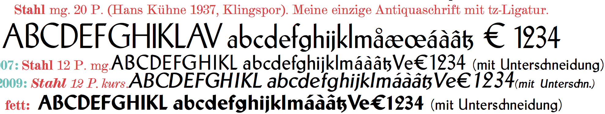
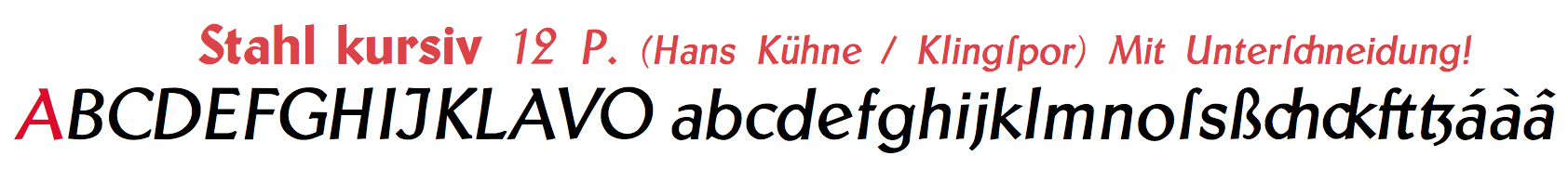
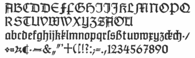
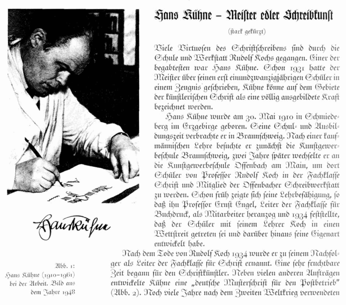
German type designer (b. 1910, Schmiedeberg-d. 1961, Hamburg), who, after studies in Offenbach under Rudolf Koch and Ernst Engel, became a soldier in 1939. After the war, he became a freelance graphic designer in Hamburg, where he also taught at Werbefachschule Hamburg. Wolfgang Hendlmeier summarized his contributions in 1985. His typefaces include:
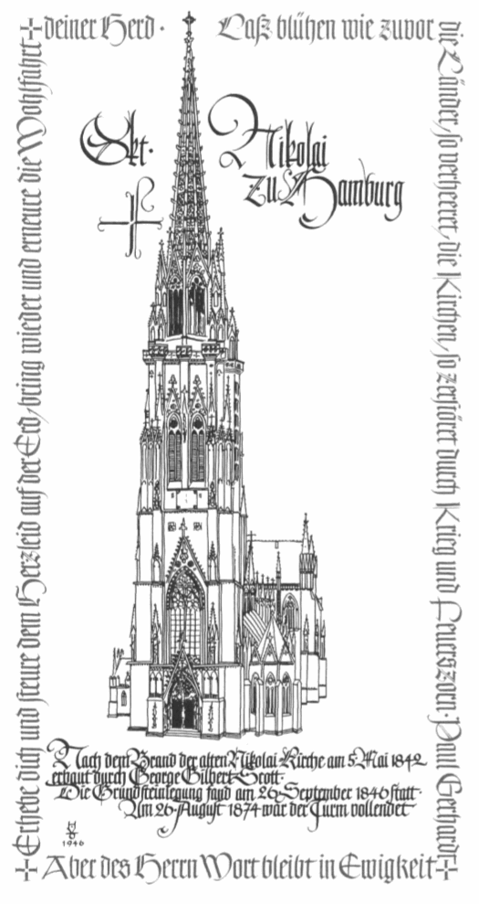
Other material: Logos done by him. Brief German biography. A famous poster of the Nikolaikirche in Hamburg. Picture. [Google] [More] ⦿ | |
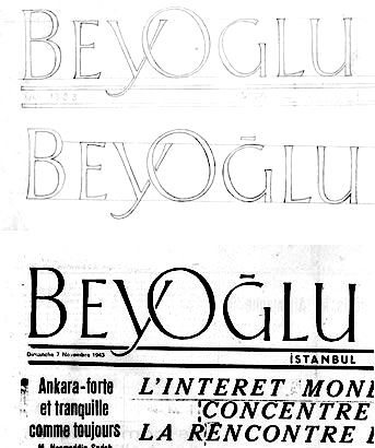
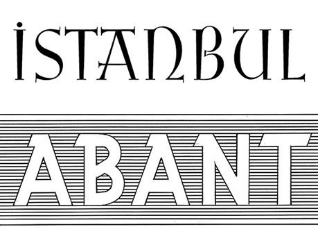
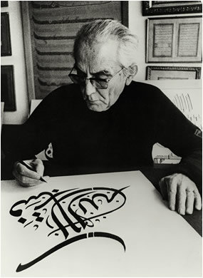
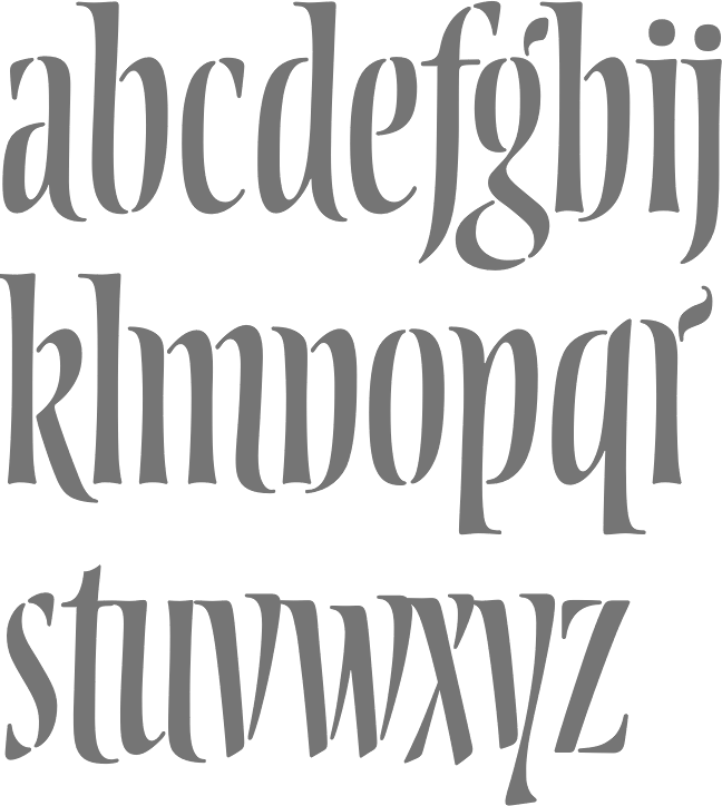
Turkish graphic and type designer, and calligrapher of both Latin and Arabic. He lived from 1913 until 1987. His calligraphy has led to some fine alphabets, including a blackletter and a flared Basque alphabet. Picture. Bio (in Turkish). [Google] [More] ⦿ | |
Vitoria-Gasteiz, Spain-based designer of the handcrafted typeface Rigobertus (2015) and the blackboard bold typeface Elena (2015). [Google] [More] ⦿ | |
Basque designer from San Sebastian who created a Basque typeface for the Euskadi company in 2006. [Google] [More] ⦿ | |
Typeface designer and calligrapher from New York City, where he worked at Mucca and studied typeface design at The Cooper Union's Type@Cooper Extended Program. Graduate of the Type Media program at KABK in Den Haag, The Netherlands, class of 2019. Presently located in Berlin. His typefaces:
Future Fonts link. [Google] [More] ⦿ | |
Typefaces from 2020: Flat, Eve (a monolinear script). FontStruct link. [Google] [MyFonts] [More] ⦿ | |
Euskara Typeface Box
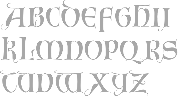
| Basque font company headed by Thierry Arsaut from Biarritz, France. Sells about 12 Basque typefaces. Has a history of Basque letters. Thierry Arsaut designed the commercial Basque typefaces Koldaka (2002), Sculpturas, Euskara Classic, Euskara Emakhor, Euskara Etxeak, Euskara Old, Euskara Ferrus, Euskara Gernika, Euskara Haritzaga, Euskara Irouleguia, Euskara Karako, Euskara Kaxko, Euskara Kutxas (farm dingbats), Euskara Moderna, Euskara Ostoa (with Ramuntxo Partarrieu), Euskara Eskultura. His typefaces can be bought here. Basque Classic is discussed here. [Google] [More] ⦿ |
Filip Karaga
| |
Font Factory
|
|
Spanish language site for various non-Latin language fonts. A sampling: Afus Deg Wfus 2 (for Berber), AlKatib1 (2001, an Arabic typeface by Naseem Amjad), Albanian, Alice_0 (Lao typeface by by Ngakham Southichack), LAOMAY_5 CHAREUNSILP (Lao typeface by by Soupasith Bouahom), Arial AMU (1999, Armenian typeface by Ruben Tarumian), BaltFrutigerLight, BaltHelveticaMedium, BaltNewCenturySchoolbookMedium, BaltOptimaMedium, BaltTiffanyMedium, BaltUniversityMedium, CarloAtor (1997, Arabic family by Timm Erickson, Summer Institute of Linguistics), Caligraf-W, Ciula (1996, a Romanian typeface by Paul Hodor), Cursiv (Romanian), AnlongvillKhek, GabrialAtor (another Arab family by Timm Erickson), Gin, Greek (1993, by Peter J. Gentry&Andrew M. Fountain), HandSign (1993, Sam Wang), HFMassisShantNUnicode (1990-1994, an Armenian unicode typeface by BYTEC Computers and Massis Graphics), HONGKAD (1994, a family by Dr. Hongkad Souvannavong), IsmarBold, IsmarLight, Lakshmi, X000000A (1994, a lao typeface by Sith Bouahom), LAOMAY_2-CHAREUNSILP, Alice3Medium, Alice0Medium, Langagedessignes (1998, by Philippe and François Blondel), NorKirk (1997, a great Armenian typeface by Ruben Tarumian), NovaTempo (for Esperanto), Pazmaveb (for Armenian), ILPRumanianB100 (1996, by Charles J. Coker), Saysettha-Lao, Saysettha-LaoBold, SenzorgaAnhok, Timok, Tribuno, Turn-W, TimesUnicode, ArialAMU, PoliceTypeAPI (for Armenian), Cieszyn-Regular, PoojaNormal, Shibolet (1995, Hebrew), Shree-Ass-0552 (2000, by Modular InfoTech), Tudor-Semi-Lite, Webdunia, TimesNRCzech, TNRLiboriusVII (2001, a fully accented Times typeface by Libor Sztemon), GreatMoravia (2001 Libor Sztemon, Czechia), Johaansi-ye-Peyravi (2001, a full accent blackletter typeface by Libor Sztemon, Czechia), TimesNREuskaraEuransiEsperanto (2001, Libor Sztemon). [Google] [More] ⦿ | |
Vitoria-Gasteiz, Spain-based designer of the open (blackboard bold, bilined) typeface Elena (2015). [Google] [More] ⦿ | |
In 2017, Hamex Design (Bilbao, Spain), Teresa Bacelar, Laura Pajuelo, and Ainara Rodriguez co-designed a geometric solid typeface. [Google] [More] ⦿ | |
Graduate of the Universidade Federal de Pernambuco, Brazil, class of 2013. As an exchange student at Universidad del Pais Vasco in Leiao, Bilbao, Spain-based Hannah Sa designed the pixel typeface Alma Terix Down (2016, FontStruct). She also made the striking display typeface Gandaya (2016). Behance link. [Google] [More] ⦿ | |
Designer of the Basque style typeface Bilboboum, the sans typeface family Viparis (2015) and the wide Peignotian display sans typeface La Saumuroise (2015). At Production Type, assisted by Hugues Gentile, she published PVC (2019): PVC is a rambunctious display sans that plays at the edges of width and weight. As those in the plumbing industry know, PVC stands for polyvinyl chloride, but most of us know about PVC because of the pipes and other objects that are made of the hard, plastic polymer. PVC is kind of a wonder plastic, because it is both extremely durable and incredibly versatile. Which is actually a great way to describe PVC, the typeface: the family includes four super-varied styles (Menu, Promo, Banner, and Banner Ultra), all of which share a hearty backbone while flaunting very different shapes. Other typefaces include MahJ (2015: on commission for the musée d'art et d'histoire du Judaisme, and art directed by Malou Verlomme), WNBA (2019: a sports fonts produced with the Production Type team of Hugues Gentile and Marion Sendral, for the WNBA). [Google] [More] ⦿ | |
| |
Helen Rice
| |
Hernán Ordoñez
| |
Based in Vitoria, Spain, Hollmed created the free octagonal typeface Delta in 2015. In 2013, he created a nice set of posters called La Tipoteca to survey the typographic terms in Spanish. [Google] [More] ⦿ | |
During their studies at EASD Vitoria-Gasteiz ADGE, Irati Sagasta (Elorrio,Spain), Salvia Perez San Jose (Vitoria-Gasteiz, Spain) and Iara Aguiriano Hidalgo (Vitoria-Gasteiz, Spain) designed the modular typefaces Filetto (2017) and Iwik (2017). [Google] [More] ⦿ | |
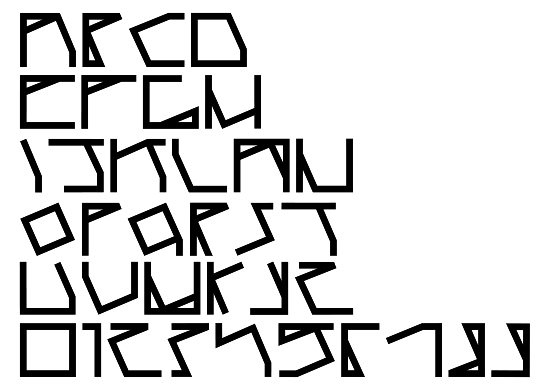
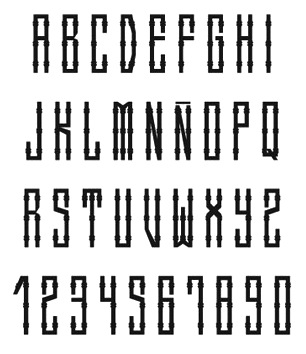
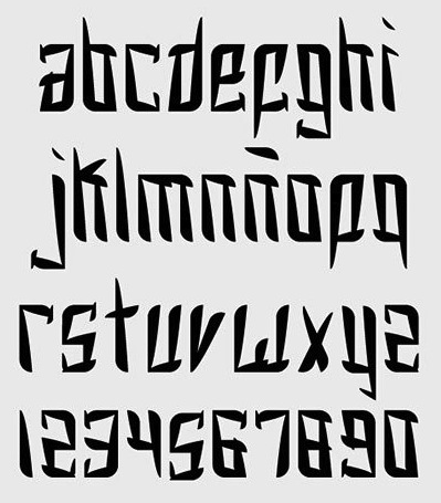
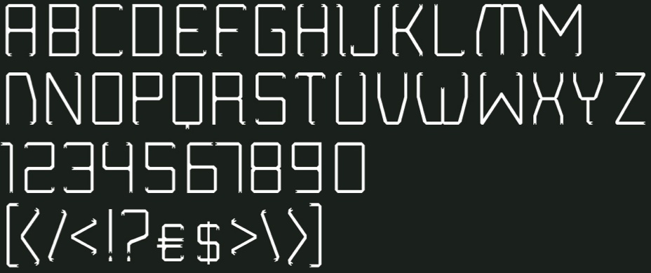
Basque designer located in San Sebastian, Spain. Creator of Lineados (2013, a sans typeface with curly terminals), and Blackletter Typeface (2013, an octagonal font). [Google] [More] ⦿ | |
Designer of the free Basque typeface Vasca (1995). Download. [Google] [More] ⦿ | |
Creator of the Basque look typeface Euskal (2000). Old URL. Dafont link. [Google] [More] ⦿ | |
During their studies at EASD Vitoria-Gasteiz ADGE, Irati Sagasta (Elorrio,Spain), Salvia Perez San Jose (Vitoria-Gasteiz, Spain) and Iara Aguiriano Hidalgo (Vitoria-Gasteiz, Spain) designed the modular typefaces Filetto (2017) and Iwik (2017). [Google] [More] ⦿ | |
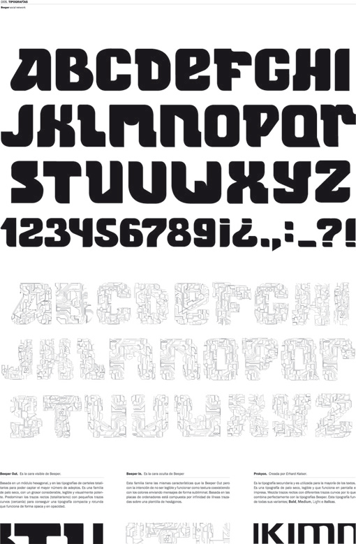
Creator of Ligaduras Duras (2012, an experiment in ligatures) and the modular typeface Beeper (2012). Jabier is a graphic designer in Donostia-San Sebastian. [Google] [More] ⦿ | |
Basque lettering artist in Biarritz, France. [Google] [More] ⦿ | |
In 2013, Joan Barjau published the cartoonish typeface family Sniff, which he first created in 1995. He writes: Joan Barjau used the pseudonym Sniff while working as a cartoonist for the Spanish satirical magazine El Papus, and Sniff is also the typeface based on the style of lettering he used for the balloons. FontShop link. MyFonts link. Klingspor link. [Google] [MyFonts] [More] ⦿ | |
Jordi Manero Pascual
| |
Author of Arte de escribir la letra bastarda española (1827). The second edition, dated 1835, was published by Imprenta de don A. Mateis Muñoz in Madrid. Local download of that book. [Google] [More] ⦿ | |
Graphic designer in Elorrio, Basque country. Together with Gotzon Garaizabal, he made the brush typeface Zu Zarautz (2013). It was developed specifically for Debolex films for use in their film series that centres around the people of the coastal Basque town of Zarautz. Angel Brotxa (2013) is a free brush script typeface by them. Behance link. Dafont link. [Google] [More] ⦿ | |
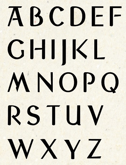
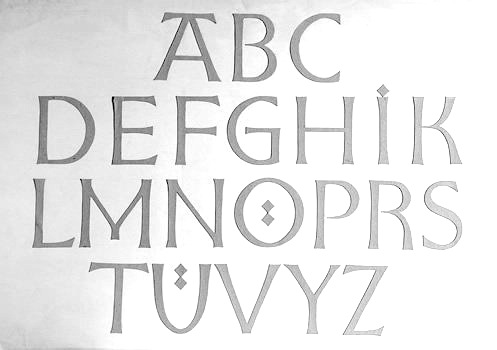
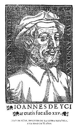
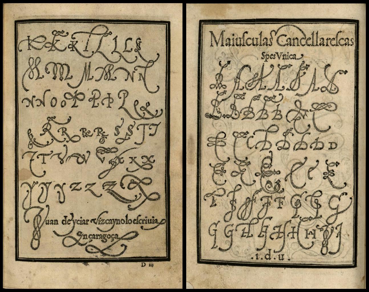
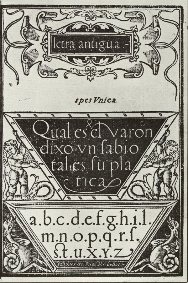
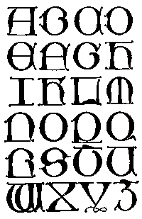
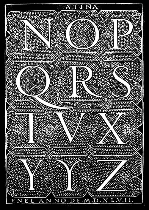
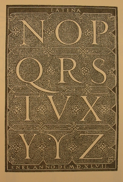
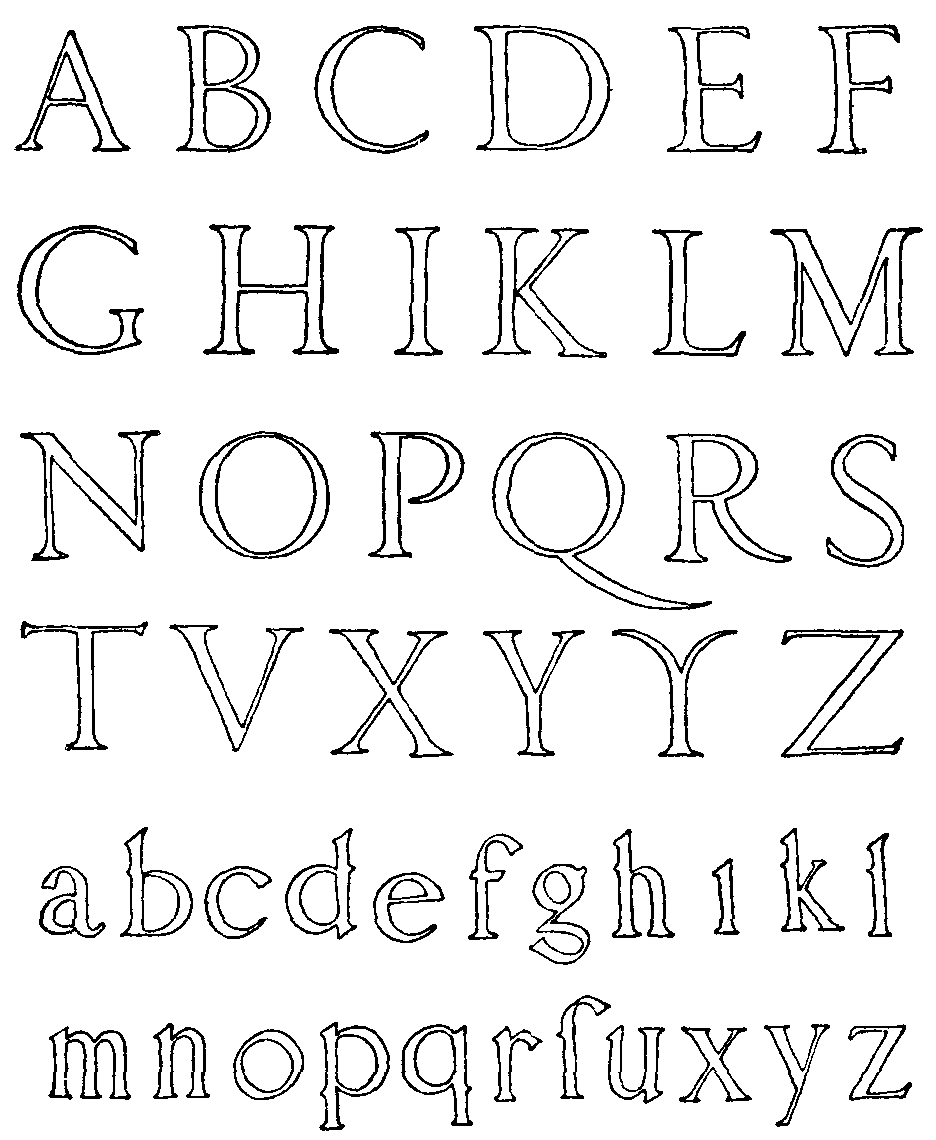
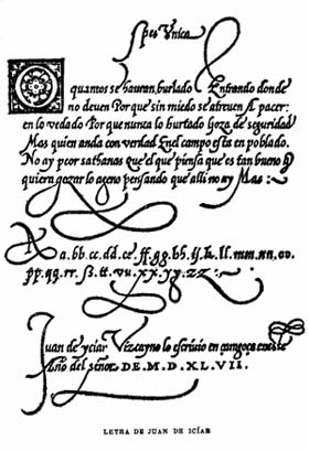
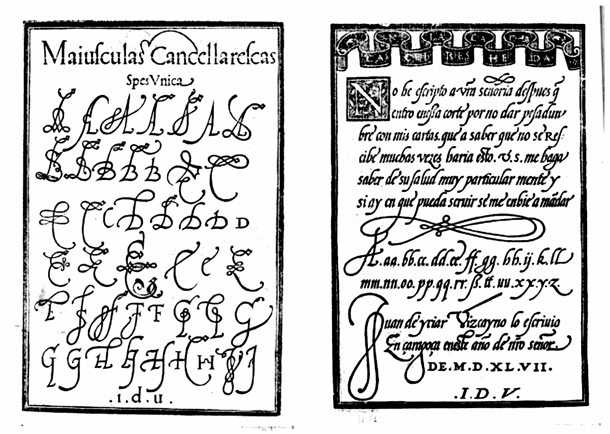
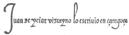
Image of Spanish gothic capitals (1550). He published Recopilación subtillísima intitulada Orthographia Practica in 1547-1548 (Zaragoza), the first writing manual in Spain. He also published Arte Subtilissima por la cual se enseña a escribir perfectamente in 1548 (8 editions from 1548 to 1566). Recopilación subtillísima intitulada Orthographia Practica was republished in 2003 by Jakider. From that book, his beautiful Latina initial caps. Scan of his Spanish renaissance alphabet, other alphabets, Ave Maria (1548, from Arte Subtilissima), chancery hand, and Cancellaresca gruesca (1548). Biblioteca complutense de Madrid has images on-line. [Google] [More] ⦿ | |
Juan Luis Blanco
| |
Codesigner with Santos Bregaña and Maore Sagarzazu of the calligraphic typeface Lamia (2013, Atelier Laia, Basque country), which is based on Jose Francisco de Iturzaeta Eizaguirre's "lower case pancilla reformed" found in General collection of characters of European Letters (1833, Madrid). [Google] [MyFonts] [More] ⦿ | |
Vitoria-Gasteiz, Spain-based designer of the thin display typeface Iparralde (2015). [Google] [More] ⦿ | |
Santurtzi, Spain-based designer of the octagonal modular typeface Bilbao (2015, with Amaia Martinez). [Google] [More] ⦿ | |
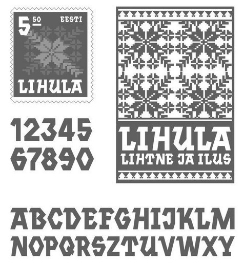
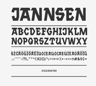
Estonian designer who made a Basque / slab serif face in 2011. In 2013, she created the tweetware font Jannsen and was located in San Francisco. Devian Tart link. Behance link. Dafont link. [Google] [More] ⦿ | |
Kunsthal
| Design school in Irun, in the Basque country. One of the typography teachers is Hernán Ordoñez, who occasionally offers type design workshops. [Google] [More] ⦿ |
Graphic designer in Barakaldo, Spain. In 2017, Hamex Design (Bilbao, Spain), Teresa Bacelar, Laura Pajuelo, and Ainara Rodriguez co-designed a geometric solid typeface. [Google] [More] ⦿ | |
Bilbao, Spain-based designer of a modular typeface in 2016. [Google] [More] ⦿ | |
Bilbao, Spain-based designer of the straight-edged typeface Luc (2018). [Google] [More] ⦿ | |
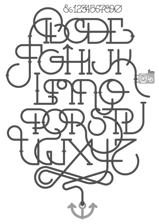
The independent design studio Loideo Graphic Design (Irun, near San Sebastian, Basque Country) designed the broad typeface family Basque LD in 2014. Behance link. [Google] [More] ⦿ | |
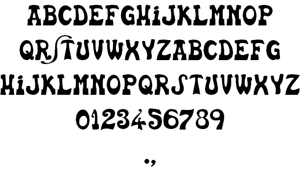
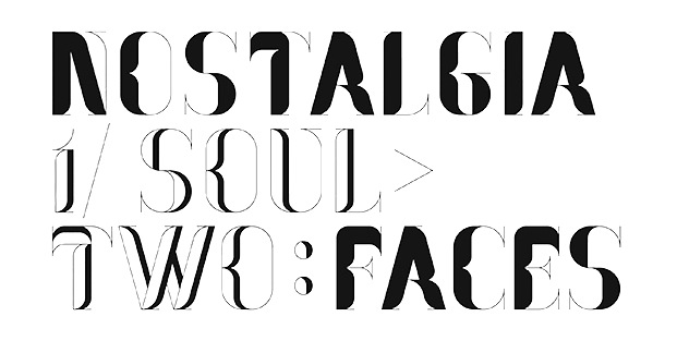
Designer of Pleasant Despair (2002), Bad Future (2002), the decorative didone typeface Nostalgia (2005), the Basque lettering font Basca (2001), Mestral (2001, an artsy tall freeware font) and Passeig A and B (2002). Dafont link. [Google] [More] ⦿ | |
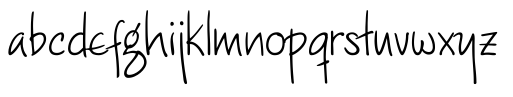
Maarziin (Marina) is from Donostia, near San Sebastian. She made the child handwriting font Maarziin (2008). [Google] [More] ⦿ | |
MacCampus
| Europe's largest independent foreign language font developer for the Macintosh, which is directed by Sebastian Kempgen from Germany. Fonts include: Western Languages (CoreFont series), Eastern Europe (CE-Font series), Cyrillic (Professional series: RomanCyrillic Pro, Ladoga Pro etc. (text fonts); DEsign fonts: Faktor, Inessa Cyr etc. (headline, handwriting); Olliffe Fonts: Batumi, Schechtel, Russian Open (display type; example: Mashinka); Scientific Cyrillic (includes old orthography, accents, old characters); Old Church Slavonic (Cyrillic and Glagolitic, Square and Round); Non-Slavic Cyrillic: Roman CyrTurk, Ladoga CyrTurk), Greek (Modern Greek and Classical Greek (Agora and Parmenides)), Icelandic&Faeroese (PolarFont series), Irish&Welsh (Gaelic, Celtic in the CeltoFont series), Romanian (DacoFont series), Turkish (TurkoFont series), BalkanFont series (Hungarian, Romanian, Turkish, Azerbaijani, Maltese), Basque (BaskoFont series), Saami (SamoFont series), Georgian, Armenian, Coptic (such as the Pachomius font), Cuneiform, Sabean, SinoFont series for Vietnamese plus more or Chinese (Pinyin) transliteration, phonetic Fonts (Trubetzkoy&Phonetica), Transliteration Fonts. Some of its fonts (like Campus Ten/Twelve and Magister Book) are now sold through Agfa/Monotype. Names of some fonts: Breitkopf Fraktur, Campus Sans, CampusRoman Pro, CampusSans Block, Dareios, Faktor, Glagol Pro, Inessa, Konkret, Kronstadt, Marib, Method, Moskva Pro, Parmenides, Polar, Retrograd, Saames, Tafelkreide, Tatlin, Thule, Trubetzkoy. [Google] [More] ⦿ |
Iratxe de la Torre, Jon Anguloa and Maider Sorasu (Valencia, Spain) co-designed the Basque typeface Aintzina in 2013. Behance link. A URL for their photographer / collaborator, Juanjo Sagi. [Google] [More] ⦿ | |
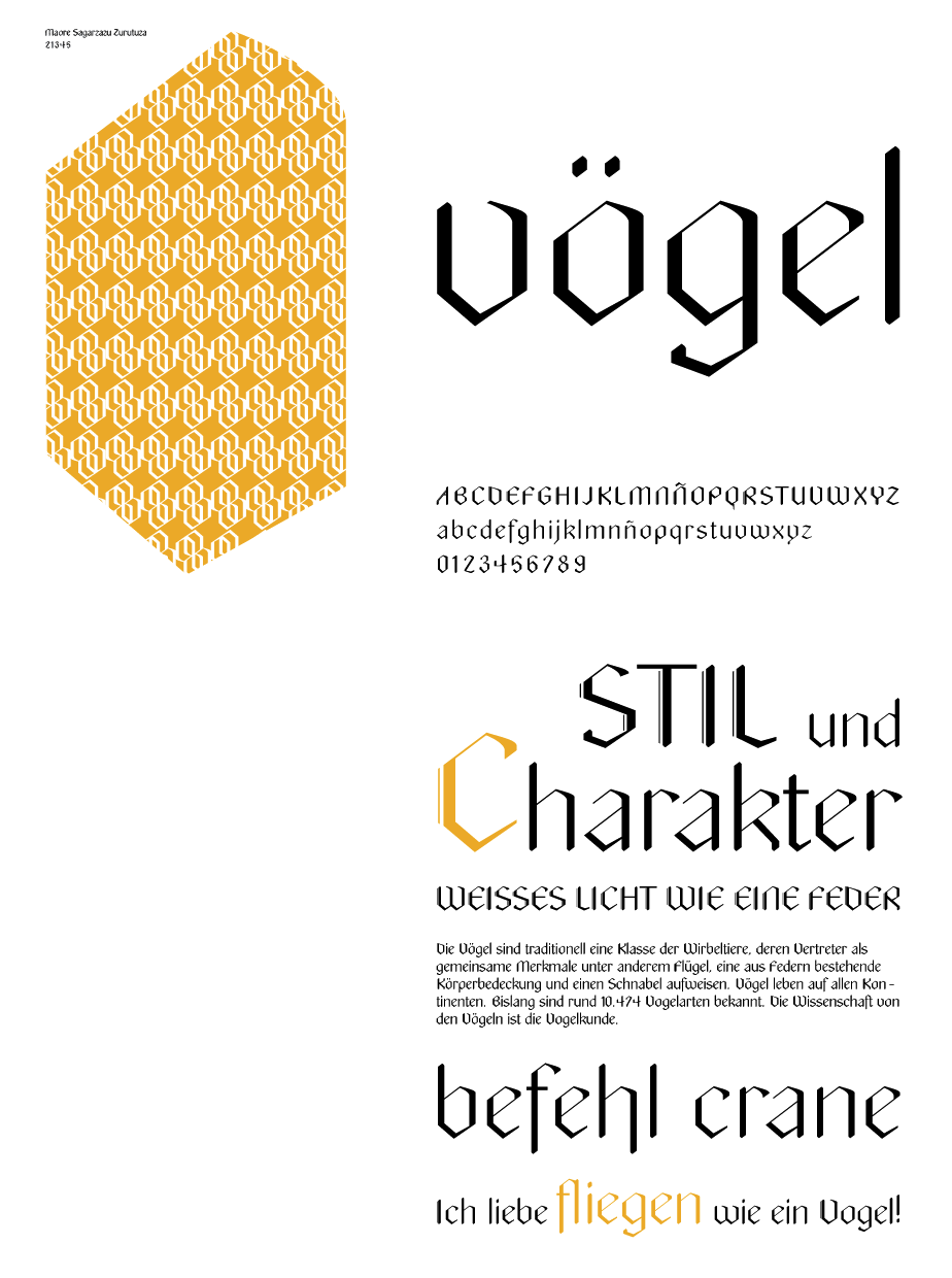
At Comando Cran, which he co-founded with nine others, he created the beautiful angular hexagonal typeface Vögel (2012). [Google] [MyFonts] [More] ⦿ | |
Mark Davies
| |
Designer in Bilbao, Spain, who studied at the Emilio Campuzano Institute in Bilbao. Creator of Confettiva (2014: a stackable confetti-inspired all caps typeface), and Design Walk (2013, a signage system with its own dedicated font). [Google] [More] ⦿ | |
Designer of the display font with Basque influences, Circos (2001, at Fontsanon). Mary Kelleher is a lettering artist who did the lettering for "Wind of the Gods, v. 1: Blood from the Moon" (by Patrick Cothias). [Google] [More] ⦿ | |
Designer of the Kai family (1999, with Santos Bregana, at LAIA in the Basque country) at Garagefonts. FontShop link. Klingspor link. [Google] [More] ⦿ | |
Basque designer who studied at EASD Vitoria-Gasteiz, and works in London. In 2016, he created the Basque typeface Relbau, which revives one of the first Basque typefaces, Bilbao. Behance link. [Google] [More] ⦿ | |
Spanish designer who lives in Donostia-San Sebastian. Her typefaces include Sydney Meller (2017), Alexis Jernigan (2017, circle-themed), 36 Days of Type (2016, a decorative caps alphabet), Manyar (2013), Lost in Time (2012, display face) and Edden (2013, oriental simulation). Behance link. [Google] [More] ⦿ | |
An hexagonal typeface at Monotype called Basque. Origins unclear. [Google] [More] ⦿ | |
Morula Type (or: Type01 Foundry, or: T1 Foundry)
|
Type department link. [Google] [More] ⦿ |
Mostar Design
|
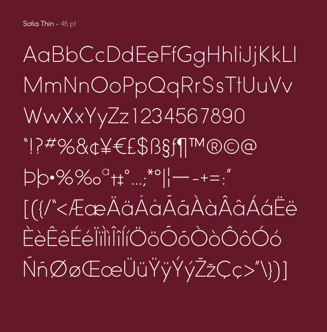
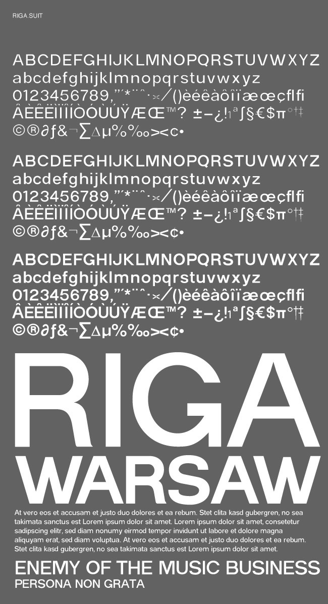
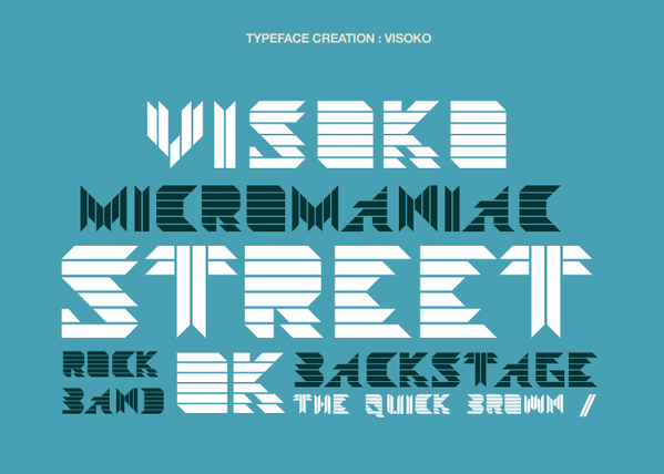
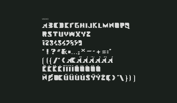
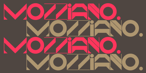
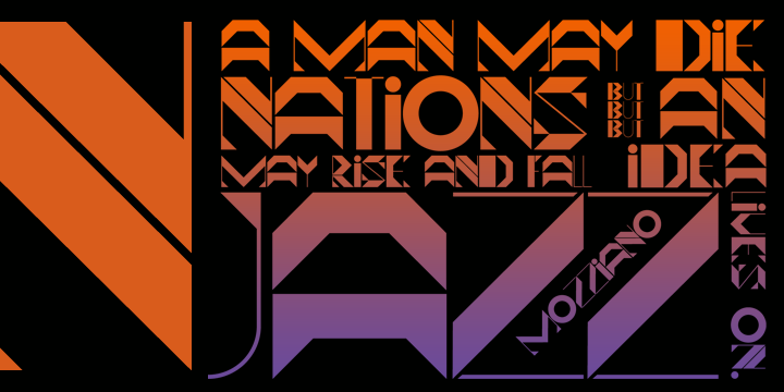
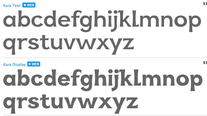
Typefaces: Sofia (2009; a great sans family which includes a hairline weight), Sofia Pro (2012), Sofia Pro Soft (2014: a rounded version of Sofia Pro, soft as a baby's bottom), Sofia Rough (2015, letterpress emulation and layering, in the style of Trend or Nexa Rust), Sofia Rough Script (2015), Hexagon, Microbia, Bucharest, Interval (Condensed, Sans), Neolux (experimental), Riga (sans family), Visoko (striped; Visoko is a playful, geometric typeface inspired by post-modern fonts designed by Mecanorma in the 80s), Glamwords (2009, a 1970's glitter style face), Mozziano (2009, purely geometric), UNIcod Sans Pro (2010, a techno sans family), Kyrial Display Pro (2011, a mini-serifed sans family). In 2012, Olivier Gourvat designed the flared typeface family Kara which was inspired by Basque (Euskaran). Mettro Pro (2013) is an elliptical sans family that could attract a large fan base. Its hairline weight is called Mettro Air. A few weeks later, we learn that this family was renamed Metronic Pro. And a month later, Gourvat published Metronic Slab Pro (2013). It was followed by Metronic Slab Narrow in 2014. Typefaces from 2014: Filson Pro (a geometric sans family with curvy R, k and t). Typefaces from 2015: Univia Pro (a squarish sans family), Strato Pro (not to be confused with Sophie Brown's Strato from 2013; Strato is a legible classical roman serif typeface family), Chronica Pro (a clean geometric sans workhorse). Typefaces from 2016: Interval Next (a successor of Interval Sans Pro), Filson Soft, Fengo (an oriental brush typeface by Olivier and Jean-Claude Gourvat that was influenced by Sino-Japanese and traditional Chinese hieroglyphic characters). Typefaces from 2017: Rival Sans, Magnetic Pro (inspired by typewriter characters; with a mechanical aspect), Rival (slab serif). In 2018, Olivier added Rival Slab and the soft sans serif Marlon Pro. Typefaces from 2019: Archeron Pro (a sharp-edged serif and stencil typeface family), Ariana Pro (a 9-style geometric sans). Typefaces from 2021: Natom Pro (an 18-style chunky low contrast geometric sans), Natom Pro Variable (a geometric sans), Sofia Pro Variable. MyFonts link. Creative Market link. Behance link. Klingspor link. MyFonts interview. Images of some of Olivier Gourvat's commercial typefaces. Fontspring link. [Google] [MyFonts] [More] ⦿ |
Grace Meinvil (NABO Basque Fonts, Weiser, ID) sells a nice collection of Basque style fonts for 120 USD. Fonts by Thierry Arsaut from Biarritz. [Google] [More] ⦿ | |
Olivier Gourvat
| |
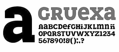
Óscar Salinas is the Mexican designer of Gruexa (2004, a typeface with Basque influences) and Mitla, mentioned here. [Google] [More] ⦿ | |
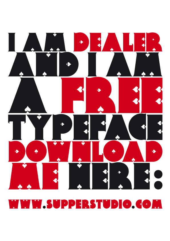
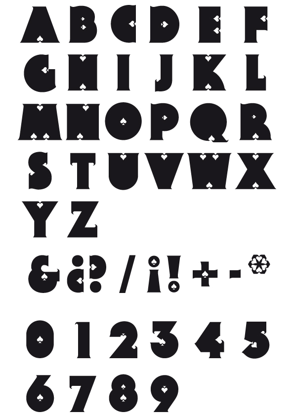
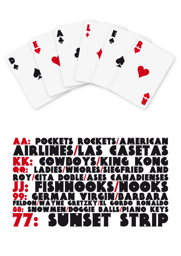
PAAM (was: Supperstudio)
|
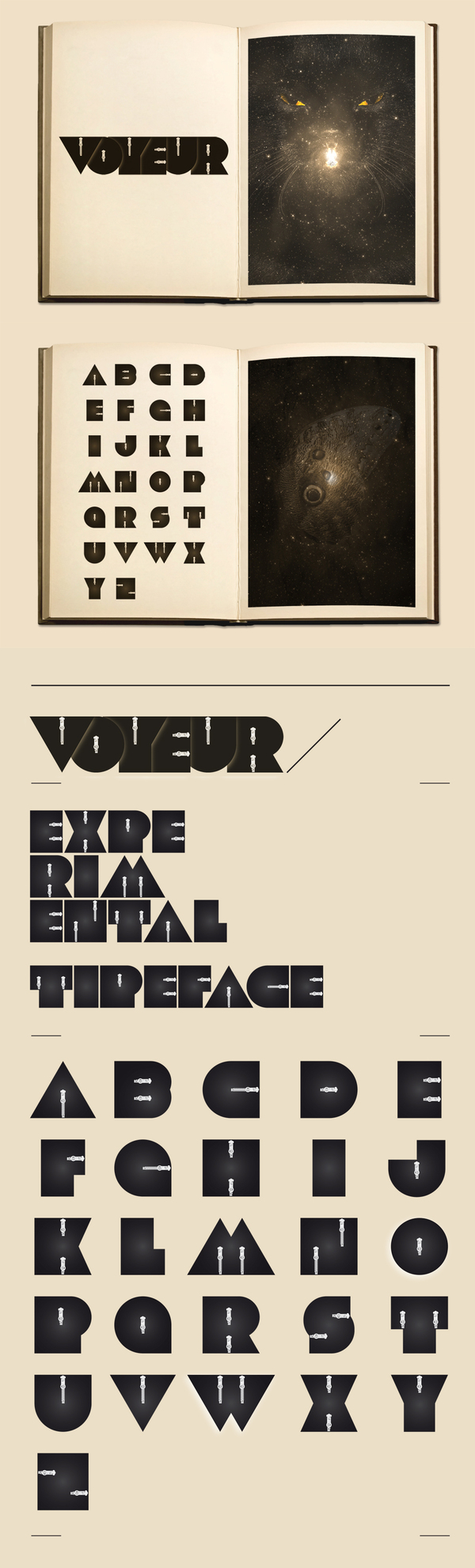
Pablo Abad's other typefaces: No Future (2009, sci-fi), Knife (2008, modular), Pinza (2008, clothespin-themed), Romantique (2008, ultra-fat modular art deco face), Modul01 (2008), and Mambo (2008, super-ultra-fat art deco), Slaba (2009, fat slab serif), Voyeur (2009), Nostalgia (2013, Hype For Type). Old URL. Behance link. [Google] [More] ⦿ |
Pablo Abad
| |
Thierry arsaut tells the history of Basque charcaters, the "Euskara". The basic reference is a rare 1930s book by M. Colas. Arsaut sketches the influence of roman lettering and later Celtic letter forms. [Google] [More] ⦿ | |
Thierry Arsaut tells us about the history of Basque type. [Google] [More] ⦿ | |
Basque type designer and lettering artist in Biarritz, France. Died in 1976. Type owned by Imprimerie Ferrus, 3 rue Barthou, 64600 Biarritz, France. Tel (33) 05 59 24 00 10. [Google] [More] ⦿ | |
Bilbao, Spain-based designer of Digital (2019) and National Team (2019: a sports font). [Google] [More] ⦿ | |
In 2019, they art directed the custom typeface Kymco for a motorcycle brand. Again, the type production was by Jordi Embodas (tipografies). [Google] [More] ⦿ | |
Pretend Foundry (or: Fuzzco)
|
|
Basque type designer and lettering artist in Hasparren, France. [Google] [More] ⦿ | |
Robby Woodard
| |
Bilbao-based designer of Inmaculatta (1997, grunge) at Garcia fonts. [Google] [More] ⦿ | |
Salamandra
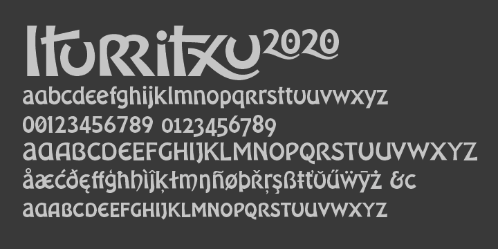
| Mark Davies (Salamandra), (b. 1956, Manchester, UK) lives in Victoria-Gasteiz, in Basque country. In 2010, he made Iturritxu. Klingspor link. [Google] [MyFonts] [More] ⦿ |
During their studies at EASD Vitoria-Gasteiz ADGE, Irati Sagasta (Elorrio,Spain), Salvia Perez San Jose (Vitoria-Gasteiz, Spain) and Iara Aguiriano Hidalgo (Vitoria-Gasteiz, Spain) designed the modular typefaces Filetto (2017) and Iwik (2017). In 2018, Salvia Perez, now based in Pamplona, added the slab serif Redit. [Google] [More] ⦿ | |
Designer of the slightly Basqueish sans display typeface Cachetona (2008). [Google] [More] ⦿ | |
Santos Bregaña
| |
| |
Sebastian Kempgen
| |
Stone Type Foundry
|
At ATypI 2007 in Brighton, he spoke about The foundation of the humanist sans serif. As of 2008, his entire collection can be licensed for 20 computers in an educational lab for just 300 dollars. Scripps College pages. CV at Agfa. Bio at Linotype. Page at Emodigi. His lecture in 2007 on W.A. Dwiggins. PDF file of his work. Signature. 2012 Newyear's card. Interview by MyFonts in 2014. FontShop link. Klingspor link. View Sumner Stone's typefaces. Summary overview of Sumner Stone's typefaces. [Google] [MyFonts] [More] ⦿ |
A Basque font auction took place on March 9, 2001, in Bilbao and was organized by the cultural association Consonni from Bilbao. The current page on Basque typefaces is run by Franck Larcade at Consonni and Hinrich Sachs from Switzerland. History of Basque fonts. [Google] [More] ⦿ | |
Sumner Stone
| |
Irun, Spain-based illustrator. Designer of the typographic poster Nacionalsocialismo (2012). [Google] [More] ⦿ | |
The free Asap Symbol font (2015, Omnibus Type) was designed by Tania Quindos, Marcela Romero, Elena Gonzalez Miranda and Pablo Cosgaya, to accompany the rounded sans family Asap. In 2017, she designed the text typeface Alaia. Behance link. [Google] [More] ⦿ | |
Graphic designer in Bilbao, Spain. In 2017, Hamex Design (Bilbao, Spain), Teresa Bacelar, Laura Pajuelo, and Ainara Rodriguez co-designed a geometric solid typeface. [Google] [More] ⦿ | |
Thierry Arsaut
| |
Basque font archive: Bilbao, BasqueLight, VASCA, Vasca-Berria-TT, Basque-Country-2.0 [Google] [More] ⦿ | |
Behance link. [Google] [More] ⦿ | |
Basque web site of Txiki Zabalo. This site contains a lot of cultiral information on the Basque country (Gipuzkoa) and on special glyphs used there. [Google] [More] ⦿ | |
Type Republic
|
Balius set up Garcia Fonts in 1989. He co-founded Typerware in 1996 (which existed until 2001), where he managed type-related projects for La Vanguardia newspaper, La Fura dels Baus and Primavera Sound Festival. In 2003, he launched Type Republic, catering to clients such as SEAT/Wolkswagen group, Victoria's Secret, Acciona, Ferrovial, and designed text typefaces for newspapers such as La Gaceta, Tribuna (Salamanca, Spain) and La Discusion (Chile). Some fonts sold through MyFonts:
Custom / bespoke typefaces include Carmen VS (for Victoria's Secret, New York), Ferrovial, Dsignes (a wayfinding sans), VLC (for Valencia Tourism Bureau), Lladro (sans), Forum. |
Typofactura
|
|
Bilbao-based doctoral student who created the Basque typeface Gaueko Plana in 2013 during his studies. Behance link. [Google] [More] ⦿ | |
Bilbao, Spain-based designer of the bicolored deco typeface Auurbo (2018). [Google] [More] ⦿ | |
Graphic designer in Bilbao, who created a few untitled typefaces in 2013. Behance link. [Google] [More] ⦿ | |
Paris-based Italian type designer (b. 1972) who designed Estrella (1996), a Basque font based on research she did at L'école Estienne (1996) on Basque lapidary engravings in cemeteries. Her mentor there was Gérard Blanchard. Rustica (1996), also done during her studies, is based on Latin calligraphy from the Vth century. Valérie taught typography for a while at Beaux-Arts de Rennes, but is now a freelance designer in Paris. Behance link. [Google] [More] ⦿ | |
Valerio Monopoli
| |
The free basque lettering font Vasca, which seems to be everywhere, is indeed orphaned. Who designed it? [Google] [More] ⦿ | |
| |
Vicente Ballester Marco (Valencia, 1887-1980) was a graphic designer, illustrator and poster artist affiliated with the CNT (Confederacion Nacional del Trabajo) who created political propaganda posters of modernist and post-cubist influence during the Spanish Civil War in the studio Artes Gráficas de la Alianza de Intelectuales Antifascistas de Valencia. In his honor, Fernando Haro made the free color SVG font Gudariak that was inspired by one of the posters he made for the Government of Euskadi. [Google] [More] ⦿ | |
Vince Connare
|
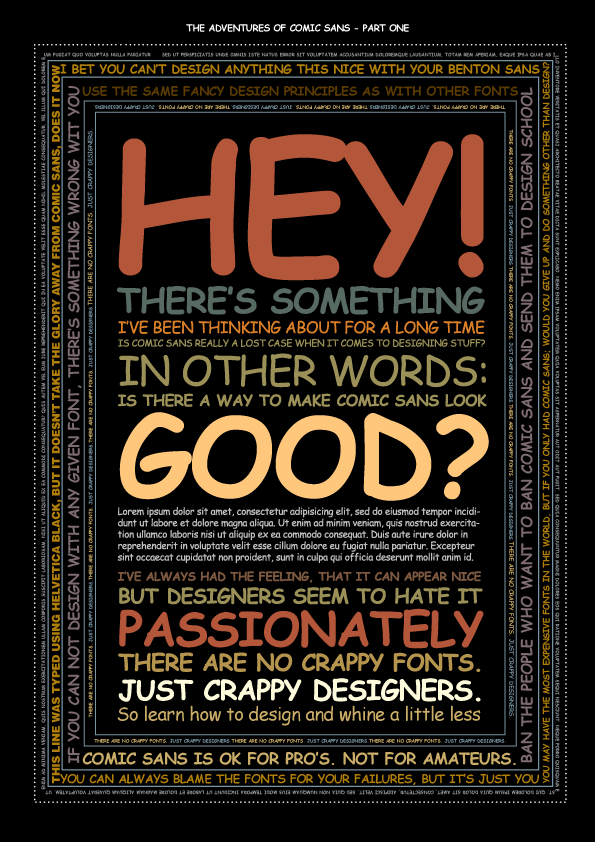
At Connare.com (Seattle), he designed the transitional book text typeface Magpie in 2000. Vincent Connare joined Dalton Maag in the spring of 2001 as production manager. At Dalton Maag he was part of the team that developed Ubuntu and Nokia Pure. His own Magpie typeface was published in 2008 at Dalton Maag as Magpie Typo. Lesser known fonts by Connare include WildStyle (done for the Agfa Creative Alliance), Fabula (a font for children's texts in Basque, Catalan, Dutch, English, French, Frisian, Irish, Spanish and Welsh), Amaze (for mazes), and Vixar ASCII (1995, for Microsoft). Connare also enjoys a reputation as an expert font hinter. There is a movement by Isaac Stanfield to ban Comic Sans, discussed at Typographica and Typophile. Interview by Karen Huang. Piece by Emily Steel. Can Comic Sans look good in design? Check Markku Ylisirniö's Comic Sans poster. At Ampersand in 2011, he concluded "I just wanted to let it go; it just looks ridiculous" explaining why he was not involved with Ascender's Comic Sans Pro. Video: Influencers and Innovation: Comic Sans (2013). [Google] [More] ⦿ |
Vincent Connare
| |
WoodardWorks Type Design (was: Robby Woodard Design and Illustration)
|
In 2019, he added extreme weights (from hairline weights to extra black weights) to Joshua Darden's popular Freight series: Freight Big Compressed Pro (2019, a sturdy rational newspaper masthead and book cover typeface by Robby Woodard and Phil's Fonts), Freight Display Compressed Pro (2019), Freight Text Compressed Pro (2019), Freight Sans HPro Hairlines, Freight Sans HCnd Pro Hairlines, Freight Sans HCmp Pro, Freight Sans UPro Ultra Black. Typefaces from 2020: P22 Posies (a six-font system for creating multi-colored floriated initial caps in the spirit of illuminated manuscripts), P22 Bangersfield (P22: a casual monoline comic book font designed to replace or compete with Comic Sans). Typefaces from 2021: Quirkwood (Canada Type: a reverse stress Western font; Canada Type describes it as a spaghetti western with Shazam and Wile E. Coyote cast in prominent starring roles, a bluegrass album of Edith Piaf covers). Typefaces from 2022: ,a href="https://canadatype.com/product/robbins/">Robbins (a soft flared slightly undulating sans). Fontspace link. Klingspor link. Kernest link. View Robby Woodard's commercial typefaces. [Google] [MyFonts] [More] ⦿ |
Woodcutter Manero
|
In 2013, he created Gothic Winter (snow-capped blackletter), Woodcutter Anonymous (ransom note font; +part2, 2014), The Shining (movie scanbats), Woodcutter Optical Army (op-art), Viking Runes Shields, Fresh Blood, Pig Rules, Pole Dance, Music+Party, Asian Food, Deers (sic), Woodcutter Amor de Madre (curly tattoo font), Tattoo Vieja Escuela 1, 2 and 3, Origami (animal dingbats), Vintage Motorcycle Club (scanbats), Vintage Christmas (dingbats), Terry Richardson World (scanbats), Woodcutter Wire Fence, Woodcutter Points (textured face), Made in Spain 4, I Love 80s (dings), Drugs (drug paraphernalia dings), Barber Shop (dingbats), Woodcutter del Reves, Adventure Time, New York New York (1 and 2), Woodcutter Dripping Classic, Woodcutter Tinta China (ink splatter font), Woodcutter Cross, Nightmare on Social Media, Breaking Bad (scanbats), Fight Club (boxing scanbats), Boligrafo (sketched font), Robots, Luxury Brands, Woodcutter Buena Lettra, Barcelona (scanbats), Devoto (religious dingbats), Joker (dingbats), Woodcutter Typewritter (sic), Banksy (scanbats), Made in Spain 1, 2 and 3 (company logos), Animal City (funny dingbats), LSD Junior (a scary alphading font), Woodcutter Army (army stencil), Woodcutter El Día De Todos Los Santos (Mexican dingbats), Woodcutter Summer Shadows, and the monster dingbat typeface Woodcutter El Dia del Juicio. Still in 2013, he designed Woodcutter Black Square, DaPunk, Woodcutter Pollita Alegre (a penis font), Woodcutter Hungry Pig, and Woodcutter Hand Light. Typefaces from 2014: Hospital Icons, Woodcutter Rare Drawings, Headache, Irresistible (rounded sans), Doctor Garcia (textured), Violence, Hipster Icons, Saint Valentine's Day, Mister Manson, Casino (dingbats), Christian Icons, Christmas Icons, Hermes Manero, Beauty (dingbats), Art Icons & Tools, Clouds Mix, Malamadre (grunge), Offset Punk, Manos de Cerdo, Hotel Oriental, Basic Trip, Popeye (scanbats), Viva la Fiesta (flag alphadings), Street Stencil, Supermarket, Ebola Font, Vintage Halloween, Motel Imperial, Clothes, The Second World War (army stencil), Tahs On A Rope, Penis (dingbats), Regular Show (dingbats), Parkinsonism, The 70 Greatest Directors of All Time (scanbats), Smartphone (alphadings), Dripping, Chaos in Wisconsin, Saturno, Gym (dingbats), Angie, Antique Book, Black Rodeo, Gutierrez+, Matias-Font, Viejo-Oeste, Woodcutter-Prison-Tattoo, old+sailor, Italian Revolution, Kid Nightmare, Anderson (rough stencil), Manero (scratchy script), Tecno-Chaos (dot matrix font), Neverland, Martian Font, Radical Block, Woodcutter Delicada, Bon Appetit, Termica, Kandinsky, Hotel Paradiso, Seven Arts, Street Icons, Militaria (dingbats), Undergramo (poster font), Woodcutter Avispa, Fuego Fatuo, Other Space, Electrica Sals, Woodcutter Dramatica, Cocinitas (cooking dingbats), Bad Mother Fucker, Quentin Tarantino (scanbats), El Extraño, Fine Disorder, Woodcutter BCN Style (dripping blood font), Woodcutter Virus, Efectiva, Mogambo (fat brush), Duck Tape, Warriors, Cutre Glam, Woodcutter Sutill Shadow, Woodcutter Future, Rage, Woodcutter Negative, Manolo, Vegetables, Woodcutter Storm (lightning texture), Woodcutter Rare Drawings, Rustic Heavy Metal, Grass, Virgin Mary (scanbats), Laurus Nobilis (wreaths), Mister Bambu, Woodcutter Barcode, Conquest, Multimedia Icons, Preschool, Cursors, Woodcutter Kaos, Woodcutter Lines, Ukraine (constructivist), Meccano, Woodcutter Simple Font, Crux (crucifixes), Dolores (3d), Eyes, MoneyMoneyMoney, Made in Spain 5, Barcelona Mon Amour, New Society (a 3d shadow face), Federico (a hand-printed shadow typeface), Aranea (spider dings), Fifth Avenue (art deco), Beware of Pitbull, Dictators (scanbats), Woodcutter Vintage Cartoon, The American (textured face), Woodcutter Mixed Icons, Apple Japanese Keyboard, Vintage Classics Disney, Carnage College (blood splatter font), Vintage Porn (scanbats), Woodcutter Fontana (textured caps), Woodcutter Mixed Icons, Woodcutter Jet Set, Woodcutter Gothic Drama (blackletter), Woodcutter Relieve, Mixed Icons Vol. 1, Woodcutter Electric, Woodcutter Cloth, Street Style (graffiti font), Gothic Punk, Human Body Parts, Dirty Harry, Woodcutter Fine Sketch, Woodcutter Invisible, Miley Cyrus (scanbats), Old Guard, Circus and Fair, Comic Cover, Woodcutter Gigantismo, Clockwork Orange (scanbats), Dosmilcatorce, The Walking Dead (scanbats). Typefaces from 2015: Rude High School, Imprenta Gonzales (white on black), Estrategia (textured style), Monkey Business, Venganza (dripping blood font), Woodcutter Executive, Left Hand Comic (textured), Dirty News, Gorilla BCN (a great handcrafted athletic lettering typeface), Neo Protein (bio-grunge), Barrio-Santo (graffiti style), Periodic-Table-of-Elements, TerrorToons, Vanilla-Candy, Baseball-Icons, Boots, Fine-Homage, Jesus-Christ (religious icons), Lock, Meredith (texturted typeface), Neo-Victorian, Old-Europe (soft blackletter), White-Army (military stencil), HeadWear, Oil-Icons, Pollito-Peligroso (white-on-black letters), Taxi, The-Dentist, Planeta Zero (white-on-black letters), Cronenberg, Hell Bar, Horror Poster, Big Gipsy Bro, Peccatum (bloo drip font), Tempus Fugit (grunge), Indiana State (a great shaded titling face), DJ Icons, Gentleman Icons, Dope Crisis (textured), Bad Quality, Love and Hate, Smoking (dingbats), Phantom of the Opera (dripping blood font), Video Games (dingbats), Beauty Initials, Knife, Ciudad Capital, System Error (dot matrix font), Rejilla (gridded font), Punk Survival, Watches, Barrio Chino (grungy typeface), Delayed (dot matrix font), Impertinencia, Ecology, Anchor, Comic Sandchez, Beard, Globe Icons, Jalisco Company (handcrafted 3d typeface), Summer Icons, New Art Deco (textured art nouveau typeface), Gordita Alegre, Banned World, Pixel Chaos, Dirty Grunge, Metal Curvy, Jazz Club, One Percent, Profile, Scoreboard, Sentencia, The Octopus (silhouettes of octopi), New Sailor (tattoo script), Cleaner, Bear Icons, Woodcutter Trama, Manolete (wavy font), Skully (alphadings), Big Designer, Vintage Punk (white on black), Streets of Fire (textured), Nordica, Belle Epoque (art deco), Bakery, The Worlds Best Logos, Special Unit (textured typeface), Manifesto, Shooter, Woodcutter Carnage, Black Rain (sketched), Soft Addiction, Digital Camera Symbols, Surf, Tailoring, Palo Santo, Morbida (rounded athletic letters), Fine Shadows, The Woodcutter (dings), Experimento (textured typeface), Seven Sisters, Senior Citizen (dingbats), Hotel California, Woodcutter Hand 2015, Fire Department (scanbats), Dolor de Muelas [toothache], Hamburger, Vintage Mixed Vol 1 and 2, Torremolinos, Ol Torero (bullfight scanbats), Formula 1 (scanbats), Presidents of the United States of America, Furure Blood (dripping blood typeface), Wild West Icons, Maravillosos, Territorio (textured display face), Forced Flowers, Black Hole, The Death, Extra Fat (comic book font), Cristobal, Cirilico, Fuck Off (a very useful raised middle finger font), Mexican Skull (the best Mexican skull font anywhere), Old Nuremberg, Maria Dolores, China, Street College, Rodriguez, Tourism, Community, Oklahoma (varsity font), Smartphone Icons, Science Icons, Horse, Greek Mythology, Persiana (a Venetian blind font), Alcohol, Whatsap Emoticons, Library (possibly the best library icon font today), Candelita, Remember Me, Flamenco, Universidad 2015 (athletic lettering), Sneakers, Fire, Industrial Worker, Europe, Abstemious, Police, School, Paris, Savage Empire, Nautical (dingbats), Crusader (dingbats), Woodcutter MMXV, Rats, Monster Mash, 5th Avenue Stencil, Baby Icons, New Space, City Icons, Diamonds, Punkland, Temblores, Puttana Antique, Human Anatomy (dingbats), Guerra Santa, Winter Icons, Farm, NeoWriter, Russia. Typefaces from 2016: Woodcutter People Faces, Ear, Codociosa (grungy), Viking Hell, Simple Myopia (textured, halftone style), Bulbs, Emblem, Vegan Icons, Fleur de Lis, Pregnancy, Harley Davidson, Window, Owl, Native American Indians, The Toy Castle, Aristogramos Chernow, Mediogramo (monogram font), Yes Darling, Dilema Emocional (white on black), Original 301 (draftsman style), Emperador Oscuro (scribbly), Vespa (scanbats), Fine-Sheriff, Hard-Western, Olivia-Garcia (brush script), Woodcutter-Rude-Press (a great handcrafted poster typeface), Printing, Disabled Icons, Golf Icons, Electric Guitar Icons, Airport-Icons, Prudencia (pixel style), Rude-Basic, Stencil-Guerrilla, Tramita-club, Drone, Garden Icons, Feminine Hygiene, Psycho Dad, Intransigencia (textured), Fat Food Icons, Torrebruno, Home Appliances, La Pecosa (textured), Gyn Toons, Insect Icons, Bomb, Special Forces, Business, Irish, Female Underwear, Zombie Salad, Isometric Love, Dinastia (textured), Fireworks, Happy Birthday, Snake Mix, US Election, Spectrum, Extreme Simple, Drunk Sailor (tattoo font), Mountain (dingbats), Cafe Madrid (white on black), Celebration, Rabbit, Rude College, Words, Wingding Review, Transilvania (blood drip font), Tattoo Museum, El Arropeiro (dry brush font), TV (scanbats), Western Dead, Star Wuarras, File Types, Industrial Poison (grunge), Future War, Masacre Digital, Senor Domingo (grungy), Workout Routine (dingbats), Gipsy Bar, Finegrams (ornamental caps, monogram font), Diving (dingbats), Extupida, Dictadura, Euro Estilazo, Cul de Sac, Lions, Woodcutter Olla Barrejada, Cocaine, Monogramos, Gobierno (rounded sans), Maldita Comebolsas, Macho (spurred style), Eagle (great eagle-themed dingbats for East European coup d'etats ca. 1880), Fuck Love, Woodcutter Rocks (white on black), England (dingbats), Mechanic (garage mechanic dingbats), Rodaja (script), Le Petit Chaos, Old Deutschland (blackletter), Mister George, Cloud Candy, Ceporro, Old School Toons, Big Drama (fat poster style), Serial Font, Hotel Madriz, Lady Fiesta, Punk Army, Enfermo Rules, The Laguna, Casa Camaron, Mister Muerte (dripping blood font). Typefaces from 2017: Sea Life, Sushi Sushi, Destruccion, The Barrio Caps (blackletter for gangs), Prehistoric Paintings, Sumo, Hot Air Balloons, Woodcutter Self-Portraits, Manero Universe (grune), Digital Dark Sister (LED font), New Watch (LED style), Free Biker (spurred tattoo font), The King, Canada, Super Hero, Target Shooting, Smokeland, Rabia Absoluta, Infringement, Gifts Icons, Sprinkled (textured), Miopia Internacional, Chupapollas, Orientalismus (oriental emulation), Technopollas, Doctor Punk (ransom note font), Global Terror, Bananas Social Club, Wedding, Coffee Icons, Archeology, Graffiti Tags, Maquina de Escribir (old typewriter font), Little Candy Shop, Madre Superiora (script), Territorial, Diogenes, Cyber Tittle, Pain Explosion, Panchito Style, Lightning Bolt, Pixeland, Club Seven Espadas, Chandelier, Computer Mouse, Restroom, Wash Care, Hell Circus, Extraterrestre, Pix Punk, Lamp, Pizza, Pirate Style, Vacaciones, Hecatombe, Fuente Manerismo, La Cucaracha (white on black), Plastic Surgery, Mafia Mix, Dirty Classic Machine (old typewriter), Woodcutter Noise, Cokelines, Simple Cream, Vintage Poison, Lighter Icons, Pacific Break, Maldito Gringo, Bazar Costa, Doctor Satan (dripping blood font), Caja Fuerte (textured stencil typeface), Saint Peter (brush script), Bela-Lisboa, Ear, Future-Socialism (constructivist), Poop, Retro-Toons, Tattoo-Pro-Icons, Victorian-Gang, Woodcutter-Justice, Writing, Amusement-Park, Linoleum, Funny Barber (shaded), Decadence, Victorian Gang, Depalma (spurred sans), Bela Lisboa. Typefaces from 2018: La Gilda, Portugal Vintage, Call to Huesi, Wood Xmas, Black Empire (a fancy blackletter), Benedicto (a textured all caps typeface), Pixel Icons, Hysterical, Cadalso 74 (grunge), Gramitos, Negroni Chaos, Carajillo de Anis, Hail Disney, Pen Icons, Neo Spain (a glitch font), Adolfito, Anesthesia, Don Pasquale, The Imperial, Juanita Banana, Sovereignty, Bloody Winter (dripping blood font), Drunk College, Sunset Boulevard (shadow font), Miss Order (3d effect font), Burning Manero, Dirty War (a grungy military stencil), Press Division (a shadow font), Fight Team 18, Time To Dead (grunge), Woodcutter Clasica, La Nueva Vieja Escuela (a paint drip font), Woodcutter Animal Faces, Crochet (a softly spurred typeface), Marshal Manero, Nou Barris Bcn, Bad Things (a dripping blood font), Biker Vamp, Insuperable, Pain Shop, El Monstruo del Raval, Arabesque Ornaments, Fans, Tarraco City, Woodcutter Basic Viking (rune simulation), The Hurraca Company, Broken Press, Carnage 1974 (a dripping blood font), Manicomio Woodcutter (a very funny comic book style dingbat font), Amor (spurred), Rompetechos, Electric Punk, Happy Square, Bad Signal (a glitch font), Funny Death, Fresh Nieve (paint drip font), Rota en mil Pedazos (a glitch font), Perra Gorda, Goma de Mascar (a bubblegum font), Mister Love, La Deco Klan, Glitchland, Hackerchaos, Vicious Stencil, Hippie (dings), Skate (dingbats), Dinosaur Icons, Mastodontus, Alphaletras, Torito Style (a woven font), Problems in Wisconsin, Alarma Social, Rue Mademoiselle, Tree Icons, Go Go Sports, Rage Against Mom, Hell Kitchen, Black Order, Black Trident, Sale, War Times (dingbats), Ice Cream Icons, Bastardo, Titi Yayo Rules, Jailbreak, Britannia (blackletter), Venenosa (grungy letterpress), The Gallery (3d, sketched), El Puto Amo, Finolis, Lovegramos (monogram font), Smartwatch, Interferencias (glitch font), Hostage (ransom note font), Miss Antonia (grungy caps), Bocadilla de Mortelada, Bitcoin, Car Parts, Celtic Knots, Cock (rooster dingbats), Dubious Reputation, Funny Chaos, Garage Imperio (shaded, vintage), Geometriarquia (archeological stone font), Good Morning, Graphic Design (dings), Hard Core, HoldFast (spurred), MacizoCompany, Milk, New Gang (garage dingbats), Ninja and Samurai, PhayaThai (Thai emulation), Robotic Arm, Rotunda, Social Media Circled, Stone Block, Unicorn, Victorious (Victorian), Gypsyland, Modernist Chaos, Rata Negra, MMA Champ, Love Initials, Doctor Glitch, Mad College, E-Commerce (dingbats), Sheriff (dingbats), Outline Mix, Stencil Icons, Fairy Tales (dingbats), Alfabetizacion, Night Fever Again, Jodido & Noble, Woodcutter Oligarquia, Screwdriver, Baroque Explosion, Seville Kid, Huesitos, Hanging Party, Brave Grams, Tower of London (outlined, Tuscan), Quintanar de la Orden, Punk West, El Forastero, The Enemigo (ink splash font), El Camino, Finisterre (thin sans). Typefaces from 2019: Ho Chi Minh City, Retro Team, Brushland, Stamp Empire, The Drama Army (an irregular military stencil), Space Grunge, Disturbed (a glitch font), Dead Corporation, El Tito Adolfo (textured), Dirty Deco, Mister Black, Grunge Manifesto, Dark College, Indian casino (a striped Far West font), Heil West (Tuscan), Bonesitos (a bone font), Bad Santa Company, Felipe Segundo, Vanity Garden, Rough Blacky, Rough City (textured, weathered caps), California, Canarias, Chernobyl (weathered), Beauty Bee (an inky script), Chain Style (a bike chain font), Spaniard Soldier, The Matadero (a slimey font), Lapicero, The Minima, House Icons, La Distinguida, Fuente Jalisco, Cordoba, Extreme Glitch, Simulacro, Dies Irae Saloon, El Hispano (decorative Tuscan capitals), Senorita Esmeralda (Tuscan; white on black), Easy Listening, Cool Chaos, Guarrilla, Big Dealer (a grungy poster typeface), Lord British (decorative caps), Cantina Jalisco (Tuscan), Disco Paradiso (brush font), Dark Metal Institute, Asteroide, Bloody Office (dripping blood font), Los Chapters, Home Entertainment, Witch, Cemetery King (dripping blood font), Steel Soldier (a military stencil), Estreno (a dot matrix font), Cat Faces, Gears Icons, Flower Icons, Hardcore Poster, Northern Army (a military stencil), Casimiro, Pantano Gipsy (sic), Zodiac Mix, Insane Empire, Break Summer, Wood Hell Company, Merluza Company (a grungy typeface), Metalurgia Sexual, Aztec Icons, Cemetery Picnic, Pantano Thing, Falange Punk, Jupiter Team, Breakdance, Origaminator, Gothic Gotera, Friday 14, Wifi Icons, Parque del Buen Retiro, Bato Todo El Rato (a graffiti font), Neo Nacional (a shadow font), Capitan Morgan (a Tuscan pirate font), Habitacion 37, Santa Monica (a shadow font), Casino Bar (shaded font), El Boxeador, Attack the Block, Sister Ant, Hard Tree, Another Round, Charcuteria, Thor Gonzalez, Crappy Town (grungy), European War (eroded military stencil), Rock of Times (3d), Crazy Saigon (shaded), Diamondgrams (monograms), Humanoide 2014 (a dripping blood font), Cheddar Cheese (weathered type), Alberto ha Vuelto, Sweet Cake, Cortocircuito (a glitch font), Potorro Angular, Hijo Puta Peligroso (a 3d shadow font), Constitution, Mastodonte, Street Reich, Hispania Manero, Pureta, Pandora, Spray Letters, Roca de Escama, Fat Mom Rules, Thespian, Stencil Time, Isometria Club (3d), Meteoritox, Cinema Capitol, Barna Break, Scratch Night Team, The Estampada, Afterhours, B-Team, Caballito, Ampersand, Gothic Manus, Espana (spurred, Western), Circus Manerus (Tuscan circus font), Hood Army Stencil, Negative System, Positive System, Pagan Symbols, Andy Capp, American Sign Language, Tiki Idols, Greek Column, Maze, Euro Western, Speed Grams, Tiki Tako, Burgos City (waethered caps), The Company (inline caps), Waste Money (a striped money font), Speedy Retro (a circus font), La Rapidita (a speed emulation font), Chill-out Gang, Resistance (grunge), Normandy Squad (condensed military stencil), Last Round, Tecno Extrema, Madrid Grunge, Escabetxina, Face To Sun, Sailor Gonzalez (a tattoo font), Times Now (a codex font), Sergi Tete, Orgasm Co. Typefaces from 2020: Pocket Change, Basura Humana, Korean Icons, Construction Icons, Cowboy Manero (handcrafted, Western), National College, Big Junkie Joe, New World Order, Le Club Parisien, Hardcore Attitude (grungy), Orchestra Icons, Soccer Icons, Tennis, Billiard, Startup Icons, The Fortune, Imperator, La Ramera de Barcelona, The North Hell, Soccer Team, Traditional Punk (a ransom note font), Seismo Club (a glitch font), Ugly, Pistolas, Thailand Icons, Renderland (beveled), Traditional Tattoo Parlour, Retro Computer (halftone font), Vintage Glitch, Torquemada in da house, Louisiana Biker Shop, Le Casino Royale (vintage caps, almost Tuscan), Property of Thor, Los Angeles MMXX (a dripping blood blackletter), American Dreamer (a circus font), American Signs, Back To The Fantasy, Badass Draws, Ballooning, Barcelona Streets (a dripping paint font), Battle of Gettysburg, Bisturi Night Club (a marquee font), Born To be Strong (grungy), Bourbon Whiskey, Century Manero (blackletter), Crunch Motel, Decorative Stencil, Drunk Company, Fat Enterprise, Fellini Club, Gameboard, Gorilla Team, Grandma Rules (a stitching font), Grindcore Records (a scratchy font), Hygiene Icons, La Cebadita, Laia the Great Blondie, Latino Heart, Mass Hysteria, Neo Metropolis, Old Celtiberian (blackletter), Oscuro Club (a heavy grungy brush font), Pandemic&co, Poster Queen, Retro Killer (splattered blood font), Saint-Tropez, Sangre y Arena, Se Esta Lianado, Skate Brand (grungy), Spanish Nightmare (a glitch font), The Happy Bear, The Poster King (grungy), Trabello, Trapeze Artist, Western Samurai, City of Brussels, Daddy Ink (a dripping blood font), Conflictive, Albacete Team, Ornaments Salad, Strong Brain, Hand Shadows Icons, Hello Kitty, Bunker Lowercase (a blackletter), LSD Glitch, Rounder Dirty Team, Ole Torrero, Doctor Terror, Hello Chilly (a glitch font), Donuts Icons, Candy Icons, Holy Bible, Old Japanese, Gothic Notausgang, Adventure Magazine, Nordic Thunder, Black Metal, Franco Bros, Saigon Hotel, Piratas, English Bulldog, Mount Olympus (stone cut Greek emulation), Recreativos, Coronavirus, Dirty And Elegant (grungy), 18 Army (an army stencil), Dirty Streets (grungy), Dark Citizen (grungy), Wild Spain, Marbella, Woodcutter People Faces Vol2, Hawaiian Icons, Vietnam, Maps of USA, Comandante Glitch, Planets, Documenta (a shadow font), Ghetto Bros, Charnego (a wooden plank font), Westfalia (a blackletter), Oi!oi!oi! Party (a ransom note font), Bad Gringo (Tuscan), La Formalita, Sabandija Asquerosa, Woman Faces, Dark Tales, Model Woman Silhouettes, Super Impacto, Adolfo's Punk Restuarant, Virginia, Henry McCarty (a grungy western font), Neo Euskal Herria (a Basque font), Heartbreaking, Battery Icons, Space Rangers, Terremoto, La Distorsionada (a glitch font), New York Press (textured ultra fat caps). Typefaces from 2021: Retro Grunge West, The Bandido (spurred), Casino Madrid, Rosita's Dinner, Mom's Gang (a grungy slab serif), Las Brigadas (a military stencil), Typewriter Grunge, Fire Safety Icons, Zodiac Killer Code, Hearts Salad, American Offset (a halftone texture font) Schizoid Personality, Happy Ending (a dripping semen font), María Magdalen, Nuevo Orden Nacional, Future Shit, Carnage Movie Poster (brush), Big Holidays (counterless), San Judas Tadeo, The King Of Wall (a ransom note font), Graffiti City, Spanish College (a sports font), Campo De La Bota, History Icons, Gothic War, Rocking Bunny, White Storm, Police Department, Rebel Hero, Graphic Lady, La Casa Del Cementerio, Picapiedra (a 3d stone font), Barcelona Scared (a dripping blood font), Nightmare On Raval Streets, High Moon, The Lord of War, La Isla Tortuga (a pirate font), Carmen Polo Superstar (script), Napolitana, New Dimension (3d), Heavy Steel, Barna Hardcore, Fine Books (Initial caps), Descompensada (a ransom note font), Rifle Casual, Espana Imperial, Big Titles, La Costa Dorada is Spain, Brasil Icons, Indonesian Icons, Los Guripas (a grungy blackletter). [Google] [More] ⦿ |
 Adriana Perez Conesa is a Spanish graphic and typeface designer, currently based in Barcelona. She studied art and graphic design at the University of the Basque Country. Graduate of
  Aida Diaz (Torrelavega, Spain) designed the
  Bilbao-based graduate of the EASD-ADGE School of Arts and Design in Vitoria-Gasteiz. He moved to Madrid to join Fetenstudio. Designer of the
  Vitoria-Gasteiz, Spain-based designer of the Basque typeface Gasteiz (2015), which is a redesign of Bilbao. She also created the modular typeface Fontana (2015).
 [
[ [
[ During her studies, Aria Taylor created the Basque typeface
  ARTypes is based in Chicago, and is run by Ari Rafaeli, earlier possibly known as Richard Everds.
  Spanish type foundry, est. 2013. One of its founders, Santos Bregaña, writes: Of Croatian origin, Santos Bregaña is born by chance in the city of Pamplona in 1965 on the very day that Le Corbusier drowns in Cap Martin. After studying architecture in San Sebastian and Barcelona he launches the Laia Atelier in 1996 where he focuses on interior design, and on graphic and industrial design projects associated with the culinary culture and business. In 2008 he receives, along with co-creator Anne Ibañez Guridi, the Art Director's Club of New York Sphere Award for their body of work for the restaurant Mugaritz. He leads Tabula, a publishing house dedicated to the spread of culture and gastronomy, and is a speaker on public forums and seminars related to high cuisine. His porcelain designs and his O! Luna, Tabula, and Linneo collections have received international praise and are in many of the best restaurants and hotels in the world.
  Original fonts by Polishman Bartek Nowak (aka Barme, b. 1973) made in 2000-2001: BukwaNormal (Cyrillic), Nokian (pixel font), Passja, Xar, BarmeReczny, Elementarz (orthographic writing for kids) [see also
  [
[ Graphic designer in Texas, active since ca. 2000. In 2021, he designed
  Juan Luis Blanco is a graphic designer, type designer and calligrapher based in Zumaia in the heart of the Basque country. Since 1993, he works as a freelancer graphic designer. In 2013, he obtained an MA in Typeface Design from the University of Reading. Currently he combines calligraphy classes and graphic design with typographic projects that focus on Basque lettering as well as multi script typefaces involving the Latin, Arabic and Tifinagh alphabets.
  Basque designer, b. 1985 Vitoria-Gasteiz. He currently studies in San Sebastian. In 2010, he created
  Bilbao, Spain-based of the modular typeface McDonald's Custom Type (2014). [
 Santander, Spain-based designer. In 2021, she designed these typefaces:
 Graduate of Ecole Supérieure Estienne, Paris, 2010 who works as a graphic designer, sign painter and lettering artist in Paris. She works for clients from French cultural institutions to American national sport league, and collaborates actively with members of the Parisian experimental music scene. She also teaches lettering at Paris City Hall Graphic Arts School (Epsaa).
  Type designer and associate member at the open source type foundry
 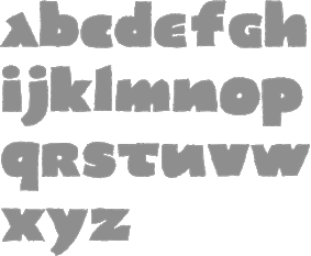 Born in Barcelona in 1950, Joan Barjau is a graphic and type designer, cartoonist, illustrator, painter, and animator who taught at Eina in Barcelona from 1984-1993. Designer at type-o-tones in Barcelona who made Analfabeta Regular (1999, with Flavio Morais), Analfabeta Pics (1999, with Flavio Morais),
  [
[ Basque penman, 1788-1853. His designs were engraved in 1833 by Giraldos and Nicolás de Gangioti and dedicated to the Queen Governor. That work was published in Colección General de los Caractéres de Letras Europeas (see
 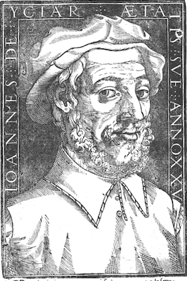 Also written as
  [
[ Codesigner with Santos Bregaña and Julen Cano Linazasoro of the calligraphic typeface
  Barcelona-based designer of these typefaces:
  Graphic and type design studio founded in La Boissière-d'Ans and/or Cubjac, France by
  [
[ Studio with offices in Madrid and Bilbao, first called Supperstudio and then PAAM (run by
  [
[ Studio based in Barcelona and New York. In 2020, they designed the custom Basque typeface Arbizu for the Basque electronic music company Zetak. Its glyphs are inspired by old funerary inscriptions, engravings, gravestones, and lintels from the Basque Country. The typeface was produced by Jordi Embodas.
  Helen Rice and Josh Nissenboim run Pretend Foundry / Fuzzco, as an outlet to try out experimental fonts. Located in South Carlina, their typefaces as of early 2020 include:
  [
[ Graduated in Communication Design from the Fachhochschule für Gestaltung in Hamburg in 1993. He studied under Mark Jamra. Designer of the semi-Western semi-Basque display typeface
  The
The  [
[ Bilbao, Spain-based designer (b. 1986, Bilbao) of a set of decorative numerals called Numeros de Palacio (2014). She also created the modular typeface Zati (2014). Tania studied fine arts at la Universidad del País Vasco (UPV/EHU).
  Bilbao-based designer of the experimental typeface
  Catalan foundry headed by Andreu Balius (b. 1962), who is based in Barcelona and Son (Alt Aneu), Lleida. Balius holds a PhD in Design from the University of Southampton (UK) and teaches typography and type design at EINA, University School of Design and Art, in Barcelona.
  Type designer in Croatia. His typefaces include
  [
[ An
An  Vincent Connare (b. 1960, Boston) is an ex-painter turned type designer, who holds an MA in typeface design from the University of Reading in 1999. In the late eighties/early nineties Connare worked in the Ikarus, Intellifont and TrueType teams for Agfa/Compugraphic, and was one of the first type designers to learn TrueType hinting. Then he joined Microsoft, where he designed
  Robby Woodard is the Fresno, CA-based designer of fonts at
  Prolific Barcelona-based type designer. He started out by creating the counterless hand-printed typefaces Woodcutter Dripping Nightmare (2012) and
|
|
|
|