| | |
A Survey of Free Math Fonts for TeX and LaTeX
[Stephen G. Hartke]
|
Article by Stephen Hartke from Urbana, IL, written in 2006. He surveys free math fonts for TeX and LaTeX, with examples, instructions for using LaTeX packages for changing fonts, and links to sources for the fonts and packages. PDF version of the paper. Hartke is a Professor of Mathematics at the University of Illinois at Urbana-Champaign. He finished a font family called Aurulent Sans and Aurulent Sans Mono (2007), and released the free monospaced font Verily Serif Mono (2006, based on Vera Serif, with same dimensions as Vera Sans Mono). Fontsy link. Alternate URL. Yet another URL. Twentyfour examples of text face/math typeface are showcased. Some are quite disappointing. Here are the better ones (with some text quoted from Hartke's article): - Computer Modern (by Don Knuth), still my favorite. Type 1 versions of Computer Modern from Blue Sky Research and Y&Y, Inc. have been made freely available by the American Mathematical Society (AMS). Basil K. Malyshev has also released a free Type 1 version of Computer Modern, the BaKoMa fonts. Computer Modern has been extended to include more characters, particularly for non-English European languages. These fonts include European Computer Modern by Jörg Knappen and Norbert Schwarz (METAFONT only), Tt2001 by Peter Szabó (converted into Type 1 format from METAFONT sources using textrace), CM-Super by Vladimir Volovich (also converted using textrace); and Latin Modern by Bogusaw Jackowski and Janusz M. Nowacki (extended from the Blue Sky AMS fonts using MetaType1).
- Concrete text with Euler math, or Concrete text with Concrete math. The Concrete font was created by Knuth for his book Concrete Mathematics. Hermann Zapf was commissioned by the AMS to create the math font Euler for use in Concrete Mathematics. Type 1 versions of Concrete in T1 encoding are available in the CM-Super collection, and Type 1 versions of Euler are available in the Blue Sky collection from the AMS and in the BaKoMa collection. The eulervm package by Walter Schmidt implements virtual fonts for Euler that are more efficient to use with LaTeX. Ulrik Vieth created the Concrete Math fonts to match the Concrete text fonts; the only early free versions are implemented in METAFONT. The ccfonts package by Walter Schmidt changes the text font to Concrete and changes the math font to the Concrete Math fonts if eulervm is not loaded. Note that Concrete Text has no bold, but the Computer Modern Bold does just fine for that. However, in 2022, Daniel Flipo developed a free OpenType font based on Vieth's Metafont, also called Concrete Math.
- Antykwa Poltawskiego text and Computer Modern Math. J. M. Nowacki created the font Antykwa Poltawskiego using the MetaType1 system based on a typeface by Polish typographer Adam Poltawski.
- Antykwa Toruńska text and math. Antykwa Toruńska was created by J. M. Nowacki using the MetaType1 system based on a typeface by the Polish typographer Zygfryd Gardzielewski. The package anttor has complete math support in both TeX and LaTeX.
- Kerkis text and math. Kerkis was created by Antonis Tsolomitis by extending URW Bookman L to include Greek and additional Latin characters. The resulting fonts are stand-alone and can be used by applications outside of TeX. A font of math symbols is included, but not used by the LaTeX package. The package kmath uses txfonts for math symbols and uppercase Greek letters.
- New Century Schoolbook with Millennial math. New Century Schoolbook with Fourier math. The Millennial math font by Stephen Hartke contains Greek letters and other letter-like mathematical symbols. A set of virtual fonts is provided that uses New Century Schoolbook for Latin letters in math, Millennial for Greek and other letter-like symbols, and txfonts and Computer Modern for all other symbols, including binary operators, relations, and large symbols. This font is still in development, but will hopefully be released in 2006. The fouriernc package of Michael Zedler uses New Century Schoolbook for text and Latin letters in mathematics, and the Greek and symbol fonts from the Fourier-GUTenberg package for the remaining mathematical symbols.
- Palatino and pxfonts, Pazo, or mathpple for math symbols. Young Ryu created the pxfonts collection, which contains Greek and other letter-like symbols, as well as a complete set of geometric symbols, including the AMS symbols. Diego Puga created the Pazo math fonts, which include the Greek letters and other letter-like symbols in a style that matches Palatino. The LaTeX package mathpazo (now part of PSNFSS) uses Palatino for Latin letters, Pazo for Greek and other letter-like symbols, and Computer Modern for geometric symbols. The LaTeX package mathpple (also part of PSNFSS) uses Palatino for Latin letters and slanted Euler for Greek and other symbols. Since Hermann Zapf designed both Palatino and Euler, the designs mesh well. An alternate use of Euler is using the eulervm package. Ralf Stubner added small caps and old-style figures to URW Palladio L in the FPL package, and Walter Schmidt extended these fonts in the FPL Neu package.
- Utopia and Fourier or Math Design. Utopia was donated by Adobe for use with X Windows. Michel Bovani created Fourier-GUTenberg as an accompaniment to Utopia and is very complete, containing both Greek letters and standard and AMS symbols. The Math Design fonts for Utopia of Paul Pichaureau are also very complete, including Greek letters and AMS symbols.
- Charter and Math Design. Or URW Garamond and Math Design. Charter was donated by Bitstream for use with X Windows. The Math Design fonts for Charter created by Paul Pichaureau are very complete, including Greek letters, symbols from Computer Modern, and the AMS symbols. Charis SIL might be an alternate source for Greek letters that match Charter more closely. Another possibility for a math font is to use the Euler fonts with the charter and eulervm packages. URW Garamond No. 8 is available under the Aladdin Free Public License as part of the GhostPCL project. The Math Design fonts for URW Garamond created by Paul Pichaureau are very complete, including Greek letters, symbols from Computer Modern, and the AMS symbols.
- Times or Omega Serif, and txfonts, Belleek, mathptmx, or mbtimes. Young Ryu created the txfonts collection, which contains Greek and other letter-like symbols, as well as a complete set of geometric symbols, including the AMS symbols. The txfonts package also includes a very nice typewriter font, txtt. Belleek was created by Richard Kinch and is a drop-in replacement for the commercial fonts required by the mathtime package (now part of PSNFSS). The LaTeX package mathptmx (also part of PSNFSS) uses Times for Latin letters and Symbol for Greek and other symbols. Michel Bovani created the mbtimes package by using Omega Serif for text and Latin and Greek letters in mathematics. mbtimes also includes symbol fonts and a set of calligraphic letters. Omega Serif is the primary font for Omega, a 16-bit extension of TeX by John Plaice and Yannis Haralambous. The STIX fonts project is a collaboration of several academic publishers to create a set of Times-compatible fonts containing every possible glyph needed for mathematical and technical publishing. These fonts are still in development, with a scheduled release in the middle of 2006. Note: When Adobe introduced Postscript in 1984, they defined 35 core fonts (in 10 typefaces) that must be present in all Postscript interpreters. In 1996, URW++ released a replacement set for the core fonts under the GNU General Public License. The URW++ fonts were primarily released for use with Ghostscript, a free Postscript interpreter. For example, Times is Nimbus Roman No. 9 L, Palatino is URW Palladio L, New Century Schoolbook is Century Schoolbook L and Symbol is Standard Symbols L.
Klingspor link. Dafont link. Abstract Fonts link. [Google]
[More] ⦿
|
Aditi Gunaji
|
Pune, India-based designer in 2016 of a Devanagari typeface that is based on Bookman Old Style. [Google]
[More] ⦿
|
Alexander Phemister
[Bookman]
|
[More] ⦿
|
Alexander Phemister

|
Punchcutter. From MyFonts: Scottish punchcutter (b. Edinburgh, 1829, d. Chelsea, MA, 1894) active in the revival of oldstyle designs at Miller&Richard in the 1850s. He went to America in 1861, working at the Bruce type foundry for two years, and then for the Dickinson foundry. In 1872 this foundry was ravaged by fire; Phemister was made a partner by its founder Samuel Nelson Dickinson and worked there until retirement in 1891. MyFonts missed the boat on this one! Phemister was the first man to design the famous Bookman. His typefaces include these: - Bookman. McGrew states: Bookman Old Style has become a lastingly popular "workhorse" design for plain, easy-to-read text, and to some extent for display as well. It is derived from an oldstyle antique typeface designed by A. C. Phemister about 1860 for the Scottish foundry of Miller&Richard, by thickening the strokes of an oldstyle series. From there on, his design was copied and refined over and over again, starting with the Bruce Type Foundry (Antique No. 310), MacKellar (Oldstyle Antique), Keystone (Oldstyle Antique), Hansen (Stratford Old Style). His design of Bookman was refined at Kinsley/ATF in 1934-1936 by Chauncey H. Griffith. The Bookman story does not end there, but at least, Phemister started it! Numerous implementations of Bookman exist, such as the free URW Bookman L family, and the free extension of the latter family in the TeX-Gyre project, called Bonum (2007).
- Franklin Old Style. McGrew writes: Franklin Old Style was intended to be a modernization of Caslon, cut in 1863 by Alexander Phemister, once of Edinburgh, later of Boston, for Phelps, Dalton&Company. Being more regularized, it has lost the individuality and most of the charm of Caslon, but is a clear, legible typeface that has had considerable popularity. It was one of the early typefaces cut by Linotype for book work; the italic has an extreme slant for a slug-machine face, but composes remarkably well. Compare Binny, Clearcut Oldstyle.
Some images below by Alex Delgado. FontShop link. Klingspor link. View and compare Bookman-style commercial typefaces. [Google]
[MyFonts]
[More] ⦿
|
Antonis Tsolomitis
[Kerkis]
|
[More] ⦿
|
ATF: Bookman Oldstyle
|
 A classical typeface with different names. The name Bookman Oldstyle was coined by ATF. Thew history was told by Mac McGrew. The notes below are based on his discussion.
 - The genesis: Bookman Old Style has become a lastingly popular "workhorse" design for plain easy-to-read text, and to some extent for display as well. It is derived from an oldstyle antique typeface designed by A. C. Phemister about 1860 for the Scottish foundry of Miller&Richard, by thickening the strokes of an oldstyle series. This typeface was copied by Bruce Type Foundry in this country as Antique No. 310, by MacKellar, Keystone and others as Oldstyle Antique (q.v.), and by Hansen as Stratford Old Style (q.v.). In 1901 Bruce brought out Bartlett Oldstyle, based on the small sizes of their older face, refitted and otherwise improved. In that year Bruce was taken over by ATF, which thought well of Bartlett but changed the name to Bookman Oldstyle; it was cast at the Bruce foundry under both names until the plants were actually combined in 1906.
- McGrew: Few roman typefaces have swash letters. In our specimen, the first group of swash letters for both roman and italic was drawn by Wadsworth A. Parker for ATF, the second group, somewhat different, is by Ludlow. For printers who preferred type without the swash characters, Oldstyle Antique No. 560 was introduced; it is identical to Bookman and Bartlett except for those characters. In fact, some of the original matrices for Bruce Antique No. 310 were used for many years for casting Bookman after the other names had vanished.
- The period 1909-1930, by McGrew: Bookman was adapted to the Monotype in 1909. Compositors are only slightly modified to fit mechanical requirements, but display sizes are virtually exact copies of the ATF face, including roman swash letters other than M and The, which are too wide for Monotype molds in the larger sizes. Intertype issued its Bookface, a close copy of Bookman including all swash letters and with alternate oldstyle figures, about 1920. Ludlow Bookman and Italic are close copies of the ATF typefaces, but with redesigned swash characters as shown.
- From 1930 on, by McGrew: C. H. Griffith redesigned Bookman in 1936 for Linotype, staying close to the feeling of Bookman but omitting swash and alternates. A further modifi- cation isNew Bookman, designed by Sol Hess for Monotype in 1927; it departs more than the others in such details as serifs, but maintains the general feeling of the original face. Bookman Old Style Condensed was designed for Monotype by Sol Hess in 1916-figures are the same as Bookman and there is no lowercase. Antique No.1 (q. v.) is quite similar to Bookman, and in fact is often but erroneously called Bookman by Linotype and Intertype users.
- About equivalences between various metal Bookman oldstyle typefaces: BB&S Bookman Oldstyle appears to be an exact copy of the ATF typeface but lacks swash letters other than The and of; matrices undoubtedly came from Western Type Foundry when BB&S acquired it in 1918. Other BB&S Book- mans were renamed in 1925 from Western typefaces originally issued under other names. Bookman Lightface was Western's Custer, in turn a copy of ATF's Cushing No. 2; Bookman Bold was Western's Custer Bold, similar to Cushing Oldstyle. Bookman Bold Condensed was formerly BB&S's Monitor No.5, first shown in 1895. Inland's Faust is the equivalent of Bookman.
Digital versions: [Google]
[More] ⦿
|
Bitstream font analogue
|
 Bitstream font name equivalences. The original file, dated 2007, was at Fontinfo.net, but dispappeared some time ago. Here is that list in text format:
 Aachen == Charlemagne; Ruhr; Vanadium; Westlake Ad Lib == Alibi Adsans == Ad Gothic; Angro; Humanist 970; News Ad Akzidenz Grotesk == Ad Grotesk; Gothic 725; Grigat; Standard; Wayland Albertus == Adelon; Alburt; Flareserif 821 Aldus == Breklum; Luce; Mannucci Roman Alternate Gothic No.2 == Alpin Gothic; Gothic Amazone == Amazonia; Fredrika Amelia == Computer 651; Orbit; Orea American Text == Blackletter 851; National Text Americana == AM; American Classic; Aston; Colonial; Concord; Flairserif 721; Freedom; Independence Antique No. 3 == Egyptian 710 Antique Olive == Alphavanti; AO; Berry Roman; Gibson Antique; Incised 901; Oliva; Olivanti; Olive; Olive Antique; Oliver; Olivette; Olivette Antique; Olivia; Provence Antique Roman Open == Roman Stylus Antique Roman Shaded == Roman Shaded Arnold Bocklin; Auckland == Bock; Expo; Medusa; Nouveau; Youth; Freeform 715 Asta == Albany; AS; Astro; Aztec; Corolla; Dutch 823 Auriol == Freeform 721; Robur; Skylark Aurora Bold Condensed == Anzeigen Grotesk; Aura; Aurora; Grotesque Condensed Aurora == Empira; News 706; News No.12; News No.2; Polaris; Regal Baker Signet == Keene; Signature; Signatur Vario; Signete Balloon == BL; Freehand 041; Lasso Bank Gothic == Bond Gothic; Commerce Gothic; Deluxe Gothic; Magnum Gothic; Square 021; Stationer's Gothic Baskerville == Baskenland; Baskerline; Basque; Beaumont; BK; Transitional 401 Baskerville No.2 == Euro Baskerville; Transitional 404 Bauer Bodoni == Bodoni B; Euro Bodoni; Headline Bodoni; Modern 405 Bell Centennial == Gothic 762 Bell Gothic == Directory Gothic; Furlong; Gothic 761; Paddock Belwe == Belter; Welby Bembo == Aldine 401; Aldine Roman; Ambo; BE; Bem; Bernstein vario; Bingo; Griffo; Latinesque Berling == Carmichel; Revival 565 Bernhard Modern == Beacon; Bernie; BN; Duchess; Engravers Oldstyle Bernhard Tango == Aigrette; Carmine Tango Bingham Script == Freehand 591 Bison == Bison; Blizzard; Brush 738 Bitstream Alisal == Calligraphic 456 Bitstream Amerigo == Flareserif 831 Bitstream Arrus == Lapidary 721 Bitstream Carmina == Calligraphic 811 Bitstream Charter == Transitional 801 Bitstream Cooper == Freeform 741 Bitstream Fournier == Transitional 601 Bitstream Iowan Old Style == Venetian 801 Bitstream Oz Handicraft == Freehand 701 Bitstream Ventana == Humanist 800 Blippo == Geometric 755 Block == Black; Block; Gothic 821; Hobble Bloc == Geometric 885 Bodoni == BO; Bodoni No. 2; Brunswick; Empiriana; Gorvind; Modern 421 Bodoni Campanile == Modern 735; Palisade Bookman == Bookface; Bookman Antique; Bookprint; Revival 710 Bremen == Exotic 011 Britannic == Gallery; Grenoble Broadway == Big City; BW; Deco; Hudson; Moderne; Modernistic; Ritz; Showtime Brody == Brophy Script Bruce Old Style == Bruce; No. 31; Old Style No.3; Old Style No.7; Revival 704 Brush Script == Bombay; BR; Brush; Brilliant Bold Script; Brush 451; Punch Cable == Geometric 231; Kabel; Kabello; Kobel Caledonia == Calderon; Caledo; California; Cornelia; Edinburgh; Gael; Gemini; Highland; Laurel; Transitional 511 Candida == Candide Cascade == Freehand 471; Kascade Script Caslon 540 == Caslon 74; CL; Caslon 2; Caslon 484; Caslon 485 Caslon Bold == Caslon No. 3; New Caslon; Caslon 74 Bold Caslon Old Face == Caslon Old Style; Caslon; Caslon 128; Caslon 471; Caslon 76 Cataneo == Chancery 731 Centaur == Arrighi; Centaurus; Venetian 301 Century Expanded == Century Light/II; Century X; Cambridge Expanded; CE; Century; Century Bold Century Oldstyle == Cambridge Oldstyle Century Schoolbook == Century Text; Century Textbook; CS; Schoolbook; Cambridge Schoolbook; Century Medium; Century Modern Chapel Script == Mahogany Script; Monterey Cheltenham Old Style == Cheltonian; Chesterfield; Gloucester; Kenilworth; Nordhoff; Sorbonne; Winchester Choc == Staccato 555 City == Square Slabserif 711; Town Clarendon == Clarique; Clarion; Cerebral Cloister Black == Abbey; Cloister Black Codex == Calligraphic 421 Concorde == Dutch 809; Chinchilla; Concert Cooper Black == Bitstream Cooper; Burlesque; Coop; CP; Ludlow Black; Pabst; Plymouth; Rugged Black Copperplate Gothic == Atalante; Copperplate; Formal Gothic; Gothic No.29; Gothic No.30; Gothic No.31; Gothic No.32; Gothic No.33; Lining Plate Gothic; Mimosa; Spartan Corona == Aquarius; Cardinal; CR; Crown; Elmora; Ideal; Koronna; News 705 BT; News No.3; News No.5; News No.6; Nimbus; Quincy; Royal; Scotsman Royal; StarNews; Vela Coronet == Pageant; Ribbon 131 Courier == Messenger Davida == DaVinci De Vinne == Congressional; Industrial 731 Della Robbia == Cantoria; Canterbury; Dahila; Firenze; Westminster Old Style Diotima == Calligraphic 810; Diotima Dom Casual == Ad Bold; Brush 431; Brush Roman; Dom Casual; Polka Eckmann == Freeform 710 Egyptian 505 == Egyptios; Egypt 55 Egyptienne == Humanist Slabserif 712; Egyptien Electra == Avanta; Elante; Illumna; Selectra; Transitional 521 Embassy == Boston Script; Florentine Script; Hellana Script; Script No.1; Script No.2 Englische Schreibschrift == English 157; English Script Engravers' Old English == Old English; Old English Text Engravers' Roman == Lining Litho Engravers Roundhand == Roundhand No. 1; Signet Roundhand; Snell; Snell Roundhand Eurostile == Aldostyle; Astron; ES; Eurogothic; Europa; Gamma; Micro; Microstyle; Square 721; Waltham Excelsior == Angeles; Berlin; Camelot; Commerce No.1; Commerce No.2; Digi-Antique; Esquire; EX; Excel; Excella; League Text; News 702; News No.10; News No.14; Opticon; Paragon; Primus; Victoria Fairefax; Fairfield == Fairmont; Savant; Transitional 551 Financial == Letter Gothic Folio == Haverhill Fraktur == German Gothic Franklin Gothic == Gothic No.16; Pittsburgh Frutiger == CG Frontiera; Concorde; Freeborn; Humanist 777; Provencale; Roissy; Siegfried Fry's Baskerville == Baskerville Display; Baskerville F; Baskerville Old Face; Transitional 409 Futura == Alphatura; Atlantis; FU; Future; Photura; Sirius; Utica Gando == Gando Ronde Garamond == Aldine 511; American Garamond; Canberra; Carrera; Garamond No.2; Garamond No.3; Garamond No.49; Garamont; GD; Grenada Gill Sans == Eric; Gillies; Glib; Graphic Gothic; Hammersmith; Humanist 521; Sans Serif 2 Gothic No.13 == Gothic No.4 Goudy Old Style == Grecian; Number 11; Goudy; Goudy Bold; Goudy Extra Bold Granjon == Elegant Garamond; Garamont Premier; Grandeur Grotesque 126 == Gothic 720 Hanseatic == Swiss 924; Geneva 2 Hanoverian; Helvetica Compressed == Helvetica Pressed; Spectra Compressed; Swiss 911; Claro Compressed; Geneva 2 Compressed; Helios Compressed Helvetica Inserat == Swiss 921; Geneva 2 Sera; Geneva Inserat; Helios Inserat Helvetica Monospaced == Monospace 821 Helvetica == Aristocrat; CG Triumvirate; Claro; Corvus; Europa Grotesk; Geneva/2; Hamilton; HE; Helios/II; Helv; Helvette; Holsatia; Megaron/II; Newton; Spectra; Swiss 721; Vega; Video Spectra Hobo == Hobnob; Tramp Imperial == Bedford; Emperor; Gazette; New Bedford; News No.4; Taurus Imprint == Period Old Style; Dutch 766 Impuls == Impuls; Brush 439 Ionic No. 5 == Ionic-326; Ionic/2; News 701; News Text Medium; Rex; Windsor; Zar; Corinth; Doric; Ionic 342; Dow News; Ideal; Regal Italian Script == Lorraine Script; Lucia ITC American Typewriter == Amertype; AT; Newriter; Typewriter 911 ITC Avant Garde Gothic == AG; Avanti; Cadence; Geometric 711; Suave; Vanguard ITC Bauhaus == BH Geometric 752 ITC Benguiat Gothic == BT; Informal 851 ITC Benguiat == Beget; BG; Revival 832 ITC Berkeley Oldstyle == Venetian 519 ITC Bolt Bold == Square 821 ITC Bookman == Revival 711; Bookman; BM ITC Busorama == Geometric 075; Omnibus; Panorama; ITC Century == Centrum ITC Galliard == Seville ITC Garamond == Garamet ITC Kabel == Kabot ITC Korinna == Kordova ITC New Baskerville == Transitional 402 ITC Serif Gothic == Line Gothic ITC Souvenir == Sovran; SV ITC Tiffany == Jewel ITC Zapf Chancery == Chancelor Janson == Jason; Journal; Kis; Kis-Janson; Nikis; Dayton; Jan/Dutch Jefferson == Freehand 575 Kaufmann == Swing Bold; Tropez Liberty == Bernhard Cursive; Bernhard Schonschrift; Lotus; Viant Libra == Libretto; Libby Uncial Life == Fredonia Linotype Modern == Modern 880; Telegraph Modern London Text == Belvedere; Blackletter 686 Lydian Cursive == Granite Cursive; Lisbon Cursive Lydian == Granite; Lisbon Madison == Century 725 Mandate == Command; Freehand 521 Matt Antique == Garth Graphic Melior == Ballardvale/2; CG Melliza; Hanover/II; Lyra; Mallard; Matrix; ME; Medallion; Metrion; Uranus; Ventura; Vermilion; Zapf Elliptical Memphis == Alexandria; Cairo; Geometric Slabserif 703; Nashville; Pyramid Meridien == Zenith; Equator; Latin 725; Latine; Maximal Metro == Chelsea; Geometric 415; Gothic No.2; Gothic No.3; Megamedium; Meteor Mirarae == Calligraphic 808 Mister Earl == Freehand 651 Mistral == Aeolus; Missive; Staccato 222; Zephyr Script Neuland == Othello; Informal 011 Neuzeit Grotesk == Genneken; Geometric 706; Grotesk S News Gothic == Alpha Gothic; CG Trade; Classified News; Gothic Bold-131; Gothic No.17; Gothic No.18; Gothic No.19; Gothic No.20; Gothic-130; Lightline Gothic; Record Gothic; Toledo; Trade Gothic Nuptial Script == Bridal Script; Floridian Olympian == Olympus; Dutch 811 Ondine == Formal Script 421; Mermaid Onyx == Arsis; Onyx; Poster Bodoni Compressed Optima == Athena; CG Omega; Chelmsford/II; Musica; October; OP; Optimis; Optimist; Oracle/II; Orleans; Roma; Ursa; Zapf Humanist; Zenith Oscar == Formal 436 Palatino == Andover/II; CG Palacio; Compano; Elegante; Malibu/2; Paladium; Palatine; Palermo; Parlament; Patina; Pontiac; Zapf Calligraphic Palette == Brush 445; Palette Park Avenue == Parkway; PA Peignot == Exotic 350; Monterey; Penyoe Perpetua == Felicity; Lapidary 333; Percepta; Perpetual Piranesi Italic == Minuet Plantin == Aldine 721; Atlantic; PL; Planet; Plantin Poster Bodoni == Bodoni Extrabold/No. 2; Modern 721 Prestige == Prestige Elite Primer == Rector; Scholasta; Century 751; Premier; Bancroft Profil == Decorated 035 Raleigh == Cartier Rockwell == Slate; Geometric Slabserif 712; Rockland Romana == Romanisch; De Vinne; De Vinne Ornamental; French Old Style; Lorimer; Romaans Sabon == Berner; Classical Garamond; September; Sybil/2; Symposia Serifa == Seriverse; Sierra; Monty; Seraphim Shelley == Operinia Simoncini Garamond == Garamond Simoncini; Garamondus; Italian Garamond; Spartan == Technica; Techno; Times Gothic; Twentieth Century; Geometric 212; Sans; Sparta Star Trek == Square 051 Stempel Garamond == Euro Garamond; Garamond; Garamond Antiqua; Garamond Royale; Original Garamond Stempel Schneidler == Amalthea; Bauen Schrift; Bauer Text; Brewer Text; Kohinoor; Schneidler; Schneidler Old Style Stuyvesant == Wintergreen Stymie == ST Syntax == Synthesis; Cintal; Humanist 531; Symphony; Synchron Textype == Century 731 Times Roman == TmsRmn; TR; Varitimes; Claritas; Dutch 801; English; English 49; English Times; Euro Times; London Roman; Pegasus; Press Roman; Sonoran Serif; Tempora; Tiempo; Timeless; Times New Roman Torino == Contessa; Galileo; Industrial 736; Loren Trump Mediaeval == Activa; Ascot; Continental; Knight; Kuenstler 480; Mediaeval; Olympus; Renaissance; Saul Typo Upright == French Script; Interscript; Kaylin Script; Linoscript; Parisian Ronde Umbra == Durante; Meandme; Plastica Univers == Alphavers; Aries; Boston; Eterna; Galaxy; Kosmos; Swiss 742; UN; Versatile; Zurich University Roman == Ace; Celtic; Collegette; Forum Flair; Opera; Orna; Stunt Roman Wedding Text == Linotext; Marriage Windsor == Winslow [Google]
[More] ⦿
|
Boguslaw Jackowski
[qfonts]
|
[More] ⦿
|
Bogusław Jacko Jackowski
|
Polish type designer involved in GUST.org fonts for Polish such as QuasiTimes, QuasiPalladio, QuasiHelvetica, QuasiCourier, QuasiChancery, QuasiBookman, Antykwa Półtawskiego (based on work by Adam Półtawskiego (1923-1928), constructed by Bogusław Jackowski, Janusz M. Nowacki and Piotr Strzelczyk). He developed the Latin Modern fonts (2003, type 1) based on Knuth's Computer Modern fonts. In 2006, Nowacki and Jackowski published free extensions of the Ghostscript fonts in their TeX Gyre Project: Adventor, Bonum, Cursor, Heros, Pagella, Termes, Schola, Chorus. [Google]
[More] ⦿
|
Bookman
[Alexander Phemister]
|
 Bookman is due to Alexander Phemister (1860) and Chauncey H. Griffith (1936), and is an ATF face. Mac McGrew: Old Style Antique [No. 560] was the typeface on which Bookman was based. It was cast by a number of founders, of which Keystone continued to cast it into this century. Also see Stratford. Other pre-digital foundries that did Bookman include Ludlow, Linotype and Miller&Richard. ITC Bookman was designed in 1975 by Ed Benguiat. Other digitizations include Book PS (Softmaker), Bookface, Bookman BT (Bitstream), Revival 711 (Bitstream), BM (Itek), Brooklyn (Corel), and Antique Old Style. See also Bookman-like typefaces.
 Some images below by Alex Delgado. [Google]
[More] ⦿
|
Castcraft Software Inc (or: OptiFont)
|
Castcraft [3649 W Chase Ave Skokie, IL 60026], showed off a comprehensive library of fonts, all with extended character sets for multi-language typography. OptiFont is a trademark filed in 1990 by Fredric J. Kreiter of Castcraft. Castcraft sold a CD-ROM Type Library Volume 1 at 200 USD. Its entire font collection was sold for 1000 USD. It also made some custom fonts. Most post-1990 fonts have the prefix OPTI. For example, OPTI-Peking is an oriental simulation font. OPTI-Favrile is a copy of Tom Carnase's Favrile (WTC). A visitor warned me that there is absolutely zero security when you order from this outfit, so you are warned--this is a dangerous site! It seems that Manny Kreiter (d. 2005) was the last President&CEO, and that his family (Abe, Harry and Ned Kreiter) have been at it since the days of metal type (1936) starting as Type Founders of Chicago. I found this on their pages: Castcraft has licensing [sic] the entire 20,000 TypeFaces from "Type Films of Chicago" and the entire "Solotype Alphabets" collection. Mike Yanega claims that most of their fonts are clearly not original any more than most of Bitstream's are original, and like them they re-name many of their fonts to avoid copyright issues. Their fonts all appear to be a "dead collection" of copies of relatively old designs that have already appeared in many other collections from the likes of WSI and SSi. In 2010, John Brandt reports: Castcraft, aka Type Founders of Chicago, moved decades ago from Hubbard St in Chicago to a close-in suburb (Skokie? Niles?) and was still operating within the past few years when I happened to drive by. I failed to find any current incarnation, but they used several names even years ago as a prominent pirate. Besides pirated fonts (Typositor to later, generally poor digital), they were a big metal vendor (I have a partial metal set of Helvetica gifted as they left downtown in the 1970s), and also had a guy (whose name escapes me) who did fabulous high-end signage, from sand-blasted glass to the created-on-building inscribed metal logo for a well-known Michigan Ave mall. Longtime owner Manny Kreiter died in 2005, but whether Boomie or any of the others who may still be around kept it going is unknown. Aside from simply having ANY version of their many offerings, most would consider their collection worthless. Anyone who has a digital "OPTIfont" and a font editor can readily view the problems, including usually several times too many Bezier points within any character. I counted 78 control points on a minimal character, for instance, that should have had less than a dozen. Mark Simonson: Castcraft was notorious in the sixties and seventies for pirating film fonts for headline setting machines, such as the Typositor. They would acquire a film fonts from franchisees of VGC (who also made the Typositor) or Filmotype or Alphabet Innovations, and then make duplicates and sell them to typesetting houses, usually changing the font names. Companies like Alphabet Innovations even put deliberate mistakes into individual fonts sent to franchisees just to try to see where Castcraft was getting them. Florian Hardwig: OPTI is a label used by Castcraft (also/previously known as Typefounders of Chicago and Type Films of Chicago) for digital fonts they produced around the early 1990s. My understanding is that virtually all of them are based on designs by others, made and distributed without authorization and without compensating the original designers or IP holders. Technically, many were likely based on the copies Castcraft previously made for phototype. They typically have names different from the original to avoid trademark issues. The company is long defunct and, ethical issues aside, the fonts are of subpar quality. Listing of Castcraft fonts (compiled by myself). The 802 fonts listed here are all dated between 1990 and 1994. I know there are at least 1,000 digital fonts made by them, so my list is incomplete. This link maintained by alt.binaries.fonts regulars contains most OPTI fonts for free download. It contains in particular some scans of one-line listings (i, ii, iii), and lists of name equivalences (i, ii). Mediafire link. Picture of Ned, Abe, Harry and Manny Kreiter. Defunct Castcraft Software link. Typophile discussion. Font name equivalences (by Philippededa, 2012). List of equivalences of Castcraft names. List of Castcraft typefaces as of July 2014. [Google]
[More] ⦿
|
Chauncey H. Griffith
|
 Kentucky-based type designer and printer, 1879-1956. He was a Linotype salesman who directed the growth of the Linotype library from 1915 to 1948, and improved the look of the world's newspapers. He worked to establish Linotype as the composing machine of choice in America. He continued as a consultant to Linotype well into his retirement.
 Claus Eggers Sorensen writes: In 1922 Chauncey H. Griffith was promoted to Vice President of Typographic Development at Mergenthaler Linotype. He immediately started the development of new typefaces to replace the prevailing modern style typefaces. The issue troubling the moderns was their high contrast design. Especially the hairline parts of the cast lines could break of while printing, and counters could clog with ink and pulp. Faster printing meant transferring the cast lines with the stereotype process to a letterpress cylinder for high-speed rotary printing on endless rolls of paper stock. C. H. Griffith's new approach was to engineer new typefaces to the printing method. That meant drawing inspiration from the Egyptienne style as seen in the Clarendon typeface, with its very sturdy lower contrast design, and Theodore Low De Vinne and Linn Boyd Benton's Century Roman, which possessed elegance and legibility. The first product of these efforts was Ionic No. 5. It was an instant success, within eighteen months it was used by more than 3000 newspapers all over the world. C. H. Griffith and Mergenthaler Linotype continued to refine the design in subsequent iterations: Excelsior (1931), Paragon (1935), Opticon (1935), Corona (1941). These became known as the Legibility group. Ionic No. 5, Excelsior and Paragon form the Linotype Legibility Group. He designed or co-designed the following fonts, all at Mergenthaler: - Baskerville (1939, Linotype).
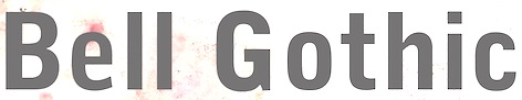
- Bell Gothic (1937-1938). Now available at Bitstream. Font Bureau has its own version, Griffith Gothic (1997-2000, by Tobias Frere-Jones): Of all his work, Chauncey Griffith claimed one type, Bell Gothic, as his own design. Griffith Gothic is a revival of the 1937 Mergenthaler original, redrawn as the house sans for Fast Company. Tobias Frere-Jones drew a six weight series from light and bold, removing linecaster adjustments and retaining the pre-emptive thinning of joints as a salient feature. Mac McGrew: Bell Gothic was developed in 1937 by C. H. Griffith of Mergenthaler Linotype, primarily for use in the New York City telephone directory, but quickly became standard for telephone books nationwide. The aim was to eliminate roman types with objectionably thin serifs and hairlines. Furlong and Market Gothic were specialized adaptations of this typeface for newspaper work, the former with special figures and other characters for setting racetrack results, the latter in 1941 with other special characters for stock market details. The basic Bell Gothic was also cut by Intertype in 1939. Compare No. 11 and No. 12, shown under Numbered Faces, previously used for directory work. Imitations include OPTI Benet (Castcraft). Poster by Jaime Schweitzer. View digital versions of Bell Gothic.
- Bookman (1936, after the 1960 original by Alexander Phemister at Kingsley ATF).
- Corona (1941), a narrow newspaper typeface with large x-height. Corona was designed to meet the rigorous requirements of high-speed printing, and is still the chosen type of many American daily newspapers. Mac McGrew: Corona was drawn and cut by Linotype under the direction of C. H. Griffith in 1941. It is a member of the "Legibility Group" of faces designed for easy reading under newspaper conditions of stereotyping and high-speed printing with inks that could be trapped in close quarters. Royal on Intertype is a 1960 copy of Corona. Digital revivals include C795 Roman (Softmaker), News 705 BT (Bitstream).
- Elegant Garamond (Bitstream). This Granjon design was made by Chauncey H. Griffith based on models by George William Jones, and before that, Robert Granjon.
- The didone-style newspaper typeface Excelsior (1931, Linotype). At Bitstream, this is News 702. URW calls it Excius, and SoftMaker's version is Exemplary. Mac McGrew: Excelsior was cut for Linotype in 1931 under the direction of C. H. Griffith. It is a plain type, but designed for the utmost readability, with only slight variation from thick to thin, and careful fitting that makes the characters flow into easily recognizable words. Long or short descenders are available in certain sizes. Like a number of Linotype typeface intended primarily for newspaper work, Excelsior is available in closely graded sizes, including odd and some half-point multiples.
- Granjon (1928-1930, with George William Jones at Linotype). MyFonts: Claude Garamond's late Texte (16 point) roman was the model used by George W. Jones when he designed this typeface for Linotype&Machinery in 1928. To avoid confusion with the Garamond romans based on Jannon's seventeenth century work, L&M called the typeface Granjon, after the designer of the italic used as a model, thus creating confusion with the typefaces based on Granjon's romans, Plantin and Galliard. Granjon is a little less crisp in cut than either Sabon, Stempel Gararmond or Berthold Garamond, but makes a magnificent and most readable text face, as shown in Reader's Digest since its founding. Mac McGrew: Granjon was designed for Linotype in 1928 by George W. Jones, distinguished English printer, to meet his own exacting requirements for fine book and publication work. It is derived from classic Garamond sources, but with refinements made possible by modern methods of punch cutting. In fact, one critic has called it "the purest form of Garamond." It is named for Robert Granjon, mid-sixteenth-century punch cutter noted in particular for his italics, from which the present Granjon Italic was derived. Granjon Bold, by C. H. Griffith, was added in 1931. Lanston Monotype acquired reproduction rights to the typeface from Mergenthaler.
- Ionic No. 5 (Linotype, 1925). Mac McGrew: Ionic is a general name for a style of typeface which is closely related to the Clarendons (q.v.). Plain, sturdy designs with strong serifs and little contrast, the Ionics were popular in the latter part of the nineteenth century. Although many founders offered them, they were generally gone by early in this century. A few received a new lease on life when they were copied by Monotype, Linotype, or Intertype. Two new Ionics appeared in this century. Ionic No.5 was designed by C. H. Griffith in 1926 for Linotype, as a newspaper text face. It features a large lowercase with short ascenders and descenders, with no fine lines or serifs to break down in stereotyping, and no small openings to fill up with ink. This is one of a few typefaces made in many closely graded sizes: 5-, 51/2-, 6-, 61/2-, 63/4-, 7-, 71/2-, 8-, 9-, 10-, and 12-point. Intertype's Windsor, developed in 1959, is comparable. Ionic Condensed was designed by Griffith in 1927, also for Linotype. It is a refinement of traditional designs, intended for newspaper head- ings, and has most of the general characteristics of the text face. Ionic Extra Condensed is essentially the same, a little narrower and without lowercase, also for newspaper headlines.
- Janson (1932). Mac McGrew: Janson is adapted from types often attributed to Anton Janson, seventeenth-century Dutch letter founder, although researchers have shown that the originals were cut by Nicolas Kis, a Hungarian punchcutter and printer. The Linotype version was done in 1932 under the direction of C. H. Griffith, based on the 14-point size of about 1660. The Monotype version was adapted by Sol Hess in 1936, in collaboration with Bruce Rogers. Both versions are sharp and clear cut, and rather compact. They bear some resemblance to the types of William Caslon, which were based on later, similar Dutch types.
- Memphis (1929): the prototypical Egyptian of Rudolf Wolf. Mac McGrew: Memphis is the Linotype copy of the popular German square-serif typeface known as Memphis or Girder, designed by Rudolf Weiss about 1929, which did much to revive interest in this old style. Memphis Light and Bold were introduced by Linotype in 1933, Italics and Unique Caps in 1934, Medium in 1935, and other variations up to 1938. The Extra Bold versions were designed by C. H. Griffith. Alternate characters are available in some versions to more nearly approximate the appearance of Stymie or Beton (q.v.). The Lining versions are comparable to small caps in the regular versions, being propor- tionately wider and heavier than caps, and have no lowercase; there are several sizes each in 6- and 12-point, permitting various cap-and-small-cap combinations, in the manner of Copperplate Gothic. Also see Ward; compare Cairo, Karnak. Digital versions are everywhere. The Bitstream version is Geometric Slabserif 703.
- Linotype Monticello was designed by Griffith in 1946. Its design is based on James Ronaldson's Roman No.1 and Oxford Typefaces from American Type Founders and was revised by Matthew Carter while he was working at Linotype between 1965-1981. Mac McGrew: Monticello is a Linotype recreation of America's first great typeface, Binny&Ronaldson's Roman No.1, cut about 1796 by Archibald Binny in Philadelphia. His was the first permanent American type foundry. After about 30 years, the Binny typeface fell into disuse. The matrices survived, though, and a few fonts were cast about 1892 and the typeface was renamed Oxford (q. v.). In 1943 Princeton University Press announced plans for publishing a 52-volume edition of The Papers of Thomas Jefferson. As President, Jefferson had personally written to friends in France, introducing a Binny&Ronald- son representative who was seeking a source of antimony to replenish the shortage which threatened the young typefounding industry in this country. Jefferson also referred in this letter to the importance of type to civilization and freedom. In addition, the popularity of this typeface coincided with the most prominent years of Jefferson's life. Therefore Linotype suggested that a recutting of the typeface would be most appropriate for the Jefferson books, and the publisher heartily agreed. C. H. Griffith, Linotype typographic consultant, made a detailed study of Binny's type and redrew it in 1946 for the requirements of Linotype composition and modern printing conditions. It is a vigorous transitional face, somewhat similar to Baskerville but slightly heavier and a little crisper.
- Opticon (1935, Linotype). Mac McGrew: Opticon was designed in 1935 by C. H. Griffith for Linotype. It is a member of what that supplier calls its Legibility Group of typefaces designed primarily for newspaper use. It is essentially the same as Excelsior, but with stems and thick lines weighted slightly, for printing on hard-surfaced paper.
- Paragon (1935, Linotype). Mac McGrew: Paragon was designed by C. H. Griffith for Linotype in 1935. It is a member of that company's Legibility Group of typefaces, planned primarily for sharp and clean printing under the difficult inking and printing conditions of newspaper production, but also useful and popular for other periodical work. This typeface is lighter and airier than most such typefaces; otherwise it is much the same style. Compare Excelsior, Ionic, Opticon, Textype.
- Poster Bodoni (1920). Digital versions of Poster Bodoni or a textured ornamental version of it include Poster Bodoni (Bitstream), Modern 721 (Bitstream), OPTI Poster Bodoni Compressed (Castcraft), Bodoni Poster (Softmaker), Bodnoff (Corel), Poster Bodoni (Tilde), Poster Bodoni WGL4 (Bitstream), Saphir (Linotype), Bodoni Poster (Linotype), Bodoni poster (Adobe; same as the Linotype version), and Bodoni Ornamental (FontMesa).
- Ryerson Condensed was designed by C. H. Griffith in 1940 for Linotype, as a modernization of Globe Gothic Condensed.
- Textype (1929, Linotype). Mac McGrew: Textype was designed in 1929 by C. H. Griffith for Linotype. Although intended as a newspaper face, Textype with its smaller x-height and longer ascenders than most newspaper typefaces also became popular for magazines and other publications, as well as for a certain amount of advertising and general printing. There is an 18-point size in roman with italic, also a bold and bold italic. The 18-point size and the bold italic are both rare in newspaper typefaces. Compare Excelsior, Ionic, Rex, etc.
- Non-Latin typefaces: Porson and Metro Greek; thirteen Arabic designs adaptable for use throughout the Moslem world; Hebrews; the Indian scripts devanagari, Gujarati, and Bengali; Sinhalese for use in Ceylon, Tamil, and Syriac.
Klingspor link. Linotype link. FontShop link. Font Bureau link. Pic. [Google]
[MyFonts]
[More] ⦿
|
Daniel Taupin
|
Daniel Taupin (1936-2003) held a degree of the ESPCI school and was a doctor in physics. He was a researcher in a solid-state physics lab at Orsay University (Physique des Solides, University Paris-Sud). Obituary. Another obituary with details of his mountain climbing career and death in the mountains. He published ttfmf2t1, a free C program, to clean up the output of Oleg Motygin's ttf2mf program that converts ttf files installed (!!) in Windows to metafont format. Metafont sources for Garamond, Times, Arial, Book Antiqua and Bookman Oldstyle are also at this site. He also codeveloped OpusTeX and Musixtex (for music notation) with Andreas Egler and Ross Mitchell. He published Les polices TTF converties en Metafont and MusiXTeX: L'écriture de la musique polyphonique ou instrumentale avec TEX. Designer of the metafont fraktur font families CM Fraktur and DM Fraktur. CM Fraktur, or cmfrak, is based on Yannis Haralambous' font yfrak (1990). [Google]
[More] ⦿
|
David Thometz's top 10 favorite text typefaces
|
- Hightower (Font Bureau: Tobias Frere-Jones, 1994-1996, based on Nicolas Jenson) and Cloister Old Style (Font Company/URW++; Nicolas Jenson; Morris Fuller Benton, 1897): "Nicolas Jenson's model is, in many typophiles' judgement, simply the best roman ever designed. Morris Fuller Benton's Cloister Old Style is by far my favorite of all the attempts to revive Jenson. ITC's Legacy Serif is too sterile, Adobe Jenson Pro lacks the same charm, and Monotype's Centaur is just a bit too spindly. Monotype's Italian Oldstyle and Jim Parkinson's Parkinson are good, but diverged a bit too much from the original form. Cloister Old Style has enough meat on its bones to print well at small sizes, but its forms are intriguing enough to keep it interesting at larger sizes. The Font Company/URW++ cut is the best that I've found, although its outlines are on the klunky side. Tobias Frere-Jones' Hightower is another font based on the same form. I haven't had it long enough to judge it completely fairly, but so far it has satisfied my expectations. It is slightly more sterile than Cloister, but not such that it completely loses its charm, and its outlines are better that any cutting of Cloister that I've yet come across. "
- Cheltenham Old Style (Bitstream; Hannibal Ingalls Kimball, Bertram Grosvenor Goodhue, Morris Fuller Benton, 1896-1911; 1990): "Demand the original design, as Bitstream's version has followed, and burn all copies of ITC's bastardization. Cheltenham Old Style is absolutely not for everyday use. Still, for those occasions when it is appropriate, it's a font you can kick off your shoes by the fire to read."
- Stempel Garamond (Stempel/Linotype AG; Claude Garamond, c.1480-1561; 1924): "This is a truly beautiful text font, and the only "Garamond" in which both the roman and the italic are based on Claude Garamond's work, and not Jean Jannon's."
- Mrs Eaves (Emigre; Zuzana Licko, 1996): Emigre's version of Baskerville isn't particularly true to Baskerville's design, but Zuzana Licko's alterations result in a fresh, new typeface that is well-suited to the realities of today's digital printing demands. The italic is especially beautiful, and the range of ligatures is (with a few exceptions) a bonus.
- FF Scala and FF Scala Sans (FontShop; Martin Majoor, 1990).
- HTF Didot (Hoefler Type Foundry; Firmin Didot, c.1784; Jonathan Hoefler, c.1992?) and Didot LH (Linotype AG; Firmin Didot, c.1784; Adrian Frutiger, 1992): "Didot is currently my favorite of the didone fonts, and both of these versions are good, each having different strengths. Still, Berthold Bodoni Old Face, Berthold Bodoni Antiqua, Bauer Bodoni and Berthold Walbaum slip into my top tier from time to time."
- Perpetua (Linotype AG; Eric Gill, c. 1925-1930; 1959; 1991): Strangely, Perpetua's flowing grace and stately structure is often too beautiful to be used for certain texts, which is why I don't use it even as often as I'd like.
- Serapion (Storm Type Foundry; Frantisek Storm, 2001): Serapion is klunky and untamed, but filled with a beautiful energy. William Berkson says in 2012: Well, I don't think Serapion is a good text face, because it's color is too uneven. You can get variety by doing uneven color, easily. To get variety while also getting even color to me is the challenge. Storm is a good designer, but to me this one is not a success. Large it's ugly as well, if you ask me. To me it's visually incoherent.
- Plantin (Agfa-Monotype; Frank Hinman Pierpont, ?): The original is much better than its descendant, Times New Roman.
- Bookman/Old Style (Ludlow, 1925; Merganthaler-Linotype, 1936; Agfa-Monotype ?): AGFA-Monotype has the best version that I've found; Bitstream's is okay. Avoid ITC's parody.
[Google]
[More] ⦿
|
Edward Benguiat
|
 Born in New York in 1927, Ed grew up in Brooklyn. He died in 2020. Ed was once a very prominent jazz percussionist playing in several big bands with Stan Kenton and Woody Herman, among others. He has created a large number of typefaces between 1970 and 1995. About his career, he once said: I'm really a musician, a jazz percussionist. One day I went to the musician's union to pay dues and I saw all these old people who were playing bar mitzvahs and Greek weddings. It occurred to me that one day that's going to be me, so I decided to become an illustrator. He designed more than 400 typefaces for PhotoLettering. He played a critical role in establishing The International Typeface Corporation (or ITC) in the late '60s and early '70s. Founded in 1971 by designers Herb Lubalin, Aaron Burns, and Ed Ronthaler, ITC was formed to market type to the industry. Lubalin and Burns contacted Benguiat, whose first ITC project was working on Souvenir. Ed became a partner with Lubalin in the development of U&lc, ITC's famous magazine, and the creation of new typefaces such as Tiffany, Benguiat, Benguiat Gothic, Korinna, Panache, Modern No. 216, Bookman, Caslon No. 225, Barcelona, Avant Garde Condensed, and many more. With Herb Lubalin, Ed eventually became vice-president of ITC until its sale to Esselte Ltd.
 Ed Benguiat taught at SVA in New York for more than fifty years. Ed is a popular keynote speaker at major type meetings, including, e.g., at TypeCon 2011, where he entertained the crowd with quotes such as I do not think of type as something that should be readable. It should be beautiful. Screw readable. His typefaces---those from PhotoLettering excepted: - ITC Avant Garde Gothic (1971-1977, with Andre Gurtler, Tom Carnase, Christian Mengelt, and Erich Gschwind).
- ITC Modern No. 216 (1982: a didone text family). The Softmaker versions are called M791 Modern and Montpellier. Ed writes: It's a revival of the classic British Modern design. I tried to capture the dignity and grace of the original designs, but not make it look stuffy. Moderns were often numbered to distinguish different versions. 216 East 45th street was where I worked when I drew the ITC Modern No. 216 font.
- Modern No. 20, after the Stephenson Blake original from 1905. [Image by Kristen Cleghorn]
- ITC Barcelona (1981). Ed writes: I was one of the design consultants for the 1992 Olympics in Barcelona, Spain. What could be more appropriate then to design a typeface for the event? The design of the ITC Barcelona font family, with its soft triangular serifs set the mood for the soft-spoken Catalan people.
- ITC Bauhaus (1974-1975). ITC Bauhaus was co-designed with Victor Caruso. The Softmaker versions are called R790 Sans and Dessau. The Infinitype version is Dessau. The Bitstream version is Geometric 752.
- ITC Benguiat (1977) and ITC Benguiat Gothic (1977-1979). This eponymous comic book (or art nouveau style) typeface family appeared in the 1980s on the covers of Stephen King novels and Choose Your Own Adventure books, in the copyright notice at the beginning of all Paramount Pictures' VHS tapes and in title sequences for Quentin Tarantino's films, the Next Generation series of Star Trek films in the mid-to-late '90s, and the recent Netflix series Stranger Things. It was revived as Benjamin and Benjamin Gothic on the SoftMaker MegaFont XXL CD (2002). Softmaker also has fonts called B693 Roman and B691 Sans that are identical. Benguiat Pro ITC was published in 2008.
- Benguiat Roman (1960s).
- PL Bernhardt (Photo-Lettering, 1970), modeled after a 1930-1931 design by Lucian Bernhard.
- ITC Bookman (1975). See B791 Roman on the SoftMaker MegaFont XXL CD (2002).
- Calendar (1960s).
- ITC Caslon 224 (1983). In 1960, he added Benguiat Caslon Swash, and in 1970, Caslon 223 followed. See C790 Roman on the SoftMaker MegaFont XXL CD (2002), and Caslon CP (2012, Claude Pelletier). Christian Schwartz and Bas Smidt at House Industries digitized Benguiat Caslon.
- ITC Century Handtooled (1993).
- ITC Cheltenham Handtooled (1993).
- ITC Edwardian Script (1994).
- ITC Garamond Handtooled.
- ITC Korinna (1974): after a 1904 typeface called Korinna by Berthold. Michael Brady thinks it is very close to the Berthold original.
- Laurent (1960s).
- Lubalin Graph (1974, ITC). By Herb Lubalin, Ed Benguiat, Joe Sundwall, and Tony DiSpigna.
- ITC Panache (1987-1988). Ed writes: I put my heart, soul, sweat and tears into the design of the ITC Panache font family. I was striving to create an easy to read, legible typeface. I know in my heart that I accomplished what I set out to do. Not only is it easy to read, it's also sophisticated.
- Scorpio (1960s).
- ITC Souvenir. Kent Lew: Benguiat revived Benton's Souvenir for ITC in the '70s and that was well-received for a while. On the other hand, look what happened after that. Souvenir in the ATF 1923 catalog looks really nice, IMO. Souvenir in the '70s seems cliché now. Souvenir these days would be downright dorky. Souvenir was done by Benguiat in 1967 at PhotoLettering. Morris Fuller Benton's original model was from 1914. It was described by Simon Loxley as follows: Souvenir is a typeface that is intractably rooted in style to a particular era, although one a half-century after its creation. It is a quintessential late 1960s and 1970s typeface, informal, with full rounded character shapes and rounded serifs, a laid-back Cheltenham. The Bitstream version of ITC Souvenir was called Sovran.
- ITC Tiffany (1974), a fashion mag typeface family. Adobe says that it is a blend of Ronaldson, released in 1884 by the MacKellar Smiths&Jordan foundry, and Caxton, released in 1904 by American Type Founders.
- PL Torino (1960, Photo-Lettering), a blackboard bold didone-inspired typeface.
- In 2004, House Industries released five typefaces based on the lettering of Ed Benguiat: Ed Interlock (1400 ligatures---based on Ed's Interlock, Photolettering, 1960s), Ed Roman (animated bounce), Ed Script, Ed Gothic and Bengbats.
- He did logotypes for many companies, including Esquire, New York Times, Playboy, Reader's Digesn, Sports Illustrated, Look, Estée Lauder, AT&T, A&E, Planet of the Apes, Super Fly.
- Lesser known Photolettering typefaces include Benguiat Bounce, Benguiat Boutique, Benguiat Bravado, Benguiat Brush, Benguiat Buffalo (+Ornaments: a western wood type font), Benguiat Century, Benguiat Cinema, Benguiat Congressional, Benguiat Cooper Black, Benguiat Cracle, Benguiat Crisp, Benguiat Debbie, (Benguiat) Montage (a fat face didone revived in 2018 at House Industries by Jess Collins and Mitja Miklavic), Benguiat Roman. Scorpio, Laurent and Charisma, all done in the 1960s, are psychedelic types. In 2021, Donald Roos digitized Plinc Buffalo for House Industries.
Links: Linotype, CV by Elisa Halperin. Daylight Fonts link (in Japanese). Catalog by Daylight, part I, part II. Pics harvested from the web: Portrait With Ilene Strivzer at ATypI 1999. One more with Strivzer. With Jill Bell at ATypI 1999. In action. At TypeCon 2011 with Matthew Carter and Alejandro Paul. At the same meeting with Carole Wahler and with Roger Black. FontShop link. Klingspor link. View Ed Benguiat's typefaces. Ed Benguiat's fonts. [Google]
[MyFonts]
[More] ⦿
|
e-foundry (was: GUST)
|
The Polish TEX users group evolved into GUST and then e-foundry. Here you can find goodies in truetype and type 1 such as - QuasiHelvetica: based on NimbusSans, modified by Bogusław Jackowski, Janusz M. Nowacki and Piotr Strzelczyk.
- QuasiCourier: based on Nimbus Mono, modified by Bogusław Jackowski, Janusz M. Nowacki and Piotr Strzelczyk.
- QuasiChancery: based on URW Chancery L, modified by Bogusław Jackowski, Janusz M. Nowacki and Piotr Strzelczyk.
- QuasiBookman: based on URW Bookman L, modified by Bogusław Jackowski, Janusz M. Nowacki and Piotr Strzelczyk.
- QuasiTimes: based on Nimbus Roman No9, modified by Bogusław Jackowski.
- QuasiPalladio: based on URW Palladio, modified by Bogusław Jackowski.
- Antykwa Półtawskiego: based on work by Adam Półtawski (1923-1928), constructed by Bogusław Jackowski, Janusz M. Nowacki and Piotr Strzelczyk.
- Antykwa Toruńska: based on work by Zygfryd Gardzielewski, electronic version by Janusz M. Nowacki.
- The Latin Modern (LM) family of fonts is expected to eventually replace Computer Modern, the first family of fonts designed by Donald E. Knuth for TeX. By Jackowski and Nowacki, this is a major undertaking.
- The TeX Gyre (TG) collection aims at remaking of the freely available fonts distributed with Ghostscript. Included in this set is the Courier and URW Nimbus Mono revival TeX Gyre Cursor (2008): Cyrillic glyphs were added by Valek Filippov, Vietnamese characters were added by Han The Thanh, and the general work was done by B. Jackowski and J.M. Nowacki. Other styles include TeX Gyre Adventor, TeX Gyre Heros, TeX Gyre Chorus, TeX Gyre Bonum, TeX Gyre Schola, TeX Gyre Termes, TeX Gyre Pagella.
- Kurier and Iwona. Kurier was designed in pre-computing times by Malgorzata Budyta, digitized and extended by Janusz M. Nowacki. He went on to design Iwona, which is based on Kurier. Iwona is named after Janusz's daughter.
- Cyklop (2008), a two-style sans headline typeface by Nowacki based on a 1920s type by the "Odlewnia Czcionek J. Idzkowski i S-ka" type foundry in Warsaw.
Fontspace link. [Google]
[More] ⦿
|
Esa Anttikoski
[Minority languages of Russia on the Net]
|
[More] ⦿
|
Font Chameleon
|
A fantastic software program, available during the mid nineties, and brought to the market by Ares Software Corporation. It allowed to mix and match and extend and blend and parametrically shake fonts. Its auto-hinting features were unequaled. The program is still around in some archives, but here is a local download of Font Chameleon 1.5 (1994-1995). Laurence Penney's take: FontChameleon (created by the same team that brought us FontMonger and Letraset FontStudio) was an extremely powerful font manipulation program. Its power resulted from taking direct control of outline editing away from the user. Using a new way of representing fonts, where each character was defined as a set of "difference descriptors" from a generic outline, Ares created close approximations of 150 well-known fonts. These all shipped with Version 1.0 - which cost around $300. Using on-screen slider controls, you could adjust the weight, width, x-height, slant and tracking of these fonts, as well as blending one font into another! In general, all characters of all fonts were defined in terms of repositionings of the same set of control points (though letters such as 'a' and 'g' had more than one point-set for obvious reasons). Exploiting stylistic consistency within a font, these repositionings could be parametrized so that each font was expressible as a 2K parameter set - compared with 40K to 60K for standard font formats. So this new power could save 95% of your fonts' disk space too. A simple use of FontChameleon's blend feature would be to interpolate between Helvetica Regular and Helvetica Bold. With my second try on the program, I tried a more crazy use: interpolating between Garamond and Futura. Wow! All the grunge fonts you'll ever need, and then some! (Ernie Brock, one of its developers, told me how ideal TrueType was for much of the blending. You could use its interpolated on-curve points to vary a corner from sharp to curved: just bring two consecutive off-curve points together, and... we have a corner point.) Now that Ares is owned by Adobe, and bearing in mind the potential personality clash with multiple masters, FontChameleon (along with all of Ares' other font products) has been discontinued. Font Chameleon video FontChameleon 1.5 Professional was released in 1994 with 220 preset "flexible" fonts, including italics. This release was a massive expansion of available base fonts which covered most classic serif and sans serif font families from Berkeley Old Style to Ares Sans 46, which was a synthetic reincarnation of Frutiger. In 1994 it was advertised for $149.95. According to Nicholas Fabian, These flexible fonts, called font descriptors average only around 4K of space. Every time a new font is needed in an application, a fully functional TrueType or Postscript Type 1 font can be generated in a matter of seconds. When a font is created in FontChameleon, it is a fully-hinted font with quality second to none. ontChameleon fonts have unparalleled flexibility. Design parameters of a font are changed using slider bars which universally modify all the characters in any of the fonts in the font descriptor list. Slider bars control the weight, length of ascenders, depth of descenders, width (condense/extend amount), cap height, number height, x-height, slant and tracking. Even two different fonts can be blended together to create a new font, which leads to potentially millions of useful font variations. The Font Chameleon flexible fonts: - Ares Serif 1 (Similar to Aachen Bold): Aachen Bold.
- Ares Serif 5 (Similar to Americana): Americana, Americana Bold and Americana Extra Bold.
- Ares Sans 7 (Similar to Antique Olive): Antique Olive Condensed Bold, Antique Olive Light, Antique Olive Roman, Antique Olive Italic, Antique Olive Bold, Antique Olive Black, Antique Olive Compact, Antique Olive Nord and Antique Olive Nord Italic.
- Ares Sans 8 (Similar to Avant Garde): Avant Garde Extra Light, Avant Garde Extra Light Oblique, Avant Garde Book, Avant Garde Book Oblique, Avant Garde Medium, Avant Garde Medium Oblique, Avant Garde Demi, Avant Garde Demi Oblique, Avant Garde Bold and Avant Garde Bold Oblique.
- Ares Serif 10 (Similar to Bauer Bodoni): Bauer Bodoni Roman and Bauer Bodoni Black.
- Ares Serif 11 (Similar to Bembo): Bembo and Bembo Extra Bold.
- Ares Serif 13 (Similar to Berkeley Old Style): Berkeley Old Style Book, Berkeley Old Style Book Italic, Berkeley Old Style Black and Berkeley Old Style Black Italic.
- Ares Serif 16 (Similar to Bookman): Bookman Light, Bookman Light Italic, Bookman Medium, Bookman Medium Italic, Bookman Demi, Bookman Demi Italic, Bookman Bold and Bookman Bold Italic.
- Bodoni: Bodoni, Bodoni Bold and Bodoni Poster.
- Caslon: Caslon Book and Caslon Black.
- Ares Serif 26 (Similar to Cheltenham): Cheltenham Condensed Light, Cheltenham Condensed Ultra, Cheltenham Condensed Book, Cheltenham Condensed Bold, Cheltenham Light, Cheltenham Book, Cheltenham Bold and Cheltenham Ultra.
- Ares Serif 27 (Similar to City): City Light, City Italic, City Bold, City Bold Italic.
- Century: Century Condensed Light, Century Condensed Book, Century Condensed Book Italic, Century Condensed Bold, Century Condensed Bold Italic, Century Light, Century Book, Century Book Italic, Century Bold, Century Bold Italic, Century Ultra, Century Condensed Ultra.
- Century Old Style: Century Old Style and Century Old Style Bold.
- Courier: Courier, Courier Oblique, Courier Bold and Courier Bold Oblique.
- Cooper Black: Cooper Black.
- Ares Serif 37 (Similar to Cushing): Cushing Book and Cushing Heavy.
- Ares Sans 38 (Similar to Doric Bold): Doric Bold.
- Ares Sans 40 (Similar to Eurostile): Eurostyle Bold Condensed, Eurostyle Condensed, Eurostyle, Eurostyle Oblique, Eurostyle Bold and Eurostyle Bold Oblique.
- Franklin Gothic: Franklin Gothic Extra Condensed, Franklin Gothic Book, Franklin Gothic Book Oblique, Franklin Gothic Demi, Franklin Gothic Demi Oblique, Franklin Gothic 2 Roman, Franklin Gothic Heavy and Franklin Gothic Heavy Oblique.
- Ares Sans 46 (Similar to Frutiger): Frutiger Light, Frutiger Light Italic, Frutiger, Frutiger Italic, Frutiger Bold, Frutiger Bold Italic, Frutiger Black, Frutiger Black Italic and Frutiger Ultra Black.
- Futura: Futura Condensed Bold, Futura Condensed Bold Oblique, Futura Condensed, Futura Condensed Oblique, Futura Condensed Light, Futura Condensed Light Oblique, Futura Condensed Extra, Bold, Futura Condensed Extra Bold Oblique, Futura Light, Futura Light Oblique, Futura Book, Futura Book Oblique, Futura, Futura Oblique, Futura Heavy, Futura Heavy Oblique, Futura Bold, Futura Bold Oblique, Futura Extra Bold and Futura Extra Bold Oblique.
- Ares Serif 48 (Similar to Galliard): Galliard Roman, Galliard Italic, Galliard Ultra and Galliard Ultra Italic.
- Garamond: Garamond Condensed Bold, Garamond Condensed Book, Garamond Condensed Light, Garamond Condensed Ultra, Garamond Light, Garamond Light Italic, Garamond Book, Garamond Book Italic, Garamond Bold, Garamond Bold Italic, Garamond Ultra and Garamond Ultra Italic.
- Ares Sans 52 (similar to Gill Sans): Gill Sans Condensed, Gill Sans Bold Condensed, Gill Sans Light, Gill Sans, Gill Sans Bold and Gill Sans Extra Bold.
- Ares Serif 53 (Similar to Glypha): Glypha Thin, Glypha Thin Oblique, Glypha Light, Glypha Light Oblique, Glypha, Glypha Oblique, Glypha Bold, Glypha Bold Oblique, Glypha Black and Glypha Black Oblique.
- Gothic 13: Gothic 13.
- Goudy Old Style: Goudy Old Style and Goudy Old Style Extra Bold.
- Ares Sans 57 (similar to Helvetica): Helvetica Ultra Compressed, Helvetica Extra Compressed, Helvetica Compressed, Helvetica Narrow, Helvetica Narrow Oblique, Helvetica Narrow Bold, Helvetica Narrow Bold Oblique, Helvetica, Helvetica Oblique, Helvetica Bold and Helvetica Bold Oblique.
- Ares Sans 60 (Similar to Helvetica Neue): Helvetica Neue Ultra Light, Helvetica Neue Ultra Light Italic, Helvetica Neue Thin, Helvetica Neue Thin Italic, Helvetica Neue Light, Helvetica Neue Light Italic, Helvetica Neue Roman, Helvetica Neue Italic, Helvetica Neue Medium, Helvetica Neue Medium Italic, Helvetica Neue Bold, Helvetica Neue Bold Italic, Helvetica Neue Heavy, Helvetica Neue Heavy Italic, Helvetica Neue Black and Helvetica Neue Black Italic.
- Ares Serif 65 (Similar to Janson): Janson Roman, Janson Bold.
- Ares Sans 63 (Similar to Kabel): Kabel Book, Kabel Medium, Kabel Demi, Kabel Bold and Kabel Ultra.
- Ares Serif 67 (Similar to Leawood): Leawood Book, Leawood Medium, Leawood Bold and Leawood Black.
- Letter Gothic: Letter Gothic, Letter Gothic Slanted, Letter Gothic Bold and Letter Gothic Bold Slanted.
- Ares Serif 69 (Similar to Lubalin Graph: Lubalin Graph Book, Lubalin Graph Book Oblique, Lubalin Graph Demi and Lubalin Graph Demi Oblique.
- Ares Serif 71 (Similar to Melior): Melior, Melior Bold.
- Ares Serif 73 (Similar to Meridien): Meridien, Meridien Bold.
- Ares Serif 75 (Similar to New Baskerville): New Baskerville Roman, New Baskerville Bold.
- News Gothic: News Gothic, News Gothic Oblique, News Gothic Bold and News Gothic Bold Oblique.
- Ares Serif 78 (Similar to New Century Schoolbook): New Century Schoolbook Roman, New Century Schoolbook Bold.
- Ares Serif 85 (Similar to Palatino): Palatino Roman, Palatino Italic, Palatino Bold Italic and Palatino Bold.
- Ares Serif 88 (Similar to Plantin): Plantin Light, Plantin, Plantin Bold.
- Prestige Elite (Similar to Prestige): Prestige Elite, Prestige Elite Slanted, Prestige Elite Bold and Prestige Elite Bold Slanted.
- Ares Serif 92 (Similar to Rockwell): Rockwell Condensed, Rockwell Light, Rockwell Light Italic, Rockwell, Rockwell Italic, Rockwell Extra Bold.
- Ares Serif 94 (Similar to Serifa): Serifa Light, Serifa Light Italic, Serifa, Serifa Italic, Serifa Bold and Serifa Black.
- Ares Sans 95 (Similar to Serif Gothic): Serif Gothic Light, Serif Gothic Bold and Serif Gothic Black.
- Ares Serif 99 (Similar to Stempel Garamond): Stempel Garamond Roman and Stempel Garamond Bold.
- Ares Serif 104 (Similar to Times): Times Roman, Times Italic, Times Bold Italic and Times Bold.
- Ares Serif 106 (Similar to Times New Roman): Times New Roman, Times New Roman Bold.
- Ares Serif 109 (Similar to Trump Mediaeval): Trump Mediaeval Roman, Trump Mediaeval Bold.
- Ares Sans 108 (Similar to Trade Gothic): Trade Gothic Light, Trade Gothic Light Oblique, Trade Gothic Condensed (18), Trade Gothic Condensed (18) Oblique, Trade Gothic Condensed (20) Bold, Trade Gothic Condensed (20) Bold Oblique and Trade Gothic Bold (2) Oblique.
- Ares Sans 110 (Similar to Univers): Univers Condensed Thin (39), Univers Ultra Condensed (59), Univers (55), Univers (55) Oblique, Univers (85) Extra Black, Univers (85) Extra Black Oblique, Univers (53) Extended, Univers (53) Extended Oblique, Univers (93) Extra Black and Univers (93) Extra Black Oblique.
- Walbaum: Walbaum, Walbaum Book, Walbaum Bold, Walbaum Book Medium and Walbaum Book Bold.
Finally, a note by Guy Jeffrey Nelson, published here with his permission: I was one of the kids who pushed points around developing Font Chameleon. I worked for the Font Bureau at the time, under the great David Berlow. Tobias Frere-Jones was there with me along with Elizabeth Holzman and Kelly Ehrgot Milligan, working obscene hours to get hundreds of fonts hinted. Never eating, barely sleeping, we lived in the studio at 18 Tremont at the time. At one point we picked up some gag "old lady" tourist sunglasses to shield our burning eyes from the glare of the old CRT monitors. Our "conference room" was empty beyond eight folding beach chairs, and at least one of us would be getting a tight 30 minutes of sleep in there through the days. But through it all there was time for meeting girls in the hall (I married the one I met. She is beside me now 28 years later.) smoking cigarettes and eating Junior Mints, dropping 60 pound monitors down the stairs, playing practical jokes on David, Sam Berlow and Harry Parker (I left and cut my hair for the first time in years and returned as my twin brother) and just general insanity in the Golden Age of digital font foundries. What fun it was to have Eric Spiekerman, Neville Brody, Matthew Carter, Roger Black and other design greats come by in the fog of war during the Font Chameleon project and others. [Google]
[More] ⦿
|
Ghostscript fonts (URW)
|
The URW GhostScript font collection, version 1.41 (2005), truetype: A028-Ext, A028-Med [A028 is a free version of Albertus], A030-Bol, A030-BolIta, A030-Ita, A030-Reg, AntiqueOlive-Bol, AntiqueOlive-Ita, AntiqueOlive-Reg, ArtLinePrinter, CenturySchL-Bold, CenturySchL-BoldItal, CenturySchL-Ital, CenturySchL-Roma, ClarendonURW-BolCon, Coronet, Dingbats, GaramondNo8-Ita, GaramondNo8-Med (2000), GaramondNo8-MedIta, GaramondNo8-Reg, LetterGothic-Bol, LetterGothic-BolIta, LetterGothic-Ita, LetterGothic-Reg, Mauritius-Reg, NimbusMonL-Bold, NimbusMonL-BoldObli, NimbusMonL-Regu, NimbusMonL-ReguObli, NimbusMono-Bol, NimbusMono-BolIta, NimbusMono-Ita, NimbusMono-Reg, NimbusRomNo9L-Medi, NimbusRomNo9L-MediItal, NimbusRomNo9L-Regu, NimbusRomNo9L-ReguItal, NimbusRomanNo4-Bol, NimbusRomanNo4-BolIta, NimbusRomanNo4-Lig, NimbusRomanNo4-LigIta, NimbusRomanNo9-Ita, NimbusRomanNo9-Med, NimbusRomanNo9-MedIta, NimbusRomanNo9-Reg, NimbusSanL-Bold, NimbusSanL-BoldCond, NimbusSanL-BoldCondItal, NimbusSanL-BoldItal, NimbusSanL-Regu, NimbusSanL-ReguCond, NimbusSanL-ReguCondItal, NimbusSanL-ReguItal, StandardSymL, U001-Bol, U001-BolIta, U001-Ita, U001-Reg, U001Con-Bol, U001Con-BolIta, U001Con-Ita, U001Con-Reg, URWBookmanL-DemiBold, URWBookmanL-DemiBoldItal, URWBookmanL-Ligh, URWBookmanL-LighItal, URWChanceryL-MediItal, URWClassico-Bol, URWClassico-BolIta, URWClassico-Ita, URWClassico-Reg, URWGothicL-Book, URWGothicL-BookObli, URWGothicL-Demi, URWGothicL-DemiObli, URWPalladioL-Bold, URWPalladioL-BoldItal, URWPalladioL-Ital, URWPalladioL-Roma. All fonts were made in 1999-2000. Alternate URL. [Google]
[More] ⦿
|
Janusz Marian Nowacki
|
Polish type designer in Grudziadz (Stycznia) involved in the restauration of historical Polish type designs. At GUST.org, he created fonts for Polish such as QuasiHelvetica, QuasiCourier, QuasiChancery, QuasiBookman, Antykwa Półtawskiego (based on work by Adam Półtawskiego (1923-1928), constructed by Bogusław Jackowski, Janusz M. Nowacki and Piotr Strzelczyk), Antykwa Toruńska (1995, based on work by Zygfryd Gardzielewski, electronic version by Janusz M. Nowacki). Alternate URL for the latter face. He runs FOTO ALFA. At the latter page, you can find these fonts in which Nowacki participated: Antykwa Torunska, Antykwa Pótawskiego, Rodzina krojów PL, Rodzina fontów LM (Latin Modern), Quasi Palatino, Quasi Times, Quasi Bookman, Quasi Courier, Quasi Swiss, Quasi Chancery. The Quasi series are Polish versions of standard URW and Ghostscript fonts. The Rodzina series are Polish versions of the Computer Modern families. In 2005, he placed these fonts on CTAN: Kurier and Iwona. Kurier is a two-element sans-serif typeface. It was designed for a diploma in typeface design by Malgorzata Budyta (1975) at the Warsaw Academy of Fine Arts under the supervision of Roman Tomaszewski. The result was presented with other Polish typefaces at the ATypI conference in Warsaw in 1975. Kurier was intended for Linotype typesetting of newspapers and similar periodicals. The design goals included resistance to technological processes destructive to the letter shapes. As a result, amongst others, the typeface distinguishes itself through intra- and extra-letter white spaces as well as ink traps at cross-sections of some elements constituting the characters. The PostScript and OpenType family covers Latin, East-European languages, Cyrillic and Vietnamese. Iwona covers all of these too and is Nowacki's alternative to Kurier. Both sans font families have many useful mathematical symbols as well. In 2006, Nowacki and Jackowski published free extensions of the Ghostscript fonts in their TeX Gyre Project: Adventor, Bonum, Cursor, Heros, Pagella, Termes, Schola, Chorus. In 2008, two styles of Cyklop were published. This was a generalization and extension of a historical type. He writes: The Cyclop typeface was designed in the 1920s at the workshop of Warsaw type foundry "Odlewnia Czcionek J. Idzkowski i S-ka". This sans serif typeface has a highly modulated stroke so it has high typographic contrast. The vertical stems are much heavier then horizontal ones. Most characters have thin rectangles as additional counters giving the unique shape of the characters. The lead types of Cyclop typeface were produced in slanted variant at sizes 8-48 pt. It was heavily used for heads in newspapers and accidents prints. Typesetters used Cyclop in the inter-war period, during the occupation in the w underground press. The typeface was used until the beginnings of the offset print and computer typesetting era. Nowadays it is hard to find the metal types of this typeface. Boguslaw Jackowski and Janusz Marian Nowacki created Latin Modern using Metatype1 based on Computer Modern, but extended with many diacritics. The list: lmb10, lmbo10, lmbx10, lmbx12, lmbx5, lmbx6, lmbx7, lmbx8, lmbx9, lmbxi10, lmbxo10, lmcsc10, lmcsco10, lmr10, lmr12, lmr17, lmr5, lmr6, lmr7, lmr8, lmr9, lmri10, lmri12, lmri7, lmri8, lmri9, lmro10, lmro12, lmro8, lmro9, lmss10, lmss12, lmss17, lmss8, lmss9, lmssbo10, lmssbx10, lmssdc10, lmssdo10, lmsso10, lmsso12, lmsso17, lmsso8, lmsso9, lmssq8, lmssqbo8, lmssqbx8, lmssqo8, lmtcsc10, lmtt10, lmtt12, lmtt8, lmtt9, lmtti10, lmtto10, lmvtt10, lmvtto10. [Google]
[More] ⦿
|
Jason Anthony Walcott
[JAW Fonts (Jukebox Type)]
|
 [MyFonts]
[More] ⦿
[MyFonts]
[More] ⦿
|
Jason Anthony Walcott
[Jukebox Collection]
|
 [MyFonts]
[More] ⦿
[MyFonts]
[More] ⦿
|
JAW Fonts (Jukebox Type)
[Jason Anthony Walcott]
|
 JAW Fonts (and before that, JAW Arts Fonts, and Jukebox Type) was founded by Jason Walcott (b. Trenton, MI, 1971) from Hollywood, CA. Jason grew up in New Jersey, and now resides in Southern California. He graduated from Kean College of New Jersey (now Kean University) in 1997 with a BFA in illustration. JAW Fonts features many elegant calligraphic and comic book style typefaces. JAW Fonts ceased operation in 2003 and Jason reintroduced his collection of fonts in a revised form under the new name of Jukebox Type.
 The original list of typefaces includes Acroterion JF (2002, formal script), Adage Script JF (2002, formal script), Alpengeist, Andantino (2003), AnnabelleJF (2002, a formal script), Baileywick Curly, Baileywick Festive, Baileywick Gothic, Baileywick Happy Grams (star dingbats), Baroque Text JF (2003, a great Fraktur font based on a hand-lettered alphabet drawn by Ross George), Boxer Script, Bronson Gothic, Buena Park (2001, Victorian vintage type influenced by Clarendon), Cathexis (2010, a heavy poster font), Cavetto, CharadeJF (2001, informal script), Debonair, Fairy Tale, Fanfare (2004, a bouncy serif family), Fenway Park, Friki Tiki, Geometric Soul (2004, an art deco all caps face), Gypsy Switch, Holiday Times, Hucklebuck (2003, upright connected signage face), Jeffriana, John Andrew JF, KonTiki (a family published in 2002 containing Aloha, Enchantment, Hula, Kona, Lanai, Lounge and Trader), Lady Fair, Luxury Royale (2003), Manual Script JF (2002), Martini (2004, a brush script), Mary Helen, Opulence JF (2002, formal script font), Peregroy, Periwinkle (2006), Cabernet (2006, frilly didone), Polynesian (2004, Hawaiian-look typeface that could also pass for an oriental simulation face), Primrose JF (2002, formal script), Rambler Script, Randolph, Retro Repro (2002, based on a script by Jerry Mullen from 1953), Saharan, Scriptorama (Hostess, Markdown and Tradeshow), Shirley Script JF (2003), Southland, Spaulding Sans, Stanzie, Stella Ann (2005), Stephanie Marie JF (2003), Tamarillo (2005), TwisterJF (2003), Valentina Joy, Varsity Script, Viceroy, Walcott Gothic (Fountain, Hollywood and Sunset), Groovin (2005, Umbrella Type), Wonderboy. The fonts of this West Hollywood, CA-based foundry can be bought at MyFonts.com. In 2003, he started Jukebox Type and started offering his fonts at Veer. In October 2003, Veer acquired Jukebox Type outright. In 2005, they added Rootin Tootin (Western style), Dulcimer (soft script), Block Party, Dandelion, Marmalade (idyllic script). In 2006, he created Jukebox Bookman, a 6-weight family, and the brush script typeface Stephanie Marie. In 2007, he added Hellenic Wide (after a 19th century ATF font), GiggleScript JF, Savoir Faire (after a handlettered slogan in 1940 for Chesterfield cigarettes), Lollipop. 2008 additions: Hogwash (paintbrush face), Antiquities Technobaby. 2009 additions: Cynthia June (calligraphic). Typefaces from 2010: Eloquent (a didone in the style of Pistilli). Counterpoint Type Studio was established by Walcott in 2013. In 2013, Jason designed the psychedelic typeface Califunkia and the calligraphic script typeface Profiterole. Domani CP (2013, CounterPoint)) is a faithful digital revival of an old photo-typositing typeface called ITC Didi. Originally designed by Herb Lubalin and Tom Carnese, Domani brings to life a font that has been somewhat neglected by the digital era until now. This is the list of fonts sold by MyFonts in 2015. It is just a subset of the fonts made by Walcott: Jukebox Type has these typefaces: Klingspor link. View the Jukebox Type typeface library. View the JAW Fonts typeface library. [Google]
[MyFonts]
[More] ⦿
|
John Colletti
[QualiType]
|
[More] ⦿
|
Josiah Stearns Cushing
|
 Born in 1854, died in 1913. Boston-based book printer who is usually credited with the design of Cushing in 1896 at Monotype. McGrew writes: Cushing is a group of typefaces rather than a family, for some members have little in common with each other, and were not intended to work together. Some accounts credit the design of these typefaces to Josiah Stearns Cushing, who in the late nineteenth century was president of the Norwood Press Company in Norwood, Massachusetts. Cushing was one of the most prominent printers of the day, but it seems more likely that he merely spelled out what he wanted in typefaces for his particular purposes, and that they were executed by others.
 Cushing and Cushing Italic were cut about 1897 by ATF. They are conventional roman and italic in basic design, but are almost completely uniform in weight of stroke throughout, with small oldstyle serifs, They were intended to provide a letter particularly adapted for book work, to print clearly and readably, and to reproduce well by electrotyping. A few years later they were shown as Lining Cushing No.2 and Italic, the added words probably indicating that some adjustment had necessarily been made to adapt them to the new standard alignment. BB&S had a copy of this roman under the name of Custer. in 1925 it was reissued as Bookman Lightface, in the same sizes. Compare Cardinal, Hunnewell. Frederic W. Goudy, the eminent type designer, includes Cushing Italic in his list of typefaces. In the book of his type designs, he says, "While in Hingham, Clarence Marder had me draw for him an italic to accompany the Cushing Roman already produced. ...Whether the italic shown in the specimen of today is the one I drew I cannot be sure. ..." It isn't; he went to Hingham in 1904; this Cushing Italic had been shown in 1898 or earlier. Cushing Oldstyle (later known as Lining Cushing Oldstyle No.2) was cut in the mid-1890s by ATF, and copied by Monotype in 1901. It is a sturdy, compact face, with a large x-height. In small sizes it is medium weight; from 18-point up it is a little heavier. The large, bracketed serifs and general style are similar to the early lonics, Dorics, and Clarendons. A copy of this typeface was made by Keystone under the name of Richelieu (named for Cardinal Richelieu), Linotype had it as Title No.1, and BB&S had a very similar face, Custer Bold, which in 1925 was renamed Bookman Bold. Lining Cushing Oldstyle Italic was cut about 1906 by ATF. It was cut for Monotype in 1910; the Monotype roman follows the original, being a little heavier in larger sizes, but the italic is wider than the original and uniform throughout, as patterns for the modified composition sizes were apparently used for display sizes as well. Cushing Monotone was cut about 1899, a refinement of an earlier typeface of the same name. It is generally a lighter version of Cushing Oldstyle, but not as light as Cushing [No. 2]. It is neat but undistinguished for either text or display, somewhat similar to Bookman but lighter. Uniline was a similar typeface shown later by Linotype. Also compare Cardinal. Cushing Antique was designed by Morris Benton for ATF in 1902, but not cut until 1905. An ATF announcement said of it, "Entirely redrawn and cut from new patterns. Conforms to approved outlines for antique typeface but modified to meet present-day requirements. Unquestionably the most complete and accurate series of antique made." It was copied by Ludlow in 1927. An italic was planned by ATF but not completed. Digital interpretations include ITC Cushing by Vincent Pacella (1982), Revival 721 (Bitstream), Calgary (SoftMaker), Bushing by David Bergsland (2010), and File Clerk (2020, Jeff Levine). [Google]
[MyFonts]
[More] ⦿
|
Jukebox Collection
[Jason Anthony Walcott]
|
 This is the new foundry of Hollywood, CA-based Jason Walcott, who formerly ran JAW Fonts, Jukebox Type, and Counterpoint Type Studio. JAW Fonts ceased operation in 2003 and Jason reintroduced his collection of fonts in a revised form under the new name of Jukebox Type. Established in 2015, Jukebox Collection started out with these typefaces, which are mainly remastered and recycled typefaces from JAW Fonts and Jukebox Type with original designs going back to the period 2001-2007, roughly spaeking:
 View the Jukebox Collection typeface library. [Google]
[MyFonts]
[More] ⦿
|
Kerkis
[Antonis Tsolomitis]
|
Mathematics and Greek font family developed between 2002 and 2019 by Antonis Tsolomitis from the Department of Mathematics at the University of the Aegean. It includes metafont, type 1 and opentype. Each of the fonts in the Kerkis family---an extension of the Bookman Oldstyle family---covers Latin and Greek. See also here. CTAN download link. The Kerkis font family (Antonis Tsolimitis, TUGbaot, vol. 23, pp. 296-301, 2002) describes the genesis of Kerkis. [Google]
[More] ⦿
|
Ludlow Typefaces
|
 A type specimen book of the Ludlow Typograph Company (2032 Clybourn Avenue, Chicago), published between 1940 and 1958. The list of typefaces shown: Artcraft, Bodoni (Bold, Black), Bodoni Campanile, Bodoni Modern, Bookman, Cameo, Caslon, Caslon Old Face Heavy, Caslon Heavy Italic, Century, Chamfer Gothic, Cheltenham Oldstyle, Cheltenham Cursive, Cheltenham Wide, Commerce Gothic, Condensed Gothic, Coronet, Clearface Bold, Cushing Antique, Delphian Open Title, Eden, Eleven, Engravers Bold, Eusebius, Extra Condensed, Franklin Gothic, Fraktur No. 16, Garamond, Gothic Bold Condensed Title, Gothic Extra Condensed, Greenwich, Hauser Script, Headline Gothic, Hebrew Modern, Karnak, Lafayette Extra Condensed, Laureate, Lining Litho, Lining Plate Gothic, Ludlow Black, Mandate, Mayfair Cursive, Medium Condensed Gothic, Number 11, Old English, Plantin, Powell, Radiant, Record Gothic, Samson, Square Gothic, Stellar, Stencil, Stygian Black, Tempo, True-Cut Caslon, Ultra-Modern, Umbra, Underwood Bold, Victoria Italic. [Google]
[More] ⦿
A type specimen book of the Ludlow Typograph Company (2032 Clybourn Avenue, Chicago), published between 1940 and 1958. The list of typefaces shown: Artcraft, Bodoni (Bold, Black), Bodoni Campanile, Bodoni Modern, Bookman, Cameo, Caslon, Caslon Old Face Heavy, Caslon Heavy Italic, Century, Chamfer Gothic, Cheltenham Oldstyle, Cheltenham Cursive, Cheltenham Wide, Commerce Gothic, Condensed Gothic, Coronet, Clearface Bold, Cushing Antique, Delphian Open Title, Eden, Eleven, Engravers Bold, Eusebius, Extra Condensed, Franklin Gothic, Fraktur No. 16, Garamond, Gothic Bold Condensed Title, Gothic Extra Condensed, Greenwich, Hauser Script, Headline Gothic, Hebrew Modern, Karnak, Lafayette Extra Condensed, Laureate, Lining Litho, Lining Plate Gothic, Ludlow Black, Mandate, Mayfair Cursive, Medium Condensed Gothic, Number 11, Old English, Plantin, Powell, Radiant, Record Gothic, Samson, Square Gothic, Stellar, Stencil, Stygian Black, Tempo, True-Cut Caslon, Ultra-Modern, Umbra, Underwood Bold, Victoria Italic. [Google]
[More] ⦿
|
Lyubov Alexeyevna Kuznetsova
|
 Moscow-based type, graphic and book designer (b. Tula, 1928, d. Moscow, 2008). In 1951, after her graduation from Moscow Printing Institute, she joined the type design team of VNII Polygraphmash, and worked there for forty years as a designer, head of the design department, and chief of the oriental type design unit. From 1992 until her death, she was a staff designer at ParaType, Moscow. Kuznetsova specialized in Arabic type design, but also created many Cyrillic and Latin typefaces. Speaker at ATypI 1998 in Lyon on Arabic type design in Russia. Recipient of many design awards and distinctions such as a citation for design excellence for PT Kufi, at the TDC2 1998. CV at bukvaraz. Russian bio. URW link. Obituary at TDC. Her typefaces:
 - Arabic type, often designed in cooperation with the Persian calligraphers Azarbud and Zarrin Hatt and other calligraphers from Egypt and Lebanon. Her typeface PTMariam (1994) is showcased in Huda Smitshijzen AbiFarès' book "Arabic Typography" (Saqi Books, 2001). Other Arabic typefaces: Cairo (1959-1960), Naskhi Aswani (1960), Naskhi Book (1962), Kuznetsova's Ruqaa (1963), Azarbud Display (1972), Zarrin Hatt (1972), Vostok (1972), Kuznetsova's Abridge (1974), Beyrouth (1977), Grot (1977), PT Mariam (1994), PT Hafiz (1994), PT Naskh Ahmad (1994), PT Basra (1994, based on her own Grot typeface), PT Damascus (1994; based on Beirouth, 1977, of Polygraphmash, also by her), PT Nast'aliq (1995), PT Thuluth (1995), and PT Kufi (1997, ParaType), winner of an award at the Type Directors Club in New York in February 1998.
- Cyrillic typefaces:
- ParaType Academy (1989). Academy was designed near 1910 at the Berthold type foundry (St.-Petersburg) based on the typeface Sorbonna (H. Berthold, Berlin, 1905), which represented the American Typefounders' reworking Cheltenham of 1896 (designers Berthram G. Goodhue, Morris F. Benton) and Russian typefaces of the middle of 18th century. The modern digital version is created in 1989 by Kuznetsova. The decorative style was added in 1997 by A.Tarbeev. Tarbeev link.
- Bannikovskaya (1946-1951) was revived by Kuznetsova as ParaType Bannikova (1999-2001). Designed at Polygraphmash type design bureau in 1946-51 by Galina Bannikova, inspired by Russian Grazhdansky early- and mid-18th century typefaces as well as Roman humanist typefaces of the Renaissance. URW states: With the archaic features of some characters the typeface is well recognized because of unique shapes. It is one of the best original typefaces of the Soviet typography. The typeface is useful in text and display composition, in fiction and art books. The revised, improved and completed digital version was designed at ParaType in 2001 by Lyubov Kuznetsova.
- ParaType Bazhanov (2000). URW writes: "PT Bazhanov TM was designed at Polygraphmash type design bureau in 1961 by Michael Rovensky (1902-1996). Based on the lettering by Moscow book designer Dmitry Bazhanov (1902-1945). Old-fashioned flavor of this design recreates the Soviet hand-lettering style of the 1940s. For use in title and display typography. The digital version was developed for ParaType in 2001 by Lyubov Kuznetsova." Paratype link.
- ParaType Elizabeth (1999). A great modern typeface about which URW writes: "The hand composition typeface was developed at the Ossip Lehmann type foundry (St. Petersburg) in 1904-07 (after designs by Alexander Leo?). It was redeveloped at Polygraphmash in 1960s for slugcasting composition. Named after Russian Empress Elizabeth I (1709-61). Based on typefaces of George Revillon type foundry of the 1840s, though some characters' shapes were redrawn similar to Russian Academy of Sciences typefaces (mid-18th century). Sharp contrast, strong weight Modern Serif with archaic flavor. The typeface is useful in text and display composition, in fiction, historical, and art books, especially connected to the 18th or 19th centuries. It looks great in Russian classical literature such as Pushkin and Gogol works. The revised, improved and completed digital version was designed at ParaType in 2001 by Lyubov Kuznetsova." Paratype link.
- ParaType Kuzanyan (2001). This modern typeface was designed at the Design Studio of Igor Nastenko by Igor Nastenko, and was based on Granit (1966, Pavel Kuzanyan). Digitized at Paratype in 2001.
- ParaType Literaturnaya (1996), after a 1937 original by A. Shchukin and T. Breyev. URW writes about this Elzevir typeface: Designed at NII OGIZ type design bureau circa 1940. Based on Latinskaya (St.-Petersburg, 1901), Cyrillic version of Lateinische. The digital version was developed at ParaType in 1996 by Lyubov Kuznetsova. The favorite text typeface of Soviet typography. Allen Hutt writes in A revolution in Russian typography (Penrose Annual, Volume 61. New York: Hastings House, 1968): The survival of this De Vinne-style type, from the worst design period of old Imperial Germany, in the premier Socialist country in the latter part of the twentieth century, is a typographical phenomenon as unique as it is deplorable.
- ParaType Neva (2002). URW: "Neva Regular with Italic was created by Moscow book and type designer Pavel Kuzanyan (1901-1992) at Polygrafmash in 1970 for slugcasting and display composition. Based on simple strict letterforms of Russian classical typefaces. Neva typeface was rewarded on the Gutenberg international type design contest in 1971 (Leipzig). The typeface is useful in text and display composition, in fiction and art books. The digital version and bold styles were designed for ParaType in 2002 by Lyubov Kuznetsova."
- ParaType New Journal (1997). Antiqua family. URW: "The typeface was designed at the Polygraphmash type design bureau in 1951-53 by Lev Malanov, Elena Tsaregorodtseva et al. Based on Cyrillic version of Excelsior, 1931, of Mergenthaler Linotype, by Chauncey H. Griffith. Excelcior Cyrillic was developed in 1936 in Moscow by Professor Michael Shchelkunov, Nikolay Kudryashev et al. A low-contrast text typeface of the Ionic - "Legibility" group."
- ParaType Quant Antiqua (1989). Antiqua family. URW: The typeface was designed at the Polygraphmash type design bureau in 1989 by Lyubov Kuznetsova. Based on the typeface Literanutnaya (Latinskaya) (Berthold, St.-Petersburg, 1901), a version of Lateinisch typeface (of Berthold in Berlin, 1899. For use in text matter.
- ParaType Svetlana (1996). Antiqua family. URW: "Designed in 1976-81 by Michael Rovensky (1902-1996) as the body text companion of his Bazhanov Display typeface (1961), of Polygraphmash type foundry. Based on the lettering by Moscow book designer Dmitry Bazhanov (1902-1945). With old-fashioned flavor, this design recreates the Soviet hand-lettering style of the 1940s. The digital version was developed at ParaType in 1996 by Lyubov Kuznetsova."
- ParaType Telingater Display (2001). Elegant display family based on Telingater Display, by Solomon Telingater, 1959, Polygraphmash. URW: "The typeface was awarded the Silver Medal at the International Book Art Exhibition (IBA-59) at Leipzig (Germany) in 1959. Light flared sans serif with calligraphic flavor and low contrast between main strokes and hairlines."
- ParaType Xenia (1990). Heavy slab serif. Paratype link.
- ParaType Xenia Western (1992). Condensed version of the Egyptian typeface Xenia.
- She made a Cyrillic version of ITC Bookman (1993).
- Paratype Bachenas (2003), after work by Violdas Bachenas.
FontShop link. Klingspor link. [Google]
[MyFonts]
[More] ⦿
|
Margaux Saulou
|
 During her studies at ECV Paris in 2017, Margaux Saulou and Solenne Deslandes co-designed an italic / sans / serif typeface family called Sailor. She also designed Bookness (2017), a revival of A. C. Phemister's Bookman (1858). At TypeParis 2017, she designed the lapidary text typeface family Opaline. [Google]
[More] ⦿
During her studies at ECV Paris in 2017, Margaux Saulou and Solenne Deslandes co-designed an italic / sans / serif typeface family called Sailor. She also designed Bookness (2017), a revival of A. C. Phemister's Bookman (1858). At TypeParis 2017, she designed the lapidary text typeface family Opaline. [Google]
[More] ⦿
|
Mark Simonson
[Mark Simonson Studio]
|
 [MyFonts]
[More] ⦿
[MyFonts]
[More] ⦿
|
Mark Simonson Studio
[Mark Simonson]
|
 Mark Simonson Studio is located in StPaul, MN. Mark founded Mark Simonson Studio around 2000, and describes himself as a freelance graphic designer and type designer. From his CV: Early in my career I worked mainly as an art director on a number of magazines and other publications including Metropolis (a Minneapolis weekly, 1977), TWA Ambassador (an inflight magazine, 1979-81), Machete (a Minneapolis broadsheet, 1978-80), Minnesota Monthly (Minnesota Public Radio's regional magazine, 1979-85), and the Utne Reader (1984-88). I was head designer and art director for Minnesota Public Radio (1981-85) and an art director for its sister company, Rivertown Trading Company (1992-2000). During that time, I designed over 200 audio packages, including most of Garrison Keillor's, along with several hundred products (t-shirts, mugs, rugs, watches, etc.) for the Wireless, Signals, and other mail order catalogs. I have frequently done lettering as part of design projects I'm working on. This has always been my favorite part, so in 2000 I opened my own shop specializing in lettering, typography and identity design. I've also been interested in type design since my college days. I started licensing fonts to FontHaus in 1992, and since starting my new business, stepped up my efforts in developing original typefaces. I now have more than 70 fonts on the market with many more to come. This is increasingly becoming the focus of my activities. In 2021, he joined The Type Founders.
 His fonts: - Coquette (2001). He says: Coquette could be the result of a happy marriage of Kabel and French Script.
- Anonymice Powerline (2009-2010). This is probably a hack by some people based on Anonymous. It is available in some Github directories.
- Kandal: a 1994 wedge serif, now also at MyFonts).
- Proxima Sans (1994, a geometric sans, rereleased in 2004), followed in 2005 by his massively successful Proxima Nova in 42 styles/weights. Followed by Proxima Nova Soft (2011). The rounded version of Proxima Nova is Proxima Soft (2017). For a variable font that captures all styles, see Proxima Vara (2021). In 2022, he added Proxima Sera (an 18-style workhorse serif that combines old style forms with contemporary and modern typefaces).
- Mostra (2001): based on a style of lettering often seen on Italian Art Deco posters and advertising of the 1930s. Look at the Light and Black versions, and drool...... The 2009 update is called Mostra Nuova. Selected styles: Mostra Nuovo Bold, Mostra One Light, Mostra Three Bold, Mostra Two Heavy.
- In 2001, he made the Mac font Anonymous. Its updated version is Anonymous Pro (2009-2010), a TrueType version of Anonymous 9, which was a freeware bitmap font developed in the mid-90s by Susan Lesch and David Lamkins. It was designed as a more legible alternative to Monaco, the mono-spaced Macintosh system font.
- In 1998 and 2001, he produced the (free) 3-style Atari Classic family.
- In 2003, he released Blakely Bold and Heavy (an art deco font first done for the Signals mail order catalog). The original Blakely is from 2000.
- Goldenbook Light, Regular, and Heavy, based on the logotype of the 1920s literary mag called "The Golden Book Magazine".
- Metallophile Sp 8 Light and Light Italic (2008): a "faithful facsimile of an 8-point sans as set on a 1940s-vintage hot metal typesetting machine".
- Refrigerator Light and Heavy, Refrigerator and its extension Refrigerator Deluxe (2009) (geometric sans).
- Changeling Light, Regular, Bold, Stencil, and Inline (2003): a redesign and expansion of China, a VGC photo-typositor typeface from 1975 by M. Mitchell, which includes unicase typefaces; see also Changeling Neo, 2009.
- Sanctuary Regular and Bold: a computerish typeface based on lettering in the 1976 movie Logan's run--later withdrawn from the market.
- Sharktooth (+Bold, +Heavy).
- Felt Tip Roman, Woman and Senior (based on his own handwriting). Felt Tip Senior (2000) is based on the hand of Mark's father. Felt Tip Woman Regular and Bold are based on the handwriting of designer Patricia Thompson.
- Filmotype Gay (2011).
- Filmotype Honey (2010): fifties brush lettering face. For a free alternative, see Honey Script (2000) by Dieter Steffmann.
- Raster Gothic Condensed Regular and Bold (12 fonts total), and Raster Bank (a pixelized version of Bank Gothic).
- Other free bitmap fonts for the Mac [the PC version was made by CybaPee]. MyFonts page.
- He digitized Phil Martin's family, Grad (2004, inspired by Century Schoolbook, and originally done by Martin in 1990).
- His 2006 production includes three script typefaces: Kinescope is a connected script based on title lettering in Fleischer Studios' animated Superman films from the 1940s. Snicker is a cartoony block letter type. Both were published at Font Bros. And Launderette is a connected very slanted script based closely on lettering used in the titles of the 1944 Otto Preminger film, Laura.
- In 2007, he revived and extended Filmotype Glenlake (2007, sold at Font Bros).
- Lakeside (2008) is a flowing 1940s-style brush script. It was inspired by hand-lettered titles in the classic 1944 film noir movie Laura.
- In 2008, he revived Filmotype Zanzibar, about which he writes: That Zanzibar is nearly an anagram of bizarre seems fitting. The surviving people from Filmotype (later Alphatype) have not been able to tell us who designed this gem, so we have no record of the designers intentions. Released in the early 1950s, it seems somewhat inspired by the work of Lucian Bernhard (Bernhard Tango, 1934) and Imre Reiner (Stradivarius, 1945). At first, it appears to be a formal script, but there are no connecting strokes. It would be better described as a stylized italic, similar to Bodoni Condensed Italic or Onyx Italic, with swash capitals.
- Filmotype Vanity (2008) is an outline typeface based on a 1955 design by Filmotype. It was derived from Filmotype Ginger.
- Filmotype Alice (2008) is casual handwriting. However, MyFonts now credits Patrick Griffin with the digitization.
- Filmotype MacBeth (2008) is a freestyle face.
- Filmotype Ginger (2008) is a heavy display typeface with an aftertaste of Futura.
- Boxy2 (2008) and Boxy1 (2008) are severely octagonal typefaces made to test out FontStruct. See also bubblewrap.
- In 2008, Mark Solsburg and Mark Simonson cooperated on the digital revival of the calligraphic Diane Script, originally designed in 1956 by Roger Excoffon.
- In 2009, Mark worked on SketchFlow Print, a font for Microsoft. It will be bundled with the next version of Christian Schormann's Expression Blend, part of Microsoft's Expression Studio suite. The fonts, based upon the handwriting of architect Michaela Mahady of SALA Architects, Inc., give that well-known architectural printing look (like Tekton).
- Filmotype Gem (2011). A sans headline typeface that was first drawn by Filmotype in the 1950s.
- Bookmania (2011) is a revival of Bookman Oldstyle (1901) and the Bookmans of the 1960s, but with all the features you would expect in a modern digital font family. Especially, Simonson's Bookmania story is worth reading.
- In 2018, he published the 25-style Acme Gothic at Fontspring. He explains: Acme Gothic (2018) is based on the thick and thin gothic lettering style popular in the U.S. in the first half of the twentieth century. There have been typefaces in this genre before, but they were either too quirky (Globe Gothic), too English (Britannic), too Art Deco (Koloss), too modern (Radiant), or too Art Nouveau (Panache). None captures the plain, workman-like style of Acme Gothic.
- Parkside (2018) is a script typeface inspired by typefaces and lettering of the 1930s and 1940s. Parkside uses OpenType magic to automatically select letter variations that seamlessly connect to the letters coming before and after.
- In 2018, he emulated wood type in his HWT Konop at P22. Named for Don Konop, a retired Hamilton Manufacturing employee, who worked from 1959 to 2003, this typeface is monospaced in both x and y directions so that letters can be stacked vertically and horizontally. All proceeds go to the Hamilton Wood Type and Printing Museum.
- Etna (2020). A 30-style text and display family that started out from William H. Page's Victorian wood type Aetna (1874), and was remolded by Simonson into a useful typeface family though still distinctly linked to its ancestor. Etna includes three different condensed widths in all six weights (intended for display use), four different figure styles, alternate characters, true small caps, and a selection of dingbats, including arrows, stars, asterisks, and manicules.
Links to his typefaces, in decreasing order of popularity: Proxima Nova, Bookmania, Mostra Nuova, Proxima Nova Soft, Coquette, Refrigerator Deluxe, Felt Tip Roman, Grad, Changeling Neo, Goldenbook, Lakeside, Kinescope, Metallophile Sp8, Blakely, Felt Tip Woman, Snicker, Felt Tip Senior, Kandal, Sharktooth, Anonymous, Raster Bank, Raster Gothic. FontShop link. Fontspace link. MyFonts interview. View all typefaces designed by Mark Simonson. Fontspring link. Google Plus link. Klingspor link. Abstract Fonts link. Kernest link. I Love Typography link. Font Squirrel link. Old link to hos site. [Google]
[MyFonts]
[More] ⦿
|
Matthew Carter
|
 Matthew Carter (born in London in 1937, and son of Harry Carter) is one of today's most influential type designers. He trained as a punchcutter at Enschedé in 1956. In 1963 he was hired by Crosfield, a firm that pioneered the new technology of photo-typesetting, to lead their typographic program. He worked for Mergenthaler Linotype (1965-1981), and co-founded Bitstream Inc. with Mike Parker in 1981, adapting many fonts to digital technology. In January 1992, he founded Carter&Cone with Cherie Cone, and often collaborated with Font Bureau. In 1995, he won the Gold Prize at the annual Tokyo Type Directors Club competition for Sophia. In 1997, he received the TDC Medal for significant contributions to the life, art, and craft of typography. In 2010, he received a MacArthur grant. He lives in Cambridge, MA.
 John Berry on Carter's art (2002). Apostrophe comments on Berry's article. Interview. His fonts: - The Microsoft screen fonts Verdana (1996), Georgia (1996), Georgia Greek, Georgia Cyrillic, Nina and the humanist sans typeface Tahoma (1994). Georgia (in roman and italic only) is a screen version of Miller, Carter's Scotch design. Nina was designed to address the requirements on smaller screens such as phones, and was used in Windows Mobile smartphones before Microsoft switched to Segoe. The Greek and Cyrillic versions of Nina were developed by François Villebrod. Georgia Pro (2010, Ascender) was developed from Georgia with the help of Steve Matteson. For Verdana Pro (2010, Ascender), Carter was assisted by David Berlow and David Jonathan Ross.
- Apple's Skia (1993), a sans serif designed with David Berlow for Apple's QuickDraw GX technology, now called AAT. [Carter's Skia and Twombly's Lithos are genetically related.]
- Monticello (2003), based on Linotype's Monticello (1950), which in turn goes back to Binny&Ronaldson's Monticello from 1797, a typeface commissioned by Princeton University Press for the Papers of Thomas Jefferson. It is in the Scotch roman style.
- Miller (1997, Font Bureau), an extremely balanced family co-designed by Carter, Tobias Frere-Jones and Cyrus Highsmith. Carter explains: Miller is a Scotch Roman, a style that had its beginnings in the foundries of Alexander Wilson In Glasgow and William Miller in Edinburgh between about 1810 and 1820. It is considered that the punchcutter Richard Austin was responsible for the types of both Scottish foundries. Miller is a revival of the style, but is not based on any historical model. Now, there is also a 16-weight newspaper version, Miller Daily (2002), and an 8-weight Miller Headline (2002). This was followed by News Miller, a typeface designed for the Guardian. Note: Georgia (1996) is a screen version of Miller, and Monticello (2002) is a later modification. A comparison of these typefaces.
- Alisal (1995, +Bold).
- ITC Galliard (1978), a recreation of Robert Granjon's garalde letters. This typeface was originally conceived in 1965. Bringhurst recommends a Carter and Cone version of this font, called Galliard CC: it has old style figures and small caps. Further versions include Aldine 701 (Bitstream), Matthew (Softmaker), ITC Galliard Etext (2013, Carl Crossgrove, Linotype), and Gareth (Softmaker).
- The ITC Charter family (1987 for Bitstream and known as Bitstream Charter; licensed to ITC in 1993; see the Elsner&Flake version of ITC Charter). An upgraded commercial version was released by Bitstream in 2004 under the name Charter BT Pro.
- Vincent (1999), a font commissioned for use in Newsweek. It is named after Vincent Figgins, an English foundry owner and punch cutter who lived in the late 18th century.
- Walker (1994), designed for The Walker Art Center.
- Ionic Number One (1999, Carter&Cone).
- Mantinia (1993, Font Bureau), based on inscriptional forms, both painted and engraved, by the Italian renaissance artist Andrea Mantegna.
- Big Caslon (1994, Font Bureau), a display typeface based on the largest romans from William Caslon's foundry.
- Big Figgins (1992) and Big Figgins Open (1998, based on the decorative didone types shown in the specimens of Vincent Figgins of 1815 and 1817). Big Figgins was called Elephant and Elephant Italic in Microsoft's Truetype Fontpack 2.
- Sammy Roman (1996), loosely based on the 17th century romans of Jean Jannon. A beautiful typeface designed to accompany kanji and kana typefaces produced by Dynalab in Taiwan.
- Sophia (1993, Font Bureau), a mix with Greek, uncial and classical Roman influences.
- Shelley Script (1972), a family of formal scripts, split into Andante, Volante and Allegro. It is based on intricate English scripts of the 18th and 19th centuries attributed to George Shelley.
- Cochin (1977, at Linotype). MyFonts writes: In 1913 Georges Peignot produced a typeface based on Nicolas Cochin's eighteenth century engravings. In 1977, Matthew Carter expanded this historic form into a three part series.
- Bell Centennial (Linotype-Mergenthaler, 1975-1978), a legible heavily ink-trapped family designed by Matthew Carter as a replacement of Bell Gothic at Mergenthaler. There are also digital Linotype and Bitstream versions. AT&T commissioned the font to replace their previous typeface choice Bell Gothic for their 100th Anniversary.
- Cascade Script (1965-1966, Linotype, now also known as Freehand 471 BT in the Bitstream collection). Paratype's extension of Freehand 471 to Cyrillic is by Oleg Karpinsky (2011).
- New Century Schoolbook was designed from 1979-1981 in the New York Lettering office of Merganthaler Linotype based on Morris Fuller Benton's Century Schoolbook from 1915-1923. It was the second face, after New Baskerville, that was digitized and expanded using Ikarus (digital technology). The Bitstream version [Century Schoolbook] is a virtually exact copy, only being moved from a 54 unit to a 2000 or so unit design.
- Auriol (Linotype), an art nouveau family (including Auriol Flowers 1 and 2 and Auriol Vignette Sylvie) based on the lettering of the painter and designer Georges Auriol. MyFonts explains: Auriol and Auriol Flowers were designed by Georges Auriol, born Jean Georges Huyot, in the early 20th century. Auriol was a French graphic artist whose work exemplified the art nouveau style of Paris in the late 19th and early 20th centuries. In 1900, Georges Peignot asked Auriol to design fonts for Peignot&Sons. The resulting Auriol font was the basis for the lettering used by Hector Guimard for the entrance signs to the Paris Metro. It was re-released by Deberny&Peignot in 1979 with a new bold face, designed by Matthew Carter. These decorative fonts with a brush stroke look are well-suited to display settings. The Peignot drawing office insisted on a more normal appearance in the boldface, calling it Robur. Matthew Carter has returned to Auriol's original design for the whole series.
- Helvetica Greek (Linotype).
- Helvetica Compressed (Linotype, 1974, with Hans-Jörg Hunziker).
- Wilson Greek (1995), compatible with Miller Text, and based on a type cut by Alexander Wilson for the Glasgow Homer of 1756. See here.
- Olympian (1970, Linotype), designed for newspaper use. This is Dutch 811 in the Bitstream collection. The custom typeface Milne (Carter&Cone) done for the Philadelphia Inquirer is based on Olympian.
- Gando, a French "ronde" typeface based on the work of Nicholas Gando (mid 1700s), and designed for photo-typesetting at Mergenthaler by Carter and Hans-Jörg Hunziker in 1970. Very similar to Bitstream's Typo Upright.
- Fenway (1998-1999, Carter&Cone), commissioned by Sports Illustrated to replace Times Roman.
- Snell Roundhand (1965-1966): a connected cursive script based on the 18th-century round hand scripts from English writing masters such as Charles Snell. Early in the digital era, Matthew published this in the Bitstream collection as Roundhand BT. A Cyrillic version by Isabella Chaeva and Vladimir Yefimov was released by ParaType in 2013.
- Auriga (1970). (Wallis dates this in 1965 at Linotype.)
- CRT Gothic (1974).
- Video (1977).
- V&A Titling (1981).
- Deface (in the FUSE 18 collection).
- Madrid (2001), done for the Spanish newspaper El País.
- Milne, done for the Philadelphia Inquirer (a revised version of Olympian). Not available.
- Durham, a sans serif family for US News&World Report.
- Airport.
- Century 725 (Bitstream, for the Boston Globe: after a design by Heinrich Hoffmeister).
- For Microsoft: Georgia, Verdana, Tahoma (1994), Nina.
- Freehand 471 (Bitstream). A chunky slightly angular script.
- New Baskerville. [Matthew Carter says that this is wrongly attributed to him. It was directed by John Quaranta.]
- Postoni [or Post-Bodoni], for the Washington Post, which is still using it. See here.
- Le Bé, a Hebrew typeface that was used in the Pennyroyal Caxton Bible.
- Rocky (2008, Font Bureau, with Richard Lipton), for the Herald in Scotland.
- Time Caledonia.
- Wiredbaum, for WIRED.
- Wrigley (for Sports Illustrated). Matthew Carter designed Roster in the 1990s, and it was adopted as a display face for Sports Illustrated under the name Wrigley. Jesse Ragan was instrumental in later expanding the family from its original seven styles to the current 60. In 2015, Carter & Cone and Font Bureau released an expanded 60-style family of this typeface under the new name Roster.
- Benton Bold Condensed (for Time Magazine).
- Foreman Light (for the Philadelphia Inquirer).
- Newsbaum (for the New York Daily News).
- Carter Latin: Matthew was commissioned in 2003 to create a new design to be cut in wood type by the Hamilton Wood Type&Printing Museum in Two Rivers, WI. He came up with an all-caps, chunky, Latin-serif design.
- Times Cheltenham (2003), which replaces in 2003 a series of headline typefaces including Latin Extra Condensed, News Gothic, and Bookman Antique.
- The Yale Typeface (2004), inspired by the late fifteenth-century Venetian typeface that first appeared in Pietro Bembo's De Aetna, published by Aldus Manutius. This extensive family is freely available to members of Yale University.
- DTL Flamande (2004, Dutch Type Library), based on a textura by Hendrik van den Keere. Since 2018, available from URW++. Additions to DTL Flamande by Lukas Schneider.
- Meiryo UI, Meiryo UI Bold, Meiryo UI Bold Italic, Meiryo UI Italic (2004). Meiryo is a modern sans serif Japanese typeface developed by Microsoft to offer an optimal on screen reading experience and exceptional quality in print, as part of the Cleartype project. The Japanese letterforms are generously open and well-proportioned; legible and clear at smaller sizes, and dynamic at larger display sizes. The beauty of Meiryo is that it sets text lines in Japanese with Roman seamlessly and harmoniously. Meiryo was designed by a team including C&G Inc., Eiichi Kono, Matthew Carter and Thomas Rickner. It won a 2007 type design prize from the Tokyo Type Directors.
- Suntory corporate types (2003-2005), developed with the help of Akira Kobayashi and Linotype from Linotype originals: Suntory Syntax, Suntory Sabon, Suntory Gothic, Suntory Mincho.
- Rocky (2008, Font Bureau): A 40-style high contrast roman family that is difficult to classify (and a bit awkward). Developed with Richard Lipton.
- Carter Sans (2010, ITC), based on epigraphic letters used in inscriptions. Created for the identity of the Art Directors Club 2010 class of its Hall of Fame, one the laureates in the 2010 Hall of Fame. Codesigned by Dan Reynolds, this chiseled typeface is loosely based on Albertus.
- In 1997, he designed Postoni for the The Washington Post's headlines, a sturdy Bodoni.
- MS Sitka (2013). A typeface with six optical sizes that are chosen on the fly if an appropriate application is present. Developed at Microsoft with the help of John Hudson (Tiro Typeworks) and Kevin Larson (who carried out extensive legibility tests). German link. Typophile link. Sitka won an award at Modern Cyrillic 2014.
- Van Lanen Wood Type (Hamilton Wood Type, 2002-2013). Carter started work on the wood type in 2002, but technical accuracy issues postponed the implementation. Digital versions were finally done in 2013 by P22's Hamilton Wood Type.
- Big Moore (2014, Font Bureau): A 1766 specimen by Isaac Moore, former manager of Joseph Fry's foundry in Bristol, England, shows many types inspired by John Baskerville. But a century later, standardization had foisted inept lining figures and shortened descenders upon these designs. Matthew Carter remedies the tragedy with Big Moore. Oldstyle figures, full-length descenders, and historic swashes are restored to this regal serif in two styles. Big Moore won an award in the TDC 2015 Type Design competition.
- Role (2019, Sans, Slab, Serif, Soft). A superfamily published at Morisawa and Fontelier. Matthew Carter, Shotaro Nakano, and Kunihiko Okano co-designed Role Serif at Morisawa.
Speaker at ATypI 2013 in Amsterdam. Speaker at ATypI 2019 in Tokyo on the topic of Expressing Vocal Tones through Typography. Linotype link. FontShop link. Favorite quote: Watching me work is like watching a refrigerator make ice. Another quote: A typeface is a beautiful collection of letters, not a collection of beautiful letters. View Matthew Carter's typefaces. Matthew Carter's fonts. The typefaces made by Matthew Carter. See also here. Wikipedia page. Klingspor link. [Google]
[MyFonts]
[More] ⦿
|
Miller&Richard
[William Miller]
|
 Founded by William Miller in Edinburgh in 1809. The company became Miller&Richard in 1838, and closed in 1952, when the designs became the property of Stephenson Blake. They are best known for innovative type design, including hits such as the Miller&Richard Oldstyle (and its boldface, nowadays called Old Style or Century Oldstyle), Le Naudin, Egyptian Expanded (1850), and Antique Old Style, or Bookman. Specimen book from 1884. In 1974, Bloomfield Books (Owston Ferry Lincs) published a facsimile of Miller&Richards Typefounders Catalogue for 1873. Scans: Cuban, Grange, Ludgate, Teutonic, Tudor Black, Grotesque Capitals, Old Style Antique No. 7, Old Style Italic, Sans Serif No. 7.
 From their 1912 catalog: Grotesque No4, Grotesque No4 Italic, Grotesque No7, Grotesque No7. Revivals: - Bruntsfield CF (2020). A revival of Bruntsfield by Chuck Mountain.
- Nick Curtis offers a few digitizations: his Millrich Moravian NF (2010) revives Bohemian (1918, a jugendstil face). Millrich Grange NF (2015) revives Grange. Millrich Reading NF (2010, Victorian) revives a 1918 Miller&Richard typeface (by the same name, I presume). Millrich Olivian NF (2014) revives Olivian. Habana Sweets NF (2012) is a Victorian typeface modeled on Cuban (1873).
- Canada Type's digitizations: King Tut (2011, Kevin Allan King) is a revival and expansion of the original Egyptian Expanded (1850).
- Vintage Type Co revived Egyptian Expanded in 2019 as Bloke.
- Wood Type Revival (Matt Braun) revived the arts and crafts typeface Teutonic (1909) as WTR Roycroft (2015).
- Sean Coady revived Egyptian Expanded as VTC Bloke (2019).
- Auber CF (2019, Chuck Mountain). A revival and extension of Bohemian, a metal type that can be seen in Printing Machinery and Material (Miller & Richard, 1902).
- Massenet (2020, Chuck Mountain). A revival of Old Style Grotesque Condensed as shown in Specimens of Printing Type (Miller & Richard, Edinburgh, c. 1920).
- Jeff Levine revived Condensed Edina from the 1921 Miller & Richard type specimen book as Office Space JNL (2021).
- Brochure Sans JNL (2022, Jeff Levine). This is based on Sans Serif No.7 from the 1921 Miller & Richard type specimen book.
[Google]
[MyFonts]
[More] ⦿
|
Minority languages of Russia on the Net
[Esa Anttikoski]
|
Esa Anttikoski's page with minority Russian language links. Has fonts for Altai/Mari, Kazakh, Tatar, Chechen, Chuvash (TimesEC), Udmurt, Ossetian, Karelian, Yakut. His font Abur (2000). Subpage on Russian minority language fonts. In particular, free fonts offered include - Eurasian fonts for Bashkir, Buryat, Chuvash, Kalmyk and Tatar (Cyrillic): Bookman Eurasian, Chancery Eurasian, Gothic Eurasian, Mono Eurasian, Palladio Eurasian, Roman Eurasian, Sans Eurasian, Sans Condensed Eurasian, Schoolbook Eurasian. The original fonts were created by URW++, the Cyrillic part by Valek Filippov, and were modified by Esa Anttikoski. These fonts can be distributed and modified freely in accordance with the GNU General Public License.
- Kildin fonts for the Kildin Saami dialect: Bookman Kildin, Mono Kildin, Roman Kildin, Sans Kildin.
- Mansi fonts for the Mansi language: Schoolbook Mansi.
- Paleoasian fonts for Chukchi, Eskimo, Itelmen, Ket, Koryak and Nivkh: ER Bukinist Paleoasian, ER Univers Paleoasian.
- Sakha fonts for Dolgan and Yakut: Bookman Sakha, Chancery Sakha, Gothic Sakha, Mono Sakha, Palladio Sakha, Roman Sakha, Sans Sakha, Sans Condensed Sakha, Schoolbook Sakha.
- Sayan-Altai fonts for Altai, Khakas and Shor: Chancery Sayan-Altai, Roman Sayan-Altai, Schoolbook Sayan-Altai.
- Uralic fonts for Altai, Khanty, Komi, Mari, Nenets, Selkup and Udmurt: Bookman Uralic, Chancery Uralic, Gothic Uralic, Mono Uralic, Palladio Uralic, Roman Uralic, Sans Uralic, Sans Condensed Uralic, Schoolbook Uralic, Zagadka.
[Google]
[More] ⦿
|
Monotype's copies of fonts
|
 Mark Simonson explains Monotype's cheap substitutes for not only Helvetica, but all the other proprietary fonts Adobe has included with PostScript. These were created at the request of Microsoft for inclusion with its PostScript clone, TrueImage, and also included with Windows and Microsoft Office. A quick list:
 - Monotype Book Antiqua (+Italic) is a copy of Palatino (+Italic), unauthorized by Herman Zapf, Palatino's creator.
- Monotype Corsiva is a poor substitute for ITC Zapf Chancery.
- Monotype Sorts is intended to replace Zapf Dingbats.
- Twentieth Century is Monotype's version of Futura. Now, Monotype Century Gothic is Twentieth Century, redrawn to match the weight and proportions of ITC Avant Garde Gothic.
- Bookman Oldstyle is the original Bookman (late 19th century, ATF) redrawn to match the weight and proportions of ITC Bookman, including its cursive italic.
- Century Schoolbook is simply the earlier design upon which New Century Schoolbook (1980, Matthew Carter, Linotype) is based, which both Monotype and Linotype licensed from American Type Founders. The two are virtually indistinguishable except for the extra weights offered in the Linotype version.
- Monotype's Arial is a poor subsitute of Helvetica with exactly the same proportions, metrics and weight. Mark Simonson takes Arial apart.
[Google]
[More] ⦿
|
MyFonts: Bookman
|
 MyFonts selection of digital typefaces modeled after Bookman:
 [Google]
[More] ⦿
|
MyFonts: Typefaces in the style of Bookman
|
MyFonts selection of Bookman-like fonts. [Google]
[More] ⦿
|
Ong Chong Wah
|
 Born in Malaysia in 1955. His type designs include
 - Mahsuri Sans (Monotype). Characterized by an awkward spiky italic f. Why?
- Ocean Sans (1993). Designed in 1993 by Chong Wah of Monotype, Ocean Sans is a two-axis multiple master typeface that ranges from normal to extended in width, and light to extra bold in weight.
- Footlight (1986, Monotype).
- Abadi (1987, Monotype), a sans serif.
- Delima (1993, Monotype). A sans serif.
- Chong Old Style (2009) and Chong Modern (2009), two beautiful sans families: Chong Modern is a sans serif interpretation of the classic modern, or neoclassical, designs of Bodoni and Didot. More than a Bodoni without serifs, Chong Modern also has an elegant, Art Deco demeanor, according to Monotype. It has a bit of the Peignot feel. Chong Old Style is a sans family in the tradition of Goudy Old Style.
- Bookman Old Style (Monotype). A digital version of Morris Fuller Benton's classic.
Klingspor link. FontShop link. [Google]
[MyFonts]
[More] ⦿
|
qfonts
[Boguslaw Jackowski]
|
Public domain type 1 fonts by Boguslaw Jackowski. Included are QuasiPalladio, QuasiTimes, QuasiBookman, QuasiChancery, QuasiCourier, QuasiHelvetica, QuasiHelveticaCondensed. See also here for the truetype versions as well. Other URLs: here, here and here. [Google]
[More] ⦿
|
QualiType
[John Colletti]
|
 Southfield, MI-based company founded in 1991 by John Colletti. The 150-strong collection of their fonts was created in 1992, a few years after the Bitstream/Corel collection. Their web page stated: Founded in 1991 as a digital type foundry and developer of leading font management software tools for Windows, QualiType Software has been a pioneer in Windows font management technology with their FontHandler software and the patented QualiType Font Sentry system for Automatic Font Management. In 2000, the company entered into an agreement with Extensis Group at CreativePro.com, which grants Extensis the exclusive rights to market and develop future versions of QualiType FontHandler. This was a de facto takeover.
 In 2009, Colletti agreed to let me host the collection for free download. The Qualitype font package from 1992 was rejuvenated in 2009 and repackaged with OpenType versions. Qualitype's license. CTAN link (maintained by Daniel Benjamin Miller). Downloads: In addition, we have the same fonts as above with the original (shorter, Windows DOS 8.3) file names: truetype, opentype, type 1. For those interested in lists and encyclopedic information: the font names are QTAbbie, QTAgateType-Bold, QTAgateType-Italic, QTAgateType, QTAncientOlive-Bold, QTAncientOlive, QTAntiquePost, QTArabian, QTArnieB, QTArtiston, QTAtchen, QTAvanti-Italic, QTAvanti, QTBasker-Bold, QTBasker-Italic, QTBasker, QTBeckman, QTBengal-Bold, QTBengal, QTBlackForest, QTBlimpo, QTBodini-Bold, QTBodini-Italic, QTBodini, QTBodiniPoster-Italic, QTBodiniPoster, QTBookmann-Bold, QTBookmann-BoldItalic, QTBookmann-Italic, QTBookmann, QTBoulevard, QTBrushStroke, QTCaligulatype, QTCanaithtype, QTCascadetype, QTCaslan-Bold, QTCaslan-BoldItalic, QTCaslan-Italic, QTCaslan, QTCaslanOpen, QTCasual, QTChanceryType-Bold, QTChanceryType-Italic, QTChanceryType, QTChicagoland, QTClaytablet, QTCloisteredMonk, QTCoronation, QTDeuce, QTDingBits, QTDoghaus, QTDoghausHeavy, QTDoghausLight, QTDublinIrish, QTEraType-Bold, QTEraType, QTEurotype-Bold, QTEurotype, QTFloraline-Bold, QTFloraline, QTFlorencia, QTFraktur, QTFrank, QTFrankHeavy, QTFrizQuad-Bold, QTFrizQuad, QTFuture-Italic, QTFuture, QTFuturePoster, QTGaromand-Bold, QTGaromand-BoldItalic, QTGaromand-Italic, QTGaromand, QTGhoulFace, QTGraphLite, QTGraveure-Bold, QTGraveure, QTGreece, QTHandwriting, QTHeidelbergType, QTHelvet-Black, QTHelvet-BoldOutline, QTHelvetCnd-Black, QTHelvetCnd-Light, QTHelvetCnd, QTHoboken, QTHowardType, QTHowardTypeFat, QTImpromptu, QTJupiter, QTKooper-Italic, QTKooper, QTKorrin-Italic, QTKorrin, QTKung-Fu, QTLautrecType, QTLetterGoth-Bold, QTLetterGoth-BoldItalic, QTLetterGoth-Italic, QTLetterGoth, QTLinoscroll, QTLinostroke, QTLondonScroll, QTMagicMarker, QTMerryScript, QTMilitary, QTOKCorral-Cnd, QTOKCorral-Ext, QTOKCorral, QTOldGoudy-Bold, QTOldGoudy-Italic, QTOldGoudy, QTOptimum-Bold, QTOptimum-BoldItalic, QTOptimum-Italic, QTOptimum, QTPalatine-Bold, QTPalatine-Italic, QTPalatine, QTPandora, QTParisFrance, QTPeignoir-Lite, QTPeignoir, QTPiltdown, QTPristine-Bold, QTPristine-BoldItalic, QTPristine-Italic, QTPristine, QTRobotic2000, QTSanDiego, QTSchoolCentury-Bold, QTSchoolCentury-BoldItalic, QTSchoolCentury-Italic, QTSchoolCentury, QTSlogantype, QTSnowCaps, QTStoryTimeCaps, QTTechtone-Bold, QTTechtone-BoldItalic, QTTechtone-Italic, QTTechtone, QTTheatre, QTTimeOutline, QTTumbleweed, QTUSA-Uncial, QTVagaRound-Bold, QTVagaRound, QTWeise-Bold, QTWeise-Italic, QTWeise, QTWestEnd. [Google]
[More] ⦿
|
R.H. Stevens
[Stevens Shanks & Sons Ltd]
|
[MyFonts]
[More] ⦿
|
Rimsha Sultan
|
Montreal-based designer of Candaman (2016), a font created as a hybrid of Candara and Bookman Old Style. [Google]
[More] ⦿
|
Sol Hess
|
 American typographer and type designer, b. 1886, Philadelphia, d. 1953. He was a man with class and style, who influenced many through his work. He managed the Lanston library from early in the 20th century (he joined Lanston in 1902) until the second World War. He created many of its typefaces himself, and commissioned many from Frederic W. Goudy. His typefaces (LTC stands for Lanston Type Company):
 - Alternate Gothic Modernized.
- LTC Artscript (Lanston Monotype, 1940; digital version in 2005 at P22/Lanston). McGrew: Artscript is a delicate calligraphic letter designed by Sol Hess for Monotype, which calls it "an attempt to convert into rigid metal the graceful penmanship of the ancient scribe. ..based on the writing of Servidori of Madrid (1798)." It was designed in 1939 but not released until 1948, because of wartime restrictions. It is a pleasing design for limited use, but its delicacy requires special care in handling. Compare Heritage, Lydian Cursive, and Thompson Quillscript.
- In 1928, he created the now famous Broadway Engraved. P22 writes: LTC Broadway was originally designed by Morris Benton. Sol Hess added a lower case in 1929 and also drew Broadway Engraved for Lanston Monotype. That font is now available in digital format from LTC/P22. Other digital fonts include OPTI Broadway Engraved from Castcraft, Broadway Inline (Softmaker), B820 Deco (Softmaker), B821 Deco (Softmaker), Deco 901 (Bitstream) and Bravo (Corel).
- Bodoni 26: a unicase interpretation of Bodoni by Hess at Lanston, designed by Giampa; digital version at P22/Lanston in 2005.
- Bodoni No. 175 (remastered in 2006 by Paul Hunt).
- LTC Bodoni Bold.
- Bruce Old Style No. 31: a transitional font at Lanston Monotype in 1909. Now a Bitstream face. Based on Bruce Old Style No. 20 from Bruce Foundry (1869).
- Linotype states that Sol Hess is responsible for a version of Cochin Bold (1921): Georges Peignot designed Cochin based on copper engravings of the 18th century and Charles Malin cut the typeface in 1912 for the Paris foundry Deberny&Peignot. The font is named after the French engraver Charles Nicolas Cochin (1715-1790) although its style had little to do with that of the copper artist's. The font displays a curious mix of style elements and could be placed as a part of the typographical Neorenaissance movement. Cochin is especially large and wide and was very popular at the beginning of the 20th century. Note: Cochin is now sold by Linotype, Adobe, Monotype, URW++ and Bitstream (as Engravers' Oldstyle 205).
- English Caslon no 37.
- Flash.
- Goudy Bible (1948). Mac McGrew: Goudy Bible is a modification of Goudy Newstyle (q.v.), adapted by Bruce Rogers with the assistance of Sol Hess for use in the Lectern Bible Rogers designed for World Publishing Company in 1948.
- Goudy Bold Swash.
- Goudy Heavyface Open (1926) and Condensed (1927). Mac McGrew: Goudy Heavface and Italic were designed by Goudy in 1925 in response to a strong request by Monotype for a distinctive typeface on the order of the very popular foundry Cooper Black. Such typefaces had little appeal for Goudy, and he always felt that Monotype was disappointed in his efforts, but the result is more informal than other similar types, and has had considerable popularity. Note the extra set of figures and the unusual number of tied characters and ornaments in the font. Goudy Heavyface Open is a variation produced by Monotype in 1926, probably designed by Sol Hess, who designed Goudy Heavyface Condensed in 1927. Compare Cooper Black, Ludlow Black, Pabst Extra Bold. See LTC Goudy Heavyface, or Goudy Heavyface (Bitstream).
- Hadriano Stone-Cut.
- Hess, Hess Bold (1910). Mac McGrew: Hess Bold was designed by Sol Hess for Monotype about 1910, as a companion typeface for Goudy Light, drawn earlier by Frederic W. Goudy. Of medium weight, it accurately reflects the characteristics of the lighter face with a high degree of legibility, but neither typeface is distinguished. There is also an italic by Hess.
- Hess Monoblack. A great display poster typeface that looks like a hand-drawn version of Nicolas Cochin. Mac McGrew: Hess Monoblack is a Monotype typeface that no doubt was drawn by Sol Hess, but it has not been found in any accounts of his work nor in the regular specimen books. The showing here is reproduced from Monotype's "specimen on request" sheet; no other information has been found except that there are only two sizes with seventy-seven characters each, a practical minimum for cap-and-lowercase fonts. Compare Greco Bold. See P22/Lanston for a digital version called LTC Hess Monoblack done by Paul Hunt in 2005.
- Hess New Bookbold (1946). Mac McGrew: Hess New Bookbold was designed for Monotype in 1946 by Sol Hess. with italic the following year; both were released in 1948. An adaptation of Garamond Bold, the typeface was reproportioned to fit a new standard arrangement which was intended to make it readily available for use with several standard oldstyle typefaces still in common use at the time, but little use seems to have been made of it. Ascenders and descenders are shorter than in Garamond, anticipating later phototype trends, weight is slightly greater, and letters are more tightly fitted.
- Hess Old Style (1920-1923). Mac McGrew: Hess Old Style was designed about 1920 (one source says 1912) by Sol Hess for Monotype, which says it was modeled after a typeface shown by Nicolas Jenson about 1479. It is neat, but does not have much in common with Centaur, Cloister, and other typefaces based on Jenson's work. However, it is a little heavier than most of them and so works to good advantage on smooth papers. The italic followed in 1922. Revived by Steve Jackaman in 1993 as Hess Old Style RR.
- Hess Neobold (1933-1934). Mac McGrew: Hess Neobold was designed by Sol Hess for Monotype in 1934. It is a narrow, bold, and very squarish gothic with small serifs, designed for attention-getting display in a style of the day, but never made in more than one size. Compare Airport Tourist (Futura Display), Othello.
- Hess Title (+Italic, 1910). Mac McGrew: Hess Title and Italic were the first type designs drawn by Sol Hess. Produced in 1910 as advertising types, they were designed for and first used by a prominent New York department store. Only the roman was made in display sizes.
- Italian Old Style Wide.
- Janson.
- LTC Jefferson Gothic: an adaptation of News Gothic Extra Condensed drawn by Sol Hess in 1916; digital version at P22/Lanston in 2005. Mac McGrew: Jefferson Gothic was originally Monotype's copy of News Gothic J Extra Condensed, using the same foundry name. In 1916 Sol Hess designed several alternate round capitals; matrix fonts include both styles of these letters, but no lowercase. Baltimore Type called it Tourist Extra Condensed. Compare Phenix.
- Kennerley Open Caps.
- Laurentian.
- Martin (+Italic). Mac McGrew: Martin and Italic are listed as a Monotype production of 1945, adapted by Sol Hess from old sources, but no specimen or further information has been found.
- New Bookman.
- Onyx Italic (1939, for Monotype). The italic version of Gerry Powell's 1937 ATF typeface Onyx, a condensed version of Poster Bodoni.
- Pendrawn (1934). Mac McGrew: Pendrawn was designed for Monotype about 1933 by Sol Hess. It retains much of the quality of sixteenth-century hand-lettering, and is generally modem in character without the severity typical of most modem types. Serifs are long and thin, slightly concave, but those at the top of lowercase stems are slanted as in oldstyle types. Stems taper slightly toward the ends, and figures are hanging. Round letters tend toward an egg shape, with the small end down. It has been made only in two sizes: regular 36-point as a complete font and 36H4 as oversize capitals only.
- Postblack Italic.
- Post-Stout Italic.
- Poster or Hess Poster. Mac McGrew: Poster or Hess Poster is a heavy, narrow, very compact gothic designed by Sol Hess for Monotype. Its general appearance suggests a contemporary serifless design but in fact there is a slight hint of serifs. The slightly splayed M and the single-bowl g are suggestive of British grotesques. Ascenders and descenders are short, giving a large x-height, and the typeface is closely fitted.
- Slimline (1939). Mac McGrew: Slimline was designed by Sol Hess in 1939 for Monotype. It is a lightweight, very narrow, monotone typeface with tiny serifs and a number of alternate round characters. It has had some use for stationery. Compare Huxley Vertical.
- Spire (1937): a condensed didone, see the digital LTC Spire in the Lanston collection. Mac McGrew: Spire is a modernization of the old modern roman extra-condensed style. drawn by Sol Hess for Monotype in 1937. There is no lowercase, but there are several alternate round characters. Compare Greenwich, Modern Roman Extra Condensed, also Empire, Slimline. Spire is also the name of a dissimilar BB&S face, cut in 1898 or earlier and shown as late as 1927. Spire has been digitized/revived by Ann Pomeroy under the same name for FontHaus and then Group Type. LTC Obelysk Grotesk was designed by the Lanston Drawing Office in the late 1980s. This typeface is a reconstruction of Spire. The skeleton of Spire Roman stands with the serifs removed. Like Spire, this font has no lower case, but does offer alternate cap styles in some of the lower case positions.
- Squareface (1940). Now available digitally as LTC Squareface from LTC/P22. Mac McGrew: Squareface was designed by Sol Hess in 1940 as a variation of Stymie Extrabold. A number of characters are the same for both typefaces, but normally round letters have been squared considerably, with only slightly rounded corners. It makes a vigorous display face, and harmonizes well with other square-serif designs.
- Stationers Gothic (1942-1948). Mac McGrew: Stationers Gothic Light and Bold were designed by Sol Hess for Monotype in 1942, and Medium in 1944, but wartime and post-war conditions delayed their release until 1948. They are similar to the Bank Gothics. following a style of squared letter popular for copperplate engraved stationery and announcements, and in effect constitute a more contemporary form of the style typified by Copperplate Gothics. Like the others, there are several sizes on each of several different bodies, making various cap-and-small-cap combinations easily practical.
- Style Script (1940). Mac McGrew: Style Script was designed by Sol Hess for Monotype in 1940. It is a popular bold thick-and-thin cursive style, which has had considerable use in advertising. It is somewhat like the earlier Coronet Bold of Ludlow, but heavier and with a greater x-height; some characters seem to make a conscious effort to differ.
- Stymie.
- Tourist Gothic (Lanston, 1909; now available digitally as LTC Tourist Gothic from LTC/P22). Mac McGrew: Tourist Gothic is a Monotype copy of Modern Condensed Gothic with a set of several round alternate caps designed by Sol Hess in 1928. (Sizes under 14-point continued under the Modern Condensed Gothic name, without the alternates.) In 1938 Hess drew a matching Tourist Gothic Italic, which added to the popularity of the face, although it lacks the round characters. The Outline Gothic Medium Condensed (or Franklin Gothic Condensed Outline) from some sources is actually an open version of Tourist Gothic. Tourist Extra Condensed of Baltimore Type is a copy of Phenix (q.v.) in 24- to 48-point sizes, and is Jefferson Gothic (q.v.) in larger sizes.
- Twentieth Century was designed by Hess between 1936 and 1947 as a monoline version of Paul Renner's Futura. Mac McGrew: Twentieth Century is Monotype's copy of Futura (q.v.), and in display sizes is essentially an exact copy, while composition sizes are only slightly modified. Several additional versions were drawn for Monotype by Sol Hess, including Twentieth Century Bold Italic and Extrabold Italic in 1937, Extrabold Condensed Italic in 1938, Ultrabold in 1941, Ultra bold Condensed in 1944, and Medium Condensed Italic and Ultra bold Italic in 1947. Some of these weights have different names than their counterparts in the original Futura series or other copies; see the list under Futura for comparison of these names as well as technical data. The main version is sold by Monotype as Twentieth Century MT. The digital type foundry Lanston, or LTC, sells LTC Twentieth Century. Hess Gothic Round NF (2008, Nick Curtis) is based on Twentieth Century. The design was reinterpreted by Herb Lubalin as Avant Garde in the 1970s. Curtis' version softens the harsh geometry of the original designs with rounded line endings. Revivals and derivations of Twentieth Century Poster include Renard Moderne NF (2010, Nick Curtis).
- Ward (1942). McGrew: ard or Montgomery Ward is an adaptation by Sol Hess in 1942 of Memphis Light, specially redesigned for use in the large catalogs of that mail-order company. Strokes are lightened a bit, and the x-height is increased slightly. It was cut by Monotype for private use. One reference says there were light and medium weights; another says there were roman and italic in normal width and also an extended version. The latter account seems more authentic.
Digital descendants of Sol Hess: LTC Hess Monoblack (Lanston Type Company), Hess Old Style (Red Rooster Collection), Hess Gothic Round NF (Nicks Fonts), Twentieth Century (Monotype), LTC Squareface (Lanston Type Company), Broadway Engraved SH (Scangraphic Digital Type Collection), Bruce Old Style (Bitstream), LTC Jefferson Gothic (Lanston Type Company), LTC Spire (Lanston Type Company), LTC Swing Bold (Lanston Type Company), LTC Artscript (Lanston Type Company), LTC Twentieth Century (Lanston Type Company), LTC Tourist Gothic (Lanston Type Company), Renard Moderne NF (Nicks Fonts), Goudy Heavyface (Bitstream), Broadway (Monotype), LTC Broadway (Lanston Type Company), Broadway (Linotype), LTC Hadriano (Lanston Type Company), Cochin (Linotype), LTC Bodoni 175 (Lanston Type Company), Stymie (Bitstream), Engravers Oldstyle 205 (Bitstream), LTC Bodoni 26 (Lanston Type Company), LTC Obelysk Grotesk (Lanston Type Company), Century Gothic (Monotype), Spire (GroupType), Havel (T4), Alternate Gothic Pro Antique (Elsner+Flake). Klingspor link. FontShop link. Linotype link. [Google]
[MyFonts]
[More] ⦿
|
Stephen G. Hartke
[A Survey of Free Math Fonts for TeX and LaTeX]
|
[More] ⦿
|
Stevens Shanks & Sons Ltd
[R.H. Stevens]
|
Stevens, Shanks & Sons Ltd. was an English type foundry formed in 1933 by the merger of the Figgins Foundry with P. M. Shanks (Patent Type Foundry) to form Stevens, Shanks. Sometime after 1971 the foundry ceased operations and all materials (including Figgins's punches and matrices) went to St. Bride's Printing Library. British Letterpress writes: Stevens, Shanks & Sons Ltd was based in Southwark, London SE1. During the 1950s they used Monotype equipment, with a modified heating unit and harder alloy to make their type more hard-wearing. In 1971 they moved from 89 Southwark Street to 22 Coleman Fields where they continued to cast type until the mid-1980s. They revived some very old typefaces, and held some ancient founders matrices. They did not use Monotype Thompson Casters for this work, so must have modified the matrix holders on standard Monotype machines. David McMillan notes: Millington notes that in 1928 P. M. Shanks and Sons Limited [Patent Type Foundry] discussed the sale of their company to Stephenson, Blake. No sale occurred, after four years of discussion. Millington notes that at the end of that discussion P.M.Shanks and Sons Ltd. "amalgamated" with R. H. Stevens Limited [the Figgins foundry]. The new firm was "Stevens, Shanks and Company". Moseley, Howes & Roche (p. 30) identify the date of the merger of R. H. Stevens and P. M. Shanks as 1933. They give the name of the resulting company as "Stevens Shanks & Sons Ltd". They also note that R. H. Stevens (the person) was the grandson of Vincent Figgins I, thus identifying R. H. Stevens Ltd. with the Figgins foundry. Moseley et. al. note that the firm moved in 1971, so it must have been in operation at least until then. Finally, Moseley, Howes & Roche also note that the Stevens Shanks & Sons. Ltd. materials (including Figgins' punches and matrices) went to the St. Bride's Printing Library on the dissolution of the foundry (but give no date for that). According to Jaspert, W. Pincus, W. Turner Berry and A.F. Johnson's The Encyclopedia of Type Faces (Blandford Press Lts.: 1953, 1983), these types were made by Stevens Shanks: - Bessemer (1936, Dennis Morgan)
- Bristol (1925, Gans Type Foundry). For a digital revival, see Bristol (1994, Group Type).
- Clarence Condensed (c. 1910, R.H. Stevens)
- Expanded Antique (c. 1880) originally cast by the Figgins Foundry.
- Extra Onamented 2
- Extended 3. a wide modern typeface with short ascenders and descenders. Close to Card Mercantile by American typefounders.
- iggins Condensed No. 2 (c. 1870) originally cast by the Figgins Foundry.
- Figgins Shaded (1815) originally cast by the Figgins Foundry.
- Gresham (1925) originally cast by the Figgins Foundry (c. 1796).
- Rosart (1925, Gans Type Foundry)
To this list, one can add Memorial (1865), Royal Gothic (1930s), Robur, Antique No. 3 (ca. 1860, taken over from the Figgins Foundry), Antique No. 6 (ca. 1860, taken over from the Figgins Foundry) and Antique Old Style (ca. 1860). [Google]
[MyFonts]
[More] ⦿
|
TeX Gyre Project
|
The TeX Gyre Project was started in 2006 as the brainchild of Hans Hagen (NTG). It is described in The New Font Project (Hans Hagen (NTG), Jerzy Ludwichowski (GUST) and Volker RW Schaa (DANTE e.V.), presented at BachoTeX2, 2006). From the project, which is being implemented by GUST's e-foundry guys, Boguslaw Jacko Jackowski and Janusz M. Nowacki aka Ulan: All of the Ghostscript font families will eventually become gyrefied as the result of the project. Gyrefication, also called LM-ization, was first applied to the Computer Modern Fonts and their various generalizations with the result known as the Latin Modern (LM) Fonts. The Gyre fonts each have 1200 glyphs that cover basically all European scripts (including Latin, Cyrillic and Greek), and have Vietnamese characters added by Han The Thanh, and Cyrillic glyphs by Valek Filippov. Available in Type 1 and OpenType, they come under a very liberal license (free, modifiable, unlimited use, and a request to rename altered fonts). The TeX Gyre fonts are - Adventor: family of four sansserif fonts, based on the URW Gothic L family, which in turn is based on ITC Avant Garde Gothic, designed by Herb Lubalin and Tom Carnase in 1970. Open Font Library link.
- Bonum (2006), based on the URW Bookman L family: TeXGyreBonum-Bold, TeXGyreBonum-BoldItalic, TeXGyreBonum-Italic, TeXGyreBonum-Regular.
- Cursor: based on URW Nimbus Mono L, which itself mimics Bud Kettler's Courier.
- Heros (2007): based on the URW Nimbus Sans L family, but heavily extended---eight typefaces of 1200 glyphs each. With the release of Heros, their QuasiSwiss fonts becomes obsolete. This is, in fact, the Gyre version of Miedinger's Helvetica. .
- Pagella (2006), based on the URW Palladio L family (and thus, indirectly, Zapf's Palatino): TeXGyrePagella-Bold, TeXGyrePagella-BoldItalic, TeXGyrePagella-Italic, TeXGyrePagella-Regular. In 2013, we find Tex Gyre Pagella Math in opentype format, by Boguslaw Jackowski, Piotr Strzelczyk and Piotr Pianowski. Greek symbols were taken from the Math Pazo font by Diego Puga. The calligraphic alphabet was taken from the Odstemplik font. The Fraktur is based on Euler. The sans part is DejaVu Sans, and the monospaced alphabet is taken from Latin Modern Mono Light Condensed.
- Termes (2006), based on the Nimbus Roman No9 L family (and thus, by transitivity, Stanley Morison's Times-Roman): TeXGyreTermes-Bold, TeXGyreTermes-BoldItalic, TeXGyreTermes-Italic, TeXGyreTermes-Regular. In 2013, we find Tex Gyre Termes Math in opentype format, by Boguslaw Jackowski, Piotr Strzelczyk and Piotr Pianowski. The Fraktur part is based on Peter Wiegel's Leipziger Fraktur. The sans serif part uses TeX Gyre Heros. The monospaced part is based on TeX Gyre Cursor. In 2017, the Open Font Library published a slightly updated and darker TG Roman.
- Schola (2006, based on the URW Century Schoolbook L family, designed by Morris Fuller Benton in 1919: TeXGyreSchola-Bold, TeXGyreSchola-BoldItalic, TeXGyreSchola-Italic, TeXGyreSchola-Regular.
- Chorus (2007): derived from handwritten letterforms of the Italian Renaissance as used by Hermann Zapf in ITC Zapf Chancery (1979). TeX Gyre Chorus is based on the URW Chancery L Medium Italic font, but heavily extended. The Vietnamese and Cyrillic characters were added by Han The Thanh and Valek Filippov, respectively.
Articles: The New Font Project (BachoTeX 2006 article by Hans Hagen (NTG), Jerzy Ludwichowski (GUST) and Volker RW Schaa (DANTE e.V.), TeX Gyre Project (2006) by Bogusaw Jackowski, Janusz M. Nowacki and Jerzy Ludwichowski, and TeX Gyre Project II (2007) by the same three authors. Fontspace link. [Google]
[More] ⦿
|
URW++ Core 35 Fonts
|
In 1999-2000, URW++ Design and Development GmbH released the Type 1 implementations of the Core 35 fonts under the GNU General Public License (GPL) and the Aladdin Ghostscript Free Public License (AFPL). In 2016, URW++ released a major Version 2.0 upgrade to the Core 35 fonts. This version is an extensive reworking of the original Core 35 fonts, with improved font outlines, and greatly extended character sets, including Cyrillic and (monotonic) Greek. Also, some font names have been changed. Version 2.0 is released in Type 1, OpenType-CFF and OpenType-TTF formats. The fonts: - C059 (=Century Schoolbook)
- D050000L (=Zapf Dingbats)
- Nimbus Mono (=Courier New)
- Nimbus Roman (=Times New Roman)
- Nimbus Sans (=Helvetica), Nimbus Sans Narrow
- P052 (=Palatino, formerly Palladio at URW)
- URW Bookman
- URW Gothic (=Avant Garde)
- Z003 (=Zapf Calligraphic)
[Google]
[More] ⦿
|
URW font name equivalences
|
- Algiers = Albertus
- Antique Olive = Antique Olive
- Dingbats = ITC Zapf Dingbats
- Garamond = Garamond
- Letter Gothic = Letter Gothic
- Mauritius = Marigold
- Nimbus Mono = Courier
- Nimbus Mono PS = Courier PS
- Nimbus Roman = Times
- Nimbus Roman No4 = CG Times
- Nimbus Roman No9 = Times New
- Nimbus Sans = Helvetica
- Nimbus Sans Narrow = Helvetica Narrow
- NimbusSansNo2 = Arial
- Palladio = Palatino
- Standard Symbol = SymbolPS
- Symbol = Symbol
- URW Bookman = ITC Bookman
- URW Century Schoolbook= New Century Schoolbook
- URW Chancery = ITC Zapf Chancery Medium Italic
- URW Clarendon Condensed = Clarendon Condensed
- URW Classic Sans = Univers
- URW Classic Sans Condensed = Univers Condensed
- URW Classico = CG Omega
- URW Coronet = Coronet
- URW David = HP David
- URW Dingbats = Wingdings
- URW Gothic = ITC Avant Garde Gothic
- URW Koufi = Koufi
- URW Miryam = HP Miryam
- URW Narkis = HP Narkis Tam
- URW Naskh = Naskh
- URW Ryadh = Ryadh
[Google]
[More] ⦿
|
Wadsworth A. Parker
|
 Printer, typefounder, and head of the ATF specimen department (1864-1938). Designer of the caps font Modernistic (1927, ATF, which is in the spirit of Gallia), Gallia (1927, art deco headline face), Graybar Book, Lexington, Stymie Compressed, Stymie Compressed Inline Title and Bookman (+Italic).
 Mac McGew: Gallia is a unique decorative letter designed by Wadsworth A. Parker for ATF in 1927, and copied by Monotype the following year. It is a severe thickand-thin style, with main strokes divided by two white lines into a thick and two thin lines. There are flourished alternate forms of several letters, for use as initials or terminals. Compare Modernistic. Nick Curtis made Metro Retro Redux (2001), an art deco font, based on Modernistic. Gallia has seen many revivals including Gallia (Monotype), Galleria (Corel) and Gambler (Softmaker). FontShop link. [Google]
[MyFonts]
[More] ⦿
|
William Miller
[Miller&Richard]
|
[MyFonts]
[More] ⦿
|

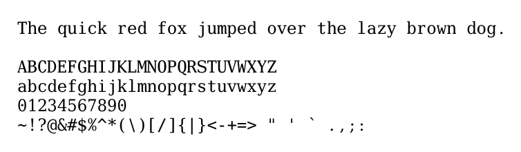
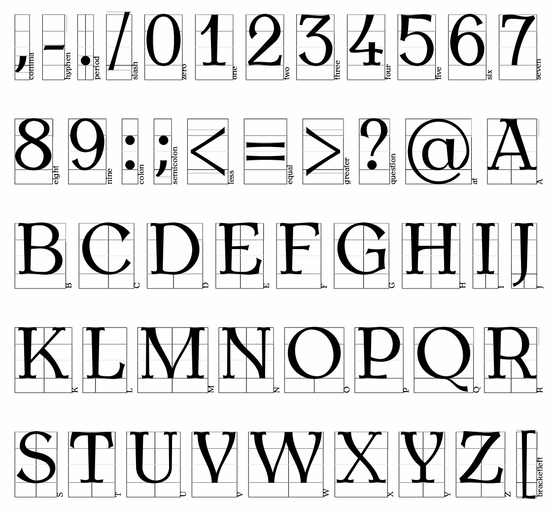
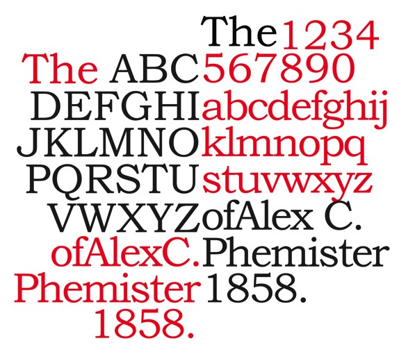
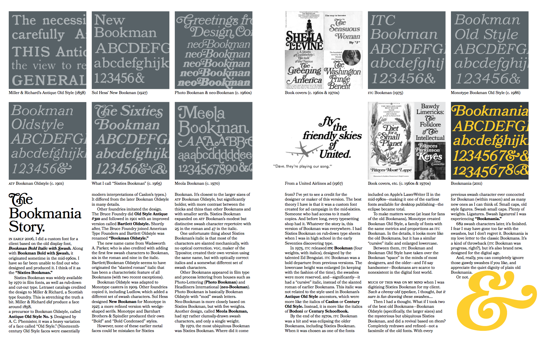
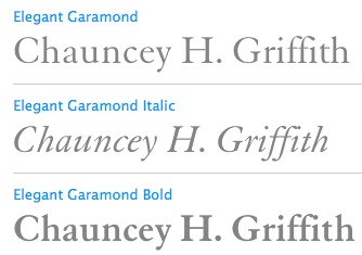
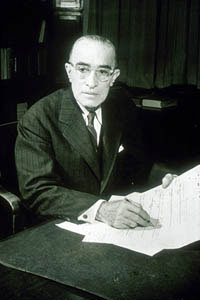
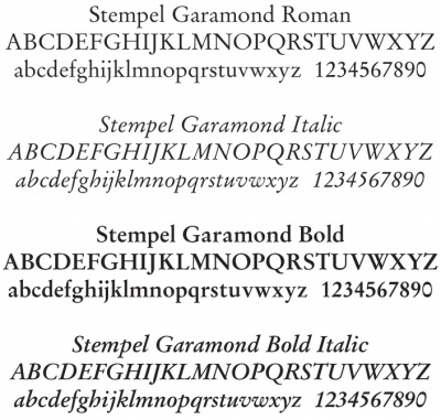
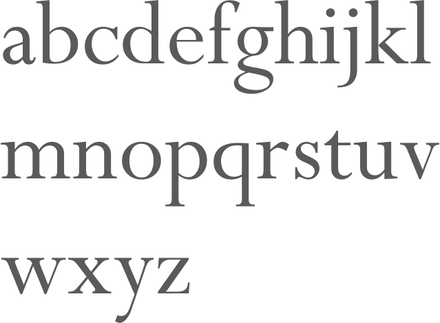
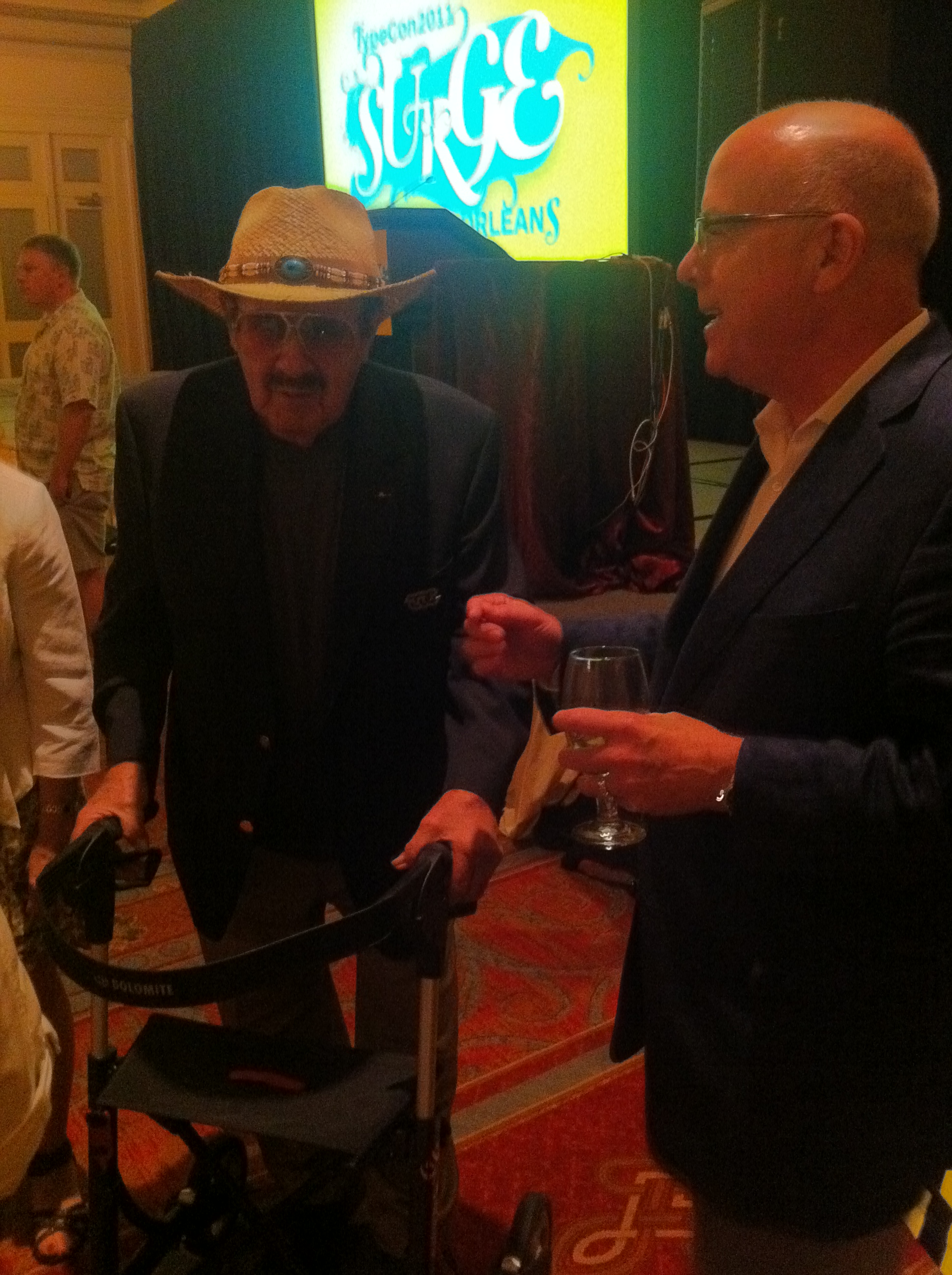
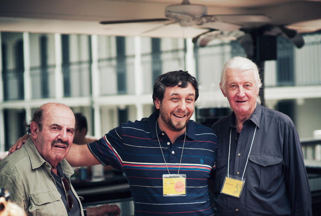
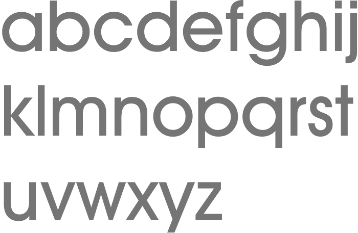
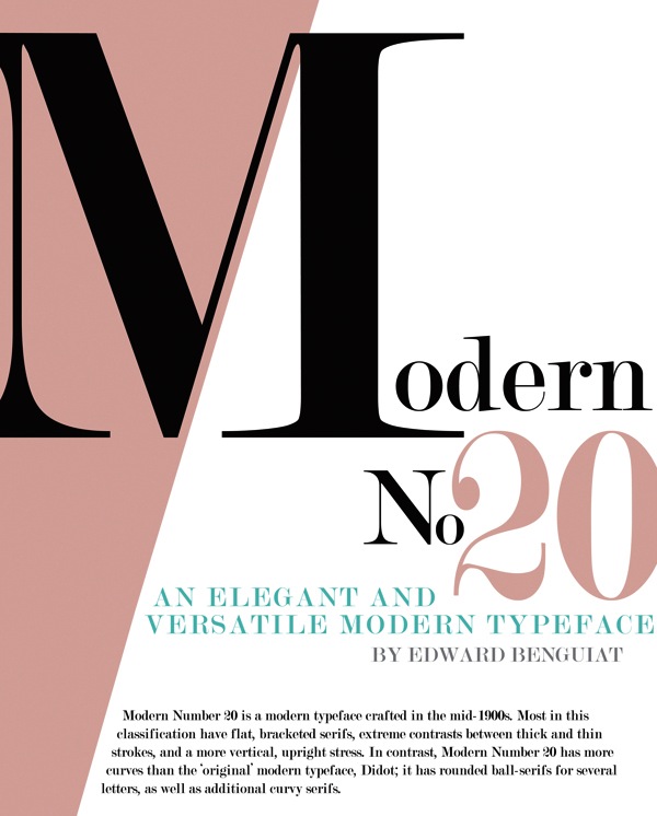
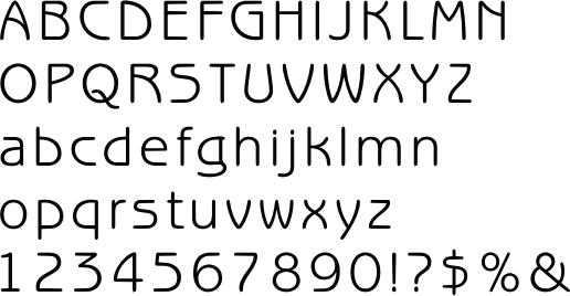
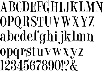
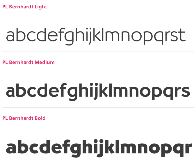
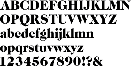
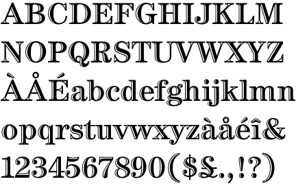
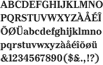
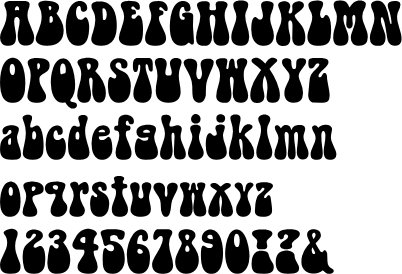
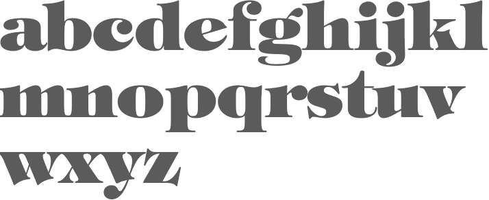
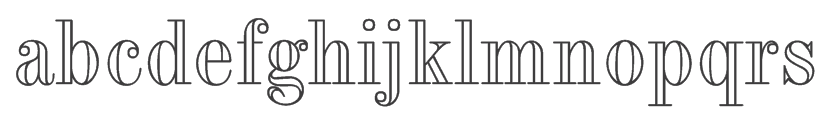
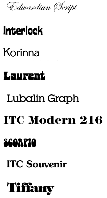
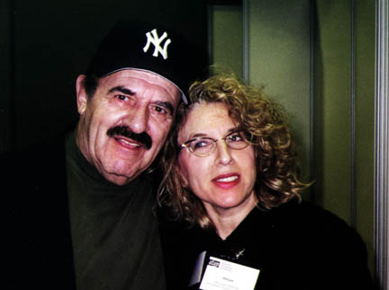
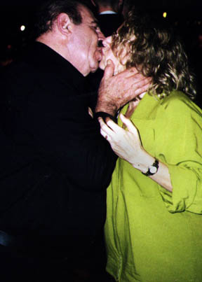
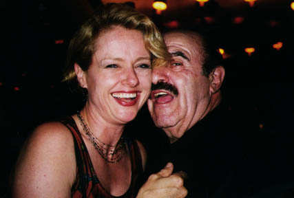
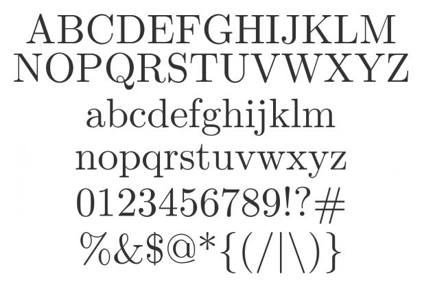
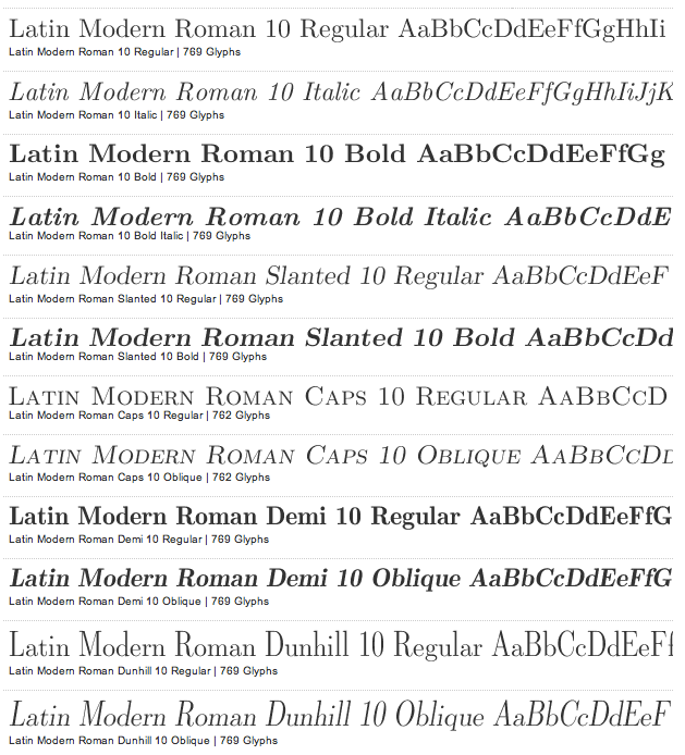
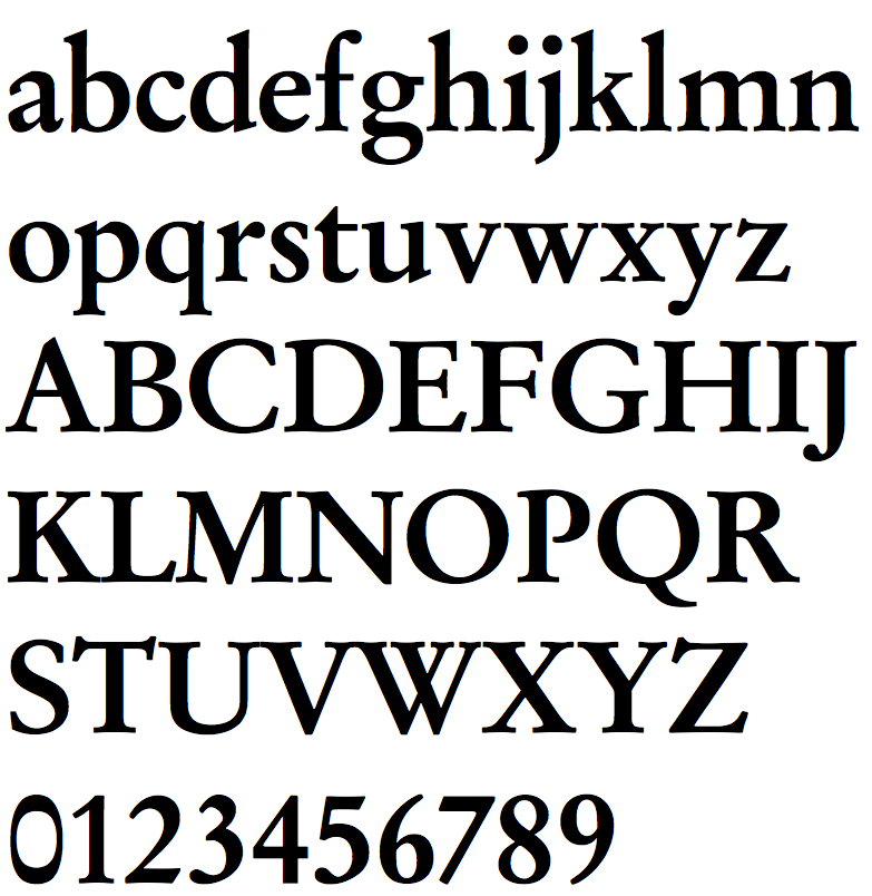
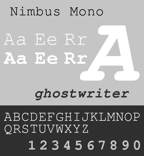
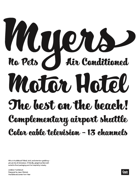
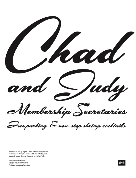
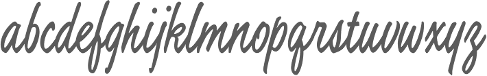
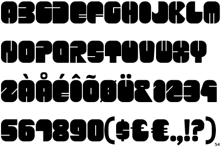
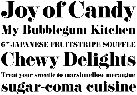
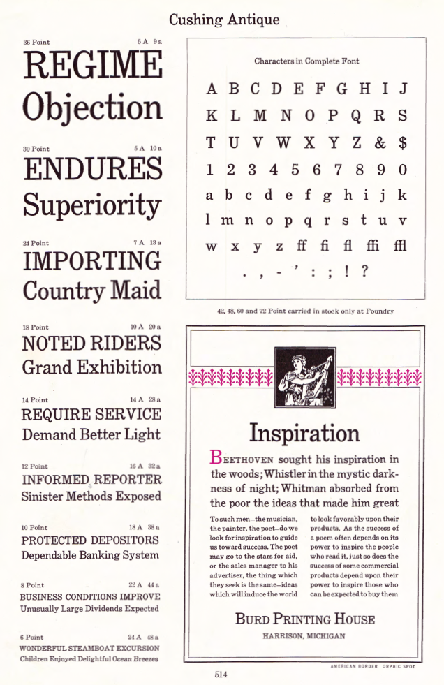
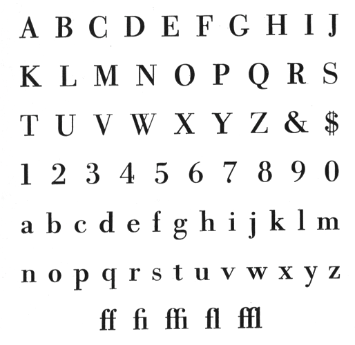
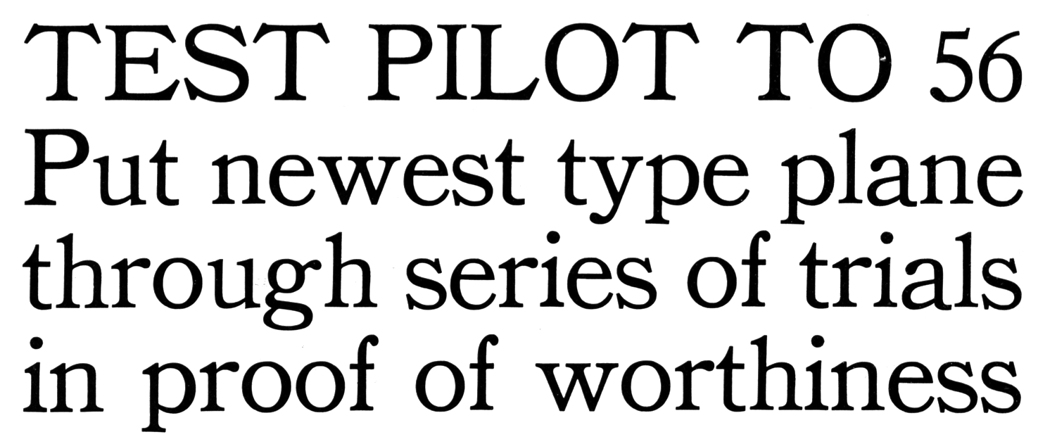
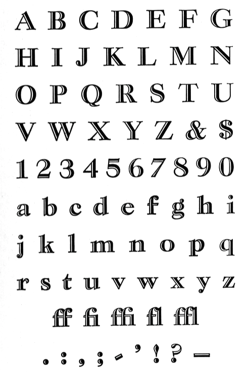
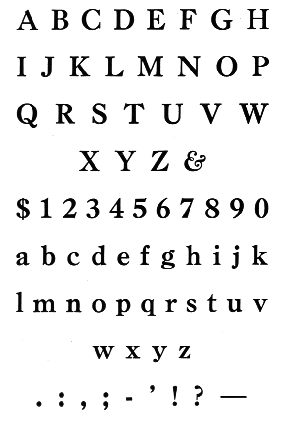
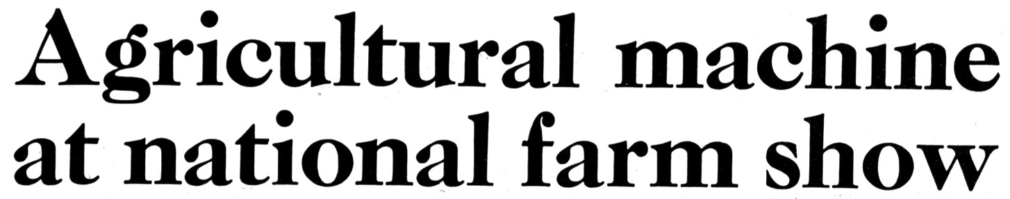
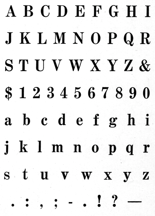
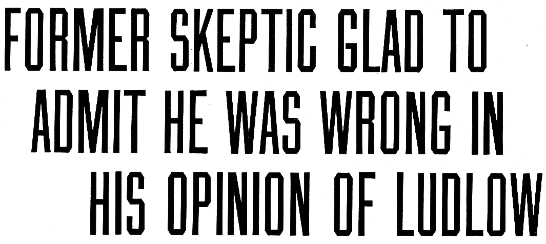
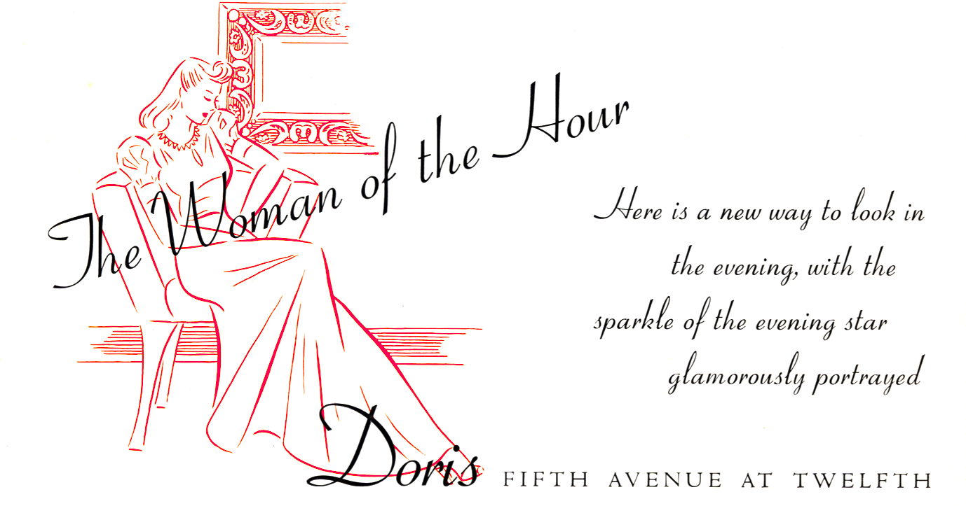
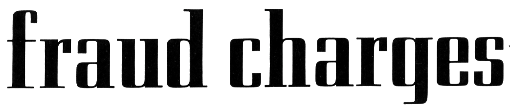
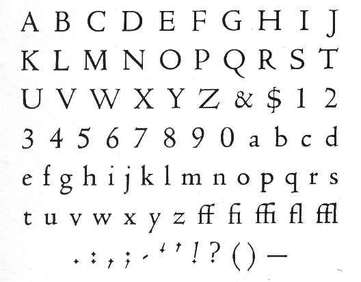
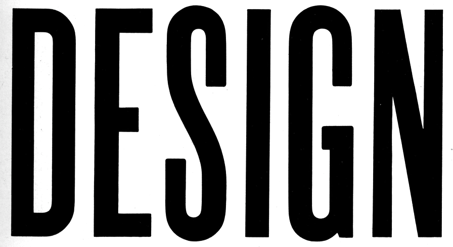
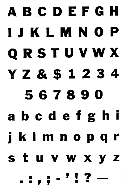
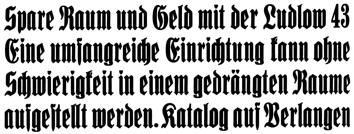
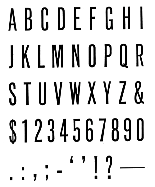
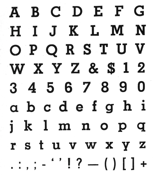
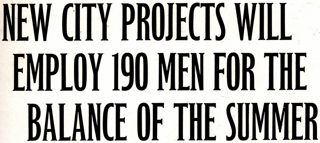
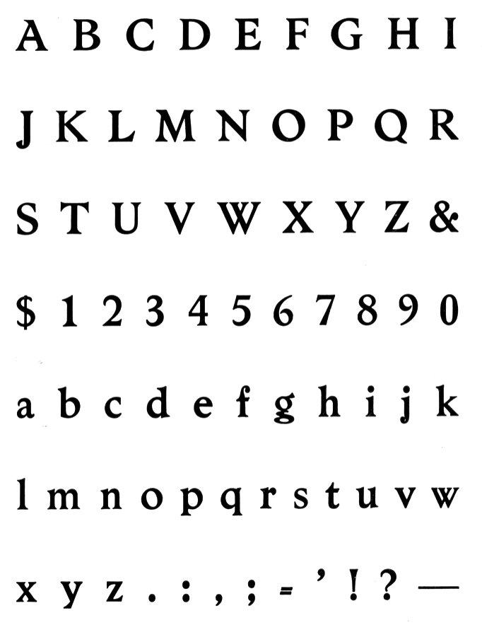
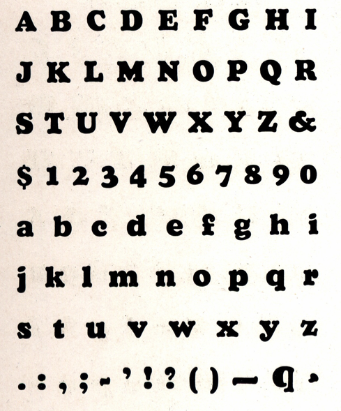
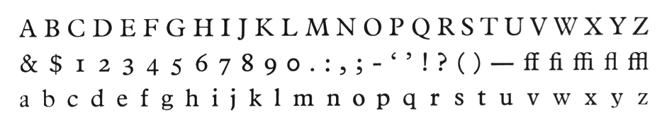
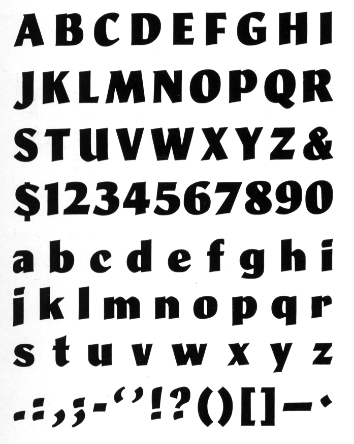
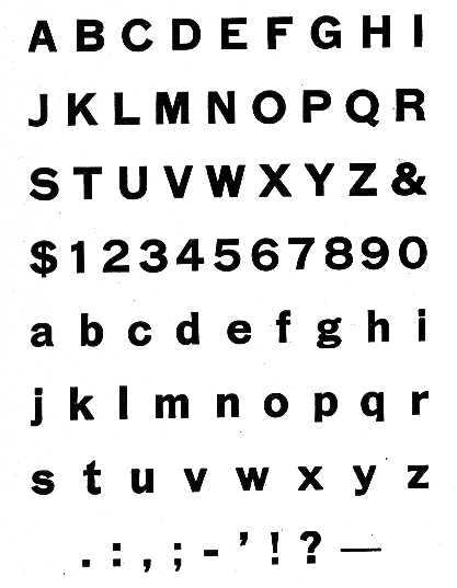
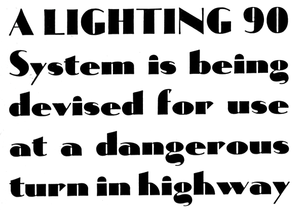
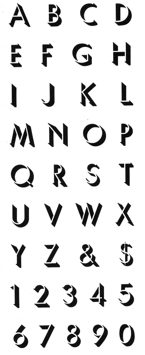
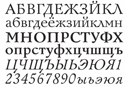
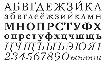
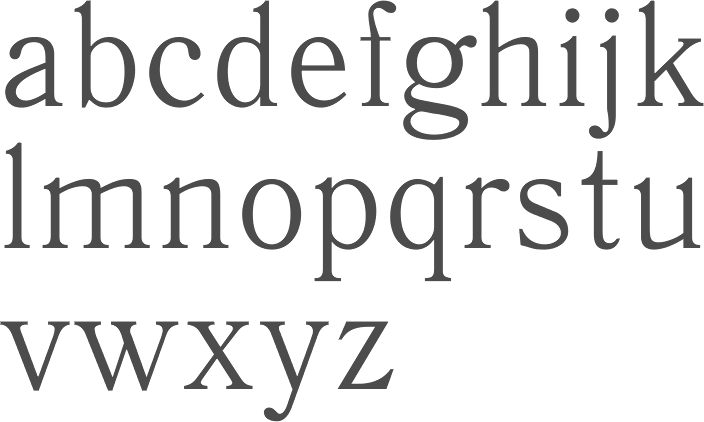
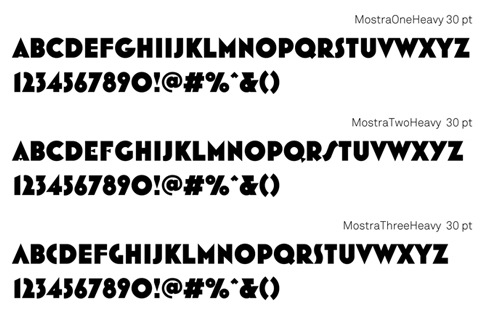
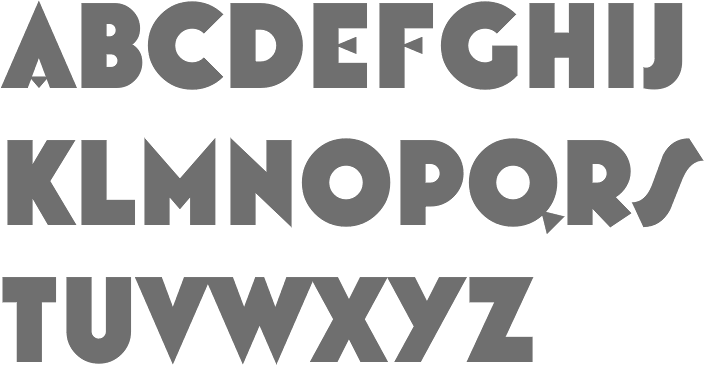
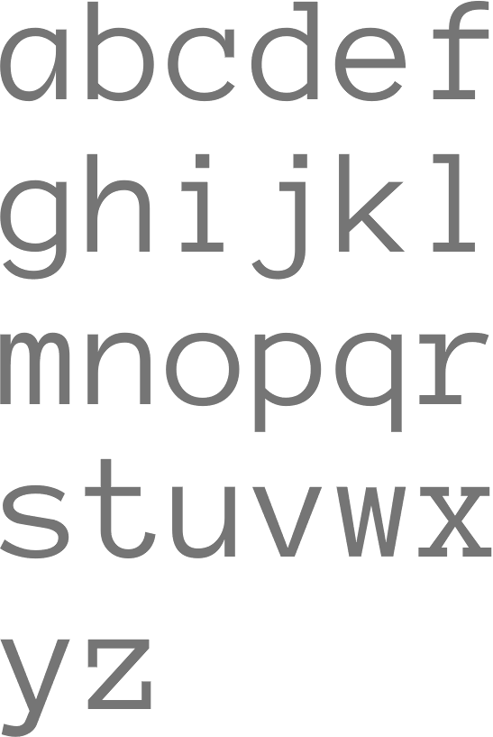
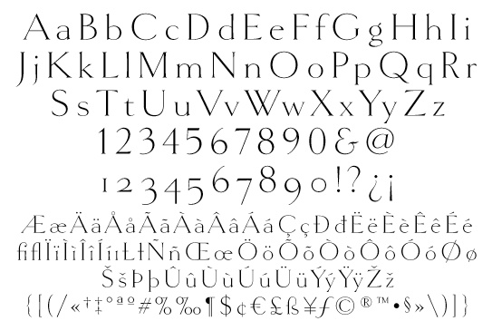
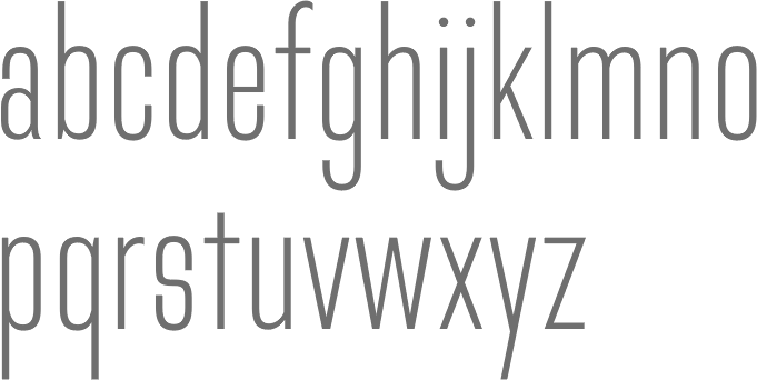
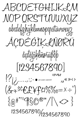
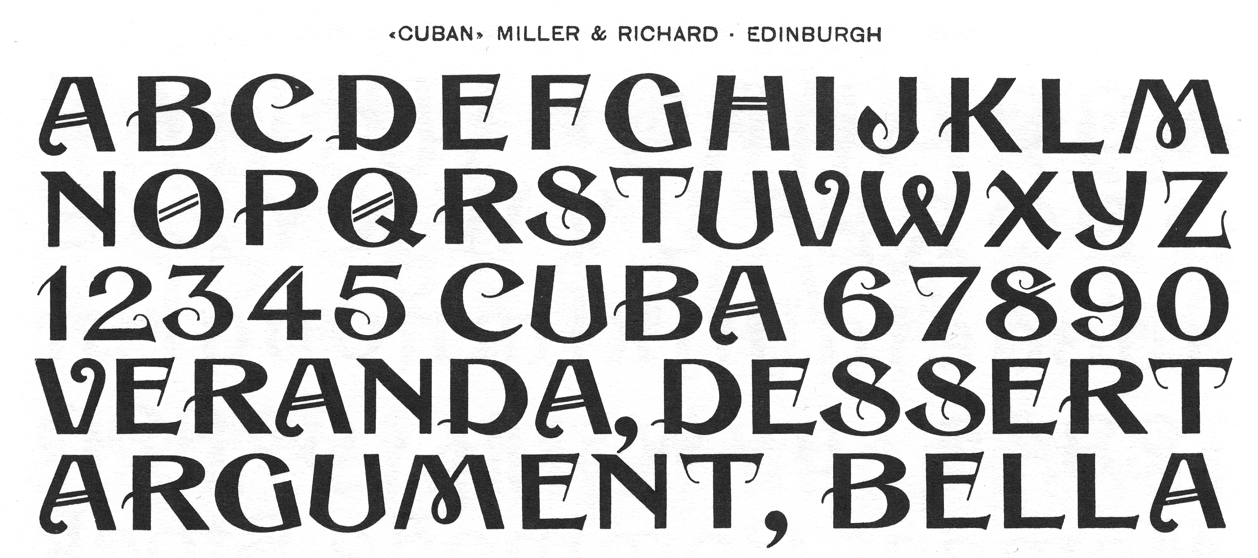
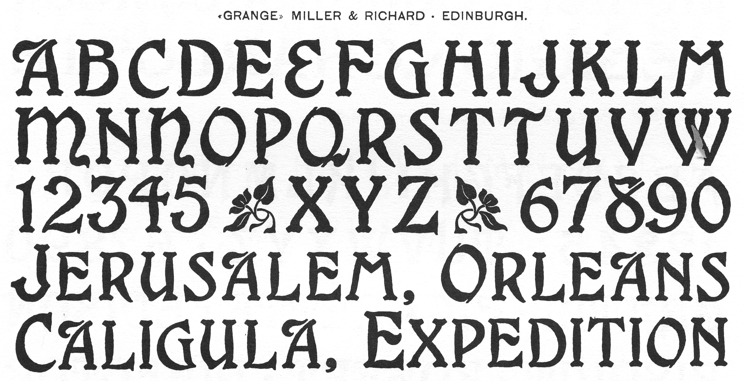
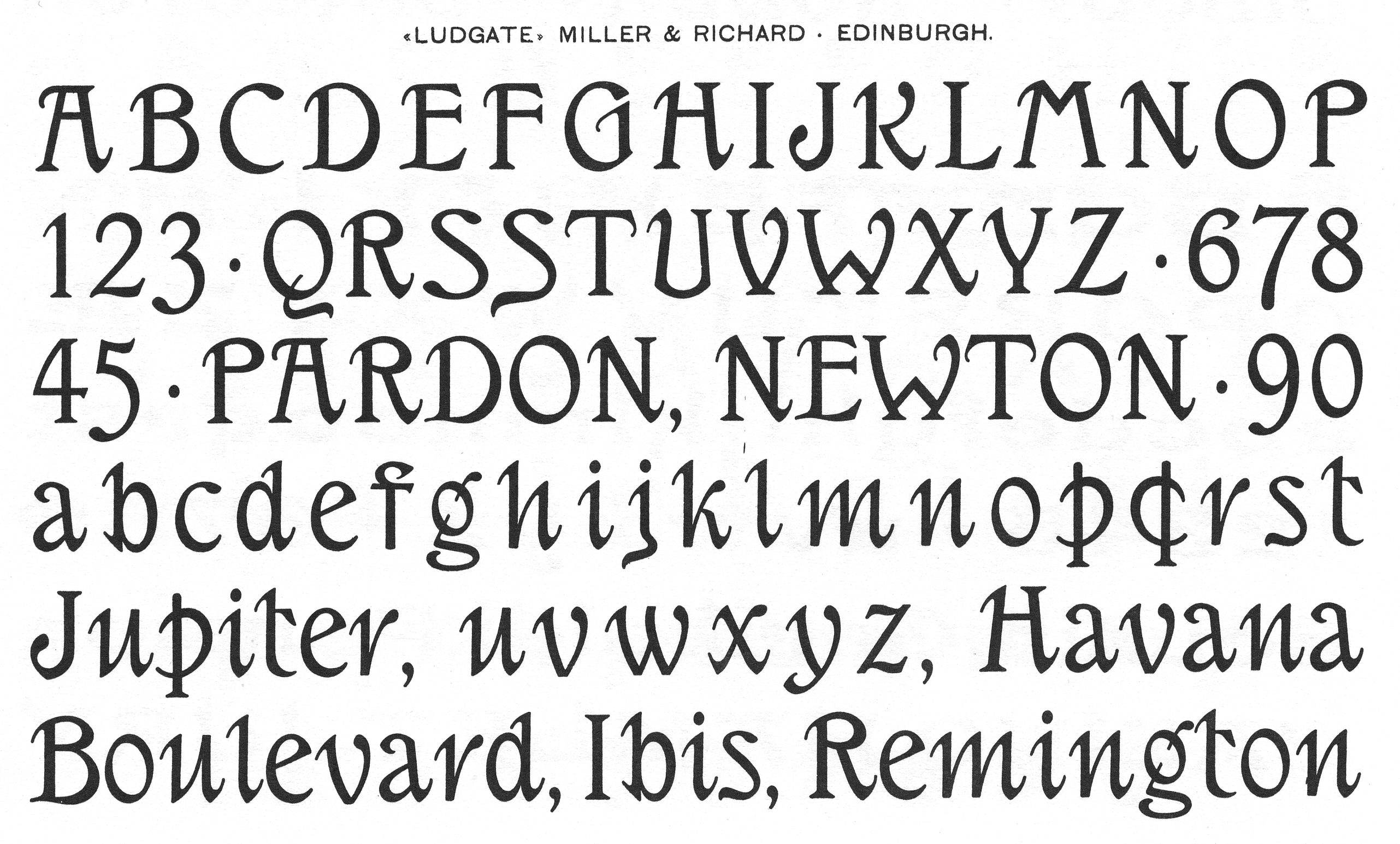
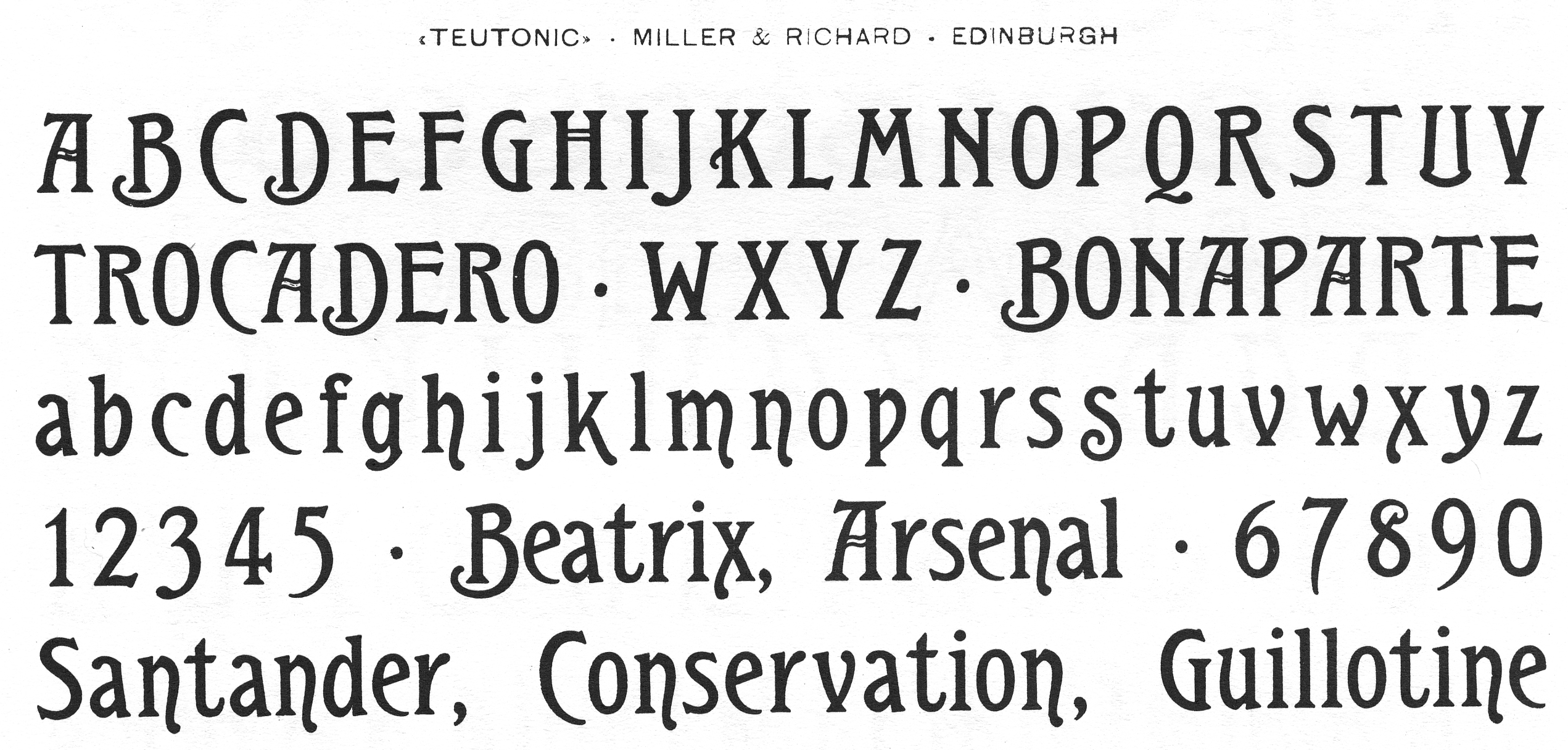
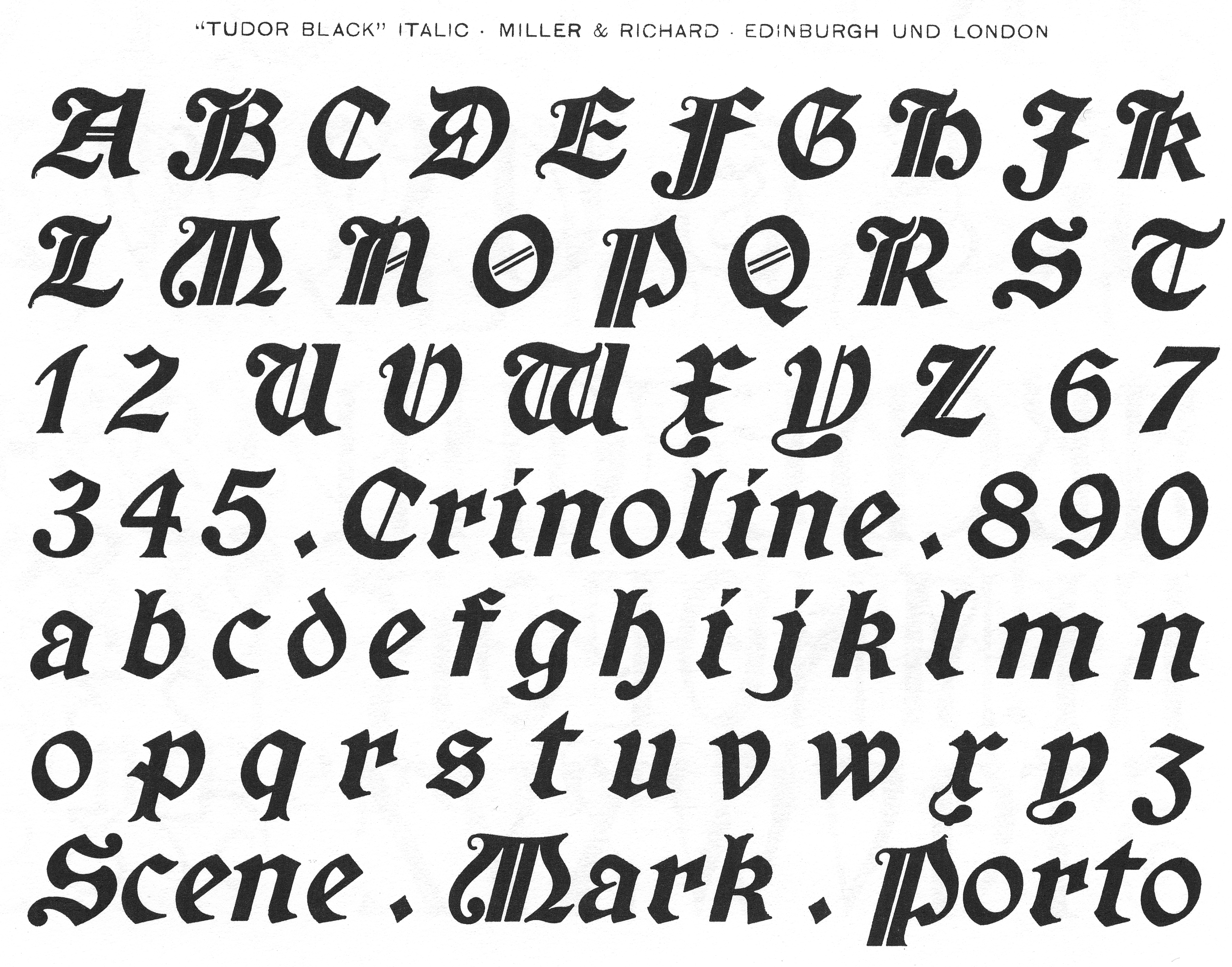
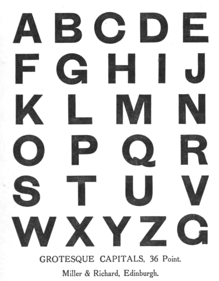
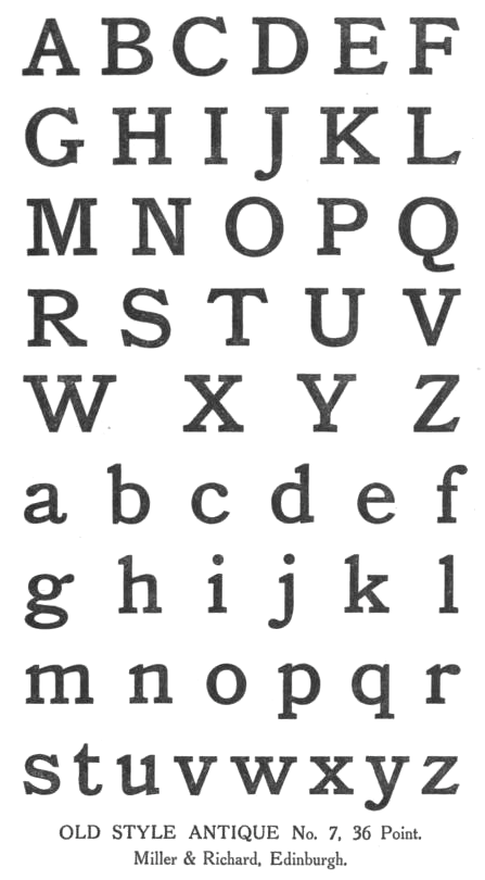
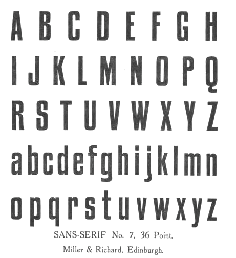
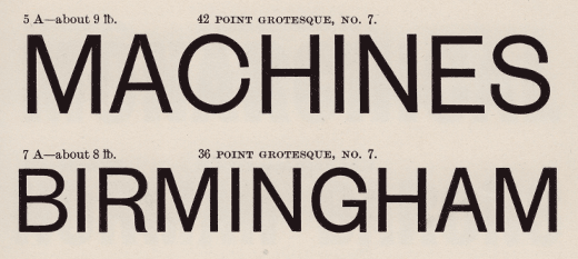
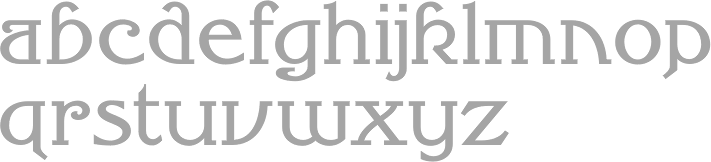
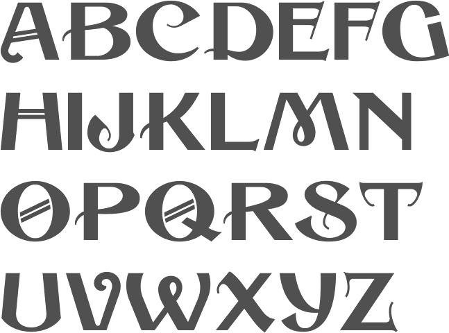
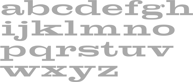
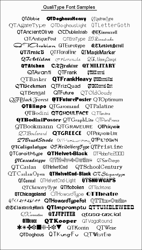
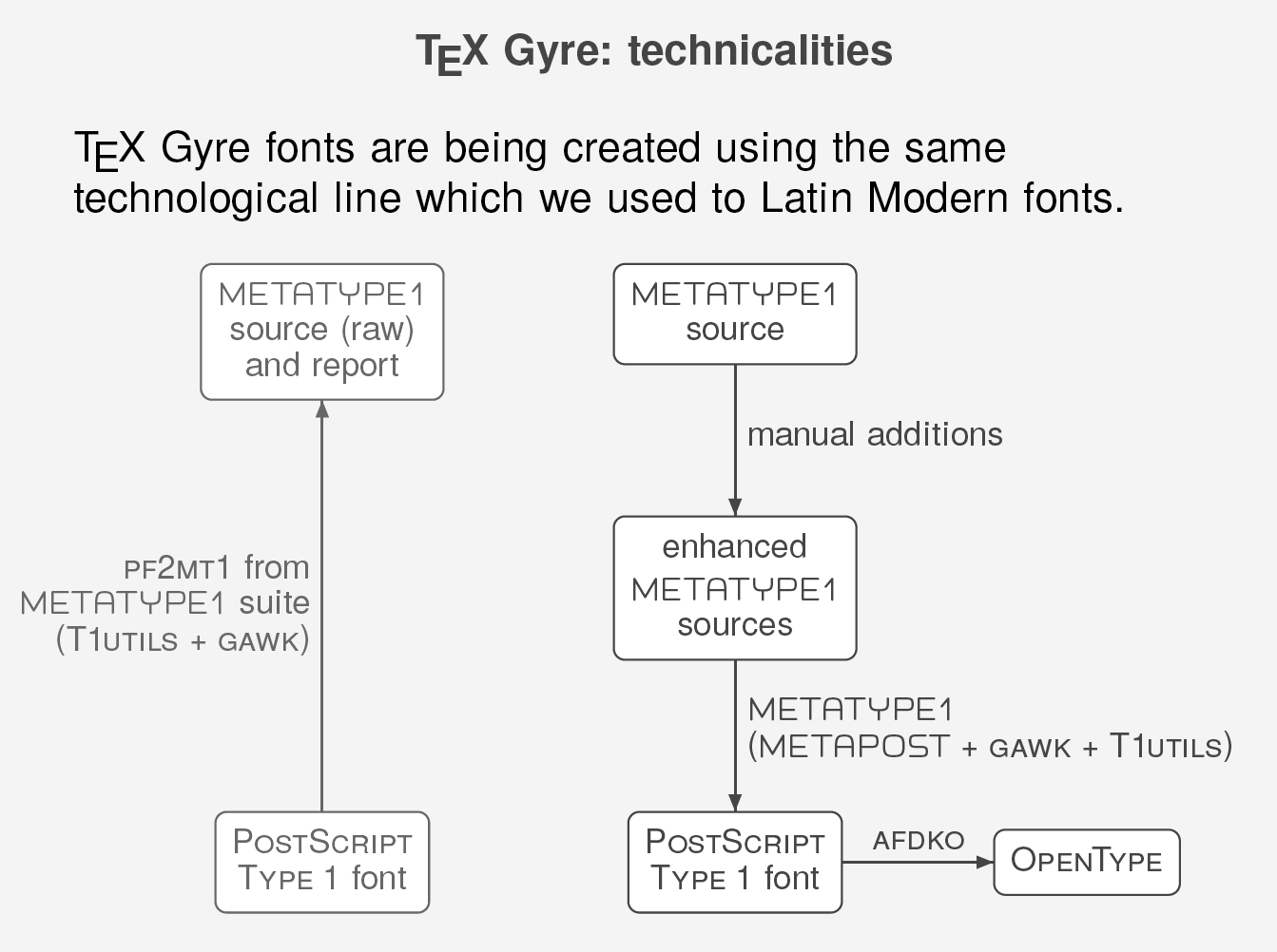
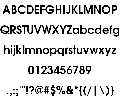
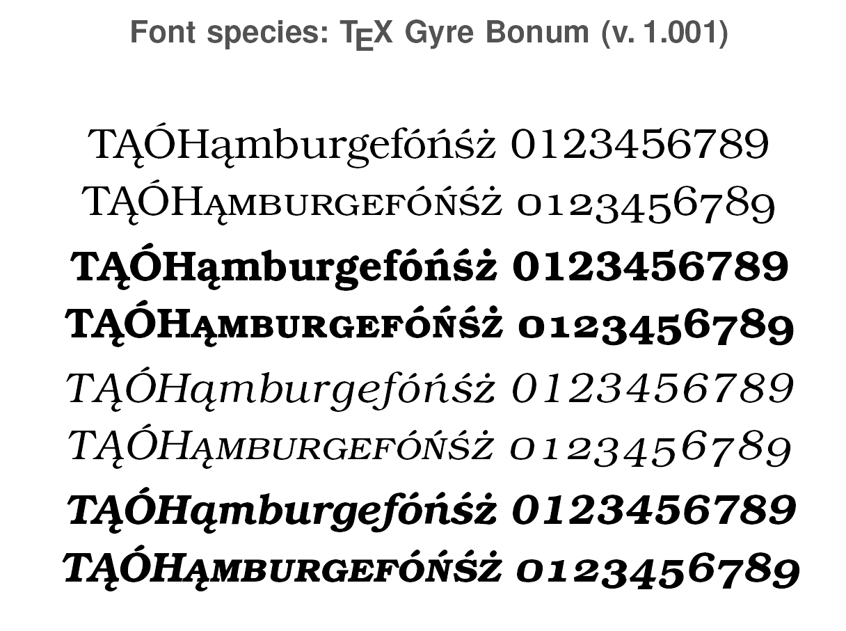
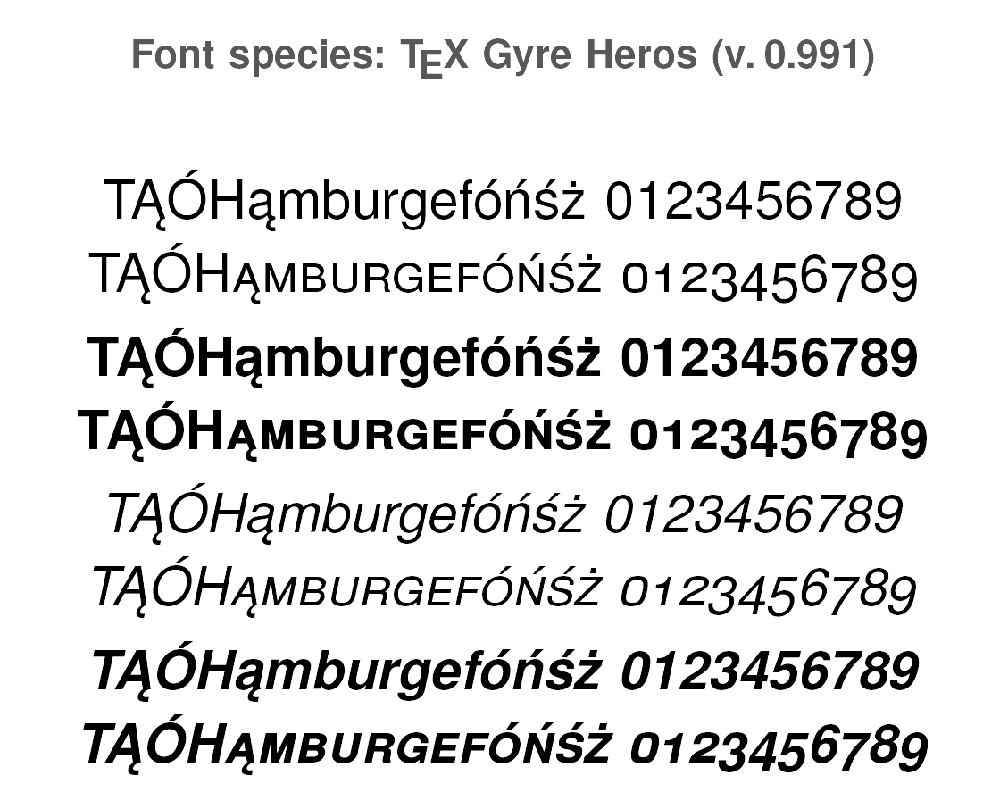
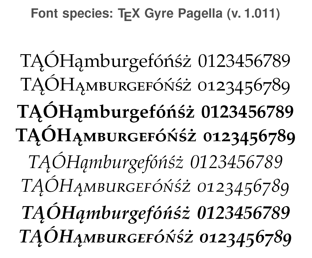
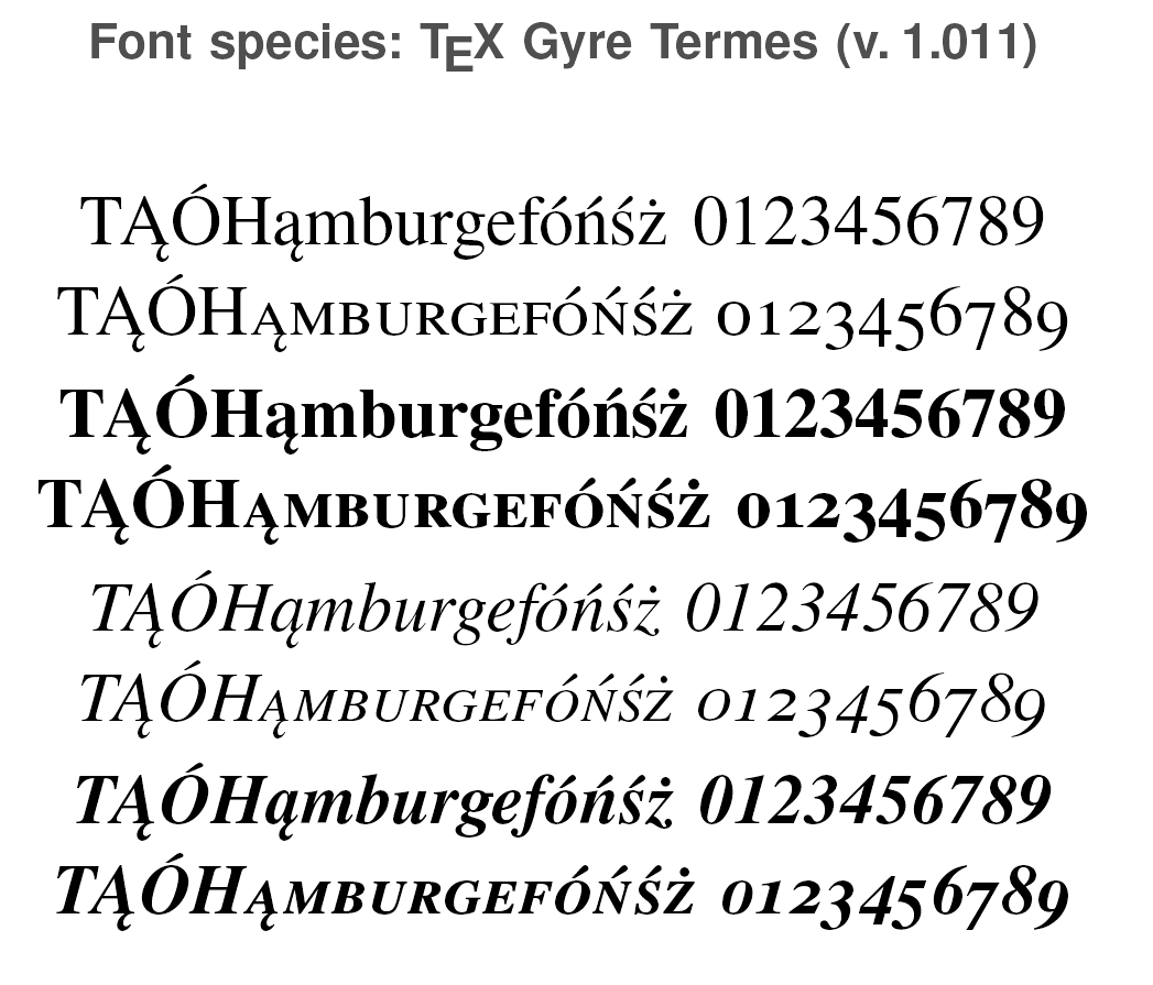
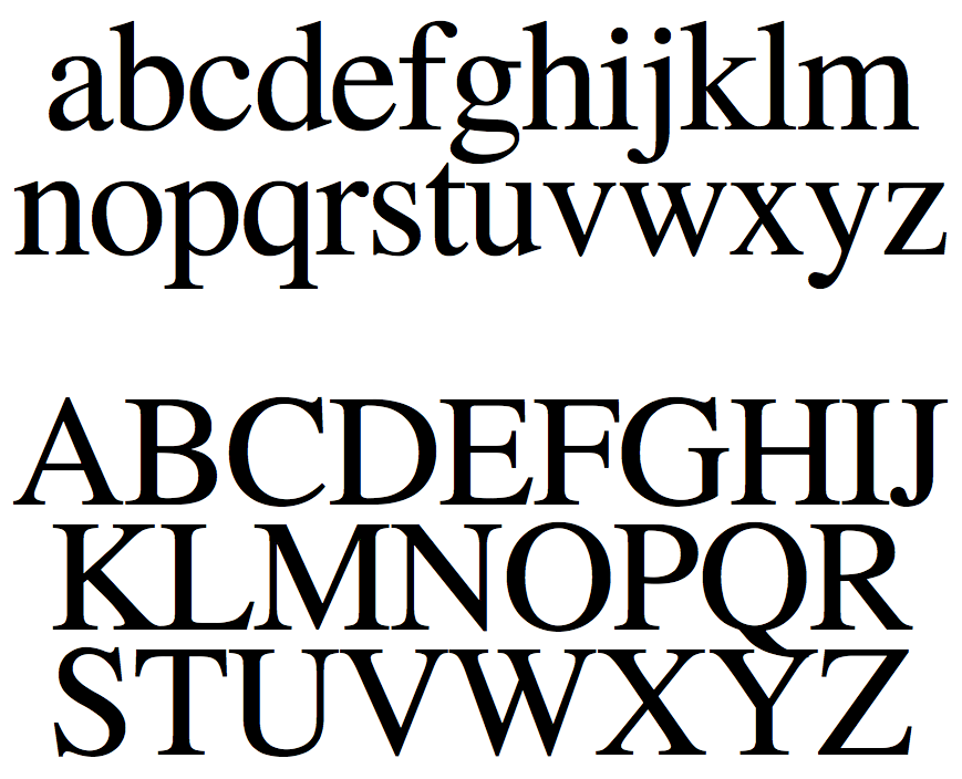
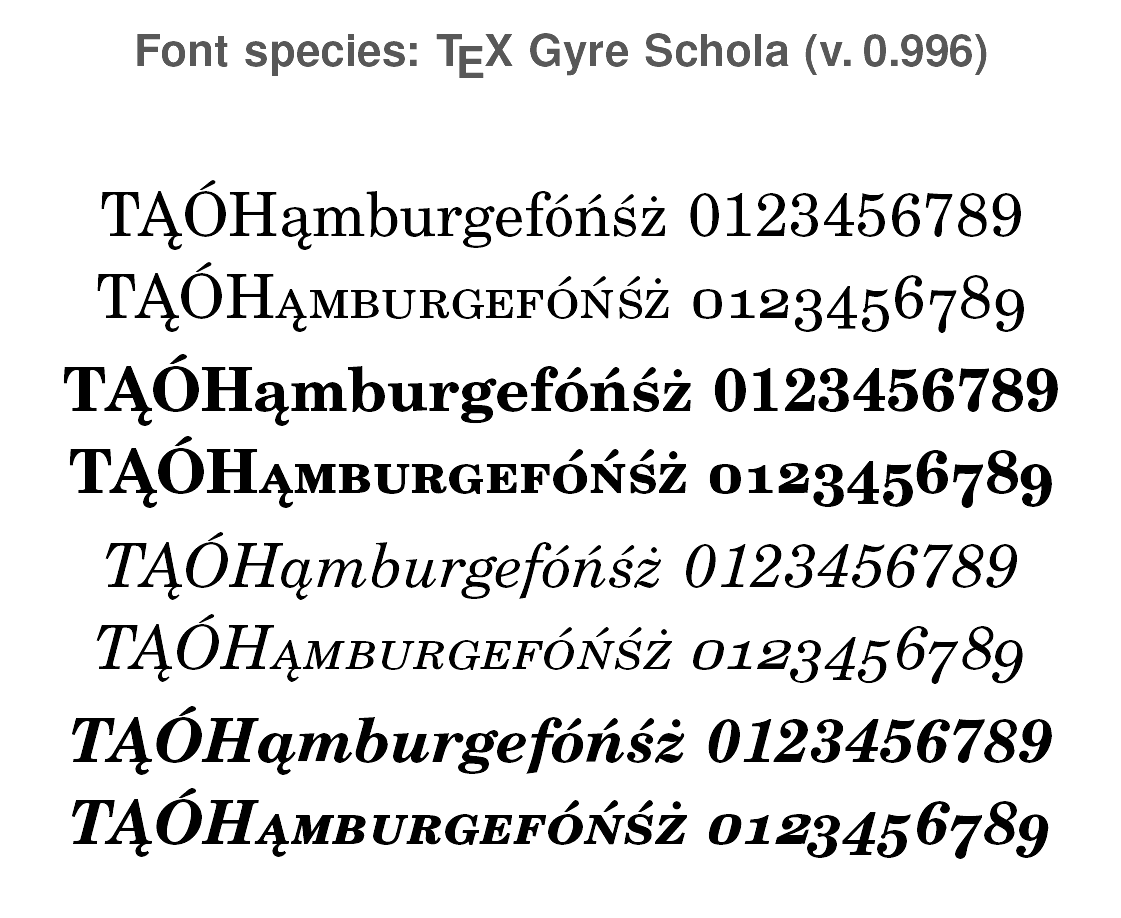