| | |
1001 Fonts.Com
|
Type classification: 33 categories. Mainly useful for downloads of fonts, and less historical. [Google]
[More] ⦿
|
100types
[Ben Archer]
|
Educational and reference site run by Ben Archer, a designer, educator and type enthusiast located in England (who was in Auckland, New Zealand, before that). Glossary. Timeline. Type categories. Paul Shaw's list of the 100 most significant typefaces of all times were recategorized by Archer: - Religious/Devotional: Gutenbergs B-42 type, Gebetbuch type, Wolfgang Hoppyl's Textura, Breitkopf Fraktur, Ehrhard Ratdolt's Rotunda, Hammer Uncial, Zapf Chancery, Peter Jessenschrift, Cancellaresca Bastarda, Poetica.
- Book Publishing&General Purpose Text Setting: Nicolas Jenson's roman, Francesco Griffo's italic, Claude Garamond's roman, Firmin Didot's roman, Cheltenham family, Aldus Manutius' roman, William Caslon's roman, Pierre-Simon Fournier's italic, Ludovico Arrighi da Vicenza's italic, Johann Michael Fleischmann's roman, ATF Garamond, Giambattista Bodoni's roman, Nicolas Kis' roman, Minion multiple master, Unger Fraktur, John Baskerville's roman, Lucida, Optima, Bauer Bodoni, Adobe Garamond, Scotch Roman, Romanée, ITC Stone family, Trinité, ITC Garamond, Sabon, ITC Novarese, Charter, Joanna, Marconi, PMN Caecilia, Souvenir, Apollo, Melior, ITC Flora, Digi-Grotesk Series S.
- Business/Corporate: Akzidenz Grotesk, Helvetica, Univers, Syntax, Courier, Meta, Rotis, Thesis, Antique Olive.
- Newspaper Publishing: Times Roman, Bell, Clarendon, Century Old Style, Ionic, Imprint.
- Advertising and Display: Futura, Robert Thorne's fat typeface roman, Vincent Figgins' antique roman (Egyptian), Memphis, Fette Fraktur, Avant-Garde Gothic, Deutschschrift, Peignot, Erbar, Stadia/Insignia, Penumbra, Compacta, Bodoni 26, WTC Our Bodoni.
- Prestige and Private Press: Romain du Roi, Golden Type, Johnston's Railway Sans, Doves Type, Walker.
- Signage: William Caslon IV's sans serif, Trajan.
- Historical Script: Snell Roundhand, Robert Granjon's civilité, Excelsior Script.
- Experimental/expressive: Mistral, Beowolf, Dead History, Behrensschrift, Eckmannschrift, Neuland, Element, Remedy, Template Gothic.
- Onscreen/multimedia: Chicago, Oakland, OCR-A, Base Nine and Base Twelve, Evans and Epps Alphabet.
- Telephone Directory publishing: Bell Gothic.
Link to Archer Design Work. [Google]
[More] ⦿
|
Agenturtschi
[Ralf Turtschi]
|
Ralf Turtschi's Swiss site that specializes in type publications. A must-buy book for type classification: Schrift vergleichen, Schrift auswählen, Schrift erkennen, Schrift finden (Verlag Hermann Schmidt, Mainz, 1991): 430 pages! Author of TypoTuning (2006) and of Praktische Typografie (1999, Verlag Niggli AG). In 2004, Anatina Blaser made a handwritten style font called Rooster (after Peter Rooster's handwriting), which can be had for free with any order over 59 dollars. [Google]
[More] ⦿
|
Aldo Novarese: Alfa Beta (1964)
|
Alfa Beta is a text book written by Aldo Novarese in 1964. It is especially useful to learn for the first time about the differences between typefaces and about type classification. [Google]
[More] ⦿
|
All Good Things Typography
[Kevin Woodward]
|
Dead link. Archive (FontPool), history of type, type classification (by Matthias Neuber and Morton K. Pedersen), page layout guide, type choice guide, logo type guide, mixing type guide, Windows software guide, Mac type software guide, glossary. By Kevin Woodward. [Google]
[More] ⦿
|
Andrew S. Fuller
[Foam Train Font Foundry]
|
[More] ⦿
|
Atelier Beinert München
|
Atelier for design and typography run by Wolfgang Beinert. Classification of type. Roman numerals. Interesting sub-page on typographical rules for numbers. Make sure to visit his award-winning designs of calendars. [Google]
[More] ⦿
|
ATypI type classification
|
In 1961, ATypI published its type classification system: - Humane
- Garalde
- Réale
- Didone
- Incise
- Linéale
- Mécane
- Scripte
- Manuaire
- Fractura
This is exactly like Maximilien Vox's system with the exception of the addition of Fractura. [Google]
[More] ⦿
|
Ben Archer
[100types]
|
[More] ⦿
|
Ben Bauermeister

|
Cofounder (b. St. Louis, 1960) with Clyde McQueen in 1990 of ElseWare Corp. Helped develop the PANOSE font classification system there. MyFonts page. [Google]
[MyFonts]
[More] ⦿
|
Ben Bauermeister
[ElseWare Corporation]
|
[MyFonts]
[More] ⦿
|
Benjamin Bauermeister
[Panose]
|
[MyFonts]
[More] ⦿
|
Bitstream's type classification system
|
Type classification system in 17 groups proposed by Bitstream in 1986: - Oldstyle
- Transitional
- Modern
- Clarendon
- Slabserif
- Latin
- Freeform
- Sanserif
- Engravers
- Stencil
- Strike-On
- Computer
- Decorated
- Script
- Exotic
- Pi
- Non-Roman
[Google]
[More] ⦿
|
Blackletter: classification
[Thiago Scatolin Barbosa]
|
 Porto Alegre, Brazil-based Thiago Scatolin Barbosa compares various blackletter styles. [Google]
[More] ⦿
Porto Alegre, Brazil-based Thiago Scatolin Barbosa compares various blackletter styles. [Google]
[More] ⦿
|
Bowfin Printworks
[Mike Yanega]
|
Links to commercial foundries. Site done by Michael Yanega, who now lives in Washington State. Has an interesting script font identification guide. It also has a bibliography on type. [Google]
[More] ⦿
|
British Standards for Type Classification
|
Typeface classification according to "British Standards 2961:1967" (or BS 2961), British Standards Institution, London, 1967. - Humanist: Centaur, Jenson, Verona, Kennerley.
- Garalde: Stempel Garamond, Garamond, Caslon Old Face, Granjon, Sabon, Bembo.
- Transitional: New Baskerville, Baskerville, Caslon, Fournier, Perpetua.
- Didone: Bodoni, Bauer Bodoni, Torino, Walbaum.
- Mechanistic: Clarendon, Memphis, Rockwell, Lubalin.
- Lineal
- Lineal Grotesque: Franklin Gothic Demi-Bold, Franklin Gothic, News Gothic, Alternate Gothic.
- Lineal Neo-Grotesque: Helvetica Light, Akzidenz Grotesk, Folio, Helvetica, Univers.
- Lineal Geometric: Avant Garde Medium, Avant Garde, Futura, Eurostile, Erbar.
- Lineal Humanist: Gill Sans, Goudy Sans, Optima.
- Incised: Albertus, Latin, Friz Quadrata.
- Script: Brush Script, Mistral, Park Avenue, Zapf Chancery.
- Manual: Neuland, Broadway, OCR-A, Pritchard.
- Black Letter: Fette Fraktur, Old English, Goudy Text, Wilhelm Klingspor-Schrift.
- Non-Latin.
[Google]
[More] ⦿
|
Candace Uhlmeyer
[DH Type Visionaries]
|
[More] ⦿
|
Childers, Gristci and Leben
|
In 2013, Taylor Childers, Jessica Griscti and Liberty Leben wrote the type classification survey paper 25 Systems for Classifying Typography: A Study in Naming Frequency in Parsons Journal for Information Mapping. They conclude with their own proposal, which I summarize here (text below quoted from the article). - Serif There are four main categories of serif typefaces: Old Style, Transitional, Modern, and Slab Serif. Our subclasses of Old Style typefaces, can be described as follows. Venetian types are humanist serif typefaces developed in the 15th century. These type are characterized by short, thick, bracketed serifs, and ascenders with slanted serifs. There is little contrast between horizontals and verticals, and the lowercase e often has a stylized slanted cross stroke. Examples are Bembo and Jenson. Gerald is a term coined by Maximilien Vox, a nod to Claude Garamond and Aldus Manutius, two prolific typographers who practiced in the fifteenth and sixteenth centuries. The category could also have been called French, but we felt that was too limiting to its intention. The section meant to hold typefaces made in the Gerald style, rather than only those that were cut in France. Geralde typefaces have more contrast between the thickness and thinness of strokes and more delicate proportions than the Venetian types. The axis of the curve in most letters is oblique as compared to the vertical axis of the next movement in old style typography, the Transitionals. Eighteenth century Transitional types like Deberny & Peignot's Baskerville had an even stronger contrast between thick and thin strokes, so much so that the letters almost glitter on the page. These typefaces marked the difference between the Geralde and Modern didone typography. At the time that they were cutting types, typographers wouldn't have considered themselves in a transitional period. The term was only given to those typefaces after the beginning of Modern typography. As such, many find issue with the name. However, the alternate name for these types, Realist, never caught on with the same fervor that Transitional did, and so here, we revert to the most popular name. We've also included a section for Revival Old Style typefaces, for those types designed post 19th century in the style of either Venetian, Geralde, or Transitional typefaces. Modern typography started with typographers Giambattista Bodoni and Firmin Didot. Modern typography has almost become synonymous with Didone typography, which is of course takes its name from Didot and Bodoni. Modern types have the strongest contrast between thick and thin lines. The serifs are hairline thin and unbracketed. The final category in serif typefaces is Slab Serifs. These typefaces grew out of Modern typefaces. Slab serifs are heavy, often rectilinear serifs a thick or thicker than the rest of the letter. Clarendon slabs are of similar or smaller size to the body of the letter, and they are bracketed. Italienne slabs are also bracketed, but thicker than the body of the letter. We created the category Uniform Slab Serifs to cover slab typefaces that are of similar weight to the body of the letter, but left unbracketed.
- Sans. These four Sans Serif subcategories have been standard since the Vox ATypI system in 1961. Grotesques, like Berthold's Azkidenz Grotesk were the first sans serif typeface. They originated in the nineteenth century, and therefore have some holdover from their predecessors; there is a degree of contrast between thick and thin strokes. From there, the Neo-Grotesque typefaces evolved in the 1950s. They were cleaner, and more mechanical than the Grotesques. The Neo-Grotesque was a large part of Swiss typography; in the beginning, they were used as display typefaces. Their stroke contrast was minimal, the letters were set wider and the x-height was raised. Many grotesque typefaces, like Helvetica, have been drawn with a great degree of varying weights and widths to accommo- date for their different uses in display design. Geometric Sans Serifs left behind all of their historical connotations. They were the most mechanical of all of the sans serifs, made to look as if they were developed by machine. The body of the letters are constructed from simple geometric shapes, often they are monoline, and there is little differentiation between each letter. Whereas the geometric abandons all notion of being derived from earlier typography, the humanist sans serif draws from the classical manuscript hand. The design is often informed by the classical Roman letter, and informs the decisions the designer makes to his fresh, monoline letter. The most celebrated humanist sans serif is Eric Gill's Gill Sans.
- Topicals. While in the days of Johannes Gutenberg, the blackletter was the most common text face, now, as a modern civiliza- tion, we are no longer trained to read letters so dense and alligraphic. Therefore, blackletter typefaces are now regarded as decorative. Textura is the most calligraphic form of blackletter. The letters are tall, narrow, and drawn with sharp, angular lines. Textura was used in France, England, and parts of Germany. Schwabacher blackletters are the earliest German print typefaces. It is closer to the manu- script handwriting that the Textura face. By 1530, it was replaced by the Fraktur, as the most oft-used text face in Germany. Fraktur typefaces were so common that almost all German blackletters of the time carried Fraktur somewhere in their name. The capital letters are created from a rounded C-shape, and S-shaped strokes. Rotunda, also know as Cursiva, blackletters is much like modern script, there are no real standards except that the letters run together. Scholars of all sorts have pulled the Script typefaces out of the general display sections because they can be qualified, classified and separated from display typography. Formal scripts are based on the writing of calligraphy masters. The letters are drawn either with a metal pen nib or quill. Handwritten scripts come from the more active modern hand. Strokes vary in width, and are generally not created with pen nib or quill. The most difficult task any typo- graphic scholar has set out to do is classify the display types, and every scholar fails, whether because he has chosen to attempt classification or ignore the types entirely. We felt that neither solution was acceptable. Display typefaces are becoming more and more popular, and as we march father into Open Type, only more are expected to appear. There are simply too many typefaces to qualify, and far too many typefaces to leave them absent from our system. So we’ve carved out a place for them in our Graphic category. Graphic, because Display is a tired term that has failed too many times before. These typefaces often reference the style of something else, they are bold, statement pieces that aren't meant for paragraphs of text, and so they need a bold category. [Google]
[More] ⦿
|
Chinese font classification
|
 Chinese has many scripts / handwriting styles including the oracle bone script to the Seal Script of the Eastern Zhou, but also to a lesser extent in the transition to the clerical script of the Han Dynasty. These have led to the present day traditional and simplified scripts. Chinese digital fonts can be roughly classified in these styles:
 - Hei Ti: sans. The rounded corner version is Yuan Ti. Look for the word Hei in a font's name.
- Song Ti: serif. This is common text font, and is widely used in publications and the media. Also called Ming style. Look for Ming or Song in the font name.
- Kai Ti: Script (handwritten) style. Look for the keyword Kai in the name.
- Ancient styles, such as Zhuan Shu (from the Dyn dynasty, 2000 years old), Li Shu (from the Han dynasty, over 2000 years ago).
- Stone-carving emulation, such as Wei Bei.
[Google]
[More] ⦿
|
Christian Liljeberg
[Retroglobe Typeface Identification Guide]
|
[More] ⦿
|
Classification of initials by Jim Moran
|
Jim Moran (Hamilton Wood Type and Printing Museum, Wisconsin) classifies initial caps using these designations: - Calligraphic: Those letters that reflect the stroke of the flat-nibbed pen.
- Criblé: A stippled dot pattern in the background.
- Floriated: Letterforms that incorporate plant and/or flower motifs.
- Historiated: Letterforms that employ people or places from a given story.
- Inhabited: Those characters that have people, mythical beings, or faces in them.
- Ornamental: A term that describes decoration that is nonrepresentational.
- Speaking: Designs that represent the first letter of the subject matter, eg., P for Piper.
- Zoomorphic: Letterforms that include animals.
[Google]
[More] ⦿
|
David Johnson-Davies
[Fontscape]
|
[More] ⦿
|
David Rault
[Sans serif classification]
|
[More] ⦿
|
Denis Potschien
|
Denis Potschien (Iserlohn, Germany) showed the history of type classification. In German. Link gone. [Google]
[More] ⦿
|
DH Type Visionaries
[Candace Uhlmeyer]
|
Candace Uhlmeyer provided a bit of type history through the work of Johannes Gutenberg (1398-1468), William Caxton (1422-1491), Aldus Manutius (1450-1515), William Caslon (1692-1766), John Baskerville (1706-1775), Giambattista Bodoni (1740-1813), William Morris (1834-1896), Frederic W. Goudy (1865-1947), Eric Gill (1882-1940), and Jan Tschichold (1902-1974). [Google]
[More] ⦿
|
DIN 1658
|
Dead link. DIN type classification system. [Google]
[More] ⦿
|
Ellen Lupton
|
Ellen Lupton is a writer, curator, and graphic designer. She is director of the MFA program in graphic design at Maryland Institute College of Art (MICA) in Baltimore. She also is curator of contemporary design at Cooper-Hewitt National Design Museum in New York City. Author of Thinking with Type (Princeton Architectural Press, 2004). Visit also the interesting Thinking with type web page, which features a fun section on "crimes against typography", notes on type classification, a course outline, and tons of other educational material. See also here and here. Author of Laws of the Letter (with J. Abbott Miller). Ellen Lupton was the keynote speaker at AypI2006 in Lisbon. In that talk, summarized here, Ellen Lupton discusses the benefits of truly free fonts (Perhaps the free font movement will continue to grow slowly, along the lines in which it is already taking shape: in the service of creating typefaces that sustain and encourage both the diversity and connectedness of humankind.) and provides key examples: Gaultney's Gentium, Poll's Linux Libertine, Peterlin's Freefont, Bitstream's Titus Cyberbit, and Jim Lyles' Vera family. She is the editor of D.I.Y.: Design It Yourself (2006). In 2007, she received the AIGA Gold Medal. Her introduction to the major typefaces. Speaker at ATypI 2010 in Dublin. [Google]
[More] ⦿
|
ElseWare Corporation
[Ben Bauermeister]
|
Founded by Ben Bauermeister and Clyde McQueen in 1990, former employees of Aldus. Based in Seattle, it created for Hewlett-Packard FontSmart (a product that gives users 110 fonts and a font-management technology for HP's LaserJet 5L, 5P and 5Si printers in an innovative and compressed format). It also made FontWorks (a truetype font generation engine for Windows), Infinifont (a parametric font generation system), and PANOSE (a fonty classification system). On December 21, 1995, HP bought the company and that was the end of it. The in-house type designer was Karl Leuthold. They produced about 340 "clones" of the major typeface styles, including Albertus, AntiqueOlive, Arial, AugustaEC, BistroEC, BodoniEC, BookAntiqua, BookmanEC, BookmanOldStyle, CGOmega, CGTimes, CafeEC, CenturyGothic, CenturySchoolbook, Clarendon, CourierEC, EtnaEC, GaramondEC, GeneraEC, GillSans, Goudy-Old-Style-EW, GraphosEC, InformaEC, LetterGothic, LetterSansEC, MentorEC, MetrostyleEC, ModalEC, NewTributeEC, OperinaEC, Ozzie, SchoolbookEC, StationEC, StriderEC, StylusEC, TerasEC, TerasMonospaceEC, Univers, VillageOldstyleEC, WilmingtonEC. MyFonts link. [Google]
[MyFonts]
[More] ⦿
|
Foam Train Font Foundry
[Andrew S. Fuller]
|
Free truetype fonts (PC, Mac) by Andrew Fuller from Portland, OR (was: Lincoln, NE), at his Foam Train Font Foundry: MMMCarbony, Buddy, Derez, Derez Hitek, Deltoid, Gloopy, Hobbit Tattoo-Brush, Hobbit Tattoo-Sloppy, Reeeally Quik Hand, RoundyButt, Unserif, DryToastCaps, Iron Filings, Eeewww Messy Boy, Thirty Months of Victory (2002, handwriting), LeakyPen (2002), Early Western Greek, Samaritan 300BC (2002), Face Eater, Fingerpaint Sans, Ingloriouser (grunge), Rat Brain, Tory Gothic Caps, Lumpin, Wendus, and InsideOut Cow. Commercial fonts include Blackburn Hand, Salted Slug, Satavahana 200AD (2003), Face Eater, Fingerpaint Sans, Gloopy, MMM Carbony, Rat Brain, Reeeeally Quik Hand. This site has a great glossary as well as subpages on type history, classification, and anatomy. Dafont link. Old URL. [Google]
[More] ⦿
|
Font School
[T. Kengo]
|
Dead link. T. Kengo's explanations, in Japanese, of the major font classifications. [Google]
[More] ⦿
|
FontExpert
[Willi Welsch]
|
Automatic font identification program by The Quick Brown Fox GmbH foundry run by Willi Welsch out of Koln, Germany. Costs 250DM. [Google]
[More] ⦿
|
FontExpert 2.0 (alternate site)
[Willi Welsch]
|
Automatic font identification program by The Quick Brown Fox GmbH foundry run by Willi Welsch out of Koln, Germany. Costs 250DM. [Google]
[More] ⦿
|
Fontroduction
[Ian Obermuller]
|
Ian Obermuller's introduction to typefaces, with a visual glossary, and wonderfully instructive pages on type classification and type recognition. Ian is a 2010 graduate of the Seattle Central Creative Academy. [Google]
[More] ⦿
|
Fontscape
[David Johnson-Davies]
|
David Johnson-Davies (Human-Computer Interface Ltd, Cambridge, UK) lists and classifies commercial fonts to make font selection easier. The same people also run Fontifier and Identifont. [Google]
[More] ⦿
|
Fontscape: Art movements
|
Fontscape categorizes typefaces by art movement. [Google]
[More] ⦿
|
François Thibaudeau
[Thibaudeau's classification]
|
[More] ⦿
|
Gebrochene Schriften
|
Proposed classification of blackletter typefaces. Main page, by Bernhard Schnelle. He has: - Xa Gotisch. Examples: Bamberg, Belwe Gotisch, Caslon-Gotisch, Cloister Black, Fette Gotisch, Ganz Grobe Gotisch, Goudy-Text, Manuskript-Gotisch, Maximilian, Sebaldus-Gotisch, Trump-Deutsch, Weiß-Gotisch Wilhelm-Klingspor-Gotisch.
- Xb Rundgotisch. Examples: Gotico, Kühne-Schrift, San Marco, Uhlen-Rundgotisch, Wallau, Weiß-Rundgotisch.
- Xc Schwabacher. Examples: Alte Schwabacher, Ehmcke-Schwabacher, Neue Schwabacher, Nürnberger Schwabacher, Rediviva, Renata-Schwabacher.
- Xd Fraktur. Examples: Amts-Fraktur, Breitkopf-Fraktur, Fette Fraktur, Fichte-Fraktur, Humboldt-Fraktur, König-Type, Luthersche Fraktur, Mainzer Fraktur, Poppl-Fraktur, Thannhaeuser-Fraktur, Unger-Fraktur, Walbaum-Fraktur, Wieynk-Fraktur, Wittenberger Fraktur (Monotype, 1904 or 1906; Adobe's digital Wittenberger Fraktur), Zentenar-Fraktur.
- Xe Fraktur-Varianten. Examples: Claudius, Engravers Text, Fette Deutsche Schrift (Koch), Fette Kanzlei, Hermann-Gotisch, Hölderlin-Fraktur, London Text (Blackletter 686), Post-Fraktur, Rhapsodie, Wedding Text (Blackletter 681).
[Google]
[More] ⦿
|
Goetz Morgenschweis
[Type Goemo]
|
[More] ⦿
|
Ian Obermuller
[Fontroduction]
|
[More] ⦿
|
Jan Solpera's system
|
Jan Solpera's type classification system. [Google]
[More] ⦿
|
Japanese typefaces
|
Classification of Japanese typefaces (with passages taken from a beautiful document by Philip Ronan: - Mincho. The Mincho style is clean, legible, and used just about everywhere, including books and newspapers. Strokes often start and/or end with small "serifs", and vertical strokes tend to be narrower than horizontal strokes. Examples: Heisei Mincho W3, Heisei Mincho W9.
- Gothic. Japanese Gothic typefaces (also called "Kaku Gothic") consist of plain rectangular strokes of equal width and with little or no serifs. They are highly legible even at small point sizes, and are used as widely as Mincho styles. Examples: Heisei Kaku Gothic W3, Heisei Kaku Gothic W9.
- Round Gothic. Also called "Maru Gothic". These are Gothic styles in which the angles at the middle and end of all the strokes have been rounded off. They are similar to Western rounded sans-serif typefaces such as Arial Rounded. Examples: Heisei Maru Gothic W4, Heisei Maru Gothic W8.
- Kaisho (block script). Anyone who studies Japanese calligraphy will start by learning the Kaisho style. It consists of discrete strokes drawn with various hooks and flourishes. Typical uses include formal notices and new year cards. Examples: Arisawa Kaisho, Hakushu Gokubuto Kaisho.
- Kyokasho (textbook). This is a print typeface derived from the Kaisho style for use in primary school textbooks. It minimizes the use of flourishes, resulting in a neat, legible typeface that provides a good example of writing style to learners of Japanese. Example: DFP Kyokashotai,
- Gyosho (semicursive script). A reasonably legible style of calligraphy in which it is possible to see a flowing motion between one stroke and the next. The basic character shapes are similar to those of the Kaisho style. Typical uses include greetings cards. Examples: HG Shonan Gyoshotai, HG Kyokusui E.
- Reisho (clerical script). An old Chinese style consisting of simplified characters that could be drawn quickly and easily. It is still used in official documents such as certificates and banknotes, and in newspaper mastheads and other types of logo. Examples: DFP Reisho, Takahashi Reisho.
- Kantei-ryu. The Kantei-ryu style originated from the Japanese kabuki tradition over two centuries ago. It consists of broad, curving, closely-packed strokes. Typically used in connection with traditional Japanese arts and crafts. Examples: HG Edomoji Kantei-ryu, DFP Kantei-ryu.
- Koin. A printed style resembling the appearance of old printed characters, including simulated aging effects such as lumpy broken strokes. Typically used to give an antiquated feel to text in book covers and headings. Examples: Hakushu Tenkoin Kyo, HG Han Koin.
- Pop styles. Japanese pop styles typically resemble characters drawn with a broad felt pen, like the "Special Offer" signs you see inside shops. They are sometimes used only for Japanese (kana) characters, with regular Gothic typefaces used for the Chinese (kanji) characters. Examples: HG Pretty Frank H, HG Soei Iori, HG Soei Kaku Pop, HG Soei Maru Pop.
- Tensho (seal script). Sosho (cursive script) This is a very old style that is still used in the name seals that pass for signatures in Japan (like the red name stamps that are used to sign Japanese artwork). It is usually quite difficult to read. Example: Hakushu Tensho Kyo.
- Sosho (cursive script). A highly stylized form of calligraphy in which entire characters are often drawn with a single stroke of the brush. Although prized as an art form, this style is almost impossible to read, and therefore serves more of a decorative role. Example: Hakushu Sosho Kyo.
- Pen styles. Pen styles emulate the appearance of characters written with implements such as ballpoint pens, fountain pens and fibre tip pens. These styles often have a flowing structure similar to that of Gyosho styles. Examples: HG Chiba Pen, HG Hakushu Pen Kaisho, HG Soei Pen.
[Google]
[More] ⦿
|
Joao Pedro Jacques
[Type classification systems]
|
[More] ⦿
|
Joel Gryniewski and Lauren Weinblatt
|
Creators of a nice typographic poster, Typographic Mustaches (2010). [Google]
[More] ⦿
|
John Magnik
[Typefaces---a free tutorial]
|
[More] ⦿
|
Juergen Krausz
|
Austrian Juergen Krausz recognizes typefaces like no one else. Ask him. He also designed UniCons (2000, OFL), which consists of common user interface icons. Home page at Grafik Krausz. [Google]
[More] ⦿
|
Jürgen F. Schopp
|
From the University of Tampere, Finland, Jürgen F. Schopp's list of books on typography. He also has a nice page on type classification. For "broken" typefaces (gebrochene Schriften), Schopp proposes this: - Gotisch: e.g., Cloister Black, Engravers Old English, Manuskript-Gotisch, Weiß-Gotisch, Wilhelm-Klingspor-Schrift.
- Rundgotisch: e.g., Rhapsody, Weiß-Rundgotisch, Wallau.
- Schwabacher: e.g., Alte Schwabacher.
- Fraktur: e.g., Kanzlei fett, Neue Luther-Fraktur, Zentenar-Fraktur, Unger-Fraktur, Walbaum-Fraktur.
- Frakturvarianten: e.g., American Text.
[Google]
[More] ⦿
|
Kai F. Oetzbach
[Typo Knowledge Base (tkb)]
|
[More] ⦿
|
Kevin Woodward
[Type classification]
|
[More] ⦿
|
Kevin Woodward
[All Good Things Typography]
|
[More] ⦿
|
Klassifikation der Druckschriften
|
From the University of Tampere, Finland, Jürgen F. Schopp's list of type classifiactions. In German. [Google]
[More] ⦿
|
L. Nettlehorst
|
Author of Schrift Muss Passen (1959), a paper meant to inform the business and advertising publishing company Essen about the importance of proper font choices. [Google]
[More] ⦿
|
Laurence Scarfe
|
Painter and graphic designer. Author (1914-1993) of Alphabets An introductory Treatise on written and printed Letter Forms for the Use of Students (W.S. Cowell Ltd, London: Batsford, 1954), which is mainly concerned with type classification. Type groups in his classification: Black Letter, Roman, Italic, Transitional, Modern, Fat Face, Egyptian, Sans Serif, Shaded, Ornamented and Script. See also here. [Google]
[More] ⦿
|
Letrag
|
Font news in English, Spanish and Galego. Lots of updates! Goodies on type classification, font search, a type glossary, font identification, type articles, and related information. [Google]
[More] ⦿
|
Linotype
|
Linotype lets you answer questions to pick a font from its library. [Google]
[More] ⦿
|
Linotype's type classification system
|
Type classification system in 10 groups proposed by Linotype in 1988: - Old Face
- Transitional
- Modern Face
- Slab Serif
- Sans Serif
- Decorative&Display
- Script&Brush
- Blackletter
- Non-Roman
- Pi
[Google]
[More] ⦿
|
Marc H. Smith
[Ménestrel]
|
[More] ⦿
|
Marc H. Smith
[Medieval typefaces: Marc Smith's list]
|
[More] ⦿
|
Martin Silvertant
[The Silvertant classification]
|
[More] ⦿
|
Maximilien Vox
[Vox type classification]
|
[More] ⦿
|
Ménestrel
[Marc H. Smith]
|
French medieval and paleotypographic jump page, mostly edited by Marc Smith, École nationale des chartes, Sorbonne, Paris. Marc Smith wrote Du manuscrit à la typographie numérique (Gazette du livre médiéval, no. 52-53, 2008, pp. 51-78), in which he describes the history of digital type and makes interesting comments on their roots and classification. The site is quite extensive---medievalists can spend weeks visiting links and sub-pages. PDF file. Marc Smith also designed some typefaces, notably Piacevole (2008, a 16th century cursive map script typeface after J. de Beauchesne), and the "ronde" La Petite Ronde (2008, after L. Barbedor). [Google]
[More] ⦿
|
Medieval typefaces: Marc Smith's list
[Marc H. Smith]
|
This list of digital types with roots in the middle age was compiled in 2008 by Marc H. Smith [Ménestrel, and École nationale des chartes, Sorbonne, Paris] in 2008. He introduces a classification of these typefaces. PDF file. [Google]
[More] ⦿
|
Mike Yanega
[Bowfin Printworks]
|
[More] ⦿
|
Monotype's type classification system
|
Type classification system in 32 groups proposed by Monotype in 1970: - Antique
- Blackletter
- Brush Script
- Clarendon
- Copperplate Script
- Didones
- Egyptian
- Fat Face
- Garaldes
- Geometric Sans Serif
- Glyphic
- Gothic
- Grotesque
- Humanist
- Informal Script
- Inline Face
- Ionic
- Italic
- Latin
- Lineale
- Monoline
- Modern Face
- Oldface
- Oldstyle
- Outline
- Sans Serif
- Script
- Shadow
- Stencil Letter
- Titling
- Transitional
- Venetian
[Google]
[More] ⦿
|
Nikita Simmons
[Slavonic Fonts]
|
[More] ⦿
|
Oldrich Menhart: Classification of blackletter types
|
Oldrich Menhart compares and classifies various blackletter typefaces in his book Nauka o Pismu (1954). He also compares Quadrata and Rustica in the uncial genre. [Google]
[More] ⦿
|
Panose
[Benjamin Bauermeister]
|
Panose is a ten-digit number where each digit is hexadecimal (between 0 and 15) that attempts to classify a font. If applicable and computed, it may be inserted into the OS/2 Table of the Rich Font Description (RFD) incorporated into each True Type font. It was invented to speed up printers by minimizing the number of fonts required in the printer memory. For eample, Times New Roman is 2263545234, but Wingdings is 5000000000. Panose numbers are useful for detecting similar styles of fonts in collections. There is software (like High Logic's Main type that permits one to view fonts in collections by Panose number. The digits take care of these properties: (1) kind (2) class (3) weight (4) aspect (5) contrast (6) serif variant (7) treatment (8) lining (9) topology (10) range of characters. Panose was developed by Benjamin Bauermeister (b. 1960, St. Louis, MO). In 1990 he cofounded ElseWare with Clyde McQueen in Seattle, where he first revealed his PANOSE1 Typeface Matching System which began as a 7 digit number. Each succeeding digit breaks the font collection down into ever smaller groups. Hewlett-Packard Co. purchased Elseware Co. and expanded PANOSE to ten digits. HP created a PANOSE engine that compressed font information into 2kb packets and incorporated the Panose numbers into their Agfa Monotype typefaces to identify which packet should be used with which font. Then they designed their printers so that instead of using an entire font, they just sent the number. The printer memory did the math and reproduced a simulation of the font. In other words, the PANOSE numbers told the printers how to draw the typeface. Some improvements were made and Panose1 became Panose2. Bauermeister wrote A Manual of Comparative Typography: The Panose System (Paperback) (1987, Van Nostrand Reinhold). Other links on Panose: Bauermeister, Panose 1, Panose 2, Panose 3, Panose 4, Panose 5, Panose 6, W3C, More W3C, Microsoft Panose page, W3C page. The details of the digits: - Family
-
- Serif Style
- Any (0)
- No Fit (1)
- Cove (2)
- Obtuse Cove (3)
- Square Cove (4)
- Obtuse Square Cove (5)
- Square (6)
- Thin (7)
- Bone (8)
- Exagerated (9)
- Triangle (10)
- Normal Sans (11)
- Obtuse Sans (12)
- Perp Sans (13)
- Flared (14)
- Rounded (15)
- Weight
- Any (0)
- No Fit (1)
- Very Light (2)[100]
- Light (3) [200]
- Thin (4) [300]
- Book (5) [400] same as CSS1 'normal'
- Medium (6) [500]
- Demi (7) [600]
- Bold (8) [700] same as CSS1 'bold'
- Heavy (9) [800]
- Black (10) [900]
- Extra Black / Nord (11) [900] force mapping to CSS1 100-900 scale
- Proportion
- Any (0)
- No Fit (1)
- Old Style (2)
- Modern (3)
- Even Width (4)
- Expanded (5)
- Condensed (6)
- Very Expanded (7)
- Very Condensed (8)
- Monospaced (9)
- Contrast
- Any (0)
- No Fit (1)
- None (2)
- Very Low (3)
- Low (4)
- Medium Low (5)
- Medium (6)
- Medium High (7)
- High (8)
- Very High (9)
- Stroke Variation
- Any (0)
- No Fit (1)
- No Variation (2)
- Gradual/Diagonal (3)
- Gradual/Transitional (4)
- Gradual/Vertical (5)
- Gradual/Horizontal (6)
- Rapid/Vertical (7)
- Rapid/Horizontal (8)
- Instant/Horizontal (9)
- Instant/Vertical (10)
- Arm Style
- Any (0)
- No Fit (1)
- Straight Arms/Horizontal (2)
- Straight Arms/Wedge (3)
- Straight Arms/Vertical (4)
- Straight Arms/Single Serif (5)
- Straight Arms/Double Serif (6)
- Non-Straight Arms/Horizontal (7)
- Non-Straight Arms/Wedge (8)
- Non-Straight Arms/Vertical 90)
- Non-Straight Arms/Single Serif (10)
- Non-Straight Arms/Double Serif (11)
- Letterform
-
- Any (0)
- No Fit (1)
- Normal/Contact (2)
- Normal/Weighted (3)
- Normal/Boxed (4)
- Normal/Flattened (5)
- Normal/Rounded (6)
- Normal/Off Center (7)
- Normal/Square (8)
- Oblique/Contact (9)
- Oblique/Weighted (10)
- Oblique/Boxed (11)
- Oblique/Flattened (12)
- Oblique/Rounded (13)
- Oblique/Off Center (14)
- Oblique/Square (15)
- Midline
-
- Any (0)
- No Fit (1)
- Standard/Trimmed (2)
- Standard/Pointed (3)
- Standard/Serifed (4)
- High/Trimmed (5)
- High/Pointed (6)
- High/Serifed (7)
- Constant/Trimmed (8)
- Constant/Pointed (9)
- Constant/Serifed (10)
- Low/Trimmed (11)
- Low/Pointed (12)
- Low/Serifed (13)
- XHeight
- Any (0)
- No Fit (1)
- Constant/Small (2)
- Constant/Standard (3)
- Constant/Large (4)
- Ducking/Small (5)
- Ducking/Standard (6)
- Ducking/Large (7)
[Google]
[MyFonts]
[More] ⦿
|
PANOSE
|
An article by Robert Stevahn (Hewlett-Packard), explaining the PANOSE type classification and matching system used by many pieces of software. Title: "PANOSE: An Ideal Typeface Matching System for the Web." There are 10 PANOSE numbers: 1 family kind, 2 serif style, 3 weight, 4 proportion, 5 contrast, 6 stroke variation, 7 arm style, 8 letterform, 9 midline, 10 x-height. The possible values for these numbers are given here. [Google]
[More] ⦿
|
PANOSE 2.0 White Paper
|
An article by Michael S. De Laurentis, Benjamin P. Bauermeister and others at Hewlett-Packard on the Panose type matching/classification system. [Google]
[More] ⦿
|
PANOSE Classification Metrics Guide
|
Hewlett-Packard's Panose grey book, with all the technical details of this font classification/matching system. Dead link. [Google]
[More] ⦿
|
Ralf Turtschi
[Agenturtschi]
|
[More] ⦿
|
Ray Larabie
[Ray Larabie's classification]
|
[More] ⦿
|
Ray Larabie's classification
[Ray Larabie]
|
Ray Larabie is upset with the lack of relevance of older type classification systems. There is not enough variation for the display, sans and decorative styles that are being produced nowadays. His classification proposal made in October 2011 [all comments are his]: - Old sans: Franklin Gothic and other sans with an ancient flavor.
- Geo-classical: Futura, Gill, Bernhard Gothic.
- Helveticas: Arial, and hundreds of other mid-century neutrals.
- Frutigers: Museo Sans, Verdana.
- Humanist sans: Easy. If the baseline is straight, it ain't humanist. Most of what I see categorized as humanist are just Franklins.
- Geo-gothic: Avant Garde.
- Square Sans: EF Digital, Bank Gothic, Chimes.
- Superelliptical: Microgramma, Eurostile.
- Brush Sans: Flash, Balloon.
- Technical: DIN, Highway Gothic, stencils, elevator buttons, template lettering, labels and other "ugly" lettering.
- Pixel: early computing retro, including segmented LED.
- MICR: Data 70.
- Rounded Sans: V.A.G., Arial Rounded.
- Compacta: Impact, Helv Inserat.
- Industrial slabs: Memphis, Museo.
- Stops: Stop and similar minimalist variants produced in the 70's and 80's. I didn't think it was a category until I moved to Japan. Bored font historians looking for a subject should try tracking Stop's influence on car emblems, videogames, graffiti and the circa 1990 4k demo scene.
- Geo slabs: Lubalin Graph.
- Structured scripts: Magneto, Deftone Stylus.
- Scripts: boo.
- Decorative: Actually decorative. Fonts that look like fire or chrome etc. It's often used as a catch-all category by the ancient ones.
- Misc: a better name for a catch-all category.
[Google]
[More] ⦿
|
Retroglobe Typeface Identification Guide
[Christian Liljeberg]
|
Dead link. Christian Liljeberg's on-line typeface identification guide: "It is a step-by-step guide to help identify around 700 different typefaces. The Guide is based on the Rookledge's International Typefinder (ISBN 1559210524 or 187075803X) by Christopher Perfect and Gordon Rookledge and David A. Mundie has converted it to HTML." Christian was born in Gotheborg, Sweden, in 1978. Typeface classification very similar in concept to David Mundie's "Field Guide to the Faces". [Google]
[More] ⦿
|
Roxane Jubert
|
Parisian graphic designer and type designer (b. 1969) who designed Roxane, 1995-1996, which is sold by François Boltana's foundry. Bio. After studies at the École Estienne, the École nationale supérieure des arts décoratifs (where she teaches typography) and the Atelier national de recherche typographique, she became an independent graphic designer and type designer. In parallel, she is studying to get a Ph.D. on the subject of the history of graphic and typographic design at the Sorbonne. She spoke at ATypI in Copenhagen in 2001 on the history and classification of certain typeforms. [Google]
[More] ⦿
|
Sans serif classification
[David Rault]
|
David Rault classifies sans designs following a slight modification of Lewis Blackwell's list in Typography of the 20th Century: - Grotesque, the first sans serif, from the early 19th century to the 1920's: Akzidenz Grotesk, Franklin Gothic
- Humanistic : Gill Sans, Johnston
- Geometrical: Futura, Avant-Garde, Kabel
- Modern : Helvetica, Univers, Folio
- Contemporary : FF Meta, Fedra Sans, Hybrea, FF Cocon
[Google]
[More] ⦿
|
Sans serif classification
|
 Several groups are generally distinguished:
 - Grotesque or Grotesk: These are the early sans-serif designs, but also include the 20th century work horses, Helvetica and Univers. Among the earlier ones, we list Akzidenz Grotesk, Bureau Grot, Grotesque, Franklin Gothic and Royal Gothic. The latter typefaces are sometimes classified as Gothic (two-story lowercase g, angled strokes on C and S).
- Humanist sans such as Johnston, Gill Sans, Frutiger and its copy, Myriad. These typefaces are alive with variations in width and calligraphic influences. Some appreciate them for beauty, others for legibility.
- Geometric sans: These typefaces are pregnant with geometric shapes, and are in some (most) cases less legible. On the other hand, they are more effective on posters and headlines. The main families in this category include Renner's Futura, and Lubalin's ITC Avant Garde. Other styles include Gotham, Spartan and Century Gothic.
- Neo-grotesque, transitional or realist: These are modern sans typefaces, often rather dull with little variation in line widths and lacking any extravagant features. Arial, Standard and Bell Centennial are in this group.
- Square Gothic, in the style of Bank Gothic: low contrast typefaces with straight lines and curved or rounded corners. Macho look.
In the DIN 16518 German classification, all sans typefaces are globbed together under the name Gruppe VI: Serifenlose Linear-Antiqua. Credit for some images below: Danielle West. [Google]
[More] ⦿
|
Schriftgrad.de
|
Wonderful German site concerned with typography. Plus a German glossary. Small free font archive. Type in use on posters, such as this beautiful 1964 poster by Lou Dorfsman (1918-2008). Their type classification: - Venetian renaissance antiqua (15th through 17th centuries). Called humanians in England, and humanes in France. Slightly left-leaning axis. Mostly characterized by a sloped stroke on the e. Includes Deepdene, Horley Old Style, Jersey.
- French renaissance antiqua (15th through 17th centuries). Also called garaldes. More left-leaning axis than the Venetians, and more contrast-rich as well. Examples include Sabon Antiqua, Goudy Old Style, Palatino, and all Garamonds.
- Baroque antiqua (17th through 19th centuries). Called transitionals in anglophone countries. These typefaces have more contrast than the old style (or antiqua) typefaces. Examples include Caslon, Baskerville and Times New Roman.
- Klassizistische Antiqua, didones, or modern typefaces, developed between 1750 and 1800. Characterized by high contrast, ball terminlas, thin square serifs and a logical design, these include Walbaum, Caledonia, Didot and Bodoni.
- Slab serifs or Egyptiennes or mechanistic typefaces, 19th and 20th centuries. Blocky serifs with some didone influences left in the glyphs. Examples incluude Clarendon, Impressum and Lubalin Graph.
- Sans serifs, aka lineales in French and lineals in English. Developed starting in the 19th and 20th centuries, the sans serifs include Franklin Gothic, Avant garde and Helvetica.
- Antiqua variants, and incised typefaces.
- Scripts.
- Hand-drawn antiqua. These include Delphin, Time Script and Ondine.
- Gebrochene Schriften
- Non-Latin scripts.
[Google]
[More] ⦿
|
Schriftklassifikation nach DIN 16 518
|
 Type classification (in German) according to the DIN 16 518 system invented in 1964. Pages by Bernhard Schnelle. I will use his German nomenclature, and quote his examples of each style.
 - I. Venezianische Renaissance-Antiqua: Amalthea, Ascot, Berkeley Old Style, Centaur, Concorde, Deepdene, Eusebius, Goudy Italian, Guardi, Horley Old Style, Jersey, Lutetia, Menhart-Antiqua, Normandy, Seneca, Schneidler-Mediaeval, Trajanus, Verona, Weidemann, Worcester Round.
- II. Französische Renaissance-Antiqua [garalde types]: Aeterna, Aldus-Buchschrift, Bembo, Berling, Charter, Comenius-Antiqua, Garamond, Granjon, Leipziger Antiqua, Meridien, Michelangelo, Octavian, Palatino, Perpetua, Plantin, Sabon-Antiqua, Trump-Mediaeval, Van Dijck, Vendome, Weiß-Antiqua.
- III. Barock-Antiqua [transitional types]: Baskerville, Bernhard Modern, Bookman, Caledonia, Caslon, Century, Century Schoolbook, Cheltenham, Cochin, Diotima, Ehrhardt, Imprimatur, Janson, Life, Nicolas Cochin, Poppl-Antiqua, Raleigh, Schoolbook, Scotch, Tiffany, Times.
- IV. Klassizistische Antiqua [modern or didone types]: Bauer Bodoni, Bodoni-Antiqua, Linotype Centennial, Corvinus, De Vinne, Linotype Didot, Ellington, Falstaff, Fat Face, Fenice, Madison-Antiqua (Amts-Antiqua), Normande, Tiemann-Antiqua, Torino, Walbaum-Antiqua.
- V. Serifenbetonte Linear-Antiqua [slab serif]: Aachen, Clarendon, Memphis, Old Towne, Pro Arte Schadow-Antiqua, Serifa, Volta.
- VI. Serifenlose Linear-Antiqua [sans]: Akzidenz-Grotesk, Antique Olive, Avant Garde Gothic, Cosmos, Delta, Erbar-Grotesk, Eurostile, Folio, Franklin Gothic, Frutiger, Futura, Gill, Helvetica, Univers.
- VII. Antiqua-Varianten: Abbot Old Style, Amelia, Americana, Arnold Böcklin, Banco, Calypso, Churchward, Cooper Black, Dynamo, Eckmann, Glaser Stencil, Hobo, Lasso, Mexico Olympic, Plastica, Profil, Souvenir, Stop, Superstar, Tintoretto, Traffic, Washington, Windsor, Zipper.
- VIII. Schreibschriften [scripts]: Arkona, Amazone, Bison, Boulevard, Brush Script, Caprice, Charme, Choc, Diskus, Englische Schreibschrift, Künstler-Schreibschrift, Lithographia, Mistral, Reiner Script, Rondo, Signal, Swing, Vivaldi.
- IX. Handschriftliche Antiqua: American Uncial, Antikva Margaret, Arcade, Codex, Delphin Dom Casual, Hadfield, Klang, Koch-Antiqua, Libra, Lydian, Ondine, Poetica, Post-Antiqua, Prima, Ritmo, Solemnis, Studio, Time Script.
- X. Gebrochene [Fraktur, blackletter], subdivided into Xa Gotisch, Xb Rundgotisch, Xc Schwabacher, Xd Fraktur, Xe Fraktur-Varianten.
- XI. Fremde Schriften [foreign types]: all non-Latin typefaces.
[Google]
[More] ⦿
|
Schrift-Klassifikationen
|
Type classification at typografie.info. By Ralf Hermann. Interesting to get used to the German terminology, so here we go: - Venezianische Renaissance-Antiqua (ca. 1470): Venetians such as Berkeley Old Style, Centaur, Deepdene, Horley Old Style, Kennerley Old Style, Trajanus, Schneidler-Mediaeval, Seneca.
- Französische Renaissance-Antiqua (ca. 1540, humanist): Garamond, Aldus-Buchschrift, Bembo, Berling, Diethelm-Antiqua, Goudy, Palatino, Sabon-Antiqua, Trump-Mediäval, Weiss-Antiqua.
- Barock-Antiqua (1750, transitional): Baskerville, Caslon, Imprimatur, Janson-Antiqua, Poppl-Antiqua, Tiffany, Times-Antiqua.
- Klassizistische Antiqua (1800, didone, modern): Bodoni-Antiqua, Didot, Madison-Antiqua, Torino, Walbaum-Antiqua.
- Serifenbetonte Linear-Antiqua (1850, slab serif) Egyptienne: American Typewriter, Beton, City, Lubalin Graph, Memphis, Rockwell, Serifa, Stymie.
- Serifenbetonte Linear-Antiqua Clarendon: Clarendon, Impressum, Melior, Volta.
- Serifenbetonte Linear-Antiqua Italienne: Figaro, Hidalgo, Memory, Old Towne, Pro Arte.
- Serifenlose Linear-Antiqua (1850, sans): Akzidenz-Grotesk, Avant Garde Gothic, Avenir, Berthold Imago, Franklin Gothic, Frutiger, Futura, Folio, Gill Sans, Helvetica, Kabel, Meta, Neuzeit-Grotesk, Rotis Sans, Stone Sans, Syntax, Univers.
- Antiqua-Varianten: Arnold Böcklin, Blur, Eckmann, Exocet, Mambo Bold, Moonbase Alpha, Revue.
- Schreibschriften: Ariston, Ballantines, Berthold-Script, Commercial Script, Diskus, Englische Schreibschrift, Künstlerschreibschrift, Lithographia, Mistral, Slogan.
- Handschriftliche Antiqua: Arkona, Delphin, Dom Casual, Express, Impuls, Justlefthand, Poppl-College, Post-Antiqua, Vivaldi.
- Gebrochene Schriften (blackletter): Gotisch (Fette Gotisch, Wilhelm-Klingspor-Gotisch), Rundgotisch (Tannenberg, Wallau, Weiss-Rundgotisch), Schwabacher (Alte Schwabacher, Renata), Fraktur (Fette Fraktur, Neue Fraktur, Unger-Fraktur, Walbaum-Fraktur, Zentenar-Fraktur), Fraktur-Varianten (Breda-Gotisch, Breite Kanzlei, Rhapsodie).
[Google]
[More] ⦿
|
Serif fonts
|
Serif fonts have sub-categories in most classification systems. Here are a few that recur in most classification systems. - Renaissance, or old style typefaces, such as Garamond or Palatino. Also called garalde, these typefaces show almost no variation in thickness. Terminal balls are non-existent.
- Baroque or transitional typefaces, such as Baskerville or Times Roman. These have greater variations in thickness.
- Classicist, didone, or modern typefaces. These are created according to geometrically precise norms, and show a great variation in thickness. Examples include Bodoni, Didot and Walbaum.
- Slab serif typefaces such as Rockwell or Memphis. These are characterized by slabby or blocky serifs.
[Google]
[More] ⦿
|
Shaun Coke
|
 Graphic designer in Bozeman, MT. He created some nice posters that explain the different features of typefaces as well as the classification of types: Anatomy, [continued], Modern typefaces, Old style typefaces, Sans serif, Slab serif, Transitional typefaces. [Google]
[More] ⦿
Graphic designer in Bozeman, MT. He created some nice posters that explain the different features of typefaces as well as the classification of types: Anatomy, [continued], Modern typefaces, Old style typefaces, Sans serif, Slab serif, Transitional typefaces. [Google]
[More] ⦿
|
Shealyn McGee
|
Traverse City, MI-based graphic designer and photographer, who studies at Grand Valley State University. She made some helpful type posters that illustrate typeface classification. A | B | C | D | E. [Google]
[More] ⦿
|
Slab Serif Fonts
|
 Linotype piece on slab serif typefaces, with its own classification into Clarendons, Contemporary Text Faces, Classic Text Faces, Standard-Bearers, and Massive Display Examples. Slab serifs started in industrial England in the 19th century and are also called Egyptians.
 - Clarendons: The first Clarendon was introduced in 1845 by R. Besley&Co, The Fann Street Foundry. It is one of the more refined slab serif typefaces. Monotype, Adobe and Linotype each have their own Clarendon families.
- Contemporary Text Faces: PMN Caecilia (by Dutch typeface designer Peter Matthias Noordzij) starts off this list, followed by Diverda Serif, Aptifer Slab, Generis Slab, Amasis, Calvert, Chaparral, Compatil Letter, HoTom, ITC Officina Serif, Siseriff and Soho.
- Classic Text Faces: Newspaper types like Excelsior, Impressum and Ionic, or solid slab serifs like Memphis, Egyptian 505 (by Gürtler) and Egyptienne F (by Frutiger).
- Others: Apollo, Breughel (1982, Adrian Frutiger), ITC Century, New Century Schoolbook, Joanna, Linoletter, Nimrod, Linotype Really (1999, Gary Munch), Perrywood and Scotch (surely, the latter is a mistake).
- Standard-Bearers: Started by Memphis (1929, Rudolf Wolf) and Beton (Heinrich Jost), and followed by the sixties typeface Glypha (Frutiger). Others: Candida, Courier, Epokha, ITC Magnifico, Rockwell, Venus Egyptienne.
- Massive Display Examples: Dark and heavy, this group includes Aachen, Linotype Authentic, Figaro, Jeunesse Slab, ITC Lubalin Graph, Neo Contact, Old Town No 536, Playbill, Princetoiwn, Retro Bold, Wanted, Waterloo Bold, Westside. Many of these are so-called Western saloon or wanted poster fonts.
[Google]
[More] ⦿
|
Slavonic Fonts
[Nikita Simmons]
|
Nikita Simmons categorized the Slavonic / Orthodox typefaces. I reproduce his classification system here. For links, information and downloads, please visit his site. - Ustav Fonts - representing the handwritten system of Paleoslavonic, Old [Church] Slavonic, AND including the Glagolitic script.
- Glagolitic fonts
- Cyrillic fonts
- Dual fonts
- Packaged fonts
- Slavonic Incunabula - representing the primitive typographic tradition of the first editions of Venice, Krakow (Dr. Francisk Skorinja), and other locations in the Balkan lands (Skopie, etc.).
- Poluustav Fonts - this can be divided into three sub-families:
- Oldstyle Poluustav
- Newstyle Poluustav
- Kievan Poluustav
- Synodal Era Slavonic Fonts - Following the lead of the Moscow Synodal Typografiia, all of the other Slavic lands (with the exception for Kievan and Old Believer editions) adopted a style of modernized typography which was heavily influenced by elements of western European typography.
- Modern Slavonic Fonts - This includes font designs of the past 30 years which have cast aside all pretense of using historical typefaces as models.
- Civil Script Fonts - This includes any modern Unicode and legacy-encoded fonts (both serif and san serif typefaces) containing Slavonic characters redesigned to match Latin letter forms, which are primarily used for academic purposes.
- Decorative Slavonic Fonts - This includes the whole range of historical letter forms used for ornamentation. This family can be subdivided as:
- Bukvitsa Fonts ("drop caps")
- Zastavka and Viaz' Fonts (titling fonts)
- Artistic Text and Titling Fonts (non-standard, innovative styles)
- Balkan Decorative Fonts
- Romanian Latinitsa Fonts
- Symbol Fonts
- Handwriting Slavonic Fonts
- Skoropis' Fonts
- Modern Cursive Fonts
- Calligraphic Fonts
- Chant Notation Fonts - This includes neumatic notations (Byzantine and Znamenny notation) and Kievan Square-note notation.
- Other Languages
[Google]
[More] ⦿
|
Steve Dell
|
Steve Dell teaches digital art design at Miami ad School in California. His site has an Adobe InDesign course, where one can find a beautiful type history primer, and a zipped font folder with these fonts: ACaslonPro-Italic, AGaramondPro-Regular, AJensonPro-Regular, ArnoPro-Bold, ArnoPro-Italic, ArnoPro-Smbd, BickhamScriptPro-Bold, BickhamScriptPro-Regular, BlackoakStd, GrotesqueMTStd-Black, GrotesqueMTStd-Bold, GrotesqueMTStd-BoldExtended, GrotesqueMTStd-Condensed, GrotesqueMTStd-ExtraCond, GrotesqueMTStd-Italic, GrotesqueMTStd-Light, GrotesqueMTStd-LightCond, GrotesqueMTStd-LightItalic, GrotesqueMTStd, HelveticaNeueLTStd-Bd, HelveticaNeueLTStd-Blk, HelveticaNeueLTStd-It, HelveticaNeueLTStd-Md, HelveticaNeueLTStd-Roman, MFCFranklinCornersFive-Regular, MFCFranklinCornersFive-Regular, MFCFranklinCornersFour-Regular, MFCFranklinCornersFour-Regular, MFCFranklinCornersSix-Regular, MinionPro-Regular, MyriadPro-Bold, MyriadPro-It, MyriadPro-Regular, NewsGothicStd-Bold, NewsGothicStd-BoldOblique, NewsGothicStd-Oblique, NewsGothicStd, NuevaStd-Bold, NuevaStd-BoldCond, NuevaStd-Regular. [Google]
[More] ⦿
|
T. Kengo
[Font School]
|
[More] ⦿
|
The Silvertant classification
[Martin Silvertant]
|
Martin Silvertant (MS Designs) proposes his own type classification system in 2012. - Serif
- Humanist/Venetian (Centaur, Roos, Brioso)
- Garalde (Garamond, Caslon, Minion)
- Transitional (Baskerville, Miller, Charter)
- Didone (Didot, Bodoni, Filosofia)
- Contemporary (Biblon, Coranto, Mokka)
- Slab serif
- Egyptienne (Glypha, Pragmatica Slab, Salvo Serif)
- Clarendon (Clarendon Text, Belizio, Suomi Slab Serif)
- Tuscan (Buckboard, De Louisville, Wood Type)
- Contemporary (Adelle, Museo Slab, Centro Slab Pro)
- Sans serif
- Grotesque (Helvetica, Univers, DIN)
- Geometric (Futura, Eurostile, Nobel)
- Humanist (Gill Sans, Frutiger, Ideal Sans)
- Chirographics
- Script (Reklame Script, Gelato Script, Metroscript)
- Hand-writing (Andrij Script, Just Lefthand, Erik Righthand)
- Comic (Comic Sans, Dion, Zoinks)
- Blackletters
- Textura (Goudy Text, Old English, Textura Quadrata)
- Schwabacher (Alte Schwabacher, SchwarzKopf, Sibyl)
- Fraktur (Breitkopf Fraktur, Fakir, Fette Fraktur)
- Rotunda (1483 Rotunda Lyon, Bucintoro, San Marco)
- Hybrida/Bastarda (Burgundica, Givry, Lucida Blackletter)
[Google]
[More] ⦿
|
Theodore Rosendorf
|
The Typographic Desk Reference (Oak Knoll Press, New Castle, DE, 2009) is Theodore Rosendorf's useful reference guide of typographic terms and type classification. There is a foreword by Ellen Lupton. The much larger Second Edition (2015) is coauthored wit Erik Spiekermann. Theo Rosendorf is based in Decatur, GA. [Google]
[More] ⦿
|
Thiago Scatolin Barbosa
[Blackletter: classification]
|
[More] ⦿
|
Thibaudeau's classification
[François Thibaudeau]
|
In 1921, François Thibaudeau (1860-1925), a French typographer, proposed a simple classification system based on serifs: - Triangular serifs are called Elzevir (or antique, as in Jenson and Garamond). When they are geometrically rigorous triangles, the style is called Latin. Heavy Elzevir types are called deVinne types.
- Didot typefaces, now called didones: these are characterized by rectangular serifs.
- Egyptians have rectangular serifs on top and bottom of thickness equal to the stroke width. When the bottom slabs are rounded on the inside, he calls them égyptiennes anglaises (English Egyptians). Another subfamily of the Egyptian types are the Italian types, which have thick slabs and reverse stress.
- "Antiques" (or: lettre baton): sans-serif typefaces such as those drawn by the Greeks and Romans.
- Hellenic types: these have triangular serifs and feature bi-concave strokes.
- Trait de plume types: these often have triangular serifs, but the glyphs are almost drawn by a pen, as in many art nouveau typefaces.
Thibaudeau later added the Script and Display sections to the list above to categorize types used in advertising. Franços Thibaudeau wrote the art nouveau-styled Manuel français de typographie moderne, faisant suite à "La Lettre d'imprimerie"... Cours d'initiation... par la pratique du croquiscalque, ou manuscrit typographique (1924). He also wrote La Fonderie Typographique Française Album d'alphabets pour la pratique du croquis-calque, édité spécialement pour le Manuel français de typographie moderne de F. Thibaudeau (ca. 1920, impr. de G. de Malherbe, Paris). Local download of the latter book in PDF format [15.7MB]. [Google]
[More] ⦿
|
Thomas Wolff
[Typeface Primer]
|
[More] ⦿
|
tipografias
|
Spanish language type blog and type jump and news site. It has excerpts of many type articles, and subpages on type history, type design type designers and type foundries. [Google]
[More] ⦿
|
Type classification
[Kevin Woodward]
|
Dead link. Type classification by Kevin Woodward. A useful timeline is illustrated with many examples. [Google]
[More] ⦿
|
Type classification of roman faces by Berry, Johnson and Jaspert
|
In their famous Encyclopaedia of Type Faces (1953), Berry, Johnson and Jaspert classify the roman or text typefaces as follows [the text below is taken verbatim from their book]: The terms by which our roman types are classified form a chronological series: but in this third edition, as mentioned in the Preface, we have arranged them alphabetically. We begin with a group called the Venetian, in which are included those types which, either consciously or unconsciously, are modelled on fifteenth century romans, prin- cipally on those of printers at Venice. The second group includes the old-face romans of the sixteenth and seventeenth centuries, the third the transitional romans of the eighteenth century and the fourth the modern face of the nineteenth century. Printers of today are the inheritors of all these schools, and although our book typography is based in the main on the designs of the second and third groups, yet we use the types of all ages and further have added our own original designs which cut across the earlier groups and which we can only classify as twentieth-century types. There are three principal features of the roman face which were gradually modified in the three centuries from Jenson to Bodoni. In the earliest romans, copied as we have pointed out, from contemporary humanistic manuscripts, the serifs were inclined and bracketed, that is to say, the underpart of the serif was connected to the stem in a curve or by a triangular piece. On the upper case the serifs were often thick slabs extending to both sides of the uprights. In the typical modern face serifs are thin, flat and unbracketed. In between the two extremes various gradations are found. In all early romans the incidence of colour or stress is diagonal, while in the modern face it is vertical. If an O is drawn with a broad-nibbed pen held at an angle to the paper, the two thickest parts of the letter will be diagonally opposite. This was the manner in which the calligraphers of the fifteenth century drew an O; but by the year 1700 the writing masters, whose work was being reproduced on copper-engraved plates, had adopted the method of holding the pen at right angles to the paper, thus producing a vertical stress. The engravers of type who developed the modern face were adapting to typography a style already prevalent among the engravers. The third point in which the design was modified was in the amount of variation between the thick and thin strokes, and in the degree of abruptness of the variation. In the fifteenth century the stress was slight and gradual, in the nineteenth it was extreme and abrupt. In this edition the romans have been arranged in alphabetical order and the marginal notes indicate a classification based on the groups set out below. - The Venetian types are characterised by their strong, bracketed, or sometimes slab serifs. The letters are in general wide and heavy in colour. The weight of colour in recently cut faces belonging to this group is perhaps more due to the example of William Morris' Golden Type than to the original Venetians. Morris, as has been said, reinforced Jenson's roman by lessening the gradation between thick and thin strokes, and so produced a black instead of a grey letter. Other characteristic letters are the wide lower-case e with a diagonal bar to the eye and the large-bowled g.
- Old faces account for the majority of the book types of English printing. The design, known as old face, has generally been attributed in origin to Garamond, the Paris founder of the first half of the sixteenth century. The term old style has been avoided as it is the name of a type face by Miller & Richard. Two important discoveries of recent years have greatly added to our knowledge of the evolution of this design. In the first place Mrs. Warde described in detail (in the 'Fleuron' No. 5) the actual origin of the Garamond romans, and has further shown that many of the so-called Garamonds are in fact seventeenth century types, ultimately derived from Jean Jannon of Sedan. In the second place Mr. Stanley Morison has proved that Garamond was modelling his design on the romans of the Venetian printer Aldus Manutius, and he therefore attributes the origin of the old-face design to Aldus's punch-cutter Francesco Griffo, the artist who also cut the Aldine italic and several other early italics. The romans of Aldus differ in several points from the earlier Venetian romans forming Group 1. The slab serifs on the capitals are abandoned; the capitals are reduced in size, being lower than the tops of the ascending lower-case letters. They are in general narrower, as are many letters of the lower-case. The lower-case e now first receives that horizontal bar to the eye which has become traditional. The serifs tend to be lighter and the graduation between thick and thin more pronounced than in the Venetian group.
- Transitional types of the eighteenth century began to appear when during the eighteenth century designers gradually transformed our romans from the traditional letter which had lasted from 1500 to 1700 to the modern face of the engravers. The story begins at the very opening of the century, and is completed, in this country, about the year 1800. At least two of the designs dating from this transitional period, Fournier and Baskerville, are now in favour as book types. There is no need to repeat at length the story of the romains du roi which will be found in all the histories of typography. This new roman was cut for the Imprimerie Royale in Paris by their engraver Phillippe Grandjean, who had the benefit of the report of a special commission appointed to consider the question of the design of roman type. The first sizes were ready in 1702; they were used throughout the eighteenth century and have been used for a few books since 1900. Grandjean's roman is not a full modern face, but has taken a long step in that direction. The gradation between thick and thin strokes is considerable when compared with Garamond, but slight when compared with Bodoni. The stress is not entirely vertical. The serifs are flat and unsupported, and on the tops of ascenders extend to the right as well as the left. They are not, however, very thin, possibly because printing methods of that period were not ready for hair-lines. The refinements of the full modern face, the sharp contrast of thick and thin, had to wait for improvements in the printing press and for the introduction of wove paper. The old presses and the rough hand-made papers of the earlier printers could not give the sharp results aimed at by the designers of the modern face. It was forbidden to copy the romains du roi, with the result that many subsequent French romans were less modern than the type of 1702. It was only in 1784 that the Didots took the next step and produced the first full modern face. Between those two dates falls the career of Pierre Simon Fournier, one of the most skilful, original and industrious of all typefounders. He was the first to cut whole families of types, large- and small-faced romans, condensed and bold faces. He revived the use of printers' flowers and produced new and original designs. He was the inventor of the point system of measuring types and made improvements in the sphere of music types.
- The English modern face, cast by most foundries, has the usual characteristic of the family, flat, unbracketed serifs, vertical stress and abrupt variation of colour. It has also some variations of its own, mostly unpleasing. The capitals are regularised in width, so that the M is very narrow and the P wide. G has a large spur and the R has a large turn-up. The T has long serifs. The upper story of the a is almost closed and the eye of the e occupies half the letter. The t is tall and generally bracketed. The italic is regular. The pot-hook beginning strokes of m, n, etc., have not the strength of the continental serifs. The tail of the g is often unclosed. This design is supplied in every possible variety, light in face or heavy, wide, condensed, with shortened descenders, etc.
- Twentieth century romans include many contemporary book types which are not modelled on earlier romans. Perhaps future generations will find a characteristic style in this period. There are some qualities which most of them share. In their gradual stress they are more akin to the old faces than the nineteenth century style. Small and sharply cut serifs and modest capitals are in favour. Many of these types rely in their designs on the Roman inscriptions of the Trajan column and subsequent modifications of these designs. There are other types with almost sans serif characteristics or a generous use of swash letters. Many of the types are space-saving.
- Calligraphic types include roman types based upon humanistic penscripts.
- Display romans include those types which follow in the main the normal roman alphabet, but are not generally intended for bookwork.
- Fat faces and heavy display types appeared in English typography about 1810. Bower, Bacon & Bower of Sheffield showed them in that year, though it is probable that some London founder was the first to design them. When the thickness of the main strokes as compared with their height reaches the proportion of 1 to 23 it may be said that we have reached the Fat Face. When the design was introduced the modern face was established in favour and inevitably Fat Face had similar characteristics, vertical and abrupt stress and flat serifs. The thin strokes were not quite hair lines, except in the italics. The bulbous ends of arcs and tails, as in the a, c, r and y, are pronounced, and there are even more of them in the italic.
[Google]
[More] ⦿
|
Type classification systems
[Joao Pedro Jacques]
|
Dead link. Joao Pedro Jacques' Brazilian page listing type classification systems: Maximilien Vox (1954), ATypI (1961), DIN 16518 (1964), BS 2961 (1967), Monotype (1970), Bitstream (1986), Linotype (1988), Adobe (1991), Microsoft (1991), URW++ (1996), PANOSE Latin (1997). [Google]
[More] ⦿
|
Type Expertise
|
Denis Ravizza's type classification site. He calls himself the inventor of the "universal font classification system" (UFCS, patent pending). [Google]
[More] ⦿
|
Type Goemo
[Goetz Morgenschweis]
|
German language type site. Has a glossatry, type classification information, type measurement information, type history, type design information, the works. Link died. [Google]
[More] ⦿
|
Typedia
|
Typedia is a community website to classify typefaces and educate people about them. Think of it like a mix between IMDb and Wikipedia, but just for type. Anyone can join, add, and edit pages for typefaces or for the people behind the type. Site created and run by Jason Santa Maria, Mark Simonson, Liz Danzico, Dan Mall, Mark Huot, Brian Warren, Ethan Marcotte, Stephen Coles, Ryan Masuga, Aaron Gustafson, Garrett Murray, and John Langdon. Blog. News. [Google]
[More] ⦿
|
Typedia: Typeface classification
|
The classification from the Typedia community: - Blackletter
- Fraktur: A German form of Blackletter with broken strokes. Classic example: Fraktur.
- Old English: The English blackletter style. Classic example: Cloister Black.
- Rotunda: A Blackletter style featuring wider lowercase with more rounded strokes.
- Schwabacher: A German form of Blackletter with simplified, rounded strokes.
- Textura: A Blackletter style featuring tall, narrow lowercase made mostly of straight strokes.
- Calligraphic
- Chancery: A script style of calligraphy made with a broad-point pen with slightly sloping, narrow letters that are the basis for italics in serif typefaces. Capitals may or may not have flourishes. Originated during the Renaissance. Classic example: Zapf Chancery.
- Etruscan: An early Roman form of calligraphy drawn with a flat brush held at a steep angle. Caps only, as lowercase had not been invented yet. Classic example: Adobe Pompeii.
- Uncial: A Celtic style of calligraphic script with forms created by a broad-nibbed pen at an almost horizontal angle, but sometimes more tilted in later variants. Roman lowercase is derived from Uncial forms. There is only one case in pure Uncial designs. Used during the middle ages. Classic example: American Uncial.
- Inscriptional---Roman Inscriptional: Stone-cut serif style from the late Roman Empire. The basis of modern roman capitals. Classic example: Trajan.
- Non-alphanumeric
- Dingbats
- Ornaments
- Pictorial
- Ornamented, Novelty
- Art Deco: A geometric display typeface style popular in the 1920s and 1930s. Classic example: Broadway.
- Art Nouveau: Display typefaces with a flowing, organic style popular in the early 20th Century. Classic example: Arnold Bocklin.
- Comic Strip Lettering: A style meant to look like the hand-drawn letters associated with comics or cartoons. This style is usually san serif, often having a loose, informal structure and is sometimes based on brush lettering. Classic example: Balloon.
- Dot Matrix: A style whose characters are composed of a pattern of dots used mainly for low-resolution impact printers, or to simulate the look of the output of such printers. Classic example: FF Dot Matrix.
- Futuristic: A style meant to suggest a futuristic theme. Often cold, brutal and geometric with a machine aesthetic and simplified construction. Classic example: Stop.
- Machine Readable: A style designed to be read by machine. These fonts are usually san serif and often feature unusual character shapes to make them more distinguishable from one another. Classic example: OCR-B.
- Pixel: A style whose characters are composed of pixels (usually represented as squares) used mainly for low-resolution computer display. Outline fonts are sometimes made to look like Pixel Fonts. Classic example: Silkscreen.
- Pseudo Foreign Script: A style intended to mimic non-Western letters. For example, a font that looks like Chinese, but is actually composed of Latin characters. Faux Chinese/Arabic/Hebrew. Classic example: Bruce Makita.
- Victorian: A whimsical, eclectic display style popular in the late 19th Century. Classic example: Skjald.
- Sans Serif
- Gothic: A sans serif style with moderate stroke contrast and modern proportions particular to the U.S. Usually features a two-story lowercase g, angled strokes on C and S, and a sloped, non-cursive italic. Classic example: Franklin Gothic.
- Grotesque: A sans serif style with moderate stroke contrast and modern proportions particular to the U.K. Usually features a two-story lowercase g, closed strokes (usually curving in slightly) on C and S, and a sloped, non-cursive italic. Classic example: Bureau Grot.
- Geometric Sans: A sans serif style made with rigidly geometric forms and little to no stroke contrast. Classic example: Futura.
- Grotesk: A sans serif style with low stroke contrast and modern proportions. Usually features a one-story lowercase g, closed or angled strokes on C and S, and a sloped, non-cursive italic. Classic examples: Akzidenz Grotesk, Helvetica.
- Humanist Sans: A sans serif style with proportions modeled on old-style typefaces. Characterized by open strokes on characters like C and S. Italics of this style often are more cursive in appearance, rather than a simple slanted version of the roman. Often has more slightly stroke contrast than other sans serifs. Classic examples: Gill Sans, Frutiger.
- Square Gothic: A sans serif style composed mainly of straight or nearly straight lines and (often) curved corners. Stroke contrast is usually low. Classic example: Bank Gothic.
- Swiss Gothic: A sans serif style with noticeable stroke contrast, straight sides on round characters, modern proportions, and large x-height. Usually features a one-story lowercase g and closed strokes on C and S. Classic example: Jay Gothic.
- Script
- Brush Script: Typefaces modeled after lettering made with a brush. Strongly associated with advertising in the mid-20th Century on. Classic example: Brush Script.
- Casual Script: Typefaces based on a style of lettering characterized by informal appearance, somewhat like handwriting, but more refined. Similar to Brush Script or Sans Serif. Classic example: Murray Hill.
- English Roundhand: A connecting-script style of calligraphy made with a flexible tipped pen. The characters are usually steeply sloped and capitals are often very elaborate. Popular in the 18th and 19th Century. Sometimes called Copperplate Script. Classic example: Bickham Script.
- French Roundhand: A connected-script style of calligraphy, sometimes with upright characters, a high stroke contrast and decorative capitals. Used in France in the 17th through 19th Century. Also called Civilité. Classic example: Typo Upright.
- Handwriting: A script style based on ordinary handwriting. Characters may or may not be connected. Classic example: Felt Tip Roman.
- Rationalized Script: A script style with sans serif qualities, low stroke contrast, and a formal appearance. Characters may or may not connect. Associated with 20th Century commercial design. Classic example: Gillies Gothic.
- Serif
- Grecian: A typically heavy display typeface with octagonal shapes where curves are normally used. Also known as Chamfered or Beveled. Popular in the 19th Century for wood types. Classic example: Acropolis.
- Latin: A serif style with large triangular or wedge-shaped serifs. Stroke contrast is medium to low. Popular in the 19th Century for wood types. Classic example: Latin.
- Modern: A serif style with high stroke contrast and vertical stress. Classic example: Modern No. 20.
- Didone: A serif style with high stroke contrast and vertical stress. Serifs are usually unbracketed. Classic examples: Bodoni (Italian), Didot (French).
- Scotch Modern: A serif style with medium to high stroke contrast and vertical stress, known for large serifs and tiny aperture. Serifs are usually bracketed. Classic examples: Modern No. 20, Scotch Modern.
- Old Style: A serif typeface with relatively low stroke contrast, angled stress, angled serifs. Classic example: Bembo.
- Antique: A serif style with moderate stroke contrast, bracketed serifs and usually vertical stress. Serifs are angled as in Old Style. Popular in the 19th Century. Classic example: Bookman.
- Dutch Old Style: A serif style with somewhat angled stress, bracketed serifs, and medium to high stroke contrast. Characteristic of Dutch and English types of the 18th Century. Classic examples: Caslon, Plantin, Times Roman.
- French Old Style: A serif style with angled stress on rounds; usually features a small eye on the lowercase e; soft, bracketed serifs and moderate stroke contrast. Classic example: Garamond.
- Spanish Old Style: A serif style with soft, bracketed serifs, medium to high stroke contrast, and often highly angled stress. Classic example: Rongel.
- Venetian Old Style: A serif style with angled stress on rounds; usually a tilted crossbar on the lowercase e; usually has somewhat low stroke contrast. Serifs are sometimes unbracketed. This style is associated with very early printing (Incunabula) in the West. Classic example: Jenson.
- Slab Serif: A serif style with serifs equal to or nearly the same thickness of the main strokes. Main strokes usually have low contrast. Classic example: Rockwell.
- Clarendon: A slab serif style with heavy, bracketed serifs, modern proportions and construction, low stroke contrast. Classic example: Clarendon.
- Egyptian: A serif style with heavy, unbracketed serifs, modern proportions, low stroke contrast. Basic construction is similar to Modern, but with low stroke contrast. Sometimes called Antique. Classic example: Egiziano.
- French Clarendon: A serif style with reverse stress (horizontal strokes thicker than vertical strokes) and slab serifs, sometimes bracketed, usually condensed. Popular in the 19th Century. Classic example: Playbill.
- Geometric Serif: A serif style made with rigidly geometric forms. Usually features slab serifs. Classic example: Stymie.
- Spur Serif: A serif style with very small serifs. Usually similar in design to san serif typefaces, except for the serifs. Usually very little stroke contrast. Classic example: Copperplate.
- Transitional: A serif style which, historically, bridges the gap between Old Style and Modern. Stroke contrast is stronger than old style, but less than modern. Bracketed serifs. Stress is mainly vertical. Characteristic mainly of English types around 1800. Classic example: Baskerville.
- Scotch Roman: A serif style with medium contrast and vertical stress, medium-sized bracketed serifs. Classic examples: Miller, Caledonia.
- Tuscan: A serif style with splayed or ornate serifs. Classic example: Thunderbird.
[Google]
[More] ⦿
|
Typeface Primer
[Thomas Wolff]
|
Intro to type history and classification. By Thomas Wolff. [Google]
[More] ⦿
|
Typefaces---a free tutorial
[John Magnik]
|
Link gone. John Magnik's tutorial on typefaces and typographic terminology. Type classification. [Google]
[More] ⦿
|
Typo Knowledge Base (tkb)
[Kai F. Oetzbach]
|
A type portal managed by teachers and students at the Fachhochschule Aachen, Germany, in German. The page contains the basic rules of legibility and good typography. There is a historic timeline, a list of famous type designers, a list of famous typefaces, a timeline of the great typefaces, anatomy of a letter (glossary), lecture notes, and font downloads of fonts that were developed in the courses of K.F. Oetzbach. The latter include Fegron (Marcel Feiter) and Unperfekt, Semiperfekt and Sansperfekt (Niels Vollrath). Finally, there are many useful book reviews. The site was started by K. F. Oetzbach, André Berkmüler, Natascha Dell and Simon (Burschi) Becker. There are about 25 people participating in the growth of this type portal. K.F. Oetzbach is the codesigner in 2005-2006 with Natascha Dell at Fontfarm of several fonts. [Google]
[More] ⦿
|
Typograffiti
|
German page by Birgit Neumann on type classification and type measurements. [Google]
[More] ⦿
|
Typografie html-site
|
Dutch type site and blog, with a glossary, and explanations of the main styles of typefaces. It is run by Milena Spaan, Sandra Kassenaar and Maurits de Bruijn. The former two are students, and the latter is a teacher at the Hogeschool voor de Kunsten Arnhem. [Google]
[More] ⦿
|
Typografie.info
|
A German typography site with pages on classification, news, designers, a type glossary, and tutorials. Run by Ralf Hermann. [Google]
[More] ⦿
|
URW++'s type classification system
|
Type classification system in seven groups proposed by URW++ in 1996: - Roman Serif
- Old Style
- Transitional
- Modern Style
- Heavy Serif
- Glyphic
- Round
- Roman Sans
- Linear Serif
- Linear Sans
- Old Style
- Transitional
- Modern Style
- Geometric
- Round
- Blackletter
- Script
- Old Style
- Modern Style
- Freeform
- Linear
- Display
- Technical
- Computer
- Typewriter
- Stencil
- Traffic
- Non-Latin
- Symbols
[Google]
[More] ⦿
|
Vincent F. Apicella
|
Vincent V. Apicella, Joanna V. Pomeranza and Nancy G. Wiatt co-authored The Concise Guide to Type Identification (1990, Lund Humphries, London), in which modern day types are classified, listed, and named. It contains equivalences between type names for various type manufacturers. Most importantly, it shows typeface equivalences for various typefaces from the phototype era. [Google]
[More] ⦿
|
Viva Logo
|
A page on type classification. [Google]
[More] ⦿
|
Vox type classification
[Maximilien Vox]
|
In 1954, Maximilien Vox published his type classification system: - Humane
- Garalde. This term, a combination of Aldine and Garamond, was coined by Vox.
- Réale
- Didone
- Mécane
- Linéale. Also a term invented by Vox. The term remnained in use until the 1980s when it was replaced by sans serif.
- Incise
- Scripte
- Manuaire
- Fractures
- Non-Latines
The type classification scheme's into nine categories translates as follows in French: manuaire, humane, garalde, réale, didone, mécane, linéale, incise, scripte. ATypI proposed the addition of two more, (in French) fractur and orientale, to get eleven styles. See also here. English translation of that French list by Paul Hunt. Invented by Maximilien Vox in 1952, it was adopted in 1962 by the Association International Typographique (ATypI). Quoted from that English translation, with corrections: - The humanists: Humanist typefaces gathers the first character Romans created with the 15th century typefaces by the Venetian printers, taking as a starting point the humanist manuscripts of the time. These typefaces, rather round in opposition to the Gothics of the Middle Ages, are characterized by short and thick serifs, and a weak contrast between full and untied. These typefaces are inspired in particular by the Carolingian minuscule, imposed by Charlemagne in his empire.
- The garaldes: This group is named in homage to Claude Garamond (16th century) and Aldus Manutius. The garaldes have finer proportions than the humanists, and a stronger contrast between downstroke and upstroke.
- The realists (réales): The realists are the result of the will of Louis XIV to invent new typographical forms, on the one hand to find a successor in the Garamond, on the other hand to compete in quality with different the printers from Europe. More contrast than in the previous two groups, the types are more rational and the axis is quasi-vertical.
- The didones: The didones are named after Didot and Bodoni. These typefaces, dating from the end of the 18th and the beginning of the 19th century, recognizable thanks to their great contrast, the verticality of the characters and their horizontal and fine footings. They correspond to the Didot of Thibaudeau's classification.
- the mécanes: The name of this group evokes the very mechanical aspect of these types, which are characteristic of the industrial age, the middle of the 19th century. There is almost no contrast, and rectangular slabs hold up the characters. These are also called slab serifs or egyptians.
- The lineals: This group combines all typefaces without serifs (called sans-serif). These correspond to the antiques of the Thibaudeau classification.
- The incised types: evoking the engraving in stone or metal. Small and triangular footings, almost like sans-serifs.
- The scripts: The scripts cover types based on formal penmanship. They seem to be written with the quill, with a strong slope. The letters can often be connected to eachother. The famous English typefaces form part of this family.
- The manuaires: the manuaires are based upon letters traced with a feather.
- The blackletters: also called gothic, these typefaces are characterized by pointed and angular forms.
- The non-Latin typefaces.
[Google]
[More] ⦿
|
Willi Welsch
[FontExpert 2.0 (alternate site)]
|
[More] ⦿
|
Willi Welsch
[FontExpert]
|
[More] ⦿
|
William Grill
|
Student at southwestern Michigan College. Dowagiac, MI-based creator of several beautiful type classification posters, showing the differences between the Lineale subfamilies Grotesque, Neo-Grotesque, and Geometric. [Google]
[More] ⦿
|

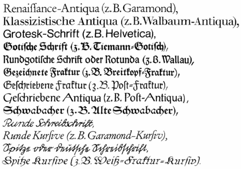
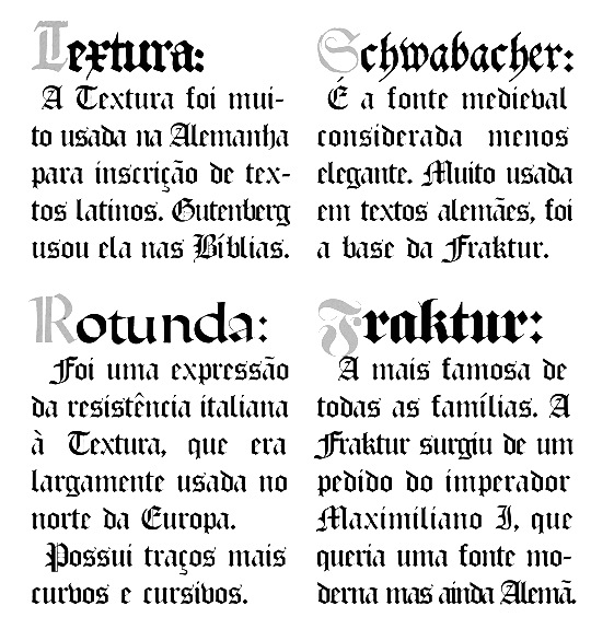
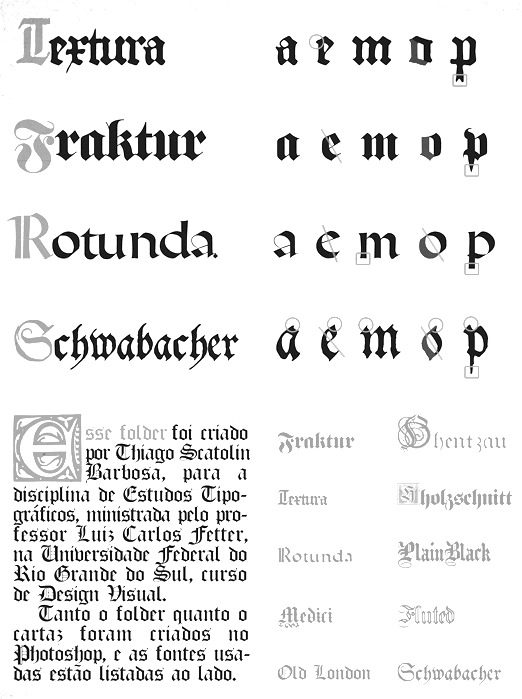
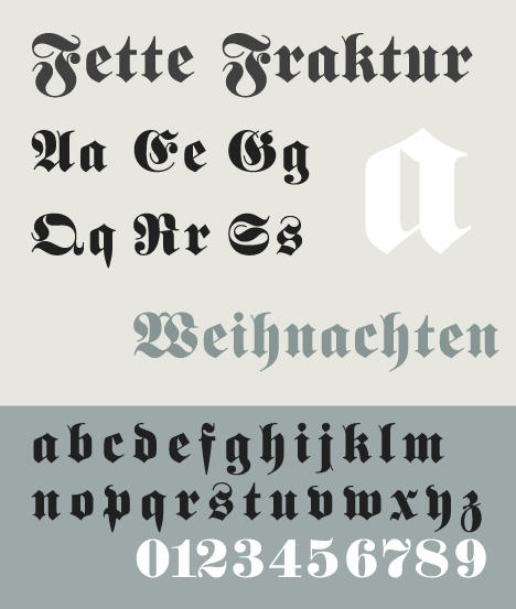
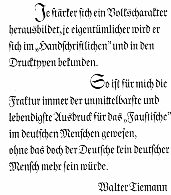
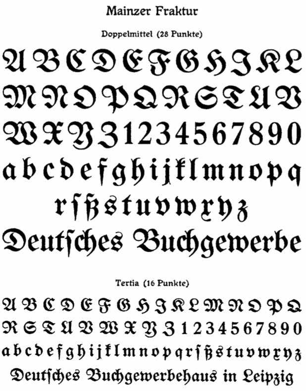
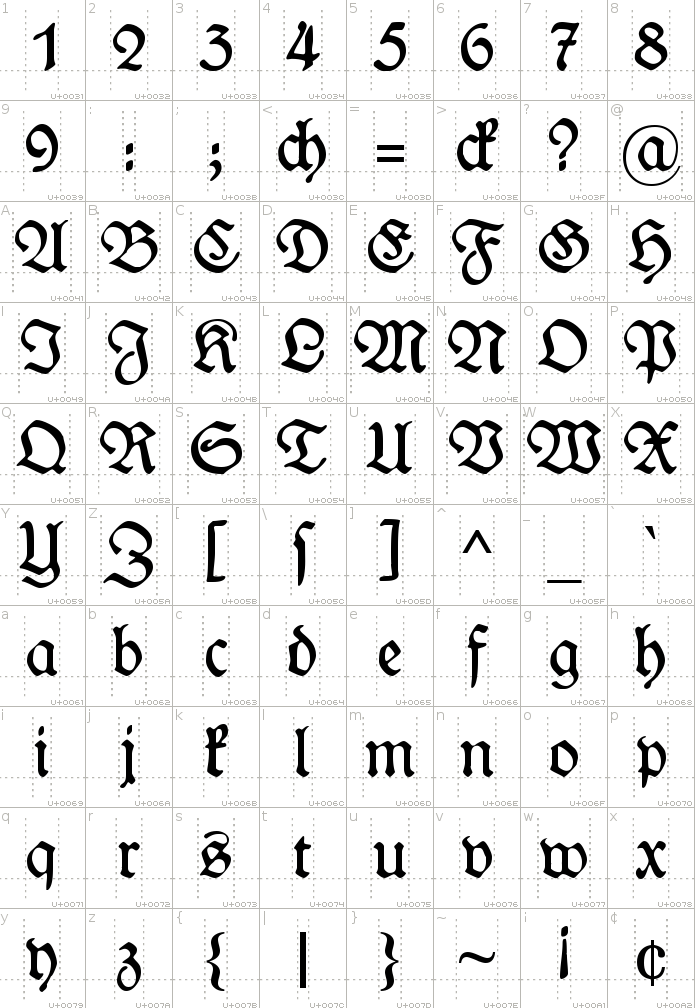
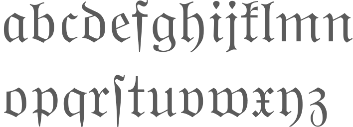
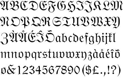
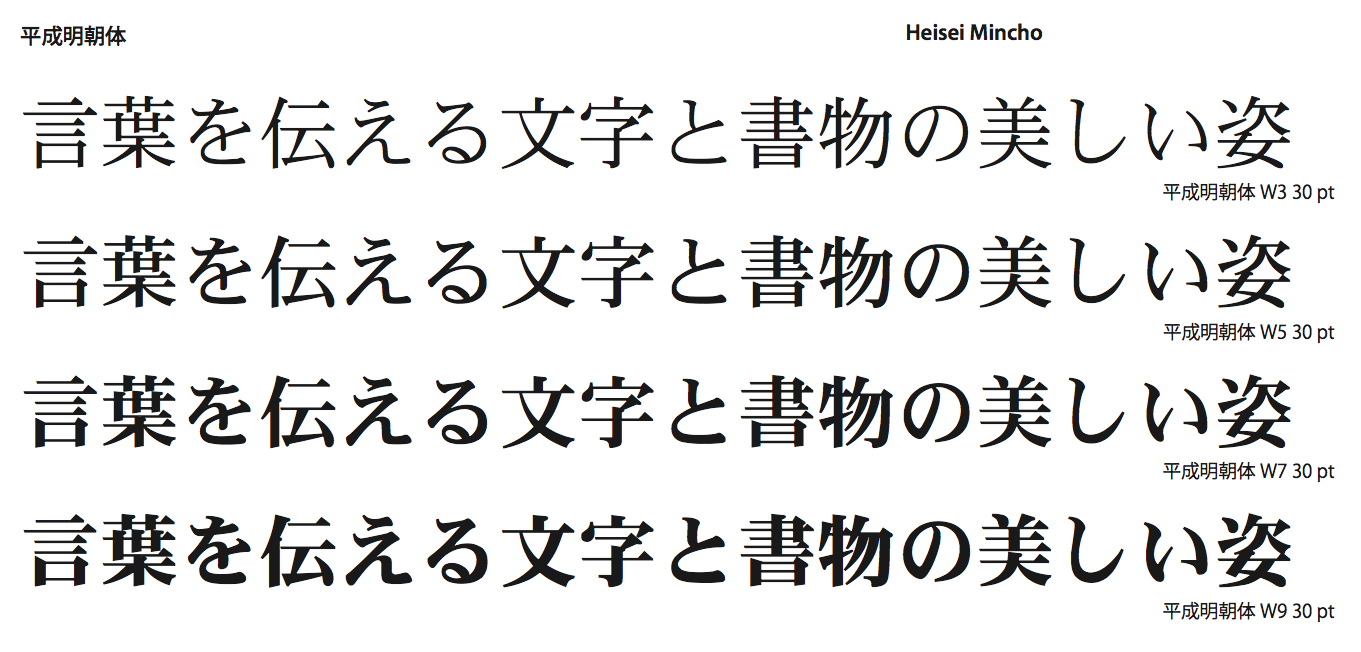
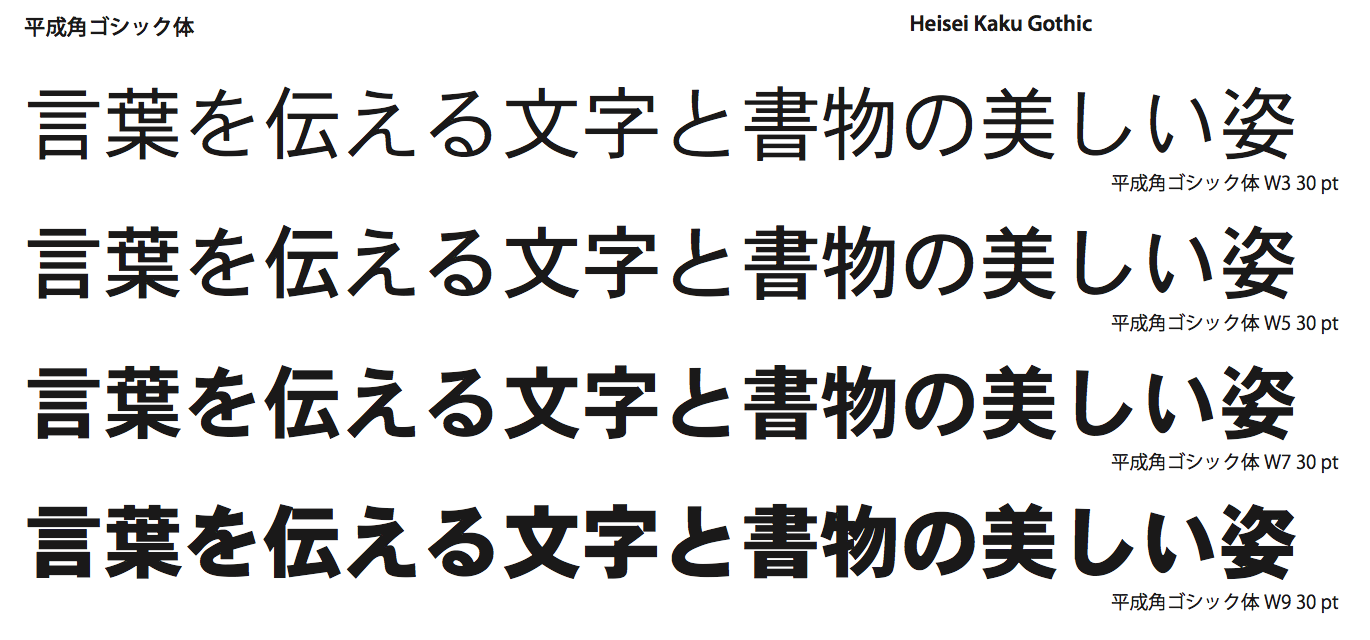
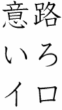
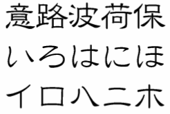
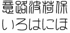
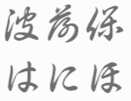
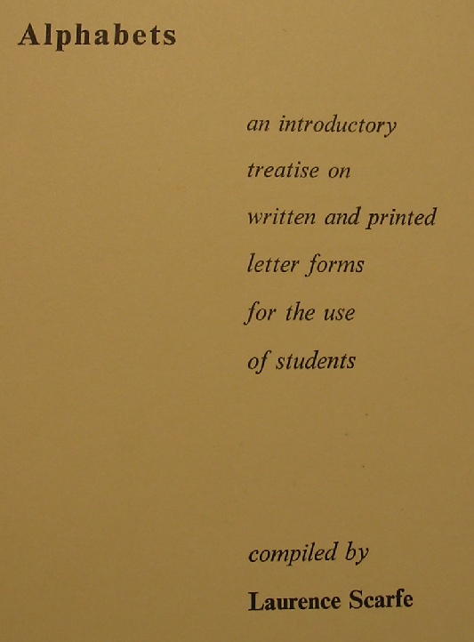
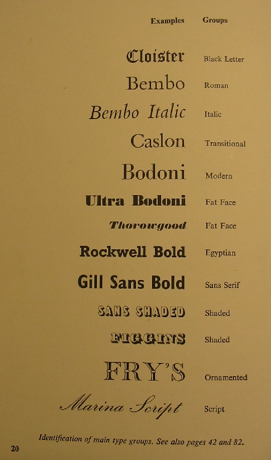
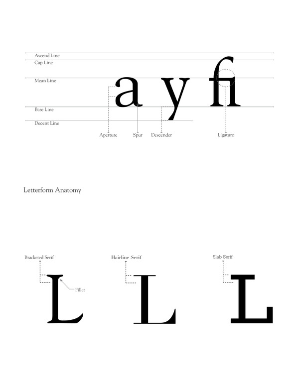
![[continued]](ShaunCoke--AnatomyII.jpg)
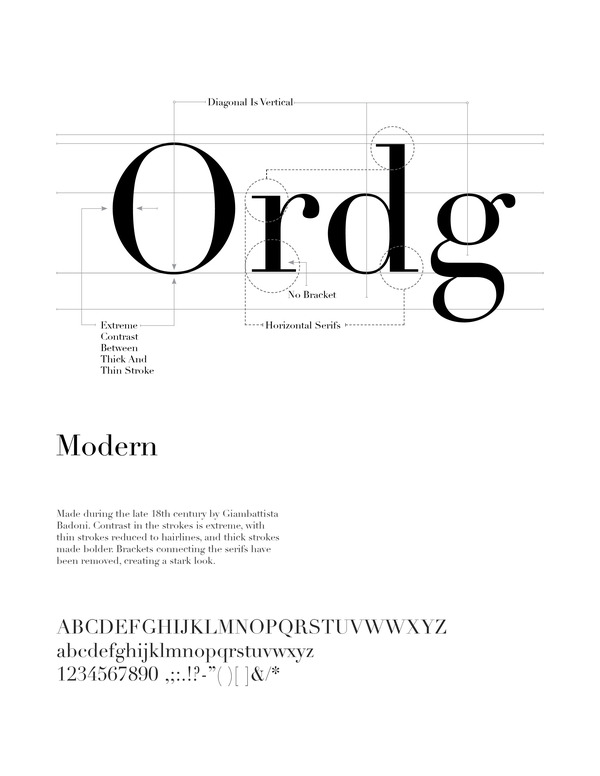
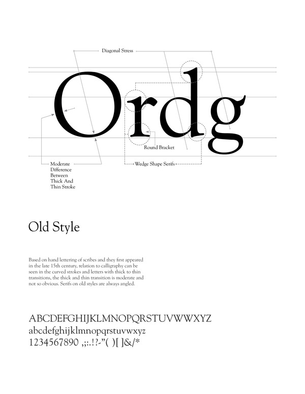
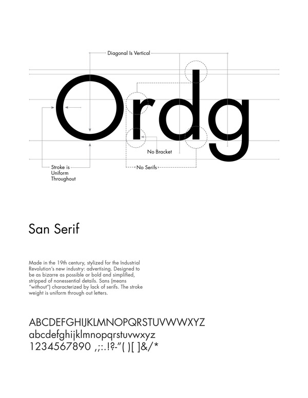
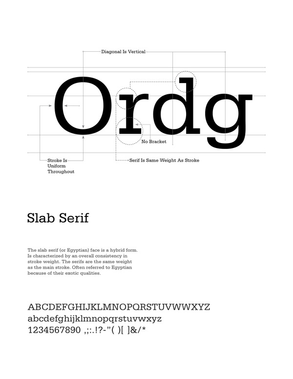
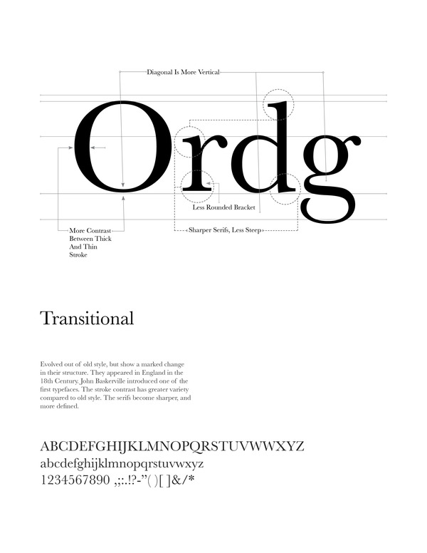
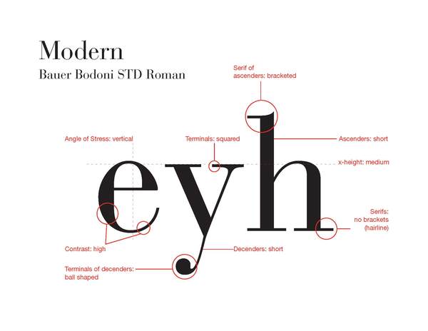
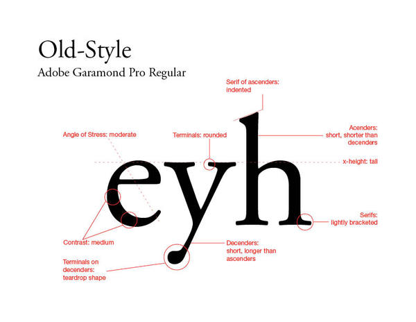
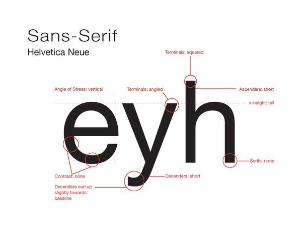
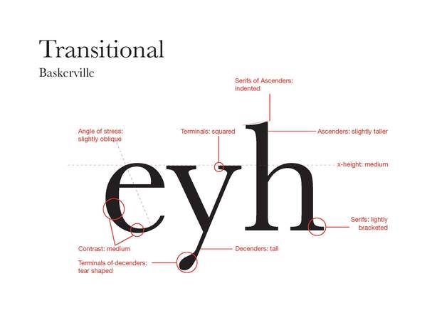
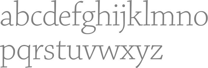
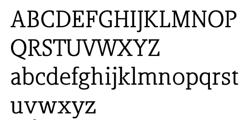
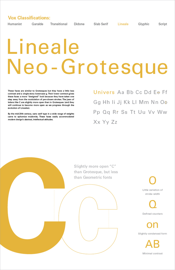