| | |
Akkadian
[John Heise]
|
John Heise's page on Akkadian. He created the cfi family of cuneiform metafonts, with signs given in New Assyrian notation. [Google]
[More] ⦿
|
Alan M. Stanier
|
Alan M. Stanier from Essex University (UK) has created the following metafonts: ams1, cherokee, cypriote, dancers (the "Dancing Men" code of Conan Doyle), estrangelo (ancient Syriac language), georgian, goblin, iching, itgeorgian, ogham (found on ancient Irish and pictish carvings), osmanian (twentieth-century font used in Somalia), roughogham, shavian, southarabian (for various languages circa 1500BC), ugaritic (ancient cuneiform alphabet). More direct access. [Google]
[More] ⦿
|
Apostrophic Laboratory
[Fredrick M. Nader]

|
 One of the most dynamic foundries from 2000 until 2003. The "Lab" was run by Apostrophe (Fredrick Nader) and was based in Toronto. The name Apostrophe comes from a Frank Zappa song. It has produced well over 1000 original free fonts, in all formats (type 1, truetype, and opentype, PC and Mac), and nearly all fonts have full character sets. Many have character sets for extended European languages and Cyrillic as well. It was for a few years the only active producer of multiple master fonts. Download site at Typoasis. Original URL, now being reworked. Highlights:
 - Miltown (from the Matrix movie).
- Fluoxetine (old typewriter).
- Desyrel (handwriting, Dana Rice).
- PicaHole-1890Morse font.
- Ritalin has almost 500 glyphs, and is a family designed for Latin, Greek, Turkish, eastern European, Cyrillic and Baltic.
- The 3-axis multiple master ImpossibleMM (of Mission Impossible fame).
- Carbolith Trips (letters from cuneiforms).
- Diehl Deco (revival of 1940 lettering by Wooster Bard Field; with Marley Diehl).
- Textan (with Rich Parks or Richard D. Parker; inspired by the Chinese Tangram).
- Poultrygeist (horror comic font).
- Hard Talk (an R-rated font by Slovenian Marjan Bozic).
- Independant (with Phynette; a faithful revival of a 1930s font by Collette and Dufour for Maison Plantin in Belgium---a fantastic Art Deco font family).
- Metrolox ("Enemy of the State" font, with Karen Clemens; a Unicode font with 567 glyphs for over 20 Latin-based languages and some math symbols).
- Komikaze, Komikazba, Komikahuna and Komikazoom (comic book fonts: 1280 glyphs for Latin, Greek, Cyrillic, Baltic, Turkish, East-European, with dingbats and Braille).
- Republika (a 300-font techno family; read about it here).
- ChizzlerMM (3-axis multiple master, a reworked version of Graham Meade's Chizzler).
- Street (a 87-font family by Graham Meade).
- Amerika (fantastic Armenian-look font series, with support for Greek, Cyrillic/Russian, Baltic, Turkish and Central European).
- The dingbats Eyecicles and Texticles, both with Graham Meade.
- Insula (2001, a Celtic/uncial font with Cybapee).
- Komika (2001, 50 comic book fonts designed with Vigilante). A spoof on Comic Sans, this family includes Komika Hand and Komika Text.
- Labrit (a great Fraktur font, with Graham Meade).
- Frigate (a Roman-kana font by Melinda Windsor).
- Scriptina (an unbelievable calligraphic font by Apostrophe, 2000-2001). In 2010, CheapProFonts published an extension, Scriptina Pro.
- Freebooter Script (an equally unbelievable calligraphic font by Graham Meade, 2001).
- Choda (a display font like none you have seen before; Apostrophe and Meade, 2001).
- Endor (with Meade, a Gothic font; 2001).
The list of designers and their fonts: - Apostrophe [dead link]: Day Roman (2002, the first digitization of Fr. Guyot's "Two Line Double Pica Roman", designed in the early 1600s), Bombardier (2002), Propaganda (2002), PropagandaCyrillic (2002), PropagandaGreek (2002), Contra (2003), Ergonome (2002), Ergonomix (2002, techno dingbats), Alfabetix (2002), SoMM (2002, a multiple master font), Templo (2001, a pixelish font), Zoloft, Miltown, Witches Brew, Celexa, Labrat, Effexor, Fluoxetine, Tralfamadore, Halcion, RxMM, Paxil, Valium, Fight This, Ritalin, Xanax, Maskalin, PicaHole, ImposMM, MiltownII, Carbolith, Komikaze, Komikazoom, Komikahuna, Diogenes, Komikazba, MistressScript, Sledge, Mary Jane, Republika, StarBat, Merkin, Erectlorite, Halter, Estrogen, Steinem (based on Dalton Maag's British Steel typeface), Lab Mix, Mary Jane II, Amerika, Masque, Konfuciuz, Mastodon, Broad, Amerika Sans, Scriptina, Karnivore, Cholo, Sedillo and Reprobate (all three based on Mike Sedillo's handwriting, 2001), Templo (screen font family, 2001).
- Marjan Bozic and Apostrophe: Hard Talk.
- Karen Clemens and Apostrophe [dead link]: Wellbutrin, Metrolox, Jagz.
- CybaPee and Apostrophe [dead link]: Cyclin, Lady Ice, Insula.
- CybaPee [dead link], Graham Meade and Apostrophe: Yellowswamp, Lady Ice revisited.
- Steve Deffeyes: Loopy.
- Marley Diehl and Apostrophe: Diehl Deco.
- Fleisch and Apostrophe: Colwell, Hadley.
- Steve Graham: Hypnosis.
- Frank Guillemette and Apostrophe: Ankora.
- Jeri Ingalls and Apostrophe: Paxil.
- Neumat Ick and Apostrophe: Icklips, Powderfinger.
- Keya Kirkpatrick: Extasy
- Keya Kirkpatrick and Apostrophe: Kimono.
- Jeff Lan: Healthy Alternative, Haven Code.
- Su Lucas and Apostrophe: Barbarello.
- Brigido Maderal and Apostrophe: Lab Bats.
- Graham Meade: Quastic Kaps (8-weight family, 2003), Quixotte (2002), Mechanihan (2002), Kameleon (2002), Lady Ice Extra (2002), Gizmo (2002), Zillah Modern (2002), Wazoo (2002), JamesEightEleven (2002), Equine (2001), Street Corner (2001), Freebooter Script, Street (31 font sans and slab serif), Bipolar Control, Lane, Street, Street Slab, 2nd Street, Kronika, Thong, Whackadoo Upper, Charrington, Lady Copra, Zebra, Extra Meade Pack, Control Freak, Dekon, Asenine, Heidorn Hill (a Fraktur font), Castorgate, Troglodyte.
- Graham Meade and Apostrophe: Moondog (2001), Choda, Futurex, Duralith, Epyval, BooterMM, Pamelor, Sabril, Erinal, Karisma, Whackadoo, Bicicles, Drummon, Primary Elector, Youthanasia, Grunja, Prussian Brew, ChizMM, Luciferus, Labtop, Gilgongo, Labrit, Kandide, Brassiere (which became the commercial typeface Ipscus in 2009), Eskargot, Endor, Labag.
- Graham Meade and Rich Parks: Luteous, Luteous II.
- Link Olsson and Apostrophe: Librium, Severina, Poultrygeist, Extrano, Komikandy.
- Rich Parks and Apostrophe: Textan, Glaukous, Textan Round, TexSquareMM, TexRoundMM.
- Alejandro Paul and Apostrophe: Fontcop, Usenet, Cayetano, Elektora.
- Evelyne Pichler: Sindrome.
- Evelyne Pichler and Apostrophe: 1910 Vienna.
- Phynette and Apostrophe: Independant.
- Peter Ramsey and Apostrophe: Distro, Futurex Distro (2001).
- Dana Rice and Apostrophe: Desyrel, Lilly.
- Wayne Sharpe: Ovulution I and II.
- Jessica Slater: Wiggles.
- Jessica Slater and Apostrophe: McKloud.
- Derek Vogelpohl: Phosphorus, Florence sans, Plasmatica, Covington, Avondale, Phosphorus II.
- Melinda Windsor: Plastic, Frigate.
- Robby Woodard: Ashby (2001).
- WolfBainX and Apostrophe: Tribal, Komika.
- Yol: Traceroute.
Font Squirrel link. Dafont link. Abstract Fonts link. [Google]
[MyFonts]
[More] ⦿
|
Archaeological Fonts (by Bonneville Electronics)
|
The was a commercial site located in West Clinton, Utah, that was run by Scott T. Smith from Clinton, Utah. It had Mayan, hieroglyphs, cuneiform, Syriac, Etruscan, old Greek, old Hebrew and archeological fonts as well as Native American dingbats. [Google]
[More] ⦿
|
archaic
[Peter R. Wilson]
|
Peter R. Wilson's metafont code (2000-2005) for many archaic languages: Proto-Semitic (16bc), Phoenician (10bc), Greek (6bc), Greek (4bc), Etruscan (8bc), Futharc (Anglo-Saxon, 6ad), Hieroglyphics (30bc: the hieroglf provides a Metafont version of about 80 Egyptian hieroglyphs from Serge Rosmorduc's comprehensive hieroglyph package, see here for a type 1 version called Archaic-Poor-Mans-Hieroglyphs (2005)), Cypriot (9bc). Peter also developed metafont fonts for bookhands. The Archaic ollection contains fonts to represent Aramaic, Cypriot, Etruscan, Greek of the 6th and 4th centuries BCE, Egyptian hieroglyphics, Linear A, Linear B, Nabatean old Persian, the Phaistos disc, Phoenician, proto-Semitic, runic, South Arabian Ugaritic and Viking scripts. The bundle also includes a small font for use in phonetic transcription of the archaic writings. The bundle's own directory includes a font installation map file for the whole collection. The authors are Peter R. Wilson, Uwe Zimmermann and Apostolos Syropoulos. See here for the type 1 fonts Archaic-OandS (2005) and Archaic-OandS-Italic (2005). Here we find type 1 versions called Square-Capitals (2005) and Square-Capitals-Bold (2005). He also made the type 1 typefaces Archaic-Etruscan (2005), Archaic-Runic (2005) and Archaic-ProtoSemitic (2005). Further packages of type 1 and metafont fonts: Archaic-Aramaic (2005), South Arabian (2005, for the South Arabian script, in use for about 1000 years from roughly 600 BC; based on a metafont by Alan Stanier), Archaic-Linear-B (2005: a syllabary used in the Bronze Age (15bc) for writing Mycenaean Greek), Archaic-Nabatean (2005: the Nabatean script used in the Middle East between the fourth centuries BC and AD), Archaic-Old-Persian (2005: the Old Persian Cuneiform script in use between about 500 to 350 BC.), Archaic-Ugaritic-Cuneiform (2005: the Ugaritic Cuniform script in use about 1300 BC), Archaic-Cypriot (1999-2005). [Google]
[More] ⦿
|
Babylon Lingua
|
William Ramey's pages on Akkadian, Aramaic, Assyrian, Coptic, Cuneiform, Cyrillic, Egyptian, Greek, Hebrew, Hieroglyphics, Latin, Meroitic, Nahkt, Phoenician, Sumerian, and Ugaritic. [Google]
[More] ⦿
|
Bendt Alster
|
PC-Mac compatible true type fonts primarily intended for the transliteration of Akkadian and Sumerian cuneiform texts. Bendt Alster's page. The fonts made by him from Monotype fonts include the BaBo family (BookmanOldStyle), the BaCesPsB family (CenturySchoolbook), the BaTak family (TimesAkkad), BaGarUni (Garamond Unicode). His BATimesAkkad (2000) is also here. [Google]
[More] ⦿
|
Brian Bjorkman
|
Graphic designer Brian Bjorkman (Richmond, VA) created Conectatype (2010), a connected typeface that was influenced by pixels, mazes, Islamic calligraphy and cuneiform. Behance link. [Google]
[More] ⦿
|
CAT Design Wolgast
[Peter Wiegel]
|
 Wolgast-based type designer Peter Wiegel (b. 1955) runs CAT Design Wolgast. Designer of these free fonts:
 - In 2019: Kufi Pattern.
- In 2018: Aurach Tri (a trilined typeface), Googee (monoline circle-themed sans), Gianna (medieval script), Hamburger Schwabacher.
- In 2017: Eyechart (heavy slab serif), Border Control (inline), Espresso Dolce (rounded sans), Gotisch Weiss, Halt (a dry brush typeface after Walter Hoehnisch's Stop from 1939), Kanzler, Llewie (rounded sans), Schulze Werbekraft (expressionist, after Arthur Schulze, 1926).
- In 2016: Ronaldson Gothic (after a MacKellar, Smiths & Jordan Co original), Vorgang (a great 1920s geometric sans), 5by7 (LED pixel font), BP 12-22 (industrial sans), u DIN 1451 Mittelschrift, Flubby, Gaeilge (Irish / uncial), Junior CAT (after Hans Heimbeck, 1936), CAT Liebing Gotisch (after Kurt Liebing), Tippa (an old typewriter font based on Adler Tippa 1).
- In 2015: Nuernberg (blackletter), CAT Schmalfette Thannhaeuser (blackletter), Offenbacher Reform (a revival of Offenbacher Reform, a blackletter typeface by Roos & Junge), Autobahn (blackletter), Barloesius Schrift (after Georg Barloesius's Barlösius Schrift, 1906), CAT-Franken-Deutsch (after Alfons Schneider, 1936), Fuckin Gwenhwyfar, CAT Kurier (a script after Herbert Thanhaeuser's Kurier from 1939), CAT Linz, CAT Rhythmus (a sharp-edged black grotesk after a Schriftguss AG original), DIN Schablonierschrift (DIN-based stencil), CAT North Licht, Feronia, Fette National Fraktur (after Walter Hoehnisch, 1934), Grobe-Plakat-Fraktur, CAT Childs (fifties style cursive typeface), Jena Gotisch (decorative caps), Kabinett Fraktur (after Johann Friedrich Unger, 1793-1794), Wattauchimma (heavy hipster sans), Friedolin (blackletter), Lorem Ipsum, Symphonie (a calligraphic script, reviving Imre Reiner's Symphonie (1938), also called Stradivarius (1945)), Power (a retro techno typeface), Krugmann Brush, Omega.
- In 2014: BernerBasisschrift1, BernerBasisschrift2 (school script), Berolina, Brausepulver (after Brause & Co., 1912), Fette Mikado (psychedelic style oriental look), Germanica, Gloria, HentimpsCirclet (blackletter), Hofstaetten (blackletter), Kleinsemmering, KuenstlerGotisch (blackletter), LacledeCAT (psychedelic), NeptunCAT, Neue Zier Schrift (a mischievous curly script), Pommern Gotisch, Reclame, CAT Report (retro brush script), Rueck-Italic, Rueck, RueckLeft, RueckLicht, RundschriftCAT (hairline ronde), Standard Graf (German expressionist and hexagonal typeface), Teutonic, VerzierteFavorite, VictoriaCAT, AdmiralCAT (a retro script), Dynamo (poster font), Des Malers Fraktur, Kanzleyrath (blackletter), Ober-Tuerkheim (art nouveau), PopplFrakturCAT (blackletter), Rundkursiv, Modeschrift (fifties script), Biedermeier Kursiv, Ehmcke Federfraktur (after a 1935 font by F.H. Ehmcke), Wernicke Schwabacher (after an original by Emmi Wernicke), Gotische Missalschrift, Hand Textur (after a 1935 font by F.H. Ehmcke), Renata (after a 1914 bastarda by Bauersche Giesserei), Rundgotisch Rauh (possibly after a Schelter & Giesecke design from 1903), Offenbacher Schwabacher (after Kurt Wanschura's bastarda from 1900), Incopins Clusters (multilined typeface), BadGong, Bernardo Moda (Bold, Semibold, Moda, Contrast: modeled after Lucian Bernhard's Bernhard fashion), CAT-Hohenzollern (after a 1902 art nouveau font by Bauersche), CATNorth, CATNorthLicht, CATNorthShadow, CAT Zentenaer Fraktur UNZ1 (a blackletter after a 1937 original by F.H.E. Schneidler), Coggers-Tariqa, EirikRaude, Fabrik (a geometric sans), Grobe Deutschmeister (German expressionist face), Harry Piel (or Piehl--a tattoo font), Kanalisirung, Klaber-Fraktur, Peter Obscure, Rumburak (a fat retro script), Flottflott (retro script), Indira K, Regent UNZ (a Schwabacher), Postamt, TGL 0-1451 Engschrift (a DIN-like font).
- In 2013: Spartakus (+Round), Cut Me Out (white on black sans), 5by9 (dot matrix face), Tartlers End (high-contrast ball terminal face), Alpha 54 (rounded flared script face), Chunk Five Ex (slab serif; he writes: With permission of Meredith Mandel, the original author of the ASCII-Font Chunk Five, I have extended Chunk Five Ex to a full featured unicode font with all figures used in Latin and Cyrillic writing), Simple Print (simple sans), Fette Bauersche Antiqua (a didone fat face), Manuskript Gothisch (after Manuskript Gotisch (1899, Bauersche), which was modeled after Wolfgang Hopyl's 1514 Textura), Quast (hairy font).
- Still in 2013, he published a number of school scripts, including Neue Rudelskopf, Deutsche Normalschrift, Imrans School, Rastenburg (German school font), and Bienchen.
- In 2012: Hardman (connected fifties script), Immermann (a quaint slab serif), Quast (grunge), Fundamental Brigade (sans family), DiffiKult (a bilined face), Men Nefer (a Memphis lookalike), Fette Unz Fraktur (like Fette Fraktur), Mutter Krause (for the reconstruction of the 1929 silent movie "Mutter Krausens Fahrt ins Glück", where it is used for intertitles, that where missing. The font is redrawn from the original intertitles), Youbilee (a font with laurels).
- In 2010: Alfabilder (dingbats), Gondrin (athletic lettering with a 3d effect), Helvetia Verbundene (making Helvetica into a school script? The original typeface was by Carl Albert Fahrenwaldt 1901), Proletarsk (a grotesk face), Vis-à-vis (great idea--a double-storied serif face), ApolloASM (Victorian), BertholdrMainzerFraktur, Doergon-Regular (license plate font), DoergonBackshift, DoergonShift, Eureka (Victorian, ornamental face), GoeschenFraktur (1880-style Fraktur used in Sammlung Göschen books), Makushka, MakushkaKontura, MakushkaQuadriga, MakushkaSecunda, Moderne3DSchwabacher, ModerneGekippteSchwabacher, StrassburgFraktur, TGL0-16 (same as DIN 16), TGL0-17 (same as DIN 17), TGL0-17Alt, Tank (emblems of gas companies), EricaType-Bold, EricaType-BoldItalic, EricaType-Italic, EricaType-Regular (typewriter), ErikaOrmig, Fibel Vienna (2012, a high-legged sans), GreifswalderTengwar-Regular, GreifswalerDeutscheSchrift (German Schreibschrift), Midroba-Regular (a strong mechanical octagonal face), MidrobaSchatten, MMX2010 (futuristic), Präsent60, Rotunda Pommerania (blackletter), TengwarOptime, TengwarOptimeDiagon, cbe-Bold, cbe-BoldItalic, cbe-Italic, cbe.
- In 2009: 18thCenturyInitials, 18thCenturyKurrent-Regular, 18thCenturyKurrentAlternates, German writing from the 18th century), CentreClaws, CentreClawsBeam1, CentreClawsSlant, Cöntgen Kanzley Regular (blackletter), Cöntgen Kanzley Aufrecht (2009), ElficCaslin, H1N1, Loxembourg1910Shadow (an art nouveau-influenced stencil face), Luxembourg1910, Tschichold, VarietScala (an art deco sans family), Varietee, VarieteeArtist, VarieteeCabaret, VarieteeCascadeur, VarieteeCasino, VarieteeCirque, VarieteeColege, VarieteeConferencier, VarieteeFolies, VarieteeIkarier, VarieteeJongleur, VarieteeMirage, VarieteeRevue, VarieteeTheatre, KochFetteDeutscheSchrift (blackletter), MoradoFelt-Regular (upright connected script), MoradoMarker (2009), MoradoNib, PreussischeVI9 (DIN-like family), PreussischeVI9Linie, PreussischeVI9Schatten-Linie, PreussischeVI9Schatten, SchatternvonPreussischeVI9, Stage (art deco), Ring Matrix (dot matrix), Nathan, Amptmann Script (2009, upright connected script), Cat Shop, Blankenburg (blackletter), Murrx (arched face), Schwaben Alt (1988, bastarda), Vrango, 14LED (Regular, Phattt-Heavy, Rised-Black), 24LED (+Bright, +Grid, +Modul), DIN1451fetteBreitschrift1936-Regular, FibelNord (basic sans family with an architectural twist), FibelSued (family), PaneuropaBankette, PaneuropaCrashbarrier-Black, PaneuropaFreeway, PaneuropaHighway, PaneuropaRoad, PaneuropaStreet, PaneuropaWrongWay, Quirkus (family), RingMatrix (dot matrix family), RingMatrix3D, RingMatrixTwo, DiscipuliBritannica (connected script), GruenewaldVA-Regular (connected school script), Rudelskopfdeutsch-Aufrecht, WiegelLatein (connected school script), WiegelLateinMedium (2009), Morado, Moebius Bicolor (art deco), Elbaris (sans), ElbarisOutline, Nomitais (multiline face), RostockKaligraph, Waschkueche, WaschkuecheGrob-Ultra, WiegelKurrent (traditional German school script), WiegelKurrentMedium, XAyax, XAyaxOutline (2009), Kaufhalle (squarish), Quimbie (art deco), CasaSans-Regular, Elb-Tunnel, MeyneTextur (blackletter), Yiggivoo, TGL 31034-1 (futuristic sans), Beroga (a simple organic sans).
- Before 2009: Xayax, PreussischeIV44Ausgabe3 (2006, a severe sans), Utusi Star (1989, very condensed all-caps face), Avocado (2006, script face), CbeNormal (2006, script face), Leipzig Fraktur (+Bold) (2006), Berlin Email (2006, a condensed sans family, followed in 2009 by Berlin Email Serif), MaassslicerItalic (2006, a futuristic typeface made for Rudolf Maass + Partner GmbH), Powerweld (a gorgeous avant-garde typeface made for OPTI Pumpen und Technik GmbH), WolgastScript (2005), WolgastTwo (2006, connected script), WolgastTwoBold, ZeichenDreihundert-Regular, ZeichenHundert-Regular, ZeichenVierhundert-Regular, ZeichenZweihundert-Regular (2006, traffic dingbats), Djerba simplified (Arabic font, Computer and Technologie, Hamburg, 1995; it can be downloaded here), Titus FrakturBaltic (1998), TITUS FrakturEast Normal (1998), and TITUS FrakturWest Normal (1998) [which used to be downloadable here; these fonts were retired and the Titus name dropped; most of the glyphs made it to Schwaben Alt].
Dafont link. One more URL. Fontspace link. Yet another URL. Font Squirrel link. Fontsy link. The list of his truetype and opentype typefaces as of 2011: 18thCenturyInitials, 18thCenturyKurrentStart, 18thCenturyKurrentText, Alfabilder, AlteDIN1451Mittelschrift, AlteDIN1451Mittelschriftgepraegt, AmptmannScript, ApolloASM, Avocado, Barnroof, BerlinEmail, BerlinEmail2, BerlinEmailBold, BerlinEmailBold, BerlinEmailHeavy, BerlinEmailHeavy, BerlinEmailOutline, BerlinEmailOutline, BerlinEmailSchaddow, BerlinEmailSchaddow, BerlinEmailSemibold-Bold, BerlinEmailSemibold-Bold, BerlinEmailSerif, BerlinEmailSerif, BerlinEmailSerifSemibold, BerlinEmailSerifSemibold, BerlinEmailSerifShadow, BerlinEmailWideSemibold, BerlinEmailWideSemibold, Beroga, Beroga, BerogaFettig-Bold, BerogaFettig-Bold, BertholdMainzerFrakturUNZ1A-Italic, BertholdMainzerFrakturUNZ1A, BertholdrMainzerFraktur, Blankenburg-Regular, BlankenburgUNZ1A-Italic, BlankenburgUNZ1A, CasaSans-Regular, CasaSans, CasaSansFettig-Bold, CatShop, CentreClaws, CentreClawsBeam1, CentreClawsSlant, ChunkFiveEx, CntgenKanzley-Regular, CntgenKanzleyAufrecht, DIN1451fetteBreitschrift1936-Regular, DiscipuliBritannica, DiscipuliBritannicaBold, Doergon-Regular, DoergonBackshift, DoergonShift, DoergonWave-Regular, Elb-Tunnel, Elb-TunnelSchatten, Elbaris, ElbarisOutline, ElficCaslin, EricaType-Bold, EricaType-BoldItalic, EricaType-Italic, EricaType-Regular, ErikaOrmig, Eureka, FibelNord-Bold, FibelNord-BoldItalic, FibelNord-Italic, FibelNord, FibelNordKontur, FibelSued-Bold, FibelSued-BoldItalic, FibelSued-Italic, FibelSued, FibelSuedKontur, GoeschenFraktur, GoeschenFrakturUNZ1A-Italic, GoeschenFrakturUNZ1A, Gondrin, GreifswalderTengwar-Regular, GreifswalerDeutscheSchrift, GruenewaldVA-Regular, GruenewaldVA1.Klasse, GruenewaldVA3.Klasse, H1N1, HelvetiaVerbundene, KochFetteDeutscheSchrift, KochFetteDeutscheSchriftUNZ1A-Italic, KochFetteDeutscheSchriftUNZ1A, LeipzigFrakturBold, LeipzigFrakturHeavy-ExtraBold, LeipzigFrakturLF-Bold, LeipzigFrakturLF-Normal, LeipzigFrakturNormal, LeipzigFrakturUNZ1A-Bold, LeipzigFrakturUNZ1A-BoldItalic, LeipzigFrakturUNZ1A-Italic, LeipzigFrakturUNZ1A, Luxembourg1910, Luxembourg1910Contur, Luxembourg1910Ombre, MMX2010-Regular, Maassslicer3D, Maassslicer3D, MaassslicerItalic, MaassslicerItalic, Makushka, MakushkaKontura, MakushkaQuadriga, MakushkaSecunda, MeyneTextur, MeyneTexturUNZ1A-Italic, MeyneTexturUNZ1A, Midroba-Regular, MidrobaSchatten, Moderne3DSchwabacher, ModerneFetteSchwabacher, ModerneFetteSchwabacherUNZ1A-Italic, ModerneFetteSchwabacherUNZ1A, ModerneGekippteSchwabacher, MoradoFelt-Regular, MoradoMarker, MoradoNib, MoradoSharp-Regular, Murrx, Nathan-CondensedRegular, Nathan-ExpandedRegular, Nathan-Semi-expandedRegular, Nathan, NathanAlternates-CondensedRegular, NathanAlternates-ExpandedRegular, NathanAlternates-Semi-expandedRegular, NathanAlternates, Nomitais, Nomitais, Numikki, Numukki-Italic, Numukki-Italic, Numukki, Powerweld, PreussischeIV44Ausgabe3, PreussischeIV44Ausgabe3, PreussischeVI9, PreussischeVI9Linie, PreussischeVI9Schatten-Linie, PreussischeVI9Schatten, Proletarsk, Prsent60, Quimbie, Quimbie3D, QuimbieShaddow, QuimbieUH, Quirkus-Bold, Quirkus-BoldItalic, Quirkus-Italic, Quirkus, QuirkusOut, QuirkusUpsideDown, RostockKaligraph, RotundaPommerania, RotundaPommeraniaUNZ1A-Italic, RotundaPommeraniaUNZ1A, Rudelskopfdeutsch-Aufrecht, SchatternvonPreussischeVI9, Schulfibel-Nord-Linie-2, SchwabenAlt-Bold, SchwabenAltUNZ1A-Italic, SchwabenAltUNZ1A, Stage, StrassburgFraktur-Regular, TGL0-16, TGL0-17, TGL0-17Alt, TGL31034-1, TGL31034-1, TGL31034-2, TGL31034-2, Tank, TengwarOptime, TengwarOptimeDiagon, TitilliumMaps29L-1wt, TitilliumMaps29L-400wt, TitilliumMaps29L-800wt, TitilliumMaps29L-999wt, TitilliumText22L-1wt, TitilliumText22L-250wt, TitilliumText22L-400wt, TitilliumText22L-600wt, TitilliumText22L-800wt, TitilliumText22L-999wt, TitilliumTitle20, UtusiStar-Bold, UtusiStar, VarietScala, Varietee, VarieteeArtist, VarieteeCabaret, VarieteeCascadeur, VarieteeCasino, VarieteeCirque, VarieteeColege, VarieteeConferencier, VarieteeFolies, VarieteeIkarier, VarieteeJongleur, VarieteeMirage, VarieteeRevue, VarieteeTheatre, Via-A-Vis, Vrng, Waschkueche, Waschkueche, WaschkuecheGrob-Ultra, WaschkuecheGrob-Ultra, WiegelKurrent, WiegelKurrent, WiegelKurrentMedium, WiegelKurrentMedium, WiegelLatein, WiegelLateinMedium, WolgastScript, WolgastScript, WolgastTwo, WolgastTwo, WolgastTwoBold, WolgastTwoBold, XAyax, XAyax, XAyaxOutline, XAyaxOutline, YiggivooUnicode-Italic, YiggivooUnicode-Italic, YiggivooUnicode, YiggivooUnicode, YiggivooUnicode3D-Italic, YiggivooUnicode3D-Italic, YiggivooUnicode3D, YiggivooUnicode3D, ZeichenDreihundert-Regular, ZeichenDreihundertAlt, ZeichenHundert-Regular, ZeichenHundertAlt, ZeichenVierhundert-Regular, ZeichenZweihundert-Regular, ZeichenZweihundertAlt, cbe-Bold, cbe-BoldItalic, cbe-Italic, cbe, kaufhalle, kaufhalle, kaufhalleblech, kaufhalleblech, moebius. His type 1 fonts as of 2011: Avocado, BerlinEmail, BerlinEmail2, BerlinEmailBold, BerlinEmailHeavy, BerlinEmailOutline, BerlinEmailSchaddow, BerlinEmailSemibold-Bold, BerlinEmailSerif, BerlinEmailSerifSemibold, BerlinEmailSerifShadow, BerlinEmailWideSemibold, Beroga, BerogaFettig-Bold, CasaSans, Elb-Tunnel, Elb-TunnelSchatten, Maassslicer3D, MaassslicerItalic, Numukki-Italic, Numukki, Powerweld, PreussischeIV44Ausgabe3, Quimbie, QuimbieUH, RostockKaligraph, TGL31034-1, TGL31034-2, UtusiStar-Bold, UtusiStar, Waschkueche, WaschkuecheGrob-Ultra, WolgastScript, WolgastTwo, WolgastTwoBold, YiggivooUnicode-Italic, YiggivooUnicode, YiggivooUnicode3D-Italic, YiggivooUnicode3D, cbe-Bold, cbe-BoldItalic, cbe-Italic, cbe, kaufhalle, kaufhalleblech. A list of typefaces in alphabetical order, with descriptive comments provided by Reynir Heidberg Stefansson from Iceland: 18th Century Kurrent (Kurrent-style handwriting, Wiegel-coded), Alfabilder (Alphabetic picture font for the German alphabet), Amptmann Script (Partly-connected, upright writing, used on Prussian Railways pattern drawings), ApolloASM (Jugendstil, vaguely resembling an ornate Bocklin), Avocado (Handwriting, broad-nib pen-style), Berlin Email (Narrow sans-serif, based on emailled signage; Wiegel-coded), Berlin Email Serif (Narrow serif, based on emailled signage; Wiegel-coded), Beroga (All-minuscule, rounded marker-style sans-serif with ca. 8° slope), Berthold Mainzer Fraktur (Fraktur in Wiegel (Regular only) and UNZ1(A) coding), Blankenburg (Semicondensed Tannenberg in Wiegel (Regular only) and UNZ1(A) coding), Casa Sans (Squarish, broad-nib pen-style block writing), CatShop (Serif, soft of an acid-washed didone), cbe Normal (Sans-serif, narrow, somewhat cuneiform), Centre Claws (Sans-serif, Art Deco display, a bit like Broadway), Cöntgen Kanzlei (Cöntgen Kanzley) (Fraktur-based calligraphy by Heinrich Hugo Cöntgen, Wiegel coding), DiffiKult (Sans-serif, display, no horizontal lines), DIN 1451 fette Breitschrift 1936 (The now-withdrawn Wide version of DIN 1451 traffic font), Discipuli Britannica (UK school handwriting), Doergon (Slab-serif, narrow-ish, all majuscule), CAT Eckmann, Elabris (Elbaris) (Sans-serif, caps/smallcaps, shades of DIN1451 Engschrift), Elb-Tunnel (Sans-serif, based on signage in the old Elbe tunnel in Hamburg), Elbic Caslon (Elfic Caslon, Elfic Caslin) (a Caslon for the Queen Galadriel), Erika Type (Erica Type) (Slab-serif, typewriter, comes from Wiegel's old Erika typewriter), Eureka (Serif, caps/smallcaps, Art Deco/Jugendstil), Fibel Nord (2009, sans-serif, based on German school primer), Fibel Sued (2009, sans-serif, based on German school primer), Fibel Vienna (Sans-serif, based on Austrian school primer), Fundamental Brigade (Sans-serif, geometric, some UNZ1 ligatures), Göschen Fraktur (Goeschen Fraktur) (Fraktur with a biblical feel, Wiegel (Rg only) and UNZ1 coding), Gondrini (Gondrin) (Sans-serif, geometric, display, shaded outlines, cookie-cutter), Greifswalder Deutsche Schrift (Handwriting, based on Rudolf Koch's Offenbacher Kurrent, Wiegel coding), Greifswalder Tengwar (Tengwar handwriting in Offenbach style), Gruenewald VA (Latin-style schoolhand, Wiegel coding), H1N1 (Heavy display typeface made of parallel wavetrains), Hardman (Heavy, wide, squarish logotype with connecting letters), Helvetia Verbundene (Swiss handwriting), Immermann (Display, resembles a seriffed Radio/Rundfunk, UNZ1 coding), Kaufhalle (Display, recreation of HO Kaufhalle logotype), Koch Fette Deutsche Schrift (Very plain fraktur, Wiegel (Rg only) and UNZ1 coding), Leipzig Fraktur (Fraktur for bread text, Wiegel coding), Leipzig Fraktur UNZ1A (Fraktur for bread text), Luxembourg 1910 (Sans-serif, Jugendstil display typeface from old spice drawers), Maass Slicer (Maassslicer) (Sans-serif, oblique display face, orig. logotype), Makushka (Sort-of an Elabris with minuscules, looks overlayable), Men Nefer (Slab-serif, geometric, UNZ1 coding), Midroba (Spur-serif, display, all-majuscule, heavy, octal), MMX2010 (Sans-serif, display, caps/smallcaps, TV game machine feel), Moderne Schwabacher (Heavily reworked, Wiegel coding), Moderne Fette Schwabacher UNZ1A (Heavily reworked, Wiegel coding), Möbius (moebius) (Sans-serif, display, bicolour (u/c = non-spacing fills, l/c = spacing outlines)), Morado (Connected handwriting with nib or marker pen), Murrx (Heavy display typeface made from ellipsoids on NE-SW axis), Mutter Krause (Serif, slanting, Jugendstil-feel), CAT Neuzeit and CAT Neuzeit Schatten (2012-2014), Nathan (Slab-serif, hand-drawn.), Nomatais (Nomitais) (Elabris with multiple levels of outlines), Numukki (Conlang, knotted-line, good for separators and scenebreaks), Powerweld (Sans-serif, Bauhaus style, all-minuscule), Präsent 60 (PI font with various East German logos), Preussische IV 44 (PreussischeIV44Ausgabe3) (Repro of Prussian Railways pattern type IV 44 version 3), Preussische VI 9 (Repro of Prussian Railways pattern type VI 9 version 2), Proletarsk (Sans-serif, monoline, doubled-up questionmark), Quast (Brush type, all-majuscule, very rough outline), Quimbie (Sans-serif, all-majuscule, resembles Amelia), Quirkus (Sans-serif), Ring Matrix (LED matrix with ring LEDs, solid LEDs and ring LEDs with shadow), Rostock Kaligraph (Very round calligraphy, resembles rotunda), Rotunda Pommerania (Rotunda style, Wiegel-code (Regular only) or UNZ1-coded), Rudelskopf deutsch (Sans-serif, based on Kurrent-style letterforms), Schwaben Alt (Schwabacher in Wiegel- (Rg only) or UNZ1-coding.), Stage (Sans-serif, narrow, Art Deco, fleeting taste of Broadway), Strassburg Fraktur (Handwritten fraktur, ornate majuscules, Wiegel-coding), Tank (PI font with (gas/petrol) tank station logos), TengwarOptime (Optima for Tengwar), TGL 0-16/0-17 (East German versions of DIN 16 and DIN 17 blueprint types), TGL 31034-1, TGL 31034-2 (East German versions of DIN 6776 / DIN EN ISO 3098 blueprint types), Utusi Star (Sans-serif, slight resemblance with Rundfunk), Varieté (Sans-serif, all-majuscule or caps/smallcaps), Vis-A-Vis (Serif, all-majuscule, split in middle), Volk Redis (Kurrent handwriting, anno 1930-1941), Vrångö (LED matrix type like Ring Matrix), Waschküche (Serif, resembles Antykwa Torunska), Wiegel Kurrent (Kurrent-style handwriting), Wiegel Latein (Latin-style handwriting), Wolgast Script (Sloppy-looking handwriting with a broad-nib pen), Wolgast Two (Latin/Cyrillic handwriting), XAyax (Serif, Jugendstil, narrow, all-majuscule), Yiggivoo Unicode (Sans-serif, wide, tall x, board game packaging feel), Youbilee (PI font with various jubilee laurels), Verkehrszeichen (Zeichen) (PI fonts with traffic signs (in layers)), Verkehrszeichen alt (Zeichen Alt) (PI fonts with old traffic signs (in layers)). Abstract Fonts link. Dafont link. Kernest link. Klingspor link. CAT Fonts link. Fontesk link. [Google]
[More] ⦿
|
Cuneiform
|
From Encyclopaedia Britannica: System of writing used in the ancient Middle East. The name, a coinage from Latin and Middle French roots meaning "wedge-shaped", has been the modern designation from the early 18th century onward. Cuneiform was the most widespread and historically significant writing system in the ancient Middle East. The origins of cuneiform may be traced back approximately to the end of the 4th millennium BC. At that time the Sumerians, a people of unknown ethnic and linguistic affinities, inhabited southern Mesopotamia and the region west of the mouth of the Euphrates known as Chaldea. Many of the cultures employing cuneiform (Hurrian, Hittite, Urartian) disappeared one by one, and their written records fell into oblivion. The same fate overtook cuneiform generally with astonishing swiftness and completeness. [Google]
[More] ⦿
|
Cuneiform: Wikipedia
|
Quoting wikipedia: Cuneiform script is one of the earliest known systems of writing. Emerging in Sumer in the late 4th millennium BC (the Uruk IV period), cuneiform writing began as a system of pictographs. In the third millennium, the pictorial representations became simplified and more abstract as the number of characters in use grew smaller, from about 1,000 in the Early Bronze Age to about 400 in Late Bronze Age (Hittite cuneiform). The original Sumerian script was adapted for the writing of the Akkadian, Eblaite, Elamite, Hittite, Luwian, Hattic, Hurrian, and Urartian languages, and it inspired the Ugaritic and Old Persian alphabets. Cuneiform writing was gradually replaced by the Phoenician alphabet during the Neo-Assyrian Empire, and by the 2nd century AD, the script had become extinct, all knowledge of how to read it forgotten until it began to be deciphered in the 19th century. Cuneiform documents were written on clay tablets, by means of a blunt reed for a stylus. The impressions left by the stylus were wedge shaped, thus giving rise to the name cuneiform "wedge shaped", from the Latin cuneus "wedge". The cuneiform writing system was in use for more than 35 centuries, through several stages of development, from the 34th century BC down to the 2nd century AD. It was completely replaced by alphabetic writing in the course of the Roman era and there are no Cuneiform systems in current use. For this reason, it had to be deciphered from scratch in 19th century Assyriology. Successful completion of decipherment is dated to 1857. The system consists of a combination of logophonetic, consonantal alphabetic and syllabic signs. The cuneiform script underwent considerable changes over a period of more than two millennia. Cuneiforms can be partitioned by era, from the Proto-literate period (4th millennium BC until about 2900 BC), the archaic cuneiform (3rd millennium BC), Akkadian cuneiform (ca. 2500 BC), and finally Assyrian cuneiform. Derived scripts include Old Persian cuneiform, and Ugaritic. [Google]
[More] ⦿
|
CuneiformComposite
[Steve Tinney]
|
A University of Pennsylvania site where a great free cuneiform font, CuneiformComposite (2004-2007) can be found. It was created and is maintained by Steve Tinney. Alphabetician and font designer Michael Everson of Evertype corrected many glyph problems. [Google]
[More] ⦿
|
Dene Studios
[James Partington]
|
Known as James Dene or James Partington. Malaga, Spain-based designer of the handcrafted typefaces Rune (2018), Calx (2018), Calligraphy Rough (2018), Back to School (2018). In 2019, he published Barleycorn, Atomic, Lost in Space, Centuria (a clean modern sans), Nadir, Geneva, Control, Cosmic, Myrkheim (a Norse or hipster font), Perehilion (a paperclip font), Aphilion (stencil), Equinox (a connect-the-dots typeface), Revolve (hipster style), Ascension, Orion (circle-based), Nova (sci-fi), Voyager (stencil), Black Velvet, Quamir (a hipster sans), Norse Elder Futhark, Interlace (a multiline typeface), Exoplanet, Orson (a serif typeface), Dr Jekyll & Mr Hyde, Sterling, Queen, Horace, Amos (a fashion mag sans), Allegra (serif), Archibald (slab serif), Cuneiform, the medieval typeface Reznor, the blackletter typefaces Griffin, Edgar and Deimos, Matrix, Egyptian Hieroglyph, Elder Futhark and Detective (a fingerprint texture font). Typefaces from 2020: Horizon, Barleycorn, Ancient Language Package, Perihelion (a paperclip typeface), Maze, Lost in Space, Quick, Assassin, Constantine, Drastica, Grace, Orson, Alistair, Antoinette, Bernard, Edgar, Lila, Anastasia, Angelica, Annabelle, Black Velvet, Centuria, Jinx (handcrafted). [Google]
[MyFonts]
[More] ⦿
|
Deniart Systems
[Jan Koehler]
|
 Great fonts for astrology, hieroglyphics, alchemy and the occult, by Toronto's Jan and Denise Koehler, mostly designed between 1993 and 1995. They moved to Litomerice and then Teplice, the Czech Republic, recently. MyFonts sells the fantastic Meso Americano dingbats, Hypnotica, AlchemySymbols (two fonts), BlackMagick, Border Twins (2010), CastlesShields, Curly Jane (2010), Cubista Geometrica (2010: op art), DaggersAlphabet, Dendera (ancient Egyptian Zodiac symbols), Dragons, Eggnog (2010), Fontazia Floradot (2012), Fontazia Papilio (2009), Fontazia Pop62 (2011, dingbats of flowers), Fontazia AquaFlorium (2010, fishtank dingbats), Fontazia Mazzo (2010, vases), Fontazia Stiletto (2011), Fontazia Y3K (2009, aliens), the Hieroglyph family (dingbats, really), Jolly Jester (2010, curly hand), MagiWriting, Meandros (2010, a paperclip design inspired by the Greek Key, or Fret, motif), Phaistos, Pocket Wrench (2010, octagonal), Polka Dot Wrench (2010), PowersofMarduk, Praha Deco (2010, inspired by the Prague art deco movement), the RongoRongo family (Easter Island script), SkeletonAlphabet, Sublimina, Superchunk, WhiteMagick, Yenda (2010, bold and angular).
 List of font packages: Aglab, Alchemy Symbols, American Sign Alphabet, Ancient Writings Vol. 1, Ancient Writings Vol. 2, Angelica, The Astrologer Bundle, Astrologer, Aztec Day Signs, Black Magick, Braille Alphabet, Castles&Shields, Celestial Writing, Celtic Astrologer, Certar, Chinese Zodiac, Coptic Alphabet, Daggers Alphabet, Dendera, Dinosauria, Dragons, Egyptian Deities, Enochian Writing, Egypt. Hieroglyphics Vol 1, Egypt. Hieroglyphics Vol 2, Egypt. Hieroglyphics Vol 3, Egypt. Hieroglyphics Vol 4, Futhark, Greco, Hebrew Basic, Hypnotica, Magi Writing, Magick&Mystic, Malachim Writing, Masonic Writing, Maya Day Names, Maya Month Glyphs, Meso Americano, Meso Deko, Morse Code, Old Persian Cuneiform, Passing the River, Phaistos, Pike's Alphabets, Powers of Marduk, Sanskrit Writing, Semaphore Code, Signals&Signs, Skeleton Alphabet, Sublimina, Tengwanda Gothic, Tengwanda Namarie, Theban Alphabet, The Egyptologist, Tolkien Scripts, WhiteMagick, Skeleton Alphabet, Hebrew Basic, Sanskrit Writing. Note: I cannot find an entry for Jan Koehler at MyFonts, where all Deniart fonts are said to have been made by Denise Koehler. [Google]
[MyFonts]
[More] ⦿
|
Denise Koehler
|
 Partner of Jan Koehler in Deniart Systems, which operated from 1993-2009 in Toronto, and then in Litomerice (Czech Republic). Her typefaces include: Skeleton Alphabet, Sanskrit Writing, White Magick Symbols, Theban Alphabet, Tolkien Tengwanda Namarie, Tolkien Tengwanda Gothic, Sublimina, Semaphore, RongoRongo (a system of glyphs discovered in the 19th century on Easter Island), Powers Of Marduk, Phaistos Disk Glyphs, Passing The River, Old Persian Cuneiform (1995), Morse Code, Meso Deko, Maya Month Glyphs, Maya Day Names, Masonic Writing, Malachim Writing, Magi Writing, Hypnotica, Egyptian Hieroglyphics Basic, Egyptian Hieroglyphics - The Egyptologist, Hebrew Basic, Greco (Greek face), Futhark, Enochian Writing, Egyptian Hieroglyphics - Deities, Medieval Dragons, Dinosauria, Egyptian Hieroglyphics - Dendera, Daggers Alphabet, Coptic Alphabet, Chinese Zodiac Symbols, Tolkien Certar, Celtic Astrologer Symbols, Celestial Writing, Castles&Shields, Braille Alpha, Black Magick, Aztec Day Signs, Astrologer Symbols, Angelica, American Sign Alphabet, Alchemy Symbols, Tolkien Aglab, Fontazia AquaFlorium (2010, fish tank dingbats), Snow Crystals (2010, followed by Snow Crystals 2 in 2012), Star Crystals (2010, more snow-like structures but having 8 instead of 6 axes of symmetry), Karika Swirls (2010), Karika Hearts (2010), Karika Encore (2011), Fontazia Chateaux (2011), Fontazia Chateaux Deux (2011), Fontazia Insomnia (2011), 21 Emmerson (2011), 4 Point Greek Fret (2011: labyrinthine), 4 Point Florals (2011), 4 Point Deco (2011), Mykonos (2011, labyrinthine), Harmonics (2011, a zig-zag face), Fontazia Motyl (2011, butterfly dings), Holiday Penguins NF (2011, Christmas dingbats), Fontazia Christmas Tree (2011), Eggs Galoe (2012, Easter egg font), Border Glyphs (2012, hieroglyphic), Fontazia Christmas Baubes (2012), Fontazia Christmas Tree 2 (2013), Karika Hypnotica (2014, hypnotic or kaleidoscopic glyphs), Symcaps Vario X1, Symcaps Vario X2, Symcaps Vario X3 (2016, op-art design). Klingspor link. [Google]
[MyFonts]
[More] ⦿
Partner of Jan Koehler in Deniart Systems, which operated from 1993-2009 in Toronto, and then in Litomerice (Czech Republic). Her typefaces include: Skeleton Alphabet, Sanskrit Writing, White Magick Symbols, Theban Alphabet, Tolkien Tengwanda Namarie, Tolkien Tengwanda Gothic, Sublimina, Semaphore, RongoRongo (a system of glyphs discovered in the 19th century on Easter Island), Powers Of Marduk, Phaistos Disk Glyphs, Passing The River, Old Persian Cuneiform (1995), Morse Code, Meso Deko, Maya Month Glyphs, Maya Day Names, Masonic Writing, Malachim Writing, Magi Writing, Hypnotica, Egyptian Hieroglyphics Basic, Egyptian Hieroglyphics - The Egyptologist, Hebrew Basic, Greco (Greek face), Futhark, Enochian Writing, Egyptian Hieroglyphics - Deities, Medieval Dragons, Dinosauria, Egyptian Hieroglyphics - Dendera, Daggers Alphabet, Coptic Alphabet, Chinese Zodiac Symbols, Tolkien Certar, Celtic Astrologer Symbols, Celestial Writing, Castles&Shields, Braille Alpha, Black Magick, Aztec Day Signs, Astrologer Symbols, Angelica, American Sign Alphabet, Alchemy Symbols, Tolkien Aglab, Fontazia AquaFlorium (2010, fish tank dingbats), Snow Crystals (2010, followed by Snow Crystals 2 in 2012), Star Crystals (2010, more snow-like structures but having 8 instead of 6 axes of symmetry), Karika Swirls (2010), Karika Hearts (2010), Karika Encore (2011), Fontazia Chateaux (2011), Fontazia Chateaux Deux (2011), Fontazia Insomnia (2011), 21 Emmerson (2011), 4 Point Greek Fret (2011: labyrinthine), 4 Point Florals (2011), 4 Point Deco (2011), Mykonos (2011, labyrinthine), Harmonics (2011, a zig-zag face), Fontazia Motyl (2011, butterfly dings), Holiday Penguins NF (2011, Christmas dingbats), Fontazia Christmas Tree (2011), Eggs Galoe (2012, Easter egg font), Border Glyphs (2012, hieroglyphic), Fontazia Christmas Baubes (2012), Fontazia Christmas Tree 2 (2013), Karika Hypnotica (2014, hypnotic or kaleidoscopic glyphs), Symcaps Vario X1, Symcaps Vario X2, Symcaps Vario X3 (2016, op-art design). Klingspor link. [Google]
[MyFonts]
[More] ⦿
|
Dr. Shirley J. Rollinson
|
At Shirley J. Rollinson's site in Portales, New Mexico, an archive with Greek, Coptic, Hebrew and dingbat fonts. A sampling: AWI105 (Amien World International), Alex, Altrussisch, AltrussischBold, AltrussischBoldItalic, AltrussischItalic, American-PresidentsSAMPLE, AngloSaxonRunes, AngloSaxonRunes1, AngloSaxonRunes2, Animals, Animals2, AntoniousJJencom, AntoniousJJencomHollow, AntoniousJJencomThin, AntoniousJJencomWide, AntoniousNormal, AntoniousNormalHollow, AntoniousNormalThin, AntoniousNormalWide, AntoniousOLOverLine, AntoniousOLOverLineHollow, AntoniousOLOverLineThin, AntoniousOLOverLineWide, Athenian, Athletes, BSTGreek, BSTHebrew, Basics, CU_SYMBL, CarrAnimalDingbats, CarrArrowsfilled, CarrArrowsoutline, CarrDingbats2, CarrDings, CelticPatterns, ChayaBold, ChemCycles, ChristianCrosses, ClassifiedDingbats, CommonBulletsNormal, Coptic-Regular, Coptic-Regular, CopticNormal, Dastafarin-Regular, Dingbat-Cats2, DivChem, DwarfRunes, DwarfRunes1, DwarfRunes2, Eggs, FOOD, Fabeldyr-2, Flower-Show, FontForFree, Futura-Thin, Futura-ThinItalic, GermanicRunes, GermanicRunes1, GermanicRunes2, GideonMedium, Grammata, Greek-Regular, Greek-Regular, Greek, GreekOldFace, GreekOldFaceC, HWGreek, Hebpar, Hebrew-Italic, Hebrew-Regular, Inter, Ismini, KirillicaWincyr, Kitchentile, KoineMedium, Koptos-Regular, Korinthus-Italic, Korinthus, Kur2siv-Italic, Lashon-Tov, Lavra-Plain, Linear-B, LudlowDingbats, MENA-1, Martin-Vogel's-Symbols, Medicine, MendelSiddurBold, MendelSiddurMW-Bold, Milan-Greek, MonitorNormal, New-Dingcats, Noam-New-Hebrew, NovaNormal, Novgorod-Plain, Ornaments, Paleo-Hebrew-NormalA, PecanSoncHebrew, Pni2na, Pointers, QuiltersDelight, RK-Meroitic-(Demotic), RK-Meroitic-(Hieroglyphics), RK-Meroitic-Transscript, RK-Persian-Cuneiform, RK-Sanskrit, RK-Ugaritic-Transscript, RK-Ugaritic, Rashi, Roman-Catholic, RuthFancy, SILDoulosIPA, SILGalatia, SILGalatiaBold, SILGalatiaExtras, SILGalatiaExtrasBold, SILManuscriptIPA, SILSophiaIPA, SPAchmim, SPDamascus, SPDoric, SPEdessa, SPEzra, SPIonic, SPTiberian, Sgreek-Fixed, Sgreek-Medium, ShalomOldStyle, ShalomOldStyle, ShalomScript, ShalomStick, ShebrewMedium, States, Statuer, Symbol-Accentuated, SymbolMW-Bold, SymbolMW-BoldItalic, SymbolMW-Italic, SymbolMW-Normal, TLHelpCyrillic, TattooNo1, TattooNo2, TimesNewRomanNavajo, TimesNewRomanNavajoBold, TimesNewRomanNavajoBoldItalic, TimesNewRomanNavajoItalic, TorahSofer, TransliterationItalic, Tzipporah, Ugarit, VintageDingbats, WarnSymbols1, WarnSymbols2, WarnSymbols3, WarnSymbols4, WarnSymbols5, YourKeys, ZapfDingbats, button_by_fanta, fantas-second, hebrew, persische-Keilschrift. [Google]
[More] ⦿
|
Eli T. Evans
[Logos Bible Software]
|
[More] ⦿
|
Fonts in Cyberspace
|
List of useful links and free fonts for Ogham, Celtic, Cuneiforem, hieroglyphs, Cyrillic, and languages in general at SIL, the Summer Institute of Linguistics. [Google]
[More] ⦿
|
Fredrick M. Nader
[Apostrophic Laboratory]
|
[MyFonts]
[More] ⦿
|
George Douros
[Unicode Fonts for Ancient Scripts]
|
 [More] ⦿
|
Graphite Fonts
|
This site has a number of free truetype fonts, such as SILDoulos PigLatinDemo (2000, Summer Institute of Linguistics), NeoAssyrianRAI (2001, a Sumero-Akkadian Cuneiform font by Karljuergen G. Feuerherm), DoulosSIL (2002, a big Unicode-compliant font), PadaukSuper (2003, Burmese font), Code2000 (2003, James Kass's huge unicode font; the version here is called Code2000 Tamil Graphite) Koli Nko Manden (1999, by the Fakoli Corporation for the West African language N'Ko). [Google]
[More] ⦿
|
IJC.at
|
Sascha Krasny's archive of cuneiform, adventure, and archaic fonts. [Google]
[More] ⦿
|
Intellecta Design (or: Monocracy Types)
[Paulo W]
|
 Intellecta Design is a design company in Brazil run by Paulo W (b. 1970) from Recife. In 2020, he also set up Monocracy Types. Paulo W is a gaúcho (Brazilian southerner), with interests in multiple areas, including poetry (he has published the digital opus Magical Book), graphic design and, most recently, type design.
 Dafont link. MyFonts. MyFonts link. Abstract Fonts link. YWFT link. Behance link. Blog. Home page. Fonthaus. Monotype. Eshops. Facebook. Flickr. Klingspor link. Wordpress. Devian tart. T26. Linkedin. Identifont. Linotype. ITC. Faces.co. His typefaces: - Free fonts: Inductive Resonance (2014: connected script), Retrodings (+Two, 2014), Living In The Past (outlined Tuscan face), Rough Ornaments Free (2014), CornPop Three (borders), Too Good To Be True (2013, retro script), Blanchard Inland (2013), Living Together (2013), Arresto (2013, brush script), Hertziano (2013, non-connected fat script), Japanese Tourist (2013), Nouveau Never Dies Free (2013), The Beat Goes On (2012, fifties script), Stencix (2012), Figgins Brute Trash (grunge), Fontaniolo Beveled (2011, ornamental caps), Czech Gotika (2011), Random Dingbats (2011), Victorian Free Ornaments (2011), Rustic (2011), Armorial (2011), Woman Silhouettes (2011), The Nile Song (2010, hieroglyphics), Smith Typewriter (2009), Sign Flags (2010, semaphore dingbats), Senectus Morbus (2010), MesoAmerica (2010, Indian symbols), ClassicSketches (2010, dingbats), Columns (2010, dingbats of Greek and Roman columns), EasyCuneiform (2010), EasyLombardicTwo (2010), EasyOpenFace (2010, blackboard bold style), Egidia (2010), Significante (2010, dingbats with, e.g., gender symbols), WhiteDominoes (2010, domino pieces), Easy Heraldics (2010), Intellecta Heraldics (2010), Heraldic Devices (2011), KidingsFree (2010, dingbats), RoughTuscan (2010), The French (2009, Fleur de Lys dings), AprendizCaligrafico (2010), Volitiva (2006, Trajan caps and chancery lower case, all based on work by Ludovico Vicentino Arrighi), Gaivota (2006), KurrentKupferstichThin (2006), PaulKlein (2010), PaulKleinTwo (2010), PortuguesArcaicoLectura (2005), ReproxScript (2009, based on Jerry Mullen's Repro Script from 1953-1954), RickGearyHomage (2007, scanbats), WestBalaio (2006, ornamental caps), Corto Maltese (2006, scanbats), Renaissance Coiffure (2006), Renaissance Ornaments (2007), Renaissance Shoes (2012, free), TTF Tattoef (2006, tattoo-inspired dingbats), ExperiTypo5 (2006), Lower Metal (2006), Geometric Serif PW (2006), Geometric (2006), Geometric Petras PW (2006), War II Warplanes (2005), Carbono (2005), Times New Vespasian (2005), BoldBold (2005), Vengeance (2005), Doppleganger (2005), Chancelaresca (2005), Cursivo Saxonio (2005), Gotische Minuskel 1269 (2005: a Kanzlei Schrift after Dekan Hermann zu Soest, 1269) and Guto Lacaz (2005, dingbats).
- Richard Gans revival project: Gans Tipo Adorno, Gans Lath Modern, Gans Titular Adornada (2006), Gans Ibarra (2006, after Carlos Winkow's Elzeviriano Ibarra), Gans Antigua (2006), Gans Antigua Manuscrito (2006), Gans Radio Lumina (2006), Gans Fulgor (2006), Gans Carmem Adornada (2006), Gans Italiana (2006, extensive Italian-style slab serif family), Gans Titania (2007), Gans Titania Adornada (2007), Gans Titular (2007), Gans Gotico Globo (2007: 9 styles by Iza W), Gans Royality (2007: 3 styles by Iza W), Gans Headpieces (2008), Gans Rasgos Escritura (2010: filets---followed in 2011 by Rasgos Escritura Nuevos), Gan Esquinazos (2010, frames), Gans Blasones (2010, shields), Gans Neoclassic Fleurons (2008), Gans Classical Fleurons, Gans Ding.
- Wood-inspired typefaces: Dead Wood Rustic (2007), Taranatiritza (5 wood type styles, after William Hamilton Page), Majestade (2007, by Iza W---two Tuscan style typefaces), Decorative Tuscanian (2007), Concave Tuscan (2010, wood type), Palermo (2007, by Iza W---Tuscan style family), Teatro (2009, Tuscan), Bruce Double Pica (2009, Tuscan; the Beveled weight is free), Antique Extended (2010, slab serif wood type), Dark Wood (2009, gothic), Dark Wood Beveled (2011).
- Charles Bluemlein's script revivals: Bluelmin Kisaburo (2013), Bluelmin Ralph (2012), Bluelmin Ronald (2012), Bluelmin Sandsfort (2012) and Bluelmin Benedict (2012). (2012).
- Blackletter: Salterio (2012, +Trash, +Three, +Gradient, +Shadow, +Shadow Two), Leothric (2011, bastarda), Bruce 532 Blackletter (2011, after George Bruce), Schneider Buch Deutsch (2007, +Trash, +Shadow, +Shadow Two), Schneidler halb fette Deutsch (2009, +Beveled), Schneidler Zierbuchstaben, Hostetler Fette Ultfraktur Ornamental (2007, blackletter caps), Gothic 16 CG (2007), Gothic 16 CG Decorative (2007, blackletter caps), Schneidler Grobe Gotisch (2008, Iza W, T-26), Allerlei Zierat (2008, ornament fonts based on a 1902 catalog of Schelter & Giesecke), Allerlei Zierat Capitals (2007), Psalter Gotisch (2009, a blackletter after the Benjamin Krebs blackletter face by the same name, ca. 1890), Münster-Gotische (2009, a blackletter family after a 1896 typeface by the same created by Schelter&Giesecke), Koberger N24 Schwabacher (2007), Student's Alphabet (2007, blackletter), Like Gutemberg Caps (2007), Nürnberg Schwabacher, Gotische Frame (2007: four framed blackletter styles by Iza W), Gotische (2007: ten ornate blackletter styles by Iza W), Gothic Garbage, Gothic Shadow, Gothic Trashed, Gothic Flourish (2009), Gotica Moderna (octagonal, blackletter), AltDeutsch (2007, four severe blackletter fonts by Iza W), Fin Fraktur, Gotische Bouffard, Heimat RGS, Gothic Handtooled Bastarda (2006), HostetlerFetteUltfrakturOrnamental (2007, blackletter caps), Gothic Handtooled Bastarda (2006).
- Historical revivals: Pantographia (2010: a digitization, as is, of several alphabets from Edmund Fry's Pantographia, 1799), Caslon2000, Caslon B, Delamotte Large Relief (2010), Figgins Brute (2007: 8 heavy Egyptian styles by Iza W based on Figgins' 1817 specimen book), Erased Figgins Brute (2007), Gras Vibert (2007, a didone family; followed by Gras Vibert Two in 2009).
- Erotic or human alphabets: American Way of Life (2011), Roman Silhouettes (2011), Silvestre Weygel (2007, named after Martin Weygel'a erotic alphabet from 1560, which in turn was based on Peter Flötner's 1534 alphabet), Gravure (caps typeface made of human silhouettes), Innocence (2007, dingbats of girls).
- Medieval chancery hand: Portugues Arcaico (2005, three medieval handwriting styles), Kurrent Kupfertisch (2006, a medieval hand done with Fernanda Salmona), Dovtrina Christam 1622 (authentic old manuscript face), Catania (2007, exquisite medieval caps in 3 styles by Iza W).
- Typewriter typefaces: Remix Typewriter (2012), Smith Trash (2012), Neo Bulletin (2010, +Trash), Remington PW (old typewriter face), Olivetti Linea (old typewriter face), Erased Typewriter 2 (2007: 4 styles by Paulo W), RIP Typewriter (2009), Shadow Typewriter (2007), Underwood Typewriter (by Iza W).
- Calligraphic: Broken Kiss (2015), Derniere Script (2015), Bradstone Parker Script (after Zaner's penmanship), Jan van den Velde Script (2011, based on the penmanship of Jan van den Velde as illustrated in vna den Velde's 1605 book Spieghel der schrijfkonste; developed jointly by Paulo and Iza W), Penabico (2010, with Iza W); Penabico is a free interpretation of the copperplate script styles to be found in the Universal Penman, London, 1741, by George Bickham---it contains over 1500 calligraphic glyphs and 250 ornaments. Samples of Penabico: i, ii, iii, iv, v, vi, vii, viii, ix), Easy Calig, Intellecta Mixed Script (2008), Spencerian Constancia (2008), Calligraphia Latina Soft4 (2010, quilled ornaments), Intellecta Script commercial (2009), Spencerian By Product (2009), Spencerian Palmer Penmanship Pro (2010), Indenture English Penman (2010), Calligraphia Latina (2008-2010, in weights called Soft2, Dense, 3, Soft4, Mixed, Square Edition).
- Victorian, Edwardian: Engel (2007, by Iza W in 15 styles that have a 1870s look), Compendium (Victorian), Costado (2009, a Victorian / Western face).
- Ornamental caps: Campi (2009), Doppel Mittel Lapidar Azure (2012), Musirte Antiqua (2012), The House of Usher (2012), Peterlon (2012), Dolphus Mieg Alphabet (2011, +Two), Dolphus Mieg Monograms (2011), Human Nature (2011), English Arabesque Revival 1900 (2011), Imprenta Royal Nonpareil (2011), XVI Century Shaw Woodcuts (2011), Ichweis Caps (2011), Cherubim Caps (2011), Rara Beleza (2011), Gothic 1880 Revival (2011), Angelicaps (2010), Unnamed Caps Two (2010), VertiCaps (2010) Rebimboca Caps (2010), Rebimboca Beveled (2012, free), Rebimboca Gradient (2012, free), Rebimboca Trash (2012, free), Rebimboca Outlined (2012, free), Republica Presente (2010), Speedball Metropolitan Caps (2010, after a design by Ross F. George), Nice Initials (2010), Morphelic (2010), DurerGotischCapitals (2010), Egmontian (2007, ornamental caps family), Saducismus Triumphatus (ornamental caps), Vogus (Victorian caps), Victorian Ornamental Capitals (2009) and Frompac 1889 Arabesque (2007) [both are classical arabesques published in Ludwig Petzendorfer's Schriften-Atlas. Eine Sammlung der wichtigsten Schreib- und Druckschriften aus alter und neuer Zeit nebst Initialen, Monogrammen, Mappen, Landeskarten und heraldischen Motiven fur die praktischen Zwecke des Kunstgewerbes, 1889], Lettrines Petin (+Ornée), Numa Initials (2006), Gradl Initialen, Vampirevich (2009, ornamental caps), Paulus Franck 1602 (2006, ornate caps), Geodec (2006, baroque caps), HostetlerFetteUltfrakturOrnamental (2007, blackletter caps), Cadels (2007, ornate caps by Iza W), Manuscript XIV Century (2007, by Iza W--four Lombardic caps), Merona (2007, by Iza W--ten Lombardic caps fonts), Selena (2007, by Iza W---ornate Victorian caps), Leyenda (great Victorian era ornamental caps), Mixed Capital Style (2007, caps), Lenda (2008, capitals), Kidnaped at Old Times (2008, ornamental caps, ransom note style), Mortised Capitals, Is Not ABrazilian Font (hand-printed blackboard bold caps), Robur The Conqueror (2009, ornamental caps), Georgia Capitals (2009), Decadence avec Elegance (exaggerated ornamental caps).
- The American Advertise series: American Advertise No. 9 (2008), American Advertise No. 17 (2007, 19th century caps), American Advertise 018 and 019 (2008), American Advertise Square Series (2007), American Advertise 003 (2012), American Advertise 004 (2010), American Advertise 005 (2010), American Advertise 006 (2010, alphadings), American Advertise 007 (2010, ornamental caps).
- Ornaments, fleurons: Transportation Dings *2015), Cornucopia of Dingbats Eight (2015), Animals Old Cuts Two (2015), Unpublished Ornaments Two (2013), Classix (2012), Cornucopia of Dingbats (2012-2014, +Two, +Three, +Four, +Five, +Six, +Seven), Cornucopia of Ornaments (2013; +Two, +Three, +Four, +Five, +Six, 2014), Cornucopia Caligrafica (2012), Vintage Hands (2012), Human Silhouettes (2012; +Free, 2013; +Two, 2013; +Human Silhouettes Three, 2013; +Four, 2013; +Five, 2014; +Six, 2014; +Seven, 2014; +Eight, 2014; +Nine, 2015), Easy Fleurons (2012), Floreale Two (2012), Neoclassic Fleurons Free (2011), Calligraphic Frames Soft (2011, +Two), Jugendstil Flowers Free (2011), Easy Ornaments (2011), Blasons (2011), Blasons Free (2012), Armorial (2011), Monograms Soft (2010, with Iza W), Easy Tiles (2010), Free Tiles (2010), Rough Fleurons Two (2010), Vegetable Breathe (2010), Corn Pop Plus (2010), Mortised Fleurons (2010), Mortised Ornaments (2011), Mortised Ornaments Free Two (2013), Golden Times (2010), Stahlhelme und Kronen (2010), Rough Fleurons (2006), Nouveau Never Dies (2009, ornaments), GeodecBruceOrnamented6 (2006, after a sample from the Bruce Type Foundry), Grave Ornamental (2006), BlackOrnaments (2008), Hera Hedelix (2009, ornamental tiles), Mortised Ornaments (2009), Soft Fleurons (2007), Half Flower (2007), Frames 1 (2007, by Iza W), Flower Essences, Micro Fleurons (2009), Naturella (2009, leaf and grape dingbats by Iza W), Black Fleurons (2010), Easy Fleurons Two (2011), Intellecta Borders (2008, by Iza W), Intellecta Style (2007, borders).
- Fonts made before 2007: Brute Aldine (2007, Western family), Bad Situation (2007, after a design by Freeman Delamotte from 1864), Benjamin Franklin (2007), Geodec Petras Enhanced (2006), Deutsche Poster (2006), FatFontGrotesk (2006), Orchis (2006, an art deco family by Iza W), Fantis (2006), Frompac (2006, with Iza W), Geodec Fog (2006), Intellecta Modern (2006), Intellecta Modern 2 (2006), Intellecta Romana Humanistica (2006), Advantage (2006, together with Iza W), Biza (2006, together with Iza W), Elegancy (2006, together with Iza W), Estiliza (2006, a sans family together with Iza W), Experitypo 4, Stairway to Heaven, Copperplate PW, Dings PW, Roger Dean, Gliphs PW, Luxeuil, Watchtower Bible 1965, Gabinete Portugues (11 fonts), Elara (2009), Xilografuras (dingbats), Beta, Alta, Paleolitica Nacional, Shakespeare Studs, Copperplate collection (5 fonts), Wine, Ampersamp, James Poem, Leal Conselheiro, Haeckel Enygma, Iza B, Of, Lementa (2006, ornate family), Pirates (dingbats), Wire Clip (2009), Divina Proportione (2009, dingbats), Tharagaverung (2007), Correo (2009, a nice manly bold face), Titivilus (2007, Roman lettering), Pirates De Luxe (2007, dingbats), Geodec Minuskel (2006), Geodec Spyral (2006), Copperplate Decorative (2006), Feosa (2006), Francesco Decorative (2006, Iza W), Geodec Petras Enhanced (2006), Ibarra Flourished (2006), Intellecta Decorative 017 (2006), Intellecta Decorative 018 (2006), Intellecta Slab Bold (2006), Kansas Decorative (2006), Pingente (2006), Sixties Living (2006), Caractere Doublet (2007), DeutschePosterSteinschrift (2007; by Iza W), Bailarina (2007), GP Casual Script (2007), Colonia Portuguesa (2007), Contouration (2007), Deco Experiment 3 (2007), Floresco (2007), Flower Jars (2007, by Iza W---a very nice idea), Frutisis (2007), Intellecta Monograms (2007: 19 monogram fonts by Paulo W), Intellecta Monograms Random Sample (2012-2013: several typefaces), Peloponeso (2007, by Iza W), Porcupine (2007, by Iza W), Southern Flight (2007, by Iza W---condensed), TTF TTTOEF 4 (2007, by Iza W---dingbats), GeodecBruceFlourished, HostetlerNormande, Victorian Ultra Parphernalia (2007), Angels (2007), Angels Free (2013), Mondrongo (2007), Oorlog (2007).
- Fonts in 2008: Das Riese (3d engraved caps, +Shadow), Economica (sans, T26), Antiqua Double 12, Bad Baltimore (+Beveled, +Typewriter), Calligraphia Latina (2008-2009, in weights called Soft2, Dense, 3, Mixed, Square Edition, Free), Fry's Alphabet, Grissom (bug dingbats, by Iza W), Latinish (by Iza W), Lettering Deco (by Iza W), Litho Romana Inland, Quadratta Serif (a slab serif by Fernando Diaz), TTF TATTOEF 7 (by Iza W).
- Fonts made in 2009: Eingraviert (engraved; scans: i, ii, iii), Eingraviert Beveled (2011), Greko Roman Oldstyle, Ortodoxa do oriente, Sans Square, Speedball (by Iza W, Victorian style), Speedball Western Letters (after Ross F. George's lettering), Elara (2009), Intellecta Roman Tall, Force Brute & Ignorance, Sunamy Caps, Starret, The Pilgrim (alphadings), Renaisperian (alphadings), Real Caps Two, Mateus Bold (4 bold styles), Intellecta Crafts (arts and crafts family), Bruce 1490, Bradley Dingies (five dingbat typefaces, after William H. Bradley), Allerlei Zierat Renaissance, Grave Plus, the grungy Monkey series (Victorian Monkey, Monkey Poesy, Monkey Messed Gutenberg Caps, Monkey Was Here, Monkey Insinuation, Monkey In The Middle Ages), Montezuma (dingbats), Grotesque and Arabesque, Calhambeque (old car dingbats), Eiger (2009, a 3d sketched headline face).
- Faces made in 2010: Polen, Pencraft (capitals were inspired in Swagger Capitals, an original design from Carl Stephen Junge, at Barnhart Brothers & Spindler; lowercase based Pencraft Specials, an ornamental variation of the Pencraft Oldstyle series, as displayed in the BBS catalog from 1922), Salamemingoe (children's hand), BarberPoles, Beware the neighbors (scary), BlackInitialText, CaligrafiaDivina, CornPop, CowboyHippie Pro, Grotesca3-D, Nardis, Senzacuore, Speedball Metropolitan Poster (2010, after a design by Ross F. George), TagWood, Tosca, TypographyTribute, Zooland, Bubbleboddy-Fat, bubbleboddylight-Light, Pretoria Gross (a Victorian family done with Iza W), Wood Font Five (wood plank font), Wood Font Four, Herr Foch (art nouveau), Rebimboca, Octagon French (a 3d beveled typeface due to George Nesbitt, 1838), Picuxuxo (retro futuristic, comic book style), Large Old English Riband, Ornamental Riband, Kidings (Dutch dingbats), Hostil (originally done in 2007: a headline family; followed by Hostil Shadow Two (free, 2012) and Hostil Gradient (free, 2012)), Grotesca, Heptagon French, Antiquariaat (condensed), Cortinado, Sanoxio (3d headline face), Violentia (grunge), Swirlies (spiral dings).
- Faces from 2011: Dia de los Muertos (fantastic skeletal masks), Inland Becker, Rasgos Escritura Nuevos, Jaggard (2007, a renaissance penmanship caps typeface modeled after Joachim Romann's Queen (1954-1956, Stempel)), Jaggard Two, Naive Ornaments Black, Augustus (+Beveled: roman letters), Sayonara (oriental simulation face; the Beveled style is free), Trash Barusa (inline ornamental face), Free Ribbons, Black Ornaments Three, Calligraphia Latina Soft 5, Heraldic Devices Premium, Ornate Blackboards, Benjamin Franklin Beveled, Baltimore Typewriter Beveled, Bernardo Beveled, Van den Velde Script (a free interpretation of the work of the famous master penman Jan van den Velde, found in the Spieghel der schrijfkonste, in den welcken ghesien worden veelderhande gheschrifften met hare fondementen ende onderrichtinghe (Haarlen, 1605)), Indenture English Penmanship, Penmanship Birds and Ornaments (2012), Beware The Neighboors Shadow (texture face), White Free (shadow face), Delamotte Large Relief Beveled.
- Typefaces made in 2012: Porosa, Presto, Derradeira (signage script), About Sweet Memories (brush script), Intellecta Ribbons, Irrelevante (beveled caps), Laus Sus Chris (Christian dingbats), Unpublished Ornaments, Heavy Squared Writing (brush face), Mezcla Titan, Sweet About (retro script), Publicité, Hard to read monograms, Free Medieval, Doctor Polidori (initial caps), Mixed Silhouettes (One through Five), Glosilla Castellana Cursiva (inline type family), Sayonax (a textured version of the oriental simulation typeface Sayonara), Wood Stevens (free), Rockabilly (fifties script), Interdite Script (heavy calligraphic face), Prismatica (free), Cristalid (free prismatic face), Zed Leppelin (free), Neo Bulletin Outline (free), Neo Bulletin College (2012), Victorian Free Ornaments (+Two), Spanish Army Shields (+Two), Varius Multiplex, Stephens Heavy Titling.
- Typefaces from 2013: Face of Yesterday (calligraphic script), Ribbon in the sky, Dreamer (a flowing upright semi-connected script), Vorname (blackletter), Barocque Capitals, Close To You (a rabbit-eared script), Wappen (heraldic shields), Eletroz (hand-printed), Morcrepito (blackletter), Metropolitan Poster Black, Animal Silhouettes, Intellecta Pointers and Hands, The Loyalist (script), Vonnegut (a left-leaning script), Perhaps Love (left-leaning script), So Lonely (script), Exposition (upright script), Plaster of Paris (connected script), Volstead (connected script), Versitia (connected script), Porongo (heavy brush script), Fat Fantasy, Das Krieg (soldier dingbats), Corn Pop Two (ornamental corners), Corn Pop Four, Corn Pop Five, Astrodings, Vulnavia Sans (comic book face), Capitular Heraldica, Mirella Initials Ornamntals (a swashy calligraphic script; with Iza W), Carpete (retro script), Free Writer, Round Hand, Exclusivite (fifties script), Hertz Oscillations (fat retro script), Heavy Rock (fifties script), Raindrops (retro script), Ralph Walker (ronde), Exiles (retro signage script), Mr. Richmond Caps (art nouveau alphadings), Berengard Caps Two.
- Typefaces from 2014: Prester John, Animals Old Cuts, Take a Pebble, Corn Pop Five (borders), Kidnapped at German Lands (ransom note font), Kidnapped at German Lands 2, Kidnapped at German Lands 3, Kidnapped at German Lands 4 (finished in 2016).
- Typefaces from 2015: Rogeer (script), Chart Moss, Eliensee, Speedball Ragged, State Bridge, Derniere Script, Grissom Four (dingbats of critters), Das Modern, Zona Pro (a sans family).
- Typefaces from 2016: Ares Modernos, Soldier William Holmes (vintage handwriting), Doctor Russel (script), Hollandisch Closed (blackletter), Rough Flowers (floral ornaments), Equis (crosses), Mattaaus (a counterless poster font), Holland Morleau (a Kanzlei style blackletter font), Rough Vignettes, Rechnung (a bejeweled didone), Alphabet Fantasie (decorative caps), Phantasinian (blackletter), Loosing Memory (blackletter), Laandbrau (blackletter), Lord Radcliff.
- Typefaces from 2019: Penmanship Feather.
- Typefaces from 2020: Victorian Alphabets (a weathered engraved money font; despite its name, this is just one alphabet), Mortised Vignettes, Mortised Caps, Monocracy Cuts And Clips, Sincelo Ornaments, Augusta Torino Ornaments (based on art nouveau ornaments from Societa Augusta Torino), Renouveau (art nouveau).
Typefaces from 2021: Gotteslob (blackletter), Cotton Mather (a medieval blackletter), Josef Wein Moderne Blackletter (after an alphabet by Josef Heim from the 1900 book Moderne Schriften / herausgegeben und verlegt von Josef Heim, Supernouveau (art nouveau ornaments). Showcase of Intellecta Design's fonts, numbering 554 as of early 2017. [Google]
[MyFonts]
[More] ⦿
|
Iran Chamber Society
|
At this site, we find a free font called Old Persian Cuneiform. They write: Darius I [522---486 BC] claims credit for the invention of Old Persian Cuneiform in an inscription on a cliff at Behistun in south-west Iran. The inscription dates from 520 BCE and is in three languages - Elamite, Babylonian and Old Persian. Some scholars are sceptical about Darius' claims, others take them seriously, although they think that Darius probably commissioned his scribes to create the alphabet, rather than inventing it himself. Old Persian, the language used in the cuneiform inscriptions of Achaemenian dynasty and the vernacular of the Achaemenian elite. Old Persian was spoken in southwestern Persia, an area known as Persis, and belongs to the Iranian branch or the Indo-Aryan family of languages. [Google]
[More] ⦿
|
James Kass
|
 Ripon, CA-based designer of Code2000, Code2001 and Code2002, free Unicode fonts. The shareware font Code2000 has 36000 glyphs, including Japanese and all European languages. He has free downloadable Unicode charts, info on Unicode in Netscape/HTML, the freeware Ol Cemet' (or JKSantal) font. His free Code2001 includes Old Persian Cuneiform, Deseret, Tengwar, Cirth, Old Italic, Gothic, Aegean Numbers, Cypriot Syllabary, Pollard Script, and Ugaritic. James Kass is located in Lake Isabella, CA. Discussion by the typophiles (with complaints about the wide spacing, the letters g, 2, J, and other typographic matters). The font is the default at the JSTOR site.
 Fontspace link. [Google]
[More] ⦿
|
James Partington
[Dene Studios]
|
[MyFonts]
[More] ⦿
|
Jan Koehler
[Deniart Systems]
|
 [MyFonts]
[More] ⦿
[MyFonts]
[More] ⦿
|
Javfa
|
Designer of Cunieform (sic) (2020). [Google]
[More] ⦿
|
Jean McGuire
[Wintertree Software]
|
[More] ⦿
|
John Heise
[Akkadian]
|
[More] ⦿
|
Joseph Moulton Jaquinta Grant
|
Designer (b. Fort Lauderdale, FL, 1965) of a few metafonts such as old uncial and cirth (Tolkien runes), to be found here, and Celtic Knotwork Font. Designer of the metafont Cun (runes, cuneiform). Now software engineer for IBM/Lotus in Ireland. [Google]
[More] ⦿
|
Karel Piska
|
Karel Piska works at the Institute of Physics, Academy of Sciences, Prague, and specializes in Neo-Assyrian Cuneiform fonts covering also Akkasdian, Ugaritic and Old persian. There, he designed these fonts from 1999-2003 (free downloads): NAOldPersianAcadBFType1, NAOldPersianAcademicType1, NAOldPersianClassicType1, NAUgariticAcadBFType1, NAUgariticAcademicType1, NAUgariticClassicType1, NeoAssyrianAcadBFType1a, NeoAssyrianAcadBFType1b, NeoAssyrianAcadBFType1c, NeoAssyrianAcademicType1a, NeoAssyrianAcademicType1b, NeoAssyrianAcademicType1c, NeoAssyrianClassicType1a, NeoAssyrianClassicType1b, NeoAssyrianClassicType1c. Free metafonts of his include Syllabary A No. 56A (additional cuneiform signs), The page also has a rare metafont triple called "cunmfa", "cunmfb" and "cummfc" by Jo Grant (1992). He wrote "Fonts for Neo-Assysian Cuneiform," Proceedings of the EuroTeX Conference, Heidelberg, Germany, September 20-24, 1999, Günter Partosch andi Gerhard Wilhelms eds, Giessen, Augsburg, 1999, pp. 142-154. At TUG 2005 he spoke on the conversion of Metafont fonts to outline fonts using Metapost. After theoretical conversion, the FontForge font editor is used for removing overlap, simplification, rounding to integer, autohinting, generating outline fonts, and necessary manual modifications. [Google]
[More] ⦿
|
Karljuergen G. Feuerherm
|
Designer of NeoAssyrianRAI (2001), a free truetype font, developed as part of CCCP (Cuneiform Computer Code Project). [Google]
[More] ⦿
|
KB Studio
[Kourosh Beigpour]
|
 Type foundry in Los Angeles, CA, run by Kourosh Beigpour. Its typefaces:
 - K-B-Cuneiform (2012), a cuneiform typeface used in Order of Darius the Great (by R.M. Ghiasabadi, Shoor Afarin Pub).
- Jomhuria (2015). A free Google Font for Persian/Arabic and Latin, suitable for headline and other display usage. The Arabic script was designed by Kourosh Beigpour, and the Latin was designed by Eben Sorkin. The font is engineered by Lasse Fister, and the technicalities build upon those developed by Khaled Hosny for his Amiri font. Github link.
- Katibeh (2015-2016). A free Google web font for Arabic and Latin. Katibeh is a headline font based on the Naskh script, infused with some qualities of the Thuluth script. Arabic design by Kourosh Beigpour, Latin design by Eduardo Tunni, engineering by Lasse Fister. Github link. They write: Jomhuria is a dark Persian/Arabic and Latin display typeface, suitable for headline and other display usage. The name means republic, and the spark of inspiration for the design was a stencil of Shablon showing just a limited character set just for the Persian language without any marks, vowels or Latin glyphs. Shablon was designed 30 years ago in Iran, and is reinterpreted by Kourosh to incorporate contemporary techniques, aesthetics and of course some personal taste. While inspired by the spirit of Shablon, Jomhuria is a new typeface that stands on its own. Kourosh created an additional original Latin design that is tailored to harmonize with the aesthetics of the Persian/Arabic design. Open Font Library link.
- Mirza (2015-2016). A free Google Font for Arabic based on the Naskh script. Github link.
- Kanun and Kanun Chromatic (2015-2016). Arabic typefaces that won an award at Granshan 2017.
- Anaqa (2021, Canada Type). An Arabic typeface originally intended as a companion for Canada Type's Semplicita Pro.
- Qasida (2021, Canada Type). A lively curly Arabic plaything.
- Risala (2022, Canada Type). A modern calligraphic Arabic typeface in the Naskh / Muhaqqaq tradition.
Behance link. Google Plus link. [Google]
[More] ⦿
|
Kourosh Beigpour
[KB Studio]
|
 [More] ⦿
|
Leirasnag
|
Designer of Cuneiform (2010, FontStruct). [Google]
[More] ⦿
|
Logos Bible Software
[Eli T. Evans]
|
Company located in Bellingham, WA, which is involved in ancient languages. Eli Evans developed some fonts for Ugaritic, a Semitic language written in cuneiform, in use around 1300 bc in the city of Ugarit in modern Syria. The fonts, called Zebel Open, are part of a commercial Ugaritic package. Here we learn that he designed Gotisch (2003) with letters representing the Gothic alphabet, as written by Wulfila and presumably as used by the Goths (pre-uncial). This was followed by a bold version, Gothic 1. He also created the runes font Futhorc. [Google]
[More] ⦿
|
MacCampus
[Sebastian Kempgen]
|
Europe's largest independent foreign language font developer for the Macintosh, which is directed by Sebastian Kempgen from Germany. Fonts include: Western Languages (CoreFont series), Eastern Europe (CE-Font series), Cyrillic (Professional series: RomanCyrillic Pro, Ladoga Pro etc. (text fonts); DEsign fonts: Faktor, Inessa Cyr etc. (headline, handwriting); Olliffe Fonts: Batumi, Schechtel, Russian Open (display type; example: Mashinka); Scientific Cyrillic (includes old orthography, accents, old characters); Old Church Slavonic (Cyrillic and Glagolitic, Square and Round); Non-Slavic Cyrillic: Roman CyrTurk, Ladoga CyrTurk), Greek (Modern Greek and Classical Greek (Agora and Parmenides)), Icelandic&Faeroese (PolarFont series), Irish&Welsh (Gaelic, Celtic in the CeltoFont series), Romanian (DacoFont series), Turkish (TurkoFont series), BalkanFont series (Hungarian, Romanian, Turkish, Azerbaijani, Maltese), Basque (BaskoFont series), Saami (SamoFont series), Georgian, Armenian, Coptic (such as the Pachomius font), Cuneiform, Sabean, SinoFont series for Vietnamese plus more or Chinese (Pinyin) transliteration, phonetic Fonts (Trubetzkoy&Phonetica), Transliteration Fonts. Some of its fonts (like Campus Ten/Twelve and Magister Book) are now sold through Agfa/Monotype. Names of some fonts: Breitkopf Fraktur, Campus Sans, CampusRoman Pro, CampusSans Block, Dareios, Faktor, Glagol Pro, Inessa, Konkret, Kronstadt, Marib, Method, Moskva Pro, Parmenides, Polar, Retrograd, Saames, Tafelkreide, Tatlin, Thule, Trubetzkoy. [Google]
[More] ⦿
|
Mai El-Maraghy
|
During his studies at German University in Cairo, Egypt, Ma El-Maraghi created the Arabic typeface Akkad (2015), which was inspired by the cuneiform writing in Iraq. [Google]
[More] ⦿
|
Mark Williamson
|
Designer of a public domain Unicode font in 2005 called MPH 2B Damase. It can be found here. Created by Mark Williamson, it covers Armenian, Cherokee, Coptic (Bohairic subset), Cypriot Syllabary, Cyrillic (Russian and other Slavic languages), Deseret, Georgian (Asomtavruli and Nuskhuri but no Mkhedruli), Glagolitic, Gothic, Greek (including Coptic characters), Hebrew, Latin, Limbu, Linear B (partial coverage of ideograms and syllabary), Old Italic, Old Persian cuneiform, Osmanya, Phoenician, Shavian, Syloti Nagri (no conjuncts), Tai Le (no combining tone marks), Thaana, Tifinagh, Ugaritic, Vietnamese. See also here. The font is used by the popular Debian Linux software. Mark Williamson also designed a free fonts for Osmanya, Ugaritic and Shavian called Andagii (2003). His Penuturesu covers Linear B. Mark contributed to the GNU Freefont project, which used these ranges: - Hanunó?o (U+1720-U+173F)
- Buginese (U+1A00-U+1A1F)
- Tai Le (U+1950-U+197F)
- Ugaritic (U+10380-U+1039F)
- Old Persian (U+103A0-U+103DF)
Dafont link. [Google]
[More] ⦿
|
Matthew Stork
[Vextor Art]
|
[More] ⦿
|
Megalomanic
[Xplo Eristotle]
|
At typOasis, we had the PC versions of the original Mac fonts by Xplo Eristotle of Megalomanic Type (now defunct): AmazonEngineer, ChinaDigital, ChirurgeonPerversion, GangAbacus, GangCuneiform, GangZiggurat, KaevmannPhrolicke, MegalomanicraticAmbassador, PfaereePhrolickeSample, ShiirElectricApocalypse, ShiirElectricGrunge, SlickBones, SlickCity, TurbinadoFlare. Well, change of plans: Xplo asked typOasis to remove the converted fonts, because he/she only wants the world to get Mac versions. And now Xplo also removed the original Mac fonts from his/her site. At least, some people (like myself) have them now. If anyone wants them, drop me a line. [Google]
[More] ⦿
|
Morty Lake djz
|
Zhengzhou, China-based designer of a vintage alphabet in 2014. He/she also drew a cuneiform alphabet in 2014. In 2015 he published the oriental simulation font ABR, the all caps typeface OHBI (Ox Hide Bronze Ingot), the experimental Honeycomb font, the cuneiform numeral typeface MQ (2015), and the flared all caps typeface EAG for Latin--the name EAG for elegant ancient Greek, though, is misleading. Home page. Another link. At Behance, we find the name Carpenter Baker. Home page. [Google]
[More] ⦿
|
Museum für Druckkunst
|
Printing museum in Leipzig's suburb of Plagwitz (Nonnenstrasse 38), an outgrowth of the old Haas-Drugulin printing house [Drugulin was started in 1829 by Friedrich Nies, became renowned for Asian and African languages, and was merged with Haas in 1928, only to be damaged during WWII, and emerge outdated from the East German era in 1990]. "There are wood and lead printing characters, matrices, steel stamps, in all some thirty tons from the stocks of the best known (no longer existing) typefoundries or printing establishments. Among them are hieroglyphs, cuneiform types, Sanskrit types from the Reichsdruckerei, the Imperial Printers in Berlin and the set of matrices of a gothic script by Jakob Sabon, cut before 1575." In 1992, the Museum was bought by Eckehart SchumacherGebler, a printer from München. Page at MyFonts. [Google]
[MyFonts]
[More] ⦿
|
Music of the Ancient Near East
[Richard J. Dumbrill]
|
Richard Dumbrill's page. Find a free font Akkadian-1, and a commercial family, RD-Akkadian (cuneiform signs). Plus RD-Times Scholar (commercial). Furthermore, custom font design for Syriac, Ugaritic, Hittite cuneiforms, South Arabian, Phoenician. [Google]
[More] ⦿
|
Paleofonts V. 2
[Vasil Gligorov]
|
Vasil Gligorov from Skopje, Macedonia, has a 16MB file with almost 300 truetype fonts that represent 30 ancient scripts: Luwian, Ugaritic, Aramaic, Runic, Syriac, Glagolitic, OCS Cyrillic, Persian Cuneiform, Egyptian Hieroglyphs, Demotic, Linear A (Complex signs), Linear B, Proto-Greek, Ancient and Medieval Greek, Ancient and Medieval Latin, Gothic, Etruscan, Oscan, Phoenician, Galilean, Celto-Iberian, Coptic, Meroitic, Cypriot, Vina, Ancient Hebrew, Samaritan, Sanskrit, Ugaritic, Manichean, Ogham, Umbrian, Asomtavruli Mrglovani, Siloam type-Inscription. Alternate URL. [Google]
[More] ⦿
|
Paulo W
[Intellecta Design (or: Monocracy Types)]
|
 [MyFonts]
[More] ⦿
[MyFonts]
[More] ⦿
|
Peter R. Wilson
[archaic]
|
[More] ⦿
|
Peter Wiegel
[CAT Design Wolgast]
|
 [More] ⦿
|
Reasonable Solutions Inc
|
From the wiki: Reasonable Solutions is a company that, along with Software Labs and Public Brand Software played an important role in the early distribution of shareware. Reasonable Solutions sent out catalogs of disks with several DOS games on each. Their "fonts" have the RS prefix. Dafont link. Fonts, all from the late 80s and early 90s, include Ambrosia, Animals, Arctic, Barcool, BenjaminCaps, Blades, Crillee, Dickens, Fletcher-Gothic, FrankTimes, GenoaItalic, GenoaRoman, Harrington, IglooCaps, Inkwell, Isadora, Landover, LibbyScript, Lumparsky, MachiavelliBld, MaidstoneScript, MiamiNights, Monotony, PCEire, PCEireMedium, PCMira, PCRounders, ParisMetro, RS, RSAlison, RSAndromeda, RSBillsDingbats, RSCanaith, RSCaveman, RSCharlieChan, RSChasline, RSChiTown, RSClassicaHeavy, RSClassicaItalic, RSClassicaRoman, RSCode39, RSCuneiFont, RSDaytona, RSDeusex, RSElGarrett, RSFlintFont, RSFutaruBold, RSFutura, RSGordon, RSGraphicLight, RSHeidleberg, RSJacksonville, RSKathlita, RSLaserLondon, RSLowerEastSide, RSLowerWestSide, RSMacHumaine, RSManzanita, RSMiamiNights, RSMoroma, RSMoromaMedium, RSNewGarrett, RSOswaldGrey, RSParkHaven, RSPhoenix, RSPixie, RSPlaybill, RSPoloSemiscript, RSRichardMurray, RSRiverside, RSRudelsberg, RSSansSerif, RSSharktooth, RSSlabface, RSSlantInf, RSStFrancis, RSStyle, RSStymie, RSTempus, RSTimesMirror, RSToulouseLautrec, RSToyBlock, RSUltraLine, RSUpperEastSide, RSUpperWestSide, RSwwwNet, Riverside, Rsandromed, RsbillsDng, Rsnewgrrtt, SchwarzWald, Shoraei, Silicon, Snowecaps, UltraBlack. [Google]
[More] ⦿
|
Reinhold Kainhofer
[RK Ancient Fonts]
|
[More] ⦿
|
Richard J. Dumbrill
[Music of the Ancient Near East]
|
[More] ⦿
|
RK Ancient Fonts
[Reinhold Kainhofer]
|
Free fonts for Sanskrit, Old Greek, Ugaritic, Meroitic, Oldpersian Cuneiform by Reinhold Kainhofer: RK-Meroitic-(Demotic), RK-Meroitic-(Hieroglyphics), RK-Meroitic-Transscript, RK-Persian-Cuneiform, RK-Sanskrit, RK-Ugaritic-Transscript, RK-Ugaritic. Kainhofer is based at Karl Franz University in Graz, Austria. Direct download. Dafont link. [Google]
[More] ⦿
|
Sebastian Kempgen
[MacCampus]
|
[More] ⦿
|
Steve Tinney
[CuneiformComposite]
|
[More] ⦿
|
Ugaritic (metafont)
|
From Essex University, Alan M. Stanier's metafont for Ugaritic, a cuneiform alphabet (as opposed to the syllabic cuneiform of Akkadian or Hittite), as found on tablets dated from the Late Bronze Age (ca 1400 - 1200 BC) in Northern Syria and Palestine, notably in the archives at Ugarit. [Google]
[More] ⦿
|
Unicode Font Guide For Free--Libre Open Source Operating Systems
|
A guide to Unicode-based fonts and script projects that are ideal for free/libre/open source (FLOSS) operating systems like Linux and FreeBSD. Maintained by Ed Trager, Ann Arbor, Michigan. Under Pan-Unicode fonts, he lists in 2005: - Bitstream Cyberbit: "a must-have professionally-designed font which provides excellent coverage of many major scripts, including Latin, extended Latin, Greek, Russian, Hebrew, Arabic, Thai, Japanese (Hiragana, Katakana, and Kanji), Korean, and Chinese Hanzi (ideographs). Among TrueType fonts with extensive Unicode coverage, this is almost certainly the best that can be downloaded for free."
- Code 2000: "an experimental shareware font with over 34,000 glyphs designed by James Kass to cover all of the non-Han sections of the Unicode Basic Multilingual Plane (BMP). Kass also has designed a beta test font called Code 2001 which covers some sections of Unicode Plane 1, including Old Persian Cuneiform, Deseret, Tengwar, Cirth, Old Italic, Gothic, Aegean Numbers, Cypriot Syllabary, Pollard Script, and Ugaritic."
- Everson Mono Unicode by Michael Everson: "covers many of the non-Han script blocks in Unicode and ISO/IEC 10646-1, including Latin, extended Latin, Cyrillic, Greek, Armenian, Georgian, and even Cherokee and the Unified Canadian Syllabics."
[Google]
[More] ⦿
|
Unicode Fonts for Ancient Scripts
[George Douros]
|
 This is a fantastic source of free high-quality fonts for scripts of the greater Aegean vicinity, Egyptian Hieroglyphs, Meroitic, Sumero-Akkadian Cuneiform, Musical Symbols and all Symbol Blocks in the Unicode Standard. George Douros is their Greek font designer. His free fonts come with this exemplary footnote: In lieu of a licence: Fonts in this site are offered free for any use; they may be opened, edited, modified, regenerated, posted, packaged and redistributed. Many of his fonts contributed to important section in the GNU Freefont project. Here is the list:
 - Abidos (2018). An attempt to catalogue about 8000 Egyptian hieroglyps. His Nilus font (2018) catalogues the Gardiner hieroglyphs.
- Aegean (2007-2012). Covers Basic Latin, Greek and Coptic, Greek Extended, some Punctuation and other Symbols, Linear B Syllabary, Linear B Ideograms, Aegean Numbers, Ancient Greek Numbers, Ancient Symbols, Phaistos Disc, Lycian, Carian, Old Italic, Ugaritic, Old Persian, Cypriot Syllabary, Phoenician, Lydian, Archaic Greek Musical Notation. Other things in it: Linear A, Cretan Hieroglyphs, Cypro-Minoan, Ancient Greek Alphabets, Phrygian, Old Italic Alphabets (Cumaean, Archaic Etruscan, Neo Etruscan, Ancient Latin, Lugano, Faliscan, Marsiliana, Messapic, Middle Adriatic South Picene, North Picene, Oscan, Umbrian), the Arkalochori Axe and Anatolian Hieroglyphs.
- Aegyptus (2007-2020) and Gardiner. Over 7000 hieroglyphs. In addition, we have Basic Latin, Greek and Coptic, Egyptian Transliteration characters, some punctuation and other symbols.
- Akkadian (2007). Basic Latin, Greek and Coptic, some Punctuation and other Symbols, Ugaritic, Cuneiform, Cuneiform Numbers and Punctuation.
- Alexander (2007, text typeface built around the Greek letters originally designed by Alexander Wilson in 1744; compare with Wilson Greek (1996, Matthew Carter) and Junicode (2006, Peter S. Baker)). The Latin and Cyrillic parts are based on Garamond.
- Alfios. Lowercase upright Greek were designed in 1805 by Firmin Didot (1764-1836) and cut by Walfard and Vibert. The typeface, together with a complete printing house, was donated in 1821 to the new Greek state by Didot's son, Ambroise Firmin Didot (1790-1876). Lowercase italic Greek were designed in 1802 by Richard Porson (1757-1808) and cut by Richard Austin. They were first used by Cambridge University Press in 1810. Capitals, Latin and Cyrillic, as well as the complete bold weights, have been designed in an attempt to create a well-balanced font. The font covers the Windows Glyph List, Greek Extended, various typographic extras and some Open Type features (Numerators, Denominators, Fractions, Old Style Figures, Historical Forms, Stylistic Alternates, Ligatures); it is available in regular, italic, bold and bold italic.
- Anaktoria. Douros: Grecs du roi was designed by Claude Garamond (1480-1561) between 1541 and 1544, commissioned by king Francis I of France, for the exclusive use by the Imprimerie Nationale in Paris. Greek in Akaktoria is based on a modern version of Grecs du roi prepared by Mindaugas Strockis in 2001. Lowercase Latin stems from the titles in the 1623 First Folio Edition of Shakespeare. Scott Mann & Peter Guither prepared a modern version for The Illinois Shakespeare Festival in 1995. Cyrillic has been designed to match the above Greek and Latin.
- Analecta (2007, Byzantine style). An ecclesiastic scripts font, in Byzantine uncial style, covering Basic Latin, Greek and Coptic, some Punctuation and other Symbols, Coptic, typographica varia, Specials, Gothic and Deseret.
- Anatolian
- Aroania: In 1927, Victor Julius Scholderer (1880-1971), on behalf of the Society for the Promotion of Greek Studies, got involved in choosing and consulting the design and production of a Greek type called New Hellenic cut by the Lanston Monotype Corporation. He chose the revival of a round, and almost monoline type which had first appeared in 1492 in the edition of Macrobius, ascribable to the printing shop of Giovanni Rosso (Joannes Rubeus) in Venice. Aroania is a modern recast of Victor Scholderer's New Hellenic font, on the basis of Verdana.
- Asea (2020, Latin-Greek-Cyrillic). A modern font based on Firmin Didot's Greek type.
- Assyrian.
- Atavyros. Douros writes: Robert Granjon (1513-1589) produced his Parangonne Greque typeface (garmond size) at the instigation of Christophe Plantin as a counterpart to Garamond's Grec du roi, in Antwerp Holland, between 1560--1565. It was used in Plantin's multilingual Bible of 1572. Versions of Granjon's type were used for the 1692 edition of Diogenes Laertius and for the Greek-Dutch edition of the New Testament in 1698, both published by Henric Wetstenium in Amsterdam. A digital revival was prepared by Ralph P. Hancock for his Vusillus font in 1999. Latin and Cyrillic are based on a Goudy typeface.
- Avdira. Douros: Upright is based on the lowercase Greek letters in the typeface used by Demetrios Damilas for the edition of Isocrates, published in Milan in 1493. A digital revival was prepared by Ralph P. Hancock for his Milan (Mediolanum) font in 2000. Italic Greek were designed in 1802 by Richard Porson (1757-1808) and cut by Richard Austin. They were first used by Cambridge University Press in 1810.
- Maya. Maya covers the glyphs in J. Eric S. Thompson's A Catalog of Maya Hieroglyphs (1962, University of Oklahoma Press).
- MusicalSymbols (2007) or Musica (2013). Basic Latin, Greek and Coptic, some Punctuation and other Symbols, Byzantine Musical Symbols, (Western) Musical Symbols, Archaic Greek Musical Notation. There is also the Greek musical notation font EE Music (2018) for Hellenic ecclesiastic music.
- UnicodeSymbols (2007, in the Computer Modern style) and UniDings (2013). It has every imaginable symbol: Basic Latin, Latin-1 Supplement, Latin Extended-A, IPA Extensions, Greek, Cyrillic, Cyrillic Supplementary, General Punctuation, Superscripts and Subscripts, Combining Diacritical Marks for Symbols, Letterlike Symbols, Number Forms, Arrows, Mathematical Operators, Miscellaneous Technical, Control Pictures, Optical Character Recognition, Box Drawing, Block Elements, Geometric Shapes, Miscellaneous Symbols, Dingbats, Miscellaneous Mathematical Symbols-A, Supplemental Arrows-A, Supplemental Arrows-B, Miscellaneous Mathematical Symbols-B, Supplemental Mathematical Operators, Miscellaneous Symbols and Arrows, CJK Symbols and Punctuation, Yijing Hexagram Symbols, Vertical Forms, Combining Half Marks, CJK Compatibility Forms, Specials, Tai Xuan Jing Symbols, Counting Rod Numerals, Mathematical Alphanumeric Symbols, Mahjong Tile Symbols, Domino Tile Symbols.
- Symbola (2013) is an unbelievably rich font. It contains Basic Latin, IPA Extensions, Spacing Modifier Letters, Combining Diacritical Marks, Greek and Coptic, Cyrillic, Cyrillic Supplement, General Punctuation, Superscripts and Subscripts, Currency Symbols, Combining Diacritical Marks for Symbols, Letterlike Symbols, Number Forms, Arrows, Mathematical Operators, Miscellaneous Technical, Control Pictures, Optical Character Recognition, Box Drawing, Block Elements, Geometric Shapes, Miscellaneous Symbols, Dingbats, Miscellaneous Mathematical Symbols-A, Supplemental Arrows-A, Braille Patterns, Supplemental Arrows-B, Miscellaneous Mathematical Symbols-B, Supplemental Mathematical Operators, Miscellaneous Symbols and Arrows, Supplemental Punctuation, Yijing Hexagram Symbols, Combining Half Marks, Specials, Byzantine Musical Symbols, Musical Symbols, Ancient Greek Musical Notation, Tai Xuan Jing Symbols, Counting Rod Numerals, Mathematical Alphanumeric Symbols, Mahjong Tiles, Domino Tiles, Playing Cards, Miscellaneous Symbols And Pictographs, Emoticons, Ornamental Dingbats, Transport And Map Symbols, Alchemical Symbols, Geometric Shapes Extended, Supplemental Arrows, and Symbols of occasional mathematical interest. It is one of a hanful fonts that dares to have a glyph that shows the middle finger. Github link for free download. see also Symbola Goomoji (2013).
- Unidings. Various glyphs and icons.
Since George permits redistribution, I am offering his work for download here. [Google]
[More] ⦿
|
Vasil Gligorov
[Paleofonts V. 2]
|
[More] ⦿
|
Vextor Art
[Matthew Stork]
|
American designer of Cell Bloch (2012, experimental), Astral Wave (2012, wavy) and Atlantius (2012, hand-printed). Atlantius is a font inspired by Sumerian cuneiform writing and hieroglyphics. Big Fat Marker (2012) and Marker Comp (2013) are fat finger fonts. Fonts made in 2013 include Cosmic Cube, Spindly Legs (hand-printed), Three Ring Circus and Martianesque. Several of his fonts are made with FontStruct. Dafont link. [Google]
[More] ⦿
|
Wintertree Software
[Jean McGuire]
|
Programmer and gamer based in Aiken, SC. Designer of the commercial font package Arcane Alphabets and the free font Instahex. These typefaces go back to ca. 1997, but updates have been made until 2019. . Purchase fonts here: - Albrecht. An ornate blackletter based on work by the German Renaissance artist Albrecht Dürer.
- Babington. The cipher famously used by Mary, Queen of Scots, when she was imprisoned by and plotting to overthrow her cousin Elizabeth I, which cost her her life.
- Blaise. A collection of three cipher fonts, Blaise, Blaise Round, and Blaise Block.
- Celestia.
- Coelbren. Named after Coelbren y Beirdd, the purported bards' alphabet of Wales.
- Cowboy. A cipher font based on authentic cattle brands from the Old West.
- Crowley, a font based on Aleister Crowley's Alphabet of Daggers.
- DarkCity, a font for making city skylines.
- EasyHex ad InstaHex (a free font from 1997). Eighty-six hex paper fonts for gamers.
- Enochian.
- Etruscan.
- Gold Bug. Based on the cipher used by Edgar Allan Poe in his classic story "The Gold-Bug."
- Grimoire. This package consists of three fonts, two of which date to the Renaissance era and the third of which was created in a similar style specifically for gaming use. Theban is sometimes called "the alphabet of the witches" and is still in use today to keep writing safe from prying eyes. Magi is derived from the Writing of the Mages, another Renaissance-era alphabet, this one based on Hebrew, with a unique look. Magehand was designed specifically for gaming use, based on Theban and other real-world secret and magical alphabets. It has the general look and feel of the two real ones without actually being them.
- Hieroglyphic Borders.
- Hieroglyphica. Egyptian hieroglyphs.
- Illuminati. A cipher font based on a secret alphabet supposedly used by the Illuminati.
- Lycian. The Lycians were ancient residents of Anatolia, and they wrote with an alphabet which had much in common with Greek, but also differed in many ways, as their language had many different sounds.
- Nug-Soth. A cipher font.
- Ogham. Ogham is an ancient Irish writing system.
- Oukoine: Many ancient alphabets are derived from Phoenician by way of ancient Greek. They are not, however, all from the same version of ancient Greek. Just as the language (Koine) had local dialects, the alphabet did too. Different letters were used in Athens, Crete, and other Greek city-states. Eventually the Ionian version became the common alphabet for the Greek world, from which the modern Greek k alphabet developed. Our own, however, came from the Euboean variant, which was used by the Etruscans and then, as with so much Etruscan culture and technology, the Romans. This explains, for example, the reason both the "C" and the "G" of the Roman alphabet look so little like the gamma of the Greek alphabet: it's not derived from that Greek alphabet.
- Pigpen Pigpen, Pigpen Square, and Royal Arch. Cipher fonts.
- PolyDice. For polyhedral dice (dFour, dSix, dEight, dTen, dTwelve, dTwenty).
- Rune Borders.
- Runes. Runes contains both authentic runes, derived from the Elder Futhark, and rune-style characters for the modern alphabet.
- Sabaean.
- Ugaritic. Ugaritic cuneiform.
[Google]
[More] ⦿
|
Xplo Eristotle
[Megalomanic]
|
[More] ⦿
|

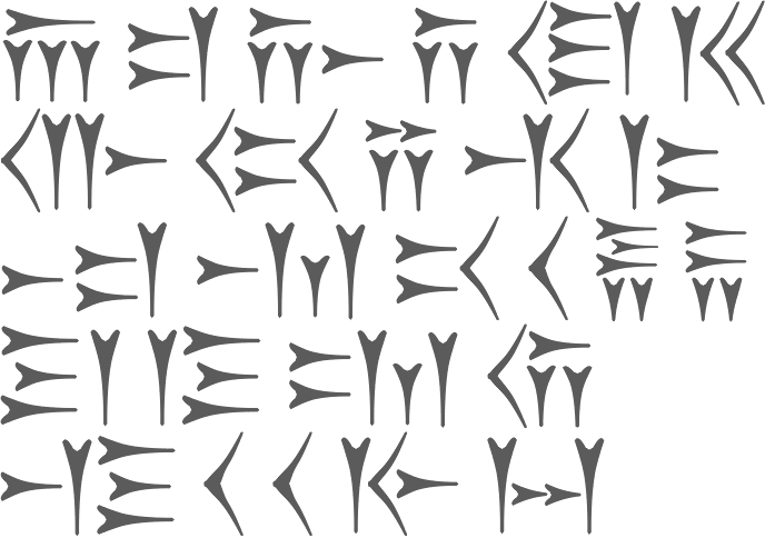
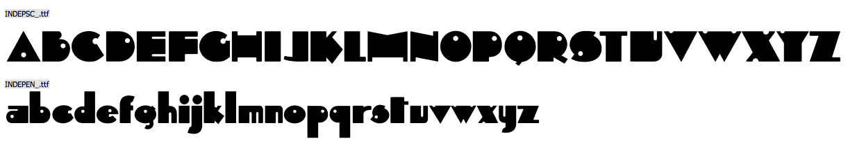
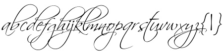
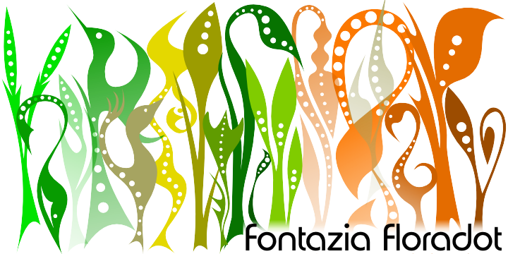
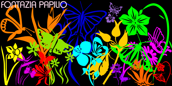
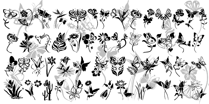
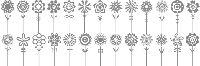
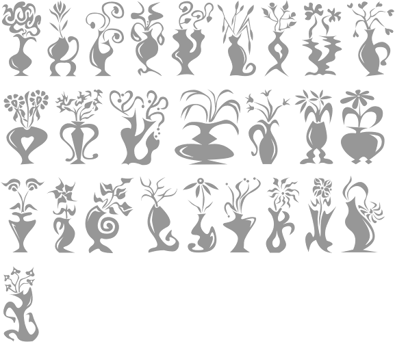
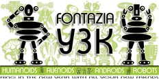
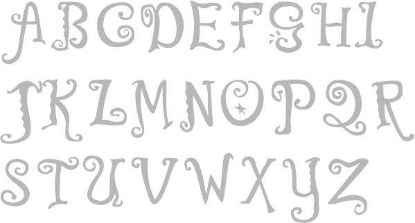
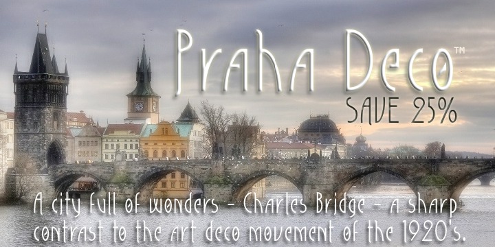
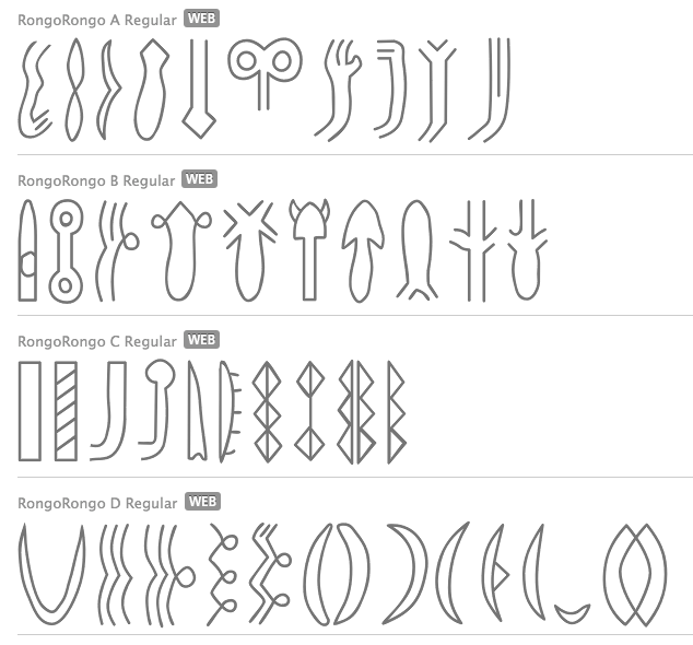
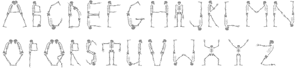
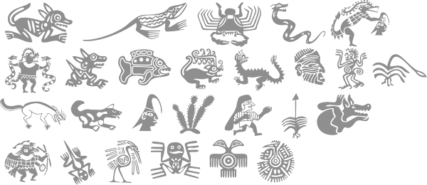
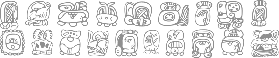
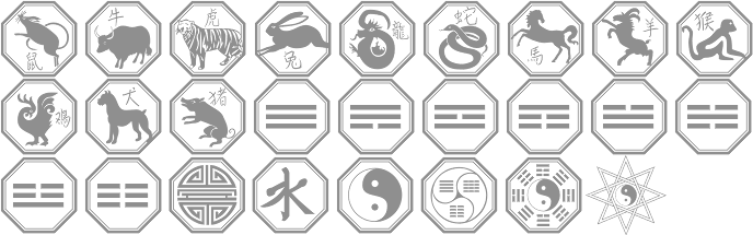
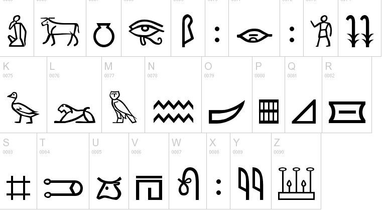
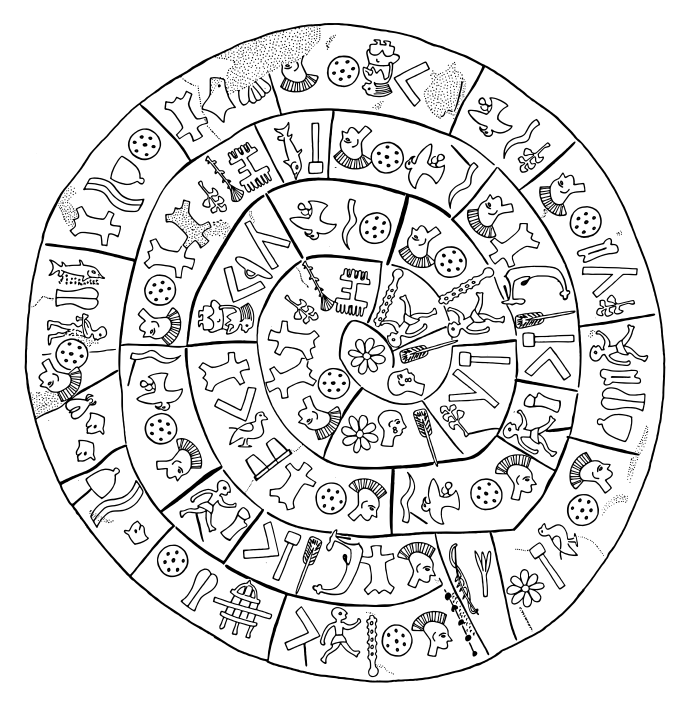
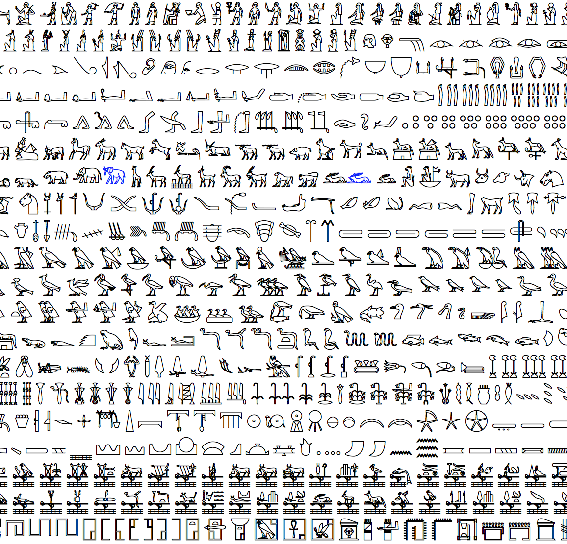
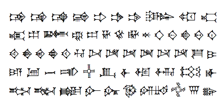
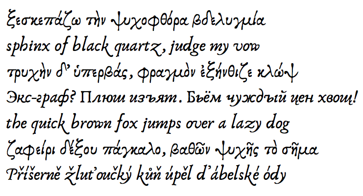
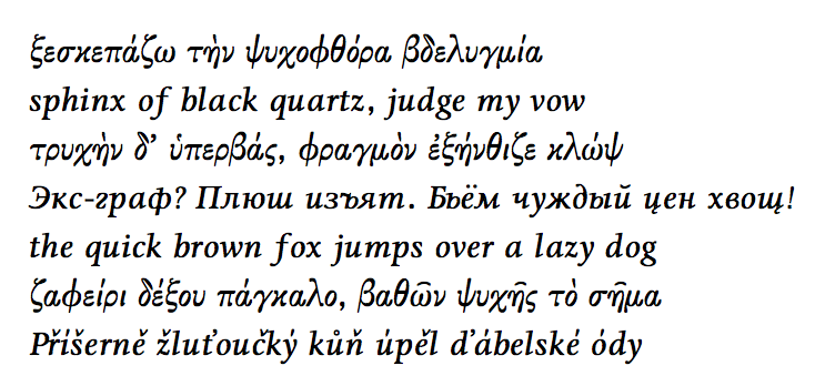
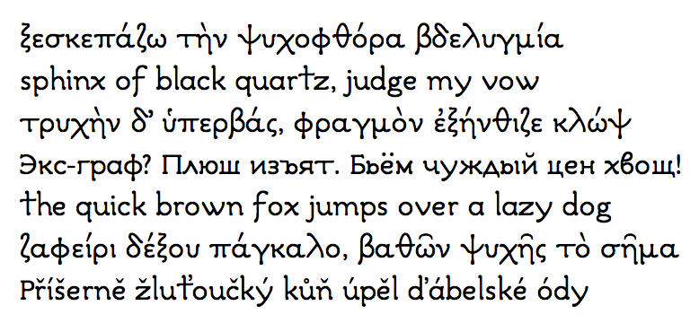