TYPE DESIGN INFORMATION PAGE last updated on Wed May 6 15:51:58 EDT 2026
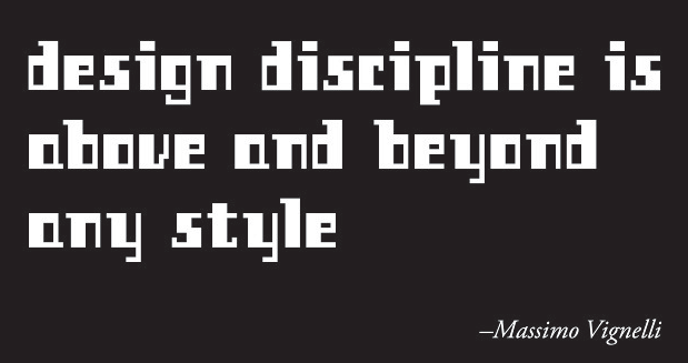
FONT RECOGNITION VIA FONT MOOSE

|
|
|
|
|
Type design in Estonia | ||
|
|
|
|
SWITCH TO INDEX FILE
Estonian Plakatschrift designer. Sample of his work from the mid 20th century. [Google] [More] ⦿ | |
| |
Tallinn, Estonia-based designer of the alchemic typeface Mermera (2012). [Google] [More] ⦿ | |
Andree Paat
| |
Andres Aarik is a graphic designer and a student in Media and Advertisement design in Tartu, Estonia. Designer of the fat and wide typeface Hustler (2010) and the chiseled typeface Tode Ja Oigus (2009). Behance link. [Google] [More] ⦿ | |
| |
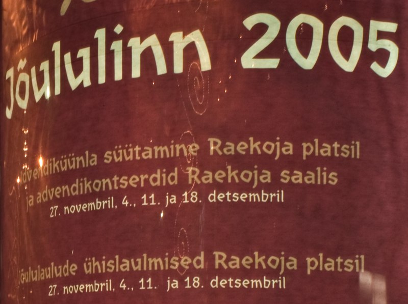
Estonian type designer. Sample of his work on posters in 2005. [Google] [More] ⦿ | |
Andrew Pixel (was: Timm Design)
|
Envato link. [Google] [More] ⦿ |
Andrew Timothy
| |
Andriy Konstantynov
| |
In 2014, he made the grunge font Okas and the white-on-black stencil typeface Propaganda. In 2015, he made Kriips, and in 2016 Summr Sketch and Scribble 2. | |
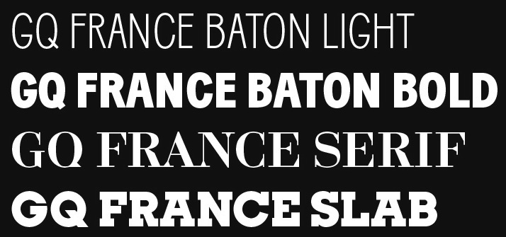
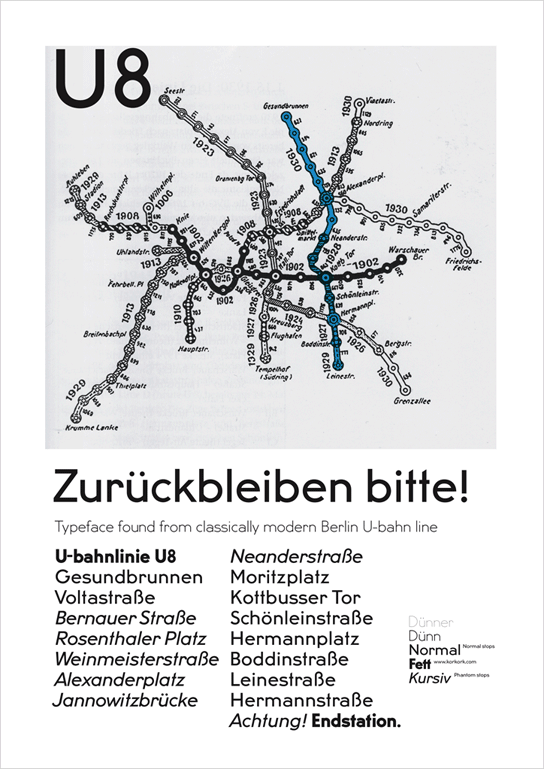
In 2012, he and Yassin Baggar set up Fatype, a type foundry in Berlin and Neuchatel, Switzerland. His most well known typeface design is Adam BP (2007, B&P Foundry), a 4-weight sans family. He also designed Aleksei (2010, unreleased serif face), GQ Slab, GQ Baton (b Anton Koovit and Yassin Baggar), U8 (2010: a grotesk family based on lettering in the Berlin underground), Arvo (2010: a free slab serif family at Google Font Directory, co-designed with Yassin Baggar). Anton Koovit and Yassin Baggar offer a new take on U8 in their UCity typeface family (2019). Experimental typefaces by him include Kork Sausage, Boudo (collage alphabet), Planton, Velo (geometric). Allan (2010) and Arvo are free at the Google Directory. Fontsquirrel link. Behance link for Fatype. [Google] [MyFonts] [More] ⦿ | |
Estonian graphic designer, mostly interested in typography, who studied at the Estonian Academy of Arts from 2008 until 2011. She created the free handwriting font Kristi (2010, Google Fonts). Fontsquirrel link. Klingspor link. [Google] [More] ⦿ | |
| |
Designer whose illuminated caps will soon be developed in cooperation with David Kettlewell. Half-Estonian, half-White Russian designer, living in Sweden. She draws illuminated caps for David Kettlewell. [Google] [More] ⦿ | |
| |
Estonian art student in Tartu who created the elegant art deco typeface Liisbeth (2011). [Google] [More] ⦿ | |
David Kettlewell
| |
Dinamo
|
Johannes Breyer. Fabian Harb. [Google] [More] ⦿ |
Phonetic font archive in Estonia with the RusEE family [RusEEBold, RusEEBoldItalic, RusEEItalic, RusEE, RusEERItalic, RusEER] (Monotype, 1992, a Microsoft core font), Venelane (Cyrillic), VenelaneTrans (Latin), Fone (Corel), and the Phonetic Times family (Monotype, 1992) [PhoneticTimesC, PhoneticTimesCBold, PhoneticTimesCBoldItalic, PhoneticTimesCItalic, PhoneticTimesEMS, PhoneticTimesEMSBold, PhoneticTimesEMSBoldItalic, PhoneticTimesEMSItalic, PhoneticTimesIMSK, PhoneticTimesIMSKBold, PhoneticTimesIMSKItalic, PhoneticTimesIMSKBoldItalic, PhoneticTimesISBoldItalic, PhoneticTimesS, PhoneticTimesSBold, PhoneticTimesSBoldItalic, PhoneticTimesSItalic, PhoneticTimesSL, PhoneticTimesSLBold, PhoneticTimesSLBoldItalic, PhoneticTimesSLItalic, PhoneticTimesV, PhoneticTimesVBold, PhoneticTimesVBoldItalic, PhoneticTimesVItalic]. Site maintained by Indrik Hein. Some of the weights of Phonetic Times are by Esko Oja (Türnpu 11-3, Tallinn EE0001, Estonia) for the Institute of Estonian Language (Roosikrantsi 6, Tallinn). [Google] [More] ⦿ | |
Estonian graphic designer, b. 1989. Creator of Seips Sans Medium (five weights). No downloads yet. [Google] [More] ⦿ | |
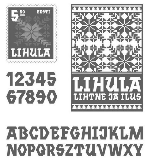
Tallinn, Estonia-based designer of Erki Moeshow (2016), a typeface that is inspired by sewing patterns. [Google] [More] ⦿ | |
Tallinn-based Estonian designer of some weights of the Phonetic Times family for the Institute of Estonian Language (Roosikrantsi 6, Tallinn) in 1994. [Google] [More] ⦿ | |
Monotype's EEArial family in truetype, for Estonian. [Google] [More] ⦿ | |
Mart Anderson's page with a pictorial overview of Estonian typography, mostly illustrated with posters. [Google] [More] ⦿ | |
Tartu, Estonia-based designer of a stencil typeface in 2018. [Google] [More] ⦿ | |
Johannes Breyer. Fabian Harb. [Google] [More] ⦿ | |
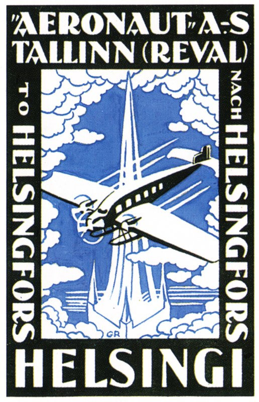
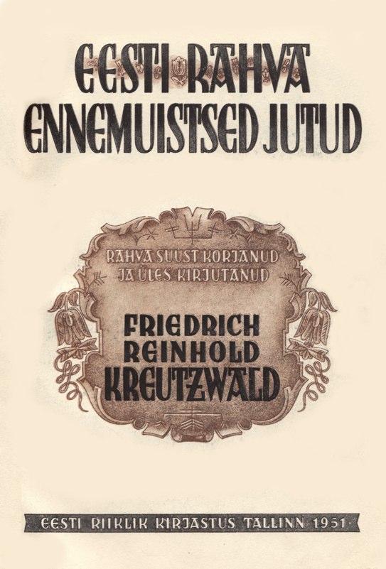
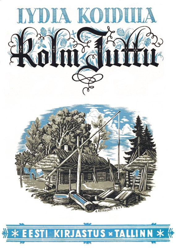
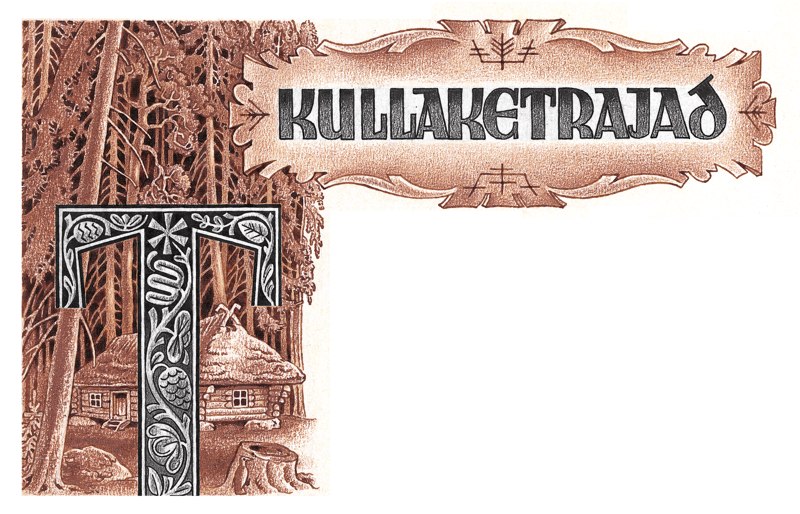
Estonian type designer from the middle of the 20th century. Sample of his work on posters, ca. 1945: Aeronaut, EREJtiitel, Koidula, Kullaketrajad. [Google] [More] ⦿ | |
Huge font archive in Estonia. Too big to sample, it has many goodies, including the Marseille Tarot card font (1997) and Math Donuts (lunatic writing). [Google] [More] ⦿ | |
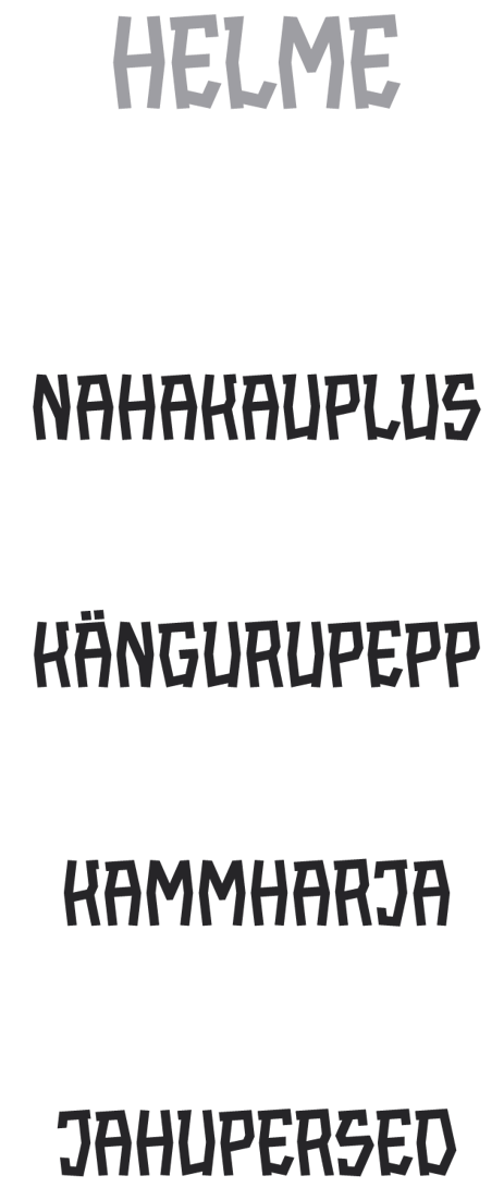
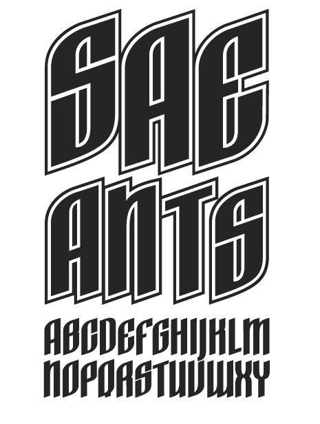
Tartu, Estonia-based designer of the angular display typeface Helme (2013), and of the modular display typeface SAE Ants (2013). [Google] [More] ⦿ | |
Tartu, Estonia-based designer at Pallas University of Applied Sciences of the modular typeface Marmor (2019). [Google] [More] ⦿ | |
HMF (or: HandMadeFont)
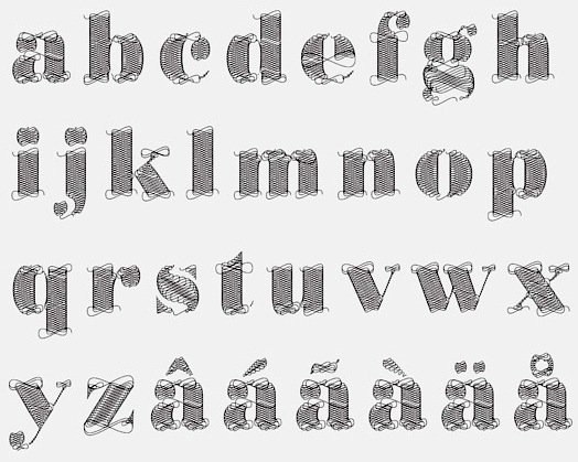
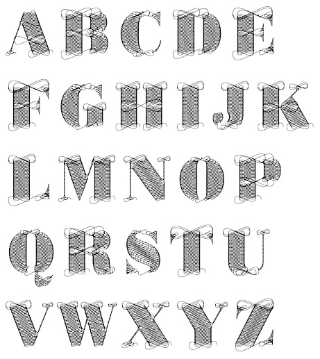
| Foundry in Tallinn, Estonia, est. 2008 by Vladimir and Maksim Loginov. Home page. A prime example of their vector craft is Vectorillo (2011), a delicate thread-themed face. In 2012, many were added, including HMF Marzipan, HMF Hulk, and HMF Read More Books (dadaist). Tens more were added in subsequent years, includiung Pen Line (2016) and Blueberries (2016). [Google] [More] ⦿ |
Indrek Hein
| |
Tartu, Estonia-based designer of the experimental typeface Submarine (2010). [Google] [More] ⦿ | |
Tartu, Estonia-based designer of the display typeface vader (2013), which was developed during his studies at Tartu Art Collage. [Google] [More] ⦿ | |
Graduate of Tartu Art School, Pärnu Non Grata Academy and Estonian Academy of Arts. Tallinn, Estonia-based designer of a modern modular typeface in 2019. [Google] [More] ⦿ | |
Tartu, Estonia-based designer of the circle-based Latin typeface Chandra (2016). [Google] [More] ⦿ | |
Estonian graphic designer designer (b. 1962) who studied industrial design at Estonian Art Academy and has worked as a graphic designer since 1986. He is mainly a poster designer. He also lectures on the history of graphic design at the Estonian Art Academy in Tallinn. At ATypI 2005 in Helsinki, he spoke on Estonian style: Russian or German? [Google] [More] ⦿ | |
Estonian Plakatschrift designer from the middle of the 20th century. Sample of his work on posters, ca. 1971. [Google] [More] ⦿ | |
At Tartu Art College in Tartu, estonia, Janeli Oun designed the interliocking squarish typeface Lapitekk (2016). [Google] [More] ⦿ | |
| |
Graphic design student from the Estonian Academy of Arts, whose particular interests lie in web design and typography. His free font Vibur (2010) is a script typeface based on handwriting. In 2012, Johan Kallas and Mihkel Virkus designed Ewert, a slab serif wood type inspired by and loosely based on the collection of cultural infographic maps by Estonian graphic artist Olev Soans. Free at Google Web Fonts. They added Revalia later in 2012---see here. Meie Script (2012, John Kallas and Mihkel Virkus, free at Google Web Fonts) is described as follows: Meie Script is a typeface, which is based on the original 1910 Estonian handwriting standard. It is less flamboyant then its Western European contemporaries. Estonian handwriting has been influenced greatly by German and Russian handwriting styles and Meie Script embodies a mixture of those two styles. | |
Tallinn, Estonia-based designer of Building CSS (2016), an experimental typefaces that is based on Yusuke Sugomori's font CSS Sans. Behance lonk. [Google] [More] ⦿ | |
Johannes Breyer
| |
Tallinn, Estonia-based designer of the extra condensed typeface Pumpkin (2017). The free font Shape Play Sans Serif (2017) was designed by changing the code in cascading style sheets (CSS), inspired by Yusuke Sugomori's experimental type. [Google] [More] ⦿ | |
During her studies, Kuressaare, Estonia-based Kati Sokko designed the display slab serif typeface Alfabeet (2014). [Google] [More] ⦿ | |
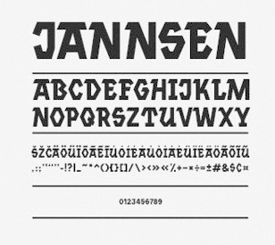
Estonian designer who made a Basque / slab serif face in 2011. In 2013, she created the tweetware font Jannsen and was located in San Francisco. Devian Tart link. Behance link. Dafont link. [Google] [More] ⦿ | |
Kirjatehnika
|
|
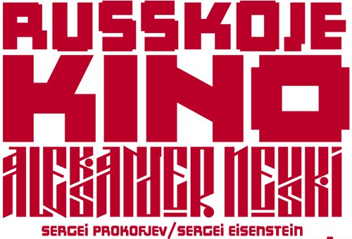
Estonian Plakatschrift designer. Sample of his work on posters. Kino. Rehe. [Google] [More] ⦿ | |
Plakatschrift type specialist from Estonia. Sample of his work from 1904. [Google] [More] ⦿ | |
Tartu, Estonia-based software specialist (b. 1971) whose main achievement is the vector drawing program Sodipdi. [Google] [More] ⦿ | |
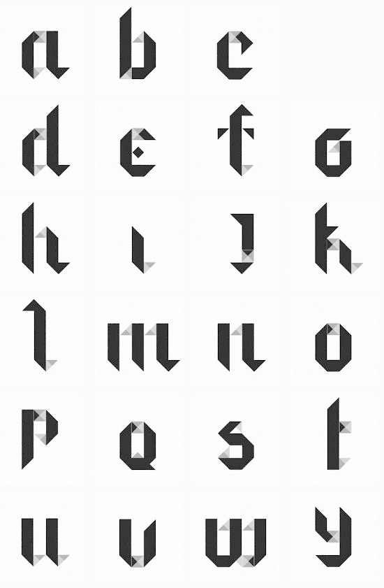
Tartu, Estonia-based designer of Typeabc (2013), an origami typeface. [Google] [More] ⦿ | |
Estonian type designer. Sample of his work on posters in 2005. [Google] [More] ⦿ | |
Letter Database
| Indrek Hein's online character database, based in Estonia. Invaluable data base of all unicode letters, with pictures! (Only the Asian languages are missing, but it is complete for all East-European languages, for example.) [Google] [More] ⦿ |
Old German Baltic maps gave him the inspiration for the signage family Livo Display (2014). Other typefaces, all done in 2015: Imperija Roman (2015, an impressive Trajan typeface for posters and editorial use; Lewis explains: The original letters were drawn from a memorial engraving in Ljubljana, Slovenia), Trout Beer (display type), Andra Roman (a humanist sans based on a letter sample dated around 1920 found in the Estonian History Museum), Cream (an Italian western type based on an original wood type), Gauss (a pointy stencil type), Heath Egyptian (based on Caslon's Two-Line Egyptian: a custom type for London-based craftsman Daniel Heath), Poison, Titanik Tuleva, Hebden (a grotesque and incised pair inspired by the original signs at Hebden Bridge train station in Yorkshire). Typefaces from 2016: Fleischer Display, Bobik (a sans / slab / wedge serif triplet of fonts initially developed based on basic principles described in Jean Alessandrini's Codex 80), Cindie Mono (four monospaced fonts of widely varying widths), Cenotaph Titling (a free engraved titling typeface influenced by Eric Gill's inscriptions). Typefaces from 2017: Osselian Demi (lapidary), Borough Grotesk (free; updated to Pro in 2018), Tusker Grotesk (a headline grotesk in the tradition of Haettenschweiler, Impact and Helvetica Inserat; influences include Inland Type's Title Gothic No.8 and Stephenson Blake Elongated Sans No.1), Gardner Sans. Typefaces from 2018: Chicken Shop Gothic (a condensed grotesk published by Typeverything: partly inspired by Benguiat's 1968 sample book Psychedelitype and part-nod to the stretched tacky stick-on-vinyl lettering on the windows of late-night takeaways, Chicken Shop is a variable font with a super-size height axis), Zierde Grotesk (a take on early advertising, small-copy grotesks of the late 19th/early 20th century, and is largely inspired by Miller & Richard's own range of grotesques. The ornaments were inspired by J.G Schelter & Giesecke's 1913 type specimen book Die Zierde). Sortie Super (Italian stress Western font). During his studies at Ecole Estienne (Paris), Manuel de Lignières (Montpellier, France) published Waba (2018) with Lewis McGuffie. Inspired by woodblock types and art nouveau, Waba is a bit of love letter to Estonia, the Baltics and the visual history of Eastern Europe. The free variable font Waba Border (2018) was added by Lewis McGuffie. Find Waba at Typeverything. Typefaces from 2019: Cham (heavy, octagonal, based on fascia lettering from 1875 in Liverpool; released by Typeverything), Chicken Shop Gothic (a condensed poster sans, with a variable type option), Columba (a variable font done for his graduation at MATDi with Latin, Greek, Cyrillic & Hebrew coverage and optical size and weight axes; Grand Prize winner at Granshan 2019). Typefaces from 2020: Salford Sans (an 8-weight headline sans family; a collaboration between Lewis McGuffie (Latin, Greek, Cyrillic), Dave Williams of Manchester Type (Latin, Arabic) and Elsa Baussier (symbols)), Jooks Script (in the style of Kurrent and Sütterlin; reviving Walter Höhnisch's Werbeschrift), Auroc (a flared incised petite-serif), Cindie 2 (an extension of Cindie Mono, this family has 26 monospaced widths). Typefaces from 2021: Tekst (a Latin / Greek / Cyrillic font family based on Literaturnaya---a book type popular in the Soviet Union; it comprises ekst A (Analog for print), Tekst D (Digital for screen) and Tekst M (M for Mono)). Typefaces from 2022: Mushy (a soft-edged joining script display type with four substyles, Cheese, Butter, Yoghurt and Cream), Rulik (unicase, uncial), Narwa (a wonderful all caps poster typeface). Future Fonts link. Type Department link. [Google] [MyFonts] [More] ⦿ | |
Libertine Open Fonts Project
|
In 2007, the following weights are available: Normal, Kursiv, Fett, Fett Kursiv, Kapitaelchen, Unterstrichen, Grotesk. As a measure of the success of the font, we find that is now used on the logo of Wikipedia. As a companion font, they offer Linux Biolinum (2010): The Biolinum is an organic sans-serif and could be also described as organogrotesque (non-linear sans serif). It is still in a beta stage. Biolinum is meant for emphasizing titles but could be used also for short passages of text. For longer texts a serif font such as the Libertine should be used in favour of readability The Biolinum has the same vertical metrics and visual weight as the Libertine, so that it fits perfectly to the Libertine and can be also used for emphasizing within the body text. In 2017, Biolilbert was born out of Biolinum. Biolilbert's name is a portmanteau from Biolinum and Hilbert. In 2012, Bob Tennent created type 1 versions of Biolinum and Libertine. In 2016, LibertineGC was published by Michael Sharpe at CTAN, adding LaTeX support files for Greek (essentially complete LGR, supporting monotonic, polytonic and ancient features) and Cyrillic. Another effort at corrections was undertaken by Khaled Hosny in 2016 in his Libertinus family. The Libertinus font family is a fork of Linux Libertine and Linux Biolinum with many bug fixes and improvements. Also included are Libertinus Math, Libertinus Serif (from Lunux Libertine), Libertinus Sans (forked from Linux Biolinum) and Libertinus Mono (from Linux Libertine Mono). Github link. CTAN link for Libertinus, maintained by Herbert Voss. Dafont link. Fontspace link. CTAN link for Libertineotf. CTAN link for Libertine download. Klingspor link. Klingspor link. CTAN link. [Google] [More] ⦿ |
Illustrator based in London and Tallinn. Creator of a bitmap typeface in 2012. [Google] [More] ⦿ | |
Tartu, Estonia-based designer of the sans typeface Questrial (2017) and the condensed spurred display typeface Lunar Spire (2017). [Google] [More] ⦿ | |
Graphic designer in Tartu, Estonia. In 2015, she created the all caps display typeface Supeleuse, which is inspired by an Estonian seaside resort. [Google] [More] ⦿ | |
Creator of the constructivist and socially critical font Tihemetsa (2014), which is named after her hometown in southern Estonia. [Google] [More] ⦿ | |
Lettering artist in Tallinn, Estonia. In 2017, she drew an all caps decorative blackletter alphabet. [Google] [More] ⦿ | |
During her studies in Tallinn, Estonia, Margit Urva designed the experimental typeface Reflector (2016). [Google] [More] ⦿ | |
Estonian graphic designer. Creator of several experimental modular typefaces. [Google] [More] ⦿ | |
Tallinn, Estonia-based designer of the prismatic art deco typeface just called Art Deco (2012), created during her studies at the Estonian Academy of Arts. [Google] [More] ⦿ | |
Tallinn, Estonia-based designer of the watercolor typeface Adelborg (2017). [Google] [More] ⦿ | |
Art Director at Vatson & Vatson (now Vatson Wunderman) in Estonia. At ATypI 2005 in Helsinki, he spoke about Digitizing the "Estonian national" typefaces. In his own words: His fonts Pagana, Vaderi and others are based on a lettering of such Estonian mid-20th century typographers as Günther Reindorff, Paul Luhtein and Villu Toots. ATypiI reports: Mart Anderson is producing a range of revival typefaces based on the lettering on 20th century Estonian book designers. The character of their (mainly pen-drawn) work is rather like woodcut lettering, with gently curved slab sides. To make them suitable for typesetting, the characters have been slightly tidied up. Typefaces: Sula (2005, flowing and angular), Panin (2006, playful), EiBanner (2006, comic book face), AmaKaas (2005, again that soft angular theme), Isanda, Humala. Sample of his work on posters, 2005-2006. [Google] [More] ⦿ | |
Estonian designer of the bitmap typeface TinyPixy (2007) and of the grunge typeface Soul Mission (2007). Aka RoCU. [Google] [More] ⦿ | |
Estonian designer of the free Peignotian sans typeface Gary (2020) at SUVA Type Foundry (supervised by Andree Paat). [Google] [More] ⦿ | |
As a student at Tartu Art College in Tartu, estonia, Mathias Vain designed the text typeface Quflot (2016). Behance link. [Google] [More] ⦿ | |
Estonian Plakatschrift designer from the middle of the 20th century. Sample of his work on posters, ca. 1971. [Google] [More] ⦿ | |
Tallinn, Estonia-based designer of the sans typeface family Tropfen (2018). [Google] [More] ⦿ | |
Tartu, Estonia-based creator of an unnamed geometric alphabet in 2013. [Google] [More] ⦿ | |
In 2012, Estonian type designers Johan Kallas and Mihkel Virkus designed Ewert, a slab serif wood type inspired by and loosely based on the collection of cultural infographic maps by Estonian graphic artist Olev Soans. Free at Google Web Fonts. They added Revalia later in 2012---see here. Meie Script (2012, John Kallas and Mihkel Virkus, free at Google Web Fonts) is described as follows: Meie Script is a typeface, which is based on the original 1910 Estonian handwriting standard. It is less flamboyant then its Western European contemporaries. Estonian handwriting has been influenced greatly by German and Russian handwriting styles and Meie Script embodies a mixture of those two styles. [Google] [More] ⦿ | |
Tartu, Estonia-based designer of Kenabi (2018). [Google] [More] ⦿ | |
Mint Type (was: PDesign 6.0)
|
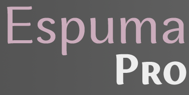
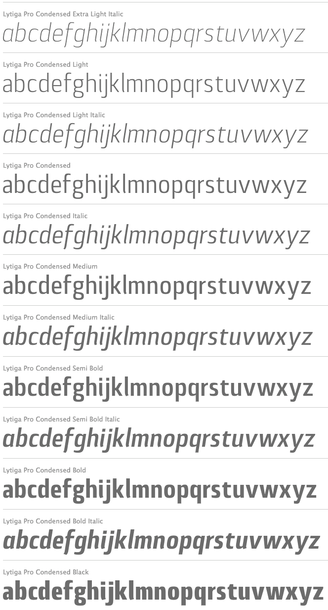
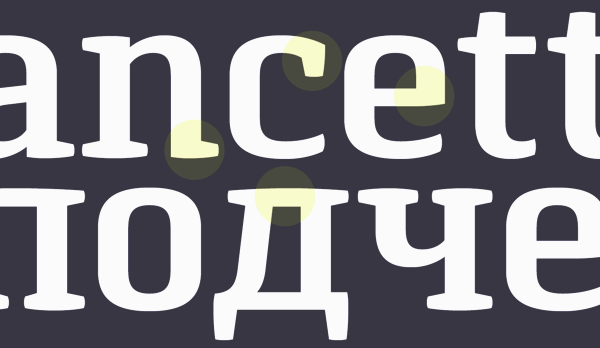
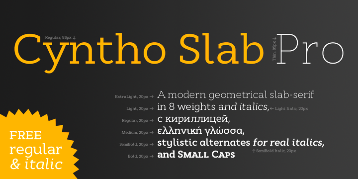
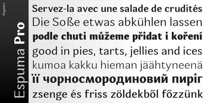
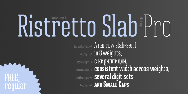
His typefaces generally cover Latin and Cyrillic: Tecco (techno), Radix, Aera Sans, Aera Serif, Careless Hand Script (2005), Guarda Sans (2012), Vitra Sans (2005), Terra Sans (2005), Terra Semi Slab (2005), Terra Slab (2005), Radix (2004), Cyntho Pro (2012, a geometric sans), Cytia Pro (2012, a geometric sans with built-in contrast), Cytia Slab Pro (2013), Lytiga Pro (2012, a 48-font techy sans family, starting with hairline weights). Typefaces from 2013: Pancetta Pro (elliptical sans), Pancetta Serif Pro, Clinica Pro (a clean non-geometric sans), Cyntho Slab Pro, Cytia Slab Pro, Espuma Pro (a soft humanist sans family with lots of curviness), Ristretto Pro (a narrow display sans), Ristretto Slab Pro. During the riots and revolution in Ukraine in 2014, Andrey designed Anglecia Pro, a text typeface in Text, Display and Title subfamilies. Just before the 2014 elections in Ukraine, he designed the geometric partially humanist sans typeface Proba Pro, which has wide spacing and small x-height---the regular and italic styles are free. Synerga Pro (2014) is a humanist slab serif with rounded terminals. In 2015, he published the newspaper typeface Diaria Pro, which started out during a course at EINA in Barcelona. Diaria Sans Pro and Quiza Pro (a geometric display sans) were published in 2016. In 2016, Oleh Lishchuk and Andriy Konstantynov co-designed the rounded scientific or technical paper font Midpoint Pro. Typefaces from 2017: Skema Pro (a 84-style serif text family with Livro, Text, Omni, News, Title and Display subfamilies), Excentra Pro (a sans family with stroke variation and inclined axis), Opinion Pro (by Oleh Lishchuk), Orchidea Pro. Typefaces from 2019: Ponzu (a stencil-style display sans), Greenwich (a modern-looking humanized sans-serif typeface with open aperture inspired by Gill and Johnson; +Cyrillic), Closer Text (a sans with overclosed apertures), Cyntho Next Slab, Cyntho Next (advertized as Swiss and Dutch). Typefaces from 2020: Ki (a monospaced display typeface inspired by older VCR / camcorder OSD (on-screen display) fonts), Fiorina (a 72-style didone family in four optical sizes). Typefaces from 2021: Accia Forte (a 16-style serif with large x-height), Accia Variable, Accia Moderato (a 16-style serif with large x-height), Accia Piano (a 16-style serif with large x-height), Accia Sans (a 16-style humanist sans), Accia Flare (also in 16 styles), Extatica (a 16-style eclectic (or: hipster) sans), Inerta (an 18-style geometric/neo-grotesk hybrid for Latin and Cyrillic). View Mint Type's typefaces. Hellofont link. Behance link. Old URL. [Google] [MyFonts] [More] ⦿ |
| |
Tallinn, Estonia-based designer of the art deco caps typeface Jou Mees (2017). Behance link. [Google] [More] ⦿ | |
| |
New Renaissance Fonts (was: New Fontografia, or: David's Fontografia 2006)
| David Kettlewell (b. Edinburgh, Scotland, 1946, d. Bollstabruk, Sweden, 2011) moved to Sweden in 1984 to take the role of head of music at a college. He was soon putting his musical and linguistic talents to researching and performing early Swedish church and choral music. He was a guest lecturer at four of Sweden's universities and for a period a professor at Tartu University in Tallin, Estonia. He worked from his forest farmhouse in Bollstabruk, Northern Sweden. Kettlewell also ran Fontografia, a medieval and calligraphic type site featuring subpages on Ludovico Vicentino [degli Arrighi], Giovambattista Palatino, and Giovanniantonio Tagliente. He also told us why Fontlab is so much better than Fontographer when developing fonts from scans. Obituary. David Kettlewell is a harper, renaissance musicologist and conductor who illuminate his work with text and type. His own work through New Renaissance Fonts is mostly with medieval and renaissance scripts, calligraphic alphabets and ornamental capitals. Direct acess. MyFonts link for New Renaissance. Klingspor link. Free fonts: AliceScrolltipRoman, AndersFancyCapitals, AndersPlainCapitals, BickhamSwashCaps, Cartouches, CelticNoadProtoype, Chiswickblack, DagmarIlluCaps, Davies-RomantiqueCaps, DaviesIlluminatedcapitals, DaviesRoundhand, DaviesSapphire, DeBeauChesneRoman, FantasiaCaps, GothicCaps, KarinsFreeLombardyCaps (2006, with Karin Skoglund), KingRichard2Caps, Kurbits3, Lettreornee, LubnaCaps, NesbittDecoratedCaps-Medium, RicksClassicItalic, RicksDecoratedUncial-Medium, RicksFolkloreRoman, RicksRelaxedHand-Italic, Samuel, SevilliaDancingText, Sevilliastandingtext, Sevilliatiles, ShawDecoratedInitials1, ShawDecoratedInitials4-Medium, Taliente-IlluCaps, WestminsterMemorialBrasses-Medium. Other fonts (some no longer available or shown): Soest St. Mary (2006, decorative capitals from embroidery work in a German church), Kurbits, Samuel, Celtic Noad, Dagmar IlluCaps, Lettre ornée, Phalesiodecor (medieval caps, 1998), American Uncial (adaptation of a URW font), FinalRomanfat or FatRoman50 (adaptation of an RWE font), Marshall (made from an 1822 parchment). Some fonts are developed in conjunction with Richard Bradley. Others involved more loosely include Adam Twardoch, Karin Skoglund, Dagmar Varaksits and Anders Rosen. MyFonts offers fonts like Chiswick Illuminated Caps (2009, Lombardic), Alice Scrolltip (2006), Albrecht Fraktur (2011), Edward's Uncial 1904 (2011, after an alphabet drawn by Edward Johnston), Davids Roundhand, Karins Lombardy Caps, Sevillia (2006, with Richard Bradley), and Soest St Mary. View the New Renaissance Fonts library. [Google] [MyFonts] [More] ⦿ |
Estonian designer of Polaris Brush (2016) and the grainy textured typefaces Salt (2017, caps) and Sugar (2017, script). [Google] [More] ⦿ | |
Estonian type designer from the middle of the 20th century. Some of his posters (ca. 1961) are here. [Google] [More] ⦿ | |
Plakatschrift type specialist from Estonia. Sample of his work from 1913 until 1927. Images: i, ii, iii, iv. [Google] [More] ⦿ | |
Estonian type designer. Sample of his work on posters in 2005. [Google] [More] ⦿ | |
Philipp H. Poll
| |
Tartu, Estonia-based designer of the display typeface Cheese (2015). Behance link. [Google] [More] ⦿ | |
During her studies, Polina Petuhhova (Tartu, Estonia) designed the multilne typeface Buhaus Deco (2019). [Google] [More] ⦿ | |
Tallinn, Estonia-based designer of the thin stencil typeface Saturn Returnz (2015). [Google] [More] ⦿ | |
Estonian designer of the grunge typeface Soul Mission (2008). Alternate URL. Programmer. [Google] [More] ⦿ | |
Estonian Plakatschrift designer from the middle of the 20th century. Sample of his work on posters, ca. 1963. [Google] [More] ⦿ | |
| |
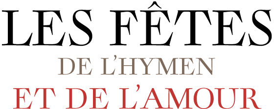
Designer of the Fournier era family Rameau (2011, Linotype). Linotype writes: Sarah Lahzarevic is a graphic designer and typographer. She has worked for ten years with the photographer Max Yves Brandily. She is now working as a freelance graphic and type designer for clients such as the French Post Office (La Poste), Millau City Council and the International Francophone Organisation. She teaches graphics and typography at the Ecole Professionnelle Supérieure d'Arts Graphiques et d'Architecture de la Ville de Paris (Graduate Training School in Graphic Arts and Architecture in Paris). She is also developing her own work in copper-plate engraving. She derived the italics of Rameau from the manuscript of the opera Les fêtes de l'hymen et de l'amour, the music for which was composed by Jean-Philippe Rameau in 1747. Linotype: In the 18th century, musical compositions were published in the form of impressions from copper plates that had been hand-engraved in contrast with books and other texts, which were printed from moveable lead type. The italic letters of Rameau include many ligatures and are thus typical of the engraving style of the period. Linotype link. Klingspor link. [Google] [MyFonts] [More] ⦿ | |
Graphic designer residing in Tallinn, Estonia. In 2012, he graduated from the Estonian Academy of Arts in the field of graphic design. His typeface Völv (2012) was inspired by arcs found in classical Estonian arhitecture. Vahtra (2010) was inspired by the works of estonian artist Jaan Vahtra, and was created under the supervision of Anton Koovit. [Google] [More] ⦿ | |
During his studies in Tallinn, Estonia, Silver Lahi created an unnamed neurotic typeface (2013). [Google] [More] ⦿ | |
Graduate of the Department of Media and Advertising Design at Tartu Art College in Estonia, who is based in London. Designer of the straight-edged display typeface Murdja (2020). [Google] [More] ⦿ | |
| |
All of the fonts featured on this site are designed by the students and faculty of the Estonian Academy of Arts in Tallinn, Estonia. The project team: Johanna Ruukholm, Elis Kitt, Laura Merendi, Anselm Oja, Sandra Nuut, Ott Kagovere, Indrek Sirkel. As of 2019, the typefaces are:
| |
British font service house: can sell you most of the commercial fonts. Sells also fonts for Albanian, Arabic, Bengali, Bulgarian, Croatian, Czech, Estonian, Farsi, Greek, Gujurati, Hindi, Hungarian, Japanese (Katakana, Hiragana, Kanji), Latvian, Lithuanian, Polish, Punjabi, Russian, Serbian, Slovak, Slovene, Thai, Turkish, Ukrainian, Vietnamese, Welsh. Has barcode fonts, and is a special distributor of the Royal Mail Barcode font. [Google] [More] ⦿ | |
Jörg Knappen's page on the European Computer Modern fonts. "The following languages are supported by the Cork encoding: Afrikaans, Albanian, Breton, Croat, Czech, Danish, Dutch, English, Estonian, Faroese, Finnish, French, Frisian, Gaelic, Galician, German, Greenlandic, Hungarian, Icelandic, Irish (modern orthography), Italian, Letzeburgish, Lusatian (Sorbian), Norwegian, Polish, Portuguese, Rhaetian (Rumantsch), Romanian, Slovak, Slovene, Spanish, Swedish, Turkish." [Google] [More] ⦿ | |
Thomas T. Pedersen
| |
Transliteration of Non-Roman Alphabets
| From Copenhagen and Estonia, Thomas T. Pedersen's page on non-Roman alphabets. He specializes in all kinds of Cyrillic alphabets, such as Abaza, Abkhaz, Adyghe, Altay, Arabic, Armenian, Avar, Azerbaijani, Bashkir, Belarusian (Belorussian), Bulgarian, Buryat, Chechen, Chukchi, Chuvash, Crimean Tatar, Dargwa (Dargin), Dungan, Erzya Mordvin (Mordva), Eskimo - Yupik, Even, Evenki, Gagauz, Georgian, Greek, Hindi, Marathi, Nepali, Ingush, Kabardian, Kalmyk, Karachay-Balkar, Karakalpak, Kazakh, Khakass, Khanty, Kirghiz, Komi (Komi Zyryan), Komi-Permyak, Koryak, Kumyk, Lakh, Lezgian (Lezgin), Macedonian, Mansi, Mari: Hill Mari, Meadow Mari, Moksha Mordvin (Mordva), Moldovan (Moldavian), Nanai, Nenets, Nivkh, Nogay (Noghay), Ossetian (Ossetic), Ottoman Turkish, Russian, Rusyn (Lemko&Vojvodinian), Selkup, Serbian, Tabasaran, Tajik, Talysh, Tatar, Turkmen, Tuvinian, Udmurt, Ukrainian, Uzbek, Yakut, Yiddish. [Google] [More] ⦿ |
During her studies in Tartu, Estonia, in 2014, Triin Alas created a paperclip / neon tube typeface. [Google] [More] ⦿ | |
During her studies at Tartu Art College in Tartu, Estonia, Triinu Laansalu created the straight-edged octagonal poster typeface Pohjola (2013). [Google] [More] ⦿ | |
Parnu, Estonia-based designer of the rounded monoline sans typeface Minima (2014). Behance link. [Google] [More] ⦿ | |
During his studies at Tartu Art College (Tartu, Estonia), Victor Uskov designed the tall condensed display typeface Magnum (2015). Behance link. [Google] [More] ⦿ | |
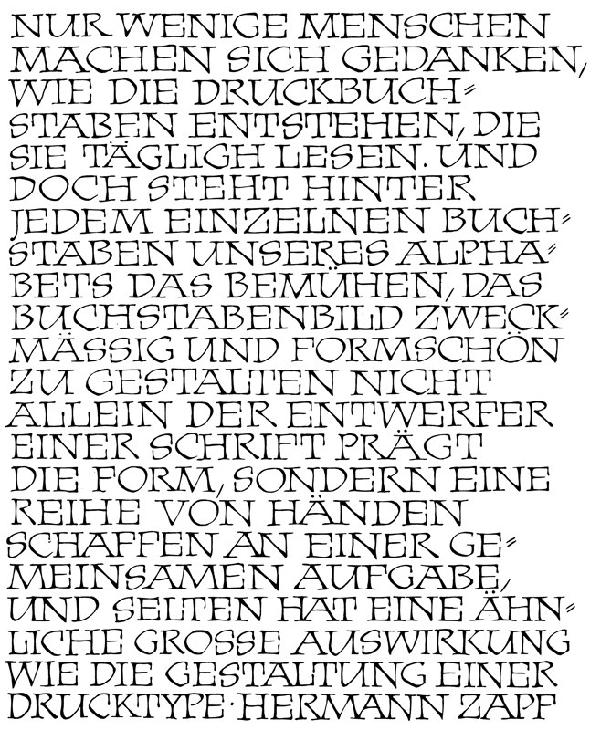
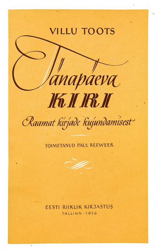
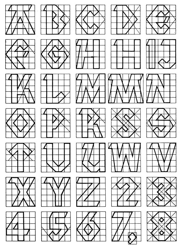
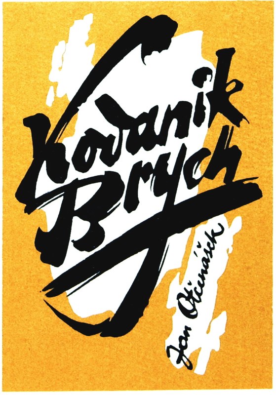
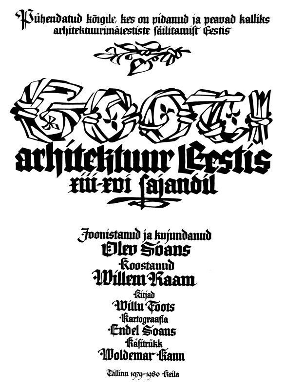
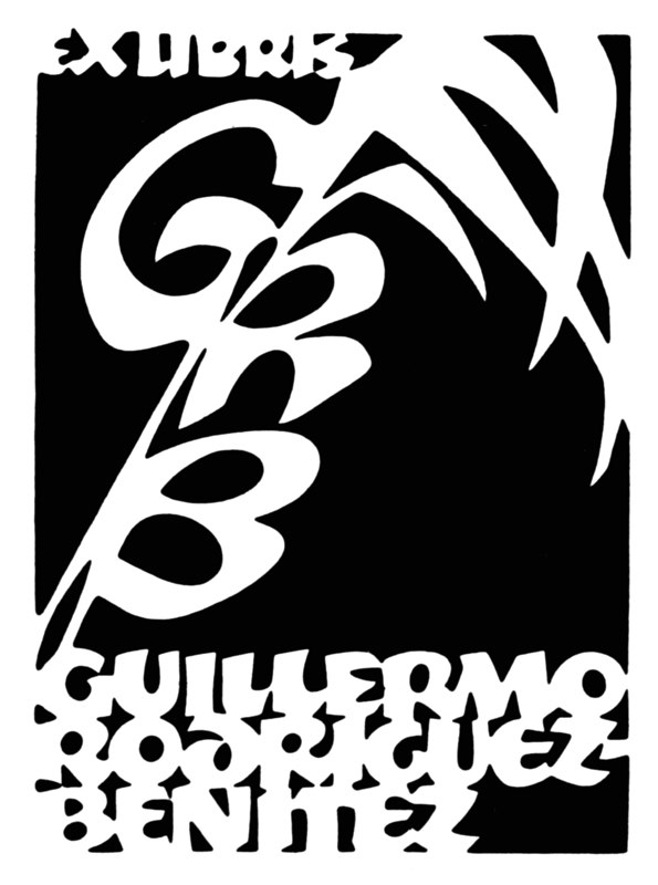
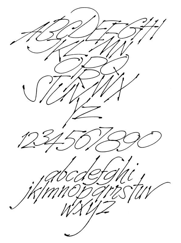
Sample of his work on posters, 1956-1980. Scans: handset text, chancery hand, book cover (1956), geometric alphabet (1956), Brych, Gooti (1980), Pro Anno (1978), Rodrigues, Tahestik. Author of many books on calligraphy. These include i Opime plakatkirja. Algteadmisi kirjakunstist (Tallinn, 1949), Tänapäeva kiri (Tallinn, 1956), 300 burtu veidi" (Riga, 1960), Kirjukunsti ABC Grotesk ehk plokk-kiri (1968, Tallinn), Eesti kirjakunst 1940-1970" (Tallinn, 1973), Kiri kui kunst (Tallinn, 1981), Kiri Eesti kultuuriloos (compiled by Rein Loodus; Tallinn, 2002), Kalligraafilisi etüüde. Calligraphical studies (Tallinn, 1976), 50 eksliibrist (Tallinn, 1979), Sule ja pintsli duett (Tallinn, 1985), Paraaf (Tallinn, 1987), Calligraphical spirals (Gothenburg and Tampere, 1989), and Calligraphic Bookplates and Monograms (San Juan Capistrano, CA, 1992). In 2016, the Society of Scribes Calligraphy NYC, has set up a pre-order website for the limited edition book Villu Toots: One Hundred Book Covers. [Google] [More] ⦿ | |
Estonian Plakatschrift designer from the middle of the 20th century. Sample of his work on posters, ca. 1965. [Google] [More] ⦿ | |
Vladimir Loginov
|
 Tallinn, Estonia-based designer of IDA Display (2018, a variable font that reacts to music) and Sveta Bold Condensed Display (2018, for Latin and Cyrillic), which was developed for the branding of Tallinn Music Week 2018. [
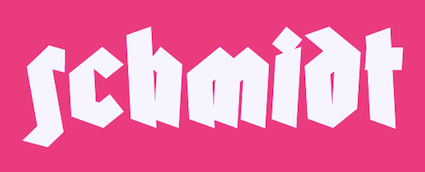 Tartu, Estonia-based creator of the German expressionist typeface Schmidt (2014).
  Estonian graphic designer who created these (mostly display sans or decorative serif style) typefaces:
 [
[ Estonian creator of the grungy stencil typeface
  Anton Koovit was born in Tallinn, Estonia, in 1981, and studied graphic design at the Estonian Academy of Arts, ESAG Paris and at the Gerrit Rietveld Academy in Amsterdam. In 2006, he obtained a masters in type design at
 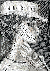 Estonian designer of a great collage typographic portrait in 2017. [
 Dinamo is a Swiss type foundry in Heiden established by Johannes Breyer and Fabian Harb after graduation from schools in Zurich, Basel and Amsterdam. Johannes and Fabian were visiting teachers at the Estonian Academy of the Arts, Tallinn. Johannes is teaching type design at University of the Arts Berlin (UDK) and HfG Offenbach. Fabian is lecturing typography at the School of Design St. Gallen. Their typefaces:
  Dinamo is a Swiss type foundry established by Johannes Breyer and Fabian Harb after graduation from schools in Zurich, Basel and Amsterdam. Johannes and Fabian are visiting teachers at the Estonian Academy of the Arts, Tallinn and regularly teach at UDK Berlin and University of Applied Sciences, St. Gallen. Their typefaces:
  Tartu, Estonia-based designer of these typefaces:
  [
[ Kirjatehnika is the type design practice of Andree Paat in Tallinn, Estonia. Their typefaces as of 2020:
  British graphic designer and sign painter who was at some point in Tallinn, Estonia. Graduate of
  Ukrainian Andrey Konstantinov (b. 1981, Moscow, lives in Kiev) graduated from the National Technical University of Ukraine in 2002. He lived for some time in Tallinn, Estonia. He ran
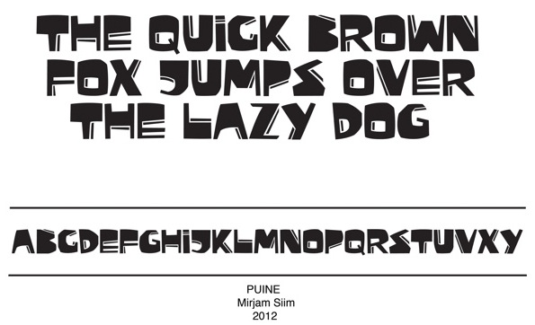
  Based in Tallinn, Estonia, Mirjam Siim (b. 1990) created
  Tartu, Estonia-based designer of the
  Santino Calvo (ES Factory, Rome, Italy, b. Sicily) created the
  Ex-student at the Ecole Estienne in Paris (b. Estonia) whose diploma work consisted of the creation of
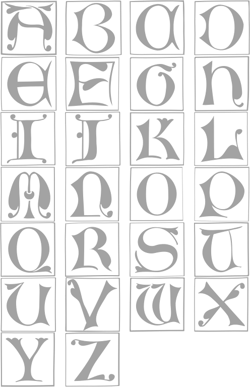
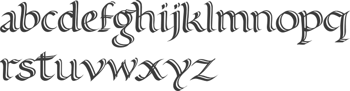
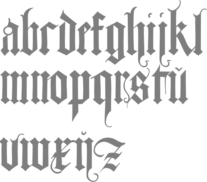
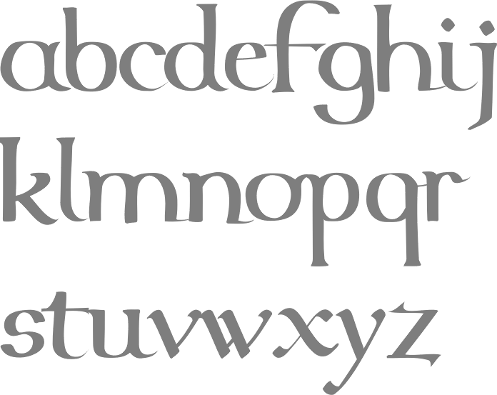
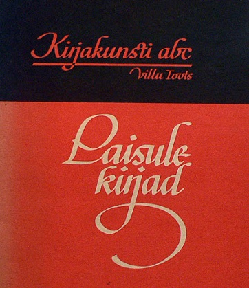
  Villu Toots (b. Tallinn, 1916, d. Tallinn, 1993) was an internationally known Estonian calligrapher, book designer, educator, palaeographer and author. In 1965 Toots established a successful one-man calligraphy school named Kirjakunsti Kool with a three-year course.
|
|
|
|