TYPE DESIGN INFORMATION PAGE last updated on Thu Jul 16 06:33:21 EDT 2026
FONT RECOGNITION VIA FONT MOOSE

|
|
|
|
|
Type in New Zealand | ||
|
|
|
|
SWITCH TO INDEX FILE
100types
| Educational and reference site run by Ben Archer, a designer, educator and type enthusiast located in England (who was in Auckland, New Zealand, before that). Glossary. Timeline. Type categories. Paul Shaw's list of the 100 most significant typefaces of all times were recategorized by Archer:
|
485 Design
|
|
New Zealand-based designer of a rocky font in 2018. [Google] [More] ⦿ | |
Accidental Design
| Josh Wyatt (Accidental Design) is a design student from Upper Hutt, Wellington, New Zealand. He created the beautiful sans face shown here. Kris Sowesby was his teacher at Massey University. [Google] [More] ⦿ |
Wellington, New Zealand-based designer of the free handwriting font EYFA Kurtrussellstan (2017), the free wavy typeface EYFA Saino West (2017), and the free display typeface family EYFA Tokva (2017). [Google] [More] ⦿ | |
Graduate of the University of Irun, Spain. Auckland, New Zealand-based designer of the custom teardrop typeface Curia Tecnoparque (2017). Behance link. [Google] [More] ⦿ | |
Alan Bauchop
| |
Born in Sydney, raised in New Zealand. Designer of GF Zucchini (1998) at Garagefonts. Also create HUD and Decoder, two techno typefaces. FontShop link. Klingspor link. [Google] [More] ⦿ | |
A typeface by Agfa-Monotype, dated 2001, that covers Maori. [Google] [More] ⦿ | |
In 2013, he created the beautiful art deco typeface New Royal Stencil, and simple and iconic Stackable Animal Illustrations. Other typefaces include the free pixelish typeface Stopwatch. [Google] [More] ⦿ | |
Auckland, New Zealand-based designer of the calligraphic typeface Briant (2015). [Google] [More] ⦿ | |
Aka Arach Finne and as Dragonstar. Based in Aotearoa, New Zealand. Creator of the handwriting font Atropos (2009, Fontcapture) and BreakingCeltic (2009, Fontcapture). [Google] [More] ⦿ | |
Behance link. [Google] [More] ⦿ | |
Allan Murray
| |
Allan Murray
| |
Wellington, New Zealand-based designer. Creator of the display typeface The Bay (2014), which is named after Titahi Bay. [Google] [More] ⦿ | |
Wellington, New Zealand-based designer of the free alchemic typeface Transmission (2013). [Google] [More] ⦿ | |
Auckland, New Zealand-based designer of the paperclip typeface Angulus (2015). [Google] [More] ⦿ | |
During her studies at Waikato Institute of Technology (WINTEC) in Hamilton, New Zealand Amber Rogers created Budding Pohutukawa (2015), a thin serif typeface inspired by the flower of a Pohutukawa Tree, a common coastal tree in New Zealand. [Google] [More] ⦿ | |
Amy Nicholson (Hamilton City, New Zealand) created a display typeface called Robust Right Round in 2013 during her graphic design studies. [Google] [More] ⦿ | |
Motion graphics designer in Auckland, New Zealand. Creator of Le Milse (2015: an avant-garde typeface). [Google] [More] ⦿ | |
Kiwi designer (b. 1983) of the handwriting typeface AndreWriting (2005). [Google] [More] ⦿ | |
André Owen
| |
Auckland, New Zealand-based designer of Disrupt (2019), a geometric sans typeface with left-leaning i, l, 1 and 4, in order to willfully disrupt. [Google] [More] ⦿ | |
Auckland, New Zealand-based creator (b. 1989) of the hand-printed typeface AngieStyle (2009). [Google] [More] ⦿ | |
Auckland, New Zealand-based designer of the display outline typeface Flormetal (2014), which is based on Ponsonby. [Google] [More] ⦿ | |
During her studies in Auckland, New Zealand, Anna Vaipulu created Curlianna (2015). [Google] [More] ⦿ | |
Auckland, New Zealand-based designer of a decorative doodled all caps typeface (2017). [Google] [More] ⦿ | |
Auckland, New Zealand-based creator of the monospaced piano key typeface Fat Boy Slim (2012). [Google] [More] ⦿ | |
During her graphic design and photography studies at Auckland University of Technology in Auckland, New Zealand, Anneliese Van der Kwaak designed the display typeface Madame (2013), which was, in her words, influenced by the French Revolution. In 2014, she created the rounded modular typeface Bombaay express. [Google] [More] ⦿ | |
Hamilton, New Zealand-based designer of Destijl (2014). [Google] [More] ⦿ | |
Annette O'Sullivan trained as a graphic designer and worked in design studios in New Zealand prior to further study in typography at the London College of Printing. She has an MA degree in typography and graphic design. While in Britain, she worked in publishing and museum design, notably for The Museum of the Royal Welch Fusiliers, Caenarfon Castle, North Wales, the Hong Kong Museum of Coastal Defence, Hong Kong and the Royal Armouries Artillery Hall, Fort Nelson. She currently lectures in typography at Massey University, Wellington, and continues to explore contemporary typographic application within a historic context. [Google] [More] ⦿ | |
| |
Based in San Francisco, AppDynamics is an enterprise software company specialising in application performance monitoring software that ensures the smooth running of business-critical applications In 2019, a rebranding of AppDynamics led to the corporate typeface AppD Sans, which was jointly developed by Göran Söderstrom (Sweden), Paul Russell (New Zealand), Kallan & Co (Finland), Brett King (Finland) and Hannu Koho (Finland). [Google] [More] ⦿ | |
Auckland, New Zealand-based designer of the shadow font Alchemist Whiteboard (2020). [Google] [More] ⦿ | |
Graphic designer at Wickliffe in Christchurch, New Zealand. Creator of a hand-drawn typeface in 2014. [Google] [More] ⦿ | |
Wellington, New Zealand-based designer of the Comic Sans-style typeface Foxglove (2014). [Google] [More] ⦿ | |
Ashley Bryant (Hamilton City, New Zealand) created the compass-and-ruler sans typeface Purpose (2013). [Google] [More] ⦿ | |
As a graphic design student in Auckland, New Zealand, Ashley Cook created the avant garde typeface Blank Space (2015). [Google] [More] ⦿ | |
Auckland, New Zealand-based graphic design student who made the monospaced typeface Paperclip (2012). [Google] [More] ⦿ | |
Designer of Early Days (2003), a display font with Basque features, and Jenkins (2004, a sans). Ashton lives in Wanganui, New Zealand. [Google] [More] ⦿ | |
| |
During his studies at the Yoobee School of Design (Auckland, New Zealand), Ben Andersen created Silo Park (2013, based on the masts and rigging atop the boats that litter Aucklands Habour). [Google] [More] ⦿ | |
Ben Archer
| |
Graphic designer in Chiristchurch, New Zealand. His typefaces include Custom Black (2009, heavy mechanical shaded face) and Boxed (2009, boxy techno face). [Google] [More] ⦿ | |
| |
Auckland, New Zealand-based designer of Toi o Tamaki (2017), a decorative caps typeface that is inspired by the Arts Precinct of the city of Auckland. [Google] [More] ⦿ | |
| |
Ben Whitmore
| |
During his studies in Auckland, New Zealand, Ben Yu created the typeface Waves (2014). [Google] [More] ⦿ | |
Benjamin Humphrey
| |
| |
Auckland, New Zealand-based designer of the geometric sans typeface Novus Simplex (2016). [Google] [More] ⦿ | |
Graphic designer in Auckland, New Zealand. Creator of the origami style typeface Shirogurafi (2013). [Google] [More] ⦿ | |
Wellington, New Zealand-based designer of the Peignotian typeface Waitangi Park (2016). [Google] [More] ⦿ | |
BluHead Studio LLC
|
BluHead Studio LLC was founded in 2005 by a group of type designers, including Steve Zafarana, who founded Tail Spin Studio in 1999, also in Norwood, MA. Steve Zafarana was senior type designer at Bitstream from 2006-2012 and at Monotype from 2012 onwards. BluHead Studio was filling out the character sets and digitizing the font designs of New Zealand designer Joseph Churchward. These include the psychedelic Ta Tiki CW (2006) and Conserif CW, Design CW (2006, geometric). Creations by Tallulah Bluhead include Soylent Blu BH (2006: a bouncy cartoony wedge serif)) and Conference Call BH (2006). Roy Preston published the Prenton RP humanist sans family in 2006 and the comic book style families Comixed RP and Roy Hand RP in 2007. Between 2006 and 2008, several hand-printed typefaces were published. These include Barbara Script BH (2007, after the hand of Barbara Bemiss), Ciof Script BH (2008, a felt tip pen font after Susan Ciofolo Antico), Sally Script BH (2006, after Sally Muspratt), and Joanne Script BH (2007, by Joanne Paul). Sparkle Bluff BH (2007) is a ball and stick font for children. Notebook BH (2008) is a block letter face. In 2007, BluHead started publishing fonts by Joseph Churchward: Churchward Asia, Churchward Brush, Churchward Chinatype, Churchward Heading, Churchward Lorina (2014---the original by Churchward goes back to 1996), Churchward Maori, Churchward Maricia, Churchward Ta Tiki, Churchward Conserif, Churchward Design Lines, Churchward Freedom, Churchward Isabella (2015, a sans), Churchward Marianna (bubblegum face), Churchward Montezuma (2012, based on an Aztec-inspired design), Churchward Newstype (2008), Churchward Samoa, Churchward Supascript, Churchward Typestyle (2022; a 12-style sans). FontShop link. Creative Market link. Klingspor link. View the BluHead typeface library. [Google] [MyFonts] [More] ⦿ |
Auckland, New Zealand-based designer of the experimental typeface family Silo Park (2015), which was inspired by industrial architecture. [Google] [More] ⦿ | |
During his studies in Auckland, New Zealand, Brandon Whiteman created the hipster typeface Obtuse (2014). [Google] [More] ⦿ | |
Brian Smith
| |
During her studies at the Auckland University of Technology (AUT) in Auckland City, New Zealand, Brittany Lane created the octagonally cut typeface Axolotl (2015). [Google] [More] ⦿ | |
Auckland, New Zealand-based creator of the decorative typeface Britomart (2013) which was inspired by the logo of Woolmark. This typeface was designed during her studies at Yoobee School of Design. | |
Noted New Zealand architect Bruce Rotherham was inspired by Herbert Bayer's universal alphabet created at the Bauhaus in 1927. While he admired Bayer's pure geometry, Rotherham felt it was virtually unreadable. The Bauhaus-inspired inclination for architectural publications to use sans serif typefaces provoked Rotherham to consider how a readable Roman book typeface might be approached using some of Bayer's same principles of simplification, but also retracing the evolution and use of the Roman form in an analytic manner. Bruce Rotherham spent his formative years working at his father's commercial printing business and was tuned in to typography from an early age. The Wedge alphabet was started in 1947 when Rotherham was an architecture student at the University of Auckland. In 1958, after years of development and consultation with his father, who was a master printer, Rotherham approached Monotype to consider producing his typeface for commercial release. After some back and forth with Monotype advertising manager A.D.B. Jones and typographical advisor John Dreyfus, and despite trial proofs being made, the design was politely declined for being too much of a specialist face. Rotherham continued to practice architecture in New Zealand and Great Britain for over thirty years. By chance, he heard the BBC radio show Science Now discussing the topic of computer typesetting. Not content to give up on Wedge, he contacted the item's producer, Adrian Pickering, at the University of Southampton School of Electronics and Computer Science. Pickering worked closely in collaboration with Rotherham in the production of the digital version of the face. The type was shown posthumously for Rotherham in the 2009 exhibit Printing Types: New Zealand Type Design since 1870, held at Objectspace, in Auckland. P22 link. [Google] [More] ⦿ | |
New Zealand-based designer of the font Me (2002). Alternate URL. [Google] [More] ⦿ | |
Wellington, New Zealand-based creator of the alchemic typeface Mercy (2013), which was designed during his studies at Yoobee School of Design (formely Natcoll Design Technology). [Google] [More] ⦿ | |
Calligraphic comment
| Calligraphy blog in Auckland, New Zealand. [Google] [More] ⦿ |
During his studies in Auckland, New Zealand, Carl van Maanen designed Type Green (2013), a sans titling face. [Google] [More] ⦿ | |
During her studies in Auckland, New Zealand, Carly Johnson created the circle-based typeface Elementary (2015). [Google] [More] ⦿ | |
Auckland, New Zealand-based designer of the pop art typeface Pop (2015), which is inspired by the pop of colours seen along the streets of Britomart in Auckland. [Google] [More] ⦿ | |
Graphic design student in Ackland, New Zealand. Creator of Cut (2010). Behance link. [Google] [More] ⦿ | |
Emoticonist from New Zealand, b. 1991. She created the bitmap fonts Bitsy Button (2009), SGAkk (2009) and Bitsymap VT (2009). Alias: Emotikonz. [Google] [More] ⦿ | |
New Zealand-based creator (b. 1991) in 2010 of the pixel typeface BitCapital. [Google] [More] ⦿ | |
Wellington, New Zealand-based designer and typographer, b. 1966. She spoke at ATypI 2005 in Helsinki on I live at the edge of the universe like everybody else. She also organized TypeSHED11, a boutique five-day international typography symposium held in Wellington, New Zealand, during February 2009. [Google] [More] ⦿ | |
Kiwi designer of the handwriting font Fiddlesticks (2004). [Google] [More] ⦿ | |
During her studies at Yoobee School of Design in Wellington, New Zealand, Chelsea Trembath created the ball terminal-laden didone poster typeface Railway (2015). [Google] [More] ⦿ | |
During her studies at Yoobee School of Design in Auckland, New Zealand, Chelsey Fong created the rounded sans typeface Oriel (2014). [Google] [More] ⦿ | |
Auckland, New Zealand-based designer of the display typeface Facade (2014). [Google] [More] ⦿ | |
Designer in Wellington, New Zealand, who created the brush script typefaces Wanderlust and Summer Script in 2016. In 2017, he designed the brush scripts Orange Sunset and ChocoShot. [Google] [More] ⦿ | |
New Zealnad-based designer of the display typeface Crane (2017). [Google] [More] ⦿ | |
Christopher Harvey
| |
Auckland-based designer of Shipwrecked (2005, bitmap face), Galathos (2005, typewriter-style face), Sophtware (2004, pixel face), Minque (2004, a bitmap typeface inspired by Garadot), Kernohan Sans (2004), this art nouveau face (2004) and Digitype (2004). [Google] [More] ⦿ | |
Churchward Type
|
His early type designs were released as photolettering through Berthold. In 2000, in partnership with Chank, his fonts are finally being converted to the standard electronic formats. In 1984, he won a Silver Prize at the Morisawa Awards competition. In 2009, he was made a life member of The New Zealand Designers Institute DINZ. MyFonts writes: Churchward Type started in 1962 as Joseph Churchward's freelance lettering service. Within six months he had generated enough work to move from his job as Senior Artist into setting up Churchward International Typefaces, which became one of the largest typesetting companies in New Zealand. In 1969 Joseph was asked to submit alphabet designs to Berthold Fototypes and saw immediate success. He later went on to sign distribution agreements with D.Stempel AG, Dr Böger Photosatz GmbH/Linotype, Mecanorma-Polyvroom B.V and Zipatone. He self-published a handful of original fonts in 1978 becoming the first and only company in New Zealand to publish original photo-lettering. Churchward International Typefaces was forced to close in June 1988 but Churchward Type lives on with a fresh set of independent releases. David Buck has taken on the role of digitisation. Joseph continues to draw alphabets and now has a stockpile of over 300 unique alphabets to his name. Catalog of Joseph Churchward's typefaces:
View Joseph Churchward's typefaces. [Google] [MyFonts] [More] ⦿ |
During her studies at Auckland University of Technology, Claudia Henty (Auckland, New Zealand) designed the all caps multiline display typeface family OCR Sprawl (2017). [Google] [More] ⦿ | |
During his studies at the Yoobee School of Design (Auckland, New Zealand), Cleo Akaroa created Viaduct Basin (2013, an angular typeface). [Google] [More] ⦿ | |
Colophon
| David Bennewith runs Colophon in Auckland, New Zealand. He created a few experimental typefaces in 2003-2004: Concorde (a diamond shape pattern font), Mobile Carrion (Courier-style face) and Pukeko. In 2016, he produced Lincoln Mitre, a free font with a military history. He writes: In the early 1950s the US NAVY and Air Force commissioned MIT Lincoln Laboratory (Massachusetts Institute of Technology, Lexington) to begin Research & Development for what was to eventually become SAGE (Semi Automatic Ground Environment)---a computer network designed for strategic, early warning air defence---in retort to a new technology-enabled reality of long range attack from the sky [and weapons of mass destruction], and new forms of Super Power paranoia that would lead to the Cold War. The SAGE network---capable of real-time mass data processing---worked with large computers, networking equipment and radar sites to produce an image of the protected airspace over the U.S. continent. One element of the computer network was the AN/FSQ-7 Combat Direction Central, a computerised command and control system, produced by IBM military Products Division. The AN/FSQ-7 was equipped with command post digital display desks operated by a soldier, using a light gun, push buttons and voice communication to identify and track targets, and if necessary plot an intercept course to them. Work on computer display systems began almost simultaneously with the computers operational design, leading to the design of a new typography for the console's displays, designed to mitigate human error in reading and reporting of data displayed on the screen. Taking into account that the type system would be used in situations of pressure and stress, the MIT Lincoln Laboratory and Mitre Corporation commissioned large studies into type legibility, as well as undertaking their own legibility tests. The goal being to create a type design that would work both technically, over various display systems [Cathode Ray Tube and Dot-Matrix displays], and visually (as a whole) while creating maximum visible differentiation between individual glyphs within its alphanumeric and graphic system, therefore reducing mistakes in recognition between signs that are commonly mistaken for one another: for example I, L and 1, or 0 and O. The outcome of the L/M type system is a programme for creating a typeface that doesn't necessarily aid legibility---which is arguably a context based phenomenon---but presents a solution to the problem of producing maximum letter differentiation in a given type design system – which aids character recognition and acquisition. The L/M types were never developed to render continuous text but call signs (the designation of the aircraft followed by an identification number), more visual signals, or data, than lexical semantics. Yet, these call signs find their way back into civil society via air disasters reported through media, like the disappearance of MH370 or the shooting down of MH17. The resources dedicated to the research and development of the L/M typefaces alone are remarkable, for example, declassified reports reference what appears to be all published studies in legibility available up to the time. We can see what is possible, and also what is impossible, with seemingly infinite resources. For example, it is impossible to define any particular author of the font, or ascertain how many people worked on its development. its design being part of a contingent and iterative process, over what appears to take place over many years. Curiously, to this day, the original drawings of the type system remain classified in The MITRE Corporation archives. These fonts are digitisations of the alphanumerics I found in many military and research reports connected to the L/M type system. Each font is connected to a particular visual display on which the letters, digits and symbols would be rendered. Punctuation and accents have been added for convenience in use. Library Stack link. [Google] [More] ⦿ |
Auckland, New Zealand-based designer of Punch It Chewie (2018). [Google] [More] ⦿ | |
During his studies at Auckland University of Technology (AUT), Conor Fox creater the Escher-style typeface Dimension (2015). Behance link. [Google] [More] ⦿ | |
During her studies in Hamilton, New Zealand, Courtney Jones designed the high-contrast fashion mag sans typeface Seria (2016). [Google] [More] ⦿ | |
Curvature Creations
| Auckland, New Zealand-based designer of Ribbonshoe (2021), Trainbridge (a display sans) (2021), Moonshadow (a display typeface) (2021) and the octagonal typeface Diashapes (2021). [Google] [MyFonts] [More] ⦿ |
During her graphic design studies in Auckland, New Zealand, Daisy Zou created the art deco typeface Niwa (2014). [Google] [More] ⦿ | |
Dale Sattler
| |
Wellington, New Zealand-based designer of Dan Sans (2015). Behance link. [Google] [More] ⦿ | |
Wellington, New Zealand-based designer of the font String Things (2015). [Google] [More] ⦿ | |
Graphic designer in Hamilton, New Zealand, who created the thin sans typeface Barrel (2013) during his studies. [Google] [More] ⦿ | |
During his studies at Yoobee School of Design in Wellington, New Zealand, Daniel Marchbank created the straight-edged Carter (2015), a typeface inspired by the Carter Observatory. [Google] [More] ⦿ | |
Daniel McQueen
| |
Christchurch, New Zealand-based creator of Cupertino (2011, a geometric sans headline face), Rathe (2012, Ten Dollar Fonts) and Native (2011, an arts and crafts face, sold by Ten Dollar Fonts). In 2012, Daniel McQueen founded Ten Dollar Fonts. [Google] [More] ⦿ | |
Daniel Reeve is a freelance artist, cartographer, calligrapher and type designer from Titahi Bay, near Wellington, New Zealand. His handcrafted fonts allow users to emulate the calligraphic styles for which he has built up a reputation in the film world. For example, he did the lettering and maps in The Lord of the Rings films. He is creating handcrafted fonts of some of his writing styles, starting with the uncial typeface Kereru (2011). Foundry link. [Google] [MyFonts] [More] ⦿ | |
Wellington, New Zealand-based designer of the compass-and-ruler typeface Tubes (2016). Behance link. [Google] [More] ⦿ | |
Danielle Smith was born March 18, 1991 in Wellington, and developed her first typeface when studying at Massey University, majoring in graphic design. Her first typeface was JY Dandy (2012, Jack Yan and Associates). Dandy JY was originally created for a theatre project at Massey University. It is reminiscent of Pablo Ferro's hand-lettering [Google] [MyFonts] [More] ⦿ | |
Kiwi designer (b. Auckland, 1985) of Handwriting (2005). [Google] [More] ⦿ | |
During her studies at the Yoobee School of Design (Auckland, New Zealand), Darelle Teau created Bohemian (2013), a mosaic-inspired ornamental caps typeface. [Google] [More] ⦿ | |
| |
David Bennewith
| |
David Buck
| |
Kiwi creator of the display typefaces Flax JY and Circles JY (2002, based on electrical circuits). [Google] [MyFonts] [More] ⦿ | |
Taumarunui, New Zealand-based designer of a number of hand-printed and grunge typefaces in 2012: Yay 14, Yay 17 (my favorite in the bunch), Deb Mixed Fancy, Deb Jagged, Deb Handwriting, Deb Fuzzy (ink splatter face). [Google] [More] ⦿ | |
Wellington, New Zealand-based digital designer. in 2019, she made the textured all caps color font Naumai, which is based on the geometric patterns found in traditional Maori art forms, weaving and tukutuku patterns. [Google] [More] ⦿ | |
Hamilton, New Zealand-based designer of the deco typeface Skyline Rotorua (2015). [Google] [More] ⦿ | |
Deni Anggara
| |
Founder of the Caxton Press in Christchurch, New Zealand, he lived from 1912-1980. "Denis Glover wrote some of our loveliest poems (The Magpies, Threnody and the sequences Sings Harry and Arawata Bill, for example) and became a legend in his lifetime for his talent, his irreverence, his hatred of humbug, his robust opinions and his remarkably diverse range of activities---as student and lecturer; as climber, rugby player, boxer and yachtsman; as journalist, typographer, publisher, satirist and critic; as war hero; and as raconteur, wit, lover and alcoholic. Inevitably, he has been characterised as the last Elizabethan." [Google] [More] ⦿ | |
Design Surplus Co
|
Typefaces from 2016: Wildbelle, Rawson, Stove, Shilling (handcrafted, almost art nouveau), Marling, Manitoba, Augusten Script, Hawthorne. Typefaces from 2017: Royal Elk (brush font made with Japanese ink). Typefaces from 2018: Pentacle (Gothic, Sans). Typefaces from 2019: Dashwood (script). Typefaces from 2020: Langston (Script, Sans: monolinear). Typefaces from 2021: Efficacy, Little Ardour (a doodle script). Creative Market link. Behance link. Home page. [Google] [More] ⦿ |
Auckland, New Zealand-based designer of the monoline compass-and-ruler display typeface Ghost (2014). [Google] [More] ⦿ | |
Hamilton, New Zealand-based creator of the school project typeface JZT (2013). [Google] [More] ⦿ | |
Illustrator and artist in Tauranga, New Zealand. Designer of a few typefaces in 2015, including Crystalean. [Google] [More] ⦿ | |
Auckland, New Zealand-based designer of the all caps display typeface SurrFace (2016). [Google] [More] ⦿ | |
During her studies in Auckland, New Zealand, Dominique Morgan designed the sans typeface Coventina (2017). [Google] [More] ⦿ | |
Dragon Tongue Foundry
| Graphic designer, computer technician and technical drawer in Christchurch, New Zealand. In 2021, when he set up shop at MyFonts, he wrote: The foundry of Dragon Tongue came in to being around 40 years ago, to be a source of new music and graphic design ideas. The first real high quality digital font from this Foundry was created around 20 years ago. It was a digitised version of Scott's wife's calligraphy. It was stunningly good, and admired by all who saw it. It was never released. Sadly, after the his wife passed away from cancer, and multiple hard-drive crashes, the font was lost, and there are now no versions of it remaining. In 2021, he released DT Squished Stuff (a children's book font), DT Paperside (6 styles; it seems like a smooth version of Papyrus, but can also be used as an architectural blueprint font), the ten-strong stylized typeface family DT Skiart. Typefaces from 2022: DT Dragon Quill (in Goth, Gothic and Tribal Tattoo versions), DT Partel (an elliptical font), DT Lythmore (16-styles; based on Carol Twombly's Lithos (1990, Adobe)). [Google] [MyFonts] [More] ⦿ |
Drunkanigans
| Tim McNeill (Drunkanigans, in Auckland, New Zealand) created the free handcrafted comic book typeface Drunkanigans (2015). Behance link. [Google] [More] ⦿ |
From New Zealand, Norbert Haley's page with free demos of Type Designer (Manfred Albracht's font editor). And a custom font design service. [Google] [More] ⦿ | |
Designer and occasional type critic working at studio Experimenta in New Zealand. [Google] [More] ⦿ | |
Hamilton, New Zealand-based designer of the handcrafted typefaces Johnny Long (2016), Dylan Comic (2016) and Dylan (2016). In 2019, he added Sigali. [Google] [More] ⦿ | |
For a school project in Auckland, New Zealand, Dylan Davies created the display typeface ascension (2015). [Google] [More] ⦿ | |
New Zealand-born designer who now works in London. He drew his bilined curly caps typeface Guillotine (2012) in Illustrator. [Google] [More] ⦿ | |
Ebiru June (New Zealand) created Formal Redigir (2011), an artificial language script font. No downloads. [Google] [More] ⦿ | |
New Zealand-based designer of the thin display typeface Arch Deco (2016), which was inspired by the art deco interior of Auckland's St. Kevins Arcade. [Google] [More] ⦿ | |
| |
Auckland-based student. Creator of the pretty brush typeface Black 2310 (2005). [Google] [More] ⦿ | |
Kiwi designer of Emili's Messy Handwriting (2009). [Google] [More] ⦿ | |
Emily Lowe, who hails from Mount Maunganui, New Zealand, created the curly display typeface Family Feed during her graphic design studies in Hamilton, New Zealand. [Google] [More] ⦿ | |
Emma Cameron (Ensign Design, New Zealand) modified a didone typeface by adding triangles to stems in her experimental typeface Pleiade (2012). [Google] [More] ⦿ | |
During her graphic design studies in Auckland, New Zealand, Emma Takiwa created the ornamental caps typeface Maori (2013). [Google] [More] ⦿ | |
Kiwi graphic designer based in Auckland. Behance link. His fonts include Cirone (2009, art deco), and Enever (2009, techno). He is working on the ornamental capitals typeface Mad Alphabet. [Google] [More] ⦿ | |
New Zealand-based designer of the floraited caps typeface Fleur (2016). [Google] [More] ⦿ | |
Tauranga, New Zealand-based designer (b. 1968) of Slumper (2000). Home page. [Google] [More] ⦿ | |
As a student at AUT University in Auckland, New Zealand, Esther Keyte Beattie designed the display typeface Core Alphabet (2015). [Google] [More] ⦿ | |
Creator of Queen Street (2013), a series of fonts that were inspired by the buildings on Queen Street in Auckland, New Zealand, where she is based for her studies. [Google] [More] ⦿ | |
Experimenta Design&typography
| Graphic design and type studio of Kia Ora, located in Wellington, New Zealand. One finds articles on typefaces, but as far as I can tell, there are no new designs at Experimenta. [Google] [More] ⦿ |
F6 Design
| New Zealand-based outfit involved in type. The typefaces are designed by Jonathan Nicol: Furby (2002), Kombat (2001), Metcard (2001, dot matrix font), X-Font (2001, pixel font), Architecture2 (2001, pixel font). Born in New Zealand, Nicol currently lives in Melbourne, Australia, where he works as a flash designer for an Australian radio and TV company. At Union Fonts, he designed Furby (2003). [Google] [More] ⦿ |
Graphic and editorial designer in Auckland, New Zealand, who created the artsy custom typeface Point Chevalier (2009). [Google] [More] ⦿ | |
Graphic designer in Auckland, New Zealand, who created the mini-serifed typeface Robin (2015). [Google] [More] ⦿ | |
Graphic designer from New Zealand who created an augmented version of Letter Gothic (2011). [Google] [More] ⦿ | |
Formatype Foundry
|
|
Fortune
| Peter Cross (b. 1971, Paraparaumu Beach, New Zealand) was an avionics technician in the Royal New Zealand Air Force. He obtained degrees in electronics and signal processing, and now designs sensors and automation equipment for the agricultural industry. He started Fortune Fonts in 2012 in Cambridge, New Zealand. His typefaces include the LED fonts AF-LED7 (Seg-2, Seg Platz, Seg Dots2, Seg Dots1, Seg-3) and AF-LED 14 Seg-1 (2012). [Google] [MyFonts] [More] ⦿ |
Waikato, New Zealand-based designer of the handcrafted typeface Listen Learn Rethink (2017). [Google] [More] ⦿ | |
At Yoobee Design School in Auckland, New Zealand, Frankie Jorna designed Fort Lane (2017). [Google] [More] ⦿ | |
Auckland, New Zealand-based designer of the rounded typefaces Rimu (2017, a geometric sans) and Rata (2017), and the condensed headline sans typeface Duke (2017). Black Sans (2017) is a versatile geometric sans-serif designed and produced for TVNZ to use across their brand assets on air, on line and on their new building including TVNZ 1, TVNZ 2, TVNZ Duke, TVNZ On Demand, and TVNZ Corporate. [Google] [More] ⦿ | |
| |
Graphic designer in Auckland, New Zealand, who created the display sans typeface Fireworks (2013) and the hand-printed typefaces Untitled (2013) and School Enrolments (2013), a chalky cursive typeface based on Snell Roundhand. Behance link. [Google] [More] ⦿ | |
During her studies at AUT in Auckland, New Zealand, Gemma Fitzpatrick designed the modular typeface Twenty (2013). [Google] [More] ⦿ | |
Graphic and web designer in Auckland, New Zealand. He created the simple yet elegant headline family Blanco (2011). [Google] [More] ⦿ | |
George Buxton (b. 1977) from Auckland, New Zealand, created the geometric sans typefaces Bucko (2014) and Basico (2013). He runs Monkey Creative. Dafont link. [Google] [More] ⦿ | |
| |
Auckland, NewZealand-based designer of the plump outlined typeface free typeface Geoeves (2020). [Google] [More] ⦿ | |
Illustrator and graphic designer in Auckland, New Zealand, who created the display typeface Droplet in 2015. [Google] [More] ⦿ | |
During her studies at Auckland University of Technology in Auckland, New Zealand, Georgina Page designed the Maori-inspired all caps typeface Korowai (2016). [Google] [More] ⦿ | |
Photographer from Wanganui, New Zealand, b. 1991. He created this handwriting font (2006). [Google] [More] ⦿ | |
Free Maori fonts could be had at this defunct Government of New Zealand web site: ArialMT-Mäori, Arial-BoldMT-Mäori, Arial-BoldItalicMT-Mäori, Arial-ItalicMT-Mäori, ArialNarrow-Mäori, ArialNarrow-Bold-Mäori, ArialNarrow-BoldItalic-Mäori, ArialNarrow-Italic-Mäori, BookAntiqua-Mäori, BookAntiqua-Bold-Mäori, BookAntiqua-BoldItalic-Mäori, BookAntiqua-Italic-Mäori, BookmanOldStyle-Mäori, BookmanOldStyle-Bold-Mäori, BookmanOldStyle-BoldItalic-Mäori, BookmanOldStyle-Italic-Mäori, CenturyGothic-Mäori, CenturyGothic-Bold-Mäori, CenturyGothic-BoldItalic-Mäori, CenturyGothic-Italic-Mäori, CenturySchoolbook-Mäori, CenturySchoolbook-Bold-Mäori, CenturySchoolbook-BoldItalic-Mäori, CenturySchoolbook-Italic-Mäori, CourierNewPSMT-Mäori, CourierNewPS-BoldMT-Mäori, CourierNewPS-BoldItalicMT-Mäori, CourierNewPS-ItalicMT-Mäori, MonotypeCorsiva-Mäori, TimesNewRomanPSMT-Mäori, TimesNewRomanPS-BoldMT-Mäori, TimesNewRomanPS-BoldItalicMT-Mäori. But no longer. [Google] [More] ⦿ | |
Maori page with 600kb worth of Maori fonts for Mac and PC: Arial, TimesNewRoman, Verdana. The fonts need a macron over vowels. Otherwise, they are indistinguishable from ordinary Latin fonts. [Google] [More] ⦿ | |
Auckland, New Zealand-based designer of the mechanized typeface Viaduct (2014). [Google] [More] ⦿ | |
New Zealand-based designer of Winona Script Font (2016). Creative Market link. [Google] [More] ⦿ | |
Graphic designer in Auckland, New Zealand, who created the high-contrast lachrymal terminal typeface Olbdio (2012). [Google] [More] ⦿ | |
Graphic designer in Hamilton, New Zealand. For a school project, she created Nga Mihi (2013), a typeface inspired by common Maori motifs appearing in traditional art and designs, in particular the art of ta moko (tattooing). [Google] [More] ⦿ | |
| |
Wellington, New Zealand-based designer of a typeface designed for a court of law (2016). [Google] [More] ⦿ | |
Auckland, New Zealand-based designer of Milford Pixel (2017: on a 3x5 grid) and Berlin Fraktur (2017, a blackletter pixel typeface). Berlin Fraktur is based on the Google font UnifrakturMagentia (J. Mach Wust), which goes back to Berthold Mainzer Fraktur (Peter Wiegel in 2014 and Carl Albert Fahrenwaldt in 1901). Behance link. [Google] [More] ⦿ | |
Bordz is a great border font by Kiwi designer "Sandy". [Google] [More] ⦿ | |
IE
| Type designer in New Zealand. In 2019, he published the thin and wavy typeface Somes Slab. [Google] [MyFonts] [More] ⦿ |
| |
Ivan Yelizarow
| |
Jack Yan
| |
Jack Yan and Associates (or: JY&A Fonts)
| Jack Yan (b. 1972, Hong-Kong) now lives in Wellington, New Zealand, where he founded Jack Yan and Associates (JY&A) in 1987, the first kiwi digital type foundry. He designed over 100 typefaces, which mostly share calligraphic roots---his lower case f is like a signature Yan glyph. In 2013, he turned to politics and is running to become mayor of wellington. He designed the extensive family Aetna, digitized based upon 16th century work by Francesco Griffo and Giovanni Antonio Tagliente. It is Yan's version of Bembo. His other font families include Decennie Express Pro (2011, a sans companion for JY Décennie), Decennie JY Titling, Integrity JY (2002), Pinnacle JY (1995-1996, +Bold), Ray JY, Rebeca JY (1993), Tranquility (1994-1995), Artemis JY, and Yan Series 333 (1987-1993). JY Koliba (by Jure Stojan, 2001) is a sans serif typeface family based on Slovenian architects' lettering of the 1940s. Other typefaces include Circles JY, Dandy JY (2012: Originally created for a theatre project at Massey University, Dandy is reminiscent of Pablo Ferro's hand-lettering; created by Danielle Smith), Comic Pro JY (1999, by Antonio Gonzalez de Santiago for Jack Yan), Novalis JY (2008, an anthroposophic family), Boomerang JY (by Greg Bastin), Boum-Boum (2002) and Alia JY (2008-2009, an aldine serif family). JY Pressly (2012, a serif family) was originally designed for Lucire, and destined for web and print use. Arts and Crafts alphabet by JY&A. Personal and political web site. Interview. Klingspor link. [Google] [MyFonts] [More] ⦿ |
Jack Yan: Obituary of Joseph Churchward, 1932-2013
| Jack Yan laments the passing of one of New Zealand's great type designers, Joseph Churchward: I started the day with the sad news that Joseph Churchward, QSM, has passed away. Joe was a great typeface designer, but, more importantly, a pioneer. He wasn't the first type designer in New Zealand, but he was certainly the most prolific, and, in the modern era, a trail-blazer. It's all the more impressive when you realize that Joe did his type design without the aid of computers---he remained sceptical of technology right to the end---using his hand, with pencil to create the outline, then inking them, and whiting out any areas where the ink had gone too far. He left the digitalization of his work to others, including the companies that sought out his designs, most notably Berthold of Germany, through which he had had numerous releases. Joe's work was marketable right to the end. New typefoundries approached Joe to license his designs, authors still sought him out to write books about him, and even Te Papa held an exhibition of his work a few years ago as it realized Wellington had a living legend right under our noses. Massey University inducted him into its Hall of Fame, although when he was honoured, he was already too ill to attend. My own contact with Joe didn't begin well. I had made the decision in the 1980s to go into typeface design professionally, and, of course, Churchward International Typefaces was the best known name. And it was right here in Wellington. Making my way up to Wang House on Willis Street, I was confronted with a notice: that the company had been wound up the week before. Later, I discovered that Joe had packed up for Samoa, where he was from. Joe was very proud of his forebears, and the English origin of his name---but he was equally proud of his Samoan and Chinese ancestry. Despite being born in Samoa, he embraced Wellington wholeheartedly, living in Kilbirnie in his youth---I seem to recall him telling me of a residence in Tacy Street---and hanging out with the Maori boys. He enrolled at what was then Wellington Technical College and some of his early hand-lettering work was created there. However, an incident there also meant that Joe could not get back into hand-lettering in his final years: a fight at the college saw a glass door smash on to his hand, a serious injury that had the principal order him to go to hospital, where surgery was performed. Joe was arguably the pioneer in typeface design in New Zealand as far as photo-lettering was concerned, and was, to my knowledge, the designer who had the greatest number of designs turned in to typefaces for phototypesetting. I still have, somewhere among my files, a photograph from the late 1960s taken at Churchward International Typefaces, which featured Mark Geard and Paul Clarke, two well respected names in the industry. But Joe's scepticism toward the computer age saw the company suffer, and I would not meet Joe till 2000 after he returned from Samoa. That first meeting was a lengthy one but, strangely, we never discussed our methods. We only discussed our finished designs, and Joe actually asked me to collaborate with him a few years later. Nothing came of that, as I was gearing up to do Lucire in print at that point, and it was an opportunity missed. My own interest in typeface design was probably less strong come the mid-2000s---Joe was easily the more passionate---but we stayed in touch, usually by telephone. On hearing of how ill he was, I visited him last year, and it was only then that we discovered that we actually adopted the same approach to design. The scale we drew at, the pencil-and-ink-and-whitening method---perhaps those were borne out of the limits we had. We had both started before desktop typeface design became the norm, and we both settled on the same method of drawing our creations. And we both did this in isolation, not knowing of peers---we just knew we had a love of drawing type forms by hand. Joe lamented that he could no longer draw because that College injury meant that he could not hold a pen properly. While in very good spirits, I could sense that Joe was pained by this. He had had a lifetime of creating, but now he was forced to sit back, watch a bit of telly, and reminisce. But the visit was a fantastic one, and the sparkle came back every now and then: Joe remained genuinely excited about type design, even to the last days. My colleague and I were gifted posters and business cards from the heyday of Churchward International Typefaces, items which we will cherish even more deeply knowing it was one of Joe's last gestures to his peers. I might go on about how I began designing type digitally, but that's not that pioneering. At least by then I had copies of U&lc and the knowledge of others who were designing type offshore. Joe began his career postwar, at a time when international communications were not as good and there was less inspiration around. Instead, he found that within himself, found the way forward himself, and just went for it. Joe was the embodiment of the Kiwi can-do attitude, and a focused Samoan work ethic. The typeface design industry is weaker today with this loss. The lettering piece is a tribute by David Foster to Churchward. [Google] [More] ⦿ |
During his studies at Victoria University in 2016, Jackson Preston (Wellington, New Zealand) designed Paper, an animated or interactive font. He wexplains: A coded parametric font based around seven parameters: the positions of each of the seven joints. The font is based on a folded papers strip and animates between the letters by refolding the strip of paper. Coded in p5.js. [Google] [More] ⦿ | |
Wellington, New Zealand-based designer of the prismatic logotype Party Down (2013), which was created for a kiwi lighting company. [Google] [More] ⦿ | |
During his studies, Te Kowhai, New Zealand-based Jacob Mitchell designed the modular typeface Equanimous (2017). [Google] [More] ⦿ | |
Upper Hutt, New Zealand-based designer of the free children's script font Jacob handwriting (2018). [Google] [More] ⦿ | |
Jade Newman
| |
Maori designer in Hamilton City, New Zealand, who created the computer simulation typeface Nikora (2013) during his studies at Waikato Institute of Technology. [Google] [More] ⦿ | |
Jaduger Design Studio (and: Twodollarshop)
|
Typefaces from 2017: Ashial Chalky, Mibrush (dry brush script), Malo Script, Egyp (hieroglyphs), Cycle Font (bike scanbats), Tamaki Pro (grungy letterpress emulation typeface), Stone Age, Kabadi (a geometric headline sans), King's Initials, Handwriter (grungy). Typefaces from 2018: Gothink (an ultra-condensed sans family with solid and aged versions of all styles), Kula, Reformer (a tall condensed gothic sans). Typefaces from 2020: Kula (+Shadow: a 4-style poster serif), Typrighter V1. A substore of Jadugar Design Studio is Twodollarshop. MyFonts link. [Google] [MyFonts] [More] ⦿ |
Kiwi creator of the fat finger hand-printed typefaces JJ Web (2011) and JJ Web 2 (2011). [Google] [More] ⦿ | |
Graphic designer in Havelock North, New Zealand, who created Love Letters Drop Capitals (2013). [Google] [More] ⦿ | |
Auckland, New Zealand-based designer of the display typeface Ed Ponsonby (2016). [Google] [More] ⦿ | |
Kiwi creator of DaRKnesS (2009), a handwriting face. [Google] [More] ⦿ | |
New Zealand-based designer of the brush script typeface Millineo (2016). [Google] [More] ⦿ | |
Graphic Designer from New Zealand, who was born in Nairobi, Kenya. He created the commercial typeface Techno Type (2010). [Google] [More] ⦿ | |
Designer of the outlined display typeface Tui (2017). She explains: Tui is a true New Zealand Typeface. Based off the native bird, the circular forms on the letters represent the Tui's identifiable white tuff on it's neck. This is paired with barely slanted and curved letter forms, signifying a New Zealand beach. With these features, the reader can be engulfed in a pure New Zealand summer, with Tui's gathered in the trees above, sea and sand beneath their feet. [Google] [More] ⦿ | |
During his studies at Yoobee Design School, Jean-Michael Hawthorne (Auckland, New Zealand) designed Harbour Typeface (2012), a font based on the architecture of the Auckland City Viaduct. [Google] [More] ⦿ | |
Behance link. [Google] [More] ⦿ | |
Jeff Marshall
| |
Alternate URL. Jem is the Kiwi designer of Jems Handwriting (2005), Voo Doo Dolly (2005), Jems Pen Writing (2005), and Kates Handwriting (2005). [Google] [More] ⦿ | |
Jeremy Gibbons
| |
Jeremy Tenison-Woods is a graphic designer in Napier, New Zealand. He offers his fonts through his Jeremy Woods Foundry. This includes the grunge typeface Free Money (2010) and the techno family Foxxy (2012, +Outline, an athletic lettering version). On Dafont, paint Bucket (2012), Candy Coloured Clown (2012), Free Money (2010) and Foxxy (2011) are free. Klingspor link. FontM link. Twitter link. [Google] [MyFonts] [More] ⦿ | |
Wellington, New Zealand-based graphic designer who created the hipster typeface Lean in 2014. Behance link. [Google] [More] ⦿ | |
Auckland, New Zealand-based designer of the architectural decorative caps typeface Pride of Place (2017). [Google] [More] ⦿ | |
During her studies at Yoobee Design School, Jessica Moore (Auckland, New Zealand) designed Nautical Font (2012). [Google] [More] ⦿ | |
As a student at Auckland University of Technology in Auckland, New Zealand, Jessie Marsh created a handwriting typeface (2015) that is absed on the hand of Natalie Bray. [Google] [More] ⦿ | |
Jigsoar icons
| Benjamin Humphrey's free icon set is called Jigsoar Icons. Benjamin is a designer for AVOS, and lives in Dunedin, New Zealand. Home page. Link to Jigsoar. [Google] [More] ⦿ |
Auckland, New Zealand-based designer of the Polynesian culture typeface Sohm (2017). [Google] [More] ⦿ | |
At AUT in Auckland, New Zealand, Jinny Kim designed the art deco typeface Avant (2015). [Google] [More] ⦿ | |
Head of Design for the Radio arm of NZME, one of New Zealand's biggest media groups, who is based in Auckland. He created the children's hand typeface Hipster (2015, for a merketing campaign for ZM) and Galliers Hand (2015, for the Hauraki brand). [Google] [More] ⦿ | |
John Mailley (Auckland, New Zealand) is the first guy to create a typeface called Gas (2012). I was waiting for this historic moment in the history of type design. He writes: I decided to focus my type design on the gas covers on the footpaths in Auckland city. From the three uppercase letters G A S, I derived the rest of the uppercase, lowercase, numbers and select symbols. The result is a rounded octagonal typeface. [Google] [More] ⦿ | |
Witehira is of Tamahaki (Ngati Hinekura), Nga Puhi (Ngai-tu-te-auru), Ngati Haua, and New Zealand European descent. In 2014, he developed the Maori typeface Whakarare after he returned to New Zealand to pursue his doctorate in Maori design at Massey University. Linkedin link. [Google] [More] ⦿ | |
Jonathan Nicol
| |
During her studies at the School of Media Arts, Wintec in Hamilton, New Zealand, Jordan Mawer (Tauranga, New Zealand) created the display typeface Mawi (2015), which was influenced by some shapes from the Maori culture. [Google] [More] ⦿ | |
Auckland, New Zealand-based designer of the colored all caps typeface Relics of Wynard (2019). [Google] [More] ⦿ | |
Joseph Churchward
| |
Joseph Churchward
| |
During his graphic design studies in Auckland, New Zealand, in 2013, Josh Griggs created an unnamed sans display typeface. [Google] [More] ⦿ | |
Josh Wyatt
| |
Or JP Designs, in Tauranga, New Zealand. Creator of the free techno / sci-fi / / semi-octagonal font Infynyte (2018). Homepage. [Google] [More] ⦿ | |
Julesart
| Original truetype handwriting fonts by Julianne Pearce from Urgent Artworks, Christchurch, New Zealand: Julesdaisy, FelicityAged10, FelicityAged10pics, julesdingz, Juleswriting, julesgirltalk, Jules P.C. Wimmin, JulesLove (2000: free). More of her fonts in the same scrapbooking style: JulesToReo, Jules Weeheart, Felicity Aged 12, Julesscratchy, Jules-Nicegirl. Alternate URL. Fontspace link. Art Mama link. Storefront. Fontcubes link. [Google] [More] ⦿ |
Julianne E. Pearce
| |
Auckland, New Zealand-based designer of the multiline art deco typeface [Google] [More] ⦿ | |
Julien Bailleux
| |
Slovenian Jure Stojan designed the sans serif family JY Koliba in 2000 at Jack Yan and Associates. Check out that wacky "g", and the great hairline style. Also at Jack Yan, he published Raj JY (2001-2011), KlinJY (2003; first done for a student magazine in Ljubljana) and JY Shapa (2014, a calligraphic serif typeface family). In 2017, designed published Saj JY, a heavily modulated sans with some exaggerated characters, which was published by Jack Yan. [Google] [MyFonts] [More] ⦿ | |
Born in 1973, Auckland, New Zealand-based Justin Biddle created the children's script typefaces M9 (2019) and Jesse 5 (2013), the handcrafted The Best of My Love (2015), and the modular Bigdog (2015). Dafont link. [Google] [More] ⦿ | |
Justin Wood (Auckland, New Zealand) designed a geometric solid typeface called Geowood in 2013. [Google] [More] ⦿ | |
Designer in New Zealand who created a sci-fi typeface in 2012 that extends the four letters in the TRON logo. Behance link. [Google] [More] ⦿ | |
Auckland, New Zealand-based designer of the octagonal experimental typeface Crossword (2013). Behance link. [Google] [More] ⦿ | |
Kelsen Findlay (Auckland, New Zealand) designed the ultra-condensed typeface Barracks (2013). [Google] [More] ⦿ | |
Kelvin Soh
| |
During her graphic design studies in Auckland, New Zealand, Kember Snaith created the geometric Apex typeface (2014). [Google] [More] ⦿ | |
In 2019, Kendra Leilua (Auckland, New Zealand) and Jacob Lepper embarked on a project to map and ccreated the (Maori) Te Reo alphabet. [Google] [More] ⦿ | |
As a student at Yoobee School of Design in Auckland, New Zealand, kevin Shi designed the inline typeface Convergence (2016). [Google] [More] ⦿ | |
Kia Ora
| |
Kieran Stowers (Wellington, New Zealand) created the heavy brush typeface Pablo Brush (2013, PDF sample) for use with the Wellington Jazz Festival of 2013. [Google] [More] ⦿ | |
For a school project at Yoobee School of Design in Auckland, New Zealand, Kimberly Mckinstry created an all caps display typeface (2015). [Google] [More] ⦿ | |
| |
Kiwiplates
| Personalised (car, license) plates seller in New Zealand who provides personalized plates to New Zealand customers. Kiwiplates cooperates with NZTA, the government agency that deals with all vehicle registrations. [Google] [MyFonts] [More] ⦿ |
A graphic designer from Wellington, New Zealand. He created a geometric optical illusion font in 2008, which was discussed by the typophiles. [Google] [More] ⦿ | |
KLIM (or: Klim Type Foundry)
|
In 2020, he started writing the text The Art of Letters. [Google] [MyFonts] [More] ⦿ |
Krackatoa Free Fonts (was: Sun Design Fonts)
| Krackatoa has Kiwi André Owen's free techno fonts (TTF, PC and Mac) made in 1997: Messerschmitt, Trance9, Bubba, Spuknik (1997), PlasmapoodleNormal and Invader. [Google] [More] ⦿ |
Kris Sowersby
| |
Kristiana (Vamphunter777) is a New Zealander specializing in phot manipulation. She created the eerie Twilight (2008). [Google] [More] ⦿ | |
Bangkok-based Kunasarn Tachalert designed the inline typeface Britomart in 2015 during his studies at Yoobee School of Design in Auckland, New Zealand. [Google] [More] ⦿ | |
Auckland, New Zealand-based designer of a stylish display typeface in 2017. Behance link. [Google] [More] ⦿ | |
Language Geek
| Chris Harvey's site started out by provding keyboards and fonts for the native languages of North America. Located in Ontario, Canada, Chris Harvey's original collection included several free Unicode-compliant creations (Aboriginal Sans Unicode, Aboriginal Serif Unicode). The following were covered: Dakelh, Cherokee, Cree syllabics, Ojibway (Ojibwe, Ojibwa) syllabics, Naskapi syllabics, Dene or Athabaskan/Athapaskan (Chipewyan, Slavey) syllabics, Blackfoot syllabics, and roman orthographies of Canadian (and some US) native languages. As of 2019, he covers more than 100 Indigenous languages, including all of the ones in northern Canada, as well as languages in Australia, New Zealand and the U.S. Of particular interest are his pages on syllabics. I quote some passages: "Syllabics became very popular first among the Cree people, then spread to other Algonquian languages such as Ojibway, Naskapi, and Blackfoot. Heading north and east, Syllabics were adopted by some of the Dene languages, and Inuktitut. The writing system was transferred from parent to child despite the attempts of the Canadian residential school system to obliterate Native languages. The system was so popular, that it has been reported that the Cree once had a near 100% literacy rate. [...] These days, Inuktitut, Cree, Naskapi, Oji-Cree, are the languages most often written in Syllabics (although Roman orthographies for these languages are also available). The others have generally switched to Roman writing systems, however some dialects, communities, or individual speakers still prefer syllabics." The list:
Interview on CBC. [Google] [More] ⦿ |
Cambridge, New Zealand-based designer of Ambriosia (2018) during her studies at Wintec, Hamilton. [Google] [More] ⦿ | |
New Zealand-based designer of the smoothed blackletter font Kairos (2018). [Google] [More] ⦿ | |
Wellington, New Zealand-based designer of LauraBeeDraws (2018). [Google] [More] ⦿ | |
Auckland, New Zealand-based designer of Backslash (2012, a techno typeface). [Google] [More] ⦿ | |
Kiwi designer of the dotted outline typeface Rank (2012). [Google] [More] ⦿ | |
Leah Shao lives in Auckland, New Zealand. Her spurred font Chiesa del Gesu (2012) is named after the Church of Gesu church in Rome. The font draws inspiration from the church's architectural floor plan. [Google] [More] ⦿ | |
Designer in Auckland, New Zealand, whose hipster typeface Modern Antique (2017) is based on the shapes of Britomart buildings. It was created during his studies at Yoobee ACG Design School. Behance link. [Google] [More] ⦿ | |
Lee Gibson
| |
Graduate of Yoobee Design School. Inspired by Maori carvings, Lee Taniwha (Auckland, New zealand) created Te Wero (2012). [Google] [More] ⦿ | |
Wellington, New Zealand-based graphic designer. Creator of the free monoline sans typeface LP Print (2015). Lena Plaksina. [Google] [More] ⦿ | |
New Zealand-based designer of the display typeface Harakeke (2018). [Google] [More] ⦿ | |
During his studies in Wellington, New Zealand, Liam Farrell created Cuspate (2015). [Google] [More] ⦿ | |
| |
Lindsay Rollo from Wellington (NZ) is/was completing an archive entitled 'Words into Print' of copies of typographic research papers, some correspondence, and some examples used or influencing the preparation and presentation of seminars conducted for the University Teachers Development Centre, Victoria University of Wellington, 1995-1998. He also made a one-character truetype font called Spaces with a hard-coded white space. [Google] [More] ⦿ | |
Creator of the stencilish typeface Semi Circle Sans (2009), of New Type (2011), and of the funky psychedelic Curly Numbers (2011). Lindsay is a graphic designer based in Christchurch, New Zealand. [Google] [More] ⦿ | |
Auckland, New ealand-based creator of a straight-edged typeface in 2014 that was inspired by the diamond shape of the roof top of Vector Arena, Auckland Harbour. [Google] [More] ⦿ | |
Auckland, New Zealand-based designer of the fat painted typeface Cruiser (2015). [Google] [More] ⦿ | |
Hamilton, New Zealand-based designer of the squarish typeface DecoVision (2015). [Google] [More] ⦿ | |
Born and raised in Auckland, New Zealand, Lucinda completed a degree in graphic design at Auckland University of Technology in 2012. Her typefaces include Jugend (2012, art nouveau; see also here), and Lineland, Flatland and Spaceland (2012, straight-edged geometrical type family). Behance link. [Google] [More] ⦿ | |
Luke Scott (Inch Design Company, Auckland, New Zealand) created the humanist sans serif typeface Savin in 2014. Behance link. [Google] [More] ⦿ | |
Dandm3 is the design place of Deirdre Idema (Irish born) and Maarten Idema. Maarten was a student at the KABK in Den Haag from 2003-2004. His graduation typeface at KABK was Pam (2004), which was specifically crafted for street maps. He also designed the experimental typeface Before. Unclear if Maarten is Dutch, Irish or Kiwi. [Google] [More] ⦿ | |
Auckland, New Zealand-based graphic designer. In 2016, she designed the angular display typeface Flagstaff. Behance link. [Google] [More] ⦿ | |
Magic Fonts
| This used to be be a great kiwi professional font service site run by Marvin Wong out of Auckland. Our professional services feature a wide range of expertise in Image Fonts, Picture Fonts, Logo Fonts, Signature Fonts, Symbol Fonts, Handwriting Fonts, and Multiple Language Fonts. Several truetype sample fonts could be downloaded. Prices varied from 10USD (one signature) to 120USD (full connected handwriting font). Fonts: MFpad4, MFpatent, MFrings2, MF-hint, MF-pic, MF_bankcheck (MICR font), MF_boats, MF_sig, MFbmw5b, MFbmwZ8, MFcareCA, MFcareJP, MFrings, MFrky6. It disappeared ca. 2004 after only a handful of years. [Google] [More] ⦿ |
During her graphic design studies in New Zealand, Mai Le created the plump bubblegum font Pooh (2014). Dafont link. [Google] [More] ⦿ | |
Auckland, New Zealand-based designer of a multilined typeface in 2014, possibly called Ponsonby. [Google] [More] ⦿ | |
Wanaka, New Zealand-based designer of the outlined typeface Pilla's ABC (2016). Behance link. [Google] [More] ⦿ | |
Wellington, New Zealand-based designer of the octagonal typeface Renditions (2016). [Google] [More] ⦿ | |
Kiwi designer of the free semaphore font Semaphore1 (2002). [Google] [More] ⦿ | |
Auckland-based freelance graphic designer, who created Conundrum (2012), a typeface inspired by the original baddmind logotype designed by Andreas Kalpakidis of Inde-Graphic. [Google] [More] ⦿ | |
Mark Charles
| |
New Zealander who has worked for the major part of his life as a graphic designer. He was co-partner in one of New Zealand's leading design firms Missen and Geard Ltd. In 1998 he took up a position at Massey University where he is now Programme Leader in the Visual Communication Design Department. His specialist area is typography and typeface design. He spoke at ATypI 2005 in Helsinki on From symbol to living form. He shows two type designs at that meeting. Creator of the humanist sans typeface Artemis JY (2011, Jack Yan). Klingspor link. [Google] [MyFonts] [More] ⦿ | |
Marshall Artz
| Born and bred in New Zealand, Jeff entered into the sign craft in 1985 at the age of 16. He moved to Gold Coast, Australia, where he set up Marshall Artz ca. 1990, a creative company active in the sign industry, specializing in commercial and custom signage, logo design, gold leaf work, hand painting, type design and the instruction of traditional signwriting. Jeff Marshall's Jeff Marshall Script and Kiwi Casual were released in 2016 and Dixon Script in 2017 at Letterhead Fonts. In 2022, he started marketing his fonts under his own brand. His fonts include LHF Jeff Marshall Script (2016), Dixon Script (2017; named after Jeff's mentor, Howard Dixon), Aplin Script (2021; named after Jeff's other mentor, Ron Aplin), Jeffs Word Pack (2020), Flick Casual (2021) and LHF Kiwi Casual (2016: a cartoon font). [Google] [MyFonts] [More] ⦿ |
Marvin Wong
| |
She also created Marino (2011): Marino is a contemporary typeface design influenced by a period of New Zealand's typographic history. Its letterforms were created based on research into typeface trends within newspaper advertising from 1920 until 1940, reflecting the increasing popularity of geometric modernity, and the peak of typographic Art Deco in 1930. In particular, Marino is based on an ad for Mencken from ca. 1930. Speaker at AtypI 2012 in Hong Kong: New Zealand Type on Display. In this talk, she introduced her typefaces. Dalton Maag, Tom Foley, Mary Faber, Stuart Brown and Hanna Donker won a Granshan 2014 award for Intel Clear Cyrillic. [Google] [More] ⦿ | |
Auckland, New Zealand-based designer of the balloon font Space Head (2012). [Google] [More] ⦿ | |
Auckland, New Zealand-based designer of a multilined all caps display typeface in 2016. [Google] [More] ⦿ | |
New Zealand-based creator of Studio (2013, Ten Dollar Fonts and The Designers Foundry). One can think of Studio as a modern take on the typewriter typeface genre. [Google] [More] ⦿ | |
Auckland, New Zealand-based creator of the blackletter typeface Poseidon (2012) for use as headings in Compendium Magazine No.1. The decorative sans typeface Onehunga (2013, Ten Dollar Fonts and The Designers Foundry) is based on signwriting from Onehunga, New Zealand. It was used in branding for Hard to Find Bookshop. Behance link. [Google] [More] ⦿ | |
New Zealand-based designer of the sturdy typeface Mosco Mule (1992). [Google] [More] ⦿ | |
Christchurch, New Zealand-based designer of the handcrafted typeface Eloise (2016), which was finished during her studies at New York University Abu Dhabi. Behance link. [Google] [More] ⦿ | |
Wellington, New Zealand-based creator of the spurred caps typeface Old Meets New (2013), which was inspired by the architecture on Lambton Quay. This typeface was finished during her studies at Yoobee School of Design. [Google] [More] ⦿ | |
Christchurch, New Zealand-based creator of the alchemic typeface Ulteria (2013). [Google] [More] ⦿ | |
Illustrator and graphic designer from Christchurch, New Zealand. Behance link. Creator of the modular fat stencil typeface Get It (2011). [Google] [More] ⦿ | |
During her studies in Auckland, New Zealand, Melissa Kow designed the Hangul ribbon font Soju Metal (2019). [Google] [More] ⦿ | |
During her media arts studies in Hamilton, New Zealand, Michelle Briffault created the architectural lettering typeface Land Downunder (2014). [Google] [More] ⦿ | |
Auckland, New Zealand-based student-designer of the art deco typeface Crosby (2014). Behance link. [Google] [More] ⦿ | |
Mobaric Minhas
| |
Auckland, New Zealand-based designer of the sailboat-inspired display typeface Crew (2016). [Google] [More] ⦿ | |
Musee Brian Smith
| Kiwi designer exhibits his work. Fonts like Bitter Fruitless, Kodafujikon, Gothic, Monkey Boy, Nikoblast. He made ArvhiveDingbats in 1994-1995 with Tom Eslinger (Charles S. Anderson Design USA and CSA ARCHIVE). [Google] [More] ⦿ |
Kiwi creator of the Bundy-Yellow stencil font family, in hollow and solid versions, modeled after the Married With Children lettering. [Google] [More] ⦿ | |
Auckland, New Zealand-based designer of the rounded bi-colored typeface Dyslexia (2017). [Google] [More] ⦿ | |
Auckland, New Zealand-based designer of a hexagonal typeface inspired by Silo Park called Fistura de Silo (2014). This was a school project at Yoobee School of Design. [Google] [More] ⦿ | |
Nathan Chambers
| |
Graphic designer in Auckland, New Zealand. Creator of Draftsman (2012). [Google] [More] ⦿ | |
New Zealand-based designer of the free handcrafted typeface Higher (2017). [Google] [More] ⦿ | |
Auckland, New Zealand-based graphic designer. Ceator of the children's handwriting font Evan (2012): Evan is based on lettering by children aged 5-8. [Google] [More] ⦿ | |
At Design and Arts College of New Zealand in Christchurch, New Zealand, Ngaio Cowell created the skelet-themed Skelefont (2017). Behance link. [Google] [More] ⦿ | |
During her studies, Hamilton, New Zealand-based Nicole Thomas designed the sans typeface Plaaybach (2017). [Google] [More] ⦿ | |
Nik Coughlin works as a web developer in Auckland, New Zealand. He used FontStruct in 2008 to make the rounded squarish typefaces Lineqsquare and Monosquare. In 2009, he added Angleblock (a dark angular face) and PipeSquareRounded. Abstract Fonts link [Google] [More] ⦿ | |
No Ponies
| Graphic and type designer from Hamilton, New Zealand, whose company there was called Eolian. Now based in Tauranga, New Zealand, he was offering some free fonts on his site such as Snow-Bit (2004: a pixel font) and Handdrawn (2004: a handwritten block type). Creator of the rigid display typeface Levin (2006) (see also here). Designer of the free modular typeface Matamata (2017), the free rounded handcrafted typeface Daycare (2017) and the free paper cut-out dada typeface Cut It Out (2017). In 2018, he designed the free sans serif Kulim Park (see Google Fonts), the blocky Four By Four, the monoline geometric sans typeface Sulphur Point (at Google Fonts) and the free octagonal typeface Turret, which was released in 2019 at Google Fonts. . Github link. [Google] [More] ⦿ |
North Park (or: Nrth Prk)
|
Graphicriver link. Behance link for North Park. Behance link. [Google] [More] ⦿ |
Wellington, New Zealand-based created of the experimental quarish typeface Exposed Panes (2012). [Google] [More] ⦿ | |
Creator of the angular gothic typeface Monsta (2007). Olivier lives in New Zealand, where he works as a designer, illustrator and photographer. [Google] [More] ⦿ | |
In 2018, Omse and Luke Woodward co-designed the monospaced typewriter family TypeType. [Google] [More] ⦿ | |
Owen Johnston
| |
Paul Branelly
| |
Paul Cracknell
| |
Kiwi designer of the handcrafted typeface Dobbo Chisel (2015). [Google] [More] ⦿ | |
Kiwi designer, b. 1989. Behance link. As a student at Christchurch Polytechnic Institute of Technology, he created Heartbreaker (2011), Beat (2011, experimental face) and Nostalgia (2011, an elliptical typeface based on the shapes of 1950's American cars). [Google] [More] ⦿ | |
Paul Shipper (Hamilton, New Zealand but born in Manchester, UK) did the hand-lettering and cover design for a Shots Fired album called Packin Heat in 2012. Behance link. [Google] [More] ⦿ | |
| |
Student in Auckland, New Zealand, who created the alchemic typeface Xui (2013), the hipster typeface Ikawai (2014), and the experimental typefaces Ka Tiritiri O Te Moana (2014), Arapito (2014), Maungataniwha (2014) and Hapua Waikawa (2014). [Google] [More] ⦿ | |
Peter Cross
| |
Peter Gilderdale
| |
Auckland, New Zealand-based designer of Stitched (2017) and the script typeface Riverdance (2017). [Google] [More] ⦿ | |
Graphic designer in Auckland, New Zealand. In 2013, he summarizes his career: Early career working in New Zealand for not for profit clients in theatre, music and fine arts. Two years at Saatchi & Saatchi NZ followed by ten years in New York City as a type director, design director and photographer. Recently returned to New Zealand after two years in Shanghai. Typefaces designed by him include Basalt (2011, bilined), Brutalism (2008), Cement (2009, octagonal), Hellvettika (1998, gothic, tattoo font), Esosquare (1998, squarish), Phrank (1997, experimental), and Hanson Unicase (2006). In 2015, the custom octagonal typeface Pure Pakati was developed at Whybin TBWA Auckland for Tourism New Zealand. Its design team comprised Philip Kelly (design director), Karl Wixon (Maori design consultant), Kris Sowersby (type designer) and Rangi Kipa (Maori carver). Pure Pakati blends the traditions of wood type with the traditional indigenous carving style of Aotearoa (New Zealand) in a hand-carved and digital fonts. Behance link. Another Behance link. Old URL. [Google] [More] ⦿ | |
Graphic designer and typographer in Wellington, New Zealand. Behance link. Designer of the informal set of typefaces called Newtown (2010). [Google] [More] ⦿ | |
Kiwi designer of kid handwriting fonts Falling Honey (2009), Pippies Doodle (2009), Neat Print (2009, kid's writing), Lefty (2010), Free-Fall (2010), Bigger (2010), Kiddy Writing (2009) and Handwriting of a Dirty Child (2009). She also made the hand-printed Tip Calligraphy (2009). [Google] [More] ⦿ | |
Free utility for translating postscript into ascii text or html (requires ghostscript, perl). Equivalent link. Part of the New Zealand Digital Library project. [Google] [More] ⦿ | |
Graphic designer in Auckland, New Zealand, who created several unnamed straight-edged typefaces in 2013. [Google] [More] ⦿ | |
Graphic designer in Wellington, New Zealand, who created an original cover for Vanity Fair in 2012 that introduces an analysis of Lady Gaga. [Google] [More] ⦿ | |
During his studies at the Yoobee School of Design (Auckland, New Zealand), Rangi Christie created Ironbank (2013, a constrivtivist typeface). Behance link. [Google] [More] ⦿ | |
Hamilton City, New Zealand-based creator of the organic modular circle-based typeface Kainga (2014). [Google] [More] ⦿ | |
Wellington, New Zealand-based designer of the Maori-themed textured typeface Ngake (2015). [Google] [More] ⦿ | |
Auckland, New Zealand-based designer of a beautiful learning infographic poster in 2012. Behance link. [Google] [More] ⦿ | |
Auckland, New Zealand-based graphic designer who created MyTypo (2012). Behance link. [Google] [More] ⦿ | |
New Zealand-based designer of the avant-garde typeface Hawkes Bay Deco (2017). [Google] [More] ⦿ | |
Auckland, New Zealnad-based designer of the bilined typeface Synth (2014). [Google] [More] ⦿ | |
Auckland, New Zealand-based designer of the art deco typeface Mastul (2016). Behance link. [Google] [More] ⦿ | |
| |
Designer of the decorative caps typeface Britomart in 2015 during his studies at Yoobee School of Design in Auckland, New Zealand. Behance link. [Google] [More] ⦿ | |
Creator of the free school fonts Kiwi School Handwriting (2013) and Kiwi School Handwriting with Guides (2013), both based on the style described in the New Zealand Ministry of Education 'Teaching Handwriting' manual. [Google] [More] ⦿ | |
Kiwi designer of the tiled typeface Scrabbles (2017). Dafont link. [Google] [More] ⦿ | |
In New Zealand Type Design Since 1870 (2009), Philip Clarke writes: Arguably New Zealand's first type designer was Robert Coupland Harding. From his early years as a newspaper printer in Wanganui, and then Napier, where he met the missionary William Colenso, the printer of the Treaty of Waitangi, Harding began to publish his own journals for which he was able to begin to demonstrate the typographic craft of a printer. Most notably he produced Hardings Almanac in the 1870s as well as New Zealand's first typographic design journal Typo which he began in 1887. Typo received such high international praise that a leading English typefounder wrote that: "For the future historian of typefounding of the present generation we shall certainly have to go to New Zealand". As Don McKenzie has written, "Robert Coupland Harding, as practitioner, historian and critic of printing has a strong claim to be considered New Zealand's first and most eminent typographer." In addition to working as a publisher, printer, journalist and importing the first North American and European metal type brought into the country, he also designed printing borders. [Google] [More] ⦿ | |
Wellington, New Zealand-based creator of Goaface (2012), the official language of Goafest in India. [Google] [More] ⦿ | |
| |
Auckland, New Zealand-based designer of Aotea Square (2018), which is an Aztec / Maori decorative caps typeface. [Google] [More] ⦿ | |
Kiwi designer (b. 1995) of the modular typeface Oxygen (2012). Dafont link. [Google] [More] ⦿ | |
Rupal Hira
| |
Graphic designer in Wanganui, New Zealand, who created the art nouveau typeface Nouveau (2012). [Google] [More] ⦿ | |
During her studies in Auckland, New Zealand, Sable Heath created the Metro typeface family (2014), which is based on the maps of the subways of New York, Brasilia and London. [Google] [More] ⦿ | |
Designer based in Auckland, New Zealand. The atrtraction of serifs led Sadhvi Kampani to design the hairline serif typeface Scintilla Serif (2013). It looks like a fragile piece of art. Sadhvi uses words like elegance, slender, trace, petite, light, lust, love, endless and 007 to describe Scintilla Serif. [Google] [More] ⦿ | |
During her studies at Banasthali University, Newai, Jaipur, India, Sakshi Rajoria created an untitled curly typeface. [Google] [More] ⦿ | |
| |
Christchurch, New Zealand-based graphic designer. He made the modular counterless Six (2009), the experimental Ngaio (2009), Shands (2009, inspired by subway maps), and Thin (2009). [Google] [More] ⦿ | |
Designer in Auckland, New Zealand. I was charmed by Sam's bio---in his own words: Born and raised in Australia, eventually fled. Now based in Auckland (greener pastures) and causing trouble by loitering on the back of a single coffee. Creator of Scorpio (2011), a modular display typeface extrapolated from a glyph found on the cover of a 1960s astrology rag. [Google] [More] ⦿ | |
Auckland, New Zealand-based designer of the poster titling typeface Banzai (2014). [Google] [More] ⦿ | |
Illustrator and graphic designer in Auckland, New Zealand, who created a botanical ornamental caps typeface called Winter Gardens (2012). [Google] [More] ⦿ | |
Palmerston North, New Zealand-based designer of the circle-based typeface Pure Round (2014). [Google] [More] ⦿ | |
Sandi
| |
Auckland, New Zealand-based designer of Ponsonby (2014), a typeface that was inspired by metal joints. [Google] [More] ⦿ | |
Sandi's Incomplete Homepage
| |
Saranna Drury (New Zealand) created the ornamental didone typeface Debussy Script (2012). Behance link. [Google] [More] ⦿ | |
Graphic designer from Auckland, New Zealand, who created the custom typeface 1984 (2010). [Google] [More] ⦿ | |
Scott Spensley
| |
Auckland, New Zealand-based designer who made experimental typefaces such as Area (2011, futuristic) and Peace by Piece (2011). [Google] [More] ⦿ | |
Seb McLauchlan
|
In 2016, Seb McLauchlan and Noel Leu co-designed GT America at Grilli Type. They write: GT America builds a bridge between the American Gothic and European Grotesque typeface genres. It combines design features from both traditions and unites them in a contemporary family. The versatile system consists of eighty-four styles across six widths and seven weights. It has tapered stems and subtly angled spurs, and a very useful monospaced GT America Mono subfamily. In 2018, he published the sans typeface Ginto Nord and Ginto Normal at Dinamo. In 2020, Fabian Harb and Seb McLauchlan co-designed the extensive grotesque family Marfa at Dinamo. Marfa contains a monospaced subfamily, and comes with two variable fonts. |
Sebastian McLauchlan
| |
During her studies at the University of Waikato, Shannen Perry (Shannen Perry Design, Cambridge, New Zealand) created the hipster sans typeface Orphic (2017). [Google] [More] ⦿ | |
New Zealand-based designer of a great ink spill typeface in 2017. [Google] [More] ⦿ | |
Hamilton, New Zealand-based designer of Whanau Kaha (2014), a typeface that is inspired by the Maoris. [Google] [More] ⦿ | |
At the NZSE School of Design and Animation in Auckland, New Zealand, Shishun Jiao created a colored geometric solid typeface (2015). Behance link. [Google] [More] ⦿ | |
Something and Nothing
|
Typefaces from 2021: Poxy (a sans typeface with water bubble texture), Swipe Write (a dry brush script). [Google] [MyFonts] [More] ⦿ |
Sophteck's Jungle and Typography
| Alan Bauchop (Sophtecks, Wellington, New Zealand) made these typefaces in 1998: Trix, ScreenyJubs, Earth People, Brickle, Cain, Chunk, Miniskip, Miniskap, Miniskup (techno), and the experimental Silo. Some pixel fonts. Fontspace link. Dafont link. [Google] [More] ⦿ |
Sparky Type (or: Sparky Malarkey)
| From Wellington, New Zealand, David Buck's creations at SparkyType: Blankey (2002, OpenType, free), Kiwi (2001), Goose, Billy (1998), Charmy (2001), Panhandler (2004, hand-inked look), Pants, Munch Corn, Tarnation (2000, with Craig Duffney), Yakitty, Paste, Sheriff, Rubic (2001), Chicken (2000), ChickenBonus (2000). All fonts have a hand-printed look. Some fonts are sold at Chankstore: Cuba3D, Thri (2001, three-lined glyphs), Rubble, Timberlake, Stacker (2002), Chicken, McKracken (2001), Munter. In addition, Chankstore offered these free fonts by David Buck: Lowery Auto (2001), SpaceToaster, and PolarBear (2001). David worked from 2001-2002 at Chank Fonts in Minneapolis. Since 2003, his typefaces can also be bought at MyFonts: Amoeba (2007, computer look), Antelope (2007, futuristic), Milford (2007, art deco black without holes), Skyler (2007, almost architectural lettering family), Billy, Tarnation, Munter (2001), Rubic, Thri, Chickens, McKracken, Rubble, Lodge, Nisswa (2003, Western slab serif), Nine Thousand (2010), Fancy, Jolene (2003), Farmer (2003), Messcara (2004, handwriting), Ruby (2005, comic book face), Licenz (2006, license plate font), Sudsy (2007, comic book style), Milford (2007, art deco), Sundae (2005, informal script at YouWorkForThem), Billy Serif (2006), David Propane (2005). In 2003, David started DavidBuck.Com. You Work For Them link. Klingspor link. View David Buck's typefaces. [Google] [MyFonts] [More] ⦿ |
St Mary's road symbol font
| Road symbols in metafont and type 1, by Alan Jeffrey and kiwi Jeremy Gibbons. [Google] [More] ⦿ |
During her studies, Auckland, New Zealand-based Stephanie Haryadi created the high-contrast decorative typeface Dulcet (2015). [Google] [More] ⦿ | |
At Auckland University of Technology (AUT) in Auckland, New Zealand, Stephanie Love created the fun music chart-inspired Crescendo typeface (2015). [Google] [More] ⦿ | |
Steve Zafarana
| |
Steven Wu
| |
Auckland, New Zealand-based designer of a techno typeface inspired by Silo Park (2014). This was a school project at Yoobee School of Design. [Google] [More] ⦿ | |
During his studies at Whitecliffe College of Art and Design, Auckland, New Zealand-based Sydney Plested designed the bilined display typeface New English (2016). [Google] [More] ⦿ | |
Wellington, New Zealand-born graphic designer and illustrator who works in London. Creator of Untitled Typeface (2012). [Google] [More] ⦿ | |
During her graphic design studies in Wellington, New Zealand, Tayla Gordon created the bilined caps typeface Left Bank (2014). [Google] [More] ⦿ | |
Wellington, New Zealand-based designer of the display typeface Advance (2014). [Google] [More] ⦿ | |
During his studies in Hamilton, New Zealand, Tegan Furneaux created Split Aotearoa (2014). [Google] [More] ⦿ | |
Ten Dollar Fonts
| Commercial foundry, est. 2012 by Daniel McQueen, and located in Christchurch, New Zealand. All fonts sell for ten dollars. In-house typefaces include Positano (2012, wavy). Designers include Drew Melton (Brite Script, 2014), Joe Warburton (Mountain), Diogo Pisoeiro (Espasmo), Hlynur Ingólfsson (Gelato, Live a Lot), Ernesto Alonso (Ipanema), Jorge Letona (Balam, Teepee), Jorge Cabrera (Moderna 10), Maarten van 't Wout (Fabric), Mathias Vandenbempt (1948), Eli Brumbaugh (Dayta), Jacopo Severitano (Inner City, Zenith, Zondag, Zwei), Daniel McQueen (Native, Rathe), Changing Lines (Changing Lines Type II), Marco Oggian (Harf 77), Rosalind Stoughton (Fonecian), Lucas Blat (Circumactio), Richard de Ruijter (Tikal), Konrad Bednarski (Odyssey), Mircea C. Dragan (Farnsworth), AARGH (Gothicecream), and Leonardo Prause (Dicto). [Google] [More] ⦿ |
Auckland, New Zealand-based graphic designer who created the shaky typeface Movement (2015). [Google] [More] ⦿ | |
Hamilton, New Zealand-based designer of the neo-grotesque typeface Largo (2020). [Google] [More] ⦿ | |
The Briar (was: Alphabets Magical, or: Fuzzypeg's Homepage)
|
In 2014, we rediscovered Ben Whitmore as The Briar. He published Coelacanth, a free typeface family inspired by Bruce Rogers' legendary Venetian typeface, Centaur, described by some as the most beautiful typeface ever designed. He writes: There are surprisingly few digital revivals of Centaur, and none that I know of providing the smaller optical sizes that were available in the original metal type. Centaur was tremendously versatile, as elegant and readable in the smallest caption text as it was at display sizes. He created the italics from scratch. Interestingly, Coelacanth has six weights from Thin to Heavy, and six optical styles, 4pt, 6pt, 8pt, 14pt, 24pt and 60pt. CTAN link for downloading Coelacanth. |
Halisa, added in 2021 by Jan Estrada-Osmycki, is a 60-style collection of semi-constructed grotesque typefaces with an industrial origin and mechanical character. Featuring super-elliptical curves, its designer is not identified on the web site. Halisa also features some variable format typefaces. [Google] [More] ⦿ | |
HandFonts is a 95NZ$ service by the Kennett Bros in New Zealand for making your handwriting into a font, based on a template provided over the web. [Google] [More] ⦿ | |
The Wilderness
| Kevin Soh runs The Wilderness in Auckland, New Zealand. He created a few experimental typefaces for his graphic design projects. [Google] [More] ⦿ |
Thesvrl
| Graphic designer Lee Gibson ("Thesvrl", located in Wutown, Wellington, New Zealand) created Handvetica (2009, hand-traced Helvetica, fed to Fontcapture), and ywks (2009, handwriting, created with YourFonts), both freely downloadable. Dafont link. [Google] [More] ⦿ |
During his graphic design studies in Wellington, New Zealand, Thomas Richardson created the alchemic typeface Rometric (2013). Rometric draws inspiration from the Wellington City Gallery and has many clean geometric and circular forms. [Google] [More] ⦿ | |
During his graphic design studies in Auckland, New Zealand, Thomas Walker created Topographic Typography (2014), which at first sight looks like a typeface with a fingerprint texture. [Google] [More] ⦿ | |
Student / designer in Auckland, New Zealand, who created the modular typeface Jasper in 2014. [Google] [More] ⦿ | |
During her studies at the School of Media Arts, Wintec in Hamilton, New Zealand, Tiana Paul created the super-organic typeface Aihikirimi (2015). This typeface uses some shapes from the Maori culture. [Google] [More] ⦿ | |
Donaldson made Pyes Pa (2010-2011), in Headline and Poster styles, high-contrast calligraphic script versions of Bodoni in the style of Canada Type's Memoriam (2009). The Otama Typeface Project: Otama (2011) is a free didone typeface family with its own dedicated web page. Well, "free" became "not quite free", as the complete Otama family is now priced at 400 dollars. Otama Italic was completed in 2012. MyFonts link. Behance link. Another Klingspor link. [Google] [MyFonts] [More] ⦿ | |
Tim McNeill
| |
Auckland, New Zealnad-based designer of the art deco typeface Civic Deco (2017). [Google] [More] ⦿ | |
| |
Auckland, New Zealand-based designer of the hipster typeface Divergent (2017), described as an eclectic typeface designed to showcase Karangahape road, Auckland. [Google] [More] ⦿ | |
Kiwi co-designer with Brian Smith of ArchiveDingbats in 1994-1995 (Charles S. Anderson Design USA and CSA ARCHIVE). [Google] [More] ⦿ | |
During his design studies at Yoobee in Auckland, New Zealand, Tony Jon Atkinson created the hipster display typeface Divergent (2016). [Google] [More] ⦿ | |
In 2010, Travis published the contemporary curvy sans family Otari. Chartwell (2011) exploits OpenType features to make fonts that create pie charts, bar charts and histograms. It was published commercially by FontShop in 2012 as FF Chartwell. He explains the tricks. Typophile discussion. Download link. FF Chartwell won an award at TDC 2013. At Vectro Type he released these typefaces:
Interview in 2016 by David Sudweeks. [Google] [MyFonts] [More] ⦿ | |
During her studies at the Yoobee School of Design in Auckland, New Zealand, she created the experimental typeface Sailo (2014). [Google] [More] ⦿ | |
TTHmachine
| A free Windows tool for applying hinting instructions to True Type fonts. Written by Allan Murray (Auckland, New Zealand). One can edit these tables: prep, fpgm tables, glyf, gasp, cvt. [Google] [More] ⦿ |
Twintype
| Twintype is the company of graphic designer Owen Johnston, who was born in 1979 in New Zealand, and works in the UK. He created several pixel or techno typefaces (no sales, no downloads): Minus (pixel family), Midgit, Frown Box (2010, multilined), Typhoon, Twice (bilined). Double Up is a bilined stencil-like typeface reminiscent of neon lights. Species is a two-line square techno face. [Google] [More] ⦿ |
Type 3.2 (was: CR8type)
| CR8type for Windows is a commercial Windows truetype and opentype font editor written by Allan Murray. Free demo. Also, CR8tracer is a freeware utility based on Peter Selinger's 'Potrace' to convert bitmap images into monochrome vector formats. Combine with CR8type 2.0 to create fonts from scanned images of signatures, handwriting etc. Windows only. It can edit PostScript and OpenType fonts and has a knife and freehand drawing tool. It draws, kerns, deals with unicode, converts between formats, and basically is a full-fledged type design tool. Type Light (2012) is a free light version of Type 3.2 for Windows. The full Type 3.2 program is for Windows, Linux and mac OS/X. CR8 Software Solutions are an independant software vendor located in Auckland, New Zealand. A creation of Allan Murray - a self-taught software developer who began programming computers in the early eighties and who has been involved in the ID card and digital printing industries for the past twelve years. CR8 Software Solutions has had a web presence since 2006. [Google] [More] ⦿ |
New Zealand-based designer of the hand-printed typeface Anna (2020). [Google] [More] ⦿ | |
Conference held in Wellington, New Zealand, from 5-9 February 2008, and from 11-15 February 2009, again in Wellington. Speakers at the 2009 event included Erich Alb, Stephen Banham, Donald Beekman, David Bennewith, Walter Bohatsch, Kyle Cooper, Masayoshi Kodaira Indra Kupferschmid, Bruno Maag, Sarah Maxey, Christian Schwartz, and Leonardi Sonnoli. It was organized by Catherine Griffiths, a typographer. [Google] [More] ⦿ | |
Uli Kozok (b. 1959, Hildesheim, Germany) is Professor in Indonesian, Hawaiian and Indo-Pacific Languages and Literatures at the University of Hawai'i at Manoa. Creator of the free font Surak Batak. Kozok writes: The Batak alphabet, or surat batak, is descended ultimately from the from Brahmi script of ancient India by way of the Pallava and Old Kawi scripts. The Batak languages of northern Sumatra - Karo Batak, Toba Batak, Dairi Batak, Simalungun/Timur, Angkola and Mandailing Batak, and occasionally Malay. In most Batak communities, only the datu (priests) are able to read and write the Batak alphabet and they use it mainly for calendars and magical texts. This site has truetype fonts by Kozok for the Battak script: KaroNormal, MandailingNormal, PakpakNormal, SimalungunNormal, TobaNormal, VariantsNormal. | |
Very Good Fonts
| Marton, New Zealand-based Paul Branelly runs Very Good Fonts. Its fonts are sold via MyFonts. Paul Brannelly is an illustrator, cartoonist, old-school ticket writer, and sign writer. He has been creating fonts by hand since he started working as a sign writer in the late 1980s. Brush and handlettering typefaces: Choc Chip + Dip (2007), Cuckoo (2007), Cuckoo Fast (2007), Cuckoo Fat (2007), Two Stroke (2007, a 3-style comic book family), Muttonbird (2009), Inmate (2009, a stencil based on eurostile). Paul has been assisted by Wellington, New Zealand-based type designer David Buck. You Work For Them link. [Google] [MyFonts] [More] ⦿ |
At the Yoobee School of Design in Auckland, New Zealand, Vinod Roy designed a curly display typeface (2015) that was inspired by the ironwork on park benches. Behance link. [Google] [More] ⦿ | |
Designer of the decorative caps typeface Britomart in 2015 during his studies at Yoobee School of Design in Auckland, New Zealand. Behance link. [Google] [More] ⦿ | |
Kiwi designer of Hauora Sans (2020), a free 7-style (unkerned?) neo-grotesque sans-serif font designed for an University of Auckland Te Whare Wanaga o Tamaki Makaurua open-sourced research project. Github link. [Google] [More] ⦿ | |
Whangarei Heads, New Zealand-based graphic desigmner and illustrator. In 2012, Wera created the monoline sans typeface Gdynia. Wera has an MA in graphic design from the University of Arts in Poznan, Poland (2012). Behance link. [Google] [More] ⦿ | |
Will Holmes (aka Pdod Jones, aka Pillysilly) is the Kiwi designer of the pixel stencil typeface Pixelhole (2009, FontStruct). [Google] [More] ⦿ | |
Will Pickering (Auckland, New Zealand, and/or London, UK) created the hexagonal typeface Box Display (2012). Behance link. [Google] [More] ⦿ | |
William Leung (Auckland, New Zealand) created Dead Font (2014), a typeface based on crosses and coffins. [Google] [More] ⦿ | |
WTFont
| Kiwi designer of the triple vision font Tired (2020), the tall handcrafted typeface Egoism (2020) and the semi-technical partly hatched typeface Overthink (2020). [Google] [MyFonts] [More] ⦿ |
Wellington, New Zealand-based designer (b. 1986) of the geometric hairline sans Space1 (2011) and of the display typeface RebornX (2013). [Google] [More] ⦿ | |
Hamilton, New Zealand-based designer of the ball terminal-themed Kiwi Bird Font (2016). This typeface was developed during her studies at Wintec School of Media Arts. Behance link. [Google] [More] ⦿ | |
Auckland, New Zealand-based designer of the techno typeface Slide (2014). This was a school project at Yoobee School of Design. [Google] [More] ⦿ | |
| |
During her studies at Yoobee School of Design in Auckland, New Zealand, Yoki Yao created an ornamental caps typeface (2014). [Google] [More] ⦿ | |
| |
Zaffar Ansari
| |
Zansari (was: White Smoke Design)
| Aka Zaffar Sabbir, b. 1995. At Auckland University in New Zealand, Zaffar Sabbir (Fox and Firefly, or White Smoke Design, b. 1995) designed the free brush typefaces Sunday Mornings (2015), Black Sand (2015), Gypsy Brush (2015), Elise No 7 (2015), White Wood (2015) and Baby Fox (2015). Other fonts from 2015 include Dear Annabelle, Dear Claudia, Nova Hearts, Bedouin, Midnight Cali (connected script), The Sarcastic Giraffe, and White Wood Hollow. Typefaces from 2016: Daylight, Desert Road, Compass, Youngblood Brush, Root Beer (handcrafted), Aroha (brush script). Typefaces from 2017: Surfer Bay, Summer Love, Five Foxes, Marmalade, Raisin Bread, Sunday Best. Typefaces from 2018: Gemini Brush, Wellington, Marbelous, Tiny Trees. Typefaces from 2020: Willow Wisp, Coral Reef, Sunday Morning, Lemon Cake. Typefaces from 2021: Honeybutter. Dafont link. Creative Market link. Fox and Firefly link. Another Dafont link. Another Creative Market link. [Google] [MyFonts] [More] ⦿ |
Designer of the geometric decorative caps typeface Britomart in 2017 during her studies at ACG Yoobee School of Design in Auckland, New Zealand. Behance link. [Google] [More] ⦿ |
 Auckland, New Zealand-based studio whose art director, Nathan Chambers, created the rounded inline typeface Fern (2015) for a New Zealand identity project.
  Kerikeri and/or Matakana, New Zealand-based multidisciplinary designer whose company is called New Royal Standard. He created the athletic lettering inline typeface
  Auckland, New Zealand-based designer of the blackletter typeface Huia (2015) and the chiseled typeface Obelisk (2015) which references early colonial hand-cut granite plaques and slabs. In 2016, he designed the typeface Monolith. In 2017, he published the roman inscription typeface Kahu, which takes inspirationn from the typography of the ANZAC war memorials across New Zealand.
  Auckland, New Zealand-based designer of the compass-and-ruler typeface Parti (2014). This great typeface was developed during his studies at AUT. It was influenced by architectuiral lettering. [
 Multidisciplinary designer in Auckland, New Zealand who is a partner at the Rote studio. Creator of an unnamed triangulated all caps typeface in 2013. [
 Ben Neumann is a graphic designer in Auckland, New Zealand, who graduated from Auckland University Of Technology (AUT). In 2014, during his studies, he created the experimental typeface Athena Black. In 2016, he published the classical serif text typeface M1911.
  Tauranga, New Zealand-based designer of the great high-contrast compass-and-ruler display typeface Fole (2018). [
 [
[ Graphic designer in Auckland, New Zealand. Designer of the classical single-weight text typeface M1911 (2016). [
 Type design studio located in Norwood, MA, est. 2005. Fonts can be bought at
  Kiwi architect (1926-2004) who made a font called Wedge. This font was
 During his studies at Yoobee School of Design (Auckland, New Zealand), Darren Hassett (b. 1976) created Handdrawn Pipe (2014). [
 [
[ Freelance graphic designer from London, who lives (lived?) in Wellington, New Zealand. In 2014, she created Gentleman's Poison, and Taco&Tequila. In 2015, she designed the handcrafted typefaces Pilgrim, Chesapeake Script (a monoline script), Kodiak (+Icons: brushy wilderness font), Globe, Old Pine, Tiny Moose, Grayling and Hawk&Hunter.
  Studio in Wellington, New Zealand. In 2018, worried about the negative impact of the Trump presidency in New Zealand, they published the free font TrumpFace. [
 Berlin, Germany and/or Medan, Indonesia and/or Bandung, Indonesia, and/or New Zealand-based designer who set uo first
  Type designer active at New York-based Frere-Jones Type, who grew up in New Zealand, designing magazines, lettering and type for cultural and commercial clients. His typefaces:
  During her studies, Hamilton, New Zealand-based Georgia Baker created the didone typeface Black Estate (2015). [
 Haylie Gray (Hamilton, New Zealand) created
  Wellington, New Zealand-based creator of the hand-drawn typeface Popsicle (2014) and the inline typeface Plimmer (2015).
  Mobaric Minhas is the Auckland, New Zealand-based designer of the old typewriter typeface families AMTW (2016), Typerighter (2016), Silk Remington Typewriter (2016),
  Graphic designer in Hamilton, New Zealand, who created the display typefaces
  Mucha Like (2009) was designed by New Zealander "Kiwifrog" (b. 1966) in the style of Alphonse Mucha's lettering. [
 KLIM is a type and graphic design studio run by Wellington, New Zealand-based designer
  [
[ During her studies at the Yoobee School of Design (Auckland, New Zealand), Linda Munt created
  Mary Faber (b. 1987) from Hamilton, New Zealand, writes about
  [
[ [
[ Auckland, New Zealand-based graphic designer who sells his creations as NrthPrk and North Park (located in Paris). designer of the signage-inspired retail typeface Bar Cap (2015), the slab serif Nixon Caps (2013), and Scrawler (2013, all caps sans serif). He also made Sustainable Resource Icons (2015) and Sport Icons (2013).
  Design consultancy in London founded by James and Briton. James was born in New Zealand but grew up in Sydney, Australia. He received a Bachelor of Design from the University of NSW in 2010, completing his final year at the University of Gothenburg, Sweden. Briton hails from Wellington, New Zealand. Briton gained a BA in Design Theory and a BCom in Marketing and Economics at the University of Otago in 2006 before heading across the ditch to Sydney. In 2016-2017, Omse created the sans typeface families Athletics, Modern Era and Modern Era Mono.
  Kiwi designer of Solid Speech Bubbles (2017). [
 Web designer in wellington, New Zealand. Creator of the sans typeface 30 Minutes to Mars (2014,
  Wellington, New Zealand-based designer of Nosy Facetype (2014, a free typeface for ceeating human typefaces--it uses Opentype ligatures to achieve this remarkable feat), Kitsune Udon (2014, a free connected handwriting typeface) and Tryna No 5 (2014, a free hand-drawn poster typeface). Kitsune Udon provides very many glyphs per letter, and thus, text rendered in it simulates handwriting quite well. Similarly, Tryna No. 5 provides four variants per glyph.
  Sam Bunny (Wellington, New Zealand) created
  Type designer in Wellington, New Zealand, who created these typefaces in or just before 2015: Colchis (sharp-edged display type), Edme (a wedge serif named after French sculptor Edme Bouchardon, as if the letters are meant for stone-cutting), Basis (sans), Central.
  [
[ Auckland, New Zealand-based designer of
  Alphabets Magical had freeware rune and old writing system fonts by Ben Whitmore from Auckland, New Zealand. They included AngelicR100, BarddasWRR100, DaggersR100, IEFutharkR100, Malachim, PVEnochian100, PWRunesR100, ThebanBW100, AlphGeniiFzpg100, Enochian-Regular, PictSwirlR100. He also had Enochian-Regular by the Digital Type Foundry, 1991.
  Type cooperative in Christchurch, New Zealand. As of the summer of 2015, it grouped 34 type designers and 58 font families. Typefaces include Super (2019: futuristic type by an unidentified designer), Gordita (2016, by Thomas Gillett) and Morion (2017, by David Einwaller).
  Not to be confused with the (much older) British type designer and calligrapher, Timothy Donaldson. This Tim Donaldson was born in Tauranga, New Zealand, in 1986.
  During his studies at Yoobee School of Design in Auckland, New Zealand, Tim Wightman created Bascule (2014), a typeface inspired by a decommissioned lift bridge at Wynyard Quarter in Auckland. [
 Ying Zhu (Auckland, New Zealand) designed an untitled art deco typeface in 2014. Perhaps her typeface is called Classic.
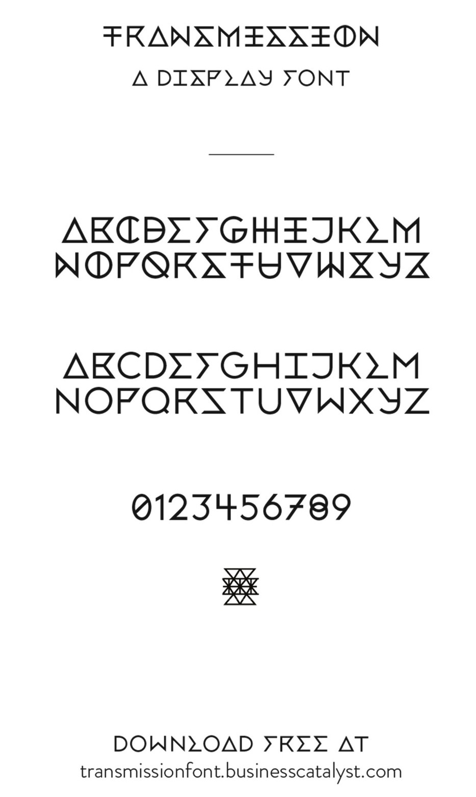
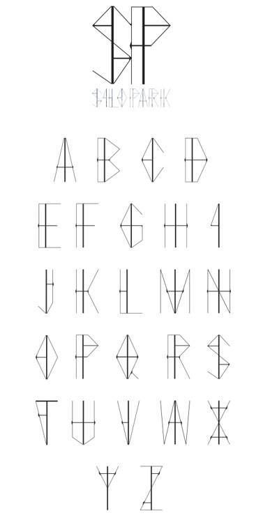
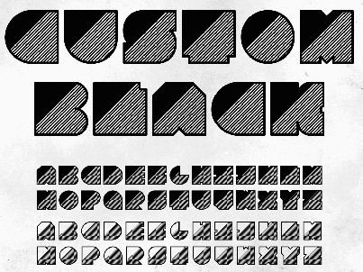
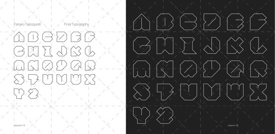
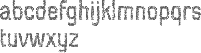
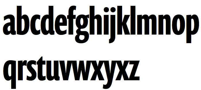
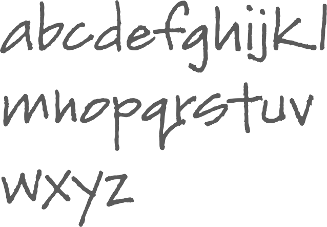
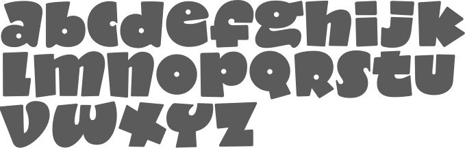
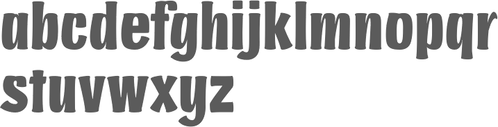
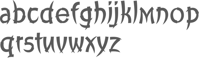
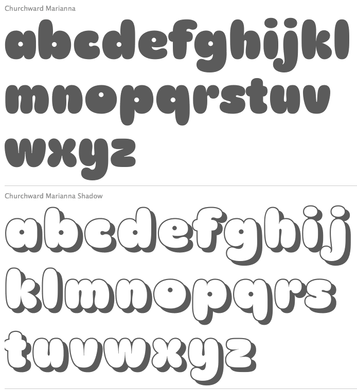
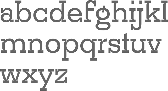
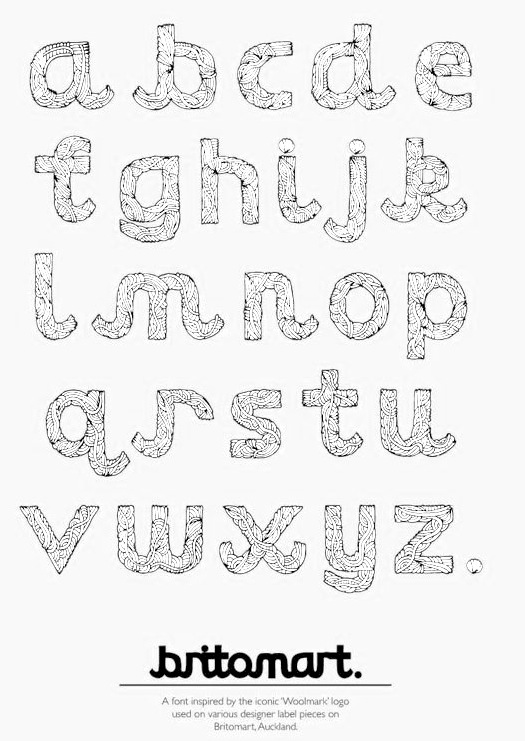
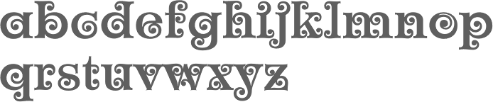
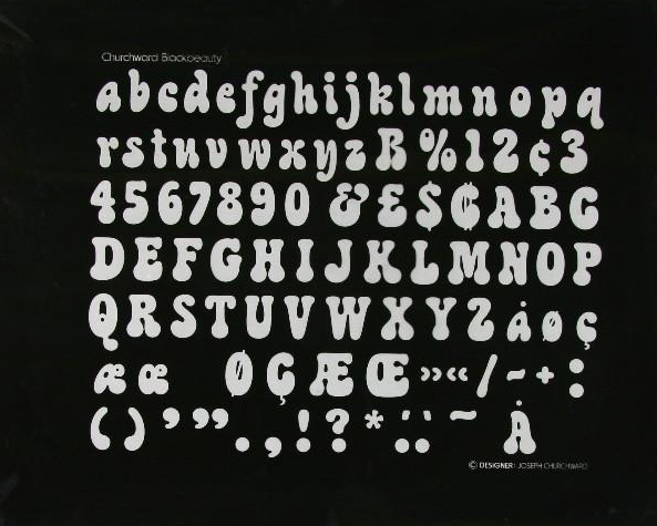
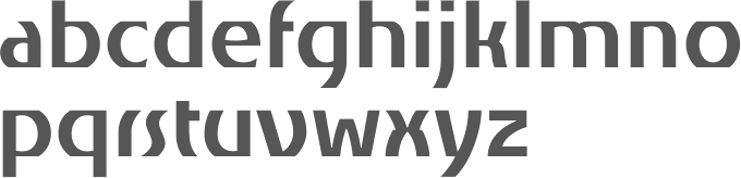
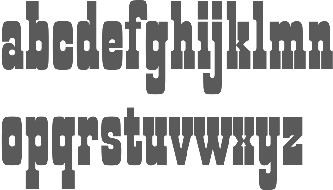
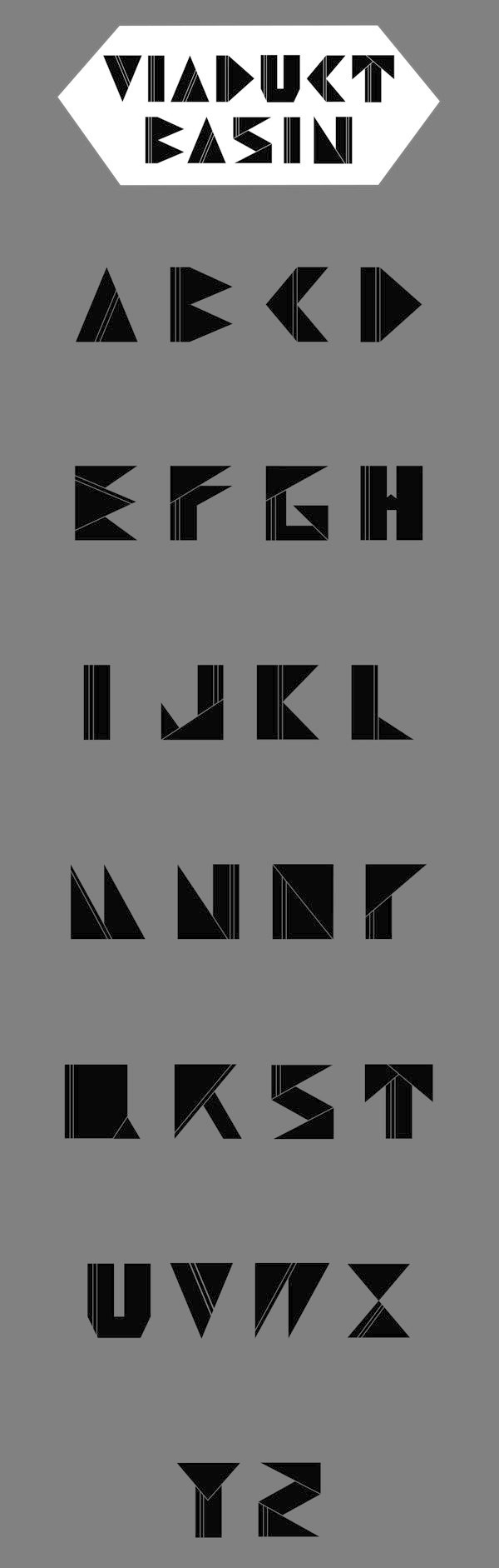
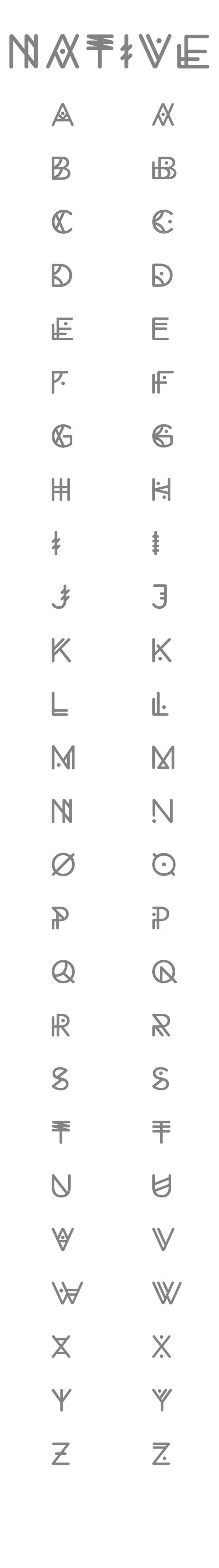
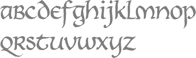
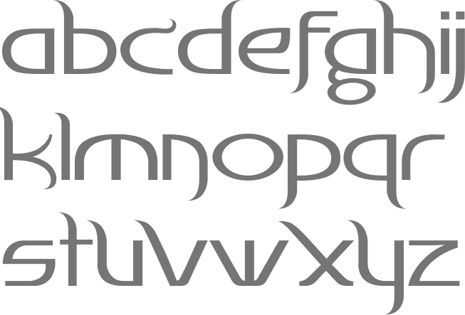
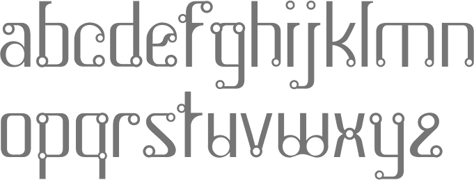
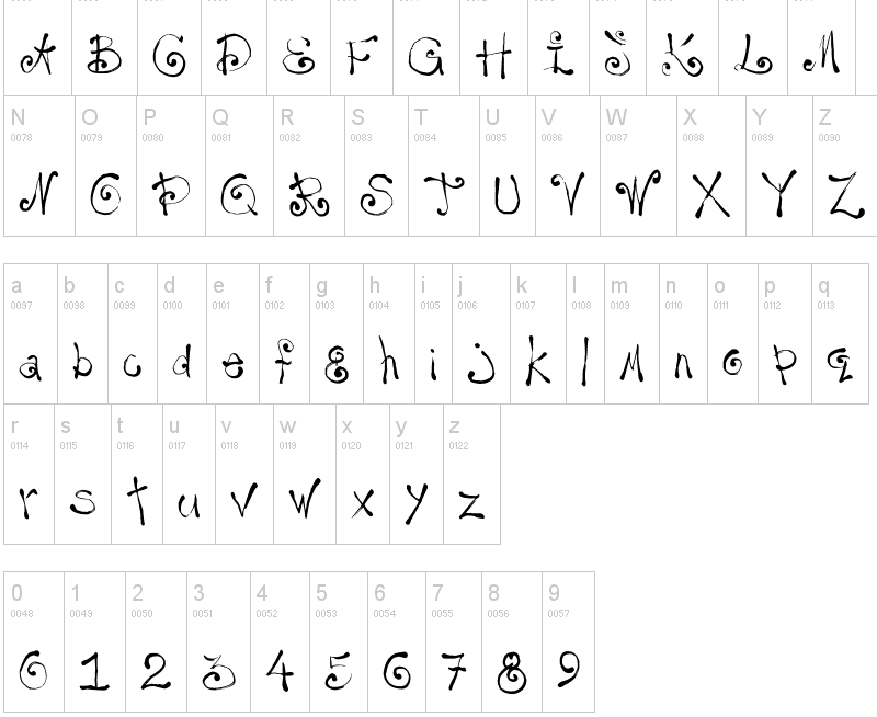
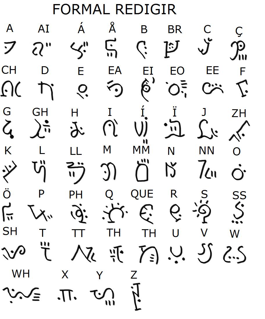
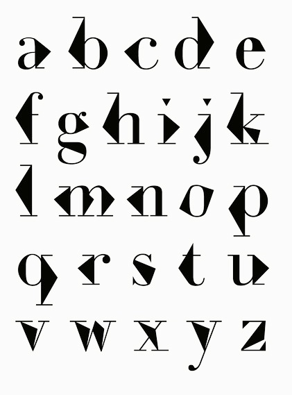
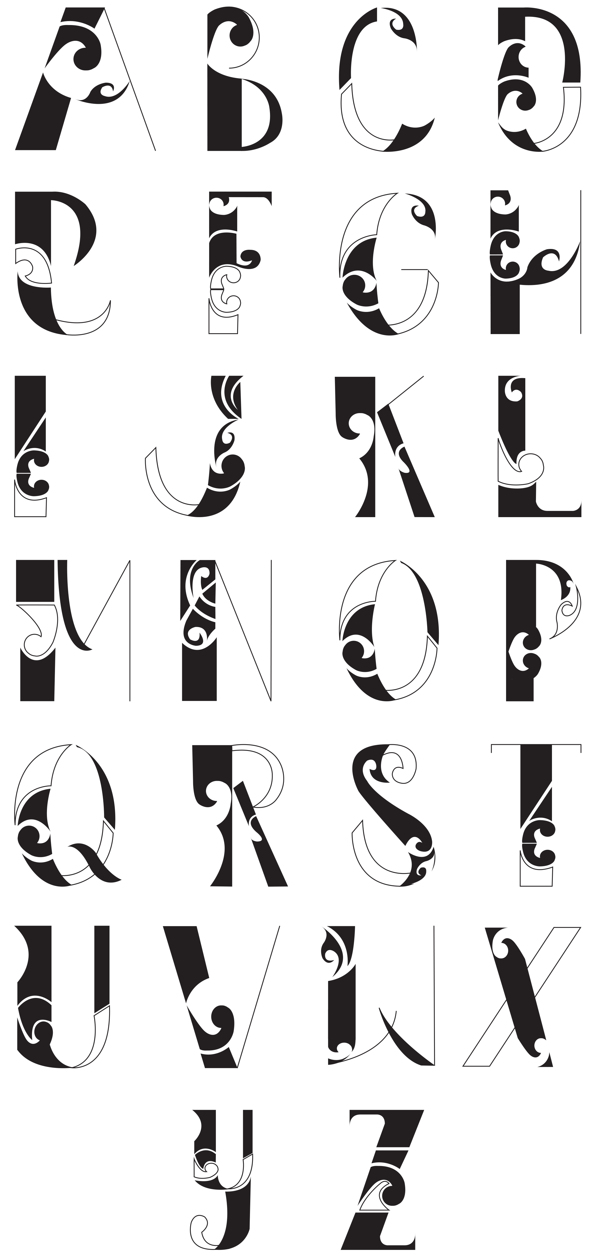
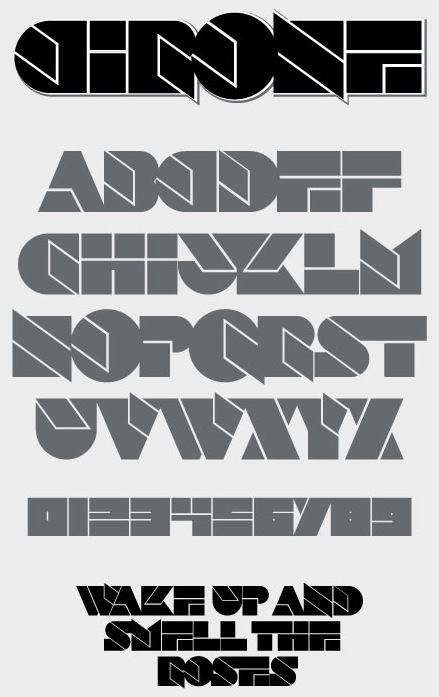
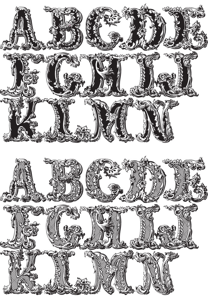
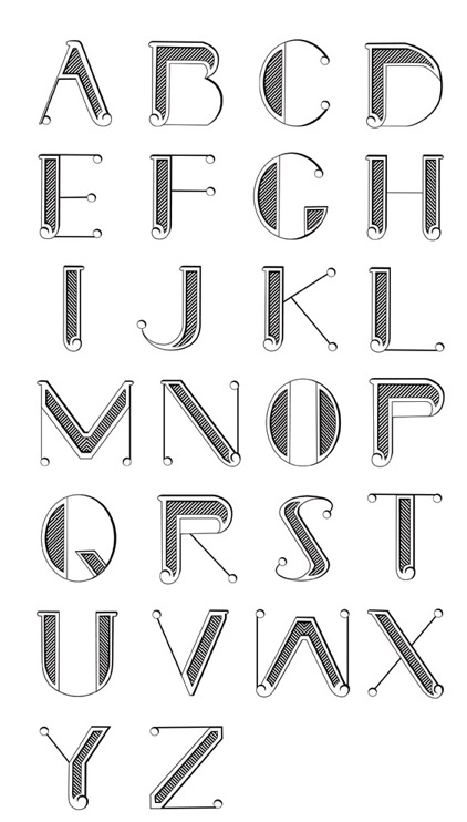
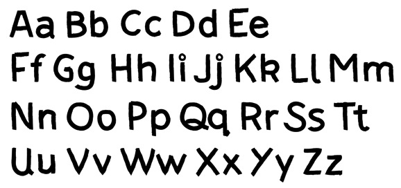
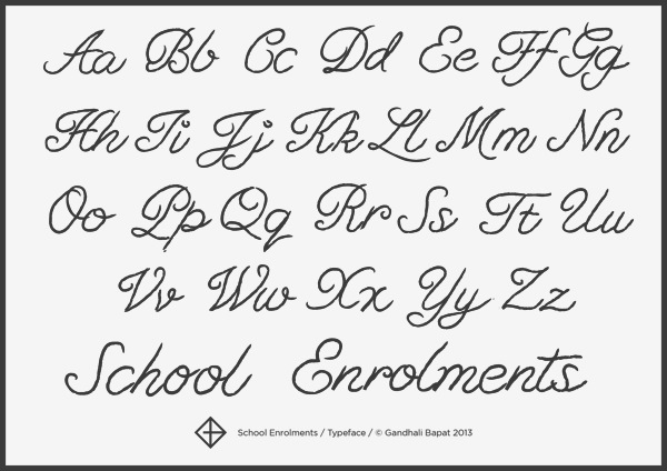
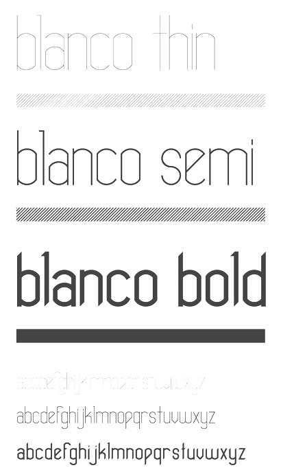
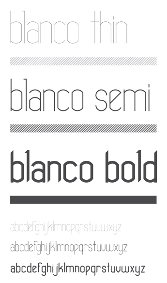
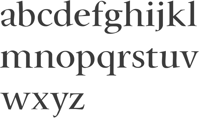
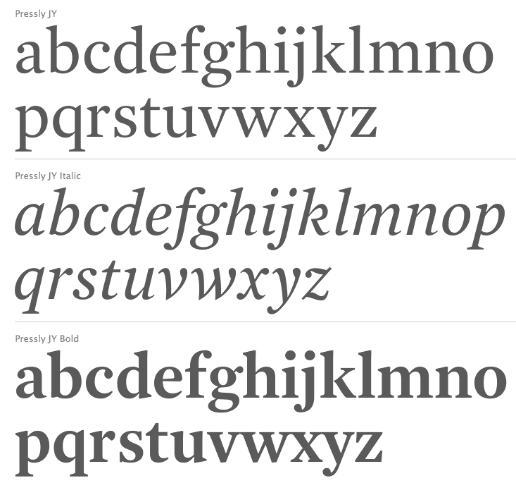
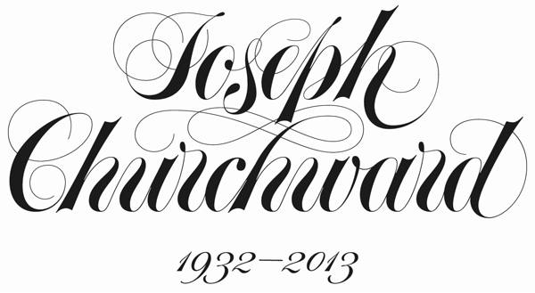
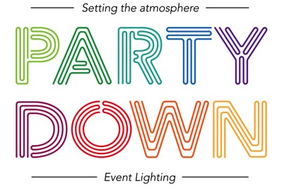
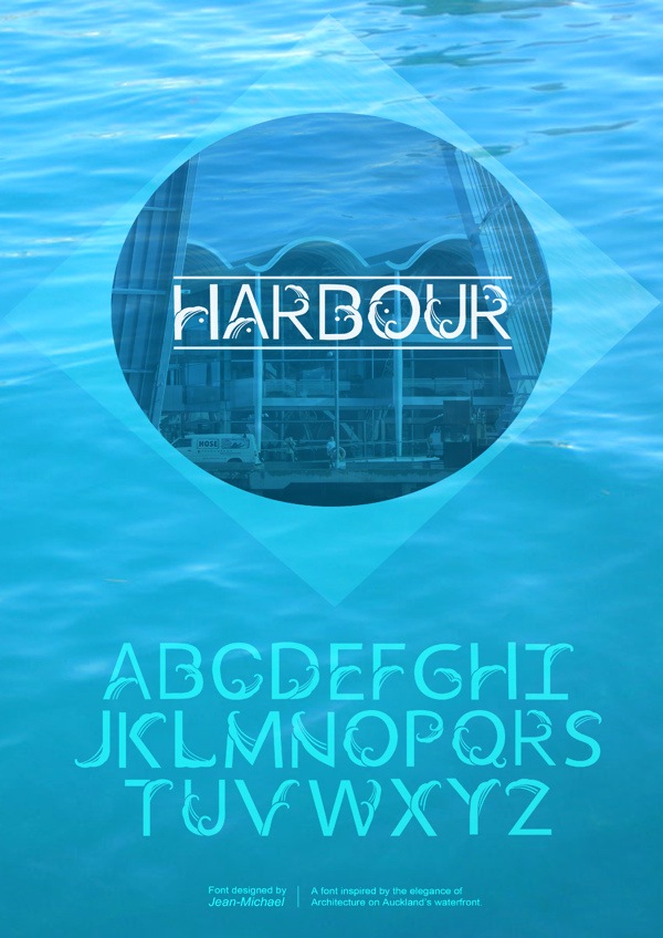
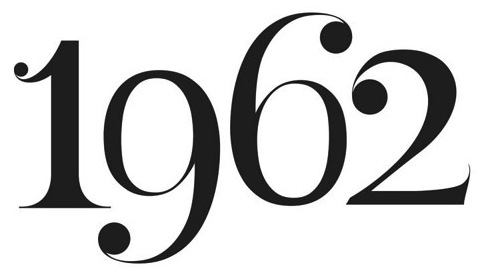
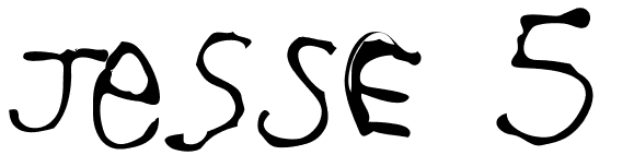
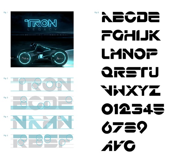
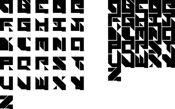
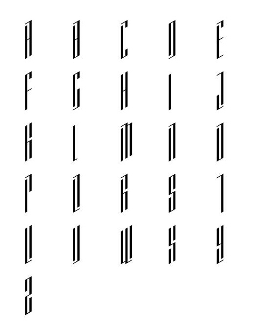
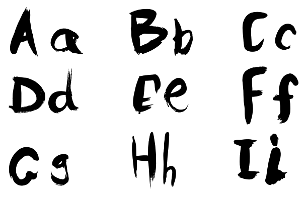
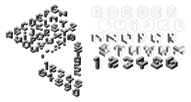
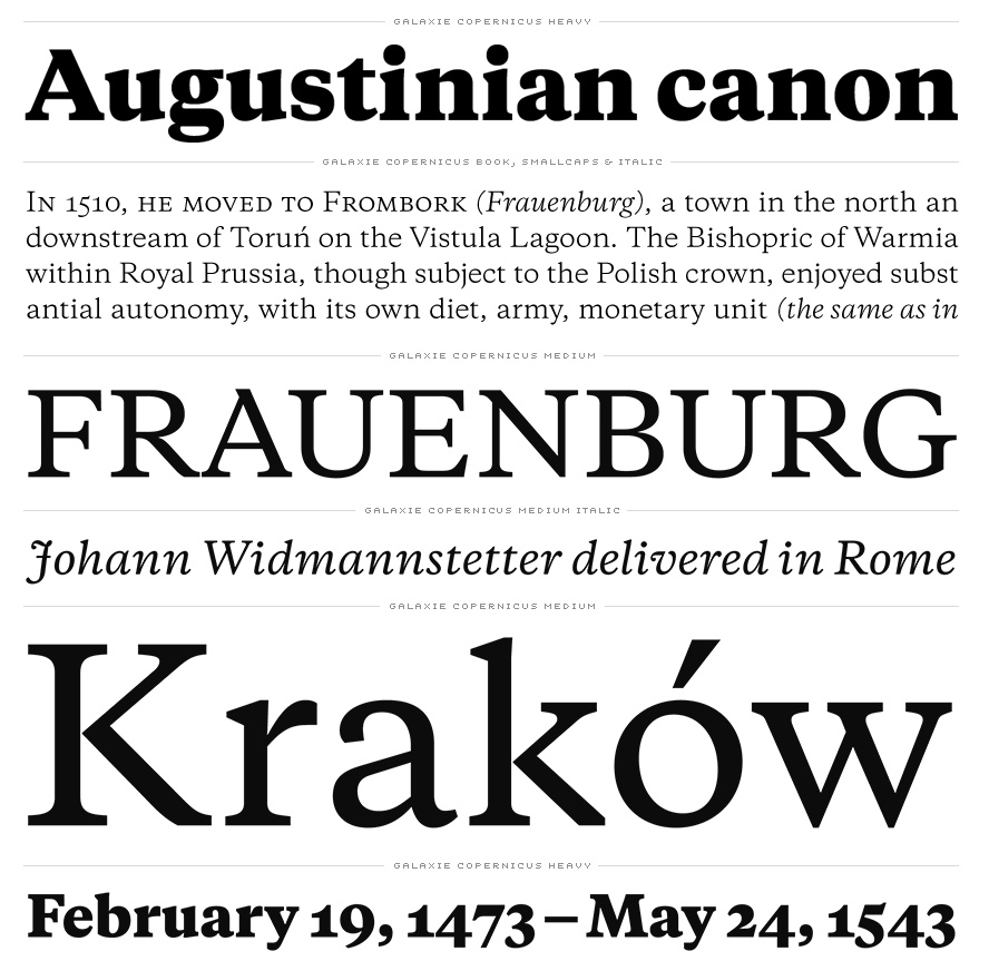
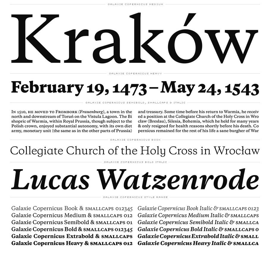
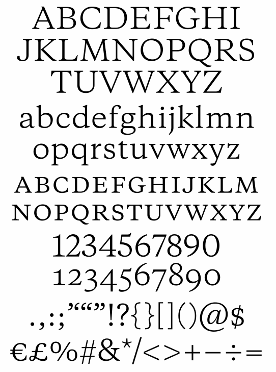
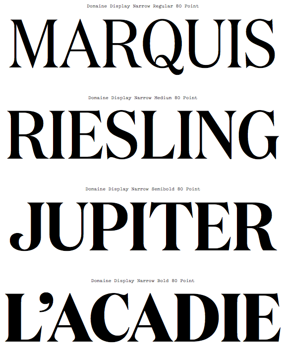
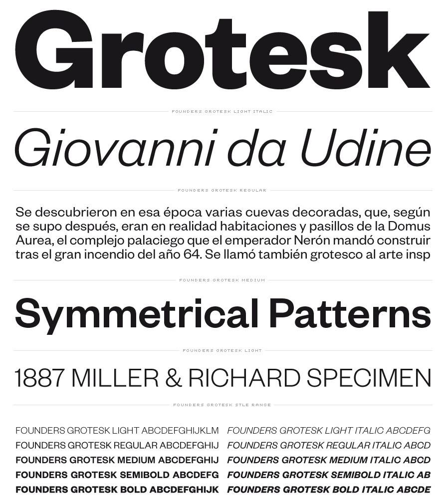
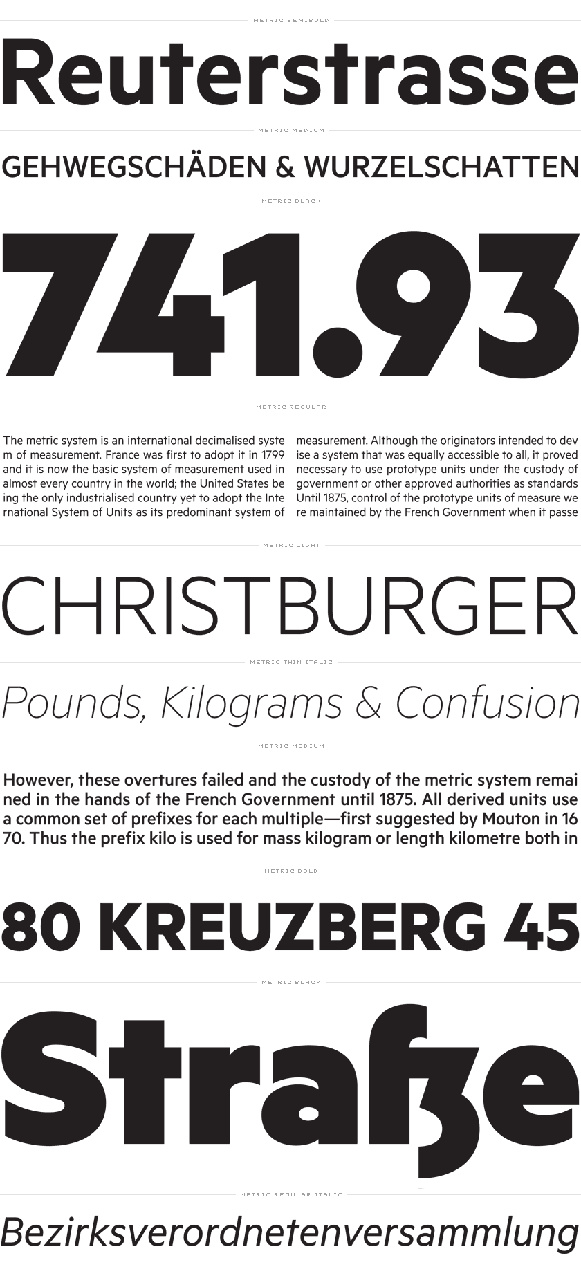
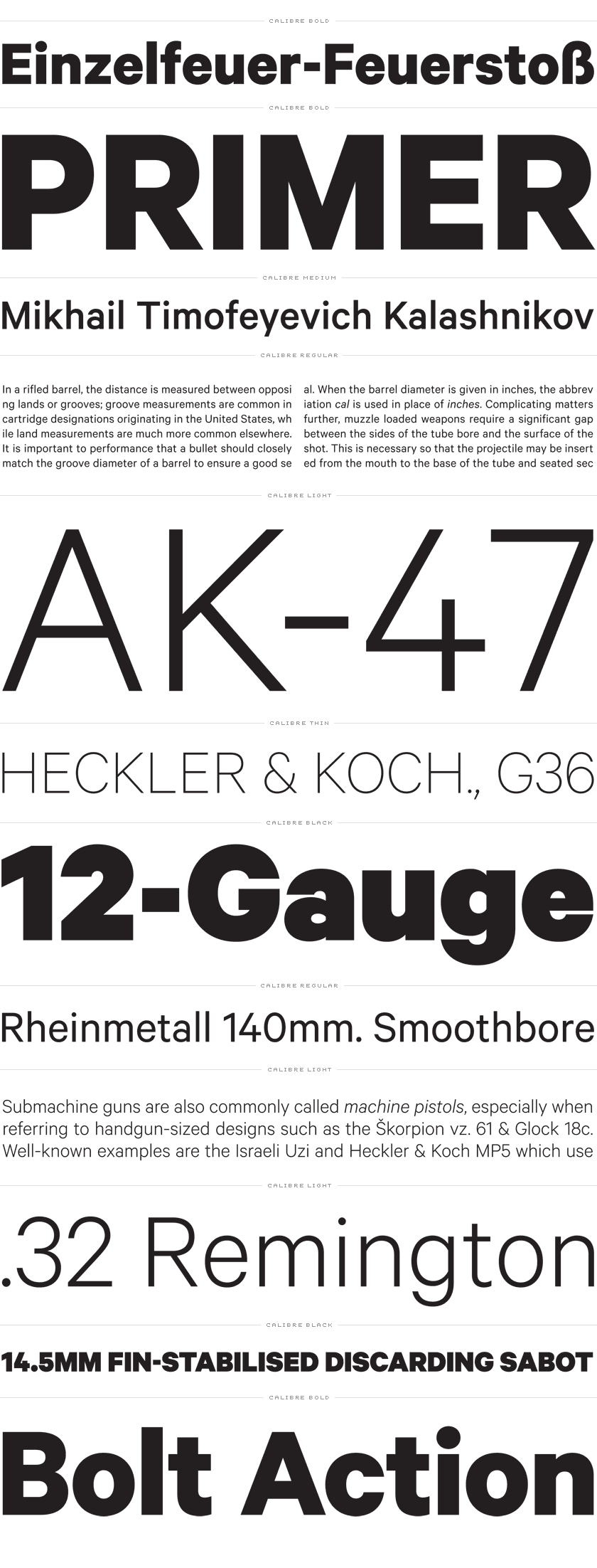
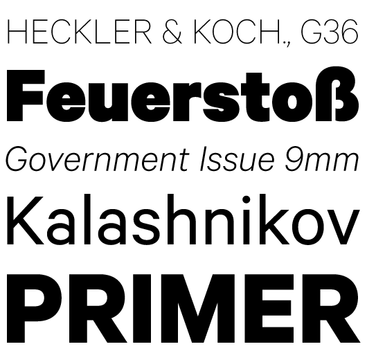
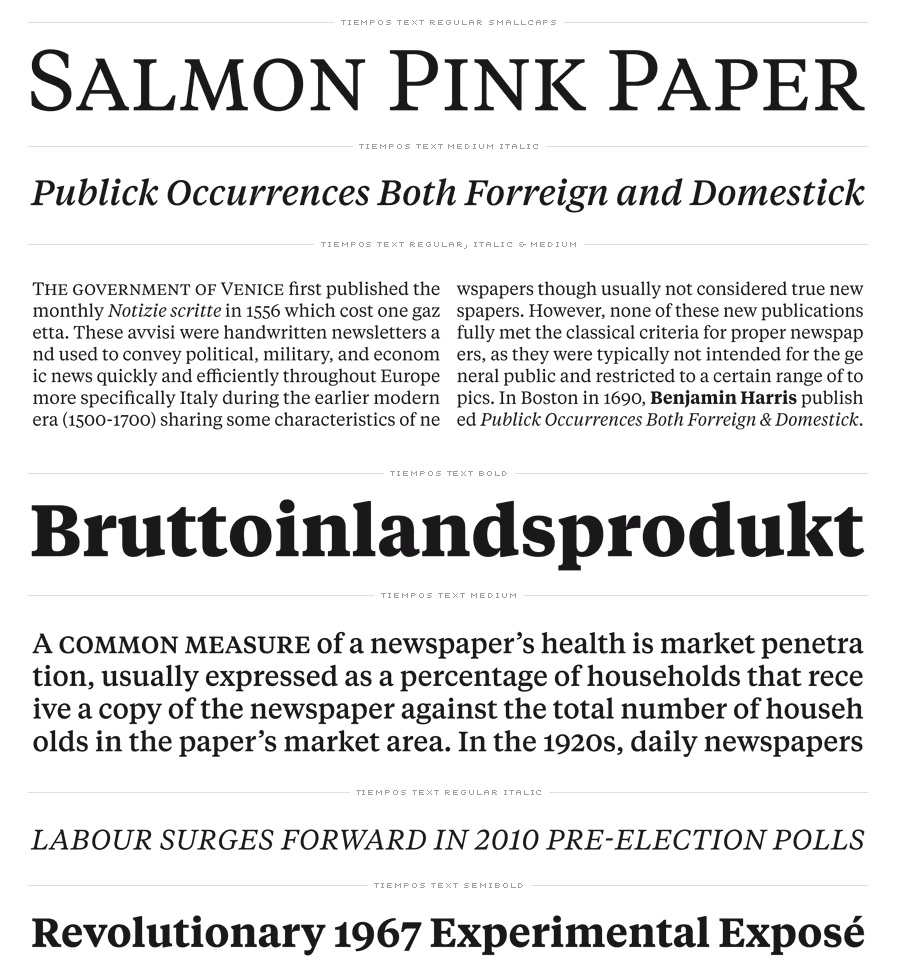
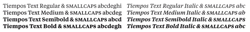
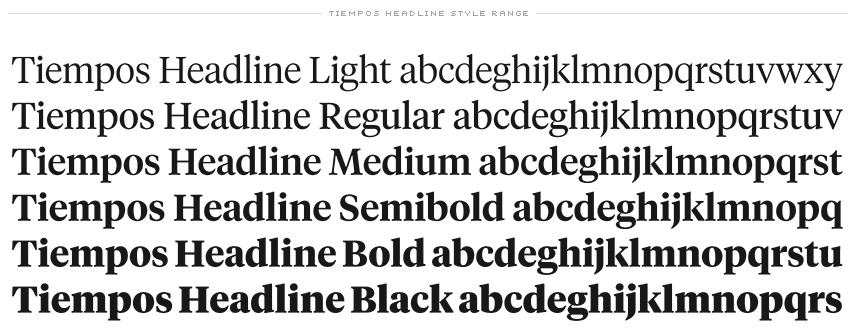
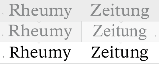
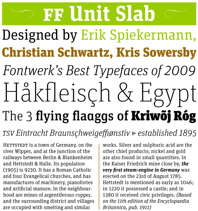
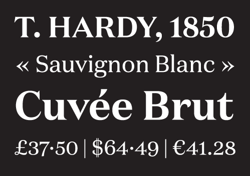
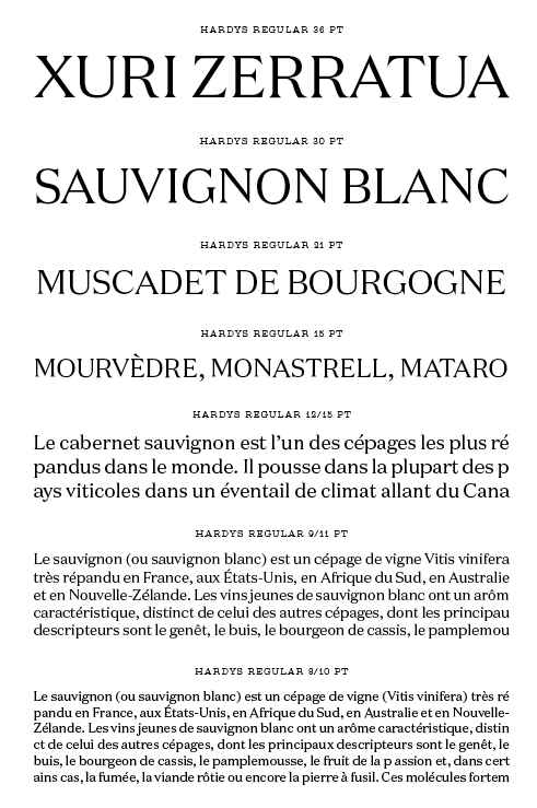
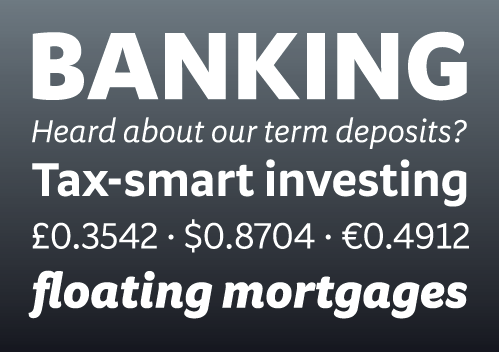
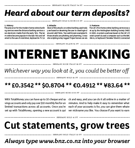
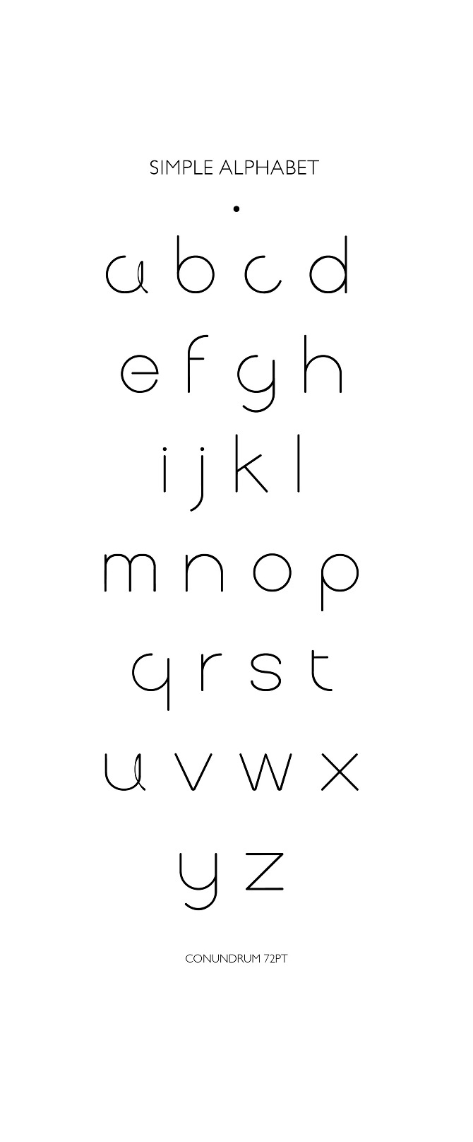
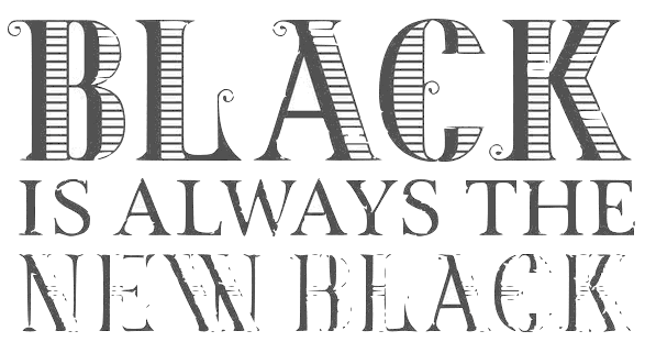
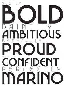
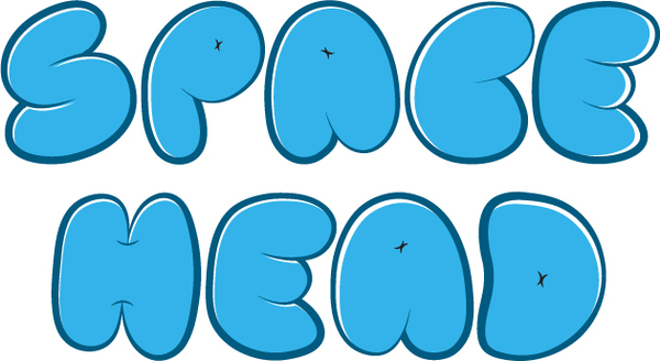
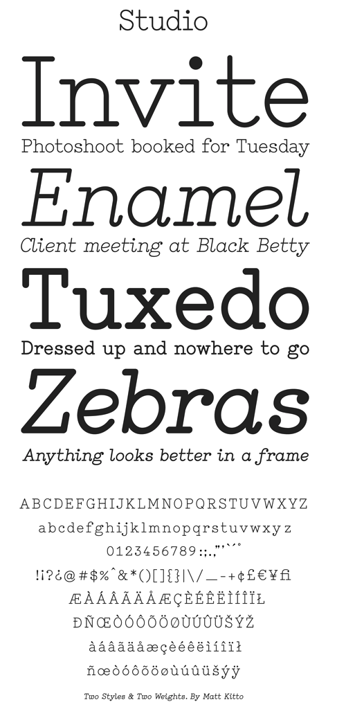
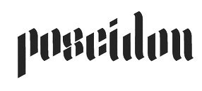
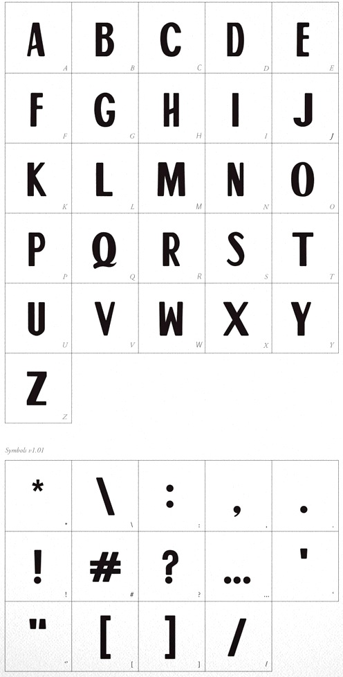
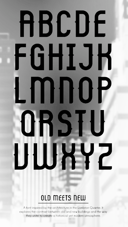
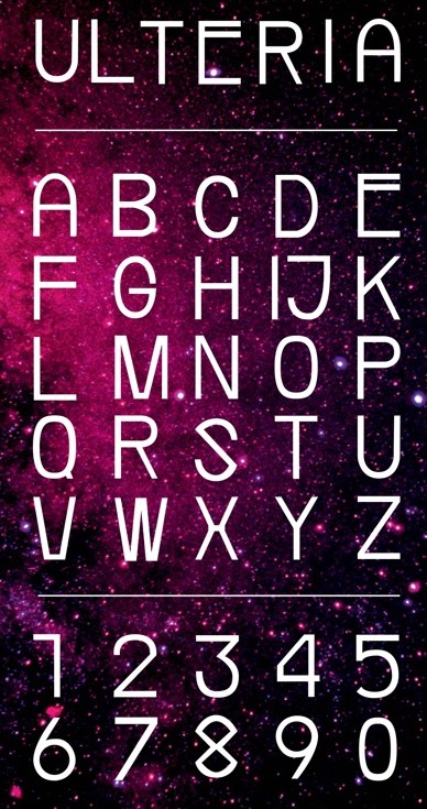
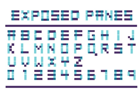
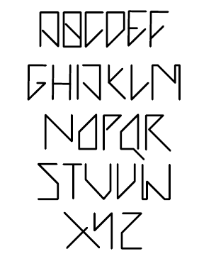
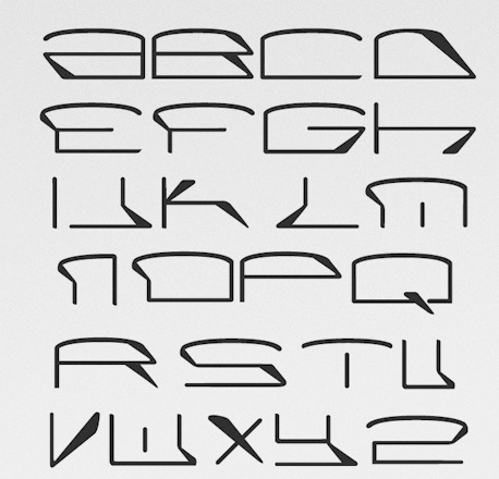
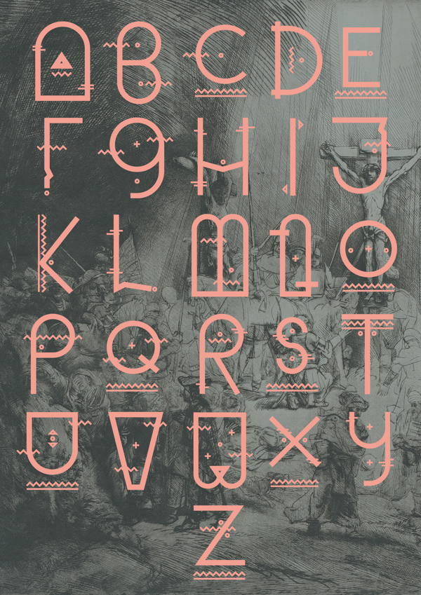
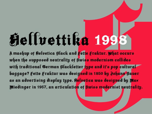
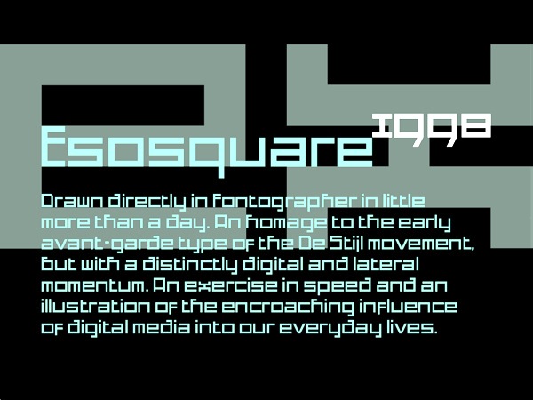
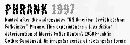
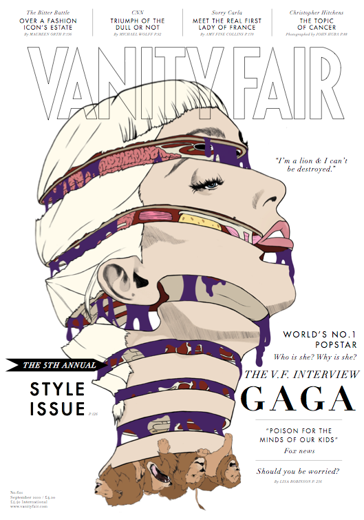
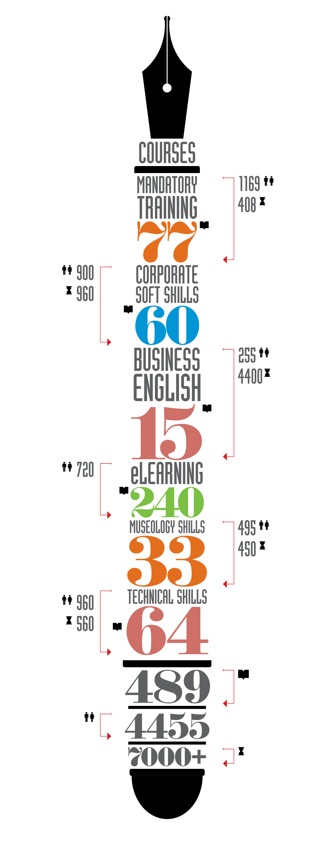
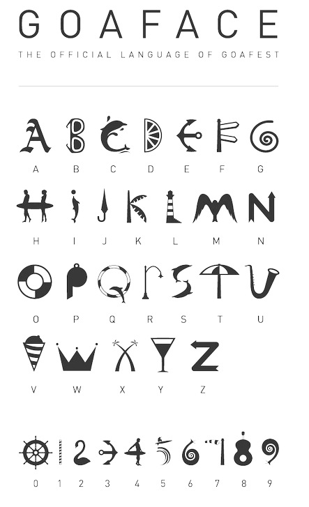
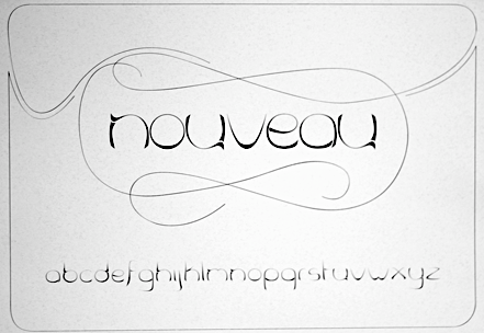
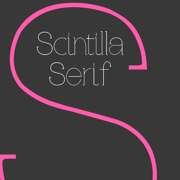
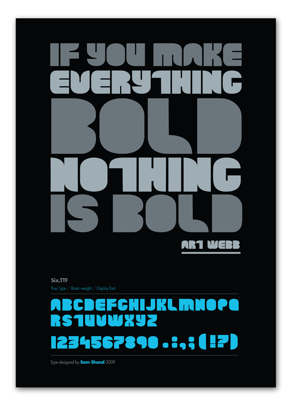
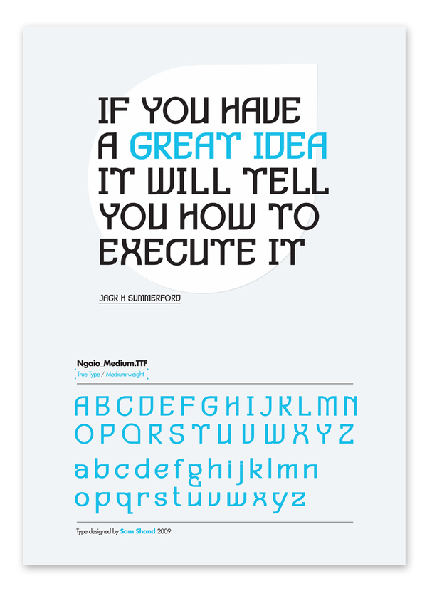
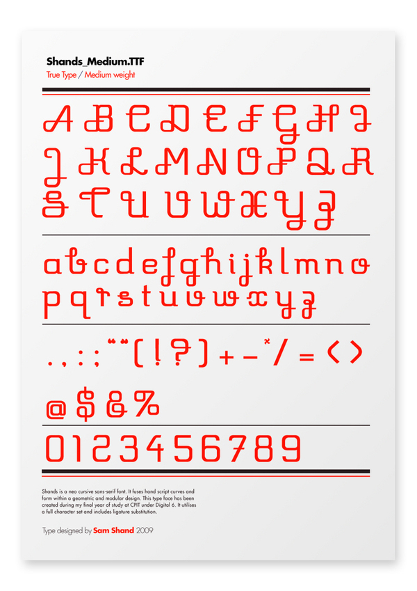
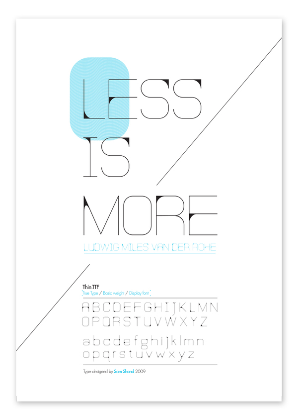
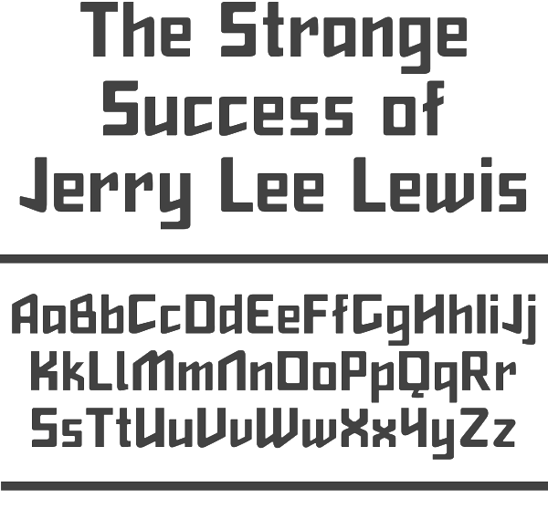
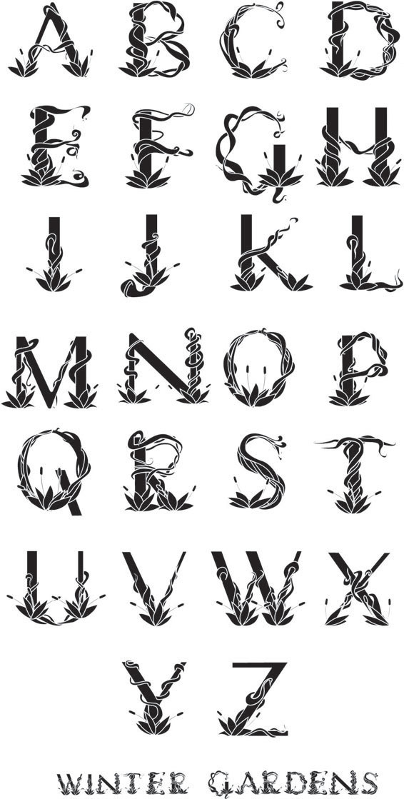
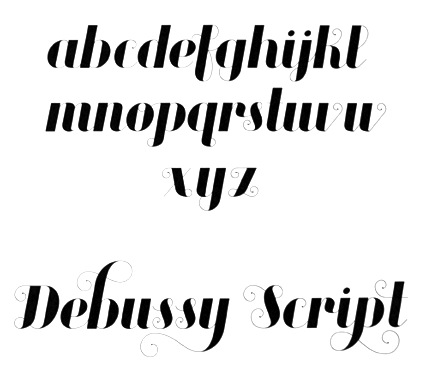
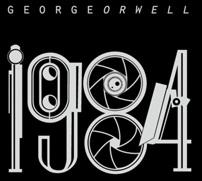
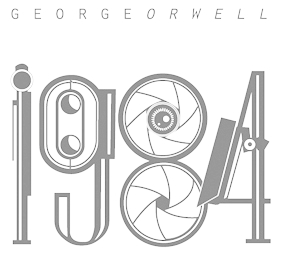
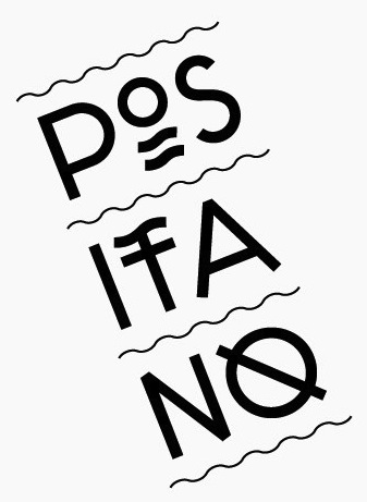
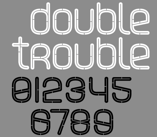
|
|
|
|