TYPE DESIGN INFORMATION PAGE last updated on Sat May 16 07:56:36 EDT 2026
FONT RECOGNITION VIA FONT MOOSE

|
|
|
|
|
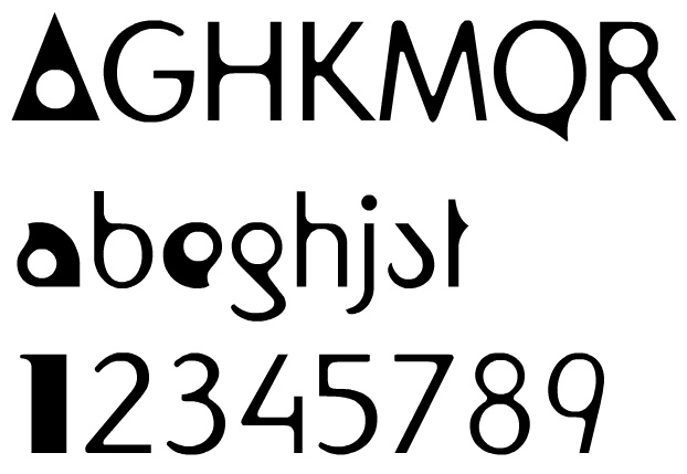
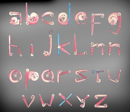
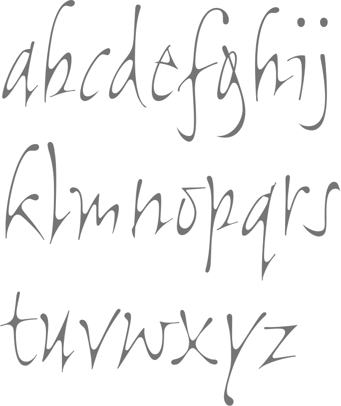
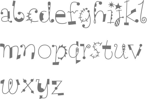
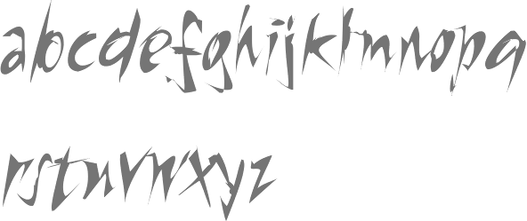
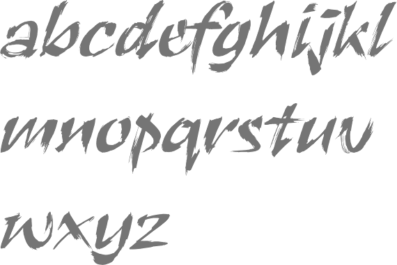
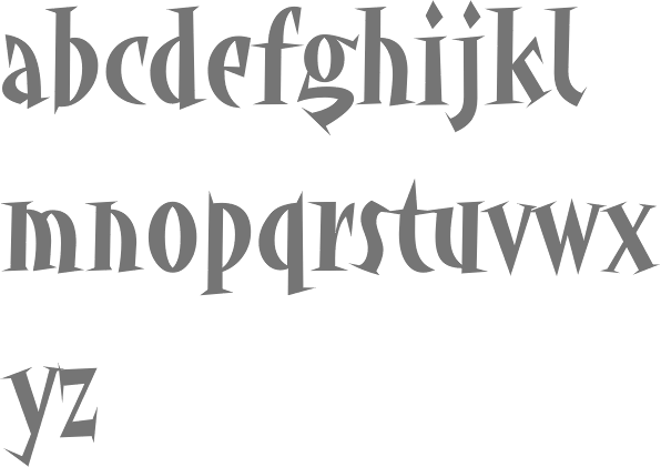
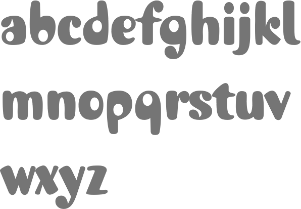
Typefaces related to Paul Klee | ||
|
|
|
|
SWITCH TO INDEX FILE
Madrid-based designer of the display typeface Quirou (2013). [Google] [More] ⦿ | |
Moscow, Russia-based designer of the decorative caps typeface Paul Klee (2016). [Google] [More] ⦿ | |
Type foundry based in Buenos Aires, Argentina. Their typefaces are all related to Letras Latinas 2002: Chill Out (organic sans), Newine, Predec (experimental serif placement), Corporation (organic italic sans), Galas (outline headline face), Literal (display), Metropolis (octagonal style), Tecno Funk (grunge), Baldosas (3d cubes, stacked), Klee, Overexpose Bi (grunge), Overexpose Tri (grunge), Air Bag (grunge). [Google] [MyFonts] [More] ⦿ | |
Swiss typographer (b. Zürich 1914, d. Basel, 1970), and type guru in the 50s and 60s. Ruder taught at the Basel School of Design (Kunstgewerbeschule), and founded the International Center for the Typographic Arts in New York, 1962. Author of Typographie: Ein Gestaltungslehrbuch - A Manual of Design - Un Manuel de Creation (Teufen: Niggli, 1967), and Typographie. Ein Gestaltungslehrbuch. Mit über 500 Beispielen (7th edition in 2001, Niggli). The Road to Basel (Helmut Schmid) is an homage to Emil Ruder by Helmut Schmid, one of Ruder's students, who headed a group of other ex-students and organized their contributions. The former students who participated are Harry Boller, Roy Cole, Heini Fleischhacker, Fritz Gottschalk, André Gürtler, Hans-Jürg Hunziker, Hans-Rudolf Lutz, Fridolin Müller, Marcel Nebel, Åke Nilsson, Bruno Pfäffli, Will van Sambeek, Helmut Schmid, Peter Teubner, Wolfgang Weingart, and Yves Zimmermann. Karl Gerstner and Kurt Hauert also contributed. Paul Shaw reviews this book and Ruder's contributions. Quotes from Shaw's piece:
IDEA Mag's special issue #332 entitled Ruder Typography Ruder Philosophy (2009), with articles by Leon Maillet (Tessin), Armin Hofmann (Lucerne), Karl Gerstner (Basel), Kurt Hauert (Basel), Lenz Klotz (Basel), Wim Crouwel (Amsterdam), Adrian Frutiger (Paris), Hans Rudolf Bosshard (Zurich), Andre Gutler (Basel), Juan Arrausi (Barcelona), Ake Nilsson (Uppsala), Fridolin Muller (Stein am Rhein), Harry Boller (Chicago), Maxim Zhukov (New York), Taro Yamamoto (Tokyo), Fjodor Gejko (Düsseldorf), Helmut Schmid (Osaka), and Susanne Ruder-Schwarz (Basel). Article on Ruder by Shane Bzdok, 2008. [Google] [MyFonts] [More] ⦿ | |
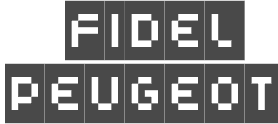
Fidel Peugeot
| |
Fontdesign by Fidel Peugeot
| |
| |
Graphic designer in Batam City, Indonesia, who created the artsy display typeface Cabeza (2016) based on a painting by Paul Klee. [Google] [More] ⦿ | |
Keith Bates
| |
K-Type
|
Commercial typefaces:
His free fonts:
Custom / corporate typefaces: With Liverpool-based art director Liz Harry, Bates created a personalized font, loosely based on Coco Sumner's handwritten capitals, for the band I Blame Coco. Medium and Semibold weights of Gill New Antique were commissioned by LPK Design Agency. Stepping Hill Hospital and Bates created Dials, a pictorial font to help hospital managers input data about improvements. A custom font was designed for Bolton Strategic Economic Partnership. Abstract Fonts link. View Keith Bates's typefaces. Dafont link. Yet another URL. Fontspace link. Fontsy link. Behance link. [Google] [MyFonts] [More] ⦿ |
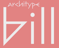
Max Bill created the typeface Bill (1949-1950) which is characterized by straight-edged glyphs (the o excepted). Digital typefaces based on his work include the geometric Max Bill (2014, Jack Harley Szukalski), Architype Bill (The Foundry), Bill Corporate Narrow (2015, Oliver Jeschke), Bill Corporate (2015, OGJ Type Design), Bill Display (2015, Oliver Jeschke: Greek simulation style) and Sequel Sans (Oliver Jeschke), Sequel Geo (2022, Oliver Jeschke). Swiss Type Design link. [Google] [MyFonts] [More] ⦿ | |
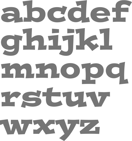
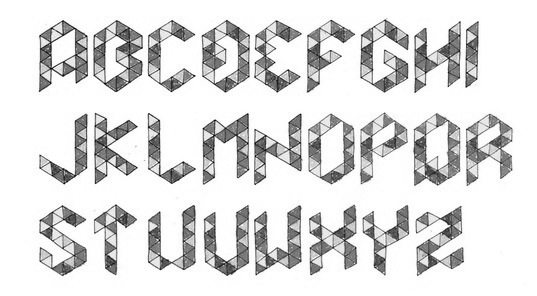
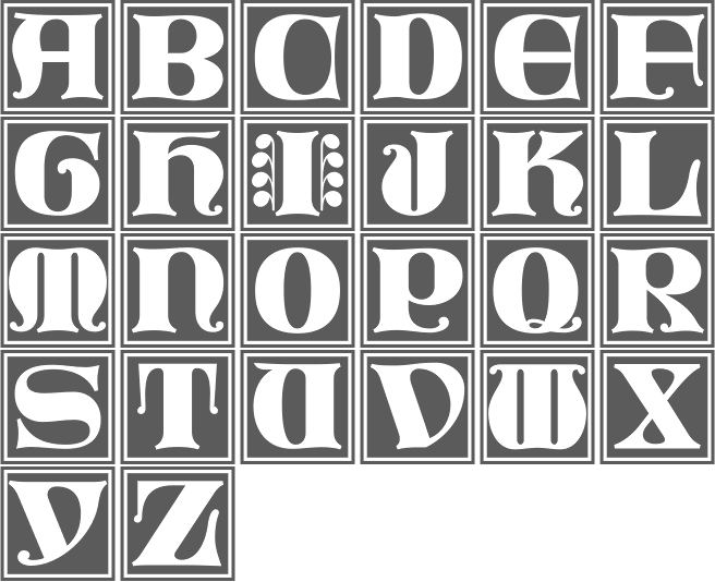
As often happens with influential artists, some typefaces were either named after him or influenced by his style. These include work by Anna Postum (2016), Alba Calderon (2013) and Rmbo Dsgn (2012). Commercial typefaces include Klee (Timothy Donaldson, ITC), Klee Print (K-Type), Swiss 921 (Bitstream), Bill Display (OGJ Type Design), and Octin Vintage (Typodermic). View some digital typefaces related to Paul Klee. Monoskop page on paul Klee. [Google] [More] ⦿ | |
RGB is Radio Galibasel. The site carried DIE GUTE FUER ALLE font collection by Fidel Peugeot (Vienna), Karl Rottweiler (Basel), Peggy Boon, Robi Watt, Hermine Demoriane, Quentin Magnus, Christian Anders, Betti Sauter, Feit F. Stauffer, Nadja Z, Cosima v. Gestern and the RGB107,6 crew (Vienna-based outfit): nice handwriting fonts for general use. It seemed like it was a free collection, but the download page was not operational. All this is moot now, as the original font site disappeared. The list of typefaces: Omen (Karl Rottweiler) is great, Gabel (by Fidel Peugeot) is a grunge font, Stukkie (by Peggy Boon) is normal handwriting, Ling (by Fidel Peugeot) is curly handwriting, Cuisinette (by Hermine Demoriane) is childish handwriting, Kanguruh (by Robi Watt) is hurried, HerrKlee (by Fidel Peugeot) is for graffiti, Mokka (by Fidel Peugeot) is for 8-year olds, the Waldmeister family (by Veit F. Stauffer) is for writing with chalk on trees, Sticker (by Christian Anders) is a disaster, Quentin Magnus der Wilde (by Fidel Peugeot) is so-so, Pirona (by Babette) is open and inviting hand-titling, BettisHand (by Betti Sauter) and Dr. R (by Dr. R) are regular handwriting fonts, Erdbeere (by Cosima von Gestern) is a doodling food-based dingbat font, Nadja's Trolle is so-so, and Trompete is Fidel Peugeot's Trumpet dingbat font. [Google] [More] ⦿ | |
Argentinian designer with Roberto Fernandez of Predec, Chill Out, Ano 84 (1993), Acustic Font (1995), Air Bag (1995), Baldosa, Bad Taste (1992), Casla Font (1995), Bitmapon Font (1994), Egolatra (1993), Gen Font (1994), Indy Car Font (1993), Galactic Groove Font (1995, for Startrek style work), Klee Font (1992), Metropolis (1996), Literal Font (1999), Overexpose Font (1994), People Font (1993), Pencil Font (1992), Raver (1998), Que Te Pasa (1993), and Tecno Funk Font (1993). [Google] [More] ⦿ | |
Freelance graphic designer in Bandung, Indonesia. Creator of the ornamental alphabet Paul Klee (2012). Behance link. [Google] [More] ⦿ | |
Argentinian designer with Ricardo Crespo of Predec, Chill Out, Air Bag (1995), Ano 84 (1993), Bad Taste (1992), Acustic Font (1995), Baldosa, Bitmapon Font (1994), Casla Font (1995), Egolatra (1993), Gen Font (1994), Galactic Groove Font (1995, for Startrek style work), Indy Car Font (1993), Klee Font (1992), Literal Font (1999), Metropolis (1996), Pencil Font (1992), Overexpose Font (1994), People Font (1993), Raver (1998), Que Te Pasa (1993), and Tecno Funk Font (1993). [Google] [More] ⦿ | |
Shapes for Cash
|
At ATypI 2004 in Prague, he spoke about The world's even bigger Hamburgefonts. At ATypI 2008 in St. Petersburg, he spoke about the resurrection of the pencil. He states in the abstract: During research for my recently published book, "Shapes for sounds", I investigated the Glagolitic alphabet created by the brothers Cyril and Methodius. This alphabet was the mother of Cyrillic. I learned to write the letters, an activity that took on a life of its own and led to a body of interpretation bordering on the obsessive. My talk will focus on the history, development, and subsequent abandonment of the Glagolitic alphabet and will show the new drawings, sculptures, scripts and typefaces I have produced as a result of this investigation. Speaker at ATypI 2010 in Dublin. Speaker at ATypI 2011 in Reykjavik. In 2012, he won the Akashi award in the Latin category of the Morisawa Type Design Competition for Jara (a fat signage script). Klingspor link. Linotype link. View Timothy Donaldson's typefaces. [Google] [MyFonts] [More] ⦿ |
Based on Paul Klee's Castle and Sun, Tazul Arifin (Bandung, Indonesia) created the hexagonal-grid typeface Trekant (2012). [Google] [More] ⦿ | |
Timothy Donaldson
| |
Revivals of his typefaces include Capital Ideas 2 NF (2012, Nick Curtis), which is based on Breitfette Unziale (1958). Schmalfette CP (Jason Walcott and Rob King) revives Walter Haettenschweiler's original titling sans from 1954. [Google] [MyFonts] [More] ⦿ | |
Anke Kempkes provides a full biography, from which I quote this passage: When the Bauhaus closed in 1933 Schawinsky first went to Italy. In Milan he worked for [Antonio Boggeri's] Studio Boggeri, the newly founded state-of-the art advertising studio. He designed outstanding poster and product designs for Motta, Illy coffee and Cinzano. He also co-designed for Olivetti the typewriter Studio 42. Schawinsky's posters and products were to become classics of commercial design of the 1930s. Philipp Johnson gave his collection of Schawinsky posters in later years as gift to the Museum of Modern Art in New York. In Nothern Italy the artist met Marinetti and Giorgio de Chirico, whose work co-influenced the growing Surrealist tendency in Schawinsky's work of the 1940s. During this time Schawinsky remained in close exchange with Walter Gropius. He actively promoted the Bauhaus ideas and planned to bring out a book about the Bauhaus years, which remained unpublished. In 1935 the political situation in Italy forced him to leave once more. Schawinsky went to London where he married Irene von Debschitz, the daughter of the director of the Debschitz-School in Munich, an art school having anticipated some of the Bauhaus ideas. In 1936, Hans Albers secured Schawinsky and his wife safe passage to the United States to teach at the later legendary Black Mountain College in North Carolina. In charge of theater arts, Schawinsky expanded his ideas for experimental theater to a multi-media "total experience." His production of Spectrodrama and Danse Macabre at the Black Mountain College demonstrated these ideas and importantly laid the foundations for the work of John Cage and others at the College in the post-war time. It can clearly be argued that Schawinsky brought the radical and avant-garde Bauhaus theater to the United States, a relation that has been receiving special attention recently. Irene Schawinsky also contributed to the College. She collaborated with Anni Albers on clothes designs and she create paper sculptures which became iconic props of Xanti's Spectodrama plays (in the following years Irene used these paper sculptures for shop window designs in New York). He designed a high-contrast ball terminal-laden typeface in 1932 that was revived in 2016 by Luca Pellegrini as Xanti32 in his graduation thesis, Forgotten typeface, Xanti Schawinsky designer di caratteri. Pellegrini's typeface was published as Xants by Adobe Originals. In 2021, CAST released the wonderful monospaced Bauhaus-inspired typewriter family Xanti Typewriter by Gianluca Sandrone. Wikipedia link. [Google] [More] ⦿ |

 [
[ Collection of typefaces at Letraset. Newest typefaces include Donaldson Hand (Tim Donaldson), La Gioconda (based on letters from Giovanni Francesco Cresci, done by Richard Dawson and Dave Farey), Spidercave (Michael Gills), Locomotiv (Phill Grimshaw), Bobbysox (Alan Dempsey), Bouchon (Roselyne and Michel Besnard), Eplica (Yvonne Diedrich), Uffington (Tim Donaldson). The fonts: Aachen Bold, Aachen Medium, Academy Engraved, Agincourt, Algerian Condensed, Ambrose, Aquinas, Aquitaine Initials, Aristocrat, Arriba, Arriba-Arriba, Artiste, Augustea Open, Avalanche Script, Avenida, Axis Bold, Balmoral, Bang, Banner, Becka Script, Belwe Mono, Belwe Mono Italic, Bendigo, Bergell, Bertie, Bertram, Bible Script, Bickley Script, Bitmax, Blackmoor, Bluntz, Bobbysox, Boink, Bordeaux Display, Bordeaux Family, Bordeaux Italic, Bordeaux Roman, Bordeaux Roman Bold, Bordeaux Script, Bouchon Bold, Bouchon Light, Brighton Bold, Brighton Light, Brighton Medium, Bronx, Burlington, Buzzer 3, Cabaret, Cabarga Cursiva, Campaign, Cancellaresca Script, Carlton, Carumba, Caslon 540 Ital/Swash, Caxton Light Italic, Caxton Roman Bold, Caxton Roman Book, Caxton Roman Light, Chalkline Bold, Challenge Bold, Challenge Extra Bold, Champers, Charlotte Bold, Charlotte Book, Charlotte Book Italic, Charlotte Family, Charlotte Medium, Charlotte Sans Bold, Charlotte Sans Book, Charlotte Sans Book Italic, Charlotte Sans Family, Charlotte Sans Medium, Charlotte Sans Small Caps, Charlotte Small Caps, Chiller, Chipper, Choc, Chromium One, Citation, Claude Sans, Claude Sans Bold Italic, Claude Sans Italic, Collins, Comedy, Commercial Script, Compacta, Compacta Bold, Compacta Italic, Coptek, Corinthian Bold, Corinthian Bold Condensed, Corinthian Light, Corinthian Medium, Crillee Bold Italic, Crillee Extra Bold Italic, Crillee Italic, Crillee Italic Inline Shadow, Cult, Dancin', Data 70, Dave Farey Display Fonts, David Quay Display Fonts, David Quay Scripts, Demian, Demian Bold, Design Font Attitudes, Design Font Calligraphic Ornaments, Design Font Celebrations, Design Font Commercials, Design Font Delectables, Design Font Diversions, Design Font Diversities, Design Font Eclectics, Design Font Energetics, Design Font Expressions, Design Font Incidentals, Design Font Industrials, Design Font Inspirations, Design Font Journeys, Design Font Mo' Funky Fresh Symbols, Design Font Moderns, Design Font Naturals, Design Font Organics, Design Font Organics II, Design Font Primitives, Design Font Radicals, Design Font Urbans, Design Font Well Beings, Design Font Wildlife, Digitek, Dolmen, Donaldson Hand, Doodlebug, Dynamo Shadow, Edwardian Medium, Elysium Bold, Elysium Book, Elysium Book Italic, Elysium Family, Elysium Medium, Elysium Small Caps, Emphasis, Enviro, Eplica Bold, Eplica Bold Italic, Eplica Book, Eplica Book Italic, Eplica Family, Eplica Medium, Eplica Medium Italic, Epokha, Equinox, Etruscan, Faithful Fly, Fashion Compressed No. 3, Fashion Engraved, Figural Bold, Figural Book, Figural Book Italic, Figural Family, Figural Medium, Figural Small Caps, Fine Hand, Flamenco Inline, Flamme, Flight, Fling, Follies, Forest Shaded, Frances Uncial,
  [
[
 Influential Swiss graphic designer, sculptor, painter and architect, b. 1908, Winterthur, d. 1994. He studied at the Bauhaus from 1927 until 1929 under Josef Albers, Paul Klee and Oskar Schlemmer, and moved to Zurich after that. In 1944, Bill became a professor at the school of arts in Zurich. In 1953, along with Inge Scholl and Otl Aicher, he founded the influential Ulm School of Design, which closed in 1968. Bill was a professor at the Hochschule für bildende Künste Hamburg and chair of Environmental Design from 1967 to 1974. He lived in Zurich in the later years of his life and died at the Berlin Tegel airport of a heart attack.
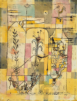
 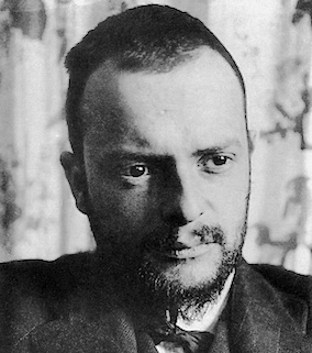 Paul Klee (b. 1879, Münchenbuchsee, Switzerland, d. 1940, Locarno, Switzerland) was a Swiss-German artist. His style was influenced by movements in art that included expressionism, futurism, cubism, and surrealism. Wikipedia: Klee was a natural draftsman who experimented with and eventually deeply explored color theory, writing about it extensively. His lectures "Writings on Form and Design Theory" (Schriften zur Form und Gestaltungslehre), published in English as the Paul Klee Notebooks, are held to be as important for modern art as Leonardo da Vinci's "A Treatise on Painting for the Renaissance". He and his colleague, Russian painter Wassily Kandinsky, both taught at the Bauhaus School of Art, Design and Architecture. His works reflect his dry humor and his sometimes childlike perspective, his personal moods and beliefs, and his musicality.
 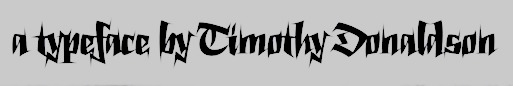 British calligrapher, signwriter, lettering artist, and type designer. He teaches typography at Stafford College and is a Research Fellow at the University of Lincoln. His typefaces:
  [
[ Swiss type designer, b. 1933, Zug. He studied at Kunstgewerbeschule Zürich, and from 1957 onwards he ran a design studio in Zug. His typefaces, often published in the Lettera book series (Lettera2, 1961; Lettera3, 1968 and Lettera4, 1972) all printed by Teufen.
  Alexander Xanti Schawinsky was born in 1904 in Basel, Switzerland, to a Jewish family of Polish descent. He died in 1979 in Locarno, Switzerland. He worked for three years in Theodor Merrill's Köln architecture office before enrolling at the Bauhaus in 1924 where he studied with Walter Gropius, Wassily Kandinsky, Paul Klee, Josef Albers, Oskar Schlemmer and Laszlo Moholy-Nagy. Schawinsky had a significant presence at the Bauhaus in Weimar and Dessau. He was particularly active in the theater department and strongly inspired by Schlemmer, whose position as teacher he took on and developed further. Photos from the early years of the Bauhaus show Schawinsky as a dynamic personality in many of its experimental extra-curricular activities. Among them was the influential Bauhaus Jazz Band where Schawinsky introduced his Step Dance versus Step Machine style of mechanical music and dance to pounding rhythms coupled with dramatic lighting effects and performance elements. At the Bauhaus Schawinsky began developing his ground-breaking concept of Spectodrama. Spectodrama represented an early idea of total theater where all aspects of the stage become independent agents. Schawinsky continued the work on Spectodrama at the Black Mountain College in the United States after his immigration, and he revisited this work in the 1960s and 70s in Europe. The original concepts and scripts are located in the archive of the Estate of Xanti Schawinsky in Zurich, as well as an extended body of work of stage photographs and sketches.
|
|
|
|