TYPE DESIGN INFORMATION PAGE last updated on Mon Mar 9 16:02:27 EDT 2026
FONT RECOGNITION VIA FONT MOOSE

|
|
|
|
|
Type design in Lebanon | ||
|
|
|
|
SWITCH TO INDEX FILE
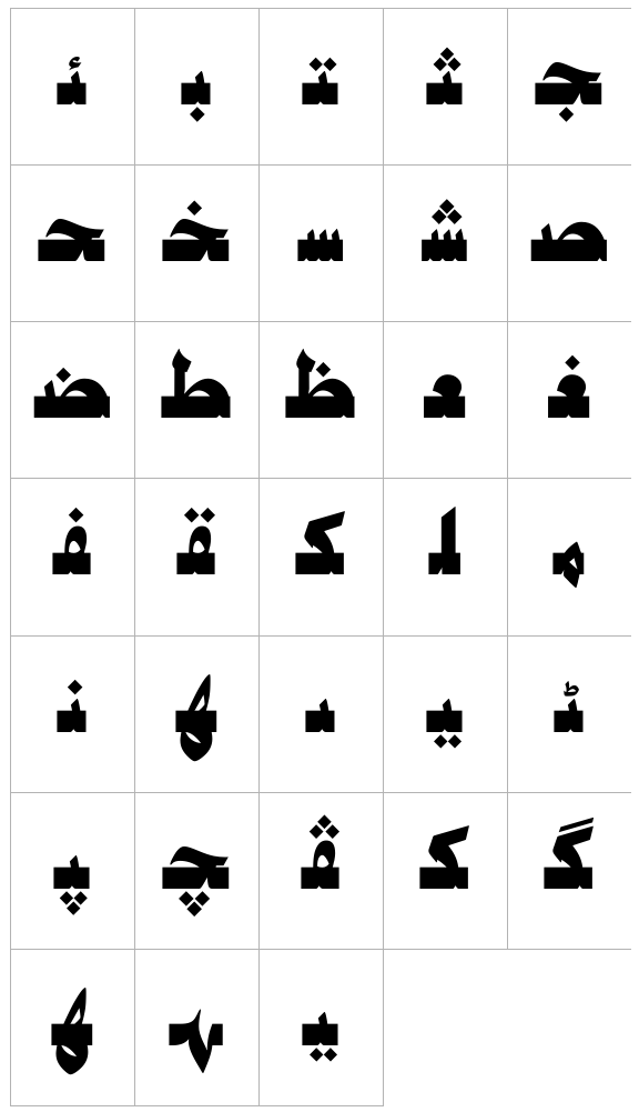
29 Letters
|
At ATypI 2008 in St. Petersburg, he ran a workshop on the Arabic Kufi script. Speaker at ATypI 2010 in Dublin on the topic of political resistance and expression through graffiti in Lebanon and Palestine. His contributions to type design:
|
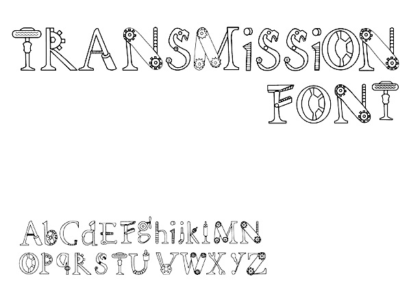
Saida, Lebanon-based designer of Transmission Font (2013). [Google] [More] ⦿ | |
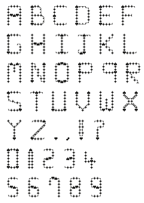
Lebanese designer who created Beantown (2004, an athletic lettering font), Staubach (2004, an athletic lettering typeface based on the lettering of the Dallas Cowboys), Wagner Modern (2011), Kroftsmann (2004, on octagonal face), Kavelry (2004, based on the Kemper Insurance logo), 4th and inches (2008, rounded octagonal; based on the proprietary font used by Russell Athletic, makers of sports apparel as used by Georgia Tech BKB, Washington State, Alabama State, Tennessee State, Mississippi Valley State, and many others in college football), and PopWarner (2004, a Bank Gothic lookalike), Wagner Zip Change (grotesque), Richardson Fancy Block. Creator of some free soccer team lettering alphabets in 2010: Louisville, Puff Script, Red Raiders, Richardson Fancy Block, Wagner Zip-Change (based on grotesque signage letters), ACMilan2009, ASRoma, ChampionsLeague, England2007, MLSUniform, RealMadrid2009. About his GeauxXPDF typeface (2010), he writes: I had extracted a nearly complete set on this one a few years back, except for J and Z which I created on my own. As best I can tell, it only exists as an upper case font without most punctuation, so I created that too to make it more useable. I don't know how much LSU [Louisiana State University] paid for this design, but to me it always looked like something that Larabie or Iconian would have given away. He also extracted HDRadioAlphabet from a rounded Arial typeface he found on HD radio. His UScoreRGK (2012) is a blocky angular font used on-screen by Fox Sports. LCD Display (2012) is a 28-segment LED font. UA Terrafont (2012) was based upon the vector art in this PDF file. In 2013, he published the athletic lettering family High School USA and the octagonal typeface UA Cadet. See also here. Dafont link. Fontspace link. Another URL. [Google] [More] ⦿ | |
Lebanese calligrapher. Designer of Hisham (Linotype, 1993), a strong sans typeface for Latin and Arabic. Klingspor link. Linotype link. [Google] [MyFonts] [More] ⦿ | |
Tyre, Lebanon-based designer of Puzzle Font (2015). [Google] [More] ⦿ | |
During her studies in Beirut, Amira Ajam created a Latin display typeface. [Google] [More] ⦿ | |
Arabic type site. Displayed font families include AT (by Tarek Atrissi), Al-Futtaim (by Mamoun Sakkal), and work by Nadine Chahine. Corporate calligraphy by Samir Sayegh. He holds a MFA in design from the School of Visual Arts in New York, a MA in interactive multimedia from the Utrecht School of the Arts in the Netherlands, and a BA in graphic design in his homeland, Lebanon. [Google] [More] ⦿ | |
AramediA Group (Boston and Beirut)
| George Hallak's outfit specializing in Arabic Fonts for Microsoft Arabic Windows 95 and Sakhr Windows. Glyph's Arabic Fonts (16) for Arabic Win 95, 3 in 1 package 59.00. Sakkal's Arabic&Islamic Calligraphic Designs (PC or Mac) $49.95. Sakhr's Modern Arabic True Type Font is $30.00. Sakhr's Al-Jawaher Fonts Scalable (Khuttout Tajmiliah) is $50.00. ASC's True Type Font Pack one for Ar. Win 3.x is $30.00. Programmers/Localizers/Consultants Arabization&Software Center, Arabic Educational Multimedia. Jawaher Al Horof 4.0 (Editor): Arabic Editor for Design Applications. Arabic Fonts. Arabic Keyboard Tutor. "The Jawaher Fonts Program provides more than fifty different font styles with all available effects, such as bold, italics, shading and molding. The Jawaher Fonts can be operated under the programs Ustaz 3.1 and Desktop Publishing 3.0 with no special operating requirements in working under Microsoft Arabic Windows and Sakhr Windows. 68USD. Other font families: Sakhr, Kofi, Naskh, Reqaa, Akhbar, Persian. Al Rassam Al Arabi is the same as Kalimat but for Windows. Al Rassam AlArabi lets you add Arabic text into non Arabic photo retouching and illustration programs such as Adobe Photoshop, Illustrater, Freehand. Corel. Al Rassam Al Arabi comes bundled with 20 Arabic fonts. [Google] [More] ⦿ |
Beirut-based designer of an untitled Latin / Arabic brush typeface in 2013. [Google] [More] ⦿ | |
In 2017, Arlette Boutros designed Boutros Futura, or Futura Arabic, at URW to work harmoniously with the URW-Latin whilst respecting Arabic calligraphic and cultural rules. URW's Futura Arabic contains, of course, as a subset, the regular Latin Futura. Still in 2017, Boutros Fonts added URW Geometric Arabic to Joern Oelsner's URW Geometric. In 2019, Volker Schnebel (URW) and Arlette Boutros joined forces and published URW DIN Arabic. She also published the ten-style Latin/Arabic humanist sans typeface Boutros Angham in 2019. Klingspor link. [Google] [MyFonts] [More] ⦿ | |
During her studies in Beirut in 2014, Aya Al-Kotob created experimental Latin and Arabic typefaces. [Google] [More] ⦿ | |
Beirut, Lebanon-based designer of the inky Latin typeface Liquido (2014). [Google] [More] ⦿ | |
During her studies in Beirut, Aya Youssef created an experimental Arabic typeface (2015). [Google] [More] ⦿ | |
The Latin / Arabic version of Dalton Maag's Effra was co-designed by Azza Alameddine and Alex Blattmann. It won an award at Granshan 2016. In 2017, she finished Adelle Sans Arabic at Type Together. In 2019, Type Together released Catalpa (Veronkia Burian, Jose Scaglione, Azza Alameddine) and wrote: Primed for headlines, Catalpa is designed to give words bulk and width and gravity itself. The Catalpa font family is José Scaglione and Veronika Burian's wood type inspired design for an overwhelming headline presence. Catalpa was followed in 2021 by Belarius, a three-axis variable family that shifts from sans to slab serif, from condensed to expanded widths, and includes every possibility in between. Published by Type Together in 2021, it was developed under the guidance of Veronika Burian and José Scaglione, with type design by Azza Alameddine and Pooja Saxena, and additional kerning and engineering help from Radek Sidun, Joancarles Casasin and Irene Vlachou. At the end of 2021, she finished Bree Arabic as part of Type Together enormous Bree multiscript typeface family. [Google] [More] ⦿ | |
Lebanese graduate of the MATD program at the University of Reading in 2012. Azza's graduation typeface is Sila (2012, for Latin and Arabic). [Google] [More] ⦿ | |
Aka Impact BBDO (Lebanon). Designer of the free font Gaza (2015). [Google] [More] ⦿ | |
Betterfear.us (or: XXII Fonts, Or Doubletwo Studios)
|
Typefaces: XXII Sinoz DSP (2010-2011, elliptical face), XXII Gory Bastard (2011), XXII BLACKMETAL WARRIOR (2010), XXII Menga (2010, a technical sans family), XXIIARMY (2007, stencil), XXIIDECONSTRUCTION-DESTRUCTION-AREA (2007, grunge), XXIIDONT-MESS-WITH-VIKINGS-HARDCORE (2007, octagonal), XXIISTRAIGHT-ARMY, Army Dirty (grunge stencil), XXIIUltimate-Black-Metal (2007, cracked metal look), XXII Scratch (2007, scratchy face), XXII DEVILS-RIGHT-HAND (hand-printed), XXII BLACK-BLOCK (grunge), XXII MISANTHROPIA (2008, a rigid geometric sans family), XXII Arabian Onenightstand (2008: Arabic or Indic simulation face), XXII Urban Cutouts (2009, grunge), and XXII Static (2007, futuristic). His web site has a threatening nazi sort of look, but the fonts are (were) free. Betterfear.us claims to be located in St. Pauli, Hamburg, and is also known on MyFonts, where some of its fonts can be bought, as Doubletwo Studios. These include XXII Yonia (rounded script family loaded with opentype features), XXII Goregrinder, XXII Grober Bleistift (2013, marker font), XXII Centar (a sans family with a free regular style), XXII Totenkult (2012), XXII Blackened Wood (2013), XXII Candylove (heavy signage or packaging script), XXII Centars Sans (2012), XXII Daemon Runes (2012), XXII Total Death (2012), XXII HandTypewriter (2012), XXII Daemon (2012), XXII Marker (2011), XXII BLACK BLOCK SERIFA (2008), XXII Mescaline (2009 Western style), XXII Misanthropia (2010, geometric sans), XXII Marker (2011), XXII Blasphema (2011) and XXII STREITKRAFT (2008, a stencil family with grungy versions added). Older list of fonts: Devils Right Hand (blackboard script), Black Block (grunge), Static (techno), Ultimate Blackmetal, Scratch, Don't Mess With Vikings, Army Dirty (grunge stencil), Army Straight, Black Block Eroded. Typefaces from 2014: XXII YeahScript (signage script). Typefaces from 2015: XXII Geom (a geometric sans typeface family), XXII Awesome Script (for signage). Typefaces from 2016: XXII Neue Norm (techno sans), XXII Cool Script, XXII Geom (a geometric sans typeface family), XXII Grober Pinsel (brush typeface). Typefaces from 2017: XXII Neue Norm Rounded, XXII InAshes (grungy blackletter). Typefaces from 2018: XXII Geom Slab. Klingspor link. Alternate URL. Behance link. Dafont link. Another Behance link. Old URL. Another Dafont link Yet another Behance link. And a final Behance link. [Google] [MyFonts] [More] ⦿ |
BluGraphic (or: Graphic Pear)
|
Typefaces from 2019: Lemon&Fresh, Germany (script), Cremona (a free fashion sans), Designer (sans). Behance link. BluGraphic link. [Google] [More] ⦿ |
Boutros International (or: Boutros Arabic Typefaces)
|
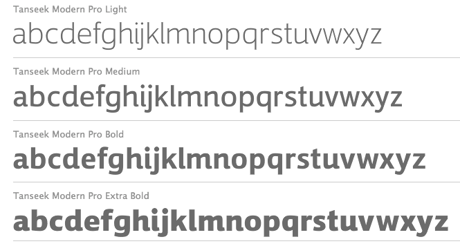
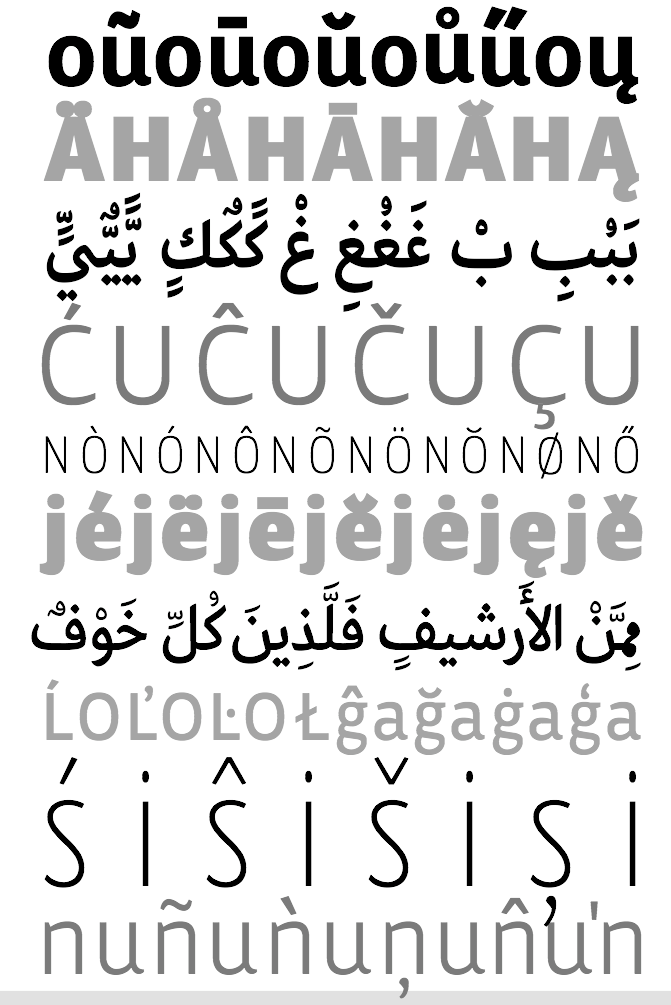
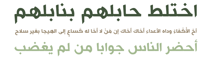
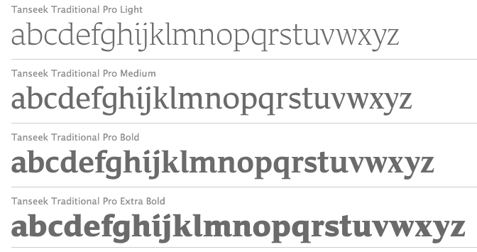
Their fonts include Boutros Decorative Kufic, Boutros Display, Boutros Koufic, Boutros MB Naskh, Boutros Modern, Boutros New Koufic Modern, Boutros Simplified Naskh, Boutros Asifa, Boutros Farah, Boutros Farasha, Boutros Fares, Boutros Najm, Boutros Thuluth (2012, based on Arabic bamboo calligraphy), Boutros Advertisers Naskh, Boutros Advertising, Boutros BBC Arabic, Boutros GE Tasmeem, Boutros Latin (Serif, Sans Serif), Boutros Maghribi, Boutros Minaret. See also here. Mourad Boutros is an experienced Arabic creative director, calligrapher and typographer. From his bio: Since 1978, he has been Arabic typographical consultant to many international companies including Letraset. Mourad has designed more than 50 Arabic typefaces, some of which are available on IBM printers as core fonts. Typeface commissions have included corporate typefaces for Mercedes-Benz and for Al Anba, the leading Kuwaiti Arabic newspaper. The early ITC collection in the 1980s had six Arabic typefaces: ITC Latif, ITC Boutros Calligraphy, ITC Boutros Setting, ITC Boutros Kufic, ITC Boutros Modern Kufic, ITC Boutros Rokaa. At Ascender, Mourad published Boutros Maghribi (2009, co-designed with Rana Abou Rjeily), based on the Arabic calligraphy bamboo classical Maghribi style. In 2008, Boutros co-designed Tanseek Modern and Tanseek Traditional with Richard Dawson and Dave Farey. Here you can download these 2004 fonts by Boutros: GEBox-Bold, GECapMedium-Medium, GEContrastBold-Bold, GECurvesMedium-Medium, GEDinarOne-LightItalic, GEDinarOne-Medium, GEDinarOne-MediumItalic, GEDinarTwo-Light, GEDinarTwo-LightItalic, GEDinarTwo-Medium, GEDinarTwo-MediumItalic, GEEast-ExtraBold, GEEast-ExtraboldItalic, GEElegant-Italic, GEElegantMedium-Medium, GEFlow-Bold, GEFlow-BoldItalic, GEFlow-Italic, GEFlow, GEHili-Book, GEHili-Light, GEJarida-HeavyItalic, GEJaridaHeavy-Heavy, GEMBFarahBold-Bold, GEMBFarashaLight-Light, GEMBFaresMedium-Medium, GEMBMBBold-CondensedBold, GEMBNajmBold-Bold, GEModernBold-Bold, GEModernLight-Light, GEModernMedium-Medium, GENarrowLight-Light, GESSTVBold-Bold, GESSTextBold-Bold, GESSTextItalic-LightItalic, GESSTextLight-Light, GESSTextMedium-Medium, GESSTextUltraLight-UltraLight, GESSThree-Italic, GESSThree-Light, GESSTwoBold-Bold, GESSTwoLight-Light, GESSTwoMedium-Medium, GESSUniqueBold-Bold, GESSUniqueLight-Light, GESmooth-LightItalic, GESmoothLight-Light, GETasmeem-Medium, GEThameen-Book, GEThameen-BookItalic, GEThameen-DemiBold, GEThameen-DemiBoldItalic, GEThameen-Light, GEThameen-LightItalic, GETye, GEUnique-ExpandedBold, GEWideExtraBold-ExtraBold. Here one can find Boutros-Ads-Pro-Bold, Boutros-Ads-Pro-Bold-Condensed, Boutros-Ads-Pro-Light, Boutros-Ads-Pro-Medium, and Boutros-Ads-Pro-Medium-Italic. In 2017, Mourad Boutros and Soulaf Khalifeh published the free low contrast Tajawal sans typeface family for Latin and Arabic. Google Fonts link. Github link. In 2018, Boutros Fonts published URW Geometric Arabic. FontShiop link. [Google] [MyFonts] [More] ⦿ |
Art director in Beirut, Lebanon, who created the Arabic typefaces Amoud (2015) and Dal (2015, calligraphic style). [Google] [More] ⦿ | |
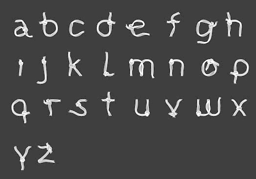
Beirut-based graphic and web designer who created Lashing Knots (2013), a Latin rope font. [Google] [More] ⦿ | |
During her design studies in Beirut, Carine Teyrouz created the architctural typeface Lashing Knots (2010, Friday Fonts. [Google] [More] ⦿ | |
| |
Beirut, Lebanon-based designer of the typographic poster Free Your Mind (2016). [Google] [More] ⦿ | |
| |
Beirut-based designer of an Arabic typeface in 2016. [Google] [More] ⦿ | |
During her studies in Beirut, Lebanon, Christina Karam designed the sharp-edged sans typeface AbsoluteC (2017). [Google] [More] ⦿ | |
Beirut-based designer, with Sarah Nehme, of Kirseh (2014), an Arabic font that was inspired by arabesque geometric patterns. [Google] [More] ⦿ | |
Beirut, Lebanon-based designer of the modern kufic Arabic typeface Dabbous (2016), which was inspired by Gotham. Behance link. [Google] [More] ⦿ | |
Beirut, Lebanon-based designer of the experimental Arabic typeface Totem (2017). [Google] [More] ⦿ | |
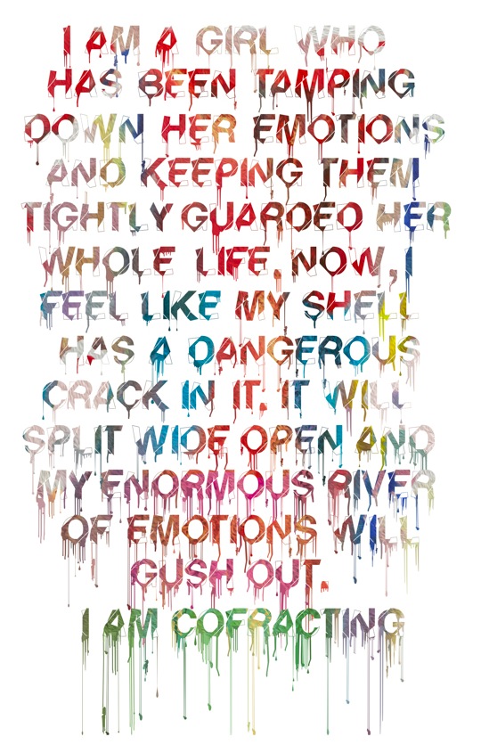
Byblos, Lebanon-based designer of the running paint typeface Cofract (2012, Latin and Arabic). Behance link. [Google] [More] ⦿ | |
Beirut, Lebanon-based designer of the Arabic display typeface Pipeline (2017). [Google] [More] ⦿ | |
David Fleming Nalle
| |
A graphic designer in Beirut, who created the bilined display typeface Highway (2014) for Latin and Arabic. [Google] [More] ⦿ | |
Graphic designer in Beirut, who created the poatao print font Batata in 2014. [Google] [More] ⦿ | |
Diana Hamdallah (Beirut, Lebanon) created the Arabic typeface Achelois in 2014 during her graphic design studies. Achelois is an Arabic Naskh font inspired by the work of fashion designer Krikor Jabotian. It is a group project with Mowana Sabeh. [Google] [More] ⦿ | |
During her studies, Douna Daou (Joünié, Lebanon) created the Arabic typeface Habibi (2015). [Google] [More] ⦿ | |
Beirut, Lebanon-based designer of the Arabic typeface Damascus (2016). [Google] [More] ⦿ | |
Beirut, Lebanon-based designer of the Latin typeface Phoenic (2018), which was inspired by the Phoenician alphabet. He also designed the Arabic typeface Satis (2018). [Google] [More] ⦿ | |
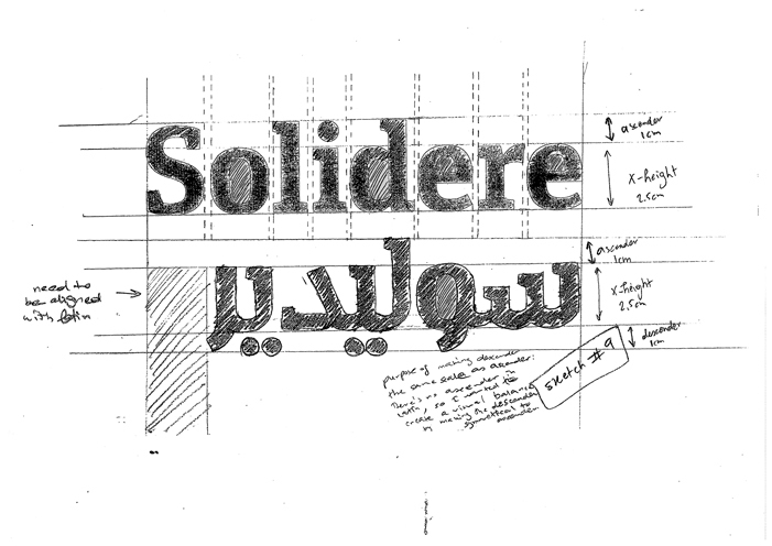
Born in Dubai, Elie has worked and studied in UAE, Lebanon and Germany. He holds a BFA in Graphic Design from the American University of Beirut. He has also done his summer internship at Linotype, where he worked under Nadine Chahine, an award-winning Lebanese type designer. He is located in Beirut, Lebanon. Creator of an Arabic graduation typeface influenced by the destruction of Beirut. For Polypod, he created an Arabic typeface to match the Latin version for Solidere (a Lebanese company involved in the reconstruction of Beirut's Central District). The Latin version is based on Slab Unit designed earlier by Bill Hill Design. | |
Beirut, Lebanon-based designer of an Arabic typeface simply called Arabic Shape (2016). [Google] [More] ⦿ | |
| |
During her studies in Beirut, Lebanon, Fatima Nasser created the beautifully textured Ornamental Garamond (2015). [Google] [More] ⦿ | |
Fridayfonts
|
In 2010, new fonts were added. Here is a partial list:
In 2013, Glissmann moved to Parsons in New York City, where he continued the tradition of posting the student work. However, there are no more downloads, and links are not clickable. [Google] [More] ⦿ |
George Hallak
| |
Beirut, Lebanon-based designer of the pixelish ArchiArabic typeface (2014). [Google] [More] ⦿ | |
Graphic designer in Beirut, Lebanon. Designer of the great display typeface Konstruct (2017), which conjures up jewelry applications. This typeface, however, is based on patterns in Dr. Woo's tattoos. [Google] [More] ⦿ | |
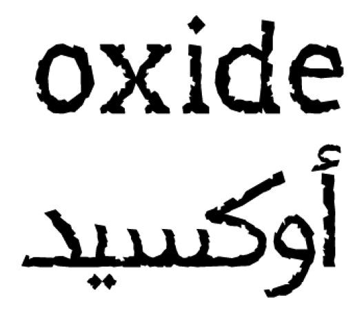
Beirut-based designer of the grungy Latin / Arabic typeface Oxide (2013). [Google] [More] ⦿ | |
Lebanese designer of the spermatoid font Dabbous (2021) for Latin and Arabic. [Google] [More] ⦿ | |
Graham Bradley
| |
Beirut, Lebanon-based designer of the tuxedoed typeface Tec (2018). [Google] [More] ⦿ | |
Beirut, Lebanon-based designer of the Arabic typeface Afreet (2016). From Hares's studies at ATDB in 2016-2017, we retain the Arabic typeface Mahrous (meaning "guarded"), which was inspired by decoration and Ruq'ah-like script seen on trucks in Lebanon. [Google] [More] ⦿ | |
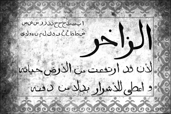
Graphic designer in Dbayeh, Lebanon. In 2012, he created an Arabic typeface called Al Zakher: A typeface designed based on the typeset used in the 16th century in the first Arabic printing press in the Orient which is located at St. John monastery at Khenchara, Lebanon. The printing press was invented by Al Shammas Abdallah Al Zakher, thus the name. Behance link. [Google] [More] ⦿ | |
During his studies in Beirut, Lebanon, Hovig Afarian created a modular Arabic typeface (2015). [Google] [More] ⦿ | |
Hrant H. Papazian
| |
During his studies in Beirut, Ibrahim Abdallah designed the Latin / Arabic typeface Wavy (2017). [Google] [More] ⦿ | |
Tyre, Lebanon-based designer of the Arabic typeface Al Contour (2017). [Google] [More] ⦿ | |
Graphic designer from Beirut with a BFA [Bachelor of Fine Arts] in graphic design from the American University of Beirut (AUB), Department of Architecture and Design. He made an Arabic typeface in 2012 called Kbareh, which was created together with his colleague Tina Balaa. [Google] [More] ⦿ | |
During her studies at the American University of Beirut, Jamal Saleh co-designed the fat outlined Arabic typeface Tabboush (2014, with Ruba Mashtoub), which is inspired by children's books illustrations. [Google] [More] ⦿ | |
Beirut, Lebanon-based designer of an Arabic student project typeface in 2017. [Google] [More] ⦿ | |
Beirut, Lebanon-based illustrator and letterer. Graduate of the American University of Beirut who started additional studies at The Academy of Art University, San Francisco, ca. 2016. Designer of the brushy Cola Pen Type typeface (2016). [Google] [More] ⦿ | |
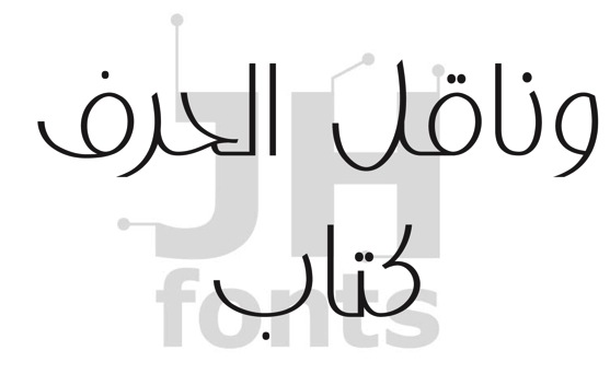
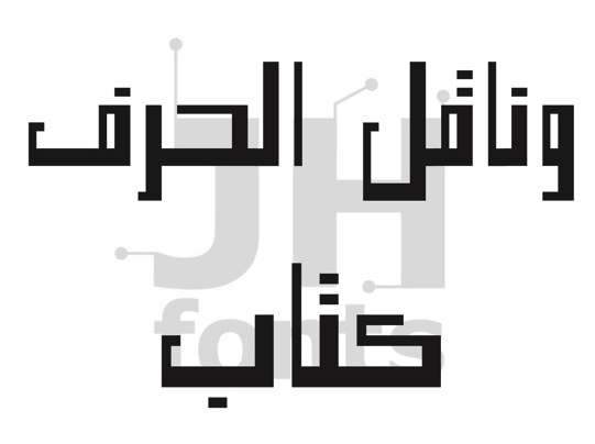
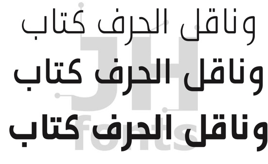
JH Fonts
|
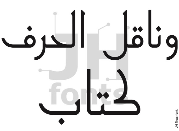
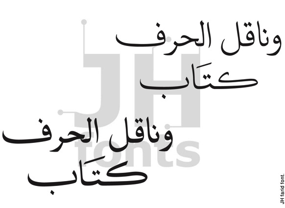
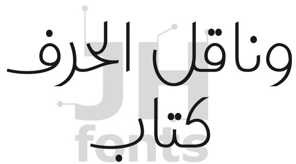
Typefaces from 2016: JH Naskh Expanded (extended by JH Naskh Expanded light in 2021). Typefaces from 2017: JH Rawan (a geometric font), JH Lina Magazine, JH Hadi. Typefaces from 2018: JH Lina, JH Roy, JH Farid, JH Fadi, JH Rawan, JH Hala, JH Mars, JH Lea (connected monoline script), JH Nazih, JH Yara. Typefaces from 2020: JH Fatina (a superb Arabic typeface family with covering the Sounboli, Naissabouri, Diwani and Thuluth calligraphic scripts), JH Zoya Cyrillic (a monoline school script for Latin and Cyrillic). Typefaces from 2021: JH Haroun (a calligraphic Thuluth script), JH Noha (a geometric Arabic typeface family). Behance link. Facebook link. [Google] [MyFonts] [More] ⦿ |
Joe Mahfouz Hatem
| |
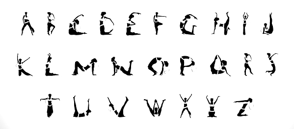
Graphic design student from Beirut, Lebanon. He created the bellydancer silhouette alphabet Alphabet vs Venus (2011). [Google] [More] ⦿ | |
Lebanese student who was at McGill University in Montreal. Developer of a free Mac font, Mesha, based on the Phoenician script from the Mesha stela. She also has some interesting exercises on Arabic typography from the American University in Beirut (AUB). [Google] [More] ⦿ | |
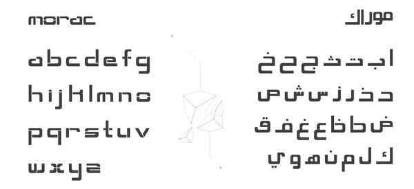
Graphic designer and illustrator in Beirut. Creator of the sci-fi typeface Morac (2011). [Google] [More] ⦿ | |
Beirut, Lebanon-based designer of the constructivist typeface Lakov (2019). [Google] [More] ⦿ | |
Beirut, Lebanon-based designer of the stencil typeface Broken (2016, FontStruct). [Google] [More] ⦿ | |
Beirut, Lebanon-based designer of the Arabic typeface Midan (2005), which won an award at TDC2 2007. Linotype: Midan is a modern Arabic typeface based on simplified Naskh with a slightly modulated stroke treatment. It is suited for text settings, especially in brochures and magazines.. Free download at OFL. In 2015, he designed the Arabic typeface Mohtaraf at Al Mohtaraf Foundry, which won an award in the TDC 2015 Type Design competition. [Google] [More] ⦿ | |
Lebanon-based designer of the German expressionist typeface Kunsta (2017). [Google] [More] ⦿ | |
Lebanese designer of the Latin display typeface Bicycle (2015). [Google] [More] ⦿ | |
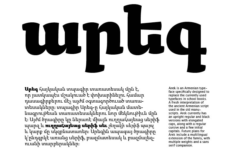
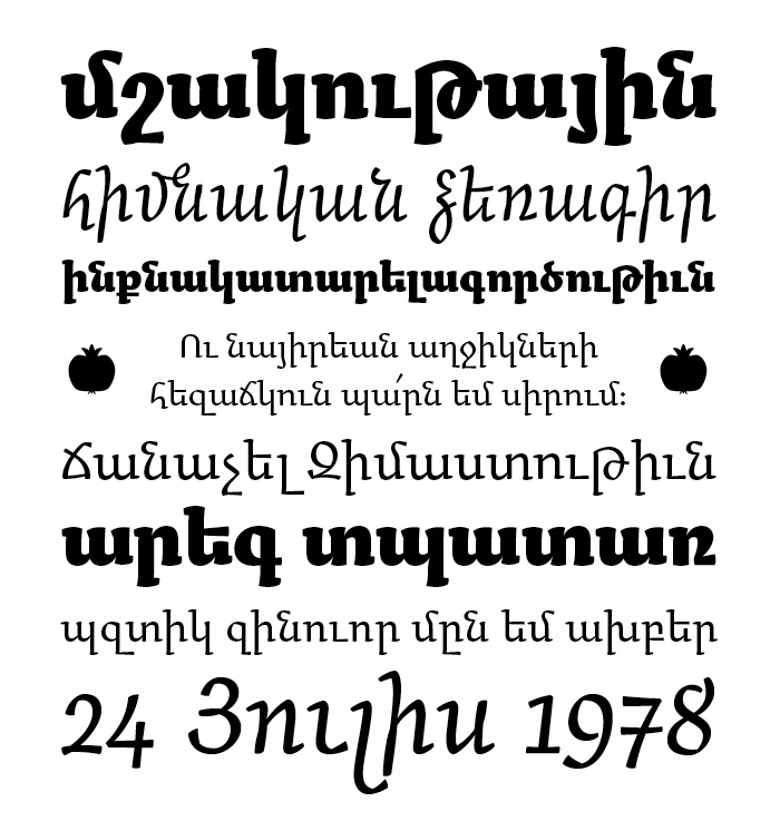
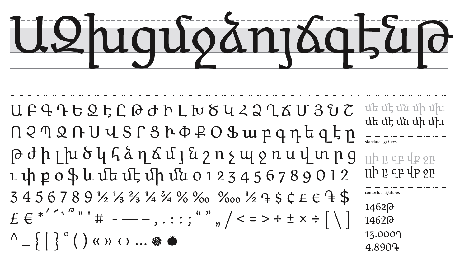
After graduation, he started freelancing as a graphic and type designer in Amsterdam. Partner at The Place. Other typefaces include The Chattam (2009, a Clarendon revival), Boujour (2008, an ultra fat deco face), Moudwi (2007, an experimental Arabic detached typeface inspired by the Unified typeface created by Nasri Khattar). His typefaces: Arek, Hagatir, Boujour (2008, piano key typeface), Mulsaq (2008, Arabic), Moudwi, Nuqat (2010: a dot matrix typeface by René Knip, Khajag Apelian, Jeroen van Erp, and Reza Abedini). Graphic Arabic (Wael Morcos and Khajag Apelian) won an award at Granshan 2017. IBM Plex Sans Arabic (2019, by Mike Abbink, Paul van der Laan, Pieter van Rosmalen, Wael Morcos and Khajak Apelian) is a free typeface family at Google Fonts. Typecache link. Behance link. [Google] [More] ⦿ | |
Kristyan Sarkis
| |
Tyre, Lebanon-based designer of the Arabic typeface Yam (2017). [Google] [More] ⦿ | |
Bchamoun, Lebanon-based designer of the wine bottle opener-inspired Arabic typeface Al Moftah (2016). [Google] [More] ⦿ | |
Lara Assouad Khoury was born in Montreal, and graduated from the American University of Beirut with a Bachelor in Graphic Design degree (BGD) in 1998. She worked as a designer at LeoBurnett (Lebanon, 1998-2000). After one year in Cairo, she moved to Dubai (UAE) and worked as a Senior Designer for Landor Associates (2001-2005) where she was involved in the design of extensive corporate identity projects for large Middle Eastern companies and institutions, such as the visual branding for the country of Jordan. She has graduated with an MA from the Atelier National de Recherche Typographique in Nancy (France), where she studied under renowned type designers such Hans-Jürg Hunziker, André Baldinger, and others. She has researched and is in the process of developing her own extensive Arabic Naskh font. She taught graphic design and Arabic typography courses, at the American University in Dubai. She is an independent type and graphic designer since 2005. She embarked on a project in 2005 with Fred Smeijers to make an Arabic sister, Fresco Arabic, for Smeijers' Fresco family. For this, she takes inspiration from calligraphic samples of the Maghrebi script. Fresco Arabic won an award at TDC2 2008. Her geometric experimental Arabic typeface Tabati (2010) won an award at TDC2 2011. [Google] [More] ⦿ | |
Graphic designer from Lebanon who is/was based in Amsterdam. She taught design and typography at the American University of Beirut until she moved to The Netherlands where she became an apprentice in DecoType's ACE technology for Arabic type. She says that she refused to design any typeface before having sufficient knowledge over the history and mechanics of the script. In 2018, she is working on an ACE-engined Arabic type family, with support from the Creative Industries Fund NL. Creator of the angular chancery typeface Cancellarecta (2012) at The Cooper Union. She graduated from Escola de Disseny i Art in Barcelona. Speaker at ATypI 2018 in Antwerp. Award winner at 25 TDC in 2022 for Youtube Sans Arabic, a member of an increasingly larger multi-script family. The typeface spans across ten weights and includes Sans, Rounded, and a Grades version. It was developed together with Khaled Hosny (font engineer), David Berlow (consultant), Dave Crossland (manager) and Chris Bettig (creative director). [Google] [More] ⦿ | |
Beirut-based designer of the Arabic school project font Al Shaeb (2014). [Google] [More] ⦿ | |
Graduate of Lebanese American University in Beirut, Lebanon. Graphic designer in Beirut who created the Bellow Straw typeface for Latin and Arabic in 2014. [Google] [More] ⦿ | |
Graphic designer in Beirut, Lebanon. In 2015, she designed the iron-inspired Arabic typeface Mikwat (2015). [Google] [More] ⦿ | |
From Beirut, Lebanon: sellers of ArabicXT, Kalimat, and Zakhrafat. They also sell a CD-ROM (v1.1) with 150 Arabic fonts. [Google] [More] ⦿ | |
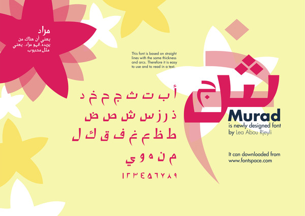
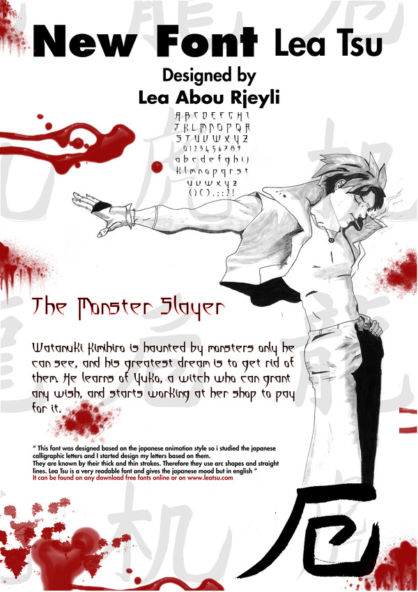
Balloune, Lebanon-based designer of the Arabic typeface Murad (2012) and the gothic Latin typeface Lea Tsu (2012). [Google] [More] ⦿ | |
Beirut, Lebanon-based designer of the inline Arabic typeface Al Afaa (2015). [Google] [More] ⦿ | |
Lecter Johnson
| |
Beirut, Lebanon-based designer of Okad (2016), an Arabic emulation typeface. [Google] [More] ⦿ | |
Beirut, Lebanon-based designer of Inkan (2017), a typeface that celebrates the Inca culture. [Google] [More] ⦿ | |
Designer and illustrator in Beirut. Creator of a script font in 2013. [Google] [More] ⦿ | |
| |
Graphic designer in Beirut who created the curly typeface Bubbly People (2013). [Google] [More] ⦿ | |
Beirut, Lebanon-based designer of the futuristic display typeface Engravers Arabic (2017). [Google] [More] ⦿ | |
Graphic designer and illustrator in Beirut. Designer of Al Nab (2012), a corporate Arabic typeface. In 2013, she created the beveled typeface Crane. [Google] [More] ⦿ | |
Tyre, Lebanon-based designer of the Arabic typeface Nota (2017). [Google] [More] ⦿ | |
During her graphic design studies in Beirut, Lebanon, Mireille Khoury created Berlin (2014, FontShop: a slab serif taypeface). [Google] [More] ⦿ | |
Beirut-based designer of the plump pop-art / bubblegum font MyFont (2014, Latin & Cyrillic). [Google] [More] ⦿ | |
Graphic designer and illustrator in Beirut, Lebanon. In 2015, he created an Arabic typeface that was inspired by a leaf. [Google] [More] ⦿ | |
Mourad Boutros
| |
Myriam El Hachem (Zouq Mkayel, Lebanon) is an experimental visual communicator. She received her Bachelor in Arts in Graphic Design from Notre Dame University in June 2017. In 2017, she created EhN1, a typeface in which ball terminals and other characteristics of Bodoni were replaced with other elements to enhance readability. [Google] [More] ⦿ | |
Beirut, Lebanon-based designer of the Latin / Arabic poster typeface Yum (2018). [Google] [More] ⦿ | |
Achrafieh, Lebanon-based designer of the Latin / Arabic outlined 3d typeface Cube (2016). [Google] [More] ⦿ | |
Beirut, Lebanon-based designer of the monoline Arabic typeface Beirut (2017). [Google] [More] ⦿ | |
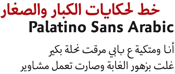
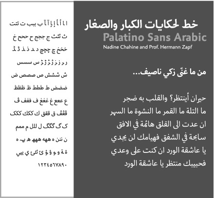
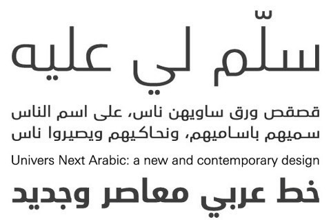
In 2004, she started a coop project with Gerard Unger to develop Big Vesta Arabic, a companion of Unger's Big Vesta. At ATypI 2008 in St. Petersburg, she ran the Linotype type design student workshop. She designed Frutiger Arabic with Adrian Frutiger and Palatino Arabic (2007) with Hermann Zapf, for which she won the Certificate of Excellence in Type Design from the TDC in 2008. For Palatino Sans Arabic, she won at TDC2 2011. In 2009, she published Neue Helvetica Arabic at Linotype. In 2011, she published Univers Next Arabic (with Adrian Frutiger, Linotype). During a week-end of 2014, she speed-designed the Arabic typeface Hamra Str. She is working on Zapfino Arabic. In 2015, she finished ITC Handel Gothic Arabic, a modern monolinear Kufi design. In 2016, with a relaese date in April 2017, Nadine Chahine and the Monotype team designed the free Latin / Arabic typeface Dubai Font for the city of Dubai. In 2017, she published Amariya (Monotype), intended for long form, on-screen textual content. It supports the Arabic, Persian and Urdu languages, and its Latin companion is Matthew Carter's ITC Charter. Neue Frutiger Arabic (2018) was created by Nadine Chahine and a team of designers and font engineers from the Monotype Studio, under the direction of Monotype type director Akira Kobayashi. Avenir Arabic (2019), extending Adrian Frutiger's Avenir. Nadine Chahine and Toshi Omagari collaborated with Akira Kobayashi and Monotype Studio on Avenir Next Arabic (2021). Designer of Kafa Black. Bio. Interview. Behance link. Speaker at ATypI 2010 in Dublin, where her talk tackled psycholinguistics and type design. Speaker at ATypI 2011 in Reykjavik and at ATypI 2013 in Amsterdam. She gave the keynote at Typecon 2016. Klingspor link. [Google] [MyFonts] [More] ⦿ | |
Nadine Kobayter
| |
Beirut-based designer of an unnamed heavy squarish Arabic typeface (2013). Behance link. [Google] [More] ⦿ | |
Beirut-based designer of the experimental typeface Gamble (2013). [Google] [More] ⦿ | |
In 2016, he designed the modern condensed Latin/Arabic typeface 29LT Adir (with Adrien Midzic; at 29 Letters). Behance link. [Google] [More] ⦿ | |
Beirut, Lebanon-based designer of the minimalist Latin typeface EBB (2015). [Google] [More] ⦿ | |
During his studies at Notre Dame University Louaize, Beirut, Lebanon-based Nareg Meguerditchain designed the Futura-inspired Arabic typeface Sa7bi (2016) and the Latin typeface Grandixer (2016). [Google] [More] ⦿ | |
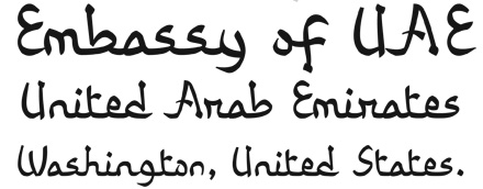
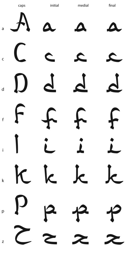
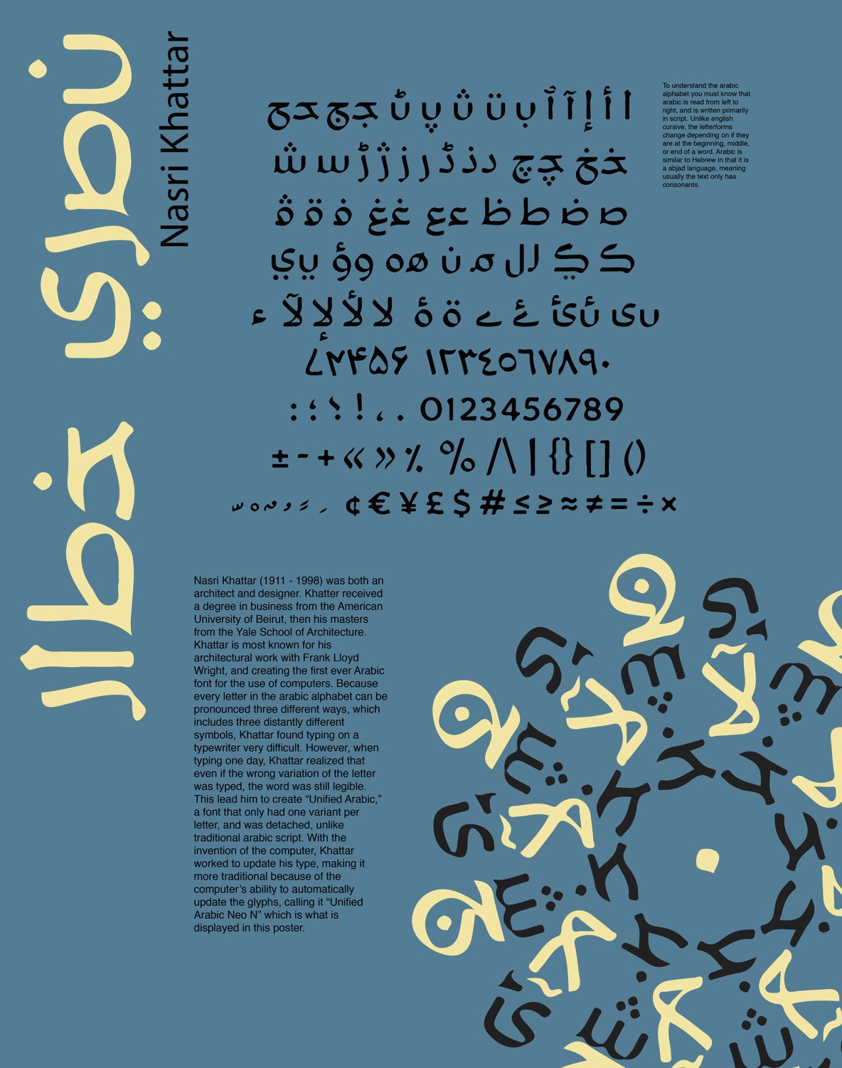
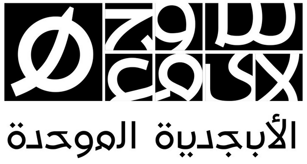
I am quoting verbatim the biography submitted to Arabic Type by his daughter: Architect, Type Designer, Inventor, Painter, Sculptor, Poet, 1911-1998. Nasri Khattar, architect, practiced his profession for thirty-five years in the United States; in Colombia, South America; and in his country of origin, Lebanon, where he pursued his early education at the American University of Beirut (AUB) with a B.B.A. awarded in 1930. In 1940, he earned an M.A. in Architecture from Yale University, in New Haven, Connecticut. In 1939, he was associated with Frank Lloyd Wright's Fellowship in Taliesin, Spring Green, Wisconsin; and in Taliesin West, in Scottsdale, Arizona.A dual American-Lebanese national, Mr. Khattar was an Arabic consultant to IBM in the fifties, and architect, Arabic calligrapher, and Arabist to Arab-American Oil Company (Aramco) in New York City, 1950-1957. During this time, he made innumerable calligraphic works for both Aramco and the Arabs. He received a Ford Foundation grant for the years 1958-1961, to promote his Unified Arabic, UA system. Unified Arabic is Mr. Khattar's Arabic type system that simplifies the printing and teaching of Arabic, Urdu, Farsi, and other languages utilizing the Arabic alphabet. As he continued to work on his Unified Arabic, Mr. Khattar designed new Arabic typefaces, practiced architecture, and lectured at the American University of Beirut. His topics were Frank Lloyd Wright's architectural achievements and principles of design, and his own work on the writing and design of Arabic type. Impressed by Mr. Khattar's versatility, Martin Giesen of AUB's Architectural Department, called him "the Renaissance Man", for being architect, calligrapher and type designer, painter and caricaturist, poet, and inventor (30-40 patents and copyrights). "It's been a long time since I've seen such perfection," wrote Mr. Giesen in 1977. In 1986, Reverend Dennis Hilgendorg and Dr. Ben Wood, Director of Educational Research at Columbia University, nominated Mr. Khattar for the Nobel Peace Prize for his life's visionary achievements and their vast implications for the fields of linguistics, literacy, printing, computers, and telecommunications. Mr. Khattar is survived by his spouse, Jacqueline Hedrick Khattar, and by his twin daughters, Alexandra Khattar and Camille Khattar Hedrick. His son, Christopher Khattar, passed away in 1992 after a long illness. As for digital revivals, we can cite Pascal Zoghbi's 29LT UA Neo B (or UA Beirut Modern) and UA Neo N (or UA Neo Nashki) (2007-2013). It can be purchased at 29 LT. [Google] [More] ⦿ | |
Beirut, Lebanon-based designer of the modular typeface Mesospace (2015) which was custom made for the Lebanese Rocket Society. He also created Arabic Bauhaus (2015). [Google] [More] ⦿ | |
El Fourzol, Lebanon-based designer of the Arabic typeface Chalet Beirut (2016), which was inspired by the Latin typeface Chalet London 1970. This typeface was developed during her studies at Notre Dame University Lebanon. [Google] [More] ⦿ | |
| |
Behance link. [Google] [More] ⦿ | |
Beirut, Lebanon-based designer of an italic Arabic typeface in 2017. [Google] [More] ⦿ | |
| |
Graphic designer in Beirut, who created Renzo (2015), a display typeface for Latin and Arabic. Behance link. [Google] [More] ⦿ | |
Beirut, Lebanon-based designer of the Arabic typeface Neo Mismari (2016). [Google] [More] ⦿ | |
Pascal Glissmann
| |
Pascal Naji Zoghbi
| |
Beirut-based graphic designer and illustrator who created the Warhol typeface (2016). [Google] [More] ⦿ | |
Penguin Cube
|
|
Rabab Charafeddine graduated from the American University of Beirut with a degree in graphic design. For her senior university project, Rabab designed a (yet unpublished) Arabic typeface. Rabab joined TypeTogether in 2018 as a graphic designer. [Google] [More] ⦿ | |
Graphic designer in Beirut, Lebanon, who created the triangulated display typeface Krista (2015). [Google] [More] ⦿ | |
| |
Art director in Beirut. His type family Exquisite (2011) started out from Latin letters and developed an Arabic family from those roots. [Google] [More] ⦿ | |
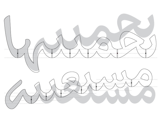
Based in Beirut, Lebanon, Rana studied graphic design and graduated from Central Saint Martins London with an MA in communication design. In 2011 she published Cultural Connectives, which bridges Arabic and Latin scripts. Designer of Parmigiano Arabic (2012-2014), as part of the larger Parmigiano Typographic System of Riccardo Olocco and Jonathan Pierini. Following a term coined by Thomas Milo, Bodoni's Arabic s Eurabic: it is the Arabic type created in Europe to imitate Arabic script without enough knowledge of or access to true Arabic script expertise. [Google] [More] ⦿ | |
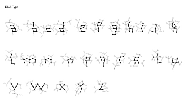
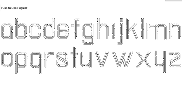
Rana Bulbul (Beirut) created the DNA typeface for Latin and Arabic in 2012. It is based on the structure of DNA. Rana also drew the experimental typeface Fuse 2 Use (2012, a circuit board font for Latin and Arabic). [Google] [More] ⦿ | |
Randa Abdel Baki is a scholar, graphic designer and artist, currently living in Beirut. She chairs the Graphic Design Department and is an Assistant Professor at Lebanese American University. Among the courses she teaches are Intro to Typography and Advanced Typography classes with an emphasis on Arabic type and layout design. Currently, her interest is on highlighting successful bilingual compositional methods, solving the challenges of Arabic and Latin bilingual type layouts. Speaker at ATypI 2010 in Dublin where she explained bilingual (Latin&Arabic) layout systems. [Google] [More] ⦿ | |
Beirut-based creator of the labyrinthine typeface Maze (2013). Behance link. [Google] [More] ⦿ | |
During her studies at Rafik Hariri University in Beirut, Lebanon, Rawan Chaaban (b. 1992) created several hybrid Latin typefaces (2015): Spaceship, Coybow, Vampire, Thickwaist, Rocco Style, Circus. [Google] [More] ⦿ | |
Beirut, Lebanon-based designer of Structure (2014), a decorative typeface inspired by gears. [Google] [More] ⦿ | |
Beirut, Lebanon-based student-designer of the Latin / Arabic display typeface London Blocks (2018). [Google] [More] ⦿ | |
During her studies in Beirut, Lebanon, Rayan Tannir designed the Latin / Arabic typeface Pretty in Punk (2018). [Google] [More] ⦿ | |
Ghazir, Lebanon-based designer of the angular typeface Suzuki Stile (2014). He also created a set of informative icons in 2014. [Google] [More] ⦿ | |
Graphic designer in Beirut, Lebanon. In 2017, she designed Wired. Latin Japanese followed in 2018. [Google] [More] ⦿ | |
During her studies in Beirut, Lebanon, in 2018, Razan Wehbi added an Arabic part to Galinos Paparounis's successful poster font Futuracha. [Google] [More] ⦿ | |
At the Academie Libanaise des Beaux Arts in Beirut, Riham Hassan created the decorative caps typeface Poison (2014, Latin and Arabic), Arabic Flotsam (2014), and the textured Latin typeface Scribble Type (2014). [Google] [More] ⦿ | |
At the University of Kaslik, Zahle, Lebanon-based Rita Azar designed the modern display typeface Poset (2017). [Google] [More] ⦿ | |
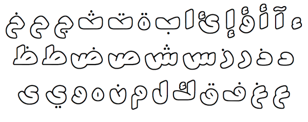
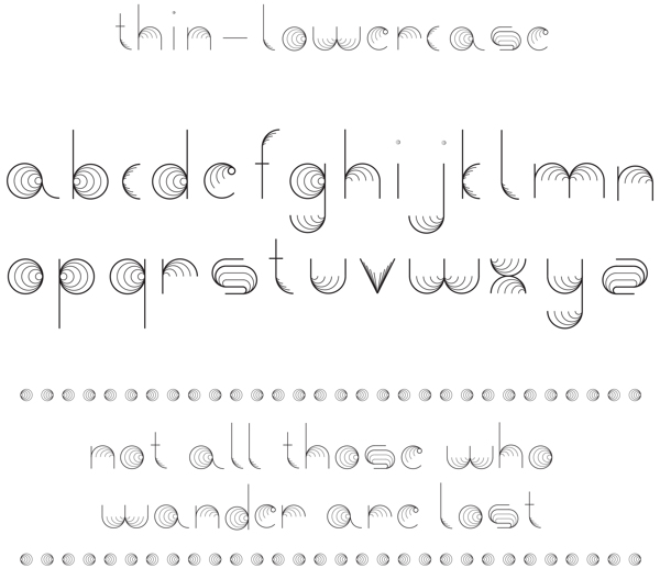
Lebanese designer of the experimental typeface Mesomorph (2008). She explains: Mesomorph is digitally created and modified using a variety of repeated geometric forms that often echo the forms of arabesque or meso-american culture, such as Maya and Aztec. Initially derived from Islamic architechtural shapes these forms, taken together, embody a never-ending pattern. Dafont link. [Google] [More] ⦿ | |
| |
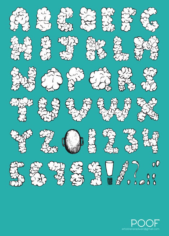
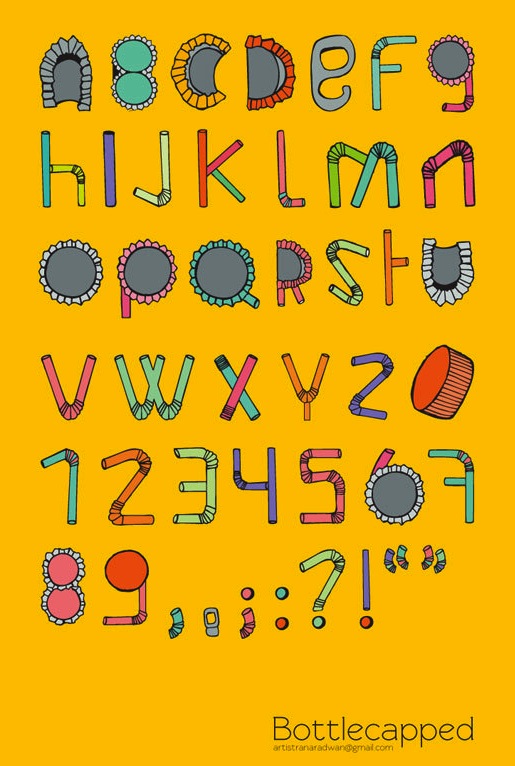
Illustrator in Beirut who created some ornamental alphabets in 2012, such as Poof and Bottlecapped. [Google] [More] ⦿ | |
Beirut, Lebanon-based designer of an Arabic typeface in 2015 (togerther with George Azar). Its octagonal design is inspired by the work of Stephan Sagmeister. [Google] [More] ⦿ | |
Roxaboxen
|
During his studies at Type@Cooper in 2012, he designed Anacapa, and writes: Anacapa is an attempt to subtly express, in type, the identity of my home state: the cool, gray calm of beach volleyball courts in the early morning, the dispersed energy of Los Angeles, the warmth of the sunlight on the rocky Central Coast... It is an imagined piece of California's vernacular, designed to be as flexible and complex as the emotional range it seeks to capture. His typeface Madtown (2019, Future Fonts) is inspired by letters from the American West, in particular the styles that have a capital oh with wedge-shaped serifs. In 2019, he also released the arts and crafts-inspired Mara des Bois at Future Fonts. Other typefaces by Graham include Ogilvy Serif (2021, with Jeremy Mickel), and Bacterium (2014, a molecular typeface done for Alexander Issey Inc; it has multiple versions for each glyph). Graham also helps with type design at MCKL Type, Jeremy Mickel's type foundry in Los Angeles. Future Fonts link. Home page. [Google] [More] ⦿ |
| |
Graphic designer in Aaley, Lebanon, who made some great Arabic typography posters in 2020. [Google] [More] ⦿ | |
Beirut, Lebanon-based designer of the Latin / Arabic multiline art deco typeface Str8 Tracks (2016). [Google] [More] ⦿ | |
During her studies in Beirut, Lebanon, Sarin Poladian created the display typeface Breach (2014). [Google] [More] ⦿ | |
Scriptorium (Ragnarok Press, Fontcraft)
|
A creative and prolific designer, he has made hundreds of beautiful (often historic) fonts. His outfit, Scriptorium (based near Austin, TX, est. 1989), also does custom font and logo design. At some points, Scriptorium was also known as Ragnarok Press and Fontcraft. It specializes in artsy and ancient typefaces. Some subset of the fonts is made by Michael Scarpitti. Free font demos. Images of his best selling fonts. Special subpages:
Fonts from 2013: Doge (a Venetian font based on a J.M. Bergling revival), Original Django (after the titling font in Quentin Tarantino's movie Django Unchained). Fonts from 2014: Highball, Carillon (based on a typeface by Samuel Welo), Edifice (based on lettering by J.M. Bergling). Fonts from 2015: Gods of Mars (an inline sci-fi typeface), Rykov (based on a 1930s Ukrainian constructivist style; Latin and Cyrillic), Vie Moderne (French art deco), Dahlgren, Grand Concours (art deco), Tantalus, Power Tie (art deco), Marquis Greeking. Fonts from 2016: Ekberg Modern (based on lettering samples by Samuel Welo from poster designs of the 1920s), Knuckleduster, Tzaphkiel, Sarandiel, Primrose Initials, Elizabethan Script (chancery style), Zeitschrift (an art nouveau font based on the Ver Sacrum magazine), Wendingen (Dutch deco), Memento Mori (Tuscan), Rounders (art deco). Fonts from 2017: Buzzmill (wooden plank font), Pumpkin Patch Initials, Talinn, Reliquary, Nopalito, Scattershot (script). Typefaces from 2018: Marionettas (a Mexican horror movie poster font), Fascination, Architextura, Santa Sangre, Glyphos. Typefaces from 2019: Cafe Corso (art nouveau), Comic Classix. Fnts released in 2020: Epigramatic (based on lettering by Dard Hunter for the Roycroft Press in the early 1900s), Cryptos (graffiti). Klingspor link. Abstract Fonts link. Dafont link. View David Nalle's typefaces. Scriptorium's library. [Google] [MyFonts] [More] ⦿ |
Serena Bobbo (Saïda, Lebanon) created an Arabic version of the hand-drawn typeface Cinnamon Cake (2011, Brittney Murphy) in 2014. [Google] [More] ⦿ | |
During her studies in Beirut, Shada Fad designed the Latin / Arabic rope font Knotted (2016). [Google] [More] ⦿ | |
Beirut, Lebanon-based designer of the wire-inspired Latin / Arabic typeface Msharbak (2014). [Google] [More] ⦿ | |
El Mansouriyet, Lebanon-based graphic designer who created the geometric circle-based typeface Orbis (2014). [Google] [More] ⦿ | |
| |
Graphic designer in Beirut, Lebanon, who designed the Latin / Arabic typeface Sleiman in 2016. [Google] [More] ⦿ | |
During her studies in Beirut, Lebanon, Souraya Momtaz designed a Latin / Arabic connect-the-dots typeface (2017). [Google] [More] ⦿ | |
Lebanese design studio which created the Arabic text typeface Midan, which won the second prize for Arabic text type at Linotype's 1st Arabic Type Design Competition in April 2006. That typeface can be bought from Linotype. [Google] [More] ⦿ | |
Talia Douaidy (Beirut) created the Latin / Arabic knot-based typeface Laced (2012). [Google] [More] ⦿ | |
| |
Graphic designer in Beirut, Lebanon, who created the handcrafted logotype Eddie in 2015. [Google] [More] ⦿ | |
Tania Shoukair studied visual communication at The Lebanese University, and worked as a graphic designer and illustrator in Utrecht, The Netherlands. Presently, she is based in Amsterdam. She created Kafiye (2012, a textured Latin typeface influenced by the traditional Arab headdress) and the experimental typeface Ink (2010): Colored ink thrown into clear water was documented and used to detect shapes resembling alphabet letters. Behance link. [Google] [More] ⦿ | |
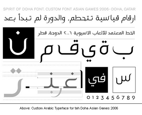
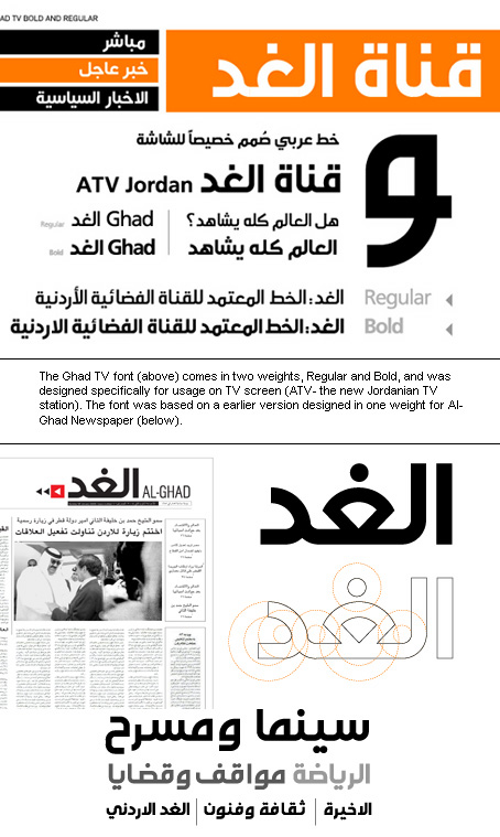
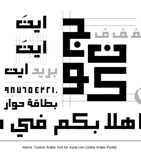
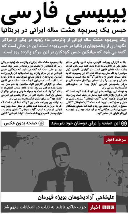
Arabic type site by Tarek Atrissi, a Beirut-born Lebanese professional designer, who is located in Hilversum, The Netherlands. He holds a BA in Graphic Design from the American University of Beirut, Masters of Arts in Interactive Multimedia from Utrecht School of Arts in Holland and an MFA in Design from the School of Visual Arts in NY. A Designer of the 6-weight Arabic family called AT, The Spirit of Doha (2004, for the Asian Games 2006), Al-Ghad (for the Jordanian newspaper Al-Ghad), the Ghad TV font (for the Jordanian station ATV), Etisalat (custom type for Etisalat Communications), Ayna (a squarish typeface done for Ayna.com), and Ambesque (2006, for the Amwaj Islands of Bahrain). He manages Arabtypography.com, a site dedicated solely to Arab typography. In 2008, he created Atrissi Sans. In 2007, he embarked on a project with Peter Bilak to develop Fedra Arabic to accompany Bilak's Fedra family. In 2010, he designed a custom Arabic font for the new BBC Arabic TV channel and custom Farsi face for the new BBC Farsi TV channel. [Google] [More] ⦿ | |
Lebanese designer of the artsy Latin / Arabic typeface Tripoli (2019). [Google] [More] ⦿ | |
During her studies in Beirut, Lebanon, Tatiana Noujaim created the Latin / Arabic hipster typeface boldly called God's Typeface (2015). Presently, she is an art director living in Jounieh, Lebanon. [Google] [More] ⦿ | |
Graphic designer in New York City who hails from Beirut, Lebanon. In 2018, he created the display typeface Splash. [Google] [More] ⦿ | |
The MicroFoundry
| From the Center for Digital Innovation at UCLA, Hrant Papazian designs and works with type, and is a specialist of Armenian. He has even done multiple master fonts for Armenian. Born in 1968 in Beirut, Hrant specializes in Armenian fonts and legibility issues in general. Designer of Linotype Maral. Founder of The Microfoundry, where he practices type design for Latin, Arabic, Cyrillic, Hebrew, Armenian and Georgian. The company is located in Glendale, CA. Latin typefaces: Harrier, TMF Daam (with sub-version Domination, Brutaal and Cristaal, all useful as dungeon typefaces), TMF Paphos, TMF Patria (serif). Armernian fonts: Linotype Maral, TMF Arasan (see here for a download), TMF Roupen. Georgian: TMF Akhalkalak. Other fonts: Brutaal, Cristaal, Trajic NotRoman (unpublished, a destructured version of Trajan, submitted to and rejected by Emigre), and DominationAvailable. In 2004, he joined Ultra Pixel Fonts, where he made the pixel typeface Mana. An entertaining speaker and all-round type boulevardier, he will be remembered for many of his insightful and entertaining quotes. He invented the word Helvomita, and once replied this to a poster: I will now Fartura in your general direction. Bio at MyFonts.com. Bio at Linotype. Bio at ATypI. Interview by Daidala. He won an award at Granshan 2008. Speaker at ATypI 2009 in Mexico City. FontShop link. Speaker at ATypI 2010 in Dublin. [Google] [MyFonts] [More] ⦿ |
TPTQ Arabic Type Foundry
|
In a KHTT interview, he writes: My first real experience with type was when I was working with Mohtaraf Beirut Graphics (2007), one of the leading design houses in Lebanon. Mohtaraf has a strong affinity to Arabic type and has produced several beautiful Arabic typefaces. Back then, I was given a task to start drawing a typeface. I was hesitant at first, but got very quickly into it. The design director Yara Khoury noticed that I 'have a knack for this', and encouraged me to go on with it. I was delighted to have the opportunity to understand a lot more about type under Yara's direction, and with some eye-opening sketches from Ali Assi, to research the calligraphic styles and explore the beauty of the Arabic script. I had very limited technical knowledge in font development at the time, therefore after I did the original digital drawings on Adobe Illustrator, Greta Khoury, my colleague at the time, who was and remains one of my biggest sources of inspiration, took over the project, did her magic tricks with it, and produced it into a working font in Fontlab Studio. I owe my start in type design to Yara Khoury and Greta Khoury and to an endless fascination with the Arabic script and the ethereal art of Arabic calligraphy. This drove me to work on self-initiated typefaces which eventually culminated in pursuing a higher education in Type Design at The Royal Academy of Art in The Hague. There, it all went to a whole new level, with countless additional inspirations: from the great teachers that we had, to all the lecturers and the amazing amount of information that was given to us. His typefaces:
Speaker at ATypI 2016 in Warsaw on A Typographic Maghribi Trialogue. In this talk, he explains, together with Laura Meseguer and Juan Luis Blanco, the Typographic Matchmaking in the Maghrib project of the Khatt Foundation, which tries to facilitate a cultural trialogue as well as shed a typographic spotlight on the largely ignored region of the Maghreb in terms of writing and design traditions. The specific goal of the collaboration is the research and development of tri-script font families (for Latin, Arabic and Tifinagh) that can communicate harmoniously. |
Type and graphic design conference, held from 28-30 April 2005 at the University of Beirut, Lebanon. Organized by Zeina El Abed, Nathalie Fallaha and Yasmine Taan, this conference was free of charge and drew 800 people.! Speakers included Ken Garland, Gerry Leonidas, Huda Smishuijzen AbiFares, Reza Abedin, Nadine Chahine, Jean-François Porchez, Heinz Widmer, Tarek Atrissi, Stephen Banham, Johannes Bergerhausen, Filip Blazek, Ashwini Deshpande, Zantides Evripides, Ben Hannam, Lazlo Lelkes, Zeina Maasri, Peter Martin, Stuart Medley, Dan Reynolds, Jennifer Spoon, and Bruno Steinert. Report by Dan Reynolds. Pictures by Porchez (change the 7 to 6, 5, 4, 3, 2, 1 for more). [Google] [More] ⦿ | |
Beirut-based designer of an untitled Arabic typeface in 2013. [Google] [More] ⦿ | |
Beirut, Lebanon-based designer of an untitled painted calligraphic caps alphabet in 2015. [Google] [More] ⦿ | |
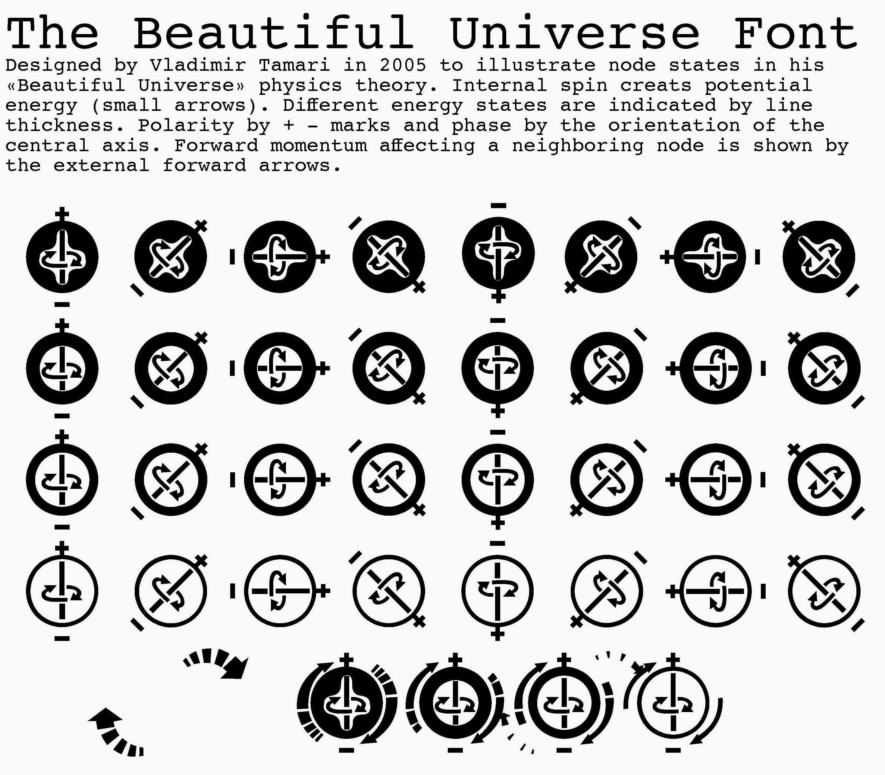
In 2005, he made Beautiful Universe, a physics symbol font designed to illustrate his physics theory. He visited Monotype In the mid-sixties at which time he patented (in the UK in 1965) a scheme to abbreviate the number of shapes to print Arabic. He created AlQuds (Arabic) fonts for the Tasmeem Adobe InDesign add-on (in 2008). [AlQuds, meaning The Holy One, is the Palestinian Arab name for Jerusalem.] We had to wait until ca. 2015 before he published the AlQuds and AlQuds Monhani family of (modern sans) fonts in its full glory with Monotype. In a separate effort, he designed three funky font families: Maribei (Arabic), Kweeky (matching Latin, also available as 5-layer 3D font sets), Monmon (Arabic). [Google] [More] ⦿ | |
His typefaces include Kufam (2013): Kufam is a bilingual typeface originally commissioned by Khatt Foundation part of the Typographic Matchmaking project. The typeface is the result of the collaboration between Dutch type designer Artur Schmal and myself. The Arabic is inspired by early Kufi inscriptions (7th century) and the Latin is inspired by Dutch urban lettering of the 1920's. The font supports the Arabic and Persian scripts. In 2014 Kufam was published on the now defunct type label OurType, where the font development team expanded the characterset from Standard to Pro and remastered the fonts. Kufam was available on OurType until 2017. From 2018 Kufam was reworked to meet Google Fonts Latin Expert and Arabic character sets and in 2020 Kufam was made available on Google Fonts (with assistance from Artur Schmal). Github link. Azer (codesigned with Pascal Zoghbi and Ian Party) won an award at TDC 2014. IBM Plex Sans Arabic (2019, by Mike Abbink, Paul van der Laan, Pieter van Rosmalen, Wael Morcos and Khajak Apelian) is a free typeface family at Google Fonts. Graphic Arabic (Wael Morcos and Khajag Apelian) won an award at Granshan 2017. [Google] [More] ⦿ | |
Beirut, Lebanon-based designer of the Arabic display typeface Iris (2018). [Google] [More] ⦿ | |
Wassim Awadallah
| |
Beirut-based designer of the left-leaning hairline typeface Trans. [Google] [More] ⦿ | |
Beirut, Lebanon-based designer of the Latin / Arabic display typeface Skeletal (2016). [Google] [More] ⦿ | |
Beirut, Lebanon-based designer of the pixel typeface Mazeme (2014). [Google] [More] ⦿ | |
Beirut, Lebanon-based designer of the Latin chisel script typeface Gaia (2017). Behance link. [Google] [More] ⦿ | |
Born in Beirut, Lebanon in 1986, Zeina graduated in 2008 from NDU (Notre Dame University Lebanon). Presently she is a print and media designer in Florence, Italy. Creator of the Arabic simulation typeface Gibran (2012), which was created for Lebanese author Gibran Khalil. Behance link. [Google] [More] ⦿ |
 Madrid (and before that, Lebanon)-based Arabic type designer who runs the Arab type news and blog site called Arabic Typography.
 Lebanese type designer who runs the London-based Boutros Foundry with Mourad Boutros. She created or co-created the Arabic typefaces Boutros Ads Pro, Boutros Advertising, and Boutros Thuluth Light. She also was one of the four co-designers (with Mourad Boutros, Richard Dawson and Dave Farey) of
  Azza Alameddine has worked as a graphic designer in Lebanon, the Netherlands and London since 2009, and is now based in Barcelona. She holds a BA in visual communication from Créapole, Paris. A graduate of the Masters in Typeface Design program of the University of Reading, she specializes in Arabic script. Her talk at
 BluGraphic (Wassim Awadallah, Beirut, Lebanon; but also claimed to be in Bern, Switzerland) specializes in free vector format graphics and typefaces. These include the modular sans typeface family Form (2014), and a collection of vector format icons (2013), weather symbols (2013) and arrows (2014). In 2017, he designed the tall sans typeface Giraffey, Viana Script, Valencia, Quenos (didone caps), Soigné (italic fashion mag typeface), Rhama Gothic (blackletter), Florence Script, Alvania, Prink Script, Virtuous Slab, Less Sans, Amigo Script and Holland Script. In 2018, he designed Strain and Tempo (a
  Boutros calligraphic Arabic fonts (sold by
  Dubai (and before that, Beirut Lebanon)-based designer of Celina (2015), a charming typeface with a hint of art nouveau warmth. In 2015, she created the Arabic kufi-style typeface Kanater.
  During her studies in Saida, Lebanon, Christelle Hayek created the lapidary typeface Chrisel (2014), an angular rhythmic Arabic typeface (2014), and Map Design Pictograms (2014). [
 [
[ During his design studies in Beirut, illustrator and graphic designer Eric Massoud created the Treefrog-style typeface
  Free font site, est. 2009. The fonts being displayed and introduced were developed by students in seminars and workshops offered by
  [
[ Freelance graphic designer from Lebanon. Born in Sharjah, UAE, an Armenian with a Lebanese nationality. Graduate of the
  [
[ [
[ Cairo, Egypt and/or Beirut, Lebanon-based designer of the Arabic student project typeface
 Naji is a French Lebanese graphic designer, type designer and animator. He studoed graphic design at the Lebanese American University. He also holds a Bachelors degree in Applied Arts from the University of Toulouse Le Mirail, and a Master's degree in interactive multimedia design from the Sorbonne University. Paris-based designer of the Kufi geometric style Arabic typeface Branji (2015) and the Kufi calligraphic Arabic typeface madid (2015).
  Nasri Khattar (1911-1998) was an architect and designer who studied at the American University of Beirut and the Yale School of Architecture, where he obtained an MA in Architecture in 1940. He worked with Frank Lloyd Wright in Spring Green, WI, and Scottsdale, AZ. In 1947, he submitted his
  During his studies, Stuttgart and/or Heidelberg, Germany-based Niklas Block created some experimental typefaces. He shattered Arial and recombined its pieces in his Verspiegelt (2017). Broken Millionaires combines the hacker style with monetary glyphs for optimal effect. See also Währungsfont (2017).
  Nisrine Sarkis is a Beirut-based graphic designer and letterer. She holds a masters in Graphic Design from USEK's Faculty of Arts. In 2007, she joined WonderEight. During a summer course called
 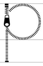 Graphic designer in Beirut, Lebanon, who created Zipped (2015), which was inspired by zippers. [
 [
[
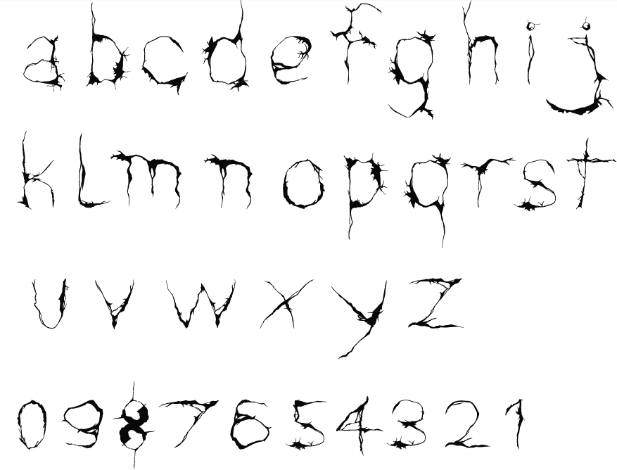
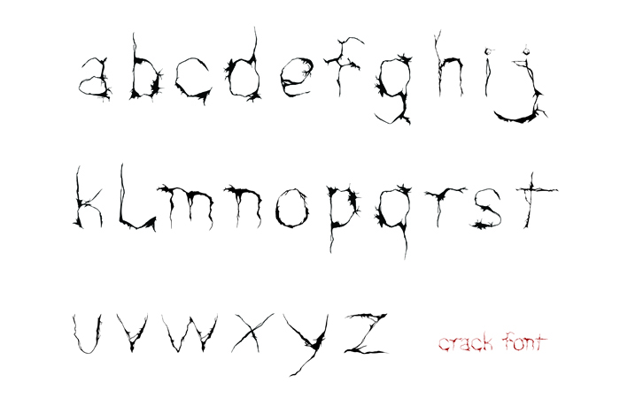
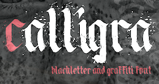 Beirut, Lebanon-based designer of the blackletter ink splatter graffiti font Calligra (2016). [
 During her studies at NDU (Notre Dame University, Louaize), Tripoli, Lebanon-based Roya El Ayoubi created the folded paper blackletter font Gothigami (2015). [
 A Lebanese American, Graham Bradley grew up in Pasadena, CA. He studied twentieth-century European history at the University of California, Berkeley, and graduated in 2009. He also graduated from the Type@Cooper program at The Cooper Union in New York. Graham designs printed materials, lettering, typefaces, and the occasional website. He is located in California. Before founding Roxaboxen, Graham was the first employee at Frere-Jones Type, where he worked with Tobias Frere-Jones on Mallory and Retina. He is an instructor at Type West at the Letterform Archive.
 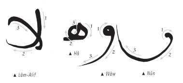 Designer in Beirut, Lebanon, associated with
  Dave Nalle was born in Beirut on March 19, 1959, and died on February 13, 2021 from COVID in his home town of Manor, Texas. From his
  Simon Hanna (Beirut, and/or Doha, Qatar) created
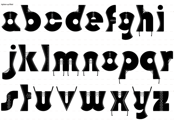
 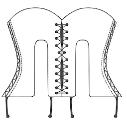 Graphic designer and illustrator in Beirut, who created the corset-themed typeface
 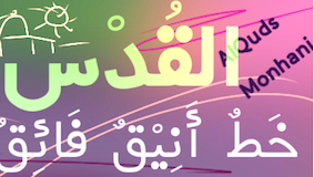 Vladimir F. Tamari (d. August 6, 2017) was born in Palestine, he spent his youth in Ramallah, and has lived in Tokyo for the past 40 years. He studied physics and art at the American University of Beirut where he met and was inspired by Buckminster Fuller (around 1960). He invented and built 3D drawing instruments. In the 1980s he joined the Optical Society of America to keep up with the field and holds U.S. patents for inventions based on his Streamline Diffraction Theory to cancel diffraction in telescopes. He
  After receiving his BA in Graphic Design from the Notre Dame University (Lebanon), Wael Morcos worked for the news website NowLebanon. A year later he joined the branding and design department of Saatchi Beirut where he spent three years developing identities, bilingual typographic solutions and working in print and exhibition design.
|
|
|
|