| | |
100types
[Ben Archer]
|
Educational and reference site run by Ben Archer, a designer, educator and type enthusiast located in England (who was in Auckland, New Zealand, before that). Glossary. Timeline. Type categories. Paul Shaw's list of the 100 most significant typefaces of all times were recategorized by Archer: - Religious/Devotional: Gutenbergs B-42 type, Gebetbuch type, Wolfgang Hoppyl's Textura, Breitkopf Fraktur, Ehrhard Ratdolt's Rotunda, Hammer Uncial, Zapf Chancery, Peter Jessenschrift, Cancellaresca Bastarda, Poetica.
- Book Publishing&General Purpose Text Setting: Nicolas Jenson's roman, Francesco Griffo's italic, Claude Garamond's roman, Firmin Didot's roman, Cheltenham family, Aldus Manutius' roman, William Caslon's roman, Pierre-Simon Fournier's italic, Ludovico Arrighi da Vicenza's italic, Johann Michael Fleischmann's roman, ATF Garamond, Giambattista Bodoni's roman, Nicolas Kis' roman, Minion multiple master, Unger Fraktur, John Baskerville's roman, Lucida, Optima, Bauer Bodoni, Adobe Garamond, Scotch Roman, Romanée, ITC Stone family, Trinité, ITC Garamond, Sabon, ITC Novarese, Charter, Joanna, Marconi, PMN Caecilia, Souvenir, Apollo, Melior, ITC Flora, Digi-Grotesk Series S.
- Business/Corporate: Akzidenz Grotesk, Helvetica, Univers, Syntax, Courier, Meta, Rotis, Thesis, Antique Olive.
- Newspaper Publishing: Times Roman, Bell, Clarendon, Century Old Style, Ionic, Imprint.
- Advertising and Display: Futura, Robert Thorne's fat typeface roman, Vincent Figgins' antique roman (Egyptian), Memphis, Fette Fraktur, Avant-Garde Gothic, Deutschschrift, Peignot, Erbar, Stadia/Insignia, Penumbra, Compacta, Bodoni 26, WTC Our Bodoni.
- Prestige and Private Press: Romain du Roi, Golden Type, Johnston's Railway Sans, Doves Type, Walker.
- Signage: William Caslon IV's sans serif, Trajan.
- Historical Script: Snell Roundhand, Robert Granjon's civilité, Excelsior Script.
- Experimental/expressive: Mistral, Beowolf, Dead History, Behrensschrift, Eckmannschrift, Neuland, Element, Remedy, Template Gothic.
- Onscreen/multimedia: Chicago, Oakland, OCR-A, Base Nine and Base Twelve, Evans and Epps Alphabet.
- Telephone Directory publishing: Bell Gothic.
Link to Archer Design Work. [Google]
[More] ⦿
|
Aggeliki Skandalelli

|
 Aggeliki Skandalelli is an Athens-born art director and graphic designer. After studying graphic design at AKTO Applied Arts School in Athens, she did an internship at Saatchi&Saatchi /Athens and went on to take a position as junior art director at Fortune Advertising. In 2000 she joined DDB /Athens and in 2003 was promoted to art director. During her time at DDB, Aggeliki collected a Grand Effie for the Tellas Telephone Network campaign, two Ermis Gold awards for an Alpha Bank print campaign and a Knorr TV spot, an Ermis Grand for the Thalassitis wine print campaign and an Ermis Silver for the hair salon Nicolas print ads. Since 2006, Aggeliki has been a senior art director at J. Walter Thompson /Athens, working for major accounts, such as Vodafone, Smirnoff, Amstel, Minoan Shipping Lines and Eurobank. She has also been in charge of various freelance assignments, creating logos, print ads and brochures.
 Designer at Parachute in Athens, Greece, of the Latin / Greek / Cyrillic signage typeface PF Scandal Pro (2007-2012). Behance link. Klingspor link. Parachute link. [Google]
[MyFonts]
[More] ⦿
|
Alex O. Kaczun
[Type Innovations]
|
 [MyFonts]
[More] ⦿
[MyFonts]
[More] ⦿
|
Alice Savoie
[Alice Savoie, Frenchtype]
|
 [MyFonts]
[More] ⦿
[MyFonts]
[More] ⦿
|
Alice Savoie, Frenchtype
[Alice Savoie]
|
 Alice Savoie is an independent typeface designer and researcher, b. 1984, based in Lyon. She studied graphic design and typography in Paris at Ecole Duperré and Ecole Estienne, and in 2006 graduated from the MA in typeface design from the University of Reading (UK). In 2014 she was awarded a PhD from the University of Reading for the research she carried out in collaboration with the Musée de l'imprimerie in Lyon (France). Her research focuses on the design of typeface in France, the UK and the USA in the postwar period, and for phototypesetting technologies in particular: International cross-currents in typeface design: France, Britain, and the US in the phototypesetting era, 1949-1975. She collaborates with international type foundries such as Monotype, Process Type Foundry, and Tiro Typeworks, and specializes in the design and development of typefaces for editorial and identity purposes. She also designs multi-script type families, including Latin, Greek, Cyrillic and Hebrew. She intends to sell her typefaces via 205 Corp.
 Between 2008 and 2010 Alice joined Monotype as an in-house type designer, working mainly on custom type designs for international clients (The Times, Turner Broadcasting, Ogilvy, etc.). She has also contributed to the design of new typefaces for the Monotype library, such as the Ysobel type family (in collaboration with Robin Nicholas), and Rotis II Sans. Her type family Capucine is distributed by Process Type Foundry. In 2012 she collaborated with John Hudson/Tiro Typeworks over the development of the Brill typeface family for the Dutch publisher Brill. Since September 2013 she teaches typeface design at the Atelier National de Recherche Typographique in Nancy, and at ESAD Amiens (France). Her type foundry is called French Type. She holds an MA and a PhD from the University of Reading (UK). She collaborates with design studios and type foundries on the design of multi-script typeface families. In 2018 she released the typeface family Faune, commissioned by the Centre national des arts plastiques (CNAP) in partnership with the Groupe Imprimerie Nationale. Alice teaches and supervises research projects at ANRT Nancy and ENSBA Lyon (FR). She is the principal Post-doctoral Researcher on the Leverhulme-funded project Women in Type under the supervision of Fiona Ross at the University of Reading. Her typefaces: - Her graduation typeface at Reading, Capucine Greek (2007) has been awarded as the best text typeface of the Greek alphabet exhibition, taking place during the 3rd international conference on typography and visual communication in Thessaloniki, Greece, 2007. Capucine is a very informal, almost hand-printed family covering both Latin and Greek in many styles. In 2010, finally, she published Capucine at Process Type Foundry (Grand Valley, MN), where she was briefly part of Eric Olson's team.
- The constructivist typeface Pozor (2005).
- The connected handwriting typeface Jeanine, done in 2006 at the École Estienne in Paris, where she studied from 2004 until 2006.
- In 2009, she co-designed Ysobel (Monotype; winner of an award at TDC2 2010) with type designers Robin Nicholas, head of type design at Monotype, and Delve Withrington. The sales pitch: According to Nicholas, the idea for the Ysobel typefaces started when he was asked to create a custom, updated version of the classic Century Schoolbook typeface, which was designed to be an extremely readable typeface - one that made its appearance in school textbooks beginning in the early 1900s. Buy it from Monotype.
- Brill (2012), co-designed with John Hudson for Koninklijke Brill NV, Leiden, The Netherlands, won an award at TDC 2013.
- The Royal Docks typeface was developed in 2012 for the London-based design studio APFEL (A practice for everyday life) as part of a wider architectural project by the London Development Agency, which proposed a new vision for the Royal Docks in East London. The strong-willed sans display typeface draws inspiration from the kind of industrial lettering frequently found around the Docklands, such as on cranes and containers. The typeface was used for a number of publications in relation to the redevelopment of the Royal Docks, and remains to this day exclusive to APFEL.
- The Fred Fredburger family was conceived by Monotype as a custom design for the identity of a children's TV channel. Conceived to be fun, friendly and adventurous, Fred Fredburger is a distinctive family of five styles: The Headline versions are conceived to be visually striking and appealing to children, while the Roman, Bold and Condensed weights are a touch quieter in order to be comfortable to read at text sizes. All five weights are also designed to work harmoniously across five different scripts: Latin, Greek, Cyrillic, Hebrew (designed by Alice Savoie) and Arabic (designed by Patrick Giasson).
- Egra Tiflex was designed in collaboration with London-based Fraser Muggeridge Studio. The starting point for the design came from an unidentified set of old stamping capital letters produced by Tiflex, a French company specialised in industrial signage. A set of lowercase letters was later designed to accompany the caps, which was inspired from Grotesk wood types from the beginning of the twentieth century.
- In 2014, she worked on the typeface family Bogartes, which is a contemporary tribute to French typographic history, from Garamond, Fournier, and Didot to the idiosyncratic shapes of the 19th century. As a result of its mixed genetic make-up, the typeface family is rather playful. The project was started with the support of the Centre National des Arts Plastiques.
- Romain Vingt (2016) is a modern reinterpretation of a foundry face originally released by the Fonderie Alainguillaume at the beginning of the twentieth century. Alice writes: An elegant and voluptuous design with a resolutely French touch, this digital interpretation departs in places from its original model, just enough to withstand modern taste.
- In 2016, she designed Faune for Centre National Des Arts Plastiques. It is freely available from Fontsquirrel and at the Microsite. Faune won an award at the Type Directors Club's Type Design Competition 2019.
- Lucette (2021, Future Fonts). Alice writes: Lucette revisits the heavy top idea, a concept dear to French type designers throughout the last century. The typeface toys with the theory that emphasizing the top part of letterforms increases legibility, taking the concept to an extreme in Lucette Black. Lucette is loosely inspired by a variety of designs such as Gill Sans Double Elefans, Antique Olive, and the unreleased Nordica by Ladislas Mandel. Its name was chosen as a tribute to Lucette Girard, a talented letter-drawer who assisted some renowned designers throughout the second part of the twentieth century, including Adrian Frutiger, Roger Excoffon and Raymond Loewy.
Typecache link. Klingspor link. At ATypI 2014 in Barcelona she spoke about phototypesetting. Speaker at ATypI 2016 in Warsaw on Typefaces for telephone directories, a talk in which she and Dorine Sauzet describe Ladislas Mandel's oeuvre. Speaker at ATypI 2018 in Antwerp. Behance link. Estienne link. Reading link. Another link for the University of Reading. Fontsquirel link. [Google]
[MyFonts]
[More] ⦿
|
Anna Horst
|
During her studies at Marquette University, Milwaukee, WI-based Anna Horst designed a retro telephone book typeface (2016). Behance link. [Google]
[More] ⦿
|
Aurélien Vret
|
 Aurélien Vret is a multidisciplinary artist and type designer. Born in Noisy-le-Sec, France, in 1987, he studied visual art at the fine arts school in Toulouse (Isdat). He studied type design with François Chastanet and obtained his B.F.A. in 2010.
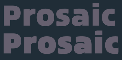
 Now based in Vincennes near Paris, he designed an experiment type based on Frutiger called L'in-vu. In 2017, he created his first real typeface, Prosaic, at Typofonderie under the guidance of Jean François Porchez. Typofonderie describes Prosaic as a postmodern vernacular sans. They write: Prosaic Black is comparable to the Antique Olive Nord, while the thinner versions can refer to Frutiger or some versions of the Ladislas Mandel typefaces intended for telephone directories. To a lesser extent, the search for forms and counterforms can be reminiscent of Jeremy Tankard's Fenland or certain Evert Bloemsma typefaces such as FF Balance or FF Legato. Interview by Porchez. [Google]
[MyFonts]
[More] ⦿
|
Ben Archer
[100types]
|
[More] ⦿
|
Bernardo Faria
|
 Bernardo Faria is a Brazilian designer specialized in logo and editorial designs. In 2014, he and Tony de Marco (Just in Type) created the masculine typeface family Terrorista, and wrote this blurb: Terrorista is a homage to everyone who fought against the Millitary Regime in Brazil from 1964 to 1985. The Terrorista Marighella features generous inktraps, and thus is perfectly suited for small sizes. Terrorista Dilma has the same design as the Marighella, but without inktraps, made for display. The last typeface from the package is Terrorista Lamarca, stencil version. This is the font for the political propaganda machine. [Google]
[MyFonts]
[More] ⦿
Bernardo Faria is a Brazilian designer specialized in logo and editorial designs. In 2014, he and Tony de Marco (Just in Type) created the masculine typeface family Terrorista, and wrote this blurb: Terrorista is a homage to everyone who fought against the Millitary Regime in Brazil from 1964 to 1985. The Terrorista Marighella features generous inktraps, and thus is perfectly suited for small sizes. Terrorista Dilma has the same design as the Marighella, but without inktraps, made for display. The last typeface from the package is Terrorista Lamarca, stencil version. This is the font for the political propaganda machine. [Google]
[MyFonts]
[More] ⦿
|
Best lo-fi types
|
The typophiles names types for lo-fi printing (phone books, newspapers, cheap paperbacks, labels, etc.): Meta, Bell Gothic, Galfra, Clottes, Nomina, Asphalt, Bell Centennial, Retina, Yellow, Adsans, Colorado, Delia, Amplitude, Rialto Pressa. Several of these were made by Mandel for telephone directories. [Google]
[More] ⦿
|
CAST
|
 CAST, or Cooperativa Anonima Servizi Tipografici (est. 2014, Bolzano, Italy) is a digital type foundry dedicated to the production and marketing of high quality fonts catering to specific needs, especially in the areas of branding and publishing. Their typefaces:
 - Divenire (2014). By Molotro / Luciano Perondi. Divenire is derived from an earlier custom typeface designed for the Partito Democratico (Italian Democratic Party), which uses it for political communications. For the information of non-Italians---this is not Berlusconi's party.
- Dic Sans (2014, Luciano Perondi). This elliptical sans was inspired by Aldo Novarese's Eurostile. It has its own idiosyncracies, and comes with a gorgeous Dic Sans Extra Bold weight (2014). On the nomenclature---French are allowed to use Sans Dic, and Americans are permitted to typeset in Extra Bold Dic, or its shadow version, Tricky Dic.
- Brevier (2014). Riccardo Olocco's typeface was designed for setting long texts in small or very small type sizes---the name Breveir refers to 8 point size in ancient times.
- Gramma (2014, Riccardo Olocco). A compact temporary sans with large x-height eventually published at CAST.
- Brasilica (2015). By Rafael Dietzsch, based on his graduation typeface in 2012 in the MATD program at the University of Reading. This Latin / Greek typeface family with sufficient diacritical support of most Brazilian indigenous languages. It is a serifed typeface but has matching sans styles. My own first reaction to this typeface was sturdy. Brasilica won an award at Tipos Latinos 2014 and was published by CAST.
- Macho Modular (2015). By Luciano Perondi. Macho was originally designed in 2010 for MAN (Museo d'Arte Provincia di Nuoro) and is based on the idea of modular widths of the 20th-century typesetting systems, as required by the Olivetti Margherita and the hot-metal Linotype machine.
- Saffran (2007, by Erasmo Cuifo and Alessio D'Ellena; published in 2015 by CAST). Saffran is a stencil sans with squarish letterforms.
- Zenon (2014, for Latin, Bengali, Greek and Cyrillic, by Riccardo Olocco). Zenon is Riccardo's graduation typeface in the MATD program at the University of Reading, UK. He writes: is a sum of different styles, from Francesco Griffo to Granjon, from modern typefaces to the first sketches of Times New Roman. Zenon is an apparently Renaissance revival with modernish proportions. A closer look reveals that it is a typographic potpourri. Zenon was published by CAST in 2015.
- Sole Serif (2016). A text typeface family by Luciano Perondi, who writes: Sole Serif is a newspaper face with features relating to book typography. Inspiration from Francesco Griffo's romans was adapted to resist the rough usage typical of newspaper printing without any loss of quality. Sole Serif is available in an extensive range of cuts including extra bold and ultra thin. With its big x-height, short ascenders and a roundish and wide italic for text and titles, it has all the attributes of a newspaper face. Nonetheless, details like the inclined axis, calligraphic terminations, Renaissance proportions and a refined but slightly mannered design, all evoke the book rather than the daily paper. In 2018, Luciano Perondi and Riccardo Olocco designed the companion typeface Sole Sans. It was originally designed for the leading Italian financial newspaper Il Sole 24 ore.
[Google]
[MyFonts]
[More] ⦿
|
Chauncey H. Griffith
|
 Kentucky-based type designer and printer, 1879-1956. He was a Linotype salesman who directed the growth of the Linotype library from 1915 to 1948, and improved the look of the world's newspapers. He worked to establish Linotype as the composing machine of choice in America. He continued as a consultant to Linotype well into his retirement.
 Claus Eggers Sorensen writes: In 1922 Chauncey H. Griffith was promoted to Vice President of Typographic Development at Mergenthaler Linotype. He immediately started the development of new typefaces to replace the prevailing modern style typefaces. The issue troubling the moderns was their high contrast design. Especially the hairline parts of the cast lines could break of while printing, and counters could clog with ink and pulp. Faster printing meant transferring the cast lines with the stereotype process to a letterpress cylinder for high-speed rotary printing on endless rolls of paper stock. C. H. Griffith's new approach was to engineer new typefaces to the printing method. That meant drawing inspiration from the Egyptienne style as seen in the Clarendon typeface, with its very sturdy lower contrast design, and Theodore Low De Vinne and Linn Boyd Benton's Century Roman, which possessed elegance and legibility. The first product of these efforts was Ionic No. 5. It was an instant success, within eighteen months it was used by more than 3000 newspapers all over the world. C. H. Griffith and Mergenthaler Linotype continued to refine the design in subsequent iterations: Excelsior (1931), Paragon (1935), Opticon (1935), Corona (1941). These became known as the Legibility group. Ionic No. 5, Excelsior and Paragon form the Linotype Legibility Group. He designed or co-designed the following fonts, all at Mergenthaler: - Baskerville (1939, Linotype).
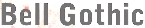
- Bell Gothic (1937-1938). Now available at Bitstream. Font Bureau has its own version, Griffith Gothic (1997-2000, by Tobias Frere-Jones): Of all his work, Chauncey Griffith claimed one type, Bell Gothic, as his own design. Griffith Gothic is a revival of the 1937 Mergenthaler original, redrawn as the house sans for Fast Company. Tobias Frere-Jones drew a six weight series from light and bold, removing linecaster adjustments and retaining the pre-emptive thinning of joints as a salient feature. Mac McGrew: Bell Gothic was developed in 1937 by C. H. Griffith of Mergenthaler Linotype, primarily for use in the New York City telephone directory, but quickly became standard for telephone books nationwide. The aim was to eliminate roman types with objectionably thin serifs and hairlines. Furlong and Market Gothic were specialized adaptations of this typeface for newspaper work, the former with special figures and other characters for setting racetrack results, the latter in 1941 with other special characters for stock market details. The basic Bell Gothic was also cut by Intertype in 1939. Compare No. 11 and No. 12, shown under Numbered Faces, previously used for directory work. Imitations include OPTI Benet (Castcraft). Poster by Jaime Schweitzer. View digital versions of Bell Gothic.
- Bookman (1936, after the 1960 original by Alexander Phemister at Kingsley ATF).
- Corona (1941), a narrow newspaper typeface with large x-height. Corona was designed to meet the rigorous requirements of high-speed printing, and is still the chosen type of many American daily newspapers. Mac McGrew: Corona was drawn and cut by Linotype under the direction of C. H. Griffith in 1941. It is a member of the "Legibility Group" of faces designed for easy reading under newspaper conditions of stereotyping and high-speed printing with inks that could be trapped in close quarters. Royal on Intertype is a 1960 copy of Corona. Digital revivals include C795 Roman (Softmaker), News 705 BT (Bitstream).
- Elegant Garamond (Bitstream). This Granjon design was made by Chauncey H. Griffith based on models by George William Jones, and before that, Robert Granjon.
- The didone-style newspaper typeface Excelsior (1931, Linotype). At Bitstream, this is News 702. URW calls it Excius, and SoftMaker's version is Exemplary. Mac McGrew: Excelsior was cut for Linotype in 1931 under the direction of C. H. Griffith. It is a plain type, but designed for the utmost readability, with only slight variation from thick to thin, and careful fitting that makes the characters flow into easily recognizable words. Long or short descenders are available in certain sizes. Like a number of Linotype typeface intended primarily for newspaper work, Excelsior is available in closely graded sizes, including odd and some half-point multiples.
- Granjon (1928-1930, with George William Jones at Linotype). MyFonts: Claude Garamond's late Texte (16 point) roman was the model used by George W. Jones when he designed this typeface for Linotype&Machinery in 1928. To avoid confusion with the Garamond romans based on Jannon's seventeenth century work, L&M called the typeface Granjon, after the designer of the italic used as a model, thus creating confusion with the typefaces based on Granjon's romans, Plantin and Galliard. Granjon is a little less crisp in cut than either Sabon, Stempel Gararmond or Berthold Garamond, but makes a magnificent and most readable text face, as shown in Reader's Digest since its founding. Mac McGrew: Granjon was designed for Linotype in 1928 by George W. Jones, distinguished English printer, to meet his own exacting requirements for fine book and publication work. It is derived from classic Garamond sources, but with refinements made possible by modern methods of punch cutting. In fact, one critic has called it "the purest form of Garamond." It is named for Robert Granjon, mid-sixteenth-century punch cutter noted in particular for his italics, from which the present Granjon Italic was derived. Granjon Bold, by C. H. Griffith, was added in 1931. Lanston Monotype acquired reproduction rights to the typeface from Mergenthaler.
- Ionic No. 5 (Linotype, 1925). Mac McGrew: Ionic is a general name for a style of typeface which is closely related to the Clarendons (q.v.). Plain, sturdy designs with strong serifs and little contrast, the Ionics were popular in the latter part of the nineteenth century. Although many founders offered them, they were generally gone by early in this century. A few received a new lease on life when they were copied by Monotype, Linotype, or Intertype. Two new Ionics appeared in this century. Ionic No.5 was designed by C. H. Griffith in 1926 for Linotype, as a newspaper text face. It features a large lowercase with short ascenders and descenders, with no fine lines or serifs to break down in stereotyping, and no small openings to fill up with ink. This is one of a few typefaces made in many closely graded sizes: 5-, 51/2-, 6-, 61/2-, 63/4-, 7-, 71/2-, 8-, 9-, 10-, and 12-point. Intertype's Windsor, developed in 1959, is comparable. Ionic Condensed was designed by Griffith in 1927, also for Linotype. It is a refinement of traditional designs, intended for newspaper head- ings, and has most of the general characteristics of the text face. Ionic Extra Condensed is essentially the same, a little narrower and without lowercase, also for newspaper headlines.
- Janson (1932). Mac McGrew: Janson is adapted from types often attributed to Anton Janson, seventeenth-century Dutch letter founder, although researchers have shown that the originals were cut by Nicolas Kis, a Hungarian punchcutter and printer. The Linotype version was done in 1932 under the direction of C. H. Griffith, based on the 14-point size of about 1660. The Monotype version was adapted by Sol Hess in 1936, in collaboration with Bruce Rogers. Both versions are sharp and clear cut, and rather compact. They bear some resemblance to the types of William Caslon, which were based on later, similar Dutch types.
- Memphis (1929): the prototypical Egyptian of Rudolf Wolf. Mac McGrew: Memphis is the Linotype copy of the popular German square-serif typeface known as Memphis or Girder, designed by Rudolf Weiss about 1929, which did much to revive interest in this old style. Memphis Light and Bold were introduced by Linotype in 1933, Italics and Unique Caps in 1934, Medium in 1935, and other variations up to 1938. The Extra Bold versions were designed by C. H. Griffith. Alternate characters are available in some versions to more nearly approximate the appearance of Stymie or Beton (q.v.). The Lining versions are comparable to small caps in the regular versions, being propor- tionately wider and heavier than caps, and have no lowercase; there are several sizes each in 6- and 12-point, permitting various cap-and-small-cap combinations, in the manner of Copperplate Gothic. Also see Ward; compare Cairo, Karnak. Digital versions are everywhere. The Bitstream version is Geometric Slabserif 703.
- Linotype Monticello was designed by Griffith in 1946. Its design is based on James Ronaldson's Roman No.1 and Oxford Typefaces from American Type Founders and was revised by Matthew Carter while he was working at Linotype between 1965-1981. Mac McGrew: Monticello is a Linotype recreation of America's first great typeface, Binny&Ronaldson's Roman No.1, cut about 1796 by Archibald Binny in Philadelphia. His was the first permanent American type foundry. After about 30 years, the Binny typeface fell into disuse. The matrices survived, though, and a few fonts were cast about 1892 and the typeface was renamed Oxford (q. v.). In 1943 Princeton University Press announced plans for publishing a 52-volume edition of The Papers of Thomas Jefferson. As President, Jefferson had personally written to friends in France, introducing a Binny&Ronald- son representative who was seeking a source of antimony to replenish the shortage which threatened the young typefounding industry in this country. Jefferson also referred in this letter to the importance of type to civilization and freedom. In addition, the popularity of this typeface coincided with the most prominent years of Jefferson's life. Therefore Linotype suggested that a recutting of the typeface would be most appropriate for the Jefferson books, and the publisher heartily agreed. C. H. Griffith, Linotype typographic consultant, made a detailed study of Binny's type and redrew it in 1946 for the requirements of Linotype composition and modern printing conditions. It is a vigorous transitional face, somewhat similar to Baskerville but slightly heavier and a little crisper.
- Opticon (1935, Linotype). Mac McGrew: Opticon was designed in 1935 by C. H. Griffith for Linotype. It is a member of what that supplier calls its Legibility Group of typefaces designed primarily for newspaper use. It is essentially the same as Excelsior, but with stems and thick lines weighted slightly, for printing on hard-surfaced paper.
- Paragon (1935, Linotype). Mac McGrew: Paragon was designed by C. H. Griffith for Linotype in 1935. It is a member of that company's Legibility Group of typefaces, planned primarily for sharp and clean printing under the difficult inking and printing conditions of newspaper production, but also useful and popular for other periodical work. This typeface is lighter and airier than most such typefaces; otherwise it is much the same style. Compare Excelsior, Ionic, Opticon, Textype.
- Poster Bodoni (1920). Digital versions of Poster Bodoni or a textured ornamental version of it include Poster Bodoni (Bitstream), Modern 721 (Bitstream), OPTI Poster Bodoni Compressed (Castcraft), Bodoni Poster (Softmaker), Bodnoff (Corel), Poster Bodoni (Tilde), Poster Bodoni WGL4 (Bitstream), Saphir (Linotype), Bodoni Poster (Linotype), Bodoni poster (Adobe; same as the Linotype version), and Bodoni Ornamental (FontMesa).
- Ryerson Condensed was designed by C. H. Griffith in 1940 for Linotype, as a modernization of Globe Gothic Condensed.
- Textype (1929, Linotype). Mac McGrew: Textype was designed in 1929 by C. H. Griffith for Linotype. Although intended as a newspaper face, Textype with its smaller x-height and longer ascenders than most newspaper typefaces also became popular for magazines and other publications, as well as for a certain amount of advertising and general printing. There is an 18-point size in roman with italic, also a bold and bold italic. The 18-point size and the bold italic are both rare in newspaper typefaces. Compare Excelsior, Ionic, Rex, etc.
- Non-Latin typefaces: Porson and Metro Greek; thirteen Arabic designs adaptable for use throughout the Moslem world; Hebrews; the Indian scripts devanagari, Gujarati, and Bengali; Sinhalese for use in Ceylon, Tamil, and Syriac.
Klingspor link. Linotype link. FontShop link. Font Bureau link. Pic. [Google]
[MyFonts]
[More] ⦿
|
Dorine Sauzet
|
 Graduate of ESAD in Amiens, France. Her graduation typeface there is Quasar (2016). She writes: Quasar is a typeface designed to meet the special needs of complex, high-density documents, with a particular focus on non-linear reading experiences. Its twelve styles are split across four ranges of weight, allowing the typesetter to create layers of informations and enabling the reader to dig through these layers. Speaker at ATypI 2016 in Warsaw on Typefaces for telephone directories, a talk in which she and Alice Savoie describe Ladislas Mandel's oeuvre.
 In 2018, Dorine Sauzet and Quentin Schmerber co-designed the angular typeface Framboisier at Future Fonts. Framboisier was inspired by the work of Marcel Jacno. [Google]
[More] ⦿
|
Eiichi Kono
|
 Japanese type designer. He started out in the photo optical industry in Tokyo with Carl Zeiss and American Optical. He studied type design at the London College of Printing and the Royal College of Art. From 1979 until 1985 he worked at the graphic design firm Banks&Miles in London. There he redesigned Johnston Underground Sans for text setting as well as display use, now known as New Johnston, and carried out a feasibility study for space saving and legibility for the BT telephone directory, proving that Matthew Carter's Bell Centennial was the best suited typeface for the purpose. He also taught typography at Middlesex Polytechnic between 1980 and 1988. With Matthew Carter, he developed the full Roman and kanji OpenType font family Meiryo (2004), as part of Microsoft's ClearType project. Other participants on this project included Takeharu Suzuki of C&G and Yukiko Ueda. Meiryo won the Tokyo TDC 2007 award. He is currently a senior research fellow at University of Brighton, leading research into Edward Johnston's legacy. From 2015 until 2016, he is president of Double Crown Club in London, a dining club and society of printers, publishers, book designers and illustrators in London that was founded in the 1920s.
 At ATypI 2007 in Brighton, he spoke about Sustainability and typography. In 2012, he designed CC Art Sans for CCA Kitakyushu. With Lida Lopes Cardozo, he designed Kindersley Street Italic, a typeface created to accompany Kindersley Street (2005), which in turn is a revival of David Kindersley's MoT Serif (1952). In 2020, he published LDN Kono and LDN Kono Hairline at London Type. LDN Kono is a clean humanist sans family originally designed by Eiichi Kono for the Center for Contemporary Art Kitakyushu under the name CCAArt Sans. [Google]
[More] ⦿
|
Erik Faulhaber
|
 Type designer involved with Linotype. He studied design in Karlsruhe with Kurt Weidemann and others. His mentor is Adrian Frutiger. Since 1996 he is an independent designer. He has taught typography at the universities of Halle, Weimar and Wuppertal. He helped develop Frutiger Next at Linotype. However, after that effort, Linotype did not give him credit in the way he thought he deserved (the credited designer for Frutiger Next is Adrian Frutiger / Linotype Design Studio). He also worked on the Compatil family (Linotype), Vialog (Linotype: 22 weights commissioned by Professor Werner Schneider, originally developed for the signs in the Munich subway), Heidelberg Gothic (Linotype: for Heidelberger Druckmachinen AG), and corporate typefaces for the city of Milan (Milano), BMW (tracking adjustments for BMW Helvetica), Microsoft (Microsoft SC), and IBM (Greek and Vietnamese characters for the IBM corporate typeface). Wiki page. In 2006, he published Generis (Linotype) type system which consists of slab serif, serif, sans, and simple sans sub-systems, all compatible and loosely in the spirit of American gothic styles.
 His Aeonis font family (2009) contains 42 sans styles about which Linotype brags: Lapidary inscriptions from Ancient Greece spurred Faulhaber on to create this typeface's basic sans serif forms. This clarity is visible in the simplified form of the typeface's capital A. Further inspiration came from a domed lamp designed in 1952 by Wilhelm Wagonfeld; this went on to inspire the roundness in Aeonis. Faulhaber sees the conflict between antiquity and modernity as a struggle between angular and round forms. Author of Frutiger Die Wandlung eines Schriftklassikers (Niggli Verlag). Free lance designer since 1996. About the Frutiger Next flap: - Erik Faulhaber was interviewed and expressed his ideas about Frutiger and Frutiger Next in Frutiger Die Wandlung eines Schriftklassikers (2004, Niggli Verlag).
- Adam Twardoch (Linotype) explains: No doubt, Erik Faulhaber has worked on the Frutiger Next project but the extent of that work is disputable. This is a typical case of getting credit. Type design only recently became an individual effort. Previously, a large team of people worked on a particular type, and yet typically, only one person got the credit as the designer. Even today, when FF Meta Pro is published, the credited designer is Erik Spiekermann and not Spiekermann, van Rossum, de Groot, Schäfer, Lipton, Schwartz, Safayev, Chayeva, Haratzopoulos et al. If it were so, it would be quite ridiculous anyway. If you want personal credit, you need to negotiate it upfront in the contract. Christian Schwartz and Erik Spiekermann collaborated on FF Unit and on FF Meta Headline. Schwartz does get personal credit for FF Meta Headline but not for FF Unit. This is obviously result of different negotiations in different projects. The credited designer for Frutiger Next is Adrian Frutiger / Linotype Design Studio. This means that Linotype chose not to personally credit the other designers who worked on the project, including Erik Faulhaber. This is similar for Linotype Univers. This is different for other projects, e.g., Avenir Next is credited to Adrian Frutiger / Akira Kobayashi, just like Palatino Nova and Optima Nova are credited Hermann Zapf / Akira Kobayashi. Altogether, such decisions are made on a per-project basis, and surely depend on the actual creative input of the other designer. Sometimes, designers arrange collaborations by themselves they might hire a collague to draw the small caps or florins in their own typeface if there is a tight deadline. Whenever youre a junior designer and embark on such a project, make sure to clarify issues such as personal credit *upfront*. Erik Faulhaber seemingly has not. He has seemingly agreed to hide his name behind the Linotype Design Studio label but now is trying to change reality retroactively. This is not how you work with other people.
- Bruno Steinert (type manager, Linotype) retorts: the idea for Frutiger Next originated from discussions between himself, Adrian Frutiger, Professor Reinhard Haus, and Otmar Hoefer (marketing, Linotype). Linotype guided and financed the development and paid Faulhaber on an hourly basis. Frutiger and Faulhaber never worked together outside Linotype.
In 2013, he published Xenois, Xenois Semi Pro, Xenois Sans Pro, Xenois Serif Pro, Xenois Soft, Xenois Super and Xenois Slab at Linotype. In 2017, he published Qantis Sans and Qantis Soft. Klingspor link. [Google]
[MyFonts]
[More] ⦿
|
Erik Spiekermann
[What makes a good typeface?]
|
[More] ⦿
|
Ewa Kucharska
|
 Polish designer of the sans typeface Brootal (2014), a typeface created for small print applications. At Typeclinic 2015, she continued the development of Brootal. [Google]
[More] ⦿
Polish designer of the sans typeface Brootal (2014), a typeface created for small print applications. At Typeclinic 2015, she continued the development of Brootal. [Google]
[More] ⦿
|
Felix Arnold
|
 A Swiss designer and type designer (b. 1970, Basel), who studied at the Basel School of Design. He created Cisalpin [also called Cassini in its earlier grotesque life, 1999-2000], a typeface for cartography, which was published it with Linotype in 2004. Pic.
 Klingspor link. Linotype link. [Google]
[MyFonts]
[More] ⦿
|
Felix Steffen
|
Felix Steffen is a German designer who moved in 1991 from Munchen to Warsaw, fascinated by the exotic life and lettering of post-communist Poland. He lives and works in Poland. He designed the Blanke family for use in Polish telephone directories. Felix claims that he got his ideas for that font from some writings in the train station of Kattowitz, from which he first developed the font Krakowa. He is currently working on the digitization/revival of Poltawskiego, a classic Polish text face, and the first typically Polish face, designed in the late 1940s by Polish type designer Adam Jerzy Poltawski (1881-1952). Felix's company in Warsaw is OM-Grafika. Someone reported to me that Felix Steffen is now Felix Tymcik. [Google]
[More] ⦿
|
Frank Hinman Pierpont
|
 American type designer, b. 1860, New Haven, CT, d. 1937, London. In 1894 he started working at Loewe AG in Berlin. In 1899, he became president of Monotype in England. His typefaces:
 - Plantin, a transitional typeface created under Pierpont's direction at Monotype in 1913-1914. Plantin Bold followed in 1925-1927 and Plantin Titling in 1936. It is based on a Gros Cicero typeface cut in the 16th century by Robert Granjon. Digitizations include Plantin (Monotype), Plantin Schoolbook (Phil's Fonts), Placid and Placid Osf (Softmaker), P761 Roman (Softmaker), Francisco Serial (Softmaker), Platus (URW), Aldine 721 (Bitstream). Stanley Morison and Victor Larent based their Times New Roman design on Plantin. Plantain (2002, Jason Castle) is a digital version and extension of Plantin Adweight. Quoting wikipedia on the name Plantin: Pierpont was inspired to use Granjon's designs by a visit to the Plantin-Moretus Museum in Antwerp, Belgium, which had them on display. The Granjon font on which Pierpont's design was based was listed as one of the types used by the Plantin-Moretus Press beginning in the 17th century, long after Plantin had died and his press had been inherited by the Moretus family, but Plantin himself had used a few letters of the font to supplement another font, a Garamond. The design for Plantin preserved the large x-height of Granjon's designs, but shortened the ascenders and descenders and enlarged the counters of the lowercase letters a and e.
- Horley Old Style (Monotype, 1925). An elegant Venetian typeface family. Digital revivals: Horley Oldstyle (Monotype), Horley Oldstyle MT (Adobe), OPTI Hobble Oldstyle (Castcraft), H790 Roman (SoftMaker), Horley Old Style (2009, Tania Raposo).
- Monotype Grotesque (1926, Monotype) is usually attributed to Pierpont, at least as project supervisor. It goes back to Thorowgood's Grotesque (1832). MyFonts mentions that it was originally an update of Berthold's Ideal Grotesque. It served as a model for Arial.
- Rockwell is a famous slab serif typeface developed by Monotype in 1934 under the guidance of Pierpont. It was no secret that it was created in reaction to Rudolf Wolf's slab serif Memphis (1929-1936) done for Stempel. Litho Antique (1910, Inland Type Foundry) served as a model for it, leading first to Rockwell Antique and then Rockwell. Despite Rockwell's atrocious lower case k, Rockwell would go on to become more popular than Memphis. Rockwell poster by Cedrik Ferrer. Rockwell poster by Jonathan Messina. Images by Viktoria Smykova: i ii, iii, iv. Digital remakes include Bitstream's Geometric Slabserif 712, and L850 Slab, Rambault and Stafford at SoftMaker.
- Rodeo (1934).
Klingspor link. Linotype link. View digital typefaces related to Frank Hinman Pierpont's work. [Google]
[MyFonts]
[More] ⦿
|
Frere Jones Type
[Tobias Frere-Jones]
|
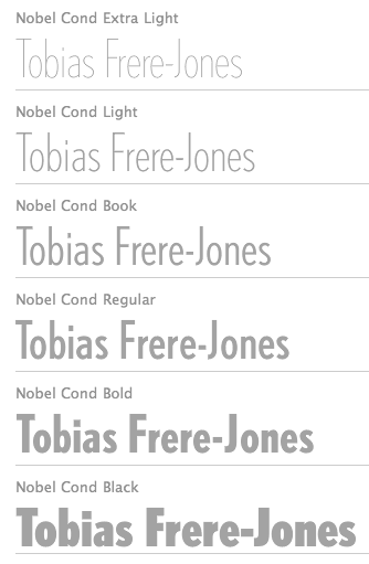 Celebrated type designer, born in 1970 in New York City. Frere-Jones received a BFA in Graphic Design from the Rhode Island School of Design in 1992. He moved to Boston, where he worked at the Font Bureau until 1999. He joined the faculty of the Yale University School of Art in 1996 and has lectured throughout the United States, Europe and Australia. From 1999 until 2014, he worked for and with Jonathan Hoefler in New York. In 2015, he set up his own type foundry, Frere Jones Type. His old Font Bureau typefaces can be bought since 2020 at Frere Jones / Type Network. His work is in the permanent collections of the Victoria & Albert Museum in London and the Museum of Modern Art in New York. In 2006, The Royal Academy of Visual Arts in The Hague (KABK) awarded him the Gerrit Noordzij Prijs, for his contributions to typographic design, writing and education. In 2013 he received the AIGA Medal, in recognition of exceptional achievements in the field of design.
 His Font Bureau typefaces: - Armada (1987-1994). A rigid elliptical sans in many styles. This is a surprisingly beautiful family despite its self-imposed design restrictions. The Compressed Black is a piano key typeface in the style of Wim Crouwel. Font Bureau: An experiment in algorithmic design, Armada follows the verticals and flat arches so often to be found in the architectural geometry of cast iron and brickwork in 19th century American cityscapes.
- Asphalt (1995). Font Bureau: Who hasn't admired the energy of Antique Olive Nord? All other ultrabolds seem sluggish in comparison. Nord exudes Excoffon's animation and Gallic impatience with the rules. Tobias Frere-Jones cross-bred the weight, proportion, and rhythms of Nord with the casual grace of his own Cafeteria, gaining informality and a dancing vitality on the page.
- Benton Sans (1995-2003). Created by Tobias frere-Jones and Cyrus Highsmith, it is a revival of Benton's 1903 family, News Gothic, and one of Font Bureau's bestsellers. It is a very complete family, ranging from regular widths to Condensed, Compressed and ExtraCompressed subfamilies. The Small Caps set is complete as well.
- Benton Modern (1997-2001). Benton Modern was originally undertaken by Tobias Frere-Jones to improve text at The Boston Globe. Widening the text face for the Detroit Free Press, he returned Century's proportions to Morris Fuller Benton's turn-of-the-century ATF Century Expanded, successfully reviving the great news text type. The italic, based on Century Schoolbook Italic, was designed by Richard Lipton and Christian Schwartz, who also added the Bold.
- Cafeteria (1993). Font Bureau about this cartoonish font: The irregularities normally found in script can enliven sans-serif letterforms. In Cafeteria, Tobias Frere-Jones took special care to balance activity with legibility on the paper napkin that served as his sketchpad, drawing a freeform sans-serif that is condensed but in no way stiff.
- Citadel (1995).
- CochinOldstyle (1992), CochinBlack (1991).
- Eldorado (1993-1994).
- Epitaph (1993). Drawn around 1880 at the Boston Type Foundry (the Boston branch of American Type Founders), Epitaph was modeled on a graceful Art Nouveau letterform that was bringing a new vitality to gravestone inscriptions at the time. The energy and life of the Vienna Secession alphabet drew the attention of Tobias Frere-Jones, who digitized the original set of titling capitals and added alternate characters for its Font Bureau release.
- Garage Gothic (1992). In three weights, it is based on parking garage ticket lettering but very reminiscent of license plate characters.
- Grand Central (1998). Grand Central was designed for 212 Associates from late-twenties capitals hand-painted on the walls of Grand Central Station. Font Bureau writes: The design is a distinguished Beaux Arts descendant of the great French Oldstyle originated by Louis Perrin in Lyons in 1846, known across Europe as Elzevir and in the U.S. as De Vinne.
- Griffith Gothic (1997-2000). A revival of Chauncey Griffith's telephone book directory typeface, Bell Gothic (1937-1938).
- Hightower (1994-1996). A Venetian typeface originally done for the Journal of the American Institute of Graphic Arts. Font Bureau: Dissatisfied with others' attempts to bring Nicholas Jenson's 1470 roman up to date, Frere-Jones prepared his version of this calligraphic roman, with his own personal italic.
- Interstate (1993, Font Bureau). Done for the United States Federal Highway Administration, but later released as a type family by Font Bureau. Interstate Mono (done with Christian Schwartz) followed in 2000, also at Font Bureau. The family is a reinterpretation of Highway Gothic, which has been the official typeface for American highway signage for decades. Its design is ultimately based on signage alphabets developed in the late 1940s by Dr. Theodore Forbes, assisted by J.E. Penton and E.E. Radek.
- Miller. A Scotch Roman finished in 1997 together with Matthew Carter and Cyrus Highsmith at Font Bureau.
- Niagara (1994). Almost a skyline typeface. Contains Niagara engraved.
- FB Nobel (1993). An exquisite geometric sans family based on old ideas of De Roos at Amsterdam who explored alternative character sets to enliven basic Futura forms. Frere-Jones views Nobel as Futura cooked in dirty pots and pans. FB Nobel showcased. The Extra Lights were added by Cyrus Highsmith and Dyana Weissman.
- Pilsner (1995). A beer bottle typeface. Font Bureau: Sitting in a Paris cafe with a bottle of beer, Tobias Frere-Jones gave his attention to the label. It was set in a roman design wearing blackletter-like clothes, probably to suggest an origin in Alsace or points to the East. Unable to forget the design, with its blocky, straight line emphasis, Tobias designed Pilsner, an exercise in straight lines in an angle-centered scheme.
- Poynter Old Style (1997, Font Bureau).
- FB Reactor (1996). This was first a FUSE7 font in 1993). Reactor destroys itself as it is put to use.
- Reiner Script (1993). Based on a 1951 brush script by Imre Reiner (ATF).
- Stereo (1993). After a typeface by Karlgeorg Hoefer, 1963 (Font Bureau says 1968).
At FontFont, he designed the children's fonts FF Dolores (1991) and FF Dolores Cyrillic. At FUSE 15, he designed Microphone (1996). At FUSE 10, he published Fibonacci, a font consisting just of lines. His custom work includes WorthGothic (1996), WorthLogo1996 (1995), WorthText (1995), GQGothic (1995), Halifax, Commonwealth (1995), Belizio-TwentySix (Font Bureau), HermanMillerLogo (1999, Font Bureau). Cassandra, Vitriol (1993), Quandry (1992-1994) and Chainletter (1993). Retina Agate (2001, specially made for small-print stock listings at the Wall Street Journal) netted him a Bukvaraz 2001 award and an AIGA 2003 Design Award. From 1999 until 2014, he designed for the Hoefler Type Foundry, which he joined as an equal partner (and the new company became Hoefler & Frere-Jones (in 2004), or H&FJ). He claims that he brought with him to H&FJ a lot of typefaces including Whitney, Whitney Titling, Elzevir, Welo Script, Archipelago (Shell Sans), Type 0, Saugerties, Greasemonkey, Vive, Apiana, and Esprit Clockface. It is not expicitly stated at the H&FJ site which typefaces he had a hand in, but one can safely assume that it must have been nearly every typeface made since he entered into the partnership. In 2014, Tobias sued Jonathan for half of the company in a 20-to-80 million dollar lawsuit since he claims that Hoefler reneged on his promise to give him his half. The typefaces at H&FJ he had a hand in include: Archer (2001, by Jonathan Hoefler and Tobias Frere Jones). A humanist slab serif originally designed for Martha Stewart Living. It has a great range of features, including a classy hairline style. Some say that Archer is just Stymie with some ball terminals. Nevertheless, it became a grand hit, and has been used by Wes Anderson in The Budapest Hotel, and by Wells Fargo for its branding. David Earls on Archer: with its judicious yet brave use of ball terminals, and blending geometry with sexy cursive forms, all brought together with the kind of historical and intellectual rigour you fully expect from this particular foundry, Archer succeeds where others falter. - HTF Retina (2002). For use in the Wall Street Journal.
- Gotham (2001). A sans serif done with the help of Jesse M. Ragan. In fact, the orignal design in 2000 was for GQ magazine. Read about it here. In 2007, he published the rounded version Gotham Round. Gotham was used in 2008 by Obama in his presidential campaign. Joshua Brustein (Business Week): Gotham is one hell of a typeface. Its Os are round, its capital letters sturdy and square, and it has the simplicity of a geometric sans without feeling clinical. The inspiration for Gotham is the lettering on signs at the Port Authority, manly works using "the type of letter that an engineer would make," according to Tobias Frere-Jones, who is widely credited with designing the font for GQ magazine in 2000. Critics have praised Gotham as blue collar, nostalgic yet exquisitely contemporary, and simply self evident. It's also ubiquitous. Gotham has appeared on Netflix (NFLX) envelopes, Coca-Cola (KO) cans, and in the Saturday Night Live logo. It was on display at the Museum of Modern Art from 2011 to 2012 and continues to be part of the museum's permanent collection. It also helped elect a president: In 2008, Barack Obama's team chose Gotham as the official typeface of the campaign and used it to spell out the word HOPE on its iconic posters. Hoefler produced versions in 2016 such as Gotham Office and Gotham Narrow Office.
- Cyclone (2003).
- In 2010, he and Jonathan Hoefler designed the sans family Forza.
- Giant (2003).
- Knoz (2003).
- Topaz (2003).
- Verlag (2006). Developed together with Jonathan Hoefler.
- Whitney (2004). This is an amazing 58-style sans family designed for the Whitney Museum, but now generally avalaible from Hoefler, and touted as a great family for infographics. A derivative, Whitney-K, is the house font of Kodak. Whitney's sales blurb: While American gothics such as News Gothic (1908) have long been a mainstay of editorial settings, and European humanists such as Frutiger (1975) have excelled in signage applications, Whitney bridges this divide in a single design. Its compact forms and broad x-height use space efficiently, and its ample counters and open shapes make it clear under any circumstances.
- With Hoefler, he collaborated on projects for The Wall Street Journal, Martha Stewart Living, Nike, Pentagram, GQ, Esquire, The New Times, Business 2.0, and The New York Times Magazine. In all, he has designed over five hundred typefaces for retail publication, custom clients, and experimental purposes. His clients have included The Boston Globe, The New York Times, The Cooper-Hewitt Museum, The Whitney Museum, The American Institute of Graphic Arts Journal, and Neville Brody. He has lectured at Rhode Island School of Design (from which he graduated with a BFA in 1992), Yale School of Art, Pratt Institute, Royal College of Art, and Universidad de las Americas. His work has been featured in How, ID, Page, and Print, and is included in the permanent collection of the Victoria&Albert Museum, London.
Interview. Interviewed by Dmitri Siegel. He created Estupido Espezial for fun, but it actually made it into an issue of Rollingstone. Catalog of his typefaces at Font Bureau. Keynote speaker at Typecon 2014. View typefaces designed by Tobias frere-Jones. Another page with typefaces created by Tobias Frere-Jones. [Google]
[MyFonts]
[More] ⦿
|
Helmut Ness
|
Graphic and type designer Helmut Ness was born 1972 in Frankfurt, Germany and lives and works in Berlin. He co-founded Fuenfwerken, which is based in Wiesbaden and Berlin. He and his team worked on several information design projects for the Munich Transport Authority including metro and tram maps, and timetables. Designer of Linotype Russisch Brot (1997, with Markus Remscheid). In 1988, Werner Schneider made "Euro Type" for the German Federal Transportation Ministry in order to optimize the legibility of and standardize transportation typefaces. In 2002, Helmut Ness cooperated with him and produced the 22-weight and 14-dingbat family Linotype Vialog, which is now used in the subway of Munich and on some products of Pfizer. Since 2006, it is also the corporate font of RENFE, the Spanish train authority. The dingbats (which have many arrows) are called Vialog Signs. Creator of the iFontMaker font TouchHel (2010, hand-printed). Linotype page. FontShop link. Klingspor link. [Google]
[MyFonts]
[More] ⦿
|
Jay Rutherford
[Typoart GmbH (or: VEB Typoart)]
|
 [MyFonts]
[More] ⦿
[MyFonts]
[More] ⦿
|
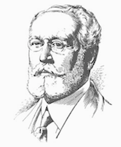
Karlgeorg Hoefer
|
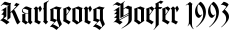 German scribe, type designer and unbelievable calligrapher, b. 1914 in Schlesisch-Drehnow, d. 2000 in Offenbach. Following schooling in Schlesien and Hamburg, he served a four-year typesetting apprenticeship from 1930-1934 in Hamburg and later at the Kunstgewerbeschule (School of Arts and Crafts) in Offenbach am Main. From 1939 until 1945 he was in active military service and became a prisoner of the Russians. After that ordeal, he became a calligraphy teacher at the Werkkunstschule in Offenbach, and developed a universal pen with novel writing and drawing techniques for the company Brause. It is at that point that Hoefer started designing types as well. From 1970 to 1979, Hoefer was a lecturer and later professor at the HfG (School of Design) in Offenbach. From 1981 to 1988, Hoefer ran summer calligraphy workshops in the USA (Los Angeles, San Francisco, Boston, New York, Washington, and other cities). In 1982, Karlgeorg Hoefer founded a calligraphy workshop in Offenbach for everyone, with evening courses and summer school, and in 1987, the registered association "Calligraphy Workshop Klingspor, Offenbach, Supporters of International Calligraphy." From 1987 to 1995, he was the chairman of the association while teaching continuing courses and summer school classes with leading foreign calligraphers. Hoefer has written two books about calligraphy: "Das alles mit einer Feder" (Brause, 1953) and "Kalligraphie, gestaltete Handschrift" (Econ, 1986). Numerous articles about Hoefer's work have appeared in calligraphy journals in Holland, France, the USA, and Japan. In 1989, the book "Schriftkunst/Letterart Karlgeorg Hoefer" was published as part of Calligraphy-Editions Herbert Maring (Die Kalligraphie Edition, Hardheim, Germany, 1989). For his activities as a calligrapher, Hoefer received the Order of Merit of the Federal Republic of Germany in 1993. His typefaces:
 - At Klingspor: Salto (1952), Saltino (1953), Saltarello (1954), Monsun (1954). Salto is a famous and often-copied brush script.
- At D. Stempel: Prima (1957), Zebra (1963-1965, D. Stempel, a script that plays on the simulation of grey and the use of two colors; revived by Colin Kahn in 2007 as P22 Zebra).
- At Ludwig&Mayer: Permanent (1962-1969, a large Grotesk family developed over many years---this was revived by Daylight in 2010 as Permanent Massiv; URW sells Permanent Headline URW D without even a word about the original designer; Softmaker has Plakette Serial and P700 sans; Castcraft has OPTI Permanent and OPTI Pinacle; Marcus Sterz published Letterpress Headline in 2009), Stereo (1963, an outline poster headline script developed between 1957 and 1968; digitally revived in 1993 as Stereo (Tobias Frere-Jones, Font Bureau)), Elegance (1964, a handwriting script, which was the basis for Sincerely (2005, Canada Type)), Big Band (1974, a fat poster script revived in 2007 by Nick Curtis as Baby Cakes NF (2007)), Big Band Terrazzo (1974, a glaz krak face), Headline (1964, a poster typeface that emanated from Permanent).
- Programm-Grotesk (1970): Hoefer's first digital typeface, commissioned by JT Hellas for the Greek telephone books It was first used in the digital machine Digiset of Dr. Ing. Hell in Kiel.
- From 1978 until 1980, Karlgeorg got involved in the development of a German license plate font that could withstand forgery by black marker pens. The typeface, FE Mittelschrift/Engschrift, had also input from other sources.
- Lateinischen Ausgangsschrift (1974): a school script for the Linotype phototypesetter. This led later to VA Schrift (Berthold and Linotype).
- At Linotype: Omnia (1990, a unicase typeface with a Celtic uncial feel), San Marco (1990, round gothic / Rundgotisch), Notre Dame (1991-1993, a full blackletter face), Dominatrix (1994), Sho (1992, an Asian brush script), Beneta (1992, a French bastarda inspired by the Littera beneventana, the script of the Benedictine scribes from the 10th to the 12th century).
Linotype page. FontShop link. View Karlgeorg Hoefer's typefaces. [Google]
[MyFonts]
[More] ⦿
|
Karl-Heinz Lange
|
 Type designer (b. 1929, Wiesenkirch, d. 2010) at Typoart Dresden (former East Germany).
 Karl-Heinz was enrolled in the Humanistic Gymnasium at Elbing from 1939 to 1945 and changed to the Wernigerode High School after his family had to flee to central Germany. From 1949 to 1951, Karl-Heinz Lange studied at the Werkkunstschule Halle, where one of his teachers was Professor Post. After 1951, he continued his studies at the Hochschule for Grafik und Buchkunst in Leipzig with an emphasis on book design. He received his diploma in 1955 with distinction based on his design of a hot metal typeface. From 1956 to 1961, Karl-Heinz Lange worked as a lecturer for Type and Commercial Graphics at the Hochschule für Angewandte Kunst in Magdeburg. From 1961 to 1963, he taught at the Hochschule für Grafik und Buchkunst in Leipzig, and finally as a freelance commercial designer in Magdeburg. From 1969 to 1976 he was Artistic Director at Henschelverlag, Berlin. From 1976 until 1994 he was Professor of Type and Typography at the Fachschule für Werbung und Gestaltung in Berlin. From 2005 to 2007 he taught at the Fachhochschule Magdeburg/Stendal. Karl-Heinz Lange was awarded the second prize at the International Type Design Contest 1971 for a headline typeface, and, in 1984, at the XIth Biannual of Graphic Design in Brno, he won a silver medal for Publica. He created the telephone book typeface Minima and redesigned the Typoart Super Grotesk (Arno Drescher, 1930) as well as the newspaper typeface Magna (originally by Herbert Thannhaeuser). His fonts include: - Publika: a sans typeface developed between 1981 and 1983---this must have been one of the last big East German typefaces.... It obtained a silver medal at the Bienale of Graphic Design Brno 1984.
- Primus (a 1962 workhorse family for the magazines in the DDR), Magna (a DDR magazine text typeface from 1968) and Typoart Super Grotesk. These metal typefaces were adapted for Phototype by Lange.
- Minima (1984): a narrow sans designed for the DDR's telephone directory. Revived by Ralph M. Unger in 2017 as Tablica.
- ViabellaT H Pro (2009-2016). From 2006 until 2009, Veronika Elsner and Günther Flake helped Lange with his new signage script typeface Viabella. Earlier, Elsner and Flake published Lange's Rotola (1985/2007). Viabella and Rotola were adjusted and finished after Lange's death by the type designer Björn Gogalla.
- At the end of his life, Lange had a fruitful cooperation with Primetype. His old typefaces were revived in 2009 with the help of Ole Schäfer as Publicala [PTL Publicala has 60 typefaces], Minimala [PTL Minimala is a family of 96 fonts from Primetype] and Superla [PTL Superla has 64 styles in the geometric/Futura genre]. The first two names refer, of course, to Publika and Minima.
- Rotula TH Pro (2016, Elsner & Flake). When first developed in 1985 at Typoart, Lange called this circle-themed psychedelic font Boutique. It was further developed by him from 2006 until 2009, and finally published by Elsner & Flake after his death in 2016.
Obituary (in German) by Ivo Grabowitsch. [Google]
[MyFonts]
[More] ⦿
|
La Police
|
Swiss type design mag, started in 2016. Issua A (2016) has these articles: - Pastis & Cigarettes. Josef Tyfa first published Academia as metal type. (Frantisek Storm)
- Subalpine. One-off One: Josef. Josef Müller-Brockmann fitting the typewriter's grid. (Atelier Carvalho Bernau)
- Typewriter type faces. Recollecting aesthetics of spacing constraints. (Alan Bartram)
- The Race for Unica. One-off Two: Unica Intermediate Portemanteau design back in fashion. (Louise Paradis)
- The Haas Type foundry Ltd. in an International Environment. Changes and Developments in its Organisation and Operation part 1. Looking back, down the rabbit hole. (Brigitte Schuster)
Issue B (2017) has these articles: - The Haas Type foundry Ltd. in an International Environment Changes and Developments in its Organisation and Operation part 2. Looking back, closer, down the rabbit hole. (Brigitte Schuster)
- Sans plomb. Early digitals. (Optimo).
- The 2002 Typographic Agenda. Learning by drawing. (François Rappo)
- Typeface Redesign. Think before your draw. (Christian Mengelt)
- A Note on the AA Files Display Initials. One-off Three: all styles Various styles for different issues. (Adrien Vasquez)
- Cogitating Vectors: The Hershey Fonts. Recoordinating the past. (Frank Grießhammer)
- Everyday types. Researching Ladislas Mandel's typefaces for telephone directories part 1: Galfra. There is interference on the lines. (Alice Savoie, Dorine Sauzet & Sébastien Morlighem)
[Google]
[More] ⦿
|
Ladislas Mandel
|
 Born in 1921 in Transylvania, he trained at the Fine Arts Academy of Budapest (Hungary) and then at the Beaux-Arts in Rouen (Normandy, France). Ladislas Mandel was a stonecutter, painter and sculptor. However, he spent his life in France, mostly as a type designer at Deberny&Peignot, where he worked since 1954. In 1955, he headed the type atelier. He was taught by and cooperated with Adrian Frutiger during nine years at Deberny, finally succeeding Frutiger in 1963 as type director. In 1955, he was in charge of the transformation of the Deberny type repertoire from lead to phototype. He created original designs under the label International Photon Corporation, and turned independent designer in 1977. After that, he specialized in typefaces for telephone directories, and made, e.g., Colorado in 1998 with Richard Southall for US West. He cofounded the ANCT in Paris in 1985 and taught there and at Paris VIII. In 1998, he published the book Ecritures, miroir des hommes et des sociétés (éditions Perrousseaux), which was followed in 2004 by Du pouvoir de l'écriture at the same publisher. He died on October 20, 2006.
 - His typefaces for the Lumitype-IPC (International Photon Corporation) catalogue include originals as well as many interpretations of famous typefaces: Arabica Arabic (1975), Aster (1960-1970), Aurélia (1967), Baskerville (1960-1970), Bodoni (1960-1970), Bodoni Cyrillic (1960-1970), Cadmos Greek (1974), Cancellaresca, (1965) Candida (1960-1970), Caslon (1960-1970), Century (1960-1970), Clarendon (1960-1970), Edgware (1974), Formal Gothic (1960-1970), Frank Ruehl Hebreu (1960-1970: this is one of the most popular Hebrew typefaces ever), Gill Sans (1960-1970), Gras Vibert (1960-1970), Hadassah (1960-1970), Haverhill (1960-1970), Imprint (1960-1970), Janson (1960-1970), Mir Cyrillic (1968), Modern (1960-1970), Nasra Arabic (1972), Néo Vibert (1960-1970), Néo-Peignot (1960-1970), Newton (1960-1970), Olympic (1960-1970), Plantin (1960-1970), Rashi Hebreu, Sofia (1967), Sophia Cyrillic (1969), Sphinx (1960-1970), Textype (1960-1970), Thai (1960-1970), Thomson (1960-1970), Times Cyrillic (1960-1970), Univad (1974), Weiss (1960-1970).
- Types done or revived at Deberny&Peignot: Antique Presse (1964, Deberny&Peignot), Times (1964). A note here: many type experts believe that Antique Presse is not by Mandel. According to Production Type, it was established that Adrian Frutiger, then art director of Deberny&Peignot, was more likely the mind behind Antique Presse. As further proof, Antique Presse quite blatantly follows Frutiger's Univers pattern on many levels.
- Types for phone directories: Clottes (1986, Sneat - France Telecom), Colorado (1998, U.S. West, created with the help of Richard Southall), Galfra (1975, Seat, Promodia, Us Seat, English Seat: there are versions called Galfra Italia (1975-1981), Galfra Belgium (1981), Galfra UK (1990), and Galfra US (1979-1990)), Lettar (1975, CCETT- Rennes), Letar Minitel (1982-1983), Linéale (1987, ITT-World Directories), Lusitania (1987, ITT-World Directories), Nordica 1985 (ITT-World Directories: Nineuil says that this is done in 1987-1988), Seatypo Italie (1980).
- Other typefaces: Portugal, Messidor (1983-1985, old style numerals font for the Imprimerie Nationale), Solinus (great!!, 1999), Laura (1999).
Ladislas Mandel, l'homme derrière la lettre is Raphael de Courville's thesis in 2008 at Estienne. In 1999, Olivier Nineuil wrote Ladislas Mandel: Explorateur de la typo français (Etapes graphiques, vol. 10, pp. 44-64). Olivier Nineuil's description of his achievements. [Google]
[MyFonts]
[More] ⦿
|
Martin Majoor
|
 Dutch type designer born in Baarn in 1960, who works in Arnhem and Warsaw. Showcase of his most popular typefaces. Type designs:
 - His 1993 Scala text family (which includes both sans and serif sub-families, as well as goodies such as the fist font FF Scala Hands, 1998) is great and well-balanced---one of the best fist fonts ever made. Scala is in the style of W.A. Dwiggins's Electra.
- He designed Telefont List and Telefont Text for the Dutch phone company PTT Telekom in 1994. He writes: The 1994 design of the Dutch telephone book can partly be seen as a reaction to the iconic 1977 phonebook designed by the modernist Wim Crouwel with Jolijn van der Wouw. Crouwel's late-modernist design, featuring the typeface Univers in lowercase-only text, had been christened The New Ugly by Dutch writers. In the following years, the original Crouwel design had been watered down considerably, and by the early 1990s, its usability had reached an all-time low. When Jan Kees Schelvis and Martin Majoor began their drastically renewed design of the phonebook, they set themselves a list of strict requirements: a new typeface, a better hierarchy, improved usability, and paper-saving typography. Majoor was responsible for both the new typeface (later named Telefont) as well as the book's microtypography. In 2018, it was announced that the last telephone book had been published.
- He created Scala Jewels in 1997.
- FF Seria and FF Seria Sans (2000). These families received awards at the Bukvaraz 2001 competition.
- In 2004, he published FF Nexus Mix, FF Nexus Sans, FF Nexus Serif, and FF Nexus Typewriter.
- He started a project with Pascal Zoghbi on the development of Sada (2007), an Arabic companion of FF Seria. In 2009, Sada was renamed FF Seria Arabic and published by FontFont.
- In 2010, he started work on Questa Sans (a typeface with a special y). The Questa project is a type project of Jos Buivenga and Martin Majoor---Questa is a squarish Didot-like font that Jos originally had planned in one display style only. It turned out to be a perfect basis to apply upon Martin's type design philosophy about the form principle of serif and sans. Questa was finished in 2014 and now includes Questa Sans, Questa Serif, Questa Slab and Questa Grande. Finally, the Questa project became the Questa Foundry.
- His corporate typefaces include Deutsche Telekom.
Interview at Typotheque. MyFonts interview. To understand Majoor, read his article My type design philosophy. At ATypI 2004 in Prague, he spoke about his experiences as a designer and type designer in Poland. The text José Mendoza y Almeida (Martin Majoor and Sébastien Morlighem, introduction by Jan Middendorp, 2010, Bibliothèque typographique) describes Mendoza's contributions to type design. Majoor's Flickr page. Speaker at ATypI 2010 in Dublin. At ATypI 2018 in Antwerp, he spoke on the history of Telefont. His type design blog. Klingspor link. FontShop link. MyFonts catalog. Adobe link. [Google]
[MyFonts]
[More] ⦿
|
Matthew Carter
|
 Matthew Carter (born in London in 1937, and son of Harry Carter) is one of today's most influential type designers. He trained as a punchcutter at Enschedé in 1956. In 1963 he was hired by Crosfield, a firm that pioneered the new technology of photo-typesetting, to lead their typographic program. He worked for Mergenthaler Linotype (1965-1981), and co-founded Bitstream Inc. with Mike Parker in 1981, adapting many fonts to digital technology. In January 1992, he founded Carter&Cone with Cherie Cone, and often collaborated with Font Bureau. In 1995, he won the Gold Prize at the annual Tokyo Type Directors Club competition for Sophia. In 1997, he received the TDC Medal for significant contributions to the life, art, and craft of typography. In 2010, he received a MacArthur grant. He lives in Cambridge, MA.
 John Berry on Carter's art (2002). Apostrophe comments on Berry's article. Interview. His fonts: - The Microsoft screen fonts Verdana (1996), Georgia (1996), Georgia Greek, Georgia Cyrillic, Nina and the humanist sans typeface Tahoma (1994). Georgia (in roman and italic only) is a screen version of Miller, Carter's Scotch design. Nina was designed to address the requirements on smaller screens such as phones, and was used in Windows Mobile smartphones before Microsoft switched to Segoe. The Greek and Cyrillic versions of Nina were developed by François Villebrod. Georgia Pro (2010, Ascender) was developed from Georgia with the help of Steve Matteson. For Verdana Pro (2010, Ascender), Carter was assisted by David Berlow and David Jonathan Ross.
- Apple's Skia (1993), a sans serif designed with David Berlow for Apple's QuickDraw GX technology, now called AAT. [Carter's Skia and Twombly's Lithos are genetically related.]
- Monticello (2003), based on Linotype's Monticello (1950), which in turn goes back to Binny&Ronaldson's Monticello from 1797, a typeface commissioned by Princeton University Press for the Papers of Thomas Jefferson. It is in the Scotch roman style.
- Miller (1997, Font Bureau), an extremely balanced family co-designed by Carter, Tobias Frere-Jones and Cyrus Highsmith. Carter explains: Miller is a Scotch Roman, a style that had its beginnings in the foundries of Alexander Wilson In Glasgow and William Miller in Edinburgh between about 1810 and 1820. It is considered that the punchcutter Richard Austin was responsible for the types of both Scottish foundries. Miller is a revival of the style, but is not based on any historical model. Now, there is also a 16-weight newspaper version, Miller Daily (2002), and an 8-weight Miller Headline (2002). This was followed by News Miller, a typeface designed for the Guardian. Note: Georgia (1996) is a screen version of Miller, and Monticello (2002) is a later modification. A comparison of these typefaces.
- Alisal (1995, +Bold).
- ITC Galliard (1978), a recreation of Robert Granjon's garalde letters. This typeface was originally conceived in 1965. Bringhurst recommends a Carter and Cone version of this font, called Galliard CC: it has old style figures and small caps. Further versions include Aldine 701 (Bitstream), Matthew (Softmaker), ITC Galliard Etext (2013, Carl Crossgrove, Linotype), and Gareth (Softmaker).
- The ITC Charter family (1987 for Bitstream and known as Bitstream Charter; licensed to ITC in 1993; see the Elsner&Flake version of ITC Charter). An upgraded commercial version was released by Bitstream in 2004 under the name Charter BT Pro.
- Vincent (1999), a font commissioned for use in Newsweek. It is named after Vincent Figgins, an English foundry owner and punch cutter who lived in the late 18th century.
- Walker (1994), designed for The Walker Art Center.
- Ionic Number One (1999, Carter&Cone).
- Mantinia (1993, Font Bureau), based on inscriptional forms, both painted and engraved, by the Italian renaissance artist Andrea Mantegna.
- Big Caslon (1994, Font Bureau), a display typeface based on the largest romans from William Caslon's foundry.
- Big Figgins (1992) and Big Figgins Open (1998, based on the decorative didone types shown in the specimens of Vincent Figgins of 1815 and 1817). Big Figgins was called Elephant and Elephant Italic in Microsoft's Truetype Fontpack 2.
- Sammy Roman (1996), loosely based on the 17th century romans of Jean Jannon. A beautiful typeface designed to accompany kanji and kana typefaces produced by Dynalab in Taiwan.
- Sophia (1993, Font Bureau), a mix with Greek, uncial and classical Roman influences.
- Shelley Script (1972), a family of formal scripts, split into Andante, Volante and Allegro. It is based on intricate English scripts of the 18th and 19th centuries attributed to George Shelley.
- Cochin (1977, at Linotype). MyFonts writes: In 1913 Georges Peignot produced a typeface based on Nicolas Cochin's eighteenth century engravings. In 1977, Matthew Carter expanded this historic form into a three part series.
- Bell Centennial (Linotype-Mergenthaler, 1975-1978), a legible heavily ink-trapped family designed by Matthew Carter as a replacement of Bell Gothic at Mergenthaler. There are also digital Linotype and Bitstream versions. AT&T commissioned the font to replace their previous typeface choice Bell Gothic for their 100th Anniversary.
- Cascade Script (1965-1966, Linotype, now also known as Freehand 471 BT in the Bitstream collection). Paratype's extension of Freehand 471 to Cyrillic is by Oleg Karpinsky (2011).
- New Century Schoolbook was designed from 1979-1981 in the New York Lettering office of Merganthaler Linotype based on Morris Fuller Benton's Century Schoolbook from 1915-1923. It was the second face, after New Baskerville, that was digitized and expanded using Ikarus (digital technology). The Bitstream version [Century Schoolbook] is a virtually exact copy, only being moved from a 54 unit to a 2000 or so unit design.
- Auriol (Linotype), an art nouveau family (including Auriol Flowers 1 and 2 and Auriol Vignette Sylvie) based on the lettering of the painter and designer Georges Auriol. MyFonts explains: Auriol and Auriol Flowers were designed by Georges Auriol, born Jean Georges Huyot, in the early 20th century. Auriol was a French graphic artist whose work exemplified the art nouveau style of Paris in the late 19th and early 20th centuries. In 1900, Georges Peignot asked Auriol to design fonts for Peignot&Sons. The resulting Auriol font was the basis for the lettering used by Hector Guimard for the entrance signs to the Paris Metro. It was re-released by Deberny&Peignot in 1979 with a new bold face, designed by Matthew Carter. These decorative fonts with a brush stroke look are well-suited to display settings. The Peignot drawing office insisted on a more normal appearance in the boldface, calling it Robur. Matthew Carter has returned to Auriol's original design for the whole series.
- Helvetica Greek (Linotype).
- Helvetica Compressed (Linotype, 1974, with Hans-Jörg Hunziker).
- Wilson Greek (1995), compatible with Miller Text, and based on a type cut by Alexander Wilson for the Glasgow Homer of 1756. See here.
- Olympian (1970, Linotype), designed for newspaper use. This is Dutch 811 in the Bitstream collection. The custom typeface Milne (Carter&Cone) done for the Philadelphia Inquirer is based on Olympian.
- Gando, a French "ronde" typeface based on the work of Nicholas Gando (mid 1700s), and designed for photo-typesetting at Mergenthaler by Carter and Hans-Jörg Hunziker in 1970. Very similar to Bitstream's Typo Upright.
- Fenway (1998-1999, Carter&Cone), commissioned by Sports Illustrated to replace Times Roman.
- Snell Roundhand (1965-1966): a connected cursive script based on the 18th-century round hand scripts from English writing masters such as Charles Snell. Early in the digital era, Matthew published this in the Bitstream collection as Roundhand BT. A Cyrillic version by Isabella Chaeva and Vladimir Yefimov was released by ParaType in 2013.
- Auriga (1970). (Wallis dates this in 1965 at Linotype.)
- CRT Gothic (1974).
- Video (1977).
- V&A Titling (1981).
- Deface (in the FUSE 18 collection).
- Madrid (2001), done for the Spanish newspaper El País.
- Milne, done for the Philadelphia Inquirer (a revised version of Olympian). Not available.
- Durham, a sans serif family for US News&World Report.
- Airport.
- Century 725 (Bitstream, for the Boston Globe: after a design by Heinrich Hoffmeister).
- For Microsoft: Georgia, Verdana, Tahoma (1994), Nina.
- Freehand 471 (Bitstream). A chunky slightly angular script.
- New Baskerville. [Matthew Carter says that this is wrongly attributed to him. It was directed by John Quaranta.]
- Postoni [or Post-Bodoni], for the Washington Post, which is still using it. See here.
- Le Bé, a Hebrew typeface that was used in the Pennyroyal Caxton Bible.
- Rocky (2008, Font Bureau, with Richard Lipton), for the Herald in Scotland.
- Time Caledonia.
- Wiredbaum, for WIRED.
- Wrigley (for Sports Illustrated). Matthew Carter designed Roster in the 1990s, and it was adopted as a display face for Sports Illustrated under the name Wrigley. Jesse Ragan was instrumental in later expanding the family from its original seven styles to the current 60. In 2015, Carter & Cone and Font Bureau released an expanded 60-style family of this typeface under the new name Roster.
- Benton Bold Condensed (for Time Magazine).
- Foreman Light (for the Philadelphia Inquirer).
- Newsbaum (for the New York Daily News).
- Carter Latin: Matthew was commissioned in 2003 to create a new design to be cut in wood type by the Hamilton Wood Type&Printing Museum in Two Rivers, WI. He came up with an all-caps, chunky, Latin-serif design.
- Times Cheltenham (2003), which replaces in 2003 a series of headline typefaces including Latin Extra Condensed, News Gothic, and Bookman Antique.
- The Yale Typeface (2004), inspired by the late fifteenth-century Venetian typeface that first appeared in Pietro Bembo's De Aetna, published by Aldus Manutius. This extensive family is freely available to members of Yale University.
- DTL Flamande (2004, Dutch Type Library), based on a textura by Hendrik van den Keere. Since 2018, available from URW++. Additions to DTL Flamande by Lukas Schneider.
- Meiryo UI, Meiryo UI Bold, Meiryo UI Bold Italic, Meiryo UI Italic (2004). Meiryo is a modern sans serif Japanese typeface developed by Microsoft to offer an optimal on screen reading experience and exceptional quality in print, as part of the Cleartype project. The Japanese letterforms are generously open and well-proportioned; legible and clear at smaller sizes, and dynamic at larger display sizes. The beauty of Meiryo is that it sets text lines in Japanese with Roman seamlessly and harmoniously. Meiryo was designed by a team including C&G Inc., Eiichi Kono, Matthew Carter and Thomas Rickner. It won a 2007 type design prize from the Tokyo Type Directors.
- Suntory corporate types (2003-2005), developed with the help of Akira Kobayashi and Linotype from Linotype originals: Suntory Syntax, Suntory Sabon, Suntory Gothic, Suntory Mincho.
- Rocky (2008, Font Bureau): A 40-style high contrast roman family that is difficult to classify (and a bit awkward). Developed with Richard Lipton.
- Carter Sans (2010, ITC), based on epigraphic letters used in inscriptions. Created for the identity of the Art Directors Club 2010 class of its Hall of Fame, one the laureates in the 2010 Hall of Fame. Codesigned by Dan Reynolds, this chiseled typeface is loosely based on Albertus.
- In 1997, he designed Postoni for the The Washington Post's headlines, a sturdy Bodoni.
- MS Sitka (2013). A typeface with six optical sizes that are chosen on the fly if an appropriate application is present. Developed at Microsoft with the help of John Hudson (Tiro Typeworks) and Kevin Larson (who carried out extensive legibility tests). German link. Typophile link. Sitka won an award at Modern Cyrillic 2014.
- Van Lanen Wood Type (Hamilton Wood Type, 2002-2013). Carter started work on the wood type in 2002, but technical accuracy issues postponed the implementation. Digital versions were finally done in 2013 by P22's Hamilton Wood Type.
- Big Moore (2014, Font Bureau): A 1766 specimen by Isaac Moore, former manager of Joseph Fry's foundry in Bristol, England, shows many types inspired by John Baskerville. But a century later, standardization had foisted inept lining figures and shortened descenders upon these designs. Matthew Carter remedies the tragedy with Big Moore. Oldstyle figures, full-length descenders, and historic swashes are restored to this regal serif in two styles. Big Moore won an award in the TDC 2015 Type Design competition.
- Role (2019, Sans, Slab, Serif, Soft). A superfamily published at Morisawa and Fontelier. Matthew Carter, Shotaro Nakano, and Kunihiko Okano co-designed Role Serif at Morisawa.
Speaker at ATypI 2013 in Amsterdam. Speaker at ATypI 2019 in Tokyo on the topic of Expressing Vocal Tones through Typography. Linotype link. FontShop link. Favorite quote: Watching me work is like watching a refrigerator make ice. Another quote: A typeface is a beautiful collection of letters, not a collection of beautiful letters. View Matthew Carter's typefaces. Matthew Carter's fonts. The typefaces made by Matthew Carter. See also here. Wikipedia page. Klingspor link. [Google]
[MyFonts]
[More] ⦿
|
Metro Bits
|
 Interesting pages about all of the world's metros: their architecture, history, art, logos and fonts. A partial list of famous metro signage fonts:
 - Amsterdam: M.O.L. (Gerard Unger, 1974)
- Berlin: Transit (MetaDesign, 1991), based on Frutiger. By Erik Spiekermann, Lucas de Groot, Henning Krause.
- Brussels: Brusseline (Eric de Berranger, 2006)
- Hong Kong: Casey (1996), based on Tahoma and Frutiger. Unknown designer.
- Lisbon: Metrolis (1995, Michael Barbosa, Freda Sack, David Quay)
- London: Johnston (Edward Johnston, 1916)
- Mexico City: Tipo Metro (1969, Lance Wyman)
- Munich: Vialog (2002, Werner Schneider, Helmut Ness)
- Newcastle: Calvert (1980, Margaret Calvert)
- New York: tile fonts by G.C. Heins, C.G. LaFarge and S.J. Vickers, 1901
- Newcastle: Calvert (1980, Margaret Calvert).
- Paris: Metropolitain (1901, Hector Guimard), Alphabet Métro (1973, Frutiger, based on Univers), Parisine (Jean-François Porchez, 1996)
- Prague: Metron (1974, Jiri Rathousky) and Helvetica
- Rotterdam: RET (1984, Henk Van Leyden)
- Seoul: Korail (2003), unknown designer.
- Singapore: LTA Identity Typeface (1980s, Hubert Jocham).
- Toronto: TTC Font (1954, based on Futura)
[Google]
[More] ⦿
|
MyFonts: Large x-height
|
Typefaces with a large x-height, as harvested from MyFonts. Typefaces with high x-height. These typefaces are typically associated with readability and are thought to be useful for small print applications such as telephone directories. Unfortunately, they are almost uniformly ugly. [Google]
[More] ⦿
|
MyFonts: Small text fonts
|
Typefaces designed for uses in small print, either on screen or on paper. [Google]
[More] ⦿
|
MyFonts: Telephone book fonts
|
MyFonts selection of telephone book fonts. Yet another page with telephone book typefaces. See also here. [Google]
[More] ⦿
|
Narrow fonts
|
 Linotype suggest seven condensed (narrow) fonts:
 - Monotype Grotesque Extra Condensed.
- Helvetica from Max Miedinger, which is similar to Monotype Grotesque, was expanded by Tom Grace to Neue Helvetica with new, extra-narrow compressed styles.
- Linotype Octane Regular (Norbert Reiners) has truncated tops, square dots and a large x-height.
- Anzeigen Grotesk (1943, Haas Type Foundry; modern digital version by URW++, 2009) is a minimal contrast extreme x-height grotesque that is legible in very small sizes.
- ITC Roswell Two (Jim Parkinson) is more geared to posters.
- Binner Gothic (Monotype).
- Facade (Steve Matteson). More a display font for large sizes, this font is added to the list for mysterious reasons.
[Google]
[More] ⦿
|
Phone Book Typography
|
Types suggested by the typophiles in 2007 for use in phone books: - Bell Centennial (Matthew Carter, 1978)
- Janszen (Martin Majoor)
- Whitney
- Univers, Franklin Gothic, or other slightly condensed sans typefaces
- Freight Micro (Joshua Darden)
- Retina (HFJ)
- BT (Dalton Maag, custom type)
- Nomina (Piero De Macchi)
- Galfra (Ladislas Mandel)
- Adsans (Walter Tracy, 1959)
- Cisalpin (Felix Arnold)
- Vialog (Werner Schneider and Helmut Ness)
[Google]
[More] ⦿
|
Piero De Macchi
|
 Italian type designer born in Turin in 1937. Designer at Nebiolo from 1956-1959. Freelancer and writer since 1971 at his own De Macchi graphic design studio. Most of his typefaces were commissioned by corporations. In 1992 he set up the calligraphic association Dal Segno alla Scrittura. His typefaces:
 - At ATypI in Rome in 2002, he spoke about Novarese, and about his new font family, Nomina, developed for the Italian telephone directories (SEAT). Commissioned in 1999, it was first produced in 2001. It replaced Mandel's Galfra which had been in use since 1977.
- Iveco (1985): commissioned by the trucking company.
- Pancarrè (2008). A sans typeface family under development (as of 2013).
- Graphicus (2003). Done for the Graphicus magazine, Alberto Greco Publishing House of Milan. There are sans and serif versions.
- The Renaissance chancery italic type Paloma (1992).
- An experimental Bodoni family (1989).
- Pitto (1997).
- The neoclassic family Alexandra (1991-1992).
- Norberto (2009). Done for an exhibition dedicated to Norberto Bobbio in 2009. A humanist curvy sans.
- Fiat Advert (2007). A grotesk commissioned by Fiat.
- The Carolingian script typeface Pennino (1996).
- WDC2 (2005). Commissioned by Badriotto Palladino Agency for the Torino World Design capital communication briefs.
- Exemplar (2005). This ten-style text family is the last unfinished alphabet of Aldo Novarese, completed by DeMacchi on request of the Novarese family.
- A destructivist humanist face, Tremolino (since 1996).
De Macchi's company, De Macchi Progetti Grafici, is located in Torino. Klingspor link. [Google]
[More] ⦿
|
Piet Zwart
|
 Dutch designer, b. 1885, Zaandijk, d. 1977, Wassenaar. Author of Cable Book (1925) and creator of many classic advertisements for the Netherlands Post Office (PTT). His work was influenced by Hungarian De Stijl artist Vilmos Huszar and Dutch architect Jan Wils, whom he met when he moved in 1913 to Voorbug. Wils had worked for Berlage. In 1913-1914, he studied at TU Delft and started his career with Berlage in Voorburg. From 1919 until 1922 he worked for Wils. In 1959, he received the Quellinus Prize in typography. The David Roellprijs followed in 1964. In 2000, Zwart was posthumously awarded the "Designer of the Century" award by the Association of Dutch Designers. From 1919 until 1933 he taught at the Rotterdamse Academie van Beeldende Kunsten en Technische Wetenschappen.
 Quoting Design Observer: Piet Zwart's work was multi-disciplinary and spanned the gamut of industrial design, typography, photography, and most notably graphic design. As an industrial designer, Zwart is best known for his design of the Bruynzeel modular kitchen in 1937, which is still available today. As a graphic designer, the work he produced for Nederlandse Kabelfabriek Delft (Dutch Cable Factory in Delft) and Dutch Postal Telegraph and Telephone Company (PTT) is arguably among the best known Dutch graphic design of the 20th century. His graphic design work clearly shows the influence of Constructivism and, though he was not a part of the De Stijl, his work reflects elements of this movement. Recurring themes are the use of repetitious patterns, lines, circles, primary colors, photomontage and explorations of experimental typography. Examples: Toneel Wij Nu, 1925, Kataloog PTT, 1924, Nutter margarine inpakpapier, 1923. Type revivals of Piet Zwart's typefaces include - Trio Grotesk (2012, Florian Schick at Bold Monday, and since 2020 at Type Network), a rounded sans family. It revives Zwart's Kaart Antieke from 1909.
- Rubber Vloeren (Ian Lynam, Wordshape). A geometric display typeface adapted from an alphabet used by Piet Zwart in the Netherlands for a series of advertisements for rubber flooring.
- Zoa Wassenaar (2013, David Rudnick).
- Monumental Grotesk (2016, Robin Mientjes, Tiny Type Co) is a stone-carving emulation typeface based on Piet Zwart's lettering for his architect friend, Hendrik Berlage.
[Google]
[MyFonts]
[More] ⦿
|
Ralph Michael Unger
[RMU (Ralph Michael Unger Typedesign)]
|
 [MyFonts]
[More] ⦿
[MyFonts]
[More] ⦿
|
Richard Southall
|
British font software specialist and type designer, 1937-2015, who was universally liked for his modesty even though he knew more than most about the theoretical and technical aspects of type design in the twentieth century. A graduate in natural sciences from Cambridge (1960), he joined Crosfield Electronics Ltd in London, where he was responsible for producing photomatrices for the Photon-Lumitype direct-photography photocomposing machines sold by Crosfield in Europe. From 1974 to 1983 he was a lecturer in the Department of Typography and Graphic Communication at the University of Reading. Between then and the end of the decade he worked in California and France, at Stanford University (where he worked with Don Knuth from 1983-1986 on the Metafont project), Xerox Palo Alto Research Center and the Université Louis-Pasteur in Strasbourg. Since then he has been a consultant type designer with the American Mathematical Society, BT, the Civil Aviation Authority, National Air Traffic Services and US West Dex (now Qwest Dex). Author of Printer's Type in the Twentieth Century Manufacturing and Design Methods (British Library Publishing, 2005; Sumner Stone's review of this book). He wrote many type-technical articles such as Designing a new typeface with METAFONT (Springer Lecture Notes in Computer Science, vol. 236, pp. 161-179, 1986), Shape and appearance in typeface design (in J H Miller (ed) Protext III: Proceedings of the Third International Conference on Text Processing Systems, 1986), Interfaces between the designer and the document (in J. André, R. Furuta and V. Quint (eds) Structured Documents, 1989), Problems of font quality assessment (with Debra Adams: in Jacques André and Roger D. Hersch (eds) Raster Imaging and Digital Typography, 1989), Presentation rules and rules of composition in the formatting of complex text (in Rosemary Sassoon's Computers and Typography, 1993), Character description techniques in type manufacture (in Rosemary Sassoon's Computers and Typography, 1993), Character generator systems for broadcast television (in Information Design Journal 2:1 (1981), Metafont in the Rockies: the Colorado typemaking project (in Roger D Hersch et al (eds) in Electronic Publishing, Artistic Imaging, and Digital typography, 1998), and Prototyping Telephone-directory Pages with TEX (in: Cahiers GUTenberg 28-29, pp. 283-294). With Ladislas Mandel, he designed the telephone directory typeface Colorado in 1998 for US West. It is one of the few examples of a practical application of a typeface coded in Metafont. Obituary by Gerry Leonidas. [Google]
[MyFonts]
[More] ⦿
|
RMU (Ralph Michael Unger Typedesign)
[Ralph Michael Unger]
|
 Ralph M. Unger (b. 1953, Thuringia, East Germany) says this about himself at MyFonts: Typesetter from the composing stick via Linotype setting machines to the Mac. Jobs in various Thuringian printeries. Barred further education by Communist authorities due to political reasons. Imprisoned in East Germany. Since 1988 in the state of Baden-Wuerttemberg, former West Germany. Jobs in several newspaper printing houses as advertisement compositor. Own office since 1995, in Aalen, Baden-Wuerttemberg. He lives in Schwaebisch Gmuend, and was a freelance type designer for Profonts and URW++, where he contributed frequently to their libraries between 2002 and 2009. In 2009, he founded RMU. MyFonts link. I split his contributions into two groups, the URW / Profonts group, and the RMU group. The prefix FontForum refers to a subseries of URW++ fonts. Unless specifically mentioned, all the following fonts are at URW++ and/or Profonts:
 - FontForum Admiral Script (2005): revival of Middleton's Admiral script from 1953.
- Amitié (2009): a garalde family.
- Arabella Pro (2006): after the script by Arnold Drescher from 1936, published at Joh. Wagner.
- Fontforum Atrament (2006): architectural lettering. Do not confuse with a Suitcase Type Foundry font from 2003 by the same name.
- Atze (2010): a comic book family.
- Behrensschrift D (2007): after the jugendstil typeface Behrens Schrift, 1902, by Peter Behrens.
- FontForum Bernhard Script (2005): after Bernhard Script from the 1920s.
- Bradley (2005): blackletter, after the original by William H. Bradley.
- Breite Kanzlei (2007).
- Breitkopf Fraktur (2003): after the original by Johann Gottlob Immanuel Breitkopf, done in 1793.
- Brocken (2011) is a signage typeface inspired by a design of Volker Küster (1960s).
- Profonts Bureau (2010, Profonts): a minimalist rounded sans family.
- FontForum Calypso (2005): a revival of Roger Excoffon's Calypso (1958).
- Card Pro (2006): a decorative display based on Ella Cursief (1916, Sjoerd Hendrik de Roos, Lettergieterij Amsterdam).
- Chaweng (2006, Profonts): an oriental all caps simulation face.
- Civilite URW (2005).
- Compliment (2004, casual script). Based on a 1965 script by Helmu Matheis for Ludwig & Mayer.
- Cranach (2007): a blackletter typeface modeled after Kuenstler Gotisch from the Krebs Foundry.
- Dominante (2007): a serif family based on Johannes Schweitzer's font by that name, 1959.
- Dominique (2010, profonts): an informal typeface.
- FontForum URW Ecsetiras (2005): revival of Ecsetirás (Zoltan Nagy, 1967, a brush face).
- Edda Pro (2008). An art nouveau typeface that revives a Heinrich Heinz Keune typeface from 1900.
- Energia Pro (2008, Profonts): connected monowidth script, based on Arno Drescher's Energos from 1932.
- Estro (2003, Western lettering). Seems close to Nebiolo's Estro from the 60s.
- Eurobrush Pro (2007, Profonts): handwriting.
- EuroSans (2008).
- Euroscript Pro (2006, Profonts): school script typeface based on his own handwriting.
- Flashes (2007): a revival of Crous-Vidal's Flash, 1953.
- Fox (2007): a brush script based on W. Rebhuhn's original from the 1950s.
- Gamundia (2010): a calligraphic copperplate script inspired by Excoffon's Diane.
- Ganz Grobe Gotisch (2006): a fat blackletter modeled after the original by F.H.E. Schneidler.
- Gmuender Elan Pro (2011) is a 1950s style script face.
- Gradl Nr 1 (2008): based on hand-drawn art nouveau upper case characters by M. J. Gradl, ca. 1900.
- Graphique Pro (2008): shaded caps face, based on Graphique, which was originally created by Swiss designer Hermann Eidenbenz in 1945, and issued as hot metal font by Haas'sche Schriftgießerei. See also New Graphique Pro (2011).
- Handel Slab (2009): a 6-style extension of Trogram's 1980 typeface Handel Gothic.
- Hanseat (2010): a grotesque family done at Profonts. It was heavily inspired by Germany's official DIN 1451 Engschrift.
- Iova Nova (2007): based on Jowa Script, designed by J. Wagner in 1967.
- Profonts>Impression (2008): art deco.
- Jessen Schrift (2004): after the Rudolf Koch blackletter typeface by that name.
- FontForum URW Konzept Pro (2005): revival of Konzept (1968, Martin Wilke's handprinting face).
- Legende (2002): a script typeface based on the original typeface of Friedrich Hermann Ernst Schneidler (1937).
- Leipziger Antiqua. The original Leipziger Antiqua by Alfred Kapr at Typoart dates from 1971 until 1973. The digital version of Leipziger Antiqua was developed by Ralph M. Unger in 2005.
- Manuskript Antiqua (2005): after Oldrich Meinhart's Manuskript Antiqua.
- The Maszynysta family of heavy industrial sans typefaces (2010) have a textured style (Struktura), a Shadow, and a plain Roman.
- Maxim (2003, Profonts): The heavy brush typeface Maxim was originally designed by Peter Schneidler in 1956 for the Bauer foundry.
- New Bayreuth (2008): after Friedrich Hermann Ernst Schneidler's Bayreuth from 1932.
- Old Borders and Lines (2010). A free font.
- Ornella (2008): Jugendstil.
- Peter Schlemihl (2008, Profonts): a revival of a blackletter by Walter Tiemann.
- Pedell (2009): a casual script.
- Polo (2002): a brush face modeled after Carl Rudolph Pohl's Polo (1960).
- In 2012, Ivana Koudelkova co-designed the grungy headline typeface Retroactive Pro with Ralph M. Unger at Profonts.
- Fontforum Rhapsody (2006): a revival of Ilse Schüle's rotunda face.
- Roberta (2003): art nouveau typeface after obert Trogman's typeface for FotoStar.
- FontForum Signs and Symbols (2006).
- Splendor (2009): a revival of a brush script typeface by Wilhelm Berg, Schriftguss, 1930. See also Splendor Pro (2014).
- Sportowy (2009): an outline face.
- Stanford (2011). A sports lettering face.
- Stiletto (2006): a medieval script.
- Fontforum Stripes (2007): a multistripe op art display typeface based on a Letraset font from 1973 by the same name.
- Fontforum Thalia (2006): retro font.
- Tintoretto (2006): shadow display face based on an origonal by Schelter & Giesecke.
- Tip Top Pro (2008): a Julius Klinkhardt art nouveau typeface revival.
- FontForum Unciala (2005): a revival of Oldrich Menhart's typeface Unciala (1953, Grafotechna).
- Unger Chancery (2005).
- Unger Script (2003): based on H. Matheis' Slogan typeface designed for Ludwig&Mayer in 1957.
- Veltro (2007): after a 1931 original by G. da Milano at Nebiolo.
- Profonts Woodpecker (2008).
The list of RMU fonts: - Affiche (2017). A revival of Helios Reklameschrift of the Klinkhardt foundry.
- Aldo Manuzio (2017). After a house typeface from 1897 by Schelter&Giesecke.
- Amati Pro (2010): after Georg Trump's condensed didone face, Amati, 1951.
- Antiqua Florenz (2021). A revival and extension of Paul Zimmermann's Antiqua Florenz (1960, Ludwig & Mayer), which is based on Venetian romans.
- Avus Pro (2012). A sans family that extends Gert Wunderlich's Maxima (1970).
- Baroque Pearl (2016). A pearly typeface that revives Peter A. Demeter's Fournier Geperlt (1922, Schriftguss).
- Behrens Kursiv (2013). After a 1906 original by Peter Behrens.
- RMU Belvedere (2020). A revival of Heinrich Wieynck's art nouveau / fin-de-siècle typeface Belvedere (1906, Bauer).
- RMU Bison (2020). A revival of Julius Kirn's brush script Bison (1935-1938, C.E. Weber).
- Bernhard Blackletter (2016). After Lucian Bernhard's extrafette Bernhard Fraktur (1921).
- Bernhard Cursive Extra Bold (2010).
- Borghese (2015). An art nouveau font after a Schelter & Giesecke original from 1904.
- Borgis Pro (2012). A Clarendon-style text family.
- Boulette (2015, a fat creamy script).
- RMU Bowery (2019) A revival of Old Bowery (1933, ATF)).
- Bravura Pro (2013). After G.G. Lange's Publica.
- Bricklayers (2012). An original fat slab display face.
- Brillant (2009): art nouveau and ultra heavy.
- Butti (2011). A script family paterned after Fluidum (1951, Alessandro Butti, Nebiolo).
- Cable Condensed (2014). Based on Koch's Kabel.
- Caesar Pro (2011). A flared sans typeface after Caesar Schrift (1913, Georg Schiller, C.F. Rühl).
- Capitol Pro (2012). An art deco typeface based on Capitol (Karl Hermann Schaefer for Schriftguss, 1931).
- Carina Pro (2017). A calligraphic script typeface based on Rautendelein (1929, Schriftguss).
- Carla Pro (2013). A broad-nibbed script modeled after Ballantines Script (Elsner & Flake, 1974; see also Ballantines Serial by SoftMaker).
- Carlsbad (2018). A couple of art nouveau typefaces based on originals from 1895 by H. Berhold called Regina Cursiv and Hansa Cursiv.
- Caslon Gotisch (2009): after the original by William Caslon from 1763.
- Celebration (2009): blackletter.
- Circensis (2016). A Western circus font based on a concept of Fritz Richter.
- Claudius (2010): after a 1937 blackletter font at Klingspor.
- Constanze Pro (2012). A light cursive typeface based on Constanze (1954, Joachim Romann, Klingspor).
- Contact Pro (2010): after Contact, a 1963 font by Helmut Matheis.
- Dante Alighieri (2018). Based on a Schelter & Giesecke original.
- Daphnis (2016). A revival of Daphnis (1929, Walter Tiemann).
- Deutschmeister (2017). A textura blackletter typeface after Deutschmeister by Berthold Wolpe for Ludwig Wagner in 1934. (Some dispute that Wolpe made this font.)
- Diamant Pro (2012). A transitional serif face.
- Emilia (2016). Based on Weiss Antiqua (1928) by Emil Rudolf Weiss.
- Neue Echo (2016). Based on Echo for Schriftguss.
- Elbflorenz (2020). A revival of Albert Auspurg's display typeface Miami (1934, Schriftguss).
- Emilia Gotisch (2016). After Weiss Gotisch (1936) by Emil Rudolf Weiss.
- Emilia Fraktur (2021). A revival of Emil Rudolf Weiss's Weiss Fraktur (1913).
- Erler Titling (2015). After Erler Versalien (1953, Herbert Thannhaeuser for Typoart).
- Eurotech Pro (2011): a slabby techno family.
- Faulkner Pro (2011): a connected heavy signage script based on Alan Meeks's Kestrel.
- Fette Kanzlei (2019).
- Fette Unger Fraktur (2010).
- Fichte Fraktur (2020). After Walter Tiemann's Fichte Fraktur (1934).
- Fontanesi RMU. An ornamental caps typeface that revives Aldo Novarese's Fontanesi (2018).
- Forelle Pro (2010): after the original Forelle script typeface by Erich Mollowitz, 1936.
- Frankenberg Pro (2012). An antique script face.
- Gabor Pro (2014). A connected copperplate script.
- Gaby Pro (2017). A revival of Hans Möhring's script typeface Gabriele (1938 or 1947, C.E. Weber).
- Garamond Antiqua Pro (2015).
- RMU Gilgengart (2020). A revival of Hermann Zapf's Fraktur font Gilgengart (1938).
- Gillray Pro (2015). A copperplate script after Hogarth Script (by Harald Bröder for Typoart).
- RMU Gloria (2019). After Gloria (1898, Emil Gursch).
- RMU Gong (2020). Based on Arno Drescher's Super Grotesk Schmalfett first released in 1933 at Schriftguss.
- Gmuender Gravur (2011). A 3d shadow face. Gmuender Antiqua Pro (2015) is influenced by the metal font Imprimatur (1952-1955, Konrad F. Bauer and Walter Baum). Gmuender Kanzlei (2018) is a blackletter typeface.
- Goethe Fraktur (2022). A revival of a blackletter typeface by Wilhelm Woellmer (1905).
- Gravira (2021). A revival of Herbert Thannhaeuser's Gravira, released by Schelter & Giesecke in 1935 .
- Haenel Antiqua (2020, based on a 19th century antiqua by Eduard Haenel) and Haenel Fraktur (2011, after Haenel Fraktur, ca. 1840).
- Hanse Textura (2020). A revival of a textura by Hermann Zapf.
- RMU Helion (2020). A revival of the 3d titling typeface Helion (1935, Arno Drescher for Schriftguss Dresden).
- RMU Herkules (2019). After a late 19th century font by Bauer and Berthold called Reklameschrift Herkules.
- Hoelderlin (2018). After Eugen Weiss's Hoelderlin blackletter font (1937).
- Hoyer Script (2017). After Hanns Thaddeus Hoyer's Hoyer Schoenschrift (1939, Stempel).
- Hupp Fraktur (2016). After Otto Hupp, 1911.
- Impuls (2010): a brushy typeface based on Paul Zimmermann's Impuls (1945).
- Initials RMU One (2012) consists of revivals of Rudhardsche Initialen (Otto Eckmann, ca. 1900) and Walthari Initials (ca. 1900, Rudhardsche Giesserei). Initials RMU Two (2012) consists of revivals of Jubilaeumsinitialen (by Bauersche) and Augsburger Initialen (by Peter Schnorr, 1901).
- Jean Paul Fraktur (2021). A revival of Breitkopf's Fraktur font Jean-Paul-Schrift (1798).
- Jobs Gravure (2011). It had to happen---a few days after Steve Jobs' death, Unger released the beveled engraved typeface Jobs Gravure, which is an extension of Trump Gravur (1954, Weber).
- Jolly Polly (2012): a curly non-connected script face.
- Kis Antiqua Pro (2018). A revival of Hildegard Korger's Kis Antiqua at Typoart.
- Kleist Fraktur (2010): after Walter Tiemann's original.
- Kompress Pro (2013). Two compressed sans typefaces.
- RMU Kontrast (2021). An art deco typeface that revives Kontrast (1930, F.H.E. Schneidler at Weber).
- Koralle RMU (2018). A revival of Schelter and Giesecke's Koralle (1915).
- Korpus Pro (2014). A text typeface family. Followed later in 2014 by Korpus Sans Pro.
- Korpus Serif Pro (2021). A revival and extension of Timeless (Typoart) that covers Greek, Latin and Cyrillic.
- Leibniz Fraktur (2012) is modeled after the famous Genzsch & Heyse blackletter font.
- Lenbach (2021). Inspired by a German font from the Victorian era.
- Liliom Pro (2012). A beautiful fat didone typeface based on an original from the Fonderie Française.
- Lipsia Pro (2011). An angular serif family.
- Literatura Pro Book (2012).
- Litfass (2021). A revival of an art nouveau font by Flisch.
- Lutetia Nova (2014). A fresh two-style take on Jan van Krimpen's Lutetia (1924).
- RMU Luchs (2021). A redesign of Jakob Erbar's inline all caps art deco font Lux (Ludwig & Mayer, 1929).
- Luxor Pro (2010): a Victorian/Western display face.
- Lyrica (2014). A revival of the informal blackletter typeface Lyrisch (1907, Georg Schiller).
- RMU Magnet (2021). A redesign and revival of Magnet (1951, Arthur Murawski at Ludwig & Mayer).
- RMU Manolo (2019). Based on the art nouveau typeface Manolo (Ludwig & Mayer).
- Manutius Pro (2012).
- Meister Antiqua (2011, +Bold, +Book). A Typoart original from 1951 in the tall flared ascender serif genre, revived and extended.
- Mitropaschrift (2016). An octagonal original.
- Mobil Pro (2011). A semi-script typeface in the fifties style of Matheis.
- Monument (2010): a 3d shadow roman caps face created after Oldrich Menhart's Monument.
- Narziss (2018). A revival of Walter Tiemann's Narziss from 1921.
- RMU Neptun (2021). A revival and extension of the art nouveau typeface Neptun by Aktiengesellschaft fuer Schriftgiesserei und Maschinenbau, Offenbach.
- Neue Kurier (2011). Typoart's popular signage script font in a new, completely remastered version.
- Neue Muenchner Fraktur (2010).
- Neue Schwabacher (2021). After Albert Anklam's Neue Schwabacher (Genzsch & Heyse, 1876).
- Neue Thannhaeuser (2011).
- Old Towne Pro (2010): a Western font.
- RMU Omega (2020). After Omega, an art deco typeface by Friedrich Kleukens at Stempel in 1926.
- Orbis Pro (2016). A revival of Walter Brudi's shadow typeface Orbis (1953, Stempel).
- Orplid Pro (2019). a layerable typeface that revives and extends Hans Bohn's all caps Bauhaus era typeface Orplid (1929).
- Parcival Antiqua (2016). A revival of Parcival Antiqua (1926, Herbert Thannhaeuser).
- Parfum (2013). A low x-height script that was inspired by Howard Allen Trafton's Quick (1933, bauer).
- Parler Fraktur (2018). A revival of Friedrich Poppl's Poppl Fraktur.
- Parler Gotisch (2011). A blackletter face.
- RMU Pittoreske (2019). A decorative Victorian typeface.
- Plastica Pro (2015, a chiseled typeface inspired by a J. Lehmann design).
- RMU Pergola (2021). A vintage shadow typeface inspired by a late-19th century font of Georg Giesecke.
- Post Fraktur (2014) and Postillon (2014). After Herbert Post, 1933-1937.
- Primana Pro (2012). A seductive geometric grotesk family.
- Prinzess Gravur (2010): a blackletter typeface modeled after Prinzeß Kupferstichschrift (1905, Berthold).
- Prisma Pro (2011). Revival and extension of Rudolf Koch's multiline typeface Prisma (1931).
- Reklame Fraktur (2016). After Reklame Fraktur by Albert Christoph Auspurg, 1914.
- Reflex Pro (2018). All caps, with an inline style.
- Reznicek Pro (2011) is a post-Victorian pre-art nouveau typeface named after Ferdinand von Reznicek (1868-1909), one of the leading artists and illustrators of those times.
- Rekord Antiqua (2020). A revival of the art nouveau era text typeface Rekord Antiqua (1911, Wagner & Schmidt).
- Rhythmus Pro (2016). After a Schriftguss AG and Schelter&Giesecke original grotesk, and extended to cover Cyrillic.
- Ridinger Std (2012). Based on Riedingerschrift (Franz Riedinger, 1906, for Benjamin Krebs Succ.).
- Ronde Pro (2011): roundhand script.
- Royal Grotesque (2021). A revival of Wotan by Wagner & Schmidt, 1914. Did this typeface become RMU Royal Sans (2022)?
- Salzmann Fraktur (2019). A revival of Max Salzmann's blackletter font released by Schelter & Giesecke in 1912.
- Saskia Pro (2016). Revival of Jan Tschichold's Saskia (1931, Schelter & Giesecke).
- Schmale Anzeigenfraktur (2009): based on Koch's Schmale Deutsche Anzeigenschrift, 1923, Klingspor.
- Schmale Mediaeval (2020). Based on Schelter & Giesecke's Schmale Mediäval (1840).
- Schmuckinitialen (2009): an ornamental caps typeface in the art nouveau style based on Walthari Initials [Walthari (1899, Heinz König for the Rudhard'sche Giesserei) in the upper case and Eckmann Initials (ca. 1900, by Otto Eckmann, Germany's chief art nouveau type designer) in the lower case].
- Schreibmeister (2021). Ralph's interpretation of Arno Drescher's formal cursive typeface for Ludwig Wagner (1958, Leipzig).
- Schwabacher Book (2013).
- Sebaldus (2019). A heavy blackletter typeface, after Sebaldus Gotisch (1926, H. Berthold).
- Senatsfraktur (2020). After Friedrich Bauer's Senats Fraktur done in 1907 for Genzsch & Heyse.
- Concordia (2020). A revival of Sensation Schmalfett (1914, Heinrich Hoffmeister).
- Siegfried Pro (2017). A revival of the art nouveau typeface Siegfried (1900, Wilhelm Woellmer).
- RMU Skizze (2021). This revives Walter Höhnisch's script typeface Skizze (1935, Ludwig&Mayer).
- Staxx Pro (2013). A prismatic typeface.
- Staufer Gotisch (2015). An engraved blackletter typeface modeled after Herbert Thannhaeuser's Hermann Gotisch (Schriftguss, 1934).
- Steinschrift Pro (2015). A single style condensed sans serif.
- Sylphe Pro (2019). A vintage script font that revives Schelter & Giesecke's Isabel (not Sylphide, as claimed by him).
- Tablica (2017). After Karl-Heinz Lange's DDR telephone directory font Minima (1984).
- Thannhaeuser Fraktur (2013) is a redesign of Typoart's Thannhaeuser Fraktur.
- Thomasschrift (2014). A rustic typeface that revives and extends Thomas-Schrift by Friedel Thomas (1957-1958, Typoart).
- Titanschrift (2011). A yummy soft and fat display face.
- Tombola (2018). After an alphabet from the 1920s by Otto Heim.
- RMU Trianon, renamed RMU Trifels (2020). After Heinrich Wieynck's Trianon (1905, Bauersche Giesserei).
- Trocadero Pro (2010): an extension and revival of Trocadero Kursiv, 1927, Albert Auspurg, Trennert.
- Troubadour Pro (2010): In Medium and Engraved styles.
- Trump Deutsch (2011): a blackletter face, after the 1935 original by Georg Trump.
- Trybuna (2013). Based on Herbert Thannhaeuser's Liberta Antiqua (1958), but completely redrawn.
- Turnier (2019). A revival of G.G. Lange's derby (1952-1953).
- Tyton Pro (2013). A brush script after Heinz Schumann's famous 1964 Stentor.
- Typoskript Pro (2010): a revival of Hildegard Korger's Typoskript, first done at TypoArt in 1968.
- Unger Fraktur (2010): after a 1793 design by Johann Friedrich Unger; includes fett and mager.
- Walbaum Antiqua Pro (2013). A revival of Justs Erich Walbaum's didone classic.
- RMU Wallau (2019). After Rudolf Koch's rotunda typeface Wallau (1926-1934).
- Werbedeutsch (2021). A revival of the blackletter typeface Buchdeutsch (Ernst Schneidler, 1926).
- Wieynck Fraktur (2019). after Heinrich Wieynck's Wieynck Fraktur (1912).
- Wieynck Gotisch (2018). After Wieynck Gotisch (1926, Heinrich Wieynck).
- Zentenar Fraktur (2010): mager and halbfett; after the 1937 workhorse by Ernst Schneidler at Bauer.
- Zierfraktur (2010): after Deutsche Zierschrift, an engraved blackletter font that was cut by Rudolf Koch between 1919 and 1921 for Klingspor.
Ralph made some typefaces outside URW/Profonts and RMU, such as Stripes (2014, a prismatic typeface puvlished by Thinkdust). Klingspor link. View Ralph M. Unger's typefaces. [Google]
[MyFonts]
[More] ⦿
|
Rudi Bass
|
The Graphic Arts Department of CBS News developed CBS News 36 [dead link], a TV font with ink traps. The project leader was Rudi Bass. Adam Twardoch compares the ink trapping with that of other fonts, such as Bell Centennial Bold (Matthew Carter, 1978). [Google]
[More] ⦿
|
Sindre Bremnes
|
 News designer and editor in Oslo. In December 2012, Sindre Bremnes, Hans Ivar and Frode Bo Helland set up the Monokrom type foundry in Norway. Type families designed there by Sindre Bremnes include:
 - Riks and Riks Negative (2012-2017). A pair of free stencil typefaces that are based on the seven letters adorning the sides of the Riks telephone kiosk, designed by architect Georg Fredrik Fasting in 1932.
- Mønster (2014, Monokrom). A Western slab serif typeface with Persian and Turkish components.
- Satyr (2012). A serifed work horse book typeface based on the principle of eliminating all straight line segments. It has airy pockets and counters.
- Faunus (2012). Related to, but slightly different from Satyr.
- Telefon (2012). Telefon is based on the lettering on the original Norwegian phone booths, drawn by architect Georg Fredrik Fasting in the 30s. Telefon is a general purpose geometric sans serif in three weights and was created by Sindre Bremnes.
Typecache link. Personal page of Frode Bo Helland. Fontshop link. [Google]
[More] ⦿
|
Tanya Farba
|
 Moscow, Russia-based designer of the hand-painted Cyrillic typeface Handmade Font (2016). [Google]
[More] ⦿
Moscow, Russia-based designer of the hand-painted Cyrillic typeface Handmade Font (2016). [Google]
[More] ⦿
|
Tobias Frere-Jones
[Frere Jones Type]
|
 [MyFonts]
[More] ⦿
[MyFonts]
[More] ⦿
|
Type Innovations
[Alex O. Kaczun]
|
 Alex Kaczun is a type designer and type expert based in Northport, NY. At MyFonts he wrote: Much of Alex's career was spent at the premier type foundry, Linotype-Hell, where he was the principal type designer and worked on many font projects aimed at modernizing the Linotype Library. Alex managed the development of The Adobe PostScript Font Library and created multiple master fonts for Apple Computer's QuickDraw technology. In 1980, he joined a small group of entrepreneurs and pioneered the development of the world's first digital font library at Bitstream, then located in Cambridge, Massachusetts. Afterwards, Alex took a position at Bozell-Worldwide, a large international advertising company, where he was type director and managed the front desk at the CPS Group. The company is well known for their successful "Got Milk" ad campaign. At Bozell, Alex honed his skills in graphic design, desktop publishing, prepress print production and the web.
 His early typefaces include Axion (2012, a futuristic, techno-looking type family; +RND, +SSF, +SER, +RX14, +STN (a stencil version)), BottleKaps (1992) at Linotype. Also at Linotype, he worked on the Fairfield family, designed in 1939 by Rudolf Ruzicka, completing the job in 1991. He also made outlines for Bell Centennial based on Matthew Carter's bitmaps. He runs Type Innovations. He designed the following fonts at Galapagos: Beatnik (1997), Android (2010, beveled techno family), Big Boy (2010, a heavy wood type), CaltexNovaSans (Galapagos), Contax (1997, Galapagos: Alex says about this family: Contax is the new Univers for the 21st century), Contax Sans (2011---this typeface is Peignotian in its light weights, and has subtle and not-so-subtle stem variations), Eclipse (1997, shadow beveled face), Extreme SDans (1997), Innovage (1997, a new Helvetica for the 21st century, in his own words), New Renaissance (1997, a true roman face), Shockwave (1997), Golum (1997), Swordtail (Galapagos, 1997, a hip hand-printed font), New Age (Galapagos, 2002), Extreme Sans (Galapagos, 2002). Other typefcaes: Kaczun Oldstyle Bold (2010), Doc Holliday (2010, a Western face), Hippyfreak (2010), Mister Twiggs and Misses Twiggs (2010), Geomatrix (2010, geometric stencil face), Oronteus Finaeus (2010, like lettering from a map dated 1531), Piccadilly Circus (2010, a Western face), Switched On and Off (Galapagos, 1997), Racetrack (2010: an octagonal multiline display face), Mandelia (2010: a wedge-serif display face). Typefaces from 2011: New Age Gothic (a kind of 21st century copperplate), Scion (wide techno logo family), Dexter (2011, an artsy grotesque), Metalica (2011, a pointy cult type family). Typefaces from 2012: Edgar No. 9 (heavy baroque slab serif in the style of 19th century wood type), Langston (outlined and octagonal), Ekeras V2 (inline face), Mecanica, Mariamne (a spurred typeface based on Contax), Axion SER (a triangle-serifed typeface), Beatnik Barbie (a beatnik font influenced by Jack Kerouac), Nadia (a modern stencil interpretation of Granjon Oldstyle). Typefaces from 2013: Directors Cut Pro (this geometric antique font was a second prize winner at the Canberra Typeface Competition), Ambriel (a curly didone that mixes in Victorian frillies), Sansational (or Sensational sans: an ultra-condensed sans family), My Darling (a bastardized didone fashion mag face), Envisage (grotesk). Typefaces from 2014: Renovatio Deco (a spurred stencil), Crypton (sci-fi face). Typefaces from 2015: Nadia (a stencil version of Granjon Oldstyle). Typefaces from 2017: Gothica (stencil), Decrypt H1, Decrypt He2 (hipster style), Decrypt 02, Decrypt 01 (this geometric sans with hipster capitals evolved from Contax Pro in 1997 and was finally published in 2017). Typefaces from 2018: Grande Sans (stylized caps with sharp triangular corners). Showcase of Alex Kaczun's typefaces. [Google]
[MyFonts]
[More] ⦿
|
Typoart GmbH (or: VEB Typoart)
[Jay Rutherford]
|
 Dresden (East Germany)-based font studio that evolved from the former East German centralized press, VEB Typoart. VEB Typoart operated from 1948 until 1989, when it was renamed Typoart GmbH. Typoart GmbH dissolved mysteriously in 1995, perhaps due to bankrupcy.
 MyFonts catalog of digitizations. Timeline as provided by Typoart-Freunde, a project of Jay Rutherford at the Bauhaus University in Weimar (and published in 2007 in a book by the same title, Heinz Wohlers Verlag, Harrlach): - 1945: Schriftguß KG (before that, Gebr. Butter) produces type again.
- 1946: Schelter&Giesecke in Leipzig becomes VEB Druckmaschinenwerk Leipzig.
- 1948: Schriftguß KG becomes VEB Schriftguß Dresden. This is the true start of Typoart.
- 1951: the foundry section of VEB Druckmaschinenwerk Leipzig is absorbed by the VEB Schriftguß Dresden. Herbert Thannhaeuser becomes art director. We see the name Typoart.
- 1952: Herbert Thannhaeuser publishes Papier und Druck, and creates Meister-Antiqua and Technotype.
- 1957: Typoart is in full production now. An eyecatcher is Albert Kapr's Leipziger Antiqua.
- 1958: Thannhaeuser publishes his Liberta Antiqua and Garamond Antiqua. The Party decides that all private industrial property now belongs to the state.
- 1961: Typoart absorbs Ludwig Wagner KG in Leipzig and Norddeutsche Schriftgießerei Berlin. The Berlin wall is built.
- 1962: There is some negative press about Typoart's domination by Thannhaeuser's designs. VEB Typoart is absorbed by Vereinigung Volkseigener Betrieb (VVB) Polygrafische Industrie.
- 1963: Thannhaeuser dies. Albert Kapr becomes art director.
- 1965: The annual production reaches 4,5 million matrices. Purchase of the Digiset machine, built by Firma hell in Kiel, which is the first machine for electronic typesetting.
- 1967: Sabon Antiqua appears.
- 1970: Typoart is now owned by SED. In the DDR, all phototype printing is now done in Berlin, Leipzig and Dresden.
- 1971: Typoart is now producing its own phototype for the Linotron 505. Their prime productions include Maxima (by Karl-Heinz Lange; based on Gert Wunderlich's Linear-Antiqua) and Prillwitz-Antiqua (Albert Kapr).
- 1973: Albert Kapr publishes Typoart-Typenkunst, in which 19 typefaces are showcased.
- 1976: Phototype fonts are developed for Diatype, Diacomp (such as Maxima, Liberta, Garamond-Antiqua, Tschörtner-Antiqua, Leipziger-Antiqua), and 2NFA (Russian). Detlef Schäfer becomes head of research and development.
- 1977: To help with the digital transition, Norbert du Vinage joins Typoart.
- 1980: New types include Kleopatra, Biga, Zyklop, Quadro and Molli.
- 1987: Albert Kapr hands the art directorship to Norbert du Vinage. Publication of the first phototype catalog by Typoart.
- 1989: Publication of Fotosatzschriften, Typoart's typeface program. Typoart folds.
- 1990: VEB Typoart is changed into a GmbH with 230 employees.
- 1991: Eckehart Schumacher Gebler acquires all of Typoart's matrices. This collection is kept in the Werkstätten und Museum für Druckkunst Leipzig GmbH. Typoart GmbH and HL Computer (Karl Holzer's company) are joined.
- 1995: Typoart GmbH still has 100 employees. It offers typefaces in truetype and postscript formats. Albert Kapr dies in Leipzig. The demise of Typoart is mysterious, and not much is known about who owes what to whom. The copyright status of its typefaces remained uncertain. This page mentions the present situation. Andreas Seidel explains that Typoart has digitized lots of its type typefaces using Ikarus, and that the rights are held by Mr. Holzer, who may be in some financial trouble. He says that no living Typoart designers have received any royalties or public recognition.
Typoart Freunde and Typowiki have partial lists of typefaces. Here is my own: - Agitator (1960). By Wolfgang Eickhoff. This rough-brush typeface was digitally revived in 2007 by Patrick Griffin at Canada Type as Merc.
- Alte Schwabacher: blackletter by Herbert Lemme.
- Antiqua (fett, kursiv fett and schmalfett) by Barbara Cain. A didone family.
- Baskerville (1982) by Volker Küster and Peter Greinke.
- Bembo: Typoart's version is by Erhard Kaiser.
- Biga: a shaded headline typeface made by Fritz Richter in 1985.
- Caslon-Gotisch: a blackletter typeface originally created by William Caslon in 1760, it was brought to Leipzig from England in 1904 by Carl Ernst Pöschel.
- Eckmann: a soft blackletter, dating from 1900.
- Egyptienne. By Hans-Peter Greinke.
- Erler Versalien (1953, Herbert Thannhaeuser). Digital versions: Erler Titling (2015, Ralph M. Unger), Missale Incana (2004, Andreas Seidel).
- Garamond (1955): the metal Typoart version is by Herbert Thannhaeuser. The digital version is Garamond No.5 at Elsner&Flake. See also here. URW published a different digital version, Garamond No. 4. And Infinitype / SoftMaker says that its German Garamond is based on TypoArt's.
- Fleischmann: a serif based on Fleischmann's historical face. An original cursive by Harald Brödel was added.
- Halbfette Baskerville: an interpretation of Baskerville by Volker Küster.
- Hogarth Script: an elegant script based on 18th century copperplate originals by William Hogarth. Font by Harald Brödel. Digital versions at URW, Softmaker (as Hobson), Alexandra Gophmann (Cyrillic version, 2005), Ralph M. Unger (as Gillray Pro, 2015), Castcraft (as OPTI Historic Script), Linotype and Elsner&Flake. Incredibly, Linotype owns the Hogarth Script trademark.
- Kis Antiqua: Hildegard Korger's interpretation of this classic Dutch Antiqua by Nikolaus Kis. For a digital revival, see Ralph Unger's Kis Antiqua Pro (2018).
- Kleopatra: a double-line decorative typeface by Erhard Kaiser (1985), digitized in 1989.
- Leipziger Antiqua: a very legible Antiqua designed by Albert Kapr in 1959, developed for phototypesetting by Hans-Peter Greinke, and further developed in digital form by Tim Ahrens in 2002 as Lapture.
- Liberta Antiqua and Kursiv: a robust house typeface from 1958 made by Herbert Thannhaeuser. Klingspor gives the date 1956.
- Lotto (1955). By Herbert Thannhaeuser.
- Luthersche Fraktur: a blackletter by Volker Küster and Herbert Lemme, digitized in 1989.
- Magna: a DDR magazine text typeface from 1968, by Herbert Thannhaeuser. In 1975, Albert Kapr added Cyrillic letters. Karl-Heinz Lange developed the phototype. URW, Linotype and Elsner&Flake (who owns the trademark) have a digital version.
- Maxima: a sans family by Gert Wunderlich (1970). Elsner&Flake (who owns the trademark), Linotype and URW have a digital version.
- Minima: Karl-Heinz Lange's narrow sans designed for the DDR's telephone directory in 1984. Revived by Ralph M. Unger in 2017 as Tablica.
- Molli: a comic book typeface by Harald Brödel.
- Neutra (1968): A variant of Clarendon, rendered more legible by Albert Kapr. Used in the DDR for advertising.
- Nidor: a slab serif by Harald Brödel.
- Norma-Steinschrift: a house sans.
- Prillwitz (1971-1987): a didone by Albert Kapr and Werner Schulze based on the original from 1790 by Johann Carl Ludwig Prillwitz. Elsner&Flake have a digital version. See also the 2015 revival by Ingo Preuss called Prillwitz Pro.
- Polo by Carl Pohl. URW++ has a digital version.
- Primus: a 1962 workhorse family (with Magna and Timeless) for the magazines in the DDR. Conceived in 1962, it was later adapted in Phototype by Karl-Heinz Lange. However, the Berthold Phototypes book of 1982 and Klingspor Museum put the date of creation at 1950.
- Publika: a sans typeface developed between 1981 and 1983 by Karl-Heinz Lange. Sometimes spelled Publica.
- Quadro: a four-line showstopper typeface by Erhard Kaiser.
- Roesner Versalien (1960). By Wolfgang Roesner.
- Schwabacher T09, T20 and T48. By Herbert Lemme.
- Sinkwitz Gotisch and Versalien (1950). By Paul Sinkwitz.
- Stentor: a brush script by Heinz Schumann (1964). Digital versions by Scangraphic, Ralph M. Unger (2013, as Tyton Pro), Elsner&Flake and URW. Rosalia (2004, Ingo Preuss) is based on Stentor.
- Super Grotesk: a legible sans by Arno Drescher (1930, Schriftguss). Super Grotesk Buchtype (kursiv and halbfett) are placed in 1951. For a digital version, see FF Super Grotesk (1999, Svend Smital).
- Technotyp (1951). By Herbert Thannhaeuser.
- Thomas Schrift (1956). By F. Thomas.
- Timeless (1982). See also Elsner&Flake and URW. In 2021, Ralph Unger revived and extended Timeless, calling it Korpus Serif Pro.
- Tschörtner Antiqua and Kursiv (1955). By Helmut Tschörtner.
- Typo Skript (1968). By Hildegrad Korger.
- Typoart Didot (antiqua, kursiv and halbfett). Added in 1958 by Herbert Thannhaeuser.
- Typoart Garamond (1955). By Herbert Thannhaeuser.
- Walbaum (1984): a didone by Hans-Peter Greinke based on Walbaum's originals.
- Zyklop: an art nouveau/Jugendstil face by Fritz Kossack.
References on Typoart: - Walter Begner: 25 Jahre Typoart Dresden In: Papier und Druck, Leipzig 6/1973.
- Walter Begner: Entwurf und Herstellung von Schrifttypen in Ostdeutschland. In: Leipziger Jahrbuch zur Buchgeschichte. Jahrgang 6 (1996), pages 405-436.
- Albert Kapr and Hans Fischer: Typoart Typenkunst. Leipzig, 1973.
- Albert Kapr and Detlef Schäfer: Fotosatzschriften, Itzehoe, 1989.
- Detlef Schäfer: Fotosatzschriften Type-Design+Schrifthersteller, VEB Fachbuchverlag Leipzig, 1989.
- Norbert du Vinage (as artistic director of Typoart): 40 Jahre Typoart---vier Jahrzehnte intensives Bemühen um niveauvolle Schriften. In: Papier und Druck, Leipzig 11/1988.
Personal home page of Jay Rutherford. MyFonts link. View Typoart's typefaces. [Google]
[MyFonts]
[More] ⦿
|
Walter Tracy
|
Born in the UK (1914-1995). He was a type designer at Barnard Press from 1935-1938, did freelance design in 1947, and worked for Linotype England as head of the type department from 1948-1978. He continued after 1978 designing Arabic typefaces for Linotype. Tracy was a typographic advisor to The Times. He is perhaps most famous for his bestselling book Letters of Credit, a View of Type Design (London, 1986). This was republished in 2003 by David R. Dine in Boston. He also published "The Typographic Scene" (London, 1988). For lo-fi printing types, a recommended reading is Tracy's Telephone Directories (in issue #15 of the old series of Typographica (1958), pp 4-15). His typefaces: - Adsans (1959). A typeface with short descenders to jam as much text as possible in newspaper ads and telephone directories. Digital revivals include Bitstream's Humanist 970 and Ian Lynam's Adora (2011).
- Doric (1973).
- Jubilee (1953-1954, Linotype). A roman with moderate stress.
- Kufics (1980, Arabic font at Linotype).
- Malik (1988, Arabic font at Linotype).
- Maximus (1967).
- Medina (1989, Arabic font at Linotype).
- Oasis (1985).
- Pilgrim (Linotype) is attributed to Walter Tracy. It is based on Eric Gill's Pilgrim (1934) originally designed by Gill for a book published by the Limited Edition Club of New York. It has an incised quality that one also finds in other typefaces by Gill such as Joanna and Perpetua.
- Qadi (1979, Arabic font at Linotype).
- Sharif (1989, Arabic font at Linotype).
- Telegraph Modern (1969). For "The Daily Telegraph" newspaper.
- Telegraph Newface Bold (with Shelley Winter, 1979).
- Times Europa (1972). For The Times of London, as a replacement of Times New Roman which was made in 1931.
Linotype link. FontShop link. Klingspor link. View Walter Tracy's typefaces. [Google]
[MyFonts]
[More] ⦿
|
Werner Schneider
|
 German scribe, type designer and calligrapher, born in Marburg in 1933 or 1935, who studied under Friedrich Poppl at the Werkkunstschule in Wiesbaden from 1954 to 1958, where he started teaching in 1959. He became a professor at the Fachhochschule Wiesbaden in 1973.
 He designed Medita (1979), Sublima (1981), Schneider-Antiqua (1987, Berthold) and Schneider Libretto BQ (1995, Berthold: a didone family). In 1988, he made "Euro Type" for the German Federal Transportation Ministry in order to optimize the legibility of and standardize transportation typefaces. In 2002, in cooperation with Helmut Ness, this family evolved into the 22-weight and 14-dingbat signage family Linotype Vialog and Vialog LT Signs (mainly arrows), which is now used in the subway system of Munich. In 2003, he created the Senatus family (Berthold), after Roman inscriptions. In 2006, he designed the calligraphic family Sunetta. In 2007, he published the text type system Satero Sans and Satero Serif at Linotype. The Aeneas font family by Tiro Typeworks (1994) is based on his work. Linotype bio. FontShop link. Klingspor link. View Werner Schneider's typefaces. [Google]
[MyFonts]
[More] ⦿
|
What makes a good typeface?
[Erik Spiekermann]
|
Erik Spiekermann reveals his rules for a good typeface: - What makes a good typeface is decided by the users, not the designer.
- Most good typefaces have been designed for one purpose, they do not come from a designers whim: Bodoni designed all his typefaces for specific books, Times was designed for the newspaper, Frutiger for signage at Charles de Gaulle airport, Helvetica to appeal to certain graphic designers, Bell Gothic for the American telephone books, Gill for a shopfront, Century for a magazine, and Meta for the German post office.
- There are certain laws of perception as well as cultural traditions which a typeface has to adhere to: it has to look almost like all the others.
- Just be a little different.
[Google]
[More] ⦿
|


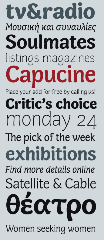
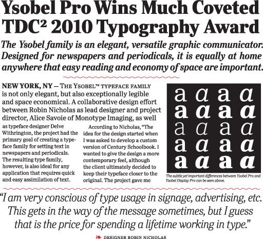
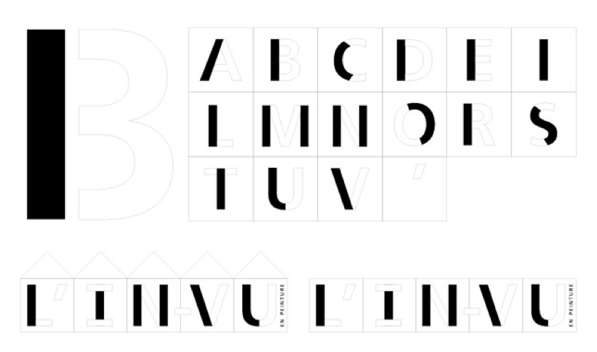
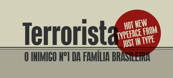
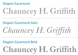
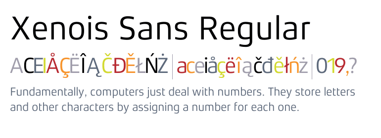
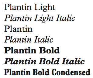
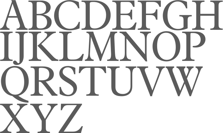
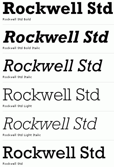
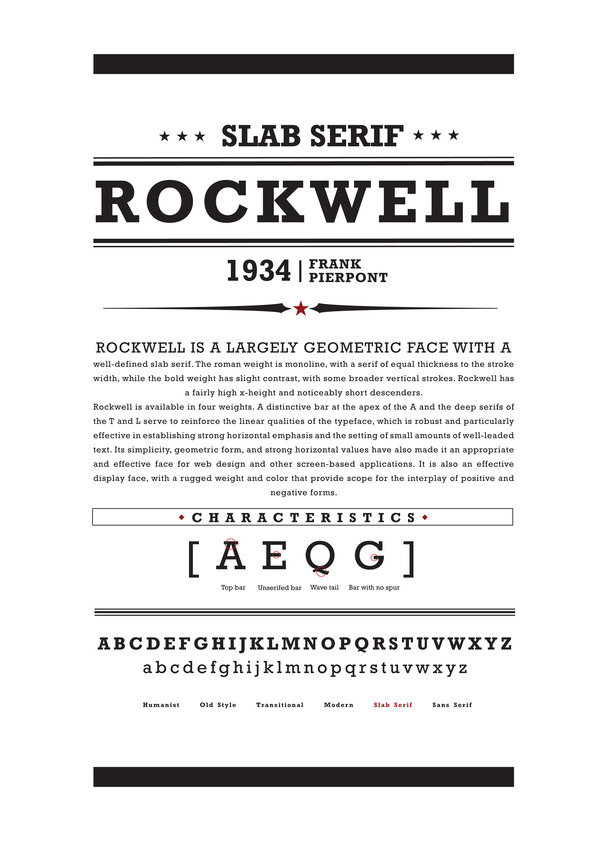
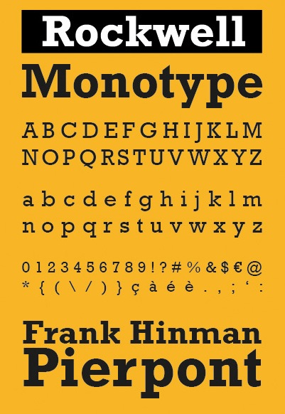
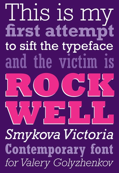
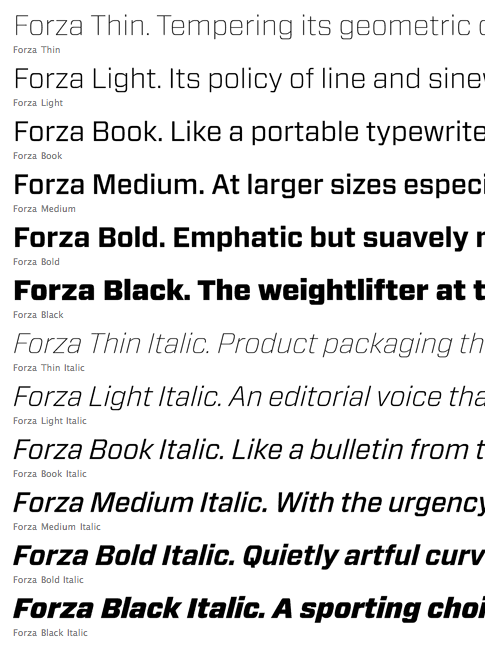
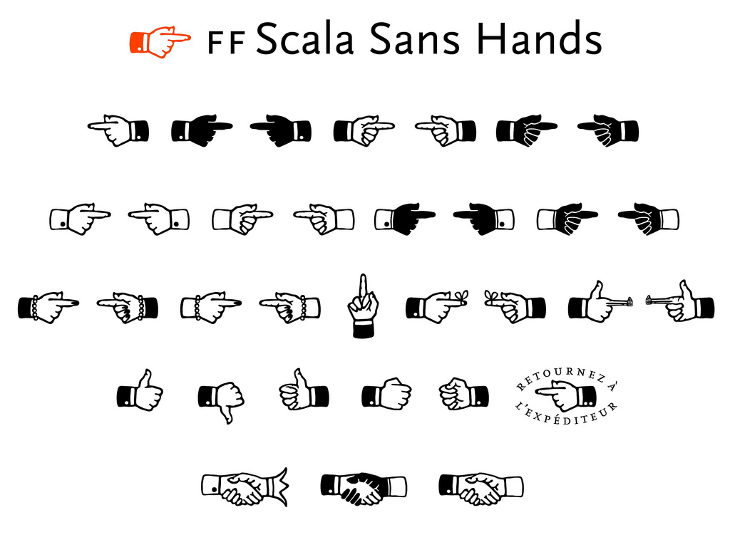
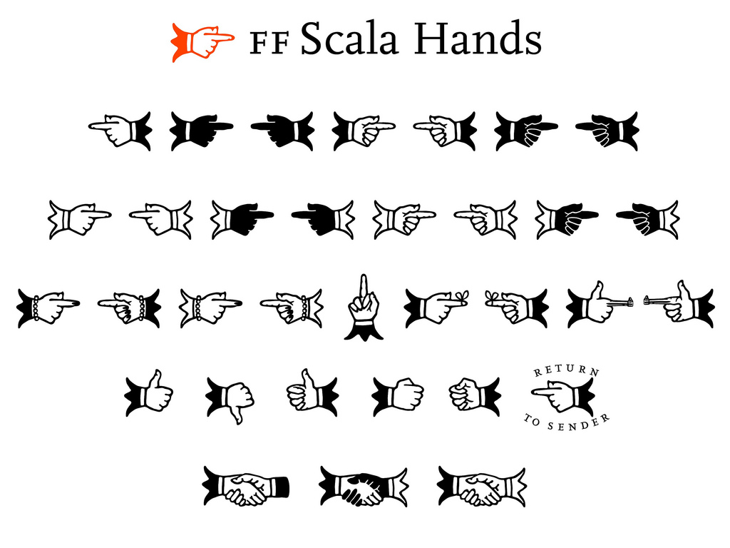
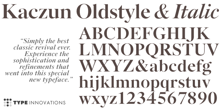
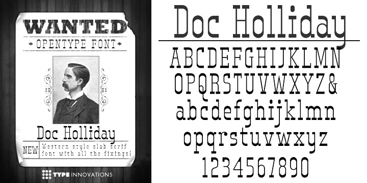
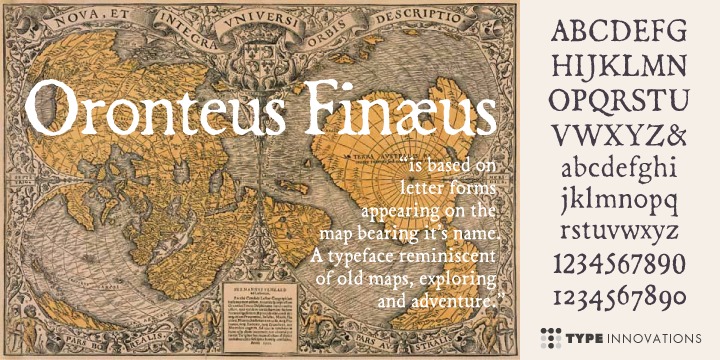
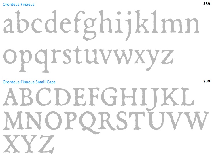
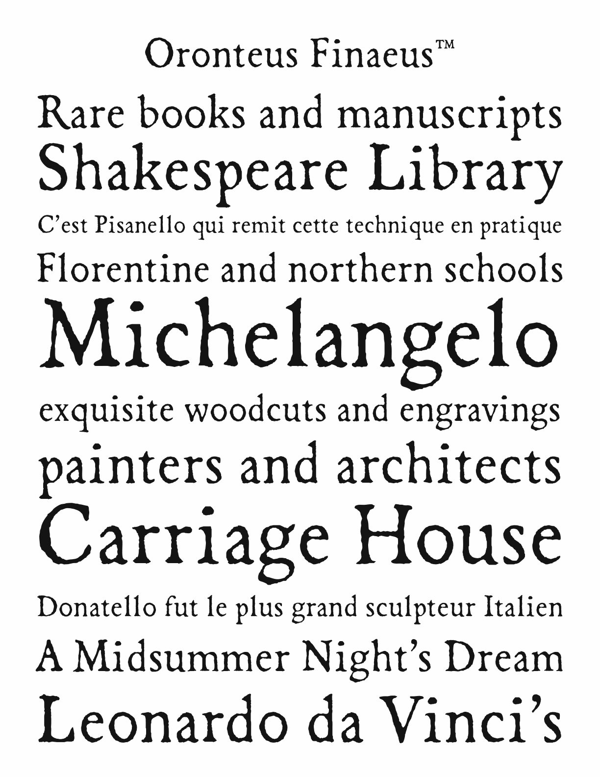
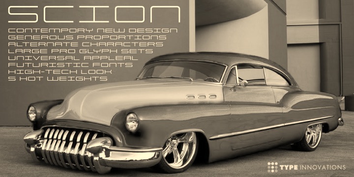
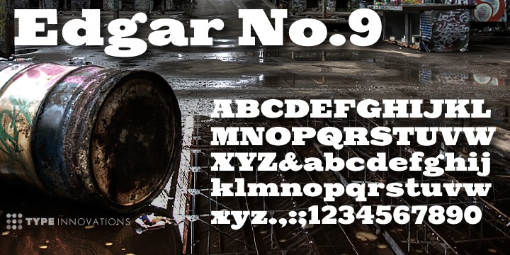