| | |
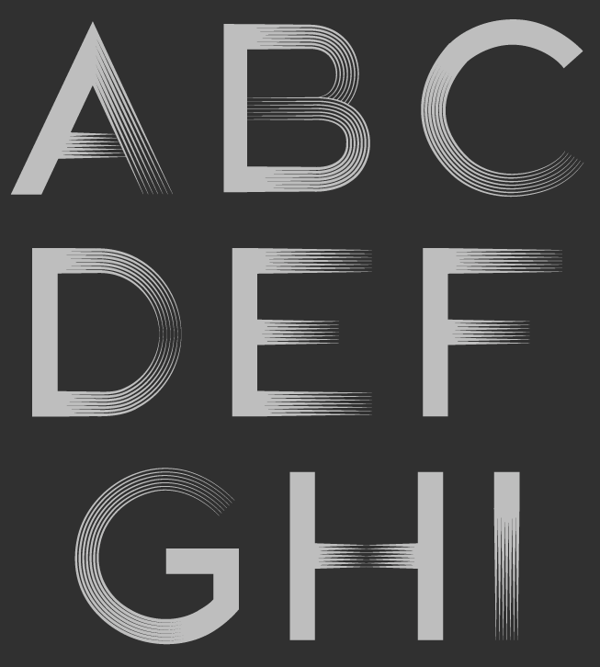
7N Types
[Situjuh Nazara]
|
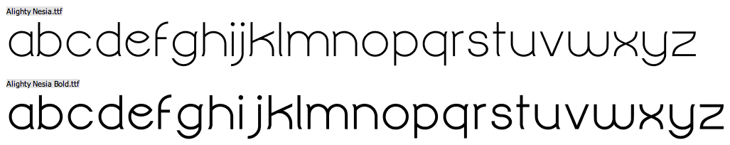
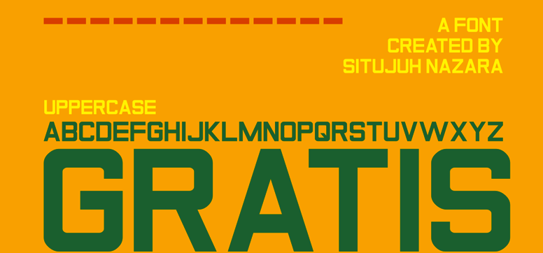
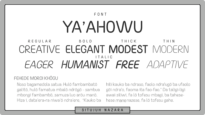
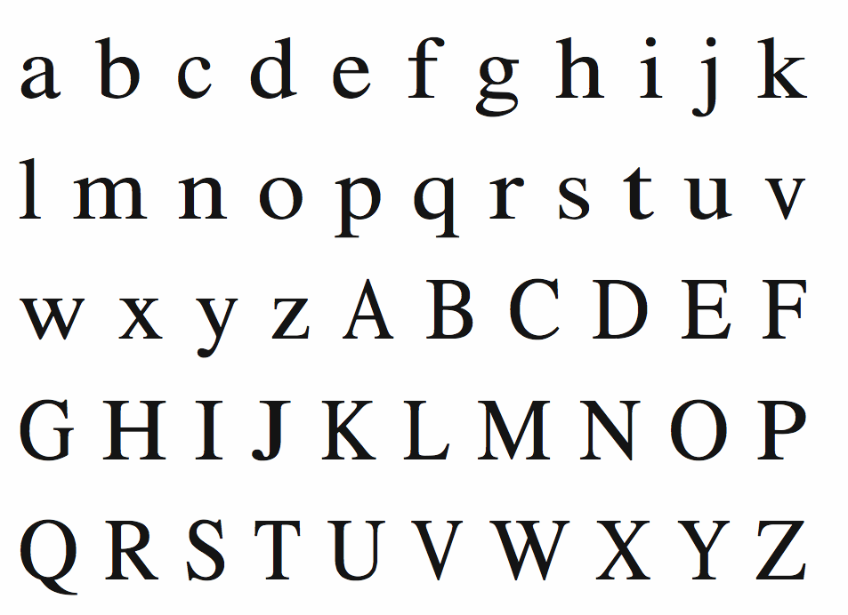
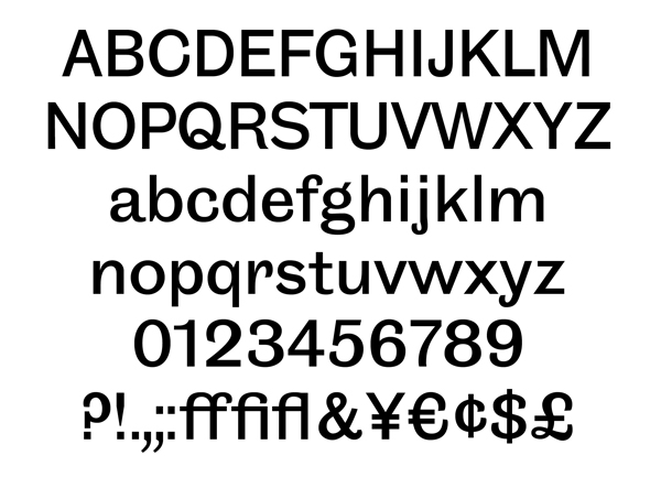
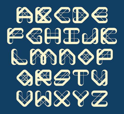
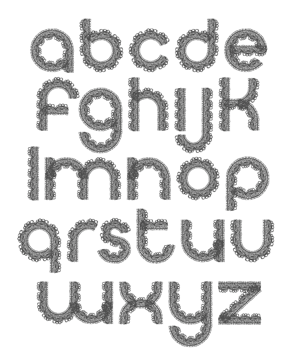
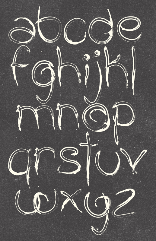
 Indonesian creator in Jakarta (b. 1985). 7NTypes includes several designers, including Keithzo, but Situjuh Nazara is the founder and main contributor. Creator of The Amazing Grace (2012), Twofold Uncomplete Design (2012), Alighty Nesia (2012, an open geometric sans family), Gratis (2012, free headline sans), C7Nazara (2012) and Situjuh Hand (2012, a curly typeface).
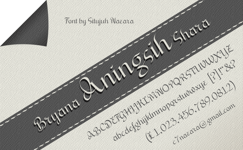
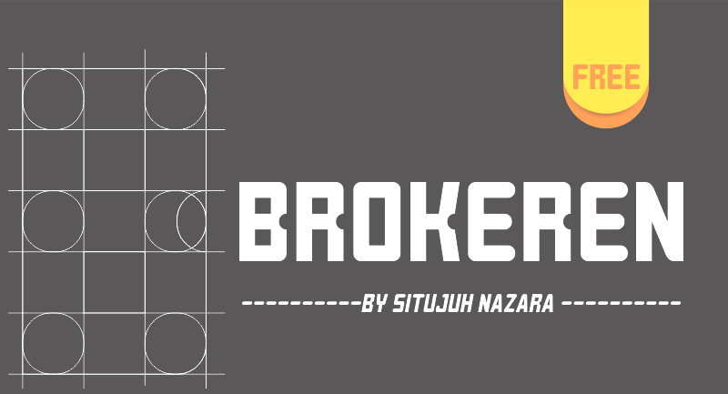
 Typefaces from 2013: Hurufo+Numero (sans family), Yaahowu (a rounded sans family), Gobold, Bryana Aningsih Shara (upright script), Gpkn (circle-based monoline sans). Typefaces from 2014: Smoolthan (monoline organic sans), Remponk (multilined), Playsir (comic book typeface), Defonarts, Tulisan Tangan 74, Fortheenas_01, Evogria (bold and mechanical), Anysome, Blackplotan, Dotcirful (dot matrix typeface), Handgley, Brokeren (techno sans), Headsome&Modif. Typefaces from 2015: Manophiser (sans), Theodista Decally (upright connected script), Upbolters (a macho sans caps typeface). Typefaces from 2016: Cutrims (a polygonal typeface), Xacose. Typefaces from 2017: Blessing in Disguise, Chirota (handcrafted), Hastoler, Merysha-Italic, Merysha (serif), SHAOutline, ShareHappinessAround (rounded sans), SomethingLooksNatural, Tentram-Italic, Tentram, Reitam (sans), Myfrida, Ribeat (smooth brush), Etchas, Goeslim, JulySeventh, Justtellmewhat, Offerings, Prohandy, Reprineato, Steagisler, Stea, Miss Nealy, Hastro, Dialoegue, Kisah Ceritra, Chesan, Boxise, Creword, Breetty, Anydore (calligraphic), Brushaff, Budiyaya (brush), Brotherina (connected script), Chosence (sans family), Handycheera, Aulyars (calligraphic script), Molleat. Typefaces from 2018: Freshness, Christed, Xyling, Youthing October Fourteen, Kayskew October Eleven, Hoty, Friday October Twelve, Codian October Nine (art deco), Caboge, Stripe October Seven, Nesdate October Ten, Codian October Eight, Odian October Nine, Stripe Shadow October Seven, Clambake October Six, Lovina October Five, Grande October Four, Grande October Three, The October Two, The October One, Favoner One, Homade McRacken, Besta Baru, Srows, Sanson, Bestar, Kathen, Byby, Charilla, CuteBeSpecial, FriendlySchoolmates-Italic, FriendlySchoolmates, GirlsMarks, HeartWarming, HeartWarmingExtra, Kaylonick, LearnShareColaborate-Bold, Mergic, MOGrhythm, OpenMinded, OpenMindedInside, PassiontoAction, PassiontoActionSlant, TeamWork-Italic, TeamWork, Yessy, Feltarigo, Motira, Adelio Darmanto, Troche, Nicolera, Mantul, Yukikato, Gebrina, Veni, Onadio, Aliena, Gabelisa, Still Loving, Shink, Sottee, Milyone, Kelidya, Yuliya, Hestina, Masbro, Goday, Milgun, Togetha, Thisay, Dhitha, Charline, Briany, Candire, Arinda, Anglena, Abilya, Story of Super Boys, Richela Kids, Seelyn, Pulen, Podo Moro, Sri Muliyo, Neigfriste, Hardino (monoline script), Purple River, Yoshephin, Theola Kids, All Season, All Season Ornaments, Hello Teman, Attracted Monday, Cirquesa, Hopeitissed (signage script), Hettas, Certhas, Fattana, Qeiza, Having Fun, Flotta, Soe, Misses, Siry, Mommy's Kitchen, Thany, Mother's Touches, Create Something Today, Well Bred, Cheria, Beatific Margella, Hidea, Gobold Blocky, Riztteen, Stika, Bintar, Ginta, Menscho, Hilona, Dehasta Momentos, Mungkin, Shartoll Light, Robaga Rounded, Ingat, Ascota, Klapjo. Typefaces from 2019: Homazing, Pre (script), Millythea, Rough Rough, The Friday Stroke (brush script), Anu, Dearly Loved One, Khalifa, Vesetia, Blending Attraction, Lova Valove, Quotable, The Simple One, Matchinger, Touch Over Next, Waiting For, Being Love, Lova Valove Serif, Clawster, Hopia, Sanson, Being Love Sans, Back To Ancient Time, Protector, Mystag, Oreta, Dearly Loved Slab One, Yep, Nuaz (a stitching font), Bronice, Nesdate October Ten. Typefaces from 2020: Sheroo (beatnik style), Thank You So Much, Styla, Racy Mango, Josy Wine (spurred), Lonely Melody, Alegra, Alenor, Conformable, Sweet Hansan, River Script, Kevin Aprilio, Jorby, Maines, Say Yes, Fish Grill, Flash on Saturday Night, Literally Natural, Lady Nature, Joyful Story, Brush Hours, Daily Walker, Free Monday, Mila Bright, Marchone, Githo Love, Fondacy, Jumat, Brastagi, Christiany, Feltarigo, Gabelisa, Gibran, Baligle, Do It With Love (a Valentine's Day font), Vecoly, Delightious, Ataro, Anticed, Cherrythea, Merrycle, Twolank, Atozimple (a monoline sans), Bikito (a curly script), Tyfanie, Hilya, Lonnie. Dafont link. Web site. Creative Market link. Creative Fabrica link. Another Creative Fabrica link. And another Creative Fabrica link. [Google]
[More] ⦿
|
A Is For (was: Aisforapple)
[Emilie Rigaud]
|
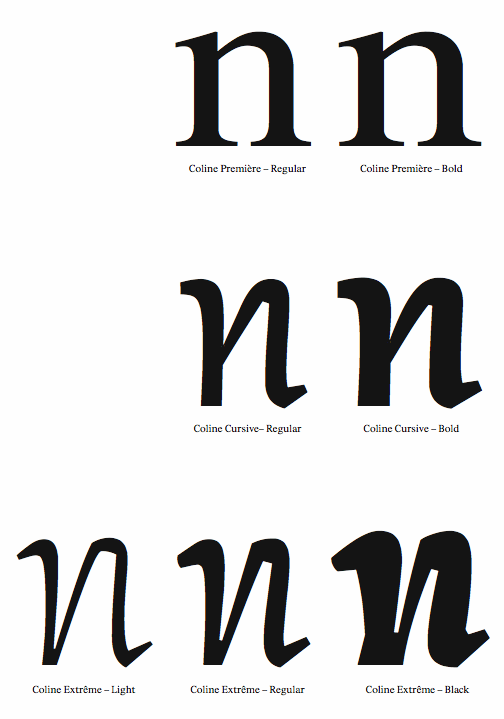
 Émilie Rigaud is a French designer who obtained an MA in typeface design from The University of Reading (2009), based on her typeface Coline, a family of seven typefaces intended for pocket books. Before Reading, at ENSAD, she made the simple monoline sans family La Miss Ulm (2006).
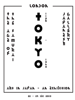
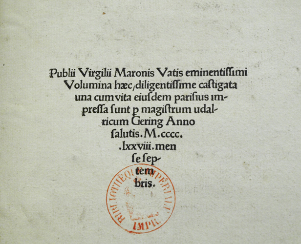
 In 2007, she started work under the guidance of Alejandro Lo Celso and Philippe Millot on a revival of the first type printed in France, at the Sorbonne, by Ulrich Gering. This work is based on a 1478 edition of Virgilius. Grotesque 6 (2009) is based on a typeface published in 1880 by Stephenson Blake. In 2010, she founded Aisforapple, where she published Jaakko (signage), Coline Cursive, Coline Première, Coline Extrême, Grotesque 6, David (2014) and BTP (polygonally-outlined typeface). In 2016, the type foundry published Knif Mono Regular, which was designed by Axel Pelletanche-Thévenart under the art direction of Guillaume Grall and Benoit Santiard. It was produced by Emilie Rigaud. In 2017, Émilie Rigaud published the sharp-edged typeface Tongari, which was modeled after samurai blades. Tongari Display followed in 2020. In 2018, she designed Naoko, a 7-style wide sans with short descenders, named after astronaut Naoko Yamazaki. Typefaces from 2020: Pachinko (six rounded almost typewriter styles including many monospaced fonts and italics), Olympe Mono (a monospaced and monolinear typeface revived from an old typewriter). Speaker at ATypI 2017 in Montreal. Old URL: Mouton Sauvage. Klingspor link. Personal site. [Google]
[More] ⦿
|
Alberto Arellano
|
Alberto Arellano (Memela Studio, Guadalajara, Mexico) designed Cali (2010) and Marga (2010, a polygonal geometric display sans done with Peter Lorenz). [Google]
[More] ⦿
|
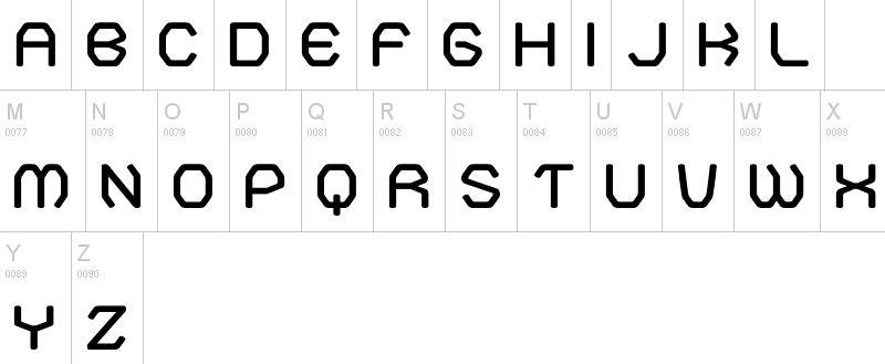
Alexander Fritsch
[Loudar]
|
[More] ⦿
|
Artis Taurins
|
Latvian designer of the free polygonal typeface Geom (2010). [Google]
[More] ⦿
|
ArtOne CreativeWorks (was: Locomotype)
[Arwan Sutanto]

|
ArtOne Digital (formerly Locomotype) is the type foundry of Arwan Sutanto, a graphic designer in Yogyakarta, Indonesia, who also owns ArtOne Creativeworks. Arwan created the elliptical sans face Fonquero (2014), the free brush typeface Belepotan (2014, +Italic), Fonesia (2014), Fonesh (2014), Fonia (2014), and the free outline typeface Fonarto XT (2014; updated in 2019 to Fonarto v2). Fondian (2014) is a commercial rounded Comic Sans style typeface. Fonago (2014) is a vintage font. Tinta Script (2014) is an upright script. Typefaces from 2015: Fonesia, Cemara (brush script typeface), Garris (monoline script), Fonstyle, Fonari, Fonderful, Fonjava (a rhythmic script), Fonjazz, Fonino (brush script). Typefaces from 2016: Om Telolet Om (free), Sumptuous (sans), Sumptuous Light, Boldero Brush (inspired by graffiti art), Hotline (a monoline connected signage script), Jogjakartype, Jogjakartype Logos. Typefaces from 2017: Endeavora, Bahagia (signature script), Windtalker, Asalasik, Fonalux, Fonquero Sedo, Wolesbro, Morning Dew, Eufoniem (upright connected script), Delicy, Matahati (script). Typefaces from 2018: Hokyaa, Jankador, Dephion (font duo), Bakso Sapi, Lemoo. Typefaces from 2019: Crimstone (a weathered octagonal typeface), Noiry (script), Bonega (an all caps inscriptional sans), Pantura (a playful casual font), Kaftice, Redsniper (Victorian), True Happiness, Harmona (Script, Sans), Pestapora, Lendiga (a monoline script), Zoelander, Wkwk, Romantick, Sweet Pancake (calligraphic script). Typefaces from 2020: Reffort (a fourteen-style sans showing emotion in its counters), Sandega (a stencil font), Halokia (a condensed monoline connected sans), Shelda, Nilakandi (an upright script), Bakso Sapi, Komikula, Antario (a stylish sans), Giga Sans (an 18-style geometric sans), Toska (squarish). Typefaces from 2021: Gunterz (a macho all caps hardware store techno typeface), Filarion (a polygonal typeface in the style of Ben Shahn), Kanzaki (a 10-style playful script). Typefaces from 2022: Bradia (a condensed Victorian typeface). Home page. [Google]
[MyFonts]
[More] ⦿
|
Arwan Sutanto
[ArtOne CreativeWorks (was: Locomotype)]
|
[MyFonts]
[More] ⦿
|
Atelier Olschinsky
[Peter Olschinsky]
|
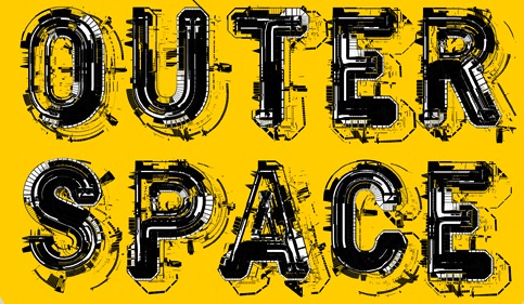
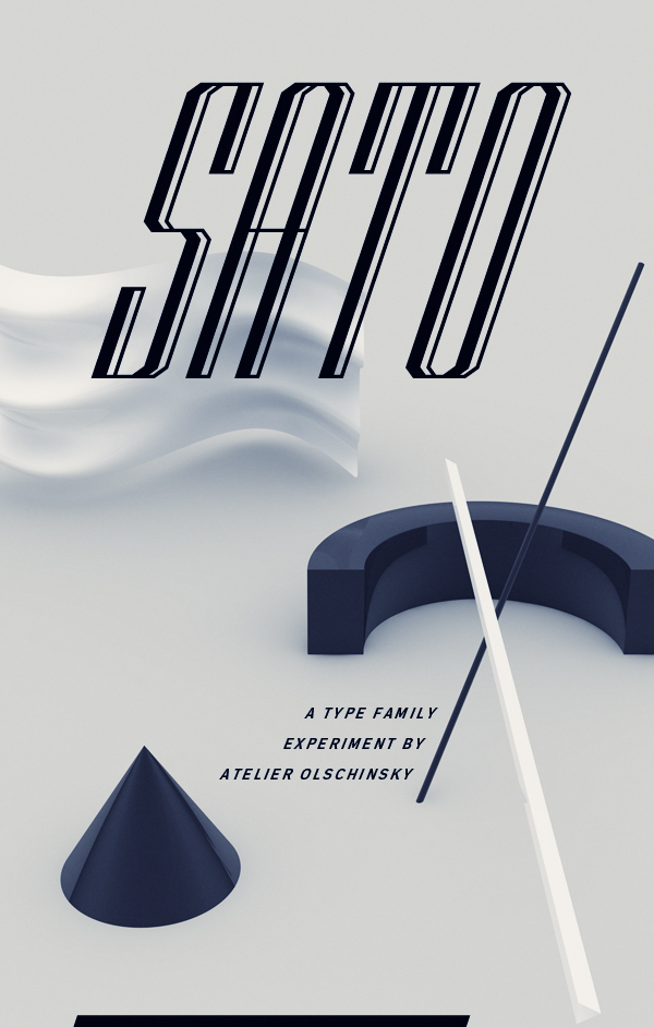
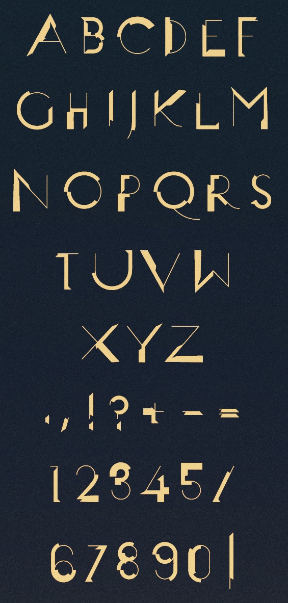
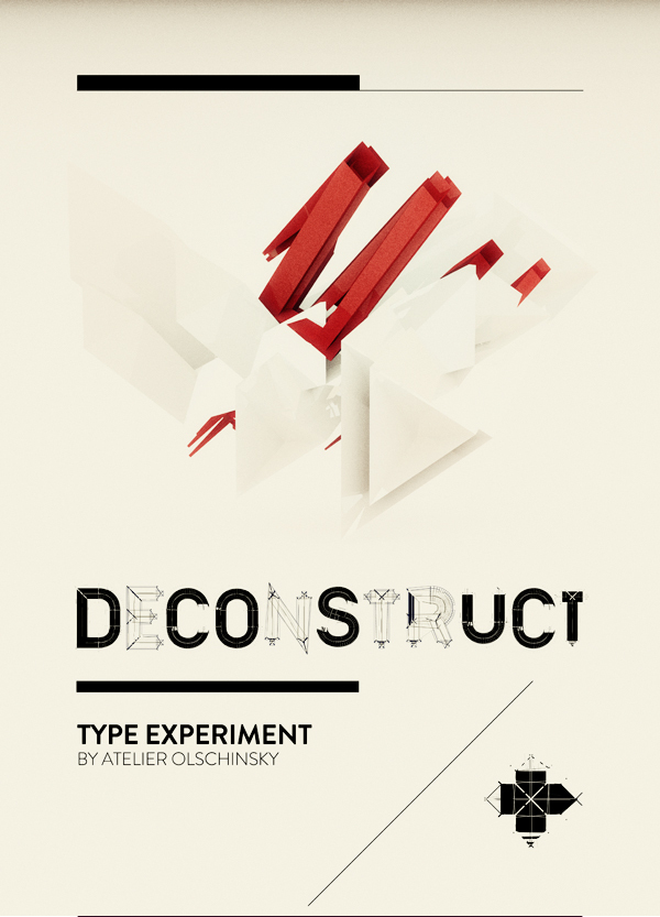
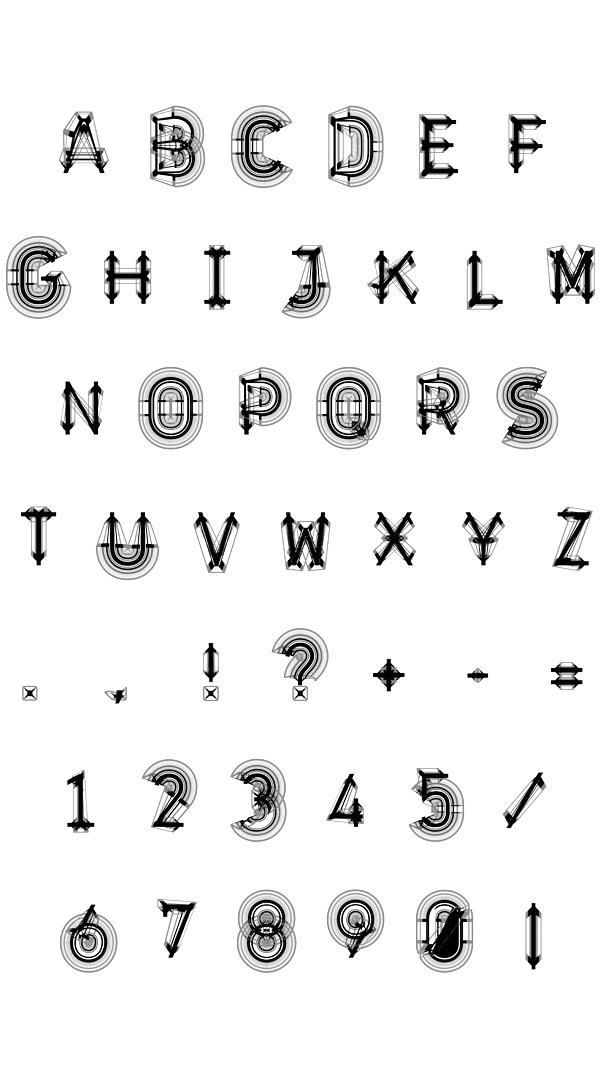
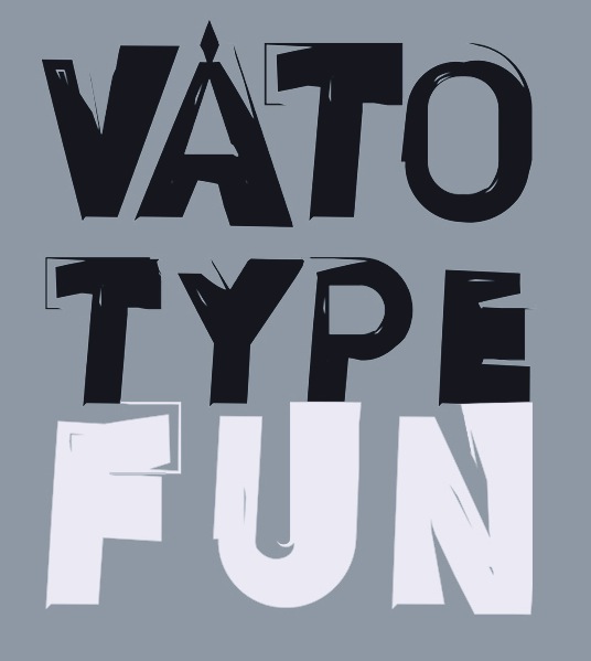
 Vienna, Austria-based design studio, est. 2002 by Peter Olschinsky and Verena Weiss. They published the type family Ato (2012), which has Sans, Slab and Display (art deco) subfamilies. Outer Space (2012), Sato (2012, a bilined display typeface), Neopolis (2012, futurismo), Deconstruct (2012), Chaos (2012) and Construct (2012) are experimental. Bato (2012) is an alchemic type family. And Vato (2012) is a wonderful brushy poster headline face.
 In 2017, he published the bespoke typeface BirdYard, the free AO Grotesk (with poygonal outlines), free display sans typeface family Matol, the free geometric solid typeface AOX, which comes in Stencil and Regular styles, the free polygonal typeface family AO Mono, and the free monospaced Minimal Mono. Typefaces from 2020: Kaomo (monlinear, monospaced), AO Mono (polygonal). Behance link. [Google]
[More] ⦿
|
Austin Stahl
|
Graduate of MICA. Baltimore, MD-based designer of the polygonal typeface Arcas (2015-2016) and of the free all caps display sans serif font Bore (2021) which was inspired by some unusual mid-20th-century fabricated signage above the entrances to the Baltimore Harbor Tunnel. [Google]
[MyFonts]
[More] ⦿
|
Barrett Reid-Maroney
|
 London, Ontario-based designer of these display typefaces in 2020: Agate, Blake, Briar (wavy, organic), Personify, Allusion (art deco), Allegory (art deco, all caps), Saltford (an industrial octagonal typeface family), Ephemera, Metaphor (a polygonal typeface).
 Typefaces from 2021: Gemini (a condensed and vey stylish display typeface), Kafka (a struggling decorative typeface partly inspired by Wes Anderson's extravagant style), Arras (a dramatic display typeface), Rae (a sharp-edged display typeface), Erga (a display typeface), Kore (a display font). Shop. [Google]
[More] ⦿
|
Bercz Design Studio
|
 Design studio in Santiago de Chile. In 2016, the Bercz team cooperated with Latinotype (Valentina Vega, Rodrigo Fuenzalida, Cesar Araya, Daniel Hernandez, Luciano Vergara) in the development of Snatch, a daringly named polygonal type system for display applications first released by Latinotype. [Google]
[MyFonts]
[More] ⦿
Design studio in Santiago de Chile. In 2016, the Bercz team cooperated with Latinotype (Valentina Vega, Rodrigo Fuenzalida, Cesar Araya, Daniel Hernandez, Luciano Vergara) in the development of Snatch, a daringly named polygonal type system for display applications first released by Latinotype. [Google]
[MyFonts]
[More] ⦿
|
Bercz Team
|
A group of South American type designers. Their first typeface family is Bowie (2016), which was developed by Leonidas Loyola, Valentina Vega, Rodrigo Fuenzalida, Cesar Araya and Bruno Jara, under the supervision of Dany Berczeller, Daniel Hernandez and Luciano Vergara. This polygonalized type grew out of a cooperation between Bercz Team and Latinotype (Chile). [Google]
[MyFonts]
[More] ⦿
|
Brand Laboratory
|
Art direction studio in Monterrey, Mexico. Their typefaces include Salad Boy (2015, polygonal) and Square Minimal (2015, pixel font). Behance link. [Google]
[More] ⦿
|
Dubius De Flon
|
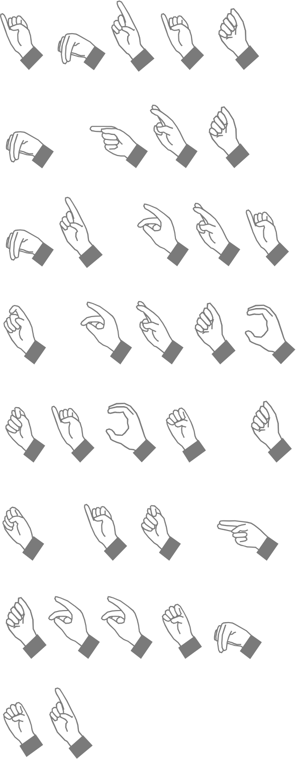
Designer at T-26 who made Dubius (2000: a polygonal typeface), Min (2002), Superfurniture (2002: pixelish, including the 3d styles Three Dee and Necker), and Qwerty (2000: pixelish), and the sign language font HandSign (2002), which can be bought at MyFonts. [Google]
[MyFonts]
[More] ⦿
|
Edouard Lallemand
|
Charleroi, Belgium-baseddesigner of the polygonal typeface Blek (2018). [Google]
[More] ⦿
|
Emilie Rigaud
[A Is For (was: Aisforapple)]
|
[More] ⦿
|
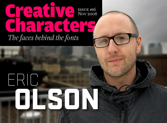
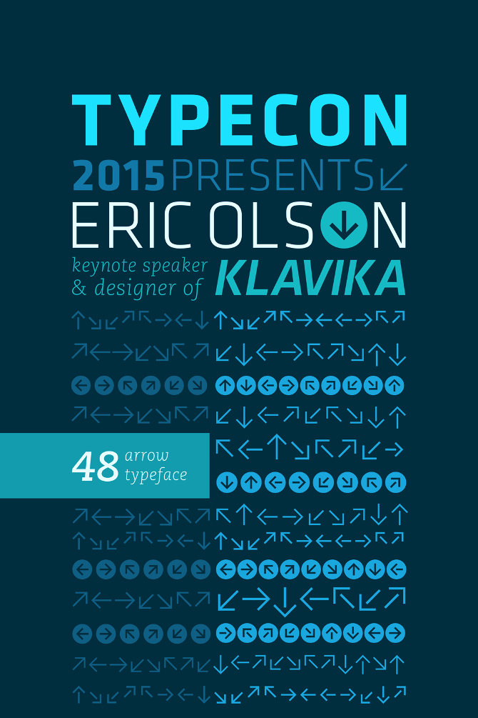
Eric Olson
[Process Type Foundry]
|
 [MyFonts]
[More] ⦿
[MyFonts]
[More] ⦿
|
Felipe Barros
|
Brazilian designer of the polygonal typeface Techno Poly (2017). [Google]
[More] ⦿
|
Frantisek Storm
[Storm Type Foundry]
|
 [MyFonts]
[More] ⦿
[MyFonts]
[More] ⦿
|
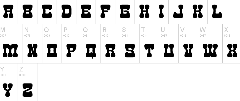
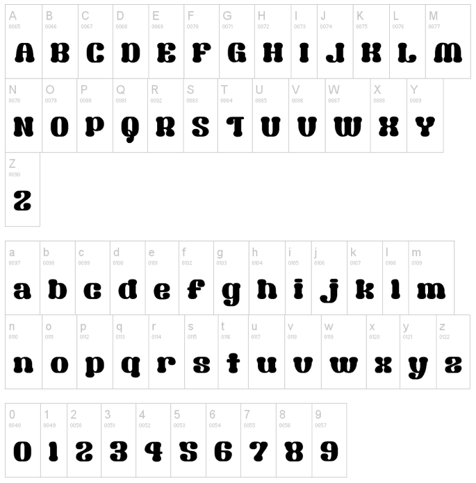
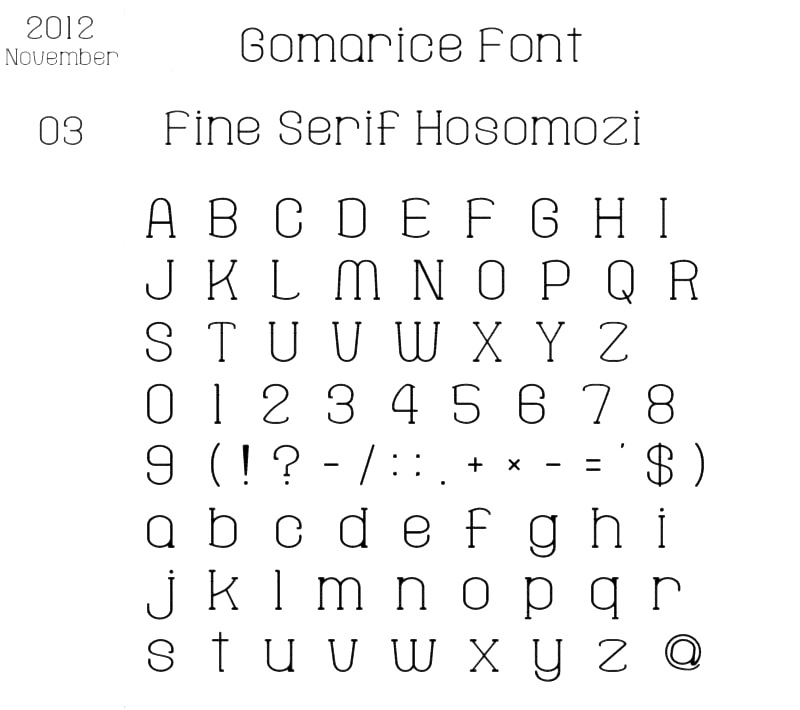
Gomarice Font (or: Goma Shin)
[Shintarou Nakayama]
|
 Japanese foundry, est. in Fukuoka in 2005 by Shintarou Nakayama (Goma Shin), b. 1982. It offers these free fonts, many of which are in the grunge or techno styles: Steel Boy (2005, techno), Manzyu (2005, liquid), The Past (2004), Atama (2004, liquid), Atama Serif G (2010), BAT-MEN__G (2004), BIG-BURGER__G (2010), Ballpoint-Pen (2004), Beer-Cape__G (2006), Boro-Slim__G (2003), Boroboro (2003), Chocolate__G (2008), Coffee-&-Curry-Shop__G (2009), Edamame Western (2012), Fude-Enogu__G (2006), GOMA-STANDARD__G (2010), Gomadelic (2003), Gomanema (2007), Goth-Goma__G (2006), Kamone__G and Kamone 6 (2006-2011, heavy mechanical / octagonal face), Kamone 7 (2012, polygonal typeface), Kigasuru__G (2006), Marker__G (2004), MINI POP__G (2010), Mukasi_Mukasi__G (2003), Mukasi_Mukasi_a__G (2005), Rihapop__G (2006), Rocks__G (2004, stone face), Simple-Slum__G (2005, informal poster face), Steel-Boy__G (2005), Tomipop__G (2006), honey-bone__G (2007), kamone-2__G (2009), kamone-3__G (2010), Yaki Goma (2010), Goma Western (2010), Goma Western 2 (2012), Mousou Recode (2010, ultra fat rounded face), Hot-Chocolate__G (2011), Milk-Chocolate__G (2011), Syouwa Retro Pop G (2011), Spicy Curry Rice (2011), Sikakusimen (2011, fat and rounded), Nantoka Western (2011), Goma Cookie (2012), Sandome G (2012: a beautiful rounded sans display face), Morning Wasabi (2012, a rounded black headline face), Goma Standard 02 (fat and rounded), Doughnut Monster G (fat elliptical typeface), Kaiju Monster (2012), Fine Serif Hosomozi G (2012), Melting Ice Cream, Wasabi Gum (2013, bubblegum face), Soy Sauce Junky (2013), Cyankonabe G (2013: oriental simulation face), Kensuco Stencil G (2013), Omotenashi (2013), Old Book (2013), Rockin Record (2014), Morning Karashi (2014: a great poster typeface), Kamone 8 (2014: octagonal), Zombie Shooting (2014; for those who still believe that zombies can shoot), Goma Block (2015), Okuba Cloud (2015), Hyouzi Display (2015), The Past (2015), What's Love Konnamozi (2015), Shibuya Zero (2015, stencil), Atama Simple (2015), Game Music Love (2016, Western font), GType (2016), Game Continue 02 (2016), Marker2 (2016), Nanikano Capsule (2016), Usuazi Hosomozi (2016), Nandaka Western (2017), No Continue (2017, squarish), Kaizen Seisaku (2017), Gogono Cocoa Mochi (2018), Kirie Fu (2018), Mucha Wo Minagara Milk Tea (2018), Katamari Serif (2018: headline slab serif), Shmup in the Zone (2018: octagonal), Yatsurano Western (2018), Heysel Synthesizer (2018), Toy Block Maestro (2019: a Western font), Round Pop (2019: rounded sans), Tanomuze Cowboy (2019: Western style).
 Dafont link. [Google]
[More] ⦿
|
Graham McFie
|
 Toronto, Ontario-based designer of the polygonal sports franchise typeface Arc Sculler (2018), which was published on Black Thursday, the day Ontario elected its first Trumpian premier, Doug Ford. Arc Sculler was made for the Toronto Argonauts and references 19-th century wood types. [Google]
[More] ⦿
Toronto, Ontario-based designer of the polygonal sports franchise typeface Arc Sculler (2018), which was published on Black Thursday, the day Ontario elected its first Trumpian premier, Doug Ford. Arc Sculler was made for the Toronto Argonauts and references 19-th century wood types. [Google]
[More] ⦿
|
Hibrain Rodriguez
|
Sucre and/or Carupano, Venezuela-based designer (b. 1998) of the free polygonal crumled paper typeface Crumpled (2018), and of the geometric experimental typefaces Squaround and Squaraound S (2018) and the modular typeface Huex (2018). [Google]
[More] ⦿
|
Ihlas Muliardy
[Ihlas Underline]
|
[More] ⦿
|
Ihlas Underline
[Ihlas Muliardy]
|
Makassar, Indonesia-based designer of the polygonal typeface Corners (2020) and the square-edged typeface Qarius (2019). [Google]
[More] ⦿
|
Imogen Ayres
[Möbel Type]
|
[More] ⦿
|
Irina Hughes
|
Chester, UK-based designer of the polygonal typeface Mountain (2016) and the handcrafted Christmas Font (2016). [Google]
[More] ⦿
|
J. Marquez
[José Marques]
|
 [More] ⦿
|
Jason Bernard
|
Wolverhampton, UK-based designer of the polygonal typeface Metatron (2015). Behance link. [Google]
[More] ⦿
|
Jérémy Perrodeau
|
French designer of BTP (2011), a polygonally outlined typeface done for the magazine Étapes, in collaboration with Maxime Fittes, Léo Pico and Benjamin Viallard. [Google]
[More] ⦿
|
Jens Kajus
|
One of the cofounders of e-types in Copenhagen in 1997. He designed fonts such as Premiere (2001, a sans), Glendale (2009: Peignotian), Cabo (2004, grotesque), Contribute (2005: a polygonal typeface), and Agita (geometric sans). [Google]
[More] ⦿
|
Joao Red
|
Lima, Peru-based designer of the polygonal typeface Fractal (2016). [Google]
[More] ⦿
|
John Downer
|
 Celebrated American sign painter and type designer (b. Tacoma, WA, 1951), who lives in Iowa City, IA. Downer earned a BA degree in Fine Art from Washington State University, and both an MA degree and an MFA degree in painting from the University of Iowa. John Downer has been a journeyman sign painter since 1973, and a type designer since 1983. He is known as a type critic and type historian. He teaches hand lettering and lectures widely at educational institutions and professional conferences. Downer's professional activities include sign painting, lettering, glass gilding, type design, typography, and logo design. His typefaces:
 - Ironmonger (1991-1992: an angular all-caps display alphabet inspired by lettering on buildings), Roxy (1990: a stroke-modulated sans), SamSans (1993: a humanist sans) at FontBureau.
- Chicago Tribune Mag (1989, Roger Black).
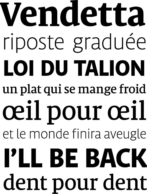
- At Emigre: Triplex Italic (1985; many weights were done by Zuzana Licko), Brothers (1999, a polygonal and almost octagonal family with wood type influences: Its inspiration came from a bright chromolithographed letterhead designed around the turn of the century for the Cole Brothers traveling shows, an extravaganza of acrobatic and circus acts that included trained horses with bareback riders.), Council (1999: an all caps condensed display wedge-serif) and Vendetta (1999: inspired by old-style Venetian serif fonts but with sharpened serifs). Council was based on lettering found on a candy tin box made in the early 1900s for John G. Woodward&Co. of Council Bluffs, Iowa. It has a wood type look.
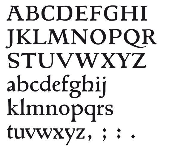
- Iowan Old Style (1990, Bitstream--his first font), Iowan Old Style Titling (2002, Bitstream). These are newspaper types. He writes about them: Iowan Old Style is classified as a Venetian old style type design. It is related to earlier, 20th-century American interpretations of Italian Renaissance types cut by Nicolas Jenson and Francesco Griffo, but it is modeled also on classical inscriptional lettering and sign painting seen in certain regions of eastern Iowa. See also Venetian 801 by Bitstream.
- Gonnick (1992, done for cartoonist Larry Gonnick).
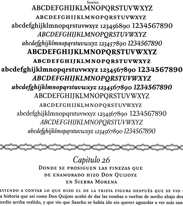
- Simona (1994-1996, Design Lab, Milan, with Jane Patterson), Simona Swash Italic (1998, Design Lab). Example of its use.
- Airy (1998, Design Lab).
- Panatela (2001, compared by Downer with Jim Parkinson's Modesto).
- Paperback (2005), a family with 6, 9, 12, 24, 48 and 96 point optical sizes. Its polygonal sections of outlines are applauded by John Berry.
- Screenmax, a bitmap serif typefaces at 7 pixel x-height in Roman, Italic, Bold and Black.
Russian piece by Ilya Ruderman on Downer's lettering. His present company is Voltage. At ATypI 2008 in St. Petersburg, he spoke about revivals, and ran a lettering workshop, something he is famous for at previous ATypI meetings as well. His abstract on font revival reads: To understand the intrinsic differences between plagiarism (normally regarded as a bad thing) and preservation (normally regarded as a good thing), we should look at various means by which newer typefaces are derived from older ones. There are indeed many approaches. Outlining them can be helpful in considering the practices surrounding revivalism in general: revivals, recuttings, reclamations - anthologies, surveys, remixes - knockoffs, clones, counterfeits - "me too", copycat - reconsiderations, reevaluations, reinterpretations - homages, tributes, paeans - encores, sequels, reprises - extensions, spinoffs, variations - caricatures, parodies, burlesques. Mug shot. Klingspor link. Brief bio. MyFonts page. FontShop link. John Downer, a master water polo player (2006). Bitstream bio. Showcase of John Downer's typefaces at MyFonts. [Google]
[MyFonts]
[More] ⦿
|
Jonathan Novak
|
Portland, ME-based designer of the counterless polygonal typeface 60lb Text (2015, with Neil Patel). Behance link. [Google]
[More] ⦿
|
Jorge Mercado
[Yock Mercado]
|
[MyFonts]
[More] ⦿
|
José Marques
[J. Marquez]
|
 Portuguese creator at FontStruct in 2008 of Goticula 1.3 (blackletter), Reposicao (octagonal), Frank Castle, Tomatix (rounded letters) and Tazaver (bold, rounded).
 In 2009, he made Corrida (multilined; +Evolved), Drible (+Drible 2.0), Lastico (octagonal), PixelSoulScript2X, DoneBefore, Ficha Serif, Ficha Sans, Sloppy, StrikeOver, Bad Point (dotted line upright script), Osoyotoyo (octagonal), Redundant, Solstice1X (pixel script), CuttingOldEdge, KickBack, MarkMyWork, Styl=0 (dotted line font), Bad Point (dotted line font), Eyelash, Garfield, Comitto, trapish, Nullam, Minipix (pixel script), Coppa, Chunky (octagonal), Douchebag Regular (as a favor for Melissa Hunt), Foxtrot, Torsion, Serifeito (slab serif), Comitto (rounded octagonal), Torsion Alt. In 2010, he made the dotted line typeface Redonda and the blackletter stencil BlindFold, as well as Lump (fat counterless), Taller, Dribble, Rumble, TheItalicJob SportsComp (techno), CryBaby, Crystallized (dotted), Hiatus (stencil blackletter). In 2011, he made the grotesk typeface Geomyk, Fonstiv (polygonal), Drible 2.0, Candy, Gibberish. Fontstructions from 2012: Lombada, Cape, Tentative, Sloppy, Cephalopod. [Google]
[More] ⦿
|
Josh Martinez Garcia
|
Wuppertal, Germany-based designer of the polygonal, or triangulated, Polyfont (2017). [Google]
[More] ⦿
|
Julie Tremblay
|
 During her studies at Concordia University in Montreal, Julie Tremblay created Gamins (2013, a polygonal almost-origami typeface) and Network (2013). In 2015, she created the thin monoline script typeface Early Morning and the cartoon typeface Dungarees. [Google]
[More] ⦿
During her studies at Concordia University in Montreal, Julie Tremblay created Gamins (2013, a polygonal almost-origami typeface) and Network (2013). In 2015, she created the thin monoline script typeface Early Morning and the cartoon typeface Dungarees. [Google]
[More] ⦿
|
Kate Ivanova
|
Kiev, Ukraine-based designer of the polygonal typeface Crystal (2016). [Google]
[More] ⦿
|
Kristina Jandova
|
Czech designer based in the UK. Creator of these typefaces: - Laborat (2021, Monotype). A 6-style grotesk that struggles with its identity and wants to come out of the closet as a geometric sans.
- FS Meridian (2019, at Fontsmith). A rhythmic geometric sans family with circular forms.
- Antique Gothic (2017). A condensed vintage sans with extreme x-height, designed by Jean-Baptiste Levée (Production Type), with the help of Emmanuel Besse, Yoann Minet, Quentin Schmerber, Hugues Gentile, Pauline Fourest, and Kristina Jandova (who was an intern at Production Type in 2017).
- Co-designer of Ofform (2019) with Marek Suchanek and Martin Vacha at Displaay. Ofform is a modular folded paper font that started out as a custom typeface for the fashion brand Ofform 3D.
- Other typefaces: Utopian (experimental), OE Display, Pusa Serif, Kryptone (a polygonal experiment).
[Google]
[MyFonts]
[More] ⦿
|
Kyle Hathcoat
|
 American designer of the free typeface family Adumu (2017), a display typeface inspired by the wildness of Africa. He also designed Bracheos (2017), an all-caps display typeface inspired by prehistoric times.
 In 2019, he released the polygonal stone cut font Marinui (writing that Marinui is a tropical display typeface inspired by the islands of Polynesia) and Hypoxia (a grungy display typeface inspired by the rock music of the 1990s and bandaids). [Google]
[More] ⦿
|
Lor 085
|
 FontStructor who made the squarish typeface Cotack (2013) and the polygonal LORR (2013). [Google]
[More] ⦿
FontStructor who made the squarish typeface Cotack (2013) and the polygonal LORR (2013). [Google]
[More] ⦿
|
Loudar
[Alexander Fritsch]
|
German designer (b. 1999) of the free polygonal typeface QX Basic (2019). Home age. [Google]
[More] ⦿
|
Luzi Gantenbein
[Luzi Type]
|
 [MyFonts]
[More] ⦿
[MyFonts]
[More] ⦿
|
Luzi Type
[Luzi Gantenbein]
|
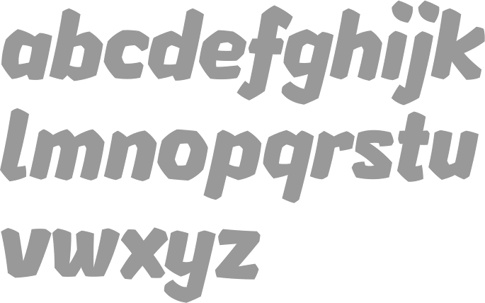
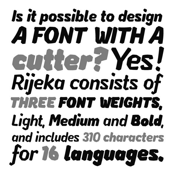
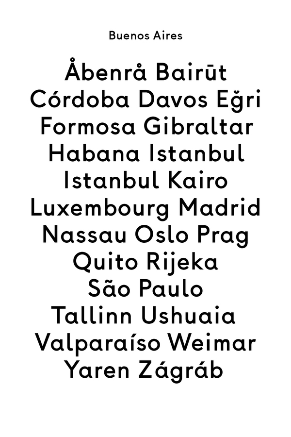
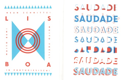
 Luzi Gantenbein (Luzi Type, Bern, Switzerland) is a type designer, b. 1988, Fläsch, Switzerland. He created the vernacular all caps wall paint typeface Valparíso (2010, Volcano). At the Hochschule der Künste Bern, he designed the angular family Rijeka (2011, Volcano), the Avenir/Futura-genre typefamily Buenos Aires (2011), and the multilayer family Lisboa (2011).
 Luzi made the sans typeface Cadiz in 2013. Cadiz Italic was finished in 2014. Livorno (2013) is a sturdy round-serifed text typeface. In 2014, she created the masculine wedge serif typeface Beirut. In 2015 she finished the titling sans typeface Faro which has two sub-versions, Lucky and Sad. She also published Faro (a typeface that by virtue of stroke curvature emulates sadness or hapiness), Messina Modern, Messina Sans (+Mono), and Messina Serif. Typefaces from 2016: Assembly (a symbol archive for the globalized world), Lynstone (sans), Nantes (transitional text typeface), Koper (a rough woodcut typeface with polygonal outlines that were inspired by Vojtech Preissig). Typefaces from 2018: Recife (an editorial typeface inspired by Times and Plantin). Typefaces from 2019: Spezia (sans). Typefaces from 2021: Portonovo (a Garamond / Caslon style font based on the typeface used in the Martyrologium Romanum; a book printed by the Plantin Press in 1690), Termoli (a Scotch roman inspired by Linn Boyd Benton's Century Roman). Klingspor link. Behance link. Home page. Behance link for Luzi Type. Fontdeck link. Volcano Type link. [Google]
[MyFonts]
[More] ⦿
|
Maicon Pereira
|
Porto Alegre, Brazil-based designer of the polygonal typeface Moka (2019). [Google]
[More] ⦿
|
Marta Yarza
[The Yarza Twins]
|
[More] ⦿
|
Maxime Fittes
|
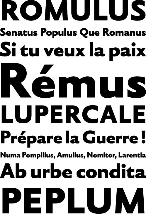
 Graduate of the DSAA Design Typographique program of the Ecole Estienne in Paris, class of 2011. He works now as a designer at Atelier Chevalvert. He created these typefaces in 2011: BTP (polygonally outlined typeface done for the magazine Étapes, in collaboration with Jérémy Perrodeau, Léo Pico and Benjamin Viallard), Talion (an angular text family---his graduation typeface at Estienne), Kriterion, Rémus (inspired by Jan Van Krimpen's Romulus Sans Bold). [Google]
[More] ⦿
Graduate of the DSAA Design Typographique program of the Ecole Estienne in Paris, class of 2011. He works now as a designer at Atelier Chevalvert. He created these typefaces in 2011: BTP (polygonally outlined typeface done for the magazine Étapes, in collaboration with Jérémy Perrodeau, Léo Pico and Benjamin Viallard), Talion (an angular text family---his graduation typeface at Estienne), Kriterion, Rémus (inspired by Jan Van Krimpen's Romulus Sans Bold). [Google]
[More] ⦿
|
Memela Studio
[Peter Lorenz]
|
Peter Lorenz (Memela Studio, Guadalajara, Mexico) designed Cali Ms (2010, with Alberto Arellano), Fina (2011, a tall hairline all-caps face), Marga (2012, a polygonal typeface done with Alberto Arellano), Marcatextos (2012, a stencil family), and Quetzal (2012, decorative). In 2013, Memela designed the art deco marquee typeface Albahaca. Behance link. Another Behance link. Behance link for Peter Lorenz. [Google]
[More] ⦿
|
Mesh Design
|
Mesh Design is a graphic and web design outfit in Burton upon Trent, UK. It created a polygonal experimental face, simply called Mesh (2009). [Google]
[More] ⦿
|
Monika
|
Dublin, Ireland-based designer of the free polygonal or paper cutout typeface Paper Play (2019). [Google]
[More] ⦿
|
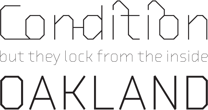
Möbel Type
[Imogen Ayres]
|
Möbel Type was founded by Imogen Ayres in Glasgow, Scotland. Their retail typefaces include Lacuna, Beach Goth (blackletter), Furniture (sans), Zetkin and Ripley (polygonal). Bespoke typefaces include Horizon (rounded stencil), Noam, Eyvin (sans), Phew, Doves Flare, Geo (a geometric art deco stencil typeface; for Paulin watches in Glasgow), and Paws N Claws. [Google]
[More] ⦿
|
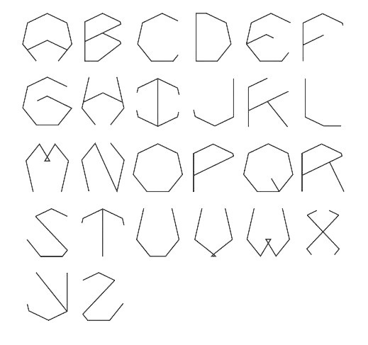
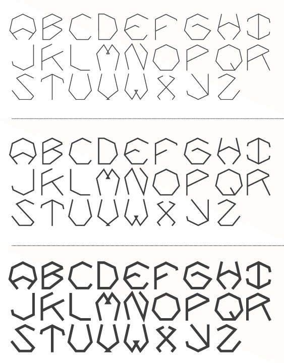
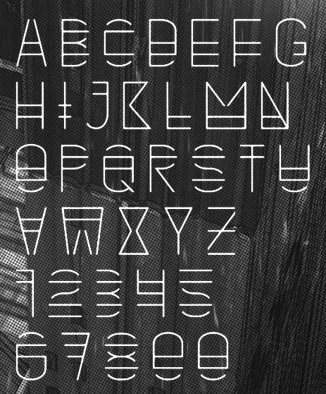
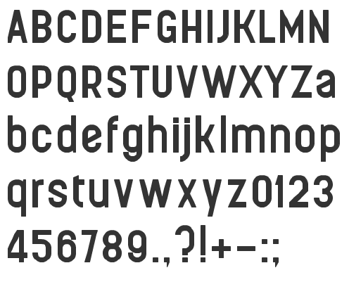
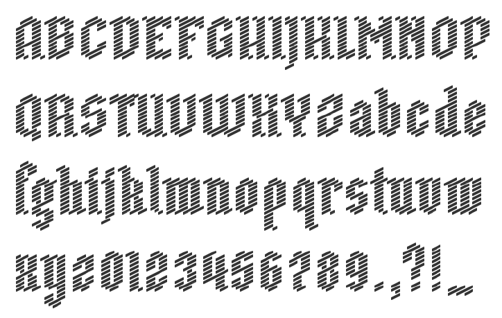
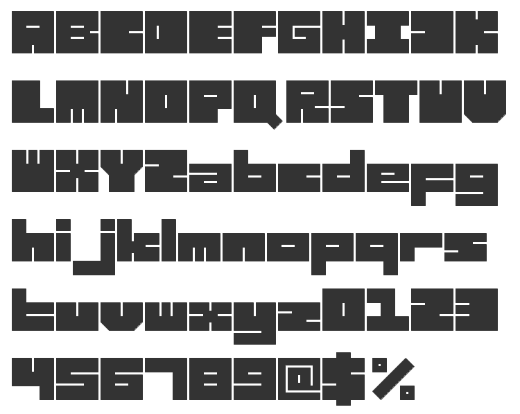
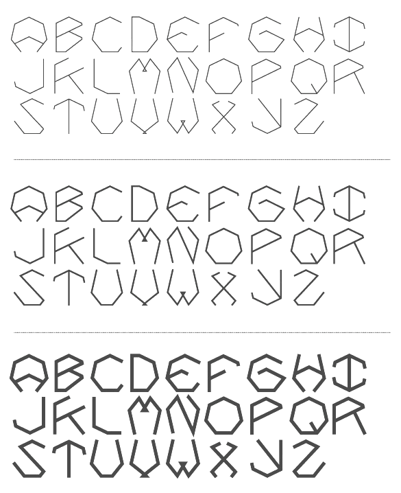
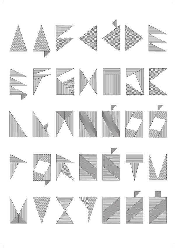
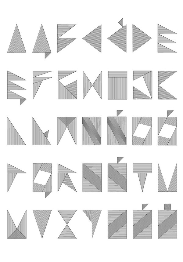
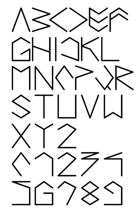
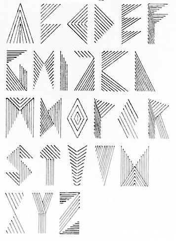
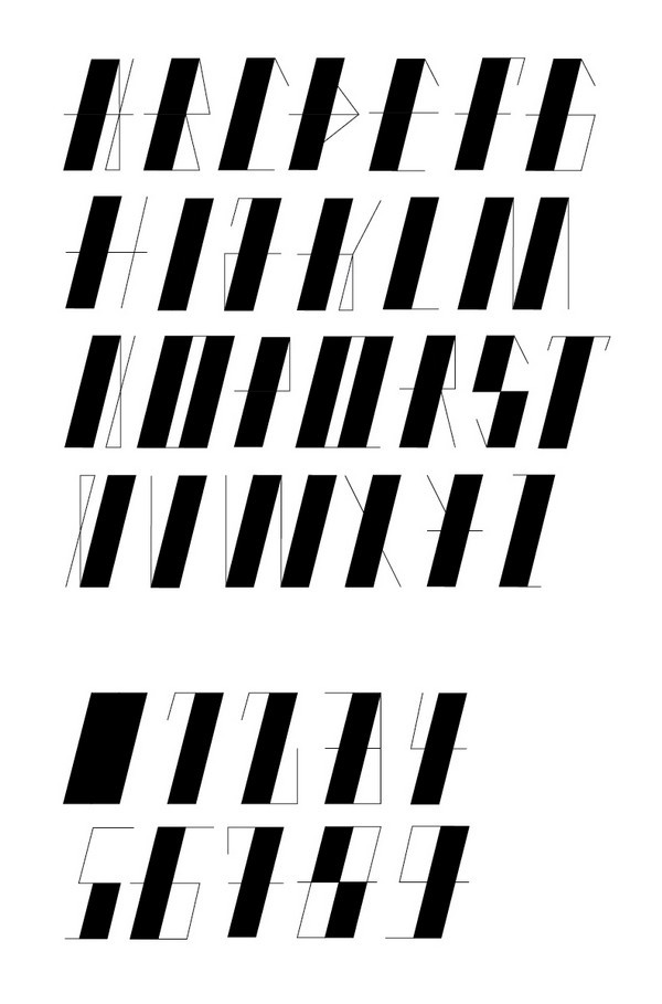
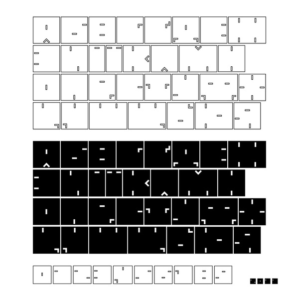
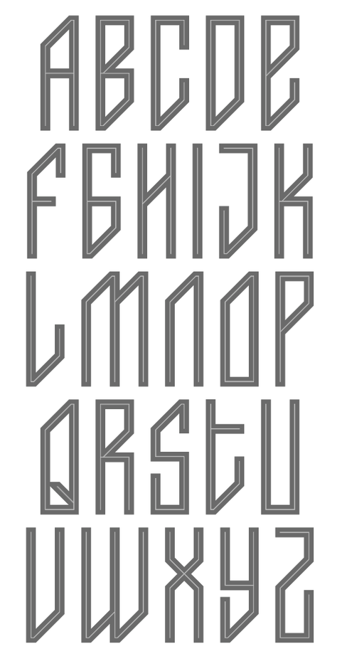
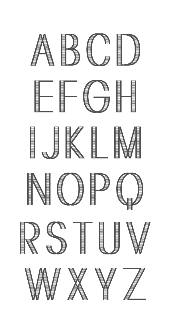
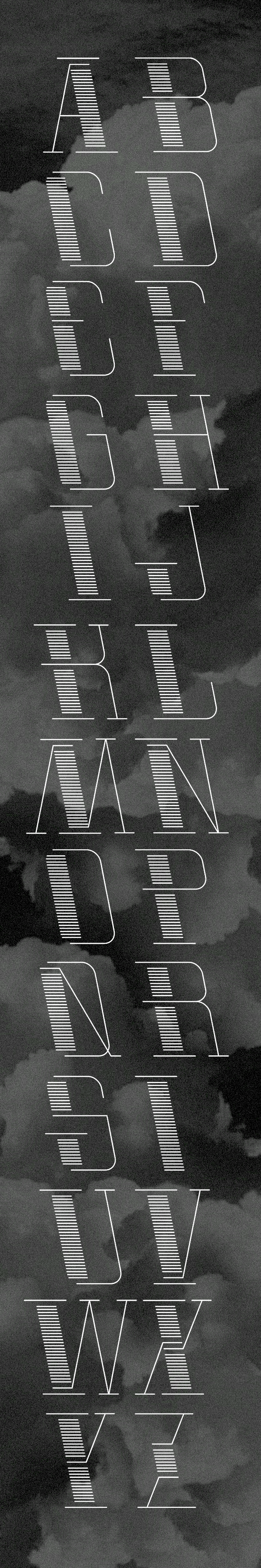
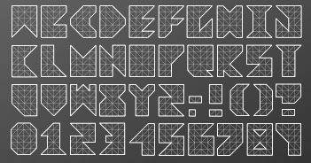
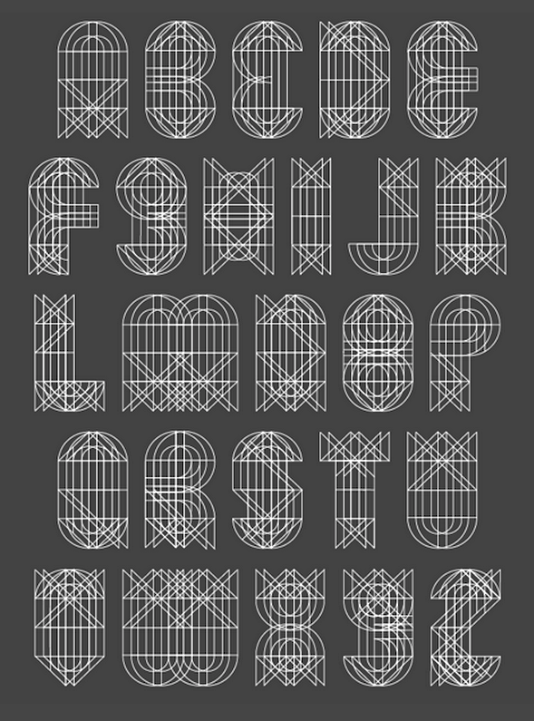
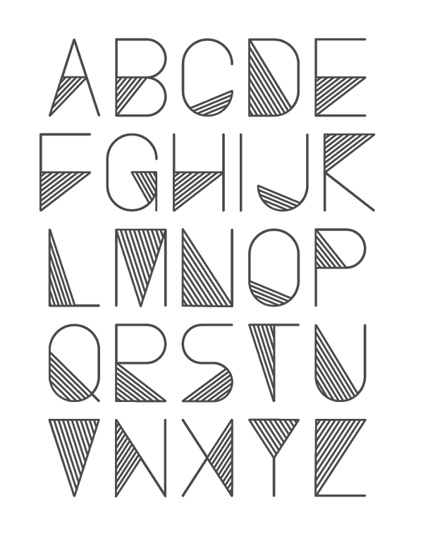
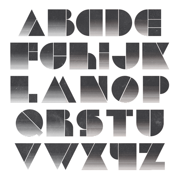
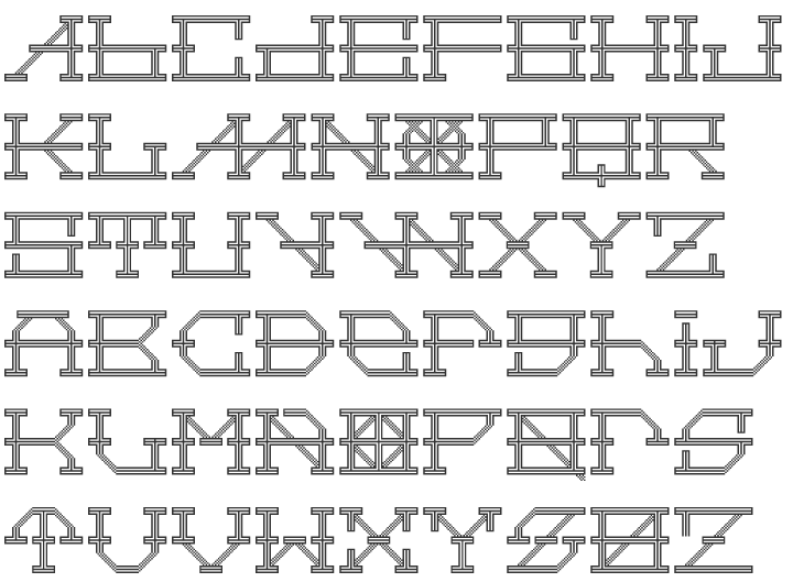
MyFonts: Polygonal typefaces
|
Polygonal typefaces, as selected from the MyFonts library. Many of these are either angular or octagonal. See also this list of polygonal typefaces. [Google]
[More] ⦿
|
Nina Gregier
|
Polish graphic designer who is based in Krakow. Nina is exploring geometric concepts such as in her Alfabetczi White (2012), My Republic, Teleport (2011, monoline hexagonal), in her Stripes typeface (2010), in Do Not Cut (2011), in CLN 3000 ID (2011), in the multiline typeface Pink Twist Alphabet (2011), in the hand-printed poster typeface Bambi Letters (2011), and in Garaz (2011). Ksavery (2011) is an architectural typeface designed for the logo of the Krakow School of Art and Fashion Design's blog. In 2012, she created the alchemic typeface Keep Going. Fruits of the Forest (2013) is an alchemic typeface family. Classic Geometry (2013) also uses geometric patterns. In 2014, she created the geometric display typeface Baltazar, the multilined typeface Wake Up, and the avant-garde Proste Wnetrze (for the interior design studio by that name). In 2015, Nina designed the free EPS format polygonal typeface Kendrick. Home page. Home page. Hellofont link. Behance link. [Google]
[More] ⦿
|
Olga Tereshchenko
|
 Talented Ukrainian designer. She has interesting illustrations, and her Latin and/or Cyrillic typefaces show tremendous potential:
 - Avangard (2012). A blocky outline family.
- Black and White (2012). A great geometric / cubist experiment in the style of Mondriaan's paintings.
- Diamond (2012). An experimental polygonal typeface.
- Old Font (2012).
- Malevich (2015, BBDO Studio). An abstract typeface to celebrate Russian suprematist Kazemir Malevich.
[Google]
[MyFonts]
[More] ⦿
|
Ophélie Alzieu
|
During her studies at Campus de la Fonderie de l'Image, Antony, France-based Ophélie Alzieu designed the polygonally stroked typeface Bilum (2017). Behance link. [Google]
[More] ⦿
|
Our Polite Society
[Radek Sidun]
|
 Our Polite Society Type is a project by Our Polite Society, a graphic design studio based in Amsterdam and Stockholm, formed in 2008 by Jens Schildt and Matthias Kreutzer (a German who graduated from and taught at Rietveld Academy in The Netherlands). Early on in their collaboration, they began designing type for specific projects, usually for limited use. Our Polite Society Type is an attempt to finalize some of their favourite designs of the past years and make them available to others as of 2019. Font engineering by Radek Sidun. Their typefaces:
 - OPS CapitalisBrutalis.
- OPS Cubic. Monospaced.
- OPS Facitype. A wide bold sans.
- OPS Favorite. A monospaced typewriter font.
- OPS Grotesko. A polygonal, almost hexagonal, font.
- OPS Kappla. A stitched style.
- OPS PastPerfect. A mini-stencil.
- OPS Placard. Monospaced, typewriter style.
- OPS RestructionalText. A readable condensed sans.
- OPS Used Future (2021).
[Google]
[More] ⦿
|
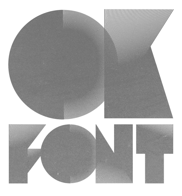
Patrick Seymour
|
 Super-talented Montreal-based illustrator and digital artist. Home page. He created several modular typefaces in 2011.
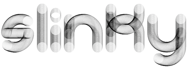
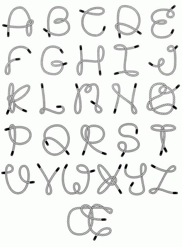
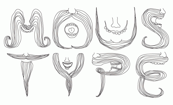
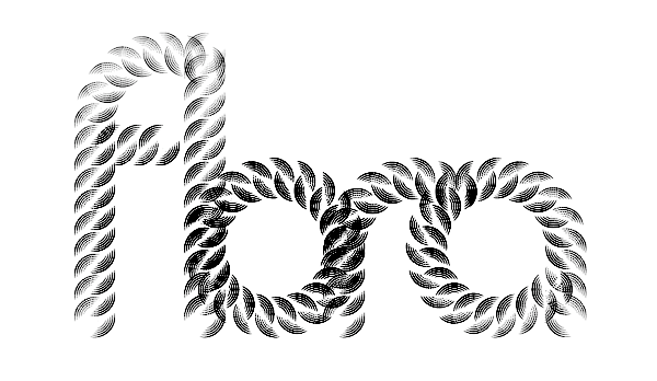
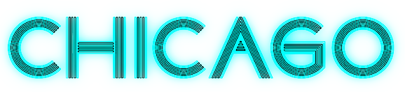
 In 2012, he created Muse, Gotham Streets (a prismatic typeface), Slinky, Stencil, Tulipe (counterless), Bad Billy (multilined, art deco), The Great Carnival (beveled caps), Web Font (prismatic), Jump Jump Font (octagonal), Fashion (a horizontally striped typeface), OK (prismatic), The Aviator (horizontally striped poster face), La Bonne Aventure (prismatic and slightly art deco), the rope-themed typeface Noeud Marin, the shaded boat name typeface Bleu Marine, the multiline caps typeface Origami, the moustache-inspired caps typeface Mous Type (ornamental moustache-shaped capitals), the multilined display typeface Empire, the hand-drawn Une Typo Faite A La Main, and the prismatic typeface Anabelypster. After a bout of salmonella, he created Intestino, still in 2012. In Motion (2012) is an awesome prismatic art deco typeface. Images of his stunning work from 2011: i, ii, ii, iv, v, vi, vii, viii, ix, x. His Cathédrale project (2011) starts from a squarish face and transforms it gradually into one that contains the features of a cathedral. Creations in 2013: Shapes (geometric font), Gold Deco, Dentelle, Twist, Sleek (a thin slab serif), Say Say Say (multiline, prismatic, hypnotic), Metrick (a gridded typeface), Film Noir (an overlay type system), Tam Tam, Diner (a striped all caps typeface), Spot Light Font (prismatic), Flora, Bright Diamond, Incandescent, XVII (multilined display face), Konga (a multiline script), Shiny Diamond, Splash (paint font), Chicago (prismatic neon tube face), Taxi (a wonderful multiline typeface), Papale (religious symbology alphabet made to mock the papal system), Empreinte (pure op-art), Broken Arrow Font (multiline caps face), Liquid Paper Font, Sunset (prismatic), Boogie (Broadway-style art deco family), New Art Deco (prismatic art deco face), Poule de Luxe, Burnout (a prismatic typeface), Marble Maze Font, M Gagnon (ornamental caps influenced by the design work of Denis Gagnon). FontStruct fonts: Test3 (2012), Jump Jump 2 (2012). Typefaces made in 2014: Moiré, Decora, Magnetic, Noise (TV noise emulation), Yes (multilined font), Broderie (braided letters), SAS (multilined), Full House, Heart Font (prismatic), 1976 (inspired by the 1976 Olympic Games in Montreal), Gold (prismatic art deco typeface), Lace, Bike. Typefaces from 2015: Detour, Allie X, Grad Font, Duct Tape, Mint Julep (bilined art deco beauty), Hourglass, Stuntman (prismatic), La Dame de Coeur (playing card font), Fog. Typefaces from 2016: Road Free (a free prismatic font), Solitaire (card font), Joliette, Denis (named after Montreal's mayor, Denis Coderre), Montreal (a prismatic typeface based on the logo of the city of Montreal), Cherry Cola Font, Bro & Co (multilined art deco beauty), Macramee (multilined). Typefaces from 2017: The Simple Font (sans), Le Cabinet (multilined neo deco). Typefaces from 2018: Atrium (a sublime multiline art deco beauty), Pride (a color font to support the LGBT community). Typefaces from 2019: Columbarium (a beveled typeface), The Invisible Font, The Usual Font, Recettes d'Ici (handcrafted style for menu design), Vinyl (multiline), Gasoline (a gasoline spill textured font), Reflet, Mint Soda (a fashion mag extravaganza), Glamarrr (a sailor or pirate font). Typefaces from 2020: Siren (a wonderful mermaid-themed initial caps font, half Engravers MT and half mermaid), Homa (decorative caps), Luna (blocky caps), Chicken Bone, Happier (an all caps 3d color font), Dollara (a polygonal typeface), Stay Home, Mundo Disko (prismatic). Typefaces from 2021: Deliria, The National Bank Open font (created for a tennis tournament). Behance link. Hellofont link (for buying his fonts). Typefaces from 2022: Trumpets (deco caps). [Google]
[More] ⦿
|
Peter Lorenz
[Memela Studio]
|
[More] ⦿
|
Peter Olschinsky
[Atelier Olschinsky]
|
 [More] ⦿
|
PH Design
|
British type foundry. Creators of the polygonal typeface Cloudia (2012). [Google]
[MyFonts]
[More] ⦿
|
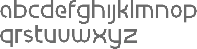
Process Type Foundry
[Eric Olson]
|
 Located in Minneapolis and/or Golden Valley, MN, Process Type Foundry is Eric Olson's foundry created in 2002. Its team grew withe additions of Alice Savoie, Nicole Dotin and Doug WilsonIts fonts:
 - Anchor.
- Bryant (2002, sans serif with simple forms). Bryant 2.0 (2005, Standard&Pro), Bryant Compressed, Bryant Condensed (all three form a neat geometric sans family), Bryant Pro.
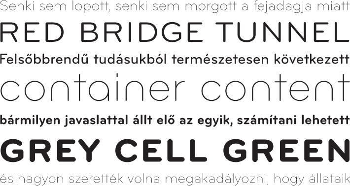
- Chrono (2012). Olson writes: Chrono: The nearly geometric sans serif. Chrono is a refined oval sans serif of 20th century origins and 21st century sensibilities. Influences ranging from the gruff Aurora Grotesk series to the elegant Neuzeit are paired with a subtle geometry and typographic utility to inform this family of sans serifs. Chrono was renamed Colfax later in 2012.
- Colfax (2012). The blurb: Colfax is a refined oval sans serif of 20th century origins and 21st century sensibilities. Influences ranging from the gruff Aurora Grotesk series to the elegant Neuzeit are paired with a subtle geometry and typographic utility to inform this family of sans serifs. It was formerly called Chrono. A complaint from another foundry with a similarly named font led to the name change. The only one I can think of is Cronos (Robert Slimbach, Adobe).
- Coordinates (2018). A monospaced almost typewriter typeface.
- Elderkin (2005). Eric Olson; A few of my typefaces were made for very specific projects (Process Grotesque + Elderkin) and really have no contribution to make beyond that. Sure they look fine, but who cares? I'm not thrilled with them and plan on removing them this spring.
- Entovo (2006, rectangular).
- FIG-Sans, FIG-Script, FIG-Serif (2002, as in needlepoint lettering, in imitation of the figlet ascii-to-letter program).
- FindReplace (2004).
- A free monospaced font, Indivisible (2002). This became a variable font in 2019.
- Kettler (2002). A Courier-like font named after Courier's designer, Howard Kettler.
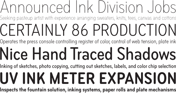
- Klavika (2004, an extensive sans family). Followed in 2005 by Klavika Condensed, in 2008 by Klavika Basic and in 2012 by Klavika Display. Klavika poster by Mary Stratton and Michele Wong Kung Fong.
- Lingua (2003, an octagonal typeface with about 200 ligatures).
- Locator (2003), Locator Display: an information design sans family.
- Maple (2005, a grotesque family that includes a beautiful Black).
- Moniker (2017, Process Type Foundry). A large rounded sans typeface family.
- Process Grotesque (or: Process Grot).
- Recent Grotesk (2020, in six weights). He writes: Recent Grotesk is a contemporary family of typefaces with influences that start in the 19th century and travel through into present day. It's a nod to the improvised weight and width strategies of wood type, the high x-heights of 20th century phototype and the puffed out Antique Olive Nord of Roger Excoffon.
- Recipient (2022). A monospaced typewriter font family that descends from the IBM Selectric and Olivetti typewriter faces.
- Scandia Line (2015). Drawn without curves, this four style+stencil variant is purely polygonal, for a special Neanderthal computer effect. Scandia (2015) on the other hand is a classic geometric sans.
- Sculpin (2021). A sharp-edged sans typeface inspired by the finishing details of square-edged tools like the chisel and brush.
- Seravek (2007, a linear and simple sans created for information design).
- Stratum 1 and 2 (2004, contemporary geometric typefaces genetically linked to Bank Gothic).
Before Process Type Foundry, Eric used to run Information Repair, where he did "typeface design and print design for clients within the cultural sector including the Walker Art Center, Minneapolis College of Art and Design (MCAD), Intermedia Arts and the Design Institute at the University of Minnesota" and made the fonts Novo Grotesk, Necrophones, Fibo001. Fonts sold by MyFonts. Behance link. View the Process Type Foundry typeface library. View Eric Olson's typefaces. [Google]
[MyFonts]
[More] ⦿
|
Radek Sidun
[Our Polite Society]
|
[More] ⦿
|
Radko Hromátka
|
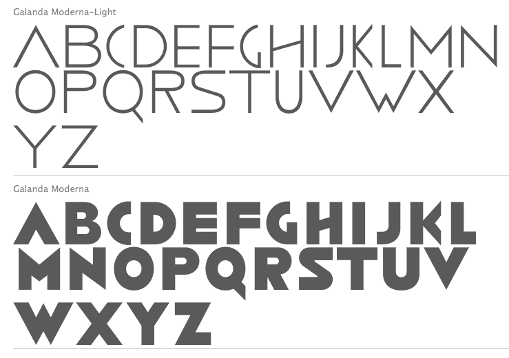
 Radko Hromátka (b. 1980) established the Radko Hromátka foundry in Prague in 2006. Radko created the art deco sans caps family Galanda Moderna (2010), which took ideas from book covers of famous Slovak painter, graphic artist and illustrator Mikulas Galanda (1895-1938).
 In 2012, he created the polygonal typeface Vaba. Typefaces from 2013 include Waves (an informal sans). [Google]
[MyFonts]
[More] ⦿
|
Reka Cserei
|
Oradea, Romania-based designer of the polygonal typeface Trapezio (2019). [Google]
[More] ⦿
|
Ruben Vandennieuwenborg
|
Ghent, Belgium-based desugner of the polygonal typeface Bolt and Nut Sans (2017). [Google]
[More] ⦿
|
Sergey Steblina
|
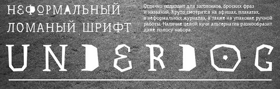
Graphic designer in Odessa, Ukraine, who made the hand-printed Latin / Cyrillic typeface Strel (2012, with Jovanny Lemonad), and the free hand-drawn polygonal Latin/Cyrillic typeface Underdog (2012, free at Google Web Fonts). Behance link. [Google]
[More] ⦿
|
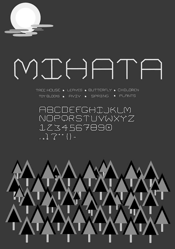
Shao Jun Seng
|
Aka Mitch Seng, she is a graphic designer in Singapore who studied at Laval College. She created the polygonal typeface Mihata (2012). [Google]
[More] ⦿
|
Shintarou Nakayama
[Gomarice Font (or: Goma Shin)]
|
 [More] ⦿
|
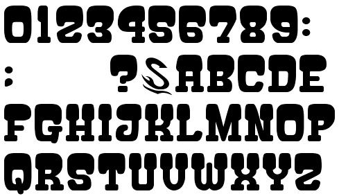
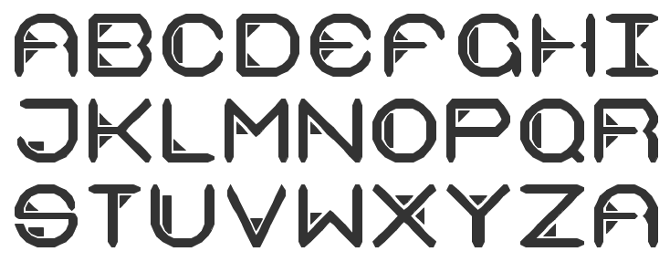
Situjuh Nazara
[7N Types]
|
 [More] ⦿
|
Sjoerd Kulsdom
|
 Sjoerd Kulsdom (Dot By Dot) is the Arnhem and/or Amsterdam-based designer of the curly typeface Spring Is In The Air (2011), the polygonal cut-out typeface Cardboard Cat (2016), the informal typeface Merijntje (2014) and the multiline typeface Monogram Rounded (2016). Sjoerd is associated with Ontwerpstudio Dot by dot.
 Typefaces from 2017: Skrova (textured layered round sans), Deux Inline, Allergen Icons, Drone Attack (dingbats), Walrus Rough, Walrus Bold. Typefaces from 2018: Confetti (a stackable multicolor font). Typefaces from 2019: BusMatrix Condensed. [Google]
[More] ⦿
|
Storm Type Foundry
[Frantisek Storm]
|
 Storm Type is a major Czech foundry that offers the inspiring work of Frantisek Storm (b. 1966, Prague). Most typefaces are made by Storm himself. The typefaces:
 - Aaahoj: a ransom note font.
- Abald (2005): Abald adds to the number of "bad-taste" alphabets as seen on faded commercial inscriptions painted on neglected old houses.
- Academica: Josef Týfa first published Academia in 1967-68. It was the winning design in a competition for scientific typefaces, announced by Grafotechna. It was cut and cast in metal in 1968 in 8 and 10 point sizes in plain, italic and semi-bold designs. In 2003 Josef Týfa and Frantisek Storm began to work on its digital version. The new name Academica distinguishes the digital execution (and modifications) from the original Academia. In 2021, Frantisek Storm added Academica Sans.
- Aichel: originally designed for use in architecture (in this particular case for a UNESCO memorial plaque for a church built by Jan Santini-Aichel on Zelenà Hora). It has a stone-chiseled look.
- Alcoholica
- Alebrije (2015). A 42-cut exaggerated cocaine-driven typeface family with instantly recognizable v and w that have slabs on their baselines.
- Amor Sans and Amor Serif (2005).
- Amphibia (2016). A lapidary typeface family.
- Andulka (2004): 24 weights for use in books, mags and newspapers. Extended in 2011 to Andulka Sans.
- Antique Ancienne, Moderne&Regent (2000): Baroque typefaces.
- Anselm Sans and Serif (2007): 20 styles about which Storm writes The ancestry of Anselm goes back to Jannon, a slightly modified Old Style Roman. I drew Serapion back in 1997, so its spirit is youthful, a bit frisky, and it is charmed by romantic, playful details. Anselm succeeds it after ten years of evolution, it is a sober, reliable laborer, immune to all eccentricities. It won an award for superfamily at TDC2 2008. It covers Greek as well.
- Areplos (2005): Based on Jan Solpera's 1982 typeface with serifs on top and serifless at the bottom.
- Bahnhof: poster typeface from the 1930s.
- Baskerville Original Pro (2010) comprising Baskerville 10 Pro, Baskerville 10 Cyr, JBaskerville, and JBaskerville Text. This is an important and thoroughly studied execution starting from photographs of prints from Baskerville's printing office, ca. 1760.
- Beletrio and Beletria (2018). Beletria (26 styles) is intended as a modern book type. Beletrio is a peaceful accompanying sans.
- Bhang (2011) is a flat brush signage family of exceptional balance.
- Biblon (2000; note: ITC Biblon is a watered down version of Biblon, so please go for the original, not the ITC version). Biblon Pro (2006) is even better; 6 weights.
- Briefmarken (2008): letters that look dented like postage stamps.
- The 64-style Carot type system (2020), which consists of Carot Sans, Carot Display, Carot Slab and Carot Text.
- Clara Sans and Clara Serif (2014). Based on sketches by Rotislav Vanek, and published at Signature Type Foundry.
- Clichee
- Cobra (2001)
- Comenia Script (Radana Lencov&acaute;), an upright script with a handwritten look for teaching writing.
- Comenia Text (2006): a serif family for school books. Also called Comenia Pro Serif.
- Compur (2000).
- Coroner (2018). A blackletter first sketched in 1988.
- Defender (2008): a heavy slab family.
- Digita (2004)
- Dracula (2017). A great blackletter family.
- Dynamo Grotesk (1995): Storm's 60-weight sans family going back to the early sans traditions. In 2009, this was updated to Dyna Grotesk Pro.
- Enamelplate (2011).
- Etelka (2005, 42 styles): a corporate identity sans family, which became commercial in 2006. Four Etelka Monospace styles were added in 2008. Etelka Sans and Etelka Slab were released in 2019.
- Evil
- Excelsior Script (1995-1996), perhaps renamed Excelsor Script around 2000.
- Farao (a great Egyptienne font in 3 weights)
- Friedhof (2011). A family based on tombstone lettering from ca. 1900. It contains handtooled and shaded (Geist + Deko) variations.
- Gallus Konzept (2007, in many weights):
- Carolingian-Roman-Gaelic-Uncial script, or an exploration into how the Latin alphabet could look were the evolution of the Carolingian Minuscule to stop in the 8th century AD in Sankt Gallen.
- Genre: a modern face.
- Fenix 21 through 23 (2010): An elliptical sans family that includes a hairline (21).
- Header (2009): a magazine headline family.
- Hercules (2001). A didone family originally influenced by Monotype's fat face Falstaff (1935).
- Hexenrunen (2006, + Reverb): a runic simulation face.
- Ideal Gothic
- Inicia (2018). A sans originally drawn in the 1980s.
- Jannon (this is a formidable Garalde family). Jannon Pro appeared on MyFonts in 2010.
- Jannon Sans (2011).
- Jannon Text Moderne (2001): thicker hairlines and smaller x-height than Jannon Text, thus more generally useful
- Jasan (2017). A 36-strong sans family with lots of wide styles.
- JohnBaskerville (2000)
- JohnSans (2001, a 72-weight sans version of Baskerville)
- Josef Sans (2013, with Jan Solpera). A humanist sans family related to Josef Tyfa's Tyfa Roman (Tyfa Antikva).
- Juvenis (2003)
- Kompressor: techno typeface
- Lexicon Gothic: newspaper and magazine type family, created in 2000. Renamed Lexon Gothic.
- Libcziowes: based on the oldest lettering found in Bohemia, on a gravestone in Libceves dating from 1591
- LidoSTF (2001, free): a redrawn Times with lots of individuality, yet still a newspaper typeface
- Lokal Script (2009): a large hand-printed letter family.
- ITC Malstock (1996-1997), a condensed film poster face.
- Mediaeval
- Metron (2004, a digital version by F. Storm and Marek Pistora after a huge sans design from 1973 by Jiri Rathousky, which was commissioned by the Transport Company of the Capital City of Prague in 1970 to be used in the information system of the Prague Metro. In 1986, the metro started using Helvetica): this typeface is eminently readable!
- Modell: techno
- Monarchia [The Monarchia family, consisting of three designs, is a transcription of "Frühling" of the German type designer Rudolf Koch, enriched by a bold and text design]
- Moyenage (2008): a 25-style blackletter family for Latin and Cyrillic, almost an experiment in blackletter design and flexibility. Winning entry at Paratype K2009.
- Mramor (1988-2013). A roman caps typeface with lower case added. Storm: The text designs are discontinued since they were replaced by the related Amor Serif family (along with its -sans version). Even so, ten display styles are left.
- Negro
- Ohrada: condensed upper case
- Ornaments 1+2
- Ozdoby 1+2 (great dingbats): The set includes heraldic figures, leaves, decorative endings, various skull forms, weather signs, borders and many more.
- Patzcuaro
- Pentagramme
- Pentagraf: a slab serif
- Pepone and Pepone Stencil. Designed for setting belles-lettres, this serifed family defies classification.
- Pivo (2006), a connected diner script inspired by Bohemian beer labels.
- Plagwitz (2000, blackletter). Plagwitz poster by Lissa Simon (2012).
- Politic (2004): a clunky fat octagonal family made for billboards, flyers, posters, teabags, and matches for the green Party in the 2004 Czech elections. Caps only.
- Preissig Antikva + Ornaments: a 1998 digitization and interpretation of Preisig's polygonal type from 1925. The Pro version is from 2012.
- Preissig 1918: a typeface by Vojtech Preissig cut in linoleum
- Preissig Ozdoby
- Regent Pro (2015): a rustic Baroque typeface that oozes energy out of its semi-transitional semi-didone orifices.
- Quercus Whiteline, Quercus 10, Quercus Serif, and Quercus Sans (2015). Four large families, created for informational and magazine design, corporate identity and branding. The sans has a Gill flavor.
- Regula Text and Regula Old Face. Regula is named after the secular monastic order Regula Pragensis. Initially, the digitized font (regular old Face, which is now free) had jagged edges and a rather narrow range of applications until the summer of 2009, when Storm added text cuts. Regula was a baroque alphabet faithfully taken over from a historical model including its inaccuracies and uneven letter edges.
- Rondka (2001)
- Sebastian (2003, a sans with a funky italic), about which he writes: Sans-serif typefaces compensate for their basic handicap---an absence of serifs---with a softening modulation typical of roman typefaces. Grotesques often inherit a hypertrophy of the x-height, which is very efficient, but not very beautiful. They are like dogs with fat bodies and short legs. More# Why do we love old Garamonds? Beside beautifully modeled details, they possess aspect-ratios of parts within characters that timelessly and beauteously parallel the anatomy of the human body. Proportions of thighs, arms or legs have their universal rules, but cannot be measured by pixels and millimeters. These sometimes produce almost unnoticeable inner tensions, perceptible only very slowly, after a period of living with the type. Serifed typefaces are open to many possibilities in this regard; when a character is mounted on its edges with serifs, what is happening in between is more freely up to the designer. In the case of grotesques, everything is visible; the shape of the letter must exist in absolute nakedness and total simplicity, and must somehow also be spirited and original.
- Serapion (a Renaissance-Baroque Roman typeface with more contrast than Jannon)
- SerapionII (2002-2003): early Baroque
- Solpera (digitization of a type of Jan Solpera, 2000)
- SplendidOrnamenty (1998, a formal script font)
- Splendid Quartett: an Antiqua, a sans, a bold and a script. Stor writes: The script was freely transcribed from the pattern-book of the New York Type Foundry from 1882, paying regard to numerous other sources of that period.
- St Croce (2014). Based on worn-out lettering on tombstones in the St. Croce Basilica in Florence, this is a flared lightly stenciled typeface family.
- Technomat (2006): this typeface takes inspiration from matrix or thermal dot printers.
- Tenebra: a combination of the Baroque inscriptional majuscule with decorative calligraphic elements and alchemistic symbols
- Teuton (2001): a severe sans family inspired by an inscription on one German tomb in the Sudetenland
- Traktoretka
- Trivia Sans (2012), Trivia Serif (2012, a didone), Trivia Serif 10 (2012), Trivia Grotesk (2012, 48 cuts), Trivia Gothic (2013), Trivia Slab (2012), and Trivia Humanist (2013, a strong wedge serif family: I wanted a clear and majestic typeface for book jackets, LP cover designs, posters, exhibition catalogues and shorter texts).
- Tusar (2004): a digitization of a type family by Slavoboj Tusar from 1926
- Tyfa ITC + Tyfa Text: Designed by Josef Týfa in 1959, digitized by F. Storm in 1996.
- Vida Pro (2005), a big sans family designed for TV screens. Vida Stencil Demo is free.
- Walbaum Text (2002). Walbaum 10 Pro (2010) and Walbaum 120 Pro (2010) are extensive (and gorgeous!) didone families, the latter obtained from the former by optical thinning. Storm quips: I only hope that mister Justus Erich won't pull me by the ear when we'll meet on the other side. Advertised as a poster sans family, he offers Walbaum Grotesk Pro (2011).
- Wittingau (2016). A wonderful decorative blackletter typeface family, with a great set of Wittingau Symbols.
- Zeppelin (2000): a display grotesk
This foundry cooperates in its revivals with experienced Czech designers Ottokar Karlas, Jan Solpera and Josef Týfa. Alternate URL. Myfonts write-up. At ATypI 2004 in Prague, he spoke about his own Czech typefaces, on his Czech Typeface Project, and on the life of Josef Týfa. Linotype link. FontShop link. Klingspor link. [Google]
[MyFonts]
[More] ⦿
|
The Yarza Twins
[Marta Yarza]
|
 The Yarza Twins, born in Vigo (Spain), are Eva and Marta Yarza. Marta graduated in 2012 with a degree in construction engineering. In 2014, she studied communication design (MA program) at Central Saint Martins (University of the Arts, London (UK)). During her studies in London, Marta Yarza created Square Print (2014, a free artsy typeface), Japanica (2014, a free experimental Asian simulation typeface, with her twin sister Eva Yarza), and Plastic Crowds (2013, with Eva Yarza), about which they write: Inspired by old cinema marquees and by the 60s advertisements of NASA, we created this unique upper case typeface for the art collective Plastic Crowds. In 2015, they designed Horas, Orchid (a decorative didone), Haustraks, and Sound Reactive.
 In 2016, Eva and Marta Yarza designed the almost polygonal typeface Batavier. In 2017, they published the industrial sans typeface FIA Formula E and the wide sans typeface Hilario YT. The Yarza Twins shop (where one can buy some of their fonts). Behance link for Eva Yarza. Behance link for Marta Yarza. [Google]
[More] ⦿
|
YH Design
|
Studio in Tokyo. Creator of the polygonal typeface Tri Type (2014). Behance link. [Google]
[More] ⦿
|
Yock Mercado
[Jorge Mercado]
|
 Monterrey (was: Saltillo and/or Mexico City)-based designer of the spiky spurred almost Western typeface family Gandul (2017) and the octagonal Western typeface Kiner (2018). In 2019, they published the relaxed informal sans serif typeface family Ciento, the blackletter typeface Doppler, and the sans typeface family Burpee.
 Typefaces from 2020: Reyes (a vintage mini-serif), Eliptik (a 6-style monolinear sans with alpha-shaped counters). Typefaces from 2021: Tabique (a polygonal typeface). [Google]
[MyFonts]
[More] ⦿
|
