| | |
Alejandra Garza
|
 During her studies in Monterrey, Mexico, Alejandra Garza designed a great typographic poster entitled Rafael Coronel Retrofutura (2014). Alejandra mixed Fette Unz Fraktur, IFC Los Banditos, and DIN Next LT Pro to obtain the hybrid typeface Oldtime Circus (2014). To celebrate Andy Warhol, she designed Pop Art Type in 2014. [Google]
[More] ⦿
During her studies in Monterrey, Mexico, Alejandra Garza designed a great typographic poster entitled Rafael Coronel Retrofutura (2014). Alejandra mixed Fette Unz Fraktur, IFC Los Banditos, and DIN Next LT Pro to obtain the hybrid typeface Oldtime Circus (2014). To celebrate Andy Warhol, she designed Pop Art Type in 2014. [Google]
[More] ⦿
|
Alessandra Daniele
|
During her studies at Accademia delle Arti e Nuove Tecnologie in Rome, Alessandra Daniele designed the pop art typeface Shape (2013). [Google]
[More] ⦿
|
Alexander Tarbeev
[TFaces]

|
 [MyFonts]
[More] ⦿
[MyFonts]
[More] ⦿
|
Andrey Yaroslavtsev
|
Designer of Hand Drawn 3D Sketch Font (2015) and Wow Pop Art Comic Font (2015). [Google]
[More] ⦿
|
Barbara Toledo
|
 Curitiba, Brazil-based designer of Warhol Type (2014), a typeface inspired by Andy Warhol's pop art. [Google]
[More] ⦿
Curitiba, Brazil-based designer of Warhol Type (2014), a typeface inspired by Andy Warhol's pop art. [Google]
[More] ⦿
|
Ben Balvanz
[Fontalicious]
|
[MyFonts]
[More] ⦿
|
Beta
[Tanawat Sakdawisarak]
|
Beta is the company of Tanawat Sakdawisarak, a graduate of the Faculty of Visual Communication Arts and Graphic Design at Assumption University in Bangkok. It sells fonts and EPS format typefaces through YWFT, all more or less alchemic in nature. In 2009, Tanawat designed several Latin and Thai typefaces such as Bedhead Sweet (avant-garde face) and Bedhead Sway (paper-fold face). In 2012, he and Praire Kongpairin co-designed the alchemic hieroglyph-inspired typeface Saita (available at Ten Dollar Fonts). Still in 2012, he created YWFT Roland (an EPS format ornamental caps face), Baltic and Whiskey in a related style. YWFT Dogma (2012) is an EPS caps typeface based on the same design principles. In 2013, he published the EPS vector set YWFT Pipe and writes: It's not a flatbed truck, it's a series of tubes, and this totally tubular Pipe will carry you down the water slide to bubble town before you can say "pop art." A little touch of Nintendo, some extra olive juice, and a green Jell-o chaser make for this bubbling EPS vector handset, containing two different styles: flat and glossy/reflection. In 2015, a regular font family was published. King (2013) is an alchemic EPS forrmat typeface family. Behance link. [Google]
[More] ⦿
|
Cahya Sofyan
[Studio Sun (or: Sun Brand Co)]
|
 [MyFonts]
[More] ⦿
[MyFonts]
[More] ⦿
|
Carmela Diaz
|
Auckland, New Zealand-based designer of the pop art typeface Pop (2015), which is inspired by the pop of colours seen along the streets of Britomart in Auckland. [Google]
[More] ⦿
|
Creative Media Lab
[Kadek Adi Mahardika]
|
 Bali, Indonesia-based designer (b. 1983) of Baruna (2018: vintage decorative font), Brotherley (2018), the hilarious Chef Characters Icons (2018), the sans typeface Drupadi (2018), the ball terminal typeface Cameo Sweet Gothic (2018), the handcrafted typefaces Miyake Signature (2018), Kiddo Handwriting (2018), Puralova Script (2018) and Children Alien (2018).
 Typefaces from 2019: Jollin, Jollin Family, Popstick (an ultra-smooth popart style rounded sans), Yellost (blackletter), Chalk and Pamor, Little Pea, Tropiello (Tuscan, Victorian), Pink Shark, Molga, Othelie (swashy and medieval), Brume, Little Pea, Kuashe (monoline), Lordish (blackletter), Blue Angel, Black Cameo (spurred), Puralova, Milova (a great calligraphic typeface). Typefaces from 2020: Zolina (a decorative sans, with a variable font added), Black Mango (a chic 10-style display sans with some flared stems; +a variable font), Mesdag, Prettywise (a decorative serif), Loubag (an elegant short-ascender vintage display typeface in ten styles), Kooka (a variable width stylish exaggerated wedge serif family), Belle Story (a high contrast display serif), Losta Masta (a decorative serif), Matterdi (a fashion mag family with an extremely large x-height), Popstone (psychedelic, with a variable font), Carpellon (a tattoo font), Dorris (a swirly psychedelic font), Losta Masta, Mavera (a modular display font), Rajjah Famillia (a blackletter), Allaina (a Victorian serif), Kaoly (a stylish bold serif), Cattedrale (blackletter). Typefaces from 2021: Losta Bonita (psychedelic), Black Mango (Kadek Mahardika) (display sans), Naskle (psychedelic), Reggy (psychedelic), Losta Frida (a curvy display serif), Parka (a decorative saber-edged stencil typeface in nine styles), Missy Voya (a decorative serif), Greyst (a fashion mag display typeface), Skinny Joe (revisiting the bell bottom 1980s in a wonderful wide display family), Morgy (intestinal), Magrit (an ultra-fat high-contrast display typeface), Pretty Boy (a decorative serif family), Catavalo (a 6-style fashion mag typeface), Voire (a swirly lachrymal serif family consisting of 18 fonts), Viva Kaiva (an intestinal and perhaps psychedelic typeface), Pink Crestelle (a ten style display typeface, and a variable font), Benoa (a 7-style decorative serif). Typefaces from 2022: Losta Nova (11 styles), Mango Style (10 styles; a stylish wide display sans with straight terminal endings: +a variable font), Cobya (a variable fashion mag family in 28 styles, influenced by ocean waves and liquids), Missy Voya (a stylish display serif), Losta Nova. [Google]
[MyFonts]
[More] ⦿
|
Danny Horner
|
During his studies in Grand Rapids, MI, Danny Horner the angular octagonal modular death metal typeface Ark (2016). He also designed a great (typographic) pop art poster. [Google]
[More] ⦿
|
Flor Jochimsen
|
 During her studies at FADU in Buenos Aires, Flor Jochimsen combined Helvetica Bold and Light into an experimental hybrid typeface (2015). She also created a fantastic set of pop art posters in 2015. [Google]
[More] ⦿
During her studies at FADU in Buenos Aires, Flor Jochimsen combined Helvetica Bold and Light into an experimental hybrid typeface (2015). She also created a fantastic set of pop art posters in 2015. [Google]
[More] ⦿
|
Fontalicious
[Ben Balvanz]
|
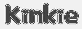 Original fonts by Ben Balvanz from Cedar Rapids, Iowa (b. Cedar Rapids, 1975), who now lives in South California. His original Fontalicious domain ceased in 2005 but was repurchased in 2007 with the help of Font Bros. Some fonts can be downloaded here and here. The list: Topanga (2017), Coney Island (2002), Cheeseburger (2002), Tabletron (2002, LCD font), Senor Pooglins, Plush (2001), Slide, Discotech, Galaxy, Pacfont, Rusty, PinniePoker, Geeves (tall letters--great), Moonpie Cadet, Fidelle, FontTwelve, Mister Easy, Mister Dope, Frosty, Chankenstein, Discotech, VintageVacation, Dazzler, Joinks!, Cyberwhiz, Swinkydad, Sonic Superpowers, Mikey Jax, Klink-o-mite, Caveman, Gloo Gun, Skylab 600, Cyberpop, Cyberjimmy, Smartie Capos, Jenkins, Earwax, Pimpbot 5000, Dreamy, Quinkie, Milkfresh, DateRape (great), SpaceAce, GirlieLeslie, Groovalicious Tweak, Porky's, International Chunkfunk, SuperTrooper, Chachie, Zodiastic, Great Head (dingbats), Chick (sassy!), the Eight Track family, Speedfreek, the Odyssey family, AlphaStep, Alpha Clown, dopenakedfoul, Lounge Bait, SpaceBeach, Jubie, Bean Town, Funkotronic, UndieCrust, and Poppycock, Pornhut, Robokid, Kinkie (Valentine's Day font), BorderMon (dingbat), Technicolor, Tennis (stencil), Moloky, JabbieJunior, Rave Queen, Alpha Niner, Croobie, Wednesday, Populuxe, the nice BoozeBats, Geekbats, Garage Sale, Arcade, Glamocon Retrobats, Fontalicious Thingbats, Good Head, Baby Kruffy, Kruffy, Fine-O-Mite, Disco Inferno, Jokewood, Toggle, Swinger, SurfSafari, OmegaMax, Pogo, Elvis, Trendy University (stencil), Hoedown, Fat, Atomic, Rocket, 12 Good, Moonpie Cadet Good, Dynomite, Superstar DJ (dingbat), Kravitz, Kravitz Thermal, hungrumlaut, Sporto, Sabadoo, Snappy, Chickabiddies (geek dingbats), Mandingo (1999, buncy hand-printed style), Heartbreaker, Smilage, 52 Pickup, Return of the Retrobats (wow!), Wunderland, Omega, Great Head, Air, Blackjack, BlackjackRollin, Borneo, CharlesAtlas, Cheri, CheriLiney (2001, Valentine's Day theme), DeejaySupreme, DigitCube, DigitLoFiShift, DigitLoFi, Digit, DimitriSwank, Dimitri, DiscoInferno, DunebugAlternates45MPH, DunebugAlternates, Dunebug, Dunebug45MPH, Freestyle, Garanimals, Gas, GleeClub, Jenkinsv20, Jenkinsv20Thik, JenkinsKeepinitReal (1998), KravitzExtraThermal, Moderna, MoogSchmoog, Moog, PussycatSassy, PussycatSnickers, Queer, Redensek, Sanka, Schmotto, SchmottoPlotto, Squarodynamic01 through 10 (pixel fonts), Stretch, SupervixenHoneyedOut, Digit, Digit Cube, Supervixen, TheKids (1999), TrendyUniversity, UltraSupervixenHoneyedOut, UltraSupervixen, WeLoveCorey, Manchester (great), Weltron (stencil font), Weltron Power, Mullet, Rolloglide, Planet, Gravity, Alba, BilloDream (2001), Stretch, Pasteris (based on the handwriting of Matthew Pasteris), PornStarAcademy (sports shirt lettering), Mullet, SuperStars (stars), Krupke (2002), Fresh Bionik, Stoney Billy (2001, not free), Hustle (2001, not free), Rustler (2001, Western font, not free).
 At T-26: Marshmallow (2001, rounded monoline geometric face), Superfly (2002, a Western font), Thursdoo (2002), Pacfont Good (2002), Thug (2002), Dokyo (2002, a free competitor of Futura Extra Black and Folio Extra Bold), Supreme (2002), Fresh (2002, at Chank's place), Juice (2002), Pinball (2002, not free), RunTron1983 (2002), Pixel Pirate (2002), Odysseus (2002). Rascal Miniatures, Wonderkid, Smilage Regular, Milk with Peanut Butter and Barnaby Candy machine are 2009 comic book style creations. Other 2009 fonts include Gringo Enchilada, Brute Strength, Blonk and Sparkle, Cheri Liney, Metroflex, Weltron (techno family), Sanka, Rolloglide (multiline), Pussycat, Poppycock, Pasteris, Moog Schmoog, Moog Synthesizer, Magnum, Krupke, Joinks, Jabbie, Hustle, Hungrumlat, Gravity, Fresh, FineOMite, Dunebug 45mph, Coney Island, Blackjack, Atomic, Air Regular, Shatner, Pixel Pirate, Munkeyshine, Thursdoo, Swinkydad, Surf Safari, Supreme, Stoney Billy, Speed Freaks, Bike Riding Chopper (Tuscan), Popcorn Loaded (ultra fat), Malibu Oceanside, Snafurter (Sinaloa?), Der Weiner Stentzel (stencil), Wordworth Byte, Blingo Diamond and Tiger Roams Jungle (art deco chic). Fonts from 2014: Blonk, Kangaroo, Giant, Jingles, Rascal, Coopman, Sinafurter (Sinaloa meets Frankfurter), Supergum (bubblegum font), Tiger, Popcorn, Der Weiner Stentzel (rounded stencil), Milk, Plague (scary font), Wonder (popart), Globitron (art deco), Death Squad (brush face), Spring Break, Tigra (stencil),Tigra (stencil), Fantastic, Parker (signage script) and the vector sets Mid Century Patterns, Banners (01, 02, 03, 05), Campus (01, 02, 03, 04: athletic lettering), Chickabiddles, Holiday 03, Jewelry, Lip Service 03, Optical Illusions, Seals, On The Radio, Viva, Hipster, Geometric Patters (+02). Interview. Alternate URL. Dafont link. Yet another URL. And another one. Many fonts sold since 2007 by Font Bros (see here for the announcement). URL from 2005-2007. Behance link. [Google]
[MyFonts]
[More] ⦿
|
Fontware Limited
|
Company located in Fareham, Hampshire, UK, and (possibly) run by David Gibbins. 150 truetype-font collection: go here, here, here, here, here, and here. The 150 fonts have no copyright information other than the date, 2001. Here are the names of this collection: Aston-Italic, Aston, AstonPoster, Barker, Bentine, Brancusi-Italic, Brancusi, Burns, ButlerCaps, Cambridge-Bold, Cambridge-BoldItalic, Cambridge-Italic, Cambridge, CambridgeOpen, Chaplin, Charterhouse-Bold, Charterhouse, Cleese, Constable, Cooke, Corbett, CorpusChristi-Bold, CorpusChristi-Italic, CorpusChristi, Crosby, DaVinci, Dali, Degas, Dodd, Donnatello, Durham-Bold, Durham-Italic, Durham, DurhamPoster-Bold, DurhamPoster-Italic, Edinburgh-Bold, Edinburgh-BoldItalic, Edinburgh-Italic, Edinburgh, Epstein, EpsteinFat, Eton-Italic, Eton, Exeter-Bold, Exeter-Italic, Exeter, Formby, Gainsborough, Gauguin, Gilbert, Gordonstoun-Bold, Gordonstoun-Italic, Gordonstoun, Hancock, Hardy, Harrow-Bold, Harrow-BoldItalic, Harrow-Italic, Harrow, Harvard-Bold, Harvard, Hepworth-Bold, Hepworth, Hope, Keaton, KebleBlack, KebleBoldOutline, KebleCondensed, KebleCondensedBlack, KebleCondensedLight, Keele-Bold, Keele, KingsCollege-Bold, KingsCollege-Italic, KingsCollege, Laurel, Leighton, LeightonCondensed, LeightonExtended, Lloyd, Manet, Marceau, Marlborough-Bold, Marlborough, Matisse, Michaelangelo, Miller, Millfield, Milligan-Bold, Milligan-BoldItalic, Milligan-Italic, Milligan, Miro, Monet, Moore, Morecambe, Peterhouse-Bold, Peterhouse-BoldItalic, Peterhouse-Italic, Peterhouse, Picasso, PicassoLite, Pollock, Pryor, QueensCollege-Bold, QueensCollege-BoldItalic, QueensCollege-Italic, QueensCollege, Raphael, Rembrandt, Rodin, Roedean-Bold, Roedean, Rubens, Secombe, Sellers, Seurat, Sorbonne-Bold, Sorbonne-BoldItalic, Sorbonne-Italic, Sorbonne, StAnnes-Italic, StAnnes, StPauls-Bold, StPauls, Stowe, Sykes, ToulouseLautrec, Turner, Upminster-Bold, Upminster, VanGogh, Verrochio, Warhol, WarholHeavy, WarholLight, Warwick-Bold, Warwick-BoldItalic, Warwick-Italic, Warwick, Wellington, WellingtonHeavy, Winchester-Bold, Winchester-Italic, Winchester, Wisdom, Wise, Yale-Bold, Yale-Italic, Yale. This free font collection may or may not be produced in agreement with Qualitype. Commercial font services, including barcode solutions (about 500 USD for Barcode2000, which includes 3 of 9, Code 93, Interleaved 2 of 5, EAN/UPC, MSI/Plessey, Code 128, Codabar, MICR/E13B, CMC-7&USPS Barcode, and OCR A, OCR B, Letter Gothic, Line Draw&the Euro Currency Symbol) and TrueType logo and signature fonts (200 USD per font in 6 weights). Sells Barcode Assistant. Free barcode demo fonts. Free copy of Fontaware (Windows 3.1 font management). Free font recognition service. Font vendor for Bitstream. Barcodes sold: - 1-Dimensional (Linear) Barcodes: Code 128, EAN 128, UCC 128, GS1 128, Code 39, Code 39 Extended, Code 93, EAN-8, EAN-13, ISBN, ISSN, 2 of 5, Interleaved 2 of 5, Industrial 2 of 5, ITF14, Codabar, MSI, DUN14, Logmars, HIBC, Bookland, IATA.
- Postal Barcodes: Royal Mail 4 State, PostNet, USZIP, KIX, French Postal, German Postal, Australian 4 State, Singapore 4 State.
- 2-Dimensional Barcodes: PDF417, Datamatrix, Aztec, QR Code, Maxicode, GS1 Databar, RSS-14, Codablock-F.
- OCR&MICR Fonts: OCR-A, OCR-B, CMC-7, MICR (E13B), OMR Marks.
[Google]
[MyFonts]
[More] ⦿
|
Gabriel Bennett
|
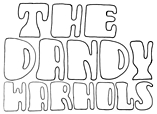 Designer of the rounded poster typeface Dandy Warhols, which was created while Gabriel was in the design program at Portfolio Center, Atlanta. Gabriel lives in Decatur, GA. Behance link. [Google]
[More] ⦿
Designer of the rounded poster typeface Dandy Warhols, which was created while Gabriel was in the design program at Portfolio Center, Atlanta. Gabriel lives in Decatur, GA. Behance link. [Google]
[More] ⦿
|
Gaslight (or: Valery Zaveryaev)
[Valery Zaveryaev]
|
 Gaslight-type-foundry is collaboration between three type designers---Valery Zaveryaev, Maria Luarvik, and Roman Shchyukin---, founded in 2011. Valery Zaveryaev is a Russian designer (b. Bryansk, 1977) at LetterBe, who created the octagonal family Teco (2005), the display typeface Brut (2005), the clean sans family Maza (2005), the informal unicase family Rezerv (2009, inspired by a logo he created for Evroterm), Barrez (2010, a techno family inspired by the TC-Helicon logo), and the stencil typeface Marshrut (2005).
 He lives in Bryansk. All his fonts are Latin/Cyrillic. In 2011, Zaveryaev set up the commercial foundry Gaslight. Fonts there include the elliptical family Maza (2005), the angular elliptical family Barrez (2010), Brut (2005), and the stencil typeface Marshrut (2005). Electrolize (2011) is a free squarish typeface available from Google Web Fonts. Bad Script (2011, Google Web Fonts) is an informal hand-printed typeface made by Roman Shchyukin. Rock Logo (2012) is a metal band / tattoo font co-designed with Roman Shchyukin. Wide Display and Wide Display Ribbon are unicase headline typefaces. Teco Sans (2012) is an octagonal military typeface family, accompanied by the icon font TecoSymbol (2012) and the stencil family Teco Sans Stencil (2012). Teco Serif (2012) is an octagonal slab version of Teco Sans. Still in 2012, Zaveryaev designed Actio, Roz (rounded sans family), Wary (pop art typeface that won an award at Modern Cyrillic 2014), the fat display overlay families Quadratish Serif and Quadratish Solid. Delgado (2012) is an elegant tall and thin fashion mag typeface for Latin and Cyrillic, made by Roman Shchyukin. It won an award at Modern Cyrillic 2014. Typefaces from 2013: Kiddy, Gen (techno), Tesla (techno face, Roman Shchyukin). Typefaces from 2014: Dotee (octagonal paper cut-out typeface, by Valery Zaveryaev and Maria Luarvik), Sofya. Typefaces from 2015: Mx and My (Peignotian caps typefaces). Typefaces from 2016: Fada (by Roman Shchyukin), Pleinair, Rawer (sans, +stencil, +outline), Misty (by Valery Zaveryaev), Agio (by Valery Zaveryaev). Hellofont link. [Google]
[MyFonts]
[More] ⦿
|
Gleb Guralnyk
|
 Dnipropetrovsk, Ukraine-based designer of these typefaces in 2015: Odd Times (a vintage blackletter typeface), Brandy Label (a layered Victorian signage font), Smoking (a great Western layered poster font), Traveller, Letterhead (steampunk, vintage, Victorian), Age, Nataly Temper, Vintage Auto (a retro chrome automobile font), Golden Dust (a lava lamp font), Rusty Phoenix, Phoenix, the Victorian signage typeface Whiskey, Spirals, Biker (spurred inline font), the oily signage font Pin Up.
 In 2016, he designed Far Kingdoms (Victorian), Brass Heart (steampunk / Victorian), Big City Light (a vintage movie theater typeface), Lostamp (a weathered vintage rough stencil script), Kexman (calligraphic script), Loftype (creamy brush script), Shoelaces (monoline script), Tobacco Box (Victorian), Humblest, Whiskey Label (a great vintage Victorian headline font), Insane Fear (spurred), Falchion Edge (Victorian display typeface), Inside The Box (techno), Amber Taste (a layered Victorian beer label font; see also Amber Taste Pro (2020)), One Thin Line (a paperclip font), Bald Eagle (Victorian), Autumn Feel (brush script), Dirty Cartoon, Magic Curls, Winery, Bite Hard (beveled caps), Lovebus (psychedelic style), Column (layered Victorian), Golden Brush, Marine Fairytale (Victorian), and Old Story (handcrafted). Typefaces from 2017: Goodwine, Daub (EPS format brush alphabet), Rusted Bevel, Dirty Cartoon (a layerable cartoon font), Bald Eagle (vintage), La Belman (Victorian; see also La Belman Pro in 2020), Bright (creamy calligraphic), Winery, Magic Curls, Black Queen (Victorian style), Little Mess (dry brush), Lovebus (psychedelic), Bite Hard, Fiver (prismatic style), Sweet Rum (vintage), The Freaky Circus (Western circus font), Biker New (spurred), Flex Wire, Agress (graffiti style), Old Story, Rusted Brushpen (dry brush), Mosaic Pool, Ranch (vintage style with layered textures), Golden Dust, Letter Head, Limber (dry brush script), Patina, Craft Beer (a layered beer label font), Droptune (Victorian), Chimera Tail, Hardwatt (dry brush), Megawatt (signage script), Jamish (a handcrafted blackboard bold typeface), Oak Lumber, Odd Times (blackletter), Gunshot (an art nouveau display typeface), Bootleggers (a vintage label typeface), Brandy Label (vintage layered font), Smoking Typeface (vintage Western style, with layering). Typefaces from 2018: Shining Night (a marquee font), Scratches, Candy Shop (a multiline titling typeface), Nataly Temper (a crayon font), Anise Seeds, Lostamp (a great stamp font), Hicksons (retro signage script), Loftype (creamy script), Far Kingdoms (spurred vintage typeface), Predators Cuspid, Sweet & Fresh, Frantic (a vintage car typeface), Affair (Victorian), Falchion Edge (spurred vintage style), Lost in Space, Traveler (an interlocking vintage Tuscan display typeface), True Black, Late Frost, Inside The Box (an interesting double-width font), Magic Garden (curly style), Skater Girl (retro script). Typefaces from 2019: True Black (Tuscan), Nature Force, Sweettooth (script: 2018-2019), Rusted Bevel, Rusted Bevel, Fishermans Knot (a vintage label font started in 2018), Skater Girl (a heavy upright script), Cidrella, Western Shooter, Little Mess (a dry brush calligraphic script), Spirit Board (pure Victoriana), Ranch Vintage (shadowed, textured, vintage), Forged Fence (an ironwork font), Long Ride (an octagonal license plate font), Chimera Tail Rough, Patina. Typefaces from 2020: Sweet Ponch, Natural Heap (letters in laurels), Street Rush, Cally (a decorative Tuscan typeface), Sunny Bay, Harietta (a retro monoline script), Cheer Inside (a vintage font), Frizzy (a vintage label font), Asia Impact (simulating an oriental brush calligraphy), Exa Metline (an inline font), Hallie (a curly display typeface), No Rules, Parallax, Golden Treasure (a vintage ironwork font), Squidink, Bushman (an organic sans), Florry (a display sans), Propeller, Spirit Board (a layered circus font family), Lord Grayson (Victorian), Grayson (a tall gloomy monoline sans), Grayson Rough, Kaipara (a patterned all caps font), Classic Heritage (a Victorian or steampunk signage typeface), Anise Seeds (vintage softly spurred Tuscan caps), Candy Shop (vintage trilined caps), Plop, Practish (an experimental slab serif family), Everleigh (a stylish thin typeface), Everleigh Duo, Love Affair (vintage, perhaps art nouveau), Lost in Space (sci-fi), Sweet and Fresh. Typefaces from 2021: Dusky Rough (a Western or saloon font), Dusky Pub (a Western typeface with Tuscan features), Dusky Slab (a reverse stress Western font), Humblest Pro (an all caps display sans), Giftbox (a vintage label font). Typefaces from 2022: Simply Royal (layerable vintage caps with an engraved money look), Go Pop (pop art). [Google]
[MyFonts]
[More] ⦿
|
Ignacia Andrade
|
Santiago, Chile-based designer of the handcrafted pop art typeface Andy Warhol (2015). [Google]
[More] ⦿
|
Igor Petrovic
|
 Graphic designer from Belgrade, Serbia, who now works at Rainy Dot in Berlin. He created these typefaces:
 - The free rounded layered vector format typeface Zujal (2013).
- The rounded monoline sans typeface Postcard (2015).
- Popsky (2015). A wonderful popart font described as constructivism wearing sunglasses. Published as a color font at Fontself.
- Prota Basic (2015), Prota Standard (2016) and Prota Pro (2018). A rounded sans inspired by Scandinavian industrial design.
- At Typeclinic 12th International Type Design Workshop in 2016, he designed the rounded sans typeface Soberlin.
- Mempix (2017). A great multicolor font made with Fontself. Its design is influenced by the Memphis Group.
- Lesbos Pen (2018) and Lesbos Multicolor (2018). This seems to be identical to his Olcino (2018). Perhaps Jack Roger who made a font called Lesbos in 2015, asked him to rename it.
- Zoran (2019). A sophisticated sans serif.
- Naslof (2019). An SVG-format display style font.
- Lezerno (2021). A relaxed rounded sans.
[Google]
[More] ⦿
|
Infinitype
|
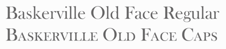 German company that sells 9999 fonts on a CD for 229 USD. In 2017, Infinitype 4 has 7444 fonts for 299 USD. One can download 20 fonts for free, as a teaser. The company is run by Martin Kotulla, owner of Softmaker, who also made the MegaFont CD. Many (most?) fonts are licensed from URW and come with a performance guarantee. Font catalog. Most fonts cover all European languages. Font catalog. Direct download of that catalog. Font name equivalences. The list: Aargau, Abott Old Style, Accent, Accolade, Adelon (lapidary), AdLib, Advertisers Gothic, Aldebaran, Alfredo, Allstar, Alternate Gothic, Alte Schwabacher, American Text, Ancona, Ancona Condensed, Ancona Extended, Ancona Narrow, Antigone, Antigone Compact, Antigone Nord, Antigone Condensed, Antiqua, Artistic, Avignon, Avignon Condensed, Avignon PS, Ballad Script, Ballantines (a broad-nib script), Balloon, Barbedor, Barbedor Osf, Baskerville, Baskerville Nova, Baskerville Old Face, Bay Script, Belfast Serial (a remake of Forsberg's Berling), Belfort, Bellboy, Benjamin [based on ITC Benguiat; identical to Softmaker's B693 Roman], Benjamin Condensed, Benjamin Gothic [free here; this comic book style typeface is based on ITC Benguiat Sans (1979-1980) and is similar to B691 Sans from Softmaker)], Benson, Bergamo, Bergamo Osf, Bernhard Condensed, Bernhard Fashion, Bestseller, Bilbao, Birmingham, Bluff, Boa Script, Bodoni, Bodoni Display, Bodoni No. 2, Bodoni Recut, Bodoni Recut Condensed, Bodoni Standard, Bonita, Book PS, Boston, Boulder, Bravo, Bristol, Broadway, Broadway Engraved, Brush Script, Bryce, Calgary, Calgary Osf, Cambridge, Cambridge Serial, Canossa, Canyon, Carlisle, Casablanca, Casad, Caslon, Caslon Antique, Caslon Osf, Caslon Elegant, Casual, Cathedral Open, Centrum, Century Old Style, Century Expanded, Century PS, Century Schoolbook, Chandler, Chantilly, Chantilly Condensed, Chantilly Extra Condensed, Chantilly Display, Chantilly Serial, Chatelaine, Cheltenham, Cheltenham Condensed, Cheltenham Old Style, Cheltenham Extra Condensed, Cimarron, Clarendon, Clarendon Serial, Clearface, Clearface Serial, Cleargothic, ClearGothic Serial, Colonel, Comix, Commercial Script, Compressed, Computer, Concept, Concept Condensed, Congress, Cooper Black, Copperplate Gothic, Copperplate Condensed, Cornered, Courier PS, Curacao, Curzon, Deco B691, Deco Black, Deco C720, Deco C790, Deco F761, Delano, Delaware, Denver, Derringer, Diamante, Digital, Durango, Disciple, Egyptian Wide, Egyptienne Standard, Elegant Script (revival of the 1972 Berthold formal calligraphic typeface Englische Schreibschrift), Elmore, Ennis, Entebbe, Estelle, Ewok, Expressa, Falcon, Farnham, Fette Engschrift, Fette Mittelschrift, Flagstaff, Flipper, Florence Script, Fraktur, Franklin Gothic, Franklin Gothic Condensed, Franklin Gothic Condensed Osf, Franklin Original, Frascati, Fremont, Front Page, Fuego, Function, Function Condensed, Function Display, Function Script, Gainsborough, Gandalf, SoftMaker Garamond, SoftMaker Garamond Condensed, SoftMaker Garamond No. 7, Garamond Elegant [based on Letraset Garamond], Garamond Nova, Garamond Nova Condensed, Garamond Original, Garamond Standard, German Garamond"> [based on TypoArt Garamond], Giulio, Glasgow Serial [based on Georg Salden's Polo, 1972-1976], Glendale Stencil, Gotisch, Goudita, Goudy Catalogue, Goudy Handtooled, Goudy Old Style, Goudy Heavyface, Granada, Grenoble, Grotesk, Handmade Script, Harlem Nights, Helium, Henderson, Hobo, Hoboken, Hobson, Honeymoon, Horsham, Hudson, Huntington, Iceberg, Illinois, Imperial Standard, Inverserif, Isonorm, Istria, Italian Garamond [based on Simoncini Garamond], Japanette, Jessica, Joseph Brush, Jugendstil, Kaleidoscope, Karin, Kingston, Koblenz, Kremlin Script, Leamington, Letter Gothic, Lingwood, Litera, Livorno, Lyon, Macao, Madeira, Malaga, Marriage, Marseille, Marseille Serial, Maurice, Medoc, Melbourne, Melville, Mercedes, Metaphor, Mexico, Micro, MicroSquare, MicroStencil, Moab, Mobil Graphics, Montreal, Napoli, Neutral Grotesk, Nevada, Newcastle, Nicolas [after Lanstpn's Nicolas Cochin], OCR-A, OCR-B, Oklahoma, Old Blackletter, OnStage, Opus, Organ Grinder, Orkney, Ornitons, Osborne, Otis, Palazzo, Palladio, Palmer, Pamplona, Park Avenue, Pasadena, Pedro, Pelota, Peoria, Persistent, Persistent Condensed, Persistent Osf, Philadelphia, Pizzicato [based on Letraset's Plaza], Plakette, Pollock, Prescott, Prestige, Quadrat, Raleigh, Roman PS, Salmon, Sans, Sans Condensed, Sans Diagonal, Sans Extended, Sans Outline, Sans PS, Sans PS Condensed, Savoy, Savoy Osf, Saxony, Scott, Seagull, Sebastian [based on ITC Serif Gothic], Sigvar [based on ATF's Baker Signet], Soledad, Square Serif, Stafford" [based on Rockwell MT], Stafford Serial, Sterling, Stratford, Stymie, Sunset [a version of ITC Souvenir], Sunset Serial, Sydney Serial, Tabasco, Tampa, Tampico, Tioga Script, Toledo [based on Trooper VGC], Typewriter, Typewriter Osf, Typewriter Condensed, Unic, VAG Rounded, Velo, Veracruz, Verona, Violin Script, Winona, Worcester. [Google]
[More] ⦿
German company that sells 9999 fonts on a CD for 229 USD. In 2017, Infinitype 4 has 7444 fonts for 299 USD. One can download 20 fonts for free, as a teaser. The company is run by Martin Kotulla, owner of Softmaker, who also made the MegaFont CD. Many (most?) fonts are licensed from URW and come with a performance guarantee. Font catalog. Most fonts cover all European languages. Font catalog. Direct download of that catalog. Font name equivalences. The list: Aargau, Abott Old Style, Accent, Accolade, Adelon (lapidary), AdLib, Advertisers Gothic, Aldebaran, Alfredo, Allstar, Alternate Gothic, Alte Schwabacher, American Text, Ancona, Ancona Condensed, Ancona Extended, Ancona Narrow, Antigone, Antigone Compact, Antigone Nord, Antigone Condensed, Antiqua, Artistic, Avignon, Avignon Condensed, Avignon PS, Ballad Script, Ballantines (a broad-nib script), Balloon, Barbedor, Barbedor Osf, Baskerville, Baskerville Nova, Baskerville Old Face, Bay Script, Belfast Serial (a remake of Forsberg's Berling), Belfort, Bellboy, Benjamin [based on ITC Benguiat; identical to Softmaker's B693 Roman], Benjamin Condensed, Benjamin Gothic [free here; this comic book style typeface is based on ITC Benguiat Sans (1979-1980) and is similar to B691 Sans from Softmaker)], Benson, Bergamo, Bergamo Osf, Bernhard Condensed, Bernhard Fashion, Bestseller, Bilbao, Birmingham, Bluff, Boa Script, Bodoni, Bodoni Display, Bodoni No. 2, Bodoni Recut, Bodoni Recut Condensed, Bodoni Standard, Bonita, Book PS, Boston, Boulder, Bravo, Bristol, Broadway, Broadway Engraved, Brush Script, Bryce, Calgary, Calgary Osf, Cambridge, Cambridge Serial, Canossa, Canyon, Carlisle, Casablanca, Casad, Caslon, Caslon Antique, Caslon Osf, Caslon Elegant, Casual, Cathedral Open, Centrum, Century Old Style, Century Expanded, Century PS, Century Schoolbook, Chandler, Chantilly, Chantilly Condensed, Chantilly Extra Condensed, Chantilly Display, Chantilly Serial, Chatelaine, Cheltenham, Cheltenham Condensed, Cheltenham Old Style, Cheltenham Extra Condensed, Cimarron, Clarendon, Clarendon Serial, Clearface, Clearface Serial, Cleargothic, ClearGothic Serial, Colonel, Comix, Commercial Script, Compressed, Computer, Concept, Concept Condensed, Congress, Cooper Black, Copperplate Gothic, Copperplate Condensed, Cornered, Courier PS, Curacao, Curzon, Deco B691, Deco Black, Deco C720, Deco C790, Deco F761, Delano, Delaware, Denver, Derringer, Diamante, Digital, Durango, Disciple, Egyptian Wide, Egyptienne Standard, Elegant Script (revival of the 1972 Berthold formal calligraphic typeface Englische Schreibschrift), Elmore, Ennis, Entebbe, Estelle, Ewok, Expressa, Falcon, Farnham, Fette Engschrift, Fette Mittelschrift, Flagstaff, Flipper, Florence Script, Fraktur, Franklin Gothic, Franklin Gothic Condensed, Franklin Gothic Condensed Osf, Franklin Original, Frascati, Fremont, Front Page, Fuego, Function, Function Condensed, Function Display, Function Script, Gainsborough, Gandalf, SoftMaker Garamond, SoftMaker Garamond Condensed, SoftMaker Garamond No. 7, Garamond Elegant [based on Letraset Garamond], Garamond Nova, Garamond Nova Condensed, Garamond Original, Garamond Standard, German Garamond"> [based on TypoArt Garamond], Giulio, Glasgow Serial [based on Georg Salden's Polo, 1972-1976], Glendale Stencil, Gotisch, Goudita, Goudy Catalogue, Goudy Handtooled, Goudy Old Style, Goudy Heavyface, Granada, Grenoble, Grotesk, Handmade Script, Harlem Nights, Helium, Henderson, Hobo, Hoboken, Hobson, Honeymoon, Horsham, Hudson, Huntington, Iceberg, Illinois, Imperial Standard, Inverserif, Isonorm, Istria, Italian Garamond [based on Simoncini Garamond], Japanette, Jessica, Joseph Brush, Jugendstil, Kaleidoscope, Karin, Kingston, Koblenz, Kremlin Script, Leamington, Letter Gothic, Lingwood, Litera, Livorno, Lyon, Macao, Madeira, Malaga, Marriage, Marseille, Marseille Serial, Maurice, Medoc, Melbourne, Melville, Mercedes, Metaphor, Mexico, Micro, MicroSquare, MicroStencil, Moab, Mobil Graphics, Montreal, Napoli, Neutral Grotesk, Nevada, Newcastle, Nicolas [after Lanstpn's Nicolas Cochin], OCR-A, OCR-B, Oklahoma, Old Blackletter, OnStage, Opus, Organ Grinder, Orkney, Ornitons, Osborne, Otis, Palazzo, Palladio, Palmer, Pamplona, Park Avenue, Pasadena, Pedro, Pelota, Peoria, Persistent, Persistent Condensed, Persistent Osf, Philadelphia, Pizzicato [based on Letraset's Plaza], Plakette, Pollock, Prescott, Prestige, Quadrat, Raleigh, Roman PS, Salmon, Sans, Sans Condensed, Sans Diagonal, Sans Extended, Sans Outline, Sans PS, Sans PS Condensed, Savoy, Savoy Osf, Saxony, Scott, Seagull, Sebastian [based on ITC Serif Gothic], Sigvar [based on ATF's Baker Signet], Soledad, Square Serif, Stafford" [based on Rockwell MT], Stafford Serial, Sterling, Stratford, Stymie, Sunset [a version of ITC Souvenir], Sunset Serial, Sydney Serial, Tabasco, Tampa, Tampico, Tioga Script, Toledo [based on Trooper VGC], Typewriter, Typewriter Osf, Typewriter Condensed, Unic, VAG Rounded, Velo, Veracruz, Verona, Violin Script, Winona, Worcester. [Google]
[More] ⦿
|
Iryna Trigubova
[Red Ink]
|
 [More] ⦿
|
Jesica Zuluaga
|
 Cali, Colombia-based designer of a colorful experimental typeface dedicated to Andy Warhol (2015). [Google]
[More] ⦿
Cali, Colombia-based designer of a colorful experimental typeface dedicated to Andy Warhol (2015). [Google]
[More] ⦿
|
Kadek Adi Mahardika
[Creative Media Lab]
|
 [MyFonts]
[More] ⦿
[MyFonts]
[More] ⦿
|
Keith Bates
[K-Type]
|
 [MyFonts]
[More] ⦿
[MyFonts]
[More] ⦿
|
Kickingbird
[Seymour Caprice]
|
 I like the description of this Catalan foundry at MyFonts: A foundry with a home in Catalunya. Kickingbird font work takes place in the quiet treehouse headquarters near a former Barcelona textile homestead. Font sketches are completed anywhere a notebook is handy... in the cafes of Gràcia, on the RENFE railway or outside the cloisters of Santa Maria del Mar. Font design inspiration comes from many sources. Faded broadside wall manifestoes in Ravel, broken floor tiles washed up on the shores of Vilassar de Mar or from old cigar boxes found at the Mercat de Sant Antoni. For those who know Barcelona, sweet memories. The designer, Seymour Caprice, created the vernacular typefaces Pop Manta (2009: Pop Manta has been described as "Morris Fuller Benton meets Roy Lichtenstein". Benton's 1903 neo-grotesque letter shapes set to a Pop Art beat.) and Locutorio (2011).
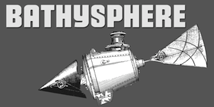
 Typefaces from 2013: Bathysphere. This is a steampunk sans described as follows: This steam era typeface, created by Gustav Schroeder in 1884, found popular use on soap box labels and tobacco tins during its initial release. Then, later, a successful and stout revival of Gustav's face, named Othello, was carried out by Morris Fuller Benton in 1934, and the typeface's appeal widened to include items such as broadside posters featuring Boris Karloff's Frankenstein. After metal gave way to film type, Gustav's creation experienced a brief fashion moment in the 1960's, but then disappeared entirely, never re-surfacing as a full digital typeface. With the release of Bathysphere, the typeface comes full circle, having been completely redrawn from scratch using Gustav's original specimens. The new extended language support establishes the typeface firmly in the modern era, while Bathysphere's refinement of subtle blunt corners restores a deep-sea grace to this iron giant. However, Nick Curtis's Iago NF (2011) is also based on Othello, and is close in execution. In 2016, Caprice designed Trop Magus and writes: Trop Magus is a rugged typeface following in the tradition of Ramon Llull and Jean Jannon. Llull's illuminated manuscripts from the Middle Ages inspired many later Alchemical texts in the Renaissance. And it was during this era, in 1615, that Jannon cut the matrices for Typi Academiae. Sixty-five astrological and alchemical symbols are included. Klingspor link. [Google]
[MyFonts]
[More] ⦿
|
Konstantine Studio
|
 Commercial typeface foundry in Jakarta, Indonesia, run by "Ian" and "Abdilah". Its first typeface is Muffler (2014), which is inspired by retro brush signage for car races. Lacydes (2014) is a spurred advertizing typeface. Upjohn (2014) is a horror movie poster typeface. Curely (2014) is a free hand-drawn curly typeface, expanded to Curely Pro in 2017. Hemera (2014) is based on vintage matchbox packages.
 Typefaces from 2015: Marthas, Risoless Script, Elska (a thick warm watercolor brush script), The Chalker (crayon font), The Bride, The Groom (brush script), Wanderlove (brush script), Rumbell (handcrafted poster typeface). Typefaces from 2016: Easy Lullabye (Swash, Sans), Wiggle (brush script). Typefaces from 2017: Fathers (a vintage packaging script), Ride Slow (a handcrafted set of motorcycle culture fonts), Delight, Kehlin (retro poster style), Butter Love (dry brush), Fathers Script (vintage), Fili & Kyla (thin script), Husky Giggle (casual hand stroked brush font), Ruffle (dashing brush script), Dollyn Script, Halloween Rock, Love Hurts (ballpoint pen font), Moneyroll, Trakster, Trakster Serif, Noswatt, Noswatt Serif (copperplate style), Notstar, Rodenda, Hammet, Hastagirl (watercolor brush), Arzeti Script (informal monoline wedding script), Sicero (vintage display typeface by Abdilah), Sign Panthers Brush Script, Magle Sans, Magle Script. Typefaces from 2018: Millerstone (connected calligraphic script), Bad Taste, Conserta (Victorian), Grestal Script, Beclave, Double Aunofa (Script and Serif), Summer Classico, Ahoy Amigo (font duo), Aunofa Serif, Aunofa Script, Delphin Spring, Delight Lettering Script, Tropical Asian, Vedacity (calligraphic), Rothe (vintage), Bigger Love (script), First Choice (calligraphic), Love Hurts, Hall Of Fun, Casual Font Bundle (which includes Easy Monoline Script, Subber Sans, Sintix, Rebel Four, and Grotes Sans), Hemera II (a vintage Victorian matchbox typeface), Asian Skyline, Queen Waffle, Rosse, Harvest Barn (script), Oh Samantha, Simple Monologue (calligraphic), Sweet Getaway (handwriting). Typefaces from 2019: Vango (a sci-fi or speed font), Aghony (script), Conserta Royal (Victorian), Roast Serif, Mister Quenos (a fast food store signage font), Calisatt (an SVG brush font), Redstock Script, Suspiria Vampira (a Halloween font set), Hoffers (a children's book font), Closer (a Swiss sans), Hoffers (a marker pen font), Mackle (Script, Serif), Blante (Sans + Script), Millerstone, Kimball, Henave (flared sans), Valsday (Sans, Script). Typefaces from 2020: Destrokes, Kremato (+Script, +Short, +Tall), Krasher (a painted brush SVG font), Rebelton (a 12-style all caps sans), Koutura (a fashion mag font), Kalleco (a free hand-printed typeface), Citypop (1990s Japanese retro pop style, with subfamilies Main Display, Neon, Screen, Digital and Automotive), Urban Shock (ultra-condensed), Renin (a Western super-heavy slab serif), Jaksel (a bold squarish sans typeface), Alkaria (a retro display typeface). Typefaces from 2021: Kingsad (a 5-style wide flared display family), Ahoy Amigo (a type duo), Harvest Barn (script), Simple Monologue (a calligraphic script), Magle (a script typeface), The Sign Painters, Makalo (an African tribal font), Discopia (neo-futurist), Daguin (a fashionable display typeface inspired by the Middle Ages), Tropical Asian (a painted font), Fosty Blue, Kofje (a daring decorative serif). Typefaces from 2022: Vogatron (sci-fi), Hwaiting Handwriting (emulating Korean), Hwaiting Serif, Hwaiting Sans (an experimental Korean vibe font), Walanor (a pop art font). Tumblr link. Graphicriver link. Fontspace link. [Google]
[MyFonts]
[More] ⦿
|
K-Type
[Keith Bates]
|
 K-Type is Keith Bates' (b. 1951, Liverpool) foundry in Manchester, UK, est. 2003. Keith works as an Art&Design teacher at a Salford High School. They custom design type, and sell some of their own creations.
 Commercial typefaces: - Adequate (2012). A basic geometric monoline sans family.
- Adventuring (2010, comic book style)
- Alan Hand (2005, based on some blobby lettering, handwritten by printer and mail artist, Alan Brignall)
- Alex (2002-2004)
- Alright (2004, cursive script)
- Anna (2002-2007).
- Argot (2019). Characterized by square counters, this typeface family exhales brutalism and industrialism. See also Argot Machine (2019).
- Artist Hand (2019).
- Axis
- Bank of England (2012, blackletter): Bank of England is loosely based on blackletter lettering from the Series F English twenty pound banknote introduced in 2007. The font also takes inspiration from German Kanzlei (Chancery) typefaces and the 17th century London calligrapher, John Ayres.
- Banks & Miles (2018). Inspired by the geometric monoline lettering created for the British Post Office in 1970 by London design company Banks & Miles, a project initiated and supervised by partner John Miles, which included Double Line and Single Line alphabets. The new digital typeface is a reworking and extension of both alphabets.
- Barbica (2015). A glyphic typeface.
- Bricola (2020).
- Brush Hand New (2013): Brush Hand New is a full font based on a copy of Flash Bold called Brush Hand marketed by WSI in the 1990s and more recently distributed through free font sites. Brush Hand was an anonymous redrawing of Flash which simplified, slightly lightened, smoothed out ragged edges, and improved the legibility of the original classic created by Edwin W. Shaar in 1939.
- Building&Loan (2007, engaved face)
- Bigfoot (2005, a Western font based on the slab capitals used by Victor Moscoso in his 1960s psychedelic rock posters)
- Bolshy (2009)
- Bolton750 (2003, a mechanical typeface done with John Washington).
- Chancery Lane (2021). An italic text typeface that is based on chancery scripts.
- Charles Wright (2016). A set of fonts based on the UK license plate fonts.
- Chock (2009)
- Circa (geometric sans)
- Cloudbuster (2019). Inspired by Imre Reiner's Corvinus Skyline of 1934.
- Club.
- Coinage Caps (2017). Coinage Caps is a trilogy of small caps fonts based on the roman lettering used for the designs of British coinage. Coinage Caps Eric Gill is a regular weight, spur serif style drawn by Eric Gill for silver coin designs in the 1920s which were rejected by the Royal Mint. Coinage Caps Humphrey Paget is a medium weight serif based on the lettering of Thomas Humphrey Paget, designer of the Golden Hind Halfpenny first struck in 1937. This font simulates the soft, slightly rounded corners of the minted letterforms. Coinage Caps Kruger Gray is a glyphic, flare serif font typical of the bold style engraved by George Kruger Gray for numerous British and Commonwealth coins during the 1920s and 30s. This font also simulates the slightly rounded corners of the minted letterforms.
- Collegiate (2009)
- Component (2012). A font for lost civilizations and dungeon rituals.
- Context (experimental)
- Credit Card (2010, font for simulating bank cards)
- Curwen Sans (2018). A monoline sans from the early 1900s originally created for in-house use at the Curwen Press in London.
- Cyberscript (2006, connected squarish face)
- Deansgate (2015). Deansgate and Deansgate Condensed are based on the clearest and most distinctive of the sans-serif letterforms used on Manchester street nameplates, and easily identified by a pointy Z and pointed middle vertices on M and W.
- Designer
- Digitalis
- English
- Enamela (2013). Keith writes: Enamela (rhymes with Pamela) is based on condensed sans serif lettering found on vitreous enamel signage dating from the Victorian era and widely used in Britain for road signs, Post Office signs, the plates on James Ludlow wall postboxes, railway signs, direction signs and circular Automobile Association wayfinding plaques throughout the first half of the twentieth century. The original model goes back to Victorian times, ca. 1880.
- Engravia (2018). Engravia is a didone display typeface supplied in three varieties of engraving---Inline, Shaded and Sawtooth---plus a plain basic font.
- Example (2017). A workhorse neo-grtesque typeface family.
- Excite
- Flip (2011), a western grotesk billboard face.
- Flyer (2009, techno)
- Frank Bellamy (2009, an all-capitals family based on the hand lettering of English artist Frank Bellamy, who is most famous for his comic art for Eagle and TV21, and his Dr Who illustrations for Radio Times)
- Future Imperfect
- Gill New Antique (2003)
- Greetings
- Helvetiquette
- Hapshash (2010): an all capitals font inspired by the 1960s psychedelic posters of British designers Hapshash and the Coloured Coat (Michael English and Nigel Waymouth), in particular their 1968 poster for the First International Pop Festival in Rome. A dripping paint font.
- Irish Penny (2016). An uncial typeface based on the lettering from Percy Metcalfe's influential pre-decimal coinage of Ireland, the Barnyard Collection.
- Ivan Zemtsov (2009)
- Kato (2007, oriental simulation face)
- Keep Calm (2015). A geometric sans inspired by a British war poster from 1939.
- Keith's Hand
- Klee Print (2010, Klee Print is based on the handwriting of American artist Emma Klee)
- Latinate (2013). A vintage wedge serif wood style typeface, and a rough version.
- Lexie (an improved or "adult" version of Comic Sans) and Lexie Readable (2006, modified in 2015). Keith writes: Lexie Readable (formerly Lexia Readable) was designed with accessibility and legibility in mind, an attempt to capture the strength and clarity of Comic Sans without the comic book associations. Features like the non-symmetrical b and d, and the handwritten forms of a and g may help dyslexic readers.
- Licencia (2016). A blocky typeface inspired by the tall, soft-cornered lettering on vehicle licence and registration plates world-wide.
- Londinia (2016).
- Matchbox
- Max
- Ming
- Modernist Stencil (2009).
- Monterey Pop (2020). A psychedelic / popart typeface based on Tom Wilkes's poster lettering for the Monterey International Pop Festival in June 1967.
- Mythica (2012). A slightly condensed lapidary roman with copperplate serifs.
- Modulario (2010): a contemporary sans.
- New Old English (2010, blackletter)
- Norton (2006)
- Nowa (2004, a play on Futura)
- NYC (octagonal)
- Openline (2008, an art deco pair)
- Oriel Chambers Liverpool: A Lombardic small caps font based on the masonry lettering on Peter Ellis's 1864 building, Oriel Chambers, on Water Street in Liverpool.
- Pentangle (2008, based on album lettering from 1967)
- Pixel
- PixL (2002-2004)
- Plasterboard (2004-2005)
- Pop Cubism (2010) is a set of four texture fonts, combining elements of cubism and pop art.
- Poster Sans (2006). A wood type family based on Ludlow 6 EC. See also Poster Sans Outline.
- Rick Griffin (2006, more psychedelic fonts inspired by a 1960s Californian artist)
- Rima (2020). A stencil typeface with heavy slabs.
- Roundel (2009, white on black)
- Runestone (2010, runic).
- Sans Culottes (2008, grunge)
- Serifina
- Solid State (2008, art deco blocks)
- Solus (2004, a revival of Eric Gill's 1929 typeface Solus which has never been digitized; read about it here)
- Stockscript (2008, down-to-earth script based on the pen lettering of the writer, Christopher Stocks)
- Susanna (2004)
- Ticketing (2011): pixelish.
- Total and Total Eclipse (2004, squarish display typefaces based on the four characters of Jaroslav Supek's title lettering for his 1980s mailart magazine, Total)
- Transport New (2009: a redrawing of the typeface designed for British road signs. In addition to the familiar Heavy and Medium weights, Transport New extrapolates and adds a previously unreleased Light weight font originally planned for back-lit signage but never actually applied. Originally designed by Jock Kinneir and Margaret Calvert beginning in 1957, the original Transport font has subtle eccentricities which add to its distinctiveness, and drawing the New version has involved walking a tightrope between impertinently eliminating awkwardness and maintaining idiosyncrasy.)
- Union Jack (octagonal)
- Victor Moscoso (2008, psychedelic)
- Wanda (2007, art nouveau)
- Waverly
- Wes Wilson (2007, psychedelic, inspired by 1960s psychedelic poster artist Wes Wilson).
- 3x5
- Zabars (2001): a Western face.
His free fonts: - Blue Plaque (2006: a distressed font based on English heritage plaques)
- Blundell Sans (2009)
- Celtica (2007) has Celtic influences
- Dalek (2005, stone/chisel face: Dalek is a full font based on the lettering used in the Dalek Book of 1964 and in the Dalek's strip in the TV21 comic, spin-offs from the UK science fiction TV show, Doctor Who. The font has overtones of Phoenician, Greek and Runic alphabets). See also Dalek Pinpoint (2018).
- Designer Block (2006)
- Flat Pack (2006)
- Future Imperfect (2006, grunge)
- Gommogravure (2005)
- Greetings (2006), Greetings Bold (2006)
- Insecurity (2005, experimental) won an award at the 2005 FUSE type competition.
- International Times (2006, inspired by the masthead of the International Times underground newspaper of the 1960s and 1970s)
- Keep Calm (2011). Related to London Underground.
- Kindersley Sans (2017). A modernized version of David Kindersley's 1950s type used for many street name plates in Britain, about which Bates writes: Kindersley Sans is a humanist sans-serif that conserves the Gill-inspired character and some of the calligraphic qualities of Kindersley's lettering, it retains the Roman proportions and its Britishness, but traditional prettiness and intricacy are discarded in favour of a clean modernity.
- Klee Capscript (2005: based on the handwriting and capitals drawn by artist Emma Klee (USA) for her Color Museum Mail Art invitation. The upper case is based on Emma's capitals and the lower case is freely adapted from her script)
- Lexia and Lexia Bold (2004)
- MAGraphics (2004)
- Magical Mystery Tour (2005, outlined shadow face), Magical Mystery Tour Outline Shadow (2005), Magica (2015, a serifed titling typeface family).
- Mailart (2004), Mailart Rubberstamp (2004), Mailart Rubberstamp Sans (2018).
- Mandatory (2004, a UK number plate font based on the Charles Wright typeface used in UK vehicle registration plates).
- McKnight Kauffer (2021). A retro poster font in the style of poster artist Edward McKnight Kauffer.
- Motorway (2015), a companion typeface to Transport, the British road sign lettering. This is an extension of an original design by Jock Kinneir and Margaret Calvert: The Motorway alphabet was created for the route numbers on motorway signage, and is taller and narrower than the accompanying place names and distances which are printed in Transport. However, for Motorway Jock Kinneir and Margaret Calvert created only the numbers 0 to 9, the capitals A, B, E, M, N, S and W, ampersand, slash, parentheses and a comma. So, although the lettering made its first appearance on the Preston bypass in 1958, K-Type Motorway is the first complete typeface and contains all upper and lower case letters, plus a full complement of punctuation, symbols and Latin Extended-A accented characters. As with the Transport alphabet the starting point was Akzidenz Grotesk, Motorway taking inspiration from condensed versions. Changes were mainly driven by a quest for legibility, resulting in some reduced contrast between horizontal and vertical strokes, and Gill-esque straight diagonal limbs on the 6 and 9, and high vertex for the M.
- Penny Lane (2014). A a sans serif derived from twentieth-century cast-iron signs displaying Liverpool street names.
- Possible (2020). A 10-style mini-serif typeface.
- Provincial (2014). A Victorian set of outline fonts.
- Ray Johnson (2006-2008)
- Roadway (2005, based on New York roadside lettering).
- Romanica (2017). A humanist sans.
- Sam Suliman (2020). A condensed squarish typeface which was inspired by lowercase lettering on a Sarah Vaughan album cover designed by Sam Suliman in 1962. Suliman was born in Manchester, England in 1927. After working for McCann Erikson in London, he moved to New York where he took on freelance work designing album covers, particularly celebrated are his striking minimalist designs for jazz records. He moved back to England in the early 1960s, designing many book jackets, film titles and fabrics, also working in Spain and India before settling in Oxford in the 1980s.
- Savor (2011). An art nouveau family.
- Sgt Peppers Lonely Hearts Club (2014).
- Sinkin Sans (2014, free) and Sinkin Sans Narrow (2015, commercial). Open Font Library link.
- Soft Sans (2010)
- Subway Ticker (2005)
- Taxicab (2016). A squarish style.
- This Corrosion (2005).
- Toppler (2018). A modern and full range top-heavy cartoon font family that includes a Popdots style. Bates was striving to improe on 1990s clasics such as Baby Kruffy (Ben Balvanz), Comix Heavy (WSI) and Startling (Dave Bastian).
- Wildcat (2016). An athletics typeface family.
- Zinc (2018). A monoline sans with diagonal nubs.
- Colnage Caps Kruger Gray (2018). Coinage Caps is a trilogy of lapidary small caps fonts based on the Roman lettering used for the designs of British coinage.
- Dalek Pinpoint (2018). Based on Dalek comic book lettering from the 1960s.
- Icky Ticket Mono (2018). IckyTicket Mono is a monospaced font based on the coarsely printed numbering from 1960s bus tickets.
- Sexbomb (2018). A psychedelic typeface family.
- Mancunium (2019). A monoline sans family.
- Straight Line (2020). An outlined font with chamfered corners and straight edges, possibly useful as a blackboard bold type.
- We The People (a blackletter font based on the peamble of the American constitution).
- Bowdon (2021). A six-style warm, Bodoni-inspired English Modern, influenced by the 1930s lettering of designer Barnett Freedman.
- Oxford Street (2021). A condensed grotesque with horizontal and vertical stem terminals; it is a street a signage font that began as a redrawing of the capital letters used for street nameplates in the borough of Westminster, which in turn were designed in 1967 by the Design Research Unit using custom lettering based on Adrian Frutiger's Univers 69 Bold Ultra Condensed.
Custom / corporate typefaces: With Liverpool-based art director Liz Harry, Bates created a personalized font, loosely based on Coco Sumner's handwritten capitals, for the band I Blame Coco. Medium and Semibold weights of Gill New Antique were commissioned by LPK Design Agency. Stepping Hill Hospital and Bates created Dials, a pictorial font to help hospital managers input data about improvements. A custom font was designed for Bolton Strategic Economic Partnership. Abstract Fonts link. View Keith Bates's typefaces. Dafont link. Yet another URL. Fontspace link. Fontsy link. Behance link. [Google]
[MyFonts]
[More] ⦿
|
Loboarches
|
 Creator at FontStruct in 2009 of Lobo, and Bat Country, while studying at UWE in Bristol, UK. Bat Country is as an aweseome blotchy hand-printed face, in the style of Treefrog. He explains: I made this for my UWE [note: University of Western England] graphic design first year project "communicating with words". I created this inspired by influences from Ralph Steadman and Jackson Pollock using the concept of inconsistency and randomized mark making with ink. The name is derived from a quote from the book "fear and loathing in Las Vegas". I designed it by firstly creating the text with a pot of ink and the back side of a Biro pen, then from that I drew them by hand onto A4 sheets of graph paper limitating each line to only 4 given angles, then finally transfering that onto FontStruct, wich took roughly 30-40 minutes per letter. [Google]
[More] ⦿
Creator at FontStruct in 2009 of Lobo, and Bat Country, while studying at UWE in Bristol, UK. Bat Country is as an aweseome blotchy hand-printed face, in the style of Treefrog. He explains: I made this for my UWE [note: University of Western England] graphic design first year project "communicating with words". I created this inspired by influences from Ralph Steadman and Jackson Pollock using the concept of inconsistency and randomized mark making with ink. The name is derived from a quote from the book "fear and loathing in Las Vegas". I designed it by firstly creating the text with a pot of ink and the back side of a Biro pen, then from that I drew them by hand onto A4 sheets of graph paper limitating each line to only 4 given angles, then finally transfering that onto FontStruct, wich took roughly 30-40 minutes per letter. [Google]
[More] ⦿
|
Luana Concatto
|
Farroupilha, Brazil-based designer of the tall minimalist sans typeface Forma (2015), the pop art typeface Pop na Arte (2015), the handcrafted typeface Manuscrita (2015), and the fun retro poster typeface Fina (2015). [Google]
[More] ⦿
|
Lydia Alexkartadjaja
|
 At Nanyang Technological University in Singapore, Lydia Alexkartadjaja designed the pop art exhibition poster typeface Pop (2016). [Google]
[More] ⦿
At Nanyang Technological University in Singapore, Lydia Alexkartadjaja designed the pop art exhibition poster typeface Pop (2016). [Google]
[More] ⦿
|
Maja Brncic
|
Serbian designer of these vector format typefaces in 2015: Alphabet Buttons Type Machine, Alphabet Vector Neon Color, English Cream Alphabet, Flat Icons Alphabet, Alphabet Chalk Vector, Vector Alphabet Set White Shadow. Typefaces from 2016: Neon Pink, Neon Green and Pink, Pink Color Neon, Pink Yelllow Neon, Ornament Font, Alphabet Paper Vector Pink, Colored Font Flat, Flat Font White And Grey, Minimalistic, Creative, 3D Vector Font, 3D Font, Pop Art Creative Fonts, Neon Buttons, Neon (ornamental caps), Love Letter, Love Alphabet (Valentine's Day vector fonts with superimposed hearts), Creative Fun Fonts, Colored Font Flat Design, ColorfulFontNeon, Old Style, Paint Colorful, Simple & Minimalistic, Colorful Metallic. Typefaces from 2017: Pink, Silver, Minimalistic, Neon Modern, Sports, Cream Color, Font Trendy, Pink (White, etc.) with Shadow, Neon White Color Outline. [Google]
[More] ⦿
|
Manfred Klein
[TypOasis 2007]
|
 [MyFonts]
[More] ⦿
[MyFonts]
[More] ⦿
|
Manfred Klein
[TypOasis, 2002]
|
 [MyFonts]
[More] ⦿
[MyFonts]
[More] ⦿
|
Manfred Klein
[Manfred Klein: Eyes]
|
[MyFonts]
[More] ⦿
|
Manfred Klein
[Manfred Klein: People]
|
[MyFonts]
[More] ⦿
|
Manfred Klein
[Manfred Klein: Caves and prehistoric man]
|
 [MyFonts]
[More] ⦿
[MyFonts]
[More] ⦿
|
Manfred Klein: Caves and prehistoric man
[Manfred Klein]
|
 On the theme of caves and prehistoric man, Manfred Klein designed these typefaces: ArteCave, AustralBats, CaveAB, CaveBatsFour, CaveBatsTwo, CaveBatsTwoB, CaveBeings, CaveDreams, CaveDreamsXtreme, CaveLife, CaveMeetings, CaveNTribalArt, CaveOSeven, CavePaint, CavePaintings, CavePaintings, CavePeople-Painting, CavePeople2002FS, CavePeopleTraces, CavePopart, CaveStars, CavebatsOne, CavebatsOneA, CavebatsThree, EtruskRough, NewCaveDrawings, NewCaveDrawingsDrei, NewCaveDrawingsZwei, OetzisTimesWillCome, PetroGlyphs07, PetroglyphMarks, Petrographs, PetrographsInverse, PrehistFantasies, StoneAgeAgain-Normal, StoneAgeFeelings.
 Download page. Download all these fonts in onze zip file. [Google]
[MyFonts]
[More] ⦿
|
Manfred Klein: Eyes
[Manfred Klein]
|
 Manfred's life story is also being told through tens of typefaces that pay special attention to the eyes. They include some his best and most original contributions as they come straight from the heart. A partial list: AftermathDings, AllesNurGeklaut, AmorEmoticons, AndBullets, ApishOne, Aprilapril, Assoziazione, AugenEyes, AugenWappen, Beardfaces, BlaxBloxxEyes, BulletsMK-Thin, Coincidences, ConfusEyecons2005, Confuseyecons, ConstructionAgainstFreehand, CrazyWorld, Decreations, DingsUndDas, EverypictTellsaStory, Exercises, Expressiones, EyeBeings, EyeBeings, EyeCatching, EyeEye, EyeEyeOnBlack, EyeNStrokeThree, EyeSee, Eyeballs, EyelecBats, Eyemen, Eyes, EyesAlphabet, EyesAndSoOn, EyesAugenMouth, EyesGallery, EyesNStrokes, EyesNoseMouth, EyesTests, FaceLaboratory, FaceToFace, Faces, FacesAlphabetBeta, Facialish, FishFaces, FisheyeButtonsTwo, Florenius, ForAlchemistsOnly, Frontal-Buttons, Frontal, GenesisSketches, GeoEyesOne, GeometricFaces, GeometricFeelings, GesturesMK, Gipfelkoepfe, GoodOldEyeCatchers, GutenbergGoesAbstract, HeadImprovisations, HeadImprovisationsTwo, HeadfeeterOTwo, IdenOfMarch, LaughBajazzo, LifeEyecons, LogoModaRoma, LogoModels, LogoModelsBowToBoss, Look, LookForLeonardo, MKDingBats, MKEyeMinals, MKSymbols, MSkizzen, MansPartsPlaying, MathEmoticonsInverse, MathEmoticonsOne, MiszCinque, MiszellMay, Miszellen-Eight, MiszellenJuly, MiszellenK-Zwo, MiszellenK, MiszellenKOne, MiszellenQuattro, MiszellenTwo, MkDrawings, Morphes, MouseTraps, MouseVectorarts, Nasenbear, NewTechnoFaces, NiceMurders, OldEyeCatchers, Olisillus, OtherEyes, OverHeads, PhantasticBeings, PhantasticSketches, RodgauerFisheyes, RomiPetito, RoundFacesTwo, RoylichBats, RuebenNosesFour, Scannings, SchauSchau, SchiessScheibeUndAuge, SeeAndAct, Strokemen, SuprematismOne, SuprematismTwo, TherapeuticApplications, TheyWasNiceMurdersAlways, TwelveYearsAfter, TypoAnarchycalEyes, VectorFaces, VectorImprovisations, VectorPaintigs, Vectories, Vectorism, VectorizedSignets, WacoGraphireSketches, Wacollection, Wacomusish, WaxworksImprovisations, WaxworksTwo, WildHeads, WithALittleHelp, WysiwygBats, Zettelkasten15.
 Download page. Download all these fonts in onze zip file.
             
[Google]
[MyFonts]
[More] ⦿
|
Manfred Klein: People
[Manfred Klein]
|
 Among Manfred Klein's dingbat typefaces, the ones that deal with people and activities of people are most frequent. Many have political undertones, a lot of them are plain funny. The list: 20thCentury-Three, AbsoluteImprovisations, AbstractFragments, Actions, AfterLastWar, AllDaysJokes, AllOverTypo, AllThatStress, AllWeathers, AlwaysPeople, AnalphabetismBats, Angelinos, AngelsOrDevils, AthletenEins, Back2School, BadCircumstances, BallerinasNPartners, BalletSketches, BalletliAbsurdo, BatsStuff, BatzBats, BatzBatsTwo, BeFit, BeachBats, BeachnWater, BeautyFaces, BeautyMaking, BeforeAlphabetsGallery, BeforeEmailAndTV, BellaMusica, Bewitched, BienMayaInvers, BigFrameTiefeConPeople, Bikers, BirthdaySurprises, Bitsbats, BlackHeads, BonFood, BookHeads, Bowing, BowingInverse, BraveOldWorld, BuddhasBigArmy, Buddhism, BuddhismTwo, BuildYourOwnPeople, Burlesque, BuschButGerman, BusinessAsUsual, BusinessPeople, BusyPeople, BusyPeople01, BuyMe, CIAThePeaceWatchers, CalligrSketches, CarToonsOSix, CaricaturesHeads, CarneVale, CarneVale, CarnevaleConCarne, CartoonHeads, Casting, ChaoticHeads, Characters-C, Characters-C, Characters, CharactersA, CharactersB, Cherubians, Chicken, ChiefCook, Circus, CircusAir, CircusClownsCompany, CircusEarth, ClassicBats, ClassicoAntiqua, Climbers, Climbers2005, ClimbersPhantasies, Clowns, ClownsAlphaBeta, ComicChars, ComicFaces, ComicHeadsBeings, Comicontemporary, CountryLife, Couples, CrazyBeings, CrazyWeather, Crazygrams, CuteFaces, Cycling, Damaged, DancingLetters, DancingPeople, DinkPatz, DirtyVectors, DiskJockeys, DongbutsBeings-Oblique, DongbutsBeings, DoubleFaces, DramaticArts, DrawingTraces, DrawingWithTypefaces07, Drivers, DueMillePix, EMotions, EarlyMidage, EarlySurrealism1, Easteria, EclectHeads, EdgedFaces, EdgedFacesKantig, Education, EggheadsCrying, ElectronicFaces, EmastEtcetera, Emkabats, EmotionDrawings, EnFace, Engel, EthnicReconstructions, EtudenEnFace, Faces, FacesAndCaps, FacesFaces, FacesTypes, FamilyLifeBats, Farmers, FarmersLife, FemalesNMales, FigaroFigaro, FightersForFreedom, Figures, FirstLove, FitnessSilhouettes, FlagHolder, FlightDreamsTwo, FlightsDreams, FlyingWomen, FolksTypo, FoolOnTheHill, FoolsThree, ForCongratulations, ForefathersSketches, Fourfeeters, FranKleinFaces, FreeLife, FreePeople-Forafreeworld, FreePeopleForafreeworld, FreudsFreeWorld, FrogsAndMen, FunnyCharacters, FunnyFaces, GangsMembers, Gestalten, GoGo, Goblins, GodsAndHeroes, GourmetIcons, GrandParents, GrandfathersDesigns, GrandfathersDesignsTwo, Gymnastics, Hanswurste, HarpersBizarre, HeadFeeterThree, HeadSketchesMK, HeadSketchesTwo, HeadToHeadFive, Headbirth, HeadbirthesTwoFS, HeadfeetersPartialDisturbed, HeadsAndHandsTwo, HeadsBackgrounders, HeadsCallSketches, HeadsConstructed, HeadsConstructedTwo, HeadsForYourAds, HeadsGallery, HeadsHandsSketches, HeadsLogoTorsi, HeadsNBirds, HeadsTorsiButtons, HeadsVectorAttempt, HelloDoc, HelloSirPeter, HelloVienna2005, HelloViennaMacabre, HinduismK, Hispaniola, Hispanish, HistoricPeople, HistoricPeople, Hobbies, HolySimplicity, Homunculus, HonorisCausaM, HorosCopies, Horoscopish, HotHatsFS, HotelPrisoner, HouseWorks, HumanDrawingsA, HumanFollowUps, HumanHeads, HumanLandscapes, HumanMirror, HumanPartsStore, HumanRelations, Humans, HumoricaPartOne, HumoricaTwo, Hybride-Between, ILikeBlacknWhite, IndiansToday, Jokers, KL1DrunkenTypefaces-DemiBold, Kampfsport, Kleerikale, KleerikaleConBlack, KlonesParents, KlonesResults, Koepp, KoeppHeads, KopfFuessler, Kopffuessler, LadiesGentlemen, LastWit, LeuteHeute, LifeIsACabaret, LifeIsAMovie, Lifestyle, LogoFacesArtists, LogoFacesToolbox, Logotrainer, LookingMasreel, LosAngeles-Bold, LosAngeles, LosAngelesBatzz, LucSanFaces, MK-Signatures, MKDoodles, MKHeads, MKImprovisations, MKMouseworx, MKMouseworxTwo, MKSilhouettaRound, MKartoonHeads, MKartoonKoepfe, MKartoonPeople, MKartoons, MKartoonsB, MKartuhn, MKlothes, MKoepfeBold, MKreatures, MKritzeleien, Madhubania, Maenneken, MaennekinTwo, MagicActs, MagicBats, MagicHelloWien, MagicMoments, Malheur, MangaTypes, ManneKen, MannesHeads, MardiKrass, MartialOne, MasKs, MechanicsActors, MediCartoons, MedicalBats, MedicalCasesFirst, Medicobats, Meeting, MenFiftyTwo, Menschen, Menschenskinder, MiszellenThree, MkDrawingsPeople, ModernArts, ModernHeros, ModernTimesMrChaplin, Moneymoney, MoreBusy, MoreClimbing, MoreClowns, MoreDancing, MoreHaringe, MouseAsBrush, MouseDroodels, MouseImprovisations, MoveU, Musicians, Musicians, MusiciansOne, MusiciansTwo, Musikantenstadel, MyMaestroMrMiro, NearModernArt, Neighbours, Neighbours, Neighbours, NewKoeppes, NewNeighbours, NewYorkNewYork, NewYorkNewYork, NextGeneration, NiceBoys, NiceNeighbours, NiceNeighbours02, NiceNeighboursCondensed, NightlifeRoaringTwenties, NudesOne, NudesTwo, Offbeats, OldArts, OldCrows, OldDrawingsOne, OldFashionPeople, OldFashionedClichees, OldfashionPeopleTwo, OnStage, OpenParlament, OtherPeople, OurPoliticians, OutdoorSports, Outside, PardonAgain, PardonThankYou, PassengersFun, People, PeopleAndOthers, PeopleButtons, PeopleSketches, PeopleSketches, PeopleSurreal, PeoplesParts, PerformTwo, PersonaRondo, PetriFreeFaces, PhantaToons, PiCaSolitaires, PictoGramma-Sketches, PicturesA, Pinocchionish, PiratesOne, PiratesThree, PiratesTwo, PoliticiansOrArtists, PoliticiansWorking, Poppenspeeler, PosterFrames, PowerWoman, PrettyPeople, PrivateLuck, ProBeauty, Professions, Profils, Protectors, QuickBats, RareClothes, RememberStoneage, RememberWinter, Risky, RockNRollTime, RoundHeads, Runners, RunningGnomes, SIlhouettes02, Scherenschnitt, ScherenschnittOSeven, Scherenschnitte, Scherenschnitte, ScienceFictions, SciencesBats, SecurityPeople, SeeItInMuseum, Semaphore-Italic, Semaphore, Services, SheAndHe, Shopping, ShoppingBats, SilhouFaces, SilhouOtto, SilhouPeopleTwo, SilhouettA, SilhouettSketches, SilhouetteSquaresInvers, SilhouettenPeople, Silhouettes03, SilhouettesABZ, SilhouettesInGrids, SilhouettesSocled, SilhouettesSocledTwo, Silhous, Silhous1900, SilhousForJeff, SilhousKette, SilhousOldfashion, SilhousSimplex, SilhousTwo, SimpleSilhouettes, SketchAsScatchCan, SketchBookOne, SketchbookTwo, SketchedMen, SketchesInTypoasis, SketchesSelection, SketchesX, SketchingDiaryOne, Sleeeeep, SomeArtistsOne, SomeArtistsSquares, SomeNewSilhouettes, SomeSilhouBatsOne, SomeSilhouettesPlus, SomeSilhouettesTwo, SomeSilhous, SomeTypesSilhous, SpiralusFaces, Spontcomic, SportSatyre-Medium, Sportive, Sportive, SportiveOne, Sportler, Sports, SportsTraining, SprayersFriends, SprayersSujets, SquareHeadsMedium, Squaredances, SteubenHelpsPresident, StrangeTypes, Swimming, SwimmingHotelTitanic, Tanzbar, TechnicFreaks, TeleCom, TestroomTwo, TheManyMKFacesVersionTwo, TheMuscleFetish, TheaterSymbols, ThingsAndSomethings, ThingsFoundOne, ToonCharsOne, ToonCharsTwo, TopNotches, Tourism, Tourists, Traffic, TrainWhatVectorMeans, TributToWarhol, TrustYourDentist, TypesAntiques, Typos-FaceToolSet, TyposSoftItalic, UnknownHeads, Unlucky, VariousPeople, VectorAnimalsOrPeople, VertigoComic, VertigoPeople, VeryBusy, Voelkerfreundschaft, VoteMe, WYSIWYG, WaComToonFS, WaPicts, WacoFaces, Wacofaces04, WacoheadsTwo, Wacomedians, Wanted, WeInside, WebFolks, WebTubbies, WebWideWorld, Webmasters, Webmasters, Webmasters, WeddingPicts, Weihnacht2006, WellnessBoom, Western, WesternPastHeroes, WetterKapriolen, WildFaces, WillkommenLeute, Winners, WinterSports, WintersAbstract, WitchesStuff, WoMan, WomanWithDoveTwo, Women, Wonderlanders, Working, WorkingClassHero-One, WreckageCuttings, WritersReaders, Yogaism, YouAndMe, YoungMusicians, YoungScene, ZagzagHeads, ZockersHomeland.
 Download page. Download all these fonts in onze zip file. [Google]
[MyFonts]
[More] ⦿
|
Marcel Ibarra
|
Monterrey, Mexico-based designer of the pop art typeface Pop It Drop It (2016). [Google]
[More] ⦿
|
mathematician
|
Designer at FontStruct in 2008 of the experimental typefaces Pop Art and Pop Art Plus. [Google]
[More] ⦿
|
Microcalligraphy
|
Around 2008, making portraits using letters became somewhat of a fad. Wikipedia: Micrography, also called microcalligraphy, is a Jewish art form developed in the 9th century, with parallels in Christianity and Islam, utilizing minute Hebrew letters to form representational, geometric and abstract designs. Colored micrography is especially distinctive because these rare artworks are customarily rendered in black and white. Here and here are some examples. Handpicked by me: [Google]
[More] ⦿
|
Mosbah Badreddine
|
Beirut-based designer of the plump pop-art / bubblegum font MyFont (2014, Latin & Cyrillic). [Google]
[More] ⦿
|
MyFonts: Pop art typefaces
|
MyFonts selection of Pop Art typefaces. [Google]
[More] ⦿
|
Nathali Albuquerque
|
During her studies, Sao Paulo, Brazil-based Nathali Albuquerque designed the multilined typeface Autoral Pop Art (2017). [Google]
[More] ⦿
|
Nurkhalish Mansor
|
Brunei Darussalam-based designer of the textured pop-art typeface Radioactive 50s (2017) that was inspired by comic book pop artists such as Roy Lichtenstein. [Google]
[More] ⦿
|
Patricia Lillie
|
 From Ashtabula, OH, Patricia Lillie (b. 1958) is the respected designer of the wonderful (shareware) Poptics dingbat fonts series (I, II and III) in 1993. See also here or here. Please read her remarks about rip-off font sellers. She sold many wonderful wonderful wonderful dingbat fonts via Eyewire: Gargoil, Fidelma, Lil Creatures (great!), Lil Ancients, Lil Critters, Lil Dings, Lil Fishies, Lil Stuff, Lil Features, Lil Folks, Lil Faces, Lil Events, Lil Flowers, Mini Pics Doohickies, Lil Edibles and Lil Vehicles. These were marketed by Image Club Graphics as their MiniPics series in 1995. She also had display fonts such as Horsefeathers, WhimsyICG, Whassis, Farrier, Shatterday, Chilada and Chilada Dos (1994), Burweed, Alleycat, Ashtabula, Damosel, and Syllogon. [T-26] designer of Ashtabula, Damosel, DamoselDingbats.
 Review of Poptics by Fred Showker. Noteworthy is that Poptics became Poptics Delux in 2010, and is now a pay font at MyFonts. Other fonts: Fidelma (at Type Quarry), Samson, Delilah, Benderville, ElegeionScript (2001, formal handwriting), ITC Tickle (2001), ITC Tickle Too, ITC Cinderella (2002), Miss Kitty Deluxe (2009, comic book face), Zarlino (2011, a brand new bastarda blackletter family), Boppa Delux (2011, an elegant bold display family). [Google]
[MyFonts]
[More] ⦿
|
Paulina Llamas
|
Art director in Mexico City. She created the psychedelic / pop art typeface Bubble Pop (2012). [Google]
[More] ⦿
|
Pepe Gimeno
|
Spanish designer (b. Valencia, 1951) of the handwriting font Warhol, with slight calligraphic influences (possibly based on the handwriting of Andy Warhol's mother, Julia Warhol). It won an award at the TDC2 2001 competition (Type Directors Club). He also designed the curly FF Pepe family (2002). Since 1987 he has worked on a free-lance basis specialising in graphic communication, corporate identity, signposting and publication design. He has taught graphic design at the C. E. U. San Pablo University, Valencia. Author of Cali Typography (2002, La Imprenta-Comunicación Gráfica). Behance link. Bio at FontFont. FontShop link. Klingspor link. [Google]
[MyFonts]
[More] ⦿
|
Pop art
|
Pop art is an art movement that emerged in the mid-1950s in Britain and in the late 1950s in the United States. Like dada, it is a revolutionary movement, a reaction to abstract expressionism and elitist culture in art. Just like dada, it uses found objects and images and makes frequent use of collages with a variety of unrelated materials. Pop art employs aspects of mass culture, such as advertising, comic books and mundane cultural objects. It stresses the banal or kitschy elements of any given culture, most often through the use of irony. Well-known artists in this movement include Andy Warhol and Roy Lichtenstein. [Google]
[More] ⦿
|
Pop Art
|
Quoting from the P22 blurb regarding their P22 Pop Art set of fonts, which includes P22 Pop Art Comic and P22 Pop Art Stencil: In the mid-1950's, Robert Rauschenberg and Jasper Johns--two young and innovative artists who admired and respected the Abstract Expressionist paintings of Jackson Pollock and Willem de Kooning-- created works which bridged the way to a dynamic new movement. Rauschenberg and Johns applied paint thickly to the canvas with a freely gestural technique similar to that of the Abstract Expressionists but they also introduced and incorporated easily recognizable images as well as found objects. At roughly the same time in England, a mid-fifties postwar giddiness with newly available consumer goods was responsible for an art movement drawing on popular cultural sources for its imagery. Magazine advertising, cartoons, and films provided the stimulus for much of the art and led Lawrence Alloway, an English art critic, to name it "Pop Art." By the early 1960's in New York, several artists including Andy Warhol and Roy Lichtenstein---working individually and unknown to each other as well as unaware of their English counterparts--arrived at the same destination. They traded less accessible, Abstract Expressionist gestural painting for easily recognizable painting styles and representational subject matter based on familiar commercial sources. As the art critic Lucy Lippard wrote, "Pop Art is instantly to the point, extroverted rather than introverted." These artists-- many capitalizing on their commercial art backgrounds-- invested popular culture with a new seriousness as well as with a wit and humor that blurred the boundary between high and low art as well as the boundary between art and daily life. Pop art was a reflection of what, nostalgically, seems to have been a more innocent and upbeat period in our recent history. A young President Kennedy had just created the Peace Corps and the Beatles had made their first successful recording, "I Want To Hold Your Hand." [Google]
[More] ⦿
|
Red Ink
[Iryna Trigubova]
|
 Or Ira Trigubova. Kiev, Ukraine-based designer of these typefaces in 2017: the informal typeface School, Königreich (medieval blackletter calligraphic script), Sweetheart (a cutesy children's or Valentine's Day font), Coral Waves, Winter Story (handcrafted), Little Bee (+Sans: letters with bees buzzing around), Schönheit (connected script), Aisling (a monoline script), Rhapsody (connected script), Amanita, Star Dust (handcrafted), Urbano (dry brush), Tulip Garden, Meraki (a dotted ornamental sans).
 Typefaces from 2018: Paper Snow (a paper cutout font), Hunter House, Pop Art (including SVG fonts), Rivendell (uncial), Morning Tea, First Kisses (crayon SVG font), First Kiss (display sans), Summer Jelly (font duo), Fiesta (font duo: Script and Serif), Solomiya (tribal script for Latin and Cyrillic), Friday Feelings (font duo), Nightingale (calligraphy), Monogram (a set of five decorative caps fonts), Red Tomato (script), Alter Ego, Beloved. Typefaces from 2019: White Feather, English Channel (an elegant calligraphic font duo), Letter Home, Lettering Box, Rain Soul (SVG style), Rose Petals, Miracles (font duo), Tahiti Sand (a painted brush font in SVG format), Good Feeling, Little Girl, Stonehill, Broadway Lights (font duo), Love is Love (font duo), Summer Cat, Aztec Soul (a tribal / Aztec font). Typefaces from 2020: Just Imagine (blackletter). Creative Fabrica link. YWFT link. [Google]
[More] ⦿
|
Richard William Mueller
|
 Designer from Elkader, IA (or is he from Garnavillo, IA?), b. 1956. No web page, but the fonts, mostly made in the early 1990s, were collected by CybaPee at TypOasis for your downloading pleasure. His typefaces:
 - AdvertMF, AdvertMFItalic. Ultra-heavy brush lettering.
- AkashiMF (1993). Oriental simulation font.
- AltenglischMF
- AmbrosiaMF (1995). Art nouveau.
- AndreasPenMF, AndreasPenMFBold
- AnglesMF. Beveled letters.
- ApolloMF-Shadow, ApolloMF (1994-1997). Victoriana.
- ArgosMF
- AtlantisMF
- BaileyMF (1997).
- BlackCastleMF. A rounded blackletter.
- BodieMFFlag, BodieMFHolly (1995). An American flag font.
- BolideMF. A brush font.
- BrandyMFScript (1993).
- BravoMF (1994). A script typeface inspired by a 1945 font by E.A. Neukomm.
- BurntMF. Halftone textured letters.
- CamelotMF, CamelotMFBold (1995).
- CarnivalMFOpen, CarnivalMFOpenShadow, CarnivalMFRimmed
- Casual-Regular, CasualContactMF, CasualMarkerMF (1994). Marker pen fonts.
- CignoMF. A delicate script.
- Cinema-Regular
- ClubMF
- CoffeeTinMFInitials. Western circus font.
- CreditCards. Dingbats.
- GFCristateMF (1997). Borders and dingbats, published by Garagefonts.
- DaisyMF
- DipperMF, DipperMFDemiBold
- DirectionsMF (1995).
- DragonflyMF
- EarthquakeMF. Broken letters.
- EddaMF. Art nouveau.
- EdisonMF (1995). Pure Victoriana.
- ElectMF (1997).
- FanfareMFFancy. Art nouveau.
- FantasticMFInitials, FantasticMFModern
- FarleyMF (1994).
- FlamesMF
- FleetingMF
- FranconiaMF (1994).
- GingerMF (1997). Late Victorian, early art nouveau.
- GrangeMF
- GreetingsMF
- GuttenbergMF (1995). Victorian.
- HayStackMFWide
- HeeHawMF
- HoffmanMF
- InkHighlight
- Knockout-Regular, KnockoutMFInitials
- KompaktMF
- LavaMF (1994).
- LegrandMF
- LongEarsMF
- MaizeMF
- MamaMF
- MantelMF
- MeltdownMF
- MercuriusMF
- NewDayMFScript
- OceanViewMFInitials
- OmegaMF-Bold, OmegaMF (1994).
- PaintPeelMFInitials
- ParchmentMF
- PenMarkMFBold (1995).
- PinewoodMF
- PlymouthMF
- PollockMF (1995). Marble-filled artsy display letters.
- PoloBrushMF (1993).
- PosturesMFInitials
- Primitive
- ProtestSignMF (1995).
- QuaintMF
- RaggedMF (1996).
- ReefMF (1994).
- SantaMonciaMF
- Sexy-MF
- SixtiesMF (1993). A psychedelic font.
- SophieMF (1995). Art nouveau.
- SpeedlineMF
- SpiritsMF
- StarshineMF
- StereoMF
- SteveMF (1997).
- StowawayMF
- SwingtimeMF (1995).
- TamboScriptMF
- TarantellaMF. An insect-themed decorative typeface.
- TitaniaMF
- TolkienUncialMF
- TomahawkMF (1995).
- TradingPostMFBold
- TumbleweedMF
- TuscanMFNarrow
- UncleBobMF-Shadow, UncleBobMF (1993).
- VassarMF
- VeronaScriptMF
- WaverlyMF
- WetPaintMF (1996).
- WindsweptMF
- WishMF (1997). Art nouveau.
- WizardryMF-Contour, WizardryMF (1997). Art nouveau.
Abstract Fonts link. Klingspor link. Dafont link. Fontspace link. [Google]
[More] ⦿
|
Robert Harling
|
 Born in Highbury, North London in 1910, Robert was brought up by an aunt after the early deaths of his parents, and went to school in Brighton and London. He lived in Godstore, Surrey, and died in 2008. He studied at the Central School of Arts and Crafts, London. He first worked as a designer for the Daily Mail and was simultaneously an adviser on typography for London Transport and for the Sheffield-based foundry Stephenson Blake&Co, designing their literature and three popular display typefaces:
 - Playbill (1938) is a Western saloon face. Digital versions exist at Softmaker (as Prescott), URW++ (as Playbill), Elsner&Flake, and Bitstream (as Circus 721).
- Chisel (1939) is an engravers typeface done at Stephenson Blake. Compare Bavo (Enschede). Digital versions exist at URW++, Elsner&Flake, and SoftMaker (where it is called Carlisle).
- Tea Chest (1939, Stephenson Blake) is an elegant stencil typeface. Digital revivals: Tea Chest (1999, Sigred Claessens and Günther Flake, Apply Interactive), East India Company NF (2011, Nick Curtis), Pekoe JNL (2020, Jeff Levine).
While still in his twenties, Robert co-founded and became editor of Typography, a journal of contemporary lettering and print, published by his friend and ally James Shand at the Shenval Press. When it first appeared in 1936, the journal broke new ground in its coverage of the European avant garde---including the first serious article on Jan Tschichold's work to be published in Britain. In 1951, he designed Keyboard (at Stephenson&Blake; Schnelle mentions 1949). Typographic adviser to London Transport, and director of one of London's leading advertising agencies. With James Shand, he was the founder of the Shenval Press in Hertford. He published the quarterly magazine Typography. After WWII, he published Alphabet&Image. He was also the typographic adviser and architecture correspondent for the Sunday Times. He was a during their service with naval intelligence in the second world war. Author of Ian Fleming (2015), a book about Fleming published seven years after his death. Linotype link. FontShop link. Obituary by Fiona MacCarthy in The Guardian. [Google]
[MyFonts]
[More] ⦿
|
ScreenCaffeine
|
From their site: "LiveFonts for LiveType and Final Cut Pro - animated fonts for film and video projects". The fonts of this team include Sonida, Circus, Poolside, Marquee, Undulator, Chocolate and Warhol. [Google]
[More] ⦿
|
Seymour Caprice
[Kickingbird]
|
[MyFonts]
[More] ⦿
|
Studio Sun (or: Sun Brand Co)
[Cahya Sofyan]
|
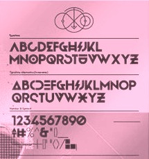 During her studies in Bandung, Indonesia, Bali-based Cahya Sogyan (b. 1994) created the free rounded sans typeface Synthesia (2014), the free sans typeface New Dawn (2015), and the free techno / futuristic typeface Cosmonaut (2015), with accompanying drop caps.
 In 2016, she co-founded Spencer and Sons with Gilang Purnama Jaya. In 2017, she started Studio Sun in Denpasar, Bali. In 2016, Cahyan published June of Fortune, the free hipster typeface family Soda Popp and writes: The new typeface called Soda Popp is inspired by pop-culture, vaporwave music, and seapunk that emerged in the early 2010s among Internet communities. It is characterized by a nostalgic fascination with retro cultural aesthetics, typically of the 1980s, 1990s, and early-mid 2000s. Typefaces from 2017 at Spencer and Sons: S&S Nickson (a copperplate display font including eight font styles and seven dingbat fonts). In 2018, she published the retro auto racing font Intensa, the extended sans typeface Matrice, and the free flared poster typeface Florent. Typefaces from 2019: Alathena (a decorative Victorian and Arts & Crafts typeface family), Rustob Club (a variable font), Tropiline, Matahari Sans (a large family that includes Matahari Sans Mono). Typefaces from 2020: Rachee (a 6-style renaissance text font), Klose Slab (an ultra-fat variable font), Gulfs Display (a 6-width ultra bold cartoon font family), Gliker (an extraordinary comic book font family; a new take on the Hobo typeface), Radiate Sans (40 styles), Balgin (a large display family that celebrates the 1990s), Brice Pop (a sixties display style; with Syarif Hafidh). Typefaces from 2021: Bethari (a 6-style art deco typeface, including a blackboard bold outline style). Typefaces from 2022: Fragmatika (a 9-style a geometric sans serif typeface with support for Latin, Cyrillic, Greek, Arabic, Armenian, Georgian, Hebrew and Thai). [Google]
[MyFonts]
[More] ⦿
|
Syarif Hafidh
|
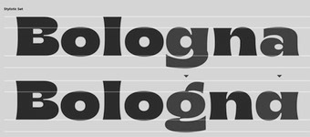 Jakarta, Indonesia-based designer of Brice Pop (2020: a sixties display style; with Cahyan Sofyan). [Google]
[More] ⦿
Jakarta, Indonesia-based designer of Brice Pop (2020: a sixties display style; with Cahyan Sofyan). [Google]
[More] ⦿
|
Tal Leming
[Type Supply]
|
 [MyFonts]
[More] ⦿
[MyFonts]
[More] ⦿
|
Tanawat Sakdawisarak
[Beta]
|
[More] ⦿
|
Taylor Wade
|
Designer of the free all caps typeface Pop Art (2021). [Google]
[More] ⦿
|
TFaces
[Alexander Tarbeev]
|
 Alexander Tarbeev is Russian type designer, graphic artist and tutor. He graduated from Moscow Electrotechnical Institute of Communication in 1979 and Moscow Polygraphic Institute in 1988, and worke in the type department of NII Polygrafmash (Institute for Scientific Research of Printing Machinery, Moscow). Between 1989 and 1997, Tarbeev worked as type designer at ParaGraph. He set up the type studio TFaces in Moscow.
 Designer of Cyrillic versions of ITC typefaces like ITC Garamond, ITC Benguiat Gothic, Friz Quadrata and other Cyrillic typefaces. Other typefaces by Alexander Tarbeev include BetinaScript, BigCity, Dagger, DenHaag, Diderot, Gauge, Jakob, Lissitzky, Montblanc, Matterhorn, Pankov, Pollock, Smarty and Tauern. He also designed typefaces for Russian magazines such as Afisha, Bolshoi Gorod, Kak, Smart Money, Ezhenedelny Zhurnal, and (the Russian version of) L'Officiel, and for newspapers such as Vedomosti and Noviye Izvestiya. Alexander Tarbeev is professor and head of type design department at Moscow State University for Printing Arts (currently a branch of Moscow Polytechnic University). He also taught at British Higher School of Art and Design (Moscow), and Moscow State University, Faculty of Journalism.. Showcase of Alexander Tarbeev's typefaces at MyFonts. List of the new designs and the old typefaces designed since 1988 for NPO Poligraphmash, ParaGraph/ParaType and TFaces: Academy, AdverGothic, ITC Anna, ITC Baltica, ITC Benguiat Gothic (1994-1997, ParaGraph; he made the Hebrew typeface Benzion in 1991 based on Benguiat Gothic as well), ITC PT Benzion, FF Beowolf, PT Bernhard, PT BetinaScript (1992, based on the handwriting of the German graphic artist Betina Kuntzsch), PT Bodoni (1989-1997), MathFont 1 (1987, Polygraphmash, based on the math font of Kudryashevskaya Encyclopedicheskaya, 1960-74, a typeface by Nikolai Kudryashev and Zinaida Maslennikova), PT Compact, PT Courier (1997; the original Cyrillic weights were done by Tagir Safayev), PT Crash (1995), PT Dagger (1996), Den Haag, Dots, DoubleClick, PT Drunk (1997), Exposure, PT FixSys (1995, pixel font), ITC Friz Quadrata (1997, ParaGraph, based on the typeface by Ernst Friz for Visual Graphic Corp. in 1965), PT Futuris, ITC Garamond (1993-1995, based on Tony Stan's 1975 version), PT Graffiti (1996, ParaGraph), PT Hermes (1993, ParaGraph), Inform, Izhitsa (1994: he added a shadow syle to Svetlana Yermolaeva's 1988 original), PT Jakob (1994), [kAk), Lazurski, PT Matterhorn (1993), PT MonoCondensed (1990), PT Montblanc (1993), PT Newton (1994, ParaGraph, a phonetic font), PT Pollock (1995), PT Pragmatica (1989), Sketch, PT Star (1995), PT Tauern (1993, extra compressed), Titanic, PT Wind (1995, based on TextBook, 1987, by Emma Zakharova). Honorable Mention at the 3rd International Digital Type Design Contest by Linotype Library for Linotype Den Haag. Free fonts made for fun at FontStruct in 2008: giammba, schlange, squaresans, squaresans_heavy, TFa BCode (extremely condensed), TFa KnightRider. In 2019-2020, he designed the large text, headline and letterpress family Gauge (Type Today). [Google]
[MyFonts]
[More] ⦿
|
Tim Biskup
|
American artist, b. Santa Monica, CA, 1967. His work is influenced by psychedelic art, tiki type, and popart. House Industries is rumoured to be making typefaces based on Tim Biskup's work. In 2016, Ana Palacios designed Tim Biskup, also based on his work. Wikipedia link. [Google]
[More] ⦿
|
Type Supply
[Tal Leming]
|
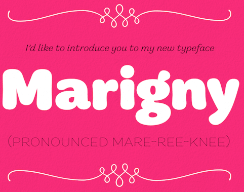 Tal Leming is a graphic designer, type designer and letterer who lived in Wilmington, DE, but moved his stakes to Baltimore, MD. He graduated from Louisiana State University in 1997. As a Python scripting guru, he worked with Letterror and House Industries on projects using FontLab and Robofab. An avid RoboFog scripter, he joined Erik van Blokland and Just van Rossum to initiate the RoboFab project in 2003. After graduation in 1997 from the Louisiana State University Graphic Design program, he worked as a designer at two agencies in south Louisiana. In September of 2001, Tal joined the House Industries staff as a designer in the Type Development, Product Promotions and Python Systems Implementation Department. He worked on the Ed Benguiat collection, for example.
 In 2005, he left House and started his own company eventually called Type Supply. Type Supply designs typefaces for corporations and publications. Their typefaces: - Baxter. An informal typeface used as a casual typeface in MyPublisher's BookMaker software. Commissioned by Christian Schwartz.
- Bullet (House). Bullet is based on a bit of lettering drawn by Ken Barber for the House Industries Pop Art package.
- Burbank (2006-2007, House Industries), a bouncy signage, animation, and package lettering family, about which Christian Schwartz writes: Well-drawn one-off display typefaces are easy to find, especially bouncy sans serifs. Complete suites of typefaces in this genre, however, are nearly impossible to find, especially families that are crafted with as much care as Burbank. I really appreciate seeing the attention to detail that usually goes into serious text family put into a family primarily intended for display use.
- House Gothic 23. Tal Leming writes: The family was originally designed by Allen Mercer for use on the company's commissions, most notably the legendary promotions for Custom Papers Group. In 1995, House released the family to the public with modest success, but it was largely relegated to the back of House's catalogs. House went through a bit of a sans serif obsession in the early 2000s and decided that it was time to give House Gothic its time in the spotlight. Rich Roat asked me to polish up House Gothic and make it a bit more usable. I completely reworked Allen's original drawings, making the letterforms work better in headlines, added accented glyphs, reorganized the styles and more. Once that was done, I added completely new Extended and Text styles. The family more than doubled its size into 23 total fonts and was rechristened House Gothic 23.
- Marigny (2014). He writes about this pleasant casual roundish typeface: Marigny, designed by Tal Leming, is a casual typeface that was drawn with serious typography in mind. It has the same basic proportions as classical oldstyle typefaces (think of Garamond and friends) and these give it a similar typographic rhythm to one that we have known for several hundred years. The hand-rendered forms transform this familiar texture into something very warm and pleasant. In a way, dipping into a block of text set in Marigny is like putting on your favorite pair of comfortable slippers.
- Mission and Control. An athletic lettering family commissioned by Reebok for their 2008 NFL Sideline and NHL Center Ice collections.
- Ohm (2009). A neon type family.
- Queue and Queue Mono (2021). A sans typeface family.
- Runway (House). Runway is an ode to House's sans serif obsession of the early 2000s.
- Shag Lounge. a signage family: When I was working at House Industries, we decided that we should develop a font kit inspired by the work of Josh "Shag" Agle. Josh hadn't done much lettering work so we asked him to send us samples of lettering that he liked. Many of the things he sent featured whimsical, hand-cut lettering from the 1960s. We were really into this as well, so that formed the starting point for Shag Lounge. The typeface evolved into an amalgamation of a neo-grotesque style sans serif and hand-cut lettering.
- Timonium (2012) can be bought from Type Supply.
- Torque. An octagonal family with a great inline style. Torque (2009) began its life as an amalgamation of an American athletic lettering style and classic space lettering styles. There were also references to the video games, laser games and 1980s pre-teen sci-fi action movies of my youth.
- United Ark. A military stencil face: Clint Schultz hired me to create a custom version of United for use on props in a Paramount feature film. The main goal of the project was to perfectly match stenciled lettering seen in a film released 27 years earlier. How exciting was it to make a typeface for a sequel to a classic film that I grew up with? Very, very, very, very exciting. This font is not, and will never be, available for relicensing, so please don't ask.
- United. House industries commissioned me to develop the United family as an homage to stereotypical U.S. Military lettering styles. [...] United has become quite popular since its release and it has been seen just about everywhere from NFL coverage on FOX to the New York Times editorial page.
- Balto (2007-2014) is a large American Gothic family.
- In 2016, Tal Leming created 90 Minutes, a typeface that is exclusive licensed to the United States Soccer Federation in perpetuity. He writes: I wanted to introduce some more American typographic and lettering influences. We have a rich history from Morris Fuller Benton's iconic work to the impactful lettering on Works Progress Administration posters to the bluntness of wood type on letterpressed event posters. I wanted to subtly reference these to make the typeface as distinctively American as possible. The typeface her 37 unique styles partitioned over three families, 90 Minutes Display, 90 Minutes Kit (a set of styles developed exclusively for use on uniforms, taking into account FIFA regulations), and 90 Minutes Text (drawn specifically for use in small sizes, paragraphs and tables of statistics).
- Stoneleigh. A fashion mag Caslon revival done for Martha Stewart Living. Stoneleigh is licensed exclusively to Martha Stewart Living through October 2019.
- Smoosh (2015-2020). A super-compressed high-contrast typeface with thorny serifs designed to work in very big sizes.
- Iota (2021). A geometric sans family that he made only because of his fear of not being innovative. And not because every other foundry is making its own geometric sans. But he could not resist throwing in some distractions that make Iota a geometric with a tantrum.
- Epoxy (2022). An experimental sans with odd shapes.
At ATypI 2008 in St. Petersburg, his talk (shared with Ken Barber) was entitled Pac-Man fever, quantum mechanics and the design of digital type. Tal Leming's personal web site. Village link. Author of Letters. [Google]
[MyFonts]
[More] ⦿
|
TypOasis, 2002
[Manfred Klein]
|
 The fonts produced in 2002 by Manfred Klein: Bauhouse, ClassiCaps Xmas 2002, GGothique MK, Lombardic, Mouse Traces, Music Elements, DreiDreiDreiBlack, Griffo's Font, Noisy Buttons, Hamlet ToBeOrNot, Oszillo Caps, Cave Paintings, Rodgauer (a CODEX-like font), Prinz Eugen (medieval font), DreiDee Sketches, Typo Cubes, AustralBats, RoundMouseBats, Torynitialen, Wood Cutted, FlowerPower, Graf Typo (a CODEX-like family), Solitaire, Breeze, Eyes, Lead Types Heap, Petit Fleur, ABCari, Floralalpha, Karlas ABC-Start, OliJo Bold, Athena Handwritten, The BroadWay, MK Squares, Incunitials, Luc's Plants, Monte Petito, Before Alphabets 4, Threedimensional, Blind Reading, Zebral Caps, Before Alphabets 3, Braille Latin, Tangoasis, Katrins (handwriting of Katrin Dillmann, Manfred's daughter), Laurens Erste (handwriting of Laurens Dillmann, Manfred's grandson), Tangodoni, Typesetters TV, Unscreen, Caps MKS, Haunted, Mouse Scribbles, RunishMK, Fatsans, Rotten Script, Stormy, Strong Dots, Caro Mio, Reduce 2 Max, Pudels Kerning, Cheerio, Gersans, ArabDances (Arabic simulation font, with Cybapee), Slab Serif Written, Shalom (Hebrew simulation), Bloxx Serif, Kara Ben Nemsi (an Arabic simulation font), Remember Cassandre, Wieynk Caps Round, Fragment Caps, Golden Swing, Tango Macabre (a gorgeous font in which letters are made with skeletons), Eye Beings, Frax Handwritten, HotsBlots, Latin China (oriental lettering), Dinos Fragments, HotchPotch, SketchBats, AmorE, Chinawestern (oriental simulation), Valentine Flies, AmorEatPersia, AmorEmoticons, Artfacts, The Kiddies, ConstrAccident, Kochs Roots, AnimSilhous, Framed Frax Caps, K-Arrows, GridEx Gallery, K-Arrows B, Swinging Petidoni, Big Swinging SlabS, Relief Caps, Shapes 1-3, Petitscript, Shapes Four, Fullsize Sans, Petitscript Italic, Shapes A 1-3, Imperium Serif, Big Broken, Semaphore, MKalligFrax, Pix Caps, Slabsoft, Windy City, Slabsoft, Windy City, Timeless, Against Rules, Berolina, FabCreatures, CookinDada, FoodnDrinks One, HabSpass-HaveFun, Mighty, Klammeraffen Italic, Elefontitis Xtreme, Cairotiqua Freestyle, Eastereggs, Cave People, RandoMiKa, Big Ella, Hands Subversive 1+2, Build Your Own People, Antroposofia, EasterChicken, GridRiding, Irish Sketches, KidPicts, MatrixbuK, Dornspitz Grotesk, PeaceBats, Arte FS, Eagles Buttons, BlowinInWind, Cave Popart, Karla 1B, Crosses, SharkJockey, Toscanienne, SilhousTwo, Kleins Three Pixel, Religionen, Shapes One-Popart, Shapes Two, ShapesTwo, QuickBats, QuickWritten, KidsDrawings, QuickBats 1.1, Shapes Strokebrushes, SteepQuickHand, Steepiqua, Sleepklill, Steepodoni, New Aliens, SteepTypewriter, CarpetParts, Fourfeeters, Steepidien, Yumiya Arrows, HotHats FS, Eyes Gallery, Steeprump, Zebra Shapes, GrafFitty, KidsArt, Klones, Belly Sans Condensed, Tshirts Springtime, Landscapes, Pastfuturum, typOasis Uncial, ABC Thru, Parma Petit, SpaceLiving, FS Funkturm, TorysTools, Aero Sans, MouseToons, Parma Petit Outline, KL1 MonoCaseKrux, Remember Reiner, Frungtura FS, Perforation Strip, Weimar, Gothic Caps, HumanPartsPoetry, Archetypo Bricks, Human Parts, Big Dots, Spiders Club, MirrorBlack, Mirror Chicken, MonoMouse, MousefraKtur, AmericanNatives, DaVincy Cut, Mouse Liturgic Sketches, MKlunger FS, Waldoni New Torsi, Bradburys Shadow Paseo, Horses, Jessica Plus, Farm Animals, Fat Free Frax, BugsNFriends, Gut Joe Black, People Sketches, Human Parts, Cycling, MousePen, Unknown Heads, NowTheWeather, Qbicle MK, Strange Friends, AfroBats, AmNativeTwo, Bayreuth Fraktur, FingerSinging, Cuxhaven Times, Schwabach Duemille, Balloons, MathRosetts, Folks, Frankophile, Caslonish Fraxx, Has Bodoni Scribbled, Peace Damaged, Wrong Types Shadows, AnimaliaScissored, Bredda, Variations In Geo Dur, QuarrelerPlus, Montages Surrealistiques, Twinset Sans, The Muscle Fetish, Mammothisch, Animali Silhouetti, EleFontissimo, Neopan, Animals Two, Loopings, Logovals, Spiderish FS, Jugendstil FS, LucSan Faces, Crazy Written, Luc Plants Growin Again, Klein Hollywood, For Kids, Total Krass, Pesces Bizarri, Headbirthes Two FS, Stampede, Tribut to Warhol, DadaSchwitters, Van Doesburg, KleinScribere, MK Uncilae, FranKlein, Tschich and Near Jan Tschich (unicase type suggested by Jan Tschichold in 1929), MK Logo Sketches, Something FS, Stencilia, Kritzel Three, Steep Oldstyle, Steepimbo, Cairotiqua Light, SteepSlab, Toms Beings (a great!!!! collection of critters), FraktSketch, MouseGrafitty, Luther Stencil, RudolfsBats, Blackberry Plants, Circus Klein, Klein Reunion, Squashed Random, Strokey, Uncial Buttons, WaComToon, JohannesButtons, BlackWhiteGrids, Johannes Buttons / Bricks+Traces, MAntiKwa, Vehicles, EyesNStrokes, Babelfish Children, Chaos, MKarolingish, Swiss Cheese, Archibeta, Frankly Spoken, Hardware, Neptunia, Rotunda Espagna, Hardware, Arabuttons, Bodoni Flying, Eggheads Crying, PopNonsens, ScrapTiqua, St Dinah, Confusica, Crazygrams, Human Redesign, Crazyness, MKorsair, Big Caesar, MoveU, MyMedieval, RodauButtons, RodauButtonsInverse, Owls&Friends, Obliqua Romana, Oggi Angular, JohG Diamonds, Ornamen, SlabStick, Morbus Parkinson Fraxx, FolksTypo, AidaSerifaCondensed, Big Cheese, Viecher, MKOCR, Decollagena, Concrete Poets, Swinging Sans, KlausBFraktur, Peitinho, Openbuttons, MCapitals, Cavebats 1-4, BonSans, Folks, Gotica Caps, SketchesForPainting, XmasSketches, FolksCircleNegative, FolksCirclePositive, FolksDecoon-Light, KarlasBats, KleinSlabSerif, KleinSlabSerifBold, CantaraGotica (Fraktur), Logomatique (experimental, minimalist), LogomatiqueShadow, LogomatiqueBold, WorkWithGrids1202, WorkWithGridsButtons, WorkWithGridsRandom, WorkWithGridsStageC, Living Yesterday, Xmas 2002, Schneesterne, CaveBats 1A+2B, Nautilus, LateBirds, SpiralusKrux, SpiralusFaces, Smokescreen (with Petra Heidorn). [Google]
[MyFonts]
[More] ⦿
The fonts produced in 2002 by Manfred Klein: Bauhouse, ClassiCaps Xmas 2002, GGothique MK, Lombardic, Mouse Traces, Music Elements, DreiDreiDreiBlack, Griffo's Font, Noisy Buttons, Hamlet ToBeOrNot, Oszillo Caps, Cave Paintings, Rodgauer (a CODEX-like font), Prinz Eugen (medieval font), DreiDee Sketches, Typo Cubes, AustralBats, RoundMouseBats, Torynitialen, Wood Cutted, FlowerPower, Graf Typo (a CODEX-like family), Solitaire, Breeze, Eyes, Lead Types Heap, Petit Fleur, ABCari, Floralalpha, Karlas ABC-Start, OliJo Bold, Athena Handwritten, The BroadWay, MK Squares, Incunitials, Luc's Plants, Monte Petito, Before Alphabets 4, Threedimensional, Blind Reading, Zebral Caps, Before Alphabets 3, Braille Latin, Tangoasis, Katrins (handwriting of Katrin Dillmann, Manfred's daughter), Laurens Erste (handwriting of Laurens Dillmann, Manfred's grandson), Tangodoni, Typesetters TV, Unscreen, Caps MKS, Haunted, Mouse Scribbles, RunishMK, Fatsans, Rotten Script, Stormy, Strong Dots, Caro Mio, Reduce 2 Max, Pudels Kerning, Cheerio, Gersans, ArabDances (Arabic simulation font, with Cybapee), Slab Serif Written, Shalom (Hebrew simulation), Bloxx Serif, Kara Ben Nemsi (an Arabic simulation font), Remember Cassandre, Wieynk Caps Round, Fragment Caps, Golden Swing, Tango Macabre (a gorgeous font in which letters are made with skeletons), Eye Beings, Frax Handwritten, HotsBlots, Latin China (oriental lettering), Dinos Fragments, HotchPotch, SketchBats, AmorE, Chinawestern (oriental simulation), Valentine Flies, AmorEatPersia, AmorEmoticons, Artfacts, The Kiddies, ConstrAccident, Kochs Roots, AnimSilhous, Framed Frax Caps, K-Arrows, GridEx Gallery, K-Arrows B, Swinging Petidoni, Big Swinging SlabS, Relief Caps, Shapes 1-3, Petitscript, Shapes Four, Fullsize Sans, Petitscript Italic, Shapes A 1-3, Imperium Serif, Big Broken, Semaphore, MKalligFrax, Pix Caps, Slabsoft, Windy City, Slabsoft, Windy City, Timeless, Against Rules, Berolina, FabCreatures, CookinDada, FoodnDrinks One, HabSpass-HaveFun, Mighty, Klammeraffen Italic, Elefontitis Xtreme, Cairotiqua Freestyle, Eastereggs, Cave People, RandoMiKa, Big Ella, Hands Subversive 1+2, Build Your Own People, Antroposofia, EasterChicken, GridRiding, Irish Sketches, KidPicts, MatrixbuK, Dornspitz Grotesk, PeaceBats, Arte FS, Eagles Buttons, BlowinInWind, Cave Popart, Karla 1B, Crosses, SharkJockey, Toscanienne, SilhousTwo, Kleins Three Pixel, Religionen, Shapes One-Popart, Shapes Two, ShapesTwo, QuickBats, QuickWritten, KidsDrawings, QuickBats 1.1, Shapes Strokebrushes, SteepQuickHand, Steepiqua, Sleepklill, Steepodoni, New Aliens, SteepTypewriter, CarpetParts, Fourfeeters, Steepidien, Yumiya Arrows, HotHats FS, Eyes Gallery, Steeprump, Zebra Shapes, GrafFitty, KidsArt, Klones, Belly Sans Condensed, Tshirts Springtime, Landscapes, Pastfuturum, typOasis Uncial, ABC Thru, Parma Petit, SpaceLiving, FS Funkturm, TorysTools, Aero Sans, MouseToons, Parma Petit Outline, KL1 MonoCaseKrux, Remember Reiner, Frungtura FS, Perforation Strip, Weimar, Gothic Caps, HumanPartsPoetry, Archetypo Bricks, Human Parts, Big Dots, Spiders Club, MirrorBlack, Mirror Chicken, MonoMouse, MousefraKtur, AmericanNatives, DaVincy Cut, Mouse Liturgic Sketches, MKlunger FS, Waldoni New Torsi, Bradburys Shadow Paseo, Horses, Jessica Plus, Farm Animals, Fat Free Frax, BugsNFriends, Gut Joe Black, People Sketches, Human Parts, Cycling, MousePen, Unknown Heads, NowTheWeather, Qbicle MK, Strange Friends, AfroBats, AmNativeTwo, Bayreuth Fraktur, FingerSinging, Cuxhaven Times, Schwabach Duemille, Balloons, MathRosetts, Folks, Frankophile, Caslonish Fraxx, Has Bodoni Scribbled, Peace Damaged, Wrong Types Shadows, AnimaliaScissored, Bredda, Variations In Geo Dur, QuarrelerPlus, Montages Surrealistiques, Twinset Sans, The Muscle Fetish, Mammothisch, Animali Silhouetti, EleFontissimo, Neopan, Animals Two, Loopings, Logovals, Spiderish FS, Jugendstil FS, LucSan Faces, Crazy Written, Luc Plants Growin Again, Klein Hollywood, For Kids, Total Krass, Pesces Bizarri, Headbirthes Two FS, Stampede, Tribut to Warhol, DadaSchwitters, Van Doesburg, KleinScribere, MK Uncilae, FranKlein, Tschich and Near Jan Tschich (unicase type suggested by Jan Tschichold in 1929), MK Logo Sketches, Something FS, Stencilia, Kritzel Three, Steep Oldstyle, Steepimbo, Cairotiqua Light, SteepSlab, Toms Beings (a great!!!! collection of critters), FraktSketch, MouseGrafitty, Luther Stencil, RudolfsBats, Blackberry Plants, Circus Klein, Klein Reunion, Squashed Random, Strokey, Uncial Buttons, WaComToon, JohannesButtons, BlackWhiteGrids, Johannes Buttons / Bricks+Traces, MAntiKwa, Vehicles, EyesNStrokes, Babelfish Children, Chaos, MKarolingish, Swiss Cheese, Archibeta, Frankly Spoken, Hardware, Neptunia, Rotunda Espagna, Hardware, Arabuttons, Bodoni Flying, Eggheads Crying, PopNonsens, ScrapTiqua, St Dinah, Confusica, Crazygrams, Human Redesign, Crazyness, MKorsair, Big Caesar, MoveU, MyMedieval, RodauButtons, RodauButtonsInverse, Owls&Friends, Obliqua Romana, Oggi Angular, JohG Diamonds, Ornamen, SlabStick, Morbus Parkinson Fraxx, FolksTypo, AidaSerifaCondensed, Big Cheese, Viecher, MKOCR, Decollagena, Concrete Poets, Swinging Sans, KlausBFraktur, Peitinho, Openbuttons, MCapitals, Cavebats 1-4, BonSans, Folks, Gotica Caps, SketchesForPainting, XmasSketches, FolksCircleNegative, FolksCirclePositive, FolksDecoon-Light, KarlasBats, KleinSlabSerif, KleinSlabSerifBold, CantaraGotica (Fraktur), Logomatique (experimental, minimalist), LogomatiqueShadow, LogomatiqueBold, WorkWithGrids1202, WorkWithGridsButtons, WorkWithGridsRandom, WorkWithGridsStageC, Living Yesterday, Xmas 2002, Schneesterne, CaveBats 1A+2B, Nautilus, LateBirds, SpiralusKrux, SpiralusFaces, Smokescreen (with Petra Heidorn). [Google]
[MyFonts]
[More] ⦿
|
TypOasis 2007
[Manfred Klein]
|
 Fonts published in 2007: Bloxxy, DodgesCaps, DrawingWithTypefaces, MKaputtExpanded, SuprematismK, CrossesCirclesEtc, FewYearsLater, Humunkuli, PictoGramma-Sketches, JustOldFashionedCond, TechnicalAlphabetExtraBlack, CurvedBeings, RememberWinter, VIP, DeconstructionCaps, Kater Rino, KeilschriftOblique, ZierCaps, DecadentaFrax, Lifestyle, Barnard, HandmadeTypewriter, MonaKo, BeforeAlphabetsGallery, BrailleHeadline, CaveMeetings, ClassicaCaps, CrazyDingdingsOne, FloraliaCaps, JugendstilCaps, MicroTypes, NonSense, Schraffura, WoodPecker, Serena, TokayOSeven, GotenborgFraktur, EasterIslandsPopart, EgyptIconsToday, KLArtifacts, LogosExercises, Mayakowski, NativeDesigns, OldAmericanSymbols, SomeArrows, TechnicFreaks, JonasLight, JonasMajuscles, JonasMinuscles, WrittenFrax, Actions, ArtsBeforeComputer, ButterflyAndCo, DadasStoneage02, MAnimalsK, MythologicalFantasy, NativeAmericans, NextOnEarth, Petroglyphs07, Silhous1900, Symbolica, TrafficTransportations, WebWoodcuts, DeconStruct-LightOblique, AdonisGreekSquares, ArtNoveauDecadente, BigCats, BirdSymbols, Books, Dadada, DeconStruct-Black, DeconStruct-BlackOblique, DinkPatz, ImprovisatedBats, MsKetches, NewCaveDrawingsDrei, OldNewspaperTypes, OrnamElements, QuickKleinSketches, RunishQuill-BlackSquares, Sansumi-Bold, Sansumi-ExtraBold, SpaceWinningFra, AnglosaxOblique, AstrologyBatsOne, CaveStars, EyesAndSoOn, FlyingCarpetsOSeven, GesturesMK, PixelsDream-DemiBold, SymbolicaThree, VectorizedSignets, Ballerinas, BirdsBirds, Butterfly, EgyptSilhous, Insects, JeffsLittleHelpers, LinolCuts, MythosChina, TypoSignals, FrakturInRings, ImresFraxCaps, SpaceEggs, CarolusKlein, DesignElementsTwo, HandsUpHandsDown, MinidomInvers, SignalsTypoTwo, GothicLetters, JohannesGLastTraces, MKFraktConstruct, MatisseTraces2007, Minidom-07, MouseAlphabets, MyRobots, OpArtCarpets, ReinersImOval, Swimming, AnarchoSquares, BradburySans-Light, CantzleyInverseCaps, FamousPix-Circles, FamousPix, HeadsCallSketches, HeadsHandsSketches, MaritimeSquares, MasqueradesK, MouseScribblesKTwo, ScherenschnittOSeven, ScissorCuts, SketchesSelection, BradburysSquares, DevilsAlphabets, HeidEcker, HybrideBetween, KL1MonoSansInvers, LombardInitials, MonoAlphabetMultiSized, Nonsensiqua, WalNussCaps, StrangeBlackletter, ArtesBats, ArtElements, ElectronicPoetry, EyeEyeOnBlack, FabCreaturesInverted, FlyingOparts, Humans (Silhous), Improvisations01, ModernArtBats, NewAliens, Perform02, SimplyDrawings, Sportive01, UpUpAndAway, VectorAnimals, VectorImprovisations, VectorImprovK1, VectoryStarFrames, WappneDichNow, Deconstruct2007, ClassicapsC, ComicNumerals, GearingZahnradABC, JuliusCaesarDisks, KlillMonograms, Pixfabet, QuasiModoButtons, RoundAbout, SilhouOtto, KaiserRotbartCaps, PopFraxFrankfurt, PopFraxFrankfurtCondensed, AnimalishMK, ArteFacte2007, FlagsMaritime, HistoricPeople, Humorix, KarlasNrThree, Kopffüßler, MathEmoticons, MedicalCasesFirst, MKartoons, Mouseworx, NextGeneration, PoesieConcrete, SimpleSilhouettes, Vectorism, Waxworks, CalligImprovis, CorrodetClassicapsBlack, HansSachsCaps, NipponLatin-Bold, OlderTypoTraces, Pompeji, Primeval, RememberZwart, RococoCoquete, SatanicAlphabet, TwilightCaps, Wacomiqua, Ancestors07, Bewitched, Birds+Friends, BirdsSinging, BlackBats, GoodOldTimes, HumanMirror, KleinsMousetraps, Musicians, MythsK, NewYork, OlympicToys, Panique, PeopleAndOthers, Pharaonica, Prehistoric, Pueblo, RememberStoneage, Scherenschnitte, Sculptures, SilhouettesABZ, SilhousKette, Traffic, Woodcuts2007, YoungMusicians, FrakturInitials07, AmericanBeforeColumbus, ArteCave, Aztecish, BeautyWorks, Birds07, BorderElements, CatDogHorse, ChaoticHeads, Education, Figures, Forbidden, FromOldArtists, HandsUp, InGarden, Insects07, KidsArt, Kringel, MedicalBats, ModernGarbage, Mythological, OldAdPosters, Planets, SilhouPeopleTwo, SketchAsScatchCan, SunAndFriends, TravelEtc, Tribalism, TypoBackgrounds, TypographicEdges, TypogrBanners, TypoSigns, VeryOldBirds, AroundTheClock, ArrowsOSeven, BarlosiusEdged, BrokenSansCaps, CaveOSeven, CavePaintings, DingsbumsPlus, EgyptHieros, FraxHandwritten-RoundCaps, GreeceArtDesign, HandsOnly, HumanDrawingsA, HumanLandscapes, KidsKids, Moneymoney, MouseImprovisations, MusicInstruments, MusiciansTwo, MyFreudsWorld, Mythical, NipponBats, OldTribalSymbols, PhaistosToday, PlantenNBlomen, RememberBauhausFaces, Swinging, TribalFigTwo, TribalisticaFigures, TypoAlphabetReaders, VariousPeople, WildHeads, JahnsCaps, Kletteralphabet, StencilBricks97, TypomaniacsSpecial, Zwiebelfisch, AstrologishSymbols, AufmBau, BeachWater, CavePeopleTraces, EarlyAmericans, EasterAnimals, Farmers, Frames, FreudsFreeWorld, HappyNewYear, HouseWorks, Humorica, KleinsElectronicJokes, LandAndTownscapes, OldTypoElements, OtherEyes, Pifont, RatsFatzBats, ReligSymbols, Sasurium, SpaceCommedians, TwoToTeaBlues, WaterfrontFriends, Weddings, Yogaism, TypewriterScribbled. [Google]
[MyFonts]
[More] ⦿
Fonts published in 2007: Bloxxy, DodgesCaps, DrawingWithTypefaces, MKaputtExpanded, SuprematismK, CrossesCirclesEtc, FewYearsLater, Humunkuli, PictoGramma-Sketches, JustOldFashionedCond, TechnicalAlphabetExtraBlack, CurvedBeings, RememberWinter, VIP, DeconstructionCaps, Kater Rino, KeilschriftOblique, ZierCaps, DecadentaFrax, Lifestyle, Barnard, HandmadeTypewriter, MonaKo, BeforeAlphabetsGallery, BrailleHeadline, CaveMeetings, ClassicaCaps, CrazyDingdingsOne, FloraliaCaps, JugendstilCaps, MicroTypes, NonSense, Schraffura, WoodPecker, Serena, TokayOSeven, GotenborgFraktur, EasterIslandsPopart, EgyptIconsToday, KLArtifacts, LogosExercises, Mayakowski, NativeDesigns, OldAmericanSymbols, SomeArrows, TechnicFreaks, JonasLight, JonasMajuscles, JonasMinuscles, WrittenFrax, Actions, ArtsBeforeComputer, ButterflyAndCo, DadasStoneage02, MAnimalsK, MythologicalFantasy, NativeAmericans, NextOnEarth, Petroglyphs07, Silhous1900, Symbolica, TrafficTransportations, WebWoodcuts, DeconStruct-LightOblique, AdonisGreekSquares, ArtNoveauDecadente, BigCats, BirdSymbols, Books, Dadada, DeconStruct-Black, DeconStruct-BlackOblique, DinkPatz, ImprovisatedBats, MsKetches, NewCaveDrawingsDrei, OldNewspaperTypes, OrnamElements, QuickKleinSketches, RunishQuill-BlackSquares, Sansumi-Bold, Sansumi-ExtraBold, SpaceWinningFra, AnglosaxOblique, AstrologyBatsOne, CaveStars, EyesAndSoOn, FlyingCarpetsOSeven, GesturesMK, PixelsDream-DemiBold, SymbolicaThree, VectorizedSignets, Ballerinas, BirdsBirds, Butterfly, EgyptSilhous, Insects, JeffsLittleHelpers, LinolCuts, MythosChina, TypoSignals, FrakturInRings, ImresFraxCaps, SpaceEggs, CarolusKlein, DesignElementsTwo, HandsUpHandsDown, MinidomInvers, SignalsTypoTwo, GothicLetters, JohannesGLastTraces, MKFraktConstruct, MatisseTraces2007, Minidom-07, MouseAlphabets, MyRobots, OpArtCarpets, ReinersImOval, Swimming, AnarchoSquares, BradburySans-Light, CantzleyInverseCaps, FamousPix-Circles, FamousPix, HeadsCallSketches, HeadsHandsSketches, MaritimeSquares, MasqueradesK, MouseScribblesKTwo, ScherenschnittOSeven, ScissorCuts, SketchesSelection, BradburysSquares, DevilsAlphabets, HeidEcker, HybrideBetween, KL1MonoSansInvers, LombardInitials, MonoAlphabetMultiSized, Nonsensiqua, WalNussCaps, StrangeBlackletter, ArtesBats, ArtElements, ElectronicPoetry, EyeEyeOnBlack, FabCreaturesInverted, FlyingOparts, Humans (Silhous), Improvisations01, ModernArtBats, NewAliens, Perform02, SimplyDrawings, Sportive01, UpUpAndAway, VectorAnimals, VectorImprovisations, VectorImprovK1, VectoryStarFrames, WappneDichNow, Deconstruct2007, ClassicapsC, ComicNumerals, GearingZahnradABC, JuliusCaesarDisks, KlillMonograms, Pixfabet, QuasiModoButtons, RoundAbout, SilhouOtto, KaiserRotbartCaps, PopFraxFrankfurt, PopFraxFrankfurtCondensed, AnimalishMK, ArteFacte2007, FlagsMaritime, HistoricPeople, Humorix, KarlasNrThree, Kopffüßler, MathEmoticons, MedicalCasesFirst, MKartoons, Mouseworx, NextGeneration, PoesieConcrete, SimpleSilhouettes, Vectorism, Waxworks, CalligImprovis, CorrodetClassicapsBlack, HansSachsCaps, NipponLatin-Bold, OlderTypoTraces, Pompeji, Primeval, RememberZwart, RococoCoquete, SatanicAlphabet, TwilightCaps, Wacomiqua, Ancestors07, Bewitched, Birds+Friends, BirdsSinging, BlackBats, GoodOldTimes, HumanMirror, KleinsMousetraps, Musicians, MythsK, NewYork, OlympicToys, Panique, PeopleAndOthers, Pharaonica, Prehistoric, Pueblo, RememberStoneage, Scherenschnitte, Sculptures, SilhouettesABZ, SilhousKette, Traffic, Woodcuts2007, YoungMusicians, FrakturInitials07, AmericanBeforeColumbus, ArteCave, Aztecish, BeautyWorks, Birds07, BorderElements, CatDogHorse, ChaoticHeads, Education, Figures, Forbidden, FromOldArtists, HandsUp, InGarden, Insects07, KidsArt, Kringel, MedicalBats, ModernGarbage, Mythological, OldAdPosters, Planets, SilhouPeopleTwo, SketchAsScatchCan, SunAndFriends, TravelEtc, Tribalism, TypoBackgrounds, TypographicEdges, TypogrBanners, TypoSigns, VeryOldBirds, AroundTheClock, ArrowsOSeven, BarlosiusEdged, BrokenSansCaps, CaveOSeven, CavePaintings, DingsbumsPlus, EgyptHieros, FraxHandwritten-RoundCaps, GreeceArtDesign, HandsOnly, HumanDrawingsA, HumanLandscapes, KidsKids, Moneymoney, MouseImprovisations, MusicInstruments, MusiciansTwo, MyFreudsWorld, Mythical, NipponBats, OldTribalSymbols, PhaistosToday, PlantenNBlomen, RememberBauhausFaces, Swinging, TribalFigTwo, TribalisticaFigures, TypoAlphabetReaders, VariousPeople, WildHeads, JahnsCaps, Kletteralphabet, StencilBricks97, TypomaniacsSpecial, Zwiebelfisch, AstrologishSymbols, AufmBau, BeachWater, CavePeopleTraces, EarlyAmericans, EasterAnimals, Farmers, Frames, FreudsFreeWorld, HappyNewYear, HouseWorks, Humorica, KleinsElectronicJokes, LandAndTownscapes, OldTypoElements, OtherEyes, Pifont, RatsFatzBats, ReligSymbols, Sasurium, SpaceCommedians, TwoToTeaBlues, WaterfrontFriends, Weddings, Yogaism, TypewriterScribbled. [Google]
[MyFonts]
[More] ⦿
|
Valery Zaveryaev
[Gaslight (or: Valery Zaveryaev)]
|
 [MyFonts]
[More] ⦿
[MyFonts]
[More] ⦿
|
Velvetyne Type Foundry Workshops: Font Fonk Fork
|
 Regular workshops held by Velvetyne Type Foundry at La Générale in Paris. These workshops result in a number of hybrid or derived typefaces that are free to use. Download link for all fonts. A list of initial typefaces, all named Coupeur (after the French pronunciation of Cooper in Cooper Hewitt):
 - Alexandre Lescieux, Hadrien Bulliat: Haltère.
- Hugo Dumont: Coupeur Jack (2016).
- Anton Moglia: Coupeur Bricoleur (2014).
- Clément Baudouin: Coupeur de Légumes.
- Anonymous: Coupeur Bold Block (2014).
- Arthur Dinant: Coupeur Skull .
- Aurélia de Azambuja: Coupeur Crise (2016: angular typeface).
- Jeanne Frantz, Vincent Ricard, Camille Rigou-Chemin: Coupeur Carve (2014).
- Antoine Gros, Gil Ndjouwwou: Coupeur Rounded (2016).
- Martin Campillo, Laurie Giraud: Coupeur Monospace (2016, a programming font family).
- Léa Rolland: Coupeur Texte (2016).
- Yohanna My Nguyen: CoupeurDeco (2016, a neon or popart font).
- Domitille Debret, Florian Michelet, Margaux Saulou: Coupeur Reverse (2016).
- Thomas Bouillet: Coupeur Almeida (2014).
- Pauline Pourcelot, Fanny Guilhen, Tibo: Coupeur Ligadom (2016).
- A dingbat font jointly designed by all participants in 2020, Imago Mundi Mei. The glyphs placed side by side (typometry) allows one to draw emotional, conceptual, psychological landscapes (psychogeography). Open Font Library link.
[Google]
[More] ⦿
|
Vered Gilad Friedman
[vfont]
|
[More] ⦿
|
vfont
[Vered Gilad Friedman]
|
Vfont is a distressed font foundry with typefaces by Vered Gilad Friedman, an Israeli digital artist born in 1970. Fonts made by her in 2001-2002: Badpcopyvgfgrunge, Chopchop, Chopchopbig, Copycriptveredgf, Crookiidveredgf, DirtyEnglish (calligraphic), DrunkRomanbyveredgf, FakeAncientveredgf, FatHorse, HandRight, Handwritefill, Pixalong, Pixapointv3veredgfpix, Pixuriav3, Pollockveredgf, Slantorama (handwriting), StableNobyveredgf, Thatsit, Tlatyalduti, Wetsampleveredgf, Blotchyahoo, Akoom, Butterscratch, Doubletrouble, Handmuck, Interloop, Very3. Direct download. In 2005, she finished Akoom. In 2008, she added the hand-printed Not Perfect and the pencilled grunge typeface Strippin Dirty. In 2009, the hand-drawn outline typeface FasType followed, as well as Moody Boys (script), Freekture (grunge), Angry Prego, Prinks (grunge), Grumbling Effect (grunge), MonoMadness, Balballa (grungy script) and CanScan (scratchy script). In 2010: Tracing Blood. Alternate URL. Dafont link. Another URL. [Google]
[More] ⦿
|
Wilson Thomas
|
 Designer (aka Funk King, b. Fort Knox, KY) who lives in Orlando, FL, and/or Apopka, FL. He used FontStruct in 2008-2009 to make over 550 decorative fonts, and became one of the world's top experts on FontStruct, FontShop's on-line font editor. Most of his fonts were withdrawn in 2012. He did a few commercial typefaces at his commercial foundry, Funk King. His creations include
 - A Bit Eccentric.
- Alphabots
- Alphadings: Picnic Basket (2014), Rat Race (2014), Pod Invasion (2014), On Hangers (2012, a commercial series that includes Pants on Hangers, etc), Dog Tag, Black Bird, Easter Egg Dots, Ser Egghead T. handlebar, Ovoidotta (now called Sniff), Play Book, BuddhaBuddha, Swizzle Sticks, Computer Backplate, Milky Way, Sprout, Football, Clapboard (for movie makers), Teed Off, Book Stack, Speaker Box, Ant Farm, Sound and Vision, Speaker Grill, Tom Tom, Caged Type, Conga Lounge, Spinal, Add Van, Frostruct, Picket Fence, Regatta, Cranestruct, Impossible Alphabet, Igloo Village, Mortar Board, Jack, Marionette, Golden Gate (+Short, +Solid), Crossed, Eff U ("the finger"!), Tall Big Top, Jackpot, Skulls&Cross Bones Redux, Crosshairs, Drama Club, Good Day Sunshine, Butterfly, Steps and Windows, Heartbroken, O Christmas Tree, Christmas Lights, Candle, Supper Time (alphadings of plates), Sands of Time (alphadings of hour glasses), Fishbones (commercial since 2012), Handy (alphading with hands), Hang Ten (feet alphadings) and High Five (hand alphadings), Armade and Ghost Ship Armada (ship alphadings), Cut Here (stitching alphadings), Schematic (electric circuit alphading), Masquerade, Mortar Board, Gear Bits, Gearswork, Hi-Lo Gears, Gears, Resistor, Gear Shift, Castle, Castle with Flags, Antique Keys, Rounded Keys, Pods, Piano Keys (+Alt, +Correct), Framework, Dixieland Jazz, Spats, and City of New Orleans (the last three are alphdings based on the same Victorian alphabet), Saturn, Piggy Bank, Voodoo Doll, Dice, Fist Bump.
- Antennas, Antennas Outline
- Antiquity
- Arcostellati, Arcostellato, Arcangolo, Arcontorno (2011): a blackletter family.
- Architect, Ruled, Gridworks, Blueprint (Solid, Dashed), Quadular (+Serif), Isometric Modified (+Light, +Bold Outline), Isometric (a 3d gridded family: +Basic Latin, +Basic Latin Lite, +More Latin, +Bold, +Black).
- Art deco: Arc Neuvo (rounded letters), Arc Nuevo (2012, commercial), Toneelschuur (based on the letterhead created for the Theatre Toneelschuur Haarlem), Shift (bold), Eye Spy (this says Peter Sellers), Mod Squad.
- Atomic.
- Avenue, Avenue Alphabet (white on black).
- Badge
- Ball And Chain (neat), Ball Bearings.
- Balls and Bats
- Banjo (2012).
- Barber Shop
- Barcoded
- Basket
- Beachwear (horizontally striped)
- Beat Block, Beat Box.
- Beatnik.
- Beltway.
- Birdseye
- Birdsteps
- Bitten
- Blackletter: Abbey
- Blanket Serif Caps, Blanket Sans Serif
- Block Inline Block
- Block Mosaic (great gridded letters)
- Blockheads
- Blood Sweat&Tears
- Bolla Fratturato (2011): outlined blackletter face.
- Bolt, Bolted
- Bon Mots.
- Break, Balance Beam, After Party (2010).
- Bubble Zwrap (2010).
- Build A Bridge
- Buzz Kill
- Cafe Fumante.
- Carp Black, Carp Blanc
- Caterpillar, Tall Caterpillar.
- Cattails
- Chain Gang, Krazy King
- Channel
- Check Mate (checkered flag font).
- Cherry Bomb.
- Chubby
- Cinder Block (2010): a 3d typeface with texture thrown in.
- Circuit Board Solid, Circuit Board Outline, Circuit Board Outline Numbers, Circuit Board Simple, Micro Clean, Microcircuitz, Circuit Board Simple, Schematode (2013).
- Circus Maximus Outline
- Cirquela (2012). a non-FontStruct font, this is his first hand-printed typeface.
- Clean
- Cobblestones
- Code Hijack (2014).
- Compass (+Plain)
- Connected scripts: Cruise, Jet Cruise (2009), Notched Script (upright, connected), Rough Script (italic, connected), square Script (pixelish, connected).
- Computer Backplate, Milky Way.
- Contempole
- Crimped Pincushion (2010).
- Crispy Inline (classy)
- Crooked Marker, Marker
- Crop Circles
- Crownbar.
- Curls And Twirls
- Cut Here
- Daisies (nice rounded square letters with painted daisies)
- Decoscriptic, Decoish.
- Diamonds Are Forever, Liberty (dot amtrix fonts)
- Didactic fonts: Back to School.
- Digital, Digital Whimsy (gorgeous fonts in which the meat of the glyphs is made up of 0's and 1's), Digital Italics, Digital Non-italics.
- Dingbats: Digital Biz Bitz (2012), Capitalist Pictograms (2012), Kapitalist Kit (2011), Weather System (2011), Twelve Days of Christmas (2010), Learning For Business (2010), Calder Symbols (2010), Mad Aliens (2010), FSEmoticons, Maven Pictograms, Temp (weather dings), Sports Wave, Bullet Arrows
- Dinner at 8
- Diode
- Directional
- Ditier Cycles (2010): a grunge version of J. Hughes's Dirt Cycles.
- Disco Ball, Disco Salvation.
- Doggie Tracks (2010).
- Dollars and Cents.
- Domestic Bliss (+Solid), Blissful Hearts (Valentine's Day alphadings).
- Domino, Dominodot
- Dot matrix fonts: Belly Button (2013), Fandangle (2013), Trace Remains (2013), Billiards (2013), Pome (2013), Cow Poke (2013), Rouletto (2014), Crawler (2014), Zephyrelli (2012), Yoyo (2012), Carousel (2011), Corsivo Punti (2011), Wisp (2011), Amusement (2011), Menagerie (2011), Junk (2011), Iphont (white on black dot matrix face), Lyrical (dot matrix script), Petits Pois, Elli, Industrial Magic, Wind Chime, Domestic Bliss (2010, +Serif, +Sans Serif), Ying Yang (2009)
- Double Decker
- Eau de Kerning.
- Efficiency (2010).
- Eiffel family: mechanical.
- Electrifunkified (2013).
- Emergency
- eq Regular, eq Radio Waves, eq Tight.
- Erector Set (2010).
- Extension Cord
- Fairy Tale (curly)
- Fantastic
- Fast Cars, Fast Lane, Fast Forward
- Fifty Famous Fairy Tales (bi-lined and bejeweled)
- Flair Ornate, Flaired Script, Flair, Flaired
- Floor Plan
- Flash (gridded face)
- Folk Art (wooden plank simulation)
- Font Troll
- Fractal, Wireframe, Hemisphere, Origami (now Mummification): experiments in glyph partitioning.
- Funk, Funky palms
- Gancio (2014). Hand-drawn.
- Gemstone (letters in a mosaic)
- Glyphs made from broken objects: Broken Combs, Broken Glasses
- GI Joe
- Grain
- Graphont
- Grid1, Grid2, Pas De Grille Pli Isométrique (+Plombé), Grille Noir Pli Isométrique (+Plombé), Grille Intrépide Pli Isométrique (+Plombé), Grille Facile Pli Isométrique (+Plombé).
- Grunge typefaces: Feather (2010).
- Gummy (2010).
- Happily Ever After (2010).
- Heath Robinson (gorgeous mechanical font).
- Hexcavated (2010).
- High Anxiety.
- High Wire (dotted).
- Honeycomb Black (hexagonal).
- Horizontally Phased (like IBM logo from afar), Vertically Phased, Field Goal.
- Hot Diggity Dog (2010): a monoline rounded sans.
- Void.
- Inline: Hi-Fi Deco, Track (+Filled), Crispy Inline
- Imperfect Optical Experiment.
- Ironside, Ironworks.
- Isomixed (+Inline, +Inverted, +Light, +Inline Light), Isomixerd Moire (nine textured styles).
- Jacks (2010): a stitching font.
- Jeannie
- Jelly Bean series: I's, Wide, O's, Split
- Jetsons (futuristic).
- Jolly Swash 9+Tall, +Tall Wide Tail).
- Kaleidoscope, Kaleidoscope Solid
- Kitchen tile typefaces: MadisonAveAvenue (2010), Edgar Fernhout (2012).
- Lace
- Ladder
- Last Days Of Summer, Endless Summer, Beach.
- Lattice, Lattice Black
- Lean
- Leaves
- l-e-display
- Little Miss Muffet.
- Loom.
- Love, Love Letters
- Martini
- Metroliner and Metroliner Deluxe.
- MICR fonts: Wedge Solid.
- Mike
- Mitered, Zietgeist: striped 3d typefaces.
- Modal.
- Modern Ancient (chiseled font imitation)
- Molecular (+Complex, +Complex 1), Dense Molecular Complex (1 through 5), Molecular Architecture, Tessellation 1 (+Continuous), Tessellation 2.
- Monkey Bars.
- Montreal (+Italics)
- Monumental, Less Monumental,
- Mortar Booted (+Thick, Separated, Mission, Booted Mission).
- Mouthy
- Music fonts: Fret Full (2010), Fret Station (2010).
- MyBlock
- Mystere (2012, grunge).
- Necklace
- Ninja.
- Oblique
- Octovision Remix
- Open&Shuttered Day, Open&Shuttered Night
- Oriental simulation/look: Shoji Pixel, Shoji Stage&Screen Soapbox, Chinese Democracy, Asian Influence.
- Origami City (2010): formerly Simply Elevated Black. Simple Elevation (2012) is in the same family.
- Outline Habitat
- Ozmosis (2014), Ozian (2014), Cardinal (2014), Emblem (2014), Oblio (2014), Hollow Branch (2014)
- Pallina (2010, + Stampino, +Diluente).
- Palm, Tall Palm
- Paperclip typefaces: Neue Werner Paperclip (2012).
- Patterns
- Pavers
- Piccadilly (2010).
- Pipes
- Pisa.
- Pixel Dust, Pixels Dusted, Zogg Domination (video game font)
- Plaid
- Pop Arc (2010). In the same style: Conveyor Belt, Milk Bottle, Cookie Cutter, Erector Set (2010).
- Popsicle Sticks (nice vertically striped glyphs).
- Playbook (2010).
- Power Grid, Power Gridlocked
- Process This (2010) and Flowcahrt (2010): based on graphs of computer programs.
- Pump Boys (2010).
- Puzzle
- Quagmire (2010)
- Radio Waves
- Razorback Block
- Receipt (2012): a dot matrix face.
- Regular Habitat
- Relativity
- Remixintag (2011, a clone of Wallachia by Intaglio).
- Repeat
- Ribbodini (2010, ribbon font).
- Riveted
- Road Trip
- Sausalito Nautica (2011).
- Say What? (Exaggerated ink trap face)
- Scaffoldini (2010): a 3d gridded face. Followed by Scaffo (2012), Scaffoldini Senza Griglia (2010), Scaffoldini Ascendente Contrario SG, Scaffoldini Ascendente Senza Griglia, Scaffoldini Contrario Senza Griglia, Scaffoldini Ascendente, Scaffoldini Contrario, and Scaffoldini Ascendente Contrario, Scaffoldini Prospettico (+Contrario, +SG).
- Scichosis.
- Scripts: Diode (+Dioded, Diodoubled, Diodocked, Diodedocked, Diodiced), Scherzando, Fontstitution, Rough Script, Scriptilicious, Whipped Cream, 45 Degrees, Script Town (2013), Aloha (2013), Sinal Strength (2013), Ink Well (2013).
- Skulls, Skully
- Slice N dice
- Skyscraper.
- Small Wonder, Small World
- Snowflake (2010).
- Soap.
- Sole
- Soma (2009): 3d letters mades from cubes.
- Spooky Eyeballs (2009).
- Squiggles
- Stained Glass, Stained with Cross
- Starburst
- Stencil fonts: GI Joe (2012, military), Kid's Stencil (white on black), Black Tie, Matchstick, Stensei, Stencillated, Tri-Fold, Tri-Fold Cut, Tri-Fold Rounded, Stencil, Stencil Plate, Stencil Face, Semi Stencil, Psuedo Stencil, Psychedelic Stencil.
- Stitching fonts: Cross Worded (2013), Cut Here (2014), Sampler
- T-Shirts on a Clothesline
- Swamp Frog and Tadpole: artsy fat letters
- Swamp Funk, Mojo (curly letters)
- Swatches.
- Tabular
- Tall Habitat
- Techno look: Technified, Slick, Tangential (2010).
- Tanqueray (2010): octagonal face.
- Teepee (wood look)
- Tennis themed: Racket, Net Ball, World Cup.
- Tetrominoes Black (2010): a 3d typeface cloned from TP2 Marriott's Tetrominoes.
- Textile
- Texture fonts: Global (2011, globes), SS Half Tone (One, Two, Three), SS Watermark, SS Silk Screen (2010). These brush texture typefaces were cloned from Swifted Strokes by Mike Lee. Tramarada (2011) has a stunning woven look.
- Thalistic.
- The Adventure of the Dancing Men (2011, dingbats).
- The Big Top
- The Real McCoy
- Tiki.
- Time
- Timpani, Timpaniless, Timpaniblok, Alien Crop Circles (outer space face).
- Toothpaste (2011): imitating oozing toothpaste.
- Trapezoidot, Zoidot, Dotz (dotted typefaces).
- Upright connected scripts: Madie (2009)
- Valentine's fonts: Hearts and Flowers, Hearts and Arrows, Keys to your Heart, Bed of Hearts
- Vapors and Mirage: evaporating glyphs.
- Vibration (2010). This multiline typeface was followed by Echo (2010).
- Victorian fonts: Alouette, Swamp Funk
- Void.
- Waveform
- WPA Household Arts Stripes, WPA Household Arts Chex, WPA Household Arts (poster stencil face)
- Wee The People, Small World.
- Werner Paperclip (2009), Paperclip (2010): paperclip typefaces after a 1974 original by Ad Werner.
- Western fonts: Bolo (2010), Bow Tie (2010), Bowl (2010), Western Doodle, Sparky, Buckaroo, Diamond Buckaroo, Saloon and Desert Rose. Western style alphadings: Cart Before The Horse, Wagon Train
- Weird
- White on black typefaces: Tabs, Dot Keys, Rounded Keys, Block Keys, Keys.
- Wiggles
- Wim Crouwel-related fonts: Unknown Crouwel #1, Edgar Fernhout (2012: a Wim Crouwel tribute font in kitchen tile style taken from a 1963 poster), Kalender 1976 Letters (octagonal based on a Wim Crouwel calendar from 1976), Kalender 1976, Brusselmans (based on a Wim Crouwel poster), Rabobank (based on a Wim Crouwel poster), Brabant (based on a Wim Crouwel poster)
- Woodcut, Woodcut Recut, Woodcut Banjo.
- Woven.
- Wrenched
- Yay Team
- Zebeast (Zebra-striped letters)
- Zodiac Block
In 2012, he added these fonts at MyFonts: Architect, Black Tie, Carousel, Check Mate, Cobblestones, Cruise, Dog Tag, Edgar Fernhout (2012), Fifty Famous Fairy Tales, Fratturato Digitale (pixelish blackletter face), Ghost Town, Jackpot, Jelly Bean, Keyboard, Kingdom (a castle font), Lagniappe (Victorian), Lyrical, Madie, Matchstick, Menagerie, Q Typ, Scaffo, Sprinkle, Stained Glass, Stencillated, Stensei (stencil), Sweet Valley, Toothpaste, Vibration MF, Yoyo, Zephyrelli. Typefaces from 2013 (no longer freely downloadable!): Pome (dot matrix), Cow Poke (dot matrix), Sausalito Nautica, Cut Here (stitching typeface), Belly Button (dot matrix face), Rouletto (bejeweled typeface), Picnic Basket (alphadings), Fandangle (dot matrix), Trace Remains (dot matrix), Billiards (dot matrix), Cross Worded, Script Town, Schematode (connect-the-dots), Electrifunkified, Aloha, Signal Strength, Ink Well, Satellite, Supper Time (alphadings), Mike (alphadings), Licorice, Conga Lounge OF, Monkey Bars, Daisies, Fractal OF (textured face), Saloon OF, Ball and Chain, Say What. Typefaces from 2014: the multilined or inline typefaces Ozmosis, Ozian, Cardinal, Hollow Branch, Emblem, and Oblio. The alphading typefaces Rat Race and Picnic Basket. The pearly dot matrix typeface Rouletto and Crawler. The video game typefaces Pod Invasion and Zogg Domination. The stitching typeface Cut Here. The pixelized typeface Code Hijack. Klingspor link. Dafont link. Fontspace link. Additional URL. Myfonts link. MyFonts foundry link. View Wilson Thomas's commercial typefaces. [Google]
[MyFonts]
[More] ⦿
|
Women's Font Collective
|
Dead link. These gorgeous pages had a link and/or an archive for many female type designers. - Lacey Kavanaugh: Huxley, Washi, VeryShortFuse.
- CybaPee: Hasenchartbreaker, Greex (Greek simulation), Postmoderne Fraktur.
- Zal: Caplines.
- Layla: High Plains Drifter.
- Andi Darnell: Whitemouse, OutOfInk, Myopia, Hurry Up.
- Solar Sister (Isabelle Trolio): Big Mister C, Chubb, Chang And Eng, Stanky.
- Leigh: LeighScratch.
- Gabrielle Gaither: Renaissance Scrolls, Keagan, Hooters.
- Ann Stretton: Blotto, Ann Crawlers.
- Patricia Lillie: Poptics series.
- Aileen Lau (of Stimuleye Fonts: Trubble, BungleCity, VanillaBoys.
- Anke Arnold (of Anke Art: Butterbrotpapier, Manko (is this a Japanese word, Anke?), Tafelschrift.
- Charlotte Dymock (of Blonde Fonts): Weimar, ShadyLady, Underwater, Matrix.
- Annie Vega: Annifont, Alcohole, Addict, Happy.
- GyrlFriday (Heather Daniels): Luftwanker, Gyrlfriday, Watertoy, Singlegyrl, Shower, Hubbly.
- Jen Johnston: Twisted.
- Jo the Webmistress: Dorothy Parker, Testosterone, Squaresville, FloppyDisk, ToolboxMetal.
[Google]
[More] ⦿
|

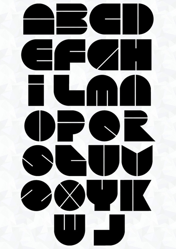
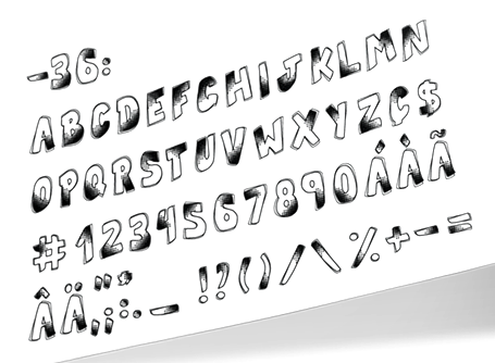
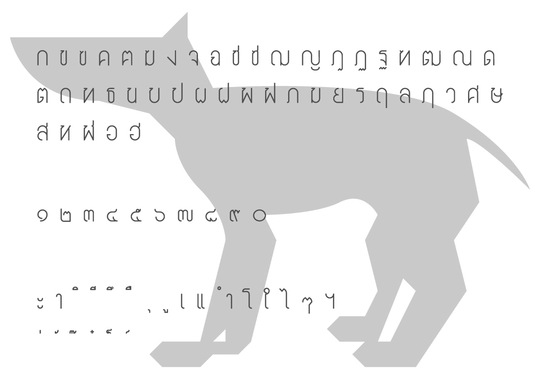
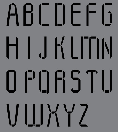
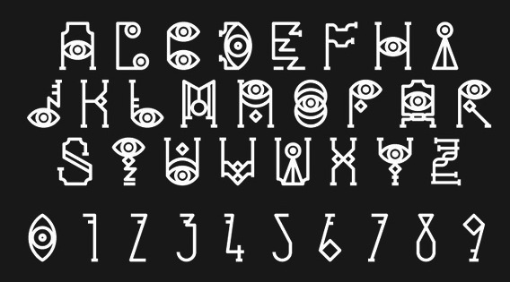
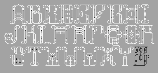
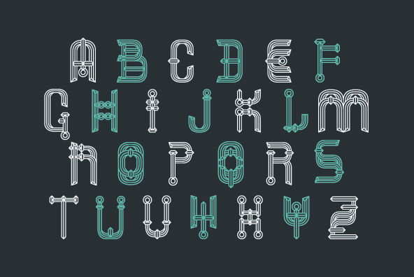
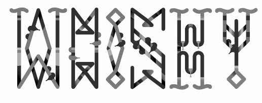
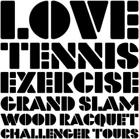
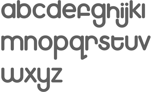
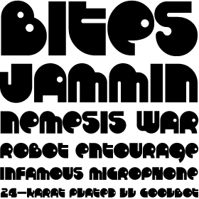
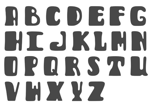
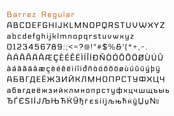
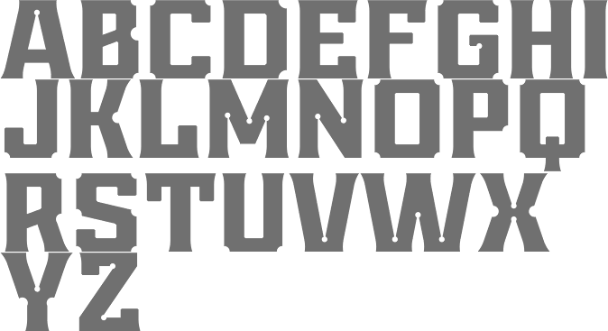
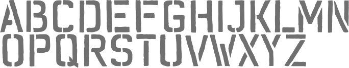
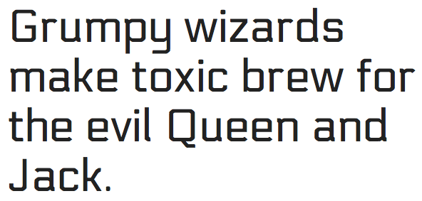
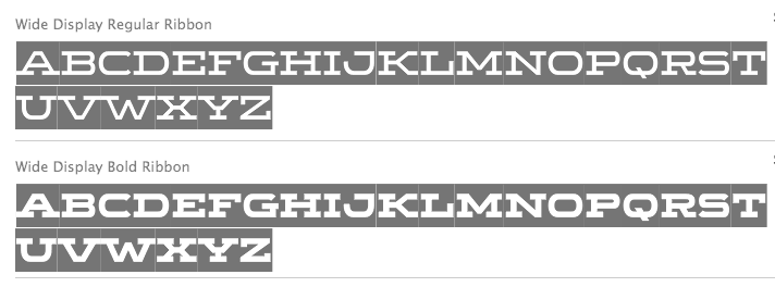
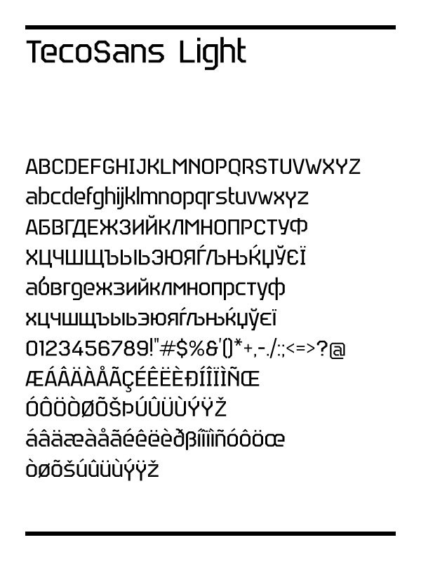
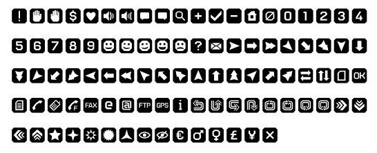
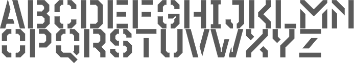
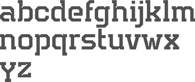
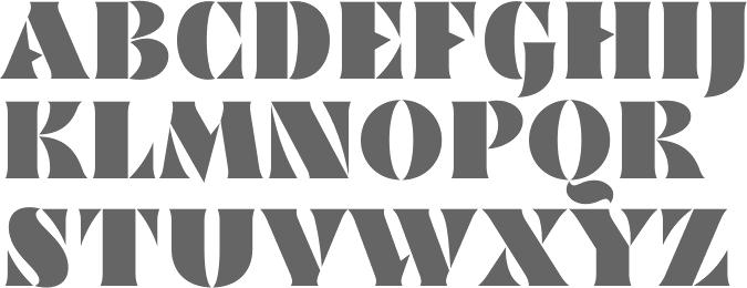
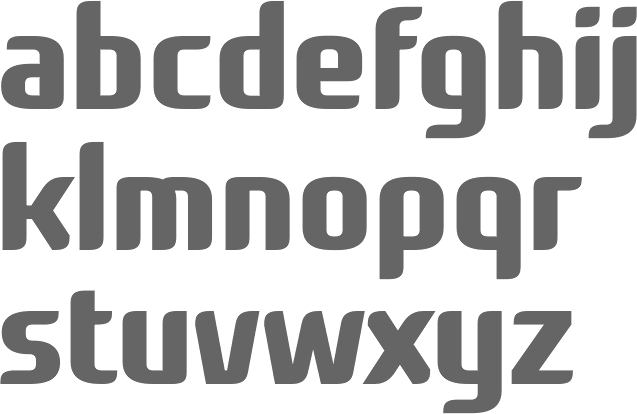
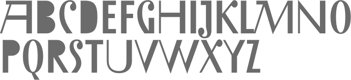
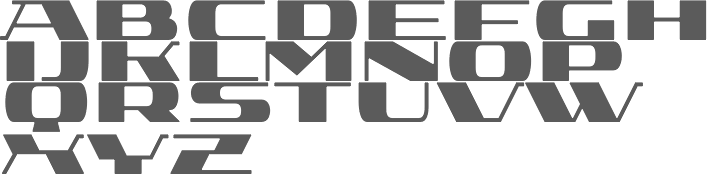
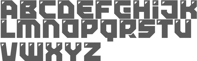
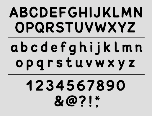
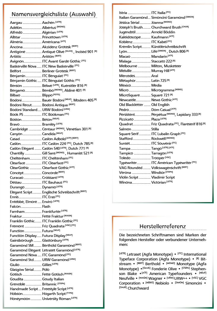
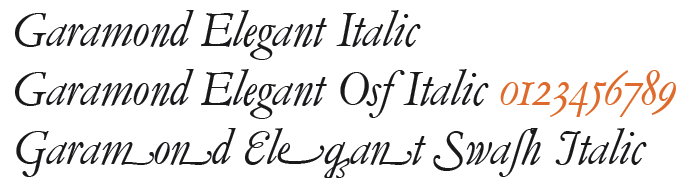
![German Garamond"> [based on TypoArt Garamond], Giulio,](Infinitype--GermanGaramond--basedonTypoartGaramond.png)
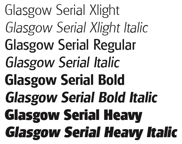
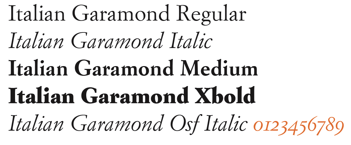
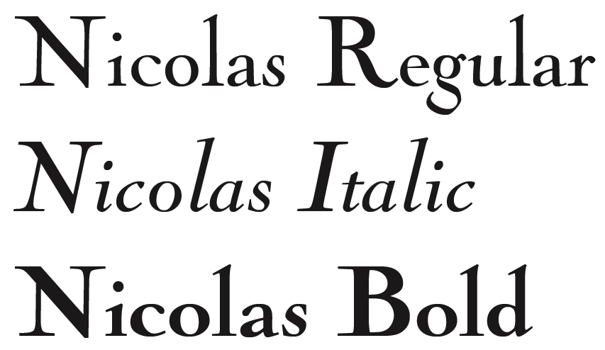
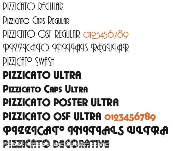
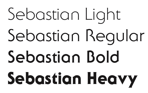
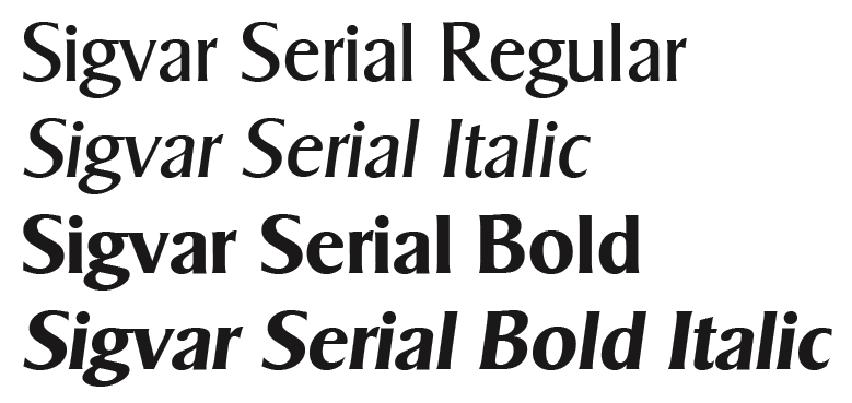
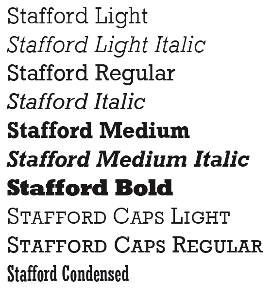
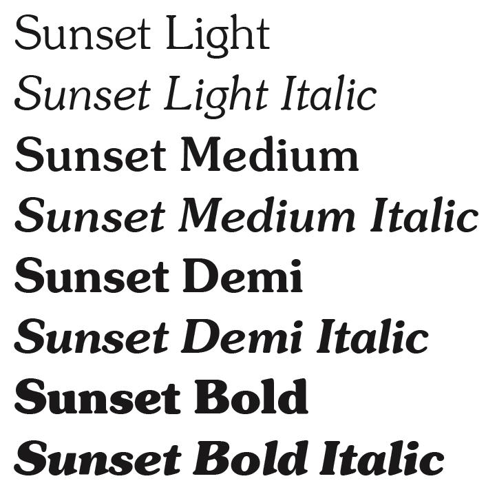
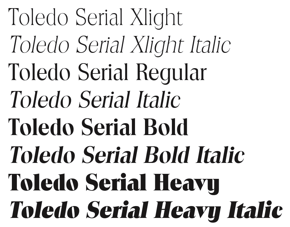
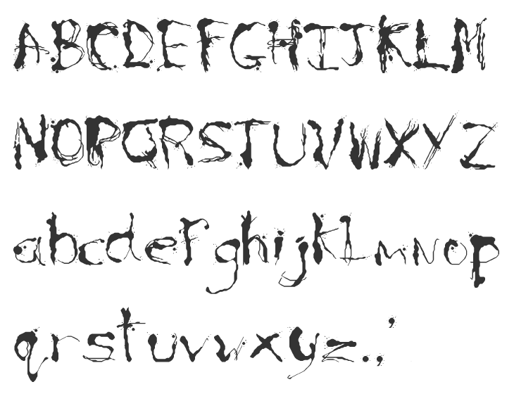
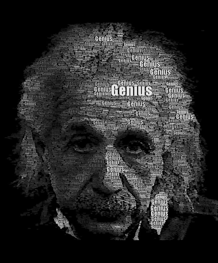
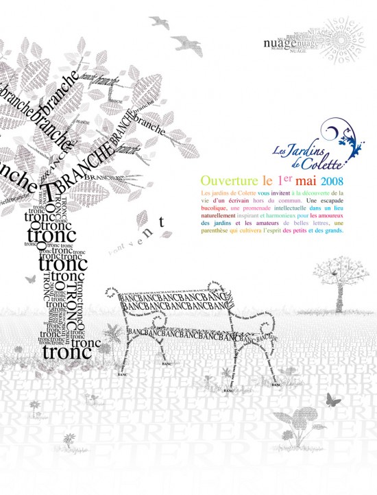
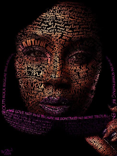
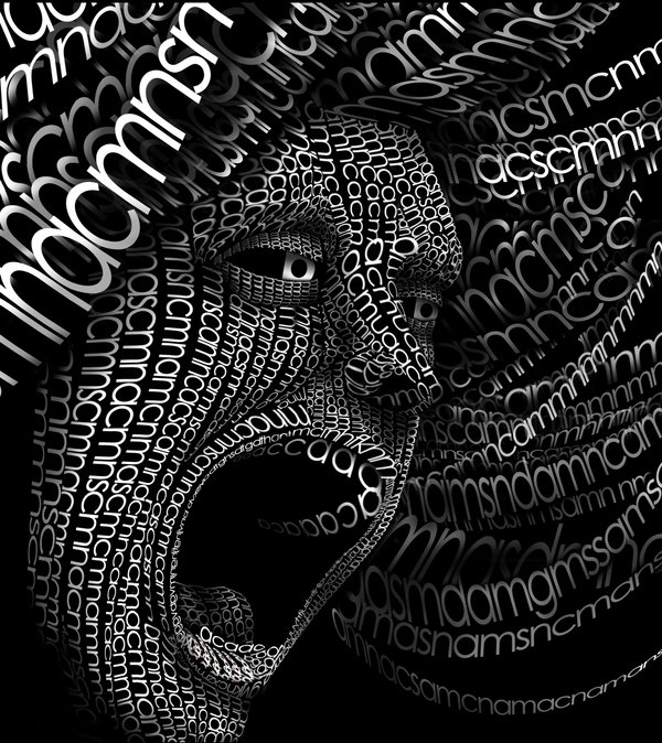
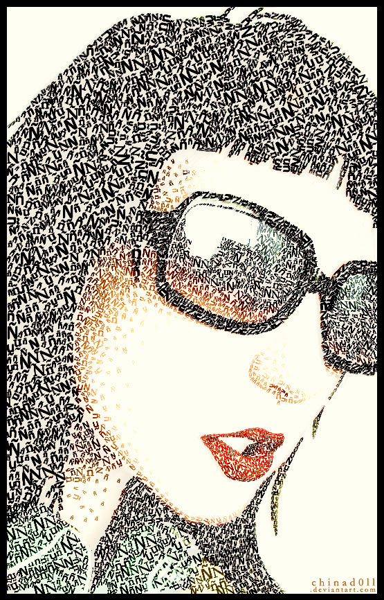
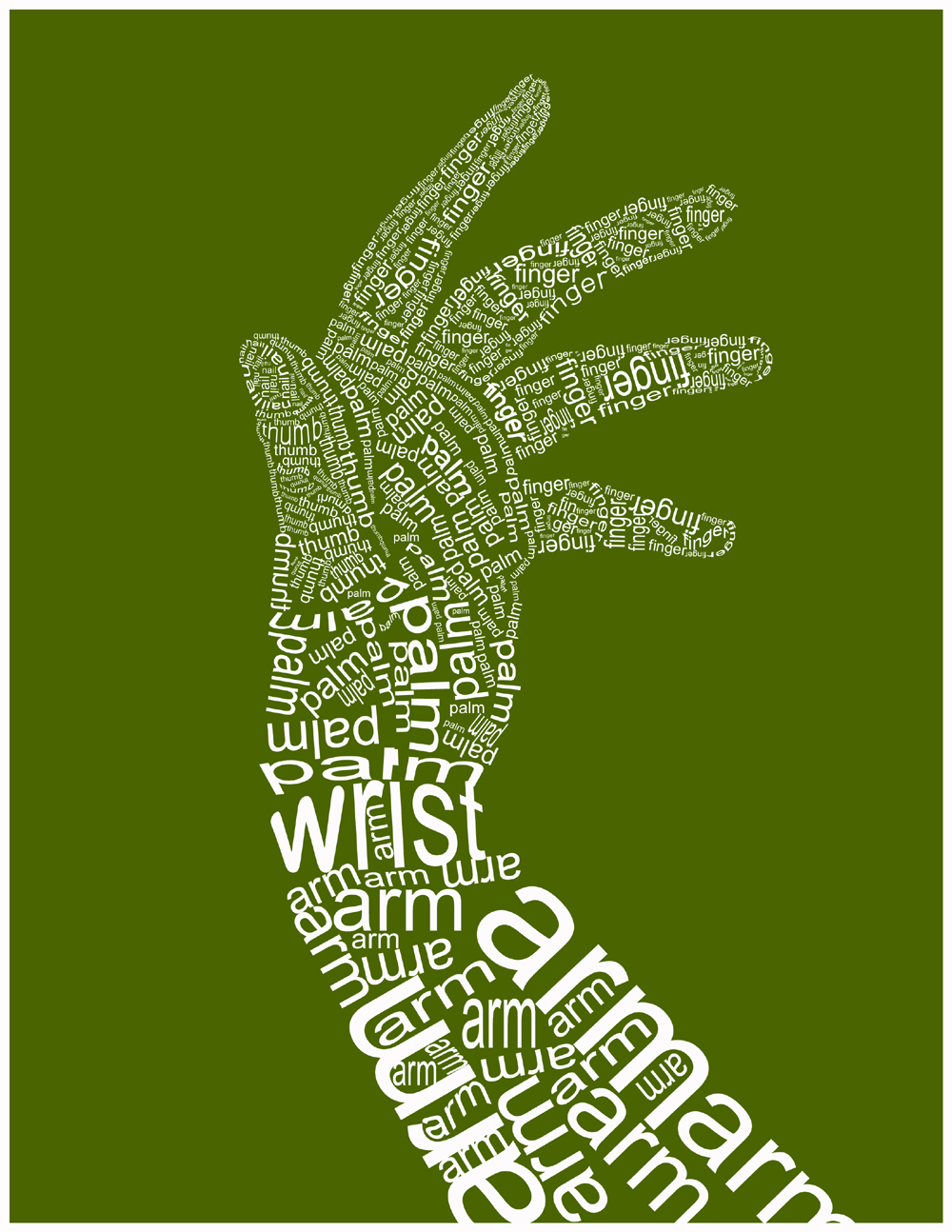
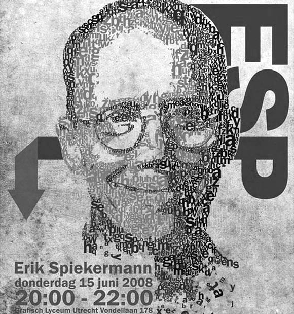
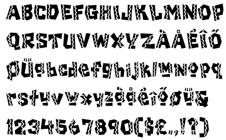
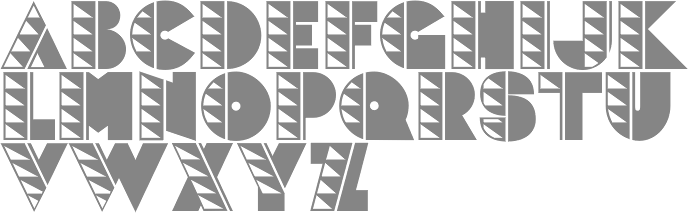
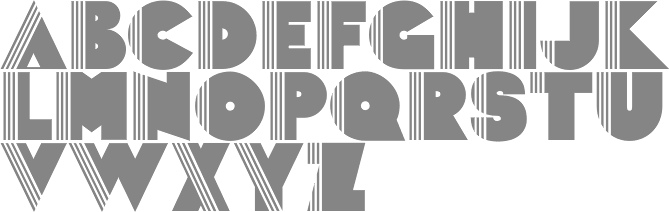
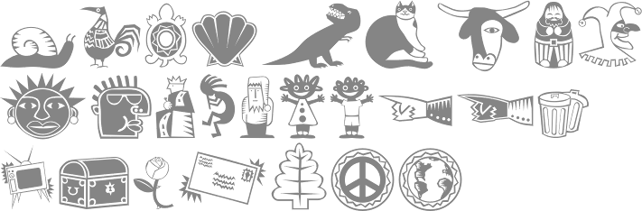
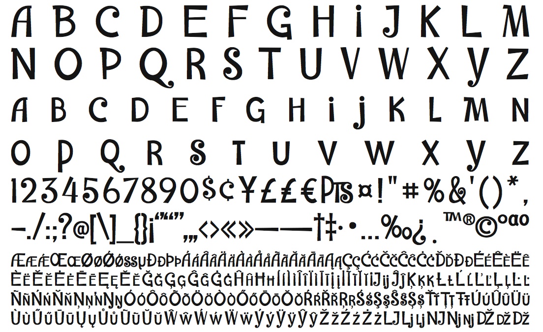
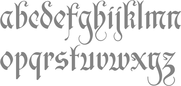
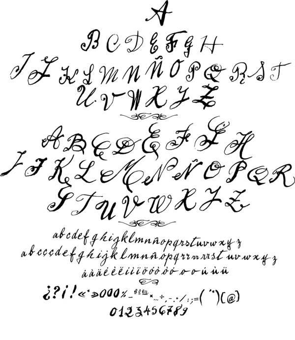
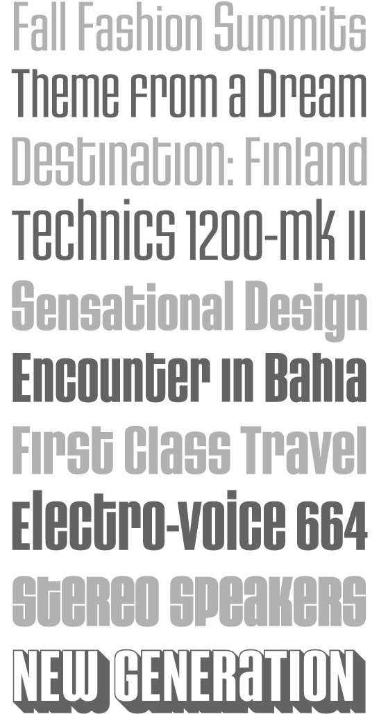
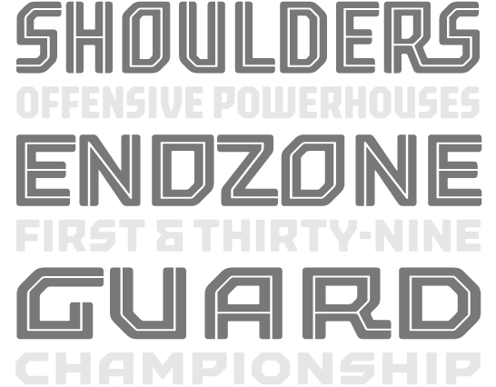
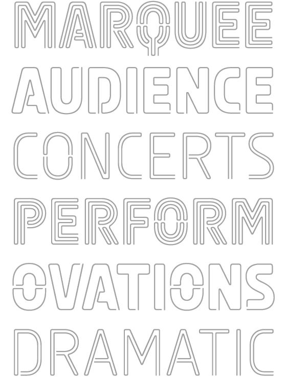
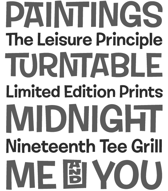
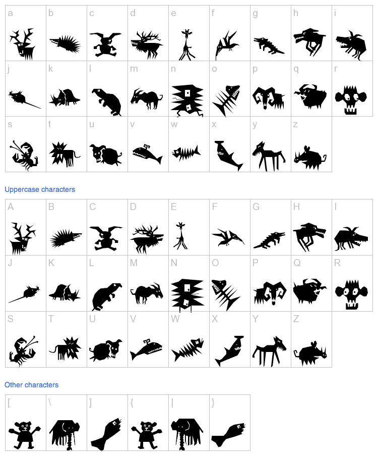