TYPE DESIGN INFORMATION PAGE last updated on Sat May 16 08:16:03 EDT 2026
FONT RECOGNITION VIA FONT MOOSE

|
|
|
|
|
Rune simulation fonts | ||
|
|
|
|
SWITCH TO INDEX FILE
In 2019, he designed the 62-style sci-fi typeface family Ares (+Ares VF), the condensed Latin / Greek / Cyrillic sans Rywalka, the creamy stencil typeface Aromatron and the leafy Aromatron Ornaments. Typefaces from 2020: AJ Quadrata (a revival of Textura Qadrata). Aka Quadratype. Devian Tart link. Creative Fabrica link. [Google] [MyFonts] [More] ⦿ | |
Kouvola, Finland-based designer of the rune-inspired typeface Ilmatar (2017). [Google] [More] ⦿ | |
Newsense (2013) is an art deco typeface that extends Milton Glaser's Film Sense (1968). Romaji Mincho (2013) is a free Asian simulation font based on the style of the Mincho typeface. Rhyder (2013) is a great (free) geometric 1930s style sans typeface. Martell (2013) is a free general purpose slab serif family. AC Big Serif (2013) is a free rounded wedge serif typeface. AC Thermes (2013) is a sans display typeface. Typefaces from 2014: AC Wanita (hand-drawn). Typefaces from 2019: AC Guanche (a font based on the ancient scripts used by the Guanches, the aboriginal inhabitants of the Canary Islands). [Google] [More] ⦿ | |
Ahmet Prosic
| |
Malpils, Latvia-based designer of the rune emulation typeface Rakstu Raksti (2018). [Google] [More] ⦿ | |
Alex Ivanov
| |
Aka Harry Hubbard. Creator of the runic simulation font Schaff (2012, OFL). [Google] [More] ⦿ | |
Type designer, b. 1989, Lviv, Ukraine. In 2014, with Lukyan Turetskyy at 2D Typo, she created Kalyna. This Latin and Ukrainian-Cyrillic font has asymmetrical serifs, characteristic for the Ukrainian style. It is based on Heorhiy Narbut's sketches, a well-known Ukrainian graphic artist from the early 20th century. Kalyna comes also with a set of ornaments. Still in 2014, she created the rune simulation typeface Norden (Latin and Cyrillic). Behance link. [Google] [MyFonts] [More] ⦿ | |
Madrid-based designer. He created the runic simulation typeface Runica (2012). Behance link. [Google] [More] ⦿ | |
Illustrator Amber June Cross (Sarasota, FL) designed the brushy The Scream-style typeface Sorry For The Pentagram (2015) during her studies at Ringling College of Art & Design. In 2017, she designed the runic emulation typeface Runic, and the curly Heffner. Behance link. [Google] [More] ⦿ | |
During her studies at Btk University of Applied Science in Berlin, Germany, Amina Urkumbayeva designed the rune-inspired hipster typeface Runotype (2016). [Google] [More] ⦿ | |
During her studies, Anastasia Ev (Mikkeli, Finland) created a Finnish rune simulation font (2013). [Google] [More] ⦿ | |
Andrew Pixel (was: Timm Design)
|
Envato link. [Google] [More] ⦿ |
Andrew Timothy
| |
Andrii Mahda
| |
Originally from Reykjavik, Atli Þor Árnason is studying at The School of Visual Communication in Haderslev, Denmark. He created the runic and/or Futhark simulation typeface Ristir (2011), a typeface that was heavily inspired by The Elder and The Newer Futhark alphabet. Behance link. [Google] [More] ⦿ | |
Senuior designer in Madrid, who created the runic typeface Heaven Can Wait (2013) and the brick-based typeface WFT Typo (2014). Behance link. [Google] [More] ⦿ | |
Bogstav
| Bogstav is the second type foundry identity of Pizzadude, kindergarten teacher Jakob Fischer (Denmark). Typefaces from 2022: Pausefisk, Turpentine Kisses (a hand-crafted version of Clarendon), Kitchen Stink, Organic Respect (a hand-crafted slab serif), Saturday Detentions, Dusty Hands, Tired Sunday, Frisky Bug. His typefaces from 2021: Lemon Smash, Fruitcake Fanatics, Gimcrack (a great informal sans with an even greater name), Public Interest, Overly Sweet, Sugar Flash (a vernacular party announcement font), Sugar Flash, Exit Punch, Weekday Mornings, Huskeseddel, Painless Feedback, Random Phrase, Organic Benefit, Organic Weekend, Sugar Junk, Saturday Light (a five-lined handcrafted typeface), Selfish Jeans, Foolish Talk (a fat finger font), Easy Answer, Dramatisk, Butter Cookie (a fat finger font), Appelsin, Brutal Fashion, Scrungy Picnic, Scrungy Picnic, Burger Shake, Sticky Rush, Gurgle Jock, Smartburst, Gurgle Jock, Smartburst, Organic Tuesday, Shaky Monday, Fransk Nougat, Cookie Kit, Musty Scoot, Lazy Boutique (counterless), Supertanker (counterless), Nonsense Note, Misquote Note (a fat finger font), Vintersjov, Personlighed, Spinat, Yggdrasil (hand-drawn, inspired by Nordic runes), Party Toast. His typefaces from 2020: Magisk Time, Ignorant, Magic Hour, Syndebuk, Chunky Dressing, Remarkably Dressed, Doorkick (a heavy brush face), Udklip, Misheard Lyrics. In 2019, he designed Tacky Song, Bungler, Overblik, Superfan, Jealous Punk, Talking Cat, Joking Lemon, Same Old Joke, Fake Fury, Rookie Heat, Direkteur, Identity and Helpless Advice (a dry brush typeface). In 2018, he published these mostly handcrafted typefaces: Charmetrold, Drivkraft, Frihed, Samtale, Primus Motor, Pusling, Komfortabel, Gulerod, Skulderklap, Tudeprins, Jernhelbred, Hyggebukser, Grovflab, Blikfang, Romkugle, Pauseklovn, Ugiftig, Wastebag (graffiti), Drillepind, Ramaskrig, Jackdaws, Karamboule. In 2017, he made these handcrafted typefaces: Otherwise, News Junkie, Nikotinus (drybrush), Budskab (dry brush), Swingdevil, Legwork, Milepost, Pandorama, Gymnastik (rough brush), Hummingbird, Curiousness, Butterfish, Snubnose, Obstacle, Luxurious (dry brush), Your Flames (heavy brush), Filmgoer, Dummkopf, Eventually, Teapoy, Tastebud, Leisurely, Automnious, Ravishing, Charmelade (dry brush), Habitatus, Temperamental, Ahorn, Chaplet, Everlasting, Honeypunch, Lemonism, Osculate, Repartee, Talkback, Tantamount. Dafont link. [Google] [MyFonts] [More] ⦿ |
Livingston, NJ-based designer of the free Nordic rune and Nordic rune emulation typeface Norsk (2017). [Google] [More] ⦿ | |
Graphic designer and art director in Genève, Switzerland, who created the runic simulation typeface Runiska in 2016. Behance link. [Google] [More] ⦿ | |
| |
Typefaces from 2016: Writna (feels like a runic font, although the authors claims inspiration from old Asian sources). [Google] [More] ⦿ | |
Athens, Greece-based designer of Runabic (2015), a typeface for Latin and Greek that combines Nordic rune elements with pixacao graffiti. In 2018, he published the spurred typeface Avacyn. [Google] [More] ⦿ | |
Dan Steinbok
| |
His early typefaces: Mushman (2012) is a techno-sans typeface inspired by the adventurous spirit of actor Steve McQueen, who raced motorcycles under the false name "Harvey Mushman." His second typeface, Bronson (2012, free if you ask), is a display type inspired by Danny "Tunnel King" Lewinski, Charles Bronson's character in The Great Escape. In 2013, he created the elegant (free) futuristic typeface Astroman. In 2014, Darren designed the free hipster typeface Skandi, which was inspired by Nordic runes. Behance link. [Google] [More] ⦿ | |
Typefaces not listed above: Alastor, Etude, Ezekiel, HyperTerra, HyperZoa, Kala Light, ManMake, Mandem, Marathon, Tranz Mono, Unity Terminal, Verseau. [Google] [More] ⦿ | |
Dene Studios
| Known as James Dene or James Partington. Malaga, Spain-based designer of the handcrafted typefaces Rune (2018), Calx (2018), Calligraphy Rough (2018), Back to School (2018). In 2019, he published Barleycorn, Atomic, Lost in Space, Centuria (a clean modern sans), Nadir, Geneva, Control, Cosmic, Myrkheim (a Norse or hipster font), Perehilion (a paperclip font), Aphilion (stencil), Equinox (a connect-the-dots typeface), Revolve (hipster style), Ascension, Orion (circle-based), Nova (sci-fi), Voyager (stencil), Black Velvet, Quamir (a hipster sans), Norse Elder Futhark, Interlace (a multiline typeface), Exoplanet, Orson (a serif typeface), Dr Jekyll & Mr Hyde, Sterling, Queen, Horace, Amos (a fashion mag sans), Allegra (serif), Archibald (slab serif), Cuneiform, the medieval typeface Reznor, the blackletter typefaces Griffin, Edgar and Deimos, Matrix, Egyptian Hieroglyph, Elder Futhark and Detective (a fingerprint texture font). Typefaces from 2020: Horizon, Barleycorn, Ancient Language Package, Perihelion (a paperclip typeface), Maze, Lost in Space, Quick, Assassin, Constantine, Drastica, Grace, Orson, Alistair, Antoinette, Bernard, Edgar, Lila, Anastasia, Angelica, Annabelle, Black Velvet, Centuria, Jinx (handcrafted). [Google] [MyFonts] [More] ⦿ |
Dima Pole
| |
Student at NABA (Nuova Accademia Belle Arti) in Milan. Creator of the elegant bilined typeface Jadore (2012) and of the rune simulation / hipster font Quarz 974 (2012). In 2012, he started his own foundry. In 2013, he published the alchemic typefaces Blazer and Quarz 974 Light (a free font). Hellofont link. [Google] [MyFonts] [More] ⦿ | |
| |
At Visual Arts Institute, Eger, Hungary-based Edina Varga designed the rune emulation typeface Runa (2019) as a derivation of Pablo Impallari's Monda. [Google] [More] ⦿ | |
Elena Paletskaya
| |
Moscow-based designer of the free rune emulation typeface Runa (2019) and the handcrafted typefaces Chapa (2019) and Karton (2014, for Latin and Cyrillic). [Google] [More] ⦿ | |
Lodz, Poland-based designer (b. 1987) of the rune emulation font Runny (2016) and the experimental typefaces 1987 Nukmat (2016) and Bez Rail (2016). [Google] [More] ⦿ | |
During her graphic design studies in Linz, Austria, Fabienne Plangger, now based in Barcelona, created the experimental typefaces Silk Paper Font (2013), Old Spice (2013, a rune simulation font), Marbling (2013), Rorschach (2013) and YO (2013). In 2014, she released a Juan Miro-style typeface. [Google] [More] ⦿ | |
Typefaces from 2014: Pontiac Inline (by Fanny Coulez and Julien Saurin---a classy almost art deco inline caps font with layering and shadow and other effects). Typefaces from 2015: Pontiac (also with Julien Saurin). Typefaces from 2016: Naive Line Sans, Naive Line. A great all caps handcrafted sans serif font designed by Fanny Coulez and Julien Saurin. Followed in 2017 by Naive Sans and Naive Deco Sans. Typefaces from 2018: Papercute Inline, Colette (an inky script). Typefaces from 2021: Almarose (an 18-style geometric sans). Typefaces from 2022: The Hand Wide (hand-printed). [Google] [MyFonts] [More] ⦿ | |
FontStructor specializing in rune simulation typefaces. He made Viking Runes (2012) in styles called Younger, Middle, and Elder. He writes: VIKING is a false-historical font evolving from Elder Futhark Runes. This runic typeface is based upon the ancient Germanic symbols later adapted by the Goths, Anglo-Saxons, Vikings, The Third Reich, and within Fantasy genera, depicted as Dwarven Runes. ELDER VIKING is almost an exact interpretation of Elder Futhark plus a few extra characters corresponding as a best fit to the basic 26 upper-case Latin characters. MIDDLE VIKING is the second generation evolution Rune based upon Elder Futhark. Designed as a semi-cryptic, visually interesting type but intended to be almost-readable as a Latin equivalent (unlike ELDER VIKING), MIDDLE VIKING contains numeric runes and basic punctuation. YOUNGER VIKING is the third generation rune type which is a fully modern interpretation of Elder Futhark. [Google] [More] ⦿ | |
Fontikon
|
Her Symbolikon set (2020) contains over 800 symbols / icons from the following cultures: Adinkra, Africa, Alchemy, American Native Rock Art, Ashtamangala, Asia, Astrology, Aztec, Buddhism, Celtic, Central America, Central Europe, Chakra, Christianity, Egyptian, Flowers, Greek Mythology, Hopi, Inca, Islam, Lakota Sioux, Latvian, Lovecraftian Mythos, Maori, Mapuche, Maya, Mu, Norse, Norse Runes, North America, North Europe, Pacific Area, Sacred Geometry, Slavic, South America, South Europe, Taino, Tarot Major Arcana. [Google] [More] ⦿ |
Frank Adebiaye
| |
Oslo, Norway-based designer of a custom rune simulation font in 2017. [Google] [More] ⦿ | |
During his studies in Toronto, graphic designer Grant Irving created the rune simulation font Druid (2016). [Google] [More] ⦿ | |
Greater Albion Typefounders (or: GATF)
|
Edwardian creations from 2008-2010: Ark Wright (traditional shop signage), Adantine, Goldbarre, Brosse, Crewekerne, Crewekerne Magna and Crewekerne Magister (arts and crafts face), Larchmont, Brissard, Brossard (slab serif), Bonavia, Bonavia Blanc, Clementhorpe, Veneribe, Chiara Script, Howlett, Svengali Roman, Bonning and Bonnington (1920's style families with ideas from University Roman), Absinette (2009, art nouveau), Bamberforth, Tumbletype, Vertrina, Bromwich, Great Bromwich, Fleete, Helenium. Chipping emulates the Edwardian 1920s. In 2012, he added the Bolton Commercial family (late Edwardian, early art nouveau). Art deco typefaces: Oakland (2011, multiline typeface gleaned from a 1930s French car ad), Zenia (2010, trilined), Plebe (Plebia, 2008: a grotesk emulating the 1930s), Whitehaven (2008, an extensive art deco family with several shadow weights), Merry Fleurons (2008, Christmas ornament dingbats), Braxia (2008), Keynsia (fifties style art deco family with Peignot influences). Other typefaces: Haymer is a large sans family made in 2010. Clunic (2008) is a blackletter face. Tectura (2008) is a handwriting font. Eldridge is a slab serif family. Aliqua (2009), Chipperly (2009) and Syondola (2008, Tuscan) are Wild West families. Terazza Tilings (2009) and Valentine's Fleurons (2009) are dingbat typefaces. Additions in 2009 include Lowndes (soft blackletter), Christmas Fleurons, Merry Snowmen, Cherritt (described as a Victorian era Courier), DoodleBirds, Halloween Fleurons, ButtonFaces, Sabio (neither slab nor sans), Daub (brush graffiti font), Sabinard (a modern swash face), Cullions (futuristic blackletter), Coronard (blackletter / roman hybrid), Easter Fleurons, Chapter Initials, Paveline (19th century calligraphic script), Mellin Sans and Open, Gildersleeve (evoking the 1920s Arts and Crafts movement), Stannard (a 1920's advertising inspired small caps face), Slattery (a horizontally shaded fun face), Slatterine (2009, more retro futurism), Spillsbury (2010, Victorian family), Cirflex (2010, geometric display typeface based on arcs of circles), Oxonia (2010, a classic roman family) and Vectis (classic Roman elegance, another small caps face). Creations in 2010: Windevere, Albion's White Christmas, Paragon (a great didone display family with a wood type feel), Compton (slab serif family), Mexborough, Morover (Schwabacher family), Anavio (a classical roman family), Corvone (3d-effect font), Granville (Victorian), Corton (Victorian), Wellingborough (Victorian), Worthing (Victorian), Ark Wright (traditional shop signage), Bonaventure (art nouveau), Federal Streamliner (1950s feel techno face), Deva (classical roman), Crucis Ornaments (crosses), Bronzino (a roman with Arts and Crafts roots), Bertoni (2010, a didone family), Pardon Me Boy (train dingbats), Woodruff (Open Face fonts with a wood type look), Jonquin (based on a WWI poster; +Incised), Luscombe (1920s display family; +Parva), Movella (futuristic from the 1950s), Magdalena Sans (2010: a clear monoline sans), Endymion (2010: Tuscan), Paget (a Tuscan experimental all caps face), Portello (Victorian). Typefaces made in 2011: Admiral (art nouveau), Tuscaloosa (Tuscan face), Eccles (bombastic Victorian), Wolverhampton (pre-Victorian), Doncaster (Victorian family), Metropole (art nouveau family), Corsham (stone engraved lettering family), Leibix (casual), Albia Nova (an elegant futuristic organic face), Flapper (art nouveau face), Bertolessi (curly Victorian), Tulk's Victorian Banner (all caps banner face), Fitzgerald (Victorian all caps face), Cleveden (Victorian headline family), Spargo (an extensive set of early 20th century-look engraved typefaces for official documents and securities), Bettendorf (2011, based on a 1900s masthead typeface), Wolvercote (2011, similar to Bettendorf), Pittsburgh (2011, a Western-style engraved face), Chubbly (2011), Portmeirion No. 6 (2011, a Victorian / circus design), Bronzetti (2011; images: i, ii, iii, iv, v, vi), Sophie J (hanprinted), Dem Bones (2011, glyphs made from bones), Stout (2011), Birmingham New Street (a Victorian family inspired by the hand lettered title on a 19th century railway map), Beckinslade (ornamental blackletter). Production in 2012: Alfere Sans Stripes, Albion's Americana (Western stars and stripes face), Tudor Perpendicular (blackletter), Amici (rounded headline face), Amie (rounded sans), Wolverton Text (Edwardian family), Vinea (10-style display family), Par Avion (retro futuristic), AstroBats (retro sci-fi dingbats), Beeching (+Shadowed), Gondolieri (didone meets Tuscan), Penrose Slabserif (an Escher-like trompe l'oeuil 3d face), Haldane (art nouveau, Arabic look), Solidarius (chubby, fat felt-tip pen font), Bluebottle (angular display face), Merrivale (Victorian), Future Runes (runic simulation), Coliseo, Alfrere Sans (inspired by a 1950s television caption style), Tectura II (Lloyd's answer to Comic Sans), Secombe (Edwardian caps family), Milligan, London Court (Tudor-era caps family). Typefaces from 2013: Speedblur, Belhampton (Edwardian), Merry Baubles (Christmas tree dings), Merry Bauble Letters (Christmas alphadings), Wroxeter (blackletter), Thurbrooke (+Banner, +Initials, +Black, +Reverso, all based on 19th century banner headings and engraved lettering), Bourne (a rounded type system), Henrician (a set of eight Tudor style display typefaces), Belle Jardin (art deco marquee face), Lavery (Edwardian), Baldione (a stylized didone), Chequers (a vintage poster face), Turvy Topsy (fat finger face), Merrivaux (faux medieval), Blout (German expressionist typeface), Easter Egg Letters, Isometrica (a banner typeface family), Valentine's Letters, Imperial Granum (roman titling face), Brollo (chunky display face). Typefaces from 2014: Albions Very Old Masthead, Albions Engraved Black, Albions Old Masthead, Albions Incised Masthead, Albions Black Holly, Zanderley (pure Victoriana, +Initials), Landsdowne Commercial, Friendly Shaded Sans, Trivette, Wellmere Sans, Uncia Black, Henry VII, Greene and Rollins (layered Victorian typeface), Barollo, Alfrine, Alfrere Banner (+Incised), Lugano, Lanvier (1930s-style caps typeface family), Bonlivet (a hyper-decorative capitals alphabet from the late Victoian or early art nouveau era), Ames Text (a didone family with rounded brackets), Ames Roman (related to didones but with wedge serifs), Ames Weathered, Ames Shadow, Ames Shaded, Amersham (vintage signage family, 2013-2014). Typefaces from 2015: Netherland Perpendicular (Victorian blackletter), Ledbury (Victorian), Ambergate (Edwardian poster face), Empyrean (futuristic, yet curvy), Flinscher (1920s script), Signwriter Standard, Display Hatched, Albions Marker No.1 (a charming outlined marker pen typeface inspired by Bembo and Caslon), Joyvrie, Kinver (Victorian), Nationale (Victorian), Doges Banner, Doges Darker (Victorian), Doges Delight (Victorian), Doges Venezia (Victorian). Typefaces from 2016: Buntisland, Elmcourt, Allorette, Albion Sharp Italic, Deco Metro (art deco), SpeedSwash (blackletterish), Stridere (blackletterish), SpeedSketch. Typefaces from 2017: Shervington, Cantebriggia 1207 (a weathered blackletter), Algreve, Alambart, Duquesne Dark Woodcut, Courtold Shadow, Athabasca (Wild West Tuscan), Fargo Tuscan, Millerstown (Western), Millerstown Races, Old Millerstown, Sasparillo (Tuscan), Sasparillo Fizz, Wylgate, Herald Banner. Typefaces from 2018: Garstang Engraved, Halliwell Casual, Portculliard, Rotham Industria, Sombrieul (Edwardian), Shervington Engraved (a shaded typeface that appears hand-engraved on copper-plate). Typefaces from 2019: Dewhirst Display, Rakia (retro futuristic), Eurobia (art nouveau style). Typefaces from 2020: Draughtsman Engraved, Draughtsman Label Hand (Victorian), Civic Triline. Typefaces from 2021: Albion Seventies, Portculliard Engraved (an engraved ultra-decorative blackletter). Type announcements. Behance link. Klingspor link. Abstract Fonts link. Font Squirrel link. Kernest link. Abstract Fonts link. Hellofont link. View all typefaces by Paul Lloyd. Images of Paul Lloyd's best-selling typefaces. Greater Albion Typefounders: typeface collection. View Paul Lloyd's Victorian typefaces. [Google] [MyFonts] [More] ⦿ |
Guguh Gumantoro
| |
Hellokisdottir
| Saint Petersburg, Russia-based designer of the runic emulation typeface Nordica (2016). Behance link. [Google] [More] ⦿ |
Hendra Permana (Yogyakarta, Indonesia) created the free rune simulation typeface Bambu Runcing Font in 2014. As it turns out, runes were not the source of inspiration, but rather Japanese mecha movies. Behance link. Dafont link. Home page. [Google] [More] ⦿ | |
Heru Budi Santoso
| |
Herulogo
|
Typefaces from 2020: Beatbox, Break Cube, Christ2019, Covid 19, Dark Spartan, Elephant King, Forest, Free Fire, Master Tagline, Neroka, Night Party, Patriot, Skyline, Sun, Speed Racer, Victorianz, Viking-Empire (rune emulation), Warrior. [Google] [More] ⦿ |
Minsk-based Belarussian, b. 1987. Creator of "gothic" and "broken" Latin and Cyrillic fonts like Wings of Darkness (2015), Bad Behaviour (2015), Ancient Runes (2015), Last Words from Earth (2015, ink splatter script), Blood Blocks (2015, a dripping blood font), Gothic Spell (2015, blackletter/tattoo font), MB Thin Worms (2013, a spiked horror black metal font), MB Think Twice (2012, gothic face), MB Demonic Tale (2012), MB Underground (2012), MB Forever Raw (2012), MB Element (2012, +Brutalized: horror fonts), MB Real Grinder (2011), MB Evil Ghost (2010), MB Slavonic Minsk (2010), MB An Old Witch (2010), MB Before The End (2010), MB Horror House (2010), MB Poisoned Type (2010), MB Gravitation (2010), MB-Alien Report 72 (2010), MB-Graveyard-Designs (2010), MB-TheGreatReaper (2010), MB Arcane Gothic (2009), MB-Back for Death (2009), MB-Lords of Evil (2010), MB-BlackBookType (2009), MB-ElvenType (2009), MB-GothicDawn (2009), MB-InDigit (2009), MB-RustyIron (2009), MB TyranT (2009), MB-DigitalReality (2009). Devian Tart link. Dafont link. Another link. Home page. Old link. Abstract Fonts link. [Google] [More] ⦿ | |
J. Paul Snow
| |
Jakob Fischer
| |
James Partington
| |
Mannheim, Germany-based designer of the free runic display typeface Aquilone (2016) and the free rustic display typeface Wanderlust (2018). Behance link. [Google] [More] ⦿ | |
JC Fonts
|
He created the minimal sans serif family Estate (2009, T-26). In 2011, he created the fattish comic book style typeface Bango and the monoline geometric sans family Ando. In 2013, he published the simple condensed sans typeface Hand Gothic and the rounded sans family Korb. Typefaces from 2014: Bango Pro (a heavyweight poster font with a strong cartoon feel), Troika (a free German expressionist or dadaist papercut typeface), Reso (an experimental geometric typeface), Linotte (a rounded sans that can see applications in techno advertising but also children's products and food posters; it is in the round bubblegum style of Sofia Soft and Nokia), Norse (free rune simulation font). Typefaces from 2016: Doblo (blackboard bold family for layering, with choice of textures). Typefaces from 2018: Calima (a humanist sans), Kernel (squarish). Typefaces from 2019: Rikon (a flat top organic sans family). Typefaces from 2020: Bari Sans (an 18-style grotesk). Typefaces from 2021: Surimi (an organic sans). Typefaces from 2022: Galica (a 6-style sans with Celtic roots). Klingspor link. Behance link. Creative Market link. Dafont link. Fontsquirrel link. [Google] [MyFonts] [More] ⦿ |
Jimmy Moberg
| |
Joël Carrouché
| |
John Power
| |
Some fonts: Altogether OOky, Addams-AltogetherOoky, Addams-Capitals, Addams-Regular, CCBithead-Bark, CCBithead-Byte, CC Bryan Talbot (2008, created for Bryan Talbot's Alice in Sunderland), CCHooky-Open, CCHooky-Solid, CCAlchemite, CCChills, CCDigitalDelivery, CCDivineRight-Regular, CCDoubleBack-Future, CCDoubleBack-Past, CCElsewhere-Regular, CCFlameOn, CCFrostbite, CCGrimlyFiendish-Regular, CCJimLee, CCJoeMadInt, CCLosVampiros, CCMeanwhile, CCMeltdown, CCMonsterMash, CCSpills, CCSplashdown, CCStormtrooper (1997), CCTheStorySoFar-Regular, CCThrills, CCToBeContinued, WildAndCrazySFX. With Richard Starkings, he designed Achtung Baby (2001), Adamantium and DoubleBack in 2001 for Agfa/Monotype. Other designs: Dave Gibbons (2006), UpUpAndAway (2005), Forked Tongue (2005), Paranoid Android (2005), Snowmany Snowmen (2005), Gibbous (2006), Astronauts in Trouble, Chatterbox, Red Star, Tough Talk, Sean Phillips, Atomic Wedgie, Pass The Port, Divine Right, Shoutout, Battle Scarred, Danger Girl, Primal Scream, PhaseSonStun, Yeah Baby, Nuff Said (2005), Trick Or Treat, MonsterMash, CarryOnScreaming, Chills, Goosebumps, CreepyCrawly, GrimlyFiendish, IncyWincySpider, Spookytooth, Meltdown and TrickOrTreat dingbats, BiffBamBoom, Spellcaster, Cheese And Crackers, FaceFont, Hedge, Meanwhile, Wildwords International, Comicrazy, Storyline (2006), Happy Holidays (2007), Foom (2007). MyFonts sells these fonts by him: Adamantium, Alchemite, Altogether Ooky (vampire script), Area51, Aztech, Battle Cry, Bithead, Chills, Dave Gibbons, Dead Mans, Destroyer, Digital Delivery, Divine Right, Drop Case, Elsewhere, Euphoria, CC Fairy Tale (2007), Face Front, Fighting Words, Flame On, Foom, Frostbite, Gibbons Gazette (2009, Gobbledygook, Golem (2002), Grimly Fiendish, Happy Holidays, Hellshock, Hip Flask, Holier Than Thou, Hooky, Hyperdrive, Joe Kubert, Meanwhile, CCMild Mannered (2007), Monologous, Near Myth, Overbyte, Phat Boi, PhilYeh, Rough Tongue, Sanctum Sanctorum, Scott McCloud, Smash, Speeding Bullet, Spills, Splashdown, Spookytooth, Stonehenge Runes, Stormtrooper, Storyline, Thats All Folks, The Story So Far, Thingamajig, Thrills, Tim Sale, Tim Sale Brush, Timelord, Treacherous, Treasure Trove (2007), Up Up And Away, Wild And Crazy, Zzzap, Deadline (2007), Kickback (2007, with David Lloyd), Sticky Fingers (2007, scary). Typefaces made in 2008: Ratatatat (2008), CC Mad Scientist (2008), HammerHorror (2008), EnemyLines (2008, based on WWII lettering used by the nazis), Cutthroat Lower (2008), Philyeh (2008), Doohickey Lower (2008), CC Sign Language (2008, fruit vendor lettering). Typefaces made in 2009: SpillProof (2009), Slaphappy (2009), Hooky (2009, spraycan style), Long Underwear (2009), Digital Delivery (2009), Grande Guignol (2003, art nouveau), Bronto Burger (2009), Elsewhere (2009, art nouveau), Exterminate (2009, stone carving face), You Blockhead (2009), CC Rugged Rock (2009), Creations in 2010: Wild Words Lower (2010), Back Beat (2010), Rick Veitch (2010, based on the lettering of comic book artist Rick Veitch), Credit Extension (2010), Shiver (2010, with Richard Starkings), Shake (2010, with Richard Starkings), Elephantmen (2008-2010, squarish family). Contributions from 2011: Knobbly Knees, Ed McGuinness (comic book script family), Big Top, Clean Cut Kid, Dash Decent (a very round almost-bubblegum family), Fancy Pants (connected script), Goth Chic (blackletter). Fonts from 2012: Lunar Modular, Lunar Orbiter, Lunar Rover, Geek Speak, Ancient Astronaut, Totally Awesome (comic book caps face). Fonts from 2013: Samaritan and Samaritan Tall (with Richard Starkings), Ghost Town (a family of seven gold rush era typefaces), Colleen Doran (a comic book family: A Distant Soil is a classic bold and beautiful science fiction/fantasy comic book series by creator, writer, artist and letterer Colleen Doran. A Distant Soil is being remastered and re-released by those awfully nice chaps at Image Comics and Colleen commissioned Comicraft to create the definitive bold and beautiful Colleen Doran font, based on her original pen lettering), Mega City (an elliptical in-your-face advertising signage typeface family), Soliloquous (fat rounded hand-printed comic book family), Excalibur Stone, Excalibur Sword, Legendary Legerdemain (+Leggy), Cool Beans (beatnik font). Fonts from 2014: Shaky Kane (based on the comic books by that name), Resistance Is Lowered (techno), Hero Sandwich Ingedients, Hero Sandwich Combos (a layered set of informal typefaces combined in many ways), Monstrosity (a ghoulish typeface), HighJinks, Onomatopedia, Killzone, Killswitch, Killjoy. Fonts from 2014: Mike Kunkel (based on the hand of comic book artist Mike Kunkel). In 2015, John Roshell (Comicraft) created the comic book typeface family The Sculptor based on Scott McCloud's lettering. Other fonts from 2015 include AB Flock Poster, Hypnotique, Samaritan Lower (by Richard Starkings and John Roshell), Graveyard Smash, Maladroit, Extra Extra (pen-lettered newspaper headline font family), Merry Melody, Temporal Shift and Temporal Gap (computer emulation typeface), Temporal Shift and Temporal Gap Expanded, Temporal Shift and Temporal Gap Compressed, Danger Girl Hex (with Jeffery Scott Campbell), J. Scott Campbell Lower (with Jeffery Scott Campbell). Typefaces from 2016: Victory Speech Lower, Man Of Tomorrow, Thrills, Holy Grail, A Likely Story, Victory Speech, Questionable Things (with Richard Starkings), The Story Begins + Ends, Pixel Arcade (video game font), Schadenfreude (octagonal style), Vengeance Is Mine. Typefaces from 2017: Right In The Kisser, Music To My Eyes">, True Believer. Typefaces from 2018: Metcon (+a stencil version, Metcon Rx), Summer Fling, Samaritan Tall Lower (by Starkings and Roshell), Blah Blah Upper (by John Roshell and Richard Starkings), Ultimatum, Wuxtry Wuxtry (art nouveau), Single Bound (a sans), Evil Doings (by Richard Starkings and John Roshell), Prince of Darkness (a gothic layered font family), Empire State Gothic, Empire State Deco. Typefaces from 2019 by John Roshell: Whatchamacallit (a variable cartoon sans with weight, width and italic axes), Ask For Mercy, Excelsius, Space Race, When Suddenly. Typefaces from 2020: FX Machina (squarish, octagonal), Origin Story, Cybervox, CCQuigglesmith (a beatnik font), Ripped Bam Boom, Dynamic Duo, If This Be Doomsday, Elektrakution (a Greek simulation font family by Richard Starkings and John Roshell), Whatchamacallit, CCMighty Mouth, This Man This Monster (by John Roshell and Richard Starkings), Simply Marvelous, Meanwhile Uncial, Transylvanian (a jungle font), Shark Snack, Letterhack Sans, Letterhack Serif. Typefaces from 2021: Ultimatum MFV (a 21-style chamfered military typeface family including several stencil fonts), Grim N Gritty, Richard Starkings Brush (a comic book typeface by Richard Starkings and John Roshell), Scoundrel (a comic book face by Richard Starkings and John Roshell), Tall Tales (a fat finger font). Typefaces from 2022: Beyond Belief. | |
Copenhagen, Denmark-based designer of Saxo Grammaticus (2019: a tall geometric sans in three styles) and the rune emulation and Viking art font Sacred North (2019). [Google] [MyFonts] [More] ⦿ | |
During his studies in Strasbourg, Jonathan Kleinpeter created the typeface Runica (2014). It consists of Runica True (a runic font) and Runica and Runica Bold, which are runic simulation typefaces. [Google] [More] ⦿ | |
Jordi Manero Pascual
| |
Creator of the runic video game font Forerunner Halo (2014). [Google] [More] ⦿ | |
Jose Tijerin (b. 1966) is based in Madrid. In 2015 he created the free fairytale typeface Dark Elf, Silver Leaves, Hojas de Plata (floriated typeface), and Aaerea Brick. Dafont link. [Google] [More] ⦿ | |
JPS Graphic Designs
| J. Paul Snow (JPS Graphic Designs) is a Glendale, AZ-based type designer. He created Osirian Runic Upright (2012). [Google] [MyFonts] [More] ⦿ |
Julien Saurin
| |
Kaer
|
Typefaces from 2017: OneLine Bold (rounded fat color font). Typefaces from 2019: Antique Initials (regular and color; with a flower pattern), OneLine Overlap (a color font). Typefaces from 2020: Pagesso (a lava lamp font), Avery (a monolinear connected sans), Sailem (an inline art deco font), Old Stamp (a fingerprint font), Silvery (a display typeface on the theme of thick and thin), Blueberry Spot, Coffee Chalk (a textured typeface), Allegro (a blueprint type), Northern Monk (beveled), Westland (blackletter), Neon Line, Bronze (art deco, +color, +texture), Shtrih (dry brush), Geoline (sketched, textured), Flowline, Foliageant (floral, curly), Northern Runes (rune emulation), Neon (color font), Parallel Lines, Bronzen Abundance (a display family with textured and color options), Sharp Stroke (a heavy brush typeface), Renaissance Initial, Celtic Spiral, Lace Line. Typefaces from 2021: Atta Weird (a font for LSD addicts), Three Neon Lines, Dead Saint (a Halloween alphabet), Lockdown Christmas (a dot matrix font), Nordic Folk (a layerable typeface family with Scandinavian texture; plus Nordic Folk Icons), Hewy (a display typeface), Planny (a blueprint font), Sportlight (a speed font), Wesloy (a brush serif font), Carle (a 3d polygonal children's book font; +Shadow, +Colored), Absundo (a playful dual weight font), Wide Plump (a geometric solid typeface), Colton (a condensed boutique serif), Aztec Initials (+a colored version), Adrim (a thin floriated sans), Northern Monk (an inscriptional ustav-inspired typeface), Sogia (a decorative serif). Typefaces from 2022: Asl Line (an American Sign Language font). [Google] [MyFonts] [More] ⦿ |
Kaunas, Lithuania-based designer of Wood Runes (2017). [Google] [More] ⦿ | |
Kiev, Ukraine-based designer of the Cyrillic rune simulation font Kelty (2016). [Google] [More] ⦿ | |
Designer (b. 1989, Poland) of the rune simulation typeface Latin Runes (2011, FontStruct) and Runelike (2014). [Google] [More] ⦿ | |
During her studies in Coimbra, Portugal, Leah Gois created the rune emulation font Nordik (2015). [Google] [More] ⦿ | |
Legend Art
| Designer of these display typefaces in 2016: Askold (a monoline runic simulation typeface), Flawourite, Architect Sans. |
Swedish type designer, calligrapher and graphic designer, b. 1939, who lives in Skane, Denmark. He created RunaSerif (for Miles, 1995: inspired by the forms of ancient Viking runes, this typeface won the Nordic Typeface Competition in Copenhagen), Crane (1995, Agfa), Renasci (1997, based on old Danish inscriptions, mainly in churches), ZiP (Agfa Creative Alliance), and Hansson Stencil (Mecanorma). CV (in Swedish). | |
Letter Stock (was: Gumacreative)
|
Typefaces from 2018: Vanhala (Tuscan), Orchard, Solitaire, Founder (a thin script), Elanor, Callous (signature script), Keith (script), Subsky (script), Hamburger (artsy script), Smith (monoline rounded sans). Typefaces from 2019: Steven Mattew, Romansa (script), Pianicas, Infamous, Voltras, Faddox, Slayer Creeper (a dripping blood blackletter font), Hellioum (a balloon font), Grootten Beast (a wooden plank font), Lazarrous (beatnik), Salmounth (a clean script), Damaskush (a blackletter), Neurotic (spurred, blackletter), Maclucash, Neowave, Throoper, Maldivine, Morrisette (signage script), Descrendent (sans), Athlenstan, Hole Script, Cardigan, Lenox, Aero Space, Esentrik (over-decorated), Lethal (sans), Markwell (script), Hallmark, Fymous (signature script), Brighford (spurred), Bulb (a bubblegum font), Wavecraft. Typefaces from 2020: Flinch (a stone cut Flintstone font), Jack Miller (a signature script), Jaguar Jugglers (squarish, constructivist), Lazarrous (beatnik style), Jane Frediction, Grindmore (a calligraphic blackletter typeface), Descendent (a monolinear rounded coffee shop sans), Oliver Queen (a fat brush script), Orangutan, Chadwick (a Halloween font), Oakleaf, Buckles, Hackwell, Susan Brooks, Jacqueline, Alistair Morrison, Gibson Walsh, Slapstick, Monkey Werch, Rooselyn, Northway (lettering for outdoor or nature trail signage), Ghotana, Apija, Rawkin Pickles, Lockdown, Linger (a curly delight), Nuttyclash (a dry brush typeface), Ghosie, Kuro (a brush script). Typefaces from 2021: Bellamind (a decorative serif), Bingana (a playful typeface with oriental influences; appropriate for toys), Cheshire (sketched, textured), Creepycall, Croftler (a grungy athletic shirt font), Goldenwick (a vintage decorative serif), Karlburns (an ultra-decorative font by Vic Carless), Shorelly (an arts and crafts all caps serif), Walkingblue (a round vernacular slab serif), Garlicha (a great formal copperplate calligraphic font that unfortunately features a lower case r that can be confused with a lower case n), Hamingduck (copperplate calligraphy), Antucious (an ornamental serif), Monkeymod (a textured reverse srtress display font), Eightbit (a retro pixel font), Maloney West (art nouveau), Adamovick (a spurred Halloween font), Grindleaf (organic), Cronicalypse (a reverse stress elephant foot display font), Houston Palace (a monolinear retro script), Raceryouth (a weathered stencil font), Lyonade (a monolinear script based on retro motorbike posters), Alleysondust (a calligraphic script), Carlosberg (a spurred Victorian typeface), Clubeight (a trilined neon typeface that is reminiscent of Wyman's designs for the 1968 Olympics in Mexico), Slacksluger (a decorative inline typeface with medieval terminals), Beckmarine (a rough typeface inspired by retro cartoon and retro motorbike posters), Bullmars (a heavy font), Sinofluck (a stylish brush script inspired by a samurai poster), Scandlers (a dry brush script), Melvines (a thick paint brush font), Rockapolis (stencil), Lexaviers (a rune simulation font), Mylo (a dry brush typeface), Meckatler, Machiates (a vintage signage font), Fluxion (a dry brush script), Black Marilyn (blackletter), Palermosh, New Kids on the Font, Psychonaut (a reverse contrast, or even a Western, font), Black Valentine (a decorative blackletter), Buckles (a dry brush font), Smegh Mouth (a dry brush font), Armthadore, Brookland (a dry brush script), Khian Shantang (a decorative blackletter), Laekar (a hand-drawn blocky poster font), Schoutler (an ornamental fantasy font), Sonoxa (a heavy and creamy dry brush typeface), Classicloud (a decorative and festive blackletter). Typefaces from 2022: Gavin Zoo (a vintage decorative serif), Sallam (Arabic emulation), Sururim Maudunah (emulating Arabic), Ar Rayyan (Arabic emulation), Hollybucks (a round handprinted typeface), Mack Dutch (a weathered elephant foot serif), Obidel (a squarish vernacular typeface), Pinkerton (a playful cartoonish font), Sloopy Joe (a condensed sans with some curly terminals), Xylo Macloud (a decorative serif), Hickenwitch (a decorative serif), Parkwilson (a decorative serif), Buckedtalk (an inline blackletter typeface), Buckedtalk (an inline blackletter typeface). Creative Fabrica Script. [Google] [MyFonts] [More] ⦿ |
During her studies in Poznan, Poland, Lina Jarczyk created the rune emulation typeface Svalbard (2015). [Google] [More] ⦿ | |
Designer of Dutrilin (2016), a mix of sci-fi and runes. [Google] [More] ⦿ | |
Braunschweig, Germany-based designer of the rune simulation typeface Newhork (2014). Behance link. [Google] [More] ⦿ | |
In 2012, Madeleine designed the hexagonal Etern typeface family. In 2013, she designed Circ (circle-based). In 2014, she published the sans titling typeface Haandlagd. In 2015 she added Friends who Drink and in 2016 Oval. Behance link. [Google] [More] ⦿ | |
Manfred Klein
| |
Manfred Klein: Runes
| Manfred Klein retraced the roots of writing in central Europe before the middle ages. There was indeed a Germanic hookish style of writing that I will group under "runes". Some of his typefaces: ArmsIdeasNParts, CalligImprovis-Bold, CalligImprovis-BoldPlus, GerManishTwo, GermanishOne, LatinLoversRunes, MKRunes, MKRunes-Light, MKRunes-Light, MKRunes, ModernRunes, PetitexBut-Bold, PetitexBut-Light, PetitixBut-Normal, PetitixThreeCallig-Bold, PetitixThreeCallig-Light, PetitixThreeCallig-Normal, ReadableGothic, RuneStones, RunesWritten-Bold, RunesWritten, RuniK100-Bold, RuniK50-Normal, RuniKleinFreeform, RunishMKMedium, RunishQuill-BlackSquares, RunishQuillMK-Medium, RunishQuillMK, TheRomanRunesAlliance, TodayRunes, Twiggy-Bold, Twiggy-Light. Download page. Download all these fonts in onze zip file. [Google] [MyFonts] [More] ⦿ |
Cologne-based creator of a rune simulation font called Rune in 2012. In 2013, she made the elegant monoline sans typeface Sushimi. [Google] [More] ⦿ | |
| |
| |
Barcelona-based designer of the runic straight-edged typeface Focka (2015). Behance link. [Google] [More] ⦿ | |
Athens, Greece-based designer of the rune-inspired Latin / Greek typeface Witchcraft (2018). [Google] [More] ⦿ | |
Norwegian graphic designer, who created New Typeface (2012, experimental), Marune Five (2012, runic simulation typeface), and Spacematter (2012). [Google] [More] ⦿ | |
Matthieu Cortat
| |
Aka Maya TD. Creator of the hand-drawn straight-edged typefaces Over Obsessed Girlfriend. [Google] [More] ⦿ | |
Medialoot
|
|
| |
Creator of the rune simulation font Runeicity Decorative (2013). [Google] [More] ⦿ | |
Michela Graziani
| |
Espoo, Finland-based designer of the straight-edged, almost runic, typeface Protom (2016) and the pixel typeface Retro Robot (2017). [Google] [More] ⦿ | |
Typefaces from 2016: Miodrag (handwriting script), Brona (brush type), Genoise (a brush splatter font), Mustachelle (handcrafted blackboard bold typeface), Norweg (a rune simulation font). | |
Haderslev, Denmark-based designer of Runic (2012), a runic simulation typeface This was created while she was studying at the School of Visual Communication in Haderslev. In 2013, she designed Octopus with Trine Hansen It is a circle-based minimalist sans. [Google] [More] ⦿ | |
Moberg Design
| Illustrator and designer in Malmö, Sweden, who studied at Eksjö School Jönköping and Gävle University (class of 20120. He created he rune emulation typeface Odenruna (2016). [Google] [More] ⦿ |
Neale Davidson
| |
Maracaibo, Venezuela-based designer of Rune Gothic Type (2013). [Google] [More] ⦿ | |
Moscow-based designer of the Cyrillic typefaces Cheerful (2019), Rurun (2019: runic) and Kolchuga (2019). [Google] [More] ⦿ | |
Creator of the free thin chisel font New Theory (2012), of the stick font SixSixSix (2013), and of the hand-drawn Dollar Lemonade (2013, yours for two dollars), Anke Sans (2014: a free geometric sans), Beeeer (2014, tweetware poster font), Giant (2014), California (2014), My Hand (2014), Raw Font (2014), and Composition (2014). In 2015, he made the watercolor brush script typefaces Arrows, Hawaii, Cafune Script, Karla Script, Michelle (free), Love Letter, Matilda, Natalie, Palapa, Heather and Wendy. Other typefaces from 2015 include Beeeer (poster type), Compass, Rustic (consisting of Things, Paper, Margot, Monsters, and Welcome Home), Akuma (heavy brush), Composition (hand-printed), Saints (a stick, or rune emulation font), Lorem Serif, Helena (watercolor brush script), Dakota (script), Convoy (handcrafted), Tomahawk (hand-drawn), Holga Script, and Emily (hand-drawn). Typefaces from 2016: Rapture (rough brush), Mono (futuristic), Big Sur (thin sans), Piedra & Stone, Tigers, Tiburon, Colorado, Super Normal, Brown Fox Script, Reading This, Frank, Nudos (script), Penny Handmade, Lula (brush style), Jamaica Script (brush font). Typefaces from 2017: Wild (dadaist), OK Regular, Ugo. Typefaces from 2018: Weekend, Destroyer (brush). Creative Market link. Behance link. Dafont link. Open Font Library link. [Google] [More] ⦿ | |
Nonpareille (was: Chastellun.net)
|
His typefaces:
Speaker at ATypI 2017 Montreal. View Matthieu Cortat's typefaces. View Nonpareille's font library. [Google] [MyFonts] [More] ⦿ |
Oliver Weiss
| |
Open City Design
|
Free typefaces from 2019: Norilsk, Chernobyl (Cyrillic simulation), Kaiser (a rounded blackletter), Campaign, Revolucion (constructivist), Oligarchy, Contraband (a free monoline script), Viking, Myrkvior (rune emulation), Vintage74, Art Nuvo (psychedelic, art nouveau). Typefaces from 2020: Vanity (a free German expressionist typeface), Nordic Club (a national park typeface), Shogun (a gaspipe font), Contraband (a monolinear font duo), Pariah (a rounded heavy blackletter). Dribble link. Open City Design link. [Google] [More] ⦿ |
Out of Step Font Company
|
Typefaces from 2014: Batter Up, Fortitude, Cvlt Rvne Regular (Norwegian rune simulation typeface), Toni Regular (hipster font), Nuvio Demo, Congruency Demo, Turnonacular Demo, Giants-Regular, Held-x-Fast-Regular (tattoo font), Salto, House-Paint-Shadow-Regular (3d shadow face), Sailor-Stitch-Regular, Munich (ultra-condensed), Cleptograph, Raw Denim Audacity, Creatif, Nue Gothic (Nue Gothic Round followed in 2019), Simpleton Gothic, Street Robot Inline, Shipmates, Team Captain (octagonal and spurred), House Paint Shadow (a flat square house paint graffiti font with a floating shadow). Typefaces from 2015: Playful Script, Sebastien Slab. Typefaces from 2016: Sailor Stitch (pixel tattoo font), Bristle Brush Script, Elegrand Gothic, Mister Brightstride (brush script), Ruben Gothic, Creatif Regular (hipster style). Typefaces from 2017: Brewmaster Gothic, Thick Brush, Botsmatic (pixelish), Annihilator, Sebastien Slab. Typefaces from 2018: Batter Up, Walkthru, Strike Back, Backtrack (a cracked stone font). Typefaces from 2019: Graf Script (graffiti), Simple Brush Script, Super Simple Brush Script, Annihilation, Bridal Shower Monoline script, Team Athletics, Sebastien Slab Round, Team MVP (octagonal, spurred), Brewmaster Gothic Round, Humbley Script. Typefaces from 2020: Ghoulie Tattoo Script, Plum Brush Script, Bubble Frum. FontStruct link. Fontspace link. Dafont link. Behance link. Creative Market link. [Google] [More] ⦿ |
Paul James Lloyd
| |
Peter Rempel
| |
Phil MacIsaac
| |
Pixel Sagas (was: Protoform Project, and Fontshack)
|
Neale Davidson's typefaces:
Dafont link. See also here and here, here, and here. Klingspor link. Abstract Fonts link. Devian Tart link. Fontspace link. [Google] [More] ⦿ |
Powerfonts
| British designer of Mechanism (2019: a high blood pressure typeface full of tension) and Bounce (2019: a slinky font inspired by molecular structures). In 2020, he released Trad, a carved typeface that is inspired by Viking mythology and runic alphabets. In 2021, he made the techno stencil typeface Kezuri. [Google] [MyFonts] [More] ⦿ |
PR Fonts
|
He writes about himself: educated in music composition and visual design. In his family home, there were many wall plaques with German Bible verses, rendered in a variety of gothic and fraktur lettering styles. In the 1980s he discovered the art of calligraphy, first through the speedball lettering textbook, and later by joining the calligraphers Guild of Manitoba. He has studied a variety of lettering styles, but his strongest interest is in the letter styles of the Middle Ages, starting with the German Fraktur styles he knew from childhood, and extending back, into uncials, runic shapes, and the Classical Roman Letter. The Chancery cursive, or Italic hand, which to many people is synonymous with calligraphy, never held much interest for him. He released his first shareware fonts in 1996. In 2010, he went partially commercial. His first pay font is PR Pointers (2010, an arrows font). In 2011, he designed the commercial typefaces PR Mapping and PR Stars. In 2012, he published PR Arco (arcs for framing curved lines of text, in a style common on Victorian posters and almanac covers) and PR Hydra (a Greek simulation font). Typefaces from 2013 include PR Snowflakes 01, PR Bramble Wood 1 and 2, PR Valendoodle 01 (Valentine's Day ornaments), PR Swirlies (in series numbered 01 through 13), PR Swirlies Frames, PR HallowDoodles (Halloween dingbats), PR Nouveau Ornaments (art nouveau), PR Viking (a rune simulation face), PR Foxtail 01, PR Foxtail 02, PR Scrolls 03, 04 and 05 (2014), PR Sprucewood (2014), PR Swells One (2014), PR Xmas Doodles (2014), PR Hearts Take Wing 01, PR Mysticon 01 (star dingbats), PR Pointers 01 (arrows), PR Valknut (Norse god symbolism), PR Scrolls, PR Uncial (1998), PR Dim Sum (brush face), PR Columban (a Celtic uncial, named after Irish monk Columbanus), PR Columbian. Typefaces from 2014: PR Cauldron (a scary Celtic style font), Vanaheim (a flared display typeface influenced by Nordic runes). Typefaces from 2015: PR Hallow Doodles 03, PR Ex Cathedra (Trajan capitals). MyFonts link. MyFonts foundry link. Klingspor link. Fontsy link. Dafont link. Castles&Crypts link. [Google] [MyFonts] [More] ⦿ |
Pro Studio
|
|
UK-based designer of the runic simulation typeface Towers of Babel (2012). [Google] [More] ⦿ | |
| |
Boston-based graphic designer. Creator of the rune simulation font Ragnarok (2012), a display typeface that uses forms from pagan runes. Behance link. [Google] [More] ⦿ | |
Using the alias Toadellin Danaan, Australian Roger Thomas designed a Norse rune simulation typeface called Toradellin Skogvokter (2013). [Google] [More] ⦿ | |
Roman Korolev
| |
S&C Type Paris (was: La Goupil Paris)
|
Graffiti fonts: Ruelles (2009), Vandalism Alternate (2008). The original Vandalism (2007, co-designed by Saurin and Blanc) was free at Dafont. The scratchy Carving (2010) is commercial, however. In 2011, Saurin made the pure geometric art deco face Haussmann. With Angela Bolliger, Julien Saurin published the classic avant-gardist hand-drawn typeface Paris (2012, La Goupil). It comes with art nouveau ornaments called Paris Serif Ornaments. Typefaces from 2012: Paper Cute (a paper cut face), Adrenaline (hand-printed), Montmartre (a soft hand-printed typeface family, now retired from the line-up). Typefaces by Julien Saurin in 2013: The Serif Hand (with Fanny Coulez), The Hand (a hand-printed caps typeface done with Fanny Coulez), Naive (a curly hand-printed serif typeface done with Fanny Coulez), Insolente (a connected script done with Fanny Coulez), Neo Phoenician (a straight-edged rune simulation font done with Fanny Coulez). Typefaces from 2014: Pontiac Inline (by Fanny Coulez and Julien Saurin---a classy almost art deco inline caps font with layering and shadow and other effects). Typefaces from 2015: Pontiac (with Fanny Coulez), Insolente (by Julien Saurin and Fanny Coulez), Carving (scratchy hand). Typefaces from 2016: Naive Deco Sans, Naive Line Sans. A great all caps handcrafted sans serif font designed by Fanny Coulez and Julien Saurin. Typefaces from 2017: Majorelle (signage script). Typefaces from 2018: Papercute Inline (with Fanny Coulez), Colette (an inky script). Typefaces from 2022: The Hand Wide (hand-printed). Creative Market link. Fontspring link. MyFonts link. Klingspor link. Behance link for S&C Type Paris. Creative Market link for S&C Type Paris. [Google] [MyFonts] [More] ⦿ |
In 2011, he created the experimental typefaces Mourier (based on a geometric alphabet created in 1973 by Danish graphic designer Eric Mourier. The font uses square of 7 x 7 units and consists of unclosed lines. The first and only use was in the booklet The Myth about Bird B by Knud Holten), Semicir, BipHop, Broom, Flaubertine (with Olivier Dolbeau), Hangul and Rotunda. In 2013, he added Victorianna (thin Victorian slab serif), Runic Sans (inspired by a runic semi-uncial callygraphy seen on the Book of Kells), Courrrier (with three r's---a monospaced experimental typewriter face), Process (geometric, experimental), Lment (hipster typeface), Gnaw. In 2014, he designed the free font VTF Victoriianna Thin at Velvetyne. In 2020, with Ariel Martin Perez, he released the free typeface Cantique at Velvetyne. Cantique was inspired by some hand-carved titles used in post-romantic French bookplates, both for their ornamental qualities and for their kind of medieval mood. Klingspor link. Velvetyne Type foundry, where one can download most of his fonts. Old URL. Behance link. Sébastien Hayez at Velvetyne. [Google] [More] ⦿ | |
| |
Norwegian graphic designer with a Bachelor of Creative Arts (Graphic Design) from Deakin University, Melbourne, Australia. Based in Tromso and then in Oslo, Sigbjørn Sørensen created these typefaces: Bris (2013, avant-garde), Organs (2013, an organic typeface that was inspired by Dali's paintings), Old Days (2012, a hairline runic simulation typeface). Behance link. [Google] [More] ⦿ | |
Slovolitni de Grande Tartaria
|
Designer of the clean sans typeface Hinton (2016), the lapidary typeface Gor (2016), and the handcrafted typefaces Pocherk 26, Zelo (calligraphic), Rusich, Etruria (based on Etruscan inscriptions, this handcrafted font tries to accurately simulate the writing of the Etruscans; published in 2018), Hors, Fufluns, and Fufluns Luna. Most of his fonts cover both Latin and Cyrillic. In 2017, he designed Garuspik (ultra-condensed; in Krug, Original and Kvadrat styles), Konung, which is a mixture of various medieval central European styles for Latin and Cyrillic. He also designed the contrast-rich typeface Retra, the blackletter typeface Getman, the eroded typeface family Hors, the Celtic typeface Keltichi, and the angst-ridden Dubrove (which was inspired by Moravian angular type design of 1930-50s) in 2017. Typefaces from 2018: Tartaria, Osovec (a wedge serif text typeface in one style), Maribor, Vinneta (a Latin / Cyrillic italic). Typefaces from 2019: Arkaim (East Slavic simulation style). [Google] [MyFonts] [More] ⦿ |
Struvictory Art
|
Typefaces from 2019: Runista, Runista Symbols, Wigwams, Aronia, Norwolk (a Nordic folklore font, +Symbols), Solarica (a tribal font family), Agnostic Font (a hipster font), Modesto (arts and crafts style font), Wigwam and Wigwam Symbols (a tribal font), Sealife. Typefaces from 2020: Moonwild (a celestial font and symbol set), Moonwild Decorative, Okaeri (a Japanese emulation foint), Quizles (a stencil serif), Doubleganger (a Peignotian typeface for fashion magazines that plays on two different widths), Hedonist (a great modern poster sans). Typefaces from 2021: Hygge Adore (a hairline slab serif), Geonica (a great geometric deco typeface), Le Tarot (a spurred celestial font), Stonage (stone age letters and patterns), Foliart (floriated, blackboard bold; originally called Foliar), Mystyline Decorative, Ajoure (a folk art font that includes a set of symbols). Typefaces from 2022: Nomad Decorative (a decorative boho font). [Google] [MyFonts] [More] ⦿ |
During his studies, Oslo-based Svein Ligaard designed the rune-inspired typeface Haarfagre (2016). [Google] [More] ⦿ | |
Osasco, Brazil-based designer of the rune emulation typeface Valhalla Rising (2018). [Google] [More] ⦿ | |
San Diego, CA-based student-designer of the rune-inspired display typeface Hyberia (2017). [Google] [More] ⦿ | |
Tony Thomas
| |
Vates Design
|
In 2018, he designed the beautiful Spencerian penmanship font Jamaica Script, which was inspired by Louis Madarasz. In 2019, he released Rough Antiqua and Viking Caps (a rune and rune emulation typeface). Typefaces from 2020: Lodbrok (Celtic). Typefaces from 2021: Marquise (a calligraphic script). Link to a business that makes vintage coat-of-arms logos. [Google] [More] ⦿ |
Velvetyne Type Foundry (or: VTF)
|
Creator of some free (often experimental) fonts in 2010-2011. Cooperators include Sylvain Henri, Jérémy Landes-Nones, and Sébastien Hayez. Frank's typefaces:
Author of a book on the life and work of Fran+çois Boltana (2012, with Suzanne Cardinal). Behance link. Open Font Library link. Klingspor link. Home page. Future Fonts link. [Google] [More] ⦿ |
Dafont link. Aka Viktor Hamburger. Behance link. [Google] [More] ⦿ | |
Lviv, Ukraine-based designer of the display typefaces Cosmos (2018: sci-fi style), Roonah (2018: rune emulation) and Silencio (2018). [Google] [More] ⦿ | |
Viktoryia Strukouskaya
| |
Budapest-based designer of the runic simulation typeface Kerecsen (2011) and the hipster typeface Guterhorn (2015), which is based on the carved letters on the Gutenberg-Otthon building. [Google] [More] ⦿ | |
Walden Font
|
Dafont link. [Google] [MyFonts] [More] ⦿ |
Woodcutter Manero
|
In 2013, he created Gothic Winter (snow-capped blackletter), Woodcutter Anonymous (ransom note font; +part2, 2014), The Shining (movie scanbats), Woodcutter Optical Army (op-art), Viking Runes Shields, Fresh Blood, Pig Rules, Pole Dance, Music+Party, Asian Food, Deers (sic), Woodcutter Amor de Madre (curly tattoo font), Tattoo Vieja Escuela 1, 2 and 3, Origami (animal dingbats), Vintage Motorcycle Club (scanbats), Vintage Christmas (dingbats), Terry Richardson World (scanbats), Woodcutter Wire Fence, Woodcutter Points (textured face), Made in Spain 4, I Love 80s (dings), Drugs (drug paraphernalia dings), Barber Shop (dingbats), Woodcutter del Reves, Adventure Time, New York New York (1 and 2), Woodcutter Dripping Classic, Woodcutter Tinta China (ink splatter font), Woodcutter Cross, Nightmare on Social Media, Breaking Bad (scanbats), Fight Club (boxing scanbats), Boligrafo (sketched font), Robots, Luxury Brands, Woodcutter Buena Lettra, Barcelona (scanbats), Devoto (religious dingbats), Joker (dingbats), Woodcutter Typewritter (sic), Banksy (scanbats), Made in Spain 1, 2 and 3 (company logos), Animal City (funny dingbats), LSD Junior (a scary alphading font), Woodcutter Army (army stencil), Woodcutter El Día De Todos Los Santos (Mexican dingbats), Woodcutter Summer Shadows, and the monster dingbat typeface Woodcutter El Dia del Juicio. Still in 2013, he designed Woodcutter Black Square, DaPunk, Woodcutter Pollita Alegre (a penis font), Woodcutter Hungry Pig, and Woodcutter Hand Light. Typefaces from 2014: Hospital Icons, Woodcutter Rare Drawings, Headache, Irresistible (rounded sans), Doctor Garcia (textured), Violence, Hipster Icons, Saint Valentine's Day, Mister Manson, Casino (dingbats), Christian Icons, Christmas Icons, Hermes Manero, Beauty (dingbats), Art Icons & Tools, Clouds Mix, Malamadre (grunge), Offset Punk, Manos de Cerdo, Hotel Oriental, Basic Trip, Popeye (scanbats), Viva la Fiesta (flag alphadings), Street Stencil, Supermarket, Ebola Font, Vintage Halloween, Motel Imperial, Clothes, The Second World War (army stencil), Tahs On A Rope, Penis (dingbats), Regular Show (dingbats), Parkinsonism, The 70 Greatest Directors of All Time (scanbats), Smartphone (alphadings), Dripping, Chaos in Wisconsin, Saturno, Gym (dingbats), Angie, Antique Book, Black Rodeo, Gutierrez+, Matias-Font, Viejo-Oeste, Woodcutter-Prison-Tattoo, old+sailor, Italian Revolution, Kid Nightmare, Anderson (rough stencil), Manero (scratchy script), Tecno-Chaos (dot matrix font), Neverland, Martian Font, Radical Block, Woodcutter Delicada, Bon Appetit, Termica, Kandinsky, Hotel Paradiso, Seven Arts, Street Icons, Militaria (dingbats), Undergramo (poster font), Woodcutter Avispa, Fuego Fatuo, Other Space, Electrica Sals, Woodcutter Dramatica, Cocinitas (cooking dingbats), Bad Mother Fucker, Quentin Tarantino (scanbats), El Extraño, Fine Disorder, Woodcutter BCN Style (dripping blood font), Woodcutter Virus, Efectiva, Mogambo (fat brush), Duck Tape, Warriors, Cutre Glam, Woodcutter Sutill Shadow, Woodcutter Future, Rage, Woodcutter Negative, Manolo, Vegetables, Woodcutter Storm (lightning texture), Woodcutter Rare Drawings, Rustic Heavy Metal, Grass, Virgin Mary (scanbats), Laurus Nobilis (wreaths), Mister Bambu, Woodcutter Barcode, Conquest, Multimedia Icons, Preschool, Cursors, Woodcutter Kaos, Woodcutter Lines, Ukraine (constructivist), Meccano, Woodcutter Simple Font, Crux (crucifixes), Dolores (3d), Eyes, MoneyMoneyMoney, Made in Spain 5, Barcelona Mon Amour, New Society (a 3d shadow face), Federico (a hand-printed shadow typeface), Aranea (spider dings), Fifth Avenue (art deco), Beware of Pitbull, Dictators (scanbats), Woodcutter Vintage Cartoon, The American (textured face), Woodcutter Mixed Icons, Apple Japanese Keyboard, Vintage Classics Disney, Carnage College (blood splatter font), Vintage Porn (scanbats), Woodcutter Fontana (textured caps), Woodcutter Mixed Icons, Woodcutter Jet Set, Woodcutter Gothic Drama (blackletter), Woodcutter Relieve, Mixed Icons Vol. 1, Woodcutter Electric, Woodcutter Cloth, Street Style (graffiti font), Gothic Punk, Human Body Parts, Dirty Harry, Woodcutter Fine Sketch, Woodcutter Invisible, Miley Cyrus (scanbats), Old Guard, Circus and Fair, Comic Cover, Woodcutter Gigantismo, Clockwork Orange (scanbats), Dosmilcatorce, The Walking Dead (scanbats). Typefaces from 2015: Rude High School, Imprenta Gonzales (white on black), Estrategia (textured style), Monkey Business, Venganza (dripping blood font), Woodcutter Executive, Left Hand Comic (textured), Dirty News, Gorilla BCN (a great handcrafted athletic lettering typeface), Neo Protein (bio-grunge), Barrio-Santo (graffiti style), Periodic-Table-of-Elements, TerrorToons, Vanilla-Candy, Baseball-Icons, Boots, Fine-Homage, Jesus-Christ (religious icons), Lock, Meredith (texturted typeface), Neo-Victorian, Old-Europe (soft blackletter), White-Army (military stencil), HeadWear, Oil-Icons, Pollito-Peligroso (white-on-black letters), Taxi, The-Dentist, Planeta Zero (white-on-black letters), Cronenberg, Hell Bar, Horror Poster, Big Gipsy Bro, Peccatum (bloo drip font), Tempus Fugit (grunge), Indiana State (a great shaded titling face), DJ Icons, Gentleman Icons, Dope Crisis (textured), Bad Quality, Love and Hate, Smoking (dingbats), Phantom of the Opera (dripping blood font), Video Games (dingbats), Beauty Initials, Knife, Ciudad Capital, System Error (dot matrix font), Rejilla (gridded font), Punk Survival, Watches, Barrio Chino (grungy typeface), Delayed (dot matrix font), Impertinencia, Ecology, Anchor, Comic Sandchez, Beard, Globe Icons, Jalisco Company (handcrafted 3d typeface), Summer Icons, New Art Deco (textured art nouveau typeface), Gordita Alegre, Banned World, Pixel Chaos, Dirty Grunge, Metal Curvy, Jazz Club, One Percent, Profile, Scoreboard, Sentencia, The Octopus (silhouettes of octopi), New Sailor (tattoo script), Cleaner, Bear Icons, Woodcutter Trama, Manolete (wavy font), Skully (alphadings), Big Designer, Vintage Punk (white on black), Streets of Fire (textured), Nordica, Belle Epoque (art deco), Bakery, The Worlds Best Logos, Special Unit (textured typeface), Manifesto, Shooter, Woodcutter Carnage, Black Rain (sketched), Soft Addiction, Digital Camera Symbols, Surf, Tailoring, Palo Santo, Morbida (rounded athletic letters), Fine Shadows, The Woodcutter (dings), Experimento (textured typeface), Seven Sisters, Senior Citizen (dingbats), Hotel California, Woodcutter Hand 2015, Fire Department (scanbats), Dolor de Muelas [toothache], Hamburger, Vintage Mixed Vol 1 and 2, Torremolinos, Ol Torero (bullfight scanbats), Formula 1 (scanbats), Presidents of the United States of America, Furure Blood (dripping blood typeface), Wild West Icons, Maravillosos, Territorio (textured display face), Forced Flowers, Black Hole, The Death, Extra Fat (comic book font), Cristobal, Cirilico, Fuck Off (a very useful raised middle finger font), Mexican Skull (the best Mexican skull font anywhere), Old Nuremberg, Maria Dolores, China, Street College, Rodriguez, Tourism, Community, Oklahoma (varsity font), Smartphone Icons, Science Icons, Horse, Greek Mythology, Persiana (a Venetian blind font), Alcohol, Whatsap Emoticons, Library (possibly the best library icon font today), Candelita, Remember Me, Flamenco, Universidad 2015 (athletic lettering), Sneakers, Fire, Industrial Worker, Europe, Abstemious, Police, School, Paris, Savage Empire, Nautical (dingbats), Crusader (dingbats), Woodcutter MMXV, Rats, Monster Mash, 5th Avenue Stencil, Baby Icons, New Space, City Icons, Diamonds, Punkland, Temblores, Puttana Antique, Human Anatomy (dingbats), Guerra Santa, Winter Icons, Farm, NeoWriter, Russia. Typefaces from 2016: Woodcutter People Faces, Ear, Codociosa (grungy), Viking Hell, Simple Myopia (textured, halftone style), Bulbs, Emblem, Vegan Icons, Fleur de Lis, Pregnancy, Harley Davidson, Window, Owl, Native American Indians, The Toy Castle, Aristogramos Chernow, Mediogramo (monogram font), Yes Darling, Dilema Emocional (white on black), Original 301 (draftsman style), Emperador Oscuro (scribbly), Vespa (scanbats), Fine-Sheriff, Hard-Western, Olivia-Garcia (brush script), Woodcutter-Rude-Press (a great handcrafted poster typeface), Printing, Disabled Icons, Golf Icons, Electric Guitar Icons, Airport-Icons, Prudencia (pixel style), Rude-Basic, Stencil-Guerrilla, Tramita-club, Drone, Garden Icons, Feminine Hygiene, Psycho Dad, Intransigencia (textured), Fat Food Icons, Torrebruno, Home Appliances, La Pecosa (textured), Gyn Toons, Insect Icons, Bomb, Special Forces, Business, Irish, Female Underwear, Zombie Salad, Isometric Love, Dinastia (textured), Fireworks, Happy Birthday, Snake Mix, US Election, Spectrum, Extreme Simple, Drunk Sailor (tattoo font), Mountain (dingbats), Cafe Madrid (white on black), Celebration, Rabbit, Rude College, Words, Wingding Review, Transilvania (blood drip font), Tattoo Museum, El Arropeiro (dry brush font), TV (scanbats), Western Dead, Star Wuarras, File Types, Industrial Poison (grunge), Future War, Masacre Digital, Senor Domingo (grungy), Workout Routine (dingbats), Gipsy Bar, Finegrams (ornamental caps, monogram font), Diving (dingbats), Extupida, Dictadura, Euro Estilazo, Cul de Sac, Lions, Woodcutter Olla Barrejada, Cocaine, Monogramos, Gobierno (rounded sans), Maldita Comebolsas, Macho (spurred style), Eagle (great eagle-themed dingbats for East European coup d'etats ca. 1880), Fuck Love, Woodcutter Rocks (white on black), England (dingbats), Mechanic (garage mechanic dingbats), Rodaja (script), Le Petit Chaos, Old Deutschland (blackletter), Mister George, Cloud Candy, Ceporro, Old School Toons, Big Drama (fat poster style), Serial Font, Hotel Madriz, Lady Fiesta, Punk Army, Enfermo Rules, The Laguna, Casa Camaron, Mister Muerte (dripping blood font). Typefaces from 2017: Sea Life, Sushi Sushi, Destruccion, The Barrio Caps (blackletter for gangs), Prehistoric Paintings, Sumo, Hot Air Balloons, Woodcutter Self-Portraits, Manero Universe (grune), Digital Dark Sister (LED font), New Watch (LED style), Free Biker (spurred tattoo font), The King, Canada, Super Hero, Target Shooting, Smokeland, Rabia Absoluta, Infringement, Gifts Icons, Sprinkled (textured), Miopia Internacional, Chupapollas, Orientalismus (oriental emulation), Technopollas, Doctor Punk (ransom note font), Global Terror, Bananas Social Club, Wedding, Coffee Icons, Archeology, Graffiti Tags, Maquina de Escribir (old typewriter font), Little Candy Shop, Madre Superiora (script), Territorial, Diogenes, Cyber Tittle, Pain Explosion, Panchito Style, Lightning Bolt, Pixeland, Club Seven Espadas, Chandelier, Computer Mouse, Restroom, Wash Care, Hell Circus, Extraterrestre, Pix Punk, Lamp, Pizza, Pirate Style, Vacaciones, Hecatombe, Fuente Manerismo, La Cucaracha (white on black), Plastic Surgery, Mafia Mix, Dirty Classic Machine (old typewriter), Woodcutter Noise, Cokelines, Simple Cream, Vintage Poison, Lighter Icons, Pacific Break, Maldito Gringo, Bazar Costa, Doctor Satan (dripping blood font), Caja Fuerte (textured stencil typeface), Saint Peter (brush script), Bela-Lisboa, Ear, Future-Socialism (constructivist), Poop, Retro-Toons, Tattoo-Pro-Icons, Victorian-Gang, Woodcutter-Justice, Writing, Amusement-Park, Linoleum, Funny Barber (shaded), Decadence, Victorian Gang, Depalma (spurred sans), Bela Lisboa. Typefaces from 2018: La Gilda, Portugal Vintage, Call to Huesi, Wood Xmas, Black Empire (a fancy blackletter), Benedicto (a textured all caps typeface), Pixel Icons, Hysterical, Cadalso 74 (grunge), Gramitos, Negroni Chaos, Carajillo de Anis, Hail Disney, Pen Icons, Neo Spain (a glitch font), Adolfito, Anesthesia, Don Pasquale, The Imperial, Juanita Banana, Sovereignty, Bloody Winter (dripping blood font), Drunk College, Sunset Boulevard (shadow font), Miss Order (3d effect font), Burning Manero, Dirty War (a grungy military stencil), Press Division (a shadow font), Fight Team 18, Time To Dead (grunge), Woodcutter Clasica, La Nueva Vieja Escuela (a paint drip font), Woodcutter Animal Faces, Crochet (a softly spurred typeface), Marshal Manero, Nou Barris Bcn, Bad Things (a dripping blood font), Biker Vamp, Insuperable, Pain Shop, El Monstruo del Raval, Arabesque Ornaments, Fans, Tarraco City, Woodcutter Basic Viking (rune simulation), The Hurraca Company, Broken Press, Carnage 1974 (a dripping blood font), Manicomio Woodcutter (a very funny comic book style dingbat font), Amor (spurred), Rompetechos, Electric Punk, Happy Square, Bad Signal (a glitch font), Funny Death, Fresh Nieve (paint drip font), Rota en mil Pedazos (a glitch font), Perra Gorda, Goma de Mascar (a bubblegum font), Mister Love, La Deco Klan, Glitchland, Hackerchaos, Vicious Stencil, Hippie (dings), Skate (dingbats), Dinosaur Icons, Mastodontus, Alphaletras, Torito Style (a woven font), Problems in Wisconsin, Alarma Social, Rue Mademoiselle, Tree Icons, Go Go Sports, Rage Against Mom, Hell Kitchen, Black Order, Black Trident, Sale, War Times (dingbats), Ice Cream Icons, Bastardo, Titi Yayo Rules, Jailbreak, Britannia (blackletter), Venenosa (grungy letterpress), The Gallery (3d, sketched), El Puto Amo, Finolis, Lovegramos (monogram font), Smartwatch, Interferencias (glitch font), Hostage (ransom note font), Miss Antonia (grungy caps), Bocadilla de Mortelada, Bitcoin, Car Parts, Celtic Knots, Cock (rooster dingbats), Dubious Reputation, Funny Chaos, Garage Imperio (shaded, vintage), Geometriarquia (archeological stone font), Good Morning, Graphic Design (dings), Hard Core, HoldFast (spurred), MacizoCompany, Milk, New Gang (garage dingbats), Ninja and Samurai, PhayaThai (Thai emulation), Robotic Arm, Rotunda, Social Media Circled, Stone Block, Unicorn, Victorious (Victorian), Gypsyland, Modernist Chaos, Rata Negra, MMA Champ, Love Initials, Doctor Glitch, Mad College, E-Commerce (dingbats), Sheriff (dingbats), Outline Mix, Stencil Icons, Fairy Tales (dingbats), Alfabetizacion, Night Fever Again, Jodido & Noble, Woodcutter Oligarquia, Screwdriver, Baroque Explosion, Seville Kid, Huesitos, Hanging Party, Brave Grams, Tower of London (outlined, Tuscan), Quintanar de la Orden, Punk West, El Forastero, The Enemigo (ink splash font), El Camino, Finisterre (thin sans). Typefaces from 2019: Ho Chi Minh City, Retro Team, Brushland, Stamp Empire, The Drama Army (an irregular military stencil), Space Grunge, Disturbed (a glitch font), Dead Corporation, El Tito Adolfo (textured), Dirty Deco, Mister Black, Grunge Manifesto, Dark College, Indian casino (a striped Far West font), Heil West (Tuscan), Bonesitos (a bone font), Bad Santa Company, Felipe Segundo, Vanity Garden, Rough Blacky, Rough City (textured, weathered caps), California, Canarias, Chernobyl (weathered), Beauty Bee (an inky script), Chain Style (a bike chain font), Spaniard Soldier, The Matadero (a slimey font), Lapicero, The Minima, House Icons, La Distinguida, Fuente Jalisco, Cordoba, Extreme Glitch, Simulacro, Dies Irae Saloon, El Hispano (decorative Tuscan capitals), Senorita Esmeralda (Tuscan; white on black), Easy Listening, Cool Chaos, Guarrilla, Big Dealer (a grungy poster typeface), Lord British (decorative caps), Cantina Jalisco (Tuscan), Disco Paradiso (brush font), Dark Metal Institute, Asteroide, Bloody Office (dripping blood font), Los Chapters, Home Entertainment, Witch, Cemetery King (dripping blood font), Steel Soldier (a military stencil), Estreno (a dot matrix font), Cat Faces, Gears Icons, Flower Icons, Hardcore Poster, Northern Army (a military stencil), Casimiro, Pantano Gipsy (sic), Zodiac Mix, Insane Empire, Break Summer, Wood Hell Company, Merluza Company (a grungy typeface), Metalurgia Sexual, Aztec Icons, Cemetery Picnic, Pantano Thing, Falange Punk, Jupiter Team, Breakdance, Origaminator, Gothic Gotera, Friday 14, Wifi Icons, Parque del Buen Retiro, Bato Todo El Rato (a graffiti font), Neo Nacional (a shadow font), Capitan Morgan (a Tuscan pirate font), Habitacion 37, Santa Monica (a shadow font), Casino Bar (shaded font), El Boxeador, Attack the Block, Sister Ant, Hard Tree, Another Round, Charcuteria, Thor Gonzalez, Crappy Town (grungy), European War (eroded military stencil), Rock of Times (3d), Crazy Saigon (shaded), Diamondgrams (monograms), Humanoide 2014 (a dripping blood font), Cheddar Cheese (weathered type), Alberto ha Vuelto, Sweet Cake, Cortocircuito (a glitch font), Potorro Angular, Hijo Puta Peligroso (a 3d shadow font), Constitution, Mastodonte, Street Reich, Hispania Manero, Pureta, Pandora, Spray Letters, Roca de Escama, Fat Mom Rules, Thespian, Stencil Time, Isometria Club (3d), Meteoritox, Cinema Capitol, Barna Break, Scratch Night Team, The Estampada, Afterhours, B-Team, Caballito, Ampersand, Gothic Manus, Espana (spurred, Western), Circus Manerus (Tuscan circus font), Hood Army Stencil, Negative System, Positive System, Pagan Symbols, Andy Capp, American Sign Language, Tiki Idols, Greek Column, Maze, Euro Western, Speed Grams, Tiki Tako, Burgos City (waethered caps), The Company (inline caps), Waste Money (a striped money font), Speedy Retro (a circus font), La Rapidita (a speed emulation font), Chill-out Gang, Resistance (grunge), Normandy Squad (condensed military stencil), Last Round, Tecno Extrema, Madrid Grunge, Escabetxina, Face To Sun, Sailor Gonzalez (a tattoo font), Times Now (a codex font), Sergi Tete, Orgasm Co. Typefaces from 2020: Pocket Change, Basura Humana, Korean Icons, Construction Icons, Cowboy Manero (handcrafted, Western), National College, Big Junkie Joe, New World Order, Le Club Parisien, Hardcore Attitude (grungy), Orchestra Icons, Soccer Icons, Tennis, Billiard, Startup Icons, The Fortune, Imperator, La Ramera de Barcelona, The North Hell, Soccer Team, Traditional Punk (a ransom note font), Seismo Club (a glitch font), Ugly, Pistolas, Thailand Icons, Renderland (beveled), Traditional Tattoo Parlour, Retro Computer (halftone font), Vintage Glitch, Torquemada in da house, Louisiana Biker Shop, Le Casino Royale (vintage caps, almost Tuscan), Property of Thor, Los Angeles MMXX (a dripping blood blackletter), American Dreamer (a circus font), American Signs, Back To The Fantasy, Badass Draws, Ballooning, Barcelona Streets (a dripping paint font), Battle of Gettysburg, Bisturi Night Club (a marquee font), Born To be Strong (grungy), Bourbon Whiskey, Century Manero (blackletter), Crunch Motel, Decorative Stencil, Drunk Company, Fat Enterprise, Fellini Club, Gameboard, Gorilla Team, Grandma Rules (a stitching font), Grindcore Records (a scratchy font), Hygiene Icons, La Cebadita, Laia the Great Blondie, Latino Heart, Mass Hysteria, Neo Metropolis, Old Celtiberian (blackletter), Oscuro Club (a heavy grungy brush font), Pandemic&co, Poster Queen, Retro Killer (splattered blood font), Saint-Tropez, Sangre y Arena, Se Esta Lianado, Skate Brand (grungy), Spanish Nightmare (a glitch font), The Happy Bear, The Poster King (grungy), Trabello, Trapeze Artist, Western Samurai, City of Brussels, Daddy Ink (a dripping blood font), Conflictive, Albacete Team, Ornaments Salad, Strong Brain, Hand Shadows Icons, Hello Kitty, Bunker Lowercase (a blackletter), LSD Glitch, Rounder Dirty Team, Ole Torrero, Doctor Terror, Hello Chilly (a glitch font), Donuts Icons, Candy Icons, Holy Bible, Old Japanese, Gothic Notausgang, Adventure Magazine, Nordic Thunder, Black Metal, Franco Bros, Saigon Hotel, Piratas, English Bulldog, Mount Olympus (stone cut Greek emulation), Recreativos, Coronavirus, Dirty And Elegant (grungy), 18 Army (an army stencil), Dirty Streets (grungy), Dark Citizen (grungy), Wild Spain, Marbella, Woodcutter People Faces Vol2, Hawaiian Icons, Vietnam, Maps of USA, Comandante Glitch, Planets, Documenta (a shadow font), Ghetto Bros, Charnego (a wooden plank font), Westfalia (a blackletter), Oi!oi!oi! Party (a ransom note font), Bad Gringo (Tuscan), La Formalita, Sabandija Asquerosa, Woman Faces, Dark Tales, Model Woman Silhouettes, Super Impacto, Adolfo's Punk Restuarant, Virginia, Henry McCarty (a grungy western font), Neo Euskal Herria (a Basque font), Heartbreaking, Battery Icons, Space Rangers, Terremoto, La Distorsionada (a glitch font), New York Press (textured ultra fat caps). Typefaces from 2021: Retro Grunge West, The Bandido (spurred), Casino Madrid, Rosita's Dinner, Mom's Gang (a grungy slab serif), Las Brigadas (a military stencil), Typewriter Grunge, Fire Safety Icons, Zodiac Killer Code, Hearts Salad, American Offset (a halftone texture font) Schizoid Personality, Happy Ending (a dripping semen font), María Magdalen, Nuevo Orden Nacional, Future Shit, Carnage Movie Poster (brush), Big Holidays (counterless), San Judas Tadeo, The King Of Wall (a ransom note font), Graffiti City, Spanish College (a sports font), Campo De La Bota, History Icons, Gothic War, Rocking Bunny, White Storm, Police Department, Rebel Hero, Graphic Lady, La Casa Del Cementerio, Picapiedra (a 3d stone font), Barcelona Scared (a dripping blood font), Nightmare On Raval Streets, High Moon, The Lord of War, La Isla Tortuga (a pirate font), Carmen Polo Superstar (script), Napolitana, New Dimension (3d), Heavy Steel, Barna Hardcore, Fine Books (Initial caps), Descompensada (a ransom note font), Rifle Casual, Espana Imperial, Big Titles, La Costa Dorada is Spain, Brasil Icons, Indonesian Icons, Los Guripas (a grungy blackletter). [Google] [More] ⦿ |
Web designer Yan Kittsel (Saint Petersburg) created Runur (2013, an alchemic rune-like typeface). [Google] [More] ⦿ | |
Kiev, Ukraine-based creator of the free hipster typeface Nordic (2014), which was inspired by Norwegian runes. In 2015, while at the Kyiv National University of Construction and Architecture, she created the free techno sans typeface Build. In 2016, she finished the free futuristic typeface Quantum, and the free connected calligraphic typeface Luciano (2016). [Google] [More] ⦿ |

 Aka Iorveth Aen Seidhe. Katowice, Poland-based designer of
  Valencia, Spain-based creator of the Bauhaus-inspired monoline geometric rounded sans typeface
  [
[ Estonian graphic designer who created these (mostly display sans or decorative serif style) typefaces:
 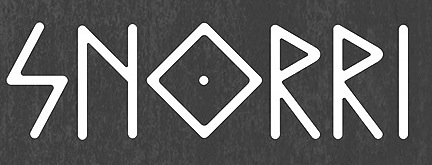 During his studies at SCAD in Savannah, GA, Chrius Turpen designed the elegant rhombic rune simulation typeface Snorri (2014). It is based on Icelandic and Nordic manuscripts and carvings. [
 Lille, France-based graphic artist who studied at ECV Lille. Designer of the vernacular typeface Montana (2014-2015), the hybrid typeface Bebas Android (2015), and the condensed sans typeface Gills (2014). Together with Edouard Spriet, he created the rounded organic sans typeface Kimono (2015) for wayfinding applications---it uses the circle as a basic building block and is developed with chromatic use in mind.
 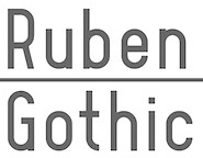 [
[ Graphic designer who started in Los Angeles, where he ran
  Born in 1986, David Rudnick is a graphic designer in the UK. He created quite a number of typefaces ca. 2013. These include:
 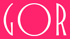 [
[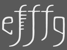 During her studies in Oslo, Edel Horne created the rune emulation font Fornminne (2015).
  French designer of
  Rome, Italy-based designer. In her Fontikon font project (2020), ishe has produced eight fonts, each with letters and culture symbols: Alchemy Complex, Adinkra Wisdom, Aztec Empire, Celtic Iron, Lovecraftian Neue, Japan Kamon, Viking Norse, Slavian Ustav.
  [
[
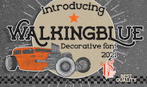 [
[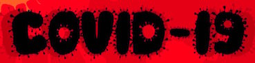 Cirebon, Indonesia-based designer (b. 1974) of the display typefaces Fatkids (2019), Greentea (2019), Biosi (2019), Tajam (2019), Prehistoric (2019: a Jurassic Park font), Piraka (2019), Mars (2019), Square (2019), Fire (2019) and Worm (2019).
  JC Fonts is the foundry, est. 2009, of
 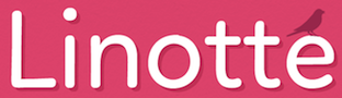 [
[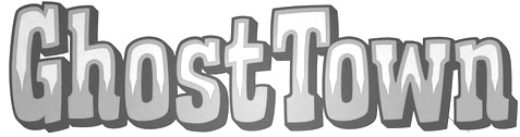
 [
[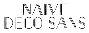 [
[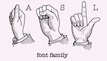 Roman Korolev (Kaer, Vologda, Russia) designed the wood stick brush typeface WoodStick in 2016.
 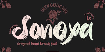 Bandung, Indonesia-based designer (b. 1982) of Masura (2016, brush style), Space Cake (2016, sci-fi style), Caroline Script (2016), Morning Fever (2016), Binzo (2016), Morning Cloud (2016, handcrafted), Rancha (2016: grungy style), Alkhali (2016), Gath Is A Robot (2015) and Scarlet (2015, textured typeface).
  Graduate of the Westerdals School of Communication in Oslo. Creator of a nice typographic logo called Reach (2010). She also created a high-contrast art deco typeface called
  Graduate of Escola Serra i Abella de l'Hospitalet de Llobregat, class of 2013. Graphic designer in Barcelona who created the antiqued typeface
  During his studies at Norges Kreative Fagskole in Trondheim, Norway, and at Solent University, Southampton, UK, Marcus Lien Gundersen designed these typefaces:
  [
[ Graphics cooperative in Philadelphia that sells some fonts. These include:
  Mehmet Reha Tugcu (Tugcu Design Company, Istanbul, Turkey) designed these typefaces:
  Graphic designer from Kragujevac, Serbia, b. 1988. She created the free fonts Mareke (2015, script), Wuggle (2015, handcrafted poster font), Omen (2011, a severe thunder-like face), and Miodrag (2011, a handwriting face).
  [
[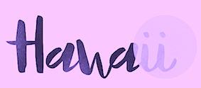 Graphic designer in Monterrey, Mexico, b. 1990, whose company is called Handcrafted Types.
 [
[ Charlottetown, Prince Edward Island-based designer of the
 [
[ [
[ Free original designs, often with a science fiction feel, by Neale Davidson (b. 1971). Does some custom font work.
  Peter Rempel (b. 1958) is a Winnipeg-based calligrapher.
 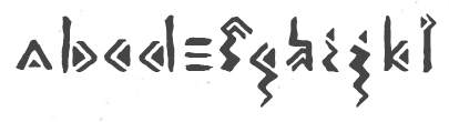 Bihac / Serajevo, Bosnia and Herzegovina-based designer of the free rough chiseled runic emulation typeface Land (2016), which was inspired by the Stecak monument and the old Bosnian script Bosancica. [
 During his studies in Trier, Germany, Rasselbock created FK Hoc (2015), FK Cut (2012, a cut paper dada typeface), FK Zeugma 2012, (an irregular eerie sans inspired by bad movie titling fonts from the 1930s), FK Futhark (2012, Germanic runes), FK Epiphany (2013, blackletter), FK Permutata (2013, an angular octagonal corporate typeface) and FK Neoz (2012, a smooth sans display family). In 2011, he designed FK Beo. [
 Type and graphic designer and art teacher, b. 1978, Lyon, France, who is based in Villeurbanne. He was artistic director at Crescend'O and curator of sifgners-book.com (2009-2018) and agfronzoni.com (2012-2018). His typefaces are mostly released at Frank Adebiaye's
  Ukrainian graphic designer. Designer of the free rune emulation font Rurik Viking (2021) for Latin and Cyrillic. In 2020, he published the free dystopian typeface Two Twenty. [
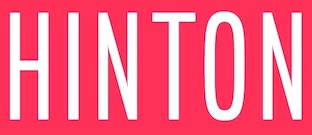 Dima Pole (Slovolitni de Grande Tartaria, Yalta, Russia) is a Russian type designer [as a joke, he claimed on Behance to be from Russellstown, Ireland and on Hellofont he said that he was in Berjozovskii, Iceland].
  Struvictory Art (Hrodna, Belarus) is run by Viktoryia Strukouskaya and
  Moscow-based illustrator specializing in vintage style, calligraphy, ornate crests and emblems. In 2014, Vates Design created the commercial copperplate script typeface Bodega Script and the engraved currency font Bold Price. In 2015, Vates added the copperplate gothic typeface Barracuda Display and the curly Austen Display. In 2016, they published the calligraphic chancery style November Script. Fonts from 2017 include Achievement (a brush script) and Black Spot (vintage style).
  Velvetyne Type Foundry (or
 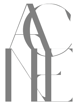 Karlskrona, Sweden-based designer of the rune simulation typeface Fort Wendy (2014), The Medic (2014), Coco Puff (2014), Maniac (2014: avant garde), Agony (2014: hairline circle-based experimental typeface), Acne (2014), and the hairline sans typeface Galacticastle (2014).
  [
[ Walden Font (est. 1997) sells historical typefaces&clip-art by Oliver Weiss from Winchester, MA. Walden's site includes a
  Prolific Barcelona-based type designer. He started out by creating the counterless hand-printed typefaces Woodcutter Dripping Nightmare (2012) and
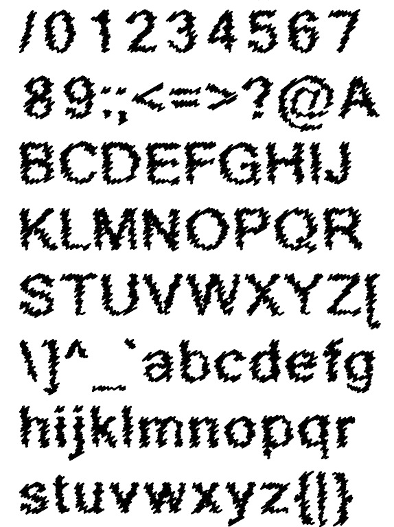
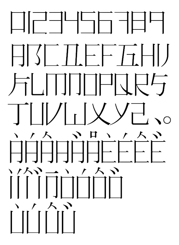
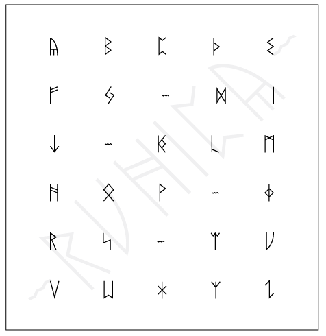
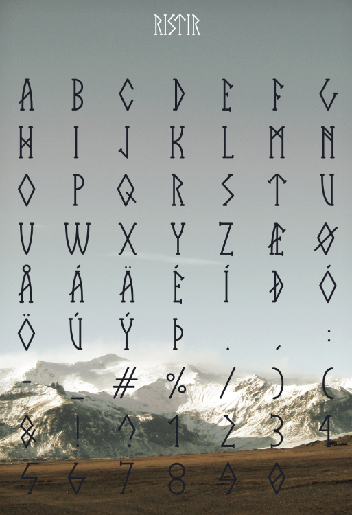
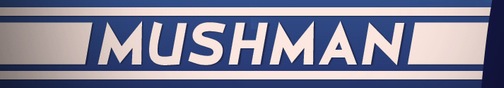
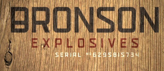
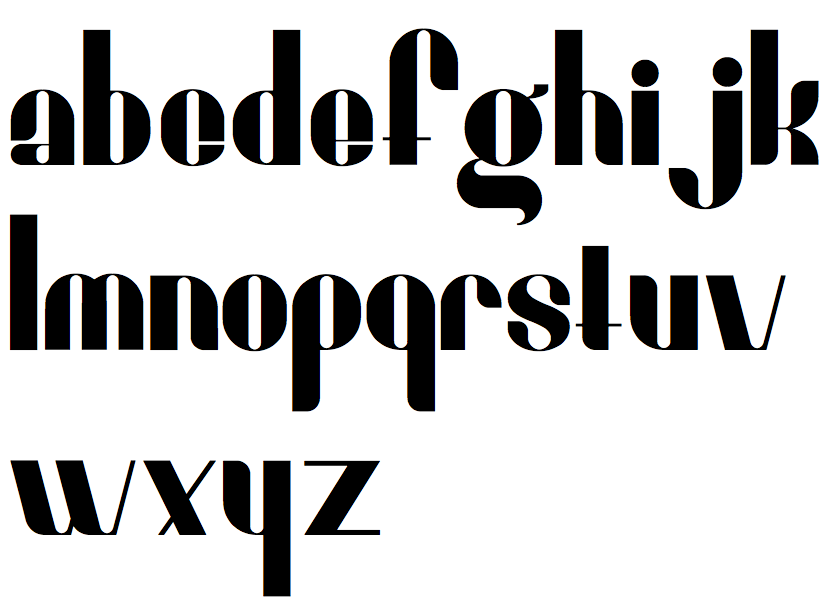
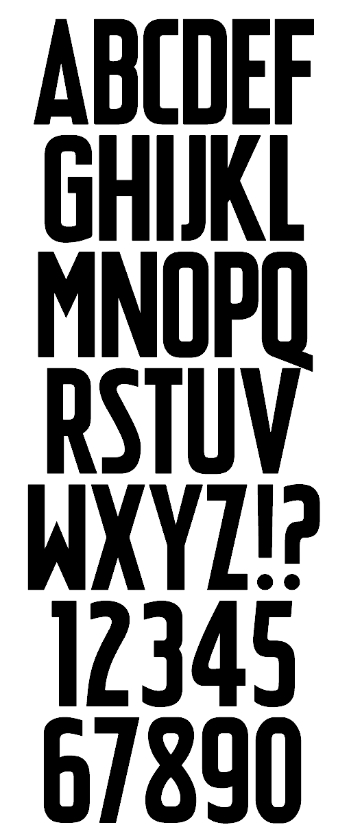
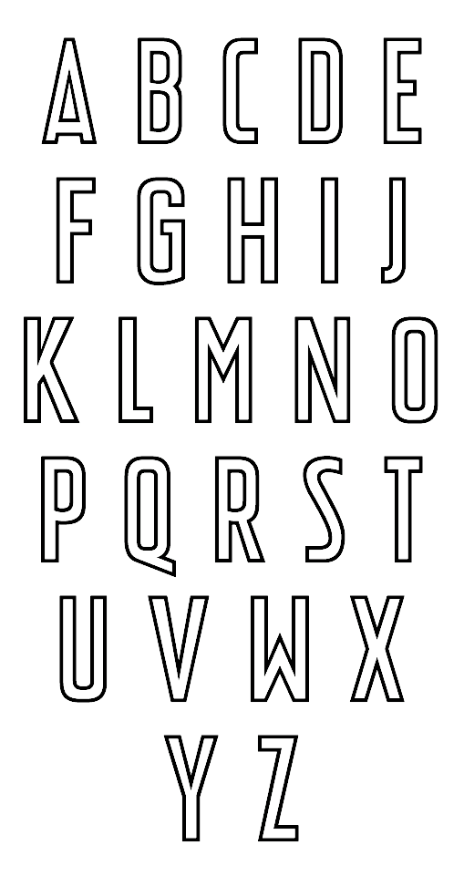
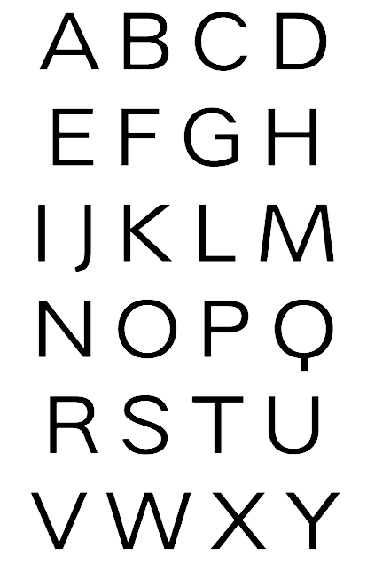
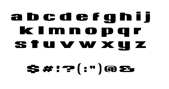
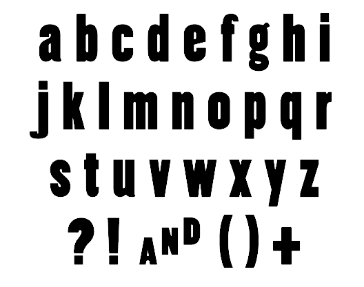
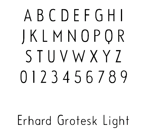
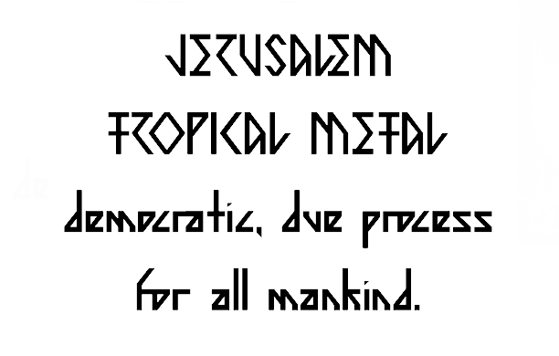
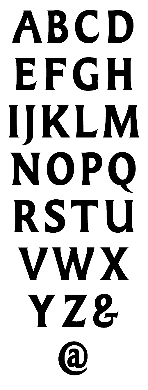
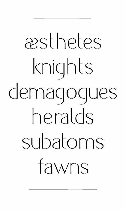
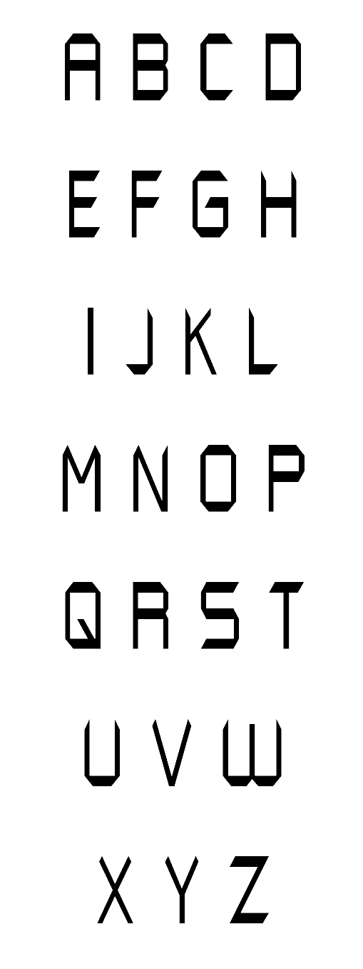
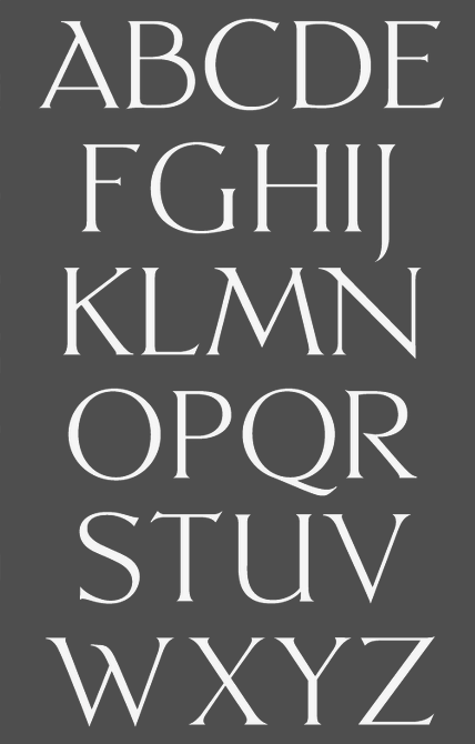
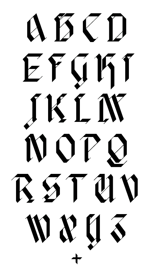
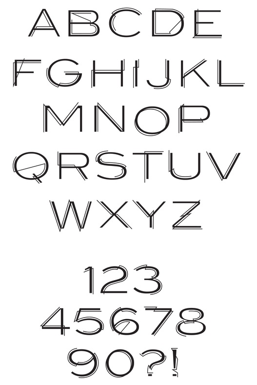
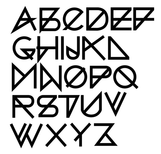
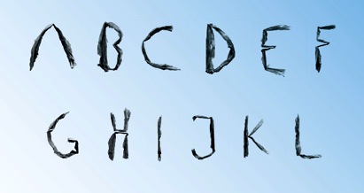
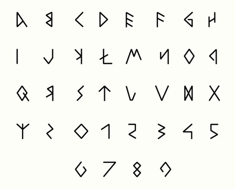
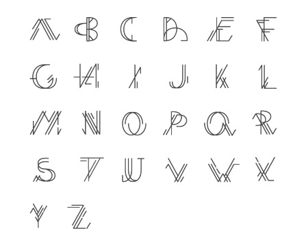
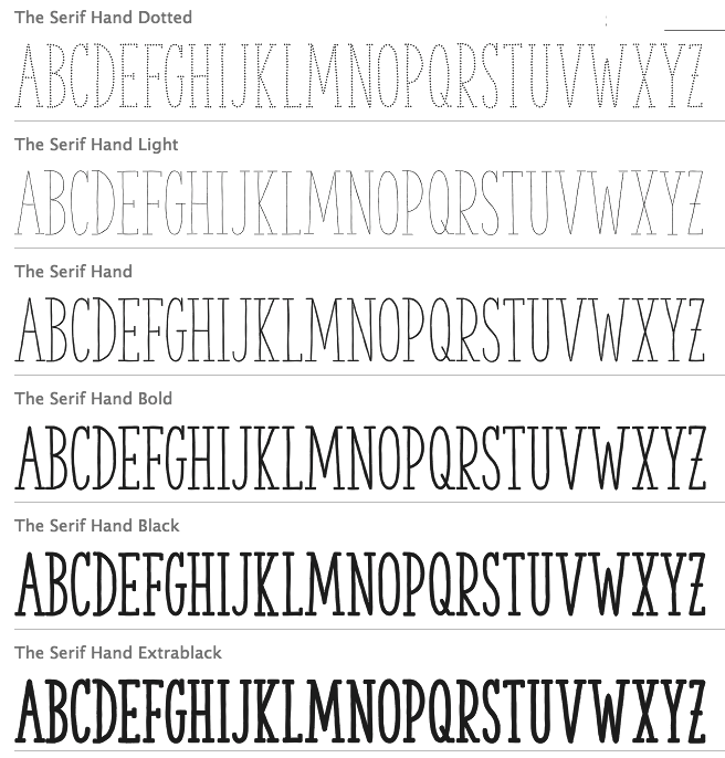
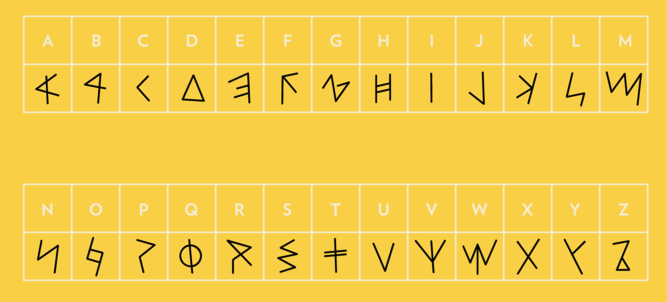
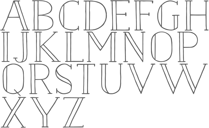
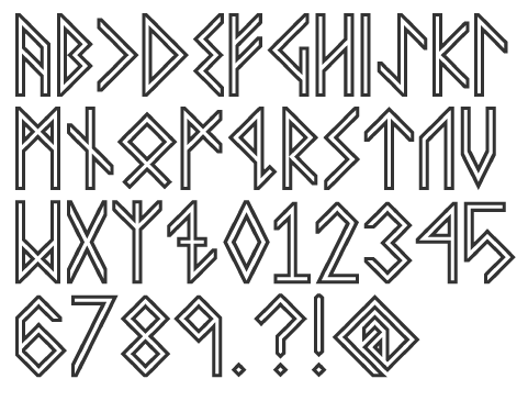
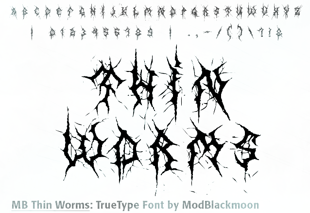
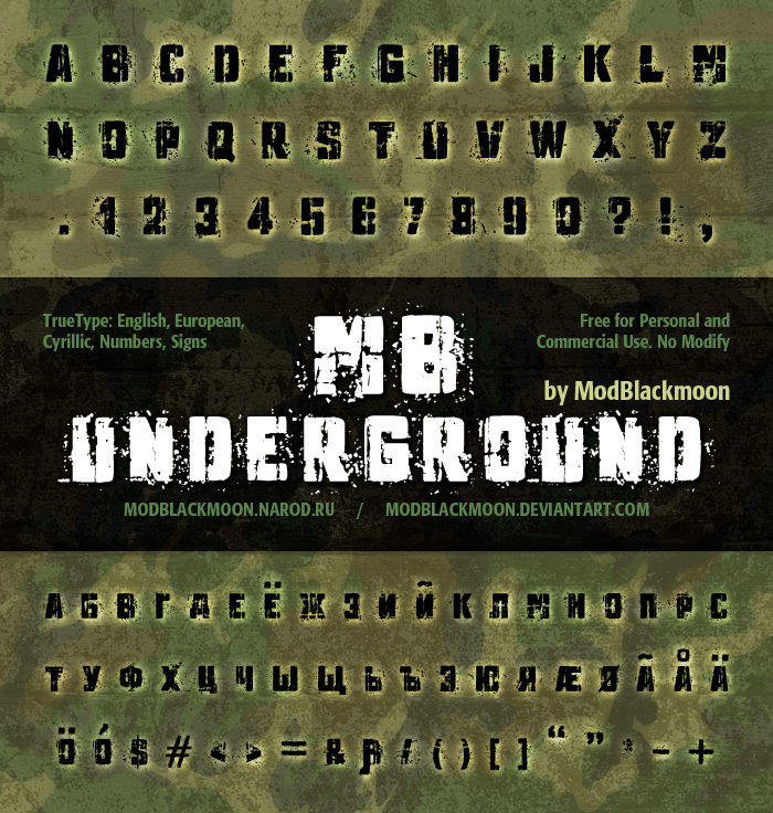
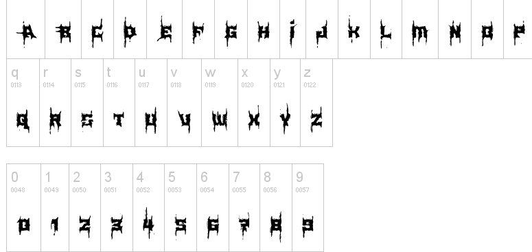
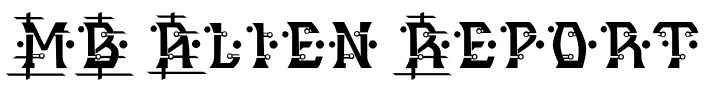
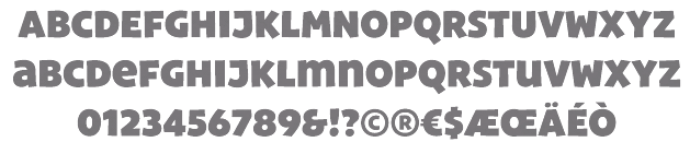
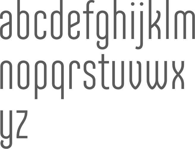
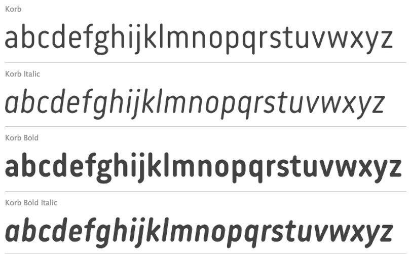
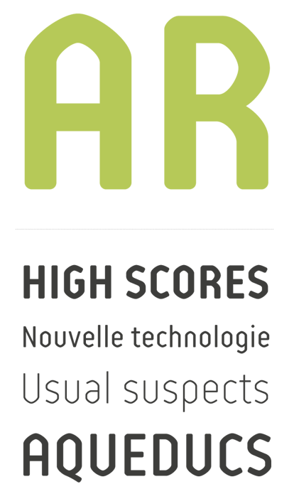
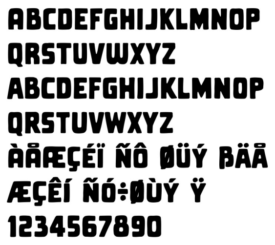
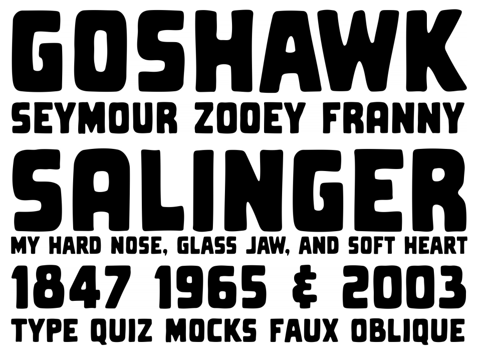
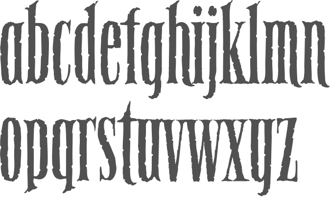
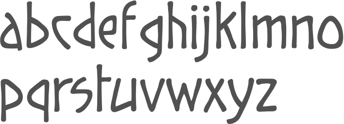
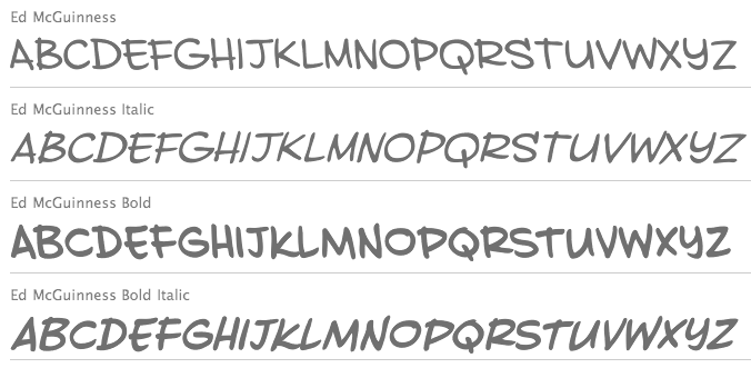
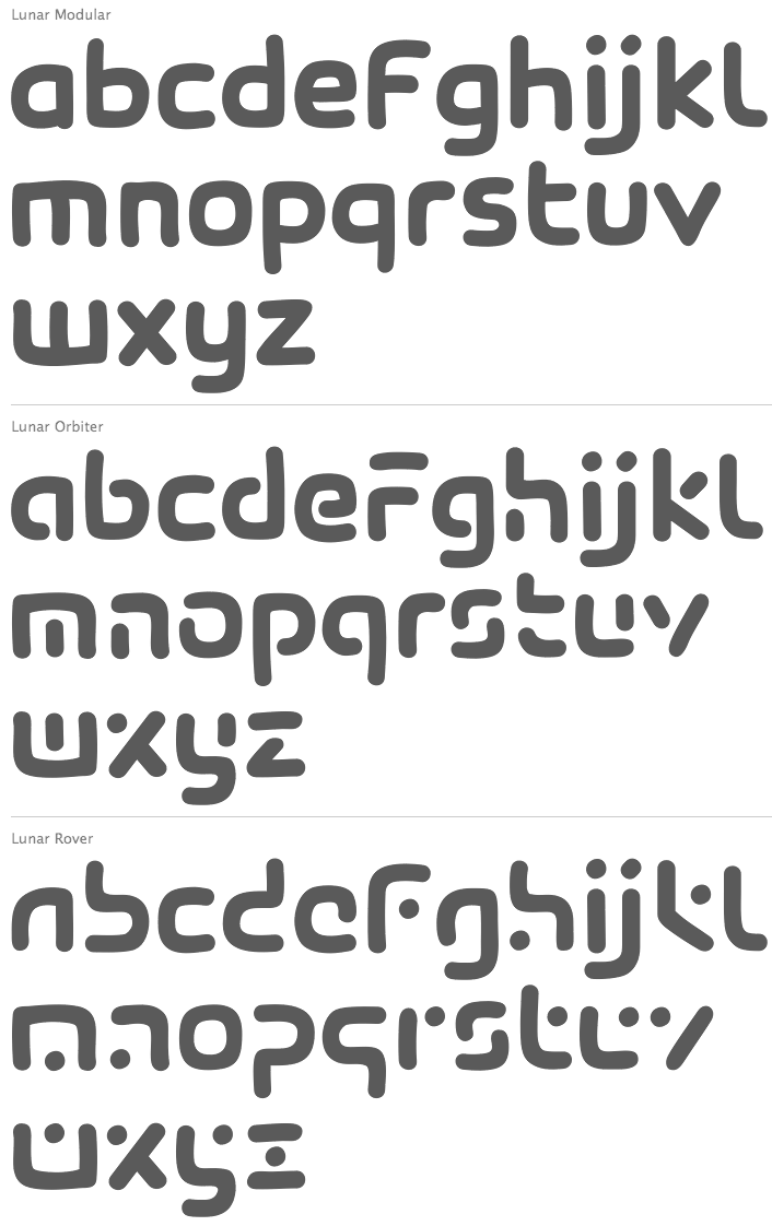
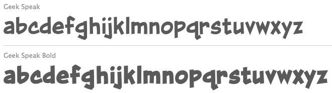
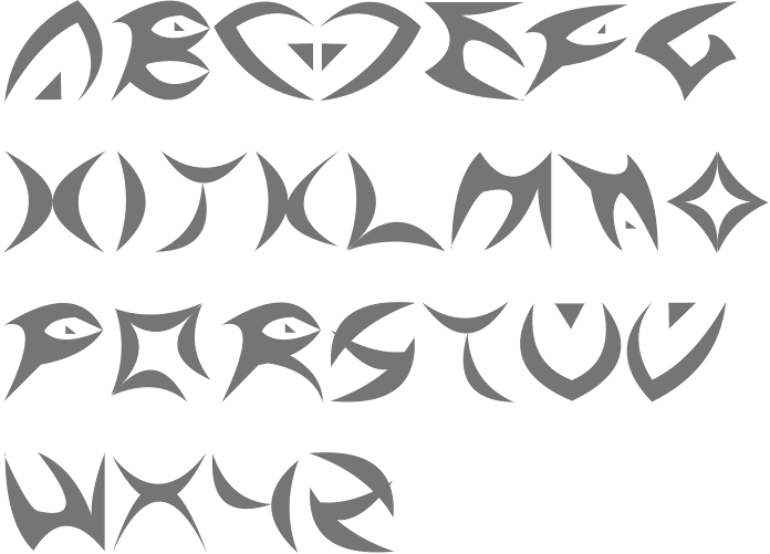
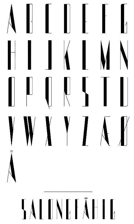
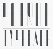
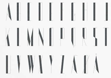
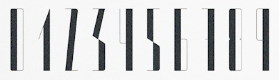
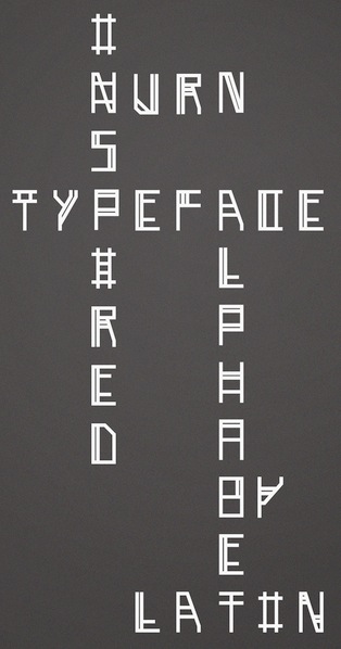
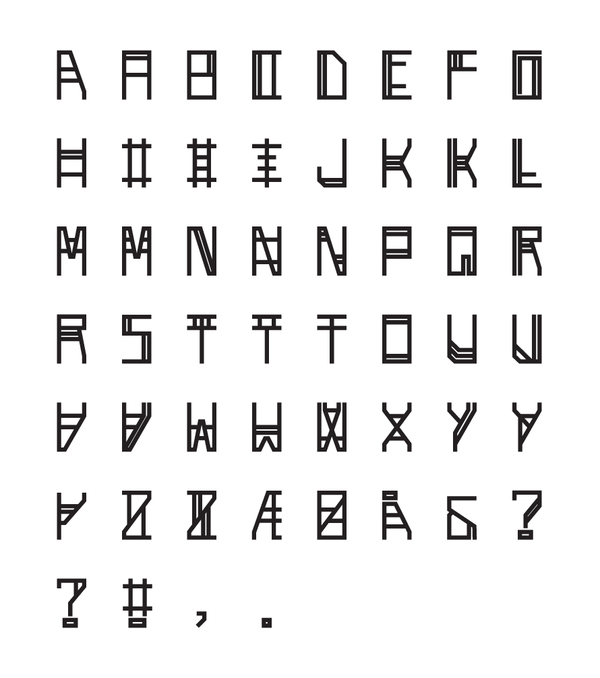
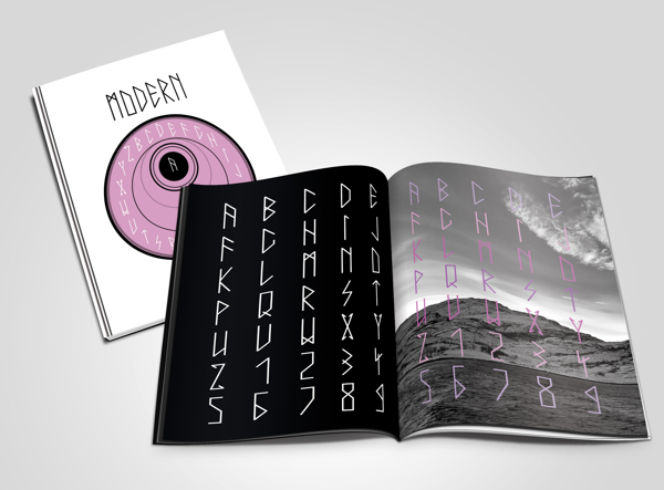
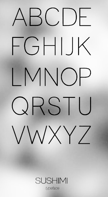
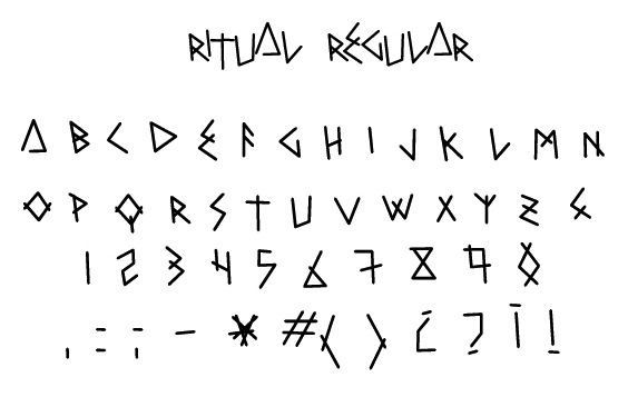
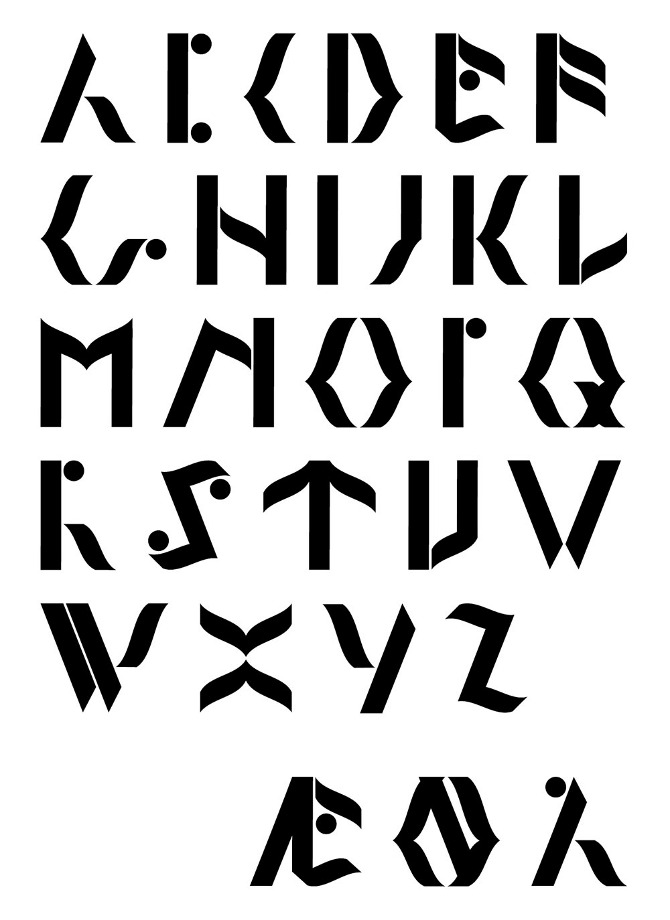
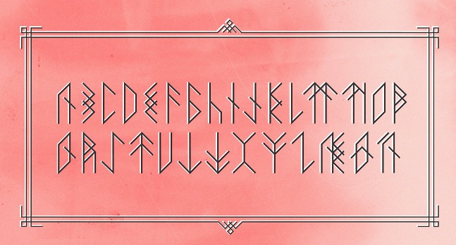
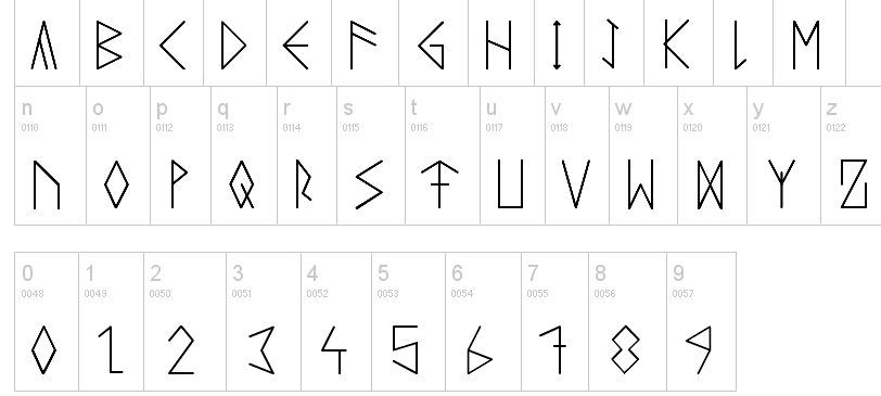
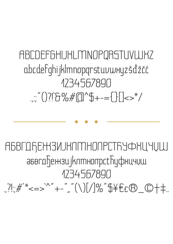
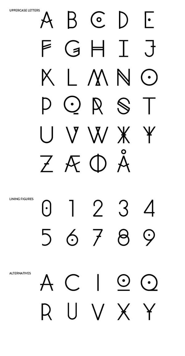
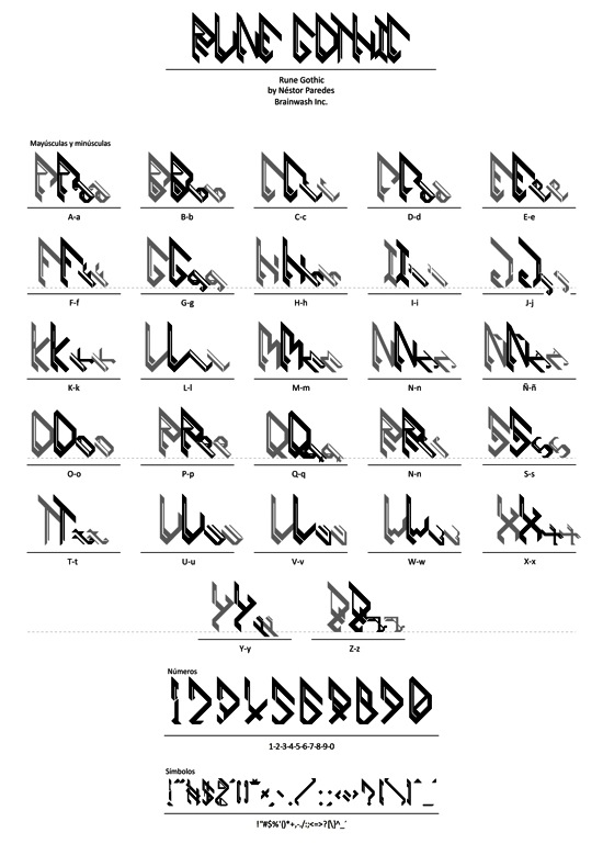
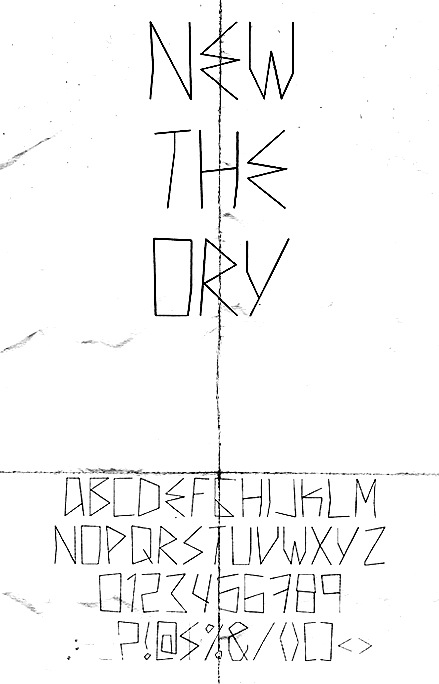
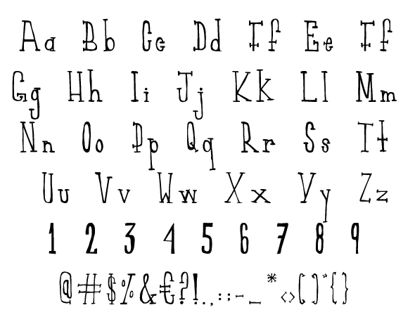
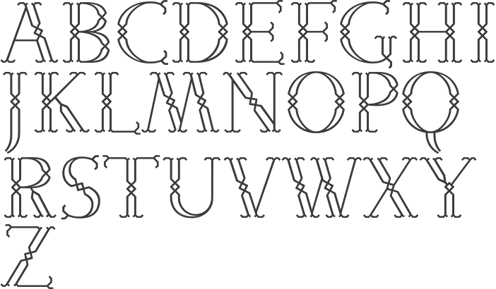
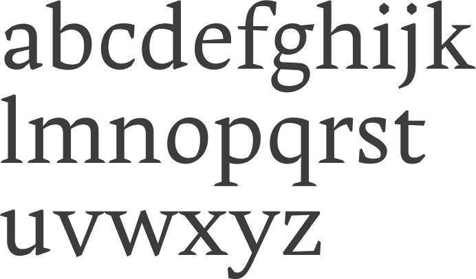
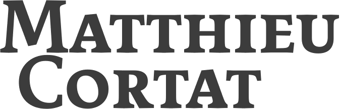
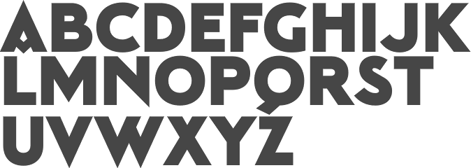
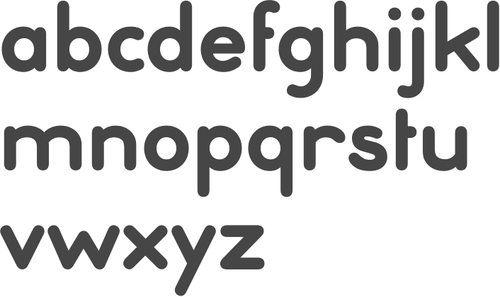
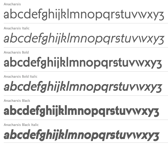
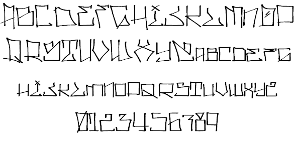
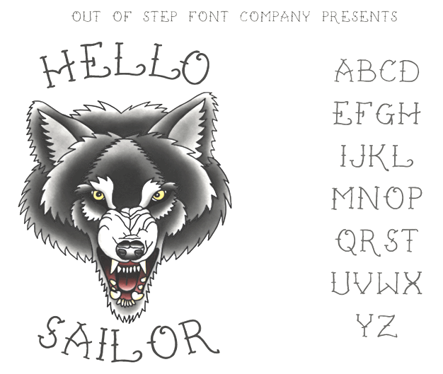
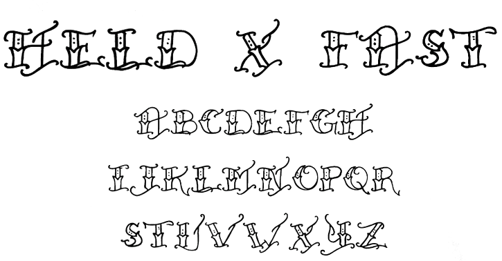
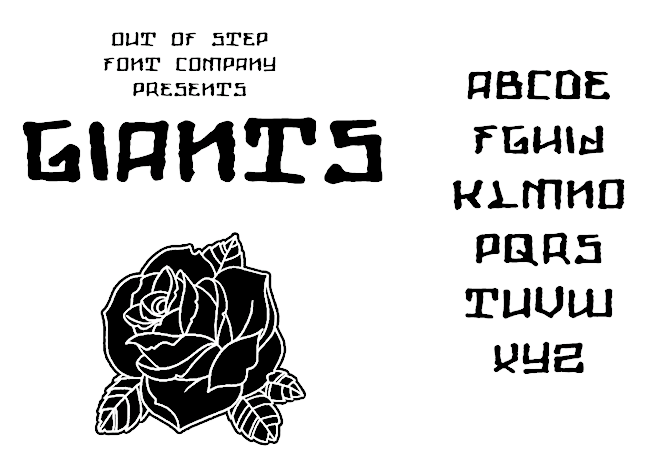
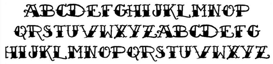
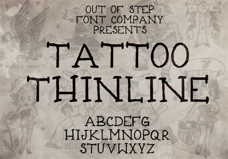
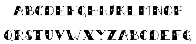
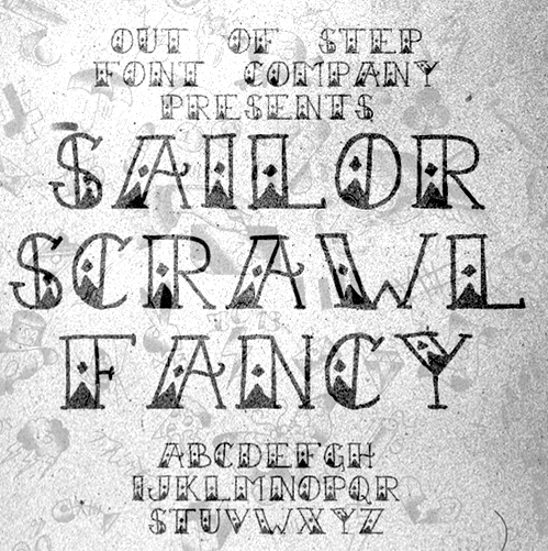
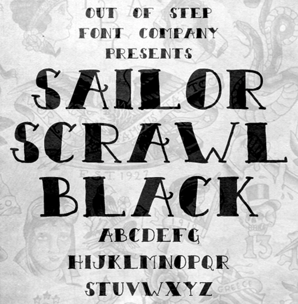
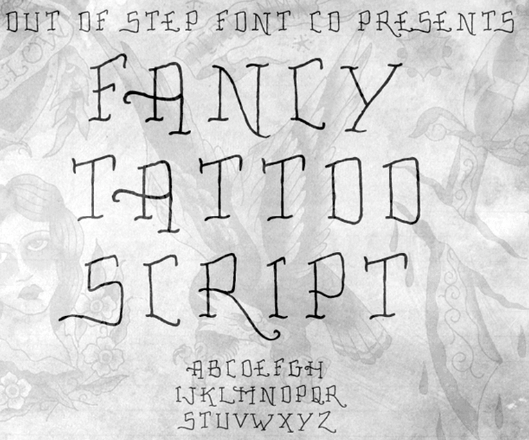
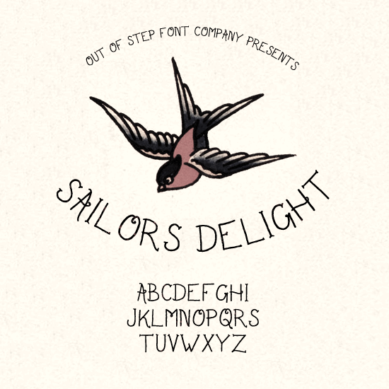
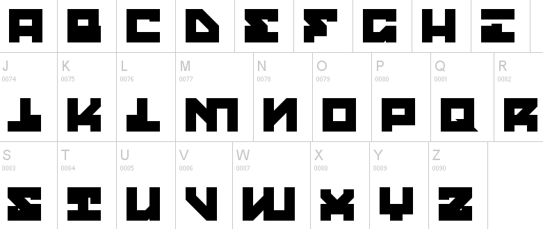
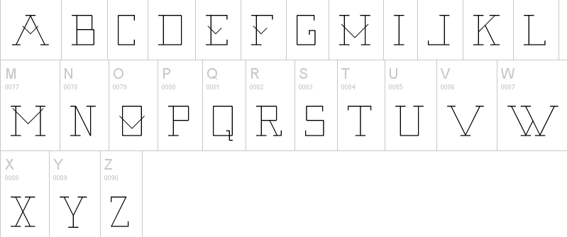
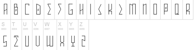
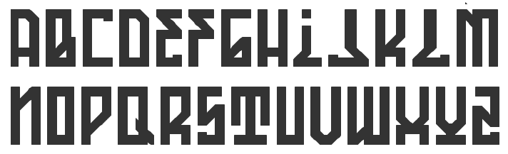
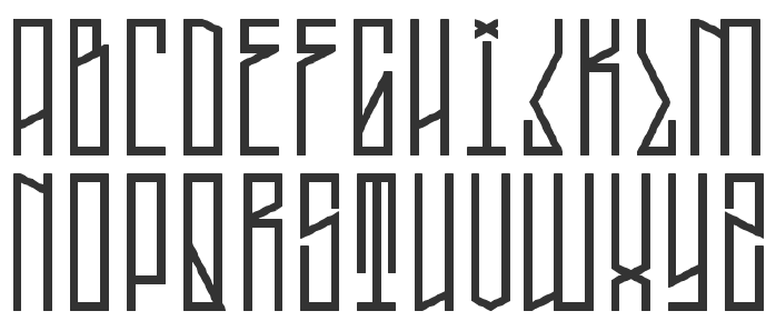
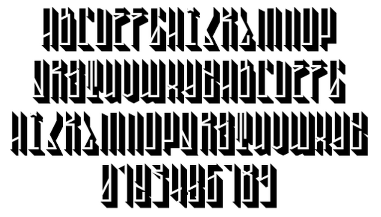
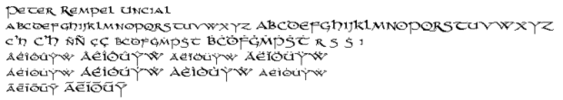
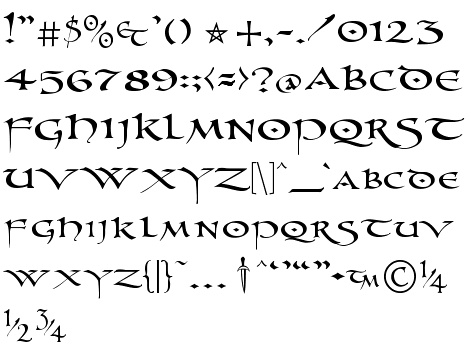
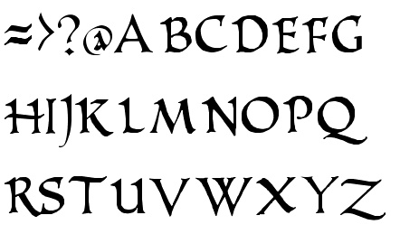
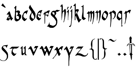
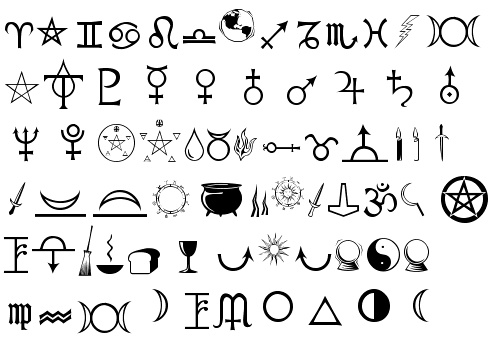
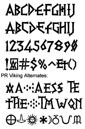
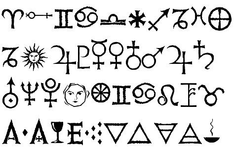
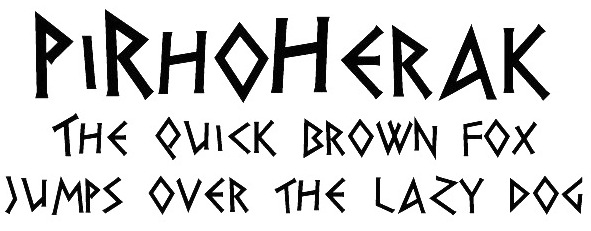
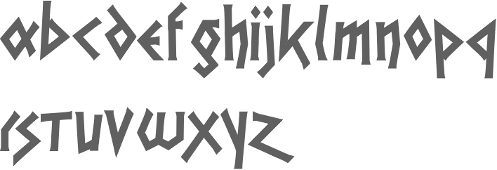
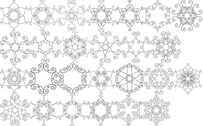
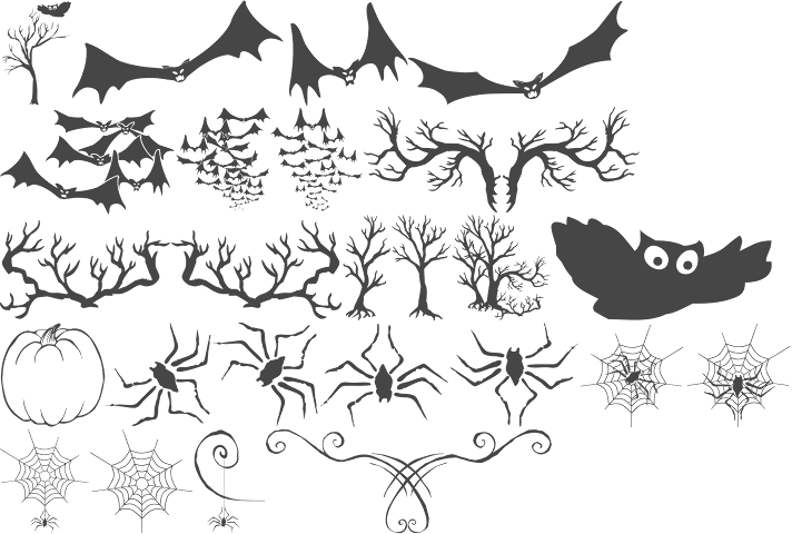
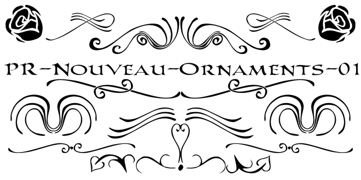
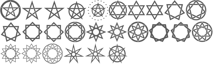
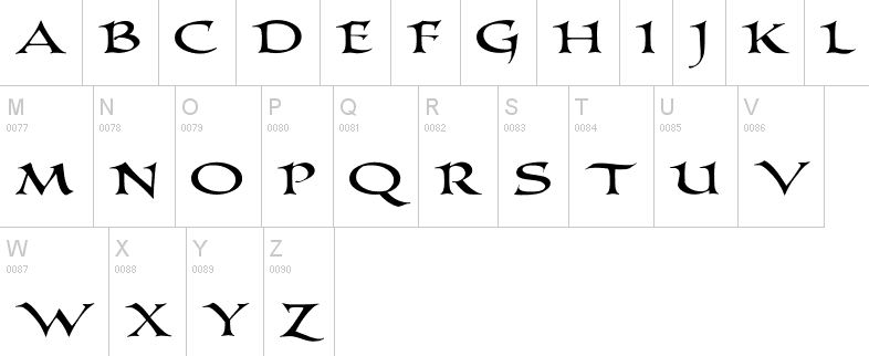
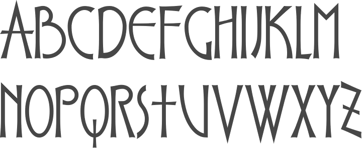
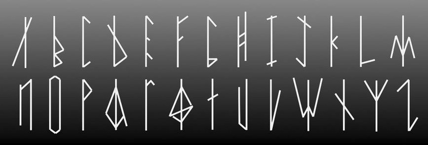
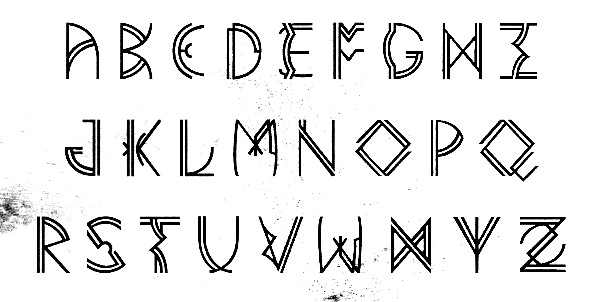
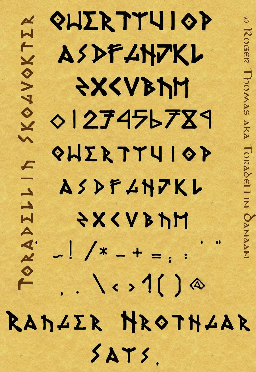
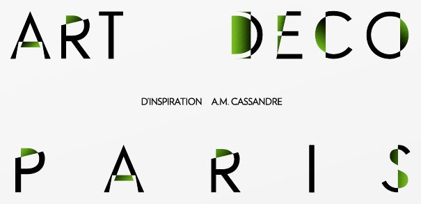
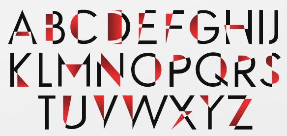
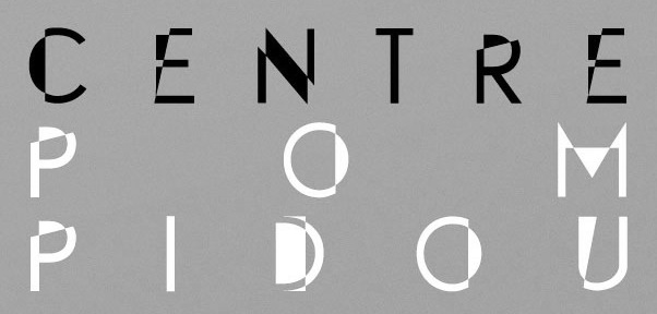
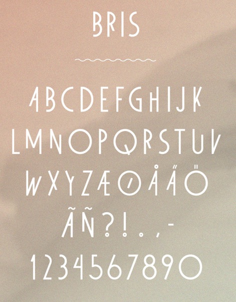
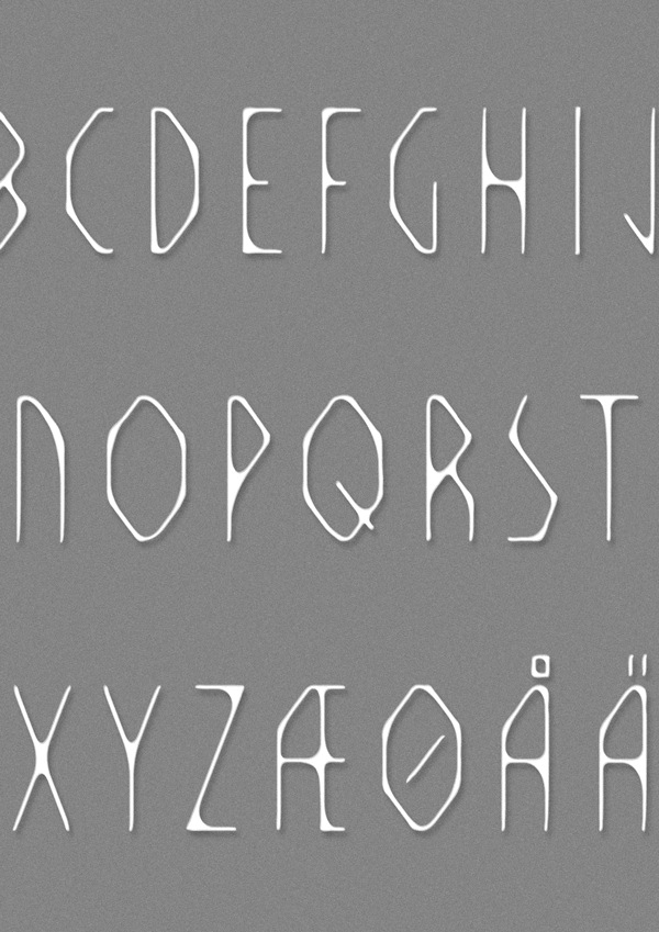
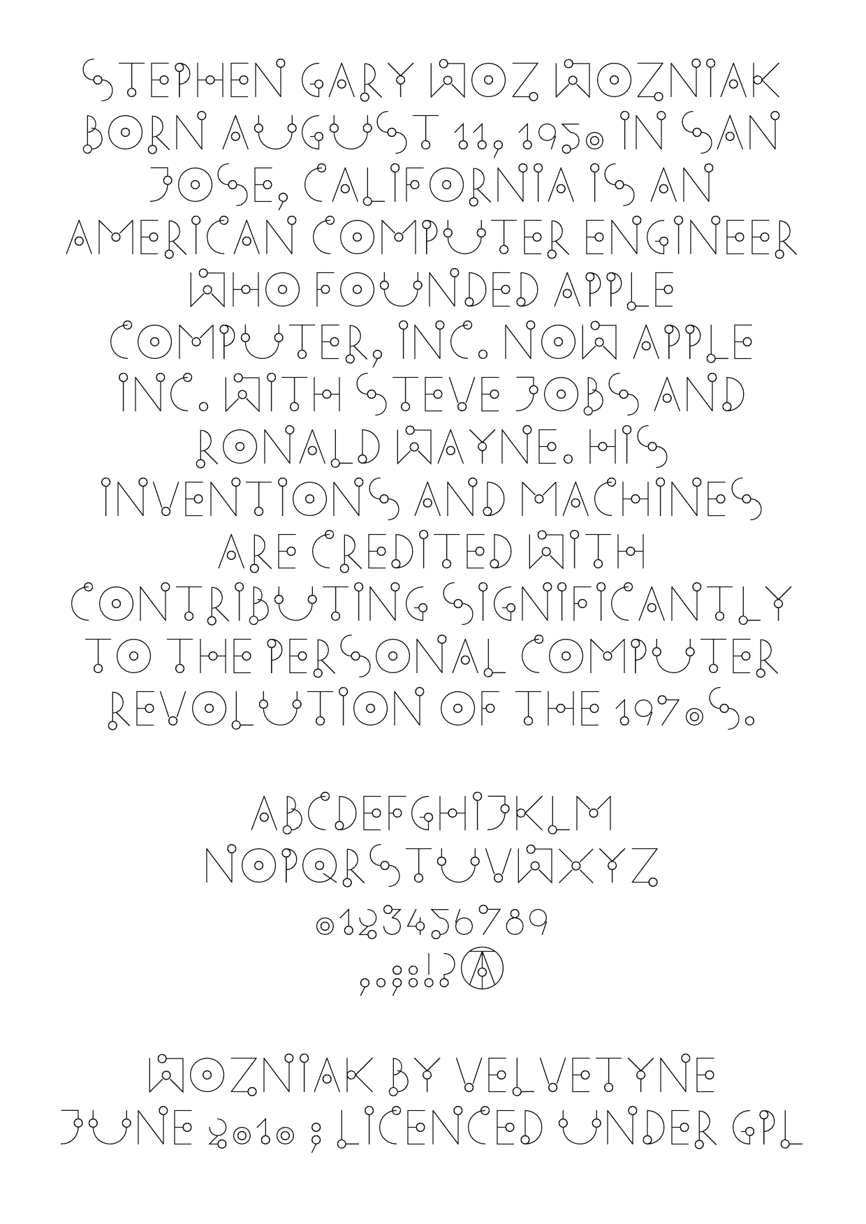
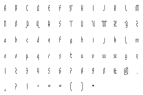
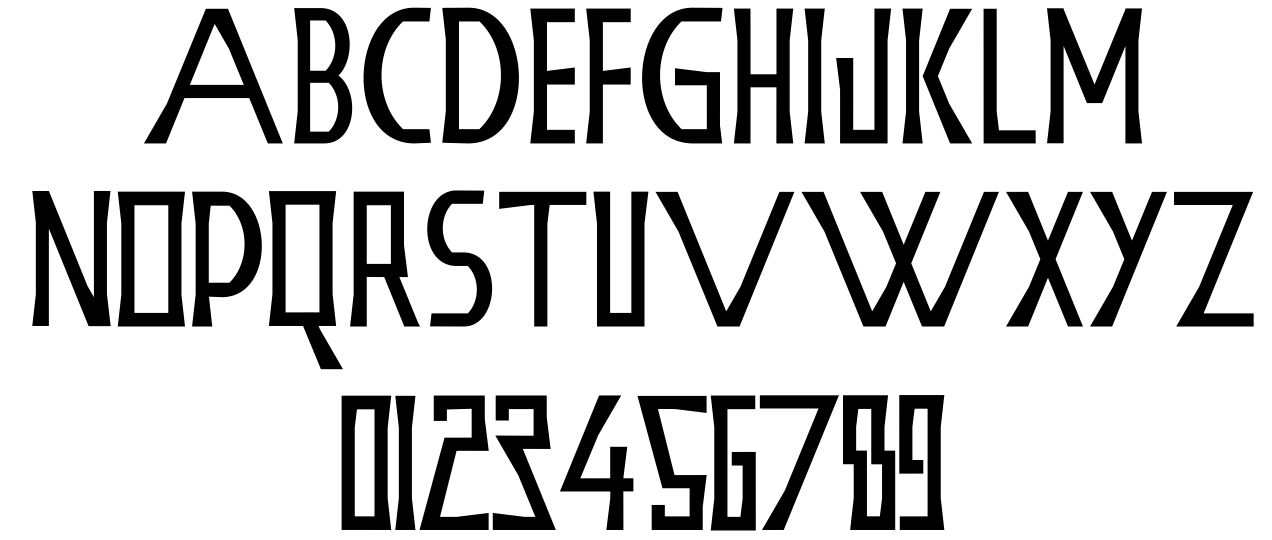
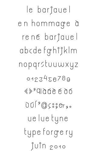
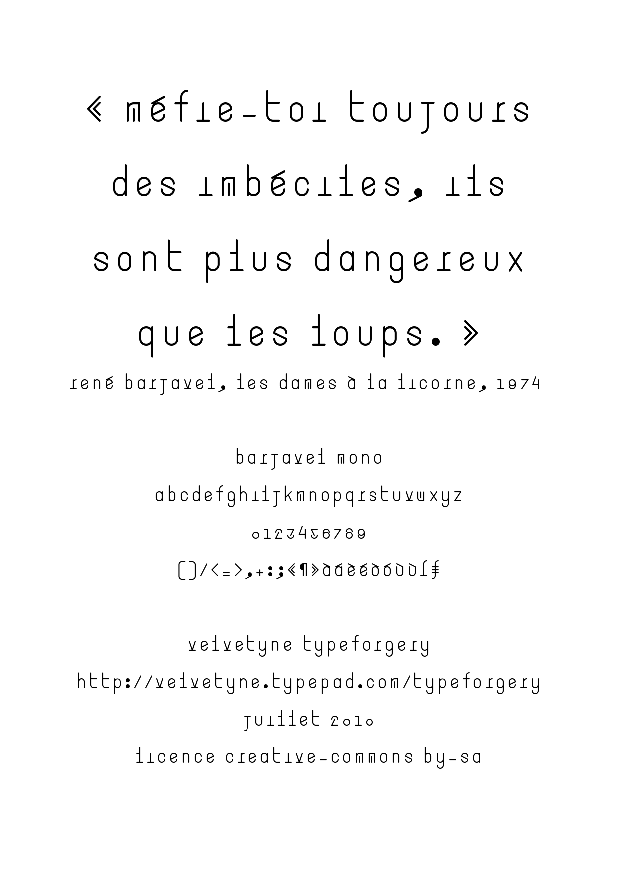
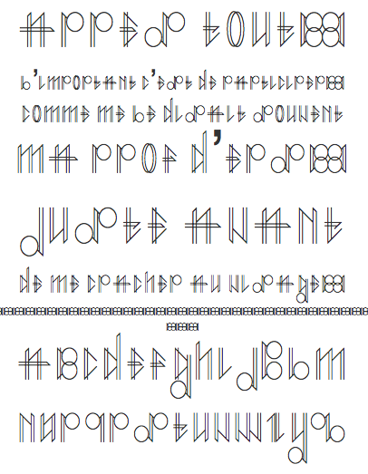
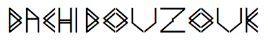
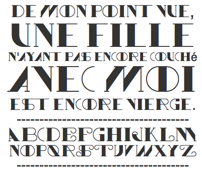
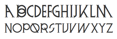
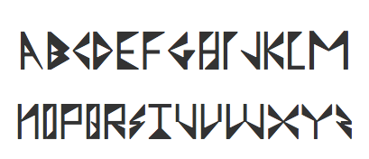
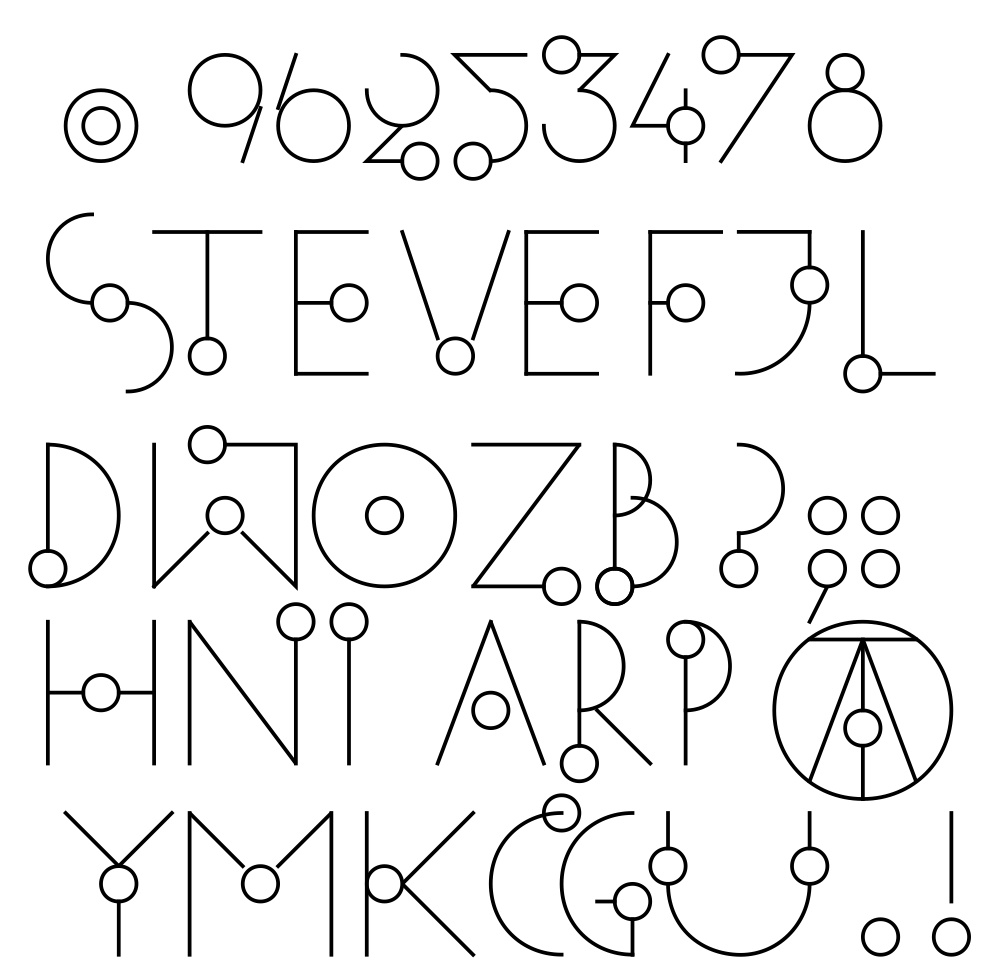
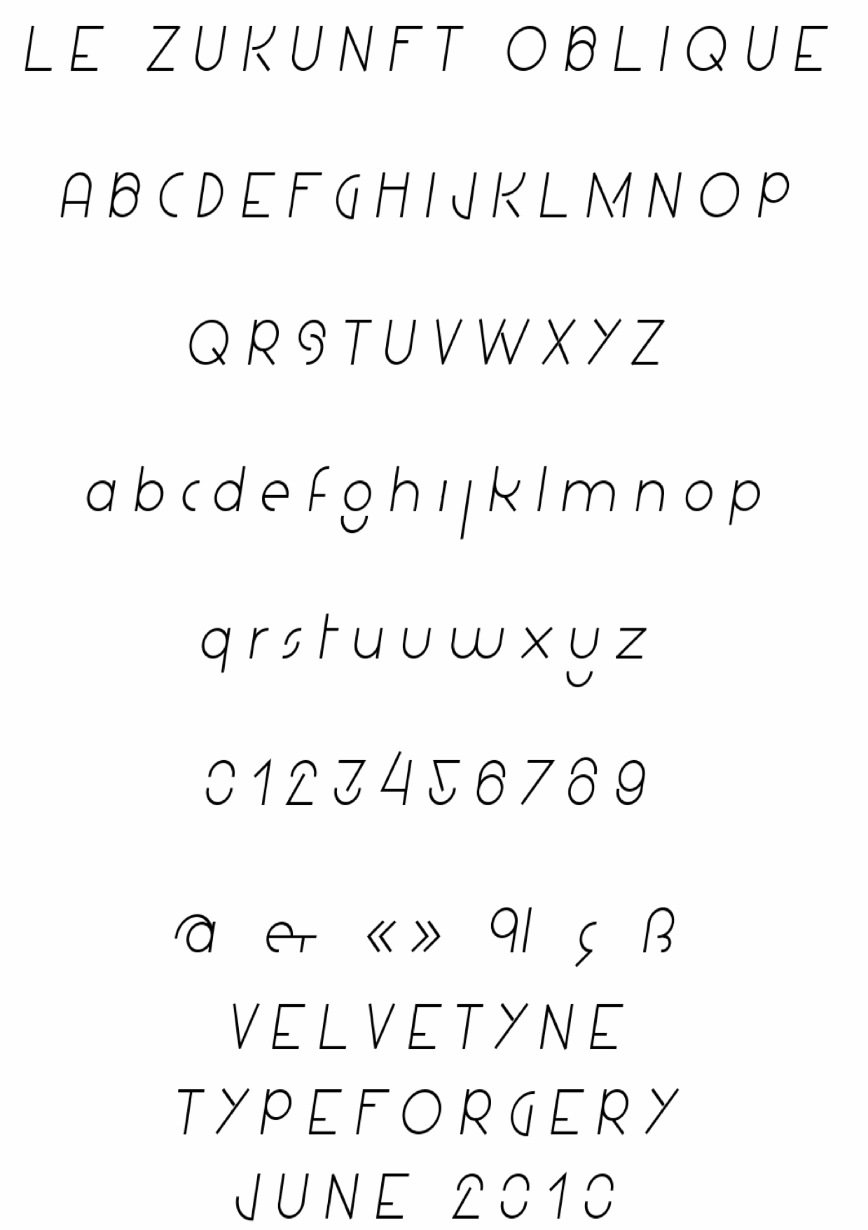
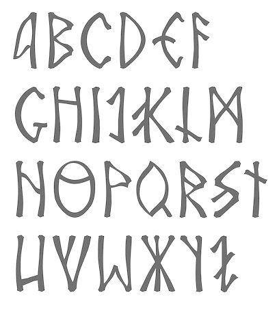
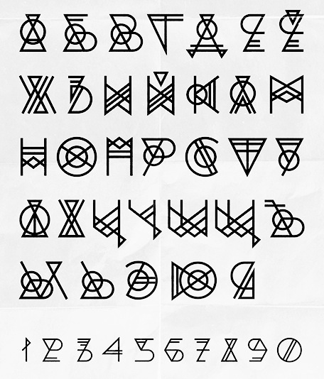
|
|
|
|