| | |
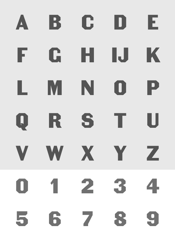
Actiontype.de
[Tanja Diezmann]
|
German designers of some experimental 2d and 3d fonts, under the guidance of Professor Tanja Diezmann from the Hochschule Anhalt in Dessau. Fonts include Isometrie (sans), Actiontype Bold (3d), Actiontype Light, Actiontype Serif (slab serif). Using these fonts as base models, several random fonts were constructed by interpolation. Actiontype is managed by Marcus Schaefer in Dessau. [Google]
[More] ⦿
|
Adrian Robert
|
Adrian Robert's pages with links on random generation of images (using iterated function systems, or fractals), including a bit of material on random font generation. He wrote the free program "randim". [Google]
[More] ⦿
|
Ananda Das on type 3
|
Ananda Das tells the type 3 story: Type 3 is an almost-obsolete format once very popular because it was the only way for non-Adobe folks to produce PostScript fonts in the old days. The font technology was generally considered inferior because it did not allow hinting to make the fonts reproduce well on 300-dpi laser printers, although they generally were fine on filmsetters. Adobe kept the proprietary secret of how to make Type 1 fonts to themselves, so that they could sell the best-looking fonts. This, together with Adobe's then-high royalties for PostScript itself, annoyed Apple and Microsoft, so they developed TrueType as an alternative to PostScript. Learning of this development, Adobe's John Warnock publicly released the Type 1 spec so that anyone could make such a font. Thereafter, almost no Type 3 fonts were ever made. But Type 3 fonts did have some capabilities of their own, not shared with Type 1 fonts. They allowed shading and textures, as well as "random" substitution of particular glyphs, as Alan rightly pointed out. If you want to see some Type 3 fonts, they are probably still widely available at FTP freeware/shareware sites, usually under "PostScript" headings, sometimes under "PostScript Type 3". [Google]
[More] ⦿
|
Andreas Seidel
[astype.de (or: Astype)]

|
 [MyFonts]
[More] ⦿
[MyFonts]
[More] ⦿
|
Angela Riechers
|
Angela Riechers has an MFA in Design Criticism from SVA in New York City. She is an art director and writer and the coordinator of Typography as Language: Theory and Practice, an SVA Summer Residency Program. Author of Random Characters: The Past, Present and Future of Generative Typography (Visual Arts Journal, Fall 2016 issue). Her examples include randomized typefaces, programmed typefaces, dynamic typefaces and parametric fonts. [Google]
[More] ⦿
|
Antonio Roberts
|
Birmingham, UK-based Antonio Roberts (aka Hellocatfood) wrote a program called glitch that will replace a certain portion of the font data by random values, esulting in glitch typefaces. A prototype example was called Dataface (2012, free at OFL). OFL link. [Google]
[More] ⦿
|
astype.de (or: Astype)
[Andreas Seidel]
|
 Astype.de is a German foundry started in 2003 by illustrator and type designer Andreas Seidel (b. 1975, bad saarow, near Berlin, Germany). He lives in Cottbus, Germany. In 1998, he obtained a Masters degree in business administration. In 2007, he and Ingo Preuss set up The German Type Foundry. In 2017, he joined the initial crew at Fust & friends. The typefaces:
 - One of his first typefaces was Crayfish (originally a URW font, but withdrawn by Seidel from URW in 2002). Crayfish is a display type originally designed for an American Football club. The Crayfish typefaces are sold as Thunder Bold and Titan Bold.
- Check his nice weather symbols (not a font).
- He finished Ornaments Thanksgiving and the great ASTYPEOrnaments-WineGrape A (2004).
- He is working on 14th century initials (2003).
- He created Sattler (2003): Joseph Kaspar Sattler, one of the great German art nouveau artists created these nice initials in 1897 for the famous royal monumental book project Die Nibelunge for the Reichsdruckerei Berlin. Only 200 exclusive signed masterpieces were printed in four years from 1900 till 1904. Joseph Sattler was the art director, type designer and designer in one person. The Reichsdruckerei showed samples of the unfinished work in 1900 at the world exhibition in Paris to advertise the high craftsmanship of the German presses.
- He made Heraut (2003), an art nouveau lettering typeface based on a 1901 design of Hermann Hoffmann called Herold Reklameschrift.
- He created Sveva AS Versal (2003, art nouveau).
- About Missa Solemnis, he writes: Solemnis was designed by Günter Gerhard Lange and first cut in metal 1953 (this is the date he quotes himself, other sources mention 1950 or 1952). It seems to be one of his earliest typeface designs that he had done as a freelancer for H. Berthold AG in Berlin. [...] Missa Solemnis AS is a new, remastered and extended version of Mr Lange's typeface. The font is available in the OpenType format and comes in two styles: 1953 and 2003. The 1953 style contains all characters of the original metal type, as well as a few additions. [...] The 2003 cut is more delicate and makes extensive use of the OpenType format. It contains over 650 glyphs, covering Roman-based languages of Western and Central Europe. His Solemnis inspired Simeon AS (2003), a 650-glyph uncial style face.
- In 2004, he created Missale Incana, an interpretation of a typeface from Herbert Thannhaueser.
- Still in 2004, he created ASTYPE Ornaments Christmas A2 and ASTYPE Ornaments Christmas A. These were followed in 2005 by ASTYPE Ornaments Christmas B.
- He made Missale Lunea (2004). This has astroligical symbols, moon phases and medieval characters.
- In 2005, the exquisite calligraphic script typeface Gracia was added, consisting of Gracia No. 44, 45, 54 and 55 (graceful calligraphic script), and Gracia Solo.
- Paola is a redesigned, new interpretation of a brush typeface from Carl Rudolf Pohl.
- He made Adana (2005): The roots of Adana going back to the year 1930, to the Berlin-based German graphic designer Wilhelm Berg. His typeface can be interpreted as an answer to Lucian Bernhards Schönschrift. The Initials are nearly close to the original drawings but the Circular typeface was changed dramaticly. Excentric, unusual forms and loops were changed to fit todays needs. Due to the lack of a corresponding Roman letter form, the Regular version was designed including small caps, fitting the contrast and swinging shapes of Adana Circular. Both typefaces play well together in all kinds of adverts, as well with designs like Bodoni or Didot.
- Alea AS Initials (2005) is a floral faced based on the drawings of Maria Ballé.
- Taiko (2006). A revival of Otto Arpke's Arpke Antiqua (1928, copperplate).
- ASTYPE Ornaments Accolades A (2007), and ASTYPE Ornaments Accolades C (2011).
- GTF Toshna Std (2008, German Type Foundry) is a garaldic type family in three optical weights, after a 1955 family called Tschörtner-Antiqua by Hellmuth Tschörtner that was very popular in the DDR.
- Secca (2009, German Type Foundry) is a simple sans family rooted in early German grotesque type designs. See also Secca Soft (2014) and Secca Stencil (2015).
- Nepos (2010) is an experimental modular type kit consisting of ready-made typefaces and a set of special BUILD fonts to build your own letters and ornaments. These BUILD fonts can be used on layers with different colors and overprinting for special effects. The effects like Antiplex can be considered as kitchen tiles. There are also color inversions and stencil types.
- Secca Saloon (2011) is a versatile ornamental Western family.
- Popsil (2011) is a white-on-black hand-printed poster face.
- Ademo (2011) is a classic shaded layered 3d caps face, based on two typefaces designed by Carl Albert Fahrenwaldt that were published in 1931-1932 by Schriftguss AG.
- Wood Bonnet Antique No.7 (2012) is based on real vintage wood type blocks from Switzerland.
- VTG Stencil US No. 4 (2012) is based on plate US No. 4 from New York Stencil Works. This revolving stencil-plate was invented by Eugene L. Tarbox and patented in 1868. The military stencil fonts VTG Stencil US No. 2 (+Ornaments), VTG Stencil US No. 51, VTG Stencil UK No. 76, VTG Stencil Germany No. 101 (2014, modeled after historic blackletter stencil plates from Bavaria), and VTG Stencil US No. 72 followed in 2014. In 2016, he added Vtg Stencil DIN.
- VTG Stencil Germany No. 1 (2013) is a set of nicely executed didone stencil typefaces based on real models used in Germany from 1871-1918 and later. There is a Sketch style.
- Wood Poster Eight (2015) is a free wood type slab serif.
- Alea Initials (2017, floriated caps).
- Wood Bonnet Grotesque No 4 (2017).
- The Vtg Stencil France series (2017) in substyles Vtg Stencil France No1, Vtg Stencil France No3 and No. 5.
- The expressionist typeface Alarm (2017, Fust & Friends), which is based on an old design of Heinz König also called Alarm (1928, at Trennert).
- Presto (2017, Fust & Friends), a revival of a script by Helmut Matheis (1970).
- Vtg Stencil Italy No2 (2018).
- Rocaie (2018). Decorative caps base on antique rococo letters from a gilding workshop.
- Wood Heinz No.4 (2019). Wood Heinz No.4 offers up to four printed look variations of all the Latin base letters and figures. An OpenType letter rotator is programmed into the fonts to emulate the randomness of wood type printing. Also: Wood Heinz No.2 (2019).
- Missale Solis (2019). An uncial typeface that overhauls Missale Lunea (2004).
- Vtg Stencil UK No2 (2019).
- Vtg Stencil Marsh (2020). Based on one inch stencils, cut by a Marsh machine. Marsh was an American stencil machine maker in the 1920s.
- Bonnet Grotesque Narrow (2020). A condensed grotesque family.
Behance link. Creative Market link. Fust & Friends link. Klingspor link. Home page. See also here. View Andreas Seidel's typefaces. [Google]
[MyFonts]
[More] ⦿
|
Bernard Desruisseaux
[MetamorFont]
|
[More] ⦿
|
Caligraft
[Ricard Marxer Piñón]
|
Beautiful (programmed) experimental letters derived from fonts. This is based on the Masters Thesis in Digital Arts, obtained in 2005 by the Catalan designer Ricard Marxer Piñón, 2006. For this, he wrote the "Geomerative" library of programs, which includes a truetype importer and interpreter. Alternate URL. [Google]
[More] ⦿
|
Christian Schwartz
|
 Christian Schwartz was born in 1977 in East Washington, NH, and grew up in a small town in New Hampshire. He attended Carnegie Mellon University in Pittsburgh, Pennsylvania, where he graduated in 1999 with a degree in Communication Design. After graduation, he spent three months as the in-house type designer at MetaDesign Berlin, under the supervision of Erik Spiekermann. In January 2000, he joined Font Bureau. Near the end of 2000, he founded Orange Italic with Chicago-based designer Dino Sanchez, and left Font Bureau in August 2001 to concentrate full-time on developing this company. Orange Italic published the first issue of their online magazine at the end of 2001 and released their first set of typefaces in the beginning of 2002. Presently, he is an independent type designer in New York City, and has operated foundries like Christian Schwartz Design and Commercial Type (the latter since 2009). He has designed commercial fonts for Emigre, FontShop, House Industries and Font Bureau as well as proprietary designs for corporations and publications. In 2005, Orange Italic joined the type coop Village.
 His presentations. At ATypI 2004 in Prague, he spoke about "The accidental text face". At ATypI 2006 in Lisbon, he and Paul Barnes explained the development of a 200-style font family for the Guardian which includes Guardian Egyptian and Guardian Sans. FontShop's page on his work. Bio at Emigre. At ATypI 2007 in Brighton, he was awarded the Prix Charles Peignot. Jan Middendorp's interview in October 2007. Speaker at ATypI 2009 in Mexico City, where he announced his new type foundry, simply called Commercial. FontShop link. Font selection at MyFonts. A partial list of his creations: - FF Bau (2001-2004): Art direction by Erik Spiekermann. Released by FontShop International. He says: Bau is based on Grotesk, a typeface released by the Schelter&Giesecke type foundry in Leipzig, Germany at the end of the 19th century and used prominently by the designers at the Bauhaus. Each weight was drawn separately, to give the family the irregularity of the original, and the Super is new.
- Neutraface (2002, House Industries) and Neutraface Condensed (2004). Art directed by Ken Barber and Andy Cruz. MyFonts offers Neutraface Slab Text, Neutraface Slab Display, Neutraface Display and Neutraface Text. Schwartz states: Neutraface was an ambitious project to design the most typographically complete geometric sans serif family ever. We didn't have many actual samples of the lettering that the Neutras used on their buildings, so it ended up taking a lot of interpretation. There was no reference for the lowercase, so it's drawn from scratch, looking at Futura, Nobel, and Tempo for reference. Stephen Coles reports: Reminiscent of the recent FB Relay and HTF Gotham, Neutraface is an exaggerated Nobel with nods to Bauhaus and architectural lettering. Yes, and maybe Futura? Maggie Winters, Ioana Dumitrescu, Nico Köckritz, Nico Kockritz and Michelle Regna made great Neutraface posters.
- Neutraface No. 2 (2007), discussed by Stephen Coles: By simply raising Neutrafaces low waist, most of that quaintness is removed in No. 2, moving the whole family (which is completely mixable) toward more versatile, workhorse territory. This release is surely Houses response to seeing so many examples of Neutraface standardized by its users. Also new is an inline version. Who doesn't love inline type? It so vividly recalls WPA posters and other pre-war hand lettering. There are other heavy, inlined sans serifs like Phosphate, but one with a full family of weights and text cuts to back it up is very appealing. A typophile states: Designed by Christian Schwartz for House Industries, Neutraface captures the 1950s stylings of architect Richard Neutra in a beautiful typeface meant for application on the screen, in print, and in metalwork. If you are ever in need of a classy retro face, they don't get any more polished than this.
- At House Industries, Christian Schwartz, Mitja Miklavcic and Ben Kiel co-developed Yorklyn Stencil.
- Farnham (2004, Font Bureau) and Farnham Headline (2006, Schwartzco). Commissioned by Esterson Associates and de Luxe Associates. Winner of an award at TDC2 2004. Based on work by Johannes Fleischman, a German punchcutter who worked for the Enschedé Foundry in Haarlem in the mid-to-late 1700s. Schwartz: Truly part of the transistion from oldstyle (i.e. Garamond) to modern (i.e. Bodoni) Fleischman's romans are remarkable for their energy and "sparkle" on the page, as he took advantage of better tools and harder steel to push the limits of how thin strokes could get. In the 1800s, Fleischman's work fell into obscurity as tastes changed, but interest was renewed in the 1990s as digital revivals were designed by Matthew Carter, the Hoefler Type Foundry, and the Dutch Type Library, each focusing on a different aspect of the source material. I think the DTL version is the most faithful to the source, leaving the bumps and quirks inherent to metal type untouched. I've taken the opposite approach, using the source material as a starting point and trying to design a very contemporary text typeface that uses the basic structure and character of Fleischman without duplicating features that I found outdated, distracting, or unttatractive (i.e., the extra "spikes" on the capital E and F, or the form of the y).
- FF Unit (2003-2004, Fontshop, designed with Erik Spiekermann). A clean and blocky evolution of FF Meta intended as a corporate typeface for the Deutsche Bahn (but subsequently not used).
- Amplitude (2001-2003, Font Bureau), Amplitude Classified and Amplitude Headline. A newspaper-style ink-trapped sans family, unfortunately given the same name as a 2001 font by Aenigma. Winner of an award at TDC2 2004. The typeface selected by the St Louis Post Dispatch in 2005. One of many agates (type for small text) successfully developed by him. This page explains that they've dumped Dutch 811 and Bodoni and Helvetica and Franklin Gothic and News Gothic (whew!) for various weights of Amplitude, Poynter Old Style Display and Poynter Old Style Text. AmplitudeAubi was designed in 2002-2003 by Schwartz and Font Bureau for the German mag AutoBild.
- Simian (2001, House Industries): SimianDisplay-Chimpanzee, SimianDisplay-Gorilla, SimianDisplay-Orangutan, SimianText-Chimpanzee, SimianText-Gorilla, SimianText-Orangutan. Designed at Font Bureau. Art Direction by Ken Barber and Andy Cruz. Schwartz: "Although Simian's roots are in Ed Benguiat's logos for the Planet of the Apes movies, Simian wound up veering off in its own direction. The display styles look very techno, and we really went nuts with the ligatures, since this was one of House's first Opentype releases."
- Publico (2007): A predecessor of Guradian Egyptian. Schwartz writes: During the two year process of designing the typeface that would eventually become Guardian Egyptian, Paul Barnes and I ended up discarding many ideas along the way. Some of them were decent, just not right for the Guardian, including a serif family first called Stockholm, then renamed Hacienda after the legendary club in the Guardian's original home city of Manchester. Everyone involved liked the family well enough, but it didn't fit the paper as the design evolved, and several rounds of reworking left us more and more unsure of what it was supposed to look like. In the summer of 2006, Mark Porter and Esterson Associates were hired to redesign Publico, a major Portuguese daily newspaper, for an early 2007 launch. He asked us to take another look at Hacienda, to see if we might be able to untangle our many rounds of changes, figure out what it was supposed to look like in the first place, and finish it in a very short amount of time. Spending some time away from the typeface did our eyes a world of good. When we looked at it again, it was obvious that it really needed its "sparkle" played up, so we increased the sharpness of the serifs, to play against softer ball terminals, and kept the contrast high as the weight increased, ending up with an elegant and serious family with some humor at its extreme weights. As a Spanish name is not suitable for a typeface for a Portuguese newspaper, Hacienda was renamed once more, finally ending up as Publico. Production and design assistance by Kai Bernau. Commissioned by Mark Porter and Esterson Associates for Publico
- Austin (2003): Designed by Paul Barnes at Schwartzco. Commissioned by Sheila Jack at Harper's&Queen.
- Giorgio (2007): Commissioned by Chris Martinez at T, the New York Times Sunday style magazine. Small size versions produced with Kris Sowersby. Not available for relicensing. A high contrast condensed "modern" display typeface related to Imre Reiner's Corvinus. Ben Kiel raves: Giorgio, like the fashion models that it shares space with in T, the New York Times fashion magazine, is brutal in its demands. It is a shockingly beautiful typeface, one so arresting that I stopped turning the page when I first saw it a Sunday morning about a year ago. [...] Giorgio exudes pure sex and competes with the photographs beside it. The designers at T were clearly unafraid of what it demands from the typographer and, over the past year, kept on finding ways to push Giorgio to its limit. Extremely well drawn in its details, full of tension between contrast and grace, it is a typeface that demands to be given space, to be used with wit and courage, and for the typographer to be unafraid in making it the page.
- Empire State Building (2007): An art deco titling typeface designed with Paul Barnes for Laura Varacchi at Two Twelve Associates. Icons designed by Kevin Dresser at Dresser Johnson. Exclusive to the Empire State Building.
- Guardian (2004-2005): Commissioned by Mark Porter at The Guardian. Designed with Paul Barnes. Not available for relicensing until 2008. Based on an Egyptian, this 200-style family consists of Guardian Egyptian (the main text face), Guardian Sans, Guardian Text Egyptian, Guardian Text Sans and Guardian Agate.
- Houston (2003): Commissioned by Roger Black at Danilo Black, Inc., for the Houston Chronicle. Schwartz: As far as I know, this typeface is the first Venetian Oldstyle ever drawn for newspaper text, and only Roger Black could come up with such a brilliant and bizarre idea. The basic structures are based on British Monotype's Italian Old Style, which was based on William Morris's Golden Type. The italic (particularly the alternate italic used in feature sections) also borrows from Nebiolo Jenson Oldstyle, and there is a hint of ATF Jenson Oldstyle in places as well.
- Popular (2004): Commissioned by Robb Rice at Danilo Black, Inc., for Popular Mechanics. An Egyptian on testosterone.
- Stag (2005): Commissioned by David Curcurito and Darhil Crooks at Esquire. Yet another very masculine slab serif family. Schwartz writes I showed them a range of slab serifs produced by French and German foundries around 1900-1940, and synthesized elements from several of them (notably Beton, Peignot's Egyptienne Noir, Georg Trump's Schadow, and Scarab) into a new typeface with a very large x-height, extremely short ascenders and descenders, and tight spacing. Also, we find Stag Sans (2007, Village) and Stag Dot (2008, Village).
- Plinc Hanover (2009, House Industries). A digitization of a blackletter font by Photo Lettering Inc.
- Fritz (1997, Font Bureau). Schwartz: "Fritz is based on various pieces of handlettering done in the early 20th century by Ozwald Cooper, a type designer and lettering artist best known for the ubiquitous Cooper Black. Galapagos Type foundry's Maiandra and Robusto are based on the same pieces of lettering."
- Latino-Rumba, Latino-Samba (2000, House Industries). Art Direction by Andy Cruz. Designed with Ken Barber. Jazzy letters based on an earlier design of Schwartz, called Atlas (1993).
- Pennsylvania (2000, FontBureau). A monospaed family inspired by Pennsylvanian license plates. Schwartz: "Thai type designer Anuthin Wongsunkakon's Keystone State (1999, T26) is based on the exact same source."
- Plinc Swiss Interlock (by Christian Schwartz and Adam Cruz for House Industries). Based on originals by PhotoLetteringInc.
- Luxury (2002, Orange Italic, co-designed with Dino Sanchez). Gold, Platinum and Diamond are the names of the 1930s headline typefaces made (jokingly) for use with luxury items. The six-weight Luxury family at House Industries in 2006, contains three serif text weights called Luxury Text, as well as three display typefaces, called Platinum (art deco), Gold, and Diamond (all caps with triangular serifs).
- Los Feliz (2002, Emigre). Based on handlettered signs found in LA.
- Unfinished typefaces: Masthead, Reform, Bitmaps, Bilbao, Boyband, Addison, Elektro, Sandbox, Vendôme, Bailey.
- Fonts drawn in high school: Flywheel (1992, FontHaus), Atlas (1993, FontHaus, a "a fairly faithful revival of Potomac Latin, designed in the late 1950s for PhotoLettering, Inc"), Elroy (1993, FontHaus), ElroyExtrasOrnaments, Hairspray (1993, "a revival of Steinweiss Scrawl, designed in the mid-1950s by Alex Steinweiss, best known for his handlettered record covers": HairsprayBlonde, HairsprayBrunette, HairsprayPix, HairsprayRedhead), Twist (1994, Precision Type and Agfa), Zombie (1995, Precision Type and Agfa), Morticia (1995, Agfa/Monotype), Gladys (1996, an unreleased revival of ATF's turn-of-the-century Master Script).
- Ant&Bee&Art Fonts (1994-1995): three dingbat fonts, Baby Boom, C'est la vie, and Raining Cats&Dogs, based on drawings by Christian's aunt, Jill Weber. Released by FontHaus.
- Digitizations done between 1993-1995: Dolmen (Letraset), Latino Elongated (Letraset), Regatta Condensed (Letraset), Fashion Compressed (Letraset), Jack Regular (Jack Tom), Tempto Openface (Tintin Timen).
- Hand-tuned bitmap fonts: Syssy, Zimmer's Egyptian, Elizzzabeth, Newt Gothic, Trags X, Tibia, Fibula, Tino, Digest Cyrillic (based on Tal Leming's Digest). Free downloads of the pixel typefaces Newt Gothic, Tibula and Fibia here.
- At Village and Orange Italic, one can get Local Gothic (2005), now in OpenType, a crazy mix of Helvetica Bold, Futura Extra Bold, Franklin Gothic Condensed and Alternate Gothic No. 2. It is a collection of alternates one can cycle through---thus a for of randomization.
- FF Oxide (2005), a Bank Gothic style stencil family. FF Oxide Light is free!
- Graphik (2008), a sans between geometric and grotesk made for thew Wallpaper mag. Kris sSwersby writes: In a sweltering typographic climate that favours organic look-at-me typefaces bursting with a thousand OpenType tricks, Graphik is a refreshing splash of cool rationality. Its serious, pared-back forms reference classic sans serifs but remain thoroughly modern and never get frigid. Any designer worth their salt needs to turn away from the screen&pick up the latest copy of Wallpaper magazine. There you will find one of the most beautiful, restrained sans serifs designed in a very long time. See also Graphik Wide (2018).
- In 2011, he created a 22-style revival of Helvetica called Neue Haas Grotesk (Linotype), which offers alternates such as a straigt-legged R and a differently-seriffed a. It is based on the original drawings of Miedinger in 1957.
Schwartz also made numerous custom fonts: [Google]
[MyFonts]
[More] ⦿
|
Context-sensitive handwriting
|
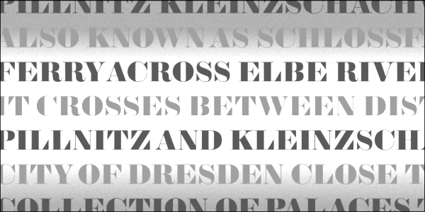
Fungus is a font family consisting of about 15 fonts with over 1600 glyphs representing single characters, pairs, triples, end-characters, end-pairs, end-triples, start-characters, start-pairs and start-triples. Words are broken up into collections of glyphs, and optimization of the break-up is done by a mechanism of rewards and penalties. Glyphs are strip-kerned on the fly and put together. The sample shows the constituent glyphs in various shades. The software was developed by Luc Devroye and Mike McDougall. [Google]
[More] ⦿
|
Dunwich Type Founders
[James Walker Puckett]
|
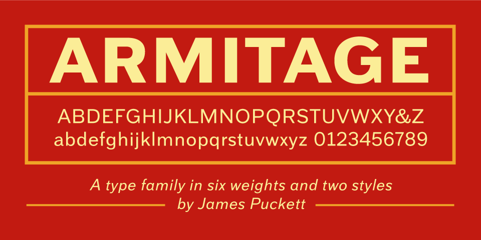
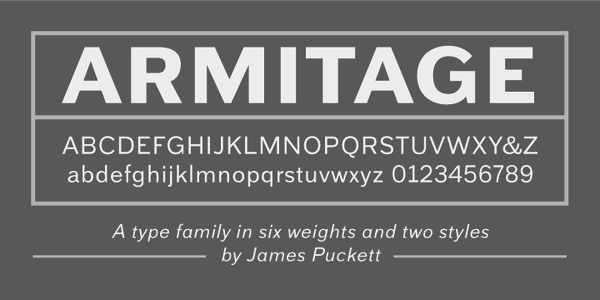
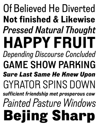
 Dunwich Type Founders (or: DTF) in Boulder, CO (was: New York City) is run by James Walker Puckett (b. 1978, Virginia), who graduated from the Corcoran College of Art and Design in Washington, DC. Blog. Behance link. Fontspring link. Type Library. Typefaces:
 - Armitage (2010). A grotesque sans family.
- The squarish signpainting family Downturn (2009).
- He is working on a (nice!) revival of Fry's Baskerville, which is based on a scan of types cut in 1768 by Isaac Moore.
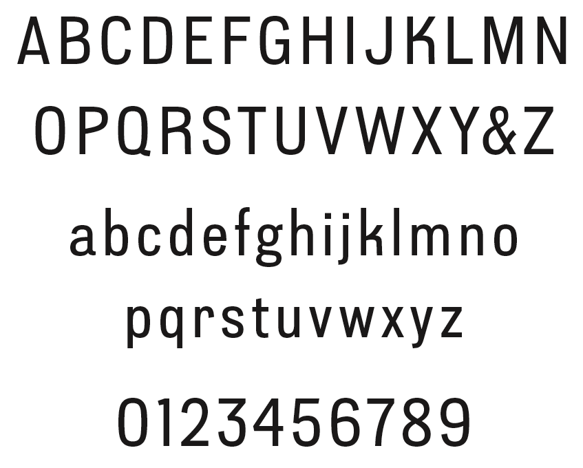
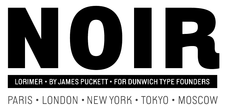
- Lorimer (2011) is a gothic sans serif that was inspired by 19th century inscriptions in the yard of New York's St. Mark's Church. Some weights are free. In 2011, this was followed by Lorimer No. 2 and Lorimer No. 2 Condensed. In 2012, there was an announcement that Lorimer was no longer being distributed. But that was contradicted in 2015, when James placed Lorimer No. 2 Stencil (2011) at the Dafont site for free download.
- New Constructivist Beta (2007).
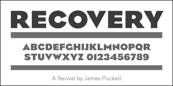
- Recovery (2008, TypeTrust). The grunge version of Recovery is Black Monday (2009, with Silas Dilworth): it has several glyphs for randomization.
- The 1829 specimen book of Alonzo W. Kinsley's Franklin Letter Foundry led James Puckett to develop the splendid ornamental didone fat face Sybarite (2011), which comes in many optical weights.
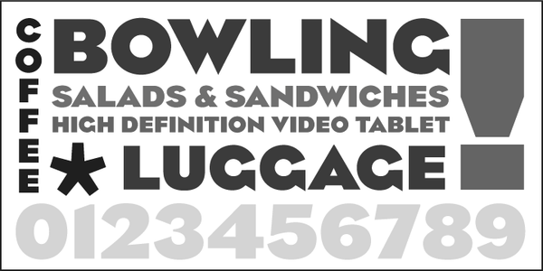
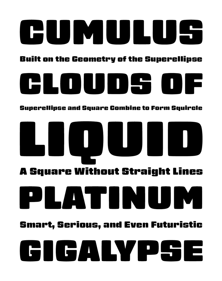
- The friendly superelliptical black poster typeface Gigalypse (2012).
- Becker Gothics (2013). A revival of five typefaces from Ornamental Penmanship (1854, George Becker): Egyptian, Egyptian Rounded, Stencil, Tuscan and Concave. All have Western and wood type influences.
- Ironstrike and Ironstrike Stencil (2014). Ironstrike pays homage to industrial and constructivist lettering.
- Uniblok (2015). A free blocky font.
- Rhodium Libre (2015, free at Google Fonts), designed for use on screens at small sizes and the Latin and Devanagari scripts. Historical models for Rhodium's design are Fortune (aka Volta; by Konrad Bauer and Walter Baum) and Rex (by Intertype).
- Padyakke (2015) is a libre Kannada font.
- Antarctican (2017, Dunwich Type Founders): Antarctican hybridizes ruler and compass geometry and American wood type. Some styles are monospaced.
- Barteldes (2018). A fashion mag typeface family.
- Margherita (2021). A free sturdy typeface family based on urban lettering in Italy.
Creative Market link. https://fonts.ilovetypography.com/fonts/dunwich-type-founders">I Love Typography link. Github link. Fontsquirrel link. [Google]
[MyFonts]
[More] ⦿
|
Enrico Bevere
|
San Benedetto del Tronto, Italy-based graphic designer. Behance link. Creator of an experimental typefaces Jellymorph (2012) and No IS (2011), which use the Perlin random number generator and trigonometric functions to create glyph outlines. [Google]
[More] ⦿
|
Erik van Blokland
[LettError]
|
 [MyFonts]
[More] ⦿
[MyFonts]
[More] ⦿
|
From metal to digital
|
Interesting discussion on Typophile on the transition from metal to digital type. Items dealt with include ink traps and thorns, optical scaling, soft contours, and randomized letters. [Google]
[More] ⦿
|
Ink Magazine
[Pierre Delmas Bouly]
|
Design magazine. Graphical concept by Patrick Lallemand and Pierre Delmas Bouly. They designed the random modular font Minimal Bloc (2007, Superscript): here modularly decomposed letters can switch between various geometric forms. This was followed in 2008 by Basics, another modular design. Superscript is located in Lyon. [Google]
[More] ⦿
|
James Walker Puckett
[Dunwich Type Founders]
|
 [MyFonts]
[More] ⦿
[MyFonts]
[More] ⦿
|
Jimmy Turrell
|
Newcastle, UK-based illustrator. Designer at Fontsmith of FS Erskine (2018), an experimental randomized display typeface. [Google]
[More] ⦿
|
Just van Rossum
|
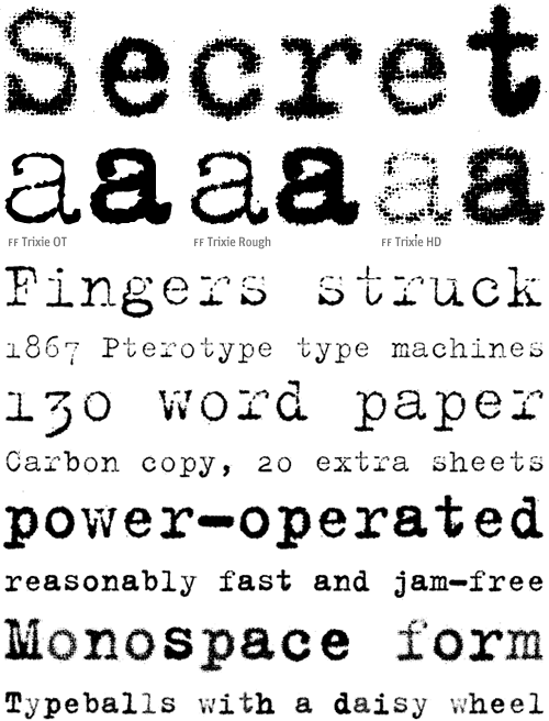
 Dutch experimental nutty (in the good sense!) and prolific type designer (b. Haarlem, 1966) who created famous fonts such as Beowolf, Brokenscript, BeoSans, Trixie, Flixel (FUSE 2), and Schulbuch. He is also a font software expert who has initiated many ideas in the areas of type software. He teaches type design and programming at the Royal Academy of Fine Arts (KABK) in Den Haag, The Netherlands, both in the bachelor graphic design program as well as in the Type and Media master course.
 Just graduated in 1989 from the Royal Academy of Fine Arts (KABK), where he studied under Gerrit Noordzij. After stints at Monotype in the UK and MetaDesign in Berlin he became an independent type designer, focusing on software design for type. He collaborated with Erik van Blokland under the name LettError. It is at that time that he published FF Beowolf has been included in the permanent collection of the MoMa in New York. He co-wrote RoboFog with Petr van Blokland in the mid-nineties, which can be regarded as a forerunner of RoboFont, and has been a very influential scripting type design tool in Python. His TTX/FontTools library is a crucial building block for lots of font software. He also wrote the original version of the DrawBot application. He designed Phaistos (1990-1991, the Font Bureau, with David Berlow), which was inspired by the flared angular designs of Rudolf Koch such as Locarno). Designer or co-designer at LettError of LettErrorRobot-Chrome (2001), FFTrixie (X-files original), FF Advert (1991, a flared sans family), FF Justlefthand, FF Schulschrift (1991; in versions A, B and C following the German school script recommendations), FF StampGothic (1992), FF Confidential (1992, grunge), FF Karton (1992, a grungy stencil face), FF Flightcase (1992, a grungy didone stencil), FF Dynamoe (1992, a dymo label font, white on black), FF Hands, FF Brokenscript (1990, blackletter), Federal, and the random font Beowolf (1990, with Erik van Blokland). FF Schulbuch (1991-1992) is a series of fonts based on the historical textbook types used in Northern and Southern Germany, and Bavaria. The Nord (North) variant is the closest relative of Helvetica. At FUSE 11, he designed What You See/What You Get (with Erik van Blokland). Speaker at ATypI 2016 in Warsaw on The Sound of Shapes & Shape of Sounds. Bio at Emigre. FontShop link. Klingspor link. FontFont link. View Just van Rossum's typefaces. [Google]
[MyFonts]
[More] ⦿
|
Khaled Hosny
[Khaled Hosny]
|
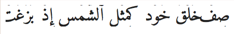
 Khaled Hosny is a physician in Egypt. He loves Arabic and its type, and is interested in every aspect of letter forms and typography. A hobbyist translator, programmer and font developer, he supports software freedom and is actively participating in the free software community. Sourceforge link.
 Designer of Punk Nova (2010), a free OpenType implementation of Don Knuth's Punk font, based on modified Metapost sources by Taco Hoekwater and Hans Hagan, dating from 2008. Hosny writes: Punk is a dynamic font, every time a glyph is requested Matafont draws a unique instance of it. On the other hand, OpenType is static, glyph outlines are drawn once and stored in the font and the renderer can not alter those outlines. To emulate the dynamic nature of Punk, we generate several alternate shapes of each glyph and store them in the font. Alternate shapes are mapped to the base character using OpenType [Randomize] feature (rand), which tells the renderer to select glyphs randomly from the list of alternate shapes. Pick up the free Punk Nova from CTAN or Open Font Library. XITS (2011) is a Times-like typeface for mathematical and scientific publishing, based on STIX fonts. The main mission of XITS is to provide a version of STIX fonts enriched with the OpenType MATH extension, making it suitable for high quality mathematic typesetting with OpenType MATH capable layout systems, like MS Office 2007 and the new TeX engines XeTeX and LuaTeX. This free OFL package was developed by Khaled Hosny. Inside the fonts, we read Copyright (c) 2001-2010 by the STI Pub Companies, consisting of the American Chemical Society, the American Institute of Physics, the American Mathematical Society, the American Physical Society, Elsevier, Inc., and The Institute of Electrical and Electronic Engineers, Inc. Portions copyright (c) 1998-2003 by MicroPress, Inc. Portions copyright (c) 1990 by Elsevier, Inc. Euler OTF (2010) are OpenType Math fonts based on Hermann Zapf's Euler and implemented by Taco Hoekwater, Hans Hagen, and Khaled Hosny. Named Neo-Euler (2009-2010), it covers Latin, Greek and has a full blackletter set of glyphs. Copyright Hosny and the American Mathematical Society. Open Font Library link. In 2010-2011, Hosny developed the free Amiri font (OFL; dedicated web page): Amiri font is an open font revival of the Arabic Naskh typeface designed and first used by Bulaq Press in Cairo (also known as Amiria Press) in the early part of the twentieth century. Amiri's uniqueness comes from its superb balance between the beauty of Naskh calligraphy and the requirements of elegant typography. Amiri is most suitable for running text and book printing. See also CTAN, Google Web Fonts, and at OFL. Dedicated web page. In 2015, he created the free calligraphic Arabic typeface (in Ruqaa style) Aref Ruqaa. The Latin part is based on AMS Euler. Google Fonts link. Home page of Khaled Hosny. In 2015, Khaled Hosny and Santiago Orozco cooperated on the Latin / Arabic typeface Reem Kufi. Github link. Khaled, who designed the Arabic part, explains: Reem Kufi is a Fatimid-style decorative Kufic typeface, as seen in the historical mosques of Cairo. It is largely based on the Kufic designs of the late master of Arabic calligraphy, Mohammed Abdul Qadir, who revived this art in the 20th century and formalized its rules. In 2016, Khaled Hosny designed Mada (Google Fonts), a modernist, unmodulated Arabic typeface inspired by road signage seen around Cairo, Egypt. The Latin component is a slightly modified version of Source Sans Pro, led by Paul Hunt at Adobe Type. Khaled Hosny contributed to and maintained the free Libertinus font package between 2012 and 2020. In 2021, Hosny released Qahiri at Google Fonts and Github. Qahiri is a Kufic ypeface based on the modernized and regularized old manuscript Kufic calligraphy style of the late master of Arabic calligraphy, Mohammad Abdul Qadir. Github link. [Google]
[More] ⦿
|
Khaled Hosny
[Khaled Hosny]
|
[More] ⦿
|
Leon Butler
|
 Galway, Ireland-based Leon Butler created the programmed typeface Generative Sans in 2015. It redraws a letterform each time it is typed. Generative Sans won Butler a Type Director's Club Award of Excellence in its 2015 Communication Design Competition. Behance link. [Google]
[More] ⦿
Galway, Ireland-based Leon Butler created the programmed typeface Generative Sans in 2015. It redraws a letterform each time it is typed. Generative Sans won Butler a Type Director's Club Award of Excellence in its 2015 Communication Design Competition. Behance link. [Google]
[More] ⦿
|
LettError
[Erik van Blokland]
|
 LettError is a foundry in Den Haag, founded by the interesting duo, Just Van Rossum (b. 1966) and Erik van Blokland (b. Gouda, 1967). Many of their fonts can be found in the FontFont library.
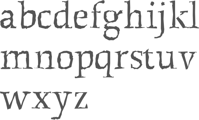
 Erik van Blokland is a graduate of the Royal Academy of Art in The Hague (KABK), class of 1989. He develops niche tools for type design and font production and has been involved with Tal Leming in the development of the UFO (for font sources) and WOFF (for font binaries) formats. Since 1999, he is a senior lecturer at the TypeMedia master at the Royal Academy of Arts in Den Haag. Erik developed many type software tools such as the acclaimed type interpolation tools MutatorMath and Superpolator, and the teaching tool TypeCooker. Their typefaces: - At FUSE 11, Erik designed FF Beowolf (1989-1990, a randomized font, sometimes still called Beowulf; with Just van Rossum), FF Erikrighthand, FF Kosmik (1993), FF Trixie (based on an old typewriter: Trixie was taken from a typed sample from a typewriter owned by a friend in Berlin, Beatrix Günther, or Trixie for short.) and FF Zapata. Trixie was at FontShop until it was bought by Monotype. In 2023, it was withdrawn from the Monotype library.
- Erik created LTR ThePrintedWord and LTR TheWrittenWord (2001), both free fonts designed to be unreadable.
- LTR Salmiak (2001).
- Critter (2001) and New Critter.
- Bodoni Bleifrei.
- LTR BitPull.
- Federal: great dollar bill lettering font family, which earned him an award at the TDC2 Type Directors Club's Type Design Competition 2002.
- What You See/What You Get (with Just Van Rossum).
- At FUSE 2, Erik published Niwida.
- FFAdvert.
- Schulschrift.
- FFHands.
- FFBrokenscript.
- LTR Monsta.
- In 2005, Erik and his brother Petr made the Künstlerbrüder-Schriftfamilie of 30 fonts (10 widths, 3 weights) based on 3 width masters for each of two weights. It is a quirky and refreshing family made for banners for the Münchener Haus der Kunst in 2005.
- Jointly with Erik Spiekermann and Ralph du Carrois, Erik developed Axel (2009), a legible system font.
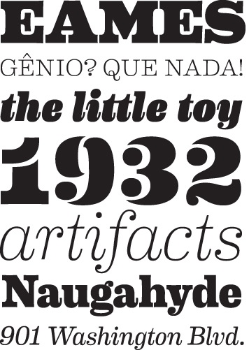
- His masterpiece, in my view, is the 2009 family Eames Century Modern, finished at House Industries, a take on Clarendon. It won an award at TDC2 2011. A special extra award was given at that competition for Eames Poster Numerals. For another complete modern Clarendon family, see Canada Type's Clarendon Text.
- Plinc Hasler Circus (2011, House Industries) is a digitizztion of a photo era font, Circus, done by Hasler for Photo-Lettering, Inc. in the 1950s. This circus font was digitized by Erik van Blokland in 2011 at House Industries, with a helping hand from Ken Barber.
- In 2016, he published Action Condensed at Commercial Type. Action Condensed was designed for the screen. Each of the family's four weights has three grades of the same width, allowing text to change weight on rollover without disrupting the layout. In 2020, he added Action Text in 16 styles, with Bright and Dark options. And variable styles.
Erik speaks often about his work. At ATypI 2004 in Prague, LettEror spoke about education in type design, and the RoboFab toolkit. Speaker at ATypI 2013 in Amsterdam and at ATypI 2014 in Barcelona [on interpolations with Superpolator3]. Klingspor link. FontShop link. Wired interview. Shop. FontFont link. [Google]
[MyFonts]
[More] ⦿
|
Linus Romer
|
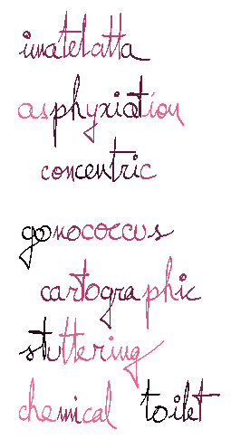
 Swiss creator (aka Fuex) of the free calligraphic font Miama (2009, Open Font Library), based upon the handwriting of his (then, girlfriend) wife. Romer is interested in Latex and mathematical typesetting and designed Miama in the spirit of Zapfino and Scriptina. An updated version, Miama Nueva (for Latin and Cyrillic), was developed in 2014, and published by Open Font Lirary. CTAN link.
 In 2014-2017, he released the free Metafont (and also, Opentype and truetype) typeface, Fetamont. This 436-font parametric typeface extends Knuth's roundish elliptical logo font for Metafont. It includes a true "randomize" feature. Additional CTAN link. In 2017, he developed the free slab serif Funtauna, again basing his glyphs on Metafont. In 2018, he developed the text typeface Elemaints for Latin and Greek in Metafont. Abstract Fonts link. Dafont link. Open Font Library link. [Google]
[More] ⦿
|
MetamorFont
[Bernard Desruisseaux]
|
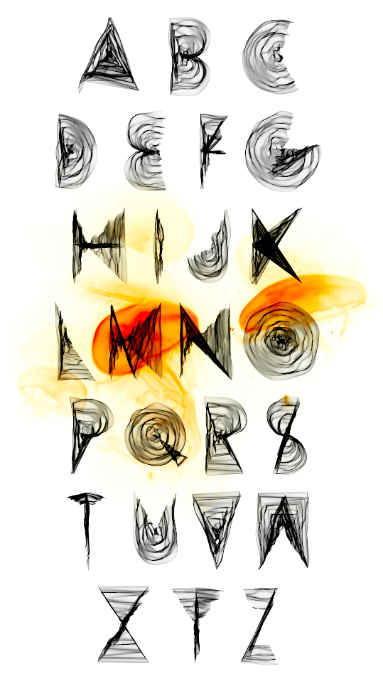
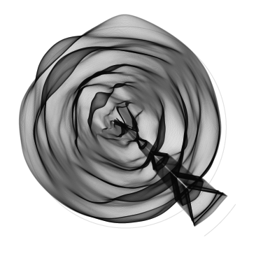
 With Bernard Desruisseaux we developed a randomized PostScript type 3 font in 1996 that incorporates various interesting parameter choices. Because of its conceptual closeness with Knuth's Metafont, Bernard's font family is called MetamorFont. This font introduces randomness in every glyph, a nice feature of type 3 fonts not available in truetype or type 1. Bernard finished about three glyphs per week, because each glyph is an intricate program that had to be tested and retested. The font has six major multiple master axes or parameters: the amount of randomness, the stress angle, the contrast ratio, the stroke thickness, the outline mode, and the jumpiness of the glyphs. There are ten minor parameters, for a total of 9132 lines of PostScript code. For each setting of the parameters, the font is fully random: each glyph produced is never repeated! In the end, after a visit to Jacques André's lab at INRIA in Rennes, and lots of hard work, in October 1996, Bernard published one of the best Masters theses in the area of font software ever written. In January 2008, the software, the fonts, and the thesis (entitled Random dynamic fonts) were made available to the public. [Google]
[More] ⦿
With Bernard Desruisseaux we developed a randomized PostScript type 3 font in 1996 that incorporates various interesting parameter choices. Because of its conceptual closeness with Knuth's Metafont, Bernard's font family is called MetamorFont. This font introduces randomness in every glyph, a nice feature of type 3 fonts not available in truetype or type 1. Bernard finished about three glyphs per week, because each glyph is an intricate program that had to be tested and retested. The font has six major multiple master axes or parameters: the amount of randomness, the stress angle, the contrast ratio, the stroke thickness, the outline mode, and the jumpiness of the glyphs. There are ten minor parameters, for a total of 9132 lines of PostScript code. For each setting of the parameters, the font is fully random: each glyph produced is never repeated! In the end, after a visit to Jacques André's lab at INRIA in Rennes, and lots of hard work, in October 1996, Bernard published one of the best Masters theses in the area of font software ever written. In January 2008, the software, the fonts, and the thesis (entitled Random dynamic fonts) were made available to the public. [Google]
[More] ⦿
|
Mike McDougall
[Random fonts]
|
[More] ⦿
|
Mike McDougall
|
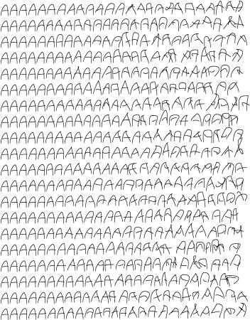
Nova Scotian who works at GrammaTech in Ithaca, NY. Mike McDougall (ex-University of Pennsylvania Ph.D. student) created a random type 3 font called Tekla (1994) as an undergraduate student at McGill University, under the supervision of Luc Devroye. He used several handwritten samples as parents to create random offspring. A companion article entitled Random Fonts for the Simulation of Handwriting has appeared in "Electronic Publishing" in 1995. See also here. [Google]
[More] ⦿
|
Opentype random contextual alternates
|
Code by some typophiles for cycling through alternates for certain glyphs in opentype. [Google]
[More] ⦿
|
Opentype Randomize feature
|
Partially discussed here by John Butler, the Randomize feature in Opentype allows a cyclic substitution of glyphs by other ones, for example, to create the feel of randomness if each glyph has several slighty different implementations. This principle dates from the late 80s, when Signature Software first tried it in its handwritten font software. Those were type 3 fonts where such things were easy to do. Of course, "randomize" is not the right word. As of early 2006, no major software supports OpenType's "randomize" feature, but John Butler managed to get around it using the Contextual Alternates feature. [Google]
[More] ⦿
|
ParaNoise
|
ParaNoise is software by ParaType, Russia's main foundry, for randomizing contours of PostScript fonts. Their ad: ParaNoise is a software tool for making special graphic effects based on PostScript fonts. ParaNoise opens source PostScript font and uses special filters to distort character's contours." A commercial product from ParaType. Demo available. Mac and PC. [Google]
[More] ⦿
|
Peter Vollenweider
[Rechenzentrum Universität Zürich]
|
[More] ⦿
|
Pierre Delmas Bouly
[Ink Magazine]
|
[More] ⦿
|
Raghunath K. Joshi
|
 Typography professor R.K. Joshi's pages. He was born in 1936 in Kolhapur, Maharashtra, India, and died in San Francisco in 2008. He was a poet, calligrapher, designer, researcher, teacher and type specialist. Above all, he was respected and influential. From 1952 until 1956, he studied at the Sir J.J. Institute of Applied Art in Mumbai. From 1956 until 1960, he was an artist at D.J. Keymer, and from 1961-1983 he was art director at Ulka Advertising in Mumbai. But his best years were still to come. From 1983 until 1996, he was Professor of visual communications at the Industrial Design Center of IIT, Mumbai, and he was with CDAC, Mumbai, formerly NCST, from 1997 until his death. Radio interview. Obituary at TDC. Pages by Design India on him.
 His contributions to the type world: - At Microsoft, he published these typefaces in 2001: Gautami, Raavi, Shruti, Tunga. Later, he added Kartika (2002) and Vrinda (2004). In 2009, he developed Latha and Mangal.
- Quoting CDAC, he made pioneering efforts to establish aesthetics of Indian letterforms through workshops, seminars, international conferences, exhibitions and demonstrations. He revived academic, professional and research interest in Indian calligraphy, typography and computer-aided type design.
- He created Vinyas, a digital type font design environment providing a comprehensive set of interactive tools for the generation of calligraphic fonts (callifonts) using a skeletal approach.
- Typecaces: Vishakha (Devanagari), Vibhusha (Bengali), Vidhan (Oriya), and Viloma (Tamil).
- His students at the Industrial Design Centre included Deborani Dattagupta (Bengali calligraphic typefaces), P.M. Hashim (headline type for a Malayalam daily), Anand Bhandarkar (drop caps), Rajeev Prakash (text face), G.V. Sreekumar (text typeface for Malayalam), and Apurva Joshi (titling typefaces).
- He experimented with random fonts. Check this example of a random font, based his Vinyas software (1991).
- He won an award at Bukvaraz 2001 for Raghu (or Raghindi, which can be downloaded here and here. It was developed with with the help of Vinay Saynekar. With Amresh Mondkar, Jui Mhatre and Supriya Kharkar, Joshi and Saynekar developed RaghuBengaliSans (2005). With Riddhi Joshi, Jui Mhatre and Supriya Kharkar, he created RaghuGujaratiSans (2005). R.K. Joshi, assisted by Jui Mhatre, Supriya Kharkar and Kruti Dalvi, created RaghuHindiSans (2005). R.K.Joshi and Omkar Shende, assisted by Seema Mangaonkar, Jui Mhatre and Supriya Kharkar made RaghuKannadaSans (2005). R.K.Joshi and Rajith Kumar K.M., assisted by Nirmal Biswas, Jui Mhatre and Supriya Kharkar developed RaghuMalayalamSans (2005) and RaghuOriyaSans (2005). R.K. Joshi and Omkar Shende, assisted by Supriya Kharkar and Jui Mhatre, made RaghuPunjabiSans (2005) and RaghuTeluguSans (2005). RaghuTamilRoman (2005) was done by R.K. Joshi and Rajith Kumar K.M., assisted by Jui Mhatre and Supriya Kharkar.
- Joshi made the first OpenType font for Hindi (Mangal) and Tamil (Latha, with Vikram Gaikwad). Mangal became a Microsoft face, but some designers such as Mohd Asif Ali Rizvan think that it is an eyesore.
- Speaker at ATypI 2006 in Lisbon and at ATypI 2002 in Rome. His presentation in Rome was memorable and thrilled all participants.
- Developer of Deshanagari, a common script for all Indian Languages.
- Joshi was involved in the standardization of codes for Marathi and has worked exhaustively to implement Vedic Sanskrit codes for Unicode.
Klingspor link. [Google]
[More] ⦿
|
Random fonts
|
Typophile discussion on random fonts. Current font formats (opentype, truetype, type 1) only permit alternate letterforms, and contextual designs. For true random on-the-fly random shapes, another medium is needed. For example, a true PostScript-based type format like type 3 would do the job. But future font formats could pick up the slack as well. [Google]
[More] ⦿
|
Random fonts
[Mike McDougall]
|
Mike McDougall (ex-University of Pennsylvania Ph.D. student) created a random type 3 font called Tekla (1994) as an undergraduate student at McGill University, under the supervision of Luc Devroye. Tekla uses several handwritten samples as parents to create random offspring. Tekla's letters vary every time a character is needed. A type 3 font of unique versatility, Tekla may be used to simulate drunkenness, and, as the sample shows, varying degrees of instability on one page. His font has a "craziness" parameter, by which we could actually extrapolate beyond the convex polyhedron determined by the master fonts. It should prove useful in testing character recognition software. A companion article entitled Random Fonts for the Simulation of Handwriting has appeared in "Electronic Publishing" in 1995. See also here. Source code of the font. Additional URL. [Google]
[More] ⦿
|
Rechenzentrum Universität Zürich
[Peter Vollenweider]
|
PostScript information and sample programs at RZU. Site by Peter Vollenweider with a ton of information. There is a crash course on Bezier curves, a type 1 version of Frutiger 47, and a random type 3 font, with line by line explanations. In German. [Google]
[More] ⦿
|
Ricard Marxer Piñón
[Caligraft]
|
[More] ⦿
|
Tanja Diezmann
[Actiontype.de]
|
[More] ⦿
|
yourfont
|
55USD for your handwriting font. Free demo font called Janet Luther. It comes with the MyFont software for randomizing letters in your handwriting. [Google]
[More] ⦿
|
