| | |
Abdulrahman Youssif
|
Riyadh, Saudi Arabia-based designer of the knot fon Emotion (2017). [Google]
[More] ⦿
|
Adnan Iskandar
|
Padang, Indonesia-based student-designer of the rope font Pilin (2015). [Google]
[More] ⦿
|
Alex Oakenman
|
Designer of AO Waxed Rope (2016), AO Drunken Sailor (2016), Fisherman Toolset (2016, dingbats), Lineart Icon Set (2016: 600+ icons), AO Pine Needle Sans Serif (2016) and AO Iron Bolt Serif Bold (2016). [Google]
[More] ⦿
|
Anastasiia Macaluso
|
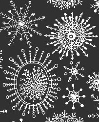 A freelance artist and illustrator based in Palermo, Italy, and born in Russia, Anastasiia Macaluso created various handcrafted typefaces in 2015, including a mummy-themed font, a bloody font, a bubblegum font, a couple of crayon typefaces and watercolor and dry brush types. In 2015, she started selling her work, such as the vampire script font Rodion, the crayon typeface Carbon Script, and a drop-dead gorgeous set of vector format snowflakes.
 Typefaces from 2016: Prosto (a handcrafted Latin / Cyrillic typeface), Sofia (thick brush. free), Astrid (hipster style), Giglio (paperclip style). Typefaces from 2017: Palma Nana (script). Typefaces from 2019: Module (a monoline display typeface), Unmoor (an outlined and color rope font). Typefaces from 2020: Katrin Sketch, Be My Candy.nastasiiaMacaluso-Module-2019 [Google]
[More] ⦿
|
Anke van der Meer
[funfontshop]
|
[More] ⦿
|
Annette Ward
[PC Crafters (was: Provo Craft)]
|
[More] ⦿
|
Aring Typeface
[Måns Grebäck]

|
 Måns Grebäck (Aring Typeface, Örebro, Sweden) is a prolific Swedish designer (b. Lindesberg, Sweden, 1990), who lives in Borlänge, Sweden. Måns Grebäck has a bachelor's degree in graphic design from the University of Dalarna (2012). In 2010, he went commercial, and started selling fonts through MyFonts. In 2011 he started Mawns Design. In 2013, that was renamed to Aring Typeface. In 2011 he already had over seven million downloads of his fonts, which were featured at websites such as Dafont and Myfonts. He also does custom type work. His typefaces, both free and commercial:
 - Acryle Script (2014).
- Actonia (2016). A monoline script.
- Adielle (2018).
- Aerofoil (2017). A vintage bottom-heavy script.
- Airways (2016). A signage script.
- Akayla Script (2018). Calligraphic.
- Aliey (2021). A 4-style Victorian copperplate serif.
- Aliment (2018). A sharp geometric sans.
- Amertha (2020). a fat finger font.
- Amplify (2013). A signage script.
- Angars Runes (2019: medieval, with gothic cathedral curves).
- Angilla Tattoo (2013). A connected spurred tattoo typeface. Followed by Angilla Script (2020).
- Antlers (2012). A calligraphic script.
- Aquate Script (2019).
- Arachnids (2011, graffiti face)
- Artely Inks (2016).
- Artisual Deco (2021). Pure art deco.
- Artographie (2020). An all caps art deco typeface family.
- Atelas (2015). Signage type, baseball script.
- Atures (2018). Futuristic and monoline.
- Autograf (2015) and Autografia (2021). Signature typefaces.
- Ave (2016) in styles called Ave Utan, Ave Betwan and Ave Fedan. A family of baseball scripts.
- Avelana. A connected script.
- Backpack (2014). A thick signage script typeface.
- Backyard (2016). A blackletter typeface.
- Barkants (2011, elegantly hand-printed family).
- Barley Script (2017). A signage script.
- Baystar Script (2021).
- Beautiful Trouble (2012). A rabbit-eared upright connected script.
- Beaked Tyrant (2014). A copperplate calligraphic script.
- Beckasin (2011, signage face)
- Before The Rain (2011, calligraphic) Before The Rain Arabic (2016).
- Belladio (2021). An urban script.
- Bellino (2018).
- Bezar (2020). A script.
- Billion Dreams (2020, by Mans Grebäck and Rangga Subekti). A heavy signage script.
- Billion Stars (2013). A tattoo script font.
- Bira (2012). A retro connected brush / signage script.
- Blaak (2019).
- Black Fox (2014). A sirupy brush face.
- Black Signature (2021). A bold signature font.
- Black Larch (2016) and Dark Larch (2016).
- Bloc Boy (2016). Like handwriting.
- Blockography (2011). A sketched typeface.)
- Block Talk (2011, with Zaydek Michels-Gualtieri)
- Blods (2011, a great blotty brush face)
- Blueberry Script (2017; with Noah Kinard).
- Botanink (2011)
- Bouncy (a cartoon font).
- Bourdos2022). A script typeface.
- Brannboll (2011, baseball signage face), Brannboll NY (2013), Brannboll Connect (2020), Brannboll Stencil (a baseball script) (2020).
- Bready (2011). A retro signage script with art nouveau aroma.
- Brev Script (2014). A connected secretary hand from the 19th century.
- Bronze Script (2014).
- Brother Tattoo (2012).
- Bumblebees (2012). A plump curvy script.
- Bunya (2016). A geometric slightly deco sans typeface family.
- Calendary Hands (2012).
- Caligraf (2020).
- Canela Bark (2015, co-designed with Luis Miguel).
- Caneletter Sans and Script (2013). Upright unconnected and connected scripts.
- Cantona Script (2019).
- Canyon (2021). A wide elliptical sans in 18 styles, featuring a coathanger lower case f.
- Capoon (2018). A ten-style sans family.
- Caprica Sans (2014) and Caprica Script. A plump script.
- Caravela (2020). A pirate map script.
- Casat Cap (2017). An all caps brush typeface family.
- Caster (2019). A heavy poster script.
- Castro Script (2012).
- Catchland (2021). A retro baseball script.
- Celebrater (sic) (2012). An oily font.
- Cellos Script (2013).
- Centeria Script (2012).
- Channel (2011, connected upright script)
- Chapel Script (216). For signage.
- Characteristic (2011).
- Chavenir (2011).
- Chinal (2018).
- Choko (2011, released in 2016). Chocolate and cream-themed decorative typeface.
- Christmas Miracle (2018), Christmas Reign (Tuscan, all caps) (2020), and Christmas Sparkle (2018).
- Chrysante (2020). A monoline flowing pen script.
- Clear Line (2012). A fat finger / signage typeface.
- Clipper Script (2011).
- Clothe (2017).
- Coneria Script (2012). A connected script.
- Conture Script (2018). Elegant, classical, and with exaggerated capitals.
- Crackin (2011).
- Crunchy (2016). An upright connected script.
- Cruz Quaste (2020). A handcrafted blackletter typeface.
- Cubest (2021). A squarish monospaced techno family.
- CutScript (2011, connected script).
- Danbury (2022). A speed-emulating sans.
- Dark Crow (2020). a dry brush script.
- Dollie Script (2013).
- Ebbing (2018).
- Echinos Park Script (2012).
- Ederson (2018). A vintage signage script.
- Ekologie Hand (2012).
- Ekorre 2021). Aa vintage decorative serif.
- Elaya Script (2019). A creamy signage script.
- Electronics (2017). A retro signage script.
- Elevate (2016).
- Emiral Script (2017). A baseball script.
- Encina Script (2016). A thin calligraphic typeface.
- Enlighten (2011)
- Delinquente (2012).
- Denigan (2011, hairline)
- Equal Sans (2012).
- Espesor Olas (2011, fine hand-printed calligraphic family)
- Esplanade Script (2015, by Mario Arturo).
- Ethernal (2017). A connected script.
- Europe Underground (2010, geometric sans with a hairline weight).
- Fabulous (2017) and Fabulous Gold (2017). Signage script.
- Falkin Sans (2016), Falkin Script (2016), Falkin Serif (2016).
- Faltura (2011, constructivist), Faltura Alien (grunge), Faltura Guerra (grunge)
- Faltura Animals (2011)
- Feathergraphy Decoration (2011, calligraphic).
- Duera (2016). A variable width sans typeface family.
- Fargo (2021). A cursive script.
- Fat Wandals (2018). A graffiti font.
- Feathergraphy Clean (2011).
- Fibography (2013). A caps typeface composed of fibers.
- Filbert Brush (2012), Filbert Color (2013, a soft brush font).
- Finition (2017). A connected brush script.
- Fireplace (2020). A connected script.
- Firstly (2020). A flowing calligraphic signature script.
- First Lyrics (2011).
- First Reign (2022). A medieval typeface. Second Reign (2022), Third Reign (2022) and Fourth Reign (2022) are further medieval typefaces.
- Flighter (2018). A retro airplane font.
- Fondy Script (2018).
- Frankentype (2013). An all-caps brush typeface for signage.
- From Skyler (2016).
- Funkygraphy (2011, fat and counterless).
- Gecko (2015, a fine creamy signage script).
- Geza Script (2017). A great angular almost Arabic-looking script.
- Ghang (2011, graffiti family).
- Gingo (2020). A script.
- Goatskin Brush (2015). A great brush typeface.
- Golden Hopes (2021). A signature script.
- Gonzi (an 31-style sans). Published in 2021.
- Graced Script (2016). A wide calligraphic connected brush script.
- Grandi (2016). A ten-style display sans.
- Gready (2021). A fat signage script.
- Greback Grotesque (2012). The Thin is very very thin.
- Gretoon (2011, cartoon family)
- Griphite (2018). A rough brush typeface.
- Guld Script (2015).
- Habanero (2016). A fat signage typeface.
- Handtalk (2010, silhouettes)
- Harbell (2013).
- Hard Block (2011, Western slab face).
- Hastafi (2022). An 8-style sharp-edged display serif.
- Haydon Brush (2016).
- Heavy Rain (2021). Decorative initials, and an all caps wedge serif.
- Hemicube (a wide squarish all caps sans) (2020).
- Hemmet (2013). A signage script.
- Hierograf (2016). A layered textured handcrafted poster typeface family.
- Hitalica (2011).
- Honeymoon (2017). A connected script.
- Housegrind (2013, connected script).
- House of the Dragon (blackletter). Published in 2021.
- Hoyle (2020). A slab serif.
- Hundred Miracles (a signage script). Published in 2021.
- Impregnable (2013). A connected script.
- Indiana Script (2017). A baseball script.
- Inked Bones (2019). a hand-painted blackletter font.
- Intrique Script (2013). A baseball script.
- Isle Body (2019), Isle Headline (2019).
- Jacked Eleven (2011), Jacked Eleven Highlight (2011), Jack Pirate (2020: a tattoo blackletter typeface), January Script (2013).
- Jaymont (2018). A sharp-edged wedge serif typeface family.
- Jengotan (2021). A dry brush script.
- Jumper (2021). A 13-style sans. Free download for personal use only.
- Kandira (2018). A sleek sans family.
- Kanvas (2020). A script typeface.
- Kerater (2011, sans)
- Lace 2.0 (2012). A thin connected script co-designed with Matteo Milazzo.
- Lacosta (2020). A signage script.
- Kompar (2018).
- Krinkes (2015, baseball script). A connected swashy signage script.
- Kurri Island (2020).
- Lakesight (2014). A connected script.
- Larch (2016). A crisp script typeface.
- Largelake (2021). A signage script.
- Las Enter (2013). A neon light script.
- Leaders (2020). A blackletter font.
- Ledare (2021). A 14-style bold and expressive sans.
- Letric (2021).
- Let Me Ride (2011)
- Levitee (2011, a lively connected script).
- Lighthouse (2013). A bold high-contrast script face.
- Lina Script (2012). A tattoo script done with Vicky Mardian.
- Lourino (2018).
- Low Casat (2017) and Low Casat Fat (2017).
- Lyrics Movement (2011, tall-ascendered hand).
- Lyster (2020).
- Mandoul Script (2021) and Mandoul Black (2021: a brush script).
- Mainland (2018). A sans family.
- Mainstream (2017). Graffiti style.
- Manofik (a 4-style warm retro serif with a coathanger lower case f; for Latin, Cyrillic and Arabic). Published in 2021.
- Martyric (2014, brush script),
- Masteries (2013). A connected formal script.
- Mastoc (2014).
- Mauritz Caps (brushed) and Mauritz (a great wild script family), both published in 2021. Followed by Mauritz Sans (a brush script with a strong personality and a cartoon vibe) in 2022.
- Mean Casat (2018).
- Medish Script (2018). A great calligraphic handwriting typeface.
- Together with Noah Kinard, he designed the calligraphic typeface Melay Script (2016).
- Middle Ages (2019). A Lomardic blackletter in Regular and Deco styles.
- Milasian Circa (2015) and Milasian. A connected script.
- Merry Christmas (2015). A retro script in Flake and Star styles. Followed in 2017 by the color script font Merry Christmas Color.
- Milkyway Hotel (art deco sans).
- Miraikato Hand (2022) and Miraikato Script (a rustic script) (2022).
- Mistuki (2015). An oriental brush simulation font.
- Mochary (2016). A signage or tattoo script.
- Molly Sans (2019). Caps only.
- Monsta Tag (2013): a graffiti font.
- Motion Picture (2013). A heavy connected retro script.
- Mount (2012).
- MAWNS Graffiti (2010) and MAWNS Serif (2010)
- MAWNS Handwriting (2010).
- Made With B (2011, sketched face).
- Mardian (2012). A calligraphic tattoo script done with Vicky Mardian.
- Markera (2011, marker pen family)
- Many Weatz (2011)
- Mawns Rock (2011)
- Monoment (2011). A fat upright connected script.
- Moneymachine (2022).
- Monosphere (2012-2016). A futuristic monospaced typeface.
- Murality (2022). A readable graffiti or mural typeface.
- Myteri Tattoo (2021) and Myteri Script (2021: a calligraphic script).
- Nacinth (2020). A script.
- Nino Script (2018). A tattoo font.
- Nobella (2021). A retro baseball script.
- Normale (2014). A set of distressed typewriter fonts.
- Notera (2014). A connected handwriting font. Followed by Notera 2 in 2018.
- Odenburgh (2020). A medieval calligraphic typeface.
- Optien (2011, techno face)
- Ordinatum (2011, a severe sans).
- Original Black (2021). A fat blackletter typeface.
- Ornamental Versals (2011, ornamental caps)
- Painter (2016). A sign painting script.
- Patched (2021).
- Pennybridge 1563 (2010, blackletter)
- Pharmount (2014). A calligraphic connected script.
- Phraell (2013). A great italic formal calligraphic script with optional swashes.
- Pigeon (2016).
- Pineapple (2012).
- Plates Napery (2015).
- Plicata (2016).
- Pligo (2016). A balloon or cartoon font.
- Preside (2017).
- Prime Script (2012).
- Prognostic (2011)
- Qaskin (2015). A semi-formal connected script typeface with Black and White (outlined) styles.
- Qhuman (2021). A 6-style Victorian serif.
- Qraxy (2016). Quache Variable (2020) and Quache (2020). A 28-style flexible sans family.
- Quanton (2022). An 8-style angular serif.
- Querino Sans (2019). A very bold sans. Followed by Querino Script (2019).
- Quickier Pro (2012). A swashy calligraphic script face.
- Quincho Script (2016).
- Quintal Script (2021). A retro signage font.
- R-2014 (2011, LED face).
- Rabento (2021). A 6-style condensed display slab serif.
- Race Fever Pro (2015, in Brush and Pen versions) and Race Fever Brush (2015).
- Radio 187.5 (2010, techno family)
- Rakoon (2014). A creamy ultra-fat upright script. Followed by Rough Rakoon in 2016.
- Rangly (2017-2018). A paint roll font.
- Raspberry Script (2017).
- Recorda Script (2013). A formal calligraphic script.
- Reditum (2014). A decorative script.
- Reeler (2014, with Noah Kinard).
- Remachine Script (2013). Retro signage script. In 2020, Mans added Remachine Script Arabic.
- Respective (2011, calligraphic script, +Swashes).
- Respondent (2021). A script.
- Rider (2011, a 30-style "versal" sans family)
- Ringer (circle and arc-based sans)
- Ristella (2017). A baseball script.
- Rivera 2022). A narrow sans in 10 styles.
- Rodrigues (2021). A script typeface.
- Roona Sans (2018: modernist and organic curves).
- Ropest (2018). A rope font.
- Roskrift (2011, calligraphic; + Roskrift Clean).
- Rougant (2021). An organic display font.
- Roughen (2020).
- Rurable (2015).
- Ruthless Wreckin (graffiti typefaces), Ruthless Drippin' (dripping paint family)
- Safir Script (2016). A fat baseball script.
- Saker Sans (2017).
- San Andre (2021) and San Andreas (2021), the free version. A baseball script.
- Santa Claus (2019). A blackletter typeface, accompanied by Santa Claus Deco, a snow crystal font.
- Scantype (2016).
- Sculptor's Hand (2011, connected chancery hand).
- Second Lesson (2022). A wide script.
- Second Lyrics (2011, Treefrog-style handwriting)
- Sequal (2020). Graffiti style.
- Sicret (2020) and Sicret Mono (2020). An all caps family.
- Servin' for Salute (2011)
- Shaded Larch (2016).
- Sharpe (2019). A sharp-edged high-contrast serif typeface family. See also Sharpe Variable (2020).
- Shenandoah (flowing signage script).
- Shimes (2015).
- Shipped Goods (2011). A copperplate calligraphic script.
- Shortbrush (2011)
- Signerica (2011, connected flowing hand)
- Sketchica (2011, sketchy face)
- Skyzhi (2016). An advertising headline typeface.
- Society Editor (2013, connected script).
- Snacker Comic (2013).
- Snowstreet (2013, an octagonal typeface) and Snowy (2013).
- Some Weatz (2011, calligraphic, copperplate; +Swashes)
- Sonika (2018).
- South African (2014). A movie poster brush typeface.
- Southern Aire (2013, connected script face).
- Specify (2016). A 40-style sans family. Download, free for personal use.
- Spoken (2019). A graffiti font.
- Sponger (2021). In the VAG Round genre.
- Square Worm (2011)
- Stackyard (2015). A script.
- Stainy (2013). A signage script.
- Starella Script (2019) and Starella Tattoo (2019).
- Starge (2019).
- Starkey (2020).
- Stormland (2021). A wide monoplinear sans.
- Stormline (2021). All caps, wide and outlined.
- Strawberry Script (2017).
- String Lines (2018).
- Stroke Dimension (2011). A 3d typeface.
- Struck Base (2021). A baseball script.
- Suecos Locos (2011---yummy!).
- Sultan Cafe (2014). An interlocking poster typeface.
- Sunny Sam (2020). A script typeface.
- Sverige Script (2012). Calligraphic wedding font.
- Tall Casat (2018).
- Tamoro Script (2014).
- Taylor Hand (2020). A signature script.
- Tevegraphy (2011, elliptical)
- The Hills (2017).
- The World is Yours (2011, quaint)
- Throwupz (2011)
- Toley Hand (2019).
- Tipbrush Script (2011).
- Tomino (2016).
- Top Comic (2013). A very fat cartoon bubble face.
- Treehouse (2011, upright connected script; +Snowhouse for a snow-covered version)
- Tusch Touch 1 (2011)
- Two and Three (2011: a tattoo parlor blackletter family)
- Typographic Onedalism (2011, graffiti simulation face).
- Undergone (2014). Decorative and calligraphic.
- Unthrift (2015). A pen script.
- Vacer Sans and Vacer Serif (2016). The latter is a slab serif.
- Validity Script (2020, with Misti Hammers).
- Ventography (2013). A bold signage script.
- Vinho De Amora (2021). A vintage all caps wedge serif and a stencil version.
- Waiter (2017).
- Walk Da Walk One
- Wandals (2018). A graffiti font.
- Wankstaberg Battles (2010, a tall fat script)
- White Dream (2021). A retro script.
- White Larch (2016). A connected script typeface.
- Wholecar (2021). An unerground train graffiti typeface family.
- Wild Growth (2011).
- Wildline (2021).
- Winfield Script (2019).
- World Series (2021). A baseball script.
- Xtreem (2012) and Xtreem2 (2014).
- Yanty, Yanty Big, Yanty Script, and Yanty Script Big (2012).
- Yaquote Script (2014).
- Yaty (2019).
- Yoghurt (2011).
- Zoney (2021).
View Mans Grebäck's typefaces. Abstract Fonts link. Fontspace link. MyFonts link. Another URL. Dafont link. Klingspor link. Buy fonts directly from Måns Grebäck. Old URL. [Google]
[MyFonts]
[More] ⦿
|
Ashley Osborn
|
Floridian creator of the rope font Bomdiggity (2013). [Google]
[More] ⦿
|
Audi Prasetya
[Portype (was: Idesain Creative)]
|
[MyFonts]
[More] ⦿
|
Baseline Fonts
[Nathan Williams]
|
 Foundry in Wichita, KS, founded in 1999 by Nathan Williams (b. Concordia, KS, 1973), formerly from the University of Kansas Art Museum Library. Its motto: The goal of the foundry is to provide uninterpreted revivals of type samples generated through disappearing printing methods, and create new fonts for dissemination in the type community. Order through MyFonts.Com or Union Fonts or Creative Market. FontShop link. Klingspor link.
 Fonts: - The Rodeo family of wood type fonts: 66 Rodeo, 57 Rodeo, 58 Rodeo (2003), Rodeo Rope, Rodeo Rope Superchunk.
- The Tuscan family: Tuscan (2003, a wild west face). To this group we can add the Tuscan typeface Circus KS (2006).
- Egyptians: Grit Gothic (2013), Grit Sans (2013), Heirloom Artcraft (2013), Worn Gothic (2013), Stately GG (2013), Grit Egyptienne (2005, grunge Egyptian family), Rough Egyptienne (2005).
- Grunge typefaces: Antimony (2005, grunge), Dryden (distressed handwritten face).
- Old typewriter fonts: Slab American Regular (old typewriter), Slab American Titling, Slab American Titling Heavy (2002). Slab American has 55 styles.
- Art nouveau typefaces: Old Paris Nouveau (2003).
- Pixelish typefaces: Base PXL7, 80s PXL Bold.
- Display Sans: Maxime (2004, having support for most European languages; Maxime Shadow is available at FontShop), Woodgrit Thin (based on 19th century American letterpress fonts), Woodgrit Medium, Woodgrit Heavy, Pippen (squarish).
- Calligraphic: Roundhand Regular.
- Victorian: Boback.
- The Grit family: Grit History (2003-2004), Grit Primer (2003), Grit Egyptienne, Grit Typesorts (2006, free).
- The Old Times American family (+Italic, +Titling).
- Pia Regular.
- Kandt: the handwriting of legendary designer and art director James Kandt; 4 styles.
- Chitchy.
- AVI Sans.
- Country Fang (2003, with Brian Miller).
- Craft Roman
- Licious Script.
- Luxe (2003, casual).
- Momentum (2002).
- George Gibson (handwriting from mid 1800s).
- Dingbats: Megaflakes 2010 (2010) and Megaflakes 2011 (2011).
- Sketchwriter (2011).
- Dusty Circus (2011) is a five-layer stacking display face designed to be infinitely morphed. It is a prototypical member of that old western circus font genre.
- Bobbi Bee (2013). A connected script.
[Google]
[MyFonts]
[More] ⦿
|
Caio Oliveira
|
During his studies in Curitiba, Brazil, Caio Oliveira created the rope font Navy (2014). [Google]
[More] ⦿
|
Carine Teyrouz
|
Beirut-based graphic and web designer who created Lashing Knots (2013), a Latin rope font. [Google]
[More] ⦿
|
Carlos Intriago
|
Art director in Santa Fe, Mexico, who designed the knotted rope-themed dingbat font Nudista in 2016. [Google]
[More] ⦿
|
Character
[Herbert F. Van Brink]
|
 Prolific Woodland Hills, CA-based typophile and type designer (1937-2013) whose portfolio consisted largely of revivals and who used the alias Character for his typographic work. The Los Angeles Times posted this obituary: Herb passed away after a brief fight against esophageal cancer. He was a 42 year resident of Woodland Hills CA. Son of the late Jean and Mary Van Brink, he was born in Manhattan, graduated from Stuyvesant High School (1952) and Queens College (1956) and always considered himself a New Yorker. He had a long career in Information Technology and retired from Arco. He loved traveling, bowling, genealogy, and was a bridge Life Master among his many interests. He was a trickster and a perfectionist. He leaves his wife, Paula, his son, David Van Brink and DIL Deb Culmer of Santa Cruz CA, his daughter Qarin Van Brink and SIL James Ray of Burien WA, grandchildren Amelia and Wilhelmina Ray Van Brink, brother and sister-in-law Jeffrey and Louise Van Brink of E. Northport NY and nephews Matthew and Jordan Van Brink.
 His typefaces: - Animal dingbat fonts: AbecedarianZoo (2003, created from an alphabet in Art Explosion 200,000), Turf&surf (2005).
- Alphadings: Jennifer's train (2011), ABCPlay (2005), DiddleTheMouse (2005), Silly Set (2005), Stone Carving (2005), Snow Persons (2005), Alaskan Ice (2005), Peppermin Canes (2005), USStarsNStripes (2003, first called USFlags), XmasTree (2002), XmasTree II (2004), Xmas Alpha (2005).
- Erotic alphabets: Flotner (2002, based on a scan of the human character alphabet by Peter Flötner (1534)), SilvestreBodies (2006, based on a figurative alphabet designed by Joseph Balthazar Silvestre in 1834, with engravings made by Girault), ErotiCaps Outline (2007), ErotiCaps Solid (2007), WeygelBodies (2006, adapted from Martin Weygel's 1560 interpretation of Peter Flotner's 1534 figurative alphabet).
- Stained glass themed fonts: ModernStainedGlass (2007), ModernStainedGlass2Tone (2007).
- Capital alphabets: Cameo Antique (2011, after Cameo Antique on page 17 of The Solotype Catalog of 4,147 Display Typefaces---a shaded outline version of the typeface called NightShade, on the same page of Dan Solo's book; the only known digitized fonts of NightShade are "Shadowed Serif" by James Fordyce (1994) and NigelSadeSH, from Soft Horizons (1993)), Modern French Capitals (2010, after a set of capitals drawn by Alphonse Mucha), Mucha French Capitals (2010, similar?), Marcel Caps (2007; based on "Crossroads" by August Will (1891)), WoodLook (2007, an improvement of 101's Wooden Alpha BlockZ), 3DAlphabet (2008, based on an alphabet coloring book designed by Jean Larcher, 1978), RomantiqueInitials (2007, based on work by Aridi), Blistered, BlisteredFramed, BlisteredReverse (2005, based on Marwan Aridi's Blister from the Initial Caps Vol I), ChiseledRound, Contemporary CH (2010), CourierInitials (2005, based on an alphabet by Johan)), Eclectica (2003, party-theme), FeathersInYourCaps (2002), FlowerSketches (2002), LACETRIM (2002), LeafyStencil (2003), QuiltedStippled (2004, based on an embroidery alphabet created by DesignsInStitches), RetroCapsBW (2004), RetroCapsWB (2004), Rope5 (2004, rope font), Rustic Black Shadow (2011. He explains: In the Solotype Catalog of 4,147 typefaces, RUSTIC is shown with a black shadow. RUSTIC WHITESHADOW has a white shadow. However, the Solotype digital font named RUSTIC has no shadow. Similar no-shadow fonts are also available as Pinewood (by Rick Mueller and one by Dieter Steffmann) and as Woody (by DincType). As of October, 2011, no digitized version of Rustic Whiteshadow is known. Character has produced a font named RusticBlackShadow, which matches the font named Rustic in the Solotype Catalog. Dick Pape had created an earlier version named Pepin Press Caps FA204, based on fonts contained in the Pepin Press book Fancy Alphabets. ), THINROPE (2002), VALENTINEHEARTS (2002), Printed Circuit (2005), SportsABC (2005), Feathered Flight (2005), Joe Clement (2007, Western pixel face), Ribbon Shadow (2007).
- Fonts based on scans from Awesome Alphabets (Mike Artell, 1999, Good Year): SketchBoards, SketchBones, SketchClothes, SketchLogs (2005), SketchPencils, SketchPipes, SketchTools, all done in 2005.
- Athletic lettering: Collegiate Heavy Outline (2006), Real Madrid 2011-2012 (2011, an expansion of a font by "Adriano"), The Football League (2011), Adidas Euro 2008 (2011), Puma World Cup 2010 (2010: based on Crepello, a custom-made font by Paul Barnes for Puma, that was used on the jersey of Italy, Switzerland and Uruguay during the 2010 FIFA World Cup), Adidas Unity (2010), LINKEB+Regular (2008) uses the lettering of the Geaux font used by LSU.
- Pixel or dot matrix style fonts: Dash It All (2007, based on Cooper Black), Even Hearted (2007, an improvement of CK More Hearts), Square 9x9 (2007).
- Brush typefaces: Skippingbrush (2006), GraffitiPaintBrush (2008).
- Dingbats: Being Sport Pictograms (2008).
- Scanbats: PilobusSilhouettes (2010) is based upon a human alphabet photographed by John Kane.
- Techno: BultacoDual (2010), Dr Who 42 (2007), London MMXII (2008), ArrowheadLake (2009, +Shadows, +Sunlit; based on the nearly blackletter typeface Arrowhead from the Solotype Catalog and alphabet books).
- Historic typefaces: Driftwood 67 (2011, Driftwood on page 67 of The Solotype Catalog of 4,147 Display Typefaces), ArrowheadLake and ArrowheadLakeShadows (2011, based on Solotype Catalog p.74), Cutin (2011, a simple rounded monoline sans called Cut-in Medium on page 163 of The Solotype Catalog of 4,147 Display Typefaces),Cutin (2011, a simple rounded monoline sans called Cut-in Medium on page 163 of The Solotype Catalog of 4,147 Display Typefaces), Pepin FA288 (2011, based on Matra, or Bifur, on page 54 of The Solotype Catalog of 4,147 Display Typefaces by Dan X. Solo), Varicka (2010, from "Decorative Condensed Alphabets", by Dan Solo, p. 94. It is similar to Red Rooster's Triple Gothic Condensed, but the Solo's font has different features), MaxfieldParrish140 (2007: From an incomplete (no "N") hand-drawn alphabet by Maxfield Parrish. See figure 140 of "Letters&Lettering" by Frank C. Brown, 1921. This is a different source than the P22 Parrish font family.), Ronde Antique (2009, based on page 110 of the Verlag Gerlach 1881 catalog).
- Other: Scramble Mixed (2006, scrabble face), Happy Fourth, Emperor AN (2009: this semi-art nouveau typeface is Emperor on page 42 of The Solotype Catalog of 4,147 Display Typefaces---not the same as Dan Solo's Emperor at MyFonts), Wood Gothic Caps (2011, blackletter), WoodWud (2011), Gallia Two (2010, based on a font found on page 55 of The Solotype Catalog of 4,147 Display Typefaces as Gallia No. 2), Charleston (2010, based on page 46 of The Solotype Catalog of 4,147 Display Typefaces), Azteca Regular (2010: based on Azteca Condensed by Dan X. Solo, page 74 of The Solotype Catalog of 4,147 Display Typefaces), Othello Fill and Solid (2011, derived from Othello on page 155 of The Solotype Catalog of 4,147 Display Typefaces), Sharons Shadows (2010, +Bold), Masked Menace (2012, based on Bodoni Poster).
Fontspace link. Dafont link. Fontspace link. And another one. See also at abfonts. Dafont link. [Google]
[More] ⦿
|
Cynthia Ko
|
During her industrial design engineering studiers, Delft, The Netherlands-based Cynthia Ko created the rope font Forget Me Not (2016). [Google]
[More] ⦿
|
Daniel Marsh
|
Photographer in Chenhassen, MN, who made a pixel typeface and Five Day Font (hand-printed: overlay of his handwriting over five consecutive days) in 2012. Personal web site. Trailhead (2012) is a pseudofont made from sticks and ropes. [Google]
[More] ⦿
|
Daniel U. Thibault
[Urhixidur Fonts Type Foundry]
|
[More] ⦿
|
Dieter Steffmann
|
 FontShop was the name of Dieter Steffmann's foundry in Kreuztal, Germany (not to be confused with the FontShop foundry and font vendor). He made about 600 self-proclaimed "old-fashioned" fonts, and among these many Fraktur fonts. His site became too expensive to run, and was for about two decades hosted by Typoasis. His fonts can now de downloaded afrom 1001 Fonts. Alternate URL. Current list of fonts. See also here. New stuff. Fontspace link. A nice essay about Fraktur fonts accompanies the fonts. News. As Dieter puts it: I am not a designer but I add missing letters to public domain fonts in order to get a complete character set and I hint the fonts and create new weights (shadow, inline etc.) His Christbaumkugeln font, and how it was made. The font families:
 - Acorn Initialen (2000), Adine Kirnberg (2000, after David Rakowski's Adine Kirnberg Script, 1991), AI Parsons (1999: a simple conversion to truetype of AI Parsons (1994, Inna Gertsberg ans Susan Everett), which in turn revived Will Ransom's Parsons from the 1920s), Albert Text (2000), Alpine (2000), Altdeutsche Schrift (1998: a rotunda), Alte Caps (2000: white on black), Alte Schwabacher (2000, +Shadow), Ambrosia (2000), American Text (2000: a blackletter), Aneirin (2000: Lombardic), Angel (2000: an ironwork font), Anglican Text (2000: a frilly blackletter), Angular (1999: +Inline, +Shadow), Ann-Stone (2000: boxed art nouveau caps), Antique No. 14 (2000: fuzzy hand-crafted letters), Arabella (2000: script), ArabesqueInitialen (2002), Argos George (1999, an art nouveau font after Georges Lemmen's George-Lemmen-Schrift (1908); Steffmann added Argos Geirge Contour), Aristokrat Zierbuchstaben (2002, after a house font at Ludwig&Mayer, 1911), Ariston Script (2000: a formal calligraphic script), Art Nouveau Initialen (1999), Attic Antique, Augusta (2000: a rotunda; +Shadow).
- Baldur (2000: art nouveau; +Shadow, +RoughSliced; after a schelter typeface from 1895), Ballade Bold (2002, a Schwabacher font based on Ballade Halbfette designed by Paul Renner in 1937; +Contour, +Shadow), Barock Initialen (2002: an incomplete decorative initials typeface), Becker (1999; +Shadow, +Inline), Beckett-Kanzlei (2001), Behrens-Schrift (2002: an art nouveau-inspired blackletter typeface based on an original by Peter Behrens), Belshaw (2000: a Victorian decorative serif), Belwe (2002, after an original by Georg Belwe, 1913; Gotisch, Vignetten), Benjamin Franklin Antique (2000, after a warm wood type designed in 1991 by Walter Kafton-Minkel simply called Benjamin), Berlin Squiggle Condensed, Bernhard Schmalfett, Bier und Wein Vignetten (2002, based on drawings from the Bauersche Giesserei), Billboard, Bizzaro, Black Forest (2000, blackletter; +Text, +ExtraBold), Black Knight (1999: blackletter), Blackletter (2001; +ExtraBold, +Shadow), Blackwood Castle (2000: an almost Lombardic blackletter; +Shadow), Breitkopf Fraktur (2000), Bretagne Gaelic (1999), Brian James Bold (2000, +Contour), Bridgnorth, Broadcast Titling (2000, 3d caps), Broadway Poster, Brock Script (2000: formal calligraphic script).
- Cabaret (2000: all caps, +Contour, +Shadow), Campanile (2000: Victirian), Camp Fire (2000: wooden plank font), Canterbury Old English (2001: blackletter), Cardiff (2000: textured caps), Cardinal (2000: almost Lombardic; +Alternate, +Anglican), Carmen (1998: art nouveau style; +Shadow), Carrick Caps (2000), Caslon Antique, Caslon Fette Gotisch, Cavalier (2000), Celtic Frames (2000), Celtic Hand (2000), Challenge (2000; +Contour, +Shadow), Chelsea (2000: a serif), Chopin Script (2000, a formal penmanship script identical to Polonaise), Christbaumkugeln (1999: art nouveau alphadings consisting of Christmas ornaments), Chursächsische Fraktur, Cimbrian (2001: blackletter), Circus Ornate Caps (2001, a Western or circus font), Cloister Black Light (2001: blackletter), Coaster Black (2001, +Shadow), Coelnische Current Fraktur (2000), Colchester Black (2001: an ornamental blackletter), College, Courtrai (2000: a decorative blackletter), Coventry Garden, Cruickshank (2000: art nouveau caps).
- Damn Noisy Kids (2002: a heavy brush font), Davy's Dingbats, Debussy, Decorated Roman Initials (2003), Deutsch Gotisch (2002: an expressive blackletter font; +Dutesch Gotisch Heavy, +Outline, +Shadow), Deutsche Uncialis (+Shadow) (2000), Deutsche Zierschrift (2002, after Rudolf Koch, 1919-1921), Devinne Swash (2000), Digits (2000), Direction (2000: letters with embedded arrows), Dobkin Script (2000: after David Rakowski, 1992, Domino, Domo Arigato (1999: oriental emulation), Dover, Driftwood Caps (2000: a wooden plank font), Due Date (2000: a grungy stencil typeface), Duerer Gotisch (2001), Duo Dunkel (+Licht), Durwent (2001: a rotunda).
- Easter Bunny (after a 1994 font by Apropos Creations), Easter Egg (2001; after a 1994 font by Apropos Creations), Eckmann Initialen (2002, after the famous art nouveau typeface from 1900 by Otto Eckmann), Eckmann Plakatschrift (2002), Eckmann-Schrift (2002), Eckmann Titelschrift (2002), Eckmann Schmuck (2002), Egyptienne Zierinitialen (2002), Egyptienne Zierversalien (2002), Ehmcke-FrakturInitialen (2002), Ehmcke-Schwabacher Initialen (2002), Eichenlaub Initialen (2000), Eileen Caps (2000; after David Rakowski, 1992), Eisenbahn (2002, based on train vignettes at Bauersche Giesserei), Elzevier Caps (2000; after David Rakowski), Enge Holzschrift (2000; +Shadow), English Towne Medium (2000: a Fraktur), Epoque (1999; an art nouveau typeface; +Shadow, +Inline), Erbar Initialen, Estelle, Evil of Frankenstein, Express (1999).
- Faktos (1998; a rip-off of Cory Maylett's Faktos, 1992; +Striped, +Contour, +Shadow), Fabliaux (2000: Lombardic caps), Fancy Card Text (2000: a textura), Fat Freddie (2000: a fat all caps font; +Shadow, +Outline), Faustus (2000: a Schwabacher), Fenwick Woodtype (blackletter: 2001), Fette Caslon Gotisch (2001), Fette Deutsche Schrift (2002, a revival of a Rudolf Koch font from 1908), Fette Egyptienne, Fette Haenel Fraktur (2000), Fette Kanzlei (2002), Fette Mainzer Fraktur (2001), Fette Steinschrift (2002), Fette Thannhäuser (2002; after Herbert Thannhäuser, 1937-1938; +Schattiert), Fette Trump Deutsch (20002, after Georg Trump, 1936), Firecat, Flaemische Kanzleischrift (2000: calligraphic), Flowers Initials (2000: floriated caps), Forelle (2002: a retro script; +Shadow), Fraenkisch Spitze Buchkursive (2002; after Lorenz Reinhard Spitzenpfeil, 1906), Fraktur Coelnische Current (2000), Fraktur Schmuck (2001: ornaments), Fraktur Shadowed (2001), Fraktur Theuerdank (2000: a Schwabacher), Frederick Text (2001: a blackletter), Futura Script.
- Gabrielle (1999: a retro script), Ganz Grobe Gotisch (2000), Gebetbuch Fraktur (2000: a Schwabacher), Gebetsbuch Initialen (2001), Germania (2001, a revival of the 1903 blackletter typeface by Heinz König called Germania as well), Germania-Versalien, Gille Fils Zierinitialen (2002, after Gillé Fils, ca. 1820), Gingerbread Initials (Victorian initials, after an original from ca. 1890), Globus, Gloucester Initialen (2001), Gorilla Black (2000: rounded elephant feet font), Gotenburg A+B (2002, after Friedrich Heinrichsen), Gothenburg Fraktur (2000), Gotische Initialen (two different sets with the same name, one from 2000 and one from 2002), Gotisch Schmuck (2002, Fraktur), Goudy Initialen (2000), Goudy Medieval (2000), Goudy Thirty (2000), Grange (1999), GrenzschInitials (2001), Grusskarten Gotisch (2001), Gutenberg Textura (2000).
- Haenel Fraktur Fett, Hansa (1999: art nouveau), Hansa Gotisch (2001: a textura), Hansen (1998; +Contour, +Shadow), Happy Easter (1994, by Apropos Creations: art deco caps), Harrowgate (2001: a textura), Hazard Signs (2000), Headline Text (2001: a textura), Hercules (1999: art nouveau), Herkules (2004: art nouveau), Hermann-Gotisch (2002; after an original by Herbert Thannhaeuser, 1934), Herold (2002), Hippy Stamp (2000: after rubber stamps from the 1960s), Hoedown (2000; +Shadow), Holla (2001; after Rudolf Koch), Holidayfont, Holtzschue(2000: a circus font, after David Rakowski, 1992), Honey Script (2000: a retro script), Horror Dingbats (2000; after Letters from the Claw, 1998), Houtsneeletter, Humboldt Fraktur (2002-2005; after a Schwabacher font by Hiero Rhode, 1938; +Zier, +Initialen).
- Iglesia Light (2002), Iron Letters (2000), Isadora Original.
- Jan Brad, Journal Dingbats, Jahreskreis (seasonal dingbats, 2002), JSL Blackletter Antique (2000, by Jeffrey S. Lee), Jugendstil Fraktur (originally designed by Heinz Koenig, 1907-1910), Jugendstil Ornamente (2002, art nouveau ornaments, after Schelter & Giesecke).
- Kabinett Fraktur, Kaiserzeit Gotisch (2001), Kanzle (2001)i, Kanzlei Initialen (2002), Kalenderblatt Grotesk (2000), Kashmir (2001: an arts and crafts typeface), Kinder Vignetten (2002), KingsCross (2001: blackletter), Kinigstein Caps (2000: art nouveau initials after David Rakowski, 1990), Klarissa (2000), Kleist Fraktur + Zierbuchstaben (2002, after Walter Tiemann, 1928), Koch Antiqua (2002), Koch Antiqua Zierbuchstaben (2002), Koch Initialen (2000, after Rudolf Koch, 1922), Koenigsberger Gotisch (2001), Koenig-Type (2002; a Jugendstil Fraktur originally designed by Heinz Koenig, 1907-1910), Kohelet (2001), Koloss, Konanur Kaps (2000, after David Rakowski, 1991), Kramer, Krone Bold.
- La Negrita (2000, +Shadow), Latina (2001: script), Lautenbach (2001, +Zierversalien), Legrand (1999: art nouveau), Lemiesz (2000), Lettres ombrées ornées (2002, based on a typeface by Schriftgiesserei J. Gillé, 1820), Linolschrift (2000, +Heavy, a linocut font as in the Munch paintings), Lintsec (2000, a stencil typeface, after David Rakowski, 1992), Liturgisch + Zierbuchstaben (2002, after Otto Hupp, 1906), Logger (2000, after David Rakowski, 1991), Lohengrin Fraktur (2000), Long Island Antiqua, Louisianne (1998-2000: +Contour, +Shadow; a bold upright connected script), Ludlow Dingbats (2000, after Ludlow, 1930), Luthersche Fraktur (2000).
- Mainzer Fette Fraktur, Marker Felt (2001), Marketing Script (1999, +Shadow, +Inline), Marlboro (2000), Maximilian (2002, a Fraktur font and decorated caps based on Rudolf Koch, 1914; +Zier), Mayflower Antique (2000), Mediaeval Caps (2000), Medici Text (2002: an ornamental blackletter), Menuetto (1994, after K.R. Field), Messing Lettern (2000), Metropolitain (2000, an art nouveau font like the ine used for the Paris metro; +Contour, +Condensed), Middle Saxony Text (2001), Moderne Fraktur (1999), Monats-Vignetten (2002, based on drawings by Franz Franke for Bauersche Giesserei, 1920), Montague (2000), Monument (2002, after Oldrich Menhart, 1952), Mordred (2000), Morgan Twenty-Nine (1999: Victorian caps), Morris Roman Black (2002, after William Morris, 1893), Morris Initialen (2000, after William Morris).
- Napoli Initialen (2000), Neptun Gotisch (1999), Neugotische Initialen (2002, after an original from 1890), North Face (2000), Nougat (2000), Nougat Nouveau Drop Caps (2000), Nubian (after Walter T. Sniffin's font from 1928).
- Olde English, Old English Five (2000: blackletter), Old Town (2000: Western), Old London (2000: blackletter).
- Packard Antique (2000), Paganini Text (2000: blackletter), Pamela (2000: an ornamental blackletter), Paris Metro (1998; +Outline), Parsons Heavy (2000, after Bill Ransom, 1918), Paulus Franck Initialen (2002), Penelope (2000, Victorian), Peter Schlehmil (2002, after Walter Tiemann, 1918-1921), Peter Schlemihl Fraktur, Picture Alphabet (2000; after an original from 1834), Pilsen Plakatschrift (2000), Pinewood (2000, like wooden branches), Pinocchio (based on a psychedelic typeface by Gustav Jaeger, TypeShop, 1994), Plakat-Fraktur (2001), Plakat Antiqua, Plastisch (2002: ornamental caps), Plastische Plakat Antiqua (2002), Plum Script (2000: an upright script)), Pointage (2000; after David Rakowski, 1992), Polonaise (1999: a formal calligraphic script), Polo Semi (2000), Powell Antique (2000), Prince Valiant (1999: blackletter), Printer's Ornaments One (after Blake Haber, 1994), Prisma (2003, a four-line typeface inspired by Rudolf Koch's Prisma), Progressive Text (2001), Puritan (2000, +Swash).
- Quentin Caps (2001: Tuscan).
- Rediviva (2002), Rediviva Zierbuchstaben (2002: a Schwabacher font after a 1905 typeface at Benjamin Krebs designed by Franz Riedinger), Reeperbahn (1999; aka Rope), Regatta Relief, Reiner Script, Relief Grotesk (2003), Revue Decor, Reynold Art Deco (2000: arts and crafts; +Contour), Rheinische Fraktur (1999: after a 1905 Stempel font called Arminius Fraktur and Rheinische Fraktur), Rio Grande, Rockmaker (2000, after David Rakowski, 1992), Roland 92000. +Shadow, +Contour), Rolling No. 1 ExtraBold (2000), Roman Antique (+Italic) (2000), Romantik Initialen (2000), Romantiques (2002: ornamental caps, perhaps a circus font), Rondo, Rosemary Roman (2001: a great calligraphic script based on Rosemary Hall's Rosemary Roman), Roskell (1998: a poster font, +Bold, +Shadow), Roslyn Contour (2000), Rossano (2000, +Shadow), Rothenburg Decorative (2000: a frilly blackletter), Rothenburg Fraktur, Royal Initialen (1999), Roycroft Initials (2000), Rudelsberg (Schrift, Initialen, Schmuck: a typeface family in Munch Jugendstil style, based on Otto Eckmann's Eckmann from 1901).
- Saddlebag Black (2000: Western), Saloon ExtraBold, Saltino, Salto, Sans Plate Caps (2000), San Remo (2000: a Parisian art nouveau typeface), Sans Serif Shaded (2000, after a font by Stephenson Blake), Savings Bond, Schampel Black (2001: a blackletter), Schmalfette Fraktur (2000; +Schattiert), Schluss-Vignetten (2002, also from Bauersche Giesserei), Schmale Anzeigenschrift + Zierbuchstaben (2002, after Rudolf Koch's Deutsche Anzeigenschrift, 1916-1923), Schmuck Initialen (2001), Schwabacher (2002), Sebaldus-Gotisch (2002, a blackletter after H. Berthold's Sebaldus Gotisch from 1926), Sentinel (decorative caps from 2001), Sesame (2000, +Shadow), Shaded (2002, a take on Sans Serif Shaded by Stephenson, Blake & Co. Ltd., Sheffield), Sholom (1999: Hebrew emulation), Showboat Caps (2000), Shrapnel (2000: in the font, we find a reference to David Rakowski, 1992), Siegfried (2001, art nouveau, based on a typeface by Wilhelm Woellmer), Simplex, Sixties, Snowtop Caps (2001), Starburst (2000; after a 1990 font by David Rakowski), Steelplate Textura (2002), Stencil Display, Subway (2001: Black, Shadow), Supermarkt.
- Tanach (2003: Hebrew emulation), Tannenberg (Fette Gotisch, Fett, Umrandet, Schattiert: after Emil Meyer, 1933-1935), Thannhaeuser Fette Fraktur, Thannhäuser Zier (2002; original by Herbert Thannhauser, 1937/38), Theuerdank Fraktur (2000; after Schoensperger's Theuerdank, 1517), Thorne Shaded (2002, a shaded didone based on a Robert Thorne design of 1810), Tierkreiszeichen (2002, zodiac signs, based on drawings by Franz Franke for Bauersche Giesserei), Tintoretto (2000, after a Schelter & Giesecke original), Titania (2001; after Titania by Haas, 1906), Titling Roman Antique, Tobago Poster (2001; +Shadow), Tone And Debs (2002; after a 1991 snow capped font by D. Rakowski; identical to Snowtop Caps in 2001), Tonight (2002: a marquee font), Topic, Toskanische Egyptienne Initialen (2003: after a 1889 font by Schelter & Giesecke), Transport Pictorials, Tribeca (2001, after a David Rakowski original), Trocadero Caps, Trucker Style ExtraBlack, Turtles (2000; an extension of Turtles by Neale Davidson), Typographer Caps (2000), Typographer Fraktur (2002), Typographer Gotisch (2002), Typographer Holidayfont (2002: Christmas dingbats), Typographer Rotunda (2002), Typographer Subway (2011), Typographer Textur (2002, Fraktur), Typographer Uncial Gotisch (2002), Typographer Woodcut Initials (2002), Typographer's Schmuck-Initialen.
- Uechi Gotisch, Uncialis Deutsche, Unger Fraktur Zierbuchstaben (2002; after an ornamental caps typeface by Julius Nitsche done in 1908), Unicorn (2000).
- Vadstena Rundgotisch, Varah Caps, Ventura Bold (2000), Verve (+Shadow, 2000), Victorian Initials (2001), Victorian Text (2001), Viking (2000), Vivian (2000, +Shadow), Vogeler Initialen (2002, aka Vogeler Caps), Volute (1999: art nouveau caps).
- Walbaum Fraktur (after Justus Erich Walbaum, 1800), Wallau Deutsch, Wallau Rundgotisch, Wallau Unzial and Wallau Zierbuchstaben (2002; originals by Rudolf Koch 1925-1930), Walthari Text, Washington Text, Waterloo Relief, Wave, Weiß Initialen (2000), Weiss Lapidar (2002, revival of a typeface by Emil Rudolf Weiss), Weiss Rundgotisch (1998; Bold and Shadow), Werbedeutsch (2002, original by Herbert Thannhaeuser, 1934), Westminster Gotisch (2001: Lombardic), Wharmby (2000, a shadow font), White Bold (2003, a shadow font), Wieynk Fraktur (2002, +Initialen, + Caps Round; after a Schwabacher by Heinrich Wieynck, 1912), Wieynk Fraktur Vignetten (2001), Will-Harris Caps (2002, after David Rakowski, 1992), Woodcut.
- Yellow Submarine (1995; after Stanley Davis's Amelia, 1966), Yentus (2001: Hebrew emulation), Yonkers (2001: a Rundgotisch font), Yorktown (2000: a Western wood type emulation font).
- Zallman Caps (2000, after David Rakowski, 1991), Zentenar Fraktur (2003: after Friedrich Hermann Ernst Schneidler, 1937), Zentenar Zier (2002; after F.H.E. Schneidler, 1937), Zierinitialen 1 (2002, after an original from ca. 1800), Zierinitialen Two (2002; based on Deutsche Zierschrift by Rudolf Koch), Ziffern und Pfeile, Zither Script, Zodiac Pictorials.
A set of TeX service files for many of the decorative caps fonts was published by Maurizio Loreti from the University of Padova. The collection is now also available in OpenType. 1001Fonts link. Fontsquirrel link. Dafont link. Fontspace link. Abstract Fonts link. Home page. [Google]
[More] ⦿
|
Dysa Studio
[Yusup Saputra]
|
 Indonesian designer of these tyypefaces in 2020: Badbad (a monoline script), Nofela (a dry brush script), Marida Cole (a rope font), Meiloly, Own Friday, Hantlay (a dry brush script), Castya, Maesha, Beslin, Catetin, Katika, Latton, Luloy (a brush script), and Mongoill (a signature script).
 Typefaces from 2021: Summer Paradise (a plump slab serif for soft displays), Ralligant (a fashionable typeface), Claudia Alves (a fashion mag display typeface), Eligade (a stylish serif), Marithin (a ball terminal wedge serif), Playfulion (hand-printed), Renattosa (a monoline script), Pianka Brush (a dry brush script), Laceria (a stylish sans with hipster caps), Quilany (a modern display serif), Monka (a display serif), Belagoya (a thin display serif), Rotally (a stylish serif), Wonderplay (a monolinear comic book or children's book font), Maloya (script), Rallisaguen (a decorative serif), Pantai Bali (a signature script), Gladies (a stylish display serif), Actu (a notched display typeface), Amitha (a calligraphic script), Rawgly, Alems (a sharp-serifed display serif), Quensialy (a wide signature script), Mounlee (script), Luthfya (a fat finger font), Cannu, Gallient (a fashion mag serif), Manky (a decorative serif emulating ink spread). [Google]
[MyFonts]
[More] ⦿
|
Eleonora Petrova
[Rabbit and Pencil]
|
[More] ⦿
|
Eren Saracevic
|
Barcelona-based designer of the rope font Knot Numbers (2014). Behance link. [Google]
[More] ⦿
|
Esra Oguz
|
Graphic design and typographer in Ankara. She made Rope (2010). [Google]
[More] ⦿
|
Estudio Calderon
[Felipe Calderón]
|
 Felipe Calderón Arteaga is a graduate of the Academy of Professional Drawing in Cali, Colombia, who runs Calderon Design and Calderon Estudio Type Foundry. As an illustrator, calligrapher and graphic designer based in Cali, he won an award in the display type category at Tipos Latinos 2012 for Letrista Script (a signage script).
 In 2013, he designed the signage script typeface Tulipan, which comes with Broken Caps (+pro in 2014) and several sets of ornaments. Typefaces from 2014: Risotto Script (a calligraphic signage script with slightly rough edges), Planet Express. Typefaces from 2015: Trendy (a brush script) and Hollie Script Pro, which won an award in the TDC 2015 Type Design competition. Trendy Script won an award at Tipos Latinos 2016. Typefaces from 2016: Pistacho (a handcrafted font family for coffee shops), Ruth Script (a retro brush style signage script family influenced by signs in bars, billiard halls, motels and night clubs). Typefaces from 2017: Melts Script (based on Colin Brignall's Harlow Solid; followed in 2018 by Melts Script Rough), Saltbush Rough, Saltbush (handcrafted script/sans pair). Typefaces from 2018: Bordonaro Script, Bordonaro Spur (influenced by old beer labels and includes some serifs based on Frederic W. Goudy's Copperplate), Bordonaro Script Rounded, Bordonaro Spur Rounded, Fregata Sans (a playful solid and inline sans) and Fregata Script Inline (a rope font). Typefaces from 2019: Vallejo Serif (a flared titling typeface inspired by the Stephen King's book covers), Vallejo Serif Rounded, Sussan (a handlettered typeface family, +Sussan Extras by Jhony Velasco). In 2020, Felipe Calderon and Jhony Velasco co-designed the compressed typeface Compilation Grotesk. With Ritmo Estudio he designed the inscribed lapidary typeface RT Singular (2020). Typefaces from 2021: Sweep Poster (a 7-style sharp serif), Blunch (a vintage all caps typeface with flared terminals), Masantina (a meaty decorative sans, designed by Ritmo Estudio), RT Austin Plain (a retro beer label script). Typefaces from 2022: Prody (a warm serif family in three styles inspired by Cheltenham, Belwe and Souvenir). Blogspot link. Behance link. [Google]
[MyFonts]
[More] ⦿
|
Evelyn Lane Design
[Lane Weinheimer]
|
During her studies at Flagler College in St. Augustine, FL, Lane Weinheimer designed the rope font Can You Knot (2017). Later, from Charleston, SC, she published the modular rope font CC Regatta (2019). [Google]
[More] ⦿
|
Felipe Calderón
[Estudio Calderon]
|
 [MyFonts]
[More] ⦿
[MyFonts]
[More] ⦿
|
Font Mesa
[Michael Hagemann]
|
 Michael Hagemann's creations have a 1850-1920 style or at evoke the Wild West. Font Mesa was located in Naperville, IL, but is now based in Las Vegas, NV.
 Free fonts include Cactus Sandwich (Mexican simulation face), Timepiece (originally called Tax Cut), Timepiece 3D, Magic School One and Two (2004, two Harry Potter typefaces), Wild Ride, Corleone (2001: see also here), Corleone Due (2001), MightyRapids (2001: discontinued) and the Ferrari logo font FerroRosso (2002). Michael Hagemann's commercial fonts by year of production: - 2001: La Mesa (2001), Maverick's Luck (2001), Desperado (2001), Rio Mesa, Maverick's Luck (based on a bank document from 1876), La Macchina (2001, Lamborghini car lettering)
- 2002: Brewmaster Modern (lettering of Budweiser Racing), Saddlery and Saddlery Post (Western-style caps: a revival of Minaret by Ihlenberg in 1868; Solo calls it Trocadero), FerroRosso (lettering as in the Ferrari logo), Stampede (a family based on lettering used in document from the Chicago, Indiana&Eastern Railway Co. in 1902), Main Event (a Tuscan font, based on Tuscan Ornate, or Bracelet, fonts that date from before 1860; originally called Main Strike in 2003), Red Dog Saloon, Rough Riders (great Western-style caps), Draft Beer.
- 2003: OK Corral (revival of Caslon and Catherwood's Italian from 1821), OK Corral Lined (same as OK Corral with layers; called Italianate Barnum by Dan Solo), Gold Standard (a Tuscan font based on a few letters found on an old Gold Certificate from 1882), Rodeo Clown (based on Carnival), Taqueria, Cove.
- 2004: Bronc Stomper, Open Range, Saloon Girl (a spurred version, Tex Mex, appeared in 2021), Gillé Classic an exquisitily detailed family based on work by Joseph Gillé, 1820's, and implemented elsewhere under the names Circus, Roma and Madame; this was originally called Home Style; some say that the original goes back to Silvestre and not to Gillé; because of this, finally renamed Maison Luxe in 2017; the condensed versions, released in 2021, are Mi Casa and Mariachi), Miss Scarlett (Gone with the Wind poster lettering), Open Range, High Noon, Draft Beer Classic (2002-2005, connected 50s script), High Country, American West, West Wind, AmericanPop (Coca-Cola font).
- 2005: Buckhorn (a Tuscan style Western or circus font; renamed Circus Wagon in 2020), Rodeo Roundup (rope font; Solo called it Rope Initials), Algerian Mesa (32 fonts; extended to the gigantic font family Tavern in 2017, with further development in 2020 in Bay Tavern and Bayside Tavern; the original Algerian goes back to Stephenson and Blake), Conestoga (circus font), Rough Riders (a nice Western font based on the logo of the Beach Creek Railroad Company in the 1860s), Rough Riders Redux, Mesa Pointe (pointing hands, from 19th century sources), Black Pearl (an ornamental blackletter typeface based on an original from ca. 1860; it has two beautiful manicules; some say it is based on an 1860 font called Rimmed Black by West, published by Farmer&Little), Saloonkeeper (inspired by the Leinenkugels brewing label), Wanderer (inspired by the title logo of the TV show The Wild West), Lynchburg (inspired by the Jack Daniels Green Label Whiskey logo).
- 2006: Flatrock (a revival of Inverted Shaded by Julius Herriet, done at Conner in 1886; Solo calls it Big Cat; in 2020, Flat Rock was renamed Big Cat by Hagemann), Livery Stable (revival of GlypticShaded by Ihlenburg at MS&J, 1878. See also Glyptic and Glyptic No.2, 1878), Happy Holly Day, Main Street (a Tuscan typeface that revives Soutache by Julius Herriet and Bruce, 1873).
- 2007: Birdcage (2007, after a lettering sample in Rob Roy Kelly's American Wood Type book), Lonestar, Lonestar Western, Railhead (2007: 4 styles, a revival of an 1870s type style that was originally available from both Bruce's New York and James Conner's&Sons type foundries called English Two-Line Ornamented No.4; an earlier version was English, done in 1853 by Caslon, Austin, Woods and Sharwoods; and before that, the typeface was created by a German designer in 1849), Flying Dutchman (2007, a revival of a MacKellar, Smiths&Jordan Co Kanzlei-style font from 1876), and Western Sky (2007, a revival of a late 1800s Italian font known as Italian Slab Fancy or Dodge City: it is Italic Ornate from Smith, 1874, MS&J). Country Western (2007, 11 styles; plus versions called Country Western Script and Country Western Swing) is a revival of the classic William Page font known as Clarendon Ornamented originally designed in 1859 and again in 1877 by Vanderburgh&Wells. Abbiente (2007) is his first foray into the world of Bodoni and Didot. Buffalo Bill (2007) is a beautiful Western style font that revives a classic from James Conner's foundry from 1888 [Solo also calls it Buffalo Bill].
- 2008: Gold Rush and Gold Spur (2008) are further Wild West style families, based on typos from the Bruce Foundry, 1865. Silverland (2008, 8 styles; a revival of Ornamented No. 1490 by Ihlenberg, 1874, Bruce) and Belgian (2008, 5 styles; a revival of Ornamented No. 1515 by Julius Herriet, 1861, Bruce) are further revivals of typefaces from the Bruce Foundry.
- 2009: Spanish Main (revival of an old MacKellar Smiths&Jordan blackletter font named Sloping Black, 1896; others mention Witham and MS&J and give the date 1869), Spanish Rose, Black Rose (spiky blackletter based on BlackOrnamented No. 532, Ihlenberg, 1873, Bruce), Bella Rose (2009, blackletter), Broadgauge Ornate (revival of an 1869 Western poster typeface by Ihlenberg at MacKellar Smiths&Jordan). Apple Pie (2009) is some sort of Bodoni Ornate---it revives and extends a William Hagar Type Foundry face, ca. 1850 [MS&J added a lowercase in 1869]. This was followed immediately by Bodoni Ornamental. Hickory (2009) is an ornamental Western face, a revival of an old unnamed font dating back to 1852 and was sold through a few different type foundries including Bruce, MacKellar Smiths&Jordan and James Conner's Sons.
- 2010: Gunsmoke is a Far West font, a revival of a James Conner's Sons font that has been around the block under different names such as Extended Clarendon Shaded, Original Ornamented and Galena [Solo called it Galena]. Night Train is another Far West font.
- 2011: Gold is a multi-style slab serif font family based on the classic Gold Rush (1865, Bruce), with the shadows removed. Images: Gold Black, Gold Thin.
- Undated: Cowboy Serenade (based on Phidian by Ihlenberg, 1870, MS&J; Solo's names: Eureka, Shaded Phidian), Gold Fever (based on Caxtonian, 1878, MS&J), Old Thunder (based on a Tuscan typeface from the 1800s).
- 2013: Great Western, Cowboy Western, Cowboy Rodeo.
- 2014: Magnum Sans.
- 2015: Grillmaster (a basic sans family consisting of 128 fonts).
- 2016: Pitmaster.
- 2017: Ribfest (a Tuscan circus font), Texicali, Alta Mesa (Wild West wood type).
- 2019: Marlin Geo, a large sans typeface family---a modern geometric take on Helvetica. Michael writes on Creative Market: You may have noticed a new FontMesa font released on June 17th called Geovetica, Monotype has asked me to rename the font because it's too close to their best selling product. Marlin is the new name choice for our new font with the geometric version [Marlin Geo] being released first. Marlin Geo has many opentype features and comes with italics (at a 12 degree angle) and a slanted version (at a 6 degree angle). See also Marlin Soft (2019).
- Fried Chicken (2020). A 32-style slab serif family intended for supermarket or food product advertizing.
- Philadelphian (2020). A Western or billboard font family based on a MacKellar, Smiths & Jordan font from 1867 by the same name.
- Taco (2020). A multistyle Mexican party font.
- Tortilla (2021). A 24-style Tuscan typeface, a flat-sided version of Fontmesa's Saloon Girl and Tex Mex font families.
- Marzano (2021-2022). A 30-style blend of Futura, Helvetica and his own Marlin.
Klingspor link. Fontspace link. Dafont link. Creative Market link. MyFonts page. View Michael Hagemann's typefaces. Abstract Fonts link, [Google]
[MyFonts]
[More] ⦿
|
Frogii
[Frogii's Free Fonts]
|
[More] ⦿
|
Frogii's Free Fonts
[Frogii]
|
 Frogii is the designer of some free typefaces between 2001 and 2005. They were stored at Moorstation until that web site disappeared. I am now hosting that collection:
 - 26 Famous Peeps (2002). Caricature dingbat font.
- Abstract.
- Alphadings made in 2002: AlphaBaby, AlphaCar, AlphaDishes, AlphaFlowers, AlphaRope, AlphaWizard.
- BearyLoveable.
- BlackFrog.
- BouquetInitials.
- ChefTurkey (2001).
- Chilluns (2005).
- FlowerShower (2001).
- Fontanesi (2003). Ornamental caps. After Aldo Novarese's Fontanesi from 1951.
- FrillyDillies.
- Frogii's-Froggeroo (2001).
- FrogiiCapsNumbers (2001).
- FrogiiChristmas (2001).
- FrogiisFrogCapsDingfont.
- FrogiisFroggers.
- Futurex (2002). A font designed at Apostrophic Labs.
- Iranian Hand-Lettered (2001). Based on Hand-Lettered by Siynn bar-Diyonn (Dennis Ortiz-Lopez).
- OrnamentalNo2 (2003).
- PosterLinguini (2001).
- Pumpkinese.
- SantasGiftCaps.
- ShapeAbet.
- WhyOhWhy.
[Google]
[More] ⦿
|
funfontshop
[Anke van der Meer]
|
Anke van der Meer (Heerlen, The Netherlands, b. 1981), aka Ankepanke, is an illustrator and graphic designer. She sells her typefaces under the label funfntshop. In 2013, she created some free hand-drawn typefaces such as I Love Snailmail, Lieve Letters, and Stripe 3D. In 2015, many of her typefaces became commercial. The initial offering from 2015 includes Read A Book, Crystals (octagonal font), Measuring Tape, Merry Christmas, Building Blocks Font, Old Knitting Lady, Side View (3d typeface), Noodles, Wonderland, Bead Necklace, Snailmail Mag (fat finger font), Delightful, Seeing Double (bilined), Cherry Pie, Pretty Random I and II (ransom note fonts), Polkadots I and II, Morse Code, High Altitude, Fold It (origami), Cubes I and II, Crazy Cat Lady, Build It, Blocks, Skipping Ropes, Deco Borders, Drop Out Handmade, I Heart Snailmail, Sweet Letters, Skinny Chips, Picnic Handmade, Earn Your Stripes, Stripe 3D Handmade, Cut It Out, Teqniq, Tell Me About It, Sweet Pancakes, Strike A Pose, Papercut, Monkey Tails, Little Friends, Lets Go To Paris, Halfway, Full Of It, Daydreas, Creppy, Connect It, Basic Fun, Backstage. Dafont link. Creative Market link. Creative Market link for funfontshop. [Google]
[More] ⦿
|
Helmith Thoms
|
Designer from Phoenix who made the rope font Lariat (1963, Typefounders of Phoenix), which was released in 1965. Lariat is an upright, connected script with rope-like features. [Google]
[More] ⦿
|
Herbert F. Van Brink
[Character]
|
[More] ⦿
|
hertoy
|
Polish designer of the script typeface Nopra (2013), the fat marker typeface Kmurka (2013), the dot matrix font Lilas (2013), Lalek (2013), the rope font Robalek (2013), the composed typeface Pikia (2013), Bianca (2013, hand-drawn) and Domik (2013, domino tiles). Ditica (2013) is another domino tile font. Typefaces from 2014: Lift Me Up, Skygge, Lalex Hex (textured and hexagonal), Bistort, Szionka (pixelish), Karora (textured triangulated all caps typeface), 4K&A, Unek, Afterglow, Linka (textured), With The Waves. Typeface from 2015: Skontt. Typefaces from 2018: Plegusq, Qlka (textured), Cuksa (textured), Lalek Hex Q (textured). Dafont link. [Google]
[More] ⦿
|
Ian McMurray
|
Ian McMurray (Madrid, Spain) created Fibre Script (2013), an ornamental rope-textured caps alphabet. [Google]
[More] ⦿
|
Intriago Carlos
|
Veracruz, Mexico-based designer of the rope font Nudista (2014). [Google]
[More] ⦿
|
Jade Gordon
|
 American illustrator (b. 1974). Creator of the ornamental dingbats JadeDingbats (2009) and the alphadings JadeSquiddles (2009), and of Bones&Rope (2009), JadeMarkerRough (2009), and JadeMarkerStyled (2009). She also made Bolts (2009) using FontStruct.
 Home page. Klingspor link. [Google]
[More] ⦿
|
Josh Denny
|
London-based designer of the rope font Twine (2019). [Google]
[More] ⦿
|
Julien Laureau
|
 Born in 1985, Julien Laureau studied in Grenoble, Villefontaine, Limoges, and finally Strasbourg (at the Ecole Superieure des Arts Decoratifs, class of 2011). He currently is artistic director in Paris. He designed the all caps art deco sans typeface Voyageur, which comes with an Inline version. He also created Scriptus (cursive typeface), Gothic (a blackletter), Mona (sans), Neutra (sans), and Intes (a rope font). [Google]
[More] ⦿
Born in 1985, Julien Laureau studied in Grenoble, Villefontaine, Limoges, and finally Strasbourg (at the Ecole Superieure des Arts Decoratifs, class of 2011). He currently is artistic director in Paris. He designed the all caps art deco sans typeface Voyageur, which comes with an Inline version. He also created Scriptus (cursive typeface), Gothic (a blackletter), Mona (sans), Neutra (sans), and Intes (a rope font). [Google]
[More] ⦿
|
Kark G. Andersson
|
Designer at Mecanorma of Rope. [Google]
[More] ⦿
|
Knot Fonts
|
Archive offering knot fonts: 40knot, RopeMF (by Richard William Mueller), knots. [Google]
[More] ⦿
|
Lane Weinheimer
[Evelyn Lane Design]
|
[More] ⦿
|
Laura Guerrero
|
Barcelona-based designer of the ribbon font Knot (2016). [Google]
[More] ⦿
|
Laurie Szujewska
|
Sonoma-based Adobe art director and designer of the Adobe font Giddyup (1993, with rope letters). And of the ornament font Giddyup Thangs. From her web page: Laurie Szujewska is the principal of Szujewska Design, a firm specializing in graphic design and typography for use in the education and entertainment of children. Ms. Szujewska received her MFA in Graphic Design from the Yale School of Art, where she studied with Paul Rand, Bradbury Thompson, Wolfgang Weingart, Armin Hofmann and Edward Tufte. She joined Silicon Valley's Adobe Systems early in its formation, serving as art director in Adobe's type products division under the leadership of Sumner Stone. Szujewska was responsible for the design of the award-winning Adobe Original type specimen books series, the magazine Font and Function, and the creation of the typeface Giddyup. The recipient of numerous design awards, she has taught design and typography at the California College of Arts and Crafts in San Francisco and Minneapolis College of Art and Design. She also studied and maintained a studio at the Center for Book Arts, New York City. MyFonts page. Poster by Joao Esse Andrade (2013). [Google]
[MyFonts]
[More] ⦿
|
Lizzie Darden
|
Jewelry designer and student in Jacksonville, FL, who created the rope font Frayed Knot (2014). Behance link. [Google]
[More] ⦿
|
Lorena G
|
 Award-winning graphic designer and illustrator in Barcelona, whose work and letter designs are characterized by flashy and colorful contructions. She studied at the University of Salamanca (2008) and ELISAVA (2013). Her type designs include 36 Days of Type (2016) and Ahoy (2013, a decorative rope font, which can be bought here). She shows exquisite lettering in posters such as Playing Arts 8 (2016) and ATC Rosemary (2016, based on ATC's Rosemary font from 2013). Behance link. [Google]
[More] ⦿
Award-winning graphic designer and illustrator in Barcelona, whose work and letter designs are characterized by flashy and colorful contructions. She studied at the University of Salamanca (2008) and ELISAVA (2013). Her type designs include 36 Days of Type (2016) and Ahoy (2013, a decorative rope font, which can be bought here). She shows exquisite lettering in posters such as Playing Arts 8 (2016) and ATC Rosemary (2016, based on ATC's Rosemary font from 2013). Behance link. [Google]
[More] ⦿
|
Lu Feng
|
 Lu Feng is a graphic designer living in Valencia, CA. She graduated in May 2017 with an MFA in graphic design from California Institute of the Arts, where, in 2015, she designed the rope-inspired rounded geometric sans typeface Loop Sans. Behance link. [Google]
[More] ⦿
Lu Feng is a graphic designer living in Valencia, CA. She graduated in May 2017 with an MFA in graphic design from California Institute of the Arts, where, in 2015, she designed the rope-inspired rounded geometric sans typeface Loop Sans. Behance link. [Google]
[More] ⦿
|
Marcella Caraballo
|
Athens, GA-based designer of an untitled ornamental rope font (2014). [Google]
[More] ⦿
|
Mariem Osama
|
During her studies in Dammam, saud Arabia, Mariem Osama designed an Arabic rope font (2018). [Google]
[More] ⦿
|
Måns Grebäck
[Aring Typeface]
|
 [MyFonts]
[More] ⦿
[MyFonts]
[More] ⦿
|
Marquis Love
|
Student in Saint Louis, MO. During his studies at The University of Missouri Saint Louis, he created the rope font Ahoy (2012). [Google]
[More] ⦿
|
MatNowRock
|
Jerantut Pahang, Malaysia-based designer of the outlined typefaces Hahahaha (2016) and Jerantet 1977 (2016), and the wooden plank typeface Sri Papan (2016). In 2017, he made the handcrafted typeface Conteng Marker and Buloh Inn II (a rope font). [Google]
[More] ⦿
|
Michael Hagemann
[Font Mesa]
|
 [MyFonts]
[More] ⦿
[MyFonts]
[More] ⦿
|
Michael Hermann
|
Linden, UT-based designer of Climbing Rope (2017). [Google]
[More] ⦿
|
Nathan Williams
[Baseline Fonts]
|
 [MyFonts]
[More] ⦿
[MyFonts]
[More] ⦿
|
Neha Fauzan
|
Lahore, Pakistan-based illustrator and designer who created the experimental typeface Wires in 2017. [Google]
[More] ⦿
|
Patrick Seymour
|
 Super-talented Montreal-based illustrator and digital artist. Home page. He created several modular typefaces in 2011.
 In 2012, he created Muse, Gotham Streets (a prismatic typeface), Slinky, Stencil, Tulipe (counterless), Bad Billy (multilined, art deco), The Great Carnival (beveled caps), Web Font (prismatic), Jump Jump Font (octagonal), Fashion (a horizontally striped typeface), OK (prismatic), The Aviator (horizontally striped poster face), La Bonne Aventure (prismatic and slightly art deco), the rope-themed typeface Noeud Marin, the shaded boat name typeface Bleu Marine, the multiline caps typeface Origami, the moustache-inspired caps typeface Mous Type (ornamental moustache-shaped capitals), the multilined display typeface Empire, the hand-drawn Une Typo Faite A La Main, and the prismatic typeface Anabelypster. After a bout of salmonella, he created Intestino, still in 2012. In Motion (2012) is an awesome prismatic art deco typeface. Images of his stunning work from 2011: i, ii, ii, iv, v, vi, vii, viii, ix, x. His Cathédrale project (2011) starts from a squarish face and transforms it gradually into one that contains the features of a cathedral. Creations in 2013: Shapes (geometric font), Gold Deco, Dentelle, Twist, Sleek (a thin slab serif), Say Say Say (multiline, prismatic, hypnotic), Metrick (a gridded typeface), Film Noir (an overlay type system), Tam Tam, Diner (a striped all caps typeface), Spot Light Font (prismatic), Flora, Bright Diamond, Incandescent, XVII (multilined display face), Konga (a multiline script), Shiny Diamond, Splash (paint font), Chicago (prismatic neon tube face), Taxi (a wonderful multiline typeface), Papale (religious symbology alphabet made to mock the papal system), Empreinte (pure op-art), Broken Arrow Font (multiline caps face), Liquid Paper Font, Sunset (prismatic), Boogie (Broadway-style art deco family), New Art Deco (prismatic art deco face), Poule de Luxe, Burnout (a prismatic typeface), Marble Maze Font, M Gagnon (ornamental caps influenced by the design work of Denis Gagnon). FontStruct fonts: Test3 (2012), Jump Jump 2 (2012). Typefaces made in 2014: Moiré, Decora, Magnetic, Noise (TV noise emulation), Yes (multilined font), Broderie (braided letters), SAS (multilined), Full House, Heart Font (prismatic), 1976 (inspired by the 1976 Olympic Games in Montreal), Gold (prismatic art deco typeface), Lace, Bike. Typefaces from 2015: Detour, Allie X, Grad Font, Duct Tape, Mint Julep (bilined art deco beauty), Hourglass, Stuntman (prismatic), La Dame de Coeur (playing card font), Fog. Typefaces from 2016: Road Free (a free prismatic font), Solitaire (card font), Joliette, Denis (named after Montreal's mayor, Denis Coderre), Montreal (a prismatic typeface based on the logo of the city of Montreal), Cherry Cola Font, Bro & Co (multilined art deco beauty), Macramee (multilined). Typefaces from 2017: The Simple Font (sans), Le Cabinet (multilined neo deco). Typefaces from 2018: Atrium (a sublime multiline art deco beauty), Pride (a color font to support the LGBT community). Typefaces from 2019: Columbarium (a beveled typeface), The Invisible Font, The Usual Font, Recettes d'Ici (handcrafted style for menu design), Vinyl (multiline), Gasoline (a gasoline spill textured font), Reflet, Mint Soda (a fashion mag extravaganza), Glamarrr (a sailor or pirate font). Typefaces from 2020: Siren (a wonderful mermaid-themed initial caps font, half Engravers MT and half mermaid), Homa (decorative caps), Luna (blocky caps), Chicken Bone, Happier (an all caps 3d color font), Dollara (a polygonal typeface), Stay Home, Mundo Disko (prismatic). Typefaces from 2021: Deliria, The National Bank Open font (created for a tennis tournament). Behance link. Hellofont link (for buying his fonts). Typefaces from 2022: Trumpets (deco caps). [Google]
[More] ⦿
|
PC Crafters (was: Provo Craft)
[Annette Ward]
|
 Publisher of scrapbook fonts, made roughly between 2000 and 2008, including fonts by Jill Webster, Amy Dott, Annette Ward, Deena Rutter, Kathy Griffiths, Debbie Lewis, Lorie Lakey, Rebecca Carter, Pat Olson, Rebecca Hogue, Anne Fetzer, Leere Aldrich, Fayette Terlow, Kristen Cook, Cara Bradshaw and Julie Young.
 The fonts: AllOccasionsNormal, CountrysideNormal, FourSeasonsNormal, GardenPartyNormal, HolidaysNormal, PC1776, PC50sSpin, PCAloha, PCAlphabetSoup, PCAmericana, PCAnderson, PCAngelHandwriting, PCAntique, PCApril, PCArrows, PCArtNouveau, PCAugust, PCBabyCurls, PCBaby, PCBackwards, PCBakesale, PCBalloon, PCBalloons, PCBandages, PCBang, PCBarney, PCBauble, PCBeachBum, PCBeachFront, PCBeachParty, PCBeached, PCBeads, PCBeccaBrush, PCBedrock, PCBerrySprig, PCBestFriends, PCBigStickOutline, PCBigStick, PCBingoDots, PCBirdhouse, pcBirthdayCard, PCBlackJackOutline, PCBlackJack, PCBlack, PCBlanketStitch, PCBlimp, PCBlockItalic, PCBloom, PCBoldOutline, PCBold, PCBorders, PCBotanicalStraight, PCBoxy, PCBoysToyz, PCBright, PCBrita, PCBubbleBath, PCBubbleDot, PCBubbleHearts, PCBubble, PCBugTracks, PCBugs, PCBunnyDash, PCBurlap, PCButterflight, PCButtons, PCBuzzyBee, PCCJ, PCCalendar, PCCalico, PCCallihan, PCCampus, PCCandlewick, PCCandyCane, PCCandyStripes, PCCandyman, PCCarolee, PCCartoon, PCCasual, PCCatScratch, PCCelebrate, PCCelebrations, PCCelestial, PCCereal, PCChalk, PCCheck, PCCheer, PCChessieDash, PCChessie, PCChicksFont, PCChildish, PCChopsticks, PCChowmein, PCChristmasVillage, PCChubby, PCChunkyDash, PCChunkyJumbled, PCChunky, PCChuva, PCClassicEnglish, PCClouds, PCClubhouse, PCCocoa, PCComicStripBlack, PCComicStrip, PCConfetti, PCConnected, PCCookieCrumbs, PCCookieDough, PCCookieFilling, PCCookieTime, PCCool, PCCountry, PCCountryside, PCCozy, PCCrackled, PCCrazed, PCCrazySerif, PCCream, PCCremeBrulee, PCCrossStitch, PCCupid, PCCurl, PCCurls, PCCurlyQue, PCCurlz, PCCursive, PCCurved, PCCutiePie, PCDaddyLongLegs, PCDancer, PCDangleStar, PCDashed, PCDashes, PCDashingDiva, PCDazzleOutline, PCDazzleTremor, PCDazzle, PCDecember, PCDented, PCDinosaur, PCDiva, PCDivertido, PCDoodle, PCDotWriter, PCDot, PCDotsandBows, PCDots, PCDoubleLine, PCDoubleTick, PCDoubleVisionMonogram1, PCDrop, PCDucky, PCEarthquakeOutline, PCEarthquake, PCEasterEgg, PCEggy, PCEightBall, PCElegantDots, PCEli, PCFabric, PCFall, PCFallingStars, PCFancy, PCFebruary, PCFernLeaf, PCFiesta, PCFillItIn, PCFlipFlop, PCFlourish, PCFlowerBed, PCFlowerGarden, PCFlowerGirl, PCFlower, PCFlowery, PCFolk, PCFootballWhite, PCForgetMeNot, PCFoundationHand, PCFreshEggs, PCFriendlyDots, PCFriends, PCFriendship, PCFunkyBits, PCFunkyBlack, PCFunkyFlowers, PCFunky, PCGarden1, PCGarden2, PCGardenFlower, PCGardenPacket, PCGardenSeedGiftPacket, PCGarden, PCGardenia, PCGeoAngles, PCGermanText, PCGhostly, PCGirly, PCGoo, PCGoofy, PCGraffitiOutline, PCGrandmasGarden, PCGrass, PCGreetings, PCGroovyOutline, PCGroovy, PCGrowingVines, PCGuenevere, PCGypsy, PCHalloween, PCHannahsHand, PCHappyTalk, PCHardball, PCHarvestGrain, PCHarvestMoon, PCHarvest, PCHawaiianHut, PCHeartDrops, PCHeartStrings, PCHeartBeat, PCHearts, PCHeavenSent, PCHeavyTrim, PCHolidayGlow, PCHoliday, PCHollyberries, PCHoneyvilleFill, PCHoneyville, PCHookLine, PCHotdog, PCHug, PCInaHeartBeat, PCInthePines, PCInformalFormal, PCItalicLines, PCItalic, PCJackOLantern, PCJam, PCJanuary, PCJennPen, PCJuly, PCJumpRope, PCJune, PCJustRosie, PCKaesKasual, PCKennedy, PCKeyhole, PCKickPlate, PCKid, PCKidsWingDing, PCKidz, PCKimmi, PCKindHeart, PCKnobbish, PCKoolSkool, PCLADoodles, PCLadyBugDots, PCLadyBug, PCLadyBugTracks, PCLadybugGarden, PCLadybugz, PCLaughter, PCLaundry, PCLeaves, PCLeere, PCLet'sLeave, PCLewisDot, PCLewis, PCLicorice, PCLights, PCLights, PCLilac, PCLine, PCLinedPlaid, PCLinesandLoops, PCLis, PCLittleBear, PCLittleGrace, PCLittlePrincess, PCLittleSquiggles, PCLog, PCLombardicLimbo, PCLoopDeLou, PCLooped, PCLoopie, PCLoring, PCLorisans, PCMadison, PCMallow, PCMarch, PCMarkerSwirl, PCMarshmallow, PCMay, PCMeadow, PCMelon, PCMeringue, PCMichelle, PCMismatch, PCMissThom, PCMonster, PCMotherDear, PCMotion, PCMouse, PCMummBasicNormal, PCMummNeoClassic, PCMunchkin, PCNatalie, PCNature, PCNeedles, PCNoodleBaby, PCNovember, PCOctober, PCOldEnglish, PCOldWorldScript, PCOutline, PCOvertheMoon, PCOveralls, PCPaintbrush, PCPaisleyGarden, PCPaperChop, PCPaperClip, PCPaperClips, PCPartyFun, PCPartyTime, PCParty, PCPatchScraps, PCPawPrint, PCPencil, PCPenmanship, PCPeppermint, PCPetiteDot, PCPicketFence, PCPigPen, PCPigtail, PCPilgrims, PCPinWheel, PCPizazzOutline, PCPizazz, PCPlainJane, PCPlayful, PCPlaytime, PCPoint, PCPolkadot, PCPoodleDoodle, PCPopstick, PCPosiePoints, PCPosie, PCPretty, PCPrimitiveStitch, PCPuff, PCPuffy, PCPumpkinpatch, PCPuppy, PCQTOutline, PCQT, PCQTip, PCQuack, PCQuiltBlocks, PCQuilting, PCRagdoll, PCRagtime, PCRandsomNote, PCRatatat, PCRazzle, PCRebeccaUncial, PCRebecca, PCRebsWrit, PCRectangle, PCRecycle, PCRideEmCowboy, PCRings, PCRockBlock, PCRockingShip, PCRodIron, PCRoman, PCRope, PCRosebush, PCRosemary, PCRoundAbout, PCRoundup, PCRuler, PCSaltboxHill, PCSantaSuit, PCSaucy, PCScarecrow, PCScarecrows, PCSchoolDays, PCScrapWood, PCScratchPad, PCScratch, PCScrawledDelight, PCScript, PCSeaBreeze, PCSeaside, PCSeasons, PCSeedling, PCSeeds, PCSellersSwirls, PCSeptember, PCSewingScraps, PCShadowHut, PCShamrockDark, PCShamrockLight, PCShamrock, PCSheSellsShells, PCShells, PCShimmyDot, PCSimple, PCSimplicitee, PCSketchbook, PCSketched, PCSkool, PCSmoochie, PCSnapdragon, PCSnowCaps, PCSnowDay, PCSnowFlake, PCSnowballs, PCSnowfall, PCSnowflake, PCSnowflakes, PCSnowmen, PCSommerset, PCSpaghetti, PCSpangled, PCSpecialDay, PCSpeckle, PCSpiceRack, PCSpice, PCSplinters, PCSpookIt, PCSpooky, PCSports, PCSpotted, PCSpringBliss, PCSpring, PCSpringish, PCSquareLoop, PCSquiggle, PCSquirrelly, PCStamps, PCStarOrnament, PCStar, PCStarsNStripes, PCStarsandStripes, PCStars, PCStencil, PCStitch, PCStitches, PCStitching, PCStockings, PCStoneScript, PCStraight, PCStrawberries, PCStretch, PCStringy, PCStripedRibbon, PCStroke, PCSuitcase, PCSunnyDay, PCSunnyFlowers, PCSuperHappyFunFun, PCSurfboard, PCSwayin, PCSweet, PCSweetie, PCSwirlyQ, PCSwish, PCSwissCheese, PCTallSwirl, PCTape, PCTaylor, PCTeaCupParty, PCTeeTime, PCThanksElegance, PCTheme, PCThickDots, PCThickSwirls, PCThickandThin, PCThick, PCThicky, PCThread, PCThumbtack, PCTidings, PCToolman, PCToothpaste, PCToothpics, PCTrainChain, PCTree, PCTrueLove, PCTwiggi, PCTwinkleStar, PCTwistedRibbon, PCType, PCTypewriter, PCUSA, PCUnevenCrazy, PCUnevenOutlines, PCUneven, PCVavoom, PCVegetableGarden, PCVine, PCViola, PCVogue, PCWacky, PCWatermelon, PCWave, PCWeb, PCWedgie, PCWetNoodle, PCWhimseyHolly, PCWhimsey, PCWideAngle, PCWiggle, PCWild, PCWilla, PCWillabella, PCWindswept, PCWinterWeather, PCWinter, PCWired, PCWish, PCWishes, PCWitchesToe, PCWitches, PCWoodenLetters, PCWooden, PCWoodland, PCYearbook, PCYellowSands, PCYoungstuff, PCZebra, PCZesty, PCZigZag, PCZiggyZag, pcApples&Pears, pcAutumn, pcBabyStar, pcBearFairies, pcBeautifulApril, pcBlackMarker, pcBlockParty, pcBlownOver, pcCandyCorn, pcCandyCorn, pcCatchAStar, pcFallDeco, pcFishingTrip, pcFlowerPot, pcFlowerPower, pcGirlFriends, pcGiveThanks, pcHolidayLights, pcHomeGrown, pcJust4Girls, pcKeyPad, pcLoveLetter, pcMothersDay, pcMothersLove, pcMyValentine, pcNewBeginnings, pcNoel, pcPamperMe, pcPartyFlower, pcPeppermintCandy, pcPilgrimHats, pcPilgrimScript, pcRibbon, pcRooster, pcRoosters, pcSnowmanScript, pcSpringTime, pcSunflower, pcTeddyBear, pcVictorianHome, pcVictorianScript, pcWinter'sGarden, pcWinterNewYears, pcWoodSticks, pcYouGoGirl. Old link to the shareware fonts. [Google]
[More] ⦿
|
Portype (was: Idesain Creative)
[Audi Prasetya]
|
Jakarta, Indonesia-based designer (b. 1997) of the handcrafted typefaces Black Mother (2020), Junkrik (2020), Mystery (2020), Halloworld (2020), Oddie (2020), Oddie Cortal (2020), Baby Mermaid (2020), Cute Bunny (2020), The Wedding (2020), The Halloween (2020), Baby Dog (2020), Winter Unicorn (2020), Genius (2020), Rossa (2020), Black Mother (2020), Junkrik (2020), Viraly (2020), My Mother (2020), Makan Rendang (2020), Cameron (2020), Elenia (2020), Delecious (sic) (2020), George (2020), Arthur (2020), Stella (2020), Caset Cusut (2020), Genta (2020), Trumble (2020: brush), Trumvolion (2020), Talidi (2020: a rope font), Keriting (2020: curly), Melodi (2020), Kilimanjaro (2020), Jack Seel (2020) and Parasit (2020). Typefaces from 2022: Majapahit (grungy). [Google]
[MyFonts]
[More] ⦿
|
Rabbit and Pencil
[Eleonora Petrova]
|
Aka Ely Petrova, Travel Rabbit and Sunset Rabbit. Dumaguete, Philippines-based designer of the minimalist futuristic typeface Futare (2017), Chalkee (2017, a crayon font), the vector format Rope Alphabet (2017), and the handcrafted typeface Blacked Doodle (2017). She also designed several sets of icons, including a collection of cacti, Pretty Prickly (2017). In 2018, she released the brush typeface The Real Islander. In 2020, she designed Papercut (SVG format), the woolly handcrafted typeface Pinkment (for Latin and Cyrillic). Home page. Behance link. Home page. [Google]
[More] ⦿
|
Richard William Mueller
|
 Designer from Elkader, IA (or is he from Garnavillo, IA?), b. 1956. No web page, but the fonts, mostly made in the early 1990s, were collected by CybaPee at TypOasis for your downloading pleasure. His typefaces:
 - AdvertMF, AdvertMFItalic. Ultra-heavy brush lettering.
- AkashiMF (1993). Oriental simulation font.
- AltenglischMF
- AmbrosiaMF (1995). Art nouveau.
- AndreasPenMF, AndreasPenMFBold
- AnglesMF. Beveled letters.
- ApolloMF-Shadow, ApolloMF (1994-1997). Victoriana.
- ArgosMF
- AtlantisMF
- BaileyMF (1997).
- BlackCastleMF. A rounded blackletter.
- BodieMFFlag, BodieMFHolly (1995). An American flag font.
- BolideMF. A brush font.
- BrandyMFScript (1993).
- BravoMF (1994). A script typeface inspired by a 1945 font by E.A. Neukomm.
- BurntMF. Halftone textured letters.
- CamelotMF, CamelotMFBold (1995).
- CarnivalMFOpen, CarnivalMFOpenShadow, CarnivalMFRimmed
- Casual-Regular, CasualContactMF, CasualMarkerMF (1994). Marker pen fonts.
- CignoMF. A delicate script.
- Cinema-Regular
- ClubMF
- CoffeeTinMFInitials. Western circus font.
- CreditCards. Dingbats.
- GFCristateMF (1997). Borders and dingbats, published by Garagefonts.
- DaisyMF
- DipperMF, DipperMFDemiBold
- DirectionsMF (1995).
- DragonflyMF
- EarthquakeMF. Broken letters.
- EddaMF. Art nouveau.
- EdisonMF (1995). Pure Victoriana.
- ElectMF (1997).
- FanfareMFFancy. Art nouveau.
- FantasticMFInitials, FantasticMFModern
- FarleyMF (1994).
- FlamesMF
- FleetingMF
- FranconiaMF (1994).
- GingerMF (1997). Late Victorian, early art nouveau.
- GrangeMF
- GreetingsMF
- GuttenbergMF (1995). Victorian.
- HayStackMFWide
- HeeHawMF
- HoffmanMF
- InkHighlight
- Knockout-Regular, KnockoutMFInitials
- KompaktMF
- LavaMF (1994).
- LegrandMF
- LongEarsMF
- MaizeMF
- MamaMF
- MantelMF
- MeltdownMF
- MercuriusMF
- NewDayMFScript
- OceanViewMFInitials
- OmegaMF-Bold, OmegaMF (1994).
- PaintPeelMFInitials
- ParchmentMF
- PenMarkMFBold (1995).
- PinewoodMF
- PlymouthMF
- PollockMF (1995). Marble-filled artsy display letters.
- PoloBrushMF (1993).
- PosturesMFInitials
- Primitive
- ProtestSignMF (1995).
- QuaintMF
- RaggedMF (1996).
- ReefMF (1994).
- SantaMonciaMF
- Sexy-MF
- SixtiesMF (1993). A psychedelic font.
- SophieMF (1995). Art nouveau.
- SpeedlineMF
- SpiritsMF
- StarshineMF
- StereoMF
- SteveMF (1997).
- StowawayMF
- SwingtimeMF (1995).
- TamboScriptMF
- TarantellaMF. An insect-themed decorative typeface.
- TitaniaMF
- TolkienUncialMF
- TomahawkMF (1995).
- TradingPostMFBold
- TumbleweedMF
- TuscanMFNarrow
- UncleBobMF-Shadow, UncleBobMF (1993).
- VassarMF
- VeronaScriptMF
- WaverlyMF
- WetPaintMF (1996).
- WindsweptMF
- WishMF (1997). Art nouveau.
- WizardryMF-Contour, WizardryMF (1997). Art nouveau.
Abstract Fonts link. Klingspor link. Dafont link. Fontspace link. [Google]
[More] ⦿
|
R.O. Peel
[Studio Bob]
|
[More] ⦿
|
Robyn Phillips
[Skeldale House Treasures]
|
[More] ⦿
|
Rodi de Asis
|
Creator of the hand-printed typefaces Sistah Ysse (2016, a wild Treefrog style script), Yen Gee (2016), Chichiz (2014), Rolina (2010), Rodi de Asis (2010), Allan Rooster (2014, brush face), Cecile (2014), Kaeden (2015, a cartoon font) and Romer (2015, a rope font). Aka Kurdz, and operating as VV Bluezz Design. Dafont link. [Google]
[More] ⦿
|
Sarah Brockett
|
Sarah Brockett (Macomb, MI) created a rope font called Spurred (2012). [Google]
[More] ⦿
|
Shada Fad
|
During her studies in Beirut, Shada Fad designed the Latin / Arabic rope font Knotted (2016). [Google]
[More] ⦿
|
Shane Murphy
|
Australian designer of Flamingo (2016, a connected script), Driftwood (2016), Sea Rope (2016), the handcrafted typeface Splinter (2016) and the accompanying dingbat font, Splinter Ornamental (2016). Typefaces from 2017: Seashell Script. [Google]
[More] ⦿
|
Skeldale House Treasures
[Robyn Phillips]
|
This site used to have shareware dingbats by Missi (Robyn Phillips from Cascade, Montana). For a short while, it was a commercial site featuring 246 fonts on one CD for 49USD. And some time after that, it shut down altogether. However, the fonts will forever be floating around in cyberspace. Fontspace link. The font names start with Ryp or ryp, and with that prefix omitted, we have: Abctrain, Animal, Aquatic, Bars 1, Birds 1, Buildings, Butterfly 1+2, Button 1-4, Caps Fonts (60 typefaces !), Cartoon Bugs, Cats 1 + 2, Children 1-3, China Art (11 typefaces), Christmas 1-4, Christmas Bells, Christmas Caps, Deco 1-20, Element 1+2, Evil 1, Facets 1, Fat 1, Fiesta 1+2, Floral 1-11, Frames 1+2, Geometrics, Greek Vases 1+2, Halloween 1, Hats 1+2, Hearts 1, Jewels 1-4, Keys 1+2, Kokopelli Flute, Ladies Hats 1+2, Leaves 1, Lighthouse 1, Nature 1, Nymphic, Old Wood Cuts 1-6, 10-14, Old World Art 1-4, Ornate 1-7, Pipes 1+2, Quilt 1-10, Real Bugs, Ropes 1+2, Santa 1+2, Scarey, Snowflake 1-8 (image of Snowflake 1 and of Snowflake 3), Silhouette 1-20, Thanksgiving, Transportation 1-3, Trees, Victorian 1-3. Dafont link. [Google]
[More] ⦿
|
Studio Bob
[R.O. Peel]
|
Or Studio ROP, probably a German outfit, active as a free font creator in 1998 and 1999. Studio Bob designed the Celtic-looking 6-weight St. Charles family (1998), sB-Cross (crosses), Crayomonde (1999), MelonSeeds, Mosuna, Nymph, Howdy Roper (1999: an artistic rope script font), Piratus&Parts (1999: dingbats) and FontsAnonBats Dingbat (1999). [Google]
[More] ⦿
|
svcxb
|
Designer of the free rope font Here We Go Rodeo (2019). [Google]
[More] ⦿
|
Sveinn Þorri Daviðsson
|
Sveinn Þorri Daviðsson was born and raised in Akureyri on the north-east side of Iceland. He moved to Reykjavik in 2005 to study graphic design at the Iceland Academy of the Arts (B.A. degree in 2008). After his graduation, he moved to Berlin, where he shares a studio space with his friend Siggi Eggertsson. His typefaces: - Times New Rope (2008).
- Grindavik (monospace face). Inspired by Wim Crouwel's type design, Futhark runes and older cumae forms.
- Tekkno. An isometric modular and angry face.
- Papers. An origami typeface.
- Russibani. A super-organic typeface done with Siggi Eggertsson.
- Reinhardt. Done with Siggi Eggertsson, this typeface is based on old German woodcut posters.
- Bad Times. A hand-printed Times Roman.
- Ultima Thule. A grotesk headline typeface co-designed with Siggi Eggertsson.
- Api. A curly typeface.
- Ryksug. An experimental typeface.
YWFT link. [Google]
[More] ⦿
|
Talia Douaidy
|
Talia Douaidy (Beirut) created the Latin / Arabic knot-based typeface Laced (2012). [Google]
[More] ⦿
|
Timothy Hykes
|
Creator of the script rope typeface Rodeo (2013), which was finished during his studies in Saint Louis, MO. Behance link [Google]
[More] ⦿
|
Urhixidur Fonts Type Foundry
[Daniel U. Thibault]
|
Daniel U. Thibault (computer scientist at RDDC Valcartier, Quebec) designed the Kzinti (2002, his interpretation of Larry Niven's "dots-and-commas" Kzinti script), 3Strands-Regular (2002, rope font), Apollonian (2002, a Greek-based late-mediaeval secret alphabet attributed to Apollonius of Tyana), Deseret (2002), Drow_Angular, Drow_Rounded (2002, originally designed by the on-line Elven Kingdom of Arèthane), KhemiticHieratic (2003, role-playing face), MIB2 (2002, alien glyphs from Men in Black II), Matoran (2003, glyphs by the LEGO group for its Bionicle world), Nug-Soth (2002, a secret alphabet), Passage_du_Fleuve (2002, an occult script derived from Hebrew). [Google]
[More] ⦿
|
Venni Razalie
|
During her studies at Nanyang Academy of Fine Arts Singapore, Venni razalie designed the rope typeface Tassel Fringe (2013). [Google]
[More] ⦿
|
Volodymyr Vechirnii
|
 Varna, Bulgaria-based designer of Handdrawn Letters (2016), A Rope Black (2016, a rope font), Maryna 1 (2016, a script), Atanas Brush (2016, in vector format), AxWood (2016), and a textured decorative caps typeface (for Latin) in 2016. [Google]
[More] ⦿
Varna, Bulgaria-based designer of Handdrawn Letters (2016), A Rope Black (2016, a rope font), Maryna 1 (2016, a script), Atanas Brush (2016, in vector format), AxWood (2016), and a textured decorative caps typeface (for Latin) in 2016. [Google]
[More] ⦿
|
Yusup Saputra
[Dysa Studio]
|
[MyFonts]
[More] ⦿
|

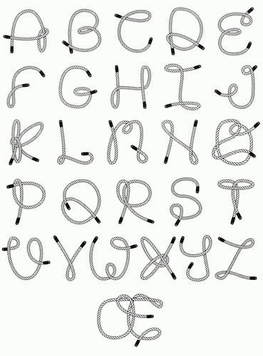
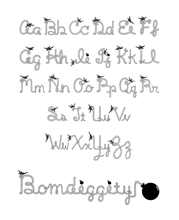
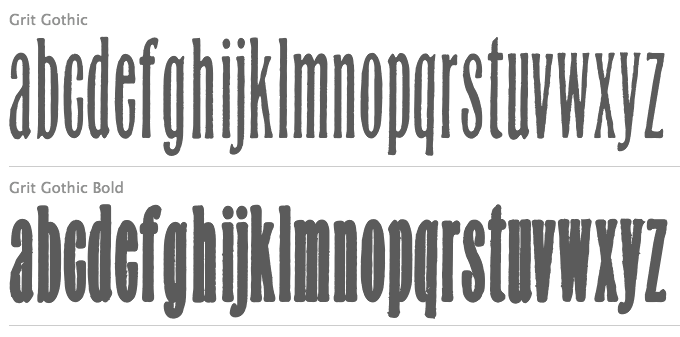
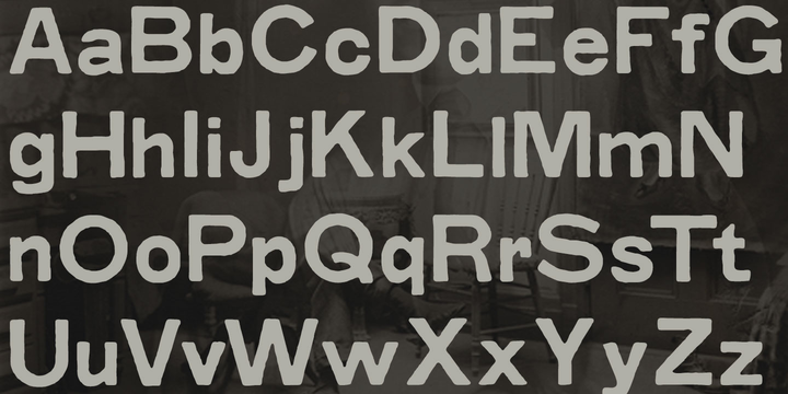
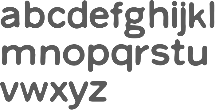
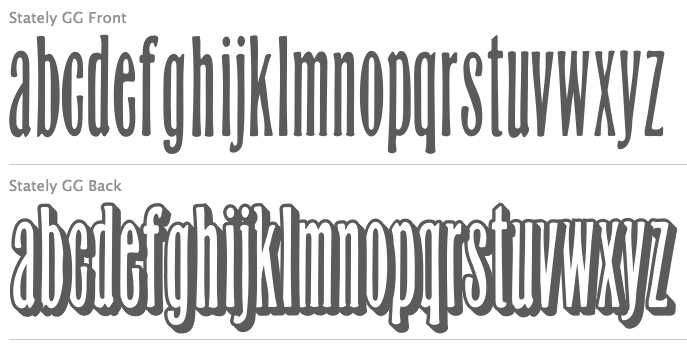
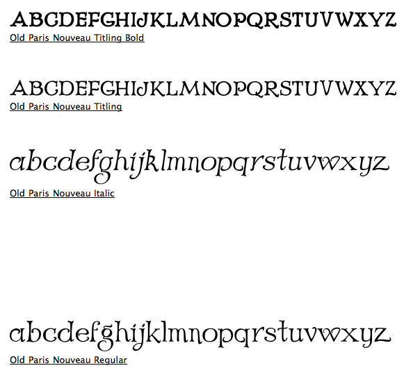
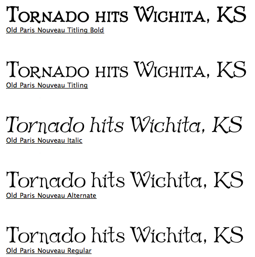
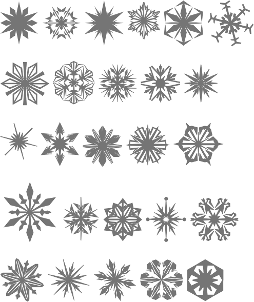
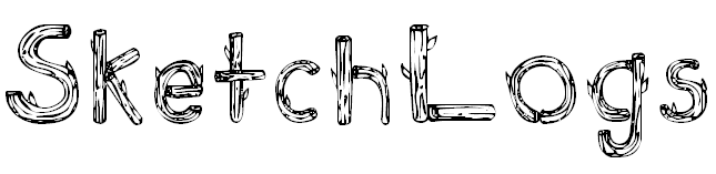
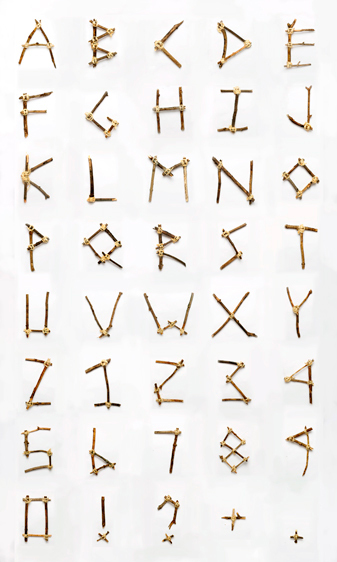
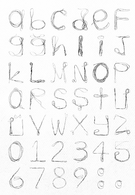
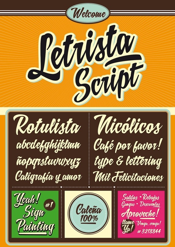
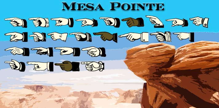
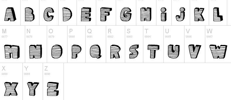
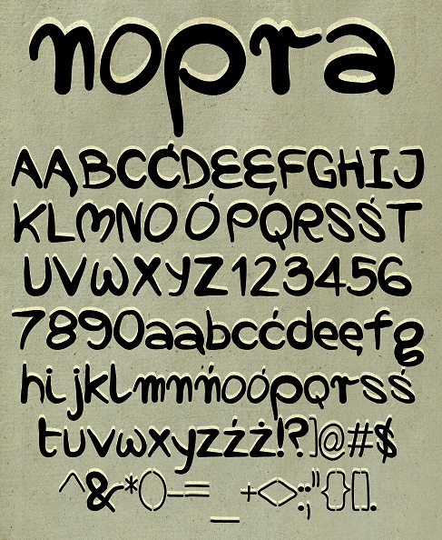
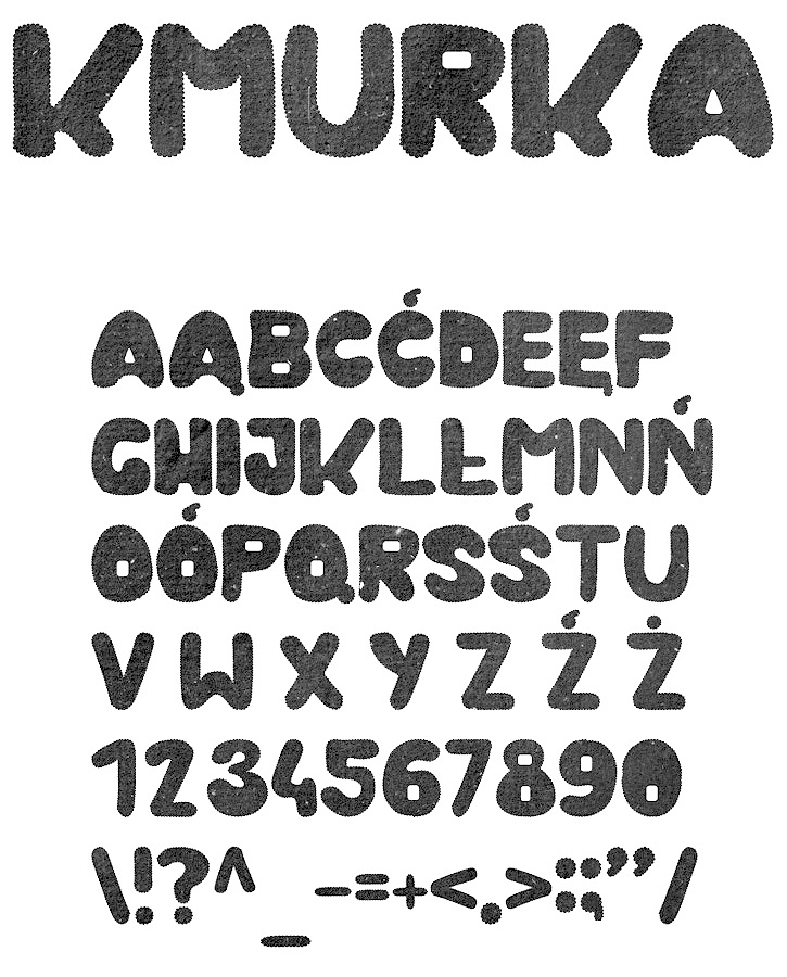
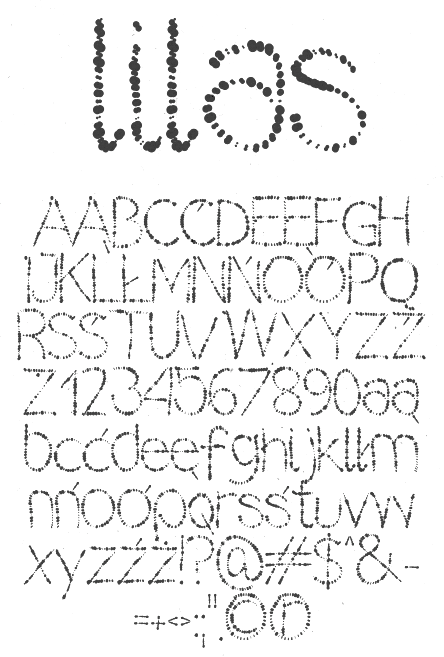
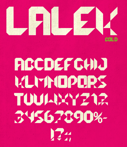
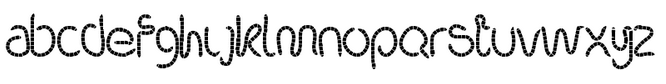
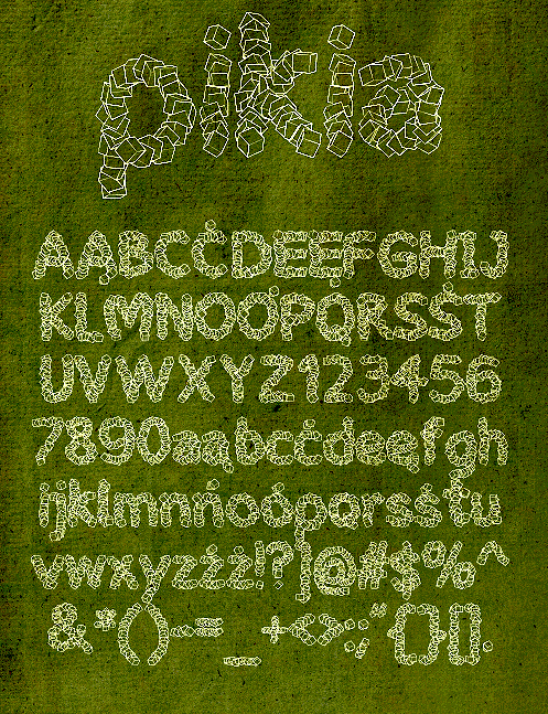
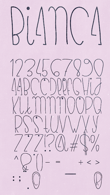
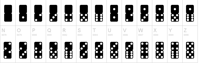
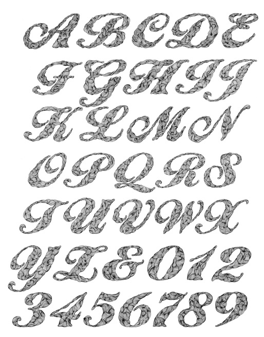
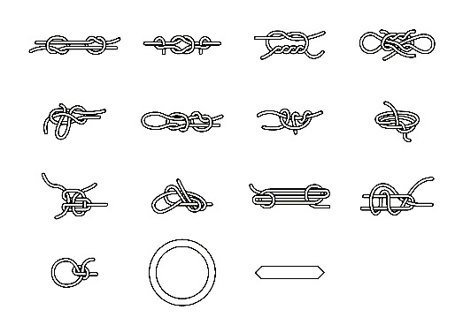
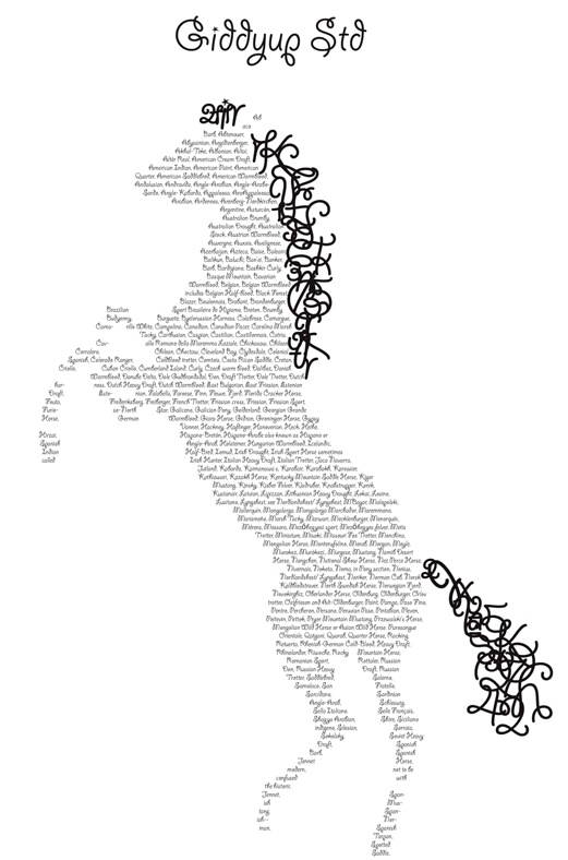
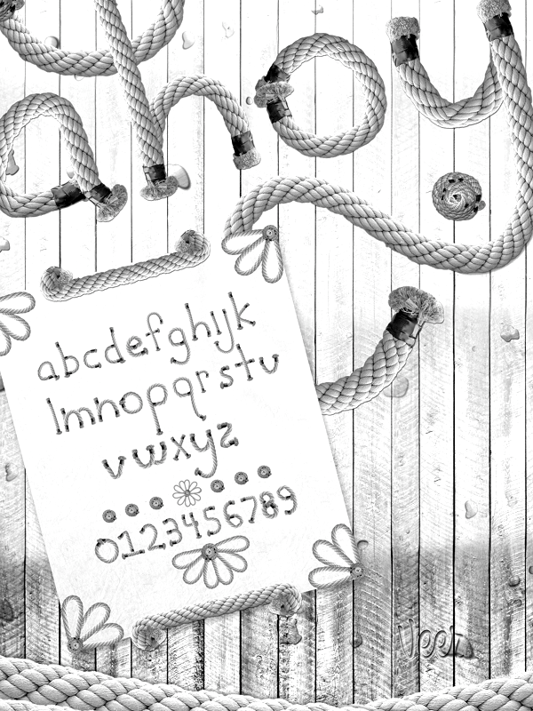
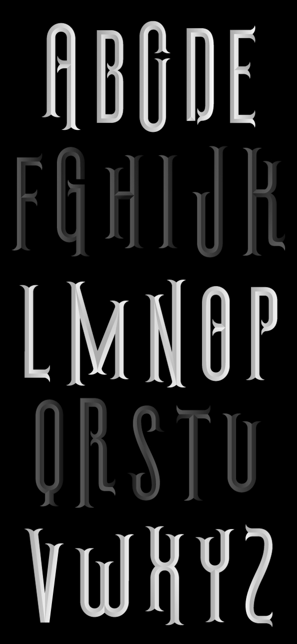
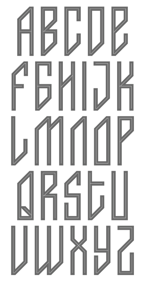
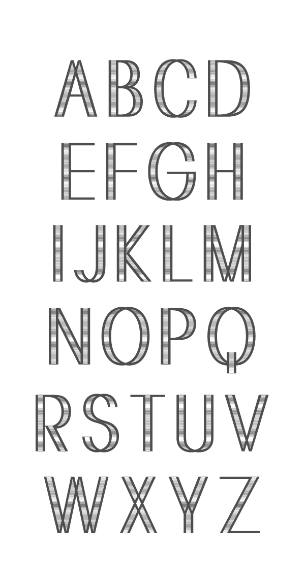
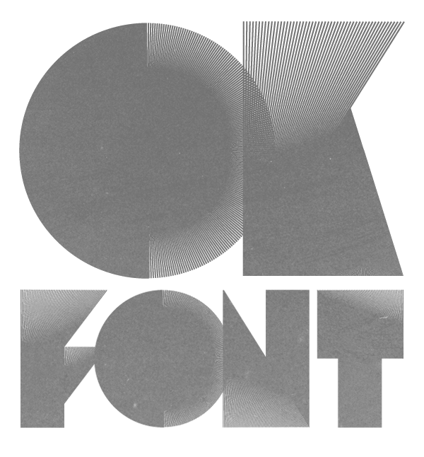
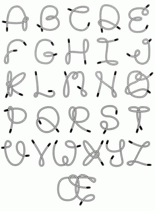
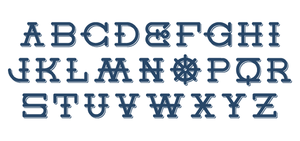
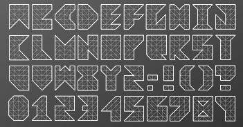
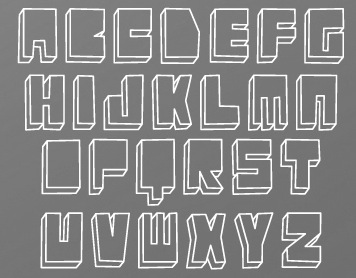
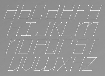
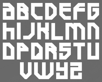
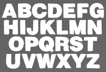
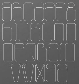
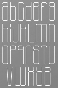
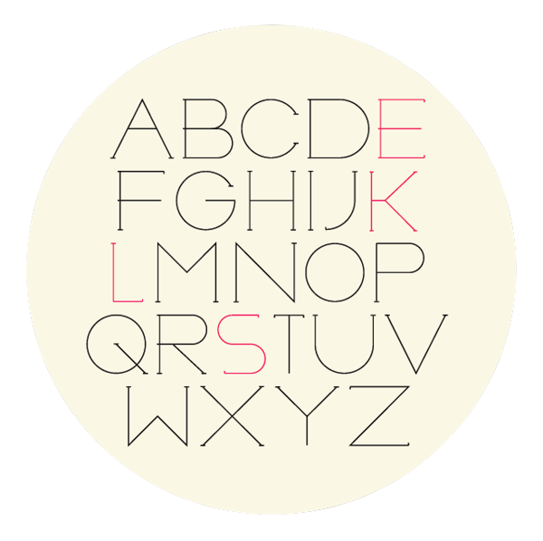
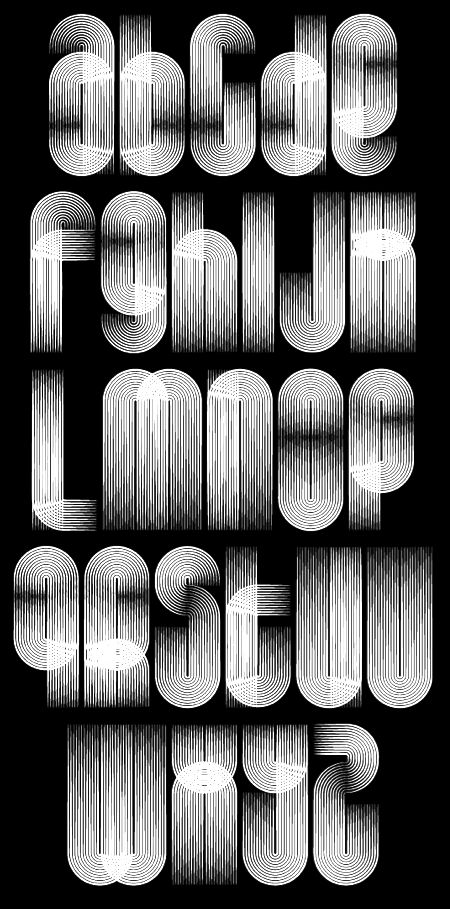
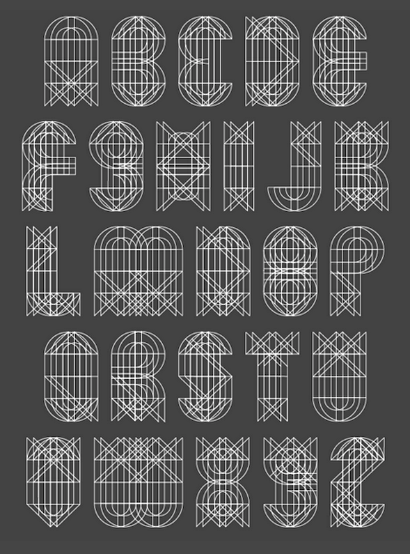
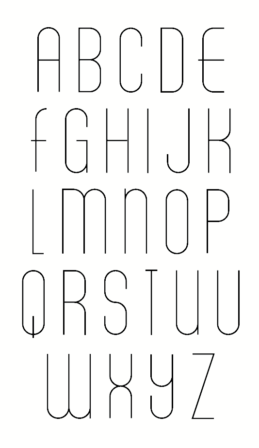
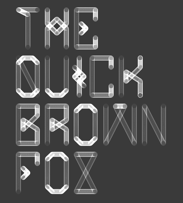
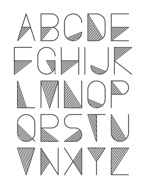
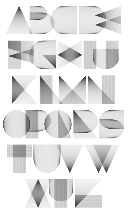
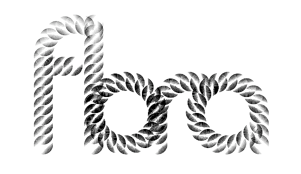
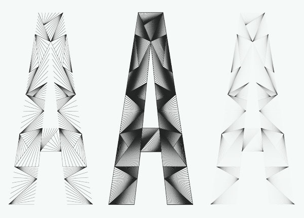
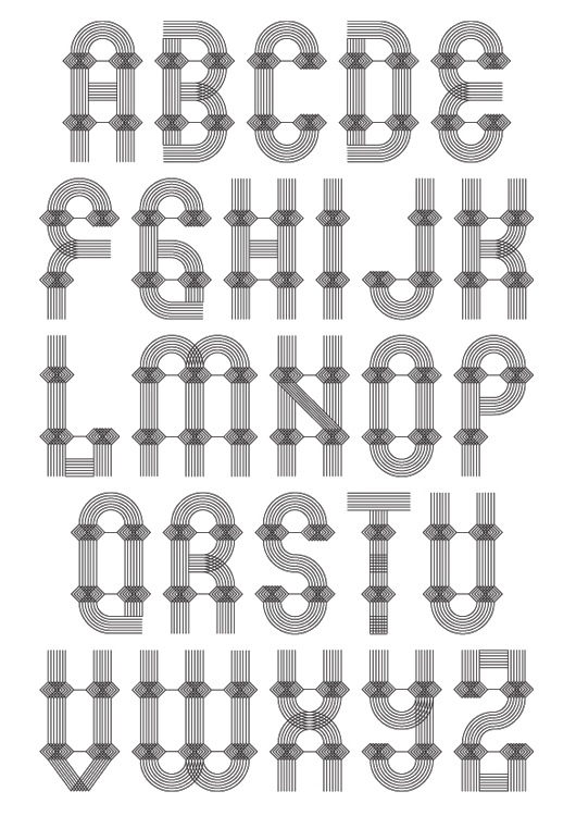
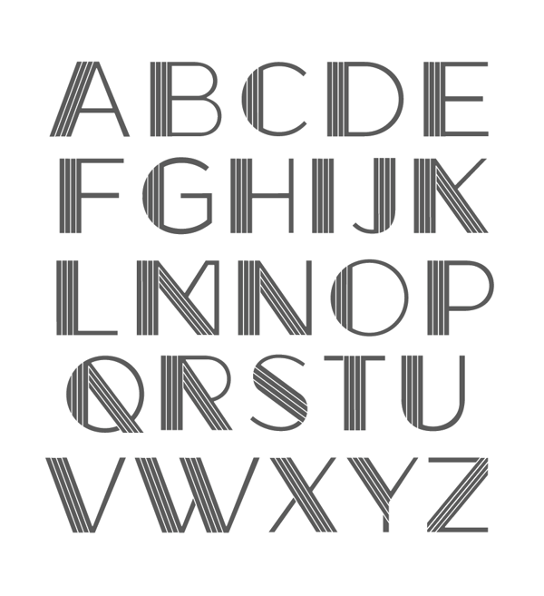
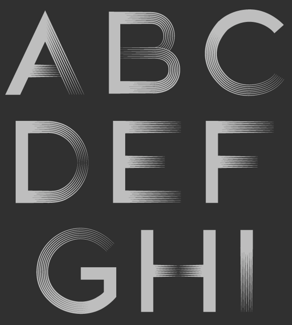
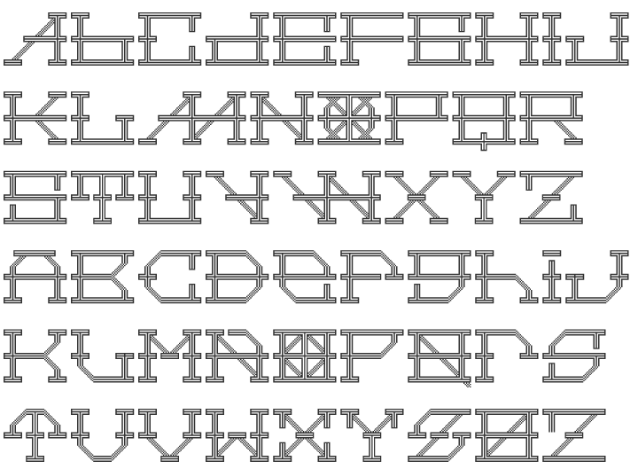
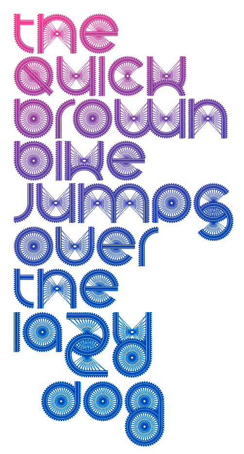
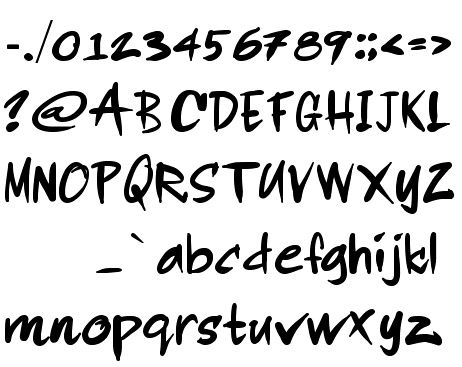
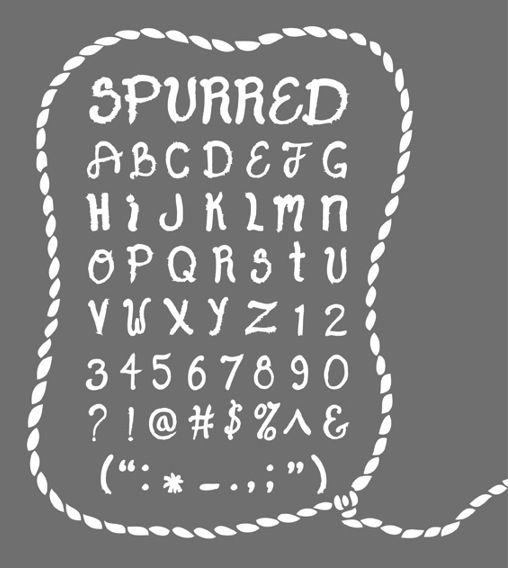
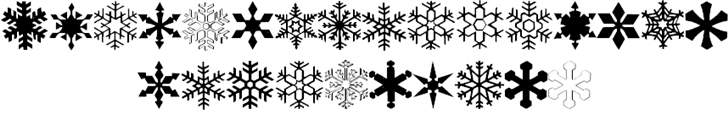
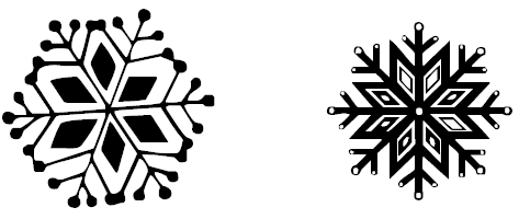
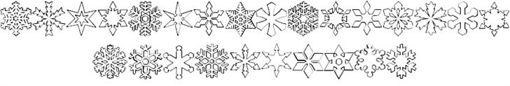
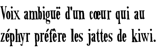
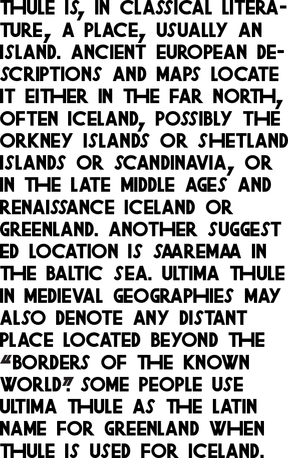
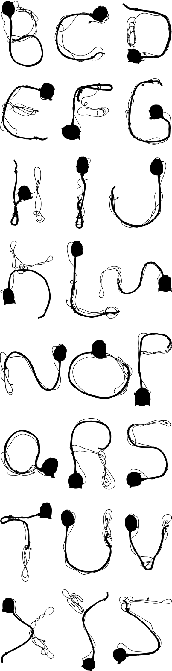
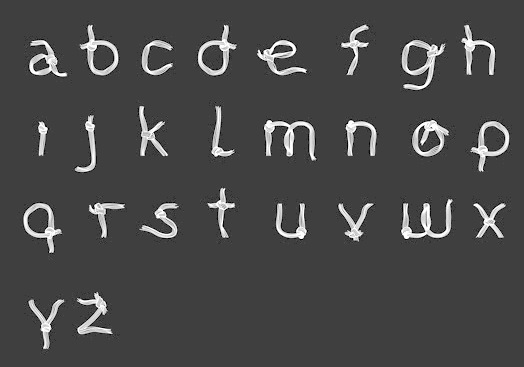