TYPE DESIGN INFORMATION PAGE last updated on Mon Mar 9 16:15:12 EDT 2026
FONT RECOGNITION VIA FONT MOOSE
|
|
|
|
|
Type design in Slovakia | ||
|
|
|
|
SWITCH TO INDEX FILE
" <...> is the title of a new graphic design magazine (now based in Den Haag, The Netherlands) intended to fill a gap in current arts publishing. It is not interested in re-promoting established material or creating another 'portfolio' magazine. Instead, it offers inventive critical journalism on a variety of topics related both directly and indirectly to graphic design culture. " Editors: Jurgen Albrecht, Stuart Bailey, Peter Bilak. [Google] [More] ⦿ | |
Design community headquartered in Bratislava, Slovakia. Creators of the commercial calligraphic typeface Feathergraphy (2013) [not to be confused with a font by the same name published much earlier by Mans Greback], Tzanah (2016; identical to a font by Dorian Grey), and Secret Society Font Family (2016; identical to another font by Dorian Grey). Icon sets designed by them include Sports Icons, Medical Icons, Flat Social Icons, and Vegetables. In 2017, they designed the distressed typeface Dark Matter [I thought that this was by Dorian Grey...] and the handcrafted Pugzley [again, by Dorian Grey, if you ask me]. In 2018, we find typeface such as the handcrafted Emily and the weathered gas mask font Verboten. [Google] [More] ⦿ | |
Namestovo, Slovakia-based designer of Linedot (2018). [Google] [More] ⦿ | |
Adtypo
|
|
Kosice, Slovakia-based designer of the display typeface Pier (2016). [Google] [More] ⦿ | |
Kosice, Slovakia-based designer of Snoite (2014, an art deco typeface) and Abscissa (2014, a multiline decorative typeface). Behance link. [Google] [More] ⦿ | |
Bratislava, Slovakia-based designer of Genetika (2014) and Rhum Negrita (2014, a shaded caps typeface family). Behance link. [Google] [More] ⦿ | |
Andrej Canecký
| |
Andrej Dienes
| |
He also made the extensive family Adriq (1989-1990). This typeface became Nara (1989-2009, Typotheque)---it was completed by Nikola Djurek and Peter Bilak. The modern serif text typeface is accompanied by two different angular scriptish italics for dramatic and quite spectacular effects. In 2017, he added Nara Sans (designed with the assistance of Slavka Paulikova, Nikola Djurek, and Marko Hrastovec). Speaker at ATypI 2016 in Warsaw on Creating a platform for type foundries. Klingspor link. [Google] [MyFonts] [More] ⦿ | |
Slovak designer from the early part of the 20th century. One of his posters entitled Deleni Plochy (1927) shows rectangular bi-colored partitions of space. [Google] [More] ⦿ | |
Bit-fonts.com (was: M-D Fonts)
| Martin Steiner (Bit-fonts.com, and before that, M-D Fonts) is the Slovak designer (b. 1992) of the warning sign dingbat font Warning Tables (2006), Old newspaper font (2008), the ink run typefaces Catalogue (2008) and Black Ink (2007), Old Typewriter (2007), Imperative Tables (2007, warning dingbats), Rugged Type (2008, grunge) and the pixel typefaces BitBox (2007), BitNano (2007), BitDotted (2007), BitMicro01 (2007), BitBold (2006), Bit Favorite, BitNanov211, Bit_01, Bit Classic, BitNanov33, BitCube (2009), Ghotic Sketch (2014), and BitMirror (2006). Home page where one can also download the fonts. [Google] [More] ⦿ |
BW 90
| Radovan Cernak (BW90) is a Slovakian graphic designer. In 2017, he created the slab serif / athletic lettering typeface Supreme (2017). In 2019, he published the textured typeface Dry Brush Blocks and the gooey gory Poster Monster. Typefaces from 2020: PXL3287 (a pixel art font inspired by '80s space and sci-fi cartoons and arcade games) [Google] [MyFonts] [More] ⦿ |
Byzantine Catholics in Slovakia
| The following fonts can be downloaded at this Slovak site of the Byzantine catholic church in Slovakia: the music fonts Juhasevic (2006, David Pancza), Lviv (2006, David Pancza), Lvov (2006, David Pancza), Manjava (2006, David Pancza), and the Olsavica family (also 2006, David Pancza). Also: S407 (David Pancza), Izitsa StarosloviencinaA (1995, old Slavonic), bwgrkl (1994, Michael S. Bushell), pismotest, znamC (David Pancza). [Google] [More] ⦿ |
Carnoky Design
|
In 2012, he designed Technik (completely constructed from geometric elements). Typefaces from 2013: Technik Mono, Technik Serif (slab serif family). In 2014, Carnoky published the squarish modular typeface family Corner, which is split into subfamilies called A (pixelish), B (octagonal), C and D. In 2015, Carnoky's talent and energy were rewarded by his splendid 42-style text family, Inka, which has subfamilies with larger x-height (A) and smaller x-height (B), and is characterized by daring vertical butcher cuts in letters such as a, c and italic f. Typefaces from 2016: Normatica (a neutral typeface inspired by advertising letters used as letterings on shop windows during period of normalization (1960-1990) in former Czechoslovakia). Typefaces from 2017: Zin Slab, Zin Sans. Typefaces from 2020: Zin Display (33 styles, sharp terminals), Zin Serif. MyFonts link. Behance link. Klingspor link. [Google] [MyFonts] [More] ⦿ |
Chmela Studio
|
Behance link. [Google] [More] ⦿ |
Software and TeX specialist at the University of Bayreuth, Germany, who designed AuriocusKalligraphicus (2004), a calligraphic type 1 handwriting font. In 2006, these fonts were added: Lukas Svatba (originally called AmiciLogo for the group Amici Musicae Antiquae in September 2004, this was changed, after adding Czech and Slovak diacritics for the wedding of Lukas Palatinus and Ludmila Nyvltova in the Spring of 2005), Jana Skrivana. Alternate URL. From the readme file: Each font features oldstyle digits and (machine-generated) boldface and slanted versions. Lukas Svatba is provided in a variant with a long s with the same input convention as in fraktur.sty by Matthias Mühlich. [Google] [More] ⦿ | |
| |
Cruzine
|
Creative Market link. Behance link. Dafont link. [Google] [More] ⦿ |
| |
This TeX users group has an active Bulletin, which has several interesting issues with articles each month. Free access to the issues. (In Czech) [Google] [More] ⦿ | |
During her studies at Josef Vydra School of Applied Arts in Bratislava, Slovakia, Daniel Brunovska created the thin sans typeface Grape Font (2014). [Google] [More] ⦿ | |
Svidnik, Slovakia-based designer of the handcrafted curly serif typeface Wonderland (2017). [Google] [More] ⦿ | |
More recent free typefaces include Fava Black (2012, a massive magazine font) and Keytin Light (2012, a thin condensed sans). Viable (2010, a sans typeface) s a commercial typeface that was published at Graphic River. Dafont link. A second Dafont link. Klingspor link. Devian tart link. From this site, it seems that Dannci is in fact Ben Stucki from Nashville, TN. But over at Graphic River, where we can buy his sans typeface Viable, we read that he is Slovakian. Devian Tart link. [Google] [More] ⦿ | |
Slovak designer who created Globus (1999), a text face. His Hrana (1997) has the hookishness pioneered by Vojtech Preissig. [Google] [More] ⦿ | |
Bratislava, Slovakia-based designer of a hexagonal typeface in 2015. [Google] [More] ⦿ | |
| |
David Pancza
| |
During his studies in Dublin, Ireland, Declan Behan designed the multiline display typeface Lockup (2015) and the display typeface Brathair (2017). He explains: Brathair is a typeface that combines the characteristics of An Clo Gaelach (Gaelic type) with Slovak typography used on street signs, billboards and shopfronts during the Socialist period, particularly during the period of normalisation between 1960 and 1990. The typeface was created during my Erasmus semester at the Academy of Fine Arts and Design in Bratislava.Behance link. [Google] [More] ⦿ | |
Deeezy
| Pete Deeezy is Bratislava, Slovakia-based designer Peter Olexa, who also is involved in or running Dealjumbo and Cruzine Design. Designer of these fonts in 2017: Trendy Script, Demonius Bold Inline, Murray Inline Bold, Money, Just Marriage (script), Valeria (Victorian). Typefaces from 2020: Retjeh, Blokee, Helga, Starship Shadow, Aviation Cocktail, Arthemis, Monument, The Crow, Marseille (script), Meravin Inline, Paulina Elegance (script), Venomous Shadow, Magneto Bold, Madeva Suarte, Legacy Outline, Hermes Futuristic, Mocca Inline Grunge, Skywalker Shadow Grunge, Majestic Inline Grunge, Blue North, Murray Inline, Metro Inline Bold, Salada Inline, Vultron Bold, Capella, Bureno, Napoleon Shadow, Atara Inline, Stella Inline Grunge, Temu Shadow, Rodeo Shadow. Typefaces from 2022: Wimberley (a display serif). [Google] [MyFonts] [More] ⦿ |
Kosice, Slovakia-based designer of the display typeface Ludovienka (2016). [Google] [More] ⦿ | |
DizajnDesign
|
His graduation project at the Type and Media MA program of KABK was Preto (2009), a multilingual type family which explores the impact of serifs in legibility and readability (+Sans, +Sans Basic). He says: The three core styles that structure the family (sans, semi and serif) are particularly useful in the context of multilingual typesetting to achieve an even colour in equivalent texts written in different languages. In 2010, he created Rukou, a script that reminds me of Sütterlin. In 2011, he made Anca (playful rounded monoline sans). Typefaces from 2013: Preto Serif, Razom Script (an angular monoline script). Typefaces from 2014: Preto Semi. Typefaces from 2015: Kontrast Grotesk (Display, Grande). In 2016, Cesar Puertas and Jan Filipek co-designed the newspaper typeface Bagatela for La Republica. In 2018, he published Nakoso. In 2019, Martina Rozinajova and Jan Filipek co-designed the Slovak school writing font Skolske Pismo. MyFonts link. Behance link. Cargocollective link. Fontspring link. [Google] [MyFonts] [More] ⦿ |
| |
During her studies in Bratislava, Slovakia, Ema Cepkova designed the hand-printed font family Handwriting (2016). [Google] [More] ⦿ | |
Nitra, Slovakia-based desiger of the gridded typeface North Shore (2018). [Google] [More] ⦿ | |
Slovak designer of the logotype typeface Hexagon (1997). [Google] [More] ⦿ | |
Slovak scientist (b. 1988) who lives in Prague. Creator of the handwriting typefaces Enyon Handwrite (2008) and Naramel (2008). Home page. [Google] [More] ⦿ | |
During her studies at the Academy of Fine Arts and Design in Bratislava, Slovakia, Ester Nemcova created a connect-the-dots icon font called Dots (2013). She also made Icons of Bratislava (2015). Home page. [Google] [More] ⦿ | |
Graphic designer in Kosica, Slovakia. Designer of the typeface Origami Space (2013). [Google] [More] ⦿ | |
Slovak IT company, est. 1990. It is a vendor for Monotype fonts, among other things. It also sells Central and Eastern European fonts developed under license from Bitstream. Some of their typefaces are sold on a CD called Fontotéka. [Google] [More] ⦿ | |
Creator of 10 Muc Zeit (2010) and Cholerik (2012, OFL). Speaker at ATypI 2016 in Warsaw on How skeleton based type design could shake up digital type design workflows. In 2017, he and Martin Cetkovsky published an extension to Glyphs, called Letterink, which permits type design based on a stroke (or skeleton) with a directional nib. Related approaches include Ofir Shafit's FontArk, and Donald Knuth's Metafont. Typefaces by Filip Zajac, Jakub Valach and Martin Pysny in 2019: Skeleton Type One Poster, Skeleton Type One Initial Max. [Google] [More] ⦿ | |
Filip Zajac
| |
Commercial PC program for identifying or finding a close match for scanned fonts. Free trial with 30runs. By Balarad Software (Ladislav Balara) in Presov, Slovakia. The font recognition program recognizes 5300+ Corel Draw, Microsoft Windows, Microsoft Word and other trueType fonts based on font features and some key letters. Can also be used as a font installer and printer. Download site. [Google] [More] ⦿ | |
Fontra Foundry
| Koslice, Slovakia-based designer of Retro Nova TW (2017), Retro Nova GL (2017, or Retro Nova Glow), Asphalt Racer (2017: sci-fi style), Papercut (2017), and Papercut Cat & Mouse (2017). Behance link. [Google] [More] ⦿ |
Fonts2U
| Large nicely categorized font archive. Font designers. Font vendors. The owner seems to Peter Olexa, a Slovakian visual artist who is based in Bratislava. [Google] [More] ⦿ |
Slovak designer from the early part of the 20th century. Check out the sturdy typography in his Annual Report for the Vocational School of Graphic Design (1927). [Google] [More] ⦿ | |
Freshmeat
| Freshmeat (Stupava, Slovakia) is the foundry of type designer Andrej Canecký. Designer of the minimalist monoline sans typeface Primitive (2011). [Google] [MyFonts] [More] ⦿ |
Designer in Bratislava, Slovakia. He created an untitled wavy typeface in 2014. [Google] [More] ⦿ | |
Grafotechna Garamond was introduced in 1959 by Stanislav Marso. Praha (1968) is a text typeface that was revived by Synoptic Office in 2017. [Google] [MyFonts] [More] ⦿ | |
Guerillacraft
| Senica, Slovakia-based designer of the free angular poster typeface Pool Riders (2017, +Dingbats), which is inspired by punk and skateboarding culture. He also drew several great alphabets in vector format, such as the dry brush set Classic Strokes (2017) and the woodsy Woodcraft (2017). Behance link. [Google] [More] ⦿ |
Slovakian designer of the free organic sans typeface Capsuula (2010). [Google] [More] ⦿ | |
Nitra, Slovakia-based designer who created the free font Capsuula (2010, monoline sans). | |
Helen Priputen (Kosice, Slovakia) created the arrowed typeface Hell Font (2012) during her graphic design studies. [Google] [More] ⦿ | |
Bratislava, Slovakia-based designer of the arrowed typeface Hell Font (2014). Behance link. [Google] [More] ⦿ | |
Into the Type
|
Graduate of the Type & Media program at KABK in Den Haag in 2014, where she created Kin, an unconventional serif type family which explores distinctive styles while maintaining consistency. It has phonetic support and a drop-dead gorgeous black. In 2015, the 72-font family Skolar Sans (see also, Skolar Sans PE, 2016), codeveloped by David Brezina and Slava Jevcinova at Rosetta Type Foundry, won a silver medal at the European Design awards. In 2017, Slavka Jevcinova published Avory Latin at Rosetta Type Foundry. Calling it retro-chic, she writes about this sturdy Latin / Greek / Cyrillic sans typeface family: Avory is a gently condensed sans that challenges convention. Tall, with broad shoulders, easily spotted from afar. Inspired by the lettering work of Czech designer Jaroslav Benda. In 2019, she released the fashionable sans typeface Clarette at Future Fonts. Clarette pays special attention to Vietnamese. In 2019, at Rosetta Type, together with William Montrose and David Brezina, she released the variable font Adapter (with three axes, for Latin, Greek and Cyrillic). Typefaces from 2020: Wilmer (a multilayered three-dimensional ornamental Tuscan type family), Polaire (a monoline cursive stencil). Future Fonts link. [Google] [MyFonts] [More] ⦿ |
Typefaces from 2017: Frosty Sky, Pink Lady, Mon Amour (script), Catedral Script (calligraphic), Catedral Brush, Palm Beach (Sans, Script), Broadway (brush script), Gustavson Script (dry brush). Typefaces from 2018: Smooth River, Chester (SVG format brush font), Lucky Bloom (OpenType SVG), Black Caviar (SVG format brush font), Empathy (SVG brush), Melvin and Emily (a wedding script font duo), Margarita (formal calligraphy), Rocked (SVG format brush font), Royal Touch, South Wind, Diplomatic (formal calligraphy), and the hand-lettered font collection (HLF Supreme, HLF Montreal, HLF Marco Polo, HLF Rockway, HLF Black Caviar). Typefaces from 2019: Santa Fiora (an SVG font duo), Biago Serif, The Brightside, Balkan (brush script), Rosematty (wild calligraphy), Boutique in Heaven (a casual brush font), Bianca Kamelo, Stay Bright (script), White Heart (brush script). Typefaces fro 2020: Cosmopolite (a dry brush script), Bonami (calligraphic). Typefaces from 2021: Cherion (a fashion mag serif), Fairy Spirit (reverse stress), Wistenia, Selina, Betliar (a bold display serif), Siena (a luxurious sans), Asther (a fashion mag serif), Glamy (a ligature-rich serif), Giovany (a bold display serif), Monet (a hipsterish display typeface), Hanesy, Ribolla (German expressionist), Olive Village (a decorative serif), Grande (a stylish serif), Algiers (sans), Francie (serif and script), Meraki (serif and script), Queen Victoria SVG (script), Rocked SVG, Primer SVG, Horal SVG, Magic Flower SVG (a calligraphic script), Crystal SVG, Black Caviar SVG, Perfect Moment SVG, The Bloomington, Belgravia Terrace, Maison (a stylish flared typeface), Emporio Hotel (art deco), Black Dragon SVG, Sweater, Balkan, Corinthia, Smooth River, Empathy SVG, Beach, Los Banditos (script). [Google] [MyFonts] [More] ⦿ | |
Graphic designer in Lucenec and/or Bratislava, Slovakia. She designed Circle Font (2011, dot matrix face) and Filharmonia (2012). [Google] [More] ⦿ | |
Ján Filípek
| |
| |
Jan Hus (1370-1415) introduced the principle of a diacritic (in his case, a dot above some letters) in his "Orthographia Bohemia" (1406-1412). This work became the basis for modern Czech typography. Hus was burnt at the stake in Konstanz, but not because of his typographic convictions. [Google] [More] ⦿ | |
Slovak designer of Vlna (2004), an experimental typeface. [Google] [More] ⦿ | |
Trencin, Slovakia-based creator (b. 1999) of the fat finger fonts Drag (2014), Comicksan (2014), Lines (2014) and ASDF (2014). Persoanl site. [Google] [More] ⦿ | |
During his studies in Ruzomberok, Slovakia, Janci Gejdos created the experimental typeface Initial (2013). [Google] [More] ⦿ | |
During her studies in Bratislava, Slovakia, Janette Diouha created JD Font (2014). [Google] [More] ⦿ | |
Slovakian designer of the Treefrog-like handwriting font Jano (2008). [Google] [More] ⦿ | |
Jaroslav Kocian (b. 1977, Slovakia) created the free pixel typeface Muzalemova (2014). Dafont link. [Google] [More] ⦿ | |
Johanna Balusikova (b. 1974, Slovakia), now Johanna Bilak, studied typography at Atelier National de Création Typographique in Paris and at the Bratislava Art Academy in her native Slovakia, as well as at the Jan van Eyck Akademie in the Netherlands. She now works as a freelance graphic designer in The Hague, where she has lived since 1999. She designed Jigsaw (1999-2000) at Typotheque: this was originally intended as a Multiple Master font that varies from roman to stencil. At ATypI 2004 in Prague, she spoke about "Experiment and typography". Co-editor with Alan Zaruba of We Want You To Love Type (2004, e-a-t). Since 2003 she is a partner in Peter Bilak's Typotheque. [Google] [MyFonts] [More] ⦿ | |
Designer of RL Lyra (2017; by Jozef Ondrik: after Othman Motter). With Matej Vojtus, at Regular Lines, he designed RL Refusit (2018: a black display typeface), RL RW (2018: a Western font), RL Roman and RL Unno (2017-2018: a tuxedoed sans). [Google] [More] ⦿ | |
Slovak designer from the early part of the 20th century. Here is an example of an art deco magazine ad published by him in 1937. [Google] [More] ⦿ | |
Slovak designer who created Bible01 (1993, pictograms interpreted from biblical stories). [Google] [More] ⦿ | |
Pic. Myfonts link. Creative Market link. Klingspor link. Fontspring link. Behance link. Showcase of Juraj Chrastina's typefaces at MyFonts. Behance link. View Juraj Chrastina's typefaces. Showcase of Juraj Chrastina's typefaces at MyFonts. [Google] [MyFonts] [More] ⦿ | |
Juraj Sukop
| |
| |
Slovak type designer based in Bratislava. In 2008, Karol designed the sans typeface Klin at the Academy of Arts, Architecture and Design in Prague, under the guidance of Frantisek Storm. Klin is characterized by chamfered line caps and flaring. It was primarily created for architecture and design. Klin received an Honourable mention at the Slovak National Prize for Design 2009 contest. [Google] [More] ⦿ | |
Martin, Slovakia-based designer of the monoline hipster typeface Noryt (2015) for Latin and Cyrillic. [Google] [More] ⦿ | |
Kea SK
| Peter Felix (Krea SK, Slovakia) designed Krea Sans (2018). [Google] [MyFonts] [More] ⦿ |
Trencin, Slovakia-based graphic designer. She created Essen Sans (2012) and Wood Font (2012, based on the patterns in tree bark). [Google] [More] ⦿ | |
Slovakian designer of a De Stijl-inspired typeface in 2017. [Google] [More] ⦿ | |
Bratislava-based creator of the 3d cubic grid font ABCD (2012). [Google] [More] ⦿ | |
Kristina Uhrakova was born in Trnava, Slovakia. She graduated in Graphic Design at Central St. Martins College of Art and Design London. Creator of the octagonal typeface Sputnik Regular (2012). [Google] [More] ⦿ | |
I was waiting for the first racist font in this dystopian era. That honor goes to Slovakian designer Kristian Ulicna with Jugos (2018). [Google] [More] ⦿ | |
Letterink
| In 2017, Filip Zajac (Trstena, Slovakia) and Martin Cetkovsky published an extension to Glyphs, called Letterink, which permits type design based on a stroke (or skeleton) with a directional nib. Related approaches include Ofir Shafit's FontArk, and Donald Knuth's Metafont. Discussion on Typedrawers. [Google] [More] ⦿ |
Zilina, Slovakia-based designer of the freepixel font Swamp Thing (2014). Behance link. [Google] [More] ⦿ | |
Slovak professor, who is curating an exhibition called "20th century Slovak typography, part 1: 1918-1970" from October 8th 2004 until January 2nd 2005, in Bratislava's Mirbachov Palace. He has done a pioneering job on historical research of typographical work done by Slovak artists since the beginning of the Czechoslovak state in 1918. Author of Modernost Tradicie (or: Modernity of Tradition) (2012, Slovart), about which Typotheque writes: This book uncovers the largely forgotten history of Slovak graphic design since 1918. After a slow start, cultural life in Central Europe underwent an unprecedented development, as is documented in the works of Martin Benka, Andrej Kovacik, Jaroslav Vodrazka, Karol Ondreicka, Jozef Cincik, Stefan Bednar and Rudolf Fabry. The works are placed in their historical context and are accompanied by historical facts and descriptions of the cultural and political situation in the country. Designer of hundreds of book covers. Author of Martin Benka, the first designer of the Slovak National Myth. [Google] [More] ⦿ | |
Slovak designer from Zilina who made the Z Font (1994), an italic font with some mathematical symbols needed for the Z language. Truetype, type 1, type 3. [Google] [More] ⦿ | |
| |
Slovakian designer (b. 1978) of the free comic book typefaces Konstructer (2008), AntiHrdina (2008), PetBone (2008), My E Go (2008), Rehotalk (2008), Dessin Immortel (2008) and Mankinoid 2008 (2008). [Google] [More] ⦿ | |
Creative director in Bratislava, Slovakia. Designer of the artsy typeface Ultima Campagnoli (1998). Dafont link. [Google] [More] ⦿ | |
During his studies, Zilina, Slovakia-based Marek Ciesarik designed the paperclip typeface Last (2018). [Google] [More] ⦿ | |
Bratislava, Slovakia-based creator of the ghoulish typeface Cringer (2013). Behance link. [Google] [More] ⦿ | |
Slovak designer of the experimental typeface Benka (2001) and of the pictogram typeface Via Dolorosa (2002). [Google] [More] ⦿ | |
Slovak painter and illustrator, b. 1888, Kostoliste, d. 1971, Malacky. He is regarded as the founder of Modernist 20th century Slovak painting. His typefaces include a hexagonal typeface from 1956, and a stone-chiseled typeface from the 1940s. Lubomir Longauer wrote Martin Benka, the first designer of the Slovak National Myth. [Google] [More] ⦿ | |
Speaker at ATypI 2016 in Warsaw on How skeleton based type design could shake up digital type design workflows. He writes: We have developed new tool inspired by the Stroke theory by Gerrit Noordzij. The tool translates a stroke and width and rotation of a nib into a shape. At ATyPI we let people try our software and conduct discussion about what might designing with skeleton based approach brings to the industry. [Google] [More] ⦿ | |
Martin Malina (Bratislava, Slovakia) created the octagonal typeface Chichman in 2013. [Google] [More] ⦿ | |
Martin Steiner
| |
Czechoslovakian designer/typographer. He created the informal blocky fave Pakt. [Google] [More] ⦿ | |
| |
Matej Ilcik
| |
Graphic designer in Bratislava, Slovakia. Creator of the organic typeface Not Enough Small (2011). [Google] [More] ⦿ | |
His web page in in Slovakia, but his body is in Brno (and before that, Prague). This graphic designer created the fat rounded typeface Rusalka (2011), Dargov Grotesk (2015), Inter Grotesk (2015), Helios Serif (2015), Neu Neon (2015), Boris Serif (2015), Burza Display (2015) and Deci Display (2015, inline style). With Jozef Ondrik, he set up Regular Lines. Together, they designed RL Refusit (2018: a black display typeface), RL RW (2018: a Western font), RL Roman and RL Unno (2017-2018: a tuxedoed sans). [Google] [More] ⦿ | |
Slovak designer of the paper cutout typeface Nozhnitsy (2014) and the grungy blackletter typeface Kyvadlo Blues (2016). [Google] [More] ⦿ | |
| |
Bratislava, Slovakia-based designer of a few hand-printed ornamental caps alphabets in 2013. [Google] [More] ⦿ | |
During her studies in Bratislava, Slovakia, Michaela Novosadova xreated the display typeface Baroko (2015). [Google] [More] ⦿ | |
Graphic designer in Bratislava, Slovakia, who created the free techno typeface Phelix Boomgartner (2015). [Google] [More] ⦿ | |
Slovakian type designer, b. 1980, who graduated from the Academy of Fine Art and Design, Department of Visual Communication, Bratislava, Slovakia. He is into type design, lettering, typography, illustration, and comics. His typefaces include Deputy Caps (2003, Western), Esens (2003-2004), Esens Display (2006), Sacra (2005), Empirik (2006, and angular typeface in the Menhart tradition), and Panta Rhei (2010). [Google] [More] ⦿ | |
Michal Vydareny
| |
Slovak site: the file fonts.rar has a bunch of AType fonts from 1992 (such as ATBard, ATBeehive, ATBusker, ATChalk, ATCosmicTwo, ATCottage, ATCrescent, ATEklektic, ATErieContour, ATFrankHighlight, ATFrankenstein, ATGoldMine, ATGriffonShadow, ATIndiana, ATIreland, ATLincoln, ATViking), and a number of HiStroke fonts, also from 1992: ArtistikCE, AshleyInlineCE, CreepyCE, EclipseCE, FattiPattiBoldCE, FletcherGothicMediumCE, JapanetteCE, LeasterixCE, OldEnglishCE, SnowdriftCE. [Google] [More] ⦿ | |
Typefaces from 2021: Monograf (a monospaced technical sans), Florensans (all caps, Peignotian). Typefaces from 2022: Chocolatier (an all caps display serif). [Google] [MyFonts] [More] ⦿ | |
Milos Micatek
| |
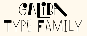
IN 2018, she designed the children's book typeface Galiba. [Google] [MyFonts] [More] ⦿ | |
MM Font Factory
| Czech comic book font designer. His creations include MM Script Evolution Italic, MMFF Kucetom (Tomas Kucerovsky), Mankinoid v2, Vierkas Handwriting MMFF, Nut Tree, DevCageR SFX, DevJed, Testament, MMTelenko, Telenko SFX, Sebastiano, Prophiety, Pan-Opti-Cum, Murena, BumPraskBang, KlasikoidCaps, Klasikoid, Conaniada 2, Bronzaica, MMFF Murderiada, MMFF WiShiWaShi, Noah Van Sciver, Vhrsti, Pavel "PaTa" Talas (MM Pata), Planeta Dinosauru. [Google] [More] ⦿ |
Bratislava, Slovakia-based designer of the handcrafted Treefrog-style typeface Gumont (2016). Behance link. [Google] [More] ⦿ | |
Ondrej Jób
| |
During his industrial design studies in 2015, Pavol Luptak (Ruzomberok, Slovakia) created a wide octagonal typeface. Behance link. [Google] [More] ⦿ | |
Pete Faes (Poprad, Slovakia) created the experimental typeface Typoxperiments (2012). [Google] [More] ⦿ | |
Presov, Slovakia-based creator of the tattoo font Bad Boys (2010). Specializing in vintage and Victorian lettering, he published Sign Shop (an ornamental Victorian typeface with many spurs and frills; together with Neuron Type) and Tobie in 2020. [Google] [More] ⦿ | |
Peter Bilak
| |
| |
Peter Chmela
| |
Peter Felix
| |
Graphic designer and illustrator from Kocurice, Slovakia, who is now based in Copenhagen, Denmark. Creator of the free vector format font Darect (2013), which consists of broken line segments. DromedarX (2016) is a display typeface developed during a two-day workshop with Immo Schneider and Johannes Breyer from Dinamo at Atelier of Graphic Design 2 of the Faculty of Fine Arts Brno. [Google] [More] ⦿ | |
Peter Olexa
| |
Peter Olexa
| |
Peter Olexa
| |
Prask
| Michal Vydareny (aka Prask) is the Slovakian creator (b. 1986, Bratislava) of the double-printed handwriting typeface Pencil Grid (2008), of the art deco condensed Zemiakovy Salat CE (2009), of the artsy Font Penetration (2004), of Wooo (2009) and of NewFacebook (2009). In 2012, he made the water bubble typeface Viktoria and the squarish Skew It. Dafont link. [Google] [More] ⦿ |
Radovan Cernak
| |
Rafael Rybar
| |
Slovakian designer of Revidendum (2011, experimental). [Google] [More] ⦿ | |
A type foundry set up in 2019 by Slovak type designers Jozef Ondrik and Matej Vojtus. [Google] [More] ⦿ | |
Bratislava, Slovakia-based designer of Vertigonal (2017, FontStruct). [Google] [More] ⦿ | |
Kosice, Slovakia-based designer of Freeze (2018). [Google] [More] ⦿ | |
Slovakian writer, b. Cairo, 1990. Creator of the grungy typeface The End Font (2014). Fontspace link. Dafont link. [Google] [More] ⦿ | |
| |
Slovak illustrator and book cover designer from the early part of the 20th century. [Google] [More] ⦿ | |
During his studies at University of Tomas Bata in Zlin, Czechia, Trencin, Slovakia-based Rudolf Vychovaly designed the ball terminal-laden display typeface Cornea (2017). [Google] [More] ⦿ | |
Samuel Carnoky
| |
Setup (was: Urtd)
|
In 2008, Peter Bilak, Eike Dingler, Ondrej Jób, and Ashfaq Niazi created the 21-style family History at Typotheque: Based on a skeleton of Roman inscriptional capitals, History includes 21 layers inspired by the evolution of typography. These 21 independent typefaces share widths and other metric information so that they can be recombined. Thus History has the potential to generate thousands of different unique styles. History 1, e.g., is a hairline sans; History 2 is Peignotian; History 14 is a multiline face; History 15 is a stapler face, and so forth. He founded Urtd in 2009 in Liptovsky Hradok, Slovakia, and renamed it Setup in 2016. He sells these fonts: the ION family (2010, LED simulation typefaces), Outliner (2008, architectural lettering), and the icon sets Ico Weather (2010), Ico Time (2010) and Ico Phone (2010). Klimax Bold (2008) is in the ultra-ultra-fat art deco category, and won an award at TDC2 2009 for display face. See also Klimax Plus (2009). Creations in 2011: Clip (2011) is a 4-style Opentype-feature-loaded paperclip family. Typefaces made in 2012: Remi (useful monospaced geometric sans family), Bismuth (angular techno family), Bismuth Stencil. In 2013, Ondrej Job published the script typeface Odesta. Odesta won an award at TDC 2014. Typefaces from 2014: Woodkit (a series of grungy wood emulation typefaces for Latin, Greek and Cyrillic published at Typotheque; Woodkit won second prize in the TDC 2015 Type Design competition), Pexico and Pexico Micro (pixel typefaces). Woodkit won an award at Modern Cyrillic 2014. In 2020, he designed the warm sligtly flared typeface family Clarinet. See also Clarinet Wide (2020). Corporate typefaces by Ondrj Job include Milkface, About Face and Fox Sports Netherlands. MyFonts link. Typedia link. Behance link. Klingspor link. Village link. Future Fonts link. [Google] [MyFonts] [More] ⦿ |
In 2013, FontFont published FF Dora (the angular text family extended from her thesis work in 2010) and FF Dora Display (which is a bit in the style of Rudolf Koch's German expressionist style). Behance link. Fontfont link. [Google] [MyFonts] [More] ⦿ | |
Slavka Jevcinova
| |
Slavo Ulicny
| |
Bratislava-based illustrator who drew the painted floral all caps alphabet Made In Modra (2012). [Google] [More] ⦿ | |
Slovak illustrator and designer from the early part of the 20th century. He did, for example, newspaper illustrations [example from 1934], and book covers [example from 1942]. [Google] [More] ⦿ | |
Studio 49
| Slavo Ulicny is the Slovak designer at Studio 49 in Presov who created the airplane and helicopter dingbat typeface Letiskovy flashtrace (2002). Dafont link. [Google] [More] ⦿ |
Jörg Knappen's page on the European Computer Modern fonts. "The following languages are supported by the Cork encoding: Afrikaans, Albanian, Breton, Croat, Czech, Danish, Dutch, English, Estonian, Faroese, Finnish, French, Frisian, Gaelic, Galician, German, Greenlandic, Hungarian, Icelandic, Irish (modern orthography), Italian, Letzeburgish, Lusatian (Sorbian), Norwegian, Polish, Portuguese, Rhaetian (Rumantsch), Romanian, Slovak, Slovene, Spanish, Swedish, Turkish." [Google] [More] ⦿ | |
Tomas Veselovsky
| |
I suspect that TV Art Works is yet another alias of Slovakian designer Peter Olexa. At Graphicriver, as TV Art Works, he sells the grungy typeface family Marquee (2017). [Google] [More] ⦿ | |
TV Artworks
|
|
Typism
| Typism is Juraj Sukop's web-based font editor published in 2009: It is a public site where anyone can create a font for others to use and to study, to modify and to copy. You write the description of a typeface, design the outlines of a glyph, track the development history and publish any revision in human-readable format to store locally. All it takes to run it is a browser supporting a few open standards. [...] I believe it is of uttermost importance that everyone has the unrestricted access to the tools one needs to create freely. Therefore everyone can come here and may do good and that is why typism uses SVG. All the code and fonts are released under MIT License and Open Font License, respectively. [...] In other words, typism borrows heavily from Blender, Firefox, Wikipedia and The Pirate Bay. Juraj was an exchange student at UIAH in Helsinki, and got support for this project from the Slovak government. [Google] [More] ⦿ |
Typotheque
|
Typotheque also offers its own type utilities: AccentKernMaker and FontAgent. In 2000, with Stuart Bailey, Peter Bilak co-founded art and design journal Dot Dot Dot. Along with Andrej Kratky he co-founded Fontstand.com, a font rental platform. Peter is teaching at the Type & Media postgraduate course at the Royal Academy of Arts, The Hague. Free fonts: Remix Typotheque and RaumSüd. Commercial fonts: Fedra Sans (2001, 30 weights), Holy Cow (2000), Champollion (2000), Eureka (2000), Eureka Phonetik (2000), Eureka Arrows (2000), Eureka Glyphs (2000), Jigsaw (Light and Stencil, 2000, by Johanna Balusikova), Fedra Mono (2002), Fedra Bitmaps (2002), Fedra Serif (2003, 48 weights, with a characteristic shy female A, toes pointing inwards), Fedra Serif Display (2006) and Fedra Arabic (2006) . Greta (2006-2007, Greta Text and Greta Display) is a newspaper type family designed initially for the main Slovak newspaper, SME. Greta Text won an award at TDC2 2007. It is also being used by the Sunday Times (along with Sunday Times Modern by Emtype and Flama by M. Feliciano). Greta Symbol (2012) is a 10-style 1200-glyphs-per-style superfamily of symbols commonly used in newspapers, magazines and online publications. Finally, Greta Mono (by Peter Bilak and Nikola Djurek) saw the light in 2015. Codesigner with Daniel Berkovitz of Greta Sans Hebrew (2015), which won an award at TDC 2016 and was released in 2017. Greta Sans supports Latin, Greek, Cyrillic, Armenian, Arabic, Hebrew, Devanagari, Thai and Hangul. Greta Sans was designed by Peter Bilak, produced together with Nikola Djurek. Irina Smirnova designed the Cyrillic version. The Latin part has been published in 2012, the Cyrillic and Greek in 2015. In 2015, Greta Sans was recognised by the Tokyo TDC. The Arabic version was designed by Kristyan Sarkis and published in 2015. Greta Sans Devanagari was published in 2017, designed by Hitesh Malaviya at ITF under the supervision of Satya Rajpurohit. The Thai version was designed by Smich Smanloh from Cadson Demak, and published in 2019. This Hangul version was designed by Sandoll designers Yejin We and Jinhee Kim, and directed by Chorong Kim. In 2005, Collins Fedra Sans and Serif were published for use in the Collins dictionaries. A slightly modified version of Fedra Sans is used by the Czech Railways. In 2008, Peter Bilak, Eike Dingler, Ondrej Jób, and Ashfaq Niazi created the 21-style family History at Typotheque: Based on a skeleton of Roman inscriptional capitals, History includes 21 layers inspired by the evolution of typography. These 21 independent typefaces share widths and other metric information so that they can be recombined. Thus History has the potential to generate thousands of different unique styles. History 1, e.g., is a hairline sans; History 2 is Peignotian; History 14 is a multiline face; History 15 is a stapler face, and so forth. In 2009, Bilak published the extensive Irma (Sans, Slab) family, which includes a hairline. Typotheque's other designer is Johanna Balusikova. Collection of over 90 articles on type design by by Stuart Bailey, Michael Bierut, Peter Bilak, Andrew Blauvelt, Erik van Blokland, Max Bruinsma, David Casacuberta, Andy Crewdson, Paul Elliman, Peter Hall, Jessica Helfand, Steven Heller, Roxane Jubert, Emily King, Robin Kinross, Rosa Llop, Ellen Lupton, Martin Majoor, Rick Poynor, Michael Rock, Stefan Sagmeister, and Dmitri Siegel. In 2011, he created Julien, a playful geometric display typeface loosely inspired by the early 20th century avant-garde. It is based on elementary shapes and includes multiple variants of each letter. It feels like a mix of Futura, Bauhaus, and geometric modular design. Julien (2012) is a playful geometric display typeface loosely inspired by the early 20th century avant-garde. Karloff (2012, Typotheque: Positive, Negative, Neutral) is a didone family explained this way: Karloff explores the idea how two extremes could be combined into a coherent whole. Karloff connects the high contrast Modern type of Bodoni and Didot with the monstrous Italians. The difference between the attractive and repulsive forms lies in a single design parameter, the contrast between the thick and the thin. Neutral, the offspring, looks like a slab face. They were made by Peter Bilak, Nikola Djurek and Peter van Rosmalen. Lumin (2013) is a family that includes slab-serif, sans serif, condensed and display typefaces, and no attept is made to make them uniform in style. Lava (2013) is a magazine typeface originally designed for Works That Work magazine. It was extended to a multilingual workhose typeface family. It as extended in 2021 to Lava 2.0, at which time they added a variable version of Lava that does this size-specific tracking optimization automatically---Typotheque calls it optical spacing. By 2021, Lava covered Latin, Greek, Cyrillic, Devanagari, Telugu and Kannada. Typotheque collaborated with type designers Parimal Parmar, who drew the Devanagari; and Ramakrishna Saiteja, who drew Kannada and Telugu companions for Lava Latin, designed by Peter Bilak. For Musée des Confluences in Lyon, France, Typotheuqe designed the custom sans typeface Confluence (2014). For Buccellati Jewellery and Watches in Milan, Typotheque made the classy sans typeface Buccellati in 2013. In 2016, Peter Bilak, Nikola Djurek and Hrvoje Zivcic published the Uni Grotesk typeface family at Typotheque. It is based on Grafotechna's 1951 typeface Universal Grotesk, which in turn is based on 1934 design by Vladimir Balthasar. Noteworthy also is the prismatic style Uni Grotesk Display. In 2016, Peter Bilak designed the wayfinding sans typeface family November for Latin, Greek, Cyrillic and Hebrew. Its rounded version is October. November, co-designed by Peter Bilak, Irina Smirnova and Kristyan Sarkis, won two awards at Granshan 2017. November Stencil was published in 2018. The Q Project was conceived in 2016 by Peter Bilak, and published in June 2020. Nikola Djurek produced the Q Shape 01, loosely based on the Edward Catich's basic brush strokes from his book The Origin of the Serif: Brush Writing and Roman Letters. Bilak explains: The Q Project is a game-like [modular] type system that enables users to create a nearly infinite number of variations. Inspired by toys like Lego or Meccano, Q invites you to explore its vast creative space and discover not only new solutions, but also new problems. Q consists of ix uppercase Base fonts and 35 attachments that can be added as individual layers (Q Base and Serifs). It also comes with a variable font with a motion axis (Q Mechanic), as well as three levels of basic shapes that can be combined into new forms (Q Shapes). In 2021-2022, Typotheque custom-designed the humanist sans typeface NRK Sans for the Norwegian broadcaster, NRK. History won an award at ProtoType in 2016. Behance link. Typedia link. [Google] [MyFonts] [More] ⦿ |
Type design workshop held from 24-30 October 2011 in FreeDom Gallery, Bahon, Slovak Republic. The organizers were Áron Jancsó, Ondrej Jób and Ján Filípek. [Google] [More] ⦿ | |
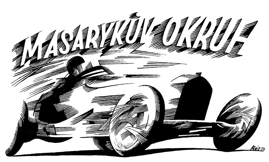
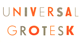
Universal Grotesk
|
Free download of two fonts made in 2010 and 2012 respectively, also by an unknown designer. One of these fonts claims in its metadata that the original is due to Vladimir Balthasar in 1934. In 2016, Peter Bilak reports that Indra Kupferschmid told him that Universal Grotesk is basically Kristall Grotesk (1937, Wagner & Schmidt in Leipzig). As Wagner & Schmidt morphed into the East-German type foundry TypoArt some time after 1945, Bilak conjectures that Grafotechna got its matrices from Wagner & Schmidt. Digital descendants:
|
During her studies in Kosice, Slovakia, Veronika Trnkova designed the square-edged typeface Corner (2016). [Google] [More] ⦿ | |
Bratislava, Slovakia-based designer of the display sans typeface Hviezdokopa (2018). [Google] [More] ⦿ | |
| |
Kosice, Slovakia-based designer of the handcrafted school project font Hommage (2019). [Google] [More] ⦿ | |
Jelka, Slovakia-based designer of the textured typeface Modular (2017). [Google] [More] ⦿ | |
During her studies, Jelka, Slovakia-based Viktoria Borosova designed a modular typeface (2017). [Google] [More] ⦿ | |
The East-European typographic scene of the past 50 years reviewed by Adam Twardoch. Site temporarily in limbo. [Google] [More] ⦿ | |
Vladimir Balthasar
| |
Slovakian designer of the dot matrix font FS Blok (2009, FontStruct). Aka Toy Boy. [Google] [More] ⦿ | |
Media agency in Duna-Szerdahely, Slovakia, est. 2010. Behance link. They made a fat counterless face, Abandon (2010). [Google] [More] ⦿ | |
Kosice, Slovakia-based designer of the vector format alchemic display typeface Squeezer Typo (2013). Hellofont link. [Google] [More] ⦿ | |
Cadca, Slovakia-based designer of the display sans typeface Amalka (2017). [Google] [More] ⦿ | |
Bratislava, Slovakia-based designer of Vysivka (2015), a modular typeface. [Google] [More] ⦿ | |
Martin, Slovakia-based student-designer of some handcrafted typefaces in 2018. [Google] [More] ⦿ |
|
|
|
|


 Andrej Dienes is a type designer in Bratislava, Slovakia. He set up the commercial type foundry Adtypo in 2013. Creator of these typefaces:
  [
[ Slovak designer who made FF Bradlo (1994-1995) at
 Chmela is a Bratislava-based design studio founded by brothers Peter & David Chmela. In 2009, Peter created the hand-printed typeface Penis, which can be downloaded from
  Creative Maker is Xenia, who is based in Bratislava, Slovakia. Her vector format fonts from 2016 include Constructor, Oldrus, Twins, Parallel, and Snake (circle-based style). In 2017, she published Stripes. [
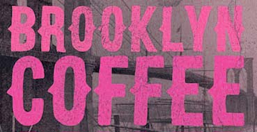 Peter Olexa (Bratislava, Slovakia, b. 1978) created the (typically retro / vintage) mostly commercial typefaces Slow SVG (2020: a brush font), Hurley (2020), Royal (2020: vintage caps), Wagoon (2020), Snow (2020: a 3d color SVG font), Venomous (2020: spurred, grungy), Behofeel (2020), Chasmophile (2020: formal calligraphy), Angelic (2019: dry brush), Boutique Paris (2019), Umbrella (2019), Cellica Bold (2019), Abigaile (2019), Ragtime (2019: a brush font), Ragtime Marker (2019), Futu (2018), Kiko (2018), Pineapple (2018), Urban (2018: inline), Plasma (2018), Evolve (2018: inline), Hallowen (sic; 2018), Phantom (2018), Palam (2018), Alter (2018), Chrome (2018), Rhino (2018), Giant (2018), Valeria (2018), Ruas (2018), Strife (2018), Giant (2018), Atari (2018), Octopus (2018), Green Light (2018), Atlantis (2018), Maroon (2018), Secure 3D (2018), Cube (2018), Billionaire (2018: art deco), Savana (2018: bejeweled), Castile (2018), Starla (2018), Brodo (2018), Nomos (2018), Brisk (2018, art deco), Tron (2018), Jewel (2018), Forest (2018), Noxa (2018), Ama Deust Inline (2018), Goliath Inline Grunge (2017), Arbatosh (2017: Victorian), Momoco (2017), Heyro Fun (2017), Calliope Fun (2017), Steampunk Gears (2017), Ponds (2017: Victorian), Zahra (2017: inline grunge), Green Light (2017: inline grunge), Jordan Bold Grunge (2017: inline), Metalic 3D (2017), Mecha Grunge (2017), Buffalo (2017), Queen (2017), Lacoste Inline (2017), Ollie (2017, sans family), Nomos (2017), Blue North (2017: spurred), Murray (2017), Atlantis (2017), Montana (2017, outlined), Speedhunter Line (2017), Star Black Inline (2017), Gatsby Inline (2017: art deco), Jibril (2016: spurred), Hallowen (sic) (2016), Kiko (2016), Sailor (2016, tattoo font), Annabel (2016), Zalora (2016), Geno (2016), Marin (2016), Starship (2016), Mozza Shadow (2016), Meravin (2016), Venomous (2016), Amora Inline Grunge (2016), Rocket Shadow (2016), Hydrant (2016), Boston Inline Grunge (2016), Skywalker (2016, art deco), Ocela (2016), Columbus (2016), Raven (2016), Nomura Grunge (2016), Stella (2016), Salada (2016), Vultron (2016), Majestic (2016), Napoleon (2016), Temu (2016), Rodeo (2016, Western style family), Brooklyn (2016), Thunder (2016, Victorian label typeface family), Murray Inline Grunge (2016), Opera (2016, Victoriana), Flamingo Shadow (2016), Blue North Inline Grunge (2016), Montana Bold Outline (2016), Monophone Fancy (2016, retro style), Marin Victorian (2016), Westwood (16-style Western font family), Mozza (2016, +Inline, +Shadow, +Grunge), Speed Hunter (2016), Metro Grunge (2016), Annabel (2016, Victorian), La Forest (2016, blackletter), Star (2016, decorative caps, with outlined and inline versions), Phoenix (2016, a spurred typeface), Gatsby (2016), Bureno (2016, a Victorian display typeface), New York (2016, letterpress emulation), Capella (2016), Almanac Italic Grunge (2015), Anabel (2016, roman caps), Regolith (2015), Chocoleta (2015, hand-printed), Sailor (2015), Turmeric (2015), Ultimatum (2015), Heyro (2015, a rough brush font), Calliope (2015, a rough brush), Glass Beads (2015), Red Paprika (2015), Greenkitchen (2015), Artistico (2015, grungy), Brush Shop (2015), Graceful (2015, irregular script), Brush Wall (2015), Nickainley (2015, connected script), Harloft (2015, a warm brush script), Detective Typewriter (2015), Not Perfect (2015), Good Vibes (2015), Cool Story (2014), Get Coffee (2014), Think Happy (2014), Say Less (2014), Let's Do This (2014), Just Be Cool (2014), Brooklyn Coffee (2014, a spurred poster typeface), Bronx Shoes (2014), Nevermind (2014), RockNRoll (2014), Bluegrass (2014), Memento (2014, spurred Victorian face), Melody (2014) and Grazioso (2014). He runs
  Studio in Zilina, Slovakia. Creators of the
  Daniel Kratky is a Slovak type designer. He started out as Dannci and ran
  Slovak type designer, b. 1985, who studied first at the Academy of Fine Arts and Design in Slovakia and later attended the
 Dolny Kubin, Slovakia-based designer of the monoline stroke-based Transparent Font (2015). This font was finished during her studies. [
 Slovakian designer, b. 1986, who splits his time between Essen, Germany, and Kosice, Slovakia.
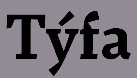
 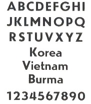 Czech state type foundry (est. 1951) from the communist era at which Josef Týfa, Oldrich Menhart and Rudolf Ruzicka worked for some time. Týfova Antikva (1959, inspired by the work of architect P.L. Nervi) by Josef Týfa later became Tyfa Text (and
 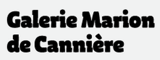 Or Slava Jevcinova. Designer from Bardejov, Slovakia, now located in Nice, France, whose first degree was an MA from J.E. Purkyne University in Czechia. She interned at Mota Italic in Berlin, and then started working for Fontwerk, a company specicializing in TrueType hinting. Since 2013 she is a freelancer and she regularly collaborates with the Rosetta Type foundry.
  Ziar nad Hronom, Slovakia-based designer of the brush typefaces Amazonia Bay (2016), Bahamas Brush (2016), Constance Brush (2016) and Malina Brush (2016), and the script typeface King Size (2016).
  [
[ Jozef Ondrik (b. 1988, Ruzomberok, Slovakia) studied at the School of Applied Arts in Slovakia and at the Graphic Design and Typography Department of Tomas Bata University in Zlin (Czech Republic). He currently lives in Prague. He created Paper Font and

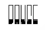 Puchov, Slovakia-based designer of the piano key typeface
 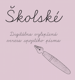 Graphic designer and illustrator in Slovakia. In 2019, Martina Rozinajova and Jan Filipek co-designed the Slovak school writing font
 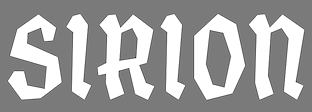 Zvolen, Slovakia-based designer of the angular German expressionist typeface Sirion (2016). [
 Milan Pleva is a freelance Slovak graphic designer who focuses mainly on logo, branding, visual identities and book design. In 2020, he set up his own type foundry, and promptly released the techno-industrial font
  Slovak designer, at the
  [
[ [
[ Slovakian type designer (b. 1973), who lives in The Netherlands.
  [
[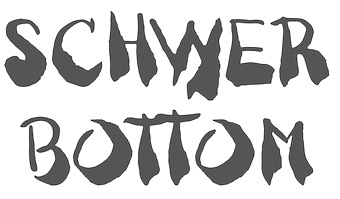 Bratislava, Slovakia-based designer of the brushy typeface Schwer Bottom (2014) and the modular typeface KED (2014). [
 [
[ Bratislava-based type and graphic designer (b. 1984, Czechoslovakia). He graduated from AFAD Bratislava, and in 2009 from the
  Slovak graphic designer, who graduated from the Academy of Fine Arts in Bratislava, Slovakia, and the Faculty of Fine Arts in Brno, Czechia, both in 2009. Then she did a
  [
[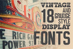 Bratislava-based designer. In 2017, he made the 18-style grungy typeface family Marquee.
  Typotheque is an initiative of Peter Bilak and ui42 out of Bratislava (Slovakia), and later, The Netherlands: Typotheque is an Internet-based independent type foundry. It offers quality fonts for PC and Macintosh platforms in standard European character set and in CE (central european) character set. All fonts have full (european) character sets, are thoroughly tested and manually kerned.
  Fontstructor who made the modular octagonal counterless typeface
  [
[