TYPE DESIGN INFORMATION PAGE last updated on Mon Jun 8 17:36:24 EDT 2026
FONT RECOGNITION VIA FONT MOOSE

|
|
|
|
|
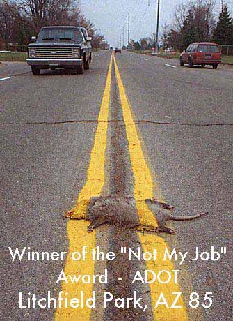
Type scene in Arizona | ||
|
|
|
|
SWITCH TO INDEX FILE
Abbie Bess Meson
| |
Alex is a senior Visual Communications and Advertising student at Northern Arizona University in Flagstaff, AZ. He created the (free) ultra fat typeface A/Bru Subtle (2010). Home page of A Bru Design in Flagstaff, AZ. [Google] [More] ⦿ | |
Arizona-based designer of the handcrafted typeface Tulip (2015) and the brush script typeface Wildflower (2016). Dafont link. [Google] [More] ⦿ | |
Tempe, AZ-based designer of the eroded sans typeface Love Type (2013) and the tweetware handcrafted typeface Fofer (2015). Mousse Creative link. [Google] [More] ⦿ | |
Annette Ruchala, a freelance designer in Phoenix, AZ, created the alchemic typeface Cult Font in 2013. [Google] [More] ⦿ | |
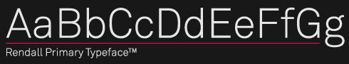
A young designer studying in Mesa, AZ, Anthony published his first face, a Swiss sans, with HypeForType in 2009: Rendall. [Google] [More] ⦿ | |
During her studies, Ariel Blackman (Gilbert, AZ) designed the thin impressionist art nouveau script typeface Keats Imperfect (2015). [Google] [More] ⦿ | |
Welcome to the sewer of the internet. For 78USD per year, you can subscribe to this service, which offers lots of font downloads (almost 6000, they claim). Not only are the fonts rather standard, but upon inspection of the fonts (Erik's Hand, Stencil, Snowcaps, HotTamale, etcetera), it is clear that these guys are asking money for access to freeware/shareware fonts made by others! Holy cow! So, I did some digging and learned that ArtToday.com is owned by Zedcor Inc, 5232 E. Pima St. Suite 200C Tucson, AZ 85712. The head parasite seems to be Peter Gariepy, tel: (520) 881-8101 520-881-1841. Gariepy has become rich (at least judging from his hobbies and other information culled from the web), so, as is often the case in this world, the bad guy won. [Google] [More] ⦿ | |
Atomic Media (was: SmartDust)
| Matthew Bardram (b. New York City, 1965) is the Tucson, AZ-based [T-26] founder of Atomic Media, who specializes in bitmap fonts. He designed Atomic, Centrifuge, Bromide (at T-26), Crackle, Klaxon. At Nakedface (now gone), he made Arachnid, Bitpak, Bylinear, DhexInline, Genetica, Economy Large, Empiric, Hypersigna (2005, bitmap face), Montreal (the family) and two katakana fonts. His Bitpack includes the following pixel fonts: Bylinear (2000), Cellular (2000), Genetica (2000, free download), Genetrix, Macroscopic, Metodic, Microscopic, Noir, Scriptometer, Remote (2000), Monocule (2000), Joystik, Centrifuge, Quantaa (2000), Bionika, Megalon (2000), Wired, Badfish. Bardram's Digipak includes Atomic-Inline, Atomic-Outline, Bionika-Black, Bionika, Genetrix-Crossed, Genetrix-Square, Genetrix-SquareCore, Genetrix-SquareHollow, Joystik, Macroscopic-A, Macroscopic-B, Macroscopic-C, Macroscopic-D, Macroscopic-E, Methodic-Bold, Methodic, Microscopic, Noir, Scriptometer-SanScript, Scriptometer. Additional typefaces: a 3D pixel font called Boxer 3D (2002), Neuronic (2002-2004, nice outlined pixel font; see also here), Fusionaire (2002, a display font) and Wijdeveld, a squarish font based on the lettering of poster artist Wijdeveld from The Netherlands. In 2005, these fonts were added: Magnetica, Imperium, Ratio, Hypersigna, Sequence and Tempora, all by Matthew Bardram. Sausan Kare's pixel fonts at Atomic Media: Mini Food, Kare Dingbats, Biology, Everett, Harry, Ramona, Kare Five Dots, Kare Five Dots Serif, Kare Six Dots, Kare Six Dots Serif. Alternate URL. Interview. Klingspor link. [Google] [MyFonts] [More] ⦿ |
Bess Rebel
| Arizona-based designer (b. 1987) of the hand-printed typefaces The Struggle Is Real (2016), Dribble (2014), Mitchell Park (2014), Avia (2014) and Laura Claire (2014), and of Nearly Dignified (2014), New School Class (2014), Furngilly (2014), Hambone (2014), Old School Class (2014), Dingbash (2014, puppy dingbats), and Lumiere (2014). Aka Bess Asher Rebel. Fontspace link. [Google] [More] ⦿ |
Billie Heitzman (b. Arizona) graduated from the University of Southern California with a degree in fine arts and advertising. Creator of Hot Goo (2012). [Google] [More] ⦿ | |
Blackout Fonts
| Blackout is run by Raymond Robert Holling (b. Phoenix, AZ, 1987) who studied visual communication at Arizona State University. Designer of MyFonts link (2007, futuristic), Curves Accent (2007, multilined and artsy), and Paperclip Wire (2007). [Google] [MyFonts] [More] ⦿ |
Brian Johnson
| |
Brian Willson
| |
Phoenix, AZ-based designer of the handcrafted typeface Radical Ghost (2016). [Google] [More] ⦿ | |
Waddell, AZ-based designer at The Art Institute of Phoenix of the octagonal typeface Stellar (2016), which she describes as a geometric mandala hipster font. [Google] [More] ⦿ | |
Phoenix, AZ-based designer of the poster typeface Fizzzle (2016). Behance link. [Google] [More] ⦿ | |
FontShop link. [Google] [MyFonts] [More] ⦿ | |
Continental Type
| Type foundry established in 2017 by Winston Scully & Scott Biersack, aka Scinston & Wott. Both graduated from the Type@Cooper program. Scott Biersack is a designer and illustrator, while Winston Scully is a lettering artist and type designer. Their typefaces:
Home page of Scott Biersack. Link to You Bring Fire, Scott's studio that offers custom lettering. At You Bring Fire, he released Malice Stencil (2018), a calligraphic blackletter-inspired typeface with a modern approach. At Type Paris 2019, he designed Sweet Jesus (an 8 style display family with the beginnings of an 8 style italic companion; with large open counters, sharp angular terminals and serifs). [Google] [MyFonts] [More] ⦿ |
| |
Located in Mesa, AZ, David Manzer created several typefaces in 2012. [Google] [More] ⦿ | |
Derek Vogelpohl
| |
Design Concern
|
|
Peoria and/or Phoenix, AZ-based designer of the stencil typeface Sea Dog (2018). [Google] [More] ⦿ | |
Dustin Chessin
| |
Phoenix, AZ-based designer of the The Devil's Alphabet (2015). Behance link. [Google] [More] ⦿ | |
Phoenix, AZ-based designer of the semi-stencil typeface Broken Font (2016). [Google] [More] ⦿ | |
During his studies at the Art Institute of Phoenix, Edwin Dominguez (Glendale, AZ) designed Iron Interlock (2016). In 2017, he published the hexagonal sci-fi typeface Hiveline. Behance link. [Google] [More] ⦿ | |
Ekloff Design (was: Liquid Parallax)
| Ekloff Design by Joseph Ekloff (aka F. Folke) grew out of Liquid Parallax. It has free and commercial fonts created by Joey, who has a BFA in Visual Communications with a Marketing minor from the University of Arizona. He is based in Seattle. His fonts: Times New Rhombus (2005, handwriting), Jupiter Jellypop and Jupiter Jellyrock (2005, grunge), Dinosaur Skin (2005), Abdomentality, Cactus Milk, Derivia (based on a public domain serif font called Livia Medium by S.G. Moye, 1992), Remodula (gridded, kitchen tile face, FontStruct), Electric Pencil (hand), Lower Optic Fibercase, Qualymer Beanpole, Qualymer Husky, Hopskotch (monoline sans with long swashes), Prevek, Rooty Voutee. In 2013, he designed the commercial typeface Fervent Sans. In 2014, he created White Label (hand-printed) and Remejug (hand-printed). Typefaces from 2015: Hudso (handcrafted multiline typeface), Haywire, Baystyle. Typefaces from 2016: Fullford (a warm handcrafted poster typeface family), Aweswell (handcrafted). Dafont link. Fontspace link. Behance link. Creative Market link. [Google] [More] ⦿ |
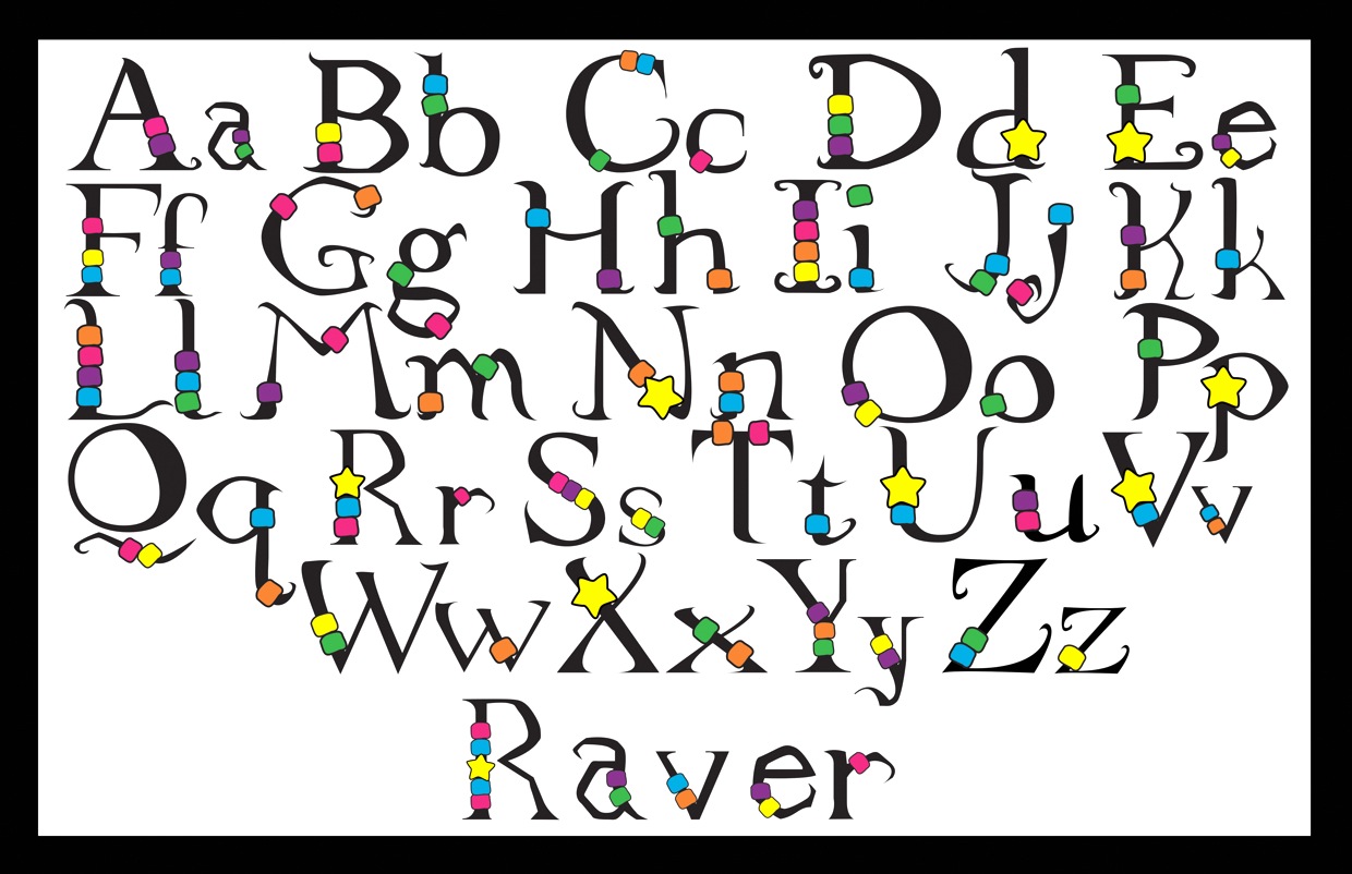
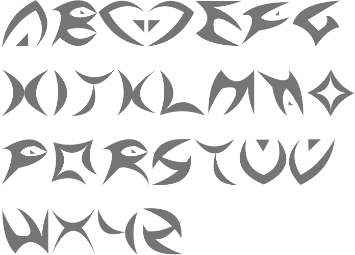
Tucson, AZ-based creator of the ornamental typeface Raver (2013) for a design class at the Art Institute of Tucson. [Google] [More] ⦿ | |
American type designer, b. 1984, Baku, Azerbaijan. She earned a degree in International Law from Western University in Baku, Azerbaijan and paralegal certificate from the National Paralegal College in Arizona. In 2010, she created the ink-stained handprinting font Jeyran together with Michael Jason Browers. [Google] [MyFonts] [More] ⦿ | |
Arizona-based designer (b. 1983) of the children's hand Erin's Handwriting (2012; see also Erin's Handwriting 2, 2017). [Google] [More] ⦿ | |
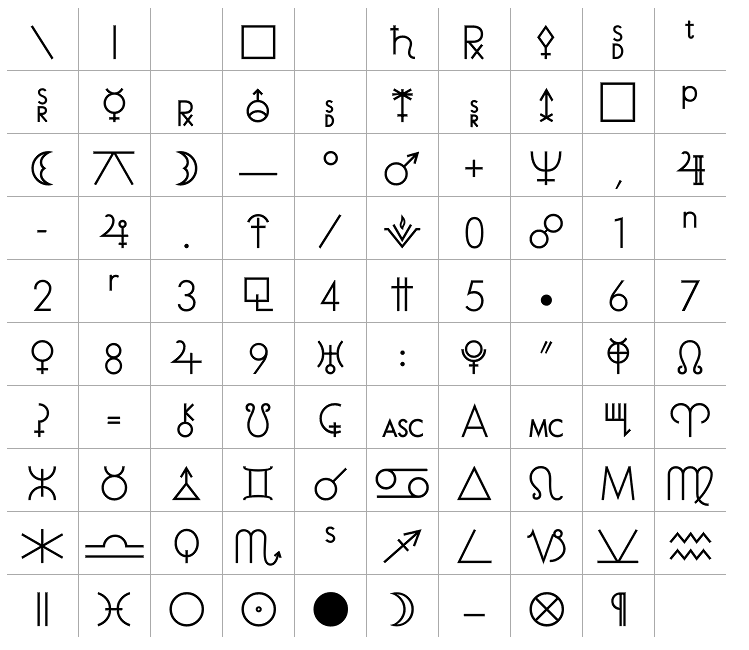
Greek/Byzantine music font package brought to you by Father Ephraim from the Greek Orthodox St. Anthony's Monastery in Arizona: EZ-Oxeia, EZ-Fthora, EZ-Psaltica, EZ-Special-I, EZ-Special-II, EZ Omega. These fonts are similar to the fonts from CYLLOGOS MOUSIKOFILON CON. The Byzantine Drop Caps package includes Agion Oros XHR (1994, by I.M. Grhgorioy), EileenCaps, Genesis, MgAgiaSofiaUC, MgAgionOrosUC, MgByzantineUCPol, MgEkklisiaUC, MgGothicOld, MgKonstantinosUC, MgViking, MrSByzantinePT, Mt, PFGoudyInitials, PFKonstantinople and PFKonstantinopleInitials. The fonts starting with Mg are by Magenta, ca. 1989. The PF fonts refer to Parachute, ca. 2003. [Google] [More] ⦿ | |
FAQ by Sridhar Venkataraman (Arizona State University), last updated in 1994. [Google] [More] ⦿ | |
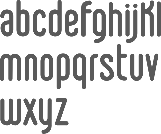
Phoenix, AZ-based designer of Penmanship (2015), a 4-style monoline sans serif with handwriting roots. In 2016, he designed the rounded monoline sans typeface Speakeasy and the architectural blueprint font, Schematic. [Google] [More] ⦿ | |
| |
Los Angeles-based graphic and type designer (b. 1994, Scottsdale, AZ) who studied at Chapman University. He designed the children's script typeface Mathieu (2016). Behance link. [Google] [MyFonts] [More] ⦿ | |
Go Faster Labs
|
|
Graceful Market
| Phoenix, AZ-based designer of the brush script typefaces Athena (2016) and Verona Script (2016) and the handcrafted Paige (2016), Love Struck (2016) and Hamilton (2016: free). Typefaces from 2017: Socialite Script, Oakland Sans Serif, Cabana, Denim (sans), Mimosa (handcrafted), Karma. Creative Market link. [Google] [More] ⦿ |
Arizona-based designer (b. 1987) of Sharpie Caps Madness (2005, handwriting), also called MyHandwriting. [Google] [More] ⦿ | |
Arizona-based Don Lancaster's huge list of links for PDF and Acrobat. Includes PostScript code websitan.ps, reflog1.ps and weblogu2.ps (website analysis in PostScript), urlindoc.ps (embed url links directly into your pre-Acrobat source documents), tutorial on PostScript "alpha" transparency, a JPEG to PDF file conversion tutorial, catools1.ps (a et of PostScript utilities that let you read Acrobat catalog internals), and a PFB2PFA.PS program. He has, among many other things, some articles on text justification in postscript, called Picojustification and Postjustification. [Google] [More] ⦿ | |
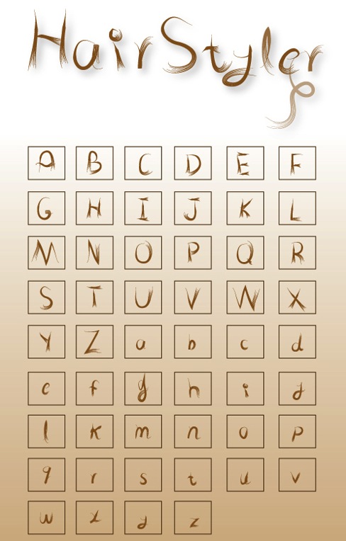
Designer, b. 1979, Daytona Beach, FL, who lives in Tucson, AZ, where he studies at the University of Arizona, class of 2013. Creator of Hair Styler (2013). Behance link. [Google] [More] ⦿ | |
Goodyear, AZ-based designer of the free trekkie font Veloped Logotype (2011), the spurred rounded Suppli Logotype (2014), the spurred typeface Rafael (2014), and the signage / athletic lettering typeface Orlando (2014). Behance link. [Google] [More] ⦿ | |
Designer from Phoenix who made the rope font Lariat (1963, Typefounders of Phoenix), which was released in 1965. Lariat is an upright, connected script with rope-like features. [Google] [More] ⦿ | |
Phoenix, AZ-bbased designer of the abstract form typeface Form Feelings (2021). [Google] [More] ⦿ | |
J. Paul Snow
| |
J. Randall Harris
| |
Bisbee, AZ-based designer of the free monospaced 8x8 pixel font Mia Monospace (2015). Aka Red Fox J. [Google] [More] ⦿ | |
Dafont link. [Google] [More] ⦿ | |
American designer in Glendale, AZ, of the hand-printed Southpawcomic (2009, FontCapture). [Google] [More] ⦿ | |
Phoenix, AZ-based designer of Next Level (2017), a typeface that was inspired by video games and sci-fi movies. [Google] [More] ⦿ | |
Phoenix, AZ-based designer of Fence (2017). Behance link. [Google] [More] ⦿ | |
Graduate of McPherson College, who is based in Sun City West, AZ. Typefaces designed by him in 2017 include Phantom, Overgrown and Concept. [Google] [More] ⦿ | |
Phoenix, AZ-based designer of the drafting font Schematix (2019), the set of signpainters fonts Handbrushed Gothic (2019) and Handbrushed Spure (2019). [Google] [More] ⦿ | |
Jennifer Duran
| |
Apparatus (2012) is a computer game typeface, slightly modernized. [Google] [More] ⦿ | |
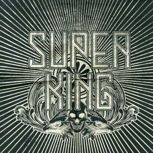
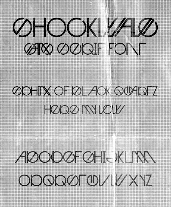
Phoeniz, AZ-based creator of the free techno fonts Super King (2013) and Shockwave (2013). Behance link. [Google] [More] ⦿ | |
Free handwriting fonts made in 1996 by John David Banks from Tucson, AZ (b. 1953) such as BudHand (Regular, Bold, Angular), BethHand (Angular, based on the hand of Beth E.LK. Banks), and fonts such as BudEasy, BudNull, and BudBird. Dafont link. Fontspace link. [Google] [More] ⦿ | |
Joseph Ekloff
| |
JPS Graphic Designs
| J. Paul Snow (JPS Graphic Designs) is a Glendale, AZ-based type designer. He created Osirian Runic Upright (2012). [Google] [MyFonts] [More] ⦿ |
June Lee Yoon (Viad Corp, Phoenix, AZ) created the display typeface Geometry in 2015. Behance link. [Google] [More] ⦿ | |
Just My Type
|
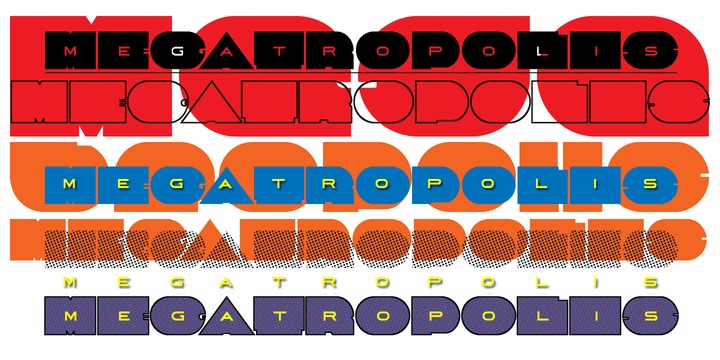
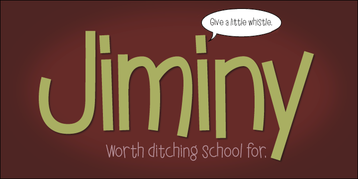
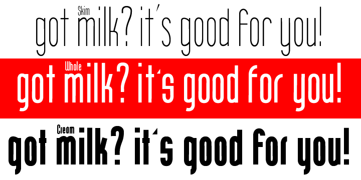
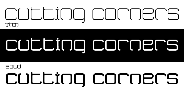
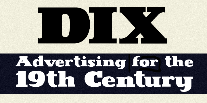
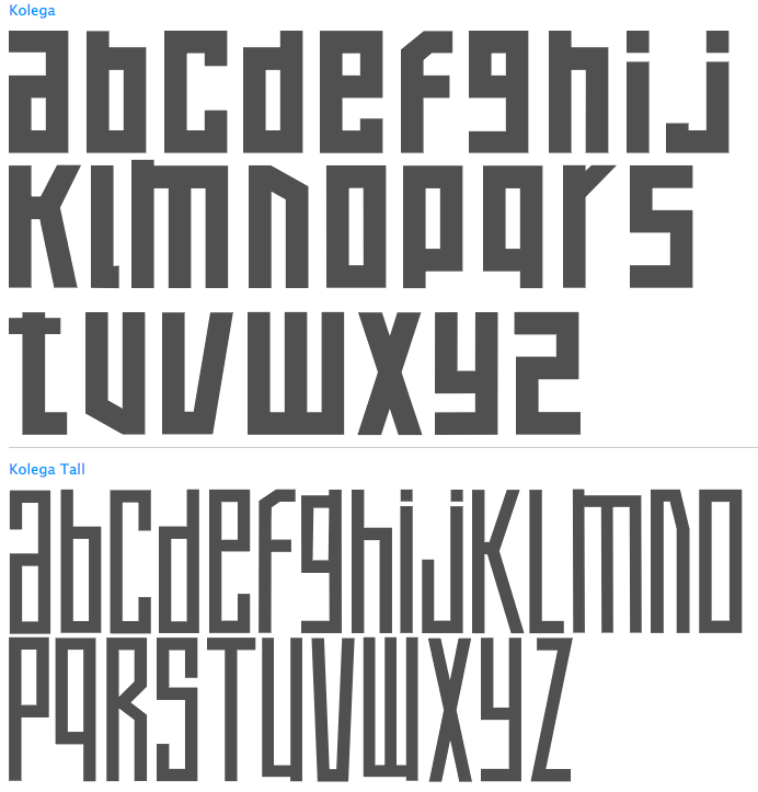
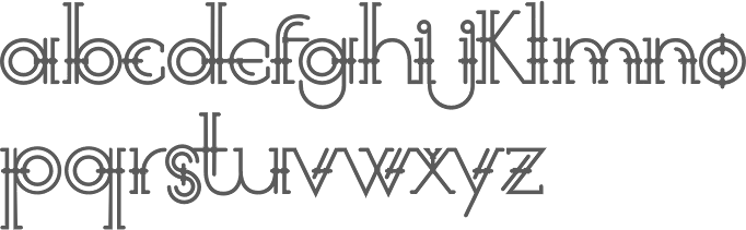
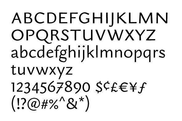
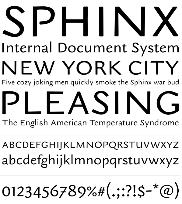
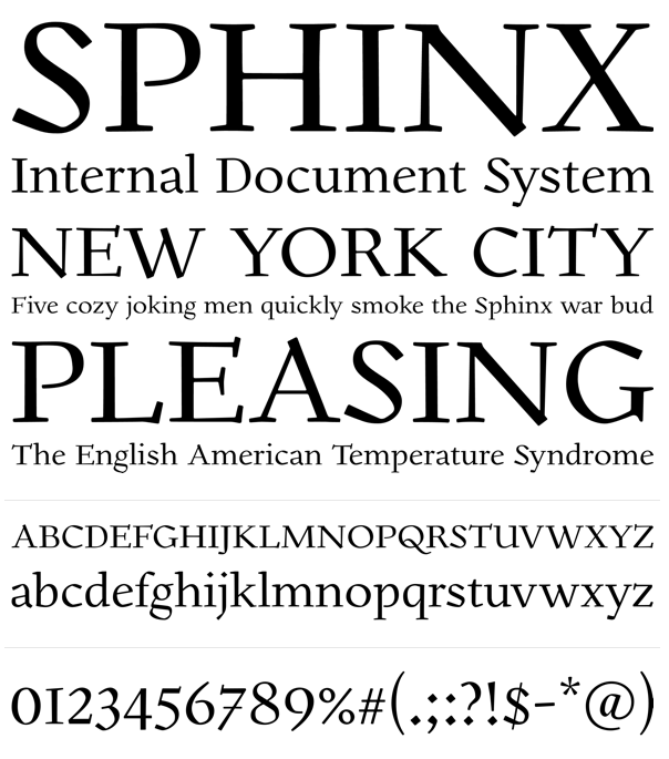
Typefaces from 2012: Happenstance (a lovely retro-futuristic script), Illuminations Woodcut, Yule Love It (Christmas time dingbats), Gawain (based on the hand of Gawain Douglas), Oaxaca (a Mexican look face), Boxy Code, Channel B (a rounded monoline sans), Curves, Puzzle, Dempsey (based on the writing of Tucson film teacher, media artist and programmer, Vikki Dempsey), Chilespice, Strata, Deco Donut, Jiminy (a comic book face), Invites (a roundish upright script that intends to recreate the 1920s spirit), Hunky Chunky (an obese poster face), the hand-printed typeface Carissa, Got Milk, Cutting Corners, Astro (retro-futurustic), Dix (2012: a slabby wood style typeface inspired by the poster for the 1929 film Redskin, and a desire to create a black Edwardian font with an offbeat serif), and the monoline rounded stripped-down sans typeface family Laszlo (2012: the name is an homage to Laszlo Moholy-Nagy of Bauhaus fame). Kolega (2012) is a constructivist typeface family that consists of Kolega, Kolega Tall, and Kolega Podrobska (fake comrade). Steampipe (2012) is an ironwork, Jules Verne, wrought iron and time machine font. Los Muertos (2012) is a Halloween font. Typefaces from 2013: Megatropolis (a stackable deco font system). In 2014, he created the art deco typeface HG Welles, which was originally designed for a privately-published luxury edition of The Time Machine. Behance link. J Randall Harris Design link. Home page. [Google] [MyFonts] [More] ⦿ |
During her studies in 2016, Kaitlyn O'Kane (Tucson, AZ) designed Dotted Hook, a dot matrix font inspired by the classic arcade game Pacman. She used FontStruct to make it. [Google] [More] ⦿ | |
Picacho Peak, AZ-based architect. Designer of Allen Lewis 27 (2021) and Allen Lewis 150 (2021), two fonts that are revivals of a font designed ca. 1925 by woodcut expert Allen Lewis. The lettering of Allen Lewis served as a model for Rae Irvin's famous New Yorker font. [Google] [More] ⦿ | |
Avondale, AZ-based designer of the custom hand-lettered typeface Katie Lizzies (2017). Creative Market link. [Google] [More] ⦿ | |
Flagstaff, AZ-based creator of a typographic poster called Open Day (2013). [Google] [More] ⦿ | |
Chandler, AZ-based designer of the monoline display typeface Stringg Beann (2016). This typeface was developed during his studies at Art Institute of Phoenix. [Google] [More] ⦿ | |
Laura Dozor (Tucson, AZ) designed a stick figure alphabet with several choices per glyph so that the letters can be animated. [Google] [More] ⦿ | |
As a student in Phoenix, AZ, Lexy Howard designed the hybrid typeface Botura (2016) which mixes Bodoni with Futura. [Google] [More] ⦿ | |
Taiwanese designer who studied at Fu Jen Catholic University (calss of 2016) and Arizona State University (Master of Visual Communication Design, class of 2019). At Type Cooper 2021, she developed the whimsical casual typeface Azure. [Google] [More] ⦿ | |
Phoenix, AZ-based designer of Phoenix Summer (2018) and the script typeface Slightly Sweet (2017). [Google] [More] ⦿ | |
Lydia Watson
| |
| |
Graphic designer in Glendale, AZ, who designed the sci-fi typefaces Hexabyte (2016, hexagonal) and Continuum (2016). [Google] [More] ⦿ | |
Matthew Bardram
| |
Phoenix, AZ-based designer of Weather Icons (2018). [Google] [More] ⦿ | |
Tucson, AZ-based designer of a deco poster style typeface called NBA Preview (2017), and Men's Health Icon Font (2017). Behance link. [Google] [More] ⦿ | |
Miller Type Foundry
|
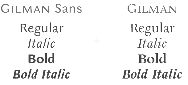
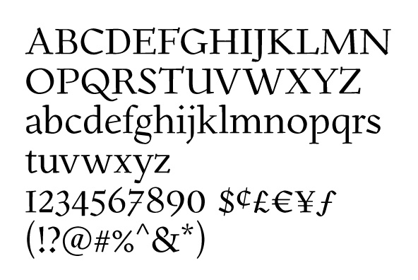
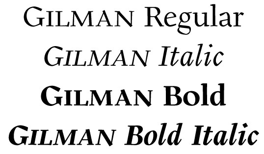
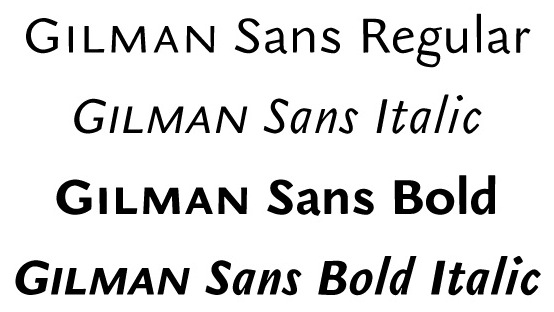
Creator in 2009 of the sans and headline sans family Mr. Jones. The Richard Miller all caps sans family (2009) is testosterone-powered. It was followed by the softer Richard Miller Rounded (2009), the rounded signage typeface Kalico (2010), Manwriting (2010), Nikaia (2010, a contemporary sans family), Nikaia Script (2010), Swagg (2011, humanist sans family with one slab serif "r" thrown in to make a statement), Westin Black (2011, a take on Cooper Black), Gilman (2011, a text family), Gilman Sans (2011, to accompany Gilman Serif for large bodies of text), and Project Fairfax (2009, stencil). In 2014, Miller published the multi-width geometric typeface Uniform. That was followed in 2015 by Uniform Rounded and Uniform Italic. In 2016, he published the large techno typeface family Tactic Sans: Tactic Sans was created to be as versatile as a special forces operator. Tactic Round is its rounded cousin. Towards the end of 2016, he finished the geometric sans typeface family Mercenary. Typefaces from 2017: Veronica Script and Caps, Blunt. Typefaces from 2018: Intervogue (a revival of Vogue (1929, Stephenson Blake) and Intertype Vogue, competitors of Kabel and Futura in the 1930s), Intervogue Soft. Typefaces from 2019: American Auto (a retro monoline script family). Typefaces from 2020: Uniform Pro (a 42-style geometric sans). Fontsquirrel link. Behance link. Another Behance link. [Google] [MyFonts] [More] ⦿ |
Phoenix, AZ-based illustrator, type designer and cat lady, aka Geek Missy. Typefaces from 2021: Sleepy Bear (a scrapbook font). Typefaces from 2020: Witch Hazel, Pickled Limes, Spring Herbs. Typefaces from 2019: Frogurt, Boisterous Fun (a fat finger font), Tropical Punch, Muggsy Sketch, Dear Agatha (a monoline hairline script), Alimentary, Delbert Sketch (free), Piggy Bank, Orchid Key (spurred), Argyle Socks (influenced by Saul Bass's movie posters). Typefaces from 2018: Raisin Rage, Berryfield, Muggsy, Juicy Gossip, Barn Party, Tippy Tappy Type (typewriter font), Breaking Bread, Breakfast Pastry, Allegory (curly script), Boisterous, Loquat (brush script in SVG style), Cheesy Grits, Puckery Tart, Blorp (comic book style). Typefaces made in 2017: Mystical Woods, Uncle Grump, Bloomdings, Kookyheads, Barn Dance, Mr. Stretch, Mr. Stout, Terrapin, Saboteur, Garrulous, Sportsball, Scott Slaughter (a free horror script font), Ankle Biter, Buddy Mac, Taxpayer (hand-printed), Chaotic Neutral, Trillian, Garlic Butter, Benji (monospaced rounded sans), Pickle Biscuit (children's script), United Scripts (all names of states), Succulent, MacGuffin (children's book or comic book typeface family), Limetta (brush script), Gray Skies, Scamper, Lallsey, Meddling Kids, Crispin (marker font), Fatty Cakes, Mossy Rock, Jumbuck, Candlepin (rounded and monospaced), Intruding Cat, Allspice, Skrawk Serif (a free sketched font), Starch Raw (a free sans typeface). Typefaces made in 2016: Starch, Showpony Sans (free), Pinsetter, Quintsy (+Sans, +Deco, +Casual, +SansRounded, +Slab), Virga Script (a wide connected script), Virga Sans, Virga Casual, Undulant (curly marker script), Tallsy, Breezy Beach, Kidlit, Missyhand, Cherry Cordial (brush script), Big Sweetie (a textured handcrafted heart-filled typeface), Big Freeze (snow-filled letters), Big Frost, Morning Sunset (smooth brush script), Rough Puff (fat brush style), Race Coarse (dry brush), Zooky Squash (curly script), Bobbles (a curvy monoline script), Skellyman (a free marker pen Halloween font for Latin and Cyrillic), Tingler, the free brush script typeface King Basil, the free font Gumption, the free hand-drawn Twenty Minutes, the brush script typeface Spiffy McGee, the free beatnik typeface Gallimaufry, free brush script typeface Sprightly Two, the free sketched typeface Skrawk Serif, the free watercolor brush font Brizzush, free brush font Ludicrous, the free marker pen font family HoliDoodles, the free handcrafted Tragic Marker, free brush script font Sprightly, and the free hand-printed typefaces Cavorting, Boldly Missy (comic book style) and Trawll. [Google] [MyFonts] [More] ⦿ | |
| |
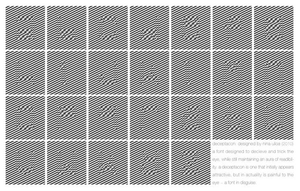
Designer in Tucson, AZ, who made Deceptacon (2012), an optical experimental typeface. Behance link. [Google] [More] ⦿ | |
Navajo American in Window Rock, AZ, who created the native American (Latin) typeface Naho and the chaotic typeface Step in 2018. [Google] [More] ⦿ | |
Pace Creative
| Arizona-based designer of the hand-printed typeface Saturday Morning (2017). Creative Market link. [Google] [More] ⦿ |
Page Studio Graphics (or: Pixymbols)
|
The fonts (grouped under the name PIXymbols) include ADA symbols v.2.0, Africa, Alphabox, Alphacircle, Ameslan (ASL), Antorff (blackletter), Antorff Fractions, Apothecary, Arrows, Astrology, Backstitch, Boxkey, BoxNLines, Braille grade 2, Casual, Chalk Casual, PIXymbols Chess, Command Key, Courex (typewriter family), Crossword, PIXymbols Deco Glass (2001), Digit&Clocks (+LED symbols), Dingbats&Online, DOSScreen, Fabric Care, FARmarks (Federal Aviation Regulations lettering), Flagman (semaphore), Fractions, Gridmaker, Highway Gothic (U.S. Department of Transportation's Standard Alphabets for Highway Signs), PIXymbols Highway Gothic 2002, Highway Signs (U.S. Department of Transportation), Hospital&Safety, LCD, Linea (2002, prismatic), Luna, Malkoff (calligraphic font), Marina, Meeting, Mejicana (2001, a Mexican party font), Menufonts, Morse, Musica (instruments), Newsdots, Orchestra, Passkey, Patchwork, PCx, Phone, PIXymbolsMusica, Prescott (2001, Western), Penman (2001, connected script), PrimerD (letters with lines), Recycle, Roadsigns, Shadowkey, Signet (family), Signet Shadow, Squared, Strings, Stylekey, Tolerances&Datum, Travel&Hotel, TV List, Unikey, US Map, Vershen (2001), Xcharting, Xstitch. They also sell EPS files of all Arms of Swiss cantons, and many nice initial caps. Look also for Faux Hebrew (simulated Hebrew), as part of the Faux package that also includes Faux Sanskrit, Faux Runic, Faux Hebrew, Faux Japanese, Faux Arabic, Faux Chinese and Faux Chinese Sans. Alternate URL. Previews at MyFonts. Klingspor link. View the Page Studio Graphics typeface library. [Google] [MyFonts] [More] ⦿ |
Paul D. Hunt
| |
Paul Howalt
| |
Pilcrow Type
|
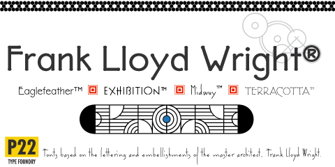
He created Howard (2006, a digitization of Benton's Sterling), P22 Allyson (2006, based on Hazel Script by BB&S; a winner at Paratype K2009), the P22 FLWW Midway font family (2006-2018: Midway One, Two and Ornaments; based on the lettering found on the Midway Gardens working drawings of Frank Lloyd Wright from 1913---tall-legged and casual), Kilkenny (2005, P22), a Victorian-style font based on the metal types named Nymphic and Nymphic Caps which were designed by Hermann Ihlenburg in 1889. This typeface has almost 1000 glyphs and comes in OpenType format. It includes Cyrillic characters. Check the studies here and here. For another revival of Nymphic Caps, see Secesja by Barmee. Designer of the display typefaces Seventies Schoolbook (2004) and Interlocq (2004). Hunt also digitized Goudy's Village (2005). Village was originally designed by Fredric Goudy in 1903 for Kuppenheimer & Company for advertising use, but it was decided it would be too expensive to cast. It was later adopted as the house face for Goudy's and Will Ransom's Village Press. The matrices were cut and the type cast by Wiebking. The design was influenced by William Morris's Golden Type. This Venetian typeface was digitized by David Berlow (1994, FontBureau) and by Paul D. Hunt (2005). Hunt's version was eventually released in 2016 by P22/Lanston as LTC Village. He revived Hazel Script (BB&S), which he renamed Allyson (2005). Still in 2005, he created a digital version of Sol Hess' Hess Monoblack called LTC Hess Monoblack. In 2006, he published a nice set of connected calligraphic script fonts, P22 Zaner. Bodoni 175 (2006, P22/Lanston) is a revival of Sol Hess' rendition of Bodoni. He was working on Junius (2006), a revival/adaptation of Menhart Antiqua. Frnklin's Caslon, or P22 Franklin Caslon, was designed in 2006 by Richard Kegler and Paul Hunt in collaboration with the Philadelphia Museum of Art. This slightly eroded font set includes faithfully reproduced letterforms digitized directly from images of impressions made by Benjamin Franklin and his printing office circa 1750. It comes with a set of ornaments. In 2007, he used Goudy's 1924 typeface Italian Old Style in the development at P22/Lanston of LTC Italian Old Style. That typeface was remastered and extended to cover several languages by James Grieshaber in 2011. In 2014, Paul Hunt finished work on the wood type revival font HWT Bulletin Script Two (P22 & Hamilton Wood Type). This backslanted psychedelic typeface can be traced back to the wood type manufacturers Heber-Wells (Bulletin Condensed, No. 5167), Morgans and Wilcox (Bulletin Script No. 2, No. 3184), Empire Wood Type (1870: Bulletin Script), Keystone Type Foundry (1899: Bulletin Script), Hamilton (117), and Wm. H. Page & Co (No. 111 through No. 113). Free fonts at Google Web Fonts: Source Sans Pro (2012; Source Sans Pro for the TeX crowd), Source Code Pro (2012, a companion monospaced sans set by Paul D. Hunt and Teo Tuominen). Source Serif Pro, its Fournier-style relative, was developed at Adobe by Frank Grießhammer. They can also be downloaded from CTAN and Open Font Library. Fun creations at FontStruct in 2008-2009: Possibly (a stencil loosely based on the Mission Impossible series logo), Probably (same as Possibly but not stenciled), Med Splode, Arcade Fever, negativistic_small, New Alpha_1line, New Alpha_4line, New Alpha_bit, New Alpha_dot [dot matrix font], New Azbuka [after Wim Crouwel's New Alphabet from 1967], positivistic, slabstruct_1, slabstruct_too, structurosa_1, structurosa_bold, structurosa_bold_too, structurosa_caps, structurosa_faux_bold, structurosa_leaf, structurosa_script, structurosa_soft, structurosa_tape, structurosa_too, structurosa_two, Slabstruct Too Soft, Structurosa Clean Soft, Structurosa Script Clean, Structurosa Clean, Structurosa Clean Too, Structurosa Clean Leaf, Structurosa Boxy, Stucturosa Script Heavy. In 2010, he designed he programming font Sauce Code Powerline. Well, this is probably a renaming of Source Code by some hackers. Just mentioning that sauce Code is on some Github pages. Klingspor link. Google Plus link. [Google] [MyFonts] [More] ⦿ |
Free FON type screen fonts by R.E. Harvey from Glendale, AZ. [Google] [More] ⦿ | |
Phoenix, AZ-based art director. Behance link. For a group he formed in Arizina called The Dead, he made a minimalist alphabet for its identity in 2009. [Google] [More] ⦿ | |
Ravohn Mokiao from Honolulu works as an independent graphic designer in Maricopa, AZ. Creator of the all caps sans typeface CAPS (2014). Behance link. [Google] [More] ⦿ | |
Raymond Robert Holling
| |
Richard Miller
| |
Phoenix, AZ-based designer of the sans typefaces Faraday (2018) and Gothura (2018). [Google] [More] ⦿ | |
Rob Roy Kelly (b. Nebraska, 1925, d. Tempe, AZ, 2004) collected wood type from local printers for use by his students at the Minneapolis College of Art&Design. He began gathering the types in the late 1950s and continued adding to the collection over the next decade. He started researching the history, manufacture, and use of the growing collection partly in response to questions that arose from working with his students. His research was first published in the 1963 issue of Design Quarterly (No. 56), and was followed in 1964 by a limited-edition folio of specimen sheets from the collection, entitled American Wood Types 1828-1900, Volume One. Kelly's research would culminate with the publishing in 1969 of American Wood Type, 1828-1900: Notes on the Evolution of Decorated and Large Types and Comments on Related Trades of the Period. Since 1993, his substantive wood type collection resides at the University of Texas. At Dover, he published 100 Wood Type Alphabets. Kelly's final work with the Collection came in the early 1990s when he was asked by Adobe Systems to participate in a project to develop digital revivals of historic wood types as part of the Adobe Originals program. As consultant to the project, Kelly helped select, from his own collected materials, the type styles that would be made into digital fonts. Kelly died in January 2004. Obituary, which states: He studied design at the University of Nebraska and the Minneapolis School of Art and served in the Army during the Korean War. Later he did graduate work at the School of Art and Architecture at Yale, where he studied with Josef Albers, Alvin Eisenman, Alvin Lustig, Herbert Matter, Leo Lionni, Lester Beall and Alexey Brodovitch. He both taught and administered graphic design programs at the Minneapolis College of Art, Kansas City Art Institute, Carnegie Mellon University, Western Michigan University and, most recently, at Arizona State University. [Google] [More] ⦿ | |
Roger Vershen
| |
Arizona-based designer of Sweet Sorbet Font (2016) and Pumpkin Mini Font (2015, an upright connected script). Her company is called RW Productions. Creative Market link. [Google] [More] ⦿ | |
Scott Biersack
| |
Student at the Art Institute of Phoenix in 2017. His type designs include PB Stencil (2017: a military stencil), and Salty Sand Sans (2017: triangle-themed). [Google] [More] ⦿ | |
During his studies at The Art Institute of Phoenix, Sergio Magallanez designed the squarish display typeface Skinne (2016). [Google] [More] ⦿ | |
ShyFoundry (was: ShyFonts)
| ShyFoundry (formerly ShyFonts Type Foundry), located in Elkhorn, NE, was founded in 1995 by Derek Vogelpohl (b. Phoenix, AZ, 1971), whose (often techno) fonts used to be free. His original free font site closed down in February 2001. The fonts were thereafter available at CybaPee's site. Fontspace link. Derek briefly joined ApostrophicLabs in March 2001. His first font there is Phosphorus. In 2001, he created the beautiful Plasmatica family, PhosphorusII, Avondale (a great display family), and the large Covington text family, which is also available now for the Tex community. Dafont link. In 2008, he took his operation to MyFonts. Each type family comes in 8 to 12 styles.
|
Signatures, logos and handwriting converted to PostScript or TrueType fonts for 75USD. Based in Phoenix, AZ. [Google] [More] ⦿ | |
From Arizona State University, Sridhar Venkataraman's collection of links on Indian fonts. [Google] [More] ⦿ | |
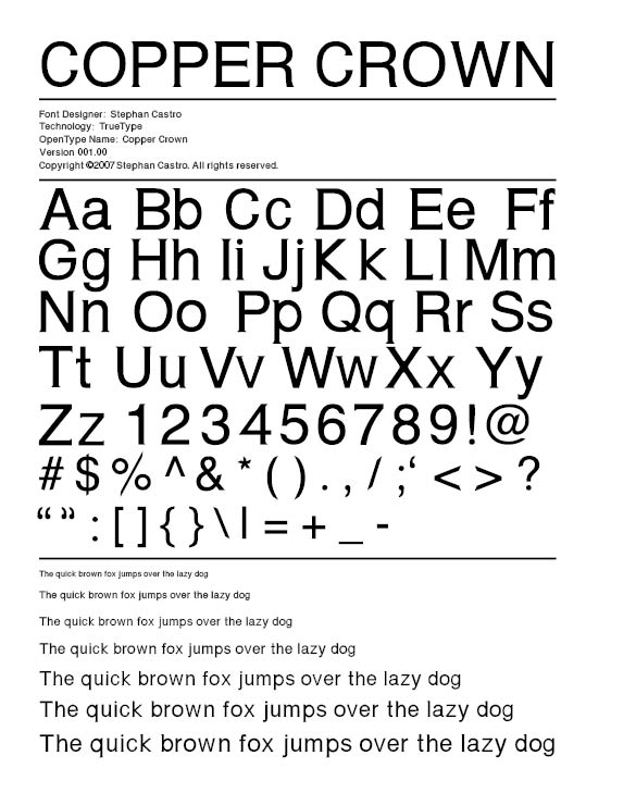
Scottsdale, AZ-based print designer, who created the copperplate font Copper Crown (2007). Behance link. [Google] [More] ⦿ | |
As a student at the University of Arizona, Tucson, AZ-based Stephanie Reid designed the squarish typeface Echo (2017, FontStruct). [Google] [More] ⦿ | |
Scottsdale, AZ-based designer of the modular typeface Chop Suey (2014). [Google] [More] ⦿ | |
Ted Grajeda
| |
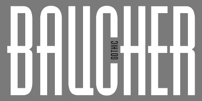
Stuart Sandler (The Font Diner) explains: Dan Barthel was the owner of The Font Company out of Phoenix, AZ and now lives in Ft Myers, FL . . . I have his phone number if you wanted to REALLY get all the inside scoop . . . Generally speaking, he was among the first groups along with a handful of young employees he trained to scan and digitize fonts from filmstrips and did a number of conversions for Harry Brodjian of Alphatype typefaces in the late 1980s. Among those included were Parade and Contemporary Brush Bold which were eventually licensed by Robert Norton for Microsoft . . . I'm certain they used the Ikarus system to make their digitizations . . . The Font Company eventually went on to digitize a good amount of typefaces and nearly all of them were distributed by the Precision Type Company until it closed its doors in the mid-2000s . . . Get your hands on one of those catalogs to see the entire library they released . . . At some point in the 1990s Dan decided to close up shop and tossed all the assets digital or otherwise and start over in another business but walked away from the font business all together regardless . . . The fonts: Abbey, Accolade, Adelon (patterned after Albertus MT), Adroit, Advertisers, Aggie, Amanda, Amber, American, Annual, Apache, April, Art Gothie, Artcraft, Ashley, Atrax, Avalon, Avon, Baker Signet, Ballantines, Balloon, Balzac, Baucher Gothic (a headline, tall and geometric typeface designed by URW Studio in 1995 according to some sources---unclear where it originated), Bauer Topic, Beacon, Beale, Bee, Benjamin, Bernhard, Bible, Bluejack, Boa Script, Brittany, Bulmer, California Grotesk, Cartel, Cartoon, Casablanca, FC Caslon, Century Expand, Charter Oak, Chevalier, Chinat, Cloister, Contemporary Brush, Continental, Cooper Old Style, Corporate, Corvinus Skyline, Craw Modern, Criterion, Danmark, FC Deepdene, Diamante, Didoni, Digital, Din 16, Disco, Egizio, Elaine, Erbar, Expressa, Fanfare, Firmin Didot, Florentine, Frency, Gatsby, Geshexport, Glamour, Glasgow, Globe, Gorden, Harem, FC Heldustry, Helenic, Helium, Helserif, FC Highway Gothic, Hildago, Hobo, Holly Script, Howland, Hudson, Huxley Vertical, Impact, Introspect, Inverserif, Japanette, Jay Gothic, Kelles, Kennerley, Kenneth, Koloss, Largo, Leasterix, Legothic, Lightline Gothic, Lucida Type, Marcato, Martin Gothic, Martinique, Mr Big, Napoli, Nashville, Newport Land, Novel Gothic, Neuland, Ondine, Organ Grinder, Ornitons Heavy, Paladin, Pandora Black, Parade, Pasadena, Pekin, Permanent Headline, Philly Sport, Pinnochio, Plakat, Polonaise, Precis, Pretoria, Promoter, Publicity, Quratz, Quint, Racer, Radiant, Regency, Reiner, Rochester, Roger, Rolling Stone, Roman Shaded, Roman Stylus, Roman Solid, Ronda, Roundest, San Serif, Scenario, Sevilla, Shotgun, Siegfried, Souvenir Gothic, Spire, Stanza, Stark, Thor, Ticonderoga, Timbre, Toledo, Torino, Umbra, Veracruz, Viant, Viking Gothic, Village, Vixon, Woodcut, Wordsworth, Yorkshire, Zanzibar and Zola. Other fonts: AGBuch, AGrotesk, Accent-Normal, Aggie-Normal, AlternateGothic, AmericanGothic, AntiqueOlive, Apache, BAVGarde, BOSGoudy, BakerSignet, Bauer Topic (1999-2002), BernhardModern, BrodyNormal, CaslonC224, CaslonC37, CaslonC637, Centaur, CenturyExpanded, Cochin, DisneyPrint, ECBGill, Exquisit, Flash, Folio, GaramondM, Grotesk, IceAge, ImpactCondensed, Imprint, Jenson, Latin, Laudatio, Lynton, MagicSymbols, MBrighton, Michelangelo (a roman caps typeface based on Hermann Zapf's Michelangelo from 1950), NewportLand, NovelGothic, Nueland, Panache, QuaySans, RealtyExecutives, Roman, SpiritCraw, Univers, Venus. In 2009, the elegant transitional---almost modern--- high-legged typefaces Roman Solid and Roman Stylus (outlines) are shown as part of the URW++ collection. Ascender sells these fonts: Accent, Amber, Amber Italic, Amelia, American Text, American Uncial Regular, April, Artcraft Pro, Avon, Balloon Bold, Balzac, Baucher Gothic, Bernhard Gothic Light, BoaScript, Cartoon, Chinat, Contemporary Brush, Cowgirl, Devinne, Digital, N 16, Erbar, Expressa, Fanfare, Florentine, Geshexport, Glasgow ExtraBold, Handel Gothic, Hastings, Hobo, Hobo Bold, Holly Script, Hudson, Koloss, LeAsterix, Nashville, Novel Gothic, Nueland, Nueland Inline, Opportunity, Pasadena Family, Philly Sport, Pretoria, Quartz, Reiner, Resonance, Souvenir Gothic, Stanza, Thor, Ticonderoga, Umbra, Viant, Woodcut, Zanzibar, Zola. [Google] [More] ⦿ | |
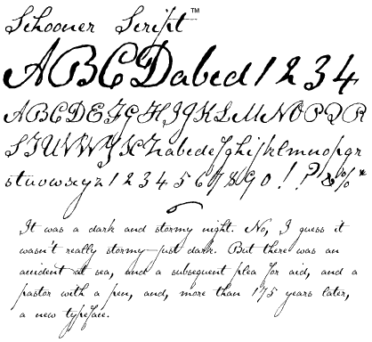
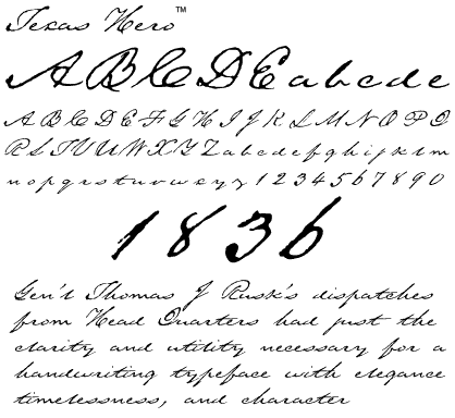
Three Islands Press (was: The Type Quarry)
|
Alternate URL. MyFonts link. Alternate URL. alternate site. Agfa-Monotype page. Fonts sold by Mindcandy. Creative Market link. FontShop link. Klingspor link. |
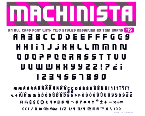
Murfreesboro, TN and/or Anthem, AZ-based illustrator and graphic designer (b. 1978). Creator of Toonish (2008), a cartoon face, which in 2009 became a commercial typeface at T-26. He also made the modular typeface Machinista (2010, T26). Dafont link. MyFonts link. Klingspor link. Behance link. [Google] [MyFonts] [More] ⦿ | |
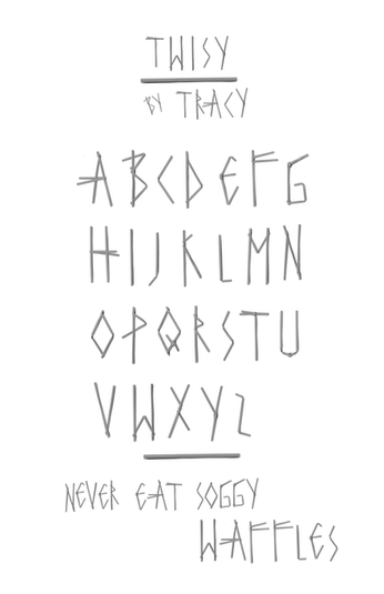
Graphic designer in Phoenix, AZ. She created the 3d font Wisy (2010), with letters looking like they were made from grocery store twist ties. [Google] [More] ⦿ | |
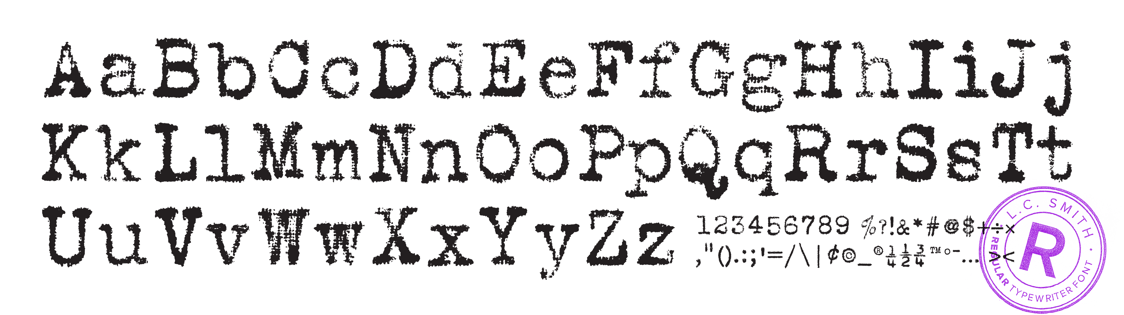
Advertising and design studio in Mesa, AZ. Behance link. Creators of the old typewriter family L.C. Smith Modern (2012), based on the typeface used by the vintage 1929 typewriter L.C. Smith. [Google] [More] ⦿ | |
Union Dues Design Co
| Gilbert, AZ-based designer of the handcrafted typeface Union Hand (2016) and the sans typeface Cold (2017). [Google] [More] ⦿ |
Klingspor link. [Google] [MyFonts] [More] ⦿ | |
Vector Maps
| Arizona-based designer of various vector format maps and icons. MapGlyphs (2015) is a font with the outlines of the states of the United States. Creative Market link. [Google] [More] ⦿ |

 [
[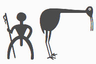 Graduate of Northern Arizona University. Carolyn Gibbs has combined her design skills and her love of Southwest American Indian images into a nice series of fonts, published by the Creative Alliance (now Monotype):
  As a student at the University of Arizona, Daniel Ryan Dougherty (Tucson, AZ) created the art deco typeface Golden Years (2015). [
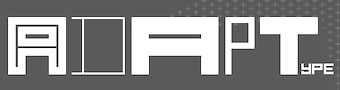 Scottsdale, AZ-based creator of the hand-lettered tattoo typeface Xibalba (2014) and the squarish De Stijl-related typeface family Adaptype (2016). In cooperation with
 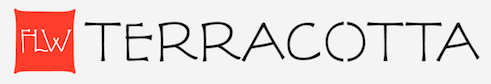 American architect, artist and designer, b. Richland Center, WI, 1867, d. Phoenix, AZ, 1959. He was associated with the Arts and Crafts movement. His lettering inspired many to create typefaces based on them. The Frank Lloyd Wright museum is near the University of Chicago. He lived in Oak Park, IL, two blocks away from Luc Devroye's daughter.
 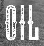 Graduate of Arizona State University, class of 1992. Now based in Mesa, AZ, where he works as a designer and illustrator, Paul Howalt started
  [
[ Tucson, AZ-based designer of
  Graphic designer who ran
 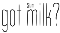 Just My Type is a type foundry set up in 2012 by J. Randall (or Randy) Harris (b. 1947, Marion, IN) in Tucson, AZ. Harris is a graphic and type designer who has been making typefaces since 1997. He teaches at the Art Institute of Tucson. His typefaces from 2013:
  Phoenix, AZ-based designer of an experimental multiline typeface in 2016. [
 American type designer in Chino Valley, AZ. She created
  Page Studio Graphics is Roger Vershen's Oro Valley, AZ-based company specializing in symbols and symbol fonts, founded by him in 1986. Roger Vershen died in Tucson, AZ, in 2003.
  [
[ Type and graphic designer from Joseph City, AZ. His first degree was from Brigham Young University. He was a type designer at
 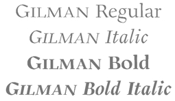 [
[ [
[ Dan Barthell's Phoenix, AZ-based foundry, was founded in 1988. It produced about 400 fonts. It was merged into Precision Type Foundry in 1993. Its fonts can now be bought via URW or
 Ursula Suess was born in 1924 to German parents in Camden, NJ, and grew up in Munich, Germany, where she attended two semesters of design school at the Academy of Fine Art before it burned down during the war. She then studied calligraphy with Anna Simons for two years. She returned to America in 1946 and established herself as a graphic designer working for Oxford University Press, Macmillan Co., Harper, and other publishers. She also taught calligraphy for 20 years at the Westchester Art Workshop, and at the Cooper Union in New York City. In her fifties, she learned to cut gems and became a gem carver. She moved to Green Valley, AZ, in 1998, and has been applying her artistic versatility with clay, water-color and acrylics. In 1972 she designed Book Jacket Italic, one of film type era's most famous typefaces [copied by Phil Martin as Bagatelle]. In 2010, with the help of Patrick Griffin, she released the revised and
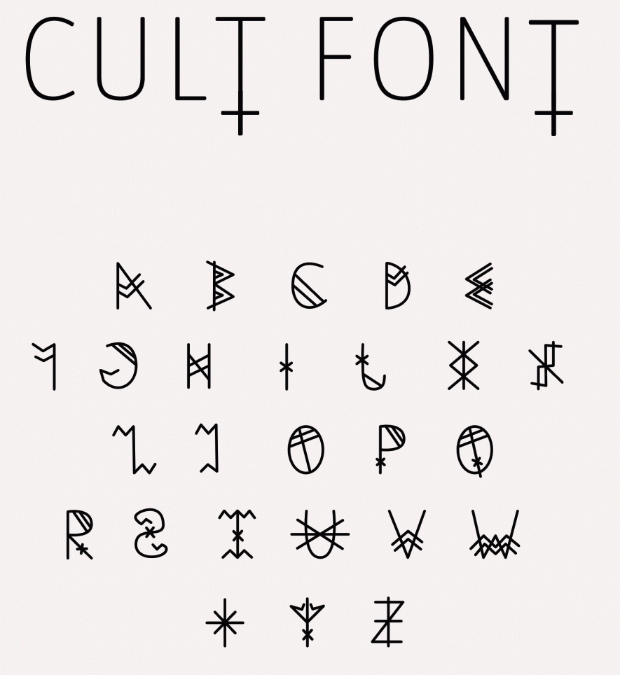
|
|
|
|