| | |
Aaron May
[Durham Brand & Co]
|
[More] ⦿
|
Adam Mitchell
|
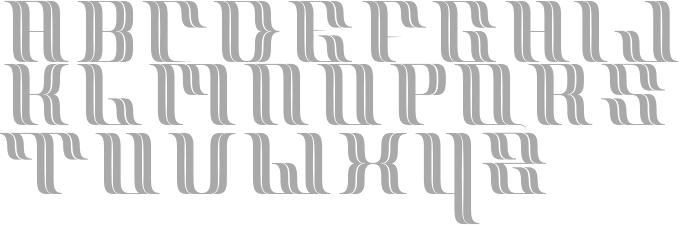
Covington, KY-based designer of the techno typeface Phosphor (2014). [Google]
[More] ⦿
|
Amanda Newman
|
Operating as Peaches Prints in Murray, KY, Amanda Newman designed these typeface in 2017: Sansy, Dunling. Creative Market link. [Google]
[More] ⦿
|
American Printing House for the Blind
|
Louisville, KY-based producers of free fonts for visually impaired such as APHont (2003, four sans serif styles). [Google]
[More] ⦿
|
Andrew Stewart
|
Graphic designer in Covington, KY. Designer of Stiltz Thin (2014). Behance link. [Google]
[More] ⦿
|
Angelica Domingo
|
Louisville, KY-based graphic designer who will get a BFA in design from the University of Louisville in 2011. She created a display face in 2011. [Google]
[More] ⦿
|
Angryblue
[Justin Kamerer]
|
Justin Kamerer (Angryblue) is the Louisville, KY-based creator (b. 1980) of the handwriting fonts Angryblue Controlled (2002) and Angryblue Crazy (2002). Alternate URL. Fontspace link. [Google]
[More] ⦿
|
Ashlee Freeman
|
During her studies at Murray State University in Lexington, KY, Ashlee Freeman designed Slave Trade (2013), a roundish display typeface. [Google]
[More] ⦿
|
Babbling Abby
|
Kentucky-based designer of several sets of handcrafted fonts for children. [Google]
[More] ⦿
|
Bernardd William Nadall

|
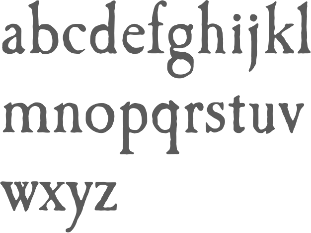
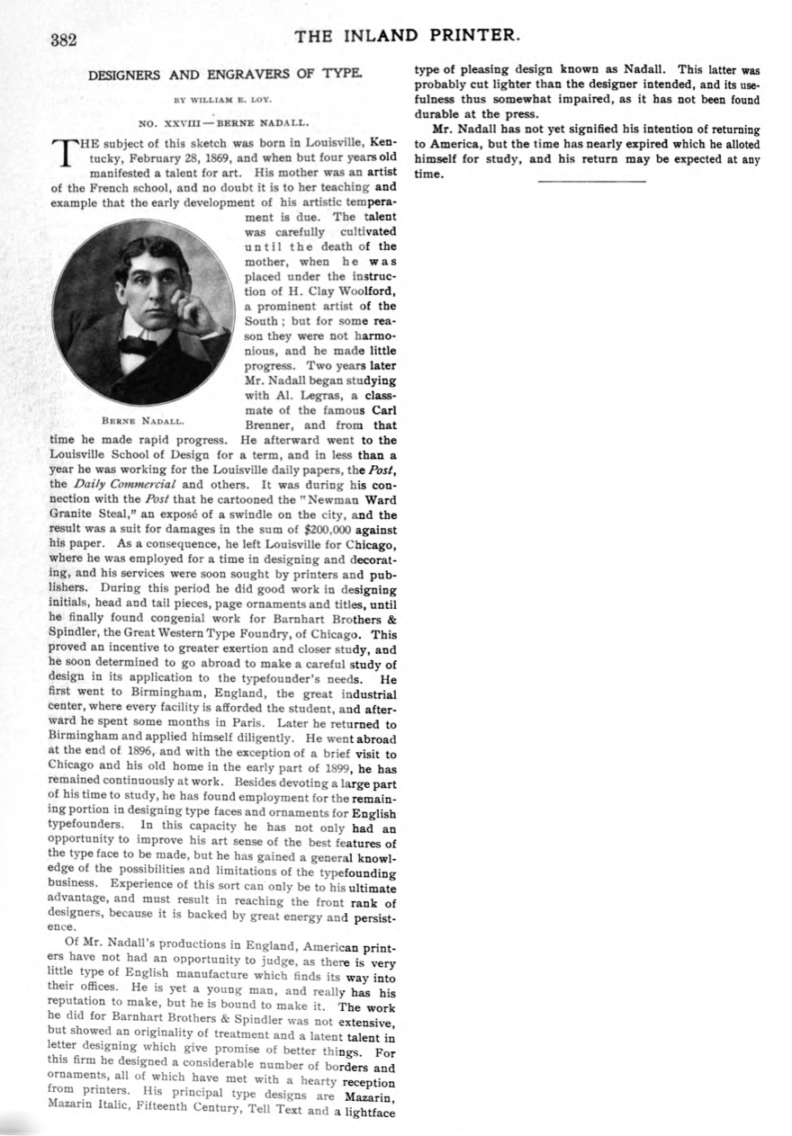
 Or Berne Nadall, or Bernd Nadall. This designer (b. 1869, Louisville, KY) studied at the Louisville School of Design, worked briefly for some newspapers in Lousville, and then left for Chicago, where he worked for Barnhart Brothers & Spindler (The Great Western Type Foundry). For BBS he designed borders, ornaments, and some typefaces such as Faust Text (1896: a quaint blackletter based on uncial lettering later renamed Missal Text in their 1923 catalog), Fifteenth Century (1898), Tell Text (1898) and a typeface now known as Nadall (1895-1896, BBS). The last typeface was digitized by Dan X. Solo as Nadall Regular in 2001.
 Creator at BBS of Mazarin (1895), Mazarin Italic (1895). The historians do not mince words about Mazarin. McGrew writes: Mazarin was introduced by BB&S in 1895, redesigned from the Golden Type of William Morris. Mazarin Italic was introduced a year later, but neither typeface lasted long. See Jenson Oldstyle. Mazarin HTF by Hoefler Type Foundry is a digital version. Nadall also created Caslon Antique (and Italic) in 1895 (Caslon EF Antique in the Elsner&Flake collection, and Caslon Antique in the Linotype collection), a version unlike any original Caslon. Some say it was developed between 1896 and 1898. For another digital version of this, see Caslon Antique (1993, Group Type). MFC Nadall Medieval (2019, Monogram Fonts Co) and Faust Text (2005, Dan X. Solo) revive Faust Text. William E. Loy writes about Nadall in The Inland Printer. Patent office link. [Google]
[MyFonts]
[More] ⦿
|
Beth Shirrell
|
Designer and illustrator. A graduate of Tyler School of Art's MFA graphic and interactive design program, she spent her formative years in Louisville, Kentucky. Currently she teaches at Philadelphia University and moonlights as a freelance designer and illustrator. Her Kalakari alphabet (ornamental caps with an Indian look) is simply stunning. It received the first place award in the 2009 AIGA Center for Cross-Cultural Design Competition. [Google]
[More] ⦿
|
BLP Fonts (or: Blue Line Pro Fonts)
|
Commercial cartoon fonts: BLComic, BLSFX font, DigitalCartoon, SacredBlue, and many balloons. Based in Florence, KY. [Google]
[More] ⦿
|
Blythe Magnuson
|
Louisville, KY-based designer of the classy titling typeface Magnus (2015, for a school project at the University of Louisville). [Google]
[More] ⦿
|
Bourgeois Bear
[Jason Stewart]
|
Eubank, KY-based software expert at Eggplant Systems and Design. Creator of the free programming font DaddyTimeMono (20170-2019). [Google]
[More] ⦿
|
Brandon Shepherd
[Font Flipper]
|
[More] ⦿
|
Briana Arnold
|
During her Visual Communication Design studies at Northern Kentucky University, Briana Arnold (Ft. Mitchell, KY and Cincinnati, OH) created the rounded squarish sans typeface Aero (2012). She also created the sans typeface Sequent in 2012, which was designed for screens. Behance link. [Google]
[More] ⦿
|
Charles Hodge
|
As a student in Louisville, KY, Charles Hodge created the cursive typeface Hodgie (2015). [Google]
[More] ⦿
|
Charles Wesley Yonts
|
Wes Yonts is a freelance designer in Somerset, KY. Creator of the vintage typeface Maulta (2014). Behance link. [Google]
[More] ⦿
|
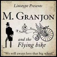
Chauncey H. Griffith
|
 Kentucky-based type designer and printer, 1879-1956. He was a Linotype salesman who directed the growth of the Linotype library from 1915 to 1948, and improved the look of the world's newspapers. He worked to establish Linotype as the composing machine of choice in America. He continued as a consultant to Linotype well into his retirement.
 Claus Eggers Sorensen writes: In 1922 Chauncey H. Griffith was promoted to Vice President of Typographic Development at Mergenthaler Linotype. He immediately started the development of new typefaces to replace the prevailing modern style typefaces. The issue troubling the moderns was their high contrast design. Especially the hairline parts of the cast lines could break of while printing, and counters could clog with ink and pulp. Faster printing meant transferring the cast lines with the stereotype process to a letterpress cylinder for high-speed rotary printing on endless rolls of paper stock. C. H. Griffith's new approach was to engineer new typefaces to the printing method. That meant drawing inspiration from the Egyptienne style as seen in the Clarendon typeface, with its very sturdy lower contrast design, and Theodore Low De Vinne and Linn Boyd Benton's Century Roman, which possessed elegance and legibility. The first product of these efforts was Ionic No. 5. It was an instant success, within eighteen months it was used by more than 3000 newspapers all over the world. C. H. Griffith and Mergenthaler Linotype continued to refine the design in subsequent iterations: Excelsior (1931), Paragon (1935), Opticon (1935), Corona (1941). These became known as the Legibility group. Ionic No. 5, Excelsior and Paragon form the Linotype Legibility Group. He designed or co-designed the following fonts, all at Mergenthaler: - Baskerville (1939, Linotype).
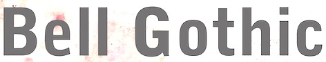
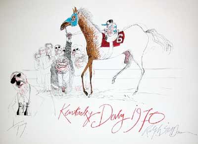
- Bell Gothic (1937-1938). Now available at Bitstream. Font Bureau has its own version, Griffith Gothic (1997-2000, by Tobias Frere-Jones): Of all his work, Chauncey Griffith claimed one type, Bell Gothic, as his own design. Griffith Gothic is a revival of the 1937 Mergenthaler original, redrawn as the house sans for Fast Company. Tobias Frere-Jones drew a six weight series from light and bold, removing linecaster adjustments and retaining the pre-emptive thinning of joints as a salient feature. Mac McGrew: Bell Gothic was developed in 1937 by C. H. Griffith of Mergenthaler Linotype, primarily for use in the New York City telephone directory, but quickly became standard for telephone books nationwide. The aim was to eliminate roman types with objectionably thin serifs and hairlines. Furlong and Market Gothic were specialized adaptations of this typeface for newspaper work, the former with special figures and other characters for setting racetrack results, the latter in 1941 with other special characters for stock market details. The basic Bell Gothic was also cut by Intertype in 1939. Compare No. 11 and No. 12, shown under Numbered Faces, previously used for directory work. Imitations include OPTI Benet (Castcraft). Poster by Jaime Schweitzer. View digital versions of Bell Gothic.
- Bookman (1936, after the 1960 original by Alexander Phemister at Kingsley ATF).
- Corona (1941), a narrow newspaper typeface with large x-height. Corona was designed to meet the rigorous requirements of high-speed printing, and is still the chosen type of many American daily newspapers. Mac McGrew: Corona was drawn and cut by Linotype under the direction of C. H. Griffith in 1941. It is a member of the "Legibility Group" of faces designed for easy reading under newspaper conditions of stereotyping and high-speed printing with inks that could be trapped in close quarters. Royal on Intertype is a 1960 copy of Corona. Digital revivals include C795 Roman (Softmaker), News 705 BT (Bitstream).
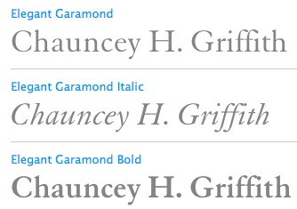
- Elegant Garamond (Bitstream). This Granjon design was made by Chauncey H. Griffith based on models by George William Jones, and before that, Robert Granjon.
- The didone-style newspaper typeface Excelsior (1931, Linotype). At Bitstream, this is News 702. URW calls it Excius, and SoftMaker's version is Exemplary. Mac McGrew: Excelsior was cut for Linotype in 1931 under the direction of C. H. Griffith. It is a plain type, but designed for the utmost readability, with only slight variation from thick to thin, and careful fitting that makes the characters flow into easily recognizable words. Long or short descenders are available in certain sizes. Like a number of Linotype typeface intended primarily for newspaper work, Excelsior is available in closely graded sizes, including odd and some half-point multiples.
- Granjon (1928-1930, with George William Jones at Linotype). MyFonts: Claude Garamond's late Texte (16 point) roman was the model used by George W. Jones when he designed this typeface for Linotype&Machinery in 1928. To avoid confusion with the Garamond romans based on Jannon's seventeenth century work, L&M called the typeface Granjon, after the designer of the italic used as a model, thus creating confusion with the typefaces based on Granjon's romans, Plantin and Galliard. Granjon is a little less crisp in cut than either Sabon, Stempel Gararmond or Berthold Garamond, but makes a magnificent and most readable text face, as shown in Reader's Digest since its founding. Mac McGrew: Granjon was designed for Linotype in 1928 by George W. Jones, distinguished English printer, to meet his own exacting requirements for fine book and publication work. It is derived from classic Garamond sources, but with refinements made possible by modern methods of punch cutting. In fact, one critic has called it "the purest form of Garamond." It is named for Robert Granjon, mid-sixteenth-century punch cutter noted in particular for his italics, from which the present Granjon Italic was derived. Granjon Bold, by C. H. Griffith, was added in 1931. Lanston Monotype acquired reproduction rights to the typeface from Mergenthaler.
- Ionic No. 5 (Linotype, 1925). Mac McGrew: Ionic is a general name for a style of typeface which is closely related to the Clarendons (q.v.). Plain, sturdy designs with strong serifs and little contrast, the Ionics were popular in the latter part of the nineteenth century. Although many founders offered them, they were generally gone by early in this century. A few received a new lease on life when they were copied by Monotype, Linotype, or Intertype. Two new Ionics appeared in this century. Ionic No.5 was designed by C. H. Griffith in 1926 for Linotype, as a newspaper text face. It features a large lowercase with short ascenders and descenders, with no fine lines or serifs to break down in stereotyping, and no small openings to fill up with ink. This is one of a few typefaces made in many closely graded sizes: 5-, 51/2-, 6-, 61/2-, 63/4-, 7-, 71/2-, 8-, 9-, 10-, and 12-point. Intertype's Windsor, developed in 1959, is comparable. Ionic Condensed was designed by Griffith in 1927, also for Linotype. It is a refinement of traditional designs, intended for newspaper head- ings, and has most of the general characteristics of the text face. Ionic Extra Condensed is essentially the same, a little narrower and without lowercase, also for newspaper headlines.
- Janson (1932). Mac McGrew: Janson is adapted from types often attributed to Anton Janson, seventeenth-century Dutch letter founder, although researchers have shown that the originals were cut by Nicolas Kis, a Hungarian punchcutter and printer. The Linotype version was done in 1932 under the direction of C. H. Griffith, based on the 14-point size of about 1660. The Monotype version was adapted by Sol Hess in 1936, in collaboration with Bruce Rogers. Both versions are sharp and clear cut, and rather compact. They bear some resemblance to the types of William Caslon, which were based on later, similar Dutch types.
- Memphis (1929): the prototypical Egyptian of Rudolf Wolf. Mac McGrew: Memphis is the Linotype copy of the popular German square-serif typeface known as Memphis or Girder, designed by Rudolf Weiss about 1929, which did much to revive interest in this old style. Memphis Light and Bold were introduced by Linotype in 1933, Italics and Unique Caps in 1934, Medium in 1935, and other variations up to 1938. The Extra Bold versions were designed by C. H. Griffith. Alternate characters are available in some versions to more nearly approximate the appearance of Stymie or Beton (q.v.). The Lining versions are comparable to small caps in the regular versions, being propor- tionately wider and heavier than caps, and have no lowercase; there are several sizes each in 6- and 12-point, permitting various cap-and-small-cap combinations, in the manner of Copperplate Gothic. Also see Ward; compare Cairo, Karnak. Digital versions are everywhere. The Bitstream version is Geometric Slabserif 703.
- Linotype Monticello was designed by Griffith in 1946. Its design is based on James Ronaldson's Roman No.1 and Oxford Typefaces from American Type Founders and was revised by Matthew Carter while he was working at Linotype between 1965-1981. Mac McGrew: Monticello is a Linotype recreation of America's first great typeface, Binny&Ronaldson's Roman No.1, cut about 1796 by Archibald Binny in Philadelphia. His was the first permanent American type foundry. After about 30 years, the Binny typeface fell into disuse. The matrices survived, though, and a few fonts were cast about 1892 and the typeface was renamed Oxford (q. v.). In 1943 Princeton University Press announced plans for publishing a 52-volume edition of The Papers of Thomas Jefferson. As President, Jefferson had personally written to friends in France, introducing a Binny&Ronald- son representative who was seeking a source of antimony to replenish the shortage which threatened the young typefounding industry in this country. Jefferson also referred in this letter to the importance of type to civilization and freedom. In addition, the popularity of this typeface coincided with the most prominent years of Jefferson's life. Therefore Linotype suggested that a recutting of the typeface would be most appropriate for the Jefferson books, and the publisher heartily agreed. C. H. Griffith, Linotype typographic consultant, made a detailed study of Binny's type and redrew it in 1946 for the requirements of Linotype composition and modern printing conditions. It is a vigorous transitional face, somewhat similar to Baskerville but slightly heavier and a little crisper.
- Opticon (1935, Linotype). Mac McGrew: Opticon was designed in 1935 by C. H. Griffith for Linotype. It is a member of what that supplier calls its Legibility Group of typefaces designed primarily for newspaper use. It is essentially the same as Excelsior, but with stems and thick lines weighted slightly, for printing on hard-surfaced paper.
- Paragon (1935, Linotype). Mac McGrew: Paragon was designed by C. H. Griffith for Linotype in 1935. It is a member of that company's Legibility Group of typefaces, planned primarily for sharp and clean printing under the difficult inking and printing conditions of newspaper production, but also useful and popular for other periodical work. This typeface is lighter and airier than most such typefaces; otherwise it is much the same style. Compare Excelsior, Ionic, Opticon, Textype.
- Poster Bodoni (1920). Digital versions of Poster Bodoni or a textured ornamental version of it include Poster Bodoni (Bitstream), Modern 721 (Bitstream), OPTI Poster Bodoni Compressed (Castcraft), Bodoni Poster (Softmaker), Bodnoff (Corel), Poster Bodoni (Tilde), Poster Bodoni WGL4 (Bitstream), Saphir (Linotype), Bodoni Poster (Linotype), Bodoni poster (Adobe; same as the Linotype version), and Bodoni Ornamental (FontMesa).
- Ryerson Condensed was designed by C. H. Griffith in 1940 for Linotype, as a modernization of Globe Gothic Condensed.
- Textype (1929, Linotype). Mac McGrew: Textype was designed in 1929 by C. H. Griffith for Linotype. Although intended as a newspaper face, Textype with its smaller x-height and longer ascenders than most newspaper typefaces also became popular for magazines and other publications, as well as for a certain amount of advertising and general printing. There is an 18-point size in roman with italic, also a bold and bold italic. The 18-point size and the bold italic are both rare in newspaper typefaces. Compare Excelsior, Ionic, Rex, etc.
- Non-Latin typefaces: Porson and Metro Greek; thirteen Arabic designs adaptable for use throughout the Moslem world; Hebrews; the Indian scripts devanagari, Gujarati, and Bengali; Sinhalese for use in Ceylon, Tamil, and Syriac.
Klingspor link. Linotype link. FontShop link. Font Bureau link. Pic. [Google]
[MyFonts]
[More] ⦿
|
Chungyen Chang
|
Chungyen Chang (b. 1990!!) is the Kentucky-based creator of the irregular handwriting fonts Spoopy Squirrels Deluxe (2002) and BeezaroAbstract (2000). [Google]
[More] ⦿
|
Cody Scott Young
|
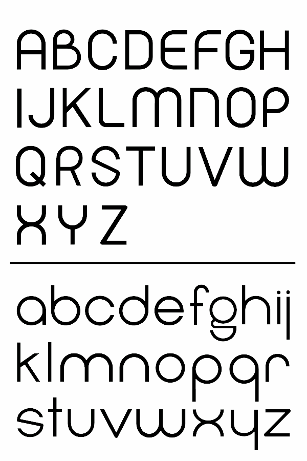
During his studies at Northern Kentucky university, Cody scott Young (Highland Heights, KY) created the clean sans typeface Coherent Sans (2014). [Google]
[More] ⦿
|
Creation Cafe
[Jason Morrison]
|
Louisville, KY-based designer of the free Snow Day Marker (2018) and Dubtastic (2018). Home page. [Google]
[More] ⦿
|
Dakota Bragdon
|
Louisville, KY-based designer (b. 115) of the duct tape font Riley's Tape (2017). [Google]
[More] ⦿
|
Darren Embry
|
Louisville, KY-based designer of the free technical drawing font Routed Gothic (2017). Darren writes: I created this font by purchasing a Leroy Lettering set, using Inkscape to trace the scanned letterforms of one of its templates, and some FontForge Python scripting. Github link. [Google]
[More] ⦿
|
Dingbat Dungeon
[Duane Richard Haut II]
|
Maze maker fonts from 1999 by Duane Richard Haut II from Lewisport, KY. Puzzler scanbat fonts based on art work by Lee Seed and Ingrid Neilson. The list: Maze Maker Inverted Level 1F, Maze Maker Dungeon Level 1F, Maze Maker Solid Level 1F, Maze Maker, Puzzler1, Puzzler2, Puzzler3, Puzzler4, MM Caver Regular (FW), Maze Maker Cavern Level 1F, Maze Maker Caverns Level 2F, MM Cavern Solid (FW), MM Cavern Solid Inverted (FW), MM Dungeon Regular (FW), MM Dungeon Regular Inverted (FW), Maze Maker Dungeon Level 2F, MM Dungeon Solid (FW), MM Dungeon Solid Inverted (FW), Maze Maker Solid Level 2F. He also made BlairCaps, after the Blair Witch Project movie. Fontspace link. Dafont link. [Google]
[More] ⦿
|
Duane Richard Haut II
[Dingbat Dungeon]
|
[More] ⦿
|
Durham Brand & Co
[Aaron May]
|
Art director in Covington, KY, who created the free handcrafted poster typefaces Stuff & Things Co (2016) and Mayhem (2015), the free hand-drawn Blood Sweat & Beers (2015), and the brush typeface Endless Bummer (2015). Behance link. [Google]
[More] ⦿
|
Emily Frink
|
During her studies at University of Louisville (KY), Emily Frink designed Circus Silly (2018). [Google]
[More] ⦿
|
Font Flipper
[Brandon Shepherd]
|
Font Flipper is a free web app. Designers can upload images, place text on them, and then preview that text in different font styles. Users can work their way through any number of the 800+ font families found on Google Fonts, liking or disliking each one along the way. Their liked fonts are then easily accessible to download. Font Flipper is an easy way to preview Google Fonts on top of custom designs without having to download fonts to a computer first. The designers are Brandon Shepherd (Lexington, KY) and Brett Shepherd. [Google]
[More] ⦿
|
Gary D. Jessey
|
 Jenkins, KY-based designer of Art Brush and Karate (oriental simulation face). Alternate URL. He writes about Art Brush: Gary D. Jessey worked at a newspaper and they needed a stylic special font for advertisement purposes. He found this typeface in an old type book from back in the 40s. He had it scanned, then later manufactured a font from the scans. About Karate: Karate was created back in 1992. I worked at a newspaper and we needed a stylic special font for advertisement purposes. I found this typeface in an old type book from back in the 40s. I had it scanned, then later manufactured a font from the scans. Free download. Dafont link. [Google]
[More] ⦿
Jenkins, KY-based designer of Art Brush and Karate (oriental simulation face). Alternate URL. He writes about Art Brush: Gary D. Jessey worked at a newspaper and they needed a stylic special font for advertisement purposes. He found this typeface in an old type book from back in the 40s. He had it scanned, then later manufactured a font from the scans. About Karate: Karate was created back in 1992. I worked at a newspaper and we needed a stylic special font for advertisement purposes. I found this typeface in an old type book from back in the 40s. I had it scanned, then later manufactured a font from the scans. Free download. Dafont link. [Google]
[More] ⦿
|
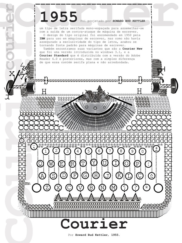
Howard G. Bud Kettler
|
 Designer from Lexington, KY, b. 1919, d. 1999. He was most famous for creating Courier for IBM in 1955. Some sources claim that he created the monospaced Prestige Elite (1953; see here) for the IBM Selectric typewriters. But evidence points more in the direction of Clayton Smith. URW has a digital version of Prestige Elite.
 Courier has seen many digital implementations: - URW Nimbus Mono L (free).
- TeXGyre Cursor (2007). Also free.
- Courier 10 Pitch. A digital family by Bitstream. See also Courier Ten, which is Courier 10 Pitch BT, offered in OpenType format as well as Type 1 for use with LaTeX. Package maintained by Daniel Benjamin Miller starting in 2020.
- The Apple system font Courier is a 1990 typeface by Bitstream.
- Kettler (2002). By Eric Olson, Priocess Type Foundry.
- Courier New (2000). Published by Microsoft, with the help of Adrian Frutiger.
- The free Courier Prime family by Alan Dague Greene (2013) was specially designed for screenwriters.
A student in Uberlandia, Brazil, Patrick Gouvea, created a great letter-based poster of a typewriter, and dedicated it to Kettler. FontShop link. Klingspor link. View some digital typefaces created by or related to Howard Kettler. [Google]
[MyFonts]
[More] ⦿
|
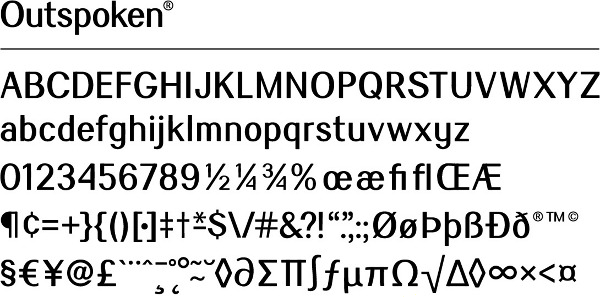
Isaac Van Heuklon
|
Member of the Cubero Studio in Louisville, KY. Creator of the contrast-rich sans typeface Outspoken (2012). [Google]
[More] ⦿
|
Jacob Wells
|
Student at the University of Cincinnati, who is from Villa Hills, KY. Creator of Tux Serif (2012). [Google]
[More] ⦿
|
Jared Wagner
|
In 2015, during his studies at the University of Louisville, KY, Jared designed the handcrafted typeface Legolas. [Google]
[More] ⦿
|
Jason Morrison
[Creation Cafe]
|
[More] ⦿
|
Jason Stewart
[Bourgeois Bear]
|
[More] ⦿
|
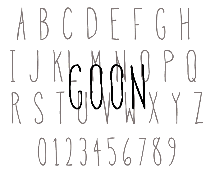
Jeremy Booth
|
Designer and illustrator in Louisville, KY. Creator of Goon (2013), a hand-drawn typeface custom designed for an app called Goon. Lucent (2013) is a blackboard bold typeface. [Google]
[More] ⦿
|
Jessica McCarty
[Magpie Paper Works]
|
 [MyFonts]
[More] ⦿
[MyFonts]
[More] ⦿
|
Justin Kamerer
[Angryblue]
|
[More] ⦿
|
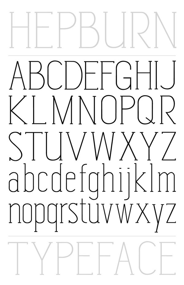
Karah Nall
|
Karah Nall (Kentucky) graduated from the University of Louisville with a BFA in Communication Art&Design. Home page. She created the tall thin monoline slab serif typeface Hepburn (2011), which has potential as a fashion mag face. [Google]
[More] ⦿
|
Kat Flaherty
|
Graphic designer in Louisville, KY, who created Lamplighter in 2014. [Google]
[More] ⦿
|
Kevin Risinger
|
Kevin Risinger (b. 1992) is located in Louisville, KY. Kevin created the techno typeface Sloux (2012). Dafont link. [Google]
[More] ⦿
|
Leah Kroeger
|
During her studies at Northern Kentucky University, Leah Kroeger (Cincinnati, OH) created the slab serif typeface Audacity (2014). [Google]
[More] ⦿
|
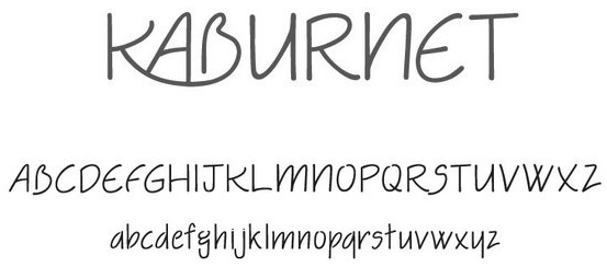
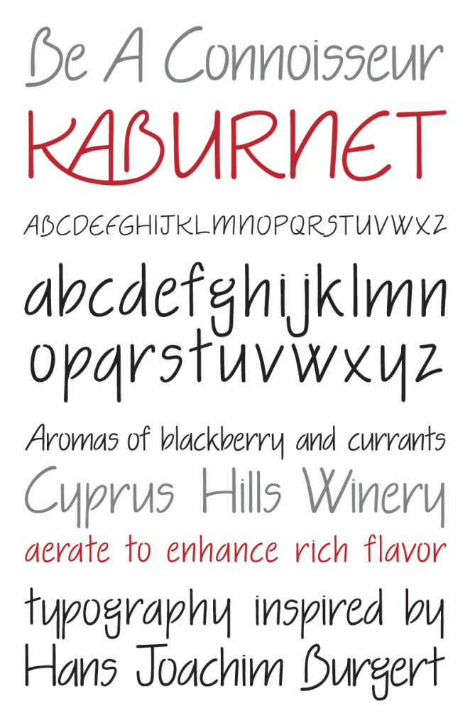
Lindsay Jacobs
|
In 2011, Lindsay graduated from the University of Louisville with a BFA in Communication Art&Design. She created the readable hand-printed typeface Kaburnet (2011). Home page. [Google]
[More] ⦿
|
Liz Knochelmann
|
During her studies at the University of Kansas in Lawrence, KS, Liz Knochelmann (b. Kentucky) created the triangle-based typeface Anti Ethereal (2014). [Google]
[More] ⦿
|
Luke Elrod
[Unveil Co]
|
[More] ⦿
|
Magpie Paper Works
[Jessica McCarty]
|
 Type foundry in the United Staes, run by lettering artist Jessica McCarty, which specializes in hand-drawn, pen-drawn and hand-printed typefaces. In 2017, she co-founded Rare Bird Font Foundry.
 The following fonts were released in 2012: Vermandois (a great irregular vintage penman's hand, accompanied by Vermandois Splatter), Saltpetre (grungy medieval outline face), Plinth (architectural typeface), Mignonette, Jacob Riley (a vintage 18th century printers' specimen revival, hand-illustrated with calligraphy nibs dipped in walnut ink), Ghouligoo, Cerise (curly hand), Sullivan, Saissant (Treefrog style), Campland. In 2013, she made the upright calligraphic script typeface Ahra and the children's script typeface Mirabelle (not to be confused wit an earlier typeface called Mirabelle by Alessandro Colizzi, or the 1926 Mirabelle typeface by Wagner&Schmidt). Ondise (2013) and Dasha (2013) are other decorative scripts in the mould of Emily Lime's Bombshell Pro. Typefaces from 2014: Woolen (a hand-inked & italicized serif, based upon a 17th century type specimen by Jean Jannon. Many of the capital letters are decorated with subtle sprigs and leaves, while the lowercase letters remain classically styled). Typefaces from 2015: Quimbly, Rivea Twist, Rivea Upright: two calligraphic scripts. Typefaces from 2017: Liesel (a watercolor brush typeface family consisting of Regular, Brush, Pencil, Shadow, Printed, Icons). Typefaces from 2019: RF Marshall. Behance link. Creative Market link. View Jessica McCarty's typefaces. [Google]
[MyFonts]
[More] ⦿
|
Marcy Ferguson
|
Fort Thomas, KY-based designer of the roman typeface Penny Lane (2013). [Google]
[More] ⦿
|
Mark Jamra
[Type Culture]
|
[MyFonts]
[More] ⦿
|
Matt Barnes
|
 Art director in Louisville, KY, who designed the geometric solid typeface family Steak and Lemonade (2016). Behance link. [Google]
[More] ⦿
Art director in Louisville, KY, who designed the geometric solid typeface family Steak and Lemonade (2016). Behance link. [Google]
[More] ⦿
|
Mia Cinelli
|
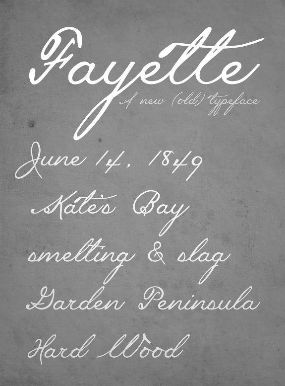
 Mia Cinelli is a designer, who obtained a BFA from Northern Michigan University (2011) and finished her graduate studies at the University of Michigan in Ann Arbor. Currently, she is a Professor of Digital Media and Design in University of Kentucky's School of Art and Visual Studies in Lexington, KY. Her typefaces:
 - The connected script typeface Fayette (2012).
- The free penmanship font Mackinac 1895 (2020), which she drafted during Michigan's 2019 Mackinac State Historic Parks Artist-In-Residence Program. Mackinac 1895 is a script typeface inspired by handwriting discovered in a ledger from 1895, the year the Mackinac Island State Park Commission was founded.
[Google]
[More] ⦿
|
Michael Manning
|
 Michael Manning, a graphic designer in Louisville, KY (was: New Albany, IN), has a BA degree from Indiana University. He created the sketched typeface Stitch and the plump sans typeface Coastal in 2013. In 2016, he designed Burnillo Display. [Google]
[More] ⦿
Michael Manning, a graphic designer in Louisville, KY (was: New Albany, IN), has a BA degree from Indiana University. He created the sketched typeface Stitch and the plump sans typeface Coastal in 2013. In 2016, he designed Burnillo Display. [Google]
[More] ⦿
|
Mikala Shepherd
|
Fort Thomas, KY-based designer of the humanist sans typeface Numo (2016). [Google]
[More] ⦿
|
Molly Bumpous
|
Louisville, KY-based designer of the experimental minimalist sans typeface Moonwalk (2015), which was finished during her studies at the University of Louisville. [Google]
[More] ⦿
|
NKU Advanced Typography
|
Type blog at Northern Kentucky University. [Google]
[More] ⦿
|
On The Spot Studio
[Tiffany Willett]
|
 Kentucky-based designer of great script, poster and hand-drawn typefaces that are sold via Creative Market. Typefaces from 2014 include Violet Simple, Bren, Keke, Starburst, Stilt, Hadley Script, Gracyn, Heather Small Caps, Eloise, Porter, Milly, Sweetheart, Angelika, Elliot, Praline, Joplin, Rachel, Briar Rose, Emerson, Stanley, Sarah Jane, Alice, Waterbrush, Gypsy, London, Wonderland, Willow, Fink, Bluegrass, Amy Regular & Expanded, Canteen, Oliver, Oliver Light, Oliver Extra Light, Yard Sale, Carry On, Adventure, Loxley, Everly, Werd, Trudy, Farmers Market, Ashlyn, Laurel, Free Spirit, Swan, Layla, Luck - Serif & Sans Serif, Savanna, Indigo, Jaden, Ella.
 In 2013, she made Kinley, Turner, Winter, Phoebe, Rae, Kris, Tris, Whit, Emma, Jenna, Blake, Jessy, Aubrey, Juliet, Piper, Harper, Caroline, Wren, Adam Serif Font, Nora, Arwen, Emelie, Elizabeth, Eden, Lena, Aria, Sawyer, CeCe, Patsy, Jasmine, Stella, Coop, BREE, Lu, Honeysuckle, Iris, Tea Party, Paper Doll, Dewdrops, Peach Cobbler, Lucy Mixed Caps, Berry, Becca, Annabelle, Quirked. Typefaces from 2015: Juniper, Girl Friday, Reba, Pigment (brush script), Satellite, Della (calligraphic inky script), Janney, Mia, Heidi, Dreamcatcher (watercolor brush), Wallflower, Kharisma (watercolor brush script), Cracker Jack, Brownie Pie, Cricket, Young Blood, Lorelei, Sylvia Script, Kellie, Kale, Hayden. Typefaces from 2016: Watermelon Smile, Bachelor Pad, Olive Beret, Dallon, Rodgers, Bursta Brush, Sydalee, Nadia Script, Buckley, Serya, Imogen (Treefrog style), Girlfriend, Bittersweet, Harley Q, Ophelia, Colleen, Delilah, Freddy, Rowan, Snowcone. Typefaces from 2017: Kinlie, Oaker, Rippely, Calliah, Novala, Silver Fox, Lolabelle, Chocolate Milk, Girl Child, Brekkie, McGee, Mazamanian, Rawwr Dinosaur, Mickelmas, Renley, Surly Teen, Nickely, Zesty Orange, Chandler Print, Rigby, Jackapple, Meraki, Eggcup, Weatherd Sweater, Lucille Rose, Birkland, Flamingo Gold, August June, Willow Market, Endless Summer, Sycophantic, Croquet Bay, Jacobie, Florrie, Quickfly, Wild Onion, Korinn, Starlite Motel (neon style), Snicket (beatnik style), Strawberry Wine (brush script), Desmond, Camisado, Gator (children's book font), Schuyler Script, Northern Downpour, Pixles (script), Carafe, Eleanor Bosch (signature script), Peony Hearts, Unicorn Letters, Bantam, Broklyn (sic), Paxton Print, Zesty Orange, Becca, Annabelle, Sweet Caroline, Faraway, Celestia, Bohemia (creamy script), Limony, Esperance, Bigtime, Blink Script, Wicket, Begrime Light, Verve Distressed, Slapdash, Carafe, Freya. Typefaces from 2018: Shelbyville, Sushannah (monoline script), Awsten, Sherman, Custard Pie, Wyfais Script, Cuyler, Harrow, Sienna Blue, Gallie Girl, Marisol, Crinkle, Alley, Milk Tea, Sunshine Riptide, Stupid Cupid, Blackheart. [Google]
[More] ⦿
|
Parker McAdams
|
Walton, KY-based designer of the free font Norront Sans (2020), which was inspired by Nordic runes. [Google]
[More] ⦿
|
Patrick Dewenter
|
Patrick Dewenter started a type foundry in 2011 in Fort Thomas, KY. He created the biline typeface Dryer Grain (2011). [Google]
[MyFonts]
[More] ⦿
|
Patrick Spiers
|
Graphic designer and illustrator in Richmond, KY. He is currently exploring experimental typefaces. Behance link. [Google]
[More] ⦿
|
Paul Reis
|
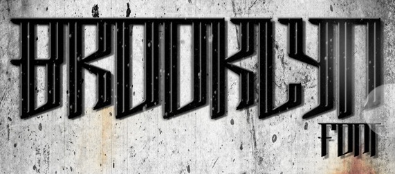
Paul Reis (Covington, KY) created the 3d architectural typeface Pane (2012). Ana (2012) is a bicolored typeface made to be seen with 3d red/cyan glasses. In 2013, he designed Wabeco (a free 6-style art deco typeface family), Brooklyn (+Inline). Free download here and here. Promesh (2013, an athletic lettering font) is also free. Typefaces from 2014: Promesh Two (free), Wafer (3d face: free), Redbud (a free vintage set with a letterpress feel). Typefaces from 2015: Royals (a free mechanical octagonal typeface). [Google]
[More] ⦿
|
Rachel Sinclair
|
Illustrator and fine artist in Louisville, KY, who confesses to many art nouveau influences. Her only entrance in the world of type design thus far is her typeface Fibonacci (2011), which is based on the golden ratio and the so-called Fibonacci sequence. The curves of the Fibonacci spiral inspired the shapes of the glyphs in the font, and magically, it has an art nouveau look because of it. [Google]
[More] ⦿
|
Richard Morris
|
 Graphic designer in Lexington, KY, who created the Peignotian typeface Matterhorn (2015). [Google]
[More] ⦿
Graphic designer in Lexington, KY, who created the Peignotian typeface Matterhorn (2015). [Google]
[More] ⦿
|
Robin Nicholas
|
 Born in Westerham, KE (1947). He joined the Monotype drawing office in 1965 and moved to the type design department in 1968, where he became manager in 1982. In 2009, he is head of typography at Monotype. Klingspor link. Robin Nicholas's typefaces:
 - With Patricia Saunders and a team of ten, he co-designed the Arial family at Monotype, an outgrowth of a program for low resolution sans typefaces started in 1982. I do not have to add anything here---Arial was made to mimic Helvetica and to adopt the same metrics. No other motivation. No higher artistic ideals. No admission from Nicholas, and no apologies. Arial is a stained 1982 stamp on the rest of Robin Nicholas' life.
- Still at Monotype, he made Nimrod (1980), which was first used by the Leicester Mercury in its year of introduction. Nimrod became a popular newspaper type.
- He created Plantin Headline Condensed (1995).
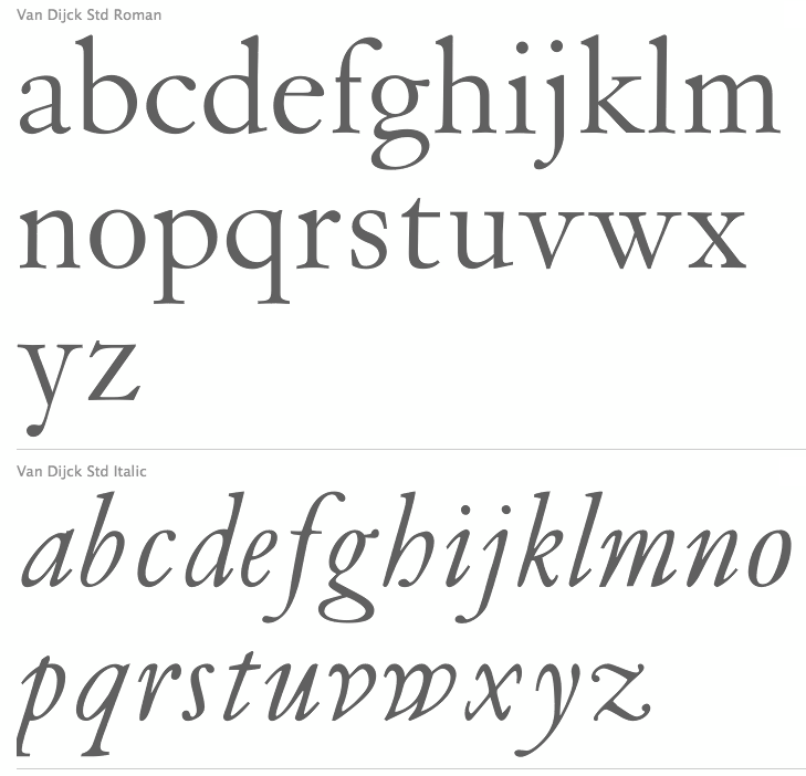
- He had a hand in the development and revival of Bell, Centaur, Clarion (a newspaper text face), Janson, Van Dijck and Walbaum, all between 1982 and 1989, all at Monotype. A blurb: Nicholas has directed the design of fonts such as the Clarion and Columbus fonts, as well as the digital versions of many Monotype typefaces including the Bell, Centaur, Dante, Monotype Janson, Fournier, Van Dijck, Monotype Walbaum, Bulmer and Pastonchi designs.
- He had a hand in Columbus (1992, Monotype). Ascender writes: Columbus has a fresh and lively hand-drawn feel but works well with today's computer systems and printers. An excellent text face, Columbus can also be used for display in advertising, posters, flyers and headlines, where the true elegance and beauty of the letters can be seen. Columbus was designed by Patricia Saunders and directed by Robin Nicholas in 1992 to celebrate the quincentenary of the voyage from Spanish shores by Christopher Columbus. The regular weight is based on types used in Spain by Jorge Coci circa 1513, and the italic is derived from a font cut by Robert Granjon circa 1543 and used by Bartolome de Najera in 1548 to print a famous manual by the writing master Juan de Yciar.
- He has done custom font projects for British Airways, Scandinavian Airlines, Barclays Bank, Opel automobiles (see Opel Sans; more here on this derivative of Futura; posted here), and Ikea (Ikea Sans is based on Futura and Ikea Serif on New Century Schoolbook).
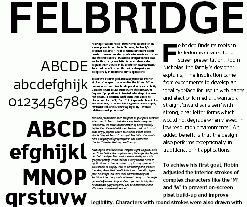
- In 2003, he published the Felbridge family and Fairbank MT (a chancery hand) at Agfa-Monotype.
- Cambria, Jelle Bosma's 2006 typeface for Ascender and Microsoft, was a joint effort with Steve Matteson and Robin Nicholas.
- In a project started in 2002 at Monotype, and finished in 2005, he created Bembo Book. Monotype's page explains: Originally drawn by Monotype in 1929, Bembo was inspired by the types cut by Francesco Griffo and used by Aldus Manutius in 1495 to print Cardinal Bembo's tract de Aetna. A beautiful design with tall ascending lowercase and elegant letterforms, Bembo has been a favourite for book setting for over 70 years. No italic was used in the Aldine de Aetna work so another source was needed. This was found in a publication by the writing master, Giovantonio Tagliente, produced in Venice circa 1524. Considered by many to be one of Stanley Morisons finest achievements during his tenure as Typographical Advisor to the Monotype Corporation, Bembo has consistently been a best selling typeface, both in its original hot metal form and in todays digital formats. Not intended to be a facsimile of Manutius work, Bembo was drawn to embody the elegance and fine design features of the original but marry them with the consistency of contemporary production methods and to ensure that the typeface would work satisfactorily with high speed printing techniques. The first phototypesetting and digital versions were based on hot metal 9 point drawings. This gave good legibility in small sizes, due to a comparatively large x height, but lacked some of the elegance present in larger hot metal sizes. This new digital version of Bembo, called Bembo Book, has been designed to be more suited to text setting in the size range from 10 point to 18 point. Based on the hot metal 10/18 point drawings, which were used to cut all sizes from 10 point to 24 point, this new typeface has been carefully drawn to produce similar results to those achieved from the hot metal version when letterpress printed. The project started in 2002 when a high quality UK Printing House asked for a digital version of Bembo which would give a similar appearance on the page to the 13 point hot metal they were currently using. Hot metal drawings were digitised and extensive editing was carried out on the resultant outlines to ensure that design features and overall colour from the digital output remained close to that of the letterpress product. The resultant typeface is slightly narrower than existing digital versions of Bembo, it is a little more economical in use and gives excellent colour to continuous pages of text. Ascending lowercase letters are noticeably taller than capitals, giving an elegant, refined look to the text.
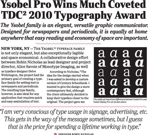
- In 2009, he co-designed Ysobel (Monotype; winner of an award at TDC2 2010) with type designers Alice Savoie, also working at Monotype Imaging's UK subsidiary, and Delve Withrington based in the U.S. The sales pitch: According to Nicholas, the idea for the Ysobel typefaces started when he was asked to create a custom, updated version of the classic Century Schoolbook typeface, which was designed to be an extremely readable typeface - one that made its appearance in school textbooks beginning in the early 1900s.. The web version by Linotype in 2013 is called Ysobel eText Pro. It has larger x-height and wider spacing.
View the typefaces made by Robin Nicholas. [Google]
[MyFonts]
[More] ⦿
|
Roger W. Roberson
|
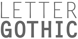 American designer, b. 1939, Saint Louis, MO, d. 2013, Lexington, KY. He also lived in Wildwood, Florida and Rushville, Indiana. Creator of the typewriter typeface Letter Gothic for IBM between 1956 and 1962, which was inspired by Optima. Poster by Ashley Donahue (2013).
 Later versions of the font: Letter Gothic (Agfa), Letter Gothic (Linotype), Letter Gothic 12 Pitch (Bitstream), Letter Gothic L (URW++, 1993). The non-monospaced version of Letter Gothic is called New Letter Gothic, which was digitized and Cyrillized by Gayaneh Bagdasaryan in 1999 at Paratype. In fact, at Paratype, LetterGothic Baltic, LetterGothic Central European, LetterGothic Cyrillic Asian, LetterGothic Cyrillic International, LetterGothic Cyrillic Old Russian, LetterGothic Multi Lingual, LetterGothic Turkish and LetterGothic Western were digitized based on Roberson's work by Gayaneh Bagdasaryan. Same goes for New Letter Gothic Baltic, New Letter Gothic Central European, New Letter Gothic Cyrillic Accented, New Letter Gothic Cyrillic Asian, New Letter Gothic Cyrillic International, New Letter Gothic Cyrillic Old Russian, New Letter Gothic Multi Lingual, New Letter Gothic Turkish, New Letter Gothic Western. [Google]
[MyFonts]
[More] ⦿
|
Sidney Geller
|
Graphic designer in Louisville, KY, who created these typefaces in 2019: Firenze, Margot. [Google]
[More] ⦿
|
Stephanie Netherton
|
Stephanie Netherton (Stephanie Netherton Designs, Louisville, KY) created the serifed typeface Fiorentino (2011). Behance link. [Google]
[More] ⦿
|
Steven Skaggs
|
 A native of Louisville, KY, he studied calligraphy and typography under Hermann Zapf. His typefaces, all part of Delve Fonts (Delve Withrington's foundry in Alameda, CA), in alphabtical order:
 - Piston (2012). A steam-punk typeface designed to be customized by the user through converting to outlines and pulling the straight strokes to pack as desired. It was called Engine nine at some point.
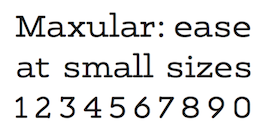
- Maxular (2012-2018). A 14-font rounded slab serif family that includes special Rx styles fine-tuned for macular degeneration sufferers. Very legible at small sizes.
- Rieven Uncial (2009). Post-modern hybrid uncial. Rieven received a "Certificate of Excellence in Type Design" in the 2010 TDC2 competition. The Rieven family was expanded with the additions of Rieven Roman and Rieven Ornaments in 2013.
Professor of Design at the University of Louisville. He also works in design theory and semiotics. Author of FireSigns A Semiotic Theory for Graphic Design (2017, MIT Press). The publisher writes: Graphic design has been an academic discipline since the post-World War II era, but it has yet to develop a coherent theoretical foundation. Instead, it proceeds through styles, genres, and imitation, drawing on sources that range from the Bauhaus to deconstructionism. In FireSigns, Steven Skaggs offers the foundation for a semiotic theory of graphic design, exploring semiotic concepts from design and studio art perspectives and offering useful conceptual tools for practicing designers. [Google]
[MyFonts]
[More] ⦿
|
Terry Helstrom
|
Graphic designer and illustrator in Louisville, KY. Behance link. He created an unnamed ultra-fat font in 2010. [Google]
[More] ⦿
|
Tiffany Willett
[On The Spot Studio]
|
 [More] ⦿
|
Toni Coleman
|
During her visual communication studies in Highland Heights, KY, Toni Coleman designed the techno typeface Slanty (2013) and the circle-based monoline sans typeface Circa (2013). [Google]
[More] ⦿
|
Type Culture
[Mark Jamra]
|
 Advertised as Mark Jamra's Portland, ME-based digital type foundry and an academic resource. There is an extremely useful research directory, a great jump point for learning about type and its history. The site also has useful articles such as Jamra's article on optical image support and his article on form and proportion in a typeface. Mark Jamra (b. 1956) lives in Portland, Maine, where he designs type and teaches letterform and graphic design at the Maine College of Art. He did postgraduate work at the Basel School of Design, Switzerland, 1980-83, then worked for URW in Hamburg (where he lived for 12 years), and set up Jamra Design there. He left Germany in 1995. Fonts by Jamra:
 View Mark Jamra's typefaces. Brief bio. Speaker at ATypI 2006 in Lisbon. FontShop link. Speaker at ATypI 2018 in Antwerp on the topic of a multi-script type system for Africa. [Google]
[MyFonts]
[More] ⦿
|
University of Kentucky
|
A selection of truetype and type fonts: Nina is a 1996 Garamond-like family of heavily accented fonts, copyright of the International Journal of Tantric Studies. SILDoulosIPA (1993) is a phonetic font. Sanskrit 1.2, Sanskrit 1998 (both 1998, Omkarananda Ashram Himalayas, Rishikesh, India) and SanskritVijay (Vijay K. Patel) are Indic fonts. The Times_CSX+ Sanskrit family is by URW (1994). The Translit98 family is a Nina-lookalike. [Google]
[More] ⦿
|
Unveil Co
[Luke Elrod]
|
Luke Elrod (Unveil Co, Louisville, KY) created the hand-drawn pirate ship fonts Timbersland (2014) and Shipwright (2014). He also made Victoria's Curl (2014) and Base Camp (2015). Creative Market link. [Google]
[More] ⦿
|
Wilson Thomas
|
 Designer (aka Funk King, b. Fort Knox, KY) who lives in Orlando, FL, and/or Apopka, FL. He used FontStruct in 2008-2009 to make over 550 decorative fonts, and became one of the world's top experts on FontStruct, FontShop's on-line font editor. Most of his fonts were withdrawn in 2012. He did a few commercial typefaces at his commercial foundry, Funk King. His creations include
 - A Bit Eccentric.
- Alphabots
- Alphadings: Picnic Basket (2014), Rat Race (2014), Pod Invasion (2014), On Hangers (2012, a commercial series that includes Pants on Hangers, etc), Dog Tag, Black Bird, Easter Egg Dots, Ser Egghead T. handlebar, Ovoidotta (now called Sniff), Play Book, BuddhaBuddha, Swizzle Sticks, Computer Backplate, Milky Way, Sprout, Football, Clapboard (for movie makers), Teed Off, Book Stack, Speaker Box, Ant Farm, Sound and Vision, Speaker Grill, Tom Tom, Caged Type, Conga Lounge, Spinal, Add Van, Frostruct, Picket Fence, Regatta, Cranestruct, Impossible Alphabet, Igloo Village, Mortar Board, Jack, Marionette, Golden Gate (+Short, +Solid), Crossed, Eff U ("the finger"!), Tall Big Top, Jackpot, Skulls&Cross Bones Redux, Crosshairs, Drama Club, Good Day Sunshine, Butterfly, Steps and Windows, Heartbroken, O Christmas Tree, Christmas Lights, Candle, Supper Time (alphadings of plates), Sands of Time (alphadings of hour glasses), Fishbones (commercial since 2012), Handy (alphading with hands), Hang Ten (feet alphadings) and High Five (hand alphadings), Armade and Ghost Ship Armada (ship alphadings), Cut Here (stitching alphadings), Schematic (electric circuit alphading), Masquerade, Mortar Board, Gear Bits, Gearswork, Hi-Lo Gears, Gears, Resistor, Gear Shift, Castle, Castle with Flags, Antique Keys, Rounded Keys, Pods, Piano Keys (+Alt, +Correct), Framework, Dixieland Jazz, Spats, and City of New Orleans (the last three are alphdings based on the same Victorian alphabet), Saturn, Piggy Bank, Voodoo Doll, Dice, Fist Bump.
- Antennas, Antennas Outline
- Antiquity
- Arcostellati, Arcostellato, Arcangolo, Arcontorno (2011): a blackletter family.
- Architect, Ruled, Gridworks, Blueprint (Solid, Dashed), Quadular (+Serif), Isometric Modified (+Light, +Bold Outline), Isometric (a 3d gridded family: +Basic Latin, +Basic Latin Lite, +More Latin, +Bold, +Black).
- Art deco: Arc Neuvo (rounded letters), Arc Nuevo (2012, commercial), Toneelschuur (based on the letterhead created for the Theatre Toneelschuur Haarlem), Shift (bold), Eye Spy (this says Peter Sellers), Mod Squad.
- Atomic.
- Avenue, Avenue Alphabet (white on black).
- Badge
- Ball And Chain (neat), Ball Bearings.
- Balls and Bats
- Banjo (2012).
- Barber Shop
- Barcoded
- Basket
- Beachwear (horizontally striped)
- Beat Block, Beat Box.
- Beatnik.
- Beltway.
- Birdseye
- Birdsteps
- Bitten
- Blackletter: Abbey
- Blanket Serif Caps, Blanket Sans Serif
- Block Inline Block
- Block Mosaic (great gridded letters)
- Blockheads
- Blood Sweat&Tears
- Bolla Fratturato (2011): outlined blackletter face.
- Bolt, Bolted
- Bon Mots.
- Break, Balance Beam, After Party (2010).
- Bubble Zwrap (2010).
- Build A Bridge
- Buzz Kill
- Cafe Fumante.
- Carp Black, Carp Blanc
- Caterpillar, Tall Caterpillar.
- Cattails
- Chain Gang, Krazy King
- Channel
- Check Mate (checkered flag font).
- Cherry Bomb.
- Chubby
- Cinder Block (2010): a 3d typeface with texture thrown in.
- Circuit Board Solid, Circuit Board Outline, Circuit Board Outline Numbers, Circuit Board Simple, Micro Clean, Microcircuitz, Circuit Board Simple, Schematode (2013).
- Circus Maximus Outline
- Cirquela (2012). a non-FontStruct font, this is his first hand-printed typeface.
- Clean
- Cobblestones
- Code Hijack (2014).
- Compass (+Plain)
- Connected scripts: Cruise, Jet Cruise (2009), Notched Script (upright, connected), Rough Script (italic, connected), square Script (pixelish, connected).
- Computer Backplate, Milky Way.
- Contempole
- Crimped Pincushion (2010).
- Crispy Inline (classy)
- Crooked Marker, Marker
- Crop Circles
- Crownbar.
- Curls And Twirls
- Cut Here
- Daisies (nice rounded square letters with painted daisies)
- Decoscriptic, Decoish.
- Diamonds Are Forever, Liberty (dot amtrix fonts)
- Didactic fonts: Back to School.
- Digital, Digital Whimsy (gorgeous fonts in which the meat of the glyphs is made up of 0's and 1's), Digital Italics, Digital Non-italics.
- Dingbats: Digital Biz Bitz (2012), Capitalist Pictograms (2012), Kapitalist Kit (2011), Weather System (2011), Twelve Days of Christmas (2010), Learning For Business (2010), Calder Symbols (2010), Mad Aliens (2010), FSEmoticons, Maven Pictograms, Temp (weather dings), Sports Wave, Bullet Arrows
- Dinner at 8
- Diode
- Directional
- Ditier Cycles (2010): a grunge version of J. Hughes's Dirt Cycles.
- Disco Ball, Disco Salvation.
- Doggie Tracks (2010).
- Dollars and Cents.
- Domestic Bliss (+Solid), Blissful Hearts (Valentine's Day alphadings).
- Domino, Dominodot
- Dot matrix fonts: Belly Button (2013), Fandangle (2013), Trace Remains (2013), Billiards (2013), Pome (2013), Cow Poke (2013), Rouletto (2014), Crawler (2014), Zephyrelli (2012), Yoyo (2012), Carousel (2011), Corsivo Punti (2011), Wisp (2011), Amusement (2011), Menagerie (2011), Junk (2011), Iphont (white on black dot matrix face), Lyrical (dot matrix script), Petits Pois, Elli, Industrial Magic, Wind Chime, Domestic Bliss (2010, +Serif, +Sans Serif), Ying Yang (2009)
- Double Decker
- Eau de Kerning.
- Efficiency (2010).
- Eiffel family: mechanical.
- Electrifunkified (2013).
- Emergency
- eq Regular, eq Radio Waves, eq Tight.
- Erector Set (2010).
- Extension Cord
- Fairy Tale (curly)
- Fantastic
- Fast Cars, Fast Lane, Fast Forward
- Fifty Famous Fairy Tales (bi-lined and bejeweled)
- Flair Ornate, Flaired Script, Flair, Flaired
- Floor Plan
- Flash (gridded face)
- Folk Art (wooden plank simulation)
- Font Troll
- Fractal, Wireframe, Hemisphere, Origami (now Mummification): experiments in glyph partitioning.
- Funk, Funky palms
- Gancio (2014). Hand-drawn.
- Gemstone (letters in a mosaic)
- Glyphs made from broken objects: Broken Combs, Broken Glasses
- GI Joe
- Grain
- Graphont
- Grid1, Grid2, Pas De Grille Pli Isométrique (+Plombé), Grille Noir Pli Isométrique (+Plombé), Grille Intrépide Pli Isométrique (+Plombé), Grille Facile Pli Isométrique (+Plombé).
- Grunge typefaces: Feather (2010).
- Gummy (2010).
- Happily Ever After (2010).
- Heath Robinson (gorgeous mechanical font).
- Hexcavated (2010).
- High Anxiety.
- High Wire (dotted).
- Honeycomb Black (hexagonal).
- Horizontally Phased (like IBM logo from afar), Vertically Phased, Field Goal.
- Hot Diggity Dog (2010): a monoline rounded sans.
- Void.
- Inline: Hi-Fi Deco, Track (+Filled), Crispy Inline
- Imperfect Optical Experiment.
- Ironside, Ironworks.
- Isomixed (+Inline, +Inverted, +Light, +Inline Light), Isomixerd Moire (nine textured styles).
- Jacks (2010): a stitching font.
- Jeannie
- Jelly Bean series: I's, Wide, O's, Split
- Jetsons (futuristic).
- Jolly Swash 9+Tall, +Tall Wide Tail).
- Kaleidoscope, Kaleidoscope Solid
- Kitchen tile typefaces: MadisonAveAvenue (2010), Edgar Fernhout (2012).
- Lace
- Ladder
- Last Days Of Summer, Endless Summer, Beach.
- Lattice, Lattice Black
- Lean
- Leaves
- l-e-display
- Little Miss Muffet.
- Loom.
- Love, Love Letters
- Martini
- Metroliner and Metroliner Deluxe.
- MICR fonts: Wedge Solid.
- Mike
- Mitered, Zietgeist: striped 3d typefaces.
- Modal.
- Modern Ancient (chiseled font imitation)
- Molecular (+Complex, +Complex 1), Dense Molecular Complex (1 through 5), Molecular Architecture, Tessellation 1 (+Continuous), Tessellation 2.
- Monkey Bars.
- Montreal (+Italics)
- Monumental, Less Monumental,
- Mortar Booted (+Thick, Separated, Mission, Booted Mission).
- Mouthy
- Music fonts: Fret Full (2010), Fret Station (2010).
- MyBlock
- Mystere (2012, grunge).
- Necklace
- Ninja.
- Oblique
- Octovision Remix
- Open&Shuttered Day, Open&Shuttered Night
- Oriental simulation/look: Shoji Pixel, Shoji Stage&Screen Soapbox, Chinese Democracy, Asian Influence.
- Origami City (2010): formerly Simply Elevated Black. Simple Elevation (2012) is in the same family.
- Outline Habitat
- Ozmosis (2014), Ozian (2014), Cardinal (2014), Emblem (2014), Oblio (2014), Hollow Branch (2014)
- Pallina (2010, + Stampino, +Diluente).
- Palm, Tall Palm
- Paperclip typefaces: Neue Werner Paperclip (2012).
- Patterns
- Pavers
- Piccadilly (2010).
- Pipes
- Pisa.
- Pixel Dust, Pixels Dusted, Zogg Domination (video game font)
- Plaid
- Pop Arc (2010). In the same style: Conveyor Belt, Milk Bottle, Cookie Cutter, Erector Set (2010).
- Popsicle Sticks (nice vertically striped glyphs).
- Playbook (2010).
- Power Grid, Power Gridlocked
- Process This (2010) and Flowcahrt (2010): based on graphs of computer programs.
- Pump Boys (2010).
- Puzzle
- Quagmire (2010)
- Radio Waves
- Razorback Block
- Receipt (2012): a dot matrix face.
- Regular Habitat
- Relativity
- Remixintag (2011, a clone of Wallachia by Intaglio).
- Repeat
- Ribbodini (2010, ribbon font).
- Riveted
- Road Trip
- Sausalito Nautica (2011).
- Say What? (Exaggerated ink trap face)
- Scaffoldini (2010): a 3d gridded face. Followed by Scaffo (2012), Scaffoldini Senza Griglia (2010), Scaffoldini Ascendente Contrario SG, Scaffoldini Ascendente Senza Griglia, Scaffoldini Contrario Senza Griglia, Scaffoldini Ascendente, Scaffoldini Contrario, and Scaffoldini Ascendente Contrario, Scaffoldini Prospettico (+Contrario, +SG).
- Scichosis.
- Scripts: Diode (+Dioded, Diodoubled, Diodocked, Diodedocked, Diodiced), Scherzando, Fontstitution, Rough Script, Scriptilicious, Whipped Cream, 45 Degrees, Script Town (2013), Aloha (2013), Sinal Strength (2013), Ink Well (2013).
- Skulls, Skully
- Slice N dice
- Skyscraper.
- Small Wonder, Small World
- Snowflake (2010).
- Soap.
- Sole
- Soma (2009): 3d letters mades from cubes.
- Spooky Eyeballs (2009).
- Squiggles
- Stained Glass, Stained with Cross
- Starburst
- Stencil fonts: GI Joe (2012, military), Kid's Stencil (white on black), Black Tie, Matchstick, Stensei, Stencillated, Tri-Fold, Tri-Fold Cut, Tri-Fold Rounded, Stencil, Stencil Plate, Stencil Face, Semi Stencil, Psuedo Stencil, Psychedelic Stencil.
- Stitching fonts: Cross Worded (2013), Cut Here (2014), Sampler
- T-Shirts on a Clothesline
- Swamp Frog and Tadpole: artsy fat letters
- Swamp Funk, Mojo (curly letters)
- Swatches.
- Tabular
- Tall Habitat
- Techno look: Technified, Slick, Tangential (2010).
- Tanqueray (2010): octagonal face.
- Teepee (wood look)
- Tennis themed: Racket, Net Ball, World Cup.
- Tetrominoes Black (2010): a 3d typeface cloned from TP2 Marriott's Tetrominoes.
- Textile
- Texture fonts: Global (2011, globes), SS Half Tone (One, Two, Three), SS Watermark, SS Silk Screen (2010). These brush texture typefaces were cloned from Swifted Strokes by Mike Lee. Tramarada (2011) has a stunning woven look.
- Thalistic.
- The Adventure of the Dancing Men (2011, dingbats).
- The Big Top
- The Real McCoy
- Tiki.
- Time
- Timpani, Timpaniless, Timpaniblok, Alien Crop Circles (outer space face).
- Toothpaste (2011): imitating oozing toothpaste.
- Trapezoidot, Zoidot, Dotz (dotted typefaces).
- Upright connected scripts: Madie (2009)
- Valentine's fonts: Hearts and Flowers, Hearts and Arrows, Keys to your Heart, Bed of Hearts
- Vapors and Mirage: evaporating glyphs.
- Vibration (2010). This multiline typeface was followed by Echo (2010).
- Victorian fonts: Alouette, Swamp Funk
- Void.
- Waveform
- WPA Household Arts Stripes, WPA Household Arts Chex, WPA Household Arts (poster stencil face)
- Wee The People, Small World.
- Werner Paperclip (2009), Paperclip (2010): paperclip typefaces after a 1974 original by Ad Werner.
- Western fonts: Bolo (2010), Bow Tie (2010), Bowl (2010), Western Doodle, Sparky, Buckaroo, Diamond Buckaroo, Saloon and Desert Rose. Western style alphadings: Cart Before The Horse, Wagon Train
- Weird
- White on black typefaces: Tabs, Dot Keys, Rounded Keys, Block Keys, Keys.
- Wiggles
- Wim Crouwel-related fonts: Unknown Crouwel #1, Edgar Fernhout (2012: a Wim Crouwel tribute font in kitchen tile style taken from a 1963 poster), Kalender 1976 Letters (octagonal based on a Wim Crouwel calendar from 1976), Kalender 1976, Brusselmans (based on a Wim Crouwel poster), Rabobank (based on a Wim Crouwel poster), Brabant (based on a Wim Crouwel poster)
- Woodcut, Woodcut Recut, Woodcut Banjo.
- Woven.
- Wrenched
- Yay Team
- Zebeast (Zebra-striped letters)
- Zodiac Block
In 2012, he added these fonts at MyFonts: Architect, Black Tie, Carousel, Check Mate, Cobblestones, Cruise, Dog Tag, Edgar Fernhout (2012), Fifty Famous Fairy Tales, Fratturato Digitale (pixelish blackletter face), Ghost Town, Jackpot, Jelly Bean, Keyboard, Kingdom (a castle font), Lagniappe (Victorian), Lyrical, Madie, Matchstick, Menagerie, Q Typ, Scaffo, Sprinkle, Stained Glass, Stencillated, Stensei (stencil), Sweet Valley, Toothpaste, Vibration MF, Yoyo, Zephyrelli. Typefaces from 2013 (no longer freely downloadable!): Pome (dot matrix), Cow Poke (dot matrix), Sausalito Nautica, Cut Here (stitching typeface), Belly Button (dot matrix face), Rouletto (bejeweled typeface), Picnic Basket (alphadings), Fandangle (dot matrix), Trace Remains (dot matrix), Billiards (dot matrix), Cross Worded, Script Town, Schematode (connect-the-dots), Electrifunkified, Aloha, Signal Strength, Ink Well, Satellite, Supper Time (alphadings), Mike (alphadings), Licorice, Conga Lounge OF, Monkey Bars, Daisies, Fractal OF (textured face), Saloon OF, Ball and Chain, Say What. Typefaces from 2014: the multilined or inline typefaces Ozmosis, Ozian, Cardinal, Hollow Branch, Emblem, and Oblio. The alphading typefaces Rat Race and Picnic Basket. The pearly dot matrix typeface Rouletto and Crawler. The video game typefaces Pod Invasion and Zogg Domination. The stitching typeface Cut Here. The pixelized typeface Code Hijack. Klingspor link. Dafont link. Fontspace link. Additional URL. Myfonts link. MyFonts foundry link. View Wilson Thomas's commercial typefaces. [Google]
[MyFonts]
[More] ⦿
|
