| | |
Aisha Scott
[Reel Hood]

|
[MyFonts]
[More] ⦿
|
Alisa Nowak
|
 French type designer who studied at Fachhochschule Düsseldorf (2009) and at the Ecole supérieure d'art et de design d'Amiens, France, class of 2011. At ESAD her graduation typeface was called Eskapade. In 2012, the blackletter typeface Eskapade Fraktur was published by Type Together. The angular weights Eskapade Regular and Eskapade Italic were added in 2012.
 With Sebastien Degeilh, she is a partner in Nowak & Degeilh, a French type foundry started in 2012. At Nowak & Degeilh, she created the 3d geometric overlay font family Carton (2012). For the next few yours, her work was published by Fontyou: - She co-designed the stylish Egyptian typeface Achille FY (2012) with Gia Tran, Gregori Vincens, Valentine Proust and Bertrand Reguron, and Achille II FY (2014) with Valentine Proust and Gregori Vincens.
- With Gia Tran, Gregori Vincens, Valentine Proust and Elvire Volk, she co-designed the monoline sans display typeface Younion FY (2013). Younion One FY is free at Dafont.
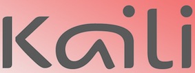
- Codesigner of Kaili FY (2013): an exotic typeface with crazy ligatures, inspired by Indian scripts, designed by Gregori Vincens, Bertrand Reguron, Gia Tran and Alisa Nowak.
- The EPS format display typeface Alice FY (2013). Co-designed by Alisa Nowak, Micaela Neustadt, Gia Tran, Bertrand Reguron and Valentine Proust. Alice FY was inspired by Adrien Genevard's lettering. Sub-themes are Alice in Wonderland and playing cards.
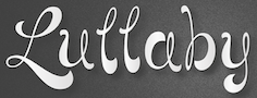
- The EPS format frilly script typeface Lullaby FY (2013), co-designed by Alisa Nowak, Micaela Neustadt, Gia Tran, Bertrand Reguron and Valentine Proust at Fontyou. It too was inspired by Adrien Genevard's lettering.
- Exquise FY (2013). A fashion mag didone co-designed by Bertrand Reguron, Alisa Nowak, Valentine Proust, Elvire Volk and Gia Tran at Fontyou.
- Bruum FY (2013) by Gia Tran, Alisa Novak, Micaela Neustadt, Bertrand Reguron and Grégori Vincens. Bruum FY is a curvy stressed elliptical sans typeface.
- Four typefaces done with Luis Gomes and Jeremie Hornus: Booster FY (2013: a rounded sans), Gauthier FY (2013: a transitional typeface family, followed in 2014 by Gauthier Next FY), Lean-O FY (2013: a slab serif with leaning asymmetrical brackets; see also LeanO Sans in 2014), Marianina FY (2013: a contemporary condensed 24-style headline sans family with simple strokes. Characterized by kinks in the ascenders).
- Gregori Vincens, Gia Tran, J&eacxute;rémie Hornus and Alisa Nowak co-designed the humanist sans typeface Klaus FY (2013).
- The slender display typeface Sérafine FY (2013). Co-designed with Jason Vandenberg and Jérémie Hornus.
- Codesigner with Mr. Zyan of the alchemic hipster font Pyrenees FY (2013).
- She collaborated with Jérémie Hornus and Fabien Gailleul on the design of the astrological simulation typeface Astral FY (2013). The same group of three collaborated in 2014 on Naive Gothic FY.
- In 2014, Adrien Midzic, Jason Vandenberg, Jérémie Hornus, Julien Priez and Alisa Nowak co-designed the creamy script Vanilla FY. It was renamed Vanille FY after a few days.
- Still in 2014, Adrien Midzic, Jérémie Hornus and Alisa Nowak co-designed the very humanist sans family Saya FY and Saya Semisans FY.
- Luis Gomes, Jérémie Hornus and Alisa Nowak co-designed the rounded sans typeface family Booster Next FY in 2014.
- Joao Costa co-designed the thin lachrymal typeface Zitrone FY in 2014 at FontYou with Jérémie Hornus and Alisa Nowak.
- In 2014, Monica Munguia, Alisa Nowak and Jérémie Hornus co-designed the blackletter typeface Blackmoon FY.
- In 2014, Matthieu Meyer, Alisa Nowak and Jérémie Hornus co-designed the wedge serif typeface Ennio FY at FontYou.
- The punchy poster typeface Kraaken FY (2014) was designed by the FontYou team of Bertrand Reguron, Alice Resseguier, Valentine Proust, Julien Priez, Gia Tran, Jérémie Hornus, and Alisa Nowak.
- In 2014, Joachim Vu, Jérémie Hornus and Alisa Nowak co-designed the classical copperplate script typeface Vicomte FY.
- Codesigner with Jan Dominik Gillich of Sperling FY (2014, FontYou), a didone-inspired headline or fashion mag display typeface family.
- Designer of Marianina Wide FY (2014).
- In 2014, Alisa Nowak, Gregori Vincens and Andrey Kudryavtsev created Achille II Cyr FY.
- Codesigner of Hansom Slab FY (2014, Gia Tran, Jeremie Hornus and Alisa Nowak).
- Still in 2014, Julien Priez, Hugo Dumont, Jérémie Hornus and Alisa Nowak co-designed Rowton Sans FY, a sans family patterned after Gill Sans in six weights, from Hairline to Bold---named after Arthur Eric Rowton Gill, it has the Gillian lower case g but italic lowercase is a bit too far afield for my own taste, especially the squeezed g.
In 2015, Jérémie Hornus, Clara Jullien and Alisa Nowak co-designed the spurless / organic slightly inflated sans typeface family Diodrum at Indian Type Foundry. Diodrum Rounded (2020, by Manushi Parikh, Jérémie Hornus, Clara Jullien and Alisa Nowak) is a spurless organic sans family. In 2016, Alisa Nowak, Julie Soudanne and Jean-Baptiste Morizot co-designed Graphico (Indian Type Foundry): Its letterforms are industrial and square-sided. The typeface looks like the product of precision mechanics: it should be featured together with tech---either old tech like appliances or watches, or new tech like apps and laptop stands. In 2016, Alisa Nowak designed the all caps art deco / avant garde typeface family Inbox that comes with many great ligatures and interlocking glyph pairs. It was published at Indian Type Foundry. Alpinist (2016) is a humanist sans with a small x-height optimized for magazine design and other editorial applications. The edges are slightly rounded for easy reading. It was designed by Jeremie Hornus and Alisa Nowak. Somehow, it evolved into Alpino at Fontshare. In 2016, Jeremie Hornus and Alisa Nowak released Associate Sans and Slab (+Stencil), and Associate Mono at Indian Type Foundry. This is a family with an American gothic look. Vesterbro (Jeremie Hornus, Alisa Nowak, Ilya Naumoff, Black Foundry, 2017) is a high-contrast Latin / Cyrillic typeface with a Viking feel that won an award at Granshan 2017. Papelli (2016) is an informal typeface family by Alisa Nowak and Julie Soudanne. At Fontstore / Fontshare, she released the 6-weight sans typeface Excon in 2017. Excon is named after and a tribute to French designer Roger Excoffon (1910–1983). Excon's letters are top-heavy, a rarely-explored idea in type design Excoffon himself experimented with. In 2017, Jérémie Hornus, Théo Guillard, Morgane Pambrun, Alisa Nowak and Joachim Vu co-designed Bespoke Sans, Bespoke Serif and Bespoke Slab at Fontstore / Fontshare. In 2020, Bespoke Stencil was added. In 2017, Jérémie Hornus, Julie Soudanne and Alisa Nowak designed the attractive titling didone typeface Zesta. Zodiak (2021, Jérémie Hornus, Gaetan Baehr, Jean-Baptiste Morizot, Alisa Nowak, and Théo Guillard at Fontshare) is a free 24-style text family with Century-like newspaper roots and sturdy bracketed slab serifs that was originally named Claire (2020). In 2020, Jeremie Hornus, Theo Guillard, Morgane Pambrun, Alisa Nowak and Joachim Vu co-designed Bespoke Stencil (2020, Fontstore). [Google]
[MyFonts]
[More] ⦿
|
Alpine Fonts
[Steve Smith]
|
Chess fonts and other game fonts at this company in Laramie, WY. The Alpine Fonts, by Steve Smith, are supplied as three sets with different designs (Hastings, Linares or Zürich) containing 17 TrueType or Adobe Type 1 fonts in each set. They are specially supported by my macros. Commercial site. Products include checkers, shogi, ChiangQi, Copenhagen Othello, Las Vegas dice and domino fonts, Monte Carlo backgammon font, Canton Mah Jong font, Tokyo go font, Chess fonts: Linares, Hastings, Zurich. Bermuda playing card font. [Google]
[More] ⦿
|
Altemus Creative
[Robert Altemus]
|
Altemus Creative Services sells dingbat fonts by Robert Altemus from New York, NY: Your premiere source for digital decorative fonts. Their commercial dingbats are sold by MyFonts. Partial list: AltemusBirds, AltemusBorders 1 through 4 (1992; Borders 4 containss pointing hands and flourishes), AltemusBursts 1 through 4, Altemus Bursts 1 through 4 (2002, contains snowflakes), AltemusChecks, AltemusChecksTwo, AltemusCorners, AltemusCrosses, AltemusCuts, AltemusCutsThree, AltemusCutsTwo, AltemusFlowers, AltemusHands, AltemusHolidaysOne, AltemusKitchen, AltemusPinwheels (1996), AltemusPointers, AltemusRays, AltemusRaysBold, AltemusRoughcuts, AltemusRounds, AltemusRules, AltemusSecurity, AltemusShields, AltemusSpirals, AltemusSpiralsBold, AltemusSpiralsBoldItalic, AltemusSpiralsItalic, AltemusSquares, AltemusStars 1 through 3, AltemusSuns, AltemusSunsBold, AltemusToolKit (2 fonts), Altemus Web Icons, EuropaArabesque, Games (cards, domino), Games 2 (mahjong, chess), Sports (balls), Sports 2, Leaves 1 and 2. Catalog, part I, part II. [Google]
[MyFonts]
[More] ⦿
|
Amondo Szegi
[FONTana Typestudio]
|
[MyFonts]
[More] ⦿
|
Andrew Hunt
[Quantum Enterprises]
|
[More] ⦿
|
Anisoara Mina
|
During her studies, Anisoara Mina (Bucharest, Romania) created Sky (2015, a monoline rounded sans typeface) and Dama de Caro (2015, a playing card font). [Google]
[More] ⦿
|
aphoria
|
 Designer at FontStruct in 2008 of Interest (dot matrix), Order (constructivist), Attica, Continuum (rounded bold), Fairway (+Slab, +Serif), Slant (techno), Cowboy (2008, Western-themed), Lights in the sky, Olymia Bold, Solida (psychedelic), Digi (pixel face), Villa (heavy slab serif) and Olympia Light. In 2009, he added Versional, Crown, Vend, Reed (Slab, Sans, both octagonal), Spaced Out (Bold, Italic, Regular), Jingle, ReMix (kitchen tile), Squire (3d face), Garage Sale (stencil), Signage, Futility (blackletter), Expearemint, Textual, Callout, tweedie, Embolden, Clipped, Economical, Emphasis, Vessel, Honest, Union (+Flat, +Sans, +New), Interest (pixel/dotted face), Venus Sans, Minanim, Diner (rounded), Lights in the Sky (De Stijl-like font), Opine, Charmer (+Inverse), Tweedle, Textual, Solida (ultra round), Slant, Slant, Villa (heavy slab serif), Versional, Vend, Union, Union Sans, Union New Sans, Union New Flat, Paperclip, Poofy, Steel (+Outline: octagonal), Crown, Diner (rounded), Solemn Bold, Solemn, reed Sans Mono (octagonal).
 Fonts from 2010: Full Deck (playing card font), Scrollboard, Power Up (piano key face), Groovy Fu, Formality, Union New (+Sans, +Flat), Angle Tutorial, Aurora Light (elliptical monoline sans), Pushpins, Aurora Light, Scrawl (marker face), Evity (a grotesk face), Altipen (upright script). Fonts from 2011: Obleak (oblique techno face), Likea (a heavy mechanical sans), Uptake (elliptical). Fonts from 2012: Omit (a bilined stencil face). Fonts from 2013: Emblazoned. Typefaces from 2014: Game Over, Aurora Light, Flowidity, Oxquad (textured, octagonal). [Google]
[More] ⦿
|
Bermuda card and Bridge fonts
|
The Bermuda card and bridge font set for 29USD from Alpine. [Google]
[More] ⦿
|
Bernhard Kahles
|
 Stockholm-based design student. Bernhard created Duni Icons (2011, dining dingbats) and a bilined typeface called Solitaire (2011) for use on card decks. Behance link. [Google]
[More] ⦿
Stockholm-based design student. Bernhard created Duni Icons (2011, dining dingbats) and a bilined typeface called Solitaire (2011) for use on card decks. Behance link. [Google]
[More] ⦿
|
Bertrand Reguron
|
 French designer of Achille FY (2012, a slab serif typeface done with Gia Tran, Alisa Nowak, Valentine Proust, Elvire Volk, and Gregori Vincens). This typeface was published at Fontyou.
 Codesigner of Kaili FY (2013: an exotic typeface with crazy ligatures, inspired by Indian scripts, by Gregori Vincens, Bertrand Reguron, Gia Tran and Alisa Nowak) at Fontyou. The EPS format display typeface Alice FY (2013) was co-designed by Alisa Nowak, Micaela Neustadt, Gia Tran, Bertrand Reguron and Valentine Proust at Fontyou. It was inspired by Adrien Genevard's lettering. Sub-themes are Alice in Wonderland and playing cards. The EPS format frilly script typeface Lullaby FY (2013) was co-designed by Alisa Nowak, Micaela Neustadt, Gia Tran, Bertrand Reguron and Valentine Proust at Fontyou. It too was inspired by Adrien Genevard's lettering. Exquise FY (2013) is a fashion mag didone co-designed by Bertrand Reguron, Alisa Nowak, Valentine Proust, Elvire Volk and Gia Tran at Fontyou. Gia Tran, Alisa Novak, Micaela Neustadt, Bertrand Reguron and Grégori Vincens co-designed the curvy stressed elliptical sans typeface Bruum FY (2013). In 2013, Denis Moulin, Bertrand Reguron, Valentine Proust and Laurène Girbal co-designed the hipster typeface Theory FY (2013, alchemic). In 2014, Gia Tran and Bertrand Reguron co-designed the zombie script Vidok FY (free at Dafont). The punchy poster typeface Kraaken FY (2014) was designed by the FontYou team of Bertrand Reguron, Alice Resseguier, Valentine Proust, Julien Priez, Gia Tran, Jérémie Hornus, and Alisa Nowak. Bertrand Reguron, Alice Resseguier and Gia Tran co-designed the retro signage script typeface Coco FY (2014). [Google]
[MyFonts]
[More] ⦿
|
Bradley Kennedy
|
Graduate of the University of Northern Iowa. Cedar Falls, IA-based creator of Playing Card Font (2017). [Google]
[More] ⦿
|
Cabbages&Kings
[Davin Perry]
|
American designer who made the free experimental fonts Discus (2011, circle-based), Atlantean (2011) and Aced It (2011). [Google]
[More] ⦿
|
Carolina Sattie
|
 Sao Luis, Brazil-based designer of an untitled vernacular typeface in 2012. She also made a very original card deck called Encantos Maranhenses (2014). Behance link. [Google]
[More] ⦿
Sao Luis, Brazil-based designer of an untitled vernacular typeface in 2012. She also made a very original card deck called Encantos Maranhenses (2014). Behance link. [Google]
[More] ⦿
|
Cerulean Stimuli
[Kevin Pease]
|
Kevin Pease runs Cerulean Stimuli in Collingswood, NJ. He created the typefaces Cerulean (2003) and Cerulean Black (2005). Check also his pixel family Fourmat (2004) and the very original card game-inspired Pokeresque (2006). In 2016, he designed the unicase display typeface family Cerulea for Latin, Greek and Cyrillic. In 2017, he published Walklike, its name referring to the song Walk Like an Egyptian and thus to hieroglyphic influences. He ends 2017 with the balloon font family Glazed. Typefaces from 2022: Anachrony (a weirdly modular family; ten styles). [Google]
[MyFonts]
[More] ⦿
|
Chen Zhang
|
Graduate of Iowa State University, now based in San Francisco. In 2016, she designed the display typeface The Curl, which is inspired by curled paper. She also made Tarot Card Icons (2016). Behance link. [Google]
[More] ⦿
|
Daniel Carsten
|
Art director at Acne in Stockholm. Designer of the corporate playing card text typeface Gnuf (2010). [Google]
[More] ⦿
|
David Bradbury
|
American designer of Hoyle Playing Cards Font (2004). Fontspace link. Aka Conexion. Dafont link [Google]
[More] ⦿
|
Davin Perry
[Cabbages&Kings]
|
[More] ⦿
|
Edileno Capistrano Filho
|
 Salvador, Brazil-based game and industrial designer who graduated from Escola de Belas Artes at the University of Bahia (UFBA) and from the State University of Bahia. His 2009 graduation project involved an experimental 4 to 6-person card game featuring 40 Brazilian typefaces.
 In 2021, Edileno Capistrano Filho and Genilson Santos designed Milagre, a free display font based on text on azulejos [tiles] at Fundação Casa de Jorge Amado in Largo do Pelourinho, Salvador, Brazil, with text by writer James Amado, lettering by artist Floriano Teixeira and engraving on the tiles by ceramist Udo Knoff in 1987. [Google]
[More] ⦿
|
ESONET Area FTP Fonts
|
Italian archive with old language fonts, alchemy symbol fonts, rune fonts, and dingbats. Contains MarseilleTarotA (1997). [Google]
[More] ⦿
|
Ferrets N Fonts
[Perry Mason]
|
Perry Mason is the prolific ozzie creator (based in Newcastle) of Nato, a truetype font apparently made for NATO military vehicle lettering (2001). Since that first font, he has made well over 1000 fonts, mostly in 2001, but some as late as 2003. Back-up of his fonts at Just Us Now, now defunct. Alternate URL for Just Us Now (also defunct). Yet another URL. List of his fonts, by date, and alphabetical list. Perry Mason's dingbats. [Google]
[More] ⦿
|
FONTana Typestudio
[Amondo Szegi]
|
 FONTana is a font design studio in Szeged, Hungary, started in 1999. Free and commercial typefaces (39USD/piece) by Gabor Kóthay (La Danse, Luxury, Sehrgut (Fraktur), Faximile (1999), L&R (1999), Monsoon (1999)), and Amondó Szegi (Telegdi family, which is based on the worn typefaces used by Abbot Nicolaus Telegdi at the Vienna Jesuit press in the 16th Century; Velorex (1999)). Very beautiful web page, and fantastic fonts in all respects!
 Free typefaces: Zodiac (2000), Cards (Gyula Zsigri, 2001), Maldoror, Domino (Gabor Kóthay), Count, Csenge (a Hungarian rune font by Csaba Dávid), Qwerty (Gabor Kóthay, 2000), Y2K (Gabor Kóthay, 2000). Early commercial fonts: Woodini (caps), Sleeping Beauty (caps), Zimbalo (1999, Amondó Szegi), Pacalsone (1999, Amondó Szegi), Paradox (1999, Amondó Szegi), Construct (2001, Amondó Szegi), Binario (2000, Amondó Szegi), Bikewrench (2001, Amondó Szegi), Cabin (2001, Gábor Kóthay). At T-26, in 2001, Amondó Szegi published the commercial typefaces MuseFace (art nouveau), Glosso (2003), Xodus (2001, Regular, Italic, Forgotten), Kozma-Ornaments, all showing old Slavonic and/or Armenian influences in Latin letters. In 2000, he made Alian Ornaments (floral ornaments) for T-26. At T-26, Gábor Kóthay published Adagietto (2000), Minerva (2000), Archetype (2000). At PsyOps, Gábor Kóthay published the formal script Anglia (2001), Berill (2001), and Plexo (2001). Amondó Szegi's typefaces at T-26: Nexodus (2008, medieval style), Zenthes (2008), Alien Ornaments, Glosso, Iskola (2002, a Victorian typeface done with Silas Dilworth), Kozma (great ornaments), Melico, Melico Ornaments (2004, another great set), Xodus. At P22, Szegi designed the curly typeface Mantra (2005). Amondó Szegi's Telegdi family is since 2001 available from P22. At The Type Trust, he created the playful Gepetto (2006). Typefaces from 2013: Ma (avant-garde, constructivist, done as an hommage to Lajos Kassak), Overdose, Sorry (kitchen tile typeface), Atett (hommage to Lajos Kassak), Street Soul, Samizdat, Velorex (brush script), Zsir (fat octagonal face), Kedves (hipster font). Typefaces from 2014: Iseum, Pix Gotisch. Among their custom corporate identity jobs, the Losonczi Hair Salon work (2012) is quite outstanding. Dubstep (2012) is an experimental triangulated grid-based typeface. In 2013, Glosso Novum (2013, Fontana Type Foundry), a remastering of Glosso (2003), was published. Nexodus (2013) is a reworking of his 2001 typeface Xodus, with new ornaments and zodiac signs, and more weights. Xodus (2001, Regular, Italic, Forgotten) revives work by Miklós Kis Misztótfalusi (Nicholas Kis), who was one of the first designers of Armenian type: He prepared his first set of exotic types before September 1685 for the Armenian printing house in Amsterdam. It was the knowledgeable mayor of Amsterdam who requested that those types be founded. These types were used to print the mayor's (Nicolaes Witsen) work entitled Noord en Oost Tartarye. Misztótfalusi's name appears in the colophon of the book. Later, in 1687, he found Georgian types, which were, in many respects, similar to the Armenian set. Since there was no printing house in Georgia, he designed the types on the basis of some manuscripts. Unfortunately, as legend has it, the types never reached the Georgian court, which had commissioned Misztótfalusi to design them. They were either lost or stolen somewhere in Sweden. However, a sample sheet survived and was found in 1980 in Amsterdam. It may seem to make no sense to re-Latinise the types of Misztótfalus, who himself was a great master in founding Latin types, and for whom Armenian types meant the first step in a new direction. Typefaces from 2016: Crave Sans. Klingspor link. Fontspace link. Behance link. Dafont link. Creative Market link. [Google]
[MyFonts]
[More] ⦿
|
Fontboard (was Nyelvészeti Fontok)
[Gyula Zsigri]
|
Free truetype fonts for linguistics by Gyula Zsigri include Uralica, Saecula Hungarica, OctoCyrillic and ExtraLow. All are fonts with plenty of accents for Hungarian and Cyrillic. Linguistic fonts: direct link. Alternate URL. Check out Gyula Zsigri's cards font called "Cards" (1998). Hungarian mirror. Another Hungarian mirror. Uralica and OctoCyrillic are also here. [Google]
[More] ⦿
|
George Douros
[Unicode Fonts for Ancient Scripts]
|
 [More] ⦿
|
Gia Tran
|
 Gia Tran is a self-taught calligrapher and type designer. He has worked for Dragon Rouge, 4uatre and A&Mcreative in Paris, as well as Saffron Brand Consultants in Madrid. Gia was the Type Director at the French foundry FontYou, which was founded by Gregori Vincens in 2013. He also teaches calligraphy and type design at various graphic design and visual communication schools such as Strate College Designer, Intuitlab and ESAV Marrakech. With Brahim Boucheikha, he founded the Paris and Casablanca-based design studio Babelfont.
 Under the cover of Type Lovers and/or Fontyou in Paris, Gia Tran created the medieval typeface Court Hand (2012) and the blackletter typeface Gothic Fraktur (2012). He also did some great calligraphic pieces. In 2013, together with Gregori Vincens, Alisa Nowak, Valentine Proust, and Elvire Volk at FontYou, Gia Tran created the monoline geometric sans typeface Younion FY. Younion One FY is free at Dafont. With Franck Montfermé, he co-designed the ball terminal beauty Squirrel FY. The letters of this ultra-fat didone reveal audacious geometric smoothness at large sizes. Codesigner of Kaili FY (2013: an exotic typeface with crazy ligatures, inspired by Indian scripts, by Gregori Vincens, Bertrand Reguron, Gia Tran and Alisa Nowak) at Fontyou. The EPS format display typeface Alice FY (2013) was co-designed by Alisa Nowak, Micaela Neustadt, Gia Tran, Bertrand Reguron and Valentine Proust at Fontyou. It was inspired by Adrien Genevard's lettering. Sub-themes are Alice in Wonderland and playing cards. The EPS format frilly script typeface Lullaby FY (2013) was co-designed by Alisa Nowak, Micaela Neustadt, Gia Tran, Bertrand Reguron and Valentine Proust at Fontyou. It too was inspired by Adrien Genevard's lettering. Exquise FY (2013) is a fashion mag didone co-designed by Bertrand Reguron, Alisa Nowak, Valentine Proust, Elvire Volk and Gia Tran at Fontyou. Gia Tran and Jason Vandenberg created the decorative typeface Ella FY (2013, Fontyou). Gia Tran, Alisa Novak, Micaela Neustadt, Bertrand Reguron and Grégori Vincens co-designed the curvy stressed elliptical sans typeface Bruum FY (2013). Beaurencourt FY (2013) is a 19th centery secretary's hand co-designed with Jeremie Hornus. Gregori Vincens, Gia Tran, J&eacxute;rémie Hornus and Alisa Nowak co-designed the humanist sans typeface Klaus FY (2013). At Fontyou, Benjamin Lieb, Gia Tran and Julien Priez co-designed the hand-drawn typeface Brixton FY (2013). Not to be confused with two earlier typefaces called Brixton, one by Tom Chalky, and one by Luke Ferrand. Since two of the three Brixtons are commercial, I expect FontYou to change the name imminently. In 2014, Gia Tran and Bertrand Reguron co-designed the zombie script Vidok FY (free at Dafont). Together, Elliott Amblard (France) and Gia Tran created the bold signage / retro baseball script typeface Paname FY at FontYou in 2014. Minuit FY (2014, by Jason Vandenberg and Gia Tran) is a beautiful angular angry calligraphic display typeface. The punchy poster typeface Kraaken FY (2014) was designed by the FontYou team of Bertrand Reguron, Alice Resseguier, Valentine Proust, Julien Priez, Gia Tran, Jérémie Hornus, and Alisa Nowak. Bertrand Reguron, Alice Resseguier and Gia Tran co-designed the retro signage script typeface Coco FY (2014). Alice Resseguier and Gia Tran co-designed the girly script typeface Lola Lola FY (2014). This typeface was forcibly renamed Chelly FY a few days after its first appearance, possibly because there already was a typeface called Lola by Laura Messeguer. Codesigner with illustrator Quentin Vijoux of the hand-printed typeface Léon FY (2014). In 2014, he published the modular kitchen tile typeface Dorum FY with Julien Thébault. Benjamin Lieb and Gia Tran co-designed the 4-style retro display family Belleville FY (2014). With Evgeny Tkhorzhevsky, he designed the creamy signage script typefaces Maio FY (2014) and Kumiz FY [Maio renamed]. Hansom Slab FY (2014, Gia Tran, Jeremie Hornus and Alisa Nowak). Another URL. Behance link. Dafont link. [Google]
[MyFonts]
[More] ⦿
|
GillSansBridge
|
 Gill Sans augmented with some playing card symbols. [Google]
[More] ⦿
Gill Sans augmented with some playing card symbols. [Google]
[More] ⦿
|
Graphic Peace
|
Creator of the free grungy Western style headline typeface Casino Queen (2007). [Google]
[More] ⦿
|
Gyula Zsigri
[Fontboard (was Nyelvészeti Fontok)]
|
[More] ⦿
|
Harik
|
Huge font archive in Estonia. Too big to sample, it has many goodies, including the Marseille Tarot card font (1997) and Math Donuts (lunatic writing). [Google]
[More] ⦿
|
Ignat Plot
|
Cambridge, UK-based designer of decorative caps alphabet in 2012 and 2015, and a set of cards in 2012. Behance link. [Google]
[More] ⦿
|
Jim Sutherland
|
Designer of a playing card font at Hat-Trick Design in London. [Google]
[More] ⦿
|
Jin Hui Tan
|
Penang, Malaysia-based creator of Flip Card Font (2013). The letter design is based on poker cards. [Google]
[More] ⦿
|
K. Septyn
|
Board game expert. Designer of the free font Suit Icons (2020) for playing cards. Home page: Board Game Geek. [Google]
[More] ⦿
|
Kerrie Carbary
[Turtle Arts Fonts]
|
[MyFonts]
[More] ⦿
|
Kevin Pease
[Cerulean Stimuli]
|
[MyFonts]
[More] ⦿
|
Lex Kominek
|
 Calgary-based designer of Naranja (2005), an experimental typeface built up of quarter circles and L-brackets. Its dingbats are inspired by Clockwork Orange. Faces made with FontStruct in 2008: Robot Builder (Solid, Shaded and Open: squarish typefaces), Polygonal Lasso (Far West type: 938 glyphs for Latin, Latin Extended A & B, Greek, Cyrillic, and Katakana), Marshmallow Script (based on Einhorn, Eclat, Deftone Stylus, and Magneto, all connected diner scripts), Crazy Eights (deck of cards), Ficus Stencil (+Compressed, +Condensed, +Extended, +Regular, +Zebra, +StencilOpen), Big Fat (+Vibrate, +Solid, +Shaded), Negatron (Regular, Solid and Fill), Tuscan Radar, Nuclear Depot Americum (495 glyphs consisting of stars), Nuclear Depot (Radioum, Neptunium, Plutonium, Uranium: a futuristic family that covers Cyrillic), Am I see are you pee see, eh? (a font that combines MICR with UPC-A). The links: big_fat_shaded, crazy_eights, ficus_stencil_compressed, ficus_stencil_condensed, marshmallow_script, negatron_fill, negatron_regular, negatron_solid, serpent_like_bold, tuscan_radar.
 2009 creations: Haemophobe (pixel), Star Wreck, Mouthcaster (a bilined typeface based on the lettering on the front of the 1978 edition of the Scoutmaster's Handbook), Pasta (white on black), Medical Station Alpha (techno), Disco Stud (Chrome, Solid, Chrome Oblique, Solid Oblique), Affix, Infix (experimental and minimalist), Pinball Blizzard, Tears in Rain (a simplistic textura), Five Minute Hair Colour (slab serif), Seg Sixteen (LED face), Trajedy (pixel), Nobody 8 Italic (pixel), Home Sweet Home (a cross-stitch font), Wotan, Tiki Deaky, Writetyper, Chromatose (shadow family), Chocobot (an octagonal family containing Dark, Stacked (multilined), Milk, White), Big Fat (Shaded, Vibrate, Solid). 2010 creations: Fungal Sharp, Fungal Rounded (described by himself as a unicase stovepipe sans), Elliptical Lasso (Western ornamental caps), Astral Projection (a dot matrix typeface that updates Astra, a Letraset font designed by François Robert and Natacha Falda in 1973), Brick-block tops (3d effect), Knots, Spacerock (an extensive arc-based geometric family), Telephone (counterless), Pixular, StarWreck the Next Generation, Hockey Club, Brick-Block Tops, Bubblemania, Ziabelle Remix (outline, 3d, shaded), Hextone, Falcone (robotic face), but I didn't Trap the Deputy (Egyptian), Dinosaur Gothic. Fonts from 2011: Apé'ritif (bilined), Csillagok (a futuristic face based on a Hungarian Star Wars poster), Valhalla (faux runic), Birodalom, Haboruja, Piezo, Felix (black art deco face). Typefaces from 2013: Portafina, Portofino. Typefaces from 2014: Hanz and Franz, McRasky (a MICR font), Apricpt, Classic Spacerock, Five Minute Hair Colour. Typefaces from 2015: Big Fat Shaded Neue, Rampy, Managrom (monogram font), Spagett (connected cursive script). [Google]
[More] ⦿
|
Lorena G
|
 Award-winning graphic designer and illustrator in Barcelona, whose work and letter designs are characterized by flashy and colorful contructions. She studied at the University of Salamanca (2008) and ELISAVA (2013). Her type designs include 36 Days of Type (2016) and Ahoy (2013, a decorative rope font, which can be bought here). She shows exquisite lettering in posters such as Playing Arts 8 (2016) and ATC Rosemary (2016, based on ATC's Rosemary font from 2013). Behance link. [Google]
[More] ⦿
Award-winning graphic designer and illustrator in Barcelona, whose work and letter designs are characterized by flashy and colorful contructions. She studied at the University of Salamanca (2008) and ELISAVA (2013). Her type designs include 36 Days of Type (2016) and Ahoy (2013, a decorative rope font, which can be bought here). She shows exquisite lettering in posters such as Playing Arts 8 (2016) and ATC Rosemary (2016, based on ATC's Rosemary font from 2013). Behance link. [Google]
[More] ⦿
|
Luiza Morgado
|
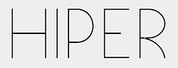 During her studies, Rio de Janeiro-based Luiza Morgado created the hairline avant garde sans typeface Hiper Cool (2015) and the modular octagonal typeface Box (2015). She also designed a set of playing cards based on the work of Cassandre. [Google]
[More] ⦿
During her studies, Rio de Janeiro-based Luiza Morgado created the hairline avant garde sans typeface Hiper Cool (2015) and the modular octagonal typeface Box (2015). She also designed a set of playing cards based on the work of Cassandre. [Google]
[More] ⦿
|
Luke Lisi
|
 Luke Lisi (Lisi Design) was born in Colorado but lives in Kansas City. He created the modular and superimposable Homestead (2011, Lost Type), a free Western or athletic slab type family.
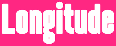
 In 2013, he designed the layered typeface family Summit. In 2015, he created the condensed sans display typeface family Longitude (+Rounded, +Display, which includes an inline). iIn or just before 2017 he designed Lost Type Playing cards. Behance link. Alternate URL. Creative market link. [Google]
[More] ⦿
|
Meriem Mghazli
|
Marrakech-based designer of Helvegut (2012), a series of playful extensions of Helvetica. She also did a signage project for her school, L'Ecole Supérieure des Arts Visuels, in 2012. Creator of Archi-Alphabet (2014), an experimental rhombic typeface. She also designed an ornamental card game set for Rummy (2014). [Google]
[More] ⦿
|
Metaphase Brothel Graphix
|
 bobistheowl (lower case b) is the Ontario-based designer of the dingbat fonts HaydenPanettiereBats (2007, about 30 headshots of Hayden Panettiere) and LaetitiaBats1 and 2 (2007, based on images of Corsican supermodel Laetitia Casta). He also digitized the Rider-Waite-Smith Tarot (copyright Pamela Colman Smith for The Rider Company, 1909) in 2007 as Gypsy-Tarot-Major-Arcana, Gypsy-Tarot-Minor-Arcana, Gypsy-Tarot-Minor-Arcana-Inverted. Other fonts: Through the Looking Glass (2007, based on images dating from 1871 by Sir John Tenniel for the first Edition of Lewis Carroll's Through the Looking Glass, and What Alice Found There), Alice in Wonderland (2007, based on Sir John Tenniel's 1865 illustrations of Lewis Carroll's Alice in Wonderland), Apoux (2007, a digitization of the naughty all-caps collection of letters by Joseph Apoux, ca. 1880, called Alphabet Pornographique), KleinKarpets (2007, a snake skin-based geometric pattern font dedicated to Manfred Klein), AmyBats 1 though 4 (2008, Amy Winehouse scanbats), JessicasSoftballFont (2008, softball scanbats), GrimNatwickBettyBoop (2008, a Betty Boop dingbat font), Obey (2009---a huge family of scanbats), SINSofBOBCO (2008, a one glyph font made for Bob Dobbs), Woodland Creatures (2008, forest animals), Princess Madeleine of Sweden (2008). In 2010, he added FixCystNeon, a typeface that emulates Terminal, the 1981 IBM systems font.
 In 2012, he made MockingJay XL (a single glyph dingbat face), Outstanding (a Victorian caps set that looks like a rounded version of Ernst Voelker's Vineta (1973)), and Beauty Marks (an erotic silhouette scanbat font). In 2016, he finally published Cabbagetown, which he started in 2014. Cabbagetown is based on Light Shade (1874, Richard Smith). It later appeared in Dan X. Solo's The Solotype Catalog of 4,147 Display Typefaces on page 17 as Night Shade. The first known digital version of this typeface was Nigel SadeSH (1993, Soft Horizons). Other versions include Shadowed Serif (1994, James Fordyce), Cameo Antique (2009, by Character), and Outstanding (2012, Bobistheowl). Link at Dafont. Fontspace link. Abstract Fonts link. Devian Tart link. [Google]
[More] ⦿
|
Micaela Neustadt
|
 Type designer at Fontyou in Paris. Creator of the EPS format techno typeface Cyclotron FY (2013). This typeface was inspired by the lettering of Denis Moulin.
 The EPS format display typeface Alice FY (2013) was co-designed by Alisa Nowak, Micaela Neustadt, Gia Tran, Bertrand Reguron and Valentine Proust at Fontyou. It was inspired by Adrien Genevard's lettering. Sub-themes are Alice in Wonderland and playing cards. The EPS format frilly script typeface Lullaby FY (2013) was co-designed by Alisa Nowak, Micaela Neustadt, Gia Tran, Bertrand Reguron and Valentine Proust at Fontyou. It too was inspired by Adrien Genevard's lettering. Gia Tran, Alisa Novak, Micaela Neustadt, Bertrand Reguron and Grégori Vincens co-designed the curvy stressed elliptical sans typeface Bruum FY (2013). Cargocollective link. [Google]
[More] ⦿
|
MyFonts: Poker typefaces
|
A list of typefaces with the tag poker at the MyFonts site. These include some fonts for card games. [Google]
[More] ⦿
|
Neale Davidson
[Pixel Sagas (was: Protoform Project, and Fontshack)]
|
 [More] ⦿
|
Omegatype Typography
[Ryan Neaveill]
|
At Omegatype in Champaign, IL, Ryan Neaveill designed BTP-Baby-Bl, Baby-Blocks, Bamboo (oriental simulation), Funny-Face (smilies), I-Ching, Musicfun, Ryan's-Rotten-Writing. His fonts are not on these pages though, but they are on various archives. His Playing Cards font can be found at Fontastic, Uncle Bear's, or Fontazm. Dafont link. Aka Creative. Fontspace link. [Google]
[More] ⦿
|
PAAM (was: Supperstudio)
[Pablo Abad]
|
 Studio with offices in Madrid and Bilbao, first called Supperstudio and then PAAM (run by Pablo Abad and Vicente Garcia Morillo from Madrid). Pablo Abad created the free poker card typeface DealerType (2009).
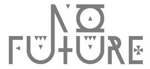
 Pablo Abad's other typefaces: No Future (2009, sci-fi), Knife (2008, modular), Pinza (2008, clothespin-themed), Romantique (2008, ultra-fat modular art deco face), Modul01 (2008), and Mambo (2008, super-ultra-fat art deco), Slaba (2009, fat slab serif), Voyeur (2009), Nostalgia (2013, Hype For Type). Old URL. Behance link. [Google]
[More] ⦿
|
Pablo Abad
[PAAM (was: Supperstudio)]
|
 [More] ⦿
|
Patrick Seymour
|
 Super-talented Montreal-based illustrator and digital artist. Home page. He created several modular typefaces in 2011.
 In 2012, he created Muse, Gotham Streets (a prismatic typeface), Slinky, Stencil, Tulipe (counterless), Bad Billy (multilined, art deco), The Great Carnival (beveled caps), Web Font (prismatic), Jump Jump Font (octagonal), Fashion (a horizontally striped typeface), OK (prismatic), The Aviator (horizontally striped poster face), La Bonne Aventure (prismatic and slightly art deco), the rope-themed typeface Noeud Marin, the shaded boat name typeface Bleu Marine, the multiline caps typeface Origami, the moustache-inspired caps typeface Mous Type (ornamental moustache-shaped capitals), the multilined display typeface Empire, the hand-drawn Une Typo Faite A La Main, and the prismatic typeface Anabelypster. After a bout of salmonella, he created Intestino, still in 2012. In Motion (2012) is an awesome prismatic art deco typeface. Images of his stunning work from 2011: i, ii, ii, iv, v, vi, vii, viii, ix, x. His Cathédrale project (2011) starts from a squarish face and transforms it gradually into one that contains the features of a cathedral. Creations in 2013: Shapes (geometric font), Gold Deco, Dentelle, Twist, Sleek (a thin slab serif), Say Say Say (multiline, prismatic, hypnotic), Metrick (a gridded typeface), Film Noir (an overlay type system), Tam Tam, Diner (a striped all caps typeface), Spot Light Font (prismatic), Flora, Bright Diamond, Incandescent, XVII (multilined display face), Konga (a multiline script), Shiny Diamond, Splash (paint font), Chicago (prismatic neon tube face), Taxi (a wonderful multiline typeface), Papale (religious symbology alphabet made to mock the papal system), Empreinte (pure op-art), Broken Arrow Font (multiline caps face), Liquid Paper Font, Sunset (prismatic), Boogie (Broadway-style art deco family), New Art Deco (prismatic art deco face), Poule de Luxe, Burnout (a prismatic typeface), Marble Maze Font, M Gagnon (ornamental caps influenced by the design work of Denis Gagnon). FontStruct fonts: Test3 (2012), Jump Jump 2 (2012). Typefaces made in 2014: Moiré, Decora, Magnetic, Noise (TV noise emulation), Yes (multilined font), Broderie (braided letters), SAS (multilined), Full House, Heart Font (prismatic), 1976 (inspired by the 1976 Olympic Games in Montreal), Gold (prismatic art deco typeface), Lace, Bike. Typefaces from 2015: Detour, Allie X, Grad Font, Duct Tape, Mint Julep (bilined art deco beauty), Hourglass, Stuntman (prismatic), La Dame de Coeur (playing card font), Fog. Typefaces from 2016: Road Free (a free prismatic font), Solitaire (card font), Joliette, Denis (named after Montreal's mayor, Denis Coderre), Montreal (a prismatic typeface based on the logo of the city of Montreal), Cherry Cola Font, Bro & Co (multilined art deco beauty), Macramee (multilined). Typefaces from 2017: The Simple Font (sans), Le Cabinet (multilined neo deco). Typefaces from 2018: Atrium (a sublime multiline art deco beauty), Pride (a color font to support the LGBT community). Typefaces from 2019: Columbarium (a beveled typeface), The Invisible Font, The Usual Font, Recettes d'Ici (handcrafted style for menu design), Vinyl (multiline), Gasoline (a gasoline spill textured font), Reflet, Mint Soda (a fashion mag extravaganza), Glamarrr (a sailor or pirate font). Typefaces from 2020: Siren (a wonderful mermaid-themed initial caps font, half Engravers MT and half mermaid), Homa (decorative caps), Luna (blocky caps), Chicken Bone, Happier (an all caps 3d color font), Dollara (a polygonal typeface), Stay Home, Mundo Disko (prismatic). Typefaces from 2021: Deliria, The National Bank Open font (created for a tennis tournament). Behance link. Hellofont link (for buying his fonts). Typefaces from 2022: Trumpets (deco caps). [Google]
[More] ⦿
|
Perry Mason
[Ferrets N Fonts]
|
[More] ⦿
|
Philipp Herrmann
|
 Creator (b. Münich, Germany) of a great blackletter typeface called Diek while he was studying at the Hochshshule für Gestaltung und Kunst in Zürich.
 Designer at Optimo of the playing cards slab serif font Piek (2006). In 2013, Philipp Herrmann set up the Out of the Dark foundry in Zurich. [Google]
[More] ⦿
|
Pixel Sagas (was: Protoform Project, and Fontshack)
[Neale Davidson]
|
 Free original designs, often with a science fiction feel, by Neale Davidson (b. 1971). Does some custom font work. Adventure.
 Neale Davidson's typefaces: - 4E Dings (based on those used in WotC's 4E Dungeons and Dragons game).
- AdventureNormal (1998), AdventureSubtitlesNormal, Alpha Mutation (2012, based on the title logo to the 2011 version of "Gammaworld"), Algol (2013, based on the logo for R Talsorian's "Mekton Zero" role-playing game), Alternity, Amuro (2013, +Condensed: an ocragonal typeface), Anayanka (2013, Cyrillic simulation font), Ancient Thorass (2013), Angel Arms (2012, a shothole font), Anglo Celestial (2014, connect-the-dots typeface), Anglorunic (2011), AngloYsgarth (2014), Angolmois (2013, based on the Hasbro 'Dark Energon' exclusive toy line), Armorhide (2013, sci-fi face), Arneson (2013), Artifact (2011; became Ravenwood), Aurebesh (2013, based on the WEG version of Star Wars Imperial Writing).
- Bantorain (2013, spurred), Barazhad (2014, flourished, runic typeface based on the demonic and occult and necrotic languages from Wizards of the Coast's Dungeons and Dragons game), BattleBeasts (2000), Bayformance (2014), Beastformer (2011, based on the long-ago logo of Hasbro's "Battle Beasts"), Bayformance (2014), Beast Wars (2011, based on the logo of the show of the same name), Betazed (2013, for Star Trek betazoids), Bidan (2013, constructivist), Bienvenu (2011, pixel face), Blitzwing (2013, octagonal family), Blofeld (2013, a distressed font based on the title logo of Exile's cult-classic "Evil Genius"), Bloomingworth (2013), Braddington (2013, art deco), Britannian (2014, runes), Broadmoor (2012, art deco).
- Callie Mae (2013: a rounded organic sans), Cardosan (2013, runic script), Carlton (2012), Celestial, Chapleau (2012, art deco), Chinyen (2005, oriental simulation), Clark (2013), Classic Robot (2011), Coburn (2013: military stencil), Colony Wars (replaced by Gallonigher), Comic Book, Constitution Class Hull, Convoy (2011, based on the logo for "Armada" and "Robots in Disguise"), Counterfire (2014, stencil), Crichton (2013, an avant-garde font based on the title logo from the "Farscape" television series), 2015 Cruiser (2013, based on the police-car lettering used in the move "Back to the Future II"), Crystal Deco (2008, based on the logo for much of the merchandising for "Indiana Jones and the Crystal Skull"), CuniformEnglishNormal, Cyberfall (2013, octagonal / mechanical typeface based on the logo of the console game "Fall of Cybertron"), Cybertron Generations (dingbats, now replaced by Transdings), Cybertron Metals, Cybertron OpCode (2014), Coulson (2014, stencil), Cyberverse (2011, futuristic), Cyrodiil (2014).
- Daedra (2012: based on the Elder Scrolls series of games), Dai Atlas (2013, based on the original Transformers logo from Hasbro), DalelandsNormal (a Celtic typeface based on the lettering used in early TSR Dungeons and Dragons products), Datacron (2013: based on the Fall of Cybertron toyline), Davek (2014, based on the dwarven and "under-mountain" runic scripts found in Wizards of the Coast's Dungeons and Dragons fourth edition role-playing game), Decahedron (2012), Destronic Graffiti (2013), Dethek Stone (2011, runes), DiamondFantasyNormal, Dinobots (based on the Dinobots logo from Hasbro's Beast Machines line), Dodecahedron (2012), Downlink (2013, techno), Dragonmaster, Droid (2015), Dunkin and Dunkin Sans (2012, based on the rounded fat letters of the Dunkin Donuts logo), Dovahkiin (2013), dPoly (2013, polyhedra and game dingbats), Duodecahedron (2012), Dwemer (2013), Dynotherm (2013, a heavy octagonal face).
- Eladrin (2011, based on the third edition version of the Elven font used in Dungeons and Dragons), Electrorocket (2012, art deco), Elminster, Emotion Engine (2012, based on the Playstation 2 logo from Sony), Empanada (2013), Emulator (based on the old Nintendo game font), Energon (2011), Equestria (2012: based on the My Little Pony Line), Erte (2013), Espruar (2011, based on the Elvish script found within TSR's "2nd Edition: Dungeons and Dragons" Forgotten Realms Elvish script), Eurocorp (2012, based on the logo and menus within the classic "Syndicate Wars" game from Bullfrog Entertainment), Exodite Distressed (2013, a custom design for LPJ's "Neo-Exodus" Pathfinder campaign world), Explorien (2014), Eyvindr (2014, rune simulation font).
- Falmer (2013), Fhokki (2014), Flipbash (2012, an octagonal typeface that is based on the logo of Hasbro's Bot Shots), Flynn (2011, futuristic stencil face), Fontana (2011, techno-futuristic), Fractyl (2013, used for the Predacons' speaking bubbles in the BotCon "Ground Zero" comic in 1997), Furmanite (2011).
- Gaiking (2012: Based on the logo of Mattel's Giant Robot toyline, Shogun Warriors), Galaxy Force (2011, based on Hasbro's Transformers: Cybertron logo), Gallonigher (was Colony Wars), Gamedings, Gargish (2013), Gargoyles, Garriott (2013, runic), Geddes (2011, art deco sans related to Futura), Gemcut (2013), Generation Two, GIColton (2014), GiediAncientAutobot (2014), GiediDecepticonGraffiti, GiediGoldenDisk, GiediMaximal, GiediPredacon, Gin Rai (2011, based on the logo of Hasbro's latter-era "Generation One" Transformers series), Gold Box (2012, a pixel typeface based on the in-game lettering from the classic SSI "Gold Box" game collection, featuring Dungeons and Dragons: Pool of Radiance, Curse of the Azure Bonds, and so on), Gosub (2011, a pixel typeface similar to the on-screen lettering of the Timex Sinclair), Gotham Nights (2011, based on the lettering used in "Batman: The Animated Series"), Green Martian (2013), Gutcruncher (2011, based on the logo from the famous Blood Bowl game), Graalen (2013: an alien-glyph typeface based on the Andorian writing found in Last Unicorn Games' Among the Clans supplement for their Star Trek: Roleplaying Game).
- Harker (2013), Harpers (runes), Hauser (octagonal, futuristic; Former "Action Force", based on the logo of GI Joe), Hellpoint (2013, based on some of the plate markings founds in IDW's "Transformers" comic series), Hetfield (2013: a spurred typeface), Hexahedron (2012: dice), Hexahedron Rounded (2013), Hyperspace (2012, thin monoline octagonal, based on the original Atari vector font from Battlezone, and on Asteroids).
- Imaki (2011, futuristic; was Cybertron Metals; based on the logo of the Japanese Beast Wars Metals series), Indiana (2012, from the titling for the Indiana Jones movies and comics), Instruction (2012, monospaced and monoline caps typeface for engineering applications), Interceptor (2014, sci-fi), Invaders (2012, based on posters for the 1960s movie), Iokharik (2014, a Mandarin-stylized runic typeface based on the language described in Wizards of the Coast's Dungeons and Dragons), Iori (2013, octagonal stencil family).
- Jedi (2012: Star Wars logo font), JediHollowNormal, JediSolidNormal, Jefferies (former Constitution Class Hull, based on the original Star Trek Enterprise lettering), Jhiaxus (2011, based on the logo of "Transformers: Generation Two"), Joystick (2011, based on the lettering used from Sears' Tele-Games cartridges), Jumpman (2012, based on the logo of the original Donkey Kong game from Nintendo).
- Kanno (a geometric sans formerly called Sharon Apple), Kargi (2014), Kentaurus (2013, Greek simulation typeface; he writes: This 'microgramma-like' font is based on the "Kentaurus" writing found within Franz Joseph's "Star Trek: Technical Manual"), Ketchum (2011, a comic book typeface based on the logo of the popular Pokemon franchise), Kehdrai (2014), Kreon (2011, a round techno typeface based on the logo of Hasbro's Kre-O line).
- LaBoeuf (2011, techno: based on Indiana Jones subtitles), Laser Rod (2011, based on the Transformers line), Lassiter (2012, a spurred Western typeface), Lorre (art deco).
- Mage Script (2013), Majel (2013, an avant-garde typeface), Majoram (2012, a hairline avant garde typeface), Majoram Serif (2012), Manga (2011, oriental simulation), Mara's Eye (2013, based on the lettering used on Disneyland's Indiana Jones "Forbidden Eye" ride), Marston (2013, on the title logos of numerous Spaghetti westerns), Masterforce, MasterforceHollow, MasterforceSolid, MaximalBeasts, Maximus, Mechalock (2013, based on the "Combiners" subline logo from Hasbro's "Robots in Disguise" Transformers series), Mech Tech (2013, based on Hasbro's "Transformers: Dark of the Moon's" toys' "Mech Tech" logo), Medabots (based on the Hasbro toy line), Megatron (2011, based on the logo of the live-action Transformers movies), Microgramma Extended (later replaced by Probert), Minerva (2012: based on the logos used for Shout's releases of Transformers: Headmasters, Masterforce, and Victory), Mission GT-R (2013, based on Takara's "Transformers: GT-R"), Mode X (2012, based on lettering from classic "Mode X" games of the early 1990s), Modern Cybertronic (2013: an alien-dings font based on Jim Sorenson's "Ancient Autobot" script), Modern Destronic (2013: based on Jim Sorensen's "Ancient Decepticon" script), Modern Iaconic (2014: based on the 'runic' letting found in Transformers: Legacy), Mons Olympia (2014, sci-fi), Montalban (2011, based on the title credits of Star Trek II: The Wrath of Khan), Moria (runes), Morse Tech, MysticEtchingsNormal.
- Nakadai (2011, a unicase techno font based on Hasbro's Transformers: Prime figures), Neo Gen (2011, based on the logo for the SD Gundam series of games), Neostar (2012, sci-fi), Neverwinter (2011, based on the logo of the popular "Neverwinter Nights" computer game from Bioware) (see also here), Night Warrior, Nippon Tech (faux oriental), Nite Club (2011, dot matrix), Nyctographic (2014).
- Octohedron (2012), Okuda (formerly Okudagrams; based on the LCARS characters from Star Trek: The Next Generation), Omnicron, Ophidian, Optic (2011), Optimus (2011, based on the original Transformers logo from Hasbro), Orion (2012, a techno-style font based on the "Robots in Disguise" logo from Hasbro's 2012 Transformers toyline), Overseer (2011).
- Pacmania (2013), Palisoc (2013), Pcap Terminal (2014, sci-fi face), Phoenixians (2012: based on the logo of Centuri's Phoenix arcade game), Pixel Cowboy (2015), Pixel Musketeer (2013, based on Sony's Wild Arms and Wild Arms 2 games for the Playstation), Pixel Azure Bonds (2015), Pixel Combat (2015), Pixel NES (2013: based on screen fonts of Colecovision, Timex Sinclar, Nintendo, SimTech's ModeX VGA, Tandy Color), Planewalker (formerly called Magic Cards. Based on the text used in older Magic: The Gathering cards), PlanewalkerDings (2014), Plavsky (2013), Pokemon, Politik (2014, constructivist), Powerpuff (based on the logo of "The Powerpuff Girls" from Cartoon Network), PredaconBeasts, Probert (replaces Microgramma Extended), Protoculture (2012, based on the franchise logo of Robotech).
- Qijomi (2013), Quintanar (2011), Quantum (2013: based on the title credits of the James Bond movie "Quantum of Solace").
- Rapier Zero (2013), Ravenwood (2011), Razorclaw (2013: based on the logo of the Beast Hunters Transformers line), Reanaarian (2014), Reconstruct (2013), Red World (2014), Regen (2012: a science-fiction font based on the logo used on the cover of the Transformers: Regeneration One comics), Rellanic (2014), Renegade (2013, techno stencil, based on FASA's "Renegade Legions" gaming line), Resavy (2012, a Broadway style art deco beauty), Rio Oro (2012, a Far West Tuscan marquee font), Robot Masters (now called Takara), Roddenberry (2011, based on the StarTrek logo), Roughknight (formerly Materia Arms. Based on the Wild Arms 5 video game logo---it simulates wood type and is Western in concept), RubCaps (2013), RunicEnglishNormal.
- SandsofFireNormal, Schnaubelt (2011, rounded technical caps face), Semphari (2014), SharpAvienne (2014), Sierra Madre (2012: an avant-garde typeface based on the Sierra Madre casino's logo from Fallout: New Vegas: Dead Money), Silverball Oblique (2012, LED font), Simple Runes, Sinescript (2013), SkeksisNormal, Skir, Sorenson (2013, a stencil typeface), StarburstPips (2014), StarcraftNormal, Starfleet (2004), Stark (2012: based on the title logo of the Iron Man and Iron Man 2 movies), Steamcog Caps (2013), Steampuff (2012), Steamwreck (2012), Steiner (2014), Sternbach (2011), Straczynski (2011, based on the opening credits for the classic television series "Babylon 5"), Strongarm (2014, based on the title logo of Hasbro's Transformers: Robots in Disguise (2015) line), Suchet (2013: a nice art deco typeface inspired by the material of BBC Production's legendary "Poirot" series starring David Suchet), Symtext (2012, a faux 5x5 bitmap font based on the lettering used in early VGA games, such as Syndicate).
- Taibaijan (faux Arabic), Takara (former Robot Masters; based on the "Robot Masters" logo from Takara's Transformers), Tandysoft (2011, based on the old typeface of the MC-10 computer), Tellarite (2013: based on the canonical glyphs of the "Tellarite" language from Paramount's Star Trek franchise), Tetrahedron (2012), Thorass (runes), Thundara (the old name was Thundercats), Tirolese (2013, an alien glyph font), Tonopah (2012, western font), Toril (2011), Transdings (replaces Cybertron Generations: based on Transformers logos from Hasbro), Transformers, TransformersHollowNormal, TransformersSolidNormal, Transmaidens, Transmetals (based on Hasbro Inc's, "Beast Wars: Transmetals" logo), Trek Arrowheads (2013), Trek Arrowcaps (2013), Tsa Script (2011, based on logos used within TSR's classic "Dragon Magazine"), Turok (2011, based on the logo of the "Turok" video game), Turtles (2011, based on the popular classic "Teenage Mutant Ninja Turtles" logo; for an extension, see Dieter Steffmann's Turtles), Twobit (2013, LCD font).
- Vector Sigma (2011, based on the secondary "Beast Machines" logo), Vecna (2014), Videopac (2013, a stencil typeface based on a Philips gamme from the 1970s), Virtucorp (2014), Visionaries, Visitor Script (2013), Volkoff (2013, a Russian style tencil face).
- Warlords (2011, based on the logo of the game series), Whitestone (2014, octagonal), Whittle (2013, octagonal), Winslett (2012, Far West face), Wreckers (2013, octagonal).
- XBall (2013, loosely based on several title logos from Electronic Arts's (EA's) sports gaming titles).
- YsgarthEnglishNormal (2011, almost blackletter).
- Zarathos (2012, based on the titles for the Ghost Rider movie series), Zebulon (2013, sci-fi typeface based on the title logo of TSR's classic "Star Frontiers" game series), Zentran (2013, based on the Zentraedi glyphs found in Harmony Gold's "Robotech" franchise).
- Typefaces from 2014: Rebellion, Politik (squarish).
- Typefaces from 2015: Diner Bold, RPM, Pixel Calculon, Pixel Intv, Pixel Digivolve (based loosely on the title logo from the classic Digimon), Mechfire (military stencil and octagonal styles), Aurabesh Cantina (Star Wars font), Huggy Bear, Sigma Five, dPoly Block Dice, dPoly Imperial, dPoly Steampips (steampunk genre), Pixel Gosub, Pixel Symtext, Strongarm (circled glyphs), Chromia, Pixel Countdown, Pixel Tactical, Pixel Azure Bonds, Pixel Combat, Pixel Cowboy, IDroid.
- Typefaces from 2016: Hastings (art deco), Timepiece, Norfolk (octagonal; based on US Navy ship lettering), Nuffle (slab serif), Nuffle Dice, Outland (octagonal), Subspace (based on the early logo for CBS/Paramount's 2017 Star Trek television series), Spellweaver Nodes (a simple runic connect-the-dots font based on Dragon Magazine's fantasy hieroglyphics), Gobotronic (based on a design from Jim Sorenson, Gobotronic is a symbolic interpretation of the language of Hanna-Barbera's own take on robots in disguise), Kaplah (angular sans), Brainstorm, Manhattan Tower, Persis, Exostencil, Phelps (based on the Mission Impossible series), Inquisitor (insipired by the Dark Heresy sub-titles from Fantasy Flight Games), Steamwheel (steampunk style), Horizon, Thirty-Seven (art deco), Draconis (loosely on the title logos of Wizards of the Coast's Dungeons and Dragons: Fifth Edition game line).
Dafont link. See also here and here, here, and here. Klingspor link. Abstract Fonts link. Devian Tart link. Fontspace link. [Google]
[More] ⦿
|
Playing Cards
|
A free truetype font called Playing Cards at La Kikita's site. [Google]
[More] ⦿
|
Playing Cards Joker Collecting
|
Archive with these playing card-themed fonts: Playing cards (Ryan Neaveill), Jester-Regular, IndigoJoker (Phillip Cavette), Jokerman-Regular (1997, Esselte), LittleBigMan (1998, Samuel Marcius), Cards (Zsigri Gyula). [Google]
[More] ⦿
|
Playing Cards (WSI)
|
A commercial truetype font called Playing Cards at the WSI site. [Google]
[More] ⦿
|
Quantum Enterprises
[Andrew Hunt]
|
Run by Andrew Hunt. Handwriting font service in Somerset, UK, at 16USD a shot. Free sample truetype fonts made in 2003: QEAndySully2, QEAshleySmith-1, QEDawnKing, QEHandSerif, QESteveColes. Other typefaces that can be found on the web include JF_Arc_De_Triomphe, JF_Butterfly_1, JF_Liberty, JF_Playing_Cards, JF_Tower_Of_Westminster, all made in 2004. In 2006, there was a more extensive list of free handwriting fonts, dated 2004-2006: QEAmyDrake, QEAndyHamment, QEAndySully2, QEAshleighLowery, QEAshleySmith-1, QEBenjaminMerritt, QEBobGellatly, QECarlMorris, QECarolRobertson, QECaroleHall, QEChristopherTodd, QECliveCounsell, QEConnorGilmore, QEDSFont, QEDanaJOliver, QEDawnKing, QEDenisWilson, QEDonaldRoss, QEDotWilliams, QEDrewAngell, QEDunk, QEGerryHughes, QEGrahamGrover, QEHandSerif, QEJANMackenzie, QEJGS, QEJerryJohns, QEJessicurl, QEJohnCaplin, QEJohnChivers, QEJohnMoir, QEJonasVasey, QEJonathanTucker, QEJulietteCule, QEKraid1, QELisaHuntPU, QELocalGirlUneven, QELoriWollmann, QEMamasAndPapas, QEMarciaBein, QEMarekHill, QEMarionMitchell, QEMichaelBourne, QENormanMorgan, QEPamelaPeake, QEPattiButche, QEPeteLister, QERicoRomano, QERobFeltner, QERobertaLapointe, QERogerBrown, QERogerKilner, QERogerLaw, QERoseMcCullagh, QESaraWiseman, QESteveColes, QEStuartDurrant, QESusanHunting, QESusanZelie, QEValerieMorris-Cook, QEVernKits, QEWillows, QEgeeKzoid. Jig Font turns any image sent to them into a "jig font" which you can use in a word processor to reconstruct the image as a jigsaw puzzle. A free JF Liberty font, as well as JF Arc de Triomphe, JF Playing Cards, JOF Butterfly and JF Tower of Westminster are freely provided as examples. In 2007, a custom logo font service was added. [Google]
[More] ⦿
|
Redruth's Basement Software
[Tom Redruth]
|
Tom Redruth is the American designer of Black Sam's Gold, based on handwritten characters from a map reprinted in the NATIONAL GEOGRAPHIC (vol. 195 no. 5; May 1999). Looks like treasure map writing. He designed Fountain Pen Frenzy in 2001 [compare with Treefrog]. This font was used on the cover of an album by Belle Monroe&her Brewglass Boys. Other typefaces include Bellamy's-Mapbats, Whydah-Heck-Poker, and the old typewriter typeface Carpal Tunnel (2003, based on a Remington typewriter). Finally, he made the Tolkien rune typefaces Tengwar-Teleri (2003) and Tengwar Marzabul (2002). Fontspace link. [Google]
[More] ⦿
|
Reel Hood
[Aisha Scott]
|
Aisha Scott (Reel Hood, Detroit, MI) is an American type designer. Aisha's first commercial typeface is the playing card typeface Giglio Rosso (2011). Klingspor link. [Google]
[MyFonts]
[More] ⦿
|
Robert Altemus
[Altemus Creative]
|
[MyFonts]
[More] ⦿
|
Ryan Neaveill
[Omegatype Typography]
|
[More] ⦿
|
Shelley Evans
|
Sydney, Australia-based designer (b. 1963) of the script fonts Alpha Kids (2019), Cavity (2019), Fast Monk (2019), Cold Ocean (2019), Happy Birthday (2019), Happy Day (2019), Sincerely Yours (2019), The Crown Is Mine (2019) and Picnic For Two (2019), and the hand-printed typefaces Sign Language (2019), Alphabet Houses (2019), Northern Stars, School Teacher, Cognac Rum, Beloved, All is well, Psyche Ward, Llama Zoo, Ships Cargo, The Crosses We Bear (2019), Southern Stars, Throne of Egypt (2019), Royal Flush (2019: playing cards) and School Education (2019). Typefaces from 2020: Friendship Bracelets (dingbats). [Google]
[More] ⦿
|
Steve Smith
[Alpine Fonts]
|
[More] ⦿
|
Time Peace
|
 FontStructor who made the horizontally-striped typeface Strobes (2012), Simplicity (2012), Smashel (2012), Extora (2012, textured face), Dead Stirrup (2012), Checker (2012), Slice (2012), and Tesla (2012, based on the logo of the electrical company Tesla).
 In 2013, we find Hearty (Valenttine's Day font), Anubis (retro futurism), Tockice (connect-the-dots), Swirl, Teeny Dots (dot matrix face), Specs (arrowed letters), Atlas Regul (art deco marquee face), Smash (dot matrix face), Steam (steam punk, mechanical), Apricot (dot matrix), Peach, Koverkav (tall connected script), Zastava (art deco), Syncopation (avant garde), Centrivid, Time Script, Grey Sans (a textured sans), Seriphagy, Mona, Lightheart (a Broadway style art deco face), Lower (tall ascenders), 2Time, DotoMagy (dot matrix face), Finolin, Remaster (horizontal stripes), Whimsy, Procol (vertical striping), Ceremonio (vertical striping), Island, and Quindle. In March 2013, he published Circles and wrote I finally nailed a perfect circle, which many consider the holy grail over at FontStruct. That is to say, the imperfections in the circle are only visible at large point sizes---quite an achievement. Typefaces from 2014: Cybertron, Puzzler, Just Peachy (blackboard bold), Bubble Pop, Pointy (arrowed face), Gypsy Train (bilined, frilly), Mad Hatter (card font), Origami, Pointers (hexagonal), Angled (deco), Owlarium, Blossum (floral), Jarvis (wooden plank font), Cocktail Bar, Circuit Breaker, Every Good Boy, Circus Comes to Towne (sic) (circus font), Fruit Stripes (art deco, striped). Typefaces from 2015: Cogsworth (connect-the-dots), Neomorph (techno). [Google]
[More] ⦿
|
Tom Redruth
[Redruth's Basement Software]
|
[More] ⦿
|
Turtle Arts Fonts
[Kerrie Carbary]
|
 Turtle Arts Fonts is the Seattle, WA-based foundry of Kerrie Carbary (b. 1970), est. 2000. MyFonts page. Kerrie Carbary's creations: 3 D (2002), Ballard Avenue (2006, ransom note font), Bubbles (2006), Canvas (2004, brush), Collage (2003, ransom note), Cut (2003, rubber stamp font), Deck (2003, old playing card font), Eraser (2001, grunge), Handprint (2001, grunge), Inkblock (2005, grunge), Inkie (2006, hand-drawn pen), Jessie (2001, typewriter), Journal (2000, brush family), Paint (2002, a crayon / brush family), PriceTag (2005), Redemption (2002, grunge), Scripty (2005, curly handwriting), Spirals (2005, curly letters).
 MyFonts link. Klingspor link. View the Turtle Arts typeface collection. [Google]
[MyFonts]
[More] ⦿
|
Unicode Fonts for Ancient Scripts
[George Douros]
|
 This is a fantastic source of free high-quality fonts for scripts of the greater Aegean vicinity, Egyptian Hieroglyphs, Meroitic, Sumero-Akkadian Cuneiform, Musical Symbols and all Symbol Blocks in the Unicode Standard. George Douros is their Greek font designer. His free fonts come with this exemplary footnote: In lieu of a licence: Fonts in this site are offered free for any use; they may be opened, edited, modified, regenerated, posted, packaged and redistributed. Many of his fonts contributed to important section in the GNU Freefont project. Here is the list:
 - Abidos (2018). An attempt to catalogue about 8000 Egyptian hieroglyps. His Nilus font (2018) catalogues the Gardiner hieroglyphs.
- Aegean (2007-2012). Covers Basic Latin, Greek and Coptic, Greek Extended, some Punctuation and other Symbols, Linear B Syllabary, Linear B Ideograms, Aegean Numbers, Ancient Greek Numbers, Ancient Symbols, Phaistos Disc, Lycian, Carian, Old Italic, Ugaritic, Old Persian, Cypriot Syllabary, Phoenician, Lydian, Archaic Greek Musical Notation. Other things in it: Linear A, Cretan Hieroglyphs, Cypro-Minoan, Ancient Greek Alphabets, Phrygian, Old Italic Alphabets (Cumaean, Archaic Etruscan, Neo Etruscan, Ancient Latin, Lugano, Faliscan, Marsiliana, Messapic, Middle Adriatic South Picene, North Picene, Oscan, Umbrian), the Arkalochori Axe and Anatolian Hieroglyphs.
- Aegyptus (2007-2020) and Gardiner. Over 7000 hieroglyphs. In addition, we have Basic Latin, Greek and Coptic, Egyptian Transliteration characters, some punctuation and other symbols.
- Akkadian (2007). Basic Latin, Greek and Coptic, some Punctuation and other Symbols, Ugaritic, Cuneiform, Cuneiform Numbers and Punctuation.
- Alexander (2007, text typeface built around the Greek letters originally designed by Alexander Wilson in 1744; compare with Wilson Greek (1996, Matthew Carter) and Junicode (2006, Peter S. Baker)). The Latin and Cyrillic parts are based on Garamond.
- Alfios. Lowercase upright Greek were designed in 1805 by Firmin Didot (1764-1836) and cut by Walfard and Vibert. The typeface, together with a complete printing house, was donated in 1821 to the new Greek state by Didot's son, Ambroise Firmin Didot (1790-1876). Lowercase italic Greek were designed in 1802 by Richard Porson (1757-1808) and cut by Richard Austin. They were first used by Cambridge University Press in 1810. Capitals, Latin and Cyrillic, as well as the complete bold weights, have been designed in an attempt to create a well-balanced font. The font covers the Windows Glyph List, Greek Extended, various typographic extras and some Open Type features (Numerators, Denominators, Fractions, Old Style Figures, Historical Forms, Stylistic Alternates, Ligatures); it is available in regular, italic, bold and bold italic.
- Anaktoria. Douros: Grecs du roi was designed by Claude Garamond (1480-1561) between 1541 and 1544, commissioned by king Francis I of France, for the exclusive use by the Imprimerie Nationale in Paris. Greek in Akaktoria is based on a modern version of Grecs du roi prepared by Mindaugas Strockis in 2001. Lowercase Latin stems from the titles in the 1623 First Folio Edition of Shakespeare. Scott Mann & Peter Guither prepared a modern version for The Illinois Shakespeare Festival in 1995. Cyrillic has been designed to match the above Greek and Latin.
- Analecta (2007, Byzantine style). An ecclesiastic scripts font, in Byzantine uncial style, covering Basic Latin, Greek and Coptic, some Punctuation and other Symbols, Coptic, typographica varia, Specials, Gothic and Deseret.
- Anatolian
- Aroania: In 1927, Victor Julius Scholderer (1880-1971), on behalf of the Society for the Promotion of Greek Studies, got involved in choosing and consulting the design and production of a Greek type called New Hellenic cut by the Lanston Monotype Corporation. He chose the revival of a round, and almost monoline type which had first appeared in 1492 in the edition of Macrobius, ascribable to the printing shop of Giovanni Rosso (Joannes Rubeus) in Venice. Aroania is a modern recast of Victor Scholderer's New Hellenic font, on the basis of Verdana.
- Asea (2020, Latin-Greek-Cyrillic). A modern font based on Firmin Didot's Greek type.
- Assyrian.
- Atavyros. Douros writes: Robert Granjon (1513-1589) produced his Parangonne Greque typeface (garmond size) at the instigation of Christophe Plantin as a counterpart to Garamond's Grec du roi, in Antwerp Holland, between 1560--1565. It was used in Plantin's multilingual Bible of 1572. Versions of Granjon's type were used for the 1692 edition of Diogenes Laertius and for the Greek-Dutch edition of the New Testament in 1698, both published by Henric Wetstenium in Amsterdam. A digital revival was prepared by Ralph P. Hancock for his Vusillus font in 1999. Latin and Cyrillic are based on a Goudy typeface.
- Avdira. Douros: Upright is based on the lowercase Greek letters in the typeface used by Demetrios Damilas for the edition of Isocrates, published in Milan in 1493. A digital revival was prepared by Ralph P. Hancock for his Milan (Mediolanum) font in 2000. Italic Greek were designed in 1802 by Richard Porson (1757-1808) and cut by Richard Austin. They were first used by Cambridge University Press in 1810.
- Maya. Maya covers the glyphs in J. Eric S. Thompson's A Catalog of Maya Hieroglyphs (1962, University of Oklahoma Press).
- MusicalSymbols (2007) or Musica (2013). Basic Latin, Greek and Coptic, some Punctuation and other Symbols, Byzantine Musical Symbols, (Western) Musical Symbols, Archaic Greek Musical Notation. There is also the Greek musical notation font EE Music (2018) for Hellenic ecclesiastic music.
- UnicodeSymbols (2007, in the Computer Modern style) and UniDings (2013). It has every imaginable symbol: Basic Latin, Latin-1 Supplement, Latin Extended-A, IPA Extensions, Greek, Cyrillic, Cyrillic Supplementary, General Punctuation, Superscripts and Subscripts, Combining Diacritical Marks for Symbols, Letterlike Symbols, Number Forms, Arrows, Mathematical Operators, Miscellaneous Technical, Control Pictures, Optical Character Recognition, Box Drawing, Block Elements, Geometric Shapes, Miscellaneous Symbols, Dingbats, Miscellaneous Mathematical Symbols-A, Supplemental Arrows-A, Supplemental Arrows-B, Miscellaneous Mathematical Symbols-B, Supplemental Mathematical Operators, Miscellaneous Symbols and Arrows, CJK Symbols and Punctuation, Yijing Hexagram Symbols, Vertical Forms, Combining Half Marks, CJK Compatibility Forms, Specials, Tai Xuan Jing Symbols, Counting Rod Numerals, Mathematical Alphanumeric Symbols, Mahjong Tile Symbols, Domino Tile Symbols.
- Symbola (2013) is an unbelievably rich font. It contains Basic Latin, IPA Extensions, Spacing Modifier Letters, Combining Diacritical Marks, Greek and Coptic, Cyrillic, Cyrillic Supplement, General Punctuation, Superscripts and Subscripts, Currency Symbols, Combining Diacritical Marks for Symbols, Letterlike Symbols, Number Forms, Arrows, Mathematical Operators, Miscellaneous Technical, Control Pictures, Optical Character Recognition, Box Drawing, Block Elements, Geometric Shapes, Miscellaneous Symbols, Dingbats, Miscellaneous Mathematical Symbols-A, Supplemental Arrows-A, Braille Patterns, Supplemental Arrows-B, Miscellaneous Mathematical Symbols-B, Supplemental Mathematical Operators, Miscellaneous Symbols and Arrows, Supplemental Punctuation, Yijing Hexagram Symbols, Combining Half Marks, Specials, Byzantine Musical Symbols, Musical Symbols, Ancient Greek Musical Notation, Tai Xuan Jing Symbols, Counting Rod Numerals, Mathematical Alphanumeric Symbols, Mahjong Tiles, Domino Tiles, Playing Cards, Miscellaneous Symbols And Pictographs, Emoticons, Ornamental Dingbats, Transport And Map Symbols, Alchemical Symbols, Geometric Shapes Extended, Supplemental Arrows, and Symbols of occasional mathematical interest. It is one of a hanful fonts that dares to have a glyph that shows the middle finger. Github link for free download. see also Symbola Goomoji (2013).
- Unidings. Various glyphs and icons.
Since George permits redistribution, I am offering his work for download here. [Google]
[More] ⦿
|
Valentine Proust
|
Artistic director in Paris whose type designs are published through Fontyou. Her typefaces: - The connected handwriting font Yumana (2012).
- Younion FY (2013, with Alisa Nowak, Gregori Vincens, Elvire Volk, Gia Tran). Younion One FY is free at Dafont.
- Achille FY (2012). A slab serif typeface done with Gia Tran, Alisa Nowak, Gregori Vincens, and Bertrand Reguron. She also created Achille II FY (2014, a slab serif by Alisa Nowak, Valentine Proust, and Gregori Vincens).
- The EPS format display typeface Alice FY (2013) was co-designed by Alisa Nowak, Micaela Neustadt, Gia Tran, Bertrand Reguron and Valentine Proust at Fontyou. It was inspired by Adrien Genevard's lettering. Sub-themes are Alice in Wonderland and playing cards.
- The EPS format frilly script typeface Lullaby FY (2013) was co-designed by Alisa Nowak, Micaela Neustadt, Gia Tran, Bertrand Reguron and Valentine Proust at Fontyou. It too was inspired by Adrien Genevard's lettering.
- Exquise FY (2013) is a fashion mag didone co-designed by Bertrand Reguron, Alisa Nowak, Valentine Proust, Elvire Volk and Gia Tran at Fontyou.
- In 2013, Denis Moulin, Bertrand Reguron, Valentine Proust and Laurène Girbal co-designed the hipster typeface Theory FY, an alchemic typeface.
- The punchy poster typeface Kraaken FY (2014) was designed by the FontYou team of Bertrand Reguron, Alice Resseguier, Valentine Proust, Julien Priez, Gia Tran, Jérémie Hornus, and Alisa Nowak.
- In 2014, Proust designed Meeko FY, a Latin display typeface genetically linked to the didones.
Behance link. Fontyou link. [Google]
[MyFonts]
[More] ⦿
|
Yael Goldstein
|
As a student in Baltimore, MD, Yael Goldstein designed the diamond-studded decorative didone typeface Gambit in 2016, which is advertized as a playing card font. [Google]
[More] ⦿
|
Zachary Sawtelle
|
During his studies at Fitchburg State University in Fitchburg, MA, Zachary Sawtelle (Southwick, MA) created an ornamental typeface for playing cards (2014). [Google]
[More] ⦿
|

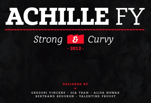
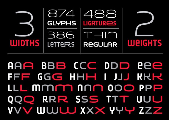
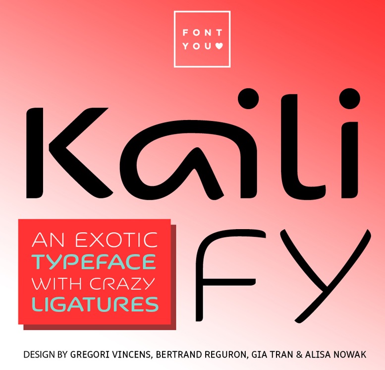
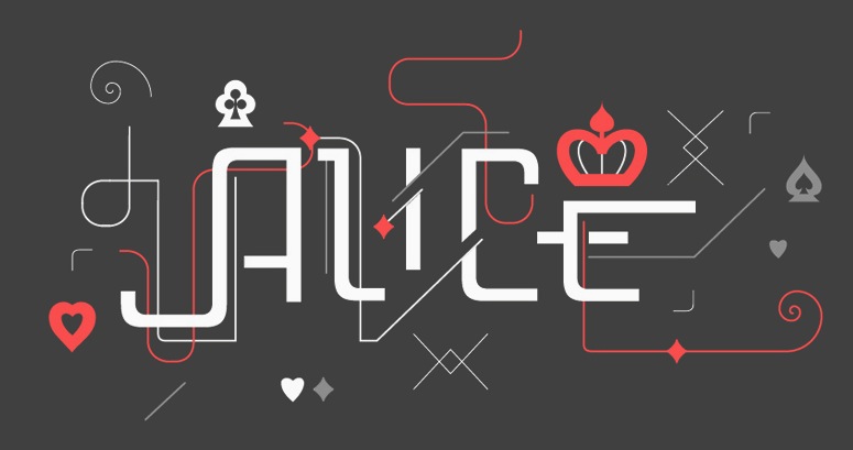
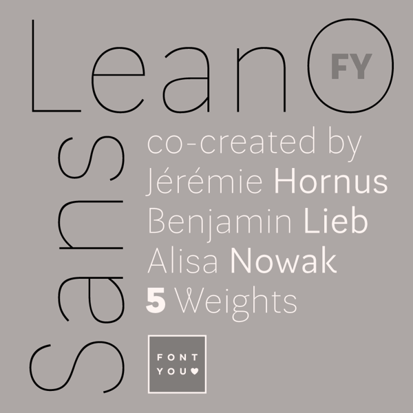
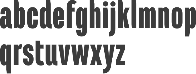
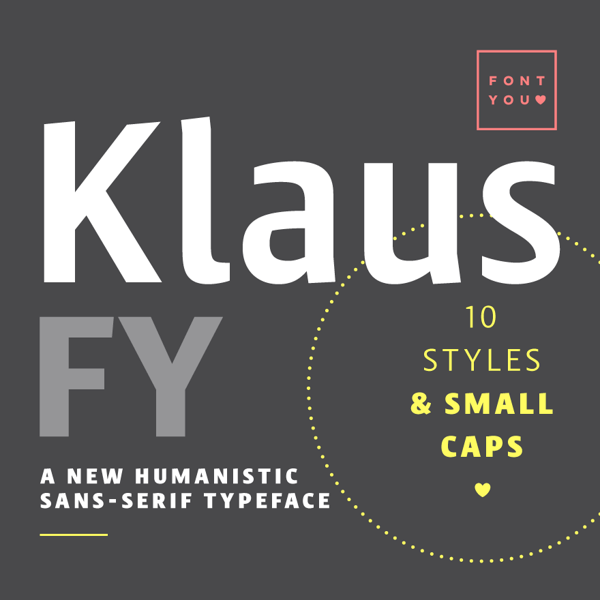
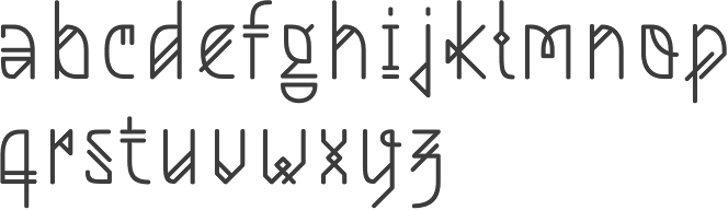
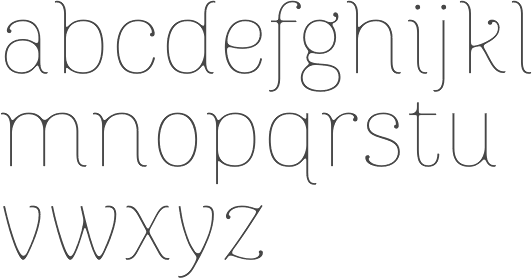
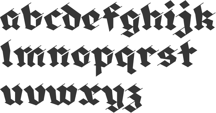
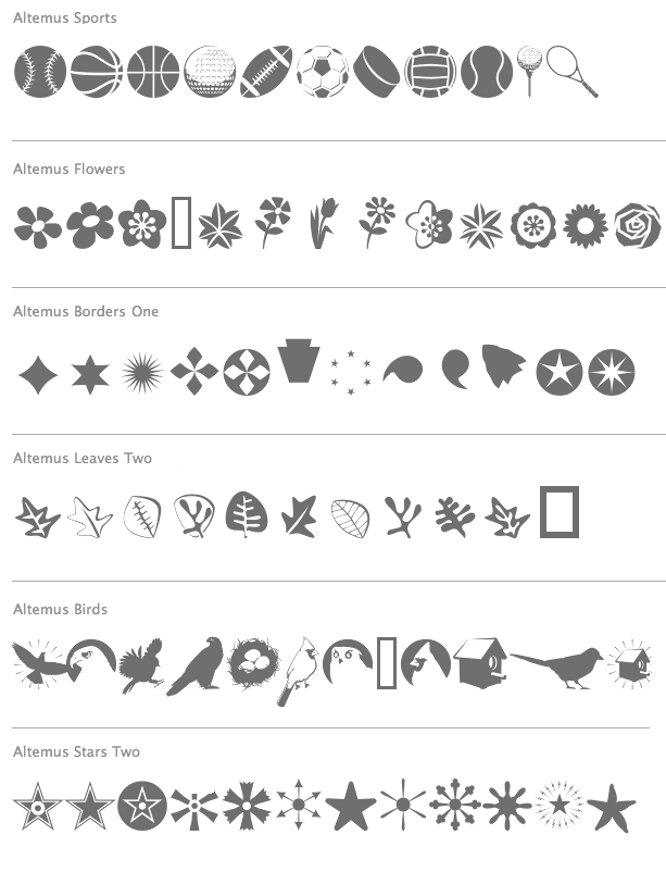
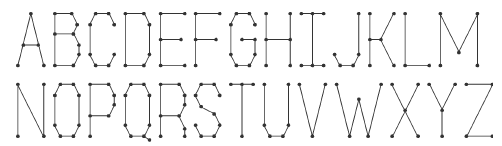
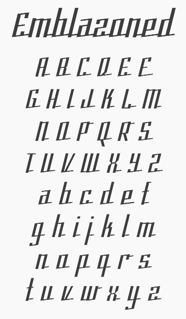
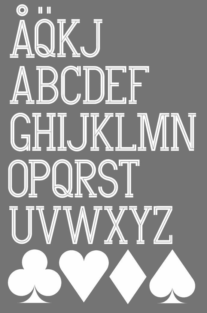
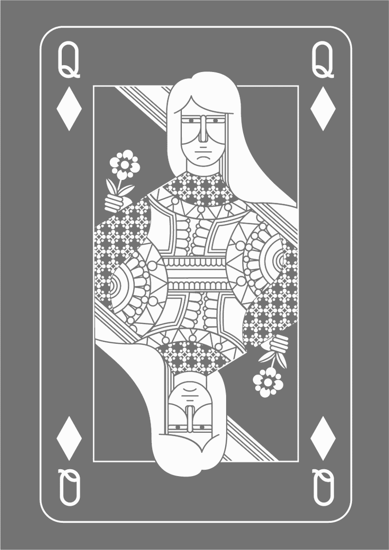
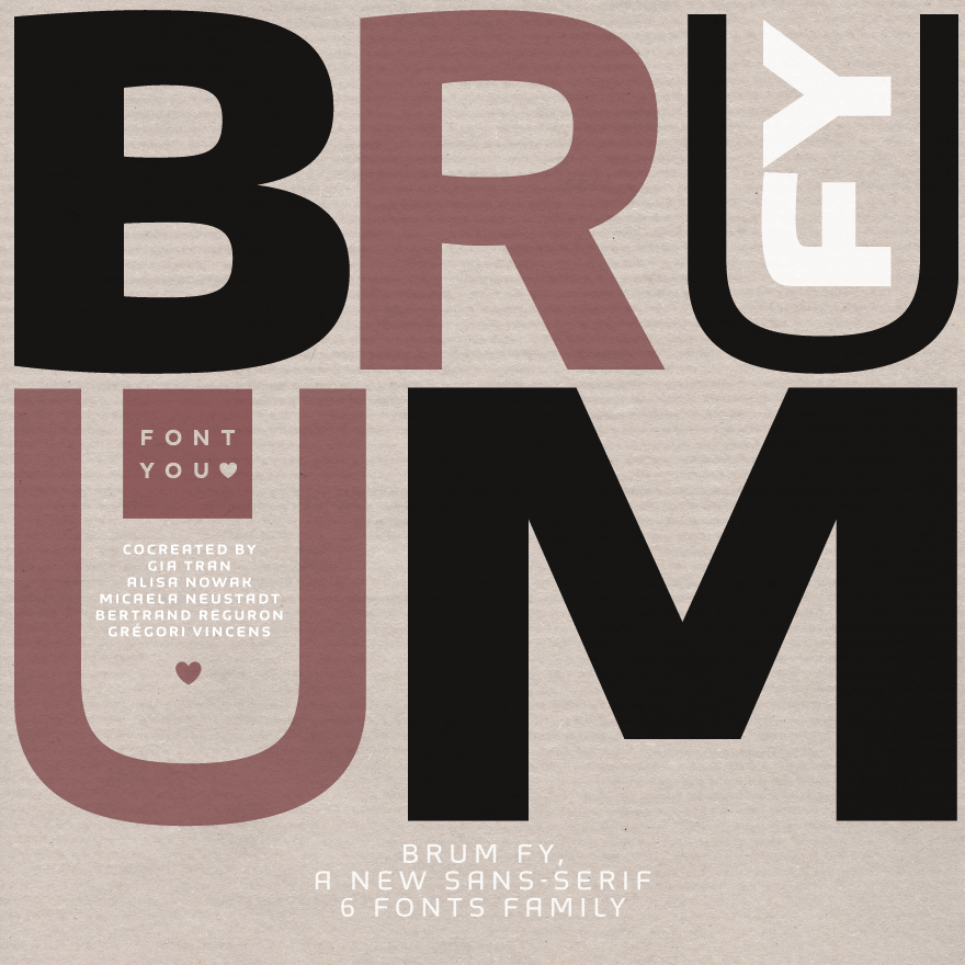
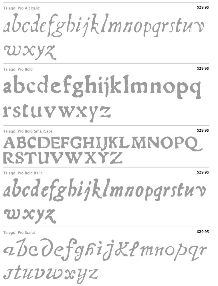
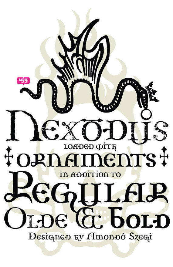
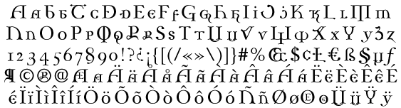
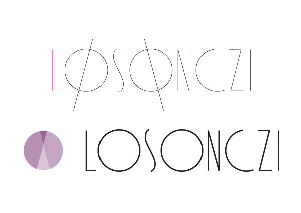
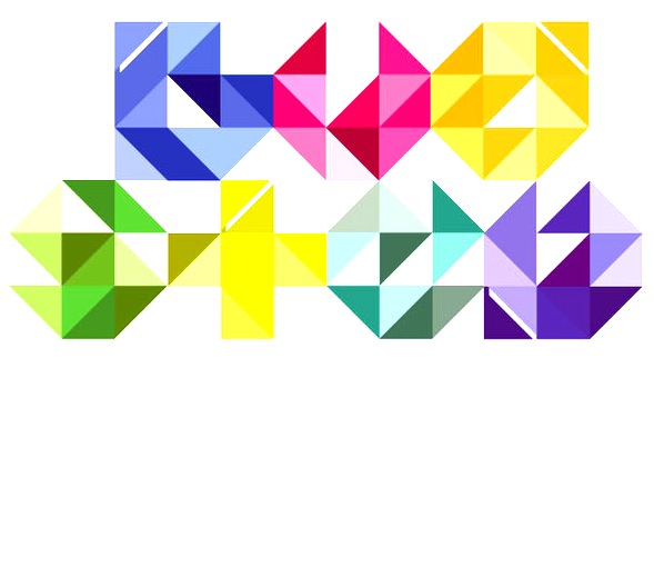
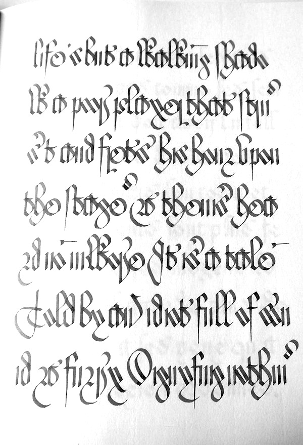
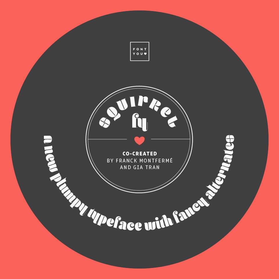
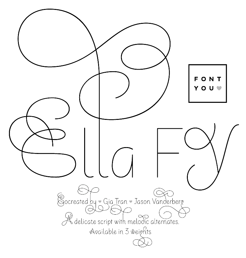
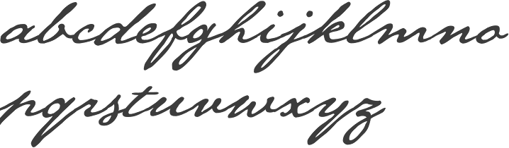
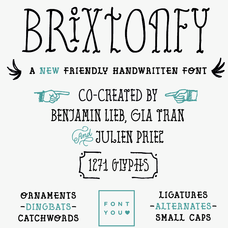
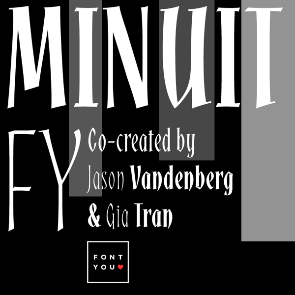
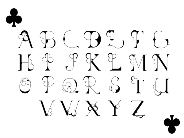
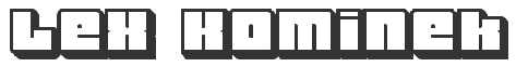
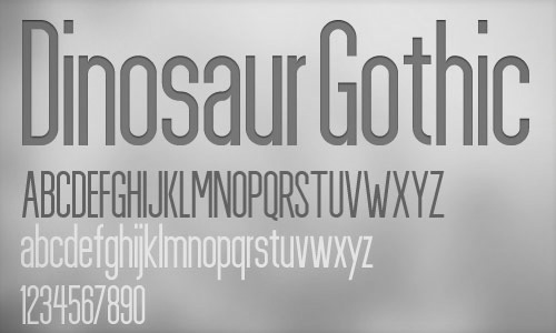
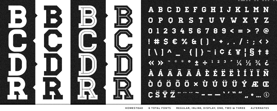
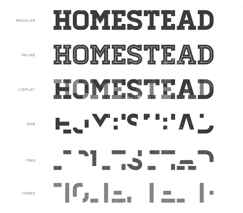
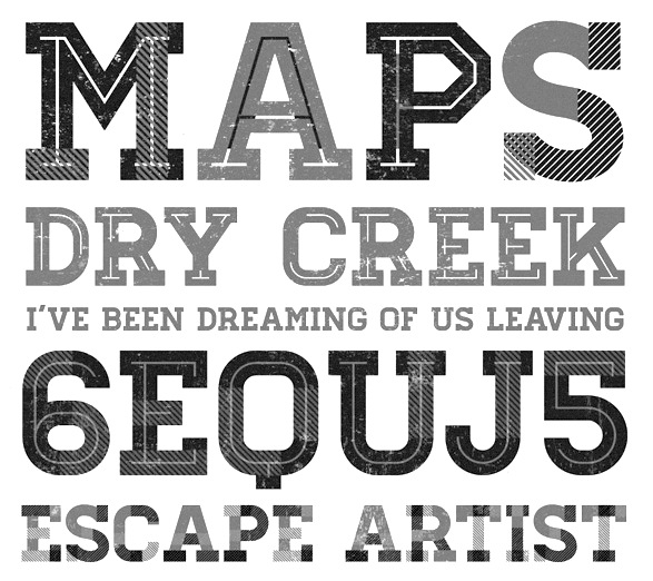
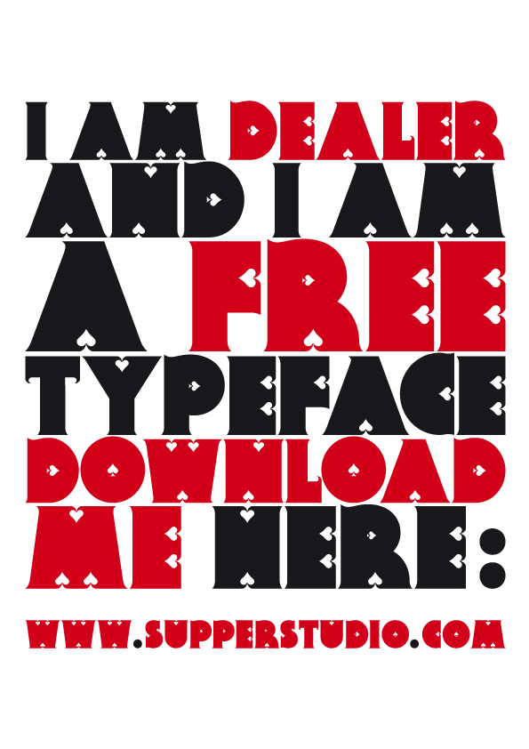
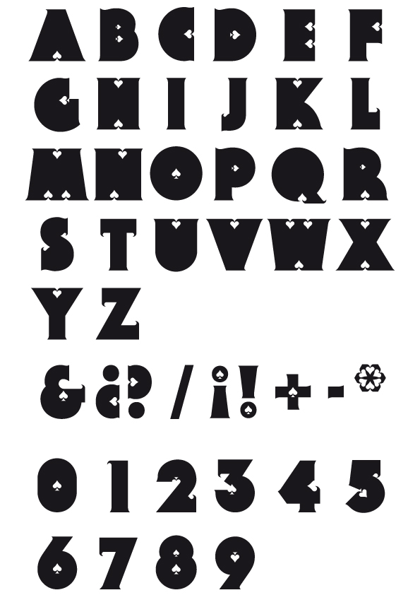
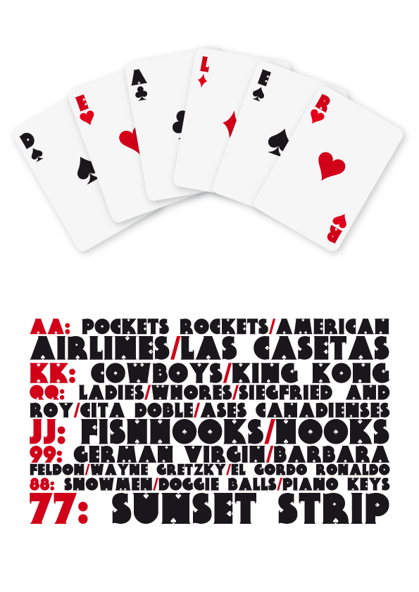
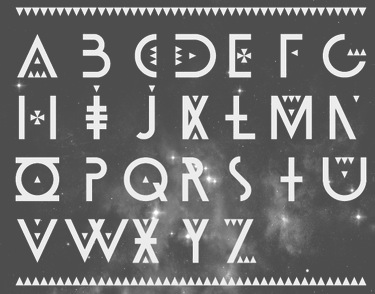
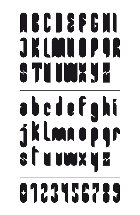
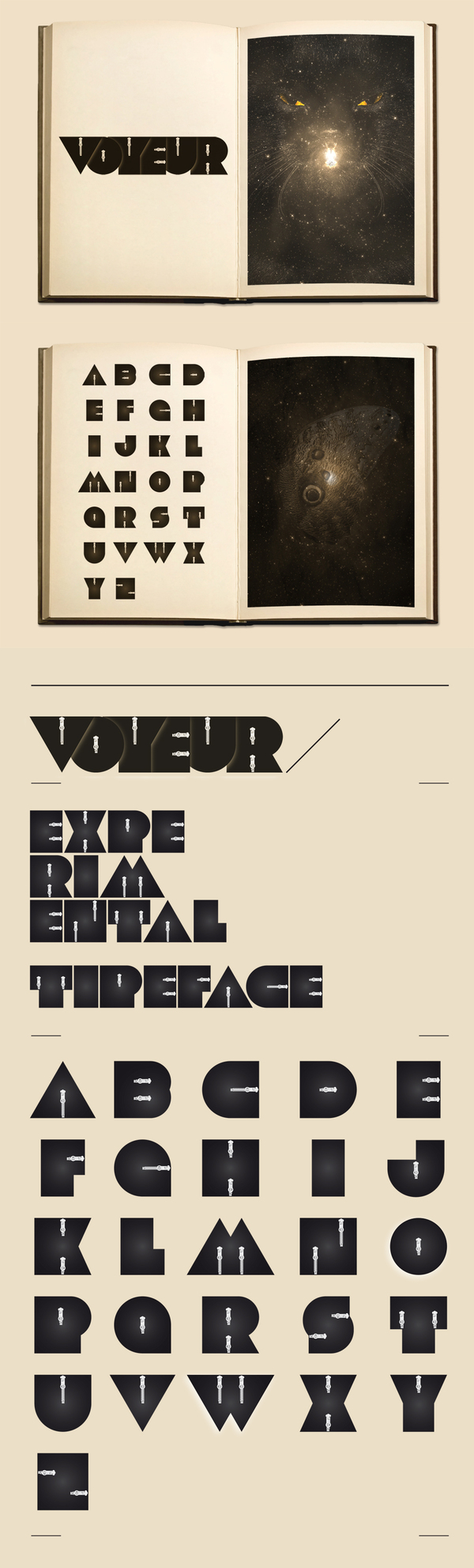
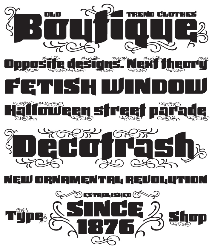
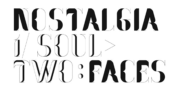
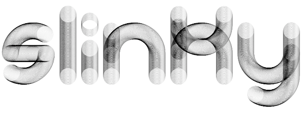
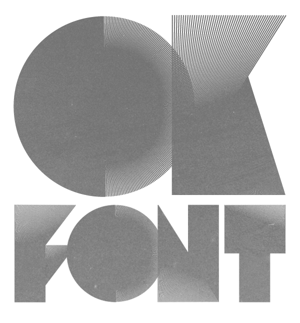
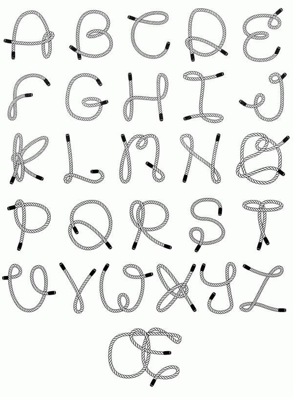
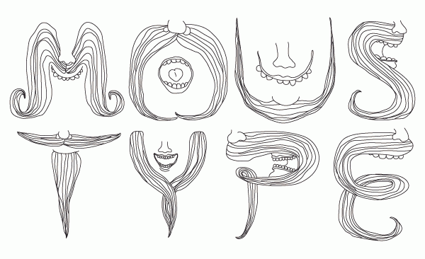
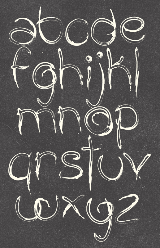
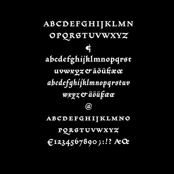
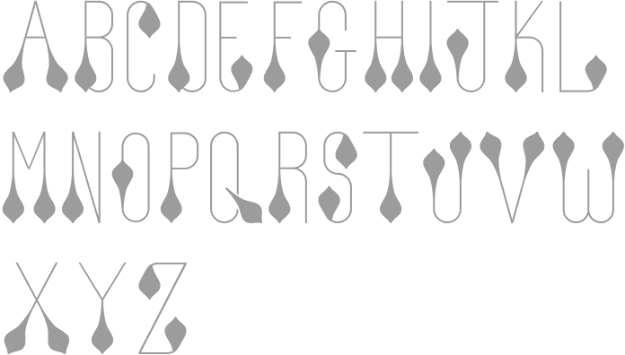
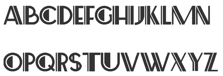
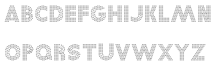
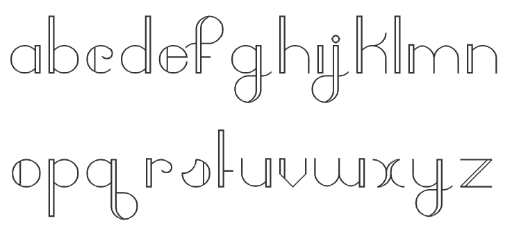
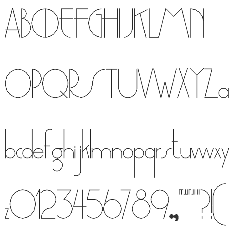
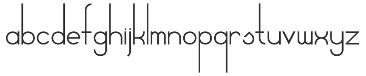
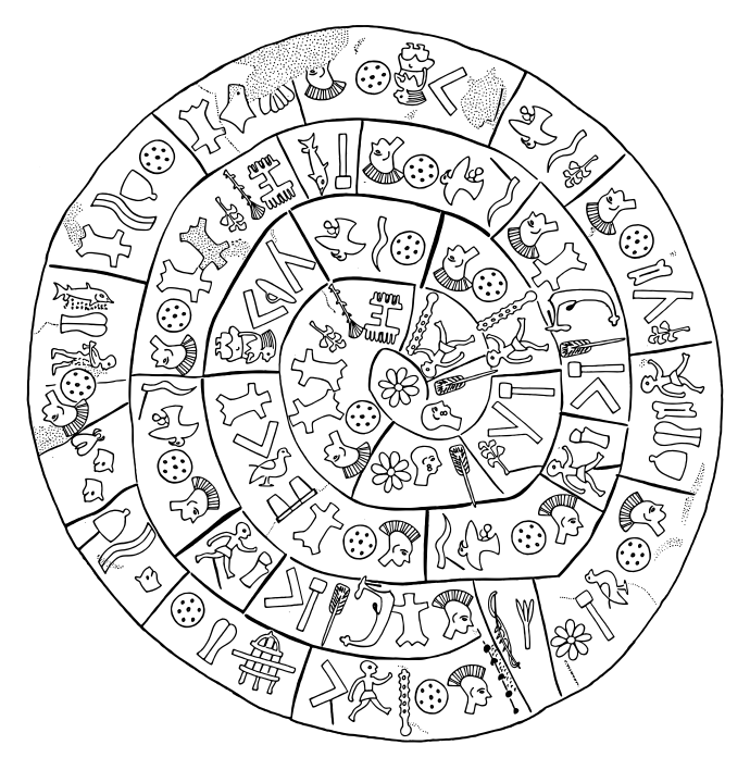
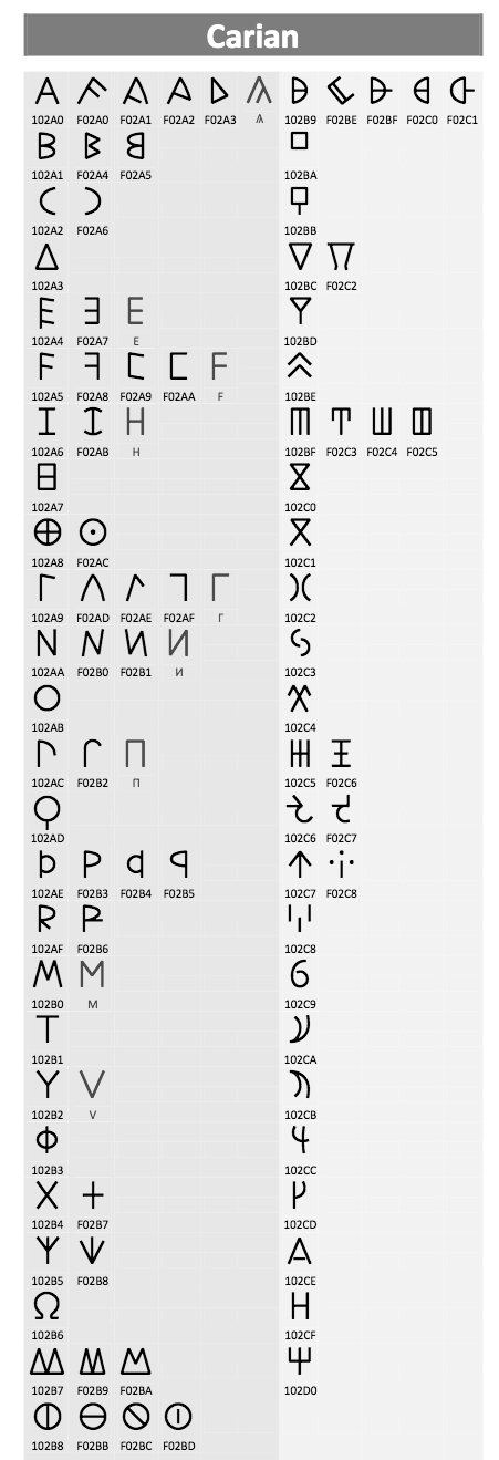
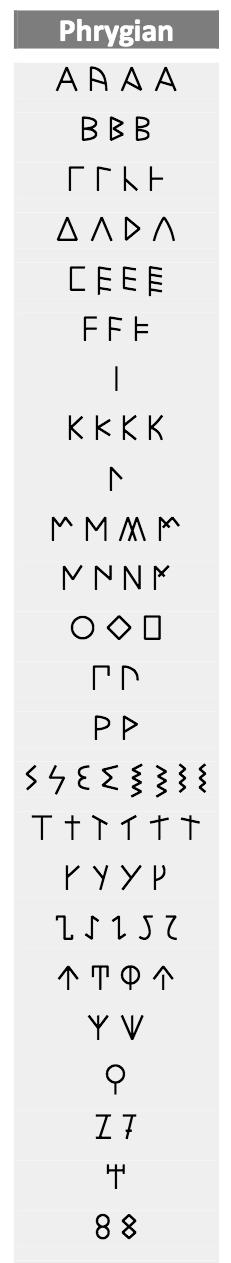
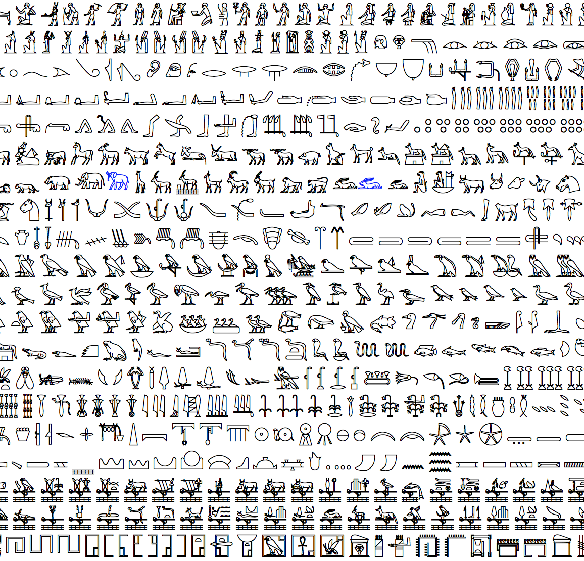
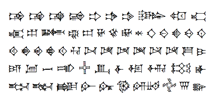
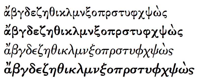
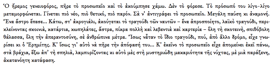
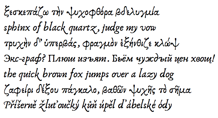
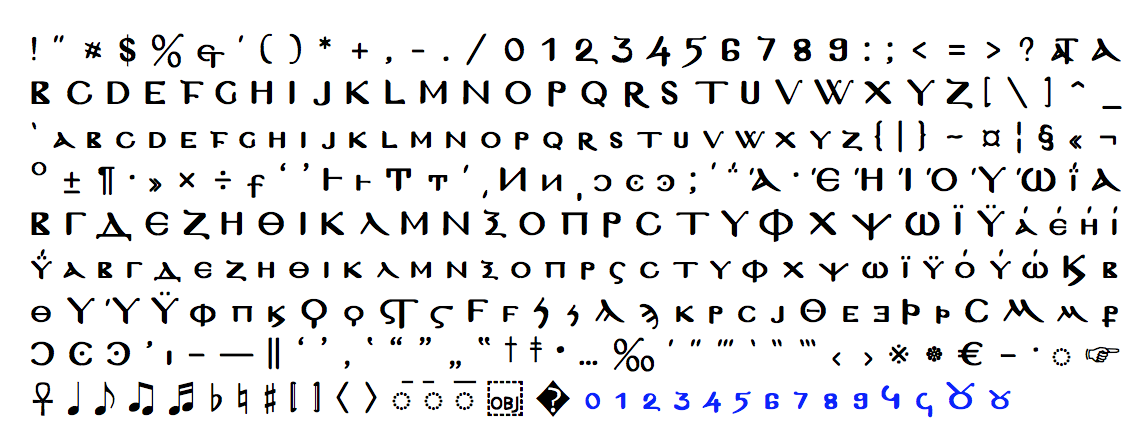
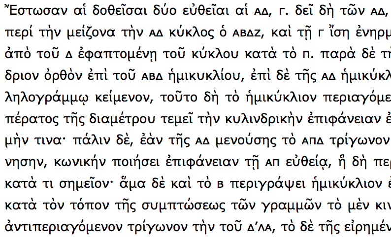
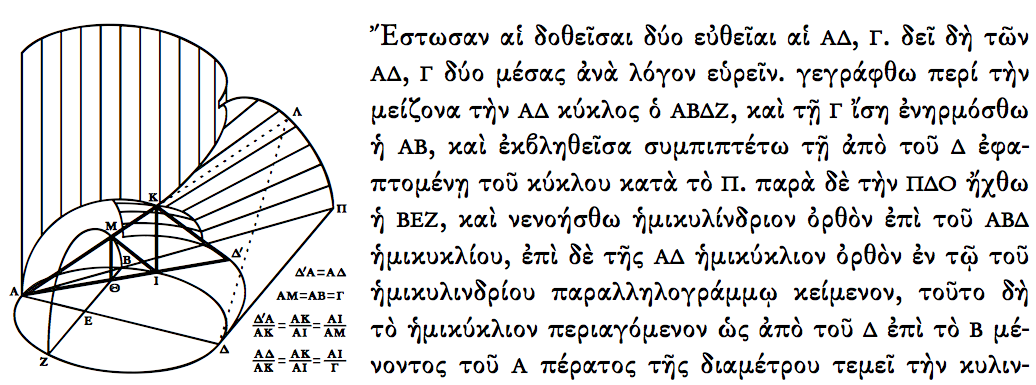
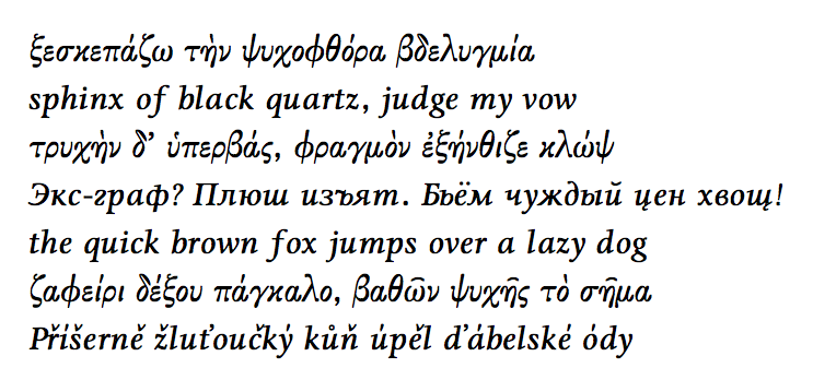
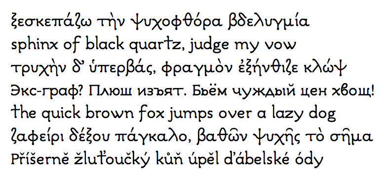
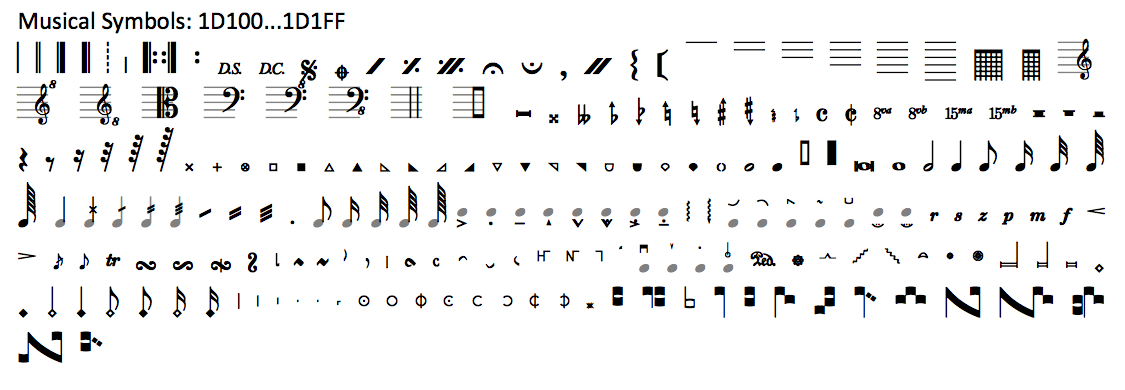
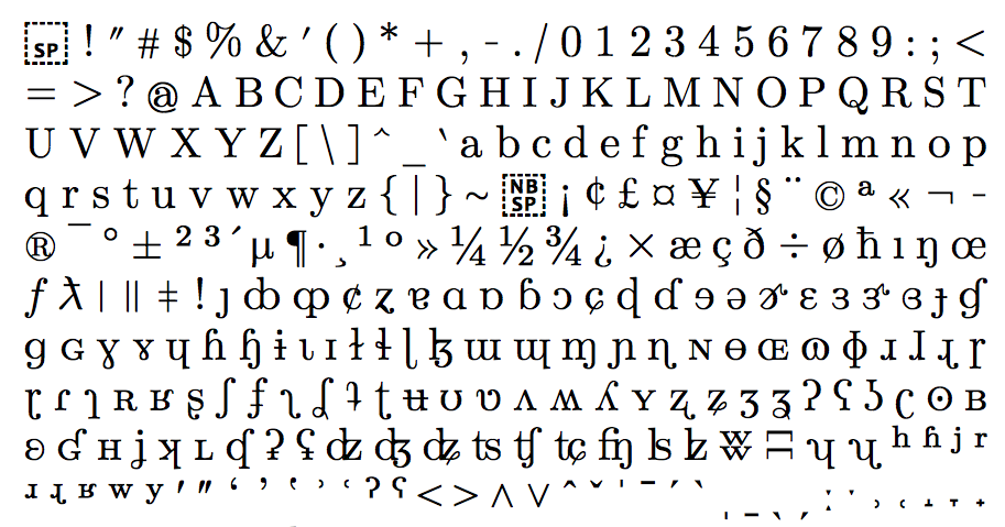
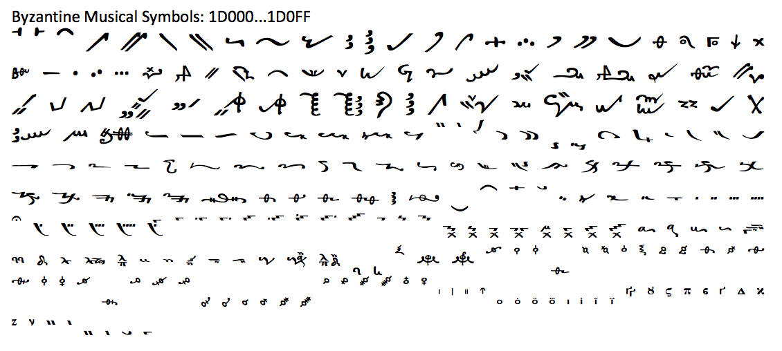