TYPE DESIGN INFORMATION PAGE last updated on Mon Mar 9 16:05:21 EDT 2026
FONT RECOGNITION VIA FONT MOOSE

|
|
|
|
|
Dadaism | ||
|
|
|
|
SWITCH TO INDEX FILE
Creative designer in Moscow who made a Cyrillic font called Origami (2013). This typeface was obtained by scanning cut and folded strips of paper, and has a hand-made dadaist appearance. I am not sure that it has been digitized. [Google] [More] ⦿ | |
During his graphic design studies in Maranguape, Brazil, Alessandro Valentim created the dadaist typeface Luzitana (2014). [Google] [More] ⦿ | |
Alexandre Dimos
| |
AlfaType
|
His typefaces:
|
| |
Amry Al Mursalaat
| |
Codesigner with Dragan Pesic (Kraljevo, Serbia) of Train Of Thought (2016, based on vintage and retro posters of the 19th and 20th centuries) and Days Like This (2017, an angular handcrafted dadaist counterless pair of typefaces). [Google] [MyFonts] [More] ⦿ | |
Andreas Brunelius
| |
Andrew McCluyskey designed the free LED-inspired Kinglify (2011), Digital Display (2012), and Princelify (2011). Manly Man (2011), Metal Arhyrthmetic (2011) and Ace Futurism (2011) are semi-octagonal. Consider Me Vexed (2011) and Pixel Flag (2011) are pixel typefaces. In 2012, he made She Curls in the Mist, Xero's Karma, Pastcorps (army stencil), Gnome Splinters, Fought Knight, Vermin Vibes (futuristic), Vermin Vibes 1989 (pixel face), Vermin Vibes 2, Vermin Vibes 3 (2014), Vermin Vibes Diet, Vermin Vibes Redux, Dubbing Star (futuristic), Sorrier Statements, Particulator (an octagonal paper fold typeface), Coder's Crux (a pixel typeface created for programmers, FontStruct), Triggering Fanfares (octagonal), Alt West, Notalot25 (pixel face), Notalot35 (pixel face), Lord Juusai (inspired by the logo for Lord Tensai from WWE), Zephyr Jubilee (an alien language simulation typeface), Bevel Fifteen, Xero's Theorem (sci-fi), Sawchain (2012, FontStruct), Dubbing Step and Here Be Dubstep (FontStruct), Italic Bricks, Gang Wolfik (angular, +Blade), Ruaturecu, Quous Inno, Electramaniacal, Xodohtro-Nu (a black octagonal typeface), Distortion of the Brain, Berate the elementary (techno face), Not sure if weird or just regular, Opulent Fiend, Rawhide Raw 2012 (techno, inspired by the WWE Raw logo of 2012), Particulator II (octagonal), The Missing Link (trekkie), Thunderstrukk, Understrukk, Ganf Wolfik Blade (a pointy Blade style font). Typefaces made in 2013: Call of Ops Duty, Spinebiting, Laceration, Casual Hardcore, Zany Races, Vermin Vibes 2 Nightclub, Exoskeleton, Perspire, Piston Pressure (sans), Particulator III, Liberty City Ransom (grunge), Zdyk Leo, Variety Killer (grunge), Savantism, Vermin Vision, Zdyk Sagittarius (a circle-based experimental font), Milestone One (a gaspipe sans), Comfortably Fucked, Noasarck (+Sporadico, +Quattro), Future Time Splitters, Heart Breaking Bad, Jan Hand, Erhank, Exoskeleton, The Rave Is In Your Pants, Minecraft Evenings (inspired by the Minecraft logo), FoughtKnight Victory (a video game font), Piescese, Comic Spans, Cauterise, Dead Font Walking (rough-edged poster font), Cutthroat Clawmarks, Eride (grunge), Effervescent Superbeings, Front Page News, Kill The Noise (brush script), Distort You A Lesson (grungy), Vermin Vibes 2 Black, Vermin Vibes 2 White, Vermin Vibes 2 Soft, Dubstep Cadence, Relapse Into Madness, Kings of Kings Lynn (dadaist), Smorgasbord, Scream When You'Re Ready, I Phone You Phone, Respire, Perspire, Vermin Vibes Slant, Sharp, Cursivertex, Rick Lobster (stencil face), Cursivertex, Vermin Vibes Dystopia (cyberpunk), Wabbit Sans, Calligraphy Aquiver, Agra Axera (knife-edged sci-fi face), The Keepsake Days, See You At The Movies, Xero's Proof, Vermin Vibes Out Of Ink (textured), Melancholic Roadeo, Wickermanor (a stiletto typeface), Lord Juusai Rises, Vermin Vibes Ex, Vermin Vibes Roundhouse, Just in the Firestorm, Stuntcroft (modular), Ghetto Magnetic (grunge), QA Reports (fat finger typeface), Y-Andermo (stiletto style), Dragon Slapper. Typefaces from 2014: Man Flu (FontStruct), Zany Races, Big Quicksand, Modern Caveman, Alpha Sapphire (a Pokemon typeface), Omega Ruby (a Pokemon typeface), Schweiz, Beta (FontStruct), Jawbreaker (FontStruct), Tomorrow Wind, Embezzler, Royal, Final Gambit (grungy athletic lettering), NAL Hand, Fingbanger, Dont Waste That Napkin (squarish font), Bold Testament, Cisgender, NonchalantLove, Grelsey Kammar (sic), Valiant (stencil), Anger Management, Italipixel, Ultramarine, Nero (sci-fi font), Bamboozler, Seriffic, High Jinks, Iregula (sic), LNR Phonetic Alphabet, Primary School, Playtime (3d face), Electromagnetic Lungs, Node to Nowhere, Alienated (trekkie font), Questrian, Scars, Da Se Nei (art deco), Dance Floor (dot matrix face), Edge Cutting, Lord Juusai reigns, Superpower Synonym (fat brush), Fought Knight Die (techno), The Thrill of the Kill, Lay of the Land, Deavantgar (art deco), Confidel, Fight Night, Comeback of the Damned, Vermin Vibes Corrupto, Chandstate, Scars, Bustin Jieber (pixel typeface), A Dash of Salt, Come Rain or Fall, Xsotik, Sanseriffic (avant-garde sans), Cassius Garrod, Effortless Tattoo, Coder's Crux 2, Radaro, Overdrive Sunset (brush face), Dead CRT, Fatality's Edge, Tolerant, Coder's Crux 2 (dot matrix), Consider Me Vexed (pixel face), Diamante, Pixel Flag, Aardvark CWM Type, Enter The Grid, Vermin Vibes 2 EDM XTC, Byron, See You at the Movies 2, And Then It Ends, God Hates Westboro, Writing Without Ink, Zdyk Aquarius, Curvert, Superdie, Rocky Road, Animal Silence (constructivist), Gnaw Hard, 19th Century Renegade, Trip Trap, Freudian Slit, Digital Dismay (LED face), Zdyk Pisces (circle-based typeface), Zdyk Scorpio, Guilty Treasure (techno), Wolfganger (inspired by Wolfgang Gartner), Xero's Retreat, Sitdown (octagonal), Stencylette, No More Justice (blackletter), Masterblast (sci-fi), Kesha (sci-fi), Primal Dream, Grandma's Television, Keyboard Warrior, Foughtknight, Blissful Thinking, Positive Reinforcement, The End of Days. Typefaces from 2015: This Sucks (pixel font), Front Page Neue, Vermin Vibes Mert, Rock Elegance, Stripes. Typefaces from 2016: Enter The Grid, Fill In The Gaps, FoughtKnight, Grunge Tank, Alt West. Dafont link. Most of his typefaces were made using FontStruct, where he is known as NAL or Notalot. Fontspace link. [Google] [More] ⦿ | |
Digital artist in Erie, PA. She illustrates (check Le French and Chris & Morgan, 2012) and she designs type (check her first font, a dada style typeface without a name, 2012). [Google] [More] ⦿ | |
Anke van der Meer
| |
Graphic designer in Moscow. During a type design workshop in 2017, Anna Lukyanchenko designed the dada typeface Psychodelic Serifim. She writes: I was inspired by Dmitrovskaya station in Moscow metro and created two sets of characters, based on trapezium: characters from one set are wide on the top, and from the other set on the bottom. They can be combined or used separately. This Latin / Cyrillic all caps typeface has no relationship with the psychedelic style of the 1960s and 1970s. [Google] [More] ⦿ | |
| |
Apply Design Group
| German foundry (est. 1989) based in Hannover and run by Thomas Sokolowski, selling mainly display fonts. Thomas made standard ransom note fonts such as Mystery EF Mixed (1990). He also designed about ten clean old typewriter fonts such as Old Typewriter EF Regular, 1990. Other fonts include the ultra-thin Spirit EF, Imprimeur Classique (1989, a computer modern face), Scripture (1990, handwriting). Sokolowski founded Apply Design Group in Hanover, Germany, in 1989. Apply Design Typeface Library. Overview. Fonts and designers: DNA (by Steven Boss), CasaSeraSera (by Yanek Iontef), Nurse Ratchet (by Don Synstelien), Thordis, Amoebia (by Jens Gehlhaar), Aspera (by Harald Oehlerking), Bastard (1995, Ansgar Knipschild), BigDots (1993, Andreas Klimek-Falke), Birds (Manfred Klein), Blindfish (1992, Jens Gehlhaar), BodoniRough (1998, Thomas Sokolowski), FuturRough, GaramondRough (1997, Christian Terbeck), Rohrfeder-Rough (1997, Christian Terbeck), Bumpers, Casc Seta, Coltrane, Concept One, Concept Two, Cornwall, DamnedDingbats, DeconStruct, Electrobazar, Elside, EthnoFont, Fuzzy (1998, Jonas Gonell), Gagamond (1993, Jens Gehlhaar), Grind (1994, Ansgar Knipschild), Hansel (Catinka Keul, children's handwriting), Homeboyz (1994, Oliver Hoffmann), ImprimeurClassique (a didone font, 1993, Thomas Sokolowski), Indian Summer, Las Bonitas (1992, Thomas Sokolowski), MarieLuise (1994, Dietmar Schmidt), MedLed, Merz (1993, Thomas Sokolowski: not clear idf this is supposed to be a dada typeface), Monterrey (1993, Thomas Sokolowski), MoreKaputt, Mex (1992, Thomas Sokolowski), Mystery (1992, Thomas Sokolowski), Old Typewriter (1992, Thomas Sokolowski), Tierfreund, Thing (1993, Mathias Maassen-Pohlen), Paccer, Rio (1994, Alfred Smeets), Scripture, Spirit, Steelplate, Truck, Uhura (1993, Ansgar Knipschild), Xtronic (1995, Thomas Sokolowski), Tokay, ScreamHot, scanneZ, Fanatique, Euredice, and WhyNot. Great web presentation, and complete character sets. In grunge, Concept is as good as they come, for example. The company also sells a CD with erotic icons. CD ROM called "typografica" with high quality display fonts in PostScript. List of fonts. Fonts sold by Faces. Other type designers: Manfred Klein, Alexander Koch, Carlo Krüger, Antje Wolf. FontHaus link. Klingspor link. [Google] [More] ⦿ |
Artery Design
|
Dafont link. [Google] [More] ⦿ |
Lawrence, KS-based designer of the dadaist typeface Scissor (2014). [Google] [More] ⦿ | |
On the digital side, in chronological order:
Dead link by the Typophiles on this subject. [Google] [More] ⦿ | |
Budapest, Hungary-based designer of the dada style monospaced font Locksmith (2017). [Google] [More] ⦿ | |
Ashford, UK-based creator of the avant garde sans family Alvar Benjamin (2011), and a dada paper cut-out typeface (2012). Behance link. Another Behance link [this one goes to a Londoner, who made the dada face---they are possibly different Ben Greens]. He graduated in 2007 from The University of Kent at Canterbury. [Google] [More] ⦿ | |
Graphic designer in Buenos Aires who designed the typeface Dada in 2017. [Google] [More] ⦿ | |
Bird Brain Factory
|
Typefaces from 2016: Space Fox (a trekkie font). Instagram link. Behance link. Creative Market link. Dafont link. [Google] [More] ⦿ |
Bjarne Henning Kvaale
| |
Bold Version
| Victor Coreas (Bold Version, Long Island, NY) designed these typefaces: Slim Kid (2015), Wild Pitch (2015: a free handcrafted baseball font), Donuts (2014), Cut Out The Jams (2014: free paper cut typeface), Cut Out Jams 2 (2013), and Version (2013, free hand-drawn poster typeface, Empire One Studios, VCAD), Version Type Pro (2016). Behance link. Creative Market link. Home page. [Google] [More] ⦿ |
Graphic designer in Buenos Aires. In 2012, he made the experimental typeface Absurda, which in spirit, and to some extent in form, conjures up images of dadaism. [Google] [More] ⦿ | |
Botond Bokor
| |
In 2018, Brian LaRossa and Erica Carras co-designed the Bauhaus typeface Staatliches. The alphabet revives and extends Herbert Bayer's title lettering on the cover of the first Bauhaus exhibition catalogue from 1923. It features full sets of capitals, numbers, punctuation, and symbols, in addition to alternate widths, discretionary ligatures, and common Latin accents. Staatliches is free at Google Fonts. [Google] [More] ⦿ | |
Brode Vosloo
| |
Paris-based designer of Cut Up Font (2016, dadaist). Behance link. [Google] [More] ⦿ | |
Born in 1956 in Santiago, Cuba, Segura founded the design firm Segura Inc in 1991 and the type foundry [T-26] in 1994 in Chicago. He made Square 40 and Square 45 (2006, athletic lettering, octagonal), 26FacesA, Peepod (2000, great ornaments), Boxspring (1995, dadaist), Dingura, FaxfontFine (1997), FaxfontStandard (1997), FaxfontTone, FlacoSolid, FreeBeCaps, FreeDom-Normal, Mattress, Neo-Bold, Pintor (2006, wallpainting face), RPM (decals and logos), Sport IT (dingbats), Time In Hell (deconstructed Times). Interview at typographer.com. Emodigi site. Interview. Another interview. CV. Klingspor link. Catalog of Carlos Segura's typefaces. [Google] [MyFonts] [More] ⦿ | |
Lille, France-based designer of a typeface in 2018 that was inpired by the art of Swiss dada era painter / sculptor Jean Tinguely (1925-1991). [Google] [More] ⦿ | |
Cockrockdisco
| Musician and designer in New York City, who created the free punk /dada font Dead Block, the free dot matrix font Handdigital, the free experimental Half-Helvetica, the wacky Psyche Wide (free download) and Psyche Serif (free download), and the free handcrafted 57 Futura in 2017. He started the type magazine Curious Type. Behance link. Graphicriver link. [Google] [More] ⦿ |
Comoon Laboratorios
| Madrid and/or Badajoz-based designer David Serrano (Comoon Laboratorios) published the counterless dadaist typeface Ardua (2012), Footter (2012, free), Mariana (2012, alchemic), the titling typeface Cuadrate (2012) and the display typefaces Robusta (2012) and Rea Time (2012). In 2013, he drew the Fubika alphabet. Behance link. [Google] [More] ⦿ |
Coniglio Type
|
Other fonts: Aspersion, Grasshopper (dada), Burnt Toast (rounded fat finger face), Yardbord Numerals, Snyder Speed, Autocrat, NudE, Jack Rabbit, Felt Marker, Oregon Dry, Sublime, Omaha, Nomad, Aquacia (stencil), Rainmaker (stencil), Dirty Numbers (2021). Showcase of Joseph Coniglio's typefaces at MyFonts. The Coniglio Type typeface library. [Google] [MyFonts] [More] ⦿ |
Dada or Dadaism is a cultural movement that began in Zürich, Switzerland, during World War I and peaked from 1916 to 1922. The movement primarily involved visual arts, literature-poetry, art manifestoes, art theory-theatre, and graphic design, and concentrated its anti-war politics through a rejection of the prevailing standards in art through anti-art cultural works. For many participants, the movement was a protest against the bourgeois nationalist and colonialist interests which many Dadaists believed were the root cause of the war, and against the cultural and intellectual conformity - in art and more broadly in society - that corresponded to the war. Dada was anti-art. It is believed that Dadaism started in October 1916 in Zurich where Hugo Ball, Emmy Hennings, Tristan Tzara, Jean Arp, Marcel Janco, Richard Huelsenbeck, Sophie Täuber, along with others, discussed art and put on performances in the Cabaret Voltaire expressing their disgust with the war and the interests that inspired it. In the Netherlands the Dada movement centered mainly around Theo van Doesburg, most well known for establishing the De Stijl movement and magazine of the same name. The dadaists developed some art techniques such as collages, assemblages (3d collages), photomontages, and readymades. Another encyclopedia. German page on Dada's history. Summary. [Google] [More] ⦿ | |
Fontscape uses ransom note (collage) fonts for its dadaist category: Alta California (Monotype), P22 Dada. [Google] [More] ⦿ | |
| |
Dale Sattler
| |
| |
Santo Domingo-based designer of the dada poster typeface Blue Devil (2015). David says that he was inspired by Saul Bass when he designed Blue Devil. [Google] [More] ⦿ | |
Valparaiso, Chile-based designer (b. 1992) of the dadaist, or paper cut, typeface Valparaletra (2014) and of Blocking (2014, FontStruct). Home page. [Google] [More] ⦿ | |
David Phillips
| |
David Serrano
| |
de Valence
| de Valence is a graphic design and type design bureau in Saint-Ouen, France, run by Alexandre Dimos and Gaël Étienne. Their typefaces: Dada Grotesk (2007, Optimo), Dodo Grotesk (2005), Trois-cent quinze (2003), Le Gras (2004), Manuel (2003, stencil), Sweet Sweat (2004), Le Gros (2003), Sansas (2005, futuristic). [Google] [More] ⦿ |
Docallisme HAS
|
Typefaces from 2016: Ry-Tha (alphadings), Good Time, One Piece, Blangkon, Syrial Mursa (script), Chopperrr (cartoon font), Dilove, Ceria Cinta (handcrafted), Move On, Enjoy Boy, Melankolia, I Will Wait. Typefaces from 2017: Broken Home, Bogor, Rainbow, Going Merry (cartoon font), Bromo, Gatot Kaca, Sweet Revenge, Mars Mellow (cartoon font), Glory United (comic book font), A Voice of Liberty (scratchy brush font), Jak Arta (graffiti font), Home Sweet Home, Dragon Ball, Sweety Tea, Hero Killer, Fish&Bear, Baduy, Coffe&Milk, Bansky, Goblins (brush style), Hoobie. Typefaces from 2018: Queen Mataram, Browny Bear, Sea Salt, Bood Street, Lord of the Ring (brush), Sweety Cheese, Rocket to Mars (3d, sketched), Sweety Baez, Dutsky Time, Moqa Float, Banda Neira (shadow font), Zara Thustra (a fat finger font), The Jacatra (outlined cartoon typeface). Typefaces from 2019: Read and Read (grungy), Happy Little Soul, Hell Raiser (a brush font), Killing The Moon (a dry brush font), Avocado, Nias Bird, Jakarta Legal Aid Institute, Redhead Snake, Ubud Fest, Tigeryen. Typefaces from 2020: Joe Rabbit (a cartoon font), My Dutsky Art, Calm Down, Sugar Poof, Ciao Adios, Hooman (Love, Stitch, World), Dark Sky, Dafont link. Another home page. Yet another home page. [Google] [More] ⦿ |
His fonts have perfect rhythm, and were published by FontShop in the FontFont collection. View Dung van Meerbeeck's typefaces. [Google] [MyFonts] [More] ⦿ | |
Kragujevac, Serbia-based designer of the dada papercut typeface Kiddocut (2017). [Google] [More] ⦿ | |
During his studies in New York City, Ege Dalaman created an art tape typeface (2015). [Google] [More] ⦿ | |
Saint Petersburg, Russia-based designer of a cutout dada style alphabet in 2017. Creative Market link. [Google] [More] ⦿ | |
Elwood Madison
| |
During her studies at CCAD, Columbus, OH-based Emily Pack designed the deconstructed dadaist typeface Dadalliance (2016). [Google] [More] ⦿ | |
During his studied, Bologna, Italy-based Eugenio Pancaldi designed Pelerin (2020), a revival of a dadaist sans typeface found inside of the French church's Almanach du Pélerin (1955). In 2019, he published Hot Tiles, which is a variable font designed at a workshop with ABCDinamo Studio at ISIA Urbino. [Google] [More] ⦿ | |
During his studies at the British Higher School of Art and Design in Moscow, Fedor Sorokin designed the modular Bauhaus stencil typeface Ründstük (2012) and Russian Dolls Font (2012). In 2013, he published the free typeface Bodonika, a fun dada font, the result of what if Helvetica f u c k s Bodoni? [Google] [More] ⦿ | |
In 2011, he made the monoline organic sans typeface Lerótica (free at OFL). In 2012, he created Nabatea (stone chisel typeface), V de Vacia (a grungy outline face), Sabática (organic), the straight-edged data style typeface Gabardina, the grotesk typeface A Bebedera, the shadow typeface B de Bonita, D Puntillas, and the deconstructed Qebrada. In 2013, he designed Yacarena Ultra, H.H. Agallas, Nacimiento (a dymo label font), J Airplane Swash (a psychedelic typeface named after Jefferson Airplane), CA Garrutas (grunge), CA Gatintas (grunge), I Am Telefono (the largest phone dingbat and scanbat typeface on earth), Wach Op-Art (kaleidoscopic icons), K.O. Activista, I Am Hueca, X Template (stencil), H.H.Samuel (rounded sans), U2 Metalona (a beautiful white-on-black display face), M F Plexus Italic, J.M. Nexus Grotesque (an "thin inline" fat grotesque), Wachinanga, Tabaquera, Pabellona (grunge), El Pececito (video game font), the poster typeface Hobby of Night (OFL), H2O Shadow (outline version of Fabada), Zabatana Poster (a didone-inspired poster font), Oaxaquena Tall, Yacimiento (wood style wedge serif), and Rabanera. Typefaces from 2014: Babalusa Cut, A Cuchillada, Sabandija (a plump round display typeface), F2 Tecnocratica, F1 Secuencia Quad (pixel face), La Pejina FFP (bilined), Tabaiba Wild, Gabachita (ultra-condensed rounded sans). Typefaces from 2015: Tabarra Pro (Swiss style sans family for Latin, Cyrillic and Greek), A Sogra Ruth (ultra-condensed art deco), Gaban (an outline version of Tabardo), Tabardo (a heavy blocky font), Wacamoler Caps (a Tuscan typeface inspired opening credits of the Western movie Winchester '73 directed by Anthony Mann in 1950), Ubicada (condensed geometric sans), Rabiosa (neurotic font), Zacatecas (condensed shaded sans), F3 Secuencia Round, La Babaca (a powerful black condensed sans in the style of Impact), Obcecada Sans + Serif (condensed with almost disappearing descenders), Eacologica Round Slab (a nice commercial font with an incomplete set of numerals), Palim Script (curly), Vacaciones (signage face), de La Cruz. Typefaces from 2016: Yugoslavia (calligraphic), Love Box (stencil), Cienfuegos (connected retro script named after the Cuban her Camilo Cienfuegos), Gaitera Ball (round fat script), The Black Box (a retro banner font), Durum Kebab (shadow sans), Jolgoria In Town (script), Yerbaluisa (signage script), Escobeta One (brush script), Posteratus Rex, Bastardilla (a cursive font), Rotulona Hand, The Juke Box (retro juke box lettering), Angelique Rose (connected monoline script), Promenades, Bucanera (a swashbuckle font), Lucemita, Panama Road (a casual calligraphic font), Deslucida, Disoluta, Sucesion Slab, Tabarra Pro Round, Qebab Pro Shadow, Monserga (white on black), Indulta SemiSerif. Typefaces from 2017: Partizano Serif (a retro poster font; free demo), Jack Stanislav (a great condensed movie poster font), Fontanero (rounded fat sans), Yonky (fat slab serif), Zigzageo, Libertatus (manual serif fonts based on a Czech poster from 1935), Libertatus Duas (slab serif), Flamante Sans, Flamante Serif, Flamante (Round, SemiSlab, Stencil, Seca, Cairo, Roma), Seisdedos Dead (rough stencil fonts), Neo Latina (stencil), Carta Magna (blackletter), La Sonnambula (signature script), Bola Ocho (an eightball font), Clandestina (textured, layered), Acratica (signage script), Penitencia Inline, Autarquica (outlined vernacular style), Caminata One (shaded signage typeface), Sin Razon (wedge serif), Glotona Black and White (a layered tattoo style font duo), Glotona Dots (the textured versions of Glotona), 6th Aniversario, Tribal Box (squarish sans, with tattoo ornaments and a great environment for borders), Candy Pop (bubblegum font), Sargento Gorila (army stencil font), Libertinas + co (a curly calligraphic script; the free version has no numerals). Typefaces from 2018: Gudariak (a free color SVG font: Vicente Ballester Marco (Valencia 1887-1980) was a graphic designer and Valencian poster artist affiliated with the CNT (Confederacion Nacional del Trabajo) who created political propaganda posters of clear modernist and post-cubist influence during the Spanish Civil War. The Gudariak typeface is inspired mainly by one of the posters he made for the Government of Euskadi and also in others where the author continues to explore this particular typographic style. ), Farisea Fraktur, Octuple Max (techno), Ordeal Eroded, Panfleta Stencil, Secuela (free), Fragua Pro (condensed sans family), Getho (a geometric semi-sans), Cowboya Tuscan (a curly Tuscan circus font), Txuleta Deco (a striped art deco typeface), Coltan Gea (slab serif), Getho Semi Sans, Cowboys (a Tuscan typeface), Drystick Geo Grotesk, Diezma, Grifa Slab, Coltan Gea (slab serif family), Paloseco (geometric and grotesk), Stoica (a color SVG font), Letrera Caps (a rounded square style layered and color font that pays homage to the sans serif inline genre), Enagol Math (a condensed rounded slab serif based on carefully applied mathematical ratios), Heptal, Velocista, Octagen Condensed, Octagen Black, Sextan Serif, Sextan Cyrillic, Quickat (signage script), Octagen (condensed sand with short descenders), Wolframia Script (flowing handwriting), Pentay Slab, Pentay Sans, Pentay Book, Cuatra, Judera (Flat and Ring: monospaced, unicase and totally sqaurish), Quotus (slab serif), Tripleta Grotesk (a 16-style geometric sans family). Typefaces from 2019: Pervitina Dex (sci-fi), Megalito Slab, Obesum Caps, Jane Roe (sans), Icons Opentype, Felona (stencil: a variable font), Neo Fobia, Bocartes Fritos (food icons), Red Thinker (a squarish monoline sans), Pena Caldaria (blackletter). Typefaces from 2020: Anoxic (a squarish monoline sans). Typefaces from 2021: Humato (a sturdy font for weightlifters), Probeta (a squarish techno sans family in 42 styles), Speeday (a speed emulation sans). Creative Market link. OFL link. Behance link. Dafont link. Devian tart link. Abstract Fonts link. Fontspace link. [Google] [MyFonts] [More] ⦿ | |
FOD:4 stands for Fonts Over Drive Four. Free truetype fonts for PC and Mac: DH-Angry-Santa-Claus, DemonCubicBlock-NKP, DemonCubicBlock-NKP-Black, DemonCubicBlock-NKP-Dark, DemonCubicBlock-NKP-Shade, DemonCubicBlock-NKP-Tile, DemonCubicBlockFont, DemonCubicBlockFont-Black, DemonCubicBlockFont-Dark, DemonCubicBlockFont-Shade, DemonCubicBlockFont-Tile (a family of 3d block fonts for Latin and katakana), DemonDaDaFont, DH-GENTRY, DH-GENTRY-(SIDE-B), DH-O-Ne-Sho, Hayasaw, DemonicHyperNovaFont, DemonKakubariFont, DemonMetallicFont, SonicDemonFont, Windows, DemonWipeOutFont, DemonWipeOutFont-Proportional, DemonicWipeoutXLFont, DemonWipeoutXLFontProportional. Home page in Japan. [Google] [More] ⦿ | |
Montreal-based designer and artist, who created a paper cutout / dada typeface in 2013 called Not Everything Is Easy. Behance link. [Google] [More] ⦿ | |
funfontshop
| Anke van der Meer (Heerlen, The Netherlands, b. 1981), aka Ankepanke, is an illustrator and graphic designer. She sells her typefaces under the label funfntshop. In 2013, she created some free hand-drawn typefaces such as I Love Snailmail, Lieve Letters, and Stripe 3D. In 2015, many of her typefaces became commercial. The initial offering from 2015 includes Read A Book, Crystals (octagonal font), Measuring Tape, Merry Christmas, Building Blocks Font, Old Knitting Lady, Side View (3d typeface), Noodles, Wonderland, Bead Necklace, Snailmail Mag (fat finger font), Delightful, Seeing Double (bilined), Cherry Pie, Pretty Random I and II (ransom note fonts), Polkadots I and II, Morse Code, High Altitude, Fold It (origami), Cubes I and II, Crazy Cat Lady, Build It, Blocks, Skipping Ropes, Deco Borders, Drop Out Handmade, I Heart Snailmail, Sweet Letters, Skinny Chips, Picnic Handmade, Earn Your Stripes, Stripe 3D Handmade, Cut It Out, Teqniq, Tell Me About It, Sweet Pancakes, Strike A Pose, Papercut, Monkey Tails, Little Friends, Lets Go To Paris, Halfway, Full Of It, Daydreas, Creppy, Connect It, Basic Fun, Backstage. Dafont link. Creative Market link. Creative Market link for funfontshop. [Google] [More] ⦿ |
Future Fonts
| Future Fonts is a Liverpool-based company run by Jonathan Edwards, the UK-based designer of GF Cappuccino (1999, at GarageFonts), Nemesis (2003, brushy handwriting), Nemesis Shareware, CherryCoke (a dadaist face) and Expresso (2000, Linotype). Other commercial fonts: Ameticana (handwriting), Bjork (a 2000 update of a 1998 font by Animus), Dragon, Nightingale, Scrooge. Free fonts: Aftermath, Cherry Coke, Da Bomb, OverExpose, Tribal Funk. They used to have Oberon, Broken, Coca Kola, Willo the Wisp, Not-so-free fonts Santa-Claus, Bitched, and the beautiful Ginseng. Alternate URL. FontShop link. [Google] [MyFonts] [More] ⦿ |
Designer of the squarish dadaist typeface Underground (2014). [Google] [More] ⦿ | |
| |
Based in Verona, Italy, this graphic designer and art director created the typeface Swan (2009) and the avant garde typeface Architecta (2009, Happycentro). In 2015, he designed the condensed piano key typeface Clexidra 8. In 2016, he designed the data typeface No Fly Zone, and the airport signage typeface Terminale. Typefaces from 2018: Ragazi Fugazi, Sabotage (experimental), Abracadabra (condensed and modular), Nultras (a free all caps monoline and monospace typeface). [Google] [More] ⦿ | |
London, UK-based designer of Punk Font (2017, dada style) and Berlin Font (2017, anthropomorphic style). [Google] [More] ⦿ | |
| |
Gustav & Brun
|
View Andreas Brunelius's typefaces. Creative Market link. View all their typefaces. [Google] [MyFonts] [More] ⦿ |
During her graphic design studies at the Gold Coast Institute of TAFE in Gold Coast, Australia, Hanae Ejiri created the typeface Dada (2014), named after the dada movement from 1916 until 1923. [Google] [More] ⦿ | |
Heyheydecay
|
|
HMF (or: HandMadeFont)
| Foundry in Tallinn, Estonia, est. 2008 by Vladimir and Maksim Loginov. Home page. A prime example of their vector craft is Vectorillo (2011), a delicate thread-themed face. In 2012, many were added, including HMF Marzipan, HMF Hulk, and HMF Read More Books (dadaist). Tens more were added in subsequent years, includiung Pen Line (2016) and Blueberries (2016). [Google] [More] ⦿ |
Sao Paulo-based designer of the dadaist vernacular typeface Mainha (2014), which emulates the technique of xilogravura. [Google] [More] ⦿ | |
Ingrid Garcia (Kontur Networx, Germany) created the tape font Typo3InspiredV2 (2013). This is a commercial hook. Fontspace link. [Google] [More] ⦿ | |
Jason Forrest
| |
JC Fonts
|
He created the minimal sans serif family Estate (2009, T-26). In 2011, he created the fattish comic book style typeface Bango and the monoline geometric sans family Ando. In 2013, he published the simple condensed sans typeface Hand Gothic and the rounded sans family Korb. Typefaces from 2014: Bango Pro (a heavyweight poster font with a strong cartoon feel), Troika (a free German expressionist or dadaist papercut typeface), Reso (an experimental geometric typeface), Linotte (a rounded sans that can see applications in techno advertising but also children's products and food posters; it is in the round bubblegum style of Sofia Soft and Nokia), Norse (free rune simulation font). Typefaces from 2016: Doblo (blackboard bold family for layering, with choice of textures). Typefaces from 2018: Calima (a humanist sans), Kernel (squarish). Typefaces from 2019: Rikon (a flat top organic sans family). Typefaces from 2020: Bari Sans (an 18-style grotesk). Typefaces from 2021: Surimi (an organic sans). Typefaces from 2022: Galica (a 6-style sans with Celtic roots). Klingspor link. Behance link. Creative Market link. Dafont link. Fontsquirrel link. [Google] [MyFonts] [More] ⦿ |
| |
| |
Jess Ysais (Philadelphia, PA) used paper cut letters to construct a dadaist typeface called Feist Metals (2012). Behance link. [Google] [More] ⦿ | |
Joël Carrouché
| |
Author of Font Design (2018, Huis van het Beeld, Brussels). Johnny Bekaert designed these fonts: Oneline (1971), Urbas (1976), Scrittostyle (1985), Fridabrush (1986), Plowboys (1988), Hibblesibble (1990, deco style), Xorkaz (1991), Thingydingy (1992), Bruxell (1996, a redesign of a font by Jacques Richez, 1957), Zuzulma (1997, angular and expressionist), Razor Dina (1998, dada style), Cakewalk (1999), Theo & Phil (2000), Gasbangers (2002), Blind Liddy (2003), Archie Teck (2003), Fridadida (2005), Bettsie-X (2008), Tweedledum (2010), Roswellian (2013, a UFO font), Struktura (2013-2014), Blacknoir (2014), Blackblanc (2014), Enozeno (2015, a compass-and-ruler typeface), Kublar (2015), Zapristie (2014-2015), Delphis (1993), Quodic (2015), Oscura (2016). [Google] [More] ⦿ | |
Jonathan Edwards
| |
Graphic designer in Norrkoping, Sweden. Creator of the monospaced dadaist typeface Block Me (2011). [Google] [More] ⦿ | |
Joseph Coniglio
| |
Joseph Miceli
| |
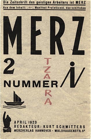
Joshua Olsthoorn (Athens, Greece) designed Merz Grotesk in 2013 after a Merz Magazine model from 1924 published by Kurt Schwitters. [Google] [More] ⦿ | |
Inspired by Jean Hans Arp, a dada movement artist, Joy Paton (Leicester, UK) dropped some objects on a table, and made glyphs in this randomized manner. The experimental and nonsensical result is The Laws Of Chance typeface (2014). Behance link. [Google] [More] ⦿ | |
Canadian designer of the squarish dadaist typeface Box (2012). [Google] [More] ⦿ | |
| |
Komet & Flicker (was: StockBucket)
| StockBucket was founded in May of 2004 by graphic designers David Phillips and Traci Daberko in Bellevue / Seattle, WA. It was renamed Komet & Flicker in 2021. David Phillips had earlier run Radar Design (est. 1995), also in Seattle. One can purchase these creations at MyFonts:
|
| |
Kulturë Type (or: Kulture Type)
|
|
Mumbai-based creator of Fumio Tachibana (2013), a dada style typeface that is based on the iconic collage style of Japanese designer and artist Fumio Tachibana. [Google] [More] ⦿ | |
German artist and writer associated with the Dada movement in Hanover, 1887-1948. Unclear which fonts he designed. But he had many original book designs, book covers, and posters. Cover of Merz (1925). [Google] [MyFonts] [More] ⦿ | |
Graphic designer in Birmingham, UK, who studied at the Birmingham Institute of Art and Design at BCU (Birmingham City University) in 2008. He created a number of typefaces in 2012 such as Coco, Deco Sans, Lovelle Stencil, and dada paper cutout typeface. Behance link. [Google] [More] ⦿ | |
Graphic designer in Buenos Aires, who designed the dada or Die Brücke style font Ramonita in 2017. Earlier, in 2014, she designed the experimental interlocking typeface Werplonix. [Google] [More] ⦿ | |
Leonit Gashi
| |
Russian designer. | |
| |
Lina Grin (or: Lina Grigorenko, or Alina Grigorenko) is from Moscow, Russia, where she studied at the British Higher School of Art and Design. At that school, she designed the dada paper cutout typeface People Were Here (2011). She continued her studies at the University of the Arts London / London College of Communication, where she created the experimental circle-based typeface Sigma (2012), the "cloudy" Sky (2013), he playful Jamze (2013), Lily (2013), and the scratchy typeface Saiko (2013). She also created the experimental geometric Latin typeface Zepta (2011), the free modular typeface family Utopia (2015), Loony (2015, a squarish font), Sex Revolution (2015, an icon font), the free circle-based Greko family, and the free compass-and-rular typeface Draw (2015). Currently, Lina is based in London. Behance link. [Google] [More] ⦿ | |
| |
| |
Manfred Klein
| |
Manfred Klein
| |
Manfred Klein: Dadaism
|
Download page. Download all these fonts in onze zip file. [Google] [MyFonts] [More] ⦿ |
This zip file contains all his fonts. For those interested in particular styles, please visit this web page for downloads of individual fonts, or fonts grouped by these themes: 3d, Africa, aliens, animals, architecture, arrows, astrology, birds, calligraphy, cave style, codex, Christmas, dada, decorative caps, didone style, dingbats, display style, Egypt, eyes, fists, Fraktur, handcrafted typefaces, Karla, kids, Laurens, masks, medieval styles, Mexico, monsters, native themes, ornaments, painters, peace, people, pixel fonts, runes, Sans, serif, slab, stencil, stone age, typewriter, uncial, wood and woodcuts. [Google] [More] ⦿ | |
Bucharest, Romania-based creator (b. 1982) of the straight-edged angular dadaist typeface Magario (2016). Dafont link. [Google] [More] ⦿ | |
French dada artist, 1887-1968. Several fonts were made that were inspired by his writing, most notably FF DuDuchamp (Dung Van Meerbeeck). Interestingly, Richard Kegler, the founding partner of P22 type foundry in 1994, mentioned that P22 was an outgrowth of his Master's thesis project on Marcel Duchamp. P22 has had its trouble with the Duchamp font of Kegler, which was designed in 1994. As P22 puts it [text by them]:
Footnote: It appears that P22 also designed a set of ornaments called Readymades in the original collection, together with P22 Duchamp and P22 Duchamp Bold. [Google] [More] ⦿ | |
Marilia, Brazil-based digital artist (b. 1976), who studied at Faac-Unesp and teaches in Marilia. Marcio created the techno typeface Nucleo (2010) and the organic experimental typeface Wabi MD (2009, free). The organic typeface Sayuri followed in 2010. Creator of the free fonts Textbox Stencil (2010) and Textbox Regular (2013). At FontStruct, he made Nucleo (2011) and Geo MD (2012, octagonal). In 2013, he set up SeaTypes together with Jefferson Cortinove. Slab MD (2013) is a slab serif typeface and Di Grado (2012) is a dadaist / beatnik poster typeface after the lettering of Brazilian book cover designer Vicente Di Grado in tge 1960s. In 2015, Duarte published the modular elliptical sans typeface Hollyday (sic) at Sea Types. Behance link. Dafont link. Behance klink for SeaTypes. [Google] [More] ⦿ | |
Merida, Venezuela-based designer of the dadaist typeface Carbonella in 2015. [Google] [More] ⦿ | |
Roman designer of the free angular chiseled typeface Incise (2014). [Google] [More] ⦿ | |
Krasnoyarsk, Russia-based designer of the dadaist HVO script (2014, Latin and Cyrillic). [Google] [More] ⦿ | |
Dutch creator of Tapefont (2013), which was made by superimposing pieces of tape. [Google] [More] ⦿ | |
French creator (b. 1995) of the fat rounded counterless typeface Zitti (2009), the fat angular counterless typeface Kiss Kiss from Paris (2010, dadaist), and the geometric typeface Crazy Loop in Paris (2009). In 2012, he created the brush typeface Durden. In 2013, he added the geometric typeface KV. Dafont link. [Google] [More] ⦿ | |
As a student in Poznan, Poland, Martyna Talaga designed the paper cutout typeface Gaga (2016), the counterless typeface Chomik (2016), and the Arabic simulation typeface Arabica (2016). [Google] [More] ⦿ | |
Belgian designer in Brussels who is a partner at Club Sandwich, an ensemble of creative independents dedicated to help organisations better understand themselves. His typefaces are all of the display type and are often commissions for agencies and companies. These include, in 2017, Gamatik (a modular 3d typeface), Vroomi (a custom typeface for a karting company, Wik, based in Brussels), Ronbun (a dadaist typeface designed for the visual identity of "Knees to Chin", a restaurant that offers a range of delicious Vietnamese rice paper rolls). Behance link. [Google] [More] ⦿ | |
Brussels-based creator of No Way Back (2012, dadaist titling face). Dafont link. Behance link. [Google] [More] ⦿ | |
Michael Jarboe
| |
Graphic designer in Mississauga, Ontario. In 2012, she designed the dadaist typeface Mese. [Google] [More] ⦿ | |
Monochrom (and--or Pheist)
| Monochrom is Stefanie Koerner's place. She works at the Academy of Fine Arts in Hamburg, and has designed fonts such as Baltic Interface Net (2000, pixel font), ReconstructDing (2005), FastenYourSeatbelt (2002, dingbats; Clean and Textured), BIN-Outline and BIN (2000, pixel font family). At Cape Arcona, she made the free fonts CA Dater (2005, grunge), CA Fusion (2005, outline), CA Misfit (2009, grunge) and CA Scribb (2005). Pheist in Hamburg is another site of hers. Here she has all the fonts mentioned above, plus the freeware or shareware fonts pxlpack (2005), TXTRS (2005), DPX (2005), Mink (2012), Paper Johnny (2006, a dada typeface), Rodeo King (2007, hand-printed), Fipps (2007, outline pixel face), HeinzHeinrich (2008, blackletter pixel face), PlakkenWalls (2003, scanbats), Plakken (2003, grunge), Phatone (2007, pixel face), Commo (2008, pixel face), wide9serif, wide9, wide8, and narrow8. Dafont link. [Google] [More] ⦿ |
Graphic designer in Rio de Janeiro. In a type design course of Nair de Paula, she created the dadaist Durex and Durex Sem Falhas typeface in 2011. Free downloads here and here and here. [Google] [More] ⦿ | |
Nicolas Massi
| |
Nilson Art Design
| Sao Paulo, Brazil-based designer of the squarish typeface Quadratic (2019). Typefaces from 2020: Bolchray (an artsy script), Rotundum (a dadaist poster typeface). [Google] [MyFonts] [More] ⦿ |
Nilson Lima
| |
No Ponies
| Graphic and type designer from Hamilton, New Zealand, whose company there was called Eolian. Now based in Tauranga, New Zealand, he was offering some free fonts on his site such as Snow-Bit (2004: a pixel font) and Handdrawn (2004: a handwritten block type). Creator of the rigid display typeface Levin (2006) (see also here). Designer of the free modular typeface Matamata (2017), the free rounded handcrafted typeface Daycare (2017) and the free paper cut-out dada typeface Cut It Out (2017). In 2018, he designed the free sans serif Kulim Park (see Google Fonts), the blocky Four By Four, the monoline geometric sans typeface Sulphur Point (at Google Fonts) and the free octagonal typeface Turret, which was released in 2019 at Google Fonts. . Github link. [Google] [More] ⦿ |
Creator of the free thin chisel font New Theory (2012), of the stick font SixSixSix (2013), and of the hand-drawn Dollar Lemonade (2013, yours for two dollars), Anke Sans (2014: a free geometric sans), Beeeer (2014, tweetware poster font), Giant (2014), California (2014), My Hand (2014), Raw Font (2014), and Composition (2014). In 2015, he made the watercolor brush script typefaces Arrows, Hawaii, Cafune Script, Karla Script, Michelle (free), Love Letter, Matilda, Natalie, Palapa, Heather and Wendy. Other typefaces from 2015 include Beeeer (poster type), Compass, Rustic (consisting of Things, Paper, Margot, Monsters, and Welcome Home), Akuma (heavy brush), Composition (hand-printed), Saints (a stick, or rune emulation font), Lorem Serif, Helena (watercolor brush script), Dakota (script), Convoy (handcrafted), Tomahawk (hand-drawn), Holga Script, and Emily (hand-drawn). Typefaces from 2016: Rapture (rough brush), Mono (futuristic), Big Sur (thin sans), Piedra & Stone, Tigers, Tiburon, Colorado, Super Normal, Brown Fox Script, Reading This, Frank, Nudos (script), Penny Handmade, Lula (brush style), Jamaica Script (brush font). Typefaces from 2017: Wild (dadaist), OK Regular, Ugo. Typefaces from 2018: Weekend, Destroyer (brush). Creative Market link. Behance link. Dafont link. Open Font Library link. [Google] [More] ⦿ | |
Mexican designer in Guadalupe, b. 1984. He created the dadaist typeface Nudo Dislocado (2012). [Google] [More] ⦿ | |
| |
Colombian designer (b. 1983) of Cartoonero (2015, comic book font), Chum-Chum (2015, fat rounded poster typeface), Rhino (2015, handcrafted), Funnier (2015), Alagunna (2015, connected script), Creepy Circus (2014), Bad Luck (2014, paper cut font), Gonza (2014, fat finger font), Chanda Feliz (2014, caps only comic book typeface), Sin Gracia (2014), Caricaturista (2014, a comic book font), Oh January (2014, hand-printed), Mr Mogollon (2013, hand-drawn) and Digital Kid (2013, dadaist). Dafont link. Twitter link. Link to Alagunna, his cartoon site. [Google] [More] ⦿ | |
P22 Dada
| Richard Kegler (P22) created P22 Dada in 1995-1996. Changes were made in 1998 and 2006. This style is sometimes classified under ransom note fonts and hacker fonts. [Google] [More] ⦿ |
P22 Type Foundry
|
The fonts are: Industrial Design (an industrial look font based on letters drawn by Joseph Sinel in the 1920s---this font is free!), LTC Jefferson Gothic Obliquie (2005, free), Sinel (free), P22Snowflakes (free in 2003 and P22 Snowflakes (retail) in 2020, finishedd by Richard Kegler and Terry Wüdenbachs), Acropolis Now (1995, a Greek simulation typeface done with Michael Want), P22 Albers (1995; based on alphabets of Josef Albers made between 1920 and 1933 in the Bauhaus mold), Arts and Crafts (based on lettering of Dard Hunter, early 1900s, as it appeared in Roycroft books), Ambient, Aries (2004, based on Goudy's Aries), Arts and Crafts ornaments, Atomica, Bagaglio (Flat, 3D; in the style of Il Futurismo), P22 Basel Roman (2020, Richard Kegler: an update of a 2015 typeface, P22 Basel, based on a garalde font used by Johannes Herbst (aka Ioannes Oporinus) in 1543 to publish Andreas Vesalius' On the Fabric of the Human Body (De humani corporis fabrica) in Basel), Bauhaus (Bauhaus fonts based on the lettering of Herbert Bayer), Bifur (2004, Richard Kegler, after the 1929 original by Cassandre), Blackout, P22 Brass Script Pro (2009, Richard Kegler; based on an incomplete script fond in a booklet from Dornemann&Co. of Magdeburg Germany, ca. 1910 entitled Messingschriften für Handvergoldung; for years, P22 and MyFonts claimed that Michael Clark co-designed this, but Michael does not want any credit, as he did only about 20 letters), Cage (based on handwriting and sketches of the American experimental composer John Cage), P22 Casual Script (2011, Richard Kegler, a digitization of letters by sign painter B. Boley, shown in Sign of the Times Magazine), Cezanne (Paul Cezanne's handwriting, and some imagery; made for the Philadelphia Museum of Art), Child's Play, Child's Play Animals, Child's Play Blocks, Constructivist (Soviet style lettering emulating the work of Rodchenko and Popova), Constructivist extras, Czech Modernist (based on the design work of Czech artist Vojtech Preissig in the 20s and 30s), Daddy-o (Daddy-o Beatsville was done in 1998 with Peter Reiling), Daddy-o junkie, Da Vinci, Destijl (1995, after the Dutch DeStijl movement, 1917-1931, with Piet Mondrian inspired dingbats; weights include Extras, P22 Monet Impressionist (1999), Regular and Tall), Dinosaur, Eaglefeather, Escher (based on the lettering and artwork of M.C. Escher), P22 FLW Exhibition, P22 FLW Terracotta, Folk Art (based on the work of German settlers in Pennsylvania), Il futurismo (after Italian Futurism, 1908-1943), Woodtype (two Tuscan fonts and two dingbats, 2004), P22 Woodcut (1996, Richard Kegler: based on the lettering carved out in wood by German expressionists such as Heckel and Kirchner), Garamouche (2004, +P22 Garamouche Ornaments; all co-designed with James Grieshaber), GD&T, Hieroglyphic, P22 Infestia (1995), Insectile, Kane, Kells (1996, a totally Celtic family, based on the Book of Kells, 9th century; the P22 Kells Round was designed with David Setlik), Koch Signs (astrological, Christian, medieval and runic iconography from Rudolf Koch's The Book of Signs), P22 Koch Nueland (2000), Larkin (2005, Richard Kegler, 1900-style semi-blackletter), London Underground (Edward Johnston's 1916 typeface, produced in an exclusive arrangement with the London Transport Museum; digitized by Kegler in 1997, and extended to 21 styles in 2007 by Paul D. Hunt as P22 Underground Pro, which includes Cyrillic and Greek and hairline weights), Pan-Am, Parrish, Platten (Richard Kegler; revised in 2008 by Colin Kahn as P22 Platten Neu; based on lettering found in German fountain pen practice books from the 1920s), P22 Preissig (and P22 Preissig Calligraphic, 2019), Prehistoric Pals, Petroglyphs, Rodin / Michelangelo, Stanyan Eros (2003, Richard Kegler), Stanyan Autumn (2004, based on a casual hand lettering text created by Anthony Goldschmidt for the deluxe 1969 edition of the book "...and autumn came" by Rod McKuen; typeface by Richard Kegler), Vienna, Vienna Round, Vincent (based on the work of Vincent Van Gogh), Way out West. Now also Art Nouveau Bistro, Art Nouveau Cafe and the beautiful ornamental font Art Nouveau Extras (all three by Christina Torre, 2001), the handwriting family Hopper (Edward, Josephine, Sketches, based on the handwriting styles of quintessential American artist Edward Hopper and his wife, Josephine Nivison Hopper, and was produced in conjunction with the Whitney Museum of American Art), Basala (by Hajime Kawakami), Cusp (by James Grieshaber), P22 Dearest (calligraphic, by Christina Torre and Miranda Roth), Dwiggins (by Richard Kegler), Dyrynk Roman and Italic (2004, Richard Kegler, after work by Czech book artist Karel Dyrynk), Gothic Gothic (by James Grieshaber), La Danse (by Gábor Kóthay;), Mucha (by Christina Torre), Preissig Lino (by Richard Kegler), P22Typewriter (2001, Richard Kegler, a distressed typewriter font), the William Morris set (Morris Troy, Morris Golden, Morris Ornaments, based up the type used by William Morris in his Kelmscott Press; 2002), Art Deco Extras (2002, Richard Kegler, James Grieshaber and Carima El Behairy), Art Deco Display, the Benjamin Franklin revival font Franklin's Caslon (2006), Dada (2006) and the Art Nouveau font Salon (bu Christina Torre). In 2006, Kegler added Declaration, a font set consisting of a script (after the 1776 declaration of independence), a blackletter, and 56 signatures. Many of the fonts were designed or co-designed by Richard Kegler. International House of Fonts subpage. Lanston subpage (offerings as of 2005: Bodoni Bold, Deepdene, Flash, Fleurons Granjon, Fleurons Garamont, Garamont, Goudy Thirty, Jacobean Initials, Pabst, Spire). In-house fonts made in 2008 include Circled Caps, the Yule family (Regular, Klein Regular, Light Flurries, Heavy, Klein heavy, Heavy Snow, Inline; all have Neuland influences). Kegler / P22 created a 25-set P22 Civilité family in 2009 based on a 1908 publication from Enshedé, the 1978 English translation by Harry Carter, and a 1926 specimen also from Enshedé. P22 Declaration (Script, Signatures, Blackletter, 2009) is based on the lettering used in the 1776 Declaration of Independence. At ATypI 2004 in Prague, Richard spoke about Vojtech Preissig. Speaker at ATypI 2010 in Dublin, where he presented Making Faces: Metal Type in the 21st Century about which he writes: This film has the dual aim of documenting the almost-lost skill of creating metal fonts and of capturing the personality and work process of the late Canadian graphic artist Jim Rimmer (1931-2010). P22 type foundry commissioned Mr. Rimmer to create a new type design (Stern) that became the first-ever simultaneous release of a digital font and hand-set metal font in 2008. At ATypI 2011 in Reykjavik, he showed Making Faces. Typefaces from 2014: LTC Archive Ornaments (Richard Kegler and Miranda Roth). Typefaces from 2020: Showcard Script (by Terry Wüdenbachs, based on an original of Beaufont at the Hamilton Wood Type Museum, custom designed by the Morgan Sign Machine Company of Chicago). Typefaces from 2021: P22 Glaser Houdini (a layerable family, after Glaser's Houdini from 1964), P22 Glaser Babyteeth. Kegler writes: In 2019, P22 Type Foundry met with Milton Glaser (1929-2020) to initiate the official digital series of typefaces designed by Glaser in the 1960s and 70s. P22 Glaser Babyteeth is the first family released in the series. Milton Glaser's inspiration for his Babyteeth typeface came from a hand painted advertisement for a tailor he saw in Mexico City. He was inspired by that E drawn as only someone unfimilar with the alphabet could have concieved. So he set about inventing a completelly ledgible alphabet consistant with this model. P22 Glaser Babyteeth was based on original drawings and phototype proofs from the Milton Glaser Studios archives. Over the years there have been many typefaces that borrowed heavily from the Glaser designs, but these are the only official Babyteeth fonts approved by Milton Glaser Studio and the Estate of Milton Glaser. The solid and open versions are designed to overlap for two-color font effects and can even be mixed and matched for multi layer chromatic treatments. In 2021, he published the 3d art deco shadow font P22 Glaser Kitchen which is based on Big Kitchen (1976). View Richard Kegler's typefaces. View the IHOF / P22 typeface library. [Google] [MyFonts] [More] ⦿ |
During her graphic design studies at FADU / UBA in Buenos Aires, Pia Montes de Oca created the thin display typeface Pocafont (2013). [Google] [More] ⦿ | |
During his studies, Qaees Khan (Dudley, UK) created several untitled typefaces, including a dada style cutout typeface and a crayon typeface. [Google] [More] ⦿ | |
| |
In 2011, she made StraightLines (cut out, dada style), New Age, Nintey Degrees (sic), Disco, Untitled, Gothic Regular and Futuristica (dada style). [Google] [More] ⦿ | |
Reserves (or: AE Type)
|
The earliest typefaces: Base (stencil), Evac (octagonal), Claes (a heavy blacked out display typeface named after Swedish sculptor Claes Oldenburg), Raider, Error (LED simulation face), Reserves03 (2009), Output II (2009), Scape (octagonal stencil), Void, Vacant (2009, monoline stencil), Debacle (2009), Scam (2009; a fun geometric experiment), Immortality, Asecs, Analog SE, Scheme (pixel face). Typefaces made in 2010: Idiom (2010, a piano key family inspired by P22 Albers), Vector RG (2010, an octagonal typeface inspired by the 1979 Atari Asteroids video game UI screen font), Sevigne (2010, monoline geometric avant-garde sans that looks a bit like a stencil), Velvet (2010, a heavy rounded block retro typeface inspired by the typeset album covers of the protopunk rock band The Velvet Underground), Monocle (2010, monospaced and monoline geometric sans). Typefaces made in 2011: Scape (2011, rounded monoline stencil family), Velvet (2011), Defense (2011, octagonal slabbed stencil), Offense (2011, strong octagonal mechanical family), Vanitas Bold (2011, Peignotian fashion mag typeface rooted in didones). In 2012, Mike published Enamel (a condensed sans family---the inline version of Sorren), Sorren (a condensed sans influenced by neo-grotesque designs, and dada in style), Sorren Ex, Vanitas Stencil and Memoire (a charming fashion mag monoline hairline stencil). Typefaces from 2013: A large Neue Haas Grotesk / Helvetica-style sans family called Acronym, from Hairline to Extra Black and Outline. Typefaces from 2014: Reload (octagonal), Reload Stencil (military stencil). Reload Alt and Reload Alt Stencil were added in 2015. Typefaces from 2015: Averes Title (a sharp geometric sans titling typeface), Averes Title Roman (fashion mag styles). Klingspor link. Behance link. Flickr site. Behance link. MyFonts link. |
In 2013, he published Pacaembu, an extraordinary multilined typeface family inspired by graphic patterns of Brazilian indians. Carona (2013) is a vernacular typeface based on wall writing. Lock Type (2013) is a heavy rounded techno sans typeface family. In 2014, he published the dadaist paper-cut typeface Pulso, the octagonal typeface Louco, and the plump bubblegum typeface Burle Marx, which shares the roundness of the official Olympics 2016 typeface. The vernacular typeface Copa (2014) was designed to honor the world cup in 2014 in Brazil. It is based on street painting. This project was supported by illustrations made by Henrique Mamede. Hincha (2015) is a paper tape font used for soccer posters. Block (2015) and United Squad (2015) are soccer lettering fonts. Behance link. Another Behance link. Dafont link. [Google] [More] ⦿ | |
Singapore-based Richard Culbert creating a paper cut-out typeface called Folding (2012). [Google] [More] ⦿ | |
Richard Kegler
| |
Richard Kegler
| |
During his studies at Inseec Bordeaux, Robert Lassalle created the dada style Saul Bass Font (2015). [Google] [More] ⦿ | |
Ross Turnbull is based in Edinburgh, Scotland. He created the fat (vernacular, dadaist) poster typeface RT DIY-Tape (2014). Dafont link. [Google] [More] ⦿ | |
Sacred Nipple Type Foundry
| Founded in 1996, Sacred Nipple Type Foundry was a South African foundry located in KwaZulu-Natal, located at this dead link. The main designers were Brode Vosloo, Lyall Coburn, Stephen Embleton and Scott Dukes. They had grungy fonts such as the great graffiti font StarSalon, Sloth (1996), Albino (Brode Vosloo), Belch (Clint Vosloo), and Spiked Soda (Lyall Coburn and Cock Vosloo). The Vosloo brothers and Coburn are originally from Zaire. Brode Vosloo is also the [T-26] designer of AfroDisiac (dingbats, 1997, with Garth Walker, William Rea and Lisa King), Slicka (2002), FreeLine (a techno face, T-26) and ShoeRepairs (a dadaist and 3d family made in 2000, T-26). Their own designs include interesting African fonts such as MrCV Joint, and Shoe Repairs (2000, family). Newest fonts: ErrorType8 (2000, Brode Vosloo), IZulu-Outline (2000, Brode Vosloo), IZulu-Regular (2000, Brode Vosloo), PleineStr (2000, Brode Vosloo), Rural (2000, Brode Vosloo), Biltong, BirthRiot, Caslonostrate, Cynic, Ejectile, EjectileItalic, Fondle, Fuel, FuelItalic, GrossAkzidentFucked, Hole, Holier, IAlfabhethi, IZuluOutline, Lymphatic, Propane, PropaneRounded, PropaneSmallCaps, Scrapt, ScripteriaCola, ScripteriaGummy, ScripteriaToid, Slick69, StyleLiner. Since 2004, Brode Vosloo works (not sure if he still does today) for Iron Fist Design. Another URL. Dafont link. Klingspor link. [Google] [MyFonts] [More] ⦿ |
Fontspace link. Another link. [Google] [More] ⦿ | |
Sean Rees
| |
Creator of the octagonal modular Castania (2012), the squarish display typeface DLG Monospace (2012), the dadaist cut-out typeface Mad Cut (2012), the hand-printed poster typeface Morning Coffee (2012), the Polish antiqua typeface Modena (2012, +Modena Printed), and the blackletter typeface Luft (2012). Typefaces from 2013: USKOK, Bosman (a sketched or tattoo font family), Marina (a tattoo font), Grot, Olech (a layered poster or letterpress simulation face based on Martin Jacoby-Boy's Bravour, 1912), Garda (a layered system with a great inline), Pancake (a signage script), Zapora, Sailors Dream (layered font family). Typefaces from 2014: USKOK, Old Craftsman. Typefaces from 2018: Epsum (a squarish poster or logo typeface family). Behance link. Hellofont link. Creative Market link. [Google] [MyFonts] [More] ⦿ | |
During his studies at the High School of Graphic Design in Moscow, Silva Vasil designed a dada typeface called Brooklyn (2013). [Google] [More] ⦿ | |
Typefaces from 2015: Neon, Buckley, Buckley Serif, Bold Riley (a handcrafted serif), Balham to Brooklyn (fifties script), Petit Jardin, Gently Script, Troupe (an inline Tuscan typeface), Mr. Blue Sky (an inline typeface), Moorgate (fat brush font), Sunshine, Dogtown (grunge), Gods Own Junkyard (neon sign font, named after Chris Bracey's neon sign store in London), Teardrop (watercolor brush with dripping ink), Western Grit (spurred), In The Wood, Gallow Tree (free brush font), Thirsty Dog (scratchy brush), Dear Prudence. Typefaces from 2016: Get Lucky, Take Me To The River, Lawless (vintage display typeface), Not My Type (old typewriter font), Roadhouse Blues, Just Like Heaven, Resize, Atomic Dustbin, Mind The Gap (stencil family), Munky (a fun children's book typeface), Hunky Dory (a handcrafted children's book typeface), Little Wonder (brush script), Mister Rooster, Whippin Piccadilly (handcrafted), Bangers & Mash, Mr. Chumley. Typefaces from 2017: Hunky Dory, Circus Freak, Fake Empire, Gilly Script, Banoffee (a kooky handcrafted typeface), Tuck Shop (a chalk font), Fake Empire (grunge), Mu-Th-Ur (a free octagonal typeface inspired by the film Prometheus). Typefaces from 2018: Be More Human (for Reebok), Higgs Boson Blues (SVG font), Fierce (dry brush SVG font), Yeah Foil Balloon (color font), Wild Irish Rose (brush script). Typefaces from 2021: Beautiful Freak, Neon. Behance link. Another Behance link. Envato link. [Google] [More] ⦿ | |
Creator of the paper cutout or cartoon font Enliteleo (2019), free pixel typefaces Canid (2019) and Deltoid Sans (2014), and the dadaist typeface Martilo (2014). [Google] [More] ⦿ | |
Stefanie Koerner
| |
Behance link. Dafont link. [Google] [More] ⦿ | |
Her early typefaces: 1 | 2 | 3 | 4 | 4 | 5 | 6 | 7 | 8 | 9 | 10 | Sukkhos (Mr. Softie) | Overseas Type (2010, done at Concordia University in Montreal) | Moda Barcelona (2011). In 2010, she designed the map face Cartola, which grew out of a project at EINA in Barcelona and is based on Mrs Eaves. Mar 34 (2011) designed exclusively for the identity of Estruch, a restaurant located at the Plaza of the Cathedral in downtown Barcelona. The project was made in collaboration with Raquel Quevedo, who used the typeface for designing a graphic system for the identity. Both the face&the graphic design are based on postal service paraphernalia. Momo (2011) is a typeface that is developed based on the concepts of dada by El Lissitsky&Kurt Schwitters. In 2013, she graduated from the Type & Media program at KABK in Den Haag with a text typeface called Botanica that is geared towards scientific publications. In 2018, she published Tara at Indian Type Foundry. Designed for immersive reading, it has considerable contrast and wedge serifs. | |
Graphic designer in Saint Petersburg, Russia. She created the display typeface Orava (2012). I also like her experimental typography in a dada-styled poster entitled Philippe Soupault (2012). Behance link. [Google] [More] ⦿ | |
Bandung, Indonesia-based designer of the brush type Arsenio (2016) and the dada typeface Syzda (2016). [Google] [More] ⦿ | |
| |
Els Hoek, Marleen Blokhuis, Ingrid Goovaerts, Natalie Kamphuys, et al. penned Theo Van Doesburg: Oeuvre Catalogus (2000, Centraal Museum). Picture of a dada poster by him. Page at Design History. [Google] [MyFonts] [More] ⦿ | |
During his studies at Canterbury College, UK, Thomas Bagnall (London, and before that, Ashford, UK) designed Paper Cut Typeface (2013), X-Code (2013, a circular typeface), and the modular typeface Quadratix (2013). In 2016, he designed the octagonal typeface family System. In 2017, he published Adept Sans. [Google] [More] ⦿ | |
In 2012, we discover Thomas Canale The Sequel at Saginaw Valley State University [what is the relation with Thomas Canale?]. And also this second Dafont link. The "Sequel" created the spiky hand-printed typeface Outback (2012). Canale designed Chunky Munky (2012, angular almost dadaist style), Chunky Munky Serif, Slug Bug (2012), Noir (2012), Baby Moons (2012, old typewriter font), Cropfont (2012, +Serif, +Xtra, +Expanded), Boxey Moron (2012, white on black), Funky Dunky (2013), HoDad (2013), Bitchen Nord (2013), Bitchen (2013), Hodad Warped One (2013), Dibble Nibble (2013, sketch font), and Dubble Trubble (2013, old typewriter face). [Google] [More] ⦿ | |
Thomas Sokolowski
| |
Behance link. [Google] [More] ⦿ | |
Tomo Fonts (was: We Are Tomo)
|
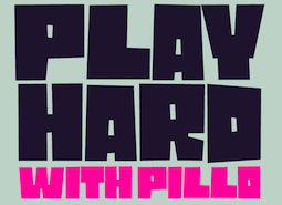
Typefaces from 2018: Tomo Acuario. Typefaces from 2019: Tomo Bossa (a cartoon font for Latin and Cyrillic), Tomo Haraka, Tomo Fango (a comic book font). Typefaces from 2020: TOMO Ziguret (a fat finger font), TOMO Sponge, Tomo Pillo (an expressive blocky typeface), Tomo Trompa Pro (a retro poster font), Tomo Catcher (tall, handcrafted), Tomo Tosca (a stone age font), Tomo Dora Sans (tall, handcrafted), Maryhoid (a casual all caps sans), Mindwalk (a casual hand-printed font), Unione (a geometric sans in 24 styles), Unione GX (a variable font version of Unione). Typefaces from 2021: Tomo Nara (a cartoon font). |
TypOasis 2004
|
|
Valerio Barba (Valerio Barba Design, Rome, Italy) created Dada Font in 2015. Behance link. [Google] [More] ⦿ | |
Victor Coreas
| |
Vladimir Loginov
| |
Foundry in Ljubljana, Slovenia, est. 2011. Vladimir & Vladimir soes art direction at Modna, the main Slovenian fashion magazine. Based in Lubljana, Vladimir & Vladimir designed the fat finger font Krink in 2013. Earlier, he (they?) created the free Tape Font (2011, dadaist). [Google] [MyFonts] [More] ⦿ | |
Brand designer William Bailey (b. 1990), alias William Suckling (Bayley Design, Hastings, UK and/or Camberwell, UK, and/or London, UK) studied at Brighton University. Typefaces from 2020: Côte (2020: an elegant all caps geometric sans with various multiline styles). Typefaces from 2019: Block (beveled). Typefaces from 2017: Fixer (a free layered typeface in 3D, Display, Inline, Line, Outline and Regular styles). Typefaces from 2016: Porto, Empire. Typefaces from 2015: Rocket (bold sans), Boxer. Typefaces from 2014 include Figgy (formal monoline connected face), and Mongo. In 2013, he designed Telegram (piano key typeface), Quackers, Drunken Sailor, Victoria (a Victorian titling face), Chomp (comic book style typeface), Albert Sans and Slab (decorative), Iron, Butcher (a free thin stencil face), Liquor (free Victorian typeface), Axe (a free hexagonal typeface). Typefaces from 2012: the free monoline hand-drawn typeface Acorn, Bourbon (a free monoline sans), Tool Kit (dadaist), Obey (a free elliptical sans), Pathway (free), Thrice (a typeface made by using only three shapes), and Perspective (free). In 2011, he created an unnamed geometric typeface. Cargo Collective link. [Google] [MyFonts] [More] ⦿ | |
Woolly Pixels
| Harrisonburg, VA-based designer of the dada typeface Oberplank (2017). Creative Market link. [Google] [More] ⦿ |
Buenos Aires-based designer of the dada typeface Experimentype (2015) and the script typeface Fiona (2015), as school projects at FADU / UBA. [Google] [More] ⦿ | |
Creator of the dadaist typeface Swallow Falls (2012) and the cartoon font Cloudy With A Chance of Love (2014). [Google] [More] ⦿ | |
Singapore-based designer of an untitled straight-edged dada style typeface in 2014. [Google] [More] ⦿ |
 Graduate of the Rietveld Academie in Amsterdam. Born in Syracuse, Sicily, he spent half of his life in New York City, and studied for four years in The Netherlands. He worked in Lithuania with a group called Alfa60, and is now based in Turin.
  Creator of AMToon (2009, Fontcapture), a bouncy dada face. [
 Independent game developer Andrew McCluskey (NAL Games, Dundee, Scotland, b. 1991) published hundreds of free typefaces before 2015 under the NAL label. In 2015, Andrew McCluskey, after becoming Allison James, joined forces with Daniel Johnston and set up
  Freelance designer in Mendoza, Argentina. In 2015, inspired by Pedro Almodovar's movies, she made the paper-cut or dada typeface Almodovar. [
 Artery Design is located in Gothenburg, Sweden, and is run by Botond Bokor (b. 1978). In 2012, Botond published a few free fonts at Dafont:
  The original Aurora Grotesk dates back to the Johannes Wagner Foundry (1912), but Paul Barnes points out that the same typeface appears under multiple names in the Handbuch der Schriftarten, 1926:
  Assistant Professor at Utah Valley University in Salt Lake City, who is based in Sandy, UT. His typographic work/
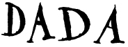 [
[ Raised in Atlanta, Brian earned his Bachelor's and Master's degrees from MICA in Baltimore, MD. He currently lives in Brooklyn, NY. He is an alumnus of Milton Glaser's Summer Program and a founding member of The Children's Publishing Design Forum. A designer, artist and illustrator recognized by many awards, Brian designed these art-historical typefaces in 2014:
  Delta, CO (and, earlier, Stamford, CT)-based
  Linotype confuses Dadaism with grunge, and suggests that its library has the following dadaist typefaces: Agrafie, F2F Shakkarakk, F2F TechLand, F2F Whale Tree, Linotype Automat,
  Llo Lleo, Chile-based designer of the dada typeface Guagua Sans (2015). This typeface was inspired by Patrick Griffin's Fido. [
 Or A.M. Ryal. Or Docallisme HAS Feat Dusky. Jakarta, Indonesia-based designer, b. 1994, of the free typefaces Love You (2015, letters on blocks), Batavia Kota (2015, shadow typeface), Raditas Cartoon (2015), Soekarno Hatta (2015, octagonal), Bhineka Tunggal Ika (2015), Sweet as Revenge (2015, graffiti font), Pagi Jakarta (2015, comic book style), Desminore (2015), The Minion (2015), Indah Papuaka (2015, outlined shaded typeface), Merdeka (2015, a dripping blood font), Awan Nusantara (2015), Docallisme On Street (2015; shadow graffiti font), Cheerful Party (2015), Super Docallisme Has Pattern (23015, a patterned, textured typeface), Hero Do Call (2015: a shadow font), Party Chocolate and Soda (2015), Cheese Cake (2015), Crayon Social Art (2015), Bali Tolak Reklamasi (2015), Nusantara (2015, decorative caps), A Ryal Black Block (2015), The Super Ryal 2015 (2015), Doraemon Slalala (2015), Grateful Sound (2015), Dadapaw Friends (2015), Cartoon 1994 (2015), Valentine Radita (2015, dot matrix), Sally Ross (2015, dot matrix), Juni 2009 (2015), Dear Raditas (2015, a dada typeface), Docallisme HAS (2015) and Minirus (2015, constructivist).
  Vietnamese/Belgian designer (b. Saigon, 1958) who used brushes and pens to create handwritten fonts in 1994 such as DuMathieu,
  Las Palmas de Gran Canaria, Ampuero and Laredo, Spain-based designer (b. 1971) who set up deFharo. Creator of the monoline sans typeface
  German painter and illustrator of the Berlin Dada and New Objectivity eras. He emigrated to the United States in 1933.
  Swedish type designer associated with
  Designer of these
  JC Fonts is the foundry, est. 2009, of
  New York City-based designer of Sans Bass (2015), a dadaist typeface created in honor of Saul Bass. In 2015, Marques was studying at the Institute of Technology in New York, after earlier studies at Sao Paulo State University. [
 Jeff Rogers (or Rodgers in some publications) was born in Texas and lives in New York City where he works as a designer and illustrator. He has created custom lettering for such clients as Nike, The New York Times, Good Magazine, Metropolis Magazine, Blue Q and others. Jeff is also a partner at Abidesco, a Texas based design collective. With the help of the crew at YWFT, he created three typeface families:
  [
[ Freelance graphic artist in Gent, Belgium, who won many awards for his design of posters and poster typefaces. He specializes in book cover, poster and cartoon types, and excels in all. Many of
  Art director who studied at San Diego State University and California State University. In 2014, she created the dadaist typeface Fat Julia for the Yogurtland brand . [
 Kristina Gess (aka Sproot, based in Chelyabinsk, Russia) created the Latin paper-cut typeface
  Graphic designer in Pristina, Kosovo. Creator of these typefaces:
  [
[ Melbourne-based codesigner with Tony Ibbotson in 2008 of the dada typeface
  Illustrator and graphic designer located in Oslo, Norway. His/her typefaces:
  Italian art cooperative in Omegna, where one can download the nice hand-printed Ave Giulio (2009). Other fonts viewable via
  [
[ Dada typefaces by
  In July 2017, Typoasis / Moorstation shut down. Run by Petra Heidorn out of Hamburg, Germany, it hosted her own fonts, as well as those of the popular and talented type designer and artist
  [
[ [
[ Graphic designer in Monterrey, Mexico, b. 1990, whose company is called Handcrafted Types.
  Kiev, Ukraine-based designer of the handcrafted Latin / Cyrillic typeface Kuplu (2017: dadaist) and the experimental typefaces Unpleasant Dream (2017) and Stkl (2017). [
 During his studies in Trier, Germany, Rasselbock created FK Hoc (2015), FK Cut (2012, a cut paper dada typeface), FK Zeugma 2012, (an irregular eerie sans inspired by bad movie titling fonts from the 1930s), FK Futhark (2012, Germanic runes), FK Epiphany (2013, blackletter), FK Permutata (2013, an angular octagonal corporate typeface) and FK Neoz (2012, a smooth sans display family). In 2011, he designed FK Beo. [
 Creator of free fonts. These include
  Reserves (and, since 2012,
 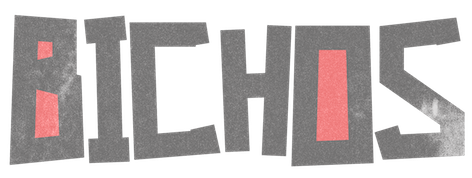 Brazilian graphic and type designer in Sao Paulo, b. 1990. He made the hand-printed brushy typeface
  [
[ Creator of the
  Sebastian Cabaj (or: Pan Cabaj) studied graphic design at the Academy of Fine Arts in Warsaw, where he now works as a graphic and type designer, and runs Kometa Studio. In 2012, he set up the Sebastian Cabaj Foundry via MyFonts.
  London-based creator of the
  Design studio in San Salvador, El Salvador. Creators of the (commercial) dada typeface Urbanica (2014), the dadaist typeface Deformed Font (2014), and the hand-drawn typeface Lovers Italic (2014). They also sell Random Icon Set (2014).
  Talented Mexican graphic designer and digital artist (b. 1985) who was based in Montreal but is now back in Mexico City. She pushed the boundaries of experimental typography with creations like Fabric Type (2009), which was developed at Concordia University in Montreal, where she obtained a BFA in design in 2009. She continued her studies at EINA in Barcelona, graduating in 2010.
  Toulouse-based designer and illustrator.
  Dutch cofounder (1883-1931) with Piet Mondriaan, Bart van der Leck, Anthony Kok, Vilmos Huszar and J.J.P. Oud of the
  Michigan-based designer of the grunge typefaces tommytxtey#4 (2011), Couriertxt (2011), and Uknowjack (2011), and of Stickfig (2011) and
  Tilman Jersch (Studio Jersch, Berlin, Germany) created the papwer fold typeface
 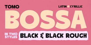 Argentinian digital type cooperative foundry run by Nicolas Massi. The fonts published by Tomo Fonts were made by a variety of people. Tomo Fonts created the handcrafted poster typefaces
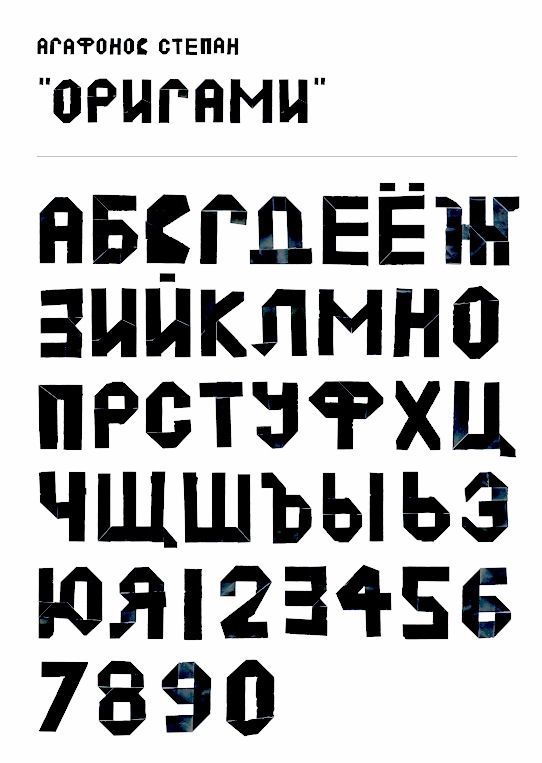
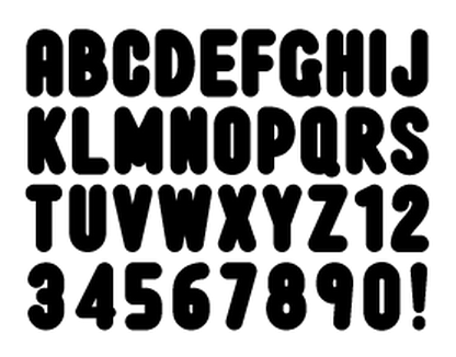
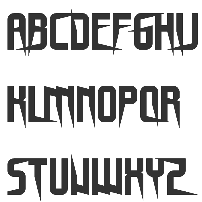
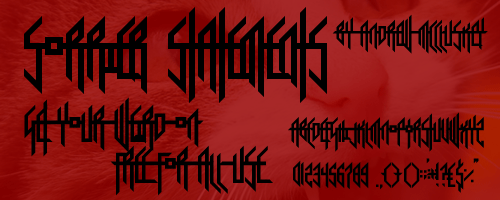
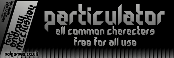
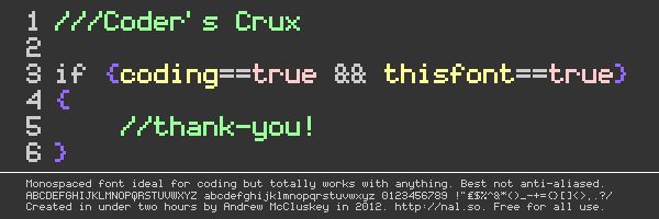
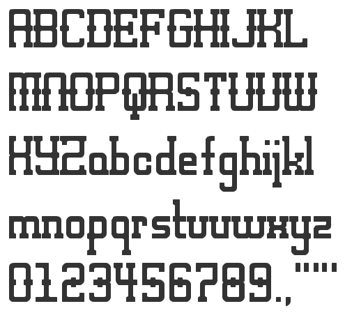
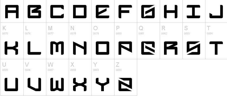
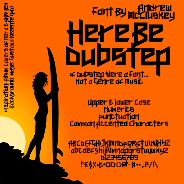
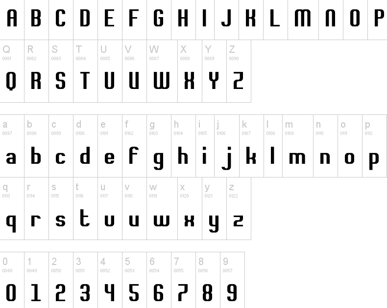
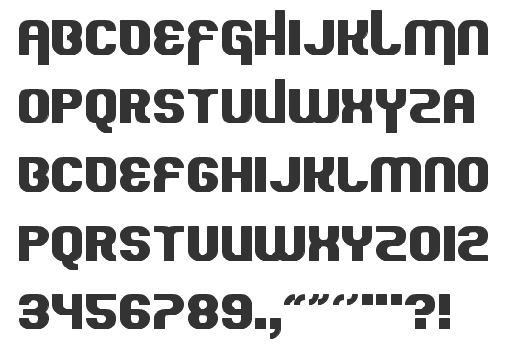
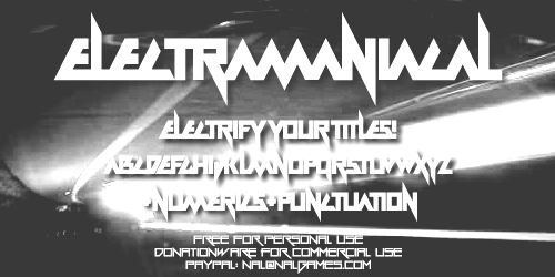
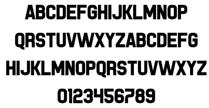
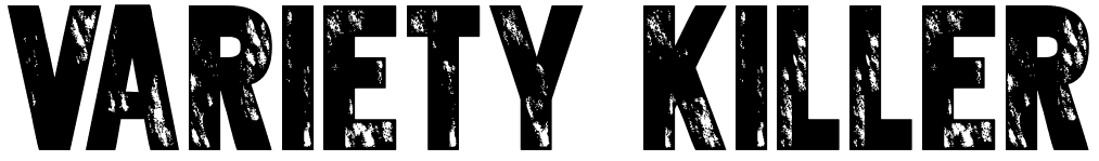
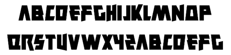
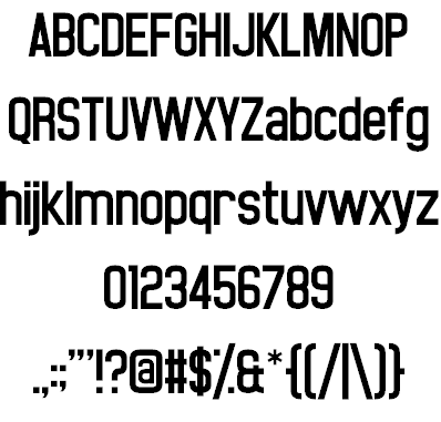
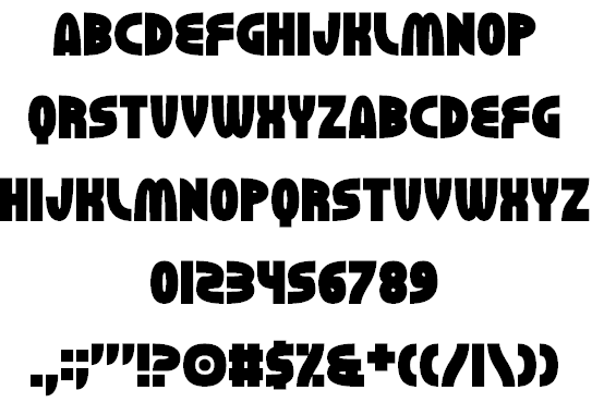
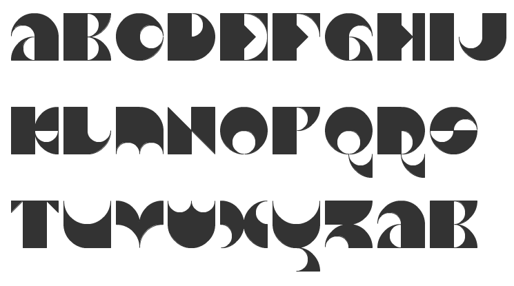
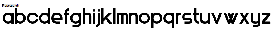
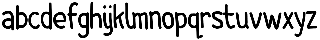
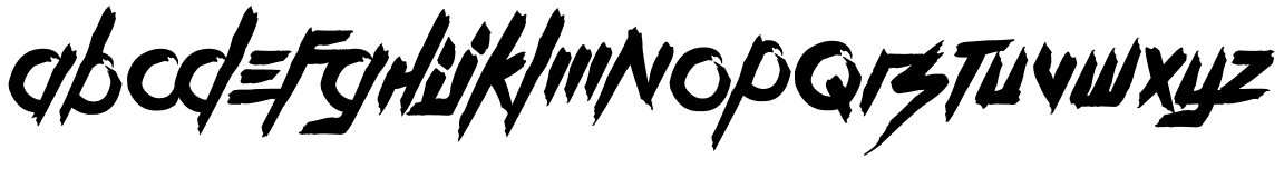
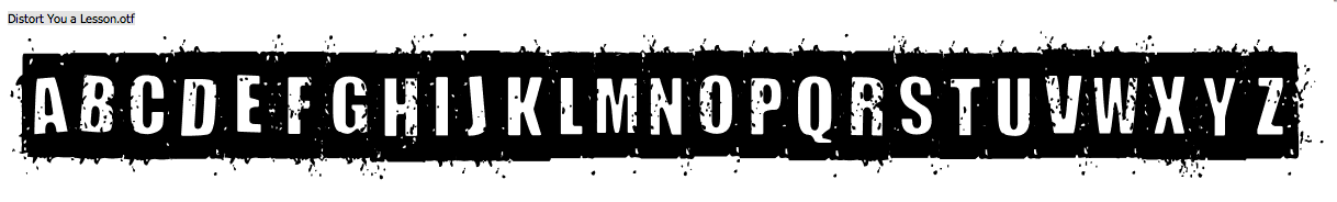
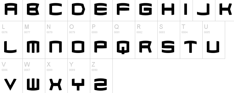
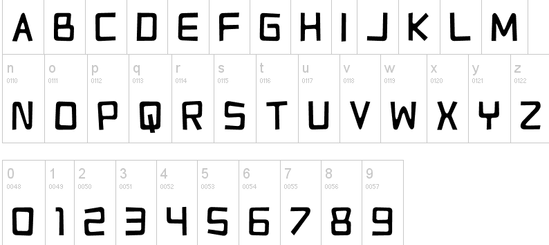
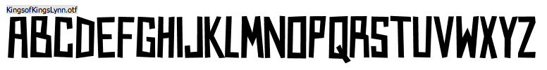
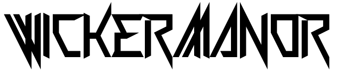
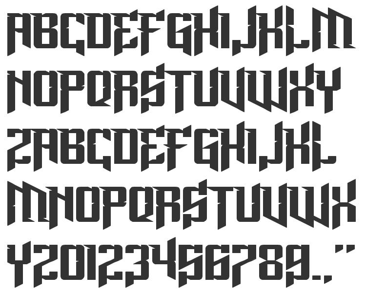
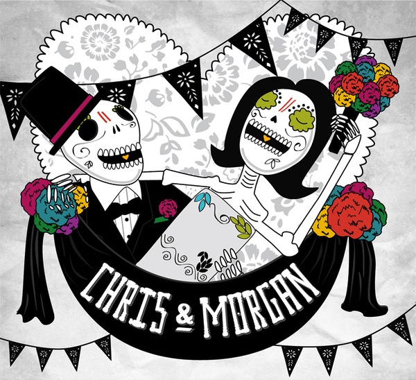
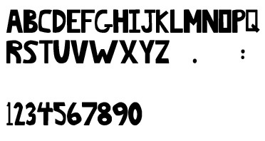
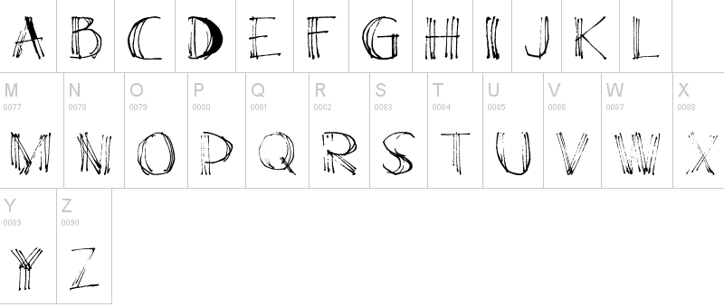
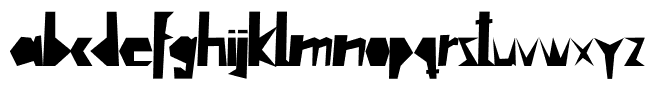
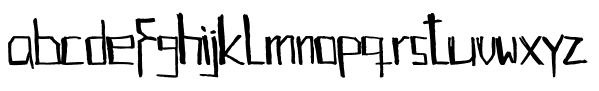
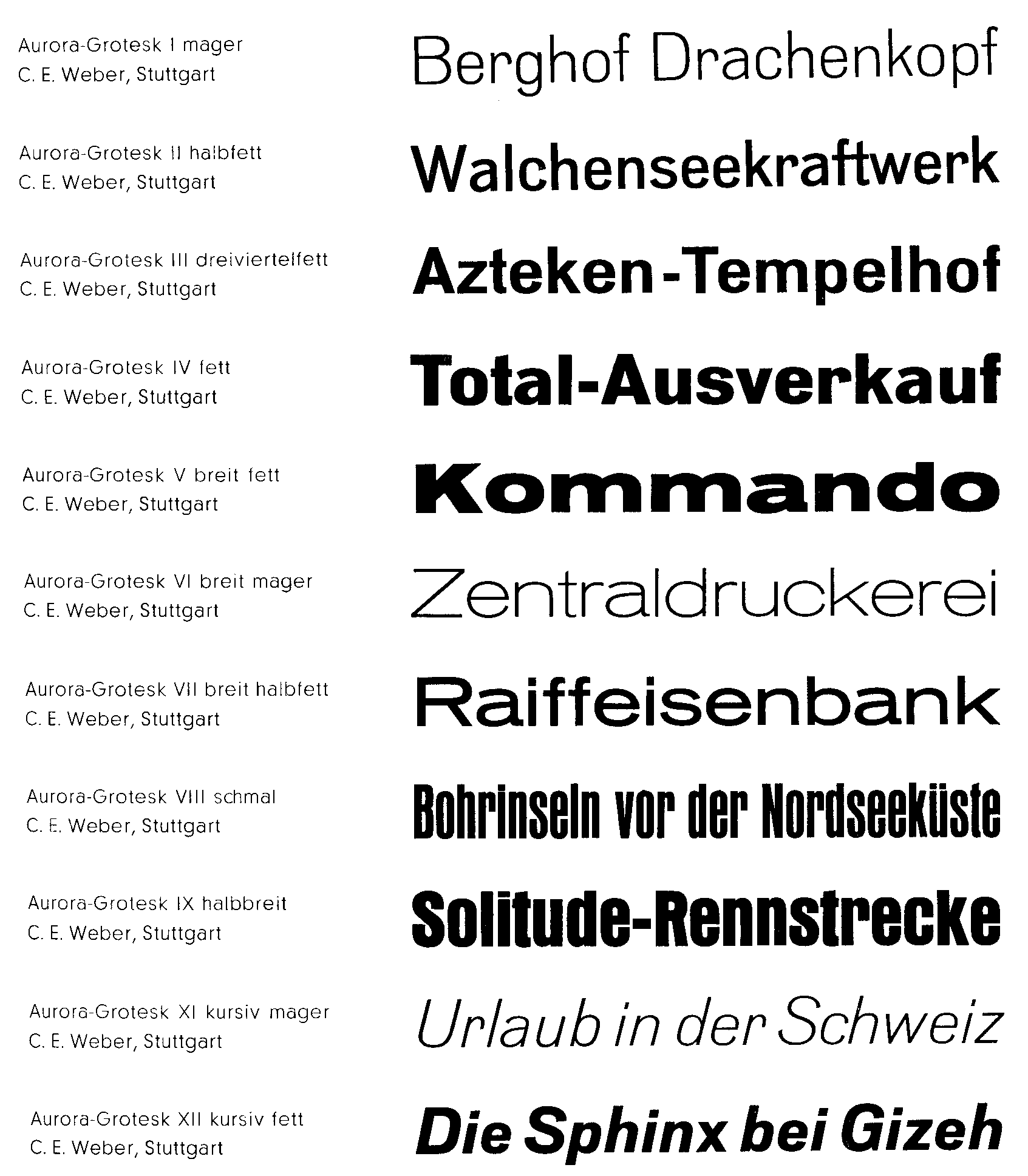
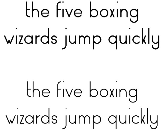
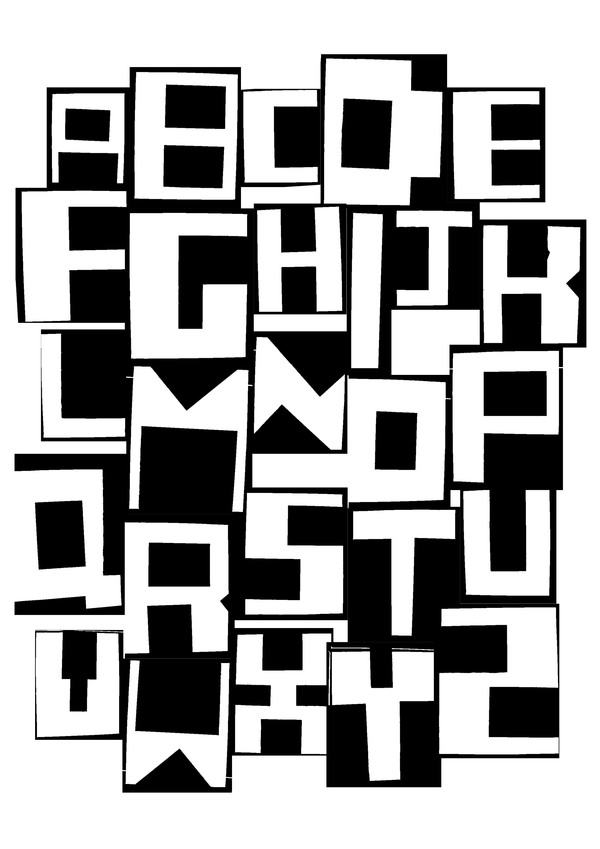
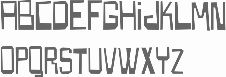
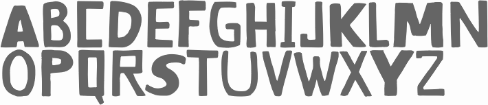
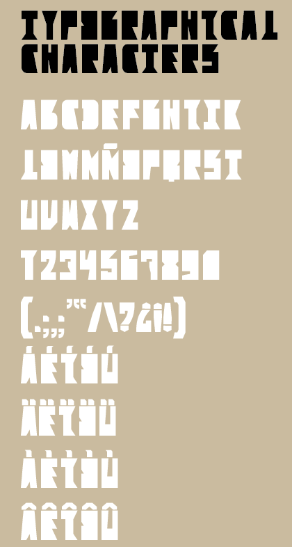
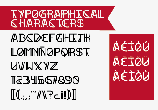
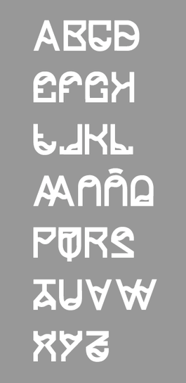
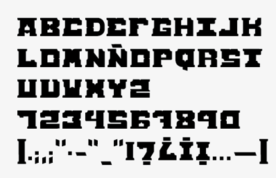
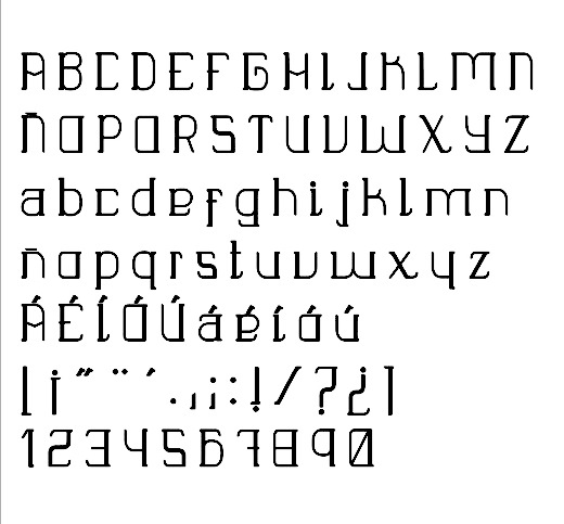
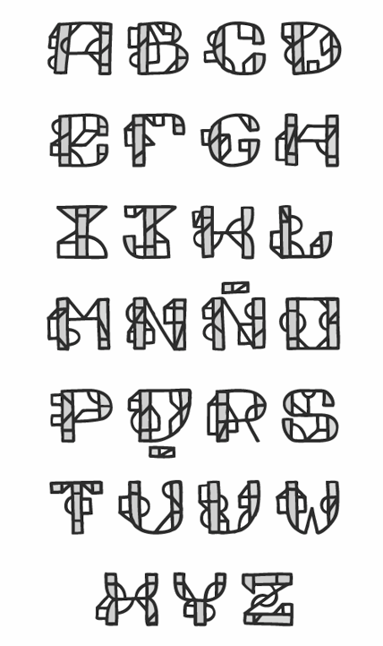
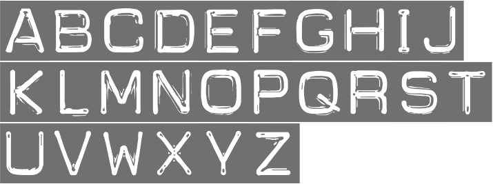
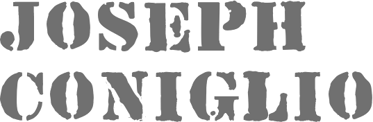
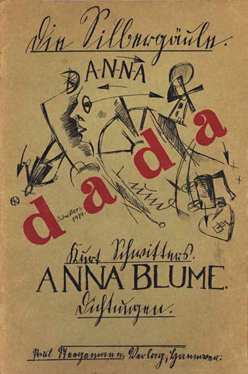
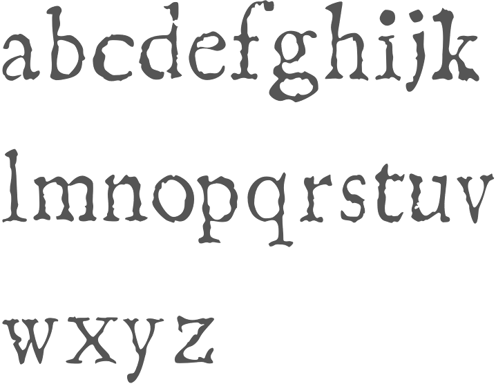
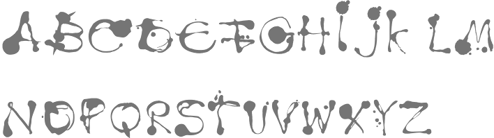
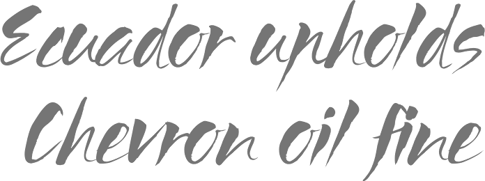
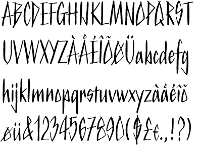
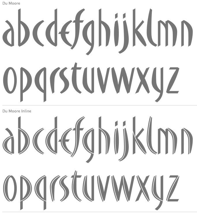
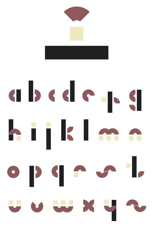
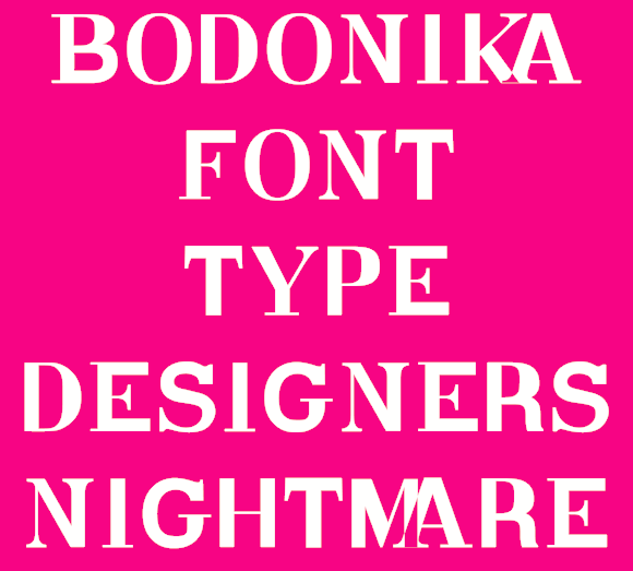
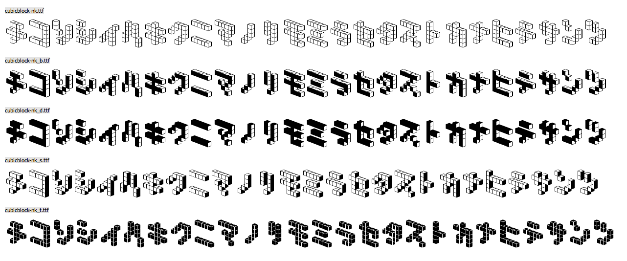
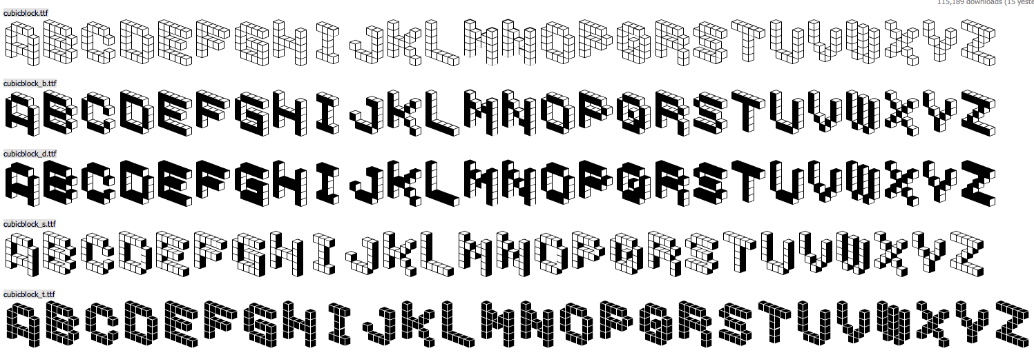
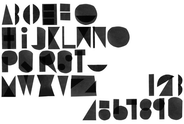
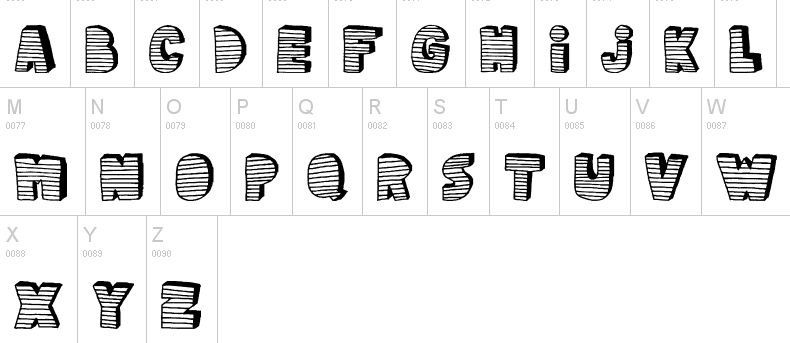
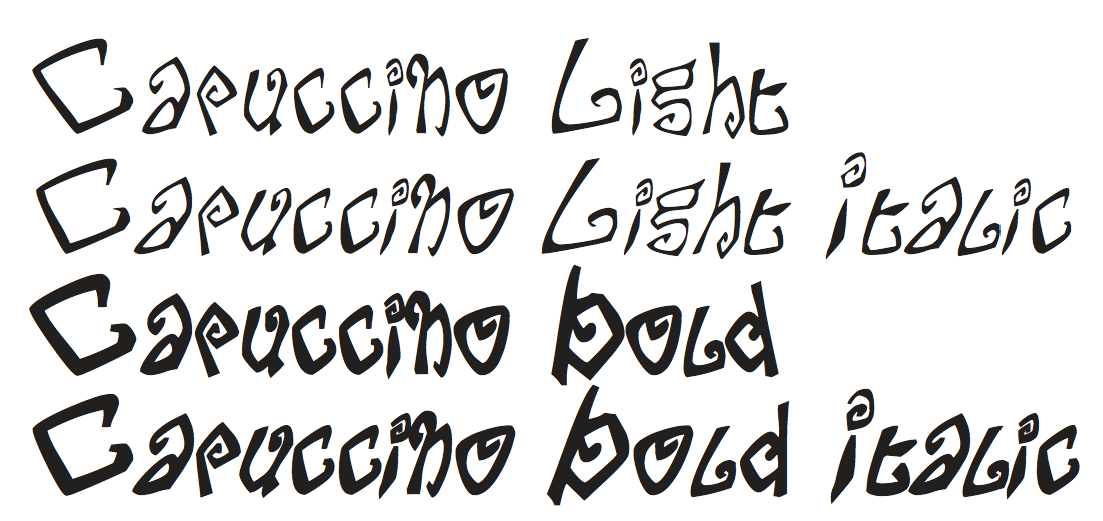
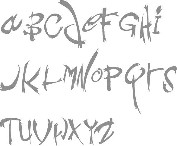
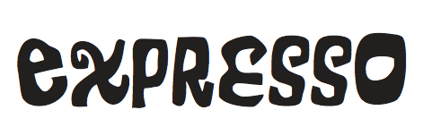
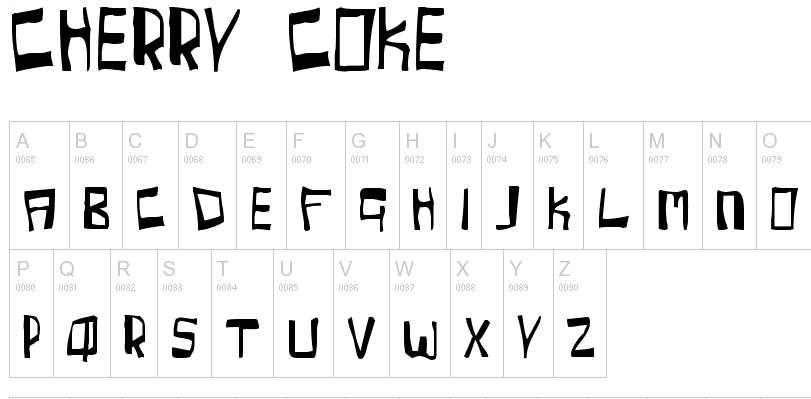
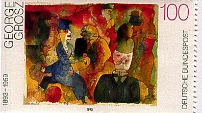
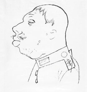
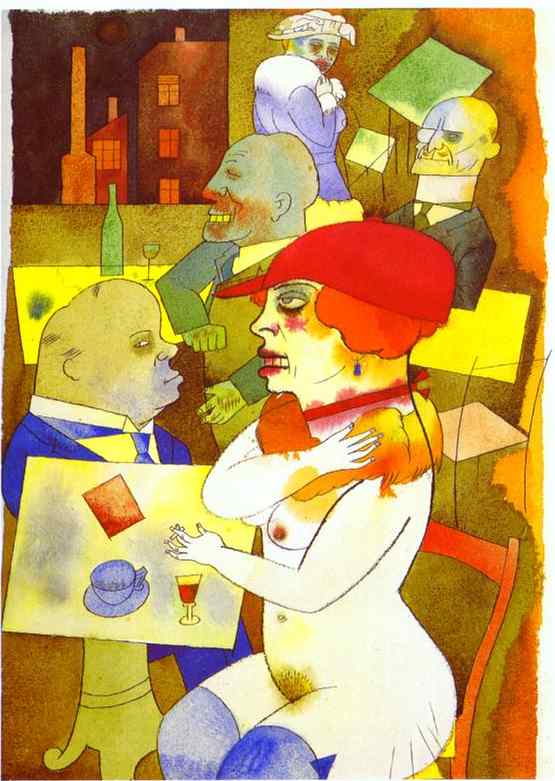
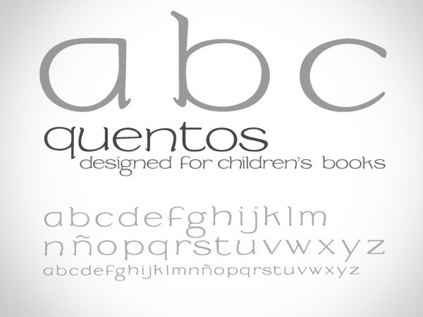
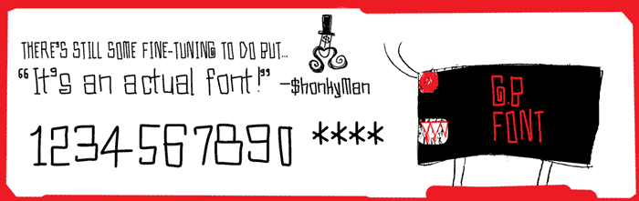
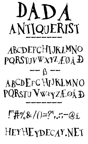
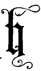
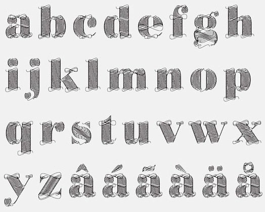
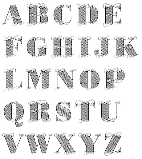
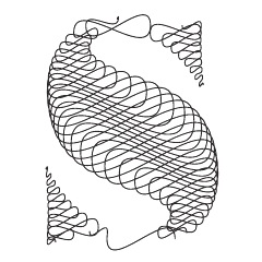
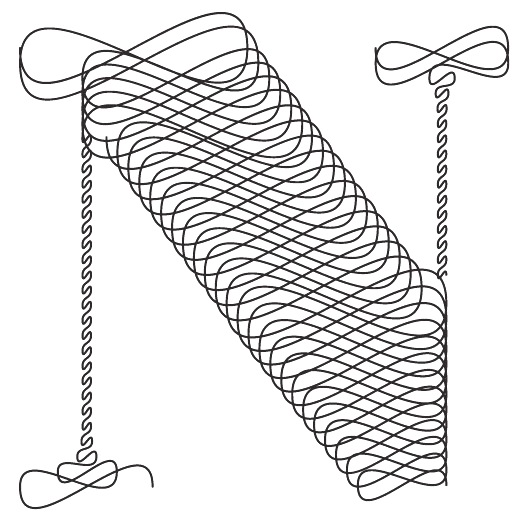
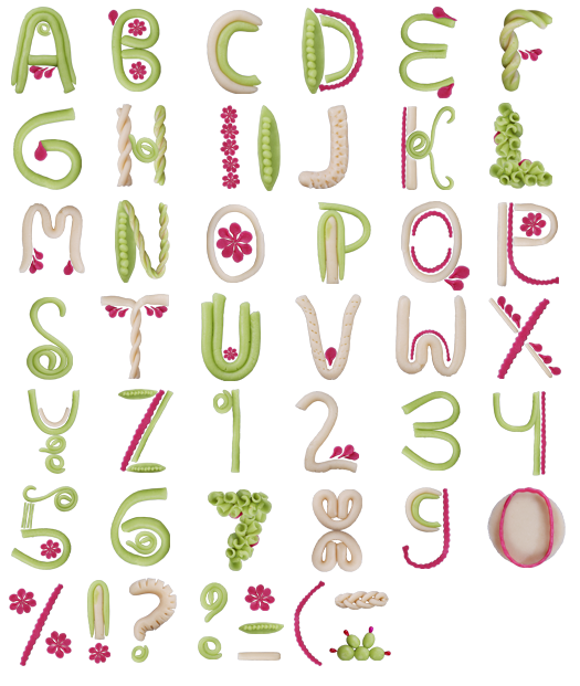
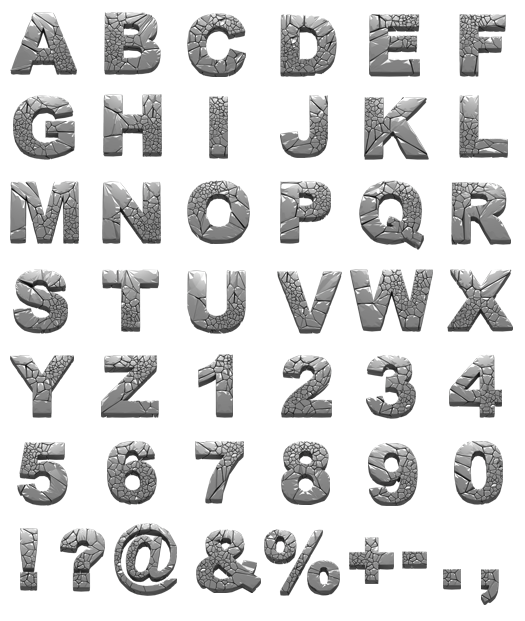
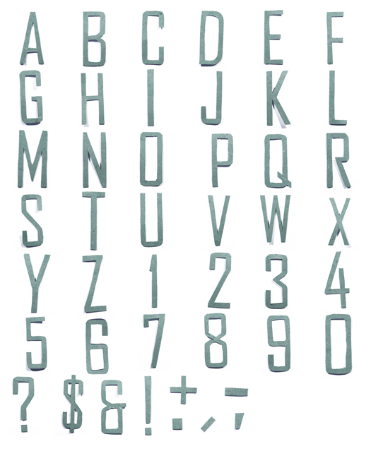
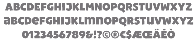
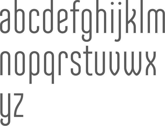
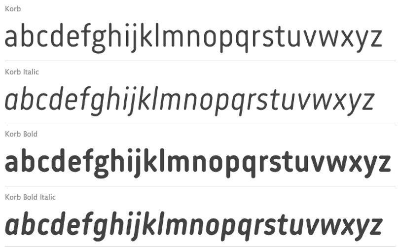
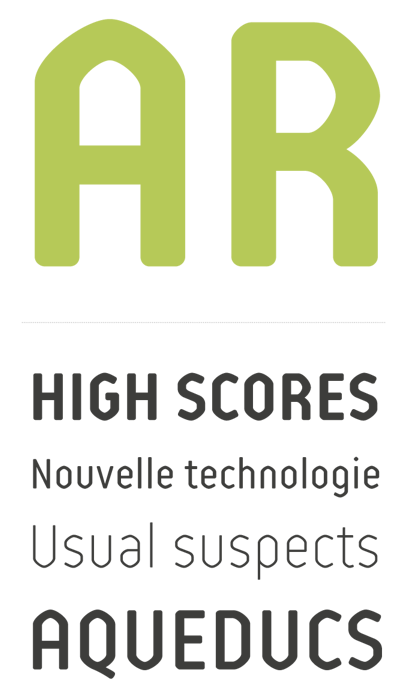
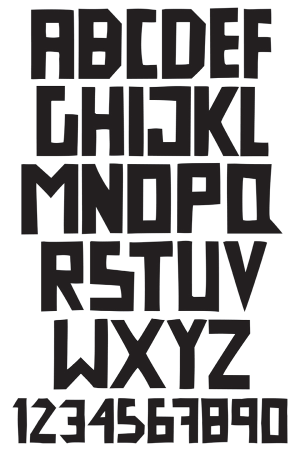
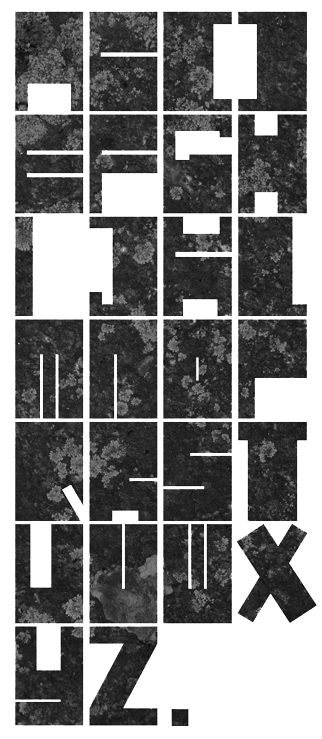
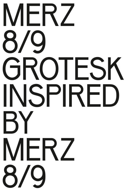
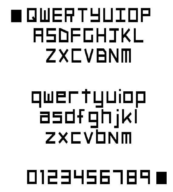
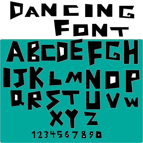
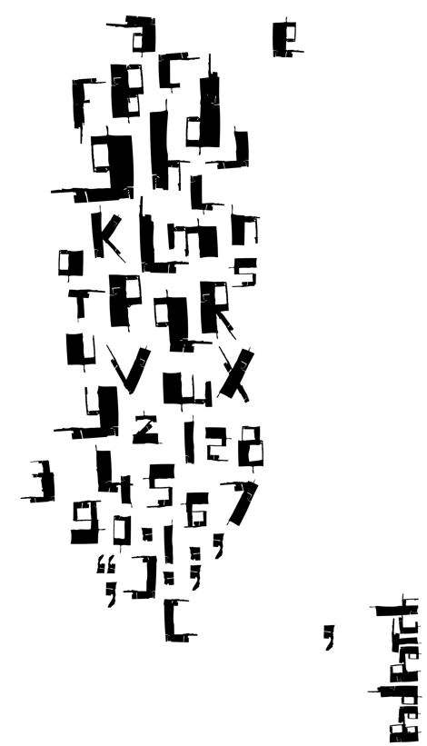
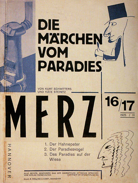
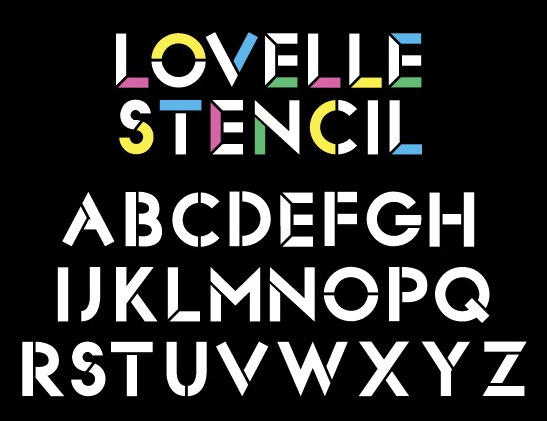
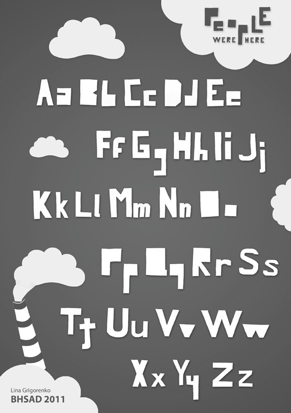
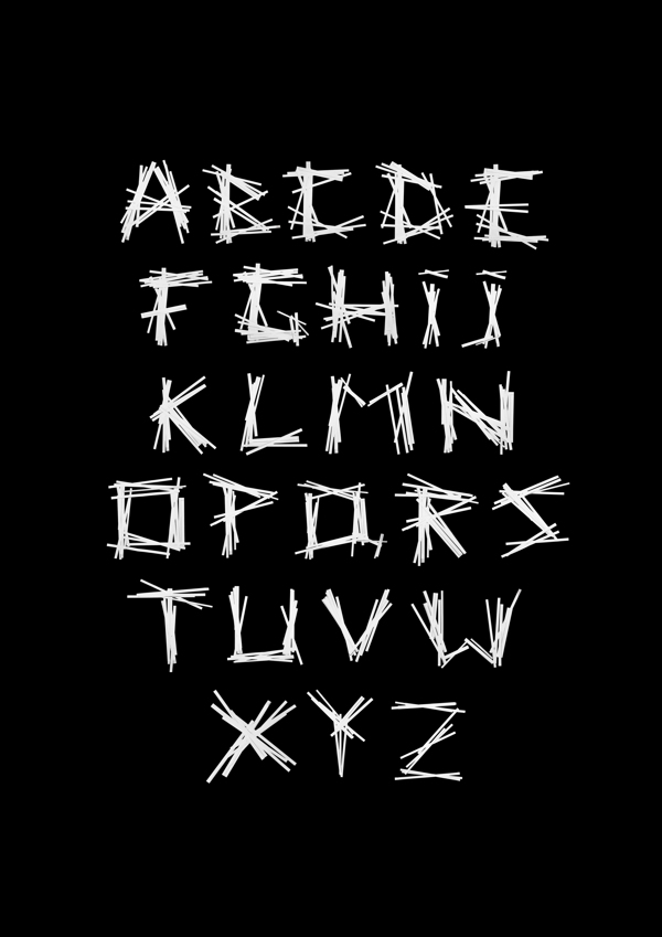
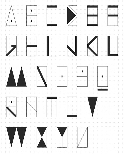
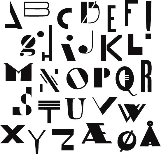
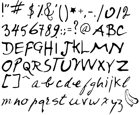
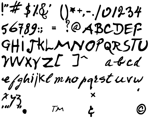
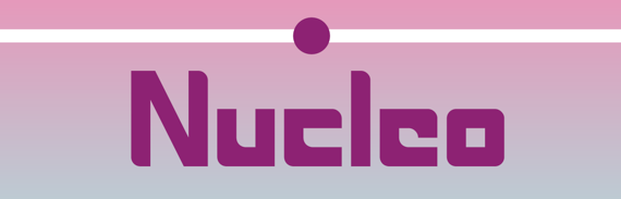
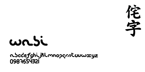
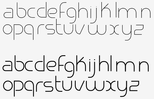
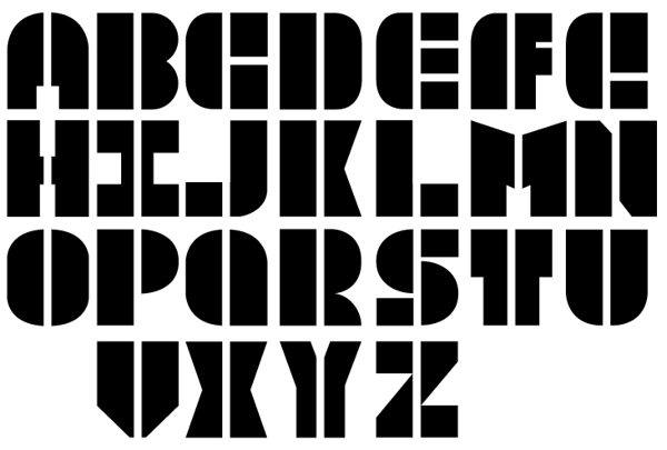
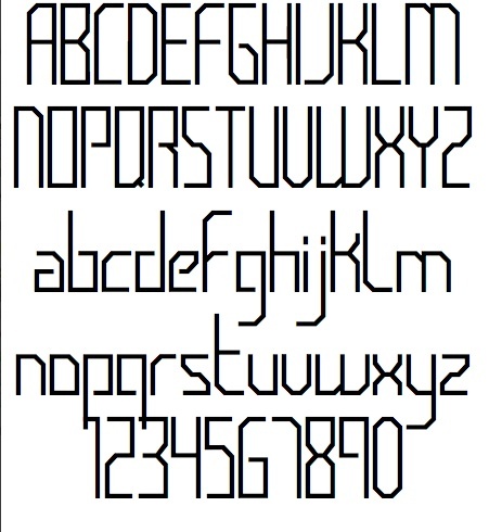
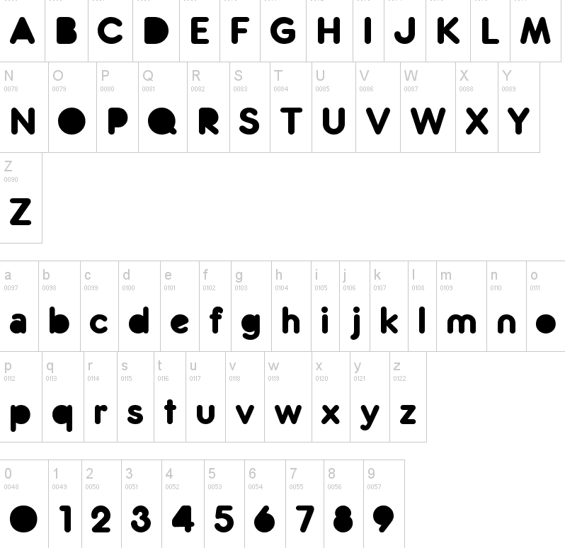
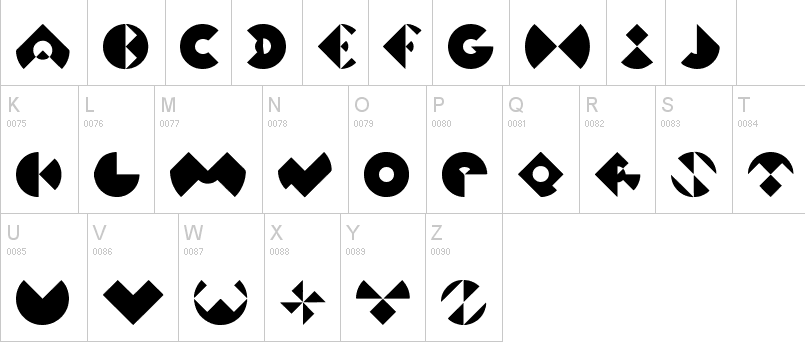
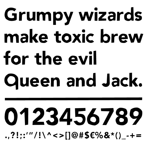
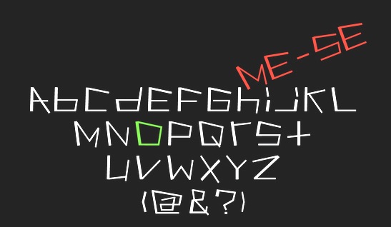
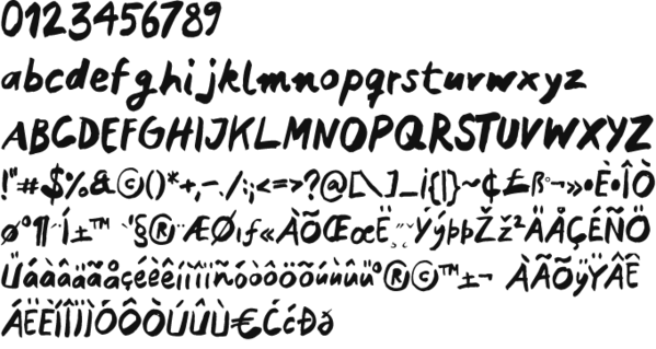
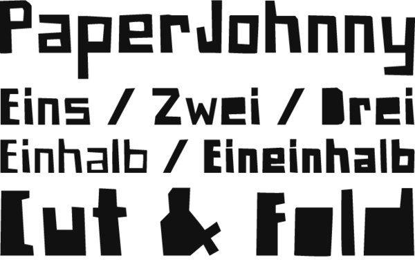
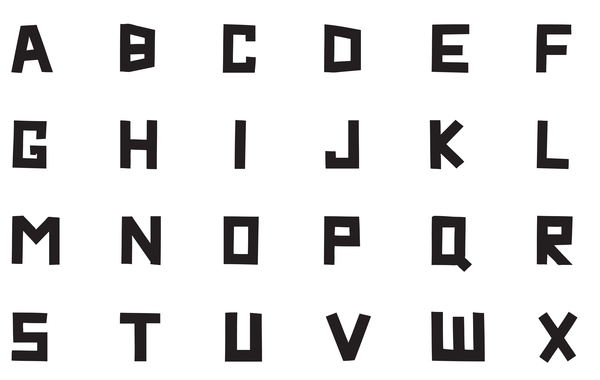
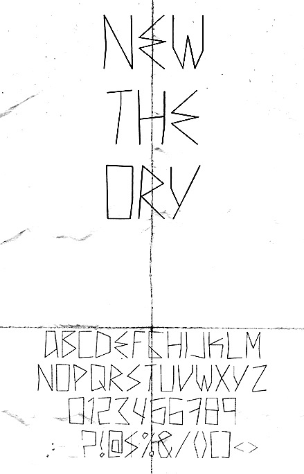
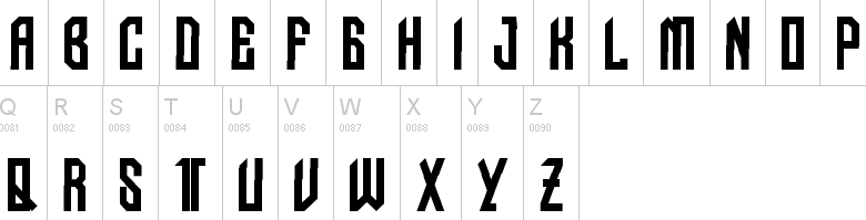
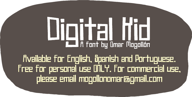
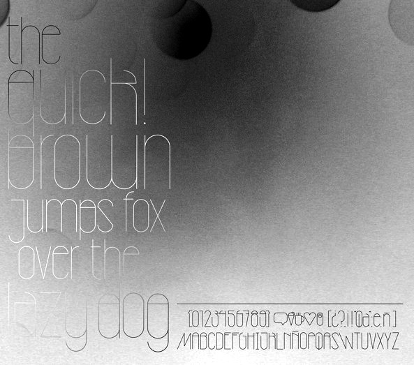
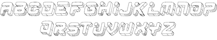
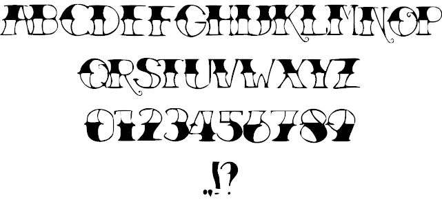
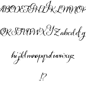
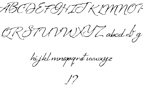
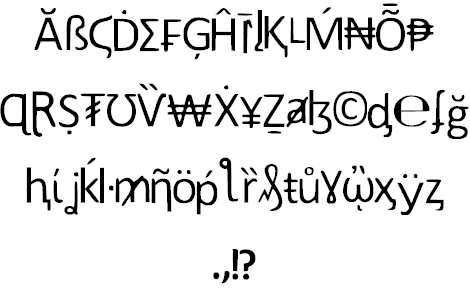
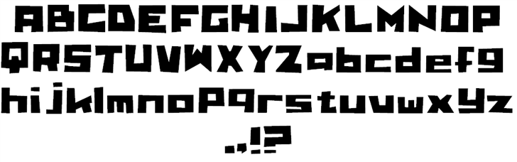
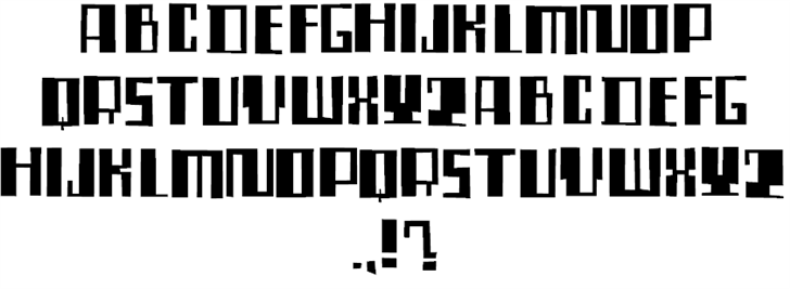
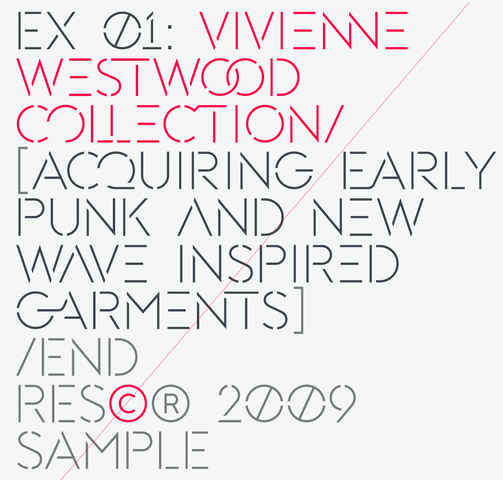
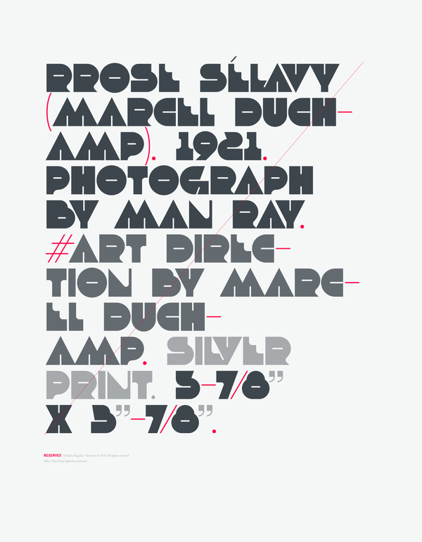
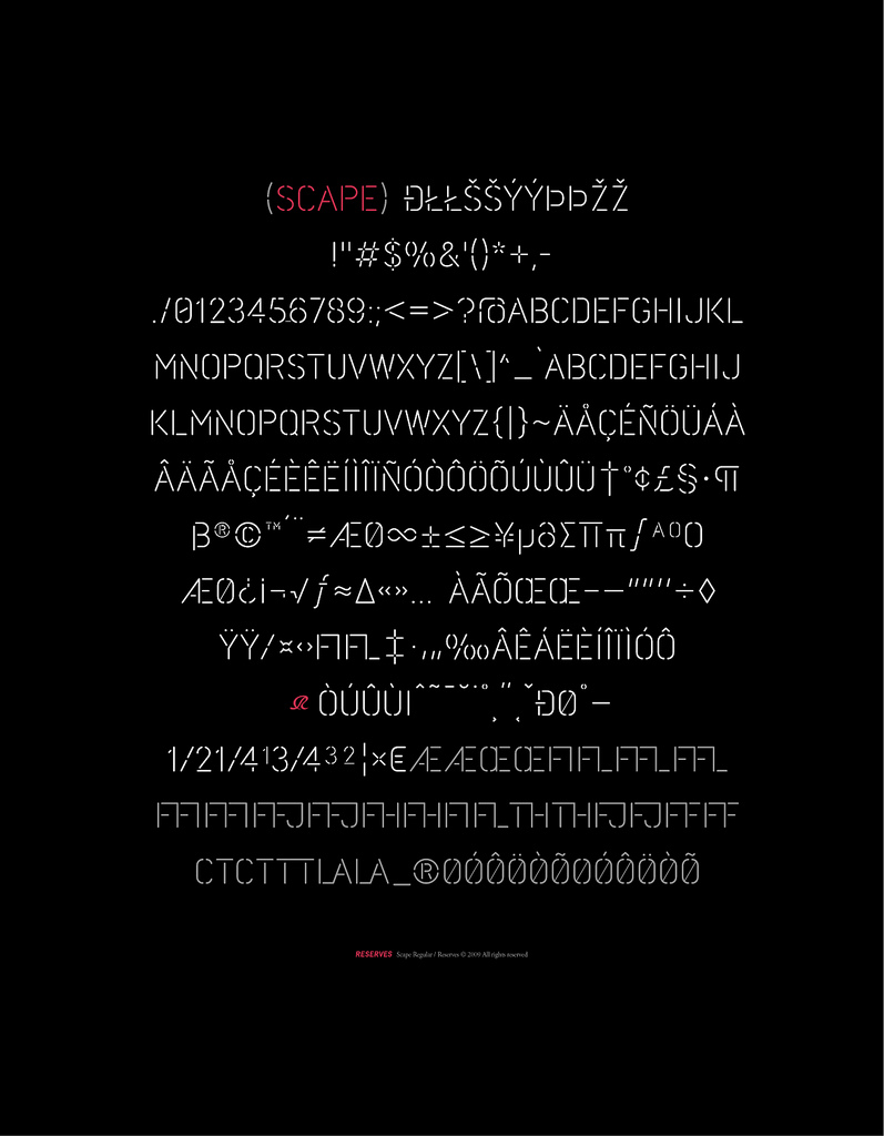
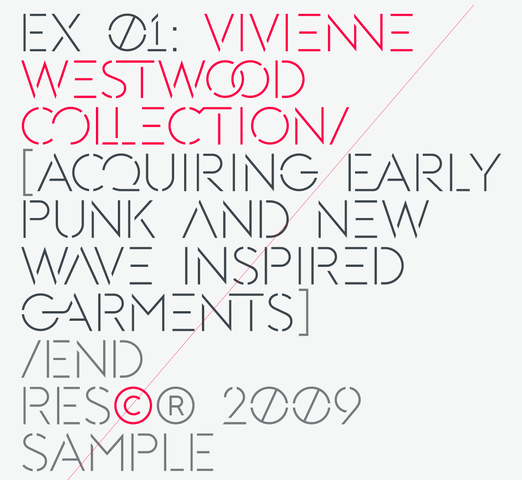
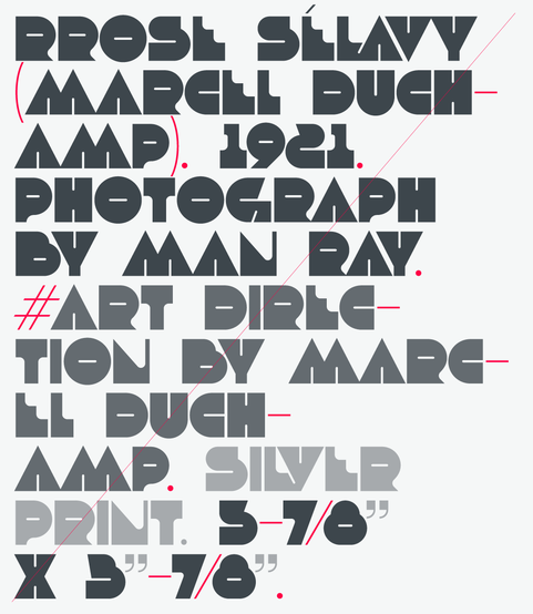
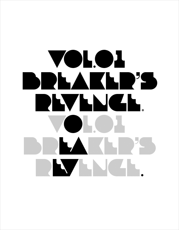
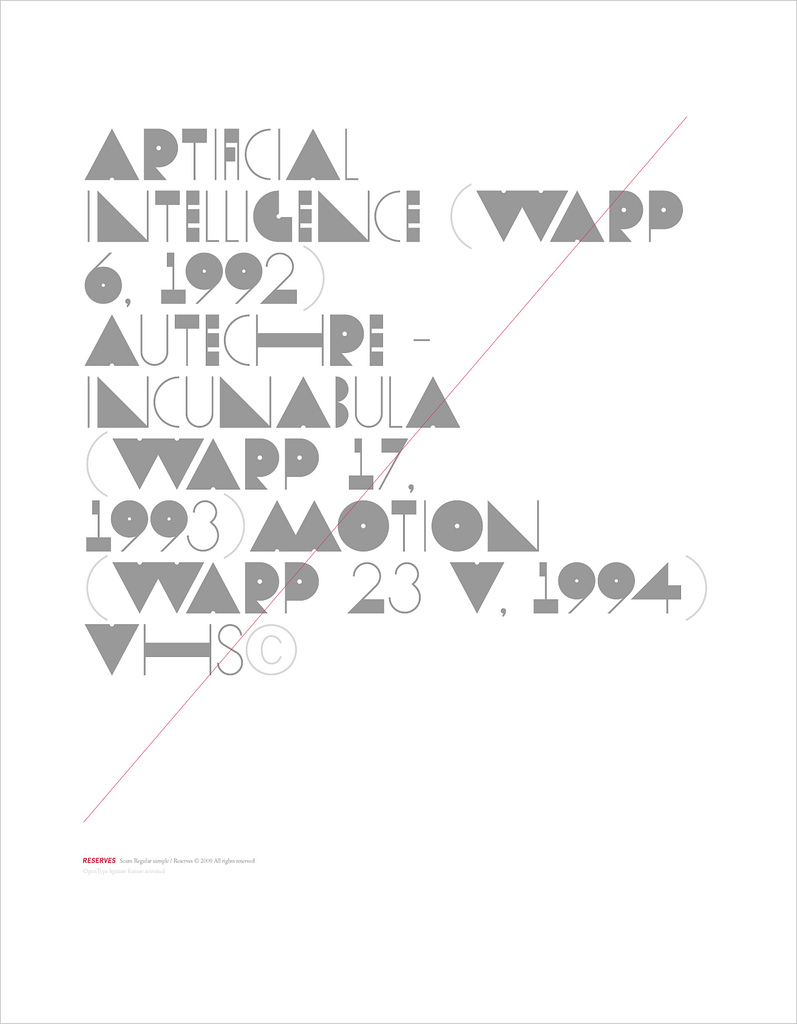
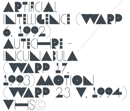
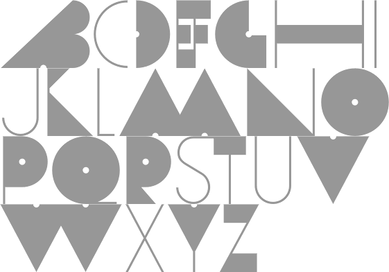
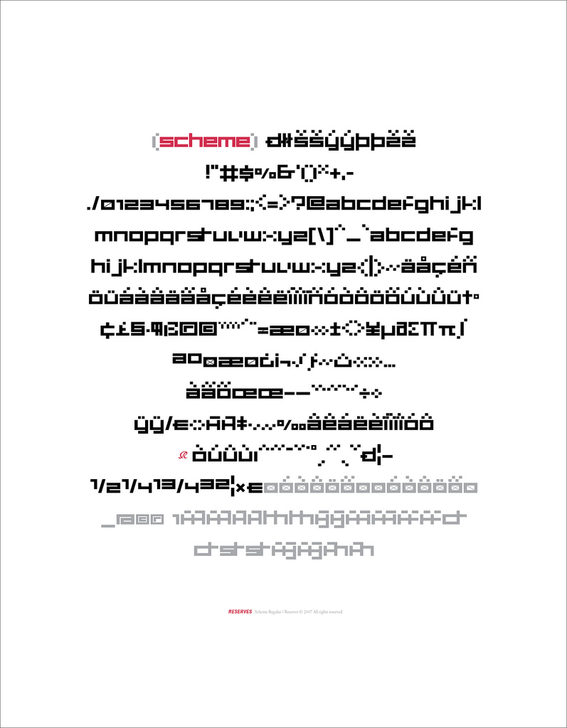
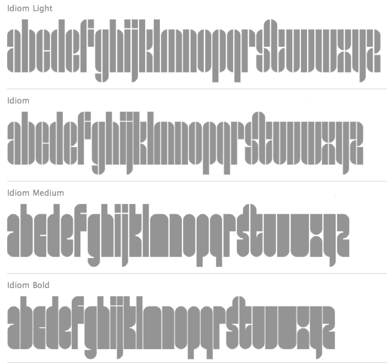
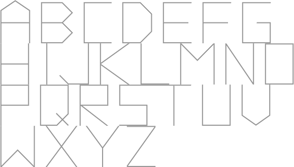
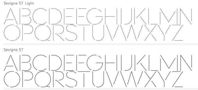
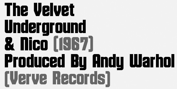
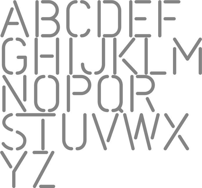
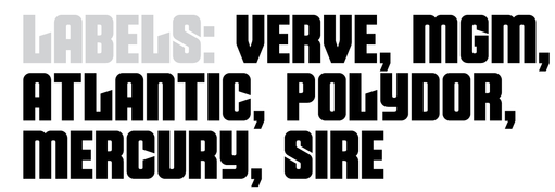
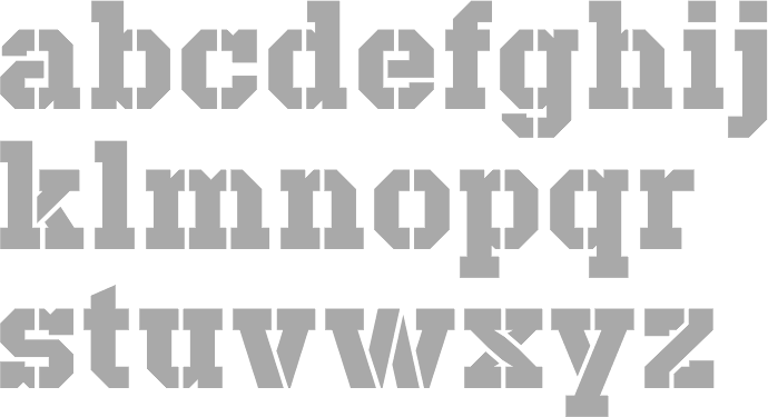
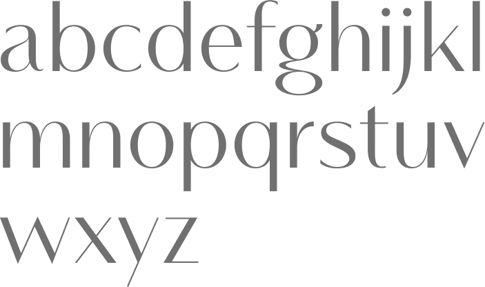
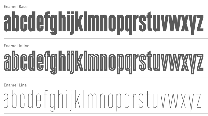
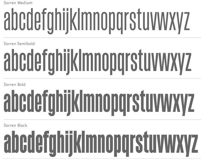
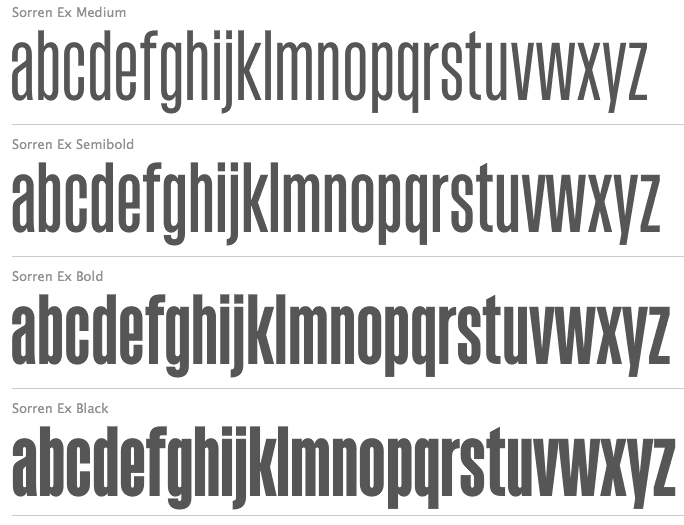
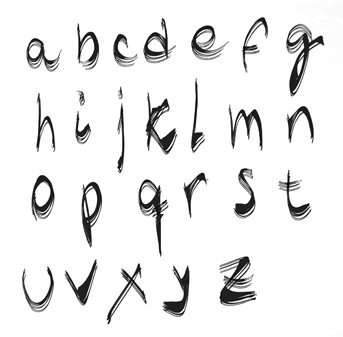
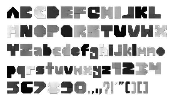
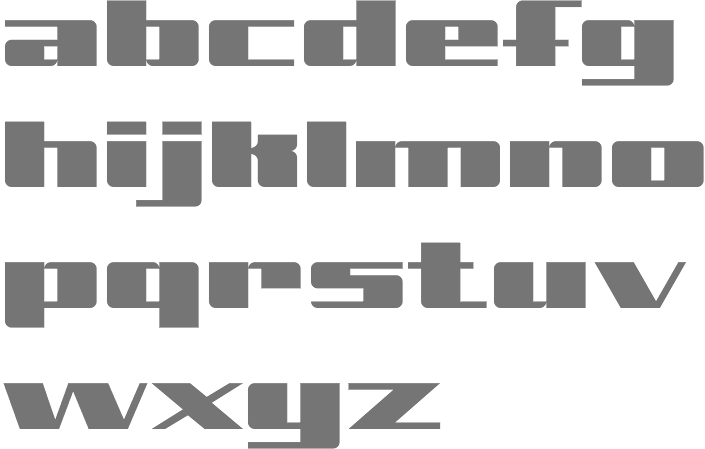
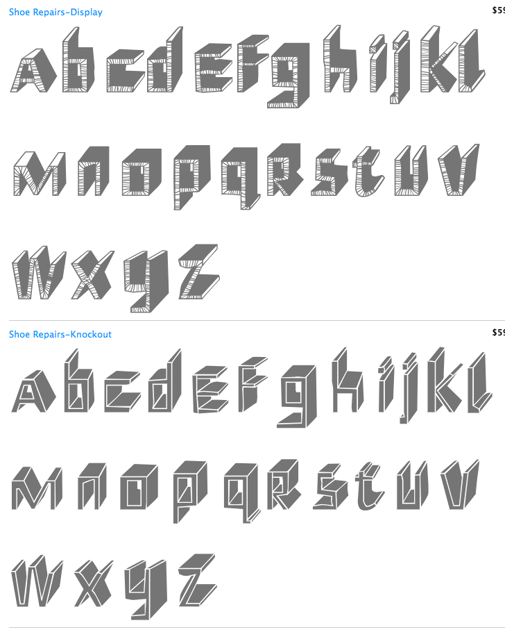
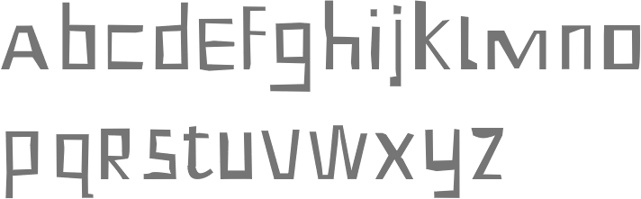
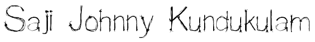
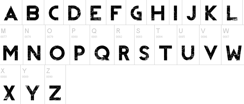
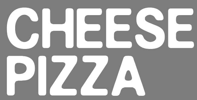
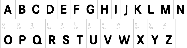
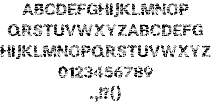
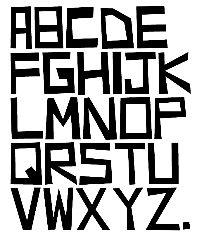
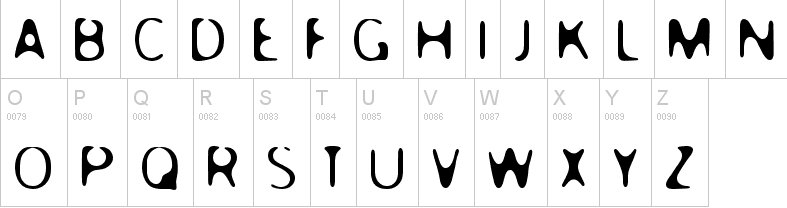
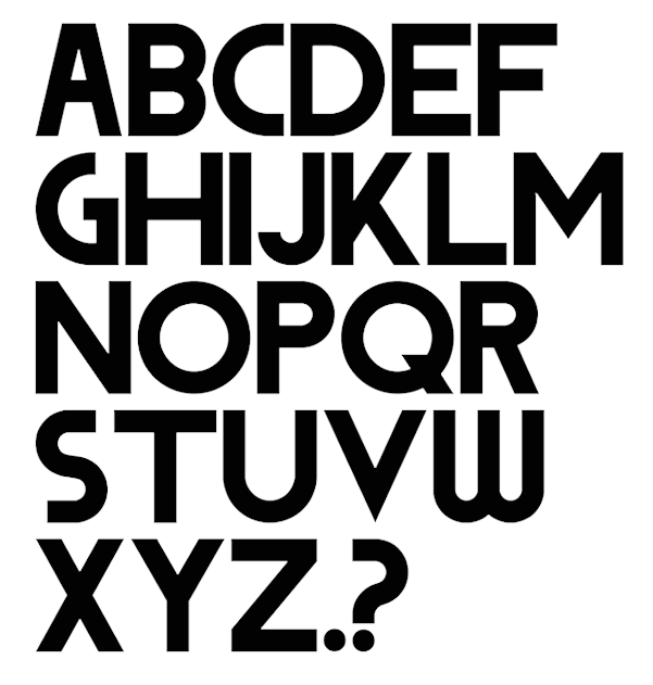
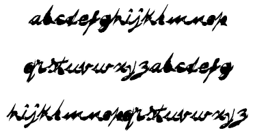
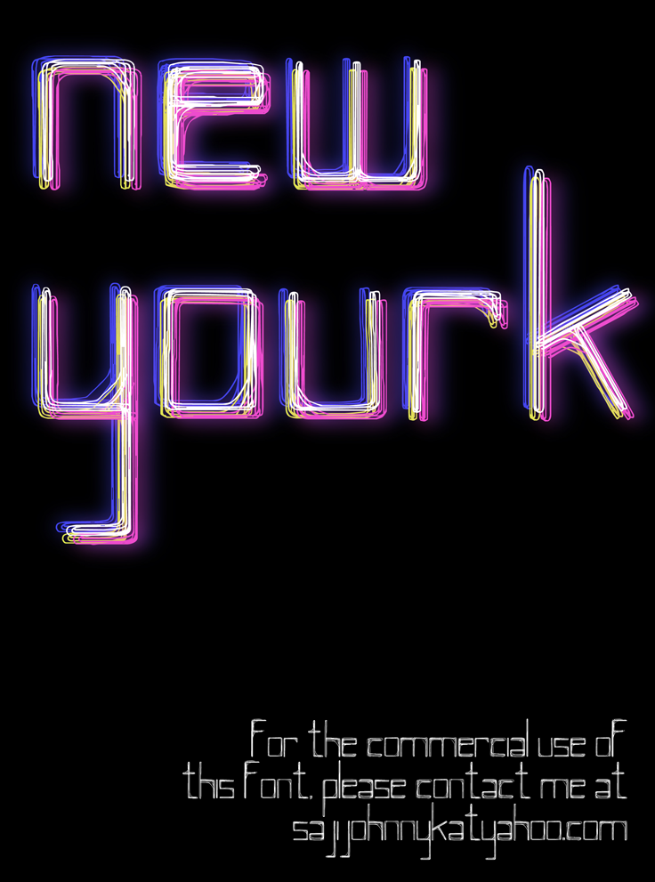
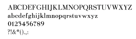
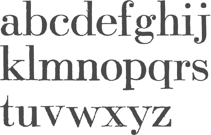
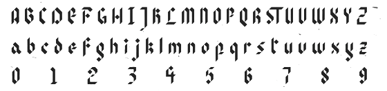
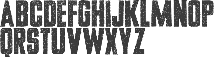
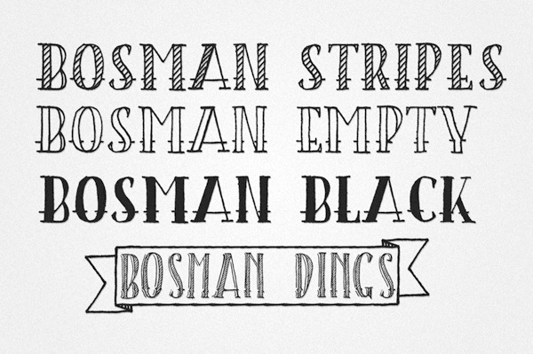
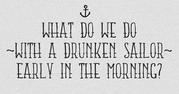
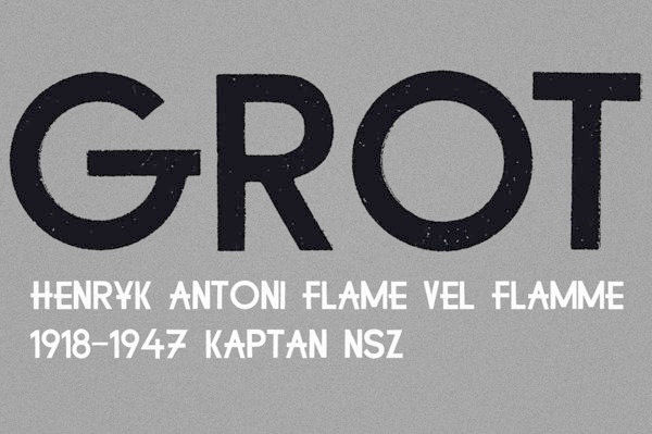
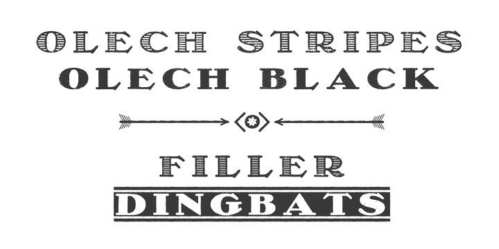
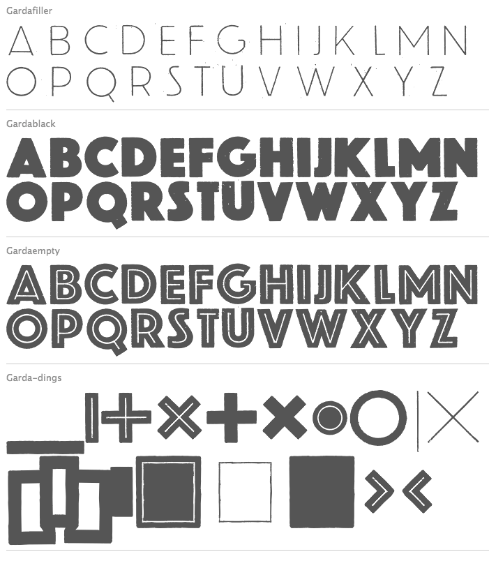
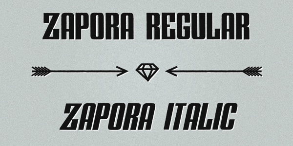
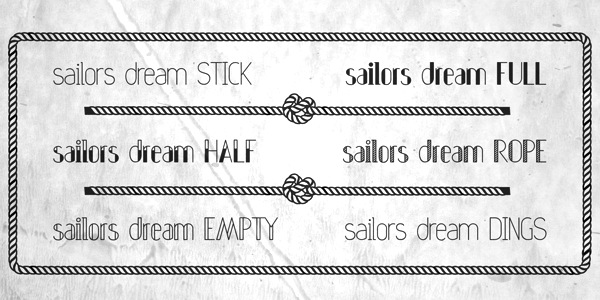
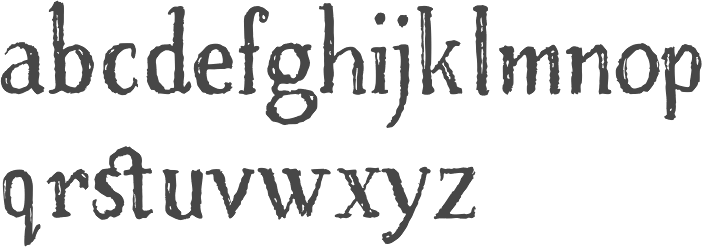
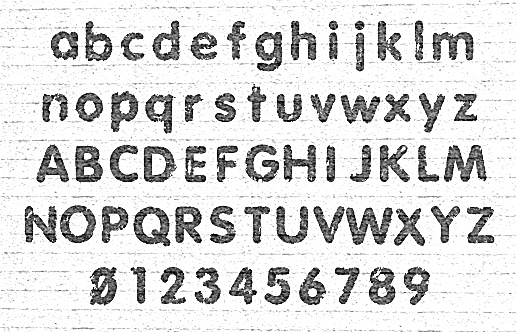
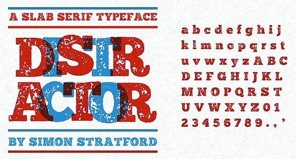
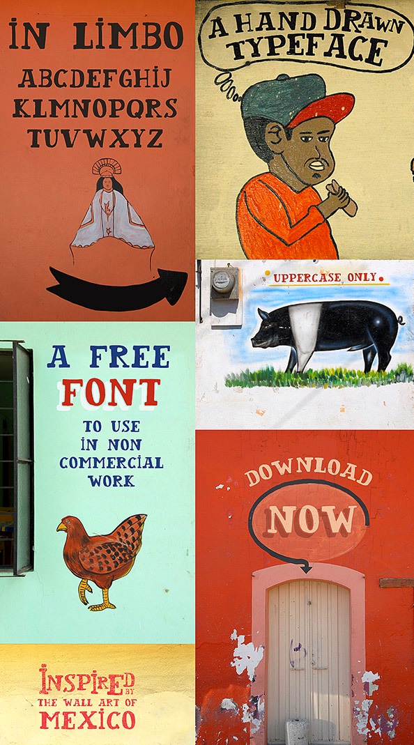
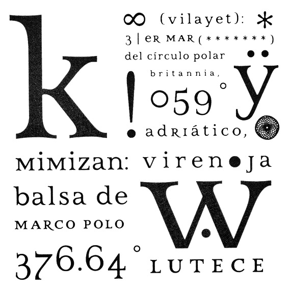
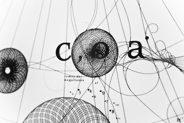
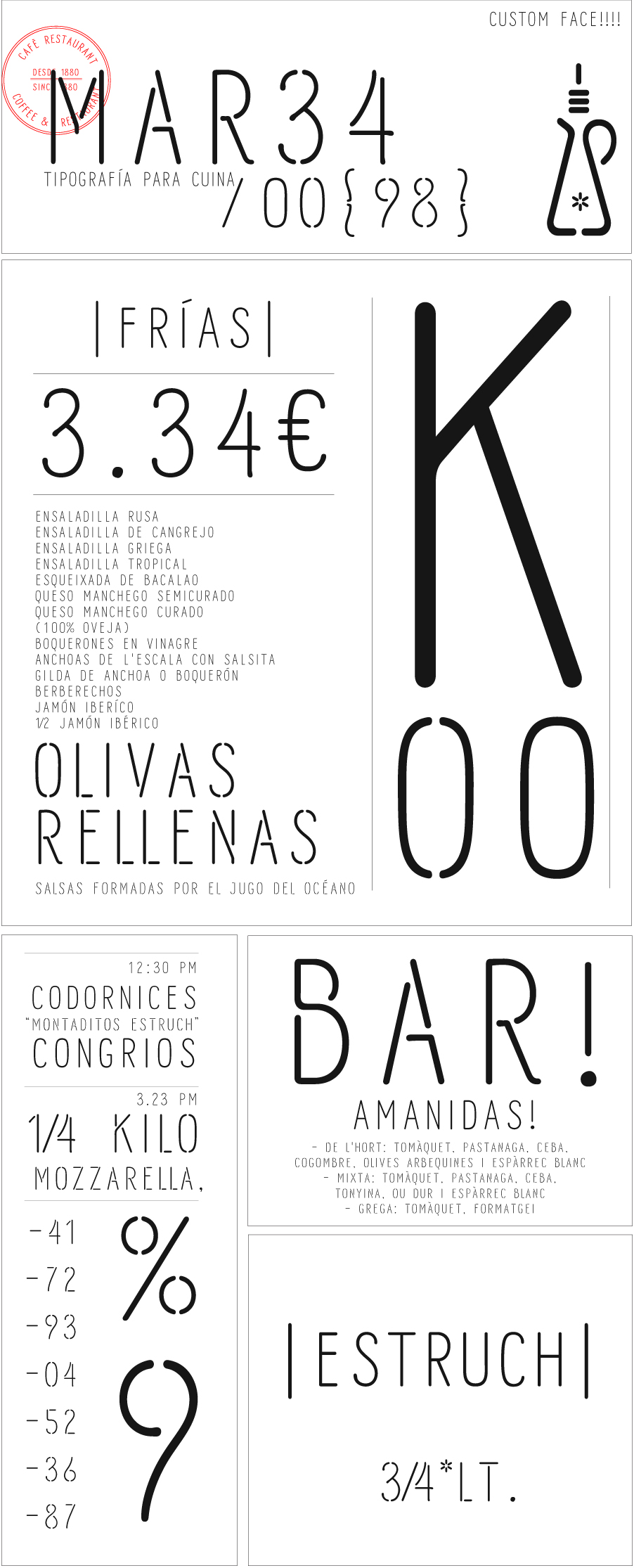
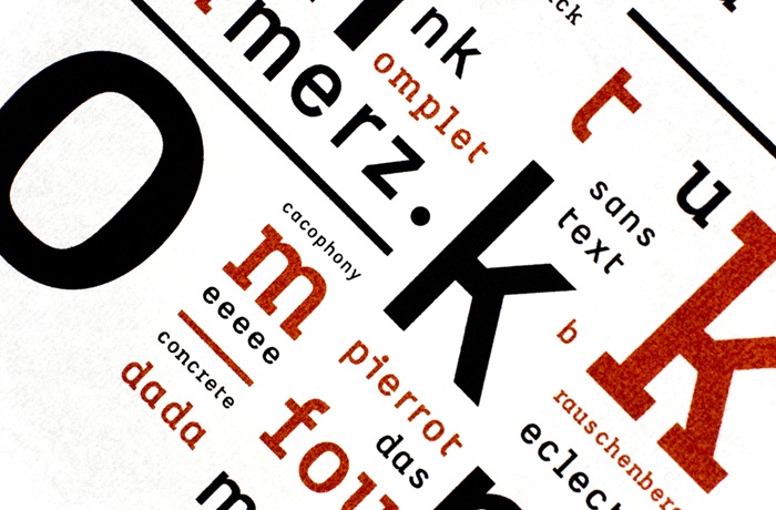
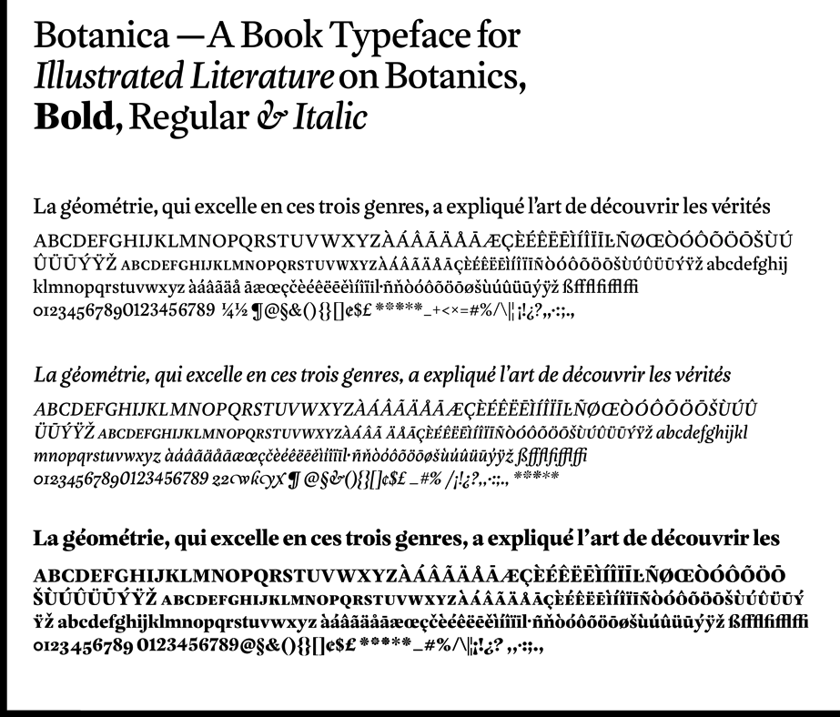
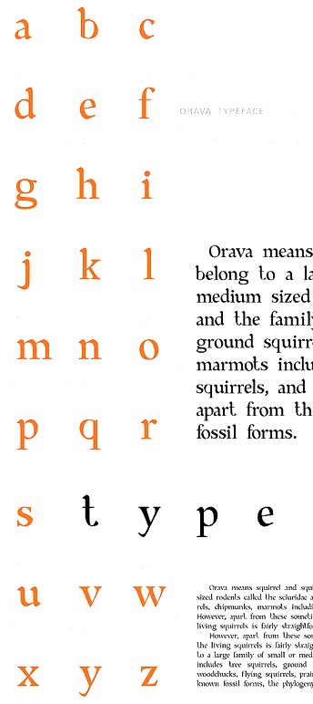
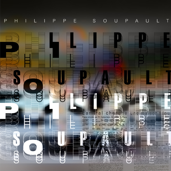
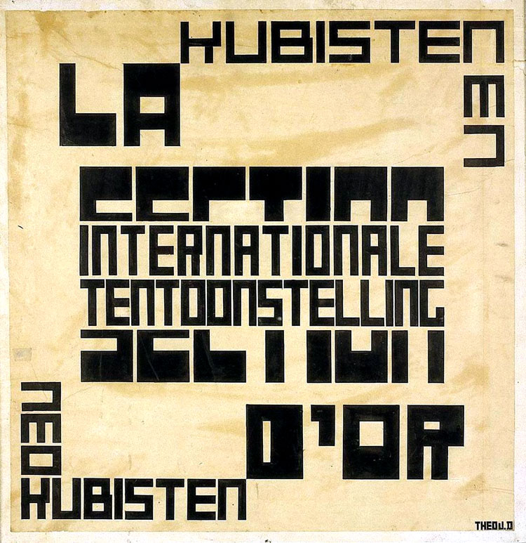
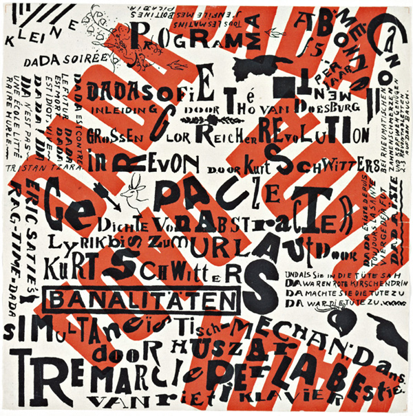
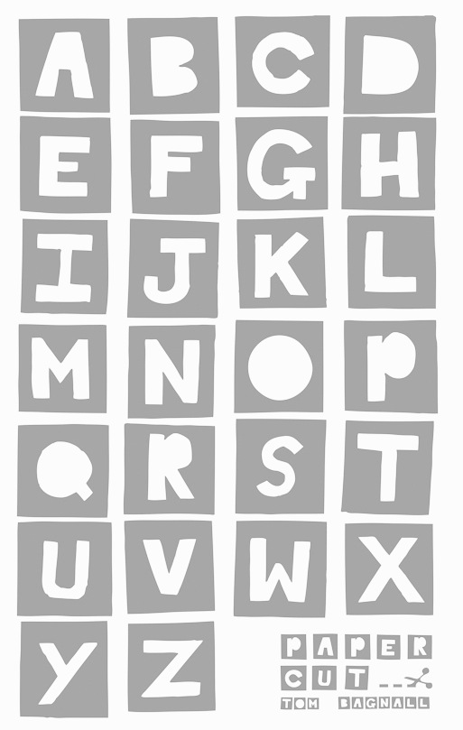
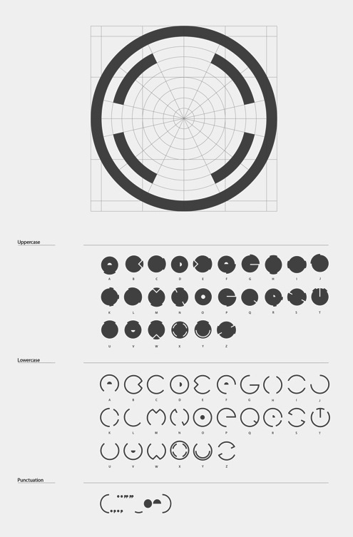
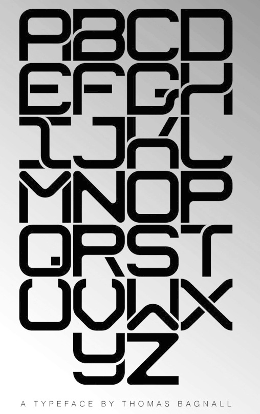
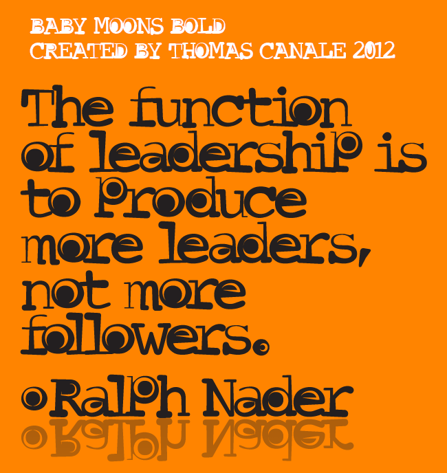
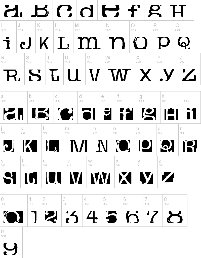
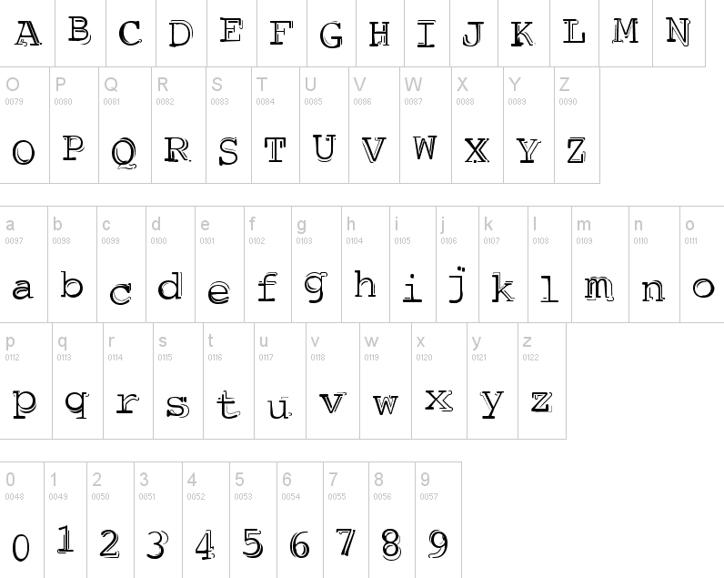
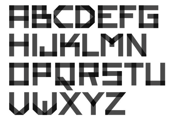
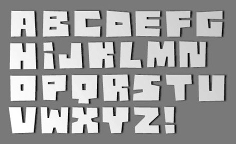
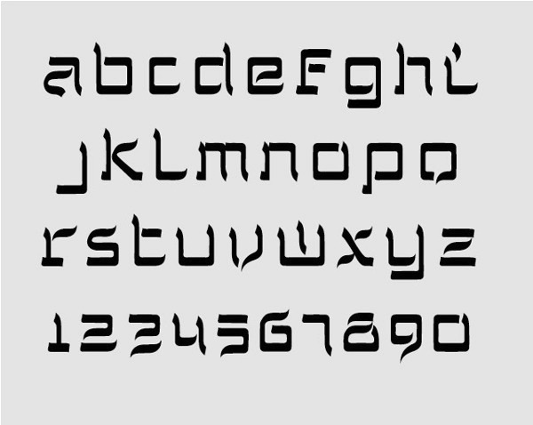
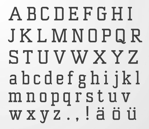
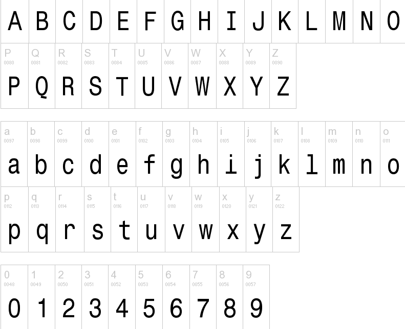
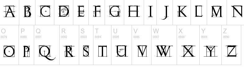
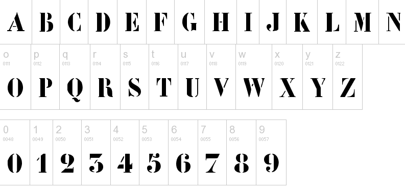
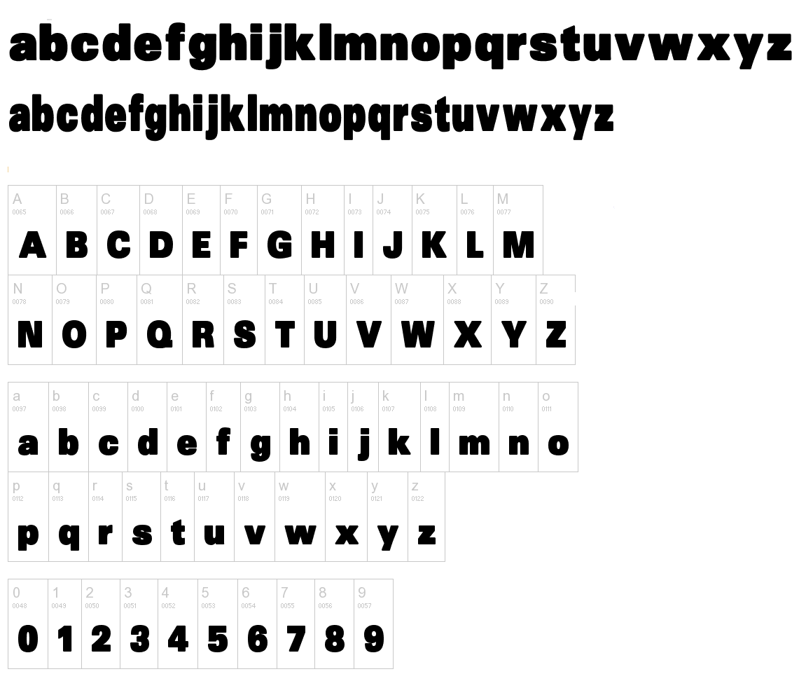
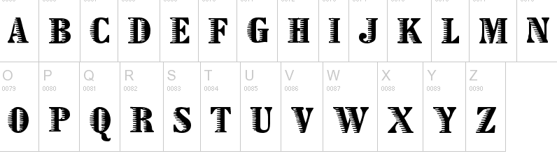
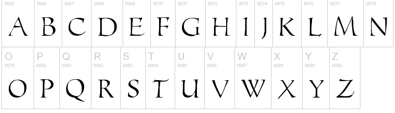
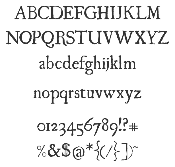
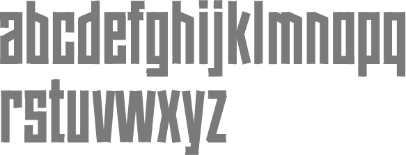
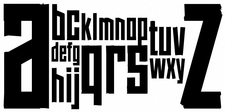
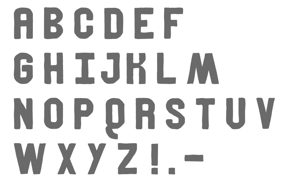
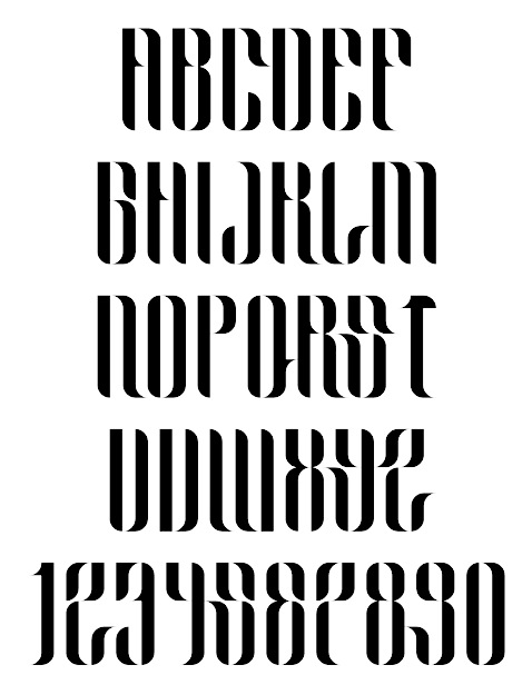
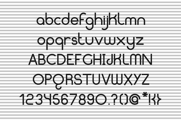
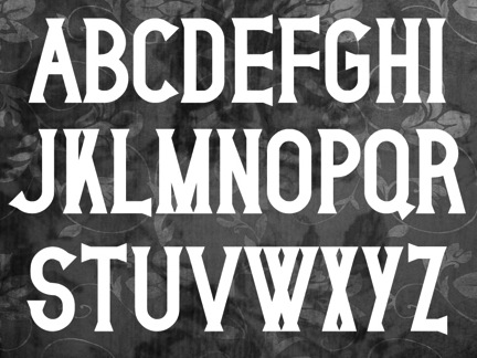
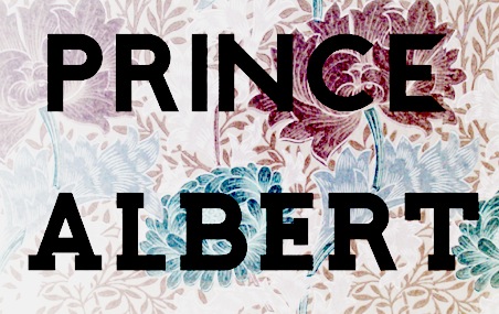
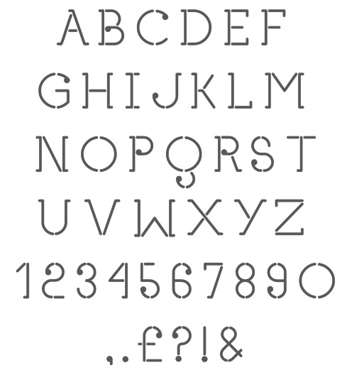
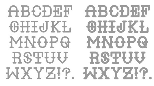
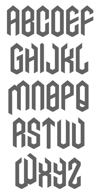
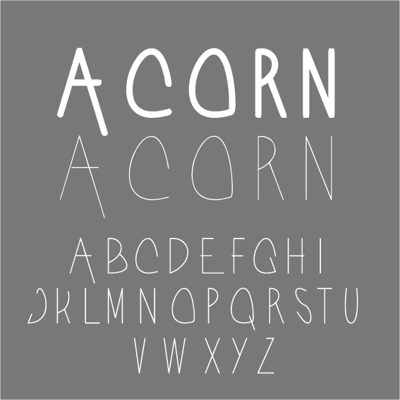
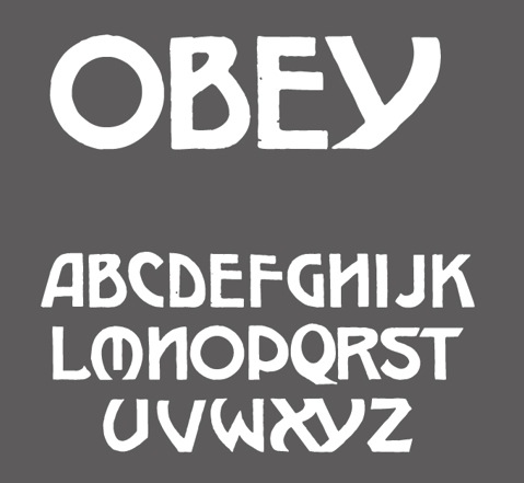
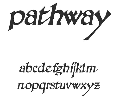
|
|
|
|