| | |
Amit Botre
[Redfonts]
|
[More] ⦿
|
Andreu Balius Planelles
[Garcia Fonts&Co]

|
[MyFonts]
[More] ⦿
|
Andreu Balius Planelles
|
 Born in Barcelona in 1962, Andreu Balius studied Sociology in the Universidad Autonoma de Barcelona (1980-1984), and graphic design at IDEP in Barcelona (1985-1989). He holds a PhD in Design from the University of Southampton (UK). He founded Garcia Fonts&Co in Barcelona in 1993 to show his experimental designs. He cofounded Typerware in 1996 with Joancarles P. Casasín. Typerware existed until 2001 and was based in Santa Maria de Martorelles, a village near Barcelona. He cofounded Type Republic (see also here), and ran Andreu Balius (tipo)graphic design. He is presently an associate professor at Pompeu Fabra University in Barcelona.
 Balius won a Bukvaraz 2001 award for Pradell. Pradell also won an award at the TDC2 Type Directors Club's Type Design Competition 2002. SuperVeloz (codesigned with Alex Trochut) won an award at the TDC2 2005 type competition. At ATypI 2005 in Helsinki, he spoke on Pradell and Super-Veloz. Speaker at ATypI 2006 in Lisbon. At ATypI 2009 in Mexico City, he spoke about the Imprenta Real. Coorganizer of ATypI 2014 in Barcelona. Author of Type at work. The use of Type in Editorial Design, published in English by BIS (Amsterdam, 2003). FontFont link. Linotype link. Behance link. His production: - Garcia/Typerware offers about 50 fonts, including some very artsy typefaces, such as Fabrique (Andreu Balius), Futuda, Garcia Bodoni (Typerware), Alkimia (Estudi Xarop), Ariadna (pixel font, 1988-1989), Garcia Bitmap (1993), Playtext (Andreu Balius, 1995), Matilde Script (Andreu Balius, 1994: an embroidery face), Fabrique (1993, Andreu Balius) and Dinamo (1993, Balius and Casasin at Typerware), Helvetica Fondue (1993-1994), Futuda (1993), Ozo Type (1994), Tiparracus (1994, dingbats), Mi mama Me Soba Script (1994), Parkinson (1994), Garcia Bodoni (1995), Garcia snack's (1993-1995), Juan Castillo Script (1995, irregular handwriting), and Vizente Fuster (1995), all by Andreu Balius and Joancarles Casasin, 1993-1995; Water Knife (Laudelino L.Q., 1995); Alquimia (Estudi Xarop, 1995); Jam Jamie (Malcolm Webb, 1996); Network (Alex Gifreu, 1996); Panxo-Pinxo (David Molins, 1996); Euroface 80 mph (Peter Bilak, 1996); Inmaculatta (Roberto Saenz Maguregui, 1997); Proceso Sans (by Argentinan Pablo Cosgaya, 1996); Afligidos deudos (Adria Gual, 1996); Route 66 (Francesc Vidal, 1997); Popular (Sergi Ibanez, 1997); Visible (handwriting by Fabrice Trovato, 1997); SoundFile (Reto Brunner, 1998); Ninja type (kana-lookalike alphabet by Charly Brown, 1995); Vertigo (Charly Brown, 1996); Loop UltraNormal (Franco and Sven, 1996); Inercia (Inigo Jerez, 1996).
- Fontshop: FF Fontsoup.
- ITC: ITC Temble (1996, a great subdued ghoulish face). With Joancarles P. Casasin, he created ITC Belter (1996) and ITC Belter Mega Outline (1996).
- Typerware: Czeska was developed from Vojtech Preissig's woodtype typefaces. Andreu Balius completed the design and included an italic version and a large variety of ligatures (both for regular and italic).
- Type Republic: Pradell, Trochut, SuperVeloz, SV Marfil Caps (2004), SV Fauno Caps. Pradell was freely inspired from punches cut by catalan punchcutter Eudald Pradell (1721-1788), and is considered to be Balius' main work. Trochut is based on specimens from the 1940s by Joan Trochut. SuperVeloz is a collection of the type modules designed by Joan Trochut and produced at José Iranzo foundry in the beginning of the 40's, in Barcelona. Digitized and recovered by Andreu Balius and Alex Trochut in 2004. Example of such composition of modules include the great art nouveau typefaces SV Fauno Caps and SV Marfil Caps. In 2007, he added Taüll, a blackletter type. Still in 2007, he did the revival Elizabeth ND, which was based on an old type of Elizabeth Friedlander.
- In 2008, he created the Vogue mag like family Carmen (Display, Fiesta, Regular), which are rooted in the didone style. Carmen, and its flirtatious companion Carmen Fiesta, were both reviewed by Typographica.
- Barna (2011) and Barna Stencil (2011).
- In 2012, Trochut was published as a free font family at Google Web Fonts. It was based on Joan Trochut-Blanchard's Bisonte.
- Lladro (2012) is a custom sans typeface done for the Lladro company.
- Rioja (2013) is a grotesque typeface that was custom-designed for Universidad de La Rioja.
[Google]
[MyFonts]
[More] ⦿
|
Antoine Derouineau
[Lafourmi-freelance]
|
[More] ⦿
|
Barrett Reid-Maroney
|
 London, Ontario-based designer of these display typefaces in 2020: Agate, Blake, Briar (wavy, organic), Personify, Allusion (art deco), Allegory (art deco, all caps), Saltford (an industrial octagonal typeface family), Ephemera, Metaphor (a polygonal typeface).
 Typefaces from 2021: Gemini (a condensed and vey stylish display typeface), Kafka (a struggling decorative typeface partly inspired by Wes Anderson's extravagant style), Arras (a dramatic display typeface), Rae (a sharp-edged display typeface), Erga (a display typeface), Kore (a display font). Shop. [Google]
[More] ⦿
|
Carles Closa
|
Barcelona-based graphic designer. Creator of the Baille simulation typeface called Braille (1999, Garcia Fonts), the child's handwriting typeface Loreakop (1995, Garcia Fonts) and the funky display typeface Calypso (1997). Uses the artistic alias Txarly Brown. He also made the Kafkaesque caps typeface Vertigo (1996, Garcia Fonts), the stunning stencil typeface Floridax (1997) and the oriental simulation font NinjaType (1995, Garcia Fonts). [Google]
[More] ⦿
|
Danny Carbury
|
Australian designer of the Kafkaesque typeface Danny Varefella (2008). [Google]
[More] ⦿
|
David Uebel
|
Austrian designer of a few signature / handwriting fonts of famous people. These include Franz Kafka (2009, handwriting; made with Fontcapture) and Hillary (2015, after Hillary Clinton). Home page. Dafont link. [Google]
[More] ⦿
|
Device Fonts
[Rian Hughes]
|
 Rian Hughes studied at the LCP in London before working for an advertising agency, i-D magazine, and a series of record sleeve design companies. Under the name Device he now provides design and illustration for the advertising, entertainment, publishing, and media industries. He works from Richmond, UK, as a comic book artist, letterer and typefounder---his foundry is called Device. He creates mostly display type. List of fonts. Interview. Review by Yves Peters. Monotype Imaging page. Interview by Die Gestalten. Various (overlapping) font listings, still unorganized.
 - Dingbats: Pic_Format, Mastertext Symbols, MacDings, RiansDingbats, Autofont.
- FontFont fonts: Identification (1993), Revolver, Rian's Dingbats, LustaOneSixtySans, Knobcheese, CrashBangWallop, and Outlander.
- [T-26] fonts: English Grotesque (1998), Data90 (2003; a free FontStruct typeface that is virtually identical to Data90 is Bitrate by Kummaeno (2010)), Flak Heavy (2003, stencil), Flak (2003, stencil), Freeman (2003), Klaxon (2003, kitchen tile font), Cordite, Substation (2003), September (2003), West Way (2003), Egret (2003), Paralucent Complete (2003), Paralucent Condensed, Paralucent Stencil (2003), Mercano Empire (2003), Iconics (2003), Cantaloupe (2003), Gravel (2003), Acton (blocky screen font, 2002), Ainsdale, Amorpheus, Anytime Now (alarm dingbats), Bingo, Blackcurrant (Blackcurrant Cameo (1997) is free), Bordello, Elektron, Haulage (U-Haul lettering, 2002), WexfordOakley, Telecast, Terrazzo, Transit, Untitled, Scrotnig, Skylab (2002), Silesia (1993), SlackCasual, Ritafurey, Reasonist-Medium, Regulator, GameOver, Novak, Quagmire, PicFormat, Jakita Wide (2000, techno font), Metropol-Noir, Motorcity, Mastertext, Mystique (2002), MacDings, Lusta, Laydeez, Sinclair, Paralucent (sans serif), Judgement, Bullroller, Zinger (a fifties font), Citrus (2002), Popgod (2003), Range (2000, a futuristic font), Hounslow, Jemima, Griffin, GranTurismo, Gargoyle, Foonky, DoomPlatoon, Darkside ("remixed" by FontStructor Kummaeno in his Ubangi (2011)), Kallisto (2010), Kallisto Lined (2010), Cyberdelic, Contour, and the very original Stadia Outline family (Stadia is a kitchen tile font).
- List of all fonts by Rian Hughes, as of 2004: Acton, Ainsdale, Amorpheus, Anytime Now, Bingo, Blackcurrant, Bordello, Bull Roller, Chascarillo, Contour, Cottingley (1992), FF CrashBangWallop, Cyberdelic, Darkside, Data90, Doom Platoon (1996), Elektron, English Grotesque, Flak, Foonky, Freeman, Game Over, Gargoyle, Gran Turismo, Griffin, Haulage, Hounslow, Iconics, FF Identification, Jakita, Jemima, Judgement, FF Knobcheese, Laydeez Nite, Lusta (big family), Mac Dings, Mastertext, Men Swear, Metropol Noir, Motorcity, Mystique, Novak, FF Outlander, Paralucent, Pic Format, Platinum, Quagmire, Range, Reasonist, Register (A and B), Regulator, FF Revolver, FF Rian's Dingbats, Ritafurey, Scrotnig, September, Silesia, Sinclair, Skylab, Slack Casual, Space Cadet, Stadia, Substation, Telecast, Terrazzo, Transmat, Untitled One, Vertex, Westway, Wexford Oakley, Why Two Kay, Zinger.
- At Veer, in 2005, these Device fonts were published: Gentry, Gridlocker, Valise Montreal, Custard, Box Office (moviemaking letters), Sparrowhawk, Monitor, Moonstone, Miserichordia, Yolanda (a great playful medieval text typeface in three styles: Duchess, Princess, Countess), Gusto, Dauphine, Rogue, Ritafurey, Dynasty, Radiogram, Xenotype, Roadkill (grunge), Payload (stencil family comprising Regular, Outline, Spraycan, Narrow, Narrow Outline, Wide, Wide Outline), Catseye, Electrasonic, Absinthe (psychedelic style), Straker, and Chantal (brush).
- In 2006, Veer added these: Profumo, Ironbridge, Cheapside, Battery Park (grunge), Forge, Shenzhen Industrial, Hawksmoor (grunge), Coldharbour Gothic, Wormwood Gothic (grunge), Chase (grunge), Diecast, Roadkill Heavy, Tinderbox (fuzzy blackletter), Dazzle (multiline face), Nightclubber (art deco), Klickclack (2005, comic book or cartoon caper typeface), Vanilla (art deco), Wear it's at (grunge), Diecast, Drexler, Box Office (movie icon font).
- Fonts from 2007: DF Conselheiro (2007, grunge), DF Glitterati (2007), Indy Italic (script), DF Apocrypha (2006, rough outline), DF Quartertone (2007), DF Lagos (2007, rough stencil), DF Pulp Action, DF Reliquary #17 (2006, grunge didone), DF Dukane (2007, octagonal grunge), DF Strand (2007, striped stencil), DF Rocketship from Infinity (2006, futuristic), DF Appointment with Danger (2006), DF Las Perdidas (2006, grunge stencil), DF Kelly Twenty (2007, grunge stencil), DF Heretic, DF Roadkill, DF Ironbridge, DF Forge, DF Shenzhen Industrial, DF Hawksmoor, DF Cheapside, DF Battery Park, DF Saintbride, DF Profumo, DF Coldharbour Gothic, DF Wormwood Gothic, DF Tinderbox, DF Flickclack, DF Vanilla (multiline art deco face), DF Chase, DF Nighclubber (art deco jazz club face), DF Diecast, DF Dazzla, DF Zond Diktat (grunge), DF Yellow Perforated, DF Mulgrave (grunge), DF Ministry B, DF Ministry A (with a hairline weight), DF Gridlocker, DF Gentry, DF Valise Montréal (grunge), DF Custard, DF Box Office, DF Roadkill, DF Payload Wide, DF Payload Narrow, DF Catseye Narrow, DF Catseye, DF Yolanda, DF Xenotype, DF Telstar, DF Straker, DF Sparrowhawk, DF Rogue Serif, DF Rogue Sans Extended, DF Rogue Sans Condensed, DF Rogue Sans, DF Ritafurey B, DF Ritafurey A, DF Radiogram, DF Pitshanger, DF Payload (stencil), DF Outlander Nova, DF Moonstone, DF Monitor, DF Miserichordia, DF Interceptor, DF Gusto, DF Glitterati, DF Galicia (2004), DF Galaxie, DF Electrasonic, DF Dynasty B, DF Dynasty A, DF Drexler, DF Dauphine, DF Chantal, DF Absinthe, DF Register Wide B, DF Register Wide A, DF Register B, DF Register A, DF Quagmire B, DF Cordoba (2007, grunge), Mellotron (2004, stencil), Seabright Monument (2007), Charger (2007, grunge).
- T-26 releases in 2007: Klickclack, Hawksmoor (grunge), Heretic, Ironbridge (old letter simulation), Battery Park (grunge), Chase (grunge), Cheapside (grunge), Dazzle (multiline art deco), Diecast (grunge), and Forge (grunge).
- T-26 releases in 2008: Automoto (fat multiline deco face), Straker (organic). Also from 2008: Mission Sinister (grunge), Gonzalez (grunge).
- FontBros release in 2009: Filmotype Modern. Other Filmotype series fonts include Filmotype Miner (2012), Filmotype Manchester (2012), Filmotype Meredith (2012), Filmotype Marlette (2012), Filmotype Mansfield (2012), Filmotype Power (2012) and Filmotype Major (2012: this is based on a typeface used as the titling font for the popular children's book by Dr. Seuss entitled One Fish Two Fish Red Fish Blue Fish, 1960). Other 2009 fonts: Degradation (grunge).
- Creations in 2010: Pod (2010, fat round stencil), Korolev (2010, a 20-style monoline sans family based on communist propaganda from 1937), DF Agent of the Uncanny (2010, brush face), DF Destination Unknown (2010, Kafkaesque brush), DF Maraschino Black (a sleek, sophisticated high-contrast swash capital font).
- Creations in 2011: DF Capitol Skyline, DF Capitol Skyline Underline and DF Capitol Skyline Capitals (a multi-weight all-caps pair that epitomizes Streamline Moderne), DF Korolev (a 20-weight sans serif family based on lettering by an anonymous Soviet graphic designer who did the propaganda displays at the Communist Red Square parade in 1937. Named in honor of Sergey Pavlovich Korolyov, or Korolev, considered to be the father of practical astronomics). In 2018, Korolev was expanded to Korolev Rounded and Korolev Rough.
- Typefaces from 2012: Ember (informal script), Kane (based on the Batman logo), Glimmer Glossy, Glimmer Mate, Galleria (avant-garde caps), Clique (flared sans).
- Typefaces from 2013: Wulf Utility (grungy), Charterhouse (an aggressive black sans), Filmotype Melon (after a 1959 original, this is an offbeat Googie era doo-wop typeface), Filmotype Melody (similar to Melon), Filmotype Mellow (also similar to Melon), Raw (worn wood type), Cadogan (a rhythmic connected script), Whiphand (brush face), Steed (heavy codensed masculine sans inspired by the titles of the Avengers TV show), State Stencil (Clean and Rough: in the style of Futura Black), Korolev Military Stencil (named after Sergei Korolev, father of Soviet astronautics, and based on signs from the Red Army parade of 1932), Armstrong (a 1950s automobile font).
- Typefaces from 2015: 112 Hours (numerals font).
- Typefaces from 2016: Typex (an angular yet rounded monospaced typewriter or OCR-style typeface based on the lettering used on Alan Turing's and Tutte's famous code-breaking machine at Bletchley Park, the Bombe, and the subsequent British answer to the German Enigma machine, the Typex), Serenity (a legible sans family).
- Typefaces from 2017: Pitch (a heavy block sans in chrome and solid variants), Shard (originally commissioned for Nickelodeon's 3D reboot of the Teenage Mutant Ninja Turtles franchise), Championship Inline, Mood (a great liquid deco font), Grange, Grange Rough, Dazzle Unicase, Urbane (sans), Urbane Rounded, Albiona (a modern take on Clarendon; includes Albiona Heavy Stencil), Albiona Soft (a rounded version of Albiona), Pact (a modular geometric font).
- Typefaces from 2018: Rutherford, Salvation (a potato cut font), Kano (inspired by the work of Dutch furniture designer and architect Gerrit Rietveld, one of the principal members of the Dutch artistic movement De Stijl), Rogue Sans Nova, Fairtrade (rough-edged font), Goddess (Victoriana), Neuropa (a five-weight semi-extended sans that projects a muscular corporate authority), Worthington Arcade (a caps-only lapidary typeface), Zeno (a piano key stencil typeface), Vektra (an experimental crosshatch-textured typeface), Recon (a quartz display font), Kinesis (Kinesis is inspired by the work of Dutch furniture designer and architect Gerrit Rietveld, one of the principal members of the Dutch artistic movement De Stijl. It is a modular headline font, constructed from white, black and grey overlapping rectangles), Freehouse (Freehouse is a reinterpretation of the well-remembered Watney's logo, a brewery and pub chain infamous for its poor quality beer and brutalist decor.), Zipline (a great multiline typeface), Argent Sans, Craska (a multiline font), Panther Black, Carilliantine (art nouveau with many interlocking letter pairs), Regulator Nova, Broadside, Bubblegum Pop, Heft (a heavy slab serif), Faction (stencil style), Metaluna (techno, engineering), Magnetron (futuristic), Urbane Rough, Urbane Adscript (a monoline semi-linking sans), Revolver (original from 1992), Albiona Inked (a Clarendon).
- Typefaces from 2019: Gerson Rand, Gravesend Sans (an all caps sans family based on the unique typeface used for the iconic grass-green signage for the now-defunct Southern Railway in England).
- Other: Customised Foonky Starred, Altoona, DfAncestorITC, DfAttitudesPlain, HotRod (2002).
- Typefaces from 2020: Breach (a display typeface with partitioned capital letters), Epiphany (stencil), Aurore Grotesque (an elegant geometric art deco sans family with small x-height), Faculty (a geometric sans with large x-height), Fathom (a flared serif typeface), Atomette (a stylized comic book typeface family), Conquera (a stylish extended caps-only font in five weights plus an inline), Dare (a tape font, that borrows a pinch of the hand-drawn swagger of Bauer's Cartoon (designed in 1936 by H. A. Trafton), used as Dan Dare's signature logo in the British boy's comic Eagle, and also the upward-pointing serifs of machine-moderne typefaces such as Dynamo (designed by K. Sommer for Ludwig & Mayer in 1930), Urbane Condensed.
- Typefaces from 2021: Maximum (a blocky techno or sports font), Paralucent Slab (a monolinear slab serif), Guildhall (a 10-style strong-willed mechanical font family), Broadside Text (14 styles), Cynosure (a 14-style elliptical sans), Valvolina (a geometric display typeface inspired by Italian Futurismo), Chassis (a sci-fi or computer game font), Fomalhaut (a space exploration font), Disclosure (a grungy font), Sheffield Fiesta (a squarish font based on the brutalist concrete landmark nightclub in Sheffield, now the Odeon Cinema), Grange Text (a 14-style sans), Wilko (a fat rounded poster typeface), Farthing (a 5-style wedge serif).
- Typefaces from 2022: Bradbury Five (a vernacular / bubblegum / supermarket / cartoon typeface in 18 styles), Tracker (an inline space-age disco font from the 1960s or 1970s, reminiscent of the Mexico City olympics font), Salient (a 12-style didone).
FontShop link. Klingspor link. [Google]
[MyFonts]
[More] ⦿
|
Diana Edith Domínguez Ruiz
|
Mexican type designer. Award winner at Tipos Latinos 2010 for her text typeface Kafka Regular. [Google]
[More] ⦿
|
Dick Pape
[Dick Pape: ornamental typefaces]
|
 [More] ⦿
|
Dick Pape
|
 Dick Pape (Dallas, TX) is digitizing the Dan Solo books one by one, and has digitized many other sources of alphabets and images. He started making fonts ca. 2007. In 2009, he was doing Solo's art deco tome. He is on several font-making forums such as High Logic, and is interested in revivals. "Toto" writes: Dick Pape made hundreds of fonts and here are the links to most of his fonts. This list has not been updated and later additions are found in Rapidshare folders. I've missed some and some links had been deleted by Rapidshare during its migration from .de to .com. Some have also been sent directly to the group, like those based on Mada's alphas. It is hard to tell whether the font has been made by Dick Pape. The only indication that he created the fonts is that the font have "DP" as font vendor and/or has "Digitized by TTD" in the trademark field. Both are not present in some of his fonts. He seems not to want to take credit. He is just a guy who wants to digitize anything he likes. In 2010, he made Bultaco, based on the logotype for Bultaco Motorcycles---see Freehostia.
 Download here. [Google]
[More] ⦿
|
Dick Pape: ornamental typefaces
[Dick Pape]
|
 Ornamental typefaces made in 2008-2010 by Dick Pape: 2 Cute 4 U (+Block), Abstract Alphabet (2009), Aged Ornaments (2009), Ancient Mortises (2008), Angel Alpha (2009), Angelica Alpha (2009), Ani-Red Jello Alpha (2009), Antique Alphabet (2009), Arabesque Design (2009), Art Deco Dingbat Images (2010), Art Deco Frames (2010), AlphabetArt, AndrewHolmesArtA, AndrewHolmesArtB, AndrewHolmesArtC, AndrewHolmesArtD, AndrewHolmesArtE, AndrewHolmesArtF, Angel Alpha, Angelica Alpha, Ani Red Jello Alpha (2009), AvonInitials, BritishAirwaysNumbers, CaFaitDur, CelticDesignDark, CelticDesigns-Light, Continnental, EckenFlowerBorders, GermanGothicManuscript, KafkaFlourishes, LaxtonCommonRevival, NiceOldAlphabet, Portent, RomanoAlphabet, Weissranken-Initialen, Babylon Initials (2009), Bird Drawings Alphabet (2008), Black Buttons (2010, +Bold), Bold Cameo (2009), Bubble Gum (2010, +Condensed, +Extended), Bultaco (2010, after the motorcycle brand), Cardio Black and White (2010, ECG-inspired), Charcoal family (2010, crayon typefaces), Checkerboard (2010), Chinese Flowers (2008), Chiswick Press (2007), Chocolate Type (2011), ChrisGreen (2010), Calligraphia Latina (2010), Dough (2011), Electronic Alphabet (2011), Elo (2010), EstupidoEspezial1, EstupidoEspezial2 (2010, based on the Hoefler Swash variant of OCR_A), TokoFont, Clip People (2010), Clothes Pin Font, Compass Rose (2008), Coptic Letters (2010), Cubes, Cups, Cute Lolo Animals, Dark Herald (2011, Celtic caps), Dave's Glyphs, Design Images, Digital Auto Sampler, Drinking Scenes, Drinking Utensils, DunHuang Art, Eating Signs, EcoLeaf, Eduardo Recife, Eggs And Milk, Eroding Alphabet Italic (2010), Extra Initials, Extra Ornaments, Fantasy Butterflies, Fantasy Dragon FX, Fantasy Monster Skulls, Far Away Places Images, Festival Books Borders, Festival Books Initials, Festival Books Ornaments, Fire Letters, Fire Letters Cameo, Fire Letters Monospaced, Fire Letters Monospaced, Floral Initials, Florentine Initials, Florentine Initials Reverse, Flower Panels, Flower Panels Outline, Flower Vines, Fresh Fish, Funky (2010), Funny Numbers, Furore Mexican (2011), Futorisugi Face, Garden Nouveau Initials, Gill Canterbury Capitals (2011), Give me a break, Gothic Metal Initials, Goudy Initials, Graph Glyphs (2010), Halbfette Egyptienne (2008), Hat Dance Alpha, Haunted Initials (2010), Hellenic Sketch (2010), Hollandisch-Gothic (2008), Holly Alpha, Hula Ribbon, Hula Ribbon 2, Hula Ribbon1, Humanistic Alphabet 106 Italic (2011), Humanistic Alphabet 108 (2011, uncial), India Designs, Irina Batkova HRG (2010, based on Giger's paintings), Japanese Design Parts, Japanese Design Templates A, Japanese Design Templates B, Jugendstil A, Jugendstil B, Kelt Ornaments 1, Kelt Ornaments 2, Kleft Bold (2011, dot matrix face), Lichte Jonisch, Madeleine Shaded (2010), Mayan Affixes A, Mayan Affixes B, Mayan Main Signs A, Mayan Main Signs B, Mayan Profiles, Mc Call's Magazine, Metal Branches (2010), Mimbres Pottery, Moderne-Zelda (2010, after a Dan X. Solo alphabet), Moderne-Zelda Black, More Drinkings Scenes, Mostly Fish, Moto Bykes, Mythological&Fantastic I, Mythological&Fantastic II, Mythological&Fantastic III, Mythological&Fantastic IV, Mythological&Fantastic V, Mythological&Fantastic VI, Mythological&Fantastic VII, Native Designs-Mexico&Peru 1, Native Designs-Mexico&Peru 2, Native Designs-Mexico&Peru 3, New Music, Objects of Nature, Old English Images, Ondawall Versal (2011, Celtic), Panels&Frames, Parapam (2010), Pinto Inline (2010, +Speckled), Random Doodles, RangeMurata, Rankin-Initialen, Really Black Alphabet (2010), Robu Bold (2010), Rons Old Patterns, Rons Old Patterns Bare, Rosart Initials, Rustic Alphabet, Sacon Inititals, Saks (2010, bilined), Schmale Jonisch, Sea Shells of Nature, Shuttershock Vector Demo, Simple Alphabet, Simple China Images, Simple Doodles, Snails&Slugs, Softsquare, Some Guitars, Soviet Founders, Soviet Life Posters I, Soviet Life Posters II, Soviet Life Posters III, Soviet Life Posters IV, Soviet Propaganda Posters, Splish-Splash (2009), Strange Black Blobs, Tauba Auerbach, The Goetia, Tribal Dividers, Tribal Flames, ViaFaceDon Black, ViaFaceDon Black Hats, ViaFaceDon Outline, ViaFaceDon Speckled, Victorine (2010, Tuscan typeface), Viking Design A, Viking Design B, White Buttons Bold (2010), Wood Type Cheltenham Bold (2010), ZEart Designs, Zelek, Zelek Black, Zelek Boldline, Zelek Shadline.
 From 2012: French Onion. Download here. [Google]
[More] ⦿
|
Edgar Eliud
[Edgar Rios]
|
Edgar Eliud (Edgar Rios, Chicago, IL, b. 1994) created the Kafkaesque black-on white poster typeface Pimper (2008) and the handwriting typefaces riosedgxrNo (2009), Edgar Da Cool (2008) and Cursive Edgar (2008). Behance link. [Google]
[More] ⦿
|
Edgar Rios
[Edgar Eliud]
|
[More] ⦿
|
Eduardo Recife
[Misprinted Type]
|
 [MyFonts]
[More] ⦿
[MyFonts]
[More] ⦿
|
Eldes Oliveira
|
 Brazilian illustrator in Sao Carlos, b. 1974. Creator of the Kafkaesque wood cut style typeface Eldes Cordel (2011). [Google]
[More] ⦿
Brazilian illustrator in Sao Carlos, b. 1974. Creator of the Kafkaesque wood cut style typeface Eldes Cordel (2011). [Google]
[More] ⦿
|
Energear
|
 Japanese creators of free techno fonts in 2009: 134217728 (dot matrix), Mondroid, Athlobatica, Energear, Ocatazke (almost Kafkaesque), Sorobin, Xbywire, Siki on koo, Octatrax. The hexagonal typeface Eusocia was added in 2014.
 Fontspace link. [Google]
[More] ⦿
|
Eric Wiryanata
[Thunder Panda Dings]
|
[More] ⦿
|
Florent Texier
|
 French graphic designer who studied at Rennes. His typefaces include Creatyon (2011).
 In 2013, he created the great high-contrast poster font Kafka to evocate the oppressive aspect of Kafka's stories. It is a clear reference to emprisonment and jail. Behance link. Old URL. [Google]
[More] ⦿
|
Fontasmic
[Sawyer Hume]
|
 Fontasmic is located in Hesperia, CA. It is run by Sawyer Hume (b. 1971, Victorville, CA), the designer of Woodchip (2008, Kafkaesque grunge), IronOn (2008, a masculine octagonal collection), Hondo (2008, a Western billboard obeso-sign typeface) and Hondo Grunge (2008). Machismo (+Titling) are display-size plump typefaces made in 2009---ideal for posters. [Google]
[MyFonts]
[More] ⦿
Fontasmic is located in Hesperia, CA. It is run by Sawyer Hume (b. 1971, Victorville, CA), the designer of Woodchip (2008, Kafkaesque grunge), IronOn (2008, a masculine octagonal collection), Hondo (2008, a Western billboard obeso-sign typeface) and Hondo Grunge (2008). Machismo (+Titling) are display-size plump typefaces made in 2009---ideal for posters. [Google]
[MyFonts]
[More] ⦿
|
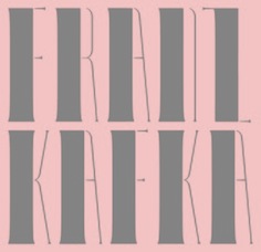
Franz Kafka
|
Franz Kafka (1883-1924) is one of the most influential fiction writers of the early 20th century; a novelist and writer of short stories whose works, only after his death, came to be regarded as one of the major achievements of 20th century literature. He was born to middle class German-speaking Jewish parents in Prague, Bohemia [now capital of the Czech Republic, but then part of the Austro-Hungarian Empire]. Kafka's work-the novels The Trial (1925), The Castle (1926) and Amerika (1927), as well as short stories including The Metamorphosis (1915) and In the Penal Colony (1914)-is now collectively considered to be among the most original bodies of work in modern Western literature. Much of his work, unfinished at the time of his death, was published posthumously. He has nothing to do with type design, except for the fact that I use the term Kafkaesque to describe a gloomy, dark and/or illogical style of lettering. Well, not totally true---some people have tried to digitize his handwriting, most notably Julia Sysmalainen in her typefaces Josef K Paneuropean (2015) and Mister K (2008). [Google]
[More] ⦿
|
Gabriela Namie
|
 Graphic designer in Sao Paulo, who created the text typeface Kafka Serif (2013). This typeface looks very readable and is of medium weight. It has medium contrast, large x-height and soft but pronounced terminals. I assume that the name Kafka was chosen because of its dark overall look.
 Behance link. [Google]
[More] ⦿
|
Galdino Otten
|
 Cartoonist from Recife, Brazil, b. 1966, whose sense of humor and artsistic prowess shine in his dingbat fonts. Dafont link. Fontsy link.
 Creator of the experimental Almost Sanskrit (2009), Zodiac Nice (2009, astrological symbols), Xilo in Zodiac (2009), Xilo-Cordel-Literature (2009, dingbats), Cordel Circo Mambembe (2010), Inside Issue (2009), Stretched Signature Flex (2009), Action of the time (2009, grunge), the dingbat typeface Ugly Cars (2010), the grunge typeface Capitão Galdino (2008), the grunge typeface Saltpeter-N-Fungus (2010), Texture Road (2010, more grunge), BSB DF 50 (2010, grunge), Fine Serif (2009), and the nice dingbat typeface Ochent Silibrina (2009). Fonts made in 2010: Sport 4 Ever (dingbats for Olympic Games), 60sPop (multiline face), DotSpot (dot matrix), IRON H METAL (tattoo, gothic), IngaStoneSigns (stone age glyphs), Ode2PasteUp (hand-printed), WideSquare (pixelish), ActionoftheTimeNewUL, BSBDF50, Haus-Sweet-Haus, INSIGHT-ISSUE-NEW, Movie Filmstrip, SquareChalk, Action Of The Time New (grunge), CordelValentine (dingbats), IngaStoneSigns (petroglyphs), SustainableAmazon, VeryDamaged (grunge), ParkTechCG (letters as in wired circuits), kidSWritten, Iron H MetallLight, LaceNice (knitted look), Ode2PasteUp, TextureRoad (grunge). Fonts from 2011: Booklet Cordel (sketched), Cordel Encarnado, Nuclear Accident (texture face), Noncircular (techno), Old Press (grunge), Old Typography (grunge). Fonts made in 2012: New Press (condensed sans family, +Eroded), Sketch Wall, Comic Gibi, Own Written, Comica BD (comic book shadow font), Cartoon Relief (a 3d cartoon typeface), Riscada Doodle (scratchy hand), Sketch Nice, Needlework Good (a stitching font), Biscuit Made, Just Skinny, Crazy Style, After Cheret (hand-drawn 3d shaded outline face), Spots in the mirror, TNT Xplosion, Escrita Toska (curly script), Cordel Movies (moviemaking dingbats), Fine N Tall, Cordel Groteska, From Street Art (free graffiti font), Sketch College (sketched athletic shirt font), Thin Press (grungy vernacular type), Sketch Serif, Relief BD, Maxxi Serif (very heavily slabbed serif face), Semi Cursive Gut, Sketch Coursive (sketch face), Salt Pet Non Eroded, Advanced Architecture, Very Fine Serif (a monoline Egyptian), Sketch Nothing, Freehand Nothing, Shark Attack (curly), Do Doodle, Maybe Pollock (dust texture face), Xilo Prosa (grunge), Thin Design, Amazon Palafita (hand-drawn 3d outline face), Snow Times, Snow Traces, USSR Army (rough army stencil with a Russian feel), Needlework US (stitch font), Old Scribe (Greek lapidary face), Nickel Bumpy, Soviet Style (stencil face), Top Modern (heavy slab serif), Lettering Set New, Carton East, Not Tuned TV (sketch font), Scar Bleed (scary font), Maxxi Dots (texture face, +Shadows), Dots Land Gotika (grungy blackletter), Stefanie Dots (textured letters), Karamuruh (textured caps), Broken Type (grunge: a glaz krak font), Touppeka (a Kafkaesque, tribal or painter's font), Old Dreams (grungy), Bad King (sketched typeface), False 3D (hand-printed 3d outline typeface), True2D, I Wrote All, Resistance Until The End. Typefaces from 2013: Serifa Comica (comic book slab), Press Style Serif (letterpress style), Press Style Large, Triatlhon In (sic: a Greek simulation face), Go 2 Old Western (grungy wood type), Old Serif Gut, Press Style (letterpress style typeface), Dust Serif, Thing Press, Thin Grotesk Serif, Before Collapse (glaz krak face), Stencil Style New (a military stencil), Damaged Serif, Press Serif Cool, Press Feeling, Sketch Toska, Link Parties, Almost Cartoon, Cartoon Toy, Toy Toy Toon, Fine Style (didone caps), Fine Sans (Peignotian), Beyond Blackboard, Forgotten Junk (grunge). Typefaces from 2014: Simply Rounded, Cartoon 2 Packages, Pain N Bleed, Yummy Lollipop, Hippie Movement, Rotunda Geo, Old Figaro Cursive, Cute Cartoon, Sketch Gothic School (sketched blackletter), Fine College (hatched athletic lettering face), Press Felling Eroded (letterpress emulation), School Book New (sketched), Stencil Cargo Army (military stencil), Fine Eroded, Grunge Poster, Education Is A Way, Cartoon Blocks, Cartoon Bones, Cursive Option, Odd Press (letterpress emulation), Cartoon Tunes, From Cartoon Blocks (3d), Hippie Movement, Yummy Lollipop, Needlework Perfect, Press Gutenberg (blackletter), Unic Calligraphy, Roundfed Eroded, Children's Book (outlined), Neon 2 News, Good Choice (shaded letterpress emulation), Cartoon 2 Us, O 10 Type, Dust West (grungy Western style), Comic Balloon, Caligraf 1435 (pirate era script), No Name Sans, Top Secret Stamp (grungy stencil), Fine Blackboard (blackboard bold, inline), Press Style Extra L (letterpress), Sounds Good (geometric sans), Sounds Eroded (shaded letterpress font), Cartoon Blocks Christmas, Street 2 Art (graffiti font). Typefaces from 2015: Snaps Taste (a grocery store or comic book font), Snaps Taste Christmas, Calligraphy Hand Made, Silly Aliens (dingbats), Sketch Match (3d, sketched), Cartoon 4 Sports (dingbats), Kids Book, Almost Japanese (oriental simulation font, +Comic, +Cartoon), Inga Stone Redesigned, Money Money Plus (engraved money font emulation), Thin Cool, Old N New Media (dingbats), Thinkers World (scanbats of famous intellectuals), Magical Cord, Quick Writing, Eroded 2 Much, Stencil Army WW I (military stencil), Stencil WW II (military stencil), D-Day Stencil (military stencil), Western Bang Bang (weathered Western font), Modern Serif, Modern Serif Eroded, Money Money (handcrafted engraved currency font), Almost Japanese Smooth (oriental simulation typeface), Write Righ, Ease Christmas (dingbats), Sketch Script Cool, Ficticcia College. Typefaces from 2016: Doodle Cafe Scents (dingbats), Christmas Cookies, Coffee Written, Soft Marshmallow, Niagra Faults, Sketch Toronto, Sketch Fine Serif, Sketch Handwriting, Typewriter Press, Typewriter Style, Sketch 3D, Maple 3 Cartoon (snow-covered letters). Typefaces from 2017: Crazy Krabs, Old Barbwire, Gregory Packaging, Ghost Army Stencil, Old Wise Sketch (sketched blackletter), Packaging Funny, Blackboard Restaurant, Kavernosa (bony typeface), Little Kid. Typefaces from 2018: 1927 Epoque, Cartoon Toy Turbo, Old Wise Lord (blackletter), Handmade Memories, Silly Cartoon, Old Press Original, Pet Shop, Cute Script, Dust West College (hatched), New Comic BD. Typefaces from 2019: Eco Bamboo (Cartoon, Fun), Karamuruh Turbo (all caps with a quilted texture), Cordel Junina, Cordel de Mangai (240 dingbats), Cordel Rustika. Typefaces from 2020: Beach Party Cartoon. [Google]
[More] ⦿
|
Garcia Fonts&Co
[Andreu Balius Planelles]
|
Experimental foundry, est. 1993 in Barcelona by Andreu Balius who lives in Santa Maria de Martorelles near Barcelona. It existed for a few years and evolved into Typerware. Garcia/Typerware offered about 50 fonts, including some very artsy typefaces, such as Garcia Bitmap (1993), Playtext (Andreu Balius, 1995), Matilde Script (Andreu Balius, 1994: an embroidery face), Helvetica Fondue (1993-1994), Futuda (1993), Ozo Type (1994), Tiparracus (1994, dingbats), (Mi mama) Me soba Script (1994), Parkinson (1994), Garcia Bodoni (1995), Garcia snack's (1993-1995), and Vizente Fuster (1995), all by Andreu Balius and Joancarles Casasin, 1993-1995. The list of typefaces as of 2007: Afligidos deudos (1996, grunge typeface by Adi&arave; Gual), Alexis (1997, handwriting typeface by Alexis Rom), Alfallufat, (1998, fun display family by Saíz), Alquimia (1995, grunge typeface by Estudi Xarop), Ariadna (1988-1989, pixel typeface by Andreu Balius), Braille (1999, by "Txarly Brown", a Braille simulation face), Bubbles (1996, dot matrix typeface by Franco Bonaventura), BuckShot (1994, total grunge by Malcolm Webb), Bunghole (1996, grungy pixel typeface by Michael G. Kippenhan), Calypso (1997, Txarly Brown), Cartolina (2000, poster stencil typeface by Jordi Fosch), Cero (2001, sans typeface by Miguel M. Velacoracho), Dinamo (1993, Andreu Balius), Dr. Zaius (1997, André Nossek), Euroface 80mph ad 100mph (1996, Peter Bilak: a joke typeface that reads more easily as one speeds up on a highway), Fabrique (1993, Andreu Balius), Floridax (1997, a stunning stencil typeface by Txarly Brown), Freddie Frog (1996, Malcolm Webb), Funny (2001, caps for kids, by Jordi Fosch), Futuda (1993, grunge by Balius and Perez Casasin), Game (2002, by Miguel M. Velacoracho), Garage (1997, grunge by Fabrice Trovato), Garcia Bitmap (1993, Balius), Garcia Bodoni (1995, an experimental Bodoni by Balius and Perez Casasin), Garcia Snack's (1993-1995, snack bar lettering by Balius and Perez Casasin), Helvetica Fondue (1993-1994, Helvetica with cheese holes; by Balius and Perez Casasin), Hispana (1996, by José M. Ribagorda), Hokvo (1994, pixel style typeface by Perez Casasin), Inercia (1996, a rounded sans by Inigo Jerez), Inmaculatta (1997, grunge by Roberto Saenz Maguregui), Jam Jamie (1996, painted letter simulation typeface by Malcolm Webb), Janson (1997, grunge by Harald Weber), Juan Castillo Script (1995, by Balius and Perez Casasin, based on the handwriting of an old man in Albacete), Joroña (2001, Kafkaesque caps by Jordi Fosch), Kentucky (1997, grune by André Nossek), Loop Ultra (1996, Franco Bonaventura), Loreakop (1995, irregular hand by Txarly Brown), Martí Hand Script (1998, Saíz), Matilde Script (1993-1994, Balius), MCK mono (2005, pixel typeface by Milos Radosavljevic), Mi Mama Me Soba Script (1994, grunge script by Balius and Perez Casasin), Network (1996, Alex Gifreu), Ninja type (1995, kana-lookalike by Txarly Brown), Ozó Type (1994, an overprinted type by Balius and Perez Casasin), Pantacas (1998, grunge by Nicolas Gallardo), Panxo Pinxo (1996, David Molins), Parkinson (1994, grunge typeface by Balius and Perez Casasin), Playtext (1993-1996, Balius), Popular (1997, Sergi Ibañez), Proceso Sans (1996, only crosses, by Pablo Cosgaya), Rocky (1997, grunge by Harald Weber), Route 66 (1997, Francesc Vidal), Sablon (2005, a stencil typeface by Marcus Schreiter), Simple (2001, experimental typeface by Romulo Fernandez), Skupitajo (1998, graffiti letters by Nicolas Gallardo), SoundFiles (1998, totally off-the-wall experimental typeface by Reto Brunner), Surface (2001, grunge by Jordi Fosch), Temble (1993, Balius), Tiparracus (1994, dingbats by Balius and Perez Casasin), Trash (1996, grunge typeface by Matthias Rawald), Vertigo (1996, a Kafkaesque typeface by Txarly Brown), Visible (handwriting by Fabrice Trovato, 1997), Vizente Fuster (1995, handwriting by Balius and Perez Casasin based on scripts seen in the Sant Antoni market), Water Knife (1995, a medieval calligraphic script revival by Laudelino L.Q), Weird (1996, an experimental typeface by Mladen Balog). [Google]
[MyFonts]
[More] ⦿
|
Hans Bacher
|
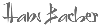 German animation artist who lives in Southern California where he works for Disney Feature Animation. He is a member of the Academy of Motion Picture Arts and Sciences. His typefaces were mostly made at Agfa-Monotype:
 Catalog. FontShop link. Klingspor link. [Google]
[MyFonts]
[More] ⦿
|
Hector Alonso Perez
|
Gijon, Spain-based designer of the horror font Kafka (2019). [Google]
[More] ⦿
|
Jake Luedecke
[Luedecke Design Font Co (was: LDF Fonts)]
|
 [More] ⦿
|
Joan Barjau
|
 Born in Barcelona in 1950, Joan Barjau is a graphic and type designer, cartoonist, illustrator, painter, and animator who taught at Eina in Barcelona from 1984-1993. Designer at type-o-tones in Barcelona who made Analfabeta Regular (1999, with Flavio Morais), Analfabeta Pics (1999, with Flavio Morais), Analfabeto (+Pics, 2007, another vernacular typeface done with Flavio Morais), Ebu Script (1991-2013, a technical script done with José Manuel Urós), Iva (1993-2007), Jeune Adrian (1997), MeMimas (1991-2007, upright connected script done with José Manuel Urós; a Spanish school script commissioned in 1991 by publisher Barcanova), MeMimasAlternate, the great Sniff (1995, poster family), Talqual (1997, handwriting), Tschicholina (1997, unicase font inspired by Tschichold), Xiquets Primitives (1995, dingbats), Zubizarreta (1997, an award winner at Bukvaraz 2001; Zubizarreta Tosca is clearly Kafkaesque; the whole family is a mix between Neanderthal simplicity and Basque toughness).
 In 2013, Joan Barjau published the cartoonish typeface family Sniff, which he first created in 1995. He writes: Joan Barjau used the pseudonym Sniff while working as a cartoonist for the Spanish satirical magazine El Papus, and Sniff is also the typeface based on the style of lettering he used for the balloons. Interview by MyFonts. FontShop link. MyFonts link. Klingspor link. [Google]
[MyFonts]
[More] ⦿
|
Johnny Bekaert
|
 Freelance graphic artist in Gent, Belgium, who won many awards for his design of posters and poster typefaces. He specializes in book cover, poster and cartoon types, and excels in all. Many of his fonts have a Kafkaesque slightly threatening look, while others are satirical and delightfully funny. His magnificent posters showcase the Belgian humor that is undoubtedly inherited from growing up during the golden era of Belgian cartoon and comic strip design that included Tintin / Kuifje, Lucky Luke and Robbedoes / Spirou.
 Author of Font Design (2018, Huis van het Beeld, Brussels). Johnny Bekaert designed these fonts: Oneline (1971), Urbas (1976), Scrittostyle (1985), Fridabrush (1986), Plowboys (1988), Hibblesibble (1990, deco style), Xorkaz (1991), Thingydingy (1992), Bruxell (1996, a redesign of a font by Jacques Richez, 1957), Zuzulma (1997, angular and expressionist), Razor Dina (1998, dada style), Cakewalk (1999), Theo & Phil (2000), Gasbangers (2002), Blind Liddy (2003), Archie Teck (2003), Fridadida (2005), Bettsie-X (2008), Tweedledum (2010), Roswellian (2013, a UFO font), Struktura (2013-2014), Blacknoir (2014), Blackblanc (2014), Enozeno (2015, a compass-and-ruler typeface), Kublar (2015), Zapristie (2014-2015), Delphis (1993), Quodic (2015), Oscura (2016). [Google]
[More] ⦿
|
Jonathan Stephen Harris
[Tattoo Woo (or: JSH Creates, or: Smokewire)]
|
 [MyFonts]
[More] ⦿
[MyFonts]
[More] ⦿
|
Jordi Fosch
|
Tarragona-based Catalan designer of the typewriter font called Let32,2, and of the comic book font Love Gun. He also made Escher Desigual and FoschWords 1. In 2000, he created the poster stencil typeface called Cartolina (2000). In 2001, he designed the grunge typeface Surface (Garcia Fonts), the Kafkaesque all-caps typeface Jroña (Garcia Fonts) and the all-caps kids typeface Funny (Garcia Fonts). [Google]
[More] ⦿
|
Juha Korhonen
|
 Juha Korhonen (b. 1966, aka Junkohanhero) is a Finnish artist and type designer, who created these free fonts, mostly in the grunge genre:
 - In 2006: Tasapainoaisti (grunge), Type-Ra (old typewriter), 60 Sekuntia (grunge), Waving My Arms in the Air (dingbats), Cold Night for Alligators (grunge), Shangri-La (handwriting), Horros, How Can I Organize My Garage?, They're coming to take me away, Hullunkruunu (grunge), Liitu (grunge), Snakepit (dings), In My Head (grunge), FCockroach (grunge), 3-2-1 Jungbats (which includes a Deux Chevaux!), Aamunkoi (handwriting), Not now, I have a headache!, Kulminoituva, Kallot (skeleton dingbats), Ummagumma (handwriting), finitimusiungo, jungodingbats, Junkos Typewriter (almost a ransom note font), notakangaroo (handwriting), Minenookenguru, ympyroity.
- In 2007: 215000E, 6000km, Gubben-I-L, Hevonen, Horros, IKHIOOGLA2, IKHIOOGLA3, IKHIOOGLAcow, IKHIOOGLAone, IKHIOOGLAwithout, Postinkantaja-Job (ransom note face), They're-coming-to-take-me-away, Jungobungo (ransom note), Nollapistet (grunge), VieraskirjanPeto (skull dingbats), Maksukehoitus (white on black), Avain (dingbats of keys), Pink Bazooka, Phorssa (ransom note), Bones (pirate font), 215000EURO (ransom note), DINGDONG (dingbats including a 2CV), CKAS (tape dingbats), JoskusEi (grunge), Puoli-ihminen, Zupagargonizer, ZupagargonizerT, Puoli Ihminen (hand-printed), Polla (a great scratchy ink stain lettering font in the style of Treefrog), Wahroonga, Tienpaalla (traffic signs), Typenoksidi (old typewriter), Pozo, Pozotwo, Pozothree, Pozofour (Kafkaesque). He also made the dingbats Avain, Tajunnan-tuolla-puolen (movie dingbats), Vieraskirjan-Peto, Payday (white on black).
- In 2008: Melkein Aito Kopio (tool dingbats), Znort3000 (white on black grungy typewriter), Oravanpyörä (white on black outline face), Ellet Niin (ransom note face), Kuusinollakahdeksan (ransom note font), Jadefedga08, Jadefedgah80, Jadefedgah8002 (all ransom note fonts), Jormadorka (more ransom notes), Maaliskuu (handwriting), PajaRaja, Aikasiirtyma, Bugghet.
- In 2009: Tarkistatiedot, Bugebol, Harmaa Perkele (grungy outline face), Huomenna (grunge outline), Betelgeuse (hand-printed), Merkurius (more grungy outlines), GhundZiliag, Laboratoriokoira (grunge), PolviHumppilasanoo.
- In 2010: Tammikuunkolmas, Kosminentaustasateily (old typewriter), SinisenharmaaPerkele, Osasto329suljettu.
- In 2011: 19000paarmaa, Tunnepinta, Vuosivuodelta (grunge).
- In 2014: Adieresis, Air-Atlas, Appendix (ransom note font), Bactosaurus, Bad-Pizza-wth-Pepperoni, Bad-Pizza, Bakesaurus, Balochisaurus, Bambiraptor, Beast-Of-Burden, Bilbao (a fat rough brush face), Birds-Requiem-Svart, Birds-Requiem, Bug-Report, Burgerbuzz, Buzz-Aloha, BwheroGreeZero, Cactus-Tequila, Charlie Dont Surf, Chryse-Planitia, Culdesac, Cyberpnuk2, DSIODRER, DSIODRER2, Damsterdam, Downleft (3d typeface), Drop!, Existence, Firebug, GogolSimone&Monroe (textured), GROmagnon, Gromagroo, Handful of Nothing (grunge), Hangen-henki, Hangover, Haudankorva, Helleplus 32, Hetkea Myohemmin, Hiekkalasi, huhtikuu, Human Error, Hyeenan-haukotus, Inertia-Creeps, I Wanna Be Your Dog, Jamaica Aroma (grunge), Jazz Zebra, Jockey Full of Bourbon (white on black letters), Jupiter (children's script), Kaktuspiste, Kalmari (blackletter), Keskiyon-Lumisade, Kothika (grungy blackletter), Krakle!, Kulkeuma, Kuumotus, Lasihiekka, Lean on me, Liima,-paperi,-sakset-2 (ransom note font), Llama-Grazy, Llama-Mad, Louis Cypher, Lumenharmaa, Lumihyeena (ransom note font), Lyhyt-Lauantai (children's script), Me-and-your-mother, Mechanical-Machine (old typewriter), Metalbox, Mustasurma, Muurahaiskarhu (weathered calligraphic script), Nasty MSG, Neptunus, Nirhauma, Nopee Torstai, Noppalukemat, Onion-soup, Paltamo 88300, Persona Non Grata (grungy ransom note font), Pintaväre, Plastika-Elektronika, Pyromaani, Quark Zone, Quiet Evening (old typewriter typeface), Quiet Zoo, Red Rabbit, Rho Cassiopeiae, RGMB 6044 Str, Rottapuisto, Ruoste, Rush-Minute, Rust Never Sleeps, Sadannes, Sensory Cortex, Sensuroitu, Siamese-Twins, Singalonga, Singapore, Sitruunahyeena, Skinny Zebra (shaded face), Snapz!, Soul-Sister, Stranger-In-You, Takapiru, Takapiru2, Tempo-Minimo-Bass, Terra, Terraario, Terrieri, Territorio, Terrorisoija, Tomorrow-Comes-Today, Torstai-perjantai, Tricky-Christine (all caps Treefrog style inky script), Trolli, Tulihuuma, Tulikuume, Typetype, Typetys, Typistys, Typpea (old typewriter), Union-soap, Wallowxenon, Whisper in the Dark, White Elk, Wripetyter (old typewriter), Wrong-place-right-time, Wrong-time-right-place, Wrong-time-wrong-place, Xmas Year Zero, Yericho-Punx, ZIGZAGZOEL, Zombie Queen (grungy old typewriter).
- In 2015: 49 Birthdays, A Box For, All Rights Reserved, Almost-like-the-blues, Androidi Pisa, Aurinko, Avojaloin (old typewriter), Boring, Blacklist, Blah-blah-bang, Blank Eye, Burn Out Fade Away, Beyond-These-Things, Can-you-ever-see-a-whole-circle, Children-of-the-revolution, Close-your-eyes, Cut The Crap, Dancing-in-the-dark, Dark-Dream, Dark-was-the-night, Deafening Silence, Destroy-X, Dharma Bum, Dharma Punk, Digi Ziggy, Divisible-Invisible-High, Divisible-Invisible-Low, Drenazmozgow, Dystopia, Eight Days A Week, Endrophenomeua, Ensimmäinen-kevät, Every Little Thing That You Did, Everything is possible, Feeling Babylon (shaded typeface), Fifteen Feet of Pure White Snow, Forty Six, FourFiveSixSevenEight, GalvanizeBurn, Garbage Guerilla, Glingzerminator, Good-And-Evil-Day, Good-And-Evil-Night, Green-Dream, Have-nothing-to-do-with, Hidden Zebra, Holy Cow, Humectez-La-Mouture, Hyvä voittaa pahan, Hugo Z, Ice-cream-for-crow, Ihana-Perkele-Alaston, Ihana-Perkele, I Love You, Instant Karma, Instant-Nirvana, Is That Clear, Is-there-anybody-out-there?, January Threed, Justaword, Kasuaari-kirjastossa, Keveat Sandaalit, Killing Me Softly, Kasuaari-kirjastossa, Kirjainkone (old typewriter), Kirkuvanpunainen kirsikk, Kiss Me My Darling Kiss Me (grunge), Last-living-souls-Dark, Last-living-souls-Dirty, Last-living-souls-Shadow, Last-living-souls, Lauantaiaamu-7:25, Lazy Opossum, Life is so wonderful, Lilith X, Lost in Moments, Lovely Weekend, Lower Atmosphere, Lumi-nauroit, Manamansalo (shaded handcrafted font), Mandelio di Paedre (textured), Metamorphose Requiem (blackletter), Moa, Molienda de Paedra (textured), Moons of Jupiter, Nicotine Love, Nie Zabawne Komik, Nirepnirun-atsum, Nirepnirun-oivuk, Nirepnirun-oknalb, Nollanaama, Onnenmyyra (halftone emulation), Open-your-eyes, Oranssi Hohde (textured), Paljain Jaloin (grunge), Pikku-Julmuri, Pink-T-shirt, Puolelta Toiselle, QWERTYpe (old typewriter), Quicksand-x, Radar Echoes Unclear Atmosphere, Raparperitaivas, Read between the lines, Redhair, Refuse-to-bow-down, Regurgance, Requiem-for-A (blackletter), Rhinoceros (a pretty Treefrog script), Rip-off, Road-to-nowhere, Ronttifontti, Rye Field, Safe-from-harm, Screaming Red, Sekunda, Seven Deadly Sins, Shadow Catcher, Six Feet Under, Slave-only-dreams-to-be-king, Some-Distant-Memory-Dark, Some-Distant-Memory, Something-in-the-air, Something in the Way, Sonic Barrier, Sound of Silence, Syntax Error, Syyskuu-repaleinen, TakeYourClothesOffWhenYouDance, Tango Psychedelia (old typewriter), Tell Us Pangaia, The-Beginning-Of-Memory, Thirteenth Floor 2, This-side-up, Time Goes So Slowly, Toinen Tammikuu, Too-drunk-to-fuck, Uglygoodbad, Uglygoodbaddark, Under the Influence (grungy texture), Unfinished-Sympathy, Universal Mind, Universedge, Universum Invenire, Velvet Queen, Viimeinen-syksy, Villasukat, Walk-with-me-now (letterpress emulation), Waste-of-time, Waveternity, White Elephant, White-funky-rabbit, White-light,-black-line, White Submarine, Windy Indigo, World Without End, Xsdeterminatoer (sic).
- Typefaces from 2015 published in 2016: Dark Monday (ransom note font), Jinzingoer, No More Lies, Cubebroken, Cult-of-the-toucan, Doublpeopl, InvisiblerrorEdge, InvisiblerrorFast, Invisiblerror, Jugglingoose, On-the-horizon, Raccoon, Strawolverine, Wantedo, Edge, Black is not a color, Apocalypse, Disturbo, Black Owl, Spirit Ritual, Woodcut, Animals are like people, Tox Typewriter, I Believe In Life Before Death, Crab, Dieproud, In the deep dark woods, Chic Chak Zubra (Treefrog style), Non Watercolor, April-Fools'-Day-Crazy-vrs, April-Fools'-Day-Silly-vrs, April-Fools'-Day, As-long-as-I-can-hold-my-breath, Floating-tin-can, Head-like-a-hole, Here-Just-Now-Black, Here-Just-Now-Out, Here-Just-Now, Scratch-X-Black, Scratch-X, Shoemaker, Skriik!-Electro-mechanical-mach, Thin-king, Blinded-by-desire, Brake-a-leg, Deja Vu Dive, Greater-than-the-sum-of-its-par, Hell-is-round-the-corner, I-love-the-smell-of-rain, Kopio-639, March-of-the-pigs, Methods-of-escape, Overdose, People-per-square-kilometer, Right-where-it-belongs, The-universe-in-a-nutshell, This-is-nu-jazz, Torture, Trashbox (white on black), Walk-this-way, What-is-this--some-kind-of-joke (white on black), Why-do-we-blink-so-frequently (old typewriter), 2016-Bugs, 3-Times-Recycled-Old-Newspaper, 3TimesRecycledOldNewspaper, Always-Been-Right, Amateur-Dirty, Amateur-Naked, Amateur-Slash, Another-name-for, Brief-Moment-Between, Bubu-Ghost, By-the-way, Contrite-in-spirit, Crash-test-dummy, Dead-end, Dimension-Zero, Dirty-Old-Town, Dreamer-Eternal, Dreamer, Endless-heartache, Feel-the-universe, Found-my-way-out, Grapevine, Grasshopper-Z, GrasshopperZ, Hehku, Here-we-are-now,-entertain-us, Hidden-meanings-Italic, I've-seen-that-face-before, I-Did-It-My-Way, I-tell-you-all-my-secrets, IDidItMyWay, Is-there-time-in-outer-space?, Jokioinen, Kube-Vertiko, KubeVertiko, Lazarus-Oz-Kolsvart, Lazarus-Oz-Moerkt, Lazarus-Oz-Syndfri, Lazarus-Oz, Libertango, More-news-from-nowhere (white-on-black), Now-your-conscience-is-clear, Paradox-Mosaic, Paranoid Orange, Pelkistettya todellisuutta (old typewriter), Piparivahtiperhonen-Itio, Piparivahtiperhonen, Planet-Garbage, Secretly-wishing-for-rain, Send-me-a-postcard, Sun-zoom-spark, Through-the-night (old typewriter), Trash!-More-trash!, Trash-Zydego, Tremolo-Flaw, with-righteous-indignation,-aga, with-righteous-indignation, Dark-Underground, Feelings-On-Off, From-here-to-eternity-too, From-here-to-eternity, Fuga-de-cerebros, Gsubadaslowly, Hell-Finland, Hello-Finland, It-started-here,-again, It-started-here, Lost-in-the-supermarket, Muspi-Merol-Krad, Muspi-Merol-Mirg, Muspi-Merol-Thgil, Razterhunch-Burn (textured typeface), Razterhunch-Shadow, Razterhunch, Sister-Morphine, Syntinen-ihminen-on-kaunis-ihmi, Tropic-of-Cancer, Velvet-Dream, Viiden-pennin-operetti, Auribus-tenere-lupum, Big-Bubu, Completely-Nonsense, Corner-Dark-Distance, Corner-Dark-Just-X, Corner-Dark (white on black font), How-do-you-sleep?, How-low-is-low?, Karmakooma, Long-distance-call, On-aika-soittaa-sinfonia, Pink-Bunny-2, Pink-Bunny, Pink-Chaos, Right-to-remain-silent, Rough-Simple.
Typefaces from 2017: Pink Kangaroo, Punktype, Dog Foz Zebra, Mondmonkey, Quiet Horror Story, Strawobbly, Better Get Ready, Flea Market Finds, Background Noise, Rhythm Vino, Echoes, Music For Empty Apartments, Synonym Blank. Typefaces from 2018: Blockheads (white on black), Blue Sky Blue Grass, Lievidence (a ransom note font), Quick Pangolin, Brillianthre. - Typefaces from 2020: Mugwort Maximum (grunge), Heart Jungle (textured).
- Typefaces from 2021: Nothing Clean, Central European Time, Examples Of Erosion, Overconsumption, Ransom Blanco Zero, Bullfrog, Damage Red, A Good Day To Die, Everything Experience, Ring Singularity, Grey+Red, Memento Griseo Ruber, Think Harder.
Dafont link. Old URL. Additional URL. Font Squirrel link. Fontsy link. Abstract Fonts link. [Google]
[More] ⦿
|
Julia Bausenhardt
|
 Type designer from Hamburg, Germany, who is based in Goslar.
 In 2010, she made Kafka, a font based on the handwriting of Franz Kafka. Edvard (2012) is based on the handwriting of Norwegian painter Edvard Munch. In 2014, she designed the hand-printed poster typeface Walpurga. In 2015, she designed the expressive poster typeface Bassanova and the connected script typeface Luba Luft. Klingspor link. Creative Market link. Behance link. [Google]
[MyFonts]
[More] ⦿
|
Julia Sysmäläinen
[Juliasys]
|
 [MyFonts]
[More] ⦿
[MyFonts]
[More] ⦿
|
Juliasys
[Julia Sysmäläinen]
|
 Julia Sysmäläinen Carelian (Juliasys) is a Finnish type designer, who studied at Pekka Halosen Akatemia in Tuusula. She runs her own type foundry, Juliasys. Julia presently lives in Berlin, where she works for Edenspiekermann Berlin.
 Julia created these typefaces: - FF Mister K Pro (2008, FontFont). A winner at Paratype K2009, where it says that the typeface was co-designed by Jürgen Sanides from Germany. This is a digital rendering extraordinaire of Franz Kafka's handwriting. Ivo Grabowitsch writes: This meant not only creating hundreds of ligatures - each of them consisting of two, three or even four single characters - but also integrating numerous alternate characters to avoid successions of repeating shapes, in order to lend FF Mister K Pro a more authentic script feel. Furthermore handy OpenType functions were added, for example for stylistic alternatives including hatched text as well as underlining and crossing out. Eventually three completely different single fonts were developed. Besides the normal cut there's also Crossout, which allows for setting extensively crossed out text and Onstage, which clearly looks more extravagant and wriggly. All foreign languages and features included the standard cut alone contains more than 1,500 glyphs. In 2009, she published FF Mister K Dingbats. FF Mister K Informal (2011) won an award at TDC 2012. FF Mister K Splendid followed in 2014 and Mister K Crossout and Mister K Onstage in 2015.
- In 2012, Julia published the beautiful handwriting font ALS SyysScript at Art Lebedev Studio.
- As Juliasys, Julia Sysmäläinen published the semi-serif Latin / Cyrillic / Greek typeface family Mir (2013) and the handwriting font Emily in White (2014, based on the writing style of American lyricist Emily Dickinson (1830-1886)).
- ALS Finlandia Script (2015, for Art Lebedev Studio).
- ALS Pobeda (2015). A MIG29-themed dot matrix typeface inspired by the Moscow Victory Day Parade commemorating the 70th anniversary of the end of the Second World War.
- Sentres Icons (2015). Designed for Sentres, a tourist portal for South Tyrol. In 2016, she designed the Visit Berlin Icons.
- Josef K Paneuropean, and Josef K Patterns (2015, ornaments based on Kafka's letterforms).
- ALS Scripticus (2013). A blackboard script.
- Colorado (2016). A ribbon type family with several kinds of zebra stripes. Codesigned by Julia Sysmäläinen and Jürgen Sanides, published by Juliasys.
- Optimisti (2016). A smooth thick script typeface.
- Little House Script (2017). A typeface simulating Laura Ingalls Wilder's handwriting.
- MIR Next (2021). A 20-style humanist---semi---slab-serif for Latin, Cyrillic and Greek, with enough bells and whistles to make it useful for Vietnamese and scientific texts.
Klingspor link. FontShop link. Behance link. Another Behance link. Art Lebedev link. [Google]
[MyFonts]
[More] ⦿
|
Jure Legac
|
Slovenian designer of the grungy Kafkaesque typeface Tank during the design workshop TipoBrda in 2007. [Google]
[More] ⦿
|
Kafka Design
|
Czech design studio in Prague, and publisher of "Font" (in Czech): Od roku 1991 vydáváme odborný èasopis Font, toho èasu jediný specializovaný èasopis v ÈR zamìøený na grafiku, písmo, typografii, pre-press, reklamní praxi atd. Mezi odbìratele patøí vìtina tuzemských grafických studií, výtvarníkù a reklamních agentur. [Google]
[More] ⦿
|
Kafkaesque
|
On my pages, I often use the adjective Kafkaesque to describe typefaces that are menacing or reminiscent of a dark bureaucracy and irrational impending loom. I quote the wiki entry: "Kafkaesque" is an eponym used to describe concepts, situations, and ideas which are reminiscent of the literary work of Prague writer Franz Kafka, particularly his novels The Trial and The Castle, and the novella The Metamorphosis. The term, which is quite fluid in definition, has also been described as "marked by a senseless, disorienting, often menacing complexity: Kafkaesque bureaucracies" and "marked by surreal distortion and often a sense of impending danger: Kafkaesque fantasies of the impassive interrogation, the false trial, the confiscated passport ... haunt his innocence" - The New Yorker. It can also describe an intentional distortion of reality by powerful but anonymous bureaucrats. "Lack of evidence is treated as a pesky inconvenience, to be circumvented by such Kafkaesque means as depositing unproven allegations into sealed files..." Another definition would be an existentialist state of ever-elusive freedom while existing under unmitigable control. The adjective refers to anything suggestive of Kafka, especially his nightmarish style of narration, in which characters lack a clear course of action, the ability to see beyond immediate events, and the possibility of escape. The term's meaning has transcended the literary realm to apply to real-life occurrences and situations that are incomprehensibly complex, bizarre, or illogical. [Google]
[More] ⦿
|
Kreis
|
Kreis is a young communication designer from Tenerife, and is into fonts, fashion and film. He lives in Braunschweig, Germany, and is present on Behance. In 2010, he made an experimental alphabet---perhaps not a font---, called Kafka. [Google]
[More] ⦿
|
Lafourmi-freelance
[Antoine Derouineau]
|
Toulouse-based Frenchman (b. 1977) who created the Kafkaesque typeface HandNegativ (2007). Dafont link. Fontsy link. [Google]
[More] ⦿
|
Luedecke Design Font Co (was: LDF Fonts)
[Jake Luedecke]
|
 Jake Luedecke (LDF Fonts, or Luedecke Design Font Co) (b. 1999) is the Dallas, TX-based creator of preponderantly hand-printed and pixel typefaces. These include:
 - Typefaces from 2012: Boston Regular, University, Historian (hand-printed), Helveticamazing, TM Tonite (an art deco poster font), Cozumix, Swagger Capitals, Flovio and Dotty (hand-printed).
- Typefaces from 2013: Mild East (sketched typeface), Knew It All, Five Dollar Font, Output (outlined face), Take Two (outline face), DayLight (outline face), Nineteen Oh Five (3d poster face), Licensepl8 (sketched typeface), Always Here (Victorian), Stereoscope, Villa (a 3d outline face), Plateaux (a sketch font), Slab Thing (a sketched font), Electronica (hand-printed), Red Wood, Waking Up, Earthy, Rekles, Figurativative (sic) (sketched font), TeleVision, Dynasty (a beautiful 3d sketched outlined typeface), Mom's Diner (sketched didone font), Flatbread (+Inline), LDF Comic Sans, Splinterwood (Kafkaesque), Best Day Ever, Kibby Sans, Kibby Slab (an extra-condensed FontStruct typeface), Variety (textured caps), Spring Time, Blue Printed, Exposition (fat finger face, +Shadow), Okay (outlined face), Anthro, Vintage One (an outlined and shaded face), (a minimalist sans), Barua, Vibe (a multiline typeface), University Two, Ovrlap (outlined), Swirlvetica (sketch font), Futurr (textured typeface based on Futura Bold Condensed), Maximum, Carrier Hand (a hand-printed Courier), Stroke (a scratchy typeface), Three Dee, Blue Noon (textured typeface), Cordova (pixel font), Komik (comic book face), Eggs, Eggs Extra Yolk, CymoPxl (pixel face), Pxlvetrica (pixel face), Cymo, Promoleus.
- Typefaces from 2014: Apparitions, Peach, Folktale (a sketched font), Influence (a beveled typeface), Reckoning (a shaded typeface based on Clarendon), Apparitions (2014).
- Typefaces from 2015: Moose, Parcel (sketched), Wooden Cabin, Lindy's Diner (a great handcrafted didone), Libro Showtime (sketched).
- Typefaces from 2019: Folktale (sketched).
Fontspace link. Dafont link. Old URL. Behance link. Old URL. Creative Market link. Another Fontspace link. [Google]
[More] ⦿
|
Marie Joe
|
Chilean photo manipulator. She designed Breakdown (2009, a Kafkaesque grunge face). [Google]
[More] ⦿
|
Marty Bee
|
Marty Bee is a designer and medical illustrator in Sulphur, LA. He has designed both free and commercial typefaces. His commercial fonts are available from Plazm and T-26: Slumgullion (1993, a party headline font), Flowerchild, CropCircles, Gargantua, SonofStarmanA, StarmanPict. At Plazm, he did Cibola (1995, nice dingbats), Wet and Wilde (1994) and Three Rivers (1994), for example. Some more fonts: Wildside (1994, angular and gothic), Cheap Motel, Halloweenies, Flowerchild, Sangreal (1994, gothic), Scaredycat, SidTheSpider, Slasher (2000), Slumgullion (1993, ornamental caps), Space Cowboy, Stiletto (2000), Saguaro (2000, angular), Cactus Pete, MyShoes, Tropicana (1994, chiseled look), Trapping, Galleon, Goblin Moon (scary), Ghost Bayou (blood drip face), Big Bubba, Lafitte (2000, a didone display face), Daytripper, Contraband (grungy), Fat (1994, oriental simulation face), Fat Sushi, Beatnik, Kerouac (1994, a Kafkaesque face), PostModern Oblique (2000), PricklyPear (2000, angular and angry), AtomicSushi. The font WheresMarty by an unknown designer is named after the world-wide search for Marty. Where are you, Marty? Free fonts at Fontspace: Freakout, Frankenstein, Atomic Sushi (1999, oriental simulation face), Manzanita (1990), Hill William (2011, brush face), Kris Kris (2000, gothic; an even sharper and more condensed version of Stiletto), Porpoise (1994, pixelish). FontShop link. Moorstation link, where one can also find Calypso (1997, after Excoffon's Calypso, 1958), which Marty claims as not done by him. The Calypso typeface at that site was made by Martin Pfeiffer, in fact. Klingspor link. [Google]
[MyFonts]
[More] ⦿
|
Mevstory Studio (or: Mandeh Studio, or: Eleanor Studio, or: Mevricks Studio, or: Lettercorner Studio)
[Muhammad Afif Ersya]
|
 Padang, Indonesia-based studio and designer that changes its name almost monthly: Mevstory Studio, Mandeh Studio, Eleanor Studio, Mevricks Studio, Lettercorner Studio, Mhdafifersya, take your pick. Designer of these typefaces:
 - Signage script: Retroshoes (2021), Pokechu (2021), Stanok Valley (2020: a retro signage script), Sunnylise (2020), Cansast (2020), The Bellerin Script (2020), Bealiva Vintage (2020), Retropus (2019), The Dreamstars (2019), Codename (2018).
- Script: Scripted (2021), Tropical Smoothie (2021), Adelynn Display (2020), Babyla (2020), La Rosaleda (2020: a creamy rhythmic script with some personality, accompanied by La Rosaleda Serif), Sunnylise (2019), Toulouse (2019) Kick Slide (2019), Speakup Script (2019), Hendys Playfull (2019), Pandal Sikek (2019), North Landon (2019), Natash Sena (2019).
- Brush style: Litch in Holland (2020), Bryana (2020), Little Linka (2020: kawaii style), Tormanted (2019), Future Enforcer (2019), Jorge (2019), Kafka (2019), Kick Slipe (2019), Royal Dutch (2019).
- Monoline script: Mocha Frappuccino (2020), Pergola (2020), Breachery (2019).
- Signature script: Danisya (2019).
- Eerie fonts: The Tormanted (2019).
- Vintage: Satisfice (2021: a chunky didone display serif), Akira Jimbo (2020: spurred), Revicil (2019: spurred), Tropper (2019: spurred).
- Stencil: The Time Machine (2020), Cosmos (2020: futuristic).
- Squarish, techno: Crizen (2021), Raceline (2021: a speed font), Time Machine (2020), Astroman (2019), Droping Sans (2019).
- Decorative serif: Devitos (2020: free)), Pulchella (2020), Vikendi (2020: a free chubby serif), Cholens (2020), Kiano (2020).
- Font duo: Nyctaghina (2021), Javelin (2021), Lachi (2020), Futusicia (2019).
- Arabic emulation: Al Risalah (2019).
- Sans: Lichfield (2021), Nomz (2020), Molina (2020), Gelael (a 16-style artistic sans loosely related to Peignot) (2020), Bechtlers (2020), Garuda Kencana (2020). Giagonic Regular (2019), Muvcix (2019), Fourty (2019), Hello World (2018: a display sans).
- Western: Stinky Pete (2020).
- Alphadings: Christmasland (2020).
- Speed emulation fonts: Super Drift (2021).
- Deco typefaces: Beatrick (2022).
- Miscellaneous: Fantasea (2021), Crafton (2021: an octagonal mechanical typeface), Varane (2021).
Behance link for Lettercorner Studio. [Google]
[MyFonts]
[More] ⦿
|
Misprinted Type
[Eduardo Recife]
|
 Misprinted Type (est. 1998) offers free and commercial old typewriter and grunge fonts designed by Eduardo Recife, an illustrator and graphic designer from Belo Horizonte, Brazil, b. 1980. Although his main work is in illustration, he became well-known in the early 2000's for his original grunge type designs. Typefaces:
 - Max Rhodes (based on the handwriting of Max Rhodes), Nasty, Shortcut, Carimbo (2003), Mosh (2004), Trashold (2004), Great Circus> (2004, a five-weight calligraphic decorative family), Pastelaria, Downcome (2002), DIESEL, DirtyEgo (2001), Mialgia, OverBored, PrintError, RecifeDings, ThirdWorldBuzz, Besign, HorsePuke, Lhabia, MemoryLapses, misprintedtype, NoMoreTypewriters, PrintFuck151, Selfish (2001), Misproject, Porcelain, Rochester (old typewriter), NailScratch, Astonished, Broken15, DisgustingBehavior, Guilty (2011, grunge).
- NeasdenPIP was designed with Steve Smith (2001).
- At Visuelle Orgasmus, we find Superphunky, Superload and Superaircraft, all made in 2001.
- Here, we find DirtyEgo, Downcome, Porcelain, Selfish, Shortcut.
- Myfonts sells Rapid Writing (a penmanship font), Magic 1985 (2017, grunge), King Bloser (2014, a calligraphic penmanship font named after E.W. Bloser), Bloser Serif (2014), King Bloser X (2014, ornaments), Mercy (2013, a set of connected Spencerian penmanship style fonts, with ornaments and flourishes if needed), Revanche (2013, a grunge stencil font), Grandpas Typewriter (2013, old typewriter font family), Monster Days (2007, grunge calligraphy), Kyoto (grunge), AntiRomantic (2006), Toscography (2007, slightly Kafkaesque), LeKing (2007: Eduardo calls it the Frankenstein of vintage ornamental typefaces of the past centuries), HandMade (2007, hand-drawn ornamental caps), Nars (2003, grungy script).
Earlier versions of this site could be found at TypOasis (dead link) and Dafont. Many of his fonts are also here and here. Klingspor link. Creative Market link. Fontspace link. Dafont link. [Google]
[MyFonts]
[More] ⦿
|
Muhammad Afif Ersya
[Mevstory Studio (or: Mandeh Studio, or: Eleanor Studio, or: Mevricks Studio, or: Lettercorner Studio)]
|
[MyFonts]
[More] ⦿
|
Muhammad Afifersya
|
Aka Muhammad Afif. Indonesian designer of these typefaces in 2018: Kalimastha (script), Pariangan (a script), Kafka (a signage script), Hello World (free), Codename, Natash Sena (a script), Futusicia (font duo), Jorge (a brush font), Fourty (sans), Giagonic (a hipster sans), Muvcix (a display sans). Typefaces from 2019: North London (script), Astroman (sci-fi), Retropus (signage script), Sureface (a dry brush typeface), Kick Slipe (a free brush font), The Tormanted (sic) (a scary brush type), The Breachery Script, The Dreamstars (a creamy script), Starhawks (a font duo), Speakup Script, Droping (a techno sans). [Google]
[More] ⦿
|
Natasha Bu
|
Creator of the Kafkaesque typeface Pura Vida (2012). [Google]
[More] ⦿
|
Nele
|
German. She designed the Kafkaesque typeface Font Breakdown (2009). Fontsy link. [Google]
[More] ⦿
|
Nika Nekrasova
|
 Type designer born in 1986 in Lviv, Ukraine. She created the Kafkaesque woodcut face Messy Linocut 2D (2011, 2D Typo).
 Klingspor link. [Google]
[MyFonts]
[More] ⦿
|
Oded Ezer
[Oded Ezer Design Studio]
|
[MyFonts]
[More] ⦿
|
Oded Ezer Design Studio
[Oded Ezer]
|
 Givatayim, Israel-based Hebrew type design studio in London established in 2000 by one of the main Hebrew type designers of today, Oded Ezer (b. Tel Aviv, 1972). Ezer designed the award-winning font Mayai (Hebrew script: awards at TDC2 2001 and Bukvaraz 2001), Anemia, Kafka, Eden, Ezer Shapes, Neve Zedek, OE Meoded, OE Shalvata, OE Kafka, Franrühlya, Impacta, Anemia, Systeza (based on Schiavi's Sys) and Alchimai. In 2010, he published Rutz.
 Another designer at the studio is Michel Sahar. Ezer graduated from Bezalel Academy of Art&Design, Jerusalem, with a Bachelor degree in Visual Communication Design (1998). He teaches typography and graphic design in several academies in Israel and other countries, among them the Bezalel Academy for Art&Design, Jerusalem, the Shenkar College of Engineering near Tel Aviv, the Wizo College of Design, Haifa, and the Mimar Sinan University, Faculty of Fine Arts Graphic Design Department, in Istanbul, Turkey. Heebo (2015, Google Fonts link) is a Hebrew and Latin typeface family, which extends Christian Robertson's Roboto Latin to Hebrew. The Hebrew was drawn by Oded Ezer and the font files were mastered by Meir Sadan. Since the Hebrew design of this family is primary, the vertical metrics are different to the original Roboto family. This family is auto-hinted, whereas Roboto is hand-hinted, so the rendering quality of Roboto may be better on older Windows machines. The Heebo project is led by Meir Sadan, a type designer based in Tel Aviv. Github link. Open Font Library link. At ATypI 2005 in Helsinki, he spoke on Contemporary hebrew typography as an expression of a new identity. He spoke at ATypI 2005 in Helsinki on Contemporary hebrew typography as an expression of a new identity. About his award-winning posters. The Oded Ezer Typosperma Project. Ezer's Flickr page. His experimental Hebrew typography is discussed by Uleshka in Ping Mag. It deals with a 3-d lettering experiment called Plastica, and describes many other ingenious projects. Speaker at ATypI 2010 in Dublin. Winner at D&AD 2011 with his typeface Rutz (2011, aka Vesper Hebrew). Klingspor link. [Google]
[MyFonts]
[More] ⦿
|
Peter Bilak
|
 Slovakian type designer (b. 1973), who lives in The Netherlands. Bio at FontFont. Designed: FF Atlanta, FF Craft (Kafkaesque), Champollion, Collapse, Didot Sans (unpublished), Decoratica (great display font, unpublished), Desthetica (grunge, but nice!), FF Eureka, FF Eureka Sans (2000), FF Eureka Mono (2001, FontFont), FF Eureka SansCond, FF Eureka Symbols (2002), FF Eureka CE, FF Eureka Sans CE, FF Eureka Sans Office (2011), FF Eureka Mono Office (2011), Fountain Pen (free fountain pen nib dingbat font), FF Masterpiece (wacky), FF Orbital, Fedra Sans (2001, a de-protestantised version of Univers, originally a corporate font for Bayerische Rück, a German insurance company), Fedra Bitmap (2002), Euroface (1996, Typerware, a scribbly font allegedly more legible than Helvetica at 80km/h), HolyCow and The Case. Essays on typography and design. Editor of dot dot dot. He also made AccentKernMaker, a font utility. Peter Bilak now lives in The Hague, The Netherlands, at the same address as Paul van der Laan. Free dingbat font FountainPen (Mac). At ATypI 2004 in Prague, he spoke about white spaces in typography. Speaker at ATypI 2005 in Helsinki. [Google]
[More] ⦿
Slovakian type designer (b. 1973), who lives in The Netherlands. Bio at FontFont. Designed: FF Atlanta, FF Craft (Kafkaesque), Champollion, Collapse, Didot Sans (unpublished), Decoratica (great display font, unpublished), Desthetica (grunge, but nice!), FF Eureka, FF Eureka Sans (2000), FF Eureka Mono (2001, FontFont), FF Eureka SansCond, FF Eureka Symbols (2002), FF Eureka CE, FF Eureka Sans CE, FF Eureka Sans Office (2011), FF Eureka Mono Office (2011), Fountain Pen (free fountain pen nib dingbat font), FF Masterpiece (wacky), FF Orbital, Fedra Sans (2001, a de-protestantised version of Univers, originally a corporate font for Bayerische Rück, a German insurance company), Fedra Bitmap (2002), Euroface (1996, Typerware, a scribbly font allegedly more legible than Helvetica at 80km/h), HolyCow and The Case. Essays on typography and design. Editor of dot dot dot. He also made AccentKernMaker, a font utility. Peter Bilak now lives in The Hague, The Netherlands, at the same address as Paul van der Laan. Free dingbat font FountainPen (Mac). At ATypI 2004 in Prague, he spoke about white spaces in typography. Speaker at ATypI 2005 in Helsinki. [Google]
[More] ⦿
|
Redfonts
[Amit Botre]
|
Amit Botre (Redfonts) is the Indian designer (b. 1978) of AB Dent (1999), AB Engraved (1999), AB Fatchic (1999), AB Fubu (1999, pixel), AB Ultrachic (1999, rounded sans), ABBarberian (1999, art nouveau meets gothic), ABExp (1999, striped letters), ABMindblock (1999, Franz Kafka's lettering?), AbFangs (2000), ABFuturun (1999, futuristic), AB Cave (1999, grunge), AB Majik (1999, slender letters) and AB Nirvana (1999, display lettering). Devian Tart link. [Google]
[More] ⦿
|
Rian Hughes
[Device Fonts]
|
 [MyFonts]
[More] ⦿
[MyFonts]
[More] ⦿
|
Ron Olson
|
Designer of Franz Kafka. [Google]
[More] ⦿
|
Sawyer Hume
[Fontasmic]
|
 [MyFonts]
[More] ⦿
[MyFonts]
[More] ⦿
|
Svetlana Vasilkovskaya
|
Designer of the poster typeface Brush Grotesque (2015) and the typeface family Knitted (2015). In 2016, she designed the Kafkaesque brush fonts Brush Grungy Thin and Brush Grungy Grotesque. Typefaces from 2020: Brash (a wild ink spill script), Britanic (a brush font), Thick Pen (a great painted letter font). Typefaces from 2021: Linden (floral), Ugly Sweater (knitted look), Knitted Christmas. [Google]
[More] ⦿
|
Tattoo Woo (or: JSH Creates, or: Smokewire)
[Jonathan Stephen Harris]
|
 Tattoo Woo (or: Smokewire) is American tattooist Jonathan Harris. He also runs JSH Creates.
 In 2011, he created the curly gothic tattoo typefaces Hot Chocolate Latte, League of Ages, Royal Inferno, Tribal Times and Tribal Dragon, and the spiky typeface Quasari (2011). He also made Jelly Swirls (curly), Highway to hell, What a mess (grunge), Pixie Moon, Sword Thrasher, Starship XXXII (Star Trek face), Christmas Snow (art nouveau snowcapped glyphs), and Jazzy Caveman (a stone age face). Typefaces created in 2012: Bright Star Tonight, Harristoon, a crayon series (Crimes Times Six, Colored Crayns, XXX Dirty Jokes XXX, Harris Wear, Black Crayon), Alien Mutations Begin, Vineyard Magazines, Forbidden Land (scratchy face), Way Gardens (flowery script), Pencil Shading, Cartoon Shadow, Heart Shapes, Sassy Stark, Back to School, Black Eye Peas, Silly People, Street Art (a great ink splatter font), Heartbroken, Jen Luves Ben Forever, Heart Broken, Catalina, Anywhere but home, Holly Christmas, Kringley Christmas (dingbats), Seasons Greetings, Cheese Cake, Abraham Heights, Call me maybe (sketch font), Lydia Puente (calligraphic script), Tribal Script, The Daily Bread (a beautiful ronde), Naughty Nights, a set of four Asian brush style typefaces (Japanese Style, All Yoko, Chinese Asian Style, Chinese Takeaway), Hey Cutie, Zing Easy (brush), Kids Play, Keep It Simple (loopy script), Standing Tall (anguished Kafkaesque typeface), The Abandoned Treasure (brushy caps face), The Mocking Bird, Nighty Nights, Road Trip, Been Hanging Around, Divided Nations, Dodger Gear, The Best Night (brush), Stencil Brush (brush), Quite Chocolatey, Round About (stitch font), Physics Teacher, Madman Howling, Love Sequel, Cross Out, My Mistake, Colours of Autumn, Da Streets (graffiti face), Hard Fox (stencil brush), You Are Precious (curly script), The Blue Oasis, Dysfunctional Family (brush face), Lovely Excuse (brush family), No Fear (brush face), Dead End, The Art Show (brush face), Comical Smash, The Quick, The Lost Paintings, Stone Age, Eyeliner Tattoo, Sketch Pad, Art Class (spilled paint face), Ink Studio, Stay Holy Okay, Water Park (bubblegum face), Urban Jungle, Geez Seriously (curly typeface), Crazy Weekend, Slimeball, Real People, A Brush No, Beware of the Hogs (blood drip typeface), Definitely Maybe, Draw Freehand, Bloodthirsty (blood drip font), Zombie Slayer (blood drip font), Your Bloody Choice (blood drip font), Barn Animals, Comic Strip, Scribble Fun (textured face), Boom Shanker, Girly Punk, Pucky, Spray Break, Font Insane, Fairground, Last Breath (2012), Follow Your dreams, Together Again, Drawing Guides, Death Branch, Panda Spots, Fuzzy Bear, Threadz Needle, Homeboy, Hairs Dens Bag, Primitive Alien, Bonney Lass, Cake Nom (3d and shaded), Headshop (psychedelic), Tribal Butterflies (dings), Tribal Dragons Tattoo Designs, Tribal Animals Tattoo Designs, Abstract Alien Symbols, Jewelry Design Shapes, Wander Ball, Love Hue, The Fat Store, Chooka Zoon (bubblegum face), Happy Roxy, Hearts and Stars, Arcade Book, Teaspoon Display (swashy calligraphic face), Ready Black (another swashy calligraphic face), The Lodger Rang (gothic script), Sketch Book, Sketchline, Drafting, Last Breath (tattoo font), Drawing Pad, Child's Play, Design Bubble, A Stitch Plus Nine, Ming in Bling (comic book shadow face), You Are Something (curly script), Hot Pink, How To Do Something (comic book face), I Love What You Do, Get Wet. Typefaces from 2013: Seaside Heights, Falling Rain, Ace Records, Today People, Night Adder, Squicky (curly font), No Messin (scratchy brush), Wrong Tracks, Postcard From Mars, Aluminum Trucks (script), Life Azures, The Waddys, The Angels, Oliver Richards (brush face), Arabic Magic, Messenger, Anxiety Management, Basterds, Beep Beep, Suburban Legends, Street Wild, Abreviater, Snowmania, Yak Shamash, Booday, Everyday Mayhem, Mega Team, Beaty Pagent (sic), Monster Unleashed, Hopeless Place, Alley Cat, The Lovers, Crazy Rascals, Golden Star, Gimme Your Love, Every Freakin Night (a sketched poster face), Big Top, Hopeless Place, The Lovers, Alley Cat, Queenie Beebie, Swirly Shirley (curly script), Dark World (scratchy face), Fun House (sketched face), Ultimate Chaos, Wake Me Up, Find A Way, Fat Tats (signage script), Big Winks, Nothing To Lose (blood drip typeface), Art Brewery (brush font), Holiday Blues (scratchy brush), Punked Out, The Jolly Rancher, Quite Mighty, Smudgie Crayon, Squiggley Brown, Morning Star (brush face), No Talking Allowed, Butter Finger (scratchy typeface), Mad Beef (thin script), Dinosaur, Reed of Love (a textured script face), First Grader, School Holiday (brush script), Spin Head (sketched face), Russian Roulette, Blah (brush face), Eating You Alive (brush face), Christians United (brush face, same as Blah), Beginning of Summer (brush face), Something Strange (blood drip font), Messy Script, Broken Ink, Car Wash, Head Case (a very curly script), Barn Owl, Ruff Ruff, Shadow Jumper, Barn Oil, Phantom Ghost, Tardy Kid, Scrapbooking, Fiesta Time, Science Project, Oh No Not Again, Oh Shit (brushy), Teaser Houses, Eternal Fascination (connected script), Shades of Black, Bingo Bangos (brushy script), Street Fighter, Marker Pen (brush), Home and Away (brush), Spring Cleaning, Scribble Table, Sound Heart, Imagination Station (a heavy brush face), Teddy Bear, Good Day, Easy Rider (retro script), Silent Reaction, Today is the Oldest and Youngest (tall condensed script), Brush Strokes, Texas (brush), Messing About (scratchy hand), Kindergarten (hand-printed), Oh No (dusty typeface), Art Studio, Crazy Horse (great grungy brush), Time Machine, Strings and Things (sketched typeface), Twisted Brother, Big Easy, Egyptian Nights, Demolished, Lazy Girls, Angels Message (pixie dust script), Medieval Queen, Kings and Queens (swashy script), Admiration Pains, Confetti Stream, Hill Billies (signage face), Sweet Heart, Manhunter, Beware of the dog, Kiss Me Quick (Valentine's Day script), Atomic Number (a chalky dusty typeface), Potted Balls, The Boatman (graffiti font), Dead Island (brush face), Age to Age (swashy brush), Sticky Things (brush face), Lasting Love, Beware of the Zombies, Skyscraper, Coffee House, Rough Rider (fat brush face), The Green Life, National Cartoon (sketched 3d face), True Lies (brush face), Heron's Nest (sketched), Freaky Friday, Be There Soon, Praying Angel, Leap of Faith (graffiti brush), Beginning Yoga (brush script), Tims Grocery Store, Biogalaxy, Funga Donga Binge, Sketchbook Challenge, Arsonist, Say No to Drugs, Frizzled Planet, Decayed in Sixty Seconds. Typefaces from 2014: Believer Fever (tattoo script), Millennium (sketched font), Everything Holiday (tattoo script), Angel Warriors, Ghetto Master, Going Rogue (3d, hand-printed), Times Are Hard (brush), Oliver Twist (fat brush), Story Book (brush face), Rockers, Berty Script, Broken Promise (textured all caps typeface), Paranoid Freak (a great scratchy typeface), Nitya HK (or: Drawing Practice: a sketch font), Early Bird, British Quest, Crazy Thoughts (fat brushy script), Teenage Dreams, Renegades (hairy, grungy), The Pits (crayon font), Always Beside You (tattoo script), Greed (fat brush), Sea Reef, Sandy Bay, Fun Crayon, Mother in Law (caryon brush), Asylum Mansion (fat brush), Taking Notice, Basquiat, The Beach, Open Hours, Paranoia (brush typeface), Beast of Avalon, Motives, The Hit, Air Heads, Painted Lady (brush script), Born Wild (fat brush), Rebel Beat, Across the Road (script), Zentaiges (script), Fearing Madness (tattoo font), Rags to Riches (a great brush face). Typefaces from 2015: Merry Christmas Tree, Christmas Trees Celebration, Fun Christmas Trees, Ocean Rotation, Street Sound (thick brush), Without Notice (thick brush font), Slowed Down (brush font), Girlfriend (sketched shaded beauty), The Others Are Here (scary brush font), Government Torment (brush font), Love Rock, Skid (charcoal brush), Redrum (grungy brush), Charcoal, Home School (textured), Mona Shark (textured 3d typeface), Cookie Dough, Minimum Loss, Moonstreet, Friday Lovers, Broken Dreams, Cutie Pie, Freedom Fighters, Cooperation Nest, Magic Pies (rough brush script), Rain Tax. Typefaces from 2016: Loads of Love, Personal Delinquent, The Right Thing, Devastated (scratchy style), Broken Ground, Slimed, Cartoon Madness (sketched), Anything For You, Sketchy Script, Beautiful Vampires (scratchy), Think Nothing, Barn House (paint or blood drip typeface), Thready Bear, Get Richer, Bedrock, Chocolate Smoothie, Running Scared, Truly Yours, Coffee Mocha, Abrahams Wish, Dicey Slices, Forbid Nothing, Cartoon Freak, The Oyster Bar, Nowadays, Rough Script, Messy Artist, Fun Things, Bubble Bash (grungy), Yeti Fety (dry brush script), Kahuna Island (a tropical island font), Dancing on the Beach, Consistency Measures, Dead Wood (dry brush), Regent Way, Last Feast, Steppers, Oily. Typefaces from 2017: Wishing Well, Darkside of the Morning, From Nowhere, Wreak Havoc, Rocky Bottoms, Shock Horror, Signatures, Elyse, Stew Tuesdays (brush script), Majestic Mansion, Chasing Magnolia. Typefaces from 2018: Queens Perfume, Shiny Pimple, Belly Queens, Martian Vacation, School's Out (sketch font), Brush Pains (dry brush), Death Valley (dry brush), Steady Rain (crayon font), Blinkets, Trap Beats, Chicken Fajitas, Knackers, Regal Eagle. Typefaces from 2019: Sketchy Night (a dry brush font), Royal Riot (dry brush), Questionary (a chalk font), Holly Hood, Squiggles, Pirate Scripts, Mutation Patient, Futures Past, Monster Reading (sketched), Metal Head, Ghosting, Wear and Tear, Rain Shower (textured), Ring Master, Yellow Rose, Splat Attack, Crazy Hearts (dingbats), Margarita, Black Brush, Ghost Story, Chalk Stick, Spiritual Ritual (textured), Farty Breath, When in Rome (brush), Crazy Metro, Swirly Tops (curly). Typefaces from 2021: Crimes Times Six (a dry brush font), Sticky Pops. Fontspace link. Dafont link. Abstract Fonts link. Fontspace link for Smokewire. Link to Smokewire. Fontspace link for Jonathan harris. [Google]
[MyFonts]
[More] ⦿
|
TeGeType
[Thierry Gouttenègre]
|
 Thierry Gouttenègre is a Belgian designer (b. 1961), who is located in Tullins-Fures, France. After a stint as type director of Alfac-Decadry in Belgium, Thierry Gouttenègre moved to the south of France and started his own Design Studio in the mid 90s. In 2007, he set up TeGeType. He is one of my favorite type designers. His fonts:
 - Aldogizio (2013). The name gives the font away, an amalgamation of Aldo Novarese and Egizio---this is a slab serif fest.
- Batarde Bourguignonne: a medieval blackletter.
- Carcel (2009): striped letters.
- Cinio (2009): used for signage by several French cities. For use on screen, he slightly rounded the corners and released the result as Cinio Text in 2019.
- David Aubert (1992, Alfac): a bastarda (bâtarde bourguignonne) named after David Aubert, the calligrapher of Philippe Le Bon and Charles Le téméraire, both dukes of Burgundy who worked and lived in Brussels in the 1500s.
- Dickens (1995, Fonderie Barthélémy).
- Dilectus (2019). Originally intended for musea, this lapidary typeface takes inspiration from paleochristian engravings.
- Falace (2008): a contemporary interpretation of the Didone typefaces.
- Firmin Didot (1989, Alfac).
- Fournier (1990, Alfac).
- Fraktur (1990, Alfac).
- Grégoire (1994, Fonderie Barthélémy).
- Alipe Script (2014). A calligraphic connected (wedding, chancery, greeting card, divrce) script.
- Hugo (1995, Fonderie Barthélémy).
- Kafka (1994, Fonderie Barthélémy).
- Limine (2008), a 3D beveled typeface family in styles called Creux and Relief.
- LouisJou (2000).
- Majuscule (1991, Alfac).
- Neutre (1997, Fonderie Barthélémy). A sans family specially designed for signposting applications. This type family is used by several cities in France.
- Oculi Magni (2020). Specially designed for small and tight texts, the glyphs have maximal x-height.
- Otsu Sans (2011) and Otsu Slab (2013).
- Poltrone (2010), a great titling family inspired by 19-th century public inscriptions.
- Rome (1995, Fonderie Barthélémy).
- Rosart (1991, Alfac), named after the 18th century Belgian typefounder, J.-F. Rosart.
- Sand (1996, Fonderie Barthélémy).
- Sursum (2009): a roman almost-typewriter family.
- Tolstoï (1994, Fonderie Barthélémy).
- Varvara (2017: a weathered all caps constructivist typeface created as a tribute to Barbara Stepanova (1894-1958)).
- Vizille (1998-2009): a phenomenal Fournier text family made for the Musée de la Revolution Française in Vizille.
- WebType (2002): a techno family.
Klingspor link. View Thierry Gouttenègre's typefaces. [Google]
[MyFonts]
[More] ⦿
|
Thierry Gouttenègre
[TeGeType]
|
 [MyFonts]
[More] ⦿
[MyFonts]
[More] ⦿
|
Thomas Ledin
|
Illustrator in the San Francisco area, b. 1970. Dafont link. Creator of the signage typeface Tom Bombadill (2009), Bone Hymie (2009), Tioem Handwriting (2009), Tioem Open (2009), Tioem Black Distressed (2009), Dullard (2010, 3d, sketched), Flim-Flam (2009). He also made the lined didactic font Life Lessons (2009), the multilined scratchy typefaces The Spaz (2010) and Scrum Bucket (2009), the grungy Rock Biter (2009), Truffle Shuffle (2009, Kafkaesque), Metal Up Your Ear (2009), Griswold (2009), Seismacrap (2009), Snarky's Machine (2009, 3d shadow face), and Grog-Binge (2009, hand-printed). Creations in 2010: ChickenButt (textured comic book face), Janky, SailorLarry-ExtraFancy (ornamental caps), SailorLarry-Fade, SailorLarry-Fancy, SailorLarry. [Google]
[More] ⦿
|
Thunder Panda Dings
[Eric Wiryanata]
|
Bandung, Jakarta-based designer (b. 1982) of fearless Coyne (2011), Booblr (2010), ROBOCADAVER-1982 (2010), Barlow (2010, outlined and hand-printed), Tweedie (3d hand-printed family), Darah (2008, dripping blood font), Kick Ass Bob (2008), Banhart Black (2008), Banhart Hollow (2008), Banhart Skinny (2008, grunge), Banhart Drip (2008, paint drip grunge), thunderpanda_dings_erc_2008_ (2008), Thurston (2008, sketched letters), citrus2008ericwiryanata (2008, informal), BRANDON (2008, Kafkaesque lettering), BRANDON-02 (2008, grunge), Paranoid Rabbit (2008, grunge), Barnes_erc (2008), MetroSlum (2007), Thurston (2007, paintbrush simulation), Violent Alligator (2007, pixel), Djakarta 13210 (2007), Killer Panda (2007, hand-printed), Pixel Noise (2007), Killer Panda (2006), Nemesis (2006-2007, pixelized face), Woomble (2006: see here for Woomble Version 2), Snorg-reuploadfont (2006), Snorg ver002 (2006), The Stilts (2006), Djakarta13210-future city font (2006, techno), Spaceworms (2006, almost a paperclip style font), Spaceworm ver 2 (2006), Tartarsauce (2006), THURSTON_erc (2002), Correy (2006, tall-ascendered hand), Rilo (2006, happy lettering face), Karen (2006, cool scratchy hand), The newest fashion (2006), Gibbard (2005), Tweedy Erc 01 (2005), Chocolate Muffin Font (2005), Malkmus, Folds (2006), Death Futurist (2006), Narcoleptic Dance (2006, a nice bouncy display caps face) and GambarnyaWiryanata (2005). Dafont link. Devian Tart link. Fontsy link. [Google]
[More] ⦿
|
Viktor Kharyk
|
 Ukrainian designer, b. Kiev, 1957. Graduate of the Senior College for Print and Design in Kiev in 1982. Viktor became art director at Sphera in Kiev. Main type designer at Düsseldorf-based company Unique GmbH since 1998. In 2012, he cofounded Apostrof with Konstantin Golovchenko. He designs Armenian, Greek, Georgian, Devanagari, Hebrew, Cyrillic and Arabic fonts, and is particularly interested in revivals of ancient, forgotten, or historically important typefaces and writing systems. His work:
 - At Elsner and Flake, he published EF Bilibin (2004, uncial), EF Abetka (2004), EF Gandalf (2004, uncial), Bilbo (2004-2008, an uncial family), Kiev EF (2002), Lanzug EF (2002, letters as zippers), Rose Deco EF (2001), EF Elf (2002, imitating Tolkien's writing), EF Deco Uni (2001-2004), EF Deco Akt Light (2001-2004), EF Fairy Tale (2003-2008, caps face), EF Varbure (2004, an experimental family), Rose Garden EF (2001, initial caps ornamented with roses; the text is uncial), and Viktors Raven EF (a spectacular caps font with letters made out of a raven).
- At MasterFont: Abetka MF (1999, with Alexeev), Kiev MF (1976-2003), and Netta MF (1999, text family). These fonts have Latin and Hebrew components.
- At Paratype, he published Uni Opt (2007, Op Art letters based on free brush technique similar to experimental lettering of the early decades of the 20th century; for instance to Graficheskaya Azbuka (Graphic ABC) by Peter Miturich and works by Victor Vasareli), Joker (1978, a subtractive font---since 2000, also in Cyrillic, Latin, Hebrew, Greek, Georgian, Armenian and Arabic), Blooming Meadow (2007, flowery ornaments), Bogdan Rejestrowy and Bogdan Siczowy (2006, based on Ukrainian Skoropis (fast handwriting) of the 16th and 17th centuries, and named after Ukrainian Getman Bogdan Khmelnitsky. The character set contains Cyrillic, Old Slavonic, Glagolitic, Latin and Greek alphabets), Lidia (2006, a lined engraving typeface based on a 1967 font by Iraida Chepil for Polygraphmash).
- At 2D Typo: Florentin 2D (2011, angular family), New Hotinok 2D (2010, with Henadij Zarechnijuk).
- Other work: Simeon 2D (2011, 2D Typo), some fonts at Face Typesetting (1970s), Getto (1970s), White Raven (2002), Handwritten Poluustav Ioan Cyrillic (1999-2001), Letopis (1983), New Zelek (1980s), UniAkt (2001, based on Unifont, an erotic caps face, done with Natalia Makievska).
- Free fonts at Google Web Fonts, published via Cyreal: Iceberg (2012, octagonal).
- Cyrillizations by Viktor Kharyk: Data 70 (1976; original from 1970 by R. Newman), ITC American Typewriter, Bullion Shadow (1984; of the shadow font Bullion Shadow (1978; original from 1970 by Face Photosetting), Calypso (1984; of Excoffon's 1958 original), Lazybones (1980s; of a 1972 Letraset font with the same name), Glagolitic (1983, Elvira Slysh, digitized in 2003), Augustea (1947, Allessandro Butti), Stencil (after a 1938 typeface by R.H. Middleton called Stencil), Columna (1980s; after Max Caflisch's original from 1955), Sistina (1951, Hermann Zapf), Weiss Kapitale (1935, Emil Rudolf Weiss), Vivaldi (1965, Friedrich Peter), ITC Tiffany (1974, Ed Benguiat, digitized in 1995), ITC Bookman Herb Lubalin (1974, digitized in 1980s), Berthold Cyrillic Helvetica Cyrillic (1980), Churchward Galaxy (1970s, J. Churchward, digitized in 1980s), Olive Bold Condensed (1980s, original of Roger Excoffon in 1962-1966), Motter Ombra (1980, original by O. Motter in 1975), Sinaloa (1981, original by Odermatt and Tissi in 1972), Serif Gothic (1990, original by Herb Lubalin and Tony DiSpigna in 1974), Dynamo (1980s, original of K. Sommer in 1930), EF Gimli and EF Gloin (2004-2010, mediaeval typefaces done at Elsner&Flake together with Marina Belotserkovskaja).
- Other typefaces: Lili (multilined), Rutenia (by Henadij Zarechjuk and Viktor Kharyk).
At TypeArt 01, he won first prize with Varbur Grotesque (1999-2001, with Natalia Makeyeva), third prize with Joker (1970-2000), and honorable mention with Abetka. At TypeArt 05, he received awards for UniOpt (2002, Kafkaeqsue Op Art display style) and Blooming Meadow (dingbats). In 2009, his 2006 digitization of Anatoly Shchukin's 1968 typeface Ladoga (+Text, +Display, +Ladoga Armenian) won an award at Paratype K2009. In 2016, Henadij Zarechnjuk and Viktor Kharyk designed Dnipro for Apostrof. The Cyrillic version of this font follows Ukrainian decorative traditions, initiated by Georgy Narbut and Mark Kirnarsky in the 1920s and continued until the 1980s. The Latin part has an uncial character. Typefaces made in 2018: Algor, Zluka (with Henadij Zarechnjuk; named after The Act Zluka, or Ukraine's Unification Act of 1919), XX Sans, Yurch (developed by Henadij Zarechnjuk and Viktor Kharyk by samples of calligraphic lettering by Ukrainian book designer Volodymyr Yurchyshyn), heb? [Google]
[MyFonts]
[More] ⦿
|
Vladislav Ivanov
|
 Botevgrad, Sofiska-based Bulgarian designer (b. 1987) of Jamaistevie (2007, a nice grunge outline face). Alternate URL. He lives in Botevgrad, and started the commercial Vladislav Ivanov Font Foundry in 2008.
 His fonts at the foundry include Panopticum (2010, sketch face), Jamaistevie, Masha (2008, outlined, 3d and grungy), Habana (2008, splashy grunge), Lost Souls (2008, ultra-condensed), and Oh No (2008). Bacchante (2009) and Circus Stars (2009) are grungy Far West fonts. MyFonts link. Klingspor link. [Google]
[MyFonts]
[More] ⦿
|
Zach Smith
|
Graphic designer in Manchester, UK. In 2016, he designed Glitch (as in electrical glitch) and Morph, a squarish typeface influenced by Franz Kafka's Die Verwandlung (Metamorphosis). Behance link. [Google]
[More] ⦿
|

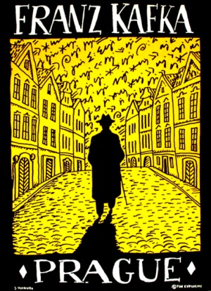
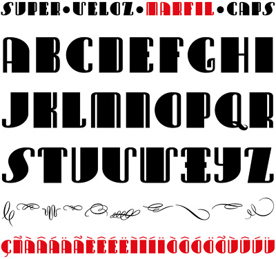
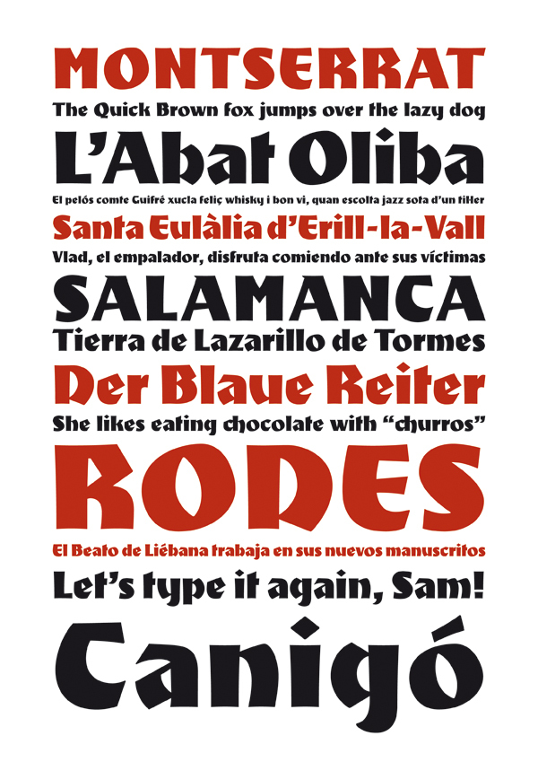
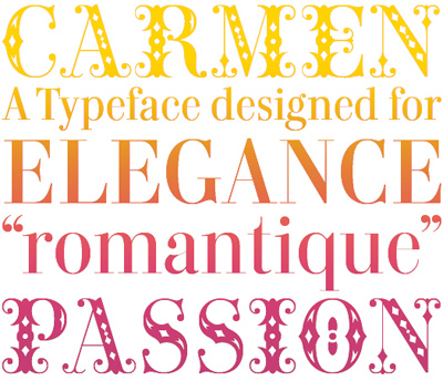
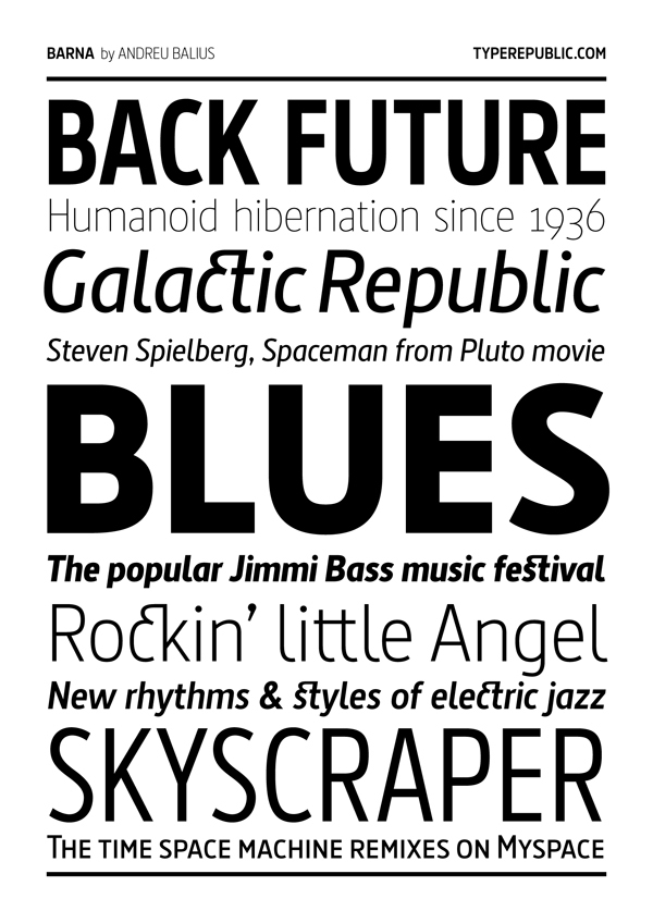
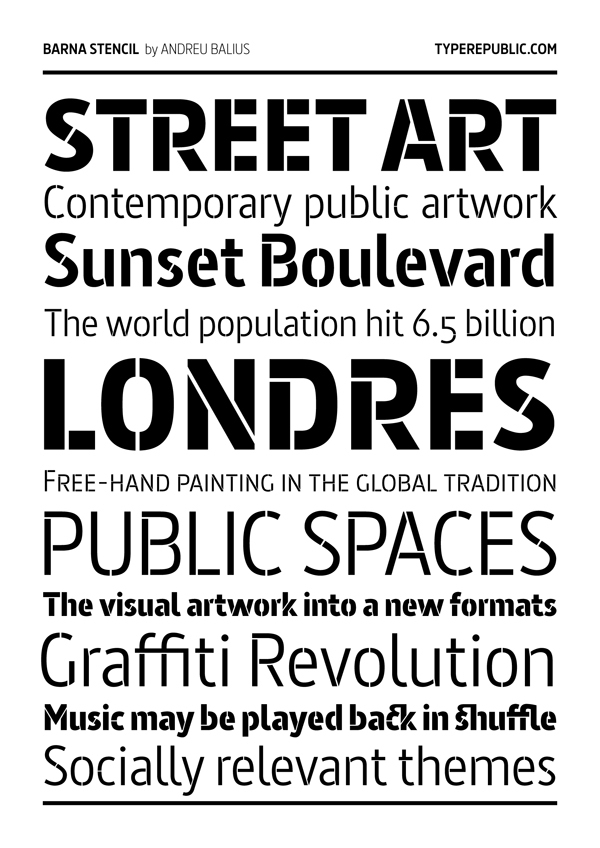
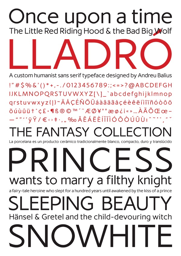
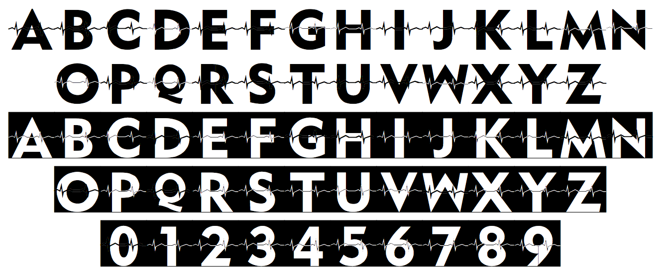
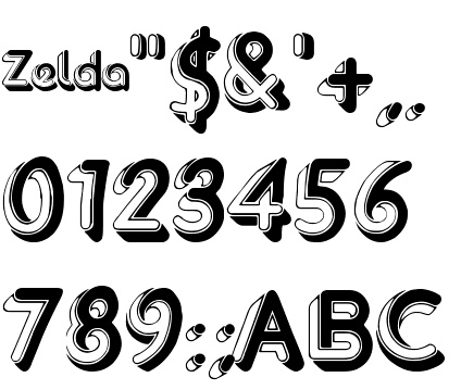
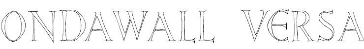
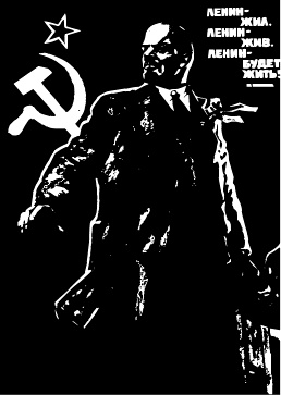
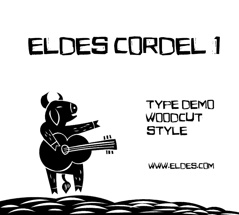
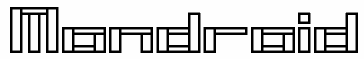
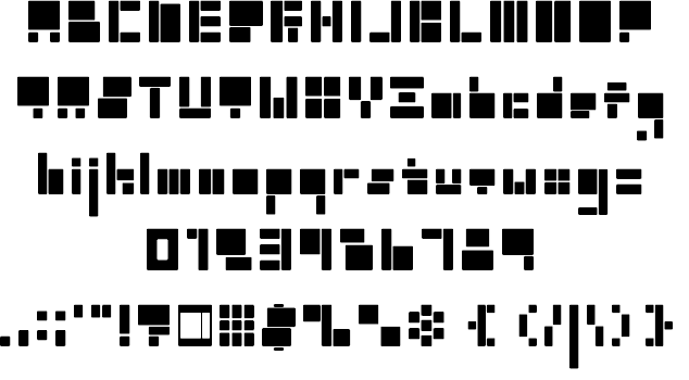
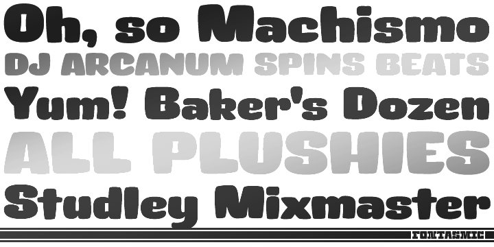
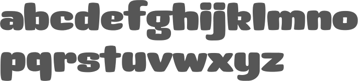
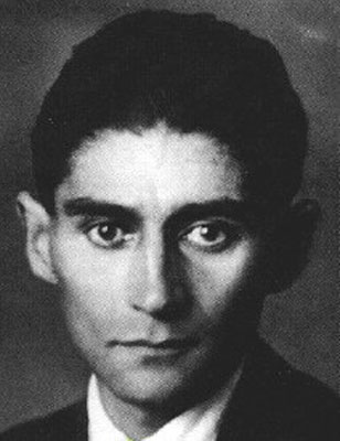
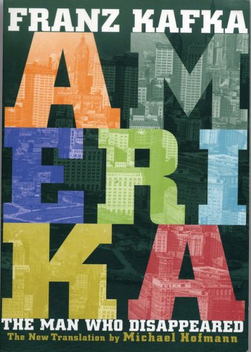
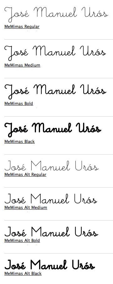
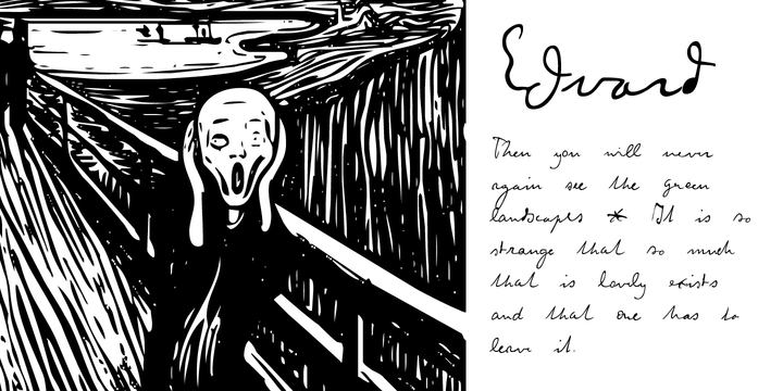
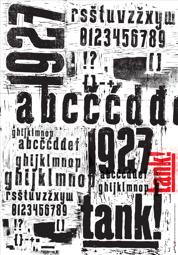
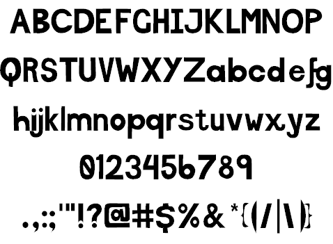
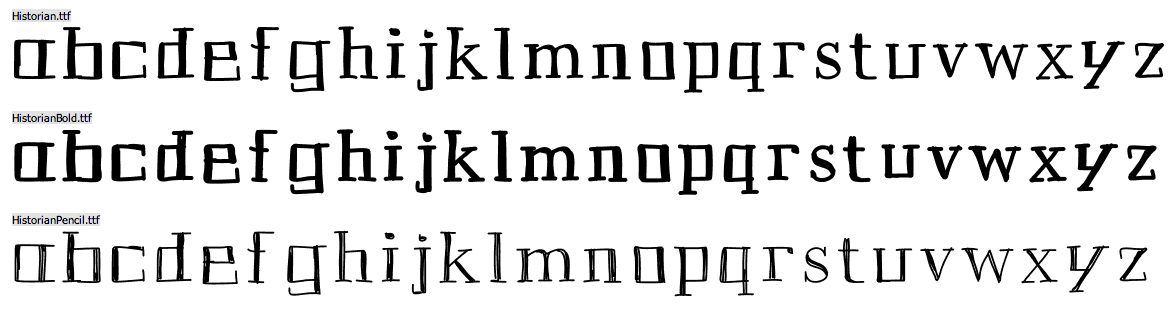
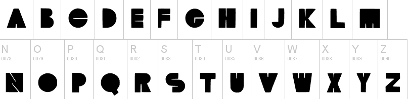
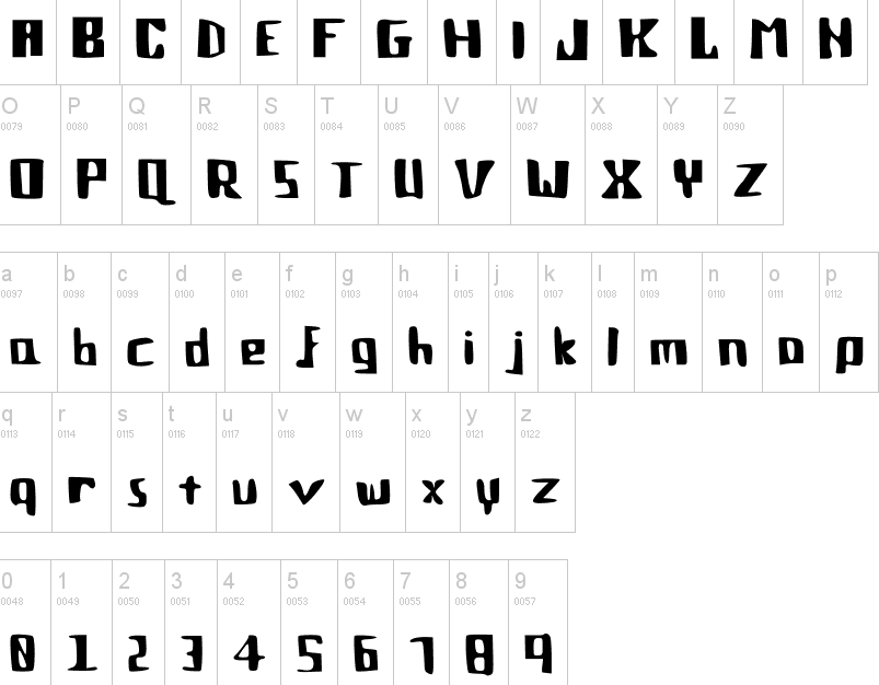
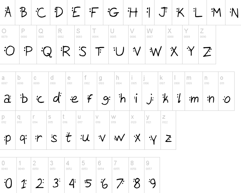
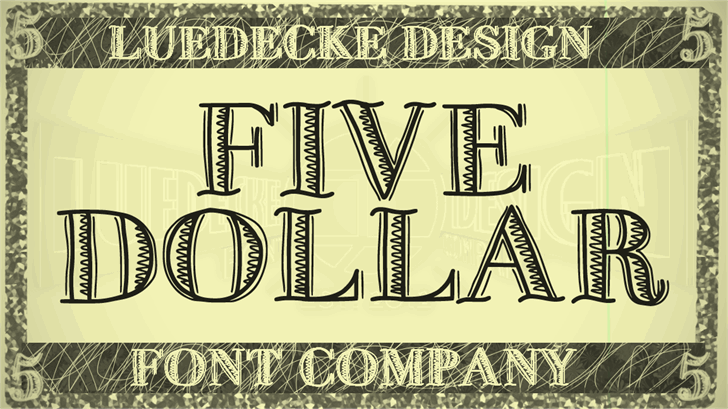
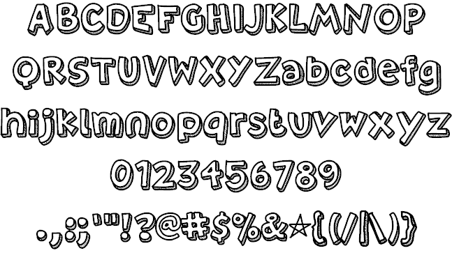
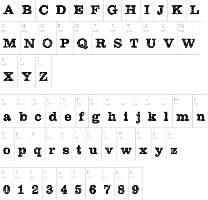
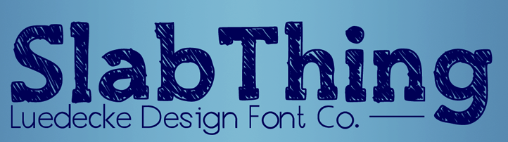
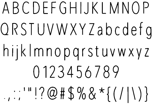
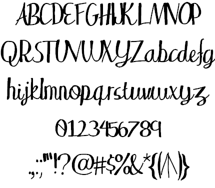
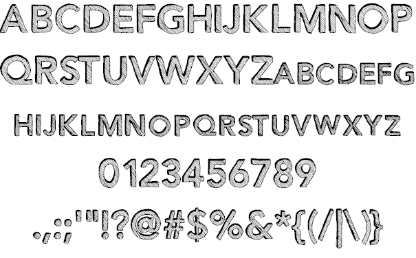
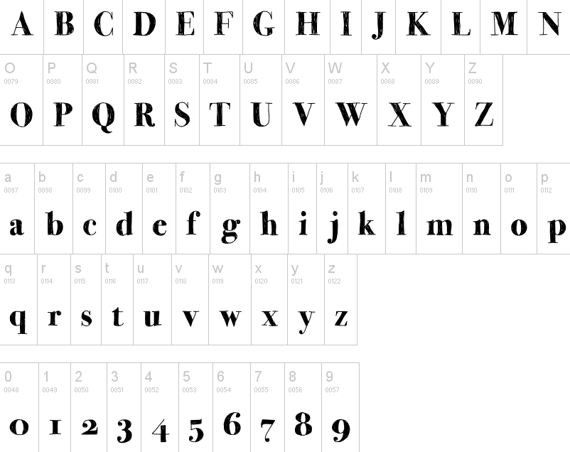
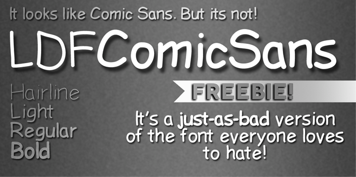
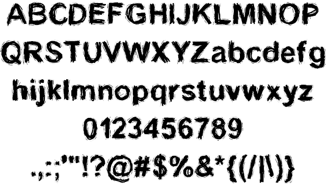
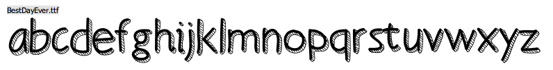
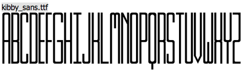
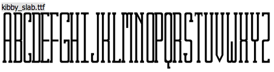
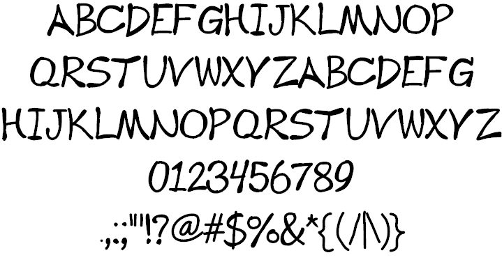
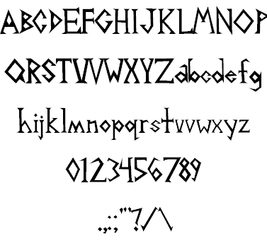
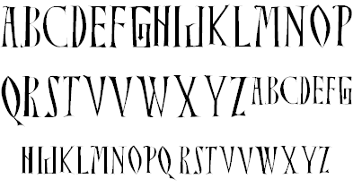
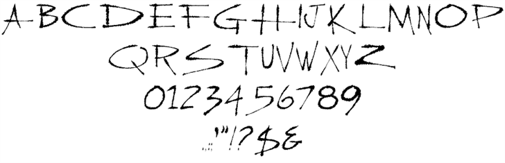
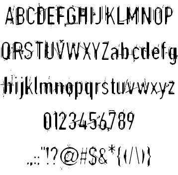
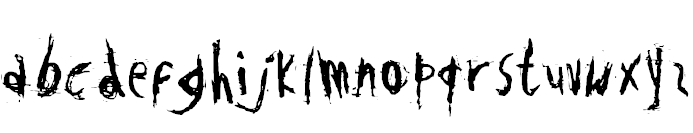
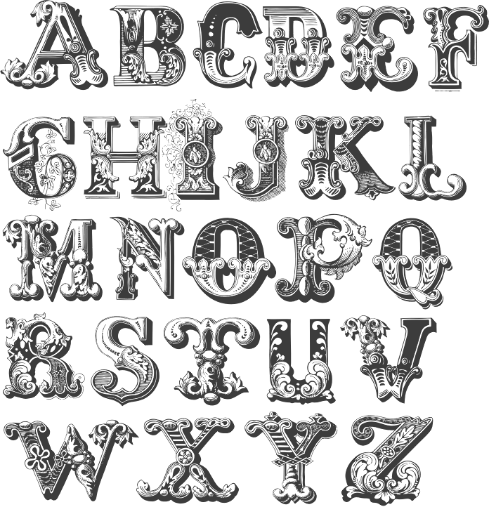
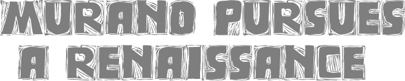
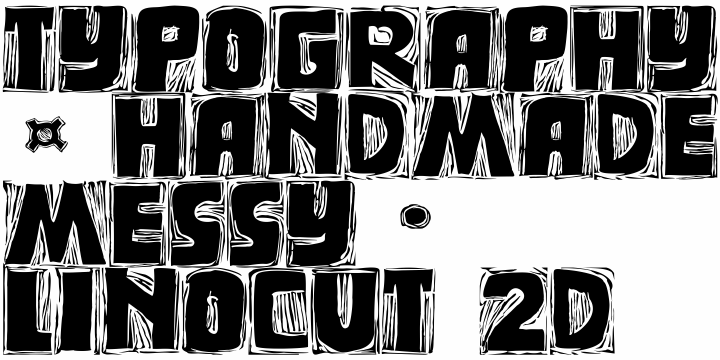
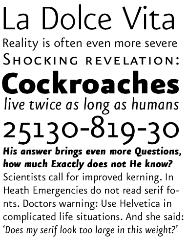
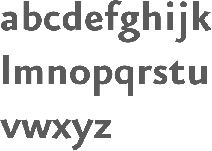
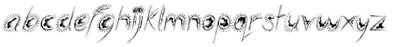
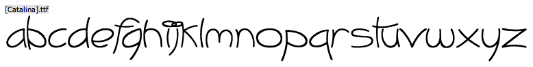
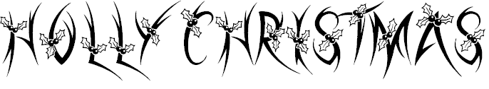
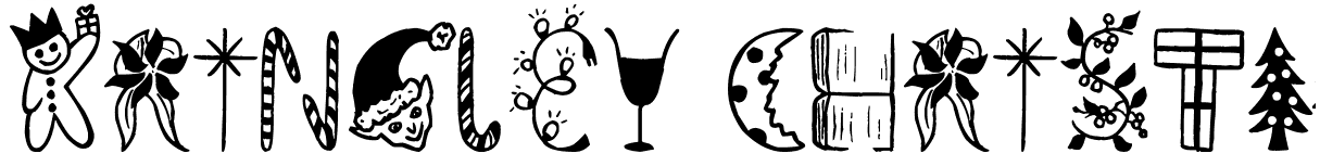
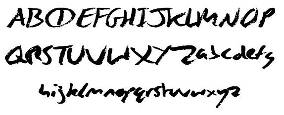
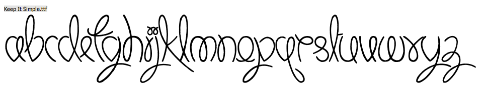
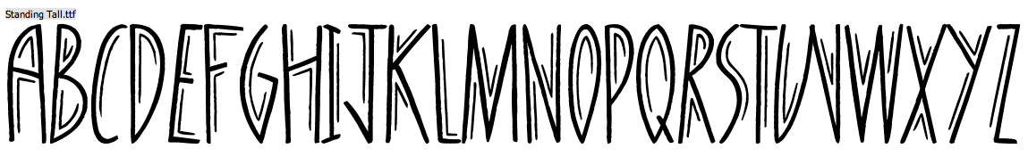
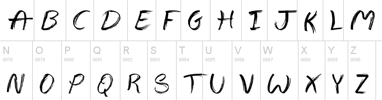
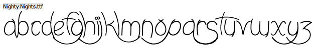
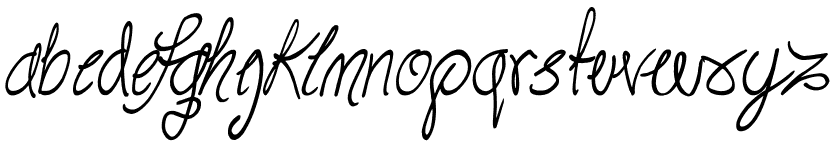
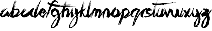
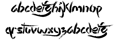
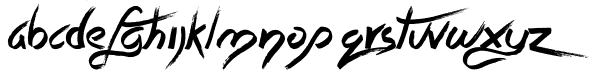
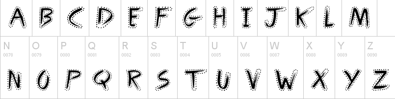
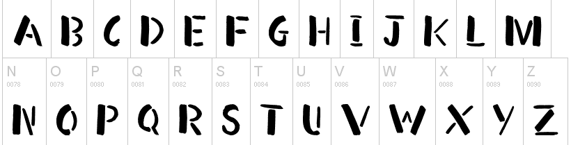
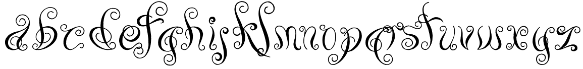
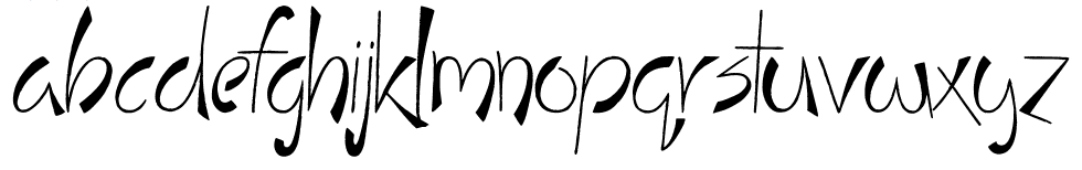
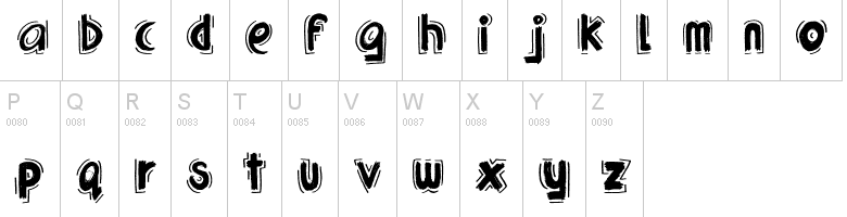
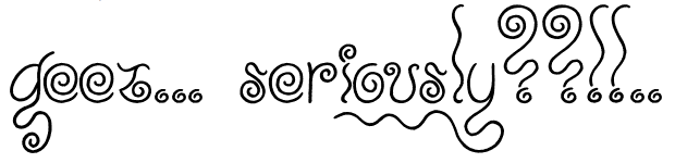
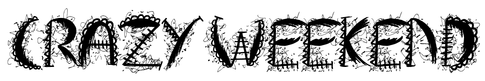
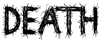
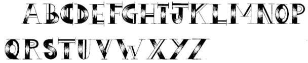
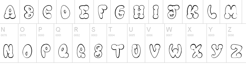
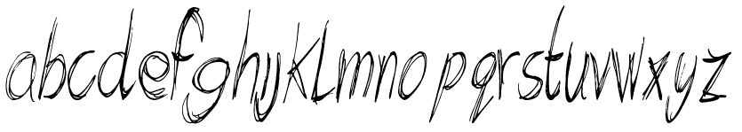
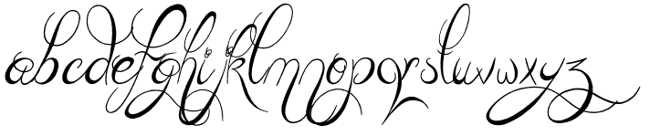
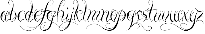
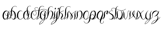
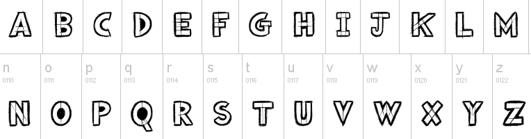
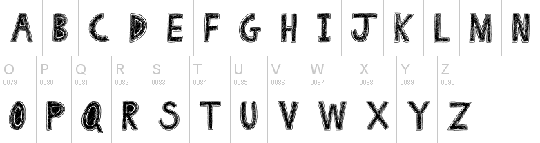
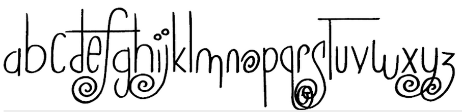
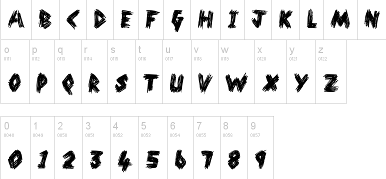
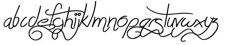
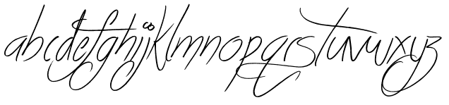
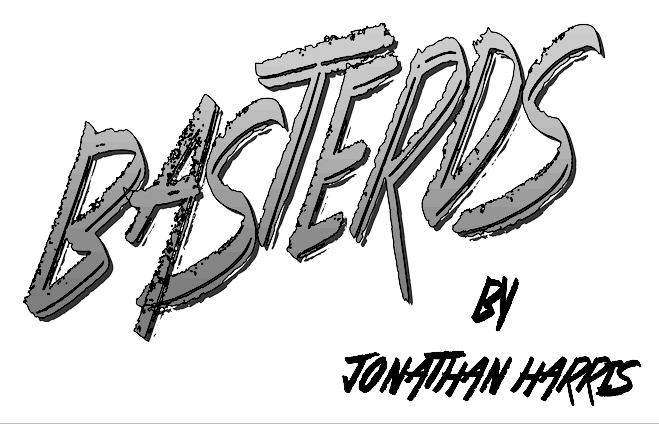
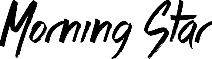
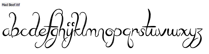
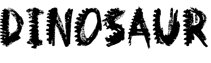
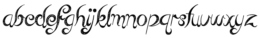
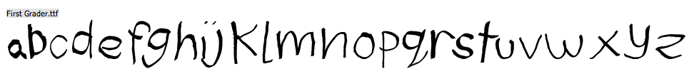
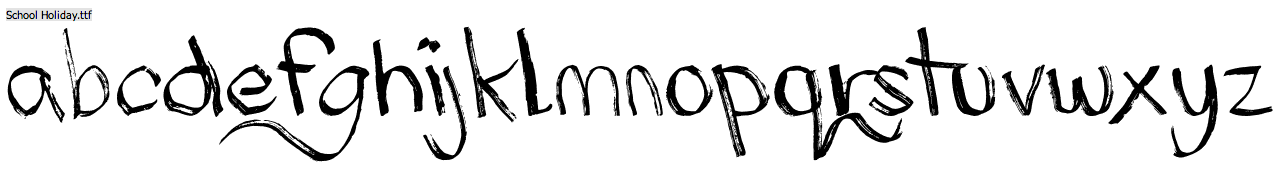
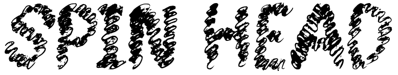
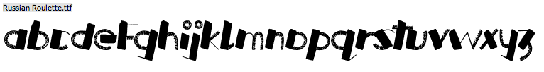
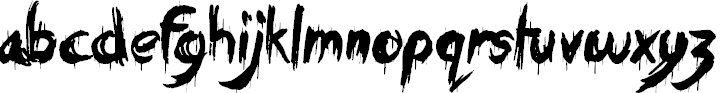
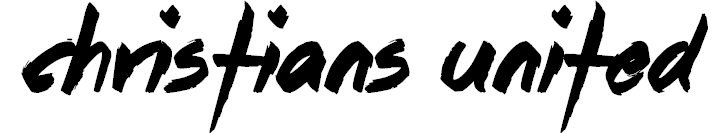
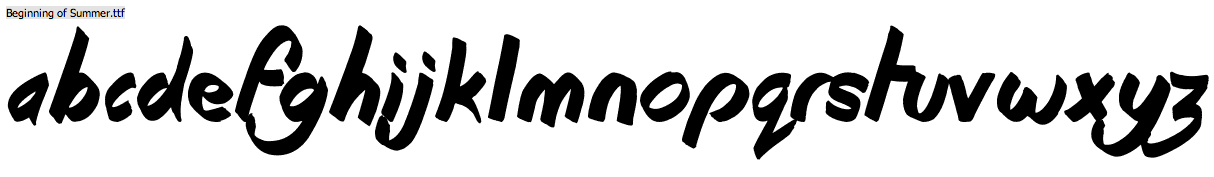
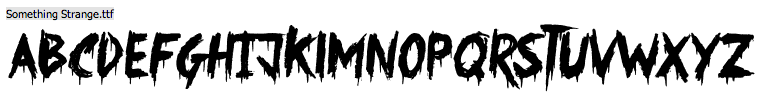
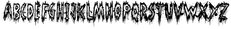
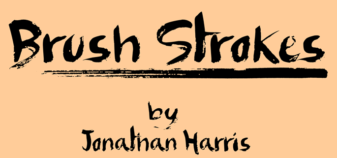
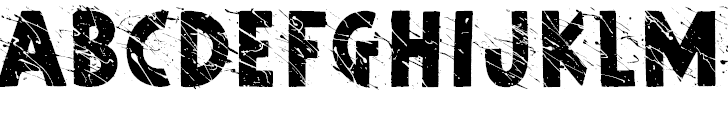
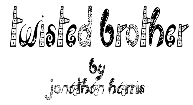
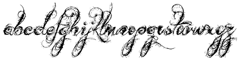
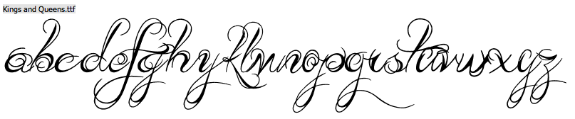
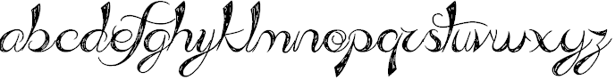
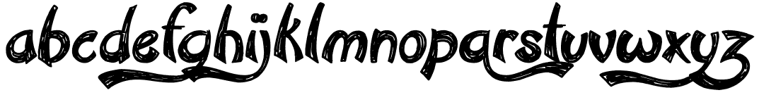
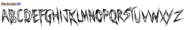
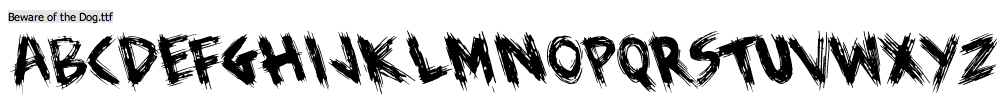
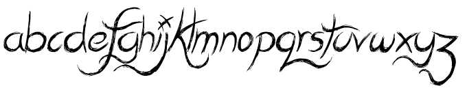
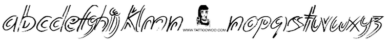
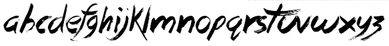
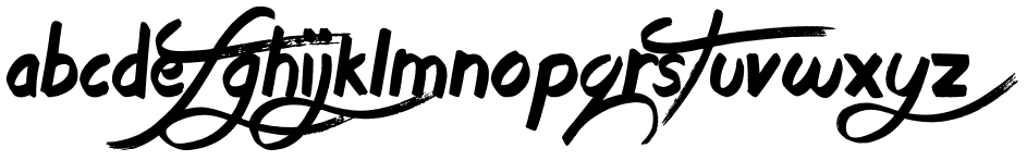
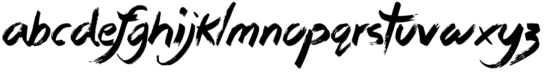
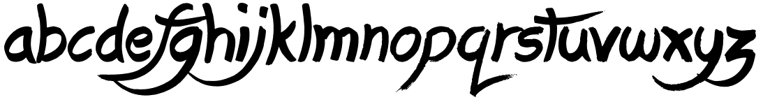
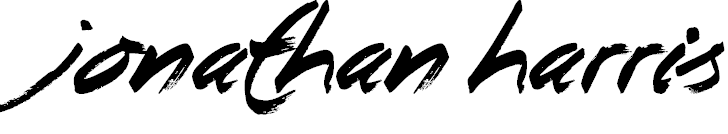
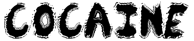
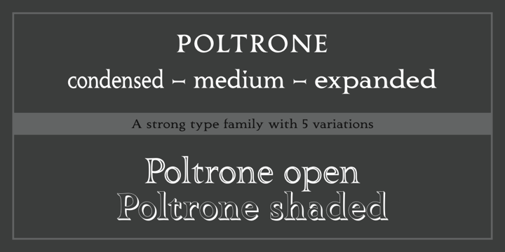