TYPE DESIGN INFORMATION PAGE last updated on Thu Apr 16 21:35:12 EDT 2026
FONT RECOGNITION VIA FONT MOOSE
|
|
|
|
|
Type design in Latvia | ||
|
|
|
|
SWITCH TO INDEX FILE
FontShop link. Klingspor link. [Google] [MyFonts] [More] ⦿ | |
Illustrator from Rezekne, Latvia, who made an ornamental caps face in 2012. [Google] [More] ⦿ | |
Aleksandra's graduating project Pilot is an angular display typeface with German expressionist influences. It won the first prize as a titling face at The Fine Press Association's inaugural Student Type Competition, and won an award in the TDC Typeface Design competition in 2017. From 2012 until early 2017 Aleksandra worked as a type designer at LucasFonts in Berlin. In the beginning of 2017 she moved to the Netherlands to work independently. Aleksandra's retail typeface in the Bold Monday catalog: Pilot (2017). She also designed Necktie. Speaker at ATypI 2016 in Warsaw on Diacritics as a Means of Self-Identification. In that talk, she looked at several Eastern European nations that were created during the 19th century, and in particulat, Latvia. Bold Monday link. [Google] [More] ⦿ | |
Designer and illustrator in Riga, Latvia. Creator of Glutinous (2010, FontStruct). [Google] [More] ⦿ | |
Latvian designer of the curly typeface Twiddle (2022). [Google] [More] ⦿ | |
Typefaces from 2021: Kolka (a great 18-style geometric sans with virtually no contrast). [Google] [MyFonts] [More] ⦿ | |
At Escola Superior de Artes e Design de Caldas da Rainha (ESAD.CR), Portugal, during an exchange program, Anita Abarenkova (Riga, Latvia) created the stencil typeface Anita PT Light (2013). [Google] [More] ⦿ | |
Anna Pocius
| |
| |
Riga, Latvia-based designer of Alina Script (2015). Behance link. [Google] [More] ⦿ | |
Latvian designer of the free polygonal typeface Geom (2010). [Google] [More] ⦿ | |
Artmaker
| Anna Pocius (Artmaker, Riga, Latvia) is the creator of Unique (2012), the free fat round monoline monospace sans family VDS and VDS Bold (2011, Open Font Library). She also made Banana Brick Font (2011, free at OFL). |
Asketic Design Studio
|
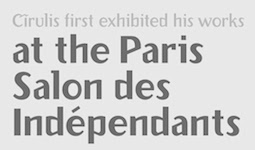
Home page. Dedicated web site for the Cirulis font. You Work For Them link. [Google] [MyFonts] [More] ⦿ |
Six standard Microsoft TrueType fonts (Arial, etc.), and two free Baltic fonts, Serif and Sans, provided by Codefusion Communications Inc. [Google] [More] ⦿ | |
Burtus Type is an initiative of Asketic. It showcases selected Baltic typefaces. [Google] [More] ⦿ | |
Cyrillic, Latvian and English fonts: the Rim family (Times, Souvenir, etc.) by AG Fonts. The PragmaticaLatvian family by ParaGraph JV.&E. Gailis&Y. Ivanov. BaltHelvetica by AG Baltia. The Peterburg family by Atech Software. Dead link. [Google] [More] ⦿ | |
Graphic designer in Saldus, Latvia, who created Dots (2012), a dot matrix typeface. [Google] [More] ⦿ | |
Latvian design blog, with occasional type design information. [Google] [More] ⦿ | |
Stirling, UK-based graphic designer and typographer. Originally from Latvia, he cooked up some exquisite corporate identities. [Google] [More] ⦿ | |
Riga, Latvia-based type designer who created Swan (1992, Tilde, type 3 font) and New Symbol (2013, a type 3 dingbat font that probably also was done in the 1990s originally). Swan can be downloaded here. [Google] [More] ⦿ | |
Riga, Latvia-based art director. During a workshop at Type Paris 2018, she designed Ome, a typeface that was inspired by the Trajan inscriptions, and that she intends to use on her grandmother's gravestone. [Google] [More] ⦿ | |
Dutch / Latvian FontStructor who made Georgian Boldy (2012), Latvian High Condensed (2012, a piano key typeface), and Aluksne (2012, a bold sans with 854 glyphs). [Google] [More] ⦿ | |
| |
Riga Latvia-based designer of the lava lamp typeface Caldas Life (2016). [Google] [More] ⦿ | |
Designer in Riga, Latvia. In 2015, Gatis Vilaks and Evita Vilaka co-designed the handcrafted Latin / Cyrillic typeface Summer. Earlier, in 2014, they co-designed Reef (a free rounded sans), Sunn Pro and Thin Line Font. In 2016, they co-designed the handcrafted typefaces Weem and Vintii. In 2017, they published the handcrafted Mona, and the free monoline sans typeface Hover Classic. In 2018, they designed the brush fonts Austra and Leira, and the display sans font Lokka. Their companies are called RIT Creative, Wildtype Design and Wild Ones Design. [Google] [MyFonts] [More] ⦿ | |
Favete Art
|
Typefaces from 2017: Cutout, Mucho Gusto (Script+Doodles), Scandinavian (textured, patterned), Golden Boy, Rotterdam (dry brush font), Soft Spot (thick soft brush font), Kaleido (a spectcular brush script), Silentium, Big Brush, Sydney (brush), Woodland, Gizmo (marker font), Typetop (dry brush style). [Google] [More] ⦿ |
Designers of the Latvian-Russian typefaces LR_Architect, LR_Baltica-Bold, LR_Baltica-BoldItalic, LR_Baltica-Italic, LR_Baltica, LR_Benguiat-Bold, LR_Compact-Italic, LR_Compact, LR_Helvetica-Bold, LR_Helvetica-BoldItalic, LR_Helvetica-RegularItalic, LR_Lazurski-Bold, LR_Lazurski-BoldItalic, LR_Lazurski-Italic, LR_Lazurski, LR_Optima-Bold, LR_Optima, LR_Souvenir, LR_Times-Bold, LR_Times-BoldItalic, LR_Times-Italic, LR_Times, LR_University-Roman. [Google] [More] ⦿ | |
Gatis Cirulis
| |
Gatis Vilaks
| |
Gatis Vilaks
| |
Latvian designer, b. 1985, Riga. He graduated from Design Academy Eindhoven in 2011 and set up his own graphic design studio in Amsterdam in 2014. Creator of the Western circus font How Are You. [Google] [More] ⦿ | |
Latvian designer of the pixel typeface QuinqueFive (2019). In 2020, he added Fortzilla (octagonal caps), E1234 (an LED font), Pulstar, the 3d typeface 3D Isometric, the monoline sans typeface Zector, and the grungy script Kurland. [Google] [More] ⦿ | |
Girts Ulmanis (Riga, Latvia) designed the display sans typeface Recorda in 2013 during his studies. Creative Market link. [Google] [More] ⦿ | |
FontShop link. Linotype link. Klingspor link. MyFonts collection. View Grinbergs's typefaces. [Google] [MyFonts] [More] ⦿ | |
Latvian designer of the display typeface Kolka. [Google] [More] ⦿ | |
In 2017, Ieva Mezule and Krisjanis Mezulis (Riga, Latvia) designed the donationware handcrafted typeface Leafy and the free handcrafted typefaces Espa and Espa Extended. In 2018, Ieva Mezule and Krisjanis Mezulis published the free brush titling font Aloja and Aloja Extended (brush script). Typefaces from 2019: Loki (a free roman caps font by Krisjanis Mezulis and Ieva Mezule) [Google] [More] ⦿ | |
Janis Kalaus
| |
Designer of sci-fi and pixelized fonts. Fonts: 8BITWONDERNominal (2001), Cybernetic-Ninja, DotComradeNominal, JHUFNominal (1998, techno), JHDigitalNominal, JHTITLESNominal, NewHorizonsNominal, StellarKombatMENominal, Stellar-Kombat, Vasquez, SpaceMarine, 8BITWONDER, JHTITLES, New Horizons (2001), SpaceMarine, JH_Fallout (2002), Xenophobia (2001). Open Font Library link. Fontspace link. Dafont link. [Google] [More] ⦿ | |
Latvia-based designer of the pixelish typeface Evilborn (2016). Dafont link. [Google] [More] ⦿ | |
June 23
| June23 is a Latvian type foundry run by Janis Kalaus. In 2018, he published Framer Sans (a low-contrast condensed basic sans). [Google] [MyFonts] [More] ⦿ |
Riga, Latvia-based designer of the brush typeface Imperfect (2019). [Google] [More] ⦿ | |
Latvian graphic designer. For a university project, he designed Sanriff. [Google] [More] ⦿ | |
| |
Mezulis designed the art deco era sans typeface Etan (2015; for Latin and Cyrillic; free) and the rough brush script typeface Plume (2015, free). In 2015, he designed the free rough brush script typeface Kust, again for both Latin and Cyrillic. Typefaces from 2016: Fibre Extended Brush, Banaue (a free brush font), Fjord Handwritten (dry brush script; free demo). Typefaces from 2017: Undeka (sans: MyFonts link), Peomy, Espa (with Ieva Mezulis), Espa Extended Brush (by Ieva Mezule), Avene (a free brush font), Leafy (a handcrafted typeface done with Ieva Mezule), Leafy Extended. Typefaces from 2018: Aloja Extended (brush script by Ieva and Krisjanis Mezulis), Sanos (brush script), Arber (free). Typefaces from 2019: Loki (a free roman caps font by Krisjanis Mezulis and Ieva Mezule). Typefaces from 2020: Nafta Brush Font, Nafta Marker (a free brush font), Nafta Extended, Wuhan (a free slimy horror font), Sanos Extended. Behance link. Another Behance link. Mezulis's company is called Wild Type or Wild Ones. [Google] [MyFonts] [More] ⦿ | |
Latvian designer of the free retro diner script typeface Camouflage. [Google] [More] ⦿ | |
Latvian designer of the free comic book font Explorer (2019). It was inspired by hand-painted signs found off the beaten track. [Google] [More] ⦿ | |
Kristians Sics
| |
Riga, Latvia-based designer of the free all caps war propganda typeface Propaganda (2010). Behance link. [Google] [More] ⦿ | |
Lamatas un Slazdi
|
Klingspor link. [Google] [MyFonts] [More] ⦿ |
Libertine Open Fonts Project
|
In 2007, the following weights are available: Normal, Kursiv, Fett, Fett Kursiv, Kapitaelchen, Unterstrichen, Grotesk. As a measure of the success of the font, we find that is now used on the logo of Wikipedia. As a companion font, they offer Linux Biolinum (2010): The Biolinum is an organic sans-serif and could be also described as organogrotesque (non-linear sans serif). It is still in a beta stage. Biolinum is meant for emphasizing titles but could be used also for short passages of text. For longer texts a serif font such as the Libertine should be used in favour of readability The Biolinum has the same vertical metrics and visual weight as the Libertine, so that it fits perfectly to the Libertine and can be also used for emphasizing within the body text. In 2017, Biolilbert was born out of Biolinum. Biolilbert's name is a portmanteau from Biolinum and Hilbert. In 2012, Bob Tennent created type 1 versions of Biolinum and Libertine. In 2016, LibertineGC was published by Michael Sharpe at CTAN, adding LaTeX support files for Greek (essentially complete LGR, supporting monotonic, polytonic and ancient features) and Cyrillic. Another effort at corrections was undertaken by Khaled Hosny in 2016 in his Libertinus family. The Libertinus font family is a fork of Linux Libertine and Linux Biolinum with many bug fixes and improvements. Also included are Libertinus Math, Libertinus Serif (from Lunux Libertine), Libertinus Sans (forked from Linux Biolinum) and Libertinus Mono (from Linux Libertine Mono). Github link. CTAN link for Libertinus, maintained by Herbert Voss. Dafont link. Fontspace link. CTAN link for Libertineotf. CTAN link for Libertine download. Klingspor link. Klingspor link. CTAN link. [Google] [More] ⦿ |
During her studies, Cesis, Latvia-based Liene Bakane designed a thin Latin display typeface (2015). [Google] [More] ⦿ | |
Latvian designer of Mammalampa and the free circle-themed typeface Pump (2003). [Google] [More] ⦿ | |
Art student from Latvia who, during her studies at Caldas da Reinha, Portugal, created Citybridge Stencil (2015). Behance link. [Google] [More] ⦿ | |
Riga, Latvia-based designer of Citybridge Type (2017). Behance link. [Google] [More] ⦿ | |
Salaspils, Latvia-based designer of White Vulff (2017). [Google] [More] ⦿ | |
Mikelis Bastiks
| |
MyFonts foundry page. Dafont link. Klingspor link. [Google] [MyFonts] [More] ⦿ | |
Typefaces from 2022: Mahbook. Typefaces from 2021: Mareh, Tashweeq (a truly spectacular Arabic typeface in which glyph is a piece of modern geometric art), Mithqal, Dardashah (an inline Arabic display typeface), Lakhbatah, Lafet, Hawadeet, Caricaturey (a comical and comic book font), Mopaxel (a pixelish color font), Teraaz, Tashweesh (pixelish), Najmy, Rakan. Typefaces from 2020: Tashkeel (a color font), Talasem, Naghamah (a children's book font), Qafashat, Makana (a fat display typeface), Shakhabeet, Meshkal (Arabic for kaleidoscope: an Arabic display font that is inspired by the kaleidoscopic geometries), Kahraman. Typefaces from 2019: Mostaqbali, Wafir (condensed), Modhesh, Graffitica, Lamhah, Lattouf, Laftah, Kaleel, Mawzoon. Typefaces from 2018: Moltaqa, Khorafi, Mateen, Jadeer, Taiween, Lafeef (rounded), Tamema, Ikseer, Origami (a color font), Fenoon, Dahka, Tajreed, Oajoubi. In 2017, he designed Etlalah, Tashabok, Olfah, Zahey, Alama, Takween (based on the Mashrequi writing style), Loabah, Makeen, Maheeb, Enferad, Paxalah (a pixelish Arabic typeface), Mozarkash (deco style). Earlier typefaces: Fokaha (2016), Khetab (2016, Kufic), Taleeq (2016), Saiihah (2016, an experimental Arabic typeface), Ahaleel (2016), Inseyab (2016, a monoline Arabic typeface), Ostouri (2015, a heavy calligraphic Arabic typeface), Kaleem (2015, Arabic display typeface), Ebhaar (2015), Tarhaal (2015), Jazeel (2014), Hetaf (2014), Bareeq (2014), Tawasul (2014), Wahaj (2013), Bedayah (2013, a geometric Arabic typeface), Atyaaf (2013, a multiline display face), Aqlaam (2012, Arabic), Falak (2012, Arabic typeface), Ahlan (2012, Arabic typeface), the hairline Arabic typeface Khayal (2012), the fat octagonal typeface PolyFont (2012), the corporate typeface Tasreeh (2012), the comics book font Nokta (2012), Ekleel (2012), Friendo (2012), Retro Town (2012, free demo), and the pixel typefaces Kufigraph (2012), Raqami (2012) and Pixelogist (2012). Arabic typefaces made in 2013: Fekrah, Fenoon (square Kufic style). Creative Market link. Dafont link. Behance link. You Work For Them link for Scribo Studio. [Google] [More] ⦿ | |
Lithuanian graphic artist and type designer, b. Riga, 1924. [Google] [More] ⦿ | |
Olga Zakharova
| |
Philipp H. Poll
| |
RAWTYPE
| Gatis Cirulis (Rawtype, Latvia) is a graphic designer and illustrator who does projects for individuals and companies in Central Europe and the USA. He specializes in logos, identity, illustration, publication, drawing, painting, lettering, book arts web design. He was art director at McCann Latvia but is now located in Bloomington, IN, where he was Letterpress Type Shop Graduate Assistant at Indiana University Bloomington. He currently lives in Las Cruces, NM. His typefaces:
|
RIT Creative
| Gatis Vilaks (RIT Creative, Riga, Latvia) created Weem (2016, free), Thin Line Font (2014), Sunn (2014, a free hand-printed typeface; with Krisjanis Mezulis), Reef (2014, a free rounded sans), and Modeka (2014, a free techno typeface in which elliptical curves are at war with octagonal forces). In 2015, he went commercial and published Sunn Pro (Latin and Cyrillic) and Summer (a handcrafted Latin / Cyrillic typeface co-designed with Evita Vilaka). Free typefaces from 2016: Vintii (with Evita Vilaks; see also Vintii Extended, 2017), Deepo, Alepo. Free typefaces from 2017: Cornera (hexagonal; free), Sunn Line Serif. Creative Market link. Behance link. Gumroad link. Behance link. [Google] [MyFonts] [More] ⦿ |
Ryan Pescatore Frisk
| |
Sergejs Kolecenko (b. 1989, Riga) is currently studying fine art and type design at the Art Academy of Latvia. He designed the display family Fingerz (2011). MyFonts link. Dafont link. [Google] [MyFonts] [More] ⦿ | |
Latvian designer of Wet Cat (1998). Home page. [Google] [More] ⦿ | |
Strange Atrtractors Design
| Together with Catelijne van Middelkoop, Ryan Pescatore Frisk established Strange Attractors Design in the Netherlands. Their creations include Turfhaus (custom design sans), Cranbrook 53 (custom dingbats face), Fourteen Boxed (custom), Hey Dutchie! (custom face), Grau (custom hand-drawn version of Weiss), King of Latvia (custom made) and Brunn, a display typeface that won an award at TDC2 2004. Ryan received a BFA in Graphic Design from Savannah College of Art and Design in 1999, and an MFA in 2D Design from Cranbrook Academy of Art in 2002. In 2004-2005, he is a grad student at the KABK in Den Haag. [Google] [More] ⦿ |
Latvian page with about ten mixed Latin/Cyrillic TrueType fonts: the Atunt family, and CNtunt, a Courier New family. [Google] [More] ⦿ | |
British font service house: can sell you most of the commercial fonts. Sells also fonts for Albanian, Arabic, Bengali, Bulgarian, Croatian, Czech, Estonian, Farsi, Greek, Gujurati, Hindi, Hungarian, Japanese (Katakana, Hiragana, Kanji), Latvian, Lithuanian, Polish, Punjabi, Russian, Serbian, Slovak, Slovene, Thai, Turkish, Ukrainian, Vietnamese, Welsh. Has barcode fonts, and is a special distributor of the Royal Mail Barcode font. [Google] [More] ⦿ | |
The Tilde/AG Fonts collection published between 1991-1995 also includes these families designed by Andrejs Grinbergs: AGAalenBold, AGBengaly, AGCenturion, AGCrown, AGFriQUer, AGGalleon, AGGloria, AGLetterica, AGMelanie, AGNewHandbook, AGOpus, AGOpusHR, AGPalatial, AGPresquire, AGReverence, AGZeppelin. The Bitstream-based collection comprised these typefaces in 2015: Aachen, Aldine 401, Aldine 721, Allegro, Alternate Gothic, Am Beauty, Amazone, Amelia, Americana, Amerigo, Aurora, Baker Signet, Balloon, Baltic Ornaments, Bank Gothic, Baskerville, Bell Centennial, Belwe, Bernhard Fashion, Bernhard Modern, Bernhard Tango, Blippo, Bodoni, Bremen, Broadway, Brunch Pro, Brush 445, Brush 738, Brush Script, Calligraph 421, Candida, Carmina, Cataneo, Caxton, Century Old Style, Cheltenham, Clarendon, Classical Garamond, Cloister Black, Cloister, Commercial Script, Constellation Pro, Cooper, Copperplate Gothic, Davida, Della Robbia, Dom, Egyptian 505, Elegant Garamond, Empire, English 111, English 157, Engravers Gothic, Engravers Old English, Exquisite Pro, Flareserif 821, Flemish Script, Folio, Formal 436, Fraktur, Franklin Gothic, Freehand 471, Freehand 521, Freehand 575, Freehand 591, Futura, Futura Black, Geometric 231, Geometric 415, Geometric 706, Geometric 885, Geometric Slabserif 703, Gothic 720, Gothic 725, Gothic 821 Condensed, Goudy Handtooled, Goudy Heavyface, Goudy Old Style, Handel Gothic, Hobo, Humanist 521, Humanist 531, Humanist 777, Huxley Vertical, Impress, Impuls, Incised 901, Informal 011, Kaufmann, Kette Pro, Kuenstler 480, Lapidary 333, Letter Gothic 12, Liberty, Libra, Lucian, Lydian, Lydian Cursive, Matt Antique, Mirarae, Mister Earl, Monterey, Murray Hill, News 702, News 705, News 706, News Gothic, Nuptial, OCR-B-10, Onyx, Oranda, Orator 10, Original Garamond, Parisian, Park Avenue, Piranesi, Poster Bodoni, Prestige 12, Raleigh, Revue, Ribbon 131, Rigaer Tango Pro, Robusta, Romana, Roundhand, Schadow, Scintilla Pro, Seagull, Serifa, Shotgun, Snow Cap, Snowbird, Square 721, Staccato 222, Staccato 555, Starfighter, Stencil, Swiss 721, Tango, Tourandot Pro, Transitional 521, Transitional 551, Umbra, University Roman, VAG Rounded, Waldorf Pro, Wedding Text, Windsor, Zapf Calligraphic 801, Zapf Elliptical 711, Zapf Humanist 601, Zurich. MyFonts link where one finds Starfighter TL (2012, a font family for gamers), Snowbird (2011, informally hand-printed family), Constellation Pro (geometric sans family), Kette Pro and Rigaer Tango Pro (calligraphic script). View Tilde's typefaces. [Google] [MyFonts] [More] ⦿ | |
Illustrator in Riga, Latvia, who designed the handcrafted typeface Baltic Holidays in 2017. [Google] [More] ⦿ | |
Latvian studio. Creators of the display typeface Dubult Dibens (2013). [Google] [More] ⦿ | |
Wild Ones
| Riga, Latvia-based designers Krisjanis Mezulis, Evita Vilaka and Gatis Vilaks are the Wild Ones. Typefaces from 2020 include Inola (a script), Quira (a geometric sans) and Quint (a sans). In 2018, Gatis Vilaks designed Monly. In 2017, they designed Hover Lite (free), Mona (by Evita Vilaka), Modeka Extended, Entra (free), Sunn Line, Sunn Line Serif and Sunn Serif, a handcrafted typeface family. They created these typefaces in 2016: Fibre, Etna (by Krisjanis Mezulis), Fjord (brush style, by Krisjanis Mezulis), Kust Extended Brush (by Krisjanis Mezulis), Plume (by Krisjanis Mezulis), Besom (brush style, by Krisjanis Mezulis). In 2015, they designed Summer (Gatis Vilaks and Evita Vilaka). In 2014, Gatis Vilkas and Evita Vilaks co-designed Reef (2014, a free rounded sans), Sunn Pro (2014) and Thin Line Font (2014). Their company was called RIT Creative. Gatis Vilaks designed Weem (2016) and Modeka (2014). Creative Market link. Behance link. Behance link for Gatis Vilaks. Behance link for Wild Ones. [Google] [MyFonts] [More] ⦿ |
Riga, Latvia-based designer of an angular typeface simply called Lettering (2014). [Google] [More] ⦿ |
|
|
|
|


 Born in Tockum (near Riga, Latvia) in 1876, he died in Bialystok in 1942. German type designer who designed the classical display typeface
 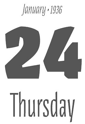 Aleksandra Samulenkova (b. Latvia) studied visual communication at the Latvian Art Academy in Riga and at Kunsthochschule Weißensee in Berlin, where she took a type design course with Luc(as) de Groot. In 2012 Aleksandra graduated from the
 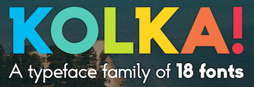 Latvian designer of the blackboard bold font
 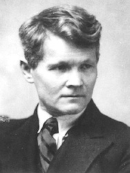 Latvian graphic designer, b. 1883, Majori, d. 1942, Riga. His part art deco part constructivist style led to some digital typefaces that are based on it. These include
  Outfit in San Francisco, London and Riga, Latvia, est. 2007. Most typefaces are designed by Mikelis Bastiks and Aigars Mamis. These include:
  Graduate of the
 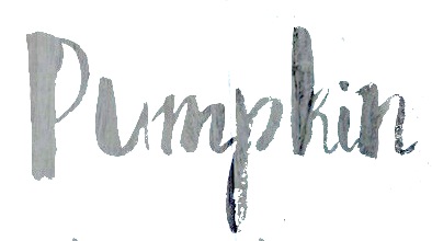 Moscow and/or Riga, Latvia-based designer of the pleasingly rough brush typeface Bronks Script (2015) and of the handcrafted typeface Marshmallow (2015). In 2016, she made the dry brush font Density (2016), the brush scripts Firecracker, Caricia, Pepper, Lady in Red (a fine brush script), Asparagus, Siberia (crayon style), Newport (marker font), Emerald and Haiti, Ambrosia Script, the wide calligraphic font Lancaster, the curly watercolor brush script typeface Candyland, Fallen Angel, the Treefrog-style script Lemon, Penelopa, Cutout, and the creamy brush script Marmaris.
  Born in Riga, Latvia, in 1943, he has mainly cooperated (since 1990) with
  Designer at the University of Latvia of the free technical handwriting font family Drukaatie Burti (2015, Open Font Library) and the circle dingbat font Circles 8 9 12 (2019). [
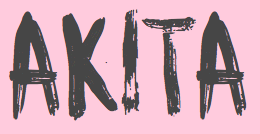 Gatis Vilaks (RIT Creative, Riga, Latvia) and Krisjanis Mezulis (Latvian-born art director and painter in Riga, Latvia) together created Besom (2015, a
  [
[ Design studio, est. 1999 in Riga, Latvia. They are doing some
  Now, here is a project with a name I like! This project by Philipp H. Poll has been started in order to create fonts that can be released under the GNU Public License. As of early 2005, we have the following Times New Roman lookalikes: LLibertineCaps, LinLibertine, LinLibertine-Italic, LinLibertineBd. Libertine Grotesque is next on the list of things to do. The fonts came in truetype and fontforge (SFD) text formats, but have now been extended to include opentype and type 1 as well. Linux Libertine covers a
 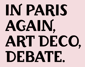 [
[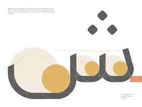 Alexandria, Egypt and Stockholm, Sweden, and Riga, Latvia-based creator of these Arabic typefaces in 2022: Anteeqa.
  [
[ Reinis Ludvik's Riga-based Latvian font design and software development company sells high quality fonts (adapted from Bitstream fonts) for Baltic, Cyrillic, Turkish and Eastern European languages. Includes the