| | |
Akzidenz Grotesk
|
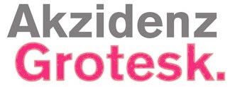 Akzidenz Grotesk and is digital descendants. These include the many versions of it at Berthold (Akzidenz Grotesk, AG Book, AG Book Old Face, Akzidenz Grotesk Next, and so forth), typefaces like the Linotype clone, Basic Commercial, and some fonts that are further afield. The Bitstream clone is Gothic 725 (1990). The Softmaker clone is Atkins. [Google]
[More] ⦿
Akzidenz Grotesk and is digital descendants. These include the many versions of it at Berthold (Akzidenz Grotesk, AG Book, AG Book Old Face, Akzidenz Grotesk Next, and so forth), typefaces like the Linotype clone, Basic Commercial, and some fonts that are further afield. The Bitstream clone is Gothic 725 (1990). The Softmaker clone is Atkins. [Google]
[More] ⦿
|
Arial
|
 Arial is one of the most widely used designs of the digital era. Designed in 1982 by Robin Nicholas and Patricia Saunders for use in an early IBM laser printer, Arial has become a standard font in many font libraries. The design itself was based on Monotype Grotesque (and not Helvetica as many believe). The digital versions of Arial are sold by Ascender, Microsoft and Monotype.
 [Google]
[More] ⦿
|
Bell Centennial
|
View various digital implementations of Bell Centennial, or its predecessor, Bell Gothic. [Google]
[More] ⦿
|
Bodoni Ultra
|
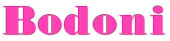 View various digital implementations of Bodoni Ultra. [Google]
[More] ⦿
View various digital implementations of Bodoni Ultra. [Google]
[More] ⦿
|
Caribbean fonts
|
A list of commercial Caribbean fonts. [Google]
[More] ⦿
|
Cartographic typefaces
|
A collection of commercial typefaces inspired by map typography and cartography. [Google]
[More] ⦿
|
Dan X. Solo
[Solotype]

|
 [MyFonts]
[More] ⦿
[MyFonts]
[More] ⦿
|
Engravers Old English
|
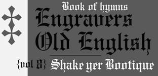 Engravers Old English is a plain, sturdy rendition of the blackletter style, commonly known as Old English. It was designed in 1901 by Morris Benton and another person identified by ATF only as Cowan, but has also been ascribed to Joseph W. Phinney. Mac McGrew writes: It is a modernization of Caslon Text, and has been widely used. Engravers Old English Open was produced by ATF in 1902. Sidney Gaunt designed Engravers Old Black, very similar to Engravers Old English, for BB&S in 1910, but BB&S later produced Engravers English, a copy of Engravers Old English. It has also been copied by Intertype, and by Ludlow as Old English. Hansen's Lafayette Text (q.v.) was very similar. Engravers Old English Bold was designed by Morris Benton for ATF in 1910. The unfamiliar characters of Old English types are often misused, and the alternate forms of some letters add to the confusion. I and J are particularly subject to mix-up, because they were originally the same letter, and never developed as definite a distinction in these styles as in roman letters. In Ludlow Old English, cap I is comparable to the one in the Bold weight, but this style has not been found elsewhere in the regular weight. Curiously, in the Engravers Old English Bold specimen shown, the letters appear as the Monotype copy presents them; however, Monotype's I and J are respectively the second and first forms of I as originally designed, while the specimen here shows separately the original foundry J, which Monotype does not make, along with the alternate H. Compare Wedding Text, a similar design in lighter weight; also Cloister Black; Shaw Text; Lafayette Text.
 Digital revivals and interpretations include [Google]
[More] ⦿
|
Eurostile
|
 Nebiolo's Eurostile set a precedent that led to tens of typefaces and descendants. View a few of the commercially available ones. [Google]
[More] ⦿
Nebiolo's Eurostile set a precedent that led to tens of typefaces and descendants. View a few of the commercially available ones. [Google]
[More] ⦿
|
Fillmore
|
 The Fillmore poster lettering style initiated by Alfred Roller in 1902 and revived by Wes Wilson in the 1960s (also called Curvy Blocked Lettering by Matthijs Herzberg) is representative of the psychedelic era. Some digital typefaces in this style are showcased in this page. They include Psychedelic-Fillmore West (Jeff Bortniker, T26), Psychedelic-Fillmore East (Jeff Bortniker, T26), Jonah (Canada Type), Roller Poster HiH), Mojo (Jim Parkinson for Adobe), Butterfield (1993, Scriptorium), Melrose Modern SG (Spiece Graphics), Moon Star Soul (Flat-it), Tambourine (Transkrypt), Illuminata (Scriptorium), Churchward (BluHead), Psychedelic (T-26), Rebel Train Goes (Flat-it), Guillotine (Canada Type), Flat20 Hippies (Flat-it), Churchward Ta Tiki (Churchward Type), Earthpig (Scriptorium). Flower Children JNL (Jeff Levine). [Google]
[More] ⦿
The Fillmore poster lettering style initiated by Alfred Roller in 1902 and revived by Wes Wilson in the 1960s (also called Curvy Blocked Lettering by Matthijs Herzberg) is representative of the psychedelic era. Some digital typefaces in this style are showcased in this page. They include Psychedelic-Fillmore West (Jeff Bortniker, T26), Psychedelic-Fillmore East (Jeff Bortniker, T26), Jonah (Canada Type), Roller Poster HiH), Mojo (Jim Parkinson for Adobe), Butterfield (1993, Scriptorium), Melrose Modern SG (Spiece Graphics), Moon Star Soul (Flat-it), Tambourine (Transkrypt), Illuminata (Scriptorium), Churchward (BluHead), Psychedelic (T-26), Rebel Train Goes (Flat-it), Guillotine (Canada Type), Flat20 Hippies (Flat-it), Churchward Ta Tiki (Churchward Type), Earthpig (Scriptorium). Flower Children JNL (Jeff Levine). [Google]
[More] ⦿
|
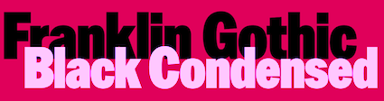
Franklin Gothic
[Morris Fuller Benton]
|
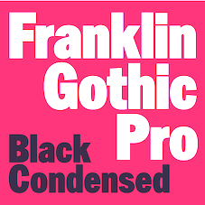 Franklin Gothic was designed from 1904 until 1913 by Morris Fuller Benton for ATF. It was one of the most successful advertising sans typefaces ever made. What the Americans called gothic in those days corresponds to the German Grotesk and the British grotesque. Designs close to Franklin Gothic of that era in Germany include Basic Commercial and Reform from D. Stempel AG. Later serif typefaces by Benton include Alternate Gothic, Lightline Gothic and News Gothic.
 Franklin Gothic is seen in many high-profile situations, from books to billboards. It was featured on the cover of Lady Gaga's The Fame Monster. It is the official typeface of the MOMA (Museum of Modern Art) in New York, and was even the typeface in the PBS series The Electric Company. Franklin Gothic Condensed was used for subtitles in the Star Wars films. In 1979, under license with ATF, Vic Caruso began work on more weights of Franklin Gothic for ITC. His version adheres closely to the subtle variations in stroke thickness of the original design. As was usual with all ITC designs of that period, it had an enlarged x-height and condensed proportions, and, as a result, it became a standard choice for use in newspapers and advertising. In 1991, David Berlow completed the family for ITC (MyFonts shows 96 styles) by creating compressed and condensed weights. He writes: ITC Franklin Gothic Compressed is designed especially to solve impossibly tight copyfitting problems, while maintaining high legibility standards. ITC Franklin Condensed provides medium weights of narrow proportions. Digital remakes and variations and versions include Franklin Gothic (URW++), Gothic 744 (Bitstream, later simply renamed Franklin Gothic), Franklin Gothic SG (2016, Elsner & Flake), Franklin Gothic Pro Black Condensed (2011, Red Rooster), and Frankfurt Gothic (Corel). In 2019, ATF Type published ATF Franklin Gothic (Mark van Bronkhorst, Igino Marini, and Ben Kiel), a broad and multi-weight interpretation of Franklin Gothic, which only had bolder weights. For the lighter styles, the designers were inspired by Benton's Monotone Gothic. MyFonts hit list for Franklin Gothic and its descendants. Subpage with the 96 styles of ITC Franklin Gothic by David Berlow, 1991-2008. [Google]
[More] ⦿
|
Frederic Goudy: Digital typefaces
|
 A list of various digital typefaces that are based on Frederic Goudy's designs. The digital revivals include these fonts: Berkeley Oldstyle (Adobe), Goudy Old Style (Bitstream), LTC Goudy Oldstyle (Lanston Type Company), Copperplate (URW++), Copperplate Gothic (Linotype), LTC Pabst Oldstyle (Lanston Type Company), Goudy Handtooled (Monotype), Goudy Old Style (Monotype), LTC Goudy Ornate (Lanston Type Company), Italian Old Style (Monotype), Copperplate Gothic (Adobe), Goudy Ornate MT (Monotype), LTC Record Title (Lanston Type Company), LTC Goudy Text (Paul D. Hunt for Lanston Type Company; this includes LTD Goudy Text Lombardic Caps), LTC Goudy Initials (Lanston Type Company), LTC Remington Typewriter (Lanston Type Company), WTC Goudy Swash (URW++), LTC Kennerley (Lanston Type Company), LTC Deepdene (Lanston Type Company), Goudy Modern MT (Adobe), Hadriano (Monotype), Hadriano (Adobe), LTC Californian (Lanston Type Company), LTC Goudy Open (Lanston Type Company), Goudy Text (Monotype), Goudy Text (Adobe), LTC Goudy Handtooled (Lanston Type Company), Cloister Initials (GroupType), Hadriano (Linotype), LTC Camelot (Lanston Type Company), LTC Village No 2 (Lanston Type Company), LTC Powell (Lanston Type Company), LTC Forum Title (Lanston Type Company), Copperplate EF (Elsner+Flake), Goudy Handtooled EF (Elsner+Flake), Goudy Sorts (Monotype), ITC Berkeley Oldstyle (ITC), Goudy Trajan Pro (CastleType), Village (Font Bureau), Copperplate Gothic (Bitstream), Goudy Modern MT (Monotype), Copperplate Gothic Hand (Wiescher Design), Goudy Heavyface (Bitstream), Goudy Forum Pro (Ascender), LTC Goudy Sans (Lanston Type Company), Tickety Boo NF (Nicks Fonts), Friar Pro (Ascender), Franciscan Caps NF (Nicks Fonts), Scripps College Old Style (Monotype), Bertham Pro (Ascender), LTC Goudy Extras (Lanston Type Company), LTC Hadriano (Lanston Type Company), Goudy Stout CT (CastleType), National Oldstyle NF (Nicks Fonts), ITC Goudy Sans (1986, ITC), Goudy Handtooled (Linotype), LTC Italian Old Style (Lanston Type Company), Monotype Goudy (Monotype), Goudy Catalogue (Linotype), Goudy Catalogue (Bitstream), Goudy 38 (Red Rooster Collection), LTC Kaatskill (Lanston Type Company), Monotype Goudy Catalogue (Monotype), LTC Garamont (Lanston Type Company), Goudy Catalogue EF (Elsner+Flake), Californian FB (Font Bureau), Goudy Handtooled (Bitstream), Kennerley BQ (Berthold), Deepdene BQ (Berthold). [Google]
[More] ⦿
A list of various digital typefaces that are based on Frederic Goudy's designs. The digital revivals include these fonts: Berkeley Oldstyle (Adobe), Goudy Old Style (Bitstream), LTC Goudy Oldstyle (Lanston Type Company), Copperplate (URW++), Copperplate Gothic (Linotype), LTC Pabst Oldstyle (Lanston Type Company), Goudy Handtooled (Monotype), Goudy Old Style (Monotype), LTC Goudy Ornate (Lanston Type Company), Italian Old Style (Monotype), Copperplate Gothic (Adobe), Goudy Ornate MT (Monotype), LTC Record Title (Lanston Type Company), LTC Goudy Text (Paul D. Hunt for Lanston Type Company; this includes LTD Goudy Text Lombardic Caps), LTC Goudy Initials (Lanston Type Company), LTC Remington Typewriter (Lanston Type Company), WTC Goudy Swash (URW++), LTC Kennerley (Lanston Type Company), LTC Deepdene (Lanston Type Company), Goudy Modern MT (Adobe), Hadriano (Monotype), Hadriano (Adobe), LTC Californian (Lanston Type Company), LTC Goudy Open (Lanston Type Company), Goudy Text (Monotype), Goudy Text (Adobe), LTC Goudy Handtooled (Lanston Type Company), Cloister Initials (GroupType), Hadriano (Linotype), LTC Camelot (Lanston Type Company), LTC Village No 2 (Lanston Type Company), LTC Powell (Lanston Type Company), LTC Forum Title (Lanston Type Company), Copperplate EF (Elsner+Flake), Goudy Handtooled EF (Elsner+Flake), Goudy Sorts (Monotype), ITC Berkeley Oldstyle (ITC), Goudy Trajan Pro (CastleType), Village (Font Bureau), Copperplate Gothic (Bitstream), Goudy Modern MT (Monotype), Copperplate Gothic Hand (Wiescher Design), Goudy Heavyface (Bitstream), Goudy Forum Pro (Ascender), LTC Goudy Sans (Lanston Type Company), Tickety Boo NF (Nicks Fonts), Friar Pro (Ascender), Franciscan Caps NF (Nicks Fonts), Scripps College Old Style (Monotype), Bertham Pro (Ascender), LTC Goudy Extras (Lanston Type Company), LTC Hadriano (Lanston Type Company), Goudy Stout CT (CastleType), National Oldstyle NF (Nicks Fonts), ITC Goudy Sans (1986, ITC), Goudy Handtooled (Linotype), LTC Italian Old Style (Lanston Type Company), Monotype Goudy (Monotype), Goudy Catalogue (Linotype), Goudy Catalogue (Bitstream), Goudy 38 (Red Rooster Collection), LTC Kaatskill (Lanston Type Company), Monotype Goudy Catalogue (Monotype), LTC Garamont (Lanston Type Company), Goudy Catalogue EF (Elsner+Flake), Californian FB (Font Bureau), Goudy Handtooled (Bitstream), Kennerley BQ (Berthold), Deepdene BQ (Berthold). [Google]
[More] ⦿
|
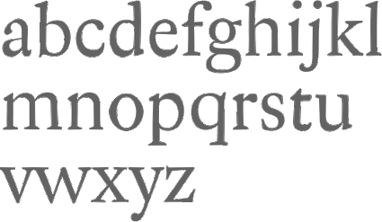
Garamond
|
Compare many digital versions of Garamond based upon showings of the lower case alphabet. [Google]
[More] ⦿
|
Graffiti fonts
|
Showcasing the best commercial graffiti typefaces. [Google]
[More] ⦿
|
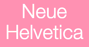
Helvetica
|
View various digital implementations of Helvetica. [Poster by Charlotte Bagnara] [Google]
[More] ⦿
|
Kabel
[Rudolf Koch]
|
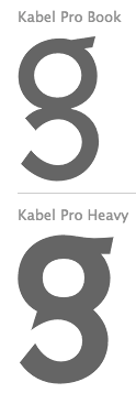 Kabel was designed by Rudolf Koch in 1927. Many of its commercial versions are shown in this link. [Google]
[More] ⦿
Kabel was designed by Rudolf Koch in 1927. Many of its commercial versions are shown in this link. [Google]
[More] ⦿
|
Laurence Penney
[MyFonts.com]
|
[MyFonts]
[More] ⦿
|
Layering type with CSS z-index
|
A MyFonts webfonts feature article. The summary: Layering text adds depth and visual interest to headlines, mastheads and other large display type on your site. There are plenty of fonts that are specifically designed for this technique. Font families designed for this technique will typically have two or more versions of the font, such as a shadow, fill, outline or a texture. It is especially important that the fonts all have the same metric values, because making manual tweaks to spacing and kerning is hard enough in DTP applications; in CSS, it is virtually impossible. The typefaces below all work right out of the box. The basic principle of this technique is that it takes two identical lines of text, applies a different version of the font to each (such as an outline and a fill version) and then layers one above the other. [Google]
[More] ⦿
|
Marker scripts
|
Showcasing the best commercial marker script typefaces. [Google]
[More] ⦿
|
Morris Fuller Benton
[MyFonts: Broadway]
|
[More] ⦿
|
Morris Fuller Benton
[Franklin Gothic]
|
 [More] ⦿
|
MyFonts: 1700s
|
Top-ranked fonts at MyFonts on the theme "1700s". [Google]
[More] ⦿
|
MyFonts: 1860s
|
Typefaces from the 1860s. [Google]
[More] ⦿
|
MyFonts: 1870s
|
Typefaces from the 1870s. [Google]
[More] ⦿
|
MyFonts: 1880s
|
Top-ranked fonts at MyFonts on the theme "1880s". View a longer list of fonts rooted in the 1880s. [Google]
[More] ⦿
|
MyFonts: 1890s
|
Top-ranked fonts at MyFonts on the theme "1890s". View a long list of typefaces rooted in the 1890s. [Google]
[More] ⦿
|
MyFonts: 1900s
|
Top-ranked fonts at MyFonts on the theme "1900s". [Large web page warning.] View a long list of typefaces rooted in the 1900s. [Google]
[More] ⦿
|
MyFonts: 1910s
|
Top-ranked fonts at MyFonts on the theme "1910s". View a long list of typefaces rooted in the 1910s. [Google]
[More] ⦿
|
MyFonts: 1920s
|
Top-ranked fonts at MyFonts on the theme "1920s". View a long list of typefaces rooted in the 1920s. [Google]
[More] ⦿
|
MyFonts: 1930s
|
Top-ranked fonts at MyFonts on the theme "1930s". View a long list of typefaces rooted in the 1930s. A list of 1000 fonts from the 1930s. [Google]
[More] ⦿
|
MyFonts: 1940s
|
MyFonts selection for the keyword 1940s. View a long list of typefaces rooted in the 1940s. [Google]
[More] ⦿
|
MyFonts: 1950s
|
MyFonts typefaces that typify the 1950s. View a long list of typefaces rooted in the 1950s. [Google]
[More] ⦿
|
MyFonts: 1960s
|
MyFonts hit list for 1960s style typefaces. [Google]
[More] ⦿
|
MyFonts: 1970s
|
MyFonts selection for the keyword 1970s. Frutiger is the main representative. [Google]
[More] ⦿
|
MyFonts: 1980s
|
MyFonts selection for the keyword 1980s. [Google]
[More] ⦿
|
MyFonts: 1990s
|
MyFonts selection for the keyword 1990s. [Google]
[More] ⦿
|
MyFonts: 3D typefaces
|
A collection of 3d typefaces that can be seen at MyFonts. [Google]
[More] ⦿
|
MyFonts: 4d Typefaces
|
A list of 4d typefaces at MyFonts. [Google]
[More] ⦿
|
MyFonts: Abstract typefaces
|
A list of abstract commercial typefaces. [Google]
[More] ⦿
|
MyFonts: Academic typefaces
|
A list of academic typefaces at the MyFonts site. [Google]
[More] ⦿
|
MyFonts: Action fonts
|
Action fonts, as culled from the MyFonts type library. [Google]
[More] ⦿
|
MyFonts: Adolphe Mouron Cassandre
|
 Typefaces related to Adolphe Mouron Cassandre, as selected from the MyFonts library. [Google]
[More] ⦿
Typefaces related to Adolphe Mouron Cassandre, as selected from the MyFonts library. [Google]
[More] ⦿
|
MyFonts: Adventurous typefaces
|
MyFonts selection of typefaces that shout Adventure! [Google]
[More] ⦿
|
MyFonts: Advertising
|
MyFonts selection for typefaces that are appropriate for advertising. This is not my selection---these are selected by "the system". A more extensive list. [Google]
[More] ⦿
|
MyFonts: Advertising scripts
|
A list of script typefaces appropriate for advertising. [Google]
[More] ⦿
|
MyFonts: Aeroplane fonts
|
A selection of typefaces tagged aeroplane at MyFonts. [Google]
[More] ⦿
|
MyFonts: African style typefaces
|
Find a list of typefaces with an African theme. [Google]
[More] ⦿
|
MyFonts: African typefaces
|
African-themed typefaces at MyFonts. [Google]
[More] ⦿
|
MyFonts: Album
|
The keyword album generated this list at MyFonts. See here for a typical user album. [Google]
[More] ⦿
|
MyFonts: Alcohol
|
A list of commercial typefaces that are related to alcohol and alcoholics. [Google]
[More] ⦿
|
MyFonts: Aldine typefaces
|
 The main aldine typefaces at MyFonts. View a longer list of Aldine typefaces. View yet another list of Aldine typefaces. [Google]
[More] ⦿
The main aldine typefaces at MyFonts. View a longer list of Aldine typefaces. View yet another list of Aldine typefaces. [Google]
[More] ⦿
|
MyFonts: Alex Sheldon, Match&Kerosene Typefaces
|
MyFonts selection for Alex Sheldon (Match&Kerosene). [Google]
[More] ⦿
|
MyFonts: All-connecting typefaces
|
A list of script typefaces that connect. [Google]
[More] ⦿
|
MyFonts: Alphonse Mucha
|
MyFonts pages on typefaces related to the work of the Czech art nouveau master Alphonse Mucha. [Google]
[More] ⦿
|
MyFonts: Alternatives for Times New Roman.
|
 MyFonts selection of alternatives for Times New Roman. Some images below by Alex Delgado. [Google]
[More] ⦿
MyFonts selection of alternatives for Times New Roman. Some images below by Alex Delgado. [Google]
[More] ⦿
|
MyFonts: American typefaces
|
MyFonts lists the classic American typefaces. These have roots in the era of the ATF and Morris Fuller Benton. [Google]
[More] ⦿
|
MyFonts: American typefaces
|
MyFonts selection for American typefaces. It is unclear what the definition is, but in general it is understood that these are contemporary American typefaces, amny of which can be traced back to the great designers at ATF. [Google]
[More] ⦿
|
MyFonts: American Typewriter
|
Compare various commercial versions of the American Typewriter typeface. [Google]
[More] ⦿
|
MyFonts: Americana
|
A list of typefaces that are tagged as Americana at MyFonts. [Google]
[More] ⦿
|
MyFonts: Amusing typefaces
|
From the MyFonts collection: amusing typefaces. [Google]
[More] ⦿
|
MyFonts: Anarchism
|
View some typefaces that relate to anarchism and revolution. [Google]
[More] ⦿
|
MyFonts: Angular typefaces
|
Typefaces at MyFonts that are tagged as angular. Long list of angular typefaces. See also here. [Google]
[More] ⦿
|
MyFonts: Anime
|
Typefaces that are appropriate for anime. [Google]
[More] ⦿
|
MyFonts: Anniversary typefaces
|
A list of typefaces for anniversaries. [Google]
[More] ⦿
|
MyFonts: Announcements
|
Typefaces that are appropriate for announcements. [Google]
[More] ⦿
|
MyFonts: Antiqua
|
Top-ranked fonts at MyFonts on the theme Antiqua. Large web page with more Antiqua typefaces. See also here. [Google]
[More] ⦿
|
MyFonts: Antique Olive
|
Antique Olive and similar fonts sold by MyFonts. [Google]
[More] ⦿
|
MyFonts: Antiqued typefaces
|
View the typefaces tagged antiqued at MyFonts. A long list of antiqued typefaces. Another long list of antiqued digital typefaces. [Google]
[More] ⦿
|
MyFonts: Apocalypse
|
A list of apocalyptic typefaces over at MyFonts. [Google]
[More] ⦿
|
MyFonts: Arabesques
|
View typefaces with arabesques, as culled from the MyFonts site. [Google]
[More] ⦿
|
MyFonts: Architectural fonts
|
MyFonts selection of architectural typefaces. [Google]
[More] ⦿
|
MyFonts: Architectural typefaces
|
A list of architectural typefaces at MyFonts. And another list of typefaces by or for architects. [Google]
[More] ⦿
|
MyFonts: Ari Rafaeli (AR Types)
|
 MyFonts selection for Ari Rafaeli (AR Types). [Google]
[More] ⦿
MyFonts selection for Ari Rafaeli (AR Types). [Google]
[More] ⦿
|
MyFonts: Arrows
|
A list of commercial typefaces that contain arrows. [Google]
[More] ⦿
|
MyFonts: Art deco typefaces
|
Large web page with all typefaces at MyFonts labeled "art deco". [Google]
[More] ⦿
|
MyFonts: Art deco typefaces
|
Most relevant art deco typefaces at MyFonts. See also here. [Google]
[More] ⦿
|
MyFonts: Art nouveau
|
Top-ranked fonts at MyFonts on the theme "Art nouveau". See also this art nouveau album. [Google]
[More] ⦿
|
MyFonts: Art nouveau / Secession typefaces
|
The Secession, or The Viennese Secession, is a subtrend of art nouveau at the turn of the century. Typefaces that typify this movement, which was sandwiched between Victorian and art nouveau, are showcased in this page. [Google]
[More] ⦿
|
MyFonts: Artistic typefaces
|
Typefaces tagged artistic at MyFonts. [Google]
[More] ⦿
|
MyFonts: Arts and Crafts
|
Top Arts and Crafts fonts at MyFonts. View the full list of Arts and Crafts typefaces. See also here and here. [Google]
[More] ⦿
|
MyFonts: Ascender / Microsoft --- Vista Fonts
|
MyFonts selection for the six Windows Vista fonts, now sold by Ascender. [Google]
[More] ⦿
|
MyFonts: Astrology
|
MyFonts pages on astrological symbol fonts and zodiac symbol fonts. [Google]
[More] ⦿
|
MyFonts: Austrian typefaces
|
A list of typefaces identified or tagged as Austrian over at MyFonts. [Google]
[More] ⦿
|
MyFonts: Automobile scripts
|
A small list of typefaces used for car emblems and automobiles in the fifties and sixties. [Google]
[More] ⦿
|
MyFonts: Automobile typefaces
|
A list of typefaces that are associated with automobile emblems or logos. [Google]
[More] ⦿
|
MyFonts: Automotive typefaces
|
A list of automotive typefaces. [Google]
[More] ⦿
|
MyFonts: Avant Garde
|
MyFonts selection of Avant Garde style typefaces. View some commercial avant garde typefaces. [Google]
[More] ⦿
|
MyFonts: Babyish typefaces
|
A listing at MyFonts for the tag word babyish. See also Here. [Google]
[More] ⦿
|
MyFonts: Bakery typefaces
|
Which typefaces are used for signage and packaging by bakeries? Find out for youself in this list of commercial fonts. [Google]
[More] ⦿
|
MyFonts: Ball terminal typefaces
|
A collection of commercial typefaces with ball terminals. [Google]
[More] ⦿
|
MyFonts: Ball terminals
|
A selection of typefaces with ball terminals. A longer list. [Google]
[More] ⦿
|
MyFonts: Ballpoint pen typefaces
|
Ballpoint pen typefaces. View more ballpoint pen typefaces here. [Google]
[More] ⦿
|
MyFonts: Bamboo typefaces
|
From the MyFonts collection: bamboo typefaces. [Google]
[More] ⦿
|
MyFonts: Bank Gothic style typefaces
|
Bank Gothic lookalikes at MyFonts. Another page. [Google]
[More] ⦿
|
MyFonts: Banknote types
|
MyFonts hit list for typefaces used on bank notes. [Google]
[More] ⦿
|
MyFonts: Banner typefaces
|
Banner typefaces, as selected from the MyFonts library. [Google]
[More] ⦿
|
MyFonts: Baroque
|
 Baroque fonts at MyFonts---these are typefaces that have roots in the 18th century, and thus include many Fournier-style and transitional typefaces. See also here. For an extensive list of almost 300 type families see here [large web page warning] and here. [Google]
[More] ⦿
Baroque fonts at MyFonts---these are typefaces that have roots in the 18th century, and thus include many Fournier-style and transitional typefaces. See also here. For an extensive list of almost 300 type families see here [large web page warning] and here. [Google]
[More] ⦿
|
MyFonts: Baseball script typefaces
|
 A list of commercial baseball script typefaces. [Google]
[More] ⦿
A list of commercial baseball script typefaces. [Google]
[More] ⦿
|
MyFonts: Baskerville
|
 Top-ranked fonts at MyFonts in the Baskerville or transitional styles. [Google]
[More] ⦿
Top-ranked fonts at MyFonts in the Baskerville or transitional styles. [Google]
[More] ⦿
|
MyFonts: Basketball typefaces
|
A selection of typefaces tagged basketball at MyFonts. [Google]
[More] ⦿
|
MyFonts: Basque typefaces
|
Commercial Basque typefaces. [Google]
[More] ⦿
|
MyFonts: Bastarda
|
The MyFonts listing of Bastarda (Schwabacher) fonts includes [Google]
[More] ⦿
|
MyFonts: Batman typefaces
|
A list of commercial typefaces that are related to Batman. [Google]
[More] ⦿
|
MyFonts: Bauhaus
|
Top-ranked fonts at MyFonts on the theme "Bauhaus". See also here. See here for a really long list of almost 300 Bauhaus style typefaces. [Google]
[More] ⦿
|
MyFonts: Bauhaus sans
|
The Bauhaus sans style has been used in many digital typefaces. This page samples some of these. [Google]
[More] ⦿
|
MyFonts: Beatnik typefaces
|
A list of beatnik typefaces. [Google]
[More] ⦿
|
MyFonts: Beefy typefaces
|
View a collection of beefy typefaces in the MyFonts collection. [Google]
[More] ⦿
|
MyFonts: Beer typefaces
|
A list of typefaces related to beer labels. [Google]
[More] ⦿
|
MyFonts: Belle Epoque typefaces
|
La Belle Epoque, the early part of the twentieth century, as typified by the swinging and fashionable streets of Paris. Some typefaces often associated with this era are showcased here. [Google]
[More] ⦿
|
MyFonts: Bembo
|
 The main Bembo implementations at MyFonts. More digital versions of the Bembo typeface. [Google]
[More] ⦿
The main Bembo implementations at MyFonts. More digital versions of the Bembo typeface. [Google]
[More] ⦿
|
MyFonts: Best fonts of 2010
|
 The annual MyFonts list is based on sales. Some fonts were made long before 2010. The list, which is overflowing with display fonts, shows that there is perhaps more mass market money in display type, and it also highlights the growing chasm between classical "text family" foundries (Font Bureau, Hoefler, etc.) and the web vendors. Anyway, here is the list.
 - By Hannes von Döhren: Brandon Grotesque, Livory (done with Livius Dietzel).
- By Alejandro Paul: Affair (a wedding font) and Lady René. Both are script typefaces.
- By Laura Worthington: Origins (based on hand-lettering with a Crow Quill pen on parchment paper).
- By Sascha Timplan: St. Ryde.
- By Ulrike Wilhelm: Liebe Erika.
- By Jos Buivenga: Museo Slab.
- By Maximiliano Sproviero: Breathe.
- By Hiekka Graphics: Sketchetik.
- By Ricardo Rousselot: Despeinada.
[Google]
[More] ⦿
|
MyFonts: Best of 2009
|
MyFonts declares the top 10 fonts of 2009. - Formal scripts: Champion Script Pro (Parachute), the year's most successful formal script font, with 4280 glyphs in all.
- Brush scripts: Liza Pro (Underware).
- Calligraphic display scripts: Memoriam (Canada Type), used in the December 2008 memorial issue of The New York Times.
- Festive scripts: Aphrodite Slim Pro (Typesenses).
- Dingbats: We Love Nature (Kapitza). I personally like their Snow Crystals better.
- Swirligig style: Narziss (Hubert Jocham), with swashes and ball terminals to turn your head.
- Victorian/Edwardian look: Ivory (FaceType).
- Workhorse sans: Alright Sans (Okay Type).
- Serifed text family: Calluna (Jos Buivenga).
- Macho sans: Geogrotesque (Eduardo Manso), in seven weights.
[Google]
[More] ⦿
|
MyFonts: Best sellers of the past 50 days
|
MyFonts: best sellers of the last 50 days. [Google]
[More] ⦿
|
MyFonts: Bestsellers for April 2012
|
The fifty best-selling typefaces at MyFonts, as reported by them on April 1, 2012. The strong grotesque and sans families are still selling very well. The geometric sans category is quite popular---Proxima Nova (Mark Simonson) is first, followed by Brandon Grotesque (HVD), while strong contenders Museo Sans (Jos Buivenga, third), PF Din Text Pro (fourth), Interstate (1993, Tobias Frere-Jones) (7th), Benton Sans (8th), Akzidenz Grotesk BQ (9th and 30th), Swiss 721 (11th), News Gothic (12th), Futura (134th), Nimbus Sans Novus (21st), Geogrotesque (25th), Myriad Pro (27th), Centrale Sans (33rd), Houschka Pro (39th), Code Pro (41st), Alright Sans (42nd), Zurich (43rd) and Museo Sans Rounded (49th), close out the sans typefaces in the top 50. There are some semi-sans or organic typefaces in the top 50 as well. The scripts are a bit down in ranking and total number (9 out of 50, down from 11 last month)---in this category, Carolyna Pro (Emily Lime) remains in the lead (in fifth overall), while its forerunner, Carolyna, is 24th. Mia Mano by Kate Brankin makes a surprise 40th place appearance. In the text typeface category, only Mrs Eaves (in 48th) and a few slab typefaces are left. Fancy didone-inspired fashion mag typefaces continue unabated, with Reina (Lian Types, 44th), Hera Big (Lucas Sharp, 26th), and Narziss (19th). The grungy Anodyne of Yellow Design Studio is at 16, but the almost identical Veneer is lurking at 17, thanks to a big 90% reduced sale price during the month of March. Another irregular face, Monstro, appears in the charts at 32. [Google]
[More] ⦿
|
MyFonts: Bestsellers for April 2013
|
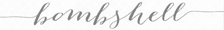 The fifty best-selling typefaces at MyFonts, as reported by them on April 1, 2013: #1: Proxima Nova (Mark Simonson), #2: Brandon Grotesque (HVD Fonts), #3: Quan (Typesketchbook), #4: Avenir (Linotype), #5: Brandon Text (HVD Fonts), #6: Quadon (Rene Bieder), #7: Helvetica Neue LT Std (Adobe), #8: Futura PT (ParaType), #9: Thirsty Rough (Yellow Design Studio), #10: Museo Sans (exljbris), #11: Bombshell Pro (Emily Lime), #12: Trend (Latinotype), #13: Ollie (Schizotype), #14: Trade Gothic (Linotype), #15: Interstate (Font Bureau), #16: Neue Helvetica (Linotype), #17: Carolyna Pro Black (Emily Lime), #18: Futura (Bitstream), #19: Rollerscript (G-Type), #20: Univers (Linotype), #21: DIN Next (Linotype), #22: Veneer (Yellow Design Studio), #23: Geogrotesque (Emtype Foundry), #24: Akzidenz-Grotesk BE (Berthold), #25: Hipster Script Pro (Sudtipos), #26: Neusa (The Northern Block), #27: Museo Slab (exljbris), #28: Boxed (Tipo Pèpel), #29: Directa Serif (Outras Fontes), #30: PF Din Text Condensed Pro (Parachute), #31: Benton Sans (Font Bureau), #32: Bellissima Script Pro (Sudtipos), #33: Sanchez Slab (Latinotype), #34: Thirsty Script (Yellow Design Studio), #35: Frutiger (Adobe), #36: Solomon (Fontfabric), #37: Frutiger (Linotype), #38: Neo sans (Monotype Imaging), #39: Station (Kimmy Design), #40: Sweet Sans (Sweet), #41: Intro (Fontfabric), #42: Nexa (Fontfabric), #43: Alright Sans (Okay Type), #44: Museo (exljbris), #45: Futura (Adobe), #46: Klavika (Process Type Foundry), #47: ITC Avant Garde Gothic (ITC), #48: PF Din Text Pro (Parachute), #49: Helvetica (Adobe), #50: Anna Clara (Trial by Cupcakes). [Google]
[More] ⦿
The fifty best-selling typefaces at MyFonts, as reported by them on April 1, 2013: #1: Proxima Nova (Mark Simonson), #2: Brandon Grotesque (HVD Fonts), #3: Quan (Typesketchbook), #4: Avenir (Linotype), #5: Brandon Text (HVD Fonts), #6: Quadon (Rene Bieder), #7: Helvetica Neue LT Std (Adobe), #8: Futura PT (ParaType), #9: Thirsty Rough (Yellow Design Studio), #10: Museo Sans (exljbris), #11: Bombshell Pro (Emily Lime), #12: Trend (Latinotype), #13: Ollie (Schizotype), #14: Trade Gothic (Linotype), #15: Interstate (Font Bureau), #16: Neue Helvetica (Linotype), #17: Carolyna Pro Black (Emily Lime), #18: Futura (Bitstream), #19: Rollerscript (G-Type), #20: Univers (Linotype), #21: DIN Next (Linotype), #22: Veneer (Yellow Design Studio), #23: Geogrotesque (Emtype Foundry), #24: Akzidenz-Grotesk BE (Berthold), #25: Hipster Script Pro (Sudtipos), #26: Neusa (The Northern Block), #27: Museo Slab (exljbris), #28: Boxed (Tipo Pèpel), #29: Directa Serif (Outras Fontes), #30: PF Din Text Condensed Pro (Parachute), #31: Benton Sans (Font Bureau), #32: Bellissima Script Pro (Sudtipos), #33: Sanchez Slab (Latinotype), #34: Thirsty Script (Yellow Design Studio), #35: Frutiger (Adobe), #36: Solomon (Fontfabric), #37: Frutiger (Linotype), #38: Neo sans (Monotype Imaging), #39: Station (Kimmy Design), #40: Sweet Sans (Sweet), #41: Intro (Fontfabric), #42: Nexa (Fontfabric), #43: Alright Sans (Okay Type), #44: Museo (exljbris), #45: Futura (Adobe), #46: Klavika (Process Type Foundry), #47: ITC Avant Garde Gothic (ITC), #48: PF Din Text Pro (Parachute), #49: Helvetica (Adobe), #50: Anna Clara (Trial by Cupcakes). [Google]
[More] ⦿
|
MyFonts: Bestsellers for April 2014
|
 The fifty best-selling typefaces at MyFonts, as reported by them on April 1, 2014: #1: Proxima Nova (Mark Simonson), #2: Brandon Grotesque (HVD Fonts), #3: Glober (Fontfabric), #4: Showcase (Latinotype), #5: Helvetica Neue (Linotype), #6: Avenir (Linotype), #7: Bombshell Pro (Emily Lime), #8: Trade Gothic (Linotype), #9: Campton (Rene Bieder), #10: Museo Sans (exljbris), #11: Brandon Printed (HVD Fonts), #12: Brandon Text (HVD Fonts), #13: Univers (Linotype), #14: Industry Inc (Hold Fast Foundry), #15: FF DIN (FontFont), #16: Helvetica Neue LT Std (Adobe), #17: Neo sans (Monotype), #18: Carolyna Pro Black (Emily Lime), #19: Ainslie (insigne), #20: Centrale Sans (Typedepot), #21: Cantoni (Debi Sementelli Type Foundry), #22: Futura (Bitstream), #23: Interstate (Font Bureau), #24: Trend (Latinotype), #25: Nimbus Sans Novus (URW++), #26: Creighton Pro (Red Rooster Collection), #27: Geogrotesque (Emtype Foundry), #28: Akzidenz-Grotesk BE (Berthold), #29: ITC Avant Garde Gothic (ITC), #30: Jacques & Gilles (Emily Lime), #31: Intro (Fontfabric), #32: Avenir Next Pro (Linotype), #33: Thirsty Rough (Yellow Design Studio), #34: Museo Slab (exljbris), #35: DIN Next (Linotype), #36: ITC Conduit (ITC), #37: Etelka (Storm), #38: Thirsty Script (Yellow Design Studio), #39: Pacific Northwest Letters (Cultivated Mind), #40: Nexa (Fontfabric), #41: Benton Sans (Font Bureau), #42: Century Gothic (Monotype), #43: Quadon (Rene Bieder), #44: Veneer (Yellow Design Studio), #45: Crique Grotesk (Stawix), #46: Gill Sans (Monotype), #47: Pluto (HVD Fonts), #48: Manus (JOEBOB graphics), #49: Myriad Pro (Adobe), #50: Rleud (Stawix). [Google]
[More] ⦿
The fifty best-selling typefaces at MyFonts, as reported by them on April 1, 2014: #1: Proxima Nova (Mark Simonson), #2: Brandon Grotesque (HVD Fonts), #3: Glober (Fontfabric), #4: Showcase (Latinotype), #5: Helvetica Neue (Linotype), #6: Avenir (Linotype), #7: Bombshell Pro (Emily Lime), #8: Trade Gothic (Linotype), #9: Campton (Rene Bieder), #10: Museo Sans (exljbris), #11: Brandon Printed (HVD Fonts), #12: Brandon Text (HVD Fonts), #13: Univers (Linotype), #14: Industry Inc (Hold Fast Foundry), #15: FF DIN (FontFont), #16: Helvetica Neue LT Std (Adobe), #17: Neo sans (Monotype), #18: Carolyna Pro Black (Emily Lime), #19: Ainslie (insigne), #20: Centrale Sans (Typedepot), #21: Cantoni (Debi Sementelli Type Foundry), #22: Futura (Bitstream), #23: Interstate (Font Bureau), #24: Trend (Latinotype), #25: Nimbus Sans Novus (URW++), #26: Creighton Pro (Red Rooster Collection), #27: Geogrotesque (Emtype Foundry), #28: Akzidenz-Grotesk BE (Berthold), #29: ITC Avant Garde Gothic (ITC), #30: Jacques & Gilles (Emily Lime), #31: Intro (Fontfabric), #32: Avenir Next Pro (Linotype), #33: Thirsty Rough (Yellow Design Studio), #34: Museo Slab (exljbris), #35: DIN Next (Linotype), #36: ITC Conduit (ITC), #37: Etelka (Storm), #38: Thirsty Script (Yellow Design Studio), #39: Pacific Northwest Letters (Cultivated Mind), #40: Nexa (Fontfabric), #41: Benton Sans (Font Bureau), #42: Century Gothic (Monotype), #43: Quadon (Rene Bieder), #44: Veneer (Yellow Design Studio), #45: Crique Grotesk (Stawix), #46: Gill Sans (Monotype), #47: Pluto (HVD Fonts), #48: Manus (JOEBOB graphics), #49: Myriad Pro (Adobe), #50: Rleud (Stawix). [Google]
[More] ⦿
|
MyFonts: Bestsellers for April 2015
|
 The fifty best-selling typefaces at MyFonts, as reported by them on April 1, 2015: #1 Brandon Grotesque (HVD Fonts), #2 FF DIN (FontFont), #3 Proxima Nova (Mark Simonson), #4 Helvetica Neue (Linotype), #5 Avenir (Linotype), #6 Amsi Pro (Stawix), #7 Avenir Next Pro (Linotype), #8 Bombshell Pro (Emily Lime), #9 Univers (Linotype), #10 Boho (Latinotype), #11 Museo Sans (exljbris), #12 Brandon Text (HVD Fonts), #13 Intro (Fontfabric), #14 Trade Gothic (Linotype), #15 DIN Next (Linotype), #16 ITC Avant Garde Gothic (ITC), #17 Nexa Rust (Fontfabric), #18 Frutiger (Linotype), #19 Effra (Dalton Maag), #20 Interstate (Font Bureau), #21 Futura (Bitstream), #22 Wanderlust Letters (Cultivated Mind), #23 Selfie (Lian Types), #24 Neo Sans (Monotype), #25 Muller (Fontfabric), #26 Museo Sans Rounded (exljbris), #27 Texta Narrow (Latinotype), #28 Akzidenz-Grotesk BE (Berthold), #29 FF Meta (FontFont), #30 Glober (Fontfabric), #31 Jacques + Gilles (Emily Lime), #32 Nexa (Fontfabric), #33 Burford (Kimmy Design), #34 Futura PT (ParaType), #35 Geogrotesque (Emtype Foundry), #36 Gloss Drop (phospho), #37 Panton (Fontfabric), #38 Helvetica Neue LT Std (Adobe), #39 Baskerville (Monotype), #40 Salt + Spices Pro (Fontforecast), #41 Campton (Rene Bieder), #42 Carolyna Pro Black (Emily Lime), #43 Gill Sans (Monotype), #44 Cantoni (Debi Sementelli Type Foundry), #45 Veneer (Yellow Design Studio), #46 Museo Slab (exljbris), #47 Frutiger (Adobe), #48 Brandon Printed (HVD Fonts), #49 Century Gothic (Monotype), #50 Benton Sans (Font Bureau). [Google]
[More] ⦿
The fifty best-selling typefaces at MyFonts, as reported by them on April 1, 2015: #1 Brandon Grotesque (HVD Fonts), #2 FF DIN (FontFont), #3 Proxima Nova (Mark Simonson), #4 Helvetica Neue (Linotype), #5 Avenir (Linotype), #6 Amsi Pro (Stawix), #7 Avenir Next Pro (Linotype), #8 Bombshell Pro (Emily Lime), #9 Univers (Linotype), #10 Boho (Latinotype), #11 Museo Sans (exljbris), #12 Brandon Text (HVD Fonts), #13 Intro (Fontfabric), #14 Trade Gothic (Linotype), #15 DIN Next (Linotype), #16 ITC Avant Garde Gothic (ITC), #17 Nexa Rust (Fontfabric), #18 Frutiger (Linotype), #19 Effra (Dalton Maag), #20 Interstate (Font Bureau), #21 Futura (Bitstream), #22 Wanderlust Letters (Cultivated Mind), #23 Selfie (Lian Types), #24 Neo Sans (Monotype), #25 Muller (Fontfabric), #26 Museo Sans Rounded (exljbris), #27 Texta Narrow (Latinotype), #28 Akzidenz-Grotesk BE (Berthold), #29 FF Meta (FontFont), #30 Glober (Fontfabric), #31 Jacques + Gilles (Emily Lime), #32 Nexa (Fontfabric), #33 Burford (Kimmy Design), #34 Futura PT (ParaType), #35 Geogrotesque (Emtype Foundry), #36 Gloss Drop (phospho), #37 Panton (Fontfabric), #38 Helvetica Neue LT Std (Adobe), #39 Baskerville (Monotype), #40 Salt + Spices Pro (Fontforecast), #41 Campton (Rene Bieder), #42 Carolyna Pro Black (Emily Lime), #43 Gill Sans (Monotype), #44 Cantoni (Debi Sementelli Type Foundry), #45 Veneer (Yellow Design Studio), #46 Museo Slab (exljbris), #47 Frutiger (Adobe), #48 Brandon Printed (HVD Fonts), #49 Century Gothic (Monotype), #50 Benton Sans (Font Bureau). [Google]
[More] ⦿
|
MyFonts: Bestsellers for April 2016
|
 The fifty best-selling typefaces at MyFonts, as reported by them on April 1, 2016: #1 FF DIN (FontFont), #2 Avenir (Linotype), #3 Proxima Nova (Mark Simonson), #4 Brandon Grotesque (HVD Fonts), #5 Fabrikat (HVD Fonts), #6 Helvetica Neue (Linotype), #7 Guess (DearType), #8 Fourth (Jason Vandenberg), #9 Univers (Linotype), #10 Inkheart (Fenotype), #11 Futura PT (ParaType), #12 Trade Gothic (Linotype), #13 Avenir Next Pro (Linotype), #14 Brandon Text (HVD Fonts), #15 Nexa (Fontfabric), #16 FF Mark (FontFont), #17 ITC Avant Garde Gothic (ITC), #18 Frutiger (Linotype), #19 Campton (Rene Bieder), #20 Blend (Typesenses), #21 Cera (TypeMates), #22 Nexa Rust (Fontfabric), #23 Museo Sans (exljbris), #24 Futura (Bitstream), #25 Intro (Fontfabric), #26 Helvetica Neue LT Std (Adobe), #27 Interstate (Font Bureau), #28 Freeland (Trial by Cupcakes), #29 DIN Next (Linotype), #30 Avenir (Adobe), #31 Panton (Fontfabric), #32 FF Meta (FontFont), #33 Geogrotesque (Emtype Foundry), #34 Hurme Geometric Sans No.4 (Hurme Design), #35 Amsi Pro (Stawix), #36 Pluto (HVD Fonts), #37 Effra (Dalton Maag), #38 Folio (URW++), #39 Hurme Geometric Sans No.3 (Hurme Design), #40 Sofia Pro (Mostardesign), #41 ITC Avant Garde Gothic (Adobe), #42 Benton Sans (Font Bureau), #43 Futura (Adobe), #44 bill corp m3 (OGJ Type Design), #45 Bombshell Pro (Emily Lime), #46 Neue Haas Grotesk (Linotype), #47 Lucida Sans (URW++), #48 Lifehack (DearType), #49 Mrs Eaves (Emigre), #50 Rational (Rene Bieder). [Google]
[More] ⦿
The fifty best-selling typefaces at MyFonts, as reported by them on April 1, 2016: #1 FF DIN (FontFont), #2 Avenir (Linotype), #3 Proxima Nova (Mark Simonson), #4 Brandon Grotesque (HVD Fonts), #5 Fabrikat (HVD Fonts), #6 Helvetica Neue (Linotype), #7 Guess (DearType), #8 Fourth (Jason Vandenberg), #9 Univers (Linotype), #10 Inkheart (Fenotype), #11 Futura PT (ParaType), #12 Trade Gothic (Linotype), #13 Avenir Next Pro (Linotype), #14 Brandon Text (HVD Fonts), #15 Nexa (Fontfabric), #16 FF Mark (FontFont), #17 ITC Avant Garde Gothic (ITC), #18 Frutiger (Linotype), #19 Campton (Rene Bieder), #20 Blend (Typesenses), #21 Cera (TypeMates), #22 Nexa Rust (Fontfabric), #23 Museo Sans (exljbris), #24 Futura (Bitstream), #25 Intro (Fontfabric), #26 Helvetica Neue LT Std (Adobe), #27 Interstate (Font Bureau), #28 Freeland (Trial by Cupcakes), #29 DIN Next (Linotype), #30 Avenir (Adobe), #31 Panton (Fontfabric), #32 FF Meta (FontFont), #33 Geogrotesque (Emtype Foundry), #34 Hurme Geometric Sans No.4 (Hurme Design), #35 Amsi Pro (Stawix), #36 Pluto (HVD Fonts), #37 Effra (Dalton Maag), #38 Folio (URW++), #39 Hurme Geometric Sans No.3 (Hurme Design), #40 Sofia Pro (Mostardesign), #41 ITC Avant Garde Gothic (Adobe), #42 Benton Sans (Font Bureau), #43 Futura (Adobe), #44 bill corp m3 (OGJ Type Design), #45 Bombshell Pro (Emily Lime), #46 Neue Haas Grotesk (Linotype), #47 Lucida Sans (URW++), #48 Lifehack (DearType), #49 Mrs Eaves (Emigre), #50 Rational (Rene Bieder). [Google]
[More] ⦿
|
MyFonts: Bestsellers for April 2017
|
 The fifty best-selling typefaces at MyFonts, as reported by them on April 5, 2017: #1 FF DIN (FontFont), #2 Proxima Nova (Mark Simonson), #3 Brandon Grotesque (HVD Fonts), #4 Helvetica Neue (Linotype), #5 Tazugane Gothic (Monotype), #6 Axiforma (Kastelov), #7 Brandon Text (HVD Fonts), #8 Avenir (Linotype), #9 Artegra Sans (Artegra), #10 Univers (Linotype), #11 Frutiger (Linotype), #12 Avenir Next Pro (Linotype), #13 Born Ready (Nicky Laatz), #14 Gilroy (Radomir Tinkov), #15 Cera Pro (TypeMates), #16 Rockeby (My Creative Land), #17 FF Mark (FontFont), #18 ITC Avant Garde Gothic (ITC), #19 Futura (Linotype), #20 Uni Neue (Fontfabric), #21 Campton (Rene Bieder), #22 Museo Sans (exljbris), #23 Amsi Pro (Stawix), #24 Filson Soft (Mostardesign), #25 Sofia Pro (Mostardesign), #26 Effra (Dalton Maag), #27 Nexa Rust (Fontfabric), #28 FF Kievit (FontFont), #29 DIN Next (Linotype), #30 Helvetica Neue LT Std (Adobe), #31 Kappa (W Foundry), #32 Nexa (Fontfabric), #33 Trade Gothic (Linotype), #34 Akzidenz-Grotesk BE (Berthold), #35 Blooming Elegant (Nicky Laatz), #36 Praho Pro (Maciej Wloczewski), #37 Quickbrush (Trial by Cupcakes), #38 Helvetica (Linotype), #39 TT Limes (TypeType), #40 Sabon (Linotype), #41 Intro (Fontfabric), #42 Futura (Bitstream), #43 Sofa Sans Hand (FaceType), #44 Neo Sans (Monotype), #45 Myriad Pro (Adobe), #46 Muller (Fontfabric), #47 Hurme Geometric Sans 1 + 2 (Hurme), #48 Viva Beautiful (Cultivated Mind), #49 Rig Shaded (Jamie Clarke Type), #50 Neue Haas Grotesk (Linotype). [Google]
[More] ⦿
The fifty best-selling typefaces at MyFonts, as reported by them on April 5, 2017: #1 FF DIN (FontFont), #2 Proxima Nova (Mark Simonson), #3 Brandon Grotesque (HVD Fonts), #4 Helvetica Neue (Linotype), #5 Tazugane Gothic (Monotype), #6 Axiforma (Kastelov), #7 Brandon Text (HVD Fonts), #8 Avenir (Linotype), #9 Artegra Sans (Artegra), #10 Univers (Linotype), #11 Frutiger (Linotype), #12 Avenir Next Pro (Linotype), #13 Born Ready (Nicky Laatz), #14 Gilroy (Radomir Tinkov), #15 Cera Pro (TypeMates), #16 Rockeby (My Creative Land), #17 FF Mark (FontFont), #18 ITC Avant Garde Gothic (ITC), #19 Futura (Linotype), #20 Uni Neue (Fontfabric), #21 Campton (Rene Bieder), #22 Museo Sans (exljbris), #23 Amsi Pro (Stawix), #24 Filson Soft (Mostardesign), #25 Sofia Pro (Mostardesign), #26 Effra (Dalton Maag), #27 Nexa Rust (Fontfabric), #28 FF Kievit (FontFont), #29 DIN Next (Linotype), #30 Helvetica Neue LT Std (Adobe), #31 Kappa (W Foundry), #32 Nexa (Fontfabric), #33 Trade Gothic (Linotype), #34 Akzidenz-Grotesk BE (Berthold), #35 Blooming Elegant (Nicky Laatz), #36 Praho Pro (Maciej Wloczewski), #37 Quickbrush (Trial by Cupcakes), #38 Helvetica (Linotype), #39 TT Limes (TypeType), #40 Sabon (Linotype), #41 Intro (Fontfabric), #42 Futura (Bitstream), #43 Sofa Sans Hand (FaceType), #44 Neo Sans (Monotype), #45 Myriad Pro (Adobe), #46 Muller (Fontfabric), #47 Hurme Geometric Sans 1 + 2 (Hurme), #48 Viva Beautiful (Cultivated Mind), #49 Rig Shaded (Jamie Clarke Type), #50 Neue Haas Grotesk (Linotype). [Google]
[More] ⦿
|
MyFonts: Bestsellers for April 2018
|
 The fifty best-selling typefaces at MyFonts, as reported by them on April 5, 2018: #1 Helvetica Neue (Linotype), #2 Proxima Nova (Mark Simonson), #3 Brandon Grotesque (HVD Fonts), #4 FF DIN (FontFont), #5 DIN Next (Linotype), #6 Avenir Next (Linotype), #7 Avenir (Linotype), #8 Univers (Linotype), #9 Pluto (HVD Fonts), #10 TT Commons (TypeType), #11 Gilroy (Radomir Tinkov), #12 Brandon Text (HVD Fonts), #13 Neue Haas Grotesk (Linotype), #14 Cera Pro (TypeMates), #15 Trade Gothic (Linotype), #16 Frutiger (Linotype), #17 TT Jenevers (TypeType), #18 TT Norms (TypeType), #19 Franca (Rene Bieder), #20 Futura (Linotype), #21 Mont (Fontfabric), #22 Qualion (ROHH), #23 Campton (Rene Bieder), #24 Gill Sans (Monotype), #25 Sofia Pro (Mostardesign), #26 ITC Avant Garde Gothic (ITC), #27 Helvetica Neue LT Std (Adobe), #28 Museo Sans (exljbris), #29 Neurial Grotesk (Indian Type Foundry), #30 Foco (Dalton Maag), #31 Intervogue (Miller Type Foundry), #32 FF Dax (FontFont), #33 Averta (Intelligent Design), #34 FF Mark (FontFont), #35 Freight Text Pro (GarageFonts), #36 Neue Haas Unica (Linotype), #37 Nexa Rust (Fontfabric), #38 Freight Sans Pro (GarageFonts), #39 Geogrotesque (Emtype Foundry), #40 ITC Franklin Gothic (ITC), #41 Madera (Monotype), #42 Akzidenz-Grotesk BE (Berthold), #43 Futura PT (ParaType), #44 Tazugane Gothic (Monotype), #45 Nexa (Fontfabric), #46 Century Gothic (Monotype), #47 Zesta (Indian Type Foundry), #48 Intro (Fontfabric), #49 Gilam (Fontfabric), #50 DIN 2014 (ParaType). [Google]
[More] ⦿
The fifty best-selling typefaces at MyFonts, as reported by them on April 5, 2018: #1 Helvetica Neue (Linotype), #2 Proxima Nova (Mark Simonson), #3 Brandon Grotesque (HVD Fonts), #4 FF DIN (FontFont), #5 DIN Next (Linotype), #6 Avenir Next (Linotype), #7 Avenir (Linotype), #8 Univers (Linotype), #9 Pluto (HVD Fonts), #10 TT Commons (TypeType), #11 Gilroy (Radomir Tinkov), #12 Brandon Text (HVD Fonts), #13 Neue Haas Grotesk (Linotype), #14 Cera Pro (TypeMates), #15 Trade Gothic (Linotype), #16 Frutiger (Linotype), #17 TT Jenevers (TypeType), #18 TT Norms (TypeType), #19 Franca (Rene Bieder), #20 Futura (Linotype), #21 Mont (Fontfabric), #22 Qualion (ROHH), #23 Campton (Rene Bieder), #24 Gill Sans (Monotype), #25 Sofia Pro (Mostardesign), #26 ITC Avant Garde Gothic (ITC), #27 Helvetica Neue LT Std (Adobe), #28 Museo Sans (exljbris), #29 Neurial Grotesk (Indian Type Foundry), #30 Foco (Dalton Maag), #31 Intervogue (Miller Type Foundry), #32 FF Dax (FontFont), #33 Averta (Intelligent Design), #34 FF Mark (FontFont), #35 Freight Text Pro (GarageFonts), #36 Neue Haas Unica (Linotype), #37 Nexa Rust (Fontfabric), #38 Freight Sans Pro (GarageFonts), #39 Geogrotesque (Emtype Foundry), #40 ITC Franklin Gothic (ITC), #41 Madera (Monotype), #42 Akzidenz-Grotesk BE (Berthold), #43 Futura PT (ParaType), #44 Tazugane Gothic (Monotype), #45 Nexa (Fontfabric), #46 Century Gothic (Monotype), #47 Zesta (Indian Type Foundry), #48 Intro (Fontfabric), #49 Gilam (Fontfabric), #50 DIN 2014 (ParaType). [Google]
[More] ⦿
|
MyFonts: Bestsellers for April 2019
|
 The fifty best-selling typefaces at MyFonts, as reported by them on March 31, 2019: #1 Gilroy (Radomir Tinkov), #2 Neue Helvetica (Linotype), #3 FF DIN (FontFont), #4 Avenir (Linotype), #5 Avenir Next (Linotype), #6 Proxima Nova (Mark Simonson), #7 Helvetica (Linotype), #8 Univers (Linotype), #9 Tazugane Gothic (Monotype ), #10 FF Mark (FontFont), #11 TT Norms Pro (TypeType), #12 Brandon Grotesque (HVD Fonts), #13 DIN Next (Linotype), #14 Cera Pro (TypeMates), #15 Campton (Rene Bieder), #16 Recoleta (Latinotype), #17 Noah (Fontfabric), #18 Frutiger (Linotype), #19 Galano Grotesque (Rene Bieder), #20 Trade Gothic (Linotype), #21 Mont (Fontfabric), #22 Amsi Pro (Stawix), #23 Nexa (Fontfabric), #24 Brandon Text (HVD Fonts), #25 FF Kievit (FontFont), #26 ITC Avant Garde Gothic (ITC), #27 Bebas Neue Pro (Dharma Type), #28 Museo Sans (exljbris), #29 Futura PT (ParaType), #30 Intro (Fontfabric), #31 TT Commons (TypeType), #32 Uni Neue (Fontfabric), #33 Neue Haas Grotesk (Linotype), #34 Sofia Pro (Mostardesign), #35 Neue Haas Unica (Linotype), #36 Artegra Sans (Artegra), #37 Glober (Fontfabric), #38 Silk Serif (SilkType), #39 DIN 2014 (ParaType), #40 Futura (URW), #41 Century Gothic (Monotype ), #42 Mikado (HVD Fonts), #43 Averta (Intelligent Design), #44 Turbinado (Aerotype), #45 Futura (Linotype), #46 TT Trailers (TypeType), #47 Freight Text Pro (GarageFonts), #48 Hurme Geometric Sans 1 + 2 (Hurme), #49 Sweet Sans (Sweet), #50 Nexa Rust (Fontfabric). [Google]
[More] ⦿
The fifty best-selling typefaces at MyFonts, as reported by them on March 31, 2019: #1 Gilroy (Radomir Tinkov), #2 Neue Helvetica (Linotype), #3 FF DIN (FontFont), #4 Avenir (Linotype), #5 Avenir Next (Linotype), #6 Proxima Nova (Mark Simonson), #7 Helvetica (Linotype), #8 Univers (Linotype), #9 Tazugane Gothic (Monotype ), #10 FF Mark (FontFont), #11 TT Norms Pro (TypeType), #12 Brandon Grotesque (HVD Fonts), #13 DIN Next (Linotype), #14 Cera Pro (TypeMates), #15 Campton (Rene Bieder), #16 Recoleta (Latinotype), #17 Noah (Fontfabric), #18 Frutiger (Linotype), #19 Galano Grotesque (Rene Bieder), #20 Trade Gothic (Linotype), #21 Mont (Fontfabric), #22 Amsi Pro (Stawix), #23 Nexa (Fontfabric), #24 Brandon Text (HVD Fonts), #25 FF Kievit (FontFont), #26 ITC Avant Garde Gothic (ITC), #27 Bebas Neue Pro (Dharma Type), #28 Museo Sans (exljbris), #29 Futura PT (ParaType), #30 Intro (Fontfabric), #31 TT Commons (TypeType), #32 Uni Neue (Fontfabric), #33 Neue Haas Grotesk (Linotype), #34 Sofia Pro (Mostardesign), #35 Neue Haas Unica (Linotype), #36 Artegra Sans (Artegra), #37 Glober (Fontfabric), #38 Silk Serif (SilkType), #39 DIN 2014 (ParaType), #40 Futura (URW), #41 Century Gothic (Monotype ), #42 Mikado (HVD Fonts), #43 Averta (Intelligent Design), #44 Turbinado (Aerotype), #45 Futura (Linotype), #46 TT Trailers (TypeType), #47 Freight Text Pro (GarageFonts), #48 Hurme Geometric Sans 1 + 2 (Hurme), #49 Sweet Sans (Sweet), #50 Nexa Rust (Fontfabric). [Google]
[More] ⦿
|
MyFonts: Bestsellers for April 2020
|
 The fifty best-selling typefaces at MyFonts, as reported by them on April 1, 2020: #1 Gilroy (Radomir Tinkov), #2 TT Norms Pro (TypeType), #3 Neue Helvetica (Linotype), #4 FF DIN (FontFont), #5 Proxima Nova (Mark Simonson), #6 FF Mark (FontFont), #7 DIN Next (Linotype), #8 Avenir (Linotype), #9 Avenir Next (Linotype), #10 Mont (Fontfabric), #11 Paralucent (Device), #12 Cera Pro (TypeMates), #13 Univers (Linotype), #14 Mixta (Latinotype), #15 Frutiger (Linotype), #16 Nexa (Fontfabric), #17 Helvetica (Linotype), #18 Recoleta (Latinotype), #19 Helvetica Now (Monotype), #20 Sofia Pro (Mostardesign), #21 Brandon Grotesque (HVD Fonts), #22 Diodrum (Indian Type Foundry), #23 Geometria (Brownfox), #24 Axiforma (Kastelov), #25 TT Commons (TypeType), #26 Futura (Linotype), #27 ITC Avant Garde Gothic (ITC), #28 FF Clan (FontFont), #29 Limon (Typesenses), #30 Tazugane Gothic (Monotype), #31 Slate (Monotype), #32 Trade Gothic (Linotype), #33 Arial (Monotype), #34 Averta (Intelligent Design), #35 Campton (Rene Bieder), #36 URW DIN (URW Type Foundry), #37 Museo Sans (exljbris), #38 Neue Haas Grotesk (Linotype), #39 Panton (Fontfabric), #40 Amsi Pro (Stawix), #41 Silk Serif (SilkType), #42 Neue Plak (Monotype), #43 Bebas Neue Pro (Dharma Type), #44 Mastro (Ndiscover), #45 Intro (Fontfabric), #46 Madera (Monotype), #47 Colby (Jason Vandenberg), #48 Zooja (Aerotype), #49 Gelion (Letter Omega Typefoundry), #50 Arsilon (Dhan Studio). [Google]
[More] ⦿
The fifty best-selling typefaces at MyFonts, as reported by them on April 1, 2020: #1 Gilroy (Radomir Tinkov), #2 TT Norms Pro (TypeType), #3 Neue Helvetica (Linotype), #4 FF DIN (FontFont), #5 Proxima Nova (Mark Simonson), #6 FF Mark (FontFont), #7 DIN Next (Linotype), #8 Avenir (Linotype), #9 Avenir Next (Linotype), #10 Mont (Fontfabric), #11 Paralucent (Device), #12 Cera Pro (TypeMates), #13 Univers (Linotype), #14 Mixta (Latinotype), #15 Frutiger (Linotype), #16 Nexa (Fontfabric), #17 Helvetica (Linotype), #18 Recoleta (Latinotype), #19 Helvetica Now (Monotype), #20 Sofia Pro (Mostardesign), #21 Brandon Grotesque (HVD Fonts), #22 Diodrum (Indian Type Foundry), #23 Geometria (Brownfox), #24 Axiforma (Kastelov), #25 TT Commons (TypeType), #26 Futura (Linotype), #27 ITC Avant Garde Gothic (ITC), #28 FF Clan (FontFont), #29 Limon (Typesenses), #30 Tazugane Gothic (Monotype), #31 Slate (Monotype), #32 Trade Gothic (Linotype), #33 Arial (Monotype), #34 Averta (Intelligent Design), #35 Campton (Rene Bieder), #36 URW DIN (URW Type Foundry), #37 Museo Sans (exljbris), #38 Neue Haas Grotesk (Linotype), #39 Panton (Fontfabric), #40 Amsi Pro (Stawix), #41 Silk Serif (SilkType), #42 Neue Plak (Monotype), #43 Bebas Neue Pro (Dharma Type), #44 Mastro (Ndiscover), #45 Intro (Fontfabric), #46 Madera (Monotype), #47 Colby (Jason Vandenberg), #48 Zooja (Aerotype), #49 Gelion (Letter Omega Typefoundry), #50 Arsilon (Dhan Studio). [Google]
[More] ⦿
|
MyFonts: Bestsellers for April 2021
|
 The fifty best-selling typefaces at MyFonts, as reported by them on April 1, 2021: #1 Gilroy (Radomir Tinkov), #2 Avenir (Linotype), #3 Neue Helvetica (Linotype), #4 TT Commons (TypeType), #5 Avenir Next (Linotype), #6 Helvetica Now (Monotype), #7 Univers (Linotype), #8 TT Norms Pro (TypeType), #9 Cera Pro (TypeMates), #10 Helvetica (Linotype), #11 Galano Grotesque (Rene Bieder), #12 FF DIN (FontFont), #13 Sofia Pro (Mostardesign), #14 Trade Gothic (Linotype), #15 Proxima Nova (Mark Simonson), #16 ITC Avant Garde Gothic (ITC), #17 FF Mark (FontFont), #18 Frutiger (Linotype), #19 Neue Haas Unica (Linotype), #20 Recoleta (Latinotype), #21 Brandon Text (HVD Fonts), #22 DIN Next (Linotype), #23 Neue Haas Grotesk (Linotype), #24 Campton (Rene Bieder), #25 Brandon Grotesque (HVD Fonts), #26 Nexa (Fontfabric), #27 Uni Neue (Fontfabric), #28 Mont (Fontfabric), #29 Avenir Next World (Linotype), #30 Gazpacho (Santi Rey), #31 Century Gothic (Monotype), #32 Coco Sharp (Zetafonts), #33 Academica (Storm Type Foundry), #34 Futura PT (ParaType), #35 ITC Franklin Gothic (ITC), #36 Juana (Latinotype), #37 Albra (BumbumType), #38 Quincy CF (Connary Fagen), #39 Panton (Fontfabric), #40 Vary (Monotype), #41 Intro (Fontfabric), #42 Northwell (Set Sail Studios), #43 Pluto (HVD Fonts), #44 Futura (Linotype), #45 Optima (Linotype), #46 Amsi Pro (Stawix), #47 Palmer Lake (Jen Wagner Co.), #48 Averta (Intelligent Design), #49 Tazugane Gothic (Monotype), #50 Houschka Pro (G-Type), [Google]
[More] ⦿
The fifty best-selling typefaces at MyFonts, as reported by them on April 1, 2021: #1 Gilroy (Radomir Tinkov), #2 Avenir (Linotype), #3 Neue Helvetica (Linotype), #4 TT Commons (TypeType), #5 Avenir Next (Linotype), #6 Helvetica Now (Monotype), #7 Univers (Linotype), #8 TT Norms Pro (TypeType), #9 Cera Pro (TypeMates), #10 Helvetica (Linotype), #11 Galano Grotesque (Rene Bieder), #12 FF DIN (FontFont), #13 Sofia Pro (Mostardesign), #14 Trade Gothic (Linotype), #15 Proxima Nova (Mark Simonson), #16 ITC Avant Garde Gothic (ITC), #17 FF Mark (FontFont), #18 Frutiger (Linotype), #19 Neue Haas Unica (Linotype), #20 Recoleta (Latinotype), #21 Brandon Text (HVD Fonts), #22 DIN Next (Linotype), #23 Neue Haas Grotesk (Linotype), #24 Campton (Rene Bieder), #25 Brandon Grotesque (HVD Fonts), #26 Nexa (Fontfabric), #27 Uni Neue (Fontfabric), #28 Mont (Fontfabric), #29 Avenir Next World (Linotype), #30 Gazpacho (Santi Rey), #31 Century Gothic (Monotype), #32 Coco Sharp (Zetafonts), #33 Academica (Storm Type Foundry), #34 Futura PT (ParaType), #35 ITC Franklin Gothic (ITC), #36 Juana (Latinotype), #37 Albra (BumbumType), #38 Quincy CF (Connary Fagen), #39 Panton (Fontfabric), #40 Vary (Monotype), #41 Intro (Fontfabric), #42 Northwell (Set Sail Studios), #43 Pluto (HVD Fonts), #44 Futura (Linotype), #45 Optima (Linotype), #46 Amsi Pro (Stawix), #47 Palmer Lake (Jen Wagner Co.), #48 Averta (Intelligent Design), #49 Tazugane Gothic (Monotype), #50 Houschka Pro (G-Type), [Google]
[More] ⦿
|
MyFonts: Bestsellers for April 2022
|
 The fifty best-selling typefaces at MyFonts, as reported by them on April 1, 2022: #1 Neue Helvetica (Linotype), #2 Celias (Type Dynamic), #3 Gilroy (Radomir Tinkov), #4 Helvetica Now (Monotype), #5 Avenir (Linotype), #6 Proxima Nova (Mark Simonson), #7 FF DIN (FontFont), #8 TT Norms Pro (TypeType), #9 Cera Pro (TypeMates), #10 Univers (Linotype), #11 Helvetica (Linotype), #12 Trade Gothic (Linotype), #13 Galano Grotesque (Rene Bieder), #14 Mont (Fontfabric), #15 Frutiger (Linotype), #16 Neue Haas Grotesk (Linotype), #17 Sofia Pro (Mostardesign), #18 Nexa (Fontfabric), #19 Shorai Sans (Monotype), #20 Tazugane Gothic (Monotype), #21 Recoleta (Latinotype), #22 FF Mark (FontFont), #23 Campton (Rene Bieder), #24 Futura Now (Monotype), #25 Avenir Next (Linotype), #26 TT Commons Pro (TypeType), #27 Neue Plak (Monotype), #28 DIN Next (Linotype), #29 Futura (Linotype), #30 Faktum (Rene Bieder), #31 Larken (EllenLuff), #32 ITC Avant Garde Gothic (ITC), #33 Moneta Sans (Santi Rey), #34 Gill Sans (Monotype), #35 Brandon Grotesque (HVD Fonts), #36 Axiforma (Kastelov), #37 Trade Gothic Next (Linotype), #38 Neue Haas Unica (Linotype), #39 Biennale (Latinotype), #40 Museo Sans (exljbris), #41 TT Hoves (TypeType), #42 Arboria (Type-o-Tones), #43 FF Dax (FontFont), #44 Linotype Didot (Linotype), #45 The Seasons (My Creative Land), #46 Futura PT (ParaType), #47 Averta (Intelligent Design), #48 Gazpacho (Santi Rey), #49 Hurme Geometric Sans 1 + 2 (Hurme), #50 Century Gothic (Monotype). [Google]
[More] ⦿
The fifty best-selling typefaces at MyFonts, as reported by them on April 1, 2022: #1 Neue Helvetica (Linotype), #2 Celias (Type Dynamic), #3 Gilroy (Radomir Tinkov), #4 Helvetica Now (Monotype), #5 Avenir (Linotype), #6 Proxima Nova (Mark Simonson), #7 FF DIN (FontFont), #8 TT Norms Pro (TypeType), #9 Cera Pro (TypeMates), #10 Univers (Linotype), #11 Helvetica (Linotype), #12 Trade Gothic (Linotype), #13 Galano Grotesque (Rene Bieder), #14 Mont (Fontfabric), #15 Frutiger (Linotype), #16 Neue Haas Grotesk (Linotype), #17 Sofia Pro (Mostardesign), #18 Nexa (Fontfabric), #19 Shorai Sans (Monotype), #20 Tazugane Gothic (Monotype), #21 Recoleta (Latinotype), #22 FF Mark (FontFont), #23 Campton (Rene Bieder), #24 Futura Now (Monotype), #25 Avenir Next (Linotype), #26 TT Commons Pro (TypeType), #27 Neue Plak (Monotype), #28 DIN Next (Linotype), #29 Futura (Linotype), #30 Faktum (Rene Bieder), #31 Larken (EllenLuff), #32 ITC Avant Garde Gothic (ITC), #33 Moneta Sans (Santi Rey), #34 Gill Sans (Monotype), #35 Brandon Grotesque (HVD Fonts), #36 Axiforma (Kastelov), #37 Trade Gothic Next (Linotype), #38 Neue Haas Unica (Linotype), #39 Biennale (Latinotype), #40 Museo Sans (exljbris), #41 TT Hoves (TypeType), #42 Arboria (Type-o-Tones), #43 FF Dax (FontFont), #44 Linotype Didot (Linotype), #45 The Seasons (My Creative Land), #46 Futura PT (ParaType), #47 Averta (Intelligent Design), #48 Gazpacho (Santi Rey), #49 Hurme Geometric Sans 1 + 2 (Hurme), #50 Century Gothic (Monotype). [Google]
[More] ⦿
|
MyFonts: Bestsellers for August 2012
|
The fifty best-selling typefaces at MyFonts, as reported by them on August 1, 2012: #1: Proxima Nova (Mark Simonson), #2: Pluto Sans (HVD Fonts), #3: Brandon Grotesque (HVD Fonts), #4: Museo Sans (exljbris), #5: Helvetica Neue (Adobe), #6: Thirsty Script (Yellow Design Studio), #7: Veneer (Yellow Design Studio), #8: Intro (Fontfabric), #9: Museo Slab (exljbris), #10: Interstate (Font Bureau), #11: Bombshell Pro (Emily Lime), #12: Futura (Bitstream), #13: PF Din Text Pro (Parachute), #14: Narziss (Hubert Jocham Type), #15: Carolyna Pro Black (Emily Lime), #16: Akzidenz-Grotesk BE (Berthold), #17: Geogrotesque (Emtype Foundry), #18: Aire (Liá Types), #19: Avenir (Linotype), #20: Proxima Nova Soft (Mark Simonson), #21: Univers (Linotype), #22: Trade Gothic (Linotype), #23: Peoni Pro (Emily Lime), #24: Variable (MADType), #25: Frontage (Juri Zaech), #26: Museo (exljbris), #27: Frutiger (Adobe), #28: Julieta (Latinotype), #29: Pluto (HVD Fonts), #30: Funkydori (Laura Worthington), #31: Carolyna (Emily Lime), #32: Parfumerie Script Pro (Typesenses), #33: Flexo (Durotype), #34: Bree (TypeTogether), #35: Populaire (PintassilgoPrints), #36: Klavika (Process Type Foundry), #37: Myriad Pro (Adobe), #38: RBNo3.1 (Rene Bieder), #39: Belluccia (Correspondence Ink), #40: Antenna (Font Bureau), #41: Swiss 721 (Bitstream), #42: Graublau Slab Pro (FDI), #43: Slim Tony (Fenotype), #44: Gelato Script (Schizotype), #45: Breakers (Kostic), #46: New Cuisine (Stephen Rapp), #47: Museo Sans Rounded (exljbris), #48: DIN Next (Linotype), #49: Adelle (TypeTogether), #50: Akzidenz-Grotesk BQ (Berthold). The battle of the grotesks and the sansculottes continues atop the charts, and across the board, with Proxima Nova heading the lot. Helvetica sneaks in there with two entries, Helvetica Neue and Swiss 721. The controversial Thirsty Script (Yellow Design Studio) is the first of the signage scripts (the fact that I prefer Slim Tony and Gelato Script further on in the rankings does not matter), while Emily Lime continues to wow with Bombshell Pro (which reminds me of Madonna's Erotica CD cover) and Carolyna. A surprise is the shaded caps typeface Frontage by Juri Zaech in #25. Serif text typefaces are now entirely absent, with customers more enticed by various styles of slab typefaces. [Google]
[More] ⦿
|
MyFonts: Bestsellers for August 2013
|
 The fifty best-selling typefaces at MyFonts, as reported by them on August 3, 2013: #1: Proxima Nova (by Mark Simonson), #2: Brandon Grotesque (by HVD Fonts), #3: Clavo (by Dada Studio), #4: Core Circus (by S-Core), #5: Trade Gothic (by Linotype), #6: Avenir (by Linotype), #7: Helvetica Neue (by Linotype), #8: Museo Sans (by exljbris), #9: Brand (by Lián Types), #10: Bombshell Pro (by Emily Lime), #11: Brandon Text (by HVD Fonts), #12: Univers (by Linotype), #13: Interstate (by Font Bureau), #14: Thirsty Rough (by Yellow Design Studio), #15: Niveau Grotesk (by HVD Fonts), #16: Helvetica Neue LT Std (by Adobe), #17: Trend (by Latinotype), #18: Gentona (by Rene Bieder), #19: FF DIN (by FontFont), #20: Futura (by Bitstream), #21: Carolyna Pro Black (by Emily Lime), #22: Avenir Next Pro (by Linotype), #23: Museo Slab (by exljbris), #24: Style Script (by TypeSETit), #25: Alianza (by Corradine Fonts), #26: Benton Sans (by Font Bureau), #27: Gin (by Hold Fast Foundry), #28: Veneer (by Yellow Design Studio), #29: Festivo Letters (by Ahmet Altun), #30: Neo sans (by Monotype Imaging), #31: Geogrotesque (by Emtype Foundry), #32: Rolling Pen (by Sudtipos), #33: Hurme Geometric Sans No.4 (by Hurme Design), #34: Lunch Box (by Kimmy Design), #35: ITC Conduit (by ITC), #36: Adelle Sans (by TypeTogether), #37: Thirsty Script (by Yellow Design Studio), #38: Nanami (by Thinkdust), #39: Mrs Eaves (by Emigre), #40: Frutiger (by Linotype), #41: Myriad Pro (by Adobe), #42: Akzidenz-Grotesk BE (by Berthold), #43: Klavika (by Process Type Foundry), #44: Locator (by Process Type Foundry), #45: Trade Gothic (by Adobe), #46: Museo (by exljbris), #47: Nexa (by Fontfabric), #48: Voyage (by Fenotype), #49: DIN Next (by Linotype), #50: Aparo (by DSType). [Google]
[More] ⦿
The fifty best-selling typefaces at MyFonts, as reported by them on August 3, 2013: #1: Proxima Nova (by Mark Simonson), #2: Brandon Grotesque (by HVD Fonts), #3: Clavo (by Dada Studio), #4: Core Circus (by S-Core), #5: Trade Gothic (by Linotype), #6: Avenir (by Linotype), #7: Helvetica Neue (by Linotype), #8: Museo Sans (by exljbris), #9: Brand (by Lián Types), #10: Bombshell Pro (by Emily Lime), #11: Brandon Text (by HVD Fonts), #12: Univers (by Linotype), #13: Interstate (by Font Bureau), #14: Thirsty Rough (by Yellow Design Studio), #15: Niveau Grotesk (by HVD Fonts), #16: Helvetica Neue LT Std (by Adobe), #17: Trend (by Latinotype), #18: Gentona (by Rene Bieder), #19: FF DIN (by FontFont), #20: Futura (by Bitstream), #21: Carolyna Pro Black (by Emily Lime), #22: Avenir Next Pro (by Linotype), #23: Museo Slab (by exljbris), #24: Style Script (by TypeSETit), #25: Alianza (by Corradine Fonts), #26: Benton Sans (by Font Bureau), #27: Gin (by Hold Fast Foundry), #28: Veneer (by Yellow Design Studio), #29: Festivo Letters (by Ahmet Altun), #30: Neo sans (by Monotype Imaging), #31: Geogrotesque (by Emtype Foundry), #32: Rolling Pen (by Sudtipos), #33: Hurme Geometric Sans No.4 (by Hurme Design), #34: Lunch Box (by Kimmy Design), #35: ITC Conduit (by ITC), #36: Adelle Sans (by TypeTogether), #37: Thirsty Script (by Yellow Design Studio), #38: Nanami (by Thinkdust), #39: Mrs Eaves (by Emigre), #40: Frutiger (by Linotype), #41: Myriad Pro (by Adobe), #42: Akzidenz-Grotesk BE (by Berthold), #43: Klavika (by Process Type Foundry), #44: Locator (by Process Type Foundry), #45: Trade Gothic (by Adobe), #46: Museo (by exljbris), #47: Nexa (by Fontfabric), #48: Voyage (by Fenotype), #49: DIN Next (by Linotype), #50: Aparo (by DSType). [Google]
[More] ⦿
|
MyFonts: Bestsellers for August 2014
|
 The fifty best-selling typefaces at MyFonts, as reported by them on August 1, 2014: #1 Proxima Nova (Mark Simonson), #2 Brandon Grotesque (HVD Fonts), #3 Helvetica Neue (Linotype), #4 Avenir (Linotype), #5 Trade Gothic (Linotype), #6 Brandon Text (HVD Fonts), #7 DIN Next (Linotype), #8 Eveleth (Yellow Design Studio), #9 Museo Sans (exljbris), #10 Bombshell Pro (Emily Lime), #11 Avenir Next Pro (Linotype), #12 Sanelma (Mika Melvas), #13 Aire (Lian Types), #14 True North (Cultivated Mind), #15 PF Din Text (Parachute), #16 Helvetica Neue LT Std (Adobe), #17 Choplin (Rene Bieder), #18 Interstate (Font Bureau), #19 Univers (Linotype), #20 Frutiger (Linotype), #21 Futura (Bitstream), #22 FF DIN (FontFont), #23 Adorn (Laura Worthington), #24 Carolyna Pro Black (Emily Lime), #25 Intro (Fontfabric), #26 Brandon Printed (HVD Fonts), #27 ITC Avant Garde Gothic (ITC), #28 Neo Sans (Monotype), #29 Quire Sans (Monotype), #30 Trend (Latinotype), #31 Thirsty Rough (Yellow Design Studio), #32 Effra (Dalton Maag), #33 Cantoni (Debi Sementelli Type Foundry), #34 Jacques + Gilles (Emily Lime), #35 Rukola (Nikola Giacintova), #36 Geogrotesque (Emtype Foundry), #37 Akzidenz-Grotesk BQ (Berthold), #38 Hiruko Pro (Thinkdust), #39 Adelle (TypeTogether), #40 Libertad (TipoType), #41 Museo Slab (exljbris), #42 Campton (Rene Bieder), #43 Quickpen (Trial by Cupcakes), #44 Gill Sans (Monotype), #45 Tabac (Suitcase Type Foundry), #46 Macarons (Latinotype), #47 Benton Sans (Font Bureau), #48 Swiss 721 (Bitstream), #49 Thirsty Script (Yellow Design Studio), #50 Peaches And Cream (Fenotype). [Google]
[More] ⦿
The fifty best-selling typefaces at MyFonts, as reported by them on August 1, 2014: #1 Proxima Nova (Mark Simonson), #2 Brandon Grotesque (HVD Fonts), #3 Helvetica Neue (Linotype), #4 Avenir (Linotype), #5 Trade Gothic (Linotype), #6 Brandon Text (HVD Fonts), #7 DIN Next (Linotype), #8 Eveleth (Yellow Design Studio), #9 Museo Sans (exljbris), #10 Bombshell Pro (Emily Lime), #11 Avenir Next Pro (Linotype), #12 Sanelma (Mika Melvas), #13 Aire (Lian Types), #14 True North (Cultivated Mind), #15 PF Din Text (Parachute), #16 Helvetica Neue LT Std (Adobe), #17 Choplin (Rene Bieder), #18 Interstate (Font Bureau), #19 Univers (Linotype), #20 Frutiger (Linotype), #21 Futura (Bitstream), #22 FF DIN (FontFont), #23 Adorn (Laura Worthington), #24 Carolyna Pro Black (Emily Lime), #25 Intro (Fontfabric), #26 Brandon Printed (HVD Fonts), #27 ITC Avant Garde Gothic (ITC), #28 Neo Sans (Monotype), #29 Quire Sans (Monotype), #30 Trend (Latinotype), #31 Thirsty Rough (Yellow Design Studio), #32 Effra (Dalton Maag), #33 Cantoni (Debi Sementelli Type Foundry), #34 Jacques + Gilles (Emily Lime), #35 Rukola (Nikola Giacintova), #36 Geogrotesque (Emtype Foundry), #37 Akzidenz-Grotesk BQ (Berthold), #38 Hiruko Pro (Thinkdust), #39 Adelle (TypeTogether), #40 Libertad (TipoType), #41 Museo Slab (exljbris), #42 Campton (Rene Bieder), #43 Quickpen (Trial by Cupcakes), #44 Gill Sans (Monotype), #45 Tabac (Suitcase Type Foundry), #46 Macarons (Latinotype), #47 Benton Sans (Font Bureau), #48 Swiss 721 (Bitstream), #49 Thirsty Script (Yellow Design Studio), #50 Peaches And Cream (Fenotype). [Google]
[More] ⦿
|
MyFonts: Bestsellers for August 2015
|
 The fifty best-selling typefaces at MyFonts, as reported by them on August 1, 2015: #1 Proxima Nova (Mark Simonson), #2 Avenir (Linotype), #3 FF DIN (FontFont), #4 Brandon Grotesque (HVD Fonts), #5 Intro Rust (Fontfabric), #6 Helvetica Neue (Linotype), #7 Trade Gothic (Linotype), #8 Goodlife (HVD Fonts), #9 Effra (Dalton Maag), #10 Nexa (Fontfabric), #11 Futura PT (ParaType), #12 Avenir Next Pro (Linotype), #13 Museo Sans (exljbris), #14 Panton (Fontfabric), #15 ITC Avant Garde Gothic (ITC), #16 FF Meta (FontFont), #17 Brandon Text (HVD Fonts), #18 Frutiger (Linotype), #19 Helvetica Neue LT Std (Adobe), #20 ITC New Baskerville (ITC), #21 Slate (Monotype), #22 DIN Next (Linotype), #23 Univers (Linotype), #24 Helvetica Neue eText Pro (Linotype), #25 Freeland (Trial by Cupcakes), #26 Nexa Rust (Fontfabric), #27 Vito (Typejockeys), #28 Blog Script (Sudtipos), #29 Bombshell Pro (Emily Lime), #30 Neo Sans (Monotype), #31 Campton (Rene Bieder), #32 Futura (Bitstream), #33 Corporative (Latinotype), #34 Neue Haas Grotesk (Linotype), #35 Gill Sans (Monotype), #36 Trasandina (TipoType), #37 Akzidenz-Grotesk BE (Berthold), #38 Futura (Linotype), #39 Amsi Pro (Stawix), #40 Mulberry Script (Cultivated Mind), #41 Interstate (Font Bureau), #42 Boho (Latinotype), #43 Helvetica (Linotype), #44 SantElia Script (Yellow Design Studio), #45 Selfie (Lian Types), #46 Geogrotesque (Emtype Foundry), #47 Hurme Geometric Sans No.4 (Hurme Design), #48 Benton Sans (Font Bureau), #49 Glober (Fontfabric), #50 Jacques + Gilles (Emily Lime). [Google]
[More] ⦿
The fifty best-selling typefaces at MyFonts, as reported by them on August 1, 2015: #1 Proxima Nova (Mark Simonson), #2 Avenir (Linotype), #3 FF DIN (FontFont), #4 Brandon Grotesque (HVD Fonts), #5 Intro Rust (Fontfabric), #6 Helvetica Neue (Linotype), #7 Trade Gothic (Linotype), #8 Goodlife (HVD Fonts), #9 Effra (Dalton Maag), #10 Nexa (Fontfabric), #11 Futura PT (ParaType), #12 Avenir Next Pro (Linotype), #13 Museo Sans (exljbris), #14 Panton (Fontfabric), #15 ITC Avant Garde Gothic (ITC), #16 FF Meta (FontFont), #17 Brandon Text (HVD Fonts), #18 Frutiger (Linotype), #19 Helvetica Neue LT Std (Adobe), #20 ITC New Baskerville (ITC), #21 Slate (Monotype), #22 DIN Next (Linotype), #23 Univers (Linotype), #24 Helvetica Neue eText Pro (Linotype), #25 Freeland (Trial by Cupcakes), #26 Nexa Rust (Fontfabric), #27 Vito (Typejockeys), #28 Blog Script (Sudtipos), #29 Bombshell Pro (Emily Lime), #30 Neo Sans (Monotype), #31 Campton (Rene Bieder), #32 Futura (Bitstream), #33 Corporative (Latinotype), #34 Neue Haas Grotesk (Linotype), #35 Gill Sans (Monotype), #36 Trasandina (TipoType), #37 Akzidenz-Grotesk BE (Berthold), #38 Futura (Linotype), #39 Amsi Pro (Stawix), #40 Mulberry Script (Cultivated Mind), #41 Interstate (Font Bureau), #42 Boho (Latinotype), #43 Helvetica (Linotype), #44 SantElia Script (Yellow Design Studio), #45 Selfie (Lian Types), #46 Geogrotesque (Emtype Foundry), #47 Hurme Geometric Sans No.4 (Hurme Design), #48 Benton Sans (Font Bureau), #49 Glober (Fontfabric), #50 Jacques + Gilles (Emily Lime). [Google]
[More] ⦿
|
MyFonts: Bestsellers for August 2016
|
 The fifty best-selling typefaces at MyFonts, as reported by them on August 1, 2016: #1 Helvetica Neue (Linotype), #2 Proxima Nova (Mark Simonson), #3 FF DIN (FontFont), #4 Brandon Grotesque (HVD Fonts), #5 Rift (Fort Foundry), #6 Avenir (Linotype), #7 BeachBar (DearType), #8 Museo Sans (exljbris), #9 Camila (Latinotype), #10 Posterama (Monotype), #11 Brandon Text (HVD Fonts), #12 DIN Next (Linotype), #13 Univers (Linotype), #14 Avenir Next Pro (Linotype), #15 Trade Gothic (Linotype), #16 Cera (TypeMates), #17 Campton (Rene Bieder), #18 Veneer (Yellow Design Studio), #19 ITC Avant Garde Gothic (ITC), #20 FF Mark (FontFont), #21 Freeland (Trial by Cupcakes), #22 Rational TW (Rene Bieder), #23 Gilroy (Radomir Tinkov), #24 Frutiger (Linotype), #25 Typnic (Corradine Fonts), #26 Helvetica Neue LT Std (Adobe), #27 Futura (Linotype), #28 Neue Haas Grotesk (Linotype), #29 FF Clan OT (FontFont), #30 Sofia Pro (Mostardesign), #31 Akzidenz-Grotesk BE (Berthold), #32 FF Meta (FontFont), #33 Rainier (Kimmy Design), #34 Amsi Pro (Stawix), #35 Lubaline (Lian Types), #36 Queulat (Latinotype), #37 Fabrikat (HVD Fonts), #38 Nexa Rust (Fontfabric), #39 Futura PT (ParaType), #40 Aktiv Grotesk (Dalton Maag), #41 Helvetica (Linotype), #42 Panton (Fontfabric), #43 Nexa (Fontfabric), #44 Sanchez (Latinotype), #45 ITC Franklin Gothic (ITC), #46 Swiss 721 (Bitstream), #47 Muller (Fontfabric), #48 Century Gothic (Monotype), #49 VAG Rounded (Linotype), #50 Intro (Fontfabric). [Google]
[More] ⦿
The fifty best-selling typefaces at MyFonts, as reported by them on August 1, 2016: #1 Helvetica Neue (Linotype), #2 Proxima Nova (Mark Simonson), #3 FF DIN (FontFont), #4 Brandon Grotesque (HVD Fonts), #5 Rift (Fort Foundry), #6 Avenir (Linotype), #7 BeachBar (DearType), #8 Museo Sans (exljbris), #9 Camila (Latinotype), #10 Posterama (Monotype), #11 Brandon Text (HVD Fonts), #12 DIN Next (Linotype), #13 Univers (Linotype), #14 Avenir Next Pro (Linotype), #15 Trade Gothic (Linotype), #16 Cera (TypeMates), #17 Campton (Rene Bieder), #18 Veneer (Yellow Design Studio), #19 ITC Avant Garde Gothic (ITC), #20 FF Mark (FontFont), #21 Freeland (Trial by Cupcakes), #22 Rational TW (Rene Bieder), #23 Gilroy (Radomir Tinkov), #24 Frutiger (Linotype), #25 Typnic (Corradine Fonts), #26 Helvetica Neue LT Std (Adobe), #27 Futura (Linotype), #28 Neue Haas Grotesk (Linotype), #29 FF Clan OT (FontFont), #30 Sofia Pro (Mostardesign), #31 Akzidenz-Grotesk BE (Berthold), #32 FF Meta (FontFont), #33 Rainier (Kimmy Design), #34 Amsi Pro (Stawix), #35 Lubaline (Lian Types), #36 Queulat (Latinotype), #37 Fabrikat (HVD Fonts), #38 Nexa Rust (Fontfabric), #39 Futura PT (ParaType), #40 Aktiv Grotesk (Dalton Maag), #41 Helvetica (Linotype), #42 Panton (Fontfabric), #43 Nexa (Fontfabric), #44 Sanchez (Latinotype), #45 ITC Franklin Gothic (ITC), #46 Swiss 721 (Bitstream), #47 Muller (Fontfabric), #48 Century Gothic (Monotype), #49 VAG Rounded (Linotype), #50 Intro (Fontfabric). [Google]
[More] ⦿
|
MyFonts: Bestsellers for August 2017
|
 The fifty best-selling typefaces at MyFonts, as reported by them on July 31, 2017: #1 TT Norms (TypeType), #2 Proxima Nova (Mark Simonson), #3 FF DIN (FontFont), #4 Helvetica Neue (Linotype), #5 Brandon Grotesque (HVD Fonts), #6 Lota Grotesque (Los Andes), #7 Avenir (Linotype), #8 Brandon Text (HVD Fonts), #9 Futura (Linotype), #10 Avenir Next Pro (Linotype), #11 Univers (Linotype), #12 FF Mark (FontFont), #13 Bunday Sans (Buntype), #14 Trade Gothic (Linotype), #15 Gotcha (Nicky Laatz), #16 DIN Next (Linotype), #17 Gilroy (Radomir Tinkov), #18 Campton (Rene Bieder), #19 Bourton Hand (Kimmy Design), #20 ITC Avant Garde Gothic (ITC), #21 Neue Haas Grotesk (Linotype), #22 Univia Pro (Mostardesign), #23 Good Karma (Positype), #24 FF Meta (FontFont), #25 Mr Eaves Modern (Emigre), #26 Cera Pro (TypeMates), #27 Moments (DearType), #28 Akzidenz-Grotesk BE (Berthold), #29 Aktiv Grotesk (Dalton Maag), #30 Museo Sans (exljbris), #31 Frutiger (Linotype), #32 Dear Sarah Pro (Betatype), #33 Freight Sans Pro (GarageFonts), #34 Bibliophile Script (Sudtipos), #35 Nexa (Fontfabric), #36 Century Gothic (Monotype), #37 LiebeErika (LiebeFonts), #38 Sofia Pro (Mostardesign), #39 Amsi Pro (Stawix), #40 Helvetica Neue LT Std (Adobe), #41 Uni Neue (Fontfabric), #42 Geogrotesque (Emtype Foundry), #43 FF Kievit (FontFont), #44 Galano Grotesque (Rene Bieder), #45 Futura PT (ParaType), #46 Nexa Rust (Fontfabric), #47 Slate (Monotype), #48 Intro (Fontfabric), #49 ITC Garamond (ITC), #50 Averta (Intelligent Design). [Google]
[More] ⦿
The fifty best-selling typefaces at MyFonts, as reported by them on July 31, 2017: #1 TT Norms (TypeType), #2 Proxima Nova (Mark Simonson), #3 FF DIN (FontFont), #4 Helvetica Neue (Linotype), #5 Brandon Grotesque (HVD Fonts), #6 Lota Grotesque (Los Andes), #7 Avenir (Linotype), #8 Brandon Text (HVD Fonts), #9 Futura (Linotype), #10 Avenir Next Pro (Linotype), #11 Univers (Linotype), #12 FF Mark (FontFont), #13 Bunday Sans (Buntype), #14 Trade Gothic (Linotype), #15 Gotcha (Nicky Laatz), #16 DIN Next (Linotype), #17 Gilroy (Radomir Tinkov), #18 Campton (Rene Bieder), #19 Bourton Hand (Kimmy Design), #20 ITC Avant Garde Gothic (ITC), #21 Neue Haas Grotesk (Linotype), #22 Univia Pro (Mostardesign), #23 Good Karma (Positype), #24 FF Meta (FontFont), #25 Mr Eaves Modern (Emigre), #26 Cera Pro (TypeMates), #27 Moments (DearType), #28 Akzidenz-Grotesk BE (Berthold), #29 Aktiv Grotesk (Dalton Maag), #30 Museo Sans (exljbris), #31 Frutiger (Linotype), #32 Dear Sarah Pro (Betatype), #33 Freight Sans Pro (GarageFonts), #34 Bibliophile Script (Sudtipos), #35 Nexa (Fontfabric), #36 Century Gothic (Monotype), #37 LiebeErika (LiebeFonts), #38 Sofia Pro (Mostardesign), #39 Amsi Pro (Stawix), #40 Helvetica Neue LT Std (Adobe), #41 Uni Neue (Fontfabric), #42 Geogrotesque (Emtype Foundry), #43 FF Kievit (FontFont), #44 Galano Grotesque (Rene Bieder), #45 Futura PT (ParaType), #46 Nexa Rust (Fontfabric), #47 Slate (Monotype), #48 Intro (Fontfabric), #49 ITC Garamond (ITC), #50 Averta (Intelligent Design). [Google]
[More] ⦿
|
MyFonts: Bestsellers for August 2018
|
 The fifty best-selling typefaces at MyFonts, as reported by them on August 1, 2018: #1 Gilroy (Radomir Tinkov), #2 FF DIN (FontFont), #3 Neue Helvetica (Linotype), #4 Proxima Nova (Mark Simonson), #5 Avenir Next (Linotype), #6 Univers (Linotype), #7 Brandon Grotesque (HVD Fonts), #8 Avenir (Linotype), #9 Brandon Text (HVD Fonts), #10 Walbaum (Monotype), #11 FF Mark (FontFont), #12 TT Norms (TypeType), #13 Blacker (Zetafonts), #14 DIN Next (Linotype), #15 Cera Pro (TypeMates), #16 Recoleta (Latinotype), #17 Mont (Fontfabric), #18 TT Commons (TypeType), #19 Neue Haas Grotesk (Linotype), #20 Trade Gothic (Linotype), #21 Futura (Linotype), #22 ITC Avant Garde Gothic (ITC), #23 Miniline Icons (Howcolour), #24 Campton (Rene Bieder), #25 Frutiger (Linotype), #26 Trade Gothic Next (Linotype), #27 Futura (Bitstream), #28 Neue Haas Unica (Linotype), #29 Museo Sans (exljbris), #30 Sofia Pro (Mostardesign), #31 Colby (Jason Vandenberg), #32 TT Smalls (TypeType), #33 Larsseit (Type Dynamic), #34 Proxima Soft (Mark Simonson), #35 Foco (Dalton Maag), #36 Averta (Intelligent Design), #37 Optima (Linotype), #38 Helvetica (Linotype), #39 Nexa (Fontfabric), #40 Anteb (Typesketchbook), #41 Fineday (Mika Melvas), #42 Panton (Fontfabric), #43 Harmonia Sans (Monotype), #44 Artegra Sans (Artegra), #45 Neo Sans (Monotype), #46 Bison (EllenLuff), #47 Kings Caslon (Dalton Maag), #48 Intro (Fontfabric), #49 FF Clan (FontFont), #50 Karlie (DearType). [Google]
[More] ⦿
The fifty best-selling typefaces at MyFonts, as reported by them on August 1, 2018: #1 Gilroy (Radomir Tinkov), #2 FF DIN (FontFont), #3 Neue Helvetica (Linotype), #4 Proxima Nova (Mark Simonson), #5 Avenir Next (Linotype), #6 Univers (Linotype), #7 Brandon Grotesque (HVD Fonts), #8 Avenir (Linotype), #9 Brandon Text (HVD Fonts), #10 Walbaum (Monotype), #11 FF Mark (FontFont), #12 TT Norms (TypeType), #13 Blacker (Zetafonts), #14 DIN Next (Linotype), #15 Cera Pro (TypeMates), #16 Recoleta (Latinotype), #17 Mont (Fontfabric), #18 TT Commons (TypeType), #19 Neue Haas Grotesk (Linotype), #20 Trade Gothic (Linotype), #21 Futura (Linotype), #22 ITC Avant Garde Gothic (ITC), #23 Miniline Icons (Howcolour), #24 Campton (Rene Bieder), #25 Frutiger (Linotype), #26 Trade Gothic Next (Linotype), #27 Futura (Bitstream), #28 Neue Haas Unica (Linotype), #29 Museo Sans (exljbris), #30 Sofia Pro (Mostardesign), #31 Colby (Jason Vandenberg), #32 TT Smalls (TypeType), #33 Larsseit (Type Dynamic), #34 Proxima Soft (Mark Simonson), #35 Foco (Dalton Maag), #36 Averta (Intelligent Design), #37 Optima (Linotype), #38 Helvetica (Linotype), #39 Nexa (Fontfabric), #40 Anteb (Typesketchbook), #41 Fineday (Mika Melvas), #42 Panton (Fontfabric), #43 Harmonia Sans (Monotype), #44 Artegra Sans (Artegra), #45 Neo Sans (Monotype), #46 Bison (EllenLuff), #47 Kings Caslon (Dalton Maag), #48 Intro (Fontfabric), #49 FF Clan (FontFont), #50 Karlie (DearType). [Google]
[More] ⦿
|
MyFonts: Bestsellers for August 2019
|
The fifty best-selling typefaces at MyFonts, as reported by them on July 31, 2019: #1 Gilroy (Radomir Tinkov), #2 Neue Helvetica (Linotype), #3 FF DIN (FontFont), #4 Avenir (Linotype), #5 Helvetica Now (Monotype), #6 Avenir Next (Linotype), #7 DIN Next (Linotype), #8 TT Hoves (TypeType), #9 Cera Pro (TypeMates), #10 Univers (Linotype), #11 Proxima Nova (Mark Simonson), #12 Brandon Grotesque (HVD Fonts), #13 FF Mark (FontFont), #14 TT Commons (TypeType), #15 TT Norms Pro (TypeType), #16 Neue Haas Grotesk (Linotype), #17 Helvetica (Linotype), #18 Recoleta (Latinotype), #19 Averta (Intelligent Design), #20 Nimbus Sans Chinese (URW Global), #21 Nexa (Fontfabric), #22 Effra (Dalton Maag), #23 Axiforma (Kastelov), #24 Mont (Fontfabric), #25 Brandon Text (HVD Fonts), #26 Trade Gothic (Linotype), #27 Frutiger (Linotype), #28 Futura (Linotype), #29 Museo Sans (exljbris), #30 Cooper BT (Bitstream), #31 Campton (Rene Bieder), #32 ITC Avant Garde Gothic (ITC), #33 Eina (Textaxis), #34 Freight Text Pro (GarageFonts), #35 Univers Next (Linotype), #36 Sofia Pro (Mostardesign), #37 Turbinado (Aerotype), #38 Mokoko (Dalton Maag), #39 Futura PT (ParaType), #40 Intro (Fontfabric), #41 Amsi Pro (Stawix), #42 Sailec (Type Dynamic), #43 Galano Grotesque (Rene Bieder), #44 Gill Sans (Monotype), #45 Bebas Neue Pro (Dharma Type), #46 Isidora Sans (Latinotype), #47 Silk Serif (SilkType), #48 FF Good (FontFont), #49 Gordita (Type Atelier), #50 Harmonia Sans (Monotype). [Google]
[More] ⦿
|
MyFonts: Bestsellers for August 2020
|
 The fifty best-selling typefaces at MyFonts, as reported by them on August 1, 2020: #1 Neue Helvetica (Linotype), #2 Gilroy (Radomir Tinkov), #3 Proxima Nova (Mark Simonson), #4 Helvetica Now (Monotype), #5 Helvetica (Linotype), #6 Avenir (Linotype), #7 Milliard (Rene Bieder), #8 Avenir Next (Linotype), #9 ITC Avant Garde Gothic (ITC), #10 JHA Times Now (JHA), #11 Cera Pro (TypeMates), #12 FF DIN (FontFont), #13 TT Norms Pro (TypeType), #14 Nexa (Fontfabric), #15 Brandon Grotesque (HVD Fonts), #16 Mont (Fontfabric), #17 Univers (Linotype), #18 Recoleta (Latinotype), #19 Futura PT (ParaType), #20 FF Kievit Slab (FontFont), #21 DIN Next (Linotype), #22 Sofia Pro (Mostardesign), #23 Frutiger (Linotype), #24 Neue Haas Grotesk (Linotype), #25 FF Mark (FontFont), #26 Averta (Intelligent Design), #27 Facundo (Latinotype), #28 Galano Grotesque (Rene Bieder), #29 Alkes (Fontfabric), #30 Slate (Monotype), #31 Futura (URW Type Foundry), #32 Santral (Taner Ardali), #33 Futura (Linotype), #34 Amsi Pro (Stawix), #35 Rockford Sans (Fenotype), #36 Trade Gothic (Linotype), #37 Conneqt (Roman Melikhov), #38 Greycliff CF (Connary Fagen), #39 Tazugane Gothic (Monotype), #40 Montecatini Pro (Louise Fili Ltd), #41 Gelica (Schizotype), #42 Faktum (Rene Bieder), #43 Fixture (Sudtipos), #44 HongKong (Indian Type Foundry), #45 Neue Haas Unica (Linotype), #46 Axiforma (Kastelov), #47 Intro (Fontfabric), #48 Quincy CF (Connary Fagen), #49 Campton (Rene Bieder), #50 Equip Slab (Hoftype). [Google]
[More] ⦿
The fifty best-selling typefaces at MyFonts, as reported by them on August 1, 2020: #1 Neue Helvetica (Linotype), #2 Gilroy (Radomir Tinkov), #3 Proxima Nova (Mark Simonson), #4 Helvetica Now (Monotype), #5 Helvetica (Linotype), #6 Avenir (Linotype), #7 Milliard (Rene Bieder), #8 Avenir Next (Linotype), #9 ITC Avant Garde Gothic (ITC), #10 JHA Times Now (JHA), #11 Cera Pro (TypeMates), #12 FF DIN (FontFont), #13 TT Norms Pro (TypeType), #14 Nexa (Fontfabric), #15 Brandon Grotesque (HVD Fonts), #16 Mont (Fontfabric), #17 Univers (Linotype), #18 Recoleta (Latinotype), #19 Futura PT (ParaType), #20 FF Kievit Slab (FontFont), #21 DIN Next (Linotype), #22 Sofia Pro (Mostardesign), #23 Frutiger (Linotype), #24 Neue Haas Grotesk (Linotype), #25 FF Mark (FontFont), #26 Averta (Intelligent Design), #27 Facundo (Latinotype), #28 Galano Grotesque (Rene Bieder), #29 Alkes (Fontfabric), #30 Slate (Monotype), #31 Futura (URW Type Foundry), #32 Santral (Taner Ardali), #33 Futura (Linotype), #34 Amsi Pro (Stawix), #35 Rockford Sans (Fenotype), #36 Trade Gothic (Linotype), #37 Conneqt (Roman Melikhov), #38 Greycliff CF (Connary Fagen), #39 Tazugane Gothic (Monotype), #40 Montecatini Pro (Louise Fili Ltd), #41 Gelica (Schizotype), #42 Faktum (Rene Bieder), #43 Fixture (Sudtipos), #44 HongKong (Indian Type Foundry), #45 Neue Haas Unica (Linotype), #46 Axiforma (Kastelov), #47 Intro (Fontfabric), #48 Quincy CF (Connary Fagen), #49 Campton (Rene Bieder), #50 Equip Slab (Hoftype). [Google]
[More] ⦿
|
MyFonts: Bestsellers for August 2021
|
 The fifty best-selling typefaces at MyFonts, as reported by them on July 31, 2021: #1 Gilroy (Radomir Tinkov), #2 Neue Helvetica (Linotype), #3 Proxima Nova (Mark Simonson), #4 Avenir Next (Linotype), #5 Helvetica Now (Monotype), #6 Sofia Pro (Mostardesign), #7 Helvetica Now Variable (Monotype), #8 Avenir (Linotype), #9 FS Joey (Fontsmith), #10 TT Norms Pro (TypeType), #11 Campton (Rene Bieder), #12 Nexa (Fontfabric), #13 Cera Pro (TypeMates), #14 Univers (Linotype), #15 Helvetica (Linotype), #16 Resolve Sans (Fenotype), #17 John Sans (Storm Type Foundry), #18 Recoleta (Latinotype), #19 Gazpacho (Santi Rey), #20 FF Mark (FontFont), #21 Trade Gothic (Linotype), #22 Neue Haas Grotesk (Linotype), #23 FF DIN (FontFont), #24 Brandon Grotesque (HVD Fonts), #25 Galano Grotesque (Rene Bieder), #26 ITC Avant Garde Gothic (ITC), #27 TT Commons Pro (TypeType), #28 Silk Serif (SilkType), #29 Mont (Fontfabric), #30 Frutiger (Linotype), #31 Arial (Monotype), #32 Futura (Linotype), #33 Faktum (Rene Bieder), #34 Neue Haas Unica (Linotype), #35 Intro (Fontfabric), #36 Averta (Intelligent Design), #37 Larken (EllenLuff), #38 DIN Next (Linotype), #39 Bebas Neue Pro (Dharma Type), #40 Frutiger Arabic (Linotype), #41 Lufga (Adam Ladd), #42 TT Fors (TypeType), #43 Rational (Rene Bieder), #44 Sailec (Type Dynamic), #45 TT Bluescreens (TypeType), #46 Hanley Pro (District 62 Studio), #47 Futura PT (ParaType), #48 Causten (Trustha), #49 Tazugane Gothic (Monotype), #50 Rustica (TipoType). [Google]
[More] ⦿
The fifty best-selling typefaces at MyFonts, as reported by them on July 31, 2021: #1 Gilroy (Radomir Tinkov), #2 Neue Helvetica (Linotype), #3 Proxima Nova (Mark Simonson), #4 Avenir Next (Linotype), #5 Helvetica Now (Monotype), #6 Sofia Pro (Mostardesign), #7 Helvetica Now Variable (Monotype), #8 Avenir (Linotype), #9 FS Joey (Fontsmith), #10 TT Norms Pro (TypeType), #11 Campton (Rene Bieder), #12 Nexa (Fontfabric), #13 Cera Pro (TypeMates), #14 Univers (Linotype), #15 Helvetica (Linotype), #16 Resolve Sans (Fenotype), #17 John Sans (Storm Type Foundry), #18 Recoleta (Latinotype), #19 Gazpacho (Santi Rey), #20 FF Mark (FontFont), #21 Trade Gothic (Linotype), #22 Neue Haas Grotesk (Linotype), #23 FF DIN (FontFont), #24 Brandon Grotesque (HVD Fonts), #25 Galano Grotesque (Rene Bieder), #26 ITC Avant Garde Gothic (ITC), #27 TT Commons Pro (TypeType), #28 Silk Serif (SilkType), #29 Mont (Fontfabric), #30 Frutiger (Linotype), #31 Arial (Monotype), #32 Futura (Linotype), #33 Faktum (Rene Bieder), #34 Neue Haas Unica (Linotype), #35 Intro (Fontfabric), #36 Averta (Intelligent Design), #37 Larken (EllenLuff), #38 DIN Next (Linotype), #39 Bebas Neue Pro (Dharma Type), #40 Frutiger Arabic (Linotype), #41 Lufga (Adam Ladd), #42 TT Fors (TypeType), #43 Rational (Rene Bieder), #44 Sailec (Type Dynamic), #45 TT Bluescreens (TypeType), #46 Hanley Pro (District 62 Studio), #47 Futura PT (ParaType), #48 Causten (Trustha), #49 Tazugane Gothic (Monotype), #50 Rustica (TipoType). [Google]
[More] ⦿
|
MyFonts: Bestsellers for December 2011
|
The fifty best-selling typefaces at MyFonts, as reported by them on December 1, 2011. The strong grotesques remain ahead of the pack. The scripts are still quite present (11 out of 50) but are in a slight decline in overall ranking---in this category, Carolyna by Emily Lime, a newcomer, leads the sales. There are virtually no text typefaces (maybe that is not what MyFonts is about nowadays), and the ones that are present have been around the block a few times, like Mrs. Eaves. The slab typeface segment is rather thinly represented in two typefaces only, Sanchez and Museo Slab. [Google]
[More] ⦿
|
MyFonts: Bestsellers for December 2012
|
 The fifty best-selling typefaces at MyFonts, as reported by them on December 1, 2012: #1: Proxima Nova (Mark Simonson), #2: Brandon Grotesque (HVD Fonts), #3: Mercury Script (Fenotype), #4: Museo Sans Rounded (exljbris), #5: Nexa (Fontfabric), #6: Verb (Yellow Design Studio), #7: Museo Sans (exljbris), #8: Interstate (Font Bureau), #9: Bombshell Pro (Emily Lime), #10: RBNo2.1 (Rene Bieder), #11: Pluto Sans (HVD Fonts), #12: PF Din Text Pro (Parachute), #13: Futura (Bitstream), #14: Hipster Script Pro (Sudtipos), #15: Akzidenz-Grotesk BE (Berthold), #16: Helvetica Neue (Adobe), #17: Graublau Sans Pro (FDI), #18: Intro (Fontfabric), #19: Novel Sans Rounded Pro (Atlas), #20: Benton Sans (Font Bureau), #21: Museo Slab (exljbris), #22: Carolyna Pro Black (Emily Lime), #23: Swiss 721 (Bitstream), #24: Veneer (Yellow Design Studio), #25: Luella (Cultivated Mind), #26: Trade Gothic (Linotype), #27: Avenir (Linotype), #28: Geogrotesque (Emtype Foundry), #29: PT Sans Pro (ParaType), #30: EF Diamanti Condensed (Elsner+Flake), #31: Pluto (HVD Fonts), #32: Univers (Linotype), #33: Mishka (Fenotype), #34: Ride my Bike (Latinotype), #35: Dom Loves Mary (Correspondence Ink), #36: Populaire (PintassilgoPrints), #37: Museo (exljbris), #38: Diamonds (HVD Fonts), #39: Frutiger (Adobe), #40: DIN Next (Linotype), #41: Belluccia (Correspondence Ink), #42: Harriet (Okay Type), #43: Cpl Kirkwood (Kimmy Design), #44: Uni Sans (Fontfabric), #45: Aire (Lian Types), #46: Chalk Hand Lettering (Fontscafe), #47: Alright Sans (Okay Type), #48: PF Centro Sans Pro (Parachute), #49: Neuron (Corradine Fonts), #50: Neue Helvetica (Linotype).
 Once again, Brandon Grotesque and Proxima Nova are trading places atop the charts, as they have done for the past two years. The biggest riser is Mercury Script (Emil Karl Bertell), at #3, an amazing position for a script typeface. The only other script in the top ten is the consistent Bombshell Pro (Emily Lime). The other scripts are Hipster Script (Sudtipos), Carolyna Pro (Emily Lime), Mishka (Fenotype), Dom Loves Mary (Correspondence Ink), Belluccia (Correspondence Ink) and Chalk Hand Lettering (Fontscafe). Text typefaces are still unpopular, so the appearance of the didone typeface Harriet (#42, Okay Type) is noteworthy. My own sentimental favorite, Neuron (#49), an elliptical sans My own sentimental underdog is Neuron (#49), an elliptical sans. [Google]
[More] ⦿
|
MyFonts: Bestsellers for December 2013
|
 The fifty best-selling typefaces at MyFonts, as reported by them on December 1, 2013: #1 Proxima Nova (Mark Simonson), #2: Desire (CBdO Fonts), #3: Brandon Grotesque (HVD Fonts), #4: Helvetica Neue (Linotype), #5: Museo Sans (exljbris), #6: Centrale Sans (Typedepot), #7: Bombshell Pro (Emily Lime), #8: Avenir (Linotype), #9: Trade Gothic (Linotype), #10: Brandon Text (HVD Fonts), #11: Ondise (Magpie Paper Works), #12: Wishes Script (Typesenses), #13: Neo sans (Monotype), #14: Le Havre Layers (insigne), #15: Carolyna Pro Black (Emily Lime), #16: Thirsty Rough (Yellow Design Studio), #17: Cantoni (Debi Sementelli Type Foundry), #18: Avenir Next Pro (Linotype), #19: Univers (Linotype), #20: Futura (Bitstream), #21: Helvetica Neue LT Std (Adobe), #22: Alright Sans (Okay Type), #23: FF DIN (FontFont), #24: Pacific Northwest (Cultivated Mind), #25: Trend (Latinotype), #26: Alek (Fenotype), #27: No. Seven (Fenotype), #28: DIN Next (Linotype), #29: Veneer (Yellow Design Studio), #30: Radikal (Nootype), #31: Intro (Fontfabric), #32: Interstate (Font Bureau), #33: Core Circus (S-Core), #34: ITC Avant Garde Gothic (ITC), #35: Gill Sans (Monotype), #36: Museo Slab (exljbris), #37: Jacques & Gilles (Emily Lime), #38: News Gothic (Bitstream), #39: Frutiger (Linotype), #40: Charcuterie (Laura Worthington), #41: Benton Sans (Font Bureau), #42: Frutiger (Adobe), #43: Nexa (Fontfabric), #44: Asterism (Great Lakes Lettering), #45: Akzidenz-Grotesk Pro (Berthold), #46: Chameleon (Fontforecast), #47: Hipster Script Pro (Sudtipos), #48: Geogrotesque (Emtype Foundry), #49: Thirsty Script (Yellow Design Studio), #50: Akzidenz-Grotesk BE (Berthold). [Google]
[More] ⦿
The fifty best-selling typefaces at MyFonts, as reported by them on December 1, 2013: #1 Proxima Nova (Mark Simonson), #2: Desire (CBdO Fonts), #3: Brandon Grotesque (HVD Fonts), #4: Helvetica Neue (Linotype), #5: Museo Sans (exljbris), #6: Centrale Sans (Typedepot), #7: Bombshell Pro (Emily Lime), #8: Avenir (Linotype), #9: Trade Gothic (Linotype), #10: Brandon Text (HVD Fonts), #11: Ondise (Magpie Paper Works), #12: Wishes Script (Typesenses), #13: Neo sans (Monotype), #14: Le Havre Layers (insigne), #15: Carolyna Pro Black (Emily Lime), #16: Thirsty Rough (Yellow Design Studio), #17: Cantoni (Debi Sementelli Type Foundry), #18: Avenir Next Pro (Linotype), #19: Univers (Linotype), #20: Futura (Bitstream), #21: Helvetica Neue LT Std (Adobe), #22: Alright Sans (Okay Type), #23: FF DIN (FontFont), #24: Pacific Northwest (Cultivated Mind), #25: Trend (Latinotype), #26: Alek (Fenotype), #27: No. Seven (Fenotype), #28: DIN Next (Linotype), #29: Veneer (Yellow Design Studio), #30: Radikal (Nootype), #31: Intro (Fontfabric), #32: Interstate (Font Bureau), #33: Core Circus (S-Core), #34: ITC Avant Garde Gothic (ITC), #35: Gill Sans (Monotype), #36: Museo Slab (exljbris), #37: Jacques & Gilles (Emily Lime), #38: News Gothic (Bitstream), #39: Frutiger (Linotype), #40: Charcuterie (Laura Worthington), #41: Benton Sans (Font Bureau), #42: Frutiger (Adobe), #43: Nexa (Fontfabric), #44: Asterism (Great Lakes Lettering), #45: Akzidenz-Grotesk Pro (Berthold), #46: Chameleon (Fontforecast), #47: Hipster Script Pro (Sudtipos), #48: Geogrotesque (Emtype Foundry), #49: Thirsty Script (Yellow Design Studio), #50: Akzidenz-Grotesk BE (Berthold). [Google]
[More] ⦿
|
MyFonts: Bestsellers for December 2014
|
 The fifty best-selling typefaces at MyFonts, as reported by them on December 1, 2014: #1 Brandon Grotesque (HVD Fonts), #2 Proxima Nova (Mark Simonson), #3 Helvetica Neue (Linotype), #4 Selfie (Lian Types), #5 Bombshell Pro (Emily Lime), #6 Avenir (Linotype), #7 FF DIN (FontFont), #8 Texta (Latinotype), #9 Nexa Rust (Fontfabric), #10 Univers (Linotype), #11 Museo Sans (exljbris), #12 Avenir Next Pro (Linotype), #13 Brandon Text (HVD Fonts), #14 Cantoni (Debi Sementelli Type Foundry), #15 ITC Avant Garde Gothic (ITC), #16 Harman (Ahmet Altun), #17 Interstate (Font Bureau), #18 Carolyna Pro Black (Emily Lime), #19 Brandon Printed (HVD Fonts), #20 Trade Gothic (Linotype), #21 Jacques + Gilles (Emily Lime), #22 Benton Sans (Font Bureau), #23 Frutiger (Linotype), #24 Galano Grotesque (Rene Bieder), #25 Gill Sans (Monotype), #26 Catalina (Kimmy Design), #27 DIN Next (Linotype), #28 Uomo (Latinotype), #29 Intro (Fontfabric), #30 Futura (Bitstream), #31 Geogrotesque (Emtype Foundry), #32 Lulo Clean (Yellow Design Studio), #33 Local Market (Cultivated Mind), #34 Uniform (Miller Type Foundry), #35 Core Rhino (S-Core), #36 Centrale Sans (Typedepot), #37 Miller Banner (Font Bureau), #38 Hollyhock (Angie Makes), #39 Asterism (Great Lakes Lettering), #40 Baskerville Original Pro (Storm), #41 Nexa (Fontfabric), #42 Glober (Fontfabric), #43 Campton (Rene Bieder), #44 Neo Sans (Monotype), #45 News Gothic (Bitstream), #46 Wishes Script (Typesenses), #47 Helvetica Neue LT Std (Adobe), #48 Museo Slab (exljbris), #49 Uni Sans (Fontfabric), #50 Veneer (Yellow Design Studio). [Google]
[More] ⦿
The fifty best-selling typefaces at MyFonts, as reported by them on December 1, 2014: #1 Brandon Grotesque (HVD Fonts), #2 Proxima Nova (Mark Simonson), #3 Helvetica Neue (Linotype), #4 Selfie (Lian Types), #5 Bombshell Pro (Emily Lime), #6 Avenir (Linotype), #7 FF DIN (FontFont), #8 Texta (Latinotype), #9 Nexa Rust (Fontfabric), #10 Univers (Linotype), #11 Museo Sans (exljbris), #12 Avenir Next Pro (Linotype), #13 Brandon Text (HVD Fonts), #14 Cantoni (Debi Sementelli Type Foundry), #15 ITC Avant Garde Gothic (ITC), #16 Harman (Ahmet Altun), #17 Interstate (Font Bureau), #18 Carolyna Pro Black (Emily Lime), #19 Brandon Printed (HVD Fonts), #20 Trade Gothic (Linotype), #21 Jacques + Gilles (Emily Lime), #22 Benton Sans (Font Bureau), #23 Frutiger (Linotype), #24 Galano Grotesque (Rene Bieder), #25 Gill Sans (Monotype), #26 Catalina (Kimmy Design), #27 DIN Next (Linotype), #28 Uomo (Latinotype), #29 Intro (Fontfabric), #30 Futura (Bitstream), #31 Geogrotesque (Emtype Foundry), #32 Lulo Clean (Yellow Design Studio), #33 Local Market (Cultivated Mind), #34 Uniform (Miller Type Foundry), #35 Core Rhino (S-Core), #36 Centrale Sans (Typedepot), #37 Miller Banner (Font Bureau), #38 Hollyhock (Angie Makes), #39 Asterism (Great Lakes Lettering), #40 Baskerville Original Pro (Storm), #41 Nexa (Fontfabric), #42 Glober (Fontfabric), #43 Campton (Rene Bieder), #44 Neo Sans (Monotype), #45 News Gothic (Bitstream), #46 Wishes Script (Typesenses), #47 Helvetica Neue LT Std (Adobe), #48 Museo Slab (exljbris), #49 Uni Sans (Fontfabric), #50 Veneer (Yellow Design Studio). [Google]
[More] ⦿
|
MyFonts: Bestsellers for December 2015
|
 The fifty best-selling typefaces at MyFonts, as reported by them on December 1, 2015: #1 FF DIN (FontFont), #2 Revista (Latinotype), #3 Brandon Grotesque (HVD Fonts), #4 Proxima Nova (Mark Simonson), #5 Helvetica Neue (Linotype), #6 Gill Sans Nova (Monotype), #7 Lifehack (DearType), #8 Avenir (Linotype), #9 Brandon Text (HVD Fonts), #10 Blend (Typesenses), #11 Fratello Nick (Correspondence Ink), #12 Univers (Linotype), #13 Trade Gothic (Linotype), #14 Mila Script Pro (FaceType), #15 Futura (Bitstream), #16 Museo Sans (exljbris), #17 Nexa Rust (Fontfabric), #18 ITC Avant Garde Gothic (ITC), #19 Freeland (Trial by Cupcakes), #20 Avenir Next Pro (Linotype), #21 DIN Next (Linotype), #22 Frutiger (Linotype), #23 Geogrotesque (Emtype Foundry), #24 Neue Haas Grotesk (Linotype), #25 Mirador (Rene Bieder), #26 Benton Sans (Font Bureau), #27 Panton (Fontfabric), #28 Futura PT (ParaType), #29 Nexa (Fontfabric), #30 FF Mark (FontFont), #31 Interstate (Font Bureau), #32 Helvetica Neue LT Std (Adobe), #33 Intro (Fontfabric), #34 Campton (Rene Bieder), #35 Futura (Adobe), #36 Sensa (Fontfabric), #37 Akzidenz-Grotesk BE (Berthold), #38 Amsi Pro (Stawix), #39 Glober (Fontfabric), #40 Trade Gothic Next (Linotype), #41 Bombshell Pro (Emily Lime), #42 Slate (Monotype), #43 Gill Sans (Monotype), #44 Galano Grotesque (Rene Bieder), #45 Selfie (Lian Types), #46 Quotes (Sudtipos), #47 FF Dax (FontFont), #48 Sofia Pro (Mostardesign), #49 Centrale Sans (Typedepot), #50 Aktiv Grotesk (Dalton Maag). [Google]
[More] ⦿
The fifty best-selling typefaces at MyFonts, as reported by them on December 1, 2015: #1 FF DIN (FontFont), #2 Revista (Latinotype), #3 Brandon Grotesque (HVD Fonts), #4 Proxima Nova (Mark Simonson), #5 Helvetica Neue (Linotype), #6 Gill Sans Nova (Monotype), #7 Lifehack (DearType), #8 Avenir (Linotype), #9 Brandon Text (HVD Fonts), #10 Blend (Typesenses), #11 Fratello Nick (Correspondence Ink), #12 Univers (Linotype), #13 Trade Gothic (Linotype), #14 Mila Script Pro (FaceType), #15 Futura (Bitstream), #16 Museo Sans (exljbris), #17 Nexa Rust (Fontfabric), #18 ITC Avant Garde Gothic (ITC), #19 Freeland (Trial by Cupcakes), #20 Avenir Next Pro (Linotype), #21 DIN Next (Linotype), #22 Frutiger (Linotype), #23 Geogrotesque (Emtype Foundry), #24 Neue Haas Grotesk (Linotype), #25 Mirador (Rene Bieder), #26 Benton Sans (Font Bureau), #27 Panton (Fontfabric), #28 Futura PT (ParaType), #29 Nexa (Fontfabric), #30 FF Mark (FontFont), #31 Interstate (Font Bureau), #32 Helvetica Neue LT Std (Adobe), #33 Intro (Fontfabric), #34 Campton (Rene Bieder), #35 Futura (Adobe), #36 Sensa (Fontfabric), #37 Akzidenz-Grotesk BE (Berthold), #38 Amsi Pro (Stawix), #39 Glober (Fontfabric), #40 Trade Gothic Next (Linotype), #41 Bombshell Pro (Emily Lime), #42 Slate (Monotype), #43 Gill Sans (Monotype), #44 Galano Grotesque (Rene Bieder), #45 Selfie (Lian Types), #46 Quotes (Sudtipos), #47 FF Dax (FontFont), #48 Sofia Pro (Mostardesign), #49 Centrale Sans (Typedepot), #50 Aktiv Grotesk (Dalton Maag). [Google]
[More] ⦿
|
MyFonts: Bestsellers for December 2016
|
 The fifty best-selling typefaces at MyFonts, as reported by them on December 3, 2016: #1 FF DIN (FontFont), #2 Proxima Nova (Mark Simonson), #3 Brandon Grotesque (HVD Fonts), #4 Helvetica Neue (Linotype), #5 Avenir (Linotype), #6 Avenir Next Pro (Linotype), #7 Gilroy (Radomir Tinkov), #8 Brandon Text (HVD Fonts), #9 Univers (Linotype), #10 Museo Sans (exljbris), #11 Frutiger (Linotype), #12 ITC Avant Garde Gothic (ITC), #13 Helvetica Neue LT Std (Adobe), #14 FF Mark (FontFont), #15 Trade Gothic (Linotype), #16 Hurme Geometric Sans 1 + 2 (Hurme), #17 Futura (Bitstream), #18 Geogrotesque (Emtype Foundry), #19 Sofia Pro (Mostardesign), #20 The Hipton (Ilham Herry), #21 Sagona (Rene Bieder), #22 Campton (Rene Bieder), #23 Decima Mono Pro (TipografiaRamis), #24 Foundry Gridnik (The Foundry), #25 Between (Monotype), #26 FF Tisa (FontFont), #27 Akzidenz-Grotesk BE (Berthold), #28 Hurme Geometric Sans 4 (Hurme), #29 Cera Pro (TypeMates), #30 FF Meta (FontFont), #31 Nexa Rust (Fontfabric), #32 Freeland (Trial by Cupcakes), #33 DIN Next (Linotype), #34 Galano Grotesque (Rene Bieder), #35 Amsi Pro (Stawix), #36 Marydale (Three Islands Press), #37 Volte Rounded (Indian Type Foundry), #38 Jazz Script (Fenotype), #39 Foco (Dalton Maag), #40 Nexa (Fontfabric), #41 Viva Beautiful (Cultivated Mind), #42 Gill Sans (Monotype), #43 Din Condensed (ParaType), #44 FF More Pro (FontFont), #45 Museo Slab (exljbris), #46 Century Gothic (Monotype), #47 Intro (Fontfabric), #48 Futura ND (Neufville Digital), #49 Futura PT (ParaType), #50 Industry (Fort Foundry). [Google]
[More] ⦿
The fifty best-selling typefaces at MyFonts, as reported by them on December 3, 2016: #1 FF DIN (FontFont), #2 Proxima Nova (Mark Simonson), #3 Brandon Grotesque (HVD Fonts), #4 Helvetica Neue (Linotype), #5 Avenir (Linotype), #6 Avenir Next Pro (Linotype), #7 Gilroy (Radomir Tinkov), #8 Brandon Text (HVD Fonts), #9 Univers (Linotype), #10 Museo Sans (exljbris), #11 Frutiger (Linotype), #12 ITC Avant Garde Gothic (ITC), #13 Helvetica Neue LT Std (Adobe), #14 FF Mark (FontFont), #15 Trade Gothic (Linotype), #16 Hurme Geometric Sans 1 + 2 (Hurme), #17 Futura (Bitstream), #18 Geogrotesque (Emtype Foundry), #19 Sofia Pro (Mostardesign), #20 The Hipton (Ilham Herry), #21 Sagona (Rene Bieder), #22 Campton (Rene Bieder), #23 Decima Mono Pro (TipografiaRamis), #24 Foundry Gridnik (The Foundry), #25 Between (Monotype), #26 FF Tisa (FontFont), #27 Akzidenz-Grotesk BE (Berthold), #28 Hurme Geometric Sans 4 (Hurme), #29 Cera Pro (TypeMates), #30 FF Meta (FontFont), #31 Nexa Rust (Fontfabric), #32 Freeland (Trial by Cupcakes), #33 DIN Next (Linotype), #34 Galano Grotesque (Rene Bieder), #35 Amsi Pro (Stawix), #36 Marydale (Three Islands Press), #37 Volte Rounded (Indian Type Foundry), #38 Jazz Script (Fenotype), #39 Foco (Dalton Maag), #40 Nexa (Fontfabric), #41 Viva Beautiful (Cultivated Mind), #42 Gill Sans (Monotype), #43 Din Condensed (ParaType), #44 FF More Pro (FontFont), #45 Museo Slab (exljbris), #46 Century Gothic (Monotype), #47 Intro (Fontfabric), #48 Futura ND (Neufville Digital), #49 Futura PT (ParaType), #50 Industry (Fort Foundry). [Google]
[More] ⦿
|
MyFonts: Bestsellers for December 2017
|
 The fifty best-selling typefaces at MyFonts, as reported by them on December 1, 2017: #1 Proxima Nova (Mark Simonson), #2 FF DIN (FontFont), #3 Brandon Grotesque (HVD Fonts), #4 Helvetica Neue (Linotype), #5 FF Mark (FontFont), #6 Morl (Typesketchbook), #7 Avenir (Linotype), #8 Futura (Linotype), #9 Merlod (Stawix), #10 Gilroy (Radomir Tinkov), #11 Univers (Linotype), #12 Avenir Next Pro (Linotype), #13 ITC Avant Garde Gothic (ITC), #14 Brandon Text (HVD Fonts), #15 TT Travels (TypeType), #16 TT Norms (TypeType), #17 Sofia Pro (Mostardesign), #18 DIN Next (Linotype), #19 Rosella (Monotype), #20 Vodka (Fenotype), #21 Trade Gothic (Linotype), #22 Didonesque Ghost (Paulo Goode), #23 Campton (Rene Bieder), #24 Scotch (Positype), #25 Cera Pro (TypeMates), #26 Cenzo Flare (W Foundry), #27 Century Gothic (Monotype), #28 Frutiger (Linotype), #29 Amsi Pro (Stawix), #30 Univers Next (Linotype), #31 Helvetica Neue LT Std (Adobe), #32 Museo Sans (exljbris), #33 Aromatica (Latinotype), #34 Akzidenz-Grotesk BQ (Berthold), #35 Neue Haas Grotesk (Linotype), #36 Axiforma (Kastelov), #37 Nexa Rust (Fontfabric), #38 Sailec (Type Dynamic), #39 Futura PT (ParaType), #40 Neo Sans (Monotype), #41 Azo Sans (Rui Abreu), #42 Heading Pro (Zetafonts), #43 Trenda (Latinotype), #44 Rare Bird Specimen II (Rare Bird Font Foundry), #45 Intro (Fontfabric), #46 Texta (Latinotype), #47 Nexa (Fontfabric), #48 Galano Grotesque (Rene Bieder), #49 Averta (Intelligent Design), #50 Aktiv Grotesk (Dalton Maag). [Google]
[More] ⦿
The fifty best-selling typefaces at MyFonts, as reported by them on December 1, 2017: #1 Proxima Nova (Mark Simonson), #2 FF DIN (FontFont), #3 Brandon Grotesque (HVD Fonts), #4 Helvetica Neue (Linotype), #5 FF Mark (FontFont), #6 Morl (Typesketchbook), #7 Avenir (Linotype), #8 Futura (Linotype), #9 Merlod (Stawix), #10 Gilroy (Radomir Tinkov), #11 Univers (Linotype), #12 Avenir Next Pro (Linotype), #13 ITC Avant Garde Gothic (ITC), #14 Brandon Text (HVD Fonts), #15 TT Travels (TypeType), #16 TT Norms (TypeType), #17 Sofia Pro (Mostardesign), #18 DIN Next (Linotype), #19 Rosella (Monotype), #20 Vodka (Fenotype), #21 Trade Gothic (Linotype), #22 Didonesque Ghost (Paulo Goode), #23 Campton (Rene Bieder), #24 Scotch (Positype), #25 Cera Pro (TypeMates), #26 Cenzo Flare (W Foundry), #27 Century Gothic (Monotype), #28 Frutiger (Linotype), #29 Amsi Pro (Stawix), #30 Univers Next (Linotype), #31 Helvetica Neue LT Std (Adobe), #32 Museo Sans (exljbris), #33 Aromatica (Latinotype), #34 Akzidenz-Grotesk BQ (Berthold), #35 Neue Haas Grotesk (Linotype), #36 Axiforma (Kastelov), #37 Nexa Rust (Fontfabric), #38 Sailec (Type Dynamic), #39 Futura PT (ParaType), #40 Neo Sans (Monotype), #41 Azo Sans (Rui Abreu), #42 Heading Pro (Zetafonts), #43 Trenda (Latinotype), #44 Rare Bird Specimen II (Rare Bird Font Foundry), #45 Intro (Fontfabric), #46 Texta (Latinotype), #47 Nexa (Fontfabric), #48 Galano Grotesque (Rene Bieder), #49 Averta (Intelligent Design), #50 Aktiv Grotesk (Dalton Maag). [Google]
[More] ⦿
|
MyFonts: Bestsellers for December 2018
|
 The fifty best-selling typefaces at MyFonts, as reported by them on November 30, 2018: #1 Neue Helvetica (Linotype), #2 Gilroy (Radomir Tinkov), #3 FF DIN (FontFont), #4 Brandon Grotesque (HVD Fonts), #5 Proxima Nova (Mark Simonson), #6 Avenir (Linotype), #7 FF Mark (FontFont), #8 DIN Next (Linotype), #9 TT Norms (TypeType), #10 Cera Pro (TypeMates), #11 Avenir Next (Linotype), #12 Grandstander (Tyler Finck), #13 Mont (Fontfabric), #14 Trade Gothic (Linotype), #15 Fixture (Sudtipos), #16 Recoleta (Latinotype), #17 Neue Frutiger (Linotype), #18 Univers (Linotype), #19 Brandon Text (HVD Fonts), #20 Neue Haas Grotesk (Linotype), #21 Faktum (Rene Bieder), #22 TT Commons (TypeType), #23 Frutiger (Linotype), #24 Nexa Rust (Fontfabric), #25 Filson Pro (Mostardesign), #26 Nexa (Fontfabric), #27 Futura (Linotype), #28 Campton (Rene Bieder), #29 Walbaum (Monotype), #30 Museo Sans (exljbris), #31 ITC Avant Garde Gothic (ITC), #32 Fieldwork (TipoType), #33 Helvetica (Linotype), #34 Neue Plak (Monotype), #35 Galano Grotesque (Rene Bieder), #36 Brix Sans (HVD Fonts), #37 Double Porter (Fenotype), #38 PF DIN Text (Parachute), #39 Sofia Pro (Mostardesign), #40 ITC Conduit (ITC), #41 Larsseit (Type Dynamic), #42 Intro Rust (Fontfabric), #43 Futura PT (ParaType), #44 Scotch (Positype), #45 TT Firs Neue (TypeType), #46 Panton (Fontfabric), #47 Authenia (Mika Melvas), #48 Turbinado (Aerotype), #49 Brandon Grotesque Condensed (HVD Fonts), #50 Northwell (Set Sail Studios). [Google]
[More] ⦿
The fifty best-selling typefaces at MyFonts, as reported by them on November 30, 2018: #1 Neue Helvetica (Linotype), #2 Gilroy (Radomir Tinkov), #3 FF DIN (FontFont), #4 Brandon Grotesque (HVD Fonts), #5 Proxima Nova (Mark Simonson), #6 Avenir (Linotype), #7 FF Mark (FontFont), #8 DIN Next (Linotype), #9 TT Norms (TypeType), #10 Cera Pro (TypeMates), #11 Avenir Next (Linotype), #12 Grandstander (Tyler Finck), #13 Mont (Fontfabric), #14 Trade Gothic (Linotype), #15 Fixture (Sudtipos), #16 Recoleta (Latinotype), #17 Neue Frutiger (Linotype), #18 Univers (Linotype), #19 Brandon Text (HVD Fonts), #20 Neue Haas Grotesk (Linotype), #21 Faktum (Rene Bieder), #22 TT Commons (TypeType), #23 Frutiger (Linotype), #24 Nexa Rust (Fontfabric), #25 Filson Pro (Mostardesign), #26 Nexa (Fontfabric), #27 Futura (Linotype), #28 Campton (Rene Bieder), #29 Walbaum (Monotype), #30 Museo Sans (exljbris), #31 ITC Avant Garde Gothic (ITC), #32 Fieldwork (TipoType), #33 Helvetica (Linotype), #34 Neue Plak (Monotype), #35 Galano Grotesque (Rene Bieder), #36 Brix Sans (HVD Fonts), #37 Double Porter (Fenotype), #38 PF DIN Text (Parachute), #39 Sofia Pro (Mostardesign), #40 ITC Conduit (ITC), #41 Larsseit (Type Dynamic), #42 Intro Rust (Fontfabric), #43 Futura PT (ParaType), #44 Scotch (Positype), #45 TT Firs Neue (TypeType), #46 Panton (Fontfabric), #47 Authenia (Mika Melvas), #48 Turbinado (Aerotype), #49 Brandon Grotesque Condensed (HVD Fonts), #50 Northwell (Set Sail Studios). [Google]
[More] ⦿
|
MyFonts: Bestsellers for December 2019
|
 The fifty best-selling typefaces at MyFonts, as reported by them on December 8, 2019: #1 Gilroy (Radomir Tinkov), #2 Neue Helvetica (Linotype), #3 FF DIN (FontFont), #4 Proxima Nova (Mark Simonson), #5 Avenir (Linotype), #6 Avenir Next (Linotype), #7 Helvetica Now (Monotype), #8 Slate (Monotype), #9 TT Norms Pro (TypeType), #10 Mont (Fontfabric), #11 Cera Pro (TypeMates), #12 Galano Grotesque (Rene Bieder), #13 Recoleta (Latinotype), #14 Sofia Pro (Mostardesign), #15 TT Commons (TypeType), #16 DIN Next (Linotype), #17 Eina (Extratype), #18 Zeit (Fenotype), #19 Brandon Grotesque (HVD Fonts), #20 TT Interphases (TypeType), #21 Univers (Linotype), #22 ITC Avant Garde Gothic (ITC), #23 Axiforma (Kastelov), #24 Prelo (DSType), #25 FF Mark (FontFont), #26 Din Condensed (ParaType), #27 Freight Display Pro (GarageFonts), #28 Frutiger (Linotype), #29 Prelo Slab (DSType), #30 Tazugane Gothic (Monotype), #31 Nexa (Fontfabric), #32 Panton (Fontfabric), #33 Helvetica (Linotype), #34 Brandon Text (HVD Fonts), #35 Campton (Rene Bieder), #36 Trade Gothic (Linotype), #37 Sailec (Type Dynamic), #38 Intro (Fontfabric), #39 Silk Serif (SilkType), #40 TT Firs Neue (TypeType), #41 Neue Haas Grotesk (Linotype), #42 Swissra Condensed (Abjad), #43 DIN Next Arabic (Linotype), #44 Creo (Wahyu and Sani Co.), #45 Futura PT (ParaType), #46 Bebas Neue Pro (Dharma Type), #47 Museo Sans (exljbris), #48 Blacker Pro (Zetafonts), #49 Futura (Linotype), #50 Eidetic Neo (Emigre). [Google]
[More] ⦿
The fifty best-selling typefaces at MyFonts, as reported by them on December 8, 2019: #1 Gilroy (Radomir Tinkov), #2 Neue Helvetica (Linotype), #3 FF DIN (FontFont), #4 Proxima Nova (Mark Simonson), #5 Avenir (Linotype), #6 Avenir Next (Linotype), #7 Helvetica Now (Monotype), #8 Slate (Monotype), #9 TT Norms Pro (TypeType), #10 Mont (Fontfabric), #11 Cera Pro (TypeMates), #12 Galano Grotesque (Rene Bieder), #13 Recoleta (Latinotype), #14 Sofia Pro (Mostardesign), #15 TT Commons (TypeType), #16 DIN Next (Linotype), #17 Eina (Extratype), #18 Zeit (Fenotype), #19 Brandon Grotesque (HVD Fonts), #20 TT Interphases (TypeType), #21 Univers (Linotype), #22 ITC Avant Garde Gothic (ITC), #23 Axiforma (Kastelov), #24 Prelo (DSType), #25 FF Mark (FontFont), #26 Din Condensed (ParaType), #27 Freight Display Pro (GarageFonts), #28 Frutiger (Linotype), #29 Prelo Slab (DSType), #30 Tazugane Gothic (Monotype), #31 Nexa (Fontfabric), #32 Panton (Fontfabric), #33 Helvetica (Linotype), #34 Brandon Text (HVD Fonts), #35 Campton (Rene Bieder), #36 Trade Gothic (Linotype), #37 Sailec (Type Dynamic), #38 Intro (Fontfabric), #39 Silk Serif (SilkType), #40 TT Firs Neue (TypeType), #41 Neue Haas Grotesk (Linotype), #42 Swissra Condensed (Abjad), #43 DIN Next Arabic (Linotype), #44 Creo (Wahyu and Sani Co.), #45 Futura PT (ParaType), #46 Bebas Neue Pro (Dharma Type), #47 Museo Sans (exljbris), #48 Blacker Pro (Zetafonts), #49 Futura (Linotype), #50 Eidetic Neo (Emigre). [Google]
[More] ⦿
|
MyFonts: Bestsellers for December 2020
|
 The fifty best-selling typefaces at MyFonts, as reported by them on November 30, 2020: #1 Futura Now (Monotype), #2 Gilroy (Radomir Tinkov), #3 Neue Helvetica (Linotype), #4 Cera Pro (TypeMates), #5 Futura PT (ParaType), #6 Avenir (Linotype), #7 TT Norms Pro (TypeType), #8 Helvetica (Linotype), #9 Helvetica Now (Monotype), #10 Mont (Fontfabric), #11 FF Mark (FontFont), #12 Univers (Linotype), #13 Brandon Grotesque (HVD Fonts), #14 DIN Next (Linotype), #15 Proxima Nova (Mark Simonson), #16 Recoleta (Latinotype), #17 ITC Avant Garde Gothic (ITC), #18 Sofia Pro (Mostardesign), #19 Avenir Next (Linotype), #20 Tazugane Gothic (Monotype), #21 FF DIN (FontFont), #22 Futura (Bitstream), #23 Neue Haas Grotesk (Linotype), #24 TT Commons (TypeType), #25 Campton (Rene Bieder), #26 Nexa (Fontfabric), #27 TT Ramillas (TypeType), #28 Trade Gothic (Linotype), #29 Juana (Latinotype), #30 Frutiger (Linotype), #31 Axiforma (Kastelov), #32 Bebas Neue Pro (Dharma Type), #33 Rational (Rene Bieder), #34 Macklin (Monotype), #35 Rozanova (Variable Type Foundry), #36 Futura (Linotype), #37 Boston (Latinotype), #38 Diodrum Arabic (Indian Type Foundry), #39 Intro (Fontfabric), #40 Northwell (Set Sail Studios), #41 Palmer Lake (Jen Wagner Co.), #42 Plantin (Monotype), #43 Quincy CF (Connary Fagen), #44 JHA Times Now (JHA), #45 Neue Plak (Monotype), #46 Galano Grotesque (Rene Bieder), #47 Mono Spec (Letter Omega Typefoundry), #48 Museo Sans (exljbris), #49 Neue Haas Unica (Linotype), #50 Century Gothic (Monotype). [Google]
[More] ⦿
The fifty best-selling typefaces at MyFonts, as reported by them on November 30, 2020: #1 Futura Now (Monotype), #2 Gilroy (Radomir Tinkov), #3 Neue Helvetica (Linotype), #4 Cera Pro (TypeMates), #5 Futura PT (ParaType), #6 Avenir (Linotype), #7 TT Norms Pro (TypeType), #8 Helvetica (Linotype), #9 Helvetica Now (Monotype), #10 Mont (Fontfabric), #11 FF Mark (FontFont), #12 Univers (Linotype), #13 Brandon Grotesque (HVD Fonts), #14 DIN Next (Linotype), #15 Proxima Nova (Mark Simonson), #16 Recoleta (Latinotype), #17 ITC Avant Garde Gothic (ITC), #18 Sofia Pro (Mostardesign), #19 Avenir Next (Linotype), #20 Tazugane Gothic (Monotype), #21 FF DIN (FontFont), #22 Futura (Bitstream), #23 Neue Haas Grotesk (Linotype), #24 TT Commons (TypeType), #25 Campton (Rene Bieder), #26 Nexa (Fontfabric), #27 TT Ramillas (TypeType), #28 Trade Gothic (Linotype), #29 Juana (Latinotype), #30 Frutiger (Linotype), #31 Axiforma (Kastelov), #32 Bebas Neue Pro (Dharma Type), #33 Rational (Rene Bieder), #34 Macklin (Monotype), #35 Rozanova (Variable Type Foundry), #36 Futura (Linotype), #37 Boston (Latinotype), #38 Diodrum Arabic (Indian Type Foundry), #39 Intro (Fontfabric), #40 Northwell (Set Sail Studios), #41 Palmer Lake (Jen Wagner Co.), #42 Plantin (Monotype), #43 Quincy CF (Connary Fagen), #44 JHA Times Now (JHA), #45 Neue Plak (Monotype), #46 Galano Grotesque (Rene Bieder), #47 Mono Spec (Letter Omega Typefoundry), #48 Museo Sans (exljbris), #49 Neue Haas Unica (Linotype), #50 Century Gothic (Monotype). [Google]
[More] ⦿
|
MyFonts: Bestsellers for December 2021
|
 The fifty best-selling typefaces at MyFonts, as reported by them on December 4, 2021: #1 Neue Helvetica (Linotype), #2 Gilroy (Radomir Tinkov), #3 Avenir (Linotype), #4 Univers (Linotype), #5 Proxima Nova (Mark Simonson), #6 Neue Helvetica World (Linotype), #7 FF DIN (FontFont), #8 Helvetica Now (Monotype), #9 Cera Pro (TypeMates), #10 Recoleta (Latinotype), #11 FF Mark (FontFont), #12 Avenir Next (Linotype), #13 Mont (Fontfabric), #14 TT Norms Pro (TypeType), #15 ITC Avant Garde Gothic (ITC), #16 Helvetica (Linotype), #17 Frutiger (Linotype), #18 Sofia Pro (Mostardesign), #19 Brandon Grotesque (HVD Fonts), #20 Neue Haas Grotesk (Linotype), #21 Tazugane Gothic (Monotype), #22 Campton (Rene Bieder), #23 Nexa (Fontfabric), #24 Juana (Latinotype), #25 Trade Gothic (Linotype), #26 Brandon Text (HVD Fonts), #27 Coco Gothic Pro (Zetafonts), #28 Cotford (Monotype), #29 Galano Grotesque (Rene Bieder), #30 DIN Next (Linotype), #31 Futura (Linotype), #32 Cotford Variable (Monotype), #33 Gill Sans (Monotype), #34 TT Rationalist (TypeType), #35 Neue Haas Unica (Linotype), #36 Trade Gothic Next (Linotype), #37 Gazpacho (Santi Rey), #38 Axiforma (Kastelov), #39 TT Commons Pro (TypeType), #40 TheSans (LucasFonts), #41 Albra (BumbumType), #42 Larken (EllenLuff), #43 Osbourne (Latinotype), #44 Intro (Fontfabric), #45 Myriad (Adobe), #46 Futura PT (ParaType), #47 Canaro (Rene Bieder), #48 Prelo Slab (DSType), #49 Panton (Fontfabric), #50 JHA Times Now (JHA). [Google]
[More] ⦿
The fifty best-selling typefaces at MyFonts, as reported by them on December 4, 2021: #1 Neue Helvetica (Linotype), #2 Gilroy (Radomir Tinkov), #3 Avenir (Linotype), #4 Univers (Linotype), #5 Proxima Nova (Mark Simonson), #6 Neue Helvetica World (Linotype), #7 FF DIN (FontFont), #8 Helvetica Now (Monotype), #9 Cera Pro (TypeMates), #10 Recoleta (Latinotype), #11 FF Mark (FontFont), #12 Avenir Next (Linotype), #13 Mont (Fontfabric), #14 TT Norms Pro (TypeType), #15 ITC Avant Garde Gothic (ITC), #16 Helvetica (Linotype), #17 Frutiger (Linotype), #18 Sofia Pro (Mostardesign), #19 Brandon Grotesque (HVD Fonts), #20 Neue Haas Grotesk (Linotype), #21 Tazugane Gothic (Monotype), #22 Campton (Rene Bieder), #23 Nexa (Fontfabric), #24 Juana (Latinotype), #25 Trade Gothic (Linotype), #26 Brandon Text (HVD Fonts), #27 Coco Gothic Pro (Zetafonts), #28 Cotford (Monotype), #29 Galano Grotesque (Rene Bieder), #30 DIN Next (Linotype), #31 Futura (Linotype), #32 Cotford Variable (Monotype), #33 Gill Sans (Monotype), #34 TT Rationalist (TypeType), #35 Neue Haas Unica (Linotype), #36 Trade Gothic Next (Linotype), #37 Gazpacho (Santi Rey), #38 Axiforma (Kastelov), #39 TT Commons Pro (TypeType), #40 TheSans (LucasFonts), #41 Albra (BumbumType), #42 Larken (EllenLuff), #43 Osbourne (Latinotype), #44 Intro (Fontfabric), #45 Myriad (Adobe), #46 Futura PT (ParaType), #47 Canaro (Rene Bieder), #48 Prelo Slab (DSType), #49 Panton (Fontfabric), #50 JHA Times Now (JHA). [Google]
[More] ⦿
|
MyFonts: Bestsellers for February 2012
|
The fifty best-selling typefaces at MyFonts, as reported by them on February 1, 2012. The strong grotesque and sans families are selling very very well. The geometric sans category is quite popular---Proxima Nova (Mark Simonson) is first, followed by Brandon Grotesque (HVD), while strong contenders Museo Sans (Jos Buivenga, 5th), Akzidenz Grotesk BE (7th), Code Pro (Svetoslav Simov, 22nd), Futura (30th), Akzidenz Grotesk BQ (34rd), Futura PT (37th), and Museo Sans Rounded (48th) are hot on their heels. The scripts are still quite present (11 out of 50) but are in a slight decline in overall ranking---in this category, Carolyna Pro (Emily Lime) has taken over the lead (in fourth overall). In the text typeface category, Cassia (Dieter Hofrichter) went up the charts from #39 to #11. Fancy didone-inspired fashion mag typefaces continue unabated, with Reina (Lian Types, 10th), Hera Big (Lucas Sharp, 24th), Narziss (Hubert Jocham, 35th), and Guadalupe (Latinotype, 47th). Personally, I like relative newcomers Brix Slab (HVD, 20th), and Sanchez (Latinotype, 23rd), which are both spunky slab serif families with 12 styles each. But it is amazing that over half of the entries are old-timers. [Google]
[More] ⦿
|
MyFonts: Bestsellers for February 2013
|
 The fifty best-selling typefaces at MyFonts, as reported by them on February 1, 2013: #1: Trend (Latinotype), #2: Proxima Nova (Mark Simonson), #3: Thirsty Rough (Yellow Design Studio), #4: Brandon Grotesque (HVD Fonts), #5: Veneer (Yellow Design Studio), #6: Halis Grotesque (Ahmet Altun), #7: Bombshell Pro (Emily Lime), #8: Helvetica Neue LT Std (Adobe), #9: Museo Sans (exljbris), #10: Thirsty Script (Yellow Design Studio), #11: Hipster Script Pro (Sudtipos), #12: Carolyna Pro Black (Emily Lime), #13: Nexa (Fontfabric), #14: Interstate (Font Bureau), #15: Museo Slab (exljbris), #16: Neue Helvetica (Linotype), #17: Frontage (Juri Zaech), #18: Avenir (Linotype), #19: Halis Rounded (Ahmet Altun), #20: Quarzo (Corradine Fonts), #21: Mercury Script (Fenotype), #22: Soin Sans Pro (Stawix), #23: Trade Gothic (Linotype), #24: Aire (Lian Types), #25: Swiss 721 (Bitstream), #26: Futura (Bitstream), #27: Univers (Linotype), #28: Geogrotesque (Emtype Foundry), #29: Brandon Text (HVD Fonts), #30: Ride my Bike (Latinotype), #31: DIN Next (Linotype), #32: Encorpada Pro (dooType), #33: Akzidenz-Grotesk BE (Berthold), #34: Graublau Sans Pro (FDI), #35: Populaire (PintassilgoPrints), #36: Intro (Fontfabric), #37: Belluccia (Correspondence Ink), #38: Klavika (Process Type Foundry), #39: Neo sans (Monotype Imaging), #40: Frutiger (Adobe), #41: RBNo2.1 (Rene Bieder), #42: Adelle (TypeTogether), #43: Concord (Soneri Type), #44: Melany Lane (Yellow Design Studio), #45: Agenda (Font Bureau), #46: Museo (exljbris), #47: Pluto (HVD Fonts), #48: Mishka (Fenotype), #49: Jacques & Gilles (Emily Lime), #50: Pluto Sans (HVD Fonts).
 This month's hit parade features several typefaces that were aggressively marketed with discounts of up to 90%, lifting Trend to the top spot, and carrying with it two styles of Halis to positions 6 and 19. The weathered woodsy look of Thirsty (#3 and #10) and Veneer (#5) and the atrractive script typefaces of Emily Lime (Bombshell Pro in #7, Carolyna Pro Black in #12, and Jacques & Gilles in #49) remain polular. The new kid on the block is Brandon Text (#29), which was published only mid-January. It is a text version of Brandon Grotesque, which has slipped to #4. Not one serifed text typeface made it to the top 50 this month, but a couple of slab serifs did. [Google]
[More] ⦿
|
MyFonts: Bestsellers for February 2014
|
 The fifty best-selling typefaces at MyFonts, as reported by them on February 1, 2014: #1: Proxima Nova (Mark Simonson), #2: Brandon Grotesque (HVD Fonts), #3: Helvetica Neue (Linotype), #4: Brandon Printed (HVD Fonts), #5: Avenir (Linotype), #6: Bombshell Pro (Emily Lime), #7: Brandon Text (HVD Fonts), #8: Desire (Borges Lettering), #9: Trend (Latinotype), #10: Cabrito (insigne), #11: Charcuterie (Laura Worthington), #12: Cantoni (Debi Sementelli Type Foundry), #13: Museo Sans (exljbris), #14: Trade Gothic (Linotype), #15: Canaro (Rene Bieder), #16: Centrale Sans (Typedepot), #17: Univers (Linotype), #18: ITC Avant Garde Gothic (ITC), #19: Core Circus (S-Core), #20: Carolyna Pro Black (Emily Lime), #21: FF DIN (FontFont), #22: Futura (Bitstream), #23: Interstate (Font Bureau), #24: Benton Sans (Font Bureau), #25: Intro (Fontfabric), #26: Avenir Next Pro (Linotype), #27: Al Fresco (Laura Worthington), #28: Thirsty Rough (Yellow Design Studio), #29: Arquitecta (Latinotype), #30: Dasha (Magpie Paper Works), #31: Bridone (Tipo Pèel), #32: Jacques & Gilles (Emily Lime), #33: Klavika (Process Type Foundry), #34: DIN Next (Linotype), #35: Helvetica Neue LT Std (Adobe), #36: Sofia Pro (Mostardesign), #37: Museo Slab (exljbris), #38: Veneer (Yellow Design Studio), #39: Nexa (Fontfabric), #40: Swiss 721 (Bitstream), #41: No. Seven (Fenotype), #42: Style Script (TypeSETit), #43: Neo sans (Monotype), #44: Gill Sans (Monotype), #45: Lunch Box (Kimmy Design), #46: Akzidenz-Grotesk BE (Berthold), #47: The Carpenter (Fenotype), #48: Hurme Geometric Sans No.4 (Hurme Design), #49: Quadon (Rene Bieder), #50: Frutiger (Adobe). [Google]
[More] ⦿
The fifty best-selling typefaces at MyFonts, as reported by them on February 1, 2014: #1: Proxima Nova (Mark Simonson), #2: Brandon Grotesque (HVD Fonts), #3: Helvetica Neue (Linotype), #4: Brandon Printed (HVD Fonts), #5: Avenir (Linotype), #6: Bombshell Pro (Emily Lime), #7: Brandon Text (HVD Fonts), #8: Desire (Borges Lettering), #9: Trend (Latinotype), #10: Cabrito (insigne), #11: Charcuterie (Laura Worthington), #12: Cantoni (Debi Sementelli Type Foundry), #13: Museo Sans (exljbris), #14: Trade Gothic (Linotype), #15: Canaro (Rene Bieder), #16: Centrale Sans (Typedepot), #17: Univers (Linotype), #18: ITC Avant Garde Gothic (ITC), #19: Core Circus (S-Core), #20: Carolyna Pro Black (Emily Lime), #21: FF DIN (FontFont), #22: Futura (Bitstream), #23: Interstate (Font Bureau), #24: Benton Sans (Font Bureau), #25: Intro (Fontfabric), #26: Avenir Next Pro (Linotype), #27: Al Fresco (Laura Worthington), #28: Thirsty Rough (Yellow Design Studio), #29: Arquitecta (Latinotype), #30: Dasha (Magpie Paper Works), #31: Bridone (Tipo Pèel), #32: Jacques & Gilles (Emily Lime), #33: Klavika (Process Type Foundry), #34: DIN Next (Linotype), #35: Helvetica Neue LT Std (Adobe), #36: Sofia Pro (Mostardesign), #37: Museo Slab (exljbris), #38: Veneer (Yellow Design Studio), #39: Nexa (Fontfabric), #40: Swiss 721 (Bitstream), #41: No. Seven (Fenotype), #42: Style Script (TypeSETit), #43: Neo sans (Monotype), #44: Gill Sans (Monotype), #45: Lunch Box (Kimmy Design), #46: Akzidenz-Grotesk BE (Berthold), #47: The Carpenter (Fenotype), #48: Hurme Geometric Sans No.4 (Hurme Design), #49: Quadon (Rene Bieder), #50: Frutiger (Adobe). [Google]
[More] ⦿
|
MyFonts: Bestsellers for February 2015
|
 The fifty best-selling typefaces at MyFonts, as reported by them on February 1, 2015: #1 Brandon Grotesque (HVD Fonts), #2 Proxima Nova (Mark Simonson), #3 Helvetica Neue (Linotype), #4 Panton (Fontfabric), #5 Avenir (Linotype), #6 FF DIN (FontFont), #7 Bombshell Pro (Emily Lime), #8 DIN Next (Linotype), #9 ITC Zapf Dingbats (ITC), #10 Interstate (Font Bureau), #11 Nexa Rust (Fontfabric), #12 Effra (Dalton Maag), #13 Brandon Text (HVD Fonts), #14 Selfie (Lian Types), #15 Museo Sans (exljbris), #16 Avenir Next Pro (Linotype), #17 Galano Classic (Rene Bieder), #18 Trade Gothic (Linotype), #19 ITC Avant Garde Gothic (ITC), #20 Univers (Linotype), #21 Brandon Printed (HVD Fonts), #22 Adorn (Laura Worthington), #23 Cantoni (Debi Sementelli Type Foundry), #24 Trend Rough (Latinotype), #25 Jacques + Gilles (Emily Lime), #26 Quickpen (Trial by Cupcakes), #27 Futura (Bitstream), #28 Distillery (Sudtipos), #29 Carolyna Pro Black (Emily Lime), #30 Intro (Fontfabric), #31 Helvetica Neue LT Std (Adobe), #32 FF Kievit (FontFont), #33 Salt + Spices Pro (Fontforecast), #34 Geogrotesque (Emtype Foundry), #35 Campton (Rene Bieder), #36 Texta (Latinotype), #37 TD Lemon (Type Department), #38 Harman (Ahmet Altun), #39 Nexa (Fontfabric), #40 Glober (Fontfabric), #41 PF Din Text (Parachute), #42 Asterism (Great Lakes Lettering), #43 Akzidenz-Grotesk BE (Berthold), #44 Gill Sans (Monotype), #45 Cereal (Andinistas), #46 Museo Sans Rounded (exljbris), #47 True North (Cultivated Mind), #48 PH (Fontfabric), #49 Frutiger (Linotype), #50 Thirsty Soft (Yellow Design Studio). [Google]
[More] ⦿
The fifty best-selling typefaces at MyFonts, as reported by them on February 1, 2015: #1 Brandon Grotesque (HVD Fonts), #2 Proxima Nova (Mark Simonson), #3 Helvetica Neue (Linotype), #4 Panton (Fontfabric), #5 Avenir (Linotype), #6 FF DIN (FontFont), #7 Bombshell Pro (Emily Lime), #8 DIN Next (Linotype), #9 ITC Zapf Dingbats (ITC), #10 Interstate (Font Bureau), #11 Nexa Rust (Fontfabric), #12 Effra (Dalton Maag), #13 Brandon Text (HVD Fonts), #14 Selfie (Lian Types), #15 Museo Sans (exljbris), #16 Avenir Next Pro (Linotype), #17 Galano Classic (Rene Bieder), #18 Trade Gothic (Linotype), #19 ITC Avant Garde Gothic (ITC), #20 Univers (Linotype), #21 Brandon Printed (HVD Fonts), #22 Adorn (Laura Worthington), #23 Cantoni (Debi Sementelli Type Foundry), #24 Trend Rough (Latinotype), #25 Jacques + Gilles (Emily Lime), #26 Quickpen (Trial by Cupcakes), #27 Futura (Bitstream), #28 Distillery (Sudtipos), #29 Carolyna Pro Black (Emily Lime), #30 Intro (Fontfabric), #31 Helvetica Neue LT Std (Adobe), #32 FF Kievit (FontFont), #33 Salt + Spices Pro (Fontforecast), #34 Geogrotesque (Emtype Foundry), #35 Campton (Rene Bieder), #36 Texta (Latinotype), #37 TD Lemon (Type Department), #38 Harman (Ahmet Altun), #39 Nexa (Fontfabric), #40 Glober (Fontfabric), #41 PF Din Text (Parachute), #42 Asterism (Great Lakes Lettering), #43 Akzidenz-Grotesk BE (Berthold), #44 Gill Sans (Monotype), #45 Cereal (Andinistas), #46 Museo Sans Rounded (exljbris), #47 True North (Cultivated Mind), #48 PH (Fontfabric), #49 Frutiger (Linotype), #50 Thirsty Soft (Yellow Design Studio). [Google]
[More] ⦿
|
MyFonts: Bestsellers for February 2016
|
 The fifty best-selling typefaces at MyFonts, as reported by them on February 1, 2016: #1 Proxima Nova (Mark Simonson), #2 FF DIN (FontFont), #3 Brandon Grotesque (HVD Fonts), #4 URW Geometric (URW++), #5 Helvetica Neue (Linotype), #6 Avenir (Linotype), #7 Nolan Next (Kastelov), #8 FF Mark (FontFont), #9 Trade Gothic (Linotype), #10 Panton (Fontfabric), #11 Bambusa Pro (Fontforecast), #12 Avenir Next Pro (Linotype), #13 Brandon Text (HVD Fonts), #14 Univers (Linotype), #15 DIN Next (Linotype), #16 Freeland (Trial by Cupcakes), #17 Helvetica Neue LT Std (Adobe), #18 Avaline Script (Kimmy Design), #19 Futura (Bitstream), #20 LFT Etica (TypeTogether), #21 Blend (Typesenses), #22 Interstate (Font Bureau), #23 Museo Sans (exljbris), #24 Gibson (Canada Type), #25 Intro (Fontfabric), #26 ITC Avant Garde Gothic (ITC), #27 Stolzl (The Northern Block Ltd), #28 Futura PT (ParaType), #29 Frutiger (Linotype), #30 FF Clan Pro (FontFont), #31 SantElia Script (Yellow Design Studio), #32 FF Kievit (FontFont), #33 Nexa Rust (Fontfabric), #34 DIN 2014 (ParaType), #35 Lifehack (DearType), #36 Geogrotesque (Emtype Foundry), #37 Campton (Rene Bieder), #38 Beloved (Laura Worthington), #39 Nexa (Fontfabric), #40 Cera (TypeMates), #41 Neue Haas Grotesk (Linotype), #42 Mila Script Pro (FaceType), #43 Bombshell Pro (Emily Lime), #44 Titling Gothic FB (Font Bureau), #45 Revista (Latinotype), #46 Effra (Dalton Maag), #47 Azo Sans (Rui Abreu), #48 Costa Std (Typofonderie), #49 Hurme Geometric Sans No.3 (Hurme Design), #50 Museo Slab (exljbris). [Google]
[More] ⦿
The fifty best-selling typefaces at MyFonts, as reported by them on February 1, 2016: #1 Proxima Nova (Mark Simonson), #2 FF DIN (FontFont), #3 Brandon Grotesque (HVD Fonts), #4 URW Geometric (URW++), #5 Helvetica Neue (Linotype), #6 Avenir (Linotype), #7 Nolan Next (Kastelov), #8 FF Mark (FontFont), #9 Trade Gothic (Linotype), #10 Panton (Fontfabric), #11 Bambusa Pro (Fontforecast), #12 Avenir Next Pro (Linotype), #13 Brandon Text (HVD Fonts), #14 Univers (Linotype), #15 DIN Next (Linotype), #16 Freeland (Trial by Cupcakes), #17 Helvetica Neue LT Std (Adobe), #18 Avaline Script (Kimmy Design), #19 Futura (Bitstream), #20 LFT Etica (TypeTogether), #21 Blend (Typesenses), #22 Interstate (Font Bureau), #23 Museo Sans (exljbris), #24 Gibson (Canada Type), #25 Intro (Fontfabric), #26 ITC Avant Garde Gothic (ITC), #27 Stolzl (The Northern Block Ltd), #28 Futura PT (ParaType), #29 Frutiger (Linotype), #30 FF Clan Pro (FontFont), #31 SantElia Script (Yellow Design Studio), #32 FF Kievit (FontFont), #33 Nexa Rust (Fontfabric), #34 DIN 2014 (ParaType), #35 Lifehack (DearType), #36 Geogrotesque (Emtype Foundry), #37 Campton (Rene Bieder), #38 Beloved (Laura Worthington), #39 Nexa (Fontfabric), #40 Cera (TypeMates), #41 Neue Haas Grotesk (Linotype), #42 Mila Script Pro (FaceType), #43 Bombshell Pro (Emily Lime), #44 Titling Gothic FB (Font Bureau), #45 Revista (Latinotype), #46 Effra (Dalton Maag), #47 Azo Sans (Rui Abreu), #48 Costa Std (Typofonderie), #49 Hurme Geometric Sans No.3 (Hurme Design), #50 Museo Slab (exljbris). [Google]
[More] ⦿
|
MyFonts: Bestsellers for February 2017
|
 The fifty best-selling typefaces at MyFonts, as reported by them on January 31, 2017: #1 Brandon Grotesque (HVD Fonts), #2 FF DIN (FontFont), #3 Proxima Nova (Mark Simonson), #4 Helvetica Neue (Linotype), #5 Avenir (Linotype), #6 Aktiv Grotesk (Dalton Maag), #7 Gilroy (Radomir Tinkov), #8 Brandon Text (HVD Fonts), #9 Blooms (DearType), #10 Univers (Linotype), #11 Trade Gothic (Linotype), #12 Sofia Pro (Mostardesign), #13 Town (Jason Vandenberg), #14 FF Mark (FontFont), #15 News Gothic (Bitstream), #16 TT Hazelnuts (TypeType), #17 Museo Sans (exljbris), #18 Avenir Next Pro (Linotype), #19 Wreath (insigne), #20 Cera Pro (TypeMates), #21 Madelyn (Fontfabric), #22 ITC Avant Garde Gothic (ITC), #23 DIN Next (Linotype), #24 Neue Haas Grotesk (Linotype), #25 FF Kievit (FontFont), #26 Thillends (Wacaksara co), #27 Helvetica Neue LT Std (Adobe), #28 Milliard (Rene Bieder), #29 Campton (Rene Bieder), #30 Formular (Brownfox), #31 Zooja (Aerotype), #32 Frutiger (Linotype), #33 Larsseit (Type Dynamic), #34 Nexa (Fontfabric), #35 Myriad Pro (Adobe), #36 Herschel (Tried + True Supply Co.), #37 Utopia (Adobe), #38 Futura (Bitstream), #39 Nexa Rust (Fontfabric), #40 Viva Beautiful (Cultivated Mind), #41 Bourton (Kimmy Design), #42 Effra (Dalton Maag), #43 Neo Sans (Monotype), #44 Haptic Pro (Henning Skibbe), #45 Aspira (Durotype), #46 Futura (Linotype), #47 Tazugane Gothic (Monotype), #48 FF Dax (FontFont), #49 Brother 1816 (TipoType), #50 Futura PT (ParaType). [Google]
[More] ⦿
The fifty best-selling typefaces at MyFonts, as reported by them on January 31, 2017: #1 Brandon Grotesque (HVD Fonts), #2 FF DIN (FontFont), #3 Proxima Nova (Mark Simonson), #4 Helvetica Neue (Linotype), #5 Avenir (Linotype), #6 Aktiv Grotesk (Dalton Maag), #7 Gilroy (Radomir Tinkov), #8 Brandon Text (HVD Fonts), #9 Blooms (DearType), #10 Univers (Linotype), #11 Trade Gothic (Linotype), #12 Sofia Pro (Mostardesign), #13 Town (Jason Vandenberg), #14 FF Mark (FontFont), #15 News Gothic (Bitstream), #16 TT Hazelnuts (TypeType), #17 Museo Sans (exljbris), #18 Avenir Next Pro (Linotype), #19 Wreath (insigne), #20 Cera Pro (TypeMates), #21 Madelyn (Fontfabric), #22 ITC Avant Garde Gothic (ITC), #23 DIN Next (Linotype), #24 Neue Haas Grotesk (Linotype), #25 FF Kievit (FontFont), #26 Thillends (Wacaksara co), #27 Helvetica Neue LT Std (Adobe), #28 Milliard (Rene Bieder), #29 Campton (Rene Bieder), #30 Formular (Brownfox), #31 Zooja (Aerotype), #32 Frutiger (Linotype), #33 Larsseit (Type Dynamic), #34 Nexa (Fontfabric), #35 Myriad Pro (Adobe), #36 Herschel (Tried + True Supply Co.), #37 Utopia (Adobe), #38 Futura (Bitstream), #39 Nexa Rust (Fontfabric), #40 Viva Beautiful (Cultivated Mind), #41 Bourton (Kimmy Design), #42 Effra (Dalton Maag), #43 Neo Sans (Monotype), #44 Haptic Pro (Henning Skibbe), #45 Aspira (Durotype), #46 Futura (Linotype), #47 Tazugane Gothic (Monotype), #48 FF Dax (FontFont), #49 Brother 1816 (TipoType), #50 Futura PT (ParaType). [Google]
[More] ⦿
|
MyFonts: Bestsellers for February 2018
|
 The fifty best-selling typefaces at MyFonts, as reported by them on February 1, 2018: #1 FF DIN (FontFont), #2 Proxima Nova (Mark Simonson), #3 Helvetica Neue (Linotype), #4 Brandon Grotesque (HVD Fonts), #5 Avenir (Linotype), #6 Gilroy (Radomir Tinkov), #7 FF Mark (FontFont), #8 Above the Sky (My Creative Land), #9 DIN Next (Linotype), #10 Futura (Linotype), #11 Cera Pro (TypeMates), #12 Helvetica Neue LT Std (Adobe), #13 Univers (Linotype), #14 Rumble Brave Vintage Fonts (Alit Design), #15 Museo Sans (exljbris), #16 Avenir Next Pro (Linotype), #17 Kuunari Rounded (Mika Melvas), #18 Trade Gothic (Linotype), #19 Mont (Fontfabric), #20 Geogrotesque (Emtype Foundry), #21 ITC Avant Garde Gothic (ITC), #22 Frontage Condensed (Juri Zaech), #23 Neue Haas Grotesk (Linotype), #24 Myriad Pro (Adobe), #25 TT Norms (TypeType), #26 Zing Rust (Fontfabric), #27 Nexa (Fontfabric), #28 Sofia Pro (Mostardesign), #29 Akzidenz-Grotesk BE (Berthold), #30 Frutiger (Linotype), #31 Nexa Rust (Fontfabric), #32 Brandon Text (HVD Fonts), #33 Larsseit (Type Dynamic), #34 Galano Grotesque (Rene Bieder), #35 Campton (Rene Bieder), #36 FF Netto (FontFont), #37 VAG Rundschrift (URW++), #38 Helvetica (Linotype), #39 Core Sans DS (S-Core), #40 ITC Conduit (ITC), #41 Aktiv Grotesk (Dalton Maag), #42 Averta (Intelligent Design), #43 Cervo Neue (Typoforge Studio), #44 Intro (Fontfabric), #45 Futura PT (ParaType), #46 Urban Grotesk (Suitcase Type Foundry), #47 Hurme Geometric Sans 1 + 2 (Hurme), #48 Gill Sans (Monotype), #49 Axiforma (Kastelov), #50 Futura (Bitstream). [Google]
[More] ⦿
The fifty best-selling typefaces at MyFonts, as reported by them on February 1, 2018: #1 FF DIN (FontFont), #2 Proxima Nova (Mark Simonson), #3 Helvetica Neue (Linotype), #4 Brandon Grotesque (HVD Fonts), #5 Avenir (Linotype), #6 Gilroy (Radomir Tinkov), #7 FF Mark (FontFont), #8 Above the Sky (My Creative Land), #9 DIN Next (Linotype), #10 Futura (Linotype), #11 Cera Pro (TypeMates), #12 Helvetica Neue LT Std (Adobe), #13 Univers (Linotype), #14 Rumble Brave Vintage Fonts (Alit Design), #15 Museo Sans (exljbris), #16 Avenir Next Pro (Linotype), #17 Kuunari Rounded (Mika Melvas), #18 Trade Gothic (Linotype), #19 Mont (Fontfabric), #20 Geogrotesque (Emtype Foundry), #21 ITC Avant Garde Gothic (ITC), #22 Frontage Condensed (Juri Zaech), #23 Neue Haas Grotesk (Linotype), #24 Myriad Pro (Adobe), #25 TT Norms (TypeType), #26 Zing Rust (Fontfabric), #27 Nexa (Fontfabric), #28 Sofia Pro (Mostardesign), #29 Akzidenz-Grotesk BE (Berthold), #30 Frutiger (Linotype), #31 Nexa Rust (Fontfabric), #32 Brandon Text (HVD Fonts), #33 Larsseit (Type Dynamic), #34 Galano Grotesque (Rene Bieder), #35 Campton (Rene Bieder), #36 FF Netto (FontFont), #37 VAG Rundschrift (URW++), #38 Helvetica (Linotype), #39 Core Sans DS (S-Core), #40 ITC Conduit (ITC), #41 Aktiv Grotesk (Dalton Maag), #42 Averta (Intelligent Design), #43 Cervo Neue (Typoforge Studio), #44 Intro (Fontfabric), #45 Futura PT (ParaType), #46 Urban Grotesk (Suitcase Type Foundry), #47 Hurme Geometric Sans 1 + 2 (Hurme), #48 Gill Sans (Monotype), #49 Axiforma (Kastelov), #50 Futura (Bitstream). [Google]
[More] ⦿
|
MyFonts: Bestsellers for February 2019
|
 The fifty best-selling typefaces at MyFonts, as reported by them on January 31, 2019: #1 Avenir (Linotype), #2 Proxima Nova (Mark Simonson), #3 Neue Helvetica (Linotype), #4 FF DIN (FontFont), #5 Gilroy (Radomir Tinkov), #6 Brandon Grotesque (HVD Fonts), #7 Avenir Next (Linotype), #8 Univers (Linotype), #9 FF Mark (FontFont), #10 Mont (Fontfabric), #11 Trade Gothic (Linotype), #12 DIN Next (Linotype), #13 Campton (Rene Bieder), #14 TT Norms (TypeType), #15 Cera Pro (TypeMates), #16 Recoleta (Latinotype), #17 Frutiger (Linotype), #18 Hermann (W Foundry), #19 Futura (Linotype), #20 Amsi Pro (Stawix), #21 ITC Avant Garde Gothic (ITC), #22 Panton (Fontfabric), #23 Neue Haas Unica (Linotype), #24 Helvetica (Linotype), #25 TT Supermolot Neue (TypeType), #26 Sailec (Type Dynamic), #27 Brandon Text (HVD Fonts), #28 Geller (Ludka Biniek), #29 Futura PT (ParaType), #30 Tazugane Gothic (Monotype), #31 Neue Haas Grotesk (Linotype), #32 Axiforma (Kastelov), #33 Museo Sans (exljbris), #34 TT Commons (TypeType), #35 Nexa (Fontfabric), #36 Sofia Pro (Mostardesign), #37 Hurme Geometric Sans 4 (Hurme), #38 Pluto (HVD Fonts), #39 Neue Plak (Monotype), #40 Intro (Fontfabric), #41 FF Real Text (FontFont), #42 Eina (Textaxis), #43 Gill Sans (Monotype), #44 Volte (Indian Type Foundry), #45 Neue Frutiger World (Monotype), #46 Galano Grotesque (Rene Bieder), #47 Extenda (Zetafonts), #48 Averta (Intelligent Design), #49 Nexa Rust (Fontfabric), #50 Cheltenham (Bitstream). [Google]
[More] ⦿
The fifty best-selling typefaces at MyFonts, as reported by them on January 31, 2019: #1 Avenir (Linotype), #2 Proxima Nova (Mark Simonson), #3 Neue Helvetica (Linotype), #4 FF DIN (FontFont), #5 Gilroy (Radomir Tinkov), #6 Brandon Grotesque (HVD Fonts), #7 Avenir Next (Linotype), #8 Univers (Linotype), #9 FF Mark (FontFont), #10 Mont (Fontfabric), #11 Trade Gothic (Linotype), #12 DIN Next (Linotype), #13 Campton (Rene Bieder), #14 TT Norms (TypeType), #15 Cera Pro (TypeMates), #16 Recoleta (Latinotype), #17 Frutiger (Linotype), #18 Hermann (W Foundry), #19 Futura (Linotype), #20 Amsi Pro (Stawix), #21 ITC Avant Garde Gothic (ITC), #22 Panton (Fontfabric), #23 Neue Haas Unica (Linotype), #24 Helvetica (Linotype), #25 TT Supermolot Neue (TypeType), #26 Sailec (Type Dynamic), #27 Brandon Text (HVD Fonts), #28 Geller (Ludka Biniek), #29 Futura PT (ParaType), #30 Tazugane Gothic (Monotype), #31 Neue Haas Grotesk (Linotype), #32 Axiforma (Kastelov), #33 Museo Sans (exljbris), #34 TT Commons (TypeType), #35 Nexa (Fontfabric), #36 Sofia Pro (Mostardesign), #37 Hurme Geometric Sans 4 (Hurme), #38 Pluto (HVD Fonts), #39 Neue Plak (Monotype), #40 Intro (Fontfabric), #41 FF Real Text (FontFont), #42 Eina (Textaxis), #43 Gill Sans (Monotype), #44 Volte (Indian Type Foundry), #45 Neue Frutiger World (Monotype), #46 Galano Grotesque (Rene Bieder), #47 Extenda (Zetafonts), #48 Averta (Intelligent Design), #49 Nexa Rust (Fontfabric), #50 Cheltenham (Bitstream). [Google]
[More] ⦿
|
MyFonts: Bestsellers for February 2020
|
 The fifty best-selling typefaces at MyFonts, as reported by them on January 31, 2020: #1 Gilroy (Radomir Tinkov), #2 Helvetica Now (Monotype), #3 Neue Helvetica (Linotype), #4 FF DIN (FontFont), #5 Avenir Next (Linotype), #6 Recoleta (Latinotype), #7 Cera Pro (TypeMates), #8 Avenir (Linotype), #9 DIN Next (Linotype), #10 Mont (Fontfabric), #11 TT Norms Pro (TypeType), #12 Bebas Neue Pro (Dharma Type), #13 Univers (Linotype), #14 Amsi Pro (Stawix), #15 Proxima Nova (Mark Simonson), #16 ITC Avant Garde Gothic (ITC), #17 Tazugane Gothic (Monotype), #18 Brandon Grotesque (HVD Fonts), #19 Nexa (Fontfabric), #20 Sofia Pro (Mostardesign), #21 Trade Gothic (Linotype), #22 Silk Serif (SilkType), #23 FF Clan (FontFont), #24 TT Commons (TypeType), #25 Axiforma (Kastelov), #26 Helvetica (Linotype), #27 FF Mark (FontFont), #28 Swiss 721 (Bitstream), #29 Campton (Rene Bieder), #30 Intro (Fontfabric), #31 Frutiger (Linotype), #32 Neue Haas Grotesk (Linotype), #33 Noah (Fontfabric), #34 Galano Grotesque (Rene Bieder), #35 Eina (Extratype), #36 Stolzl (The Northern Block Ltd), #37 Neue Haas Unica (Linotype), #38 Blacker Pro (Zetafonts), #39 Kapra Neue (Typoforge Studio), #40 Futura (Linotype), #41 Gabriela (Latinotype Mexico), #42 Larsseit (Type Dynamic), #43 DIN 2014 (ParaType), #44 Aktiv Grotesk (Dalton Maag), #45 Trade Gothic Next (Linotype), #46 TT Hoves (TypeType), #47 Averta (Intelligent Design), #48 Panton (Fontfabric), #49 Silver South (Set Sail Studios), #50 Schorel (insigne). [Google]
[More] ⦿
The fifty best-selling typefaces at MyFonts, as reported by them on January 31, 2020: #1 Gilroy (Radomir Tinkov), #2 Helvetica Now (Monotype), #3 Neue Helvetica (Linotype), #4 FF DIN (FontFont), #5 Avenir Next (Linotype), #6 Recoleta (Latinotype), #7 Cera Pro (TypeMates), #8 Avenir (Linotype), #9 DIN Next (Linotype), #10 Mont (Fontfabric), #11 TT Norms Pro (TypeType), #12 Bebas Neue Pro (Dharma Type), #13 Univers (Linotype), #14 Amsi Pro (Stawix), #15 Proxima Nova (Mark Simonson), #16 ITC Avant Garde Gothic (ITC), #17 Tazugane Gothic (Monotype), #18 Brandon Grotesque (HVD Fonts), #19 Nexa (Fontfabric), #20 Sofia Pro (Mostardesign), #21 Trade Gothic (Linotype), #22 Silk Serif (SilkType), #23 FF Clan (FontFont), #24 TT Commons (TypeType), #25 Axiforma (Kastelov), #26 Helvetica (Linotype), #27 FF Mark (FontFont), #28 Swiss 721 (Bitstream), #29 Campton (Rene Bieder), #30 Intro (Fontfabric), #31 Frutiger (Linotype), #32 Neue Haas Grotesk (Linotype), #33 Noah (Fontfabric), #34 Galano Grotesque (Rene Bieder), #35 Eina (Extratype), #36 Stolzl (The Northern Block Ltd), #37 Neue Haas Unica (Linotype), #38 Blacker Pro (Zetafonts), #39 Kapra Neue (Typoforge Studio), #40 Futura (Linotype), #41 Gabriela (Latinotype Mexico), #42 Larsseit (Type Dynamic), #43 DIN 2014 (ParaType), #44 Aktiv Grotesk (Dalton Maag), #45 Trade Gothic Next (Linotype), #46 TT Hoves (TypeType), #47 Averta (Intelligent Design), #48 Panton (Fontfabric), #49 Silver South (Set Sail Studios), #50 Schorel (insigne). [Google]
[More] ⦿
|
MyFonts: Bestsellers for February 2021
|
 The fifty best-selling typefaces at MyFonts, as reported by them on February 1, 2021: #1 Gilroy (Radomir Tinkov), #2 Neue Helvetica (Linotype), #3 Avenir (Linotype), #4 Helvetica Now (Monotype), #5 Nexa (Fontfabric), #6 FF DIN (FontFont), #7 Helvetica (Linotype), #8 Sofia Pro (Mostardesign), #9 Univers (Linotype), #10 TT Norms Pro (TypeType), #11 Futura Now (Monotype), #12 Trade Gothic (Linotype), #13 ITC Avant Garde Gothic (ITC), #14 Proxima Nova (Mark Simonson), #15 Avenir Next (Linotype), #16 Neue Haas Grotesk (Linotype), #17 FF Mark (FontFont), #18 Axiforma (Kastelov), #19 Neue Haas Unica (Linotype), #20 Cera Pro (TypeMates), #21 Muller (Fontfabric), #22 Recoleta (Latinotype), #23 TV Nord (Elsner+Flake), #24 Brandon Grotesque (HVD Fonts), #25 TT Commons (TypeType), #26 Supria Sans (HVD Fonts), #27 Campton (Rene Bieder), #28 Frutiger (Linotype), #29 URW DIN (URW Type Foundry), #30 DIN Next (Linotype), #31 Mont (Fontfabric), #32 Quincy CF (Connary Fagen), #33 Macklin (Monotype), #34 Averta (Intelligent Design), #35 Swiss 721 (Bitstream), #36 Glamour Absolute (Nicky Laatz), #37 Sailec (Type Dynamic), #38 Juana (Latinotype), #39 Palmer Lake (Jen Wagner Co.), #40 Conneqt (Roman Melikhov), #41 Galano Grotesque (Rene Bieder), #42 La Luxes (Set Sail Studios), #43 Neusa Next (The Northern Block), #44 Larken (EllenLuff), #45 Futura (Linotype), #46 Bebas Neue Pro (Dharma Type), #47 Greycliff CF (Connary Fagen), #48 Futura PT (ParaType), #49 Avenir Next World (Linotype), #50 Lufga (Adam Ladd) [Google]
[More] ⦿
The fifty best-selling typefaces at MyFonts, as reported by them on February 1, 2021: #1 Gilroy (Radomir Tinkov), #2 Neue Helvetica (Linotype), #3 Avenir (Linotype), #4 Helvetica Now (Monotype), #5 Nexa (Fontfabric), #6 FF DIN (FontFont), #7 Helvetica (Linotype), #8 Sofia Pro (Mostardesign), #9 Univers (Linotype), #10 TT Norms Pro (TypeType), #11 Futura Now (Monotype), #12 Trade Gothic (Linotype), #13 ITC Avant Garde Gothic (ITC), #14 Proxima Nova (Mark Simonson), #15 Avenir Next (Linotype), #16 Neue Haas Grotesk (Linotype), #17 FF Mark (FontFont), #18 Axiforma (Kastelov), #19 Neue Haas Unica (Linotype), #20 Cera Pro (TypeMates), #21 Muller (Fontfabric), #22 Recoleta (Latinotype), #23 TV Nord (Elsner+Flake), #24 Brandon Grotesque (HVD Fonts), #25 TT Commons (TypeType), #26 Supria Sans (HVD Fonts), #27 Campton (Rene Bieder), #28 Frutiger (Linotype), #29 URW DIN (URW Type Foundry), #30 DIN Next (Linotype), #31 Mont (Fontfabric), #32 Quincy CF (Connary Fagen), #33 Macklin (Monotype), #34 Averta (Intelligent Design), #35 Swiss 721 (Bitstream), #36 Glamour Absolute (Nicky Laatz), #37 Sailec (Type Dynamic), #38 Juana (Latinotype), #39 Palmer Lake (Jen Wagner Co.), #40 Conneqt (Roman Melikhov), #41 Galano Grotesque (Rene Bieder), #42 La Luxes (Set Sail Studios), #43 Neusa Next (The Northern Block), #44 Larken (EllenLuff), #45 Futura (Linotype), #46 Bebas Neue Pro (Dharma Type), #47 Greycliff CF (Connary Fagen), #48 Futura PT (ParaType), #49 Avenir Next World (Linotype), #50 Lufga (Adam Ladd) [Google]
[More] ⦿
|
MyFonts: Bestsellers for February 2022
|
 The fifty best-selling typefaces at MyFonts, as reported by them on February 1, 2022: #1 Gilroy (Radomir Tinkov), #2 Neue Helvetica (Linotype), #3 Helvetica Now (Monotype), #4 Proxima Nova (Mark Simonson), #5 Avenir Next (Linotype), #6 Urbane (Device), #7 Recoleta (Latinotype), #8 FF DIN (FontFont), #9 Univers (Linotype), #10 Avenir (Linotype), #11 Helvetica (Linotype), #12 Mont (Fontfabric), #13 TT Norms Pro (TypeType), #14 Sofia Pro (Mostardesign), #15 ITC Avant Garde Gothic (ITC), #16 Nexa (Fontfabric), #17 Milligram (Zetafonts), #18 Frutiger (Linotype), #19 Eina (Extratype), #20 DIN Next (Linotype), #21 Trade Gothic (Linotype), #22 Avenir Next World (Linotype), #23 Mencken Std (Typofonderie), #24 Brandon Grotesque (HVD Fonts), #25 Tazugane Gothic (Monotype), #26 Helvetica Now Variable (Monotype), #27 FF Mark (FontFont), #28 Galano Grotesque (Rene Bieder), #29 Gazpacho (Santi Rey), #30 Campton (Rene Bieder), #31 Neue Plak (Monotype), #32 Trade Gothic Next (Linotype), #33 Swiss 721 (Bitstream), #34 Futura (Linotype), #35 Adelle (TypeTogether), #36 Arial (Monotype), #37 Neue Haas Grotesk (Linotype), #38 Futura Now (Monotype), #39 TT Commons Pro (TypeType), #40 Cera Pro (TypeMates), #41 Lufga (Adam Ladd), #42 Larken (EllenLuff), #43 Uniform (Miller Type Foundry), #44 Panton (Fontfabric), #45 Century Gothic (Monotype), #46 Axiforma (Kastelov), #47 Intro (Fontfabric), #48 Bebas Neue Pro (Dharma Type), #49 Coco Sharp (Zetafonts), #50 Adelle Sans (TypeTogether). [Google]
[More] ⦿
The fifty best-selling typefaces at MyFonts, as reported by them on February 1, 2022: #1 Gilroy (Radomir Tinkov), #2 Neue Helvetica (Linotype), #3 Helvetica Now (Monotype), #4 Proxima Nova (Mark Simonson), #5 Avenir Next (Linotype), #6 Urbane (Device), #7 Recoleta (Latinotype), #8 FF DIN (FontFont), #9 Univers (Linotype), #10 Avenir (Linotype), #11 Helvetica (Linotype), #12 Mont (Fontfabric), #13 TT Norms Pro (TypeType), #14 Sofia Pro (Mostardesign), #15 ITC Avant Garde Gothic (ITC), #16 Nexa (Fontfabric), #17 Milligram (Zetafonts), #18 Frutiger (Linotype), #19 Eina (Extratype), #20 DIN Next (Linotype), #21 Trade Gothic (Linotype), #22 Avenir Next World (Linotype), #23 Mencken Std (Typofonderie), #24 Brandon Grotesque (HVD Fonts), #25 Tazugane Gothic (Monotype), #26 Helvetica Now Variable (Monotype), #27 FF Mark (FontFont), #28 Galano Grotesque (Rene Bieder), #29 Gazpacho (Santi Rey), #30 Campton (Rene Bieder), #31 Neue Plak (Monotype), #32 Trade Gothic Next (Linotype), #33 Swiss 721 (Bitstream), #34 Futura (Linotype), #35 Adelle (TypeTogether), #36 Arial (Monotype), #37 Neue Haas Grotesk (Linotype), #38 Futura Now (Monotype), #39 TT Commons Pro (TypeType), #40 Cera Pro (TypeMates), #41 Lufga (Adam Ladd), #42 Larken (EllenLuff), #43 Uniform (Miller Type Foundry), #44 Panton (Fontfabric), #45 Century Gothic (Monotype), #46 Axiforma (Kastelov), #47 Intro (Fontfabric), #48 Bebas Neue Pro (Dharma Type), #49 Coco Sharp (Zetafonts), #50 Adelle Sans (TypeTogether). [Google]
[More] ⦿
|
MyFonts: Bestsellers for January 2012
|
The fifty best-selling typefaces at MyFonts, as reported by them on January 3, 2012. The strong grotesque and sans families are selling very very well. The geometric sans category is quite popular---Brandon Grotesque (HVD) leads the rankings for the n-th month in a row, while Futura PT and Code Pro (Svetoslav Simov) are a bit further down the list. The scripts are still quite present (10 out of 50) but are in a slight decline in overall ranking---in this category, Melany Lane by Ryan Martinson leads the sales this time, in third position. There are very few text families if one excludes the didones. The first one, Cassia, by Dieter Hofrichter, shows up in position 39 only, followed by Adelle (Type Together) in position 40. Mrs. Eaves is hanging on to position 50. [Google]
[More] ⦿
|
MyFonts: Bestsellers for January 2013
|
 The fifty best-selling typefaces at MyFonts, as reported by them on January 2, 2013: #1: Proxima Nova (Mark Simonson), #2: Graublau Sans Pro (FDI), #3: Brandon Grotesque (HVD Fonts), #4: Helvetica Neue LT Std (Adobe), #5: Graublau Slab Pro (FDI), #6: Museo Sans (exljbris), #7: Bombshell Pro (Emily Lime), #8: RBNo2.1 (Rene Bieder), #9: Futura (Bitstream), #10: Trade Gothic (Linotype), #11: Thirsty Rough (Yellow Design Studio), #12: Carolyna Pro Black (Emily Lime), #13: Marat Sans (Ludwig Type), #14: Halis Grotesque (Ahmet Altun), #15: Intro (Fontfabric), #16: Chalk Hand Lettering (Fontscafe), #17: Neue Helvetica (Linotype), #18: Avenir (Linotype), #19: Akzidenz-Grotesk Std (Berthold), #20: Veneer (Yellow Design Studio), #21: Swiss 721 (Bitstream), #22: Museo Slab (exljbris), #23: Univers (Linotype), #24: Interstate (Font Bureau), #25: Hipster Script Pro (Sudtipos), #26: Mercury Script (Fenotype), #27: Geogrotesque (Emtype Foundry), #28: Thirsty Script (Yellow Design Studio), #29: Nexa (Fontfabric), #30: Centrale Sans Condensed (Typedepot), #31: News Gothic (Bitstream), #32: PF Din Text Pro (Parachute), #33: Dom Loves Mary (Correspondence Ink), #34: Neo sans (Monotype Imaging), #35: Alright Sans (Okay Type), #36: PF Centro Slab Pro (Parachute), #37: DIN Next (Linotype), #38: Mishka (Fenotype), #39: Pluto (HVD Fonts), #40: Museo (exljbris), #41: Novel Sans Rounded Pro (Atlas), #42: Aire (Lian Types), #43: Helvetica (Adobe), #44: Frutiger (Adobe), #45: ITC Avant Garde Gothic (ITC), #46: Belluccia (Correspondence Ink), #47: Adelle (TypeTogether), #48: Centrale Sans (Typedepot), #49: Sofia Pro (Mostardesign), #50: Populaire (PintassilgoPrints).
 Proxima Nova ends a successful year atop the charts, pushing Brandon Grotesque to #3. Graublau Sans (FDI) rose to #2 from #17 a month earlier, pulling Graublau Slab Pro up with it to #5. Mercury Script fell from #3 to #26. I can only explain such dramatic shifts as a special year-end effect in which sales are determined by other forces and a different market. There are no surprising new typefaces in the list besides Halis Grotesque (#14, Ahmet Altun), which climbed into the list from nowhere: Bombshell (#7) is still cleaning up in the script category, and the sans domination continues with Helvetica Neue, Museo Sans, RBNNo2.1 (despite its ugly name), Futura and Trade Gothic all nestled in the top ten. I will be keeping an eye on Sofia Pro (#49, Mostar Design), Centrale Sans (#30 and #48, Typedepot), and DIN Next (#37, Linotype). [Google]
[More] ⦿
|
MyFonts: Bestsellers for January 2014
|
 The fifty best-selling typefaces at MyFonts, as reported by them on January 1, 2014: #1: Proxima Nova (Mark Simonson), #2: Brandon Grotesque (HVD Fonts), #3: Bombshell Pro (Emily Lime), #4: Helvetica Neue (Linotype), #5: No. Seven (Fenotype), #6: Avenir (Linotype), #7: Desire (Borges Lettering), #8: FF DIN (FontFont), #9: Centrale Sans (Typedepot), #10: Sofia Pro (Mostardesign), #11: Trade Gothic (Linotype), #12: Avenir Next Pro (Linotype), #13: Canaro (Rene Bieder), #14: Helvetica Neue LT Std (Adobe), #15: Akzidenz-Grotesk BE (Berthold), #16: Chameleon (Fontforecast), #17: Univers (Linotype), #18: Museo Sans (exljbris), #19: Carolyna Pro Black (Emily Lime), #20: Brandon Text (HVD Fonts), #21: Radikal (Nootype), #22: Sharik Sans (Dada Studio), #23: Interstate (Font Bureau), #24: Lunchbox Slab (Kimmy Design), #25: Cantoni (Debi Sementelli Type Foundry), #26: Trend (Latinotype), #27: Thirsty Rough (Yellow Design Studio), #28: Futura (Bitstream), #29: Dasha (Magpie Paper Works), #30: DIN Next (Linotype), #31: Alright Sans (Okay Type), #32: Intro (Fontfabric), #33: Jacques & Gilles (Emily Lime), #34: Nexa (Fontfabric), #35: Veneer (Yellow Design Studio), #36: Ondise (Magpie Paper Works), #37: ITC Avant Garde Gothic (ITC), #38: Lunch Box (Kimmy Design), #39: Thirsty Script (Yellow Design Studio), #40: Geogrotesque (Emtype Foundry), #41: Frutiger (Linotype), #42: Santis (Latinotype), #43: Al Fresco (Laura Worthington), #44: Gill Sans (Monotype), #45: Trade Gothic Next (Linotype), #46: Museo Slab (exljbris), #47: Harriet (Okay Type), #48: Charcuterie (Laura Worthington), #49: Neo sans (Monotype), #50: Frutiger (Adobe). [Google]
[More] ⦿
The fifty best-selling typefaces at MyFonts, as reported by them on January 1, 2014: #1: Proxima Nova (Mark Simonson), #2: Brandon Grotesque (HVD Fonts), #3: Bombshell Pro (Emily Lime), #4: Helvetica Neue (Linotype), #5: No. Seven (Fenotype), #6: Avenir (Linotype), #7: Desire (Borges Lettering), #8: FF DIN (FontFont), #9: Centrale Sans (Typedepot), #10: Sofia Pro (Mostardesign), #11: Trade Gothic (Linotype), #12: Avenir Next Pro (Linotype), #13: Canaro (Rene Bieder), #14: Helvetica Neue LT Std (Adobe), #15: Akzidenz-Grotesk BE (Berthold), #16: Chameleon (Fontforecast), #17: Univers (Linotype), #18: Museo Sans (exljbris), #19: Carolyna Pro Black (Emily Lime), #20: Brandon Text (HVD Fonts), #21: Radikal (Nootype), #22: Sharik Sans (Dada Studio), #23: Interstate (Font Bureau), #24: Lunchbox Slab (Kimmy Design), #25: Cantoni (Debi Sementelli Type Foundry), #26: Trend (Latinotype), #27: Thirsty Rough (Yellow Design Studio), #28: Futura (Bitstream), #29: Dasha (Magpie Paper Works), #30: DIN Next (Linotype), #31: Alright Sans (Okay Type), #32: Intro (Fontfabric), #33: Jacques & Gilles (Emily Lime), #34: Nexa (Fontfabric), #35: Veneer (Yellow Design Studio), #36: Ondise (Magpie Paper Works), #37: ITC Avant Garde Gothic (ITC), #38: Lunch Box (Kimmy Design), #39: Thirsty Script (Yellow Design Studio), #40: Geogrotesque (Emtype Foundry), #41: Frutiger (Linotype), #42: Santis (Latinotype), #43: Al Fresco (Laura Worthington), #44: Gill Sans (Monotype), #45: Trade Gothic Next (Linotype), #46: Museo Slab (exljbris), #47: Harriet (Okay Type), #48: Charcuterie (Laura Worthington), #49: Neo sans (Monotype), #50: Frutiger (Adobe). [Google]
[More] ⦿
|
MyFonts: Bestsellers for January 2015
|
 The fifty best-selling typefaces at MyFonts, as reported by them on January 1, 2015: #1 Proxima Nova (Mark Simonson), #2 Brandon Grotesque (HVD Fonts), #3 Helvetica Neue (Linotype), #4 Avenir (Linotype), #5 FF DIN (FontFont), #6 Bombshell Pro (Emily Lime), #7 DIN Next (Linotype), #8 Galano Grotesque (Rene Bieder), #9 Museo Sans (exljbris), #10 Avenir Next Pro (Linotype), #11 Interstate (Font Bureau), #12 Selfie (Lian Types), #13 Univers (Linotype), #14 Nexa Rust (Fontfabric), #15 Trend Rough (Latinotype), #16 Cantoni (Debi Sementelli Type Foundry), #17 Jacques + Gilles (Emily Lime), #18 DIN Next Slab (Linotype), #19 ITC Avant Garde Gothic (ITC), #20 Texta (Latinotype), #21 Brandon Text (HVD Fonts), #22 Intro (Fontfabric), #23 Futura (Bitstream), #24 Trade Gothic (Linotype), #25 Benton Sans (Font Bureau), #26 Ropa Soft Pro (lettersoup), #27 Campton (Rene Bieder), #28 Carolyna Pro Black (Emily Lime), #29 Akzidenz-Grotesk BE (Berthold), #30 Lulo Clean (Yellow Design Studio), #31 Brandon Printed (HVD Fonts), #32 Sofia Pro (Mostardesign), #33 Glober (Fontfabric), #34 Harman (Ahmet Altun), #35 Futura PT (ParaType), #36 Frutiger (Linotype), #37 Centrale Sans (Typedepot), #38 Nexa (Fontfabric), #39 Effra (Dalton Maag), #40 Asterism (Great Lakes Lettering), #41 Geogrotesque (Emtype Foundry), #42 Wishes Script (Typesenses), #43 Neo Sans (Monotype), #44 Hipster Script Pro (Sudtipos), #45 Adorn (Laura Worthington), #46 Swiss 721 (Bitstream), #47 Altis (Typolar), #48 Miller (Font Bureau), #49 Gill Sans (Monotype), #50 Core Circus Rough (S-Core). [Google]
[More] ⦿
The fifty best-selling typefaces at MyFonts, as reported by them on January 1, 2015: #1 Proxima Nova (Mark Simonson), #2 Brandon Grotesque (HVD Fonts), #3 Helvetica Neue (Linotype), #4 Avenir (Linotype), #5 FF DIN (FontFont), #6 Bombshell Pro (Emily Lime), #7 DIN Next (Linotype), #8 Galano Grotesque (Rene Bieder), #9 Museo Sans (exljbris), #10 Avenir Next Pro (Linotype), #11 Interstate (Font Bureau), #12 Selfie (Lian Types), #13 Univers (Linotype), #14 Nexa Rust (Fontfabric), #15 Trend Rough (Latinotype), #16 Cantoni (Debi Sementelli Type Foundry), #17 Jacques + Gilles (Emily Lime), #18 DIN Next Slab (Linotype), #19 ITC Avant Garde Gothic (ITC), #20 Texta (Latinotype), #21 Brandon Text (HVD Fonts), #22 Intro (Fontfabric), #23 Futura (Bitstream), #24 Trade Gothic (Linotype), #25 Benton Sans (Font Bureau), #26 Ropa Soft Pro (lettersoup), #27 Campton (Rene Bieder), #28 Carolyna Pro Black (Emily Lime), #29 Akzidenz-Grotesk BE (Berthold), #30 Lulo Clean (Yellow Design Studio), #31 Brandon Printed (HVD Fonts), #32 Sofia Pro (Mostardesign), #33 Glober (Fontfabric), #34 Harman (Ahmet Altun), #35 Futura PT (ParaType), #36 Frutiger (Linotype), #37 Centrale Sans (Typedepot), #38 Nexa (Fontfabric), #39 Effra (Dalton Maag), #40 Asterism (Great Lakes Lettering), #41 Geogrotesque (Emtype Foundry), #42 Wishes Script (Typesenses), #43 Neo Sans (Monotype), #44 Hipster Script Pro (Sudtipos), #45 Adorn (Laura Worthington), #46 Swiss 721 (Bitstream), #47 Altis (Typolar), #48 Miller (Font Bureau), #49 Gill Sans (Monotype), #50 Core Circus Rough (S-Core). [Google]
[More] ⦿
|
MyFonts: Bestsellers for January 2016
|
 The fifty best-selling typefaces at MyFonts, as reported by them on January 1, 2016: #1 FF DIN (FontFont), #2 HMS Gilbert (Fenotype), #3 Brandon Grotesque (HVD Fonts), #4 Proxima Nova (Mark Simonson), #5 Avenir (Linotype), #6 Helvetica Neue (Linotype), #7 Futura (Bitstream), #8 DIN Next (Linotype), #9 Museo Sans (exljbris), #10 Univers (Linotype), #11 Gill Sans Nova (Monotype), #12 Lifehack (DearType), #13 Frutiger (Linotype), #14 Sensa (Fontfabric), #15 Avenir Next Pro (Linotype), #16 Brandon Text (HVD Fonts), #17 Corporative Soft (Latinotype), #18 Weissenhof Grotesk (Indian Type Foundry), #19 Trade Gothic (Linotype), #20 ITC Avant Garde Gothic (ITC), #21 Helvetica Neue LT Std (Adobe), #22 Quotes (Sudtipos), #23 Freeland (Trial by Cupcakes), #24 Blend (Typesenses), #25 Interstate (Font Bureau), #26 Neue Haas Grotesk (Linotype), #27 Akzidenz-Grotesk BE (Berthold), #28 Hurme Geometric Sans No.4 (Hurme Design), #29 FF Franziska (FontFont), #30 Amsi Pro (Stawix), #31 Revista (Latinotype), #32 Futura PT (ParaType), #33 Galano Grotesque (Rene Bieder), #34 FF Meta (FontFont), #35 Nexa Rust (Fontfabric), #36 Campton (Rene Bieder), #37 Panton (Fontfabric), #38 FF Scala Sans (FontFont), #39 FF Dax (FontFont), #40 Effra (Dalton Maag), #41 Intro (Fontfabric), #42 FF Mark (FontFont), #43 Titling Gothic FB (Font Bureau), #44 Hurme Geometric Sans No.3 (Hurme Design), #45 Nexa (Fontfabric), #46 Myriad Pro (Adobe), #47 Swiss 721 (Bitstream), #48 Sofia Pro (Mostardesign), #49 Whitman Display (Font Bureau), #50 Geogrotesque (Emtype Foundry). [Google]
[More] ⦿
The fifty best-selling typefaces at MyFonts, as reported by them on January 1, 2016: #1 FF DIN (FontFont), #2 HMS Gilbert (Fenotype), #3 Brandon Grotesque (HVD Fonts), #4 Proxima Nova (Mark Simonson), #5 Avenir (Linotype), #6 Helvetica Neue (Linotype), #7 Futura (Bitstream), #8 DIN Next (Linotype), #9 Museo Sans (exljbris), #10 Univers (Linotype), #11 Gill Sans Nova (Monotype), #12 Lifehack (DearType), #13 Frutiger (Linotype), #14 Sensa (Fontfabric), #15 Avenir Next Pro (Linotype), #16 Brandon Text (HVD Fonts), #17 Corporative Soft (Latinotype), #18 Weissenhof Grotesk (Indian Type Foundry), #19 Trade Gothic (Linotype), #20 ITC Avant Garde Gothic (ITC), #21 Helvetica Neue LT Std (Adobe), #22 Quotes (Sudtipos), #23 Freeland (Trial by Cupcakes), #24 Blend (Typesenses), #25 Interstate (Font Bureau), #26 Neue Haas Grotesk (Linotype), #27 Akzidenz-Grotesk BE (Berthold), #28 Hurme Geometric Sans No.4 (Hurme Design), #29 FF Franziska (FontFont), #30 Amsi Pro (Stawix), #31 Revista (Latinotype), #32 Futura PT (ParaType), #33 Galano Grotesque (Rene Bieder), #34 FF Meta (FontFont), #35 Nexa Rust (Fontfabric), #36 Campton (Rene Bieder), #37 Panton (Fontfabric), #38 FF Scala Sans (FontFont), #39 FF Dax (FontFont), #40 Effra (Dalton Maag), #41 Intro (Fontfabric), #42 FF Mark (FontFont), #43 Titling Gothic FB (Font Bureau), #44 Hurme Geometric Sans No.3 (Hurme Design), #45 Nexa (Fontfabric), #46 Myriad Pro (Adobe), #47 Swiss 721 (Bitstream), #48 Sofia Pro (Mostardesign), #49 Whitman Display (Font Bureau), #50 Geogrotesque (Emtype Foundry). [Google]
[More] ⦿
|
MyFonts: Bestsellers for January 2017
|
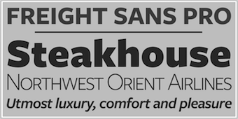 The fifty best-selling typefaces at MyFonts, as reported by them on December 31, 2016: #1 Proxima Nova (Mark Simonson), #2 Helvetica Neue (Linotype), #3 FF DIN (FontFont), #4 Brandon Grotesque (HVD Fonts), #5 Intelo (Kastelov), #6 Avenir (Linotype), #7 Gilroy (Radomir Tinkov), #8 Bourton (Kimmy Design), #9 Akzidenz-Grotesk BQ (Berthold), #10 Brandon Text (HVD Fonts), #11 FF Mark (FontFont), #12 DIN Next (Linotype), #13 Univers (Linotype), #14 Cabrito Didone (insigne), #15 Nexa (Fontfabric), #16 Avenir Next Pro (Linotype), #17 Futura (Linotype), #18 Trade Gothic (Linotype), #19 Helvetica Neue LT Std (Adobe), #20 Mrs Eaves (Emigre), #21 Neo Sans (Monotype), #22 ITC Avant Garde Gothic (ITC), #23 Futura (Bitstream), #24 Zooja (Aerotype), #25 Frutiger (Linotype), #26 Cera Pro (TypeMates), #27 Amsi Pro (Stawix), #28 Museo Sans (exljbris), #29 Campton (Rene Bieder), #30 Akzidenz-Grotesk BE (Berthold), #31 Jazz Script (Fenotype), #32 Slate (Monotype), #33 FF Meta Serif (FontFont), #34 Helvetica (Linotype), #35 Avenir (Adobe), #36 Metronic Pro (Mostardesign), #37 Geogrotesque (Emtype Foundry), #38 Nexa Rust (Fontfabric), #39 Viva Beautiful (Cultivated Mind), #40 Averta (Intelligent Design), #41 Freeland (Trial by Cupcakes), #42 Taberna (Latinotype), #43 Camingo Dos Office (Jan Fromm), #44 Freight Sans Pro (GarageFonts), #45 Between (Monotype), #46 Gill Sans (Monotype), #47 Galano Grotesque (Rene Bieder), #48 Winner (sportsfonts), #49 Pluto (HVD Fonts), #50 Museo Sans Rounded (exljbris). [Google]
[More] ⦿
The fifty best-selling typefaces at MyFonts, as reported by them on December 31, 2016: #1 Proxima Nova (Mark Simonson), #2 Helvetica Neue (Linotype), #3 FF DIN (FontFont), #4 Brandon Grotesque (HVD Fonts), #5 Intelo (Kastelov), #6 Avenir (Linotype), #7 Gilroy (Radomir Tinkov), #8 Bourton (Kimmy Design), #9 Akzidenz-Grotesk BQ (Berthold), #10 Brandon Text (HVD Fonts), #11 FF Mark (FontFont), #12 DIN Next (Linotype), #13 Univers (Linotype), #14 Cabrito Didone (insigne), #15 Nexa (Fontfabric), #16 Avenir Next Pro (Linotype), #17 Futura (Linotype), #18 Trade Gothic (Linotype), #19 Helvetica Neue LT Std (Adobe), #20 Mrs Eaves (Emigre), #21 Neo Sans (Monotype), #22 ITC Avant Garde Gothic (ITC), #23 Futura (Bitstream), #24 Zooja (Aerotype), #25 Frutiger (Linotype), #26 Cera Pro (TypeMates), #27 Amsi Pro (Stawix), #28 Museo Sans (exljbris), #29 Campton (Rene Bieder), #30 Akzidenz-Grotesk BE (Berthold), #31 Jazz Script (Fenotype), #32 Slate (Monotype), #33 FF Meta Serif (FontFont), #34 Helvetica (Linotype), #35 Avenir (Adobe), #36 Metronic Pro (Mostardesign), #37 Geogrotesque (Emtype Foundry), #38 Nexa Rust (Fontfabric), #39 Viva Beautiful (Cultivated Mind), #40 Averta (Intelligent Design), #41 Freeland (Trial by Cupcakes), #42 Taberna (Latinotype), #43 Camingo Dos Office (Jan Fromm), #44 Freight Sans Pro (GarageFonts), #45 Between (Monotype), #46 Gill Sans (Monotype), #47 Galano Grotesque (Rene Bieder), #48 Winner (sportsfonts), #49 Pluto (HVD Fonts), #50 Museo Sans Rounded (exljbris). [Google]
[More] ⦿
|
MyFonts: Bestsellers for January 2018
|
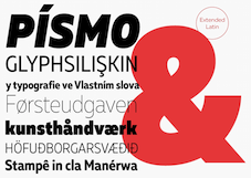 The fifty best-selling typefaces at MyFonts, as reported by them on December 31, 2017: #1 Helvetica Neue (Linotype), #2 FF DIN (FontFont), #3 Brandon Grotesque (HVD Fonts), #4 Proxima Nova (Mark Simonson), #5 Avenir (Linotype), #6 Gilroy (Radomir Tinkov), #7 Uni Neue (Fontfabric), #8 DIN 2014 (ParaType), #9 Effra (Dalton Maag), #10 Neue Haas Unica (Linotype), #11 TT Norms (TypeType), #12 Futura PT (ParaType), #13 Cera Pro (TypeMates), #14 Galano Grotesque (Rene Bieder), #15 Brandon Text (HVD Fonts), #16 Avenir Next Pro (Linotype), #17 Nexa Rust (Fontfabric), #18 DIN Next (Linotype), #19 Panton (Fontfabric), #20 FF Mark (FontFont), #21 ITC Avant Garde Gothic (ITC), #22 Univers (Linotype), #23 Trade Gothic (Linotype), #24 Neue Haas Grotesk (Linotype), #25 Akzidenz-Grotesk BE (Berthold), #26 Sagona (Rene Bieder), #27 Neue Frutiger (Linotype), #28 Museo Sans (exljbris), #29 Proxima Soft (Mark Simonson), #30 Rockeby SemiSerif (My Creative Land), #31 Intro Rust (Fontfabric), #32 Azo Sans (Rui Abreu), #33 Campton (Rene Bieder), #34 Century Gothic (Monotype), #35 Freight Sans Pro (GarageFonts), #36 Nexa (Fontfabric), #37 Helvetica Neue LT Std (Adobe), #38 Sailec (Type Dynamic), #39 Futura (Linotype), #40 Creighton Pro (Red Rooster Collection), #41 Frutiger (Linotype), #42 FF Scala Sans (FontFont), #43 Sofia Pro (Mostardesign), #44 Tazugane Gothic (Monotype), #45 PF DIN Text Arabic (Parachute), #46 Vista Sans (Emigre), #47 Muller (Fontfabric), #48 Viva Beautiful (Cultivated Mind), #49 Intro (Fontfabric), #50 Zing Rust (Fontfabric). [Google]
[More] ⦿
The fifty best-selling typefaces at MyFonts, as reported by them on December 31, 2017: #1 Helvetica Neue (Linotype), #2 FF DIN (FontFont), #3 Brandon Grotesque (HVD Fonts), #4 Proxima Nova (Mark Simonson), #5 Avenir (Linotype), #6 Gilroy (Radomir Tinkov), #7 Uni Neue (Fontfabric), #8 DIN 2014 (ParaType), #9 Effra (Dalton Maag), #10 Neue Haas Unica (Linotype), #11 TT Norms (TypeType), #12 Futura PT (ParaType), #13 Cera Pro (TypeMates), #14 Galano Grotesque (Rene Bieder), #15 Brandon Text (HVD Fonts), #16 Avenir Next Pro (Linotype), #17 Nexa Rust (Fontfabric), #18 DIN Next (Linotype), #19 Panton (Fontfabric), #20 FF Mark (FontFont), #21 ITC Avant Garde Gothic (ITC), #22 Univers (Linotype), #23 Trade Gothic (Linotype), #24 Neue Haas Grotesk (Linotype), #25 Akzidenz-Grotesk BE (Berthold), #26 Sagona (Rene Bieder), #27 Neue Frutiger (Linotype), #28 Museo Sans (exljbris), #29 Proxima Soft (Mark Simonson), #30 Rockeby SemiSerif (My Creative Land), #31 Intro Rust (Fontfabric), #32 Azo Sans (Rui Abreu), #33 Campton (Rene Bieder), #34 Century Gothic (Monotype), #35 Freight Sans Pro (GarageFonts), #36 Nexa (Fontfabric), #37 Helvetica Neue LT Std (Adobe), #38 Sailec (Type Dynamic), #39 Futura (Linotype), #40 Creighton Pro (Red Rooster Collection), #41 Frutiger (Linotype), #42 FF Scala Sans (FontFont), #43 Sofia Pro (Mostardesign), #44 Tazugane Gothic (Monotype), #45 PF DIN Text Arabic (Parachute), #46 Vista Sans (Emigre), #47 Muller (Fontfabric), #48 Viva Beautiful (Cultivated Mind), #49 Intro (Fontfabric), #50 Zing Rust (Fontfabric). [Google]
[More] ⦿
|
MyFonts: Bestsellers for January 2019
|
 The fifty best-selling typefaces at MyFonts, as reported by them on December 31, 2018: #1 Gilroy (Radomir Tinkov), #2 Neue Helvetica (Linotype), #3 Proxima Nova (Mark Simonson), #4 Brandon Grotesque (HVD Fonts), #5 FF DIN (FontFont), #6 Avenir (Linotype), #7 FF Mark (FontFont), #8 Univers (Linotype), #9 Avenir Next (Linotype), #10 TT Norms (TypeType), #11 Nexa (Fontfabric), #12 Trade Gothic (Linotype), #13 Helvetica (Linotype), #14 Cera Pro (TypeMates), #15 Panton (Fontfabric), #16 PF DIN Text (Parachute), #17 Mont (Fontfabric), #18 Frutiger (Linotype), #19 Brandon Text (HVD Fonts), #20 DIN Next (Linotype), #21 Futura (Linotype), #22 Sofia Pro (Mostardesign), #23 TT Commons (TypeType), #24 Recoleta (Latinotype), #25 Campton (Rene Bieder), #26 ITC Avant Garde Gothic (ITC), #27 Museo Sans (exljbris), #28 Volte (Indian Type Foundry), #29 Config (Adam Ladd), #30 Larsseit (Type Dynamic), #31 Neue Haas Grotesk (Linotype), #32 Freight Sans Pro (GarageFonts), #33 FF Fago (FontFont), #34 Axiforma (Kastelov), #35 Brandon Grotesque Condensed (HVD Fonts), #36 Aktiv Grotesk (Dalton Maag), #37 Galano Grotesque (Rene Bieder), #38 Quickbrush (Trial by Cupcakes), #39 Geller (Ludka Biniek), #40 Faktum (Rene Bieder), #41 Neo Sans (Monotype), #42 White Oleander (Nicky Laatz), #43 Turbinado (Aerotype), #44 Nexa Rust (Fontfabric), #45 Fineday (Mika Melvas), #46 Averta Standard (Intelligent Design), #47 Qualion (ROHH), #48 Muller (Fontfabric), #49 FF Meta (FontFont), #50 Slate (Monotype). [Google]
[More] ⦿
The fifty best-selling typefaces at MyFonts, as reported by them on December 31, 2018: #1 Gilroy (Radomir Tinkov), #2 Neue Helvetica (Linotype), #3 Proxima Nova (Mark Simonson), #4 Brandon Grotesque (HVD Fonts), #5 FF DIN (FontFont), #6 Avenir (Linotype), #7 FF Mark (FontFont), #8 Univers (Linotype), #9 Avenir Next (Linotype), #10 TT Norms (TypeType), #11 Nexa (Fontfabric), #12 Trade Gothic (Linotype), #13 Helvetica (Linotype), #14 Cera Pro (TypeMates), #15 Panton (Fontfabric), #16 PF DIN Text (Parachute), #17 Mont (Fontfabric), #18 Frutiger (Linotype), #19 Brandon Text (HVD Fonts), #20 DIN Next (Linotype), #21 Futura (Linotype), #22 Sofia Pro (Mostardesign), #23 TT Commons (TypeType), #24 Recoleta (Latinotype), #25 Campton (Rene Bieder), #26 ITC Avant Garde Gothic (ITC), #27 Museo Sans (exljbris), #28 Volte (Indian Type Foundry), #29 Config (Adam Ladd), #30 Larsseit (Type Dynamic), #31 Neue Haas Grotesk (Linotype), #32 Freight Sans Pro (GarageFonts), #33 FF Fago (FontFont), #34 Axiforma (Kastelov), #35 Brandon Grotesque Condensed (HVD Fonts), #36 Aktiv Grotesk (Dalton Maag), #37 Galano Grotesque (Rene Bieder), #38 Quickbrush (Trial by Cupcakes), #39 Geller (Ludka Biniek), #40 Faktum (Rene Bieder), #41 Neo Sans (Monotype), #42 White Oleander (Nicky Laatz), #43 Turbinado (Aerotype), #44 Nexa Rust (Fontfabric), #45 Fineday (Mika Melvas), #46 Averta Standard (Intelligent Design), #47 Qualion (ROHH), #48 Muller (Fontfabric), #49 FF Meta (FontFont), #50 Slate (Monotype). [Google]
[More] ⦿
|
MyFonts: Bestsellers for January 2020
|
 The fifty best-selling typefaces at MyFonts, as reported by them on January 1, 2020: #1 Gilroy (Radomir Tinkov), #2 Neue Helvetica (Linotype), #3 Proxima Nova (Mark Simonson), #4 TT Norms Pro (TypeType), #5 FF DIN (FontFont), #6 Avenir Next (Linotype), #7 Avenir (Linotype), #8 Helvetica Now (Monotype), #9 FF Mark (FontFont), #10 Univers (Linotype), #11 Mont (Fontfabric), #12 Brandon Grotesque (HVD Fonts), #13 Cera Pro (TypeMates), #14 FF Clan (FontFont), #15 DIN Next (Linotype), #16 Faktum (Rene Bieder), #17 Sofia Pro (Mostardesign), #18 Panton (Fontfabric), #19 Din Condensed (ParaType), #20 TT Commons (TypeType), #21 Recoleta (Latinotype), #22 ITC Avant Garde Gothic (ITC), #23 Frutiger (Linotype), #24 Helvetica (Linotype), #25 Tazugane Gothic (Monotype), #26 Galano Grotesque (Rene Bieder), #27 Silk Serif (SilkType), #28 Intro (Fontfabric), #29 TT Firs Neue (TypeType), #30 Nexa (Fontfabric), #31 Zeit (Fenotype), #32 Brandon Text (HVD Fonts), #33 Swiss 721 (Bitstream), #34 Isidora (Latinotype), #35 Futura (URW Type Foundry), #36 Futura PT (ParaType), #37 Axiforma (Kastelov), #38 Swift (Linotype), #39 Averta (Intelligent Design), #40 Campton (Rene Bieder), #41 Steradian (Emtype Foundry), #42 Museo Sans (exljbris), #43 Futura (Bitstream), #44 Sailec (Type Dynamic), #45 Gill Sans (Monotype), #46 Slate (Monotype), #47 TT Hoves (TypeType), #48 FF Meta Serif (FontFont), #49 TT Supermolot Neue (TypeType), #50 TT Interphases (TypeType). [Google]
[More] ⦿
The fifty best-selling typefaces at MyFonts, as reported by them on January 1, 2020: #1 Gilroy (Radomir Tinkov), #2 Neue Helvetica (Linotype), #3 Proxima Nova (Mark Simonson), #4 TT Norms Pro (TypeType), #5 FF DIN (FontFont), #6 Avenir Next (Linotype), #7 Avenir (Linotype), #8 Helvetica Now (Monotype), #9 FF Mark (FontFont), #10 Univers (Linotype), #11 Mont (Fontfabric), #12 Brandon Grotesque (HVD Fonts), #13 Cera Pro (TypeMates), #14 FF Clan (FontFont), #15 DIN Next (Linotype), #16 Faktum (Rene Bieder), #17 Sofia Pro (Mostardesign), #18 Panton (Fontfabric), #19 Din Condensed (ParaType), #20 TT Commons (TypeType), #21 Recoleta (Latinotype), #22 ITC Avant Garde Gothic (ITC), #23 Frutiger (Linotype), #24 Helvetica (Linotype), #25 Tazugane Gothic (Monotype), #26 Galano Grotesque (Rene Bieder), #27 Silk Serif (SilkType), #28 Intro (Fontfabric), #29 TT Firs Neue (TypeType), #30 Nexa (Fontfabric), #31 Zeit (Fenotype), #32 Brandon Text (HVD Fonts), #33 Swiss 721 (Bitstream), #34 Isidora (Latinotype), #35 Futura (URW Type Foundry), #36 Futura PT (ParaType), #37 Axiforma (Kastelov), #38 Swift (Linotype), #39 Averta (Intelligent Design), #40 Campton (Rene Bieder), #41 Steradian (Emtype Foundry), #42 Museo Sans (exljbris), #43 Futura (Bitstream), #44 Sailec (Type Dynamic), #45 Gill Sans (Monotype), #46 Slate (Monotype), #47 TT Hoves (TypeType), #48 FF Meta Serif (FontFont), #49 TT Supermolot Neue (TypeType), #50 TT Interphases (TypeType). [Google]
[More] ⦿
|
MyFonts: Bestsellers for January 2021
|
 The fifty best-selling typefaces at MyFonts, as reported by them on January 2, 2021: #1 Gilroy (Radomir Tinkov), #2 Neue Helvetica (Linotype), #3 TT Norms Pro (TypeType), #4 Avenir (Linotype), #5 Avenir Next (Linotype), #6 Univers (Linotype), #7 Helvetica (Linotype), #8 Cera Pro (TypeMates), #9 Brandon Grotesque (HVD Fonts), #10 Helvetica Now (Monotype), #11 Nexa (Fontfabric), #12 Frutiger (Linotype), #13 Recoleta (Latinotype), #14 TT Commons (TypeType), #15 FF Mark (FontFont), #16 Optima (Linotype), #17 ITC Avant Garde Gothic (ITC), #18 Sofia Pro (Mostardesign), #19 Mont (Fontfabric), #20 Proxima Nova (Mark Simonson), #21 DIN Next (Linotype), #22 Trade Gothic (Linotype), #23 Campton (Rene Bieder), #24 Galano Grotesque (Rene Bieder), #25 Neue Haas Unica (Linotype), #26 FF DIN (FontFont), #27 Axiforma (Kastelov), #28 Neue Haas Grotesk (Linotype), #29 Futura (Linotype), #30 Bicyclette (Kostic), #31 Futura PT (ParaType), #32 Brandon Text (HVD Fonts), #33 Anko (Eko Bimantara), #34 Trade Gothic Next (Linotype), #35 Houschka Pro (G-Type), #36 Palmer Lake (Jen Wagner Co.), #37 Intro (Fontfabric), #38 Sancoale Softened (insigne), #39 TT Ramillas (TypeType), #40 Larken (EllenLuff), #41 Tazugane Gothic (Monotype), #42 TT Hoves (TypeType), #43 Juana (Latinotype), #44 Panton (Fontfabric), #45 ITC Caslon No. 224 (ITC), #46 Eina (Extratype), #47 PMN Caecilia (Monotype), #48 TT Firs Neue (TypeType), #49 Larsseit (Type Dynamic), #50 Hanley Pro (District 62 Studio). [Google]
[More] ⦿
The fifty best-selling typefaces at MyFonts, as reported by them on January 2, 2021: #1 Gilroy (Radomir Tinkov), #2 Neue Helvetica (Linotype), #3 TT Norms Pro (TypeType), #4 Avenir (Linotype), #5 Avenir Next (Linotype), #6 Univers (Linotype), #7 Helvetica (Linotype), #8 Cera Pro (TypeMates), #9 Brandon Grotesque (HVD Fonts), #10 Helvetica Now (Monotype), #11 Nexa (Fontfabric), #12 Frutiger (Linotype), #13 Recoleta (Latinotype), #14 TT Commons (TypeType), #15 FF Mark (FontFont), #16 Optima (Linotype), #17 ITC Avant Garde Gothic (ITC), #18 Sofia Pro (Mostardesign), #19 Mont (Fontfabric), #20 Proxima Nova (Mark Simonson), #21 DIN Next (Linotype), #22 Trade Gothic (Linotype), #23 Campton (Rene Bieder), #24 Galano Grotesque (Rene Bieder), #25 Neue Haas Unica (Linotype), #26 FF DIN (FontFont), #27 Axiforma (Kastelov), #28 Neue Haas Grotesk (Linotype), #29 Futura (Linotype), #30 Bicyclette (Kostic), #31 Futura PT (ParaType), #32 Brandon Text (HVD Fonts), #33 Anko (Eko Bimantara), #34 Trade Gothic Next (Linotype), #35 Houschka Pro (G-Type), #36 Palmer Lake (Jen Wagner Co.), #37 Intro (Fontfabric), #38 Sancoale Softened (insigne), #39 TT Ramillas (TypeType), #40 Larken (EllenLuff), #41 Tazugane Gothic (Monotype), #42 TT Hoves (TypeType), #43 Juana (Latinotype), #44 Panton (Fontfabric), #45 ITC Caslon No. 224 (ITC), #46 Eina (Extratype), #47 PMN Caecilia (Monotype), #48 TT Firs Neue (TypeType), #49 Larsseit (Type Dynamic), #50 Hanley Pro (District 62 Studio). [Google]
[More] ⦿
|
MyFonts: Bestsellers for January 2022
|
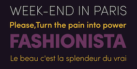 The fifty best-selling typefaces at MyFonts, as reported by them on January 1, 2022: #1 Sofia Pro (Mostardesign), #2 Gilroy (Radomir Tinkov), #3 Neue Helvetica (Linotype), #4 Urbane (Device), #5 Avenir (Linotype), #6 Avenir Next (Linotype), #7 TT Norms Pro (TypeType), #8 Univers (Linotype), #9 Proxima Nova (Mark Simonson), #10 FF DIN (FontFont), #11 Helvetica Now (Monotype), #12 Tazugane Gothic (Monotype), #13 Frutiger (Linotype), #14 FF Mark (FontFont), #15 Univers Next (Linotype), #16 Galano Grotesque (Rene Bieder), #17 Brandon Grotesque (HVD Fonts), #18 Cera Pro (TypeMates), #19 ALS SyysScript (Art. Lebedev Studio), #20 Neue Haas Grotesk (Linotype), #21 DIN Next (Linotype), #22 Nexa (Fontfabric), #23 Avenir Next World (Linotype), #24 Coco Gothic Pro (Zetafonts), #25 TT Commons Pro (TypeType), #26 Averta (Intelligent Design), #27 Helvetica (Linotype), #28 Campton (Rene Bieder), #29 Mont (Fontfabric), #30 Neue Haas Unica (Linotype), #31 ITC Avant Garde Gothic (ITC), #32 Recoleta (Latinotype), #33 Intro (Fontfabric), #34 Futura (Linotype), #35 Gazpacho (Santi Rey), #36 Trade Gothic (Linotype), #37 VAG Rounded (Linotype), #38 Din Condensed (ParaType), #39 Futura PT (ParaType), #40 Optima (Linotype), #41 FS Albert (Fontsmith), #42 Cotford (Monotype), #43 Brandon Text (HVD Fonts), #44 Panton (Fontfabric), #45 Paralucent (Device), #46 Gill Sans (Monotype), #47 TT Hoves (TypeType), #48 Larken (EllenLuff), #49 Albra (BumbumType), #50 TT Interphases (TypeType). [Google]
[More] ⦿
The fifty best-selling typefaces at MyFonts, as reported by them on January 1, 2022: #1 Sofia Pro (Mostardesign), #2 Gilroy (Radomir Tinkov), #3 Neue Helvetica (Linotype), #4 Urbane (Device), #5 Avenir (Linotype), #6 Avenir Next (Linotype), #7 TT Norms Pro (TypeType), #8 Univers (Linotype), #9 Proxima Nova (Mark Simonson), #10 FF DIN (FontFont), #11 Helvetica Now (Monotype), #12 Tazugane Gothic (Monotype), #13 Frutiger (Linotype), #14 FF Mark (FontFont), #15 Univers Next (Linotype), #16 Galano Grotesque (Rene Bieder), #17 Brandon Grotesque (HVD Fonts), #18 Cera Pro (TypeMates), #19 ALS SyysScript (Art. Lebedev Studio), #20 Neue Haas Grotesk (Linotype), #21 DIN Next (Linotype), #22 Nexa (Fontfabric), #23 Avenir Next World (Linotype), #24 Coco Gothic Pro (Zetafonts), #25 TT Commons Pro (TypeType), #26 Averta (Intelligent Design), #27 Helvetica (Linotype), #28 Campton (Rene Bieder), #29 Mont (Fontfabric), #30 Neue Haas Unica (Linotype), #31 ITC Avant Garde Gothic (ITC), #32 Recoleta (Latinotype), #33 Intro (Fontfabric), #34 Futura (Linotype), #35 Gazpacho (Santi Rey), #36 Trade Gothic (Linotype), #37 VAG Rounded (Linotype), #38 Din Condensed (ParaType), #39 Futura PT (ParaType), #40 Optima (Linotype), #41 FS Albert (Fontsmith), #42 Cotford (Monotype), #43 Brandon Text (HVD Fonts), #44 Panton (Fontfabric), #45 Paralucent (Device), #46 Gill Sans (Monotype), #47 TT Hoves (TypeType), #48 Larken (EllenLuff), #49 Albra (BumbumType), #50 TT Interphases (TypeType). [Google]
[More] ⦿
|
MyFonts: Bestsellers for July 2012
|
The fifty best-selling typefaces at MyFonts, as reported by them on July 2, 2012. The strong grotesque and sans families are still selling very well. The geometric sans category is quite popular---Proxima Nova (Mark Simonson) is first, followed by Brandon Grotesque (HVD) in second place, with others such as Museo Sans, Futura, Helvetica Neue, Pluto Sans and Intro taking positions in the top ten. Expect the newest HVD font, Pluto Sans, to rise some more. We find eight scripts in the top fifty, just as a month ago: Bombshell Pro, Funkydori, Carolyna Pro Black, Thirsty Script, Belluccia, Carolyna, Peoni Pro, and Gelato Script. In the text typeface category, we have a small recovery: Shinn Type's Bodoni Egyptian is doing fine (9th), as predicted. Joining the top 50 are Adelle (Type Together), Miller (Font Bureau) and Museo and Museo Sans. Personal favorites hitting the top fifty this month include Benton Sans (Font Bureau), Populaire (a poster typeface by Pintassilgo), Sofia Pro (Mostardesign), and Shinn Type's Bodoni Egyptian Pro. [Google]
[More] ⦿
|
MyFonts: Bestsellers for July 2013
|
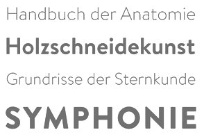 The fifty best-selling typefaces at MyFonts, as reported by them on July 2, 2013: #1: Proxima Nova (Mark Simonson), #2: Brandon Grotesque (HVD Fonts), #3: Avenir (Linotype), #4: Helvetica Neue LT Std (Adobe), #5: Trade Gothic (Linotype), #6: Brandon Text (HVD Fonts), #7: Museo Sans (exljbris), #8: FF DIN (FontFont), #9: Thirsty Rough (Yellow Design Studio), #10: Univers (Linotype), #11: Bombshell Pro (Emily Lime), #12: Trend (Latinotype), #13: Style Script (TypeSETit), #14: Hurme Geometric Sans No.4 (Hurme Design), #15: Lunch Box (Kimmy Design), #16: Carolyna Pro Black (Emily Lime), #17: Antenna (Font Bureau), #18: Akzidenz-Grotesk BE (Berthold), #19: Helvetica Neue (Linotype), #20: Gin (Hold Fast Foundry), #21: Futura (Bitstream), #22: Interstate (Font Bureau), #23: Museo Slab (exljbris), #24: Neo sans (Monotype Imaging), #25: Nexa Slab (Fontfabric), #26: Wishes Script (Typesenses), #27: Esmeralda Pro (Sudtipos), #28: Veneer (Yellow Design Studio), #29: Avenir Next Pro (Linotype), #30: Nanami (Thinkdust), #31: Nexa (Fontfabric), #32: Tablet Gothic (TypeTogether), #33: Intro (Fontfabric), #34: Benton Sans (Font Bureau), #35: Thirsty Script (Yellow Design Studio), #36: Hipster Script Pro (Sudtipos), #37: ITC Avant Garde Gothic (ITC), #38: Brand (Lian Types), #39: Frutiger (Linotype), #40: Alright Sans (Okay Type), #41: Narziss (Hubert Jocham Type), #42: Helvetica Neue Pro (Linotype), #43: Frutiger (Adobe), #44: Agenda (Font Bureau), #45: Geogrotesque (Emtype Foundry), #46: Pluto Sans (HVD Fonts), #47: Akzidenz-Grotesk Pro (Berthold), #48: Helvetica (Linotype), #49: Museo (exljbris), #50: Pluto (HVD Fonts). [Google]
[More] ⦿
The fifty best-selling typefaces at MyFonts, as reported by them on July 2, 2013: #1: Proxima Nova (Mark Simonson), #2: Brandon Grotesque (HVD Fonts), #3: Avenir (Linotype), #4: Helvetica Neue LT Std (Adobe), #5: Trade Gothic (Linotype), #6: Brandon Text (HVD Fonts), #7: Museo Sans (exljbris), #8: FF DIN (FontFont), #9: Thirsty Rough (Yellow Design Studio), #10: Univers (Linotype), #11: Bombshell Pro (Emily Lime), #12: Trend (Latinotype), #13: Style Script (TypeSETit), #14: Hurme Geometric Sans No.4 (Hurme Design), #15: Lunch Box (Kimmy Design), #16: Carolyna Pro Black (Emily Lime), #17: Antenna (Font Bureau), #18: Akzidenz-Grotesk BE (Berthold), #19: Helvetica Neue (Linotype), #20: Gin (Hold Fast Foundry), #21: Futura (Bitstream), #22: Interstate (Font Bureau), #23: Museo Slab (exljbris), #24: Neo sans (Monotype Imaging), #25: Nexa Slab (Fontfabric), #26: Wishes Script (Typesenses), #27: Esmeralda Pro (Sudtipos), #28: Veneer (Yellow Design Studio), #29: Avenir Next Pro (Linotype), #30: Nanami (Thinkdust), #31: Nexa (Fontfabric), #32: Tablet Gothic (TypeTogether), #33: Intro (Fontfabric), #34: Benton Sans (Font Bureau), #35: Thirsty Script (Yellow Design Studio), #36: Hipster Script Pro (Sudtipos), #37: ITC Avant Garde Gothic (ITC), #38: Brand (Lian Types), #39: Frutiger (Linotype), #40: Alright Sans (Okay Type), #41: Narziss (Hubert Jocham Type), #42: Helvetica Neue Pro (Linotype), #43: Frutiger (Adobe), #44: Agenda (Font Bureau), #45: Geogrotesque (Emtype Foundry), #46: Pluto Sans (HVD Fonts), #47: Akzidenz-Grotesk Pro (Berthold), #48: Helvetica (Linotype), #49: Museo (exljbris), #50: Pluto (HVD Fonts). [Google]
[More] ⦿
|
MyFonts: Bestsellers for July 2014
|
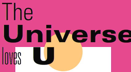 The fifty best-selling typefaces at MyFonts, as reported by them on July 1, 2014: #1: Proxima Nova (Mark Simonson), #2: Brandon Grotesque (HVD Fonts), #3: Helvetica Neue (Linotype), #4: Adorn (Laura Worthington), #5: Avenir (Linotype), #6: FF DIN (FontFont), #7: Univers (Linotype), #8: Intro (Fontfabric), #9: Bombshell Pro (Emily Lime), #10: Brandon Text (HVD Fonts), #11: Trade Gothic (Linotype), #12: Uni Sans (Fontfabric), #13: Museo Sans (exljbris), #14: DIN Next (Linotype), #15: Choplin (Rene Bieder), #16: Interstate (Font Bureau), #17: Eveleth (Yellow Design Studio), #18: ITC Avant Garde Gothic (ITC), #19: Futura (Bitstream), #20: PF Din Text (Parachute), #21: Avenir Next Pro (Linotype), #22: Heroe (Lián Types), #23: Frutiger (Linotype), #24: Gill Sans (Monotype), #25: Cantoni (Debi Sementelli Type Foundry), #26: Thirsty Rough (Yellow Design Studio), #27: Museo Slab (exljbris), #28: Brandon Printed (HVD Fonts), #29: Carolyna Pro Black (Emily Lime), #30: Quickpen (Trial by Cupcakes), #31: Benton Sans (Font Bureau), #32: Helvetica Neue LT Std (Adobe), #33: Microbrew (Albatross), #34: PF Din Display Pro (Parachute), #35: Nexa (Fontfabric), #36: Darwin (Los Andes), #37: Jacques & Gilles (Emily Lime), #38: Trend (Latinotype), #39: Festivo Letters (Ahmet Altun), #40: Libertad (TipoType), #41: Geogrotesque (Emtype Foundry), #42: ITC Conduit (ITC), #43: Newslab (Latinotype), #44: Mikado (HVD Fonts), #45: Franklin Gothic (URW++), #46: Core Circus (S-Core), #47: Sofia Pro (Mostardesign), #48: Miller (Font Bureau), #49: Frutiger (Adobe), #50: Campton (Rene Bieder). [Google]
[More] ⦿
The fifty best-selling typefaces at MyFonts, as reported by them on July 1, 2014: #1: Proxima Nova (Mark Simonson), #2: Brandon Grotesque (HVD Fonts), #3: Helvetica Neue (Linotype), #4: Adorn (Laura Worthington), #5: Avenir (Linotype), #6: FF DIN (FontFont), #7: Univers (Linotype), #8: Intro (Fontfabric), #9: Bombshell Pro (Emily Lime), #10: Brandon Text (HVD Fonts), #11: Trade Gothic (Linotype), #12: Uni Sans (Fontfabric), #13: Museo Sans (exljbris), #14: DIN Next (Linotype), #15: Choplin (Rene Bieder), #16: Interstate (Font Bureau), #17: Eveleth (Yellow Design Studio), #18: ITC Avant Garde Gothic (ITC), #19: Futura (Bitstream), #20: PF Din Text (Parachute), #21: Avenir Next Pro (Linotype), #22: Heroe (Lián Types), #23: Frutiger (Linotype), #24: Gill Sans (Monotype), #25: Cantoni (Debi Sementelli Type Foundry), #26: Thirsty Rough (Yellow Design Studio), #27: Museo Slab (exljbris), #28: Brandon Printed (HVD Fonts), #29: Carolyna Pro Black (Emily Lime), #30: Quickpen (Trial by Cupcakes), #31: Benton Sans (Font Bureau), #32: Helvetica Neue LT Std (Adobe), #33: Microbrew (Albatross), #34: PF Din Display Pro (Parachute), #35: Nexa (Fontfabric), #36: Darwin (Los Andes), #37: Jacques & Gilles (Emily Lime), #38: Trend (Latinotype), #39: Festivo Letters (Ahmet Altun), #40: Libertad (TipoType), #41: Geogrotesque (Emtype Foundry), #42: ITC Conduit (ITC), #43: Newslab (Latinotype), #44: Mikado (HVD Fonts), #45: Franklin Gothic (URW++), #46: Core Circus (S-Core), #47: Sofia Pro (Mostardesign), #48: Miller (Font Bureau), #49: Frutiger (Adobe), #50: Campton (Rene Bieder). [Google]
[More] ⦿
|
MyFonts: Bestsellers for July 2015
|
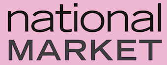 The fifty best-selling typefaces at MyFonts, as reported by them on July 1, 2015: #1 Brandon Grotesque (HVD Fonts), #2 Proxima Nova (Mark Simonson), #3 FF DIN (FontFont), #4 Helvetica Neue (Linotype), #5 Avenir (Linotype), #6 Futura PT (ParaType), #7 Effra (Dalton Maag), #8 ITC Avant Garde Gothic (ITC), #9 FF Mark (FontFont), #10 SantElia Script (Yellow Design Studio), #11 Nexa Rust (Fontfabric), #12 Brandon Text (HVD Fonts), #13 Trade Gothic (Linotype), #14 Museo Sans (exljbris), #15 Univers (Linotype), #16 Freeland (Trial by Cupcakes), #17 Avenir Next Pro (Linotype), #18 Futura (Bitstream), #19 Indie (Lian Types), #20 Bombshell Pro (Emily Lime), #21 Helvetica Neue LT Std (Adobe), #22 Futura (Linotype), #23 Frutiger (Linotype), #24 Campton (Rene Bieder), #25 Neue Haas Grotesk (Linotype), #26 Slate (Monotype), #27 DIN Next (Linotype), #28 Nexa (Fontfabric), #29 Swiss 721 (Bitstream), #30 Museo Slab (exljbris), #31 Amsi Pro (Stawix), #32 Goodlife (HVD Fonts), #33 Gratitude Script (Sudtipos), #34 Intro (Fontfabric), #35 Selfie (Lian Types), #36 Benton Sans (Font Bureau), #37 Brandon Printed (HVD Fonts), #38 Museo Sans Rounded (exljbris), #39 Vito (Typejockeys), #40 Sofia Pro (Mostardesign), #41 Periodico (Emtype Foundry), #42 Panton (Fontfabric), #43 Geogrotesque (Emtype Foundry), #44 Glober (Fontfabric), #45 Interstate (Font Bureau), #46 Akzidenz-Grotesk BE (Berthold), #47 Gill Sans (Monotype), #48 Botanica (My Creative Land), #49 Mulberry Script (Cultivated Mind), #50 Muller (Fontfabric). [Google]
[More] ⦿
The fifty best-selling typefaces at MyFonts, as reported by them on July 1, 2015: #1 Brandon Grotesque (HVD Fonts), #2 Proxima Nova (Mark Simonson), #3 FF DIN (FontFont), #4 Helvetica Neue (Linotype), #5 Avenir (Linotype), #6 Futura PT (ParaType), #7 Effra (Dalton Maag), #8 ITC Avant Garde Gothic (ITC), #9 FF Mark (FontFont), #10 SantElia Script (Yellow Design Studio), #11 Nexa Rust (Fontfabric), #12 Brandon Text (HVD Fonts), #13 Trade Gothic (Linotype), #14 Museo Sans (exljbris), #15 Univers (Linotype), #16 Freeland (Trial by Cupcakes), #17 Avenir Next Pro (Linotype), #18 Futura (Bitstream), #19 Indie (Lian Types), #20 Bombshell Pro (Emily Lime), #21 Helvetica Neue LT Std (Adobe), #22 Futura (Linotype), #23 Frutiger (Linotype), #24 Campton (Rene Bieder), #25 Neue Haas Grotesk (Linotype), #26 Slate (Monotype), #27 DIN Next (Linotype), #28 Nexa (Fontfabric), #29 Swiss 721 (Bitstream), #30 Museo Slab (exljbris), #31 Amsi Pro (Stawix), #32 Goodlife (HVD Fonts), #33 Gratitude Script (Sudtipos), #34 Intro (Fontfabric), #35 Selfie (Lian Types), #36 Benton Sans (Font Bureau), #37 Brandon Printed (HVD Fonts), #38 Museo Sans Rounded (exljbris), #39 Vito (Typejockeys), #40 Sofia Pro (Mostardesign), #41 Periodico (Emtype Foundry), #42 Panton (Fontfabric), #43 Geogrotesque (Emtype Foundry), #44 Glober (Fontfabric), #45 Interstate (Font Bureau), #46 Akzidenz-Grotesk BE (Berthold), #47 Gill Sans (Monotype), #48 Botanica (My Creative Land), #49 Mulberry Script (Cultivated Mind), #50 Muller (Fontfabric). [Google]
[More] ⦿
|
MyFonts: Bestsellers for July 2016
|
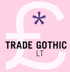 The fifty best-selling typefaces at MyFonts, as reported by them on July 1, 2016: #1 The Foundation Collection (Monotype), #2 FF DIN (FontFont), #3 Proxima Nova (Mark Simonson), #4 Brandon Grotesque (HVD Fonts), #5 Helvetica Neue (Linotype), #6 Meltow (Typesketchbook), #7 Avenir (Linotype), #8 Publica Sans (FaceType), #9 Rainier (Kimmy Design), #10 Brandon Text (HVD Fonts), #11 FF Kievit (FontFont), #12 Sailec (Type Dynamic), #13 Trade Gothic (Linotype), #14 FF Meta (FontFont), #15 FF More Pro (FontFont), #16 Avenir Next Pro (Linotype), #17 Freeland (Trial by Cupcakes), #18 Rational TW (Rene Bieder), #19 Univers (Linotype), #20 Black Script (Fenotype), #21 Cera (TypeMates), #22 DIN Next (Linotype), #23 Frutiger (Linotype), #24 Helvetica Neue LT Std (Adobe), #25 Panton (Fontfabric), #26 Blonde Script (Indian Type Foundry), #27 Microbrew Soft (Albatross), #28 ITC Avant Garde Gothic (ITC), #29 Amberly (DearType), #30 Garden Grown (Cultivated Mind), #31 Campton (Rene Bieder), #32 FF Mark (FontFont), #33 Museo Sans (exljbris), #34 Intro (Fontfabric), #35 Nexa Rust (Fontfabric), #36 Futura PT (ParaType), #37 Avenir (Adobe), #38 Blend (Typesenses), #39 Nexa (Fontfabric), #40 Aktiv Grotesk (Dalton Maag), #41 Prangs (Sudtipos), #42 Sofia Pro (Mostardesign), #43 Handelson (Mika Melvas), #44 Geogrotesque (Emtype Foundry), #45 Effra (Dalton Maag), #46 Akzidenz-Grotesk BE (Berthold), #47 Futura (Bitstream), #48 Futura (Linotype), #49 FF Dax (FontFont), #50 Amsi Pro (Stawix). [Google]
[More] ⦿
The fifty best-selling typefaces at MyFonts, as reported by them on July 1, 2016: #1 The Foundation Collection (Monotype), #2 FF DIN (FontFont), #3 Proxima Nova (Mark Simonson), #4 Brandon Grotesque (HVD Fonts), #5 Helvetica Neue (Linotype), #6 Meltow (Typesketchbook), #7 Avenir (Linotype), #8 Publica Sans (FaceType), #9 Rainier (Kimmy Design), #10 Brandon Text (HVD Fonts), #11 FF Kievit (FontFont), #12 Sailec (Type Dynamic), #13 Trade Gothic (Linotype), #14 FF Meta (FontFont), #15 FF More Pro (FontFont), #16 Avenir Next Pro (Linotype), #17 Freeland (Trial by Cupcakes), #18 Rational TW (Rene Bieder), #19 Univers (Linotype), #20 Black Script (Fenotype), #21 Cera (TypeMates), #22 DIN Next (Linotype), #23 Frutiger (Linotype), #24 Helvetica Neue LT Std (Adobe), #25 Panton (Fontfabric), #26 Blonde Script (Indian Type Foundry), #27 Microbrew Soft (Albatross), #28 ITC Avant Garde Gothic (ITC), #29 Amberly (DearType), #30 Garden Grown (Cultivated Mind), #31 Campton (Rene Bieder), #32 FF Mark (FontFont), #33 Museo Sans (exljbris), #34 Intro (Fontfabric), #35 Nexa Rust (Fontfabric), #36 Futura PT (ParaType), #37 Avenir (Adobe), #38 Blend (Typesenses), #39 Nexa (Fontfabric), #40 Aktiv Grotesk (Dalton Maag), #41 Prangs (Sudtipos), #42 Sofia Pro (Mostardesign), #43 Handelson (Mika Melvas), #44 Geogrotesque (Emtype Foundry), #45 Effra (Dalton Maag), #46 Akzidenz-Grotesk BE (Berthold), #47 Futura (Bitstream), #48 Futura (Linotype), #49 FF Dax (FontFont), #50 Amsi Pro (Stawix). [Google]
[More] ⦿
|
MyFonts: Bestsellers for July 2017
|
 The fifty best-selling typefaces at MyFonts, as reported by them on June 30, 2017: #1 Helvetica Neue (Linotype), #2 FF DIN (FontFont), #3 Proxima Nova (Mark Simonson), #4 Avenir (Linotype), #5 Brandon Grotesque (HVD Fonts), #6 Tazugane Gothic (Monotype), #7 Sequel Sans (OGJ Type Design), #8 Univers (Linotype), #9 Gilroy (Radomir Tinkov), #10 Avenir Next Pro (Linotype), #11 Limon (Typesenses), #12 Akzidenz-Grotesk BE (Berthold), #13 Bourton Hand (Kimmy Design), #14 Trade Gothic (Linotype), #15 Cera Pro (TypeMates), #16 FF Mark (FontFont), #17 Bourton (Kimmy Design), #18 Frutiger (Linotype), #19 Moments (DearType), #20 Futura (Linotype), #21 Amsi Pro (Stawix), #22 ITC Avant Garde Gothic (ITC), #23 Brandon Text (HVD Fonts), #24 Montecatini (Louise Fili Ltd), #25 Slate (Monotype), #26 TT Norms (TypeType), #27 Futura (Bitstream), #28 Just Lovely (Nicky Laatz), #29 Helvetica Neue LT Std (Adobe), #30 Adorn (Laura Worthington), #31 Coco Gothic (Zetafonts), #32 Montana Typeface (Alex Couture), #33 Glypha (Linotype), #34 Museo Sans (exljbris), #35 Nexa Rust (Fontfabric), #36 Timberline (Resistenza), #37 Nexa (Fontfabric), #38 Viva Beautiful (Cultivated Mind), #39 Texta (Latinotype), #40 Avenir (Adobe), #41 Intro Rust (Fontfabric), #42 TT Berlinerins (TypeType), #43 Campton (Rene Bieder), #44 Neue Haas Grotesk (Linotype), #45 Larsseit (Type Dynamic), #46 Futura PT (ParaType), #47 Sofia Pro (Mostardesign), #48 DIN Next (Linotype), #49 Brush Up (PintassilgoPrints), #50 ITC Franklin Gothic (ITC). [Google]
[More] ⦿
The fifty best-selling typefaces at MyFonts, as reported by them on June 30, 2017: #1 Helvetica Neue (Linotype), #2 FF DIN (FontFont), #3 Proxima Nova (Mark Simonson), #4 Avenir (Linotype), #5 Brandon Grotesque (HVD Fonts), #6 Tazugane Gothic (Monotype), #7 Sequel Sans (OGJ Type Design), #8 Univers (Linotype), #9 Gilroy (Radomir Tinkov), #10 Avenir Next Pro (Linotype), #11 Limon (Typesenses), #12 Akzidenz-Grotesk BE (Berthold), #13 Bourton Hand (Kimmy Design), #14 Trade Gothic (Linotype), #15 Cera Pro (TypeMates), #16 FF Mark (FontFont), #17 Bourton (Kimmy Design), #18 Frutiger (Linotype), #19 Moments (DearType), #20 Futura (Linotype), #21 Amsi Pro (Stawix), #22 ITC Avant Garde Gothic (ITC), #23 Brandon Text (HVD Fonts), #24 Montecatini (Louise Fili Ltd), #25 Slate (Monotype), #26 TT Norms (TypeType), #27 Futura (Bitstream), #28 Just Lovely (Nicky Laatz), #29 Helvetica Neue LT Std (Adobe), #30 Adorn (Laura Worthington), #31 Coco Gothic (Zetafonts), #32 Montana Typeface (Alex Couture), #33 Glypha (Linotype), #34 Museo Sans (exljbris), #35 Nexa Rust (Fontfabric), #36 Timberline (Resistenza), #37 Nexa (Fontfabric), #38 Viva Beautiful (Cultivated Mind), #39 Texta (Latinotype), #40 Avenir (Adobe), #41 Intro Rust (Fontfabric), #42 TT Berlinerins (TypeType), #43 Campton (Rene Bieder), #44 Neue Haas Grotesk (Linotype), #45 Larsseit (Type Dynamic), #46 Futura PT (ParaType), #47 Sofia Pro (Mostardesign), #48 DIN Next (Linotype), #49 Brush Up (PintassilgoPrints), #50 ITC Franklin Gothic (ITC). [Google]
[More] ⦿
|
MyFonts: Bestsellers for July 2018
|
 The fifty best-selling typefaces at MyFonts, as reported by them on July 1, 2018: #1 FF DIN (FontFont), #2 Neue Helvetica (Linotype), #3 Brandon Grotesque (HVD Fonts), #4 Foundry Sterling (The Foundry), #5 Gilroy (Radomir Tinkov), #6 Avenir Next (Linotype), #7 Proxima Nova (Mark Simonson), #8 Avenir (Linotype), #9 Neue Haas Grotesk (Linotype), #10 ITC Avant Garde Gothic (ITC), #11 FF Mark (FontFont), #12 Panton (Fontfabric), #13 Mont (Fontfabric), #14 Walbaum (Monotype), #15 TT Norms (TypeType), #16 Univers (Linotype), #17 Futura (Linotype), #18 Cera Pro (TypeMates), #19 Campton (Rene Bieder), #20 Brandon Text (HVD Fonts), #21 DIN Next (Linotype), #22 Helvetica (Linotype), #23 Futura PT (ParaType), #24 Sofia Pro (Mostardesign), #25 Frutiger (Linotype), #26 Mackay (Rene Bieder), #27 Effra (Dalton Maag), #28 Trade Gothic (Linotype), #29 Recoleta (Latinotype), #30 Gill Sans (Monotype), #31 Museo Sans (exljbris), #32 Larsseit (Type Dynamic), #33 TT Commons (TypeType), #34 Neo Sans (Monotype), #35 Joane (W Foundry), #36 Trade Gothic Next (Linotype), #37 Century Gothic (Monotype), #38 Myriad Pro (Adobe), #39 Codec (Zetafonts), #40 Nexa (Fontfabric), #41 Boston (Latinotype), #42 Neue Haas Unica (Linotype), #43 Uni Neue (Fontfabric), #44 Objektiv (Dalton Maag), #45 FF Cocon (FontFont), #46 Palomino (My Creative Land), #47 Quiche (Adam Ladd), #48 Scotch (Positype), #49 Sailec (Type Dynamic), #50 Kapra Neue Pro (Typoforge Studio). [Google]
[More] ⦿
The fifty best-selling typefaces at MyFonts, as reported by them on July 1, 2018: #1 FF DIN (FontFont), #2 Neue Helvetica (Linotype), #3 Brandon Grotesque (HVD Fonts), #4 Foundry Sterling (The Foundry), #5 Gilroy (Radomir Tinkov), #6 Avenir Next (Linotype), #7 Proxima Nova (Mark Simonson), #8 Avenir (Linotype), #9 Neue Haas Grotesk (Linotype), #10 ITC Avant Garde Gothic (ITC), #11 FF Mark (FontFont), #12 Panton (Fontfabric), #13 Mont (Fontfabric), #14 Walbaum (Monotype), #15 TT Norms (TypeType), #16 Univers (Linotype), #17 Futura (Linotype), #18 Cera Pro (TypeMates), #19 Campton (Rene Bieder), #20 Brandon Text (HVD Fonts), #21 DIN Next (Linotype), #22 Helvetica (Linotype), #23 Futura PT (ParaType), #24 Sofia Pro (Mostardesign), #25 Frutiger (Linotype), #26 Mackay (Rene Bieder), #27 Effra (Dalton Maag), #28 Trade Gothic (Linotype), #29 Recoleta (Latinotype), #30 Gill Sans (Monotype), #31 Museo Sans (exljbris), #32 Larsseit (Type Dynamic), #33 TT Commons (TypeType), #34 Neo Sans (Monotype), #35 Joane (W Foundry), #36 Trade Gothic Next (Linotype), #37 Century Gothic (Monotype), #38 Myriad Pro (Adobe), #39 Codec (Zetafonts), #40 Nexa (Fontfabric), #41 Boston (Latinotype), #42 Neue Haas Unica (Linotype), #43 Uni Neue (Fontfabric), #44 Objektiv (Dalton Maag), #45 FF Cocon (FontFont), #46 Palomino (My Creative Land), #47 Quiche (Adam Ladd), #48 Scotch (Positype), #49 Sailec (Type Dynamic), #50 Kapra Neue Pro (Typoforge Studio). [Google]
[More] ⦿
|
MyFonts: Bestsellers for July 2019
|
 The fifty best-selling typefaces at MyFonts, as reported by them on June 30, 2019: #1 Neue Helvetica (Linotype), #2 Gilroy (Radomir Tinkov), #3 FF Mark (FontFont), #4 FF DIN (FontFont), #5 Helvetica Now (Monotype ), #6 Avenir Next (Linotype), #7 DIN Next (Linotype), #8 Avenir (Linotype), #9 Proxima Nova (Mark Simonson), #10 Brandon Grotesque (HVD Fonts), #11 TT Norms Pro (TypeType), #12 Univers (Linotype), #13 Cera Pro (TypeMates), #14 Recoleta (Latinotype), #15 Frutiger (Linotype), #16 Futura (Linotype), #17 Helvetica (Linotype), #18 Mont (Fontfabric), #19 ITC Avant Garde Gothic (ITC), #20 Aktiv Grotesk (Dalton Maag), #21 Foco (Dalton Maag), #22 Brandon Text (HVD Fonts), #23 Campton (Rene Bieder), #24 TT Commons (TypeType), #25 Fixture (Sudtipos), #26 Fela (Picador), #27 Sofia Pro (Mostardesign), #28 Liberty (URW), #29 Axiforma (Kastelov), #30 Trade Gothic (Linotype), #31 Nexa (Fontfabric), #32 Intro (Fontfabric), #33 Averta (Intelligent Design), #34 Bebas Neue Pro (Dharma Type), #35 TT Hoves (TypeType), #36 Cardillac (Hoftype), #37 Museo Sans (exljbris), #38 Stolzl (The Northern Block Ltd), #39 FF Meta (FontFont), #40 Gill Sans (Monotype ), #41 Larsseit (Type Dynamic), #42 Silk Serif (SilkType), #43 Eckhart (ROHH), #44 Filson Pro (Mostardesign), #45 Bembo (Monotype ), #46 Magnat (Rene Bieder), #47 Panton (Fontfabric), #48 Myriad Pro (Adobe), #49 Neue Haas Unica (Linotype), #50 FF DIN Round (FontFonta. [Google]
[More] ⦿
The fifty best-selling typefaces at MyFonts, as reported by them on June 30, 2019: #1 Neue Helvetica (Linotype), #2 Gilroy (Radomir Tinkov), #3 FF Mark (FontFont), #4 FF DIN (FontFont), #5 Helvetica Now (Monotype ), #6 Avenir Next (Linotype), #7 DIN Next (Linotype), #8 Avenir (Linotype), #9 Proxima Nova (Mark Simonson), #10 Brandon Grotesque (HVD Fonts), #11 TT Norms Pro (TypeType), #12 Univers (Linotype), #13 Cera Pro (TypeMates), #14 Recoleta (Latinotype), #15 Frutiger (Linotype), #16 Futura (Linotype), #17 Helvetica (Linotype), #18 Mont (Fontfabric), #19 ITC Avant Garde Gothic (ITC), #20 Aktiv Grotesk (Dalton Maag), #21 Foco (Dalton Maag), #22 Brandon Text (HVD Fonts), #23 Campton (Rene Bieder), #24 TT Commons (TypeType), #25 Fixture (Sudtipos), #26 Fela (Picador), #27 Sofia Pro (Mostardesign), #28 Liberty (URW), #29 Axiforma (Kastelov), #30 Trade Gothic (Linotype), #31 Nexa (Fontfabric), #32 Intro (Fontfabric), #33 Averta (Intelligent Design), #34 Bebas Neue Pro (Dharma Type), #35 TT Hoves (TypeType), #36 Cardillac (Hoftype), #37 Museo Sans (exljbris), #38 Stolzl (The Northern Block Ltd), #39 FF Meta (FontFont), #40 Gill Sans (Monotype ), #41 Larsseit (Type Dynamic), #42 Silk Serif (SilkType), #43 Eckhart (ROHH), #44 Filson Pro (Mostardesign), #45 Bembo (Monotype ), #46 Magnat (Rene Bieder), #47 Panton (Fontfabric), #48 Myriad Pro (Adobe), #49 Neue Haas Unica (Linotype), #50 FF DIN Round (FontFonta. [Google]
[More] ⦿
|
MyFonts: Bestsellers for July 2020
|
 The fifty best-selling typefaces at MyFonts, as reported by them on July 1, 2020: #1 Gilroy (Radomir Tinkov), #2 Macklin (Monotype), #3 Neue Helvetica (Linotype), #4 Proxima Nova (Mark Simonson), #5 Helvetica Now (Monotype), #6 Avenir (Linotype), #7 Avenir Next (Linotype), #8 Univers (Linotype), #9 Frutiger (Linotype), #10 FF DIN (FontFont), #11 DIN Next (Linotype), #12 Brandon Grotesque (HVD Fonts), #13 Helvetica (Linotype), #14 Nexa (Fontfabric), #15 Galano Grotesque (Rene Bieder), #16 Cera Pro (TypeMates), #17 Mont (Fontfabric), #18 TT Lakes Neue (TypeType), #19 TT Norms Pro (TypeType), #20 Recoleta (Latinotype), #21 ITC Avant Garde Gothic (ITC), #22 Sofia Pro (Mostardesign), #23 Facundo (Latinotype), #24 M Kai 2 HK (Monotype HK), #25 Alkes (Fontfabric), #26 Neue Haas Grotesk (Linotype), #27 FF Mark (FontFont), #28 Brandon Text (HVD Fonts), #29 TT Commons (TypeType), #30 Sassoon Infant (Sassoon-Williams), #31 Century Gothic (Monotype), #32 Campton (Rene Bieder), #33 Rockford Sans (Fenotype), #34 Tazugane Gothic (Monotype), #35 DIN Next Rounded (Linotype), #36 Neue Plak (Monotype), #37 Felt That (Blue Vinyl Fonts), #38 Aktiv Grotesk (Dalton Maag), #39 Amsi Pro (Stawix), #40 Aventa (EllenLuff), #41 TT Hoves (TypeType), #42 Rotunda (TipoType), #43 Trade Gothic (Linotype), #44 Greycliff CF (Connary Fagen), #45 Futura PT (ParaType), #46 Neue Haas Unica (Linotype), #47 Quincy CF (Connary Fagen), #48 Spock (Los Andes), #49 Harmonia Sans (Monotype), #50 Bebas Neue Pro (Dharma Type). [Google]
[More] ⦿
The fifty best-selling typefaces at MyFonts, as reported by them on July 1, 2020: #1 Gilroy (Radomir Tinkov), #2 Macklin (Monotype), #3 Neue Helvetica (Linotype), #4 Proxima Nova (Mark Simonson), #5 Helvetica Now (Monotype), #6 Avenir (Linotype), #7 Avenir Next (Linotype), #8 Univers (Linotype), #9 Frutiger (Linotype), #10 FF DIN (FontFont), #11 DIN Next (Linotype), #12 Brandon Grotesque (HVD Fonts), #13 Helvetica (Linotype), #14 Nexa (Fontfabric), #15 Galano Grotesque (Rene Bieder), #16 Cera Pro (TypeMates), #17 Mont (Fontfabric), #18 TT Lakes Neue (TypeType), #19 TT Norms Pro (TypeType), #20 Recoleta (Latinotype), #21 ITC Avant Garde Gothic (ITC), #22 Sofia Pro (Mostardesign), #23 Facundo (Latinotype), #24 M Kai 2 HK (Monotype HK), #25 Alkes (Fontfabric), #26 Neue Haas Grotesk (Linotype), #27 FF Mark (FontFont), #28 Brandon Text (HVD Fonts), #29 TT Commons (TypeType), #30 Sassoon Infant (Sassoon-Williams), #31 Century Gothic (Monotype), #32 Campton (Rene Bieder), #33 Rockford Sans (Fenotype), #34 Tazugane Gothic (Monotype), #35 DIN Next Rounded (Linotype), #36 Neue Plak (Monotype), #37 Felt That (Blue Vinyl Fonts), #38 Aktiv Grotesk (Dalton Maag), #39 Amsi Pro (Stawix), #40 Aventa (EllenLuff), #41 TT Hoves (TypeType), #42 Rotunda (TipoType), #43 Trade Gothic (Linotype), #44 Greycliff CF (Connary Fagen), #45 Futura PT (ParaType), #46 Neue Haas Unica (Linotype), #47 Quincy CF (Connary Fagen), #48 Spock (Los Andes), #49 Harmonia Sans (Monotype), #50 Bebas Neue Pro (Dharma Type). [Google]
[More] ⦿
|
MyFonts: Bestsellers for July 2021
|
 The fifty best-selling typefaces at MyFonts, as reported by them on July 1, 2021: #1 Gilroy (Radomir Tinkov), #2 Neue Helvetica (Linotype), #3 Campton (Rene Bieder), #4 Mont (Fontfabric), #5 Avenir (Linotype), #6 Proxima Nova (Mark Simonson), #7 Avenir Next (Linotype), #8 Sofia Pro (Mostardesign), #9 Univers (Linotype), #10 Galano Grotesque (Rene Bieder), #11 Recoleta (Latinotype), #12 DIN Next (Linotype), #13 Helvetica Now (Monotype), #14 Helvetica (Linotype), #15 TT Norms Pro (TypeType), #16 Nexa (Fontfabric), #17 FF DIN (FontFont), #18 Neue Haas Grotesk (Linotype), #19 ITC Avant Garde Gothic (ITC), #20 FF Mark (FontFont), #21 Frutiger (Linotype), #22 Cera Pro (TypeMates), #23 Myriad Pro (Adobe), #24 Brandon Grotesque (HVD Fonts), #25 Futura PT (ParaType), #26 Arial (Monotype), #27 Futura Now (Monotype), #28 Neue Haas Unica (Linotype), #29 Silk Serif (SilkType), #30 TT Commons Pro (TypeType), #31 Gazpacho (Santi Rey), #32 Futura (Linotype), #33 Trade Gothic (Linotype), #34 Larken (EllenLuff), #35 Bebas Neue Pro (Dharma Type), #36 Panton (Fontfabric), #37 Tazugane Gothic (Monotype), #38 Heading Now (Zetafonts), #39 Neuzeit Grotesk (URW Type Foundry), #40 Exo Soft (Ndiscover), #41 Brandon Text (HVD Fonts), #42 TT Fors (TypeType), #43 Loew Next Arabic (The Northern Block), #44 Quincy CF (Connary Fagen), #45 Averta (Intelligent Design), #46 Blacker Pro (Zetafonts), #47 Juana (Latinotype), #48 Cervo Neue (Typoforge Studio), #49 Avenir Next World (Linotype), #50 Gill Sans (Monotype). [Google]
[More] ⦿
The fifty best-selling typefaces at MyFonts, as reported by them on July 1, 2021: #1 Gilroy (Radomir Tinkov), #2 Neue Helvetica (Linotype), #3 Campton (Rene Bieder), #4 Mont (Fontfabric), #5 Avenir (Linotype), #6 Proxima Nova (Mark Simonson), #7 Avenir Next (Linotype), #8 Sofia Pro (Mostardesign), #9 Univers (Linotype), #10 Galano Grotesque (Rene Bieder), #11 Recoleta (Latinotype), #12 DIN Next (Linotype), #13 Helvetica Now (Monotype), #14 Helvetica (Linotype), #15 TT Norms Pro (TypeType), #16 Nexa (Fontfabric), #17 FF DIN (FontFont), #18 Neue Haas Grotesk (Linotype), #19 ITC Avant Garde Gothic (ITC), #20 FF Mark (FontFont), #21 Frutiger (Linotype), #22 Cera Pro (TypeMates), #23 Myriad Pro (Adobe), #24 Brandon Grotesque (HVD Fonts), #25 Futura PT (ParaType), #26 Arial (Monotype), #27 Futura Now (Monotype), #28 Neue Haas Unica (Linotype), #29 Silk Serif (SilkType), #30 TT Commons Pro (TypeType), #31 Gazpacho (Santi Rey), #32 Futura (Linotype), #33 Trade Gothic (Linotype), #34 Larken (EllenLuff), #35 Bebas Neue Pro (Dharma Type), #36 Panton (Fontfabric), #37 Tazugane Gothic (Monotype), #38 Heading Now (Zetafonts), #39 Neuzeit Grotesk (URW Type Foundry), #40 Exo Soft (Ndiscover), #41 Brandon Text (HVD Fonts), #42 TT Fors (TypeType), #43 Loew Next Arabic (The Northern Block), #44 Quincy CF (Connary Fagen), #45 Averta (Intelligent Design), #46 Blacker Pro (Zetafonts), #47 Juana (Latinotype), #48 Cervo Neue (Typoforge Studio), #49 Avenir Next World (Linotype), #50 Gill Sans (Monotype). [Google]
[More] ⦿
|
MyFonts: Bestsellers for June 2012
|
The fifty best-selling typefaces at MyFonts, as reported by them on June 2, 2012. The strong grotesque and sans families are still selling very well. The geometric sans category is quite popular---Proxima Nova (Mark Simonson) is first, followed by Brandon Grotesque (HVD) in third, with others such as Intro (Fontfabric), Swiss 721, Futura, Interstate (1993, Tobias Frere-Jones), Museo Sans and Avenir (not a grotesque...) all taking positions in the top ten. We find eight scripts in the top fifty, just as a month ago. Emily Lime is cleaning up, with Carolyna, Carolyna Pro, Bombshell Pro, Jacques & Gilles, and Peoni Pro. The others are Belluccia (Correpondence Ink), Slim Tony (Fenotype) and Funkydori (Laura Worthington). In the text typeface category, we have a single entry, Tabac (Suitcase). Personal favorites hitting the top fifty this month include the good old Corporate S (URW++), Populaire (a poster typeface by Pintassilgo), and Shinn Type's Bodoni Egyptian Pro. [Google]
[More] ⦿
|
MyFonts: Bestsellers for June 2013
|
 The fifty best-selling typefaces at MyFonts, as reported by them on June 1, 2013: #1: Proxima Nova (Mark Simonson), #2: Brandon Grotesque (HVD Fonts), #3: Trend Hand Made (Latinotype), #4: Avenir (Linotype), #5: Brandon Text (HVD Fonts), #6: Neue Helvetica (Linotype), #7: Bombshell Pro (Emily Lime), #8: Thirsty Rough (Yellow Design Studio), #9: Helvetica Neue LT Std (Adobe), #10: Wishes Script (Typesenses), #11: Core Sans M (S-Core), #12: Trend (Latinotype), #13: Museo Sans (exljbris), #14: FF DIN (FontFont), #15: Nexa Slab (Fontfabric), #16: DIN Next (Linotype), #17: Univers (Linotype), #18: Trade Gothic (Linotype), #19: Mikado (HVD Fonts), #20: Carolyna Pro Black (Emily Lime), #21: Benton Sans (Font Bureau), #22: Futura (Bitstream), #23: Akzidenz-Grotesk BE (Berthold), #24: Museo Slab (exljbris), #25: Veneer (Yellow Design Studio), #26: Neo sans (Monotype Imaging), #27: Anna Clara (Trial by Cupcakes), #28: Intro (Fontfabric), #29: Geogrotesque (Emtype Foundry), #30: ITC Avant Garde Gothic (ITC), #31: Hurme Geometric Sans No.4 (Hurme Design), #32: Thirsty Script (Yellow Design Studio), #33: Style Script (TypeSETit), #34: Vaud (Wordshape), #35: Museo (exljbris), #36: Nexa (Fontfabric), #37: Avenir Next Pro (Linotype), #38: Frutiger (Adobe), #39: Interstate (Font Bureau), #40: Pluto (HVD Fonts), #41: Harriet (Okay Type), #42: Jacques & Gilles (Emily Lime), #43: Carolyna (Emily Lime), #44: Lunch Box (Kimmy Design), #45: Futura (Adobe), #46: Gin (Hold Fast Foundry), #47: Hipster Script Pro (Sudtipos), #48: FF Meta (FontFont), #49: Museo Sans Rounded (exljbris), #50: Gill Sans (Monotype Imaging). [Google]
[More] ⦿
The fifty best-selling typefaces at MyFonts, as reported by them on June 1, 2013: #1: Proxima Nova (Mark Simonson), #2: Brandon Grotesque (HVD Fonts), #3: Trend Hand Made (Latinotype), #4: Avenir (Linotype), #5: Brandon Text (HVD Fonts), #6: Neue Helvetica (Linotype), #7: Bombshell Pro (Emily Lime), #8: Thirsty Rough (Yellow Design Studio), #9: Helvetica Neue LT Std (Adobe), #10: Wishes Script (Typesenses), #11: Core Sans M (S-Core), #12: Trend (Latinotype), #13: Museo Sans (exljbris), #14: FF DIN (FontFont), #15: Nexa Slab (Fontfabric), #16: DIN Next (Linotype), #17: Univers (Linotype), #18: Trade Gothic (Linotype), #19: Mikado (HVD Fonts), #20: Carolyna Pro Black (Emily Lime), #21: Benton Sans (Font Bureau), #22: Futura (Bitstream), #23: Akzidenz-Grotesk BE (Berthold), #24: Museo Slab (exljbris), #25: Veneer (Yellow Design Studio), #26: Neo sans (Monotype Imaging), #27: Anna Clara (Trial by Cupcakes), #28: Intro (Fontfabric), #29: Geogrotesque (Emtype Foundry), #30: ITC Avant Garde Gothic (ITC), #31: Hurme Geometric Sans No.4 (Hurme Design), #32: Thirsty Script (Yellow Design Studio), #33: Style Script (TypeSETit), #34: Vaud (Wordshape), #35: Museo (exljbris), #36: Nexa (Fontfabric), #37: Avenir Next Pro (Linotype), #38: Frutiger (Adobe), #39: Interstate (Font Bureau), #40: Pluto (HVD Fonts), #41: Harriet (Okay Type), #42: Jacques & Gilles (Emily Lime), #43: Carolyna (Emily Lime), #44: Lunch Box (Kimmy Design), #45: Futura (Adobe), #46: Gin (Hold Fast Foundry), #47: Hipster Script Pro (Sudtipos), #48: FF Meta (FontFont), #49: Museo Sans Rounded (exljbris), #50: Gill Sans (Monotype Imaging). [Google]
[More] ⦿
|
MyFonts: Bestsellers for June 2014
|
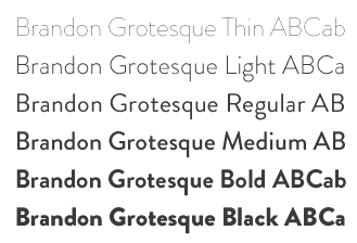 The fifty best-selling typefaces at MyFonts, as reported by them on June 1, 2014: #1: Proxima Nova (Mark Simonson), #2: Brandon Grotesque (HVD Fonts), #3: Helvetica Neue (Linotype), #4: Museo Sans (exljbris), #5: Avenir (Linotype), #6: Microbrew (Albatross), #7: Bombshell Pro (Emily Lime), #8: Quickpen (Trial by Cupcakes), #9: Brandon Text (HVD Fonts), #10: Adorn (Laura Worthington), #11: FF DIN (FontFont), #12: Intro (Fontfabric), #13: ITC Avant Garde Gothic (ITC), #14: Trade Gothic (Linotype), #15: Brandon Printed (HVD Fonts), #16: Avenir Next Pro (Linotype), #17: Univers (Linotype), #18: Darwin (Los Andes), #19: Interstate (Font Bureau), #20: DIN Next (Linotype), #21: Carolyna Pro Black (Emily Lime), #22: Helvetica Neue LT Std (Adobe), #23: Thirsty Rough (Yellow Design Studio), #24: Pinto (FaceType), #25: Cantoni (Debi Sementelli Type Foundry), #26: Museo Slab (exljbris), #27: Mariné (TipoType), #28: Futura (Bitstream), #29: Freight Text Pro (GarageFonts), #30: Centrale Sans (Typedepot), #31: Glober (Fontfabric), #32: News Gothic (Bitstream), #33: PF Din Text (Parachute), #34: Festivo Letters (Ahmet Altun), #35: Heroe (Lián Types), #36: Futura (Linotype), #37: Jacques & Gilles (Emily Lime), #38: Ropa Sans Pro (lettersoup), #39: Gill Sans (Monotype), #40: Campton (Rene Bieder), #41: Sofia Pro (Mostardesign), #42: Politica (Sudtipos), #43: Trend (Latinotype), #44: Benton Sans (Font Bureau), #45: Frutiger (Linotype), #46: Nexa (Fontfabric), #47: VAG Rounded (Linotype), #48: Veneer (Yellow Design Studio), #49: Thirsty Script (Yellow Design Studio), #50: Freight Sans Pro (GarageFonts). [Google]
[More] ⦿
The fifty best-selling typefaces at MyFonts, as reported by them on June 1, 2014: #1: Proxima Nova (Mark Simonson), #2: Brandon Grotesque (HVD Fonts), #3: Helvetica Neue (Linotype), #4: Museo Sans (exljbris), #5: Avenir (Linotype), #6: Microbrew (Albatross), #7: Bombshell Pro (Emily Lime), #8: Quickpen (Trial by Cupcakes), #9: Brandon Text (HVD Fonts), #10: Adorn (Laura Worthington), #11: FF DIN (FontFont), #12: Intro (Fontfabric), #13: ITC Avant Garde Gothic (ITC), #14: Trade Gothic (Linotype), #15: Brandon Printed (HVD Fonts), #16: Avenir Next Pro (Linotype), #17: Univers (Linotype), #18: Darwin (Los Andes), #19: Interstate (Font Bureau), #20: DIN Next (Linotype), #21: Carolyna Pro Black (Emily Lime), #22: Helvetica Neue LT Std (Adobe), #23: Thirsty Rough (Yellow Design Studio), #24: Pinto (FaceType), #25: Cantoni (Debi Sementelli Type Foundry), #26: Museo Slab (exljbris), #27: Mariné (TipoType), #28: Futura (Bitstream), #29: Freight Text Pro (GarageFonts), #30: Centrale Sans (Typedepot), #31: Glober (Fontfabric), #32: News Gothic (Bitstream), #33: PF Din Text (Parachute), #34: Festivo Letters (Ahmet Altun), #35: Heroe (Lián Types), #36: Futura (Linotype), #37: Jacques & Gilles (Emily Lime), #38: Ropa Sans Pro (lettersoup), #39: Gill Sans (Monotype), #40: Campton (Rene Bieder), #41: Sofia Pro (Mostardesign), #42: Politica (Sudtipos), #43: Trend (Latinotype), #44: Benton Sans (Font Bureau), #45: Frutiger (Linotype), #46: Nexa (Fontfabric), #47: VAG Rounded (Linotype), #48: Veneer (Yellow Design Studio), #49: Thirsty Script (Yellow Design Studio), #50: Freight Sans Pro (GarageFonts). [Google]
[More] ⦿
|
MyFonts: Bestsellers for June 2015
|
 The fifty best-selling typefaces at MyFonts, as reported by them on June 1, 2015: #1 Brandon Grotesque (HVD Fonts), #2 Avenir (Linotype), #3 Proxima Nova (Mark Simonson), #4 FF DIN (FontFont), #5 Helvetica Neue (Linotype), #6 Neue Haas Unica (Linotype), #7 Freeland (Trial by Cupcakes), #8 Brandon Text (HVD Fonts), #9 Nexa Rust (Fontfabric), #10 Avenir Next Pro (Linotype), #11 Effra (Dalton Maag), #12 Museo Sans (exljbris), #13 Bombshell Pro (Emily Lime), #14 DIN Next (Linotype), #15 Trade Gothic (Linotype), #16 Univers (Linotype), #17 True North Textures (Cultivated Mind), #18 Futura (Bitstream), #19 ITC Avant Garde Gothic (ITC), #20 Helvetica Neue LT Std (Adobe), #21 Trivia Sans (Storm), #22 Frutiger (Linotype), #23 Nexa (Fontfabric), #24 SantElia Script (Yellow Design Studio), #25 Interstate (Font Bureau), #26 Campton (Rene Bieder), #27 Glober (Fontfabric), #28 Selfie (Lian Types), #29 Intro (Fontfabric), #30 Gratitude Script (Sudtipos), #31 Akzidenz-Grotesk BE (Berthold), #32 Panton (Fontfabric), #33 Museo Slab (exljbris), #34 Benton Sans (Font Bureau), #35 Gill Sans (Monotype), #36 Futura PT (ParaType), #37 Adelle (TypeTogether), #38 Cera PRO (type me! fonts), #39 Jacques + Gilles (Emily Lime), #40 Galano Grotesque (Rene Bieder), #41 Brix Sans (HVD Fonts), #42 Notera (Aring Typeface), #43 Burford Rustic (Kimmy Design), #44 Prelo Slab (DSType), #45 Indie (Lian Types), #46 Cantoni (Debi Sementelli Type Foundry), #47 News Gothic (Bitstream), #48 Veneer (Yellow Design Studio), #49 True North (Cultivated Mind), #50 Miller (Font Bureau). [Google]
[More] ⦿
The fifty best-selling typefaces at MyFonts, as reported by them on June 1, 2015: #1 Brandon Grotesque (HVD Fonts), #2 Avenir (Linotype), #3 Proxima Nova (Mark Simonson), #4 FF DIN (FontFont), #5 Helvetica Neue (Linotype), #6 Neue Haas Unica (Linotype), #7 Freeland (Trial by Cupcakes), #8 Brandon Text (HVD Fonts), #9 Nexa Rust (Fontfabric), #10 Avenir Next Pro (Linotype), #11 Effra (Dalton Maag), #12 Museo Sans (exljbris), #13 Bombshell Pro (Emily Lime), #14 DIN Next (Linotype), #15 Trade Gothic (Linotype), #16 Univers (Linotype), #17 True North Textures (Cultivated Mind), #18 Futura (Bitstream), #19 ITC Avant Garde Gothic (ITC), #20 Helvetica Neue LT Std (Adobe), #21 Trivia Sans (Storm), #22 Frutiger (Linotype), #23 Nexa (Fontfabric), #24 SantElia Script (Yellow Design Studio), #25 Interstate (Font Bureau), #26 Campton (Rene Bieder), #27 Glober (Fontfabric), #28 Selfie (Lian Types), #29 Intro (Fontfabric), #30 Gratitude Script (Sudtipos), #31 Akzidenz-Grotesk BE (Berthold), #32 Panton (Fontfabric), #33 Museo Slab (exljbris), #34 Benton Sans (Font Bureau), #35 Gill Sans (Monotype), #36 Futura PT (ParaType), #37 Adelle (TypeTogether), #38 Cera PRO (type me! fonts), #39 Jacques + Gilles (Emily Lime), #40 Galano Grotesque (Rene Bieder), #41 Brix Sans (HVD Fonts), #42 Notera (Aring Typeface), #43 Burford Rustic (Kimmy Design), #44 Prelo Slab (DSType), #45 Indie (Lian Types), #46 Cantoni (Debi Sementelli Type Foundry), #47 News Gothic (Bitstream), #48 Veneer (Yellow Design Studio), #49 True North (Cultivated Mind), #50 Miller (Font Bureau). [Google]
[More] ⦿
|
MyFonts: Bestsellers for June 2016
|
 The fifty best-selling typefaces at MyFonts, as reported by them on June 1, 2016: #1 Proxima Nova (Mark Simonson), #2 FF DIN (FontFont), #3 Brandon Grotesque (HVD Fonts), #4 Avenir (Linotype), #5 Avenir Next Pro (Linotype), #6 Helvetica Neue (Linotype), #7 Cervo Neue (Typoforge Studio), #8 Blend (Typesenses), #9 Trade Gothic (Linotype), #10 Sica (dooType), #11 Brandon Text (HVD Fonts), #12 Swiss 721 (Bitstream), #13 ITC Avant Garde Gothic (ITC), #14 True North (Cultivated Mind), #15 Intro (Fontfabric), #16 Sofia Pro (Mostardesign), #17 DIN Next (Linotype), #18 Amberly (DearType), #19 Storyteller (My Creative Land), #20 Museo Sans (exljbris), #21 Univers (Linotype), #22 Frutiger (Linotype), #23 Futura (Linotype), #24 Interstate (Font Bureau), #25 Muller (Fontfabric), #26 Futura PT (ParaType), #27 Nexa (Fontfabric), #28 Prangs (Sudtipos), #29 Arial Unicode (Monotype), #30 FF Kievit (FontFont), #31 Garden Grown (Cultivated Mind), #32 FF Mark (FontFont), #33 Slate (Monotype), #34 Aktiv Grotesk (Dalton Maag), #35 Houschka Alt Pro (G-Type), #36 Panton (Fontfabric), #37 Helvetica Neue LT Std (Adobe), #38 Nexa Rust (Fontfabric), #39 Ridley Grotesk (Radomir Tinkov), #40 Lexia (Dalton Maag), #41 Benton Sans (Font Bureau), #42 Cera (TypeMates), #43 Gibson (Canada Type), #44 Campton (Rene Bieder), #45 Azo Sans (Rui Abreu), #46 Geogrotesque (Emtype Foundry), #47 Freeland (Trial by Cupcakes), #48 Canvas Acrylic Megafamily (Yellow Design Studio), #49 Myriad Pro (Adobe), #50 Guess (DearType). [Google]
[More] ⦿
The fifty best-selling typefaces at MyFonts, as reported by them on June 1, 2016: #1 Proxima Nova (Mark Simonson), #2 FF DIN (FontFont), #3 Brandon Grotesque (HVD Fonts), #4 Avenir (Linotype), #5 Avenir Next Pro (Linotype), #6 Helvetica Neue (Linotype), #7 Cervo Neue (Typoforge Studio), #8 Blend (Typesenses), #9 Trade Gothic (Linotype), #10 Sica (dooType), #11 Brandon Text (HVD Fonts), #12 Swiss 721 (Bitstream), #13 ITC Avant Garde Gothic (ITC), #14 True North (Cultivated Mind), #15 Intro (Fontfabric), #16 Sofia Pro (Mostardesign), #17 DIN Next (Linotype), #18 Amberly (DearType), #19 Storyteller (My Creative Land), #20 Museo Sans (exljbris), #21 Univers (Linotype), #22 Frutiger (Linotype), #23 Futura (Linotype), #24 Interstate (Font Bureau), #25 Muller (Fontfabric), #26 Futura PT (ParaType), #27 Nexa (Fontfabric), #28 Prangs (Sudtipos), #29 Arial Unicode (Monotype), #30 FF Kievit (FontFont), #31 Garden Grown (Cultivated Mind), #32 FF Mark (FontFont), #33 Slate (Monotype), #34 Aktiv Grotesk (Dalton Maag), #35 Houschka Alt Pro (G-Type), #36 Panton (Fontfabric), #37 Helvetica Neue LT Std (Adobe), #38 Nexa Rust (Fontfabric), #39 Ridley Grotesk (Radomir Tinkov), #40 Lexia (Dalton Maag), #41 Benton Sans (Font Bureau), #42 Cera (TypeMates), #43 Gibson (Canada Type), #44 Campton (Rene Bieder), #45 Azo Sans (Rui Abreu), #46 Geogrotesque (Emtype Foundry), #47 Freeland (Trial by Cupcakes), #48 Canvas Acrylic Megafamily (Yellow Design Studio), #49 Myriad Pro (Adobe), #50 Guess (DearType). [Google]
[More] ⦿
|
MyFonts: Bestsellers for June 2017
|
 The fifty best-selling typefaces at MyFonts, as reported by them on May 31, 2017: #1 FF DIN (FontFont), #2 Proxima Nova (Mark Simonson), #3 Helvetica Neue (Linotype), #4 Brandon Grotesque (HVD Fonts), #5 Avenir Next Pro (Linotype), #6 Avenir (Linotype), #7 Trade Gothic (Linotype), #8 Gilroy (Radomir Tinkov), #9 Limon (Typesenses), #10 Univers (Linotype), #11 Museo Sans (exljbris), #12 Montana Typeface (Alex Couture), #13 Brandon Text (HVD Fonts), #14 Nutmeg (W Foundry), #15 Campton (Rene Bieder), #16 Arquitecta (Latinotype), #17 Helvetica Neue LT Std (Adobe), #18 ITC Avant Garde Gothic (ITC), #19 FF Mark (FontFont), #20 Coco Gothic (Zetafonts), #21 FF Kievit (FontFont), #22 DIN Next (Linotype), #23 Nocturne Serif (BORUTTA GROUP), #24 Nexa (Fontfabric), #25 Fabrikat Mono (HVD Fonts), #26 Sofia Pro (Mostardesign), #27 Uni Neue (Fontfabric), #28 Futura (Linotype), #29 Neue Haas Grotesk (Linotype), #30 Frutiger (Linotype), #31 Saturday Script (Nicky Laatz), #32 Cera Pro (TypeMates), #33 Intro (Fontfabric), #34 Galano Grotesque (Rene Bieder), #35 FF Dax (FontFont), #36 Trade Gothic Next (Linotype), #37 Avenir (Adobe), #38 Just Lovely (Nicky Laatz), #39 Akzidenz-Grotesk BE (Berthold), #40 Nexa Rust (Fontfabric), #41 Larsseit (Type Dynamic), #42 Marine Rounded (TipoType), #43 Museo Slab (exljbris), #44 Timeout (DearType), #45 Kapra Neue (Typoforge Studio), #46 Amsi Pro (Stawix), #47 Intro Rust (Fontfabric), #48 Futura SH (Scangraphic Digital Type Collection), #49 News Gothic (Bitstream), #50 Neo Sans (Monotype). [Google]
[More] ⦿
The fifty best-selling typefaces at MyFonts, as reported by them on May 31, 2017: #1 FF DIN (FontFont), #2 Proxima Nova (Mark Simonson), #3 Helvetica Neue (Linotype), #4 Brandon Grotesque (HVD Fonts), #5 Avenir Next Pro (Linotype), #6 Avenir (Linotype), #7 Trade Gothic (Linotype), #8 Gilroy (Radomir Tinkov), #9 Limon (Typesenses), #10 Univers (Linotype), #11 Museo Sans (exljbris), #12 Montana Typeface (Alex Couture), #13 Brandon Text (HVD Fonts), #14 Nutmeg (W Foundry), #15 Campton (Rene Bieder), #16 Arquitecta (Latinotype), #17 Helvetica Neue LT Std (Adobe), #18 ITC Avant Garde Gothic (ITC), #19 FF Mark (FontFont), #20 Coco Gothic (Zetafonts), #21 FF Kievit (FontFont), #22 DIN Next (Linotype), #23 Nocturne Serif (BORUTTA GROUP), #24 Nexa (Fontfabric), #25 Fabrikat Mono (HVD Fonts), #26 Sofia Pro (Mostardesign), #27 Uni Neue (Fontfabric), #28 Futura (Linotype), #29 Neue Haas Grotesk (Linotype), #30 Frutiger (Linotype), #31 Saturday Script (Nicky Laatz), #32 Cera Pro (TypeMates), #33 Intro (Fontfabric), #34 Galano Grotesque (Rene Bieder), #35 FF Dax (FontFont), #36 Trade Gothic Next (Linotype), #37 Avenir (Adobe), #38 Just Lovely (Nicky Laatz), #39 Akzidenz-Grotesk BE (Berthold), #40 Nexa Rust (Fontfabric), #41 Larsseit (Type Dynamic), #42 Marine Rounded (TipoType), #43 Museo Slab (exljbris), #44 Timeout (DearType), #45 Kapra Neue (Typoforge Studio), #46 Amsi Pro (Stawix), #47 Intro Rust (Fontfabric), #48 Futura SH (Scangraphic Digital Type Collection), #49 News Gothic (Bitstream), #50 Neo Sans (Monotype). [Google]
[More] ⦿
|
MyFonts: Bestsellers for June 2018
|
 The fifty best-selling typefaces at MyFonts, as reported by them on June 1, 2018: #1 Neue Helvetica (Linotype), #2 Proxima Nova (Mark Simonson), #3 Brandon Grotesque (HVD Fonts), #4 FF DIN (FontFont), #5 Avenir Next (Linotype), #6 Avenir (Linotype), #7 Frutiger (Linotype), #8 Gilroy (Radomir Tinkov), #9 Futura (Linotype), #10 Futura PT (ParaType), #11 DIN Next (Linotype), #12 Cera Pro (TypeMates), #13 Trade Gothic (Linotype), #14 Univers (Linotype), #15 Neue Plak (Monotype), #16 Kapra Neue Pro (Typoforge Studio), #17 TT Norms (TypeType), #18 Neue Haas Grotesk (Linotype), #19 Brandon Text (HVD Fonts), #20 Neue Haas Unica (Linotype), #21 FF Mark (FontFont), #22 Campton (Rene Bieder), #23 Museo Sans (exljbris), #24 Codec (Zetafonts), #25 Panton (Fontfabric), #26 ITC Avant Garde Gothic (ITC), #27 Geogrotesque (Emtype Foundry), #28 Co (Dalton Maag), #29 Mont (Fontfabric), #30 Lexia (Dalton Maag), #31 TT Commons (TypeType), #32 Freight Sans Pro (GarageFonts), #33 Northwell (Set Sail Studios), #34 Hurme Geometric Sans 4 (Hurme), #35 Nexa (Fontfabric), #36 Nexa Rust (Fontfabric), #37 TT Tricks (TypeType), #38 Darwin Rounded (Los Andes), #39 Effra (Dalton Maag), #40 ITC Conduit (ITC), #41 Sofia Pro (Mostardesign), #42 Hurme Geometric Sans 1 & 2 (Hurme), #43 Hope Sans (Monotype), #44 Scotch (Positype), #45 Neo Sans (Monotype), #46 Averta (Intelligent Design), #47 Galano Grotesque (Rene Bieder), #48 Tazugane Gothic (Monotype), #49 DIN 2014 (ParaType), #50 Century Gothic (Monotype). [Google]
[More] ⦿
The fifty best-selling typefaces at MyFonts, as reported by them on June 1, 2018: #1 Neue Helvetica (Linotype), #2 Proxima Nova (Mark Simonson), #3 Brandon Grotesque (HVD Fonts), #4 FF DIN (FontFont), #5 Avenir Next (Linotype), #6 Avenir (Linotype), #7 Frutiger (Linotype), #8 Gilroy (Radomir Tinkov), #9 Futura (Linotype), #10 Futura PT (ParaType), #11 DIN Next (Linotype), #12 Cera Pro (TypeMates), #13 Trade Gothic (Linotype), #14 Univers (Linotype), #15 Neue Plak (Monotype), #16 Kapra Neue Pro (Typoforge Studio), #17 TT Norms (TypeType), #18 Neue Haas Grotesk (Linotype), #19 Brandon Text (HVD Fonts), #20 Neue Haas Unica (Linotype), #21 FF Mark (FontFont), #22 Campton (Rene Bieder), #23 Museo Sans (exljbris), #24 Codec (Zetafonts), #25 Panton (Fontfabric), #26 ITC Avant Garde Gothic (ITC), #27 Geogrotesque (Emtype Foundry), #28 Co (Dalton Maag), #29 Mont (Fontfabric), #30 Lexia (Dalton Maag), #31 TT Commons (TypeType), #32 Freight Sans Pro (GarageFonts), #33 Northwell (Set Sail Studios), #34 Hurme Geometric Sans 4 (Hurme), #35 Nexa (Fontfabric), #36 Nexa Rust (Fontfabric), #37 TT Tricks (TypeType), #38 Darwin Rounded (Los Andes), #39 Effra (Dalton Maag), #40 ITC Conduit (ITC), #41 Sofia Pro (Mostardesign), #42 Hurme Geometric Sans 1 & 2 (Hurme), #43 Hope Sans (Monotype), #44 Scotch (Positype), #45 Neo Sans (Monotype), #46 Averta (Intelligent Design), #47 Galano Grotesque (Rene Bieder), #48 Tazugane Gothic (Monotype), #49 DIN 2014 (ParaType), #50 Century Gothic (Monotype). [Google]
[More] ⦿
|
MyFonts: Bestsellers for June 2019
|
 The fifty best-selling typefaces at MyFonts, as reported by them on May 31, 2019: #1 Helvetica Now (Monotype ), #2 Neue Helvetica (Linotype), #3 Gilroy (Radomir Tinkov), #4 Avenir Next (Linotype), #5 FF DIN (FontFont), #6 Avenir (Linotype), #7 Proxima Nova (Mark Simonson), #8 Univers (Linotype), #9 Helvetica (Linotype), #10 Brandon Grotesque (HVD Fonts), #11 TT Norms Pro (TypeType), #12 FF Mark (FontFont), #13 TT Commons (TypeType), #14 Cera Pro (TypeMates), #15 Sofia Pro (Mostardesign), #16 Mont (Fontfabric), #17 DIN Next (Linotype), #18 Campton (Rene Bieder), #19 Nexa (Fontfabric), #20 Recoleta (Latinotype), #21 Neue Plak (Monotype ), #22 Futura PT (ParaType), #23 ITC Avant Garde Gothic (ITC), #24 Amsi Pro (Stawix), #25 Futura (Linotype), #26 Brandon Text (HVD Fonts), #27 Bebas Neue Pro (Dharma Type), #28 Trade Gothic (Linotype), #29 Silk Serif (SilkType), #30 Magnat (Rene Bieder), #31 Neue Haas Grotesk (Linotype), #32 Frutiger (Linotype), #33 Gordita (Type Atelier), #34 Swiss 721 (Bitstream), #35 Larsseit (Type Dynamic), #36 Nexa Rust (Fontfabric), #37 Tazugane Gothic (Monotype ), #38 Axiforma (Kastelov), #39 FF Clan (FontFont), #40 Intro Rust (Fontfabric), #41 Sailec (Type Dynamic), #42 Quasimoda (lettersoup), #43 Intro (Fontfabric), #44 FF Signa Pro (FontFont), #45 Turbinado (Aerotype), #46 Averta (Intelligent Design), #47 DIN 2014 (ParaType), #48 Myriad Pro (Adobe), #49 Blacker (Zetafonts), #50 Neue Haas Unica (Linotype). [Google]
[More] ⦿
The fifty best-selling typefaces at MyFonts, as reported by them on May 31, 2019: #1 Helvetica Now (Monotype ), #2 Neue Helvetica (Linotype), #3 Gilroy (Radomir Tinkov), #4 Avenir Next (Linotype), #5 FF DIN (FontFont), #6 Avenir (Linotype), #7 Proxima Nova (Mark Simonson), #8 Univers (Linotype), #9 Helvetica (Linotype), #10 Brandon Grotesque (HVD Fonts), #11 TT Norms Pro (TypeType), #12 FF Mark (FontFont), #13 TT Commons (TypeType), #14 Cera Pro (TypeMates), #15 Sofia Pro (Mostardesign), #16 Mont (Fontfabric), #17 DIN Next (Linotype), #18 Campton (Rene Bieder), #19 Nexa (Fontfabric), #20 Recoleta (Latinotype), #21 Neue Plak (Monotype ), #22 Futura PT (ParaType), #23 ITC Avant Garde Gothic (ITC), #24 Amsi Pro (Stawix), #25 Futura (Linotype), #26 Brandon Text (HVD Fonts), #27 Bebas Neue Pro (Dharma Type), #28 Trade Gothic (Linotype), #29 Silk Serif (SilkType), #30 Magnat (Rene Bieder), #31 Neue Haas Grotesk (Linotype), #32 Frutiger (Linotype), #33 Gordita (Type Atelier), #34 Swiss 721 (Bitstream), #35 Larsseit (Type Dynamic), #36 Nexa Rust (Fontfabric), #37 Tazugane Gothic (Monotype ), #38 Axiforma (Kastelov), #39 FF Clan (FontFont), #40 Intro Rust (Fontfabric), #41 Sailec (Type Dynamic), #42 Quasimoda (lettersoup), #43 Intro (Fontfabric), #44 FF Signa Pro (FontFont), #45 Turbinado (Aerotype), #46 Averta (Intelligent Design), #47 DIN 2014 (ParaType), #48 Myriad Pro (Adobe), #49 Blacker (Zetafonts), #50 Neue Haas Unica (Linotype). [Google]
[More] ⦿
|
MyFonts: Bestsellers for June 2020
|
 The fifty best-selling typefaces at MyFonts, as reported by them on June 1, 2020: #1 Gilroy (Radomir Tinkov), #2 Macklin (Monotype), #3 Neue Helvetica (Linotype), #4 Cera Pro (TypeMates), #5 Proxima Nova (Mark Simonson), #6 Brandon Text (HVD Fonts), #7 Avenir (Linotype), #8 TT Norms Pro (TypeType), #9 Helvetica Now (Monotype), #10 Recoleta (Latinotype), #11 Nexa (Fontfabric), #12 ITC Avant Garde Gothic (ITC), #13 Brandon Grotesque (HVD Fonts), #14 Avenir Next (Linotype), #15 FF DIN (FontFont), #16 Mont (Fontfabric), #17 FF Meta (FontFont), #18 Helvetica (Linotype), #19 Sofia Pro (Mostardesign), #20 Univers (Linotype), #21 Neue Haas Grotesk (Linotype), #22 FF Mark (FontFont), #23 Frutiger (Linotype), #24 DIN Next (Linotype), #25 Rotunda (TipoType), #26 Galano Grotesque (Rene Bieder), #27 Larsseit (Type Dynamic), #28 Neue Haas Unica (Linotype), #29 Filson Pro (Mostardesign), #30 Trade Gothic (Linotype), #31 TT Commons (TypeType), #32 Hurme Geometric Sans 1 + 2 (Hurme), #33 Aktiv Grotesk (Dalton Maag), #34 Futura PT (ParaType), #35 Mixta (Latinotype), #36 Axiforma (Kastelov), #37 Aventa (EllenLuff), #38 Optima (Linotype), #39 Averta (Intelligent Design), #40 Panton (Fontfabric), #41 Spock (Los Andes), #42 Futura (Linotype), #43 Campton (Rene Bieder), #44 TT Norms Std Condensed (TypeType), #45 Silk Serif (SilkType), #46 Greycliff CF (Connary Fagen), #47 FF Chartwell (FontFont), #48 Turbinado (Aerotype), #49 Eina (Extratype), #50 Tazugane Gothic (Monotype). [Google]
[More] ⦿
The fifty best-selling typefaces at MyFonts, as reported by them on June 1, 2020: #1 Gilroy (Radomir Tinkov), #2 Macklin (Monotype), #3 Neue Helvetica (Linotype), #4 Cera Pro (TypeMates), #5 Proxima Nova (Mark Simonson), #6 Brandon Text (HVD Fonts), #7 Avenir (Linotype), #8 TT Norms Pro (TypeType), #9 Helvetica Now (Monotype), #10 Recoleta (Latinotype), #11 Nexa (Fontfabric), #12 ITC Avant Garde Gothic (ITC), #13 Brandon Grotesque (HVD Fonts), #14 Avenir Next (Linotype), #15 FF DIN (FontFont), #16 Mont (Fontfabric), #17 FF Meta (FontFont), #18 Helvetica (Linotype), #19 Sofia Pro (Mostardesign), #20 Univers (Linotype), #21 Neue Haas Grotesk (Linotype), #22 FF Mark (FontFont), #23 Frutiger (Linotype), #24 DIN Next (Linotype), #25 Rotunda (TipoType), #26 Galano Grotesque (Rene Bieder), #27 Larsseit (Type Dynamic), #28 Neue Haas Unica (Linotype), #29 Filson Pro (Mostardesign), #30 Trade Gothic (Linotype), #31 TT Commons (TypeType), #32 Hurme Geometric Sans 1 + 2 (Hurme), #33 Aktiv Grotesk (Dalton Maag), #34 Futura PT (ParaType), #35 Mixta (Latinotype), #36 Axiforma (Kastelov), #37 Aventa (EllenLuff), #38 Optima (Linotype), #39 Averta (Intelligent Design), #40 Panton (Fontfabric), #41 Spock (Los Andes), #42 Futura (Linotype), #43 Campton (Rene Bieder), #44 TT Norms Std Condensed (TypeType), #45 Silk Serif (SilkType), #46 Greycliff CF (Connary Fagen), #47 FF Chartwell (FontFont), #48 Turbinado (Aerotype), #49 Eina (Extratype), #50 Tazugane Gothic (Monotype). [Google]
[More] ⦿
|
MyFonts: Bestsellers for June 2021
|
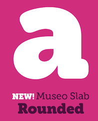 The fifty best-selling typefaces at MyFonts, as reported by them on June 2, 2021: #1 Neue Helvetica (Linotype), #2 Gilroy (Radomir Tinkov), #3 Avenir Next (Linotype), #4 Avenir (Linotype), #5 Proxima Nova (Mark Simonson), #6 Sofia Pro (Mostardesign), #7 TT Norms Pro (TypeType), #8 Univers (Linotype), #9 Helvetica (Linotype), #10 Neue Haas Grotesk (Linotype), #11 Recoleta (Latinotype), #12 Helvetica Now (Monotype), #13 TT Commons Pro (TypeType), #14 FF DIN (FontFont), #15 FF Mark (FontFont), #16 PGF Qualta (PeGGO Fonts), #17 Brandon Grotesque (HVD Fonts), #18 Frutiger (Linotype), #19 ITC Avant Garde Gothic (ITC), #20 Cera Pro (TypeMates), #21 Nexa (Fontfabric), #22 Nimbus Sans (URW Type Foundry), #23 Larken (EllenLuff), #24 DIN Next (Linotype), #25 Mont (Fontfabric), #26 Heading Now (Zetafonts), #27 Trade Gothic (Linotype), #28 Tazugane Gothic (Monotype), #29 TT Fors (TypeType), #30 Optima (Linotype), #31 Galano Grotesque (Rene Bieder), #32 Brandon Text (HVD Fonts), #33 Futura PT (ParaType), #34 URW DIN (URW Type Foundry), #35 Neuzeit Grotesk (URW Type Foundry), #36 Museo Sans (exljbris), #37 Gill Sans Nova (Monotype), #38 Cocogoose Pro (Zetafonts), #39 Campton (Rene Bieder), #40 Axiforma (Kastelov), #41 Quincy CF (Connary Fagen), #42 Neue Haas Unica (Linotype), #43 Gazpacho (Santi Rey), #44 Proxima Soft (Mark Simonson), #45 Neue Plak (Monotype), #46 Macklin (Monotype), #47 Futura (Linotype), #48 Averta (Intelligent Design), #49 Ionic No 5 (Monotype), #50 Panton (Fontfabric). [Google]
[More] ⦿
The fifty best-selling typefaces at MyFonts, as reported by them on June 2, 2021: #1 Neue Helvetica (Linotype), #2 Gilroy (Radomir Tinkov), #3 Avenir Next (Linotype), #4 Avenir (Linotype), #5 Proxima Nova (Mark Simonson), #6 Sofia Pro (Mostardesign), #7 TT Norms Pro (TypeType), #8 Univers (Linotype), #9 Helvetica (Linotype), #10 Neue Haas Grotesk (Linotype), #11 Recoleta (Latinotype), #12 Helvetica Now (Monotype), #13 TT Commons Pro (TypeType), #14 FF DIN (FontFont), #15 FF Mark (FontFont), #16 PGF Qualta (PeGGO Fonts), #17 Brandon Grotesque (HVD Fonts), #18 Frutiger (Linotype), #19 ITC Avant Garde Gothic (ITC), #20 Cera Pro (TypeMates), #21 Nexa (Fontfabric), #22 Nimbus Sans (URW Type Foundry), #23 Larken (EllenLuff), #24 DIN Next (Linotype), #25 Mont (Fontfabric), #26 Heading Now (Zetafonts), #27 Trade Gothic (Linotype), #28 Tazugane Gothic (Monotype), #29 TT Fors (TypeType), #30 Optima (Linotype), #31 Galano Grotesque (Rene Bieder), #32 Brandon Text (HVD Fonts), #33 Futura PT (ParaType), #34 URW DIN (URW Type Foundry), #35 Neuzeit Grotesk (URW Type Foundry), #36 Museo Sans (exljbris), #37 Gill Sans Nova (Monotype), #38 Cocogoose Pro (Zetafonts), #39 Campton (Rene Bieder), #40 Axiforma (Kastelov), #41 Quincy CF (Connary Fagen), #42 Neue Haas Unica (Linotype), #43 Gazpacho (Santi Rey), #44 Proxima Soft (Mark Simonson), #45 Neue Plak (Monotype), #46 Macklin (Monotype), #47 Futura (Linotype), #48 Averta (Intelligent Design), #49 Ionic No 5 (Monotype), #50 Panton (Fontfabric). [Google]
[More] ⦿
|
MyFonts: Bestsellers for March 2012
|
The fifty best-selling typefaces at MyFonts, as reported by them on March 1, 2012. The strong grotesque and sans families are still selling very well. The geometric sans category is quite popular---Proxima Nova (Mark Simonson) is first, followed by Brandon Grotesque (HVD), while strong contenders Museo Sans (Jos Buivenga, 4th), Interstate (1993, Tobias Frere-Jones) (6th), News Gothic (8th), Futura (9th), PF Din Text Pro (12th), Geogrotesque (13th), Swiss 721 (14th), Benton Sans (16th), Akzidenz Grotesk BQ (27th), Code Pro (Svetoslav Simov, 28th), Akzidenz Grotesk BE (29th), Klavika (31st), Museo Sans Rounded (32nd), PF Square Sans Pro (38th), Acto (42nd), Zurich (43rd), Franklin Gothic (45th), Alright Sans (48th) and Eurostile (50th) close out the sans typefaces in the top 50. The scripts are still quite present (11 out of 50, just as last month) but are in a slight decline in overall ranking---in this category, Carolyna Pro (Emily Lime) remains in the lead (in fifth overall, down from fourth). In the text typeface category, Cassia (Dieter Hofrichter), 11th last month, disappeared from the charts, leaving only Mrs Eaves (in 46th) and a few slab typefaces. Fancy didone-inspired fashion mag typefaces continue unabated, with Reina (Lian Types, 19th), Hera Big (Lucas Sharp, 24th), Narziss (Hubert Jocham, 25th), and Guadalupe (Latinotype, 26th). The grungy Anodyne of Yellow Design Studio surges to third, and another irregular face, Populaire, ends up in 11th, which proves that the demand for typefaces is quite varied. [Google]
[More] ⦿
|
MyFonts: Bestsellers for March 2013
|
 The fifty best-selling typefaces at MyFonts, as reported by them on March 1, 2013: #1: Proxima Nova (Mark Simonson), #2: Brandon Text (HVD Fonts), #3: Brandon Grotesque (HVD Fonts), #4: Trend (Latinotype), #5: Museo Sans (exljbris), #6: Soin Sans Pro (Stawix), #7: Thirsty Rough (Yellow Design Studio), #8: Bombshell Pro (Emily Lime), #9: Futura (Bitstream), #10: Helvetica Neue LT Std (Adobe), #11: Freight Display Pro (GarageFonts), #12: Neue Helvetica (Linotype), #13: Interstate (Font Bureau), #14: Mandevilla (Laura Worthington), #15: Avenir (Linotype), #16: Carolyna Pro Black (Emily Lime), #17: Veneer (Yellow Design Studio), #18: Univers (Linotype), #19: Trade Gothic (Linotype), #20: Quan (Typesketchbook), #21: Salamander (Fenotype), #22: Museo Slab (exljbris), #23: Benton Sans (Font Bureau), #24: DIN Next (Linotype), #25: Halis Rounded (Ahmet Altun), #26: Akzidenz-Grotesk BE (Berthold), #27: Hipster Script Pro (Sudtipos), #28: ITC Avant Garde Gothic (ITC), #29: Thirsty Script (Yellow Design Studio), #30: Neo sans (Monotype Imaging), #31: Nexa (Fontfabric), #32: Ollie (Schizotype), #33: Museo (exljbris), #34: Neusa (The Northern Block), #35: Core Sans N (S-Core), #36: Swiss 721 (Bitstream), #37: Avenir Next Pro (Linotype), #38: Intro (Fontfabric), #39: Mercury Script (Fenotype), #40: Klavika (Process Type Foundry), #41: Geogrotesque (Emtype Foundry), #42: Helvetica (Adobe), #43: Populaire (PintassilgoPrints), #44: Jacques & Gilles (Emily Lime), #45: Diamonds (HVD Fonts), #46: Avenir (Adobe), #47: Trade Gothic (Adobe), #48: Frutiger (Adobe), #49: Pluto (HVD Fonts), #50: Gill Sans (Monotype Imaging). [Google]
[More] ⦿
The fifty best-selling typefaces at MyFonts, as reported by them on March 1, 2013: #1: Proxima Nova (Mark Simonson), #2: Brandon Text (HVD Fonts), #3: Brandon Grotesque (HVD Fonts), #4: Trend (Latinotype), #5: Museo Sans (exljbris), #6: Soin Sans Pro (Stawix), #7: Thirsty Rough (Yellow Design Studio), #8: Bombshell Pro (Emily Lime), #9: Futura (Bitstream), #10: Helvetica Neue LT Std (Adobe), #11: Freight Display Pro (GarageFonts), #12: Neue Helvetica (Linotype), #13: Interstate (Font Bureau), #14: Mandevilla (Laura Worthington), #15: Avenir (Linotype), #16: Carolyna Pro Black (Emily Lime), #17: Veneer (Yellow Design Studio), #18: Univers (Linotype), #19: Trade Gothic (Linotype), #20: Quan (Typesketchbook), #21: Salamander (Fenotype), #22: Museo Slab (exljbris), #23: Benton Sans (Font Bureau), #24: DIN Next (Linotype), #25: Halis Rounded (Ahmet Altun), #26: Akzidenz-Grotesk BE (Berthold), #27: Hipster Script Pro (Sudtipos), #28: ITC Avant Garde Gothic (ITC), #29: Thirsty Script (Yellow Design Studio), #30: Neo sans (Monotype Imaging), #31: Nexa (Fontfabric), #32: Ollie (Schizotype), #33: Museo (exljbris), #34: Neusa (The Northern Block), #35: Core Sans N (S-Core), #36: Swiss 721 (Bitstream), #37: Avenir Next Pro (Linotype), #38: Intro (Fontfabric), #39: Mercury Script (Fenotype), #40: Klavika (Process Type Foundry), #41: Geogrotesque (Emtype Foundry), #42: Helvetica (Adobe), #43: Populaire (PintassilgoPrints), #44: Jacques & Gilles (Emily Lime), #45: Diamonds (HVD Fonts), #46: Avenir (Adobe), #47: Trade Gothic (Adobe), #48: Frutiger (Adobe), #49: Pluto (HVD Fonts), #50: Gill Sans (Monotype Imaging). [Google]
[More] ⦿
|
MyFonts: Bestsellers for March 2014
|
 The fifty best-selling typefaces at MyFonts, as reported by them on March 3, 2014: #1: Brandon Printed (HVD Fonts), #2: Proxima Nova (Mark Simonson), #3: Glober (Fontfabric), #4: Brandon Grotesque (HVD Fonts), #5: Helvetica Neue (Linotype), #6: Trade Gothic (Linotype), #7: Bombshell Pro (Emily Lime), #8: Brandon Text (HVD Fonts), #9: Avenir (Linotype), #10: Arquitecta (Latinotype), #11: The Carpenter (Fenotype), #12: Museo Sans (exljbris), #13: Industry Inc (Hold Fast Foundry), #14: FF DIN (FontFont), #15: Interstate (Font Bureau), #16: Avenir Next Pro (Linotype), #17: Neo sans (Monotype), #18: Univers (Linotype), #19: ITC Avant Garde Gothic (ITC), #20: Carolyna Pro Black (Emily Lime), #21: Helvetica Neue LT Std (Adobe), #22: Trend (Latinotype), #23: Intro (Fontfabric), #24: DIN Next (Linotype), #25: Futura (Bitstream), #26: Thirsty Rough (Yellow Design Studio), #27: Centrale Sans (Typedepot), #28: Cantoni (Debi Sementelli Type Foundry), #29: Veneer (Yellow Design Studio), #30: Geogrotesque (Emtype Foundry), #31: Jacques & Gilles (Emily Lime), #32: Akzidenz-Grotesk BE (Berthold), #33: Frutiger (Linotype), #34: Castor (Albatross), #35: Museo Slab (exljbris), #36: Desire (Borges Lettering), #37: Houschka Pro (G-Type), #38: Gist (Yellow Design Studio), #39: Nexa (Fontfabric), #40: Cabrito (insigne), #41: Core Circus (S-Core), #42: Narziss (Hubert Jocham Type), #43: Code Pro (Fontfabric), #44: Lunch Box (Kimmy Design), #45: Narziss Text (Hubert Jocham Type), #46: Miller (Font Bureau), #47: Mrs Eaves (Emigre), #48: Dasha (Magpie Paper Works), #49: Museo (exljbris), #50: Charcuterie (Laura Worthington). [Google]
[More] ⦿
The fifty best-selling typefaces at MyFonts, as reported by them on March 3, 2014: #1: Brandon Printed (HVD Fonts), #2: Proxima Nova (Mark Simonson), #3: Glober (Fontfabric), #4: Brandon Grotesque (HVD Fonts), #5: Helvetica Neue (Linotype), #6: Trade Gothic (Linotype), #7: Bombshell Pro (Emily Lime), #8: Brandon Text (HVD Fonts), #9: Avenir (Linotype), #10: Arquitecta (Latinotype), #11: The Carpenter (Fenotype), #12: Museo Sans (exljbris), #13: Industry Inc (Hold Fast Foundry), #14: FF DIN (FontFont), #15: Interstate (Font Bureau), #16: Avenir Next Pro (Linotype), #17: Neo sans (Monotype), #18: Univers (Linotype), #19: ITC Avant Garde Gothic (ITC), #20: Carolyna Pro Black (Emily Lime), #21: Helvetica Neue LT Std (Adobe), #22: Trend (Latinotype), #23: Intro (Fontfabric), #24: DIN Next (Linotype), #25: Futura (Bitstream), #26: Thirsty Rough (Yellow Design Studio), #27: Centrale Sans (Typedepot), #28: Cantoni (Debi Sementelli Type Foundry), #29: Veneer (Yellow Design Studio), #30: Geogrotesque (Emtype Foundry), #31: Jacques & Gilles (Emily Lime), #32: Akzidenz-Grotesk BE (Berthold), #33: Frutiger (Linotype), #34: Castor (Albatross), #35: Museo Slab (exljbris), #36: Desire (Borges Lettering), #37: Houschka Pro (G-Type), #38: Gist (Yellow Design Studio), #39: Nexa (Fontfabric), #40: Cabrito (insigne), #41: Core Circus (S-Core), #42: Narziss (Hubert Jocham Type), #43: Code Pro (Fontfabric), #44: Lunch Box (Kimmy Design), #45: Narziss Text (Hubert Jocham Type), #46: Miller (Font Bureau), #47: Mrs Eaves (Emigre), #48: Dasha (Magpie Paper Works), #49: Museo (exljbris), #50: Charcuterie (Laura Worthington). [Google]
[More] ⦿
|
MyFonts: Bestsellers for March 2015
|
 The fifty best-selling typefaces at MyFonts, as reported by them on March 1, 2015: #1 Proxima Nova (Mark Simonson), #2 Brandon Grotesque (HVD Fonts), #3 Helvetica Neue (Linotype), #4 FF DIN (FontFont), #5 Avenir (Linotype), #6 Panton (Fontfabric), #7 Brandon Text (HVD Fonts), #8 Bombshell Pro (Emily Lime), #9 Nexa Rust (Fontfabric), #10 Salt + Spices Pro (Fontforecast), #11 Museo Sans (exljbris), #12 Hurme Geometric Sans No.3 (Hurme Design), #13 Trade Gothic (Linotype), #14 Wanderlust Letters (Cultivated Mind), #15 Univers (Linotype), #16 Avenir Next Pro (Linotype), #17 Futura (Bitstream), #18 Selfie (Lian Types), #19 Galano Classic (Rene Bieder), #20 Interstate (Font Bureau), #21 ITC Avant Garde Gothic (ITC), #22 Amsi Pro (Stawix), #23 Jacques + Gilles (Emily Lime), #24 Frutiger (Linotype), #25 Campton (Rene Bieder), #26 Gill Sans (Monotype), #27 Neo Sans (Monotype), #28 Cantoni (Debi Sementelli Type Foundry), #29 Boho (Latinotype), #30 Effra (Dalton Maag), #31 Burford (Kimmy Design), #32 Nexa (Fontfabric), #33 Carolyna Pro Black (Emily Lime), #34 DIN Next (Linotype), #35 Museo Sans Rounded (exljbris), #36 Glober (Fontfabric), #37 Brandon Printed (HVD Fonts), #38 Helvetica Neue LT Std (Adobe), #39 Frost (Fenotype), #40 Thirsty Rough (Yellow Design Studio), #41 FF Tisa Sans (FontFont), #42 ITC Conduit (ITC), #43 Intro (Fontfabric), #44 Cereal (Andinistas), #45 Museo Slab (exljbris), #46 Benton Sans (Font Bureau), #47 Asterism (Great Lakes Lettering), #48 Quickpen (Trial by Cupcakes), #49 Franklin Gothic (URW++), #50 Centrale Sans (Typedepot). [Google]
[More] ⦿
The fifty best-selling typefaces at MyFonts, as reported by them on March 1, 2015: #1 Proxima Nova (Mark Simonson), #2 Brandon Grotesque (HVD Fonts), #3 Helvetica Neue (Linotype), #4 FF DIN (FontFont), #5 Avenir (Linotype), #6 Panton (Fontfabric), #7 Brandon Text (HVD Fonts), #8 Bombshell Pro (Emily Lime), #9 Nexa Rust (Fontfabric), #10 Salt + Spices Pro (Fontforecast), #11 Museo Sans (exljbris), #12 Hurme Geometric Sans No.3 (Hurme Design), #13 Trade Gothic (Linotype), #14 Wanderlust Letters (Cultivated Mind), #15 Univers (Linotype), #16 Avenir Next Pro (Linotype), #17 Futura (Bitstream), #18 Selfie (Lian Types), #19 Galano Classic (Rene Bieder), #20 Interstate (Font Bureau), #21 ITC Avant Garde Gothic (ITC), #22 Amsi Pro (Stawix), #23 Jacques + Gilles (Emily Lime), #24 Frutiger (Linotype), #25 Campton (Rene Bieder), #26 Gill Sans (Monotype), #27 Neo Sans (Monotype), #28 Cantoni (Debi Sementelli Type Foundry), #29 Boho (Latinotype), #30 Effra (Dalton Maag), #31 Burford (Kimmy Design), #32 Nexa (Fontfabric), #33 Carolyna Pro Black (Emily Lime), #34 DIN Next (Linotype), #35 Museo Sans Rounded (exljbris), #36 Glober (Fontfabric), #37 Brandon Printed (HVD Fonts), #38 Helvetica Neue LT Std (Adobe), #39 Frost (Fenotype), #40 Thirsty Rough (Yellow Design Studio), #41 FF Tisa Sans (FontFont), #42 ITC Conduit (ITC), #43 Intro (Fontfabric), #44 Cereal (Andinistas), #45 Museo Slab (exljbris), #46 Benton Sans (Font Bureau), #47 Asterism (Great Lakes Lettering), #48 Quickpen (Trial by Cupcakes), #49 Franklin Gothic (URW++), #50 Centrale Sans (Typedepot). [Google]
[More] ⦿
|
MyFonts: Bestsellers for March 2016
|
 The fifty best-selling typefaces at MyFonts, as reported by them on March 1, 2016: #1 Proxima Nova (Mark Simonson), #2 Brandon Grotesque (HVD Fonts), #3 FF DIN (FontFont), #4 Avenir (Linotype), #5 Helvetica Neue (Linotype), #6 Univia Pro (Mostardesign), #7 Guess (DearType), #8 Burford (Kimmy Design), #9 Local Brewery (Cultivated Mind), #10 Avenir Next Pro (Linotype), #11 Trade Gothic (Linotype), #12 Brandon Text (HVD Fonts), #13 Univers (Linotype), #14 Museo Sans (exljbris), #15 Blend (Typesenses), #16 Frutiger (Linotype), #17 Futura (Bitstream), #18 Campton (Rene Bieder), #19 Nolan Next (Kastelov), #20 Nexa (Fontfabric), #21 ITC Avant Garde Gothic (ITC), #22 DIN Next (Linotype), #23 Geogrotesque (Emtype Foundry), #24 Neue Haas Grotesk (Linotype), #25 Helvetica Neue LT Std (Adobe), #26 Nexa Rust (Fontfabric), #27 Lifehack (DearType), #28 Century Gothic (Monotype), #29 Freeland (Trial by Cupcakes), #30 Panton (Fontfabric), #31 Intro (Fontfabric), #32 FF Mark (FontFont), #33 FF Clan Pro (FontFont), #34 Futura PT (ParaType), #35 Bombshell Pro (Emily Lime), #36 Interstate (Font Bureau), #37 Haboro (insigne), #38 Acta Display (DSType), #39 Effra (Dalton Maag), #40 Scrapbooker (Sudtipos), #41 Dear Sarah Pro (Betatype), #42 Hurme Geometric Sans No.4 (Hurme Design), #43 LiebeErika (LiebeFonts), #44 Devinyl (Nootype), #45 Muller (Fontfabric), #46 URW Geometric (URW++), #47 Benton Sans (Font Bureau), #48 SantElia Script (Yellow Design Studio), #49 Humanist 521 (Bitstream), #50 Swiss 721 (Bitstream). [Google]
[More] ⦿
The fifty best-selling typefaces at MyFonts, as reported by them on March 1, 2016: #1 Proxima Nova (Mark Simonson), #2 Brandon Grotesque (HVD Fonts), #3 FF DIN (FontFont), #4 Avenir (Linotype), #5 Helvetica Neue (Linotype), #6 Univia Pro (Mostardesign), #7 Guess (DearType), #8 Burford (Kimmy Design), #9 Local Brewery (Cultivated Mind), #10 Avenir Next Pro (Linotype), #11 Trade Gothic (Linotype), #12 Brandon Text (HVD Fonts), #13 Univers (Linotype), #14 Museo Sans (exljbris), #15 Blend (Typesenses), #16 Frutiger (Linotype), #17 Futura (Bitstream), #18 Campton (Rene Bieder), #19 Nolan Next (Kastelov), #20 Nexa (Fontfabric), #21 ITC Avant Garde Gothic (ITC), #22 DIN Next (Linotype), #23 Geogrotesque (Emtype Foundry), #24 Neue Haas Grotesk (Linotype), #25 Helvetica Neue LT Std (Adobe), #26 Nexa Rust (Fontfabric), #27 Lifehack (DearType), #28 Century Gothic (Monotype), #29 Freeland (Trial by Cupcakes), #30 Panton (Fontfabric), #31 Intro (Fontfabric), #32 FF Mark (FontFont), #33 FF Clan Pro (FontFont), #34 Futura PT (ParaType), #35 Bombshell Pro (Emily Lime), #36 Interstate (Font Bureau), #37 Haboro (insigne), #38 Acta Display (DSType), #39 Effra (Dalton Maag), #40 Scrapbooker (Sudtipos), #41 Dear Sarah Pro (Betatype), #42 Hurme Geometric Sans No.4 (Hurme Design), #43 LiebeErika (LiebeFonts), #44 Devinyl (Nootype), #45 Muller (Fontfabric), #46 URW Geometric (URW++), #47 Benton Sans (Font Bureau), #48 SantElia Script (Yellow Design Studio), #49 Humanist 521 (Bitstream), #50 Swiss 721 (Bitstream). [Google]
[More] ⦿
|
MyFonts: Bestsellers for March 2017
|
 The fifty best-selling typefaces at MyFonts, as reported by them on March 1, 2017: #1 FF DIN (FontFont), #2 Brandon Grotesque (HVD Fonts), #3 Helvetica Neue (Linotype), #4 Proxima Nova (Mark Simonson), #5 Town (Jason Vandenberg), #6 Tazugane Gothic (Monotype), #7 Avenir (Linotype), #8 Gilroy (Radomir Tinkov), #9 Trade Gothic (Linotype), #10 Uni Neue (Fontfabric), #11 Univers (Linotype), #12 DIN Next (Linotype), #13 FF Mark (FontFont), #14 Brandon Text (HVD Fonts), #15 Madelyn (Fontfabric), #16 Lucky Fellas (Nicky Laatz), #17 Trenda (Latinotype), #18 Museo Sans (exljbris), #19 Cera Pro (TypeMates), #20 ITC Avant Garde Gothic (ITC), #21 VAG Rounded (Linotype), #22 Avenir Next Pro (Linotype), #23 Helvetica Neue LT Std (Adobe), #24 Nexa (Fontfabric), #25 Larsseit (Type Dynamic), #26 Effra (Dalton Maag), #27 Futura (Bitstream), #28 Frutiger (Linotype), #29 Campton (Rene Bieder), #30 Akzidenz-Grotesk BE (Berthold), #31 Authenia (Mika Melvas), #32 Sofia Pro (Mostardesign), #33 Futura (Linotype), #34 Blooms (DearType), #35 Neue Haas Grotesk (Linotype), #36 FF Meta (FontFont), #37 Nexa Rust (Fontfabric), #38 Isidora (Latinotype), #39 Salty (Fenotype), #40 Galano Grotesque (Rene Bieder), #41 Viva Beautiful (Cultivated Mind), #42 Envelove (Sudtipos), #43 FF Clan Pro (FontFont), #44 Tuna (Ligature Inc), #45 Century Gothic (Monotype), #46 Din Condensed (ParaType), #47 Geogrotesque (Emtype Foundry), #48 Ronnia (TypeTogether), #49 Bourton (Kimmy Design), #50 ITC Franklin Gothic (ITC). [Google]
[More] ⦿
The fifty best-selling typefaces at MyFonts, as reported by them on March 1, 2017: #1 FF DIN (FontFont), #2 Brandon Grotesque (HVD Fonts), #3 Helvetica Neue (Linotype), #4 Proxima Nova (Mark Simonson), #5 Town (Jason Vandenberg), #6 Tazugane Gothic (Monotype), #7 Avenir (Linotype), #8 Gilroy (Radomir Tinkov), #9 Trade Gothic (Linotype), #10 Uni Neue (Fontfabric), #11 Univers (Linotype), #12 DIN Next (Linotype), #13 FF Mark (FontFont), #14 Brandon Text (HVD Fonts), #15 Madelyn (Fontfabric), #16 Lucky Fellas (Nicky Laatz), #17 Trenda (Latinotype), #18 Museo Sans (exljbris), #19 Cera Pro (TypeMates), #20 ITC Avant Garde Gothic (ITC), #21 VAG Rounded (Linotype), #22 Avenir Next Pro (Linotype), #23 Helvetica Neue LT Std (Adobe), #24 Nexa (Fontfabric), #25 Larsseit (Type Dynamic), #26 Effra (Dalton Maag), #27 Futura (Bitstream), #28 Frutiger (Linotype), #29 Campton (Rene Bieder), #30 Akzidenz-Grotesk BE (Berthold), #31 Authenia (Mika Melvas), #32 Sofia Pro (Mostardesign), #33 Futura (Linotype), #34 Blooms (DearType), #35 Neue Haas Grotesk (Linotype), #36 FF Meta (FontFont), #37 Nexa Rust (Fontfabric), #38 Isidora (Latinotype), #39 Salty (Fenotype), #40 Galano Grotesque (Rene Bieder), #41 Viva Beautiful (Cultivated Mind), #42 Envelove (Sudtipos), #43 FF Clan Pro (FontFont), #44 Tuna (Ligature Inc), #45 Century Gothic (Monotype), #46 Din Condensed (ParaType), #47 Geogrotesque (Emtype Foundry), #48 Ronnia (TypeTogether), #49 Bourton (Kimmy Design), #50 ITC Franklin Gothic (ITC). [Google]
[More] ⦿
|
MyFonts: Bestsellers for March 2018
|
 The fifty best-selling typefaces at MyFonts, as reported by them on March 1, 2018: #1 FF DIN (FontFont), #2 Brandon Grotesque (HVD Fonts), #3 Helvetica Neue (Linotype), #4 Proxima Nova (Mark Simonson), #5 Mont (Fontfabric), #6 Neue Haas Grotesk (Linotype), #7 Gilroy (Radomir Tinkov), #8 Avenir Next (Linotype), #9 Avenir (Linotype), #10 DIN Next (Linotype), #11 TT Norms (TypeType), #12 Trade Gothic (Linotype), #13 Cera Pro (TypeMates), #14 Muara (Surotype), #15 ITC Avant Garde Gothic (ITC), #16 Univers (Linotype), #17 Sailec (Type Dynamic), #18 Galiano (DearType), #19 Freight Sans Pro (GarageFonts), #20 Futura (Linotype), #21 Frutiger (Linotype), #22 Museo Sans (exljbris), #23 Campton (Rene Bieder), #24 Brandon Text (HVD Fonts), #25 Axiforma (Kastelov), #26 Nexa (Fontfabric), #27 FF Mark (FontFont), #28 Century Gothic (Monotype), #29 FF Meta (FontFont), #30 Futura (Bitstream), #31 Sofia Pro (Mostardesign), #32 Galano Grotesque (Rene Bieder), #33 Artegra Sans (Artegra), #34 Akzidenz-Grotesk BE (Berthold), #35 Neue Frutiger (Linotype), #36 Scotch (Positype), #37 Nexa Rust (Fontfabric), #38 Autor (Latinotype), #39 Sweet Sans (Sweet), #40 Helvetica Neue LT Std (Adobe), #41 Equip (Hoftype), #42 Intro (Fontfabric), #43 Gill Sans (Monotype), #44 ITC Clearface (ITC), #45 Lulo Clean (Yellow Design Studio), #46 Heading Pro (Zetafonts), #47 Averta (Intelligent Design), #48 Amsi Pro (Stawix), #49 Hurme Geometric Sans 1 + 2 (Hurme), #50 Museo Slab (exljbris). [Google]
[More] ⦿
The fifty best-selling typefaces at MyFonts, as reported by them on March 1, 2018: #1 FF DIN (FontFont), #2 Brandon Grotesque (HVD Fonts), #3 Helvetica Neue (Linotype), #4 Proxima Nova (Mark Simonson), #5 Mont (Fontfabric), #6 Neue Haas Grotesk (Linotype), #7 Gilroy (Radomir Tinkov), #8 Avenir Next (Linotype), #9 Avenir (Linotype), #10 DIN Next (Linotype), #11 TT Norms (TypeType), #12 Trade Gothic (Linotype), #13 Cera Pro (TypeMates), #14 Muara (Surotype), #15 ITC Avant Garde Gothic (ITC), #16 Univers (Linotype), #17 Sailec (Type Dynamic), #18 Galiano (DearType), #19 Freight Sans Pro (GarageFonts), #20 Futura (Linotype), #21 Frutiger (Linotype), #22 Museo Sans (exljbris), #23 Campton (Rene Bieder), #24 Brandon Text (HVD Fonts), #25 Axiforma (Kastelov), #26 Nexa (Fontfabric), #27 FF Mark (FontFont), #28 Century Gothic (Monotype), #29 FF Meta (FontFont), #30 Futura (Bitstream), #31 Sofia Pro (Mostardesign), #32 Galano Grotesque (Rene Bieder), #33 Artegra Sans (Artegra), #34 Akzidenz-Grotesk BE (Berthold), #35 Neue Frutiger (Linotype), #36 Scotch (Positype), #37 Nexa Rust (Fontfabric), #38 Autor (Latinotype), #39 Sweet Sans (Sweet), #40 Helvetica Neue LT Std (Adobe), #41 Equip (Hoftype), #42 Intro (Fontfabric), #43 Gill Sans (Monotype), #44 ITC Clearface (ITC), #45 Lulo Clean (Yellow Design Studio), #46 Heading Pro (Zetafonts), #47 Averta (Intelligent Design), #48 Amsi Pro (Stawix), #49 Hurme Geometric Sans 1 + 2 (Hurme), #50 Museo Slab (exljbris). [Google]
[More] ⦿
|
MyFonts: Bestsellers for March 2019
|
 The fifty best-selling typefaces at MyFonts, as reported by them on March 1, 2019: #1 Gilroy (Radomir Tinkov), #2 Neue Helvetica (Linotype), #3 Avenir (Linotype), #4 Proxima Nova (Mark Simonson), #5 FF DIN (FontFont), #6 Cera Pro (TypeMates), #7 Brandon Grotesque (HVD Fonts), #8 Avenir Next (Linotype), #9 FF Mark (FontFont), #10 ITC Avant Garde Gothic (ITC), #11 DIN Next (Linotype), #12 Univers (Linotype), #13 Noah (Fontfabric), #14 Brandon Text (HVD Fonts), #15 Trade Gothic (Linotype), #16 TT Commons (TypeType), #17 Helvetica (Linotype), #18 Mont (Fontfabric), #19 Nexa (Fontfabric), #20 TT Norms (TypeType), #21 Neue Haas Grotesk (Linotype), #22 Futura (Linotype), #23 Amsi Pro (Stawix), #24 Twentieth Century (Monotype ), #25 Recoleta (Latinotype), #26 Campton (Rene Bieder), #27 Nexa Rust (Fontfabric), #28 Frutiger (Linotype), #29 Galano Grotesque (Rene Bieder), #30 Neue Haas Unica (Linotype), #31 Tazugane Gothic (Monotype ), #32 Graphit (HVD Fonts), #33 Artegra Sans (Artegra), #34 Silk Serif (SilkType), #35 Larsseit (Type Dynamic), #36 FF Netto (FontFont), #37 Sofia Pro (Mostardesign), #38 Slate (Monotype ), #39 FF Clan (FontFont), #40 Axiforma (Kastelov), #41 Sailec (Type Dynamic), #42 Museo Sans Rounded (exljbris), #43 Ysobel (Monotype ), #44 Futura PT (ParaType), #45 Frankfurter (ITC), #46 Madera (Monotype ), #47 Optima (Linotype), #48 Harmonia Sans (Monotype ), #49 Century Gothic (Monotype ), #50 Brandon Grotesque Condensed (HVD Fonts). [Google]
[More] ⦿
The fifty best-selling typefaces at MyFonts, as reported by them on March 1, 2019: #1 Gilroy (Radomir Tinkov), #2 Neue Helvetica (Linotype), #3 Avenir (Linotype), #4 Proxima Nova (Mark Simonson), #5 FF DIN (FontFont), #6 Cera Pro (TypeMates), #7 Brandon Grotesque (HVD Fonts), #8 Avenir Next (Linotype), #9 FF Mark (FontFont), #10 ITC Avant Garde Gothic (ITC), #11 DIN Next (Linotype), #12 Univers (Linotype), #13 Noah (Fontfabric), #14 Brandon Text (HVD Fonts), #15 Trade Gothic (Linotype), #16 TT Commons (TypeType), #17 Helvetica (Linotype), #18 Mont (Fontfabric), #19 Nexa (Fontfabric), #20 TT Norms (TypeType), #21 Neue Haas Grotesk (Linotype), #22 Futura (Linotype), #23 Amsi Pro (Stawix), #24 Twentieth Century (Monotype ), #25 Recoleta (Latinotype), #26 Campton (Rene Bieder), #27 Nexa Rust (Fontfabric), #28 Frutiger (Linotype), #29 Galano Grotesque (Rene Bieder), #30 Neue Haas Unica (Linotype), #31 Tazugane Gothic (Monotype ), #32 Graphit (HVD Fonts), #33 Artegra Sans (Artegra), #34 Silk Serif (SilkType), #35 Larsseit (Type Dynamic), #36 FF Netto (FontFont), #37 Sofia Pro (Mostardesign), #38 Slate (Monotype ), #39 FF Clan (FontFont), #40 Axiforma (Kastelov), #41 Sailec (Type Dynamic), #42 Museo Sans Rounded (exljbris), #43 Ysobel (Monotype ), #44 Futura PT (ParaType), #45 Frankfurter (ITC), #46 Madera (Monotype ), #47 Optima (Linotype), #48 Harmonia Sans (Monotype ), #49 Century Gothic (Monotype ), #50 Brandon Grotesque Condensed (HVD Fonts). [Google]
[More] ⦿
|
MyFonts: Bestsellers for March 2020
|
 The fifty best-selling typefaces at MyFonts, as reported by them on March 7, 2020: #1 Gilroy (Radomir Tinkov), #2 Neue Helvetica (Linotype), #3 FF DIN (FontFont), #4 TT Norms Pro (TypeType), #5 Proxima Nova (Mark Simonson), #6 Helvetica Now (Monotype), #7 Avenir (Linotype), #8 Nexa (Fontfabric), #9 Avenir Next (Linotype), #10 FF Mark (FontFont), #11 Univers (Linotype), #12 Paralucent (Device), #13 Brandon Grotesque (HVD Fonts), #14 Sofia Pro (Mostardesign), #15 DIN Next (Linotype), #16 ITC Avant Garde Gothic (ITC), #17 Mont (Fontfabric), #18 TT Commons (TypeType), #19 Cera Pro (TypeMates), #20 Recoleta (Latinotype), #21 Helvetica (Linotype), #22 Axiforma (Kastelov), #23 Biotif (Degarism Studio), #24 Larsseit (Type Dynamic), #25 Frutiger (Linotype), #26 Sailec (Type Dynamic), #27 Quickpen (Trial by Cupcakes), #28 Silk Serif (SilkType), #29 FF Clan (FontFont), #30 Galano Grotesque (Rene Bieder), #31 Bebas Neue Pro (Dharma Type), #32 Campton (Rene Bieder), #33 Trade Gothic (Linotype), #34 Neue Haas Grotesk (Linotype), #35 TT Hoves (TypeType), #36 Intro (Fontfabric), #37 Neue Haas Unica (Linotype), #38 Futura (Linotype), #39 Lasiver (Type Dynamic), #40 Futura PT (ParaType), #41 Brice (Studio Sun), #42 Harmonia Sans (Monotype), #43 JHA Times Now (JHA), #44 Museo Sans (exljbris), #45 Mixta (Latinotype), #46 Cerebri Sans (Hanken Design Co.), #47 Objektiv (Dalton Maag), #48 Moneta (Santi Rey), #49 Goldplay (Latinotype), #50 Geometria (Brownfox). [Google]
[More] ⦿
The fifty best-selling typefaces at MyFonts, as reported by them on March 7, 2020: #1 Gilroy (Radomir Tinkov), #2 Neue Helvetica (Linotype), #3 FF DIN (FontFont), #4 TT Norms Pro (TypeType), #5 Proxima Nova (Mark Simonson), #6 Helvetica Now (Monotype), #7 Avenir (Linotype), #8 Nexa (Fontfabric), #9 Avenir Next (Linotype), #10 FF Mark (FontFont), #11 Univers (Linotype), #12 Paralucent (Device), #13 Brandon Grotesque (HVD Fonts), #14 Sofia Pro (Mostardesign), #15 DIN Next (Linotype), #16 ITC Avant Garde Gothic (ITC), #17 Mont (Fontfabric), #18 TT Commons (TypeType), #19 Cera Pro (TypeMates), #20 Recoleta (Latinotype), #21 Helvetica (Linotype), #22 Axiforma (Kastelov), #23 Biotif (Degarism Studio), #24 Larsseit (Type Dynamic), #25 Frutiger (Linotype), #26 Sailec (Type Dynamic), #27 Quickpen (Trial by Cupcakes), #28 Silk Serif (SilkType), #29 FF Clan (FontFont), #30 Galano Grotesque (Rene Bieder), #31 Bebas Neue Pro (Dharma Type), #32 Campton (Rene Bieder), #33 Trade Gothic (Linotype), #34 Neue Haas Grotesk (Linotype), #35 TT Hoves (TypeType), #36 Intro (Fontfabric), #37 Neue Haas Unica (Linotype), #38 Futura (Linotype), #39 Lasiver (Type Dynamic), #40 Futura PT (ParaType), #41 Brice (Studio Sun), #42 Harmonia Sans (Monotype), #43 JHA Times Now (JHA), #44 Museo Sans (exljbris), #45 Mixta (Latinotype), #46 Cerebri Sans (Hanken Design Co.), #47 Objektiv (Dalton Maag), #48 Moneta (Santi Rey), #49 Goldplay (Latinotype), #50 Geometria (Brownfox). [Google]
[More] ⦿
|
MyFonts: Bestsellers for March 2021
|
 The fifty best-selling typefaces at MyFonts, as reported by them on March 4, 2021: #1 Neue Helvetica (Linotype), #2 Gilroy (Radomir Tinkov), #3 TT Norms Pro (TypeType), #4 Avenir (Linotype), #5 Sofia Pro (Mostardesign), #6 Helvetica Now (Monotype), #7 Helvetica (Linotype), #8 FF Mark (FontFont), #9 Proxima Nova (Mark Simonson), #10 Cera Pro (TypeMates), #11 Univers (Linotype), #12 Avenir Next (Linotype), #13 Recoleta (Latinotype), #14 ITC Avant Garde Gothic (ITC), #15 Coco Sharp (Zetafonts), #16 FF DIN (FontFont), #17 Frutiger (Linotype), #18 Neue Haas Grotesk (Linotype), #19 Futura PT (ParaType), #20 Mont (Fontfabric), #21 Brandon Grotesque (HVD Fonts), #22 Gazpacho (Santi Rey), #23 Quincy CF (Connary Fagen), #24 Nexa (Fontfabric), #25 Macklin (Monotype), #26 Trade Gothic (Linotype), #27 Futura Now (Monotype), #28 TT Hoves (TypeType), #29 Avenir Next World (Linotype), #30 Neue Haas Unica (Linotype), #31 Brandon Text (HVD Fonts), #32 Foundry Gridnik (The Foundry), #33 Juana (Latinotype), #34 Tusker Grotesk (Lewis McGuffie Type), #35 DIN Next (Linotype), #36 Masqualero (Monotype), #37 Futura (Linotype), #38 Panton (Fontfabric), #39 Galano Grotesque (Rene Bieder), #40 La Luxes (Set Sail Studios), #41 Palmer Lake (Jen Wagner Co.), #42 Hurme Geometric Sans 3 (Hurme), #43 Intro (Fontfabric), #44 Optima (Linotype), #45 Bebas Neue Pro (Dharma Type), #46 Campton (Rene Bieder), #47 Albra (BumbumType), #48 Century Gothic (Monotype), #49 Averta (Intelligent Design), #50 Tazugane Gothic (Monotype). [Google]
[More] ⦿
The fifty best-selling typefaces at MyFonts, as reported by them on March 4, 2021: #1 Neue Helvetica (Linotype), #2 Gilroy (Radomir Tinkov), #3 TT Norms Pro (TypeType), #4 Avenir (Linotype), #5 Sofia Pro (Mostardesign), #6 Helvetica Now (Monotype), #7 Helvetica (Linotype), #8 FF Mark (FontFont), #9 Proxima Nova (Mark Simonson), #10 Cera Pro (TypeMates), #11 Univers (Linotype), #12 Avenir Next (Linotype), #13 Recoleta (Latinotype), #14 ITC Avant Garde Gothic (ITC), #15 Coco Sharp (Zetafonts), #16 FF DIN (FontFont), #17 Frutiger (Linotype), #18 Neue Haas Grotesk (Linotype), #19 Futura PT (ParaType), #20 Mont (Fontfabric), #21 Brandon Grotesque (HVD Fonts), #22 Gazpacho (Santi Rey), #23 Quincy CF (Connary Fagen), #24 Nexa (Fontfabric), #25 Macklin (Monotype), #26 Trade Gothic (Linotype), #27 Futura Now (Monotype), #28 TT Hoves (TypeType), #29 Avenir Next World (Linotype), #30 Neue Haas Unica (Linotype), #31 Brandon Text (HVD Fonts), #32 Foundry Gridnik (The Foundry), #33 Juana (Latinotype), #34 Tusker Grotesk (Lewis McGuffie Type), #35 DIN Next (Linotype), #36 Masqualero (Monotype), #37 Futura (Linotype), #38 Panton (Fontfabric), #39 Galano Grotesque (Rene Bieder), #40 La Luxes (Set Sail Studios), #41 Palmer Lake (Jen Wagner Co.), #42 Hurme Geometric Sans 3 (Hurme), #43 Intro (Fontfabric), #44 Optima (Linotype), #45 Bebas Neue Pro (Dharma Type), #46 Campton (Rene Bieder), #47 Albra (BumbumType), #48 Century Gothic (Monotype), #49 Averta (Intelligent Design), #50 Tazugane Gothic (Monotype). [Google]
[More] ⦿
|
MyFonts: Bestsellers for March 2022
|
 The fifty best-selling typefaces at MyFonts, as reported by them on March 4, 2022: #1 Neue Helvetica (Linotype), #2 Gilroy (Radomir Tinkov), #3 FF DIN (FontFont), #4 Proxima Nova (Mark Simonson), #5 Amsi Pro (Stawix), #6 Univers (Linotype), #7 Avenir (Linotype), #8 Helvetica Now (Monotype), #9 Avenir Next (Linotype), #10 FF Mark (FontFont), #11 Frutiger (Linotype), #12 Helvetica (Linotype), #13 Sofia Pro (Mostardesign), #14 TT Norms Pro (TypeType), #15 Cera Pro (TypeMates), #16 Nexa (Fontfabric), #17 DIN Next (Linotype), #18 Gazpacho (Santi Rey), #19 Brandon Grotesque (HVD Fonts), #20 Tazugane Gothic (Monotype), #21 Neue Haas Grotesk (Linotype), #22 Trade Gothic (Linotype), #23 Recoleta (Latinotype), #24 Mont (Fontfabric), #25 Slate (Monotype), #26 Campton (Rene Bieder), #27 Futura PT (ParaType), #28 Lota Grotesque (Los Andes), #29 Neuzeit Grotesk (URW Type Foundry), #30 Trade Gothic Next (Linotype), #31 TT Commons Pro (TypeType), #32 FF Good Headline (FontFont), #33 Averta (Intelligent Design), #34 Axiforma (Kastelov), #35 TT Fellows (TypeType), #36 Neue Haas Unica (Linotype), #37 The Seasons (My Creative Land), #38 ITC Garamond (ITC), #39 Futura (Linotype), #40 ITC Cheltenham (ITC), #41 Museo Sans (exljbris), #42 Faktum (Rene Bieder), #43 Galano Grotesque (Rene Bieder), #44 Brandon Text (HVD Fonts), #45 FS Me (Fontsmith), #46 Compacta (ITC), #47 JHA Times Now (JHA), #48 Century Gothic (Monotype), #49 Intro (Fontfabric), #50 TT Hoves (TypeType). [Google]
[More] ⦿
The fifty best-selling typefaces at MyFonts, as reported by them on March 4, 2022: #1 Neue Helvetica (Linotype), #2 Gilroy (Radomir Tinkov), #3 FF DIN (FontFont), #4 Proxima Nova (Mark Simonson), #5 Amsi Pro (Stawix), #6 Univers (Linotype), #7 Avenir (Linotype), #8 Helvetica Now (Monotype), #9 Avenir Next (Linotype), #10 FF Mark (FontFont), #11 Frutiger (Linotype), #12 Helvetica (Linotype), #13 Sofia Pro (Mostardesign), #14 TT Norms Pro (TypeType), #15 Cera Pro (TypeMates), #16 Nexa (Fontfabric), #17 DIN Next (Linotype), #18 Gazpacho (Santi Rey), #19 Brandon Grotesque (HVD Fonts), #20 Tazugane Gothic (Monotype), #21 Neue Haas Grotesk (Linotype), #22 Trade Gothic (Linotype), #23 Recoleta (Latinotype), #24 Mont (Fontfabric), #25 Slate (Monotype), #26 Campton (Rene Bieder), #27 Futura PT (ParaType), #28 Lota Grotesque (Los Andes), #29 Neuzeit Grotesk (URW Type Foundry), #30 Trade Gothic Next (Linotype), #31 TT Commons Pro (TypeType), #32 FF Good Headline (FontFont), #33 Averta (Intelligent Design), #34 Axiforma (Kastelov), #35 TT Fellows (TypeType), #36 Neue Haas Unica (Linotype), #37 The Seasons (My Creative Land), #38 ITC Garamond (ITC), #39 Futura (Linotype), #40 ITC Cheltenham (ITC), #41 Museo Sans (exljbris), #42 Faktum (Rene Bieder), #43 Galano Grotesque (Rene Bieder), #44 Brandon Text (HVD Fonts), #45 FS Me (Fontsmith), #46 Compacta (ITC), #47 JHA Times Now (JHA), #48 Century Gothic (Monotype), #49 Intro (Fontfabric), #50 TT Hoves (TypeType). [Google]
[More] ⦿
|
MyFonts: Bestsellers for May 2012
|
 The fifty best-selling typefaces at MyFonts, as reported by them on May 1, 2012. The strong grotesque and sans families are still selling very well. The geometric sans category is quite popular---Proxima Nova (Mark Simonson) is second, followed by Brandon Grotesque (HVD) in third, with others such as Intro (Fontfabric), Futura, Interstate (1993, Tobias Frere-Jones), Museo Sans and Sofia Pro (Mostar Design) all taking positions in the top ten.
 The scripts are a bit down in ranking and total number (8 out of 50, down from 9 last month and 11 two months ago)---in this category, we find newcomer Peoni Pro (Emily Lime) at the top of the heap (in eighth), followed by Carolyna Pro (Emily Lime), Storefront Pro (Sudtipos), Carolyna (Emily Lime), Belluccia (Correpondence Ink), Gelato Script (Schizotype), Parfumerie Script Pro (Typesenses), and Burgues Script (Sudtipos). In the text typeface category, we now have zero (nil, null, none) typefaces. How sad. The presence of Yellow Design Studio's grungy wood style typefaces Veneer (in first) and Anodyne (in 39th) is still due to continued aggressive pricing. Personal favorites hitting the top fifty this month include the good old Corporate S (URW++) and Canada Type's Gibson. [Google]
[More] ⦿
|
MyFonts: Bestsellers for May 2013
|
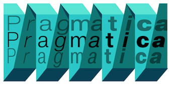 The fifty best-selling typefaces at MyFonts, as reported by them on May 1, 2013: #1: Proxima Nova (Mark Simonson), #2: Pragmatica (ParaType), #3: Quadon (Rene Bieder), #4: Brandon Grotesque (HVD Fonts), #5: Neue Helvetica (Linotype), #6: Avenir (Linotype), #7: Letrista Script (Calderon Estudio Type Foundry), #8: Futura (Bitstream), #9: Thirsty Rough (Yellow Design Studio), #10: Museo Sans (exljbris), #11: Helvetica Neue LT Std (Adobe), #12: Trend (Latinotype), #13: Trade Gothic (Linotype), #14: Bombshell Pro (Emily Lime), #15: Benton Sans (Font Bureau), #16: Boxed (Tipo Pèpel), #17: Brandon Text (HVD Fonts), #18: Veneer (Yellow Design Studio), #19: Museo Slab (exljbris), #20: Wishes Script (Typesenses), #21: Carolyna Pro Black (Emily Lime), #22: Station (Kimmy Design), #23: Interstate (Font Bureau), #24: Neo sans (Monotype Imaging), #25: Univers (Linotype), #26: Anna Clara (Trial by Cupcakes), #27: Antenna (Font Bureau), #28: Akzidenz-Grotesk (Berthold), #29: Nexa (Fontfabric), #30: Hand Shop Pack (Fontscafe), #31: Hipster Script Pro (Sudtipos), #32: Thirsty Script (Yellow Design Studio), #33: Gibson (Canada Type), #34: Effra (Dalton Maag), #35: Trend Hand Made (Latinotype), #36: DIN Next (Linotype), #37: MVB Solano Gothic (MVB), #38: ITC Avant Garde Gothic (ITC), #39: Intro (Fontfabric), #40: Frutiger (Adobe), #41: Helvetica (Adobe), #42: Avenir (Linotype), #43: Jacques & Gilles (Emily Lime), #44: Geogrotesque (Emtype Foundry), #45: Corbert (The Northern Block), #46: Directa Serif (Outras Fontes), #47: Pluto (HVD Fonts), #48: Only You Pro (LeType), #49: Solomon (Fontfabric), #50: Frutiger (Linotype). [Google]
[More] ⦿
The fifty best-selling typefaces at MyFonts, as reported by them on May 1, 2013: #1: Proxima Nova (Mark Simonson), #2: Pragmatica (ParaType), #3: Quadon (Rene Bieder), #4: Brandon Grotesque (HVD Fonts), #5: Neue Helvetica (Linotype), #6: Avenir (Linotype), #7: Letrista Script (Calderon Estudio Type Foundry), #8: Futura (Bitstream), #9: Thirsty Rough (Yellow Design Studio), #10: Museo Sans (exljbris), #11: Helvetica Neue LT Std (Adobe), #12: Trend (Latinotype), #13: Trade Gothic (Linotype), #14: Bombshell Pro (Emily Lime), #15: Benton Sans (Font Bureau), #16: Boxed (Tipo Pèpel), #17: Brandon Text (HVD Fonts), #18: Veneer (Yellow Design Studio), #19: Museo Slab (exljbris), #20: Wishes Script (Typesenses), #21: Carolyna Pro Black (Emily Lime), #22: Station (Kimmy Design), #23: Interstate (Font Bureau), #24: Neo sans (Monotype Imaging), #25: Univers (Linotype), #26: Anna Clara (Trial by Cupcakes), #27: Antenna (Font Bureau), #28: Akzidenz-Grotesk (Berthold), #29: Nexa (Fontfabric), #30: Hand Shop Pack (Fontscafe), #31: Hipster Script Pro (Sudtipos), #32: Thirsty Script (Yellow Design Studio), #33: Gibson (Canada Type), #34: Effra (Dalton Maag), #35: Trend Hand Made (Latinotype), #36: DIN Next (Linotype), #37: MVB Solano Gothic (MVB), #38: ITC Avant Garde Gothic (ITC), #39: Intro (Fontfabric), #40: Frutiger (Adobe), #41: Helvetica (Adobe), #42: Avenir (Linotype), #43: Jacques & Gilles (Emily Lime), #44: Geogrotesque (Emtype Foundry), #45: Corbert (The Northern Block), #46: Directa Serif (Outras Fontes), #47: Pluto (HVD Fonts), #48: Only You Pro (LeType), #49: Solomon (Fontfabric), #50: Frutiger (Linotype). [Google]
[More] ⦿
|
MyFonts: Bestsellers for May 2014
|
 The fifty best-selling typefaces at MyFonts, as reported by them on May 1, 2014: #1: Brandon Grotesque (HVD Fonts), #2: Proxima Nova (Mark Simonson), #3: Intro (Fontfabric), #4: Helvetica Neue (Linotype), #5: Avenir (Linotype), #6: Bombshell Pro (Emily Lime), #7: Trade Gothic (Linotype), #8: Museo Sans (exljbris), #9: FF DIN (FontFont), #10: Showcase (Latinotype), #11: Brandon Text (HVD Fonts), #12: Interstate (Font Bureau), #13: Brandon Printed (HVD Fonts), #14: Campton (Rene Bieder), #15: DIN Next (Linotype), #16: Akzidenz-Grotesk BE (Berthold), #17: Microbrew (Albatross), #18: Avenir Next Pro (Linotype), #19: Univers (Linotype), #20: ITC Avant Garde Gothic (ITC), #21: Nimbus Sans Novus (URW++), #22: Futura (Bitstream), #23: Carolyna Pro Black (Emily Lime), #24: Helvetica Neue LT Std (Adobe), #25: Thirsty Rough (Yellow Design Studio), #26: Swiss 721 (Bitstream), #34: Centrale Sans (Typedepot), #35: Nexa (Fontfabric), #36: Akzidenz-Grotesk BQ (Berthold), #37: LiebeErika (LiebeFonts), #38: Benton Sans (Font Bureau), #39: Geogrotesque (Emtype Foundry), #40: Trend (Latinotype), #41: Adelle (TypeTogether), #42: Gill Sans (Monotype), #43: Festivo LC (Ahmet Altun), #44: Neo sans (Monotype), #45: Thirsty Script (Yellow Design Studio), #46: Rodeqa Slab 4F (4th february), #47: Quickpen (Trial by Cupcakes), #48: Foro (Hoftype), #49: Frutiger (Linotype), #50: Canaro (Rene Bieder). [Google]
[More] ⦿
The fifty best-selling typefaces at MyFonts, as reported by them on May 1, 2014: #1: Brandon Grotesque (HVD Fonts), #2: Proxima Nova (Mark Simonson), #3: Intro (Fontfabric), #4: Helvetica Neue (Linotype), #5: Avenir (Linotype), #6: Bombshell Pro (Emily Lime), #7: Trade Gothic (Linotype), #8: Museo Sans (exljbris), #9: FF DIN (FontFont), #10: Showcase (Latinotype), #11: Brandon Text (HVD Fonts), #12: Interstate (Font Bureau), #13: Brandon Printed (HVD Fonts), #14: Campton (Rene Bieder), #15: DIN Next (Linotype), #16: Akzidenz-Grotesk BE (Berthold), #17: Microbrew (Albatross), #18: Avenir Next Pro (Linotype), #19: Univers (Linotype), #20: ITC Avant Garde Gothic (ITC), #21: Nimbus Sans Novus (URW++), #22: Futura (Bitstream), #23: Carolyna Pro Black (Emily Lime), #24: Helvetica Neue LT Std (Adobe), #25: Thirsty Rough (Yellow Design Studio), #26: Swiss 721 (Bitstream), #34: Centrale Sans (Typedepot), #35: Nexa (Fontfabric), #36: Akzidenz-Grotesk BQ (Berthold), #37: LiebeErika (LiebeFonts), #38: Benton Sans (Font Bureau), #39: Geogrotesque (Emtype Foundry), #40: Trend (Latinotype), #41: Adelle (TypeTogether), #42: Gill Sans (Monotype), #43: Festivo LC (Ahmet Altun), #44: Neo sans (Monotype), #45: Thirsty Script (Yellow Design Studio), #46: Rodeqa Slab 4F (4th february), #47: Quickpen (Trial by Cupcakes), #48: Foro (Hoftype), #49: Frutiger (Linotype), #50: Canaro (Rene Bieder). [Google]
[More] ⦿
|
MyFonts: Bestsellers for May 2015
|
 The fifty best-selling typefaces at MyFonts, as reported by them on May 9, 2015: #1 Brandon Grotesque (HVD Fonts), #2 FF DIN (FontFont), #3 Proxima Nova (Mark Simonson), #4 Helvetica Neue (Linotype), #5 Neue Haas Unica (Linotype), #6 Avenir (Linotype), #7 Trade Gothic (Linotype), #8 Brandon Text (HVD Fonts), #9 DIN Next (Linotype), #10 Bombshell Pro (Emily Lime), #11 Museo Sans (exljbris), #12 Nexa Rust (Fontfabric), #13 Univers (Linotype), #14 Avenir Next Pro (Linotype), #15 Freeland (Trial by Cupcakes), #16 Frutiger (Linotype), #17 Futura (Bitstream), #18 ITC Avant Garde Gothic (ITC), #19 Galano Grotesque (Rene Bieder), #20 Effra (Dalton Maag), #21 Trivia Sans (Storm), #22 Akzidenz-Grotesk BE (Berthold), #23 Pill Gothic (Betatype), #24 Helvetica Neue LT Std (Adobe), #25 Selfie (Lian Types), #26 Futura PT (ParaType), #27 True North Textures (Cultivated Mind), #28 Geogrotesque (Emtype Foundry), #29 News Gothic (Bitstream), #30 Campton (Rene Bieder), #31 Muller (Fontfabric), #32 Futura (Linotype), #33 Museo Slab (exljbris), #34 Panton (Fontfabric), #35 Neo Sans (Monotype), #36 Frutiger Next (Linotype), #37 FF Meta (FontFont), #38 Nexa (Fontfabric), #39 Jacques + Gilles (Emily Lime), #40 Neue Haas Grotesk (Linotype), #41 Veneer (Yellow Design Studio), #42 Gill Sans (Monotype), #43 Intro (Fontfabric), #44 Benton Sans (Font Bureau), #45 Interstate (Font Bureau), #46 Amsi Pro (Stawix), #47 Glober (Fontfabric), #48 Asterism Clean (Great Lakes Lettering), #49 Wanderlust Letters (Cultivated Mind), #50 Carolyna Pro Black (Emily Lime). [Google]
[More] ⦿
The fifty best-selling typefaces at MyFonts, as reported by them on May 9, 2015: #1 Brandon Grotesque (HVD Fonts), #2 FF DIN (FontFont), #3 Proxima Nova (Mark Simonson), #4 Helvetica Neue (Linotype), #5 Neue Haas Unica (Linotype), #6 Avenir (Linotype), #7 Trade Gothic (Linotype), #8 Brandon Text (HVD Fonts), #9 DIN Next (Linotype), #10 Bombshell Pro (Emily Lime), #11 Museo Sans (exljbris), #12 Nexa Rust (Fontfabric), #13 Univers (Linotype), #14 Avenir Next Pro (Linotype), #15 Freeland (Trial by Cupcakes), #16 Frutiger (Linotype), #17 Futura (Bitstream), #18 ITC Avant Garde Gothic (ITC), #19 Galano Grotesque (Rene Bieder), #20 Effra (Dalton Maag), #21 Trivia Sans (Storm), #22 Akzidenz-Grotesk BE (Berthold), #23 Pill Gothic (Betatype), #24 Helvetica Neue LT Std (Adobe), #25 Selfie (Lian Types), #26 Futura PT (ParaType), #27 True North Textures (Cultivated Mind), #28 Geogrotesque (Emtype Foundry), #29 News Gothic (Bitstream), #30 Campton (Rene Bieder), #31 Muller (Fontfabric), #32 Futura (Linotype), #33 Museo Slab (exljbris), #34 Panton (Fontfabric), #35 Neo Sans (Monotype), #36 Frutiger Next (Linotype), #37 FF Meta (FontFont), #38 Nexa (Fontfabric), #39 Jacques + Gilles (Emily Lime), #40 Neue Haas Grotesk (Linotype), #41 Veneer (Yellow Design Studio), #42 Gill Sans (Monotype), #43 Intro (Fontfabric), #44 Benton Sans (Font Bureau), #45 Interstate (Font Bureau), #46 Amsi Pro (Stawix), #47 Glober (Fontfabric), #48 Asterism Clean (Great Lakes Lettering), #49 Wanderlust Letters (Cultivated Mind), #50 Carolyna Pro Black (Emily Lime). [Google]
[More] ⦿
|
MyFonts: Bestsellers for May 2016
|
 The fifty best-selling typefaces at MyFonts, as reported by them on May 1, 2016: #1 Proxima Nova (Mark Simonson), #2 Brandon Grotesque (HVD Fonts), #3 FF DIN (FontFont), #4 Helvetica Neue (Linotype), #5 Avenir (Linotype), #6 Storyteller (My Creative Land), #7 Ridley Grotesk (Radomir Tinkov), #8 Canvas Acrylic Megafamily (Yellow Design Studio), #9 Helvetica Neue LT Std (Adobe), #10 Akhand Soft (Indian Type Foundry), #11 Panton (Fontfabric), #12 Fabrikat (HVD Fonts), #13 Avenir Next Pro (Linotype), #14 Sofia Pro (Mostardesign), #15 Futura (Bitstream), #16 Frutiger (Linotype), #17 Univers (Linotype), #18 Trade Gothic (Linotype), #19 Cera (TypeMates), #20 Brandon Text (HVD Fonts), #21 Interstate (Font Bureau), #22 ITC Avant Garde Gothic (ITC), #23 Futura PT (ParaType), #24 Museo Sans (exljbris), #25 Inkheart (Fenotype), #26 Clarendon (Bitstream), #27 Amsi Pro (Stawix), #28 Nexa Rust (Fontfabric), #29 Campton (Rene Bieder), #30 FF Mark (FontFont), #31 DIN Next (Linotype), #32 Baskerville (Bitstream), #33 Rational (Rene Bieder), #34 Houschka Pro (G-Type), #35 Blend (Typesenses), #36 VAG Rounded (Linotype), #37 Freeland (Trial by Cupcakes), #38 Neo Sans (Monotype), #39 Hurme Geometric Sans 1 + 2 (Hurme), #40 Galano Grotesque (Rene Bieder), #41 Nexa (Fontfabric), #42 Mrs Eaves (Emigre), #43 Fourth (Jason Vandenberg), #44 Bombshell Pro (Emily Lime), #45 Futura (Linotype), #46 Intro (Fontfabric), #47 DIN 2014 (ParaType), #48 Guess (DearType), #49 Futura (Adobe), #50 Brandon Printed (HVD Fonts). [Google]
[More] ⦿
The fifty best-selling typefaces at MyFonts, as reported by them on May 1, 2016: #1 Proxima Nova (Mark Simonson), #2 Brandon Grotesque (HVD Fonts), #3 FF DIN (FontFont), #4 Helvetica Neue (Linotype), #5 Avenir (Linotype), #6 Storyteller (My Creative Land), #7 Ridley Grotesk (Radomir Tinkov), #8 Canvas Acrylic Megafamily (Yellow Design Studio), #9 Helvetica Neue LT Std (Adobe), #10 Akhand Soft (Indian Type Foundry), #11 Panton (Fontfabric), #12 Fabrikat (HVD Fonts), #13 Avenir Next Pro (Linotype), #14 Sofia Pro (Mostardesign), #15 Futura (Bitstream), #16 Frutiger (Linotype), #17 Univers (Linotype), #18 Trade Gothic (Linotype), #19 Cera (TypeMates), #20 Brandon Text (HVD Fonts), #21 Interstate (Font Bureau), #22 ITC Avant Garde Gothic (ITC), #23 Futura PT (ParaType), #24 Museo Sans (exljbris), #25 Inkheart (Fenotype), #26 Clarendon (Bitstream), #27 Amsi Pro (Stawix), #28 Nexa Rust (Fontfabric), #29 Campton (Rene Bieder), #30 FF Mark (FontFont), #31 DIN Next (Linotype), #32 Baskerville (Bitstream), #33 Rational (Rene Bieder), #34 Houschka Pro (G-Type), #35 Blend (Typesenses), #36 VAG Rounded (Linotype), #37 Freeland (Trial by Cupcakes), #38 Neo Sans (Monotype), #39 Hurme Geometric Sans 1 + 2 (Hurme), #40 Galano Grotesque (Rene Bieder), #41 Nexa (Fontfabric), #42 Mrs Eaves (Emigre), #43 Fourth (Jason Vandenberg), #44 Bombshell Pro (Emily Lime), #45 Futura (Linotype), #46 Intro (Fontfabric), #47 DIN 2014 (ParaType), #48 Guess (DearType), #49 Futura (Adobe), #50 Brandon Printed (HVD Fonts). [Google]
[More] ⦿
|
MyFonts: Bestsellers for May 2017
|
 The fifty best-selling typefaces at MyFonts, as reported by them on April 30, 2017: #1 Helvetica Neue (Linotype), #2 FF DIN (FontFont), #3 Proxima Nova (Mark Simonson), #4 Brandon Grotesque (HVD Fonts), #5 Avenir (Linotype), #6 Kapra Neue (Typoforge Studio), #7 Gilroy (Radomir Tinkov), #8 FF Mark (FontFont), #9 Cera Pro (TypeMates), #10 Neusa Next (The Northern Block Ltd), #11 Trade Gothic (Linotype), #12 Brandon Text (HVD Fonts), #13 RF Rufo (Russian Fonts), #14 Verb (Yellow Design Studio), #15 Avenir Next Pro (Linotype), #16 Just Lovely (Nicky Laatz), #17 Alfons (Fenotype), #18 Artegra Sans (Artegra), #19 Helvetica Neue LT Std (Adobe), #20 Univers (Linotype), #21 Futura (Linotype), #22 Museo Sans (exljbris), #23 Linotype Didot (Linotype), #24 Muller (Fontfabric), #25 Frutiger (Linotype), #26 Rawson (Latinotype), #27 Amsi Pro (Stawix), #28 DIN Next (Linotype), #29 Sofia Pro (Mostardesign), #30 Nexa Rust (Fontfabric), #31 Sofa Sans Hand (FaceType), #32 Born Ready (Nicky Laatz), #33 Timeout (DearType), #34 ITC Avant Garde Gothic (ITC), #35 Nexa (Fontfabric), #36 Saveur Sans (Arkitype), #37 Gill Sans (Monotype), #38 Goldana (Seventh Imperium), #39 Futura (Bitstream), #40 Axiforma (Kastelov), #41 Buinton (Mika Melvas), #42 Tazugane Gothic (Monotype), #43 Revla Sans (Schizotype), #44 Neue Haas Grotesk (Linotype), #45 Futura PT (ParaType), #46 Viva Beautiful (Cultivated Mind), #47 Mrs Eaves (Emigre), #48 Myriad Pro (Adobe), #49 Freight Text (GarageFonts), #50 Campton (Rene Bieder). [Google]
[More] ⦿
The fifty best-selling typefaces at MyFonts, as reported by them on April 30, 2017: #1 Helvetica Neue (Linotype), #2 FF DIN (FontFont), #3 Proxima Nova (Mark Simonson), #4 Brandon Grotesque (HVD Fonts), #5 Avenir (Linotype), #6 Kapra Neue (Typoforge Studio), #7 Gilroy (Radomir Tinkov), #8 FF Mark (FontFont), #9 Cera Pro (TypeMates), #10 Neusa Next (The Northern Block Ltd), #11 Trade Gothic (Linotype), #12 Brandon Text (HVD Fonts), #13 RF Rufo (Russian Fonts), #14 Verb (Yellow Design Studio), #15 Avenir Next Pro (Linotype), #16 Just Lovely (Nicky Laatz), #17 Alfons (Fenotype), #18 Artegra Sans (Artegra), #19 Helvetica Neue LT Std (Adobe), #20 Univers (Linotype), #21 Futura (Linotype), #22 Museo Sans (exljbris), #23 Linotype Didot (Linotype), #24 Muller (Fontfabric), #25 Frutiger (Linotype), #26 Rawson (Latinotype), #27 Amsi Pro (Stawix), #28 DIN Next (Linotype), #29 Sofia Pro (Mostardesign), #30 Nexa Rust (Fontfabric), #31 Sofa Sans Hand (FaceType), #32 Born Ready (Nicky Laatz), #33 Timeout (DearType), #34 ITC Avant Garde Gothic (ITC), #35 Nexa (Fontfabric), #36 Saveur Sans (Arkitype), #37 Gill Sans (Monotype), #38 Goldana (Seventh Imperium), #39 Futura (Bitstream), #40 Axiforma (Kastelov), #41 Buinton (Mika Melvas), #42 Tazugane Gothic (Monotype), #43 Revla Sans (Schizotype), #44 Neue Haas Grotesk (Linotype), #45 Futura PT (ParaType), #46 Viva Beautiful (Cultivated Mind), #47 Mrs Eaves (Emigre), #48 Myriad Pro (Adobe), #49 Freight Text (GarageFonts), #50 Campton (Rene Bieder). [Google]
[More] ⦿
|
MyFonts: Bestsellers for May 2018
|
 The fifty best-selling typefaces at MyFonts, as reported by them on April 30, 2018: #1 Neue Helvetica (Linotype), #2 FF DIN (FontFont), #3 Proxima Nova (Mark Simonson), #4 Brandon Grotesque (HVD Fonts), #5 Gilroy (Radomir Tinkov), #6 Avenir (Linotype), #7 Avenir Next (Linotype), #8 DIN Next (Linotype), #9 ITC Avant Garde Gothic (ITC), #10 TT Commons (TypeType), #11 Madera (Monotype), #12 Mont (Fontfabric), #13 Univers (Linotype), #14 Futura (Bitstream), #15 TT Norms (TypeType), #16 FF Mark (FontFont), #17 Cera Pro (TypeMates), #18 Azo Sans (Rui Abreu), #19 TT Tricks (TypeType), #20 Futura (Linotype), #21 Museo Sans (exljbris), #22 Helvetica Neue LT Std (Adobe), #23 Neue Haas Unica (Linotype), #24 Campton (Rene Bieder), #25 Sofia Pro (Mostardesign), #26 Larsseit (Type Dynamic), #27 Brandon Text (HVD Fonts), #28 Baro (Indian Type Foundry), #29 Frutiger (Linotype), #30 Trade Gothic (Linotype), #31 Calps (Typesketchbook), #32 Akzidenz-Grotesk BQ (Berthold), #33 Filson Pro (Mostardesign), #34 Neue Haas Grotesk (Linotype), #35 Mohr (Latinotype), #36 Futura PT (ParaType), #37 Viva Beautiful (Cultivated Mind), #38 Galano Grotesque (Rene Bieder), #39 Nexa (Fontfabric), #40 Gill Sans (Monotype), #41 Boston (Latinotype), #42 Century Gothic (Monotype), #43 HongKong (Indian Type Foundry), #44 FF Meta (FontFont), #45 Sailec (Type Dynamic), #46 Averta (Intelligent Design), #47 Akzidenz-Grotesk BE (Berthold), #48 Geogrotesque (Emtype Foundry), #49 Zesta (Indian Type Foundry), #50 Volte (Indian Type Foundry). [Google]
[More] ⦿
The fifty best-selling typefaces at MyFonts, as reported by them on April 30, 2018: #1 Neue Helvetica (Linotype), #2 FF DIN (FontFont), #3 Proxima Nova (Mark Simonson), #4 Brandon Grotesque (HVD Fonts), #5 Gilroy (Radomir Tinkov), #6 Avenir (Linotype), #7 Avenir Next (Linotype), #8 DIN Next (Linotype), #9 ITC Avant Garde Gothic (ITC), #10 TT Commons (TypeType), #11 Madera (Monotype), #12 Mont (Fontfabric), #13 Univers (Linotype), #14 Futura (Bitstream), #15 TT Norms (TypeType), #16 FF Mark (FontFont), #17 Cera Pro (TypeMates), #18 Azo Sans (Rui Abreu), #19 TT Tricks (TypeType), #20 Futura (Linotype), #21 Museo Sans (exljbris), #22 Helvetica Neue LT Std (Adobe), #23 Neue Haas Unica (Linotype), #24 Campton (Rene Bieder), #25 Sofia Pro (Mostardesign), #26 Larsseit (Type Dynamic), #27 Brandon Text (HVD Fonts), #28 Baro (Indian Type Foundry), #29 Frutiger (Linotype), #30 Trade Gothic (Linotype), #31 Calps (Typesketchbook), #32 Akzidenz-Grotesk BQ (Berthold), #33 Filson Pro (Mostardesign), #34 Neue Haas Grotesk (Linotype), #35 Mohr (Latinotype), #36 Futura PT (ParaType), #37 Viva Beautiful (Cultivated Mind), #38 Galano Grotesque (Rene Bieder), #39 Nexa (Fontfabric), #40 Gill Sans (Monotype), #41 Boston (Latinotype), #42 Century Gothic (Monotype), #43 HongKong (Indian Type Foundry), #44 FF Meta (FontFont), #45 Sailec (Type Dynamic), #46 Averta (Intelligent Design), #47 Akzidenz-Grotesk BE (Berthold), #48 Geogrotesque (Emtype Foundry), #49 Zesta (Indian Type Foundry), #50 Volte (Indian Type Foundry). [Google]
[More] ⦿
|
MyFonts: Bestsellers for May 2019
|
 The fifty best-selling typefaces at MyFonts, as reported by them on April 30, 2019: #1 Helvetica Now (Monotype ), #2 Gilroy (Radomir Tinkov), #3 FF DIN (FontFont), #4 Avenir (Linotype), #5 Neue Helvetica (Linotype), #6 Avenir Next (Linotype), #7 Proxima Nova (Mark Simonson), #8 DIN Next (Linotype), #9 Brandon Grotesque (HVD Fonts), #10 Cera Pro (TypeMates), #11 Univers (Linotype), #12 Campton (Rene Bieder), #13 FF Mark (FontFont), #14 Galano Grotesque (Rene Bieder), #15 TT Norms Pro (TypeType), #16 Nexa (Fontfabric), #17 Trade Gothic (Linotype), #18 Axiforma (Kastelov), #19 Recoleta (Latinotype), #20 TT Commons (TypeType), #21 ITC Avant Garde Gothic (ITC), #22 Neue Haas Grotesk (Linotype), #23 Montecatini Pro (Louise Fili Ltd), #24 Mont (Fontfabric), #25 Helvetica (Linotype), #26 Brandon Text (HVD Fonts), #27 Frutiger (Linotype), #28 Intro (Fontfabric), #29 Gabriela (Latinotype Mexico), #30 Futura (Linotype), #31 Sofia Pro (Mostardesign), #32 Averta (Intelligent Design), #33 Silk Serif (SilkType), #34 Aquawax Pro (Zetafonts), #35 Museo Sans (exljbris), #36 LunchBox (Kimmy Design), #37 Bebas Neue Pro (Dharma Type), #38 Amsi Pro (Stawix), #39 Muller (Fontfabric), #40 Neue Plak (Monotype ), #41 Gopher (Adam Ladd), #42 Walbaum (Monotype ), #43 Futura PT (ParaType), #44 Biotif (Degarism Studio), #45 FF Marselis (FontFont), #46 Lota Grotesque (Los Andes), #47 Frontage Condensed (Juri Zaech), #48 Isidora Sans (Latinotype), #49 Tazugane Gothic (Monotype ), #50 Authenia (Mika Melvas). [Google]
[More] ⦿
The fifty best-selling typefaces at MyFonts, as reported by them on April 30, 2019: #1 Helvetica Now (Monotype ), #2 Gilroy (Radomir Tinkov), #3 FF DIN (FontFont), #4 Avenir (Linotype), #5 Neue Helvetica (Linotype), #6 Avenir Next (Linotype), #7 Proxima Nova (Mark Simonson), #8 DIN Next (Linotype), #9 Brandon Grotesque (HVD Fonts), #10 Cera Pro (TypeMates), #11 Univers (Linotype), #12 Campton (Rene Bieder), #13 FF Mark (FontFont), #14 Galano Grotesque (Rene Bieder), #15 TT Norms Pro (TypeType), #16 Nexa (Fontfabric), #17 Trade Gothic (Linotype), #18 Axiforma (Kastelov), #19 Recoleta (Latinotype), #20 TT Commons (TypeType), #21 ITC Avant Garde Gothic (ITC), #22 Neue Haas Grotesk (Linotype), #23 Montecatini Pro (Louise Fili Ltd), #24 Mont (Fontfabric), #25 Helvetica (Linotype), #26 Brandon Text (HVD Fonts), #27 Frutiger (Linotype), #28 Intro (Fontfabric), #29 Gabriela (Latinotype Mexico), #30 Futura (Linotype), #31 Sofia Pro (Mostardesign), #32 Averta (Intelligent Design), #33 Silk Serif (SilkType), #34 Aquawax Pro (Zetafonts), #35 Museo Sans (exljbris), #36 LunchBox (Kimmy Design), #37 Bebas Neue Pro (Dharma Type), #38 Amsi Pro (Stawix), #39 Muller (Fontfabric), #40 Neue Plak (Monotype ), #41 Gopher (Adam Ladd), #42 Walbaum (Monotype ), #43 Futura PT (ParaType), #44 Biotif (Degarism Studio), #45 FF Marselis (FontFont), #46 Lota Grotesque (Los Andes), #47 Frontage Condensed (Juri Zaech), #48 Isidora Sans (Latinotype), #49 Tazugane Gothic (Monotype ), #50 Authenia (Mika Melvas). [Google]
[More] ⦿
|
MyFonts: Bestsellers for May 2020
|
 The fifty best-selling typefaces at MyFonts, as reported by them on May 1, 2020: #1 Gilroy (Radomir Tinkov), #2 Neue Helvetica (Linotype), #3 Avenir (Linotype), #4 Helvetica Now (Monotype), #5 Macklin (Monotype), #6 TT Norms Pro (TypeType), #7 Univers (Linotype), #8 FF DIN (FontFont), #9 Avenir Next (Linotype), #10 Brandon Grotesque (HVD Fonts), #11 Recoleta (Latinotype), #12 Sofia Pro (Mostardesign), #13 Mixta (Latinotype), #14 Meiryo UI (Microsoft), #15 Averta (Intelligent Design), #16 Neue Haas Grotesk (Linotype), #17 ITC Avant Garde Gothic (ITC), #18 Proxima Nova (Mark Simonson), #19 Helvetica (Linotype), #20 TT Commons (TypeType), #21 Spock (Los Andes), #22 Frutiger (Linotype), #23 Neue Haas Unica (Linotype), #24 Qanelas Soft (Radomir Tinkov), #25 Cera Pro (TypeMates), #26 Nexa (Fontfabric), #27 Rockwell (Monotype), #28 Rotunda (TipoType), #29 DIN Next (Linotype), #30 Mont (Fontfabric), #31 Intro (Fontfabric), #32 Galano Grotesque (Rene Bieder), #33 Bebas Neue Pro (Dharma Type), #34 Trade Gothic (Linotype), #35 Swiss 721 (Bitstream), #36 Century Gothic (Monotype), #37 Larsseit (Type Dynamic), #38 FF Mark (FontFont), #39 Faktum (Rene Bieder), #40 Tusker Grotesk (Lewis McGuffie Type), #41 Silk Serif (SilkType), #42 Tazugane Gothic (Monotype), #43 Campton (Rene Bieder), #44 Axiforma (Kastelov), #45 Ample Soft Pro (Soneri Type), #46 Brandon Text (HVD Fonts), #47 TT Octosquares (TypeType), #48 Hawkes (Kimmy Design), #49 Gabriela (Latinotype Mexico), #50 Brandon Grotesque Condensed (HVD Fonts). [Google]
[More] ⦿
The fifty best-selling typefaces at MyFonts, as reported by them on May 1, 2020: #1 Gilroy (Radomir Tinkov), #2 Neue Helvetica (Linotype), #3 Avenir (Linotype), #4 Helvetica Now (Monotype), #5 Macklin (Monotype), #6 TT Norms Pro (TypeType), #7 Univers (Linotype), #8 FF DIN (FontFont), #9 Avenir Next (Linotype), #10 Brandon Grotesque (HVD Fonts), #11 Recoleta (Latinotype), #12 Sofia Pro (Mostardesign), #13 Mixta (Latinotype), #14 Meiryo UI (Microsoft), #15 Averta (Intelligent Design), #16 Neue Haas Grotesk (Linotype), #17 ITC Avant Garde Gothic (ITC), #18 Proxima Nova (Mark Simonson), #19 Helvetica (Linotype), #20 TT Commons (TypeType), #21 Spock (Los Andes), #22 Frutiger (Linotype), #23 Neue Haas Unica (Linotype), #24 Qanelas Soft (Radomir Tinkov), #25 Cera Pro (TypeMates), #26 Nexa (Fontfabric), #27 Rockwell (Monotype), #28 Rotunda (TipoType), #29 DIN Next (Linotype), #30 Mont (Fontfabric), #31 Intro (Fontfabric), #32 Galano Grotesque (Rene Bieder), #33 Bebas Neue Pro (Dharma Type), #34 Trade Gothic (Linotype), #35 Swiss 721 (Bitstream), #36 Century Gothic (Monotype), #37 Larsseit (Type Dynamic), #38 FF Mark (FontFont), #39 Faktum (Rene Bieder), #40 Tusker Grotesk (Lewis McGuffie Type), #41 Silk Serif (SilkType), #42 Tazugane Gothic (Monotype), #43 Campton (Rene Bieder), #44 Axiforma (Kastelov), #45 Ample Soft Pro (Soneri Type), #46 Brandon Text (HVD Fonts), #47 TT Octosquares (TypeType), #48 Hawkes (Kimmy Design), #49 Gabriela (Latinotype Mexico), #50 Brandon Grotesque Condensed (HVD Fonts). [Google]
[More] ⦿
|
MyFonts: Bestsellers for May 2021
|
 The fifty best-selling typefaces at MyFonts, as reported by them on May 1, 2021: #1 Neue Helvetica (Linotype), #2 Helvetica (Linotype), #3 Gilroy (Radomir Tinkov), #4 Avenir Next (Linotype), #5 Helvetica Now (Monotype), #6 FF DIN (FontFont), #7 Proxima Nova (Mark Simonson), #8 Univers (Linotype), #9 DIN Next (Linotype), #10 Neue Haas Grotesk (Linotype), #11 Avenir (Linotype), #12 Frutiger (Linotype), #13 TT Norms Pro (TypeType), #14 Cera Pro (TypeMates), #15 Brandon Grotesque (HVD Fonts), #16 Trade Gothic (Linotype), #17 Sofia Pro (Mostardesign), #18 TT Commons (TypeType), #19 FF Mark (FontFont), #20 Mont (Fontfabric), #21 Recoleta (Latinotype), #22 Futura PT (ParaType), #23 Neue Haas Unica (Linotype), #24 Nexa (Fontfabric), #25 ITC Avant Garde Gothic (ITC), #26 Brandon Text (HVD Fonts), #27 Coco Sharp (Zetafonts), #28 Larken (EllenLuff), #29 Campton (Rene Bieder), #30 Gill Sans Nova (Monotype), #31 FF Basic Gothic (FontFont), #32 Heading Now (Zetafonts), #33 Univers Next (Linotype), #34 Futura (Linotype), #35 Criteria CF (Connary Fagen), #36 Tazugane Gothic (Monotype), #37 Wonder (Fenotype), #38 Quincy CF (Connary Fagen), #39 Pluto (HVD Fonts), #40 Goldplay (Latinotype), #41 Gazpacho (Santi Rey), #42 Bebas Neue Pro (Dharma Type), #43 Optima (Linotype), #44 Aspira (Durotype), #45 Myriad Pro (Adobe), #46 Albra (BumbumType), #47 Intro (Fontfabric), #48 Lemon Milk Pro (Marsnev), #49 Century Gothic (Monotype), #50 Vary (Monotype). [Google]
[More] ⦿
The fifty best-selling typefaces at MyFonts, as reported by them on May 1, 2021: #1 Neue Helvetica (Linotype), #2 Helvetica (Linotype), #3 Gilroy (Radomir Tinkov), #4 Avenir Next (Linotype), #5 Helvetica Now (Monotype), #6 FF DIN (FontFont), #7 Proxima Nova (Mark Simonson), #8 Univers (Linotype), #9 DIN Next (Linotype), #10 Neue Haas Grotesk (Linotype), #11 Avenir (Linotype), #12 Frutiger (Linotype), #13 TT Norms Pro (TypeType), #14 Cera Pro (TypeMates), #15 Brandon Grotesque (HVD Fonts), #16 Trade Gothic (Linotype), #17 Sofia Pro (Mostardesign), #18 TT Commons (TypeType), #19 FF Mark (FontFont), #20 Mont (Fontfabric), #21 Recoleta (Latinotype), #22 Futura PT (ParaType), #23 Neue Haas Unica (Linotype), #24 Nexa (Fontfabric), #25 ITC Avant Garde Gothic (ITC), #26 Brandon Text (HVD Fonts), #27 Coco Sharp (Zetafonts), #28 Larken (EllenLuff), #29 Campton (Rene Bieder), #30 Gill Sans Nova (Monotype), #31 FF Basic Gothic (FontFont), #32 Heading Now (Zetafonts), #33 Univers Next (Linotype), #34 Futura (Linotype), #35 Criteria CF (Connary Fagen), #36 Tazugane Gothic (Monotype), #37 Wonder (Fenotype), #38 Quincy CF (Connary Fagen), #39 Pluto (HVD Fonts), #40 Goldplay (Latinotype), #41 Gazpacho (Santi Rey), #42 Bebas Neue Pro (Dharma Type), #43 Optima (Linotype), #44 Aspira (Durotype), #45 Myriad Pro (Adobe), #46 Albra (BumbumType), #47 Intro (Fontfabric), #48 Lemon Milk Pro (Marsnev), #49 Century Gothic (Monotype), #50 Vary (Monotype). [Google]
[More] ⦿
|
MyFonts: Bestsellers for May 2022
|
 The fifty best-selling typefaces at MyFonts, as reported by them on May 3, 2022: #1 Neue Helvetica (Linotype), #2 Gilroy (Radomir Tinkov), #3 Tazugane Gothic (Monotype), #4 Proxima Nova (Mark Simonson), #5 Univers (Linotype), #6 Avenir (Linotype), #7 Avenir Next (Linotype), #8 Helvetica (Linotype), #9 Comic Code (Tabular Type Foundry), #10 Helvetica Now (Monotype), #11 TT Norms Pro (TypeType), #12 Nimbus Sans Novus (URW Type Foundry), #13 Futura (Linotype), #14 FF DIN (FontFont), #15 Frutiger (Linotype), #16 Nexa (Fontfabric), #17 Shorai Sans (Monotype), #18 DIN Next (Linotype), #19 Sunbeat (PintassilgoPrints), #20 Recoleta (Latinotype), #21 Galano Grotesque (Rene Bieder), #22 Neue Haas Grotesk (Linotype), #23 Cera Pro (TypeMates), #24 TT Commons Pro (TypeType), #25 Trade Gothic (Linotype), #26 Sofia Pro (Mostardesign), #27 Gazpacho (Santi Rey), #28 Brandon Grotesque (HVD Fonts), #29 Helvetica Now Variable (Monotype), #30 FF Mark (FontFont), #31 Volte (Indian Type Foundry), #32 Neue Haas Unica (Linotype), #33 Futura Now (Monotype), #34 Campton (Rene Bieder), #35 Mont (Fontfabric), #36 Axiforma (Kastelov), #37 Gill Sans (Monotype), #38 Larsseit (Type Dynamic), #39 TT Hoves (TypeType), #40 Averta (Intelligent Design), #41 Arial (Monotype), #42 Madera (Monotype), #43 Larken (EllenLuff), #44 FF Dax (FontFont), #45 Futura PT (ParaType), #46 Heading Now (Zetafonts), #47 Brandon Text (HVD Fonts), #48 M XiangHe Hei TC (Monotype), #49 Eina (Extratype), #50 Panton (Fontfabric). [Google]
[More] ⦿
The fifty best-selling typefaces at MyFonts, as reported by them on May 3, 2022: #1 Neue Helvetica (Linotype), #2 Gilroy (Radomir Tinkov), #3 Tazugane Gothic (Monotype), #4 Proxima Nova (Mark Simonson), #5 Univers (Linotype), #6 Avenir (Linotype), #7 Avenir Next (Linotype), #8 Helvetica (Linotype), #9 Comic Code (Tabular Type Foundry), #10 Helvetica Now (Monotype), #11 TT Norms Pro (TypeType), #12 Nimbus Sans Novus (URW Type Foundry), #13 Futura (Linotype), #14 FF DIN (FontFont), #15 Frutiger (Linotype), #16 Nexa (Fontfabric), #17 Shorai Sans (Monotype), #18 DIN Next (Linotype), #19 Sunbeat (PintassilgoPrints), #20 Recoleta (Latinotype), #21 Galano Grotesque (Rene Bieder), #22 Neue Haas Grotesk (Linotype), #23 Cera Pro (TypeMates), #24 TT Commons Pro (TypeType), #25 Trade Gothic (Linotype), #26 Sofia Pro (Mostardesign), #27 Gazpacho (Santi Rey), #28 Brandon Grotesque (HVD Fonts), #29 Helvetica Now Variable (Monotype), #30 FF Mark (FontFont), #31 Volte (Indian Type Foundry), #32 Neue Haas Unica (Linotype), #33 Futura Now (Monotype), #34 Campton (Rene Bieder), #35 Mont (Fontfabric), #36 Axiforma (Kastelov), #37 Gill Sans (Monotype), #38 Larsseit (Type Dynamic), #39 TT Hoves (TypeType), #40 Averta (Intelligent Design), #41 Arial (Monotype), #42 Madera (Monotype), #43 Larken (EllenLuff), #44 FF Dax (FontFont), #45 Futura PT (ParaType), #46 Heading Now (Zetafonts), #47 Brandon Text (HVD Fonts), #48 M XiangHe Hei TC (Monotype), #49 Eina (Extratype), #50 Panton (Fontfabric). [Google]
[More] ⦿
|
MyFonts: Bestsellers for November 2011
|
The fifty best-selling typefaces at MyFonts, as reported by them on November 4, 2011. The trends remain steady---art deco or vintage sans typefaces, the old Helvetica in its many disguises such as Bitstream's Swiss 721, and didone fashion mag typefaces. [Google]
[More] ⦿
|
MyFonts: Bestsellers for November 2012
|
 The fifty best-selling typefaces at MyFonts, as reported by them on November 1, 2012: #1: Proxima Nova (Mark Simonson), #2: Brandon Grotesque (HVD Fonts), #3: Hipster Script Pro (Sudtipos), #4: Nexa (Fontfabric), #5: Museo Sans (exljbris), #6: Futura (Bitstream), #7: Helvetica Neue (Adobe), #8: Interstate (Font Bureau), #9: Bombshell Pro (Emily Lime), #10: Diamonds (HVD Fonts), #11: Veneer (Yellow Design Studio), #12: Akzidenz-Grotesk BE (Berthold), #13: Museo Slab (exljbris), #14: Ride my Bike (Latinotype), #15: Carolyna Pro Black (Emily Lime), #16: Mercury Script (Fenotype), #17: Avenir (Linotype), #18: Intro (Fontfabric), #19: Benton Sans (Font Bureau), #20: Geogrotesque (Emtype Foundry), #21: Neue Helvetica (Linotype), #22: Univers (Linotype), #23: Pluto (HVD Fonts), #24: Frutiger (Adobe), #25: Aire (Lián Types), #26: Narziss (Hubert Jocham Type), #27: Graublau Sans Pro (FDI), #28: Populaire (PintassilgoPrints), #29: Museo (exljbris), #30: Clarendon (Bitstream), #31: Klavika (Process Type Foundry), #32: Mishka (Fenotype), #33: PF Din Text Pro (Parachute), #34: Futura PT (ParaType), #35: Neuron (Corradine Fonts), #36: Samantha Script (Laura Worthington), #37: LUELLA (Cultivated Mind), #38: Trade Gothic (Linotype), #39: Adelle (TypeTogether), #40: Neo sans (Monotype Imaging), #41: Helvetica (Adobe), #42: Belluccia (Correspondence Ink), #43: Verb (Yellow Design Studio), #44: Aphrodite Pro (Typesenses), #45: Freight Sans Pro (GarageFonts), #46: Carolyna (Emily Lime), #47: Pluto Sans (HVD Fonts), #48: Akzidenz-Grotesk BQ (Berthold), #49: NewJune (Hubert Jocham Type), #50: ITC Avant Garde Gothic (ITC).
 Once again, Brandon Grotesque and Proxima Nova are trading places atop the charts, as they have done for the past two years. The biggest risers are Hipster Script (Sudtipos) and Nexa (a clean sans from Fontfabric), which went from nowhere to #3 and #4, respectively. Other highly ranked new entries include Diamonds (Hannes von Doehren) and Mercury Script (Fenotype). There are no big surprises, as well-known names fill the reaminder of the list, with just a few glitzes. These include, in the soft rounded sans category, the beautiful Neuron family (#35) by Manuel Eduardo Corradine and Sergio Ramírez. Higher up in the ranking we find other sanses with similar almost elliptical curvatures such as Klavika and Geogrotesque, but they don't have the juicy plumpness of Neuron. In #40, Neo sans (Monotype) has the elliptical genes and a bit of the roundness, but it is more subdued. Text typefaces were clobbered this month. [Google]
[More] ⦿
|
MyFonts: Bestsellers for November 2013
|
 The fifty best-selling typefaces at MyFonts, as reported by them on November 1, 2013: #1: Brandon Grotesque (HVD Fonts), #2: Proxima Nova (Mark Simonson), #3: Helvetica Neue (Linotype), #4: Geogrotesque (Emtype Foundry), #5: Avenir (Linotype), #6: Trade Gothic (Linotype), #7: Museo Sans (exljbris), #8: Bombshell Pro (Emily Lime), #9: Helvetica Neue LT Std (Adobe), #10: Erotica (Liá Types), #11: Cantoni (Debi Sementelli Type Foundry), #12: Interstate (Font Bureau), #13: Futura (Bitstream), #14: Univers (Linotype), #15: Thirsty Rough (Yellow Design Studio), #16: FF DIN (FontFont), #17: Nanami Rounded (Thinkdust), #18: Charcuterie (Laura Worthington), #19: Avenir Next Pro (Linotype), #20: Neo sans (Monotype), #21: Benton Sans (Font Bureau), #22: Carolyna Pro Black (Emily Lime), #23: Museo Slab (exljbris), #24: Trend (Latinotype), #25: Akzidenz-Grotesk (Berthold), #26: Alright Sans (Okay Type), #27: DIN Next (Linotype), #28: Intro (Fontfabric), #29: Veneer (Yellow Design Studio), #30: Ondise (Magpie Paper Works), #31: Brandon Text (HVD Fonts), #32: Hurme Geometric Sans No.4 (Hurme Design), #33: Frutiger (Linotype), #34: Nexa (Fontfabric), #35: Core Circus (S-Core), #36: Asterism (Great Lakes Lettering), #37: ITC Avant Garde Gothic (ITC), #38: Bello (Underware), #39: Alek (Fenotype), #40: Centrale Sans (Typedepot), #41: Hipster Script Pro (Sudtipos), #42: Voyage (Fenotype), #43: Aphrodite Slim (Typesenses), #44: Thirsty Script (Yellow Design Studio), #45: Gill Sans (Monotype), #46: Jacques & Gilles (Emily Lime), #47: Myriad Pro (Adobe), #48: Prelo Slab (DSType), #49: Quiroga Serif Pro (TipoType), #50: Desire (CBdO Fonts). [Google]
[More] ⦿
The fifty best-selling typefaces at MyFonts, as reported by them on November 1, 2013: #1: Brandon Grotesque (HVD Fonts), #2: Proxima Nova (Mark Simonson), #3: Helvetica Neue (Linotype), #4: Geogrotesque (Emtype Foundry), #5: Avenir (Linotype), #6: Trade Gothic (Linotype), #7: Museo Sans (exljbris), #8: Bombshell Pro (Emily Lime), #9: Helvetica Neue LT Std (Adobe), #10: Erotica (Liá Types), #11: Cantoni (Debi Sementelli Type Foundry), #12: Interstate (Font Bureau), #13: Futura (Bitstream), #14: Univers (Linotype), #15: Thirsty Rough (Yellow Design Studio), #16: FF DIN (FontFont), #17: Nanami Rounded (Thinkdust), #18: Charcuterie (Laura Worthington), #19: Avenir Next Pro (Linotype), #20: Neo sans (Monotype), #21: Benton Sans (Font Bureau), #22: Carolyna Pro Black (Emily Lime), #23: Museo Slab (exljbris), #24: Trend (Latinotype), #25: Akzidenz-Grotesk (Berthold), #26: Alright Sans (Okay Type), #27: DIN Next (Linotype), #28: Intro (Fontfabric), #29: Veneer (Yellow Design Studio), #30: Ondise (Magpie Paper Works), #31: Brandon Text (HVD Fonts), #32: Hurme Geometric Sans No.4 (Hurme Design), #33: Frutiger (Linotype), #34: Nexa (Fontfabric), #35: Core Circus (S-Core), #36: Asterism (Great Lakes Lettering), #37: ITC Avant Garde Gothic (ITC), #38: Bello (Underware), #39: Alek (Fenotype), #40: Centrale Sans (Typedepot), #41: Hipster Script Pro (Sudtipos), #42: Voyage (Fenotype), #43: Aphrodite Slim (Typesenses), #44: Thirsty Script (Yellow Design Studio), #45: Gill Sans (Monotype), #46: Jacques & Gilles (Emily Lime), #47: Myriad Pro (Adobe), #48: Prelo Slab (DSType), #49: Quiroga Serif Pro (TipoType), #50: Desire (CBdO Fonts). [Google]
[More] ⦿
|
MyFonts: Bestsellers for November 2014
|
 The fifty best-selling typefaces at MyFonts, as reported by them on November 1, 2014: #1 Nexa Rust (Fontfabric), #2 Proxima Nova (Mark Simonson), #3 Brandon Grotesque (HVD Fonts), #4 Helvetica Neue (Linotype), #5 Avenir (Linotype), #6 FF DIN (FontFont), #7 Harman (Ahmet Altun), #8 Interstate (Font Bureau), #9 Selfie (Lian Types), #10 Brandon Text (HVD Fonts), #11 Bombshell Pro (Emily Lime), #12 Museo Sans (exljbris), #13 Univers (Linotype), #14 Avenir Next Pro (Linotype), #15 DIN Next (Linotype), #16 Trade Gothic (Linotype), #17 Texta (Latinotype), #18 ITC Avant Garde Gothic (ITC), #19 Intro (Fontfabric), #20 Carolyna Pro Black (Emily Lime), #21 Nexa (Fontfabric), #22 Futura (Bitstream), #23 Campton (Rene Bieder), #24 FF Dax (FontFont), #25 Sabon (Linotype), #26 Benton Sans (Font Bureau), #27 Akzidenz-Grotesk BE (Berthold), #28 Cantoni (Debi Sementelli Type Foundry), #29 Miller (Font Bureau), #30 Geogrotesque (Emtype Foundry), #31 Helvetica Neue LT Std (Adobe), #32 Museo Slab (exljbris), #33 Frutiger (Linotype), #34 Trade Gothic Next Soft Rounded (Linotype), #35 Lulo (Yellow Design Studio), #36 Glober (Fontfabric), #37 Brandon Printed (HVD Fonts), #38 Garden (Los Andes), #39 Jacques + Gilles (Emily Lime), #40 InterFace (Dalton Maag), #41 Uomo (Latinotype), #42 Sofia Pro (Mostardesign), #43 Tolyer (Typesketchbook), #44 Adorn (Laura Worthington), #45 PF Din Text (Parachute), #46 Akzidenz-Grotesk Pro (Berthold), #47 Neo Sans (Monotype), #48 Gill Sans (Monotype), #49 Asterism (Great Lakes Lettering), #50 Veneer (Yellow Design Studio). [Google]
[More] ⦿
The fifty best-selling typefaces at MyFonts, as reported by them on November 1, 2014: #1 Nexa Rust (Fontfabric), #2 Proxima Nova (Mark Simonson), #3 Brandon Grotesque (HVD Fonts), #4 Helvetica Neue (Linotype), #5 Avenir (Linotype), #6 FF DIN (FontFont), #7 Harman (Ahmet Altun), #8 Interstate (Font Bureau), #9 Selfie (Lian Types), #10 Brandon Text (HVD Fonts), #11 Bombshell Pro (Emily Lime), #12 Museo Sans (exljbris), #13 Univers (Linotype), #14 Avenir Next Pro (Linotype), #15 DIN Next (Linotype), #16 Trade Gothic (Linotype), #17 Texta (Latinotype), #18 ITC Avant Garde Gothic (ITC), #19 Intro (Fontfabric), #20 Carolyna Pro Black (Emily Lime), #21 Nexa (Fontfabric), #22 Futura (Bitstream), #23 Campton (Rene Bieder), #24 FF Dax (FontFont), #25 Sabon (Linotype), #26 Benton Sans (Font Bureau), #27 Akzidenz-Grotesk BE (Berthold), #28 Cantoni (Debi Sementelli Type Foundry), #29 Miller (Font Bureau), #30 Geogrotesque (Emtype Foundry), #31 Helvetica Neue LT Std (Adobe), #32 Museo Slab (exljbris), #33 Frutiger (Linotype), #34 Trade Gothic Next Soft Rounded (Linotype), #35 Lulo (Yellow Design Studio), #36 Glober (Fontfabric), #37 Brandon Printed (HVD Fonts), #38 Garden (Los Andes), #39 Jacques + Gilles (Emily Lime), #40 InterFace (Dalton Maag), #41 Uomo (Latinotype), #42 Sofia Pro (Mostardesign), #43 Tolyer (Typesketchbook), #44 Adorn (Laura Worthington), #45 PF Din Text (Parachute), #46 Akzidenz-Grotesk Pro (Berthold), #47 Neo Sans (Monotype), #48 Gill Sans (Monotype), #49 Asterism (Great Lakes Lettering), #50 Veneer (Yellow Design Studio). [Google]
[More] ⦿
|
MyFonts: Bestsellers for November 2015
|
 The fifty best-selling typefaces at MyFonts, as reported by them on November 1, 2015: #1 Proxima Nova (Mark Simonson), #2 Brandon Grotesque (HVD Fonts), #3 Helvetica Neue (Linotype), #4 FF DIN (FontFont), #5 Avenir (Linotype), #6 Blend (Typesenses), #7 Avenir Next Pro (Linotype), #8 Univers (Linotype), #9 DIN Next (Linotype), #10 Brandon Text (HVD Fonts), #11 Frutiger (Linotype), #12 Museo Sans (exljbris), #13 ITC Avant Garde Gothic (ITC), #14 Trade Gothic (Linotype), #15 Freeland (Trial by Cupcakes), #16 Helvetica Neue LT Std (Adobe), #17 Campton (Rene Bieder), #18 Futura (Bitstream), #19 Interstate (Font Bureau), #20 Mila Script Pro (FaceType), #21 Harriet (Okay Type), #22 Nexa Rust (Fontfabric), #23 Effra (Dalton Maag), #24 Gill Sans (Monotype), #25 TT Firs (TypeType), #26 Nexa (Fontfabric), #27 ITC Lubalin Graph (ITC), #28 Sofia Pro (Mostardesign), #29 Panton (Fontfabric), #30 Mirador (Rene Bieder), #31 Benton Sans (Font Bureau), #32 Vanilla Shot (Fenotype), #33 Centrale Sans (Typedepot), #34 Futura PT (ParaType), #35 Dolly Pro (Underware), #36 Azo Sans (Rui Abreu), #37 FF Mark (FontFont), #38 Neue Haas Grotesk (Linotype), #39 Hurme Geometric Sans No.4 (Hurme Design), #40 Neo Sans (Monotype), #41 Eurostile (Linotype), #42 Beloved (Laura Worthington), #43 FF Meta (FontFont), #44 Selfie (Lian Types), #45 Wanderlust Collection (Cultivated Mind), #46 Bombshell Pro (Emily Lime), #47 Noyh (Typesketchbook), #48 Revista (Latinotype), #49 Helvetica (Linotype), #50 Amsi Pro (Stawix). [Google]
[More] ⦿
The fifty best-selling typefaces at MyFonts, as reported by them on November 1, 2015: #1 Proxima Nova (Mark Simonson), #2 Brandon Grotesque (HVD Fonts), #3 Helvetica Neue (Linotype), #4 FF DIN (FontFont), #5 Avenir (Linotype), #6 Blend (Typesenses), #7 Avenir Next Pro (Linotype), #8 Univers (Linotype), #9 DIN Next (Linotype), #10 Brandon Text (HVD Fonts), #11 Frutiger (Linotype), #12 Museo Sans (exljbris), #13 ITC Avant Garde Gothic (ITC), #14 Trade Gothic (Linotype), #15 Freeland (Trial by Cupcakes), #16 Helvetica Neue LT Std (Adobe), #17 Campton (Rene Bieder), #18 Futura (Bitstream), #19 Interstate (Font Bureau), #20 Mila Script Pro (FaceType), #21 Harriet (Okay Type), #22 Nexa Rust (Fontfabric), #23 Effra (Dalton Maag), #24 Gill Sans (Monotype), #25 TT Firs (TypeType), #26 Nexa (Fontfabric), #27 ITC Lubalin Graph (ITC), #28 Sofia Pro (Mostardesign), #29 Panton (Fontfabric), #30 Mirador (Rene Bieder), #31 Benton Sans (Font Bureau), #32 Vanilla Shot (Fenotype), #33 Centrale Sans (Typedepot), #34 Futura PT (ParaType), #35 Dolly Pro (Underware), #36 Azo Sans (Rui Abreu), #37 FF Mark (FontFont), #38 Neue Haas Grotesk (Linotype), #39 Hurme Geometric Sans No.4 (Hurme Design), #40 Neo Sans (Monotype), #41 Eurostile (Linotype), #42 Beloved (Laura Worthington), #43 FF Meta (FontFont), #44 Selfie (Lian Types), #45 Wanderlust Collection (Cultivated Mind), #46 Bombshell Pro (Emily Lime), #47 Noyh (Typesketchbook), #48 Revista (Latinotype), #49 Helvetica (Linotype), #50 Amsi Pro (Stawix). [Google]
[More] ⦿
|
MyFonts: Bestsellers for November 2016
|
 The fifty best-selling typefaces at MyFonts, as reported by them on November 1, 2016: #1 FF DIN (FontFont), #2 Brandon Grotesque (HVD Fonts), #3 Century Gothic (Monotype), #4 Proxima Nova (Mark Simonson), #5 Avenir (Linotype), #6 Helvetica Neue (Linotype), #7 Avenir Next Pro (Linotype), #8 Isidora (Latinotype), #9 Sagona (Rene Bieder), #10 Trade Gothic (Linotype), #11 Gilroy (Radomir Tinkov), #12 Sunshine Daisies (My Creative Land), #13 Brandon Text (HVD Fonts), #14 Univers (Linotype), #15 Brother 1816 (TipoType), #16 Neue Haas Unica (Linotype), #17 ITC Avant Garde Gothic (ITC), #18 FF Mark (FontFont), #19 Museo Sans (exljbris), #20 Ridley Grotesk (Radomir Tinkov), #21 Eurostile (URW++), #22 Campton (Rene Bieder), #23 Neo Sans (Monotype), #24 Futura (Bitstream), #25 Frutiger (Linotype), #26 Cera (TypeMates), #27 Gabriela Stencil (Latinotype), #28 Hurme Geometric Sans 4 (Hurme), #29 Pistacho (Estudio Calderon), #30 DIN Next (Linotype), #31 Viva Beautiful (Cultivated Mind), #32 TT Lakes (TypeType), #33 Helvetica Neue LT Std (Adobe), #34 Sofia Pro (Mostardesign), #35 Amsi Pro (Stawix), #36 Mrs Eaves (Emigre), #37 Effra (Dalton Maag), #38 Nexa Rust (Fontfabric), #39 Cosmopolitan (Fenotype), #40 Akzidenz-Grotesk BE (Berthold), #41 Nexa (Fontfabric), #42 FF Meta (FontFont), #43 Intro (Fontfabric), #44 Gill Sans (Monotype), #45 Freight Sans Pro (GarageFonts), #46 Geogrotesque (Emtype Foundry), #47 Malva (Harbor Type), #48 PhotoWall (DearType), #49 Fairwater (Laura Worthington), #50 Frutiger Next (Linotype). [Google]
[More] ⦿
The fifty best-selling typefaces at MyFonts, as reported by them on November 1, 2016: #1 FF DIN (FontFont), #2 Brandon Grotesque (HVD Fonts), #3 Century Gothic (Monotype), #4 Proxima Nova (Mark Simonson), #5 Avenir (Linotype), #6 Helvetica Neue (Linotype), #7 Avenir Next Pro (Linotype), #8 Isidora (Latinotype), #9 Sagona (Rene Bieder), #10 Trade Gothic (Linotype), #11 Gilroy (Radomir Tinkov), #12 Sunshine Daisies (My Creative Land), #13 Brandon Text (HVD Fonts), #14 Univers (Linotype), #15 Brother 1816 (TipoType), #16 Neue Haas Unica (Linotype), #17 ITC Avant Garde Gothic (ITC), #18 FF Mark (FontFont), #19 Museo Sans (exljbris), #20 Ridley Grotesk (Radomir Tinkov), #21 Eurostile (URW++), #22 Campton (Rene Bieder), #23 Neo Sans (Monotype), #24 Futura (Bitstream), #25 Frutiger (Linotype), #26 Cera (TypeMates), #27 Gabriela Stencil (Latinotype), #28 Hurme Geometric Sans 4 (Hurme), #29 Pistacho (Estudio Calderon), #30 DIN Next (Linotype), #31 Viva Beautiful (Cultivated Mind), #32 TT Lakes (TypeType), #33 Helvetica Neue LT Std (Adobe), #34 Sofia Pro (Mostardesign), #35 Amsi Pro (Stawix), #36 Mrs Eaves (Emigre), #37 Effra (Dalton Maag), #38 Nexa Rust (Fontfabric), #39 Cosmopolitan (Fenotype), #40 Akzidenz-Grotesk BE (Berthold), #41 Nexa (Fontfabric), #42 FF Meta (FontFont), #43 Intro (Fontfabric), #44 Gill Sans (Monotype), #45 Freight Sans Pro (GarageFonts), #46 Geogrotesque (Emtype Foundry), #47 Malva (Harbor Type), #48 PhotoWall (DearType), #49 Fairwater (Laura Worthington), #50 Frutiger Next (Linotype). [Google]
[More] ⦿
|
MyFonts: Bestsellers for November 2017
|
 The fifty best-selling typefaces at MyFonts, as reported by them on October 31, 2017: #1 Helvetica Neue (Linotype), #2 Avenir (Linotype), #3 Proxima Nova (Mark Simonson), #4 Brandon Grotesque (HVD Fonts), #5 FF DIN (FontFont), #6 Gilroy (Radomir Tinkov), #7 Heading Pro (Zetafonts), #8 Univers (Linotype), #9 Nexa Rust (Fontfabric), #10 Avenir Next Pro (Linotype), #11 Frutiger (Linotype), #12 Futura (Linotype), #13 Trade Gothic (Linotype), #14 Sofia Pro (Mostardesign), #15 Scotch (Positype), #16 FF Mark (FontFont), #17 ITC Avant Garde Gothic (ITC), #18 TT Norms (TypeType), #19 Cera Pro (TypeMates), #20 Museo Sans (exljbris), #21 Serendipity (Nicky Laatz), #22 Helvetica Neue LT Std (Adobe), #23 Campton (Rene Bieder), #24 Banjax (Paulo Goode), #25 Neue Haas Grotesk (Linotype), #26 Nexa (Fontfabric), #27 DIN Next (Linotype), #28 Brandon Text (HVD Fonts), #29 Myriad Pro (Adobe), #30 Intro (Fontfabric), #31 Organika (Mika Melvas), #32 Eina (Textaxis), #33 Geogrotesque (Emtype Foundry), #34 Helvetica Neue Pro (Linotype), #35 Galano Grotesque (Rene Bieder), #36 Wolpe Pegasus (Monotype), #37 Limon (Typesenses), #38 TT Backwards (TypeType), #39 Bourton (Kimmy Design), #40 Albertus Nova (Monotype), #41 Tazugane Gothic (Monotype), #42 Mrs Eaves (Emigre), #43 Panton (Fontfabric), #44 Larsseit (Type Dynamic), #45 Pluto Sans (HVD Fonts), #46 Helvetica (Linotype), #47 Averta (Intelligent Design), #48 Muller (Fontfabric), #49 Rift (Fort Foundry), #50 Sagona (Rene Bieder). [Google]
[More] ⦿
The fifty best-selling typefaces at MyFonts, as reported by them on October 31, 2017: #1 Helvetica Neue (Linotype), #2 Avenir (Linotype), #3 Proxima Nova (Mark Simonson), #4 Brandon Grotesque (HVD Fonts), #5 FF DIN (FontFont), #6 Gilroy (Radomir Tinkov), #7 Heading Pro (Zetafonts), #8 Univers (Linotype), #9 Nexa Rust (Fontfabric), #10 Avenir Next Pro (Linotype), #11 Frutiger (Linotype), #12 Futura (Linotype), #13 Trade Gothic (Linotype), #14 Sofia Pro (Mostardesign), #15 Scotch (Positype), #16 FF Mark (FontFont), #17 ITC Avant Garde Gothic (ITC), #18 TT Norms (TypeType), #19 Cera Pro (TypeMates), #20 Museo Sans (exljbris), #21 Serendipity (Nicky Laatz), #22 Helvetica Neue LT Std (Adobe), #23 Campton (Rene Bieder), #24 Banjax (Paulo Goode), #25 Neue Haas Grotesk (Linotype), #26 Nexa (Fontfabric), #27 DIN Next (Linotype), #28 Brandon Text (HVD Fonts), #29 Myriad Pro (Adobe), #30 Intro (Fontfabric), #31 Organika (Mika Melvas), #32 Eina (Textaxis), #33 Geogrotesque (Emtype Foundry), #34 Helvetica Neue Pro (Linotype), #35 Galano Grotesque (Rene Bieder), #36 Wolpe Pegasus (Monotype), #37 Limon (Typesenses), #38 TT Backwards (TypeType), #39 Bourton (Kimmy Design), #40 Albertus Nova (Monotype), #41 Tazugane Gothic (Monotype), #42 Mrs Eaves (Emigre), #43 Panton (Fontfabric), #44 Larsseit (Type Dynamic), #45 Pluto Sans (HVD Fonts), #46 Helvetica (Linotype), #47 Averta (Intelligent Design), #48 Muller (Fontfabric), #49 Rift (Fort Foundry), #50 Sagona (Rene Bieder). [Google]
[More] ⦿
|
MyFonts: Bestsellers for November 2018
|
 The fifty best-selling typefaces at MyFonts, as reported by them on October 31, 2018: #1 Gilroy (Radomir Tinkov), #2 FF DIN (FontFont), #3 Neue Helvetica (Linotype), #4 Proxima Nova (Mark Simonson), #5 Avenir Next (Linotype), #6 Cera Pro (TypeMates), #7 Brandon Grotesque (HVD Fonts), #8 Avenir (Linotype), #9 DIN Next (Linotype), #10 FF Mark (FontFont), #11 TT Norms (TypeType), #12 TT Commons (TypeType), #13 Univers (Linotype), #14 Mont (Fontfabric), #15 Helvetica (Linotype), #16 M XiangHe Hei TC (Monotype), #17 Sigvar Serial (SoftMaker), #18 Just Lovely (Nicky Laatz), #19 ITC Avant Garde Gothic (ITC), #20 Tazugane Info (Monotype), #21 Geogrotesque (Emtype Foundry), #22 Myriad Pro (Adobe), #23 Futura PT (ParaType), #24 Neue Haas Unica (Linotype), #25 Recoleta (Latinotype), #26 Nexa Rust (Fontfabric), #27 Brandon Text (HVD Fonts), #28 Univers Next (Linotype), #29 Nexa (Fontfabric), #30 Trade Gothic (Linotype), #31 Museo Sans (exljbris), #32 Neutrif Studio (Degarism Studio), #33 Axiforma (Kastelov), #34 Hurme Geometric Sans 1 + 2 (Hurme), #35 Amino (Cadson Demak), #36 Neue Haas Grotesk (Linotype), #37 Campton (Rene Bieder), #38 Turbinado (Aerotype), #39 Sofia Pro (Mostardesign), #40 FF Meta (FontFont), #41 Intro Rust (Fontfabric), #42 Galano Grotesque (Rene Bieder), #43 Larsseit (Type Dynamic), #44 Intro (Fontfabric), #45 Gill Sans (Monotype), #46 Frutiger (Linotype), #47 Century Gothic (Monotype), #48 Futura (Linotype), #49 Futura (Bitstream), #50 Singel (Fontfabric). [Google]
[More] ⦿
The fifty best-selling typefaces at MyFonts, as reported by them on October 31, 2018: #1 Gilroy (Radomir Tinkov), #2 FF DIN (FontFont), #3 Neue Helvetica (Linotype), #4 Proxima Nova (Mark Simonson), #5 Avenir Next (Linotype), #6 Cera Pro (TypeMates), #7 Brandon Grotesque (HVD Fonts), #8 Avenir (Linotype), #9 DIN Next (Linotype), #10 FF Mark (FontFont), #11 TT Norms (TypeType), #12 TT Commons (TypeType), #13 Univers (Linotype), #14 Mont (Fontfabric), #15 Helvetica (Linotype), #16 M XiangHe Hei TC (Monotype), #17 Sigvar Serial (SoftMaker), #18 Just Lovely (Nicky Laatz), #19 ITC Avant Garde Gothic (ITC), #20 Tazugane Info (Monotype), #21 Geogrotesque (Emtype Foundry), #22 Myriad Pro (Adobe), #23 Futura PT (ParaType), #24 Neue Haas Unica (Linotype), #25 Recoleta (Latinotype), #26 Nexa Rust (Fontfabric), #27 Brandon Text (HVD Fonts), #28 Univers Next (Linotype), #29 Nexa (Fontfabric), #30 Trade Gothic (Linotype), #31 Museo Sans (exljbris), #32 Neutrif Studio (Degarism Studio), #33 Axiforma (Kastelov), #34 Hurme Geometric Sans 1 + 2 (Hurme), #35 Amino (Cadson Demak), #36 Neue Haas Grotesk (Linotype), #37 Campton (Rene Bieder), #38 Turbinado (Aerotype), #39 Sofia Pro (Mostardesign), #40 FF Meta (FontFont), #41 Intro Rust (Fontfabric), #42 Galano Grotesque (Rene Bieder), #43 Larsseit (Type Dynamic), #44 Intro (Fontfabric), #45 Gill Sans (Monotype), #46 Frutiger (Linotype), #47 Century Gothic (Monotype), #48 Futura (Linotype), #49 Futura (Bitstream), #50 Singel (Fontfabric). [Google]
[More] ⦿
|
MyFonts: Bestsellers for November 2019
|
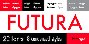 The fifty best-selling typefaces at MyFonts, as reported by them on October 31, 2019: #1 Gilroy (Radomir Tinkov), #2 Neue Helvetica (Linotype), #3 Helvetica Now (Monotype), #4 Avenir (Linotype), #5 Avenir Next (Linotype), #6 FF DIN (FontFont), #7 Cera Pro (TypeMates), #8 TT Norms Pro (TypeType), #9 Neue Haas Grotesk (Linotype), #10 ITC Avant Garde Gothic (ITC), #11 Univers (Linotype), #12 Proxima Nova (Mark Simonson), #13 FF Mark (FontFont), #14 DIN Next (Linotype), #15 Recoleta (Latinotype), #16 Brandon Grotesque (HVD Fonts), #17 Mont (Fontfabric), #18 TT Commons (TypeType), #19 Futura (Linotype), #20 Sofia Pro (Mostardesign), #21 Neue Haas Unica (Linotype), #22 Frutiger (Linotype), #23 Helvetica (Linotype), #24 TT Supermolot Neue (TypeType), #25 Futura PT (ParaType), #26 TT Interphases (TypeType), #27 Nexa (Fontfabric), #28 Intro (Fontfabric), #29 Silk Serif (SilkType), #30 Brandon Text (HVD Fonts), #31 Futura (Bitstream), #32 Noah (Fontfabric), #33 Campton (Rene Bieder), #34 Axiforma (Kastelov), #35 Tazugane Gothic (Monotype), #36 Bebas Neue Pro (Dharma Type), #37 Larsseit (Type Dynamic), #38 PF DIN Text (Parachute), #39 Trade Gothic (Linotype), #40 Gill Sans (Monotype), #41 Rockwell (Monotype), #42 Myriad Pro (Adobe), #43 Jazmin (Latinotype), #44 Averta (Intelligent Design), #45 Volte (Indian Type Foundry), #46 Neuzeit Grotesk (URW), #47 Blacker Pro (Zetafonts), #48 Neue Plak (Monotype), #49 Panton (Fontfabric), #50 Avenir Arabic (Linotype). [Google]
[More] ⦿
The fifty best-selling typefaces at MyFonts, as reported by them on October 31, 2019: #1 Gilroy (Radomir Tinkov), #2 Neue Helvetica (Linotype), #3 Helvetica Now (Monotype), #4 Avenir (Linotype), #5 Avenir Next (Linotype), #6 FF DIN (FontFont), #7 Cera Pro (TypeMates), #8 TT Norms Pro (TypeType), #9 Neue Haas Grotesk (Linotype), #10 ITC Avant Garde Gothic (ITC), #11 Univers (Linotype), #12 Proxima Nova (Mark Simonson), #13 FF Mark (FontFont), #14 DIN Next (Linotype), #15 Recoleta (Latinotype), #16 Brandon Grotesque (HVD Fonts), #17 Mont (Fontfabric), #18 TT Commons (TypeType), #19 Futura (Linotype), #20 Sofia Pro (Mostardesign), #21 Neue Haas Unica (Linotype), #22 Frutiger (Linotype), #23 Helvetica (Linotype), #24 TT Supermolot Neue (TypeType), #25 Futura PT (ParaType), #26 TT Interphases (TypeType), #27 Nexa (Fontfabric), #28 Intro (Fontfabric), #29 Silk Serif (SilkType), #30 Brandon Text (HVD Fonts), #31 Futura (Bitstream), #32 Noah (Fontfabric), #33 Campton (Rene Bieder), #34 Axiforma (Kastelov), #35 Tazugane Gothic (Monotype), #36 Bebas Neue Pro (Dharma Type), #37 Larsseit (Type Dynamic), #38 PF DIN Text (Parachute), #39 Trade Gothic (Linotype), #40 Gill Sans (Monotype), #41 Rockwell (Monotype), #42 Myriad Pro (Adobe), #43 Jazmin (Latinotype), #44 Averta (Intelligent Design), #45 Volte (Indian Type Foundry), #46 Neuzeit Grotesk (URW), #47 Blacker Pro (Zetafonts), #48 Neue Plak (Monotype), #49 Panton (Fontfabric), #50 Avenir Arabic (Linotype). [Google]
[More] ⦿
|
MyFonts: Bestsellers for November 2020
|
 The fifty best-selling typefaces at MyFonts, as reported by them on November 1, 2020: #1 Futura Now (Monotype), #2 Cerebri Sans (Hanken Design Co.), #3 Neue Helvetica (Linotype), #4 Gilroy (Radomir Tinkov), #5 Avenir Next (Linotype), #6 Helvetica (Linotype), #7 Helvetica Now (Monotype), #8 TT Norms Pro (TypeType), #9 Avenir (Linotype), #10 FF DIN (FontFont), #11 Nexa (Fontfabric), #12 Campton (Rene Bieder), #13 Brandon Grotesque (HVD Fonts), #14 Sofia Pro (Mostardesign), #15 Resolve Sans (Fenotype), #16 FF Mark (FontFont), #17 Mont (Fontfabric), #18 Proxima Nova (Mark Simonson), #19 TT Ramillas (TypeType), #20 Univers (Linotype), #21 Cera Pro (TypeMates), #22 Recoleta (Latinotype), #23 ITC Avant Garde Gothic (ITC), #24 Galano Grotesque (Rene Bieder), #25 Prelo Slab (DSType), #26 Futura PT (ParaType), #27 DIN Next (Linotype), #28 TT Commons (TypeType), #29 Futura (Linotype), #30 Trade Gothic (Linotype), #31 Aestetico (Latinotype), #32 Neue Haas Unica (Linotype), #33 Larken (EllenLuff), #34 Neue Haas Grotesk (Linotype), #35 Juana (Latinotype), #36 Axiforma (Kastelov), #37 Neue Frutiger (Linotype), #38 Panton (Fontfabric), #39 Frutiger (Linotype), #40 Anguita Sans (Latinotype), #41 Moneta (Santi Rey), #42 Century Gothic (Monotype), #43 Rotunda (TipoType), #44 Bebas Neue Pro (Dharma Type), #45 Trade Gothic Next (Linotype), #46 Quincy CF (Connary Fagen), #47 Filson Pro (Mostardesign), #48 Brandon Text (HVD Fonts), #49 Macklin (Monotype), #50 Amsi Pro (Stawix). [Google]
[More] ⦿
The fifty best-selling typefaces at MyFonts, as reported by them on November 1, 2020: #1 Futura Now (Monotype), #2 Cerebri Sans (Hanken Design Co.), #3 Neue Helvetica (Linotype), #4 Gilroy (Radomir Tinkov), #5 Avenir Next (Linotype), #6 Helvetica (Linotype), #7 Helvetica Now (Monotype), #8 TT Norms Pro (TypeType), #9 Avenir (Linotype), #10 FF DIN (FontFont), #11 Nexa (Fontfabric), #12 Campton (Rene Bieder), #13 Brandon Grotesque (HVD Fonts), #14 Sofia Pro (Mostardesign), #15 Resolve Sans (Fenotype), #16 FF Mark (FontFont), #17 Mont (Fontfabric), #18 Proxima Nova (Mark Simonson), #19 TT Ramillas (TypeType), #20 Univers (Linotype), #21 Cera Pro (TypeMates), #22 Recoleta (Latinotype), #23 ITC Avant Garde Gothic (ITC), #24 Galano Grotesque (Rene Bieder), #25 Prelo Slab (DSType), #26 Futura PT (ParaType), #27 DIN Next (Linotype), #28 TT Commons (TypeType), #29 Futura (Linotype), #30 Trade Gothic (Linotype), #31 Aestetico (Latinotype), #32 Neue Haas Unica (Linotype), #33 Larken (EllenLuff), #34 Neue Haas Grotesk (Linotype), #35 Juana (Latinotype), #36 Axiforma (Kastelov), #37 Neue Frutiger (Linotype), #38 Panton (Fontfabric), #39 Frutiger (Linotype), #40 Anguita Sans (Latinotype), #41 Moneta (Santi Rey), #42 Century Gothic (Monotype), #43 Rotunda (TipoType), #44 Bebas Neue Pro (Dharma Type), #45 Trade Gothic Next (Linotype), #46 Quincy CF (Connary Fagen), #47 Filson Pro (Mostardesign), #48 Brandon Text (HVD Fonts), #49 Macklin (Monotype), #50 Amsi Pro (Stawix). [Google]
[More] ⦿
|
MyFonts: Bestsellers for November 2021
|
 The fifty best-selling typefaces at MyFonts, as reported by them on October 31, 2021: #1 Neue Helvetica (Linotype), #2 Gilroy (Radomir Tinkov), #3 TT Norms Pro (TypeType), #4 Proxima Nova (Mark Simonson), #5 Sofia Pro (Mostardesign), #6 Helvetica Now (Monotype), #7 Avenir (Linotype), #8 Avenir Next (Linotype), #9 FF DIN (FontFont), #10 Helvetica (Linotype), #11 Univers (Linotype), #12 FF Mark (FontFont), #13 Cera Pro (TypeMates), #14 Brandon Grotesque (HVD Fonts), #15 ITC Avant Garde Gothic (ITC), #16 DIN Next (Linotype), #17 Mont (Fontfabric), #18 Recoleta (Latinotype), #19 Nexa (Fontfabric), #20 Frutiger (Linotype), #21 Larken (EllenLuff), #22 Coco Gothic Pro (Zetafonts), #23 Tazugane Gothic (Monotype), #24 TT Commons Pro (TypeType), #25 Axiforma (Kastelov), #26 Neue Haas Grotesk (Linotype), #27 Tabac Glam (Suitcase Type Foundry), #28 ITC Clearface (ITC), #29 Geogrotesque Sharp (Emtype Foundry), #30 Galano Grotesque (Rene Bieder), #31 Futura PT (ParaType), #32 Futura (Linotype), #33 Trade Gothic (Linotype), #34 Intro (Fontfabric), #35 Rebrand (Latinotype), #36 Albra (BumbumType), #37 Gazpacho (Santi Rey), #38 Flexible (Art Grootfontein), #39 Campton (Rene Bieder), #40 TT Hoves (TypeType), #41 Avenir Next World (Linotype), #42 Cocogoose Pro (Zetafonts), #43 Arboria (Type-o-Tones), #44 Century Gothic (Monotype), #45 TT Travels Next (TypeType), #46 Panton (Fontfabric), #47 Silk Serif (SilkType), #48 Averta (Intelligent Design), #49 Faktum (Rene Bieder), #50 Qanelas Soft (Radomir Tinkov). [Google]
[More] ⦿
The fifty best-selling typefaces at MyFonts, as reported by them on October 31, 2021: #1 Neue Helvetica (Linotype), #2 Gilroy (Radomir Tinkov), #3 TT Norms Pro (TypeType), #4 Proxima Nova (Mark Simonson), #5 Sofia Pro (Mostardesign), #6 Helvetica Now (Monotype), #7 Avenir (Linotype), #8 Avenir Next (Linotype), #9 FF DIN (FontFont), #10 Helvetica (Linotype), #11 Univers (Linotype), #12 FF Mark (FontFont), #13 Cera Pro (TypeMates), #14 Brandon Grotesque (HVD Fonts), #15 ITC Avant Garde Gothic (ITC), #16 DIN Next (Linotype), #17 Mont (Fontfabric), #18 Recoleta (Latinotype), #19 Nexa (Fontfabric), #20 Frutiger (Linotype), #21 Larken (EllenLuff), #22 Coco Gothic Pro (Zetafonts), #23 Tazugane Gothic (Monotype), #24 TT Commons Pro (TypeType), #25 Axiforma (Kastelov), #26 Neue Haas Grotesk (Linotype), #27 Tabac Glam (Suitcase Type Foundry), #28 ITC Clearface (ITC), #29 Geogrotesque Sharp (Emtype Foundry), #30 Galano Grotesque (Rene Bieder), #31 Futura PT (ParaType), #32 Futura (Linotype), #33 Trade Gothic (Linotype), #34 Intro (Fontfabric), #35 Rebrand (Latinotype), #36 Albra (BumbumType), #37 Gazpacho (Santi Rey), #38 Flexible (Art Grootfontein), #39 Campton (Rene Bieder), #40 TT Hoves (TypeType), #41 Avenir Next World (Linotype), #42 Cocogoose Pro (Zetafonts), #43 Arboria (Type-o-Tones), #44 Century Gothic (Monotype), #45 TT Travels Next (TypeType), #46 Panton (Fontfabric), #47 Silk Serif (SilkType), #48 Averta (Intelligent Design), #49 Faktum (Rene Bieder), #50 Qanelas Soft (Radomir Tinkov). [Google]
[More] ⦿
|
MyFonts: Bestsellers for October 2012
|
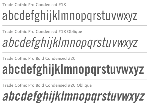 The fifty best-selling typefaces at MyFonts, as reported by them on October 1, 2012: #1: Brandon Grotesque (HVD Fonts), #2: Proxima Nova (Mark Simonson), #3: Futura (Bitstream), #4: Helvetica Neue (Adobe), #5: Museo Sans (exljbris), #6: Bombshell Pro (Emily Lime), #7: Geogrotesque (Emtype Foundry), #8: Interstate (Font Bureau), #9: Intro (Fontfabric), #10: Carolyna Pro Black (Emily Lime), #11: Veneer (Yellow Design Studio), #12: Museo Slab (exljbris), #13: Adelle (TypeTogether), #14: Pluto Sans (HVD Fonts), #15: Sancoale Slab (insigne), #16: Hipster Script Pro (Sudtipos), #17: Akzidenz-Grotesk BE (Berthold), #18: PF Din Text Pro (Parachute), #19: Frutiger (Adobe), #20: Pluto (HVD Fonts), #21: Benton Sans (Font Bureau), #22: Peoni Pro (Emily Lime), #23: Thirsty Script (Yellow Design Studio), #24: Trade Gothic (Linotype), #25: Clarendon (Bitstream), #26: Univers (Linotype), #27: Andes Condensed (Latinotype), #28: Museo Sans Rounded (exljbris), #29: Gesta (Rui Abreu), #30: Populaire (PintassilgoPrints), #31: Ride my Bike (Latinotype), #32: Museo (exljbris), #33: Aire (Lián Types), #34: Vermandois (Magpie Paper Works), #35: Flexo (Durotype), #36: Avenir (Linotype), #37: Narziss (Hubert Jocham Type), #38: Klavika (Process Type Foundry), #39: Mishka (Fenotype), #40: Clio Condensed (LeType), #41: Alright Sans (Okay Type), #42: ITC Avant Garde Gothic (ITC), #43: Almibar (Corradine Fonts), #44: Swiss 721 (Bitstream), #45: Neo sans (Monotype Imaging), #46: Diamonds (HVD Fonts), #47: News Gothic (Bitstream), #48: Myriad Pro (Adobe), #49: Alda (Emigre), #50: AG Book Pro (Berthold).
 The main dishes served up this month are grotesks and other sans typefaces. Brandon Grotesque and Proxima Nova have exchanged the top two places again. It is quite amazing how much food is offered on fifty-year old plates, like Futura (in #3), Helvetica Neue (in #4), Akzidenz Grotesk (in #17), Trade Gothic (in #24), Clarendon (in #25---this one is served on a hundred year-old antique), Univers (in #26, still a decade away from 50), Swiss 721 (in #44), and News Gothic (in #48, in hundred and three-year old bentonware). There is still enough on the menu for a script sugar high, with Bombshell Pro in #6 as main dessert. I feel like a mini-surge of slabs is peeking out from underneath the ossobucco---Museo Slab (#12), Adelle (#13), Sancoale Slab (#15), and Clarendon (#25). The plain carpaccios today consist of the simple but successful office sans typefaces like Clio Condensed from LeType (#40), Flexo from Durotype (#35) and the well-known Klavika (#38), all closely related to each other. [Google]
[More] ⦿
|
MyFonts: Bestsellers for October 2013
|
 The fifty best-selling typefaces at MyFonts, as reported by them on October 1, 2013: #1: Charcuterie (Laura Worthington), #2: Proxima Nova (Mark Simonson), #3: Brandon Grotesque (HVD Fonts), #4: Cantoni (Debi Sementelli Type Foundry), #5: Avenir (Linotype), #6: Helvetica Neue (Linotype), #7: Metro Nova (Linotype), #8: Museo Sans (exljbris), #9: Helvetica Neue LT Std (Adobe), #10: Thirsty Rough (Yellow Design Studio), #11: Bombshell Pro (Emily Lime), #12: FF DIN (FontFont), #13: Trade Gothic (Linotype), #14: DIN Next (Linotype), #15: Univers (Linotype), #16: Interstate (Font Bureau), #17: Brandon Text (HVD Fonts), #18: Carolyna Pro Black (Emily Lime), #19: Futura (Bitstream), #20: Core Circus (S-Core), #21: Geogrotesque (Emtype Foundry), #22: Trend (Latinotype), #23: Neo sans (Monotype Imaging), #24: Pluto (HVD Fonts), #25: Museo Slab (exljbris), #26: Veneer (Yellow Design Studio), #27: Alright Sans (Okay Type), #28: Avenir Next Pro (Linotype), #29: Benton Sans (Font Bureau), #30: Frutiger (Linotype), #31: Nexa (Fontfabric), #32: Voyage (Fenotype), #33: FF Meta (FontFont), #34: Museo Sans Rounded (exljbris), #35: Akzidenz-Grotesk (Berthold), #36: Hipster Script Pro (Sudtipos), #37: Centrale Sans (Typedepot), #38: ITC Avant Garde Gothic (ITC), #39: Hurme Geometric Sans No.4 (Hurme Design), #40: Frutiger (Adobe), #41: Intro (Fontfabric), #42: PT Sans Pro (ParaType), #43: Gill Sans (Monotype Imaging), #44: Brand (Lián Types), #45: Thirsty Script (Yellow Design Studio), #46: Jacques & Gilles (Emily Lime), #47: Futura (Adobe), #48: Freight Sans Pro (GarageFonts), #49: Asterism (Great Lakes Lettering), #50: Akzidenz-Grotesk BQ (Berthold). [Google]
[More] ⦿
The fifty best-selling typefaces at MyFonts, as reported by them on October 1, 2013: #1: Charcuterie (Laura Worthington), #2: Proxima Nova (Mark Simonson), #3: Brandon Grotesque (HVD Fonts), #4: Cantoni (Debi Sementelli Type Foundry), #5: Avenir (Linotype), #6: Helvetica Neue (Linotype), #7: Metro Nova (Linotype), #8: Museo Sans (exljbris), #9: Helvetica Neue LT Std (Adobe), #10: Thirsty Rough (Yellow Design Studio), #11: Bombshell Pro (Emily Lime), #12: FF DIN (FontFont), #13: Trade Gothic (Linotype), #14: DIN Next (Linotype), #15: Univers (Linotype), #16: Interstate (Font Bureau), #17: Brandon Text (HVD Fonts), #18: Carolyna Pro Black (Emily Lime), #19: Futura (Bitstream), #20: Core Circus (S-Core), #21: Geogrotesque (Emtype Foundry), #22: Trend (Latinotype), #23: Neo sans (Monotype Imaging), #24: Pluto (HVD Fonts), #25: Museo Slab (exljbris), #26: Veneer (Yellow Design Studio), #27: Alright Sans (Okay Type), #28: Avenir Next Pro (Linotype), #29: Benton Sans (Font Bureau), #30: Frutiger (Linotype), #31: Nexa (Fontfabric), #32: Voyage (Fenotype), #33: FF Meta (FontFont), #34: Museo Sans Rounded (exljbris), #35: Akzidenz-Grotesk (Berthold), #36: Hipster Script Pro (Sudtipos), #37: Centrale Sans (Typedepot), #38: ITC Avant Garde Gothic (ITC), #39: Hurme Geometric Sans No.4 (Hurme Design), #40: Frutiger (Adobe), #41: Intro (Fontfabric), #42: PT Sans Pro (ParaType), #43: Gill Sans (Monotype Imaging), #44: Brand (Lián Types), #45: Thirsty Script (Yellow Design Studio), #46: Jacques & Gilles (Emily Lime), #47: Futura (Adobe), #48: Freight Sans Pro (GarageFonts), #49: Asterism (Great Lakes Lettering), #50: Akzidenz-Grotesk BQ (Berthold). [Google]
[More] ⦿
|
MyFonts: Bestsellers for October 2014
|
 The fifty best-selling typefaces at MyFonts, as reported by them on October 2, 2014: #1 Proxima Nova (Mark Simonson), #2 Brandon Grotesque (HVD Fonts), #3 Helvetica Neue (Linotype), #4 Avenir (Linotype), #5 Nexa Rust (Fontfabric), #6 Brix Sans (HVD Fonts), #7 FF DIN (FontFont), #8 Harman (Ahmet Altun), #9 Avenir Next Pro (Linotype), #10 DIN Next (Linotype), #11 Interstate (Font Bureau), #12 Bombshell Pro (Emily Lime), #13 Trade Gothic (Linotype), #14 Museo Sans (exljbris), #15 Brandon Text (HVD Fonts), #16 Univers (Linotype), #17 Velino Text (DSType), #18 Uni Sans (Fontfabric), #19 Voltage (Laura Worthington), #20 Glober (Fontfabric), #21 Garden (Los Andes), #22 ITC Avant Garde Gothic (ITC), #23 NewJune (Hubert Jocham Type), #24 Intro (Fontfabric), #25 Carolyna Pro Black (Emily Lime), #26 Museo Slab (exljbris), #27 Neue Haas Grotesk (Linotype), #28 Frutiger (Linotype), #29 Effra (Dalton Maag), #30 Alright Sans (Okay Type), #31 Brandon Printed (HVD Fonts), #32 True North (Cultivated Mind), #33 Tolyer (Typesketchbook), #34 Chevin Pro (G-Type), #35 Futura (Bitstream), #36 Geogrotesque (Emtype Foundry), #37 Cantoni (Debi Sementelli Type Foundry), #38 Thirsty Rough (Yellow Design Studio), #39 Neo Sans (Monotype), #40 Adorn (Laura Worthington), #41 Jacques + Gilles (Emily Lime), #42 Eveleth (Yellow Design Studio), #43 Veneer (Yellow Design Studio), #44 PF Din Text (Parachute), #45 Nexa (Fontfabric), #46 Darwin (Los Andes), #47 Helvetica Neue LT Std (Adobe), #48 Harriet (Okay Type), #49 Miller (Font Bureau), #50 Mrs Eaves (Emigre). [Google]
[More] ⦿
The fifty best-selling typefaces at MyFonts, as reported by them on October 2, 2014: #1 Proxima Nova (Mark Simonson), #2 Brandon Grotesque (HVD Fonts), #3 Helvetica Neue (Linotype), #4 Avenir (Linotype), #5 Nexa Rust (Fontfabric), #6 Brix Sans (HVD Fonts), #7 FF DIN (FontFont), #8 Harman (Ahmet Altun), #9 Avenir Next Pro (Linotype), #10 DIN Next (Linotype), #11 Interstate (Font Bureau), #12 Bombshell Pro (Emily Lime), #13 Trade Gothic (Linotype), #14 Museo Sans (exljbris), #15 Brandon Text (HVD Fonts), #16 Univers (Linotype), #17 Velino Text (DSType), #18 Uni Sans (Fontfabric), #19 Voltage (Laura Worthington), #20 Glober (Fontfabric), #21 Garden (Los Andes), #22 ITC Avant Garde Gothic (ITC), #23 NewJune (Hubert Jocham Type), #24 Intro (Fontfabric), #25 Carolyna Pro Black (Emily Lime), #26 Museo Slab (exljbris), #27 Neue Haas Grotesk (Linotype), #28 Frutiger (Linotype), #29 Effra (Dalton Maag), #30 Alright Sans (Okay Type), #31 Brandon Printed (HVD Fonts), #32 True North (Cultivated Mind), #33 Tolyer (Typesketchbook), #34 Chevin Pro (G-Type), #35 Futura (Bitstream), #36 Geogrotesque (Emtype Foundry), #37 Cantoni (Debi Sementelli Type Foundry), #38 Thirsty Rough (Yellow Design Studio), #39 Neo Sans (Monotype), #40 Adorn (Laura Worthington), #41 Jacques + Gilles (Emily Lime), #42 Eveleth (Yellow Design Studio), #43 Veneer (Yellow Design Studio), #44 PF Din Text (Parachute), #45 Nexa (Fontfabric), #46 Darwin (Los Andes), #47 Helvetica Neue LT Std (Adobe), #48 Harriet (Okay Type), #49 Miller (Font Bureau), #50 Mrs Eaves (Emigre). [Google]
[More] ⦿
|
MyFonts: Bestsellers for October 2015
|
 The fifty best-selling typefaces at MyFonts, as reported by them on October 1, 2015: #1 FF DIN (FontFont), #2 Proxima Nova (Mark Simonson), #3 Brandon Grotesque (HVD Fonts), #4 Helvetica Neue (Linotype), #5 Avenir (Linotype), #6 Brandon Text (HVD Fonts), #7 Univers (Linotype), #8 Trade Gothic (Linotype), #9 Panton (Fontfabric), #10 Neue Haas Grotesk (Linotype), #11 FF Meta (FontFont), #12 Museo Sans (exljbris), #13 Freeland (Trial by Cupcakes), #14 Nexa Rust (Fontfabric), #15 Effra (Dalton Maag), #16 Interstate (Font Bureau), #17 Campton (Rene Bieder), #18 Futura (Bitstream), #19 Futura PT (ParaType), #20 ITC Avant Garde Gothic (ITC), #21 Avenir Next Pro (Linotype), #22 Gill Sans (Monotype), #23 Beloved (Laura Worthington), #24 Frutiger (Linotype), #25 Noyh (Typesketchbook), #26 Blend (Typesenses), #27 Larsseit (Type Dynamic), #28 FF Kievit (FontFont), #29 Akzidenz-Grotesk BE (Berthold), #30 Brix Sans (HVD Fonts), #31 Nexa (Fontfabric), #32 SantElia Script (Yellow Design Studio), #33 Bombshell Pro (Emily Lime), #34 DIN Next (Linotype), #35 Geogrotesque (Emtype Foundry), #36 Alright Sans (Okay Type), #37 Muller (Fontfabric), #38 Sofia Pro (Mostardesign), #39 Museo Slab (exljbris), #40 Helvetica Neue LT Std (Adobe), #41 Neo Sans (Monotype), #42 Intro (Fontfabric), #43 Aktiv Grotesk (Dalton Maag), #44 Futura (Linotype), #45 Myriad Pro (Adobe), #46 Breakers (Kostic), #47 FF Clan OT (FontFont), #48 Galano Grotesque (Rene Bieder), #49 Veneer (Yellow Design Studio), #50 Impact (Monotype). [Google]
[More] ⦿
The fifty best-selling typefaces at MyFonts, as reported by them on October 1, 2015: #1 FF DIN (FontFont), #2 Proxima Nova (Mark Simonson), #3 Brandon Grotesque (HVD Fonts), #4 Helvetica Neue (Linotype), #5 Avenir (Linotype), #6 Brandon Text (HVD Fonts), #7 Univers (Linotype), #8 Trade Gothic (Linotype), #9 Panton (Fontfabric), #10 Neue Haas Grotesk (Linotype), #11 FF Meta (FontFont), #12 Museo Sans (exljbris), #13 Freeland (Trial by Cupcakes), #14 Nexa Rust (Fontfabric), #15 Effra (Dalton Maag), #16 Interstate (Font Bureau), #17 Campton (Rene Bieder), #18 Futura (Bitstream), #19 Futura PT (ParaType), #20 ITC Avant Garde Gothic (ITC), #21 Avenir Next Pro (Linotype), #22 Gill Sans (Monotype), #23 Beloved (Laura Worthington), #24 Frutiger (Linotype), #25 Noyh (Typesketchbook), #26 Blend (Typesenses), #27 Larsseit (Type Dynamic), #28 FF Kievit (FontFont), #29 Akzidenz-Grotesk BE (Berthold), #30 Brix Sans (HVD Fonts), #31 Nexa (Fontfabric), #32 SantElia Script (Yellow Design Studio), #33 Bombshell Pro (Emily Lime), #34 DIN Next (Linotype), #35 Geogrotesque (Emtype Foundry), #36 Alright Sans (Okay Type), #37 Muller (Fontfabric), #38 Sofia Pro (Mostardesign), #39 Museo Slab (exljbris), #40 Helvetica Neue LT Std (Adobe), #41 Neo Sans (Monotype), #42 Intro (Fontfabric), #43 Aktiv Grotesk (Dalton Maag), #44 Futura (Linotype), #45 Myriad Pro (Adobe), #46 Breakers (Kostic), #47 FF Clan OT (FontFont), #48 Galano Grotesque (Rene Bieder), #49 Veneer (Yellow Design Studio), #50 Impact (Monotype). [Google]
[More] ⦿
|
MyFonts: Bestsellers for October 2016
|
 The fifty best-selling typefaces at MyFonts, as reported by them on October 1, 2016: #1 Helvetica Neue (Linotype), #2 Brother 1816 (TipoType), #3 FF DIN (FontFont), #4 Proxima Nova (Mark Simonson), #5 Brandon Grotesque (HVD Fonts), #6 Univers (Linotype), #7 Avenir (Linotype), #8 Avenir Next Pro (Linotype), #9 FF Mark (FontFont), #10 TT Lakes (TypeType), #11 Futura PT (ParaType), #12 Dragonflight Pro (Fontforecast), #13 Trade Gothic (Linotype), #14 Frontage Condensed (Juri Zaech), #15 Gilroy (Radomir Tinkov), #16 ITC New Baskerville (ITC), #17 PhotoWall (DearType), #18 DIN Next (Linotype), #19 Nexa Rust (Fontfabric), #20 Slate (Monotype), #21 Assemblage (Latinotype), #22 Futura (Bitstream), #23 Brandon Text (HVD Fonts), #24 Frutiger (Linotype), #25 Amsi Pro (Stawix), #26 Cera (TypeMates), #27 Nexa (Fontfabric), #28 Museo Sans (exljbris), #29 Fuse V.2 (W Foundry), #30 ITC Avant Garde Gothic (ITC), #31 Guess (DearType), #32 Campton (Rene Bieder), #33 Viva Beautiful (Cultivated Mind), #34 Adelle (TypeTogether), #35 Hurme Geometric Sans 4 (Hurme), #36 Freight Sans Pro (GarageFonts), #37 Sofia Pro (Mostardesign), #38 Intro (Fontfabric), #39 Inbox (Indian Type Foundry), #40 Akzidenz-Grotesk BE (Berthold), #41 Gill Sans (Monotype), #42 Panton (Fontfabric), #43 Effra (Dalton Maag), #44 BeachBar (DearType), #45 Neue Haas Unica (Linotype), #46 Bikini Season (Los Andes), #47 Colosseum (Alan Meeks), #48 Lifehack (DearType), #49 Manus (JOEBOB graphics), #50 Blend (Typesenses). [Google]
[More] ⦿
The fifty best-selling typefaces at MyFonts, as reported by them on October 1, 2016: #1 Helvetica Neue (Linotype), #2 Brother 1816 (TipoType), #3 FF DIN (FontFont), #4 Proxima Nova (Mark Simonson), #5 Brandon Grotesque (HVD Fonts), #6 Univers (Linotype), #7 Avenir (Linotype), #8 Avenir Next Pro (Linotype), #9 FF Mark (FontFont), #10 TT Lakes (TypeType), #11 Futura PT (ParaType), #12 Dragonflight Pro (Fontforecast), #13 Trade Gothic (Linotype), #14 Frontage Condensed (Juri Zaech), #15 Gilroy (Radomir Tinkov), #16 ITC New Baskerville (ITC), #17 PhotoWall (DearType), #18 DIN Next (Linotype), #19 Nexa Rust (Fontfabric), #20 Slate (Monotype), #21 Assemblage (Latinotype), #22 Futura (Bitstream), #23 Brandon Text (HVD Fonts), #24 Frutiger (Linotype), #25 Amsi Pro (Stawix), #26 Cera (TypeMates), #27 Nexa (Fontfabric), #28 Museo Sans (exljbris), #29 Fuse V.2 (W Foundry), #30 ITC Avant Garde Gothic (ITC), #31 Guess (DearType), #32 Campton (Rene Bieder), #33 Viva Beautiful (Cultivated Mind), #34 Adelle (TypeTogether), #35 Hurme Geometric Sans 4 (Hurme), #36 Freight Sans Pro (GarageFonts), #37 Sofia Pro (Mostardesign), #38 Intro (Fontfabric), #39 Inbox (Indian Type Foundry), #40 Akzidenz-Grotesk BE (Berthold), #41 Gill Sans (Monotype), #42 Panton (Fontfabric), #43 Effra (Dalton Maag), #44 BeachBar (DearType), #45 Neue Haas Unica (Linotype), #46 Bikini Season (Los Andes), #47 Colosseum (Alan Meeks), #48 Lifehack (DearType), #49 Manus (JOEBOB graphics), #50 Blend (Typesenses). [Google]
[More] ⦿
|
MyFonts: Bestsellers for October 2017
|
The fifty best-selling typefaces at MyFonts, as reported by them on October 1, 2017: #1 FF DIN (FontFont), #2 Proxima Nova (Mark Simonson), #3 Brandon Grotesque (HVD Fonts), #4 Avenir (Linotype), #5 Isidora Sans (Latinotype), #6 Helvetica Neue (Linotype), #7 Gilroy (Radomir Tinkov), #8 Avenir Next Pro (Linotype), #9 Ciutadella Rounded (Emtype Foundry), #10 Univers (Linotype), #11 Colby (Jason Vandenberg), #12 Scotch (Positype), #13 Cera Pro (TypeMates), #14 Frutiger (Linotype), #15 Praktika (Fenotype), #16 Amsi Pro (Stawix), #17 Trade Gothic (Linotype), #18 Nudista (Suitcase Type Foundry), #19 Museo Sans (Exljbris), #20 DIN Next (Linotype), #21 TT Norms (TypeType), #22 Blog Script (Sudtipos), #23 Balford (Ilham Herry), #24 Brandon Text (HVD Fonts), #25 Lovingly Friends (My Creative Land), #26 ITC Avant Garde Gothic (ITC), #27 Neue Haas Grotesk (Linotype), #28 FF Mark (FontFont), #29 Sofia Pro (Mostardesign), #30 Futura (Linotype), #31 Brown Pro (ShinnType), #32 Gill Sans (Monotype), #33 Intro (Fontfabric), #34 ITC Franklin Gothic (ITC), #35 Muller (Fontfabric), #36 Aktiv Grotesk (Dalton Maag), #37 Nexa (Fontfabric), #38 Campton (Rene Bieder), #39 FF Good Pro (FontFont), #40 Moments (DearType), #41 Helvetica Neue LT Std (Adobe), #42 Nexa Rust (Fontfabric), #43 Kapra Neue (Typoforge Studio), #44 Helvetica (Linotype), #45 Museo Sans Rounded (Exljbris), #46 Glober (Fontfabric), #47 Akzidenz-Grotesk Pro (Berthold), #48 PhotoWall (DearType), #49 Akzidenz-Grotesk BE (Berthold), #50 Geogrotesque (Emtype Foundry). [Google]
[More] ⦿
|
MyFonts: Bestsellers for October 2018
|
 The fifty best-selling typefaces at MyFonts, as reported by them on October 1, 2018: #1 Univers (Linotype), #2 Neue Helvetica (Linotype), #3 Proxima Nova (Mark Simonson), #4 FF DIN (FontFont), #5 Avenir Next (Linotype), #6 Gilroy (Radomir Tinkov), #7 Brandon Grotesque (HVD Fonts), #8 Cera Pro (TypeMates), #9 Avenir (Linotype), #10 FF Mark (FontFont), #11 DIN Next (Linotype), #12 Campton (Rene Bieder), #13 TT Norms (TypeType), #14 TT Commons (TypeType), #15 Brandon Text (HVD Fonts), #16 ITC Avant Garde Gothic (ITC), #17 Lota Grotesque (Los Andes), #18 Futura PT (ParaType), #19 Trade Gothic (Linotype), #20 TT Rounds Neue (TypeType), #21 Frutiger (Linotype), #22 Univers Next (Linotype), #23 Trade Gothic Next (Linotype), #24 Recoleta (Latinotype), #25 Sofia Pro (Mostardesign), #26 Mont (Fontfabric), #27 Neue Haas Unica (Linotype), #28 Helvetica (Linotype), #29 Galano Grotesque (Rene Bieder), #30 Museo Sans (exljbris), #31 Tazugane Info (Monotype), #32 Multiple (Latinotype), #33 Neue Haas Grotesk (Linotype), #34 Monroe (Latinotype), #35 Nexa (Fontfabric), #36 Shentox (Emtype Foundry), #37 Futura (Linotype), #38 Intro Rust (Fontfabric), #39 Freight Sans Pro (GarageFonts), #40 Aktiv Grotesk (Dalton Maag), #41 FF Scala Sans (FontFont), #42 Turbinado (Aerotype), #43 Averta (Intelligent Design), #44 Authenia (Mika Melvas), #45 Larsseit (Type Dynamic), #46 Century Gothic (Monotype), #47 Klint (Linotype), #48 Intro (Fontfabric), #49 Sailec (Type Dynamic), #50 Panton (Fontfabric), [Google]
[More] ⦿
The fifty best-selling typefaces at MyFonts, as reported by them on October 1, 2018: #1 Univers (Linotype), #2 Neue Helvetica (Linotype), #3 Proxima Nova (Mark Simonson), #4 FF DIN (FontFont), #5 Avenir Next (Linotype), #6 Gilroy (Radomir Tinkov), #7 Brandon Grotesque (HVD Fonts), #8 Cera Pro (TypeMates), #9 Avenir (Linotype), #10 FF Mark (FontFont), #11 DIN Next (Linotype), #12 Campton (Rene Bieder), #13 TT Norms (TypeType), #14 TT Commons (TypeType), #15 Brandon Text (HVD Fonts), #16 ITC Avant Garde Gothic (ITC), #17 Lota Grotesque (Los Andes), #18 Futura PT (ParaType), #19 Trade Gothic (Linotype), #20 TT Rounds Neue (TypeType), #21 Frutiger (Linotype), #22 Univers Next (Linotype), #23 Trade Gothic Next (Linotype), #24 Recoleta (Latinotype), #25 Sofia Pro (Mostardesign), #26 Mont (Fontfabric), #27 Neue Haas Unica (Linotype), #28 Helvetica (Linotype), #29 Galano Grotesque (Rene Bieder), #30 Museo Sans (exljbris), #31 Tazugane Info (Monotype), #32 Multiple (Latinotype), #33 Neue Haas Grotesk (Linotype), #34 Monroe (Latinotype), #35 Nexa (Fontfabric), #36 Shentox (Emtype Foundry), #37 Futura (Linotype), #38 Intro Rust (Fontfabric), #39 Freight Sans Pro (GarageFonts), #40 Aktiv Grotesk (Dalton Maag), #41 FF Scala Sans (FontFont), #42 Turbinado (Aerotype), #43 Averta (Intelligent Design), #44 Authenia (Mika Melvas), #45 Larsseit (Type Dynamic), #46 Century Gothic (Monotype), #47 Klint (Linotype), #48 Intro (Fontfabric), #49 Sailec (Type Dynamic), #50 Panton (Fontfabric), [Google]
[More] ⦿
|
MyFonts: Bestsellers for October 2019
|
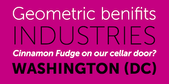 The fifty best-selling typefaces at MyFonts, as reported by them on September 30, 2019: #1 Gilroy (Radomir Tinkov), #2 Neue Helvetica (Linotype), #3 Avenir (Linotype), #4 FF Mark (FontFont), #5 FF DIN (FontFont), #6 Proxima Nova (Mark Simonson), #7 Helvetica Now (Monotype), #8 Cera Pro (TypeMates), #9 Avenir Next (Linotype), #10 Neuzeit Grotesk (URW), #11 Univers (Linotype), #12 TT Norms Pro (TypeType), #13 DIN Next (Linotype), #14 Brandon Grotesque (HVD Fonts), #15 VAG Rounded (Linotype), #16 Nexa (Fontfabric), #17 Silk Serif (SilkType), #18 TT Commons (TypeType), #19 Futura PT (ParaType), #20 Recoleta (Latinotype), #21 Helvetica (Linotype), #22 Trade Gothic (Linotype), #23 Avenir Arabic (Linotype), #24 Campton (Rene Bieder), #25 Futura (Linotype), #26 Mont (Fontfabric), #27 Sofia Pro (Mostardesign), #28 Axiforma (Kastelov), #29 Frutiger (Linotype), #30 Intro (Fontfabric), #31 ITC Avant Garde Gothic (ITC), #32 Eina (Extratype), #33 Brandon Text (HVD Fonts), #34 Neue Haas Grotesk (Linotype), #35 Tazugane Gothic (Monotype), #36 Syntax Next (Linotype), #37 Aktiv Grotesk (Dalton Maag), #38 Slate (Monotype), #39 Averta (Intelligent Design), #40 Trade Gothic Next (Linotype), #41 Neue Haas Unica (Linotype), #42 Bebas Neue Pro (Dharma Type), #43 Museo Sans (exljbris), #44 Galano Grotesque (Rene Bieder), #45 Univers Next (Linotype), #46 Geogrotesque (Emtype Foundry), #47 Univia Pro (Mostardesign), #48 Harmonia Sans (Monotype), #49 Seventies (Lian Types), #50 Larsseit (Type Dynamic). [Google]
[More] ⦿
The fifty best-selling typefaces at MyFonts, as reported by them on September 30, 2019: #1 Gilroy (Radomir Tinkov), #2 Neue Helvetica (Linotype), #3 Avenir (Linotype), #4 FF Mark (FontFont), #5 FF DIN (FontFont), #6 Proxima Nova (Mark Simonson), #7 Helvetica Now (Monotype), #8 Cera Pro (TypeMates), #9 Avenir Next (Linotype), #10 Neuzeit Grotesk (URW), #11 Univers (Linotype), #12 TT Norms Pro (TypeType), #13 DIN Next (Linotype), #14 Brandon Grotesque (HVD Fonts), #15 VAG Rounded (Linotype), #16 Nexa (Fontfabric), #17 Silk Serif (SilkType), #18 TT Commons (TypeType), #19 Futura PT (ParaType), #20 Recoleta (Latinotype), #21 Helvetica (Linotype), #22 Trade Gothic (Linotype), #23 Avenir Arabic (Linotype), #24 Campton (Rene Bieder), #25 Futura (Linotype), #26 Mont (Fontfabric), #27 Sofia Pro (Mostardesign), #28 Axiforma (Kastelov), #29 Frutiger (Linotype), #30 Intro (Fontfabric), #31 ITC Avant Garde Gothic (ITC), #32 Eina (Extratype), #33 Brandon Text (HVD Fonts), #34 Neue Haas Grotesk (Linotype), #35 Tazugane Gothic (Monotype), #36 Syntax Next (Linotype), #37 Aktiv Grotesk (Dalton Maag), #38 Slate (Monotype), #39 Averta (Intelligent Design), #40 Trade Gothic Next (Linotype), #41 Neue Haas Unica (Linotype), #42 Bebas Neue Pro (Dharma Type), #43 Museo Sans (exljbris), #44 Galano Grotesque (Rene Bieder), #45 Univers Next (Linotype), #46 Geogrotesque (Emtype Foundry), #47 Univia Pro (Mostardesign), #48 Harmonia Sans (Monotype), #49 Seventies (Lian Types), #50 Larsseit (Type Dynamic). [Google]
[More] ⦿
|
MyFonts: Bestsellers for October 2020
|
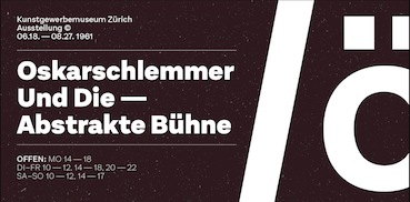 The fifty best-selling typefaces at MyFonts, as reported by them on September 30, 2020: #1 Gilroy (Radomir Tinkov), #2 Neue Helvetica (Linotype), #3 TT Norms Pro (TypeType), #4 Helvetica Now (Monotype), #5 DIN Next (Linotype), #6 Cera Pro (TypeMates), #7 Avenir (Linotype), #8 FF DIN (FontFont), #9 Sofia Pro (Mostardesign), #10 Brandon Grotesque (HVD Fonts), #11 Avenir Next (Linotype), #12 FF Mark (FontFont), #13 Mont (Fontfabric), #14 Nexa (Fontfabric), #15 Resolve Sans (Fenotype), #16 Effra (Dalton Maag), #17 Neue Haas Grotesk (Linotype), #18 Helvetica (Linotype), #19 Proxima Nova (Mark Simonson), #20 Aestetico (Latinotype), #21 Univers (Linotype), #22 ITC Avant Garde Gothic (ITC), #23 Recoleta (Latinotype), #24 Frutiger (Linotype), #25 Museo Sans (exljbris), #26 Larken (EllenLuff), #27 Tazugane Gothic (Monotype), #28 TT Commons (TypeType), #29 Linotype Didot (Linotype), #30 Campton (Rene Bieder), #31 Albra (BumbumType), #32 Trade Gothic (Linotype), #33 FF Meta (FontFont), #34 Axiforma (Kastelov), #35 Galano Grotesque (Rene Bieder), #36 Panton (Fontfabric), #37 Brandon Text (HVD Fonts), #38 Futura PT (ParaType), #39 Adelle Sans (TypeTogether), #40 Century Gothic (Monotype), #41 FF Clan (FontFont), #42 Adelle (TypeTogether), #43 Neue Haas Unica (Linotype), #44 Quincy CF (Connary Fagen), #45 Ginko (Monotype), #46 Intro (Fontfabric), #47 Faktum (Rene Bieder), #48 Franklin Gothic (URW Type Foundry), #49 Averta (Intelligent Design), #50 Silk Serif (SilkType). [Google]
[More] ⦿
The fifty best-selling typefaces at MyFonts, as reported by them on September 30, 2020: #1 Gilroy (Radomir Tinkov), #2 Neue Helvetica (Linotype), #3 TT Norms Pro (TypeType), #4 Helvetica Now (Monotype), #5 DIN Next (Linotype), #6 Cera Pro (TypeMates), #7 Avenir (Linotype), #8 FF DIN (FontFont), #9 Sofia Pro (Mostardesign), #10 Brandon Grotesque (HVD Fonts), #11 Avenir Next (Linotype), #12 FF Mark (FontFont), #13 Mont (Fontfabric), #14 Nexa (Fontfabric), #15 Resolve Sans (Fenotype), #16 Effra (Dalton Maag), #17 Neue Haas Grotesk (Linotype), #18 Helvetica (Linotype), #19 Proxima Nova (Mark Simonson), #20 Aestetico (Latinotype), #21 Univers (Linotype), #22 ITC Avant Garde Gothic (ITC), #23 Recoleta (Latinotype), #24 Frutiger (Linotype), #25 Museo Sans (exljbris), #26 Larken (EllenLuff), #27 Tazugane Gothic (Monotype), #28 TT Commons (TypeType), #29 Linotype Didot (Linotype), #30 Campton (Rene Bieder), #31 Albra (BumbumType), #32 Trade Gothic (Linotype), #33 FF Meta (FontFont), #34 Axiforma (Kastelov), #35 Galano Grotesque (Rene Bieder), #36 Panton (Fontfabric), #37 Brandon Text (HVD Fonts), #38 Futura PT (ParaType), #39 Adelle Sans (TypeTogether), #40 Century Gothic (Monotype), #41 FF Clan (FontFont), #42 Adelle (TypeTogether), #43 Neue Haas Unica (Linotype), #44 Quincy CF (Connary Fagen), #45 Ginko (Monotype), #46 Intro (Fontfabric), #47 Faktum (Rene Bieder), #48 Franklin Gothic (URW Type Foundry), #49 Averta (Intelligent Design), #50 Silk Serif (SilkType). [Google]
[More] ⦿
|
MyFonts: Bestsellers for October 2021
|
 The fifty best-selling typefaces at MyFonts, as reported by them on October 2, 2021: #1 Gilroy (Radomir Tinkov), #2 Neue Helvetica (Linotype), #3 Univers (Linotype), #4 TT Norms Pro (TypeType), #5 Sofia Pro (Mostardesign), #6 Proxima Nova (Mark Simonson), #7 Helvetica Now (Monotype), #8 Cera Pro (TypeMates), #9 Avenir (Linotype), #10 Axiforma (Kastelov), #11 Tazugane Gothic (Monotype), #12 ITC Avant Garde Gothic (ITC), #13 Avenir Next (Linotype), #14 FF Mark (FontFont), #15 Helvetica (Linotype), #16 Mont (Fontfabric), #17 Recoleta (Latinotype), #18 Eckhart (ROHH), #19 Frutiger (Linotype), #20 FF DIN (FontFont), #21 Neue Haas Unica (Linotype), #22 Nexa (Fontfabric), #23 Neue Haas Grotesk (Linotype), #24 DIN Next (Linotype), #25 Brandon Grotesque (HVD Fonts), #26 Brandon Text (HVD Fonts), #27 Galano Grotesque (Rene Bieder), #28 Coco Gothic (Zetafonts), #29 Gazpacho (Santi Rey), #30 Trade Gothic (Linotype), #31 Campton (Rene Bieder), #32 Neue Frutiger World (Monotype), #33 Corbert (The Northern Block), #34 Rebrand (Latinotype), #35 Freigeist (Rene Bieder), #36 Futura PT (ParaType), #37 Atyp (Suitcase Type Foundry), #38 Futura (Linotype), #39 Panton (Fontfabric), #40 Franklin Gothic (URW Type Foundry), #41 Eina (Extratype), #42 Urbane Rounded (Device), #43 Diodrum Arabic (Indian Type Foundry), #44 Swiss 721 (Bitstream), #45 TT Commons Pro (TypeType), #46 Lagom (Fenotype), #47 Albra (BumbumType), #48 Century Gothic (Monotype), #49 Intro (Fontfabric), #50 Ageo (Eko Bimantara). [Google]
[More] ⦿
The fifty best-selling typefaces at MyFonts, as reported by them on October 2, 2021: #1 Gilroy (Radomir Tinkov), #2 Neue Helvetica (Linotype), #3 Univers (Linotype), #4 TT Norms Pro (TypeType), #5 Sofia Pro (Mostardesign), #6 Proxima Nova (Mark Simonson), #7 Helvetica Now (Monotype), #8 Cera Pro (TypeMates), #9 Avenir (Linotype), #10 Axiforma (Kastelov), #11 Tazugane Gothic (Monotype), #12 ITC Avant Garde Gothic (ITC), #13 Avenir Next (Linotype), #14 FF Mark (FontFont), #15 Helvetica (Linotype), #16 Mont (Fontfabric), #17 Recoleta (Latinotype), #18 Eckhart (ROHH), #19 Frutiger (Linotype), #20 FF DIN (FontFont), #21 Neue Haas Unica (Linotype), #22 Nexa (Fontfabric), #23 Neue Haas Grotesk (Linotype), #24 DIN Next (Linotype), #25 Brandon Grotesque (HVD Fonts), #26 Brandon Text (HVD Fonts), #27 Galano Grotesque (Rene Bieder), #28 Coco Gothic (Zetafonts), #29 Gazpacho (Santi Rey), #30 Trade Gothic (Linotype), #31 Campton (Rene Bieder), #32 Neue Frutiger World (Monotype), #33 Corbert (The Northern Block), #34 Rebrand (Latinotype), #35 Freigeist (Rene Bieder), #36 Futura PT (ParaType), #37 Atyp (Suitcase Type Foundry), #38 Futura (Linotype), #39 Panton (Fontfabric), #40 Franklin Gothic (URW Type Foundry), #41 Eina (Extratype), #42 Urbane Rounded (Device), #43 Diodrum Arabic (Indian Type Foundry), #44 Swiss 721 (Bitstream), #45 TT Commons Pro (TypeType), #46 Lagom (Fenotype), #47 Albra (BumbumType), #48 Century Gothic (Monotype), #49 Intro (Fontfabric), #50 Ageo (Eko Bimantara). [Google]
[More] ⦿
|
MyFonts: Bestsellers for September 2012
|
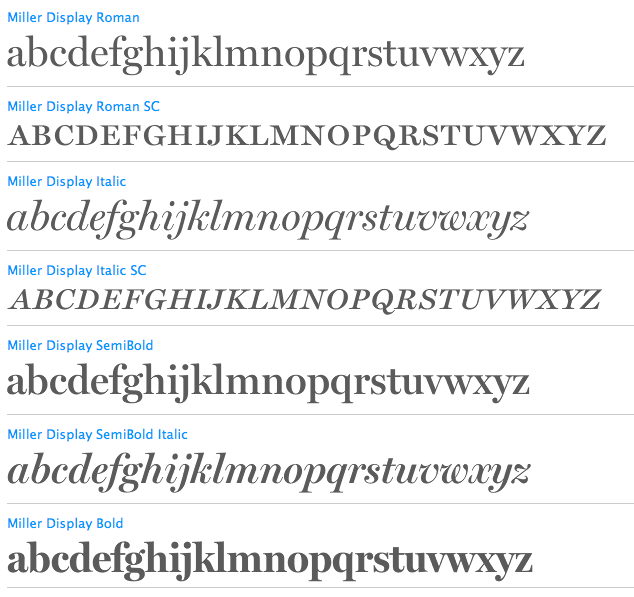 The fifty best-selling typefaces at MyFonts, as reported by them on September 3, 2012: #1: Proxima Nova (Mark Simonson) #2: Brandon Grotesque (HVD Fonts) #3: RBNo3.1 (Rene Bieder) #4: Museo Sans (exljbris) #5: Serifa (Bitstream) #6: Helvetica Neue (Adobe) #7: Interstate (Font Bureau) #8: Air (NiceType) #9: Museo Slab (exljbris) #10: Bombshell Pro (Emily Lime) #11: Proxima Nova Soft (Mark Simonson) #12: Akzidenz-Grotesk BQ (Berthold) #13: Futura (Bitstream) #14: Veneer (Yellow Design Studio) #15: Thirsty Script (Yellow Design Studio) #16: Narziss (Hubert Jocham Type) #17: PF Din Text Pro (Parachute) #18: Avenir (Linotype) #19: Intro (Fontfabric) #20: Carolyna Pro Black (Emily Lime) #21: Akzidenz-Grotesk [Google]
[More] ⦿
The fifty best-selling typefaces at MyFonts, as reported by them on September 3, 2012: #1: Proxima Nova (Mark Simonson) #2: Brandon Grotesque (HVD Fonts) #3: RBNo3.1 (Rene Bieder) #4: Museo Sans (exljbris) #5: Serifa (Bitstream) #6: Helvetica Neue (Adobe) #7: Interstate (Font Bureau) #8: Air (NiceType) #9: Museo Slab (exljbris) #10: Bombshell Pro (Emily Lime) #11: Proxima Nova Soft (Mark Simonson) #12: Akzidenz-Grotesk BQ (Berthold) #13: Futura (Bitstream) #14: Veneer (Yellow Design Studio) #15: Thirsty Script (Yellow Design Studio) #16: Narziss (Hubert Jocham Type) #17: PF Din Text Pro (Parachute) #18: Avenir (Linotype) #19: Intro (Fontfabric) #20: Carolyna Pro Black (Emily Lime) #21: Akzidenz-Grotesk [Google]
[More] ⦿
|
MyFonts: Bestsellers for September 2013
|
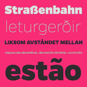 The fifty best-selling typefaces at MyFonts, as reported by them on September 1, 2013: #1: Proxima Nova (Mark Simonson), #2: Brandon Grotesque (HVD Fonts), #3: Voyage (Fenotype), #4: Gentona (Rene Bieder), #5: Avenir (Linotype), #6: Helvetica Neue (Linotype), #7: Core Circus (S-Core), #8: Metro Nova (Linotype), #9: Interstate (Font Bureau), #10: Museo Sans (exljbris), #11: Bombshell Pro (Emily Lime), #12: Thirsty Rough (Yellow Design Studio), #13: Trade Gothic (Linotype), #14: FF DIN (FontFont), #15: Charcuterie (Laura Worthington), #16: Futura BQ (Berthold), #17: Futura (Bitstream), #18: Helvetica Neue LT Std (Adobe), #19: DIN Next (Linotype), #20: Brandon Text (HVD Fonts), #21: Carolyna Pro Black (Emily Lime), #22: Univers (Linotype), #23: Cinta (Tipo Pèpel), #24: Veneer (Yellow Design Studio), #25: Neo sans (Monotype Imaging), #26: Trend (Latinotype), #27: Cantoni (Debi Sementelli Type Foundry), #28: ITC Avant Garde Gothic (ITC), #29: Brand (Lián Types), #30: Avenir Next Pro (Linotype), #31: Museo Slab (exljbris), #32: Rolling Pen (Sudtipos), #33: Niveau Grotesk (HVD Fonts), #34: Frutiger (Linotype), #35: Festivo Letters (Ahmet Altun), #36: Hurme Geometric Sans No.4 (Hurme Design), #37: Style Script (TypeSETit), #38: Pluto Sans (HVD Fonts), #39: Minion Pro (Adobe), #40: Intro (Fontfabric), #41: Alright Sans (Okay Type), #42: Zulia Pro (Sudtipos), #43: Hipster Script Pro (Sudtipos), #44: Jacques & Gilles (Emily Lime), #45: Encorpada Classic (dooType), #46: Benton Sans (Font Bureau), #47: Museo (exljbris), #48: Nexa (Fontfabric), #49: Geogrotesque (Emtype Foundry), #50: Frutiger (Adobe). [Google]
[More] ⦿
The fifty best-selling typefaces at MyFonts, as reported by them on September 1, 2013: #1: Proxima Nova (Mark Simonson), #2: Brandon Grotesque (HVD Fonts), #3: Voyage (Fenotype), #4: Gentona (Rene Bieder), #5: Avenir (Linotype), #6: Helvetica Neue (Linotype), #7: Core Circus (S-Core), #8: Metro Nova (Linotype), #9: Interstate (Font Bureau), #10: Museo Sans (exljbris), #11: Bombshell Pro (Emily Lime), #12: Thirsty Rough (Yellow Design Studio), #13: Trade Gothic (Linotype), #14: FF DIN (FontFont), #15: Charcuterie (Laura Worthington), #16: Futura BQ (Berthold), #17: Futura (Bitstream), #18: Helvetica Neue LT Std (Adobe), #19: DIN Next (Linotype), #20: Brandon Text (HVD Fonts), #21: Carolyna Pro Black (Emily Lime), #22: Univers (Linotype), #23: Cinta (Tipo Pèpel), #24: Veneer (Yellow Design Studio), #25: Neo sans (Monotype Imaging), #26: Trend (Latinotype), #27: Cantoni (Debi Sementelli Type Foundry), #28: ITC Avant Garde Gothic (ITC), #29: Brand (Lián Types), #30: Avenir Next Pro (Linotype), #31: Museo Slab (exljbris), #32: Rolling Pen (Sudtipos), #33: Niveau Grotesk (HVD Fonts), #34: Frutiger (Linotype), #35: Festivo Letters (Ahmet Altun), #36: Hurme Geometric Sans No.4 (Hurme Design), #37: Style Script (TypeSETit), #38: Pluto Sans (HVD Fonts), #39: Minion Pro (Adobe), #40: Intro (Fontfabric), #41: Alright Sans (Okay Type), #42: Zulia Pro (Sudtipos), #43: Hipster Script Pro (Sudtipos), #44: Jacques & Gilles (Emily Lime), #45: Encorpada Classic (dooType), #46: Benton Sans (Font Bureau), #47: Museo (exljbris), #48: Nexa (Fontfabric), #49: Geogrotesque (Emtype Foundry), #50: Frutiger (Adobe). [Google]
[More] ⦿
|
MyFonts: Bestsellers for September 2014
|
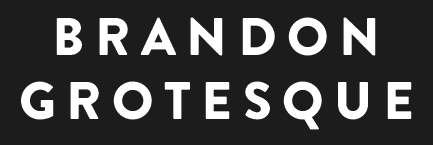 The fifty best-selling typefaces at MyFonts, as reported by them on September 1, 2014: #1 Brandon Grotesque (HVD Fonts), #2 Proxima Nova (Mark Simonson), #3 Helvetica Neue (Linotype), #4 True North (Cultivated Mind), #5 Avenir (Linotype), #6 Avenir Next Pro (Linotype), #7 DIN Next (Linotype), #8 Bombshell Pro (Emily Lime), #9 Museo Sans (exljbris), #10 Sofia Pro (Mostardesign), #11 Trade Gothic (Linotype), #12 Interstate (Font Bureau), #13 Brandon Text (HVD Fonts), #14 Peaches And Cream (Fenotype), #15 FF DIN (FontFont), #16 Benton Sans (Font Bureau), #17 Clarendon (Bitstream), #18 Brandon Printed (HVD Fonts), #19 Brix Sans (HVD Fonts), #20 Carolyna Pro Black (Emily Lime), #21 Quire Sans (Monotype), #22 Univers (Linotype), #23 Eveleth (Yellow Design Studio), #24 ITC Avant Garde Gothic (ITC), #25 Frutiger (Linotype), #26 Riga (Ludwig Type), #27 Jacques + Gilles (Emily Lime), #28 Futura (Bitstream), #29 Museo Slab (exljbris), #30 Futura PT (ParaType), #31 Adorn (Laura Worthington), #32 Thirsty Rough (Yellow Design Studio), #33 Helvetica Neue LT Std (Adobe), #34 Campton (Rene Bieder), #35 Effra (Dalton Maag), #36 Cantoni (Debi Sementelli Type Foundry), #37 Intro (Fontfabric), #38 Quickpen (Trial by Cupcakes), #39 AmpleSoft (Soneri Type), #40 Gill Sans (Monotype), #41 Trend (Latinotype), #42 Voltage (Laura Worthington), #43 Nexa (Fontfabric), #44 Akzidenz-Grotesk BE (Berthold), #45 Sanelma (Mika Melvas), #46 Neo Sans (Monotype), #47 Futura Round (URW++), #48 Glober (Fontfabric), #49 Alright Sans (Okay Type), #50 Myriad Pro (Adobe). [Google]
[More] ⦿
The fifty best-selling typefaces at MyFonts, as reported by them on September 1, 2014: #1 Brandon Grotesque (HVD Fonts), #2 Proxima Nova (Mark Simonson), #3 Helvetica Neue (Linotype), #4 True North (Cultivated Mind), #5 Avenir (Linotype), #6 Avenir Next Pro (Linotype), #7 DIN Next (Linotype), #8 Bombshell Pro (Emily Lime), #9 Museo Sans (exljbris), #10 Sofia Pro (Mostardesign), #11 Trade Gothic (Linotype), #12 Interstate (Font Bureau), #13 Brandon Text (HVD Fonts), #14 Peaches And Cream (Fenotype), #15 FF DIN (FontFont), #16 Benton Sans (Font Bureau), #17 Clarendon (Bitstream), #18 Brandon Printed (HVD Fonts), #19 Brix Sans (HVD Fonts), #20 Carolyna Pro Black (Emily Lime), #21 Quire Sans (Monotype), #22 Univers (Linotype), #23 Eveleth (Yellow Design Studio), #24 ITC Avant Garde Gothic (ITC), #25 Frutiger (Linotype), #26 Riga (Ludwig Type), #27 Jacques + Gilles (Emily Lime), #28 Futura (Bitstream), #29 Museo Slab (exljbris), #30 Futura PT (ParaType), #31 Adorn (Laura Worthington), #32 Thirsty Rough (Yellow Design Studio), #33 Helvetica Neue LT Std (Adobe), #34 Campton (Rene Bieder), #35 Effra (Dalton Maag), #36 Cantoni (Debi Sementelli Type Foundry), #37 Intro (Fontfabric), #38 Quickpen (Trial by Cupcakes), #39 AmpleSoft (Soneri Type), #40 Gill Sans (Monotype), #41 Trend (Latinotype), #42 Voltage (Laura Worthington), #43 Nexa (Fontfabric), #44 Akzidenz-Grotesk BE (Berthold), #45 Sanelma (Mika Melvas), #46 Neo Sans (Monotype), #47 Futura Round (URW++), #48 Glober (Fontfabric), #49 Alright Sans (Okay Type), #50 Myriad Pro (Adobe). [Google]
[More] ⦿
|
MyFonts: Bestsellers for September 2015
|
 The fifty best-selling typefaces at MyFonts, as reported by them on September 1, 2015: #1 FF DIN (FontFont), #2 Proxima Nova (Mark Simonson), #3 Brandon Grotesque (HVD Fonts), #4 Helvetica Neue (Linotype), #5 Avenir (Linotype), #6 Intro Rust (Fontfabric), #7 Avenir Next Pro (Linotype), #8 Trade Gothic (Linotype), #9 Univers (Linotype), #10 Effra (Dalton Maag), #11 Brandon Text (HVD Fonts), #12 Blog Script (Sudtipos), #13 ITC Avant Garde Gothic (ITC), #14 FF Clan Pro (FontFont), #15 Frutiger (Linotype), #16 Museo Sans (exljbris), #17 Futura (Bitstream), #18 SantElia Script (Yellow Design Studio), #19 Freeland (Trial by Cupcakes), #20 Nexa Rust (Fontfabric), #21 DIN Next (Linotype), #22 Akzidenz-Grotesk BE (Berthold), #23 Lexia (Dalton Maag), #24 Helvetica Neue LT Std (Adobe), #25 Corporative (Latinotype), #26 Coliseum (Red Rooster Collection), #27 Bombshell Pro (Emily Lime), #28 Interstate (Font Bureau), #29 Aktiv Grotesk (Dalton Maag), #30 Nexa (Fontfabric), #31 FF Mark (FontFont), #32 Slate (Monotype), #33 Helvetica Neue Pro (Linotype), #34 Intro (Fontfabric), #35 Swiss 721 (Bitstream), #36 FF Super Grotesk (FontFont), #37 Campton (Rene Bieder), #38 Futura PT (ParaType), #39 Vito (Typejockeys), #40 FF Meta (FontFont), #41 Hurme Geometric Sans No.4 (Hurme Design), #42 Hudson NY (Andrew Footit), #43 Neo Sans (Monotype), #44 Amsi Pro (Stawix), #45 Panton (Fontfabric), #46 LFT Etica (TypeTogether), #47 Futura (Linotype), #48 Museo Slab (exljbris), #49 Sofia Pro (Mostardesign), #50 Texta (Latinotype). [Google]
[More] ⦿
The fifty best-selling typefaces at MyFonts, as reported by them on September 1, 2015: #1 FF DIN (FontFont), #2 Proxima Nova (Mark Simonson), #3 Brandon Grotesque (HVD Fonts), #4 Helvetica Neue (Linotype), #5 Avenir (Linotype), #6 Intro Rust (Fontfabric), #7 Avenir Next Pro (Linotype), #8 Trade Gothic (Linotype), #9 Univers (Linotype), #10 Effra (Dalton Maag), #11 Brandon Text (HVD Fonts), #12 Blog Script (Sudtipos), #13 ITC Avant Garde Gothic (ITC), #14 FF Clan Pro (FontFont), #15 Frutiger (Linotype), #16 Museo Sans (exljbris), #17 Futura (Bitstream), #18 SantElia Script (Yellow Design Studio), #19 Freeland (Trial by Cupcakes), #20 Nexa Rust (Fontfabric), #21 DIN Next (Linotype), #22 Akzidenz-Grotesk BE (Berthold), #23 Lexia (Dalton Maag), #24 Helvetica Neue LT Std (Adobe), #25 Corporative (Latinotype), #26 Coliseum (Red Rooster Collection), #27 Bombshell Pro (Emily Lime), #28 Interstate (Font Bureau), #29 Aktiv Grotesk (Dalton Maag), #30 Nexa (Fontfabric), #31 FF Mark (FontFont), #32 Slate (Monotype), #33 Helvetica Neue Pro (Linotype), #34 Intro (Fontfabric), #35 Swiss 721 (Bitstream), #36 FF Super Grotesk (FontFont), #37 Campton (Rene Bieder), #38 Futura PT (ParaType), #39 Vito (Typejockeys), #40 FF Meta (FontFont), #41 Hurme Geometric Sans No.4 (Hurme Design), #42 Hudson NY (Andrew Footit), #43 Neo Sans (Monotype), #44 Amsi Pro (Stawix), #45 Panton (Fontfabric), #46 LFT Etica (TypeTogether), #47 Futura (Linotype), #48 Museo Slab (exljbris), #49 Sofia Pro (Mostardesign), #50 Texta (Latinotype). [Google]
[More] ⦿
|
MyFonts: Bestsellers for September 2016
|
 The fifty best-selling typefaces at MyFonts, as reported by them on September 1, 2016: #1 FF DIN (FontFont), #2 Helvetica Neue (Linotype), #3 Brandon Grotesque (HVD Fonts), #4 Proxima Nova (Mark Simonson), #5 Gilroy (Radomir Tinkov), #6 Avenir (Linotype), #7 DIN Next (Linotype), #8 Basic Sans (Latinotype), #9 Trade Gothic (Linotype), #10 Rufina Stencil (TipoType), #11 Brandon Text (HVD Fonts), #12 Amsi Pro (Stawix), #13 Univers (Linotype), #14 Bach (Los Andes), #15 Cera (TypeMates), #16 Campton (Rene Bieder), #17 Frutiger (Linotype), #18 Viva Beautiful (Cultivated Mind), #19 TT Corals (TypeType), #20 Avenir Next Pro (Linotype), #21 ITC Avant Garde Gothic (ITC), #22 FF Mark (FontFont), #23 Morebi Rounded (GT+CANARY), #24 Museo Sans (exljbris), #25 Sofia Pro (Mostardesign), #26 Linotype Didot (Linotype), #27 SantElia Script (Yellow Design Studio), #28 Mrs Eaves (Emigre), #29 Intro (Fontfabric), #30 Bambusa Pro (Fontforecast), #31 Nexa (Fontfabric), #32 Panton (Fontfabric), #33 Hurme Geometric Sans 1 + 2 (Hurme), #34 Akzidenz-Grotesk BE (Berthold), #35 Futura PT (ParaType), #36 Larsseit (Type Dynamic), #37 Futura (Linotype), #38 Halis Rounded (Ahmet Altun), #39 Nexa Rust (Fontfabric), #40 Geogrotesque (Emtype Foundry), #41 Sailec (Type Dynamic), #42 Freeland (Trial by Cupcakes), #43 Texta (Latinotype), #44 Helvetica Neue LT Std (Adobe), #45 Blend (Typesenses), #46 FF Meta (FontFont), #47 Canilari (Latinotype), #48 Gill Sans (Monotype), #49 Stylist Pro (Fontforecast), #50 Avenir (Adobe). [Google]
[More] ⦿
The fifty best-selling typefaces at MyFonts, as reported by them on September 1, 2016: #1 FF DIN (FontFont), #2 Helvetica Neue (Linotype), #3 Brandon Grotesque (HVD Fonts), #4 Proxima Nova (Mark Simonson), #5 Gilroy (Radomir Tinkov), #6 Avenir (Linotype), #7 DIN Next (Linotype), #8 Basic Sans (Latinotype), #9 Trade Gothic (Linotype), #10 Rufina Stencil (TipoType), #11 Brandon Text (HVD Fonts), #12 Amsi Pro (Stawix), #13 Univers (Linotype), #14 Bach (Los Andes), #15 Cera (TypeMates), #16 Campton (Rene Bieder), #17 Frutiger (Linotype), #18 Viva Beautiful (Cultivated Mind), #19 TT Corals (TypeType), #20 Avenir Next Pro (Linotype), #21 ITC Avant Garde Gothic (ITC), #22 FF Mark (FontFont), #23 Morebi Rounded (GT+CANARY), #24 Museo Sans (exljbris), #25 Sofia Pro (Mostardesign), #26 Linotype Didot (Linotype), #27 SantElia Script (Yellow Design Studio), #28 Mrs Eaves (Emigre), #29 Intro (Fontfabric), #30 Bambusa Pro (Fontforecast), #31 Nexa (Fontfabric), #32 Panton (Fontfabric), #33 Hurme Geometric Sans 1 + 2 (Hurme), #34 Akzidenz-Grotesk BE (Berthold), #35 Futura PT (ParaType), #36 Larsseit (Type Dynamic), #37 Futura (Linotype), #38 Halis Rounded (Ahmet Altun), #39 Nexa Rust (Fontfabric), #40 Geogrotesque (Emtype Foundry), #41 Sailec (Type Dynamic), #42 Freeland (Trial by Cupcakes), #43 Texta (Latinotype), #44 Helvetica Neue LT Std (Adobe), #45 Blend (Typesenses), #46 FF Meta (FontFont), #47 Canilari (Latinotype), #48 Gill Sans (Monotype), #49 Stylist Pro (Fontforecast), #50 Avenir (Adobe). [Google]
[More] ⦿
|
MyFonts: Bestsellers for September 2017
|
 The fifty best-selling typefaces at MyFonts, as reported by them on August 31, 2017: #1 FF DIN (FontFont), #2 Proxima Nova (Mark Simonson), #3 Brandon Grotesque (HVD Fonts), #4 Helvetica Neue (Linotype), #5 Sonny Gothic (W Foundry), #6 Avenir (Linotype), #7 Univers (Linotype), #8 Avenir Next Pro (Linotype), #9 Futura (Linotype), #10 Typold (The Northern Block Ltd), #11 Gilroy (Radomir Tinkov), #12 TT Norms (TypeType), #13 DIN Next (Linotype), #14 Moreno (Typedepot), #15 Museo Sans (Exljbris), #16 Brandon Text (HVD Fonts), #17 DIN Next Stencil (Linotype), #18 Magneton (Mika Melvas), #19 Quarion (Rene Bieder), #20 Trade Gothic (Linotype), #21 Frutiger (Linotype), #22 Cera Pro (TypeMates), #23 FF Mark (FontFont), #24 TT Polls (TypeType), #25 Neue Haas Grotesk (Linotype), #26 Caslon Graphique (ITC), #27 Ernest + Emily (Nicky Laatz), #28 Nexa Rust (Fontfabric), #29 Campton (Rene Bieder), #30 Quentine (Alex Couture), #31 Styled Up (Nicky Laatz), #32 Sofia Pro (Mostardesign), #33 Akzidenz-Grotesk BE (Berthold), #34 ITC Avant Garde Gothic (ITC), #35 Rift (Fort Foundry), #36 Helvetica Neue LT Std (Adobe), #37 Muller (Fontfabric), #38 Effra (Dalton Maag), #39 Nexa (Fontfabric), #40 Kapra Neue (Typoforge Studio), #41 Galano Grotesque (Rene Bieder), #42 Viva Beautiful (Cultivated Mind), #43 Slate (Monotype), #44 Larsseit (Type Dynamic), #45 Nizzoli (Los Andes), #46 FF Meta (FontFont), #47 FF Uberhand (FontFont), #48 Axiforma (Kastelov), #49 Core Sans C (S-Core), #50 Futura PT (ParaType). [Google]
[More] ⦿
The fifty best-selling typefaces at MyFonts, as reported by them on August 31, 2017: #1 FF DIN (FontFont), #2 Proxima Nova (Mark Simonson), #3 Brandon Grotesque (HVD Fonts), #4 Helvetica Neue (Linotype), #5 Sonny Gothic (W Foundry), #6 Avenir (Linotype), #7 Univers (Linotype), #8 Avenir Next Pro (Linotype), #9 Futura (Linotype), #10 Typold (The Northern Block Ltd), #11 Gilroy (Radomir Tinkov), #12 TT Norms (TypeType), #13 DIN Next (Linotype), #14 Moreno (Typedepot), #15 Museo Sans (Exljbris), #16 Brandon Text (HVD Fonts), #17 DIN Next Stencil (Linotype), #18 Magneton (Mika Melvas), #19 Quarion (Rene Bieder), #20 Trade Gothic (Linotype), #21 Frutiger (Linotype), #22 Cera Pro (TypeMates), #23 FF Mark (FontFont), #24 TT Polls (TypeType), #25 Neue Haas Grotesk (Linotype), #26 Caslon Graphique (ITC), #27 Ernest + Emily (Nicky Laatz), #28 Nexa Rust (Fontfabric), #29 Campton (Rene Bieder), #30 Quentine (Alex Couture), #31 Styled Up (Nicky Laatz), #32 Sofia Pro (Mostardesign), #33 Akzidenz-Grotesk BE (Berthold), #34 ITC Avant Garde Gothic (ITC), #35 Rift (Fort Foundry), #36 Helvetica Neue LT Std (Adobe), #37 Muller (Fontfabric), #38 Effra (Dalton Maag), #39 Nexa (Fontfabric), #40 Kapra Neue (Typoforge Studio), #41 Galano Grotesque (Rene Bieder), #42 Viva Beautiful (Cultivated Mind), #43 Slate (Monotype), #44 Larsseit (Type Dynamic), #45 Nizzoli (Los Andes), #46 FF Meta (FontFont), #47 FF Uberhand (FontFont), #48 Axiforma (Kastelov), #49 Core Sans C (S-Core), #50 Futura PT (ParaType). [Google]
[More] ⦿
|
MyFonts: Bestsellers for September 2018
|
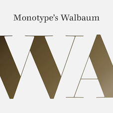 The fifty best-selling typefaces at MyFonts, as reported by them on September 1, 2018: #1 Gilroy (Radomir Tinkov), #2 Neue Helvetica (Linotype), #3 Proxima Nova (Mark Simonson), #4 FF DIN (FontFont), #5 Brandon Grotesque (HVD Fonts), #6 Avenir Next (Linotype), #7 FF Mark (FontFont), #8 Cera Pro (TypeMates), #9 Avenir (Linotype), #10 TT Norms (TypeType), #11 VAG Rounded (Linotype), #12 Univers (Linotype), #13 Helvetica (Linotype), #14 TT Nooks (TypeType), #15 Trade Gothic (Linotype), #16 Mont (Fontfabric), #17 Museo Sans (exljbris), #18 DIN Next (Linotype), #19 Futura PT (ParaType), #20 Sofia Pro (Mostardesign), #21 ITC Avant Garde Gothic (ITC), #22 Futura (Linotype), #23 Neue Haas Grotesk (Linotype), #24 Gill Sans (Monotype), #25 Brandon Text (HVD Fonts), #26 Nexa (Fontfabric), #27 FF Bau (FontFont), #28 Unitext (Monotype), #29 Myriad Pro (Adobe), #30 Campton (Rene Bieder), #31 Tazugane Gothic (Monotype), #32 Frutiger (Linotype), #33 Squad (Fontfabric), #34 Bio Sans (Dharma Type), #35 Galano Grotesque (Rene Bieder), #36 Recoleta (Latinotype), #37 Monorama (Indian Type Foundry), #38 Ridley Grotesk (Radomir Tinkov), #39 TT Commons (TypeType), #40 Fineday (Mika Melvas), #41 Sidecar (Fenotype), #42 Authenia (Mika Melvas), #43 Walbaum (Monotype), #44 Panton (Fontfabric), #45 Between (Monotype), #46 Museo (exljbris), #47 Neue Haas Unica (Linotype), #48 Nexa Rust (Fontfabric), #49 Hideout (Monotype), #50 Baro (Indian Type Foundry). [Google]
[More] ⦿
The fifty best-selling typefaces at MyFonts, as reported by them on September 1, 2018: #1 Gilroy (Radomir Tinkov), #2 Neue Helvetica (Linotype), #3 Proxima Nova (Mark Simonson), #4 FF DIN (FontFont), #5 Brandon Grotesque (HVD Fonts), #6 Avenir Next (Linotype), #7 FF Mark (FontFont), #8 Cera Pro (TypeMates), #9 Avenir (Linotype), #10 TT Norms (TypeType), #11 VAG Rounded (Linotype), #12 Univers (Linotype), #13 Helvetica (Linotype), #14 TT Nooks (TypeType), #15 Trade Gothic (Linotype), #16 Mont (Fontfabric), #17 Museo Sans (exljbris), #18 DIN Next (Linotype), #19 Futura PT (ParaType), #20 Sofia Pro (Mostardesign), #21 ITC Avant Garde Gothic (ITC), #22 Futura (Linotype), #23 Neue Haas Grotesk (Linotype), #24 Gill Sans (Monotype), #25 Brandon Text (HVD Fonts), #26 Nexa (Fontfabric), #27 FF Bau (FontFont), #28 Unitext (Monotype), #29 Myriad Pro (Adobe), #30 Campton (Rene Bieder), #31 Tazugane Gothic (Monotype), #32 Frutiger (Linotype), #33 Squad (Fontfabric), #34 Bio Sans (Dharma Type), #35 Galano Grotesque (Rene Bieder), #36 Recoleta (Latinotype), #37 Monorama (Indian Type Foundry), #38 Ridley Grotesk (Radomir Tinkov), #39 TT Commons (TypeType), #40 Fineday (Mika Melvas), #41 Sidecar (Fenotype), #42 Authenia (Mika Melvas), #43 Walbaum (Monotype), #44 Panton (Fontfabric), #45 Between (Monotype), #46 Museo (exljbris), #47 Neue Haas Unica (Linotype), #48 Nexa Rust (Fontfabric), #49 Hideout (Monotype), #50 Baro (Indian Type Foundry). [Google]
[More] ⦿
|
MyFonts: Bestsellers for September 2019
|
 The fifty best-selling typefaces at MyFonts, as reported by them on August 31, 2019: #1 Gilroy (Radomir Tinkov), #2 Cera Pro (TypeMates), #3 Neue Helvetica (Linotype), #4 Helvetica Now (Monotype), #5 Avenir (Linotype), #6 Avenir Next (Linotype), #7 FF DIN (FontFont), #8 TT Commons (TypeType), #9 Proxima Nova (Mark Simonson), #10 Univers (Linotype), #11 FF Mark (FontFont), #12 Brandon Grotesque (HVD Fonts), #13 DIN Next (Linotype), #14 ITC Avant Garde Gothic (ITC), #15 Helvetica (Linotype), #16 Fixture (Sudtipos), #17 Mont (Fontfabric), #18 Recoleta (Latinotype), #19 TT Norms Pro (TypeType), #20 Sofia Pro (Mostardesign), #21 Brandon Text (HVD Fonts), #22 Nexa (Fontfabric), #23 Galano Grotesque (Rene Bieder), #24 Trade Gothic (Linotype), #25 Frutiger (Linotype), #26 Kitsch (Zetafonts), #27 Campton (Rene Bieder), #28 Axiforma (Kastelov), #29 Mrs Eaves (Emigre), #30 Sucrose (Yellow Design Studio), #31 Bebas Neue Pro (Dharma Type), #32 Futura PT (ParaType), #33 Geogrotesque (Emtype Foundry), #34 URW DIN (URW), #35 Neue Haas Grotesk (Linotype), #36 Sailec (Type Dynamic), #37 FF Meta (FontFont), #38 Larsseit (Type Dynamic), #39 Passenger Sans (Indian Type Foundry), #40 Gill Sans (Monotype), #41 Panton (Fontfabric), #42 Averta (Intelligent Design), #43 Ciutadella (Emtype Foundry), #44 Uni Neue (Fontfabric), #45 Futura (Linotype), #46 Tazugane Gothic (Monotype), #47 M XiangHe Hei TC (Monotype), #48 Ambiguity (Monotype), #49 Intro (Fontfabric), #50 Montecatini Pro (Louise Fili Ltd). [Google]
[More] ⦿
The fifty best-selling typefaces at MyFonts, as reported by them on August 31, 2019: #1 Gilroy (Radomir Tinkov), #2 Cera Pro (TypeMates), #3 Neue Helvetica (Linotype), #4 Helvetica Now (Monotype), #5 Avenir (Linotype), #6 Avenir Next (Linotype), #7 FF DIN (FontFont), #8 TT Commons (TypeType), #9 Proxima Nova (Mark Simonson), #10 Univers (Linotype), #11 FF Mark (FontFont), #12 Brandon Grotesque (HVD Fonts), #13 DIN Next (Linotype), #14 ITC Avant Garde Gothic (ITC), #15 Helvetica (Linotype), #16 Fixture (Sudtipos), #17 Mont (Fontfabric), #18 Recoleta (Latinotype), #19 TT Norms Pro (TypeType), #20 Sofia Pro (Mostardesign), #21 Brandon Text (HVD Fonts), #22 Nexa (Fontfabric), #23 Galano Grotesque (Rene Bieder), #24 Trade Gothic (Linotype), #25 Frutiger (Linotype), #26 Kitsch (Zetafonts), #27 Campton (Rene Bieder), #28 Axiforma (Kastelov), #29 Mrs Eaves (Emigre), #30 Sucrose (Yellow Design Studio), #31 Bebas Neue Pro (Dharma Type), #32 Futura PT (ParaType), #33 Geogrotesque (Emtype Foundry), #34 URW DIN (URW), #35 Neue Haas Grotesk (Linotype), #36 Sailec (Type Dynamic), #37 FF Meta (FontFont), #38 Larsseit (Type Dynamic), #39 Passenger Sans (Indian Type Foundry), #40 Gill Sans (Monotype), #41 Panton (Fontfabric), #42 Averta (Intelligent Design), #43 Ciutadella (Emtype Foundry), #44 Uni Neue (Fontfabric), #45 Futura (Linotype), #46 Tazugane Gothic (Monotype), #47 M XiangHe Hei TC (Monotype), #48 Ambiguity (Monotype), #49 Intro (Fontfabric), #50 Montecatini Pro (Louise Fili Ltd). [Google]
[More] ⦿
|
MyFonts: Bestsellers for September 2020
|
 The fifty best-selling typefaces at MyFonts, as reported by them on August 31, 2020: #1 Gilroy (Radomir Tinkov), #2 Neue Helvetica (Linotype), #3 Avenir Next (Linotype), #4 Sofia Pro (Mostardesign), #5 Helvetica Now (Monotype), #6 FF DIN (FontFont), #7 Proxima Nova (Mark Simonson), #8 Brandon Grotesque (HVD Fonts), #9 Avenir (Linotype), #10 Recoleta (Latinotype), #11 Helvetica (Linotype), #12 ITC Avant Garde Gothic (ITC), #13 Nexa (Fontfabric), #14 FF Mark (FontFont), #15 Frutiger (Linotype), #16 Cera Pro (TypeMates), #17 TT Norms Pro (TypeType), #18 Trade Gothic (Linotype), #19 Neue Haas Grotesk (Linotype), #20 Univers (Linotype), #21 Muller (Fontfabric), #22 Campton (Rene Bieder), #23 DIN Next (Linotype), #24 FF Meta (FontFont), #25 Averta (Intelligent Design), #26 Galano Grotesque (Rene Bieder), #27 Mont (Fontfabric), #28 Uni Neue (Fontfabric), #29 Alkes (Fontfabric), #30 Neusa Next (The Northern Block Ltd), #31 Bio Sans (Dharma Type), #32 Bebas Neue Pro (Dharma Type), #33 Greycliff CF (Connary Fagen), #34 Neue Plak (Monotype), #35 Gill Sans Nova (Monotype), #36 Winden (Latinotype), #37 Brandon Text (HVD Fonts), #38 Quincy CF (Connary Fagen), #39 Panton (Fontfabric), #40 Conneqt (Roman Melikhov), #41 Futura (Linotype), #42 Neue Haas Unica (Linotype), #43 DIN 2014 (ParaType), #44 Futura PT (ParaType), #45 Gill Sans (Monotype), #46 Austera Text (Corradine Fonts), #47 Gordita (Type Atelier), #48 Gambler (Fenotype), #49 Adelle Sans (TypeTogether), #50 Century Gothic (Monotype). [Google]
[More] ⦿
The fifty best-selling typefaces at MyFonts, as reported by them on August 31, 2020: #1 Gilroy (Radomir Tinkov), #2 Neue Helvetica (Linotype), #3 Avenir Next (Linotype), #4 Sofia Pro (Mostardesign), #5 Helvetica Now (Monotype), #6 FF DIN (FontFont), #7 Proxima Nova (Mark Simonson), #8 Brandon Grotesque (HVD Fonts), #9 Avenir (Linotype), #10 Recoleta (Latinotype), #11 Helvetica (Linotype), #12 ITC Avant Garde Gothic (ITC), #13 Nexa (Fontfabric), #14 FF Mark (FontFont), #15 Frutiger (Linotype), #16 Cera Pro (TypeMates), #17 TT Norms Pro (TypeType), #18 Trade Gothic (Linotype), #19 Neue Haas Grotesk (Linotype), #20 Univers (Linotype), #21 Muller (Fontfabric), #22 Campton (Rene Bieder), #23 DIN Next (Linotype), #24 FF Meta (FontFont), #25 Averta (Intelligent Design), #26 Galano Grotesque (Rene Bieder), #27 Mont (Fontfabric), #28 Uni Neue (Fontfabric), #29 Alkes (Fontfabric), #30 Neusa Next (The Northern Block Ltd), #31 Bio Sans (Dharma Type), #32 Bebas Neue Pro (Dharma Type), #33 Greycliff CF (Connary Fagen), #34 Neue Plak (Monotype), #35 Gill Sans Nova (Monotype), #36 Winden (Latinotype), #37 Brandon Text (HVD Fonts), #38 Quincy CF (Connary Fagen), #39 Panton (Fontfabric), #40 Conneqt (Roman Melikhov), #41 Futura (Linotype), #42 Neue Haas Unica (Linotype), #43 DIN 2014 (ParaType), #44 Futura PT (ParaType), #45 Gill Sans (Monotype), #46 Austera Text (Corradine Fonts), #47 Gordita (Type Atelier), #48 Gambler (Fenotype), #49 Adelle Sans (TypeTogether), #50 Century Gothic (Monotype). [Google]
[More] ⦿
|
MyFonts: Bestsellers for September 2021
|
 The fifty best-selling typefaces at MyFonts, as reported by them on August 31, 2021: #1 Atyp (Suitcase Type Foundry), #2 Neue Helvetica (Linotype), #3 Sofia Pro (Mostardesign), #4 Gilroy (Radomir Tinkov), #5 Helvetica Now Variable (Monotype), #6 Atyp BL (Suitcase Type Foundry), #7 Helvetica Now (Monotype), #8 Avenir (Linotype), #9 TT Norms Pro (TypeType), #10 Avenir Next (Linotype), #11 FS Joey (Fontsmith), #12 Nexa (Fontfabric), #13 Trade Gothic (Linotype), #14 Univers (Linotype), #15 Helvetica (Linotype), #16 FF Mark (FontFont), #17 Campton (Rene Bieder), #18 FF DIN (FontFont), #19 Frutiger (Linotype), #20 DIN Next (Linotype), #21 Proxima Nova (Mark Simonson), #22 ITC Avant Garde Gothic (ITC), #23 Recoleta (Latinotype), #24 Brandon Grotesque (HVD Fonts), #25 Cera Pro (TypeMates), #26 Gazpacho (Santi Rey), #27 Albra (BumbumType), #28 Galano Grotesque (Rene Bieder), #29 Neue Haas Grotesk (Linotype), #30 Mont (Fontfabric), #31 TT Commons Pro (TypeType), #32 Futura (Linotype), #33 Tazugane Gothic (Monotype), #34 Freight Big Pro (GarageFonts), #35 Futura (Bitstream), #36 Bebas Neue Pro (Dharma Type), #37 Neue Haas Unica (Linotype), #38 Larken (EllenLuff), #39 TT Supermolot Neue (TypeType), #40 FS Siena (Fontsmith), #41 Zapf Humanist 601 BT (Bitstream), #42 Skolar Latin (Rosetta), #43 TT Travels Next (TypeType), #44 Rockwell (Monotype), #45 Rebrand (Latinotype), #46 Intro (Fontfabric), #47 Century Gothic (Monotype), #48 Linotype Centennial (Linotype), #49 Futura PT (ParaType), #50 Gill Sans (Monotype). [Google]
[More] ⦿
The fifty best-selling typefaces at MyFonts, as reported by them on August 31, 2021: #1 Atyp (Suitcase Type Foundry), #2 Neue Helvetica (Linotype), #3 Sofia Pro (Mostardesign), #4 Gilroy (Radomir Tinkov), #5 Helvetica Now Variable (Monotype), #6 Atyp BL (Suitcase Type Foundry), #7 Helvetica Now (Monotype), #8 Avenir (Linotype), #9 TT Norms Pro (TypeType), #10 Avenir Next (Linotype), #11 FS Joey (Fontsmith), #12 Nexa (Fontfabric), #13 Trade Gothic (Linotype), #14 Univers (Linotype), #15 Helvetica (Linotype), #16 FF Mark (FontFont), #17 Campton (Rene Bieder), #18 FF DIN (FontFont), #19 Frutiger (Linotype), #20 DIN Next (Linotype), #21 Proxima Nova (Mark Simonson), #22 ITC Avant Garde Gothic (ITC), #23 Recoleta (Latinotype), #24 Brandon Grotesque (HVD Fonts), #25 Cera Pro (TypeMates), #26 Gazpacho (Santi Rey), #27 Albra (BumbumType), #28 Galano Grotesque (Rene Bieder), #29 Neue Haas Grotesk (Linotype), #30 Mont (Fontfabric), #31 TT Commons Pro (TypeType), #32 Futura (Linotype), #33 Tazugane Gothic (Monotype), #34 Freight Big Pro (GarageFonts), #35 Futura (Bitstream), #36 Bebas Neue Pro (Dharma Type), #37 Neue Haas Unica (Linotype), #38 Larken (EllenLuff), #39 TT Supermolot Neue (TypeType), #40 FS Siena (Fontsmith), #41 Zapf Humanist 601 BT (Bitstream), #42 Skolar Latin (Rosetta), #43 TT Travels Next (TypeType), #44 Rockwell (Monotype), #45 Rebrand (Latinotype), #46 Intro (Fontfabric), #47 Century Gothic (Monotype), #48 Linotype Centennial (Linotype), #49 Futura PT (ParaType), #50 Gill Sans (Monotype). [Google]
[More] ⦿
|
MyFonts: Bestsellers October 2011
|
Top-ranked fonts at MyFonts in October 2011. [Google]
[More] ⦿
|
MyFonts: Beton
|
Beton and related typefaces. [Google]
[More] ⦿
|
MyFonts: Beveled typefaces
|
MyFonts pages on beveled typefaces. [Google]
[More] ⦿
|
MyFonts: Bible fonts
|
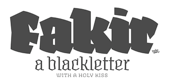 Bible fonts, as selected from the MyFonts library. [Google]
[More] ⦿
Bible fonts, as selected from the MyFonts library. [Google]
[More] ⦿
|
MyFonts: Bickham
|
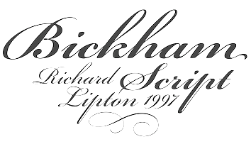 View a small collection of digital versions of Bickham Script and typefaces related to Bickham's penmanship. [Google]
[More] ⦿
View a small collection of digital versions of Bickham Script and typefaces related to Bickham's penmanship. [Google]
[More] ⦿
|
MyFonts: Biform typefaces
|
Typefaces tagged biform at MyFonts. [Google]
[More] ⦿
|
MyFonts: Biline typefaces
|
Top bilined or bilinear fonts at MyFonts. See also here. [Google]
[More] ⦿
|
MyFonts: Birthdays
|
A selection of typefaces related to birthdays, or fit for birthday wishes. [Google]
[More] ⦿
|
MyFonts: Bistro typefaces
|
View a number of typefaces that are called bistro typefaces over at MyFonts. [Google]
[More] ⦿
|
MyFonts: Blackletter
|
The most popular blackletter fonts sold by MyFonts. [Google]
[More] ⦿
|
MyFonts: Blackletter typefaces
|
Commercial blackletter typefaces. [Google]
[More] ⦿
|
MyFonts: Blambot
|
MyFonts selection for Blambot (Nate Piekos). [Google]
[More] ⦿
|
MyFonts: Bloated typefaces
|
A list of bloated typefaces. [Google]
[More] ⦿
|
MyFonts: Blobby typefaces
|
A list of blobby typefaces available via MyFonts. [Google]
[More] ⦿
|
MyFonts Blog
|
MyFonts has a blog. [Google]
[More] ⦿
|
MyFonts: Bloody typefaces
|
MyFonts lists bloody, blood-stain or dripping blood typefaces. [Google]
[More] ⦿
|
MyFonts: Blueprints
|
View typefaces that are appropriate for blueprints. See also this longer list. [Google]
[More] ⦿
|
MyFonts: B-Movie typefaces
|
A few commercial digital typefaces that are tagged by their creators as B-movie fonts. [Google]
[More] ⦿
|
MyFonts: Bodoni
|
Top-ranked fonts at MyFonts on the theme "Bodoni". Also, check this large web page with all typefaces at MyFonts labeled as or related to Bodoni. Pink poster below created by Michael Robinson (Raleigh, NC). Lower case g poster below created by Mirella Llamas Bejar (Barcelona) in 2014. [Google]
[More] ⦿
|
MyFonts: Bohemian typefaces
|
A list of commercial bohemian typefaces. [Google]
[More] ⦿
|
MyFonts: Bombshell Pro's competition
|
A list of over 3000 typefaces that, according to MyFonts, resemble Bombshell Pro (2012, Emily Lime). Except for a handful, that is of course a lie. [Google]
[More] ⦿
|
MyFonts: Book cover typefaces
|
A large list of typefaces appropriate for book covers. [Google]
[More] ⦿
|
MyFonts: Book text fonts
|
Here the extended list of book typefaces that one can obtain at MyFonts. [Google]
[More] ⦿
|
MyFonts: Book typefaces
|
A MyFonts list of typefaces appropriate for text in books. [Google]
[More] ⦿
|
MyFonts: Bookman
|
 MyFonts selection of digital typefaces modeled after Bookman:
 [Google]
[More] ⦿
|
MyFonts: Borders
|
A list of digital typefaces with borders. [Google]
[More] ⦿
|
MyFonts: Botanical typefaces
|
MyFonts selection for the keyword botanical. A longer list. [Google]
[More] ⦿
|
MyFonts: Bouncy typefaces
|
MyFonts selection for bouncy typefaces. [Google]
[More] ⦿
|
MyFonts: Bowling alley typefaces
|
A list of typefaces associated with bowling alleys and the fifties. Some of them are dingbats. [Google]
[More] ⦿
|
MyFonts: Branding
|
A selection of typefaces at MyFonts that were tagged for branding. A list of nearly 500 fonts for branding. [Google]
[More] ⦿
|
MyFonts: Broad nib typefaces
|
A visual comparison of many of the commercial digital broad nib typefaces. [Google]
[More] ⦿
|
MyFonts: Broad pen typefaces
|
View a number of broad pen typefaces. [Google]
[More] ⦿
|
MyFonts: Broadway
[Morris Fuller Benton]
|
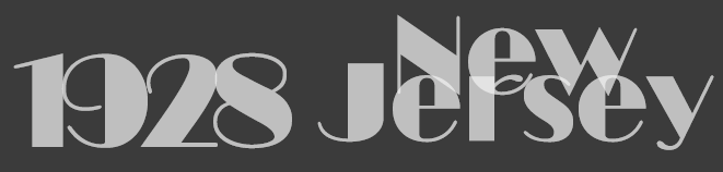 Broadway is Morris Fuller Benton's iconic art deco typeface. Here we show various typefaces in the MyFonts library that are identical to, or emulations of Broadway. [Google]
[More] ⦿
Broadway is Morris Fuller Benton's iconic art deco typeface. Here we show various typefaces in the MyFonts library that are identical to, or emulations of Broadway. [Google]
[More] ⦿
|
MyFonts: Brochures
|
Fonts that are appropriate for brochures are showcased at MyFonts. See also here and here. [Google]
[More] ⦿
|
MyFonts: Brush script typefaces
|
A collection of commercial brush script typefaces. [Google]
[More] ⦿
|
MyFonts: Brush typefaces
|
 MyFonts hit list for brush typefaces. [Google]
[More] ⦿
MyFonts hit list for brush typefaces. [Google]
[More] ⦿
|
MyFonts: Brushdrawn typefaces
|
The typefaces tagged as brushdrawn over at MyFonts. View more brushdrawn typefaces. [Google]
[More] ⦿
|
MyFonts: Brutalist typefaces
|
MyFonts selection of brutalist typefaces. [Google]
[More] ⦿
|
MyFonts: Bubble
|
MyFonts selection for the keyword bubble. [Google]
[More] ⦿
|
MyFonts: Bubble typefaces
|
View some commercial typefaces on the theme of bubbles and tagged as bubble typefaces. [Google]
[More] ⦿
|
MyFonts: Bubblegum
|
MyFonts selection for the keyword bubblegum. Think retro, fifties, brillantine. [Google]
[More] ⦿
|
MyFonts: Bubbly typefaces
|
Bubbly typefaces are often plump or balloon-shaped. Somew call them bubblegum typefaces. In any case, über-round is the word. [Google]
[More] ⦿
|
MyFonts: Buccaneer typefaces
|
A small collection of commercial buccaneer or swashbuckler typefaces. [Google]
[More] ⦿
|
MyFonts: Bulbous typefaces
|
Bulbous or plump typefaces in the MyFonts collection. [Google]
[More] ⦿
|
MyFonts: Bullies
|
A visual comparison of many of the commercial digital typefaces that can and should be used by bullies. [Google]
[More] ⦿
|
MyFonts: Business text typefaces
|
Business text typefaces, as selected from the MyFonts library. A longer list of business text typefaces. [Google]
[More] ⦿
|
MyFonts: Business text typefaces
|
A list of commercial typefaces for use in business texts. [Google]
[More] ⦿
|
MyFonts: Business typefaces
|
A listing of typefaces that are appropriate for business applications. [Google]
[More] ⦿
|
MyFonts: Byzantine typefaces
|
Byzantine Latin typefaces. [Google]
[More] ⦿
|
MyFonts: Cactus typefaces
|
View some frivolous digital cactus-themed typefaces. [Google]
[More] ⦿
|
MyFonts: Cafe scripts
|
Typefaces tagged as cafe typefaces by the folks at MyFonts. [Google]
[More] ⦿
|
MyFonts: Calligraphic
|
Top-ranked fonts at MyFonts on the theme calligraphic. Long list of calligraphic typefaces. And an even longer list of calligraphic typefaces. Calligraphic script typefaces. [Google]
[More] ⦿
|
MyFonts: Calligraphic script text typefaces
|
MyFonts: examples of calligraphic script text typefaces. [Google]
[More] ⦿
|
MyFonts: Calligraphy
|
Top-ranked fonts at MyFonts on the theme of calligraphy. A long list of calligraphic typefaces. [Google]
[More] ⦿
|
MyFonts: Camera
|
A list of typefaces on the theme of cameras. [Google]
[More] ⦿
|
MyFonts: Camouflage fonts
|
A selection of typefaces tagged camouflage at MyFonts. These are mostly military stencil fonts. [Google]
[More] ⦿
|
MyFonts: Canada Type
|
 MyFonts hit list for Canada Type. [Google]
[More] ⦿
MyFonts hit list for Canada Type. [Google]
[More] ⦿
|
MyFonts: Canadian fonts
|
A selection of typefaces tagged Canadian at MyFonts. [Google]
[More] ⦿
|
MyFonts: Candida
|
Typefaces that emulate or implement Candida, as selected from the MyFonts library. [Google]
[More] ⦿
|
MyFonts: Capitalis
|
MyFonts hit list for Capitalis typefaces, i.e., roman inscriptional typefaces. [Google]
[More] ⦿
|
MyFonts: Captions
|
Fonts that are appropriate for captions are showcased at MyFonts. See also here, here, here and here. [Google]
[More] ⦿
|
MyFonts: Car emblem typefaces
|
A small list of typefaces used for car emblems and automobiles in the fifties and sixties. [Google]
[More] ⦿
|
MyFonts: Cargo typefaces
|
Cargo fonts. These are mostly rough stencil caps typefaces. [Google]
[More] ⦿
|
MyFonts: Carolingian
|
Top-ranked fonts at MyFonts on the theme "Carolingian". Additional page. [Google]
[More] ⦿
|
MyFonts: Cartography
|
Typefaces appropriate for cartographic applications, as selected from the MyFonts library. See also here. [Google]
[More] ⦿
|
MyFonts: Cartoon characters
|
All cartoon character dingbat typefaces at MyFonts. [Google]
[More] ⦿
|
MyFonts: Cartoon fonts
|
The main cartoon fonts at MyFonts. A longer list. [Google]
[More] ⦿
|
MyFonts: Cartoonish typefaces
|
A list of cartoonish typefaces. [Google]
[More] ⦿
|
MyFonts: Casino fonts
|
Fonts on the casino theme over at MyFonts. [Google]
[More] ⦿
|
MyFonts: Caslon
|
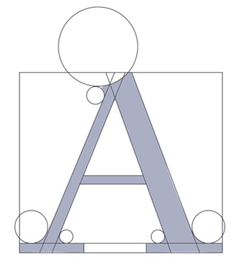 All Caslon typefaces at MyFonts, and all typefaces that are related to or a descendant of Caslon. Large web page warning! Another similar list. Short hit list of the most popular Caslon typefaces. [Google]
[More] ⦿
All Caslon typefaces at MyFonts, and all typefaces that are related to or a descendant of Caslon. Large web page warning! Another similar list. Short hit list of the most popular Caslon typefaces. [Google]
[More] ⦿
|
MyFonts: Caslon Graphique
|
The Caslon Graphique typefaces sold at MyFonts. [Google]
[More] ⦿
|
MyFonts: Celtic and Gaelic typefaces
|
Various implementations of Celtic and Gaelic typefaces. [Google]
[More] ⦿
|
MyFonts: Celtic typefaces
|
A list of Celtic typefaces at MyFonts. [Google]
[More] ⦿
|
MyFonts: Centaur
|
 Various commercial digital versions of the Centaur typeface. For a 36-style free revival, see Ben Whitmore's Coelacanth (2014).
 The list of commercial Centaur-like typefaces: [Google]
[More] ⦿
|
MyFonts: Century
|
View various commercial versions of Century. [Google]
[More] ⦿
|
MyFonts: Century Gothic
|
View some digital versions of Century Gothic. [Google]
[More] ⦿
|
MyFonts: Ceremonial fonts
|
MyFonts selection for ceremonial fonts. [Google]
[More] ⦿
|
MyFonts: Certificate typefaces
|
Typefaces appropriate for certificates. [Google]
[More] ⦿
|
MyFonts: Chalkboard fonts
|
A list of chalkboard fonts. [Google]
[More] ⦿
|
MyFonts: Chalky typefaces
|
Chalky or chalkboard typefaces. [Google]
[More] ⦿
|
MyFonts: Chamfered typefaces
|
A chamfer is a beveled edge connecting two surfaces, often at a 45 degree angle. The link shows collection of chamfered, i.e., octagonal or mechanical, typefaces. [Google]
[More] ⦿
|
MyFonts: Chancery
|
Top-ranked chancery fonts at MyFonts. [Google]
[More] ⦿
|
MyFonts: Chaotic typefaces
|
A list of typefaces that evoke chaos. [Google]
[More] ⦿
|
MyFonts: Chapbook typefaces
|
Compare some commercial chapbook typefaces. [Google]
[More] ⦿
|
MyFonts: Charlemagne
|
MyFonts selection for the tag word Charlemagne. [Google]
[More] ⦿
|
MyFonts: Chauncey H. Griffith
|
MyFonts selection for Chauncey Griffith [Google]
[More] ⦿
|
MyFonts: Cheap Pro Fonts
|
MyFonts selection of fonts for Cheap Pro Fonts [Google]
[More] ⦿
|
MyFonts: Cheeky typefaces
|
Cheeky typefaces, as selected from the MyFonts library. [Google]
[More] ⦿
|
MyFonts: Cheques
|
MyFonts selection of typefaces appropriate for cheques. These are also called MICR typefaces. [Google]
[More] ⦿
|
MyFonts: Chic typefaces
|
MyFonts hit list for the tag word "chic". [Google]
[More] ⦿
|
MyFonts: Child writing
|
Commercial typefaces that imitate a child's hand. [Google]
[More] ⦿
|
MyFonts: Children's book typefaces
|
A collection of commercial typefaces appropriate for children's books. See also here. [Google]
[More] ⦿
|
MyFonts: Children's cartoon fonts
|
Children's cartoon fonts include Mikado (HVD Fonts), LunchBox Slab (Kimmy Design), Cabrito Sans (insigne), Love Potion (HVD Fonts), Marvin (Canada Type), Mr Dodo (Hipopotam Studio), Monstro (PintassilgoPrints), PaperCute (La Goupil), Mrs Lollipop (Hipopotam Studio), Sugarplum (Tart Workshop), Mr Lucky (Hipopotam Studio), Liam (Laura Worthington), Sensational Sans (Type Innovations), Oyster (PintassilgoPrints), Myster (Dzianis Serabrakou), Pequena (RodrigoTypo), Rumpelstiltskin (Hanoded), JollyGood Sans (Pixilate), Transmogrifier (PintassilgoPrints), Mr Dog Dog (Hipopotam Studio), Grandma (HVD Fonts), Freude (Typejockeys), Rumpus Room Filled (Sideshow), Mr Happy (Hipopotam Studio), Yellow Balloon (Hanoded), Axion RND (Type Innovations), Tokig Px (Pixilate), Rowboat (Atlantic Fonts), Ladybird (Laura Worthington), Loose (Zeptonn), Pocket Px (Pixilate), Zubilo (ParaType), Dead Rite PB (Pink Broccoli), Rumpus Room (Sideshow), Beatnik Barbie (Type Innovations), Axion RX-14 (Type Innovations), Envisage (Type Innovations), Harimau (Hanoded), Bandoliers (PintassilgoPrints), Manita Px (Pixilate), Limoen (Hanoded), Makalu (Juraj Chrastina), Nanuk (Hanoded), Cayenne (Luxus), Maduki (Hanoded), Loyola (RodrigoTypo), Axion SSF (Type Innovations), Sofya (Gaslight), Embryo Tiny (HVD Fonts), Filmotype Melody (Filmotype), Filmotype Melon (Filmotype), crosswordBelle (JOEBOB graphics), Rocha (Eurotypo), Hedgehog Hans (Hanoded), Little Cecily (ParaType), Clumsy (Gaslight), Srostky (Nikita Kanarev), Republica 4F (4th february), Quiff (Schizotype), Pisak (Cuda Wianki), Fini (Atlantic Fonts), Rabbit On The Moon (Hanoded), Canned Whale (Hanoded), Coming Soon Pro (Open Window), Oranjerie (Hanoded), Colmena (ParaType), Pocket Serif Px (Pixilate), Dr Eric (Schizotype), Snemand (Hanoded), Meep (Dawnland), Greenhorn (Juraj Chrastina), Whipsnapper (Pink Broccoli), Guakala (RodrigoTypo), Sweet Melody (Artcity), Souffle (Eurotypo), Polina (GRIN3 Nowak), FF Justlefthand (FontFont), Lalalo (Cuda Wianki), Caramello (Resistenza), Scholle (Tour De Force), Pukupuku (yamayama), Glob (Resistenza), Chunky Chicken (Hanoded), FF Erikrighthand (FontFont), Kiddy (Gaslight), Axion SER (Type Innovations), Kid Captain PB (Pink Broccoli), Collage BB (Posterizer KG), Rumburak (Juraj Chrastina), Chelly FY (Fontyou), Thievery (Hanoded), Sansational (Type Innovations), Earthling (Atlantic Fonts), Rawhide (Canada Type), Pantano Pro (Latinotype), Angry Ronin (Artcity), Aylan (Eurotypo), Plain Script (ParaType), WinstonNero (JOEBOB graphics), Edgar No 9 (Type Innovations), Filmotype Mellow (Filmotype), Bergelmir (Hanoded), Clementina (Resistenza), BullyGirl (Gaslight), Blondy (Eurotypo), Peepz AF (Andrew Foster), Harry Plotter (ParaType), Uncle Eric (Schizotype), Doc Holliday (Type Innovations), Kycka (Eurotypo), Mama Bear (Hanoded), Lugo (Eurotypo), Chump Change (AdultHumanMale), Peralta Pro (Stiggy + Sands), Langston (Type Innovations), Onna (Eurotypo), Thrond Sans (Throndsen), Mecanica (Type Innovations), Morganhand (Morganismi), Leshy (ParaType), Tobu (Hanoded), Amoebica (Hanoded), Polly (RodrigoTypo), Cucho (RodrigoTypo), Mosca (Hanoded), Swingers (AdultHumanMale), Loncherita (Fabio Godoy), Fat Kitty Kat (Hanoded), And Then (Throndsen), Pukupuku Japan (yamayama), Belha (Eurotypo), Mister Mustard (AdultHumanMale), Dale Kids (AdultHumanMale), Bowman (ParaType), PT Earthquake (ParaType), Tooned Out JNL (Jeff Levine), Toon In JNL (Jeff Levine), Jaggy (ParaType), TPG FaceFont (Tolstrup Pryds Graphics). [Google]
[More] ⦿
|
MyFonts: Chiseled typefaces
|
Chiseled typefaces in the MyFonts library. [Google]
[More] ⦿
|
MyFonts: Chocolate typefaces
|
A list of typefaces associated with chocolate. [Google]
[More] ⦿
|
MyFonts: Christmas fonts
|
Christmas-themed typefaces, as selected from the MyFonts library. [Google]
[More] ⦿
|
MyFonts: Chromatic typefaces
|
MyFonts pages on the theme of chromatic type. See also here. A long list of chromatic typefaces. [Google]
[More] ⦿
|
MyFonts: Chrome typefaces
|
Chrome typefaces refer to types used for the chrome elements of retro cars. [Google]
[More] ⦿
|
MyFonts: Chubby typefaces
|
Digital typefaces that are chunky, chubby, fattish. [Google]
[More] ⦿
|
MyFonts: Chunky typefaces
|
A list of chunky typefaces. [Google]
[More] ⦿
|
MyFonts: Church typefaces
|
View typefaces at MyFonts that are appropriate for uses in churches. See also here and here. [Google]
[More] ⦿
|
MyFonts: Cinema
|
A selection of typefaces appropriate for or related to cinema / film. [Google]
[More] ⦿
|
MyFonts: Circles
|
Circle-based typefaces, as selected from the MyFonts library. [Google]
[More] ⦿
|
MyFonts: Circuit fonts
|
 A list of typefaces that evoke circuit boards or electrical circuits. [Google]
[More] ⦿
A list of typefaces that evoke circuit boards or electrical circuits. [Google]
[More] ⦿
|
MyFonts: Circus fonts
|
View a collection of circus fonts in the MyFonts collection. These have typically a Western look. [Google]
[More] ⦿
|
MyFonts: Civilité
|
The main typefaces at MyFonts that are in the Civilité style. [Google]
[More] ⦿
|
MyFonts: Clarendon
|
MyFonts hit list for Clarendon style typefaces, popular in the wood type era. A longer list of implementations of Clarendon. [Google]
[More] ⦿
|
MyFonts: Classical Roman typefaces
|
Classical Roman typefaces at MyFonts. [Google]
[More] ⦿
|
MyFonts: Classicist typefaces
|
Typefaces that are tagged as classicist at MyFonts. This is just another word for modern or didone. [Google]
[More] ⦿
|
MyFonts: Clean typefaces
|
 Most relevant typefaces at MyFonts for the keyword clean. [Google]
[More] ⦿
Most relevant typefaces at MyFonts for the keyword clean. [Google]
[More] ⦿
|
MyFonts: Clearface
|
A listing of various digital implementations and descendants of Clearface. [Google]
[More] ⦿
|
MyFonts: Clinton's album
|
This is "Clinton's album" of typefaces over at MyFonts. [Google]
[More] ⦿
|
MyFonts: Cochin
|
A list of digital versions of Cochin. [Google]
[More] ⦿
|
MyFonts: Cocktail hour typefaces
|
A list of typefaces that are associated with cocktails. [Google]
[More] ⦿
|
MyFonts: Coding
|
A list of typefaces for coding / programming, available via MyFonts. [Google]
[More] ⦿
|
MyFonts: Coffee fonts
|
MyFonts pages on the theme of coffee. [Google]
[More] ⦿
|
MyFonts: Cold war typefaces
|
A list of commercial cold war typefaces. [Google]
[More] ⦿
|
MyFonts: Collage typefaces
|
A list of collage typefaces. [Google]
[More] ⦿
|
MyFonts: College typefaces
|
A list of college typefaces. These are mostly athletioc lettering fonts. [Google]
[More] ⦿
|
MyFonts: Colonial typefaces
|
Typefaces tagged colonial at MyFonts. [Google]
[More] ⦿
|
MyFonts: Combat
|
A list of typefaces that evoke combats. Many of these are army stencil fonts. [Google]
[More] ⦿
|
MyFonts: Comic book fonts
|
The main comic book typefaces at MyFonts. [Google]
[More] ⦿
|
MyFonts: Communism and typefaces
|
MyFonts selection on the theme of communism. A short list of communist or propaganda fonts. [Google]
[More] ⦿
|
MyFonts: Compact typefaces
|
A list of compact typefaces. These are situated somewhere between compressed, narrow and condensed. [Google]
[More] ⦿
|
MyFonts: Compass-and-ruler typefaces
|
Compass-and-ruler typefaces at MyFonts. [Google]
[More] ⦿
|
MyFonts: Compressed typefaces
|
A list of compressed typefaces over at MyFonts. These are great for setting headlines. [Google]
[More] ⦿
|
MyFonts: Computer fonts
|
Fonts from the MyFonts vault that evoke computers, computer games and computer screens. [Google]
[More] ⦿
|
MyFonts: Condensed typefaces
|
MyFonts selection of condensed typefaces. See also here. [Google]
[More] ⦿
|
MyFonts: Connected scripts
|
From the MyFonts collection: connected scripts. A very long list of connected typefaces. [Google]
[More] ⦿
|
MyFonts: Connected scripts
|
MyFonts hit list for connected scripts. [Google]
[More] ⦿
|
MyFonts: Conservative typefaces
|
It is unclear why one would tag typefaces as being conservative. But some have done exactly that. A long list of conservative fonts. [Google]
[More] ⦿
|
MyFonts: Constructed fonts
|
Constructed fonts are modular, artificial, cold-blooded, planned, and meticulous. View a list of such typefaces on this page. [Google]
[More] ⦿
|
MyFonts: Constructivist fonts
|
Constructvist and old USSR fonts at MyFonts. [Google]
[More] ⦿
|
MyFonts: Contemporary sans typefaces
|
MyFonts hit list for contemporary sans typefaces. [Google]
[More] ⦿
|
MyFonts: Cookbook typefaces
|
A list of cookbook typefaces on the MyFonts site. [Google]
[More] ⦿
|
MyFonts: Copperplate
|
MyFonts hit list for copperplate scripts. [Google]
[More] ⦿
|
MyFonts: Copperplate scripts
|
A collection of commercial copperplate scripts. [Google]
[More] ⦿
|
MyFonts: Copperplate URW
|
Most relevant typefaces at MyFonts related to Copperplate URW, which is based on Goudy's original Copperplate Gothic. [Google]
[More] ⦿
|
MyFonts: Corporate typefaces
|
Top-ranked fonts at MyFonts on the theme "Corporate typefaces". Or typefaces for corporate branding [huge web page warning]. [Google]
[More] ⦿
|
MyFonts: Correspondence
|
Typefaces for correspondence. [Google]
[More] ⦿
|
MyFonts: Corroded typefaces
|
Corroded typefaces, as culled from the MyFonts type library. [Google]
[More] ⦿
|
MyFonts: Cosmetics
|
 MyFonts hit list for the tag word cosmetics. See also here. [Google]
[More] ⦿
MyFonts hit list for the tag word cosmetics. See also here. [Google]
[More] ⦿
|
MyFonts: Cosmopolitan typefaces
|
A list of typefaces that are tagged as cosmopolitan. [Google]
[More] ⦿
|
MyFonts: Counterless typefaces
|
Counterless typefaces, as selected from the MyFonts library. And another list of counterless typefaces. [Google]
[More] ⦿
|
MyFonts: Country and Western fonts
|
A selection of typefaces tagged Country and Western at MyFonts. [Google]
[More] ⦿
|
MyFonts: Country fonts
|
A selection of typefaces tagged country at MyFonts. [Google]
[More] ⦿
|
MyFonts: Courier
|
MyFonts selection for Courier. [Google]
[More] ⦿
|
MyFonts: Cowboy fonts
|
Typefaces tagged cowboy fonts at MyFonts. [Google]
[More] ⦿
|
MyFonts: Craft
|
Typefaces tagged by the word craft at MyFonts. [Google]
[More] ⦿
|
MyFonts: Craftsman
|
Craftsman's typefaces listed at MyFonts. [Google]
[More] ⦿
|
MyFonts: Crate stencil typefaces
|
MyFonts selection of stencil typefaces as used on crates. [Google]
[More] ⦿
|
MyFonts: Crayon typefaces
|
Commercial typefaces that simulate writing with crayons. [Google]
[More] ⦿
|
MyFonts: Creamy script typefaces
|
A list of creamy script typefaces at the MyFonts site. [Google]
[More] ⦿
|
MyFonts: Crosses
|
Typefaces with crosses, as culled from the MyFonts vault. [Google]
[More] ⦿
|
MyFonts: Crosshairs
|
A short list of typefaces on the theme of crosshairs. [Google]
[More] ⦿
|
MyFonts: Crusades
|
A list of typefaces that somehow conjure up images of the crusades. [Google]
[More] ⦿
|
MyFonts: Cuban typefaces
|
The top typefaces at MyFonts that are tagged as Cuban. See also here. [Google]
[More] ⦿
|
MyFonts: Cubist typefaces
|
A collection of commercial cubist typefaces. [Google]
[More] ⦿
|
MyFonts: Curly typefaces
|
A visual listing of curly typefaces over at MyFonts. See also here and here. [Google]
[More] ⦿
|
MyFonts: Cursive scripts
|
MyFonts hit list for cursive scripts. A long list of cursive typefaces. View more cursive script typefaces. Cursive scripts. [Google]
[More] ⦿
|
MyFonts: Cutout typefaces
|
A list of cutout typefaces sold by MyFonts. [Google]
[More] ⦿
|
MyFonts: Cyrillic typefaces
|
MyFonts selection for Cyrillic typefaces. [Google]
[More] ⦿
|
MyFonts: Dada
|
Dada movement fonts at MyFonts. [Google]
[More] ⦿
|
MyFonts: De Stijl
|
MyFonts hit list for typefaces influenced by the De Stijl movement. [Google]
[More] ⦿
|
MyFonts: De Vinne
|
A list of typefaces at MyFonts that are related to Theodore De Vinne. [Google]
[More] ⦿
|
MyFonts: Decadence
|
From the MyFonts library: fonts that characterize decadence or a decadent lifestyle. [Google]
[More] ⦿
|
MyFonts: Decal typefaces
|
A collection of commercial typefaces that could be used for decals. [Google]
[More] ⦿
|
MyFonts: Decayed typefaces
|
A list of decayed typefaces. [Google]
[More] ⦿
|
MyFonts: Declaration of Independence typefaces.
|
A list of typefaces related to the Declaration of Independence of the United States. [Google]
[More] ⦿
|
MyFonts: Delicate
|
MyFonts selection for the keyword delicate. [Google]
[More] ⦿
|
MyFonts: Demi-serif typefaces
|
A list of demi-serif or semiserif typefaces. [Google]
[More] ⦿
|
MyFonts: Democratic typefaces
|
At MyFonts, people have tagged twelve fonts as being democratic. Find out which ones. [Google]
[More] ⦿
|
MyFonts: Detective fonts
|
Detective fonts, as culled from the MyFonts type library. View more fonts that are appropriate for murder mystery and detective novels. [Google]
[More] ⦿
|
MyFonts: Detroit serif typefaces
|
MyFonts selection of a particular subclass of Western typefaces, the Detroit serif. [Google]
[More] ⦿
|
MyFonts: Dia de los muertos
|
Typefaces that celebrate Dia de los muertos: ABTS Day Of The Dead (Albatross), Los Muertos (Just My Type), Dia de los Muertos (Intellecta). [Google]
[More] ⦿
|
MyFonts: Diagram
|
Typefaces that are appropriate for diagrams, as selected from the MyFonts library. [Google]
[More] ⦿
|
MyFonts: Diamond typefaces
|
A list of diamond typefaces. The first definition of a diamond typeface is one that has rhombus or diamond-shaped dots on the i and j. [Google]
[More] ⦿
|
MyFonts: Didone typefaces
|
Large web page with all didone typefaces at MyFonts. [Google]
[More] ⦿
|
MyFonts: Didot
|
Top-ranked fonts at MyFonts that emulate Didot. [Google]
[More] ⦿
|
MyFonts: DIN
|
 Most relevant typefaces at MyFonts for the keyword DIN. View a longer list of DIN fonts. [Google]
[More] ⦿
Most relevant typefaces at MyFonts for the keyword DIN. View a longer list of DIN fonts. [Google]
[More] ⦿
|
MyFonts: Diner typefaces
|
View a number of diner typefaces. These are alsio called retro typefaces, or typefaces from the 1950s. [Google]
[More] ⦿
|
MyFonts: Dinner invitation typefaces
|
The main typefaces at MyFonts that are listed under dinner invitation fonts. [Google]
[More] ⦿
|
MyFonts: Diploma fonts
|
Typefaces appropriate for printing diplomas. [Google]
[More] ⦿
|
MyFonts: Dirty typewriter typefaces
|
A list of dirty typewriter typefaces. [Google]
[More] ⦿
|
MyFonts: Disco
|
MyFonts selection for disco style retro fonts. See here for a longer list of disco typefaces. [Google]
[More] ⦿
|
MyFonts: Disconnected scripts
|
View a number of disconnected script typefaces. [Google]
[More] ⦿
|
MyFonts: Discretionary ligatures
|
A selection of typefaces with discretionary ligatures. [Google]
[More] ⦿
|
MyFonts: Disney typefaces
|
Typefaces related to Disney movies and Disneyworld. See also here for Disney's parks and attractions. [Google]
[More] ⦿
|
MyFonts: Display typefaces
|
Large web page warning. This list of commercial display typefaces contains 3100 units / images. They are ranked from most to least relevant. [Google]
[More] ⦿
|
MyFonts: Distressed typefaces
|
Distressed typefaces un the gamut from shaky outlines and ink spotting to grainy textures and special effects. This long web page lists some of its main (commercial) representatives. [Google]
[More] ⦿
|
MyFonts: DIY typefaces
|
A list of digital typefaces tipped as DIY fonts. [Google]
[More] ⦿
|
MyFonts: Dolce typefaces
|
Dolce, sweets. Here is a list of typefaces that can be associated with sweets. [Google]
[More] ⦿
|
MyFonts: Dollar fonts
|
View some digital typefaces that are related to the type used on dollar bills. [Google]
[More] ⦿
|
MyFonts: Dot matrix typefaces
|
Dot matrix typefaces with commercial licenses. [Google]
[More] ⦿
|
MyFonts: Drafting typefaces
|
Drafting typefaces, as selected from the MyFonts library. [Google]
[More] ⦿
|
MyFonts: Draftsman typefaces
|
Draftsman typefaces, as selected from the MyFonts library. [Google]
[More] ⦿
|
MyFonts: Drawn typefaces
|
Drawn typefaces at MyFonts. By this, we mean typefaces that are hand-drawn on the basis of existing typefaces. [Google]
[More] ⦿
|
MyFonts: Drop shadow typefaces
|
A list of commercial drop shadow typefaces. [Google]
[More] ⦿
|
MyFonts: Dry brush typefaces
|
A visual comparison of many of the commercial digital dry brush typefaces. [Google]
[More] ⦿
|
MyFonts: Dunkin Donuts typefaces
|
A list of typefaces that are related to Dunkin Donuts. [Google]
[More] ⦿
|
MyFonts: Dutch deco
|
A collection of commercial typefaces in the Dutch deco style. [Google]
[More] ⦿
|
MyFonts: Dutch fonts
|
I am always surprised by the attribute Dutch fonts. Therea re many fonts tagged that way at MyFonts, and this page shows them all. [Google]
[More] ⦿
|
MyFonts: Dutch Old Style
|
MyFonts tags these typefaces as Dutch Old Style: FF Meta Serif (FontFont), ITC Caslon No. 224 (ITC), ITC Zapf International (Linotype), Fleischman BT Pro (Bitstream), ITC Souvenir (ITC), ITC Newtext (ITC), Century 751 (Bitstream), Amerigo BT (Bitstream), ITC Newtext (Linotype), Matt Antique (Bitstream), Elegant Garamond (Bitstream), ITC Usherwood (ITC), Minister (Linotype), Charter BT Pro (Bitstream), Dutch 766 (Bitstream), Garth Graphic (Monotype), Aldus Nova Pro (Linotype), Diverda Serif (Linotype), ITC Charter (Linotype), Agfa Wile Roman (Monotype), Scherzo (Monotype), Kuenstler 480 (Bitstream), Perrywood (Monotype), Homeland BT (Bitstream), ITC Zapf International (ITC), Alisal (Monotype), Karim (Linotype), ITC Humana Serif (ITC), ITC Kallos (ITC), Buccardi (Monotype), Maidenhead (Monotype), Hassan (Linotype), Wile (Monotype). [Google]
[More] ⦿
|
MyFonts: Dürer-style typefaces
|
Typefaces that are based on Dürer's proportioned style. [Google]
[More] ⦿
|
MyFonts: Dymo label typefaces
|
Dymo label typefaces. [Google]
[More] ⦿
|
MyFonts: Dynamic typefaces
|
A listing of dynamic typefaces at MyFonts. [Google]
[More] ⦿
|
MyFonts: Dystopian typefaces
|
A visual comparison of many of the commercial digital dystopian typefaces. [Google]
[More] ⦿
|
MyFonts: East German typefaces
|
MyFonts selection for East German typefaces. I guess what appears are typefaces that are revivals of old East German typefaces or that are made by East German type designers during or after the four decades of its existence. [Google]
[More] ⦿
|
MyFonts: Easy-to-read fonts
|
Easy-to-read fonts, as selected from the MyFonts library. [Google]
[More] ⦿
|
MyFonts: Eccentric typefaces
|
A list of commercial typefaces tagged as eccentric. [Google]
[More] ⦿
|
MyFonts: Ecological typefaces
|
Typefaces associated with ecology, either in look, or through dingbats and symbols. [Google]
[More] ⦿
|
MyFonts: Economic typefaces
|
Economic typefaces. [Google]
[More] ⦿
|
MyFonts: Edgy typefaces
|
View a collection of edgy typefaces in the MyFonts collection. [Google]
[More] ⦿
|
MyFonts: Editorial typefaces
|
Typefaces for editorials. These are often classy text typefaces. [Google]
[More] ⦿
|
MyFonts: Educational typefaces
|
Educational typefaces, as culled from the MyFonts type library. [Google]
[More] ⦿
|
MyFonts: Edwardian
|
Top Edwardian era fonts at MyFonts. View a longer list. A longer list of Edwardian typefaces. [Google]
[More] ⦿
|
MyFonts: Eerie typefaces
|
MyFonts selection of eerie typefaces. [Google]
[More] ⦿
|
MyFonts: Egyptian
|
Top-ranked Egyptian fonts at MyFonts. [Google]
[More] ⦿
|
MyFonts: Egyptienne typefaces
|
Egyptiennes are Egyptian, or slab serif, typefaces. This page lists many of its commercial representatives, such as Memphis, Egizio, and Rockwell. [Google]
[More] ⦿
|
MyFonts: Electric typefaces
|
View a collection of electric typefaces in the MyFonts collection. [Google]
[More] ⦿
|
MyFonts: Electronic typefaces
|
A list of display typefaces that evoke electonics. [Google]
[More] ⦿
|
MyFonts: Electronica
|
A list of typefaces on the general theme of electronica. [Google]
[More] ⦿
|
MyFonts: Elegant fonts
|
Top elegant fonts at MyFonts. This could mean anything. [Google]
[More] ⦿
|
MyFonts: Elliptical typefaces
|
MyFonts hit list for elliptical typefaces. [Google]
[More] ⦿
|
MyFonts: Elongated typefaces
|
A collection of elongated typefaces culled and ranked from the MyFonts site. [Google]
[More] ⦿
|
MyFonts: Elzevir
|
A list of typefaces at MyFonts that are related to the elzevir style. See also here. [Google]
[More] ⦿
|
MyFonts: Elzevir
|
Elzevirian typefaces that can be found at MyFonts. [Google]
[More] ⦿
|
MyFonts: Emblem type
|
Emblem type refers to type styles used for car emblems, often in the fifties and sixties. Typically, these are heavy connected scripts. [Google]
[More] ⦿
|
MyFonts: Embossed typefaces
|
Typefaces that are embossed or that have an embossed substyle. [Google]
[More] ⦿
|
MyFonts: Engagement fonts
|
A list of commercial engagement typefaces. I guess they complement wedding fonts, but I am stumped as to why people use these two classifications. [Google]
[More] ⦿
|
MyFonts: English Roundhand
|
A list of English round hand typefaces. [Google]
[More] ⦿
|
MyFonts: English typefaces
|
View the typefaces tagged English at MyFonts. I think that they mean typefaces made in England or with historical ties to England (Baskerville, Caslon, Fry, Stephenson Blake). [Google]
[More] ⦿
|
MyFonts: Engraved blackletter typefaces
|
A small collection of commercial engraved blackletter typefaces. [Google]
[More] ⦿
|
MyFonts: Engraved fonts
|
Typefaces at MyFonts related to the engraving process. Another link. See also here and here. [Google]
[More] ⦿
|
MyFonts: Engraved typefaces (on money)
|
A small collection of commercial engraved-style typefaces used for money, bills and financial certificates. [Google]
[More] ⦿
|
MyFonts: Eric Gill
|
 Eric Gill's typefaces showcased at MyFonts. [Google]
[More] ⦿
Eric Gill's typefaces showcased at MyFonts. [Google]
[More] ⦿
|
MyFonts: Eszett
|
A selection of typefaces that have the German eszett glyph, ß. [Google]
[More] ⦿
|
MyFonts: Etched typefaces
|
A list of etched typefaces. [Google]
[More] ⦿
|
MyFonts: Ethnic typefaces
|
Latin typefaces along ethnic themes. Some of these can be called faux fonts. [Google]
[More] ⦿
|
MyFonts: Eurostile
|
Eurostile (Aldo Novarese and Alessandro Butti, Nebiolo) and its derived typefaces, as selected from the MyFonts library. Another list of Eurostile fonts. [Google]
[More] ⦿
|
MyFonts: Evil typefaces
|
A list of evil typefaces. These include spooky, ghostly, dripping blood and Halloween fonts. [Google]
[More] ⦿
|
MyFonts: Exotic fonts
|
MyFonts selection for the tag exotic. A longer list of exotic typefaces. [Google]
[More] ⦿
|
MyFonts: Export
|
MyFonts selection of typefaces tagged with the word export. Some of these are stencil typefaces. [Google]
[More] ⦿
|
MyFonts: Expressionist typefaces
|
Expressionist typefaces, as selected from the MyFonts library. A longer list of expressionist typefaces. [Google]
[More] ⦿
|
MyFonts: Expressive typefaces
|
Expressive typefaces at MyFonts. See also here and here. [Google]
[More] ⦿
|
MyFonts: Extra black typefaces.
|
MyFonts selection of extra black typefaces [Google]
[More] ⦿
|
MyFonts: Factory fonts
|
Factory fonts, as selected from the MyFonts library. [Google]
[More] ⦿
|
MyFonts: Fairground typefaces
|
A selection of typefaces for fairgrounds. [Google]
[More] ⦿
|
MyFonts: Fairytale typefaces
|
From the MyFonts collection: fairytale typefaces. [Google]
[More] ⦿
|
MyFonts: Fancy typefaces
|
MyFonts selection for the keyword fancy. [Google]
[More] ⦿
|
MyFonts: Fantastic
|
MyFonts selection for the keyword fantastic. [Google]
[More] ⦿
|
MyFonts: Fashion mag typefaces
|
 Most relevant typefaces at MyFonts for the keyword fashion. [Google]
[More] ⦿
Most relevant typefaces at MyFonts for the keyword fashion. [Google]
[More] ⦿
|
MyFonts: Fashion scripts
|
A small collection of commercial fashion script typefaces. [Google]
[More] ⦿
|
MyFonts: Fashionable typefaces
|
Typefaces labeled fashionable in the MyFonts collection. [Google]
[More] ⦿
|
MyFonts: Fat typeface didones
|
A list of one hundred fat typeface didones. [Google]
[More] ⦿
|
MyFonts: Fat typefaces
|
A list of fat typefaces. [Google]
[More] ⦿
|
MyFonts: Fatso typefaces
|
A list of typefaces that were tagged as Fatso by the good people at MyFonts. [Google]
[More] ⦿
|
MyFonts: Felt pen typefaces
|
Typefaces in the MyFonts collection that simulate felp pen writing. [Google]
[More] ⦿
|
MyFonts: Feminine fonts
|
Top-ranked fonts at MyFonts on the theme Feminine fonts. A longer list of feminine typefaces. And an even longer one. [Google]
[More] ⦿
|
MyFonts: Festive typefaces
|
MyFonts selection of festive typefaces. [Google]
[More] ⦿
|
MyFonts: Filigree
|
A short list of typefaces on the theme of filigree. [Google]
[More] ⦿
|
MyFonts: Filled counters
|
Typefaces with filled counters, i.e., counterless typefaces. [Google]
[More] ⦿
|
MyFonts: Film fonts
|
MyFonts pages on film fonts. See also here. [Google]
[More] ⦿
|
MyFonts: Film noir typefaces
|
Film noir, the middle of the 20th century, mystery movies, expressionism, depression, thrillers, Hitchcock, Goddard. [Google]
[More] ⦿
|
MyFonts: Filmotype
|
MyFonts selection for Filmotype (Stuart Sandler). [Google]
[More] ⦿
|
MyFonts: Fin de siècle typefaces
|
Fin de siècle refers to the end of the 19th century. These typefaces were created in the era of art nouveau. [Google]
[More] ⦿
|
MyFonts: Fingerprint typefaces
|
A list of typefaces that contain fingerprints or have fingerprints worked into the alphabet. [Google]
[More] ⦿
|
MyFonts: Finnish typefaces
|
View a selection of Finnish typefaces. [Google]
[More] ⦿
|
MyFonts: Flamboyant typefaces
|
A list of flamboyant typefaces. Another list of flamboyant fonts. [Google]
[More] ⦿
|
MyFonts: Flared serif typefaces
|
A list of flared serif typefaces available via MyFonts. [Google]
[More] ⦿
|
MyFonts: Flared typefaces
|
Web page with all typefaces at MyFonts labeled as being flared or incised. [Google]
[More] ⦿
|
MyFonts: Flareserif typefaces
|
A list of flared serif typefaces on the MyFonts site. Important members of this class include the Albertus subfamily (gradual flaring) on one end and the Friz Quadrata subfamily (extremity flaring) at the other end. [Google]
[More] ⦿
|
MyFonts: Flat-It
|
MyFonts selection of the bestselling Flat-It fonts. [Google]
[More] ⦿
|
MyFonts: Fleurons
|
View typefaces with fleurons, as culled from the MyFonts site. View a longer list of typefaces with fleurons. View yet another list of fonts with fleurons. [Google]
[More] ⦿
|
MyFonts: Floral typefaces
|
MyFonts selection of floral typefaces. Many of these are ornamental caps typefaces. See also here. [Google]
[More] ⦿
|
MyFonts: Flourished typefaces
|
MyFonts hit list for flourished typefaces, usually scripts. [Google]
[More] ⦿
|
MyFonts: Flourishes
|
MyFonts hit list for typefaces with flourishes. [Google]
[More] ⦿
|
MyFonts: Flowing fonts
|
Digital typefaces at MyFonts that are flowing, often calligraphic. [Google]
[More] ⦿
|
MyFonts: Folklore typefaces
|
A list of typefaces associated with folkore, tradition, ethic culture. [Google]
[More] ⦿
|
MyFonts: Fonderie Olive
|
MyFonts selection for Fonderie Olive. [Google]
[More] ⦿
|
MyFonts: Font Bureau
|
MyFonts hit list for Font Bureau type. [Google]
[More] ⦿
|
MyFonts: Font City
|
MyFonts selection for Font City. [Google]
[More] ⦿
|
MyFonts: Food
|
A list of typefaces that are associated with food---dingbats, as well as menu fonts. [Google]
[More] ⦿
|
MyFonts: Football typefaces
|
A list of typefaces related to football. [Google]
[More] ⦿
|
MyFonts: Formal scripts
|
A collection of formal script typefaces that can be seen at MyFonts. [Google]
[More] ⦿
|
MyFonts: Fournier
|
Top-ranked fonts at MyFonts that are related to the 18th century style of Fournier. See also here and here. [Google]
[More] ⦿
|
MyFonts: Fraktur
|
Top-ranked Fraktur fonts at MyFonts. [Google]
[More] ⦿
|
MyFonts: Frank Heine's typefaces
|
MyFonts selection for Frank Heine. [Google]
[More] ⦿
|
MyFonts: Frank Lloyd Wright
|
MyFonts selection for Frank Lloyd Wright. [Google]
[More] ⦿
|
MyFonts: Freda Sack
|
MyFonts selection of fonts for Freda Sack. [Google]
[More] ⦿
|
MyFonts: Free form typefaces
|
View a collection of free form typefaces in the MyFonts collection. [Google]
[More] ⦿
|
MyFonts: Freestyle typefaces
|
MyFonts selection of script typefaces called freestyle. [Google]
[More] ⦿
|
MyFonts: French Clarendon
|
A list of French Clarendon (almost exclusively wood) typefaces that are available via MyFonts. [Google]
[More] ⦿
|
MyFonts: French deco
|
A collection of commercial typefaces in the French art deco style. [Google]
[More] ⦿
|
MyFonts: French typefaces
|
A list of typefaces tagged as French. [Google]
[More] ⦿
|
MyFonts: French typefaces
|
MyFonts selection for the tag French. Interesting to see what one finds here, berets and baguettes aside. [Google]
[More] ⦿
|
MyFonts: Functional typefaces
|
A selection of functional typefaces from the MyFonts vault. [Google]
[More] ⦿
|
MyFonts: Funeral typefaces
|
View the typefaces tagged funeral at MyFonts. Interestingly, straight up Bodonis are very prominent in this list. As a matter of fact, I used Bodoni myself when I composed the cards for my own father when he died. See also this list of funeral typefaces. [Google]
[More] ⦿
|
MyFonts: Funky typefaces
|
A list of funky typefaces at the MyFonts site. [Google]
[More] ⦿
|
MyFonts: Funny fonts
|
It is part of human nature. People like funny things--- entertain us, and make us smile. It is not a shock that 2460 fonts are tagged with the word "funny" at MyFonts. This [huge!!!] web page shows all 2460 fonts. [Google]
[More] ⦿
|
MyFonts: Funny typefaces
|
This lists the commercial typefaces that have received the tag funny at MyFonts. The list is about 1000 units long! [Google]
[More] ⦿
|
MyFonts: Futura
|
 MyFonts pages on Paul Renners's Futura and its digital descendants and lookalikes. See here and here for longer lists. The poster below is by Verushka Galluccio. [Google]
[More] ⦿
MyFonts pages on Paul Renners's Futura and its digital descendants and lookalikes. See here and here for longer lists. The poster below is by Verushka Galluccio. [Google]
[More] ⦿
|
MyFonts: Futurismo
|
MyFonts selection for the keyword Futurismo. [Google]
[More] ⦿
|
MyFonts: Futuristic fonts
|
 Top futuristic fonts at MyFonts. [Google]
[More] ⦿
Top futuristic fonts at MyFonts. [Google]
[More] ⦿
|
MyFonts: Gaelic typefaces
|
A small collection of commercial Gaelic typefaces. [Google]
[More] ⦿
|
MyFonts: Gambling fonts
|
I have no clue what makes a font appropriate for gambling. Perhaps the taggers use this term for Las Vegas billboard types. [Google]
[More] ⦿
|
MyFonts: Gangster fonts
|
MyFonts listing of all gangster fonts (tagged that way, anyway). Gangster scripts. [Google]
[More] ⦿
|
MyFonts: Garagefonts
|
MyFonts selection for Garagefonts [Google]
[More] ⦿
|
MyFonts: Garalde or Garamond typefaces
|
Large web page with all garalde or Garamond-style typefaces at MyFonts. Subpage with the most relevant fonts in this category. Additional pages with Garamond style fonts and fonts named Garamond. Digital typefaces that are related to Garamond. [Google]
[More] ⦿
|
MyFonts: Garamond
|
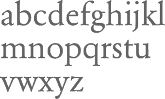 MyFonts hit list for Garamond. [Google]
[More] ⦿
MyFonts hit list for Garamond. [Google]
[More] ⦿
|
MyFonts: Gas pipe typefaces
|
MyFonts selection of gas pipe typefaces. View a more complete list of gas pipe typefaces. [Google]
[More] ⦿
|
MyFonts: Geeky typefaces
|
Commercial geeky typefaces, typefaces for and by geeks, typefaces tagged as geekish. [Google]
[More] ⦿
|
MyFonts: Geology
|
A list of typefaces that are related to geology. [Google]
[More] ⦿
|
MyFonts: Geometric grotesques
|
 Geometric grotesques cover a wide swath of typefaces. Among the important members are Brandon Grotesque (Hannes von Döhren), Galano Grotesque (René Bieder), Hurme Geometric Sans (Hurme Design), Centrale Sans (Typedepot), Le Havre (insigne), Novecento Sans (Synthview), Soin Sans (Stawix), Monod (Resident) and Arquitecta (Latinotype). [Google]
[More] ⦿
Geometric grotesques cover a wide swath of typefaces. Among the important members are Brandon Grotesque (Hannes von Döhren), Galano Grotesque (René Bieder), Hurme Geometric Sans (Hurme Design), Centrale Sans (Typedepot), Le Havre (insigne), Novecento Sans (Synthview), Soin Sans (Stawix), Monod (Resident) and Arquitecta (Latinotype). [Google]
[More] ⦿
|
MyFonts: Geometric sans typefaces
|
Huge web page with all typefaces at MyFonts labeled geometric. Small page with the main geometric typefaces. Subpage with about 1300 geometric sans typefaces. A list of 250 geometric sans typefaces. [Google]
[More] ⦿
|
MyFonts: German deco
|
A collection of commercial typefaces in the German art deco style. [Google]
[More] ⦿
|
MyFonts: German expressionism
|
Typefaces deemed to represent the German expressionist movement by the users of MyFonts. [Google]
[More] ⦿
|
MyFonts: Germanic typefaces
|
A list of typefaces that are tagged as germanic at MyFonts. [Google]
[More] ⦿
|
MyFonts: Gestalt typefaces
|
Gestaltv is the German word for design. But it is not a synonym. Gestalt is also style. The top typefaces at MyFonts that are tagged with Gestalt are shown in this link. [Google]
[More] ⦿
|
MyFonts: Gestual typefaces
|
A list of gestual typefaces. [Google]
[More] ⦿
|
MyFonts: Ghost fonts
|
A list of typefaces that evoke ghosts. Halloween typefaces. [Google]
[More] ⦿
|
MyFonts: Gig poster typefaces
|
Typefaces associated with gig posters. [Google]
[More] ⦿
|
MyFonts: Gill Sans
|
 A list of digital versions of Gill Sans, and related digital fonts. Please note the abysmal design of Gill Sans---the lower case seems to have been borrowed from a serif typeface, and the stroke widths in general are unpredictable. The lower case a destroys the entire design---what a shame. [Google]
[More] ⦿
A list of digital versions of Gill Sans, and related digital fonts. Please note the abysmal design of Gill Sans---the lower case seems to have been borrowed from a serif typeface, and the stroke widths in general are unpredictable. The lower case a destroys the entire design---what a shame. [Google]
[More] ⦿
|
MyFonts: Girly typefaces
|
A selection of 200 girly / feminine typefaces over at MyFonts. [Google]
[More] ⦿
|
MyFonts: Glamour
|
 MyFonts hit list for the keyword "glamour". [Google]
[More] ⦿
MyFonts hit list for the keyword "glamour". [Google]
[More] ⦿
|
MyFonts: Glyphic typefaces
|
A list of glyphic typefaces. [Google]
[More] ⦿
|
MyFonts: Gonzo typefaces
|
The Oxford English dictionary defines gonzo as an adjective relating to or denoting journalism of an exaggerated, subjective, and fictionalized style, and bizarre or crazy. An example of its use: The woman was either gonzo or stoned. Gonzo in Italian means foolish. Gonzo typefaces are crazy or exaggerated. [Google]
[More] ⦿
|
MyFonts: Gotham-like typefaces
|
 A list of commercial typefaces that could possibly be used in lieu of the successful Gotham typeface by Hoefler & Frere-Jones. [Google]
[More] ⦿
A list of commercial typefaces that could possibly be used in lieu of the successful Gotham typeface by Hoefler & Frere-Jones. [Google]
[More] ⦿
|
MyFonts: Gothic Tuscan fonts
|
A visual comparison of many of the commercial digital gothic Tuscan nib typefaces. [Google]
[More] ⦿
|
MyFonts: Gothic typefaces
|
A long list of typefaces in the gothics (as in sans) category, drawn from the MyFonts library. A short list of the most popular gothic typefaces. [Google]
[More] ⦿
|
MyFonts: Goudy
|
Top-ranked fonts at MyFonts related to the oeuvre of Goudy. [Google]
[More] ⦿
|
MyFonts: Graceful fonts
|
MyFonts selection for the tag graceful fonts. I am not the guy who determines what is graceful---it is more or less by self-appointment. Another page. [Google]
[More] ⦿
|
MyFonts: Graduation typefaces
|
A visual list of typefaces appropriate for graduations---parties, announcements, invitations. [Google]
[More] ⦿
|
MyFonts: Granjon
|
MyFonts selection for Granjon, the man and the typefaces he inspired. [Google]
[More] ⦿
|
MyFonts: Grayletter typefaces
|
A list of grayletter typefaces that can be licensed via MyFonts. [Google]
[More] ⦿
|
MyFonts: Greek simulation typefaces
|
A list of commercial Greek simulation fonts. [Google]
[More] ⦿
|
MyFonts: Greeting card fonts
|
A listing of various greeting card fonts. [Google]
[More] ⦿
|
MyFonts: Greeting card typefaces
|
A long list of typefaces that are appropriate for greeting cards. [Google]
[More] ⦿
|
MyFonts: Groovy typefaces
|
A list of groovy typefaces at the MyFonts site. [Google]
[More] ⦿
|
MyFonts: Grotesk
|
MyFonts pages on grotesk fonts. [Google]
[More] ⦿
|
MyFonts: Grotesk typefaces
|
 Large web page with all grotesk typefaces at MyFonts. Some are incorrectly tagged "grotesk" by users. [Google]
[More] ⦿
Large web page with all grotesk typefaces at MyFonts. Some are incorrectly tagged "grotesk" by users. [Google]
[More] ⦿
|
MyFonts: Grotesque
|
Top-ranked fonts at MyFonts on the theme Grotesque. [Google]
[More] ⦿
|
MyFonts: Gudrun Zapf von Hesse
|
MyFonts selection for Gudrun Zapf von Hesse. [Google]
[More] ⦿
|
MyFonts: Guilloche typefaces
|
A guilloche is a wavy multiline op-art style. This web page lists some guilloche typefaces. [Google]
[More] ⦿
|
MyFonts: Haas Grotesk
|
Typefaces that implement Haas Grotesk, or are derived from it. [Google]
[More] ⦿
|
MyFonts: Hairline typefaces
|
MyFonts pages on hairline typefaces. [Google]
[More] ⦿
|
MyFonts: Halloween fonts
|
MyFonts selection for Halloween fonts. Long list of Halloween typefaces. [Google]
[More] ⦿
|
MyFonts: Hand crafted typefaces
|
A list of hand crafted digital typefaces. [Google]
[More] ⦿
|
MyFonts: Hand-drawn type
|
MyFonts pages on hand-drawn typefaces. [Google]
[More] ⦿
|
MyFonts: Hand-painted typefaces
|
A list of typefaces that emulate hand-painting. [Google]
[More] ⦿
|
MyFonts: Hand-tooled typefaces
|
A list of commercial hand-tooled typefaces. [Google]
[More] ⦿
|
MyFonts: Happy typefaces
|
A list of typefaces tagged as happy on MyFonts. [Google]
[More] ⦿
|
MyFonts: Hatched typefaces
|
A list of hatched (arched, sketched) typefaces. [Google]
[More] ⦿
|
MyFonts: Headline
|
Top-ranked headline fonts at MyFonts. A (very) long list of headline typefaces. [Google]
[More] ⦿
|
MyFonts: Headstone typefaces
|
The tah headstone has been attached at MyFonts to some typefaces. Here is a list of these fonts. [Google]
[More] ⦿
|
MyFonts: Heavy
|
Top-ranked heavy fonts at MyFonts. [Google]
[More] ⦿
|
MyFonts: Heavy metal typefaces
|
It is almost, but not quite, true that most heavy metal typefaces are in fact blackletter fonts. But the angular broken style is prevalent in all of them. This link shows a number of commercial digital heavy metal typefaces. [Google]
[More] ⦿
|
MyFonts: Helvetica
|
A long list of typefaces in the Helvetica and Helvetica lookalike and descendant category, drawn from the MyFonts library. A similar page. [Google]
[More] ⦿
|
MyFonts: Hermann Zapf
|
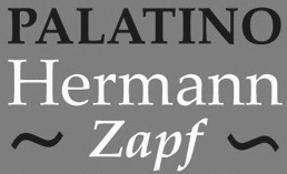 MyFonts selection for Hermann Zapf. [Google]
[More] ⦿
MyFonts selection for Hermann Zapf. [Google]
[More] ⦿
|
MyFonts: Hexagonal typefaces
|
MyFonts selection for hexagonal typefaces. [Google]
[More] ⦿
|
MyFonts: Hieroglyphic typefaces
|
View some hieroglyphic or hieroglyph emulation typefaces. [Google]
[More] ⦿
|
MyFonts: High Fashion typefaces
|
High fashion typefaces in the MyFonts collection. [Google]
[More] ⦿
|
MyFonts: High-contrast typefaces
|
A (large) display of commercial high-contrast typefaces. [Google]
[More] ⦿
|
MyFonts: Highway fonts
|
Highway fonts available from MyFonts. [Google]
[More] ⦿
|
MyFonts: Hip hop typefaces
|
View a collection of hip hop typefaces in the MyFonts collection. [Google]
[More] ⦿
|
MyFonts: Hippie typefaces
|
MyFonts hit list for hippie typefaces. [Google]
[More] ⦿
|
MyFonts: Hipster typefaces
|
Hipster typefaces---typefaces that were hip in 2011-2013 and were tagged as hipster typefaces. [Google]
[More] ⦿
|
MyFonts: Hollywood
|
A selection of typefaces associated with Hollywood. [Google]
[More] ⦿
|
MyFonts: Honey
|
A selection of typefaces with names containing the word honey. [Google]
[More] ⦿
|
MyFonts: Horror typefaces
|
MyFonts lists horror typefaces. [Google]
[More] ⦿
|
MyFonts: Hot
|
Top-ranked fonts at MyFonts on the theme "Hot fonts". Dated October 2011. More recent subpages: i, ii, ii. [Google]
[More] ⦿
|
MyFonts: Hotel typefaces
|
View the typefaces tagged hotel at MyFonts. [Google]
[More] ⦿
|
MyFonts: Humanist sans
|
Top-ranked humanist sans fonts at MyFonts. [Google]
[More] ⦿
|
MyFonts: Humanist typefaces
|
Large web page with all humanist typefaces at MyFonts. Most of these are in the humanist sans category. [Google]
[More] ⦿
|
MyFonts: Hyperbolic typefaces
|
Typefaces that have hyperbolic curvatures. [Google]
[More] ⦿
|
MyFonts: IBM
|
Typefaces related to IBM, such as Courier and IBM Bodoni. [Google]
[More] ⦿
|
MyFonts: Icons
|
MyFonts listing of all fonts tagged with the word "icons". [Google]
[More] ⦿
|
MyFonts: Identikal
|
MyFonts selection for the Identikal foundry. [Google]
[More] ⦿
|
MyFonts: Identity design
|
A listing of typefaces that are appropriate for identity design. [Google]
[More] ⦿
|
MyFonts: Idiosyncratic typefaces
|
View a set of idiosyncratic typefaces. [Google]
[More] ⦿
|
MyFonts: Illuminated typefaces
|
A selection of illuminated typefaces. [Google]
[More] ⦿
|
MyFonts: Illustrations
|
Typefaces containing illustrations, selected from or tagged at MyFonts. [Google]
[More] ⦿
|
MyFonts: Impressionist typefaces
|
A list of impressionist typefaces that are associated with impressionism. These include P22 Gauguin, P22 Cezanne, P22 Monet and others. [Google]
[More] ⦿
|
MyFonts: Impressionist typefaces
|
Impressionist typefaces, as selected from the MyFonts library. [Google]
[More] ⦿
|
MyFonts: Impulsive typefaces
|
A visual comparison of many of the commercial digital typefaces for impulsive people. [Google]
[More] ⦿
|
MyFonts: Incised typefaces
|
Large web page with all incised (flared) typefaces at MyFonts. [Google]
[More] ⦿
|
MyFonts: Incunabula
|
A selection of digital typefaces that are related to incunabula (printing from the renaissance and Gutenberg eras). [Google]
[More] ⦿
|
MyFonts: Industrial mechanical typefaces
|
A selection of industrial / mechanical typefaces at MyFonts. [Google]
[More] ⦿
|
MyFonts: Industrial sans
|
Top-ranked industrial sans fonts at MyFonts. See also here. [Google]
[More] ⦿
|
MyFonts: Industrial typefaces
|
A selection of typefaces at MyFonts that were tagged as being industrial. [Google]
[More] ⦿
|
MyFonts: Infographics
|
A list of typefaces appropriate for infographics applications. [Google]
[More] ⦿
|
MyFonts: Informal typefaces
|
MyFonts selection of the best-selling informal typefaces. See also here [large web page warning] and here. [Google]
[More] ⦿
|
MyFonts: Information design fonts
|
Fonts for information design are very popular. This web page showcases a few hundred commercial fonts that can be used for information design. View more typefaces that are appropriate for information design. [Google]
[More] ⦿
|
MyFonts: Initials
|
MyFonts selection for the keyword initials. [Google]
[More] ⦿
|
MyFonts: Ink stain, pen-and-ink and inky typefaces
|
A long list of inky typefaces available via MyFonts. [Google]
[More] ⦿
|
MyFonts: Ink traps
|
View a collection of ink trap typefaces in the MyFonts collection. [Google]
[More] ⦿
|
MyFonts: Inky typefaces
|
View a list of inky or ink blot typefaces. [Google]
[More] ⦿
|
MyFonts: Inline typefaces
|
Top inline fonts at MyFonts. [Google]
[More] ⦿
|
MyFonts: Inscribed
|
Long MyFonts list, ranked by popularity, for inscribed typefaces. Short version of the top 50 typefaces. See also here. [Google]
[More] ⦿
|
MyFonts: Inscriptional typefaces
|
A list of inscriptional typefaces. [Google]
[More] ⦿
|
MyFonts: Interior shading
|
A selection of typefaces with interior shading. [Google]
[More] ⦿
|
MyFonts: Interlocking typefaces
|
A list of typefaces with interlocking glyphs. [Google]
[More] ⦿
|
MyFonts: Invitation scripts
|
A long list of typefaces one could use for invitations. Many of these are script fonts. [Google]
[More] ⦿
|
MyFonts: Ionic
|
MyFonts hit list for ionic typefaces, which are mostly used for news text. [Google]
[More] ⦿
|
MyFonts: Irish typefaces
|
MyFonts hit list for Irish typefaces. View a longer list of Irish typefaces. [Google]
[More] ⦿
|
MyFonts: Ironwork typefaces
|
Ironwork typefaces from the MyFonts collection. [Google]
[More] ⦿
|
MyFonts: Isaac Moore
|
MyFonts selection for Isaac Moore. [Google]
[More] ⦿
|
MyFonts: Isometric typefaces
|
The top typefaces at MyFonts that are tagged as isometric. [Google]
[More] ⦿
|
MyFonts: Italian
|
Top-ranked Italian fonts at MyFonts. A larger page with Italian fonts. [Google]
[More] ⦿
|
MyFonts: Italy
|
MyFonts.com links on Italian typography. [Google]
[More] ⦿
|
MyFonts: Jagged typefaces
|
A list of jagged typefaces on the MyFonts site. [Google]
[More] ⦿
|
MyFonts: Japanese fonts
|
Japanese fonts sold by MyFonts. [Google]
[More] ⦿
|
MyFonts: Jazz fonts
|
MyFonts pages on the theme of jazz. [Google]
[More] ⦿
|
MyFonts: Jazzy typefaces
|
A selection of jazzy typefaces. [Google]
[More] ⦿
|
MyFonts: Jenson
|
View the digital typefaces that are related to Jenson, and that can be bought at MyFonts. See also here and here. [Google]
[More] ⦿
|
MyFonts: Jessica's dingbats
|
The dingbat collection assembled by "Jessica". [Google]
[More] ⦿
|
MyFonts: Jewelry typefaces
|
Compare some commercial typefaces that are appropriate for jewelry. [Google]
[More] ⦿
|
MyFonts: Johnston
|
A list of typefaces that are related to Edward Johnston's typeface for the railway. See also here. [Google]
[More] ⦿
|
MyFonts: Josef Tyfa
|
MyFonts selection for Josef Tyfa. [Google]
[More] ⦿
|
MyFonts: Joshua Darden's Freight
|
MyFonts selection for Joshua Darden. [Google]
[More] ⦿
|
MyFonts: Jugendstil
|
Top Jugendstil fonts at MyFonts. Additional pagfe on Jugendstil typefaces. [Google]
[More] ⦿
|
MyFonts: Jules Verne
|
Jules Verne is one of the pioneers of sci-fi novels. His books inspired styles that recall his era, such as the steampipe style. This page lsts a couple of Jules Verne-inspired digital typefaces. [Google]
[More] ⦿
|
MyFonts: Jungle fonts
|
MyFonts selection of jungle fonts. [Google]
[More] ⦿
|
MyFonts: Justus Erich Walbaum's typefaces
|
 MyFonts selection for Justus Erich Walbaum's typefaces. See also here. [Google]
[More] ⦿
MyFonts selection for Justus Erich Walbaum's typefaces. See also here. [Google]
[More] ⦿
|
MyFonts: Kanzlei
|
A selection of Kanzlei typefaces, i.e., ornamental blackletter typefaces. See also here. [Google]
[More] ⦿
|
MyFonts: Keystone Type Foundry
|
MyFonts hit list for revivals of typefaces from the Keystone Type Foundry. [Google]
[More] ⦿
|
MyFonts: Kim Buker Chansler
|
MyFonts selection of fonts for Kim Buker Chansler [Google]
[More] ⦿
|
MyFonts: Kindergarten fonts
|
A list of commercial kindergarten fonts. [Google]
[More] ⦿
|
MyFonts: Kuenstler typefaces
|
A list of fonts tagged as Kuenstler typefaces on the MyFonts site. [Google]
[More] ⦿
|
MyFonts: Lachrymal terminals
|
Typefaces with lachrymal (tear drop) terminals, as culled from the MyFonts type library. [Google]
[More] ⦿
|
MyFonts: Lapidary typefaces
|
Typefaces tagged lapidary at MyFonts. The main representatives are Eric Gill's Perpetua and Berthold Wolpe's Albertus MT. [Google]
[More] ⦿
|
MyFonts: Large aperture typefaces
|
All typefaces at MyFonts tagged as having a large aperture. [Google]
[More] ⦿
|
MyFonts: Large x-height
|
Typefaces with a large x-height, as harvested from MyFonts. Typefaces with high x-height. These typefaces are typically associated with readability and are thought to be useful for small print applications such as telephone directories. Unfortunately, they are almost uniformly ugly. [Google]
[More] ⦿
|
MyFonts: Large-eyed typefaces
|
From the MyFonts collection: large-eyed typefaces. [Google]
[More] ⦿
|
MyFonts: Las Vegas style typefaces
|
View the typefaces tagged Las Vegas at MyFonts. See also here. [Google]
[More] ⦿
|
MyFonts: Latinotype
|
The top typefaces at MyFonts from Latinotype, a foundry in Concepcion, Chile. [Google]
[More] ⦿
|
MyFonts: Lava lamp typefaces
|
A list of lava lamp typefaces. [Google]
[More] ⦿
|
MyFonts: Layered typefaces
|
A collection of layered typefaces. [Google]
[More] ⦿
|
MyFonts: LED fonts
|
View commercial LED fonts. [Google]
[More] ⦿
|
MyFonts: Legible typefaces
|
 MyFonts hit list for the tag word "legible". Long list of legible typefaces [large web page warning]. [Google]
[More] ⦿
MyFonts hit list for the tag word "legible". Long list of legible typefaces [large web page warning]. [Google]
[More] ⦿
|
MyFonts: Letter Gothic
|
 Compare the original Letter Gothic and its digital descendants. [Google]
[More] ⦿
Compare the original Letter Gothic and its digital descendants. [Google]
[More] ⦿
|
MyFonts: Letterbats
|
View letterbat (or alphading) typefaces at MyFonts. [Google]
[More] ⦿
|
MyFonts: Letterhead
|
MyFonts suggests these fonts for use on letterhead. [Google]
[More] ⦿
|
MyFonts: Lettering
|
Most relevant typefaces at MyFonts for the keyword lettering. Additional page. [Google]
[More] ⦿
|
MyFonts: Letterpress simulation typefaces
|
MyFonts: Letterpress simulation typefaces. [Google]
[More] ⦿
|
MyFonts: License Plate Fonts
|
A visual comparison of many of the commercial digital license plate fonts. [Google]
[More] ⦿
|
MyFonts: Ligatures
|
Many fonts stand out by their abundance of ligatures. They are making use of several features in the OpenType format to provide the user with often thousands of ligatures. Some of these fonts are listed here. [Google]
[More] ⦿
|
MyFonts: Lineal
|
Top-ranked fonts at MyFonts on the theme "Lineal". [Google]
[More] ⦿
|
MyFonts: Linear or lineale fonts
|
A selection of linear (or lineale) typefaces at MyFonts. [Google]
[More] ⦿
|
MyFonts: Linear sans typefaces
|
A long list of linear sans typefaces. [Google]
[More] ⦿
|
MyFonts: Lino cut typefaces
|
A small collection of commercial lino cut or woodcut typefaces. [Google]
[More] ⦿
|
MyFonts: Linocut typefaces
|
Commercial linocut typefaces include [Google]
[More] ⦿
|
MyFonts: Linotype
|
Bestselling Linotype fonts at MyFonts. [Google]
[More] ⦿
|
MyFonts: Lipstick fonts
|
Commercial lipstick fonts include several offerings by Alex Haigh's Thinkdust such as Mr. Chalk, Lippy and Lippy Sans [link]. Okaycat created Arco Crayon and Okay Crayon. Also of interest are Lipstick by Canada Type, Crayon Hand by Ursula Hitz, Crayonista and Crayon Crumble by David Kerkhoff, and Drawzing by Fonthead Design. In the dingbat category, check Diva Doodles by Outside The Line, and Lipstick Extras by Canada Type. Myfonts typefaces for the keywords crayon and lisptick. [Google]
[More] ⦿
|
MyFonts: List of all fonts
|
[More] ⦿
|
MyFonts: List of all foundries
|
[More] ⦿
|
MyFonts: List of all type designers
|
See also here for the old list, and here for a local list. [Google]
[More] ⦿
|
MyFonts: Lively typefaces
|
MyFonts selection of (often self-nominated) lively typefaces. [Google]
[More] ⦿
|
MyFonts: Logo fonts
|
MyFonts pages on typefaces suitable for logos. [Google]
[More] ⦿
|
MyFonts: Logo typefaces
|
Typefaces with a commercial license that could be used in the design of logos. [Google]
[More] ⦿
|
MyFonts: Logotypes
|
Logotypes are typefaces that are appropriate for logo design. [Google]
[More] ⦿
|
MyFonts: Lombardic typefaces
|
A small collection of commercial textured typefaces. [Google]
[More] ⦿
|
MyFonts: Lombardic typefaces
|
A small collection of commercial Lombardic typefaces. [Google]
[More] ⦿
|
MyFonts: Lounge typefaces
|
Lounge typefaces go back to the era of lounge jazz, James Bond, and martinis with colored umbrellas. View some of these retro fonts here. [Google]
[More] ⦿
|
MyFonts: Low res typefaces
|
Low res typefaces, as selected from the MyFonts library. [Google]
[More] ⦿
|
MyFonts: Lunar typefaces
|
Typefaces on the theme of the moon. [Google]
[More] ⦿
|
MyFonts: Luxury
|
 MyFonts selection for the keyword luxury. [Google]
[More] ⦿
MyFonts selection for the keyword luxury. [Google]
[More] ⦿
|
MyFonts: Lyrical typefaces
|
Lyrical typefaces, as culled from the MyFonts type library. [Google]
[More] ⦿
|
MyFonts: Macho typefaces
|
All typefaces at MyFonts tagged macho. [Google]
[More] ⦿
|
MyFonts: MAG time fonts
|
MyFonts selection for MAG time fonts. [Google]
[More] ⦿
|
MyFonts: Magazine fonts
|
Top-ranked magazine fonts at MyFonts. See also here. [Google]
[More] ⦿
|
MyFonts: Magic
|
Typefaces tagged magic at MyFonts. [Google]
[More] ⦿
|
MyFonts: Magnolia's album
|
Magnolia's album at MyFonts has about 60 fresh display typefaces. [Google]
[More] ⦿
|
MyFonts: Manfred Klein
|
MyFonts selection for Manfred Klein. [Google]
[More] ⦿
|
MyFonts: Manicule
|
Manicules at MyFonts. [Google]
[More] ⦿
|
MyFonts: Manicules
|
Typefaces with manicules (fists). [Google]
[More] ⦿
|
MyFonts: Mannerism
|
A list of mannerist typefaces at the MyFonts site. [Google]
[More] ⦿
|
MyFonts: Mannerist typefaces
|
Mannerist typefaces, as culled from the MyFonts type library. Mannerism is an artistic style that covered basically the period 1520-1580. [Google]
[More] ⦿
|
MyFonts: Manuals
|
Most relevant typefaces at MyFonts for the keyword manuals. [Google]
[More] ⦿
|
MyFonts: Marker pen typefaces
|
Commercial typefaces that simulate writing with a marker pen. [Google]
[More] ⦿
|
MyFonts: Marquee typefaces
|
MyFonts selection for the keyword marquee. [Google]
[More] ⦿
|
MyFonts: Masculine
|
 Top-ranked fonts at MyFonts on the theme "Masculine". A long list of masculine typefaces [Large web page warning]. [Google]
[More] ⦿
Top-ranked fonts at MyFonts on the theme "Masculine". A long list of masculine typefaces [Large web page warning]. [Google]
[More] ⦿
|
MyFonts: Masks
|
Typefaces with masks are listed here. [Google]
[More] ⦿
|
MyFonts: Masks
|
A collection of typefaces with masks. [Google]
[More] ⦿
|
MyFonts: Massive typefaces
|
A list of commercial typefaces tagged as being massive. [Google]
[More] ⦿
|
MyFonts: Masthead typefaces
|
All masthead typefaces at MyFonts. A longer list of masthead typefaces. [Google]
[More] ⦿
|
MyFonts: Mechanical fonts
|
All typefaces at MyFonts tagged mechanical. See also here. [Google]
[More] ⦿
|
MyFonts: Median spurs
|
A list of typefaces with median spurs. Typefaces in this style are sometimes referred to as tattoo fonts. [Google]
[More] ⦿
|
MyFonts: Medical typefaces
|
Medical typefaces, as selected from the MyFonts library. [Google]
[More] ⦿
|
MyFonts: Medical typefaces
|
MyFonts selection of medical typefaces. These are mostly dingbats with pharamceutical or medical care symbology. [Google]
[More] ⦿
|
MyFonts: Medieval typefaces
|
A selection of medieval typefaces discovered in the dungeons of MyFonts. [Google]
[More] ⦿
|
MyFonts: Memphis
|
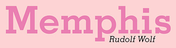 Memphis (by Rudolf Wolf) and related Egyptian digital typefaces. [Google]
[More] ⦿
Memphis (by Rudolf Wolf) and related Egyptian digital typefaces. [Google]
[More] ⦿
|
MyFonts: Menu types
|
MyFonts selection of typefaces that were flagged by them for use on menus. More menu fonts. [Google]
[More] ⦿
|
MyFonts: Mercantile typefaces
|
From the MyFonts collection: mercantile typefaces. These typefaces are associated with the British empire in the Victorian age, the late 1800s. [Google]
[More] ⦿
|
MyFonts: Merriment
|
A visual comparison of many of the commercial typefaces that can be used to illustrate merriment. [Google]
[More] ⦿
|
MyFonts: Messy typefaces
|
Typefaces that are deliberately messy. [Google]
[More] ⦿
|
MyFonts: Metallic typefaces
|
MyFonts lists metallic typefaces. [Google]
[More] ⦿
|
MyFonts: Mexican typefaces
|
MyFonts selection of Mexican typefaces, i.e., typefaces that look Mexican or have a Mexican symbolism. [Google]
[More] ⦿
|
MyFonts: MICR
|
MyFonts selection of MICR typefaces. [Google]
[More] ⦿
|
MyFonts: Microramma-like typefaces
|
A list of commercial typefaces that could possibly be used in lieu of Nebiolo's Microgramma. [Google]
[More] ⦿
|
MyFonts: Middle ages
|
A selection of medieval typefaces discovered in the belly of MyFonts. [Google]
[More] ⦿
|
MyFonts: Military stencil typefaces
|
MyFonts hit list for military stencil typefaces. [Google]
[More] ⦿
|
MyFonts: Military typefaces
|
Top military fonts at MyFonts. These are often stencil or cargo fonts. [Google]
[More] ⦿
|
MyFonts: Modern typefaces
|
Modern typefaces as culled from the MyFonts site. The tag modern is used there in a very broad sense. Classically, modern refers to didones such as Didot, Bodoni, Walbaum and descendants, but the label is used for anything that seems to be fresh or new. [Google]
[More] ⦿
|
MyFonts: Modernism
|
MyFonts selection of modernist typefaces. See also here. [Google]
[More] ⦿
|
MyFonts: Modernistic typefaces
|
Modernistic typefaces include a mish-mash of typefaces that are considered to be contemporary, but what is contemporary today is old-fashioned tomorrow. Not to be confused with modern typefaces. The cterm modern is well entrenched in typographic circles and refers to didone typefaces. [Google]
[More] ⦿
|
MyFonts: Modest typefaces
|
I am not sure what is meant by modest typefaces, but many are tagged that way at MyFonts. [Google]
[More] ⦿
|
MyFonts: Modulated typefaces
|
Modulated typefaces at the MyFonts site. [Google]
[More] ⦿
|
MyFonts: Monastery
|
MyFonts selection for the tag word monastery. [Google]
[More] ⦿
|
MyFonts: Monastic typefaces
|
MyFonts selection for the tag word monastic. See also here and here. [Google]
[More] ⦿
|
MyFonts: Money fonts
|
At MyFonts, some typefaces are tagged with the word "money"---some of these are in the engraved or other styles used on bank notes. [Google]
[More] ⦿
|
MyFonts: Monogram typefaces
|
Typefaces appropriate for making monograms. [Google]
[More] ⦿
|
MyFonts: Monoline script typefaces
|
A selection of monoline script typefaces at MyFonts. [Google]
[More] ⦿
|
MyFonts: Monoline typefaces
|
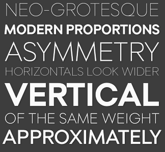 Monocase and monoline are identical notions---they refer to typefaces with uniform stroke width. This huge page [large web page warning] has all the typefaces tagged as monoline at MyFonts. [Google]
[More] ⦿
Monocase and monoline are identical notions---they refer to typefaces with uniform stroke width. This huge page [large web page warning] has all the typefaces tagged as monoline at MyFonts. [Google]
[More] ⦿
|
MyFonts: Monolinear sans typefaces
|
A selection of monolinear (or monoline) sans typefaces at MyFonts. [Google]
[More] ⦿
|
MyFonts: Monospace
|
The most popular fonts in the MyFonts monospace category in 2011. At the top was Moki (Face Type). In the top six, there are three typewriter types: Decima Mono (Tipografia Ramis: note that this was upgraded in 2014 to Decima Mono X and extended in 2015 to Decima Mono Round and in 2017 to Decima Mono Cyr), Letter Gothic (URW++) and Default (omtype). See also here. [Google]
[More] ⦿
|
MyFonts: Monsters
|
A list of Halloween and monster typefaces that are available via MyFonts. [Google]
[More] ⦿
|
MyFonts: Montreal
|
A list of typefaces that are either called Montreal or are related to Montreal. [Google]
[More] ⦿
|
MyFonts: Most popular new fonts of 2012
|
 MyFonts publishes the most popular fonts (by revenue) of 2012 that first appeared in 2012 [otherwise, Proxima Nova or Brandon Grotesque would have won]. Here is the list:
 [Google]
[More] ⦿
|
MyFonts: Motorcycle fonts
|
A list of motorcycle typefaces. Besides typefaces that have images of motorcycles, this list also includes tattoo fonts. [Google]
[More] ⦿
|
MyFonts: Multiline typefaces
|
 Top multiline fonts at MyFonts. See also here and here. [Google]
[More] ⦿
Top multiline fonts at MyFonts. See also here and here. [Google]
[More] ⦿
|
MyFonts Musings
|
A type blog maintained by the employees of MyFonts. [Google]
[More] ⦿
|
MyFonts: MVB Verdigris
|
MyFonts pages on the Verdigris family of garalde fonts by Mark van Bronkhorst (MVB Design). [Google]
[More] ⦿
|
MyFonts: Mysterious typefaces
|
A display of commercial typefaces that were tagged mysterious. [Google]
[More] ⦿
|
MyFonts: Mythological fonts
|
Fonts that are related to myths or mythology. [Google]
[More] ⦿
|
MyFonts: Mythological typefaces
|
A selection of mythological typefaces. [Google]
[More] ⦿
|
MyFonts: Narrow didone typefaces
|
The narrow or condensed didone look is very popular in newspaper circles. This page shows about 100 such typefaces as culled cfrom the MyFonts collection. [Google]
[More] ⦿
|
MyFonts: Narrow typefaces
|
Typefaces tagged narrow at MyFonts. [Huge web page warning.] [Google]
[More] ⦿
|
MyFonts: Native typefaces
|
View some commercial typefaces that include dingbats with native American symbology, or are alphabetic but on the same theme. [Google]
[More] ⦿
|
MyFonts: Nautical fonts
|
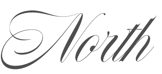 A selection of typefaces tagged nautical at MyFonts. [Google]
[More] ⦿
A selection of typefaces tagged nautical at MyFonts. [Google]
[More] ⦿
|
MyFonts: Negative typefaces
|
The link has a list of negative typefaces, i.e., white-on-black-background typefaces. These includes numbers or letters in circles, and so forth. [Google]
[More] ⦿
|
MyFonts: Neoclassical typefaces
|
Neoclassical typefaces, as culled from the MyFonts type library. Neoclassicism covers the period 1700--1800. [Google]
[More] ⦿
|
MyFonts: Neo-grotesque typefaces
|
A selection of neo-grotesque typefaces at MyFonts. Additional link. [Google]
[More] ⦿
|
MyFonts: Neohumanism
|
Neohumanist typefaces are mostly humanist sans typefaces, i.e., sans typefaces with ancient calligraphic roots sufficiently watered down to fit into the sans mould. Wikipedia defines neohumanism in this manner: Neohumanism is a holistic philosophical theory elaborated by Prabhat Ranjan Sarkar in his 1982 book, The Liberation of Intellect: Neohumanism. With neohumanism, Sarkar redefines both humanity and humanism, as well as various commonly associated concepts. In addition, Sarkar introduces many new concepts intended to facilitate both individual and collective progress. In this philosophy universalism plays a central role. If humanism tends to only cover the human dimension in a human-centric view, neohumanism, according to Sarkar, is instead the elevation of humanism to universalism. I believe that the type designers who called their typefaces neohumanist had this in mind. They just wanted to say that these humanist sans fonts were recently created. [Google]
[More] ⦿
|
MyFonts: Neon typefaces
|
MyFonts selection of neon typefaces. See also here. [Google]
[More] ⦿
|
MyFonts: Neue Haas Grotesk
|
 Neue Haas Grotesk style typefaces. [Google]
[More] ⦿
Neue Haas Grotesk style typefaces. [Google]
[More] ⦿
|
MyFonts: Neutral sans typefaces
|
A list of neutral sans typefaces. [Google]
[More] ⦿
|
MyFonts: Neutral typefaces
|
The most popular neutral typefaces at MyFonts. A long list of neutral typefaces. [Google]
[More] ⦿
|
MyFonts: News headline typefaces
|
MyFonts hit list for news headline typefaces. View a long list of news headline typefaces. [Google]
[More] ⦿
|
MyFonts: News print typefaces
|
Large web page with all typefaces at MyFonts that are suited for use in news print (or are tagged that way by visitors). [Google]
[More] ⦿
|
MyFonts: News text typefaces
|
 MyFonts hit list for news text typefaces. Long list of news text typefaces. [Google]
[More] ⦿
MyFonts hit list for news text typefaces. Long list of news text typefaces. [Google]
[More] ⦿
|
MyFonts: Newspaper typefaces
|
Top-ranked fonts at MyFonts on the theme "Newspaper typefaces". [Google]
[More] ⦿
|
MyFonts: Newsprint
|
MyFonts selection for typefaces fit for newsprint. I am not sure I agree with this selection, but there are several good representatives. [Google]
[More] ⦿
|
MyFonts: Nib
|
Typefaces tagged nib at MyFonts. Most of these are calligraphic or script fonts. [Google]
[More] ⦿
|
MyFonts: Nick Curtis
[Nick Curtis]
|
MyFonts hit list for Nick Curtis's typefaces, ordered from top sellers on down. View the complete list of Nick Curtis's typefaces made up to the end of 2011 [large web page warning!]. View the typefaces designed by Nick Curtis. [Google]
[More] ⦿
|
MyFonts: Nicolas Kis
|
Commercial typefaces based on Nicolas Kis's type [or Janson's type]: [Google]
[More] ⦿
|
MyFonts: Nightclub style
|
Top "nightclub fonts" at MyFonts [large web page warning]. A truncated list of the top nightclub fonts. [Google]
[More] ⦿
|
MyFonts: Nightlife typefaces
|
Typefaces related to nightlife. [Google]
[More] ⦿
|
MyFonts: Ninja typefaces
|
Ninja typefaces, as selected from the MyFonts library. [Google]
[More] ⦿
|
MyFonts: Normande
|
The main Normande typefaces at MyFonts: Normande is the so called fat face, an ultra heavy didone display face. The original was by Berthold. [Google]
[More] ⦿
|
MyFonts: Norse typefaces
|
View a selection of Norse typefaces. [Google]
[More] ⦿
|
MyFonts: Nostalgic typefaces
|
A list of nostalgic typefaces. Trendy, mood-setting fonts. [Google]
[More] ⦿
|
MyFonts: Notebook typefaces
|
Notebook typefaces, as selected from the MyFonts library. View more notebook fonts. [Google]
[More] ⦿
|
MyFonts: Numbers in circles
|
A list of commercial typefaces that have circled numbers. [Google]
[More] ⦿
|
MyFonts: Oceanic typefaces
|
Oceanic typefaces are somehow related to oceans and seas, either in looks (wavy), application (naval maps) or grandeur. [Google]
[More] ⦿
|
MyFonts: OCR
|
MyFonts selection of OCR A and OCR B typefaces. [Google]
[More] ⦿
|
MyFonts: Oddball typefaces
|
Oddball typefaces are often cartoon fonts. This page displays fifteen commercial typefaces that are tagged as oddball. [Google]
[More] ⦿
|
MyFonts: Offbeat typefaces
|
A list of offbeat typefaces. [Google]
[More] ⦿
|
MyFonts: Office fonts
|
Compare ffice fonts, defined in a broad sense. [Google]
[More] ⦿
|
MyFonts: Oktober Fest typefaces
|
A list of typefaces related to Bavaria's Oktober Fest. These are mostly beer label fonts. [Google]
[More] ⦿
|
MyFonts: Old English typefaces
|
From the MyFonts collection: Old English typefaces. [Google]
[More] ⦿
|
MyFonts: Old map typefaces
|
A list of typefaces that simulate the type used on ancient maps. [Google]
[More] ⦿
|
MyFonts: Old Russian typefaces
|
MyFonts selection for the tag old Russian. [Google]
[More] ⦿
|
MyFonts: Old style
|
Top-ranked old style fonts at MyFonts. [Google]
[More] ⦿
|
MyFonts: Old style numerals
|
MyFonts selection for typefaces that feature old style numerals. [Google]
[More] ⦿
|
MyFonts: Old style typefaces
|
A collection of old style typefaces that can be seen at MyFonts. [Google]
[More] ⦿
|
MyFonts: Op art fonts
|
Op art fonts use optical effects to achieve an artistic ideal. They include hypnotic fonts, and are often arched or multilined. [Google]
[More] ⦿
|
MyFonts: Openface fonts
|
 Top openface fonts at MyFonts. [Google]
[More] ⦿
Top openface fonts at MyFonts. [Google]
[More] ⦿
|
MyFonts: Opera typefaces
|
I do not known what the definition is of an opera typeface, but about a dozen fonts are tagged in that manner at MyFonts. [Google]
[More] ⦿
|
MyFonts: Optical illusion typefaces
|
Optical illusion typefaces are often 3d typefaces with some Escher-like effects that seem impossible. [Google]
[More] ⦿
|
MyFonts: Optical sizes
|
From the MyFonts collection: typefaces with several optical sizes. [Google]
[More] ⦿
|
MyFonts: Optically corrected typefaces
|
MyFonts selection of optically corrected typefaces. [Google]
[More] ⦿
|
MyFonts: Organic sans typefaces
|
MyFonts' selection of organic sans typefaces. [Google]
[More] ⦿
|
MyFonts: Organic typefaces
|
Typefaces tagged organic at MyFonts. These include the awkward sans style typefaces that seem like they were obtained by cutting off serifs and performing other chirurgical acts to make the letters simpler, and typefaces that would do well in agricultural magazines and in organic product stores. Another list of organic typefaces. [Google]
[More] ⦿
|
MyFonts: Origami
|
A selection of origami typefaces at MyFonts. [Google]
[More] ⦿
|
MyFonts: Ornate fonts
|
MyFonts' selection of ornate typefaces. [Google]
[More] ⦿
|
MyFonts: Orthodox typefaces
|
A list of orthodox typefaces. These are typefaces whose style is reminiscent of religious orthodox documents. [Google]
[More] ⦿
|
MyFonts: Oswald Cooper
|
 MyFonts selection for Oswald Cooper [Google]
[More] ⦿
MyFonts selection for Oswald Cooper [Google]
[More] ⦿
|
MyFonts: Oval typefaces
|
Oval typeface collection. [Google]
[More] ⦿
|
MyFonts: Packaging
|
Typefaces appropriate for packaging. These include both practical typefaces, as well as signage / advertising typefaces. [Google]
[More] ⦿
|
MyFonts: Palatino
|
 A list of commercial digital versions of Palatino (1948, Hermann Zapf). [Google]
[More] ⦿
A list of commercial digital versions of Palatino (1948, Hermann Zapf). [Google]
[More] ⦿
|
MyFonts: Palm Y typefaces
|
Y's with widening open arms are called palm Y glyphs. This page contains about twenty typefaces that have this feature, usually in their capital set. [Google]
[More] ⦿
|
MyFonts: Paperback typefaces
|
A list, ranked by relevance, that shows the typefaces appropriate for paperbacks. [Google]
[More] ⦿
|
MyFonts: Paperclip typefaces
|
MyFonts selection of paperclip typefaces. [Google]
[More] ⦿
|
MyFonts: Parisian typefaces
|
Parisian typefaces are either from Parisian foundries of the turn of the century (Peignot, Deberny) or typefaces that conjure up that era. [Google]
[More] ⦿
|
MyFonts: Pastry or patisserie fonts
|
Typefaces that can be used in pastry shops, as well as dingbats related to such shops. [Google]
[More] ⦿
|
MyFonts: Pat Hickson
|
MyFonts selection for Pat Hickson, a designer at Red Rooster. [Google]
[More] ⦿
|
MyFonts: Patriotic fonts
|
Patriotic fonts, as culled from the MyFonts type library. [Google]
[More] ⦿
|
MyFonts: Patterned typefaces
|
A list of patterned typefaces available via MyFonts. [Google]
[More] ⦿
|
MyFonts: Pearly or bejeweled typefaces
|
 These typefaces have pearls built into the decorations of the glyphs:
 [Google]
[More] ⦿
|
MyFonts: Pen typefaces
|
View pen typefaces at MyFonts. [Google]
[More] ⦿
|
MyFonts: Pencil typefaces
|
Typefaces based on pencil drawings. [Google]
[More] ⦿
|
MyFonts: Penmanship fonts
|
A collection of fonts in the penmanship style, harvested by a user on MyFonts. [Google]
[More] ⦿
|
MyFonts: Perfume typefaces
|
Compare some commercial typefaces that are appropriate for perfumes. [Google]
[More] ⦿
|
MyFonts: Picasso
|
Typefaces related to Picasso, as selected from the MyFonts library. View more typefaces inspired by Picasso. A partial listing: [Google]
[More] ⦿
|
MyFonts: Pirate typefaces
|
Typefaces associated with pirates or pirate books, as selected from the MyFonts library. Another list of pirate fonts. [Google]
[More] ⦿
|
MyFonts: Plakat typefaces
|
From the MyFonts collection: Plakat typefaces. Plakat is the German word for poster. [Google]
[More] ⦿
|
MyFonts: Plakatstil typefaces
|
Compare some commercial Plakatstil (poster) typefaces. [Google]
[More] ⦿
|
MyFonts: Plantin
|
 The main typefaces at MyFonts that are related to Plantin, either Granjon's original (which is still at the Plantin Museum), or the version by Frank Pierpont Hinman for Monotype, done in 1913-1914. Plantin-like typefaces. [Google]
[More] ⦿
The main typefaces at MyFonts that are related to Plantin, either Granjon's original (which is still at the Plantin Museum), or the version by Frank Pierpont Hinman for Monotype, done in 1913-1914. Plantin-like typefaces. [Google]
[More] ⦿
|
MyFonts: Playful typefaces
|
A listing of playful typefaces at the MyFonts site. [Google]
[More] ⦿
|
MyFonts: Playground fonts
|
A list of commercial typefaces that are associated wit playgrounds. [Google]
[More] ⦿
|
MyFonts: Plump typefaces
|
Plump typefaces. [Google]
[More] ⦿
|
MyFonts: Poetic typefaces
|
A list of typefaces specifically designed for use in poems. See also here. [Google]
[More] ⦿
|
MyFonts: Poetry
|
Typefaces for setting poetry. [Google]
[More] ⦿
|
MyFonts: Pointed nib typefaces
|
A list of calligraphic typefaces based on pointed nib lettering. [Google]
[More] ⦿
|
MyFonts: Pointed pen typefaces
|
View a list of pointed pen typefaces. [Google]
[More] ⦿
|
MyFonts: Poker typefaces
|
A list of typefaces with the tag poker at the MyFonts site. These include some fonts for card games. [Google]
[More] ⦿
|
MyFonts: Political typefaces
|
Typefaces tagged political by some typophiles and font designers. [Google]
[More] ⦿
|
MyFonts: Polygonal typefaces
|
Polygonal typefaces, as selected from the MyFonts library. Many of these are either angular or octagonal. See also this list of polygonal typefaces. [Google]
[More] ⦿
|
MyFonts: Pop art typefaces
|
MyFonts selection of Pop Art typefaces. [Google]
[More] ⦿
|
MyFonts: Postcard typefaces
|
A list of postcard typefaces on the MyFonts site. [Google]
[More] ⦿
|
MyFonts: Poster Fonts
|
The most popular fonts in the MyFonts poster font category in 2011. See also here. View 2711 poster fonts [huge web page warning]. View over 3000 poster typefaces [mammoth web page warning]. [Google]
[More] ⦿
|
MyFonts: Postmodernist typefaces
|
A selection of typefaces tagged postmodern at MyFonts. View more postmodernist typefaces. [Google]
[More] ⦿
|
MyFonts: Potato cut typefaces
|
Typefaces that simulate potato cut stamp printing. [Google]
[More] ⦿
|
MyFonts: Présence Typo
|
MyFonts selection for Présence Typo's typefaces. [Google]
[More] ⦿
|
MyFonts: Pre-Columbian Typefaces
|
A short list of pre-Columbian typefaces, i.e., typefaces that relate to Latin American culture before Columbus. Pre-Columbus would have been a better name. [Google]
[More] ⦿
|
MyFonts: Pre-Hispanic typefaces
|
A short list of pre-hispanic typefaces, i.e., typefaces that relate to Latin American culture before Columbus. [Google]
[More] ⦿
|
MyFonts: Primitive typefaces
|
Primitive typefaces are not typefaces made by beginners, but rather typefaces that evoke something raw and basic, void of frills, swashes, and other luxuries. [Google]
[More] ⦿
|
MyFonts: Prismatic fonts
|
MyFonts pages on prismatic fonts. See also here. [Google]
[More] ⦿
|
MyFonts: Programming
|
A list of typefaces for coding / programming, available via MyFonts. [Google]
[More] ⦿
|
MyFonts: Propaganda typefaces
|
MyFonts selection for the keyword propaganda. A shorter list of propaganda fonts. [Google]
[More] ⦿
|
MyFonts: Psychedelic type
|
MyFonts hit list for psychedelic typefaces from the good old 1960s. [Google]
[More] ⦿
|
MyFonts: Punch
|
Typefaces for punch include vintage lemonade bottle types. View a selection of commercial typefaces that evoke that mood. [Google]
[More] ⦿
|
MyFonts: Punk
|
MyFonts lists punk typefaces. Another list of typefaces in the punk style. [Google]
[More] ⦿
|
MyFonts: Quadrata
|
The main Quadrata (blackletter) style typefaces at MyFonts. [Google]
[More] ⦿
|
MyFonts: Quaint typefaces
|
MyFonts selection for the tag quaint typefaces. Another page with typefaces tagged "quaint". [Google]
[More] ⦿
|
MyFonts: Quartz typefaces
|
View commercial quartz (LED, LCD) fonts, often associated with the digits on digital watches. [Google]
[More] ⦿
|
MyFonts: Quill script typefaces
|
Compare some commercial quill script typefaces. See also here. [Google]
[More] ⦿
|
MyFonts: Racecar
|
Racecar typefaces include typefaces with lettering appropriate for logos on racecars or racecar ads. Also included are racecar dingbats. [Google]
[More] ⦿
|
MyFonts: Railroad typefaces
|
A list of railroad typefaces. These include vintage and turn of the century typefaces. [Google]
[More] ⦿
|
MyFonts: Rational typefaces
|
Rational typefaces. [Google]
[More] ⦿
|
MyFonts: Rationalist typefaces
|
Rationalist typefaces, as selected from the MyFonts library. [Google]
[More] ⦿
|
MyFonts: Realist typefaces
|
Realist typefaces, as selected from the MyFonts library. [Google]
[More] ⦿
|
MyFonts: Reclame
|
MyFonts listing of fonts that are appropriate for reclame. [Google]
[More] ⦿
|
MyFonts: Red Rooster
|
MyFonts lists the top selling fonts from Red Rooster. [Google]
[More] ⦿
|
MyFonts: Religious typefaces
|
View a number of religious typefaces. [Google]
[More] ⦿
|
MyFonts: Remington typewriter typefaces
|
Compare some commercial typewriter typefaces that can be traced back to the Remington typewriter. [Google]
[More] ⦿
|
MyFonts: Renaissance
|
 Top Renaissance fonts at MyFonts. Another long list with renaissance fonts. See also here and here. [Google]
[More] ⦿
Top Renaissance fonts at MyFonts. Another long list with renaissance fonts. See also here and here. [Google]
[More] ⦿
|
MyFonts: Restaurant fonts
|
MyFonts selection of fonts that can be used by restaurants for menus and affichage. [Google]
[More] ⦿
|
MyFonts: Restaurant typefaces
|
View the typefaces tagged restaurant at MyFonts. [Google]
[More] ⦿
|
MyFonts: Retro
|
Top-ranked retro fonts at MyFonts. A long list of retro fonts at MyFonts. [Large web page warning.] An equally long page. See also here. [Google]
[More] ⦿
|
MyFonts: Retro futuristic typefaces
|
In the 1950s, the fashion was to draw the future in magazines and publications. Many of those illustrations and typefaces look slightly silly and naively charming today. The movement is called retro-futurism. [Google]
[More] ⦿
|
MyFonts: Retro script typefaces
|
Most relevant retro script typefaces at MyFonts. [Google]
[More] ⦿
|
MyFonts: Reverse contrast fonts
|
Reverse contrast fonts have horizontal stress instead of vertical stress. A trend started with the Italian typefaces used in the Victoirian and Far West eras, it has persisted in billboard fonts until well into the twentieth century. [Google]
[More] ⦿
|
MyFonts: Revolution
|
Typefaces fit for or used in revolutions. Another page. [Google]
[More] ⦿
|
MyFonts: Ribbon typefaces
|
A list of commercial ribbon typefaces. [Google]
[More] ⦿
|
MyFonts: Riveted typefaces
|
View a selection of riveted (mechanical) typefaces. [Google]
[More] ⦿
|
MyFonts: Robot typefaces
|
Typefaces associated with robots and robotics. [Google]
[More] ⦿
|
MyFonts: Robotic typefaces
|
Robotic typefaces culled from the MyFonts library. [Google]
[More] ⦿
|
MyFonts: Robust serifs
|
Typefaces with robust serifs. [Google]
[More] ⦿
|
MyFonts: Robust typefaces
|
A list of robust typefaces. [Google]
[More] ⦿
|
MyFonts: Rococo fonts
|
MyFonts selection for the keyword rococo. [Google]
[More] ⦿
|
MyFonts: Rodeo fonts
|
A selection of typefaces tagged rodeo at MyFonts. [Google]
[More] ⦿
|
MyFonts: Romain du Roi
|
View some typefaces that are related to Romain du Roi. [Google]
[More] ⦿
|
MyFonts: Roman capitals
|
View some digital typefaces that contain a set of roman capitals. [Google]
[More] ⦿
|
MyFonts: Roman serif
|
Most relevant roman serif typefaces at MyFonts. [Google]
[More] ⦿
|
MyFonts: Romance typefaces
|
Digital typefaces tagged with the word romance at MyFonts. [Google]
[More] ⦿
|
MyFonts: Romanesque typefaces
|
A small list of digital romanesque typefaces. [Google]
[More] ⦿
|
MyFonts: Romantic typefaces
|
Romantic typefaces culled from the MyFonts library. Some of these are calligraphic or copperplate script fonts, but there are also a number of cursive typefaces. Some call this style wedding scripts. [Google]
[More] ⦿
|
MyFonts: Ronde typefaces
|
Ronde typefaces in the MyFonts collection. [Google]
[More] ⦿
|
MyFonts: Rotunda
|
Top-ranked Rotunda fonts at MyFonts. [Google]
[More] ⦿
|
MyFonts: Rounded sans typefaces
|
View a collection of rounded sans typefaces in the MyFonts collection. This style was/is fashionable in 2012, and one ciould say that the year 2012 is the year of the rounded sans. [Google]
[More] ⦿
|
MyFonts: Rounded typefaces
|
MyFonts selection of rounded typefaces. These include all those of the rounded sans fad of 2011-2012 such as Neo sans and Neuron, but also oldtimers such as VAG Round. [Google]
[More] ⦿
|
MyFonts: Roundhand typefaces
|
A selection of commercial roundhand typefaces. [Google]
[More] ⦿
|
MyFonts: Royal typefaces
|
View some commercial typefaces that are considered royal. [Google]
[More] ⦿
|
MyFonts: Rubber stamp typefaces
|
Rubber stamp simulation typefaces, complete with all their imperfections. [Google]
[More] ⦿
|
MyFonts: Rudolf Koch
|
 MyFonts selection for Rudolf Koch. [Google]
[More] ⦿
MyFonts selection for Rudolf Koch. [Google]
[More] ⦿
|
MyFonts: Russian deco
|
A collection of commercial typefaces in the Russian art deco style, which leans against constructivism. [Google]
[More] ⦿
|
MyFonts: Russian retro typefaces
|
A list of Latin and/or Cyrillic typefaces on the MyFonts site that are at the same time retro. [Google]
[More] ⦿
|
MyFonts: Rustic typefaces
|
Rustic typefaces, as selected from the MyFonts library. See also here and here. [Google]
[More] ⦿
|
MyFonts: Sabon
|
 A selection of digital typefaces that are called Sabon or are related to Jan Tschichold's Sabon (1966). [Google]
[More] ⦿
A selection of digital typefaces that are called Sabon or are related to Jan Tschichold's Sabon (1966). [Google]
[More] ⦿
|
MyFonts: Saloon fonts
|
MyFonts selection of saloon fonts. [Google]
[More] ⦿
|
MyFonts: Sans typefaces
|
MyFonts hit list for sans typefaces. This is a huge list, and to make the top 50 is a big deal. [Google]
[More] ⦿
|
MyFonts: Sassy typefaces
|
A list of typefaces tagged as sassy at MyFonts. [Google]
[More] ⦿
|
MyFonts: School paper typefaces
|
School paper typefaces on the MyFonts site. [Google]
[More] ⦿
|
MyFonts: Schwabacher
|
Top-ranked Schwabacher fonts at MyFonts. [Google]
[More] ⦿
|
MyFonts: Scientific typefaces
|
Scientific typefaces and typefaces that can be used in scientific publications. [Google]
[More] ⦿
|
MyFonts: Sci-fi typefaces
|
A selection of sci-fi typefaces at MyFonts. [Google]
[More] ⦿
|
MyFonts: Scotch roman typefaces
|
 MyFonts selection for the keyword Scotch roman. These include, in decreasing order of relevance:
 - From Monotype: Scotch Roman. Based on the original Scotch Roman by A.D. Farmer.
- From Font Bureau: Miller, Miller Banner. Designed by Matthew Carter in 1997, and augmented later by Cyrus Highsmith and Tobias Frere-Jones.
- From Adobe: Century Expanded, Inflex, Scotch Roman MT, New Caledonia. Inflex Bold is based on a Scotch Roman fat typeface by Monotype. Scotch Roman MT is identical to the Monotype font by the same name. William A. Dwiggins designed Caledonia for Linotype in 1939 as a mix between Scotch Roman and Bulmer. It is slightly flared and thus not really a pure bred Scotch Roman.
- From Huy Fonts (Juan Jose Lopez): Schotis Text.
- From Insigne (Jeremy Dooley): Schorel (2019).
- From DS Type: Prumo Banner, Prumo Deck, Prumo Display, Prumo Poster, Prumo Slab, Prumo Text,
- From Type Together: Abril Titling, Abril, Portada. Abril was designed by Veronika Burian and Jose Scaglione in 2011.
- From Linotype: Monticello. Designed by Matthew Carter in 2005, this is based on James Ronaldson's Roman No.1 and Oxford typefaces from American Type Founders.
- From Dalton Maag: Bressay
- From Positype: Scotch.
- From Okay Type: Harriet (2012). Winner of a TDC medal in 2012.
- From Berthold: Whittingham BQ. Designed by G.G. Lange and Dieter Hofrichter in 2000, Whittingham is a rendition of the type used around 1840 by Charles Whittingham, founder of the (successful) Chiswick Press in Birmingham, England. It is mostly a didone typeface.
- From Cape Arcona: CA Normal Serif. Created in 2011 by Stefan Claudius.
- From Bitstream: Century Schoolbook.
- From Type Innovations: Directors Cut Pro, My Darling.
- From DTP Types: Century Schoolbook DT.
- from Filmotype: Filmotype Royal.
- From Indian Summer Studio: Dodo, Selectric Century.
- From Indian Type Foundry: Abelard, Equitan Slab.
- From James Todd: Chapman.
- From Jawher Matmati: Roman Ionic.
- From Kimmy Kirkwood: Winslow Book.
- From Letterjuice: Quars.
- From Nick Curtis: Mercantile Display NF.
- From Sudtipos: Distillery.
- From The Ampersand Forest: The Fudge.
[Google]
[More] ⦿
|
MyFonts: Scotch typefaces
|
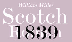 MyFonts selection for Scotch typefaces. [Google]
[More] ⦿
MyFonts selection for Scotch typefaces. [Google]
[More] ⦿
|
MyFonts: Scrapbook typefaces
|
A long list of scrapbook typefaces from the MyFonts vault. [Google]
[More] ⦿
|
MyFonts: Scratched typefaces
|
 Scratched typefaces, as culled from the MyFonts type library. More scratchy typefaces. [Google]
[More] ⦿
Scratched typefaces, as culled from the MyFonts type library. More scratchy typefaces. [Google]
[More] ⦿
|
MyFonts: Scribal typefaces
|
MyFonts selection of scribal typefaces. [Google]
[More] ⦿
|
MyFonts: Scribbly typefaces
|
Commercial typefaces that are scribbly. [Google]
[More] ⦿
|
MyFonts: Script fonts
|
Top-ranked script fonts at MyFonts. See also this MyFonts album. [Google]
[More] ⦿
|
MyFonts: Script typefaces from the 1940s
|
A few commercial digital script typefaces that take inspiration from the 1940s. [Google]
[More] ⦿
|
MyFonts: Script typefaces from the 1950s
|
A few commercial digital script typefaces that take inspiration from the 1950s. [Google]
[More] ⦿
|
MyFonts: Scripts for packaging
|
A list of script typefaces appropriate for packaging. [Google]
[More] ⦿
|
MyFonts: Secession
|
MyFonts hit list for fonts spawned by the Viennese Secession movement in the art nouveau era. See also here. [Google]
[More] ⦿
|
MyFonts: Seductive typefaces
|
A list of seductive typefaces at MyFonts. [Google]
[More] ⦿
|
MyFonts: Semi-serif typefaces
|
Semi-serif typefaces. [Google]
[More] ⦿
|
MyFonts: Sensationalist typefaces
|
A few commercial digital sensationalist typefaces are listed here. [Google]
[More] ⦿
|
MyFonts: Sensual typefaces
|
Sensual typefaces at MyFonts. [Google]
[More] ⦿
|
MyFonts: Serif
|
Top-ranked serif fonts at MyFonts. [Google]
[More] ⦿
|
MyFonts: Sexy typefaces
|
MyFonts selection for the keyword sexy. [Google]
[More] ⦿
|
MyFonts: Shaded typefaces
|
A list of shaded typefaces on the MyFonts site. [Google]
[More] ⦿
|
MyFonts: Shadowed typefaces
|
Commercial shaded typefaces. See also here. [Google]
[More] ⦿
|
MyFonts: Showcard fonts
|
A show card, or showcard, is a tradesman's advertisement mounted on card as a poster. Some fonts are better suited for this than others. This site exhibits a few dozens of commercial showcard fonts. More commercial showcard fonts. [Google]
[More] ⦿
|
MyFonts: Signage
|
Top-ranked signage fonts at MyFonts. [Google]
[More] ⦿
|
MyFonts: Signpainting typefaces
|
Most relevant typefaces at MyFonts for the keyword signpainting. A longer list of signpainting typefaces. [Google]
[More] ⦿
|
MyFonts: Silent movie typefaces
|
Fonts used in the 1810s and 1920s for silent movies. [Google]
[More] ⦿
|
MyFonts: Silhouettes
|
View a collection of silhouette dingbat typefaces in the MyFonts collection. [Google]
[More] ⦿
|
MyFonts: Sjoerd Hendrik de Roos
|
MyFonts selection of fonts for Sjoerd Hendrik de Roos [Google]
[More] ⦿
|
MyFonts: Sketched typefaces
|
MyFonts pages on sketched fonts. Long list of sketched fonts. [Google]
[More] ⦿
|
MyFonts: Sketchy typefaces
|
Sketchy typefaces at MyFonts. [Google]
[More] ⦿
|
MyFonts: Slab serif
|
Top-ranked slab serif fonts at MyFonts. For a long list of slab serif (Egyptian) typefaces, go here. See also this list of fonts with the word Slab in the font name. [Google]
[More] ⦿
|
MyFonts: Slashed zero typefaces
|
A list of typefaces for coding / programming, available via MyFonts. Slashed zero typefaces have a slashed zero to better distinguish it from the upper case O. [Google]
[More] ⦿
|
MyFonts: Sleek typefaces
|
Typefaces tagged sleek at MyFonts. [Google]
[More] ⦿
|
MyFonts: Slits
|
Typefaces with narrow slits as in perfectly executed decolletés. [Google]
[More] ⦿
|
MyFonts: Small sizes
|
MyFonts hit list for fonts designed for small sizes. See also this long list of typefaces that are useful for applications in which smal-sized typefaces are needed. [Google]
[More] ⦿
|
MyFonts: Small text fonts
|
Typefaces designed for uses in small print, either on screen or on paper. [Google]
[More] ⦿
|
MyFonts: Small x-height
|
 Typefaces with a small x-height, as harvested from MyFonts. [Google]
[More] ⦿
Typefaces with a small x-height, as harvested from MyFonts. [Google]
[More] ⦿
|
MyFonts: Small-eyed fonts
|
 Typefaces with small eyes, at MyFonts. [Google]
[More] ⦿
Typefaces with small eyes, at MyFonts. [Google]
[More] ⦿
|
MyFonts: Snow crystal typefaces
|
View a small collection of snow crystal typefaces in the MyFonts collection. [Google]
[More] ⦿
|
MyFonts: Snowflake fonts
|
View a collection of snowflake typefaces in the MyFonts collection. [Google]
[More] ⦿
|
MyFonts: Soccer typefaces
|
Typefaces associated with soccer, from dingbats to lettering for soccer jerseys. [Google]
[More] ⦿
|
MyFonts: Socialist typefaces
|
A list of commercial typefaces that conjure up socialism one way or another. [Google]
[More] ⦿
|
MyFonts: Sophisticated typefaces
|
Fonts tagged with the word sophisticated at MyFonts. Another list of such fonts. [Google]
[More] ⦿
|
MyFonts: Soviet propaganda typefaces
|
MyFonts selection for the key phrase Soviet propaganda. [Google]
[More] ⦿
|
MyFonts: Soviet typefaces
|
MyFonts selection for the keyword Soviet. These are to some extent Soviet era propaganda typefaces. [Google]
[More] ⦿
|
MyFonts: Space age typefaces
|
Space age typefaces, as selected from the MyFonts library. [Google]
[More] ⦿
|
MyFonts: Spaghetti Western typefaces
|
Typefaces appropriate for or used in spaghetti Westerns. [Google]
[More] ⦿
|
MyFonts: Speed
|
A list of typefaces that evoke Speed. Many of these are oblique by the wind effect. [Google]
[More] ⦿
|
MyFonts: Speedball
|
MyFonts selection for the keyword Speedball. View more fonts on the Speedball theme. [Google]
[More] ⦿
|
MyFonts: Spencerian typefaces
|
Spencerian penmanship typefaces, as culled from the MyFonts library. See also here. [Google]
[More] ⦿
|
MyFonts: Spiritual typefaces
|
Spiritual typefaces, as selected from the MyFonts library. [Google]
[More] ⦿
|
MyFonts: Splatter typefaces
|
Splatter typefaces have ink blots, spills, droplets, scratches, or messy stuff around the glyphs. [Google]
[More] ⦿
|
MyFonts: Spooky typefaces
|
A list of spooky typefaces. [Google]
[More] ⦿
|
MyFonts: Spraypaint typefaces
|
Typefaces associated with spraypainting. [Google]
[More] ⦿
|
MyFonts: Spur serif typefaces
|
From the MyFonts collection: spur serif typefaces. See also here. [Google]
[More] ⦿
|
MyFonts: Spurless typefaces
|
From the MyFonts collection: spurless typefaces. [Google]
[More] ⦿
|
MyFonts: Spy typefaces
|
MyFonts selection for typefaces for spies. [Google]
[More] ⦿
|
MyFonts: Squarish typefaces
|
Squarish typefaces, as culled from the MyFonts type library. [Google]
[More] ⦿
|
MyFonts: Stackable typefaces
|
A list of layered or stackable typefaces. [Google]
[More] ⦿
|
MyFonts: Stamped typefaces
|
Stamped typefaces at MyFonts include Eveleth (Yellow Design Studio), Adorn (Laura Worthington), Charcuterie (Laura Worthington), Cpl Kirkwood (Kimmy Design), Alana (Laura Worthington), Funkydori (Laura Worthington), Thunderhouse (Aerotype), Anodyne (Yellow Design Studio), Mocha Mattari (Flat-it), Number Five (Laura Worthington), Vtg Stencil Germany No1 (astype), Wood Bonnet Antique No.7 (astype), Liam (Laura Worthington), Toppo (Laura Worthington), Toppo (Blażej Ostoja Lniski), Applewood (Aerotype), Shelton Slab (HVD Fonts), Bootstrap (Aerotype), Wausau (Yellow Design Studio), Hogwild (Aerotype), Roadkill (Device), Ehmbeecee (AKOFAType), KG All Of Me (Kimberly Geswein), Vtg Stencil US No.72 (astype), PF Fuel Pro (Parachute), Buffalo Circus (Kustomtype), Prison AOE (Astigmatic), Kokoschka (PintassilgoPrints), Bookman Old Style (Monotype), Nadia (Type Innovations), FM Christmas 2.0 (The Fontmaker), Shenzhen Industrial (Device), American Brewery (Decade Type foundry), BlincType Letterpress Fontpak (Chank), FM Christmas 3.0 (The Fontmaker), AF Camberwell (ACME Collection), Antidotum (GRIN3 Nowak), Parcel (The Type Fetish), Greeting Cards (Laura Worthington), B-Movie Splatter (Die Typonauten), Bosque (Latinotype), Public Works (Aerotype), 1917 Stencil (GLC), Wallflowers (Laura Worthington), Buffalo Western (Kustomtype), Wood Factory (Kustomtype), FF Cartonnage (FontFont), Vtg Stencil US No.2 (astype), Dogjaw (Aerotype), Maple Street (Okaycat), Pewter (KC Fonts), FM Christmas 1.0 (The Fontmaker), Mailart Rubberstamp (K-Type), Winter Mix Blizzard (Great Lakes Lettering), B-Movie Retro (Die Typonauten), Label Pro XL (Kustomtype), Nanquim (PintassilgoPrints), Wallflowers II (Laura Worthington), Teeshirt (Typodermic), Renju (Typodermic), Telesforo (Andinistas), Coldsmith (Aerotype), Sluicebox (Aerotype), Vtg Stencil Ornaments A (astype), FM Valentines PRO (The Fontmaker), UXB (astroluxtype), Winter Wallflowers (Laura Worthington), Floro (Andinistas), Amateur Printer JNL (Jeff Levine), Joopica (Okaycat), Dub Tone (Seb Dub), Wickenburg (VersusTwin), Altemus Dingbats (Altemus Creative), Meteora (Andinistas), PiS Neo Print M319 (PiS), Zaius (The Northern Block Ltd), Lulo (Yellow Design Studio), Lino Stamp (Letters+Numbers), Vtg Stencil US No.4 (astype), Newsletter (Die Typonauten), Carimbo (Misprinted Type), Authentic Labels (Decade Type foundry), KG Wake Me Up (Kimberly Geswein), Awardos (upirTYPO), Viktor (Librito.de), Postal JNL (Jeff Levine), DB Post Master (Lettering Delights), Clocko (upirTYPO), DB Post Stamp (Lettering Delights), Decadence Avec Elegance (Intellecta Design), Trashold (Misprinted Type), Jonze (KC Fonts), Handy Labels (Juraj Chrastina), KG Something To Believe In (Kimberly Geswein), Profumo (Device), Outcast (Canada Type), PO Box (T-26), Antique Macabre Ornaments (Aerotype), P22 Woodcut (P22), Rustic Stamp (Okaycat), Vtg Stencil US No 51 (astype), Hondo Grunge (Fontasmic), Ony (Cuda Wianki), Montada (BRtype), Pound (Typodermic), More Than Enough (Kimberly Geswein), Boilerplate (Aerotype), Eclipse (Type Innovations), FM Easter Pro (The Fontmaker), Santa (Typo5), Ciclope (Andinistas), Maculature (Pesic), Usurp (Typodermic), Shelton (T-26), Hand Stamped JNL (Jeff Levine), CA Postal (Cape-Arcona), Christmas Card (Okaycat), DF Pommes (Dutchfonts), Btamax (Andinistas), Cheapside (Device), Telegrafo (E-phemera), Smart Labels (Juraj Chrastina), Latinate (K-Type), Vintage Badges (Decade Type foundry), Crush (Typadelic), Edgar No 9 (Type Innovations), Roughneck (Aerotype), Hazelnut Pro (Eimantas Paskonis), Ekeras (Type Innovations), RoadRage (TypeSETit), Old Stamps (Fernando Forero), Sukato (Thinkdust), Geometrix (d[esign]), Xylograph (Cuda Wianki), Chamber Of Commerce JNL (Jeff Levine), Rika (Thinkdust), Doc Holliday (Type Innovations), Refaxed (Fernando Forero), Second Impression JNL (Jeff Levine), Nyxali (Typodermic), Stampoo (Typodermic), Hand Stamp Play Rough Serif (TypoGraphicDesign), Asfalto (Fernando Forero), BD Schablone (Typedifferent), Interplanetary Crap (Typodermic), PictiFont Symbols - Calendar (PictiFont), PictiFont - Thin (PictiFont), Rocktopus (Okaycat), Big Boy (Type Innovations), Toyprint JNL (Jeff Levine), Part and Parcel JNL (Jeff Levine), Aldo (The Northern Block Ltd), Newman (TypeArt Foundry), What The Hell (TypeArt Foundry), Meanstreak (TypeArt Foundry), AF Angel (ACME Collection), OrangeRoyale (The Northern Block Ltd), Hit (Typodermic), Lasting Impression JNL (Jeff Levine), Woodchip (Fontasmic), Augustine (Typodermic), Scritto Politto Freako (FontHaus), Containment (Typodermic), Printed Letters JNL (Jeff Levine), Dirty Bakers Dozen (Larabie), Delivery Matrix AOE (Astigmatic), Day Job (FontHaus), Gothic 821 Condensed (Tilde), Stamp Of Approval JNL (Jeff Levine), Nanquim Stamp (PintassilgoPrints). [Google]
[More] ⦿
|
MyFonts: Stamps
|
From the MyFonts collection: stamped typefaces. These include, most famously, Veneer and Anodyne by Yellow Design. [Google]
[More] ⦿
|
MyFonts: Star of David typefaces
|
View some typefaces that contain the Star of David as a glyph. [Google]
[More] ⦿
|
MyFonts: Star Trek fonts
|
Typefaces on the theme of Star Trek. [Google]
[More] ⦿
|
MyFonts: Stars
|
Typefaces with stars, as culled from the MyFonts vault. [Google]
[More] ⦿
|
MyFonts: Stately typefaces
|
MyFonts selection of stately typefaces. [Google]
[More] ⦿
|
MyFonts: Static fonts
|
MyFonts pages on static fonts. See also here. [Google]
[More] ⦿
|
MyFonts: Stationary typefaces
|
MyFonts selection for the tag stationary. [Google]
[More] ⦿
|
MyFonts: Stationery typefaces
|
Typefaces appropriate for stationery. [Google]
[More] ⦿
|
MyFonts: Steamer age fonts
|
MyFonts selection for steamer age fonts. [Google]
[More] ⦿
|
MyFonts: Steampunk
|
Top Steampunk style fonts at MyFonts. [Google]
[More] ⦿
|
MyFonts: Stencil typefaces
|
MyFonts hit list for stencil typefaces. [Google]
[More] ⦿
|
MyFonts: Stephen Coles
|
Master type connoisseur Stephen Coles has rated a few hundred typefaces at MyFonts by early 2012. Find his complete list here. [Google]
[More] ⦿
|
MyFonts: Stephenson Blake
|
MyFonts selection for Stephenson Blake. [Google]
[More] ⦿
|
MyFonts: Stiletto typefaces
|
Stiletto typefaces refer to stiletto tails and endings of glyphs. Touch them and make the blood spurt out. [Google]
[More] ⦿
|
MyFonts: Stone age typefaces
|
A list of stone age typefaces. [Google]
[More] ⦿
|
MyFonts: Stone carving typefaces
|
Typefaces that emulate stone carved alphabets. [Google]
[More] ⦿
|
MyFonts: Stone cut typefaces
|
A list of stone cut typefaces. [Google]
[More] ⦿
|
MyFonts: Storm Type Foundry
|
MyFonts lists the top selling fonts of the Storm Type Foundry. [Google]
[More] ⦿
|
MyFonts: Streamline
|
A list of typefaces that are tagged streamlined by their designers. [Google]
[More] ⦿
|
MyFonts: Streamlined typefaces
|
Streamlined typefaces at MyFonts. A good portion of these are connected scripts popular for emblems of American cars in the fifties. [Google]
[More] ⦿
|
MyFonts: Stressed sans typefaces
|
A selection of stressed sans typefaces at MyFonts. A longer list of stressed sans typefaces. [Google]
[More] ⦿
|
MyFonts: Striped typefaces
|
A list of typefaces with a striped or arched texture. [Google]
[More] ⦿
|
MyFonts: Sturdy typefaces
|
View some digital typefaces that are tagged as sturdy by their designers. [Google]
[More] ⦿
|
MyFonts: Subversive typefaces
|
Some fonts are considered subversive. But that is a subjective judgment. [Google]
[More] ⦿
|
MyFonts: Subway fonts
|
Fonts tagged with the word subway at MyFonts. Check also the tag metro. [Google]
[More] ⦿
|
MyFonts: Sudtipos
|
MyFonts lists the top selling fonts of the Sudtipos type foundry run by Alejnadro Paul. [Google]
[More] ⦿
|
MyFonts: Superelliptical typefaces
|
Superelliptical typefaces show bent backs and television screen curvatures. So, often, the tops of the c, e, m, n, p and q are not round but rather subdued and elliptical in form. [Google]
[More] ⦿
|
MyFonts: Superelliptical typefaces
|
MyFonts hit list for superelliptical typefaces: Isbit Pro (CheapProFonts), VDub (Typodermic), Biome Std (Monotype), Biome Pro (Monotype), Teen (Typodermic), Robusta (Tilde), Edison (Linotype), Gnuolane (Typodermic), Gnuolane Stencil (Typodermic), Melior (Adobe), Marconi (Linotype), DDT (Typodermic), Neuropol X (Typodermic), Gnuolane Jump (Typodermic), Gigalypse (Dunwich Type Founders), Antenna (Font Bureau), Armchair Modern (PSYOPS), Melior (Linotype), Zapf Elliptical 711 (ParaType), Frio (Lamatas un Slazdi), Innervers Gothic (Svetlana Usljebrka), Familiar Pro (CheapProFonts), Torcao (insigne), RePublic (Suitcase Type Foundry). [Google]
[More] ⦿
|
MyFonts: Superfamilies
|
Top-ranked superfamilies at MyFonts. See also here. [Google]
[More] ⦿
|
MyFonts: Supermarket typefaces
|
A list of signage and dingbat typefaces that are appropriate for supermarkets. [Google]
[More] ⦿
|
MyFonts: Surreal typefaces
|
From the MyFonts collection: surreal typefaces. [Google]
[More] ⦿
|
MyFonts: Susan Kare
|
MyFonts selection for Susan Kare. [Google]
[More] ⦿
|
MyFonts: Sushi
|
Sushi typefaces, i.e., typefaces with Japanese symbols, or typefaces that remind users of sushi. [Google]
[More] ⦿
|
MyFonts: Swashy typefaces
|
MyFonts lists monster typefaces---some of these are Halloween dingbat typefaces, and others are hand-printed typefaces with an eerie look. [Google]
[More] ⦿
|
MyFonts: Swashy typefaces
|
MyFonts lists swashy typefaces and typefaces with at least one swashy style. [Google]
[More] ⦿
|
MyFonts: Swiss type
|
MyFonts lists the most popular Swiss style typefaces. A longer list of Swiss typefaces. Most of these are Helvetica clones, but there are also a few typefaces merely made by Swiss type designers. Even so, most of them only designed cold-blooded sans typefaces. [Google]
[More] ⦿
|
MyFonts: T4
|
MyFonts selection for the T4 foundry. [Google]
[More] ⦿
|
MyFonts: Tabloid typefaces
|
Commercial typefaces appropriate for tabloids, [Google]
[More] ⦿
|
MyFonts: Tabular Numerals
|
MyFonts selection of fonts that feature tabular numerals. [Google]
[More] ⦿
|
MyFonts: Tall deco typefaces
|
A collection of commercial typefaces in the art deco style having tall or elongated glyphs. [Google]
[More] ⦿
|
MyFonts: Tape fonts
|
A selection of commercial sticky or duct tape typefaces. [Google]
[More] ⦿
|
MyFonts: Tapered typefaces
|
A selection of tapered typefaces at MyFonts. [Google]
[More] ⦿
|
MyFonts: Tattoo fonts
|
A list of tattoo fonts. These come in various styles, such as spurred, spiky, heavy metal, blackletter, and script. [Google]
[More] ⦿
|
MyFonts: Tech pubs
|
A list of typefaces appropriate for technical publications. [Google]
[More] ⦿
|
MyFonts: Technical fonts
|
MyFonts' technical fonts. [Google]
[More] ⦿
|
MyFonts: Technical publication typefaces
|
A list of typefaces appropriate for technical publications. [Google]
[More] ⦿
|
MyFonts: Techno typefaces
|
A selection of techno typefaces at MyFonts. Large web page warning: this page shows side-by-side almost 1,000 typefaces. Long list of technical typefaces. [Google]
[More] ⦿
|
MyFonts: Technology
|
A selection of typefaces at MyFonts that were tagged for technology. By this, some understand that the typefaces reflect technology, and other interpret it as typefaces ready to apply in technological publications and ads. [Google]
[More] ⦿
|
MyFonts: Telephone book fonts
|
MyFonts selection of telephone book fonts. Yet another page with telephone book typefaces. See also here. [Google]
[More] ⦿
|
MyFonts: Television fonts
|
The main typefaces at MyFonts under the keyword Television. These are mostly fonts based on the titles of famous TV shows, but there is an occasional TV subtitling font. View a longer list of television fonts. See also here. [Google]
[More] ⦿
|
MyFonts: Textualis
|
Top-ranked fonts at MyFonts on the theme "Textualis". [Google]
[More] ⦿
|
MyFonts: Textura
|
Top-ranked Textura fonts at MyFonts. [Google]
[More] ⦿
|
MyFonts: Textured typefaces
|
Top-ranked textured typefaces fonts at MyFonts. [Google]
[More] ⦿
|
MyFonts: Thin serif fonts
|
Typefaces with thin serifs, and serif fonts with thin weights. [Google]
[More] ⦿
|
MyFonts: Ticker typefaces
|
A list of commercial ticker typefaces. [Google]
[More] ⦿
|
MyFonts: Tiki typefaces
|
A brief list of tiki (Hawaiian, tropical) typefaces. [Google]
[More] ⦿
|
MyFonts: Timeless typefaces
|
A list of timeless typefaces, according to taggers at MyFonts. Of course, this is a subjective interpretation. As it is, many of them are actually close to Times-Roman. [Google]
[More] ⦿
|
MyFonts: Times-Roman
|
A list of various versions and relatives of Times Roman. [Google]
[More] ⦿
|
MyFonts: Titling typefaces
|
A few commercial titling typefaces are listed here. [Google]
[More] ⦿
|
MyFonts: Tom Carnase
|
MyFonts listing for Tom Carnase. [Google]
[More] ⦿
|
MyFonts: Top Ten for 2007
|
MyFonts has posted its top ten fonts of 2007 based on sales data and staff selections from ten categories. Interesting breakdown by country: Canada 4, USA 2, Portugal 1, Japan 1, Germany 1, Sweden 1. Here we go: - Dino dos Santos: With Leitura, he has created the most successful superfamily of the year. Boasting a Sans and a Serif, special News, Headline and Display versions, as well as a smart set of Symbols, Leitura is a versatile and flexible type system for use in magazines, corporate identities, books and advertising.
- Andreas Seidel: Ornament Accolades A was the most popular ornament font.
- Canada Type has two winners: Jupiter for best inscriptional roman, and Ambassador Script for best formal script. MyFonts writes regarding the latter: Canada Type wins the award for top formal script with its exemplary revival of Aldo Novarese's Juliet. Novarese's tipo inglese, a reworking of an English roundhand, became the point of departure for a remarkable labor of love, on which designers Rebecca Alaccari and Patrick Griffin spent an estimated (and mind-boggling) one thousand hours.
- Jeremy Dooley (Insigne): The top display couple was Aviano and Aviano Sans. Aviano was inspired by the stone-carved capitals of the Roman Empire.
- Ryoichi Tsunekawa (Flat-It): Nothing was 2007's most popular script.
- Subtitude: Subikto Two wins the most popular picture font category.
- Ray Larabie: Stud is Larabie's winner in the grunge category.
- Mark van Bronkhorst: His Sacre Bleu wins the best handwriting font spot.
- Tjörbjörn Olsson: designer of the top display font category with One Night Stand.
[Google]
[More] ⦿
|
MyFonts: Top-heavy typefaces
|
A list of top-heavy typefaces. [Google]
[More] ⦿
|
MyFonts: Trade Gothic
|
A visual comparison of most of the digital descendants of Jackson Burke's Trade Gothic typeface from 1948. [Google]
[More] ⦿
|
MyFonts: Traffic typefaces
|
Traffic fonts available from MyFonts. [Google]
[More] ⦿
|
MyFonts: Trajan
|
 MyFonts hit list for Trajan typefaces, i.e., roman typefaces as modeled after the inscriptions found on the Trajan column in Rome. See also here, here and here and here. [Google]
[More] ⦿
MyFonts hit list for Trajan typefaces, i.e., roman typefaces as modeled after the inscriptions found on the Trajan column in Rome. See also here, here and here and here. [Google]
[More] ⦿
|
MyFonts: Transitional
|
Top-ranked transitional fonts at MyFonts. The (very long!!!) page with all transitional typefaces at MyFonts is here. [Google]
[More] ⦿
|
MyFonts: Transportation typefaces
|
A selection of fonts that are appropriate for transport applications. [Google]
[More] ⦿
|
MyFonts: Travel typefaces
|
A selection of typefaces at MyFonts that were tagged for travel. More travel fonts. [Google]
[More] ⦿
|
MyFonts: Trendy typefaces
|
View a collection of trendy typefaces in the MyFonts collection. [Google]
[More] ⦿
|
MyFonts: Tribal typefaces
|
A list of tribal typefaces culled from the MyFonts vault. [Google]
[More] ⦿
|
MyFonts: Triline typefaces
|
Top trilinear fonts at MyFonts. [Google]
[More] ⦿
|
MyFonts: Tropical typefaces
|
View the typefaces tagged tropical at MyFonts. [Google]
[More] ⦿
|
MyFonts: True italics
|
MyFonts shows some type families with true italics. [Google]
[More] ⦿
|
MyFonts: Tuscan typefaces
|
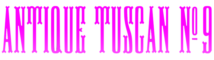 A selection of Tuscan typefaces at MyFonts. [Google]
[More] ⦿
A selection of Tuscan typefaces at MyFonts. [Google]
[More] ⦿
|
MyFonts: Type Together
|
MyFonts lists the top selling fonts of the Type Together foundry run by José Scaglione and Vik Burian. [Google]
[More] ⦿
|
MyFonts: TypeArt foundry
|
MyFonts selection for the TypeArt foundry of Lloyd Springer. [Google]
[More] ⦿
|
MyFonts: Typefaces for alcohol, wine, vodka, and champagne
|
A small collection of commercial typefaces used for drinks---wine, vodka, champagne, and so forth. These include both dingbats of bottles and glasses, and display typefaces that permeate the air with the smell of booze. [Google]
[More] ⦿
|
MyFonts: Typefaces for billboards
|
A list of typefaces appropriate for billboards. [Google]
[More] ⦿
|
MyFonts: Typefaces for movie credits
|
All typefaces at MyFonts tagged as suitable for or used in movie credits. See also here and here. [Google]
[More] ⦿
|
MyFonts: Typefaces for navigation
|
Navigation requires legible and sober typefaces. View a listing of possible candidate typefaces. [Google]
[More] ⦿
|
MyFonts: Typefaces for small sizes.
|
A collection of commercial typefaces created for use in small sizes. [Google]
[More] ⦿
|
MyFonts: Typefaces from the sixties
|
A list of digital typefaces that emulate the sixties. [Google]
[More] ⦿
|
MyFonts: Typefaces in the style of Bookman
|
MyFonts selection of Bookman-like fonts. [Google]
[More] ⦿
|
MyFonts: Typefaces like Bickham Script
|
A list of penmanship typefaces in the style of Bickham. [Google]
[More] ⦿
|
MyFonts: Typefaces like Underwood
|
A list of dirty or old typewriter typefaces in the style of Underwood, a typewriter popular in the 1920s and 1930s. [Google]
[More] ⦿
|
MyFonts: Typefaces related to drugs
|
Typefaces related to drugs, as selected from the MyFonts library. [Google]
[More] ⦿
|
MyFonts: Typefaces related to trucking
|
A selection of typefaces at MyFonts related to trucking. [Google]
[More] ⦿
|
MyFonts: Typefaces with old style numerals
|
Top-ranked fonts at MyFonts on the theme "Typefaces with old style numerals. [Google]
[More] ⦿
|
MyFonts: Typewriter typefaces
|
A list of nearly 400 typewriter typefaces. [Google]
[More] ⦿
|
MyFonts: Typo Art
|
MyFonts selection for Typo Art, the main foundry in former East Germany. [Google]
[More] ⦿
|
MyFonts: Ultra black typefaces
|
A selection of commercial ultra black typefaces. [Google]
[More] ⦿
|
MyFonts: Ultra bold typefaces
|
A selection of ultra bold typefaces. [Google]
[More] ⦿
|
MyFonts: Umbrella typefaces
|
A list of dingbat typefaces that contain umbrellas. [Google]
[More] ⦿
|
MyFonts: Uncial typefaces
|
MyFonts hit list for uncial typefaces. Many would call these "Celtic" typefaces. [Google]
[More] ⦿
|
MyFonts: Unicase
|
Unicase fonts sold by MyFonts. [Google]
[More] ⦿
|
MyFonts: Unique typefaces
|
Unique typefaces, tagged in that manner at MyFonts. [Google]
[More] ⦿
|
MyFonts: University Roman
|
MyFonts selection of University Roman typefaces. [Google]
[More] ⦿
|
MyFonts: Upright scripts
|
Upright script typefaces, including, but not limited to, rondes. [Google]
[More] ⦿
|
MyFonts: Urban typefaces
|
MyFonts selection of urban typefaces. These include graffiti style fonts. [Google]
[More] ⦿
|
MyFonts: URW
|
 The bestselling URW typefaces at MyFonts. [Google]
[More] ⦿
The bestselling URW typefaces at MyFonts. [Google]
[More] ⦿
|
MyFonts: USSR
|
Some fonts were tagged as being related to the USSR over at MyFonts. Mostly, these are fonts that were in fashion during the Cold War era. The list of CCCP fonts is very similar. See also this list of typefaces tagged as communist. [Google]
[More] ⦿
|
MyFonts: Vacation typefaces
|
Typefaces related to vacation, both for signage and advertising. [Google]
[More] ⦿
|
MyFonts: Valentine typefaces
|
A list of typefaces for Valentine's Day wishes. [Google]
[More] ⦿
|
MyFonts: Varsity typefaces
|
A list of varsity typefaces, also categorized as athletic lettering typefaces. [Google]
[More] ⦿
|
MyFonts: Venetian typefaces
|
Large web page with all Venetian typefaces at MyFonts---taken in a broad sense, Venetian or its descendants. Another take. And a long page with hundreds of commercial Venetian fonts. See also here. [Google]
[More] ⦿
|
MyFonts: Venetian typefaces
|
Top-ranked fonts at MyFonts on the theme "Venetian typefaces". I think there are many errors in the tagging. [Google]
[More] ⦿
|
MyFonts: Vernacular typefaces
|
Vernacular typefaces, as culled from the MyFonts type library. [Google]
[More] ⦿
|
MyFonts: Versal Eszett
|
MyFonts lists typefaces with versal eszett (capital sharp s). [Google]
[More] ⦿
|
MyFonts: Versatile typefaces
|
A listing of versatile typefaces at MyFonts. [Google]
[More] ⦿
|
MyFonts: Vibert "g"
|
Typefaces that have the characteristic "Vibert lower case g". [Google]
[More] ⦿
|
MyFonts: Victorian fonts
|
Top Victorian era fonts at MyFonts. [Google]
[More] ⦿
|
MyFonts: Video game typefaces
|
A list of typefaces appropriate for video games. [Google]
[More] ⦿
|
MyFonts: Video typefaces
|
A selection of typefaces appropriate for video applications. Another list of video fonts. [Google]
[More] ⦿
|
MyFonts: Vienna
|
A list of digital typefaces on the theme of Vienna, i.e., typefaces related to Vienna's history, or to the Viennese Secession (art nouveau), or to type design as practiced in Vienna today. [Google]
[More] ⦿
|
MyFonts: Vignettes
|
View typefaces with vignettes, as culled from the MyFonts site. See also here. [Google]
[More] ⦿
|
MyFonts: Viktor Solt
|
MyFonts selection for Viktor Solt. [Google]
[More] ⦿
|
MyFonts: Vintage fonts
|
A long list of commercial vintage typefaces. [Google]
[More] ⦿
|
MyFonts: Vintage handwriting typefaces
|
A list of vintage handwriting typefaces that can be licensed via MyFonts. [Google]
[More] ⦿
|
MyFonts: Vogue
|
Top-ranked fonts at MyFonts on the theme "Vogue". [Google]
[More] ⦿
|
MyFonts: Volcano
|
MyFonts selection for Volcano. [Google]
[More] ⦿
|
MyFonts: Wacky typefaces
|
A comparison of typefaces tagged as wacky at MyFonts. [Google]
[More] ⦿
|
MyFonts: Wagner
|
MyFonts selection for the Wagner type foundry. [Google]
[More] ⦿
|
MyFonts: Water
|
View the typefaces tagged water at MyFonts. [Google]
[More] ⦿
|
MyFonts: Watercolor
|
A list of digital typefaces that emulate watercolor lettering, or that evoke the esthetics of watercolor drawings. [Google]
[More] ⦿
|
MyFonts: Wayfinding typefaces
|
 A selection of sans serif typefaces that can be used for wayfinding. This list includes:
 [Google]
[More] ⦿
|
MyFonts: Weather icons
|
Typefaces that contain weather icons. [Google]
[More] ⦿
|
MyFonts: Weathered typefaces
|
A list of weathered typefaces that can be licensed via MyFonts. [Google]
[More] ⦿
|
MyFonts: Web graphics
|
MyFonts listing of fonts that are appropriate for web graphics. This includes both icons or dingbats, and alphabets. [Google]
[More] ⦿
|
MyFonts: Wedding fonts
|
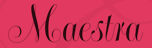 Top-ranked wedding fonts listed at MyFonts. Over 1000 wedding invitation fonts listed here. A [long] list of typefaces suitable for weddings. And an even longer list of wedding fonts. [Google]
[More] ⦿
Top-ranked wedding fonts listed at MyFonts. Over 1000 wedding invitation fonts listed here. A [long] list of typefaces suitable for weddings. And an even longer list of wedding fonts. [Google]
[More] ⦿
|
MyFonts: Wedge serif typefaces
|
From the MyFonts collection: wedge serif typefaces. See also here and here. [Google]
[More] ⦿
|
MyFonts: Western fonts
|
MyFonts selection of Western fonts. [Google]
[More] ⦿
|
MyFonts: What's New?
|
 MyFonts.com: new links announced. Newest fonts. [Google]
[More] ⦿
MyFonts.com: new links announced. Newest fonts. [Google]
[More] ⦿
|
MyFonts: Whimsical fonts
|
Whimsical font list. [Google]
[More] ⦿
|
MyFonts: Whiskey
|
A list of commercial typefaces commonly associated with whiskey. Some of these are of the Western style. [Google]
[More] ⦿
|
MyFonts: Wide typefaces
|
A long list of wide typefaces culled from the MyFonts library. [Google]
[More] ⦿
|
MyFonts: Wild West fonts
|
The main Wild West typefaces at MyFonts. [Google]
[More] ⦿
|
MyFonts: Will Carter's typefaces
|
MyFonts selection for Will Carter's typefaces. [Google]
[More] ⦿
|
MyFonts: William Thorowgood
|
 MyFonts selection for William Thorowgood. See also here. [Google]
[More] ⦿
MyFonts selection for William Thorowgood. See also here. [Google]
[More] ⦿
|
MyFonts: Wine
|
View the typefaces tagged wine at MyFonts. They mean typefaces that are appropriate for use on wine bottles or signage in vineyards. [Google]
[More] ⦿
|
MyFonts: Wintery typefaces
|
MyFonts selection of typefaces for the tag winter. These include Chriustmas and snowflake fonts. [Google]
[More] ⦿
|
MyFonts: Wizard fonts
|
A selection of wizard fonts from the dungeons of MyFonts. [Google]
[More] ⦿
|
MyFonts: Woman!
|
A list of typefaces that are tagged by the word woman. I assume that most are of the feminine style, i.e., rounded, scriptish, perhaps a bit thinner than normal. Some of the typefaces are tagged in that manner because they were merely made by women. [Google]
[More] ⦿
|
MyFonts: Wood type
|
The main (digital versions of) wood type at MyFonts. A longer list of wood type typefaces. [Google]
[More] ⦿
|
MyFonts: Woodcut typefaces
|
A list of commercial woodcut typefaces. [Google]
[More] ⦿
|
MyFonts: Workhorse fonts
|
Top-ranked workhorse fonts at MyFonts. See also here, here, and here. [Google]
[More] ⦿
|
MyFonts: WPA typefaces
|
Typefaces associated with the WPA. [Google]
[More] ⦿
|
MyFonts: Wrought iron typefaces
|
Wrought iron typefaces are either dingbats involving wrought iron, or typefaces whose glyphs borrow ideas from wrought iron shapes. [Google]
[More] ⦿
|
MyFonts: XSF
|
Fonts tagged as XSF over at MyFonts. [Google]
[More] ⦿
|
MyFonts: Zanerian typefaces
|
Zanerian script typefaces, as selected from the MyFonts library. [Google]
[More] ⦿
|
MyFonts: Zodiac typefaces
|
A selection of typefaces with the symbols of the zodiac: Zodiac (Bitstream), Chinese Zodiac Symbols (Deniart Systems), BMF Zodiac Pi (BuyMyFonts), Hand Of Sean Pro (Sean Johnson), Witchfinder (Die Typonauten), Wingdings (Ascender), MVB Celestia Antiqua (MVB), Aure Westra (Aure Font Design), Planchette (Aerotype), Urbox Nu (UrbanPixel), Chaos1996 (Dawnland), Haakke (Dawnland), Simeon AS (astype), Missale Lunea (astype), Celtic Astrologer Symbols (Deniart Systems), Astrosym (ParaType), Astro (Dingbatcave), Linotype Astrology Pi (Linotype), Taroca (Blue Vinyl Fonts), 1689 Almanach (GLC), Okay Marker (Okaycat), Andron 1 Alchemical (SIAS), PIXymbols Astrology (Page Studio Graphics), Ingy Ding MCD (Ingrimayne Type), Almanac (Monotype), Urbix Nu (UrbanPixel), SIAS Symbols (SIAS), Urbix (UrbanPixel), Archemy (Sonic Savior), P22 Koch Signs (P22), Astera (ParaType), Astrologer Symbols (Deniart Systems), RLG Astro (RightLeft Graphics), EF Optiscope Astro (Elsner+Flake), EF Bilbo (Elsner+Flake), Subasmet (Subtitude), Linotype Astrology Pi (Adobe), Urbox (UrbanPixel), PIXymbols Luna (Page Studio Graphics), PIXymbols Dingbats (Page Studio Graphics), Trop Magus (Kickingbird), ITC Holistics (ITC), Wingdings (Microsoft), MVB Celestia Antiqua (Adobe), Revista (Latinotype), Egyptian Hieroglyphics – Dendera (Deniart Systems), Scrolls A (Wiescher Design), EF Typosigns (Elsner+Flake), Cerulea (Cerulean Stimuli), SpEYErals (Dingbatcave), Tabac Sans (Suitcase Type Foundry), EF Typomix (Elsner+Flake), Pentathlon Pro (DBSV), Chaweng (profonts). [Google]
[More] ⦿
|
MyFonts.com
[Laurence Penney]
|
MyFonts was a division of Bitstream Inc., located in Marlborough, Massachusetts. After Bitstream was taken over by Monotype, it changed directions. Its mission was to make it simple for everyone to find and buy fonts. In pursuit of this mission, MyFonts has pioneered new ways to search for fonts when one does not have an exact font in mind. The concept of MyFonts was born in 1999 when Charles Ying, Bitstream's Chairman of the Board, wanted to find a font for a particular project. He was horrified to discover that the only way to find fonts on the web was to know the name of the font you were looking for, or browse a flat alphabetical list. Why can't I just search for wedding fonts, he asked. This should be as easy as shopping for shoes! I should be able to point at a font in a magazine and say, Show me fonts like this. Charles reasoned that making it hard to find and buy fonts for the average computer user meant turning away 99.9% of the potential market for fonts. He called for an open marketplace, where fonts from many vendors could compete side-by-side. Charles personally hired the initial team and commissioned a site design from (now defunct) Calgary-based Fusion Media Group. MyFonts began selling the Bitstream library on March 20, 2000 through the MyFonts.com website. It now has over 80,000 fonts from about 1000 foundries. It includes WhatTheFont (was Identafont) (send scanned images to the site for automatic recognition), "Show me more like this", TypeXplorer (font space browser), type designer and foundry info. The project manager is Laurence Penney. List of designers. Postmortem: While it remains active, MyFonts and Bitstream were acquired by Monotype in 2012. It is bleeding on both ends---high-class outfits such as Hoefler, Tobias Frere-Jones, Commercial Type and Our Type run their own shops, and the middle class is scared off by the Monotype monopoly, the business-is-more-important-than-you atmosphere, and the friendlier hunting grounds of Creative Market and similar font truck vendors. Fontacular: monthly sales specials. [Google]
[MyFonts]
[More] ⦿
|
MyFonts.de
|
This is a German version of MyFonts, launched in 2009, and is currently edited by Jan Middendorp (CEO), Florian Hardwig and Frank Rausch. It has informative, fresh, and interesting typographic discussions, and is not a subsidiary of MyFonts. Jan Middendorp: We'll offer type reviews and case studies, interviews, historical articles and the occasional book or magazine review. [Google]
[More] ⦿
|
Nick Curtis
[MyFonts: Nick Curtis]
|
[More] ⦿
|
Nick Sherman
[Specimenism]
|
[More] ⦿
|
Parametric Fonts (MyFonts)
|
MyFonts lists the active researchers in the field of parametric fonts. Never mind that I created all my fonts using self-coded parametric systems---I will humbly reproduce their list: [Google]
[More] ⦿
|
Philosophic typefaces
|
A collection of commercial typefaces associated with philosophers or with philosophy in general. [Google]
[More] ⦿
|
Rudolf Koch
[Kabel]
|
[More] ⦿
|
Skyline Fonts
|
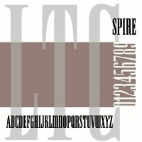 Skyline fonts are fonts that are ultra narrow or condensed in a style often seen in American magazines in the 1930s and 1940s. This group contains fonts such as Swifty (2011, Alex Sheldon, Match & Kerosene), Empire (1989-1994, David Berlow and Kelley Ehrgott-Milligan, Font Bureau), Spire (Ann Pomeroy, Group Type), LTC Spire (2005, Lanston), Corvinus Skyline (1991, Ann Pomeroy, Group Type), Niagara (1994, Tobias Frere-Jones, Font Bureau), and Manygo Serif (2012, Michel Troy).
 Font Bureau's Empire is a 7-style extension of the Empire type designed in 1937 by Morris Fuller Benton for Vogue, where it was used as a headline style. A year later, in 1938, Sol Hess created an ultra-narrow didone caps only family called Spire, which similar magazine titling applications. It was that typeface that was extended in digital form by Ann Pomeroy of Group Type and by Lanston in 2005. The typeface family Niagara by Tobias Frere-Jones revisits both styles. A separate duckling with its ultra large x-height is Corvinus Skyline, designed in 1934 by Imre Reiner. It was digitized in 1991 by Group Type. [Google]
[More] ⦿
|
Solotype
[Dan X. Solo]
|
 Dover Press sold Oakland's Dan X. Solo's digitizations. Dan Solo (b. 1928, d. 2012) has collected over 13,000 sets of metal fonts, starting when he was 9 years old and growing up in Oakland, CA. Finally, in 2002, he stopped doing that and began converting all of his fonts to computer type. Solotype, his company, was established in Alameda, CA. He printed 30 books on fonts (with Dover), including The Solotype catalog of 4,147 display typefaces, and created hundreds of fonts. In 2007, Dan Solo retired from the font business. He died in 2012.
 Robert Trogman writes: I know Dan X. Solo personally. He ran a typographic studio in Berkeley for over 30 years. He had a large collection of film fonts, including some of my own. He created thousands of fonts and is now retired and is an avocational prestigitator. Copyrights have run out on most of his fonts. He also protected himself by creating pseudonyms on the questionable font names. Stuart Sandler confirms that many of the fonts in Solo's Dover books are in fact from the Filmotype collection, which Stuart is digitizing right now. Gene Gable writes: Dan Solo of Solotype in Berkeley was experimenting with photo type as early as 1945 and started doing optical special effects in the early '60s. And a number of the larger display-type shops developed their own techniques. But in terms of opening up new markets for display type (and giving designers more control over type setting), Visual Graphics and Letraset lead the way. These companies were proud of, and promoted, the fact that that their products could be used by non-typesetters with little training. Bio. He wrote about himself: Dan X. Solo The Solotype Archive was begun in 1942 when I was 14. I was a kid printer for several years before that. At 16, after a quick three months of training, I dropped out of school and went to work full time as a radio actor and announcer in San Francisco. (Easy to get jobs in those days, due to the war-induced manpower shortage.) In 1949 and 1950, I created a magic show which played West Coast theatres with some success. After that, back to broadcasting. By 1962, I was completely burned out on radio, so I decided to see if I could make a living with my collection of antique types, which numbered about a thousand fonts at that time. In 1962, I sent out 4,000 catalogs showing the type to ad agencies all over the U.S. The timing was perfect (no thanks to me) because there was developing at that time a renewed interest in the old types. Business took off immediately. The Solotype collection was one of four commercial collections at the time, but I seemed to have been more aggressive in marketing than the other chaps. (Well, Morgan Press certainly knew how to market.) Two years into the business, I began to collect alphabets on paper for conversion to photo lettering, which was just becoming mainstream in the type business. We closed the shop for a month every year and went on a type hunt, mostly in Europe where there didn't seem to be much competition among collectors. Other typographers couldn't understand how we could do this, but I believe it made people appreciate the resource we offered even more. Over the years, the collection became quite large. When I closed Solotype a couple of years ago, I got rid of about half the archive (because the fonts were dull, or already digitized, or for a variety of other reasons) leaving me with about 6,000 fonts on paper or film. In 1974, I began to supply Dover Publications with mechanicals for books of 100 alphabets on a particular theme. I did 30 of these books over the years, and 30 more of printers' ornaments, borders, and so forth. Sometime in the 1990s, Dover asked me to digitize books of 24 fonts each, to be sold with a disk in the back. I did 12 of these. The Dover relationship came to an end when Hayward Cirker, the owner and my special friend, died and the company was sold to another publisher. Dover felt that they had covered the type field thoroughly. Now in my old age, my wife and I have a mindreading act that is great fun and good for the ego. Even so, when not traveling, I digitize type for relaxation and enjoyment, but have made no effort to sell it. Until now. Solo's wood type/Western/ headline/ Victorian collection includes Acantha, Bindweed, Dime Museum (2004, a French Clarendon revived by ATF in 1933 under the name P.T. Barnum), Egyptian Oldstyle, Excelsis, Extravaganza, Rigney, Assay, Baraboo Banner, Beijing, Brevet (after a Victorian typeface from 1887 by Ernst Lauschke), Brussels, Cathedral, Cleopatra, Cognac, Crossroads, Dainty Lady, Dangerfield, Diablo, Dutch Treat, Grecian, Lord Mayor, Malibu, Minnesota, Moulin Rouge, Penny Arcade (1992, a Victorian face after an 1890 original called Mural by Boston Type Foundry), Trixie, Valerie, Valjean, and Zorro. Alaska is based on an 1890 design of Marder, Luse and co. Arcade imitates an 1888 design of Barnhart Brothers&Spindler. Bamboo (oriental simulation face) is based on a 1889 creation of Barnhart Brothers&Spindler. Behrens Antiqua and Behrens schrift are revival of early 20th century typefaces by Peter Behrens. Eccentric is a digitization of a 1898 arts and crafts typeface by Kingsley/ATF. Hansard is a revival of a display type published in 1887 by MacKellar, Smiths,&Jordan. Pekin is a digitization of a face, first designed by Ernst Lauschke in 1888 and issued by Barnhart Bros.&Spindler foundry in Chicago under the name Dormer, and revived by them in 1923 under the name Pekin. Charles Henry Beeler made a condensed sans serif issued by Mackellar, Smiths&Jordan foundry in 1887: it was digitally revived as Roundhead. Monument is a revival of a 1893 typeface by the Boston Type Foundry, but was also cast at the Central Type Foundry. Vienna Light is a delicate early 1900s type originally created by the German foundry of Schelter&Gieseke. Other designs: Bareback, Campaign (ca. 1970), Cigar Label (1997), Estienne, Farringdon (a western face), Goodfellow (digitization of wood type from 1895 found at Hamilton and probably due to W.H. Page), Harlem Text (blackletter), Houdini (ca. 1992), Memorial, Quadrille 2 (a simplified Tuscan face), Sparticus, Vanities (a Victorian type), Whirligig. In 2005, MyFonts added Seminary (after a Victorian font from 1885 by Bruce Type Foundry), Margie (formal script based on Marggraff Bold Script by the Dresden foundry vormalig Brüder Butter, 1920s), Fancy Dan, Bamberg (2005, after a condensed wood type from ca. 1850), Fat Face No. 20, French Ionic (quite ugly--based on an 1870 Clarendon derivative by the Cincinnati Type Foundry), Hearst Italic (based on a 1904 typeface by Carl Schraubstadter of the Inland Type Foundry), Hearst Roman (based on a typeface from the Inland Type Foundry allegedly stolen from a hand lettering job done by Goudy, acccording to Goudy himself), Tally Text (early photolettering type of the comic book style), Welcome 1 (based on Van Loey-Nouri's art nouveau typeface from 1900). A list of some digitized fonts: - Art Deco: Advertisers Gothic Light, Alex, Beverly Hills, Boul Mich, Capone Light, Chic (after Morris Fuller Benton's Chic, 1927), Clyde, Eagle Bold, Eagle Narrow, Eden Bold, Eden Light, French Flash, Gallia, Graybar Book, Grock, Matra, Modernique (art deco), Parasol, Parisian, Phoenix American, Plaza Suite, Publicity Gothic, Salut, Stymie Obelisk, Zeppelin.
- Victorian: Anglo, Arboret, Campanile, Chorus Girl, Fancy Celtic, Ferdinand, Floral Latin, Glorietta, Grant Antique, Gutenberg, Hogarth, Jagged, Katherine Bold, Lafayette, Meisteringer, Olympian, Phidian, Ringlet (1998, a Victorian typeface after an 1882 original by Hermann Ihlenburg), Romanesque, Rubens, Stereopticon, Templar, Wedlock, Zinco.
- Script/Cursive: Amapola, Artists Script, Carpenters Script, Certificate Script, Commercial Script, Conway (an architectural script), Elegance, Engrossing Script, Figaro, Flare, Gloria Script, Hanover, Helvetica Cursive, Holly, Kunsteler Bold, Liberty, Manuscript, Orion Script, Pantagraph Script (+No2, +No3), Park Avenue, Romany Script, Trafton Script, Typo Upright, University Script, Virginia Antique.
- Art Nouveau: Ambrosia, Argus, Artistik, Auriol, Baldur, Bocklin, Cabaret (2003, as in Murder She Wrote), Carmen, Childs, Edda Black, Excelsior, Francomia, Giraldon, Harrington, Isadora, Metropolitan, Murillo, Oceana, Odessa, Orbit Antique, Palmetto (2005; an art nouveau typeface based on a 1887 typeface called Palm from the A.D. Farmer Foundry), Siegfried, Skjald, Spartana, Titania.
- Gothic/Medieval: Academy Text, American Uncial, Antique Black, Becker Bold, Bradley, Castlemar, Celebration Text Fancy, Church Text, Engravers Old English, Frederick Text, Freehand, Hingham Text, Initials-Bradley and Caxton, Kanzlei Light, Lautenbach, Lautenbach Fancy Caps, Libra, Morris Black, Nicholini Broadpen, Rhapsodie Swash Caps, Scottford Uncial, Solemnis, Washington Text, Wedding Text.
- Celtic: Anglo Text, Camden Text, Chappel Text, Cimbrian, Colchester Black, Durer Gothic, Durwent, Fenwick, Genzsch Initials, Gloucester Initials, Gutenberg Gothic, Hansa Gothic, Harrowgate, Kaiser Gothic, Kings Cross, Konisburg, Malvern, Medici Text, Middlesex, Progressive Text, Tudor Text, Warwick, Westminster Gothic, Yonkers.
- Special-Effects Display Fonts: Azteca Condensed, Buddha (oriental simulation face, after a Schelter&Giesecke type), Burst, Campaign (1970), Chinatown (oriental simulation), Cigar Label (1997-2002), Colonial Dame, Contract Banner (2004, a take on Mezzotint from 1880), Direction, Fillet, Filmstar (1999), Firebug, Headhunter, Hollywood Lights, Igloo Solid, Import, Lariat, Needlepoint, Old Glory, Protest, Rustic, Scimitar (Arabic simulation face), Scoreboard, Skyline, Starburst, Sundown Shadow, Tableau, Tonight, Xerxes.
- Other: Acantha, Assay, Baraboo Banner, Beijing, Bindweed, Brevet (after a Victorian original by Ernst Laushke, 1887), Brussels (positioned inbetween Stephenson Blake's Flemish Expanded and Flemish Condensed), Cathedral, Cleopatra, Cognac, Crossroads, Dainty Lady, Dangerfield, Diablo, Dime Museum, Dutch Treat, Egyptian Oldstyle, Excelsis, Extravaganza, Grecian, Lord Mayor, Malibu, Minnesota, Moulin Rouge, Penny Arcade, Rigney, Trixie, Valerie, Zorro.
Images of selected typefaces: Agency Gothic, Alpha Midnight, Alpha Twilight, Anita Lightface (1977), Art Deco Display Alphabets, Ashley Crawford, Ashley Inline, Astur, Bamberg, Banco, Beans, Blackline, Bobo Bold, Braggadocio, Broadway Engraved, Busorama Bold, Busorama Light, Bust, Charger, Checkmate, Colonel Hoople, Corral, Dudley P Narrow, Dynamo, Earth (a futuristic / prismatic typeface revived by nick Curtis in 2015 as Terranova NF), Eclipse, Empire, Ewie, Fat Cat, Fatso, Festival, Futura Black, Futura Inline, Gillies Gothic Bold, Greeting Monotone, Grooviest Gothic, Hess Neobold, Hotline, Huxley Vertical, Inkwell Black, Joanna Solotype, Joyce Black, Koloss, Lampoon, Mania, Mania Contour A, Mania Contour B, Margit, Mindy Highlight, Modernistic, Monograms Stencil, Mossman, Neon, Neuland (+Inline), Phosphor, Piccadilly, Pickfair, Polly, Prismania P, Quote, Rhythm Bold, Shady Deal, Sheet Steel, Sinaloa. The Solotype Catalog is a file with information on Dan Solo's typefaces, annotated with remarks about name equivalences and digitizations. The original file was due to Thibaudeau, but typophiles on alt.binaries.fonts have added to it in 2010. PDF version. Excel version. Text version. See also here. View Dan Solo's typefaces. Another page on Solotype. Dan Solo's typefaces listed in decreasing order of popularity. View Dan Solo's typefaces. View Dan Solo's typefaces. [Google]
[MyFonts]
[More] ⦿
|
Specimenism
[Nick Sherman]
|
A net web site by Nick Sherman, which shows oversized specimen of fonts with links to MyFonts. [Google]
[More] ⦿
|
Top 100 techno typefaces in 2015
|
Showcasing the top 100 best-selling techno typefaces from 2015. [Google]
[More] ⦿
|
Walbaum: Some digital fonts
|
A list of digital typefaces derived from Walbaum's original didone design. [Google]
[More] ⦿
|
William Caxton: Digital descendants
|
Digital typefaces based on William Caxton's work include Caxton (ITC), Caxton (Tilde), Caxton (Adobe), Caxton (Letraset), 1479 Caxton (GLC), Caxton SH (Scangraphic Digital Type Collection), 1479 Caxton Initials (GLC), Caxton (Suomi), Caxtonian Black (URW++), Holland Gothic (URW++), ITC Tiffany (Adobe), Vine Street (Proportional Lime), Printers in Marks (Proportional Lime). [Google]
[More] ⦿
|


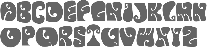
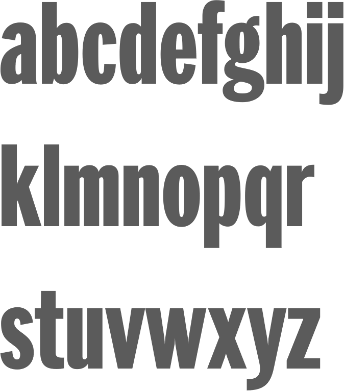
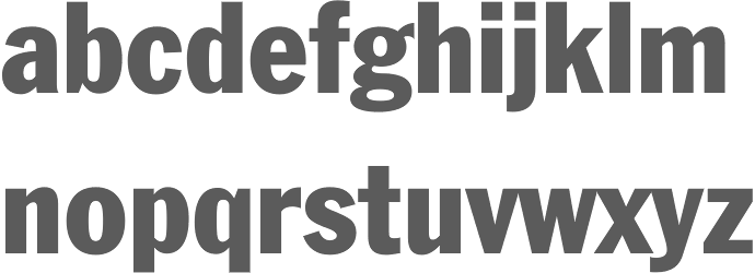
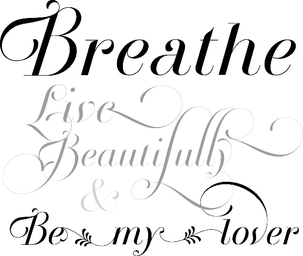
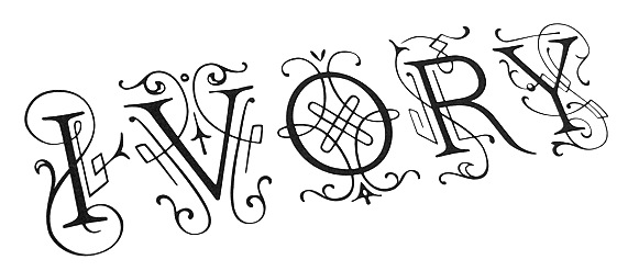
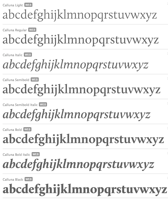
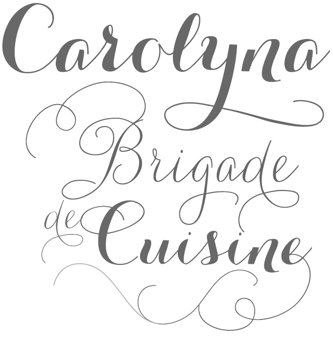
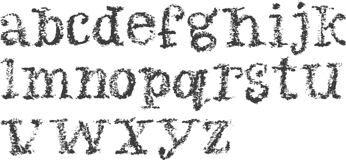
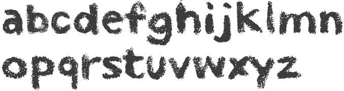
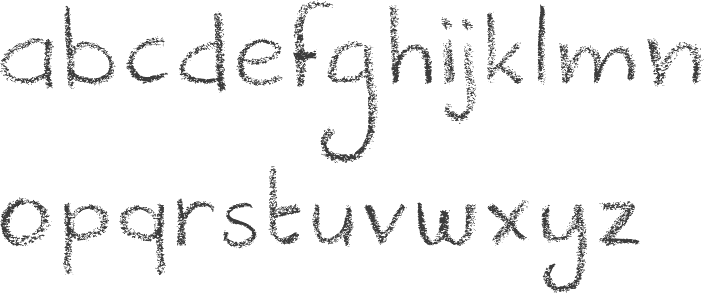
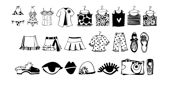