TYPE DESIGN INFORMATION PAGE last updated on Tue May 5 11:25:29 EDT 2026
FONT RECOGNITION VIA FONT MOOSE

|
|
|
|
|
Type design in Northern Ireland | ||
|
|
|
|
SWITCH TO INDEX FILE
Graphic designer in Belfast, Northern Ireland. He created the grid-based typeface called Typo Belfast (2013) and the bilined display typeface 5ive Skincare (2013). [Google] [More] ⦿ | |
Newcastle upon Tyne and/or Belfast, UK-based designer of the free squarish typeface 9Bar (2018). [Google] [More] ⦿ | |
Bach
|
|
The typeface Moment was commissioned by the Belfast City Council for its brand. Unknown designer, but free download. [Google] [More] ⦿ | |
Originally from Northern Ireland, Ciaran Crawley studied at Massachusetts College of Art & Design. Now located in Boston, MA, Ciaran designed the pixel typeface Bit Noire (2018, FontStruct). FontStruct link. [Google] [More] ⦿ | |
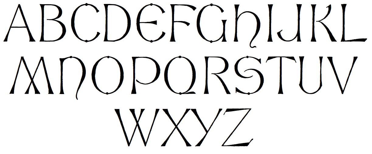
Clare Bell received a BA degree from Central Saint Martins College of Art & Design in London in 1999 after working as a designer in Dublin for eight years. She also worked in the design department of the Guardian newspaper for five years before returning to Dublin where she is undertaking a PhD entitled Typography, Culture & Society: An analysis of the visual representation of the Irish language in Northern Ireland at the Dublin Institute of Design and Technology, where she is a typography tutor. At ATypI 2005 she spoke on Typographic tales from the edge of empire, and deals mainly with the story of uncial, from the Book of Kells to present day murals in West Belfast. She co-organized ATypI in Dublin in 2010. Currently, she is Associate Researcher at the Graduate School of Creative Arts and Media. Speaker at ATypI 2018 in Antwerp. [Google] [More] ⦿ | |
During his studies at University of Ulster Belfast---Belfast School of Art, Craig Norwood created Hex Type (2014). [Google] [More] ⦿ | |
His masterpiece, The Illustrated Screwtape Letters (Geoffrey Bles, 1942) has been republished many times. The recent Harper & Collins edition is illustrated by Papas and uses great ink spill lettering on its cover. As far as I know, no attempt has been made to digitize this handwriting. However, an alternate screenprint design has been created by Paul Flanders in 2014. [Google] [More] ⦿ | |
Northern Irish designer of Carson (2017), Sam Display (2016), Marker (2016) and the rounded Machala Sans (2016). Dafont link. Creative Market link. [Google] [More] ⦿ | |
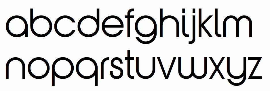
Belfast, UK-based designer of the school project font Eris Regular (2014). Behance link. [Google] [More] ⦿ | |
Hamish Muir
| |
Graphic designer in Londonderry, Northern Ieland, who created the hacker font Contrablend in 2016. Behance link. [Google] [More] ⦿ | |
James S. Kelly
| |
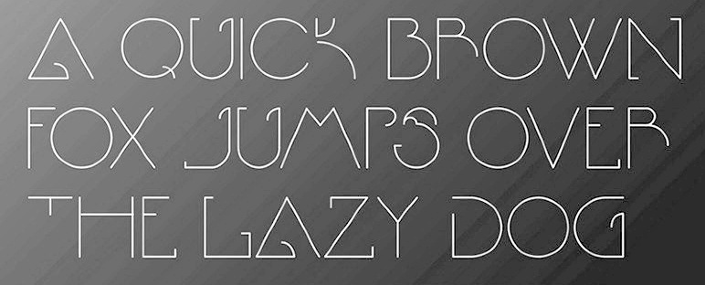
Illustrator and art director in Belfast, Northern Ireland. Designer of the hairline avant-garde caps display typeface EO (2012-2013), which is inspired by and named after biologist E.O. Wilson. Behance link. [Google] [More] ⦿ | |
John McMillan (Belfast, Northern Ireland) was Professor of Graphic Design at Ulster University. In 2018, he approached MuirMcNeil to develop digital reinterpretation of the tiled lettering used for Belfast's historic street signage in matching Latin and Gaelic scripts. This led to Farset (for Latin) and Feirste (for Gaelic). In addition to redefining contours and completing the positive character sets in upper and lower case, MuirMcNeil added new cameo type families for both scripts. Working with the guidance of Liam McComish of Ulster University, an expert in typography for signage, the appearance of the orginal tiles was replicated in caps and small caps along with several alternate characters found in the orginal tiles. [Google] [More] ⦿ | |
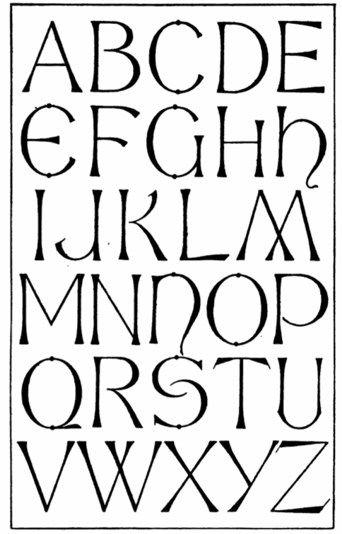
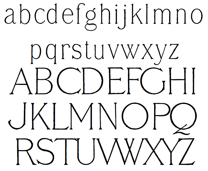
In 2012, Dick Pape created the digital typefaces LFD Thin French 208 and LFD 14th C Italian 75, based on Vinycomb's drawings shown in Alphabets Old And New For The Use Of Craftsmen (1910, Lewis Foreman Day). In 2020, Paul Harpin released LDN Queenstown at London Type. This is a single weight slightly quirky ultra light typeface that takes inspiration from a sketch of an early sans by John Vinycomb. Paul writes: Vinycomb was probably about 120 years ahead of the game, and Queenstown faithfully retains some of the charmingly unusual letterforms of JV's early modern sans serif. Characters of note include a gorgeous pince-nez letter g and a long tailed cap Q, one of four Q alternates. Photo in 1910. [Google] [More] ⦿ | |
Lucia Cerda (Belfast, Northern Ireland) designed Alphabet Erotique in 2015. [Google] [More] ⦿ | |
During his studies in Belfast, Matthew Lavery created the modular typeface Segments (2014). [Google] [More] ⦿ | |
MuirMcNeil Design Systems
|
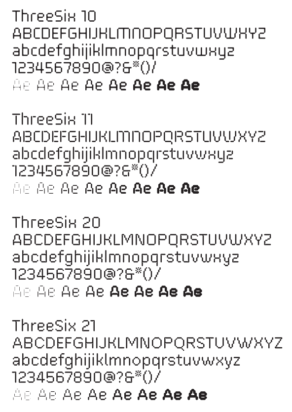
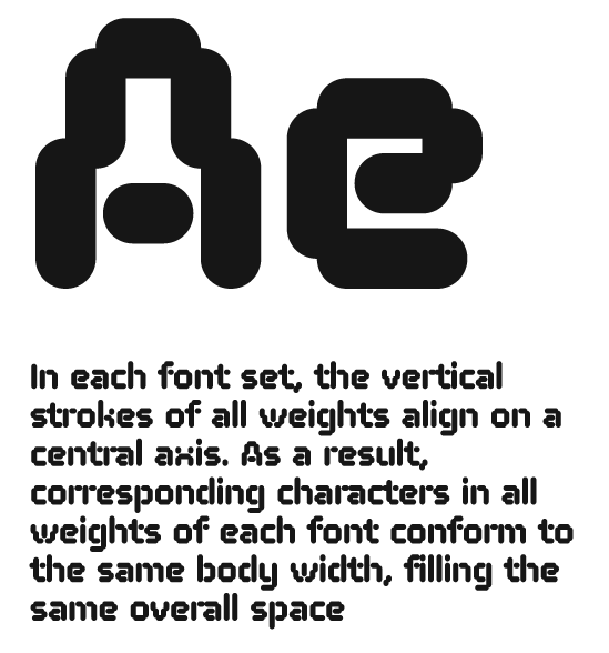
They have several parametric and modular software systems for typography and type design. These include 20-20 (done in 1974: a modular design idea in the spirit of FontStructor, but without any active software), Interact (done in 1994---grid-based parametric screen fonts), Three Six (an experimental optical / geometric type system consisting of six typefaces in eight weights. It explores the possibilities of using systematic principles to generate geometric typeforms which are distinctive at large point sizes but which can also be read at smaller sizes in bodies of extended text), Four Two (an extension of Three Six). The Three Six project led to a number of multiparametric dot fonts. It was published by FontFont in 2012. In 2014, four commercial modular and pixelish typeface families were published, Panopticon (a system of layered 3d geometric typefaces), Intersect, Nine (Metric, Mono) and Interact. In that series, the nine-weight geometric almost-typewriter typeface Nine Mono (monospaced and monoline) stands out. The superfamily of pixelish and dot matrix fonts Two followed in 2015. Muir helped Dalton Maag with the development of Tephra (2008), an experimental multi-layered LED-inspired family. In 2016, the designed the dot matrix-themed identity for Typecon on the theme Resound. Still in 2016, MuirMcNeil released the geometric stencil typeface Cut. THD Sentient (2017) is an all-capitals monolinear rounded proportionally spaced all caps sans type family in four weights, designed by Tim Hutchinson in collaboration with MuirMcNeil. In 2017, Paul McNeil and Hamish Muir co-designed the stencil family Five. Typefaces from 2018: Farset (MuirMcNeil and John McMillan), Feirste (a gaelic typeface by MuirMcNeil and John McMillan). Farset and Feirste are digital reinterpretations of the tiled lettering used for Belfast's historic street signage in matching Latin and Gaelic scripts. In 2020, they released the Bauhaus typeface Two Bar Mono to complement the TwoPoint, TwoPlus and TwoBit series. Interlock (2020) is an experimental geometric bitmap typeface. Worm (2021) is an experimental modular type system designed in seven compatible weights. Typetoken link. FontShop link. Klingspor link. [Google] [MyFonts] [More] ⦿ |
He made a custom face for the Northern Ireland Tourist Board in 2010. View Phil Garnham's typefaces. [Google] [MyFonts] [More] ⦿ | |
Rian Magee
| |
Belfast, UK-based designer of a triangle-themed typeface in 2015. [Google] [More] ⦿ | |
During her studies at Ulster University Magee, Sheila Mccallan (Londonderry, Northern Ireland) created the Braille-inspired connect-the-dots typeface Visille (2015). [Google] [More] ⦿ | |
SignArt
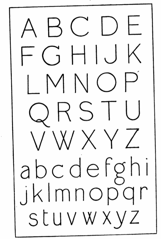
| James S. Kelly is the designer of the dingbat font Phones (1996) at SignArt in Kircubbin Co. Down, Northern Ireland. See also here.xi and here. [Google] [More] ⦿ |
Born in Belfast in 1970, Steve Payne is the designer of the free font Coma at Fountain. [Google] [More] ⦿ | |
Belfast, UK_based designer of the experimental geometric typeface Circular Shift (2014). Behance link. [Google] [More] ⦿ | |
Designer of the kitchen tile typeface Belfast (2008). [Google] [More] ⦿ | |
Twinbrush Image Forge
|
In 2018, he published the font dup Summer Escape, the great Opentype SVG-format brush typeface Maverick and the color / SVG font Candy. Typefaces from 2019: Quentin (a sturdy text typeface), Brada Sans, Summer Escape (font duo). Typefaces from 2020: Candelabra (a blackletter / tattoo font), Merchant Ledger (typewriter font), Mythshire (chancery script), Hedliner Sans (all caps). [Google] [More] ⦿ |
Yo Tomita
|
 Music fonts by Dr. Yo Tomita from the School of Music, Queen's University of Belfast: Bach Antico, Bach TS, Bach Slurs, Bach 41 (1992-2010), Kodaly (1998), Bach-stem-down, Bach-stem-down-2h, Bach-stem-down-2l, Bach-stem-down-3h, Bach-stem-down-3l, Bach-stem-up-2nd-higher, Bach-stem-up-2nd-lower, Bach-stem-up-3rd-higher, Bach-stem-up-3rd-lower.
 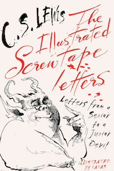 Clive Staples Lewis (1898-1963) was a novelist, poet, academic, medievalist, literary critic, essayist, lay theologian, and Christian apologist. Born in Belfast, Northern Ireland, he held academic positions at both Oxford University (1925-1954) and Cambridge University (1954-1963). He is best known both for his fictional work (The Screwtape Letters, The Chronicles of Narnia, and The Space Trilogy), and for his non-fiction Christian apologetics (Mere Christianity, Miracles, and The Problem of Pain).
 Victorian calligraphic artist, b. Newcastle-upon-Tyne, 1833, d. 1928.
 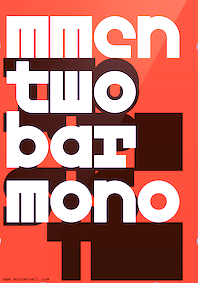 MuirMcNeil Design Systems is a project-based collaborative between Hamish Muir and Paul McNeil, est. 2010. Their activities are focussed on exploring parametric design systems to generate appropriate solutions to visual communication problems. Hamish Muir is a founding principal of 8vo (1985-2001) and co-editor of Octavo (1986-1992). He currently combines work as an independent graphic design consultant specialising in editorial, information and systems design with teaching part-time at the London College of Communication. Paul McNeil is a London-based independent graphic design consultant specialising in type, information and systems design. He is a Senior Lecturer in Postgraduate Graphic Design at the London College of Communication and lead developer, MA Contemporary Typographic Media.
  London-based Phil Garnham joined Fontsmith in June 2003 as designer to assist in the development and production of new alphabets for the Fontsmith font library. He is a 2002 graduate of Middlesex University. Many of his fonts are co-designed with Jason Smith. His typefaces:
 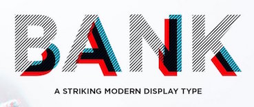 [
[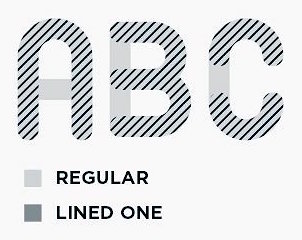 Dungiven, Londonderry, Northern Ireland-based designer of these typefaces: Bank (2017: layered and arched), Locus Sans (2017: layered all caps rounded sans), Erin (2017: uncial Celtic style).
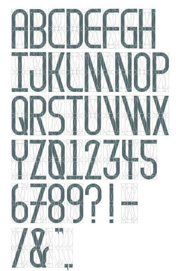
|
|
|
|