TYPE DESIGN INFORMATION PAGE last updated on Mon Mar 9 16:09:15 EDT 2026
FONT RECOGNITION VIA FONT MOOSE

|
|
|
|
|
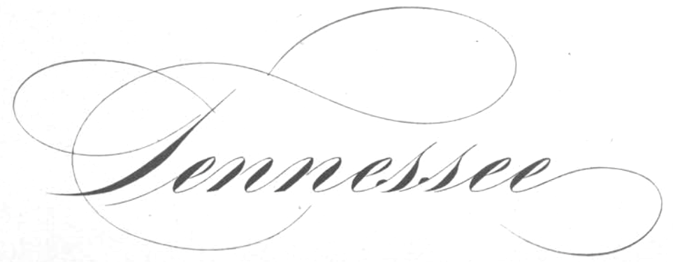
Type scene in Tennessee | ||
|
|
|
|
SWITCH TO INDEX FILE
Designer from Nashville, TN, who created the hand-printed typeface APD (2011, iFontMaker). Dafont link. [Google] [More] ⦿ | |
Graphic designer in Nashville, TN, who created the decorative typeface Twisted in 2016. [Google] [More] ⦿ | |
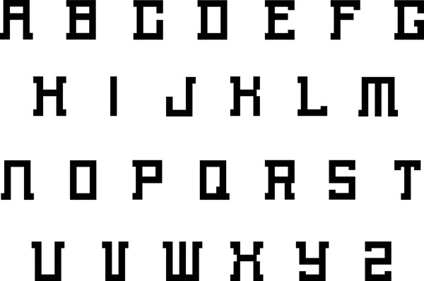
Graphic design student at Pellissippi State Community College in Knoxville, TN, 2010. Illustrator. Creator of a Grid Alphabet (2010). [Google] [More] ⦿ | |
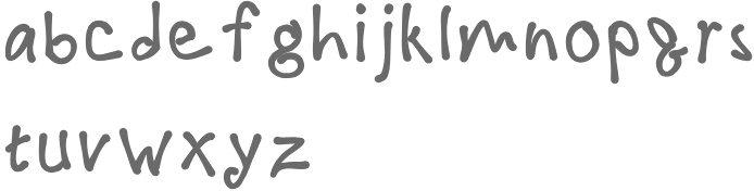
Designer in Murfreesboro, TN, who created a hand-drwan marquee alphabet in 2014. Behance link. [Google] [More] ⦿ | |
Nashville, TN-based Angela Haglund made Gatsby Caps and Nouveau Riche (1997, art nouveau). Nouveau Riche is based on a combination of 3 alphabets. The inspiration is a portfolio by two artists, J. Lehner and E. Mader, published early in the century in Vienna called Neue Schriften und Firmenschilder im Modernen stil: Serie I (New Alphabets and Business Signs in the Modern Style: Series I). [Google] [More] ⦿ | |
During her studies at Memphis College of Art, Ashley Lulo (Memphis, TN) created Circuit (2014), a prototypical circuit typeface. [Google] [More] ⦿ | |
Chattanooga, TN-based designer of the modular hexagonal typeface Pizazz (2017). Behance link. [Google] [More] ⦿ | |
During his studies, Nashville, TN-based Aubrey Griggs designed the alphading typeface Reading Glasses (2016). [Google] [More] ⦿ | |
Backwords Design
| Graphic designer in Chicago, IL (was: Oak Ridge, TN). Creator of the free retro compass-and-ruler typeface Soda Fountain (2015). Creative Market link. Behance link. [Google] [More] ⦿ |
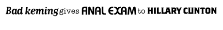
Bad Kerning
| Dan Hall (Memphis, TN) posted this example of kerning gone awry. [Google] [More] ⦿ |
Nashville, TN-based Nashville-based art director, illustrator and letterer. Designer of the handcrafted typeface Demetri (2021). [Google] [More] ⦿ | |
Ben Stucki
| |
BenStucki: Flex Font Embedding
| |
B.J. Alumbaugh
| |
Bob Hemphill
| |
Bobarama
| Spring Hill, TN-based designer of Atomic DooDads RJH (2017), a set of space age dingbats in retro futuristic style. [Google] [MyFonts] [More] ⦿ |
Bree Votava
| |
Nashville, TN-based designer of a striped typeface in 2017. [Google] [More] ⦿ | |
Kernest link. My own link to him. Google font directory link. Font Squirrel link. Devian tart link. [Google] [More] ⦿ | |
Chattanooga, TN-based designer of the handcrafted typeface Zaftig (2015), which was developed during her studies at Southern Adventist University. [Google] [More] ⦿ | |
Bryan Levay
| |
During his studies at Southern Adventist University, Collegedale, TN-based Cesar Pimentel designed the display typeface Oriana (2016). [Google] [More] ⦿ | |
| |
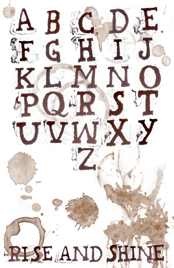
During her studies at Union University in Jackson, TN, Chelsea Wood (Nashville, TN) created Rise and Shine (2012, a spilled coffee font). [Google] [More] ⦿ | |
Charles Sartwell (Knoxville, TN) explains where to find children's handwriting fonts. [Google] [More] ⦿ | |
Choz Cunningham
| |
Dan Hall
| |
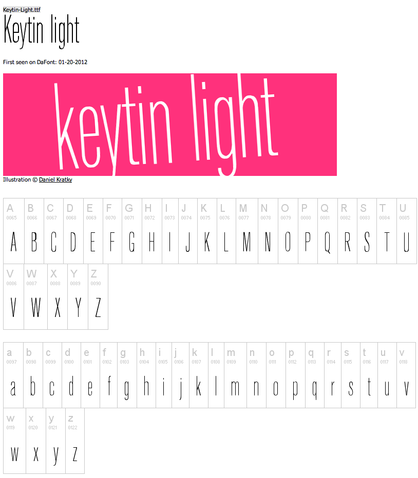
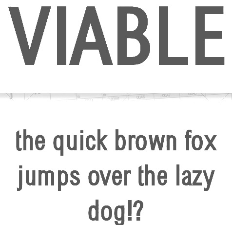
More recent free typefaces include Fava Black (2012, a massive magazine font) and Keytin Light (2012, a thin condensed sans). Viable (2010, a sans typeface) s a commercial typeface that was published at Graphic River. Dafont link. A second Dafont link. Klingspor link. Devian tart link. From this site, it seems that Dannci is in fact Ben Stucki from Nashville, TN. But over at Graphic River, where we can buy his sans typeface Viable, we read that he is Slovakian. Devian Tart link. [Google] [More] ⦿ | |
Student at the University of Tennessee at Knoxville (b. 1982) who created the handwriting font Notebook (2003) [no downloads]. [Google] [More] ⦿ | |
David Thometz
| |
David Thometz Design
|
In 2004, David Thometz Design made its debut at MyFonts with Seriatim (dingbats), Silvertone Woodtype and Hefeweizen. |
Shields holds a BFA from Memphis State University and a MFA from Cranbrook Academy of Art. He lived in Brooklyn where he co-founded the design studio Viewers Like You, and was a design consultant in New York. He designed Goofypop and Frank Rounded. Now an assistant professor at the University of Texas at Austin, Shields researches and catalogues wood type, and organizes the extensive Rob Roy Kelly wood type collection there. Speaker at ATypI 2009 in Mexico City, and at TypeCon 2012 in Milwaukee. [Google] [More] ⦿ | |
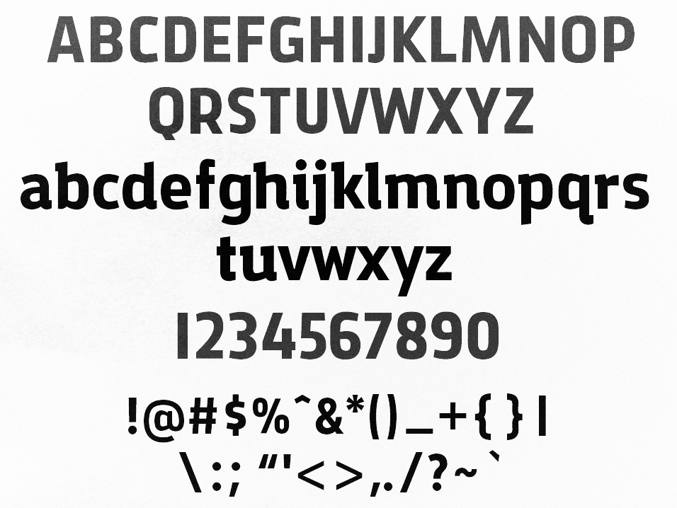
Graphic designer in Nashville, TN, who created the free typefaces Arxel (2014, modular typeface) and Cortes (2014, art deco). Behance link. [Google] [More] ⦿ | |
Dismantle Destroy
|
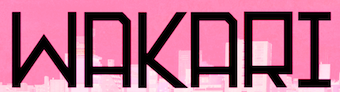
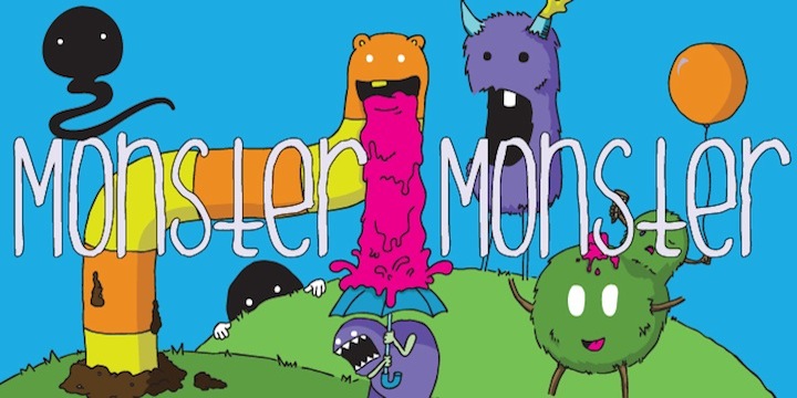
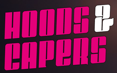
Creator of Arrivals and Departures (2011, sans display face), Ask My Flashlight (2011, a bold and bouncy comic book style face), Quiet the Thief (2011, spurred face), Raila Skies (2011, a hand-printed typeface done with Ralia Staggs), Hello Arson (2011, grunge), and Badcap (2011, grunge). Typefaces from 2012: Monster Monster. Typefaces from 2013: Meet The Submarine, Coin Operated (sketch font), I know a ghost, Weathervanes, As You Wish (hand-printed), Hoods and Capers (piano key face), Everglow, Brave Mountains (hand-drawn 3d poster face), Biloxi, Savage Kids (Treefrog-like script), Sleeping Forest, Right as Rain, That's Just Gross, Silent Seas. Dafont link. The free typefaces at Dafont included the grunge typeface Devotion and Desire (2005), and Something Dangerous, and the hand-printed typeface Meet The Submarine (2011). Many more were added to the free list in 2013. In 2014, he made Hashi, Daruma (chubby poster typeface), Amely, Crybaby, Handguns, Real Friends, Solid Ground, Skag, Kazoku, Piano Fingers, Vagabond, Wolves at Night (brush font), Write This Down, Polar Bread, Hiroba (sci-fi), Hungry Hobo, Wakari, Suncrusher, Captain Chunk, Tegami (based on the handwriting of Kaori Onoda), Surfaced. [Google] [MyFonts] [More] ⦿ |
Disturbed Type
| Active in the glory days of grunge type, Matthew Austin Petty from Nashville, TN, designed these fonts: AmarettoSour, Chigger (handwriting), CountryHam, Damit, DevonisTrashed, Dingo, DisturbedBatsYo, Feta, Fishalicious (handwriting), Goddess (handwriting by Mary Katherine Brooks), Janis, MattfontOblique, MattfontSquishedBlack, MontezumasRevenge, Muzzle, Nashville (a Western font), Pistolgrip (2002), Regork, Rockelectric, ScumbagPornking (dedicated to Larry Flynt), Serpents, ShowgirlErin, Shrooms, SoupRunny, Spittoontaxidermistjr, Tangerine, Taxidermist, Teachers (handwriting), Tetanus (2002), Trash. Abstract Fonts link. [Google] [MyFonts] [More] ⦿ |
Chattanooga, TN-based designer of the connected script typeface Lavender (2016). [Google] [More] ⦿ | |
Exclamachine Type Foundry
| Choz Cunningham (b. 1975, Santa Cruz, CA) is a Las Vegas and more recently, Nashville, TN-based designer and artist, who set up Exclamachine in 2005. Until 2012, exclamachine published free fonts. In 2012, it went commercial via MyFonts. Designer of Whiskey Songs (2007), Crass Roots, Crass Roots Alt (2016), and Crass Roots OFL (2007, stencil), Misqot (2006), The Troubles (2006), Limberjack (2006, an ornate wood titling font), this blackletter-inspired serif face (2006), Futurelic (2006, futuristic), Zugzwang (2006), Sketchy Times Bold (2005, grunge), Sketchy Times (2005, grunge), Basket of Hammers (2005, a nice wallpainting/graffiti font). His company, also called Exclamachine Foundry, where these fonts can be downloaded: The Black Bloc (2006, blackletter-inspired), MISQOT (2006), Kutura Frontalis (2006), PaulMaul (2006), Zugzwang (2006), Sketchy Times (2006), Carlos Caffeinated (2006), Basket of Hammers (2006), Disc Inferno (2006, LED simulation), Rosda Laevigata)2007, handprinting), and this heavy metal band font (2006). In 2012, Choz published the commercial typefaces MISQOT (scratchy) and Paul Maul XT (irregular hand-printed face). Typefaces from 2013: FinFang (comic book style caps), Lestatic Slashed (+Condensed), Lestatic Obsidian Outline (grungy), Lestatic Lashed (Arabic simulation face), Lestatic Celerite, Lestatic Carved, Lestatic CSS, Lestatic Withered Condensed, Lestatic Withered, Lestatic Sliced. Dafont link. Open Font Library link. Home page. Fontspace link. [Google] [MyFonts] [More] ⦿ |
Memphis, TN-based designer. Dafont link. Creator of the retro car emblem font Parkway Extended (2012). He also made Diet Pacman (2012). [Google] [More] ⦿ | |
Signature fonts (30 USD) and logos. Also vendor of over 13,000 fonts. Outfit run out of Knoxville, TN by "The Fontchicks". [Google] [More] ⦿ | |
Free font hosting site based in Knoxville, TN. In 2009, it had over 550 designers and over 20,000 fonts, incredibly neatly categorized and cross-listed. List of participating designers. Newest additions. [Google] [More] ⦿ | |
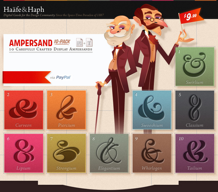
Haäfe&Haph
|
Typefaces from 2012 include Kaufie (a sans) and Chunks (an angular typeface). In 2015, he made Another Brush Pen Font, and Milkman (a great comic book font). In 2016, he designed the wonderfully refreshing Digerati Mono. In 2018, Jones published the cartoon font family Gribley. Creative Market link. Alternate URL. Older URL. Behance link. [Google] [More] ⦿ |
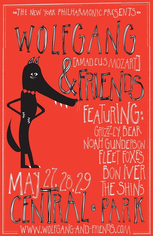
During her studies in Chattanooga, TN, Hanna Melara created a handlettered poster called Wolfgang and Friends (2013). [Google] [More] ⦿ | |
Lobelville, TN-based designer of the display typeface Boketto (2017). [Google] [More] ⦿ | |
Haunted House Fonts (was: Moonlighting Publications)
| At Haunted House Fonts (or: MoonLighting Publications), we find free original horror fonts by Bristol, TN-based Tim Harkleroad: BoneApart (1997), DracBats (1999), Haunted (1997), Mummified (1997), Spykker (1998), Vampyr (1997). |
Hemphill Studio
|
Typefaces from 2021: Suffolk (a vintage font trio consisting of Serif, Script and Print styles). [Google] [MyFonts] [More] ⦿ |
Born in Memphis, TN, in 1908, Holland had a studio in New York. From 1926 to 1936 he traveled across the country, designing theatrical posters for various motion picture companies. He was art director for several advertising agencies, notably J. Walter Thompson. He specialized in lettering and typographic design for publishers and taught calligraphy and letter design at Columbia University. For Photolettering in New York in the 1970s, he created the film typefaces Holland Antiqua, Holland Seminar (a transitional typeface family from 1973, and the first typeface family released by Compugraphic), Holland Title, Beleza (a script) and Squire. Digital descendants of his typefaces include Holland Seminar by Monotype. [Google] [More] ⦿ | |
Insigne Type Design Studio (was: Dooley Type)
|
Catalog of their typefaces. View Jeremy Dooley's font library. View Jeremy Dooley's typefaces. Adobe link. [Google] [MyFonts] [More] ⦿ |
During her graphic design studies in Chattanooga, TN, Isary Sanchez designed the condensed typeface Isary Sans (2016). [Google] [More] ⦿ | |
Knoxville, TN-based designer of the free handcrafted typeface James Hand (2016). He also made several free sets of icons, including Technology Icons (2016), Shadowcons (2015), Science Icons (2014), Vegetable Icons (2014), Fruit Icons (2014), Hexagonal Outline Icons (2014), Hexagonal Fill Icons (2014), Practicons (2014) and Foldicons (2014). Behance link. [Google] [More] ⦿ | |
Nashville, TN-based creator of the decorative typeface Radiant Tea (2013). [Google] [More] ⦿ | |
Graphic designer and wayfinding system pioneer, b. Nashville, TN, 1929, who lives in Jupiter Beach, FL. At Yale University, she obtained an MFA in architecture and design, studying with two influential professors, architect Louis Kahn and Bauhaus guru Josef Albers. Albers had a profound effect on Doggett and her use of color, which she would apply in her wayfinding solutions for about 40 airports. For some of them, she designed special typefaces. For example, for Tampa's airport, she modified Helvetica in her Alphabet A in the early 1970s. Interview by Lennie Bennett, Tampa Bay Times. [Google] [More] ⦿ | |
During his studies in Memphis, TN, Jeffrey Nguyen created a formal display typeface (2015). [Google] [More] ⦿ | |
| |
Jeremy Dooley
| |
Nashville, TN-based designer of the thin modular typeface Brooklyn (2012). [Google] [More] ⦿ | |
Clarksville, TN-based creator of Bip Map (2013, pixelish typeface). [Google] [More] ⦿ | |
Murfreesboro, TN-based designer of an African-themed display typeface in 2019.esigner of the heavy script typeface Vacansa (2019). [Google] [More] ⦿ | |
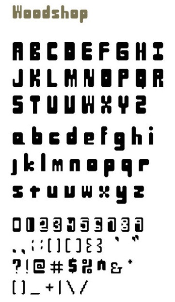
During his studies at the Memphis College of Art, Jordan Jackson created several typefaces using FontStruct: Woodshop (2013), Over The Lap (2013), Window Experimental (2013). [Google] [More] ⦿ | |
He also designed the sans typefaces Chloe (Peignotian sans), Fiona (2017), Fragile (2017, fashionable, with a lot of contrast and great use of ball terminals), Houston (2017), Von Bond (2017), Seafarer (2017, a beachy art deco font), Sinclaire (2017, clean and nearly art deco), Violet (2017) and Moonshine (2017). Typefaces from 2018: Olivia (fashion didone). Typefaces from 2019: Riley (a striking modern headline typeface). [Google] [More] ⦿ | |
Chattanooga, TN-based creator of an art deco alphabet and a modular experimental typeface in 2013. Home page. [Google] [More] ⦿ | |
Chattanooga, TN-based designer of a modular 3d typeface, Quartz (2014). [Google] [More] ⦿ | |
| |
Katie Dexter (Type Design Inc) made the connected handwriting font Mezzanine (2009). She is a graphic designer and illustrator in Chattanooga, TN. [Google] [More] ⦿ | |
During her studies in Murfreesboro, TN, Katie Stephens designed the slab serif typeface Cairo (2015). [Google] [More] ⦿ | |
Tennessee-based creator of the handwriting font Kellye's Handwriting (2009, Fontcapture). [Google] [More] ⦿ | |
Tennessee-based designer of Jasmin 1.0 and Jasmin 2.0 at Garagefonts. FontShop link. Klingspor link. [Google] [More] ⦿ | |
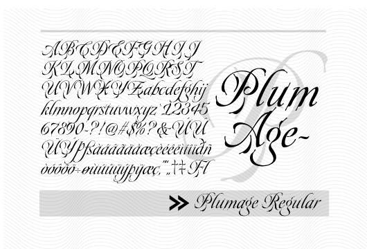
Koi was born in Nashville, TN, in 1979. From the MyFonts site: The artist Koi incorporates abstract calligraphy into mixed media pieces. She also creates calligraphy from traditional and original hands, or alphabets. She creates original brush and nib designs for !Exclamachine Foundry, including Lestatic Lashed. In 2019, she co-designed Hurringtown Script. [Google] [MyFonts] [More] ⦿ | |
Kyle Jones
| |
Laura Bennett
| |
Laura Bennett Design
| Los Angeles-based designer. During her studies at Lipscomb University in Nashville, TN, Laura Bennett designed a constructivist typeface (2012). In 2014, she designed Egidio. In 2020, she designed the dry brush font Mattina Sera with the help of New Tropical Design. [Google] [More] ⦿ |
Clarksville, TN-based student-designer of the pixelish Fontstruct font The Sun Smells Too Loud (2017). Behance link. [Google] [More] ⦿ | |
Graphic designer and illustrator in Knoxville, TN. Creator of Halloween Typeface (2014). Behance link. [Google] [More] ⦿ | |
Louis Dorman grew up in Missouri and lives in Nashville, TN. In 2014, he created the scratchy typeface Ozarks. In 2016, he published the interesting sketched typeface family Ocie. Dafont link. [Google] [More] ⦿ | |
Mabry Creative
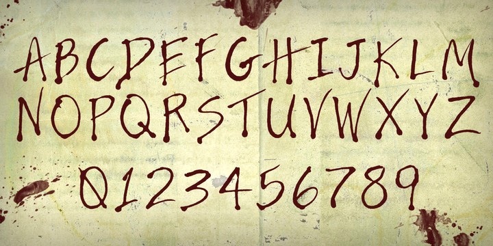
| Mark Mabry runs the design firm Mabry Creative in Nashville, TN. In 2013, he published his forst font, the blood brush hand-printed caps typeface Bloody Nose (2013). [Google] [MyFonts] [More] ⦿ |
| |
Margot + Co
|
|
Margot Groner
| |
During her studies at Middle Tennessee State University in Murfreesboro, TN, Nashville, TN-based Marissa Vaughan created the display typeface simply called Digital Alphabet (2013). [Google] [More] ⦿ | |
Mark Mabry
| |
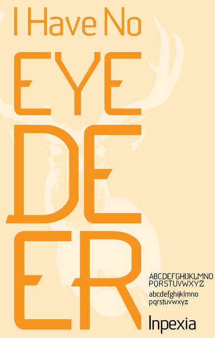
Matt Patteson (Knoxville, TN) created the custom sans typeface Inpexia (2012). [Google] [More] ⦿ | |
Matthew Austin Petty
| |
Spanish Lecturer and Language Lab Director at the University of Tennessee in Chattanooga, TN. During his studies in Auburn, AL, Matthew Stephen Stuckwisch (b. 1985) who was working on an extension of the Berling family of fonts for other scripts, including Homeric Greek (polytonic), Golden Age Spanish, Old Church Slavonic, Anglo-Saxon, Vietnamese, and Armenian. See here. He also made the wonderful high-ascendered lively serif family Coruna (2007) and the accompanying Coruna Fraktur (2007). [Google] [More] ⦿ | |
Matthew Tyndall
| |
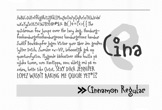
Michael Cina
| |
Michael D. Adams
| |
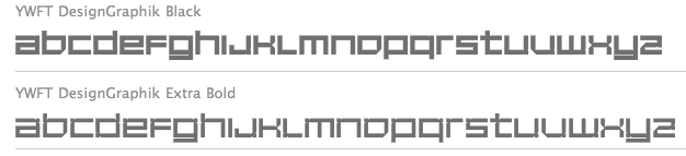
Born and raised in Tennessee, Michael Paul Young currently calls Bangkok, Thailand home. He founded, managed and directs daily the online design shop YouWorkForThem, which is located in Baltimore, MD. Home page. Creator of "Apply", a free texture tool that allows you to customize any font you wish with an array of inky splatters and sprays. In 2000-2001, he made the pixelish YWFT DesignGraphik family. With Teerayut Puchpen, he designed the ultra-fat counterless typeface Pudge (2010). In 2011, he created YWFT Motown Expanded and YWFT Motown Condensed, which were based on YWFT Motown (2009, Travis Stearns). With Michael Cina and Taechit Jiropaskosol, he designed YWFT Agostina Alternate (2011). Klingspor link. MyFonts link. Personal home page. [Google] [MyFonts] [More] ⦿ | |
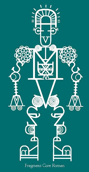
Nashville, TN-based creator of FontBot (2013), a typographic composition that uses Fragment Core Sans, a typeface originally designed by Shuji Kikuchi (Sugargliderz). [Google] [More] ⦿ | |
During her studies at the Universityof Tennessee in Chattanooga, Morgan Hampton (Nashville, TN) created a hexagonal typeface (2014). [Google] [More] ⦿ | |
Chattanooga, TN-based designer of the athletic stencil font Proformance (2016). [Google] [More] ⦿ | |
Once Blind Studios
|
Typefaces from 2016: Deadwood (Western, spurred). |
Oscillating Type Foundry (or: OSC Type Foundry)
|
In 2012, OSC published Italian Throwback 3D (shadow), Italian Throwback Outline, and Italian Throwback Fill, in the style of the Italian Western typefaces of the late 19th century. [Google] [MyFonts] [More] ⦿ |
Graphic designer in Knoxville, TN, who designed Mavrik (2010). [Google] [More] ⦿ | |
Patric King
| |
Design student at MTSU in Murfreesboro, TN. Creator of the sans caps typeface Moon Safari (2012). [Google] [More] ⦿ | |
Knoxville, TN-based creator of Ignite Me (2012, hand-printed). Dafont link. [Google] [More] ⦿ | |
Knoxville, TN-based designer of the experimental monoline typeface Rail (2014). [Google] [More] ⦿ | |
During his studies at the University of Tennessee Knoxville, Quentin Eastridge designed the handcrafted sans tiotling typeface Cinema (2016). [Google] [More] ⦿ | |
Nashville, TN-based designer of the curly typeface Raychel (2013). [Google] [More] ⦿ | |
Randy Wilcox
| |
During his studies at Memphis College of Art, Rashad Worthy created the display typeface Blades (2014). [Google] [More] ⦿ | |
Memphis, TN-based designer of Rebel Sans (2015). [Google] [More] ⦿ | |
Roadgeek Fonts
| Memphis, TN-based Michael Adams (Roadgeek Fonts) developed a series of (free) heavy sans US highway sign fonts in 2002: Roadgeek2000SeriesB, Roadgeek2000SeriesC, Roadgeek2000SeriesD, Roadgeek2000SeriesE, Roadgeek2000SeriesEModified, Roadgeek2000SeriesF, RoadgeekTransportHeavy, RoadgeekTransportMedium. In 2005, he extended his font collection to include UK, German and US highway signs:
Additional links: Fontspace link. Fontreactor link. Home page. Download the full Roadgeek 2005 collection. There was some controversy in 2022 when type xdesigners learned that the highway signs in Argentina used Roadgeek 2005, while the license obviously states that use on actual highway signs is not allowed. [Google] [More] ⦿ |
Calligrapher and greeting card designer based in Memphis, TN. In 2017, she created the formal calligraphic typeface Italian Heather. Creative Market link. [Google] [More] ⦿ | |
Robbie de Villiers
| |
Chattanooga, TN-based designer of the display typeface Javel Sans (2018). [Google] [More] ⦿ | |
Cookeville, TN-based designer of the prismatic typeface Tram (2017). Behance link. [Google] [More] ⦿ | |
Chattanooga, TN-based creator of a geometric experimental typeface in 2013. [Google] [More] ⦿ | |
During her studies in Chattanooga, TN, in 2013, Stephanie Fast created an experimental typeface by using only three design elements---a straight line, an arc, and a rounded rectangle. [Google] [More] ⦿ | |
Student of graphic design at the University of Tennessee in Chattanooga, TN. She created the art deco typeface Kilogram (2011). [Google] [More] ⦿ | |
Suzanne Hemphill
| |
Sweet Little Muse
| Bree Votava (Sweet Little Muse, Nashville, TN) created the great hand-drawn poster fonts Thinster (2014), Briley (2014), Harper (2014) and Everlie (2014). |
Tanner Puzio
| |
Graphic designer in Chattanooga, TN. Her Behance page seems to suggest that she designed some typefaces for CD covers in 2009. [Google] [More] ⦿ | |
Graphic designer from Jefferson City, TN, who studied at Anderson University, SC. In 2018, she designed the free transitional text typeface Panthera. [Google] [More] ⦿ | |
Nashville, TN-based designer of the outlined poster typeface Psychotelefunk (2019). His shop is called Junk by Taylor. [Google] [More] ⦿ | |
Nashville, TN-based designer of the Missing Link typeface (2017). [Google] [More] ⦿ | |
In 2012, he designed the (free) curly upright typeface family Mocha Script. In 2013, he designed the blood splatter font Sin. In 2014, he created the layered cartoonish font Storyland, the ink splatter typeface Isaiah 53, the wide typeface Lightyear, the blackletter typeface Easy Company, and the roundish typeface Thunder Pants (extended in 2016: see further on). Typefaces from 2015: Aventuras Stencil, Stella Grace (children's script), Sunshine Sans (+Spurred, +Stencil, +Rounded), Sugarfoot (Western), Country Bluegrass (Western), Baker Street Script, Yellowstone. Typefaces from 2016: Thunder Pants (handcrafted collection that includes the Halloween font Scaredy Pants, Narly Pants, Touchdown Pants, and Spangled Pants), Blacklisted (Peignotian sans), Old Glory, Survivor Wood (a wooden plank font modeled after the Survivor TV series), Survivor Display (cleaned-up version with several inline styles). Behance link. Creative Market link. Newer Creative Market link. [Google] [More] ⦿ | |
Thousand Type Works
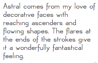
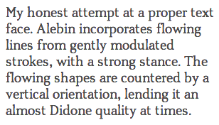
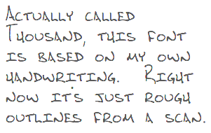
| Thousand Type Works is the Nashville, TN-based foundry of Bryan Levay. Their fonts, dated ca. 2011, include Equa (squarish family), Astral (art nouveau flavors), Alebin (large x-height text face), and Kilo (informal handprinting). [Google] [MyFonts] [More] ⦿ |
Tim Harkleroad
| |
Knoxville, TN-based designer of Burning Wrath (2008). Home page. Fontsy link. [Google] [More] ⦿ | |
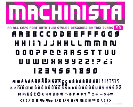
Murfreesboro, TN and/or Anthem, AZ-based illustrator and graphic designer (b. 1978). Creator of Toonish (2008), a cartoon face, which in 2009 became a commercial typeface at T-26. He also made the modular typeface Machinista (2010, T26). Dafont link. MyFonts link. Klingspor link. Behance link. [Google] [MyFonts] [More] ⦿ | |
Tommi Sharp Gill is a freelance designer from East Tennessee based in San Francisco. She is a graduate of the Type@Cooper West program. At Future Fonts, she published the potato font Taters. At Type du Nord, she released the free vintage label font Cortinas (2022). [Google] [More] ⦿ | |
Paris, TN-based designer of a dot matrix typeface and of the modular tracy Serif (2015). [Google] [More] ⦿ | |
Student at Lipscomb University in Nashville, TN, in 2014. Creator of the architectural hand typeface Clean Beats (2014). [Google] [More] ⦿ | |
Cleveland, TN-based designer of the free all caps sans typeface Monometric (2018). [Google] [More] ⦿ | |
Wilton Foundry
|
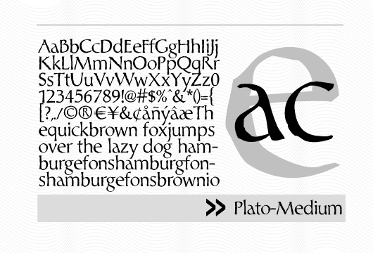
Chatype is a geometric slab serif typeface family designed in 2012 for the city of Chattanooga, TN, by Robbie de Villiers and Jeremy Dooley. Unio (2012) is a rounded slab family designed to be sturdy and legible. In 2017, Wilton Foundry published Yotta, Marcus, Chateau, Pagina, Plato, Beurre, Vecta Serif, Cyan Neue, Buckle, Suzie, Unio, Attic Sans, Blau (hand-chiseled, angular text typeface) and Taglio, a contemporary calligraphic interpretation of incised or inline engraving or carving. Typefaces from 2018: Chartre, EM, Mijne, Brew, De La Croix (a stencil sans inspired by the works of Eugène Delacroix, leader of the Romantic School) , Halla (a light monoline sans). Typefaces from 2019: Kular (monospaced), Zentral (an awesome 2-style sculptural font with the angularity of old Czech masters such as Preissig and Menhart). Typefaces from 2020: Obo Regular (a diamond-studded display typeface), Rito (monospaced). View Robbie de Villiers' typefaces. Home page. [Google] [MyFonts] [More] ⦿ |
XO Type (was: Pretty)
|
His typefaces:
Pretty's catalog. View Patric King's typefaces. Klingspor link. Behance link. Creative Market link. Fontsquirrel link. [Google] [MyFonts] [More] ⦿ |
During her studies in Chattanooga, TN, Yadira Sanchez created the curly music note-themed typeface Yadira's Clef Script (2013) and the thin script typeface Elyse (2013). [Google] [More] ⦿ | |
You Work For Them (or YWFT; formerly Cinahaus or TrueIsTrue)
|
Cina's fonts include the pixel fonts YWFT Caliper (1998), YWFT Bit (1998), 6x7oct (1998) and BlackGold; the handwriting font Cinahand; Blessed (1999, techno), YWFT Cam (1998, a slab serif based on industrial lettering), CommunityService, Crossover (1998, dot matrix with stars instead of dots), Composite (1998, octagonal), Formation (1999, a big octagonal family), Jute (2004, a masculine, military, sans-serif), YWFT Maetl (1999, octagonal, angular family), YWFT Moteur (a technical, retro, machine-like design; it briefly went under the name Alloy---in the early 2000s it was heavily used in the video gaming magazine Playstation), YWFT Novum (2002: a heavy block font that draws inspiration from a typeface originally used by the Swiss graphic designer Siegfried Odermatt), Pakt, Reversion (1997, squarish), Selector, Selek (1998, pixelish), YWFT Blackgold (2000, pixelish), Service (2001-2002, an octagonal family), YWFT Signature (1998), Trisect (1999, three-lined family), Unisect (1999, organic monoline sans), YWFT Ultramagnetic (1996, a popular rounded gothic typeface family), Ultramagnetic2 (1999), YWFT Ultramagnetic Expanded (2011), YWFT Ultramagnetic Rough (1996-2017), Unfinished. Bastard (1998), Kcap6 (with Matt Desmond), Cheese (1998), Novum (2002), Overcross (2002, unfocused letters), Stem (1998), Testacon (with Kral and Desmond, 1999), Praun (2002, pixel typefaces), OneCross (2002, pixelish stitching family), Estenceler (2004, a great stencil family a bit related to Milton Glaser's Glaser Stencil), Graphium (2004, octagonal Western style family), Expos (2004, graffiti or poster face), YWFT Pixacao (2007, after the Brazilian graffiti style), Vox (2007, monoline sans), Militia Sans (2007, like a Russian constructivist stencil), Jupiter (roman), Militia (2007, heavier stencil), Merc (2007, grunge), Guild (2007), Clarendon Text (2007, a complete revival), Jezebel (2007, script), Ambassador Script (2007, a digital revival of Novarese's typeface by that name), Enam (2002, influenced by Crouwel), Enigmatic Hand (2007), Dusty (2007, a Tuscan-eared Western font), YWFT Poplock (2007, experimental), YWFT Pakt (2004, geometric sans), Sudsy (2007), Black Sabbath (2008, ultra black slab serif, by Stefan Kjartansson), YWFT Belle (2008), YWFT Agostina (2008), YWFT Bitwood (2007-2017, pixelish Western typeface), YWFT Mullino (2009, letterpress emulation), Trithart (2008, grunge by Emma Trithart), YWFT Tapscott (2008-2017, informal and nostalgic all caps family, in the style of Rennie Mackintosh), Habano (2008, script), Amorinda (signage script), Retron (2008, connected script), MD01 (medical-themed dingbats), Adelaide (script), Centennial Script (calligraphic), Alexia (calligraphic), Ultramagnetic (experimental), Nash (1997, grunge), Amber (kitchen tile), Fab (3d), 6x7 Oct (1998, pixels and dots), Wool (2009, stencil), YWFT Matter (2009, a wide bold grotesque), YWFT Merriam (2009, a Clarendon-styled slab serif), Agostina Alternate (2011, with Michael Paul Young and Taechit Jiropaskosol), Ramsey (2012), YWFT Dessau (2013, schizograms and capitals like Bauhaus on drugs), YWFT League (2014, inspired by college football jerseys), YWFT Yoke (poster typeface done with Pintassilgo), YWFT Illuminati (2015, abstract capitals). Blog. His lovely g poster (2010). House fonts at YWFT by unknown designers: YWFT Knit (2010: knitting patterns), YWFT Motif (2015), Ramsey Condensed (2015), YWFT Roamer (2016), YWFT Whisky (alchemic), YWFT Psychosis, YWFT Processing (2001-2010: YWFT Processing was developed in 2001 for Casey Reas, the co-creator of the Processing programming language. We created this display face to be sharp, tall, unique and interesting...much like Mr. Reas himself. The font was derived from an original logo that already existed, and we continued the idea into a fully working six-weight font family. YWFT Processing was converted to Opentype format in 2010), YWFT Filbert (2012), YWFT Nim (2012, combining the hipster style with overlays for bevel and shadow effects), Dogma (2012, alchemic), Attic (spooky poster face, in EPS format), YWFT Yoke (textured all-caps), Riblah (2003, dot matrix), YWFT Fraktur (tattoo face), YWFT Burls (2013, fat poster typeface), YWFT Coltrane (2011, handdrawn poster typeface), YWFT Symplify (2013: haute couture snowflakes), YWFT Smoothie, YWFT Chance (2016), YWFT Skipper (2016), YWFT Wheatgrass (2016), YWFT Estee (2002-2017), YWFT Watermelon (2017), YWFT Ink (2017, originally designed in 2008), YWFT QUE, YWFT Burtonian (2017, named after Tim Burton), YWFT Crew (handcrafted), YWFT Maudlin (2017), YWFT Liana (2017; perhaps plumbing dingbats, who knows?), YWFT Victoria (2010: a bonbonnerie type), YWFT Valley (2017: a Memphis movement type), YWFT Wellsworth (2017), YWFT Harmony (2008-2017, a curly calligraphic script), YWFT Edger (2017), YWFT Chateau, YWFT Gummy (2002-2018), YWFT Blender (2018), YWFT Fluctuant (2018: a variable font), YWFT Gavin (a ransom note font) (2021), Ramsey (2021: a 54-style rounded squarish typeface), YWFT Hugo (2021: a child's hand). View Michael Cina's typefaces. Alternate URL. Behance link. Interview. [Google] [MyFonts] [More] ⦿ |

 Tennessee-based type designer, b. 1991, PA, who died on February 24, 2023. Before moving to Tennessee, he was based in Newton County, AR. Brian Zick's typefaces include the Times-Roman like family Neuton (2010-2011, which contains both Latin and Hebrew versions;
  A
A  Daniel Kratky is a Slovak type designer. He started out as Dannci and ran
 Dismantle Destroy (and before that,
  Foundry, est. 2006, by Kyle Jones, a graphic designer and illustrator from Brentwood, TN, who works in Nashville, TN. Their fonts, often geared towards cartoons, comic books and children's texts, include
  Graduate of Parsons School of Design who set up Hemphill Studio in Chattanooga, TN, in 2019. Designer of the art deco typeface
  Insigne Type Design Studio (est. 2006) is run by
  Jennifer Wagner (Nashville, TN; was: Denver, CO) designed these typefaces:
  [
[ Or Josh Ownby. Graphic designer in Knoxville, TN, whose fonts vcan be had via
  Nashville-based designer of an unnamed flourished typeface. [
 [
[
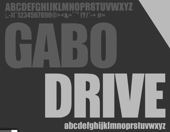
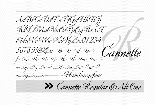
 Nashville, TN-based designer of the hand-lettered typefaces Margot (2020: a marker font), Scotty (2020) and Oakley (2019), the sans typeface Eugene (2019) and the display serif typefaces 12th South (2020), Walker (2018), Maxon Avenue (2019) and Laurel (2019). [
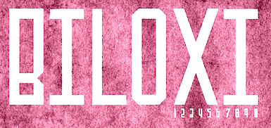 [
[ [
[ Randy and Leisa Wilcox run Once Blind Studios in Nashville, TN, where it moved after first starting in Los Angeles in 2001. They designed the grungy typefaces Rhyolite (2015), Goldfield (2015) and Gold Dust (2015), which were created in the style of ghost town and gold rush lettering. Jerome (2015) is a vintage didone newsprint font.
  OSC Type Foundry, or Oscillating Type Foundry, located in Knoxville, TN, was started by B. J. Alumbaugh.
  [
[ [
[ Thomas Ramey, a graphic designer from Austin, TX, who grew up in Pasadena, TX, and was located in San Francisco and Nashville, TN, now operates out of Seattle, WA. He created the hybrid font
  The Wilton Foundry, which started out in Wilton, CT, but is now in Chattanooga, TN), was founded in 2003 by
  A graduate of the University of Tennessee at Knoxville, Patric King began his career as a designer with Thirst in 1994, and helped to build Thirstype until 1999. All of Patric's typefaces moved with Thirstype to Village in 2001, then on to
  Michael Cina (Minneapolis) is the cofounder of WeWorkForThem and
|
|
|
|