TYPE DESIGN INFORMATION PAGE last updated on Mon Jul 20 20:37:15 EDT 2026
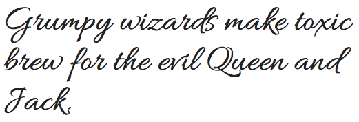
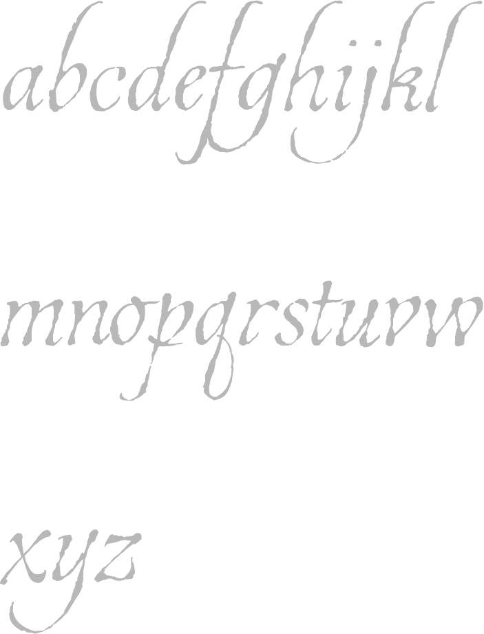
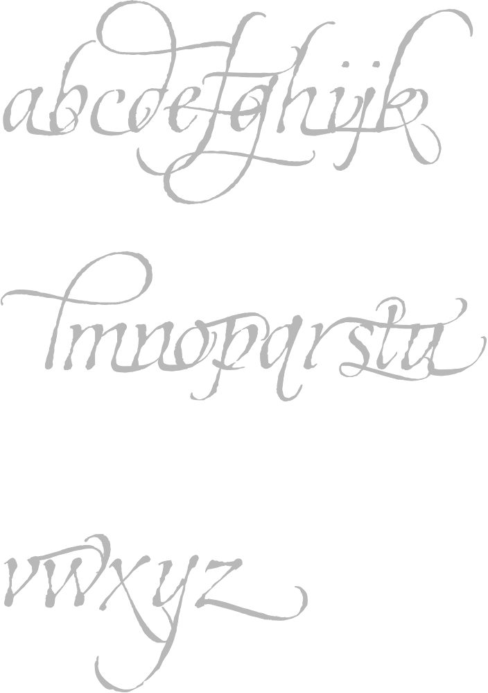
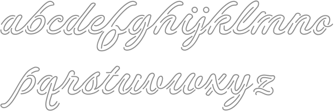
FONT RECOGNITION VIA FONT MOOSE

|
|
|
|
|
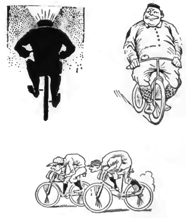
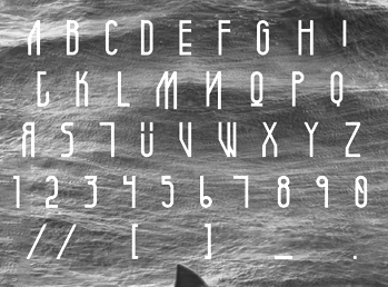
Type scene in Missouri | ||
|
|
|
|
SWITCH TO INDEX FILE
Aaron Beck
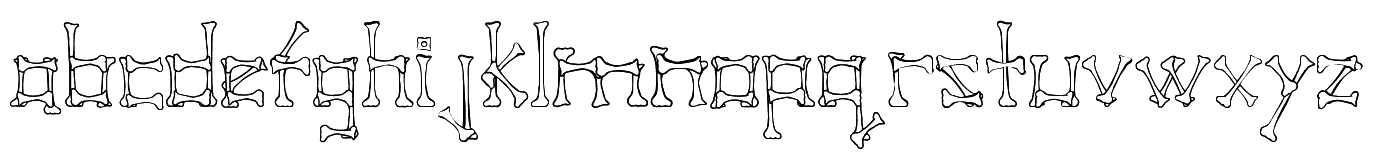
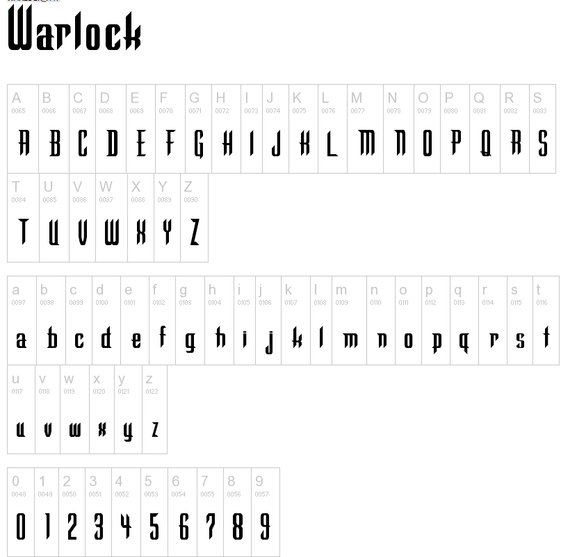
| Aaron Beck (Lee's Summit, MO) started making fonts in the 1990s under the labels Recordkeeper Software, RecordKeeper Systems LLC, Audio Electric Systems, and Aaron W. Beck Co. These include Beckett (textura, 1994), Cupertino (sci-fi face), Graveyard, Headstone, Pirate Bones, StoneCutter, Tombstone and Warlock. Fontspace link for RecordKeeper Software. Fontspace link for Aaron W. Beck Co. Dafont link. [Google] [More] ⦿ |
Aaron Beck
| |
During his studies at the University of Missouri St. Louis, Aaron Mann created the hand-drawn typeface Quartz (2014). [Google] [More] ⦿ | |
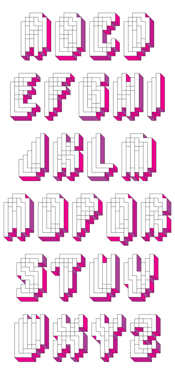
Designer in Kansas City, MO, who created the ink-trapped sab serif typeface Concordia in 2014. Free download. | |
| |
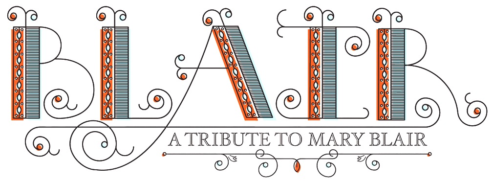
Adam Grason (aka Zadok44) is an Orlando, FL (and before that, Kansas City, MO)-based illustrator at Disney. He designed the Victorian ornamental families Blair (2012) and Patmos (2011). It is unclear whether Grey Sans (2014) and Quire (2014) are typefaces. Behance link. [Google] [More] ⦿ | |
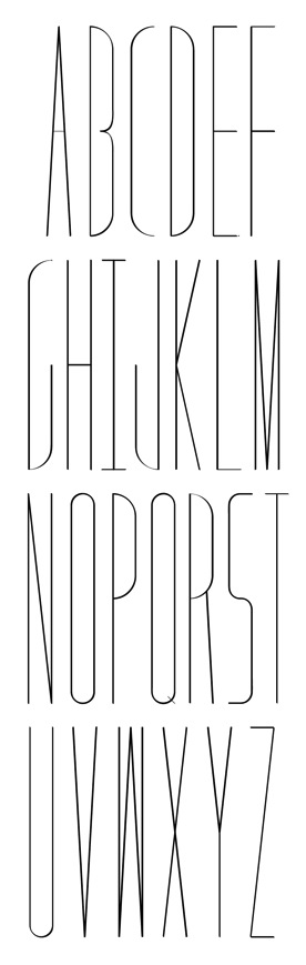
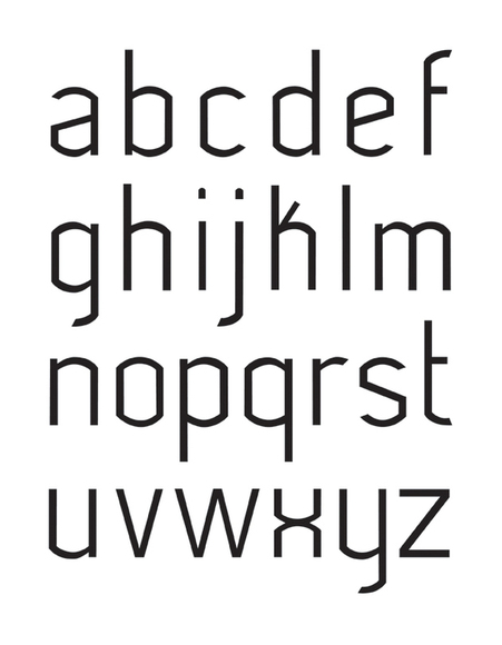
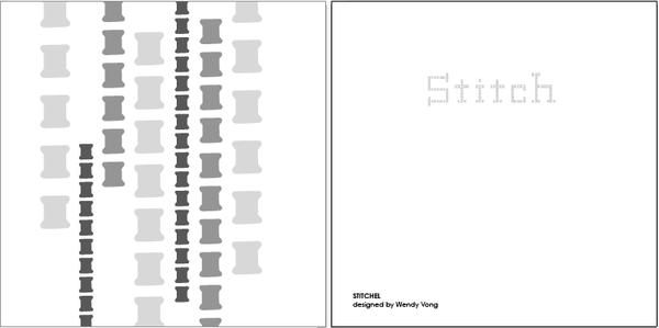
Saint Louis, MO-based graphic designer who created several typefaces in 2012, including Helvy, Stitch, Digiti, Exposed, Skinny Jeans (hairline caps), Golden Age (fashion mag caps), Tunnel Vision, and Grand Penn (ultra-condensed caps). [Google] [More] ⦿ | |
As a student in St Louis, MO, Alex Brutcher designed the decorative caps typeface Ferrum Vine (2016). [Google] [More] ⦿ | |
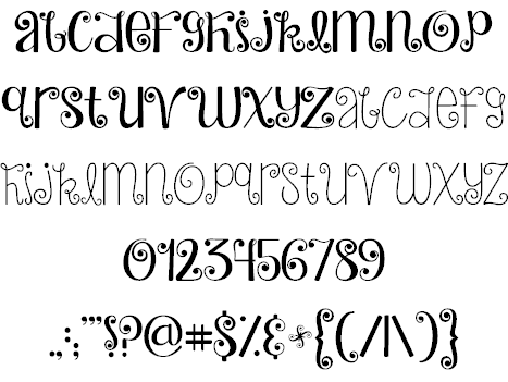
Graphic designer in Saint Louis, MO. In 2015, he created a handcrafted decorative alphabet. [Google] [More] ⦿ | |
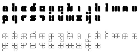
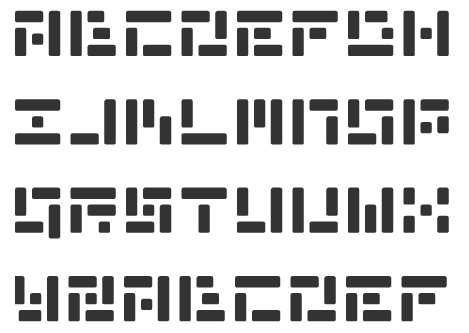
Alexandra Khoder (Kansas City, MO) designed the modular typeface families Macabre Plain and Macabre at FontStruct in 2012. FontStruct link. [Google] [More] ⦿ | |
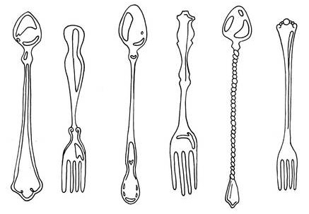
Graphic design student at the Kansas City Art Institute in Kansas City, MO. Creator of Proper Sweet (2011), a silverware dingbat face. In 2012, she created the condensed slab typeface H&S. Another Behance link. [Google] [More] ⦿ | |
Alphabytes
|
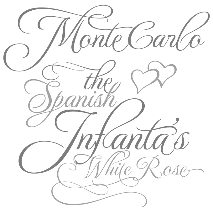
In 2003, he found an outlet for his work through P22 and published P22Corinthia, P22ImperialScript, P22OhLey [simulating Mexican writing], P22Petemoss and P22Ruthie. He also made RUSerius (2007, curly handwriting), Alex Brush (2003), Cherish Font (2003), ChildrenPlay ROB (2003), Ephesis (1988), Inspiration (2003), JackieO (2003), Licorice (2003), OoohBabyROB (2004), TheNautiGal (2006), Gideon (2009, roman), Corinthia (2009, calligraphic), Puppies Play (2009), Monte Carlo (2011). Rob Leuschke's bio. Klingspor PDF. MyFonts interview. [Google] [MyFonts] [More] ⦿ |
Kansas City, MO-based designer of Extraterrestrial (or Labyrinthian) (2015, FontStruct). FontStruct link. Behance link. [Google] [More] ⦿ | |
As a student in St. Louis, MO, Amanda Brisso designed the modular typeface Sarah Katherine (2016, FontStruct). [Google] [More] ⦿ | |
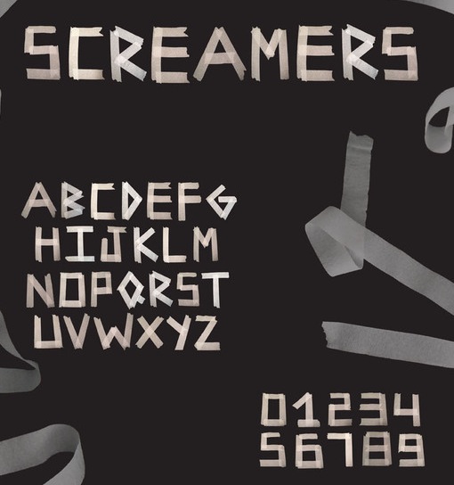
Graphic designer in Saint Louis, MO, who created Screamers (2012). [Google] [More] ⦿ | |
Kansas City, MO-based creator of the distorted typeface Para (2012), which was designed during her studies at the Kansas City Art Institute. Blogspot link. [Google] [More] ⦿ | |
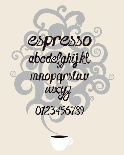
During her studies in Saint Louis, MO, Ariel Biggerstaff created the brush typeface Espresso (2013). [Google] [More] ⦿ | |
Art & Progress
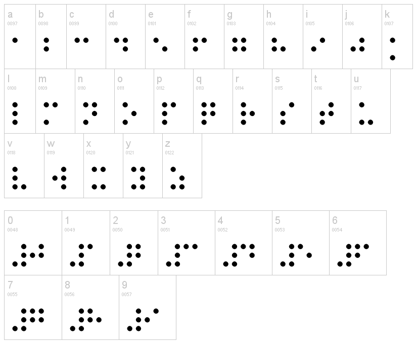
| Christian Dominick (Art & Progress) (b. 1990, Kansas City) created the free typeface Braille (2012). Dafont link. [Google] [More] ⦿ |
Aschwege Creative
| St. Louis, MO-based designer of these typefaces in 2018: Lagarto (for athletic lettering), Stag, Home Plate, Titan Sans. [Google] [More] ⦿ |
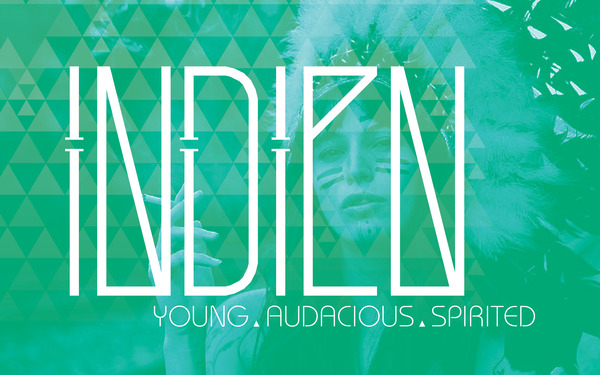
Graphic designer in Kansas City, MO. FontStructor who made the magic font Indien (2012). [Google] [More] ⦿ | |
During her studies in Kansas City, MO, Ashton Shechter created the squarish typeface Didinoe (2015). Behance link. [Google] [More] ⦿ | |
A.V. Haight
| |
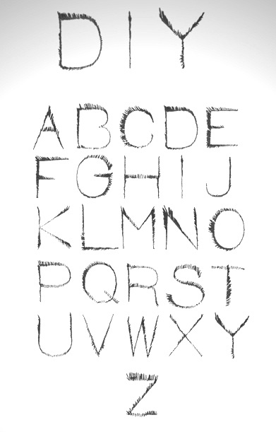
Ben Catic (Saint Louis, MO) created a display typeface out of toothpicks, the DIY Toothpick Font (2012). [Google] [More] ⦿ | |
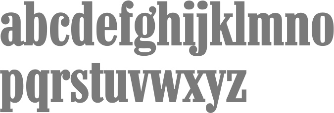
He designed Katje and Cimarron (2005, University of Reading, a serif family with support for Latin and Greek). Speaker at ATypI 2006 in Lisbon on Python scripts for FontLab and RoboFab. Image. In 2011, Vincent Pacella, Ben Kiel and Adam Cruz created the fat slab serif face Goliath, based on Film No. 6206 in the PhotoLettering archive. West Barnum Ultra, designed by Dave West and digitized by Ben Kiel&Adam Cruz in 2011, was film no. 5494 in the original Photo-Lettering archive. At House Industries, he redesigned the iconic Rea Irvin lettering for The New Yorker in September 2013. The typefaces are named New Yorker Irvin and New Yorker Neutraface. In 2012 at House Industries he revived the Photo Lettering Inc font Worthe Numerals, which pushed fat didone to its limits. Still at House Industries, Christian Schwartz, Mitja Miklavcic and Ben Kiel co-developed Yorklyn Stencil. Cortado Script (2014) was designed by Jesse Ragan and Ben Kiel. It was inspired by Swedish illustrator's Cecilia Carlstedt's hand-painted lettering. It follows one year after a similar signage script typeface, Carlstedt Script (2013), also co-designed by Jesse Ragan and Ben Kiel---it was a custom signage typeface for Aldo Shoes. In 2015, Mark van Bronkhorst set up TypoBrand LLC in Berkeley, CA. As part of TypoBrand, he published several typefaces that are modern digital reinterpretations of ATF typefaces. The collection is published by TypoBrand LLC under the names ATF Type or American Type Founders Collection. Ben Kiel co-designed, sometimes with others, classics such as ATF Alternate Gothic (2015), ATF Brush (2015), ATF Egyptian Antique (an expansion of Schraubstadter's Rockwell Antique by Mark van Bronkhorst, Igino Marini, and Ben Kiel), ATF Railroad Gothic (2016), ATF Garamond (2015), ATF Headline Gothic (2015), ATF Livermore Script (by Mark van Bronkhorst, Igino Marini, and Ben Kiel), ATF Poster Gothic (2015) and ATF Wedding Gothic (2015). At XYZ Type, Ben Kiel co-designed Cortado Script in 2013 with Jesse Ragan and designed the sans typeface Grep (2017). In 2019, Ben Kiel participated in the development of ATF Franklin Gothic (Mark van Bronkhorst, Igino Marini, and Ben Kiel). A broad and multi-weight interpretation of Morris Fuller Benton's classic from 1905, Franklin Gothic, which only had bolder weights. For the lighter styles, the designers were inspired by Benton's Monotone Gothic. Girard Sky (2019) is based on Alexander Girard's original typeface for his redesign of Braniff Airways. Working with the original drawings for the photoset typeface found in the Girard archive, the design was revived as part of the Alexander Girard collection. Followed by Girard Slab (2019). Typefaces from 2020: Ballast (Future Fonts: a condensed slab serif). [Google] [MyFonts] [More] ⦿ | |
Ben Kiel
| |
Bethany Aurand, a graphic designer in Boise, ID, combined Palatino, Kepler, and Giovanni when she created her thesis typeface in 2012 in the BFA program at the University of Missouri-St. Louis. [Google] [More] ⦿ | |
Blackdreamist
|
Creator of Minimalisto (2012). Benthem (2012) is a wonderful free art deco typeface family. Ambrosia (2014) is an all caps display typeface. Behance link. Cargo Collective link. [Google] [MyFonts] [More] ⦿ |
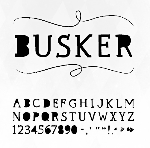
Art director in Kansas City, MO, who created the counterless display typeface Busker in 2013. [Google] [More] ⦿ | |
At Lindenwood University, St. Charles, MO-based Brannon Rehm designed the medieval typeface Middle earth (2016). [Google] [More] ⦿ | |
Caitlin Workman grew up in Saint Charles, Missouri, close to Saint Louis. She is a visual communication student at the University of Kansas in Lawrence, KS. She designed the ultra-fat round typeface Glee (2011) and the display typeface Sir Quincy (2013). Behance link. [Google] [More] ⦿ | |
St. Louis, MO-based designer of William Deco (2019). [Google] [More] ⦿ | |
Kansas City, MO-based student, who created the minimalist handwriting font Curtail (2003). [Google] [More] ⦿ | |
Kansas City, MO-based designer of Extension Type (2011, inspired by power cords). [Google] [More] ⦿ | |
During her studies at the University of Columbia-Missouri, Carmen Woodrow designed the handcrafted typeface aptly called The Sexy Serif (2017). [Google] [More] ⦿ | |
During her studies at Saint Louis University in Saint Louis, MO, Caroline Sparks designed a minimalist monoline geometric sans typeface (2016). Behance link. [Google] [More] ⦿ | |
During her studies, Carson Hartung (Ballwin, MO) designed the script typeface Callie Regular (2018). [Google] [More] ⦿ | |
| |
Cecilia Ann Harris
| |
| |
Kansas City, MO-based student, who created the display font Mineral Hall (2003). [Google] [More] ⦿ | |
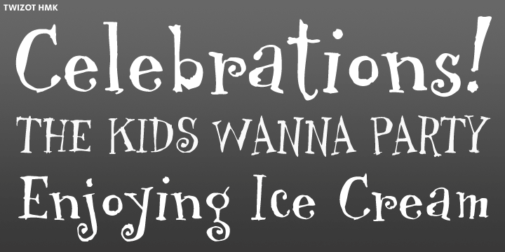
Lettering artist and typeface designer, who worked for Hallmark Cards in Kansas City for 26 years, retiring in 2002. He lived from 1938-2004, and created many calligraphic script letterforms and typefaces. Jill Bell writes: Scarcely a soul outside of the Hallmark lettering and typography department is aware of the large body of lovely, skilled typographic work you have done because the fonts are proprietary. And Bud was a quiet sort of guy. Bud had hoped to produce fonts of his own when he retired but unfortunately the grim reaper quickly arrived. Quite unfortunate for the type world. I know the Hallmark lettering and type department really misses having Bud's talents and knowledge available to them because they truly understood what he contributed and appreciated it." And Calvert Guthrie wrote: "Bud was enormously generous with his understanding of font design and I know no one who had a better grip on making script ligatures work. Bud was doing it elegantly back in the days we were setting up linking ligatures for film fonts on Linotype VIP. We only had 18 increments for spacing refinement and this was made even tougher by script's particularly small x-height. His caps and his card captions were outstanding. Many of the short cuts we still use these days here at Hallmark were first developed by Bud Braman. Some of his work appeared in Michael Clark's Scripsit last year [2003]. Some of his typefaces at Hallmark include TwizotHmk (1999, with John Dawbarn), HogwartsWizard (2002, based on style by Connie Smiley, commissioned by Warner Brothers). Picture by Jill Bell. [Google] [More] ⦿ | |
Designer in Missouri. I quite like the (commissioned) typography for a restaurant called Miso Sushi (2011). [Google] [More] ⦿ | |
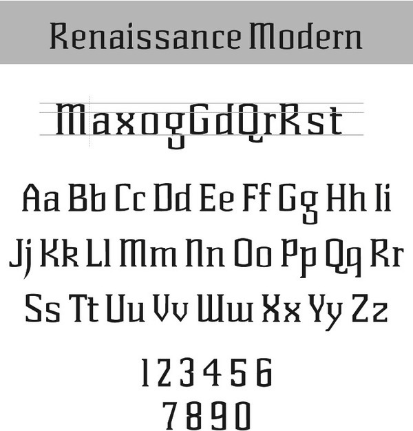
Chris Klee, a graphic designer from Missouri, now based in Austin, TX, created Renaissance Modern (2012): Renaissance Modern draws inspiration from the magnificent architecture of the pillars, windows, ledges and openings [of the Porta Nigra city gate in Trier, Germany] while also pulling from the modernity surrounding Trier. For Whole Foods, he designed the corporate typefaces Whole Sketch and Whole Sketch Sans in 2014. Behance link. [Google] [More] ⦿ | |
Kansas City, MO-based architect and photographer, who created a 3D typeface in 2011. In 2012, he made Digital Snow (simulating snow with pixels), What The What (experimental 3d face), Wicker and Lateral Lines. [Google] [More] ⦿ | |
Christian Dominick
| |
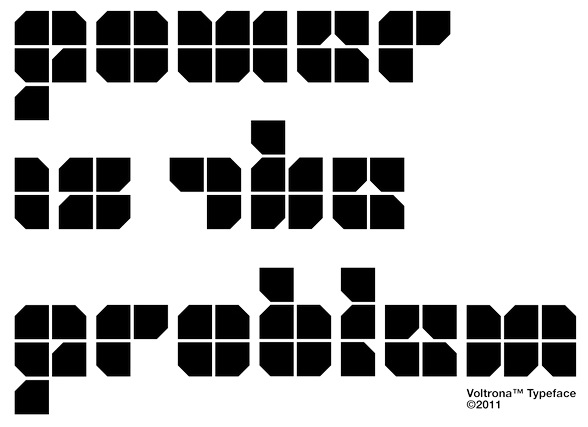
Illustrator and designer at the Kern&Letter Company in Missouri. Behance link. Home page Creator of various display typefaces including the kitchen tile typeface Voltrona (2011, a kitchen tile typeface), Hate (2012), the kitchen tile typeface Metgeo (2012), the monoline sans typeface Duplica (2012), the piano key typeface Lucreow (2012: Lucreow is a permutation of Crouwel), Caladan (2012, fat blackletter), Hague (2012, angular), the Bauhaus-style typeface Joi (2012), the blackletter typeface Caladan (2012), Rid-G (2012, experimental), Sugar (2012), Cumo (2012, a happy children's book typeface), Domm (2012, stencil face), Zukunft, Iron (2012, an old film typeface), Freight (2012, stencil face), Noir, Shamrock (2012, octagonal athletic shirt typeface), Unison (2012, sans), Basic (2012), Sexy (2012, hairline), Gitter (2012, rounded), Modo (2012, monoline techno face), and SF Mono (2012). [Google] [More] ⦿ | |
Liberty, MO-based designer of Curved Blades (2014). [Google] [More] ⦿ | |
St. Louis, MO-based designer of the kitchen tile typeface Disco (2016), which as finished during her studies at the University of Missouri at Saint Louis. [Google] [More] ⦿ | |
Missouri-based designer of the free fonts Tekno (2018) and Simplaform (2018: solid and counterless). [Google] [More] ⦿ | |
Kansas City, MO-based designer of the modular typeface Apollo (2017). [Google] [More] ⦿ | |
Coulton Thomas
| |
| |
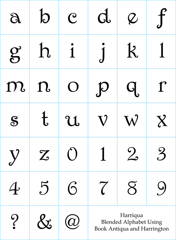
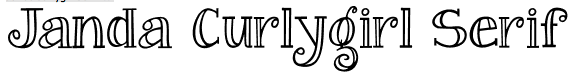
During her studies in Kansas City, MO, Crustal Mccann created Hariqua (2013), a curly typeface that blends Book Antiqua (Palatino) and Harrington. [Google] [More] ⦿ | |
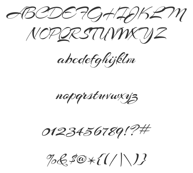
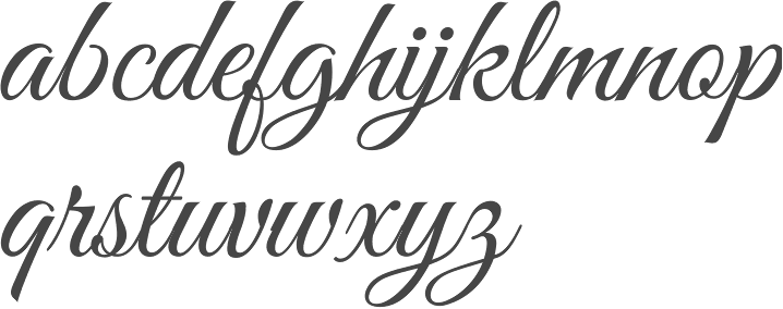
In 2017, he created the brush script typeface Shavano (+Rough). Behance link. Creative Market link. [Google] [MyFonts] [More] ⦿ | |
Daniel Shinn
| |
As a student, Warrensburg, MO-based Dante Barger designed the handcrafted typefaces Drowned Fish (2015) and Glutt Mutt (2016). [Google] [More] ⦿ | |
Lee's Summit, MO-based designer of the beatnik or children's book all caps typeface Confetti (2017). Behance link. [Google] [More] ⦿ | |
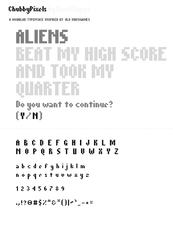
Kansas City, MO-based designer. His typefaces include Dr. Chunk (2011) and Chubby Pixels (2011). [Google] [More] ⦿ | |
Saint Louis, MO-based designer of the ornamental textured caps typeface Triland Slab (2014). [Google] [More] ⦿ | |
Graphic designer, who was born and raised in Tegucigalpa, Honduras, and moved to the United States in 2010. During his studies at the Kansas City Art Institute, Independence, MO-based Derick Lopez designed the display typefaces Imperya (2017) and I Am Enough (2013). Behance link. [Google] [More] ⦿ | |
Graphic designer in Kansas City, MO. In 2019, he released the squarish typeface SirxCitrus. [Google] [More] ⦿ | |
Sign painter and artist, b. 1930, Springfield, MO, d. 2017, Kansas City, MO, who was in the US Air Force in WWII and has a BA from the Kansas City Art Institute. Designer of the film font Chrome. This font was shown in a Lettergraphics ad in U&LC in 1974. From his obituary in the Kansas City Star: During the school years he worked at several sign shops and for Hallmark Cards. He then free-lanced while looking for a career job. In 1957 he was "discovered" by Hal Sandy, who had a small but creative sales promotion agency. Thirty-six years later, Don retired from Sandy, Inc. after having advanced to Vice-President and becoming part owner of the company. [...] In 1993, Ann "Smiley" Havlicek (his second wife) and Don formed their own free-lance company, Vernon & Assoc., and worked out of their home. . [Google] [More] ⦿ | |
As a student in Saint Louis, MO, Eden Lewis created the circle-and-arc-based typeface Neon Romancer (2013). [Google] [More] ⦿ | |
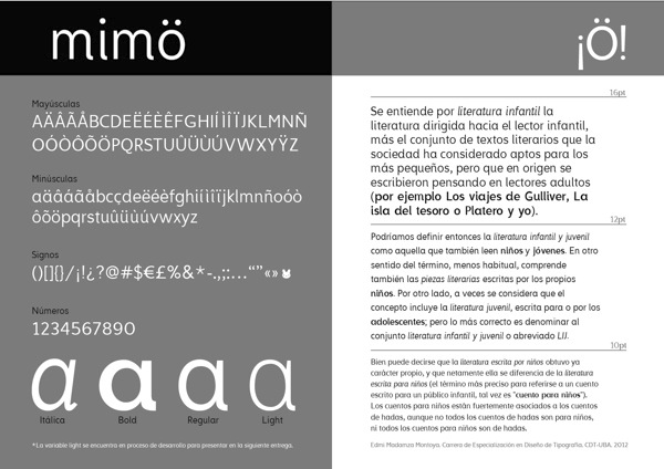
Kansas City, MO-based creator of the sans typeface Mimo (2012), which was her graduating project at FADU / UBA in Buenos Aires. It was inspired by books for 8 to 13-year old children. Allegro (2011) is a display typeface based on didones---it was developed during her studies in Buenos Aires. Behance link. Blogspot link. [Google] [More] ⦿ | |
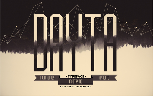
Graphic designer and illustrator currently attending KCAI in Kansas City, Missouri. Behance link. Eli used FontStruct to make condensed skinny octagonal typeface Dayta (2012, Ten Dollar Fonts). Eli says: I wanted the typeface to embody these three characteristics: adventurous, infotastic, and resolute.. [Google] [More] ⦿ | |
St. Charles, MO-based designer of the display typeface Fedora (2015) during her studies at Lindenwood University. [Google] [More] ⦿ | |
During her communication design studies at Washington University in Saint Louis, MO, Elizabeth Korb created a paperclip typeface (2013). [Google] [More] ⦿ | |
At the University of Missouri, Elizabeth Principato (Columbia, MO) designed the informal curly typeface Curly Sue (2019). [Google] [More] ⦿ | |
Saint Louis, MO-based designer of the geometric eperimental typefaces Befold (2014) and Groot (2014). Emiljo was born in Pogradec, Albania and studied at the St Louis Community College. [Google] [More] ⦿ | |
Emily Iles
| |
Kansas City, MO-based designer of Cuna (2019), a custom titling typeface for the band Making Movies. [Google] [More] ⦿ | |
Warrensburg, MO-based designer of Schweizer Comic Font (2016), a font based on handwriting of author-artist Chris Schweizer, published in his Crogan series for Oni Press, and his Creeps series for Abrams. He also published Airship Dialogue Comic Font in 2016. Behance link. [Google] [More] ⦿ | |
O'Fallon, MO-based designer of an ornamental caps alphabet based on ballet (2013). [Google] [More] ⦿ | |
FontFuel (formerly PhotoshopIsland, and Ridpath Creative Partners)
| Roger Ridpath (b. 1964, Wichita, KS, and located in Kansas City, Missouri) is a photography expert who designed the hand-printed Designer Notes (2009) and Leaves Symbol Font (2013). At MyFonts, one can buy Iron Grunge (2010), PSI Leaves (2010, dingbats), Angie Lou (2010, grunge), Designer Notes Pro (2012, hand-printed), and Grungy Old Typewriter. Home page. Klingspor link. Dafont link. Creative Market link. [Google] [MyFonts] [More] ⦿ |
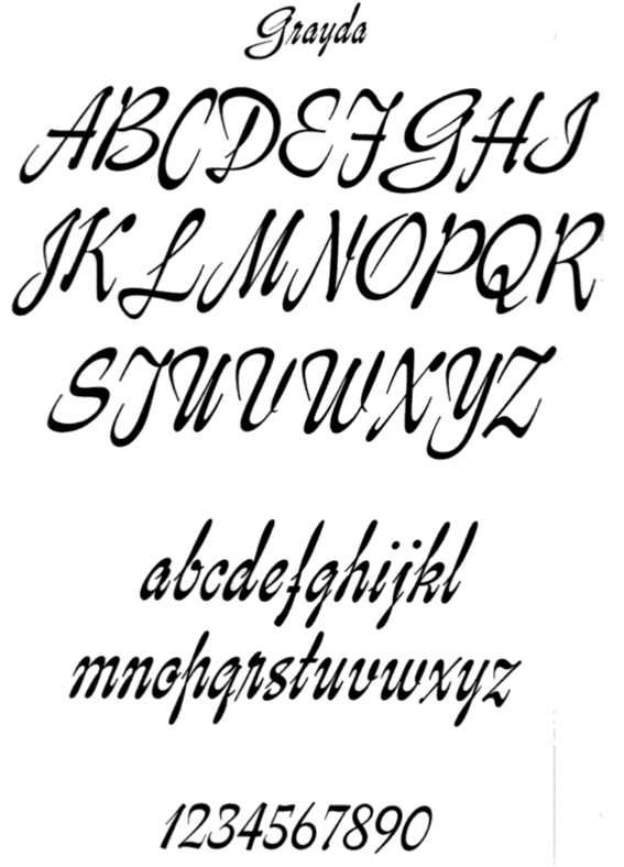
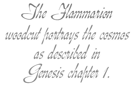
Advertising artist (b. 1894, Joseph, Missouri) influenced by Oswald Cooper and Frederic Goudy, with whom he collaborated. He worked first as a lettering artist in New York and then as a free-lancer in Chicago. Designer at American Typefounders of the condensed and stocky slab serif typeface Contact (1944: see the TS Colonel family by TypeShop for a digital version) and the calligraphic script font Grayda (1939, ATF; +Initials). Grayda was digitized, expanded and modernized by Rebecca Alaccari as Genesis (2007). McGrew writes:
Klingspor link. [Google] [MyFonts] [More] ⦿ | |
Kansas City, MO-based student, who created the grunge font Xero (2003). [Google] [More] ⦿ | |
Behance link. [Google] [More] ⦿ | |
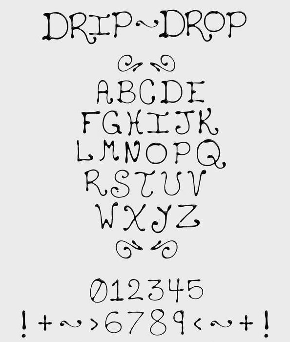
Student at the University of Missouri at Saint Louis. Saint Louis, MO-based designer of Drip Drop (2012), an alphabet based on chocolate syrup. [Google] [More] ⦿ | |
During her studies in Saint louis, MO, Geylynn Scales created the marker typeface Flexin (2014). [Google] [More] ⦿ | |
From Columbia, MO, Gus Mueller's free font GMPokey, a beautiful fat-letter font. [Google] [More] ⦿ | |
His typefaces include:
| |
Haff Raff
| St. Louis, MO-based designer of Midwest (2018). [Google] [More] ⦿ |
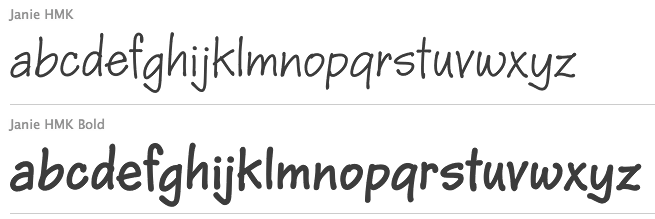
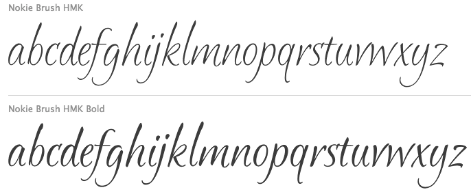
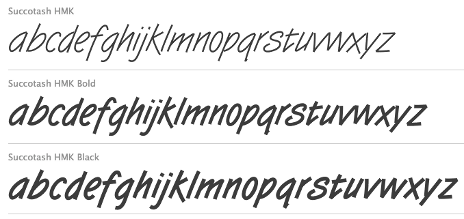
In 2008, careful hackers found these fonts in the flash files of Hallmark and posted them on alt.binaries.fonts: AngelinaHMK, AnnouncementRomanHMK, CoronaSansHMK, CrownRomanHMK, DuneHMK (2008), InkberryCondensedBoldHMK, KarasHMK, KingsHatBoldHMK, MizquitoHMK, PatriciaHMK, PoobyrdHMK, ZincHMK-Regular. One hacker points out that AnnouncementRomanHMK is a rework of Castcraft's AnnouncementRoman, adding the Euro, so Hallmark seems to have its hands in the cookie jar, unless there is an intestinal link to Castcraft (but I am not aware of any). In 2010, some people extracted fonts from Hallmark e-cards with these names: BetaCrownRomanBFA, BetaMars, BluesOnePKA, DoverA1, EdPS-Script, EvereadyOnePKA, GriegoOnePKA, InkberryCondensedBoldA1, KingsHatSansTextBoldPKA-Regular, KingsHatSansTextBoldPKA, KreamyPKA, Minion-HMK, PSOneBoldPKA, PahtooieOneSolidPKA, PahtooieTwoSolidPKA, PeanutsA1-Regular, QubitTwoBoldPKA, SlashKA, StoryBookPKA. In 2010, Ascender started selling the Hallmark fonts. The first set includes Bix Antique Script HMK, Cluff HMK, Forget Me Not HMK, Fultoon HMK, Geeoh HMK, Hasty HMK, Havix HMK, Jewels HMK, Kat Tail HMK, McBoo HMK, Okrien HMK, Ottum HMK, Starbabe HMK, Succotash HMK and Wallow HMK. The second set, published in 2011, has BoogieWoogie HMK, Calcium HMK (2010, skeletal font), Gweet HMK, Karrot HMK, Pan HMK, Slash HMK, Splint HMK, Tuf Medium HMK (2011), Twizot HMK (1999). But then Ascender was gobbled up by Monotype, so who knows what will happen? In 2012, we find a file with 107 free fonts on the Hallmark site as a support file for Hallmark Card Studio 2012. That collection: AliceFrancesHmk, BaaBookHmk, BaaBookHmkBold, BernhardFasD, BernhardFashionHmk, BernhardMordern, BethsCuteHmk, BethsCuteHmkBold, BixAntiqueScriptHmk (2009, a copperplate script), BixAntiqueScriptHmkBold, BoogieWoogieHmk, BoogieWoogieHmkBold, CallieHmk, CandyBuzzBTN, CandyBuzzBTNBold, CapriHMK, CarmineTango, CaslonAntT, CaslonNo540SwaD-Ital, ChrisHmk, ChrisHmkBold, CluffHmk, CluffHmkBold, CopperplateT-Bold, CopperplateT-Ligh, CopperplateT-Medi, DesertDogHmk (2008), DomCasualBT-Regular, DomCasualD-Regu, ForgetMeNotHMK, FrancineHmk, FrancineHmkBold, FultoonHmk (2010, a great painter's script), FuturaBT-Medium, Garamond, GaramondBold, GaramondBoldItalic, GaramondItalic, GeeohHmk (2009), GeeohHmkBold, GilliesGotD-Ligh, GrilledCheeseBTNCn, GweetHmk, GweetHmkBold, HankBT-Roman, HastyHMK (2006), HavixHmk (1998, calligraphic), HavixHmkBold, Humanist531BT-RomanA, JanieHmk (2008), JanieHmkBold, JewelsHmk (2008), KatTailBoldHMK, KatTailHMK (2009), LamboHmk, LamboHmkBold, LiorahBT-Regular, MaritaTextBookHMK, MaritaTextMediumHMK, McBooHmk (2009), MelanieBT-Roman, MissyBT-Roman, NimbusRomD-Regu, NimbusRomdBold, NimbusRomdItalic, NimbusSanT-Regu, NimbusSanT-ReguCond, NimbusSanTConBold, NokieBrushBoldHMK, NokieBrushHMK (2009), NotnorvalHmk, NotnorvalHmkBold, OkrienHmk (1999, camp site script), OkrienHmkBold, OttumHmk (2010, formal connected script), OttumHmkBold, PamHMK (2009), ParkAveD, PegsannaHMK, RegisterSansBTN, RegisterSansBTNBold, RyanBT-Heavy, SandyTextHmk (1997, formal script), SandyTextHmkBold, Shannon-Book, ShannonExtraBold, SlashHmk, SlashHmkBold, SplintHmk (2008), SplintHmkBold, StarbabeHmk (2009), StarbabeHmkBold, SuccotashHmk (1999, technical memo script), SuccotashHmkBlack, SuccotashHmkBold, Symphony, SymphonyBlack, TwizotHmk (1999), URWAlcuinT-Regu, URWImperialT-Regu, WackyActionBTN, WackyActionBTNBold, WallowHmk (1999), WallowHmkBold, WritetyperHmk, YearbookSolid. Hallmark's SMC animations font download site has the free fonts Hmk Handjive, Handshake, Handlebar, Handstand, Handspring, Handsome, all made in 2010. Additional fonts not mentioned above include Butch HMK (2008), Amberger Sans One, Angelina, Announcement Roman HMK, Constanze Mono One Med, Corona Sans, Crocka Doodle One, Crown Roman (regular, italic), Drummer Man, Dune, Inkberry Cond Bold, Karas, Kings Hat (bold, italic), Mizdemeanor One, Mizfit, Mizquito, Patricia Medium, Poobyrd, Zinc. As of the early 2010's, Hallmark had two full-time font designers in its department, Terry Lee and Josh Scruggs, and could still count on Myron McVay, who officially retired from Hallmark a few years ago and died in 2013. The type department was headed by Rick Cusick. More recently, Hallmark started to work exclusively on proprietary font designs, including fonts for various Hallmark subsidiaries. By 2016, Rick Cusick and Terry Lee also retired, leaving Hallmark with just two full-time designers: Josh Scruggs and Lila Symons. To read about type design at Hallmark, consult What Our Lettering Needs The Contribution of Hermann Zapf to Calligraphy & Type Design at Hallmark Cards by Rick Cusick. [Google] [MyFonts] [More] ⦿ | |
Graphic design student in Valley Park, MO, who created the connected script alphabet Doris (2012). [Google] [More] ⦿ | |
Herrington Design
| Graduate of Kansas City Art Institute, class of 2004. Designer of King Street (2017), and Fairfax Solid Fishtail (2017) and Fairfax Open Fishtail (2017), named after Fairfax, VA. Aka mkraft94. Creative Market link. [Google] [More] ⦿ |
Hobart Design
| Missouri-based designer of the titling typeface Fingerling (2016). Dafont link. [Google] [More] ⦿ |
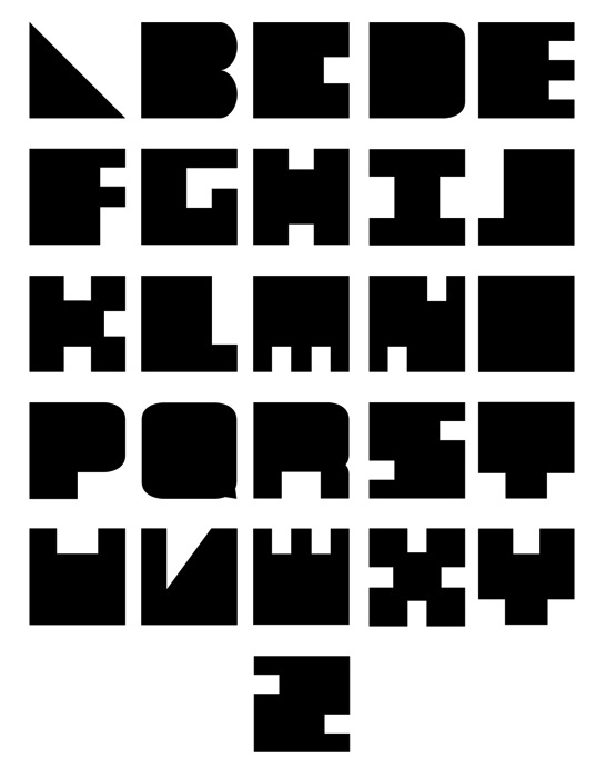
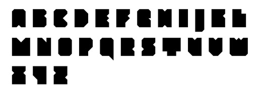
An orphaned triangulated typeface done by a student at Kansas City Art Institute in 2015. [Google] [More] ⦿ | |
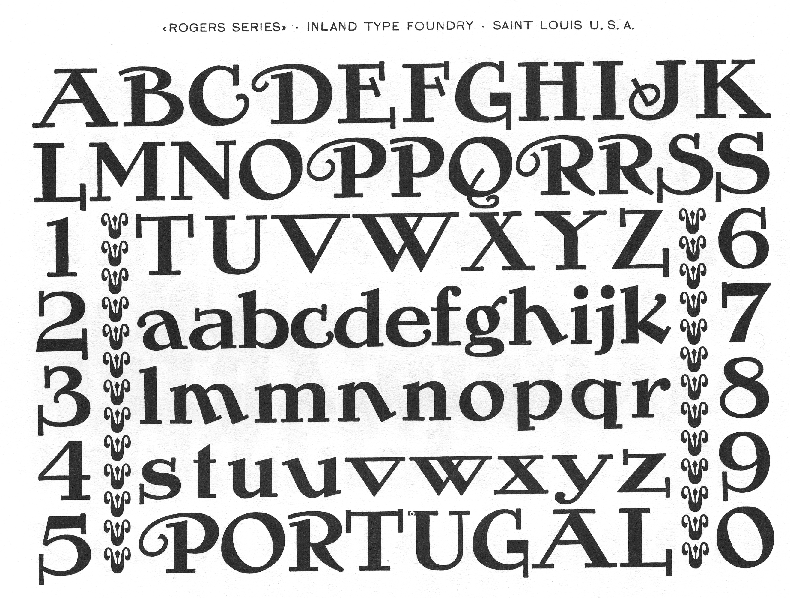
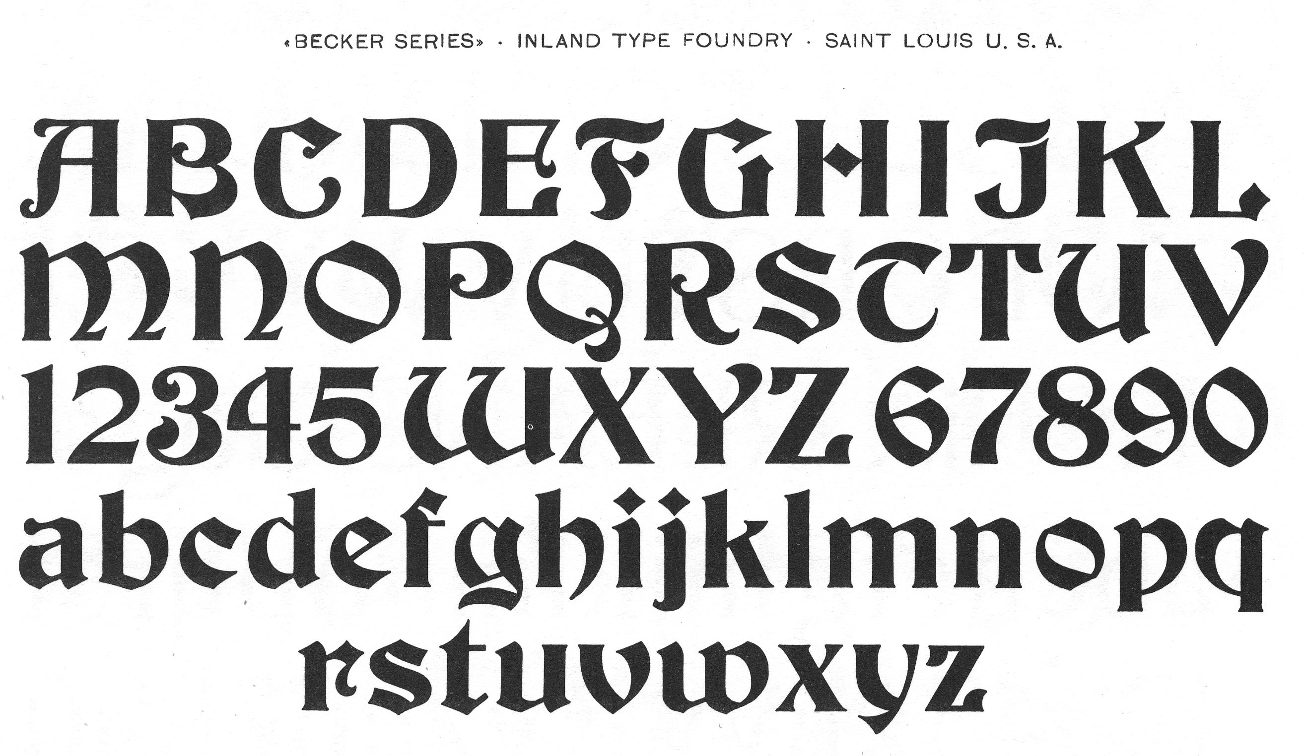
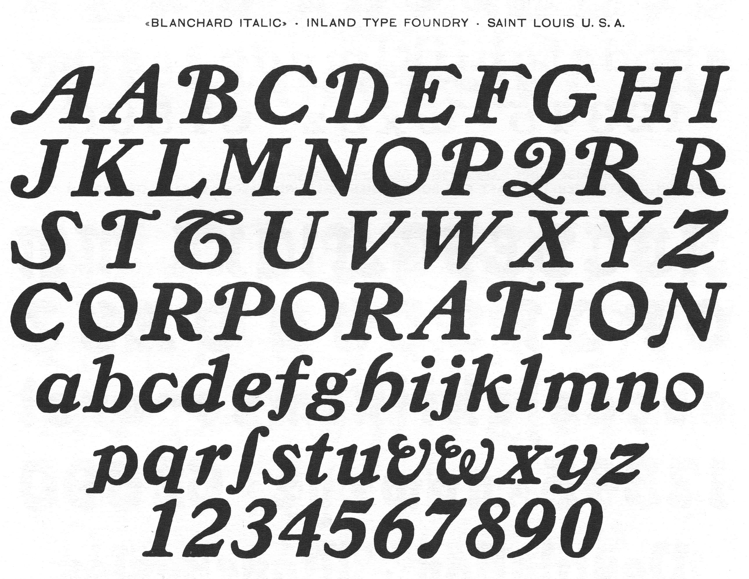
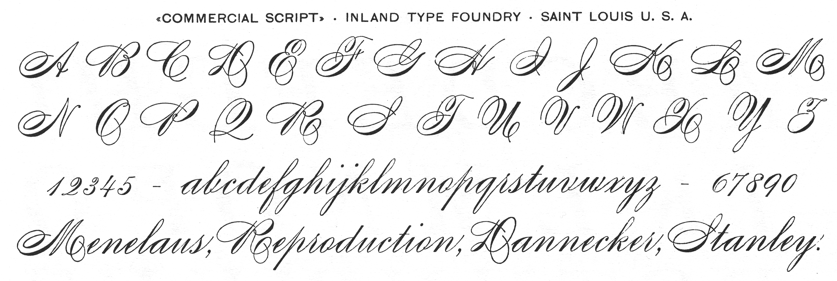
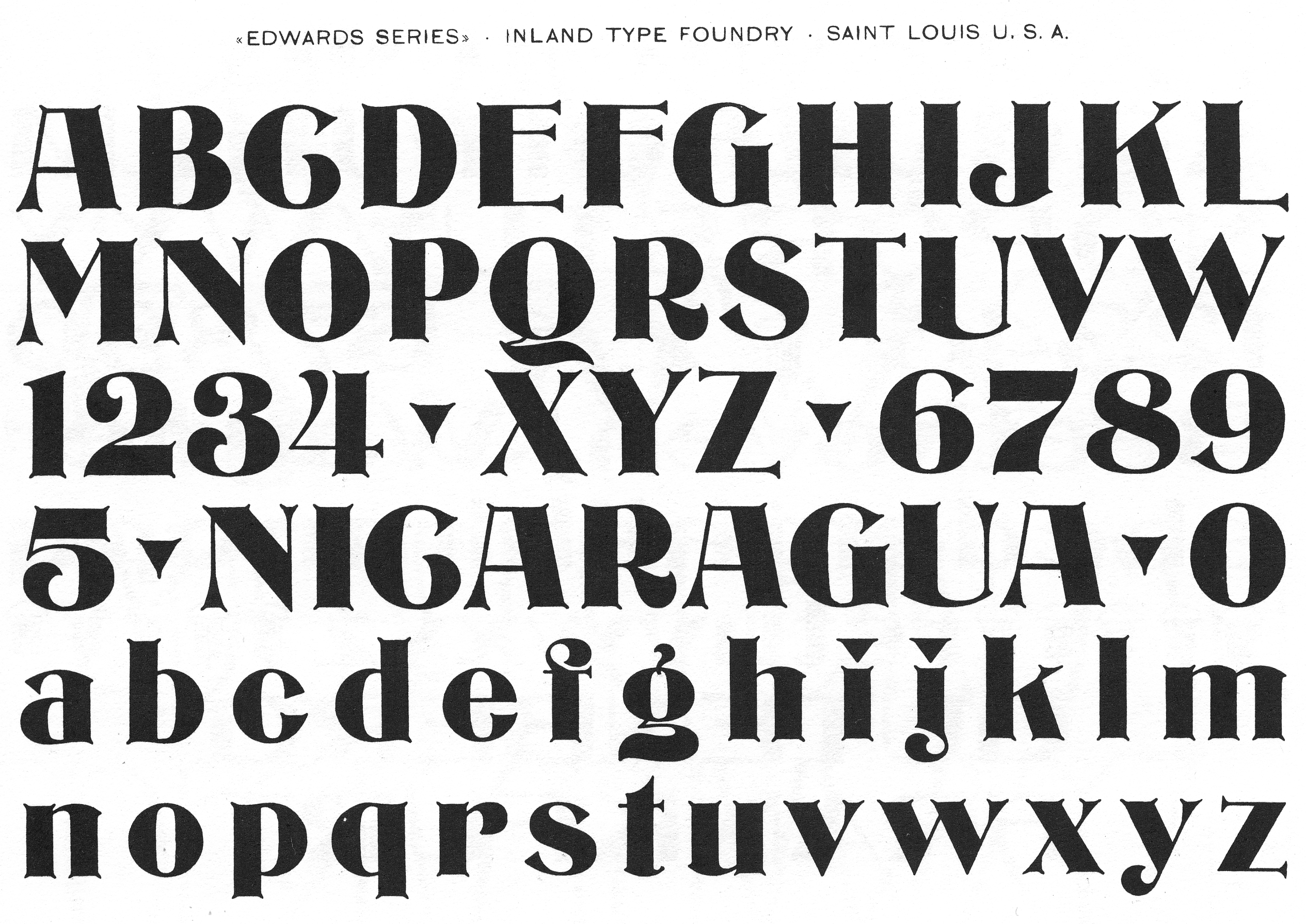
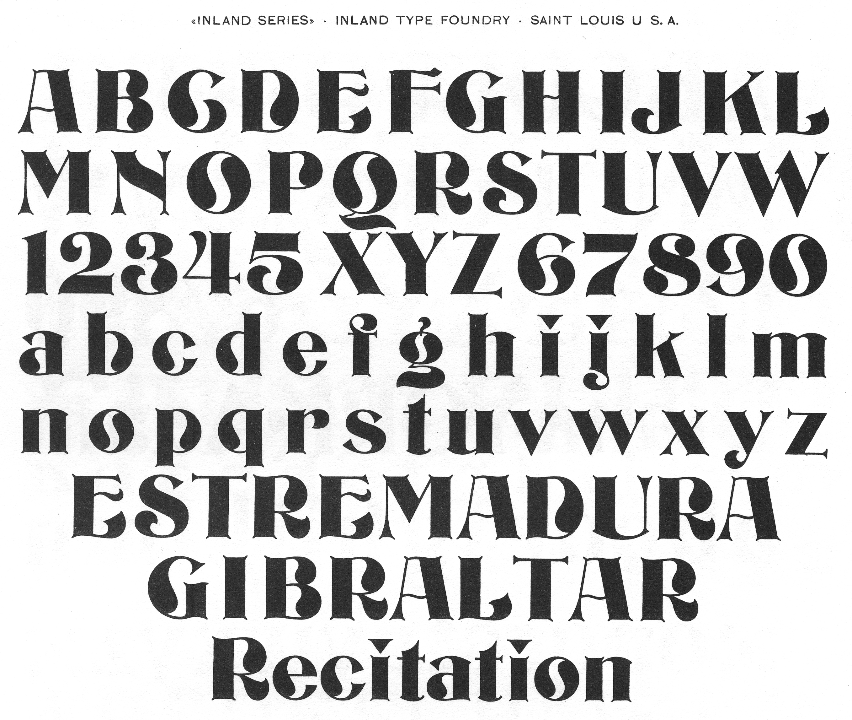
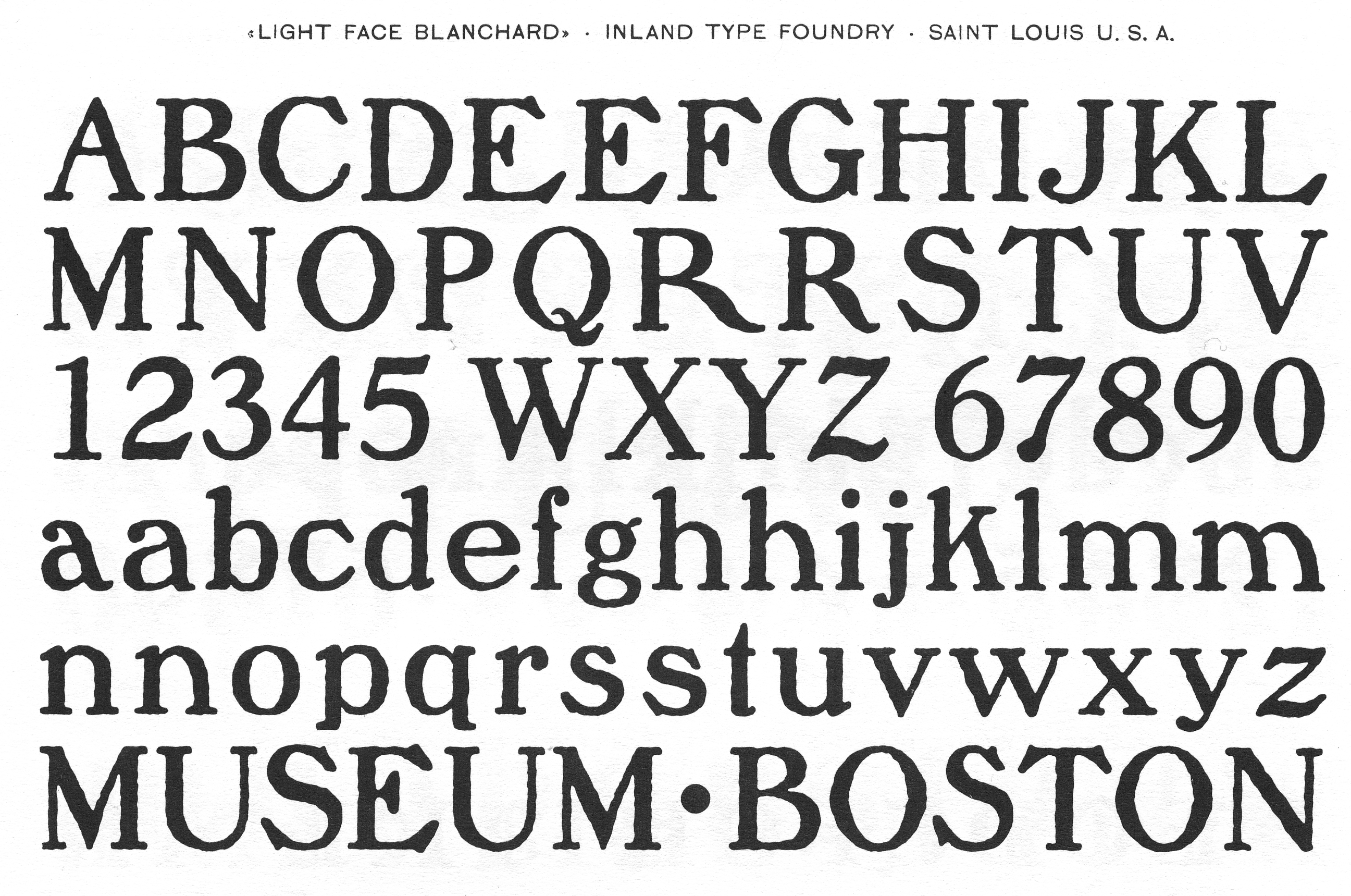
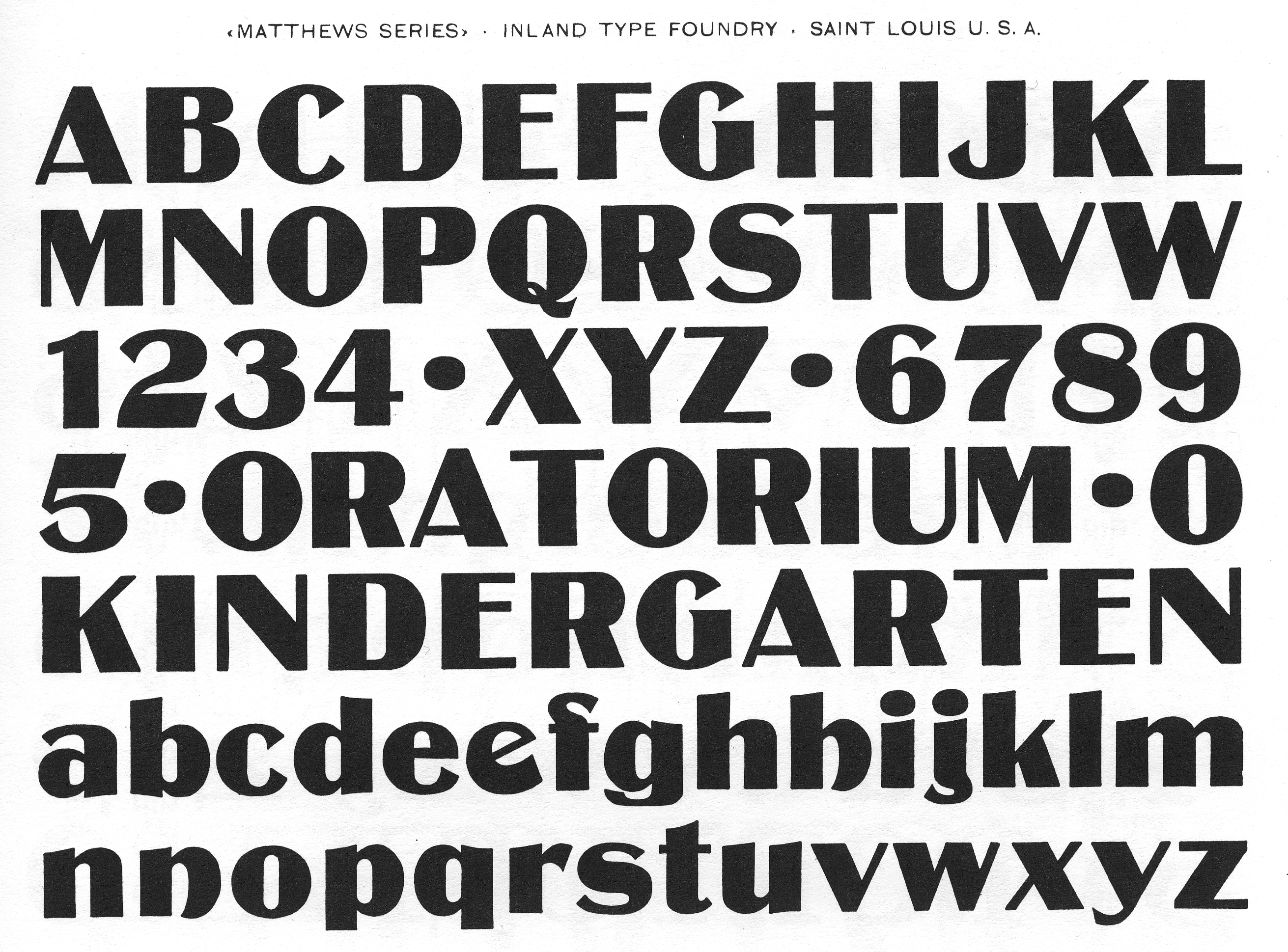
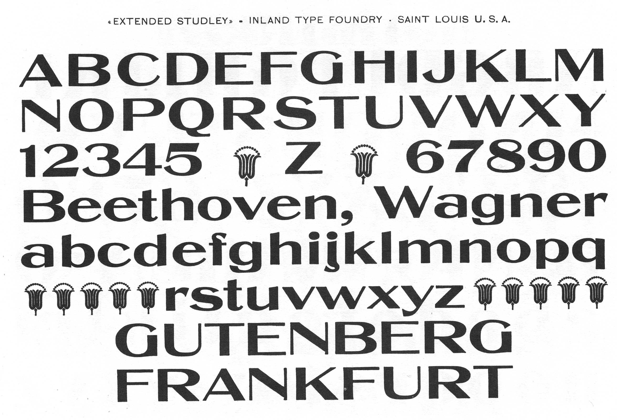
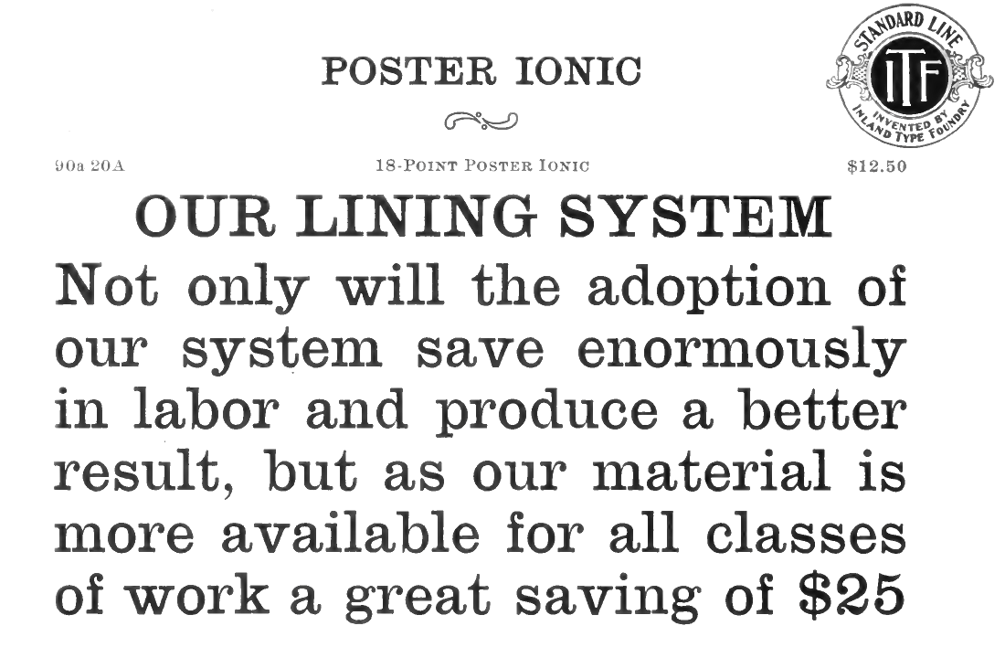
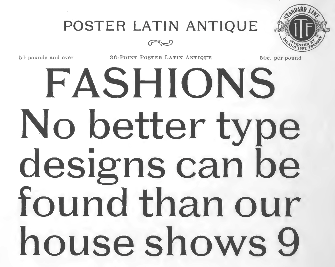
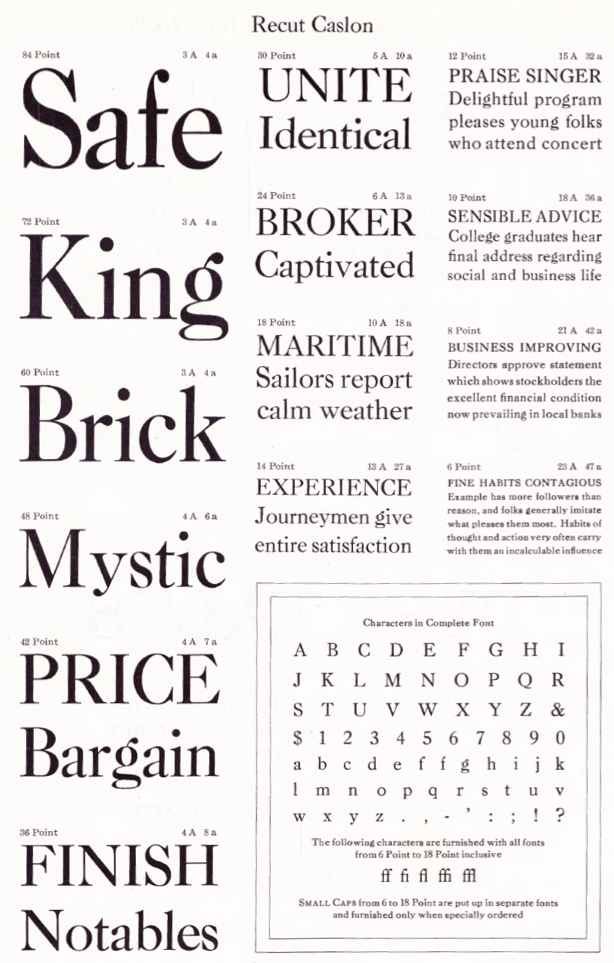
Inland Type Foundry
|
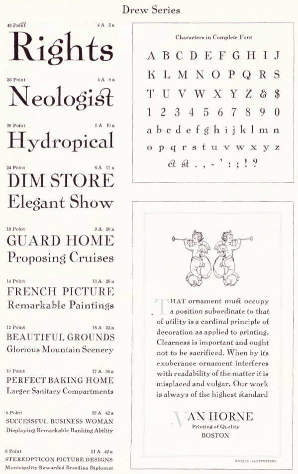
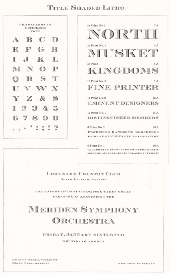
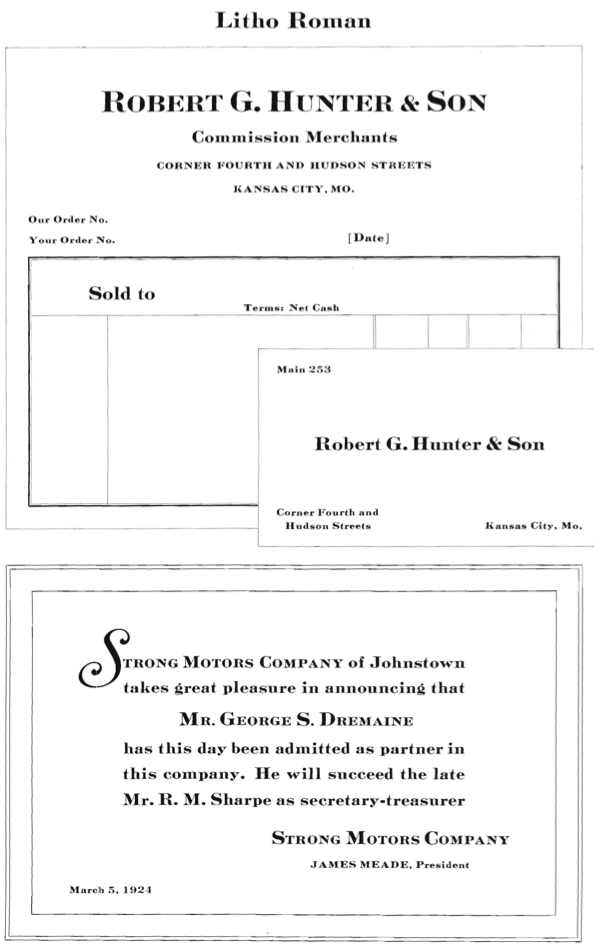
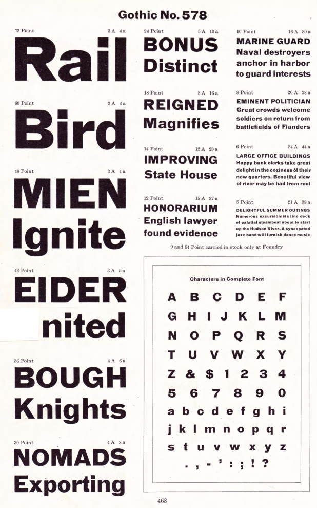
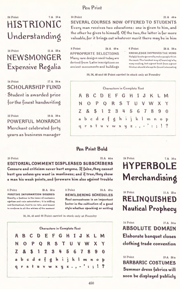
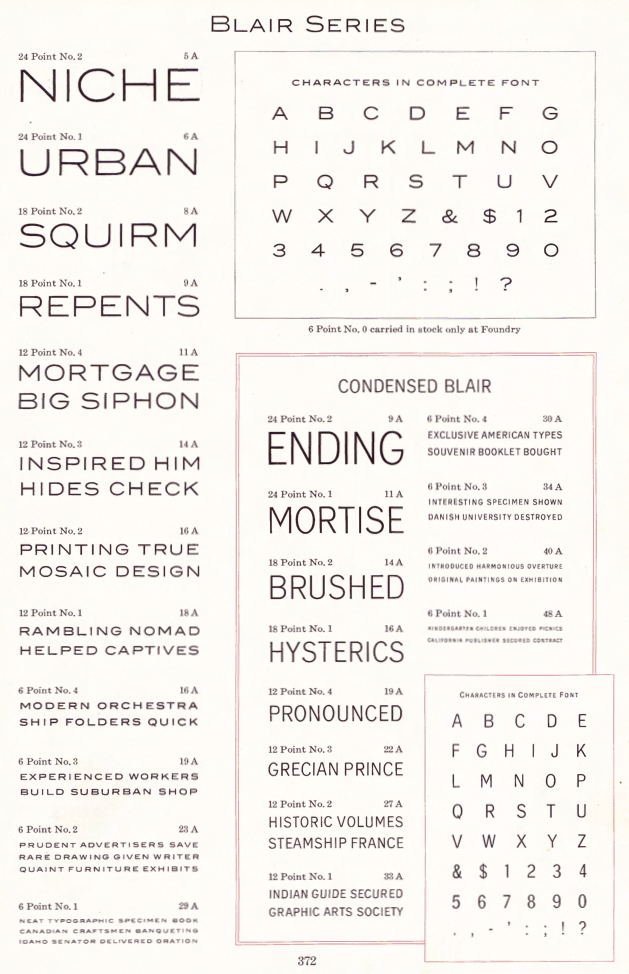
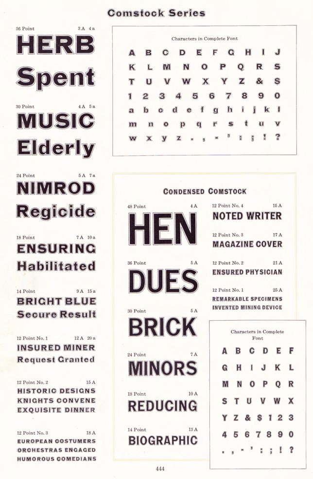
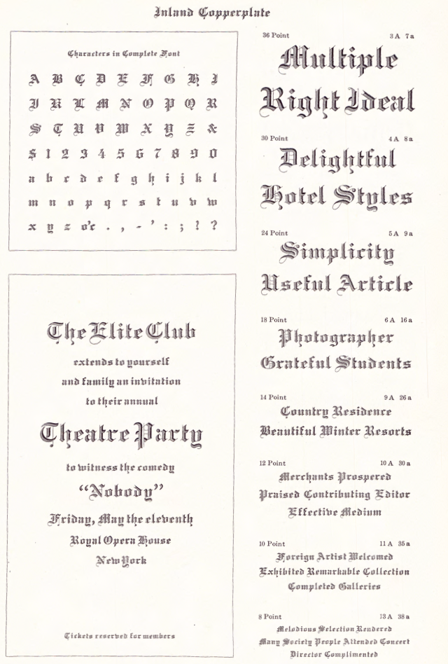
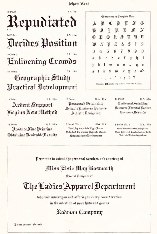
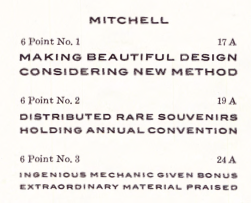
Scans of some typefaces: Becker (art nouveau), Blanchard Italic [Blanchard was revived in 2013 by Paulo W as Blanchard Inland], Commercial Script, Edwards (art nouveau), Inland, Lightface Blanchard, Matthews (1902: revived in 2019 by Chuck Mountain as Cotrell CF), Extended Studley (revived by Chuck Mountain in 2019 as Dukas CF, and by Jeff Levine in 2008 as Bayview JNL), Rogers (art nouveau), Poster French Oldstyle (1897 catalog), Poster Ionic (1897 catalog), Poster Latin Antique (1897 catalog), Pacific Bikes (ornaments, 1897 catalog), Recut Caslon (1907, as taken from the 1923 ATF catalog), Drew (1910, from the 1923 ATF catalog: a digital version called Droobie NF was created by Nick Curtis in 2014), Title Shaded Litho (1911), Litho Roman (1907), Gothic No.578 (1898), Pen Print (1911), Blair (1900; Condensed Blair was revived in 2022 by Jeff Levine as Generic Sans JNL), Mitchell (1906, a bold version of the all caps grotesque face Blair; digitally revived by Nick Curtis in 2015 as Mitchell NF), Comstock (1902), Inland Copperplate (1901), Shaw Text (1907). Commentaries by Mac McGrew on some of the typefaces:
|
Missouri-based designer of the grunge typefaces Endemic Roman (2011) and Island Roman (2011). [Google] [More] ⦿ | |
Boston and St. Louis-based typefounder, 1841-1901. He created the DeVinne series and many other 19th century typefaces. [Google] [More] ⦿ | |
During her studies at the Kansas City Art Institute in 2014 in Kansas City, MO, Janie Marino created the serifed Cyrillic simulation typeface Kapitolina, which she advertizes as a typeface for the Czar. [Google] [More] ⦿ | |
Jay David
| |
Jay David Design
| Jay David was born in St. Louis, MO, in 1975. Commercial fonts at Jay David Design and Final Nu: Manifesto, Satellite, Dang (available at Fountain). Free fonts: Millionaire, Flea Circus, Airbag, Steakhoder, 850doublebumperalley, Bachelor, Catastrophe, ColdJesusBeer, Copsucker, Driveway, Fin, Influenzaasian, MelloMedium, Shortwave, Thedevilscar, TriggerA, Tanline, Firewater, and Walkie Talkie. Direct downloads. Some downloads at Sound of Print. Fountain carries his grunge typeface Dang. Klingspor link. FontShop link. [Google] [MyFonts] [More] ⦿ |
| |
Graphic design student in Kansas City, MO. Creator of a monoline geometric avant garde sans called Eight One (2012, a free font originally created for a musician's logo) and of the pixel typeface Sample (2012). In 2015, he created the techno typefaces Skwair and Schlant. Behance link. [Google] [More] ⦿ | |
Kansas City, MO-based designer of the organic sans typeface Mosel (2012). The edges of the glyphs are slightly wavy, just as the banks of the Mosel river. Cargocollective link. [Google] [More] ⦿ | |
St. Louis, MO-based designer of the color font Chromatype (2018). [Google] [More] ⦿ | |
During his studirs at the University of Missouri-Columbia, Jesus Roman created an unnamed decorative blackletter typeface (2013). [Google] [More] ⦿ | |
| |
St. Charles, MO-based designer of the display typeface Vivaldi Strings (2020). [Google] [More] ⦿ | |
Graphic designer in Kansas City, MO, who created a modular typeface in 2012 for the logo and identity of Bambini Creativi. [Google] [More] ⦿ | |
During his studies in St. Louis, MO, Jonathan Neal designed the connect-the-dots typeface Constellation (2017). [Google] [More] ⦿ | |
Jordan Aschwege
| |
Kansas City, MO-based student, who created the cutout lettering font Bb (2003). [Google] [More] ⦿ | |
Graduate of University of Missouri-Kansas City. Kansas City, MO-based graphic designer who writes and edits TypeTogether's monthly newsletters and typeface descriptions since 2015. Type Together link. His bio in his own (eloquent) words: Joshua Farmer works as a freelance writer and editor, consultant, and graphic designer. He champions simplicity, clarity, and excellence in all things; shoddy is not his cup of tea. This commitment has allowed him to build a client roster that, besides TypeTogether, includes Martina Flor, Underware, Tobias Frere-Jones, Laura Worthington, Neil Summerour (Positype and Swash & Kern), Joana Correia (Nova Type), the Association Typographique Internationale (ATypI), the 365Typo books, TYPE Magazine, and others. Josh's wide-ranging background and interests help him approach text from the perspective of a designer and design from the mindset of an editor. [...] Josh stumbled onto a love for type when he noticed his writing could undergo a significant change in voice with a simple change of typeface. Joshua and his family currently make their home amidst an arts resurgence in America's silicon prairie, Kansas City, where he teaches typography at [...] Kansas City Art Institute (KCAI). [Google] [More] ⦿ | |
Graduate of St. Louis Community College Meramec. Now based in St. Louis, MO, he designed the display sans typeface Poesis (or Poiesis) in 2019. [Google] [More] ⦿ | |
Justin Skinner
| |
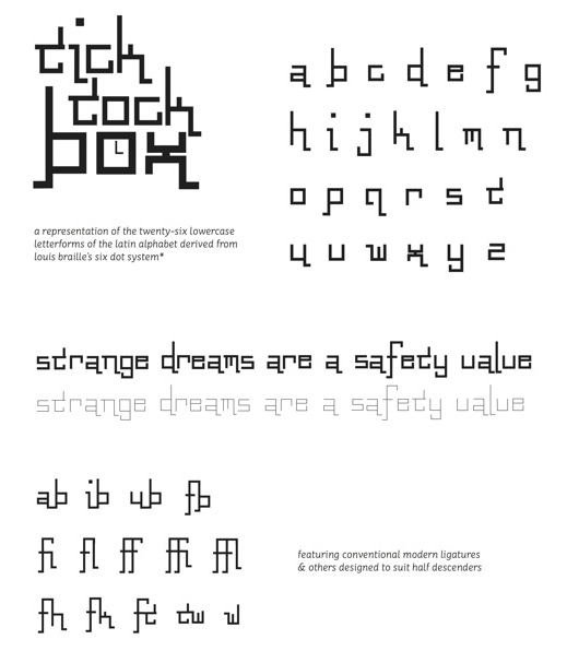
Type designer at Christian Schwartz's Commercial Type. As a student at Washington University in St. Louis, Sam Fox School of Design & Visual Arts, pursuing a Bachelor of Fine Arts in Communication Design, Kara Gordon created Tick Tock Box (2012, a squarish display face). In 2015, at Type@Paris, she designed the medium-contrast square-serifed typeface Benoit. Cargo Collective link. [Google] [More] ⦿ | |
During her studies in St Louis, MO, Katerine Lam created the art deco typeface Modern Art Deco (2015). [Google] [More] ⦿ | |
| |
St Louis, MO-based designer who was born in Poland and has an MFA from Lindenwold University, St. Charles, MO. Creator of KY Deco (2015). [Google] [More] ⦿ | |
Keith Hayden
| |
| |
At Park University, North Kansas City, MO-based Kim-Duyen Nguyen created the Fat Gentlemen typeface (2016). [Google] [More] ⦿ | |
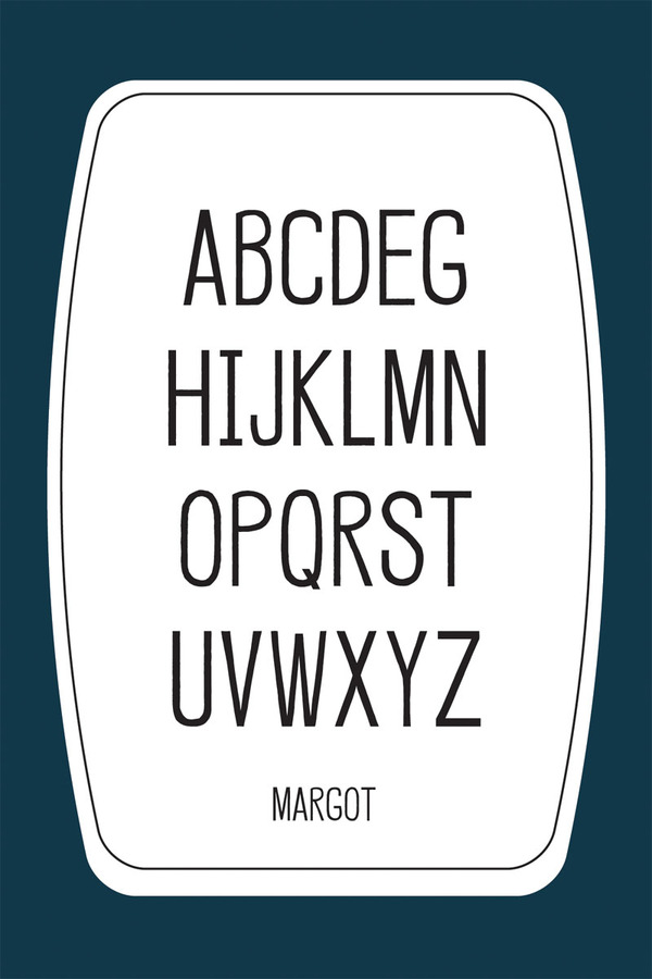
St Louis, MO-based designer of Margot (2011). [Google] [More] ⦿ | |
Designer of fonts for the National Imagery and Mapping Service, St. Louis, MO. [Google] [More] ⦿ | |
During his studies in Kansas City, MO, Kyle Smitka (Smitka Designs) created Burton Snicket (2013), a custom display typeface. [Google] [More] ⦿ | |
Saint Louis, MO-based designer of Gardener (2014), a typeface made out of weeds and modeled after Chaparral Pro. [Google] [More] ⦿ | |
Blue Springs, MO-based designer of the display typeface Snake Bite (2014). [Google] [More] ⦿ | |
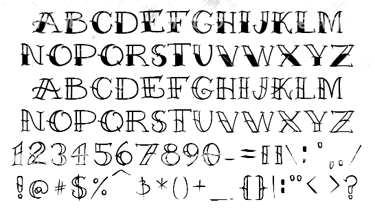
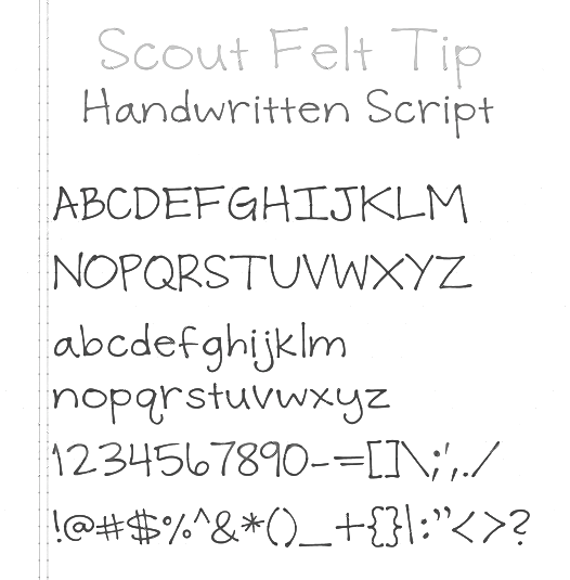
Kansas City, MO-based creator of the hand-printed blackboard bold typeface Captain Cook Tattoo Font (2011). I somehow feel that I have seen this typeface somewhere else recently. In 2013, he made Scout Felt Tip. [Google] [More] ⦿ | |
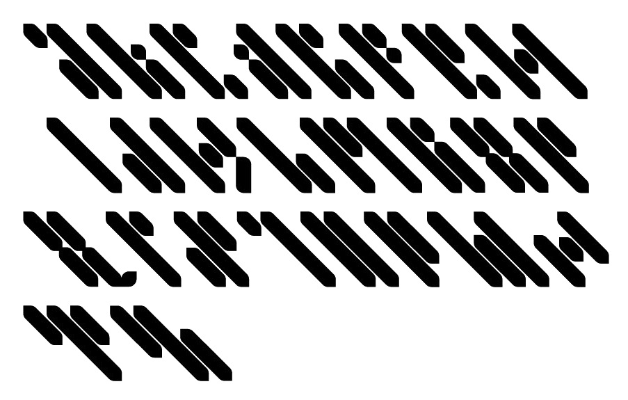
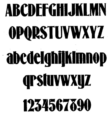
Type designers from Kansas City, MO, who created a hairy display typeface in 1897. [Google] [More] ⦿ | |
Lazydogs Type foundry
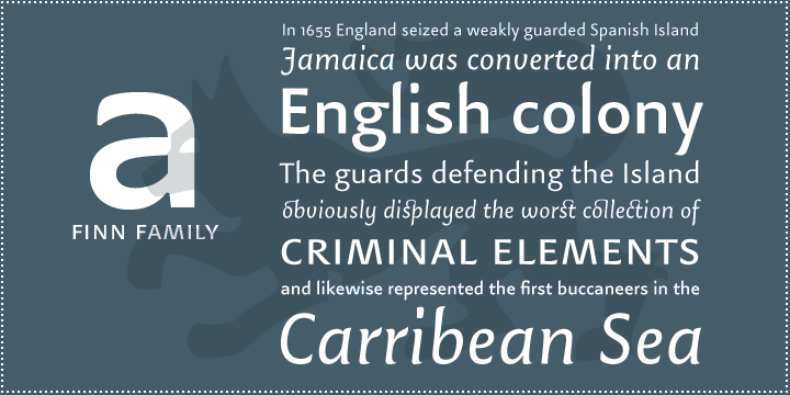
| Lazydogs Type foundry is a German foundry located in München (and before that, Augsburg), est. 2005, by Oliver Linke, Robert Strauch and Kai Büschl. Strauch left in 2014. They do custom and retail type work. Oliver Linke (b. 1971, Odenwald, Germany) studied graphic design at the University of Applied Sciences Augsburg, Germany and the University of Missouri, Kansas City (19931-1998). He continued his studies in art history, art education and philosophy (2000-2005) at the University of Augsburg. He teaches type design and typography at the Designschule München (and before that, at the Blocherer Schule) and Augsburg. By 2017, Lazydogs was run by just two of its founders, Oliver Linke and Kai Büschl. Lazydogs published some commercial typefaces, such as Fabiol (2005, a garalde by Robert Strauch), a winner at the TDC 2005 type competition. Oliver Linke created the Lazydogs Finn family (2006, a gorgeous delicate sans). At ATypI 2007 in Brighton, he spoke about Masterpieces of Johann Neudörffer the Elder (1497-1563). In 2007, Oliver Linke and Christine Sauer published Zierlich schreiben Der Schreibmeister Johann Neudörffer der Ältere und seine Nachfolger in Nürnberg (Beiträge zur Geschichte und Kultur der Stadt Nürnberg 25, Typographische Gesellschaft München / Stadtbibliothek Nürnberg). Other typefaces: Pandera (2008, Robert Strauch), Vela (2010, a text typeface), North (2008, Trine Rask), Alena (2012-2017, Roland Stieger). Typefaces from 2013: Streets of London (a complete lapidary font family out of a capital alphabet designed by the British stone cutter and type designer David Kindersley (1915-1995), a former apprentice of Eric Gill). Typefaces from 2018: the didone families LD Moderne Antiqua (+Fat) and LD Moderne Slab by Kai Büschl. Typefaces from 2019: LD Grotesk (Regular, Condensed, Wide), LD Fabiol Pro. Typefaces from 2020: LD Elsnac (a roman typeface family), LD Genzsch Antiqua (by Michael Wörgötter: a revival of Genzsch Antiqua (or Nordische Antiqua)). Typefaces from 2021: LinkeHand Pro. [Google] [MyFonts] [More] ⦿ |
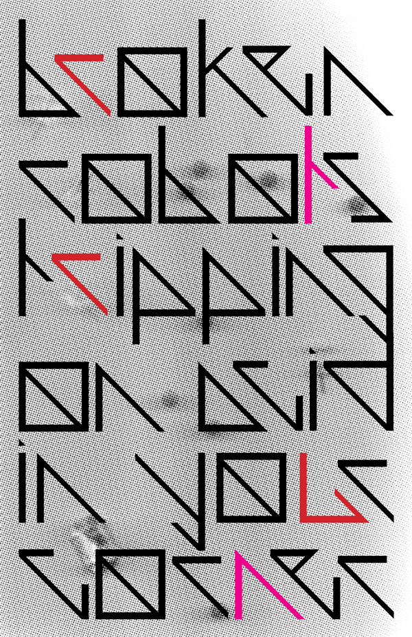
Born and raised in Kansas City, Leanna now studies at the Minneapolis College of Art and Design. FontStructor who made Robot Acid (2012, sci-fi face). [Google] [More] ⦿ | |
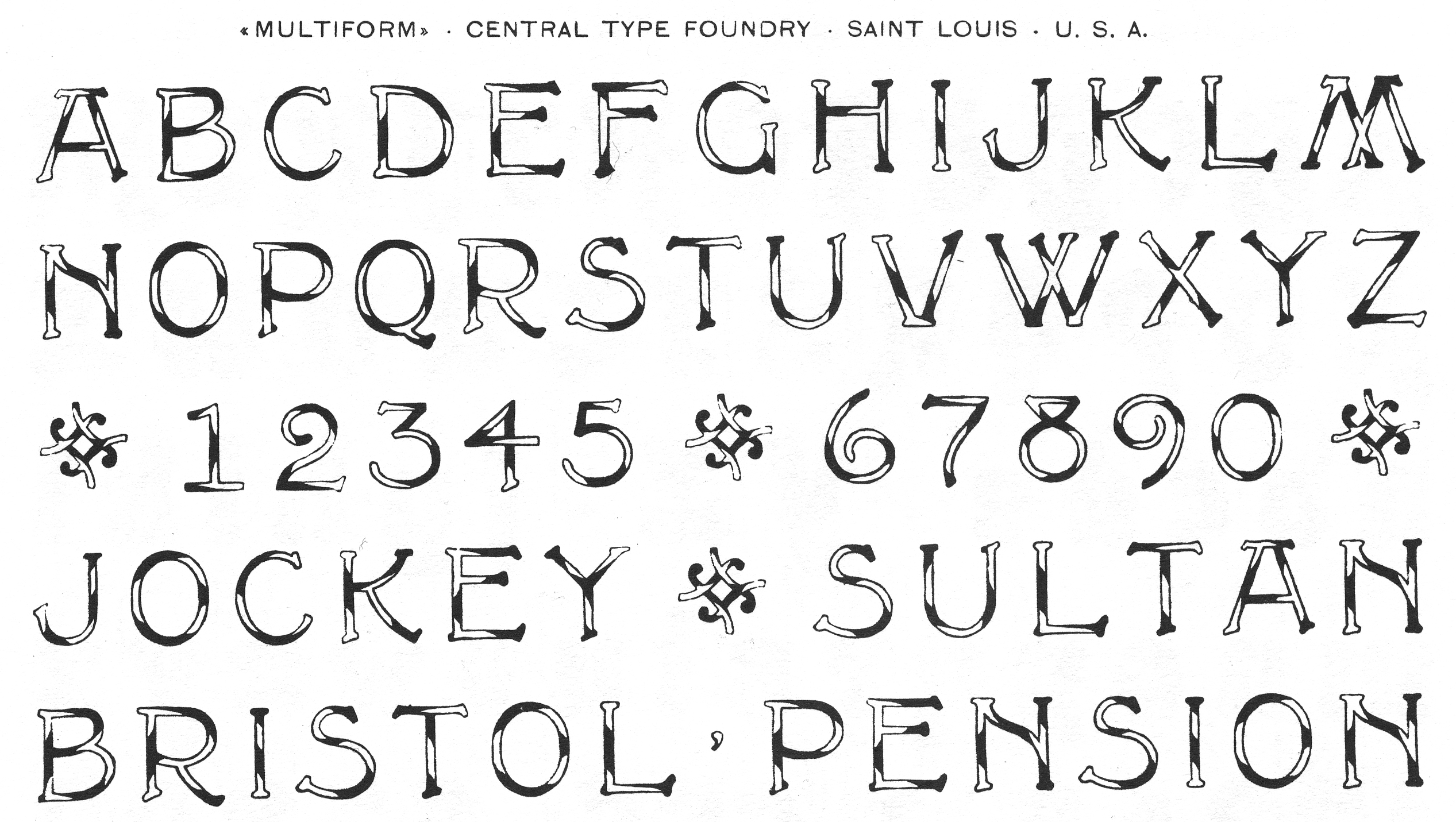
In the late 19th century, Central Type Foundry from St. Louis, MO, published Letter Combinations in one of its catalogs. It has a number of basic geometric shapes that typesetters could combine into modular typefaces, a time-consuming process. But it is not unlike the digital modular software programs like FontStruct that let users work with a palette of basic shapes. [Google] [More] ⦿ | |
Letters by Wordsworth
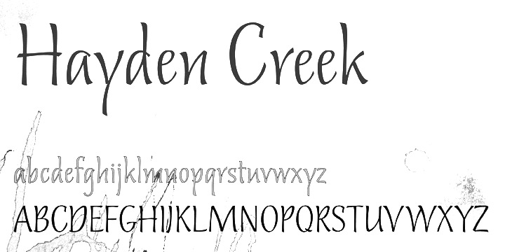
| Cecilia Ann Harris is a type designer from Bonne Terre, Missouri, b. 1958, BonneTerre. She created Dog Heaven (2011, hand-printed), CroMagnon (2010), an informal face, and the bouncy titling typeface Fribble (2010). Mile High (2011) is a Victorian family. Hayden Creek (2011) is a great informal script face. Her foundry, Letters by Wordsworth, is located in Colorado. [Google] [MyFonts] [More] ⦿ |
Calligrapher from Princeton, NJ, who was/is type designer at Hallmark cards in Kansas City, MO (since 2013). Creator of several calligraphic alphabets in 2011. During some studies at Type@Cooper in New York in 2011-2012, she designed the quirky humanist sans typeface Daryl. Home page. Behance link. [Google] [More] ⦿ | |
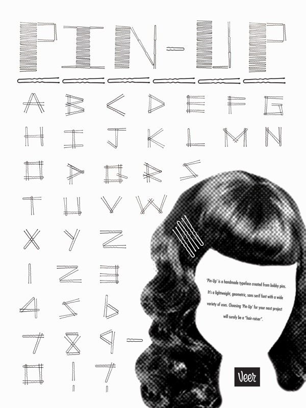
Saint Louis, MO-based creator of Pin-Up (2013, a sketched all caps typeface). Pin-Up was finisdhed during her studies at the University of Missouri Saint Louis. [Google] [More] ⦿ | |
During her graphic design studies in Saint Louis, MO, Lindsey Hays designed the ornamental typeface Ahhvetica (2013). [Google] [More] ⦿ | |
Liquid Fantasme
| Missouri-based Maria Leif, aka Liquid Fantasme (b. 1986), is the designer of the handwriting font Skrewe (2003). Alternate URL. [Google] [More] ⦿ |
Lettering artist and illustrator ot Hallmark cards in Kansas City, MO. Designer of the floriated Table Numbers (2017). Behance link. [Google] [More] ⦿ | |
Louis Dorman grew up in Missouri and lives in Nashville, TN. In 2014, he created the scratchy typeface Ozarks. In 2016, he published the interesting sketched typeface family Ocie. Dafont link. [Google] [More] ⦿ | |
In 2013, he designed the layered typeface family Summit. In 2015, he created the condensed sans display typeface family Longitude (+Rounded, +Display, which includes an inline). iIn or just before 2017 he designed Lost Type Playing cards. Behance link. Alternate URL. Creative market link. [Google] [More] ⦿ | |
During her studies at Washington University in St. Louis, MO, Maddy Angstreich designed the text typeface Galileo (2019: a didone with altered angular terminals) and the free variable typeface Jailbird (2019), in which the size of dominos changes.. She also designed the pixel typeface Dot Dot Dot (2019). [Google] [More] ⦿ | |
Saint Louis, MO-based designer of the Arabic simulation typeface Pangur Ban (2014). [Google] [More] ⦿ | |
Maria Leif
| |
Union, MO-based winner in the Chartpak Designer Velvet Touch Transfer Lettering Typeface Competition in 1988 for the ink splah typeface Oops. [Google] [More] ⦿ | |
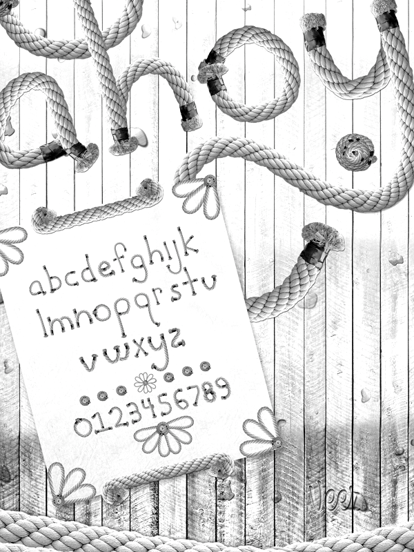
Student in Saint Louis, MO. During his studies at The University of Missouri Saint Louis, he created the rope font Ahoy (2012). [Google] [More] ⦿ | |
Typefaces from 2017: Anvyl (free; the Cyrillic characters were designed by Dmitry Sivukhin), Baywulf (a minimalist beer label blackletter typeface), Deimos (a free monospaced programming font). Typefaces from 2018: Geizer (a free all caps copperplate. Typefaces from 2019: Sorta (modular sans). [Google] [More] ⦿ | |
During his studies, St. Louis, MO-based Matthew Washausen created the display typeface Critter (2015). [Google] [More] ⦿ | |
Max Ayalla
| |
Kansas City, MO-based student, who created the display font Mayan Style (2003). [Google] [More] ⦿ | |
Megan Bottomly
| |
At the University of Missouri-St. Louis, Melinda Schmidt created the experimental typeface Flow Type (2014). [Google] [More] ⦿ | |
St. Louis, MO-based designer of the display typeface Bawse (2014). [Google] [More] ⦿ | |
FontStructor in Kansas City, MO, who made the spurred typeface Turret in 2015. Blogspot link. Behance link. [Google] [More] ⦿ | |
Midhat Selimovic (Midhat Arts, Saint Louis, MO) created the paperclip typeface Linija (2014). [Google] [More] ⦿ | |
Mikel Designs
| Missouri-based designer of the sketched typeface Kate Celebration (2017), the scratchy Kate Sketchy Print (2017), and the fat finger font Marshy Kate (2017). [Google] [More] ⦿ |
Mikel Kate
| |
Millieangelo Design Co
|
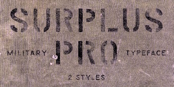
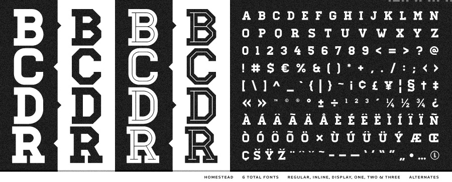
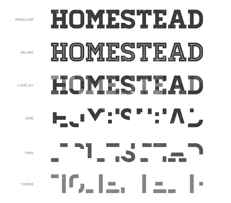
In 2016, now located in Kansas City, MO, he designed the rough stencil typeface Surplus Pro. Typefaces from 2017: Sumner (soft edge sans), Union Made (a vintage typeface family: It offers that bit of that masculine, whiskey drinking, machine using, denim wearing, ass-kicking touch to any design or logo), Argentine (a great roughened poster font), Kansas City, Pueblo Blackletter (tattoo font), Sylvester (headline sans), Soft Block (vintage octagonal typeface). Typefaces from 2018: Homestead, MDC Uptown, Vintage Athletic, Venice Gothic, Bevel Block. Behance link. Creative Market link. Old URL. [Google] [More] ⦿ |
Washington, DC and/or Kansas City, MO-based designer of the free mathematically designed serif typeface Acute Regular (2016). Behance link. [Google] [More] ⦿ | |
Kansas City, MO-based student, who created the sketchbook lettering font Sketchbook Text (2003). [Google] [More] ⦿ | |
St. Louis, MO-based designer of Dracula (2016). [Google] [More] ⦿ | |
Morgan Stockton was born in Merced, CA, and grew up in Lansing, KS. During her studies in Kansas City, MO, she created the display typeface Jemma (2014). [Google] [More] ⦿ | |
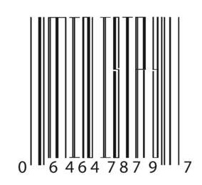
Nathan Jeffords (Falcrum Design, Kirksville, MO) created a barcode simulation font in 2010 that was inspred by Orwell's 1984. [Google] [More] ⦿ | |
During his studies at Washington University in St. Louis, MO, Nicholas Rogers designed a stencil typeface (2017). Behance link. [Google] [More] ⦿ | |
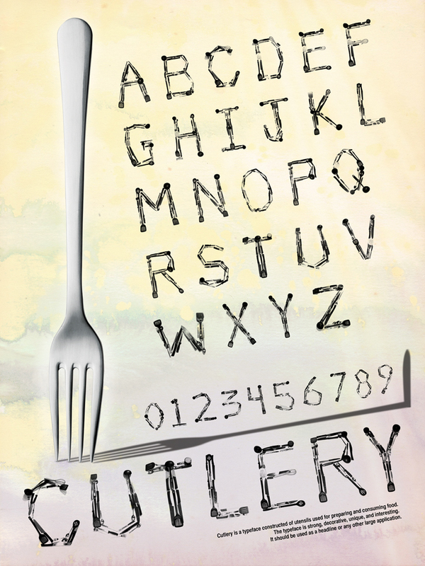
Student in Saint Louis, MO, who during his studies created the experimental typeface Cutlery (2012). [Google] [More] ⦿ | |
At Sam Fox School of Design & Visual Arts, St. Liouis, MO-based Nicole Fox created the modular typeface Abbot Suger (2017). [Google] [More] ⦿ | |
Oliver Linke
| |
During her studies in Columbia, MO, Olivia Childs designed the hand-brushed For The Love of Besom (2017). [Google] [More] ⦿ | |
As a student at Lindenwood University, St. Louis, MO-based Paige Tagliaferre designed the potato font Half Spud (2017). Behance link. [Google] [More] ⦿ | |
A singer songwriter, filmmaker, and fine artist based in St. Louis, MO. During her graphic design studies, Pamela Devine created the handcrafted typefaces Soul Flight (2015) and Letramor (2016). Behance link. [Google] [More] ⦿ | |
St Louis, Missouri-based designer in 2000 of the wonderful white-on-black LED font LED BOARD and LED BOARD REVERSED. Dafont link. [Google] [More] ⦿ | |
Peter Skwiot Smith is a graphic designer and graphic artist who lives and works in the Twin Cities. Originally from Saint Louis, he studied Graphic Design at the University of Minnesota's Twin Cities. During his time in acadamia, he also spent six months at the Gerrit Rietveld Academie in Amsterdam. Designer of the thin monoline sans typeface Thread (2008), which was started in 2004 while studying at the Gerrit Rietveld Academie. Free download. He is working on an informal poster headline typeface called Thé. [Google] [More] ⦿ | |
Prixel Creative
| Springfield, MO-based designer of the octagonal typeface Mereo (2016) intened for sports shirts. Creative Market link. [Google] [More] ⦿ |
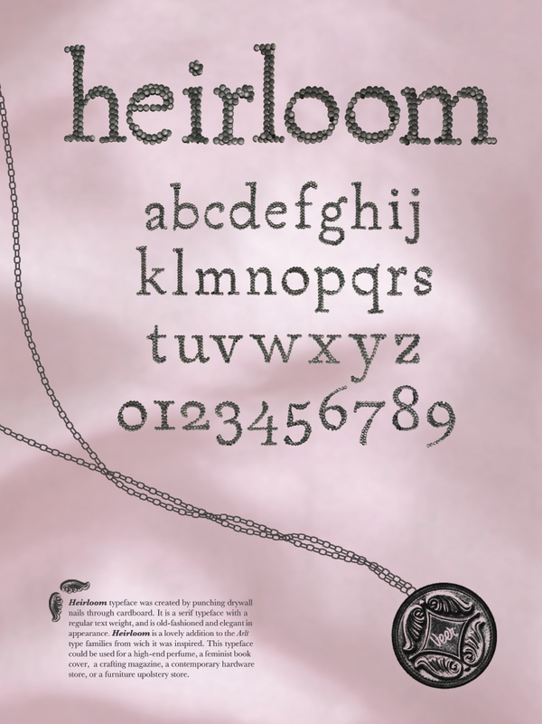
Rachel Pursley (Florissant, MO) created Heirloom Typeface (2011). [Google] [More] ⦿ | |
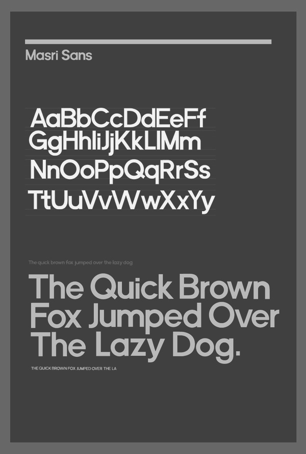
Editorial and graphic designer in Kansas City, MO. Creator of Masri Sans (2010). Behance link. [Google] [More] ⦿ | |
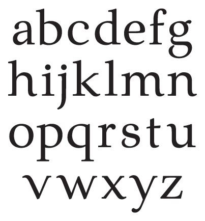
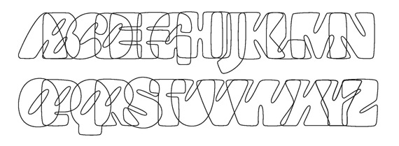
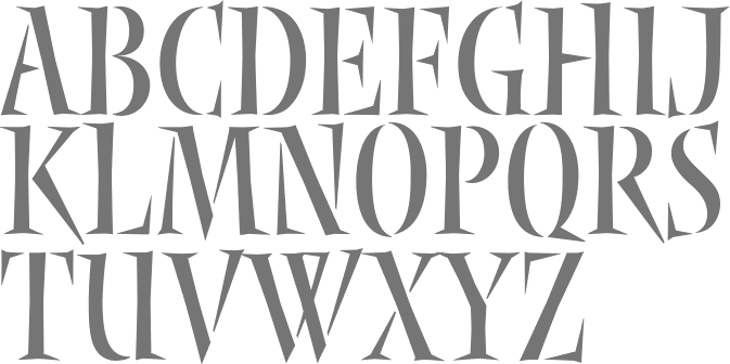
Recognizing a Bembo
| Coulton Thomas (Kansas City, MO) shows the features of Aldus Manutius's Bembo in 2016. [Google] [More] ⦿ |
American designer, b. 1928, whio graduated from Washington University Art School, St. Louis. Creator of typefaces at VGC, such as Jana (1965), which won Third Prize in the 1965 VGC National Type Face Design Competition. For a digital version / extension of Jana, see Rocklidge Pro (2011, Steve Jackaman and Ashley Muir). [Google] [More] ⦿ | |
Calligrapher, b. Stockton, CA. Art director of Letter Arts Review magazine since 1992. Designer of Nyx (1997-2002, Linotype, Adobe). Presently, Rick was Manager of Font Development at Hallmark Cards near Kansas City, MO, until some time between 2012 and 2016. Nyx won an award at Bukvaraz 2001. Author of What Our Lettering Needs The Contribution of Hermann Zapf to Calligraphy & Type Design at Hallmark Cards (2012, RIT Cary Graphic Arts Press). This books deals with Hermann Zapf's years (1966-1973) as a consultant to Hallmark Cards. Zapf's typefaces there include Crown Roman, Jeannette, Hallmark Uncial, Crown Italic. Linotype link. [Google] [MyFonts] [More] ⦿ | |
Rivet Designworks
| Graphic designer in Denver, Colorado, b. 1969, Saint Louis, MO, who set up Rivet Designworks. Creator of gothic cathedral inspired display typeface Capstone (2012). [Google] [MyFonts] [More] ⦿ |
Rob Leuschke
| |
Rob Roy Kelly (b. Nebraska, 1925, d. Tempe, AZ, 2004) collected wood type from local printers for use by his students at the Minneapolis College of Art&Design. He began gathering the types in the late 1950s and continued adding to the collection over the next decade. He started researching the history, manufacture, and use of the growing collection partly in response to questions that arose from working with his students. His research was first published in the 1963 issue of Design Quarterly (No. 56), and was followed in 1964 by a limited-edition folio of specimen sheets from the collection, entitled American Wood Types 1828-1900, Volume One. Kelly's research would culminate with the publishing in 1969 of American Wood Type, 1828-1900: Notes on the Evolution of Decorated and Large Types and Comments on Related Trades of the Period. Since 1993, his substantive wood type collection resides at the University of Texas. At Dover, he published 100 Wood Type Alphabets. Kelly's final work with the Collection came in the early 1990s when he was asked by Adobe Systems to participate in a project to develop digital revivals of historic wood types as part of the Adobe Originals program. As consultant to the project, Kelly helped select, from his own collected materials, the type styles that would be made into digital fonts. Kelly died in January 2004. Obituary, which states: He studied design at the University of Nebraska and the Minneapolis School of Art and served in the Army during the Korean War. Later he did graduate work at the School of Art and Architecture at Yale, where he studied with Josef Albers, Alvin Eisenman, Alvin Lustig, Herbert Matter, Leo Lionni, Lester Beall and Alexey Brodovitch. He both taught and administered graphic design programs at the Minneapolis College of Art, Kansas City Art Institute, Carnegie Mellon University, Western Michigan University and, most recently, at Arizona State University. [Google] [More] ⦿ | |
Robert E. Leuschke
| |
Rodney Hobart
| |
Roger Ridpath
| |
Later versions of the font: Letter Gothic (Agfa), Letter Gothic (Linotype), Letter Gothic 12 Pitch (Bitstream), Letter Gothic L (URW++, 1993). The non-monospaced version of Letter Gothic is called New Letter Gothic, which was digitized and Cyrillized by Gayaneh Bagdasaryan in 1999 at Paratype. In fact, at Paratype, LetterGothic Baltic, LetterGothic Central European, LetterGothic Cyrillic Asian, LetterGothic Cyrillic International, LetterGothic Cyrillic Old Russian, LetterGothic Multi Lingual, LetterGothic Turkish and LetterGothic Western were digitized based on Roberson's work by Gayaneh Bagdasaryan. Same goes for New Letter Gothic Baltic, New Letter Gothic Central European, New Letter Gothic Cyrillic Accented, New Letter Gothic Cyrillic Asian, New Letter Gothic Cyrillic International, New Letter Gothic Cyrillic Old Russian, New Letter Gothic Multi Lingual, New Letter Gothic Turkish, New Letter Gothic Western. [Google] [MyFonts] [More] ⦿ | |
Undergraduate student at Washington University in St. Louis's Sam Fox School of Art and Design. With a group of friends, she created the grungy Dante's Divine Comedy (2010). [Google] [More] ⦿ | |
Kansas City, MO-based designer of the sans headline typefaces Peaches & Cream (2016) and Killjoy (2015). Behance link. [Google] [More] ⦿ | |
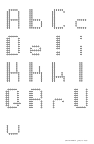
Student at the Kansas City Art Institute (Kansas, MO). Creator of the dotted modular typeface Bitmap Prototype (2011). [Google] [More] ⦿ | |
During her studies at the Kansas City Art Institute in Kansas City, MO, Samantha Yates created the monster-themed typeface Goon (2015, FontStruct). Behance link. [Google] [More] ⦿ | |
Creator (b. 1991, Missouri) of the free pixel font CaZOOM. Dafont link. [Google] [More] ⦿ | |
Denver, CO-based designer of the curly all caps typeface Monogram in 2017. Sara was raised in St. Louis, MO. Behance link. [Google] [More] ⦿ | |
During her graphic design studies at Kansas City Art Institute in Kansas City, MO, Sara Garrison created the display typeface Flak (2015). [Google] [More] ⦿ | |
During her studies at Northwest Missouri State University, Parkville, MO-based Sara Vineyard designed the display typeface Fron (2016). [Google] [More] ⦿ | |
During her studies at St. Louis Community College at Meramec, Sarah Marie Wayne designed the art deco typeface Milwaukee Mod (2016). [Google] [More] ⦿ | |
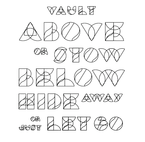
Saint Louis, MO-based designer of the modular typeface Vault (2013). [Google] [More] ⦿ | |
| |
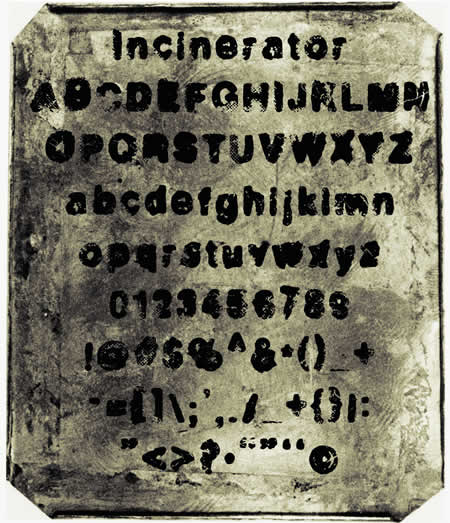
Shinnism (was: Papertypes)
| St. Louis, MO-based Daniel Shinn (Shinnism, was: Papertypes) creates grunge typefaces: Zombilaria, Dirty Liar, Asphalt, Typefrighter (old typewriter), Bitter End, Grease Monkey, Phlegm, Incinerator, Dirty Liar. These are all free. Commercial typefaces include Zombilaria. Alternate URL. Dafont link. [Google] [More] ⦿ |
| |
Kansas City, MO-based designer of the experimental typeface Notation (2016). The terminal dots in the typeface are of variable size. In 2015, Siyi designed a set of pictograms for the city of Orlando. Behance link. [Google] [More] ⦿ | |
Arnold, MO-based designer of the kitchen tile typeface Casting Stones (2015). [Google] [More] ⦿ | |
St. Louis, MO-based designer of the Escher font Optical Illusion (2017). [Google] [More] ⦿ | |
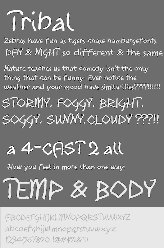
Stephen McBride (b. 1967) is based in Kansas City, MO, and before that in Edwardsville, KS and Earle, AR. He is the man behind the SWMCA Catalogs (est. 2012). An ex-signpainter, he is now turning his typefaces into digital fonts. Creator of the free hand-printed font Tribal (2012). The explanation is interesting: Tribal was first drawn in 1979 as Indian. For many years it was one of the most popular SWMCA fonts. Shortly there after there was a heavy movement among Native American tribes about being called "Indians". They'd constantly complain that they weren't from India or an Arabic nation. In response, SWMCA changed the name to Typeface (later Typefont) of Native American Honor. It was redrawn in 2012 and sent to Font Panda to be digitalized and came back more "liquidity" and much more playful than the original. Tribal was followed by Tribal Schoolhouse (2012). In 2013, he designed the hand-printed typeface families Fun Euro Schoolhouse, 2013 SWMCA Demo, Watermelon Stand, 2013 Demo of Cadaver's Script (eerie), Midtown Roman, Hexagonal Delight (angular script), Ol West Rustik, Disco Grudge and 12 Steps. Typefaces from 2014: Pupil Light, Kansas City Gothic Caps (blackletter), Kabbalah, Area 51 UFO (+Apocalypse, a glazkrak typeface). In 2015, he designed the free brush typeface 99% Occupy in support of the Occupy Movement. Dafont link. Home page. Dafont link. Fontspace link. [Google] [More] ⦿ | |
Stone Type Foundry
|
At ATypI 2007 in Brighton, he spoke about The foundation of the humanist sans serif. As of 2008, his entire collection can be licensed for 20 computers in an educational lab for just 300 dollars. Scripps College pages. CV at Agfa. Bio at Linotype. Page at Emodigi. His lecture in 2007 on W.A. Dwiggins. PDF file of his work. Signature. 2012 Newyear's card. Interview by MyFonts in 2014. FontShop link. Klingspor link. View Sumner Stone's typefaces. Summary overview of Sumner Stone's typefaces. [Google] [MyFonts] [More] ⦿ |
Sumner Stone
| |
During her studies at University of Missouri-Saint Louis, Taylor Hiette designed Bead It Sans (2016). [Google] [More] ⦿ | |
Tim Rolands
| |
Tim Rolands Digital Studio (was: TR Typographic Services, Phont Typographics, Stylus Digital Typography, Studio Renaissance)
|
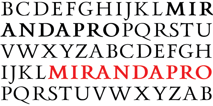
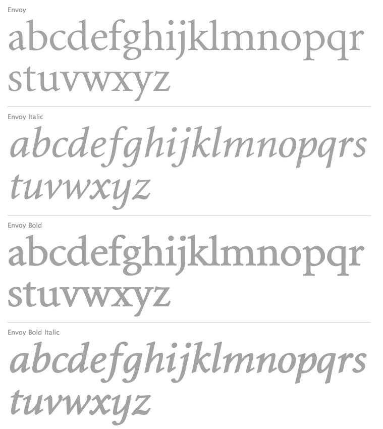
Tim's creations include Orlando (free), Anvil (also available in OpenType), Valor (2006, an experimental modern typeface that combines geometry and mediaeval Lombardic ideas), Miranda (an Aldine, roman caps family: Pro version appeared in 2012), Aegis, Prospero (1997, inspired by the early Romans of Nicolas Jenson; see Prospero Pro (1997-2008)), Illiad, Kimberly, Timotheus, Envoy (2001, garalde family), Odyssey (2001, classical Roman caps; see Odyssey Pro in 2017), Alexander, Runik Futhark (based on the earliest Germanic-Norse runes, known as the Elder Futhark). |
Creator of the script rope typeface Rodeo (2013), which was finished during his studies in Saint Louis, MO. Behance link [Google] [More] ⦿ | |
Creator of the delicate bilined caps typeface Vernon (2012). [Google] [More] ⦿ | |
During her studies, Kansas City, MO-based Tracy Khiew designed an outlined 3d typeface (2017). Behance link. [Google] [More] ⦿ | |
Kansas City, MO-based designer of CUCA (2011), a pixel typeface made up of small cockroaches. Student at the Kansas City Art Institute in Kansas City, MO, in 2012. In 2012, he used FontStruct to create Dragoon. Behance link. [Google] [More] ⦿ | |
During his studies at Saint Louis Community College in St. Louis, MO, Trevor Love designed the grungy typeface Motherboard (2017). [Google] [More] ⦿ | |
TypeSETit
|
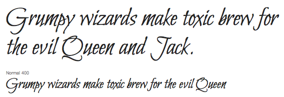
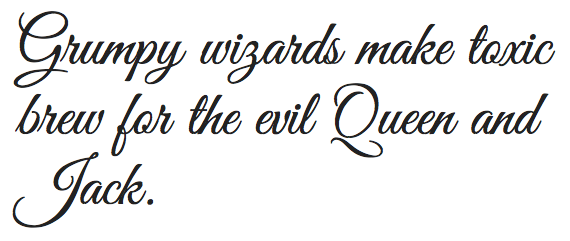
Ambiance BT (Bitstream) was Rob's first typeface. Also, early on, he created the free emoticon font AairChat (1995). An incomplete list of his creations: AlexBrush, Cherish, Ephesis, Inspiration, Jackie-O, Licorice, Kolker Brush (2004, Western version of Japanese calligraphy), Love, Neanderthaw, Ruge Boogie (2004), Saliere, Updock, Whisper, TheNautiGal (2006, connected script), Water Brush, Love Light, Passions Conflict (2004), Mea Culpa, Beau Rivage (2004: calligraphic; Github link), Good Vibrations (the commercial version of his free font Great Vibes), Lovers Quarrel, Grechen Fuemen (2003-2021), Moon Dance (2004), MsMadi (a monolinear script), Bonheur Royale (2005), Fuzzy Bubbles, LA Heat (2005), Qwigley ROB (2005), Vujah Day, he added Kings Honor (2006), Kings Quest (2006), Kings Dominion (2006), RUSerius (2007, curly handwriting), QwitcherBychen (2007, calligraphic), Arizonia (2007, calligraphic, based on lettering seen on a truck), Road Rage ROB (2008, grunge), Grey Qo (2008, calligraphic), FleurDeLeah (2008, flowery calligraphic), My Soul (2008), MooLahLah (2008, cow-spotted letters). MyFonts sells Alex Brush, Allison (an inky script that is free at Google Fonts), Ambiance BT, ITC Arid (1997), Arizonia, Babylonica (2008, a great connected brushy script), Bilbo, Bilbo Swash Caps (2011, Google Web Fonts), Bonheur Royale, Caramel (Crunch, Candy, Nuggets), Carattere, Cherish, ITC Chivalry, Corinthia (calligraphic but with slope errors on some connections such as between "o" and "r"), Ephesis, FleurDeLeah, Fuzzy Bubbles (free at Google Fonts), Good Vibrations (2003), Grapenuts, Great Vibes (2012, Google Web Fonts), Gwendolyn (free at Google Fonts), Holiday Font, Hurricane (brush script), Imperial Script (2008), (2018-2022, Google Fonts), Inspiration (2004), Jackie O, Kings (script), Kolker Brush (2004), LA Heat, (2018-2022, Google Fonts), Licorice (2004), Love Light (2003), Lovers Quarrel (since 2012 at Google Web Fonts), Mea Culpa (2003-2021), MooLahLah (2003-2021), Moon Dance (2004), Ms Madi, MySoulOne, Neonderthaw, Oh Ley, Ole (2008), Oooh Baby (2004-2021), Passions Conflict, Petemoss, Puppies Play (2009-2021: a curly script), Qwigley, QwitcherBychen, Qwitcher Grypen (2007-2021), RoadRage, Roelandt BT (2002), RUSerius, Ruthie (2003), Saliere, SassyFrass ROB (2008-2021: calligraphic), (2018, Google Fonts), Shalimar (a great calligraphic script, 2004-2021), Square Peg, Tapestry, TheNautiGal (2013-2021), Twinkle Star (2003), Updock (classical calligraphy), VujahDay (2003), Water Brush, Waterfall (2011) and Whisper. Fonts released in 2009 at P22: Babylonica, RobsPickles, RoadRage, QwitcherBychen, the Caramel family (including Crunch, Candy, Nuggets). In 2009, he also published Italianno ROB. Typefaces made in 2010: Allura (see Google Web Fonts), Estonia Nouveau (based on calligraphy by Villu Toots), Estonia Regular, Estonia Swash, Island Moments, Neon Derthaw (neon light face). Typefaces from 2011: Robs Pickles, Waterfall, Monte Carlo (a free formal calligraphic script at Google Fonts), Genos (anthroposophic; includes Cherokee; in 2021, a variable font pair was added), Bilbo (free at Google Web Fonts), Playball (free connected signage or baseball script face at Google Web Fonts). Designs from 2012: Fuggles, Explora (a delicate calligraphic script face). Typefaces from 2013: Style Script (an upright retro script; free at Google Fonts). Typefaces from 2014: Praise Pro (signage script), Ise Sport (flared font). Typefaces from 2015: Festive, Luxurious (free at Google Fonts), Luxury script, Comforter, Comforter Brush, WindSong (a connected script, not to be confused with the famous calligraphic script Windsong (1998, Bright Ideas); also at Google Fonts), Alumni Sans (an organic sans family with large x-height; +Collegiate, +Inline; free at Google Fonts). Typefaces from 2016: Glory (an organic sans family, free at Google Fonts, and a pay font at MyFonts), Hurricane (connected script family). Typefaces from 2017: Splash (ink splatter script), American Calligraphic, Smooch (a brush scriptthat is free at Google Fonts), Smooch Sans. Typefaces from 2018: Angeletta (at Monotype), Meow Script. In August 2018, he published his Smorgasbord series: Grape Nuts, (Google Fonts), (2022, Google Fonts), Kings Honor, Kings Quest, Kings Dominion, Moon Dance One, Moon Dance Two, Ms Madi, My Soul, Pickles, RUSerius, (2018, Google Fonts), Vujahday Plain, Vujahday Script, Vujahday Flourish. Typefaces from 2019: Birthstone. Typefaces from 2021 (including updates of earlier fonts), all published by Google Fonts: Are You Serious, Birthstone, Birthstone Bounce, Bonheur Royale, Caramel, Carattere, Cherish, Ephesis, Explora, Fleur De Leah, Gideon Roman, Fuggles (script), Festive (a free curly script). [Google] [MyFonts] [More] ⦿ |
This web site is dedicated to an e-book on typography and type designers written in 2011 by Lance Schmittling, Jennifer Higerd (from Union, MO), and Dominic Flask (from Wichita, KS). It is more biased towards graphic design, and has few sections on type design. [Google] [More] ⦿ | |
Now located in Boston, she created a delicate experimental curved grid typeface in 2012. Kadina Design link. [Google] [More] ⦿ | |
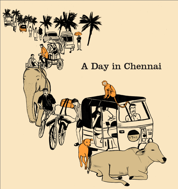
Student at Washington University in St Louis, MO, who excels at illustrations (A Day in Chennai (2012) is my favorite series). He created a great ornamental caps alphabet called Foodie in 2012. [Google] [More] ⦿ | |
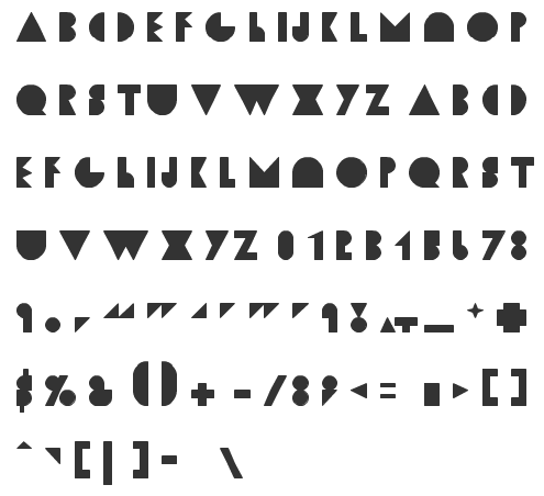
Kansas City, MO-based designer of Stitchel (2011, modular). [Google] [More] ⦿ | |
Robert Wesley Wilson is a psychedelic era poster artist, b. Sacramento, CA, 1937. He now lives in Aurora, MO. Colin Brignall writes: His most favoured form of lettering developed as a direct influence of Alfred Roller's lettering for an exhibition of Secessionist design in 1903. This lettering was generally rectangular in form and therefore ideally suited for Wilson whose work often involved wrapping words around predetermined, free-flowing areas in order to fill up space. White space being considered bete noire to the psychedelic poster designer whose style of work was intended as a reaction to the prevailing clean Swiss style of typography! Colin concludes: Wes Wilson disappeared from the San Francisco scene as quickly as he and his contemporaries and their highly individual art form breezed in, heading for the Ozark mountains in Missouri in the early 1970s to live, apparently, a reclusive lifestyle. [...] His legacy though is an incredible art form that forty-five years on is revered as truly classic of its time. Wilson's style is also known as the Fillmore Poster lettering style. Several typefaces were made that are based on Wes Wilson's lettering. These include Wes Wilson (2007, Keith Bates), Mojo (1996, Jim Parkinson, Adobe), Butterfield (1993, David Nalle), Genie (2006, Rebecca Alaccari, Canada Type), Jonah (2005, Rebecca Alaccari, Canada Type), Roller Poster (2006, HiH: named after Alfred Roller), and Peace and Love Solid by Leslie Cabarga. View some of the digital typefaces that are based on Wes Wilson's work. Facebook link. [Google] [More] ⦿ | |
All notes by Mac McGrew about various typefaces designed by Schraubstadter:
| |
| |
William Scott McConnell
| |
FontStructor who made Paper Cutout WSS (2011, counterless, geometric, Bauhaus?), De Stijl Mag (+Rounded, 2011), Randstand, Randstand Slab, Randstand Fat Face (art deco), and Randstand Practical (2011). In 2012, he published the free sans typefaces Gram (hairline), Merit (part of a student project to redesign Home Depot's brand identity), Mermaid (a bold didone) and Young. Dafont link. [Google] [More] ⦿ | |
XYZ Type
|
Ben Kiel's personal page. Jesse Ragan's personal page. I Love Typography link. Type Network link. [Google] [MyFonts] [More] ⦿ |
 Kansas City, MO-based designer of the hexagonal monoline typeface Matryx (2018). [
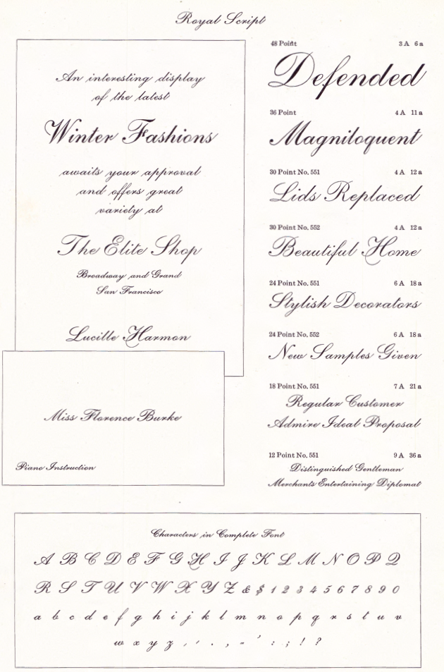
 St. Louis lettering artist Robert Leuschke (who grew up and lives in St. Charles, MO) has made some 250 calligraphic fonts for greeting cards, including many for Hallmark Cards, of which about 80 are commercially available:
  [
[ Graduate of the type design program at the University of Reading, who joined House Industries (Wilmington, DE) in 2006 to work as a typeface designer, director, and developer. He also worked with Ken Botnick at
  [
[ Blackdreamist is Keith hayden's type foundry in Kansas City, MO. Keith Hayden is graphic designer, specializing in photo-manipulations, illustrations, and branding. Born in Kansas City, where he lives and works, Keith studied at the Art Institute of San Diego, and then at the Art Institute of Kansas City where he received a Bachelors degree in Graphic Design.
  A graduate of Missouri State University, Casey Conroy now lives and works in Saint Louis, MO, and is associated wth webster University. Designer at
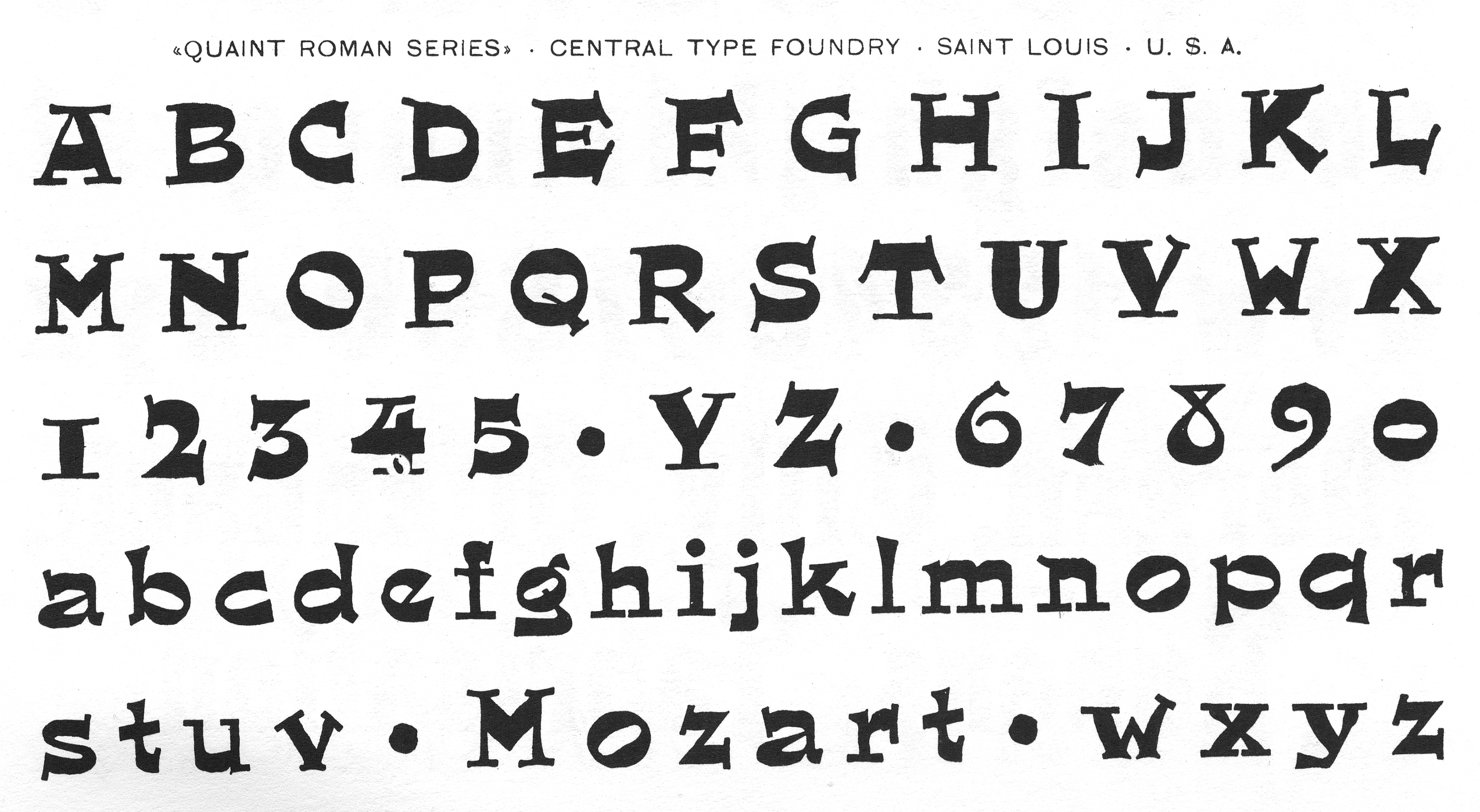
 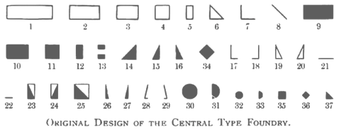 Foundry from St. Louis, est. 1872. It became "Central Division of ATF" in 1893.
  Kansas City, MO-based graphic designer, who created the fun plump display typeface
  Signpainter and letterer who worked for Hallmark in Kansas City, then in Denver, CO, and is now based in Boise, ID. In 2015, he was working on the signage typeface Krapp Jelveeto. In 2016, he published the soft rounded signage typeface
  Saratoga, FL-based designer of Armature (2014, experimental typeface) and Arqueado (2012, a combination of Baskerville and Arcus, a display typeface inspired by arches). The Armature typeface was finished during her studies at Ringling College of Art and Design in Florida. Gabriella was born in Panama and raised in Kansas City.
  Punchcutter, b. 1861 (Berlin), who made many typefaces. He worked at the Central Type Foundry and then ATF in the late 1800s, and was living in St. Louis, MO, in 1891 and in Mill Valley, CA in 1892. The Inland Printer announced in 1895 that Schroeder had joined the Pacific States Type Foundry in San Francisco. His typefaces straddle the Victorian, arts and crafts and art nouveau eras.
 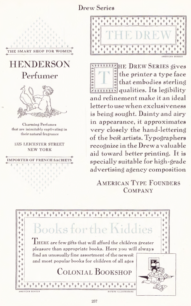 The Inland Type Foundry in Saint Louis was established in 1892 by the three sons of Carl Schraubstadter (1827-1897), William A. Schraubstadter (1864-1957), Oswald Schraubstadter (1868-1955) and Carl Schraubs Jr. (1862-1947). Carl had run the Central Type Foundry in Saint Louis and sold it to ATF (American Type Founders) in 1892, and the sons reacted by setting up Inland. Until 1911, Inland was one of the most successful foundries in the United States. In 1911 Inland was purchased by ATF and its equipment divided between that foundry and Barnhart Brothers and Spindler (BBS). A.V. Haight (Poughkeepsie) designed
  Graphic designer in Saint Louis, MO, who created the
  Located in Kansas City, MO, Jim Dore designed the inline and solid pair of typefaces called Bender (2012, free at
  Kathryn Sutton (Springfield, MO) created
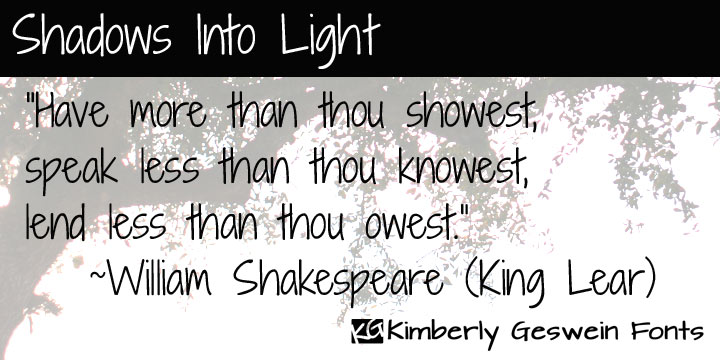
  Born in Missouri in 1979, Kimberly moved first to Texas and later (in 2007) to China, and most recently, to Orlando, FL. She made some free fonts (often handwriting styles), and also ran a personal handwriting font service [those fonts have names that start with KGD].
 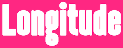 Luke Lisi (Lisi Design) was born in Colorado but lives in Kansas City. He created the
 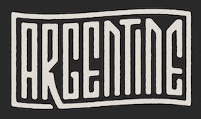 [
[ Mission, KS-based designer of the spurred Victorian display typeface
  [
[ American designer, b. 1939, Saint Louis, MO, d. 2013, Lexington, KY. He also lived in Wildwood, Florida and Rushville, Indiana. Creator of the typewriter typeface
  Independence and/or Blue Springs, MO-based Shawna Stobaugh, who runs Nonna Illustration & Design, created these typefaces in 2015: Anna Mae, Mila Floral Fill, Siri Floral Elements, Siri Uppercase, Siri Floral Numbers.
  Fashion and graphic designer based in London. At school, Sid designed the display typefaces Exobar and Genisis in 2016. [
 The
The  [
[
 Designer in Saint Louis, MO.
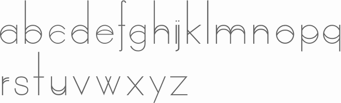
 Is it possible to design a typeface that is simultaneously octagonal and elliptical? The answer is an emphatic yes---as Verginiya Kadina shows in her
 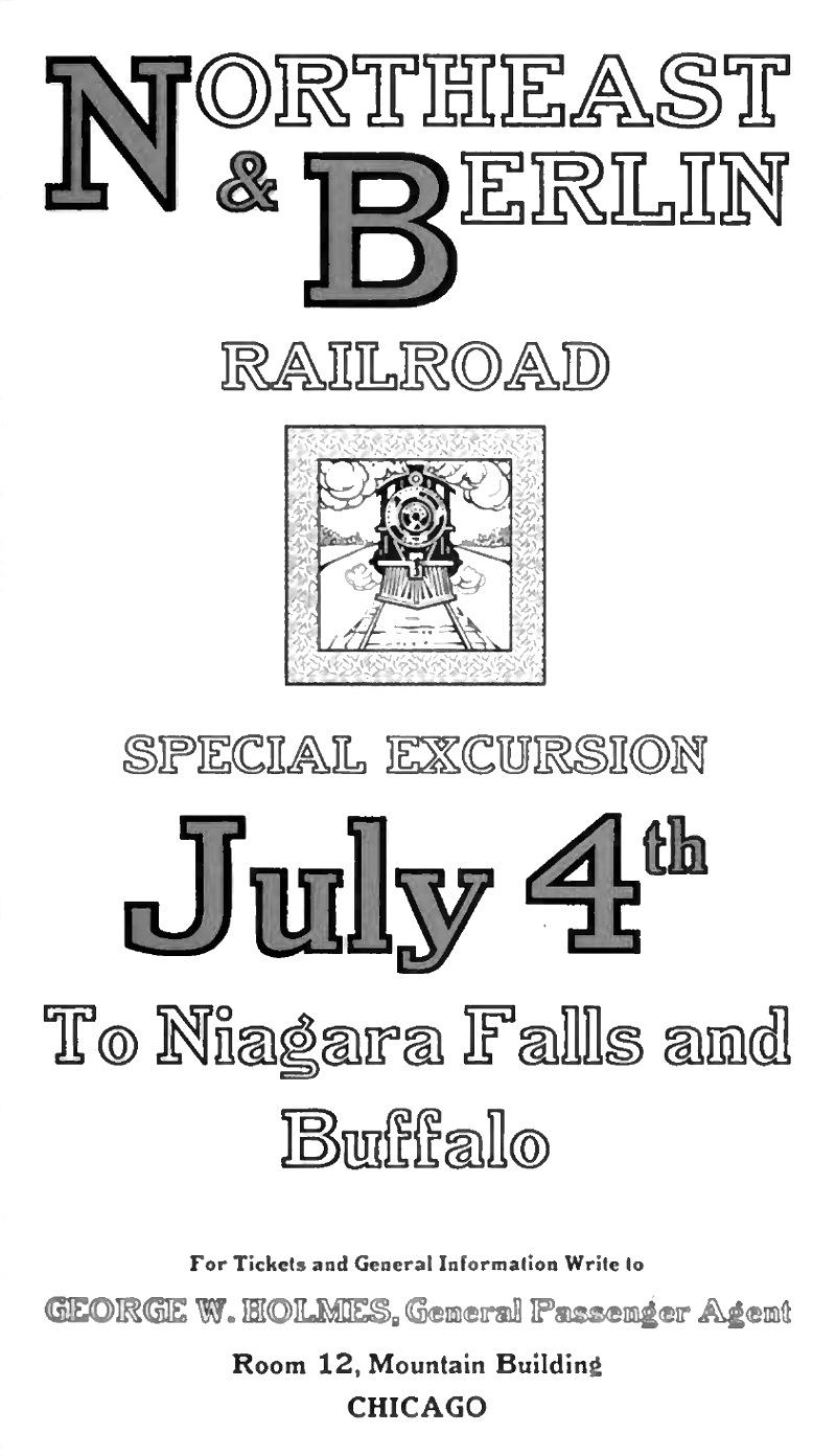 St. Louis-based punchcutter and typefounder (1864-1957) who started the Inland Type Foundry in St. Louis in 1895 together with his brothers Carl and Oswald. He is credited with the heavy square-serif typeface Foster (Inland Type foundry, 1905). Mac McGrew says: [Foster] seems rather crude by later Stymie standards-even compared with the earlier Boston Breton-particularly for the narrow G, the wide J, the high-waisted B, P, and R, and several other unusual letters. Condensed Foster, introduced by the same foundry in 1908, is comparable. He goes on: Adcraft Medium was formerly known as Rugged Medium or Alfred [Medium]. It was originated by Inland Type Foundry and patented by William A. Schraubstadter in 1910. About Comstock, McGrew writes: Condensed Comstock was introduced by Inland in 1905, but patented in the name of William A. Schraubstadter in 1908. It has no lowercase, but the design is more contemporary. Monotype has copied both typefaces, but Monotype Comstock Condensed is in 18-point only, without figures. Schraubstadter also created Woodward and Woodward Outline (1894, Inland Type foundry), Winchell Condensed, Webb, French Script, Devinne Recut, Devinne Recut Outline, and many 19th century typefaces.
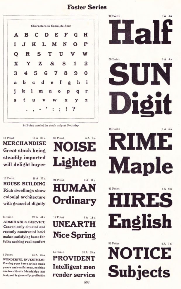
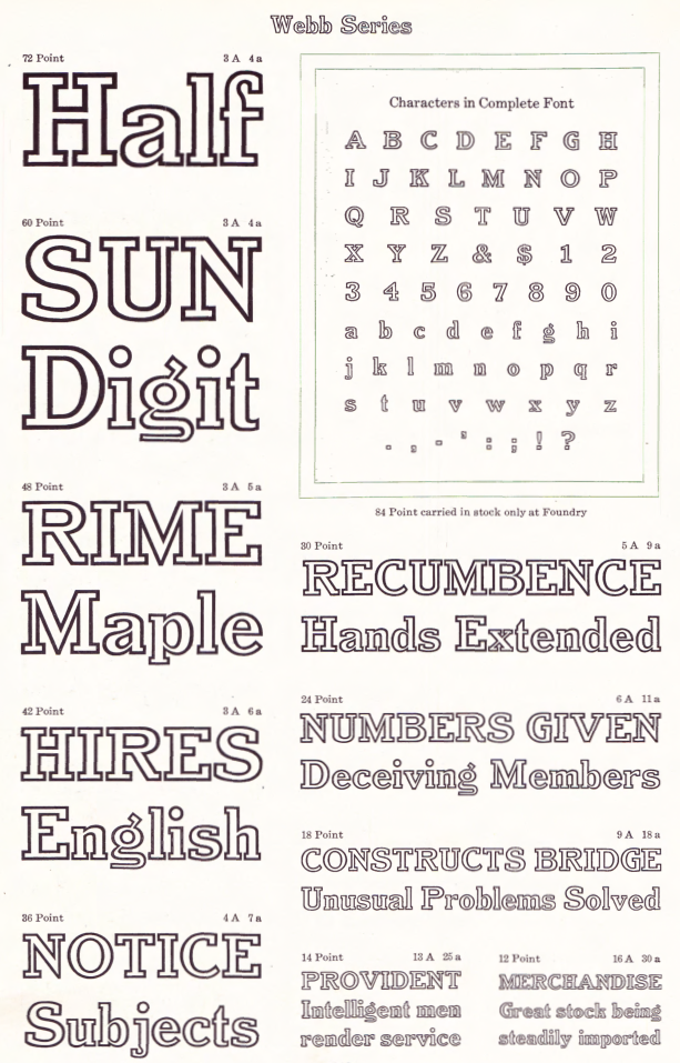
  Kansas City, MO-based designer of a typeface for ATF in 1895. The original Quentell became the basis of Taylor Gothic (1897). Taylor Gothic led to Globe Gothic by Morris Fuller Benton (1905) for the ATF. In 2019,
  Graphic designer and illustrator in the St Louis area in Missouri. Scott Simpson graduated with a Bachelor of Fine Arts in graphic design and illustration from Southeast Missouri State.
|
|
|
|