| | |
Abra Design
|
Rosario, Argentina-based designer of the 3d trompe-l-oeuil font Modern 3d (2015). Behance link. [Google]
[More] ⦿
|
Adria Romana
|
At EASD Serra i Abella (ESDAP) in L'Hospitalet del Llobregat, Mataro, Catalunya-based Adria Romana designed the free vector format Escher-inspired set of numbers called Imponumbers (2016). In 2017, she designed the piano key typeface Ona, the free Western font Sheriff and the free rounded sans typeface Rosmi. [Google]
[More] ⦿
|
Amélie Wagner
|
Parisian designer of Alphabet Impossible (2012), in Escher's style. Behance link. [Google]
[More] ⦿
|
Andre Toet Design (was: SO Design)
[André Toet]

|
 Andre Toet Design (and before that, SO Design is a Dutch studio run by André Toet (b. 1950, Den Haag). He was educated at the KABK under Gerrit Noordzij from 1974 until 1976, and at the Central School of Art and Design in London under Nicolete Gray from 1976 until 1977. From 1979 until 1980, he worked as a designer at Total Design with Jurriaan Schrofer and Wim Crouwel. Andre Toet Design is located in Apeldoorn (was: Amsterdam).
 Creator of Artu (2012, monospaced display face), Battersea (multiline face), Billiard (2012), Bloggy (experimental), AT Move Bloggy (2010), Decoupe (experimental), AT Move Decoupé (2012: a modular font based on a French game from 1906), Holborn, Mezzo (mimimalist), AT Move Pipi (2012, a playful textured caps typeface created jointly with Jasper Nijssen), AT Move Mezzo, AT Move Powerplay (1976, and redone in 2011: multilined), Musica, Nath, Powerplay, Tremelo, Wiggle. Creations from 2012: AT Move Holborn (a 3d outlined neon sign face), AT Move Tremelo (based on the logotype Microtel), Artu, AT Move Wyggle, AT Move Wolfszn, AT Move Skewy (2012), AT Move Specx and AT Move Specx Stencil (a slab serif based on the cover of a 1955 French School-Notebook; help with the design from Jasper Nijssen). Typefaces made in 2013: AT Move Altera, AT Move Altera, AT Move Herengracht (an inline typeface), AT Move Artu Super Super Heavy, AT Move Bulky (glaz krak font), AT Move Quipo (an amoebic font), AT Move MMM (with Jasper Terra and Jasper Nijssen: a rounded organic sans typeface. They write: The design is based on a old Soap-Powder advertisement. MMM is very useful for headings and/or logotypes.), AT Move Strano (squarish stencil), AT Move Nath (optical illusion typeface first made in 1974 at the Central School of Art and Design in London, and digitized in 2013 with the aid of Jasper Terra). Typefaces from 2014: AT Move Frutta, AT Move Straw (by André Toet and Jasper Nijssen), AT Move Riff Raff (octagonal, with Jasper Nijssen). Typefaces from 2015: Bombola. Typefaces from 2016: AT Move Bombola (elliptical style). Typefaces from 2017: Tremelo. Typefaces from 2018: Powerplay (trilined). Behance link. Another Behance link. [Google]
[MyFonts]
[More] ⦿
|
André Themoteo Alves Correa
[MMC typengine (was: MMC Typodrome)]
|
[MyFonts]
[More] ⦿
|
André Toet
[Andre Toet Design (was: SO Design)]
|
 [MyFonts]
[More] ⦿
[MyFonts]
[More] ⦿
|
Anuj Vijay Gadre
|
Hyderabad, India-based designer of the 3d Escher font Pichana (2016). Behance link. [Google]
[More] ⦿
|
Barnbrook (was: VirusFonts, Virus Foundry, Studio 12)
[Jonathan Barnbrook]
|
 Jonathan Barnbrook was born in 1966 in Luton, England. He is a type and graphic designer and filmmaker. Since 1990 he has worked with cultural institutions, activist groups and charities and produced a steady stream of posters. He is also known for his collaborations with Adbusters and Damien Hirst, his work for David Bowie, and his typefaces released by Emigre and Virus (his own foundry). He started Virus in 1997, and works out of the Barnbook Studio (now Studio 12) in London's Soho. Virus Foundry became just Barnbrook ca. 2017. He specializes in cult-type typefaces.
 MyFonts interview. Creative Pro interview. Bio at Emigre. In 2007, Mathieu Réguer wrote a thesis at Estienne on Barnbrook. Barnbrook designed these typefaces: - Apocalypso Pictograms and Apocalypso Crosses (1997).
- Bastard (1990, blackletter) and Bastard Even Fatter.
- Bourgeois (2005). In 32 weights, this was originally done for the Mori Art Museum in Japan. Codesigner with Jonathan Barnbrook of Bourgeois Rounded (2019) and Bourgeois Slab (2019).
- Coma (2001).
- Delux (1997).
- Julian Moncada, Jonathan Abbott and Jonathan Barnbrook jointly designed Doctrine Sans and Doctrine Stencil in 2013 at Virus.
- Draylon (1997).
- Drone 666 (2010). and Drone (1997).
- Echelon (2001, connected upright script).
- Exocet (1991, Emigre). This is possibly his most recognizable face.
- Expletive Script (2001, upright connected and modular script).
- False Idol Script (1997).
- Infidel (2003). A crusaders type family praised by Claudio Piccinini.
- Mason (1992, +Serif, +Sans). Done at Emigre.
- Melancholia (2001).
- Moron (2001).
- Newspeak (1997).
- Nixon Script (1997, fifties style connected upright script).
- Nylon and Drylon (1996).
- Patriot (1994). Exocet, Patriot---these were the good old days of the missile attacks on Israel and the war in the Falklands. Strange that Barnbrook never designed a font called Wolf Blitzer.
- Olympukes (2004, with Marcus McCallion) was a free dingbat font at Fontshop. It can now be found at Undt Typefaces. Followed by Olympukes 2012 (2012), which acknowledges the complex contradictions of the modern Olympics.
- Priori Sans (2003, Emigre), Priori Serif (2003) and Priori Acute (2010, Emigre) are Escher-like trompe l'oeuil fonts.
- Prototype (1990).
- Prozac (1997). This font was created based on just four basic shapes.
- Regime (2009). A slab serif.
- Resolution and Resolution Blackletter (2015, by Jonathan Barnbrook, Ryuhei Nakadai and Julian Moncada): A family of display typefaces that were developed as part of a creative response to the political situation in Northern Ireland.
- Sarcastic (2007). A modular connected script.
- Shock&Awe (2004).
- Sora (2019). A free sans family at Google Fonts and Github. Co-designed with Julian Moncada.
- State Machine (Virus, 2004). Based on lettering on US and Russian military vehicles.
- Tourette (2005).
Fontworks link. MyFonts link. FontShop link. Showcase of Jonathan Barnbrook's typefaces. [Google]
[MyFonts]
[More] ⦿
|
Baron von Fonthausen
[Jacques Le Bailly]
|
 Jacques Le Bailly (b. Thionville, France, 1975) is the "Baron von Fonthausen", located in Den Haag, and the self-proclaimed German-French specialist in the fields of both beer and type design. From 1999 to 2003, Le Bailly lived in Berlin, working at Moniteurs graphic design studio and as an independent graphic designer. Having returned to the Netherlands in 2003, Jacques did type production work for The Enschedé Font Foundry. He is now a typographic designer at Bau Winkel's studio in The Hague. He worked for type foundries like Lineto, Monotype, House Industries, and Bold Monday, as well as on custom projects for several brand design agencies. He has been teaching at the WdKA art academy in Rotterdam and Sint Joost in Den Bosch.
 He was working on commercial fonts such as TyPress, Ballpoint and B-Day. Sardines (2008, Vette Letters) is described by Jan Middendorp as an amusing parade of heavyweight characters crammed into squares. In 2010, that monospaced family was expanded to VLNL Neue Sardines (42 styles). Designer of the pixel font Mekka. Macula (2010) is a trompe l'oeuil typeface that is available from Bold Monday. It was inspired by Oscar Reutersvärd's impossible perspectives and M.C. Escher's optical illusions. In 2016, Jacques Le Bailly extended Vernon Adams's Nunito (2011) to a full set of weights, and an accompanying regular non-rounded terminal version, Nunito Sans, which is free at Google Fonts and Open Font Library. In 2018, he designed the free family Crimson Pro (a major update of Sebastian Kosch's Crimson from 2011) and VLNL Thueringer (at Vette Letters), and wrote: Jacques got inspired by Albrecht Düer's 15th century Fraktur (blackletter) alphabet, and decided to design a contemporary rounded version of it. It's a modern techno-style blackletter with a (beer)truckload of interesting design details. In 2019, he released the free font Livvic. Livvic is a 16-style custom corporate sans typeface designed by Jacques Le Bailly for LV (Liverpool Victoria Friendly Society Limited), an insurance company based in the UK. The typeface is part of a brand redesign. In 2020, Jacques Le Bailly, Cereal and Vernon Adams (posthumously) released the sans typeface family Mulish at Google Fonts. Mulish is a minimalist sans, designed for both display and text typography. It was initially drawn in 2011 by Vernon Adams and then refined until 2014. In 2017 the family was updated by Jacques Le Bailly to complete the work started by Vernon after he passed away, in collaboration with his wife Allison, an artist who holds the trademark on the typeface family name. In August 2019, it was updated with a variable font weight axis. Behance link. Bold Monday link. %Z Liebe Petra, Die Site ist jetzt erstmal dafür gemacht, um Leuten zu zeigen was ich gerade mache. Leider sind die meisten der gezeigten Fonts noch nicht ganz fertig und werden deshalb noch nicht angeboten. neben Schriftgestaltung, mache ich auch noch Grafik-Design. Im Moment arbeite an der Font TyPress, die bei der 1. Ausgabe folgende Schnitte enthalten wird: Roman, Italic, Bold, Bold-Italic, Caps-Roman and Caps-Bold. Unsicher ist noch wo, oder von wem sie vertrieben werden. Der Font B-Day wird 1 Schnitt haben und wenn alles gut geht, wird sie ab Februar 2002 von Lineto (www.lineto.de) verkauft. Wenn Sie interessiert sind an meinen Entwürfen, oder z.B. an Custom-Type, fragen Sie bitte nach. Oder, wenn Sie gerne sehen möchten, wie meine Schriften im Druck aussehen, kann ich Ihnen ein PDF schicken. Freundlichen Grüsse, Greetings, Baron von Fonthausen, auch Jacques Le Bailly [Google]
[MyFonts]
[More] ⦿
|
Ben Balvanz
[Fontalicious]
|
[MyFonts]
[More] ⦿
|
Biliana Velikova
|
Bucharest, Romania-based designer of the school project typeface Impossible Numbers (2015) and the school project icon set Supermarket Pictograms (2015). [Google]
[More] ⦿
|
Bill Upchurch
|
During his studies in Perth, Australia, Bill Upchurch created the trompe-l'oeil typeface Carrot Sticks (2014). [Google]
[More] ⦿
|
Bingyi Jiang
|
Designer in Shanghai of the Escher style 3d Latin font simply called Font Of Contradictory Space (2013). [Google]
[More] ⦿
|
Birgit Palma
|
 Austrian graphic designer and illustrator located in Barcelona. Lecturer at FH Salzburg & EINA Barcelona since 2016. She created the ornamental caps alphabet Reproduction (2012). In 2014, she made the Escher-inspired typeface Oxymora. In 2019, Birgit Palma and Daniel Triendl co-designed the colorful textured caps typeface Kenya.
 Behance link. Old URL. Ultratypes link. [Google]
[More] ⦿
|
Bold Monday
[Pieter van Rosmalen]
|
 Bold Monday is an independent font foundry established by Paul van der Laan and Pieter van Rosmalen and based in Eindhoven, The Netherlands (and before that, The Hague). Pieter van Rosmalen (Eindhoven, The Netherlands) studied advertising and graphic design at Sint Lucas in Boxtel and graduated from the postgraduate Type & Media program at the Royal Academy of Art (KABK) in The Hague in 2002. He runs Bold Monday's Eindhoven office.
 In 2018, Bold Monday joined The Type Network. Pieter van Rosmalen has designed retail as well as custom typefaces for clients worldwide, such as NBC Universal, Audi AG, General Electric and KPN. One of Pieter's designs is used for street signs in South Korea. Pieter's retail typefaces in the Bold Monday catalog include - Aniek (2009: a children's script).
- Bilo (2018: a grotesque).
- Capibara (2007).
- Dico (2004-2020). A varied suite of 45 typefaces by ncompassing eight proportional and monospaced sub-families (Sans, sas Soft, Mono, Code One, Code Two, Typefwriter, Slab, Mono Slab). It circles around a sans-serif van Rosmalen started in 2004 for design studio Teldesign, comprehensively updated and expanded upon in 2020. The monospaced script styles are loosely based on Corinthian Script for the IBM Selectric.
- Nitti (2008: monospaced), Nitti Grotesk (2012-2014), Nitti Mostro (2015, +Stencil, +Disco, a splendid multiline headline typeface), Nitti Typewriter (2009).
- Panno (2008, a sans), Panno Sign, Panno Text (2008-2010). By Van Rosmalen and van der Laan).
- Pinup (fat rounded sans, done in 2008). In 2013, he published Pinup Dotted (a textured typeface).
- Stanley (headline face, done in 2008; includes a stencil).
- Puffin, Puffin Display (rounded informal sans families) and Puffin Arcade (a large bitmap font family).
Bold Monday also has typefaces by other designers. In 2012, Bold Monday published the trompe l'oeuil typeface Macula (Jacques Le Bailly) which is based on designs by Oscar Reutersvärd. Oskar (2002-2013). They write: Oskar, designed by Paul van der Laan, is a typeface inspired by Dutch architectural and advertising lettering from the early 20th century. Particularly the style of lettering that was painted on walls and shopfronts, or executed in metal on buildings. This kind of typography did not exist as metal printing types, but was instead painted manually by sign painters, or drawn by architects. Initially the typeface was designed in 2002 for the lettering of a monumental school in The Hague, designed by architect Jan Duiker in 1929. In 2012, they published the trompe l'oeuil typeface Macula (Jacques Le Bailly) which is based on designs by Oscar Reutersvärd. Further typefaces include Feisar (techno), Flex (sans), Naomi (1999) and Pixel Package. GE Inspira Sans and Serif (Mike Abbink, Paul van der Laan and Pieter van Rosmalen, Bold Monday) won an award in the TDC 2015 Type Design competition. In 2018, Pieter published the experimental pixel-inspired typeface family Alterego. Typefaces from 2021: Stanley: Bold and broad-shouldered, Stanley is a poster typeface collection in three styles rooted in the first sans-serif designs of the 19th century---the grotesques. Stanley is available in Normal, Stencil, and Stencil Rough. Pieter designed custom typefaces for worldwide clients amongst others Agis, Audi, Teldesign, KPN, The government of South Korea (road signing), The Ministry of Transport, Public Works and Water Management (OV Chipcard), USA Today (Futura Today, 2012, with Paul van der Laan), and NBC Universal. For Holland Festival in 2014, Paul van der Laan designed the stencil typeface HF Stencil (in collaboration with design studio Thonik, Amsterdam, and Diana Ovezea), a design inspired by Glaser Stencil. Logo. FontShop link. Adobe link. Type Network link. [Google]
[MyFonts]
[More] ⦿
|
Brian Hollingsworth
|
Artistic director in London, who created an Escheresque typographic poster called The Truth (2012). [Google]
[More] ⦿
|
Bronislaw Zelek
|
Polish type and graphic designer, b. 1935. He graduated from the Academy of Fine Arts in Warsaw under Henryk Tomaszewski in 1961. In 1967, he received Tadeusz Trepkowski's WAG Award and from the 1970s on he worked as Hernyk Tomaszewski's assistant at the Academy of Fine Arts. Best known for his film posters, he lived in Vienna, and then moved to Lower Austria, where is is a painter. At Mecanorma in the early 1970s, he made Zelek Black, Zelek Shadline, Zelek Bold, and Zelek Boldline. Zelek Black looks twisted and almost geometrically impossible. Dan X. Solo in his Dover book "Moderne Alphabets" shows an identical face, renamed Zelda. In 2009, Zelek pops up again in a slightly reworked version by Simon Griffin for Wired UK. Typophile discussion. Dick Pape made a series of Zelek revivals including Zelel Shadline, Zelek Black, Zelek Bold, Zelek Bold Reflection, and Zelek Bold Line. The Russians have their own versions, starting with a 1987 semi-clone by G. Klikushin, which in turn inspired the 1993 face---far removed from Zelek's Zelek---, New Zelek about which its publisher Paratype writes: The typeface was developed at TypeMarket in 1993 by Alexey Kustov on the base of artworks of Viktor Kharyk and Lidia Kolesnichenko (1979), that were developed as a Cyrillic adaptation of the typeface of Bronislav Zelek, Mecanorma. The multicolor layered typeface Bron was published in 2014 by Swiss type designer Jeremia Adatte. In consultation with Zelek, Three Dots Type (Marian Misiak) in Poland did a revival called New Zelek Pro. Klingspor link. Biography at Culture.pl. [Google]
[MyFonts]
[More] ⦿
|
Candi Erwanto
[Mystical Type]
|
[MyFonts]
[More] ⦿
|
Carlos Fabián Camargo Guerrero
|
Venezuelan graphic and type designer (b. San Cristóbal, Estado Táchira, Venezuela, 1977). He studied Graphic Design between 1995 and 1998 in the Instituto Universitario de Tecnología Antonio José de Sucre (IUTAJS) Extensión Mérida, Venezuela. He runs the design studio Andinistas in Bogotá, Colombia, which he set up in 1998 with a few others. Creator of the beautiful typeface Cazon (1999-2007, a grunge script in 7 styles that includes Gris, Negra, Uno, Dos, Tres, Dingbats A and B) and of Escuadra (2003), Biologia (2003), Denedo (2003; the discussion by typophiles centers around how interesting this 3d font is experimentally---a bit like the type version of M.C. Escher's drawings, full of impossibilities), Modelia (2006), Nikona and Nikona Dual (2006, octagonal, with Rafael Rincón), Avecedario, Btamax (1999-2008, comic book style and grunge), Día D, Nativa, Codiga Icons (dingbats), Codiga (1999-2007, an 8-style octagonal family including Codiga Stencil and Codiga Dingbats), Codiga Pura (octagonal face), Pepelepu, Gancho petare, Guerrilla, and Hirofórmica (grunge). His calligraphic script family Panamericana (2007) comes in many grungy and experimental flavors: Blanca, Gris, Negra, Uno, Dos, Tres, Cuatro, Cinco, Seis and Dingbats. With María Angélica Estrada Cano, he designed the hand-drawn font families Makika (2007) and Lita (2007; in five styles---Gris, Negra, Humo, Molis, and Dingbats). His blog. In the area of combat-ready explosion-inspired letters and dingbats, check his eight-weight family Hiroformica (2007, Andinistas; for a free version, see DaFont). In 2007, he created the calligraphic grunge family Rosadelia, and the grunge lettering and crow dingbats family Gancho Petare. In 2008, he published Heleodora (beautiful scratchy hand), Magola (Negra, Supra Negra and Stencil), Navaja 1 through 4 (a collection of grunge fonts with grungy dingbats), Lucrecia 1 through 3 (a fat connected script family ranging from clean to splattered), Pomarosa (irregular hand) and Pomarosa Dingbats, Bochalema (+Dingbats, a comic book family), and Alcira 1 through 3 (nice scribbly grunge scripts). In 2020, he designed Man Ray (a wild and weathered calligraphic font, and a pirate era weathered caps typeface). [Google]
[MyFonts]
[More] ⦿
|
Catalina Mos
[Vectorielle]
|
[More] ⦿
|
Cécile Peschier
|
Graphic designer in Montreal, who created the Escheresque typeface Penrose (2012). [Google]
[More] ⦿
|
Cécile Psicheer
|
Montreal-based illustrator and graphic designer who created the impossible 3d typeface Penrose Font in 2015. Behance link. [Google]
[More] ⦿
|
Christophe Vermijlen
|
Fellow Belgian Christophe Vermijlen (Hasselt) created an experimental 3d typeface called Tilting Type (2012). [Google]
[More] ⦿
|
Christopher Ongkowidjojo
|
Graphic designer in Yogyakarta, Indonesia, who created the display typeface En Masse in 2014. This 3d font, with one Escher style, is based on Gotham by Tobias Frere-Jones. [Google]
[More] ⦿
|
Claudia Juncosa
|
Barcelona-based designer of Escher Type (2016). [Google]
[More] ⦿
|
Conor Fox
|
During his studies at Auckland University of Technology (AUT), Conor Fox creater the Escher-style typeface Dimension (2015). Behance link. [Google]
[More] ⦿
|
Cristina Moore
|
FontStructor who made the free Escher-style font Penrose (2014, a school project at the University of Tulsa, OK). Aka xtinamber. [Google]
[More] ⦿
|
Dae-Hoon Hahm
|
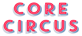 Type designer from Seoul, Korea. At S-Core, he co-designed the squarish Latin/Hangul typeface Core Dodam (2011), the shadow outline typeface Core Bandi (2012) and the hand-printed Core Narae (2011) with Hyun-Seung Lee. Hyun-Seung Lee, Dae-Hoon Hahm and Min-Joo Ham jointly designed the programmers' typeface Eco Coding (2012) and the huge Core Sans, Core Sans G (geometric), Core Sans M and Core Sans N, Core Sans NR, and Core Sans N SC families (supported codepages are MS Windows 1252 Latin1, MS Windows 949 Korean (Hangul) consisting of 11,172 letters and KS Symbols (Korean Symbols)).
 In 2013, Hyun-Seung Lee, Dae-Hoon Hahm and Min-Joo Ham jointly designed the layered type system Core Circus---as a reaction to the hugely successful Trend typeface by Latinotype, I guess. The slab version is Core Magic (2014). See also Core Circus Rough (2014) and Core Magic Rough (2014), both jointly designed by Hyun-Seung Lee, Dae-Hoon Hahm and Dong-Kwan Kim. Core Slab M (2013) is a 31-style companion of Core Sans M---it is a soft rounded slab with some seriffy tails mixed in with standard slab terminals. Core Mellow (2013) is a condensed organic rounded sans family that comes in 21 weights. In 2014, Hyun-Seung Lee, Dae-Hoon Hahm and Min-Joo Ham co-designed Core Sans D, Core Sans A, Core Rhino, Core Narae Pro (a Comic Sans alternative) and Core Deco (a 14-style art deco family). Core Escher (A and B) (2014) is a typeface family with impossible optical illusions, created by Hyun-Seung Lee and Dae-Hoon Hahm. Core Paint (2014) is a grungy paint-splatter typeface family by Dong-Kwan Kim, Hyun-Seung Lee and Dae-Hoon Hahm. In 2015, Hyun-Seung Lee, Dae-Hoon Hahm and Dong-Kwan Kim co-designed the grotesque typeface family Core Sans E and added the soft and rounded Core Sans R to the S-Core Sans series, as well as Core Sans B. In 2016, they added the rounded small x-height family Core Sans BR and the geometric sans family Core Sans C. The rounded version of Core Sans A, called Core Sans AR was designed in 2016 by Hyun-Seung Lee and Dae-Hoon Hahm. The rounded version of Care Sans C, called Core Sans CR, was designed in 2016 by Hyun-Seung Lee, Dae-Hoon Hahm, and Dong-Kwan Kim. The neutral Core Serif N was added in 2016 by Hyun-Seung Lee, Dae-Hoon Hahm and Dong-Kwan Kim. [Google]
[MyFonts]
[More] ⦿
|
Dani Marti
|
Haiku, Maui, HI-based designer of the display typeface Boga (2015) and the free 3d Escher effect font Volume (2015). He also made vector hand icons and a free AT Vecor Symbol Logo font. Typefaces from 2017: the geometric solid typeface Malibu. Creative Market link. Behance link. [Google]
[More] ⦿
|
Daniel Maarleveld
|
Dutch designer based in Amsterdam, with a strong interest in generative design and kinetic typography. He has taught typography at the Gerrit Rietveld Academy in Amsterdam and typography at the ArtEZ Institute of the Arts in Arnhem. Maarleveld co-founded Font Spectrum in 2021 with Edgar Walthert in Amsterdam. Future Fonts link. The typefaces at FontSpectrum: - Purple Haze (2021-2022). Purple Haze is an experimental variable typeface with a readable regular weight and decorative dot matrix-themed extremes. The font works best when being animated or interacted with.
In 2021, he designed the optical illusion wire frame typeface Impossible Grid. [Google]
[More] ⦿
|
Daniele De Nigris
|
Digital and graphic artist in Bologna, Italy, who runs DNDesign. He created an Escher-inspired alphabet called Impossible (2010). Flickr page. [Google]
[More] ⦿
|
Danielle Quail
|
As a student, Liverpool, UK-based Danielle Quail designed an Escher style 3d typeface in 2016. [Google]
[More] ⦿
|
David Acevedo
|
Barcelona-based designer of the Escher-style outline typeface Barcelona (2014). Behance link. [Google]
[More] ⦿
|
David Deasy
|
Greenboro, NC-based creator of an Escheresque logo for Overfield (2012) and of a savvy logo for a charter yacht in the British Virgin Islands called Grand Cru (2012). Home page. [Google]
[More] ⦿
|
David Martin
[David Pustansky (was: 24hourbauer.co.uk)]
|
 [More] ⦿
|
David Pustansky (was: 24hourbauer.co.uk)
[David Martin]
|
 David Pustansky (b. 1985) is a UK-based type designer who was active in 2005-2006, when he operated as David Martin and his web site was called 24hourbauer.co.uk. He published many free fonts, but then became inactive ca. 2007. In 2014, he resurrected as David Pustansky.
 Creator of the picture-derived typefaces Eye Spy (2006), Batman The Dark Knight (2006, scanbats), Simpsons Mmmm...Font (2006), Pokemon Pixels (2006), Silent Hill Nightmares (2006), Mario and Luigi (2006), Final Fantasy Elements (2006), Lara Croft Tombraider (2006), Superman Last Son of Krypton (2005), The Ultimate Lance Hoyt font (2005), Harry Potter and the Dingbats (2005), TNA Bound for Glory (2005), tna wrestling (2005), Doctor Who 2006 (2005), Futurama Dingbats (2005), Red Dwarf Characters (2005), Evil Characters (2005), and 24hourbauer (2005, scanbats), Simpsons Treehouse of Horror (2007), Split Splat Splodge (2006, ink slpatter), Splish Splash Splosh (commercial), TNA Lockdown (2007), Splis (2007), Donkey Kong World (2006), SonicMegaFont (2006), Doodlebears (2006), Tetris Blocks (2006), twentyfour, WWE, residentevilcharacters, wrestlinglogos. In 2014, he created Garfield Hates Mondays Loves Fonts (scanbats), the retro typeface Shakespeare First Folio (after the lettering in the 1623 collection of Shakespeare's plays), Brush Stroke of Genius, Wilson (after the baseball in the movie), Eye Am Confused Optical Illusions, Game Logos, Retro Hasbro WWF Figures, Doom and Gloom, Nato Phonetic Alphabet, Shakespeare To Be Or Not To Be (ornamental caps), Super Street Fighter Hyper Fonting (scanbats)m), An Apple A Day Fruit Font, Secret Diary (hand-printed), Balls Balls and more Balls (scanbats), Legend of Zelda TriFont (scanbats), Crushed Candy (scanbats), A Work of Art (scanbats), Console Wars Console Yourself, Futurama All Hail the Hypnotoad, Family Guy Giggity (cartoon character font), and American Dad Good Morning USA (cartoon dingbats). In 2018, he designed the shaky handcrafted Jack The Ripper Dear Boss (inspired by the original "Dear Boss" letter sent to the police at Scotland Yard by Jack the Ripper). In 2019, he added the caricature font Guess Who at the scanbat typeface Metal Gear Solid The Phantom Font. Abstract Fonts link. Home page of David Pustansky. Fontspace link. [Google]
[More] ⦿
|
Denis Kegler
|
 American designer of the fonts P22 Bauhaus Extras, P22 Bauhaus Extras, P22 Bayer Shadow, P22 Bayer Universal, P22 Cage Extras, P22 Da Vinci, P22 Da Vinci Extras, P22 Escher, P22 Escher Extras, P22 Folk Art Extras, P22 Hopper Josephine, Koch Signs (astrological, Christian, medieval and runic iconography from Rudolf Koch's The Book of Signs), P22 Michelangelo, P22 Michelangelo Extras, P22 Hieroglyphic, P22 Petroglyphs, P22 Rodin, P22 Rodin Extras, P22 Vienna Extras, P22 Vienna (1997: art nouveau and expressionist style based on the Vienna Workshop), P22 Way Out West, P22 WayOutWest Critters. [Google]
[MyFonts]
[More] ⦿
American designer of the fonts P22 Bauhaus Extras, P22 Bauhaus Extras, P22 Bayer Shadow, P22 Bayer Universal, P22 Cage Extras, P22 Da Vinci, P22 Da Vinci Extras, P22 Escher, P22 Escher Extras, P22 Folk Art Extras, P22 Hopper Josephine, Koch Signs (astrological, Christian, medieval and runic iconography from Rudolf Koch's The Book of Signs), P22 Michelangelo, P22 Michelangelo Extras, P22 Hieroglyphic, P22 Petroglyphs, P22 Rodin, P22 Rodin Extras, P22 Vienna Extras, P22 Vienna (1997: art nouveau and expressionist style based on the Vienna Workshop), P22 Way Out West, P22 WayOutWest Critters. [Google]
[MyFonts]
[More] ⦿
|
Dick Pape
[Nathalie Eiswitt]
|
[More] ⦿
|
Dick Pape
[Dick Pape: ornamental typefaces]
|
 [More] ⦿
|
Dick Pape
|
 Dick Pape (Dallas, TX) is digitizing the Dan Solo books one by one, and has digitized many other sources of alphabets and images. He started making fonts ca. 2007. In 2009, he was doing Solo's art deco tome. He is on several font-making forums such as High Logic, and is interested in revivals. "Toto" writes: Dick Pape made hundreds of fonts and here are the links to most of his fonts. This list has not been updated and later additions are found in Rapidshare folders. I've missed some and some links had been deleted by Rapidshare during its migration from .de to .com. Some have also been sent directly to the group, like those based on Mada's alphas. It is hard to tell whether the font has been made by Dick Pape. The only indication that he created the fonts is that the font have "DP" as font vendor and/or has "Digitized by TTD" in the trademark field. Both are not present in some of his fonts. He seems not to want to take credit. He is just a guy who wants to digitize anything he likes. In 2010, he made Bultaco, based on the logotype for Bultaco Motorcycles---see Freehostia.
 Download here. [Google]
[More] ⦿
|
Dick Pape: ornamental typefaces
[Dick Pape]
|
 Ornamental typefaces made in 2008-2010 by Dick Pape: 2 Cute 4 U (+Block), Abstract Alphabet (2009), Aged Ornaments (2009), Ancient Mortises (2008), Angel Alpha (2009), Angelica Alpha (2009), Ani-Red Jello Alpha (2009), Antique Alphabet (2009), Arabesque Design (2009), Art Deco Dingbat Images (2010), Art Deco Frames (2010), AlphabetArt, AndrewHolmesArtA, AndrewHolmesArtB, AndrewHolmesArtC, AndrewHolmesArtD, AndrewHolmesArtE, AndrewHolmesArtF, Angel Alpha, Angelica Alpha, Ani Red Jello Alpha (2009), AvonInitials, BritishAirwaysNumbers, CaFaitDur, CelticDesignDark, CelticDesigns-Light, Continnental, EckenFlowerBorders, GermanGothicManuscript, KafkaFlourishes, LaxtonCommonRevival, NiceOldAlphabet, Portent, RomanoAlphabet, Weissranken-Initialen, Babylon Initials (2009), Bird Drawings Alphabet (2008), Black Buttons (2010, +Bold), Bold Cameo (2009), Bubble Gum (2010, +Condensed, +Extended), Bultaco (2010, after the motorcycle brand), Cardio Black and White (2010, ECG-inspired), Charcoal family (2010, crayon typefaces), Checkerboard (2010), Chinese Flowers (2008), Chiswick Press (2007), Chocolate Type (2011), ChrisGreen (2010), Calligraphia Latina (2010), Dough (2011), Electronic Alphabet (2011), Elo (2010), EstupidoEspezial1, EstupidoEspezial2 (2010, based on the Hoefler Swash variant of OCR_A), TokoFont, Clip People (2010), Clothes Pin Font, Compass Rose (2008), Coptic Letters (2010), Cubes, Cups, Cute Lolo Animals, Dark Herald (2011, Celtic caps), Dave's Glyphs, Design Images, Digital Auto Sampler, Drinking Scenes, Drinking Utensils, DunHuang Art, Eating Signs, EcoLeaf, Eduardo Recife, Eggs And Milk, Eroding Alphabet Italic (2010), Extra Initials, Extra Ornaments, Fantasy Butterflies, Fantasy Dragon FX, Fantasy Monster Skulls, Far Away Places Images, Festival Books Borders, Festival Books Initials, Festival Books Ornaments, Fire Letters, Fire Letters Cameo, Fire Letters Monospaced, Fire Letters Monospaced, Floral Initials, Florentine Initials, Florentine Initials Reverse, Flower Panels, Flower Panels Outline, Flower Vines, Fresh Fish, Funky (2010), Funny Numbers, Furore Mexican (2011), Futorisugi Face, Garden Nouveau Initials, Gill Canterbury Capitals (2011), Give me a break, Gothic Metal Initials, Goudy Initials, Graph Glyphs (2010), Halbfette Egyptienne (2008), Hat Dance Alpha, Haunted Initials (2010), Hellenic Sketch (2010), Hollandisch-Gothic (2008), Holly Alpha, Hula Ribbon, Hula Ribbon 2, Hula Ribbon1, Humanistic Alphabet 106 Italic (2011), Humanistic Alphabet 108 (2011, uncial), India Designs, Irina Batkova HRG (2010, based on Giger's paintings), Japanese Design Parts, Japanese Design Templates A, Japanese Design Templates B, Jugendstil A, Jugendstil B, Kelt Ornaments 1, Kelt Ornaments 2, Kleft Bold (2011, dot matrix face), Lichte Jonisch, Madeleine Shaded (2010), Mayan Affixes A, Mayan Affixes B, Mayan Main Signs A, Mayan Main Signs B, Mayan Profiles, Mc Call's Magazine, Metal Branches (2010), Mimbres Pottery, Moderne-Zelda (2010, after a Dan X. Solo alphabet), Moderne-Zelda Black, More Drinkings Scenes, Mostly Fish, Moto Bykes, Mythological&Fantastic I, Mythological&Fantastic II, Mythological&Fantastic III, Mythological&Fantastic IV, Mythological&Fantastic V, Mythological&Fantastic VI, Mythological&Fantastic VII, Native Designs-Mexico&Peru 1, Native Designs-Mexico&Peru 2, Native Designs-Mexico&Peru 3, New Music, Objects of Nature, Old English Images, Ondawall Versal (2011, Celtic), Panels&Frames, Parapam (2010), Pinto Inline (2010, +Speckled), Random Doodles, RangeMurata, Rankin-Initialen, Really Black Alphabet (2010), Robu Bold (2010), Rons Old Patterns, Rons Old Patterns Bare, Rosart Initials, Rustic Alphabet, Sacon Inititals, Saks (2010, bilined), Schmale Jonisch, Sea Shells of Nature, Shuttershock Vector Demo, Simple Alphabet, Simple China Images, Simple Doodles, Snails&Slugs, Softsquare, Some Guitars, Soviet Founders, Soviet Life Posters I, Soviet Life Posters II, Soviet Life Posters III, Soviet Life Posters IV, Soviet Propaganda Posters, Splish-Splash (2009), Strange Black Blobs, Tauba Auerbach, The Goetia, Tribal Dividers, Tribal Flames, ViaFaceDon Black, ViaFaceDon Black Hats, ViaFaceDon Outline, ViaFaceDon Speckled, Victorine (2010, Tuscan typeface), Viking Design A, Viking Design B, White Buttons Bold (2010), Wood Type Cheltenham Bold (2010), ZEart Designs, Zelek, Zelek Black, Zelek Boldline, Zelek Shadline.
 From 2012: French Onion. Download here. [Google]
[More] ⦿
|
Dung Le
|
Vancouver, BC-based designer of the Escher-inspired typeface Impossible Alphabet (2017). [Google]
[More] ⦿
|
Efi Granklaten
|
Paris-based designer who works mainly for the fashion industry. In 2015, Efi created the Escher-style Penrose Triangle font. [Google]
[More] ⦿
|
Elemasele Studio
|
Graphic design studio in San Salvador, El Salvador, founded by Laura Avila and Luis Sagastume. Designers of the geometric caps typeface Impossible (2016). Behance link. [Google]
[More] ⦿
|
Enric Jardi
|
 Born in Barcelona in 1964. Graphic design teacher at Elisava in Barcelona since 1988. Director of the Master on Advanced Typography at the Eina school of art and design, in collaboration with the Autonomous University of Barcelona. He also teaches a Master's course on art direction and advertising at Ramon Llull University. Author of Twenty-two tips on typography (that some designers will never reveal) and twenty-two things you should never do with typefaces (that some typographers will never tell you) (Actar).
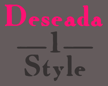
 At type-o-tones in Barcelona, Enric Jardi created Neeskens (1991-2007), Retorica Buida (1995, blackboard bold), Retorica-Plena (1995), Deseada (1995, a blurred roman), Escher, Magothic, Mayayo (1991, great children's book display font in Inline, Holes and Black styles), Peter Sellers (2007), Poca (1995, pixelish), Radiorama (1995), Verdaguera (1995, a classical weathered typeface)), Wilma (1995-2007: a chromatic type system), Xiquets Forever (1995, dingbats). Interview by MyFonts. Klingspor link. Type-o-tones link. FontShop link. Type-o-tones link. [Google]
[MyFonts]
[More] ⦿
|
Enzo Lo Re
|
Born in Sicily, Enzo Lo Re is the Milano, Italy-based designer of the decorative caps typeface Escher (2016). [Google]
[More] ⦿
|
Escher fonts
|
Discussion at typophile on designs of Escher-like geometrically impossible alphabets. [Google]
[More] ⦿
|
Esteban Simone
|
Branding specialist in Buenos Aires who graduated from FADU. I think, but am not 100% certain, hat Esteban made the Escher-inspired typeface Imposible (sic) (2013). Creator of the typeface Sofia (2010). Behance link. Fadu UBA link. [Google]
[More] ⦿
|
Faak and Paat Studio
[Julien Fesquet]
|
French design studio in Bordeaux set up in 2012 by Julien Fesquet and Benoit Baron, who were joined by Julien Taddei in 2013. Designers of the free display typeface Cascade Grotesk (2014), which is an experimental hybrid between Cascade Script and Brandon Grotesque. They also created the free high-contrast font Delicate (2014) and the free varied caps typeface 26 (2013). In 2016, they finished the Escher style typeface Deus. LVtiK (2017) is a take on Helvetica. Khodja (2016) is a piano key typeface. Slantit (2017) is an experimental stone cut typeface. Behance link. [Google]
[More] ⦿
|
Flawless Supplies
|
Greek design of the Escher-style typeface Impossible Font (2016). [Google]
[More] ⦿
|
Fleta Selmani
|
Designer of the Escher-style font Impossible (2021). [Google]
[More] ⦿
|
Font Bud
[Mikolaj Grabowski]
|
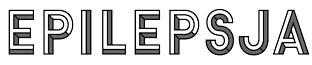 During his studies in Warsaw, Poland, Mikolaj Grabowski designed the interesting stackable typeface family Epilepsja (2015) and Epilepsja Round (2015). There is a hint of Escher-style 3d effects hidden in this beauty.
 In 2015, he set up his own commercial type foundry. Typefaces from 2018: URLOP (a 14-layer color font, with some SVG styles, and covering many multiline and stencil styles). Typefaces from 2019: Antifa (for anti-fascist---an ironic use of the blackletter style used by neonazi / fascist groups in Poland), Fushar and Fushar Arabic (a Latin / Arabic colorable and layerable comic book font family). Typefaces from 2020: Achtung (an extension of Epilepsja, covering Cyrillic as well). [Google]
[MyFonts]
[More] ⦿
|
Fontalicious
[Ben Balvanz]
|
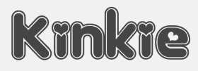 Original fonts by Ben Balvanz from Cedar Rapids, Iowa (b. Cedar Rapids, 1975), who now lives in South California. His original Fontalicious domain ceased in 2005 but was repurchased in 2007 with the help of Font Bros. Some fonts can be downloaded here and here. The list: Topanga (2017), Coney Island (2002), Cheeseburger (2002), Tabletron (2002, LCD font), Senor Pooglins, Plush (2001), Slide, Discotech, Galaxy, Pacfont, Rusty, PinniePoker, Geeves (tall letters--great), Moonpie Cadet, Fidelle, FontTwelve, Mister Easy, Mister Dope, Frosty, Chankenstein, Discotech, VintageVacation, Dazzler, Joinks!, Cyberwhiz, Swinkydad, Sonic Superpowers, Mikey Jax, Klink-o-mite, Caveman, Gloo Gun, Skylab 600, Cyberpop, Cyberjimmy, Smartie Capos, Jenkins, Earwax, Pimpbot 5000, Dreamy, Quinkie, Milkfresh, DateRape (great), SpaceAce, GirlieLeslie, Groovalicious Tweak, Porky's, International Chunkfunk, SuperTrooper, Chachie, Zodiastic, Great Head (dingbats), Chick (sassy!), the Eight Track family, Speedfreek, the Odyssey family, AlphaStep, Alpha Clown, dopenakedfoul, Lounge Bait, SpaceBeach, Jubie, Bean Town, Funkotronic, UndieCrust, and Poppycock, Pornhut, Robokid, Kinkie (Valentine's Day font), BorderMon (dingbat), Technicolor, Tennis (stencil), Moloky, JabbieJunior, Rave Queen, Alpha Niner, Croobie, Wednesday, Populuxe, the nice BoozeBats, Geekbats, Garage Sale, Arcade, Glamocon Retrobats, Fontalicious Thingbats, Good Head, Baby Kruffy, Kruffy, Fine-O-Mite, Disco Inferno, Jokewood, Toggle, Swinger, SurfSafari, OmegaMax, Pogo, Elvis, Trendy University (stencil), Hoedown, Fat, Atomic, Rocket, 12 Good, Moonpie Cadet Good, Dynomite, Superstar DJ (dingbat), Kravitz, Kravitz Thermal, hungrumlaut, Sporto, Sabadoo, Snappy, Chickabiddies (geek dingbats), Mandingo (1999, buncy hand-printed style), Heartbreaker, Smilage, 52 Pickup, Return of the Retrobats (wow!), Wunderland, Omega, Great Head, Air, Blackjack, BlackjackRollin, Borneo, CharlesAtlas, Cheri, CheriLiney (2001, Valentine's Day theme), DeejaySupreme, DigitCube, DigitLoFiShift, DigitLoFi, Digit, DimitriSwank, Dimitri, DiscoInferno, DunebugAlternates45MPH, DunebugAlternates, Dunebug, Dunebug45MPH, Freestyle, Garanimals, Gas, GleeClub, Jenkinsv20, Jenkinsv20Thik, JenkinsKeepinitReal (1998), KravitzExtraThermal, Moderna, MoogSchmoog, Moog, PussycatSassy, PussycatSnickers, Queer, Redensek, Sanka, Schmotto, SchmottoPlotto, Squarodynamic01 through 10 (pixel fonts), Stretch, SupervixenHoneyedOut, Digit, Digit Cube, Supervixen, TheKids (1999), TrendyUniversity, UltraSupervixenHoneyedOut, UltraSupervixen, WeLoveCorey, Manchester (great), Weltron (stencil font), Weltron Power, Mullet, Rolloglide, Planet, Gravity, Alba, BilloDream (2001), Stretch, Pasteris (based on the handwriting of Matthew Pasteris), PornStarAcademy (sports shirt lettering), Mullet, SuperStars (stars), Krupke (2002), Fresh Bionik, Stoney Billy (2001, not free), Hustle (2001, not free), Rustler (2001, Western font, not free).
 At T-26: Marshmallow (2001, rounded monoline geometric face), Superfly (2002, a Western font), Thursdoo (2002), Pacfont Good (2002), Thug (2002), Dokyo (2002, a free competitor of Futura Extra Black and Folio Extra Bold), Supreme (2002), Fresh (2002, at Chank's place), Juice (2002), Pinball (2002, not free), RunTron1983 (2002), Pixel Pirate (2002), Odysseus (2002). Rascal Miniatures, Wonderkid, Smilage Regular, Milk with Peanut Butter and Barnaby Candy machine are 2009 comic book style creations. Other 2009 fonts include Gringo Enchilada, Brute Strength, Blonk and Sparkle, Cheri Liney, Metroflex, Weltron (techno family), Sanka, Rolloglide (multiline), Pussycat, Poppycock, Pasteris, Moog Schmoog, Moog Synthesizer, Magnum, Krupke, Joinks, Jabbie, Hustle, Hungrumlat, Gravity, Fresh, FineOMite, Dunebug 45mph, Coney Island, Blackjack, Atomic, Air Regular, Shatner, Pixel Pirate, Munkeyshine, Thursdoo, Swinkydad, Surf Safari, Supreme, Stoney Billy, Speed Freaks, Bike Riding Chopper (Tuscan), Popcorn Loaded (ultra fat), Malibu Oceanside, Snafurter (Sinaloa?), Der Weiner Stentzel (stencil), Wordworth Byte, Blingo Diamond and Tiger Roams Jungle (art deco chic). Fonts from 2014: Blonk, Kangaroo, Giant, Jingles, Rascal, Coopman, Sinafurter (Sinaloa meets Frankfurter), Supergum (bubblegum font), Tiger, Popcorn, Der Weiner Stentzel (rounded stencil), Milk, Plague (scary font), Wonder (popart), Globitron (art deco), Death Squad (brush face), Spring Break, Tigra (stencil),Tigra (stencil), Fantastic, Parker (signage script) and the vector sets Mid Century Patterns, Banners (01, 02, 03, 05), Campus (01, 02, 03, 04: athletic lettering), Chickabiddles, Holiday 03, Jewelry, Lip Service 03, Optical Illusions, Seals, On The Radio, Viva, Hipster, Geometric Patters (+02). Interview. Alternate URL. Dafont link. Yet another URL. And another one. Many fonts sold since 2007 by Font Bros (see here for the announcement). URL from 2005-2007. Behance link. [Google]
[MyFonts]
[More] ⦿
|
GalloFonts (was: Graphics by Gallo)
[Gerald Gallo]
|
 GalloFonts is part of Graphics by Gallo, founded in 1974 by Gerald Gallo (b. Lucernemines, PA, 1941), and based in Bethesda, MD. The fonts: Bullish (squarish), Display Brutal Rough (2015), Display Black Serif Rough (2015), Pristine Light (2014: caps only squarish sans family), Display Pump (2014), Display University (2005, athletic lettering), Angulatte Light, Angulatte Medium, Angulatte Bold, Anniversary Seals (2003), Basic Bullets, Blooming Ornaments (2008), Brashee Regular, Brashee Bold, Calendar Font One, Calendar Font Two, Calendar Font Three, Carved Initials, Chiseled Initials, Cleancut, Dexterous (2010, art nouveau), Diamond Monogram - 2 Characters, Diamond Monogram - 3 Characters, Display Black Serif (2010, angular), Display Dots Five (2010), Display Dots Six (2010), Display Grungy (2010), Display Robust (2010), Dooddle, Embossed Shallow, Embossed Medium, Embossed Deep, GG Casual Light (2002, was Gallo Casula: hand printing family), GG Casual Medium, GG Casual Bold, GG Dingbats (was Gallo Dingbats, like Zapf Dingbats), GG Serif (1993, was Gallo Serif), Geometric Arrows, Geometric Ornaments, Gnarlee, Greetings, Home Sweet Home, Isometric Initial Caps - Bird's Eye View (1994), Isometric Initial Caps - Worm's Eye View, Isometric Ornaments, Jackolantern Assortment (2002) Just Bugs, Kruede Light, Kruede Regular (handwriting), Kruede Bold, Leaf Assortment (1994), Leaves Falling, Logotype, Magnificent Ornaments (2006, Victorian era decorations), Make Tracks (2002, animal footprints), Number Ornaments, Numbers 0-99 Style One - Circle Negative, Numbers 0-99 Style One - Circle Positive, Numbers 0-99 Style One - Diamond Negative, Numbers 0-99 Style One - Diamond Positive, Numbers 0-99 Style One - Square Negative, Numbers 0-99 Style One - Square Positive, Numbers 0-99 Style Two - Circle Negative, Numbers 0-99 Style Two - Circle Positive, Numbers 0-99 Style Two - Diamond Negative, Numbers 0-99 Style Two - Diamond Positive, Numbers 0-99 Style Two - Square Negative, Numbers 0-99 Style Two - Square Positive, Numbers 0-99 Style Three - Circle Negative, Numbers 0-99 Style Three - Circle Positive, Numbers 0-99 Style Three - Diamond Negative, Numbers 0-99 Style Three - Diamond Positive, Numbers 0-99 Style Three - Square Negative, Numbers 0-99 Style Three - Square Positive, Ornate Initials - Style One (2002), Ornate Initials - Style Two, Ornate Initials - Style Three, Pleasant Hand Light (2002) Pleasant Hand Medium, Pleasant Hand Bold, Precision, Rolling Ball Cursive, Serene (1993), Slender, Smiling Faces, Snowflake Assortment (1994), Snowflakes Falling (2001), Sport Numbers, Star Assortment (2002), Stature (2010, compressed sans), Swiss Folk Ornaments - Critters&Things, Swiss Folk Ornaments - Floral, Swiss Folk Ornaments - Geometric, Time Clocks, Woozee, Display Prominent (2005), Ultimate Ornaments (2005), Cross Ornaments (2005), Heraldic Creatures (2006), Victorian Leaf Ornaments (2006: great!), Quilt Patterns One (2007), Holy Ornaments (2007), Oriental Ornaments (2007), Gothic Initials One through Six (2007-2008), Interlaced Ornaments (2007), Modest Ornaments (2008), Art Nouveau Flowers (2008), Art Nouveau Ornaments (2008), Quilt Patterns Two (2008), Display Gothic (2008, blackletter), Plant Assortment (2008), Birds Flying (2009), Happy Go Lucky (2009, Victorian), Fish Fresh (2009), Display Dots One (2009, dot matrix face), Display Art Two and Three (2009, art nouveau alphabets), Display Dots Two Serif and Sans (2009, dot matrix typefaces), Display Dots Three Serif and Sans (2009), Display Dots Four Serif and Sans (2009), Display Robust (2010), Quilt Patterns Three and Four (both 2009), Gothic Initials (Seven, Eight, Nine: 2009), Carefreed (2009, a Halloween script?), Glorita (2009, casual condensed sans), Fancy Flowers (2010), Rectilinear Ornaments (2010), Display Brutal (2010, grunge), Cross Stitch Graceful (2010), Cross Stitch Regal (2011), Cross Stitch Formal (2010), Cross Stitch Discreet (2010), Cross Stitch Classic (2010), Display Dots Seven (2011), Cross Stitch Majestic (2011), Cross Stitch Elaborate (2011), Cross Stitch Medieval (2011), Cross Stitch Ornaments (2013), Display Squares One and Two (2011, gridded or dot matrix typefaces), Display Digits One through Seven (2011), Display Crisp (2012, octagonal), Blue on Blue (2012, shadow face), Green on Green (2012, 3d shadow face), White on White (2012), Orange on Orange (2012, a 3d shadow face), Victorian Ornaments (2012), Printers Plant Ornaments (2012, a floral typeface), Simple Ornaments, Numbers Style Three Diamond Positiv Regular (2012), Charisma (2013, inspired by the hand lettering used by draftsmen and architects), Display Explicit (2013), Display Uncanny (2013, unicase), Display Carlos (2013, a piano key typeface), Mighty Oaks (2013, stylized oak leaves), Sweet Hand (2014), Fast Hand (2014), Medallion Ornaments (2016), Vigorous (2016, octagonal), Heavy Duty (2016, a bold condensed sans), Tight Hand (2016), Hasty Hand (2016), Neat Hand (2016), Bullish (2017), Impossible Ornaments (2018: based on Escher's ideas), Flair Hand (2018), Severe (2018: squarish).
 Typefaces from 2022: Flashie (technio caps), Illustrious (chamfered caps), Sturdie (condensed, squarish), Jubilant (squarish), Noteworthy, Sensuous (art deco), Loftie (chamfered caps), Pudgie, Brilliante (squarish), Fervent (an all caps condensed slab serif), Bevelle (a beveled chamfered slab serif), Lankie (a gas pipe font), Rotunde (a blocky sans), Rigide (a 6-style squarish sans). View Gerald Gallo's typefaces. [Google]
[MyFonts]
[More] ⦿
|
Gene Buban
|
 Gene Buban (aka geneus1) is the creative and prolific designer at FontStruct in 2008-2009 of these typefaces:
 - Aerologica (2009): 3-d headline face.
- Alphadings: DeTracks.
- Altitudinus (2010).
- Amplifica (+Carved, 2010).
- Arkham Bloodletters (2008).
- bay6
- Bauhaus style: Slink (2009) is a tribute to Josef Albers---one could also call it a piano key font. Codename Bauhaus (2010).
- Arc Brick 1:1 and 2:2 (2010).
- Bevelicious (2009): 3d shadow face.
- Bezziaiare (2010): an imitation of Futura.
- Brikd is a fantastic headline face.
- Bubble Lab EF (2008) and Bubble Lab Bang (2008): dingbat fonts.
- Calligraphique (2010).
- Candella (2013).
- ChequereBoard (2008): a 3d face.
- Christmas fonts: Kallosia Decorative (2009, blackletter), Snowflakes (2009).
- Clone War (2008).
- code2
- Codename Bauhaus (2010).
- Country Fried (Western style)
- Crossfyre (2010).
- Crystles (2014). He writes: In 1983, Atari released the Crystal Castles video game. You play Bentley Bear walking around castles and collecting gems. Trimetric instead of isometric. Interestingly enough, the initials of the highest scorer in the leaderboard is used to build the first castle. This font version is created using the same thin plated tiles that the player traverses through the castles.
- Decorata (stylized art deco)
- Didone fonts: Legality (2009, sharply serifed), Petrissage (2009).
- Digibubble (2014: pixelish face).
- Dingbats: DeTrayne (graffiti-clad trains), Happy Halloween (2009).
- Egalite (2010): a blackletter face.
- Direktype (2014: striped).
- Elektronika (2009) and Circularities (2015). Pixelish.
- ElSeeDee (2008, white on a black grid, inspired by the baggage claim LED scrolling message system at the Oakland Airport)
- Effleurage (2009).
- Eurostijl (2008)
- Exersia, Excursia
- Ferno (hell?)
- Filmstryp (2008)
- Flameon (2008) is a vertically striped athletic lettering font.
- Fluoralei (2008) and Fluoralyte (2008) are all caps floral-themed typefaces.
- Futuro (2008) and Futuro Extra Bold (2008).
- Futurity Watch (2009).
- Fragg (2014: a rounded stencil face).
- Framestore (2008).
- G1 Construx (2012). An arched textured typeface for "under construction" signage.
- G1 Stenzilla (2012). A piano key stencil face. G1 Twyne (2014: Celtic knots), G12 Brayed (2014: Celtic knots), G1 Explo (2014), G1 Fasttrax (2013).
- Gappy and Gappy LC (2010).
- Geolateral
- Glossierre (2009).
- Graffikki (2010): graffiti face.
- Hammerslab (2008) is a very thick heavy slab serif face.
- Happy Halloween (2008): Halloween dingbats.
- HellStruct (2008): flamed letters.
- hollo, holloback, holloblack
- HulkSmash has the look of cracked concrete blocks---has to be seen to be believed!
- HyperLynk (2010).
- Indiglo (2010).
- Interblok Cylindrome (2011) and Interblok Stroke (2009): labyrinthine / Celtic knot / texture typefaces.
- IronManic (2008, letters resemble armor steel plates with bolts)
- IsoMatrix 3D (2009, an Escher deception in 3D), Bevelluzian (2010, 3d beveled checkerboard illusion).
- Jaggs (2010): angular.
- Karuso 68 (2009).
- Leefer is a kitchen tile font.
- Legere (2010, a roman face).
- LegoManiax (2008).
- G1 Lovelines (2016). A multiline typeface with embedded hearts that won an award in the 2016 FontStruct competition on the theme of love.
- Lucid (2009).
- Lush Alienne Caps (2014).
- Microboto (2014).
- Modulus and Modulus Black, ultra fat fonts.
- Motternal (2011), a version of Othmar Motter's Motter Tektura.
- Mucro Bold, a heavy metal band font
- Multiverse Diagonality (2009).
- Nontroppo (2010).
- Outlier (2010).
- Paradoxx (2011). Peignotian.
- Periculum (2010): monoline sans.
- pixsle
- Pixsle (2010).
- Predatoric ad Predatoric2 (2010).
- Prikkle (2010): angular.
- Ray Type Alpha (2014). A game font based on Konami's 1981 game Scramble.
- Renovare S1 (2010) and Renovare S2 (2015). a slab serif.
- Requiemme Decorum (Sept. 14th, 2009): blackletter. He writes: Exactly one year ago two of my cousins, Chris and Cleofe, got into a dealer-loaned Lexus for a trip after their main car was being repaired. Cleofe's husband, a CHP officer, was driving and their teen daughter was along for the ride. While on the freeway, the accelerator became stuck and they lost control of the car. As the runaway vehicle sped up to over 100 mph, all four passengers were killed in a fiery crash in the San Diego River. The loss was unquantifiably devastating. This immensely tragic event led my aunt to testify before congress with damning evidence that would initiate the recall of millions of Toyota vehicles. Requiemme Decorum was created on the way down to southern California for the funeral services. For Chris, Cleofe, Mark, and Mahala, may you all rest in peace and love.
- Renovare (2010, +Renovare S1, S2): a slab serif.
- Roboscript (2008): an upright connected school script.
- Rubrix (2008): a Rubik cube dingbat font.
- Sanserity (2013).
- Scipio (2010).
- Scribble Not (2010) is a texture face.
- Sequencia (2010).
- sedagive
- Seriface and Seriface 2.0 (2010, a roman all-caps set).
- Sharp-serifed almost modern typefaces: Legality, Petrissage, Effleurage, Karuso68.
- Sinaloco (2014: in the style of Sinaloa).
- Sirkles (2015). a dot-matrix typeface.
- Sonorous (2010). Broadway-style art deco typeface.
- Spartan Tech (2010): inspired by the multiplayer game Halo3.
- Stanley Twobrick (pointy minimalist face)
- Startrek typefaces: Transformicon (2009).
- Stencilline (2014).
- Streamlyne (2010, squarish, outlined).
- Structurocca and Structurozza (2009): Horizontally stencilled black typefaces.
- Swizelle (2015). A lava lamp typeface.
- Tangience and Tangience Solid (2008) are fonts in which the glyphs are built up from circles glued together.
- Tetrisyde
- The Pax Man (2009): metallic whatever.
- Trelief and Trelief Rounded (2010): multilined 3d beveled typefaces.
- Tubric (2010): counterless.
- Upriteous and Upriteous Black, condensed protestant fonts.
- Victoriana (Victorian caps)
- Vindicta Dualine (2011: Blackboard bold).
- Wall-F: white squarish letters in black circles
- Waverly, with scary pointed barbs like on German WWI helmets.
- Weaver (Celtic knot-themed letters)
- Xerro (2010): like Helvetica.
- Yeomamuh, a fat look face.
- Wypeout (2010)
- Zorea (2014, inline font).
[Google]
[More] ⦿
|
Gerald Gallo
[GalloFonts (was: Graphics by Gallo)]
|
 [MyFonts]
[More] ⦿
[MyFonts]
[More] ⦿
|
GG Design
|
 Maryland-based graphic and type design company. Their typeface catalog in 2021 showed these fonts, most of which are ornaments or initial caps: Americana Ornaments, Angulatte, Art Nouveau Flowers, Art Nouveau Ornaments, Art Nouveau Ornaments, Birds Flying, Blooming Ornaments, Blue On Blue, Brashee, Bullish, Carefreed, Carved Initials, Charisma, Chiseled Initials, Cleancut, Cross Ornaments, Cross Stitch Basic, Cross Stitch Brazen, Cross Stitch Carefree, Cross Stitch Classic, Cross Stitch Coarse, Cross Stitch Cursive, Cross Stitch Delicate, Cross Stitch Diamond Monogram, Cross Stitch Discreet, Cross Stitch Display, Cross Stitch Elaborate, Cross Stitch Formal, Cross Stitch Gothic, Cross Stitch Graceful, Cross Stitch Majestic, Cross Stitch Medieval, Cross Stitch Monogram, Cross Stitch Noble, Cross Stitch Ornaments, Cross Stitch Regal, Cross Stitch Simple, Cross Stitch Solid, Cross Stitch Splendid, Dexterous, Diamond Monogram, Display Ardent, Display Art, Display Art One, Display Art Two, Display Black Serif, Display Brutal, Display Carlos, Display Chamfer, Display Crisp, Display Digits Eight, Display Digits Five, Display Digits Four, Display Digits Nine, Display Digits One, Display Digits Seven, Display Digits Six, Display Digits Ten, Display Digits Three, Display Digits Two, Display Dots & Squares, Display Dots Five, Display Dots Four Sans, Display Dots Four Serif, Display Dots One, Display Dots Seven, Display Dots Six, Display Dots Three Sans, Display Dots Three Serif, Display Dots Two Sans, Display Dots Two Serif, Display Explicit, Display Exquisite, Display, Display Gothic, Display Grungy, Display Haphazard, Display Intense, Display Plump, Display Prominent, Display Robust, Display Squares Two, Display Uncanny, Display University, Dooddle, Elegant Ornaments, Embossed Deep, Embossed Medium, Embossed Shallow, Fancy Flowers, Fast Hand, Fish Fresh, Flair Hand, Fleuron Ornaments, Floral Ornaments, Foliage Ornaments, Folk Art Flowers, GG Casual, GG Serif, Glorita, Gnarlee, Gothic Initials Eight, Gothic Initials Five, Gothic Initials, Gothic Initials Four, Gothic Initials Nine, Gothic Initials One, Gothic Initials Seven, Gothic Initials Six, Gothic Initials Three, Gothic Initials Two, Green On Green, Hand Lettered, HappyFont Hasty Hand, Heavy Duty, Heraldic Creatures, Holy Ornaments, Impossible Ornaments, Interlaced Ornaments, Isometric Initial Caps Bird's Eye, Isometric Initial Caps Worm's Eye, Isometric Ornaments, Just Bugs, Kruede, Leaf Assortment, Logotype, Magnificent Ornaments, Make Tracks, Mighty Oaks, Modest Ornaments, Neat Hand, Numbers Style One, Numbers Style Three, Numbers Style Two, Orange On Orange, Oriental Ornaments, Ornate Initials, Plant Assortment, Pleasant Hand, Precision, Printers Plant Ornaments, Pristine Light, Quilt Patterns Four, Quilt Patterns One, Quilt Patterns Three, Quilt Patterns Two, Rectilinear Ornaments, Rolling Ball Cursive, Rosette Ornaments, Serene, Shield Ornaments, Simple Serif, Slender, Smiling Faces, Snowflake Assortment, Spiral Ornaments, Sport Numbers, Star Assortment, Stature, Sweet Hand, Swiss Folk Ornaments Critters, Swiss Folk Ornaments Floral, Swiss Folk Ornaments -Geometric, Tight Hand, Time Clocks, Tree Assortment, Ultimate Ornaments, Veggie Fruit, Victorian Leaf Ornaments, Victorian Ornaments, Vigorous, White On White, Woozee. [Google]
[More] ⦿
Maryland-based graphic and type design company. Their typeface catalog in 2021 showed these fonts, most of which are ornaments or initial caps: Americana Ornaments, Angulatte, Art Nouveau Flowers, Art Nouveau Ornaments, Art Nouveau Ornaments, Birds Flying, Blooming Ornaments, Blue On Blue, Brashee, Bullish, Carefreed, Carved Initials, Charisma, Chiseled Initials, Cleancut, Cross Ornaments, Cross Stitch Basic, Cross Stitch Brazen, Cross Stitch Carefree, Cross Stitch Classic, Cross Stitch Coarse, Cross Stitch Cursive, Cross Stitch Delicate, Cross Stitch Diamond Monogram, Cross Stitch Discreet, Cross Stitch Display, Cross Stitch Elaborate, Cross Stitch Formal, Cross Stitch Gothic, Cross Stitch Graceful, Cross Stitch Majestic, Cross Stitch Medieval, Cross Stitch Monogram, Cross Stitch Noble, Cross Stitch Ornaments, Cross Stitch Regal, Cross Stitch Simple, Cross Stitch Solid, Cross Stitch Splendid, Dexterous, Diamond Monogram, Display Ardent, Display Art, Display Art One, Display Art Two, Display Black Serif, Display Brutal, Display Carlos, Display Chamfer, Display Crisp, Display Digits Eight, Display Digits Five, Display Digits Four, Display Digits Nine, Display Digits One, Display Digits Seven, Display Digits Six, Display Digits Ten, Display Digits Three, Display Digits Two, Display Dots & Squares, Display Dots Five, Display Dots Four Sans, Display Dots Four Serif, Display Dots One, Display Dots Seven, Display Dots Six, Display Dots Three Sans, Display Dots Three Serif, Display Dots Two Sans, Display Dots Two Serif, Display Explicit, Display Exquisite, Display, Display Gothic, Display Grungy, Display Haphazard, Display Intense, Display Plump, Display Prominent, Display Robust, Display Squares Two, Display Uncanny, Display University, Dooddle, Elegant Ornaments, Embossed Deep, Embossed Medium, Embossed Shallow, Fancy Flowers, Fast Hand, Fish Fresh, Flair Hand, Fleuron Ornaments, Floral Ornaments, Foliage Ornaments, Folk Art Flowers, GG Casual, GG Serif, Glorita, Gnarlee, Gothic Initials Eight, Gothic Initials Five, Gothic Initials, Gothic Initials Four, Gothic Initials Nine, Gothic Initials One, Gothic Initials Seven, Gothic Initials Six, Gothic Initials Three, Gothic Initials Two, Green On Green, Hand Lettered, HappyFont Hasty Hand, Heavy Duty, Heraldic Creatures, Holy Ornaments, Impossible Ornaments, Interlaced Ornaments, Isometric Initial Caps Bird's Eye, Isometric Initial Caps Worm's Eye, Isometric Ornaments, Just Bugs, Kruede, Leaf Assortment, Logotype, Magnificent Ornaments, Make Tracks, Mighty Oaks, Modest Ornaments, Neat Hand, Numbers Style One, Numbers Style Three, Numbers Style Two, Orange On Orange, Oriental Ornaments, Ornate Initials, Plant Assortment, Pleasant Hand, Precision, Printers Plant Ornaments, Pristine Light, Quilt Patterns Four, Quilt Patterns One, Quilt Patterns Three, Quilt Patterns Two, Rectilinear Ornaments, Rolling Ball Cursive, Rosette Ornaments, Serene, Shield Ornaments, Simple Serif, Slender, Smiling Faces, Snowflake Assortment, Spiral Ornaments, Sport Numbers, Star Assortment, Stature, Sweet Hand, Swiss Folk Ornaments Critters, Swiss Folk Ornaments Floral, Swiss Folk Ornaments -Geometric, Tight Hand, Time Clocks, Tree Assortment, Ultimate Ornaments, Veggie Fruit, Victorian Leaf Ornaments, Victorian Ornaments, Vigorous, White On White, Woozee. [Google]
[More] ⦿
|
Gijs Hoeijmakers
|
Gijs's first typeface, as a student at the Academy of Fine Arts and Design in Maastricht, The Netherlands (class of 2014), was Alleycat (2013), a typeface influenced by and dedicated to bike messengers. Twisted and Strangled Type (2013) starts from Avenir and makes it into a twisted Escher-like typeface. Behance link to Graphic Denim. [Google]
[More] ⦿
|
Greater Albion Typefounders (or: GATF)
[Paul James Lloyd]
|
 Paul J. Lloyd's type foundry in Western Australia, est. 2008. Lloyd (b. UK) made over 100 free truetype fonts before that. He writes: What we will offer is new designs, replete with Edwardian Fun, Victorian distinction, or any other piece of elegance we can manage.
 Edwardian creations from 2008-2010: Ark Wright (traditional shop signage), Adantine, Goldbarre, Brosse, Crewekerne, Crewekerne Magna and Crewekerne Magister (arts and crafts face), Larchmont, Brissard, Brossard (slab serif), Bonavia, Bonavia Blanc, Clementhorpe, Veneribe, Chiara Script, Howlett, Svengali Roman, Bonning and Bonnington (1920's style families with ideas from University Roman), Absinette (2009, art nouveau), Bamberforth, Tumbletype, Vertrina, Bromwich, Great Bromwich, Fleete, Helenium. Chipping emulates the Edwardian 1920s. In 2012, he added the Bolton Commercial family (late Edwardian, early art nouveau). Art deco typefaces: Oakland (2011, multiline typeface gleaned from a 1930s French car ad), Zenia (2010, trilined), Plebe (Plebia, 2008: a grotesk emulating the 1930s), Whitehaven (2008, an extensive art deco family with several shadow weights), Merry Fleurons (2008, Christmas ornament dingbats), Braxia (2008), Keynsia (fifties style art deco family with Peignot influences). Other typefaces: Haymer is a large sans family made in 2010. Clunic (2008) is a blackletter face. Tectura (2008) is a handwriting font. Eldridge is a slab serif family. Aliqua (2009), Chipperly (2009) and Syondola (2008, Tuscan) are Wild West families. Terazza Tilings (2009) and Valentine's Fleurons (2009) are dingbat typefaces. Additions in 2009 include Lowndes (soft blackletter), Christmas Fleurons, Merry Snowmen, Cherritt (described as a Victorian era Courier), DoodleBirds, Halloween Fleurons, ButtonFaces, Sabio (neither slab nor sans), Daub (brush graffiti font), Sabinard (a modern swash face), Cullions (futuristic blackletter), Coronard (blackletter / roman hybrid), Easter Fleurons, Chapter Initials, Paveline (19th century calligraphic script), Mellin Sans and Open, Gildersleeve (evoking the 1920s Arts and Crafts movement), Stannard (a 1920's advertising inspired small caps face), Slattery (a horizontally shaded fun face), Slatterine (2009, more retro futurism), Spillsbury (2010, Victorian family), Cirflex (2010, geometric display typeface based on arcs of circles), Oxonia (2010, a classic roman family) and Vectis (classic Roman elegance, another small caps face). Creations in 2010: Windevere, Albion's White Christmas, Paragon (a great didone display family with a wood type feel), Compton (slab serif family), Mexborough, Morover (Schwabacher family), Anavio (a classical roman family), Corvone (3d-effect font), Granville (Victorian), Corton (Victorian), Wellingborough (Victorian), Worthing (Victorian), Ark Wright (traditional shop signage), Bonaventure (art nouveau), Federal Streamliner (1950s feel techno face), Deva (classical roman), Crucis Ornaments (crosses), Bronzino (a roman with Arts and Crafts roots), Bertoni (2010, a didone family), Pardon Me Boy (train dingbats), Woodruff (Open Face fonts with a wood type look), Jonquin (based on a WWI poster; +Incised), Luscombe (1920s display family; +Parva), Movella (futuristic from the 1950s), Magdalena Sans (2010: a clear monoline sans), Endymion (2010: Tuscan), Paget (a Tuscan experimental all caps face), Portello (Victorian). Typefaces made in 2011: Admiral (art nouveau), Tuscaloosa (Tuscan face), Eccles (bombastic Victorian), Wolverhampton (pre-Victorian), Doncaster (Victorian family), Metropole (art nouveau family), Corsham (stone engraved lettering family), Leibix (casual), Albia Nova (an elegant futuristic organic face), Flapper (art nouveau face), Bertolessi (curly Victorian), Tulk's Victorian Banner (all caps banner face), Fitzgerald (Victorian all caps face), Cleveden (Victorian headline family), Spargo (an extensive set of early 20th century-look engraved typefaces for official documents and securities), Bettendorf (2011, based on a 1900s masthead typeface), Wolvercote (2011, similar to Bettendorf), Pittsburgh (2011, a Western-style engraved face), Chubbly (2011), Portmeirion No. 6 (2011, a Victorian / circus design), Bronzetti (2011; images: i, ii, iii, iv, v, vi), Sophie J (hanprinted), Dem Bones (2011, glyphs made from bones), Stout (2011), Birmingham New Street (a Victorian family inspired by the hand lettered title on a 19th century railway map), Beckinslade (ornamental blackletter). Production in 2012: Alfere Sans Stripes, Albion's Americana (Western stars and stripes face), Tudor Perpendicular (blackletter), Amici (rounded headline face), Amie (rounded sans), Wolverton Text (Edwardian family), Vinea (10-style display family), Par Avion (retro futuristic), AstroBats (retro sci-fi dingbats), Beeching (+Shadowed), Gondolieri (didone meets Tuscan), Penrose Slabserif (an Escher-like trompe l'oeuil 3d face), Haldane (art nouveau, Arabic look), Solidarius (chubby, fat felt-tip pen font), Bluebottle (angular display face), Merrivale (Victorian), Future Runes (runic simulation), Coliseo, Alfrere Sans (inspired by a 1950s television caption style), Tectura II (Lloyd's answer to Comic Sans), Secombe (Edwardian caps family), Milligan, London Court (Tudor-era caps family). Typefaces from 2013: Speedblur, Belhampton (Edwardian), Merry Baubles (Christmas tree dings), Merry Bauble Letters (Christmas alphadings), Wroxeter (blackletter), Thurbrooke (+Banner, +Initials, +Black, +Reverso, all based on 19th century banner headings and engraved lettering), Bourne (a rounded type system), Henrician (a set of eight Tudor style display typefaces), Belle Jardin (art deco marquee face), Lavery (Edwardian), Baldione (a stylized didone), Chequers (a vintage poster face), Turvy Topsy (fat finger face), Merrivaux (faux medieval), Blout (German expressionist typeface), Easter Egg Letters, Isometrica (a banner typeface family), Valentine's Letters, Imperial Granum (roman titling face), Brollo (chunky display face). Typefaces from 2014: Albions Very Old Masthead, Albions Engraved Black, Albions Old Masthead, Albions Incised Masthead, Albions Black Holly, Zanderley (pure Victoriana, +Initials), Landsdowne Commercial, Friendly Shaded Sans, Trivette, Wellmere Sans, Uncia Black, Henry VII, Greene and Rollins (layered Victorian typeface), Barollo, Alfrine, Alfrere Banner (+Incised), Lugano, Lanvier (1930s-style caps typeface family), Bonlivet (a hyper-decorative capitals alphabet from the late Victoian or early art nouveau era), Ames Text (a didone family with rounded brackets), Ames Roman (related to didones but with wedge serifs), Ames Weathered, Ames Shadow, Ames Shaded, Amersham (vintage signage family, 2013-2014). Typefaces from 2015: Netherland Perpendicular (Victorian blackletter), Ledbury (Victorian), Ambergate (Edwardian poster face), Empyrean (futuristic, yet curvy), Flinscher (1920s script), Signwriter Standard, Display Hatched, Albions Marker No.1 (a charming outlined marker pen typeface inspired by Bembo and Caslon), Joyvrie, Kinver (Victorian), Nationale (Victorian), Doges Banner, Doges Darker (Victorian), Doges Delight (Victorian), Doges Venezia (Victorian). Typefaces from 2016: Buntisland, Elmcourt, Allorette, Albion Sharp Italic, Deco Metro (art deco), SpeedSwash (blackletterish), Stridere (blackletterish), SpeedSketch. Typefaces from 2017: Shervington, Cantebriggia 1207 (a weathered blackletter), Algreve, Alambart, Duquesne Dark Woodcut, Courtold Shadow, Athabasca (Wild West Tuscan), Fargo Tuscan, Millerstown (Western), Millerstown Races, Old Millerstown, Sasparillo (Tuscan), Sasparillo Fizz, Wylgate, Herald Banner. Typefaces from 2018: Garstang Engraved, Halliwell Casual, Portculliard, Rotham Industria, Sombrieul (Edwardian), Shervington Engraved (a shaded typeface that appears hand-engraved on copper-plate). Typefaces from 2019: Dewhirst Display, Rakia (retro futuristic), Eurobia (art nouveau style). Typefaces from 2020: Draughtsman Engraved, Draughtsman Label Hand (Victorian), Civic Triline. Typefaces from 2021: Albion Seventies, Portculliard Engraved (an engraved ultra-decorative blackletter). Type announcements. Behance link. Klingspor link. Abstract Fonts link. Font Squirrel link. Kernest link. Abstract Fonts link. Hellofont link. View all typefaces by Paul Lloyd. Images of Paul Lloyd's best-selling typefaces. Greater Albion Typefounders: typeface collection. View Paul Lloyd's Victorian typefaces. [Google]
[MyFonts]
[More] ⦿
|
Hyun-Seung Lee
|
 Type designer from Seoul, Korea. He started as a participant at the Koren typefoundry S-Core, and set up his own foundry, Cretype, in 2017. At S-Core, he published the Latin / Hangul typefaces Core Gaon, Core Bori, Core Narae (hand-printed), the shadow outline typeface Core Bandi (2012) and Core Dodam (squarish, with Dae-Hoon Hahm) in 2011. With Min Joo Ham, he created Core Label (2012). Hyun-Seung Lee, Dae-Hoon Hahm and Min-Joo Ham jointly designed the programmers' typeface Eco Coding (2012) and the huge Core Sans, Core Sans G (geometric), Core Sans M and Core Sans N, Core Sans NR, and Core Sans N SC families (supported codepages are MS Windows 1252 Latin1, MS Windows 949 Korean (Hangul) consisting of 11,172 letters and KS Symbols (Korean Symbols)).
 In 2013, Hyun-Seung Lee, Dae-Hoon Hahm and Min-Joo Ham jointly designed the layered type system Core Circus---as a reaction to the hugely successful Trend typeface by Latinotype, I guess. The slab version is Core Magic (2014). Core Slab M (2013) is a 31-style companion of Core Sans M---it is a soft rounded slab with some seriffy tails mixed in with standard slab terminals. Core Mellow (2013) is a condensed organic rounded sans family that comes in 21 weights. In 2014, Hyun-Seung Lee, Dae-Hoon Hahm and Min-Joo Ham co-designed Core Sans D, Core Sans A, Core Rhino, Core Narae Pro (a Comic Sans alternative) and Core Deco (a 14-style art deco family). Core Escher (A and B) (2014) is a typeface family with impossible optical illusions, created by Hyun-Seung Lee and Dae-Hoon Hahm. Core Paint (2014) is a grungy paint-splatter typeface family by Dong-Kwan Kim, Hyun-Seung Lee and Dae-Hoon Hahm. In 2015, Hyun-Seung Lee, Dae-Hoon Hahm and Dong-Kwan Kim co-designed the grotesque typeface family Core Sans E. The rounded versions of the Core Sans E, D and G families were designed in 2015 by Hyun-Seung Lee, Dae-Hoon Hahm and Dong-Kwan Kim under the names Core Sans ES, Core Sans DS, and Core Sans GS. Still in 2015, Hyun-Seung Lee, Dae-Hoon Hahm and Dong-Kwan Kim added the soft and rounded Core Sans R and Core Sans B to the S-Core Sans series. In 2016, they added the rounded small x-height family Core Sans BR and the geometric sans family Core Sans C. The rounded version of Core Sans A, called Core Sans AR was designed in 2016 by Hyun-Seung Lee and Dae-Hoon Hahm. The rounded version of Care Sans C, called Core Sans CR, was designed in 2016 by Hyun-Seung Lee, Dae-Hoon Hahm, and Dong-Kwan Kim. The neutral Core Serif N was added in 2016 by Hyun-Seung Lee, Dae-Hoon Hahm and Dong-Kwan Kim. In 2017, Hyun-Seung Lee published the Hangul / Latin font Core Gothic D, the great 9-weight sans workhorse family Core Gothic E, the 72-style modern sans serif typeface family Artico, Artico Soft, Behance link. Typefaces from 2017: Core Gothic N (a large Korean / Latin workhorse sans), Crepes (25 fonts for layering and textures), Geon Soft, Geon (an organic sans family with 54 fonts), Segaon, Segaon Soft, Caros (a clean geometric sans), Caros Soft, Coben (futuristic, rounded). Typefaces from 2018: Jiho (an organic monoline sans), Jiho Soft. Typefaces from 2020: At Rojotype, Hyunseung Lee released William Sans, an eight-weight sans serif family. YWFT link. Behance link. [Google]
[MyFonts]
[More] ⦿
|
Jacques Le Bailly
[Baron von Fonthausen]
|
 [MyFonts]
[More] ⦿
[MyFonts]
[More] ⦿
|
Jakk Breedon
|
As a student based in Nottingham, UK, Jack Breedon writes about his optical illusion font Mangata (2015): The Mangata Typeface was inspired by Surreal and Abstract French film director Germaine Dulac and her use of camera angles and on set props that created these really fascinating optical illusions, with each letter being a different optical illusion ranging from Rubins Vase, Cafe Wall, Bourdon Illusion and The Necker Cube all the way to The Impossible Cube, Penrose Triangle, Mach Bands and The Jastrow Illusion. In 2017, now located in Plymouth, UK, he designed the all caps op-art display typeface Dulac. Dulac is a font inspired by the French director Germaine Dulac. She was most renowned for her use of optical illusions within her work. Behance link. [Google]
[More] ⦿
|
Jakob Runge
[Typemefonts (was: 26plus zeichen)]
|
 [MyFonts]
[More] ⦿
[MyFonts]
[More] ⦿
|
Jan Vitásek
|
Graphic designer from Hradec Kralove, Czech Republic. Behance link. He created a groovy smoky hazy all caps alphabet in 2009. In 2010, he followed that up with a stitching font and with Suche Hrdlo, an Escher trompe l'oeuil typeface. [Google]
[More] ⦿
|
Jean-Baptiste Levée
[Production Type]
|
 [More] ⦿
|
Jeremia Adatte
|
 Lausanne, Switzerland-based type designer. He created Swissa Piccola (2012, an old typewriter font).
 In 2014, he designed the multicolor layered typeface Bron and Bron Shadline. Bron is based on Zelek, designed in the early 1970s by Polish type designer Bronislaw Zelek at Mecanorma. This typeface was originally made for dry transfer lettering sheets. It is has been redrawn and refreshed by Adatte. Also in 2014, he created Day and Collins Logotype (2014, based on catchwords and fists fond in a 1910 wood type catalog by Day & Collins, London). In 2015, he designed Marcel, an angular upright script typeface that was inspired by Jacno (1948) by French type designer Marcel Jacno. In 2016, Jeremia designed Script Typewriter Rough, which is the very first complete cursive digital typewriter font ever made after the original 1960 Smith-Corona Electra 210 typewriter. Behance link. [Google]
[MyFonts]
[More] ⦿
|
Jieun Yang
|
 Jieuin Yang (Seoul, Korea) designed the Latin optical illusion font Inception and Paceting (a typeface family for an international gem fair) in 2013. Behance link. [Google]
[More] ⦿
Jieuin Yang (Seoul, Korea) designed the Latin optical illusion font Inception and Paceting (a typeface family for an international gem fair) in 2013. Behance link. [Google]
[More] ⦿
|
Jonathan Barnbrook
[Barnbrook (was: VirusFonts, Virus Foundry, Studio 12)]
|
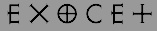 [MyFonts]
[More] ⦿
[MyFonts]
[More] ⦿
|
Jordi Fosch
|
Tarragona-based Catalan designer of the typewriter font called Let32,2, and of the comic book font Love Gun. He also made Escher Desigual and FoschWords 1. In 2000, he created the poster stencil typeface called Cartolina (2000). In 2001, he designed the grunge typeface Surface (Garcia Fonts), the Kafkaesque all-caps typeface Jroña (Garcia Fonts) and the all-caps kids typeface Funny (Garcia Fonts). [Google]
[More] ⦿
|
Jose Erre
|
Valencia, Spain-based designer of the multiline typeface Impossible 3D Letters (2019). [Google]
[More] ⦿
|
Josip Kelava
|
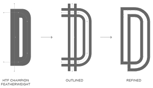 Josip Kelava (Jay Kreative, Australia and UK) is an art director and graphic designer. He has done typographic work for fashion mags and fashion-conscious ads such as for Mercedes (2011), Coco Vodka (2011, using an Escheresque typeface), and Click Magazine (2011, see the Olena Cherneyo illustration). Creator of the alchemic yet futuristic family Geomas (2011).
 Typefaces made in 2012: Metropolis (a superb bilined retro type family, ideal for posters---free download). Behance link. Hellofont link. [Google]
[More] ⦿
|
Julien Fesquet
[Faak and Paat Studio]
|
[More] ⦿
|
Kaiwa
[Kamil Iwaszczyszyn]
|
Graphic designer in Luxembourg who created the 3d typeface Hexagonetica (2013) and the oriental simulation font Tokyo (2013, or Typonetica). In 2014, he designed the simple yet elegant (free) sans typeface Simplifica. [Google]
[More] ⦿
|
Kamil Iwaszczyszyn
[Kaiwa]
|
[More] ⦿
|
Kenny Amaro
|
Caracas, Venezuela-based designer of Impossible Font (2015). [Google]
[More] ⦿
|
Laurence Dorrington
|
UK-based designer. Creator of Maurits (2012), a typeface named after Maurits Escher. [Google]
[More] ⦿
|
Laurent Lacroix
|
Belgian graphic designer from Huy. Some of his posters, such as Typographisme Escher and Al Capone, are typographically interesting. Behance link. [Google]
[More] ⦿
|
Lisaveta Shcheglova
|
Motion designer in Moscow who created the Cyrillic poster typeface CrossType (2015) and the Cyrillic 3d escher-like typeface NevozmozhnyjShrift (2015). [Google]
[More] ⦿
|
Luke Klenske
|
Graphic Design student at Iowa State University who lives in Davenport, IA. Creator of the 3d trompe-l'oeuil typeface Paradox (2011). [Google]
[More] ⦿
|
Magdalena Radu
|
Graduate of the Design Department of the National University of Art in Bucharest, Romania. Creator of the Escher-inspired gridded Impossible Letters (2010). [Google]
[More] ⦿
|
Marcos Mazzei
|
Brazilian illustrator who drew Type Distortion Love (2012), a 3d Escheresque alphabet. [Google]
[More] ⦿
|
Marcos Vinicius Machado de Oliveira
|
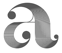 Aka Marcos Oliveira. Porto Alegre, Brazil-based designer of a prismatic decorative set of initials in 2017, with some impossible Escher-style glyphs thrown in. [Google]
[More] ⦿
Aka Marcos Oliveira. Porto Alegre, Brazil-based designer of a prismatic decorative set of initials in 2017, with some impossible Escher-style glyphs thrown in. [Google]
[More] ⦿
|
Maria Camila Valencia
|
Graphic designer in Medellin, Colombia, who created the 3d Impossible Type (2015) for a school project. [Google]
[More] ⦿
|
Martin Liljesand
|
Designer in Stockholm who created an Escher-style "impossible" alphabet in 2013. Behance link. [Google]
[More] ⦿
|
Martzi Hegedüs
[Sansless Xyz]
|
[More] ⦿
|
Matt Bortz
|
New York City-based designer of the Escher style illusion typeface Prism (2016). Behance link. [Google]
[More] ⦿
|
Maurits Cornelis Escher
|
 Aka Mauk Escher. Famous Dutch artist M.C. Escher (1898-1972) is known for his repeating patterns of interlocking motifs, tessellations of the Euclidean and the hyperbolic plane and his drawing representing impossible figures, such as his waterfall and his Belvedere. Several type designers created fonts based on these geometric contradictions and curiosities, which a I gathered on this page. The art deco lettering on some of his posters inspired P22 Escher (1998, Denis Kegler). Pic. Wiki page. [Google]
[MyFonts]
[More] ⦿
Aka Mauk Escher. Famous Dutch artist M.C. Escher (1898-1972) is known for his repeating patterns of interlocking motifs, tessellations of the Euclidean and the hyperbolic plane and his drawing representing impossible figures, such as his waterfall and his Belvedere. Several type designers created fonts based on these geometric contradictions and curiosities, which a I gathered on this page. The art deco lettering on some of his posters inspired P22 Escher (1998, Denis Kegler). Pic. Wiki page. [Google]
[MyFonts]
[More] ⦿
|
Mike Wolf
|
 Born in 1960, this German or American designed several 3d typefaces such as Twister (2006, Escher trompe-l'oeuil face), Aragon (2010), Ribbon (2006), Greek To Me (2011, Greek simulation face), Inner City (2011, an Escheresque face), A Ripping Yarn (2011, texture face), Helixx (2006), Strip Joint (2011), Wicker Man (2011), and Atomic Picnic (2006). Other typefaces include Tapestry (2011), Stonehenge (2011, textured), Tape Deck (2011), Bad Escher (2011), Swirl (2011, labyrinthine), and Grounf (sic) Round (2011). [Google]
[More] ⦿
Born in 1960, this German or American designed several 3d typefaces such as Twister (2006, Escher trompe-l'oeuil face), Aragon (2010), Ribbon (2006), Greek To Me (2011, Greek simulation face), Inner City (2011, an Escheresque face), A Ripping Yarn (2011, texture face), Helixx (2006), Strip Joint (2011), Wicker Man (2011), and Atomic Picnic (2006). Other typefaces include Tapestry (2011), Stonehenge (2011, textured), Tape Deck (2011), Bad Escher (2011), Swirl (2011, labyrinthine), and Grounf (sic) Round (2011). [Google]
[More] ⦿
|
Mikolaj Grabowski
[Font Bud]
|
[MyFonts]
[More] ⦿
|
MMC typengine (was: MMC Typodrome)
[André Themoteo Alves Correa]
|
 André Themoteo Alves Correa (b. 1986, Rio de Janeiro) is a Brazilian type designer who founded MMC Typodrome in 2013 in Rio de Janeiro. Aka Andréground-MMC, he is, in his own words, a sacred geometer, optical illusionist, enthusiast of Gestalt phenomena, artist, designer, typographer, calligrapher, graffiti writer, beginning engraver and aspiring sculptor. MMC was originally a clan of graffiti artists.
 In 2021, he replaced MMC Typodrome by MMC-TypEngine, and reminds us that MMC stands for Multimedia Mastering Creative-Types. Earlier acronyms included Macacos me Mordam and Many Meanings Challenge. His first typeface was the Escher-inspired Penrose Geometric (2013, extended to 22 styles in 2021). In 2015, he published Technical Signature (18 styles: labyrinthine) and Technical Scripture (18 styles). In the labyrinthine genre, this family is close to perfection. In 2020, he released the 22-style MMC Grafik and in 2021 the related MMC Insignia (32 styles). [Google]
[MyFonts]
[More] ⦿
|
Moritz Welker
|
Munich-based designer of the Escher-style 3d typeface Ethoth (2013). Behance link. [Google]
[More] ⦿
|
MyFonts: Optical illusion typefaces
|
Optical illusion typefaces are often 3d typefaces with some Escher-like effects that seem impossible. [Google]
[More] ⦿
|
Mystical Type
[Candi Erwanto]
|
 Called Candi Erwanto or Nemo Erwanto. Indramayu, Indonesia-based designer, b. 1992, of these handcrafted typefaces in 2018: Beranak, Gloucester Brush, Clarisca (font duo), Islant, Hilya, Guards Spirit (brush). Candi also designed the slab serif Space Rock (2018).
 Typefaces from 2019: Nata (a super condensed all caps sans family), Yoda (a super-compressed sans family), Freya (a condensed sans), Reeford (a 3d Escher-style typeface), Khalisa, Athaar (an inline sports font), Alardo (a spurred straight-edged typeface for sports branding), Westie (sans), Heulwen, Ashaal (brush), Delvin (brush), The Moon Falls (Treefrog script), Khaina (script), Leander (a Peignotian all caps typeface), Ghea Adasta (a heavy signage script). Typefaces from 2020: Aristeo (a condensed sports font family, with some Escher trompe-l'oeil styles), Rolf (an extra-condensed tall x-height sans, perhaps for movie credits). Typefaces from 2021: Slavia Carolina (a very heavy decorative serif), Safford (octagonal, in 18 styles), MT Crisiant (an 18-style tall condensed (movie credit) typeface). [Google]
[MyFonts]
[More] ⦿
|
Nathalie Eiswitt
[Dick Pape]
|
 Nathalie Eiswitt inspired Dick Pape to create the Escher-like impossible typeface iloseon in 2010.
 Download here. [Google]
[More] ⦿
|
Nedo Mion Ferrario
|
 Designer and artist, b. Milan, 1926, d. Caracas, 2001. From MyFonts: Several Venezuelan generations had acquired very strong design, typographic and drawing knowledge due to the historical and artistic heritage left by Master Nedo Mion Ferrario. He spent big part of his life teaching and working on design. His passion for impossible figures and geometric optic illusions were the most valuable characteristics of his work. Most of his knowledge was obtained from his father, Emilio Mion Vianello, who dedicated his life to wood carve, a high profile job those day in Italy. Emilio studied in the Brera Academy in Milan and Nedo studied in the Commercial and Technical Institute of Milan between 1936 and 1940, and then in the Fine Arts Academy in the same city. At the end of the Second Word War, both of them decided to leave Italy due to the political situation in those days. Encouraged by the immigration Venezuelan politics they arrived in Caracas in 1950. Wiki.
 His work inspired Carlos Camargo Guerrero to create the Escheresque font Denedo (2001-2007). According to Camargo, Denedo is a font based in one of the impossible alphabets created by the Italian graphic designer Nedo Mion Ferrario during the 60's and 70's in Caracas, Venezuela, South America. Michael Parson designed the prismatic typeface Nedo in 2013 based on Ferrario's work. Klingspor link. [Google]
[MyFonts]
[More] ⦿
|
Nuno Correia
|
Ponte de Lima, Portugal-based designer of the numerical Escher-style 3d typeface family Treze (2016). [Google]
[More] ⦿
|
Onezero
|
Taunton, UK-based designer of the free experimental typeface Silhougeo (2016). In 2017, Onezero designer the optical illusion font Illumo. [Google]
[More] ⦿
|
Op art
|
 Op art, or optical art, is a style of visual art that makes use of optical illusions. John Lancaster defines it as follows in 1973: Optical art is a method of painting concerning the interaction between illusion and picture plane, between understanding and seeing. But Op art works are not restricted to paintings. Most are abstract, with many of the better known pieces made in only black and white. The pieces offer optical illusions, an impression of movement or vibration, or a vision of something warped or impossible. Important names are Victor Vasarely, Josef Albers (Bauhaus), Richard Anuszkiewicz, and Bridget Riley.
 In type design, the op-art style refers to patterned or strangely prismatic typefaces. Checkered patterns are prevalent (as in many of Manfred Klein's typefaces), but also trompe l'oeil creations in the spirit of M.C. Escher could fit in. [Google]
[More] ⦿
|
Ovidiu Cristea
|
Bucharest, Romania-based designer of the display typefaces Illusion Fence (2014, an Escher-like experiment) and Arhaicul Modern (2014). [Google]
[More] ⦿
|
P22 Type Foundry
[Richard Kegler]
|
Richard Kegler's fun Buffalo-based foundry, which he founded in 1995 together with his wife, Carima El-Behairy. Currently, on staff, we find type designers James Grieshaber and Christina Torre. In 2004, it acquired Lanston Type. P22 has some great unusual, often artsy, fonts. In 2021, P22 jopined The Type Founders as a distribution outlet. The fonts are: Industrial Design (an industrial look font based on letters drawn by Joseph Sinel in the 1920s---this font is free!), LTC Jefferson Gothic Obliquie (2005, free), Sinel (free), P22Snowflakes (free in 2003 and P22 Snowflakes (retail) in 2020, finishedd by Richard Kegler and Terry Wüdenbachs), Acropolis Now (1995, a Greek simulation typeface done with Michael Want), P22 Albers (1995; based on alphabets of Josef Albers made between 1920 and 1933 in the Bauhaus mold), Arts and Crafts (based on lettering of Dard Hunter, early 1900s, as it appeared in Roycroft books), Ambient, Aries (2004, based on Goudy's Aries), Arts and Crafts ornaments, Atomica, Bagaglio (Flat, 3D; in the style of Il Futurismo), P22 Basel Roman (2020, Richard Kegler: an update of a 2015 typeface, P22 Basel, based on a garalde font used by Johannes Herbst (aka Ioannes Oporinus) in 1543 to publish Andreas Vesalius' On the Fabric of the Human Body (De humani corporis fabrica) in Basel), Bauhaus (Bauhaus fonts based on the lettering of Herbert Bayer), Bifur (2004, Richard Kegler, after the 1929 original by Cassandre), Blackout, P22 Brass Script Pro (2009, Richard Kegler; based on an incomplete script fond in a booklet from Dornemann&Co. of Magdeburg Germany, ca. 1910 entitled Messingschriften für Handvergoldung; for years, P22 and MyFonts claimed that Michael Clark co-designed this, but Michael does not want any credit, as he did only about 20 letters), Cage (based on handwriting and sketches of the American experimental composer John Cage), P22 Casual Script (2011, Richard Kegler, a digitization of letters by sign painter B. Boley, shown in Sign of the Times Magazine), Cezanne (Paul Cezanne's handwriting, and some imagery; made for the Philadelphia Museum of Art), Child's Play, Child's Play Animals, Child's Play Blocks, Constructivist (Soviet style lettering emulating the work of Rodchenko and Popova), Constructivist extras, Czech Modernist (based on the design work of Czech artist Vojtech Preissig in the 20s and 30s), Daddy-o (Daddy-o Beatsville was done in 1998 with Peter Reiling), Daddy-o junkie, Da Vinci, Destijl (1995, after the Dutch DeStijl movement, 1917-1931, with Piet Mondrian inspired dingbats; weights include Extras, P22 Monet Impressionist (1999), Regular and Tall), Dinosaur, Eaglefeather, Escher (based on the lettering and artwork of M.C. Escher), P22 FLW Exhibition, P22 FLW Terracotta, Folk Art (based on the work of German settlers in Pennsylvania), Il futurismo (after Italian Futurism, 1908-1943), Woodtype (two Tuscan fonts and two dingbats, 2004), P22 Woodcut (1996, Richard Kegler: based on the lettering carved out in wood by German expressionists such as Heckel and Kirchner), Garamouche (2004, +P22 Garamouche Ornaments; all co-designed with James Grieshaber), GD&T, Hieroglyphic, P22 Infestia (1995), Insectile, Kane, Kells (1996, a totally Celtic family, based on the Book of Kells, 9th century; the P22 Kells Round was designed with David Setlik), Koch Signs (astrological, Christian, medieval and runic iconography from Rudolf Koch's The Book of Signs), P22 Koch Nueland (2000), Larkin (2005, Richard Kegler, 1900-style semi-blackletter), London Underground (Edward Johnston's 1916 typeface, produced in an exclusive arrangement with the London Transport Museum; digitized by Kegler in 1997, and extended to 21 styles in 2007 by Paul D. Hunt as P22 Underground Pro, which includes Cyrillic and Greek and hairline weights), Pan-Am, Parrish, Platten (Richard Kegler; revised in 2008 by Colin Kahn as P22 Platten Neu; based on lettering found in German fountain pen practice books from the 1920s), P22 Preissig (and P22 Preissig Calligraphic, 2019), Prehistoric Pals, Petroglyphs, Rodin / Michelangelo, Stanyan Eros (2003, Richard Kegler), Stanyan Autumn (2004, based on a casual hand lettering text created by Anthony Goldschmidt for the deluxe 1969 edition of the book "...and autumn came" by Rod McKuen; typeface by Richard Kegler), Vienna, Vienna Round, Vincent (based on the work of Vincent Van Gogh), Way out West. Now also Art Nouveau Bistro, Art Nouveau Cafe and the beautiful ornamental font Art Nouveau Extras (all three by Christina Torre, 2001), the handwriting family Hopper (Edward, Josephine, Sketches, based on the handwriting styles of quintessential American artist Edward Hopper and his wife, Josephine Nivison Hopper, and was produced in conjunction with the Whitney Museum of American Art), Basala (by Hajime Kawakami), Cusp (by James Grieshaber), P22 Dearest (calligraphic, by Christina Torre and Miranda Roth), Dwiggins (by Richard Kegler), Dyrynk Roman and Italic (2004, Richard Kegler, after work by Czech book artist Karel Dyrynk), Gothic Gothic (by James Grieshaber), La Danse (by Gábor Kóthay;), Mucha (by Christina Torre), Preissig Lino (by Richard Kegler), P22Typewriter (2001, Richard Kegler, a distressed typewriter font), the William Morris set (Morris Troy, Morris Golden, Morris Ornaments, based up the type used by William Morris in his Kelmscott Press; 2002), Art Deco Extras (2002, Richard Kegler, James Grieshaber and Carima El Behairy), Art Deco Display, the Benjamin Franklin revival font Franklin's Caslon (2006), Dada (2006) and the Art Nouveau font Salon (bu Christina Torre). In 2006, Kegler added Declaration, a font set consisting of a script (after the 1776 declaration of independence), a blackletter, and 56 signatures. Many of the fonts were designed or co-designed by Richard Kegler. International House of Fonts subpage. Lanston subpage (offerings as of 2005: Bodoni Bold, Deepdene, Flash, Fleurons Granjon, Fleurons Garamont, Garamont, Goudy Thirty, Jacobean Initials, Pabst, Spire). Bio and photo. In-house fonts made in 2008 include Circled Caps, the Yule family (Regular, Klein Regular, Light Flurries, Heavy, Klein heavy, Heavy Snow, Inline; all have Neuland influences). Kegler / P22 created a 25-set P22 Civilité family in 2009 based on a 1908 publication from Enshedé, the 1978 English translation by Harry Carter, and a 1926 specimen also from Enshedé. P22 Declaration (Script, Signatures, Blackletter, 2009) is based on the lettering used in the 1776 Declaration of Independence. At ATypI 2004 in Prague, Richard spoke about Vojtech Preissig. Speaker at ATypI 2010 in Dublin, where he presented Making Faces: Metal Type in the 21st Century about which he writes: This film has the dual aim of documenting the almost-lost skill of creating metal fonts and of capturing the personality and work process of the late Canadian graphic artist Jim Rimmer (1931-2010). P22 type foundry commissioned Mr. Rimmer to create a new type design (Stern) that became the first-ever simultaneous release of a digital font and hand-set metal font in 2008. At ATypI 2011 in Reykjavik, he showed Making Faces. Typefaces from 2014: LTC Archive Ornaments (Richard Kegler and Miranda Roth). Typefaces from 2020: Showcard Script (by Terry Wüdenbachs, based on an original of Beaufont at the Hamilton Wood Type Museum, custom designed by the Morgan Sign Machine Company of Chicago). Typefaces from 2021: P22 Glaser Houdini (a layerable family, after Glaser's Houdini from 1964), P22 Glaser Babyteeth. Kegler writes: In 2019, P22 Type Foundry met with Milton Glaser (1929-2020) to initiate the official digital series of typefaces designed by Glaser in the 1960s and 70s. P22 Glaser Babyteeth is the first family released in the series. Milton Glaser's inspiration for his Babyteeth typeface came from a hand painted advertisement for a tailor he saw in Mexico City. He was inspired by that E drawn as only someone unfimilar with the alphabet could have concieved. So he set about inventing a completelly ledgible alphabet consistant with this model. P22 Glaser Babyteeth was based on original drawings and phototype proofs from the Milton Glaser Studios archives. Over the years there have been many typefaces that borrowed heavily from the Glaser designs, but these are the only official Babyteeth fonts approved by Milton Glaser Studio and the Estate of Milton Glaser. The solid and open versions are designed to overlap for two-color font effects and can even be mixed and matched for multi layer chromatic treatments. In 2021, he published the 3d art deco shadow font P22 Glaser Kitchen which is based on Big Kitchen (1976). MyFonts interview. View Richard Kegler's typefaces. View the IHOF / P22 typeface library. [Google]
[MyFonts]
[More] ⦿
|
Pat Mehbrei
|
 Editorial and graphic designer in Adelaide. He is into custom typography: he made Blackletter New (2010), Thick and Thin (2009), and Neuhausstraße (2010), but my favorite is Impossible (2009), a typeface in which Escher-style improbable 3d contradictions occur. Behance link. [Google]
[More] ⦿
Editorial and graphic designer in Adelaide. He is into custom typography: he made Blackletter New (2010), Thick and Thin (2009), and Neuhausstraße (2010), but my favorite is Impossible (2009), a typeface in which Escher-style improbable 3d contradictions occur. Behance link. [Google]
[More] ⦿
|
Patricia Stocheci
|
 Oslo, Norway-based designer of the monospaced Cyrillic simulation typeface Arhaic (2015) and of Impossible Letters (2015, Escherian characters). Behance link. [Google]
[More] ⦿
Oslo, Norway-based designer of the monospaced Cyrillic simulation typeface Arhaic (2015) and of Impossible Letters (2015, Escherian characters). Behance link. [Google]
[More] ⦿
|
Paul James Lloyd
[Greater Albion Typefounders (or: GATF)]
|
 [MyFonts]
[More] ⦿
[MyFonts]
[More] ⦿
|
Pedro Azedo
|
 Graphic designer in Alcanena and/or Terres Novas, Portugal, who created the free bilined caps typeface Kanji (2015), which was inspired by kanji. He also made the free avant garde sans low-center-of-gravity display typeface family Azedo (2015).
 In 2016, he designed the free art deco typeface Tagus, the bilined and outlined Irene, the bilined titling typeface Kanji (which contains no kanji), and the free decorative Pole Numerals. In 2017, he designed the informal typeface Phan, the Escher-inspired typeface Aclo, the children's book typeface Phan, and the blackboard bold font Quira. In 2018, he published the Escher font Loophole and the soft poster typeface Gelato. [Google]
[More] ⦿
|
Pedro Lobo
[Uppertype]
|
 [More] ⦿
|
Pedro Paletta
|
Belo Horizonte, Brazil-based designer of the 3d Escher-style typeface Twisted Blocks (2014). [Google]
[More] ⦿
|
Pieter van Rosmalen
[Bold Monday]
|
 [MyFonts]
[More] ⦿
[MyFonts]
[More] ⦿
|
Produce
[Tap Vorathit Kruavanichkit]
|
 Type foundry in Bangkok, est. 2013 by Tap Vorathit Kruavanichkit, a type and graphic director based in Bangkok, who runs his own multidisciplinary design company called Farmgroup. Their first typeface, Etch (2013, Vorathit Kruavanichkit, Sumpatha Jadee) combines art deco, tattoo style and blackboard bold in a stylish display family.
 In 2014, they published Dime (a 2d and 3d family with some optical illusions, available in Solid and Lined), the monospaced family Fixed (Vorathit Kruavanichkit, Sumpatha Jadee) which comes with a stencil style. Tech (2014, Vorathit Kruavanichkit, Sumpatha Jadee) is a techno / sci-fi typeface with a circuit-inspired sub-style, Tech 7000. They took the decorative stencil style to new heights in the six-font family Punch Pro (2014: Slab, Bracketed, Wedge, Deco, Hairline and Sans; by Vorathit Kruavanichkit and Sumpatha Jadee). In 2015, Vorathit Kruavanichkit and Sumpatha Jadee co-designed the street art typeface Lam. [Google]
[MyFonts]
[More] ⦿
|
Production Type
[Jean-Baptiste Levée]
|
 Jean-Baptiste Levée is a French type designer based in Paris. He is a co-founder of the Bureau des Affaires Typographiques, and teaches typeface design at ESAD Amiens (and before that, at the Caen-Cherbourg school of Arts & Media and at the University of Corte). His latest work is mostly published at Production Type which he manages. He designs custom and retail typefaces, and has won multiuple awards for his type designs. Other designers publishing at Production Type include Yoann Minet, Sandra Carrera, Yohanna My Nguyen, Emmanuel Besse, Mathieu Réguer, Quentin Schmerber and Loic Sander. In 2020, the support team included Hugues Gentile, Dorine Sauzet, Suehli Tan and Igino Marini. Levée's typeface portfolio:
 - Vuitton Persona (2007): a family made under the supervision of Porchez for Vuitton's bags.
- Wallpaper corporate typeface (2008): Under the art direction of Meirion Pritchard and Christian Schwartz, this 2-style sans was developed for the architectural magazine Wallpaper. It is a self-confessed blend of Meta and Amplitude.
- Le Monde Courrier (2008): an extension and OpenType completion of the glyph tables of Porchez's LeMonde Courrier (2002).
- Panorama (2004-2008): an elegant full-fledged sans family from hairline to extended bold, and from Extra Condensed to Extra Extended. It can be bought at Production Type.
- Henderson Serif & Sans (2006): This is a Baskerville family conceived by J.-F. Porchez, but extended and perfected by Levée. The Sans is in the style of Arial with large x-height. The Typofonderie page does not mention Levée.
- Retiro (2007): Done with J.-F. Porchez for Madriz Magazine. This is a didone family with juicy and classy alternates. It became a retail font at Typofonderie in 2015.
- Pimkie (2006): a playful feminine display face.
- Seenk Serif and Seenk Sans: a text family done with Christophe Badani in 2005.
- Expert (2009): a unicase typeface done for magazine, ca. 2009.
- Acier BAT (2009-2010, BAT Foundry): an extensive family that builds on Cassandre's 1930 font by the same name.
- Gemeli and Gemeli Mono (by Levée, assisted by Emmanuel Besse and Hugo Marucco). This sans family can be bought at Production Type. For Gemeli Micro (2018), Gemeli's x-height was enlarged, extenders shortened, stance widened, spacing loosened, and forms simplified.
- Synthese.
- Carrefour Origin (2011). A tall thin face. This custom typeface led to the vretail typeface family Origin Super Condensed.
- Cogito Atelier Malte Martin. The sans family Cogito can be bought at Production Type.
- Telerama Dogon. This is a matchstick or campground face.
- Nathan Enfantine (2011) and Enfantine (2015). A simple upright connected (school?) script.
- RMNGP Constellation (2013) is the bespoke dot matrix typeface of Réunion des Musées Nationaux---Grand Palais for their on-site, online and printed communications.
- Vanité for Vanity Fair France (2013).
- Plinc Beaux Arts Didot (2014). A classical didone digitized from the original Photo-Lettering film matrix by Jean-Baptiste Levée for House Industries.
- Countach (2014, Production type). Described as follows by the designers and team, Superscript2, J.-B. Levée, Sandra Carrera and Irina Smirnova: Countach, the tough compact sans supercharged with brawn & brains. Developed for The Crew, a critically acclaimed auto racing video game, Countach evokes the muscular and mechanical dynamics of fast cars and urban adventure.
- Reception Semi (2014). A hybrid corporate typeface for Unibail / Rodamco.
- Renault Carname for Renault cars. This typeface won an award in the TDC Typeface Design competition in 2017.
- Fournier Orchestre de Paris (2014): Fournier ODP is the exclusive corporate typeface of Orchestre de Paris. Named after Pierre-Simon Fournier Le Jeune (1712-1768), punchcutter and typefounder. Famous for his musical founts, the Parisian Pierre-Simon Fournier is considered one of the first French moderns. The typeface borrows from the numerous alphabets produced by Fournier, retaining only the finest cuts and adding its own peculiarities: anachronical ampersand, reversed letters in reverence to poster ephemeras of the times. The Graphiques series are designed to allow for polychromic settings. The Gothic series are a nod to the residues of modernism. Faithful to the tradition of optical sizes, different designs have been assigned to different scales of use. By Jean-Baptiste Levé, who was assisted by Yoann Minet, Mathieu Réguer, Laurent Bourcellier and Roxane Gataud.
- Libé (2015). Rob Mientjes writes about this custom typeface family done for Libération: Libé is a family of a wide array of sans serif fonts and a set of stubborn typewriter fonts with a slightly sloppy underline style. The sans part of the family is a hybrid Excoffon, nineteen-seventies, tight-but-not-touching fever dream. If the spirit of Excoffon is alive, it has possessed Libé Sans. The Typewriter styles are a typographically successful, if unexpected, match.
- Granville (2015). A Peignotian (or modulated) sans published by Production Type.
- Minotaur (2014, with Yoann Minet). Minotaur won an award in the TDC 2015 Type Design competition.
Proto Grotesk (2014). Proto Grotesk won an award in the TDC 2015 Type Design competition. Review by André Mora, who writes: This beast is a strong sans serif with two mean weights. While others were busy breeding show dogs, Proto emerged from the love den of a couple of mutts high as hell. It ain't tame. It'll never be domesticated. Proto Slab and Proto Slab Condensed followed later. - Cobalte (2015, Production Type). A flared lapidary sans serif family.
- Courrèges (2016) for the fashion house.
- Boreal (2016). A sans family.
- Columbia Sans and Columbia Sans Display (2016, Jean-Baptiste Levée). Initially intended as a sans version of Times New Roman, Levée's explorations take him far afield through his flirtation with reverse stress and his back-rotated small o. He writes: Columbia is an unorthodox blend of multiple historical models. It excavates the so-called Elzevir style, an example of permeability between French and Dutch flavours. The type's restrained nature eschews caricature, giving paragraphs a clean texture while retaining the classical touch expected from late Renaissance typefaces. Initially commissioned by science magazine Sciences & Avenir, Columbia strikes a balance between rigorous topics and an approachable, informal tone.
- ARC (2016). A custom multiline typeface for the City of Paris (L'Arc de l'Innovation).
- Spectral (2017). A 7-style sharp-edged book face by Jean-Baptiste Levée related to Mrs. Eaves, and freely available at Google Fonts. Levée describes the influence of the French Elzevir on Spectral. The type experts opine that the spacing is too loose.
- Alpine (2017). A custom sans family for the new Alpine Vision automobile.
- Antique Gothic (2017). A condensed vintage sans with extreme x-height, designed by Jean-Baptiste Levée, with the help of Emmanuel Besse, Yoann Minet, Quentin Schmerber, Hugues Gentile, Pauline Fourest, and Kristina Jandova.
- Cardinal Classic and Cardinal Fruit (2018). A large transitional typeface family by Jean-Baptiste Levée, Yoann Minet and Quentin Schmerber. The tightly set and high impact photojournalism typeface family Cardinal Photo was added in 2020.
- Media Sans (2018). A typeface family with tight spacing and some extra condensed styles to be used in headlines and on posters. It was influenced by Frutiger's Antique Presse (at Deberny & Peignot) and some European typefaces of the 1960s and 1970s, such as the tightly letterspaced Brasilia, the squarish caps of Eurostile, and the oddly contrasted Antique Olive.
- LVMH Air (2018). A knife-edged fashion typeface family custom designed for LVMH (Moet Hennessy & Louis Vuitton), a French multinational luxury goods conglomerate that specializes in snob appeal.
- Duperré Sans (2018). A custom sans by Jean-Baptiste Levée and Quentin Schmerber for École Duperré.
- Acier (2019). A bi-colored revival of Cassandre's Acier (1930, Deberny & Peignot).
- Tesseract (2019). A display typeface with edges as sharp as a bamboo-cutting machete. Stuff for James Bond movies.
Speaker at ATypI 2013 in Amsterdam and ATypI 2014 in Barcelona. Speaker at ATypI 2016 in Warsaw. Behance link. Old URL. Klingspor link. Home page of Jean-Baptiste Levée. [Google]
[More] ⦿
|
Qeanc
|
Jakarta, Indonesia-based designer (b. 1998) of the Escher-style typeface Haku (2020). [Google]
[More] ⦿
|
Quan Payne
|
Design director at Frost Design in Sydney and South Africa since 2007. Global Brand Design and Art Director for the London 2012 Olympic Games for Nike. Designer of quite a few (unnamed) typefaces in 2009-2012. These include several modular or experimental designs, a 3D typeface for Mr. Muz in Tasmania, an Escheresque typeface, a prismatic typeface, a didonbe typeface, and an op-art experimental typeface. [Google]
[More] ⦿
|
Rafa Goicoechea
|
 Barcelona-based designer of the alchemic typeface Mana Sans (2011). He writes: A commissioned display font I designed for the Mexican band Maná in late 2011. It was finally used for one of their songs on the new album, as part of the visuals for their live shows on the last tour around South America and USA. Available from Ultra Types.
 Other fonts by him from 2012 include Geoda (a geometrically designed font), Modula Mono (a monospaced bold organic caps set, available from Ten Dollar Fonts), Mana (alchemic), and Marina (this three-style text family is his final project for the Masters in Advanced Typography at EINA). In 2013, he designed the 900-glyph geometric display sans typeface Sifonn Pro (Ultra Types), which is loaded with interlocking pairs. There is a basic tweetware version. In 2015, he published Yorokobu Isometric for the Yorokobu cover---it is a 3d Escher-style typographic piece. In that year, he also made a set of travel / wayfinding icons called Trippeo, the circle-based Rotula Display. Typefaces from 2016: 36Dot (colorful 3d caps set), Bosanova (prismatic titling typeface). Behance link. Home page. Utratypes link. [Google]
[More] ⦿
|
Raksa Yin
|
Washington, DC-based designer of M.C. Escher Type (2015). [Google]
[More] ⦿
|
Ramiro Lozada
|
Designer in Villa Allende, Argentina. Creator of the 3d trompe-l'oeuil typeface Möbius (2010). Behance link. [Google]
[More] ⦿
|
Regan Fred Johnson
|
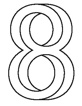 A graphic designer from American Fork, UT, now based in Portland, OR. Creator in 2008 of an Escher-inspired optical illusion font called Implausible. This typeface won an award at the Communication Arts Annual in 2011. Discussion by the Typophiles.
 In 2018, he designed Lifted at Future Fonts. [Google]
[More] ⦿
|
Richard Kegler
[P22 Type Foundry]
|
 [MyFonts]
[More] ⦿
[MyFonts]
[More] ⦿
|
RM&CO (or: Rossi Mazzei)
|
Studio in Balerna, Switzerland. Designers of the custom Eascher-style impossible typeface Utopia / Utopie [never mind that Utopia already exists as a name of an Adobe typeface] as part of an overall graphic system and identity for Eventi Letterari---a festival of Literary Events in Monte Verità in Ticino. Behance link. [Google]
[More] ⦿
|
Robin Gillet
|
 Parisian graphic designer who created a bicolored circle-based typeface called Graphic Stroke (2014), Something In The Way (2015, a rounded monoline stencil font), Impossible Font (2015, inspired by Escher), and Pattern Font (2015). Behance link. Another Behance link. [Google]
[More] ⦿
Parisian graphic designer who created a bicolored circle-based typeface called Graphic Stroke (2014), Something In The Way (2015, a rounded monoline stencil font), Impossible Font (2015, inspired by Escher), and Pattern Font (2015). Behance link. Another Behance link. [Google]
[More] ⦿
|
Rohan Rai
|
As a student iat University for the Creative Arts (UCA), Farnham, UK, Folkestone, UK-based Rohan Rai designer the 3d illusion typeface Genso (2015). [Google]
[More] ⦿
|
Ron Ruedisueli
[Sed4 Type Foundry (or: Sed4tives)]
|
 [More] ⦿
|
Sansless Xyz
[Martzi Hegedüs]
|
 Martzi (or Marton) Hegedüs (Budapest) created the gridded trompe l'oeil typeface Frustro (2012), which is based on the optical illusion created by the Penrose triangle. In 2014, it evolved into a 6-style mulilayer font. Frustro can be bought at Gestalten.
 Typefaces from 2018: Bardi Sans (a custom type family for administrative purposes commissioned by leading Hungarian auto parts dealer Bardi), Kozma (based on the hand letterings of early 20th century Hungarian architect and graphic artist Lajos Kozma, with new fat didone style lowwer case characters). [Google]
[More] ⦿
|
Sasha Zakrevska
|
Lodz, Poland-based designer of FT (2014), Geometry (2014), Abc (2014, hipster font), Ukrainian Alphabet (2014), Medicine Icons (2014), and Imopossible Figures (2014, Escher-style dingbats). Behance link. [Google]
[More] ⦿
|
Sed4 Type Foundry (or: Sed4tives)
[Ron Ruedisueli]
|
 Dutch professional music producer and audio engineer who founded his own record label. He also makes (mostly free) fonts. His work:
 - A FontStruct series called STF Letters op Maat, which attempts to recreate all alphabets designed by Dutch Bauhaus designer Jurriaan Schrofer (1926-1990). That list: STF Cutout 1985 (+Solid), STF JS Bevel (+Fill), STF Grafisch, STF Etage Aanduiding (17x17-Inline 1, 17x17-Inline 2, 17x17-Medium Fill, 17x17-Multiline, 17x17-Full Fill, 5x5 Matrix, Hi-res) [op-art, prismatic], STF Gemeentereiniging, STF Berlage (after the letters Schrofer originally designed for The "Beurs Van Berlage", a commodity market building located in the centre of Amsterdam. Later it was also digitalized and used to for the Dutch passport), STF Elevated (3d shadow typeface), STF Semiotica (Incised Outline, Incised, Book, Regular, Title), STF Sater, STF Sans Severe (Light, Heavy, Outlined, Multilines), STF Sans Rounded, STF Avant-Garde i10, STF Schrofer Modular Blocks, STF Social Human Trends (Outlined, Solid, Fill Isolated, Outined Isolated), STF Girokantoor, STF Marx (Solid, Striped), STF Squared Sans, STF Onleesbaar Alfabet (Stroke, Solid, Outlined), STF Bols Jaarverslag, STF Bredero (for the Bredero Bouwbedrijf), STF A.S.C. Communications, STF Connaissance et Langage, STF Paspoort, STF Last Warning (v1), STF Connected Squares (+Fill, +v2 Headline, +v2 Fill, +v2 Outline).
- Other FontStruct typefaces, now over 180 in all, made in 2017-2018. Included are STF Down Vote, STF Slab Inn (a Western font), STF Polygon Window (hexagonal), STF Kalender (based on a 1976 calendar with octagonal letters by Wim Crouwel), STF See You in 2019 (a tiled font), STF Uni (a varsity font), STF Geo Gothique, STF Tegel (a kitchen tile font), STF Don't Count on Me, STF Hyster (a modernist stencil), STF Der Zyklus, STF Scriptorium (blackletter), STF Paradox, STF Sutoraipu Origami Multiline, STF Sutoraipu Origami Filled Stencil, STF Futureline, STF Frescher (Escher-inspired), STF Whiskey-A-Go Go, STF Labrat (op-art, prismatic), STF Tranziztor, STF Otto Font Schirach (mosaic lettering), STF BFG (condensed piano key style), STF Ace of Maze, STF Amsterdam School, STF Neon Flux, STF Wendingen 1922 (based on a old brochure by Wendingen for the Internationale Theater Tentoonstelling Amsterdam 1922; letters designed by Hendricus Theodorus Wijdeveld (1885-1987)), STF Van Nelle (based on an early 1900's poster ad for Van Nelle coffee), STF Purple Maze, STF Militia Stencil, STF Idiocracy (stencil), STF Rode Draad, STF Praesens (based on the lettering found in the second issue of Polish avant garde architectural magazine Praesens), STF Fabricon (a De Stijl stencil; +Outline, +CrossSection), STF Defrag, STF Trilineae, STF Bolsjewie (constructivist), STF Kraftwerk (a tiled typeface; after a 2015 poster by Chuck Sperry for Kraftwerk), STF De Stijl, STF Portfolio Peeters (a tribute to Belgian modernist artist Jozef Peeters (Antwerp, 1895-1960), based on the folder art for his 1921 linocut portofolio), STF Sector 7 (military stencil).
- Pax Romana. Based on the capitalis monumentalis seen at the base of Trajan's Column.
- STF Espionaje. Inspired by the lettering found on a vintage sheet music cover art for "La Java bousculée" (1924).
- STF Oudvreugde's Ontwaken. Based on the Dutch deco lettering of Dutch graphic designer Frederika Sophia (Fré) Cohen (1903-1943). The letters were taken from a book cover design for the "Arbeiders-jeugdcentrale Amsterdam" which was published in 1924.
- Typefaces from 2019: STF Blauhaus (Bauhaus-inspired), STF Type O Negative, STF Bodidone, STF Textualis Batavicum (blackletter), STF Alhambra Blvd, STF Type O Negative, STF Ein Berliner, STF Geo Grotesque (in the style of TT Norms and LL Circular), STF Innercity (art deco), STF Photonia (futuristic), STF Square Grylls, STF Mizollen (labyrinthine), STF Mr Bob Doubalina, STF Plateau Disco (groovy), STF Uncialis Modularis (uncial).
- Typefaces from 2020: STF Schlanke Schöne, STF Care Sensitive.
FontStruct link. [Google]
[More] ⦿
|
Seir Falcone
|
Graphic designer in Milan who created the Escher-style typeface family Illuso (2015). There is a free demo. [Google]
[More] ⦿
|
Serge Hollander
|
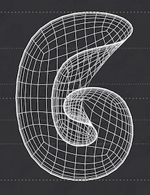 Interior design architect who is based in Nabuntaran, The Philippines. In 2018, he designed the free experimental 3d geometric grid typefaces Geometrica and Geometrica Bold, and the trompe-l'oeil typeface Trans Font. [Google]
[More] ⦿
Interior design architect who is based in Nabuntaran, The Philippines. In 2018, he designed the free experimental 3d geometric grid typefaces Geometrica and Geometrica Bold, and the trompe-l'oeil typeface Trans Font. [Google]
[More] ⦿
|
Simon Flores
|
Caracas, Venezuela-based designer of the Escher-style impossible typeface Adynata (2016). [Google]
[More] ⦿
|
Siomeng Chan
|
 During an internship at Safari Inc in Osaka, Japan, Siomeng Chan (Macau, Macao) created Ilusion Font (2015), a 3d Escher-style typeface. Among his many notable contributions to design, the hilarious Hi Serifs poster stands out. [Google]
[More] ⦿
During an internship at Safari Inc in Osaka, Japan, Siomeng Chan (Macau, Macao) created Ilusion Font (2015), a 3d Escher-style typeface. Among his many notable contributions to design, the hilarious Hi Serifs poster stands out. [Google]
[More] ⦿
|
Sol Lee
|
St. Louis, MO-based designer of the Escher font Optical Illusion (2017). [Google]
[More] ⦿
|
Stefano Ferraro
|
In 2014, Stefano Ferraro and co-student Tommaso Vecchi co-designed the Escher or Penrose-style impossible typeface family Believe. Stefano is based in Bassano del Grappa, Italy. [Google]
[More] ⦿
|
String Labs Creative Studio
[Virgiawan Listanto]
|
Serang, Indonesia-based designer (b. 1993) of handcrafted and script typefaces: Weatpoint (2019), Oaklash (2019), Marelan (2019), Blackway Brush (2019: a dry rough brush), Wreckout (2019: a wooden plank typeface), Charlotte (2019), Hallywood (2019: monoline), Hollywise (2019), Williamson (2019), Hillbear (2019), Northgate (2019), Geovanice (2019), Caramelia (2019), Gabrielle (2019), Karltown (2019), Andovine (2019: brush style), Calledliner (2019: monoline), Russeline (brush script), Blood Bold (2019: a dripping blood Halloween font), Mayestica (2019: font duo), Chellyne (2019: a clean brush script), Flavellya (2019), Southiya (2019), Gotten (2019). Typefaces from 2020: Aerillyo, After Breaking, Agenda King, Agies Fresh (a signage script), Aginoe Sans (a geometric sans), Agise Rujdi (blackletter), Aisbum Slashey, Ajuslly, Allise (a signature script), Alvens, Amazing Kids (a cartoon font), Amellis Path, Amelliz, Anasite Malela, Andy Tusvah, Angel Rhapsody (blackletter), Angelicy, Angeliny, Angelwine, Angel Wish, Angika Jaya, Anhattan (a fat script), Anjelica, Ansagia Metta, Anttariksa, Anythings, Aquilla, Arionna, Austhind, Avenus Type, Awely Shiny, Azingdar, Baby World, Bagus Stanlley, Bahisey, Balhgi Rizetons, Baliung, Ballerina, Banyu Langits, Baster Monky, Basuhed, Beautiful Vibes, Beauty Heart, Belinday, Bellamy Signature, Bethan White, Betty Finty, Binttang Selfianto, Black Ink (a dripping paint font), Black Rose, Brightly Crush, Brightside, Brittany Angella, Brogads, Bulgaria, Butterfly, Calvin Fallen, Cameliya, Candy Qelling, Candy Yefumy, Carmelia, Catthy Wellingten, Chalkboard, Chaybree, Chellyne, Chivel Mind (spurred), Cinthya Einzberg, Comic Boys, Comic Dylans, Daisuky Fancy, Dark Phoenix, Dattge Hurty (a monoline script), Dianora, Dilan Whemsy, Dirly Belly, Dulan Anzelica, Emixvade, Fatin Gengky, Fendysa, Feri Candi, Firsta (dry brush), Fortunate, Frangklin, Freedam Theory (a retro signage script), Funcy Kids, Fun Games, Geng Rimba, Girdens, Gweneth (supermarket script), Haredang, Hey Kidos, Hey Sweety, Holland Gateway, Honuzima (brush script), Hunthers Dwayne, Hysteria (dry brush), I Am Cool, Ingkar Janji, Islamic Romance (Arabic emulation), Jacmax (a horror font), Jacyking (a curly script), Jangkids, Janji Cinta, Janyss Brush, Jarida, Jasmine Daily, Jelly Belty, Jerhiyof, Jodaguz, Justhin, Kangtoni, Karltown, Kinder Boys, Lazyday, Lazy Monday, Livingstone (blackletter), Lovely-Kids, Mady Risaw, Magic Wand, Manthesy, Marelan, Marvelous Photograph, Mashiya, Mathulesy, Megahunt, Melvina Wayne, Mentari, Milky Nice, Miny Fellas, Miya Wayne, Montages (retro script), Mortal Wave, Mystic Darling, Mystique, Osake, Oyange, Pagi Senja, Pejuang-Cinta, Phoenix Squad, Playkidos, Pomthing (a dry brush script), Rachelyne, Rademos, Ratih Hyun (script), Rantliyer, Rantting Tjinta, Rathury (a curly script), Ratih Hyun, Rattnugidari, Rattu Aqilla, Rayhue, Recollect (retro script), Regalhisa, Reinstay, Renitah, Restu Bundah (a retro brush script), Revij Anovik, Rhieknuza (a cartoon or graffiti font), Rindu Alam, Roguedash, Romantika Hidup, Russel Dexter (vintage), Sabina Angellica, Sang Dewi, Sangkury, Santy-Ehisa, Sany Cimahen, Seindah Cinttya, Sellviny, Sellviny Queen, Shanta Creny, Shiny-Aisyah, Sportive (an Escher font), Stilda Script, Sugih Janji, Super Kids, Super Maizen, Taniya Relly (a signature script), The Angellica, The Anthelope, The Antique, The Austin, The Banten, The Bugatten, The Comic Struve, The Frangklin, The Gallery, The Lastring, The Saily (a monoline script), Tukiyem (a fine wild script), Twenty Senja, Vagnotie, Vezthisory, Ving Smith, Vires Gollem, Virgi Ella, Virgiluna, Vivy Aquilla, Vuttaline, Walentiny, Walytime, Weatpoint, Welingtom (bilined), Wenykidos, White Mellow, Wilson Wells (blackletter), Winsthen, Wreckout, Wynter Sandy, Zenghief. Creative Fabrica link. [Google]
[More] ⦿
|
Tad Biernot
|
Canadian designer of Linotype Rory (1997) and Linotype Dummy (1997). FontShop link. Linotype Dummy is an Escheresque optical illusion face. [Google]
[MyFonts]
[More] ⦿
|
Tap Vorathit Kruavanichkit
[Produce]
|
 [MyFonts]
[More] ⦿
[MyFonts]
[More] ⦿
|
Taylor Mulitz
|
Originally from Washington, DC, Taylor is a graphic designer and illustrator. Durinh his studies at Maryland Institute College of Art in Baltimore, MD, in 2013, he designed Penrose, an Escher-like optical illusion typeface. Folio is a display typeface from 2012. [Google]
[More] ⦿
|
Taylor Yoder
|
While studying graphic design in Baltimore, MD, Taylor Yoder designed an impossible 3d alphabet called Penrose (2013). [Google]
[More] ⦿
|
Teraoka Masatsugu
|
Designer in Fukuoka, Japan, who created the Latin op-art typeface Optical Illusion Font (2014). [Google]
[More] ⦿
|
The Real Dill
|
British illustrator who made Impossible Font (2012), an Escher-like concoction. [Google]
[More] ⦿
|
Tiago H. Ribeiro
|
Brazilian creator of the tromple l'oeil typefaces Maurits Sharp and Maurits Rounded (2012). This set was drawn during his graphic design studies at UFPEL. [Google]
[More] ⦿
|
Tibor Lantos
|
 Budapest-based creator (aka Frodo 7) in 2009 at FontStruct of FontMoot 01 (pixel face), Brego, Magor (minimalist, De Stijl typeface), Andromeda Strain, Elrond (Tengwar font), Oil Stencil, Optill 2A and 2B and 3A and 3B (optical illusion fonts), Rivendell (Celtic weaving), Cubeology (patterned cubes), The Two Towers, Mike Wazowski (emoticon face), Edoras Stencil, Elessar, Earendil, LE Meta (dot matrix), Coccinella (dot matrix), +Two, +TwoB, Picosec, Picosec Rounded (ultra fat retro), Palindrome, Valimar, Fundin Eco, Fundin Regular, Lost Entropy (series of rectangular fonts), Bombs and Men (2009, modular and blocky), Eärendil, Chromosomes, Denethor-Sans (octagonal), Edoras-, Elspeth-, Elspeth-Grey, FontMoot-01 (pixel face), French-Defence-v2 (chess font), French-Defence (chess font), Gilgalad-v2, Gilgalad (octagonal), Hommage-a-Escher-LC1, Hommage-a-Escher-LC2, Legolas-Codex-Stencil, Legolas-Codex (blackletter family), Legolas-Stencil (+v2; art nouveau style), Mirkwood-Regular and Mirkwood Outline (pixel typefaces), Nimrodel-FS, Faramir (gridded), Faramir Black (octagonal, mechanical), Elessar, Vertebrae, Etudes Pour Noir et Blanc (01, 02, 02 Vertebrae), Eomer FS, Karyotype (horizontal stripes), Snooker Ball, Aragorn, Mirkwood Nano (pixel face), Mirkwood Second Iteration, Mirkwood First Iteration, Haldir (pixel face).
 Creations in 2010: Hasta Siempre (military stencil), Hasta Siempre Supplement (Fontstruct rendering of the iconic photograph of Che Guevara by Alberto Korda), Belfalas, Fractal Font, Sierpinski White, Sierpinski Black, Sierpinski Dalmatian, Remolino Stencil, Boikot Stencil, Legolas Pixel, Brego, Vortices (dings), Gamling, Coccinella Two (+B), Cyrillic 02, Waves, Hommage à Escher v2 extLat. Creations in 2011: Midori Dot (2011, a dotted kana face), Sierpinski Black Initials (a stunning decorative caps typeface based on Sierpinski triangles), Fontstructivism (constructivist Latin/Cyrillic face), Sierpinski White Initials, Vasarely Squares (experimental---letters based on Victor Vasarely's work), Hurin (counterless, created after Nagasaki by Tom Muller), Strider (an optical illusion 3d multilined face), Dot Dot White (texture face), Dot Dot Black (texture face), Garamond Italic SP (a pixelized version of Garamond Italic), Rohan (+NE01, +NE03: a textured lined 3d logotype family, +NE04, +NE10), Gray Scale (a very interesting texture experiment in which gray scales are "simulated" by simple font mechanisms). Fonts made in 2012: Font Neuf, Khazad (stencil font), Oktogon Stencil, Oktogon Outline, Thorin Stencil (army stencil), Deagol Stencil. Typefaces from 2013: the Voxelstorm family (3d, Escher-style), Elendil (3d face), Denethor Sans (strong mechanical sans), Mirkwood Nano (pixel face), Waves (op art). Typefaces from 2014: Wrath of Mordor (video game font), Gray Scale, Luthien Pixel (blackletter pixel), Gimli (Bevel Black, Inline Shadow, Inline, Bevel Shadow, Shadow), Zebroid, Hunor, Denethor Sans v2, Vasarely Squares (op-art), Waves (op-art), Ecthelion, Hast Siempre (octagonal stencil). FontStruct link. [Google]
[More] ⦿
|
Tim Hardie
|
Designer in Amsterdam. His motto is to be like Bruce Lee, but instead of kicking the ass of bad guys I want to kick the ass of bad design. Creator of the Escher-inspired 3d typefaces Verbinding (2017) and Onverbonden (2012). Behance link. [Google]
[More] ⦿
|
Tobias Sommer
|
 Tobias Sommer ("Shasta") is the Geneva, Switzerland-based designer (b. 1986) at FontStruct in 2008 of Great Depression (influenced by headline fonts from 1929), Brutto (headline slab serif), Lame Dude (dripping paint), Toytype (an interesting Indic simulation typeface based on an earlier block font by him called Block On), Teatral and Teatral Fill (gorgeous Western circus style decorative typefaces), Fickle Mickle, Hard Light (shadow face), Tangram, Tangram Grid, Tangram Grid Rounded (kitchen tile), and Tangram Rounded (octagonal/kitchen tile). In 2009, he added Stylita, Vasyugan, Block On, Cupra, Disparador (mechanical octagonal: +Stencil, +Filled), Exempla Slab Serif, Exempla Sans (Strict, Medium, Ultra Light, Stencil: octagonal family), Stitched Outline, Escheresk (impossible outlines), Capitalia (+Rounded), Vjatka (constructivist), Punched Out (+Fill: pixelish), Cupra.
 Additions in 2010: Punchline Filled (athletic lettering), High Voltage, Punchline (ultra heavy octagonal slab; +Filled), Nicotiana (slab serif), Exempla Slab Medium, Punched Out, Exempla Sans Medium (fat octagonal), Pixel Pandemonium, Tradita, Frostletter (blackletter), Scrambled Script (blackletter), Circle Cult (circle-themed sans). Typefaces made in 2012: Apodosa (octagonal). Dafont link. Fontspace link. Blogspot link. Klingspor link. Abstract Fonts link. [Google]
[More] ⦿
|
Topdesign
|
Vendor of "font bundles", without identifying designers or giving credit. For example, their 2017 techno font bundle includes Digitalium, Stingo, Freeline, Impossible (Escher style), Sentagram and Fashion Font (letters in circles). [Google]
[More] ⦿
|
Typemefonts (was: 26plus zeichen)
[Jakob Runge]
|
 Jakob Runge (M&uum;nchen, Germany) graduated from Fachhochschule Würzburg-Schweinfurt and Muthesius Academy of Fine Arts and Design in Kiel. In 2014, Jakob Runge set up Typemefonts in München, Germany, to market his own typefaces. Before that, he was involved in 26plus, or 26+, a foundry located in Kiel, Germany: It is a platform to present and encourage student-created fonts. In 2015, he started TypeMates with Nils Thomsen. Currently he works in Munich as an independent type and brand designer and typographic consultant. Apart from his work for design agencies, he teaches typography and type design at university of applied sciences in Münster since 2011.
 His early typefaces include the free condensed octagonal typeface Fracmetrica (2009). Other typefaces of Runge's designed in 2009 and 2010---all at 26plus-zeichen---include Singula, Edelsans (a geometric sans), Sinews (a manly sans which he compares with Klavika and Corpid), JJ Realis (a Swiss sans), Ugl-y (2010), Cojonna (2010; curly--an exercise on ball terminals), Capitalis Nova (2010, dot matrix family), Graphit (2010), Devion (2010, semi-angular serif face), Textrusion (2010, Escher-style trompe l'oeuil), Frgmt (2010, experimental), Samblone (2011, an Asian-look stencil face), TJ Evolette A (2011, with Timo Titzmann---a fashionable geometric grotesque caps family). In 2014, Jakob Runge set up Typemefonts in München, Germany, to market his own typefaces, starting with the slab serif typeface Muriza (dedicated site), FF Franziska (2014: an offshoot of his graduation typeface), Mem (experimental geometric face), and the geometric sans FF Cera. Runge began work on FF Franziska in 2012 as part of a Masters thesis at Muthesius Academy of Fine Arts and Design in Kiel under the guidance of Albert-Jan Pool and André Heers. Hamburg-based information designers Christian Hruschka and Stefan Semrau used FF Franziska for the new Bündner Tagblatt. The modern, fresh layout won the European Newspaper Award 2013 in the category of Typography. Dedicated web site. In 2015, he created Cera PRO, Cera Stencil, Cera CY, Cera Stencil CY, Cera GR, Cera Stencil GR, Cera, and Cera Stencil Std (an extensive sans and stencil family for Latin, Greek and Cyrillic). In 2016, he added Cera Brush (in cooperation with Max Kostopoulos). In 2017, Jakob Runge teamed up with Lisa Fischbach for Cera Round Pro, an absolutely wonderful geometric rounded sans typeface family that covers Latin, Greek and Cyrillic. In 2018, Jakob added Cera Condensed + Compact Pro. Jakob Runge, with the help of Lisa Fischbach, designed Harrison Serif Pro (a slab serif) in 2017 at Typemates. In 2016, Jakob Runge and Lisa Fischbach co-designed the bespoke sans typeface family SAM Text and SAM Headline at TypeMates for the food company S:A:M. Jakob Runge finished Urby and Urby Soft. In 2018, Runge published the techno/industrial sans typeface family Sinews Sans Pro at TypeMates. In 2019, Jakob Runge, Nils Thomsen and Lisa Fischbach released Halvar and wrote: Halvar, a German engineered type system that extends to extremes. With bulky proportions and constructed forms, Halvar is a pragmatic grotesk with the raw charm of an engineer. A type system ready to explore, Halvar has 81 styles, wide to condensed, hairline to black, roman to oblique and then to superslanted, structured into three subfamilies: the wide Breitschrift, regular Mittelschrift and condensed Engschrift. Halvar Stencil, which was released simultaneously, is a German engineering stencil font family. In 2021, Mona Franz and Jakob Runge published the sans families Gratimo Grotesk, Gratimo Classic, Grato Grotesk and Grato Classic at Typemates. Consulting on Cyrillic by Ilya Ruderman and Yury Ostromentsky. They write: Grato and Gratimo are a system of typefaces joined by geometry but differing in genre and function. Grato's geometric core is shared by two designs with different terminals and different uppercase proportions to make a Grotesk and a Classic. And, for greater function and economy, both were redrawn for text and interface: Gratimo Grotesk and Gratimo Classic. [...] Grato is a family of two typefaces, modernist Grotesk and the humanist voice of the Geometric Suite Classic. A timeless typeface, it combines a pure, present voice with idiosyncrasy and luxury. Ignoring most calligraphic conventions, Grato is shaped by pure forms, low stroke modulation and square dots that contrast with almost perfect circles. Grato Classic pursues the classical proportions of early British geometric typefaces, while Grotesk inherits the industrial logic of early German ones. The result is a family of quirks and clarity, a substantial family for identity and editorial work. Grato includes a spectrum of nine weights, from fine hairlines to super heavy blacks. Runge's corporate custom typefaces include Lenbach Grotesk (2014). Klingspor link. Dafont link. Behance link for Runge. (old) link to 26pus zeichen. Jakob Runge's home page. Behance link for Typemefonts. [Google]
[MyFonts]
[More] ⦿
|
Uppertype
[Pedro Lobo]
|
 Portuguese foundry in Guimaraes and Porto, est. 2011 by Pedro Lobo, that sells Yorker (2012, a layered athletic lettering font), Borba (2012, a beautiful inline typeface), Sahara (2012, an antique shadow caps face), Akila (2012, a fashion mag didone), Public (2012, art deco marquee face), Scape (2012), Smart (2012, inline caps face), Desk (2012, shadow caps face), Kleiner (2012), Fabrica, Wannabe (octagonal), Kodhigo (slab serif), Molesk (2011, a free slab display face), Tabbaco (connected retro script) and Jono (2011, art deco).
 Typefaces from 2013: Player (a layered beveled typeface system), Porto (tweetware), Woodstik (a tall gothic wood type layered sans family that plays with texture and letterpress), Darko (alchemic, designed under the motto Uppertype goes hipster), Player (a layered type system), Bonie (organic sans). In 2015, he made the cursive school script font London Script and the vintage handcrafted Vintagefolk. Typefaces from 2016 include Roska (a free stencil type) and Twoface (an Escher-style impossible font). In 2018, he published the layered multiline stencil font family Issue, the multiline typeface The Social, and Borba Neu. [Google]
[More] ⦿
|
Vectorielle
[Catalina Mos]
|
Designer of Art Deco Impossible Font (2017), Geometric Line Font (2017), Honey Comb (2017), Rounded Corner Triangles Font (2017), Brushed Paint Font (2017) and Impossible Font (2017: Escher style). Behance link. [Google]
[More] ⦿
|
Virgiawan Listanto
[String Labs Creative Studio]
|
[More] ⦿
|
Vladimir Nikolic
|
 Belgrade, Serbia-based designer (b. 1981) of these typefaces:
 - The dingbat fonts Canavarlar (2020: funny men), Haircut (2020: women's hairdos), Ornament Borders (2020), Gourdy (2020: birds), Lizards (2020), Mantra (2020), All Star (2020), Speel (2020), Soavely (horses) (2020), Forma (2020), Hell Beasts (2020), Mistresses (2020), Paraiso (2020), Crow (2020), Traverser (2020: crosses), Cats (2020), Dogs (2020), Negative-Heads (2020), Otu (2020), Wakazi (2020), Risk (2020), Wurm (2020), Beard Man (2020), Hoder (2020), Damen (2018), Damen 2 (2020), Foliga (2020), Solo Drinker (2020), Congress (2020), Farmacy (2020), Elections (2020), Emergency (2020), VN Arrows (2020), Hexagonos (2020), Automobiles (2020), Cars (2020), Emoji Boom (2020), Bestia (2020), Aliens (2020), Insect (2020), Bytost (2020), Monstero (2020), Aveto (2020), Dancing Cat (2020), Atradimas (2020), Womanhood (2020), Figur (2020: an alien insect font), Halfwits (2020), Silly Donkey (2020), Crazy Monkey (2020), Round Masks (2020), The Quick Dog (2020), Flying Birds (2020), Maskid (2020), Monstra (2020), Bull Skulls (2020), War Items (2020), Public Transport (2020), Loomad (2020), Mokhabiso (2020: African patterns), Record (2020), Mulher (2020), Heroez (2020), Bulls (2020), Madarak (2020: birds), Bold People (2020), Munari (2019: a collection of drawings based on Bruno Munari's book "Artista e designer" from 1966), Screws (2019), White Mouse (2019), Schepselen (2019), Glatze (2019), Crosses (2019), Chefs (2019), Diamond Blocks (2019), Hexagons (2019), Maumbo (2019), Circles (2019), Enfeite (2019), Pigs (2019), Mythos (2019), Kreaturen (2019), Baby Alien (2019), Body Moving (2019), Various Boys (2019), Lines and Objects (2019), Mouvman (2019), Watch (2019), Credit Card (2019), Cycles (2019), Devil Emoji (2019), Fare (2019), Mund (2019), Labbra (2019), Circular Ornaments (2019), Cranium (2019), Ugok (2019), Ansigter (2019), Tsim (2019), Schmetterlinge (2019), Jungfrau Maria (2019: religious icons), Knights Helmets (2019), Kinderskizzen (2019), Wolves (2019), Various Cats (2019), Owls (2019), Spiral Object 3D (2019), Zodiac Signs (2019), Cyborg (2019), Duck (2019), Cat 3D (2019), Object 3D (2019), Circle and Line (2019), Various Girls (2019), Dulcet (2019), Erotic Symbols (2019), Frauen (2019), Pierre the Vampire (2019), Robotter (2019), Middle Finger (2019), Claudio The Cat (2019), Medusa (2019), Veggie (2019), Pablo (2019), Fishes (2019), Dream of Picasso (2019), Stam (2019), Animality (2019), Ink Drops (2019), Faces (2019), Bayan (2019), Froggy (2019), Senhoras (2019), Diamondo (2019), Skallen (2019: skulls), Swimmers (2019), Churches (2019), Easter Icons (2019), Lippen (2019), Gullar (2019), Bankwesen (2019), Creatures with Horns (2019), Vehicles (2019), Various Hands (2019), 3D Animals (2019), Abantu (2019), Herr (2019), Menge (2019), Funny Aliens (2019), Mustachos (2019), Kids Drawings (2019), Tierfarm (2019), Troep (2018), Women Heads (2018), Cats and Dogs (2018), Wanita (2018), Eyez (2018), Animales (2018), Peoples (2018), Mobile Icons (2018), Controllers (2018), Womano (2018), Lost in Space (2018), Blumen (2018: flowers), Tetriso (2018), Snowflake (2018), Meine (2018: masks), Horoscopicus (2018), Esoterica (2018), Astrologicus (2018, astrolical symbols), Abbild (2018: African masks), Being (2018: monsters), Gebell (2018), Headed (2018), Falter (2018), Filling (2018), Anichka (2018), Cyclopia (2018), Buggus (2018), Opa (2018), Messe (2017), Head of Idol (2018), Diavolo Nero (2017: funny silhouettes).
- The boxed or encircled alphabets Audience Capitals (2020), Galileo (2020), Compare (2020), Compare-Light (2020), Hexagonas (2020), Select (2020), Before (2020), Before-Dark (2020), Boxes (2020), Boxes-Extravagant (2020), Boxes-Fancy (2020), Calf-Negative (2020), Capital-Relationship (2020), Pyxidas (2020), Capitalica (2020), Tundra (2020), Ordinary Capitals (2020), Broadway Capitals (2020), Browser Capitals (2020), Capitalismo (2019), Schwarzenberg Capitals (2019), Retrospective Capitals (2019), Official Capitals (2020), Impression (2020), Oriental (2020), and Letters in Circles (2018).
- Shadowed caps: Cleopatra (2021), Farmers Market (2021), Erkekler (2021), Assignation (2021), Greek Tragedy (2021), Distorted (2021), Lightshow (2021), Credenza (2021), Ragusa (2021), Comunismo (2021), Scordia (2021), Gazelle (2021), Organ (2021), Strizhi (2021), Umoya (2021), Ninja Justice (2021), Unlimited (2021), Unicorns (2021), Labyrinth (2021), True Artisans (2021), Poker (2021), Donald (2021), Ferrari (2021), Booster (2021), Madness (2021), Favorita (2021), Vitamin (2021), Robot (2021), Robust (2021), Engine (2021), Whether (2021), Nucleus (2021), Trunk (2021), Ombre (2021), Viscosus (2021), Jewelry (2021), Verge (2021), Pursue (2021), Keener (2021), Visor (2021), Korvo (2021), Squash (2021), Scum (2021), Darker (2021), Education (2021), Cimice (2021), Tomb (2021), Bambola (2021), Calla (2021), Rump (2021), Complex (2021), Razor (2021), Driveller (2021), Karambol (2021), Princino (2021), Berger (2021), Adopted (2021), Bugbear (2021), Samara (2021), Talisman (2021), Waterway (2021), Megabus (2021: a marquee font), Roller (2021), Numerica (2020), Bond (2020), Gloom (2020: a marquee font), Chalkboard (2020: sketched), Unboxing (2020: techno), Antennas (2020), Secca (2020), Umfo (2020), Sabbia (2020), Squirrel (2020), Byzan (2020), Debtor (2020), Bridge (2020), Familie (2020), Lake (2020), Roma (2020), Tissue (2020), Bombay (2020), Osteology (2020), Restroom (2020), Speaker (2020), Bebika (2020), Center (2020), Gismo (2020), Fierce (2020), Gambler (2020), Afterparty (2020), Birdbrain (2020), Boner (2020), Divine (2020), Gelatin (2020), Lost (2020), Marshland (2020), Quadri (2020), Shadow (2020), Stairs (2020), Superba (2020), Techno (2020), Underman Book (2020), Wired Capitals (2020), Fineliner (2020), Fictive Kinship (2020), Exotica (2020), Ural (2020), Devianza (2020), Kultur (2020), Unmute (2020), Antiqua (2020), Chains (2020), Scheme (2020), Stumble (2020), Aroma (2020), Beans 2 (2020), Cover (2020), Cronica (2020), Fundament (2020), Horna (2020), Loce (2020), Mademoiselle (2020: art nouveau), Melodia (2020), Penny (2020), Taikun (2020), Assault (2020), Athletica (2020), Baraka (2020), Brassica (2020), Builder (2020), Chancellery (2020), Gwara (2020), Pliez (2020), Recinzione (2020), Right (2020), Rimes (2020), Seal (2020), Service (2020), Scorpions (2020), Terraces (2020: American flag font), Wedding Cabbage (2020), Wild Girl (2020), Tragedy (2020), Indos (2020), Starfish (2020), Vintage (2020), Adriatica (2020), Funeral (with American flag texture) (2020), Voleur (2020), Calzino (2020), Peshkop (2020), Metzger (2020), Asshole (2020), Puppet (2020), Broeksel (2020), Hals (2020), Escort (2020), Vortex (2020), Dades (2020), Boild Hedgehog (2020), Mermer (2020), Grower (2020), Rainbow (sketched) (2020), Baise (2020), Necklace (2020), Angels (2020), Smuggler (2020), Dommage (grungy) (2020), Squalor (2020), Fusto (2020), Course (2020), Fisheye (2020), Baiser (2020), Banda (2020), Cantaloupe (2020), Canto (2020), Begriff (2020), Trapeze (2020), Arabeska (2020), Silver (2020), Wasco (2020), Kosaken (2020), Triangle (2020), Banquet (2020), Demode Capitals (2020), Cultus Capitals (2020), Idiot Capitals (2020), Granary Capitals (2020), Liberta (2020), Montblanc (2020), Granary (2020), Blanket (2020), Tuyaux (2020), Wolf (2020), Comeback (2020), Oliba (2020), Idiot (2020), Trailer (2020), Bricks (2020), Toys (2020), Luxury (2020), Hertz (2020), Signal (2020), Serenada (2020), Kurven (2020), Schnecke (2020), Mona (2020), Sierra (2020), Search (2020), Tranchante (2020), Eccentric (2020), Fast (2020), Mosquito (2020), Speed-of-Light (2020), Thanks (2020), Album (2020), Boyhood (2020), Ending (2020), Trend (2020), Universal-Serial-Bus (2020), Fixed (2020), Kings (2020), Holiday (2020), Range (2020), Numbers (2020), Shipman (2020), Officer (2020), Video (2020), Order (2020), Route (2020), Cosa-Nostra (2020), Clowns (2020), Unique (2020), Voyeur (2020), Shape (2020), Brigadier (2020), Allora (2020), Spartacus (2020), Advisor (2020), Ambis (2020), Cables (2020), Genesa (2020), Horse (2020), Laptop (2020), Pork (2020), Mafioza (2020), Mucho (2020), Athens (2020), Audience (2020), Rotor (2020), Mundo (2020), Olympus (2020), Border (2020), Scale (2020), Survival (2020), Trouble (2020), Turnabout (2020), Catharsis (2020), Parade (2020), Discoteque (2020), Rude (2020), Fame (2020), Safran (2020), Ausweis (2020), Mechanica (2020), Moscowian-Party (2020), Beers (2020), Strengthen (2020), Tempo (2020), Unreal (2020), Poetico (2020), Bach (2020), Bach-Fat (2020), Energy (2020), Alexandra (2020), Basket (2020), Cushion (2020), Model (2020), Organiser (2020), White (2020), Anabela (2020), Cannibal (2020), Casablanca (2020), Castle (2020), Control (2020), Crazy (2020), Crazy-Gradient (2020), Emotion (2020), Honey-Bunny (2020), Knockout (2020), Linearo (2020), Murmure (2020), Polished (2020), Reon (2020), Sparrow (2020), Storms (2020), Street-Stars (2020), Franchise (2020), Pencil (2020), Ruanda (2020), Pepito (2020), Megalomania (2020), Rouleaux (2020), Frozen (2020), Together (2020), Saldo (2020), Museum (2020), Network (2020), Hunk (2020), Cultus (2020), Creator (2020), Flow (2020), Blocchi (2020), Possession (2020), Bad Germans (2020), Discounted (2020), Traversal (2020), Mangalica (2020), Murmansk (2019), Summer Candy (2019), Question (2019), Second Channel (2019), 3D Models (2019), Memory (2019), Computer (2019), Diversity (2019), Elastic Letters (2019), Businessman (2019), Kuchen (2019), Demode (2019), Objective (2019), Medication (2019), Nonsense (2019), Plagiat (2019), Toledo (2019), Tricks (2019), Common (2019: a trompe-l'oeil font), Mafia (2019), Releases (2019), Extradition (2019), Shoot To Kill (2019), Groowing (2019), Enough (2019), President (2019), Silence (2019), Dressed (2019), Already (2019), Hocus Pocus (2019), Password (2019), Ready (2018) and Messages (2017).
- The ornamental caps typefaces Mahal (2021), Stamp (2021), Hell Door (2021), Tangram (2021), Custom (2021), Remake (2021), Studio (2021), Adagio (2021), Oxidizer (2021), Mondial (2021), Paraglide (2021), Tattoo (2021), Developer (2021), Dama (2021), Lobby (2021), Gabaritos (2021), Sence (2021), Ombre (2021), Cresa (2021), Anniversary (2021), Wire (2021), Triton (2021), Lamina 92021), Hangup (2021), Years (2020), Dowry (2020), Sephora (2020), Jewels (2020), Straightforward (2020), Dance (2020), Necklace (2020), Maria (2020), Taxi2 (2020), Outlaw (2020), Combat (2020), Chewed (2020), Fantasy (2020), Observation (2020), Cure (2020), Pioneer (2020), Near (2020), Kleid (2020), Unitas (2020), Tomato (2020), Blader (2020), Canal (2020), Baked Snails (2019), Alcoholic (2019), Bonjour (2019), Zylinder (2019), Phenomenal (2019), Surfaces (2019), Success (2019: as in De Stijl), Retailer (2019: multilined), Havana (2019: multilined), Mechanismo (2019) and Pencil Letters (2019).
- The display typefaces Trader (2020), Oysters (2020), Furious Ride (2020), Portfolio (2019), Pontos (2019), Swordsman (2019), Regular (2019), Andrey (2019), Retrive (2019), Connected (2019), Locator (2018), Tracking (2018), Iceberg (2018: snow-capped letters), New Amsterdam (2018), Ana (2018), Enemy (2018), New Yorkers (2018), Happy Day at School (2018), Focused (2018), Modish (2018), Beholder (2018) and Principality (2017).
- The alphadings Birthdays and Parties (2021), Bahanalia (2020), Icecreams (2020), Brailler (2020), Night Dreams (2020), Flower Capitals (2020), Jingle Bells (2020), Neuron Capitals (2020), Easter Time (2020), Hearts and Arrows (2018), Penguins (2018), Kitties (2018), Doggy (2018), Teddy Bears (2018), International Capitals (2018), Aafia Capitals (2018), Answer Capitals (2018), Beholder Capitals (2018).
- The circuit font Simple Repairs (2021).
- The 3d typefaces Sharp (2021), Edited (2021), Three Dimensions (2020), Rental (2020), Shiny Blocks (2020), Turbulence (2020), Labor (2020), Worship (2020), Fantasy-3D (2020), Zucker (2020: stacked blocks) Perfetto (2020), Rude-3D (2020), Lover (2020), Kasten (2020), 3D Models (2019), Tricks (2019) and Metallic (2019).
- The multiline typefaces Yiphi (2021), Porker (2020), Formula (2020), Laguna (2020), Hypochondria (2020), Majestic (2020), Vibes (2020), Tubes (2020), Yogurt (2020), Turkish (2020), Question (2019), Pancake (2019), Remained (2017), Liquidrom (2018), Second Channel (2019), 3D Models (2019), However (2019), Confarreatio (2018) and Fudged (2018).
- The textured typefaces Incompetent (2021), Autumn (2021), Sangria (2021), Studio (2021), Kino (2021), Elixir (2021), Espace (2020), Mistress (2020), Heritage (2020), Silicone (2020), Hornettio (2018), Ignorant (2018), Americans (2020: the American flag embedded into the glyphs), Pollution (2020), Jakob (2019), Diversity (2019), Townscape (2019), Patriotic (2019: American flag theme), Meshes (2018), Complained (2019), Duration (2018) and its solid counterpart, Duration Book (2018).
- The Slavonic emulation typeface Russian Land (2017) and the Cyrillic emulation typefaces Monarch (2021), Cold War (2021), Beograd (2020), Ukrainian Princess (2019), Territory (2019), Kalinka (2019), Rubles (2018), Maniac (2018), Jurij (2018), Kachusha (2018), Soviet Program (2018), Armenia (2017), Fontograd (2018) and Russian Spring (2017).
- The constructivist typefaces Tokarev (2017), Russiano (2018), Suggested (2018), Hungaria (2018) and Schwachsinn (2018).
- Art deco typefaces: Cavalier (2021), Performer (2021), Angelica (2019), Protocol (2019), Retrospective (2019), Leculier (2018, after an alphabet in Georges Leculier's art deco lettering book from ca. 1930), Better (2018), Critical (2017).
- Art deco caps: Reverse (2020), Bathroom (2019), Idiotism (2019).
- The chess fonts Schach (2020) and Wisdom Chess (2020).
- The weather icon font Weather Symbols (2020).
- The decorative sans typefaces Shock (2021), Energia (2021), Pitviper (2021), Nemesis (2021), Addiction (2021), Nehad (2021), Chewer (2021), Nightfall (2021), Gourmet (2021), Flipside (2021), Layered Letters (2019), Imbecile (2019), Answer (2018), Hours (2018), Abandoned (2018), Sea Gardens (2017), Forvertz (2018), Yeysk (2018) and Closeness (2018).
- Sans: Wollicht (2021), Ministro (2021), Lonely (2021), Noix (2021), Messina (2021), Samara (2021), Rickrack (2021), Broadcaster (2021), Catamaran (2021), Official (2019).
- Comic book fonts: Reset (2021).
- Artsy fonts: Hornstick (2021), Kikundi (2021), Shanghai (2021), Skewed (2021), Company (2021), China (2020).
- The headline sans typefaces Finance (2020), Marija (2020), Fashion (2020), Magazine (2020), Policemen (2020), Impressum (2019), Educated Deers (2019), Hindenburg (2019) and Fixation (2018).
- The rounded organic sans typefaces Hofmann (2020), Adelino (2020), Available (2018) and Biysk (2018).
- The handcrafted typefaces Diana (2020), Flood In London (2019), Milord (2018), Sex and Breakfast (2018), Sweet Handwrite (2018), Industrial Revolution (2018), Oh Maria (2017), Sofija (2017) and Travelling (2017).
- The bubblegum typefaces Roller (2020), Jellies (2020), Designero (2019), Bubblicious (2019) and Icecreamer (2017), and its oily companions Gummy (2018) and Liquid (2018).
- The heavy deco typefaces Guest (2019), Bigger (2018), Hours (2018), Intransitive (2018: Dutch deco), Theatrical (2017) and Consequences (2017).
- The beveled fonts Iron (2020), Rising (2020), Novgorod (2020), Troy (2020), Fake Hope (2019), Diamond Ring (2019), Playback (2018) and Member (2018).
- The starred caps typefaces Farmers Market (2021), Donald (2021), Citizen (2021), Wizard (2021), Adrenaline (2021), Diabolo (2021).
- The stencil fonts Browser (2019), Serbia (2019), Belgrado (2019), Further (2019), Generals (2018), Mayor (2018) and Olga (2018).
- The semi-stencil all caps typefaces Restaurant Menu (2019), Queen Dea (2019), Latest (2019) and Large (2019).
- The fat rounded sans typefaces Guest (2019) and Subscribe (2019).
- The Western fonts Newlywed (2020) , Tombola (2019), Permission (2019), Alexander (2019), Retrosonic (2019), Kasplysk (2019).
- The experimental typeface Typo Layer (2019).
- The German expressionist outline typeface Robert (2018).
- Current Moment (2019): a digitized "Zuccini" plate by Frits Jonker.
- The LED fonts Remaster (2021), Ringing (2022), Gigabytes (2020), Error (2020) and Technology (2018).
- The octagonal athletic lettering fonts Academy (2021), Junk (2020), Barbara (2019), Soccer (2020), and Soccer League (2018) and the outlined athletic font Onderneming (2018).
- Leculier (2018). After an alphabet in Georges Leculier's art deco lettering book from ca. 1930.
- The speed fonts Live News (2020) and Speed Racing (2019).
- Essere (2018).
- The squarish typefaces Archipelago (2021), Haine (2020), Augsburg (2020), Legionary (2020), Cyber Princess (2019), Professor (2019), Layers (2018) and Cataclysmo (2017).
- Driving Around (2018).
- The decorative floral caps typefaces Floral Capitals (2018) and Narcissus (2018).
- Gradientico (2018). A textured didone.
- The Greek simulation font Meteora (2018).
- Griddy Blocks (2018) and Blocky Letters (2018).
- Decorattio (2018).
- Ordinary (2018) and Mina is Gone (2018).
- The trilined typeface Trio (2017).
- The connected handwriting typeface Eric's (2016).
- The military typefaces Login (2018), Commanders (2017) and Hunt (2017, after an alphabet by the Hunt Brothers in their 1930s book Lettering of Today).
- The neon typeface Bubble 3D (2017), and the neon and shadow font family Magia (2019).
- Schaeffer (2017). A revival of the famous multiline typeface Fatima (1933, Karl Hermann Schaefer).
- The grungy typefaces Horizont (2020), Cosmas (2020), Drunk Millionaire (2019), Leave No Fingerprints (2018), Haziness (2017) and Victorious (2017).
- The molecular typeface Neuron (2019).
- The inline caps typefaces Panther (2021), Africa (2021), Look (2019) and Speed (2019).
- The inline typefaces Green (2020), Bernard (2020), and Games (2017).
- The display serif typefaces Kandinsky (2021), Funia (2021), Army Guys (2021), Hoodie (2019).
- The marquee typefaces Squad (2021), Grotto (2021), Megabus (2021), Plagiat (2019), Dropped (2019), Casino (2018) and Chicago (2018).
- The layerable marquee font Rockefeller (2018).
- Movie fonts: Film Letters (2018).
- The outlined typeface Important (2018).
- The white-on-black typeface Circusant (2019).
- The didone typeface Vogue (2018).
- The geometric solid typeface family Ivan (2019).
- The geometric sans typeface Occupied (2017).
- Rise of Kingdom (2017).
- Cartoonish (2017).
- Hesitation (2017). A rounded handcrafted poster font.
- Leben and Leben Shadow (2018).
- Braillenum (2018).
- The condensed grotesks Around (2020), Heinrich (2019) and Schwarzenberg (2019).
- Schreibmaschine (2017). A dusty old typewriter font.
- The vintage initial caps typefaces Nautiica 3d (2018), Fantasy Capitals (2018) and Herne Capitals (2018).
- The Arabic emulation typefaces Bayram (2020) and Sinbad (2018).
- Herne (2018).
- Passage (2018).
- Knotty (2018).
- The Mexican style font Mexicanera (2018), Dilemma (2018: Mexican Calavera skulls), and Mexican Tequila (2018).
- The techno typefaces Flight 21 (2019), Cyber Princess (2019), Passionate Relationship (2019), Neighbor (2018), Bombardment (2018) and Leprosy (2018).
- The avant-garde typeface Typolino (2018).
- Regensburg (2018).
- The ultra-fat typefaces Crime (2020), Owners (2018) and Housebreak (2019).
- The prismatic typefaces Jumble (2020), Boogie Woogie (2019), Running (2019), Bigger Italic (2018; based on Bigger Book), Linerine (2018) and Cosmology (2018).
- Failed (2018).
- The codex typefaces Grille (2020), Compass (2020) and Measurements (2018).
- Damages (2018).
- The circle-themed fonts Sparks (2020) and Condition (2018).
- The textured typefaces Mitesser (2020), Object (a meshed font) (2020), Noisy Walk (2020), Brightness (2020), Mistress (2020), Heritage (2020), Silicone (2020), Hornettio (2018) and Ignorant (2018).
- The oriental simulation fonts Dasvidaniya Book (2020), Pearl Harbor (2020), Chinese Dragon (2019), Sudoku (2019), Hiroshima (2019) and Kamikaze (2018).
- Monograms: Quintete (2020), Formogram (2020), Diamond Monogram (2020), Ribbon-Monogram (2020), Bulged Monogram (2020), Monogramus (2019), Blocky Monogram (2018) and Monograma (2018).
- Blackletter: Bramble Princess (2021), Drunks (2021), Cosmopolite (2020).
- Fists: The-Point (2020).
- Scanbats: Retro-People (2020), Vladimir (2019: Putin scanbats), Portraits de Femmes (2019: scanbats), Notre Dame and Notre Dame de Paris (2019: scanbats), Hollywood Actors (2019: scanbats), European Leaders (2018: scanbats), Trumpolina (2018: Trump scanbats).
- Word fonts: Black-Lives-Matter (2020).
- Plank fonts: Wooden Planks (2020).
- The outlined typefaces Carwash (2020), Hypno (2020), George (2020), 3D Letters (2018), Milk & Chocolate (2018: trilined), Czar (2018), Classica (2018) and Created (2018).
- The glitch fonts Elderberry (2021), Sparkle (2021), Eclairages (2021), Nectar (2021), Check Your Connection (2020), Horizons (2020) and Searching For Signal (2019).
- The glaz krak font Smashed (2018).
- The circus font Amigo (2020).
- The kitchen tile font New Message (2020).
- The 3d dingbats typefaces Basic Objects (2020: geometric shapes) and Jigsaw Puzzles 3D (2018).
- The modular typefaces Orenburg (2018), Broadway (2018) and Assyrian (2018).
- Escher style: Illusion (2019), Vologda (2019).
- Slinky typefaces: Rings (2020), Zylinder (2019), Pipes (2019).
- Lombardic caps: Moher (2020), Dublin (2020), Moderno (2020).
- Ransom note caps: Today (2020).
- Artistic font: Meute (2020).
- Halftone fonts: Tourner (2020), Cinquecento (2020), Devotion (2020), Gulliver (2020), Bamboo (2020).
- Ornaments: Adornos (2020).
- Antique caps: Grandes (2020), Reveler (2020: from Draughtsman's Alphabets (1877) by Hermann Esser)).
- Funny faces: Isitolo (2020).
- Angular caps: Milk (2020), Strike (2020), Worldwide (2020).
- Tall sans caps: Bungler (2020), Shakeout (2020).
- Mecano typefaces: Shakers (2020).
- Titling sans: Steinberg (2020).
- Titling serif: Love (2020).
- Break (2020).
- China (2020).
Creative Fabrica link. [Google]
[More] ⦿
|
Wahyu Aji Prasetyo
[WAP Type]
|
[MyFonts]
[More] ⦿
|
WAP Type
[Wahyu Aji Prasetyo]
|
Banjarnegara, Indonesia-based type foundry, est. 2013. Their catalog in 2021: Adventure, B Racing, Be Bold, Blade, Brick 3D, Brusaha, Cyber Rock (brush script), Escape, Futuristic, Halloween, Ink Signature, Katana, Kid Ul , Light Paint, Line Art, Logo oblong (a circle-based logo font), MX, Mango (brush script), Merden, Milk, Modern Future, Ninja (oriental emulation), Ninja Display, Noodle Monoline (script), Oblong (a rounded circular sans), Out Line, Pixel, Pro Tech, Slim Pro (a thin minimalist sans), Sport, Stencil Army, Sticky Bold, Tecno, Wild Life, Yumna (inline). Typefaces from 2022: Hookline (an Escher style font), Barbar Shop (Victorian), Franklin Fracture (blackletter), MX Pro (a race car font), Doodle, Futuristic (a minimalist stencil typeface), Rustic (a syrupy script), Sport News (a chamfered sports font). [Google]
[MyFonts]
[More] ⦿
|
Wolfgang Homola
|
 Type design graduate from Reading who created Pulse (2004), a family consisting of a sans and an adapted serif for corporate identity design. Today, Wolfgang Homola is an independent type designer and graphic designer in Vienna. At ATypI 2009 in Mexico City, he introduces a new typeface for a new signage system for the AK building in Vienna.
 In 2011, he published the sans family Soleil at TypeTogether. This family is geometric with a twist---it features small asymmetries and optical corrections. In 2015, he added Soleil Magic Caps. His dissertation in 2004 was entitled Type Design in the Age of the Machine. The Breite Grotesk by J.G. Schelter & Giesecke. Klingspor link. [Google]
[MyFonts]
[More] ⦿
|
Zhuoshi Xie
|
Zhuoshi Xie (Pittsburgh, PA) created Labels Alphabet in 2013. I do not think that this a real typeface, as she explains: Using file labels as the medium, Zachary Bergeron and I created an optically illusional alphabet. Behance link. [Google]
[More] ⦿
|

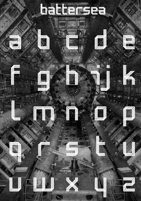
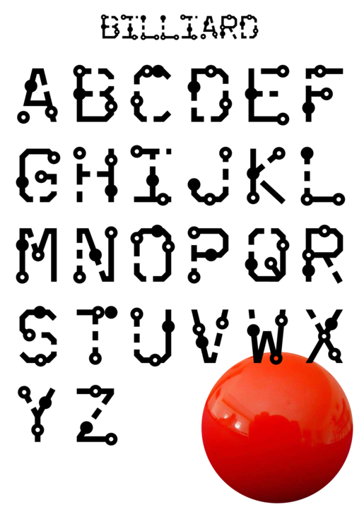
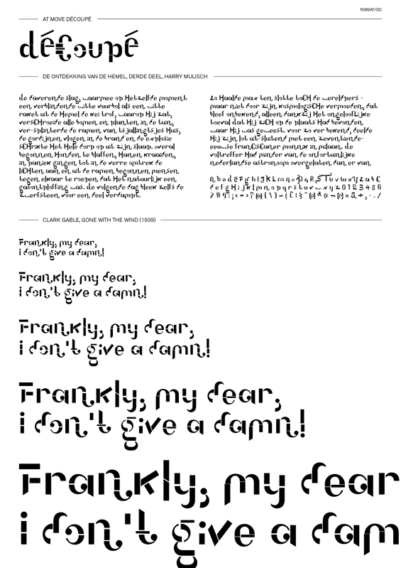
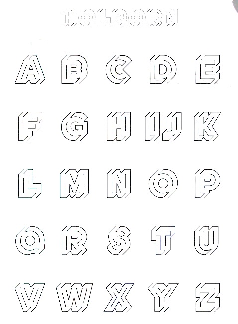
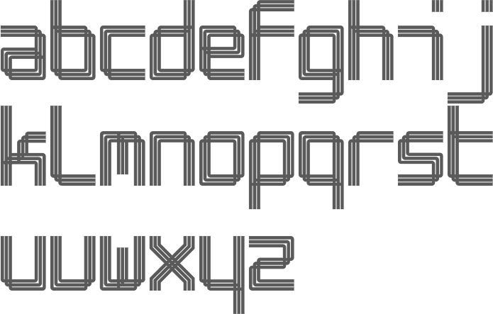
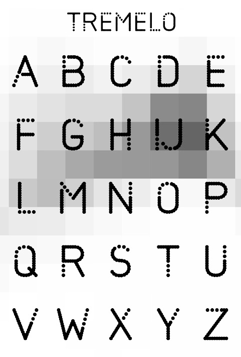
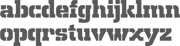
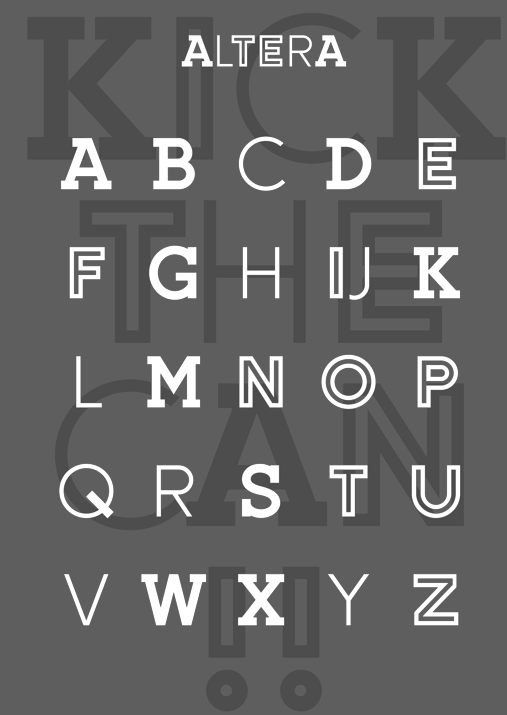
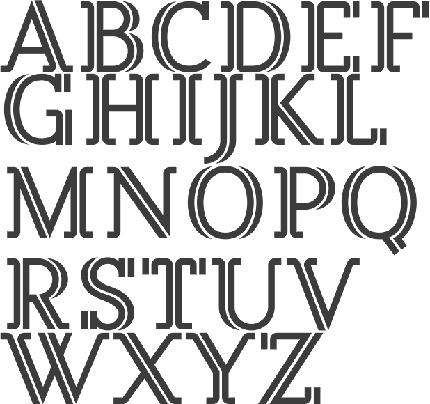
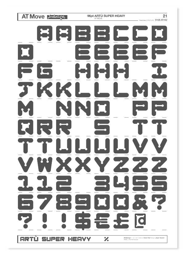
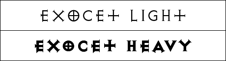
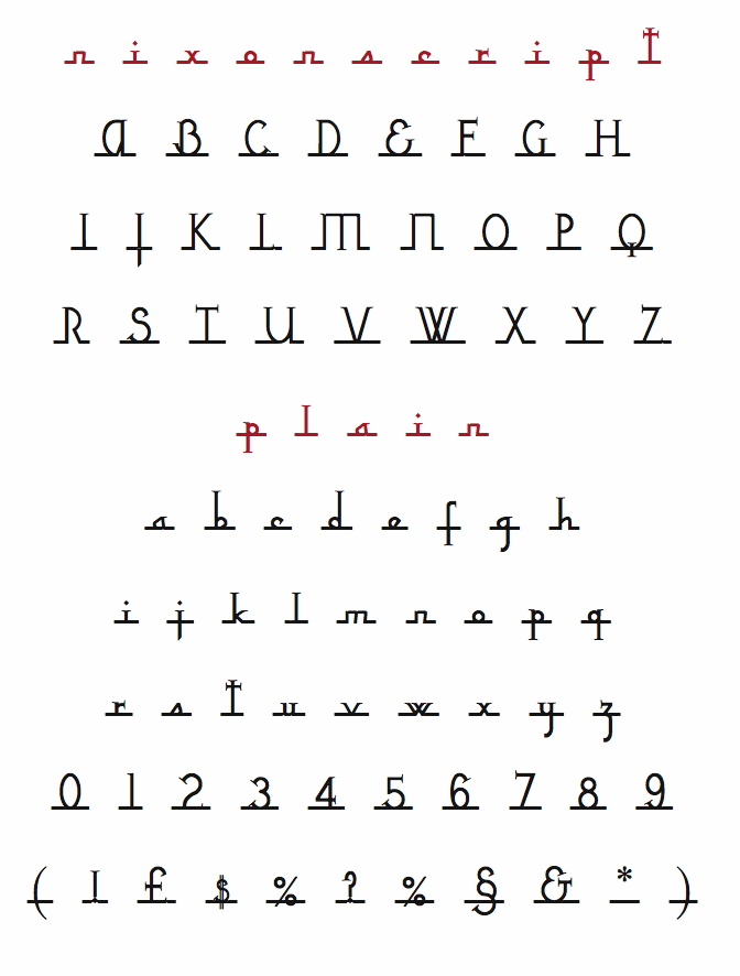
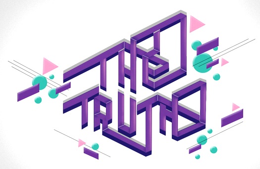
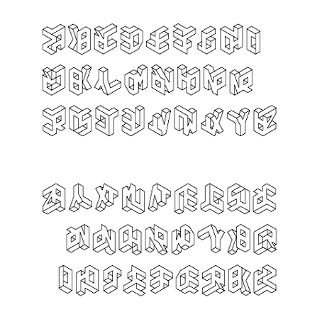
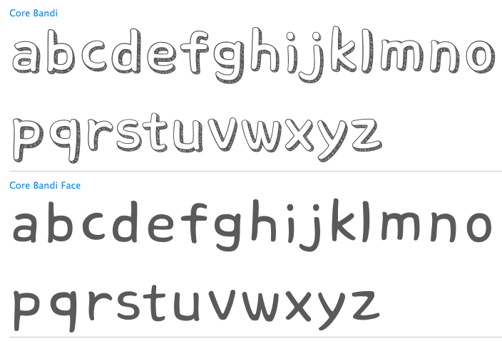
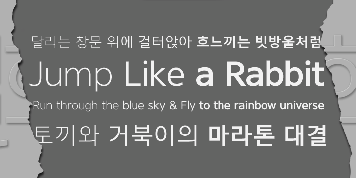
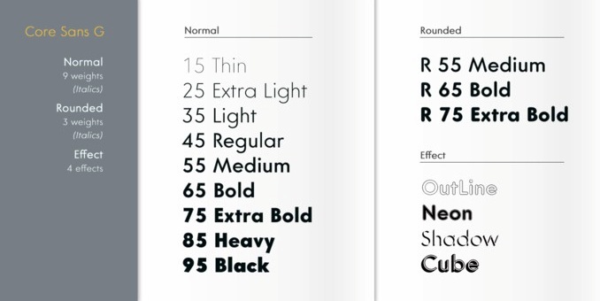
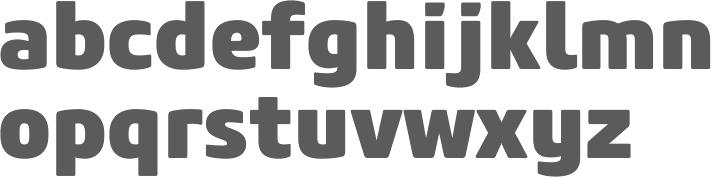
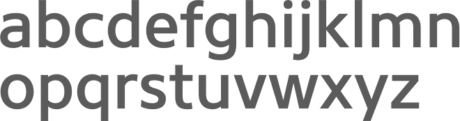
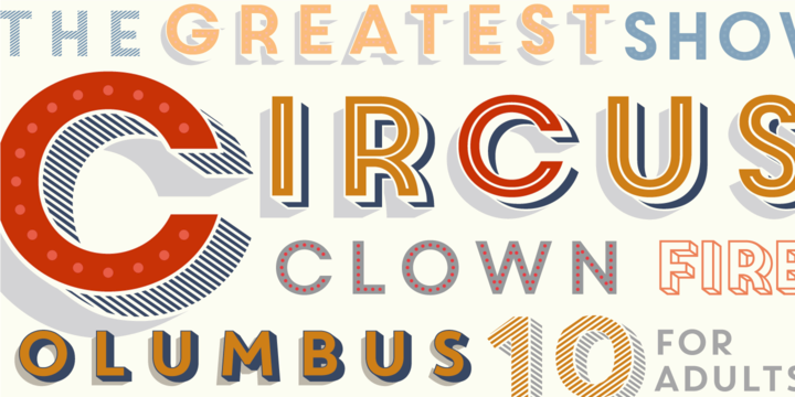
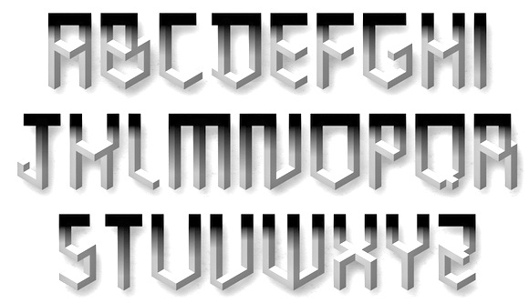
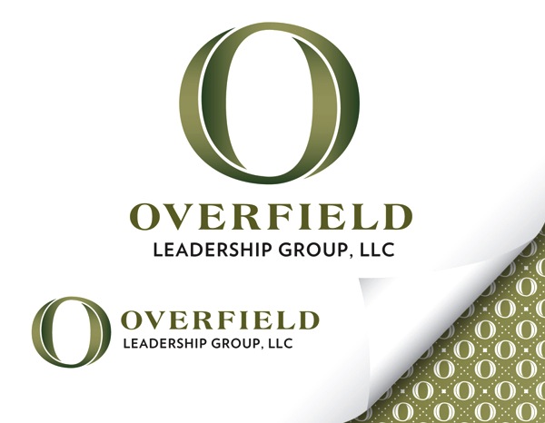
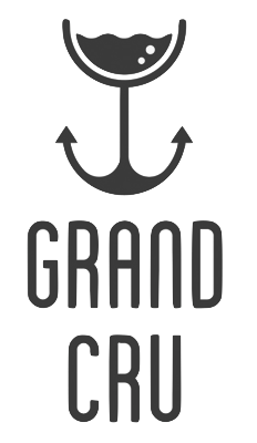
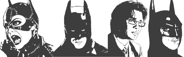
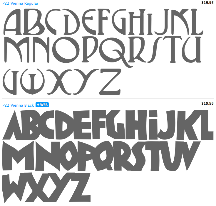
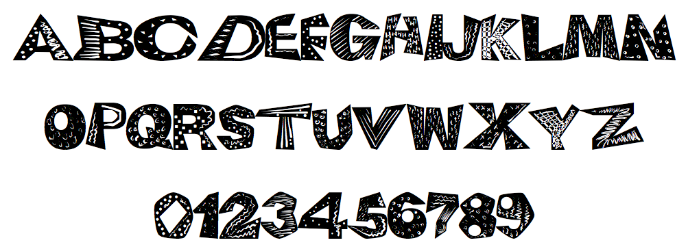
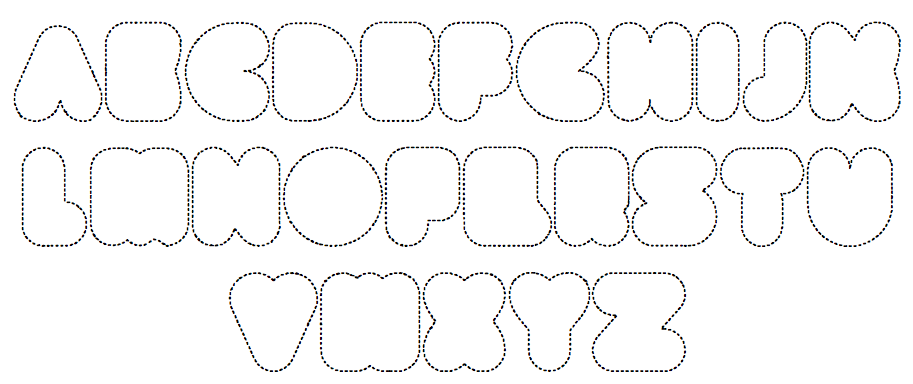
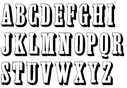
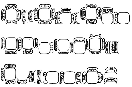
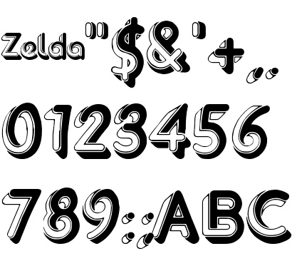
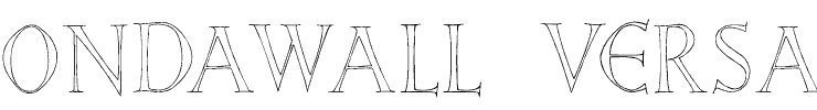
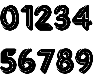
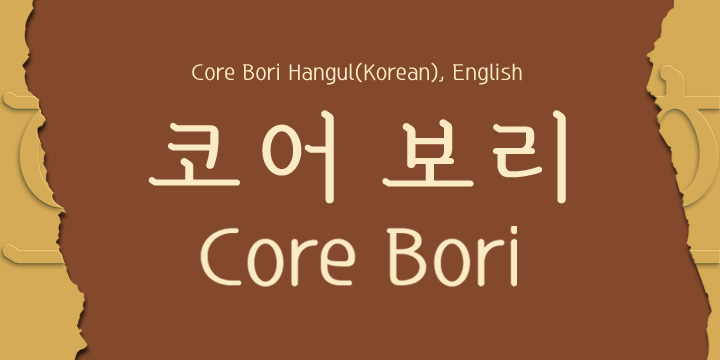
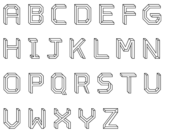
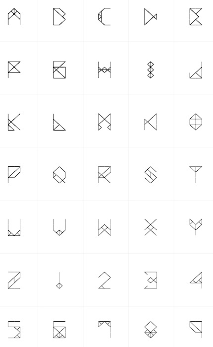
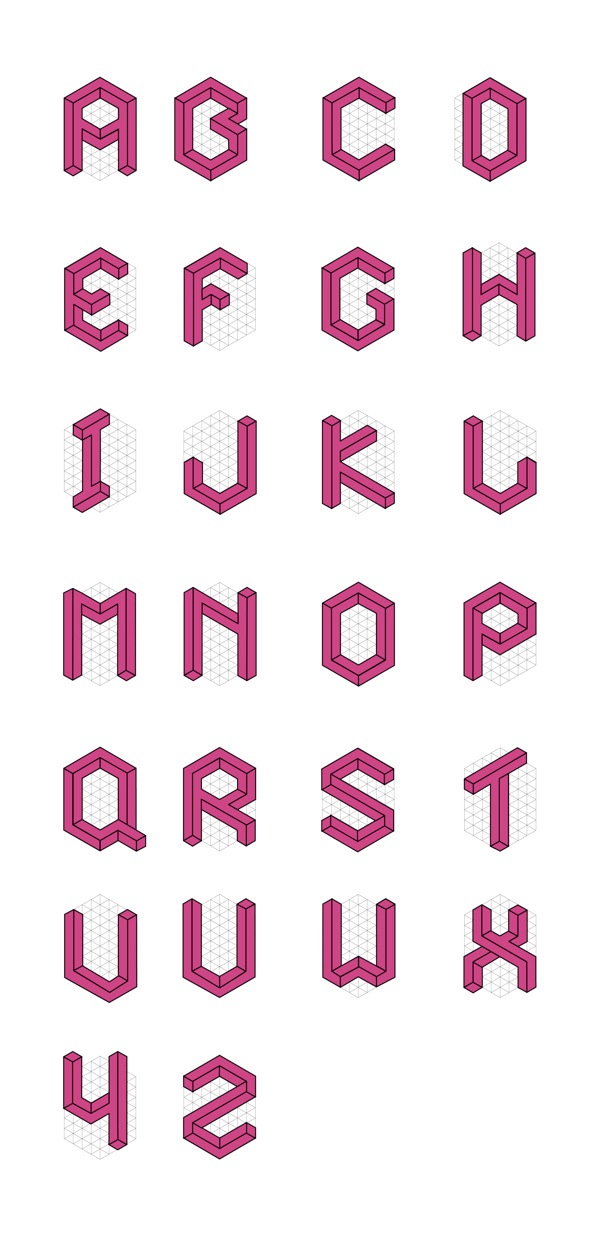
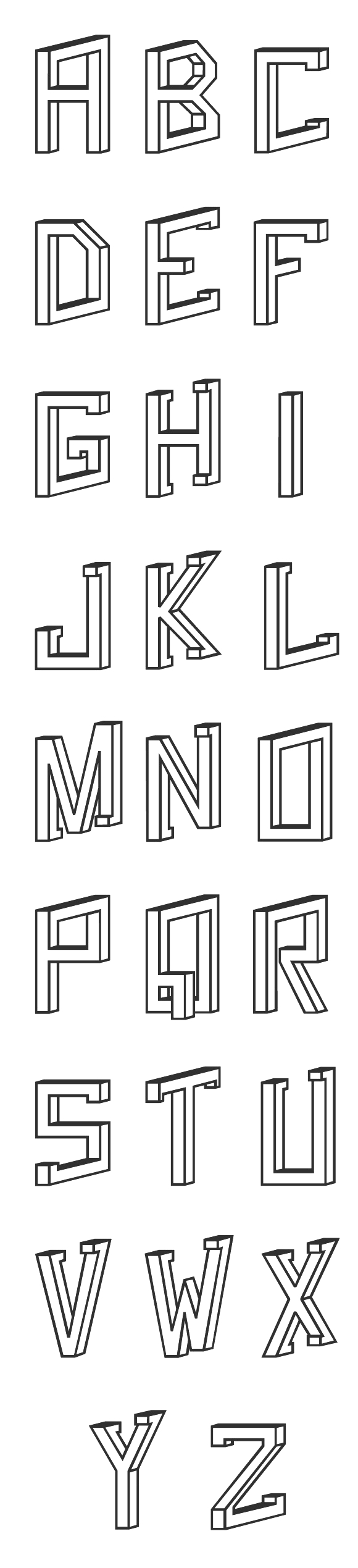
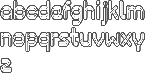
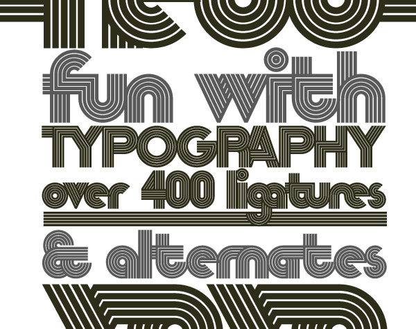
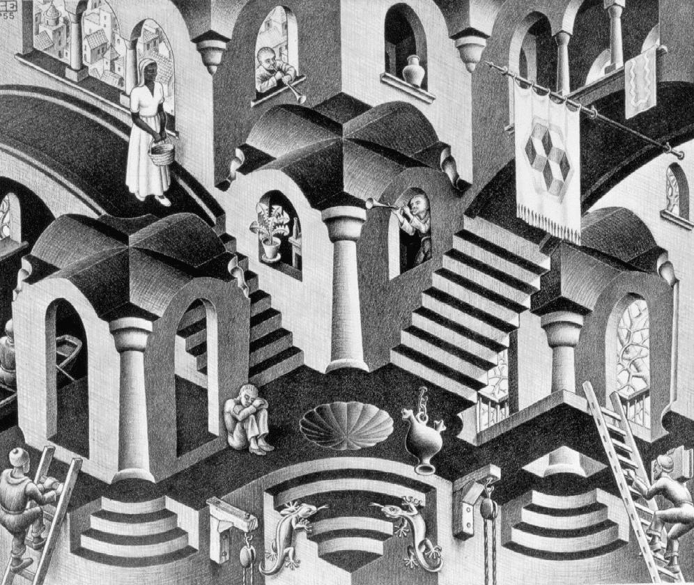
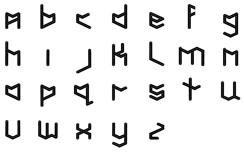
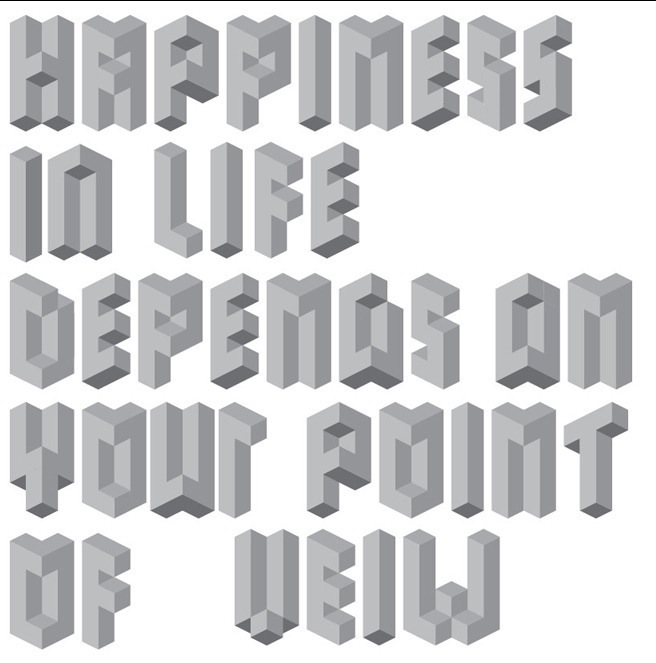
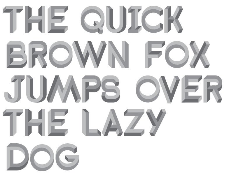
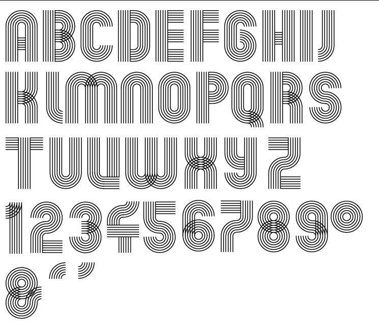
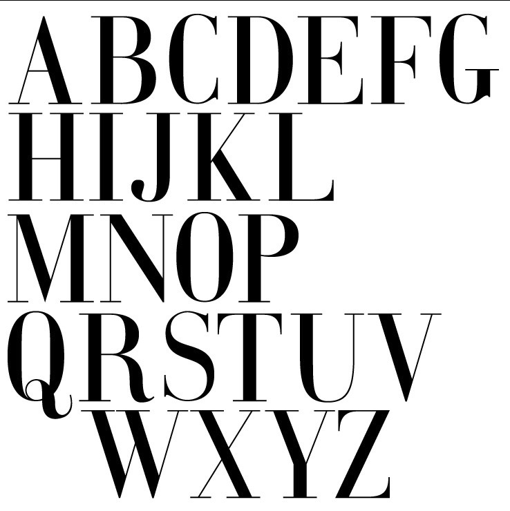
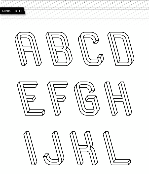
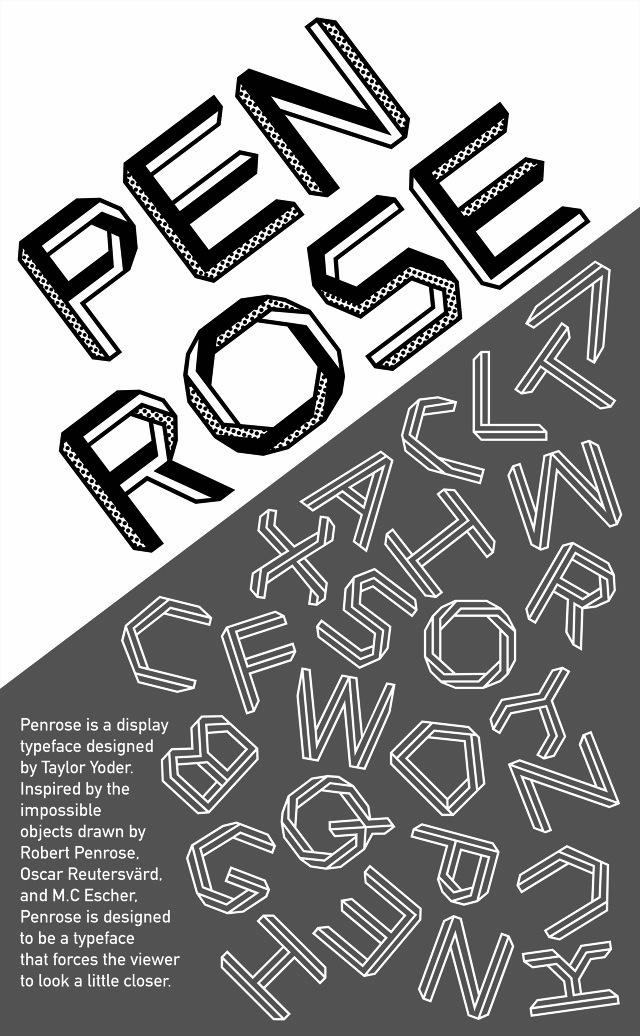
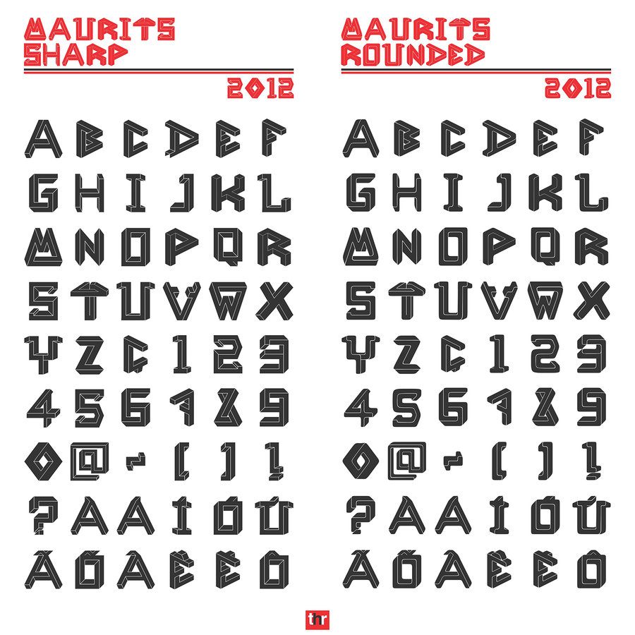
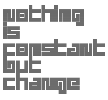
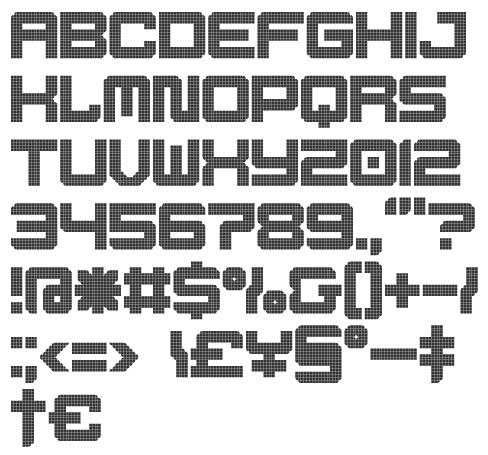
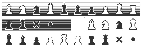
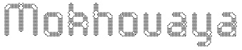
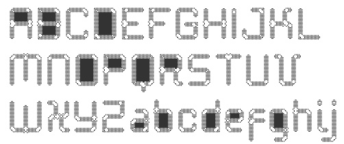
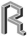
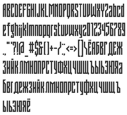
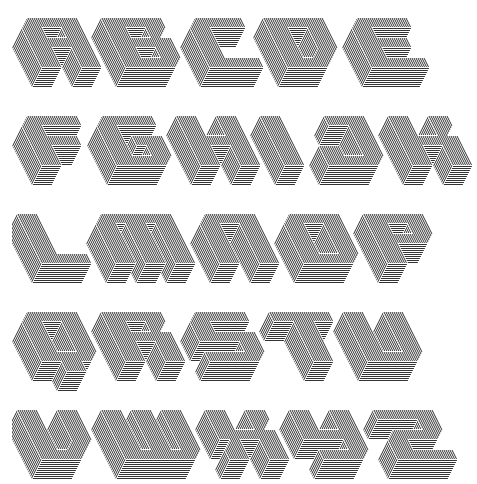
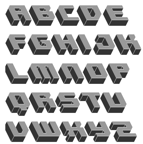
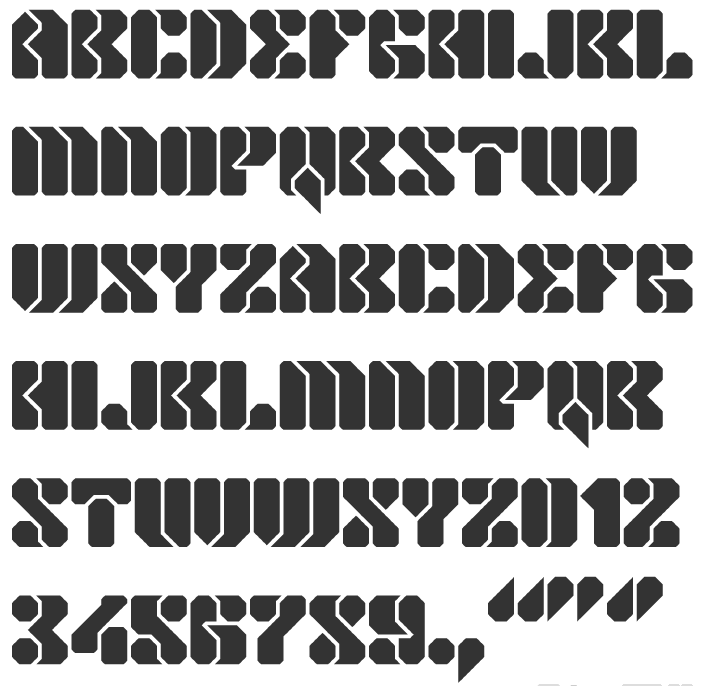
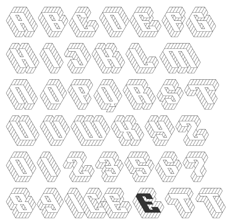
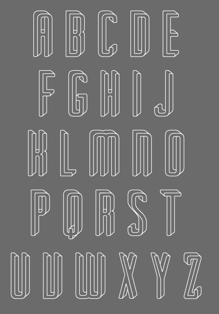
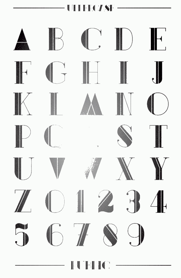