TYPE DESIGN INFORMATION PAGE last updated on Mon Jun 8 17:38:48 EDT 2026
FONT RECOGNITION VIA FONT MOOSE

|
|
|
|
|
OCR fonts | ||
|
|
|
|

SWITCH TO INDEX FILE
AdamAnt VectorWorx (was: Toniofonts)
| Antonio Bucu [AdamAnt VectorWorx, or AdamAnt Designs, The Philippines] designed EQUINOX, GraphicAttitudeMono (1999, white on black lettering), INDIOSBRAVOSTITLING (great thick lettering), MachaCow (1999, fat display face), Maharlika (1998, elegant art deco display type), Smokey, Tonio (comic book font), TONIO2, WaChaKa (1999), WASTED (hand-printed). Working on Jetstream, Multo, Buchikick, Renaissance (an OCR font). Fontspace link. Dafont link. [Google] [More] ⦿ |
Adrian Frutiger
| |
Frutiger's books include Type Sign Symbol and Signs and Symbols. Their Design and Meaning (1989, with Andrew Bluhm, published by Studio Editions, London; Amazon link). Linotype link. FontShop link. Adrian Frutiger, sa carrière française (2008) is Adèle Houssin's graduation thesis at Estienne. Klingspor link. Wikipedia link. View Adrian Frutiger's typefaces. View some digital versions of Avenir. Vimeo movie on Frutiger by Christine Kopp and Christoph Frutiger entitled "Der Mann von Schwarz und weiss: Adrian Frutiger". More Vimeo movies. [Google] [MyFonts] [More] ⦿ | |
In 1994 he started his own studio Dutch Design in Hamburg, and finally he co-founded FarbTon Konzept+Design with Jörn Iken, Birgit Hartmann and Klaus-Peter Staudinger, a professor at the University of Weimar, but Pool, Iken and Hartmann left FarbTon in 2005. Their corporate partners were DTL (Frank Blokland), URW++ (mainly for hinting), and Fontshop International. They also got freelance help from Nicolay Gogol and Gisela Will. Up until today, FarbTon has made about ten corporate types. He has worked at URW++ as a freelancer, contributing text and classification expertise to the book URW++ FontCollection. He has been teaching typeface design at the Muthesius Kunsthochschule in Kiel between 1995 and 1998 and has taken up that job again in 2005. Fonts done by Pool include FF DIN (DIN-Mittelschrift is used on German highway signs, 1995; image, another image: for more images, see FF DIN Round at issuu.com), FF DIN Round (2010; +Cyrillic; in use; sample), FF DIN Web (2010), Jet Set Sans (for JET/Conoco gas stations), DTL Hein Gas (for Hamburger Gaswerke GmbH), Regenbogen Bold (for a radical left party in Hamburg, a roughened version of Letter Gothic), and Syndicate Sans (2012, for Syndicate Design). He also made FF OCR-F. In 2022, FontFont released a major set of updates and extensions of the FF DIN family, all co-designed by Albert-Jan Pool and Antonia Cornelius. These include:
Together with type-consultant Stefan Rugener of AdFinder GmbH and copywriter Ursula Packhauser he wrote and designed a book on the effects of type on brand image entitled Branding with Type (Adobe Press). An expert on DIN typefaces, he spoke about DIN 16 and DIN 1451 at ATypI 2007 in Brighton, and wrote an article entitled FF DIN, the history of a contemporary typeface in the book Made with FontFont. Speaker at ATypI 2013 in Amsterdam: Legibility according to DIN 1450. Pic. | |
Alexander Branczyk
| |
Andreas Pihlström
| |
Russian designer of the Cyrillic/Latin version of Ray Larabie's fonts Monofonto and Neuropol, and of Newland Black (after Rudolf Koch's Neuland, 1923). He also made OCR B (a Cyrillic version) and Dollar. [Google] [More] ⦿ | |
Columbus, OH-based designer of the free font Operator (2018), a monospaced font for space cadets that shares some features with OCR. [Google] [More] ⦿ | |
Antonio Bucu
| |
Free but useless demo versions of OCR-A and OCR-B made between 2002 and 2007: ocra, ocraI, OCRAII, ocraIII, ocraIV, OCRB, OCRBI, OCRBIII, OCRBIV. Full versions: 119 dollars. Sorry, I have to leave the room to vomit. [Google] [More] ⦿ | |
Developer and distributor of business fonts and barcodes including MICR E13B, OCR-A and OCR-B, CMC-7, POSTNET, RM4SCC, Interleaved 2 of 5, Codabar, PLANET bar code (for the U.S. postal service), Code 128 and Code 39. Very expensive. All their free sample fonts are useless (most letters are missing). [Google] [More] ⦿ | |
Russian designer of the Cyrillic font OCR B. [Google] [More] ⦿ | |
Typeface classification according to "British Standards 2961:1967" (or BS 2961), British Standards Institution, London, 1967.
| |
BSI is the National Standards Body of the UK, with a globally recognized reputation for independence, integrity and innovation in the production of standards that promote best practice. It develops and sells standards and standardization solutions to meet the needs of business and society. After that paragraph, my brain needs a bit of rest. I think it says that they run a bureaucratic joint and that people better listen, or else. MyFonts pencils OCR-A down under the name of BSI, but I think that font was made by URW++. [Google] [MyFonts] [More] ⦿ | |
burodestruct (or: Typedifferent.com)
|
Free fonts include(d) the gorgeous GalaQuadra (by Angela Pestalozzi, 1999), Eject Katakana (1998), Dippex (1995, grunge font), Ticket (1995), Rocket 70 (1996), Ratterbit (1995, pixel font), Plakatbau (1995), Lodel Fizler (1996), Flossy (1995), Faxer (1995), Console Remix (1998), Cravt (1998, by "Katrin"), Stereotype (1998, by M. Brunner), Brockelmann (1995, free), Kristallo (1997, very original display face) and Billiet (1996). Other fonts: Acidboyz (1998), Alustar (1999), BD Asciimax (1999, ascii art font), BD Billding, Bdr_mono (1999), Brick (1996, like Kalendar), Cluster (1996), Console (1997), Doomed (1998), Eject (1998), Electrobazar (1995), Elside (1995), Globus (1996), Fazer (1996), Lofi (1997), Medled (1995), Paccer (1995), Solaris (1998), Spicyfruits_brush_rmx (1998, a nice high-contrast face), Spicyfruits_rmx, Wurst (free, by Heiwid, 2000), Relaunch (2000), Relaunch Katakana (2000, free), Rainbow (2000), DeLaFrance (2000, free, by Heiwid), Electronic Plastic (2000), Colonius (2001), Cash (2001), Cashbox (2001), Bilding (2001), Meter (2001), Mustang (2001), Bankwell (2001), BD Alm (2001), Balduin (2001), Tatami (2001, oriental look font), Hexades (2001, free), Nippori (2002, techno), Jura (2002), Bonbon (2002, free), Band (2002, free), Navyseals (2002, kitchen tile font), Ritmic (2002), BDR Mono (1999, OCR-like font), Mann (2003, ultra fat stencil), Aroma (2003), Zenith (2003), Nebraska (2003), BD Equipment (2004), BD El Autobus (2004), BD Unexpected (2004), BD Wakarimasu (2004, free kana face), BD Bernebeats (2004, futuristic), BD Deckard (2004), BD Spinner (2004), BD Victoria (2004), BD Designer (2004), BD Kalinka (2005, a curly ultra-fat display face), BD Equipment (2004), BD El Autobus (2004), BD Unexpected (2004), BD Varicolor (2005, stencil), BD Chantilly (2005), BD Memory (2005), BD Emerald (2005, beveled), BD Kalinka (2005, Cyrillic simulation), BD Extrwurst (2005), BD Aquatico (2005), BD Mandarin (2005), BD Polo (2005), BD Beans (2005), BD Tiny (2005, pixel face), BD Times New Digital (2006), BD Panzer (2006), BD Jupiter, BD Jupiter Stencil (2006), BD Pipe (2006), BDR Mono 2006 (2006), BD Fimo Outline (2007, free, by Nathalie Birkle), BD Bermuda (2007, experimental and geometric), BD Smoker (2007, psychedelic), BD Radiogram (2007), BD Mother (2007, exaggerated black Egyptian), BD Fimo Regular (2007, free), BD Demon (2007), BD Reithalle (2007, free), BD Halfpipe (2007, free), BD Broadband (2008, free; not to be confused with the much older fonts BroadbandICG or FLOP Design's Broadband), BD Viewmaster and BD Viewmaster Neon (2008), BD Electrobazaar (2008), BD Motra (2008, stencil), BD Virtual (2008), BD Spacy 125 (2008), BD AsciiMax, BD ElAutobus (2004), BD Equipment (2004), BD Ramen (2003), BD Retrocentric (2009), BDR A3MIK (2009, virile Latin and Cyrillic slab), BD HitBit (2009), BD Unicorse (2010, unicase and techno), BD Telegraph (2011), BD Schablone (2012, stencil face), BD Pankow (2013, stencil), BD Algebra (2014), BD Hiragana Kuro (2014), BD Qualle (2014, a fat poster typeface), BD Tribler (2015, a tribal font). Alphabetical listing of their pre-2015 free typefaces: Algebra, Alm, Apotheke, AsciiMax, Baldrian, Band, Bankwell, Bardust, Beans, Billding, Billiet, Bonbon, Brockelmann, Burner, Cash, Cashbox, Chantilly, Circo, Console, Console Remix, Cravt, Delafrance, Designer, Destination, Dippex, Eject Katakana, ElAutobus, Elmax, Elside, Equipment, Faxer, Fazer, Fimo, Flossy, Fluke, Galaquadra, Geminis, Halfpipe, Hexades, Hiragana Kuro, Jayn Fonta, Kristallo, Lodelfizler, Lofi, Medled, Meter, Mustang, Outline, Paccer, Pipe, Plakatbau, Plankton, Polo, Ragout, Ramen, Ratterbit, Reithalle, Relaunch, Relaunch Ktna, Rocket70, Sirca, Sirca Rmx, Solaris, Spacy125, Spicyfruits, Spinner, Stella, Stencler, Stereotype, Ticket, Times New Digital, TinyFont, Tribler, Unfold, Wakarimasu. Alphabetical listing of their pre-2015 commercial typefaces: A3mik, Acidboyz, Alustar, Aquatico, Aroma, Balduin, BDR Mono 2006, Bermuda, Bernebeats, Breakbeat, Brick, Broadband, Calamares, Central, Cluster (Corporate), Colonius, Deckard, Demon, Discount, Doomed, Edding850, Eject, Electrobazar 2008, Electronicplastic, Elk, Emerald, Endless, Extrawurst, Fontabello, Globus, Good Wood, Hell, Hitbit, Jupiter, Jura, Kalinka, Kameron, Kinski, Las Palmas, Mandarin, Mann, Memory, Mother, Motra, Naranino (2012: a children;s script), Navyseals, Nebraska, Nippori, Nokio, Orlando, Pankow, Panzer, Qualle, Radiogram, Rainbow, Retrocentric, Ritmic, Robotron, Schablone, Showlong, Smoker, St.Moritz, Stalker, Stonehenge, Sweethome, Tatami, Telegraph, Unexpected, Unicorse, Varicolor, Victoria, Viewmaster, Virtual, Wotka, Wurst, Wurst Directors Cut, Zenith. In 2015, Gianfreda designed BD Barbeaux (a condensed typeface with the fashionable chic of the French art nouveau or film noir). Typefaces from 2016: BD Kickrom Mono (LED emulation type). Typefaces from 2018: BD Westwork. Typefaces from 2020: BD Aubergin (an experimental poster font with Bauhaus elements), BD Microna (a pixelish variable font), BD Micron Robots (dingbats). Typefaces from 2021: BD Supper (a food packaging sans), BD Roylac (a stylish poster font that evokes modern furniture), BDRmono 2021 (hipster style techno). Alternate URL. Dafont link. Behance link. View the Typedifferent typeface library. [Google] [MyFonts] [More] ⦿ |
Peruvian graphic and web designer. At FontStruct, he created a number of pixel fonts in 2009, such as gridnPix75 (+Light, +nLite), OCR-APix6, cayoPix45, ScrptPix5, sCapsPix4, SerifPix6, moSpPix57, ClassPix5, MicriPix4, CorpoPix5, and BminiPix5. Other fonts there include Proton Type (2009), the geometric pxlNotSqr (2009) and the sturdy headline typefaces Woznian (2009, inspired by bitmap fonts like Chicago and Charcoal) and Gizmatik (2009), his best font. In 2009, he added NuevoSolStile (in the Eurostile/Microgramma mold), MacroBold (ultra-fat), Steam Punker, Funkadeliai, Monocodigo, FS Mini, FS Remix (horizontally striped), BlackSQRda (blackletter), Fontscript, Scanografia (vertical striping of letters), Stencikal, Bloxed (white on black), BlackSQRda, NSS Unicase (unicase), NuevoSolStile (unicase). [Google] [More] ⦿ | |
Christopher Widdowson
| |
During her studies at Auckland University of Technology, Claudia Henty (Auckland, New Zealand) designed the all caps multiline display typeface family OCR Sprawl (2017). [Google] [More] ⦿ | |
During his studies, Daniel Williams (Angwin, CA, b. 1986) combined the famous monospaced OCR font Data Control and the wedge serif typeface Narkisim Regular to obtain Corrupt Data (2014). He designed Meat Hook in 2014 using FontStruct. [Google] [More] ⦿ | |
UK-based designer of the large pixel fonts in the Haeccity DW family (2007). From the web site: There are all the basic Latin characters with standard punctuation, most extended Latin (accented), spacing and (common) combining diacritics, Greek and extended Greek, Cyrillic, a sort of a bash at Armenian, a sort of a bash at Glagolitic, Ogham, Runic, Gothic, mathematical and logic operators, most arrows, miscellaneous letter-like and currency symbols, box-drawing and OCR characters, astrological symbols, dingbats (I got fed up about three-quarters of the way through the stars, but most of them are there), common ligatures (ff, fi, fl, ffi, ffl, st), fractions, IPA symbols, openface and monospace characters. Also small caps for the basic Latin and Greek alphabets. Alternate URL. [Google] [More] ⦿ | |
Inventor of the optical reader, b. Milwaukee, 1923, d. San Diego, 2007. Shepard majored in electrical engineering at Cornell and earned a masters degree in mathematics from the University of Michigan. Obituary in the New York Times, from which I quote: Mr. Shepard sketched out the familiar boxy numbers on credit cards, called the Farrington B numeric font, on a cocktail napkin at the Waldorf-Astoria Hotel, his wife said. The shapes were meant to be as simple and open as possible because gasoline station pump islands were among the earliest places optical character recognition was used; the shapes were meant to minimize the effects of smearing with grease, oil and other substances. The font with a 7 that looks like two sides of a rectangle has persisted even as the numbers have faded from use: the magnetic strip on the cards back now carries the necessary information. [Google] [More] ⦿ | |
Device Fonts
|
FontShop link. Klingspor link. [Google] [MyFonts] [More] ⦿ |
Diane DiPiazza
| |
Dinc Type
| Commercial and free fonts designed by Diane DiPiazza, who lived in Hoboken, New Jersey, and was the original bass player for The Misfits. She is now in Lodi, NJ. Dinc closed its doors in January 2006 but returned some time later in 2006. Most of the fonts evoke the fifties. Wikipedia states: Diane DiPiazza was the first bass player for the The Misfits, although she does not appear on any album. She left the band, vacating the spot that was quickly filled by Jerry Only. Her name is often incorrectly spelled Diane DiPiaza. Growing up in Lodi, New Jersey, she was a friend of Glenn Danzig, the founder of the Misfits. The first lineup consisted of Glenn on vocals and electric piano, Diane on bass guitar, Jimmy Battle on guitar and Manny Martínez on drums. On the Cough/Cool single, The Misfits first release, she is the Diane who Glenn thanks on the sleeve. Diane DiPiazza is an artist. She is a type designer who distributes free fonts and vintage black and white line art at dinc! She is art director at mystifyinglyGLADdesign, who designs for the web, clothing, and packaging. She designs hand screened gig posters and many other forms of rock 'n roll art, retro art, modern art. A collector of vintage design elements, her style has been called retro/modern. Diane also creates custom hand stamped silver jewelry as well as a line of tattoo inspired pieces. She is in the process of recording a demo LP with the working title Last Year's Fab Rave, on which she plays all the instruments, including bass. Free fonts include Bobo, Dilettante, Modern-Love, Note-To-Self, Plastic-U, Post-No-Bills, Road-Crew, Saturdays-Girl, Sleeptalk, Sugaree, Mod Guitars, Woof Squared, Hatcheck, Mess Kit, Billy Dolls, Knitwits, Claim to Fame, Girlfriend, Book of Joe, Joybuzzer (2007, rough outline), Autos (2007, old typewriter), U Better, The Con, Claim to Fame, Girlfriend, Book of Joe, Ahmet. In 2006, she created Road Crew (2006, rough stencil), DINC (2006, blackletter), Post No Bills (2006, stencil), Ashtrays&Art. Typefaces from 2005: Neat Neat Neat, Shut Up, Hello Hey Joe, Wings For wheels, Trustmaker, Bad To Me, BellBottomBlues, DinkyToy, Funkhouse, Rodeoboy, SaturdaysGirl, SoWhat, Blue Monday, Betcha By Golly Wow, Nathaniel (2005, blackletter), Brillo Blue, Doctor My Eye, Guilt For Dreaming, Rhyming Bells, Bob's Your Uncle, Princess Jasmine, 45, Seven, 7-7000, Ahmet, Alexei, Boxer, Cinema Aisles, Divine Intervention, Synchronicity, Tangled Up In Blue, Tjinder, Untrue, Special Edition 6, 20,000 Roads, Big Diamonds, Charly Baltimore, Dream, Fever In The Funkhouse, Green&Blue, Ring Ring, Swoop Swoop. Typefaces from 2004: Fuzzbox (2004; not to be confused with Bragagna's pre-2004 font by the same name), Ace In The Hole, Balls, The Christmas Font, Beau Geste, ByeBye, Heart, Loverboy, Sycophant, The Comedians, Fishboy, Truth, King Me, Snapper, Blue Heaven, Oceans Eleven, Fresh Fish Seven, Trason, Your Type, Da Doo Ron Ron, Big Flirt, Dicky Dee, Boxtop, Satellites, Upsmack, Starry, Silicon Chip, Howdy, Grandpa Boy, Scarlet Letter, Capsule, Doggy, Little Eden, Frank Mills, Chewtoy, Jez, OneWitU, BrineShrimp, Joe College (2004, pixel face), stj-fro, One Inch Rock (2004, pixel face), Black Hole, Ya Ya Baby, Blondie, ShaLaLa, Lower Eastside, GeeWhiz, Sixteen, Joe Strummer, Amy Johnson, JoJo, JodiGirl, Zelda, Hipster, LaDolceVita, LittleLove, Mod, MrEarl, Noveltease, QBats, Ranger, Rhymes, BarkingDog, BFBigmouth, BooHoo, Chance, CowardSquared, Cupid, DincCorona, FiftyFive, FunkyBut, Gamble, HelloHello, IdiotWind, JimmyCap, Luck, Metropolitan, MidnightKiss, Mine (2004, letters in hearts), PerfectCouple, Resolution, Spitball, StencilMeIn, TypeToyNight, YrChickens. Typefaces designed in 2003: 11592003, 2004, BrokenPromise, DincCorona, DoublyBlessed, EchoPark, FiftyFive, Fishing, FunkyBut, HelloHello, Hoboken, InstantKarma, Integrity, KaseyMac, PeppermintLump, Resolution, StencilMeIn, ThreeCubicFeet, TypeToyNight, Crybaby, DeepDark, MajorLift, Mikes, MinorFall, Beeper, Kate, Blacktop, Def Caroline, EZ Bake, JoJo, Kima, Bait, Dreamgirl, Sugar Daddy, Friday, Birth of the True, Soul Deep, Virginia Plain, Feelin' Groovy, Sunday SF, Socks, Boy Toy and Sweet Potato, FunnyValentine, Laura, LonelyFrog, Pati, BrokenDoll, Placemats, Satori, Scout, ThousandLies, ThousandOceans, GetTheeGone, Promises, Rudeboy, YuppieFraud. Typefaces designed in 2002: Emmanuel, Strummer, Teardrops, Busterboy, Evergreen, Blulite, Respect, Pretty Baby, Hickory Wind, Chelsea Boys, Femme Fatale, Tour de Lance, Peppermint Lump, Ce La Luna! Nous, El Goodo (2002, pixel font), Big Boy, Farfallena, Life On Mars, Saturn Return, GeeWhiz, Train in Vain, Massive Blur, Lonely Planet Boy, Littlebits, Secretarial Pool, Eight Bits, Firefly, Fluff, Startone, Cupcake, Diet Dr. Creep, Dr. Creep, messaround, Pencilbox, Crush No 47, Crush No 49, and Dialtone. Mac and PC. Plus Starry F. Hope (1997) at Chank's site. Commercial fonts: Booboy, Ingigo (2001, script font), Rufus (2001: four pixel/bitmap fonts), Chinese Symbols: Good Fortune, Zen Fontkit, Boxtop Fontset, Bachelorette, Retrobats, Jailbait, Grievous Angel, Milky Way, Spyboy, Light Series: Spotlight, Cameralight, Streetlight, Firelight, Torchlight, Lovelight, Moonlight, Sunlight, YaYa, Alvin, Amplifier, BigBeatBold, BigBox, Bit-Thing, Boxboy, Chatterbox, Chinatown (oriental simulation), Chopsticks, Console, Cup O'Joe, dincBATS, dincINK, Dinette, DincINK (1998), Dixie, Dreamboat, Duojet, Esquire, Fireball, Flashlight, FourWay, Geebot, gomer, goober, Highball, Homework, jacks, Jetage, Jetage Hi-Fi, Jetage Lo-Fi, Kingbats, Light Series, Loverboy, Moondog, Mister Lee, Mr. Big Stuff, PaperTiger, Pipeline, Popstar, Pushpop, Recordhop, Rocketship, Roundup, Rubberduck, Satellite, Scripto, SquareBox, SquareCircle, Speedometer, Starlite, Sugar, Swizzle, Thinman, transistor, TwinTone, Ultramatic, Variable Videobox, W. Square, Wash&Wear, Whatnot, Winky, Yin Yang, Tight Toy Night, Funtime, OCRDINC01, 02 (OCR-like fonts), Whirlwind, Gaslight, Love, Captain, Funtime, FiFi, Fakebook, FlameJob, OCRDINC, Tight Toy Night, Swingbats, Good Fortune, Zen Fontkit, Bachelorette, Retrobats, Jailbait, Grievous Angel, Milky Way, Spyboy, YaYa, Boxtop Fontset, Light Series: Spotlight, Cameralight, Streetlight, Moonlight, Sunlight, Firelight, Torchlight, Hotrod, Iceberg, Gutterball, Homewrecker, Bubba, Starry Night, Lady Luck, Automobile, Hydromatic, Seventeen, Whirlwind, Gaslight, Love, Captain, Swingbats, FiFi, Flamejob, Fakebook, Madness, Apple Scruffs, Marmalade, Queen of Corona, Cupcake, Starry Eyes, Juice, Fivebits (2002, pixel font), Matchbox, Hot Burrito #3, Fishsticks, Eightbits (pixel font), FoolsGold, Drive, Sleepwalk, Icecube, Pruneface, Witness 2HB, Zerogirl (stencil font, 2002), Fairytale of New York, Levi Stubb's Tears, AllModCons, Babylon, BigBoy, ChampsElysees, ConcreteandClay, ElGoodo, Farfallena, Heroes&Villains, LifeOnMars, LittleRamona, MerseyBeat, MetalGuru, Missile, OnYourBike, Pinup, Reconnez, SaturdaysGirl, SaturnReturn, ShepherdsBush, Tatum, TiniestDancer, TumbinDice, VeraGemini, YesterMe, Rising, Treason, Monami Vrai, Robot Girl, Tattooed Sailor, Sunrise, Midnight, Kakadu, Ana, Ace, Yobbo (2002, dot matrix font), GoGo (2002, pixel font), Waltzing Matilda, Memorial Day 911, Good Riddance, Boys, One Tin Soldier, One After 909, Joey, Infidelities. Some of her fonts can be bought at SnapFonts. Dafont link. Klingspor link. [Google] [MyFonts] [More] ⦿ |
As posted on abf by Diogene:
| |
Additions in 2005 include the dingbat typefaces Beautilities EF Alpha, Ornamental Rules EF, Diavolo Rules EF, Squares EF (Alpha, Beta and Gamma), Topographicals EF Alpha, Typoflorals EF Alpha, Typographicals EF Alpha, Typomix EF Alpha, Typosigns EF Alpha, Typospecs EF Alpha and Beta (which have several fists), Typostuff EF Alpha, Diavolo EF, Schablone EF, Gigant EF, Maloni EF, OCRA EF, EF Unovis (a 16-weight family inspired by Quadrat). In the hand-printed category, let us mention Filzerhand. Their blackletter collection includes some bastardas (Alte Schwabacher, Lucida Blackletter), some frakturs (Fraktur, Fette Fraktur EF, Justus Fraktur, NeueLutherscheFraktur, Walbaum-Fraktur), some rotundas (Weiss-Rundgotisch), and some texturas (Gotisch, Old English). Commissioned fonts include Castrol Sans (2007). Selected additional typefaces: Garamond Rough Pro (2018), Bluset Now Mono (2018), Newspoint (2017, based on Morris Fuller Benton's News Gothic), Meier Kapitalis (2013, a lapidary typeface based on a 1994 sketch by Hans Eduard Meier in his book Die Schriftentwicklung), Gillies Gothic EF (after William S. Gillies's 1935 original), EF Medieva, Bank Sans Caps EF, Metropolitain (1985) (after a 1905 art nouveau typeface by Fonderie Berthier). Fonts4ever link (2008). Listing at Fontworks. Future events schedule. New fonts. Catalog of their typefaces [large web page warning]. See also here. [Google] [MyFonts] [More] ⦿ | |
During her studies, Emily Makarainen (Westport, CT) created the typefacae OCR-H (2014) by humanizing OCR-A. [Google] [More] ⦿ | |
Norwegian designer at Die Gestalten of Friends (2004, an OCR-like sans), Kit Lean, Kit Ideal, Kit Shiny, and Kit Fat (2001, a monoline family). FontShop link. [Google] [More] ⦿ | |
Swiss outfit that published OCR-B in 1966, Adrian Frutiger's rounded and human readable counterpart to OCR-A. One of Frutiger's rare failures. [Google] [MyFonts] [More] ⦿ | |
Fábio Duarte Martins
| |
Face 2 Face (or: F2F)
| Born in Frankfurt, Germany in 1959, Alexander Branczyk is the main typographer at F2F (Face 2 Face), which is based in Berlin and Frankfurt. Other participants include Stefan Hausen, Alessio Leonardi, Torsti Maier-Bautor, Thomas Nagel, Haike Dehl and Sybille Schlaich. F2F specializes in what it calls anarchistic typography. Branczyk made F2F CzykagoTrans (1995) and a few other experimental fonts, as well as Bellczyk, CZYKago-Cameo, CZYKago-Quer, OCR-Alexczyk, OCR-Bczyk, SubberlogoMini, TheczykM, MadzineScript (curly vampire typeface), BurnoutChaos, Frontpage, MonakoStoned, Entebbe (a ransom note font), OCRFBeta and OCRHeike. Other designers: Thomas Nagel (ScreenScream, Shakkarakk, ElDeeCons, Madame Butterfly, Pixmix, Shpeetz, TyrellCorp), Heike Nehl (LoveGrid, Starter Kid, Lego Stoned, Twins), Alessio Leonardi (PrototipaMultipla, TagliatelleSugo, Mekanik Amente, Metamorfosi, provinciali, AlRetto, F2F TechLand, F2FAlLineato, F2FMekkasoTomanik, F2FSimbolico (1992, dingbats), Poison Flowers (1992)), Stefan Hauser (F2FBoneR, Haakonsen), Sybille Schlaich (Styletti Medium). Face2Face groups the designers of Moniteurs and xplicit ffm. Bitstream link. Alternate URL. In 2003, these designs by Alexander Branczyk appeared in the Linotype Taketype 5 collection: F2FBurnoutChaos LT Std, F2FCzykago LT Std Light, F2FCzykago LT Std Semiserif, F2FCzykago LT Std Trans, F2FEntebbe LT Std, F2FFrontpageFour LT Std, F2FMadZine LT Std Dirt, F2FMadZine LT Std Fear, F2FMadZine LT Std Script, F2FMadZine LT Std Wip (1992), F2FMonakoStoned LT Std, F2FOCRAlexczyk LT Std Regular, F2FOCRAlexczyk LT Std Shake, F2FOCRBczyk LT Std Bold, F2FOCRBczyk LT Std Regular, F2FTechLand LT Std. Alexander Branczyk studied visual communication at HfG Offenbach under Friedrich Friedl. From 1988 until 1994, he was project manager at Erik Spiekermann's MetaDesign. Since 1994, Alexander is partner and managing director of xplicit Gesellschaft für visuelle Kommunikation mbH (xplicit.de) based in Frankfurt/Main. Alexander Branczyk is co-publisher of Emotional Digital, and since 2003 a visiting professor for typography at the Bauhaus University Weimar. Codesigner of Czykago Rough (2019, with Manuel Viergutz), Brush Poster Grotesk (2017, a fun semi grungy typeface designed for the children's exhibition 1,2,3 Kultummel from Labyrinth Kindermuseum Berlin by xplicit, Berlin (Annette Wüsthoff, Alexander Branczyk and Mascha Wansart) and Manuel Viergutz; loaded with glyphs and decorative extras like arrows, dingbats, emojis, symbols, geometric shapes, catchwords and decorative ligatures), TWIGS 4 kids (2020: designed for a garden exhibition for children by Daniela Costa, Julia Stanossek, Alexander Branczyk and Manuel Viergutz). Showcase of Alexander Branczyk's typefaces. [Google] [MyFonts] [More] ⦿ |
Designer of the free pixel typefaces Piacevoli (2020), Enchanted Sword (2019: blackletter), Squarewave (2019), Kapel (2019), Neutrino (2019), St26k (2019), Poco (2019), Mousetrap (2019), Typecast (2018), Planetary Contact (2018), Microserif (2018), Enter Command (2018), Peanut Money (2018), Double Homicide (2018), Root Beer (2018), Lychee Soda (2018), Optixal (2018: OCR-inspired design), Bonefish (2018), Larceny (2018), Pear Soda (2018), Five by Five (2018), Lunch Menu (2018), Scriptorium (2018), Cartridge (2018), Owre Kynge (2018, a blackletter), Grape Soda (2018), Comicoro (2018), Unbalanced (2018), Notepen (2018), Cyborg Sister (2018), Digital Disco (2018), Quadrunde (2018), Alkhemikal (2018), Kiwi Soda (2018), Mousetrap (2008), Pixolde (2008), PW Extended (2008) and Litter Lover (2007). [Google] [More] ⦿ | |
Company located in Fareham, Hampshire, UK, and (possibly) run by David Gibbins. 150 truetype-font collection: go here, here, here, here, here, and here. The 150 fonts have no copyright information other than the date, 2001. Here are the names of this collection: Aston-Italic, Aston, AstonPoster, Barker, Bentine, Brancusi-Italic, Brancusi, Burns, ButlerCaps, Cambridge-Bold, Cambridge-BoldItalic, Cambridge-Italic, Cambridge, CambridgeOpen, Chaplin, Charterhouse-Bold, Charterhouse, Cleese, Constable, Cooke, Corbett, CorpusChristi-Bold, CorpusChristi-Italic, CorpusChristi, Crosby, DaVinci, Dali, Degas, Dodd, Donnatello, Durham-Bold, Durham-Italic, Durham, DurhamPoster-Bold, DurhamPoster-Italic, Edinburgh-Bold, Edinburgh-BoldItalic, Edinburgh-Italic, Edinburgh, Epstein, EpsteinFat, Eton-Italic, Eton, Exeter-Bold, Exeter-Italic, Exeter, Formby, Gainsborough, Gauguin, Gilbert, Gordonstoun-Bold, Gordonstoun-Italic, Gordonstoun, Hancock, Hardy, Harrow-Bold, Harrow-BoldItalic, Harrow-Italic, Harrow, Harvard-Bold, Harvard, Hepworth-Bold, Hepworth, Hope, Keaton, KebleBlack, KebleBoldOutline, KebleCondensed, KebleCondensedBlack, KebleCondensedLight, Keele-Bold, Keele, KingsCollege-Bold, KingsCollege-Italic, KingsCollege, Laurel, Leighton, LeightonCondensed, LeightonExtended, Lloyd, Manet, Marceau, Marlborough-Bold, Marlborough, Matisse, Michaelangelo, Miller, Millfield, Milligan-Bold, Milligan-BoldItalic, Milligan-Italic, Milligan, Miro, Monet, Moore, Morecambe, Peterhouse-Bold, Peterhouse-BoldItalic, Peterhouse-Italic, Peterhouse, Picasso, PicassoLite, Pollock, Pryor, QueensCollege-Bold, QueensCollege-BoldItalic, QueensCollege-Italic, QueensCollege, Raphael, Rembrandt, Rodin, Roedean-Bold, Roedean, Rubens, Secombe, Sellers, Seurat, Sorbonne-Bold, Sorbonne-BoldItalic, Sorbonne-Italic, Sorbonne, StAnnes-Italic, StAnnes, StPauls-Bold, StPauls, Stowe, Sykes, ToulouseLautrec, Turner, Upminster-Bold, Upminster, VanGogh, Verrochio, Warhol, WarholHeavy, WarholLight, Warwick-Bold, Warwick-BoldItalic, Warwick-Italic, Warwick, Wellington, WellingtonHeavy, Winchester-Bold, Winchester-Italic, Winchester, Wisdom, Wise, Yale-Bold, Yale-Italic, Yale. This free font collection may or may not be produced in agreement with Qualitype. Commercial font services, including barcode solutions (about 500 USD for Barcode2000, which includes 3 of 9, Code 93, Interleaved 2 of 5, EAN/UPC, MSI/Plessey, Code 128, Codabar, MICR/E13B, CMC-7&USPS Barcode, and OCR A, OCR B, Letter Gothic, Line Draw&the Euro Currency Symbol) and TrueType logo and signature fonts (200 USD per font in 6 weights). Sells Barcode Assistant. Free barcode demo fonts. Free copy of Fontaware (Windows 3.1 font management). Free font recognition service. Font vendor for Bitstream. Barcodes sold:
| |
Fonty PL
|
His Multifonty package contains these Cyrillic typefaces: Ailanthus, Eliza, Eukalyptus, Bravus, Bureau, Classic, Fagus (Victorian), Gilead, Gilead Condensed, Gingko Biloba, Flores, Olivea, Ritmo, Switzer, Switzer Condensed, Orient, tamar Alba, Tamar Nigra, Switzer Beveled. His Eurofonty package has Aerton (+Shaded, +Caps), Alphabet (blackletter), AlphaBook, Absolut, Bravus, Abigail, Ailanthus, Edelmann (art nouveau), Dorothy (various brush typefaces), Cornelius (grunge), Bureau, Credo Chalk, Eunice, EuroGaramond, Gilead, German, Gutenberg, Gaya, Gingko Biloba, Koenig, McGregor (art nouveau), Goldy, Greenfield, Grand Antique, Irbis, Morus, Olivea, Penny Lane (script), Straight, Platea, Pinus, Symeon Old, Random, Schrift, Orient, Switzer (+Condensed, +Round, +Scribbled), Watch, Watch The Line, Tabasco, Techniczne, Rutica, Troya, Flowers, Jasmin, Handy, Fagus, Black Puzzle, Binokle, Breeze, Decorator, Kredki, Daglesia (blackletter), Tablica (chalk font), Detlef, Blackout, Ketling, Etiopia, Eukalyptus, Xtras (fleurons), Rubber, Garage, Machine One (old typewriter face), Wymalowany (brush). In 2012, he placed the brush typeface Akronim on Google Web Fonts. Google Plus link. [Google] [More] ⦿ |
Frederic Rayar
| |
Gabriele Bellanca
| |
Gerry Chapleski
| |
Creations in 2011: Generic Video Game Font 01 and 02, Take A Walk Man (based on the original logo for the Sony Walkman Cassette Tape Players from the 1980s), 21st Century Dot Matrix, Diamond Plate (texture face), Extrude (an experimental 3-D/geometric font, inspired by Mynameiscapo's "Metal Hammer [beta]"), Backtrude, OneQuarterTrude, OneQuarterTrude Inverse, MidTrude, ThreeQuarterTrude, ThreeQuarterTrude Inverse, InTrude, FrontTrude, Diamond Plate, Qbet, Fun With Curves. Creations in 2012: Titanium Mines (an octagonal typeface based on the logo of Outland, 1981). Creations from 2014: Medieval Pixel (for use in the graphic adventure game "Quest For Infamy" by Infamous Quests), New Dot City, Getting Away With It 2 (a variation of Wim Crouwel's "Stedelijk" alphabet, used on his 1966 Vormgevers poster for the Stedelijk Museum in Amsterdam). [Google] [More] ⦿ | |
Grzegorz Klimczewski
| |
Linotype page. FontShop link. [Google] [MyFonts] [More] ⦿ | |
H2D2
| Graphic and web design company in Frankfurt. Fonts to their credit: LT Mhai Thaipe (1997, Thai simulation script by Markus Remscheid, Linotype), LT Russisch Brot (1997, Linotype, a grunge typeface by Helmut Ness and Markus Remscheid), H2D2 Flame (OCR-A face, commercial), H2D2 Pochi (commercial headline face), H2D2 Lefthand (2006, children's handwriting, free). Special designs include a stencil font based on the license plates in Tobago, Alevita (based on Helvetica), H2D2TEXT-8PT (pixel face), Bizz Screen 10pt (pixel face), Audioplast (for a music label by that name), Norma (a futuristic typeface for V2). Offices in Frankfurt and San Francisco. I suspect that the type designer is Markus Remscheid. Dafont link. [Google] [MyFonts] [More] ⦿ |
Here East Fonts
| Anastasia Piven is a designer from Minsk, Belarus and founder of Here East Fonts in 2018. Piven is currently based in Amsterdam. Her initial typefaces include the logotype Carpazzi Soft (2014). In 2018, she created Grossweight Stencil, Turnu (2018: a squarish logofont for a new Danish taxi service), One Manchester (squarish), Tech Tape, OCR Camp, Pretty Much Fur, and Fat Porn. Typefaces from 2020: Lorcan Mist (a caps only display typeface), Buck (a very wide squarish block font), Beier Third, Fatporn 2.0, Flatten, Galcher, Lorcan Mist, Papa Bear (counterless), Rolling Script, TT Techtape Font, Turn Denmark (squarish), Wallnutt Corps (hipster, dystopian, caps only). [Google] [MyFonts] [More] ⦿ |
Type 1 versions of the fonts that come with the HPSJ5100C printer: AGaramond-Bold, AGaramond-BoldItalic, AGaramond-Italic, AGaramond-Regular, AlleycatICG-Bold, AlleycatICG, BernhardModern-Roman, BocaRatonICG-Solid, BocaRatonICG, ChiladaICG-Cuatro, ChiladaICG-Dos, ChiladaICG-Tres, ChiladaICG-Uno, Copperplate-ThirtyOneAB, Copperplate-ThirtyThreeBC, DecoturaICG-Inline, DecoturaICG, FajitaICG-Mild, FajitaICG-Picante, FranklinGothic-Condensed, FranklinGothic-Roman, Goudy, LitterboxICG, Myriad-Bold, Myriad-BoldItalic, Myriad-Italic, Myriad-Roman, NuptialScript, OCRA, PaisleyICG-01, PaisleyICG-01Alt, PaisleyICG-02, PaisleyICG-02Alt, ParkAvenue, PrestigeElite-Bold, PrestigeElite-BoldSlanted, SaturdaySansICG-Bold, SaturdaySansICG, Stencil, Tekton-Bold, Trajan-Bold, UltraCondensedSansOne, UltraCondensedSansTwo, VAGRounded-Black, VAGRounded-Bold, VAGRounded-Light, VAGRounded-Thin, WhimsyICG-Bold, WhimsyICG-Heavy, WhimsyICG, WontonICG. [Google] [More] ⦿ | |
Gifs of the fonts used on the old IBM Selectric type balls:
| |
Free but useless demo versions of OCR-A and OCR-B: IDAutomationSOCRa (2005), IDAutomationSOCRb (2005). Full price: an incredible 99 dollars! There are excellent free versions of OCR elsewhere. [Google] [More] ⦿ | |
Commercial barcode vendor since 2000 that wove an intyricate web of various web sites and company names. It seems to be run by Brant Anderson from AdvanceMeants. Other business names: BizFonts.com, AdvanceMeants.com, MicrEncodingFonts.com, PostnetFonts.com. In any case, they sell almost all imaginable barcode fonts, including PDF417, Code 39, Interleaved 2 of 5, Code 128, POSTNET (POSTal Numeric Encoding Technique: used for US zip codes by the US Postal Service), PLANET (a new US Postal Service barcode), FIM (Facing Identification Mark: US Postal barcode for classifying mail), 4-State, RM4SCC (Royal Mail 4 State Customer Code: British barcode), and Australia Post Address bar code fonts. The demo fonts IDAutomationSC128L, IDAutomationSI25L, IDAutomationSOCRa, IDAutomationSPLANET, IDAutomationSPLANETn, IDAutomationSPOSTNET, IDAutomationSPOSTNETn can be found here. IDAutomationHC39M Code 39 Barcode (2014) is free. They also sell other things such as MICR and OCR fonts. The PDF417 font costs 300USD per user for one computer. Postnet, Planet, OCR fonts evaluation package. There is a free Code 39 font, but the same page issues the following incredible warning: In many cases, other barcode fonts distributed as "freeware" or fonts that are sold very cheap are illegal counterfeits. You and your organization may be held liable for using and/or distributing these illegal software products. Beware of companies that distribute "free" fonts from unverifiable sources with copyright notices from companies that do not exist. Learn more about how to identify and report illegal counterfeit barcode fonts. Fear tactics are well known to politicians. To see them used by a company is particularly disturbing. First of all, barcode fonts are the easiest thing on earth to make. There are totally free barcode packages that cover *all* barcode schemes, and they were built from the ground up. Their campaign asks readers to report suspicious barcodes - huh? ID Automation's definition of "suspicious" is "different from ID Automation fonts". This is bottom of the gutter stuff, and if I were in the market, I would say no to ID Automation. Fontspace link. Dafont link where one can find IDAutomationHC39M [Google] [More] ⦿ | |
Ingo Krepinsky
| |
James Grieshaber
| |
All old links for Mattsson are dead. These include Beteckna, Kernerst, Linuks, ETH, OFL, and Debian. In 2014, Johan Mattsson developed the free font editor Birdfont. [Google] [More] ⦿ | |
Developer of a free OCR-A package (originally designed by an ANSI committee) consisting of metafonts and type 1 typefaces found here. He used the OCR-A metafont files of Tor Lillqvist and Richard B. Wales to make large bitmaps, which were use in potrace to make outline traces. FontForge was used to create the fonts. His font exactly matches the X3.17-1977 document of the American National Standards Institute. I found some problems in the truetype file, so I used FontForge to generate OCRA in 2008 in Truetype, Opentype and type 1 formats, leaving the Sauter copyright intact inside the font. [Google] [More] ⦿ | |
Joseph Kral
| |
In 2012, Stawix was established in Bangkok. In 2015, the Katatrad team and Cadson Demak (and especially Thanarat Vachiruckul) published the free loopless Thai / Latin typeface Prompt. It won an award at Granshan 2016. In 2018, they designed Niramit (Google Fonts, Cadson Demak). In 2019, Katatrad developed the free version Readiness of their geometric sans typeface family Prompt. Images of their best-selling typefaces. [Google] [MyFonts] [More] ⦿ | |
Kral Typefaces
| Born in Faribault, MN in 1974, Joseph Kral designs and sells his own typefaces. He lives in Pittsburgh. He founded Kral Typefaces (now defunct), and co-founded the Test Pilot Collective. His typefaces: AtariBaby (1998), Braille (1999), OCRJ (1998), OCRK (1998, monospaced family), Twin Sites, Xerxes (1998), Lakestreet (1998), JoesFoot (1998), Mechanical (1999), Kaliberuckus (2002, dot matrix), Pyrotechnics (1998), Saarikari (1998, rounded sans), Quayzaar (2002, a squarish font), Tricon (2002, unfocused pixel font), Shaolinstyle (1998), Stick26 (1998), Tryptomene (1998). At GarageFonts around 1996, he made HannahBad, Kindee, Kral, Pooty. Behance link. Home page. Klingspor link. View Joe Kral's typefaces. [Google] [MyFonts] [More] ⦿ |
Lorenz Lopetz Gianfreda
| |
Graphemica is the work of Luca Bresolin, an Italian graphic designer currently based in London and Zagreb. He created typefaces such as Mio Display (2016) and OCR-A Extended (2016, which covers English, Greek, Cyrillic, Arabic and Hindi). Behance link. [Google] [More] ⦿ | |
At the Lucent (was: ATT) site, one could download ATTOCRB (1995), a strange creature in which both O and Q are stabbed. [Google] [More] ⦿ | |
Microsoft's list of barcode and OCR font suppliers. [Google] [More] ⦿ | |
Manfred Klein
| |
Margaret S. Ratz
| |
Markus Remscheid
| |
Matthew Aaron Desmond
|
Free types as of 2010: Marble Roman, Environ regular, Dorkbutt, Europa, Exsect, Inthacity, Liquidy Bulbous, Lustria (2012, Google Web Fonts), Stomper. Commissioned types: 77kids (2007, for the children's brand; the sketched typefaces were done with Justin Thomas Kay), AE Aerie (2005-206, American Eagle Outfitters), AE Newburgh (2005-206, American Eagle Outfitters), AE Summer Fonts (2007, all for American Eagle Outfitters), EEL Futura (2006, for Enjoying Everyday Life), Nike World Cup (2006), Virgin America (2006). Typefaces from 2019: Starfire (2019, a retro geometric sans). Orphaned types that disappeared or were planned but never executed: BrotherMan, Caprice, Convolve, HipstersDelight, Lugubrious, ModestaSmallCaps, Serifity, Skitzoid, Sliver, ThrowupSolid, Auresh (1998, futuristic; Test Pilot Collective), Kcap6 (1998, with Cina; Test Pilot Collective), Epiphany (1997; Test Pilot Collective), Testacon (with Kral and Cina; Test Pilot Collective), Civicstylecom (1999; Test Pilot Collective), Lutix (1998; Test Pilot Collective), Xerian (1997; Test Pilot Collective), Swoon, Furtive (2004, a sans), the display typeface Flathead (2004), the blackletter typeface Bahn (2004), Mesotone BT (2006, Bitstream, a monoline sans), Practical (a monoline connec script, planned in 2007 but not published), Poliphili (planned in 2007, as a revival of an Aldus/Griffo font), Wutupdo (1996, Garage Fonts), GFDesmond (Garage Fonts), Drone, Golden Times (2014, a corporate small caps typeface for the University of Minnesota), Vapiano (2014: hand-printed typeface for Vapiano International). Behance link. View Matt Desmond's typefaces. Fontspring link. Fontsquirrel link. [Google] [MyFonts] [More] ⦿ |
In 2014, Matthew created the free sans typeface family Klima for the climate movement: Klima is my version of a more relaxed DIN: slightly wider, with a similar geometric foundation but more plainspoken. In three weights with obliques, free for non-commercial, non-climate denial use. It is exquisite and quite good, except perhaps that the italics are just obliques (slanted romans). In 2015, he made OCR-B, extending Adrian Frutiger's 1968 design towards more languages (by adding accents of all sorts) and making the weight lighter. The all caps sans typeface Graph was used in websites, signs and posters for the 2014 People's Climate March in New York City. It is designed to be a display-oriented companion to Klima. It was inspired by typefaces like DIN 1451 Engschrift, Tungsten and Trade Gothic Bold Condensed. In 2015, Graph was supplemented with Graph Paris in view of the major U.N. climate conference in Paris. It is characterized by the curvy elliptical A, V and W. | |
Matthew Desmond
| |
British Columbia and/or Winnipeg-based computer scientist who obtained his PhD from Waterloo. Currently, he is a Postdoctoral Fellow at the University of Manitoba, in the Computational Geometry Laboratory of the Department of Computer Science. He developed these fonts:
| |
| |
Monospace fonts: Christopher Widdowson
| Christopher Widdowson (Quiji, Australia) listed, showed, and compared these monospaced fonts for showing computer code, but that page disappeared. Here is that list.
|
View some of Monotype's typewriter typefaces. [Google] [More] ⦿ | |
Mumbai-based designer of the paperclip font Clipr (2012), which was inspired by Clip (URTD). In 2013 he created a Devanagari OCR font. Behance link. [Google] [More] ⦿ | |
MyFonts selection of OCR A and OCR B typefaces. [Google] [More] ⦿ | |
Nastia Piven
| |
Nelco's (commercial) truetype font set includes TxFntN6, TxFntN8, TxFntB8, TxFntB10, TxFntB12, TxFntB14, OCRA-BT, Nelco Symbols. [Google] [More] ⦿ | |
List of typefaces. MyFonts link. Fonts include a newly digitized Futura family (Paul Renner, 1928), in the Bauer Classics collection. In the collection Grafia Latina, we find Diagonal ND (Antoni Morillas, 1970), Uncial Romana (Ricardo Rousselot, 1996), Pascal ND (José Mendoza y Almeida, 1959), Sully-Jonquieres (José Mendoza y Almeida, 1980), Fidelio ND (José Mendoza y Almeida), Llerda ND, Paris ND, Flash ND and Arabescos ND, all by Enric Crous Vidal (1945 to 1953). They write: Within the GRAPHIE LATINE collection Neufville Digital releases the works of famous typographers like José Mendoza y Almeida, René Ponot, Tomas Vellvé, Antonio Morillas, Ricard Giralt Miracle, Ricardo Rousselot, Juan Trochut and others. The BAUER CLASSICS collection includes the many typefaces from the Bauersche Giesserei. The first fontfamily available is FUTURA that has been completely digitized anew to meet today's professional demands. Many other fonts are to follow. Neufville Digital produces and markets the fonts from Fundición Tipográfica Neufville, Bauersche Giesserei, Ludwig&Mayer, Fonderie Typographique Française and Fundición Tipográfica Nacional. You will certainly be familiar with famous typefaces like Futura, Bauer Bodoni, Weiss, Folio, Imprimatur and many others from the rich type founding era. Neufville Digital digitizes them from their original artwork using state of the art technology and makes them available in compliance with the latest standards. Among the fonts to be reissued, we cite a few. From Ludwig&Mayer: Allemannia Fraktur (1908), Allright (1936), Altenburger Gotisch (1928), Bastard Mediaeval, Beatrice (1931), Chic, Cochin (1922), Commerciale, Diplomat (1964), Firmin Didot (1929), Hallo (1956), Kombinette (1932), Krimhilde (1934), Kupferplatte (1950), Largo (1939), Magnet (1951), Wolfram (1930). From FT Neufville: Antiqua (1850). From FT Nacional: Astur (1940), Belinda (like 15th century Spanish calligraphic writing, with fine curved serifs on the tips of the ascenders), Cervantes, Elzeviriano, Hispalis (1940), Imperio (1949), Inglés (1940), Interpol (1950), Numantina (1940; for a digital version, see Nick Curtis's Numancia NF (2011)), Radar (1940), Romana, Victoriana (1940). From the Bauersche Giesserei: Astoria (1911), Azurée (1908), Baron (1911), Baroness (1911), Baskerville-Antiqua (1923), Batarde (1915), Bauer Bodoni (1926), Fette Antiqua (1850), Lithographia (1895), Manuskript Gotisch (1899), Noblesse (1908), Steile Futura, Stephanie (1890), Times-Antiqua, Venus (1907). From FT Française: Bizerte, Italienne, Romantiques (1937), Stylo (1937). Their Catalogo de tipos (1978) shows many other typefaces too, so, with some repetition, we find the handwriting/script typefaces Vigor, Sinfonia, Privat, Sirena, Maxim, Litografia, Leyenda (Legend), Bernhard Cursive and Adagio, the federal money typeface Azuree (1908), the typewriter family Ibematic, OCR A-1, the blackletter typeface Gotico (or Manuskript-Gotisch), the outline fonts Royal and Columna, the checkbook typeface Litho, the display typefaces Nobleza and Carnaby, the Egyptian family Epoca (=Beton), as well as Homera (=Hyperion), Corvinus, Volta and Impressum. Galaxy ND (2006) is a mysterious, organic and quite useless typeface. Go here for a description of the old printing machines. Check also the Fundicion Tipografica Bauer in Barcelona and Visualogik Technology and Design in the Netherlands. Showcase of Neufville's fonts. Neufville Digital's typeface library. Neufville Digital's collection of fonts:
| |
Norbert Schwarz
| |
Quoting: In the early days of computer optical character recognition, there was a need for a font that could be recognized by the computers of that day, and by humans. The resulting compromise was the OCR-A font, which used simple, thick strokes to form recognizable characters. The font is monospaced (fixed-width), with the printer required to place glyphs 0.254 cm (0.10 inch) apart, and the reader required to accept any spacing between 0.2286 cm (0.09 inch) and 0.4572 cm (0.18 inch). The OCR-A font was standardized by the American National Standards Institute (ANSI) as X3.4-1977. X3.4 has since become the INCITS and the OCR-A standard is now called ISO 1073-1:1976. There is also a German standard for OCR-A called DIN 66008. [Google] [More] ⦿ | |
OCR: Zach Whalen
| A part of Zach Whalen's 2008 thesis at the University of Washington touches upon the history of OCR. An excerpt: Early OCR technology such as David Shepard's Robotic Reader-Writer built in an attic and unveiled to the public in 1951, focused on tasks like reading for the blind and text duplication. It was not until Reader's Digest purchased and implemented a large-scale OCR machine for managing its database of subscribers that OCR realized its potential for streamlining data entry. In this way, utility and efficiency became the driving forces of OCR innovation as numerous corporate, government, and financial institutions purchased or developed recognition technology for managing large amounts of information. In order for any of these tools to work efficiently, a reliable input pattern must be achieved. The noted OCR developer and prolific inventor Jacob Rabinow writes of the importance of this input in developing his pattern-matching technique after working with Vannevar Bush on his Rapid Selector. Thus, the typographic challenge facing OCR developers was to develop a font as reliable and uniform as a pattern of dots that yet remained legible to human readers. Emphasizing the benefit of strict control for minimizing costs, Rabinow later wrote, "Now, how can we get this control? The answer is Standardize. Standardize the type of paper, standardize the size of paper, standardize the quality of printing, standardize the quality of printing, standardize the format, and standardize the font". This drive for standardization had culminated three years prior to Rabinow's writing in a standard document issued in 1966 by the United States of America Standards Institute (USASI). This document, X3.17-1966, presented a recommendation for a standard set of alphanumeric character shapes for OCR, including 10 numerals, 26 letters (capital), 17 symbols, and 4 abstract symbols. Shortly after the design and publication of OCR-A, the European Computer Manufacturers Association (ECMA) sponsored an alternative character set, eventually released by the ISO as ISO-B or OCR-B (Frutiger). [Google] [More] ⦿ |
| |
Adobe's version of OCR-A based on ATF's original from 1968. [Google] [More] ⦿ | |
OCRAbyBT-Regular (1990-2001) is the OCR-A font from Bitstream. [Google] [More] ⦿ | |
OCR-A commercial font choices (all called OCR-A) include fonts by Adobe, Bitstream, URW++, Elsner+Flake, Apply Interactive, ParaType, Linotype, and Monotype. [Google] [More] ⦿ | |
OCR-A: Richard Wales
| Metafont definition for the OCR-A Optical Character Recognition Font. By Richard B. Wales from UCLA's Computer Science Department. [Google] [More] ⦿ |
OCR-A: Tor Lillqvist
| OCR-A was coded in METAFONT84 by Tor Lillqvist, VTT/ATK (Technical Research Centre of Finland, Computing Services). [Google] [More] ⦿ |
OcrA (1994) is the OCR-A font from URW and Softmaker. [Google] [More] ⦿ | |
Quoting: The OCR-A font was developed by the American National Standards Institute (ANSI) to be readable by the computers of the 1960s. The OCR-A font is still used commercially in payment advice forms so that a lockbox company can determine the account number and amount owed on a bill when processing a payment. A site license for the OCR-A font is very expensive, so someone undertook to create a free font. He started with the MetaFont definitions, used FontForge and potrace to construct a TrueType font, then assigned each glyph a Unicode code point. The shape of each glyph was defined by ANSI as described in their document ANSI X3.17-1977. Those shapes were coded in the MetaFont language as strokes by Tor Lillqvist and Richard B. Wales. Their work is in the .MF files under MetaFont Sources. The MetaFont program and the OCR font definitions are available as part of the TeX package from the CTAN archive. ANSI specifies a character spacing of between 0.09 and 0.18 inch. The American National Standards Institute makes the X3.17-1977 document available on their web site for a modest fee. Unfortunately the X3.17-1977 document can not be put here, for completeness, since ANSI has copyright on it. [Google] [More] ⦿ | |
OCR-B: Adobe
| Adobe's version of OCR-B, which was originally designed by Adrian Frutiger in 1966 for the European Computer Manufacturer's Association. It is rounded and easier to read than the rounded octagonal OCR-A font, which was designed for machine readability. OCR-B is ugly, malformed and quite useless nowadays. Quoting Linotype: Additional acclaim came after Frutiger was approached to come up with a more pleasing design for the optical character recognition typefaces used for computers. The result was OCR-B, which became the worldwide standard in 1973. Quoting Spiekernmann: The work was commissioned by the European Computer Manufacturers Association ECMA in Geneva. They didn't want to adapt OCR A, which was already used in the USA. Frutiger's job was to make a machine-readable type that was acceptable to the human eye as well. He started in 1963 and designed it on a finer grid than OCR A with its 5x9 squares. Apart from the font for machines he also designed a version for letterpress printing that had lower case characters and subtle stroke variations. The original OCR B was monospaced and had round stroke endings. The second version was proportional and had straight stroke endings. [Google] [More] ⦿ |
OCR-B: Norbert Schwarz
| OCR-B was developed by Adrian Frutiger. Norbert Schwarz (Rechenzentrum, Ruhr-Universitaet Bochum) developed this metafont package. In 2010, Zdenek Wagner created type 1 and Opentype versions of this font, as OCR B Outline. [Google] [More] ⦿ |
Many products supporting hundreds of languages. A collection of products for language learning, translation, dictionary, OCR and fonts. [Google] [More] ⦿ | |
Paradiit
| The Paradiit project was started in 2011-2012 at the University of Tours, France, by Frederic Rayar and Jean-Yves Ramel. The project focused on layout analysis, text/graphics separation, Optical Character Recognition (OCR) and text transcription processes dedicated to old books and historical documents. In particular, it can separate glyphs in a text for later use in type design. . [Google] [More] ⦿ |
Designer with Tony Lyons at Letraset of the OCR style face Buzzer Three (1995). FontShop link. Linotype link. [Google] [MyFonts] [More] ⦿ | |
Free but useless demo versions of OCR-A and OCR-B: PrecisionIDOCRA1DEMO (2005), PrecisionIDOCRB1DEMO (2005). At 79 dollars a shot for the originals, this is highway robbery. [Google] [More] ⦿ | |
Waxham, NC-based vendor of barcode fonts and software. These cover Code 128, Code 3 of 9 (Code 39), EAN, UPC, Postnet, Interleaved 2 of 5, PDF417, ASP Barcodes, PDF417, OCR-A, OCR-B, MICR, and Data Matrix barcodes, and cost between 75 and 129 dollars per barcode style. [Google] [More] ⦿ | |
Japanese foundry with these free fonts: GD-TiVangerion-JA, GD-Digit13LED-OTF (pixel font), GD-HighwayGothicJA-OTF (highway lettering, kanji included), GD-AirportRunway-OTF (2008, octagonal lettering), GD-TiVangerionJA (2006, kana). Fonts without downloads: GD-HyperElectricJA, GD-HyperSuperEnergyJA, GD-OCR-K_JA, GD-SunnyEgg320, GD-MorseBarcode-JA, GD-InaniwaUdon, GD-ProjectNotes, GD-Koigokoro-JA, GD-ComicTitle-JA, GD-Digit17LED. Abstract Fonts link. [Google] [More] ⦿ | |
With the tax software QuickBooks from Intuit Inc comes a free font file with 8 weights of the family Quick Type (truetype), and an OCR-A font. Has a Pi font. All fonts are copoyright by Monotype. See also here. [Google] [More] ⦿ | |
As part of the TurboTax family, free fonts of the QuickType family (including a Mono font and a Pi font), and OCR-A. All these Agfa-Monotype fonts come in truetype format. See also here. The names: OCR-AII, OCRBMT, QuickTypeIICondensed-Bold, QuickTypeIICondensed-Italic, QuickTypeIICondensed, QuickTypeIIMono, QuickTypeIIPi, QuickTypeII-Bold, QuickTypeII-Italic, QuickTypeII. [Google] [More] ⦿ | |
Rian Hughes
| |
Richard B. Wales
| |
Linkedin link. [Google] [More] ⦿ | |
Rumors Foundry
|
Typefaces from 2021: Adverb Mono (influenced by OCR-A (1966, American Type Founders) and Frutiger's OCR-B; developed for a masterclass at IED Florence in 2020), Gerucht 2.0 (a 6-style grotesk originally designed in 2019). Typefaces from 2022: Jungler (a comic book font). [Google] [MyFonts] [More] ⦿ |
Scannerlicker (was: Loligo Vulgaris)
|
Fábio has designed some typefaces, such as Illiad Sans (2008-2012, a modular family), Exablock (2008, modular ultra-fat face), Moo (2010, another fat geometric face), and Space Mace (2008, pixel face). Moo (2009) is a free geometric outline font. His octagonal Geomelia was renamed Gerusa (2009, OCR-like face). Typefaces from 2010: Menta (an organic monoline sans), Gerusa (minimalist sans), SuperBlack (fat, counterless), Tucátulá 2010 (hand-printed, with Ricardo Gomes and Carla Estrada). Other typefaces include Catorze (geometric sans; substyles include Catorze 27 Style 1 (2011)), Horta (slab serif), Illiad, Menta (2010), Ulular, and Pixelmixel. Typefaces from 2012: Isotope (a large family in the Isonorm style). Fonts from 2013: Maoos (a layered textured typeface). Fonts from 2014: Quosm (a rounded sans), Conia (free icon font), Letreiro (underlined letters). Fonts from 2016: Grafista (monospaced programming font), Forja. Fonts from 2018: Electrica (a typewriter family inspired by IBM Selectric), Maquina (monospaced). Fonts from 2019: Fester (a geometric sans done for custom work), Optician Sans (free; Anti Hamar hired Martins to produce a bespoke typeface for one of their clients, Optiker-K, a family-held Norwegian business, providing optometrist services since 1877). Typefaces from 2010: Uivo (a grotesque). Behance link. Another Behance link. Klingspor link. Abstract Fonts link. YWFT link. [Google] [MyFonts] [More] ⦿ |
In 2004, still at Elsner&Flake, she designed OCR-A EF Pro. View Sigrid Claessens's typefaces. [Google] [MyFonts] [More] ⦿ | |
German Fontfont designer (born 1967, lives in Berlin). With Kai Vermehr, he forms the E-Boy team. His typefaces:
FontShop link. Klingspor link. [Google] [MyFonts] [More] ⦿ | |
TrueType and PostScript barcode fonts and barcode generators: Code EAN 13, EAN 8, Addon -2 and -5, EAN Velocity, Code UPC A, UPC E, Code 128, EAN128, UPS128, Code 39, -extended, PZN, Code 93, 2/5 Interleaved, 2/5 industry, direction and identcode of the Deutsche Post AG, Codabar, Monarch, plaintext-font OCR-B, 2D-Barcode PDF417 (only Bar Code generator). Commercial product. The demos are crippled. [Google] [More] ⦿ | |
Subtype (was: Typisc or Suprb)
| Swedish commercial foundry, est. 2006, earlier called Suprb or Typisc. Commercial fonts: NTMY (2009, ultra-black), Alasca (2008), Quick16 (2008: pure geometry), ASCA (2008, "the cousin of OCR"), Myld (2008, avant garde ideas), Wyld (2010, hairline version of Myld), DIRR (2007, an unreadable extra black concoction), ASCA and ASCA-D (2007, rounded octagonal), LIW (techno, in bold and regular versions), Wyld (2007, Avant Garde to the extreme), Quick16 (2008, experimental), Alkasca (2008), Building (2006), Asphalt (2007, avant garde). Free fonts: Quart (2008, kitchen tile style), SWEM (2007, experimental), Cloud (2006, hairline font with connected letters, by Andreas Pihlström). Alternate URL. YWFT link. [Google] [More] ⦿ |
Test Pilot Collective (est. 1998) is a type foundry located in San Francisco, CA, USA. Typeface designs by Joseph Kral, Matt Desmond, and Michael Cina. The fonts were available via Makambo: 6X7OCT (Michael Cina), AMBER (Matt Desmond), AMERICANGOTHIC (Matt Desmond), AOLSUCKS (Joseph Kral), ATARIBABY (Joseph Kral), Auresh (StarTrek font, Matthew Desmond, 1998), BASIS (Matt Desmond), Bastard (Michael Cina, 1998), BEAT (Matt Desmond), Braille (Joseph Kral, 1999), CALIPER (Michael Cina), CAM (Michael Cina), Cheese (Michael Cina, 1998), CINAHAND (Michael Cina), Civicstylecom (1999, Matt Desmond), COMPOSITE (Michael Cina), CROSSOVER (Michael Cina), CURBDOG (Matt Desmond), DATDATA (Joseph Kral), DESMONDTEXT (Matt Desmond), DOUBLEOSEVEN (Joseph Kral), ER9 (Matt Desmond), Europa (Matthew Desmond, 1998), FIREFLYLOVE (Joseph Kral), FORMATION (Michael Cina), FOURFORTY (Joseph Kral), GOTHICOANTIQUA (Matt Desmond), HALFWIT (Joseph Kral), INVOICE (Matt Desmond), JOESFOOT (Joseph Kral), Kcap6 (dingbats by Michael Cina and Matthew Desmond, 1998), KRALHND (Joseph Kral), Lakestreet (grunge font by Joseph Kral, 1998), LUNARMOD (Matt Desmond), Lutix (StarTrek font, Matthew Desmond, 1998), MAETL (Michael Cina), MECHANICAL (Joseph Kral), NANOCODE (Joseph Kral), NASH (Michael Cina), OCRJ (Joseph Kral), OCRK (Joseph Kral), OCTOBRE (Joseph Kral), OPENLUNCH (Joseph Kral), PLATFORMS (Joseph Kral), PYROTECHNICS (Joseph Kral&Michael Cina, 1998), RAZORSUITE (Joseph Kral), REFLECTOR (Joseph Kral), RETRON (Matt Desmond), SAARIKARI (Joseph Kral), SCREWMOPHEAD (Joseph Kral), SELECTOR (Michael Cina), SHAOLINSTYLE (Joseph Kral), SHIFTY (Matt Desmond, 1998, also [T26]), Stem (Michael Cina, 1998), STICK26 (Joseph Kral), Stomper (Matthew Desmond, 1999), SUBITO (Joseph Kral), Testacon (by Cina, Desmond and Kral, 1999), TRISECT (Michael Cina), TRYPTOMENE (Joseph Kral), TWINSITES (Joseph Kral), ULTRAMAGNETIC2 (Michael Cina), UNISECT (Michael Cina), WOODDALE (Matt Desmond), WRONGWAY (Joseph Kral), Xerian (Matthew Desmond, 1997), XERXES (Joseph Kral, 1998), ZEBRAFLESH (Joseph Kral). They made a custom font for Citibank, a modification of Joe Kral's OCRK (1998). MyFonts site. Dafont link. MyFonts link. [Google] [MyFonts] [More] ⦿ | |
The Tibetan OCR Project seeked to develop a Tibetan Optical Character Recognition System. It was started in 1998 by the Tibetan language scholars Don Stilwell (who created the Gaka Tibetan font in truetype format), Leonardo Gribaudo, Lee H. MacDonald, Marvin Moser, Chris J. Fynn, Pierre Robillard, Xavier Franc, Robert Taylor and Robert Chilton. [Google] [More] ⦿ | |
Tim Hutchinson
| |
Tim Hutchinson Design
|
|
Designer with Paul Crome at Letraset of the OCR style face Buzzer Three (1995). FontShop link. [Google] [MyFonts] [More] ⦿ | |
Tor Lillqvist
| |
Commercial barcode fonts from A-BIT_Z: Code EAN 13, EAN 8, Addon -2 und -5, EAN Velocity, Code UPC A, UPC E, Code 128, EAN128, UPS128, Code 39, -extended, PZN, Code 93, 2/5 Interleaved, 2/5 Industrie, Leit- und Identcode der Post, Codabar, Monarch, OCR-B. [Google] [More] ⦿ | |
Typeco
|
Klingspor link. Google Plus link. Behance link. Fontsquirrel link. [Google] [MyFonts] [More] ⦿ |
TypOasis, 2002
|
|
Typonauten
|
Newsletter (2007) is an extensive no-frills sans family influenced by fonts like OCR-B and DIN. Newsletter Stencil was published at Volcano Type. Creator (with Gunnar Link and Stefan Kroemer) of Royal Oak Decor (Victorian ornaments), Royal Oak Sans (Edwardian headline sans) and Royal Oak Serif (Western headline face). Other commercial fonts: Dimitri (Cyrillic simulation), Flarrow, Grebbelinsky (nice dingbats), Killvetica, Litterae Diaboli, Mosaixxs, Nautilo (pixel font), Navtilo (pixel font), R2D2 (futuristic), Sheffield (sans), Singapur (2002, a gambling dingbat font), Oklahoma (2002, Egyptienne), Transarc, Uxmal (unicase with Mexican ornaments), Weimar (Bauhaus style), Estelec (Cyrillic simulation), Trixel (2002, free pixel font), Sport1, Spacelord (2013, sci fi face). In was waiting for this moment, but in 2015, Typonauten published the free slogan typeface Je Suis Charlie. Other free fonts include the dingbat face BremerSchriftkoffer (2010). View the typefaces made by Typonauten. Klingspor link. Dafont link. View the Die Typonauten typeface library. [Google] [MyFonts] [More] ⦿ |
Unifon (or: Unifon Press)
| Unifon is a free font that serves as a proposal for a phonetic alphabet to help people read better and faster. It was proposed by Margaret S. Ratz in 1966. Unifon D 2005 (2005) is OCR-like and Uniforn Ra (2005) is roman. T [Google] [More] ⦿ |
V Design
|
Typefaces from 2013: Fragment Pro (+Inline: a great typeface family for layering), Consul Typewriter Pro (renamed Typer Pro in 2019). [Google] [MyFonts] [More] ⦿ |
V. Sarela
| |
Videogame Text
| This site is a blog about a book proposal by Zach Whalen on the typography and types used in videogame text. It is immensely useful for type historians, and highly recommended. It is based on Zach's 2008 dissertation at the University of Washington entitled The Videogame Text: Typography and Textuality. Interesting subpages: [Google] [More] ⦿ |
Vit Smejkal
| |
Commercial barcoding software: Wasp Fontware is a powerful bar code utility that seamlessly integrates TrueType fonts with your favorite business software and database applications. The fonts are compatible with all windows applications including the most common word processors and spreadsheets. Easliy (sic) create bar codes simply by changing the font. 100 USD for one user, 10,000USD for a site license. Supports Code 39, Code 128, UCC 128, Code 93, Interleaved 2 of 5, UPC-A, UPC-E, EAN/JAN-8, EAN/JAN-13, Codabar, MSI Plessy and Postnet bar codes. The package includes 6 TrueType fonts, OCR-A and OCR-B fonts, and barcoding software. [Google] [More] ⦿ | |
words+pictures
| Gerry Chapleski (b. Bahamas, 1957) used to make fonts under the names Gerry Chapleski Design and Editable Graphics. His foundry is now called Words++Pictures, and is located in Broomfield, CO. He specializes in grungy modifications of well-known styles. MyFonts sells these typefaces: Alien, Andalusia, Ave Maria, Babino, Babushka (2001), Bastante, Basterg, Blogger, Bodacious, Cabra, Chefic, Chiva, Circuit, Classico, Coalities, Cobrag, Conduct, Constitution, Cordoba, Crate, Curse, Decon, Domo, Dupe, Flash, Flute, Function, Geek, Geo, Geomed, Gross, Grotto, Gus, Highway, Hippie, Houdini, Ingots, Jose, Kinko, Kunkeltown (a stencil font), Kutztown, Leubner (2002), Lifer, Limbo, Liturgy, Marta, Mencilbold, Minsk (2001, like Babushka, a gorgeous Cyrillic imitation font), Moda, Muchobastante, Mypure, Obelika, Onesystem, Preacher, Prodigy, Qwerty, Random, Readme, Rescue, Seviche, Shrek, Sign, Spam, Spike, Student, Sweat, Topogigio (2002), Totti, Version2, Vindex, Vivacious, Zocrab. View Gerry Chapleski's typefaces. Klingspor link. Freeware fonts: Crate (a stencil font, 2001), Circuit (2001), Alien (2002), Onesystem (2002), Vindex (2002), Shrek (2002), Seviche (2001), Flute (stencil, 2001) and Supa (2002, OCR font). Fonts not listed above: Bank, Blanco, Blip, Bodega, Boot, Caslost, Deconstruct, Dente, Lagrima, Life, Liquor, Recog, Stenciloni, Tainted, Verve. [Google] [MyFonts] [More] ⦿ |
Yagpo! Wylie is an extensive free Tibetan Unicode-compliant face. Names related to this font and to the open source Tibetan OCR project are Alexander Stroganov, Namhay Norby Rinpoche, Palden Sherab, Tsewang Dongyal Rinpoche, Gualwa Karmapa Orgen tinley Dordje, Ayang Rinpoche, Rangrig Dorje Rinpoche, Geshe Tsering Dondrup and Kristoffer Lindqvist. [Google] [More] ⦿ | |
Yautja
|
Typefaces from 2011: Teotihuacan (inspired by a Mexican poster), Micra (a monospaced OCR-A font), Fast Driving, Rendez-Vous (a condensed serif font inspired by the cover of "The Essential Jean Michel Jarre"), Carat Condensed, Carat, Wolfen (a copperplate style condensed face), Futuroid (sci-fi), Instrumenta (after Neville Brody's Industria), Modern Vision (based on the opening credits from The Terminator and The Running Man), Future Earth (futuristic: based on a typeface used in The Terminator logo which is also the base for the font "Earth"), Phatprogy (+Extra Phat). Typefaces from 2012: Modus Operandi, Ikonomi (squarish sans), Genera, Hexathrone, Liquid Crystal Serif, Wulthraesk (constructivist), Electionale, Major (a high contrast didone), Commandant (2012, like Futura Stencil), Comfutur (a beautiful stencil typeface with a bit of Futura Black), Qode (a retro-futuristic LED style typeface), Graphyto (a heavy slab face), Heavy Royale, Thiage (Thai simuation face), Bravis, Cirquetry, Solidis, Velocifero (bilined), Heavy Royale, Jet Set Groove, Reactor A1 (futuristic stencil), Polymoda (an abstract font), Lino II, Sequencer (+Condensed), Hertzace (square retro-futurist), Cifira (art deco), Saturation (monoline sans), Katana (+Bold, +Condensed), Countura (abstract and minimalist), Stripelane (horizontally striped), Vortexa (in the style of Data 70), In Nomine Matrix, Afterburner, Afterburner Phase II, High Rise (Western typeface), Sulaco, Polaroid, Tech Noir (a dot matrix typeface based on the nightclub sign from The Terminator), Slabbers II, Windician (art deco), Cryptocube, DMC 12, Ken Jp (oriental simulation typeface), PxlSQ, Scorpione, Monotronic, Advancer (dot matrix face), Avico, Discolyde, Film Sequence, Modern Vision (based on an unknown typeface which was used in the opening credits of The Terminator, The Running Man, Class of 1999, and also used on Robert A. Heinlein's book covers (there's a font called Heinlein which is similar)), Cromagnon, Gace, Midora Sans, Squarium (constructivist), Cheque Matte (octagonal; athletic lettering), Plusminus, Advancer Lite, Magnetofunk (retro-futuristic), Integrafia (piano key stencil face), Network9, Cechida, Rendez-Vous (condensed square slab face), Rendez-Vous II, Equantum, Karelian Stencil, Cryptocube, Neolexia, Ambiente, Stencilae (stencil), Linearis (horizontally striped), Contrafacia A and B (horizontally striped typefaces), Stereovision, Hypetron (based on the TRON logo), Degré (hexagonal), Typorabilis, Wunderkind (kitchen tile face), Kiova Captura, Biomehanika. Typefaces from 2013: Starast Maxi, Starast Next, Lugar, Siquid (dot matrix face), Devico (constructivist), Meco (based on Meco's logo), Confiant A, Confiant B, Zerusta, Carat, Combonaut, Jet Set Groove, Cifira, Gace, Condensbit, Synditon, Abciria, Vulthraesk, Rendez-Vous (+II), Instrumenta (based on Neville Brody's Industria), Saturation, RndEX, Rewinder, Power Electronics (an octagonal typeface based on the Captain Power logo), Obsidian Deco (a gorgeous fat piano key typeface), Electrone, Plusminus, Connector Module, Scorpione, Perficio, XOX Design, Da Capo (bold slab serif), Gradiator, Phatprogy, Genexus, Finica Sharp Script, Power Electronics (based on the Captain power logo), Aftertouch (a wide sans), Telecharger, Vicenti, Modicea, Submachine (based on Stanley Davis's Amelia), Genera Deux (a computer font), Genexe, Network 9 (connect-the-dots), Square Earth, Future Earth (trekkie font based on an old Terminator logo), Cechida, Supernature, Siberiada (a great Russian simulation typeface with a medieval touch), Defigma (bilined), Carat, Back to the future (based on the movie logo; called Rewinder on FontStruct), Vibrion (techno face), Connector Module, Wunderkind (a tiled typeface), Yaguar, Pacific Serif (slab serif), Aerogenes (wide techno font), Windician, Commandant (a wide art deco stencil face). Typefaces from 2014: Brigadier, Freelight (rounded stencil), Stencilae, Protocol Sans, Vicenti, Submachine, Dalecarian, Equantum, Twiphex, Waremann, Wolfen, Waltraud, Carat, Teotihuacan, Rendez-Vous (+II), Major (didone), Ambiente, Kiova Captura (based on the font used in Kiev camera manuals), Glissando, Vibrixean (sci-fi), Licoricette, Protagon (Greek simulation), Rewinder, Ardeus (futuristic, LED simulation), Techsyna (sci-fi), Rezonans (piano key style), Modern Vision, Trideko Display (multilined typeface), Xeometro (octagonal), Verbica, Megalith (a great black slab), Calibro. Typefaces from 2015: Coffee,-Juice,-Food-2, Electric-Blue, Karakteristika (blackletter tattoo font), Memogo (horizontally-lined font), Proximitro, Stratus, Super-Eurobeat, Verdisquo, HI-NRG, Modern Vision (based on a font used in the opening credits of The Terminator, The Running Man, Class of 1999), Workflow (stencil), Blackwing. Abstract Fonts link. Behance link. Dafont link. [Google] [More] ⦿ |
Zach Whalen
| |
Zach Whalen
| |
Design student in Toronto, who is working on this unicase font (2005) which combines OCR with Startrek. [Google] [More] ⦿ | |
Czech TeX and font software expert, whose place on the web is called IceBear Soft. He created makebarcode, a free package done in 2008 for the TeX community. It contains TeX macros for printing various 2/5 bar codes and Code 39 bar codes. The macros do not use fonts but create the bar codes directly by vrules. It is therefore possible to vary width to height ratio, ratio of thin and thick bars. The package is convenient for printing ITF bar codes as well as bar codes for identification labels for HP storage media. In 2010, he published OCR-B Outline. These are type1 and OpenType versions of an earlier Metafont by Norbert Schwarz (Ruhr Universitaet Bochum, Bochum, Germany). [Google] [More] ⦿ |

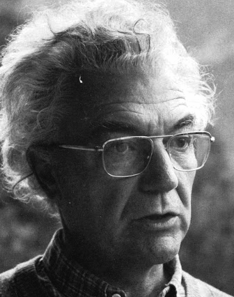 Famous type designer born in 1928 in Unterseen, Switzerland, who died in September 2015. He closely cooperated with Linotype-Hell AG, after having been artistic director at Deberny-Peignot in Paris since 1952. He established his own studio in 1962 with André Gürtler and Bruno Pfaftli. Art director for Editions Hermann, Paris 1957 to 1967. Frutiger lived near Bern, Switzerland, and was very interested in woodcuts. In 2009, Heidrun Osterer and Philipp Stamm coedited
  Dutch writer and designer, b. 1960, Amsterdam, who currently lives in Hamburg. He studied at the Royal Academy of Arts in The Hague. From 1987 until 1991 he was the type director at Scangraphic, and from 1991-1994, he was the type manager at URW in Hamburg, at which time he completed URW Imperial, URW Linear, and
 German type foundry in Hamburg established in 1986 by Veronika Elsner and Günther Flake. They offer original fonts as well as improved versions of classical fonts. There are many non-Latin fonts as well. In-house designers include Jessica Hoppe (Carpediem), Verena Gerlach (
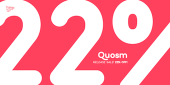 [
[ Grzegorz Klimczewski, who runs Fonty PL, a commercial Polish foundry etablished in 1994 in Wroclaw, is the Polish designer of a commercial font that mimics the letters found on Polish traffic signs, called Tablica Drogowa (
 Creator at FontStruct in 2009 of mostly pixel font families such as IMSureItSBeenDoneBefore (in many styles). He also made Material Electrons, as well as The Video Game Arcade Font, CASIOpeia ((+Menus), based on the CASIO fx-7700G Power Graphic Scientific Calculator) and Data Entry (inspired by TechnoDisplayCapsSSK, (C) 1992 Southern Software, Inc. [and 4 glyphs from the MICR font E-13B]). Other fonts: Futuristic Terminal Display (2009, great!), Mag Not Mad Solid (2009, pixel face), Mag Not Max (2009, horizontally striped pixel face), Son of Zaxxon (2009, horizontally striped, +Solid; both based on the 1984 Sega game Future Spy), Goin'Commando (2009, based on a 1985 Capcom game called Commando), Zenny Coins (2009, based on a 1987 Capcom game called Black Tiger), Smoking Gun (2009, based on the game Gun.Smoke (1985, Capcom; used again for 1943: Battle Of Midway, 1987, Capcom)), Bentley Bear (2009, based on 1983 Atari game called Crystal Castles), Temporal Aviator 84 (based on the 1984 Konami game Time Pilot 84), Reindeer Flotilla, Jet Bradley (inspired by the video game logo for "TRON 2.0", 2003 Buena Vista Interactive / Monolith Productions), Alan One (Font from TRON, 1982 Bally Midway Mfg Co), Buzzard Bait (font from Joust, 1982 Williams Electronics Inc., and its sequel, Joust 2: Survival of the Fittest, 1986 Williams Electronics Games, Inc), Genetic Engineering Error (from Robotron: 2084, (C) 1982 Williams Electronics Inc., and its sequel, Blaster, (C) 1983 Williams Electronics Inc), Mutant Bender (from Defender, (C) 1980 Williams Electronics Inc), Stargate Immortals (from Stargate, (C) 1981 Williams Electronics Inc), Separate Ways (from Journey, (C) 1983 Bally Midway Mfg), Deadly Disks (from Discs Of TRON, (C) 1983 Bally Midway Mfg Co), Jerry Belvedere (from Satan's Hollow, (C) 1981 Bally Midway Mfg Co, and from Satan's Hollow, (C) 1981 Bally Midway Mfg Co), Tortuga (from 600, (C) Konami 1981; Turtles, (C) 1981 Stern Electroncs/Konami; and Turpin, (C) 1981 Sega/Konami), OCRA Pixel 15x10, Intelligent Television Dings (Right, Left), Hand Aviator (Palm pilot font family), Intelligent Television (based on typeface used in Intellivision games by Mattel Electronics, and the True Type Font "Intellect"), DMP-200RS (based on the output of the Radio Shack DMP-200 printer), Bubbles (based on Bubbles, (C) 1982 Williams Electronics Inc), Mukor Rules All Galaxies (from Blasteroids, (C) 1987 Atari Games), Futuristic Terminal Display, Winky and the Hallmonsters (from Venture, (C) 1981 Exidy), Bubble City (from Road Blasters, (C) 1987 Atari Games), Mag Not Mad (from Mag Max, (C) 1985 Nichibutsu / Nihonbussan Co., Ltd), The Bacterian Empire (from Thunder Cross, (C) 1988 Konami, and its sequel, Thunder Cross II, (C) 1991 Konami), Solvalou Combat Aircraft (from Xevious, (C) 1982 Namco Ltd / Atari, and its sequel, Super Xevious, (C) 1984 Namco), Red Falcon Organization (from Super Contra, (C) 1988 Konami), Lucas Readies The Lawyers (from Star Fire, (C) 1979 Exidy), Cheese Was The Bait (from Mousetrap, (C) 1981 Exidy), Thunder and Lightning (from Raiden, (C) 1990 Seibu Kaihatsu Inc), Pepper The Zippering Angel (from Pepper II, (C) 1982 Exidy Incorporated), Beware I Live (from Sinistar, (C) 1982 Williams Electronics Inc), Goin Commando (from Commando, (C) 1985 Capcom), The Monkey Biz Gang (from Kangaroo, (C) 1982 Sun Electronics Corp. / Atari), Vic Viper (from Gradius / Nemesis, (C) 1985 Konami), Diskarmor Attack (from Rygar, (C) 1986 Tecmo), Benkin The Jogging Elf (from Mystic Marathon, (C) 1984 Williams Electronics Inc), Qix Are For Kids (from Qix, (C) 1981 Taito America Corporation), Omni Consumer Products (from ROBOCOP, (C) 1987 Data East Corporation), Mister Not Undo (from the Mr. Do series, Lady Bug and Jumping Jack: Lady Bug, (C) 1981 Universal; Mr. Do, (C) 1982 Universal; Mr. Do's Castle, (C) 1983 Universal; Mr. Do's Wild Ride, (C) 1984 Universal; and Jumping Jack, (C) 1984 Universal), Micro Police Pgo Stick Division (from Hopping Mappy, (C) 1983, 1986 Namco), Great Demon World Village (from Ghouls 'N Ghosts, (C) 1988 Capcom), Demon World Village (from Ghosts 'N Goblins, (C) 1985 Capcom), Secret Agent Dabney Coleman (from Cloak&Dagger, (C) 1983 Atari), Getting Away With It (from Electronic's 1991 self-titled album; a variation of Wim Crouwel's "Stedelijk" alphabet, used on his 1966 Vomgevers poster for the Stedelijk Museum in Amsterdam), Galden Tribe Attacks Mu (from Last Duel, (C) 1988 Capcom), Superior Scientists (from Vastar, (C) 1983 Sesame Japan Corp), Keeper of the Zoo (from Zookeeper, (C) 1982 Taito America Corp), Taito 1982 (Font used in the following Taito games: Elevator Action, (C) 1982 Taito Corp; Front Line, (C) 1982 Taito Corp; Jungle Hunt, (C) Taito America Corp / Jungle King, (C)1982 Taito Corp; and Wild Western, (C) 1982 Taito Corporation), Howard Fine&Howard (from The Three Stooges, (C) 1984 Mylstar Electronics), TwinBee And WinBee (from TwinBee, (C) 1985 Konami), Quest For Honor (from Last Mission, (C) 1986 Data East USA, Inc), Street Justice (from Vigilante, (C) 1988 Irem Corp), Colwyn's Glaive (from Krull, (C) 1983 D. Gottlieb And Co.), Command Prompt (a family based on Microsoft system fonts), Temporal Aviator 84 (from Time Pilot '84, (C) 1984 Konami; used again for Contra, (C) 1987 Konami), Helicopter and Jeep (from Silkworm, (C) 1988 Tecmo Ltd), A Different Space Odyssey (from Space Odyssey, (C) 1981 Sega Enterprises Ltd), Cosmic Cruiser (from Kozmik Krooz'r, (C) 1982 Bally Midway Mfg Co), Kaptn Kroozr Goes Wacko (from Wacko, (C) 1982/1983 Bally Midway Mfg Co), Rescuing Astronauts (from S.R.D. Mission, (C) 1986 Taito Corp), Super Joe (from The Speed Rumbler, (C) 1986 Capcom), Alex Murphy (inspired by the RoboCop movie logos), Blazer of Trails (Chevy logo font),
  [
[ German [T-26] designer of Cologne (a 7-weight techno font family), Tempelhof (2003, a sans family), Domestos98 (a large family), Domestos Sans (2000), DomestosSerif (1999), Romero (2002, a 5-weight techno font family), Linotype Leggodt (1997, based on the forms of the first fonts intended for multimedia, such as the OCR of Adrian Frutiger), and Plastizid97.
  [
[ Swiss or Swedish designer of OCR-A (2008), Atari Small (2007), and
  The idea of Katatrad originally comes from the vision and support of Cadson Demak design team. Started out by a type design exhibition project and transformed itself to a boutique font collection. Katatrad, which is located in Bangkok, offers fonts from new and up coming designers from Thailand. The collection is also available in standard Latin set and Latin&Thai version of the same font.
 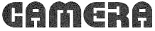 [
[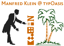 [
[
 Or Matthew Hinders-Anderson. Climate activist and lead designer for
  [
[ An
An  Monotype's monospaced font families: Andalé Monospace, Arial Monospace, Courier, Letter Gothic,
  Fundicion Tipografica Neufville SA is a foundry based in Barcelona, headed by Wolfgang Hartmann, which writes about itself: Neufville Digital produces and markets the fonts from Fundicion Tipografica Neufville, Bauersche Giesserei, Ludwig&Mayer, Fonderie Typographique Française and Fundicion Tipografica Nacional.
  In 1968, American Type Founders produced OCR-A, one of the first optical character recognition typefaces to meet the criteria set by the U.S. Bureau of Standards. The design is simple so that it can be read by a machine, but it is slightly more difficult for the human eye to read. OCR-A follows the 1981 standard set by the American National Standards Institute (ANSI), X-3.17-1981 (size I). The same design is also specified for the German DIN 66008 standard. The letters are rounded and octagonal, a true monstrosity in vogue ca. 2001 in Swiss and German graphic design circles. [
 [
[ Graduate of Monash University (Australia), class of 2016. Now based in Berlin, he is a type engineer at Dinamo. Type designer who created these typefaces:
  Rumors Foundry was set up in 2020 by Palermo, Sicily-based graphic designer Gabriele Bellanca. In 2020, he released the 5-style sans family
  Graphic and media designer and art director in Espinho, Portugal, b. 1984, who founded first
  Born in Duesseldorf in 1951. She co-designed at Apply Design (now Apply Interactive) in 1999 a nice series of stencil fonts with Guenther Flake: WaltonStencil-BlackRough, WaltonStencil-WhiteRough, LaPinaStencil,
  Britsh graphic, branding and type designer. His typefaces:
 The fonts produced in 2002 by
  Ingo Krepinsky (b. 1976, Eschwege) graduated in 2000 from Fachhochschule Hannover, and in 20903 from Hochschule für Künste Bremen, where he specialized in typography. He is a cofounder and type designer at Typonauten, a Bremen-based commercial font foundry started in 1998 (together with Christoph Hanser and Stefan Krömer).
  Foundry established in Prague in 2006 by
  [
[ [
[ This is one of the most talented FontStructors, but also an active musician. On
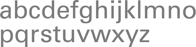
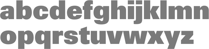
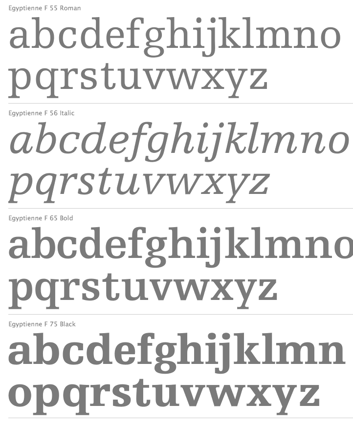
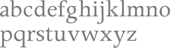
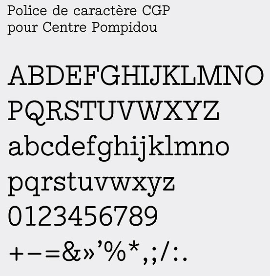
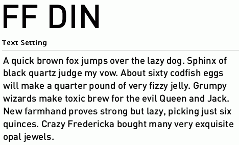
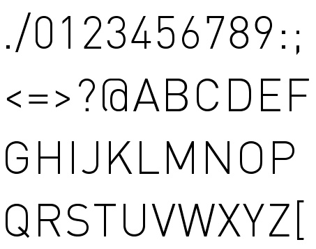
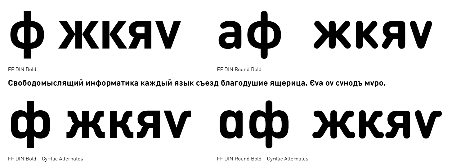
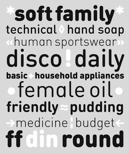
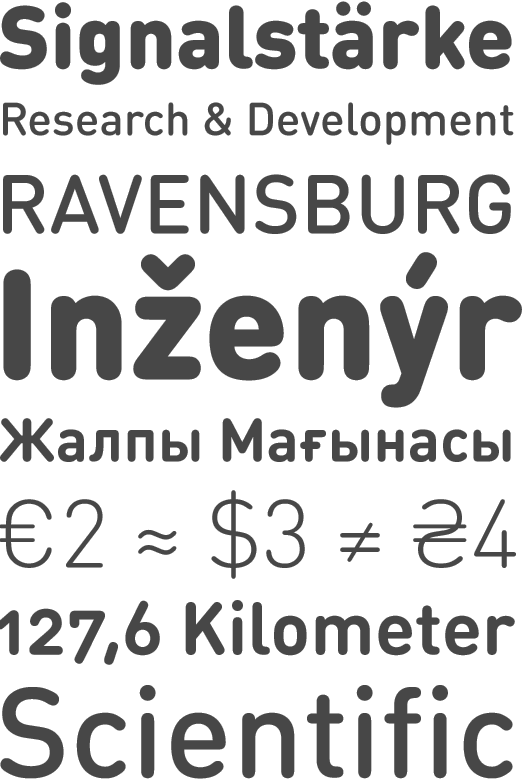
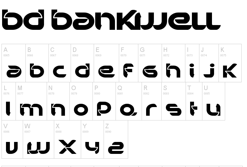
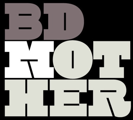
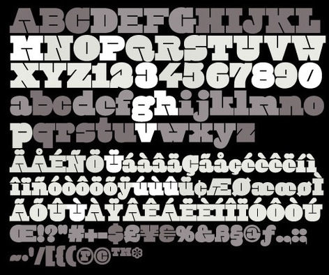
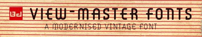
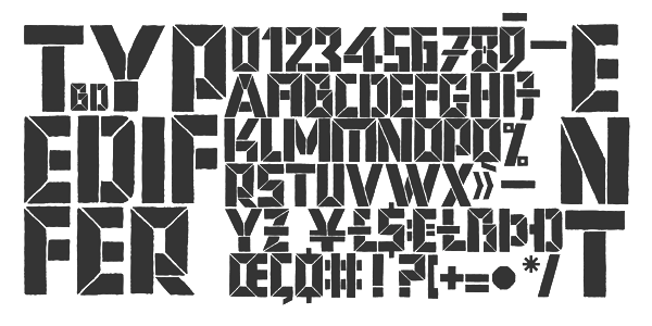
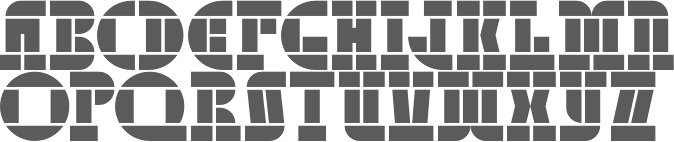
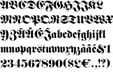
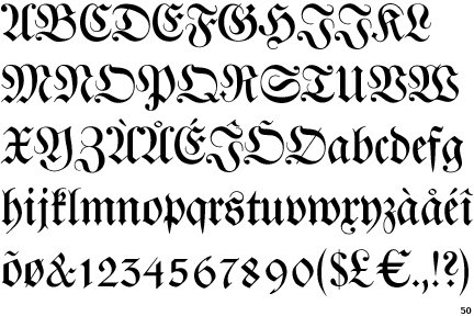
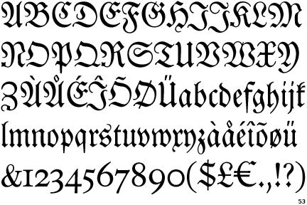
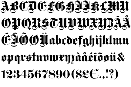
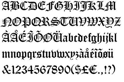
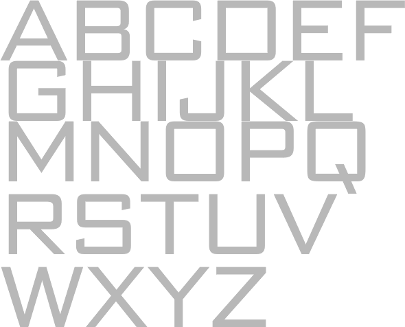
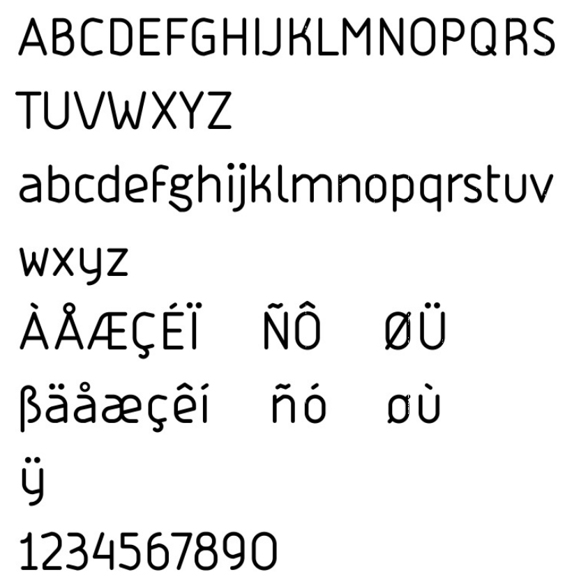
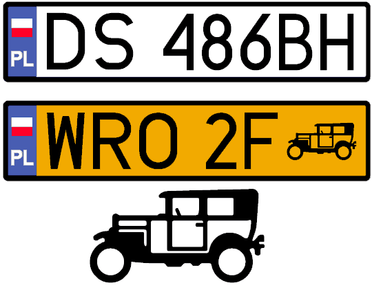
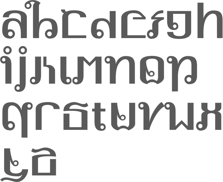
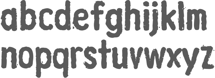
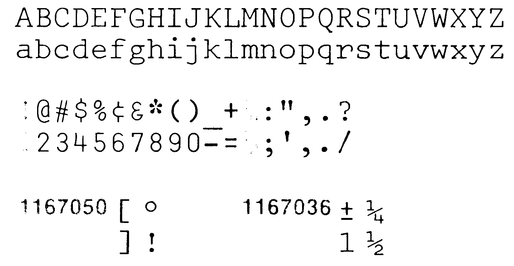
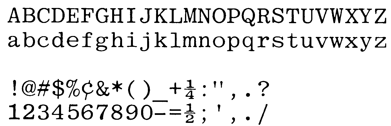
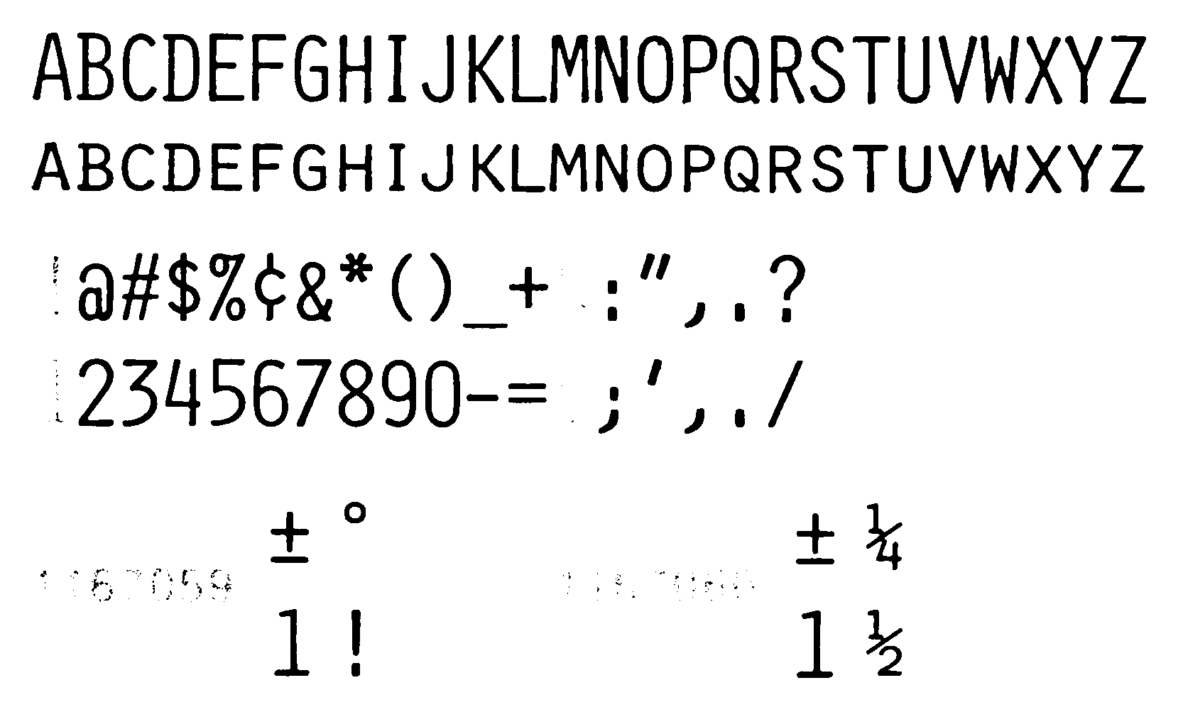
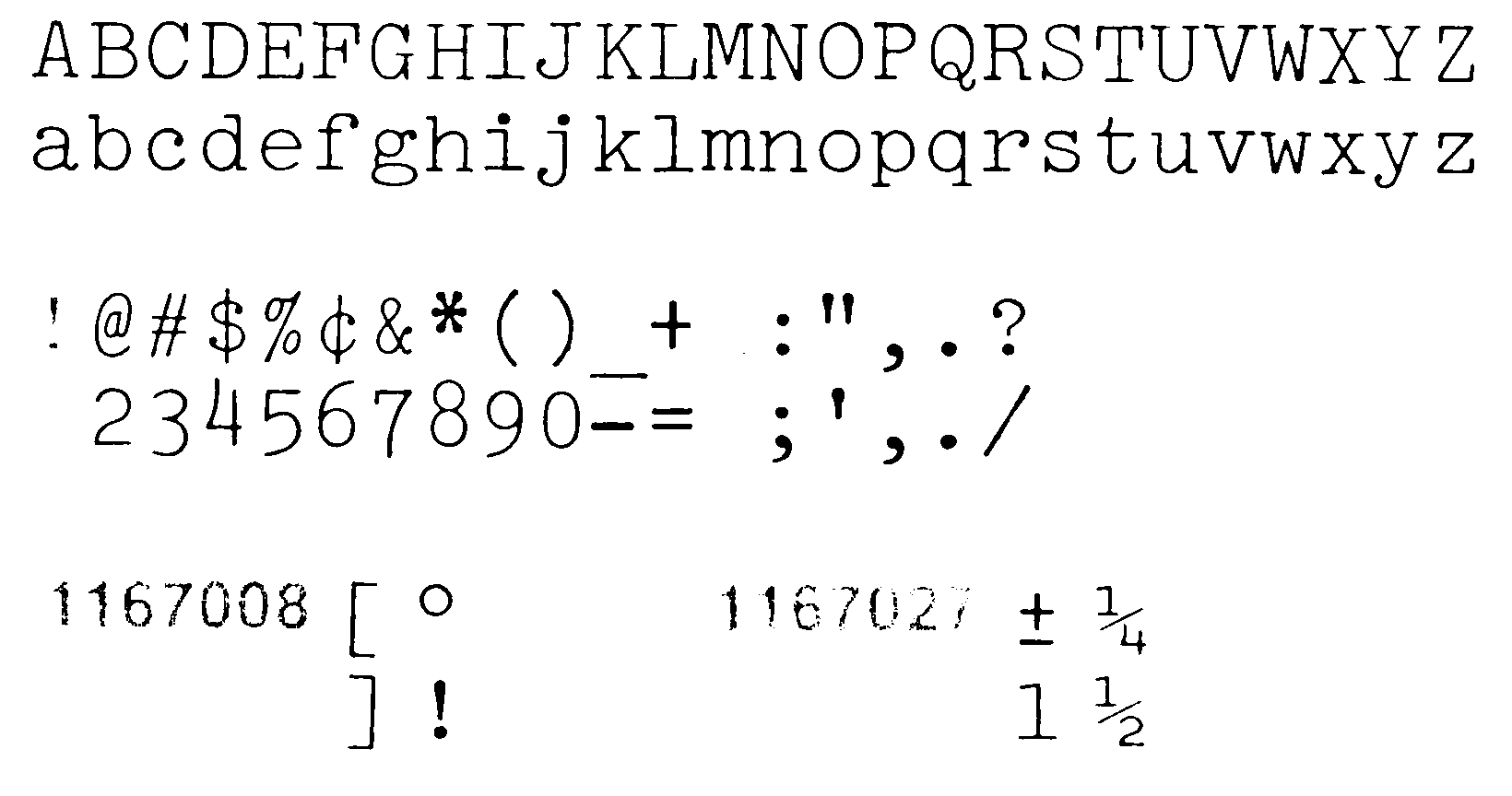
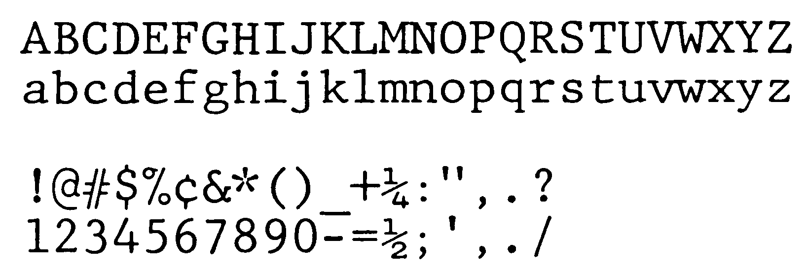
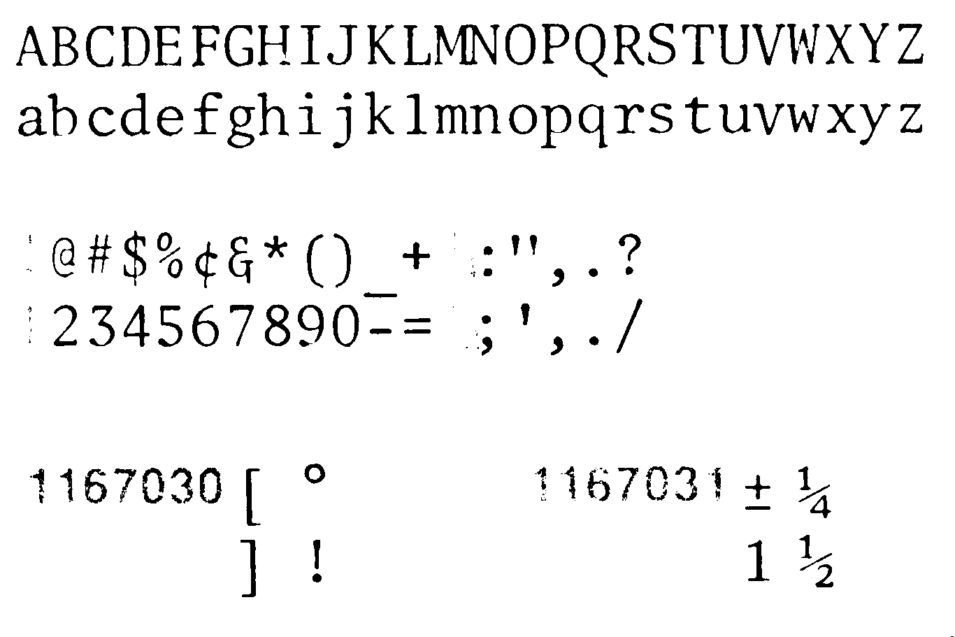
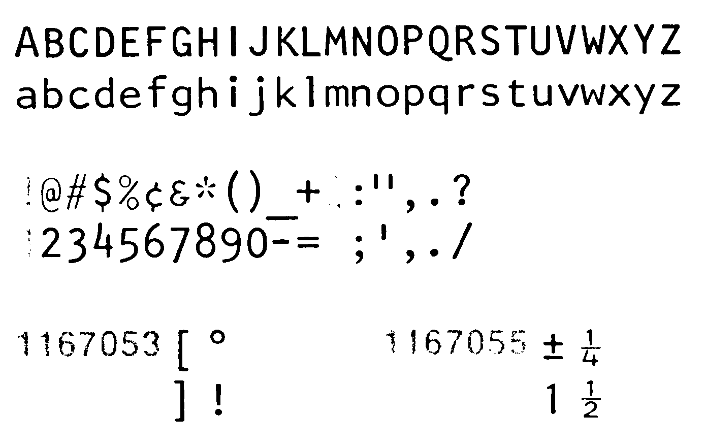
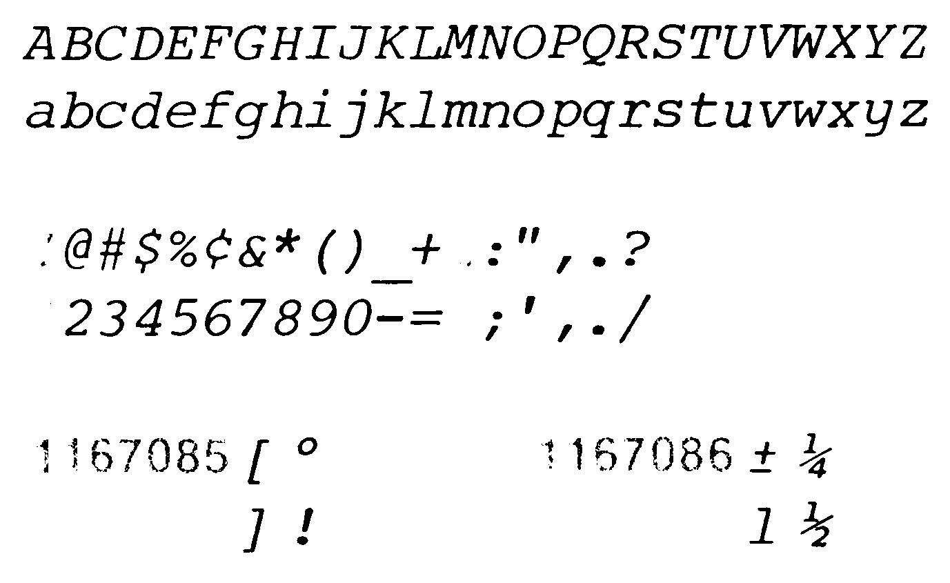
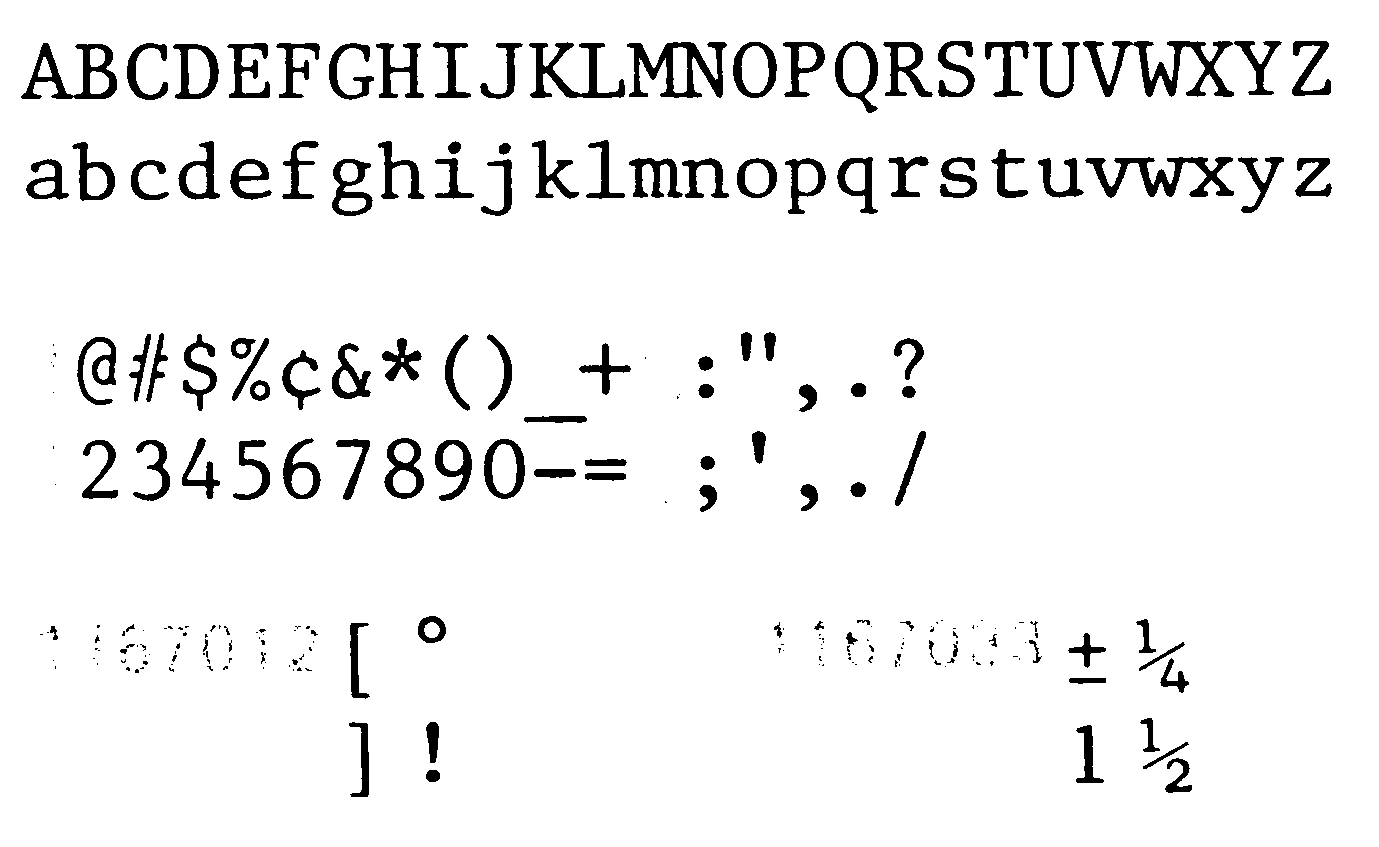
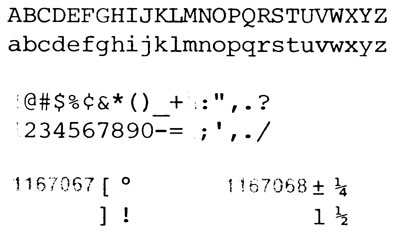
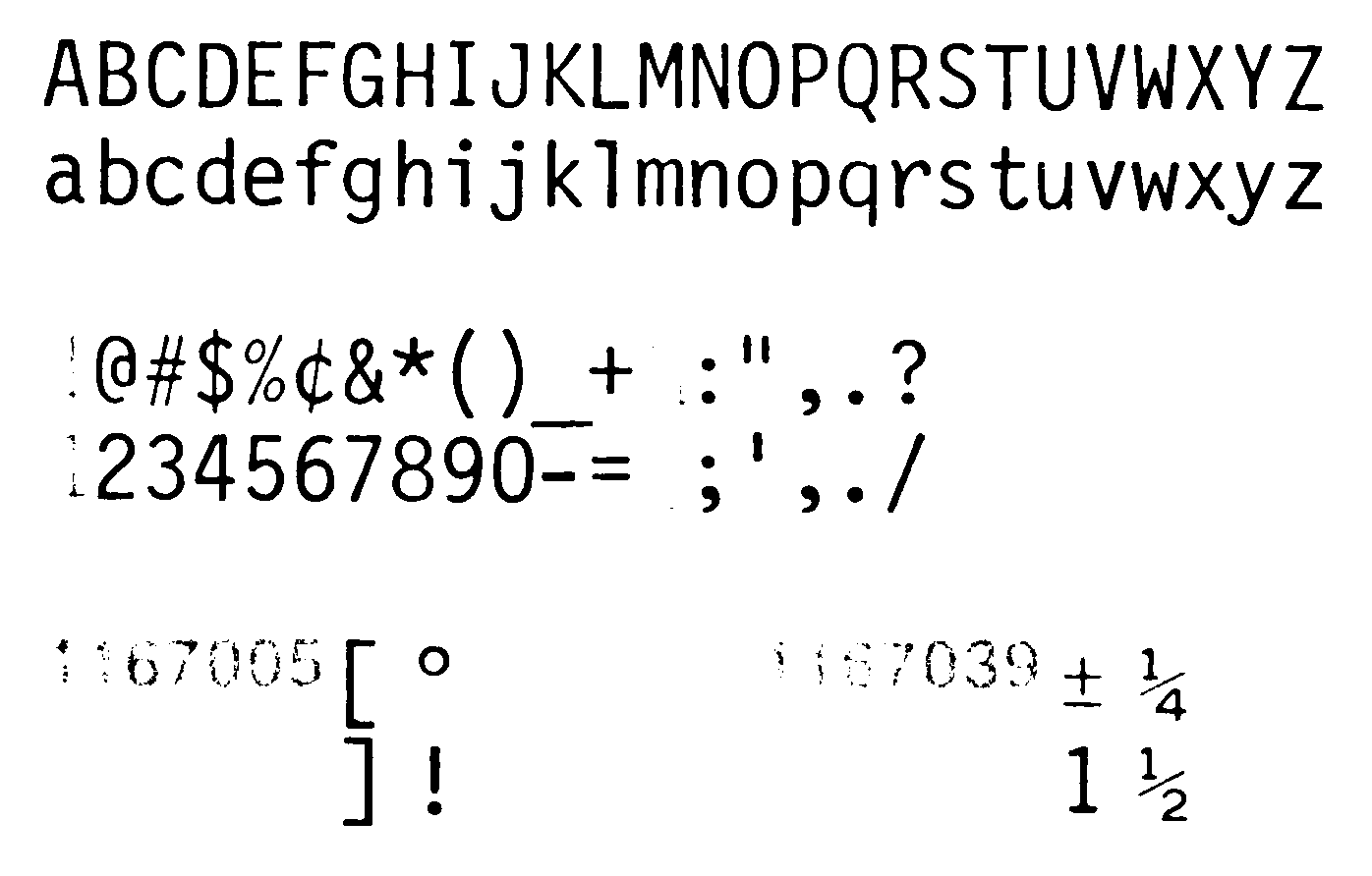
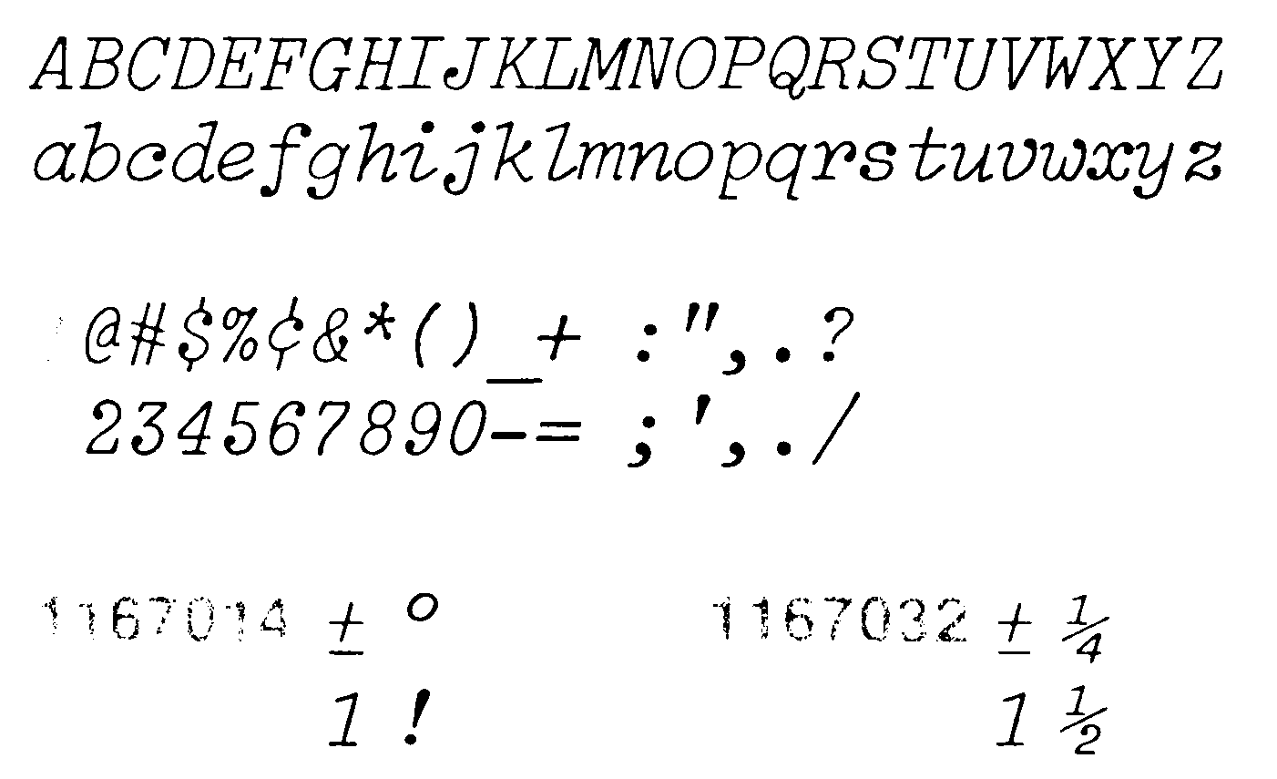
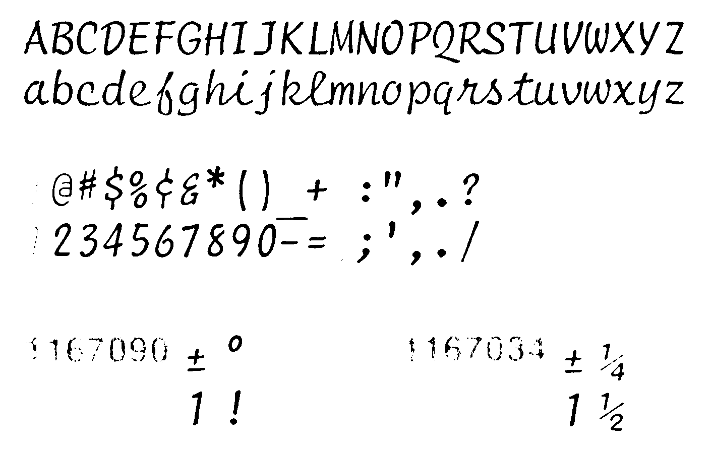
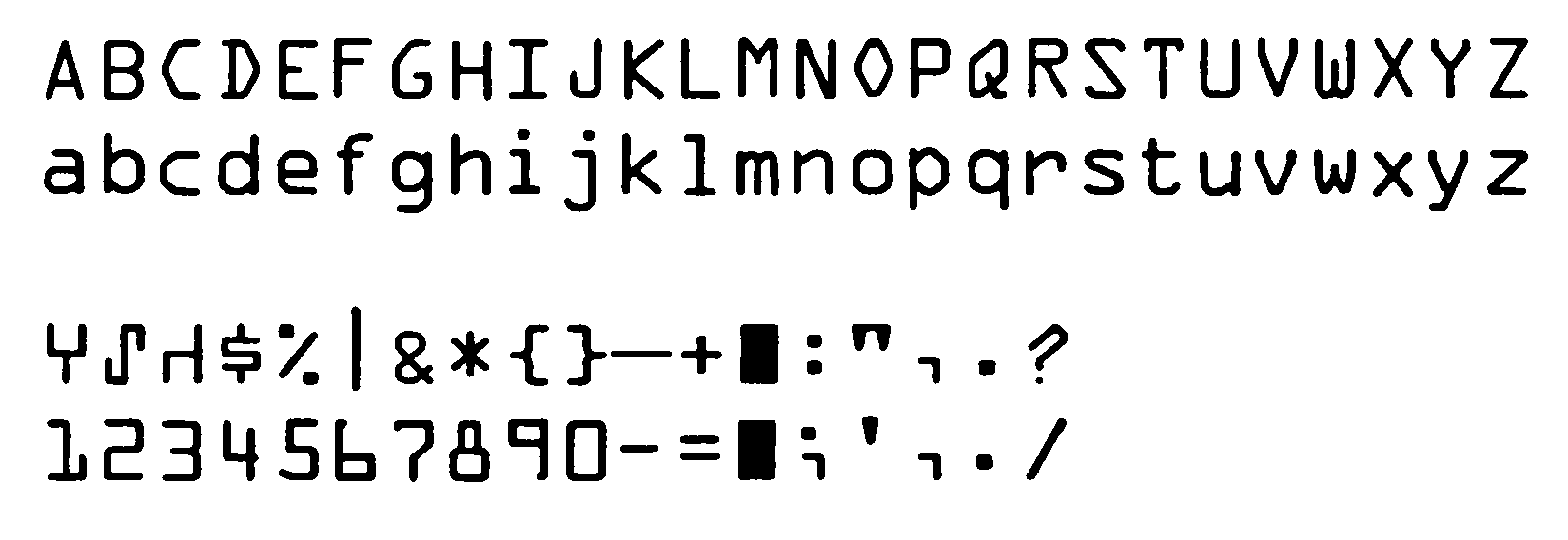
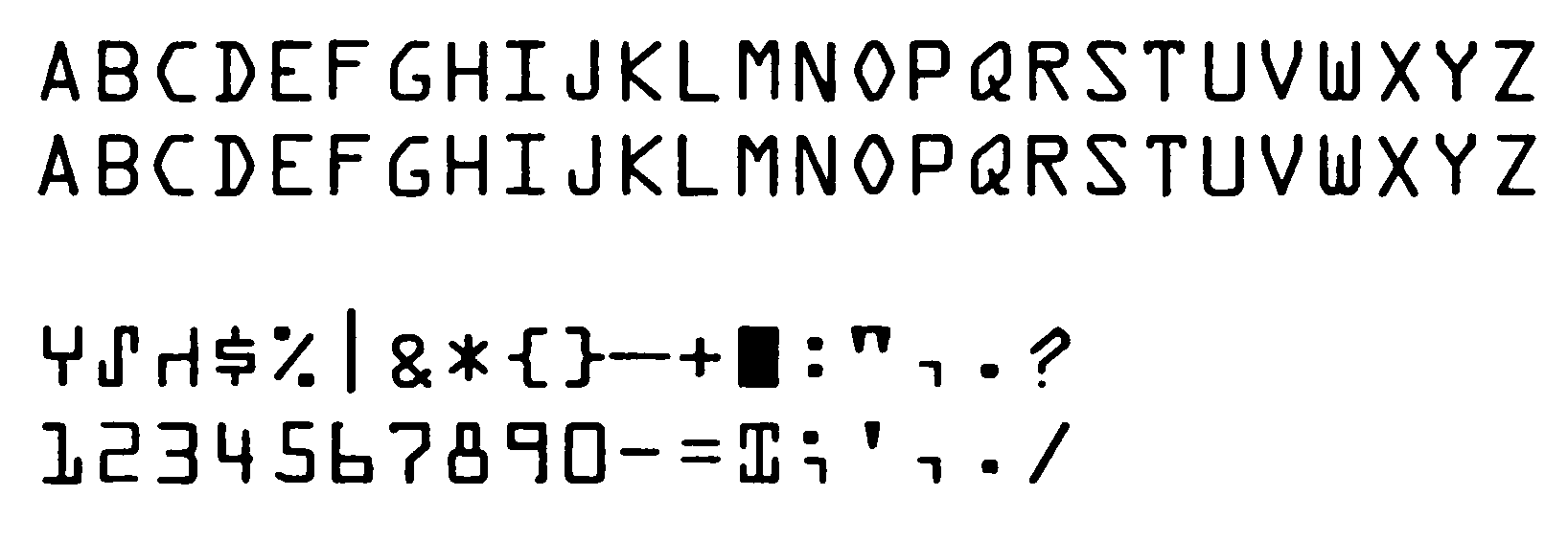
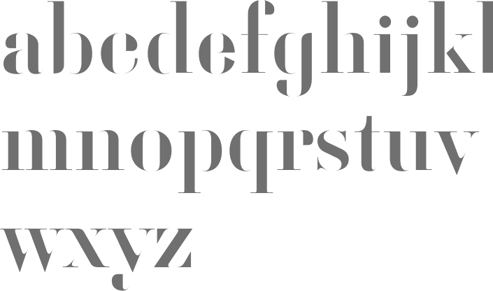
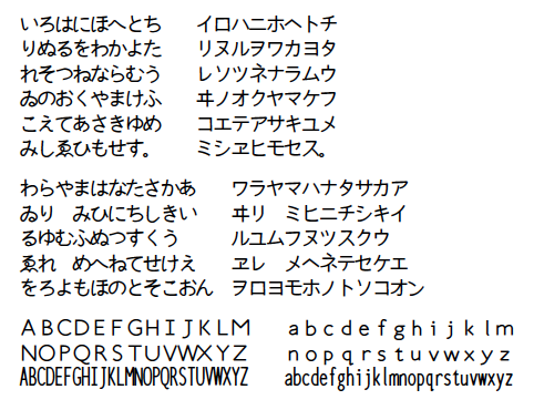
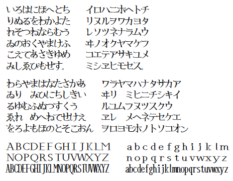
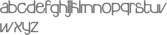
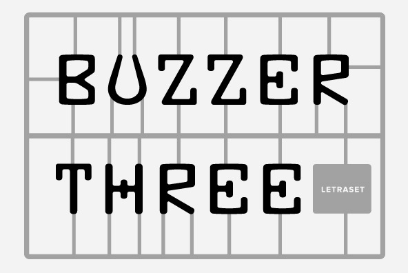
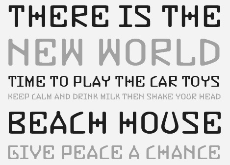
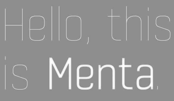
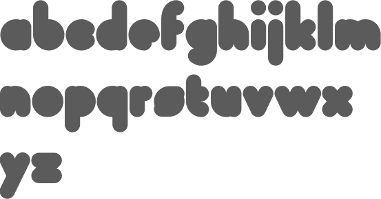
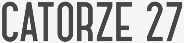
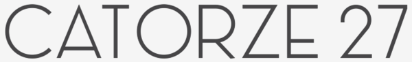
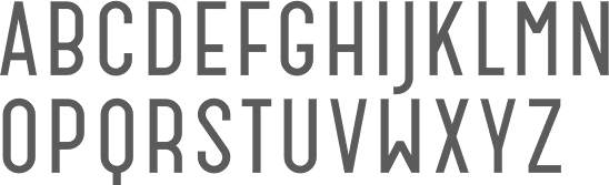
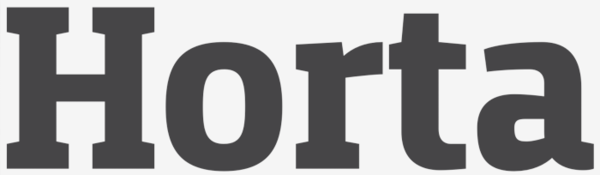
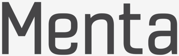
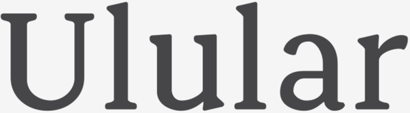
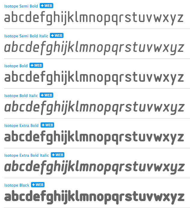
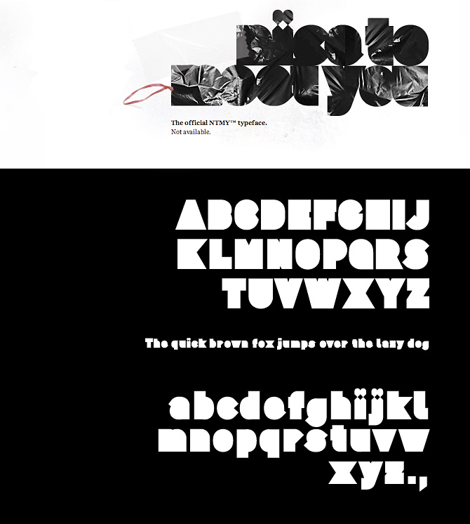
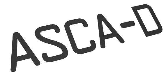
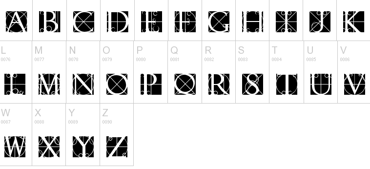
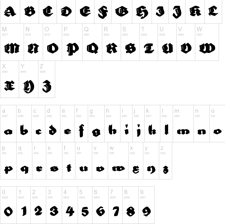
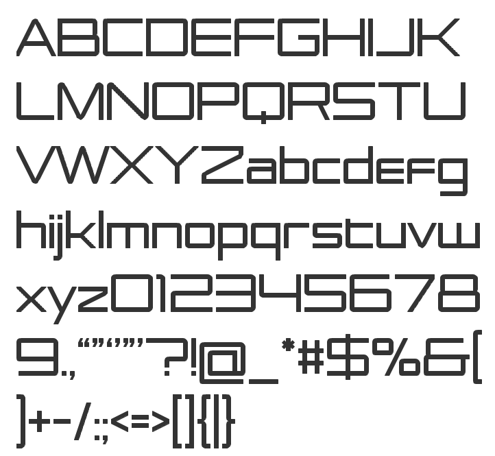
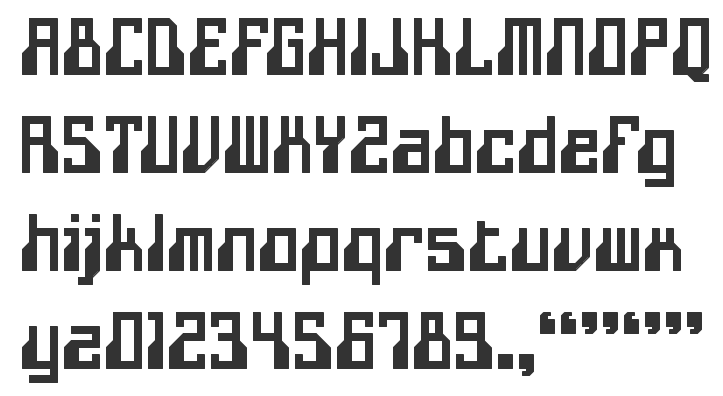
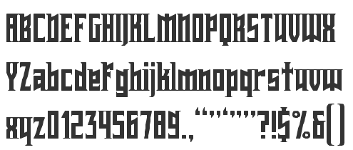
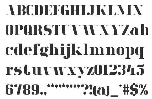
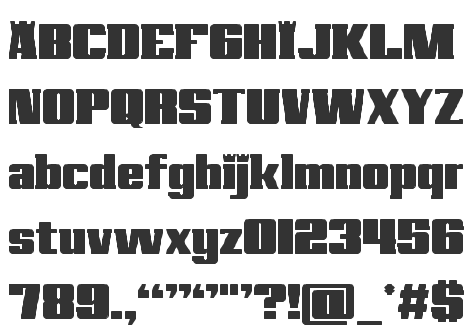
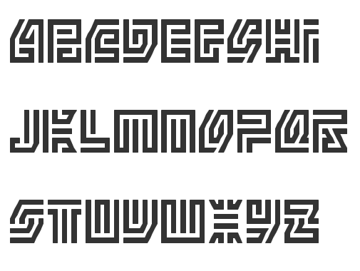
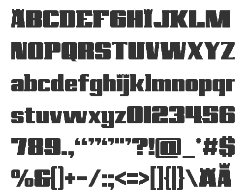
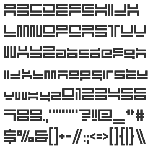
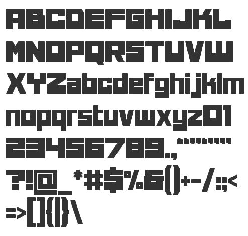
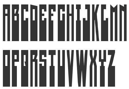
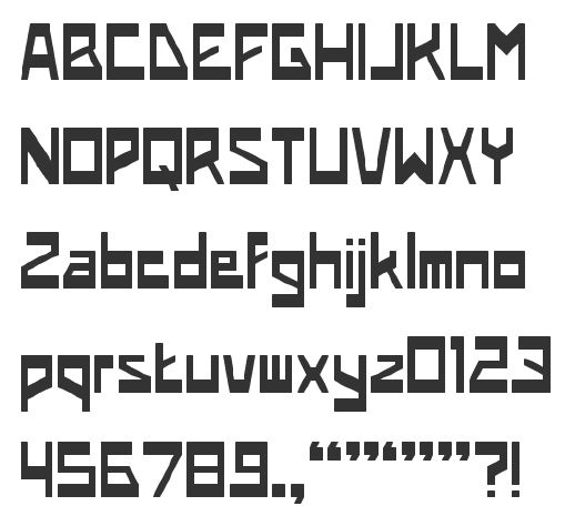
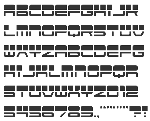
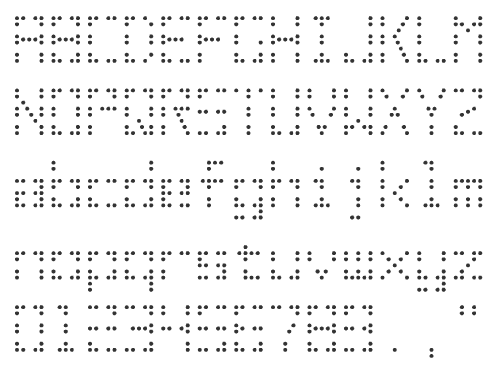
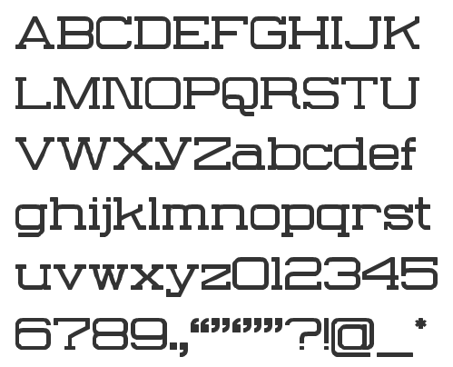
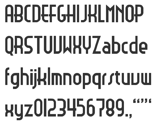
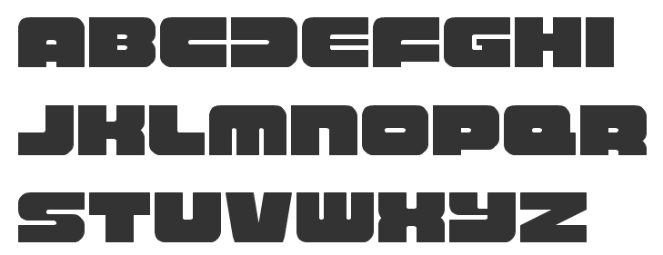
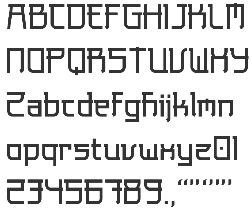
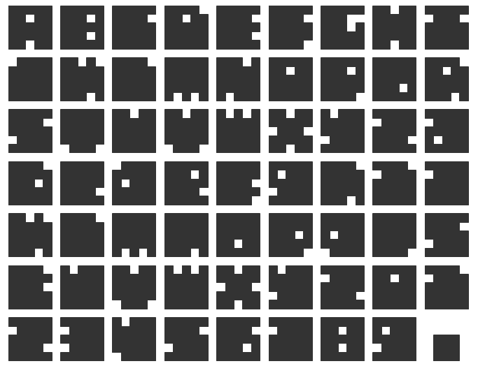
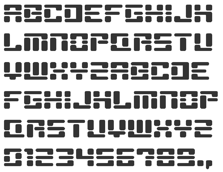
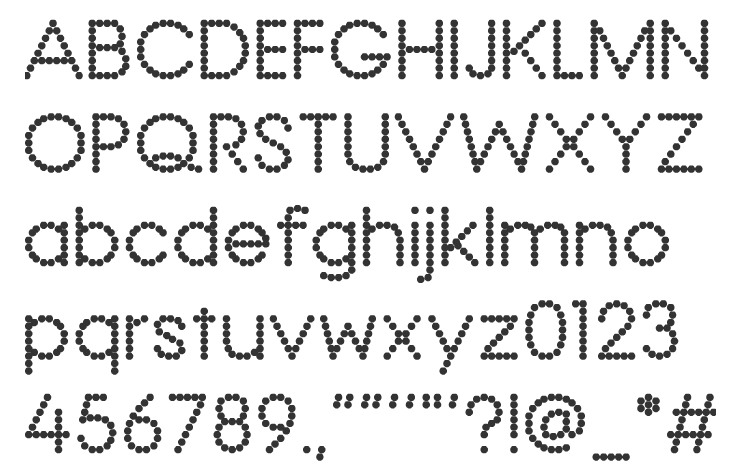
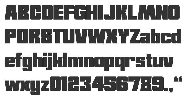
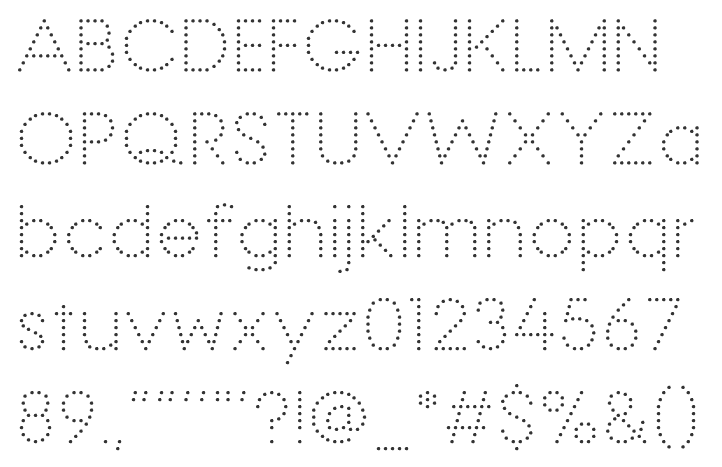
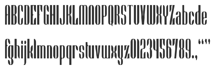
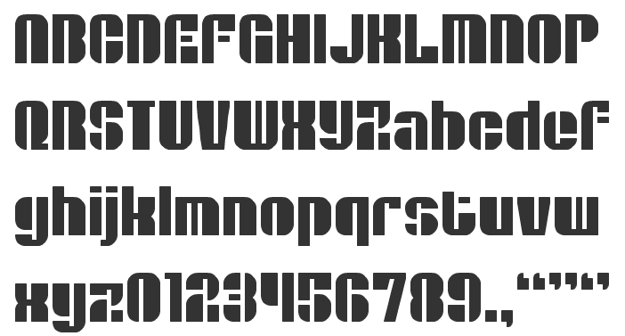
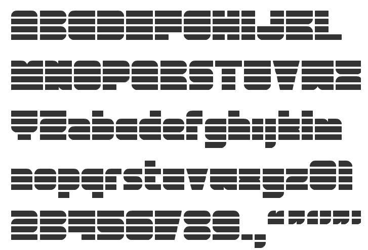
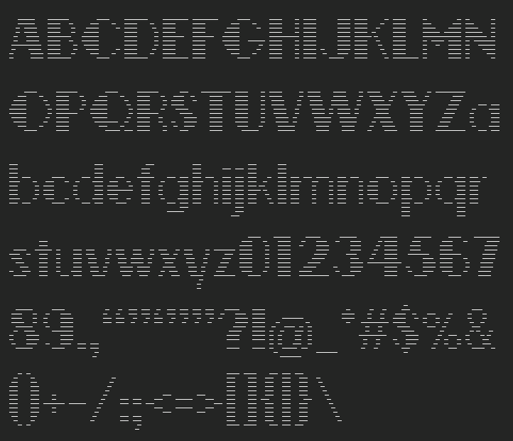
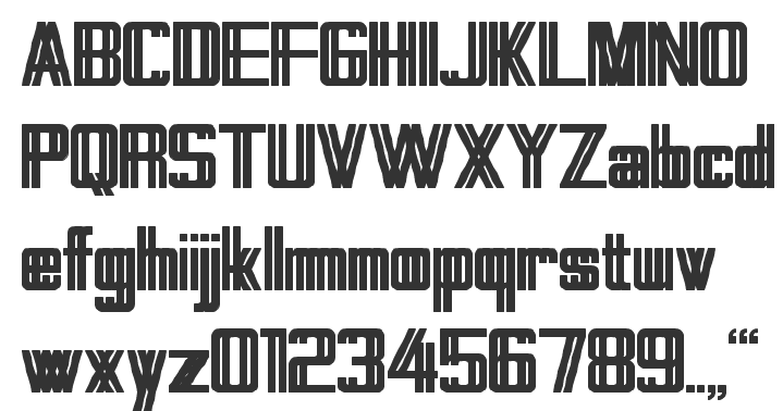
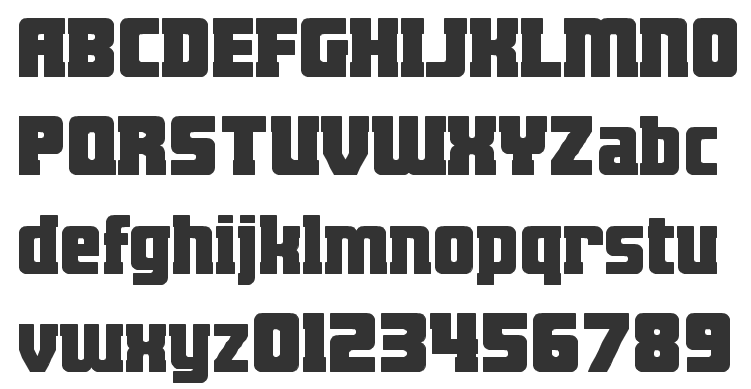
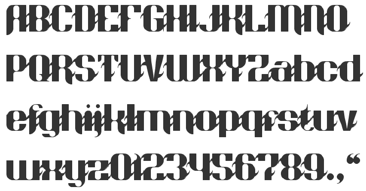
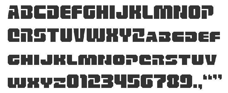
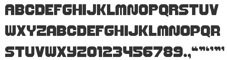
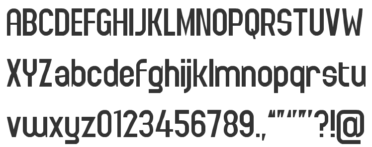
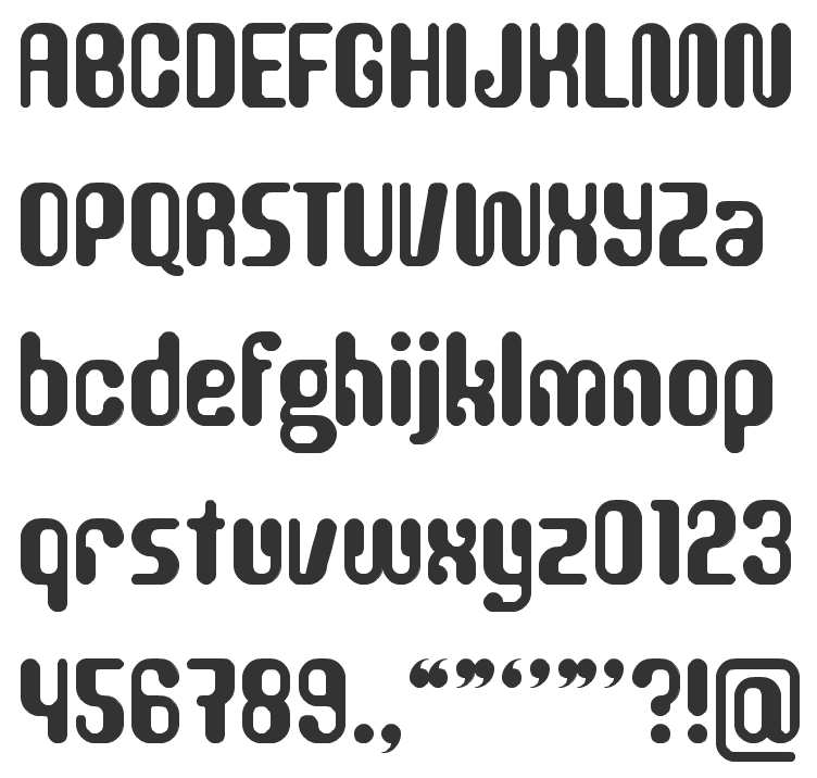
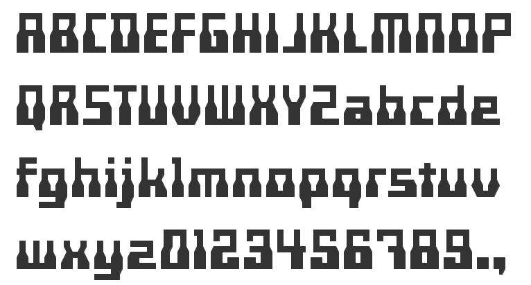
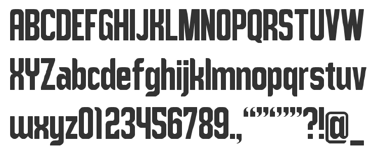
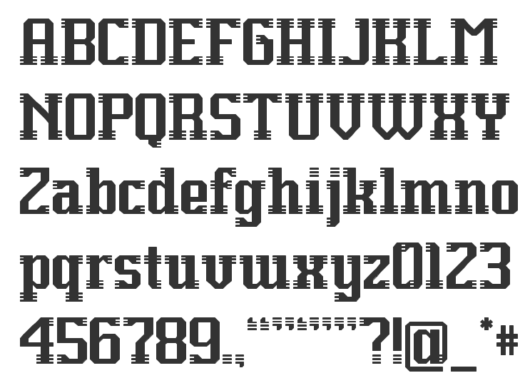
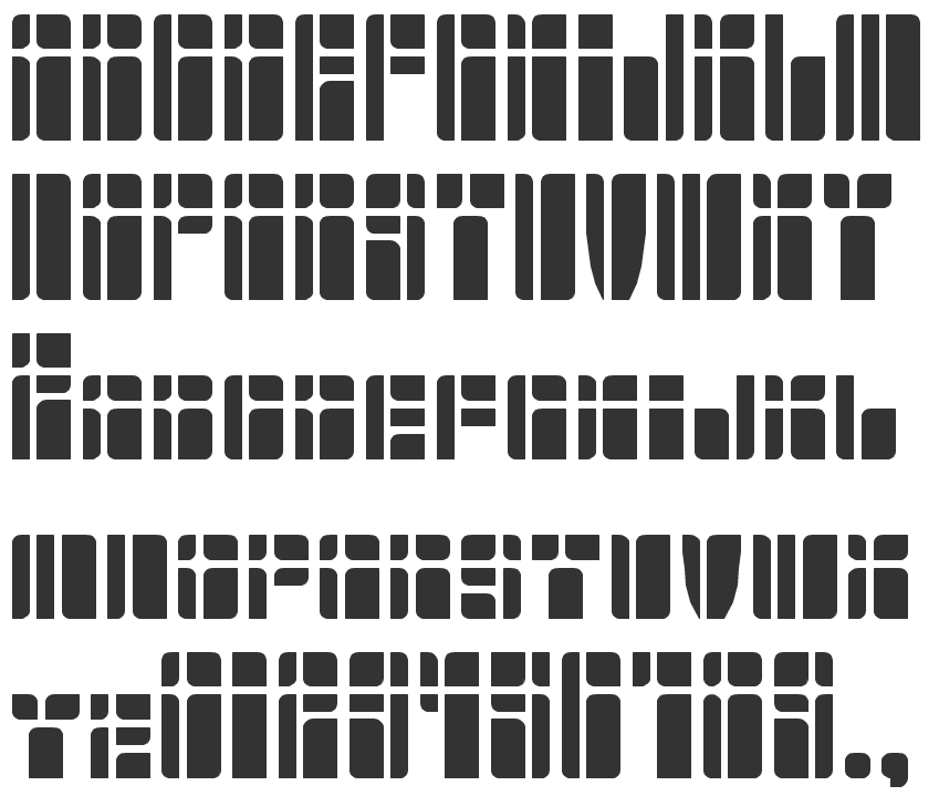
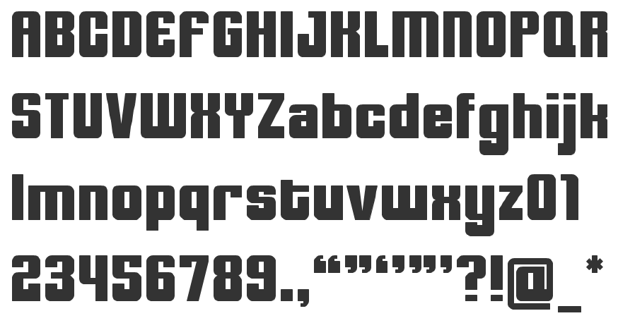
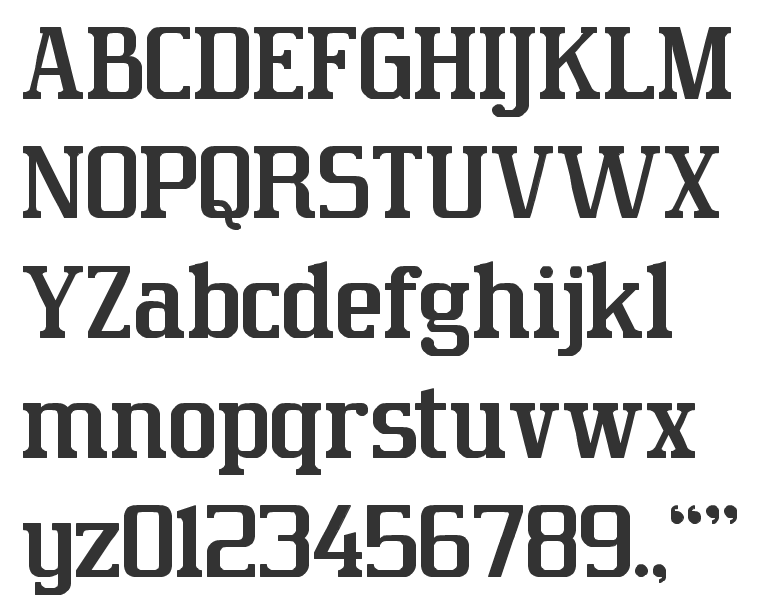
|
|
|
|