| | |
4th February
[Sergiy Tkachenko]

|
 Sergiy Tkachenko (b. 1979, Khrystynivka, Cherkasy region, Ukraine) lives in Kremenchuk, Ukraine, and has been a prolific type designer since 2008. Sergiy graduated from Kremenchuk State Polytechnic University in computer systems and networks in 2007. Various other URLs: Microsoft link, Identifont, 4th February, Behance, Klingspor link, Revision Ru, Russian creators, CPLUV Fontspace, Twitter. Kernest link. Sergey Tkachenko's typefaces:
 - 2008: the techno typefaces Bladi One 4F, Bladi One Slab 4F, Bladi Two 4F, Abia Wide 4F Thin.
- 2009: Wrongo 4F, Zantiqa (an über-serif), Serifiqo (a (free) thin didone fashion mag display face), Codename Coder 4F (monospace programming font), Droporado 4F (using circles only), Tovstun (futuristic, ultra-fat and rounded), Perfocard 4F, Modularico (five modular typefaces based on a logo from Master Kremenchug a company for which Sergiy worked for 4 years), Boldesqo Serif 4F (a splendid informal fat didone, now with Greek support), Tkachenko Sketch, Unicase Slab (a techno slab), Laftatic, Logofontik 4F (techno), PC.DE Stencil (+Italic; custom stencil font), Stenciliqo 4F, Tiap Liap 4F (handwriting), Nut Kit 4F, Rezzzistor 4F, the inline modular face Grand Hotel, and Bijou 4F.
- 2010: Roboo 4F (a bubblegum typeface family), PädIn (a custom typeface for Pädagogische Initiative e.V.: rounded fat informal face), Fat Quad (in the fatty trend), Veselka (a free multiline face), Smeshariki Black (+ Gleams: a bubble gum font made for an animation company), Republica 4F (a fat family), Rodeqa Slab 4F, ComFi (semi-octagonal), Grotesqa 4F, Nowy Geroy 4F, Fabryka 4F (a monospaced typewriter family), Placarto4F-Italic (an ultra fat art deco), Lavina 4F (a hairline sans with lachrymal terminals).
- 2011: Squartica (octagonal), Decomart (free), Model 4F Unicase (a unicase fat didone released in 2013 only), Fontatigo 4F, Kylie 4F (bilined and geometric), Waldemar 4F (a large didone style fat typeface family), Dinesqo (2011, a monoline sans of utter simplicity), Qargotesk (+Cyrillic) [images: i, ii, iii, iv], Neultica 4F (black unicase family), Squartiqa 4F (2011, constructivist), Clarenta 4F Black (after Clarendon---a great family), Designosaur (free sans), Perfopunto (based on perforated circles and squares), OlaScript 4F, Bayadera 4F (a tamed upright monoline script), Febrotesk4FUnicase (squarish unicase family).
- 2012: Targo 4F (rounded typeface with stencil and non-stencil styles), Myra (free font), Myra 4F Caps (free), Cedra (wide monolined sans face), Fontatica 4F (rounded techno grotesk), Akzentica 4F, Ukraintica 4F Wide (a monoline wide-bowled sans family), Laventa 4F, Sports World (free athletic lettering font), Web Serveroff (free computer geek font), Octin Spraypaint Cyrillic (a rough stencil done exclusively for Ninja Theory).
 2013: Condesqa (modular sans), Esqadero (an uncomplicated monoline sans), Vanyla 4F Unicase (monoline), Esqadero FF CY (a free wide sans, Cyrillic), Bond (a confident no-frills sans), Attentica (free sans font for Latin and Cyrillic), Cedra 4F Wide Thin. 2013: Condesqa (modular sans), Esqadero (an uncomplicated monoline sans), Vanyla 4F Unicase (monoline), Esqadero FF CY (a free wide sans, Cyrillic), Bond (a confident no-frills sans), Attentica (free sans font for Latin and Cyrillic), Cedra 4F Wide Thin. - Cyrillizations: several typefaces such as Lavoisier (by Alec Julien), Budmo Jiggler (Ray Larabie) and JoAnne Display (Sandy Cerovich), Gnuolane (of a Ray Larabie font), Paranoid Cyrillic (based on Kevin Lo's Paranoid), Movavi Grotesque Black (+Cyrillic; image; numerals), Azoft Sans (made for Azoft, and free here and here).
- Custom fonts: Blue Pill, Sansus Webissimo (since 2011 free at Open Font Library), Minaeff ECT (2011, a free legible family for Latin and Cyrillic, custom-made for and downloadable from WebhostingRating.com), Webhostinggeeks.Com (2011), Web Serveroff, OnlinePharmacyCheck.Com (2011), 1800Flowers.com (2011), DesignStudio.com (2011, free), ArchyStudio.Com (2011, free download, Movavi Grotesque (2011, free), Azoft Sans, PÄd In, Smeshariki, Fat Cow (2010: free condensed sans), ComFi (2010, free), PC.de (2009: free techno family, including a stencil face), League Gothic (2009-2011, The League of Movable Type) Cyrillic, Paranoid Cyrillic, 28 Days Later Cyrillic, Acid Label Cyrillic, Dead Secretary Cyrillic, Rezland Cyrillic, Sweet Leaf Cyrillic, Droid Cyrillic, Jo Anne Display Cyrillic, Gnuolane Free Cyrillic, Bosox Cyrillic, Budmo Jiggler Cyrillic.
- Typefaces from 2014: Laqonic 4F (unicase sans), Cubynets 4F, Blogger Sans (free rounded organic sans), Boncegro (free Western typeface, briefly called Vaquero before a name change), Motor 4F (based on Russian car license plates), Monitorica (a futuristic typeface made for ipHostMonitor.com, free at OFL), Areqo (condensed titling sans), Architect's Daughter Cyrillic (architectural lettering), GetVoIP Grotesque (a free typeface commissioned by GetVoIP), Meeneralca (unicase sans inspired by the logo of the mineral water Borjomi from Georgia), Glasoor (free oil spill or jelly bean font), Robotesqa.
- Typefaces from 2015: Croogla (a circle-based informal sans), Blackentina 4F (free ultra-black squarish typeface), Dart 4F (neo-grotesque), Kent 4F (a layered family for letterpress emulation).
- Typefaces from 2016: Brent 4F (original design going back to 2013), a custom typeface for the labels used in the Ukrainian Armed Forces, Economica Cyrillic Pro (with Vicente Lamonaca).
- Typefaces from 2018: Indi Kazka 4F (Indic simulation).
Abstract Fonts link. Dafont link. Creative Market link. Behance link. Hellofont link. Open Font Library link. View Sergiy Tkachenko's fonts. [Google]
[MyFonts]
[More] ⦿
|
Adrian Candela
|
 Valencia, Spain-based creator of the Bauhaus-inspired monoline geometric rounded sans typeface Bowhouse (2013, free), the retro futuristic typeface AC Brodie (2013, free), the free art deco typeface AC Mountain (2013), the 3d typeface AC Framed (2013), the film strip typeface AC Filmstrip (2013, free), Comic Runes (2013, rune simulation), Scribbled (2013), and the hexagonal typeface Bee Type (2013, +Filled, +outline).
 Newsense (2013) is an art deco typeface that extends Milton Glaser's Film Sense (1968). Romaji Mincho (2013) is a free Asian simulation font based on the style of the Mincho typeface. Rhyder (2013) is a great (free) geometric 1930s style sans typeface. Martell (2013) is a free general purpose slab serif family. AC Big Serif (2013) is a free rounded wedge serif typeface. AC Thermes (2013) is a sans display typeface. Typefaces from 2014: AC Wanita (hand-drawn). Typefaces from 2019: AC Guanche (a font based on the ancient scripts used by the Guanches, the aboriginal inhabitants of the Canary Islands). [Google]
[More] ⦿
|
Arendx Studio
[Asep Rendi]
|
Bandung, Indonesia-based designer (b. 1996). Mostly specializing in script typefaces, he designed these typefaces in 2021: Summer Glasses (a scrapbook font), Georgia Estate (a fat serif), Matsuyama (a bold brush script), Attentively (a scrapbook script), Beautiful Blossoms (a scrapbook script), Brockroom (script), Heroism Theory (a scrapbook font), Maidstone (a script), Vellyc (a fun all caps sans for supermarkets, cartoons or children's books), Ferocious (an all caps brush font), Lightness (script), Starter (a cartoon font), Bastille Members (a brush font), Creditor (a monoline script), Hypeblox (a loud blocky cartoon typeface), Hairage, Araside (a bold woodsy typeface), Birthright (script), Homeroom (a brush script), Mistook (a graffiti font), Orthodoxy (a fat brsh script), Shohibul (a fat brush script), Shootout (a street typeface), Workfares, Doorbell (script), Blessing (an inky script), Jitterbug (an irregular script), Obsessive (script), Southbound (a wild script), Bergdool (a script for lumberjacks), Bonding (script), Broomstick (script), Southland (brush script), Assuming (a signature script), Reflection, Assuming (a signature script), Loveless (an inky script), Motherhood, Conspiracy, Qualiga (a heavy script), Housewife, Outhouse (a marker font), Searchlight (a brush script), Conspirator (an urban brush font), The Overcook (a graffiti font), Hearthstone. Typefaces from 2020: Sobriquet (an inky script), Confidence (a brush script), Brookelyn (a brush script with some contrast), Soubrette (a dry brush script), Goodness (a dry brush script), Hardness (a dry brush script), Amersfoort, Honorable (a fat script), Weatherglass, Plottage, Hurstville (an inky script), Subjective, Jackart, Oregon Street, Walftower (bold, hand-printed), Cherkessk, Skidproof (an inky script), Onitsha, Loathing (a heavy brush font), Quitong Hillary Dream, Stuckeez, Murottal, Lambreta (an urban script), Contraban (brush script), Enstars, Battle Ground, Zlatoust Chaos (a fat finger font), Henares Street, Hunter Rising (a brush script), Counter Attack (gory and slimy), Quride (a playful serif), Child Witch (a Halloween font), Lockdoor (a Halloween dingbat font), Horrified Tonight (a Halloween font), Beagris (a rounded display typeface), Short Message (a fat finger font), Hofisem, Sundarta, Shockfest (a Halloween font), Rasonic (spurred, psychopathic), Shearshank (gothic), Seattle Weather (a tall handwriting script), Fukushima, Barefood Sign, Hipsterism, Shestopal, Alejandra, Thornton, Street Art (a graffiti font) Roderick (a monoline script), Bakersfield, Street Power (a graffiti font), Sunday Gang, The Urbanists (a graffiti font), Henretta Signature, Hollister, Bandung Signature, Safina Bralyn, Righteous (a dry brush script), Sulaiman, Sandiaga, Calligrapher, Bandoong, Anthropology, Hudzaifah, Followers (dry brush script), Whisper Nature (dry brush script), Bountiful Signature, Indobrush (dry brush), Raeburn (dry brush), Birdsong. Typefaces from 2019: Shifters, Winter Winds (brush script), Beautification, Hakodate (dry brush), Borderline, Panopticon, Contributor, Garlando, Sweetness, Quotes, Abdullah, Dignity, Refresh Screen, Squidrock (dry brush), Rendering, Distressered, Hah Sem, Brilliant Signature, Qibtiyah (dry brush), Matthias (a dry brush script), Bilal (a dry brush script), Klasted (dry brush script), Ranormal, Untitled Artwork, Baekrajan, Activity, North Little, Daimaru, Rellive, Beringin, Intervensi, Billfold, Navigate, Sabella, Silverstone, Orchest, Maristella, Danilla, Quetzalli, Baginda, Dear Nathan (a signature font), Dinalee (a monoline script), Decafe, Sleeping Wild, Nirwana (an inline brush script), La Vie en Rose, Hustle Faster (a monoline script), Hypotermia, Violitta, Ravioli, Tristyn, Whitley, Wolfpack, Whistle (a signature font), Naylah (a crayon font), Es Campur Enak, Galileo (a fat monoline script), Histeria, Donatella, Thalib, Retreat (a signature font), Bennedik, La Vie En Flower, Shourtcut (vintage, spurred), Destiny, Komentator, Hamasa, Sinestesia (apparently made by Haris MM), Channels (a vintage typeface), Dudeludel, Es Campur Enak (2019; a monoline handcrafted typeface), Flora, Sangkala, Vermillion, Rosalinda, Rolade, Hypothesis (spurred; was called Hipotesis), Epidemik (brush script), Taifun Script, Himalaya (a fat finger font), Sri Kandi (a fat finger font) and Biotech (2019: a rough brush font). Creative Fabrica link. [Google]
[MyFonts]
[More] ⦿
|
Aring Typeface
[Måns Grebäck]
|
 Måns Grebäck (Aring Typeface, Örebro, Sweden) is a prolific Swedish designer (b. Lindesberg, Sweden, 1990), who lives in Borlänge, Sweden. Måns Grebäck has a bachelor's degree in graphic design from the University of Dalarna (2012). In 2010, he went commercial, and started selling fonts through MyFonts. In 2011 he started Mawns Design. In 2013, that was renamed to Aring Typeface. In 2011 he already had over seven million downloads of his fonts, which were featured at websites such as Dafont and Myfonts. He also does custom type work. His typefaces, both free and commercial:
 - Acryle Script (2014).
- Actonia (2016). A monoline script.
- Adielle (2018).
- Aerofoil (2017). A vintage bottom-heavy script.
- Airways (2016). A signage script.
- Akayla Script (2018). Calligraphic.
- Aliey (2021). A 4-style Victorian copperplate serif.
- Aliment (2018). A sharp geometric sans.
- Amertha (2020). a fat finger font.
- Amplify (2013). A signage script.
- Angars Runes (2019: medieval, with gothic cathedral curves).
- Angilla Tattoo (2013). A connected spurred tattoo typeface. Followed by Angilla Script (2020).
- Antlers (2012). A calligraphic script.
- Aquate Script (2019).
- Arachnids (2011, graffiti face)
- Artely Inks (2016).
- Artisual Deco (2021). Pure art deco.
- Artographie (2020). An all caps art deco typeface family.
- Atelas (2015). Signage type, baseball script.
- Atures (2018). Futuristic and monoline.
- Autograf (2015) and Autografia (2021). Signature typefaces.
- Ave (2016) in styles called Ave Utan, Ave Betwan and Ave Fedan. A family of baseball scripts.
- Avelana. A connected script.
- Backpack (2014). A thick signage script typeface.
- Backyard (2016). A blackletter typeface.
- Barkants (2011, elegantly hand-printed family).
- Barley Script (2017). A signage script.
- Baystar Script (2021).
- Beautiful Trouble (2012). A rabbit-eared upright connected script.
- Beaked Tyrant (2014). A copperplate calligraphic script.
- Beckasin (2011, signage face)
- Before The Rain (2011, calligraphic) Before The Rain Arabic (2016).
- Belladio (2021). An urban script.
- Bellino (2018).
- Bezar (2020). A script.
- Billion Dreams (2020, by Mans Grebäck and Rangga Subekti). A heavy signage script.
- Billion Stars (2013). A tattoo script font.
- Bira (2012). A retro connected brush / signage script.
- Blaak (2019).
- Black Fox (2014). A sirupy brush face.
- Black Signature (2021). A bold signature font.
- Black Larch (2016) and Dark Larch (2016).
- Bloc Boy (2016). Like handwriting.
- Blockography (2011). A sketched typeface.)
- Block Talk (2011, with Zaydek Michels-Gualtieri)
- Blods (2011, a great blotty brush face)
- Blueberry Script (2017; with Noah Kinard).
- Botanink (2011)
- Bouncy (a cartoon font).
- Bourdos2022). A script typeface.
- Brannboll (2011, baseball signage face), Brannboll NY (2013), Brannboll Connect (2020), Brannboll Stencil (a baseball script) (2020).
- Bready (2011). A retro signage script with art nouveau aroma.
- Brev Script (2014). A connected secretary hand from the 19th century.
- Bronze Script (2014).
- Brother Tattoo (2012).
- Bumblebees (2012). A plump curvy script.
- Bunya (2016). A geometric slightly deco sans typeface family.
- Calendary Hands (2012).
- Caligraf (2020).
- Canela Bark (2015, co-designed with Luis Miguel).
- Caneletter Sans and Script (2013). Upright unconnected and connected scripts.
- Cantona Script (2019).
- Canyon (2021). A wide elliptical sans in 18 styles, featuring a coathanger lower case f.
- Capoon (2018). A ten-style sans family.
- Caprica Sans (2014) and Caprica Script. A plump script.
- Caravela (2020). A pirate map script.
- Casat Cap (2017). An all caps brush typeface family.
- Caster (2019). A heavy poster script.
- Castro Script (2012).
- Catchland (2021). A retro baseball script.
- Celebrater (sic) (2012). An oily font.
- Cellos Script (2013).
- Centeria Script (2012).
- Channel (2011, connected upright script)
- Chapel Script (216). For signage.
- Characteristic (2011).
- Chavenir (2011).
- Chinal (2018).
- Choko (2011, released in 2016). Chocolate and cream-themed decorative typeface.
- Christmas Miracle (2018), Christmas Reign (Tuscan, all caps) (2020), and Christmas Sparkle (2018).
- Chrysante (2020). A monoline flowing pen script.
- Clear Line (2012). A fat finger / signage typeface.
- Clipper Script (2011).
- Clothe (2017).
- Coneria Script (2012). A connected script.
- Conture Script (2018). Elegant, classical, and with exaggerated capitals.
- Crackin (2011).
- Crunchy (2016). An upright connected script.
- Cruz Quaste (2020). A handcrafted blackletter typeface.
- Cubest (2021). A squarish monospaced techno family.
- CutScript (2011, connected script).
- Danbury (2022). A speed-emulating sans.
- Dark Crow (2020). a dry brush script.
- Dollie Script (2013).
- Ebbing (2018).
- Echinos Park Script (2012).
- Ederson (2018). A vintage signage script.
- Ekologie Hand (2012).
- Ekorre 2021). Aa vintage decorative serif.
- Elaya Script (2019). A creamy signage script.
- Electronics (2017). A retro signage script.
- Elevate (2016).
- Emiral Script (2017). A baseball script.
- Encina Script (2016). A thin calligraphic typeface.
- Enlighten (2011)
- Delinquente (2012).
- Denigan (2011, hairline)
- Equal Sans (2012).
- Espesor Olas (2011, fine hand-printed calligraphic family)
- Esplanade Script (2015, by Mario Arturo).
- Ethernal (2017). A connected script.
- Europe Underground (2010, geometric sans with a hairline weight).
- Fabulous (2017) and Fabulous Gold (2017). Signage script.
- Falkin Sans (2016), Falkin Script (2016), Falkin Serif (2016).
- Faltura (2011, constructivist), Faltura Alien (grunge), Faltura Guerra (grunge)
- Faltura Animals (2011)
- Feathergraphy Decoration (2011, calligraphic).
- Duera (2016). A variable width sans typeface family.
- Fargo (2021). A cursive script.
- Fat Wandals (2018). A graffiti font.
- Feathergraphy Clean (2011).
- Fibography (2013). A caps typeface composed of fibers.
- Filbert Brush (2012), Filbert Color (2013, a soft brush font).
- Finition (2017). A connected brush script.
- Fireplace (2020). A connected script.
- Firstly (2020). A flowing calligraphic signature script.
- First Lyrics (2011).
- First Reign (2022). A medieval typeface. Second Reign (2022), Third Reign (2022) and Fourth Reign (2022) are further medieval typefaces.
- Flighter (2018). A retro airplane font.
- Fondy Script (2018).
- Frankentype (2013). An all-caps brush typeface for signage.
- From Skyler (2016).
- Funkygraphy (2011, fat and counterless).
- Gecko (2015, a fine creamy signage script).
- Geza Script (2017). A great angular almost Arabic-looking script.
- Ghang (2011, graffiti family).
- Gingo (2020). A script.
- Goatskin Brush (2015). A great brush typeface.
- Golden Hopes (2021). A signature script.
- Gonzi (an 31-style sans). Published in 2021.
- Graced Script (2016). A wide calligraphic connected brush script.
- Grandi (2016). A ten-style display sans.
- Gready (2021). A fat signage script.
- Greback Grotesque (2012). The Thin is very very thin.
- Gretoon (2011, cartoon family)
- Griphite (2018). A rough brush typeface.
- Guld Script (2015).
- Habanero (2016). A fat signage typeface.
- Handtalk (2010, silhouettes)
- Harbell (2013).
- Hard Block (2011, Western slab face).
- Hastafi (2022). An 8-style sharp-edged display serif.
- Haydon Brush (2016).
- Heavy Rain (2021). Decorative initials, and an all caps wedge serif.
- Hemicube (a wide squarish all caps sans) (2020).
- Hemmet (2013). A signage script.
- Hierograf (2016). A layered textured handcrafted poster typeface family.
- Hitalica (2011).
- Honeymoon (2017). A connected script.
- Housegrind (2013, connected script).
- House of the Dragon (blackletter). Published in 2021.
- Hoyle (2020). A slab serif.
- Hundred Miracles (a signage script). Published in 2021.
- Impregnable (2013). A connected script.
- Indiana Script (2017). A baseball script.
- Inked Bones (2019). a hand-painted blackletter font.
- Intrique Script (2013). A baseball script.
- Isle Body (2019), Isle Headline (2019).
- Jacked Eleven (2011), Jacked Eleven Highlight (2011), Jack Pirate (2020: a tattoo blackletter typeface), January Script (2013).
- Jaymont (2018). A sharp-edged wedge serif typeface family.
- Jengotan (2021). A dry brush script.
- Jumper (2021). A 13-style sans. Free download for personal use only.
- Kandira (2018). A sleek sans family.
- Kanvas (2020). A script typeface.
- Kerater (2011, sans)
- Lace 2.0 (2012). A thin connected script co-designed with Matteo Milazzo.
- Lacosta (2020). A signage script.
- Kompar (2018).
- Krinkes (2015, baseball script). A connected swashy signage script.
- Kurri Island (2020).
- Lakesight (2014). A connected script.
- Larch (2016). A crisp script typeface.
- Largelake (2021). A signage script.
- Las Enter (2013). A neon light script.
- Leaders (2020). A blackletter font.
- Ledare (2021). A 14-style bold and expressive sans.
- Letric (2021).
- Let Me Ride (2011)
- Levitee (2011, a lively connected script).
- Lighthouse (2013). A bold high-contrast script face.
- Lina Script (2012). A tattoo script done with Vicky Mardian.
- Lourino (2018).
- Low Casat (2017) and Low Casat Fat (2017).
- Lyrics Movement (2011, tall-ascendered hand).
- Lyster (2020).
- Mandoul Script (2021) and Mandoul Black (2021: a brush script).
- Mainland (2018). A sans family.
- Mainstream (2017). Graffiti style.
- Manofik (a 4-style warm retro serif with a coathanger lower case f; for Latin, Cyrillic and Arabic). Published in 2021.
- Martyric (2014, brush script),
- Masteries (2013). A connected formal script.
- Mastoc (2014).
- Mauritz Caps (brushed) and Mauritz (a great wild script family), both published in 2021. Followed by Mauritz Sans (a brush script with a strong personality and a cartoon vibe) in 2022.
- Mean Casat (2018).
- Medish Script (2018). A great calligraphic handwriting typeface.
- Together with Noah Kinard, he designed the calligraphic typeface Melay Script (2016).
- Middle Ages (2019). A Lomardic blackletter in Regular and Deco styles.
- Milasian Circa (2015) and Milasian. A connected script.
- Merry Christmas (2015). A retro script in Flake and Star styles. Followed in 2017 by the color script font Merry Christmas Color.
- Milkyway Hotel (art deco sans).
- Miraikato Hand (2022) and Miraikato Script (a rustic script) (2022).
- Mistuki (2015). An oriental brush simulation font.
- Mochary (2016). A signage or tattoo script.
- Molly Sans (2019). Caps only.
- Monsta Tag (2013): a graffiti font.
- Motion Picture (2013). A heavy connected retro script.
- Mount (2012).
- MAWNS Graffiti (2010) and MAWNS Serif (2010)
- MAWNS Handwriting (2010).
- Made With B (2011, sketched face).
- Mardian (2012). A calligraphic tattoo script done with Vicky Mardian.
- Markera (2011, marker pen family)
- Many Weatz (2011)
- Mawns Rock (2011)
- Monoment (2011). A fat upright connected script.
- Moneymachine (2022).
- Monosphere (2012-2016). A futuristic monospaced typeface.
- Murality (2022). A readable graffiti or mural typeface.
- Myteri Tattoo (2021) and Myteri Script (2021: a calligraphic script).
- Nacinth (2020). A script.
- Nino Script (2018). A tattoo font.
- Nobella (2021). A retro baseball script.
- Normale (2014). A set of distressed typewriter fonts.
- Notera (2014). A connected handwriting font. Followed by Notera 2 in 2018.
- Odenburgh (2020). A medieval calligraphic typeface.
- Optien (2011, techno face)
- Ordinatum (2011, a severe sans).
- Original Black (2021). A fat blackletter typeface.
- Ornamental Versals (2011, ornamental caps)
- Painter (2016). A sign painting script.
- Patched (2021).
- Pennybridge 1563 (2010, blackletter)
- Pharmount (2014). A calligraphic connected script.
- Phraell (2013). A great italic formal calligraphic script with optional swashes.
- Pigeon (2016).
- Pineapple (2012).
- Plates Napery (2015).
- Plicata (2016).
- Pligo (2016). A balloon or cartoon font.
- Preside (2017).
- Prime Script (2012).
- Prognostic (2011)
- Qaskin (2015). A semi-formal connected script typeface with Black and White (outlined) styles.
- Qhuman (2021). A 6-style Victorian serif.
- Qraxy (2016). Quache Variable (2020) and Quache (2020). A 28-style flexible sans family.
- Quanton (2022). An 8-style angular serif.
- Querino Sans (2019). A very bold sans. Followed by Querino Script (2019).
- Quickier Pro (2012). A swashy calligraphic script face.
- Quincho Script (2016).
- Quintal Script (2021). A retro signage font.
- R-2014 (2011, LED face).
- Rabento (2021). A 6-style condensed display slab serif.
- Race Fever Pro (2015, in Brush and Pen versions) and Race Fever Brush (2015).
- Radio 187.5 (2010, techno family)
- Rakoon (2014). A creamy ultra-fat upright script. Followed by Rough Rakoon in 2016.
- Rangly (2017-2018). A paint roll font.
- Raspberry Script (2017).
- Recorda Script (2013). A formal calligraphic script.
- Reditum (2014). A decorative script.
- Reeler (2014, with Noah Kinard).
- Remachine Script (2013). Retro signage script. In 2020, Mans added Remachine Script Arabic.
- Respective (2011, calligraphic script, +Swashes).
- Respondent (2021). A script.
- Rider (2011, a 30-style "versal" sans family)
- Ringer (circle and arc-based sans)
- Ristella (2017). A baseball script.
- Rivera 2022). A narrow sans in 10 styles.
- Rodrigues (2021). A script typeface.
- Roona Sans (2018: modernist and organic curves).
- Ropest (2018). A rope font.
- Roskrift (2011, calligraphic; + Roskrift Clean).
- Rougant (2021). An organic display font.
- Roughen (2020).
- Rurable (2015).
- Ruthless Wreckin (graffiti typefaces), Ruthless Drippin' (dripping paint family)
- Safir Script (2016). A fat baseball script.
- Saker Sans (2017).
- San Andre (2021) and San Andreas (2021), the free version. A baseball script.
- Santa Claus (2019). A blackletter typeface, accompanied by Santa Claus Deco, a snow crystal font.
- Scantype (2016).
- Sculptor's Hand (2011, connected chancery hand).
- Second Lesson (2022). A wide script.
- Second Lyrics (2011, Treefrog-style handwriting)
- Sequal (2020). Graffiti style.
- Sicret (2020) and Sicret Mono (2020). An all caps family.
- Servin' for Salute (2011)
- Shaded Larch (2016).
- Sharpe (2019). A sharp-edged high-contrast serif typeface family. See also Sharpe Variable (2020).
- Shenandoah (flowing signage script).
- Shimes (2015).
- Shipped Goods (2011). A copperplate calligraphic script.
- Shortbrush (2011)
- Signerica (2011, connected flowing hand)
- Sketchica (2011, sketchy face)
- Skyzhi (2016). An advertising headline typeface.
- Society Editor (2013, connected script).
- Snacker Comic (2013).
- Snowstreet (2013, an octagonal typeface) and Snowy (2013).
- Some Weatz (2011, calligraphic, copperplate; +Swashes)
- Sonika (2018).
- South African (2014). A movie poster brush typeface.
- Southern Aire (2013, connected script face).
- Specify (2016). A 40-style sans family. Download, free for personal use.
- Spoken (2019). A graffiti font.
- Sponger (2021). In the VAG Round genre.
- Square Worm (2011)
- Stackyard (2015). A script.
- Stainy (2013). A signage script.
- Starella Script (2019) and Starella Tattoo (2019).
- Starge (2019).
- Starkey (2020).
- Stormland (2021). A wide monoplinear sans.
- Stormline (2021). All caps, wide and outlined.
- Strawberry Script (2017).
- String Lines (2018).
- Stroke Dimension (2011). A 3d typeface.
- Struck Base (2021). A baseball script.
- Suecos Locos (2011---yummy!).
- Sultan Cafe (2014). An interlocking poster typeface.
- Sunny Sam (2020). A script typeface.
- Sverige Script (2012). Calligraphic wedding font.
- Tall Casat (2018).
- Tamoro Script (2014).
- Taylor Hand (2020). A signature script.
- Tevegraphy (2011, elliptical)
- The Hills (2017).
- The World is Yours (2011, quaint)
- Throwupz (2011)
- Toley Hand (2019).
- Tipbrush Script (2011).
- Tomino (2016).
- Top Comic (2013). A very fat cartoon bubble face.
- Treehouse (2011, upright connected script; +Snowhouse for a snow-covered version)
- Tusch Touch 1 (2011)
- Two and Three (2011: a tattoo parlor blackletter family)
- Typographic Onedalism (2011, graffiti simulation face).
- Undergone (2014). Decorative and calligraphic.
- Unthrift (2015). A pen script.
- Vacer Sans and Vacer Serif (2016). The latter is a slab serif.
- Validity Script (2020, with Misti Hammers).
- Ventography (2013). A bold signage script.
- Vinho De Amora (2021). A vintage all caps wedge serif and a stencil version.
- Waiter (2017).
- Walk Da Walk One
- Wandals (2018). A graffiti font.
- Wankstaberg Battles (2010, a tall fat script)
- White Dream (2021). A retro script.
- White Larch (2016). A connected script typeface.
- Wholecar (2021). An unerground train graffiti typeface family.
- Wild Growth (2011).
- Wildline (2021).
- Winfield Script (2019).
- World Series (2021). A baseball script.
- Xtreem (2012) and Xtreem2 (2014).
- Yanty, Yanty Big, Yanty Script, and Yanty Script Big (2012).
- Yaquote Script (2014).
- Yaty (2019).
- Yoghurt (2011).
- Zoney (2021).
View Mans Grebäck's typefaces. Abstract Fonts link. Fontspace link. MyFonts link. Another URL. Dafont link. Klingspor link. Buy fonts directly from Måns Grebäck. Old URL. [Google]
[MyFonts]
[More] ⦿
|
Asep Rendi
[Arendx Studio]
|
[MyFonts]
[More] ⦿
|
CAT Design Wolgast
[Peter Wiegel]
|
 Wolgast-based type designer Peter Wiegel (b. 1955) runs CAT Design Wolgast. Designer of these free fonts:
 - In 2019: Kufi Pattern.
- In 2018: Aurach Tri (a trilined typeface), Googee (monoline circle-themed sans), Gianna (medieval script), Hamburger Schwabacher.
- In 2017: Eyechart (heavy slab serif), Border Control (inline), Espresso Dolce (rounded sans), Gotisch Weiss, Halt (a dry brush typeface after Walter Hoehnisch's Stop from 1939), Kanzler, Llewie (rounded sans), Schulze Werbekraft (expressionist, after Arthur Schulze, 1926).
- In 2016: Ronaldson Gothic (after a MacKellar, Smiths & Jordan Co original), Vorgang (a great 1920s geometric sans), 5by7 (LED pixel font), BP 12-22 (industrial sans), u DIN 1451 Mittelschrift, Flubby, Gaeilge (Irish / uncial), Junior CAT (after Hans Heimbeck, 1936), CAT Liebing Gotisch (after Kurt Liebing), Tippa (an old typewriter font based on Adler Tippa 1).
- In 2015: Nuernberg (blackletter), CAT Schmalfette Thannhaeuser (blackletter), Offenbacher Reform (a revival of Offenbacher Reform, a blackletter typeface by Roos & Junge), Autobahn (blackletter), Barloesius Schrift (after Georg Barloesius's Barlösius Schrift, 1906), CAT-Franken-Deutsch (after Alfons Schneider, 1936), Fuckin Gwenhwyfar, CAT Kurier (a script after Herbert Thanhaeuser's Kurier from 1939), CAT Linz, CAT Rhythmus (a sharp-edged black grotesk after a Schriftguss AG original), DIN Schablonierschrift (DIN-based stencil), CAT North Licht, Feronia, Fette National Fraktur (after Walter Hoehnisch, 1934), Grobe-Plakat-Fraktur, CAT Childs (fifties style cursive typeface), Jena Gotisch (decorative caps), Kabinett Fraktur (after Johann Friedrich Unger, 1793-1794), Wattauchimma (heavy hipster sans), Friedolin (blackletter), Lorem Ipsum, Symphonie (a calligraphic script, reviving Imre Reiner's Symphonie (1938), also called Stradivarius (1945)), Power (a retro techno typeface), Krugmann Brush, Omega.
- In 2014: BernerBasisschrift1, BernerBasisschrift2 (school script), Berolina, Brausepulver (after Brause & Co., 1912), Fette Mikado (psychedelic style oriental look), Germanica, Gloria, HentimpsCirclet (blackletter), Hofstaetten (blackletter), Kleinsemmering, KuenstlerGotisch (blackletter), LacledeCAT (psychedelic), NeptunCAT, Neue Zier Schrift (a mischievous curly script), Pommern Gotisch, Reclame, CAT Report (retro brush script), Rueck-Italic, Rueck, RueckLeft, RueckLicht, RundschriftCAT (hairline ronde), Standard Graf (German expressionist and hexagonal typeface), Teutonic, VerzierteFavorite, VictoriaCAT, AdmiralCAT (a retro script), Dynamo (poster font), Des Malers Fraktur, Kanzleyrath (blackletter), Ober-Tuerkheim (art nouveau), PopplFrakturCAT (blackletter), Rundkursiv, Modeschrift (fifties script), Biedermeier Kursiv, Ehmcke Federfraktur (after a 1935 font by F.H. Ehmcke), Wernicke Schwabacher (after an original by Emmi Wernicke), Gotische Missalschrift, Hand Textur (after a 1935 font by F.H. Ehmcke), Renata (after a 1914 bastarda by Bauersche Giesserei), Rundgotisch Rauh (possibly after a Schelter & Giesecke design from 1903), Offenbacher Schwabacher (after Kurt Wanschura's bastarda from 1900), Incopins Clusters (multilined typeface), BadGong, Bernardo Moda (Bold, Semibold, Moda, Contrast: modeled after Lucian Bernhard's Bernhard fashion), CAT-Hohenzollern (after a 1902 art nouveau font by Bauersche), CATNorth, CATNorthLicht, CATNorthShadow, CAT Zentenaer Fraktur UNZ1 (a blackletter after a 1937 original by F.H.E. Schneidler), Coggers-Tariqa, EirikRaude, Fabrik (a geometric sans), Grobe Deutschmeister (German expressionist face), Harry Piel (or Piehl--a tattoo font), Kanalisirung, Klaber-Fraktur, Peter Obscure, Rumburak (a fat retro script), Flottflott (retro script), Indira K, Regent UNZ (a Schwabacher), Postamt, TGL 0-1451 Engschrift (a DIN-like font).
- In 2013: Spartakus (+Round), Cut Me Out (white on black sans), 5by9 (dot matrix face), Tartlers End (high-contrast ball terminal face), Alpha 54 (rounded flared script face), Chunk Five Ex (slab serif; he writes: With permission of Meredith Mandel, the original author of the ASCII-Font Chunk Five, I have extended Chunk Five Ex to a full featured unicode font with all figures used in Latin and Cyrillic writing), Simple Print (simple sans), Fette Bauersche Antiqua (a didone fat face), Manuskript Gothisch (after Manuskript Gotisch (1899, Bauersche), which was modeled after Wolfgang Hopyl's 1514 Textura), Quast (hairy font).
- Still in 2013, he published a number of school scripts, including Neue Rudelskopf, Deutsche Normalschrift, Imrans School, Rastenburg (German school font), and Bienchen.
- In 2012: Hardman (connected fifties script), Immermann (a quaint slab serif), Quast (grunge), Fundamental Brigade (sans family), DiffiKult (a bilined face), Men Nefer (a Memphis lookalike), Fette Unz Fraktur (like Fette Fraktur), Mutter Krause (for the reconstruction of the 1929 silent movie "Mutter Krausens Fahrt ins Glück", where it is used for intertitles, that where missing. The font is redrawn from the original intertitles), Youbilee (a font with laurels).
- In 2010: Alfabilder (dingbats), Gondrin (athletic lettering with a 3d effect), Helvetia Verbundene (making Helvetica into a school script? The original typeface was by Carl Albert Fahrenwaldt 1901), Proletarsk (a grotesk face), Vis-à-vis (great idea--a double-storied serif face), ApolloASM (Victorian), BertholdrMainzerFraktur, Doergon-Regular (license plate font), DoergonBackshift, DoergonShift, Eureka (Victorian, ornamental face), GoeschenFraktur (1880-style Fraktur used in Sammlung Göschen books), Makushka, MakushkaKontura, MakushkaQuadriga, MakushkaSecunda, Moderne3DSchwabacher, ModerneGekippteSchwabacher, StrassburgFraktur, TGL0-16 (same as DIN 16), TGL0-17 (same as DIN 17), TGL0-17Alt, Tank (emblems of gas companies), EricaType-Bold, EricaType-BoldItalic, EricaType-Italic, EricaType-Regular (typewriter), ErikaOrmig, Fibel Vienna (2012, a high-legged sans), GreifswalderTengwar-Regular, GreifswalerDeutscheSchrift (German Schreibschrift), Midroba-Regular (a strong mechanical octagonal face), MidrobaSchatten, MMX2010 (futuristic), Präsent60, Rotunda Pommerania (blackletter), TengwarOptime, TengwarOptimeDiagon, cbe-Bold, cbe-BoldItalic, cbe-Italic, cbe.
- In 2009: 18thCenturyInitials, 18thCenturyKurrent-Regular, 18thCenturyKurrentAlternates, German writing from the 18th century), CentreClaws, CentreClawsBeam1, CentreClawsSlant, Cöntgen Kanzley Regular (blackletter), Cöntgen Kanzley Aufrecht (2009), ElficCaslin, H1N1, Loxembourg1910Shadow (an art nouveau-influenced stencil face), Luxembourg1910, Tschichold, VarietScala (an art deco sans family), Varietee, VarieteeArtist, VarieteeCabaret, VarieteeCascadeur, VarieteeCasino, VarieteeCirque, VarieteeColege, VarieteeConferencier, VarieteeFolies, VarieteeIkarier, VarieteeJongleur, VarieteeMirage, VarieteeRevue, VarieteeTheatre, KochFetteDeutscheSchrift (blackletter), MoradoFelt-Regular (upright connected script), MoradoMarker (2009), MoradoNib, PreussischeVI9 (DIN-like family), PreussischeVI9Linie, PreussischeVI9Schatten-Linie, PreussischeVI9Schatten, SchatternvonPreussischeVI9, Stage (art deco), Ring Matrix (dot matrix), Nathan, Amptmann Script (2009, upright connected script), Cat Shop, Blankenburg (blackletter), Murrx (arched face), Schwaben Alt (1988, bastarda), Vrango, 14LED (Regular, Phattt-Heavy, Rised-Black), 24LED (+Bright, +Grid, +Modul), DIN1451fetteBreitschrift1936-Regular, FibelNord (basic sans family with an architectural twist), FibelSued (family), PaneuropaBankette, PaneuropaCrashbarrier-Black, PaneuropaFreeway, PaneuropaHighway, PaneuropaRoad, PaneuropaStreet, PaneuropaWrongWay, Quirkus (family), RingMatrix (dot matrix family), RingMatrix3D, RingMatrixTwo, DiscipuliBritannica (connected script), GruenewaldVA-Regular (connected school script), Rudelskopfdeutsch-Aufrecht, WiegelLatein (connected school script), WiegelLateinMedium (2009), Morado, Moebius Bicolor (art deco), Elbaris (sans), ElbarisOutline, Nomitais (multiline face), RostockKaligraph, Waschkueche, WaschkuecheGrob-Ultra, WiegelKurrent (traditional German school script), WiegelKurrentMedium, XAyax, XAyaxOutline (2009), Kaufhalle (squarish), Quimbie (art deco), CasaSans-Regular, Elb-Tunnel, MeyneTextur (blackletter), Yiggivoo, TGL 31034-1 (futuristic sans), Beroga (a simple organic sans).
- Before 2009: Xayax, PreussischeIV44Ausgabe3 (2006, a severe sans), Utusi Star (1989, very condensed all-caps face), Avocado (2006, script face), CbeNormal (2006, script face), Leipzig Fraktur (+Bold) (2006), Berlin Email (2006, a condensed sans family, followed in 2009 by Berlin Email Serif), MaassslicerItalic (2006, a futuristic typeface made for Rudolf Maass + Partner GmbH), Powerweld (a gorgeous avant-garde typeface made for OPTI Pumpen und Technik GmbH), WolgastScript (2005), WolgastTwo (2006, connected script), WolgastTwoBold, ZeichenDreihundert-Regular, ZeichenHundert-Regular, ZeichenVierhundert-Regular, ZeichenZweihundert-Regular (2006, traffic dingbats), Djerba simplified (Arabic font, Computer and Technologie, Hamburg, 1995; it can be downloaded here), Titus FrakturBaltic (1998), TITUS FrakturEast Normal (1998), and TITUS FrakturWest Normal (1998) [which used to be downloadable here; these fonts were retired and the Titus name dropped; most of the glyphs made it to Schwaben Alt].
Dafont link. One more URL. Fontspace link. Yet another URL. Font Squirrel link. Fontsy link. The list of his truetype and opentype typefaces as of 2011: 18thCenturyInitials, 18thCenturyKurrentStart, 18thCenturyKurrentText, Alfabilder, AlteDIN1451Mittelschrift, AlteDIN1451Mittelschriftgepraegt, AmptmannScript, ApolloASM, Avocado, Barnroof, BerlinEmail, BerlinEmail2, BerlinEmailBold, BerlinEmailBold, BerlinEmailHeavy, BerlinEmailHeavy, BerlinEmailOutline, BerlinEmailOutline, BerlinEmailSchaddow, BerlinEmailSchaddow, BerlinEmailSemibold-Bold, BerlinEmailSemibold-Bold, BerlinEmailSerif, BerlinEmailSerif, BerlinEmailSerifSemibold, BerlinEmailSerifSemibold, BerlinEmailSerifShadow, BerlinEmailWideSemibold, BerlinEmailWideSemibold, Beroga, Beroga, BerogaFettig-Bold, BerogaFettig-Bold, BertholdMainzerFrakturUNZ1A-Italic, BertholdMainzerFrakturUNZ1A, BertholdrMainzerFraktur, Blankenburg-Regular, BlankenburgUNZ1A-Italic, BlankenburgUNZ1A, CasaSans-Regular, CasaSans, CasaSansFettig-Bold, CatShop, CentreClaws, CentreClawsBeam1, CentreClawsSlant, ChunkFiveEx, CntgenKanzley-Regular, CntgenKanzleyAufrecht, DIN1451fetteBreitschrift1936-Regular, DiscipuliBritannica, DiscipuliBritannicaBold, Doergon-Regular, DoergonBackshift, DoergonShift, DoergonWave-Regular, Elb-Tunnel, Elb-TunnelSchatten, Elbaris, ElbarisOutline, ElficCaslin, EricaType-Bold, EricaType-BoldItalic, EricaType-Italic, EricaType-Regular, ErikaOrmig, Eureka, FibelNord-Bold, FibelNord-BoldItalic, FibelNord-Italic, FibelNord, FibelNordKontur, FibelSued-Bold, FibelSued-BoldItalic, FibelSued-Italic, FibelSued, FibelSuedKontur, GoeschenFraktur, GoeschenFrakturUNZ1A-Italic, GoeschenFrakturUNZ1A, Gondrin, GreifswalderTengwar-Regular, GreifswalerDeutscheSchrift, GruenewaldVA-Regular, GruenewaldVA1.Klasse, GruenewaldVA3.Klasse, H1N1, HelvetiaVerbundene, KochFetteDeutscheSchrift, KochFetteDeutscheSchriftUNZ1A-Italic, KochFetteDeutscheSchriftUNZ1A, LeipzigFrakturBold, LeipzigFrakturHeavy-ExtraBold, LeipzigFrakturLF-Bold, LeipzigFrakturLF-Normal, LeipzigFrakturNormal, LeipzigFrakturUNZ1A-Bold, LeipzigFrakturUNZ1A-BoldItalic, LeipzigFrakturUNZ1A-Italic, LeipzigFrakturUNZ1A, Luxembourg1910, Luxembourg1910Contur, Luxembourg1910Ombre, MMX2010-Regular, Maassslicer3D, Maassslicer3D, MaassslicerItalic, MaassslicerItalic, Makushka, MakushkaKontura, MakushkaQuadriga, MakushkaSecunda, MeyneTextur, MeyneTexturUNZ1A-Italic, MeyneTexturUNZ1A, Midroba-Regular, MidrobaSchatten, Moderne3DSchwabacher, ModerneFetteSchwabacher, ModerneFetteSchwabacherUNZ1A-Italic, ModerneFetteSchwabacherUNZ1A, ModerneGekippteSchwabacher, MoradoFelt-Regular, MoradoMarker, MoradoNib, MoradoSharp-Regular, Murrx, Nathan-CondensedRegular, Nathan-ExpandedRegular, Nathan-Semi-expandedRegular, Nathan, NathanAlternates-CondensedRegular, NathanAlternates-ExpandedRegular, NathanAlternates-Semi-expandedRegular, NathanAlternates, Nomitais, Nomitais, Numikki, Numukki-Italic, Numukki-Italic, Numukki, Powerweld, PreussischeIV44Ausgabe3, PreussischeIV44Ausgabe3, PreussischeVI9, PreussischeVI9Linie, PreussischeVI9Schatten-Linie, PreussischeVI9Schatten, Proletarsk, Prsent60, Quimbie, Quimbie3D, QuimbieShaddow, QuimbieUH, Quirkus-Bold, Quirkus-BoldItalic, Quirkus-Italic, Quirkus, QuirkusOut, QuirkusUpsideDown, RostockKaligraph, RotundaPommerania, RotundaPommeraniaUNZ1A-Italic, RotundaPommeraniaUNZ1A, Rudelskopfdeutsch-Aufrecht, SchatternvonPreussischeVI9, Schulfibel-Nord-Linie-2, SchwabenAlt-Bold, SchwabenAltUNZ1A-Italic, SchwabenAltUNZ1A, Stage, StrassburgFraktur-Regular, TGL0-16, TGL0-17, TGL0-17Alt, TGL31034-1, TGL31034-1, TGL31034-2, TGL31034-2, Tank, TengwarOptime, TengwarOptimeDiagon, TitilliumMaps29L-1wt, TitilliumMaps29L-400wt, TitilliumMaps29L-800wt, TitilliumMaps29L-999wt, TitilliumText22L-1wt, TitilliumText22L-250wt, TitilliumText22L-400wt, TitilliumText22L-600wt, TitilliumText22L-800wt, TitilliumText22L-999wt, TitilliumTitle20, UtusiStar-Bold, UtusiStar, VarietScala, Varietee, VarieteeArtist, VarieteeCabaret, VarieteeCascadeur, VarieteeCasino, VarieteeCirque, VarieteeColege, VarieteeConferencier, VarieteeFolies, VarieteeIkarier, VarieteeJongleur, VarieteeMirage, VarieteeRevue, VarieteeTheatre, Via-A-Vis, Vrng, Waschkueche, Waschkueche, WaschkuecheGrob-Ultra, WaschkuecheGrob-Ultra, WiegelKurrent, WiegelKurrent, WiegelKurrentMedium, WiegelKurrentMedium, WiegelLatein, WiegelLateinMedium, WolgastScript, WolgastScript, WolgastTwo, WolgastTwo, WolgastTwoBold, WolgastTwoBold, XAyax, XAyax, XAyaxOutline, XAyaxOutline, YiggivooUnicode-Italic, YiggivooUnicode-Italic, YiggivooUnicode, YiggivooUnicode, YiggivooUnicode3D-Italic, YiggivooUnicode3D-Italic, YiggivooUnicode3D, YiggivooUnicode3D, ZeichenDreihundert-Regular, ZeichenDreihundertAlt, ZeichenHundert-Regular, ZeichenHundertAlt, ZeichenVierhundert-Regular, ZeichenZweihundert-Regular, ZeichenZweihundertAlt, cbe-Bold, cbe-BoldItalic, cbe-Italic, cbe, kaufhalle, kaufhalle, kaufhalleblech, kaufhalleblech, moebius. His type 1 fonts as of 2011: Avocado, BerlinEmail, BerlinEmail2, BerlinEmailBold, BerlinEmailHeavy, BerlinEmailOutline, BerlinEmailSchaddow, BerlinEmailSemibold-Bold, BerlinEmailSerif, BerlinEmailSerifSemibold, BerlinEmailSerifShadow, BerlinEmailWideSemibold, Beroga, BerogaFettig-Bold, CasaSans, Elb-Tunnel, Elb-TunnelSchatten, Maassslicer3D, MaassslicerItalic, Numukki-Italic, Numukki, Powerweld, PreussischeIV44Ausgabe3, Quimbie, QuimbieUH, RostockKaligraph, TGL31034-1, TGL31034-2, UtusiStar-Bold, UtusiStar, Waschkueche, WaschkuecheGrob-Ultra, WolgastScript, WolgastTwo, WolgastTwoBold, YiggivooUnicode-Italic, YiggivooUnicode, YiggivooUnicode3D-Italic, YiggivooUnicode3D, cbe-Bold, cbe-BoldItalic, cbe-Italic, cbe, kaufhalle, kaufhalleblech. A list of typefaces in alphabetical order, with descriptive comments provided by Reynir Heidberg Stefansson from Iceland: 18th Century Kurrent (Kurrent-style handwriting, Wiegel-coded), Alfabilder (Alphabetic picture font for the German alphabet), Amptmann Script (Partly-connected, upright writing, used on Prussian Railways pattern drawings), ApolloASM (Jugendstil, vaguely resembling an ornate Bocklin), Avocado (Handwriting, broad-nib pen-style), Berlin Email (Narrow sans-serif, based on emailled signage; Wiegel-coded), Berlin Email Serif (Narrow serif, based on emailled signage; Wiegel-coded), Beroga (All-minuscule, rounded marker-style sans-serif with ca. 8° slope), Berthold Mainzer Fraktur (Fraktur in Wiegel (Regular only) and UNZ1(A) coding), Blankenburg (Semicondensed Tannenberg in Wiegel (Regular only) and UNZ1(A) coding), Casa Sans (Squarish, broad-nib pen-style block writing), CatShop (Serif, soft of an acid-washed didone), cbe Normal (Sans-serif, narrow, somewhat cuneiform), Centre Claws (Sans-serif, Art Deco display, a bit like Broadway), Cöntgen Kanzlei (Cöntgen Kanzley) (Fraktur-based calligraphy by Heinrich Hugo Cöntgen, Wiegel coding), DiffiKult (Sans-serif, display, no horizontal lines), DIN 1451 fette Breitschrift 1936 (The now-withdrawn Wide version of DIN 1451 traffic font), Discipuli Britannica (UK school handwriting), Doergon (Slab-serif, narrow-ish, all majuscule), CAT Eckmann, Elabris (Elbaris) (Sans-serif, caps/smallcaps, shades of DIN1451 Engschrift), Elb-Tunnel (Sans-serif, based on signage in the old Elbe tunnel in Hamburg), Elbic Caslon (Elfic Caslon, Elfic Caslin) (a Caslon for the Queen Galadriel), Erika Type (Erica Type) (Slab-serif, typewriter, comes from Wiegel's old Erika typewriter), Eureka (Serif, caps/smallcaps, Art Deco/Jugendstil), Fibel Nord (2009, sans-serif, based on German school primer), Fibel Sued (2009, sans-serif, based on German school primer), Fibel Vienna (Sans-serif, based on Austrian school primer), Fundamental Brigade (Sans-serif, geometric, some UNZ1 ligatures), Göschen Fraktur (Goeschen Fraktur) (Fraktur with a biblical feel, Wiegel (Rg only) and UNZ1 coding), Gondrini (Gondrin) (Sans-serif, geometric, display, shaded outlines, cookie-cutter), Greifswalder Deutsche Schrift (Handwriting, based on Rudolf Koch's Offenbacher Kurrent, Wiegel coding), Greifswalder Tengwar (Tengwar handwriting in Offenbach style), Gruenewald VA (Latin-style schoolhand, Wiegel coding), H1N1 (Heavy display typeface made of parallel wavetrains), Hardman (Heavy, wide, squarish logotype with connecting letters), Helvetia Verbundene (Swiss handwriting), Immermann (Display, resembles a seriffed Radio/Rundfunk, UNZ1 coding), Kaufhalle (Display, recreation of HO Kaufhalle logotype), Koch Fette Deutsche Schrift (Very plain fraktur, Wiegel (Rg only) and UNZ1 coding), Leipzig Fraktur (Fraktur for bread text, Wiegel coding), Leipzig Fraktur UNZ1A (Fraktur for bread text), Luxembourg 1910 (Sans-serif, Jugendstil display typeface from old spice drawers), Maass Slicer (Maassslicer) (Sans-serif, oblique display face, orig. logotype), Makushka (Sort-of an Elabris with minuscules, looks overlayable), Men Nefer (Slab-serif, geometric, UNZ1 coding), Midroba (Spur-serif, display, all-majuscule, heavy, octal), MMX2010 (Sans-serif, display, caps/smallcaps, TV game machine feel), Moderne Schwabacher (Heavily reworked, Wiegel coding), Moderne Fette Schwabacher UNZ1A (Heavily reworked, Wiegel coding), Möbius (moebius) (Sans-serif, display, bicolour (u/c = non-spacing fills, l/c = spacing outlines)), Morado (Connected handwriting with nib or marker pen), Murrx (Heavy display typeface made from ellipsoids on NE-SW axis), Mutter Krause (Serif, slanting, Jugendstil-feel), CAT Neuzeit and CAT Neuzeit Schatten (2012-2014), Nathan (Slab-serif, hand-drawn.), Nomatais (Nomitais) (Elabris with multiple levels of outlines), Numukki (Conlang, knotted-line, good for separators and scenebreaks), Powerweld (Sans-serif, Bauhaus style, all-minuscule), Präsent 60 (PI font with various East German logos), Preussische IV 44 (PreussischeIV44Ausgabe3) (Repro of Prussian Railways pattern type IV 44 version 3), Preussische VI 9 (Repro of Prussian Railways pattern type VI 9 version 2), Proletarsk (Sans-serif, monoline, doubled-up questionmark), Quast (Brush type, all-majuscule, very rough outline), Quimbie (Sans-serif, all-majuscule, resembles Amelia), Quirkus (Sans-serif), Ring Matrix (LED matrix with ring LEDs, solid LEDs and ring LEDs with shadow), Rostock Kaligraph (Very round calligraphy, resembles rotunda), Rotunda Pommerania (Rotunda style, Wiegel-code (Regular only) or UNZ1-coded), Rudelskopf deutsch (Sans-serif, based on Kurrent-style letterforms), Schwaben Alt (Schwabacher in Wiegel- (Rg only) or UNZ1-coding.), Stage (Sans-serif, narrow, Art Deco, fleeting taste of Broadway), Strassburg Fraktur (Handwritten fraktur, ornate majuscules, Wiegel-coding), Tank (PI font with (gas/petrol) tank station logos), TengwarOptime (Optima for Tengwar), TGL 0-16/0-17 (East German versions of DIN 16 and DIN 17 blueprint types), TGL 31034-1, TGL 31034-2 (East German versions of DIN 6776 / DIN EN ISO 3098 blueprint types), Utusi Star (Sans-serif, slight resemblance with Rundfunk), Varieté (Sans-serif, all-majuscule or caps/smallcaps), Vis-A-Vis (Serif, all-majuscule, split in middle), Volk Redis (Kurrent handwriting, anno 1930-1941), Vrångö (LED matrix type like Ring Matrix), Waschküche (Serif, resembles Antykwa Torunska), Wiegel Kurrent (Kurrent-style handwriting), Wiegel Latein (Latin-style handwriting), Wolgast Script (Sloppy-looking handwriting with a broad-nib pen), Wolgast Two (Latin/Cyrillic handwriting), XAyax (Serif, Jugendstil, narrow, all-majuscule), Yiggivoo Unicode (Sans-serif, wide, tall x, board game packaging feel), Youbilee (PI font with various jubilee laurels), Verkehrszeichen (Zeichen) (PI fonts with traffic signs (in layers)), Verkehrszeichen alt (Zeichen Alt) (PI fonts with old traffic signs (in layers)). Abstract Fonts link. Dafont link. Kernest link. Klingspor link. CAT Fonts link. Fontesk link. [Google]
[More] ⦿
|
Cenz Qobbal
|
 Malaysian designer (b. 1984) based in Petaling Jaya.
 Creator of these typefaces in 2012: Afro, Stitches (stitch font), Pop Jazz, Galah Panjang, Bunga Cengkih, Senandung Malam (Victorian all caps family), Kunang Kunang, Raja Drama (hairline avant garde sans), Piring Hitam (Peignotian sans), Dayang Senandung (hairline caps), Kaberet (a squarish outlined typeface), Kata Bidalan (hairline sans), Halusinasi (hallucination), Pak Pandir, Primadona, Mohsuri, Badang (a strong sans), Si LuNcai (monoline geometric sans), Kata Bidalon (a hairline avant garde sans), ContenG (grungy), Chempaka, Retak Seribu, Batik Indo (a textured typeface), Berus Rambut Kuda, Usang (sketched face), Songket (textured caps), Ugly Hand Writing, Dedaun (floriated), The Garden (ornamental caps), Seni Pop (a textured typeface), Modern Kerawang (ornamental caps), Cakar Ayam (scratchy hand), Sticky Notes, and Kerawang (ornamental caps). Typefaces from 2013: Selari (bilined), Haru Biru (bilined). Behance link. [Google]
[More] ⦿
|
Creative Ultra (was: Creative Whoa, Symufa, or Creative Tacos)
[Syed Faraz Ahmad]
|
 Lucknow, India-based designer who started out as Symufa, and then as Creative Whoa. Designer of the handcrafted Rushda (2016), Papercutting (2016), Aiza Shine Serif (2016), Holiday Craft Girly (2016, by Aiza Fatima), Christmas Script (2016), Emily Gold Awesome (2016), Slim Taco (2016) and Ibrat (2016), the fat brush script font Usama (2016) and the brush typeface Symufa Flow (2016).
 Typefaces from 2017: Damean, Candace, Christmas Script, Ulyssa, Hanma, Carla, Abasalom, Amidala, Vanett, Kaayla, Habel, Cabales, Barden, Zayley, Ceica, Maleah Sans, Vannah, Ireene Serif, Jerrick, Perkin, Talissa, Stay Wanderer, Immani, Acacio serif, Charlton, Earwyn Serif, Catheryn, Ailish (free), Adney, Ackley, Lisandro, Janecia Serif (angular style), Hagito Serif, Abiah Sans, Hadwin Serif, Erynn Serif, Ethan (wedge serif), Alodie, Ainsley Sans, Adyson Sans, Jesusa Serif, Jerricca Serif, Chrys Sans, Cartland Serif, Brydon Serif, Orrick Slab Serif, Adenn Sans, Dayleen Sans, Cordaro Sans, Carra Serif, Adriell Sans, Diedra Serif, Cleantha Serif, Cordaro Serif, Carra Serif, Birtle Serif, Axell Serif, Ahijah, Aderes Serif, Achazia Serif, Brycen Serif, Jaavon (fashion mag serif typeface), Cheston Slab Serif, Treyton, Shaaron, Severn Sans, Darrion (slab serif), Naava (slab serif), Tabner, Garvin (slab serif), Jotham, Sumer, Sharis serif, Jerrad, Orrick (slab serif), Ethan (wedge serif), Zack Thin, Abril, Haytham Slab Serif (free), Khwaja, Jennet Brush, Asma (curly script), Jaraad Script, Yessica Sans, Rockley (sans), Cason, Carita (text typeface), Glennda, Starlyn, Hommer (mini-serifed), Adouliss Mag (a great angular design), Wrenn Sans, Medric Serif, Erica Script, Timm Serif (high contrast fashion didone), Veera Serif, Sondra Serif (lapidary, flared), Abira Sans, Montrell Serif, Spark Serif, Jassmine Hand Written, Berton Sans, Beacher (sans), Varina, Mercuric Fancy, Deron Sans, Edina Sans, Adley (sans), Aariel (sans), Hurst (sans), Azel, Aaliyah (fashion font), Barnes Serif, Zimra Serif, Zisel (sans), Bethan (sans), Abner, Abed Serif, Aludra (serif), Myron Serif, Aster Slab Serif, Anaan (sans), Aara Serif, Zack Serif, Alex Sans, Vengeance (sans), Aaron (sans), Aaron Serif, Adon, Alex, Maaz Serif, Thomas Mag (fashion mag family), Zahra, Zack, Aagaz, Barden, Erica, Asbah, Aiden, Anzil, Zahra, Alayna, Aaminah, Atifa Serif, Barkat, Adouliss, Amirah, New Year 2017, Dr. Usama, Yadon (a fashionable Peignotian), Tyra, Abell (an angular typeface family), Akiva. Typefaces from 2018: Saarah Fresh, Pierson, Moisses, Wensley (roman caps), Cammron Serif (roman caps), Enrique Sans, Zevida, Aimen Serif, Aarianna, Farhan, Nasya, Mahlon, Jadrien, Ahsan, Gayora Slab, Haana Slab, New Year 2018 Brush, Carolin, Galvin Slab Serif, Sharoon, Bellinor, Fonzy, Hacca, Abeetha. Typefaces from 2019: Adrina, Solomon, Qanaya, Yarelli, Edingu, Eadita, Daecca, Cansu, Madelin, Caelan, Banquo, Haddie, Aabel, Hyman, Maiah, Walcot, Hyogo, Fabyen, Gerard, Hadasa, Yafeu Sans, Benett, Yahir, Raanan, Geldwine, Karlton, Abrasha, Linnett (a geometric sans), Cador (a fashion mag font), Daaron (sans), Yessica, Ammar, Eadfrid, Boulia, Stay Writer, Soulmarker, Dusty Chalk, Xantheus, Adallyn, Badrick, Paulose, Labor Union Serif. Aka Symufa. Creative Market link. Dafont link. Home page. Aka Creativewhoa. Creative Fabrica link. [Google]
[More] ⦿
|
Dan M. Zadorozny
[Iconian Fonts]
|
 [More] ⦿
|
David Fleming Nalle
[Scriptorium (Ragnarok Press, Fontcraft)]
|
 [MyFonts]
[More] ⦿
[MyFonts]
[More] ⦿
|
David Kerkhoff
[Hanoded]
|
 [MyFonts]
[More] ⦿
[MyFonts]
[More] ⦿
|
Don Marciano
[Juan Miguel Castillo]
|
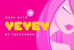 San Salvador, El Salvador-based illustrator. Designer of the oriental simulation typeface La Oriental (2018), the casual typeface Cipote (2018), the wide sans typeface Draper (2018), the fat display typeface Hornet (2018), the free athletic lettering font Varsity Team (2018), the free all caps comic book typefaces Benja (2018) and Sivar Regular (2016), the fat rounded sans Yeyey (2016, kawaii-inspired), the rounded sans typeface Lola (2016), the display typeface Contrastes (2016), and the free cartoon font JuanMikes (2016). Typefaces from 2017 and 2018: Castillo (free blackletter), Brand Co, Galactico (a sci-fi font), Cuadra (a block font), Arqui (a blueprint font), Bootcamp (+Bootcamp Morsecode), Camar (a heavy sans poster font), Cipitillo (a horror font), Don Graffiti, Hache, Innova (a techno font).
 Typefaces from 2019: Bloody Scary (a Halloween font), Invader (a Halloween font), Kabuto (an oriental simulation font based on katakana and hiragana), Bend (bilined), E-Muse (a sports font), Slugger Monogram, Amore, Slugger (signage script), Alvaro. Typefaces from 2020: Edge, Play Heavy, Natalia (a vintage script), Mystico, Castillo (blackletter), Marquez (a vintage serif), Poster, Torque, Ernesto, Frida, Don Graffiti (graffiti font), Recluta Stencil (a military stencil), Carmela (a bold script), Andrea Script, Freelancer Display, Junior (a casual script), Hugo Slab, Vaglio (an all caps sans), Alambre Lowrider Thin (squarish), John West (a spurred Western font), Santa Monica. Typefaces from 2021: Farrah (art deco), Noticia (a news headline font), Turmeric, Comico (a cartoon font), Soria (a bold caps font), Buggy (a lumpy font), Zorro (a Western font), Puerto (a vintage titling sans), Only You (an upright script), Pupusa. [Google]
[More] ⦿
|
Edric Studio
[Ega Nugraha]
|
 Known as Edric Studio, Renata Insan C, M. Nouval, and Ega Nugraha. Bandung, Indonesia-based designer of mainly modular typefaces. He created these typefaces in 2017: Nine Tail, Meatballs (a layered signage script), Rohman, Roundfra (a modular typeface), the preppy handlettered typeface Mirinia, the brush font Hummer, the deco typeface Coet, the script typefaces Ghost (smooth and with high contrast), Ora et Labora, and Lisna, the handcrafted Sild, the marker font Winkdeep, the brush script Oppy Sahra, Cully Mac, Terry Bruce, Gliford, and the art deco sans typeface Allorta.
 Typefaces from 2019: Ghost (a high-contrast script), Cully, Trumans Script, Rowland, Nairi Amber (Sans, Script), Qalin, Allorta, Rowland (sans), Flower Adaline, Rowland Caligraphy, Axton, Dezert, Kempton Serif, Kempton Sans Serif, Kempton Handwritting, Stanwick, Fornever, Victorisa, Anamelia, Oldwin Script, Old Excalibur, The Afford, Aldith, Bigboby, Victorisa Script, Aldith Script, Cully, Ethelyne, Allorta (an art deco sans), Atthia, Gladwin (a connect-the-dots font), Gladwin Script, Cyttah, Thiaga (a font duo), Neolion (sci-fi style), Trumans (Shadow, Stencil, Script), Qalin (Sans, Script), Stanwick (+Calligraphy), Holea, Livingston (Sans, Serif, Signature), Haston, Accelerare, Lionello (sans+script), Brian Worth, Kempton (font trio), Amorica (Sans, Script), Northcliff (slab serif, +Stencil, +Shadow, +Outline), Stella Alpina, The Lekker (spurred), Xharp (sci-fi), Joscelynn, The Champ, Mery Qolby, Twopath, Aldora (a monoline sans), Coet (rounded sans), Alfrida, Brian Worth (slab serif), Funny Samurai (oriental simulation font), Rohman, Zorgeous, Alaqua (rounded sans), Sam, Green Aila, Goldin Finance (sans), Saila Nurissalma, Fositif (monoline script), Twopath, Dezert, Louise Ann (script). Typefaces from 2020: Acilla Tristan, Aftermoon (a lively script), Aghnesta Sans, Aghnesta Signature, Aghnesta, Aldira, Alican, Aneetha Sans, Aneetha, Angel Valley, Angemurphy Blackletter, Angemurphy, Anindya Meita, Ariesta Moon, Arsya Edelwiess (sic), Ashelynn Sweet Sans, Aslina Ohio, Ayesha Burns, B Luna Piena, Badass Holliday (+Sans), Barnetta, Because of You, Belagiana Flowers (+Sans), Bhalbino, Birdella, Black Suit, Blind Heart, Bolliver, Breezy Bolton (+Sans), Bufferly Serif, Burning Sun, Calderdale, Callion, Canvashead, Cardolith, Carllis, Catherina, Cattily, Cerys Everett, Chairmate, Chameeta, Charlyn Rushmoor, Cheeks Rosy Script, Cheeks Rosy, Chill Friend, Choerunnisa, Cifans Bell, Claressa, Crush on You, Daisy Facthory, Damiola, Daysave, Dazz Place Display, Delafinka, Denique, Devllin, Dewebeauty, Donellia, Doughnuts, Dreamy Melodies, During Dusk, Eberta Light, Exninja Caligraphy, Exninja, Explore Sky (Greek simulation), Extraordinary U (a signature font), Ezhilan Aliqua, Fangirliya, Feliciana, Flow Perfect, Fly Feather Script, Gamila, Gapbrooth, Garan Fox, Gemintang, Ghaniya Holmy, Ghivton, Ghostlike, Ginger Bread, Ginger Spice, Gladwin (a connect-the-dots font), Gloria Beauty, Gonlotus Fangwell Script, GonlotusFangwell Dry Brush, Goodselves, Goshty Doll, Great Devotion, Greatest Show, Great March, Greentler, Guritno Script, Guritno, Happy Nature, Happy Sweety, Hasita Hillary, Haston, Hatching Love, Hazelnut Smooth Handwriting, Heluzenut, Herist, Hilliard, Himponis (a signature script)Holla Hearth, Jellita, Jenoshark Feiya, Jillfester, Kandis Marsh Script, Kanya, Karllia, Kate Raymond Script, Kathreen Smith, Keira Dreamer (+Sans), Kelana Morris, Kellia Wakeup Script, Kellista, Kelsey Wilson, Kiarina, Lamish Caritta, Lauliya, Leading Role, Leonita, Lighten Up (upright script), Long Knive, Look Down, Lorieta, Lovic, Lovic, Machaela (monoline script), Mallisa, Maxwell Leonard, Meiriona, Meisya Emilia, Mile Green, Mind Notes, Mirinia, Modya Tea, Moody Star, Morachinno, Most Sense, My Illutions, Myron Hector, Naiyana, Naminasae, Neolion, New Gladish Fancy, Nhadiem Elans, Nicollia, Nicolls, Nielsen Owen Script, Night Feel (wild calligraphy), Nikeisha, Ninabell, No Offense (a signature script), North Mount Script, Nothan (stencil), Ogorphy, Ogowey, Only Friend (a signature script), Oppy Sahra, Orla Fiola Script, Orla Fiola, Oscar Wright, Overa, Pancake Batter, Peace Boy Serif, Peace Boy, Pep Talk, Photogenics, Plaza Avenue, Pubarash Lulu, Qailla Gloam, Quinnesha, Rainray Serif, Rainray, Rashean (a rough brush font), Raysha Moonly, Redalle, Reyburn (+Script), Right Attitude Sans, Right Attitude, Rottorant, Rubicela, Saeela Nuary Serif, Saeela Nuary, Sandwell (+Sans), Secret Feeling, Selfies Script, Sellby Ridge, Selvillia Dreamer (+Sans), Semiora, Sendayu, Serameyer (a signature font), Sevastyan, Shaimaa Script, Shamora, Sheinman, Sheira, Shimponia, Sillmy Sans, Sillmy, Simple Harmony, Snoorks, Squirrel Boys, Stay Big, Straight White, Sunaiko Haines, Sunny November, Swag Ghost, Syllia, Tantra (stencil), Tantra Script, Tantra, Telly Humble Sans, Telly Humble, Thalia Hillary Script, Thalia Hillary, The Billie Monlly Sans, The Billie Monlly, The Moyanka, Thiaga Script, Thifa, Think Dreams, Thipany, Timitty Sans, Treated Good, Vanellofa, Velasquis Tamyra Script, Velasquis Tamyra, Vender Rustime Display Grunge, Vender Rustime Script, Veronica Elena, Verwalter (a great modern rounded sans). Vlorens Flower Script, Vlorens Flower, Waringtons (+Script), Washllo, Wavaca, Wednesday Night, White Chunti, White Honey (+Sans), Within Life, Wolf Rubeus, Wolven Shevana, Wooslight, Wubby Kitten, Xabiya, Xander Bruce, Xenia Urshina, Yhasmeera, Yofanka (a brush script), Yoforia, Zainiver, Zakilla, Zeanica, Zephira. Typefaces from 2021: Flower Leaf, Gladiator Arena (grunge), Hang Stick, Happy Rhino, Dalisha (script), Kinasih (a signature script), Cute Lovely, Cool Glasses, Simple Couple, Bright Summer (script), Battles Bridge (a spurred beer bottle font), Grand Estonia (script), Judicious, Brookville (calligraphic), Salisbury (script), Airframe (a monoline sans family by Widiyanti & Suci Anita), Hardenburg, Beechlands (a dry brush font), Racemate (a racecar font), Wedding Dream (calligraphic), Lifebest, Snowbare, Ice Breaking, Botanic, Seychelles (a monoline script), Juicely (script), The Empire, Monice (a rounded organic sans), Cartoonery, Beckley (brush script), Happy Moon, Rayesha Moony (a calligraphic script), Black Sting (a blackletter font), Triumphal, Strong Iron, Brockley, Chubby Toon, Super Shining (a signature script), For Kids, Rashyid, During Dusk, Rubicela, Gloria Beauty, During Dusk, Seaways, Close Distance, Yofanka, Pep Talk Script, Whether Fark, Lighten Up, Crush On You, Fairy Style, Ninabell, Aftermoon, Doughnutz, Great March, Goodselves, Extraordinary U, Dreamy Melodies, Canvashead, Mile Green, Colorful Glazed, Dazz Place Display, Treated Good, Night Feel, Plaza Avenue, Sheinman, Gingar Bread Script, Himponis, Semiora, Naminasae, Within Life, Stay BIG, No Offense, Only Friend, Black Suit, Zeanica, Krisward, Firlands House, Jazz One Script, Infinity Gown, Jazz One, Mighty Duck, Good Smells, Nice Tune, Nebula Starry, Social Trend, Slang Outfit, Leading Role, Eberta, Matchmaking, Lux Rose, Eberta Script, First Heart, Siblings Love, Mad Galaxy Script, Ghostlike, Mad Galaxy, Go Come Sans Serif, Go Come, Pink Tinge, Overall Deep, Pink Sun, Siblings Love Sans, Roxanne Elea, Young Boy, Thahiyat, Eleanor Satnight Script, Bardlove, Nadheva, Manly Dack, Khensin, Brusly Name Signature, Freakouts, Hermony, Blankspot, Stepballoon, Lansbury Goulding, Bevernice, Horror Type, Without Love (script), Crushing (font duo), Breaking Dawn, Sugar Roll, Hanry Potter (sic) (script), Bestnine, Fine Todey (sic), Havelberg (a monolinear script), Lushyana (an inky script), Catch You, Woolymood (calligraphic script), Seaways (a monoline script), April Dance, Hitz Girlz. Typefaces from 2022: Hello Bhessy, Luvi Hollis, George Asher, Curly Planet, City Halle (script), Night Lover (a fashion mag typeface), Ivanka Rachel (a fat finger script), Fire Foxes, Captain Jerry (a cartoon font), Kathleen Tico, Clock Crown, Saturday Moon (font duo), West Houston (script). [Google]
[More] ⦿
|
Ega Nugraha
[Edric Studio]
|
 [More] ⦿
|
Hanoded
[David Kerkhoff]
|
 Hanoded is the foundry (est. 2010) of Dutch designer and photographer David Kerkhoff, b. Epe / Vaassen, 1969. In its first year, Hanoded was a free font outfit specializing in handwriting and hand-printed typefaces. Its creations could be seen at Dafont, Abstract Fonts and Fontspace. Fontspring link. Klingspor link.
 In 2011, he went partially commercial via MyFonts. His typefaces became more diversified and are quite stunning at times: - A: Aardvark Dreams (2016), Abeille (2016), Abelia (2015), Abysmal Gaze (2011. scratchy face), Aceituna (2018), Adagietto (2018), Aderyn (2012: a poster family), Adieu Mon Ami (2021: a crayon font), Aeronic (2015, based on a 1937 Japanese poster for Nikke Coat by Japanese print artist Gihachiro Okuyama (1907-1981)), Aficionado (2019), After Nightfall (2018: spooky), Aiguille (2018), Aint Nothing Fancy (2010). All Over Again (2010), All Over Again All Caps (2010), Allez Hop (2011), Ambleside (2018: a fun scratchy curly script), Ambrosine (2017), Americain (2012, constructivist), American Grunge (2015), Amoebica (2014), Andorra Script (2014), Another Monday (2020), Antisocial Behavior (2010), Antidote (2016, 3d and handcrafted), Apex Brush (2019), Appelstroop (2016), Arancello (2018, a connected didone), Artful Dodger (2012, a grungy Clarendon), AshesToAshes (2010), Ashtanga (2013, curly caps), Astromonkey (2016), Atonement (2018: a great irregular inky script), Attaboy (2016, dry brush), Attention Seeker (2017), Au Revoir (2012), Autumn Voyage (2017), Avontuur (2017), Awesome Sauce (2019).
- B: Background Echo (2021), Backyard Hero (2018), Badehaus (2015, an art npuveau typeface modeled after the lettering on the Thermal Badehaus in Bad Neuenahr, Germany), Bad Medicine (2017), BadPaintjob (2010), Bakeapple (2019), Balagan (2010), Bandolina (2014), Band Wagon (2018: Western), Baznat (2010), Beanstalker (2018), Bearskin (2019), BehindDirtyBlinds (2010), DK Bergelmir (2014), Bergie Seltzer (2019), Betula (2018), Bintang (2016), Bitterbrush (2018), Bitumen (2017: a sticky typeface), Blabbermouth (2018), Black Bamboo (2014), Black Cluster (2018), Black Mark (2012, a heavy brush face), Blackminster (2017: blackletter), Bladesmith (2018), Blauhaus (2015, a rounded organic monoline Bauhaus), Bloemgracht (2014, Dutch deco), Bloomer (2019), Blueberry Jam (2016), Boarding House (2017), Bocadillo (2016, brush script), Bodiam (2016, beatnik style), Bombay Blue (2014, handcrafted poster font), Blue Sheep (2016, comic book style), Bogeyman (2019), Boris Brush (2016), Borrowdale (2016, a crayon font), Bottle Brush (2017, dry brush), Bottle Shop Faded (2010), Bratislava (2015), Breadcrumbs (2019), Breakfast Noodles (2020), Brochette (2019), Bronwen (2018: a vampire or bewitched font), Brouwerij (2021), Brushcrazy (2019), Brush Crush (2016), Buckthorn (2017, grungy), Bugbear (2019: a cartoon font), Bunny Daydream (2020), Bupkis (2017), Breakfast Burrito (2015), Brooklyner (2013: an art deco caps typeface based on the typeface used for The Brooklynite, a magazine from the 1920's), Brouillard (2017), Brushzilla (2017), Bullet in your Head (2010), Bumper Sticker (2020), Bungehuis (2015, Dutch deco after the lettering on a building in Amsterdam, 1931), Buntaro, Burobu (a blobby typeface), Business As Usual (2011, scratchy), Buttered Toast (2015), Butterfly Ball (2014), Bygone (2017, brush font).
- C: Cadora Woods (2020), Caerphilly (2018), Caffe Lungo (2019), Camping Holiday (2018: comic book style), Canned Whale (2012, outlined and hand-printed), Canoodle (2016), Capricious (2020: a dry brush font), Carambola (art deco sans), Carbonara (2011, grungy typewriter), Carpe Noctem (2017, a haunted font), Carrot Juice (2017), Carte Blanche (2012, a gorgeous arched / sketched caps face), Castanea (2012, a painter's font), Castle On The Hill (2017), Castlerigg (2020), Catskin, Mon Petit Cahier (a children's handwriting emulation) (2021), Celluloid Bliss (2010), Cerulean Blue (2018), Chalkaholic (2018), Charons Obol (2011, scary brush face), Cheat Sheet (2013, handwritten), Checkout (2015, a basic supermarket script), Cherubina (2016, beatnik style), Chewy Caramel (2020), Chillerz (2020), Chilly Cherry (2018), China Syndrome (2019: a brush-lettered typeface), Chocolatte (2016), Chunky Chicken (2013), Cinnamon Swirl (2016, curly lettering), Cinnabar Brush (2016), DK Clair de Lune (2012, an exquisite curly poster font), Clochard (funky quirky lettering), Closet Skeleton (a scary font based on the cover of the 1946 book De Sprookjeshoorn by Anton Eijkens (1920-2012)), Clootie (2020), Coal Brush (2016), Coconut Punch (2018, dry brush), Codswallop (2011, fat hand-printed), DK Coliseu (2014, art deco), Colporteur (2017), Combustible (2017), Compagnon (2017), Concertina (2018), Cookie Crumble (2019: beatnik style), Cookie Supply (2019), DK Cool Crayon, Cool Daddy (2017, bubblegum font), Coquillage (2017), Corner Shop Chique (2010), Cortese (2016: an interlocking letter poster font based on a 1971 Italian movie poster for La Morte Cammina Con I Tacchi Alti directed by Luciano Ercoli), Cosmo Stitch (2015), Cosmic Turtle (2021: hand-crafted, in beatnik style), Couldnt be bothered (2010), Courant (2011, grungy blackletter), Cover Up (2017), Crayon Crumble (2011, chalk face), Crayon En Folie (2016, a crayon or chalk typeface), DK Crayonista (2012), Crayon Works (2021), Crimson Skyline (2019), Criss Cross (2011), Crocodile Feet (2018: beatnik style), Crowbar (2017), Crowd Pleaser (2021), Crowfeather (2018), Crowd Funded (2018), Crypt (2016), Cry Wolf (2017), Cubissimo (2013, a cubist geometric font inspired by a 1929 poster advertising a museum exhibition), Cul de Sac (2010, 3d outline face, hand-printed and sketched), Cut Along (2017: a paper cutout typeface), Cykelsmed (2018).
- D: Daft Script (2021), Daily Challenge (2021), Daitengu (2020), Dapplegrim (2018), Darker Marker (2016), Darkness Rising (2018), Deco Pimp (2011), Delivery Note (2019), Demagogue (2020), Die Bruecke (2013, a woodblock printing emulation typeface named after the Die Brücke movement), Dinosaur Cake (2018), Dirrrty (2016, a grungy brush font), DK Allez Hop (2011), Discolicious (2017), Display Patrol (2017), Dominant Type (2021), Donkeyman (2021), Don Quixote (2011. nice grunge calligraphic hand), DK Dortmunder Ecke (2015, inspired by cubism), Doubledecker (2019), Double Quick (2014), Douceur (2014, a blackboard bold / tattoo script), Downhill Dive (2019), Down The Wall (2017), Downward Fall (2014, a rough brush), Dragonblood (2015), Dragon Spell (2017, drawn with Chinese ink), Drawing Blood (2010), Dreadnought (2014, brush face), Dreamworld (2022: a comic book brush font), Drop Dead Gorgeous (an all caps brush typeface), Dubbel Zout.
- E: Early Morning Coffee (2012), Earworm (2018), Elbow Grease (2017), Element 120 (2018, a hand-drawn Ultra Bodoni), Endgame (2019), Entourage (2017), Ersatz Quality (2010), Erstwhile (2019), Evil Laughter (2019: a typewriter font with blood drips), Exit Strategy (2020: all caps, dry brush).
- F: Face Your Fears (2011), Face Your Fears II (2015), FairNSquare (2010), Fairy Godmother (2018), Fallout Font (2010), Fantastique (2012, a 3d hand-printed caps face), Fat Little Piggy (2010), Father Frost (2012), Fearsome (2018), Fictional Friend (2019), Fiebiger Eins (2013, an art nouveau / arts & crafts typeface after a 1908 poster by Franz Fiebiger), Fiebiger Zwei (2013), Fingerfood (2018), Flagellum Dei (2016, a rough brush script), Fleabitten (2019), Fledermaus (2012: Fledermaus ("bat") was a cabaret theater from Vienna. The original Jugendstil decor was designed by Josef Hoffman and several posters, advertising performances, were designed by other members of the Vienna Workshop. The Fledermaus font was based on a 1907 poster by Bertold Löffler.; the missing glyphs were created by Kerkhoff), Flying Saucer (2019), Follow The Light (2018), Food Truck (2016, vernacular style), Forgotten Dream (2020: a heavy brush typeface), DK Formosa (2012), Framboisier (2017), Frozen Memory (2017), Fruity Snack (2022), Full Blast (2017: dry brush), Full English (a handcrafted stencil) (2021), Fully Automatic (2022), Funky Flamingo (2018).
- G: Galangal (a phenomenal poster typeface that plays on thick and thin, in the style of Horst Caps), Gallows Hill (2019), Gamboge (2017), Garden Bed (2016, a fat brush font), Garden Gnome (2016), Genki Desu (2019: comic book style), Gerards Gold (2010, script face), Getaway Car (2019). Ghost Reverie (2010, a scratchy family), Gingerline (2018), Glitter Candy (2018), Gobsmacked (2019: dry brush style), Goodie Bag (2019), Grafiker (2013, a brush typeface loosely based on the work of designers Oskar Kokoschka (1886-1980) and Jean Carlu (1900-1997)), Gravitational Pull (2021: a fat finger font), Gravity Well (2021: a rough brush), Greyfriars (2017, a hand-drawn Baskerville), Griezelig (2019: eerie), Grigory (2017), Grindylow (2020), Gritstomper (2020), Grumpy Tiger (2017), Guerilla Handshake (2017), Guilty Pleasure (2019: a fat brush font), Gulag Decay (2010), Gumbo (2019), Gumboots (2020).
- H: Halewyn (2017), Halfway There (a fat finger font) (2021), Hangmans Delight (2016), Hanoded Hand (2010), Hanoded-Heavy (2010), Harajuku Script (2017), Harimau (2012, a rounded children's book font), Harimau Dua (2015), Harrumph (2011, a fat poster lettering family), Hasta Luego (2020), Hasty Tasty (2011), HaraldRunicDEMO (2010), Headlock (2017), Heartsome (2020), Heckel (2013, a German expressionist hand-drawn typeface based on the handwriting of Erich Heckel (1883-1970), a founding member of Die Brücke, a group of German expressionist), Hedgehog Hans (2012, comic book typeface), Henceforth (2017), Hex (2012), Hexenhammer (2017, a font for witches and vampires), Hey Comrade (2016: a messy script font made with a bamboo satay skewer), Hibagon (a rough dry brush font) (2021), Hieratic Numerals (2010), High Tea (2012), Himawari Script (2019), DK Himmelblau (2012, art nouveau font based on a poster from 1902 made by the Künstlerbund Hagen), Hjem (2019), Hobgoblin (2014), Hofstad (2014, after an art deco typeface used by poster designer John Lavies), Hokitika (2014, art deco), Home Education (2021), Homeward Bound (2017, a grungy slab serif), Honey Dew (2016), Honeyguide (2017), Huggin and Muninn (2012, script face), Hungry Zombie (2020), Hummus Chips Salat (2010), Hyggelig (2015), Hyldemoer (2018).
- I: Ice Cream Man (2018), Identity Check (2022: handprinted), Impending Distaster (2022), Inky Fingers (2013, a fat finger font), Innuendo (2015), Interstellar Erosion (2010), DK Insomniac (2015), Instant Harmony (2019), Irena (2016, a cubist/expressionist font inspired by Czech type designer Vojtech Preissig), Ishtar (2012: spooky brush font).
- J: Jalebi (2015), Jambo (2014, bouncy and funky), Joe Schmoe (2011, hand-printed), John Brown (2016), Jubileum (2013), Juicer (2021), Just Before Liposuction (2010).
- K: Kabouter (2019), Kaikoura (2014, art deco), Kandij (2020), Kapsalon (2019, +Pencil, +Brush), Katsudon (2020), Katzenjammer (2015), Kempoka (2014, brush script), Kerberos Fang (2011), Keswick (2013, a lipstick font created using a 6B pencil), Ketimun (2019), Kingsmead Script (2020), Fat Kitty Kat (2013), DK Koerier (2014, a 3d outlined typeface), Knockdown (2016, brush style), Knucklebones (2017), Kodama Forest (2017, Treefrog style), Kokomo (2012, 3d and outlined), Kolkata Hotelroom (2010), Komsomol (2014: was modeled on several Soviet propaganda posters and anmed after the youth division of the Communist Party of the Soviet Union, the Komsomol, or Kommunisticheskii Soyuz Molodyozhi), Konditorei (2018), Koshatnik (2011, all caps brush face), Kubikajiri (2011, an India ink brush face), DK Kundalini (2013, curly), Kunstschau (2012: a beautiful poster font that was modeled on a stamp, designed by Austrian artist Bertold Löffler, for the Kunstschau 1908 exhibition in Vienna), Kurkuma (2013, a wonderful poster caps face), Kuroneko (2019), Kusukusu (2011, hand-printed), Kwark (2013: a 3d poster font).
- L: Lachrymose (2021: a brush font), Lampion (2012, a condensed unicase hand-drawn face), Leakage (2010, ink splash face), Languedoc (2016), Larks Tongues (2017), Laser Vision (2022: a marker font), Lazy Morning (2020), Leftover Crayon (2017), Lemon Yellow Sun (2014), Lenox Avenue (2017, after Studio Handbook Letter And Design For Artists And Advertisers by Samuel Welo), Lille Snemand (2015), DK Limoen (2012, shadow outline face), Liquid Amber (2018), Liquid Embrace (2015, a brush font), Little Boy Blue (2016), Lokomotiv (2012, an art deco caps typeface based on poster for the 1930 Geneva Motor Show), Longreach (2018), DK Louise (2012, art deco, cubist: based on the art of Louise Marie (lou) Loeber, a Dutch painter), Lucky Goldfish, Lunisolar (2017).
- M: Maduki (2013), Majolica (2014, art deco), Magical Brush (2017), DK Mama Bear (2012), Mandarin Whispers (2017, a brush font actually made by a marker pen), Mandolin (2014), Mango Smoothie (2015), Mariken (2017), Market Square (2017, vernacular style; +Market Square Marker), Mary Ate a Little Lamb (2010), Matrijs (grungy, stencil) (2021), Mayblossom (2021: a fat finger font), Mayonaise (2011), Meshuggeneh (2013---crazy fool on Yiddish; a twisted 3d typeface), Midnight Chalker (2016, a chalk or crayon font), Midnight Hour (2011), Midnight Sun (2019), Mikan (a bold rounded handcrafted sans) (2020), Millefeuille (2017), Mind Boggle (2020), Minehead (2020), Modern Fantasy (2020), Moi Non Plus (2011), Minou (2018), Mission Accomplished (a fat finger font) (2021), Momotaro (2015, a fun rough brush script), DK Monsieur Le Chat (2012, curly face---can't wait for Madame La Chatte...), Montello (2018), Moonlight Serenade (2016), Moonlight Shadow (2010, a nice scribbly pair of fonts), More Or Less (2016), Morgenfrisk (2017), Mortal Coil (2020: a dry brush font), Mosca (2013), Mothman (2011, a spooky scratchy face), Motley Crew (2016), Mr Stickman (2015, funny dingbats), Mulhouse (2019), Mundbind NL (2021), Mysterious (2017).
- N: Nakata (2012, a great notebook style script), Nanuk (2013, an outlined 3d typeface), Nefarious (2019: a great Halloween font), Neuer Weltschmerz (2019: a rounded sans), Neues Bauen (2011), New Beginnings (2016), Nightbird (2011, blood drip face), Northumbria (2012: modeled on original 7th and 8th century monastic gospel books from Northern England), Notaris (2015, a bouncy typeface), Nouveau Crayon (2016), Numpty (2019), DK Nutnik (2012, a mural paint font), Nuuk (2018), Nyctophobia (2010, brush face).
- O: Obrigado (2012, rounded art deco face), Odaiba Script (2019), Oei (2010), Office Squeeze (2017, a sketched font made with a Japanese brush pen), Ogenblik (2020), Oomph (2010), Okiku (2014, a scratchy poster typeface), Oranjerie (2013, poster typeface), Orenji (2016), Original Quality (2019), Oslo Stitch (2020), Otago (2014: a classic all caps art deco typeface), Output Volume (2021), Overseas (2020: a dry brush font), DK Oyuki's Ghost (2013, scratchy scary typeface made with a steel pen and Chinese Ink---the name comes from a painting by Maruyama Okyo (1733-1795), which depicts his mistress who died young. Maruyama Okyo claimed she haunted him in his sleep).
- P: Palembang (2015, a Dutch art deco typeface), Pandanus (2014), Panettone (2018: upright script), Paradise Lost (2016, created using a broken bamboo satay skewer and Chinese ink), Pardesi (2013, a fat marker pen font), Party Pocket (2019), DK Pastis (2016, a lovely handcrafted typeface), Paviljoen (2014: Dutch art deco), Pawn Shop Pretty (2010), Peanut Crunch (2019), Peking Duck (2021), Perfect Day (2019), Petit Four (2015), Petit Oiseau (2013), Phantom Peach, Pigeon Post (2020), Pimpernel (2012), Pinda (2011), P.I. (2011), Pineapple Daydream (2018), Pingo (2012, display face), Pinkus (2013, a caps-only poster font), Pisang (2013, an all caps poster font), Plague Master (2016), Plakkaat (2011), Plastic Fantastic (2019: a comic book face designed to fight the overuse of plastic), Poison Ivy (2014, scratchy hand), Pondicherry (2014, a hand-sketched 3d typeface), Popty Ping (2018, beatnik style), Popular Vote (2021), Porcupine Pickle (2011), Power Breakfast (2021), Primordial (2017), Prince Frog (2015, a cartoon / children's book font), Printout (2018: a sketched font), ProjectX (2010), ProjectY (2010), ProjectZ (2010), Promedanenmischung (2010), Psycho Killer (2013), Public Secret (textured, handcrafted) (2021), Pumpkins Brush (2021), Pumpkin Soup (2013: a poster typeface), Pundak (2014, all caps 3d outlined typeface), DK Pusekatt (2013).
- Q: DK Qilin (2014: a great inky font), Quatrain (a hand-drawn didone), Quid Pro Quo (2011, scratchy calligraphic), Quilted Butterfly (2010), Quite Something (2018), QuoVadisQuasimodo (2010).
- R: Rabbit Escape (2016), Rabbit on the Moon (2011, children's typeface), Radical Brush (2019), Rainclouds (2020), Rainforest (2010), Ramkoers (2018), Raspberry Sherbet (2020), Rat Infested Mailbox (2010), Ravenheart (2017, Treefrog or Ralph Steadman style: scary and inky), Ravenstonedale (2018: based on a number of handwritten letters by English author D.H. Lawrence), Reality Check (2019), Rearview Mirror (2018), Redcurrant (2020), Reluctant Aviator (2020), Republica Banana (2019), Retch (2013, frightening scratchy script), Retrouvailles (2018), Return Policy (2018), Roskilde (2018), Rosy Lee (2016), Rotorua (2014, art deco), Roughcast (2020: an all caps brush typeface), Rough Patch (2017), Rough Therapy (2019), Route Du Soleil (2018), Ruby Red (2015, brush style), Rum Doodle (2013), Rumpelstiltskin (2011, comic book family), Runaround Kid (2018), Runic Series [Gunfjaun Runic (2010), Modraniht Runic (2010), Leakage (2010), Hyrrokkin Runic (2010), Harald Runic (2010). Gunnar Runic (2010), Nidhogg Runic (2010), Nippon Note (2016), Skraeling Runic (2010), Sleipnir Runic (2010), Tjelvar Runic (2010), Yggdrasil Runic (2010), Graip Runic (2010), Fenrir Runic (2010), Beowulf Runic (2010)], Running Hipster (2016), Rusty Cage (2011).
- S: Saffron Walden (great fattish inky brush script), Same Same but Different (2010), DK Samhain (2012, dry brush face), Sammy Boy (2011, fat poster face), Sanseki (2016, Chinese ink brush script named after Sanseki, a Japanese term used to describe three famous Heian period calligraphers: Yaseki, Gonseki and Saseki), Satsuma (2013, a poster face), Saturday Sunday Monday (2010), Scapegoat (2018), Scissor Madness (2021: cutout font), Scrawlerz (brush script), Scratch Up (2018), Scrawny Cat (2016, a brush and China ink typeface), Scribble Note (2020), Scribbler (2015), Scurvy Dog (2011, scratchy hand), Secret Diary (2013: hand-printed), Semarang (2015, an art deco sans), Senko Hanabi (2020), Sensory Overload (brushed typeface), Seven Seas (2018: a curly script), Shadowfield (2018), Shaken Not Stirred (2015), Sheepman (2012), Shesek (2011, a fat finger face), Shibby (2019), Shinano (2017, made using a Japanese brush), Shoganai (2019), Sibylle (2018: dry brush), Silent Echo (2018), Sing Along (2021; hand-printed), Single Malta (2010), Sirius B (2013, poster font), Skeletal Wish (2019: an inky brush script), Sketchy Smiley (2010, smilies), Sketchy Smiley II (2012), Skratch (2010, broken glass face), Skulduggery (2019), Sleepy Time (2013, hand-printed), Sleight of Hand (2010), Slipstream Sweetheart (2010), Slivowitz (2017), Smiling Cat (2017), Smooth Brushings (2016), Smurrie (2016), Snemand (2013, a poster titling typeface), Snippity Snap (2015, paper cut typeface), Sobriquet (2012: a wonderful antique poster face), Soerabaja (2017, all caps Dutch art deco), Sound Bubble (2020), Souplesse (2013), Southside Fizz (2017, handcrafted art deco), Southwark (2017: sketched), Spaghetti And Cheese (2017), Spandau (art deco), Spiced Pumpkin (2016), Spiderlegs (2011, Spinnenkop (2018: a curly vampire script), Spinwash (2019), Spiraling Down (2019), Splinterhand (2017), Spoonbread (2020), Spring Chicken (2019), Springwood (2019), Springwood Display (2019), Square Beat (2021), SquareOne (2010), SquareOneGrunge (2010), Squint (2013, squarish), Starboard (2021: a dry brush font), Starlight Lovers (2016), Statendam (2014, caps only Dutch art deco influenced by interbellum ads for the Holland America Line), Steamed (2021), Sticky Toffee (2017), Struffoli (2017), Studio Brush (2019), Subway Circle (2021: an informal typeface, perhaps for comic books), Suco de Laranja (2012), Sugarloaf (2018), Sumida Script (2019), Sunbird (2019), Summer Romance, SundayMonday (2010), Sugary Pancake (2016), Superbrush (2017, a Great Chinese ink brush font), Sushi Bar (2016, dry brush), Sweet Lemon (2018: paper cutout type), Sweet Steeffie (2010), Sibylle (2018: Japanese brush), Sunny Weather (2021), Symbolic Prophecy (2020: a dry brush typeface), Symptomatic (2018: brush script), Syphon Spritz (2010, a great curly script; a Pro version appeared in 2010 at CheapProFonts), System Overload (2020).
- T: Takeshi (2019), Tartufo (sketched font), Teacup (2017), Tequileria (2016), That Little Piggy (2010), Technojunk (2014, 3d squarish hand-drawn typeface), Tenterhooks (2019), The Cats Whiskers (2016), Terpentijn (2017, grungy), Thievery (2012, curly script), Third Time Lucky (2019), This Little Piggy (2010), Toadstool (2017), Tobu (2014), Tombouctou (2019), Tompouce (2017), Tokeh (2019), Tough Cookie (2018), Tournedos (2019), Toverheks (2016, a bewitched typeface), Traiectum (2017, a messy roman caps typeface based on Goudy Old Style), Treacle (2021), Treppenwitz (2018), Trashtype (2011, grungy), Trained Monkey (2017, a cartoon font), Tripping on Acid (2010), Trollslayer (2011, brush face), Troutbeck (2020), Twelve Weeks Pregnant (2010), Twirrewyn (2018), Twisted System (2018), Tzeva Tari (2010, grunge Hebrew).
- U: Udon Soup (2018), Ugh (2010), Utroligt (2021), Umbilical Noose (2014, a rough brush), Umbrella Man (2019: dry brush), Uncle Edward, Uncle Oscar (2016, a crayon font), Under My Umbrella (2018), Understory (2019), Utroligt (2021).
- V: Vegetability (2020), Ventana (2013, created using Chinese ink and a bamboo pen), Vermilion (2013, hand-printed poster face), DK Viareggio (2012, an art deco font Viareggio is based on the handlettering found on a 1931 poster, advertising the carnival of Viareggio), Vienna Workshop (2012, an art nouveau typeface based on some of the artwork produced by Vienna Workshop artists, in particular that of Koloman Moser), Visum (2014), Vlinder (2017), Vox Populi (2012, an ancient parchment look font).
- W: Waiting For My Girl (2019), Wandering Pencil (2020), Warpspeed (2010), Wayang (2013, influenced by Indonesian puppets), Wayland (2018), Weekend Warrior (2010), Weeping Willow (2018), Welt Schmerz (2012, a post-art nouveau typeface based on a 1910 poster from Austria), WetDream (2010), Whalebone (2020), Whale Song (2017), Whatnot (2013), Whynot (2014), Widdershins (2018), Wild Bunch (2015: Western font), WindshieldMassacre, Wintanceastre (2018: an uncial based on a 10th century Latin manuscript), Winterberry (2017: a messy script), With A Twist (2011), Woebegone (2018).
- X: Xanthine (2017, a messy brush type).
- Y: Yasuragi (2021), Yellow Balloon (2013, a fat poster face), Yuge (2020), Yuli (2014).
- Z: Zealand (2017, sketched), Zeebonk (2013, a tattoo font), Zesty Lime (2016, brush font), Zombie Starfish (2017), Zonnig (2011).
[Google]
[MyFonts]
[More] ⦿
|
Iconian Fonts
[Dan M. Zadorozny]
|
 Born in Philadelphia and a resident of McKinney, Texas, Dan Zadorozny's creations at Iconian. He is a prolific type designer who specializes in techno and sci-fi typefaces. Dafont link. Fontsy link. Abstract Fonts link. Font Squirrel link. His fonts in alphabetical order:
 - #44 font (2002), 00Starmap (2001, pixel font), 1968 Odyssey (2016), 1st Cav (2008), 1st Enterprises (2017), 2-Tech, 21 Gun Salute (2013), 2nd Amendment (2007, guns), 2nd Amendment 2050 (2009, more gun silhouettes), 2Toon, 300 Trojans (2008, comic book family), 4114 Blaster (2008, futuristic), 5th Agent (2008, techno), 7th Service (2002), 8th Element (2013), 911Porscha, 98 Bottles of Beer (2016).
- Achilles, Action-Men (2008), Action Women (2008, female outlines), Aegis (2010, Greek simulation family), Aetherfox (2013), AirCobra (2002), Aircruiser (2011, trekkie family), AirForce (planes and copters), Airstrike (2013), Airstrip One (2003), Aldo's Moon, Aldo's Nova, Alexis (2001), Alien League, Alpha Century (2020), Alpha Men (2015), Alpha Sentry, Alpha Taurus (2007, octagonal, athletic lettering), Amalgam, American Kestrel (2019), Americorps (2012), Ampire (2019), Anakefka (2009, ultra-fat family), Annapolis (2016), Antietam (2015), Antikythera (2013, Greek simulation face), Antilles (2009, sans family), Arctic Guardian (2019), Argosy, Arilon (2008), Armed Lightning (2017), Army Rangers (2013, octagonal), Assassin Nation (2015, scary and perhaps referring to the "tradition" of school shootings in the USA), Astro Armada (2020: sci-fi), Astropolis (2009), Atlantia (2012, futuristic), Avenger (2008, futuristic).
- Babes&Bond (2009, erotic silhouettes), Babe-alicious (2002, erotic outlines), Bad Axe (2017), Bad Robot (2007, computer game look), Bal-Astaral (2016, octagonal), Bamf (2011, techno family), Banjin (2016), Banshee Pilot (2016), Barcade (2018), Battlefield, Battleworld (2016), Beam Rider, Beam Weapon (2015), Beastian (2011), Behemoth (2018), Ben Zion (2008, Hebrew simulation), Berserker (2008, grunge), Beta Biergärten (2008), Big Blue Bug (2021), Bio-disc, Bio-discSolid, Bio-discThin, Bionic Comic (2002), Bionic Type (2002), Birds of a Feather (2007, dingbats), Black Bishop (2015), Black Gunk (2016), Blade Singer (2021), Blizzard Shaft (2020), Block, Blood Crow (2009), Blood Drenched (2020), Bloodlust (2011, dripping blood face), Blue Cobra (2020), Blue July (2009), Body Swipers (2014, Halloween font), Bog Beast (2013), Bomber Escort (2020), Boomstick (2015), Borgsquad (2014, mechanical/octagonal), Bretton (2018), Brin Athyn (2008, uncial/Celtric), Broken Cyborg (2019), Bronic (2004), Bubble Butt (2014, bubblegum typeface), Buchanan (2016), Buddy Champion (2015), Bummer (2007, octagonal), Bushido (2008, oriental simulation), Butch and Sundance (2013), Buttons the Bear (2008, children's hand), Byte Police.
- Camp Justice (2018), Capella (2011, a wide techno family), Capricus (2018), Captain Canaveral (2019), Carnival Corpse (2016), CasperComics, Centaurus (2015), Chardin Doihle (2008), a useful informal handprinting family), Charlemagne, Charlie's Angles (2018: octagonal), Charmling (2019), Cheyenne Hand (2008), Chicago Express (2016), Christendom, Classic Cobra (2016), Clubber Lang (2013, grungy), Cobalt Alien (2015), C.O.D.E.R. (2012), Coffin Stone (2019: a stone age font), College Collage (2017), Colony Marines (2017), Colossus (2011, old chipped stone look), Combat Droid (2019), ComicBookCommando, ComicFX, Commonwealth, Concielian, Concielian Break (2015), Concielian Classic (2018), Concielien Jet (2015), Contour of Duty (2016), Corinthian, Count Suckula (2015, horror font), Covert Ops (2012, army stencil), Coyote Deco (2007, art deco), Crappity-Crap-Crap (2007), Crazy Ivan (2017: constructivist), Creepy Crawlers (2015, horror font), Crime Syndicate (2013), Crixus (2011, a squarish sans that includes an athletic lettering style), Cro-Magnum (2003), Cruiser Fortress (2016), CryUncial, Cyberdyne (2016), Cyberia (like Soviet: neat Russian imitation letters), Cyborg Rooster (2015), Cydonia Century (2017), Cyrus The Virus (2012, grungy, hand-printed).
- DS Man, Daedalus (2008), Daemonicus (2012), Dagger Dancer (2020), Dameron (2016), Dangerbot (2016), Danger Flight (2015), Dan Stargate (2008), Dan'sHand, Dark Alliance (2014), Dark Dominion (2019), Dark Hornet (2020: a great blocky mechanical typeface family), Dark Horse (nice brush font), Darklighter (2018), Darkwind, Dassault (2013), Deathblood (2014, Halloween font), Deathshead (2019: a metal band font), Deceptibots (2019: stencil), Defcon Zero (2016), Dekaranger (2015), Delta Phoenix (2019), Delta Ray, Demon Priest (2013), Department-K, DepartmentH, Deranian (2008), Devil's Tongue (2019), Detonator, Devil Summoner (2014), DiegoCon (2004), Digital Desolation (2014), Ding-o-saurs (2007), Direktor (2008, Cyrillic simulation techno), Dire Wolf (2013), Disco-Dork, Disco Deck (2005), Disco Duck, Discotechia (2015), Dodger, Dokter Monstro (2017: a great fat hand-painted typeface), Domino Jack (2016, an octagonal stencil typeface), Domino Mask Condensed (2016), Dotcom (2002), Drafting Board (2008), Drafting Table (2008), Dragon Order (oriental simulation), Dread Ringer (2015), Drid Herder (2002), Drive (2015, techno font), Droid-Lover (2008), Drone Tracker (2016), Drosselmeyer (my favorite), Dusk Demon (2020: grungy).
- Eagleclaw (2009), Eaglemania, Eagle Strike (2015), Early Warning (2021), Earth Orbiter (2016), Earthrealm (2013), Earthshake (2013), Earth's Mightiest (2002), East West (2015, constructivist), Echo Station (2017), Eco-files, Edge Racer (2917), Egg Roll (2016, oriental simulation), Elastic Lad (2020), Eldebaran (2012), Elder Magic (2009), Election Day (2009), Elephant Gun (2021), Elite Danger (2017), Emissary (2014, sci-fi), Empire Crown (2011, blackletter), Enduro, Ensign Flandry, Ephesian (2007), Eridanus (2015, octagonal / mechanical), Erin Go Bragh (2009, Celtic/uncial), Escape Artist (2015), Eskindar (2013), Eternal Knight (2013), Eurofighter (2015), Eva Fangoria (2018: a dripping blood font), EverettSteele'sHand, Excelerate, Excelsior, Excelsior Comics, Exedore (2008), Exoplanet (2013, techno), Extechchop (2005), Eyes Only (2018).
- Factor (2016), Falconhead, Falcon Punch (2015), Famous Spaceships (2007), Famous Spaceships 2 (2019), Fanfare Ticket (2018: dot matrix family), FantasticCreatures, Fantazian (2003), Fantom (2009, bad handwriting), Federal Blue (2019), Federal Escort (2014), Federal Service (2011), Federapolis (2008, octagonal techno face), Fedyral (2019), Fedyral-II (2019), Feldercarb (2003, octagonal font), Ferret Face (2013), Fiddler's Cove (2012), Fight Kid (2009), Final Front (2019), First Order (2001), Flash Rogers (2016), Flesh Eating Comic (2013, grunge), Flight Corps (2008, techno/pixelish), FlyingLetaherneck (2002), Force Commander (2019), Force Majeure (2016), Foreign Alien (2020), Foucault (2014, uncial), Fox on the Run (2018), Fox on the Run Academy (2018: athletic lettering), Frank-n-Plank (2013, a wooden plank font), Freakfinder (2014: Halloween font), Free-Agent (2008), Freedom Fighter (2013, stencil), From Bond With Love (2014: military stencil), Front Runner (2019), Frost Giant (2019), Frozen Crystal (2016, LED font), Funk Machine (2016, a great ultra-black techno family of typefaces), FunnyPages, Furiosa (2019), Future Forces (2015), Futurex Grunge (2005).
- Galactic Storm (2014), Galant, Galaxy-1 (2008), Galaxy Far Far Away (2009, futuristic dingbat font), Galaxy Force (2014), Galga (2008, futuristic), Gamma Sentry, Gemina (2011, sci-fi / techno family), Gemina2 (2013), Generation Nth, Gentleman Caller (2014), GeoBats (2007), Gearhead (2013, octagonal), Ghost Clan (2014), GI Incognito (2012), Global Dynamics (2014), Globe Trekker (2021), Goalie (2008, hockey mask alphading), Goblin Creek (2016: Halloween font), Gods of War, Gotharctica (2015, blackletter for horror flicks), Governor (2017), Graffiti Street (2019), Grand National (2015), Grand Sport (2015), Graymalkin (2011, trekky), Grease Gun (2012), Grendel's Mother, Grim Ghost (2013), Ghoulish Intent (2016: Halloween font), Grimlord (2009), Groovy Smoothie (2018), Guardian (2008), Guardian-Laser (2008), Guardian-Pro (2008), Guardian-Shadow (2008), Gunner Storm (2015), Gunrunner (2016: techno), Gunship, Gunship V2 (2002), Gypsy Killer (2013), Gyrfalcon.
- Hadriatic (2008, roman lettering), Half Elven (2013), Halfshell Hero (2013), Hall of Heroes (2007), Halo, Hanging Tree (2019: a wood print emulation font), Han Solo (2013), Hard Science (2019), Harrier (2002), Hawkmoon (2011), Head Human (2021), Heavy Copper (2020), Heavy Falcon (2019), Hello Copters (2013: helicopter dingbats), Hemogoblin (2017: spooky font), Heorot (2009, stone age fonts), Hermetic Spellbook (2017: alchemic), Heroes Assemble (2011), Heroes Assemble Dingbats (2014: all Avenger characters), Hero Worship (2021), Hexgon (2018), Hexkey (2020), Highrise Heaven (2007, city skyline dingbats), Hip Pocket (2014: psychedelic), Hitchblock (2017), Hollow Point (2015), Holly Dingle (2015), Holy Empire, Home Base (2020), Homemade-Robot, Holo Jacket (2016), Homebase (2020: heavy, octagonal), Homelander (2020), Homeworld (2003), Homeworld Translator (2003), Hong Kong Hustle (2015), Horroroid (2015), Horroween (2013, Halloween font), Hot Kiss (2017: paint splatter font), Howlin Mad (2017), Hula Hoop Girl (2019), Hulkbusters, Hydronaut (2019), Hydro Squad (2014), Hyper Vyper (2019: octagonal), Hypno Agent.
- Iapetus (2014, sci-fi), Icebox Art (2012), iChrono (2018), IWantMyTTR!, Iconian (2002), Iconified, iDroid (2020), Illuminati, Illumino (2016), Imaginary Forces (2008, mythical dingbats), Imperial Code (2003, Startrek style face), Imperium, Incubus, Incubus-Italic (2008), Incubus-Shadow (2008), Indigo Demon (2017), Infinity Formula (2003, super techno), Infobubble, Inhumanity (2014), I-House Edition (2014), Inspector General (2020), Instand Zen (2016: Halloween font), Inter Bureau (2019), Interceptor (2008), Interdiction (2012), Intergalactic (2017), International Super Hero (2002), Intrepid, Iron-Cobra (2008), Iron Forge (2012).
- Jack's Candlestick (2013), Jackson, Jannisaries, Jedi Special Forces (2012), Jeebra (2018), Jerusalem (1999, Hebrew font simulation)[see also here], Jetta, JettaTech, Jetway (2012, a stencil face), Johnny Torch (2012), Joy Shark (2018), Judge, Judge Hard, Jugger Rock (2018), Justice (2009), Jumpers (2017), Jumptroops (2003-2015), Justinian.
- Kahless, KameraDings (2009), Kangaroo Court (2018), KarateChop (2009), Kartoons (2008), Katana, Kaylon (2019), Kennebunkport (2013, script), Keystone (pixel font), Khazad-Dum (2011), Kid Cobalt (2008, comic book face), Kinex, King Commando (2011), King's Ransom, Kinnihuman (2020: dingbats), Knievel, KnightsTemplar, Kittrick (2019: a heavy octagonal type), Knock Furious (2003, dingbats), Kobold (2008, futuristic), Kondor (2013), Kountry Kodes (2008, international license plate lettering), Kovacs (2018), Kovacs-Spot (2016), Kreature Kombat (2018), Kreeture (2002), Kubrick (2008).
- Lamprey (2012, techno family), LandShark (2001), LandWhale (2001), Laredo Trail (2013, a Western face), Laser Corps (2020), Laserian, Laser Wolf (2018), Law and Order (2005, dingbats), League Wars (2013, sci-fi stencil), Leatherface (2013), LED Sled (2016, LED font), Left-Hand Luke (2016), Legacy Cyborg (2019), LegalTender, Legion, Legionnaires (2017: silhouettes), Legio Sabina (2017), Lethal (2014), Liberty Island (2013, sci-fi), Liberty Legion (2015), Lifeforce (2018), Light Brigade (2018), Lightsider (2011, Star Trekkish family), Lincoln Lode, Livewired (2015, sci-fi), Lionel (2009), Low Gun Screen (2008, a totally square screen type family), Lincoln Chain, Lionheart, Lobo-Tommy (2008), Lord of the Sith, Loveladies, Low Gun Screen (2008, screen face), Lux Contra Tenebras (2018: a fat Textura typeface).
- Machiavelli, Mad Marker, Magic Beans (2007), Major Force (2016), Mandalore (2019: squarish), Marathon-II, Marathon, Marsh Thing (2014, Halloween font), Masked Marvel (2002), Master Breaker (2017), Masterdom (2004), Merri Christina (2015, children's hand), Metal Storm 3D (2008), Metronauts (2013), Metroplex, MetroplexLaser, MetroplexShadow, Michaelmas, Michigan (2015), Milk Bar (2003), Micronian (2008, extensive pixel-based family), Military-RPG (2008), Mindless Brute (2015), Miracle Mercury (2017), Missile Man (2002, futuristic), Miss Amanda Jones (2004, brush style), Mister Twisted (2018), Mobile Infantry, Modi Thorson (2013, techno), Monsterama (2011, scary face), Monster Hunter (2017), Montroc (2015: squarish and varsity style), Moon Dart (2008), Moon Runner (2016), Morse Kode, MorseNK, Motorama (2018: car maker icons), Movie Gallery (2008, dingbats), Mrs. Monster (2013, Halloween brush font), Mystery Mobile (2015), Mystic Singler (2008, rough brush face).
- Nathan Brazil (2013, art deco), National Express (2003), Native Alien, Navy Cadet (2016), Nemesis Enforcer (2013), Neo-Geo (like the letters on the Neon cars), Neo Navy (2015), Neuralnomicon, Neuralnomicon (2018), Neutron Dance (2020), New Come Title (2016), New Mars (2015), New York Escape (2015), Nextwave (2014), NGC 292 (2020), Nick Turbo (2001), Nicomedia (2020), NifeFite, NifeFiter, NifeFites, Nightchilde (2013), Nightmare Alley (2016: Halloween font), Nightrunner (2008, sci-fi), Night Traveler (2020), Nightwraith (2011, techno family), Ninja Garden (2018), Ninjas (2002), Nobody's Home (2014: poster font), NoloContendre, Northstar (2014), Nostromo, Nuevo Passion (2013), Nyet (2002, Soviet letter simulation).
- Oberon, Oberon-Deux, Obsidian Blade (2020), Obsidiscs (2003, dingbats), Oceanic Drift (2013), October Guard (2013, Cyrillic simulation face), Odinson (2007, runes), Oh Mighty Isis (2014, Greek simulation family), Olympic Carrier (2017), Olympicons (2003), Omega 3 (2010, futuristic), Omega Flight (2020), Omega Force (2013, octagonal / mechanical), Omega Sentry, Omni Boy (2019), OmniGirl (2003, techno), Opilio (2012), Opus Magnus (2013, metal band font), Opus Mundi (2015), Oramac (2004), Ore Crusher (2013), Oubliette (2020), Outlands-Truetype (2001), Outrider (2013), Overstreet Bible (2014, hand-printed), Ozda (2011, a fat techno family with several horizontally striped styles), Ozymandias.
- Psyonic VII (2012), Paladins (2015), Pandemonious Puffery (2002), Parker's Hand (2002, handwriting), Peace & Houston (2019: squarish), Pepperland (2019), Perdition, Peregrine, Phantacon (2017), Phaser Bank (2008, techno), Philadelphia, Philly Dings (2003), Phoenicia (2015), Piper Pie (2007), Pistoleer (2011), Planet N (2016), Planet S, Planet X, Player 1 Up (2012: architectural family), Pocket Ball (2016, dot matrix style), Pocket Monster (2016), Police Cruiser (2013), Postmaster, Power Lord (2011), Predataur (2019), Presley-Press (2007), Press Darling (2012), Procyon, Prokofiev (2009, rounded and squarish), Promethean (2008), Protoplasm, Prowler (2013), Pseudo Saudi (1999, Arabic simulation), Psycho Butcher (2014, ransom note font), PuffAngel, Pulsar Class (2018), Pulsar Class Solid (2018), Pulse Rifle (2009), Punch (2020), Pyrabet.
- QTs (2013: erotic silhouettes), Quake-&-Shake, Quantum of Malice (2013), Quark Storm (2013), Quarrystone (2015), Quartermain (2002), Quasar Pacer (2018), Quasitron (2009, futuristic), Quatl (2002, an Inca font), Queen&Country (2009), Quest Knight (2009), Questlok, Quicken (2013, horizontal stencil), Quickening (2014), QuickGear (2019), Quickmark (2004), Quick Quick (2019), Quick Strike, QuickTech, Quill Sword (2016: soft blackletter style).
- RCMP, Racket Squad (2017), RadZad, Radio-Space, Raider Crusader (2016), Raise Your Flag (2013), Range Paladin (2018), Ranger Force (2020), Realpolitik, Rebecca, Rebel Command (2012, Star Trek family), Redcoat (2008, blackletter), Red Delicious (2019), Redline (2015), Red Rocket (2011, techno), Red Undead (2016: Halloween font), Regulators, Renegado (2014), Replicant, Repulsor (2013, pixelish), Rhalina (2011, a nice upright script), Rhinoclops (2019), Righteous Kill (2009), Right Hand Luke (2016), Robo Clone (2018), Robotaur (2008), Rocket Junk, Rocket Pop (2016), Rocket Type (2002), Rockledge (2019: an eroded stone look font), Rogue-Hero, Roid Rage (2003), Ro'Ki'Kier (2008), Rosicrucian (2009, stone age font), Royal Samurai (2018), Rubber Boy (2013, poster font family), Rumble Tumble (2020: a rough military stencil), Rune Slasher (2019).
- Sable Lion (2002), Sagan (2008, futuristic), Samurai Terrapin (2018: blocky), Scarab, ScarabScript, Sci-Fi (2008), SDF (2013), Sea-Dog, Searider-Falcon (2008), Secret Files (2011), Sever, Shablagoo (2015: thick creamy poster font), Shining Herald (2013), Shogunate (2019: a heavy octagonal typeface), Singapore Sling (2014), SisterEurope, Skirmisher (2014), Sky Cab (2017), Skyhawk (2014), Sky Marshal (2015), Sky Ridge (2020), Snubfighter (2009, sci-fi), Soldier (2011), Soloist (2018), Sound FX (2003), Soviet, Space Cruiser, Space Junker, Space Ranger (2013), Space Runner (2019), Spartaco (2016), Speed Phreak (2020), Speedwagon (2015), SPQR (2008, grunge roman), Spy Agency (2012), Spy Lord (2001), Starcruiser (2019), Starduster (2011), Star Eagle (2014), Star Fighter (2017), Star Guard (2019), Star Navy (2009: dingbats), Star Nursery (2018, fat stencil), Stranger Danger (2014: grunge), Strike Fighter (2017), Strikelord (2011, trekkie family), Stuntman, Subadai Baan (2013), Super Commando (2015), Super Soldier (2014, silhouettes), Super Submarine (2017: stencil), SuperUltra911, Superago (2002), Swordtooth (2017).
- Talkies (2008, dingbats), Tarrget (2013, based on the Tekken "Tag Tournament" logo), Taskforce (2008), Tauro (2012), Team America (2014), Team Galaxy (2020), Tele-Marines, Tempest Apache (2018), Terra Firma, Terran, Terror Babble (2017), Texas, Texas2, The Immortal (2019), TheRifleman, The Shire (2009), The Shooter (2012: gun dingbats), Texas Ranger (2014: Western font), Thundergod, Thundergod II (2013), Thunder-Hawk (2011, an aviation techno face), Thunderstrike (2016), Thunder Titan (2017), Thunder Trooper (2017: stencil), Tigershark (2013), Timberwolf (2011), Time Warriors (2007), Tokyo Drifter (2016), Tool (2012, dingbats of tools), Toon Town Industrial (2005, comic book font), Tower Ruins (2014: stencil), Tracer (2015), Trajia (2008, a techno/stencil/athletic lettering family), TransAmerica (2015), Traveler (2008), Travelicons (2009), Travesty (2003, scrawly handwriting), Trek Trooper (2008, Startrek font), Trigger Man (2013, octagonal and mechanical), Trireme (2011, Star trek family), Tristram (2008, uncial), Troopers (2011, futuristic), Trueheart (2009, Celtic), Turbo Charge (2016), Turtle Mode (2020: heavy octagonal), Tussle (2002), Typeecanoe (hand-printed), Typhoon (2013).
- Uberholme, Uberholme Lazar (2001), UFO Hunter (2009), Uglier Things (2018), Ultra 911, Ultramarines (2013), Underground Rose (2014, connect-the-dots), Union Gray (2015), Unisol, United Palanets (2014), UniversalJack, Uno Estado (2009, constructivist), Urban Defender (2019), U.S.A., US Angel (2017), USArmy, US Army II (2013), US Marshal (2012), US Navy (2007), U.S.S. Dallas (2008), Usuzi.
- Valerius (2009, uncial), Valiant Times (2021), Valkyrie (2008), Valley Forge (2008), Vampire Bride (2016: Halloween font), Vampire Games (2001), VariShapes (2001), Viceroy of Deacons (2016), Vicious Hunger (2014, grunge), Victory Comics (2017), VideoStar, Vigilante Notes (2003), Viking Squad (2015, stencil), Villain Team-Up (2020: a fat finger font), Vilmos Magyar, Vindicator (2012, techno), Virgin Hybrid (2014), voxBOX, Voortrekker Pro (2009: octagonal and athletic lettering family), Vorpal (2012: sci-fi stencil face), Vorvolaka (2013), Voyage Fantastique (2013), VX Rocket (2014, fat octagonal face), Vyper (2008, futuristic stencil).
- War Eagle (2009), Warlock's Ale (2014), War Machine, War Priest (2012), Warp Thruster (2013: military or Star Trek stencil), Warrior Nation (2011), Wars of Asgard (2009), Watchtower (2012), Weaponeer (2008, military lettering), Ween Dings (2918: Halloween dingbats), Were-Beast (2008), Westdelphia (2015, blackletter), Western Rail (2015), Wet Works (2013, grungy stencil), Whatafont, Ensign Flandry (2003), Whiskey Bravo (2003), Whovian (2015, scanbats of all Dr. Who characters owned by the British Broadcasting Corporation), Wiccan Ways (2020: alien writing), Wicker Man (2017), Wildcard (2011, Star trek family), Wimp Out (2004), Winter Solstice (2016), Wolf Brothers (2015), Wolf's Bane (+II, +Super-Extended, 2013), Woodgod (2013), Worldnet (great), Worm Cuisine (2016), Write Off, Writer's-Block, WyldStallyns.
- Xaphan (2003), XBones (2018), XCryption (1999, a hacker face), X-Fighters (2014), XPED, Xcelsion (2002), Xeno Demon (2017), Xenophobia, Xephyr, Xeppelin (2005, zeppelin dingbats), X-Grid (2008), Xiphos (2007), Xmas Xpress (2013), Xoxoxa, X-Racer (2012).
- Yahren, Yamagachi 2050 (2019), Yama Moto (2009: oriental simulation), Yankee Clipper (2011), Yay USA (2013), Year 2000, Year3000 (2001), Yellow Jacket (2002), Yeoman Jack (2021), Y-Files (2016), Yiroglyphics (2004), Yorstat (oriental simulation), Younger Brothers (2014), Younger Blood (2017), Young Frankenstein (2013), Young Patriot (2019: squarish), Youngtechs (2008, futuristic), Yukon Tech, Yummy Mummy (2018).
- Za's Vid (2001, pixel font), Zado (2002, dot-matrix font), Zakenstein (2011, caps only grunge), Zamboni Joe (2002, hand-printed)), Zealot (2008), Zee Lance, Zen Masters (2002, pixelish), Zero Prime (2019), Zeta Reticuli (2019), Zeta Sentry (2009, techno/futuristic), Zirconian (2021), Zollern (2013), Zombie Control (2013: a bloody paint drip face), Zone Rider, Zoologic (2009, animal dingbats), Zoomrunner (2016), Zounderkite (2017), Zyborgs, Zymbols.
[Google]
[More] ⦿
|
Intellecta Design (or: Monocracy Types)
[Paulo W]
|
 Intellecta Design is a design company in Brazil run by Paulo W (b. 1970) from Recife. In 2020, he also set up Monocracy Types. Paulo W is a gaúcho (Brazilian southerner), with interests in multiple areas, including poetry (he has published the digital opus Magical Book), graphic design and, most recently, type design.
 Dafont link. MyFonts. MyFonts link. Abstract Fonts link. YWFT link. Behance link. Blog. Home page. Fonthaus. Monotype. Eshops. Facebook. Flickr. Klingspor link. Wordpress. Devian tart. T26. Linkedin. Identifont. Linotype. ITC. Faces.co. His typefaces: - Free fonts: Inductive Resonance (2014: connected script), Retrodings (+Two, 2014), Living In The Past (outlined Tuscan face), Rough Ornaments Free (2014), CornPop Three (borders), Too Good To Be True (2013, retro script), Blanchard Inland (2013), Living Together (2013), Arresto (2013, brush script), Hertziano (2013, non-connected fat script), Japanese Tourist (2013), Nouveau Never Dies Free (2013), The Beat Goes On (2012, fifties script), Stencix (2012), Figgins Brute Trash (grunge), Fontaniolo Beveled (2011, ornamental caps), Czech Gotika (2011), Random Dingbats (2011), Victorian Free Ornaments (2011), Rustic (2011), Armorial (2011), Woman Silhouettes (2011), The Nile Song (2010, hieroglyphics), Smith Typewriter (2009), Sign Flags (2010, semaphore dingbats), Senectus Morbus (2010), MesoAmerica (2010, Indian symbols), ClassicSketches (2010, dingbats), Columns (2010, dingbats of Greek and Roman columns), EasyCuneiform (2010), EasyLombardicTwo (2010), EasyOpenFace (2010, blackboard bold style), Egidia (2010), Significante (2010, dingbats with, e.g., gender symbols), WhiteDominoes (2010, domino pieces), Easy Heraldics (2010), Intellecta Heraldics (2010), Heraldic Devices (2011), KidingsFree (2010, dingbats), RoughTuscan (2010), The French (2009, Fleur de Lys dings), AprendizCaligrafico (2010), Volitiva (2006, Trajan caps and chancery lower case, all based on work by Ludovico Vicentino Arrighi), Gaivota (2006), KurrentKupferstichThin (2006), PaulKlein (2010), PaulKleinTwo (2010), PortuguesArcaicoLectura (2005), ReproxScript (2009, based on Jerry Mullen's Repro Script from 1953-1954), RickGearyHomage (2007, scanbats), WestBalaio (2006, ornamental caps), Corto Maltese (2006, scanbats), Renaissance Coiffure (2006), Renaissance Ornaments (2007), Renaissance Shoes (2012, free), TTF Tattoef (2006, tattoo-inspired dingbats), ExperiTypo5 (2006), Lower Metal (2006), Geometric Serif PW (2006), Geometric (2006), Geometric Petras PW (2006), War II Warplanes (2005), Carbono (2005), Times New Vespasian (2005), BoldBold (2005), Vengeance (2005), Doppleganger (2005), Chancelaresca (2005), Cursivo Saxonio (2005), Gotische Minuskel 1269 (2005: a Kanzlei Schrift after Dekan Hermann zu Soest, 1269) and Guto Lacaz (2005, dingbats).
- Richard Gans revival project: Gans Tipo Adorno, Gans Lath Modern, Gans Titular Adornada (2006), Gans Ibarra (2006, after Carlos Winkow's Elzeviriano Ibarra), Gans Antigua (2006), Gans Antigua Manuscrito (2006), Gans Radio Lumina (2006), Gans Fulgor (2006), Gans Carmem Adornada (2006), Gans Italiana (2006, extensive Italian-style slab serif family), Gans Titania (2007), Gans Titania Adornada (2007), Gans Titular (2007), Gans Gotico Globo (2007: 9 styles by Iza W), Gans Royality (2007: 3 styles by Iza W), Gans Headpieces (2008), Gans Rasgos Escritura (2010: filets---followed in 2011 by Rasgos Escritura Nuevos), Gan Esquinazos (2010, frames), Gans Blasones (2010, shields), Gans Neoclassic Fleurons (2008), Gans Classical Fleurons, Gans Ding.
- Wood-inspired typefaces: Dead Wood Rustic (2007), Taranatiritza (5 wood type styles, after William Hamilton Page), Majestade (2007, by Iza W---two Tuscan style typefaces), Decorative Tuscanian (2007), Concave Tuscan (2010, wood type), Palermo (2007, by Iza W---Tuscan style family), Teatro (2009, Tuscan), Bruce Double Pica (2009, Tuscan; the Beveled weight is free), Antique Extended (2010, slab serif wood type), Dark Wood (2009, gothic), Dark Wood Beveled (2011).
- Charles Bluemlein's script revivals: Bluelmin Kisaburo (2013), Bluelmin Ralph (2012), Bluelmin Ronald (2012), Bluelmin Sandsfort (2012) and Bluelmin Benedict (2012). (2012).
- Blackletter: Salterio (2012, +Trash, +Three, +Gradient, +Shadow, +Shadow Two), Leothric (2011, bastarda), Bruce 532 Blackletter (2011, after George Bruce), Schneider Buch Deutsch (2007, +Trash, +Shadow, +Shadow Two), Schneidler halb fette Deutsch (2009, +Beveled), Schneidler Zierbuchstaben, Hostetler Fette Ultfraktur Ornamental (2007, blackletter caps), Gothic 16 CG (2007), Gothic 16 CG Decorative (2007, blackletter caps), Schneidler Grobe Gotisch (2008, Iza W, T-26), Allerlei Zierat (2008, ornament fonts based on a 1902 catalog of Schelter & Giesecke), Allerlei Zierat Capitals (2007), Psalter Gotisch (2009, a blackletter after the Benjamin Krebs blackletter face by the same name, ca. 1890), Münster-Gotische (2009, a blackletter family after a 1896 typeface by the same created by Schelter&Giesecke), Koberger N24 Schwabacher (2007), Student's Alphabet (2007, blackletter), Like Gutemberg Caps (2007), Nürnberg Schwabacher, Gotische Frame (2007: four framed blackletter styles by Iza W), Gotische (2007: ten ornate blackletter styles by Iza W), Gothic Garbage, Gothic Shadow, Gothic Trashed, Gothic Flourish (2009), Gotica Moderna (octagonal, blackletter), AltDeutsch (2007, four severe blackletter fonts by Iza W), Fin Fraktur, Gotische Bouffard, Heimat RGS, Gothic Handtooled Bastarda (2006), HostetlerFetteUltfrakturOrnamental (2007, blackletter caps), Gothic Handtooled Bastarda (2006).
- Historical revivals: Pantographia (2010: a digitization, as is, of several alphabets from Edmund Fry's Pantographia, 1799), Caslon2000, Caslon B, Delamotte Large Relief (2010), Figgins Brute (2007: 8 heavy Egyptian styles by Iza W based on Figgins' 1817 specimen book), Erased Figgins Brute (2007), Gras Vibert (2007, a didone family; followed by Gras Vibert Two in 2009).
- Erotic or human alphabets: American Way of Life (2011), Roman Silhouettes (2011), Silvestre Weygel (2007, named after Martin Weygel'a erotic alphabet from 1560, which in turn was based on Peter Flötner's 1534 alphabet), Gravure (caps typeface made of human silhouettes), Innocence (2007, dingbats of girls).
- Medieval chancery hand: Portugues Arcaico (2005, three medieval handwriting styles), Kurrent Kupfertisch (2006, a medieval hand done with Fernanda Salmona), Dovtrina Christam 1622 (authentic old manuscript face), Catania (2007, exquisite medieval caps in 3 styles by Iza W).
- Typewriter typefaces: Remix Typewriter (2012), Smith Trash (2012), Neo Bulletin (2010, +Trash), Remington PW (old typewriter face), Olivetti Linea (old typewriter face), Erased Typewriter 2 (2007: 4 styles by Paulo W), RIP Typewriter (2009), Shadow Typewriter (2007), Underwood Typewriter (by Iza W).
- Calligraphic: Broken Kiss (2015), Derniere Script (2015), Bradstone Parker Script (after Zaner's penmanship), Jan van den Velde Script (2011, based on the penmanship of Jan van den Velde as illustrated in vna den Velde's 1605 book Spieghel der schrijfkonste; developed jointly by Paulo and Iza W), Penabico (2010, with Iza W); Penabico is a free interpretation of the copperplate script styles to be found in the Universal Penman, London, 1741, by George Bickham---it contains over 1500 calligraphic glyphs and 250 ornaments. Samples of Penabico: i, ii, iii, iv, v, vi, vii, viii, ix), Easy Calig, Intellecta Mixed Script (2008), Spencerian Constancia (2008), Calligraphia Latina Soft4 (2010, quilled ornaments), Intellecta Script commercial (2009), Spencerian By Product (2009), Spencerian Palmer Penmanship Pro (2010), Indenture English Penman (2010), Calligraphia Latina (2008-2010, in weights called Soft2, Dense, 3, Soft4, Mixed, Square Edition).
- Victorian, Edwardian: Engel (2007, by Iza W in 15 styles that have a 1870s look), Compendium (Victorian), Costado (2009, a Victorian / Western face).
- Ornamental caps: Campi (2009), Doppel Mittel Lapidar Azure (2012), Musirte Antiqua (2012), The House of Usher (2012), Peterlon (2012), Dolphus Mieg Alphabet (2011, +Two), Dolphus Mieg Monograms (2011), Human Nature (2011), English Arabesque Revival 1900 (2011), Imprenta Royal Nonpareil (2011), XVI Century Shaw Woodcuts (2011), Ichweis Caps (2011), Cherubim Caps (2011), Rara Beleza (2011), Gothic 1880 Revival (2011), Angelicaps (2010), Unnamed Caps Two (2010), VertiCaps (2010) Rebimboca Caps (2010), Rebimboca Beveled (2012, free), Rebimboca Gradient (2012, free), Rebimboca Trash (2012, free), Rebimboca Outlined (2012, free), Republica Presente (2010), Speedball Metropolitan Caps (2010, after a design by Ross F. George), Nice Initials (2010), Morphelic (2010), DurerGotischCapitals (2010), Egmontian (2007, ornamental caps family), Saducismus Triumphatus (ornamental caps), Vogus (Victorian caps), Victorian Ornamental Capitals (2009) and Frompac 1889 Arabesque (2007) [both are classical arabesques published in Ludwig Petzendorfer's Schriften-Atlas. Eine Sammlung der wichtigsten Schreib- und Druckschriften aus alter und neuer Zeit nebst Initialen, Monogrammen, Mappen, Landeskarten und heraldischen Motiven fur die praktischen Zwecke des Kunstgewerbes, 1889], Lettrines Petin (+Ornée), Numa Initials (2006), Gradl Initialen, Vampirevich (2009, ornamental caps), Paulus Franck 1602 (2006, ornate caps), Geodec (2006, baroque caps), HostetlerFetteUltfrakturOrnamental (2007, blackletter caps), Cadels (2007, ornate caps by Iza W), Manuscript XIV Century (2007, by Iza W--four Lombardic caps), Merona (2007, by Iza W--ten Lombardic caps fonts), Selena (2007, by Iza W---ornate Victorian caps), Leyenda (great Victorian era ornamental caps), Mixed Capital Style (2007, caps), Lenda (2008, capitals), Kidnaped at Old Times (2008, ornamental caps, ransom note style), Mortised Capitals, Is Not ABrazilian Font (hand-printed blackboard bold caps), Robur The Conqueror (2009, ornamental caps), Georgia Capitals (2009), Decadence avec Elegance (exaggerated ornamental caps).
- The American Advertise series: American Advertise No. 9 (2008), American Advertise No. 17 (2007, 19th century caps), American Advertise 018 and 019 (2008), American Advertise Square Series (2007), American Advertise 003 (2012), American Advertise 004 (2010), American Advertise 005 (2010), American Advertise 006 (2010, alphadings), American Advertise 007 (2010, ornamental caps).
- Ornaments, fleurons: Transportation Dings *2015), Cornucopia of Dingbats Eight (2015), Animals Old Cuts Two (2015), Unpublished Ornaments Two (2013), Classix (2012), Cornucopia of Dingbats (2012-2014, +Two, +Three, +Four, +Five, +Six, +Seven), Cornucopia of Ornaments (2013; +Two, +Three, +Four, +Five, +Six, 2014), Cornucopia Caligrafica (2012), Vintage Hands (2012), Human Silhouettes (2012; +Free, 2013; +Two, 2013; +Human Silhouettes Three, 2013; +Four, 2013; +Five, 2014; +Six, 2014; +Seven, 2014; +Eight, 2014; +Nine, 2015), Easy Fleurons (2012), Floreale Two (2012), Neoclassic Fleurons Free (2011), Calligraphic Frames Soft (2011, +Two), Jugendstil Flowers Free (2011), Easy Ornaments (2011), Blasons (2011), Blasons Free (2012), Armorial (2011), Monograms Soft (2010, with Iza W), Easy Tiles (2010), Free Tiles (2010), Rough Fleurons Two (2010), Vegetable Breathe (2010), Corn Pop Plus (2010), Mortised Fleurons (2010), Mortised Ornaments (2011), Mortised Ornaments Free Two (2013), Golden Times (2010), Stahlhelme und Kronen (2010), Rough Fleurons (2006), Nouveau Never Dies (2009, ornaments), GeodecBruceOrnamented6 (2006, after a sample from the Bruce Type Foundry), Grave Ornamental (2006), BlackOrnaments (2008), Hera Hedelix (2009, ornamental tiles), Mortised Ornaments (2009), Soft Fleurons (2007), Half Flower (2007), Frames 1 (2007, by Iza W), Flower Essences, Micro Fleurons (2009), Naturella (2009, leaf and grape dingbats by Iza W), Black Fleurons (2010), Easy Fleurons Two (2011), Intellecta Borders (2008, by Iza W), Intellecta Style (2007, borders).
- Fonts made before 2007: Brute Aldine (2007, Western family), Bad Situation (2007, after a design by Freeman Delamotte from 1864), Benjamin Franklin (2007), Geodec Petras Enhanced (2006), Deutsche Poster (2006), FatFontGrotesk (2006), Orchis (2006, an art deco family by Iza W), Fantis (2006), Frompac (2006, with Iza W), Geodec Fog (2006), Intellecta Modern (2006), Intellecta Modern 2 (2006), Intellecta Romana Humanistica (2006), Advantage (2006, together with Iza W), Biza (2006, together with Iza W), Elegancy (2006, together with Iza W), Estiliza (2006, a sans family together with Iza W), Experitypo 4, Stairway to Heaven, Copperplate PW, Dings PW, Roger Dean, Gliphs PW, Luxeuil, Watchtower Bible 1965, Gabinete Portugues (11 fonts), Elara (2009), Xilografuras (dingbats), Beta, Alta, Paleolitica Nacional, Shakespeare Studs, Copperplate collection (5 fonts), Wine, Ampersamp, James Poem, Leal Conselheiro, Haeckel Enygma, Iza B, Of, Lementa (2006, ornate family), Pirates (dingbats), Wire Clip (2009), Divina Proportione (2009, dingbats), Tharagaverung (2007), Correo (2009, a nice manly bold face), Titivilus (2007, Roman lettering), Pirates De Luxe (2007, dingbats), Geodec Minuskel (2006), Geodec Spyral (2006), Copperplate Decorative (2006), Feosa (2006), Francesco Decorative (2006, Iza W), Geodec Petras Enhanced (2006), Ibarra Flourished (2006), Intellecta Decorative 017 (2006), Intellecta Decorative 018 (2006), Intellecta Slab Bold (2006), Kansas Decorative (2006), Pingente (2006), Sixties Living (2006), Caractere Doublet (2007), DeutschePosterSteinschrift (2007; by Iza W), Bailarina (2007), GP Casual Script (2007), Colonia Portuguesa (2007), Contouration (2007), Deco Experiment 3 (2007), Floresco (2007), Flower Jars (2007, by Iza W---a very nice idea), Frutisis (2007), Intellecta Monograms (2007: 19 monogram fonts by Paulo W), Intellecta Monograms Random Sample (2012-2013: several typefaces), Peloponeso (2007, by Iza W), Porcupine (2007, by Iza W), Southern Flight (2007, by Iza W---condensed), TTF TTTOEF 4 (2007, by Iza W---dingbats), GeodecBruceFlourished, HostetlerNormande, Victorian Ultra Parphernalia (2007), Angels (2007), Angels Free (2013), Mondrongo (2007), Oorlog (2007).
- Fonts in 2008: Das Riese (3d engraved caps, +Shadow), Economica (sans, T26), Antiqua Double 12, Bad Baltimore (+Beveled, +Typewriter), Calligraphia Latina (2008-2009, in weights called Soft2, Dense, 3, Mixed, Square Edition, Free), Fry's Alphabet, Grissom (bug dingbats, by Iza W), Latinish (by Iza W), Lettering Deco (by Iza W), Litho Romana Inland, Quadratta Serif (a slab serif by Fernando Diaz), TTF TATTOEF 7 (by Iza W).
- Fonts made in 2009: Eingraviert (engraved; scans: i, ii, iii), Eingraviert Beveled (2011), Greko Roman Oldstyle, Ortodoxa do oriente, Sans Square, Speedball (by Iza W, Victorian style), Speedball Western Letters (after Ross F. George's lettering), Elara (2009), Intellecta Roman Tall, Force Brute & Ignorance, Sunamy Caps, Starret, The Pilgrim (alphadings), Renaisperian (alphadings), Real Caps Two, Mateus Bold (4 bold styles), Intellecta Crafts (arts and crafts family), Bruce 1490, Bradley Dingies (five dingbat typefaces, after William H. Bradley), Allerlei Zierat Renaissance, Grave Plus, the grungy Monkey series (Victorian Monkey, Monkey Poesy, Monkey Messed Gutenberg Caps, Monkey Was Here, Monkey Insinuation, Monkey In The Middle Ages), Montezuma (dingbats), Grotesque and Arabesque, Calhambeque (old car dingbats), Eiger (2009, a 3d sketched headline face).
- Faces made in 2010: Polen, Pencraft (capitals were inspired in Swagger Capitals, an original design from Carl Stephen Junge, at Barnhart Brothers & Spindler; lowercase based Pencraft Specials, an ornamental variation of the Pencraft Oldstyle series, as displayed in the BBS catalog from 1922), Salamemingoe (children's hand), BarberPoles, Beware the neighbors (scary), BlackInitialText, CaligrafiaDivina, CornPop, CowboyHippie Pro, Grotesca3-D, Nardis, Senzacuore, Speedball Metropolitan Poster (2010, after a design by Ross F. George), TagWood, Tosca, TypographyTribute, Zooland, Bubbleboddy-Fat, bubbleboddylight-Light, Pretoria Gross (a Victorian family done with Iza W), Wood Font Five (wood plank font), Wood Font Four, Herr Foch (art nouveau), Rebimboca, Octagon French (a 3d beveled typeface due to George Nesbitt, 1838), Picuxuxo (retro futuristic, comic book style), Large Old English Riband, Ornamental Riband, Kidings (Dutch dingbats), Hostil (originally done in 2007: a headline family; followed by Hostil Shadow Two (free, 2012) and Hostil Gradient (free, 2012)), Grotesca, Heptagon French, Antiquariaat (condensed), Cortinado, Sanoxio (3d headline face), Violentia (grunge), Swirlies (spiral dings).
- Faces from 2011: Dia de los Muertos (fantastic skeletal masks), Inland Becker, Rasgos Escritura Nuevos, Jaggard (2007, a renaissance penmanship caps typeface modeled after Joachim Romann's Queen (1954-1956, Stempel)), Jaggard Two, Naive Ornaments Black, Augustus (+Beveled: roman letters), Sayonara (oriental simulation face; the Beveled style is free), Trash Barusa (inline ornamental face), Free Ribbons, Black Ornaments Three, Calligraphia Latina Soft 5, Heraldic Devices Premium, Ornate Blackboards, Benjamin Franklin Beveled, Baltimore Typewriter Beveled, Bernardo Beveled, Van den Velde Script (a free interpretation of the work of the famous master penman Jan van den Velde, found in the Spieghel der schrijfkonste, in den welcken ghesien worden veelderhande gheschrifften met hare fondementen ende onderrichtinghe (Haarlen, 1605)), Indenture English Penmanship, Penmanship Birds and Ornaments (2012), Beware The Neighboors Shadow (texture face), White Free (shadow face), Delamotte Large Relief Beveled.
- Typefaces made in 2012: Porosa, Presto, Derradeira (signage script), About Sweet Memories (brush script), Intellecta Ribbons, Irrelevante (beveled caps), Laus Sus Chris (Christian dingbats), Unpublished Ornaments, Heavy Squared Writing (brush face), Mezcla Titan, Sweet About (retro script), Publicité, Hard to read monograms, Free Medieval, Doctor Polidori (initial caps), Mixed Silhouettes (One through Five), Glosilla Castellana Cursiva (inline type family), Sayonax (a textured version of the oriental simulation typeface Sayonara), Wood Stevens (free), Rockabilly (fifties script), Interdite Script (heavy calligraphic face), Prismatica (free), Cristalid (free prismatic face), Zed Leppelin (free), Neo Bulletin Outline (free), Neo Bulletin College (2012), Victorian Free Ornaments (+Two), Spanish Army Shields (+Two), Varius Multiplex, Stephens Heavy Titling.
- Typefaces from 2013: Face of Yesterday (calligraphic script), Ribbon in the sky, Dreamer (a flowing upright semi-connected script), Vorname (blackletter), Barocque Capitals, Close To You (a rabbit-eared script), Wappen (heraldic shields), Eletroz (hand-printed), Morcrepito (blackletter), Metropolitan Poster Black, Animal Silhouettes, Intellecta Pointers and Hands, The Loyalist (script), Vonnegut (a left-leaning script), Perhaps Love (left-leaning script), So Lonely (script), Exposition (upright script), Plaster of Paris (connected script), Volstead (connected script), Versitia (connected script), Porongo (heavy brush script), Fat Fantasy, Das Krieg (soldier dingbats), Corn Pop Two (ornamental corners), Corn Pop Four, Corn Pop Five, Astrodings, Vulnavia Sans (comic book face), Capitular Heraldica, Mirella Initials Ornamntals (a swashy calligraphic script; with Iza W), Carpete (retro script), Free Writer, Round Hand, Exclusivite (fifties script), Hertz Oscillations (fat retro script), Heavy Rock (fifties script), Raindrops (retro script), Ralph Walker (ronde), Exiles (retro signage script), Mr. Richmond Caps (art nouveau alphadings), Berengard Caps Two.
- Typefaces from 2014: Prester John, Animals Old Cuts, Take a Pebble, Corn Pop Five (borders), Kidnapped at German Lands (ransom note font), Kidnapped at German Lands 2, Kidnapped at German Lands 3, Kidnapped at German Lands 4 (finished in 2016).
- Typefaces from 2015: Rogeer (script), Chart Moss, Eliensee, Speedball Ragged, State Bridge, Derniere Script, Grissom Four (dingbats of critters), Das Modern, Zona Pro (a sans family).
- Typefaces from 2016: Ares Modernos, Soldier William Holmes (vintage handwriting), Doctor Russel (script), Hollandisch Closed (blackletter), Rough Flowers (floral ornaments), Equis (crosses), Mattaaus (a counterless poster font), Holland Morleau (a Kanzlei style blackletter font), Rough Vignettes, Rechnung (a bejeweled didone), Alphabet Fantasie (decorative caps), Phantasinian (blackletter), Loosing Memory (blackletter), Laandbrau (blackletter), Lord Radcliff.
- Typefaces from 2019: Penmanship Feather.
- Typefaces from 2020: Victorian Alphabets (a weathered engraved money font; despite its name, this is just one alphabet), Mortised Vignettes, Mortised Caps, Monocracy Cuts And Clips, Sincelo Ornaments, Augusta Torino Ornaments (based on art nouveau ornaments from Societa Augusta Torino), Renouveau (art nouveau).
Typefaces from 2021: Gotteslob (blackletter), Cotton Mather (a medieval blackletter), Josef Wein Moderne Blackletter (after an alphabet by Josef Heim from the 1900 book Moderne Schriften / herausgegeben und verlegt von Josef Heim, Supernouveau (art nouveau ornaments). Showcase of Intellecta Design's fonts, numbering 554 as of early 2017. [Google]
[MyFonts]
[More] ⦿
|
Jonathan Stephen Harris
[Tattoo Woo (or: JSH Creates, or: Smokewire)]
|
 [MyFonts]
[More] ⦿
[MyFonts]
[More] ⦿
|
Jordi Manero Pascual
[Woodcutter Manero]
|
 [More] ⦿
|
Juan Miguel Castillo
[Don Marciano]
|
 [More] ⦿
|
Lettersiro
[Muhammad Sirojuddin]
|
Muhammad Sirojuddin, aka illustrator Shiro Ngampus (of The Art of Shirongampus), is a Yogyakarta, Indonesia-based designer, b. 1989. In 2016-2017, he published some fonts at Shiro Ngampus. In 2017, he started Lettersiro, where he designed these handcrafted typefaces in 2017: Stay Outside, Amsterdam (signature script), Mellisa Script, The Sunshine Script, Sunshine Ornaments, Holland Signature, Beauty (monoline script), Gisellia (signature script), Calling Heart (brush script), Handsome (dry brush script). Typefaces from 2018: Geronimo Base, Arthington, Asking Mind, Sayur Koool, Meillina, Bolder Line, Blur Sight, Sweetland, Wellsight, Reckless Art, Gojira Black, Butter Layer, Brieston, Breakout, Breaking Mad, Blinkstones (dry brush), Banthink Clean, Black Sambath, Mentega, Handsome, Wild Nature, Santana, Hunters, Kobar, Bio Monster, Good Sunday, Butter Haunted, Black Street, Dillova, Honey Butter (a font trio), The Banthink (a poster font), Sweetland, Outsmile (a signature script), Audhistine, Stella Wilson (font duo), Time Hunters Script, Onetime (signage script), Paladise (creamy upright script), Lovely Photograph Better Glory, Grooving (a weathered vintage font), Midtown. Typefaces from 2019: Best Rock, Raster Slice, Kalimat Script, Satturday Collection, Hollanda, Rallian, Gotten Say, Quick Jump, Blade Stroke, Sandiego, High Sky, Delight Place, Higher Style, Monoline Signature, Lollipa, Deliont, Bellome, Vintage Quotes, Santiago, Darkside (dry brush), Bruttall (dry brush), Bloody Durian, Ruthless, Bankzath, Blanksack Immortal, Judgement Territory, Something in The Grave Yard, Blank Smile, Think Smart, So Sweet Honey, Signatime, Nightland, Willmad Friday, Maillove, Hello Santuy, Collonar Caps, Golliath, Monumental, Zamruds, Barton (rounded sans), Brave Strong (brush style), Dreaming Time (a fat finger font), Greathunt, Wrong Hunt (brush), Lost World, Monster World, Smasher, Charitta, Donnis, Perfect Sweet, Rentuck, Silhouette, Blankid, Signatour, Splash (dry brush), Redtowns (brush), Retro Thunders (a great angular signage script), Hamilton (script), Keilla, Willian, Melting Letter, Burn Wood, Bomber Balloon, Inzomniac, Brown Choco, Dark Hammer, Black Spirit, Black Heart, Batsand, Aged Machine, Heartless, Blink Kiss. Typefaces from 2020: Breaking Wild, The Brat, Expain, Snow Fairy, Beloved Daughter, Shelva, Henniver, Cold Climate, Friend White, Agged Machine, Bradley, Friday, Haksen, Chicago, Writing Tresno, Vintage Quotes, Dalton, Earn, Media Times, Samford + Samford Black. Typefaces from 2021: Paladise (a bold upright retro script), Beauty Switzerland Duo, Honey Crafter (a bold upright retro script), Amsterdam Signature (an upright rabbit ear script), Hunters Think (a bold creamy script). Creative Fabrica link. [Google]
[MyFonts]
[More] ⦿
|
Maelle Keita
[Thomas Boucherie]
|
 Maelle Keita is the second identity of Thomas Boucherie (Montpellier, France, b. 1977). The Maelle persona is a prolific Swiss creator of many free fonts, which are mainly calligraphic or connected scripts.
 Typefaces from 2017: Adventure of the Old Giant, The Curious Incident, The Fabulous Orchestra, The Butcher factory, Dancing in the Moonlight. Typefaces from 2016: La Bataille du Sanctuaire, The Quest of Discoveries, Sentimental Beach, October Quotes, Hercule vs Goliath, Band of Reality, Street Gathering, Alicia on the Enchanted Highlands, Adventures on the Mountains, League of Giant, Richard True Crime, Dragons and Chickens, The Elves And The Secret Garden, Pokerface, Gentleman on the Rainbow, La Pantoufle en Or (tattoo font), Bulles de Chocolats, Atlantide Starlight, The Golden Flower, Mr Fisherman and the Shoemaker, Catherine de Beaumont. In 2015, Maelle made Gravity of Love (white on black letters), Incredible Angel (beatnik style), The Red Horse, The Spaghetti Movie (Western font), The Hundred King, The King of Lost Towel, les Soeurs Samurai, Mr. Jackson Rankenstein, Mathilde Castleland (calligraphic script), Question and Love (calligraphic script), Chateaux des Olives (calligraphic script), Le Cachalot du Grand Nord (a hilarious funky font), Le Grimoire du Bonheur, The Constellation of Heracles, The Citizens, Secret of the Octopus, Fabulous Vikings, King Arthur (ribbon font), Mademoiselle Catherine, Alfred La Moule, Jackie Talks to You, Les Carottes Sont Fraiches, Claudette aime le Chocolat (connected dessert script), LA-CHAMBRE-77, LACHAMBRE67, LE BAL DES COCHONNES, LE BAL DES COCHONS, LE CABARET DES FOUS, LE SILENCE DES CAFARDS, La Tortue, Le-Jardin-de-Calista (strong brush typeface), ONLY IN THIS CASE, Stink on the Death (signage script). Before 2015, Maelle designed Black December (2014), Une Grenouille Le Soir (2014), La Kame A Leon (2014, heavy brush), The Best Things In Life Are Free (2014), Caviar De Lapin Blanc (2014), La Truite à Papa (2014), Mougatine (2014, a needle thread script), Chicken Chorizo (2014), Ventilla Stone (2014), Mademoiselle Camille (2014, swashy), Authentic Hilton (2014), Olympic Branding (2014), Le Laboratoire du Docteur Steak (2014), The Chicken Love Story (2014), Les Sorcières de la Lune Noire (2014), La Compagnie des Ombres (2014), Les Sensations de Cerise (2014), La Chatte à Maman (2014, a creamy script), Aligot de Mirabelle (2014, a great delicate calligraphic script), L'Antre du Corniche (2014, thin script), Caviar de Diane (2014, thin script), Karine Aime Les Chocolats (2014: a connected script), Death in the Shadow (2014: brush script), Akhenaton (2014: brush script), Mayumi Gumi (2014), Font For Children Indo (2014: dingbats), Anabelle Script (2014, a heavy brush script), Mademoiselle K (2014, a cursive typeface), Anacondas (2014, an upright connected script), Walker on the Moon (2014, connected script), Angelique ma douce Colombe (2014), Pomerole (2014), Paper For Your Ass (2014), Paper Towel (2014), Wolf in the City (2014), Dragon is Coming (2014), J'aime bien le dimanche (2014), Camelia (2014, grungy signage script), Kosmo Cat (2014, a stone age script), Ophelia Script (2014), Monkey Snake (2014), Ventilla Script (2014), Slow Motion (2014), Ail et Fines Herbes (2014: hairline script), Mister Fish : upright curly script (2014), Elephant (2014), Nemo One (2014), Royal Chicken (2014, signage script), Nenuphar of Venus (2013), There Can Only Be One Breaver Im It (2013: flourishes), Ruskof (2013, grunbgy Cyrillic simulation face), Kawaii Food Font (2013, dingbats), Chouette Alors (2013, owls), Eglantine (2013, upright script), Zentai Itacha (2013), Magnolia (2013), God Bless America (2013), Jack And The Beanstalk (2013, upright connected script), Halloween Trick (2013, dingbats), Noyeux Joel (2013, Christmas dings), Angel of Blood (2013), Matriochkas (2013), My Princess Likes A Frog (2013), Skate or Die (2013, dingbats), Chouette Alors (2013, owls), Sleep on the moon (2013), Animox (2013, teddy bear dingbats), It Was A Good Day (2013, ornaments and filets), Ordre de Depart (dot matrix face), Diane de France (2013, calligraphic), Serval (2013, script), Chicago Eskimo (2013, fat outlined signage face), Quality Street (2013, vintage signage script), From The Moment (2013, frames), Arabia (2013, upright connected script), Hector Le Dragon (2013), Fantom Better (2013), Mont Royal, Coccinelle, Ponctuation, Miel & Abeille, La Petite Puce, Yo te amo pero en secreto, Conjecture (a sketch font), Coloscobik (2013, a marquee face), Ejaculator, This Is Not A Font, Tell Me A Secret (2013), Chocolate Cake (2013, plump outline face), Eglantine (2013), Ornamind (2013, floral dingbats), La Grosse Cochonne (2013), Toyzareux (2013, bubblegum font), Oliver Tue Les Fourmis (2013), Two Fingers King (2013, an ornamental blackletter), Piragniac (2013), Marguerite (upright connected script), Gulliver, Arakphobia (2013, a spiderweb font), Gelatina Elemente (connected script), Zenzai Itacha (oriental simulation), Atlas Eternal 78 (2013), Serial MKV 1 (2013), The Black Manba (2013), Gang Bang Crime (2013, a dripping paint font), La Grenouille Verte Qui Devient Toute Rouge (2013), Aracme Waround (2013), Zoa Elephantesque (2013), Estrela Fulguria 1748 (2013, calligraphic), Cirus Quantum Solace (2013), Paint All Time (2013), Jumbo Burn (2013), Allo t'as pas de shampoing, Helene Queen K (2013, script), Not Only The Quake (2013, script), One Day Before Rain (2013), Bullet Campus (2013), Eternal Call (2013, swashy calligraphic font), Kill The Panda (2013, a textured blackletter face), Trash Butterfly (2013, ornamental caps) and In Secret I Love You (2013, hand-printed), A Sweet Melody My Lady (a circular font), Lady Solarus Queen 1789. Fontspace link. Dafont link. [Google]
[More] ⦿
|
Maniackers Design (or: MKS)
[Masayuki Sato]
|
 About 150 free original fonts by Masayuki Sato (from Futaba and/or Takasaki, Japan), over half of them pixel fonts. Maniackers designers started in 1995. For most fonts, he has a Latin alphabet (denoted by AL) and a katakana alphabet (denoted by KT). Some also have a hiragana version (denoted by HR). All fonts were made between 1998 and 2009.
 - By Masayuki Sato&Tsuyoshi Nagae: Merumo-AL, KT, PonyPony-AL, KT, HR, Topo-AL, TM Extended-AL / 2Type, MinnanoUta-AL, KT, HR, Seele-AL / 2Type, Robin-AL, Peco-AL, KT, Honey-AL, Blur-AL.
- By Masayuki Sato&Eri Nagae: Stitch-AL.
- By Masayuki Sato&T. Waka: Chihuahua-AL, KT, HR / 3Type.
- By Masayuki Sato&Mami Kobayashi: Alphabet Man, Detroit Type City-AL, Foood-AL, KT, Pokupoku-AL, KT, HR, Ball2-AL, Box2-AL, Button2-AL, Xtal-AL, KT, HR, Ikaho-AL, KT, MD Radiogram-KT, HR, Nepon-AL.
- By Mami Kobayashi: Ikaho-HR, TypeCantabile-KT, Kotodama-KT, Sandy-AL / 2Type, Yonimofushigina-AL, KT, Cloooud-AL, Yonimofushigina-HR, Timber-AL,KT, HR, Sunday-AL / 3Weight, Hyonnakotokara-AL, KT, HR.
- By Eiji Sunaga: Tanrei 2.0-KT.
- By Junya Yamada (Channel 67): Drip-KT, Bobo-AL.
- By Masayuki Sato&Junya Yamada: Maniac 2-AL, KT.
- By Atsushi Moda: Angle.
- By Shinji Naka: Typobokan katakana (at least, the graphics of this comic book style font were by Shinji Naka).
- By Masakazu Fukushima: Lucha-doll mask (a fantastic mask dingbat font).
- By Atsuko Onozato: Pazool.
- By Malte Haust of Bionic Systems: DorisOrange.
- By André Nossek: Collage Rmx-AL, Hard Rmx-AL.
-
- By Masayuki Sato&Hiroko Takiguchi: Holiday Bitmap14-AL, Holiday Ultra-AL, KT, HR, Holiday Bold-AL, KT, HR, Holiday-AL, KT, HR, Holiday-illust, Holiday Tategaki-KT, HR, Holiday-MDJP03 / 2Byte, Holiday-MDJP02, Ribbontic 2.0-AL.
- By Masayuki Sato and Masashi Kato: Pico (2009, rounded comic book style).
- By Masashi Kato&Mayucco: Yakitori-AL, KT, HR / 2Byte.
- By Masayuki Sato&Ryo Asoda: Wallpainting-AL, Cosmic-AL, Bellows-AL, KT.
- By Masayuki Sato&Kaori Inada: Sennin-AL.
- By Masayuki Sato&Shizuka Yamazaki: SwingingBird-AL, KT, HR.
- By Masayuki Sato&Junichi Omi: Omiyage-AL, KT, HR.
- By Masayuki Sato&Rollingcradle: Poranger-AL, Lucha doll-mask.
- By Masayuki Sato&Omnikono: Gt informat-AL, KT.
- By Masayuki Sato: Donki-KT (2010), Cherry-Cherry KT (2010), 239 Schablone-AL (2010), RBIO-AL (2010), FSB08 Klang-AL (2010), 224 MKSD-AL (2010), 223 MKSD-AL (2010), 235MKSD (2009, thin octagonal), Nepon-KT, Nepon-HR, Monday-AL / 3Type, Childish-AL, KT, HR, Volt-AL, KT, HR, Gavadon Ultra-KT, Building 2-AL, KT, Gachapon 2-KT, CinemaMa-AL, KT, HR, Skinny-AL, Magatama-AL, Astro 3.0-AL, KT, 160MKSD-AL, KT, TypoBokan-KT (3DCG), Lunch-KT, HR, Partner-AL / 3Type, Pico Super Ultra Bold-AL, 096MKSD-Synapse-AL, Millennium 5lines-AL, Tekuteku Round-AL, Warp-AL, Cherry Cherry-KT, Donki-KT, 078MKSD Medium Con-AL, Poco-AL, Temporary Extra-AL, 071MKSD Medium-AL, KT, 071MKSD Bold-AL, KT, Paco-AL, Collage-AL, Zerozero Nine-AL, KT, HR, Finger Five-AL, Electronica Nine-AL, Drifter Five-AL, Ultra Seven-AL / 3Type, Thaitype Ten-Thai, AL, KT, Gogo Five 2.0-AL, System Seven-AL / 7Type, 201MKSD-AL / 4Type, Fluorescent-AL / 2Type, FSB07 Astra-AL, KT, HR / 4Type, Nihonbashi 2.0-AL, KT, 176MKSD-AL, Continue-AL, Spaghettini-AL / 3Type, Pinponpan2, 3, 4-HR / 3Type, Pico-AL / 2Type, Kokecco2-KT, Charakyoro-AL, Coppepan-AL, KT, HR, Sardinen-KT, HR, Hachipochi Eight-AL, KT, Janis Heavy-AL, Futaba-KT, April Fool-AL, KT, HR, Arawasu-KT, Airline-AL, KT, HR, Astro 2.0-KT, Snail-AL, KT, Akachan-AL, KT, HR (Flop Design), Dorisorange-AL, KT (T26), Parade20-AL, KT, UFOnt-51silhouette, Rabbit35-silhouette, Dog30-Silhouette, Coil-AL, KT / 3Type, Frankfurter Custum Black-AL, COLOR-AL, Fivemani-AL, KT, Astroro-AL, KT, Puco-AL, 184MKSD Omnibus-AL, Alfadental-AL, FSB08 Klang-AL, KT / 3Type, TDA140607-AL, Shotaro V3-AL, KT, Colopocle-AL, KT, Melt-AL / 3Type, Tekuteku-AL, Crayon-AL, Digits-AL, Performar-AL, Pinponpan-HR, Airplane 2.0-AL, KT, Button-AL, Ball-AL, Box-AL, OLD CUBE-AL, Elekitel-HR, Retroket-AL, MKS Dot-AL, RikuKaiKu-Illust, Angle-AL, FontRemix 02 (36-kanji dingbat font). Font Pavilion sells these fonts: Building, Gavadon (kata), Volt (romaji, kata), Colopocle (katakana, romaji), Shotaro (katakana, romaji). Typo Bokan, Sennin, Snail. At Digitalogue, he published the screen font series Zerozero in 2000.
- Between 2009 and 2011 he designed 232 MKSD Round.
Abstractfonts link. Fontspace link. Artistic rendering of a kanji character. Behance link. [Google]
[More] ⦿
|
Måns Grebäck
[Aring Typeface]
|
 [MyFonts]
[More] ⦿
[MyFonts]
[More] ⦿
|
Masayuki Sato
[Maniackers Design (or: MKS)]
|
[More] ⦿
|
Max Infeld
[Xerographer Fonts]
|
 [More] ⦿
|
Mehmet Reha Tugcu
|
 Mehmet Reha Tugcu (Tugcu Design Company, Istanbul, Turkey) designed these typefaces:
 - In 2020: Calamity (squarish), Blight (a spurred typeface), Kasumi (a rounded all caps sans), Nezuko (a Saul Bass style poster font), Avalon (a glitch font), Anima (a horror font), Belmont (medieval), Starforge (sci-fi).
- In 2019: Bios (octagonal), Magnate (a trilined art deco typeface), Megaton (a great stencil typeface), Polaris (cyber typeface), Quartz (art deco), Visage (an all caps titling sans), Solaire, Cinderheart (a cutout typeface), Osiris (a sci-fi typeface), Pandemic (dry brush), Loki (a comic book font), Coven, Valencia (an art deco font).
- In 2018: Mistlock, Wraith (a super wide sci-fi typeface), Sojourn, Gore (blocky), Grind (grunge), Junkdog, Wisteria (foliated caps), Brigmore, Lash (a free weathered font), Halcyon, Kusanagi (futuristic), Periwinkle, Minerva (art deco).
- In 2017: Vera (a vintage all caps typeface), Odachi (a free rough brush font), Quas, Stargaze (retro-futuristic), Derelict (a macho octagonal typeface), Noatun (hispter sans), Nigma (dry brush), Wisp, Honeysuckle (watercolor brush), Kohm (vintage), Nectar (sans), Emporia (art deco), Drip, Ghoul, Voyager (trekkie font), Heatwave, Njord (a hipster sans), Robinson (a free poster typeface family with various texture styles), Grimtotem (handcrafted).
- In 2016: Ico (multilined, labyrinthine), Nikopol (comic book style), Aoki (rounded sans), Jotunheim (rune emulation typeface), Hikou (sans), Quas, Brigmore (art deco sans), Sumac (hand-painted), Okami (rough brush font), Björn (a sharp-edged Scandinavian sans), Grind (eroded style), Equinox (sans), Bonfire, Covenant (brush font), Cormier (art deco).
- In 2015, he created Beast (brush font), Glaive (inspired by metal rock), Prospekt (a squarish headline typeface family), Primal (a squarish futuristic typeface), Muertos (a cartoon font named after Day of the Dead), Brigand (spurred Western font), Fairwind (rounded all caps sans), Portico (layered multi-style all caps headline sans typeface), Ironclad (art deco), Cred, Muertos, Beast (brush face), Mecha 08 (a free futuristic typeface), Robinson (vintage newspaper titling typeface with many styles such as Regular, Shadow, Press, Rough, Oblique, Distorted, Urban, Corroded, Diagonal, Inline, Outline), Bronco (+Inline), Centauri (futuristic), Omicron (circle-based sans), Hyperion (futuristic), Atone (a brush font), Venge (a fashionable sans), Thiket (an interlocking poster typeface), Phage (a free squarish font), Fenrir, the Soviet propaganda typeface Sputnik, the brush typeface Veritus, the retro-futuristic Dagon, the stencil typeface Ember, the tall condensed typeface Ogre (+Inline), the art deco / avant garde typeface Metropolis, the free display typeface family Geist, the hipster typeface Pandora, the handcrafted typeface Saryn, the techno sans typeface Helios, the stylish art deco typeface Fontaine (+Rough, +3D), free inline typeface Timber, the great inline slab serif typeface Decurion, and the commercial typefaces Solaris (fururistic), Sledge (grungy black sans), Behemoth, Zephyr (sans), and Manticore (brush).
- In 2021: Witch (a Halloween font), Scourge (a grungy rune simulation font), Azurite (a sci-fi font), Monolith.
Behance link. Creative Market link. [Google]
[More] ⦿
|
Muhammad Sirojuddin
[Lettersiro]
|
[MyFonts]
[More] ⦿
|
Neale Davidson
[Pixel Sagas (was: Protoform Project, and Fontshack)]
|
 [More] ⦿
|
New Typography
[Vernon Adams]
|
 Vernon Adams (born England, 1967) was a furniture restorer, woodcarver and typeface designer. On August 24, 2016 Vernon Adams passed away from injuries sustained in a scooter accident in May of 2014. New Typography was his type design site. Vernon graduated in 2007 with an MA in type design from the University of Reading and lived in San Clemente, California. His wife Allison now holds the trademark and/or copyright to most of his fonts.
 He developed Mako (2007), a type family for text and image in magazines. Earlier, he created AutoPacHousehold. Nobile (2010) is part of the Google font directory. Through the Open Font Library, one can get the source Fontforge code for this open source sans family. About Mako, he writes that he submitted the font to Fontsmith, which sat on it for a while and rejected it, only to publish a few weeks later Lurpak, which according to Vernon is too similar to his rejected design. Free fonts at Google Code by Vernon, as of the end of 2010 include Coda (a heavy elliptical face), Nobile (mentioned above), Corben (a curvy bold typeface in the style of Cooper Black), and Gruppo (a thin sans). In 2011, he added Coustard (a slab serif family), Damion (connected signage script), Smythe (Victorian), Radley (display face), Oswald (a reworking of the Alternate Gothic style: see this dedicated page; Oswald was updated continually by Vernon Adams until 2014. Vernon added Light and Bold weights, support for more Latin languages, tightened the spacing and kerning and made many glyph refinements throughout the family based on hundreds of users' feedback. In 2016 the family was updated by Kalapi Gajjar and Alexei Vanyashin to complete the work started by Vernon, and support languages that use the Cyrillic script), Candal (sans), Pacifico (connected signage face), Bangers (comic book face), Anton (heavy sans), Bevan (a reworking of Beton, a traditional slab serif display typeface created by Heinrich Jost in the 1930s), Six Caps (a condensed headline face), Meddon (a display font created from the handwritten script of an Eighteenth century legal document), Rokkitt (an Egyptian), Paytone One (headline face), Holtwood One SC (wood block simulation face), Monofett (white on black), Carter One (casual face), Francois One (gothic sans), Sigmar One (think mid twentieth century pulp magazine advertising), Bigshot One, Metrophobic, Mako, Francois One, Nunito (rounded; CTAN link), Shanti, Sigmar, Muli (minimalist sans), Kameron (an Egyptian), Stardos Stencil, Bowlby One, Bowlby One SC (fat poster face), Tienne (serif), Monoton (a multiline face in the style of Koch's Prisma, 1931), Sancreek (emulating an ornamental wood font), Amatic SC (hand-printed poster family), Sancreek (a Tuscan face), Oswald (in the old Alternate Gothic tradition of sans typefaces---a free Google font; CTAN link), Rammetto (based on the Stephenson Blake uppercase display font Basuto, released in 1926), and Michroma (modeled after Microgramma). Typefaces made in 2012 include Bench Nine (Google Web Fonts: based on old Stephenson Blake typefaces), Oxygen (a sans typeface available from Google Web Fonts; forked in 2016 at Open Font Library as Comme and in 2017 as Oxygen Sans, with two new oblique styles), Oxygen Mono (Google Web Fonts), Norican (free script font at Google Web Fonts based in part on Stephenson Blake's Glenmoy from the 1920s), Cutive (free at Google Web Fonts, based on the IBM typewriter typefaces Executive and Smith-Premier), Pontano Sans (Google Web Fonts: a light basic sans), Trocchi (Google Web Fonts: derived from Nebiolo's Egiziano, and Caslon & Co's Antique No.4 and Ionic No.2), Seymour One (Google Web Fonts: derived from Sigma One), Anaheim (sans, Google Web Fonts), Cutive and Cutive Mono (Google Web Fonts: based on the typewriter typefaces of IBM's Executive and the older Smith-Premier). Typefaces from 2013: Mondo (sans), Anton (grotesque). In 2016, Jacques Le Bailly extended Nunito to a full set of weights, and an accompanying regular non-rounded terminal version, Nunito Sans. Another extension of Nunito is Iunito (2019, unknown designer). In 2020, Jacques Le Bailly, Cereal and Vernon Adams (posthumously) released the sans typeface family Mulish at Google Fonts. Mulish is a minimalist sans, designed for both display and text typography. It was initially drawn in 2011 by Vernon Adams under the name Muli and then refined until 2014. In 2017 the family was updated by Jacques Le Bailly to complete the work started by Vernon after he passed away, in collaboration with his wife Allison, an artist who holds the trademark on the typeface family name. In August 2019, it was updated with a variable font weight axis. Donations to Vernon's family. Memorial. Fontspace link. Dafont link. Google Plus link. Fontsquirrel link. Klingspor link. Github link. Fontsquirrel link. [Google]
[More] ⦿
|
Oleg Voznyy
[Vozzy (was: Oleg Vozny)]
|
 [MyFonts]
[More] ⦿
[MyFonts]
[More] ⦿
|
On The Spot Studio
[Tiffany Willett]
|
 Kentucky-based designer of great script, poster and hand-drawn typefaces that are sold via Creative Market. Typefaces from 2014 include Violet Simple, Bren, Keke, Starburst, Stilt, Hadley Script, Gracyn, Heather Small Caps, Eloise, Porter, Milly, Sweetheart, Angelika, Elliot, Praline, Joplin, Rachel, Briar Rose, Emerson, Stanley, Sarah Jane, Alice, Waterbrush, Gypsy, London, Wonderland, Willow, Fink, Bluegrass, Amy Regular & Expanded, Canteen, Oliver, Oliver Light, Oliver Extra Light, Yard Sale, Carry On, Adventure, Loxley, Everly, Werd, Trudy, Farmers Market, Ashlyn, Laurel, Free Spirit, Swan, Layla, Luck - Serif & Sans Serif, Savanna, Indigo, Jaden, Ella.
 In 2013, she made Kinley, Turner, Winter, Phoebe, Rae, Kris, Tris, Whit, Emma, Jenna, Blake, Jessy, Aubrey, Juliet, Piper, Harper, Caroline, Wren, Adam Serif Font, Nora, Arwen, Emelie, Elizabeth, Eden, Lena, Aria, Sawyer, CeCe, Patsy, Jasmine, Stella, Coop, BREE, Lu, Honeysuckle, Iris, Tea Party, Paper Doll, Dewdrops, Peach Cobbler, Lucy Mixed Caps, Berry, Becca, Annabelle, Quirked. Typefaces from 2015: Juniper, Girl Friday, Reba, Pigment (brush script), Satellite, Della (calligraphic inky script), Janney, Mia, Heidi, Dreamcatcher (watercolor brush), Wallflower, Kharisma (watercolor brush script), Cracker Jack, Brownie Pie, Cricket, Young Blood, Lorelei, Sylvia Script, Kellie, Kale, Hayden. Typefaces from 2016: Watermelon Smile, Bachelor Pad, Olive Beret, Dallon, Rodgers, Bursta Brush, Sydalee, Nadia Script, Buckley, Serya, Imogen (Treefrog style), Girlfriend, Bittersweet, Harley Q, Ophelia, Colleen, Delilah, Freddy, Rowan, Snowcone. Typefaces from 2017: Kinlie, Oaker, Rippely, Calliah, Novala, Silver Fox, Lolabelle, Chocolate Milk, Girl Child, Brekkie, McGee, Mazamanian, Rawwr Dinosaur, Mickelmas, Renley, Surly Teen, Nickely, Zesty Orange, Chandler Print, Rigby, Jackapple, Meraki, Eggcup, Weatherd Sweater, Lucille Rose, Birkland, Flamingo Gold, August June, Willow Market, Endless Summer, Sycophantic, Croquet Bay, Jacobie, Florrie, Quickfly, Wild Onion, Korinn, Starlite Motel (neon style), Snicket (beatnik style), Strawberry Wine (brush script), Desmond, Camisado, Gator (children's book font), Schuyler Script, Northern Downpour, Pixles (script), Carafe, Eleanor Bosch (signature script), Peony Hearts, Unicorn Letters, Bantam, Broklyn (sic), Paxton Print, Zesty Orange, Becca, Annabelle, Sweet Caroline, Faraway, Celestia, Bohemia (creamy script), Limony, Esperance, Bigtime, Blink Script, Wicket, Begrime Light, Verve Distressed, Slapdash, Carafe, Freya. Typefaces from 2018: Shelbyville, Sushannah (monoline script), Awsten, Sherman, Custard Pie, Wyfais Script, Cuyler, Harrow, Sienna Blue, Gallie Girl, Marisol, Crinkle, Alley, Milk Tea, Sunshine Riptide, Stupid Cupid, Blackheart. [Google]
[More] ⦿
|
Paula Nazal Selaive
|
 Santiago de Chile-based creator of Selaive (2011, Latinotype), a geometric monoline sans with an extreme hairline weight, a bold, and several curly alternates. She also made the curly swashy script typeface Dulce (2011; Dulce Pro appeared in 2013 at Latinotype). Dulce has slight teardrop terminals.
 In 2012, she and Daniel Hernandez created the Bosque family at Latinotype, which comes with six variants, Normal, Wood, Shadow, Wood Shadow, Dingbats and Shadow One. Julieta is a curly swashy thin monoline typeface family. Romeo (Latinotype) is a swashy curly condensed unicase typeface. In 2013, with Daniel Hernandez, she designed the layered type system Trend, also at Latinotype. See also Trend Rough (2014). In 2014, together with Daniel Hernandez, she created the upright good-spirited coffee shop script Showcase. It is morally supported by a set of Ornaments and a few Sans and Slab styles. Revista (2015, Paula Nazal Selaive, Marcelo Quiroz and Daniel Hernandez, at Latinotype) is a typographic system that brings together all the features to undertake any fashion magazine-oriented project. It has Revista Script (connected style), Revista Stencil, Revista Dingbats, Revista Inline and the didone Revista all caps set of typefaces. Revista won an award at Tipos Latinos 2016. In 2016, she designed the delicate display didone typeface family Camila (Latinotype), for which she was influenced by Coco Chanel. In 2017, Paula Nazal and Daniel Hernandez co-designed Trenda, a geometric sans family based on the uppercase of Trend. The rounded edge version of Trenda is Boston [corrections and review by Alfonso Garcia and Rodrigo Fuenzalida]. In 2018, Paula Nazal and Daniel Hernandez co-designed the monoline connected script font Save The Date. Facundo (2020, Paula Nazal Selaive and Daniel Hernandez, at Latinotype) is a 14-style geometric sans family. [Google]
[MyFonts]
[More] ⦿
|
Paulo W
[Intellecta Design (or: Monocracy Types)]
|
 [MyFonts]
[More] ⦿
[MyFonts]
[More] ⦿
|
Peter Wiegel
[CAT Design Wolgast]
|
 [More] ⦿
|
Pixel Sagas (was: Protoform Project, and Fontshack)
[Neale Davidson]
|
 Free original designs, often with a science fiction feel, by Neale Davidson (b. 1971). Does some custom font work. Adventure.
 Neale Davidson's typefaces: - 4E Dings (based on those used in WotC's 4E Dungeons and Dragons game).
- AdventureNormal (1998), AdventureSubtitlesNormal, Alpha Mutation (2012, based on the title logo to the 2011 version of "Gammaworld"), Algol (2013, based on the logo for R Talsorian's "Mekton Zero" role-playing game), Alternity, Amuro (2013, +Condensed: an ocragonal typeface), Anayanka (2013, Cyrillic simulation font), Ancient Thorass (2013), Angel Arms (2012, a shothole font), Anglo Celestial (2014, connect-the-dots typeface), Anglorunic (2011), AngloYsgarth (2014), Angolmois (2013, based on the Hasbro 'Dark Energon' exclusive toy line), Armorhide (2013, sci-fi face), Arneson (2013), Artifact (2011; became Ravenwood), Aurebesh (2013, based on the WEG version of Star Wars Imperial Writing).
- Bantorain (2013, spurred), Barazhad (2014, flourished, runic typeface based on the demonic and occult and necrotic languages from Wizards of the Coast's Dungeons and Dragons game), BattleBeasts (2000), Bayformance (2014), Beastformer (2011, based on the long-ago logo of Hasbro's "Battle Beasts"), Bayformance (2014), Beast Wars (2011, based on the logo of the show of the same name), Betazed (2013, for Star Trek betazoids), Bidan (2013, constructivist), Bienvenu (2011, pixel face), Blitzwing (2013, octagonal family), Blofeld (2013, a distressed font based on the title logo of Exile's cult-classic "Evil Genius"), Bloomingworth (2013), Braddington (2013, art deco), Britannian (2014, runes), Broadmoor (2012, art deco).
- Callie Mae (2013: a rounded organic sans), Cardosan (2013, runic script), Carlton (2012), Celestial, Chapleau (2012, art deco), Chinyen (2005, oriental simulation), Clark (2013), Classic Robot (2011), Coburn (2013: military stencil), Colony Wars (replaced by Gallonigher), Comic Book, Constitution Class Hull, Convoy (2011, based on the logo for "Armada" and "Robots in Disguise"), Counterfire (2014, stencil), Crichton (2013, an avant-garde font based on the title logo from the "Farscape" television series), 2015 Cruiser (2013, based on the police-car lettering used in the move "Back to the Future II"), Crystal Deco (2008, based on the logo for much of the merchandising for "Indiana Jones and the Crystal Skull"), CuniformEnglishNormal, Cyberfall (2013, octagonal / mechanical typeface based on the logo of the console game "Fall of Cybertron"), Cybertron Generations (dingbats, now replaced by Transdings), Cybertron Metals, Cybertron OpCode (2014), Coulson (2014, stencil), Cyberverse (2011, futuristic), Cyrodiil (2014).
- Daedra (2012: based on the Elder Scrolls series of games), Dai Atlas (2013, based on the original Transformers logo from Hasbro), DalelandsNormal (a Celtic typeface based on the lettering used in early TSR Dungeons and Dragons products), Datacron (2013: based on the Fall of Cybertron toyline), Davek (2014, based on the dwarven and "under-mountain" runic scripts found in Wizards of the Coast's Dungeons and Dragons fourth edition role-playing game), Decahedron (2012), Destronic Graffiti (2013), Dethek Stone (2011, runes), DiamondFantasyNormal, Dinobots (based on the Dinobots logo from Hasbro's Beast Machines line), Dodecahedron (2012), Downlink (2013, techno), Dragonmaster, Droid (2015), Dunkin and Dunkin Sans (2012, based on the rounded fat letters of the Dunkin Donuts logo), Dovahkiin (2013), dPoly (2013, polyhedra and game dingbats), Duodecahedron (2012), Dwemer (2013), Dynotherm (2013, a heavy octagonal face).
- Eladrin (2011, based on the third edition version of the Elven font used in Dungeons and Dragons), Electrorocket (2012, art deco), Elminster, Emotion Engine (2012, based on the Playstation 2 logo from Sony), Empanada (2013), Emulator (based on the old Nintendo game font), Energon (2011), Equestria (2012: based on the My Little Pony Line), Erte (2013), Espruar (2011, based on the Elvish script found within TSR's "2nd Edition: Dungeons and Dragons" Forgotten Realms Elvish script), Eurocorp (2012, based on the logo and menus within the classic "Syndicate Wars" game from Bullfrog Entertainment), Exodite Distressed (2013, a custom design for LPJ's "Neo-Exodus" Pathfinder campaign world), Explorien (2014), Eyvindr (2014, rune simulation font).
- Falmer (2013), Fhokki (2014), Flipbash (2012, an octagonal typeface that is based on the logo of Hasbro's Bot Shots), Flynn (2011, futuristic stencil face), Fontana (2011, techno-futuristic), Fractyl (2013, used for the Predacons' speaking bubbles in the BotCon "Ground Zero" comic in 1997), Furmanite (2011).
- Gaiking (2012: Based on the logo of Mattel's Giant Robot toyline, Shogun Warriors), Galaxy Force (2011, based on Hasbro's Transformers: Cybertron logo), Gallonigher (was Colony Wars), Gamedings, Gargish (2013), Gargoyles, Garriott (2013, runic), Geddes (2011, art deco sans related to Futura), Gemcut (2013), Generation Two, GIColton (2014), GiediAncientAutobot (2014), GiediDecepticonGraffiti, GiediGoldenDisk, GiediMaximal, GiediPredacon, Gin Rai (2011, based on the logo of Hasbro's latter-era "Generation One" Transformers series), Gold Box (2012, a pixel typeface based on the in-game lettering from the classic SSI "Gold Box" game collection, featuring Dungeons and Dragons: Pool of Radiance, Curse of the Azure Bonds, and so on), Gosub (2011, a pixel typeface similar to the on-screen lettering of the Timex Sinclair), Gotham Nights (2011, based on the lettering used in "Batman: The Animated Series"), Green Martian (2013), Gutcruncher (2011, based on the logo from the famous Blood Bowl game), Graalen (2013: an alien-glyph typeface based on the Andorian writing found in Last Unicorn Games' Among the Clans supplement for their Star Trek: Roleplaying Game).
- Harker (2013), Harpers (runes), Hauser (octagonal, futuristic; Former "Action Force", based on the logo of GI Joe), Hellpoint (2013, based on some of the plate markings founds in IDW's "Transformers" comic series), Hetfield (2013: a spurred typeface), Hexahedron (2012: dice), Hexahedron Rounded (2013), Hyperspace (2012, thin monoline octagonal, based on the original Atari vector font from Battlezone, and on Asteroids).
- Imaki (2011, futuristic; was Cybertron Metals; based on the logo of the Japanese Beast Wars Metals series), Indiana (2012, from the titling for the Indiana Jones movies and comics), Instruction (2012, monospaced and monoline caps typeface for engineering applications), Interceptor (2014, sci-fi), Invaders (2012, based on posters for the 1960s movie), Iokharik (2014, a Mandarin-stylized runic typeface based on the language described in Wizards of the Coast's Dungeons and Dragons), Iori (2013, octagonal stencil family).
- Jedi (2012: Star Wars logo font), JediHollowNormal, JediSolidNormal, Jefferies (former Constitution Class Hull, based on the original Star Trek Enterprise lettering), Jhiaxus (2011, based on the logo of "Transformers: Generation Two"), Joystick (2011, based on the lettering used from Sears' Tele-Games cartridges), Jumpman (2012, based on the logo of the original Donkey Kong game from Nintendo).
- Kanno (a geometric sans formerly called Sharon Apple), Kargi (2014), Kentaurus (2013, Greek simulation typeface; he writes: This 'microgramma-like' font is based on the "Kentaurus" writing found within Franz Joseph's "Star Trek: Technical Manual"), Ketchum (2011, a comic book typeface based on the logo of the popular Pokemon franchise), Kehdrai (2014), Kreon (2011, a round techno typeface based on the logo of Hasbro's Kre-O line).
- LaBoeuf (2011, techno: based on Indiana Jones subtitles), Laser Rod (2011, based on the Transformers line), Lassiter (2012, a spurred Western typeface), Lorre (art deco).
- Mage Script (2013), Majel (2013, an avant-garde typeface), Majoram (2012, a hairline avant garde typeface), Majoram Serif (2012), Manga (2011, oriental simulation), Mara's Eye (2013, based on the lettering used on Disneyland's Indiana Jones "Forbidden Eye" ride), Marston (2013, on the title logos of numerous Spaghetti westerns), Masterforce, MasterforceHollow, MasterforceSolid, MaximalBeasts, Maximus, Mechalock (2013, based on the "Combiners" subline logo from Hasbro's "Robots in Disguise" Transformers series), Mech Tech (2013, based on Hasbro's "Transformers: Dark of the Moon's" toys' "Mech Tech" logo), Medabots (based on the Hasbro toy line), Megatron (2011, based on the logo of the live-action Transformers movies), Microgramma Extended (later replaced by Probert), Minerva (2012: based on the logos used for Shout's releases of Transformers: Headmasters, Masterforce, and Victory), Mission GT-R (2013, based on Takara's "Transformers: GT-R"), Mode X (2012, based on lettering from classic "Mode X" games of the early 1990s), Modern Cybertronic (2013: an alien-dings font based on Jim Sorenson's "Ancient Autobot" script), Modern Destronic (2013: based on Jim Sorensen's "Ancient Decepticon" script), Modern Iaconic (2014: based on the 'runic' letting found in Transformers: Legacy), Mons Olympia (2014, sci-fi), Montalban (2011, based on the title credits of Star Trek II: The Wrath of Khan), Moria (runes), Morse Tech, MysticEtchingsNormal.
- Nakadai (2011, a unicase techno font based on Hasbro's Transformers: Prime figures), Neo Gen (2011, based on the logo for the SD Gundam series of games), Neostar (2012, sci-fi), Neverwinter (2011, based on the logo of the popular "Neverwinter Nights" computer game from Bioware) (see also here), Night Warrior, Nippon Tech (faux oriental), Nite Club (2011, dot matrix), Nyctographic (2014).
- Octohedron (2012), Okuda (formerly Okudagrams; based on the LCARS characters from Star Trek: The Next Generation), Omnicron, Ophidian, Optic (2011), Optimus (2011, based on the original Transformers logo from Hasbro), Orion (2012, a techno-style font based on the "Robots in Disguise" logo from Hasbro's 2012 Transformers toyline), Overseer (2011).
- Pacmania (2013), Palisoc (2013), Pcap Terminal (2014, sci-fi face), Phoenixians (2012: based on the logo of Centuri's Phoenix arcade game), Pixel Cowboy (2015), Pixel Musketeer (2013, based on Sony's Wild Arms and Wild Arms 2 games for the Playstation), Pixel Azure Bonds (2015), Pixel Combat (2015), Pixel NES (2013: based on screen fonts of Colecovision, Timex Sinclar, Nintendo, SimTech's ModeX VGA, Tandy Color), Planewalker (formerly called Magic Cards. Based on the text used in older Magic: The Gathering cards), PlanewalkerDings (2014), Plavsky (2013), Pokemon, Politik (2014, constructivist), Powerpuff (based on the logo of "The Powerpuff Girls" from Cartoon Network), PredaconBeasts, Probert (replaces Microgramma Extended), Protoculture (2012, based on the franchise logo of Robotech).
- Qijomi (2013), Quintanar (2011), Quantum (2013: based on the title credits of the James Bond movie "Quantum of Solace").
- Rapier Zero (2013), Ravenwood (2011), Razorclaw (2013: based on the logo of the Beast Hunters Transformers line), Reanaarian (2014), Reconstruct (2013), Red World (2014), Regen (2012: a science-fiction font based on the logo used on the cover of the Transformers: Regeneration One comics), Rellanic (2014), Renegade (2013, techno stencil, based on FASA's "Renegade Legions" gaming line), Resavy (2012, a Broadway style art deco beauty), Rio Oro (2012, a Far West Tuscan marquee font), Robot Masters (now called Takara), Roddenberry (2011, based on the StarTrek logo), Roughknight (formerly Materia Arms. Based on the Wild Arms 5 video game logo---it simulates wood type and is Western in concept), RubCaps (2013), RunicEnglishNormal.
- SandsofFireNormal, Schnaubelt (2011, rounded technical caps face), Semphari (2014), SharpAvienne (2014), Sierra Madre (2012: an avant-garde typeface based on the Sierra Madre casino's logo from Fallout: New Vegas: Dead Money), Silverball Oblique (2012, LED font), Simple Runes, Sinescript (2013), SkeksisNormal, Skir, Sorenson (2013, a stencil typeface), StarburstPips (2014), StarcraftNormal, Starfleet (2004), Stark (2012: based on the title logo of the Iron Man and Iron Man 2 movies), Steamcog Caps (2013), Steampuff (2012), Steamwreck (2012), Steiner (2014), Sternbach (2011), Straczynski (2011, based on the opening credits for the classic television series "Babylon 5"), Strongarm (2014, based on the title logo of Hasbro's Transformers: Robots in Disguise (2015) line), Suchet (2013: a nice art deco typeface inspired by the material of BBC Production's legendary "Poirot" series starring David Suchet), Symtext (2012, a faux 5x5 bitmap font based on the lettering used in early VGA games, such as Syndicate).
- Taibaijan (faux Arabic), Takara (former Robot Masters; based on the "Robot Masters" logo from Takara's Transformers), Tandysoft (2011, based on the old typeface of the MC-10 computer), Tellarite (2013: based on the canonical glyphs of the "Tellarite" language from Paramount's Star Trek franchise), Tetrahedron (2012), Thorass (runes), Thundara (the old name was Thundercats), Tirolese (2013, an alien glyph font), Tonopah (2012, western font), Toril (2011), Transdings (replaces Cybertron Generations: based on Transformers logos from Hasbro), Transformers, TransformersHollowNormal, TransformersSolidNormal, Transmaidens, Transmetals (based on Hasbro Inc's, "Beast Wars: Transmetals" logo), Trek Arrowheads (2013), Trek Arrowcaps (2013), Tsa Script (2011, based on logos used within TSR's classic "Dragon Magazine"), Turok (2011, based on the logo of the "Turok" video game), Turtles (2011, based on the popular classic "Teenage Mutant Ninja Turtles" logo; for an extension, see Dieter Steffmann's Turtles), Twobit (2013, LCD font).
- Vector Sigma (2011, based on the secondary "Beast Machines" logo), Vecna (2014), Videopac (2013, a stencil typeface based on a Philips gamme from the 1970s), Virtucorp (2014), Visionaries, Visitor Script (2013), Volkoff (2013, a Russian style tencil face).
- Warlords (2011, based on the logo of the game series), Whitestone (2014, octagonal), Whittle (2013, octagonal), Winslett (2012, Far West face), Wreckers (2013, octagonal).
- XBall (2013, loosely based on several title logos from Electronic Arts's (EA's) sports gaming titles).
- YsgarthEnglishNormal (2011, almost blackletter).
- Zarathos (2012, based on the titles for the Ghost Rider movie series), Zebulon (2013, sci-fi typeface based on the title logo of TSR's classic "Star Frontiers" game series), Zentran (2013, based on the Zentraedi glyphs found in Harmony Gold's "Robotech" franchise).
- Typefaces from 2014: Rebellion, Politik (squarish).
- Typefaces from 2015: Diner Bold, RPM, Pixel Calculon, Pixel Intv, Pixel Digivolve (based loosely on the title logo from the classic Digimon), Mechfire (military stencil and octagonal styles), Aurabesh Cantina (Star Wars font), Huggy Bear, Sigma Five, dPoly Block Dice, dPoly Imperial, dPoly Steampips (steampunk genre), Pixel Gosub, Pixel Symtext, Strongarm (circled glyphs), Chromia, Pixel Countdown, Pixel Tactical, Pixel Azure Bonds, Pixel Combat, Pixel Cowboy, IDroid.
- Typefaces from 2016: Hastings (art deco), Timepiece, Norfolk (octagonal; based on US Navy ship lettering), Nuffle (slab serif), Nuffle Dice, Outland (octagonal), Subspace (based on the early logo for CBS/Paramount's 2017 Star Trek television series), Spellweaver Nodes (a simple runic connect-the-dots font based on Dragon Magazine's fantasy hieroglyphics), Gobotronic (based on a design from Jim Sorenson, Gobotronic is a symbolic interpretation of the language of Hanna-Barbera's own take on robots in disguise), Kaplah (angular sans), Brainstorm, Manhattan Tower, Persis, Exostencil, Phelps (based on the Mission Impossible series), Inquisitor (insipired by the Dark Heresy sub-titles from Fantasy Flight Games), Steamwheel (steampunk style), Horizon, Thirty-Seven (art deco), Draconis (loosely on the title logos of Wizards of the Coast's Dungeons and Dragons: Fifth Edition game line).
Dafont link. See also here and here, here, and here. Klingspor link. Abstract Fonts link. Devian Tart link. Fontspace link. [Google]
[More] ⦿
|
Ray Larabie
[Typodermic]
|
 [MyFonts]
[More] ⦿
[MyFonts]
[More] ⦿
|
Rodrigo Gonzalez
[Southype]
|
[More] ⦿
|
Scriptorium (Ragnarok Press, Fontcraft)
[David Fleming Nalle]
|
 Dave Nalle was born in Beirut on March 19, 1959, and died on February 13, 2021 from COVID in his home town of Manor, Texas. From his wiki page: Dave Nalle is a political writer, game author and font designer who was active in the early history of the development of the internet. Nalle was at one time Chairman of the Republican Liberty Caucus, a group that promotes libertarianism within the Republican Party, Senior Politics Editor at Blogcritics online magazine, and was the CEO of Scriptorium Fonts. Obituary [PDF] by Steve Jackson at the Daily Illuminator. Obituary by Shannon Appelcline at RGG Net. Obituary [PDF] at Dungeon Master Magazine.
 A creative and prolific designer, he has made hundreds of beautiful (often historic) fonts. His outfit, Scriptorium (based near Austin, TX, est. 1989), also does custom font and logo design. At some points, Scriptorium was also known as Ragnarok Press and Fontcraft. It specializes in artsy and ancient typefaces. Some subset of the fonts is made by Michael Scarpitti. Free font demos. Images of his best selling fonts. Special subpages: - Three free fonts: Onuava (a mini-serifed hybrid fixed-width font), Divona (sans), Sirona (based on Lombardic calligraphy).
- Lombardic: Aneirin, Benevento (8th century Lombardic), Cymbeline, Fabliaux, Formidable, Locksley.
- Decorative initials such as the 20th century sign lettering initials set Pencraft Initials (2009), New Saxon Initials (2016, based on work by F.G. Delamotte), Delamotte Initials One (2016), Delamotte Initials Two (2016), Holly Initials (2010, based on Real PenWork (1880s, Knowles and Maxim), Vyones (2010), Vergennes (2001), Cascade (2009), Bergling (2010; based on initials by John M. Bergling).
- Steampunk typefaces: Clockwork, Gearhead, Gears, Verne, Draughtwork, Belgravia, Boetia, Blackthorn, Linthicum, Good-fellow, Necromantic, Mephisto.
- Wild West fonts: Academy, Alcalde, Atkinson Boomtown (2009, after the lettering of Frank Atkinson), Atkinson Eccentric (2009), BigIron, Cibola, Del Norte, Lachesis, Perdido, Plowright, Primer, Riudoso, Niederwald, San Lorenzo (2011, with a Mexican and Tuscan look), Stonehouse, Manquo, Rochambeau, Purcell, Vaquero.
- Arabic simulation fonts: Samaritan is based on the poster lettering of Alphons Mucha from his poster for the play La Samaritan. Serendib and Waziri are based on the hand lettering of René Bull from his edition of the Arabian Nights. Caliph (1993) is derived from Ernst Schneidler's classic Legende font, with variant characters based on his original lettering. Also: Satampra, Jerash, Samarkand, Isfahan.
- Celtic fonts: the fonts include Constance, Durrow (1993, traditional rendering of Insular Minuscule calligraphy), Malvern, Glendower (based on the most common lettering in the Book of Kells), Knotwork (caps based on Celtic knots), Alba Text (modernized text font based on Celtic uncial lettering), Lindisfarne (based on a square uncial style), Stonecross (1997, derived from Celtic cross and gravestone inscriptions), Celtic Spirals (dingbats), Celtic Borders font (lets you combine key strokes to form decorative borders; many frames and borders are original Celtic designs by Arts&Crafts period artists like Evelyn Paul and Louis Rhead), Spiral Initials, Brigida (based on Rudolph Koch's interpretation of a squared uncial), Macteris Uncial, Coverack (heavy non-traditional uncial), Dahaut (modernized uncial), Dunsany, Glendower, Morgow (1999, spiral uncial), Teyrnon (elaborate spurred uncial), Padstow (heavy uncial), Vafthrudnir (2011, uncial), Sualtim and Columba (decorative initials based on characters found in the Book of Kells), Albemarle (2001).
- Oriental simulation fonts: Yoshitoshi (2003, based on the 1900-style writing by Yoshi Toshi.
- Gothic fonts, including Alt Gothic, Koch Gothic, Barnabas (2011), Sternhagen (2014), Montgisard (2010, roman capitals with blackletter lower case), Serenissima, Gelderland, Alcuin, Monumental, Goldwork, Waldeck, Roncesvalles, Montressor (2010, ornamental blackletter capitals), T4C Beaulieux (1998, a free copy here), Bastarda (2011), Burgundian, Cadeaulx, Collins Old English, Courtrai, Descant, Ereshkigal, Faustus, Franconian (1993, a Schwabacher), Froissart (2000), Ghost Gothic, Katisha, Koch Gothic, Ligeia, Magdeburg, Magdelena, Melusine, Pyle Gothic, Rheingold, Sanctum, Stuttgart Gothic (2010), Textura, Theodoric, Yngling (2002).
- German expressionist: Dromon.
- Renaissance fonts: Monumental Gothic, Caswallon (a Caslon family), humanist cursive (Palmieri, Castiglione and Hanes Italic), quirky Italian cursives (Fiorenza and Alleghieri), a Roman style hand-lettered font (Rudolfo and Rudolfo Swash), a Trajan-style Roman lettering (Hadrianus), a classic flourished cursive (Trinculo) and a set of floral intials from the Quattrocento (Fraticelli).
- Modern poster fonts: Ascelon, Bilitis, Cosmic Dude, Dromon, Ducatus Rough, Eglantine (after Central Type Foundry's Quaint Roman), Ekberg (2002, based on Samuel Welo's posters), Fortinbras, Hamilton, Jambon, Oblivion, Posada (2008, based on the poster lettering of Mexican artist José Guadalupe Posada), Squiffy, Suspicion, Magnin (2003).
- Mapmaker fonts: building elements are available in Basilica; Ortelius is a map dingbat font; Queensland (based on lettering by artist and calligrapher Eric Sloane), is bold, hand-drawn and reminiscent of medieval writing on maps. There are also Brandywine, Daresiel, Hesperides, Longhorne, Windlass (1996), and Cityscape. Orford (2008) is based on samples of hand lettering from a 1693 manuscript collected by Lewis Day in his classic book on historical paleography, Alphabets Old and New.
- Calligraphic fonts: Albemarle (2001), Azariel, Moncrief (2011, based on the calligraphy of J.M. Bergling), Pavane, Rasael (2009), Abdiel (2005), Roncesvalles, Gazardiel (2003, connected script), Spoonbill (2003, arts and crafts), Macteris (Roman uncial font), Antioch Uncial (Roman uncial font), Burgundian (Classic black letter font), Franconian (993, a classic black letter font), Castiglione (Attractive Renaissance lettering), Cicero (Roman Rustica font), Formidable (1993, very bold late medieval / Lombardic style), Collins Old English (Classic Old English style gothic), Corbei Uncial (Roman uncial font), Cymbeline (late medieval lettering), Durrow (Standard insular minuscule uncial font), Theodoric (Classic black letter font), Gazardiel, Ghost Gothic (Unusual gothic font), Glendower (Uncial font based on Book of Kells), Gloriana (Interesting hand lettering style), Folkard (from the hand-lettering of Charles Folkard), Offenbach Chancery, Ranegund Merovingian Courthand, Benevento (8th century Lombardic), Hesperides.
- Art deco typefaces: Imperatore (2018: based on a hand lettered design from California art deco master designer Pedro de Lemos in the 1920s), Speakeasy (2018), Gates of the West (2018), Lyceum (2014), Borealis (2009), Criterion (2011), Illuminata, Madding (2009, a bold poster font that grew out of Aventine), Alexandrine (2009), art Deco Stencil (2009, based on samples of Art Deco stencil lettering by Pedro Lemos), Falmouth.
- Art nouveau typefaces: Acadian, Agravain (2009), Amphitryon (2009), Ariosto, Asphodel, Averoigne, Beaumains (2011, based on J.M. Bergling's lettering), Beauvoir, Belgravia (based on J.M. Bergling), Bernhardt (based upon the lettering of the Czech art-nouveau artist Alphonse Mucha), Bentham, Berenicia, Boetia (2003, based on J.M. Bergling's lettering), Bruges, Bucephalus (1993), Burd Ellen (2009), Butterfield (1993; in Alfred Roller's style), Cafe Society (2018), Curetana, Damariscotta, Elsene (2011, based on lettering by early 20th century illustrator Clara Elsene Peck), Elysian, Exotique, Flaubert, Gaheris, Ganelon, Gehenna, Goodfellow, Grammophon (2019: a bold Jugendstil poster font), Harbinger, Huyot (2016, after Georges Auriol's types), Jugendstil Kunsthand (2003), Lysander, Maginot (1993; after Peter Schnorr, 1898), Munich (after the Munchner Jugend magazine), Norumbega, Odeon, Ormandine (2010), Pantagruel, Phaeton, Reggio, Rochmbeau, Rockne (2009), Rudolfo, Setebos, Sprite, Summerisle, Sylphide (2005), Undine, Valentin (2008), Vambrace (2010), Walhal, Wendingen (2016), Wormwood (2018), Zeitschrift (2016, based on the Ver Sacrum magazine).
- Modern poster fonts: Field Day (2003), Ascelon, Bilitis, Cosmic Dude, Dromon, Ducatus Rough, Eglantine (after Central Type Foundry's Quaint Roman), Ekberg (2002, based on Samuel Welo's posters), Fortinbras, Hamilton, Jambon, Oblivion, Squiffy.
- Constructivist fonts: Krasny Mir (2009), Vrubel, Structura (1997).
- Futuristic fonts: Alecto, Angelus, Circuit, Culdrose, Gearhead, Ironclaw, Parika, Sanhedrin, Semiramis (1997), Slither, Structuro, Yazata, Adastra (dings).
- Borders and ornaments. These include New Arets and Crafts Borders (20912, based on The Calendar of Golden Thoughts (Barse and Hopkins Publ, 1911).
- Boneyard fonts: Undertaker (2014), Antrobus (2010), Sepultura (2002), Halloweenies, Dementia, Boneyard, Skull and Bones, Malagua (1999-2013), Paleos (2002, from titling of B movies in the cave girl genre), Carmilla, Abaddon, Black Cow (1998), Valdemar, Cuede, Ligeia, Mayhem, Mephisto, Golgotha, Sanguinary, Ironworks, Moravia, Gehenna, Nosegrind (2005, graffiti), Corpus, Ghostly.
- School fonts: Schoolhand (2010).
- Arts and Crafts movement (late Victorian period, 19th century), based on work and lettering by Walter Crane, William Morris, Charles Rennie Mackintosh and Elbert Hubbard. The Arts&Crafts movement was enormously influential on the works of designers, artists and architects of the 20th century, and inspired the Art Nouveau and Art Deco movements. Fonts include William Morris' Kelmscott (based on Morris' Troy type), and True Golden, fonts from the Glasgow branch of the movement like Chelsea Studio (1997), which is based on Charles Rennie Mackintosh's lettering, fonts from the Roycrofters of New York like Semiramis and Ganelon, fonts based on Walter Crane's work such as Crane Gothic, Pencraft Initials (2009) and Walter Crane, and even fonts from the California Arts&Crafts period of the early 1900s like Coloma. Other typefaces: Jesse M. King (refreshed in 2015, and based on hand lettering from a frontispiece design by Glasgow-based Jessie King who was known for her lavish book covers), Aylward, Palmyra (based on work by the Roycrofters, a design community founded by Elbert Hubbard), Aylward (2010, Victorian), Hyacinth Initials, Spoonbill, Adresack (1996: inspired by the arts and crafts lettering styles of designers like Charles Rennie MacKintosh and Jessie M. King), Brandywine, Changeling (2009, based on lettering by fairy artist Fanny Railton), Goddard, and Advertising Gothic (2003), Valentin, Gaheris, Agravain (2009). Delaguerra (2001-2009) is based on a lettering style originating in the California Arts&Crafts period commonly associated with Mission Style. It is still in common usage in signage at historical sites in California.
- Victorian: Beaumarchais, Berenicia, Bilibin, Brandywine, Brigidis, Curetana, Durendal, Elphinstone, Flaubert, Folkard, Gjallarhorn, Gloriana, Hermia, Ironclaw, Magnus.
- Typewriter: Fontcraft Courier.
- Anthroposophic: Ekberg (2002, based on a sample of poster lettering by Samuel Welo).
- Medieval fonts of Scriptorium, critiqued by Marc Smith, page 65: Batwynge is based on lettre gffe by Geofroy Tory (1529), and not on an illuminated manuscript of the tenth century as claimed by Scriptorium. Perigord (1993) is based on a Carolingian alphabet drawn by Ernst Bentele in 1952. Allencon is a calligraphic font based on an interpretation of 6th century Ostrogothic Italian calligraphy.
Some selected fonts: Finchley (psychedelic), Captain Kidd (2012, an original font design based on the title lettering from the classic pirate movie starring Charles Laughton), Aerobrush (2011), Fondry Ornament (2009), Atkinson Egyptian (2008, after the lettering of Frank Atkinson), Verne (2008: remade in 2020 into Covid19), Goldwork (almost blackletter), BigBlok (2010), LetterpressGothic (2010), Plymouth (2010, in the style of Cooper Bold), Broadley (2008, an architecturally inspired script based on lettering by British architect and designer C.F.A. Voysey), Locksley (2004, medieval lettering), Tuscarora (curly lettering), Fiorenza (Renaissance calligraphy), Hesperides (old colonial calligraphic script), Angelus (beautifully printed monospaced script), Esperanza (1996, connected medieval handwriting), Ithuriel (2002), Alleghieri (2002), Hamilton (2002), Spiral Initials, Zothique (great font, based on hand lettering from a map of Clark Ashton Smith's fantasy world of Zothique), Reynard (semi-Celtic), Daresiel (elegant script), Caliph (1992, Arabic simulation), Bassackwards, Rosalinde (1999, handwriting), Arakne (2000, connected handwriting), Falconis (by Michael Scarpitti), Asrafel (semi-Celtic), Swithin (2004), Tyrfing (Art Nouveau/Fraktur, 1999), Waldeck (2008, blackletter), Woburn Initials, Stampwork, Draughtwork, Roughwork (a codex font derived from Nalle's own True Golden which is based on a=n earlier typeface by arts and crafts master William Morris), Melusine (gothic calligraphy), Corbei (uncial), Niederwald (hand lettering), Gjallarhorn (great uncial), Gaiseric (early medieval uncial), Taranis (1987, an uncial first drawn as a font for the cover of the old Ysgarth roleplaying system), De Bellis (roman era, by Michael Scarpitti), Engravers Gothic, Monimental Initials, Sanhedrin (Enemy of the State font), Vespasiano (roman capitals, by Michael Scarpitti), Bilitis, Hendrix (2002), Collins OE (old English), Samedi, Praitor, Evadare (1993, based on a character set which was hand calligraphed by Rudolf Koch), Koch Fantasie (1993), Black Cow (1998). Zothique, Ruritania, Mariner (2004, based on hand lettering originally done by Willy Pogany), Trinculo (a swinging cursive font), Texas Star (2002), Octavian (antique demi-serif font), Ruffian (antique type font), Ascelon (thin sans serif font), Munich (title lettering from Munchner Jugend magazine), Necromantic (bizarre bold titling font), Titania (romantic decorative lettering font), Oberon (bold romantic font), Knotwork, Guede (1993), Pullman, Purcell (Victorian circus poster style font), Allegheny, Carmilla, Malagua (1999-2013), Ardenwood, Platthand, Buccaneer, Cochin Archaic (2010), Boswell (1994), Guilford (based on lettering by artist and calligrapher Eric Sloane), Death Ray (2012, constructivist), Alecto (futuristic), Candlemas (2003), Bridgeport (2003, based on lettering by artist and calligrapher Eric Sloane), Medieval Tiles (2003), Linthicum (2003), Draughtwork (2003), Yngling (Fraktur, 2003), Rheingold (elaborate Fraktur: Music Hall Text elsewhere; see also Teuton Text, Cincinnati Type Foundry, 1877), Kidd (2003), Belgravia (2004), Peck Shields (2004), Scrawlies (2000, handcrafted), Albrecht Durer Gothic (2004), Orpheus (2004), InduXtrial (2004, a grunge face), Yoshitoshi (2003), Veronique (2004), Veneto (2006), Vidilex (1993, monospaced), Abelarde (2006), John Speed (1993: a mapmaker font), Furbelow (2006), Estoril (2006), Tangle, Aventine (sans), Texas Star (2002), Groningen (Bauhaus design), Nevins Hand, Scrapple (2011, Victorian, ornamental), Leodegar (2011, based on samples of 7th century Frankish hand lettering), Candlemass (2012). Fonts from 2013: Doge (a Venetian font based on a J.M. Bergling revival), Original Django (after the titling font in Quentin Tarantino's movie Django Unchained). Fonts from 2014: Highball, Carillon (based on a typeface by Samuel Welo), Edifice (based on lettering by J.M. Bergling). Fonts from 2015: Gods of Mars (an inline sci-fi typeface), Rykov (based on a 1930s Ukrainian constructivist style; Latin and Cyrillic), Vie Moderne (French art deco), Dahlgren, Grand Concours (art deco), Tantalus, Power Tie (art deco), Marquis Greeking. Fonts from 2016: Ekberg Modern (based on lettering samples by Samuel Welo from poster designs of the 1920s), Knuckleduster, Tzaphkiel, Sarandiel, Primrose Initials, Elizabethan Script (chancery style), Zeitschrift (an art nouveau font based on the Ver Sacrum magazine), Wendingen (Dutch deco), Memento Mori (Tuscan), Rounders (art deco). Fonts from 2017: Buzzmill (wooden plank font), Pumpkin Patch Initials, Talinn, Reliquary, Nopalito, Scattershot (script). Typefaces from 2018: Marionettas (a Mexican horror movie poster font), Fascination, Architextura, Santa Sangre, Glyphos. Typefaces from 2019: Cafe Corso (art nouveau), Comic Classix. Fnts released in 2020: Epigramatic (based on lettering by Dard Hunter for the Roycroft Press in the early 1900s), Cryptos (graffiti). Klingspor link. Abstract Fonts link. Dafont link. View David Nalle's typefaces. Scriptorium's library. [Google]
[MyFonts]
[More] ⦿
|
Sergiy Tkachenko
[4th February]
|
 [MyFonts]
[More] ⦿
[MyFonts]
[More] ⦿
|
Skyhaven Fonts
|
 Skyhaven (Alex, b. 1993) is located in New York City. He designed free typefaces between 2012 and 2015, and turned professional after that.
 In 2012, he designed the hand-printed typefaces Scrappy Le Doot, On Kayak, The Low Down, Lunar Oatmeal, Datamost, Retro Supermarket, Konata, Luna Graph, Clark Summit, Real Toyz, Nocturne, The Snails, StPauls, Arking (graffiti style), Conspiracy, Skeluna, Lava Lamp, Summertime Lovin (outlined signage typeface), and Nonsense. Wub Machine and Spikes are playful typefaces. Penn Avenue and The Enemy Gene are fattish poster fonts. Get The Fuck Up and Des Pot) are outlined comic book typefaces, while Nammy Sans is a comic book typeface designed for balloons. Centipede is a squiggly typeface. Mega Sans and Ursa Cape) are outlined shaded typefaces. Ursa Minor is a sci-fi typeface. Retro Gamer is a horizontally-striped geometric typeface. Raditad) is a horizontally-striped sketch face. Iron Furnaces) is ultra-condensed. Nite Owl) is an avant-garde typeface. Red Fish) is a grunge typeface based on napkin writing. Ded End) is a grungy typewriter typeface. In Metro Caves is a grungy textured typeface. Super Rad) is a geometric sans typeface. Further typefaces from 2012 include Red Snapper, Metro Skies, Belle West, The Moon, Fisher, Alisky, Enjoy The Alien, Whisperings, The Real World, Swift Death, Tall Trees, Windsor Hand, Distort Me, Split The Atom, Ursa Drop, Klondike7, Belle West, Nammy Sans, Pixel This, Summertime Lovin (comic book lettering), Spikes, Monday Morning, Where My Keys, Firefly Navigator, Coconut Point, Clarks Summit Panic (blood drip typeface), First Impressions (hand-printed), Ocean City Park (hand-printed), Limit Break, Space Game, Sky Metropolis (hand-printed), California Rad (poster face), Yellowjackets (hand-printed), Organic Fear (scary typeface), Frenzy (ornamental caps), Green Surf, Sky Fanci, Killin It, Fix You (outlined face), Punkin Pie (3d outline font), Alligator Sky (hand-printed), Freaking Strange (grunge), Oh God Why (sketched face), In The Know (condensed and hand-printed), Kamikaze (brush face), Wintered Debts, Overhead (alchemic), Wintermint, Festivala, Freaking Strange, Whale Watching, Everything's Fine, Goodnight Freak, Twilight Ozone, Distort Me, Snow Fox, Bouncing on the walls, Sleeping on a cloud, Sketchbook Nasty, On the edge, Outta Da Box, Bold Universe, Splendid Stencil, First Impressions, Strange Rituals (an avant-garde geometric sans), Regular Font (hand-printed outline and shadow font), Shanty Hand, Strawberry Avalanche, Take Warning (blood drip face), Playtitle, Hairliner, Over Atlantic City (tall hand-drawn poster font), Skyliner (tall poster font), Retroland, Owl Creek (a campground font), Insanity, Lake Script, Lakeshore Drive (poster font), Gorilla Comix, Bamboo Brisk, Scranton Fancy, Ruby Glow, Happy Dreams Med Mono, Lost in the Sound (chalk font), Ice Cream Sandwich, Art Center, Shark Fighter, Minds Alike, Supersonic Love, Brushie Brushie, Rainy Day (thin poster font), Maggie Moo (comic book font), Kinda Messy, Midsummer Circus, Ocean Coastlines, Hillside Vista, Fox Connection, Cheap Frames, Problems, Rustik (grungy), Tribal Type, Songbird, Angry Mob, New Visions, Parachutes, Loud and Clear (scratchy typeface), From The Woods. Typefaces designed in 2013: Brinetext Black (a poster font), The Grand Staircase, Windsor, Spacecraft, Nevermore, Paper Airplanes, Whipped Scream, Paper Airplanes, Sing Out, Bright and Beautiful, Into The Vortex, Embxz, Awkward, Summer Jams (outlined face), Sombody (sic) to Love, Tekno Trance, Spinning Around, Up with the Birds, Campground, Linemaster (outline face). Typefaces from 2014: Supersonik, Whirly Birdie, The Ramble, Lazy Summer, Red Moon Rising (alchemic font), The Perfect Wave, Realistik (upright script), Brinetext Pattern (textured typeface). Typefaces from 2015: Wednesday Lettering Practice, Roundmarker, Dragon Night, Sinister Black (heavy brush), February 11 2015, February 10 2015. Typefaces from 2018: Spindle Refined, Moonrise (a geometric mulilayered hipster font), Clam Shack, Nicholson Gothic, Lake Giles, Anitype Journal (a fat finger font), Anitype Redwood, Wednesday Lettering Practice, Sinister Black, Garden (lapidary vintage caps, aka Lake Giles 26). Creative Market link. Old URL for Skyhaven Fonts. Dafont link. Fontspace link. [Google]
[More] ⦿
|
Southype
[Rodrigo Gonzalez]
|
Chilean designer of the Easter dingbat fonts Easter Eggs ST (2014) and UnTaRot ST (2014). Other free typefaces from 2014 include Shapes St, Stupenda ST, Grafeno (connect-the-dots), Puente Estrecho (hairline), Tipo Capital, Cuadrada (dot matrix style), Apurado Royitto (arched typeface), Brillante, Novation Box, Rudasteria, Presidiario (horizontally striped typeface), Puente Nuevo, Rockmia ST (a glaz krak face), Boceto ST (outlined typeface), Puente Bueno ST, Open 24 Display ST (LED font), Iniciales ST, Floreada ST, Concadenado ST, Phantom ST, Santiago Sans ST, Es La Dura WN ST, Ledsitex ST, Imnova ST, Cinema ST, Cathedral ST, And Run ST (textured caps typeface), Older ST (textured face), Asrelurio ST, Hearts ST, Other Display ST (LED font), Salpicado ST, Adornada ST, Extragna Rara ST, Fichas ST, LED Simple ST (dot matrix font), Dominos ST, News Papers, Our Display ST (LED emulation), Lineal Simples ST, Cuadradex Simple ST (hexagonal face), Edournida ST (a textured typeface), Tripleled ST (dot matrix), Bicolors ST, Absolutamente Rou ST, Flowers ST, Leders (dot matrix), Old Computer ST, Rounded Display ST, Lediz (dot matrix face), Alien Faces ST, Westranga (textured), Rostros y Emociones (smilies), Filligrees and Ornaments ST, Demionatibu and Cube Face ST. Typefaces from 2015: Shapes ST (kaleidoscopic ornaments), Questra Extra ST. Typefaces from 2016: Viexa Barbuda, Justo St, Mala Vida St, Hypnossia St (textured), Boulding Work St (textured), Hand Faces St, Astronomic Signs St, Alien Bats St, Snowflakes St, The Misty South, Discotheque St (trilined), Qualentaro Wallmapu St (textured), New Russia 2108 St (Cyrillic emulation typeface), Comics of South, Puntiyisca (textured), Calendulia (textured), The LED Display dot matrix style), My Older Life St, Xmasbats St, Merry Xmas St (alphadings), The Guns Smoke St, Cubox 3D St, Mr Techly St, Coming Soon St (movie font), Old Burlesque St, The Neckbreaker St, Big Daddy St, Chinese Wok Food St (oriental simulation type), Extra Gro St (3d, outlined), Halloween Scare St, Humongous of Eternity St, La Que Cuelga St, Litle Simple St, Metalo Of South St, Mostera St, My Valentine Now St, Panda Power St, Pumpkin Halloween St (pumpkin alphadings), Shadded of South, Sheriff of South St, The Flaggy St, Big Daddy St, Digital Play Hollow St, Digital Play Italic St (LED font), Digital Play St (LED font), Happy Balloon St (alphadings), Humongous of Eternity St, Notarized Openly Script Oblique, Notarized Openly Script St (comic book style), Panda Power St, Sheriff of South St, Antique Quest St, Blockys St (3d blocks), Comely St, Data Cards St, Don Moise St, Jackdaws Love St, Maxter Board St (dot matrix), Moderna Disco St, Pointed Laid St (dot matrix), Recoleta Sans St, SS Barracuda St (a great grungy style), Score Board St (dot matrix), Second Flowers St, The Drunked Man St, The Flowers St, The Inbox St, The Outbox St, Thempo New St, And Love st, Another Faces St, DhonJako St, DoubLe CoLor St, EasterFont St, Granite Rock St, Monster oF South Hollow St, Monster oF South St Italic, Monster oF South St, Satanyc Demoniac St, Tenebrous St, The South Flag St, UltraLED St, Halloween Party St, The Display St (LED font), Good Idea St (alphadings), Mi Nuevo Display St (dot matric), Otra Mas Stf, Fantasmytas St (alphadings), Urban Tribal STF, Foontastica St, Del Recuerdo St, Cuadritos St, I Love St (Valentine's Day alphadings), Eskimporce VSF (textured). Typefaces from 2017: The Quick Frog St, Shadded South St (shadow font), Consequad St, Warmerous St, The Bad Times St, The Jack Brown St (multilined), Alphin Merytous St, News Board St, Eat at Joe's St (marquee font), Any Meritous St, The Quick South St, Kasquiwane St, Jux Kadabra St, Flowered, It's Scary Now, Cooler South, Icons South, Glass & Bottles (dingbats), Squarex (octagonal). Typefaces from 2018: Scarythin St, New Led Display St, My Display St (LED font), Petroleum St (grunge), Blade Gunner 2049 St. Typefaces from 2019: Zodiac. [Google]
[More] ⦿
|
Syed Faraz Ahmad
[Creative Ultra (was: Creative Whoa, Symufa, or Creative Tacos)]
|
 [More] ⦿
|
Tattoo Woo (or: JSH Creates, or: Smokewire)
[Jonathan Stephen Harris]
|
 Tattoo Woo (or: Smokewire) is American tattooist Jonathan Harris. He also runs JSH Creates.
 In 2011, he created the curly gothic tattoo typefaces Hot Chocolate Latte, League of Ages, Royal Inferno, Tribal Times and Tribal Dragon, and the spiky typeface Quasari (2011). He also made Jelly Swirls (curly), Highway to hell, What a mess (grunge), Pixie Moon, Sword Thrasher, Starship XXXII (Star Trek face), Christmas Snow (art nouveau snowcapped glyphs), and Jazzy Caveman (a stone age face). Typefaces created in 2012: Bright Star Tonight, Harristoon, a crayon series (Crimes Times Six, Colored Crayns, XXX Dirty Jokes XXX, Harris Wear, Black Crayon), Alien Mutations Begin, Vineyard Magazines, Forbidden Land (scratchy face), Way Gardens (flowery script), Pencil Shading, Cartoon Shadow, Heart Shapes, Sassy Stark, Back to School, Black Eye Peas, Silly People, Street Art (a great ink splatter font), Heartbroken, Jen Luves Ben Forever, Heart Broken, Catalina, Anywhere but home, Holly Christmas, Kringley Christmas (dingbats), Seasons Greetings, Cheese Cake, Abraham Heights, Call me maybe (sketch font), Lydia Puente (calligraphic script), Tribal Script, The Daily Bread (a beautiful ronde), Naughty Nights, a set of four Asian brush style typefaces (Japanese Style, All Yoko, Chinese Asian Style, Chinese Takeaway), Hey Cutie, Zing Easy (brush), Kids Play, Keep It Simple (loopy script), Standing Tall (anguished Kafkaesque typeface), The Abandoned Treasure (brushy caps face), The Mocking Bird, Nighty Nights, Road Trip, Been Hanging Around, Divided Nations, Dodger Gear, The Best Night (brush), Stencil Brush (brush), Quite Chocolatey, Round About (stitch font), Physics Teacher, Madman Howling, Love Sequel, Cross Out, My Mistake, Colours of Autumn, Da Streets (graffiti face), Hard Fox (stencil brush), You Are Precious (curly script), The Blue Oasis, Dysfunctional Family (brush face), Lovely Excuse (brush family), No Fear (brush face), Dead End, The Art Show (brush face), Comical Smash, The Quick, The Lost Paintings, Stone Age, Eyeliner Tattoo, Sketch Pad, Art Class (spilled paint face), Ink Studio, Stay Holy Okay, Water Park (bubblegum face), Urban Jungle, Geez Seriously (curly typeface), Crazy Weekend, Slimeball, Real People, A Brush No, Beware of the Hogs (blood drip typeface), Definitely Maybe, Draw Freehand, Bloodthirsty (blood drip font), Zombie Slayer (blood drip font), Your Bloody Choice (blood drip font), Barn Animals, Comic Strip, Scribble Fun (textured face), Boom Shanker, Girly Punk, Pucky, Spray Break, Font Insane, Fairground, Last Breath (2012), Follow Your dreams, Together Again, Drawing Guides, Death Branch, Panda Spots, Fuzzy Bear, Threadz Needle, Homeboy, Hairs Dens Bag, Primitive Alien, Bonney Lass, Cake Nom (3d and shaded), Headshop (psychedelic), Tribal Butterflies (dings), Tribal Dragons Tattoo Designs, Tribal Animals Tattoo Designs, Abstract Alien Symbols, Jewelry Design Shapes, Wander Ball, Love Hue, The Fat Store, Chooka Zoon (bubblegum face), Happy Roxy, Hearts and Stars, Arcade Book, Teaspoon Display (swashy calligraphic face), Ready Black (another swashy calligraphic face), The Lodger Rang (gothic script), Sketch Book, Sketchline, Drafting, Last Breath (tattoo font), Drawing Pad, Child's Play, Design Bubble, A Stitch Plus Nine, Ming in Bling (comic book shadow face), You Are Something (curly script), Hot Pink, How To Do Something (comic book face), I Love What You Do, Get Wet. Typefaces from 2013: Seaside Heights, Falling Rain, Ace Records, Today People, Night Adder, Squicky (curly font), No Messin (scratchy brush), Wrong Tracks, Postcard From Mars, Aluminum Trucks (script), Life Azures, The Waddys, The Angels, Oliver Richards (brush face), Arabic Magic, Messenger, Anxiety Management, Basterds, Beep Beep, Suburban Legends, Street Wild, Abreviater, Snowmania, Yak Shamash, Booday, Everyday Mayhem, Mega Team, Beaty Pagent (sic), Monster Unleashed, Hopeless Place, Alley Cat, The Lovers, Crazy Rascals, Golden Star, Gimme Your Love, Every Freakin Night (a sketched poster face), Big Top, Hopeless Place, The Lovers, Alley Cat, Queenie Beebie, Swirly Shirley (curly script), Dark World (scratchy face), Fun House (sketched face), Ultimate Chaos, Wake Me Up, Find A Way, Fat Tats (signage script), Big Winks, Nothing To Lose (blood drip typeface), Art Brewery (brush font), Holiday Blues (scratchy brush), Punked Out, The Jolly Rancher, Quite Mighty, Smudgie Crayon, Squiggley Brown, Morning Star (brush face), No Talking Allowed, Butter Finger (scratchy typeface), Mad Beef (thin script), Dinosaur, Reed of Love (a textured script face), First Grader, School Holiday (brush script), Spin Head (sketched face), Russian Roulette, Blah (brush face), Eating You Alive (brush face), Christians United (brush face, same as Blah), Beginning of Summer (brush face), Something Strange (blood drip font), Messy Script, Broken Ink, Car Wash, Head Case (a very curly script), Barn Owl, Ruff Ruff, Shadow Jumper, Barn Oil, Phantom Ghost, Tardy Kid, Scrapbooking, Fiesta Time, Science Project, Oh No Not Again, Oh Shit (brushy), Teaser Houses, Eternal Fascination (connected script), Shades of Black, Bingo Bangos (brushy script), Street Fighter, Marker Pen (brush), Home and Away (brush), Spring Cleaning, Scribble Table, Sound Heart, Imagination Station (a heavy brush face), Teddy Bear, Good Day, Easy Rider (retro script), Silent Reaction, Today is the Oldest and Youngest (tall condensed script), Brush Strokes, Texas (brush), Messing About (scratchy hand), Kindergarten (hand-printed), Oh No (dusty typeface), Art Studio, Crazy Horse (great grungy brush), Time Machine, Strings and Things (sketched typeface), Twisted Brother, Big Easy, Egyptian Nights, Demolished, Lazy Girls, Angels Message (pixie dust script), Medieval Queen, Kings and Queens (swashy script), Admiration Pains, Confetti Stream, Hill Billies (signage face), Sweet Heart, Manhunter, Beware of the dog, Kiss Me Quick (Valentine's Day script), Atomic Number (a chalky dusty typeface), Potted Balls, The Boatman (graffiti font), Dead Island (brush face), Age to Age (swashy brush), Sticky Things (brush face), Lasting Love, Beware of the Zombies, Skyscraper, Coffee House, Rough Rider (fat brush face), The Green Life, National Cartoon (sketched 3d face), True Lies (brush face), Heron's Nest (sketched), Freaky Friday, Be There Soon, Praying Angel, Leap of Faith (graffiti brush), Beginning Yoga (brush script), Tims Grocery Store, Biogalaxy, Funga Donga Binge, Sketchbook Challenge, Arsonist, Say No to Drugs, Frizzled Planet, Decayed in Sixty Seconds. Typefaces from 2014: Believer Fever (tattoo script), Millennium (sketched font), Everything Holiday (tattoo script), Angel Warriors, Ghetto Master, Going Rogue (3d, hand-printed), Times Are Hard (brush), Oliver Twist (fat brush), Story Book (brush face), Rockers, Berty Script, Broken Promise (textured all caps typeface), Paranoid Freak (a great scratchy typeface), Nitya HK (or: Drawing Practice: a sketch font), Early Bird, British Quest, Crazy Thoughts (fat brushy script), Teenage Dreams, Renegades (hairy, grungy), The Pits (crayon font), Always Beside You (tattoo script), Greed (fat brush), Sea Reef, Sandy Bay, Fun Crayon, Mother in Law (caryon brush), Asylum Mansion (fat brush), Taking Notice, Basquiat, The Beach, Open Hours, Paranoia (brush typeface), Beast of Avalon, Motives, The Hit, Air Heads, Painted Lady (brush script), Born Wild (fat brush), Rebel Beat, Across the Road (script), Zentaiges (script), Fearing Madness (tattoo font), Rags to Riches (a great brush face). Typefaces from 2015: Merry Christmas Tree, Christmas Trees Celebration, Fun Christmas Trees, Ocean Rotation, Street Sound (thick brush), Without Notice (thick brush font), Slowed Down (brush font), Girlfriend (sketched shaded beauty), The Others Are Here (scary brush font), Government Torment (brush font), Love Rock, Skid (charcoal brush), Redrum (grungy brush), Charcoal, Home School (textured), Mona Shark (textured 3d typeface), Cookie Dough, Minimum Loss, Moonstreet, Friday Lovers, Broken Dreams, Cutie Pie, Freedom Fighters, Cooperation Nest, Magic Pies (rough brush script), Rain Tax. Typefaces from 2016: Loads of Love, Personal Delinquent, The Right Thing, Devastated (scratchy style), Broken Ground, Slimed, Cartoon Madness (sketched), Anything For You, Sketchy Script, Beautiful Vampires (scratchy), Think Nothing, Barn House (paint or blood drip typeface), Thready Bear, Get Richer, Bedrock, Chocolate Smoothie, Running Scared, Truly Yours, Coffee Mocha, Abrahams Wish, Dicey Slices, Forbid Nothing, Cartoon Freak, The Oyster Bar, Nowadays, Rough Script, Messy Artist, Fun Things, Bubble Bash (grungy), Yeti Fety (dry brush script), Kahuna Island (a tropical island font), Dancing on the Beach, Consistency Measures, Dead Wood (dry brush), Regent Way, Last Feast, Steppers, Oily. Typefaces from 2017: Wishing Well, Darkside of the Morning, From Nowhere, Wreak Havoc, Rocky Bottoms, Shock Horror, Signatures, Elyse, Stew Tuesdays (brush script), Majestic Mansion, Chasing Magnolia. Typefaces from 2018: Queens Perfume, Shiny Pimple, Belly Queens, Martian Vacation, School's Out (sketch font), Brush Pains (dry brush), Death Valley (dry brush), Steady Rain (crayon font), Blinkets, Trap Beats, Chicken Fajitas, Knackers, Regal Eagle. Typefaces from 2019: Sketchy Night (a dry brush font), Royal Riot (dry brush), Questionary (a chalk font), Holly Hood, Squiggles, Pirate Scripts, Mutation Patient, Futures Past, Monster Reading (sketched), Metal Head, Ghosting, Wear and Tear, Rain Shower (textured), Ring Master, Yellow Rose, Splat Attack, Crazy Hearts (dingbats), Margarita, Black Brush, Ghost Story, Chalk Stick, Spiritual Ritual (textured), Farty Breath, When in Rome (brush), Crazy Metro, Swirly Tops (curly). Typefaces from 2021: Crimes Times Six (a dry brush font), Sticky Pops. Fontspace link. Dafont link. Abstract Fonts link. Fontspace link for Smokewire. Link to Smokewire. Fontspace link for Jonathan harris. [Google]
[MyFonts]
[More] ⦿
|
Thomas Boucherie
[Maelle Keita]
|
 [More] ⦿
|
Tiffany Willett
[On The Spot Studio]
|
 [More] ⦿
|
Typodermic
[Ray Larabie]
|
 Ray Larabie (b. 1970, Ottawa, Canada) ran Typodermic in Mississauga, ON, which opened in the Fall of 2001. In 2006, it moved to Vancouver, BC, and in 2009 it moved on to Nagoya, Japan. Dafont page. Ray Larabie has been making fonts since 1996, but those early fonts were freeware. His pre 2001 fonts are grouped under the label Larabie Fonts. In 2001, he set up Typodermic. Latest additions.
 The Typodermic fonts: - 2022: Biphoton (a monospaced sans with the same proporions as Letter Gothic 12), Valve (an industrial muffler shop font), Deception (a sub-pixel typeface with ten captivating effects---Deception Array (wide blocks), Deception Bars (text viewed through lenticular glass), Deception Blocks (as in heavy JPEG degradation), Deception Diamonds, Deception Lines (for a grayscale effect), Deception Particles, Deception Plusses, Deception Process (simulates grayscale LCD text or a thermal printer on the fritz), Deception Scanline (television picture tube text rendering), Deception System (1-bit dithering gone haywire)), Monofonto (a monospaced sans), Encercle Draft (permitting users to create numbers in borders), Encercle Sans, Heavy Heap (a groovy psychedelic typeface with a scorching look, reminiscent of 1960s hot-rod culture and die-cast toy vehicles), Ggx89 (a 48-style tightly spaced Swiss style sans family).
- 2021: Quadrillion (a 12-style rounded monoline sci-fi family), Mochon (a wall writing or chalk font based on the lettering of Donald Mochon, dean of the RPI School of Architecture until 1966; the Mochon samples were provided by an ex-student of Mochon, Karl A. Petersen), Steelfish Hammer (a subtly rustic version of Larabie's most popular typeface, Steelfish), Wavetable (sci-fi), Xyzai (an LED emulation font, described by Ray Larabie as a hardcore, Y2K-style techno typeface), Geoparody (a 12-style squarish typeface inspired by a late 1960s font called Anonymous), Typewriter Spool (122 fonts, modeled after the Underwood No. 5 typewriter font).
- 2020: Gravtrac (a 56-style condensed to crushed slab serif family inspired by mid-twentieth century classics like Univers 59 Ultra-Condensed, Helvetica Inserat and Compacta; +Greek, +Cyrillic), Vinque Antique (a rustic handcrafted blackletter in eight styles).
- 2019: Dealerplate (17 license plate styles for various states and provinces in the USA and Canada, current as of 2019; included are California, New York, New Jersey, Ohio, Illinois, Pennsylvania, Florida, Maryland, Michigan, Wisconsin, Massachusetts, Missouri, Washington, North Carolina, Virginia, Quebec, and Ontario), Kenyan Coffee Stencil, Good Timing, Steelfish Rounded, Bitcrusher (a consumer electronics / techno font), Galderglynn 1884 (a nineteenth-century style sans-serif typeface that exp[ands his Galderglynn Esquire).
- 2018: Cybermontage, Crack Man (a pac man font), Propaniac (a 1980s-style postmodern typeface inspired by a Pointer Sisters record sleeve which was designed by Shoot That Tiger Creative Services), Zelega Zenega, Spectrashell.
- 2017: Minicomputer (MICR style), Squirty, PCTL9600, PCTL4800 (retro techno), Ultraproxi (semi-monospaced and influenced by the high speed computer printers from the 1950s to 1970s), Toxigenesis (techno sans), Venus Rising, Vanchrome (a compact sans-serif headliner with chromatic layers), Krait (a layered geometric typeface designed for architectural display), Xylito (a layered font for chromatic or 3d effects).
- 2016: Refuel (octagonal, based on military aircraft markings), Expressway Soft (a sans-serif font family inspired by the U.S. Department of Transportation's FHWA Series of Standard Alphabets, also known as Highway Gothic), Conthrax (squarish, techno), Cornpile (cartoonish), Electric, Evensong (art deco), Fledgling (a very tall typeface), Gymkhana (sans), Remissis (sans), Sunday Evening (a reverse contrast typeface), Meloche (Meloche is a unique grotesque sans-serif typeface influenced by hand-painted French signs of the late nineteenth century. It's available in 7 weights and obliques).
- 2015: Canada 150 (a custom font for the Canadian government; see here, here, this coverage regarding the Inuktitut part of the font, and this reaction by the curmudgeons in Toronto who complain that Ray did this work for free), Autoradiographic (sans family), Built Titling (for compact headlines), Chickweed Titling (cartoon titling font), Cardigan Titling (flared headline face), Bench Grinder Titling, Kleptocracy Titling, Palamecia Titling (rounded black comic book typeface), Quasix Titling, Galderglynn Titling (all caps sans family from hairline to black), Mixolydian Titling, Stormfaze (a sci-fi font started in 1996 and finished in 2015), NK57 Monospace (a 60-style programmer typeface), Gargle, Athabasca (a sans family designed for the rugged Canadian oil patch).
- 2014: Mesmerize (a large free sans family), Kingsbridge (a large slab serif family with sharp points on the A, M, N, V and W), Manbow (a layered geometric art deco display font which includes solid, clear, stripe, polka-dot and screen patterns), Breamcatcher (an all caps art deco font inspired by the piano sheet music for With Every Breath I Take which was featured in the Bing Crosby/Kitty Carlisle musical comedy film, Here is my Heart), Kilsonburg (Dutch deco based on an old Vogue magazine cover), Uchiyama (poster typeface), Goldsaber (art deco design), Vexler Slip (unicase), Rakesly, Dacquoise, Pretender, Rimouski (a rounded geometric font family), Nulshock (techno), Recharge (techno/industrial font), Interrogator Stencil, Strange Alphabets (arts and cratfs font), Angerpoise Lampshade (free).
- 2013: Numbers With Rings, Shookup (funky cartoon font), Pastrami on Rye (cutout comic book style), Chickweed, Built (a condensed headline sans), Fluctuation (a softly rounded elliptical sans family), Astrochemistry (sci-fi, techno with rounded edges), Snasm (sci-fi).
- 2012: Engebrechtre (2000-2012), Die Nasty (1999-2012: free), Strasua (1999-2012), Planet Benson (1997-2012), Husky Stash (1998-2012), Barbatrick (1999-2012: a speed emulation font), Zero Hour (1997-2012), Urkelian (1998-2012: very condensed), Zolasixx (inspired by the video game Zaxxon), Ampacity (neon font), Chromakey (a space deco headline font inspired by box art classic video games including Matrix Marauders and Magical Chase), Disassembler (1980s style bitmap font), Zerbydoo (a dot matrix family), Superego (a geometric-techno font inspired by the cabinet graphics for the 1981 Stargate arcade game), Rukyltronic (a set of dot matrix typefaces), Nerdropol (pixel family), Gulkave (rounded pixel font), Cyclopentane, Palamecia (a fat finger poster face), Gameness (a 1990 retro industrial deco font), Camulogen (headline face), Color Basic (a pixel typeface inspired the by TRS-80 Color Computer), Triac Seventy One (a funky face), Acroyear (retro all-caps headline font), Troll Bait, Strenuous (unicase), Permanence (a retro=futuristic font based on Alvin Toffler's cover of Future Shok, 1970), Clockpunk (octagonal and quaint), Battlemaze (trekkie face), Mixolydian (industrial sans).
- 2011: Ugocranis (a brutalist typeface), Clipwave, Wheaton (MICR-inspired), Mango Scribble, TRS Million (dot matrix face), Ugogranis (constructivist), Gomoku (paper cut face), From The Internet.
- 2010: Cranberry Gin (2010, octagonal), Restore (all caps, geometric sans), From The Stars (an elliptical techno family done with Chikako Larabie), Thrusters (space age face), Dream Orphanage, Dream Orphans (2000-2012), Kengwin (rounded slab serif), Gleaming The Cube (Greek simulation face), Vectipede (a slab serif family), Great Escape (an elliptical sans family), Subrocs (connected script), Hackensack (with Chikako Larabie), Polarband (bilined stackable headline face), Naked Power, Special Forces (a great macho slab serif headline face---watch for awards to roll in), Warugaki (handpainted), Warmer, Honfleur (art deco; with Chikako Larabi), Voivode (a headline typeface done with Chikako Larabie), Hachimitsu (Asian look face, done with Chikako Larabie), Kadeworth (rounded retro look sans, done with Chikako Larabie), Gnuolane Jump (2010, with Chikako Larabie), Markerfield (brush), Board of Directors (Bank Gothic style family, done with Chikako Larabie), GGX88 (a Swiss sans family), Body Goat, Reversal, Gord (techno), Computechnodigitronic (LED, LCD geek-look font), Bench Grinder, Inklea (a bubbly face), Skygirls (retro brush script), Gloss (a paint brush typeface based on Champion, 1957, G.G. Lange), Galderglynn Esquire.
- 2009: Maqui (an industrial headline sans family), Zingende (art deco family: caps only), Misadventures, Gaz (large retro sans family), Acrylic Brush, Enamel Brush (a digitization of Catalina, 1955, Emil J. Klumpp), DDT (neutral sans), Thump (fat, casual), Desperate Glamour, Pricedown (an update of his free 1990s font, patterned after the lettering on The Price Is Right show), Mitigate (monoline and slabbed; has some typewriter styles), Catwing, Walken (slab serif stencil), Silicone (soft rounded sans family), Movatif (sans), Gunplay (a stencil family inspired by the poster for the 1972 Steve McQueen/Ali MacGraw film The Getaway), Fragile Bombers (octagonal), Forgotten Futurist (techno sans, 19 styles), Bullpen (slab serif), Coolvetica (35 styles), Duality, Good Times, Strenuous, Shlop (paint-drip style), Dirty Baker's Dozen (stencil), Junequil (VAG Rounded style), Owned (graffiti), Domyouji, Threefourtysixbvarrel (stencil), Enacti, Uniwars (futuristic, 16 styles).
- 2008: Madawaska (a rugged slab serif), Ebenezer (grunge), Gnuolane Stencil, Raincoat, Report School (avant garde sans), Jesaya, Carouselambra (art nouveau), Debusen (rounded), Barge (military font), Renju (2008, potato or rubber stamp print face), Otoboke (handlettered), Hit (informal hand), R6 D8 (futuristic sans family), Rexlia (an octagonal machinistic family), Hybrea (a display sans with TV screen rounding), Sweater School, Tussilago (2008, a neutral sans family), Presicav (extended sans), Hover Unit, Addlethorpe (grunge), Scheme (rounded sans), Usurp (bouncy poster lettering), Negotiate (technical sans family), Divulge, Sewn, Gnoulane (condensed sans), Moja, Teeshirt (old typewriter face), Pound (art deco marries grunge), Graveblade (heavy metal font), Synthemesc (psychedelic anti-Starbucks font), Chysotile (white on black grunge), Cardigan (sans), Gurkner (balloon style), Reagan (grunge).
- 2007: Tight (a copy of Dean Morris's 1976 Letraset chrome font Quicksilver), Headlight, Meloche (a 3-style grotesk), Octin Spraypaint (grunge stencil), Octin Vintage (grunge), Bouffant (script), Octin Prison (stencil), Octin Sports (octagonal), Octin College (octagonal, for sports jerseys), Octin Stencil (free octagonal font family), Burnaby Stencil (stencil), Superclarendon, Conceal, Ohitashi, Stud (grunge), Bristles (grunge), Skirt, Cotton (grunge), Kelvingrove (a bit of copperplate gothic, rounded and shaved), Augustine, Containment, Snowa, Veriox, Scrubby, Transmute, Sheaff, Injekuta (techno), Rinse (grunge), Polyflec, Domyouji (square sans), Winthorpe (old style), Cutiful (script), Flyswim (grunge), Dirtstorm (spray-painted stencil), Shnixgun (grunge), Neuzon (grunge), Oxeran (old typewriter), PRINTF (grunge all caps monospaced), Akazan (sans), Nyxali (a metal tag face), Nesobrite (25 styles of Bank Gothic lookalikes), Meloriac (a heavy headline sans inspired by Futura), Walnut (graffiti face), Gnuolane (a narrow superelliptical sans), Edifact (a damaged computer font), Darkheart, Stampoo (squarish), Raymond (rough script), Hayate (oriental look), Telephoto. The entire Octin series is free at DaFont.
- 2006: Octynaz (grunge), Paltime (ornamented), Jolie Ecriture Desard (children's hand), Mango (comic book face), Desard (child's hand), Bulltoad, Lerku (eroded serif), Charbroiled (also eroded), Ceroxa (eroded stencil), Nagomi (a chiseled-look Asian font based on calligraphy of Chikako Suzuki from Nagoya), Whiterock, Yellande, Chilopod (a futuristic typeface inspired by the logo from the 1980s videogame, Atari Centipede), Order, Goldburg (based on a typeface by George Bowditch, 1957), Laserjerks (2006, brutalist), Milibus (futuristic), Bonobo (serifed), Ohitashi, Sarasori (TV-tube shaped typeface in the style of Oban), Structia (an octagonal family), Betaphid (octagonal), Gendouki (futuristic stencil), Slugger (athletic lettering), Marianas (a gorgeous art deco face), Lineavec (octagonal), Corzinair (serif family), Buxotic (a great caps face), Cinecav X (for closed caption TV and DVD), Salsbury (comic book face), Lonsdale (loosely based on a font called Parkway Script, which was designed by Emil Hirt in 1964), Alepholon (futuristic), Kwokwi, Mikadan (a tribute to Stephenson Blake's Verona from 1948, which was in turn based on William Dana Orcutt's Humanistic from 1904), Marion (2012: a beautiful transitional family adopted as a standard Mac OS X font), Quasix (hookish), Skraype (grunge stencil), Bleeker (casual lettering), Linefeed (monospaced line printer font), Draculon (a casual typeface inspired by the letterforms of William Orcutt's humanist font from 1904 which was in turn based on an Italian manuscript from 1485), Mahavishnu (a mix between 1970s psychedelics and art nouveau), Doradani (a corporate identity sans family), Korotaki (futuristic).
- 2005: Beat My Guest, Kadonk (a Halloween face), Report (a VAG-Rounded style face), Croteau (a poster face), Heroid (ook face), Barrista (informal script), Wyvern (sans serif), Wubble (like puddles of water), Caryn (casual script), Folder (a rigid sans family), Venacti (a futuristic family), Xenara (a keyboard lettering family), Emory (a destructionist sans family), Ligurino (neat sans&serif family), Biondi (update of Copperplate Gothic; followed in 2010 by Biondi Sans; these copperplate style typefaces are in the style of AT Sackers), Byington (Trajan column lettering), Sayso Chic, Expressway (28 weights, a highway signage family), Algol (pixel type), Meposa (fat display face), Tandelle (condensed), Vigo, Maychurch, Mecheria, Vactic (dot matrix), Zosma, Topstitch, Windpower, Llandru, Soap (a creative extension of Cooper Black, with dingbats), Kleptocracy (1999-2005), Owned, Rimouski (sans), Burnstown Dam (2005, a wooden plank font), Sinzano (sans with opentype ligatures galore; compare, e.g., House Ed Interlock), Zamora.
- 2004: Affluent, Threefortysixbarrel (stencil face), Tank, Telidon (dot matrix face), Funboy, Neuropol X, Neuropol Nova, Mufferaw (comic book face), Larabiefont, Zekton (techno), Strenuous 3D, Silentina (advertised as "a silent movie font"), Amienne (brush script), Fenwick Outline (free), Betsy Flanagan (1998, a keyboard face), Boopee (children's handwriting), Pirulen (in the general Bank Gothic style), Zalderdash.
- 2003: Zupiter, Blue Highway.
- Before 2002: the dot matrix family Telidon, Telidon Ink, Butter Belly, Almonte (1999), the architectural font Jillican (octagonal), Snowgoose, Bomr, Pakenham, Neuropol, Nasalization, Fenwick, Kleptocracy DLX, Sui Generis, Dirty Bakers Dozen (faded stencil), Minya Nouvelle, Asterisp, Chinese Rocks, Jillsville (great artsy Courier), Ulian, Wevli (including Wevli Dingbats), Sappy Mugs (funny mugshots), Sofachrome (1999, inspired by Pontiac car emblems), Eden Mills (1999).
MyFonts interview. Fontspace link. Fontspring link. Catalog of the typefaces in the Larabie Fonts collection. Klingspor link. Catalog of the Typodermic library in decreasing order of popularity. Extensive (large page warning) Typodermic catalog. Font Squirrel link. Creative Fabrica link. Fontsquirrel link. Fontdaily link. [Google]
[MyFonts]
[More] ⦿
|
Vanessa Bays
|
Aka The Butterfly, Vanessa Bays specializes in very clean hand-printed typefaces. Texan creator (b. 1982) in 2014 of Sweet and Sassy Serif, Alexis Marie (a very clean hand-drawn sans), Clean Up Your Mess, Our Lil Secret Forever, My Silly Willy Girl, Amber Shaie, Expressions of the Soul, A Little Sunshine, Celia Garcia, and Sorry We're Closed. Typefaces from 2013: Running For A Cause, Give It Your Heart, Please write me a song, Where the lonely ones roam, Chunkster Jamz, Just Gotta Smile, Bubble Bath, Grandma's Garden, Sealed With A Kiss, Macilynn Marie, Love and Laughter, Baby Lexi, Papa Bear, All Things Pink, Sophmore Year, Diamond Girl, Always In My Heart, Georgia Belle, Chocolate Covered Raindrops, Miss Smarty Pants, Flower Power, Just for Giggles, Isabelle Layne, Cutie Patootie, Life's A Beach, VB Dings, Eternal Promise (upright connected script), The Urban Way (comic book font), Anjelika Rose, Jessica Elaine, My First Crush, A Gentle Touch, Penelope Loves Anne, You Make Me Smile, Simple Kind of Girl, Passing Notes, VB Dings, Wednesday, Bubble Letters, Panic Stricken, Yummy Cupcakes, Ribbon of Hope, Vanessa's Valentine, Eternal Script, Scrapoholic, Curly Shirley. Typefaces from 2012 include the free hand-printed typefaces Dazzling Divas, Smell The Roses, Urban Class (coic book style), Spring Rolls, Puppy Bellies, Too Tight, Daddy's Girl, Simplicity, Sloppy Hollow, Vanessa Loves You, Forget Me Not, Scrap It Up, Lilian, Caffeine, Sixteen, Kelli Lynn, By The Butterfly, Live Laugh Love, Little Miss Priss, LoveNess Three, Whisper a dream, Kenzie, Seriously, Hyperness, My Skinny Jeans, Love Me Forever, Sweetness, Workaholic, Connected (connect-the-dots face), Vannessa Marie, Christmas Eve, Lazy Day, Angel Toes, Fat Marker, Amanda Rae, Slopness, So Posh, I Lovers You, Wassup, DashNess, Chunkyness, Thinnyness, Bigness, Christmas Lightness, Lil Guy, Ness, LoveNess Two, Girl Next Door, Skinnyness, This Sux, VaNess, DotNess, LoveNess, Just Playin, Squishy, Cuteness. Dafont link. Fontspace link. [Google]
[More] ⦿
|
Vernon Adams
[New Typography]
|
 [More] ⦿
|
Vladimir Fedotov
[VP Creative Shop]
|
 [MyFonts]
[More] ⦿
[MyFonts]
[More] ⦿
|
Vladimir Nikolic
|
 Belgrade, Serbia-based designer (b. 1981) of these typefaces:
 - The dingbat fonts Canavarlar (2020: funny men), Haircut (2020: women's hairdos), Ornament Borders (2020), Gourdy (2020: birds), Lizards (2020), Mantra (2020), All Star (2020), Speel (2020), Soavely (horses) (2020), Forma (2020), Hell Beasts (2020), Mistresses (2020), Paraiso (2020), Crow (2020), Traverser (2020: crosses), Cats (2020), Dogs (2020), Negative-Heads (2020), Otu (2020), Wakazi (2020), Risk (2020), Wurm (2020), Beard Man (2020), Hoder (2020), Damen (2018), Damen 2 (2020), Foliga (2020), Solo Drinker (2020), Congress (2020), Farmacy (2020), Elections (2020), Emergency (2020), VN Arrows (2020), Hexagonos (2020), Automobiles (2020), Cars (2020), Emoji Boom (2020), Bestia (2020), Aliens (2020), Insect (2020), Bytost (2020), Monstero (2020), Aveto (2020), Dancing Cat (2020), Atradimas (2020), Womanhood (2020), Figur (2020: an alien insect font), Halfwits (2020), Silly Donkey (2020), Crazy Monkey (2020), Round Masks (2020), The Quick Dog (2020), Flying Birds (2020), Maskid (2020), Monstra (2020), Bull Skulls (2020), War Items (2020), Public Transport (2020), Loomad (2020), Mokhabiso (2020: African patterns), Record (2020), Mulher (2020), Heroez (2020), Bulls (2020), Madarak (2020: birds), Bold People (2020), Munari (2019: a collection of drawings based on Bruno Munari's book "Artista e designer" from 1966), Screws (2019), White Mouse (2019), Schepselen (2019), Glatze (2019), Crosses (2019), Chefs (2019), Diamond Blocks (2019), Hexagons (2019), Maumbo (2019), Circles (2019), Enfeite (2019), Pigs (2019), Mythos (2019), Kreaturen (2019), Baby Alien (2019), Body Moving (2019), Various Boys (2019), Lines and Objects (2019), Mouvman (2019), Watch (2019), Credit Card (2019), Cycles (2019), Devil Emoji (2019), Fare (2019), Mund (2019), Labbra (2019), Circular Ornaments (2019), Cranium (2019), Ugok (2019), Ansigter (2019), Tsim (2019), Schmetterlinge (2019), Jungfrau Maria (2019: religious icons), Knights Helmets (2019), Kinderskizzen (2019), Wolves (2019), Various Cats (2019), Owls (2019), Spiral Object 3D (2019), Zodiac Signs (2019), Cyborg (2019), Duck (2019), Cat 3D (2019), Object 3D (2019), Circle and Line (2019), Various Girls (2019), Dulcet (2019), Erotic Symbols (2019), Frauen (2019), Pierre the Vampire (2019), Robotter (2019), Middle Finger (2019), Claudio The Cat (2019), Medusa (2019), Veggie (2019), Pablo (2019), Fishes (2019), Dream of Picasso (2019), Stam (2019), Animality (2019), Ink Drops (2019), Faces (2019), Bayan (2019), Froggy (2019), Senhoras (2019), Diamondo (2019), Skallen (2019: skulls), Swimmers (2019), Churches (2019), Easter Icons (2019), Lippen (2019), Gullar (2019), Bankwesen (2019), Creatures with Horns (2019), Vehicles (2019), Various Hands (2019), 3D Animals (2019), Abantu (2019), Herr (2019), Menge (2019), Funny Aliens (2019), Mustachos (2019), Kids Drawings (2019), Tierfarm (2019), Troep (2018), Women Heads (2018), Cats and Dogs (2018), Wanita (2018), Eyez (2018), Animales (2018), Peoples (2018), Mobile Icons (2018), Controllers (2018), Womano (2018), Lost in Space (2018), Blumen (2018: flowers), Tetriso (2018), Snowflake (2018), Meine (2018: masks), Horoscopicus (2018), Esoterica (2018), Astrologicus (2018, astrolical symbols), Abbild (2018: African masks), Being (2018: monsters), Gebell (2018), Headed (2018), Falter (2018), Filling (2018), Anichka (2018), Cyclopia (2018), Buggus (2018), Opa (2018), Messe (2017), Head of Idol (2018), Diavolo Nero (2017: funny silhouettes).
- The boxed or encircled alphabets Audience Capitals (2020), Galileo (2020), Compare (2020), Compare-Light (2020), Hexagonas (2020), Select (2020), Before (2020), Before-Dark (2020), Boxes (2020), Boxes-Extravagant (2020), Boxes-Fancy (2020), Calf-Negative (2020), Capital-Relationship (2020), Pyxidas (2020), Capitalica (2020), Tundra (2020), Ordinary Capitals (2020), Broadway Capitals (2020), Browser Capitals (2020), Capitalismo (2019), Schwarzenberg Capitals (2019), Retrospective Capitals (2019), Official Capitals (2020), Impression (2020), Oriental (2020), and Letters in Circles (2018).
- Shadowed caps: Cleopatra (2021), Farmers Market (2021), Erkekler (2021), Assignation (2021), Greek Tragedy (2021), Distorted (2021), Lightshow (2021), Credenza (2021), Ragusa (2021), Comunismo (2021), Scordia (2021), Gazelle (2021), Organ (2021), Strizhi (2021), Umoya (2021), Ninja Justice (2021), Unlimited (2021), Unicorns (2021), Labyrinth (2021), True Artisans (2021), Poker (2021), Donald (2021), Ferrari (2021), Booster (2021), Madness (2021), Favorita (2021), Vitamin (2021), Robot (2021), Robust (2021), Engine (2021), Whether (2021), Nucleus (2021), Trunk (2021), Ombre (2021), Viscosus (2021), Jewelry (2021), Verge (2021), Pursue (2021), Keener (2021), Visor (2021), Korvo (2021), Squash (2021), Scum (2021), Darker (2021), Education (2021), Cimice (2021), Tomb (2021), Bambola (2021), Calla (2021), Rump (2021), Complex (2021), Razor (2021), Driveller (2021), Karambol (2021), Princino (2021), Berger (2021), Adopted (2021), Bugbear (2021), Samara (2021), Talisman (2021), Waterway (2021), Megabus (2021: a marquee font), Roller (2021), Numerica (2020), Bond (2020), Gloom (2020: a marquee font), Chalkboard (2020: sketched), Unboxing (2020: techno), Antennas (2020), Secca (2020), Umfo (2020), Sabbia (2020), Squirrel (2020), Byzan (2020), Debtor (2020), Bridge (2020), Familie (2020), Lake (2020), Roma (2020), Tissue (2020), Bombay (2020), Osteology (2020), Restroom (2020), Speaker (2020), Bebika (2020), Center (2020), Gismo (2020), Fierce (2020), Gambler (2020), Afterparty (2020), Birdbrain (2020), Boner (2020), Divine (2020), Gelatin (2020), Lost (2020), Marshland (2020), Quadri (2020), Shadow (2020), Stairs (2020), Superba (2020), Techno (2020), Underman Book (2020), Wired Capitals (2020), Fineliner (2020), Fictive Kinship (2020), Exotica (2020), Ural (2020), Devianza (2020), Kultur (2020), Unmute (2020), Antiqua (2020), Chains (2020), Scheme (2020), Stumble (2020), Aroma (2020), Beans 2 (2020), Cover (2020), Cronica (2020), Fundament (2020), Horna (2020), Loce (2020), Mademoiselle (2020: art nouveau), Melodia (2020), Penny (2020), Taikun (2020), Assault (2020), Athletica (2020), Baraka (2020), Brassica (2020), Builder (2020), Chancellery (2020), Gwara (2020), Pliez (2020), Recinzione (2020), Right (2020), Rimes (2020), Seal (2020), Service (2020), Scorpions (2020), Terraces (2020: American flag font), Wedding Cabbage (2020), Wild Girl (2020), Tragedy (2020), Indos (2020), Starfish (2020), Vintage (2020), Adriatica (2020), Funeral (with American flag texture) (2020), Voleur (2020), Calzino (2020), Peshkop (2020), Metzger (2020), Asshole (2020), Puppet (2020), Broeksel (2020), Hals (2020), Escort (2020), Vortex (2020), Dades (2020), Boild Hedgehog (2020), Mermer (2020), Grower (2020), Rainbow (sketched) (2020), Baise (2020), Necklace (2020), Angels (2020), Smuggler (2020), Dommage (grungy) (2020), Squalor (2020), Fusto (2020), Course (2020), Fisheye (2020), Baiser (2020), Banda (2020), Cantaloupe (2020), Canto (2020), Begriff (2020), Trapeze (2020), Arabeska (2020), Silver (2020), Wasco (2020), Kosaken (2020), Triangle (2020), Banquet (2020), Demode Capitals (2020), Cultus Capitals (2020), Idiot Capitals (2020), Granary Capitals (2020), Liberta (2020), Montblanc (2020), Granary (2020), Blanket (2020), Tuyaux (2020), Wolf (2020), Comeback (2020), Oliba (2020), Idiot (2020), Trailer (2020), Bricks (2020), Toys (2020), Luxury (2020), Hertz (2020), Signal (2020), Serenada (2020), Kurven (2020), Schnecke (2020), Mona (2020), Sierra (2020), Search (2020), Tranchante (2020), Eccentric (2020), Fast (2020), Mosquito (2020), Speed-of-Light (2020), Thanks (2020), Album (2020), Boyhood (2020), Ending (2020), Trend (2020), Universal-Serial-Bus (2020), Fixed (2020), Kings (2020), Holiday (2020), Range (2020), Numbers (2020), Shipman (2020), Officer (2020), Video (2020), Order (2020), Route (2020), Cosa-Nostra (2020), Clowns (2020), Unique (2020), Voyeur (2020), Shape (2020), Brigadier (2020), Allora (2020), Spartacus (2020), Advisor (2020), Ambis (2020), Cables (2020), Genesa (2020), Horse (2020), Laptop (2020), Pork (2020), Mafioza (2020), Mucho (2020), Athens (2020), Audience (2020), Rotor (2020), Mundo (2020), Olympus (2020), Border (2020), Scale (2020), Survival (2020), Trouble (2020), Turnabout (2020), Catharsis (2020), Parade (2020), Discoteque (2020), Rude (2020), Fame (2020), Safran (2020), Ausweis (2020), Mechanica (2020), Moscowian-Party (2020), Beers (2020), Strengthen (2020), Tempo (2020), Unreal (2020), Poetico (2020), Bach (2020), Bach-Fat (2020), Energy (2020), Alexandra (2020), Basket (2020), Cushion (2020), Model (2020), Organiser (2020), White (2020), Anabela (2020), Cannibal (2020), Casablanca (2020), Castle (2020), Control (2020), Crazy (2020), Crazy-Gradient (2020), Emotion (2020), Honey-Bunny (2020), Knockout (2020), Linearo (2020), Murmure (2020), Polished (2020), Reon (2020), Sparrow (2020), Storms (2020), Street-Stars (2020), Franchise (2020), Pencil (2020), Ruanda (2020), Pepito (2020), Megalomania (2020), Rouleaux (2020), Frozen (2020), Together (2020), Saldo (2020), Museum (2020), Network (2020), Hunk (2020), Cultus (2020), Creator (2020), Flow (2020), Blocchi (2020), Possession (2020), Bad Germans (2020), Discounted (2020), Traversal (2020), Mangalica (2020), Murmansk (2019), Summer Candy (2019), Question (2019), Second Channel (2019), 3D Models (2019), Memory (2019), Computer (2019), Diversity (2019), Elastic Letters (2019), Businessman (2019), Kuchen (2019), Demode (2019), Objective (2019), Medication (2019), Nonsense (2019), Plagiat (2019), Toledo (2019), Tricks (2019), Common (2019: a trompe-l'oeil font), Mafia (2019), Releases (2019), Extradition (2019), Shoot To Kill (2019), Groowing (2019), Enough (2019), President (2019), Silence (2019), Dressed (2019), Already (2019), Hocus Pocus (2019), Password (2019), Ready (2018) and Messages (2017).
- The ornamental caps typefaces Mahal (2021), Stamp (2021), Hell Door (2021), Tangram (2021), Custom (2021), Remake (2021), Studio (2021), Adagio (2021), Oxidizer (2021), Mondial (2021), Paraglide (2021), Tattoo (2021), Developer (2021), Dama (2021), Lobby (2021), Gabaritos (2021), Sence (2021), Ombre (2021), Cresa (2021), Anniversary (2021), Wire (2021), Triton (2021), Lamina 92021), Hangup (2021), Years (2020), Dowry (2020), Sephora (2020), Jewels (2020), Straightforward (2020), Dance (2020), Necklace (2020), Maria (2020), Taxi2 (2020), Outlaw (2020), Combat (2020), Chewed (2020), Fantasy (2020), Observation (2020), Cure (2020), Pioneer (2020), Near (2020), Kleid (2020), Unitas (2020), Tomato (2020), Blader (2020), Canal (2020), Baked Snails (2019), Alcoholic (2019), Bonjour (2019), Zylinder (2019), Phenomenal (2019), Surfaces (2019), Success (2019: as in De Stijl), Retailer (2019: multilined), Havana (2019: multilined), Mechanismo (2019) and Pencil Letters (2019).
- The display typefaces Trader (2020), Oysters (2020), Furious Ride (2020), Portfolio (2019), Pontos (2019), Swordsman (2019), Regular (2019), Andrey (2019), Retrive (2019), Connected (2019), Locator (2018), Tracking (2018), Iceberg (2018: snow-capped letters), New Amsterdam (2018), Ana (2018), Enemy (2018), New Yorkers (2018), Happy Day at School (2018), Focused (2018), Modish (2018), Beholder (2018) and Principality (2017).
- The alphadings Birthdays and Parties (2021), Bahanalia (2020), Icecreams (2020), Brailler (2020), Night Dreams (2020), Flower Capitals (2020), Jingle Bells (2020), Neuron Capitals (2020), Easter Time (2020), Hearts and Arrows (2018), Penguins (2018), Kitties (2018), Doggy (2018), Teddy Bears (2018), International Capitals (2018), Aafia Capitals (2018), Answer Capitals (2018), Beholder Capitals (2018).
- The circuit font Simple Repairs (2021).
- The 3d typefaces Sharp (2021), Edited (2021), Three Dimensions (2020), Rental (2020), Shiny Blocks (2020), Turbulence (2020), Labor (2020), Worship (2020), Fantasy-3D (2020), Zucker (2020: stacked blocks) Perfetto (2020), Rude-3D (2020), Lover (2020), Kasten (2020), 3D Models (2019), Tricks (2019) and Metallic (2019).
- The multiline typefaces Yiphi (2021), Porker (2020), Formula (2020), Laguna (2020), Hypochondria (2020), Majestic (2020), Vibes (2020), Tubes (2020), Yogurt (2020), Turkish (2020), Question (2019), Pancake (2019), Remained (2017), Liquidrom (2018), Second Channel (2019), 3D Models (2019), However (2019), Confarreatio (2018) and Fudged (2018).
- The textured typefaces Incompetent (2021), Autumn (2021), Sangria (2021), Studio (2021), Kino (2021), Elixir (2021), Espace (2020), Mistress (2020), Heritage (2020), Silicone (2020), Hornettio (2018), Ignorant (2018), Americans (2020: the American flag embedded into the glyphs), Pollution (2020), Jakob (2019), Diversity (2019), Townscape (2019), Patriotic (2019: American flag theme), Meshes (2018), Complained (2019), Duration (2018) and its solid counterpart, Duration Book (2018).
- The Slavonic emulation typeface Russian Land (2017) and the Cyrillic emulation typefaces Monarch (2021), Cold War (2021), Beograd (2020), Ukrainian Princess (2019), Territory (2019), Kalinka (2019), Rubles (2018), Maniac (2018), Jurij (2018), Kachusha (2018), Soviet Program (2018), Armenia (2017), Fontograd (2018) and Russian Spring (2017).
- The constructivist typefaces Tokarev (2017), Russiano (2018), Suggested (2018), Hungaria (2018) and Schwachsinn (2018).
- Art deco typefaces: Cavalier (2021), Performer (2021), Angelica (2019), Protocol (2019), Retrospective (2019), Leculier (2018, after an alphabet in Georges Leculier's art deco lettering book from ca. 1930), Better (2018), Critical (2017).
- Art deco caps: Reverse (2020), Bathroom (2019), Idiotism (2019).
- The chess fonts Schach (2020) and Wisdom Chess (2020).
- The weather icon font Weather Symbols (2020).
- The decorative sans typefaces Shock (2021), Energia (2021), Pitviper (2021), Nemesis (2021), Addiction (2021), Nehad (2021), Chewer (2021), Nightfall (2021), Gourmet (2021), Flipside (2021), Layered Letters (2019), Imbecile (2019), Answer (2018), Hours (2018), Abandoned (2018), Sea Gardens (2017), Forvertz (2018), Yeysk (2018) and Closeness (2018).
- Sans: Wollicht (2021), Ministro (2021), Lonely (2021), Noix (2021), Messina (2021), Samara (2021), Rickrack (2021), Broadcaster (2021), Catamaran (2021), Official (2019).
- Comic book fonts: Reset (2021).
- Artsy fonts: Hornstick (2021), Kikundi (2021), Shanghai (2021), Skewed (2021), Company (2021), China (2020).
- The headline sans typefaces Finance (2020), Marija (2020), Fashion (2020), Magazine (2020), Policemen (2020), Impressum (2019), Educated Deers (2019), Hindenburg (2019) and Fixation (2018).
- The rounded organic sans typefaces Hofmann (2020), Adelino (2020), Available (2018) and Biysk (2018).
- The handcrafted typefaces Diana (2020), Flood In London (2019), Milord (2018), Sex and Breakfast (2018), Sweet Handwrite (2018), Industrial Revolution (2018), Oh Maria (2017), Sofija (2017) and Travelling (2017).
- The bubblegum typefaces Roller (2020), Jellies (2020), Designero (2019), Bubblicious (2019) and Icecreamer (2017), and its oily companions Gummy (2018) and Liquid (2018).
- The heavy deco typefaces Guest (2019), Bigger (2018), Hours (2018), Intransitive (2018: Dutch deco), Theatrical (2017) and Consequences (2017).
- The beveled fonts Iron (2020), Rising (2020), Novgorod (2020), Troy (2020), Fake Hope (2019), Diamond Ring (2019), Playback (2018) and Member (2018).
- The starred caps typefaces Farmers Market (2021), Donald (2021), Citizen (2021), Wizard (2021), Adrenaline (2021), Diabolo (2021).
- The stencil fonts Browser (2019), Serbia (2019), Belgrado (2019), Further (2019), Generals (2018), Mayor (2018) and Olga (2018).
- The semi-stencil all caps typefaces Restaurant Menu (2019), Queen Dea (2019), Latest (2019) and Large (2019).
- The fat rounded sans typefaces Guest (2019) and Subscribe (2019).
- The Western fonts Newlywed (2020) , Tombola (2019), Permission (2019), Alexander (2019), Retrosonic (2019), Kasplysk (2019).
- The experimental typeface Typo Layer (2019).
- The German expressionist outline typeface Robert (2018).
- Current Moment (2019): a digitized "Zuccini" plate by Frits Jonker.
- The LED fonts Remaster (2021), Ringing (2022), Gigabytes (2020), Error (2020) and Technology (2018).
- The octagonal athletic lettering fonts Academy (2021), Junk (2020), Barbara (2019), Soccer (2020), and Soccer League (2018) and the outlined athletic font Onderneming (2018).
- Leculier (2018). After an alphabet in Georges Leculier's art deco lettering book from ca. 1930.
- The speed fonts Live News (2020) and Speed Racing (2019).
- Essere (2018).
- The squarish typefaces Archipelago (2021), Haine (2020), Augsburg (2020), Legionary (2020), Cyber Princess (2019), Professor (2019), Layers (2018) and Cataclysmo (2017).
- Driving Around (2018).
- The decorative floral caps typefaces Floral Capitals (2018) and Narcissus (2018).
- Gradientico (2018). A textured didone.
- The Greek simulation font Meteora (2018).
- Griddy Blocks (2018) and Blocky Letters (2018).
- Decorattio (2018).
- Ordinary (2018) and Mina is Gone (2018).
- The trilined typeface Trio (2017).
- The connected handwriting typeface Eric's (2016).
- The military typefaces Login (2018), Commanders (2017) and Hunt (2017, after an alphabet by the Hunt Brothers in their 1930s book Lettering of Today).
- The neon typeface Bubble 3D (2017), and the neon and shadow font family Magia (2019).
- Schaeffer (2017). A revival of the famous multiline typeface Fatima (1933, Karl Hermann Schaefer).
- The grungy typefaces Horizont (2020), Cosmas (2020), Drunk Millionaire (2019), Leave No Fingerprints (2018), Haziness (2017) and Victorious (2017).
- The molecular typeface Neuron (2019).
- The inline caps typefaces Panther (2021), Africa (2021), Look (2019) and Speed (2019).
- The inline typefaces Green (2020), Bernard (2020), and Games (2017).
- The display serif typefaces Kandinsky (2021), Funia (2021), Army Guys (2021), Hoodie (2019).
- The marquee typefaces Squad (2021), Grotto (2021), Megabus (2021), Plagiat (2019), Dropped (2019), Casino (2018) and Chicago (2018).
- The layerable marquee font Rockefeller (2018).
- Movie fonts: Film Letters (2018).
- The outlined typeface Important (2018).
- The white-on-black typeface Circusant (2019).
- The didone typeface Vogue (2018).
- The geometric solid typeface family Ivan (2019).
- The geometric sans typeface Occupied (2017).
- Rise of Kingdom (2017).
- Cartoonish (2017).
- Hesitation (2017). A rounded handcrafted poster font.
- Leben and Leben Shadow (2018).
- Braillenum (2018).
- The condensed grotesks Around (2020), Heinrich (2019) and Schwarzenberg (2019).
- Schreibmaschine (2017). A dusty old typewriter font.
- The vintage initial caps typefaces Nautiica 3d (2018), Fantasy Capitals (2018) and Herne Capitals (2018).
- The Arabic emulation typefaces Bayram (2020) and Sinbad (2018).
- Herne (2018).
- Passage (2018).
- Knotty (2018).
- The Mexican style font Mexicanera (2018), Dilemma (2018: Mexican Calavera skulls), and Mexican Tequila (2018).
- The techno typefaces Flight 21 (2019), Cyber Princess (2019), Passionate Relationship (2019), Neighbor (2018), Bombardment (2018) and Leprosy (2018).
- The avant-garde typeface Typolino (2018).
- Regensburg (2018).
- The ultra-fat typefaces Crime (2020), Owners (2018) and Housebreak (2019).
- The prismatic typefaces Jumble (2020), Boogie Woogie (2019), Running (2019), Bigger Italic (2018; based on Bigger Book), Linerine (2018) and Cosmology (2018).
- Failed (2018).
- The codex typefaces Grille (2020), Compass (2020) and Measurements (2018).
- Damages (2018).
- The circle-themed fonts Sparks (2020) and Condition (2018).
- The textured typefaces Mitesser (2020), Object (a meshed font) (2020), Noisy Walk (2020), Brightness (2020), Mistress (2020), Heritage (2020), Silicone (2020), Hornettio (2018) and Ignorant (2018).
- The oriental simulation fonts Dasvidaniya Book (2020), Pearl Harbor (2020), Chinese Dragon (2019), Sudoku (2019), Hiroshima (2019) and Kamikaze (2018).
- Monograms: Quintete (2020), Formogram (2020), Diamond Monogram (2020), Ribbon-Monogram (2020), Bulged Monogram (2020), Monogramus (2019), Blocky Monogram (2018) and Monograma (2018).
- Blackletter: Bramble Princess (2021), Drunks (2021), Cosmopolite (2020).
- Fists: The-Point (2020).
- Scanbats: Retro-People (2020), Vladimir (2019: Putin scanbats), Portraits de Femmes (2019: scanbats), Notre Dame and Notre Dame de Paris (2019: scanbats), Hollywood Actors (2019: scanbats), European Leaders (2018: scanbats), Trumpolina (2018: Trump scanbats).
- Word fonts: Black-Lives-Matter (2020).
- Plank fonts: Wooden Planks (2020).
- The outlined typefaces Carwash (2020), Hypno (2020), George (2020), 3D Letters (2018), Milk & Chocolate (2018: trilined), Czar (2018), Classica (2018) and Created (2018).
- The glitch fonts Elderberry (2021), Sparkle (2021), Eclairages (2021), Nectar (2021), Check Your Connection (2020), Horizons (2020) and Searching For Signal (2019).
- The glaz krak font Smashed (2018).
- The circus font Amigo (2020).
- The kitchen tile font New Message (2020).
- The 3d dingbats typefaces Basic Objects (2020: geometric shapes) and Jigsaw Puzzles 3D (2018).
- The modular typefaces Orenburg (2018), Broadway (2018) and Assyrian (2018).
- Escher style: Illusion (2019), Vologda (2019).
- Slinky typefaces: Rings (2020), Zylinder (2019), Pipes (2019).
- Lombardic caps: Moher (2020), Dublin (2020), Moderno (2020).
- Ransom note caps: Today (2020).
- Artistic font: Meute (2020).
- Halftone fonts: Tourner (2020), Cinquecento (2020), Devotion (2020), Gulliver (2020), Bamboo (2020).
- Ornaments: Adornos (2020).
- Antique caps: Grandes (2020), Reveler (2020: from Draughtsman's Alphabets (1877) by Hermann Esser)).
- Funny faces: Isitolo (2020).
- Angular caps: Milk (2020), Strike (2020), Worldwide (2020).
- Tall sans caps: Bungler (2020), Shakeout (2020).
- Mecano typefaces: Shakers (2020).
- Titling sans: Steinberg (2020).
- Titling serif: Love (2020).
- Break (2020).
- China (2020).
Creative Fabrica link. [Google]
[More] ⦿
|
Vozzy (was: Oleg Vozny)
[Oleg Voznyy]
|
 Aka Vozzy, Oleg Voznyy, Oleg Vozny, and Anton Antipov. Dnipro, Dnipropetrovsk (was: Nepropetrovsk), Ukraine-based designer whose company is called Trivia. His typefaces from 2015: Ghost (a spurred typeface), Whiskey Label, Barber Label (shaded vintage font), Scotch Whiskey Label Font, Gouache, Hot Coffee, Mastodon (hipster typeface), Whiskey Shine, Bourbon Whiskey (a Tuscan spurred signage font), Bandidas (a Tuscan spurred label font), Finest Whiskey, Retro Disco, Tequila (a vintage spurred bottle label font), Tortuga Hand (a spurred tattoo font), Hand Drawn Font, Steampunk, Vintage hand Drawn Font, Modern Whiskey, Marine Whiskey, Old Label, Rock On Font, Chulkboard Sketch Font, Chalk Board Hand Drawn Font and Whiskey Label (vintage typeface).
 His typefaces from 2016: Samurai (layerable oriental simulation type), Old Mariner (vintage signage type), Two Shots, Curls (layerable Victorian label font), Ginger Gin Label, Old Style Label (Victorian, layered), Motorcycle Gang, Absinthe (vintage labeling font family, with layering), Mystic Label, Bourbon Strong (a whiskey label font), Aged Whiskey, Bold Craft (vintage label font family for absinthe, brandy, whiskey, rum, gin and beer), Origami, Vintage (a Victorian signage typeface), Gangster (a layered Victorian signage font), Motor (+Shadow, +Shine: a spurred motorcycle / tattoo font family), Family Hand, Absinthe Label (Victorian signage font), Old Sailor (layered vintage typeface set), Old Barrel, BadBoy (hand-printed), Nautical, Sinister (Victorian), Heavy Metal, Darkness Whiskey (Victorian). Typefaces from 2017: Blended Whisky Label, Adventure Vintage Label, Whiskey Original Label, Doncaster Vintage Label, Bourbon Special Label, Vintage Marine Label, Marine Whiskey, Alcohol Vintage Label, Virginia Vintage Label, Old Barrel Vintage Label, Tequila Vintage Label, Bubble Vintage Label, Vintage Classic Look, Bourbon Vintage Label, Handcrafted Old Style, Vintage Classic Look, Barber Vintage Label, Walsall Vintage Label, Original Tequila, Retro Style Label, Absinthe Vintage Label, Whiskey Vintage Label, Mystic Vintage Label, Castlecary Vintage Label, Real Estate Vintage Label, Whiskey Vintage Label, Rock And Roll Vintage Label, Blackburn Vintage Label, Tavern Vintage Label, Bourbon Vintage Label, Rock Star Vintage Label, Sandford Vintage Label, Norwich Vintage Label, Whiskey Glory, WireFont Vintage Label, Midieval Vintage Label, Barbershop Vintage Label, Summer Hippie, Bradford Vintage Label, Cartoon Vintage Label, Vintage Age, Retro Label, Stone Angry Look, Retro Alphabet Label, Tattoo Parlor, Brandy Vintage Label, Striped Vintage Label, Hit The Light Vintage Label, Music Album, Irish Whiskey Vintage Label, Northwood Vintage Label, Stitch Vintage Label, Innkeeper Vintage Label, Whiskey Vintage Label, Racer Label, Malt Whiskey Vintage Label, Marine Bay Vintage Label, Alcohol Vintage Label, New York label, Tequila Vintage Label, Portsmouth Label, Sunderland Label, Moonshine Label, Tavern Vintage label, Harbor Vintage Label, Peterborough Label, Blackpool Vintage label, Fresh Cartoon Look Label, Spiced Rum Vintage Label, Old Windsor Vintage, Team Spirit Label, Northamton Vintage, Saloon Label, Gold Rush Label, Rock and Roll Label, New Castle Vintage, Authentic Whiskey Label, Birmingham Vintage Label, Cognac Label, Hipster Label, Rock Star Label, Stockport Label, Barber Label, Colchester Label, WildForest Vintage Label, Brentford Vintage Label, Premium Beer Vintage Label, Lumberjack Vintage Label, Manchester Label, Richmond Label, Old Logger Label, Norwich Label, London Label, Liverpool, Liberty Label, Lancaster, Independence, Grand Reserve, GreatShot Label, Derby, Coventry Label, Coldwater Label, Brighton Label, Bourbon Label, Carlisle Label. Typefaces from 2018: Brewery (vintage label font), Amber Whiskey (a great spurred vintage Western typeface family). Typefaces from 2019: Coral Reef (monoline script), Sambuca, Original Absinthe (spurred), Tattoo Master, Horror Story (a gory dry brush script), Heavy Boxing (a vintage label font), Hawaii Beach, Green Mexican, Outer Space (a vintage label font), Aviation Cocktail (vintage), Bodybuilder (14 athletic lettering fonts), Biker Whiskey, Vintage Whiskey, Wanted Denim (weathered texture), Bandidas (vintage label style), Cosmic Lager, Spicy Taste, Farm House, Pirate Bay, Smokers, Quick Or Dead (Western, layered). Typefaces from 2020: Falange (a 5-style skeletal bone font family), Western Whiskey, Big Wave (a vintage layered font family), Eight Cylinder, Whisky Trail, Brew House (a beer bottle blackletter), Cyberpunk, Beer Time (a vintage label font family), Bobber Motorcycles (a vintage label font), Fire Sauce (layerable), Space Vacation, Metal Core (a spurred blackletter metal band font), Outdoors (a vintage label font family), Bakehouse, Roots, Asgaard (a textured vintage label font), Speedster, Mountain Expedition, Junk Food (a vintage label font family), Old Biker (a vintage spurred label font). Typefaces from 2021: Circus Sideshow (a spurred circus font), Vida Bandida (a tattoo font), Healthy Freak (a vintage sign painting sans), Tokugawa (inspired by Japanese), Seaman (a lava lamp font), Stuntman (a font duo, +Stencil and Stencil Paint), Road Rage (Tuscan), Unfair (a squarish all caps typeface), Race To Space (a vintage marquee font), Fun Baking (a condensed organic sans), Urban Ink (a prototypical tattoo font---the last tattoo font you will ever need?), Brewing Crafters (spurred, vintage). Typefaces from 2022: Bistro (a vintage shadowed label font), Sport Bar (a spurred vintage label font), Time To Play (a vintage gaming label font), Happy Trip (psychedelic), Barely Legal (a vintage label font). Alternate Creative Market link. [Google]
[MyFonts]
[More] ⦿
|
VP Creative Shop
[Vladimir Fedotov]
|
 Bulgarian designer (b. 1991, Varna) of these typefaces in 2017: Nova (a great logo font), Selfish Script, Delicious Yellow Script, Emanuela (a charming upright calligraphic script), Mikaela Script, Sailor (handcrafted), Parrot, Octopus, Everest Script, Stork, Dork, Boxo, Pino.
 Typefaces from 2018: Cross Road, Desire, Marvin, Contraband (all caps display sans), Christmas (a ball terminal-laden font), Trixie, Musa, Vendée, Just Because, Splendor, Vovchik (art deco), Varna, Summer, Jane Doe, Opinio, Melancholy, MadHouse Sans, Rebel, Irina, Gentleman (art deco), Fancy, Rhino, Rimini, Tamira (high contrast luxury font), Aria (ultra-condensed), Elena, Good Wish, Kavaler (fashion mag typeface), April, Belinda Script, North East (high-contrast family), Golden Bird Serif (a fashion mag typeface), Dark Heart (an eerie typeface), Nova Logo, Maria (blackboard bold), Signature VP, Moderna, Hashtag, Fonatik, Sugar Serif, Spice Serif, Highway (vintage script), Ravenside (a fashion mag typeface family), Georgia (stylish), Pandora Display (piano key typeface), Desislava (a fashion sans with several selections of textures; the outline style is free), Young Rebel (a partially free spurred font duo), Alexandria (piano key style), Blu Purpl (a partly free sci-fi typeface family), Kalpazan (partly free: a tall condensed unicase font), Pinchik (a simple rounded sans), Echo (14-style squarish sans), Elephant (with a free Outline style), Golden Age (curly calligraphic script), Rose Gold (fashion mag serif), Godlike (monoline script). Typefaces from 2019: Propaganda, Mallie, Clementine Script, Phoeniks, Orenda (script), Monument, Rose Gold (a fashion mag typeface), Sunflower (+Script), Gentleman, Minibus, Lelushka (an inky brush script), Mondaze, Kindel (a stylish geometric typeface family), Kalorama (a font duo), Fabulist, Explorers, Errorist, Afterclap, Lotus Eater, Cute Animals, Black Gold (a stylish all caps typeface), Mantrum (brush), Highway (script), Exquisite, Belinda, Tamira, Pathway Script, Sunlight, Serendius, Portraits, Hysteria Script, Bock, Indigo, Bosnia (a monolinear all caps sans), Hippo Sans Serif, Zemarah (calligraphic), Portraits, Mooka Powder (font duo), Momentus, Searchlight, Dream (a fashion mag headline typeface), Melancholy, Knowhere (grunge), Elena (a luxury serif), Hashtag Moderna (a Peignotian sans), Musa Display, Ultimus and Ultimus Serif (fashion mag fonts), Alpha. Typefaces from 2020: Black Gold VP (a high contrast display font; with Plamen Petrov), Kompot (a condensed all caps decorative serif; co-designed with Plamen Petrov), Chalga VP (a decorative serif co-designed with Plamen Petrov), Ablation (a 6-style all caps geometric sans jointly done by Vladimir Fedotov and Plamen Petrov), Midnight Tales (vintage decorative caps jointly done by Vladimir Fedotov and Plamen Petrov), Akros (a fashion mag font by Vladimir Fedotov and Plamen Petrov), Daylight Dreams (a festive all caps typeface by Vladimir Fedotov and Plamen Petrov), Zink VP (a bold all caps sans by Vladimir Fedotov and Plamen Petrov), Billionaire Club (art deco caps; by Vladimir Fedotov and Plamen Petrov), Blackpaper (a negative space font by Vladimir Fedotov and Plamen Petrov), Metria Street (a monolinear condensed interlocking sans by Vladimir Fedotov and Plamen Petrov), Monday Boulevard (an all caps art deco typeface by Vladimir Fedotov and Plamen Petrov), Sombre (a negative space font by Vladimir Fedotov and Plamen Petrov), Bubbble Gum (a 10-style rounded monolinear sans by Vladimir Fedotov and Plamen Petrov), Equinox VP (a futuristic all caps font by Vladimir Fedotov and Plamen Petrov), Inertia (a logo font, with Plamen Petrov), Inure (a ball terminal typeface, with Plamen Petrov), Papillon VP (with Plamen Petrov), Bungalow VP, Fika VP (a rounded and modular typeface by Vladimir Fedotov and Plamen Petrov), Kavo Serif (a 5-style all caps didone by Vladimir Fedotov and Plamen Petrov), Kavo Inline (with Plamen Petrov), Kavo Sans (with Plamen Petrov), Silver Queen (a ball terminal typeface; with Plamen Petrov), Anteric, Agelast (all caps, futuristic sans), Quilin (decorative and swashy; with Plamen Petrov), Akros (an art deco serif typeface), Metria Street (art deco), Blackpaper (a font that experiments with negative space), Mischief (brush), Slang, Daylight Dreams, Kavo (a 17-style family), Midnight Tales, the tall slab serif Carnival VP (with Plamen Petrov), and the weathered Greenth (with Plamen Petrov). Typefaces from 2021, all by Vladimir Fedotov and Plamen Petrov: Aisling (a six-style ultra-compressed sans), Stolen Love (a 16-style fashion mag serif), Cruell (a high contrast ball terminal laden fashion headline typeface), Mother VP (a high-contrast fashion font with plenty of ball terminals), Magoa (a serif typeface with extreme contrast), Sorcha (a ball terminal display font by Vladimir Fedotov and Plamen Petrov), Stolen Love (a fashion mag font), Defect (grunge), Tacenda (grungy caps in SVG and OTF formats), Magoa serif (a ligature typeface), Sonder Serif (decorative, for fashion mags), Oldink (grungy), Arowen (grungy, SVG format), Cruell Serif (with ball terminals), Mother Serif (also a play on ball terminals), Derau (a bitmap SVG watercolor font), Akrasia (an SVG watercolor font), French VP (an all caps glamour font adorned with gigantic ball terminals; with Plamen Petrov), Perfectly Splendid (a ball terminals all caps typeface; with Plamen Petrov), Italian VP (a 21-style tall slab serif in which the bold weight is still thin by international standards), Huova (a decorative all caps serif), Kompot Slab, Kompot Display, Unique VP (a fashion mag titling font with many ligatures and swashes), Bronx (sans and inline), Monday Boulevard (an art deco typeface), Chalga VPoutline (a classy outline font), Mila VP (a disturbing sans & serif hybrid), Kompot Sans (an all caps titling sans), Avoqado (a 6-style all caps sans with features of DIN), Kuchek (a ligature-rich decorative serif). Typefaces from 2022: Forbidden Love (a condensed fashion mag serif), Vintage Mintage (a display serif), Lonely Moon VP (a delicate yet eerie typeface), Malinger VP (an elegnat display serif), Sign That (a wild script), Redmark. Enchanted Love (a 7-style display sans). Creative Market link. Graphicriver link. Personal web site. [Google]
[MyFonts]
[More] ⦿
|
Woodcutter Manero
[Jordi Manero Pascual]
|
 Prolific Barcelona-based type designer. He started out by creating the counterless hand-printed typefaces Woodcutter Dripping Nightmare (2012) and Woodcutter MMXII (2012).
 In 2013, he created Gothic Winter (snow-capped blackletter), Woodcutter Anonymous (ransom note font; +part2, 2014), The Shining (movie scanbats), Woodcutter Optical Army (op-art), Viking Runes Shields, Fresh Blood, Pig Rules, Pole Dance, Music+Party, Asian Food, Deers (sic), Woodcutter Amor de Madre (curly tattoo font), Tattoo Vieja Escuela 1, 2 and 3, Origami (animal dingbats), Vintage Motorcycle Club (scanbats), Vintage Christmas (dingbats), Terry Richardson World (scanbats), Woodcutter Wire Fence, Woodcutter Points (textured face), Made in Spain 4, I Love 80s (dings), Drugs (drug paraphernalia dings), Barber Shop (dingbats), Woodcutter del Reves, Adventure Time, New York New York (1 and 2), Woodcutter Dripping Classic, Woodcutter Tinta China (ink splatter font), Woodcutter Cross, Nightmare on Social Media, Breaking Bad (scanbats), Fight Club (boxing scanbats), Boligrafo (sketched font), Robots, Luxury Brands, Woodcutter Buena Lettra, Barcelona (scanbats), Devoto (religious dingbats), Joker (dingbats), Woodcutter Typewritter (sic), Banksy (scanbats), Made in Spain 1, 2 and 3 (company logos), Animal City (funny dingbats), LSD Junior (a scary alphading font), Woodcutter Army (army stencil), Woodcutter El Día De Todos Los Santos (Mexican dingbats), Woodcutter Summer Shadows, and the monster dingbat typeface Woodcutter El Dia del Juicio. Still in 2013, he designed Woodcutter Black Square, DaPunk, Woodcutter Pollita Alegre (a penis font), Woodcutter Hungry Pig, and Woodcutter Hand Light. Typefaces from 2014: Hospital Icons, Woodcutter Rare Drawings, Headache, Irresistible (rounded sans), Doctor Garcia (textured), Violence, Hipster Icons, Saint Valentine's Day, Mister Manson, Casino (dingbats), Christian Icons, Christmas Icons, Hermes Manero, Beauty (dingbats), Art Icons & Tools, Clouds Mix, Malamadre (grunge), Offset Punk, Manos de Cerdo, Hotel Oriental, Basic Trip, Popeye (scanbats), Viva la Fiesta (flag alphadings), Street Stencil, Supermarket, Ebola Font, Vintage Halloween, Motel Imperial, Clothes, The Second World War (army stencil), Tahs On A Rope, Penis (dingbats), Regular Show (dingbats), Parkinsonism, The 70 Greatest Directors of All Time (scanbats), Smartphone (alphadings), Dripping, Chaos in Wisconsin, Saturno, Gym (dingbats), Angie, Antique Book, Black Rodeo, Gutierrez+, Matias-Font, Viejo-Oeste, Woodcutter-Prison-Tattoo, old+sailor, Italian Revolution, Kid Nightmare, Anderson (rough stencil), Manero (scratchy script), Tecno-Chaos (dot matrix font), Neverland, Martian Font, Radical Block, Woodcutter Delicada, Bon Appetit, Termica, Kandinsky, Hotel Paradiso, Seven Arts, Street Icons, Militaria (dingbats), Undergramo (poster font), Woodcutter Avispa, Fuego Fatuo, Other Space, Electrica Sals, Woodcutter Dramatica, Cocinitas (cooking dingbats), Bad Mother Fucker, Quentin Tarantino (scanbats), El Extraño, Fine Disorder, Woodcutter BCN Style (dripping blood font), Woodcutter Virus, Efectiva, Mogambo (fat brush), Duck Tape, Warriors, Cutre Glam, Woodcutter Sutill Shadow, Woodcutter Future, Rage, Woodcutter Negative, Manolo, Vegetables, Woodcutter Storm (lightning texture), Woodcutter Rare Drawings, Rustic Heavy Metal, Grass, Virgin Mary (scanbats), Laurus Nobilis (wreaths), Mister Bambu, Woodcutter Barcode, Conquest, Multimedia Icons, Preschool, Cursors, Woodcutter Kaos, Woodcutter Lines, Ukraine (constructivist), Meccano, Woodcutter Simple Font, Crux (crucifixes), Dolores (3d), Eyes, MoneyMoneyMoney, Made in Spain 5, Barcelona Mon Amour, New Society (a 3d shadow face), Federico (a hand-printed shadow typeface), Aranea (spider dings), Fifth Avenue (art deco), Beware of Pitbull, Dictators (scanbats), Woodcutter Vintage Cartoon, The American (textured face), Woodcutter Mixed Icons, Apple Japanese Keyboard, Vintage Classics Disney, Carnage College (blood splatter font), Vintage Porn (scanbats), Woodcutter Fontana (textured caps), Woodcutter Mixed Icons, Woodcutter Jet Set, Woodcutter Gothic Drama (blackletter), Woodcutter Relieve, Mixed Icons Vol. 1, Woodcutter Electric, Woodcutter Cloth, Street Style (graffiti font), Gothic Punk, Human Body Parts, Dirty Harry, Woodcutter Fine Sketch, Woodcutter Invisible, Miley Cyrus (scanbats), Old Guard, Circus and Fair, Comic Cover, Woodcutter Gigantismo, Clockwork Orange (scanbats), Dosmilcatorce, The Walking Dead (scanbats). Typefaces from 2015: Rude High School, Imprenta Gonzales (white on black), Estrategia (textured style), Monkey Business, Venganza (dripping blood font), Woodcutter Executive, Left Hand Comic (textured), Dirty News, Gorilla BCN (a great handcrafted athletic lettering typeface), Neo Protein (bio-grunge), Barrio-Santo (graffiti style), Periodic-Table-of-Elements, TerrorToons, Vanilla-Candy, Baseball-Icons, Boots, Fine-Homage, Jesus-Christ (religious icons), Lock, Meredith (texturted typeface), Neo-Victorian, Old-Europe (soft blackletter), White-Army (military stencil), HeadWear, Oil-Icons, Pollito-Peligroso (white-on-black letters), Taxi, The-Dentist, Planeta Zero (white-on-black letters), Cronenberg, Hell Bar, Horror Poster, Big Gipsy Bro, Peccatum (bloo drip font), Tempus Fugit (grunge), Indiana State (a great shaded titling face), DJ Icons, Gentleman Icons, Dope Crisis (textured), Bad Quality, Love and Hate, Smoking (dingbats), Phantom of the Opera (dripping blood font), Video Games (dingbats), Beauty Initials, Knife, Ciudad Capital, System Error (dot matrix font), Rejilla (gridded font), Punk Survival, Watches, Barrio Chino (grungy typeface), Delayed (dot matrix font), Impertinencia, Ecology, Anchor, Comic Sandchez, Beard, Globe Icons, Jalisco Company (handcrafted 3d typeface), Summer Icons, New Art Deco (textured art nouveau typeface), Gordita Alegre, Banned World, Pixel Chaos, Dirty Grunge, Metal Curvy, Jazz Club, One Percent, Profile, Scoreboard, Sentencia, The Octopus (silhouettes of octopi), New Sailor (tattoo script), Cleaner, Bear Icons, Woodcutter Trama, Manolete (wavy font), Skully (alphadings), Big Designer, Vintage Punk (white on black), Streets of Fire (textured), Nordica, Belle Epoque (art deco), Bakery, The Worlds Best Logos, Special Unit (textured typeface), Manifesto, Shooter, Woodcutter Carnage, Black Rain (sketched), Soft Addiction, Digital Camera Symbols, Surf, Tailoring, Palo Santo, Morbida (rounded athletic letters), Fine Shadows, The Woodcutter (dings), Experimento (textured typeface), Seven Sisters, Senior Citizen (dingbats), Hotel California, Woodcutter Hand 2015, Fire Department (scanbats), Dolor de Muelas [toothache], Hamburger, Vintage Mixed Vol 1 and 2, Torremolinos, Ol Torero (bullfight scanbats), Formula 1 (scanbats), Presidents of the United States of America, Furure Blood (dripping blood typeface), Wild West Icons, Maravillosos, Territorio (textured display face), Forced Flowers, Black Hole, The Death, Extra Fat (comic book font), Cristobal, Cirilico, Fuck Off (a very useful raised middle finger font), Mexican Skull (the best Mexican skull font anywhere), Old Nuremberg, Maria Dolores, China, Street College, Rodriguez, Tourism, Community, Oklahoma (varsity font), Smartphone Icons, Science Icons, Horse, Greek Mythology, Persiana (a Venetian blind font), Alcohol, Whatsap Emoticons, Library (possibly the best library icon font today), Candelita, Remember Me, Flamenco, Universidad 2015 (athletic lettering), Sneakers, Fire, Industrial Worker, Europe, Abstemious, Police, School, Paris, Savage Empire, Nautical (dingbats), Crusader (dingbats), Woodcutter MMXV, Rats, Monster Mash, 5th Avenue Stencil, Baby Icons, New Space, City Icons, Diamonds, Punkland, Temblores, Puttana Antique, Human Anatomy (dingbats), Guerra Santa, Winter Icons, Farm, NeoWriter, Russia. Typefaces from 2016: Woodcutter People Faces, Ear, Codociosa (grungy), Viking Hell, Simple Myopia (textured, halftone style), Bulbs, Emblem, Vegan Icons, Fleur de Lis, Pregnancy, Harley Davidson, Window, Owl, Native American Indians, The Toy Castle, Aristogramos Chernow, Mediogramo (monogram font), Yes Darling, Dilema Emocional (white on black), Original 301 (draftsman style), Emperador Oscuro (scribbly), Vespa (scanbats), Fine-Sheriff, Hard-Western, Olivia-Garcia (brush script), Woodcutter-Rude-Press (a great handcrafted poster typeface), Printing, Disabled Icons, Golf Icons, Electric Guitar Icons, Airport-Icons, Prudencia (pixel style), Rude-Basic, Stencil-Guerrilla, Tramita-club, Drone, Garden Icons, Feminine Hygiene, Psycho Dad, Intransigencia (textured), Fat Food Icons, Torrebruno, Home Appliances, La Pecosa (textured), Gyn Toons, Insect Icons, Bomb, Special Forces, Business, Irish, Female Underwear, Zombie Salad, Isometric Love, Dinastia (textured), Fireworks, Happy Birthday, Snake Mix, US Election, Spectrum, Extreme Simple, Drunk Sailor (tattoo font), Mountain (dingbats), Cafe Madrid (white on black), Celebration, Rabbit, Rude College, Words, Wingding Review, Transilvania (blood drip font), Tattoo Museum, El Arropeiro (dry brush font), TV (scanbats), Western Dead, Star Wuarras, File Types, Industrial Poison (grunge), Future War, Masacre Digital, Senor Domingo (grungy), Workout Routine (dingbats), Gipsy Bar, Finegrams (ornamental caps, monogram font), Diving (dingbats), Extupida, Dictadura, Euro Estilazo, Cul de Sac, Lions, Woodcutter Olla Barrejada, Cocaine, Monogramos, Gobierno (rounded sans), Maldita Comebolsas, Macho (spurred style), Eagle (great eagle-themed dingbats for East European coup d'etats ca. 1880), Fuck Love, Woodcutter Rocks (white on black), England (dingbats), Mechanic (garage mechanic dingbats), Rodaja (script), Le Petit Chaos, Old Deutschland (blackletter), Mister George, Cloud Candy, Ceporro, Old School Toons, Big Drama (fat poster style), Serial Font, Hotel Madriz, Lady Fiesta, Punk Army, Enfermo Rules, The Laguna, Casa Camaron, Mister Muerte (dripping blood font). Typefaces from 2017: Sea Life, Sushi Sushi, Destruccion, The Barrio Caps (blackletter for gangs), Prehistoric Paintings, Sumo, Hot Air Balloons, Woodcutter Self-Portraits, Manero Universe (grune), Digital Dark Sister (LED font), New Watch (LED style), Free Biker (spurred tattoo font), The King, Canada, Super Hero, Target Shooting, Smokeland, Rabia Absoluta, Infringement, Gifts Icons, Sprinkled (textured), Miopia Internacional, Chupapollas, Orientalismus (oriental emulation), Technopollas, Doctor Punk (ransom note font), Global Terror, Bananas Social Club, Wedding, Coffee Icons, Archeology, Graffiti Tags, Maquina de Escribir (old typewriter font), Little Candy Shop, Madre Superiora (script), Territorial, Diogenes, Cyber Tittle, Pain Explosion, Panchito Style, Lightning Bolt, Pixeland, Club Seven Espadas, Chandelier, Computer Mouse, Restroom, Wash Care, Hell Circus, Extraterrestre, Pix Punk, Lamp, Pizza, Pirate Style, Vacaciones, Hecatombe, Fuente Manerismo, La Cucaracha (white on black), Plastic Surgery, Mafia Mix, Dirty Classic Machine (old typewriter), Woodcutter Noise, Cokelines, Simple Cream, Vintage Poison, Lighter Icons, Pacific Break, Maldito Gringo, Bazar Costa, Doctor Satan (dripping blood font), Caja Fuerte (textured stencil typeface), Saint Peter (brush script), Bela-Lisboa, Ear, Future-Socialism (constructivist), Poop, Retro-Toons, Tattoo-Pro-Icons, Victorian-Gang, Woodcutter-Justice, Writing, Amusement-Park, Linoleum, Funny Barber (shaded), Decadence, Victorian Gang, Depalma (spurred sans), Bela Lisboa. Typefaces from 2018: La Gilda, Portugal Vintage, Call to Huesi, Wood Xmas, Black Empire (a fancy blackletter), Benedicto (a textured all caps typeface), Pixel Icons, Hysterical, Cadalso 74 (grunge), Gramitos, Negroni Chaos, Carajillo de Anis, Hail Disney, Pen Icons, Neo Spain (a glitch font), Adolfito, Anesthesia, Don Pasquale, The Imperial, Juanita Banana, Sovereignty, Bloody Winter (dripping blood font), Drunk College, Sunset Boulevard (shadow font), Miss Order (3d effect font), Burning Manero, Dirty War (a grungy military stencil), Press Division (a shadow font), Fight Team 18, Time To Dead (grunge), Woodcutter Clasica, La Nueva Vieja Escuela (a paint drip font), Woodcutter Animal Faces, Crochet (a softly spurred typeface), Marshal Manero, Nou Barris Bcn, Bad Things (a dripping blood font), Biker Vamp, Insuperable, Pain Shop, El Monstruo del Raval, Arabesque Ornaments, Fans, Tarraco City, Woodcutter Basic Viking (rune simulation), The Hurraca Company, Broken Press, Carnage 1974 (a dripping blood font), Manicomio Woodcutter (a very funny comic book style dingbat font), Amor (spurred), Rompetechos, Electric Punk, Happy Square, Bad Signal (a glitch font), Funny Death, Fresh Nieve (paint drip font), Rota en mil Pedazos (a glitch font), Perra Gorda, Goma de Mascar (a bubblegum font), Mister Love, La Deco Klan, Glitchland, Hackerchaos, Vicious Stencil, Hippie (dings), Skate (dingbats), Dinosaur Icons, Mastodontus, Alphaletras, Torito Style (a woven font), Problems in Wisconsin, Alarma Social, Rue Mademoiselle, Tree Icons, Go Go Sports, Rage Against Mom, Hell Kitchen, Black Order, Black Trident, Sale, War Times (dingbats), Ice Cream Icons, Bastardo, Titi Yayo Rules, Jailbreak, Britannia (blackletter), Venenosa (grungy letterpress), The Gallery (3d, sketched), El Puto Amo, Finolis, Lovegramos (monogram font), Smartwatch, Interferencias (glitch font), Hostage (ransom note font), Miss Antonia (grungy caps), Bocadilla de Mortelada, Bitcoin, Car Parts, Celtic Knots, Cock (rooster dingbats), Dubious Reputation, Funny Chaos, Garage Imperio (shaded, vintage), Geometriarquia (archeological stone font), Good Morning, Graphic Design (dings), Hard Core, HoldFast (spurred), MacizoCompany, Milk, New Gang (garage dingbats), Ninja and Samurai, PhayaThai (Thai emulation), Robotic Arm, Rotunda, Social Media Circled, Stone Block, Unicorn, Victorious (Victorian), Gypsyland, Modernist Chaos, Rata Negra, MMA Champ, Love Initials, Doctor Glitch, Mad College, E-Commerce (dingbats), Sheriff (dingbats), Outline Mix, Stencil Icons, Fairy Tales (dingbats), Alfabetizacion, Night Fever Again, Jodido & Noble, Woodcutter Oligarquia, Screwdriver, Baroque Explosion, Seville Kid, Huesitos, Hanging Party, Brave Grams, Tower of London (outlined, Tuscan), Quintanar de la Orden, Punk West, El Forastero, The Enemigo (ink splash font), El Camino, Finisterre (thin sans). Typefaces from 2019: Ho Chi Minh City, Retro Team, Brushland, Stamp Empire, The Drama Army (an irregular military stencil), Space Grunge, Disturbed (a glitch font), Dead Corporation, El Tito Adolfo (textured), Dirty Deco, Mister Black, Grunge Manifesto, Dark College, Indian casino (a striped Far West font), Heil West (Tuscan), Bonesitos (a bone font), Bad Santa Company, Felipe Segundo, Vanity Garden, Rough Blacky, Rough City (textured, weathered caps), California, Canarias, Chernobyl (weathered), Beauty Bee (an inky script), Chain Style (a bike chain font), Spaniard Soldier, The Matadero (a slimey font), Lapicero, The Minima, House Icons, La Distinguida, Fuente Jalisco, Cordoba, Extreme Glitch, Simulacro, Dies Irae Saloon, El Hispano (decorative Tuscan capitals), Senorita Esmeralda (Tuscan; white on black), Easy Listening, Cool Chaos, Guarrilla, Big Dealer (a grungy poster typeface), Lord British (decorative caps), Cantina Jalisco (Tuscan), Disco Paradiso (brush font), Dark Metal Institute, Asteroide, Bloody Office (dripping blood font), Los Chapters, Home Entertainment, Witch, Cemetery King (dripping blood font), Steel Soldier (a military stencil), Estreno (a dot matrix font), Cat Faces, Gears Icons, Flower Icons, Hardcore Poster, Northern Army (a military stencil), Casimiro, Pantano Gipsy (sic), Zodiac Mix, Insane Empire, Break Summer, Wood Hell Company, Merluza Company (a grungy typeface), Metalurgia Sexual, Aztec Icons, Cemetery Picnic, Pantano Thing, Falange Punk, Jupiter Team, Breakdance, Origaminator, Gothic Gotera, Friday 14, Wifi Icons, Parque del Buen Retiro, Bato Todo El Rato (a graffiti font), Neo Nacional (a shadow font), Capitan Morgan (a Tuscan pirate font), Habitacion 37, Santa Monica (a shadow font), Casino Bar (shaded font), El Boxeador, Attack the Block, Sister Ant, Hard Tree, Another Round, Charcuteria, Thor Gonzalez, Crappy Town (grungy), European War (eroded military stencil), Rock of Times (3d), Crazy Saigon (shaded), Diamondgrams (monograms), Humanoide 2014 (a dripping blood font), Cheddar Cheese (weathered type), Alberto ha Vuelto, Sweet Cake, Cortocircuito (a glitch font), Potorro Angular, Hijo Puta Peligroso (a 3d shadow font), Constitution, Mastodonte, Street Reich, Hispania Manero, Pureta, Pandora, Spray Letters, Roca de Escama, Fat Mom Rules, Thespian, Stencil Time, Isometria Club (3d), Meteoritox, Cinema Capitol, Barna Break, Scratch Night Team, The Estampada, Afterhours, B-Team, Caballito, Ampersand, Gothic Manus, Espana (spurred, Western), Circus Manerus (Tuscan circus font), Hood Army Stencil, Negative System, Positive System, Pagan Symbols, Andy Capp, American Sign Language, Tiki Idols, Greek Column, Maze, Euro Western, Speed Grams, Tiki Tako, Burgos City (waethered caps), The Company (inline caps), Waste Money (a striped money font), Speedy Retro (a circus font), La Rapidita (a speed emulation font), Chill-out Gang, Resistance (grunge), Normandy Squad (condensed military stencil), Last Round, Tecno Extrema, Madrid Grunge, Escabetxina, Face To Sun, Sailor Gonzalez (a tattoo font), Times Now (a codex font), Sergi Tete, Orgasm Co. Typefaces from 2020: Pocket Change, Basura Humana, Korean Icons, Construction Icons, Cowboy Manero (handcrafted, Western), National College, Big Junkie Joe, New World Order, Le Club Parisien, Hardcore Attitude (grungy), Orchestra Icons, Soccer Icons, Tennis, Billiard, Startup Icons, The Fortune, Imperator, La Ramera de Barcelona, The North Hell, Soccer Team, Traditional Punk (a ransom note font), Seismo Club (a glitch font), Ugly, Pistolas, Thailand Icons, Renderland (beveled), Traditional Tattoo Parlour, Retro Computer (halftone font), Vintage Glitch, Torquemada in da house, Louisiana Biker Shop, Le Casino Royale (vintage caps, almost Tuscan), Property of Thor, Los Angeles MMXX (a dripping blood blackletter), American Dreamer (a circus font), American Signs, Back To The Fantasy, Badass Draws, Ballooning, Barcelona Streets (a dripping paint font), Battle of Gettysburg, Bisturi Night Club (a marquee font), Born To be Strong (grungy), Bourbon Whiskey, Century Manero (blackletter), Crunch Motel, Decorative Stencil, Drunk Company, Fat Enterprise, Fellini Club, Gameboard, Gorilla Team, Grandma Rules (a stitching font), Grindcore Records (a scratchy font), Hygiene Icons, La Cebadita, Laia the Great Blondie, Latino Heart, Mass Hysteria, Neo Metropolis, Old Celtiberian (blackletter), Oscuro Club (a heavy grungy brush font), Pandemic&co, Poster Queen, Retro Killer (splattered blood font), Saint-Tropez, Sangre y Arena, Se Esta Lianado, Skate Brand (grungy), Spanish Nightmare (a glitch font), The Happy Bear, The Poster King (grungy), Trabello, Trapeze Artist, Western Samurai, City of Brussels, Daddy Ink (a dripping blood font), Conflictive, Albacete Team, Ornaments Salad, Strong Brain, Hand Shadows Icons, Hello Kitty, Bunker Lowercase (a blackletter), LSD Glitch, Rounder Dirty Team, Ole Torrero, Doctor Terror, Hello Chilly (a glitch font), Donuts Icons, Candy Icons, Holy Bible, Old Japanese, Gothic Notausgang, Adventure Magazine, Nordic Thunder, Black Metal, Franco Bros, Saigon Hotel, Piratas, English Bulldog, Mount Olympus (stone cut Greek emulation), Recreativos, Coronavirus, Dirty And Elegant (grungy), 18 Army (an army stencil), Dirty Streets (grungy), Dark Citizen (grungy), Wild Spain, Marbella, Woodcutter People Faces Vol2, Hawaiian Icons, Vietnam, Maps of USA, Comandante Glitch, Planets, Documenta (a shadow font), Ghetto Bros, Charnego (a wooden plank font), Westfalia (a blackletter), Oi!oi!oi! Party (a ransom note font), Bad Gringo (Tuscan), La Formalita, Sabandija Asquerosa, Woman Faces, Dark Tales, Model Woman Silhouettes, Super Impacto, Adolfo's Punk Restuarant, Virginia, Henry McCarty (a grungy western font), Neo Euskal Herria (a Basque font), Heartbreaking, Battery Icons, Space Rangers, Terremoto, La Distorsionada (a glitch font), New York Press (textured ultra fat caps). Typefaces from 2021: Retro Grunge West, The Bandido (spurred), Casino Madrid, Rosita's Dinner, Mom's Gang (a grungy slab serif), Las Brigadas (a military stencil), Typewriter Grunge, Fire Safety Icons, Zodiac Killer Code, Hearts Salad, American Offset (a halftone texture font) Schizoid Personality, Happy Ending (a dripping semen font), María Magdalen, Nuevo Orden Nacional, Future Shit, Carnage Movie Poster (brush), Big Holidays (counterless), San Judas Tadeo, The King Of Wall (a ransom note font), Graffiti City, Spanish College (a sports font), Campo De La Bota, History Icons, Gothic War, Rocking Bunny, White Storm, Police Department, Rebel Hero, Graphic Lady, La Casa Del Cementerio, Picapiedra (a 3d stone font), Barcelona Scared (a dripping blood font), Nightmare On Raval Streets, High Moon, The Lord of War, La Isla Tortuga (a pirate font), Carmen Polo Superstar (script), Napolitana, New Dimension (3d), Heavy Steel, Barna Hardcore, Fine Books (Initial caps), Descompensada (a ransom note font), Rifle Casual, Espana Imperial, Big Titles, La Costa Dorada is Spain, Brasil Icons, Indonesian Icons, Los Guripas (a grungy blackletter). [Google]
[More] ⦿
|
Xerographer Fonts
[Max Infeld]
|
 Max Infeld (b. 1981, aka Xerographer Fonts) from Chico, CA, makes free fonts and offers a free font-making service. He surged onto the font scene in 2012, and is currently located in Ojai, CA.
 Creations in 2012: Perspect (3d face), Nuevo Stencil, Dingus, Dirty Serif, Skinny Serif, Batt Marber, Hollavetica (2012, grunge), Stick Tickle, Carve Your Table (2012), Stripe Fest (2012, 3d, hand-printed), Craycray For You, Feed The Bears, Yummy Nubs, Yum Nub Extended, Sleeping in Lecture (2012, informal 3d face), Zombie Checklist (2012, hand-printed), Lisas First Class (2012, hand-printed), Stick Four, Two Stick, Spacetime, Drunk Tattoo, Bantum Caps (2012, hand-printed stencil face), Funny Zebra, Sick Future (2012, grungy), Fuzzy Handcuffs, Black Spiral, Happy Caps, Come Party, Hellawood, Chronic Gothic, Ice Cream Party, Grassevent (2012, texture face), Electrical (2012, letters cracked by lightning), Rockster, Strungout, Bubbletea (2012, bubblegum font), Yumernub, Nighthour, Pointy, Simplehand, Linerstencil, Stickchop, Tapetype, Rolling Deep (2012, based on arcs of circles), Pony Rides, Bambu, Stolen Script, Secret Sauce, Eighties, Negative, Turds, Identify (2012, a fingerprint font), Another Party, Mighty Roping, Copy Stand, Cloudstorm, Teardrops, Friends Forever, Delicious Applepie (texture face), Crackvetica, Stormtime (grungified face), Therp (2012: 3d face), Spookies, Freeline (3d engraved face), Super Serious, Robot Shadow (2012: 3d face), Great Arrows, Great Shadow (2012: textured face), Alien Fur, Graffical, Bent Out, Splatish, Seamonster, Thirds Hand (2012: 3d outline face), Particle Physics, Poster Script (2012: rough script), Badazzle (2012, texture face), Serifvetica, Make Impact (2012, a 3d headline typeface), Stenciltration, Naughty Pipe, Qrurl, FunHaus, Flame Time, Steller Script, Summer Festival (2012, grungy caps), Major Earthquake (2012, grungy outline text face), Hot Sweat (2012, texture face), Metal Crime (2012, a cracked marble typeface), Summer Blacktop, Great Farmer, an angular typeface, Lucky Scratcher, Future Moon (textured face), Shatter Web (2012, a glaz krak face), Power Play (2012, another glaz krak face), Magic Crystal (2012, yet another glaz krak typeface), Rough Cut, Rock Harder (2012, texture face), Shred Hard, Clock Work, Major Veins, Paint Scratch, Break Away, Quick Comic, Summer Scriptastic, Absolute Money, Brush Sand, Playhouse, Pleasure Wash, Meat Market (dripping blood font), Paper Folder, Scratchingly, Fresh Sticks, FunTrucks, Quick Rodeo, Poster Bold, Open Bars (horizontal stripes), Outline Twelve, Spot Event (grungy outline face), Final Slash (textured typeface), Munchies, Meltasstic, Some Bubbles, French Sugar (very curly script), Cream Cone, Zap Deal, Crack Snacks, High Method, Crack Bars, Wall Fresh, Star Wonder, CurlyQue, Summer Script, Happy Lines, Just Marker, Solid Marker, Straight Hand, Wurm Fun, Rave Time (sketched face), Graff Caps, Erect Angle (outlined and hand-printed), Circle Caps, Story Time, Upper Side, Lower Side, Tech Haus (sketched), Boneyard, Status Update, Eigth Grade (sic), Table Shank, Serial Lover, Freaky Night (blood drip font), Future Girlfriend, Summer Scare, Faster Stronger, Smoking Cracks (texture face), After School, Cutting Edge, Animal Cracker, Sticky Mad, Comic Chub, Right Way, RockLess, CleanFade, Exploded Capital, Size Matters, EightBite, Extra Dimension, Cap Scratched, FanCom, Optic Nerd, Spooky Stencil, Five Dozen, Great Mix, LowCase, Swirl Insertion, Lube Splash, Organic Vines, Fall Greetings, Plant Type, Fast Brush, Hair Bows, Limo Caps, Bold Shake, Path Check, PopCap, Angle Stroke, Scratch Point, China Town (oriental simulation), Gunky Ick, Super Fade (textured), Practical Script, Delicious Outline, Fourth Dimension, College Scribble (sketch font), Dirty Western, Freeky Typewriter, Creature Builder, Bang Time (a rough brush), Fall Harvest (sketch face), EuroParty, Fire Proof, Eye Scare, Empire Caps, Pleasure Castle (a great barbed face), Scribble Time (sketched font), Star Rising (poster font), Dottline, Euro Horror, Metal Show (metal band font), Fantastic Sunset, Toxic Waste, Alien Waffle (textured face), Rewind Forward, Stitchy Times, Snug Bum, Star Fishy, Ghost Clouds, Epic Slash, Childs Persprective, Thin Fine, Metal Event (chiseled face), Tight Box, Saber Husk, Major Scare, Terminal Event, Pirates Bay, Wicked Cockney, Great Splunk, Diamond Cut, Treehause Horror, Indie hand, Sweet Revenge, Chronical Script, Peaceful Violence, Basic Header, Hand Work, Ninja Turtle, AquaColor, Furry Sack, Mad Style, Alien Dot, Dirty Feature, Wine Basement (connected script), Pen War (scratchy script), Angelina, Skate Around, Wide Thin (brush face), Frisky Vampire, SuperBling, Chronic Harvest, Fur Handcuffs, Darth Fader (textured face), House Rave, Snow Frosting, Post News, Straight Baller (white on black poster face), Heavy Weight, Angry Nerds (brush face), Future Style (hand-printed 3d face), Liner34, Tweak Diner, Frosty Holiday, Zap Control, Kids Outline, Shock Treatment, Flesh Digster, Shredding Harder (grungy scratchy typeface), Metal Chakra (barbed wire face), Childs Funtime, Super Cut, Holy Scriptacular, Tangent Print, Chung Flew, Lucky Money, Oven Bread, Soda crack, Quick Dirty, Victory Cut, College Dropout (athletic lettering), Comic Shadow, Mystery Forest (sketched), Code Danger, Slash King, Phat Rave (sketched), Tiger Tails, Major Rules, Cloud Home, Flower Header (floriated caps), Tiny Friends, Tasty Sundae, Leaking Type, Saturday Evening, Agenda Clash, Tripple Dots, Plain Handline, Cutefold, Gift Exchange, Reaganald Script, Broadway Event (marquee face), Gotfaded (textured face), Disco Rush, Some Lines, Inside Flower, Scratch This, Alien Sweater (stitch font), Fantom Bantum, Stripe Fun, Thrift Store, Legit Outline, Country Gold, Chrome Fancy, Barnyard Massacre (Treefrog style), Holiday Event, Art Times, Flesh Shop, Heart Baller, Free Kittenz, CreamPuff, Outline Around, Quivering Noodle, Rocking Lines, Tugboat, Comic Bubble, Hand Shadow, Sans College, Winter Ice, Cutout Poster, Woodblock Cutter, Handy Stencil, Dirty Cursive. The following typefaces were designed by Matt Barber: Gateway Drug (2013), Crankdeal (2012, a hand-printed poster face), Mad Caps, Third Leg (multiline typeface), Late Nights, Sewn Tight (2012, stitch font), Black Widow (2012). The following typefaces were co-designed with Dylan Tellesen in 2012: Dingleberry (+Solid), Threed, Brushingtons, Excellent Stencil, Handrelief, Partyline, Basic Chrome, Spot Lights, Big Spit, Code Bars, Color Blind, Skullvetica, Diamond Plate, Blambu, Hounds, Knity (texture face), Eightballer, Another Line (a basic straight-edged monoline sans), Rocking Poster, Robotic Revolution, Organic Nature, Underground Event, Surf Shack, Greater Shadow, Razor Slice, Big Print (textured face), Scripty Caps. Typefaces made in 2013: Fresh Maker, Lucky Dogs, Quickly Write, Gourmet King (glaz krak font), Austin Lights, Pony Maker, Crystal House (grunge), Secret Event (textured face), Indian Tiger, Great Camp, Cowboy Would, Western Racing, Stripe Attack (textured font), Art Bang (grunge), Quick Scratch, Cold Brew, Fresh Twist, Nine Eight, Going Fast, Mega Riches, Taste Bomb (textured face), Brighten Days, Supergraf (a brushy graffiti face), Last Hand, Spring Ninja (brush face), Circuit City, Global Village, Yard Gnome, Lite Hand, Metal Block (Zero, Two, Three: scanbats), Indie Rock, Ancient Story, Super Drag, Slight Rocking, Over Scribble, Quickly Caps, Crack Deco, Victory Time (faded formal script), Futuristic Outline, Another Student, More Party, Brush Grunge, Zipper Fries, Diamond Lux, Splatter Funtime, Durh Shapes, Frosty Winter, Whole Space, BlockWood, Soda Water, Magic Scribble, Seaming Stitchy, Thrash Party, Line Fever, Great Bush, Right Price, Tight Carve, American Freedom, Jimbos Print, Quick Cut (faded face), Super Cracks (glaz krak face), More Party, Half Faded (textured face), Charcoal Script, Future Lines, Dot Outline, Half Tones, Shady Walk, Quick Slash, School Notes (sketched face), Block Party, Wonderful Party, Heart Stripe, Heart Beat, Heart Hole, Paint Balls, Golden Lights, Spring Party (texture face), Shockvetica (glaz krak face), Safe Paper, Sword Fighting, Camo Wear (textured face), Disco Night (art deco), Reverse Frick, Scratchy Fun (sketched), Fun Origami, Special Exit, Kid Print, an old typewriter collection (Dirty Olympia, Sterling Keys, SuperKeys, Quiet Type, Hermes Rocket, Double Studio, Light Fingers), Designer Pixels, Beauty Salon (Treefrog script), Headshot, Mega Bone, Fantastic Habits, Fridge Letters (textured), Kids Blocks (scanbats), Theater Event (grunge), Circle Pixels, Taste Bomb, Kite High, Run Away (3d) Dirty Coal (brushy), Dot Sticks, Twerk Fifty, Dance Lights (textured), Steam Rose (textured), Donkey Punch, Fold Line (origami), Tiger Nuts (textured), Fun Bear, Standard Header (letterpress, 3d), Marble Wasteland, Bender Lines, Magical Springtime, Open Hatch (hand-printed), Retro Tastic, Space Zombie (hand-printed), Mad Triangle (textured typeface), Sweaty Party (a fun sketched typeface), Freaky Manor (gothic typeface), Special Brand (texture face), Western Clown, Company Problem, Derp Icons, Pixel Hour (textured face), Basic Scratch, Indie Sellout, Next Level (textured face), Third Rail (grunge), Real Trap (athletic lettering), Bang Party, Title Solution (textured face), Special Third (textured face), Deal Maker (textured typeface), Liquor Bank (3d), Electrical Neue, Eighties Locker (grunge), Visual magnets (textured typeface), Final Relief (textured), Comic Tans, Bright Headline (hand-printed), Tiger Bawl, Cut Away (cutout letters), Kings Castle (textured face), Southern Riots (grunge), Slick Wave (textured face), Smash Break (texture face), Thin Simple, Super Rocket, Kids Game, Eighties Shades, Melt Factory, Pirate Zombie (grunge), Doktor Scratch, Mix Tape (textured face), City Tags, Gotcha (3d face), Wild Scratch (textured), Inter Fade (textured), Urban Labels (textured), Hot Tropics, Quantum Pixel (grungy), Minus Plus, Lower Scratch, Flying High, Broken Mustangs (script), Byte Shades (textured), Bolt Light (textured), Just Quick, Hotrocks, Total Event, Racing Flow, Energy Drink (textured), Inside Box (a wonderful metal-look textured typeface), Heat Wave (a wide poster face), Great Miami (arched typeface), Disco Midnight, Clean Scratch, Vegas Nights (textured and smudgy), Pirate Disco, Swift Chops, Zero Hype, Dot Tricks (grungy), Shaken (glaz krak font), Great Points (textured), High Level (textured), Break Time (textured), Circus Party, Crash Site (glaz krak face), Lower Resolution, Fifty Hours (script), For Sale (script), Broken Fixed (script), Hieroglyph Licks, Think Plan, Fancy Shadow, Forwards Backwards, High Sales, Slash Thirty (blood drip face), Universal Freaky, Event Shark, Bone King, Sharking, Magnetic, Paper Shreads, Summer Watermelon, Bubble Yums, Crazy Eyes, Danger Waffles (textured face), Early Scare, Farm Barns, Freckle Jackson, Greater Sales, Indian Summer, Mixed Thirty, Positive Warp, Reasonable Speculation, School Party, Scratching Matters, Lemonade Summer, High Style (textured face), Biology, Aweseome Style, Box Lines, Cloud Ahead, Going Around, Hot Flash, Major Stripe (sketched face), Pixel Draw, Summer Fire, SuperTack, Sure Real (Treefrog style), Totally Straight, Mega Gothic, Basic Hand, Chief Scare, Plain Slice, Sail Away, Gone Away, Chubby Muffin, Crack King, Dirty Jobs, Paris Label, Phone Home, Kids Party, Zombie Stitch, Moden Post, Rock Bait (Treefrog style script), Tent Sale (brush face), Event Maker, Quantum Ants, Cheap Horror, Extra String, Scratch Times, Snorkel Whisp, Dirty Looks, Bould, Window Crash (glaz krak face), California Harvest, Twerking Nasty, College Movie, Easy Horror, Brush Some, Autumn Two, Season Fourteen, Always Never, Fresh Bone, Scare Camp, Twinkle Fingers, Dirty Bandit, Metal Clash, Simple Folks, Sunrise Disco, Danger Zone, Swift Break, Dusty Salmon (textured face), Urban Poster, Tasty Drips (dripping paint font), HardLine (3d font), Technophilia, Zombie State, Come Inside, Popular Invite, Tough Horror, Wonderful Phonograph, Zombie Scratch, Thunder Crack, Fresh Riot, Metal Atlas, Grunge Shack, Gif Wrap, Punk Inside, Disco Break, Quantum Future, Major Black (textured), Stone Bird, Fantastic Party, Quick Money, Fast Time, Hecka Grunge, Electric Night, Tasty Swirl, Helping Stranger, Radical Llamas, Real Gold, Double Shadow, Space Cats, Space Fight, Furious Racing (textured typeface), Snow Flakes, Solid Event, First Place, Total Shock, Hairy Fun, Cats String, Dragons Breath, Stripe Disco, College Bytes, Late Club, Road Skin (textured), City Heights (textured), Easy Bricks, Insert Fun, Grunge Kids (textured), Solid Brand, Winter Decor (snow crystal font), Doctor Meow, Real Fast, Major Sketchy, Easy Romance, Globtastic, Noses, Strike King, Salty Would, First Contact, Extra Zero, Space Bang, First Avenue, Dirty Shocker, Delicious Candy, Drop Inside. Typefaces from 2014: Divide Conquer, Mad Pic Nic (textured), American Lights (dry brush), Chromest, Absolute Invite, Fancy Sauce (simulates an oriental typeface), Fair House, Gansta Walk (graffiti typeface), Spring Away (script), Heavy Load (fat brush), Amazing Sunshine, Club House, Magic Status, Big Party, Ocean Twelve, Lost Type, Spring Harder (textured), Escape Great, Fine Things, Cut Five, House Boat (textured), Splat Matrix, We Spring (gunge), Great Band (textured), Sky Limit, Four Six, Quick Sales (textured), Vegas Neon, Xero Typique, Ink Special, Bad Luck (glaz krak face), Handing Over, Megaphilia, Late Drank, Atlas Grunge, Right Track (textured), Square Deal, Great Party, Next Wave, Doges Walk, Dirty Locals, Boulder Scare, Clean Easy, Come Around, Fresh Holiday, Half Light (a condensed brush face), Light Curls, Lower Case, Magic Beauty, Much Funky, Plain Lines, Ten Fresh, Simply Fresh, Windy Metro, Play Along, East City (textured), Bernal Heights (grunge), Metalblock Delta (textured), French Disco (textured), City Magic (textured), Thunder Head, Lucky Diamonds, Great Storm, Neon Taste (textured), Night Hawk, Trap Music (a sketched typeface), Close Race, Major Label, Fresh Track (an all-caps brush typeface), Jack Trades, Cut Blox, Metal Block Theta (textured), Fired Bread, Angry Beavers (script face), Get Real, Lost Ray, Slot Machine, Animal Planet, Very Rich, Hawt Would, Above Ground, Grave Pain, Heaven Gate, Countrry Diamonds, Master Strike, Great Ending, Dreaming Pandas, Olden Times, String Tyme, Wrecking Ball, Great Nineties (sketch face), Lightning Blaze, Club Night, Certain Times, Clean Bubbles, Disco Party, Stoned Heights (glaz krak font), Can Opener, Metal Block Tango, Disco Fresca, Static Heights, Chronic Deal, Fire Block, Capital State, Burger Hut, Chicken Waffles, Bro Hugs, Indie Hype, Smoking Pistols, Mega Play, Light Break, Fadevetica, Metal Block Serif, Dream Stencil, String Piano (grunge), Binaty Waters (textured), Soth West, Magic Pens (fat finger font), Mega Bits (dot matrix), Zebra Disco, Luxury Import, Rapid Sloths (Treefrog-style handwriting), Spring Rage, Delicious Mocha (textured), Tropic Disco, Sprung Breakers, Urban Trails, Many Times (textured), Spring Headliner (textured), Party Lights (rounded stencil), Slick Ride (grungy), Burn Side (textured), City Stencil (grungy), Love Joy (textured), Neon Disco, Witches Brew (halftone texture), North Beach (textured), Metal Black Naked, Metal Block Ultra, Wet Razors, Cat Meow (sketchy face), Dance Away, Salty Beach (textured typeface), Great Horizons, American Western, Start Menu (halftone texture typeface), Zip Down, World Peace, Super Round, Spring Fruit, Open Lounge, Magic Kids, Fresh Candy, Four Stars, Gold Ring, Fun Time, Dark Box, Major Clue, Alert Notice, Love Riot, High Boat, Real Hard, Canada Mist (textured), Flavor Maker (textured), Spring Daisy, Great Springtime, Danish Crack (glaz krak), High Rating, Awesome Play, Flash Dance, Super Awesome, Paint Night, Pixel Drip, Ready Start, High Flight, House Music, Alternative Nineties, Technologic, Beaver Scratches, Spring Bump, Fancy Animal, Graph Master, Many Lines, Quality Control, Hot Discovery, Disco Trap, Ripe Dusk, Spring Dance, Electrical Storm, Electro House, North Cowboy, BiteTyme, BubLight, ChronicSales, ColdSpring, DeliciousFrosting, FloweringBuds, FrenchDance (white on black), Frequency, GetAround, GiftCards, LargeCrayon, MadSkilz, MetalShred, PeaceFight, ProximaFour, RightPlace, RockingTimes, ShwedyBawls, ThinkLight, WildThang, Make Out (crayon font), Clean Dirty (another crayon font), Digital River, Jaged Edge (sic), Loathing Fear (a great Treefrog style typeface), Metal Spectacular, Quit Work (crayon font), Special Delivery, Big Crump, High Fence (glaz krak face), Delicious would, Neon Tech, Right Brew, After Work, Pit Stop (textured), Strong Void, Love Scratch, Maiden Voyage, News Worthy, Mint Coin, Hipster Bike, Ready Made, Ten Dimensional, New Highs, Banlieue Disco (textured face), Punk Event, Soup Kitchen, Such Money, The Pulse, Thirdly (3d face), Train Station (a great ultra-fat rounded sans), Goldfinger (script), Neurotick, Hawt Comix, Talking Louder, Mind Storm, Astral Projections, AncientSprawl, BeautifulThangs, BoulderRough, ChronicMethodMB, CleanSimpleDT, DropKickMB, EasyDoughDT, FairBanks, FaultLineDT, FiftyShadowsDT, FrenchPirates, FuelControl, FunMeatsDT, GrandCircleDT, GreatFriendsDT, GreatSails, HawtFriend, JuicyCultureDT, JustWriteDT, LearningMachine, LearningMachineItalic, Marijuana, MegaLife, RedPanda, SecretTickleMB, SlickRoadsDT, SmokingParadise, StarDancing, StringTheory, StrongEventDT, ThinkingAcademicDT, ThugLoveDT, California Delights (connected script), Super Freak (textured), Extra Highs, Slime Bawls, Metal Witch, Grape Soda, Little Spooky, Such Frosting, Monster Slash, Burn Time (textured), Quick Fade (textured), Urban Animal, Prison Escape, Super Fear (dripping blood font), Final Days, Racing Numbers, Pirate Spider, Walking Dead, Hatch (textured), Strawberry Longcake (curly), Mad Zombies, More Dimension (3d), Popular Culture, Princess Cake, Wine Tasting (vampire script), Toxic Powers, Zombie Treats (rough brush), Total Eclipse (brush), Whisky Lickers, Brain Washers, CityVetica, Turn Up, Basic Sharpie, Electronic Voyage, Swingers, Heavy Loading, Solid Waste (textured typeface), Swingers, HighLines (sketched typeface), IceCold (textured), ManyGifts, OpenStore, PlaidEvent (textured), RustyNail, SickDream, WantedPirates, BreakingNews, FantasticSeasons, FantasyMachine, FluShots (rough brush), GreatWinter, HeavenlyWings (sketched), KentuckyBourbon, LoveBombs (rough brush), MicroBrew, Slashtacular, XmasLite, Golden Dabs (grunge), Urban Paints, Making Ideas, Just Brains. Typefaces from 2015: Extra Reaper (horror font), DigitalStream, EightyOne (sketched), GrandStencil, GrandZeroes, LightFuze, LiquidMagic, MetalReason, MiamiShades (shadow font), TakenBlack, TakenBlackItalic, TeaParty, WinterCrops, WonderInk (tattoo font), YoungRanger (connected script), Late Noise, Dark Papers (textured), College Thrash (sic), CrispyBones, DrawingMachine, JusticeWanted, KrampsHandso, PolarBears, SolutionFive, Shock Colours, Washer (textured), Dynamatics (textured font), Flowery Death, Pushing Sticks (dry brush font), Righty Marks (marker pen font), Baked Trains (graffiti font), Chronic Delivery (signage script), Intaglio Plains, Modern Reality (dry brush script), Nuevo Trenta, Rastaerize, World Shocker, Grape Blaster, Slate, Stencil Disco, Technocracy, Yarden Tawns, Flaunts (textured), Ringlead (textured), Freshly Thinking (script font), Plutonium (textured), Space (textured), Boulevard, Nuevo Disco, Stamp Ink, Educated, Krusty Signs, Quagent, Dusty Hotels, Cracked (glaz krak face), Amplitudes (techno sans), Frozen Rita, Beast Mode Suite (an avant garde family; +Disco), Epicenter (athletic lettering), Kitchen Cowboy (modular and spurred), Forest Lakes, Northern Montgomery, Biometric (techno family), Modernism, Higher Pixels, Grandious Vengeance (scratchy script), Second Avenue, Just Perforate, Grave Danger, California Designs, Natural Products, Boxing Chocolates, Beyond Space (textured), Asterisk, Katchy Markers (rough dry brush), Black Ties (sketched), Twenty Singles, Great Shake, Monster Energy (textured), Precious Moments (vampire script), Nuevo York (a vampire script), Faux Antique (another vampire script), Zero College, Fun Sized (drop shadow face), Blueberry Waffle, Stale Marker, 12 ounces, Raw Diet, Megadeal, Blklite (textured), Prison Break, More Candy, Fuel Tanks, Hot Bone, Break Point, Fresh Waters, Lower Haight, Carnal Devices, Juicy Boxes (sketched font), Special Case, Urban Life (dingbats), World Beings (dingbats), Twenty Something (textured), Many Fun, Expensive Solutions (brush), Dopeframes, Fun Lines, This Way (handcrafted arrows), Rinse Wash, Trap House (crayon font), Love Marks (dingbats), Viral Fun (scanbats), Grape Dragon (brush script), Juicy Rags, Pleasure Riot. Typefaces from 2016: Reinebow (a color SVG font), DecoRated (art deco), Recreational (3d, outlined), Tiny Shack (3d, outlined), Sugar Cakes, Regime Change, Treasure Hunt, Taco Fiesta (Mexican simulation font), Crystal Breath, Purple Drank, Denominator, Perceptual (art deco), Realismo (futuristic), Banquetier (a monoline deco typeface), Continents, Asperian, Fonderian, DeadTasty, Distinguished, DraftHouse, FreakyTwenties (white on black poster typeface), LuckyTricks, (outlined) MajorChronic, (outlined) Moulden (outlined), OldeBarnsby, (outlined) Marquez (crayon script), Hand Typist, Fauquier, Blockchain (3d style), Zombie Story, Private Fort, Spiral, Spherism, Swaingarm Yori, Solarium (outlined techno typeface), Tracksion, Hail Stormz (grunge), Paper Scraps, BombingStencil (textured), ExtraSprinkles (textured), MagneticFriends, PerfectChisle, PrizedStudy (sketched), RealPrizesItalic (tattoo script), RealPrizesVeryItalic, SketchyBuilder, Tragic Prequel, Twisty Pixel, Movie Nite, Gaslighter, BeautyScript, BlackSmith, Education (grungy athletic lettering), Kickstop (white on black), LemonadeHustler, PrinceCharming, SurfPoint, Wickers, BigTangle (triangulated), FlavoredCrayons, FreshCandies, RedlightDistrict, SingleOrigin, SnakeBite, SpringRaces (children's script), Valencia (dry brush script), BoldDrink (textured), BrandStruck (sketched), CarteBlanche, DarkStars (sketched), FreightCarts, HipsterFactory (sketched), HugeCrunch (textured), LateVaping, Masquerade, Neturality (white on black), Playgrounds, Prescriptivism, RockSolid, SewModern, SimpleLucky, TotalFreak, Transylvania, WasteFactory, WickedSeventies, WindowMarkers, Boards (sketched), BigSmoke, BrightSigns, ClubSport, DatBox (3d, white-on-black), EasyPeople (signage script), GouldenTreatise, Invertage (white-on-black), SpaceTransit, Above Stars, Band Stand, Market Crash (glaz krak typeface), Opiated Values, Stamped Envelopes, Higher Bounties, Gothic Friends (blackletter tattoo font). Typefaces from 2017: Abraxeous, Schwifty (outlined shadow font), Freaks (scary font), Musky Dawn, Tigerian (tiger-striped letters), Banqued (sketched), Basket of Candy, Bouquet (handcrafted blackboard bold), Percolation, Scrapbuckets, Guangzhou (oriental simulation), Budtender (outlined), Cryptographic, Moleculan (connect-the-dots style), Robustly Brewing, Wonder Age, Graphemic, Simulacre (bilined), Squanch (squarish), Wysterium (a hatched display typeface), Value Stamp, Discover Earth, Dreaming Castle, Metal Shard, Warm Showers, Ripe Apricots, Plenty of Metal, Spackler (dry brush), Falconers, Ephemerian, Brackish Pond, Lemon Shower, Delinquence, Couper Blaque, Pelanquier, Karpow, Graphisme, Martienso, Bacon Request, Corpsey, Cloudier (cloud-themed font), Draft Quick (draftsman font), Forgivable Sin, Manufactured Consent, Comedy Show (shaded), AvailableReservation, CandyDelish, ForgeMelt (textured), FreshSteaks, FunSpace (textured), Gouldage, StuckBrayers, Substrate, SunsetBreak (textured). Typefaces from 2018: Infinity Lights, Prescribe, Huge Party, Fun Play (a 3d shadow font), Clown Shoes, Astronmica (hipster style), Bronium, Mastum, Brisquet (bilined), Mega Dose, Space Melons, Retaillistic (stencil), Algorithma (bilined), Basket Fries (crayon font), Elusive, Splasher, Midcentury, Miswak, Parabolic, Xelita. Typefaces from 2019: Brewski, Trash Fort, Rough Path, Uncertainty, Scrizbels, Psychographia, Caustic, Zipties, Light Roast, Liquor Market, Boublies, Monolithic, Brick Roads, Blokqued, Chonkies, Brushings, Fugly Stick, Fresh Bagel, Scratchers, Fentanyl, Crypto Prices, Chonky, Mucho Fiesta, Leather Jackets (grungy), Peroxide (shattered letters), Postructure (sketched), Lubricants (brushed), Train Yard, Shipment (rough stencil), Action (halftone font), Bathing in Acid. Aka Xerographer. Dafont link. Github link. [Google]
[More] ⦿
|

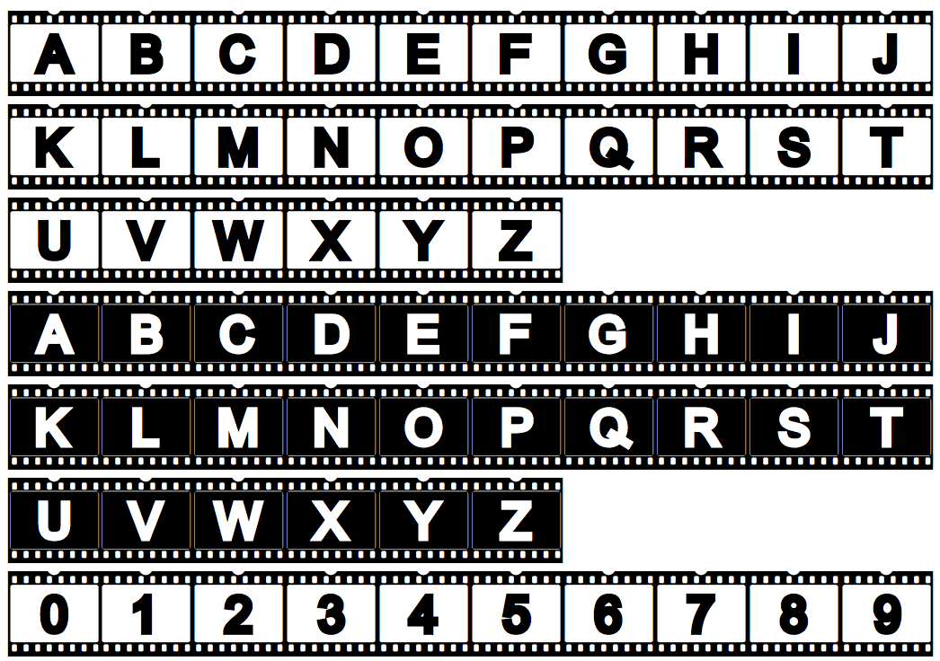
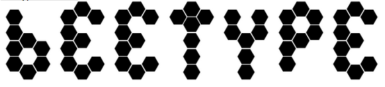
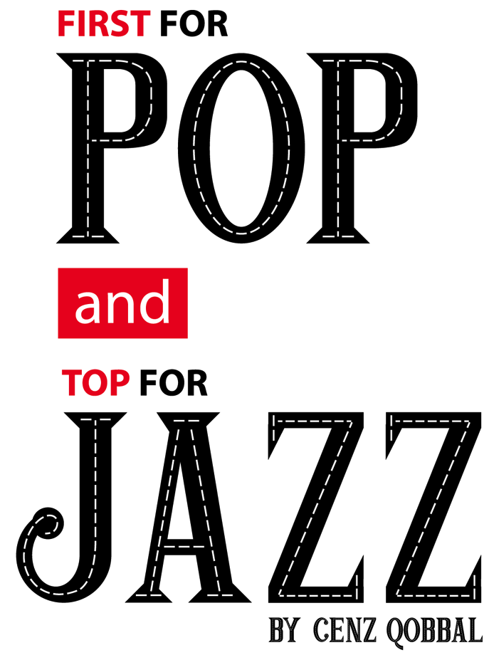
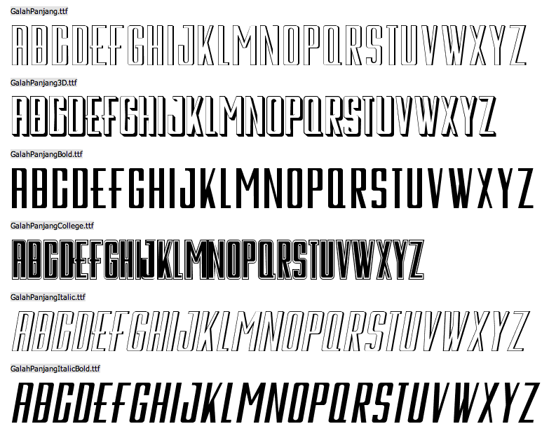
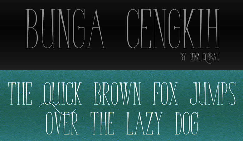
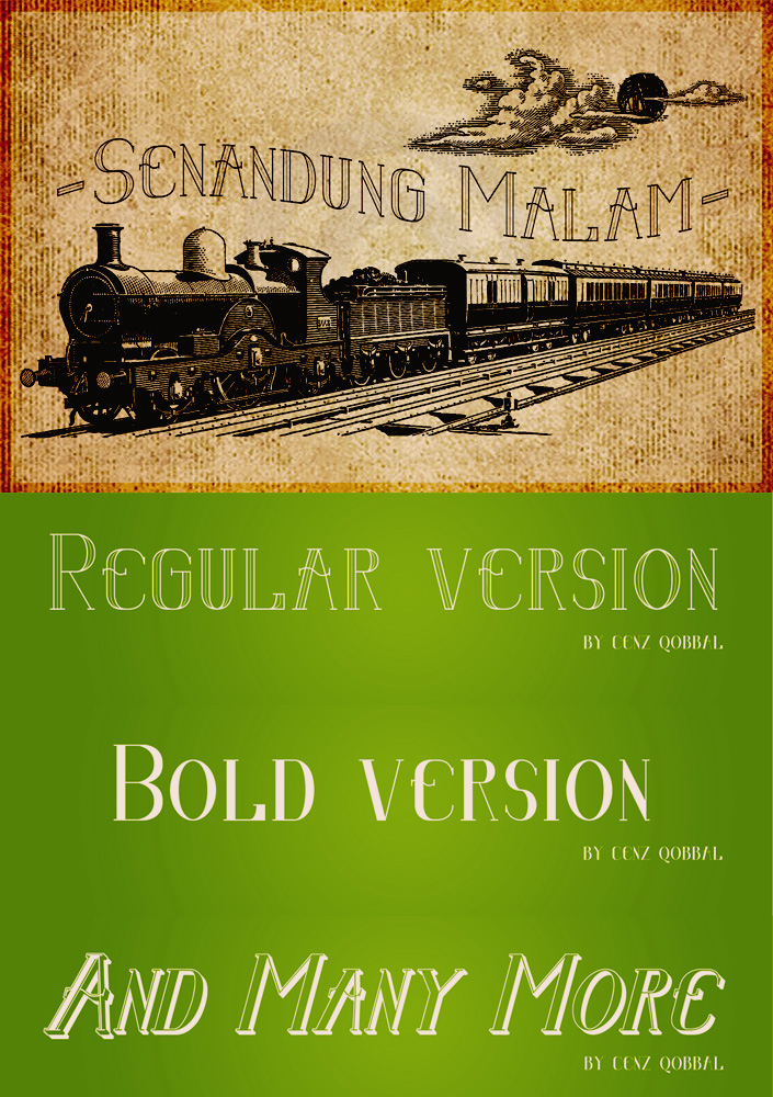
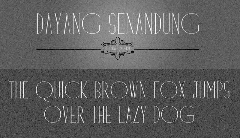
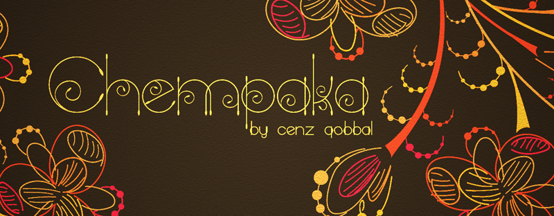
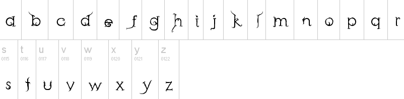
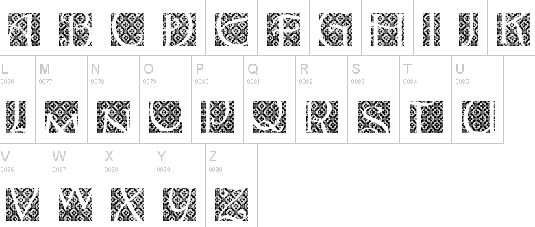
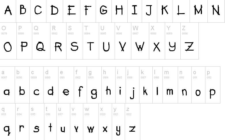
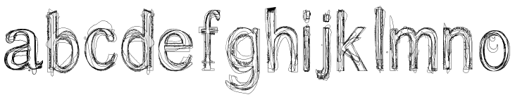
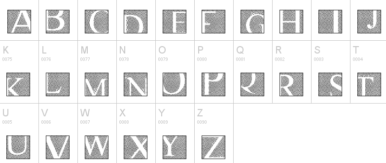
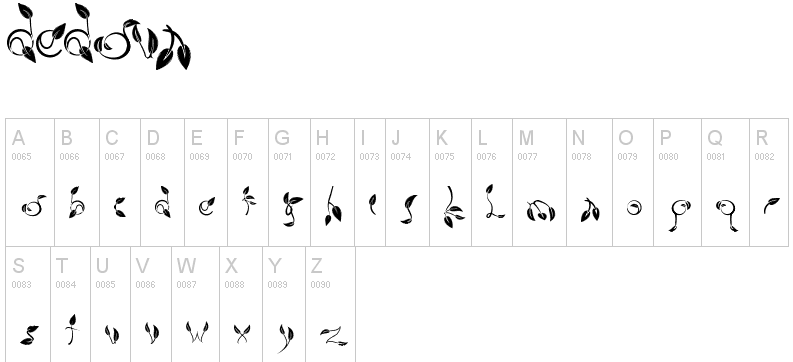
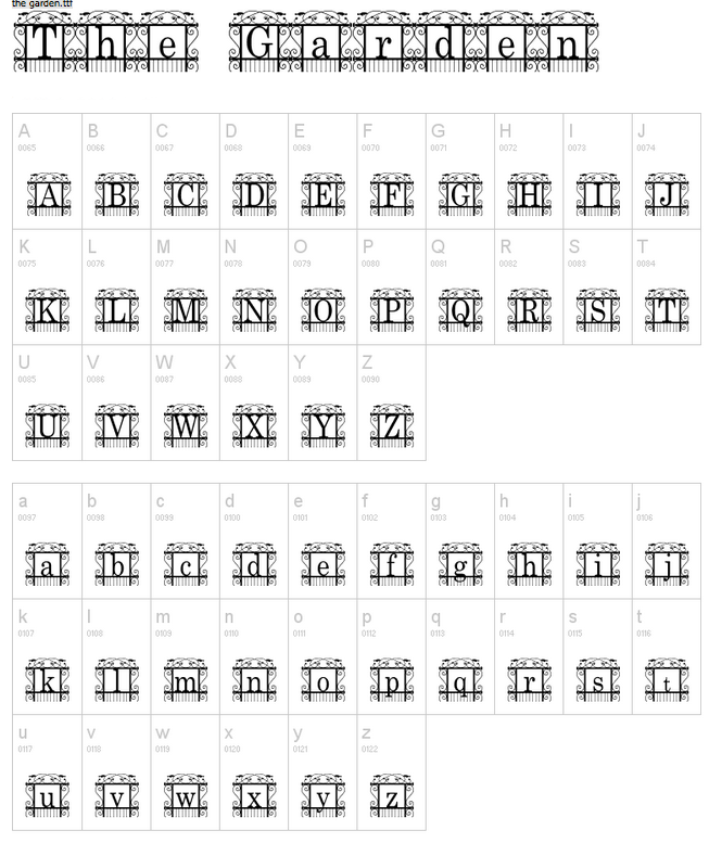
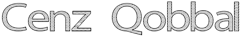
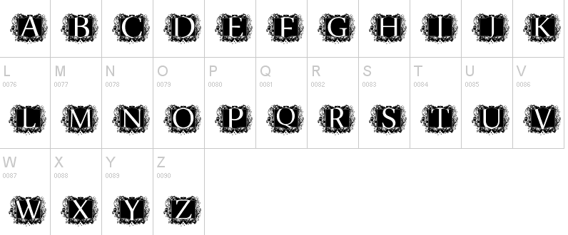
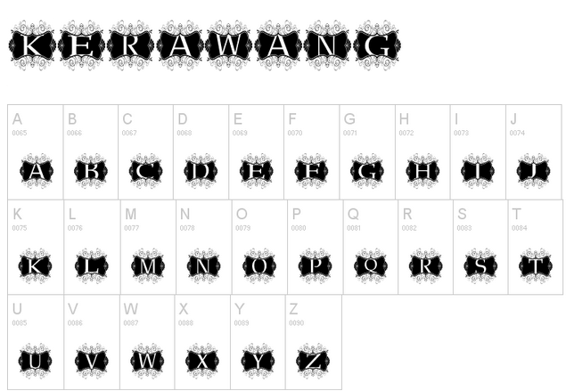
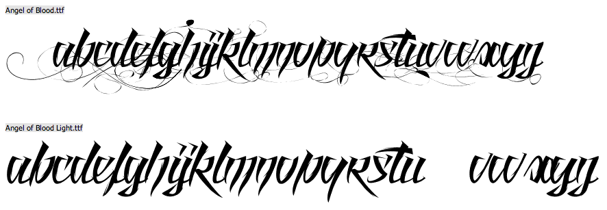
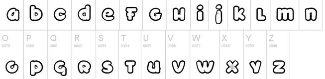
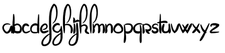
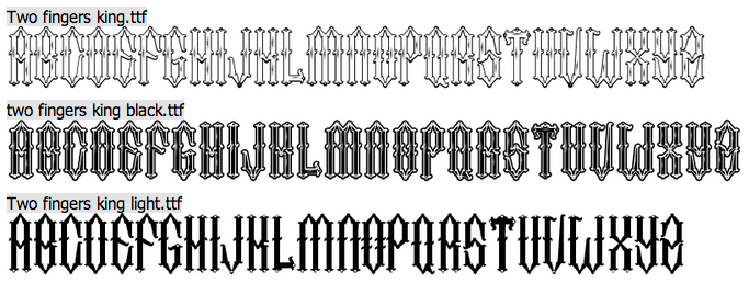
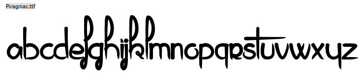
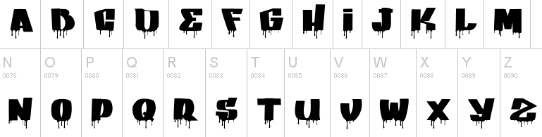
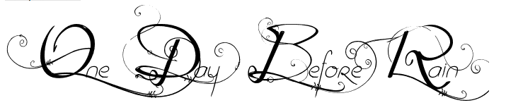
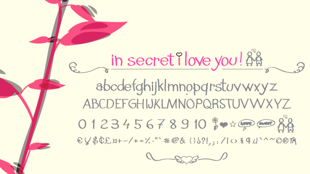
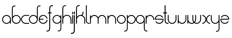
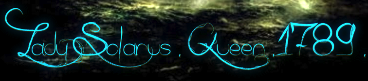
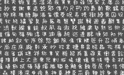
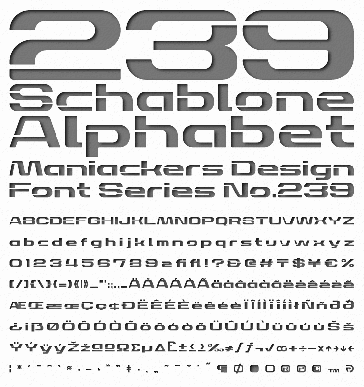
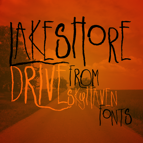
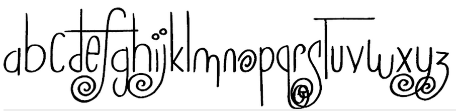
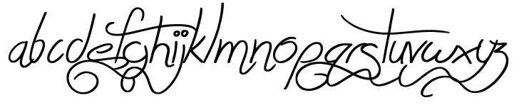
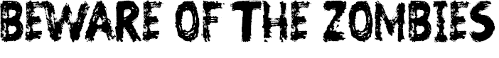
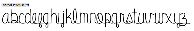
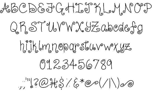
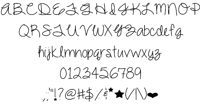
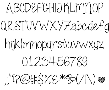
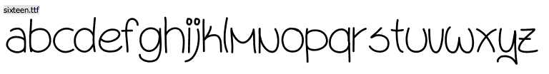
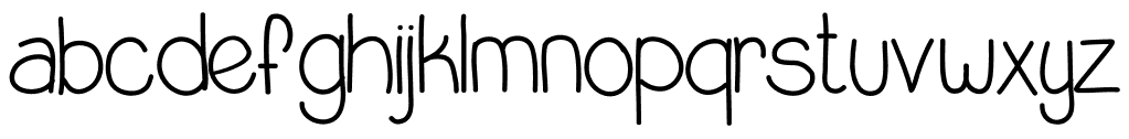
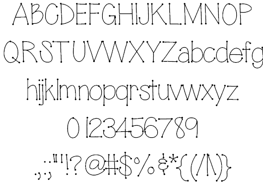
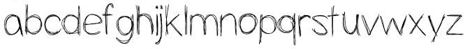